Tina Vlassopulos Ceramics
When did you decide to do one-off built pieces?
I studied ceramics in the 70s when an interest in sculptural ceramics was just beginning to grow but there were only a handful of colleges that encouraged you to explore all the possibilities inherent in making things out of humble clay. Luckily, I was accepted on the BA course at Bristol Polytechnic, which was a very forward-thinking course. Although I tried all the different pottery techniques, it was the versatility and freedom of hand building that appealed to me most and suited my personality best.
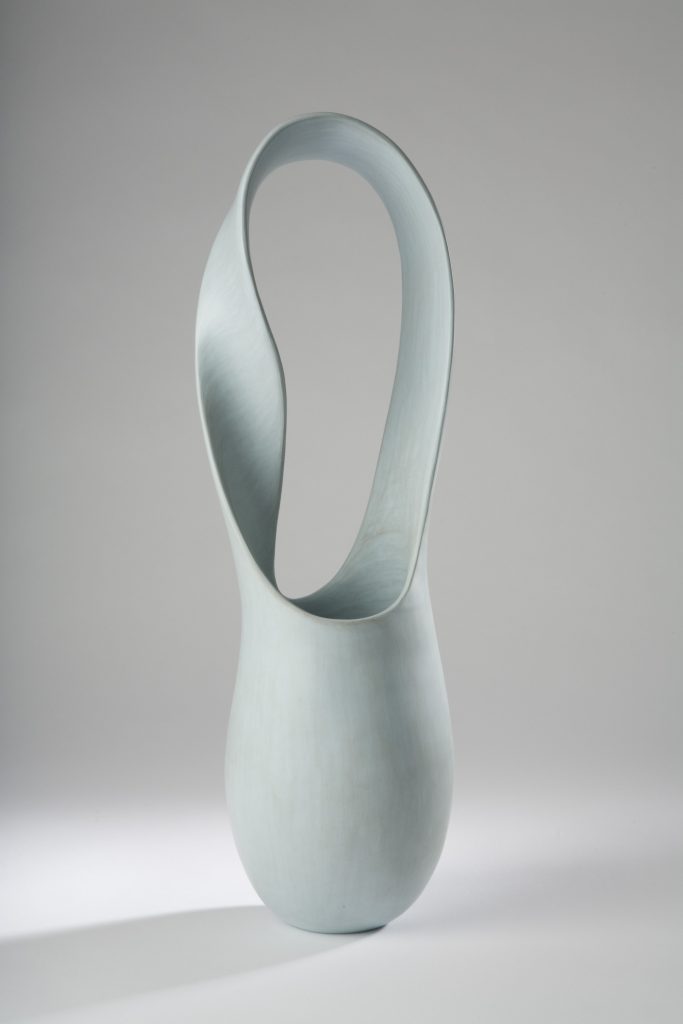
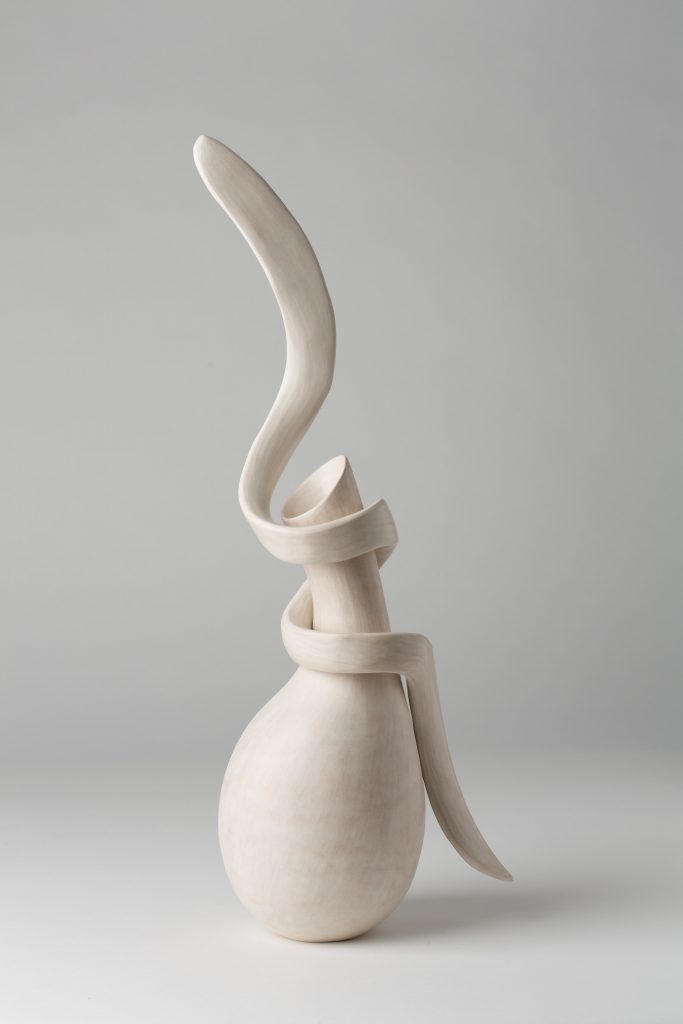
Moebius
Your colour range is very feminine discuss this choice.
The forms and concepts I come up with are my primary concern and clay is my medium of choice. I’m afraid that I’ve never been interested in the technical side of ceramics and find mixing glazes a terrible chore (although I marvel at what other potters can achieve through glazing). I discovered early on, with some relief, that it was possible to leave the clay naked so I started mixing oxides and stains into the clay, which produces pastel shades.
Nowadays I mostly use the clay straight out of the bag without any additions and have started to flock some of the pieces to give colour and a contrasting texture. This allows me to choose colours that have specific meanings or emotive connotations.
Can you discuss the use of colour in the work, ‘Portrait of Fanis’?
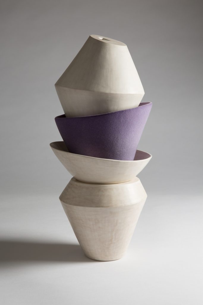
‘Portrait of Fanis’
‘Portrait of Fanis’ is part of my installation ‘Conversations with Friends’.
It took me a long time to work out how to portray Fanis who is a very dear old friend with an amazing and interesting life story, multi-faceted and many-layered with an oppressive family and many personal hurdles, which he managed to overcome with dignity, honor and a noble spirit. He is warm, gentle and loving once you get to know him but complains that he gives the wrong impression when he meets people for the first time.
It occurred to me that purple was the colour that suited him most: it is foremost a majestic colour and is created by combining a strong warm with a strong cool colour which seemed to me to be the perfect fit.
When Fanis saw his ‘portrait’ he exclaimed, “That’s exactly how my therapist described me: unsteady but with a solid core!”
You comment about your pieces as , “Abstracted portraits of friends, representing their character.” Expand on this comment in relations to the work.
In 2019 I made an installation entitled ‘Conversations with Friends’ which consisted of 14 abstract portraits of my friends. Rather than attempting to illustrate them literally, I wanted to represent each friend’s character, disposition and psyche in a subjective and symbolic way. A kind of allegory.
Harjit’s portrait
Each portrait was an assemblage of shapes containing multiple elements to symbolically express and inform my view of a particular friend. Some symbols were obvious, while others were more ambiguous requiring time to unearth their meaning.
It was a very interesting project, as I really had to rack my brain about each of my friend’s character and then come up with a new language to express myself. I found it really difficult in the beginning as I kept coming up with the same 3 adjectives that fitted all my friends’ characters: generous, intelligent and loving. I wrote lists of their attributes and spent hours thinking about each one. It was a very special time and has made me appreciate how lucky I am to have them in my life.
Surprisingly, my oldest friends proved to be the most difficult ones to conceptualise. I think that when you know someone for a very long time, it’s difficult to analyze what draws you to that person as they become an honorary member of your family.
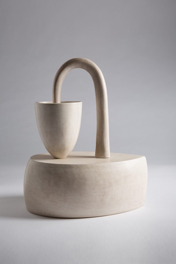
In the beginning the portraits were more literal. For instance, Harjit’s portrait is about balance (she’s a judge), her shoe fetish (the shape of the base) and her appreciation of a good glass of red wine (the cup) but the more I worked on the portraits, the more abstract they became.
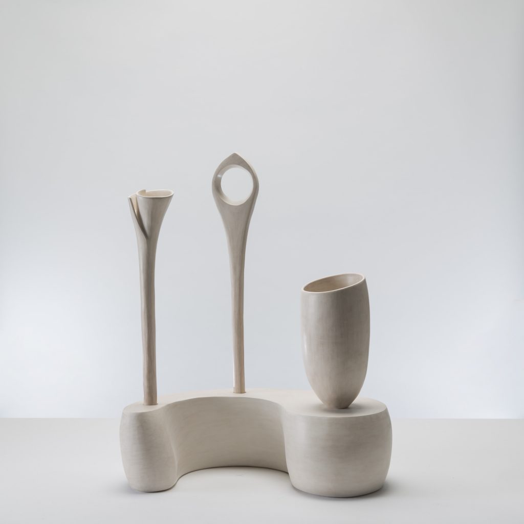
‘Portrait of Lesley’
I met Lesley 46 years ago at uni. She’s always been a fantastic listener and she’s an amazing film director so ‘Portrait of Lesley’ is all about the ear and the eye. The base is an abstract ear shape as is the standing flower (also symbolising her beauty) while the lorgnette symbolises her wonderful eye and perceptive and insightful nature.
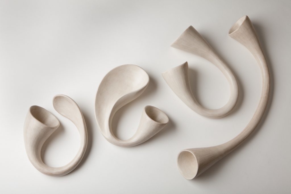
Take ‘Curlicue’ discuss the work
Curlicue, 48cm H x 20cm W
Curlicue, 48cm H x 20cm W, hand built using white stoneware clay, burnished and fired to 960C.
‘Curlicue’ is part of a group of work, which was inspired by the breathtaking rainforest I visited in Peru where nature in its unfettered glory has taken over and the extraordinary vines and creepers that grow there, with their tendrils twirling and winding around each other, all competing to reach the sunlight.
It is made up of 2 pieces that fit together. It was not possible to fit the 2 pieces together until the piece was fired because it would’ve damaged the burnished surface so I had to make several ‘tendrils’ and hope that one of them fit as I envisaged.
I was really disappointed as none of the ‘tendrils’ I made fitted the bottle-shape. Then my partner walked into the studio and picked up a tendril that I’d made for another piece and convinced me to try that one on instead. It was definitely one of those ‘glass slipper’ moments: not only was it the perfect fit but it turned it into the most successful and dynamic piece I have made so far in this series of work.
Discuss the importance of clay for your work.
I’m drawn to clay as it is malleable, flexible and transformable. It is also a down-to-earth (excuse the pun!) and humble material; one that suits all sorts of different personalities. Hard, soft, organic, geometric, from toilet bowls to false teeth to space shuttle tiles – anything and everything goes!
Ode
Your composition is so important in ‘Portrait of Yo’, comment on the piece as a still life.
Working on the portraits of my friends for the installation ‘Conversations with Friends’ allowed me to look and think in a new way. Once the shapes for each portrait had been designed, they were placed into a specific arrangement to make the whole meaningful, balanced and appealing. This took many hours of contemplation, work and scrutiny. There is a magic moment in the process of assembling a still life when it suddenly appears as a visually coherent piece and a nature morte is born.
‘Portrait of Yo’
‘Portrait of Yo’ was built up over a number of months of consideration, experimentation and much trial and error. Yo is a woman of many talents, highly intelligent, extremely amusing and oozing with charm. I was very concerned that the piece made a balanced and harmonious still life but at the same time wanted to depict Yo’s endearing clumsiness. While I was making the piece Yo managed to trip up and break her rib which gave me the idea for the element that was missing in the piece.
Adding a ceramic ‘rib’ to the portrait gave it the extra edge I was looking for and condensed the piece into the essence of Yo. A piece that was elegant but slightly awkward.
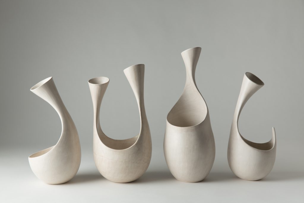
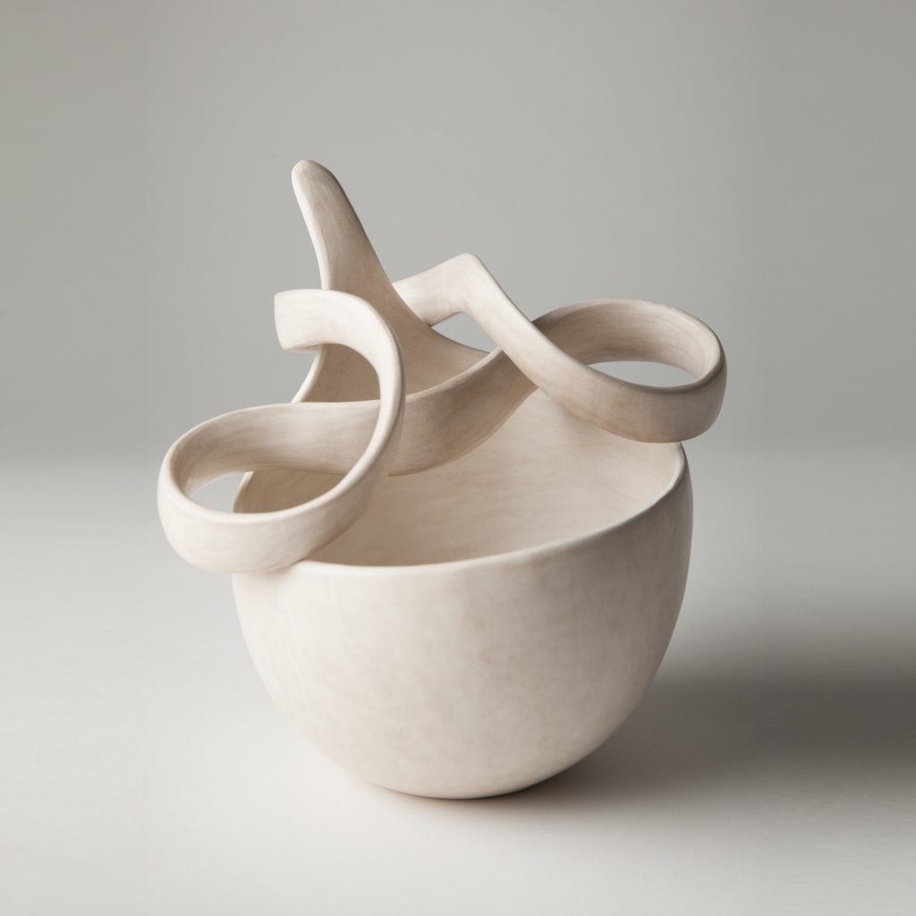
You show movement and fluidity in your ceramics, can you expand on this and how you also work with groupings.
I take a lot of inspiration from the performing arts especially ballet, contemporary dance and opera. Attending a live performance seems to unlock my creativity and allows me the time to freely roam around in my imagination.
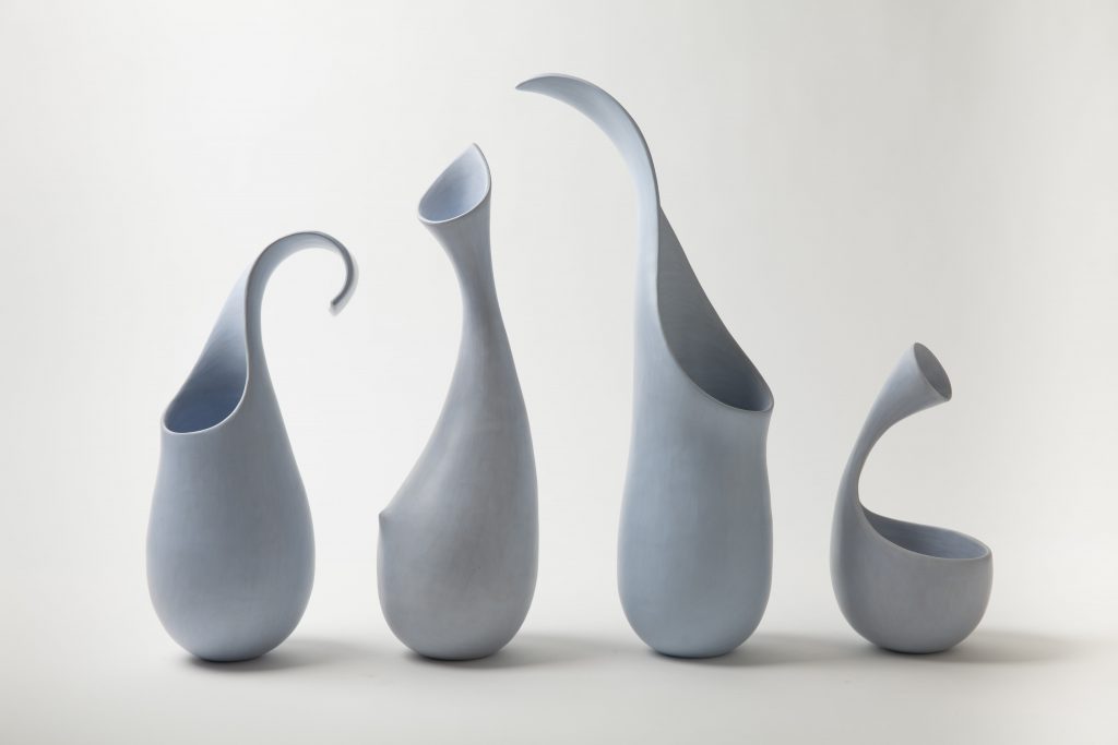
‘Blue Note’
As a homage to the gift of the performing arts, I set myself a challenge to depict undulating melodic motion. In ‘Blue Note’ and ‘Ode’, I attempted to capture the rhythm and flow of music and dance. By deciding to make a group of inter-relating forms I came closer to emulating musical notations and attempted to give the pieces tempo, inflection and movement.
Ode wallpiece
There is a piece called ‘Ribbon’ that shows the actual word – ribbon, discuss.
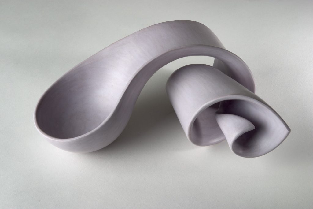
I’m always on the lookout for new ideas and a lot of them come from really mundane and unromantic things. The idea for ‘Moebius’ was born on the way home from the supermarket when the bag I was carrying got twisted round my wrist.
Most people find it irritating that the postman drops elastic bands everywhere, but I think they produce delightful little random shapes worth noting. I’m afraid that ‘Ribbon’ was inspired by an elastic band I saw curled up on my front step.
But I couldn’t bring myself to call the piece ‘Elastic Band’ so I called it ‘Ribbon’ instead.
‘Ribbon’
How do you come up with such charming names for your work?
Thank you for your kind words – I’m surprised to hear that. I think that the titles given to a work of art are a very important part of the work as it gives a clue to what the artist was thinking although personally I sometimes prefer something more ambiguous to allow my imagination to wander.
Although I’m not very good with words, I really enjoy them in literature, poetry or as little disembodied organic beauties and the truth is that I place great importance on the name I give a piece. I spend hours pouring through dictionaries and leafing through my 1966 edition of Rojet’s Thesaurus (which has many more interesting words than the later editions) to find the right title for a piece. Sometimes I succeed but other times I give up in frustration and end up calling the piece ‘Vessel’ or ‘4 pots’
Movement and layers are shown in your work discuss this using ‘Wrap’ and ‘Unravelled’.
‘Wrap’
I have always been fascinated by avant-garde fashion and try to keep abreast of new designers. I am interested in how the body can be used as a sculptural silhouette and especially the art of deconstructing and reconstructing as seen in the likes of Galliano, Supriya Lele, Yohji Yamamoto, Raf Simons and Issey Miyake.
Both ‘Wrap’ and ‘Unravelled’ have these interests at their heart.
‘Unravelled’
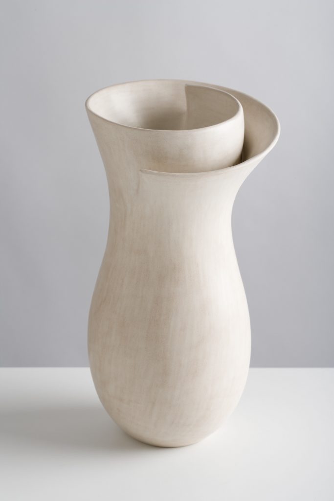
The shapes of your work are often bowls and vases but you have removed the need for objects to be held in them. How do you control the void?
A bowl that proclaims its function but is purely symbolic adds to the ambiguity of my work and draws attention to the nature of clay as a material which straddles 2 worlds.
The empty space is there to be filled by the viewer’s imagination.
Tell us about the Matthew Burrow artist support pledge?
Matthew Burrows came up with a marvelous and very generous initiative to help artists during these difficult Covid times. Artists use Instagram to post and share their work using #artistsupportpledge. The work has to be priced no more than £200 and every time an artist reaches £1000 in sales, they pledge to buy £200 of work from other artists.
Has there been a piece that on completion you have not been able to sell because you love it so much? If so why?
I make things which hopefully will give other people pleasure so the only pieces I’m left with, are the ones that haven’t sold. The most crucial thing for me is the stimulation that comes from using my imagination and the contemplation of the making process. I’m very happy when my work finds a home – in fact it’s a blessing as it makes space for more making.
Contact:
Tina Vlassopulos
www.tinavlassopulos.com
tina@tinavlassopulos.com
instagram: tinavlasso
Interview by Deborah Blakeley, November 2020
Blakeley, Melbourne, Australia
Think a colleague or friend could benefit from this interview?
Knowledge is one of the biggest assets in any business. So why not forward this on to your friends and colleagues so they too can start taking advantage of the insightful information the artist has given?
Other artists you may be interested in: