You used to paint only in water colour, recently you have been working in acrylic too. How do you find the two mediums?
I had to reverse my brain when working in acrylic, as the technique is to go from dark to light (color), usually blocking out the dark areas in advance, whereas with watercolor, one must go from light to dark, usually leaving areas of white paper for the “whites.” It took me awhile to make the change when working in acrylics.
Another difference is the “happy accidents” one gets from watercolor—how colors blend “by themselves” (with a little help sometimes). However, watercolor is less forgiving than acrylic in that one can’t paint over what one has done—it was a revelation that I can make complete changes in acrylic just by painting over what I’ve done! Both watercolor and acrylic allow layers of color over another, though with slightly different techniques. Actually, I’m now able to switch easily between media, including oil as well.
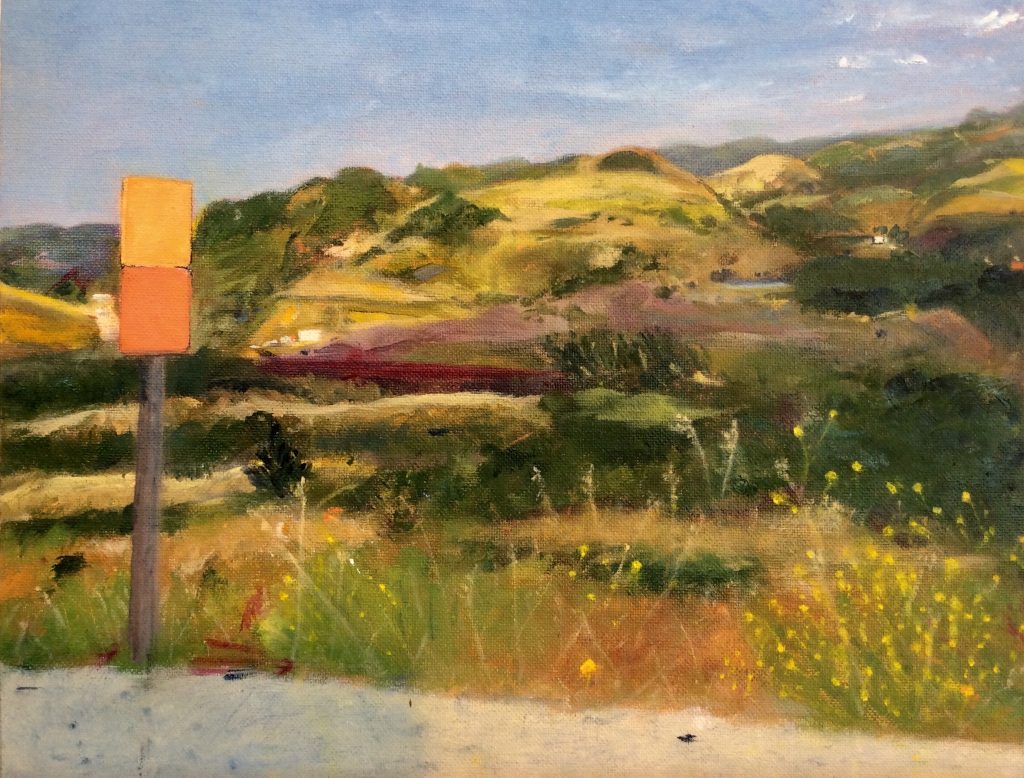
Hidden Valley Summer, oil,14”x 16”
Comment on your series of Street scenes – Santa Cruz to San Francisco. Can you use 3 to 4 paintings and take us on the trip?
Discuss the content
Discuss differences in the environment you pass through
How you have used the physical road
Since living in the San Francisco Bay Area, and now Santa Cruz County, I have found in my street-scene/local landscape paintings a way to show my love of place and the deep emotional attachment I have for my CA home. This “location” series allows me to explore my fascination with the same location in various times of day and from different perspectives and vantage points. I enjoy the challenge of combining architectural details with city and rural landscapes and solving the geometry of space. My aim with these paintings is to share with the viewer this feeling of joy and warmth, and to evoke a deep feeling of place recognition, even if it’s somewhere you have never been.
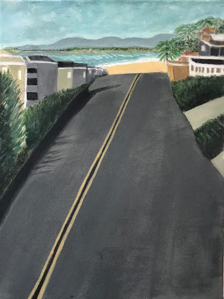
Rio Del Mar, acrylic, 12”x 14”
After completing a small painting of Rio Del Mar, My partner, Rick, suggested that I continue and paint a series of local areas that are important to me. I’d never done this level of architectural/landscape mix, but I was inspired by Richard Diebenkorn’s paintings that combine streets, buildings and landscape.
The first painting I did in this series is “Van Ness Ave” —which is the street where I live. I expanded the view to include several iconic town buildings, a hint of the Boardwalk and across the Bay to Moss Landing. It was a challenge! I had fun painting the cars, including the ice blue one parked on the street, which is my own car. It turned out well and has been exhibited in several venues, as well as prints in private collections.
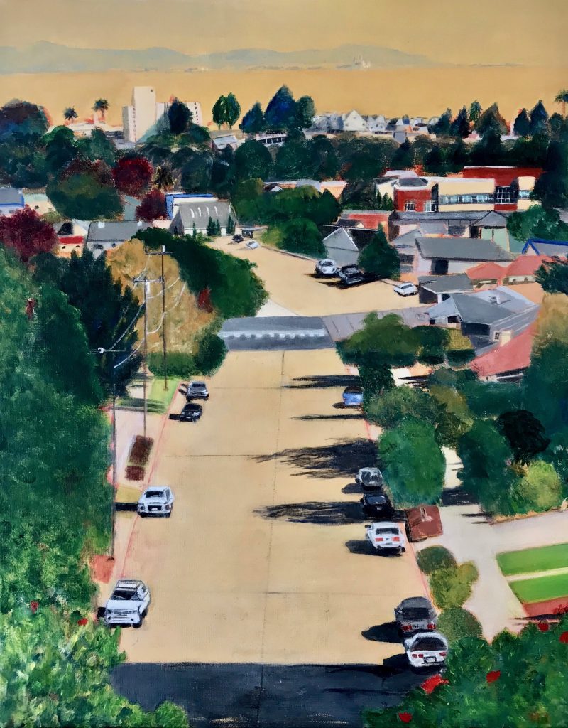
Santa Cruz Van Ness Ave, Acrylic, 18”x 24”
Next, I painted “Santa Cruz Downtown,” playing with the color of the representative buildings, including the town clock and the triangle building at the intersection of Pacific Ave. and Front St.; the main streets of the town. Another challenge, as this had lots of geometry such as the crosswalks and the angles of the street intersections.
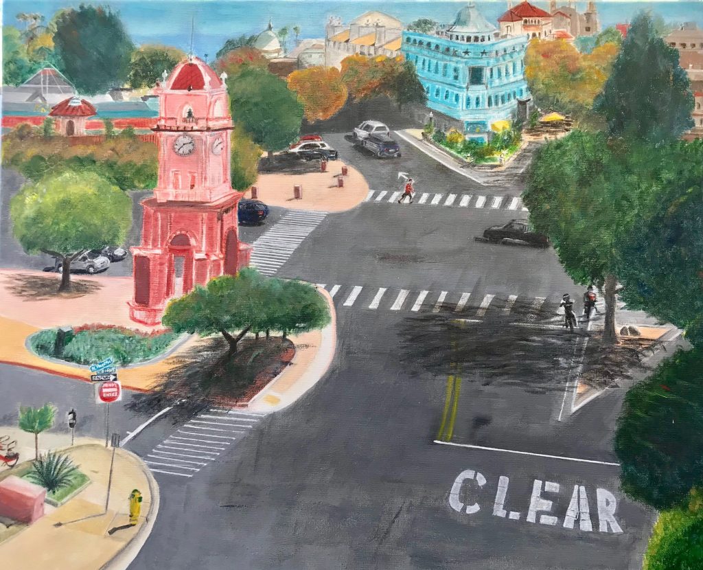
Santa Cruz Downtown, Acrylic, 18”x 24”
The next few paintings in the series are of various aspects of Davenport, CA—in different times of day and evening. Davenport is a small village with a few excellent restaurants, a country store and a famous glass blower. I’d been coming here for years to one of the restaurants, The Road House, and to Lundberg Glass before I moved to Santa Cruz, which is very close (10 miles) to Davenport. Now it’s a place I go to even more often, for brunch with friends, to walk on the bluffs, the beach and to explore the back roads.
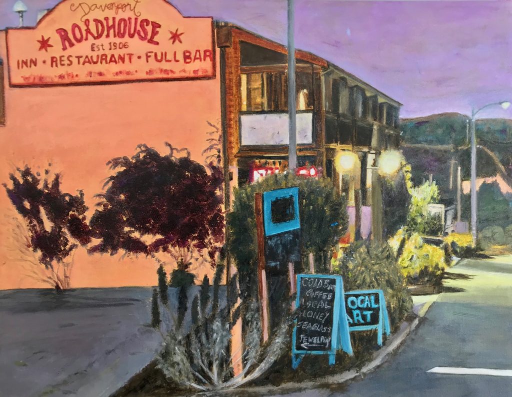
Davenport Evening, Acrylic, 16”x 20”
I’ll finish our “tour” with “San Francisco”—featuring one of the steep streets this great city is known for. I moved to the SF Bay Area in 1978, and never tire of going to the city. Again, I played with color (the street is not really purple) (<* , form and geometry.
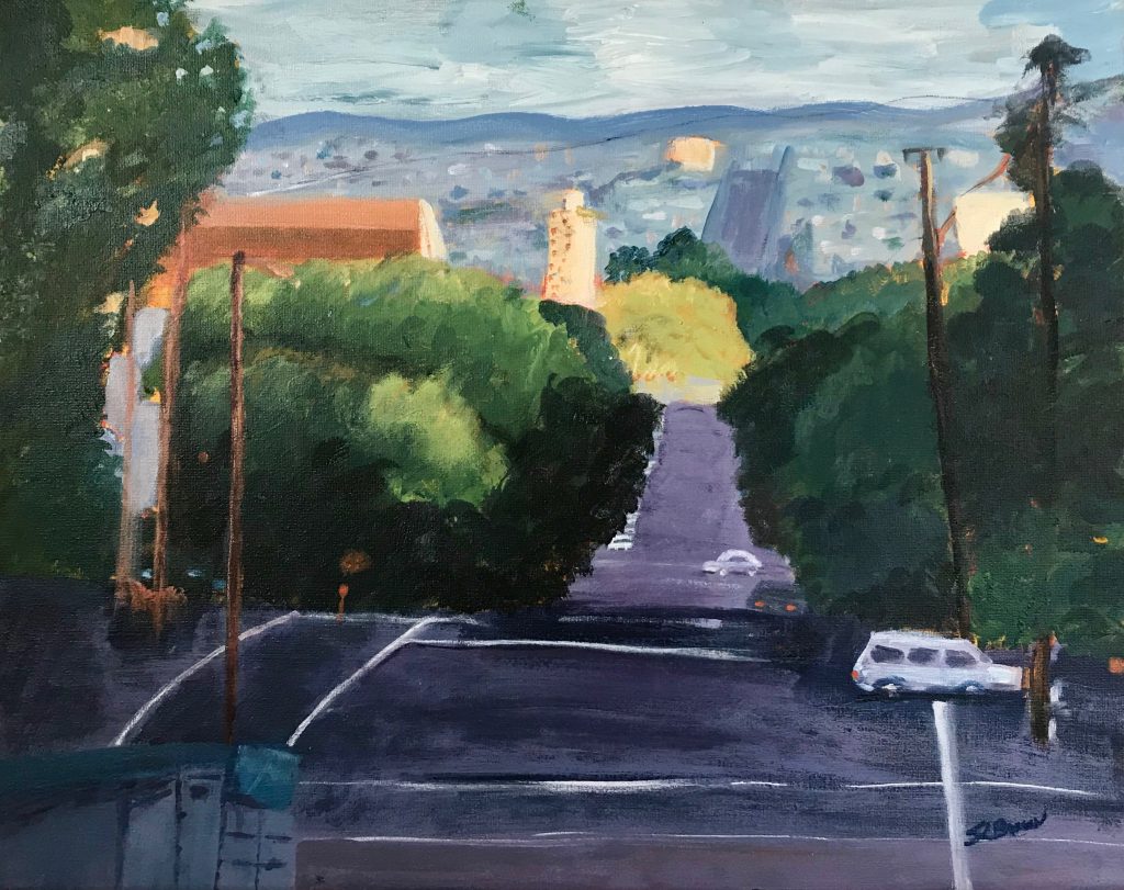
San Francisco 1, Acrylic, 16”x 20”
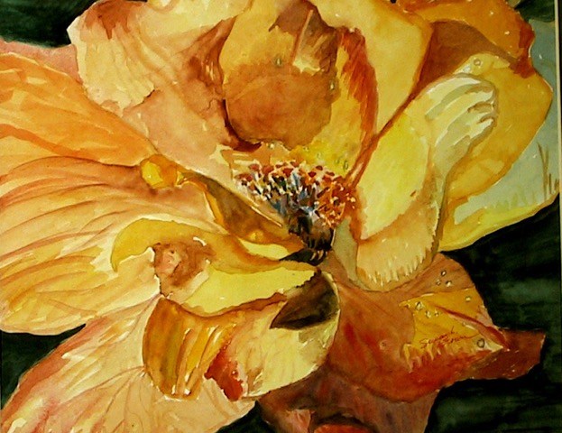
Discuss the use of colour in your flower paints also the use of cropping.
Color is the soul of all my paintings, especially the flowers, whether in watercolor or acrylics. When I was painting mainly in watercolor, I naturally gravitated to painting one or two “cropped” floral images as I was attracted to the form of each flower. I enjoyed painting watercolor flowers in large scope, including the peonies, which is the largest watercolor painting I’ve done; 36”X 24”.
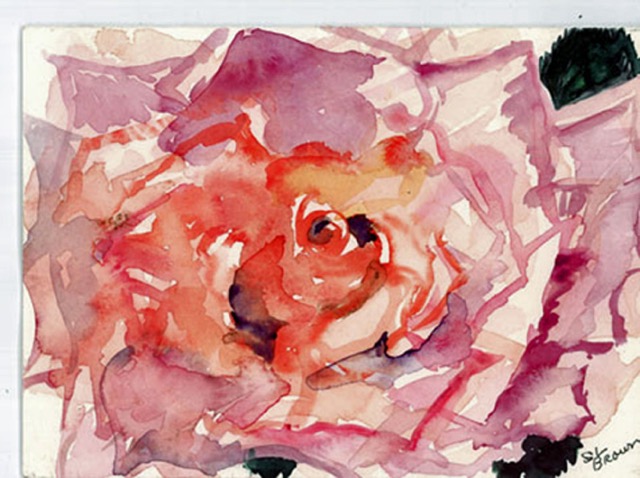
Beauty, Watercolor, 12”x 14”
The flowers seem to float off the page, which was the effect I was going for. I used watercolor glazing to show the depth of the flowers and express the delicacy and elegance of the forms, and goache to contrast the opaque dark background and leaves.
My magnolia watercolor paintings were inspired by Japanese floral paintings, including showing the petals as they are fallen off the plant. The symbolism is that the young and old are natural and inevitable parts of the same whole.
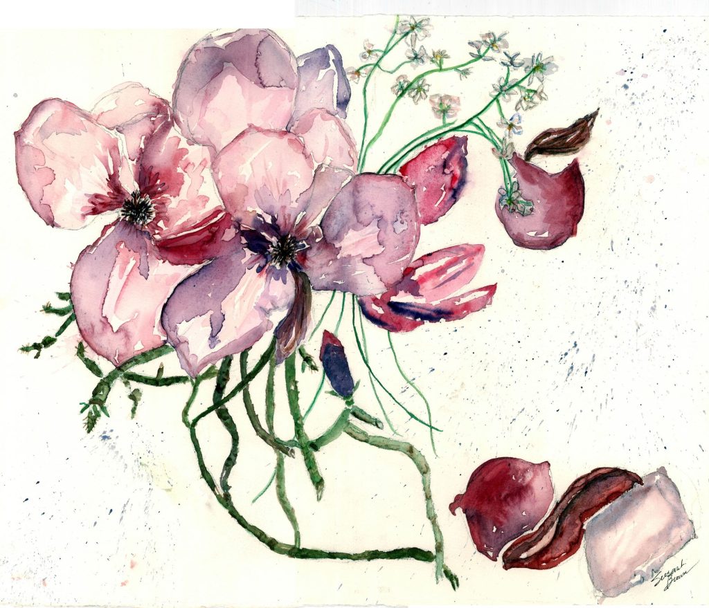
Magnolia 2, Watercolor, 16”x 20”
My acrylic flower paintings have more complexity and abstraction—using the elements of bold color and texture to which acrylic lends itself. It was fun to do them, as they are built on layers of background texture and color; the flowers themselves then added on top, even using my fingers to make effects.
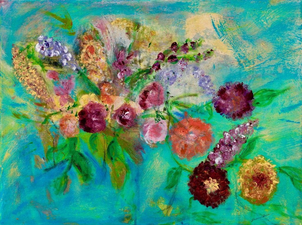
Dream of Flowers, Acrylic, 18”x 24”
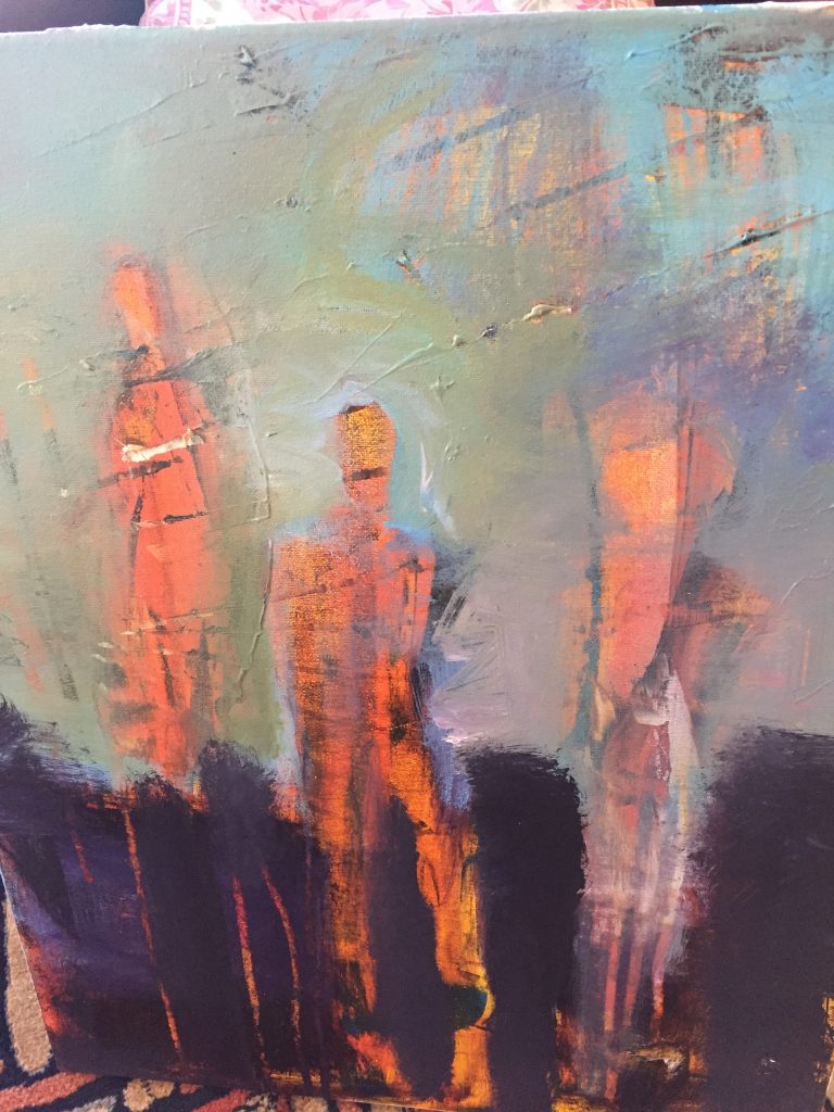
How important is colour in your abstraction work?
Color is my first instinct, then form and perspective. The abstracts are very fun and freeing for me, especially in contrast to the “Street Scene” series of paintings which are very “paintstaking,” full of geometry and detail.
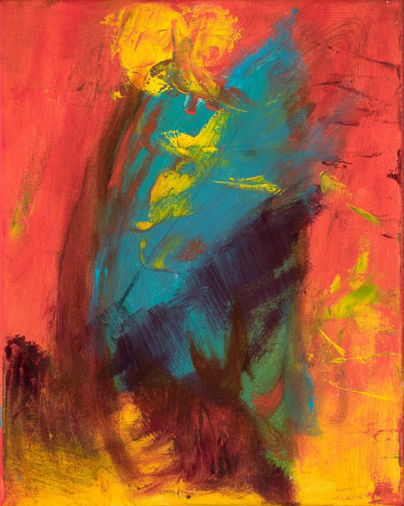
Fire Dream, Acrylic, 16”x 20”
For most of my abstracts I start with lots of background color and texture on the canvas, let this dry, then add more color and shapes as I feel them. I sometimes use tools, such as squeegees in various sizes and large brushes to add texture.
A few of my abstracts, however, were done on the bare white canvas, one using streaks of red and yellow, in a color pattern that satisfies me.
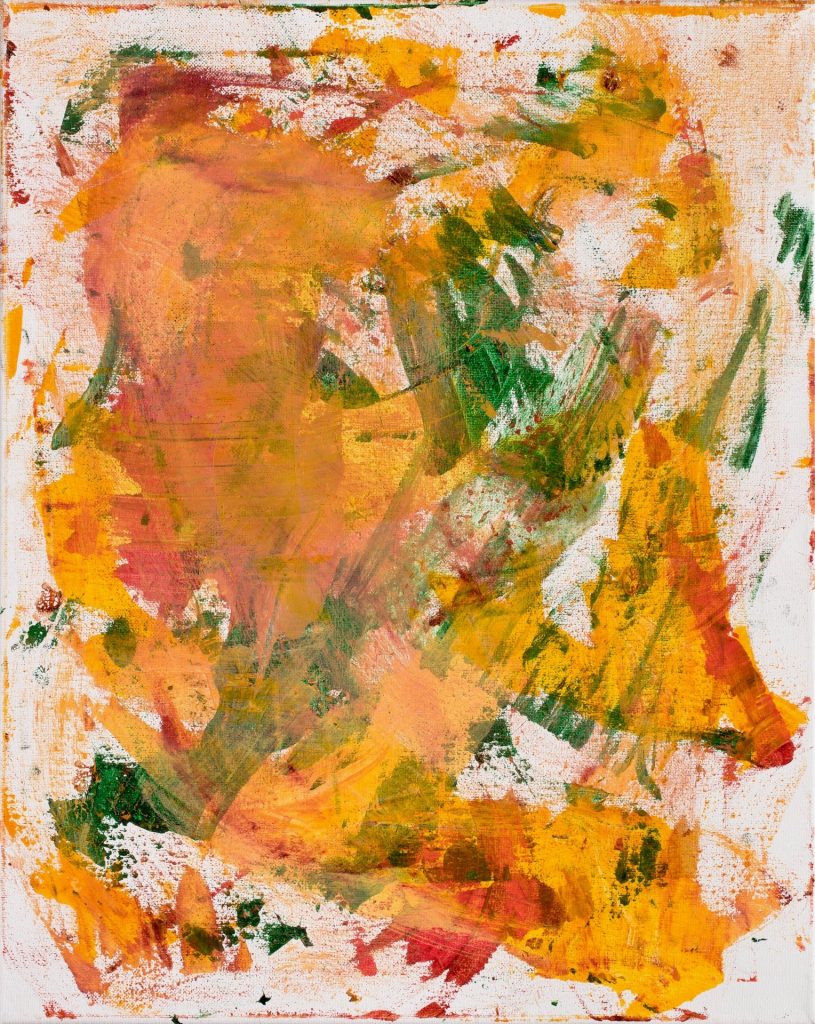
Let’s Dance, Acrylic, 16”x 20”
That’s the fun to me of abstracts—I choose a color palette but am not quite sure where they will end up. (I confess that even after I’m done, I often add marks in pen or more paint to “finish” them.) I plan to do more abstracts, after I do a few more in my “Street Scene” series.
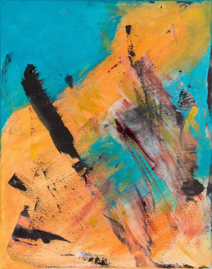
Blue Feather, Acrylic, 16”x 20”
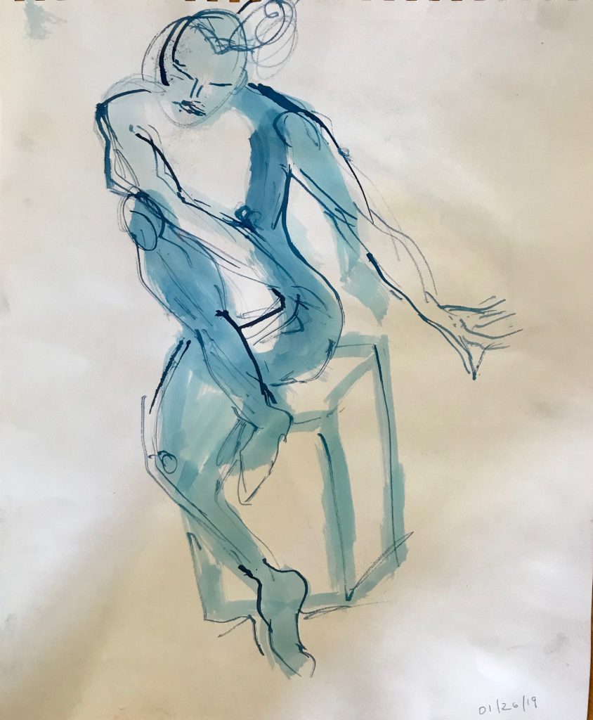
Do you go to life drawing classes regularly?
I’ve been going to life drawing classes and model drawing sessions for many years. In 2008 I was studying with Mike Kitchel, through the Pacific Art League in Palo Alto, CA. He taught a very geometric style of capturing form, which I think is a good basis for further study. Since moving to Santa Cruz in 2014, I joined the Santa Cruz Art League, and became even more dedicated to figure study with a marvelous teacher, Susie Wilson, an expert in form relationships, including explaining how to visualize an invisible grid on the body.
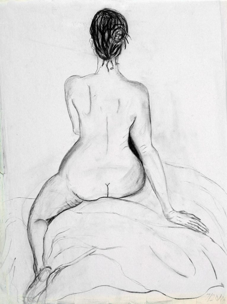
Marla 2, Vine Charcoal, 18”x 24”
She is extremely encouraging, and her concentration in how to really see the relationships and proportions of all the parts of a body, as well as how to capture movement and expression, was just what I needed to progress. I took her classes every week for about three years, and gradually became more confident in my abilities. I have entered and won several awards with my figure paintings which makes me happy that I’m on the right track!
Blue Move, Ink and Bleach, 18”x 24”
Discuss the female form and its beauty and shape as inspiration to you in your work.
I love to draw and paint the female form, especially as I’ve been studying figure drawing for several years. The more, curvy the form the more fun I think it is, as in my “Muriel” paintings. Another thing is that I think that women are victimized so often due to bodies that don’t fit the unrealistic advertising and celebrity examples that I want to show through my painting the beauty of all types of bodies.
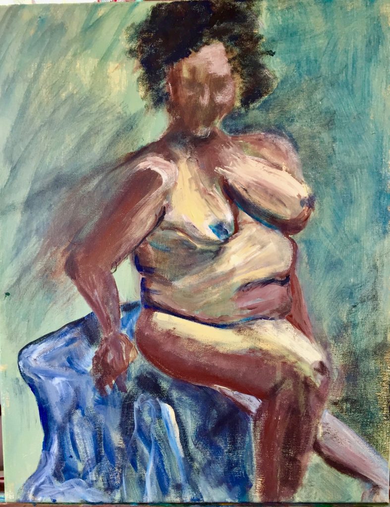 Muriel 2, Acrylic, 16”x 20”
I also enjoy the challenge of drawing poses that are more difficult, such as foreshortened ones. There is something very satisfying about getting the proportion right as well as the likeness and expression on a face. Funny thing is that I’ve developed a drawing style without trying to—folks tell me that my drawings have a definite similarity to each other.
My figure paintings are definitely inspired by Matisse’s loose yet expressive style. I love his patterns and colors too and try to incorporate this into my work as well. I did a series of figure paintings based one of my drawings, using different colors to emphasize various aspects of the form and to depict various moods and themes, including the theme of a German legend, the Lorelei, a woman who threw herself into the Rhine River for love of a man who abandoned her. (She got her revenge in the legend as she became a rock in the river which caused shipwrecks!)
Unlike my figure drawings, actually my figure paintings are in a wide range of styles. I don’t plan it exactly but find out what happens as I put paint to the canvas. Some are more expressionistic, some more realistic and some more abstract.
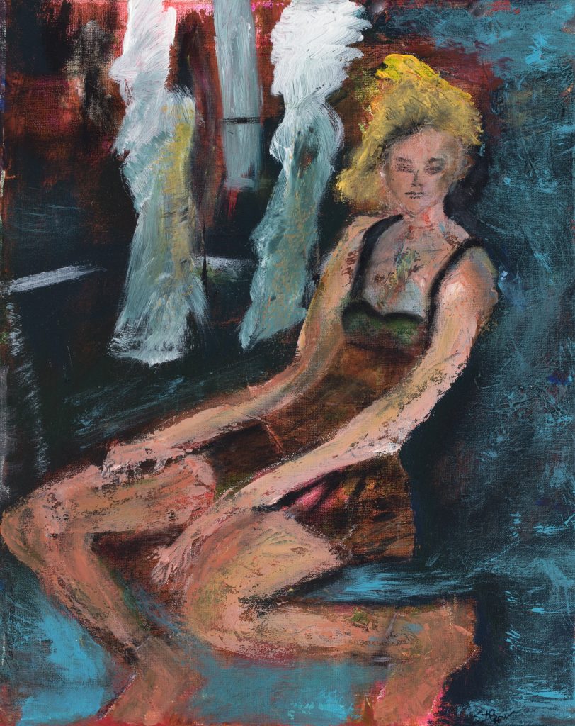
Waiting, Acrylic, 16”x 20”
You give week long classes comment briefly on the format they take.
The classes take place at Ghost Ranch, New Mexico, (www.ghostranch.org) a place where Georgia O’Keeffe lived and worked. It’s a gorgeous area of the USA, with many colorful, unusual rock formations, a beautiful river, (the Chama River), and mountains, including the Pedernal, which O’Keeffe named as her own.
Well, now it’s mine as well (<*
I’m honored to teach a class called “Inspiring Landscapes: Paint It Your Way” (as part of the Spring Festival of the Arts; from Sunday (evening), March 22–Friday (morning), March 27, 2020.
I’ll be teaching a variety of techniques, including travel sketching using pen and watercolor, color mixing technique, and acrylic and watercolor landscape painting. A good friend and excellent travel sketch artist, Julie Barreto, may be a guest teacher on one of the days when we do a field trip in the area. This workshop is available for all levels of painters and all media. The class format include demonstrations, daily studio time to work on each person’s own projects, at least one field trip and lots of individual attention to help each person progress. Besides the opportunity to stay at this beautiful property.
Using images of your work show how you have developed through your artistic career.
I started as a child in Ohio; don’t know if that counts as part of my artistic career! I went to art classes and won a few awards including one as best in show in my age group.
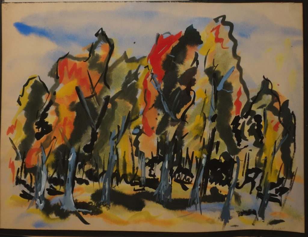 Ohio Fall Forest, Tempura, Ink, 18”x 24”
After moving to CA, I went back to my art again seriously in 1998, as I was going through a divorce. I first concentrated on my drawing skills as I was quite rusty. I took classes at the College of San Mateo, San Jose State, Pacific Art League in Palo Alto, CA and from excellent private instructors.
Watercolor took over my painting life, although I’d done oils as well. (At that time, I’d never worked in acrylics.) I painted mainly still lives and flowers, found joy in using exuberant color. I started exhibiting at galleries, restaurants and art shows and was even invited to represent the United States at the Florence (Italy) International Biennial Exhibition of Contemporary Art in 2011. I also taught watercolor for various city parks and recreation departments, and also for private classes.
Golden Blossom, Watercolor, 16”x 20”
Since moving to Santa Cruz, CA in 2014, I have tried various styles and media as explained previously, and am having the best time exploring and working in all media and many subjects, from figures, landscapes/urbanscapes to abstracts.
Orange Figures, Acrylic, 16”x 20”
Travel sketching is important, how do you approach is format?
(show examples of your sketch books)
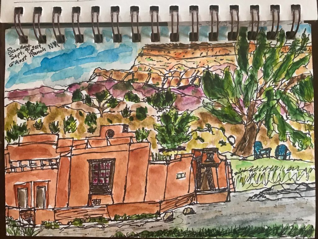
Ghost Ranch, Ink and Watercolor, 51/2”x 7” sketchbook
I have been doing travel sketching throughout my life but have been concentrating on it more in the past few years, especially as I’ve retired from a demanding career in technology marketing. Since then, I have had the opportunity to travel to many places, including Japan, Greece, Argentina, Chile, Italy and France, as well as New Mexico where I’m now teaching. I do plein air, on the spot sketching, depending on how much time I have to do it. Sometimes I’m lucky enough to get an hour or so, but mostly it’s grab a half an hour or even just a few minutes. I used to sketch mainly in pencil, but now I sketch in black ultra fine Sharpie or micro pens, as I like the effect. I’ve found that the more often I sketch the more satisfied I am with what I’ve done—probably an obvious observation (<*
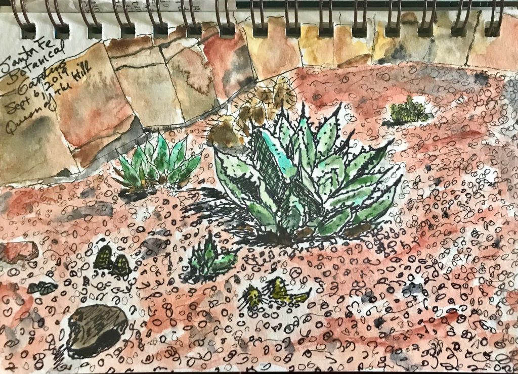
Queen of the Hill—Santa Fe Botanical Garden, Ink and Watercolor, 51/2”x 7” sketchbook
Do you use photography along with sketching when you travel. How do you combine the two?
I usually try to take a photograph of whatever I’ve sketched or started to sketch so I can fill in details later as needed. I take a small travel watercolor set with me so I can add color—sometimes as I’m sketching but often after I do the sketch and from the photo.
I find that I get great pleasure from looking back at my sketches, they bring back the experience of the place much more than a photograph alone!
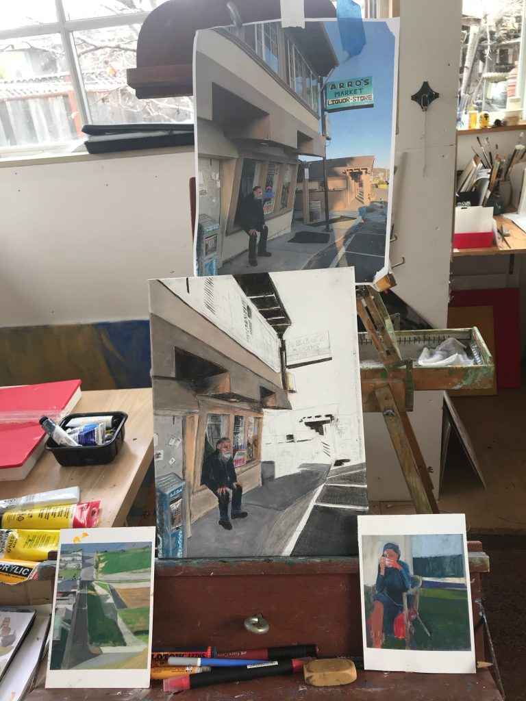
(Note the Diebenkorn cards I use as inspiration)
I usually try to take a photograph of whatever I’ve sketched or started to sketch so I can fill in details later as needed. I take a small travel watercolor set with me so I can add color—sometimes as I’m sketching but often after I do the sketch and from the photo.
I find that I get great pleasure from looking back at my sketches, they bring back the experience of the place much more than a photograph alone!
Contact:
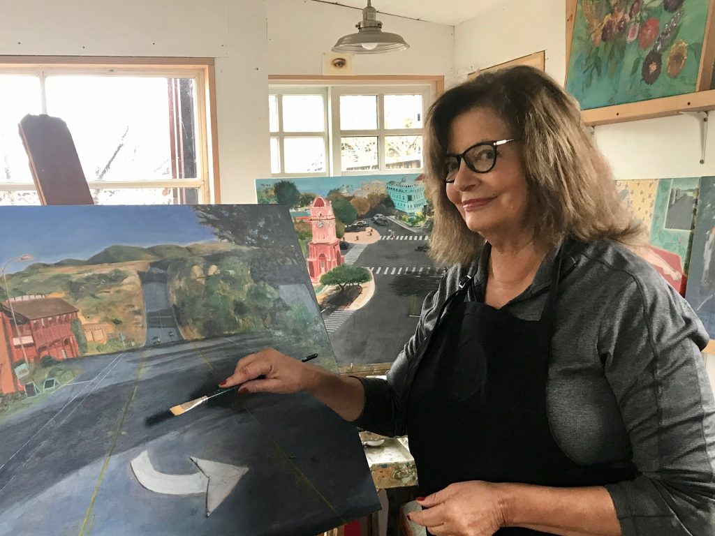
Susan Brown
email: susanbrownart@gmail.com
Deborah Blakeley, Melbourne, Australia
Interview by Deborah Blakeley, January 2020
Think a colleague or friend could benefit from this interview?
Knowledge is one of the biggest assets in any business. So why not forward this on to your friends and colleagues so they too can start taking advantage of the insightful information the artist has given?
Other artists you may be interested in: