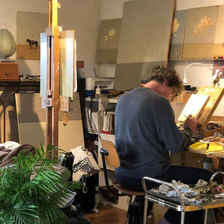

Peter Kuttner Painter / Collage Artist
How do you feel your work heading the graphic arts department at National Museum of American Illustration has affected your art?
A few months before starting at the National Museum of American Illustration, I had just graduated from Ringling College with a fine art degree in illustration. Having studied many of the works in depth as a student, suddenly being surrounded by the originals in a museum setting was surreal, to say the least. It gave me an even greater appreciation for the craftsmanship and storytelling of the illustrators who came before me.
At the time I joined, the museum was brand new to the public, and I wore many hats while working there. Beyond my role in the graphic arts department, I was involved in everything from exhibit tours to marketing, which gave me firsthand experience in how artwork is presented and received. That experience sharpened my eye for composition, color, and narrative, elements that continue to shape my artistic approach today.

Harbor of Solitude II 28”x24”
Minimalism, it is clear in your art discuss this using two works.
Minimalism plays a significant role in my work, particularly in my Cut-Out Series,
where simplicity and negative space become just as important as the painted elements. One example is Garden Serenade, where the carefully shaped cut-outs create an interplay between light, shadow, and color. They create an interplay between light, shadow, and color.
The floral elements are suggested rather than fully defined, allowing the viewer’s imagination to complete the composition. By reducing detail and focusing on form, the piece maintains a sense of openness and movement.

Garden Serenade 48”x64”
Another example is Silent Drift II, a sailboat piece set along the coastline, a piece where the balance between cut-out and textured background surfaces enhances the feeling of weightlessness and motion. The negative space acts as both sky and sea, emphasizing the quiet stillness of the sailboats while letting the composition breathe. This minimalist approach not only defines the aesthetic of the series but also reinforces the themes of airiness and fluidity that run through much of my work.

Silent Drift II: 36” x 24”
You want to bring happiness into your art. Discuss.
Art has the power to shift a person’s emotional state, and I see my work as an invitation to a moment of joy. I gravitate toward subjects, like sailboats, flowers, and hot air balloons with vast horizons, that evoke a sense of adventure, tranquility, and wonder. The colors I choose are often soothing and uplifting, reinforcing that sense of optimism.

Canyon Bend 64”x50”
There’s also a playfulness in my process. I enjoy creating compositions that feel open and welcoming, where the viewer can step in and experience a scene with their sense of imagination. Whether it’s the carefree drift of a sailboat or the quiet energy of a blooming flower, my goal is to create work that gives people a sense of lightness, something that resonates beyond the canvas.
Can you explain the importance of the horizon in your work?
The horizon is more than just a dividing line in my work, it’s a point of contemplation, a place where movement and stillness meet. I often use it as an anchor, whether subtly implied or distinctly marked, to create a sense of depth and space.
In my Quiet Landscapes series, for example, the horizon becomes the focal point, inviting the viewer into a vast, open expanse. The simplicity of layered tones suggests distance and serenity, allowing the mind to wander. In my sailboat pieces, the horizon plays a different role – it provides a sense of stability and direction, reinforcing the journey within the composition.

Quiet Landscape: 8” x 8”
For me, the horizon represents possibility. It reminds us that there’s always something beyond what we see, whether it’s a distant shore or an unexplored idea.
How important is color in your work?
Color is everything. It dictates mood, energy, and movement within my compositions. I often use color in a way that balances vibrancy with restraint, letting it guide the emotion of the piece without overwhelming it.

Taking the Long Way 28” x 58”
In Taking the Long Way, for instance, the hues of the sky against the cool blues of the balloon create a sense of uplifting adventure. The contrast is intentional, it draws the eye and evokes a sense of nostalgia.
Similarly, in my floral pieces like Openness II, I use color to create layers of texture and depth. The vibrant florals against neutral backgrounds allow the subject to emerge with quiet intensity, keeping the composition both grounded and alive.

Openness II 30″ x 54”
Ultimately, color is my way of communicating beyond words. It’s the first thing that speaks to the viewer, setting the tone before any shape or form registers.
What do you mean when you say you are a process artist?
For me, being a process artist means that the act of making is just as important as the final outcome. My work evolves through layering, cutting, refining, and reworking, each step informing the next. I embrace the unpredictability of materials and techniques, allowing intuition and experimentation to shape the final composition. The process itself becomes a dialogue between control and spontaneity, which often leads to unexpected discoveries.
 Dual Harmony 40″x34”
When did you first come to your ‘cut out ‘art?
My journey into cut-out art began in 2006 when I would scrape dried paint off my glass palette. I discovered that beautiful, organic forms emerged from the layers of paint, and I became fascinated by the complex textures created on the glass side of the scrapings. Over time, I learned to create these paint scrapings with greater control, which I now refer to as “skins” once they are peeled off the glass.
The process starts with loose painting on a mirror using acrylic paint. Once it dries, I cover the entire painting with gesso and allow it to dry completely. At that point, I peel the whole painting off the mirror’s glass surface. After peeling, I can cut or tear these skins into their final shapes. This technique allows the pigments from the paint to settle on the glass, preserving them and resulting in a more colorful and vibrant experience in the final artwork. It’s a method that blends necessity with discovery, leading me to the unique cut-out style I explore today.

Pale Green Dreams 28”x28”
How large can each cut out be? Does this affect the finished work?
The largest cut-out I’m able to create can be up to 35 x 28 inches (89 x 71 centimeters). This size does impact the finished work, as larger cut-outs allow for more intricate designs and a greater presence in a space. Additionally, working at this scale challenges me to think more broadly about composition.

Sailing the Sky 40”x70”
What is the average size of your work and why?
Most of my piece’s range between 24×24 inches and 48×48 inches, though I also create smaller and larger works depending on the project. This size range allows for a strong visual impact while maintaining an intimate, approachable quality. Larger pieces can carry a greater sense of presence, filling a space with energy, while smaller work invites more personal engagement. The scale I choose often depends on the subject matter and how I want the viewer to experience the work.
Do you use your ‘cut outs’ on in sails, balloons, and flowers?
Yes, the cut-outs are a central element in my artwork, including subjects like sailboats, flowers, and balloons. I’m also excited to share that I will soon be creating trees with colorful canopies, expanding the range of my cut-out designs. Each piece allows me to explore different forms and textures, bringing a sense of vibrancy and life to my compositions.

Elevated Horizon 48”x48”
Does your environment influence your work?
Absolutely. My surroundings shape not only the subjects I choose but also the mood and atmosphere of my work. Coastal settings, vast horizons, and open skies have a direct impact on my color choices and compositions. Even in urban environments, I find inspiration in the rhythm of architecture and the way light interacts with surfaces. Whether it’s the serenity of nature or the structure of a cityscape, my environment continuously informs my visual language.

Whispering Grove II 16”x16”
You have sold your work to the public, museums, galleries, and Royal collections – please take one and explain why it was so important to you personally and your art career?
My first painting sale remains my most memorable. In 1998, at the Best of Ringling Art Show, Louise Briggs Appleton purchased an 8×5-inch oil painting of mine. It was the first time I had ever sold a painting, and I was completely shocked that it sold for $500. That moment was pivotal, it was the first real validation that my work had value in the art world.
When I arranged to deliver the painting, I casually mentioned to Ms. Appleton that I had three other pieces painted on the same day and in a similar style. She immediately told me to bring them along, and to my surprise, she purchased the entire group. That experience taught me two important lessons: first, that my work could truly resonate with collectors, and second, that confidence in my art could lead to opportunities I never expected. That sale set the foundation for my career and gave me the motivation to continue pursuing my artistic path.
Once you have used the ‘cut out’ process does your work then become college?
There’s definitely, a overlap, but my work doesn’t fit neatly into traditional collage. While I layer elements and use shapes that get collaged, my approach is more about the utility of design. The cut-out process allows me to refine the composition in a way that feels more deliberate and structured. I love that I can get a strong sense of how a painting will look before I ever adhere material to the canvas, making the process feel more like constructing a design rather than assembling a collage in the traditional sense.
You have your art in many, Art Galleries. How do you keep up with the demand?
It’s a balance of preparation, workflow efficiency, and creative momentum. I maintain an ongoing studio practice, ensuring that I always have several works in progress while also setting aside time for experimentation. I also collaborate closely with galleries, planning for exhibitions and maintaining a steady inventory. At the same time, I’m mindful of pacing myself, quality and artistic integrity always come first. If demand exceeds what I can produce, I focus on maintaining consistency rather than rushing to fill gaps.

Winds of Reflection 48”x34”
Contact:
Peter Kuttner
Details:
Web – www.PeterKuttnerFineArt.com
Email – pkuttner@gmail.com
Deborah Blakeley, Melbourne, Australia
Interview by Deborah Blakeley, March 2025
Images on these pages are all rights reserved by Peter Kuttner.

Think a colleague or friend could benefit from this interview?
Knowledge is one of the biggest assets in any business. So why not forward this on to your friends and colleagues so they too can start taking advantage of the insightful information the artist has given?
Other artists you may be interested in: