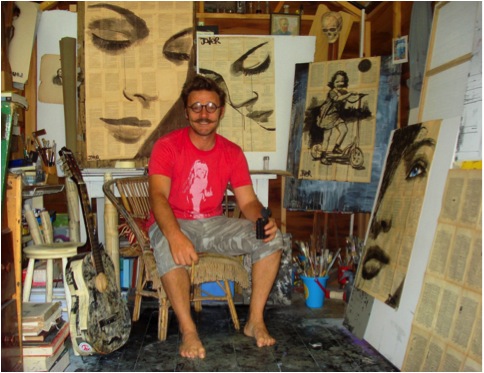
Loui Jover Painter - Gold Coast, Australia
You comment, ‘I paint, I draw, I do this every day.’ Can you elaborate on this comment?
The comment you refer to in your first question can be taken literally in the sense that …I “do” draw and or paint everyday…..I am not saying this is extraordinary but have made it a kind of ‘catch phrase’ or mantra or even an affirmation of sorts. I have made drawings be it cartoons or elaborate inks for as long as I can truly remember, I do not use this as a cliché the cliché was born form people like me…drawing is the very life blood that keeps me whole and sane and happy as well…some folk climb mountains, some need to gorge on fine food…I need to draw….’everyday’.
Your inspiration and work is often taken from everyday activities, riding a bike, the joy of a ride on a swing… Can you expand on this?
I can only guess that this may be a direct result of the first questions answer for apart from drawing I do not do much of this other stuff, I do like to ride a bike and swing however a lot of the things I draw are directly a reaction to a nostalgic need to stay connected to some ideal of youth, but then there is this whole other side of me that wants to jump into the now and use gel pens and sparkles to make up contemporary pop drawings……I have a real creative Dr Jekyll and Mr Hyde thing happening.
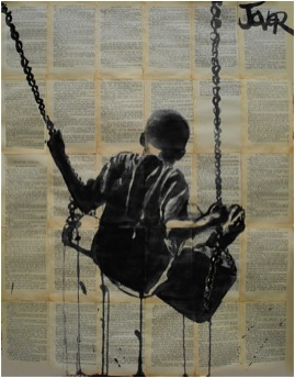
‘All Things Pass’
Can you discuss your Ballet series; both the drawing and the background of the sheet music?
When I was an adolescent I had the thrill of attending a production of the nutcracker suite at the Australian Opera House I am not sure which company it was but I think it was visiting form overseas it may have even been the Bolshoi on one of their rare tours??….it was a school thing but only a few people went…a teacher and six or seven kids, it was a lot of money back then for the ticket but my parents thought it worth it even though they were quite frugal and skimp. I remember thinking it was a lark really and did not take it seriously beforehand at all, it was a way of getting off school…but then when I sat and watched these people with sinewy strong bodies bobbling gracefully across the floor as if held up by strings I was thrown into another world, I did not follow the story or the music even it all became secondary and a mash but I fell in a trance for these dancers on a personal level they blew my mind with their ability and line and beauty. Until one has seen actual ballet of quality in front of their eyes they have no right to comment on the merit of this form at all. So I am a life time fan really but again I need stress not for the stories (I mean really the whole swan thing is a children’s fold out book…lol) but for the form and line my interest is purely buried in the artistic side of the figurative beauty of these dancers and in short I love the look of old sheet music and the two seemed to complement each other well…….simple as that really.
I think this is more about looking inward rather than out ward!
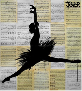
‘Odile’
You add one colour to give the final drama to the work: how and when do you decide to use this technique?
I add a colour or tone when it asks to be added…really I am not trying to be pretentious but at some point the work asks for this thing itself…unfortunately sometimes it is a long time after it has existed as a finished piece….lol..I have looked at some works from long ago and though… “hmmm I wish I would have made her eyes brown and not just left them”…. I think artists have always done a little of this thing for all history…I remember seeing a Rembrandt sketch in the London art gallery where he had added a touch of hue to a small portion of an overall unfinished study and it just made it pop, it wasn’t even a strong colour like a primary but just some sepia, but it made the eye zing around the work looking to feed on more of this surprise and thus taking in all the detail…I think too many artists hide behind great swathes of colour it is a sign of weak drawing ability and un sure composition…only the greatest of colour composers can master colour in its entirety …like the great impressionists or Matisse or turner…etc…over all colour can be used as a cloak to fool the innocent observer who really may just want something decorative….I like drawings with minimal colour for you can then see the bones and see the truth of the image. Spot colour can be dramatically effective even Spielberg knew this when he did so in Schindler’s List, it was a little corny but it worked well and is remembered.
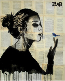
‘Bluebird’
Can you explain the importance of the text behind many of your pieces?
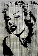
The text behind my drawings does not have any overall relevance to the image, happy accidents happen and an association seems to create itself at times but other times the words in the background are purely an aesthetic aspect this can be seen by the text being sideways or even upside down, people can make of the association with their imaginations between word an image what they will. I personally and this is just an opinion of course fond that when an ‘obvious’ connection is pushed between image and textual background that this begins to nudge towards a commercial art and is patronizing to a certain extent. It is like “oh look how clever I am!…I made a drawing of Marilyn Monroe on a bunch of clippings about Marilyn Monroe…now isn’t this clever of me?” …personally it is the happy paradox of the meeting of image and word that works best for me personally.
As well as working on the recycled paper as the background, you also use college and further text and drawings in your work.Please expand on this?
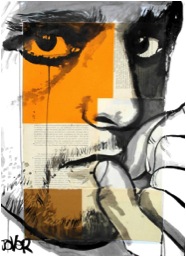
‘Faith Is Torment’
I do enjoy using mixed media a lot…I find this is a direct visceral reaction to society as it stands around us right now……there is so much information and so many things going on…in design we may like minimalism in a personal sense we may meditate to clear the mind but over all its an onslaught out here so my use of many differing aspects of visual imagery is a direct result of the conduit effect I feel at times as an artist…there are moments I want to say a little about one thing and others that I want to say a lot about much….like driving in the country as opposed to driving around the city streets.
Your drawing is mainly figurative, where do you get your models from? Or explain the inspiration behind them?
I do mainly work in a figurative style because ultimately I personally find the abstract visual language to be limited simply because one need start to repeat themselves in a visual sense….it is limited as to where one can go after a time that is why many artists have explored in both directions of painting…I did much abstract work in my younger days and still hold a fondness for it but I do feel it becomes a way of expression that is self-indulgent and ion need of explanation at times, I hate to have to explain the reason behind an image otherwise abstract art is a great way to accentuate the lounge room furniture. I like to tell stories and figurative work allows me to; more readily.
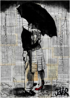
I use any means of inspiration and model, from life, from film, from books, magazines from pictures…art is a dialogue one should use anything required to express their expressive need, art has no real rules that’s why it is so great and why I love it.
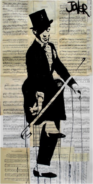
‘Hard Shoe Shuffle’
Eyes are very predominant in your paintings. Can you explain how you have developed them into your work?
For me the eye is a window and a source of all connection. Even for the blind the eye is pivotal to all reason, the minds eye. Seeing is feeling, and without feeling there is only a void. Visual art cannot be without the eye it is non grata without seeing. The eye is a major motif in my expressionistic need to convey emotion like the umbrella is for me a major image for the conveyance of romance……..I think the first thing I can recollect drawing in my memory as a child is the eye…I guess it has stuck.
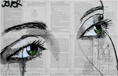
‘Hard Shoe Shuffle’
You break the boundaries by overworking on faces.Please discuss this?
Sometimes I work the face for hours then pour water over the paper till it is sodden and obliterate all I have drawn….other times I will sit and just stare at a face I have made and think “shit…this is like a dead person or something, like one of those faces that self important hotel lobby artists make on oversized canvases for the sake of the cosmopolitan philistine set, so I take the drawing outside and lay it on the wet grass and throw dirty ink wash over it and spray my brush across it and generally abuse it…lol….at times this makes a new thing, a new living persona on paper other times it ends up in the frustration file…the bin. Finally there are the faces that I make watching the negative space in between the lines and they are finished in moments and have worked in a strong graphic and emotive way these are surprises to me and I am not sure how they come about.
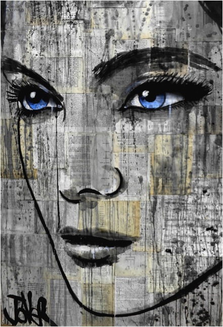
‘Danube’
Can you discuss your distinctive signature and how this has evolved?
My signature has been the same from childhood and I stole the whole premise off Picasso…his signature struck me as a separate entity from a very early age…it was a graphic on its own…a trademark…I liked this idea…. I use my signature to balance a composition and to add to the work….it is my finger print, I think artists who do not sign their work are in two camps those who are not willing to compromise on the composition with their name emblazoned across its surface and those who are too ashamed to admit alliance with the image. then there are those that sign their works in an awkward way such as this little scripted name that looks out of place or fragile to be included too unsure and elaborate and makes for a friction on the surface of the composition……I am proud of the works I finally sign (or at least I think I am…lol), it is my final curtain…the epitaph once that name goes on that’s it the work has closure for me.
Let’s talk about he size of your work: what are the restrictions?
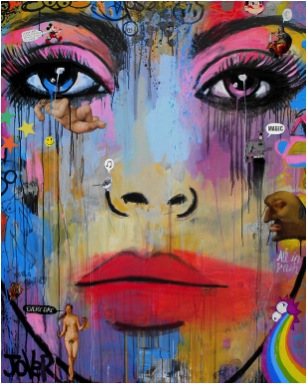
The only restriction on my work as far as large size goes is all to do with the room available, I like working big and with the right space, help and equipment I would like to tackle some massive works while I still have the stamina and passion when I am older I will work small…lol
Women play a huge part in your art. Please discuss?
I like women better than men. I think they are more pleasant to spend time with, are far more clever and even adventurous than men. They have been handed a raw prawn throughout history and have become somewhat stilted as a result, men quash womanhood it can be seen everywhere in every echelon of existence. I like the way woman express emotion openly and are sensuous and natural. If men are dogs, the woman is certainly the cat. Certain men scare me others I am perplexed by, others I just want to fight and kill…(lol) and I hate the whole sport thing….. Women fit my art better because of the first thing I said….I like them better, they are attractive and tactile. Men are brutish and stiff.
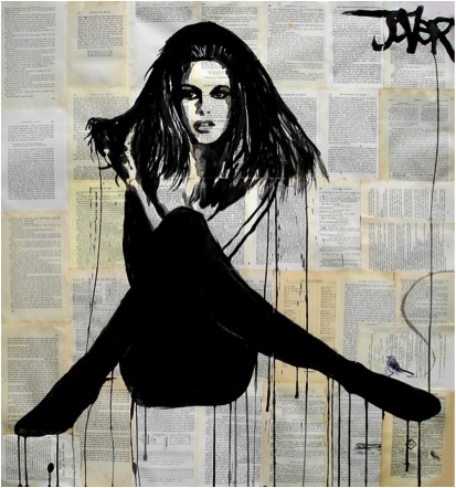
‘La Femme’
Going back in time, in 1989 you joined the army and worked as an official military illustrator. Can you expand on both this work and how it has affected you current work?
I worked as an illustrator reprographic and regimental photographer in the army for a number of crucial years, crucial for the development and discipline of my art, It was a mechanical process when I joined, computers were just beginning to become a personal device with graphic potential so all the artwork I produced was cut and paste and hand manipulated with set squares and compasses. It has helped me develop a solid foundation for my work. I am thankful for this period It was an apprenticeship rare to find now days…I did screen printing and etching, terrain model building, dark room procedures, technical drawing, graphic art and offset printing as well as so much more and was paid to do it all!
What are you currently working on?
Flourished of late…..other than that I am making women; I am working on drawings still, but am enjoying and making larger canvases of the mixed media variety, I am interested and enjoying the wave of surrealistic pop art that has faces as usual.
Many of you works are made into prints, where and how can they be purchased?
My prints are still largely an untapped resource and are still sold in a lucid way; there are no print runs or controls in place. I have licenced off some images to a major U.S. company and sell prints on http://www.saatchionline.com/profiles/portfolio/id/284005. They do well for me, however, I am yet to fully address this side of my output but am sure there will be much opportunity to do so in the future for now I am happy to be at the coal face and actually drawing…lol… in turn building up a large folio I can milk later if need be or given the opportunity.
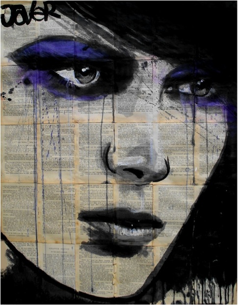
‘Nepenthe’
Contact details:
louijover@hotmail.com
https://www.facebook.com/lojoverart?ref=hl
Loui Jover, Gold Coast, Australia
Interview by Deborah Blakeley, January 2014
Think a colleague or friend could benefit from this interview?
Knowledge is one of the biggest assets in any business. So why not forward this on to your friends and colleagues so they too can start taking advantage of the insightful information the artist has given?
Other artists you may be interested in:

