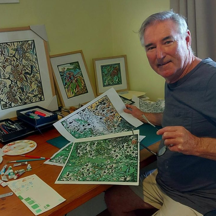
Lenny Lane Printmaker - Calgary, Canada
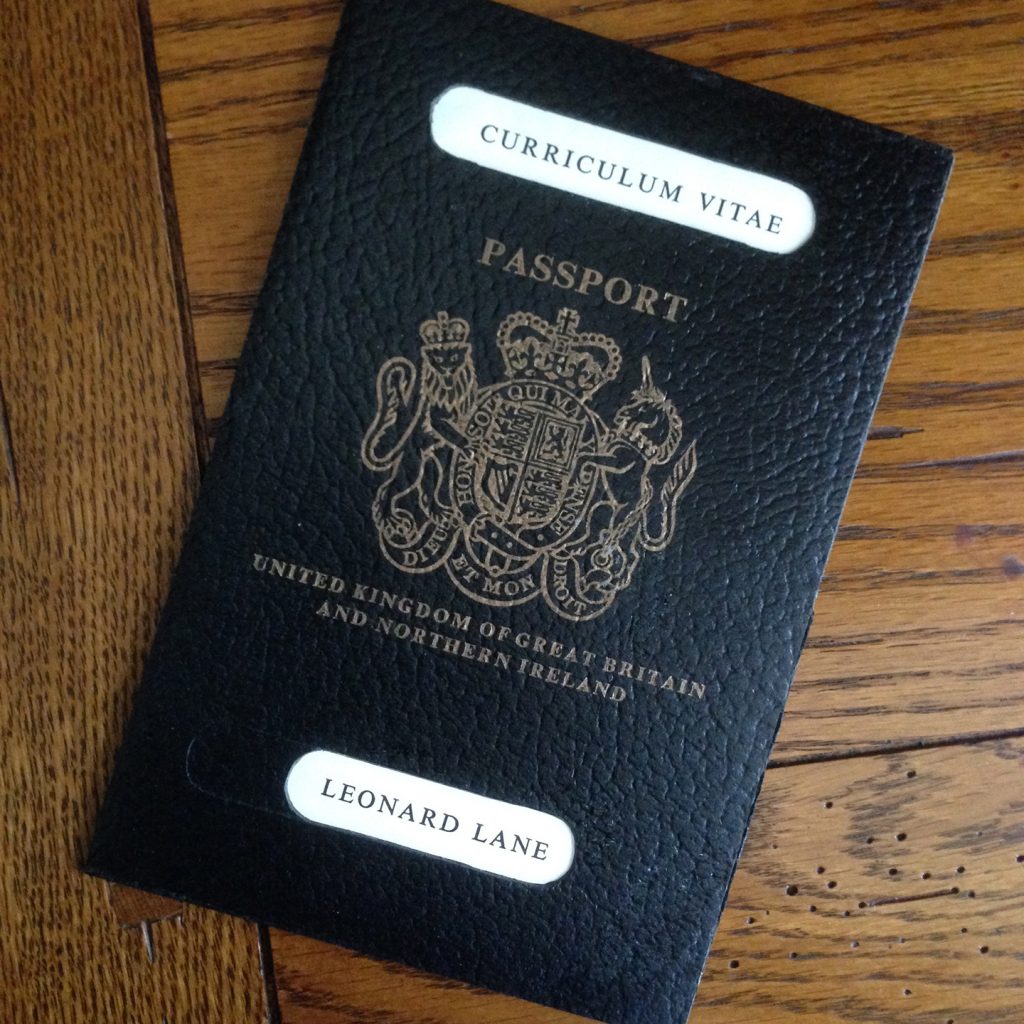
Can you expand on your innovative CV – Passport?
Inspiration:
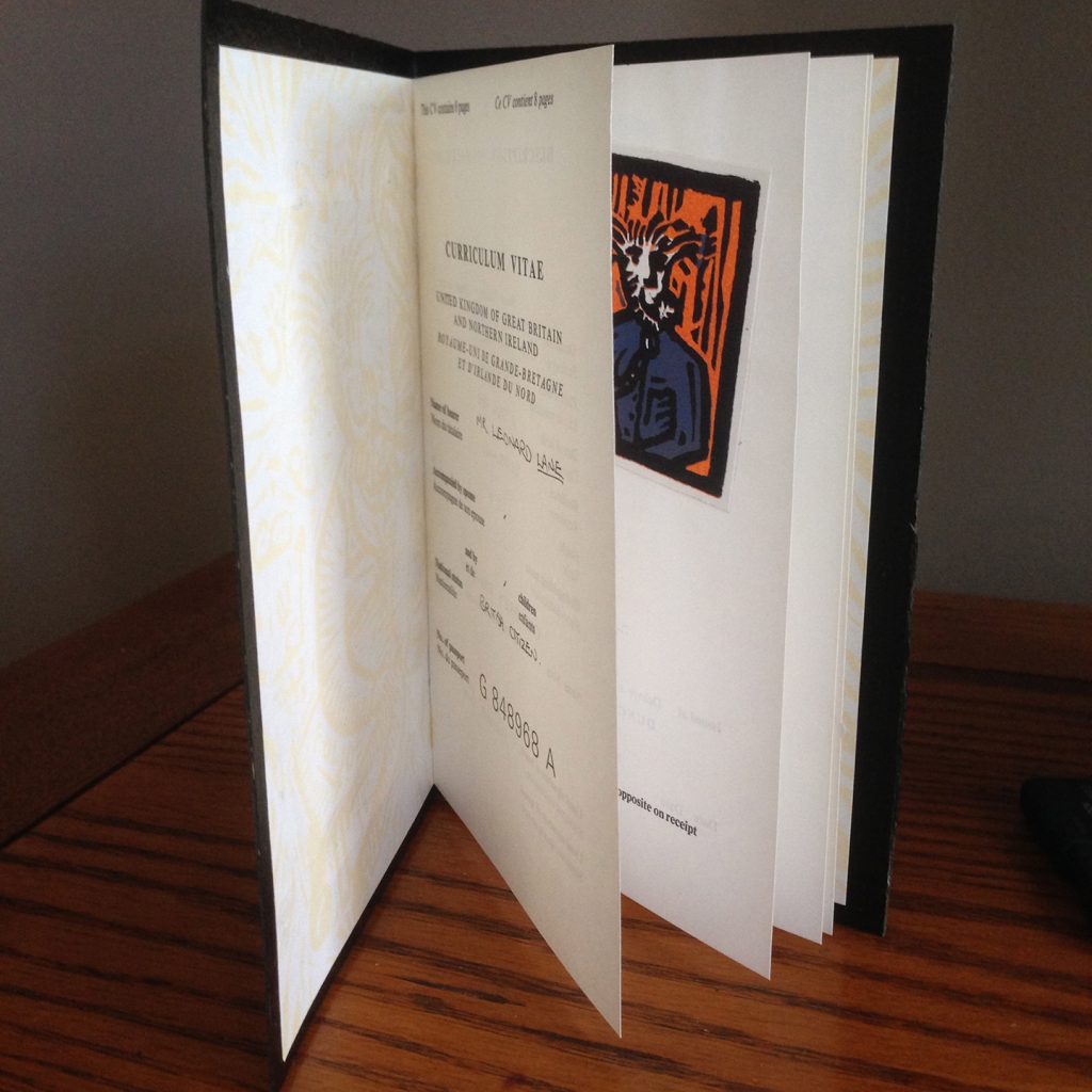
The inspired process is a difficult thing to explain or put into words. I recall admiring the different approaches my predecessors where taking in building a CV to get recognised by design agencies. With some inventive work pouring out at the end of the 1980’s, I knew I had to step up my game and really do something that hadn’t been tried before. The creation of the passport actually started in the letterpress room of Duncan of Jordanstone College of Art back in 1989 (what a magical and privileged experience that was).
I came across some large sheets of what looked like plastic, but with a textured surface similar to old leather. This wonderful room had all sorts of vignettes and relief blocks used in letterpress printing. And so it was I also came across a block of a royal seal and it was remarkably similar to that used on a British passport. It didn’t take too long to put these two items together and devise a plan to use CV pages in place of passport visa page.
The Passport To Success idea was born from this. I basically had a lot of fun from that point on, reproducing the ‘passport photo’ in lino and designing the books end papers for decoration. The talented letterpress technician saved the day by setting the type (an arduous task for any young student – especially as it was set in English and French!).
The need to stand out and be remembered?
Designers in general are always on the lookout for innovative ideas. They’re competitive that way. It’s often more so for students of design. They have the luxury of spending vast amounts of time being inventive for the sake of it. While some of it is arguably self indulgent, when used right it’s a great way to fully understand what makes great design and the things that tick’ to make them stand out. The need to ‘stand out’’ becomes less of a personal goal when working in the real world and more of a professional objective for in the success of clients businesses.
You did your training in Dundee, Scotland and it was there you picked up your TAG –Lino Lenny can you tell us how and why it has stuck?
My major study was graphic design with printmaking taken as a complementary study. The Lino Lenny tag was given to me by my friend Angie Garry as a laugh because I spent so much time in the printmaking department instead of the Graphics studio – particularly during the last two years of the degree program. I never seriously used the tag until recently when I was searching for a domain name for my website www.linolenny.com. I was amazed that it hadn’t been taken as it has a nice ring to it and it’s very easy to remember.
Discuss the technique, relief printmaking that you use?
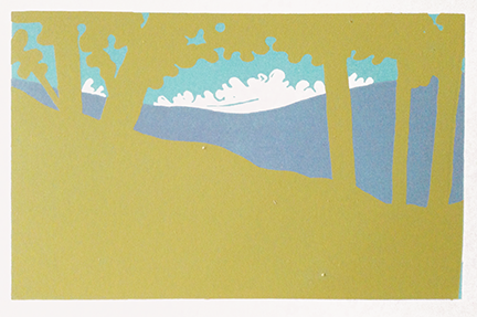
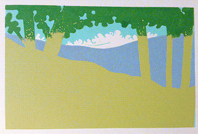
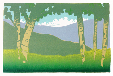
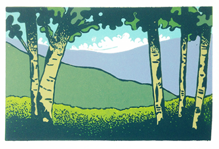
My preferred approach, and one I’ve exercised since being taught 28 years ago, is lino reduction. Basically the process involves reducing the surface of a lino block with each subsequent layer of colour.
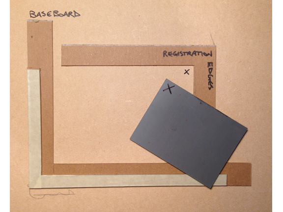
Registration board
The secret to ensuring that subsequent colours are aligned on top of previous colours lies in a tight ‘registration board’
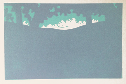
A drawing is made on the block. A colour impression is taken on predetermined number of sheets from that block (an edition of prints). The block can be cut or carved to reveal white paper prior to taking the first colour. Once the first colour has been made to the edition, the areas that are to remain that colour are removed/cut/carved from the block. This is where the lino surface is ‘reduced’. When the next colour is printed from the block, the areas that were just cut will reveal the underying colour(s) printed The secret to ensuring that subsequent colours are aligned on top of previous colours lies in a tight ‘registration board’which is essentially made up of two counter-facing ‘L’ shapes that lie on top of a base board. The ‘L’ shapes are made of cardboard. The block is snuggly fitted into one corner of one ‘L shape and the paper edge is hinged (using tape) into the opposite corner of the other ‘L’ shape. When the block is inked up and the paper placed over it (securely hinged to it’s ‘L’) an accurate impression can be taken time after time, colour after colour. That is how I create all my prints.
Do you always work in themes?
I like to work in themes and explore the different perspectives a single subject or idea can bring. The theme of nature has such a wide scope that it can transcend boundaries too. I’ve often been tempted to introduce wildlife references throughout the Year in Trees series, particularly the winter months. However, so far the trees, their shadows and the colours used provide enough character and mood, which is the sole intent of the series. Collections generally are a feature of my past and present work. However I may take months or years before I consider any theme complete. In between that I do the odd ‘one-off’ print if I’m suitably inspired. I have a reservoir of ideas of one-off designs, largely inspired by the works of other printmakers, but when I’m working on a series I mainly like to see it through – that just takes time.
Can you take us through your work – A Year in Trees?
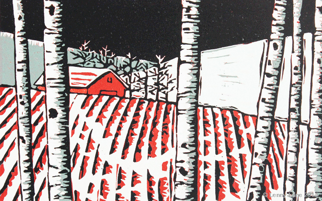
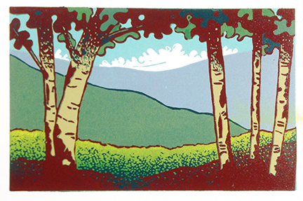
A Year in Trees started as a single design. January, a winter scene – initially intended to send to friends in place of a Christmas card.
January
It also arrived after a long dry spell of no lino printing after moving to Canada in 2001 and adjusting to a new life. However I enjoyed creating this print and I was able to reconnect with myself through it and so figured I should explore this ‘seasonal theme’ more. I started ‘a lot of thinking and looking’ at first. I wanted to really understand trees and how they impacted the environmental mood around us. For about a year I studied, drew and photographed trees in southern Alberta and around Calgary, learning about their changes, patterns, colours and habitat combined with the effects of Canadian weather.
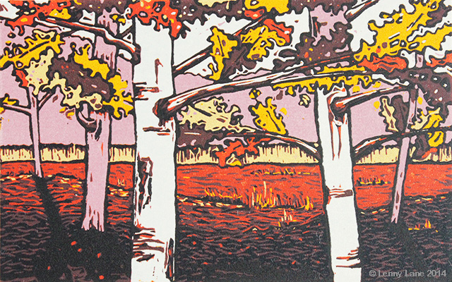
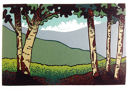
September
I found myself becoming fascinated by shadows in winter in particular, together with low lying sun, especially on snow covered ground. I also loved the different colours of similar trees – and how they’d sometimes reflect the colours of the environment or light. It was during this research that I revisited one of my favourite periods of illustra early 1900s and the British Map illustrators of that time. I’ve also been fascinated by the travel poster era of the mid 20th Century and began to rediscover the amazing colour palette of W. H. Copper and his incredible Lake District watercolours. Similarly the Canadian Group Of Seven artists have left an indelible impression on me since I first learned of them. I was surprised that much of my own ideas on this series ran parallel to some of their paintings. It was from this point that I decided I would try and bring all this inspiration into play. Successful colour rendition became a crucial focal point in the success of any print in the Year in Trees series.
Each print goes through many sketches before it’s marked on a lino block. These basic lines determine a good composition. It has to feel natural to the mood and take on a particular angle. I wanted to avoid the flatness of looking directly at a forest or wood from the outside. Beautiful as some of these are …I wanted to go somewhere entirely different with mine. Once I’ve settled on a basic arrangement of lines, always taken from a viewpoint inside a wooded area and looking out to the ‘light’, I start on my colour selection. This is where the artistic mindset comes into play on it’s own. I imagine how colours will work together to create a mood. I prefer to rely on my experience using colour rather than paint and ‘design’ every aspect. Besides, trying matching paint colours with mixed inks is never an easy or quick process …and it’s so much more fun in mixing it as you go and dealing with the consequences! So, with a minds eye I visualise the final outcome and go from there.
Needless to say, getting to where my minds eye settles can sometimes be a case of trial and error, for example, a colours transparency shows too much of the previous colour, or the earliest colours just seem a little too dark for subsequent colours. That’s when the technical element comes into play and the print starts to take a life of it’s own. I always try and navigate through these processes to find a natural balance. It’s never boring!
I use Pfeil lino cutting tools that I’ve had since college, and each of the Year in Trees prints are small (4.5” x 6.25”). Because of this scale I often use a very small cutting tool – this means exercising lots of patience as I pick away at the soft rubber of the lino block.
The greatest feeling I get from doing this series isn’t in the end result of a print, but in the process of discovering how one colour printed on top of a previous colour changes everything. From the areas cut away to reveal the earlier colour, to the texture of lino printed and the gradual journey of learning, the printing process is a journey …there’s lots to learn at each step of the process and no two prints ever produce the same experience. I’ve also had a few people mention now it reminds them of paintings of the early 1920’s. THAT is how I’d define the success of this series. It’s very encouraging.
Discuss the maximum number of colours you use in your prints?
I always start off with the idea that ‘I’ll do this in four colours’,
but I get so involved in the details and as mentioned earlier, when you pull back a print and see the effect that colour has, you begin to see future possibilities …
and often prolong the completion of a print by adding another layer of colour to create a particular detail or take two or three shades of a particular colour to achieve a certain depth.
On average I probably print a minimum of seven to ten colours on any of the Year in Trees series.
Explain your thoughts on colour reduction in your work?
The colour reduction process is, for me, a process of learning. Understanding that success is only as good as the preparation that goes into it; registration board, colour planning, selective lino cutting, etc. It’s very much a discipline that is never fully understood without a lot of practice. Colour reduction can use more than one block (each block can have one or more colours), but I like the challenge of using only one block for all my colours. It’s a primitive approach in principle but carries potentially complex obstacles for the uninitiated.
Your Series First Nation, can you discuss the amount of background and historical knowledge you have had to take before commencing each of these prints?
I took my first trip to Canada straight after graduation from college in 1990. I learned a little about the indigenous people from the McMichael Museum in southern Ontario and some of the First Nation communities in Atlantic Canada. However it wasn’t a fact-finding or scholarly mission. Seeing their art and learning about how they lived with the land just made a positive impression.
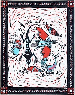
Song of the Earth
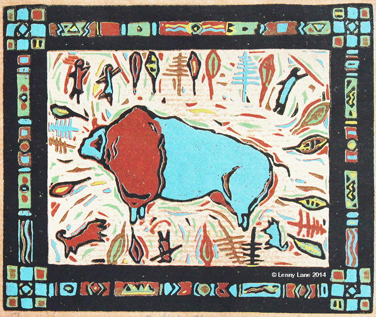
I was also amazed and a little taken back that their history and culture played virtually no role in a modern Canadian society. I returned to the UK and started a post-graduate study in Printmaking at Duncan of Jordanstone College of Art. I hadn’t considered undertaking a study in print of the First Nations culture, but found inspiration in the afterglow of that trip. I had bought some magazines and carried my memories of their artefacts and lessons of First Nations rituals and connections with the Earth. Research was very much an inspired process. This was in the days before the internet, so I relied on memory and inspired thought. I recalled how they hand made the colour pigments to transcribe their lives into wood, cloth, stone and leather – I took this as my starting point and let my own imagination create it’s own stories of First Nations lives; hunting, giving homage to animals and the elements, being one part of a cycle of life. From the start it was my way of acknowledging the richness of their lives and the simple things and ideas that sustained them.I received a word from a First Nations person about this. A gentle warning that some First Nations people may take exception to a non-indigenous person creating indigenous-styles art. Perhaps I was being naïve in this thought process, however, that was the process that fuelled the printed image. The things we’d never think of recording with our modern world. My first print of this collection was very experimental. Using a loose theme of ‘hunting’ and ‘community’, I used craft paper to simulate the colour of wood and limited my palette to three colours (plus black). I let the viewer read into the tale of this illustration to decide what it was all about. I only made an edition of 5 of this first print (Song of the Earth) but I was surprised by it’s popularity. After this I was encouraged to push this theme further. I still imagined the scenes I created and gave the prints titles that suggested a deeper story (Buffalo Blue, Wild Blue Wonder, etc.)
Buffalo Blue
When you work in black and white can you expand on the challenges that you face in balancing light and dark values?
Finding balance between light and dark areas is only achieved by selective cutting and taking a series of proofing prints along the way. For someone like me who enjoys forging ahead with colour work, black and white work is a disciplined process that requires a bit of patience and a critical eye.
Oh! Bonnie Kingdom
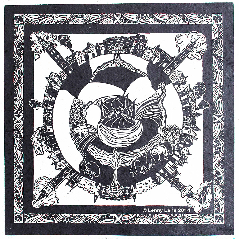
Black and white printing forces me to focus on the drawing and the details from the start. Achieving a successful balance is a fundamental skill that is shared across almost every drawing and painting discipline. At the end of the day that balance depends on the design and interpretation. Eric Gill is a master of black and white printmaking …even if some of my favourite prints of his are predominantly black – they just bring out the white. That was his point. That’s what I strive for.
Beyond the frame – can you expand on this design technique in ‘Sea Life Mammals”?
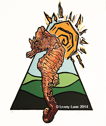
Sea Life Mammals is a series of prints created as signage designs for a fictitious Sea Life Centre in the Aldeamar region of Spain. The series of prints were created to support an interior design student project.
Aldeamar Sea Horse
The proposed building (an actual building) had a series of triangular entrance halls, each of which featured specific species of endangered sea life. The proposed purpose of this centre was environmental education.
Each print starts with a triangular frame. Inside each frame is a series of curves. These curves represent waves in the ocean in Aldeamar, but also mountain ranges that are typical of that region. I used this particular design feature to integrate each species of the series and provide character to the designs. The actual prints were produced as studies with the intent to create 3D signage from them …but this was never realized due to a lack of time.
Explain the size of the prints you make and the limitations you have with sizes?
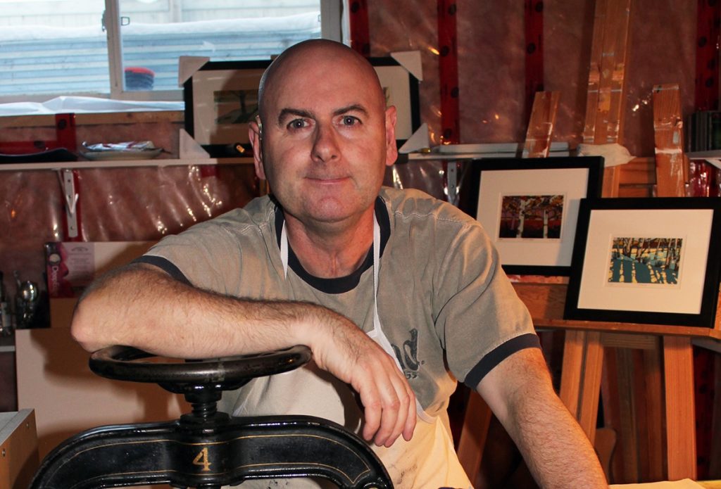
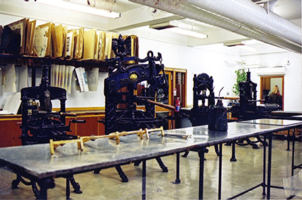
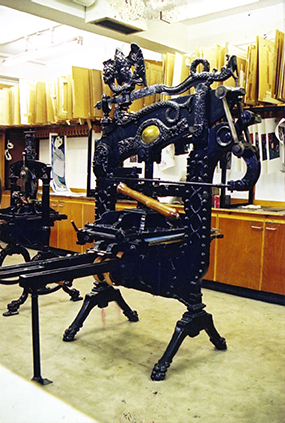
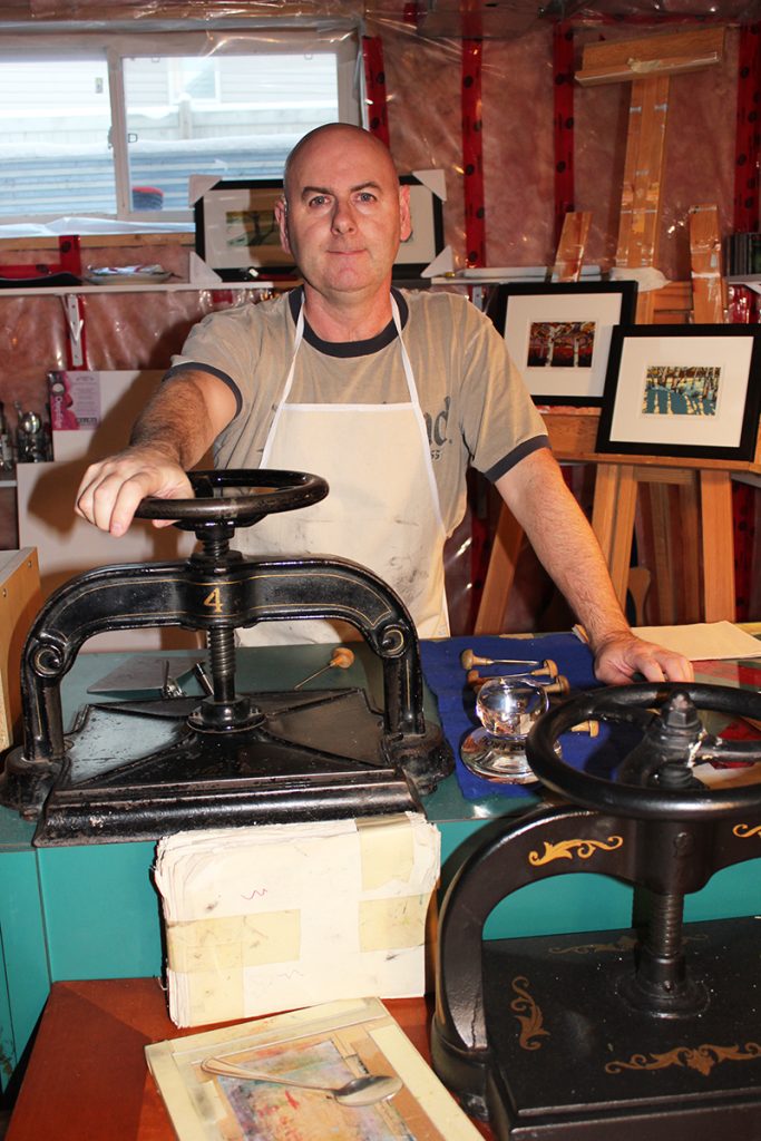
At college I had the privilege of using beautiful Columbian letterpresses. They could take large slabs of lino that were up to a few feet long. I used that to it’s fullest potential with much of my earlier work.Today I mainly use a couple of book presses (nipping presses).
The limitations are clearly in the amount of space on the bed for the registration board (10” x 13”). The paper is a couple of inches shorter on each side. There are other ways around this, for example, I’ve seen someone use a long registration board and feeding it through bit-by-bit. I’m planning on using this as part of a process for a currently commissioned project. Alternatively I use a ‘Print Frog’ – a patented glass baren made in the USA that has wonderful handling properties and printing/pressure applying capabilities. This is great for larger pieces, but doesn’t quite have the success rate of a proper press.
And then there is the old fashioned spoon. Yes, I use spoons as the last line of printmaking …a good spoon can have an amazing ability to apply pressure to ink and deal with any size.
You also do Print making classes, discuss what you teach and a bit about the content you provide.
There aren’t a lot of printmaking classes outside of established institutions that I’m aware of in Calgary or Alberta. In addition, when I ask people if they know about lino printmaking many reply, “oh yeah, I did that at school once, years ago”.
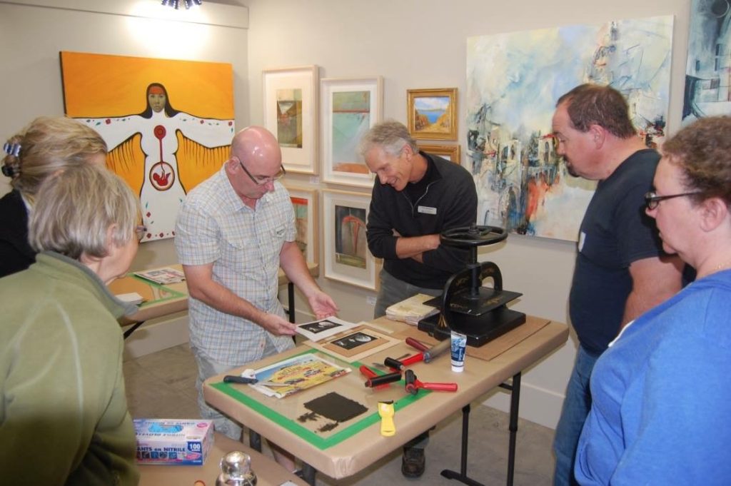
My workshops are generally supported by public demos where I prepare a two-colour print. I demonstrate the principles of registration, the board and how the lino cutting is undertaken …very simple designs. I also show how the tools are used and alternative tools that can be used to mark the surface of the lino block. Many people I meet aren’t aware of colour lino printing.
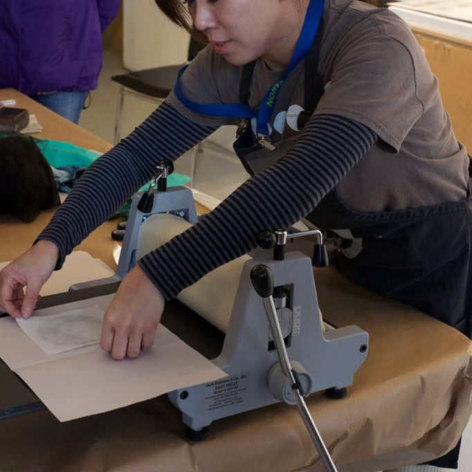
The classes introduce students to examples of good black and white prints, the studio and how it’s set up. I show them many examples of different styles, the balance of black and white and the different patterns and textures that can be used for a particular affect. I then teach the fundamentals: the drawing process, selecting a suitable image, transferring the drawing to the lino block, tools – how to use them safely, and alternative options for ‘marking the lino’, the proofing process and why it’s an important step, then how to use a book press. Only after they’ve undergone this process and know of the limitations, do I demonstrate the fundamentals of using a registration board (how to reapply ink to a print if the first impression isn’t successful), numbering the edition and good house keeping. Throughout the class I encourage students to stop often and examine their work, take rough proofs to guide them in achieving that black/white balance.
At the end of the day it’s interesting to see how students cut, the different levels of understanding and patience employed to get them to create their own lino print. It’s also encouraging to see them come through a day of learning and become quipped with an enthusiasm and appreciation of something the ‘did once at school’. With this energy they are encouraged to pursue it further. They are given a step-by-step guide of the practice they learned, the materials used and references for learning more.
Can you discuss the limitations there are to drawing for a lino cut?
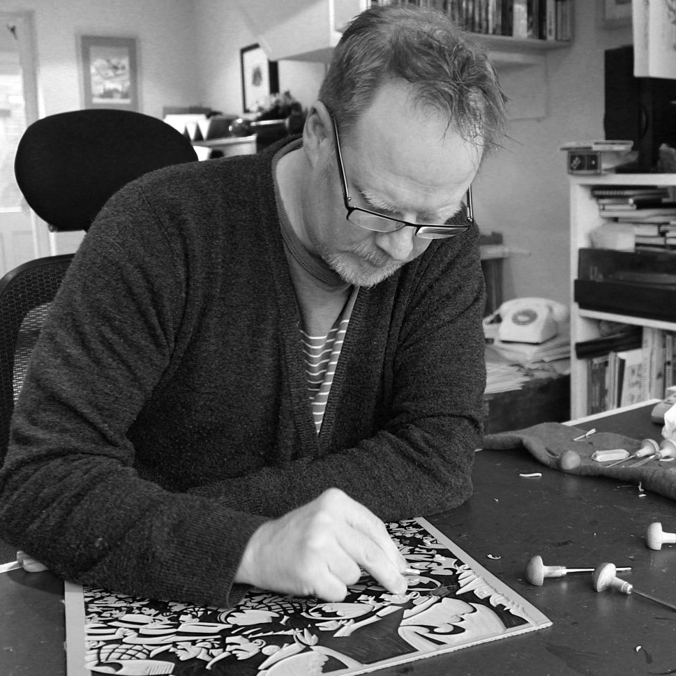
Drawing on lino requires the ability to think and draw in reverse. That is the principle underlying skill in relief printmaking. For many people, particularly new students, drawing (and printing) in reverse is an awkward principle to grasp or visualise. Having a method of transferring a drawing onto lino that is comfortable to the student’s level of skill is also a consideration. The complexity of a drawing that is too detailed to begin with, becomes compounded when trying to transfer onto the lino block. Knowing that the end product is a print, and that tools are used on the drawing is a means to a specific end result, is crucial. It’s not about the drawing in itself, although the drawing approach, or style should act as a good guide. Therefore in principle, the more accurate the drawing, the more accurate the print can often be.
But, drawings should be taken as a guide, with reference to tonal effects, contrast and composition. The character of a lino print is almost always determined by the competent handling of cutting tools.
My drawing for colour works are often well thought out, but simply composed, line drawings. These lines are my guides. The artistic element comes from my imagination, a bit of colour planning …and experience. I use the sketches created to guide me through each colour layer, knowing what to cut and what to leave uncut on the block. For black and white prints, the drawing is a more detailed and precise process – knowing when to use a fine tool will be determined by how fine your drawing lines are. Sometimes I like to transfer a rough image using tracing paper onto the lino, then draw in details based on sketches prepared. It saves on guesswork later when the block is inked up. However, I never try and replicate the print as the drawing. The art is in the execution of the print.
Discuss the importance of Art in Healthcare and your own involvement in this work?During various hospital appointments over the years, I’ve often wondered where all this art came from that I saw hanging in the corridors and hallways. A friend recently sent me a link to an organization in the UK called Art in Healthcare. I hadn’t thought of art as therapy. But after some consideration and reading their web site, I felt compelled to get involved. I quickly understood that art really can be a powerful instrument in successful recovery of a wide range of conditions. Even sitting observing in a National Gallery is a therapeutic experience. So why not Hospitals?
My main decision to get involved had much to do with my own health story at an early age, when I was always in and out of hospital for one thing or another. It’s easy to take health – and treatment, for granted – how often do we hear or say that to ourselves? Well, I made the decision to submit work to Art in Healthcare as a token of my gratitude for the excellent work that goes on in Healthcare institutions around the world. Where would we be without art? Or health?
Contact details.
http://www.linolenny.com/
Lenny Lane, Calgary, Canada
Interview by Deborah Blakeley, January, 2016
Think a colleague or friend could benefit from this interview?
Knowledge is one of the biggest assets in any business. So why not forward this on to your friends and colleagues so they too can start taking advantage of the insightful information the artist has given?
Other artists you may be interested in:

