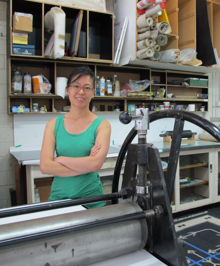
Jessi Wong Printmaker, Melbourne, Australia
Rolls and scrolls, of paper and printing.
Zoneone Arts brings Jessi Wong to you…
Your work is in many Corporate Collections, please take one and discuss how it has made a difference to your art practice, also how this commission has made you reflect on the work you were doing.
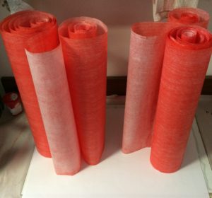
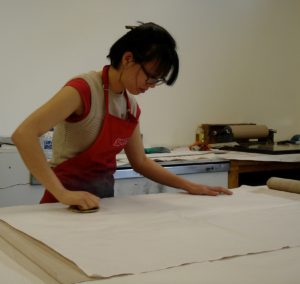
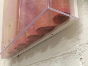
One piece that challenged me the most technically was a commission piece for a private client. The rice paper I use in my scroll works comes in 10 metre rolls with set heights, being 46cm, 69cm or 97cm, so to keep a nice deckled edge on my paper I make my work in vertical rolls at either 46cm, 69cm or 97cm high. In this way, the paper can roll naturally with the grain and it is a size that can be reasonably handled. This client wanted a piece that was 152cm high and in red, a colour that I hadn’t used very often and wasn’t familiar with. It sounds geeky but I find some colour inks print differently to others even if they’re the same brand. Maybe it’s something to do with the pigments, the batch, or the composition? Anyway, I decided to tackle it so I cut the paper and turned it sideways to make a vertical roll of 152cm. It was one of the most difficult prints I had to make. The paper had to be printed in two halves to get the proper pattern, it was difficult to handle a sheet of paper that size, the table wasn’t big enough, the rolls wouldn’t stay in place… but after some trial and error I made it in the end and I was pleased with the results. It has informed my practice because I had to consider the framing and installation, of all things, and the additional supports to keep such a large piece in place (ie, heavy duty magnets) is now used in my other works, even those 46cm in height.
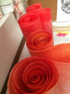
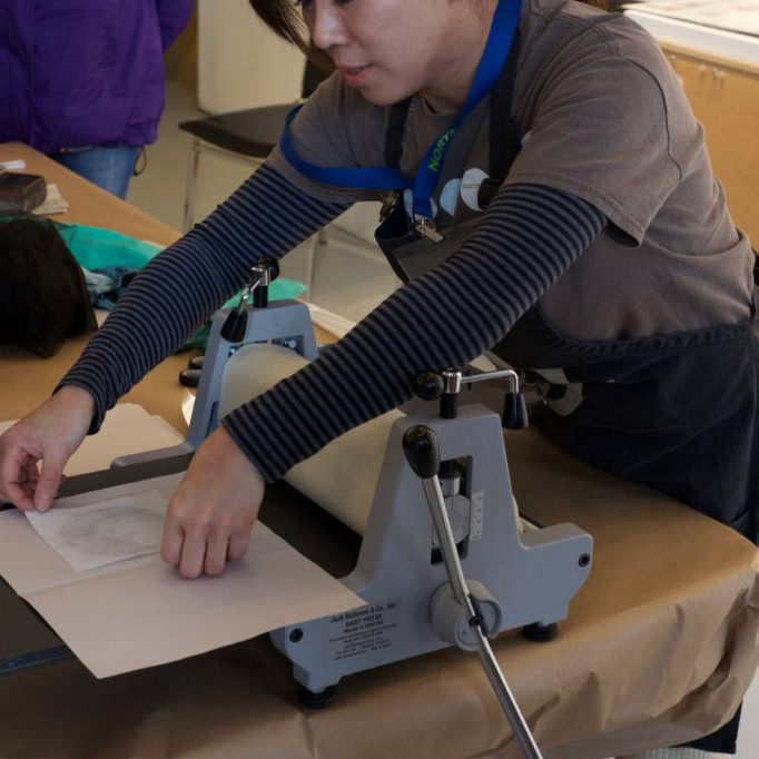
Drying ink on rolled paper
While this work was a technical challenge, it has also informed a lot of my recent works. The offcuts of paper from this work are being used in other prints and collages that feature heavily in colour. The project I’m currently working on has been partially inspired by the remnants of this work, and others.
Discuss your resent installation at the Yarra Library – Richmond…
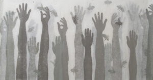
I can’t remember the exact size of the work at the City of Yarra Richmond Library but I would estimate it at 2m high x 4.5m wide. The art installation was a wall drawing and didn’t cover the entire wall top to bottom but was more an undulating shape from one side to the other. It also included three black and white framed prints previously purchased by the City of Yarra for their art collection, which were hung salon-style with the wall art drawn around it. Two of the framed prints measured about 50 x 60cm and one was larger at around 90cm x 110cm. The prints were woodblock and pen on rice paper and featured images of land masses, stick figure people on boats and migration. I used these methods to make serious issues seem comical as people are more receptive to receiving messages through satire and humour than essays or lectures, much like political cartoons with their sardonic humour. Holding a mirror up to society and making fun of human follies allow inner reflection and encourages contemplation about these issues. The works are primarily black with white on top giving it a sense of bleakness.
Installation at the City of Yarra Richmond Library
The drawing around the framed prints was done in black fineliner, markers, and texta pens directly onto white wall. I went through a few markers and textas as the fibre tips were progressively scratched off on wall and they became less fine for detailed drawing. There wasn’t much preparation needed as the wall was freshly painted. All I had to do was show up with my hammer and nails, hang up the framed prints and start drawing! The drawings were of houses, rows and rows of houses around twisting roads in a stick figure like manner, all outlines and childlike. These were black lines on a white background that gave of a sense of lightness and freedom. I wanted a juxtaposition of the framed prints with their sea and boats over the drawings with their land and solid housing to create a story of migration.
The staff at the library seemed interested in what I was doing. The work took several days to complete and I gave a few staff members the opportunity to hold the pen for a bit. Not all the trees drawn at the bottom of the wall belonged to me! It was fun working with them in a collaborative manner, all doing the same thing, drawing the same repetitive pictures.
Can you expand on your personal thoughts on the importance of Community Art.
Tell us about the Collie Print Trust Scholarship…
The Collie Print Trust Scholarship is awarded in conjunction with the Australian Print Workshop to Emerging Victorian Printmakers. It’s to encourage and nurture emerging talent and provides them with one year’s rent-free access to the Australian Print Workshop Open Access Studios, which include printing presses and etching facilities, culminating in an exhibition in the APW Gallery at the end of the year. Access to printmaking equipment can be difficult and prohibitive due to cost and space so an opportunity like this is valuable for graduating and emerging artists.
I received this in 2010, the year after I completed my Masters in Fine Art. My partner was studying at the time and we were living in a two bedroom house with another couple so space and money was very precious to everyone. Having rent-free access to the APW Open Access Studios made it that much easier to continue my arts practice and while I had experimented with rice paper in my postgrad, it was at APW that I developed and printed my first framed large-scale scroll works. I continued to use their facilities on their rental rates after my scholarship ended and until I could find a studio of my own.
What a coup to gain a place in the Beijing Museum of Contemporary Art. Discuss your work.
Youth Plus was an exhibition of 50 artists under the age of 40 in Beijing, each artist exploring cultural bridges between the East and West. It was an exhibition curated by Michael Suh, the now Executive Director of MoCA. I created a set of 4 works titled Blue Sky I – IV. They were blue and white abstract woodblock prints, each installed in 50cm x 50cm x 6cm deep acrylic frames. They were installed as vertical scrolls and were a modern interpretation of ancient Chinese scroll artwork. The installation was done using magnets and could be hung as a set of 4 in any configuration, vertical, horizontal or square.
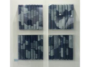
Blue Sky I -IV
Size is as much of an issue as weight. The paper is light and the installation is fragile so the artwork needs to be framed but acrylic framing can be heavy and crack easily so you have to find a balance between aesthetics, size and weight. Hanging methods can change depending on these factors. D-rings and hanging wire are the most popular hanging methods for framing but any large pieces tend to tilt forward slightly, making keyhole hangers the most suitable as they allow the work to sit flush with the wall but they require screws, precise measurements and a wall stud to drill into. Monkey grip bars are easier to install than keyholes but can be less secure if someone decides to bump into your work and it slides off the wall. For this particular work in this particular size I went with D-rings and hanging wire. I am making smaller pieces – less than 70cm – for this reason, as most galleries request D-rings. I wasn’t able to see the work installed but I did get some nice photos sent to me of the installation.
What are you thoughts on age limits on art prizes?
I haven’t really thought about it. I think it can be useful, especially if it allows for recognition of emerging talent. I think categories in career stages, such as early career or established is more useful for that but then again, trying to define what stage of your career you are at is subjective.
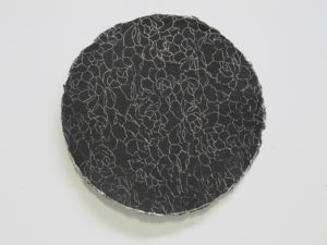
Take both pieces Flora and Fauna I and II expand on your use of layering and the paper you have used in this technique.
I have used several different wood plates cut out in hand shapes, and linocut bees all printed individually on both sides of thin floral-embedded paper.
Flora and Fauna
I was given the paper as a gift from someone returning from a trip to China so I’m not exactly sure what it is called but I’m fairly certain it’s handmade. Each of these artworks is comprised of two sheets of paper, each printed on both sides with hands and bees cut out from lino and wood and printed in varying colours. I love the texture and depth you get from layering ink and the subtle way it shines from behind from the paper, enhancing it’s beauty. I’ve always loved paper, even as a child. I enjoy playing and experimenting with printing on different hand made ones, coloured ones with long fibres, thick textured papers, round paper, banana and silk papers, mulberry paper, and plenty of papers that I don’t have a name for. I find the best ones in art supply and calligraphy stores and overseas, particularly Asia.
Earlier in your career you introduced Scrolling technique, expand on this work take 2 or 3 pieces to explain the works.
I started off with buying rolls of hosho and rice papers, thin sheets that are often used in calligraphy. I use a large sheet of plywood for inking up and printing because it has a beautiful grain and the texture is picked up really well with rice papers vs. thicker printing papers.
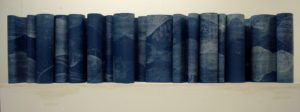
New world, same history is one of the earlier ones I made. I started with a 46cm high roll of paper and printed the entire roll by moving each section of paper along the inked up plywood until I had a full 25 metre length of paper printed with a blue woodgrain pattern. I wasn’t sure what I was going to do with it at first but I thought it looked too blue so began printing white onto it using cut out cloud shapes. As I was doing this and handling the paper, picking it up and moving it around, rolling and unrolling sections, I couldn’t help noticing the way the paper fell and curled each time I lay it down to begin working on another section. And drying the paper? You can’t have it rolled up or it will stick together as the ink dries so I had to stand it up and separate the curls and rolls.
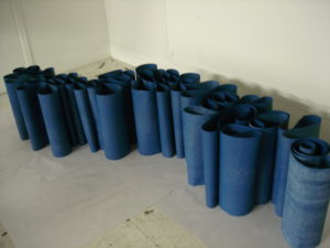
New World, Same History, In progress, drying papers
At the time I didn’t have any drying racks so this was actually the most space efficient way to dry the ink. The shapes it makes is so lovely to look at that I really wanted to do something to show off the paper. This blue work ended up becoming New world, same history.
I ended up using this method (a printing press and printing by hand with a baren) to create a series featuring black, white and grey landscapes for the exhibition Cataclysm with Anita Traverso Gallery. The series were printed using the same three plywood sheets and cutouts and a lot of torn up newsprint to block out sections between multiple layers of ink. Most scroll works are printed in varying shades and tones of the same colour, some stretching red to yellow, or black to white, or yellow to ochre as the tonal range gives a greater depth than a rainbow of colours and again, you get a soft tint as the paper is continually layered. There isn’t much planning while printing. I have a vague sense of the sort of outcome I want and just go with it. Much of it is abstract and I have learnt that it isn’t worthwhile stressing about minute details because most of the work is hidden under a fold and you never see more than a 5cm wide stretch at any time. From 1,000cm of printed paper I may get a scrolled work that is only 170cm long. If there is a section I don’t like, I can fold it under. I have tried installing individual small rolls side by side in a line but it doesn’t create the same floating ripples as folded and rolled sheets. The installation can be tricky.
New World, Same History
The acrylic box frame has to be ordered first as the work is installed directly onto the inside backing of this frame. Adhesive magnetic strips are measured, cut to size and placed at intervals along the top and bottom of the frame. Working methodically from one end to the other, the work is rolled, scrolled and held in place by magnets before the acrylic frame is put back together. I’ve mostly kept to sizes that are in line with the paper size, that is 69cm high x whatever length the roll will provide but I find myself more interested in geometric squares and groupings of works at the moment so we’ll see where that ends up.
Often your work is hung in groups. Is it always sold in these groupings?
Handmade circle paper, printed both sides.
No. They look better as a group but most people don’t have the space for 4 so I haven’t sold many sets, mostly diptychs, pairs, and larger individual landscape pieces.
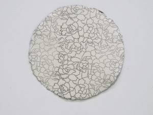
Handmade circle paper, printed both sides.
Discuss the issue as an artist on how to present and hang your work either as single pieces or a group work.
I’m not particularly fussy with the way my work is hung and presented. Once it belongs to someone else, it’s theirs, and the work is flexible enough that it lends itself to multiple arrangements. I have preferences of course, such as “please hang side by side with 5-10cm gap” or suggestions with the Blue sky set like “work does not have to be in sequence”. The Red sky series are smaller pieces of 46x46cm so they look better hung together but the larger ones of 1 metre or more are able to stand alone.
Contact details:
Jessi Wong
www.jessiwong.com
Jessi Wong, Victoria, Australia
Interview by Deborah Blakeley, November 2018
Think a colleague or friend could benefit from this interview?
Knowledge is one of the biggest assets in any business. So why not forward this on to your friends and colleagues so they too can start taking advantage of the insightful information the artist has given?
Other artists you may be interested in: