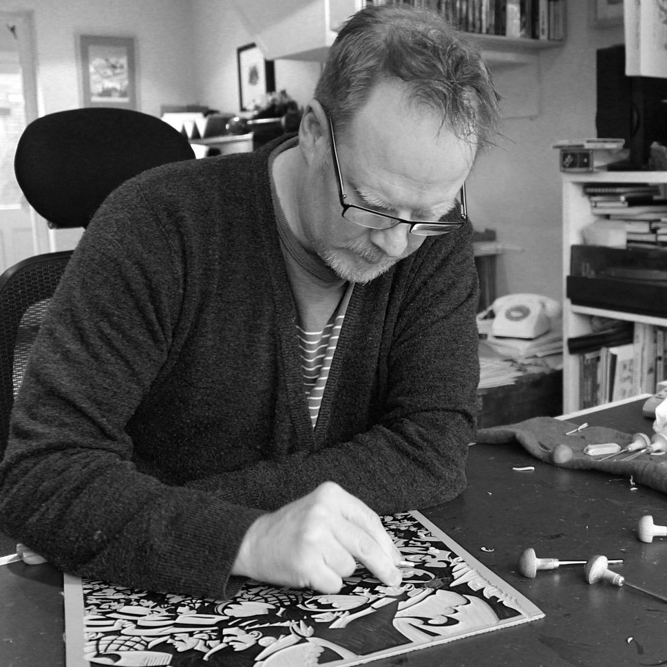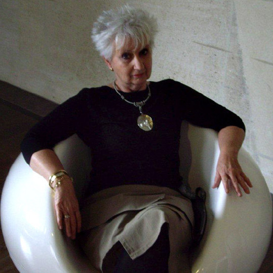
Jean Bardon PrintMaker - Dublin, Ireland
Your printmaking began in the Netherlands – can you explain the importance of your training in Amsterdam?
It was completely central to my future development as an artist. It marked my first exposure to fine art printmaking. Having just graduated from Dun Laoghaire College of Art in Dublin, I then went to Amsterdam where I found work in a graphic design studio. I enrolled in an etching class at De Werkschuit, at that time based on one of Amsterdam’s many houseboats, moored beside the Amstel Bridge. I instantly found myself fascinated by the process of drawing on copper or zinc plates, etching them in acid, thereby creating a plate from which an image could be printed, using a printing press which was almost identical to the one I had seen in Rembrandt’s house. I realised then that I had found my medium, although it would be many years before I would have the opportunity to return to printmaking at the Graphic Studio Dublin.
Is there a connection between Dutch and Flemish old masters to how your botanical art is represented?
I don’t think there is a particular connection – obviously I had a lot of access to the art of the Dutch and Flemish masters, and admired them for their light, and the calmness of their composition and colours. Holland is a country where, to this day, interiors are very important to people – they care a lot about the things they surround themselves with in their homes and seem to have an innate sense of good design and very individual style – that has certainly been very important to me, and something I took from my time there. But as regards my work, influences come from Asian and Islamic Art, formal Botanical Art and the 14th century paintings of Siena and Florence, where stamped gold backgrounds are commonly used.
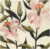
‘Illumination 1’
Trade and the Dutch East India Company brought the East to the West. Did a similar combination come about during your time in Amsterdam?
I have always loved fine detail and pattern, in a way, it was at this time that I began to develop an awareness of the use of pattern in Asian Art – the blue and white delftware, a more affordable version of the Chinese porcelain imported by the Dutch East India Company displayed in the Rijksmuseum, sparked an interest that is very apparent in my prints today. I first came across Japanese woodblock prints in the collection of the Van Gogh museum, and was impressed by the wonderful fluid lines, flat colours, use of pattern and the composition of the pieces, which frequently cut into the side of an image – it was all very different to the Western tradition in art that I had grown up with, and seemed to fit better with my own aesthetic concerns.
Wherever I go, I am always looking out for blue and white vases or ginger jars. I have a small collection at home, I cut out pictures of them in magazines, I have books with photos of them, and I sketch or photograph them in museums – Musee Guimet in Paris has a wonderful collection. But in actual fact, very few of the vases in my prints actually exist in real life – I take details from one, a border from another, make up patterns myself, and put them together in a fairly random way. I use Charbonnel etching inks for the blues – they have a fabulous selection – their Oriental Blue and Concentrated Blue are particular favourites of mine.
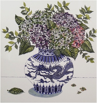
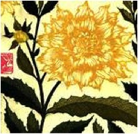
Blue Dragon and Hydrangea’
Can you briefly explain the techniques involved in your printmaking process?
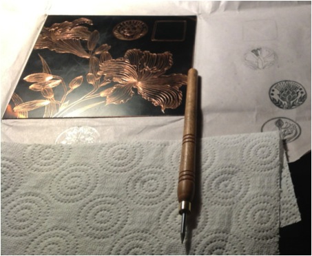
The process of producing an etching is a long, complicated and painstaking business! The techniques involved are virtually unchanged since medieval times. In this age of Digital prints, it is important to stress that all my etchings, from start to finish, are produced entirely by hand.
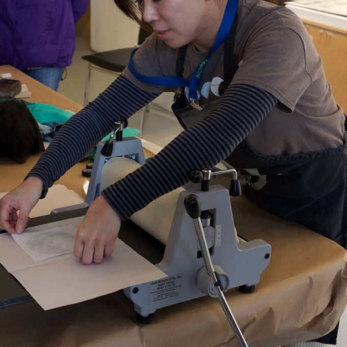
From the initial drawing made with a pointed drawing tool, on an acid resistant ‘ground’ which I will have applied to a copper plate, which I have cut to the size I wish to work on, to the biting of the lines I have drawn by immersing the plate in nitric acid, to applying powdered resin (the Aquatint process) to the plate in order to create tones, then biting it further in ferric acid, to fix the tones, and finally colour proofing and printing the final image – all is done in the age old traditional fashion. An edition number is decided on – I normally print editions of 30 – and then, each time I pull a print, it must be inked up entirely by hand, sometimes using as many as 14 colours on the one plate, before rolling it through the printing press.
All this takes time and patience. Only the truly dedicated persist.
Etching plate
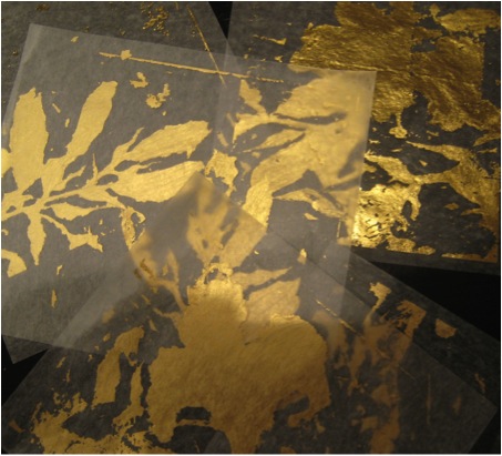
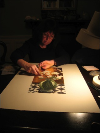
Gold leaf is a major part of your work – can you expand on the technique you use of gold leaf in your work?
I buy my 22 ¾ carat gold leaf from Cornelissens in London. It comes in small squares, and there are 25 sheets in a book. The type I prefer is referred to as “transfer” leaf – the gold squares have been stuck very lightly to a slightly larger square of tissue paper, which makes them much easier to handle than the more traditional non-transfer type, which tends to fly away from you if you so much as breathe on it! Basically, when I have finished printing an etching, and the ink has completely dried – which can take a week or two (some colours are slower to dry than others) I paint the area that I want to gild – in my case often the background of the piece – with red watercolour. This is in order to provide a rich base for the gold, rather like the “bole” used in medieval works. Then, using an acrylic metal leaf adhesive, which is water soluble, I paint very carefully the areas I wish to apply gold leaf to. I like to leave a few gaps here and there free of glue, in order that small areas of red will show through. The next step is to apply the sheets of gold to the print – I use an agate burnisher to encourage the leaf to stick to the print. Finally, I burnish it very slightly, just using a small piece of cotton wool through one of the pieces of tissue paper from the gold leaf book, moving in a circular motion, to smooth it out and give it a bit of glow.
You also use palladium – a material perhaps not as widely known. Can you explain its properties and the way you use it?
The method of applying palladium leaf is exactly as I have described above for gold leaf. Palladium is a soft, silver white metal much used in catalytic convertors apparently. To the eye, it appears identical to silver. It has however one very important characteristic which distinguishes it from silver in that it will not tarnish with time. Any examination of Mughal miniature painting, for example, will show you beautifully detailed works, with a pond or river perhaps, portrayed in the foreground, which would originally have been embellished with silver leaf, but this over the centuries has tarnished, and now appears black.
I have not used palladuim as extensively as gold, as so far I have not had as much success in making it work with my colour palette which seems to suit the warmer tone of gold better, I think palladium seems to require a gentler more subtle colour range, but I always have it at the back of my mind to try again.
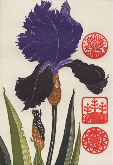
The large red seals on many of your prints, can you explain the meaning of these?
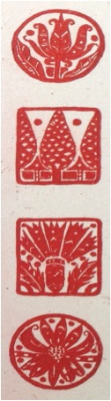
This is a question I am frequently asked. The original inspiration comes from Chinese painting, where red seals are traditionally used by the artist to sign his or her work, and subsequently by collectors of the work. I really like the idea of a piece being finished by an artist, stamped, and then changing hands over the centuries and new seals being added by each owner. Some paintings have as many as 20 different seals on them, and they in their way become very much part of the work to the extent that it is hard to imagine what the original looked like before anything was added. The fact that they were applied quite randomly and yet actually enhance the work is quite amazing. And, of course, it is a godsend for art historians, who are then able to trace the story of the painting through identifying the seals. My red seals are part of the original composition rather than being added at a later stage in that I draw the designs onto the plate and etch them into it. They are purely decorative, usually stylised plant forms and for me they are a way of adding a “shot” of red to a print, it immediately lifts the other colours. Contrary to the Chinese model, I am very careful as to where I place them in the composition, to maximise their impact. And I am not averse to the idea that someday, someone might acquire one of my etchings and add their own collectors seal to it.
You discuss “My love of decorative detail has from the beginning been a feature of my work.” Can you comment on this statement?
The term “decorative” when applied to art is often used in a rather condescending fashion. I was particularly aware of this during my art school days – the development of pattern and decorative detail in my work were the elements that I was most attracted by, but it was not really encouraged and at that time was not regarded as being compatible with “fine art”. It took a long time to shake off the lack of confidence in my ideas that this attitude engendered – to this day I feel somewhat apologetic about making what is often regarded as decorative art. As my horizons broadened and I travelled I became aware of the esteem accorded to decorative work in the eastern world, and this in turn made me reconsider the value of my earlier influences, and so I returned to my roots.
You have already been commissioned by the National Gallery of Ireland for their 2014 Diary. Can you tell us about your part in this commission?
In 2008 I was part of an exhibition in the National Gallery of Ireland called “Revelation”. In collaboration with Graphic Studio Dublin, 29 contemporary artists were invited to make a print taking the collection of the NGI as a starting point. My etching for this show, “Annunciation Lilies” is now to feature in the NGI diary for 2014. I feel quite honoured to be part of this, it is a little unusual for contemporary living artists to have their work included in a publication of this sort. Our national gallery, as in most countries, tends to lean heavily on its prestigious collection of nationally and internationally known names, so I feel I am in good company!
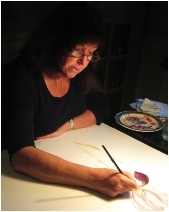
Jean guilding the ‘Annunciation Lilies’ print featured in the 2014 NGI Dia
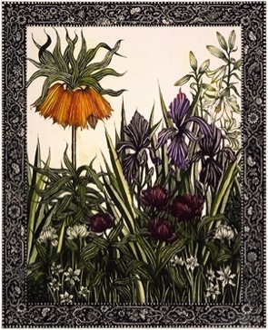
Can you expand on the work ‘Holy Show Chester Beatty Library 2002′?
Holy Show – Irish Artists and the Old Testament – took place in the Chester Beatty Library Dublin in 2002, in association with the Graphic Studio Dublin. The title of the show is a bit of a play on words – in an Irish context, someone drawing attention to themselves in an adverse way would be regarded as making a ‘holy show’ of themselves! The library’s huge collection of prints, manuscripts and works on paper, put together by Alfred Chester Beatty (1875-1968) and bequeathed to the Irish nation following his death, mark it out as the foremost museum in Ireland with an association with printmaking. The Old Testament was identified as a potential subject for artists to draw inspiration from – the collection of the CBL includes some of the rarest surviving examples of many biblical texts. Invited artists were given access to Old Testament related material in the library, written and visual, although artists were encouraged to engage with the text of the bible, rather than existing images.
For lo, the winter is past
the rain is over and gone;
the flowers appear on the earth;
The allegorical imagery employed in the Song of Solomon has frequently proved a rich source of inspiration for artists. Reading and re reading the text, I was repeatedly drawn to the descriptions of spring.
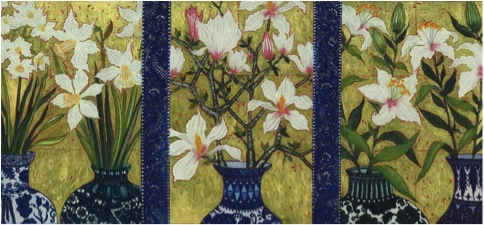
The flowers I have shown are known to have grown in biblical lands in springtime – Crown Imperial, Iris, Tulip and Narcissus. The border design brings to mind early manuscripts.
Your work is botanical but not formally botanical – can you explain how you developed your own style?
Really there was no conscious decision making involved – my style has evolved over time, influenced by formal botanical illustration, especially earlier examples such as the works of Besler, Ehret and the Bauer brothers. These, while being botanically accurate, are quite stylised in form, which appeals to me. In Asian art, it is considered more important to in some way distil the essence or the spirit of a flower rather than depict it with scientific rigour. I endeavour to bring something of all these traditions to my own work.
Prints – can you discuss the decisions you need to make about the number of editions and do you destroy your plates?
The number of prints in an edition is entirely up to the individual artist. Etching plates will stand up to printing editions of several hundred, with no discernable deterioration of the quality of the image. My editions are generally limited to between 10 and 30, although occasionally, if a specific project dictates a number, it can be larger. When an edition is completed, it is also usual to print some APs (artist’s proofs) and PPs (printers proofs) There is a tradition, generally adhered to, that says the number of APs should be in the region of 10% of the entire edition. In an edition of 30, I have the option of printing 3 more, which are signed as APs, plus I would print one or two PPs.
Although I have finished printing many of my editions, I have not so far, had the heart to destroy the plates. They are a thing of beauty in their own right!
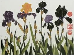
Cropping – you crop your images heavily, unlike many botanical artists. How do you make these cropping decisions?
‘Tall Lily’
I don’t actually crop as such, it is simply that I often allow my work to flow over the edges of a plate, so that it appears a little as if a detail of a larger piece has been selected and focussed on. I am very conscious that when I am working with flowers as a subject, there is a danger of the finished piece appearing twee. I think for me that mentally zooming in on the subject creates a stronger composition which I can manipulate the balance of, and creates a work that I hope is more than just a study of flowers. This practice is of course common in Asian art.
You are a member of the Graphic Studio – can you explain the importance of this membership?
It would be impossible for me to overstate the importance of Graphic Studio Dublin and the artists I have crossed paths with there. Quite apart from the well equipped studio and the technical support it offers to professional printmakers, being a member there has also opened doors for me and others through its association with other cultural institutions. I have been given an opportunity to exhibit at a level which would have otherwise been very difficult to achieve.
The Visiting Artist programme it operates, where well established Irish and international artists who are not printmakers are invited to make a print in the studio with the help of technical assistants, has also been a very inspirational experience. Working alongside artists of all persuasions who are at the top of their game is a real privilege, often challenging your perceptions and helping to develop a discerning eye.
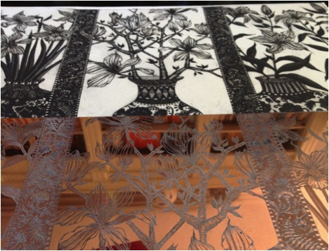
Etching plate and image, “The image prints in reverse, something that has to be factored in when you work” JBr
All this botanical art leads me to ask about your own garden. Are you the gardener?
Yes! We live in the centre of a small coastal town, half an hour from the centre of Dublin, with the Wicklow mountains half an hour away to the south, Very much the best of both worlds. Our garden is a very typical small town garden, intensively planted and looked after by me. I do quite a bit of drawing from the plants I have grown, coming back year after year to the same ones and redrawing them – working from photographs initially doesn’t work for me, I need to see the flower in the round, although I use photos for reference at a later stage.
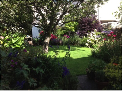
Jean’s Garden
Contact details
Website: www.jeanbardon.com
Email: jeanbardon@gmail.com
Jean Bardon, Dublin, Ireland
Interview by Deborah Blakeley, July, 2013
Think a colleague or friend could benefit from this interview?
Knowledge is one of the biggest assets in any business. So why not forward this on to your friends and colleagues so they too can start taking advantage of the insightful information the artist has given?
Other artists you may be interested in: