Frances Priest Ceramic Artist
Discuss the importance of detail in your work
I have always been drawn to intricate things, providing a place for concentration focus and respite… From the details bigger pictures emerge.
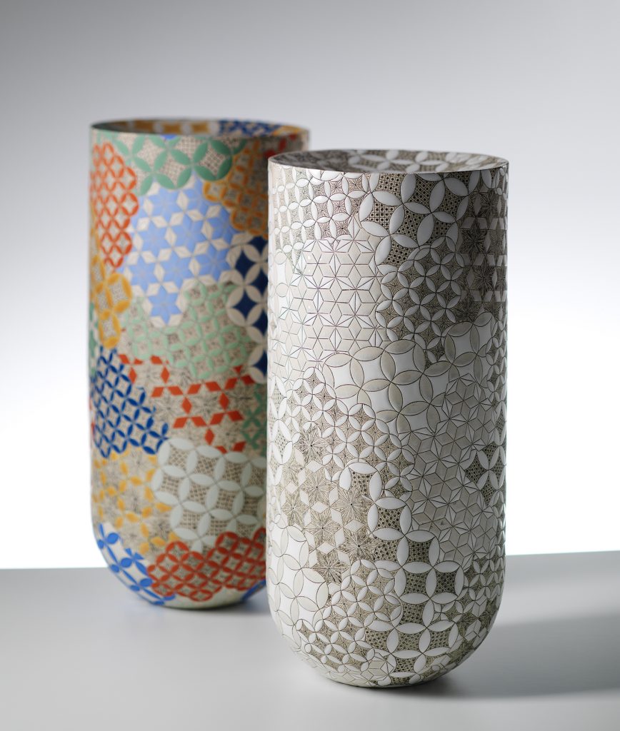
Vase Forms | Grammar of Ornament – Byzantine No3, Monochrome & Polychrome. Photography by Shannon Tofts
How has pattern continued to be so focused in your ceramics?
To ornament and decorate the world is a fundamental human impulse – even the most functional of objects are often decorated in some form. The rich history of how humans create and utilise ornament is an endlessly fascinating area of exploration.
GO Greek Commission, Photography by Shannon Tofts
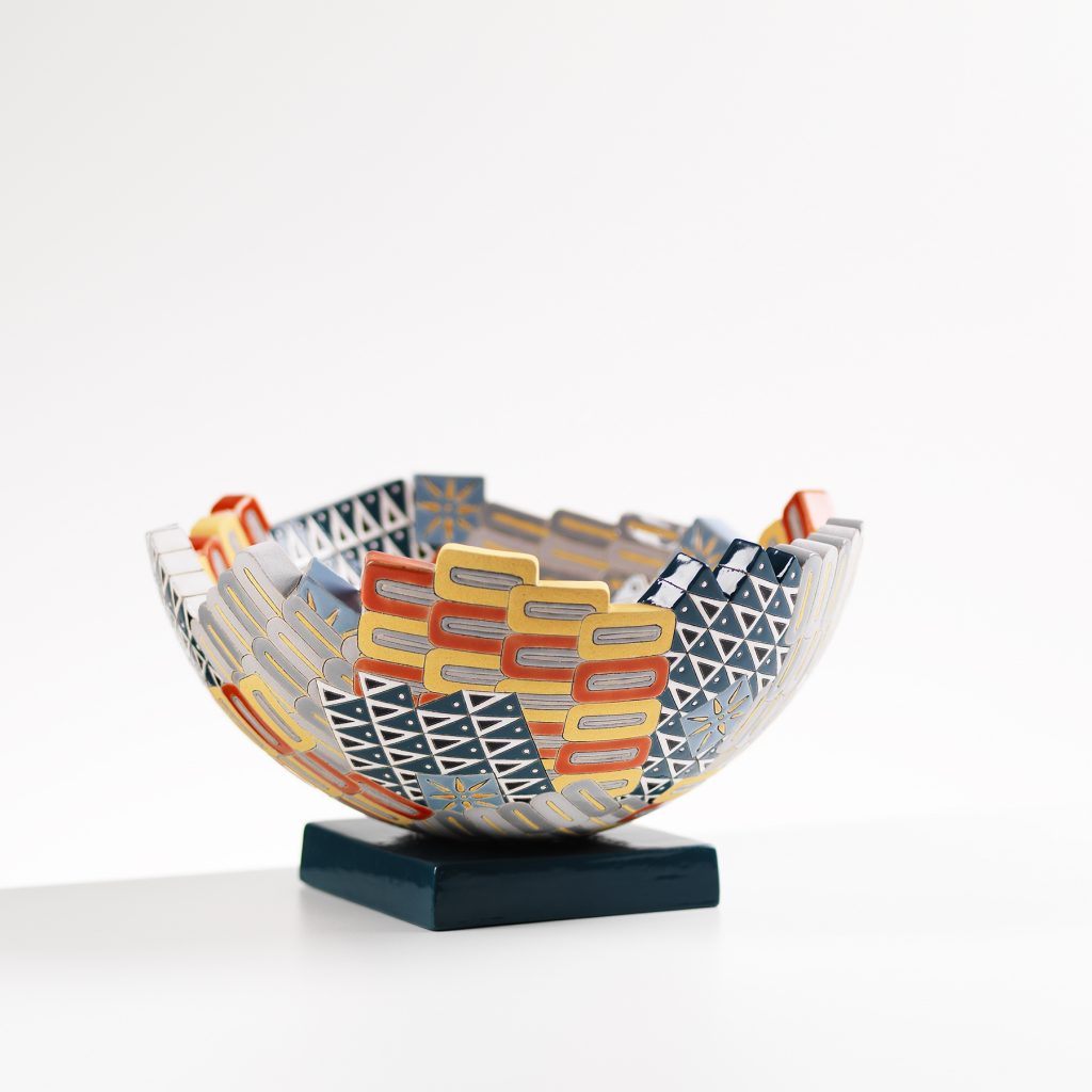
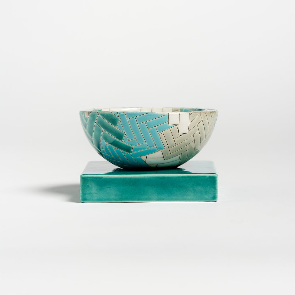
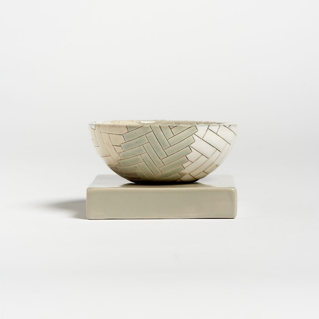
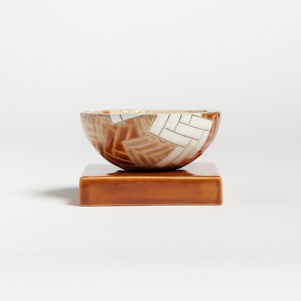
Can you tell us about your small keepsake holders, in your series, The Garnered?
Gathering Bowl | Sanday – Tresness.
This has been a lovely collaboration to work on, developing slowly through conversations with Anna Garner, founder and director of The Garnered.The work responds to an Island called Sanday in the Orkneys which has a special place in my heart. The colours are drawn from memories of autumnal beach walks around the coastline of the island, reflecting pure white sand, rust coloured kelp and the bright turquoise to deep dark blue of the sea.
Gathering Bowl | Sanday – Whitemill.
The parquet pattern is a favourite which I often return to. In this instance it seemed very fitting, recalling the patterns of tweed fabric and knitted woollens that are essential for windy walks around the island.
Gathering Bowl | Sanday – Catasand.
Comment on the small stands they sit on.
Each bowl sits on a small ceramic plinth which elevates and frames the work, giving it space to breath.
You comment that it began with a book given to you. ‘The Grammar of Ornament’ by Owen Jones in 1856. Discuss this continuing influence?
I am curious about by the journeys that languages of ornament undertake. Designers, artisans, artists and collectors, pick-up, re-work and re-interpret decorative motifs, through different materials & craft processes, by applying them to new contexts or through building up collections. The Grammar of Ornament is a perfect example of this process in action.
First published in 1856, the book is a compendium of pattern complied by Owen Jones who also devised an accompanying set of design principals intended to shake up and reform British design and manufacturing.
It is a an extraordinarily beautiful publication and a rich resource for lovers of The Decorative. It is also however highly problematic to a contemporary reader, reflecting the politics and position of Victorian era Britain and raising many questions about the dominance of a singular western empirical perspective of design history.
For those who do not know, who was Owen Jones?
I’ll quote directly from the V&A museum to answer this question
“Owen Jones (1809 – 74) was a versatile architect and designer, and one of the most influential design theorists of the 19th century. In his search for a unique modern style, Jones looked to the Islamic world for inspiration.
Jones developed key principles for the newly-established Government School of Design, which later became the Royal College of Art. Jones’ bold theories on the use of colour, geometry and abstraction formed the basis for his seminal publication, The Grammar of Ornament, a design sourcebook that is still in print 150 years later.”
Discuss the way you combine colours in your work and where the inspirations come from.
The inspiration for colour in my work is very varied: It might have a historical reference point, be a distillation of my view of a particular place or a response to a design brief. Sometimes it is just a combination that I find appealing, there are certain colours that I regularly return to.
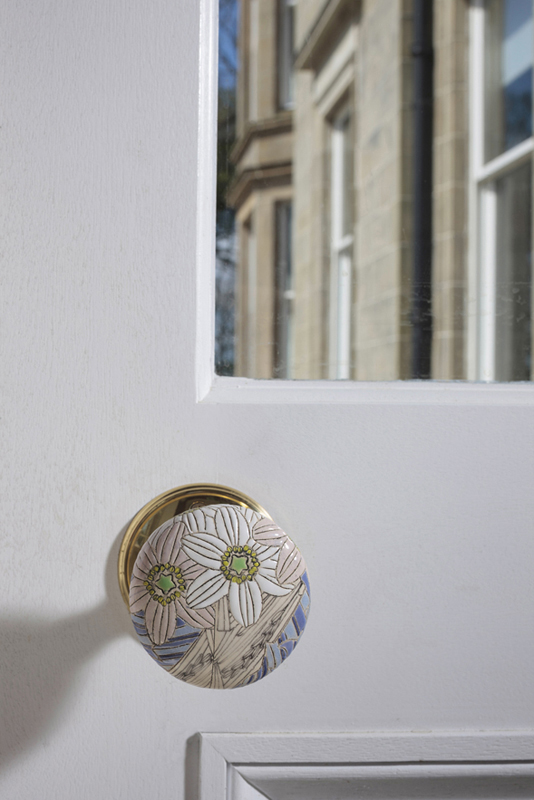
Patterns of Flora Woodland, Entrance Wear, Door Handle, Photography by Ruth Clark
I like creating movement through the use of colour, shifting across a range of hues or tones, and I enjoy adding in unexpected accents that can totally change the feel of a piece.
Patterns of Flora | Mapping Seven Raasay Habitats – Woodland. Photography by Ruth Clark
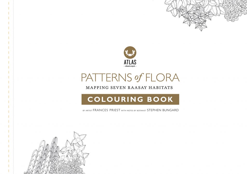
You have made a colouring book.
How did this come about?
Is it or others still available?
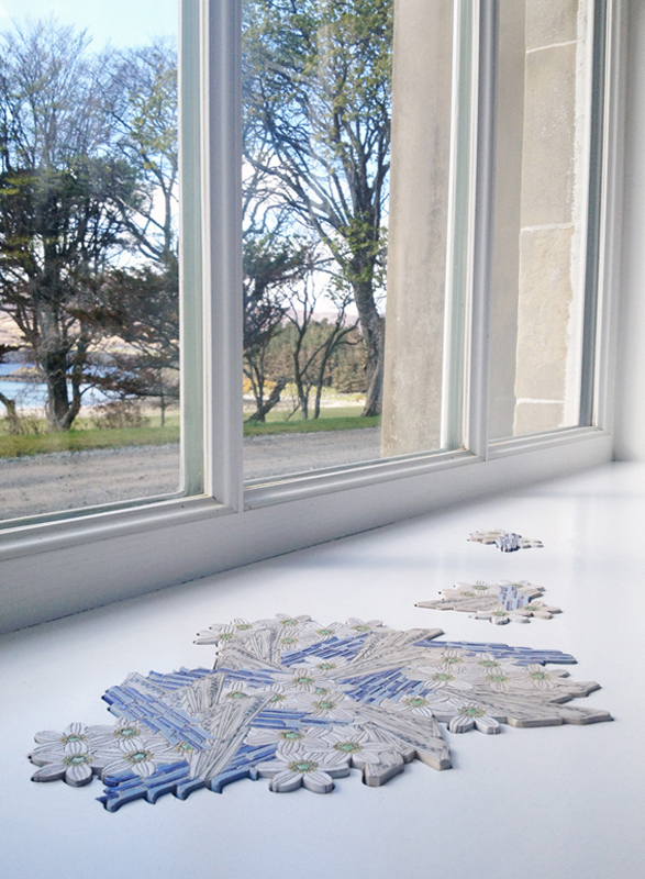
The colouring book I made was part of a larger project called ‘Patterns of Flora | Mapping Seven Raasay Habitats’.
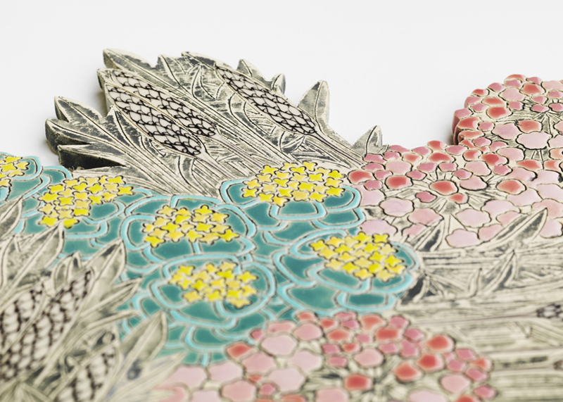
Patterns of Flora | Mapping Seven Raasay Habitats – Coast (detail) Photography by Shannon Tofts
The work was commissioned by Atlas Arts and developed for Raasay House in collaboration with Botanist Stephen Bungard. The work explored the native plants and associated habitats on the Scottish island of Raasay through a collection of permanently sited ceramics at Raasay House.
Patterns of Flora | Mapping Seven Raasay Habitats – Colouring Book.
To accompany this commission Atlas Arts invited me to create some artist editions including a colouring book. There are still a few signed copies of the original A3 colouring book available for sale via Atlas Arts. During lockdown we decided to make an a4 printer friendly copy available to download for free. You can get a copy via the Atlas Arts website:
https://atlasarts.org.uk/2020/04/03/patterns-of-flora-colouring-book-free-download/.
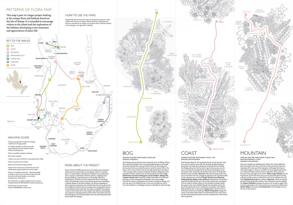
Patterns of Flora | Mapping Seven Raasay Habitats – Map
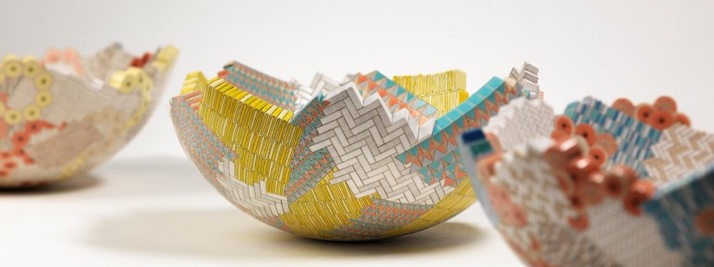
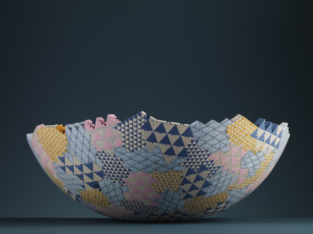
Can you expand on your work Chevron/Stripe/Asanoha, both small and large pieces?
I developed this collection exclusively for curator Valery Demure to present through her gallery Objet d’Emotion. The work brings together some of my favourite motifs across a series of hand-built drum and vase forms. Chevron motifs can be sourced back to heraldic imagery and stripes have a modernist association.
![]()
Colour Research, Chevron Stripe, Asanoha, Photography by Shanno Tofts
The Asanoha is a Japanese plant motif. I enjoy bringing together motifs from varied sources to create interesting dialogues. When developing my studio ceramics, I often look for very simple forms that act as vehicles for the surface patterns. The drum and vase forms felt particularly appropriate to the idea of a skin of pattern stretched across a surface. Making work in groups or families allows me to expand and explore an idea. With this collection each piece can stand alone but also exists in dialogue with the group. The colour palette for this work was developed in conversation with Valery and pushed me in a new direction, resulting in a very rich, bold collection.
![]()
Drum & Vase Forms | Chevron/ Stripe/ Asanoha. Photography by Shannon Tofts
How do you decide on the rim or edges of your ceramics?
Gathering Places | Collage i, ii, iii. Photography by Shannon Tofts
I allowed the drawing to dictate the shape of the rim of the ‘Gathering Places’ vessel series. The result is that the individual motifs suddenly becomes emphasised and the work appears to be constructed from individual units. I like this ambiguity and how it prompts the viewer to think about how the piece is made, referencing processes such as mosaic, inlay, marquetry, stitch or weave.
Gathering Places | Grammar of Ornament, India ii. Photography by Shannon Tofts
Tell us about becoming a scholar to both Qest and Johnny Walker?
I have recently been awarded a QEST Scholarship (Queen Elizabeth Scholarship Trust) to enable a period of research and learning with heritage tile manufacturers Craven Dunnill Jackfield. The scholarship is supported by Johnny Walker and will begin in January 2021. It is a wonderful opportunity to immerse myself in traditional tile making techniques, learning from exceptional craftspeople, with the intention that I will use the experience to develop contemporary work. QEST is a wonderful organization, and I am thrilled to be part of their growing family of talented alumni. The added bonus, of being supported by Johnny Walker has connected to an extraordinary group of craft practitioners from a diverse field of activity, covering horology, product design, printmaking and bespoke tailoring. It is a very supportive network that has proved especially valuable during this challenging year.
Take commissions you have had and the importance of each.
I am currently working on a commission for a Haematology Centre at The Edinburgh Western General Hospital, curated by Round Table projects and supported by Edinburgh & Lothian Health Foundation. The brief has allowed me to develop a collection of ceramics based on pattern books from the Linoleum manufacturing industry that was synonymous with the Scottish town of Kirkcaldy. The commission has allowed me to explore historic archives held by Fife Museums Trust including an extraordinary collection of pattern books. It is always interesting to work on a public commission, using my interests as a springboard for responding to a design brief and specific context. Working in healthcare settings adds another layer of complexity and challenge which I enjoy. I take great satisfaction from knowing that my work can help to transform clinical settings into far more approachable and welcoming environments for patients, staff and families.
The most significant of these commissions to date has been ‘The Tiled Corridor’ for The Royal Edinburgh Hospital, supported by Edinburgh & Lothian Health Foundation and realised in collaboration with tile manufactures Craven Dunnill Jackfield.
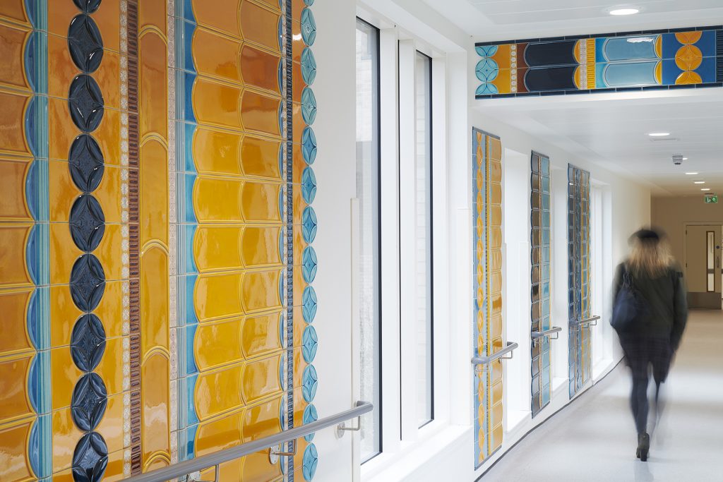
The Tiled Corridor | Royal Edinburgh Hospital. Photography by Shannon Tofts
The design is based on research into the Victorian era interiors of former hospital building Craig House and two tiled stairwells within the building. I have utilised motifs and colours extracted and adapted from these original stairwells to create a contemporary design which is vibrant and jewel like. The work spans the length of the main public corridor of a new hospital building and is comprised of around 2000 tiles, manufactured by Craven Dunnill Jackfield, and an additional 300 made by me in my Edinburgh Studio.
It has been fascinating to collaborate with a manufacturer and adapt my designs to an architectural scale. The work has become synonymous with the hospital and has achieved a great deal of recognition in design publications. It has even been included in a guidebook. To apply such a rich and carefully crafted surface to the walls of a public hospital implies a level of value, care and nurture that is very deserving of the hospital community. The corridor has become a place to linger and a means of orientation and, I hope, the work will bring moments of respite and pleasure to people using the building for many years to come.
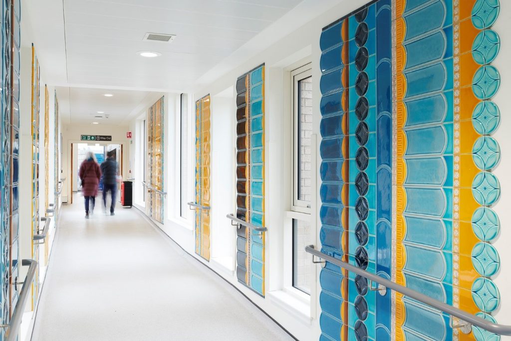
The Tiled Corridor | Royal Edinburgh Hospital. Photography by Shannon Tofts
Take one piece that still makes your heart sing when you look at it or an image of it and why?
It would have to be ‘The Tiled Corridor’. This project has been such an important work for me, a real labour of love to complete that pushed at the boundaries of my knowledge and abilities. But the hard work truly paid off with a work that has been incredibly well received, most importantly by the patients and staff at the hospital. It has led on to new and exciting opportunities including the QEST award and the chance to collaborate further with the talented team at Craven Dunnill Jackfield.
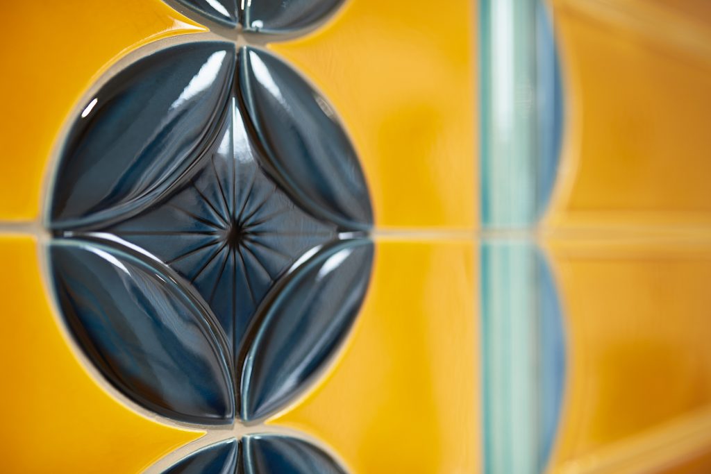
The Tiled Corridor | Royal Edinburgh Hospital (detail). Photography by Shannon Tofts
Do you have a restriction to size, both small and large?
This all depends on the project. In the studio I have two top loading electric kilns so I am limited by their capacity, but I would consider hiring kiln space if I required it. I will also work with fabricators and manufactures to realise work at scale and in none ceramic materials.
Collection | Grammar of Ornament – Byzantine No3 Polychrome. Photography by Shannon Tofts
What is one tool that makes a great difference to your work?
A scalpel and 10a scalpel blade. This is the tool I use to inscribe all of my drawings into clay.
How important is the ceramic community to you?
Creative communities, are very important, to me, whether that be within the field of ceramics or more broadly across craft, design and art. I always enjoy meeting new people and being exposed to new ways of thinking. We are fortunate in Scotland to have a vibrant & active craft & design community.
Contact:
Frances Priest
Instagram @francesprieststudio
Deborah Blakeley, Melbourne, Australia
Interview by Deborah Blakeley, November, 2020
[/vc_column_text][/vc_column][/vc_row]
Think a colleague or friend could benefit from this interview?
Knowledge is one of the biggest assets in any business. So why not forward this on to your friends and colleagues so they too can start taking advantage of the insightful information the artist has given?
Other artists you may be interested in: