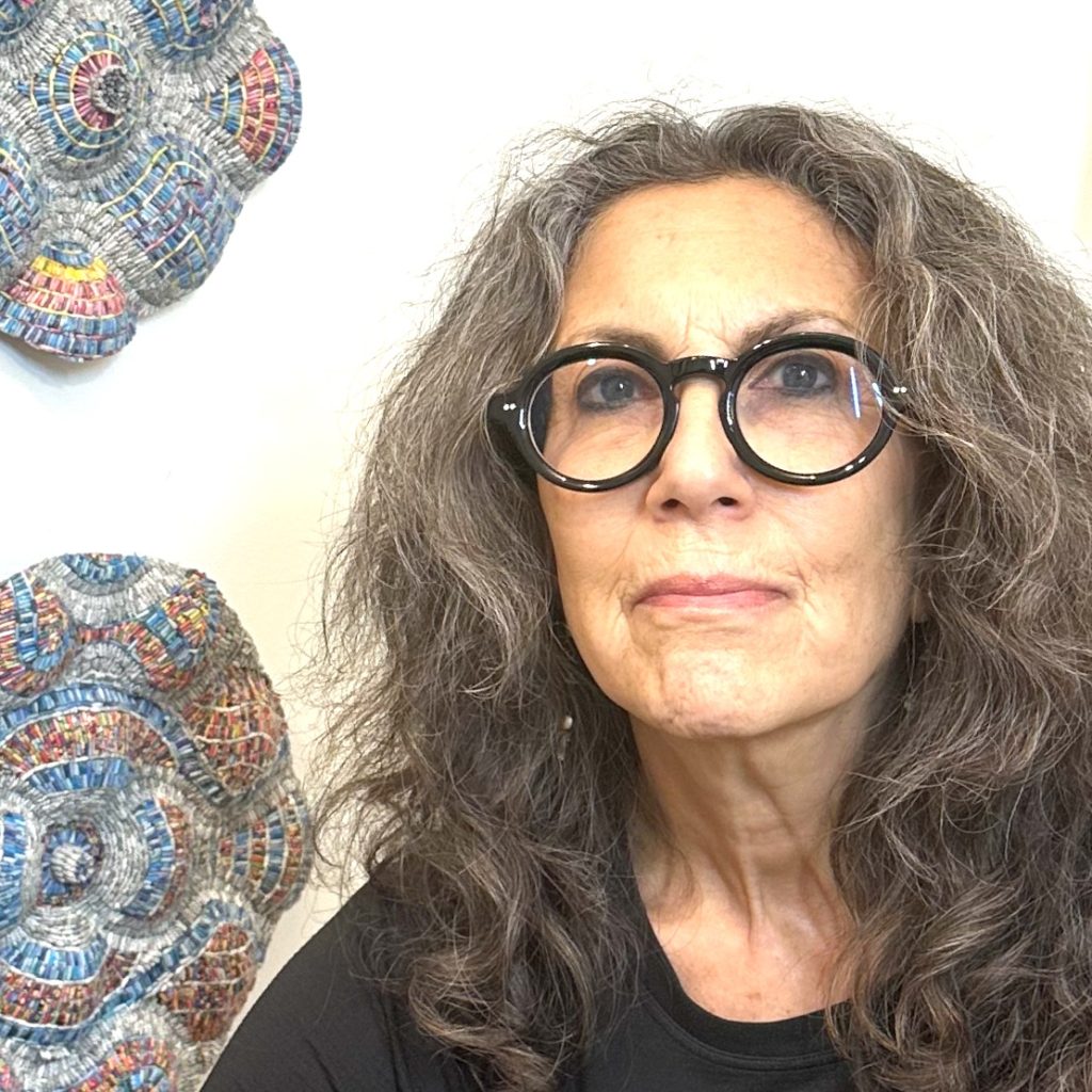
Eileen Downes Paper Artist - Sacramento, USA
When did you first start to work in collage?
I have a background in technical illustration and graphic design first working for a local Engineering firm before later starting my own Graphic Design company.
Detail of letters and how they form highlights
I am fortunate to be able to devote all of my time to the fine art medium of collage which I have been doing for the last 10 years. I think it is my early training in graphic design and specifically my exposure to a variety of “text” and “letter forms” that attracted me to use the medium of collage in my fine artwork. I see something different from what other people see in simple magazine pages or advertisements. I see the shapes and curves in letter forms as potential “paint brush strokes”…or I see long grass in a black and white magazine photo as perfect shading for under the cheekbones of a face…or I see part of a word printed in light colour ink as a reflective highlight for the curved surface of a pumpkin, for example. If you look closely at my layered paintings you can see portions of words and letters used in that way.
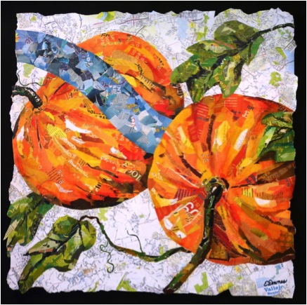
‘Pumpkins’ Corporate Collection, Vallejo, CA
The layering of paper, can you explain how you use this technique?
I have developed a unique process of building up the surface of the painting and consequently forming the image by adding and subtracting tonal values of paper used to create it. I use the total values found in the magazines, exactly like a traditional painter uses paint brush strokes on the canvas…to build the image, create shading, form, shape, highlights, and depth of field. Since my collage paintings are composed of many layers the finished works are about ¼” thick in some places. I try to remember certain words that are in the under-layers, so when I rub the surface to remove tones, these words again become visible. Sometimes I am surprised by words that appear almost magically between the torn edges as if they are part of the creators of the work.
Do you actually tear the paper or cut it?
Primarily, I tear the paper because I enjoy the organic feel of the torn edge which lends a relaxed and flowing quality to my artwork. I will, however occasionally and purposely utilize a cut edge of paper for a specific reason, such as to delineate the crisp line of a shoe lace. It is this intricate combination of both the torn edge and the cut edge that give my work complexity within the layering.
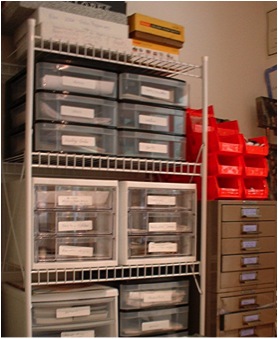
How do you store your paper?
I organize my paper by colour in many tiny drawers in my studio. I also categorize specific imagery I may want to use in the collage by subject as well as colour.
Where do you source the paper from?
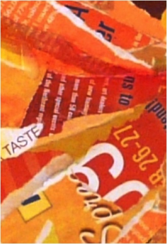
Files of Collage Goodies
Recycle…Recycle…Recycle! I have established arrangements with many professional offices in the Sacramento area that save their waiting-room magazines for me. I am selective about the printed quality of the magazines I use. The thickness and finish of the paper, the chemical make-up of the printing inks, and the amount of recycled pulp in the paper are all very important to consider as they directly affect the outcome of the layered collages. Again, my background in the graphic arts has helped me here.
You add a small amount of oil pastel. Can you explain this process?
I often rub the nearly-finished collage surface with a bit of oil pastel that catches the high spots adding to the textural feel of the pieces.
Do you give your work a final layer of sealant?
Typically, about 5 coats of matte finish added after the last layer of collage is applied in order to seal the surface.
Can you explain the size of your work?
The smallest pieces I sell are 18 x 24. Most pieces are 30 x 30, 40 x 60, or 48 x 72. I once made a piece 30x 270.
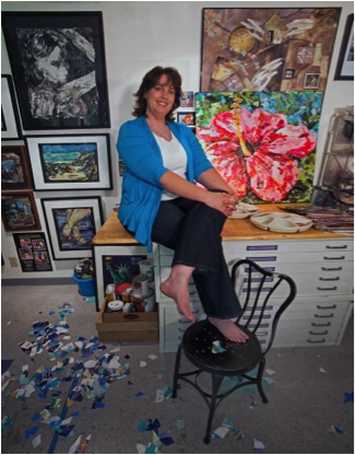
Can you share you studio?
I feel very blessed to work in a wonderful studio space located within my home. My husband and daughters built my studio for me with their very own hands; I have fond memories of my youngest daughter removing staples from the old flooring before installing the very durable asphalt tiles.
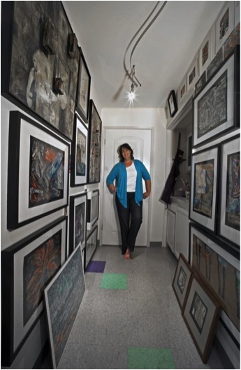
Eileen Downes in the hall of her Studio Gallery
image by Kurt Edward Fishback
My studio space features overhead adjustable white-lighting, a sink, a large a plywood working wall, flat-file drawers to store my Giclee prints, lots of tiny drawers to store my torn magazine papers filed according to colour, a huge drafting table, a light table, a carpet covered framing table, and sliding glass doors that open to my backyard patio for ventilation…and my very important studio kitty, Emmy.
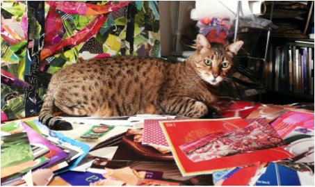
Emmy on the papers
Much of your work seems to be part of Corporate Collections. Can you discuss that aspect of your art business?
Most of my art business involves making custom commissioned pieces for Corporate Collections like hospitals, medical clinics, banks, and large corporations. I am usually brought into a project early on in the design phase, working with the architect, art consultant and interior designers. I am often asked to walk the construction site where I can gather measurements, and absorb the general feel of what the building will be like. I then create the custom site-specific work for the building. For example, the four very large custom works I created for the 9th Floor Main Corridor of the Owensboro Hospital in Kentucky, feature produce that is grown in the area.
Owensboro Hospital, ‘Blueberries’ Detail
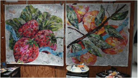
Owensboro Hospital, works in progress
When making such custom work I also include elements that are specific to the area, such as local maps and photographs of city icons.
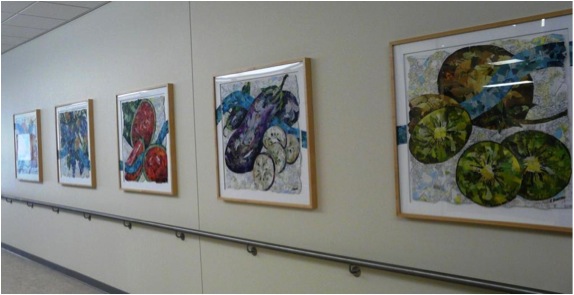
Installed, Kaiser Vallojo Floor
Many pieces in Corporate Collections are from my ‘Stepping-Up Series’ as well.
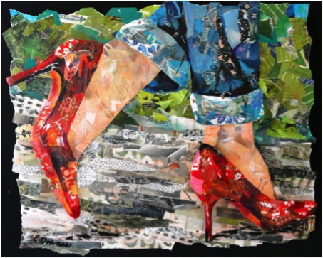
‘High Style Lady’
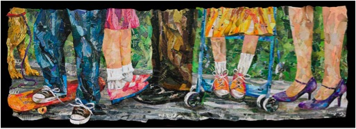
Please expand on your ‘Stepping-Up’ series.
The Stepping-Up series is an on-going collection of whimsical collage paintings embracing the diversity of human personalities, lifestyle choices, and attitudes by focusing on the different types of shoes people wear such as cowboy boots, ballerina slippers, sexy high heels, children’s sneakers and more. The styles of the shoes are used as symbolic imagery. Inter-personal relationships and family dynamics are also explored in this series as the positions of the feet in relation to others in the works help tell a narrative.
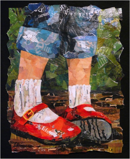
‘Nattie’s Red Shoes’
Can you discuss your ‘Beauty and the Brain Series’ from the ‘Neuro-Art Project’?
This project is very personal and dear to me, as my husband has been battling brain cancer. It has been a difficult struggle for him, for me as his wife, and for our three children. I felt compelled to build something positive out of our situation, so I did what I do best – I made art. I designed the ‘Neuro-Art Project’ as a way to honor select Neurosurgeons. The ‘Beauty and the Brain Series’ consist of very large collage paintings featuring colour saturated florals juxtaposed with scientific illustrations of the brain. I select top-notch neurosurgeons from nominations made by their patients, caregivers, staff and other sources, and I gave the paintings to these neurosurgeons as a gift of appreciation for their skill, compassion, and caring demeanour. These pieces have been given to doctors in many states including California, New York, Ohio, Arkansas, and Oregon. It is a great blessing for me to be able to use my creative talent in this way. The doctors are quite surprised when they receive my letter telling them about the project, and that they have been nominated to receive one of my paintings as a gift. I have not met any of them, (except, of course for my husband’s doctor). Several neurosurgeons have written me heartfelt thank you notes, but really the “thank you” goes to the doctors, and the paintings are really from their patients, not from me. You see, it is their patients who are appreciative of the doctors’ skill, expertise and care.
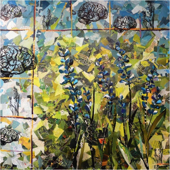
‘Beauty and the Brain’
Can you discuss one of your museum acquisition pieces?
The Museum of Biblical Arts in Dallas, Texas holds my piece titled, ‘Open Door Policy’ within their permanent collection of Contemporary Art. This piece is a large interactive collage painting featuring a real antique door which the viewer must touch and open in order to reveal the layered collage painting on the inside which displays intricately layered views of heaven. It is the only piece within the museum that viewers can touch!
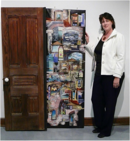
Eileen Downes next to ‘Open Door Policy’
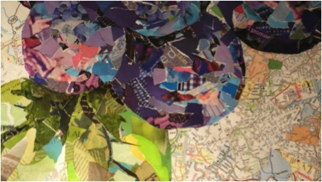
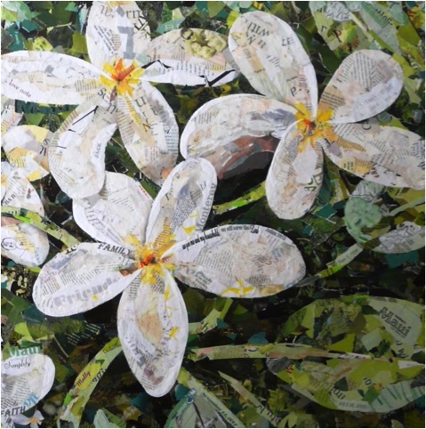
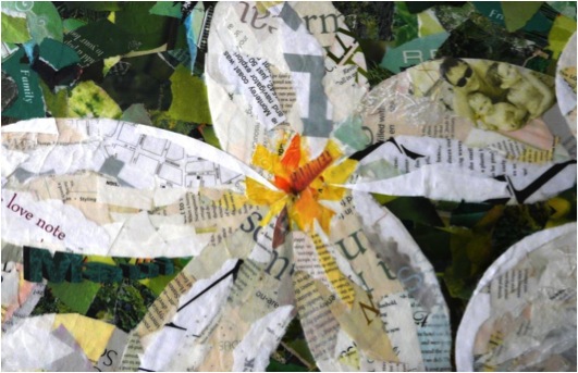
Please discuss your two flower paintings?
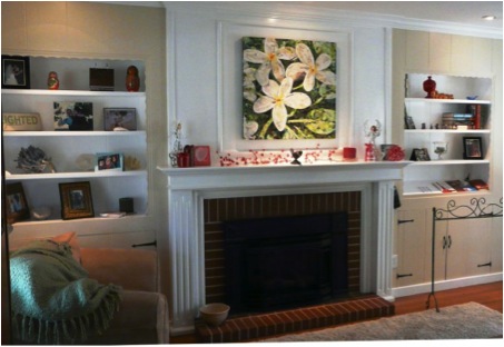
‘Tickled Pink’ is a 30 x 30 collage painting and part of my Hawaiian Summer Exhibition scheduled for July and Aug 2014 in Folsom CA. This piece is one of my favourites; in fact a Giclee print of it currently hangs over my own fireplace. I adore Hawaii, especially the tropical flowers that grow there; the saturated colours and delicate petals inspire me. During my yearly travels to the islands I take many photographs of the lush gardens, especially at the Kula Gardens in Maui. I use these photos as reference, not really duplicating them, but using the photos as a “jumping off point” to create the compositions. ‘Tickled Pink’ actually has those very words, “tickled pink” hidden within the collage layers.
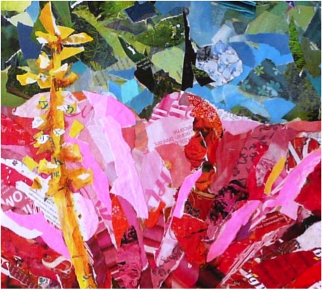
‘Tickled Pink’ Detail ’

‘Tickled Pink’
‘Kula Garden Bloom’ is another collage painting size 30 x 30 for my Hawaiian Summer Exhibition. It is from my favourite garden in Maui, and features a prominent mid-mature blossom of a Protea Flower. This species of Protea are found only in this one location in the entire world…the up-country near Kula, Maui
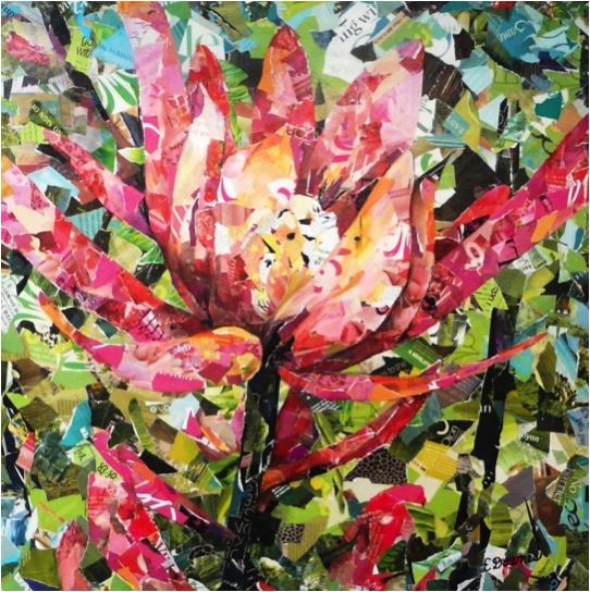
‘Kula Garden Bloom’
You have an exhibition ‘Hawaiian Summer’. Can you tell us a bit more about this?
The exhibition, Hawaiian Summer, is scheduled for the Summer of 2014 at Natoma 48 Gallery in Folsom CA featuring new work from my Hawaii Floral Series…large, square collage paintings of tropical blooms. I have been working on this series for over a year now, and I will exhibit at least 30 new pieces for the show. I will be showing with another artist, Wade Koniakowski from San Deigo CA as our work complements each others. Hawaiian style food and drink will be provided, as well as Ukulele music and maybe even hula dancers!
How do you connect your pieces to relate within an exhibition space?
I was invited to show here, and toured the exhibition space early on in the process. I always ask for a plot diagram of the space showing measurements so I can plan for a “flag ship piece” for the main focal area of the gallery, and I can also plan sizes and quantities for the rest of the space. I make sure the traffic flow is good through the space, that it has professional lighting, and a terrific staff. My series will have a very cohesive look throughout the gallery.
The materials you use are not only magazines. Can you tell us a bit more about what else you use?
Although magazine papers are what I primarily use, I often use other materials, especially for custom commissioned pieces.
‘Women & Children’s Centre’, Roseville
Can you share with us the story behind a commission piece?
Please allow me the honor of sharing the story behind the custom commissioned piece I created for a very special lady, Cate and her family. Cate had lost her husband about a year earlier, and she asked me to make the art as a special “memory piece” in the family’s honor. Actually the honor was all mine, as it was a privilege to be able to create this piece for them. The artwork is titled, ‘PS…I Love You a Lote’ (and yes, “lot” is spelled incorrectly on purpose). You see, hidden within the collage is a hand-written love note that Cate’s darling little girl wrote to her daddy declaring that she loves him a lot…”lot” is sweetly misspelled, as young children do.
‘PS I Love you a Lote’
Upon close observation you can also see charming illustrations that she and her brother had made, family photos, travel mementos, special words, meaningful dates, some wedding dress lace, a beloved Bible verse, a wedding photo (copy of course)
where the curve of the bridal veil makes up the highlighted edge of the Plumeria flower…I even included a photograph of a magnet from the family’s refrigerator door that declares “One Day at a Time.” The Plumeria blossom, which is one of Cate’s favorite flowers, reminds her of one of her favorite places, Maui. The soft tones of greens, yellows and whites where chosen to harmonize with the colors of the room.
Although the piece has a bold graphic feel when observed from a distance, it is my hope that when the family gazes into the details of the artwork they will see tidbits of family treasures and be comforted by a very special family bond
‘PS I Love you a Lote’ Detail
PS I Love you a Lote’ Installed in Collectors Home
Contact details.
Eileen Downes
www.eileendownes.com
(916) 761-0510
eileen@eileendownes.com
Eileen Downes, Sacramento, USA
Interview by Deborah Blakeley, Fabruary, 2014
Think a colleague or friend could benefit from this interview?
Knowledge is one of the biggest assets in any business. So why not forward this on to your friends and colleagues so they too can start taking advantage of the insightful information the artist has given?
Other artists you may be interested in: