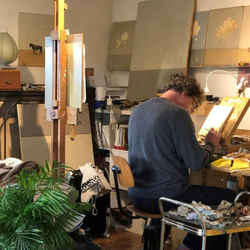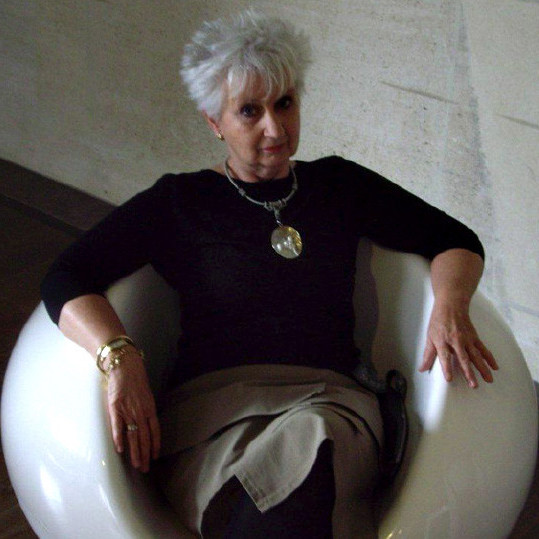

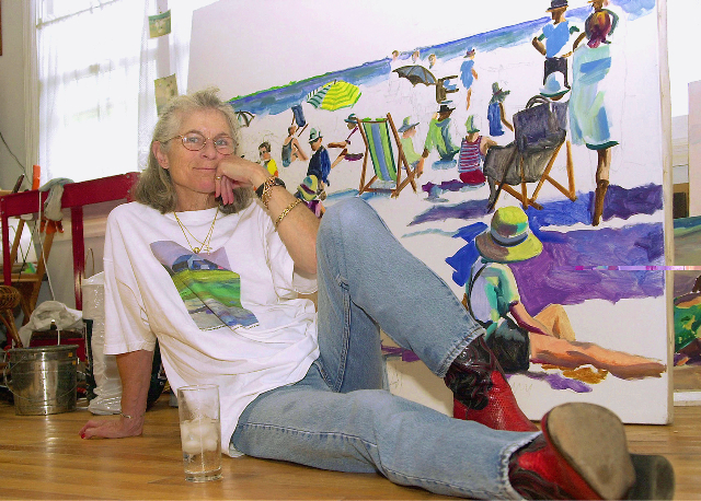
Dinah Maxwell-Smith Painter - Southampton, NY USA
Colour and light is a signature of your work can you expand on this?
I LOVE colour and light. Colour is wonderful because it sings. There is joy in it. Putting two or more colours together – particularly unusual combinations – gives a painting life. Light is also critical to all of my work, although – as an observer – I find I am often attracted to murky, vague, dark or monochromatic paintings (think fog, moonlight, boggy marshes etc.), but maybe that’s because I can’t do paintings like that. The few times I’ve tried to do monochromatic paintings; I cannot repress the desire to put a spot of red or a blob of periwinkle somewhere. It adds an element of surprise.
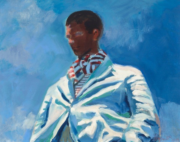
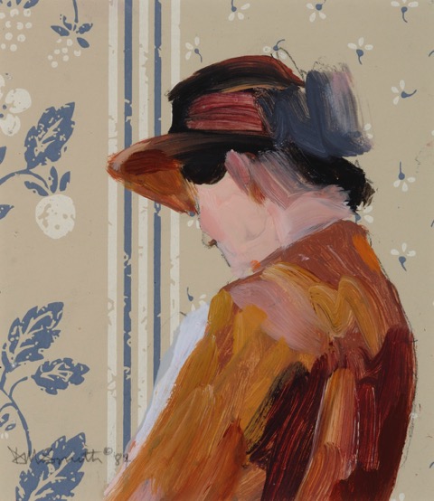
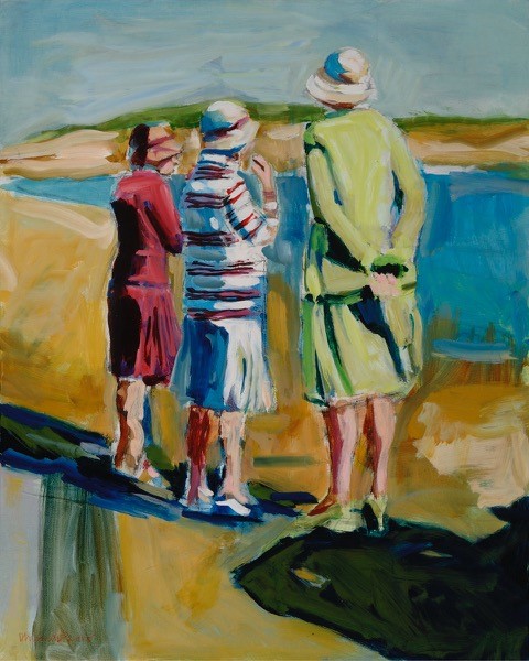
F,E,S Striped Ascot, Oil on Linen, 22 x28″
You avoid using black in your work, can you explain how you do this?
It’s a classic Impressionist tenet to avoid black, of course, yet one of my favourite things in both real life and B/W photography is shadow. A deep, dark, impenetrable shadow. I love shadows where you have to really strain and stare to make out the forms within. That being said, I don’t like using black for painting shadows because it destroys a sort of psychological “depth of field” where, for instance, a deep Prussian Blue does not. I avoid black in my painting, too, because I think it deadens the colours around it. It also creates a flat, 2-dimensional quality that detracts from the feeling of the “depth” of the oil paint itself. Flattening out the surface depth makes the resulting work seem more like graphics. It impinges upon the painterly characteristics of the work.
You love to use black and white photographs but paint in colour. Discuss this aspect of your work?
I’ve always been passionately in love with black and white photography. It can be stark and defined or blurry and ill-defined, but what I love is that the lack of colour relieves the viewer of the burden of emotionalism. What’s left is a kind of truth that I feel is impossible with colour photography. Black and white photography can be stark; whereas colour is received – either consciously or unconsciously – with a certain amount of emotive interpretation and is rarely inherently stark. B/W leaves us with something closer to the truth of the message itself. Or a truth, anyway. For the most part with photography, if the photograph is about colour – fine. Otherwise, I find it a bit of a distraction.
Painting, on the other hand, is already another step removed from reality. It’s an interpretation that allows me to play with the colours; juxtapose specific colours. I guess in painting, I am doing the opposite of what I do with B/W photography – I am trying to elicit an emotion or visceral response from the viewer often specifically through colour and only colour.
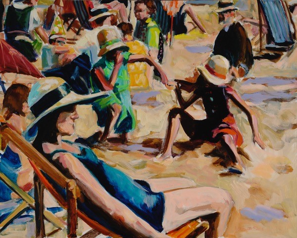
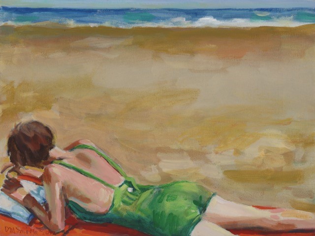
A Day at the Beach, Oil on Canvas, 24 x 30″
Most of us also “know” – essentially – about the colours around us because we’ve been looking at them most of our lives. I gave a class once where I gave my students a B/W Xerox of a landscape painting by Fairfield Porter and told them to paint it. In colour. What I said was that they knew – in their inner eye, essentially what the landscape should look like. The colour is IN YOU. Of course, they could have painted the field pink and the sky yellow if that’s what they wanted to do – I feel that anything is permissible so long as it works.
You are a keen photographer can you explain how you combine the two photography and painting?
As a photographer, I am essentially telling a story. Quickly. It is often a snapshot of a moment. Timing is very important to me. I am very attuned to gesture, irony, pathos,quirkiness, oddities of the human condition. I like the narrative that reads in an instant and needs no explanation.
Long before digital photography and Photoshop I always tried to photograph exactly what I wanted so there would be no need to crop or modify in the darkroom. My sense of timing was keen enough that I could get action shots without using a motor drive merely by anticipating the action.
Pointer, Oil on Canvas, 11 x 14″
In painting, I “crop” and frame the painting from the outset. My compositions are usually so tight and so specific that any sort of later cropping (for reproduction, for instance) can’t be done without seriously affecting the composition adversely. In both painting and photography my aim is to retain only the elements that are essential to telling the story.
Do you think photography has changed from the initial magic to now the most accessible thing and what we take now against what was taken in the 30’s and 40’s?
Photographers are everywhere!
These days, everyone including the dog, a bucking bronco or a drone, is a photographer. But not everyone is a good photographer!
What’s different today from the photography of the 30s and 40s is point of view. When Cartier-Bresson was photographing there was thought behind it. A purpose. Steichen, Ansel Adams, Dorothea Lang, to name a view, were not just out there, shooting willy-nilly. You can tell what they thought through their photographs. Even commercial photographers like Avedon and Beaton had something in mind. The general population shoots selfies, sites of where they are or have been, their friends, etc. – but there’s precious little thought or intellect involved. They’re out there clicking away, just hoping something will hit. And while the average Joe probably isn’t going to spend a lot of time Photo shopping the pictures they take, Photoshop is also, to me, like a cheat, a way to manipulate the truth. Other than burning and dodging, and cropping, there wasn’t a whole lot of manipulation available to photographers of the 30s and 40s. (Well, Lee Miller and Man Ray using solarisation, but that was for the effect itself.)
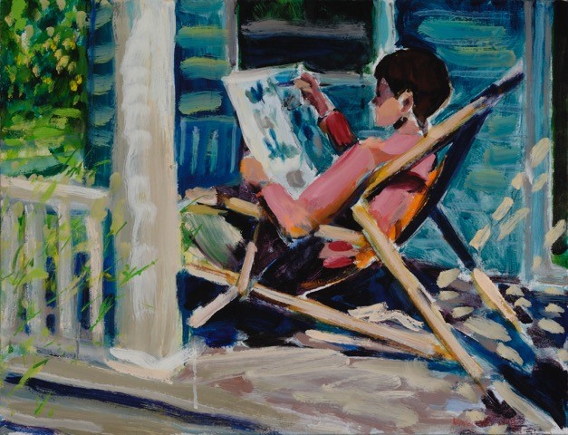
Porch Read, Oil on Canvas, 20 x 26″
Your advice is to “Look at museums. See what came before you. It’s an incredible part of your education’ discuss.
Museums provide terrific schooling because, generally you’re looking at the cream of the crop: The best work of its kind available, all under one roof. It’s basically been pre-approved for quality. Aside from what your eyes tell you, you can also get additional information from the museum itself – tour guides, headphones, lectures, books etc.
Historically, artists used to go to museums to copy the masters right there, in situ. They would take their portable field easels and set right up in front of the painting they wanted to copy. It’s an incredible exercise to closely examine a painting to see what exactly that colour is. Or to scrutinize the brushstroke of a painter you admire. Maybe his/her freedom of movement comes from using a wider brush than you would normally use in the same situation. It’s also a great way to study composition. To articulate to yourself why a particular painting works – or doesn’t. What are the elements that you, the viewer/painter can relate to? in your own work? When something does or does not work – why?
For this reason, I learned to go straight to the painting(s) I like, or, at the Metropolitan Museum of Art, for instance, to the American Wing where there are many painters I love. I used to make myself spend time in rooms with 14th century and 15th century art to “educate” myself. I was going through an intellectual exercise that held no interest for me. I realized it was robbing me of time I could have been spending absorbed in American Impressionists. Now I go straight to the American Wing and become steeped in Sargent (my all-time favourite), John White Alexander, Twachtman, Lavery, Dewing, Tarbell, etc.
Painting of fabric in Museums
Fabric. I’m not exactly sure whether you mean painting ON fabric (other than the traditional linen and cotton duck), painting OF fabric (think Sargent, Goya), or designing fabric. I have used fabrics with a design printed on them to paint on, incorporating the fabric design (1930s curtains, dress and upholstery fabrics etc.) into the painting. I used a yellow and green I“ striped cotton sail or upholstery fabric and painted a child at the beach on it. It was almost like the umbrella fabric one would have used at the beach. There was also a period when I was intrigued with using wallpaper as a background and painted on that. The paintings were successful but the pentimenti that showed through from the printing of the wallpaper was distracting, so I stopped. I’ve also done several paintings on floral-printed Japanese rice paper. A lovely medium.
You have known that art was for your since five years old, briefly discuss the journey art has taken you on?
When I was 5 I used to go to an art class at the Museum of Modern Art on Saturdays. By the time I was eight, when I got home from school at 3, I would spend the next four hours (before dinner) making art. Drawings. Very narrative. I did my first oil painting when I was nine (which I still have). My father was an art director and later the art buyer for an advertising agency so he had a lot of art supplies around. When I was ten, one of his colleagues gave me an art director’s adjustable drafting table. I was thrilled. By the time I was thirteen I knew I wanted to go to R.I.S.D. (the Rhode Island School of Design in Providence.) I applied for early admission in my junior year and went.
I majored in painting. When I graduated, I worked for a year or so at Condé Nast (Glamour magazine, Mademoiselle). I wrote an article, which they published, but I found a fashion magazine very confining and way too political for me. After that I got job in the typing pool at an advertising agency and then became one of the first women art directors. But corporate life was not really to my liking either. I thought: Why am I doing this stuff when what I really want to do is paint? So I resigned, earned my living writing free-lance copy for restaurants in New York until I finally got a 1500 s.f. loft on Spring Street during the early days of SoHo. Heaven.
I got my first solo show within the first year and used a postcard with an image for the announcement – which was not really being done yet. It got the critic from the New York Times to review the show. Solo shows were spotty in the first several years, but eventually there began to build a momentum.
How has your work in advertising help you to know what will work with the audience?
What work as an art director in advertising told me about an audience is to keep things simple? Whatever the message is, it shouldn’t be laborious for the viewer to figure it out or so obfuscated that people don’t get the point. The creative person has failed if people remember – and even admire – a print ad or a commercial but can’t remember what the product was! It’s sort of like keeping your eye upon the doughnut and not upon the hole. I also liked the telegraphic tenor of communication in advertising – a no-frills approach.
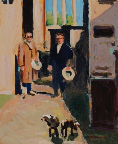
Two Men, Two Dogs, Oil on Canvas, 24 x 30″
Much of your work has a “Hampton Style” discuss.
“Hamptons Style” just means beach and summer activities: tennis, sitting around pools, in Adirondack chairs, at picnics. I started working from my parents’ photo albums years ago with photos of people on cruises, sitting in deck chairs, playing golf etc. Then started borrowing the albums of my friends’ parents and their grandparents. The photos looked like pre-Ralph Lauren fashion ads. And dogs, of course. Dogs on the beach. Dogs by pools. Dogs in laps, on leashes, playing with other dogs. I love dogs. I love putting them in my paintings.
Three Women, Oil on Canvas, 24 x 30″
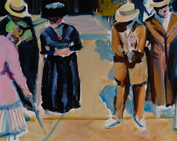
I love your work ‘Five Suits’, can you expand on this?
“Five Suits” is one of my favourite paintings. All those men on the beach, looking so serious and egotistically puffed up; they look really silly to me. And then there is the fact that they’re wearing.
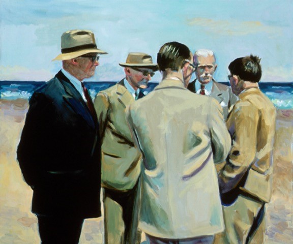
Five Suits, Oil on Canvas, 34 x 40″
SUITS – which is what they should be wearing in a city. There’s always a weird reaction to people who are wearing inappropriate or unexpected clothing: suits at the beach, a bikini in the city, jeans at a black tie dinner. There’s an air of mystery about the “Five Suits” situation. They look as though they’re in the middle of a serious confab – but why at the beach? Did they go to the beach so no one would overhear their conversation? And what about the comic-relief character with his brim pushed back?
Why don’t you paint contemporary people?
I find contemporary people pretty inelegant, on the whole.
Beach Read, Oil on Canvas, 16 x 20″
I paint a lot of kids. Kids from the turn of the century (20th) through the 30s and 40s looked like kids. Now they look like miniature adults. The clothing seems hyped. The hair shaved on one side and long on the other… I mean, what is that? I think it’s ugly, that’s what it is. Nose rings, twelve or twenty earrings in an ear, belly-button ornaments, tattoos, accessories that distort and degrade.
In an effort to look different, to stand out, to set themselves apart they all blur into one. They all look alike. Designers used to be known by the cut of their clothes, the look. Now they put the labels all over the outside of the clothing to make sure you know who they are. I find most of it pretty anaesthetic; I guess that’s the main reason. Nike sneakers are just not as pretty as dainty laced boots or 1930s pumps.

Lunch Break, Oil on Canvas, 11 x 14″
What are you currently working on?
I am currently working on several medium (24” x 36”) canvases, some larger canvases and also smaller ones, about 16” x 20”. Figurative, of course. But I also like to veer toward the abstract which sometimes happens when the photograph I’m working from is either seriously over- or underexposed and I can’t see the details. In one painting, I am trying to get a vagueness that is not generally characteristic of my work but it’s just how I envision the painting in my mind’s eye. I want it to be misty. In another, I’m working from a small B/W photo of a little girl sitting on a barn step.
It is extremely high-contrast and the area in front, where her legs and feet are, is totally black. I can see no detail whatsoever. So, for me, since that is part of what appealed to me about the photograph in the first place, the challenge is to keep the dark area but hint at the shape of her legs and feet. And make it work.
I have also been working with some mixed-media images that are quite small (5”x5”) and what I like about them so far is that they almost look like ancient frescoes. But it’s too early to tell, yet, where they are going.
‘Cut loose’ is one of your praises, expand on this in relationship to your own work?
I am a strong advocate of knowing the rules before you try to break them. The basis for describing forms in space – whether figurative or abstract – is draftsman ship.
I feel as though I have a solid background in draftsman ship and I am a figurative and essentially traditional painter. My work is classical in approach, but I also love abstract thinking and when I can attain abstraction in my work, I feel as though I’ve cut loose. I’ve broken the rules – even if they’re only in my own head. I’m torn between the delicious details of both photography and painting, and leaving things loose enough for the viewer to fill in.
I think the difference between a professional painter and an amateur is knowing when to stop. To not over-describe. If I’m undecided about whether or not a painting is finished or needs more work, I just ask myself: Is that all I have to say about it? If so, that’s it! Even if it looks unfinished to someone else, it’s done.
Contact details:
http://www.dinahmaxwellsmith.com
Dinah Maxwell-Smith, Southampton, NY USA
Interview by Deborah Blakeley, March, 2016
Think a colleague or friend could benefit from this interview?
Knowledge is one of the biggest assets in any business. So why not forward this on to your friends and colleagues so they too can start taking advantage of the insightful information the artist has given?
Other artists you may be interested in: