
Clare Conrad Ceramic Artist
Is all your work’s wheel thrown?
Yes. Since I first touched clay, at the age of 16 (on an art foundation course at college), I have been captivated by the magic of throwing – gaining such control over a lump of stuff from the ground, to create a fine, thin, perfect form. Nothing else quite measures up!
How important is place to your work?
I have always felt that my clay work is my autobiography. It has been my response to my surroundings since the first year of my degree course in 1985, when the college trip to Venice affected me deeply, resulting in the decoration technique I developed, and continue to use. I realised that every aspect of my pots reflects something that moves me. My earliest memory was picking up a “conker” (horse chestnut) in reception class in the primary school playground, fascinated by its contrasting qualities of textures and colours.


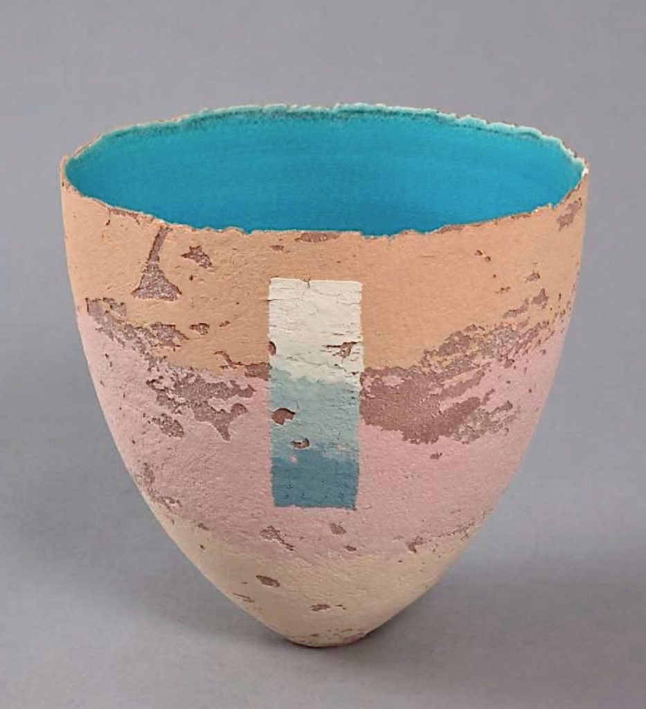
Large Round Bowl, 26cm
Over the years we have lived in many different environments, and they have each fed into my work – coastal areas (particularly the Dover cliffs on the south coast), city centres, and now, beautiful, hilly, rugged, sparsely populated countryside. I delight in using my technique and making colours to match and evoke my surroundings.
Colour
Colour has been central to my work since the Venice trip in 1985. Before that I was mainly fascinated by contrast and texture. Hans Coper was my driving force since age 16 in 1964 – still is, but now colour is an essential part of it.
I delighted in mixing all my own colours (from the three primaries with white), while studying painting on the early foundation course. It was natural that this would be the way to approach vitreous slips for my pots. I buy three primary colour glaze stains from a supplier, and achieve a vast array of shades, which I keep track of by making tiny (1”) squares – each with a code on the back (a number or short recipe). I mix everything from raw materials – the basic colour stain powder with glaze ingredients and powdered clay, which, when water is added, is divided up in varying amounts (spoonfuls) to create the myriad shades. (I have always loved paint companies’ shade cards!)
 Wave Scooped Rim
Clay
I have always used T material – recommended to me by a tutor at Bristol University, it is horribly expensive (more than porcelain), but has incredible wet strength, so it doesn’t collapse during fine throwing, or crack during the decoration stage. It is strong and warp-resistant at all stages, but too coarse for me to throw neat, so I mix it with a top quality smooth white stoneware. I have tried many alternatives, but nothing is as trouble-free as this combination.
 Autumn Colours
You have work in both private and public collections. Take one piece and explain why this purchase was so important your art work?
Every purchase is a huge boost, but a special one was in 1994, when Bristol Museum and Art Gallery bought a vessel, It is a design based on shutters against faded ochre peeling walls in the south of France. It was special to have something bought for their permanent collection, especially as I had been a very frequent visitor for the years while studying for the ceramics degree there, and had gained much inspiration – initially for the college projects, and later for my own work.
9” ht. no. Na1913 Photo Bristol Museum and Art Gallery
An occasion that stands out is when an interior design company asked me if I could match fabric and wallpaper colours for a client’s room.
This was quite a challenge, but the result was very successful, very satisfying, and gave me a new palette of undiscovered colours that I have continued to use. I made several small vessels, and the client chose the finished design, which I then made a version 24 cm.ht (9½”) 2023.

Colour matching testing
When you do a joint exhibition for example ‘Showcase 1’ with Joanne Last. How did you collaborate with the other artist?
I have shown with many other artists, but I have never had a part in the decision. It has always been the gallerist’s choice. They are usually chosen for the colour match, style, or subject inspiration. I remember being thrilled, when, in 1989, I was given a solo show to accompany Carol Farrow’s paperworks. I’d loved her work for years. It was a superb match of style, inspiration and colour. Later, an exhibition to accompany Janette Kerr’s expressive, atmospheric sea paintings. Coming right up to date – my pots were chosen to be with an artist in Flock Gallery here in the Welsh Marches border, Daniel Crawford’s superb pared-back, minimal colour paintings accentuating the stark, rugged, atmospheric landscape of the area. My next solo exhibition is of my ceramics to be shown with Newlyn Group of paintings inspired by the chalk landscape in White Chalk Gallery (named because of its position) in Wiltshire, UK.
How ceramics are displayed in Art Galleries; is very important, discuss.
I love it when my pots are chosen specially to go with a particular painting style, or colour scheme. I think it is of benefit to the potter, the painter, and the viewer. Pots and paintings complement each other – colours, or shapes in one leading the eye to the other, the placing of them is hugely important to make a satisfying composition. The display itself, when done well, is an important artwork, which can enhance peoples’ experience.
Gallery display, generally, is very important. It is noticeable when thought, and artistic skill have gone into the curation and placing, rather than just finding a space to put an object.
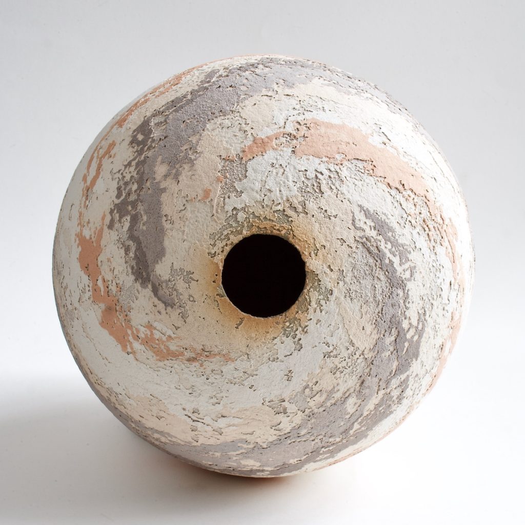 Large Round Bowl, 26cm top view
Take one of each of the three shapes you mainly work with and expanding on the techniques and the importance of the visual effect.
Since 1973, when I saw eggshells burning on a fire, my favourite shape has been the deep eggshell, – the inside membrane had turned black, leaving the outer brown shell untouched, reminiscent of Hans Coper’s pots. When, (in Venice 1985) I became obsessed with colour and texture, this form was ideal to be a canvas for my designs. I’ve almost always found it necessary to combine my colour designs on a three dimensional form, rather than on a flat canvas.
 Vessel and Jagged Bowl
An important aspect of all my forms is the rim. I intentionally make them subtly jagged. I find that it adds drama to the piece, and is a focal point, when the exterior texture is seen against the contrasting interior smoothness. This is done with ribs in the final stage of throwing.
After the base has been turned, it is decorated when nearly dry. The thickness and dryness of the slip must be just right in relation to the dryness of the pot – either too much, or too little dampness affects the amount of slip that adheres. It requires great concentration to be sure that it works when both pot and slip are constantly drying. The intensity of the final colour isn’t visible until it is fired, so I write my code in food dye on each layer, so that I can see what I’m doing. Each layer must wait for the underneath to dry slightly. I call the whole enterprise ‘controlled randomness’. I have a certain amount of control in the placing of the colours, but inevitably there is a difference in the amount of slip that adheres, and the amount that comes off with the application cloth.
Another form that I have loved to make for 40 years is the ‘jagged bowl’ semi-sphere. This springs from my love of conkers! It works best, when I throw a perfect semi-sphere, turn the base to a perfect round, cut it in half vertically, and rejoin it ‘skew-whiff’. It is high risk endeavour, cracking and warping the two main problems, and it is very time-consuming.
 Wheel thrown and altered
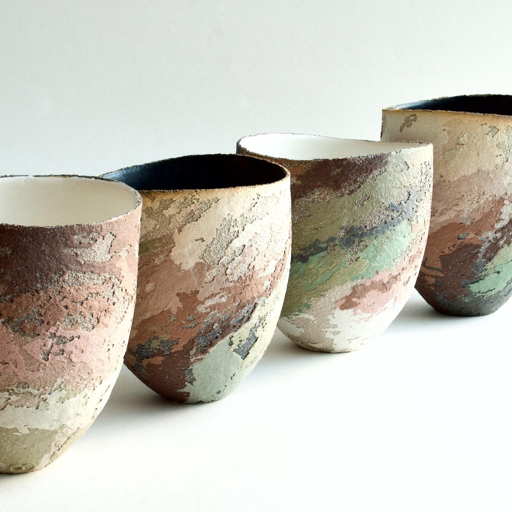
It is hard to specify three shapes that I make most frequently, I often experiment with form as well as colour. This image of blue sea-inspired pots shows the variety. When a form is more complex, it changes the nature of the design that can go onto it.
How large can you produce pieces?
The largest that I’ve made so far, is 36 cm.ht. (c 14”). I’ve thrown them in three sections, and refine them, when leather hard, to ensure a smooth perfect form. The difficulties encountered are considerable, I need to decorate most of my forms upside down, and the fine, jagged edge makes it impossible to turn, or decorate it by resting it on the rim, so it always rests on a support inside. Manipulating a large thinly-thrown pot, when it is half dry is nerve-wracking!
 36 cm.ht. (c 14”)
Kiln
I now have two kilns, both electric, the largest is 4 cu ft. Electric kilns are completely inactive atmospherically, and I delight in the fact that every mark on my surfaces is by my hand (though I do love the effects created by flame by other potters).
Discuss the limitations of your work?
Weight
My pots are quite lightweight – people are often surprised that they are not heavier. I like to throw quite thinly. They are not as fragile as they appear, and I emery them under running water during the final stage.
 Tiny round bowls
Your studio
My current studio is perfect. It is right next to the house. We converted it from a tumbledown, oil-covered Victorian brick lean-to. It’s quite small – 200 sq.ft plus an attached small room ideal for the kilns. My major requirement is daylight (and warmth!), and, with the addition of a roof window we put in, this is great. In the past, I have been in garden sheds, and a cellar, which would have been disastrous without daylight bulbs. I need daylight in order to see my colours properly.

Are all your pieces watertight?
Do you make pieces for domestic use e.g., bowls.
The pots are all watertight. They are fired to stoneware temperature, with vitreous slips, which are glaze/clay mix (sometimes glaze inside). Most of them are sculptural, rather than utilitarian, but some are used as vases.

Ripple Vessels, wheel thrown.
Do you like to think your ceramics are immediately recognisable as yours and why?
Yes, I know that they are, and this thrills me!
 Cylinder vase 20cms tall
For many years I have met strangers who tell me that they have been somewhere (like mediterranean countries) where there are peeling walls in faded colours – and that they have immediately thought of my pots. No-one has seen anything similar before, so I feel that my years of perseverance has been worthwhile in creating something unique.
 Pocket Pots, Wheel thrown and altered. 12cms
It does feel quite strange that there are hundreds of my pots out in the world, and mostly, I have no idea where they are, or who has bought them, as most of them have been bought from galleries.
 Landscape, Scooped rim, 23cm
Contact:
Clare Conrad
Contact: clareconrad@hotmail.com
https;//www.clareconradceramics.co.uk
Deborah Blakeley, Melbourne, Australia
Interview by Deborah Blakeley, March 2026
Images on these pages are all rights reserved by Clare Conrad

Think a colleague or friend could benefit from this interview?
Knowledge is one of the biggest assets in any business. So why not forward this on to your friends and colleagues so they too can start taking advantage of the insightful information the artist has given?
Other artists you may be interested in: