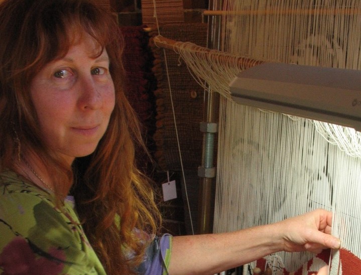
Barbara Burns Textile Artist - Maine, USA
Can you expand on your relationship with fashion and your tapestry Revolution! Fashion Series?
For about 10 years, I volunteered at a local historical society and museum. The museum had a large, chaotic collection of costumes, textiles and objects (e.g., furniture, farm equipment, household goods, etc,). When I first arrived the museum’s priority was accessioning. Eventually, I was ‘let loose’ to completely reorganize the storage room. It was a treasure trove of costumes and accessories dating back to the mid-19th century.
Many items were in need of conservation. With grant money, we hired a conservator who educated us in basic conservation and storage techniques. I then took a class on costume and textile conservation at The Fashion Institute of Technology in New York City. After my short education I was honoured to be asked by the museum board to manage the newly established costume and textile department.
At about that time I persuaded some friends to join me in a study group. Each week we read a chapter from a college text on the history of costume, beginning with the Minoans. After the group dispersed I continued on my own, reading, and collecting books on fashion, accessories, historic costume and the industrial revolution etc.
I always wished to incorporate fashion, historic and contemporary, into my work and it’s been a struggle for me to do. I keep cropping images down to faces. While contemplating a new design I was browsing through one of my books, Fashion: A History from the 18th to the 20th Century when I came upon an image of a French walking dress, circa 1780. This was the source of my tapestry Revolution. I was drawn to the colours, red and white, and the movement in the dress. I thought I could do something exciting with the image. It was also interesting to think about the history behind the dress and its relationship to the French revolution, a time of great turmoil and reaction against the wealthy classes, one of whom wore this dress. Hence the title for the tapestry.
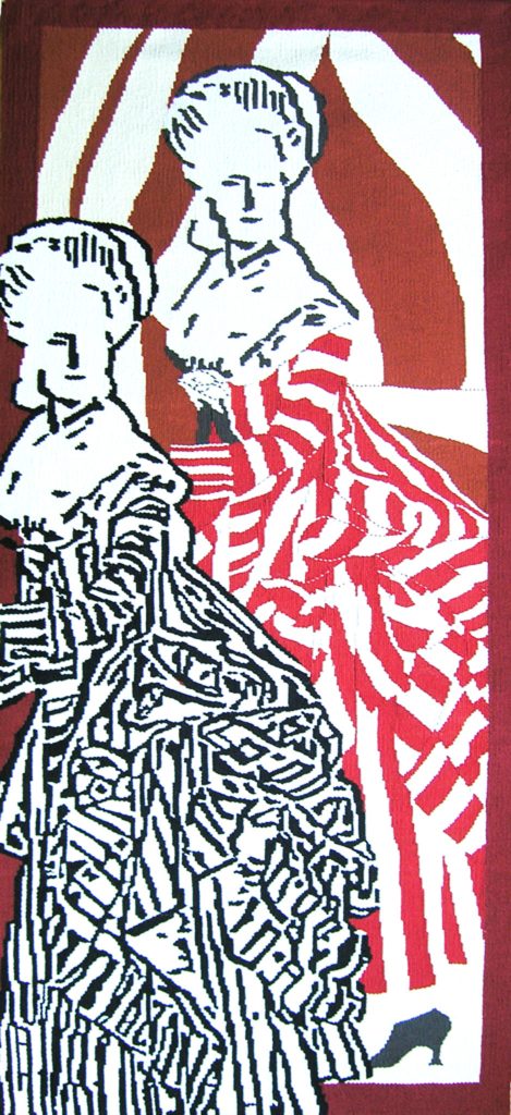 Fashion Series, Revolution 1
You mention the need to get to know your subject from history, expand on this?
I have woven several tapestries of pivotal, historic personalities. People I’ve woven include Margaret Sanger, Henry Hudson, King Amenhotep II, Frida Kahlo, Golda Meir, Anne Frank and Hitler. I’m an avid reader, so it was natural for me to read about my subjects as I prepared and wove them. I believe the process of getting to know each person through reading informed my work, both consciously and subconsciously.
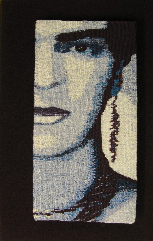
Blue Frida, 11
Although my choices of historical figures seem random, there is some logic involved. For example, I visited Egypt several years ago, right before things fell apart. The Egyptian Museum in Cairo has two mummy rooms where the mummies, in glass coffins, were packed tightly in neat rows. The bodies were draped in crisp, linen sheets and all that was visible were the heads resting on a small bun of linen. I had a tiny sketch book and pencil with me. While people filed past, between me and my subject I quickly sketched some of the mummies. I wove two versions of my portrayal of King Amenhotep II from these sketches. I wanted to capture the quality of the rushed sketch in the weaving.
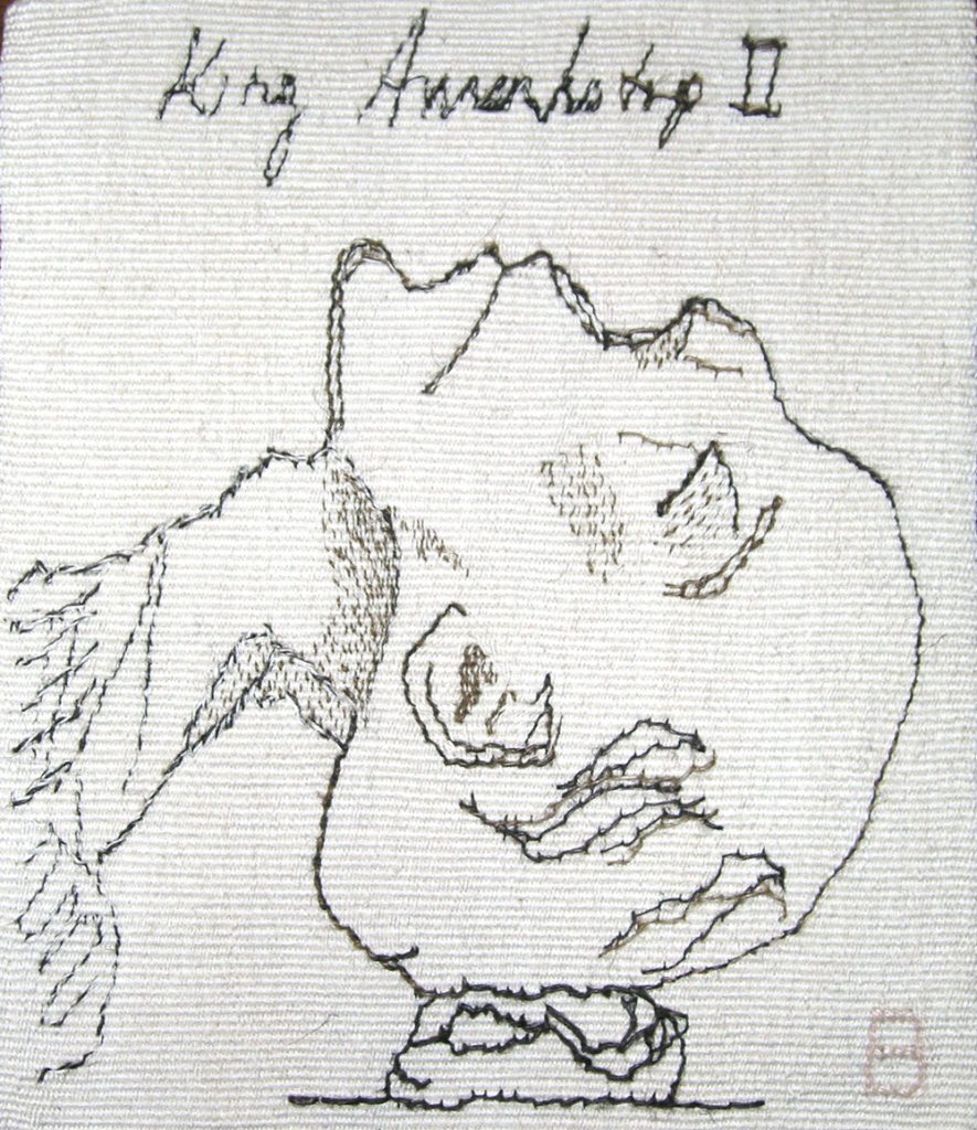
King Amenhotep, 11 #1
When I decided to weave Homage to Anne Frank I reread her diary and a psychological biography of Hitler. After many attempts on the design I finally realized that to achieve my desired effect I had to include Hitler. For me, the two faces interlaced embody the anti-theriacal; they create balance, (e.g. yin and yang, positive and negative) in this case rather macabre.
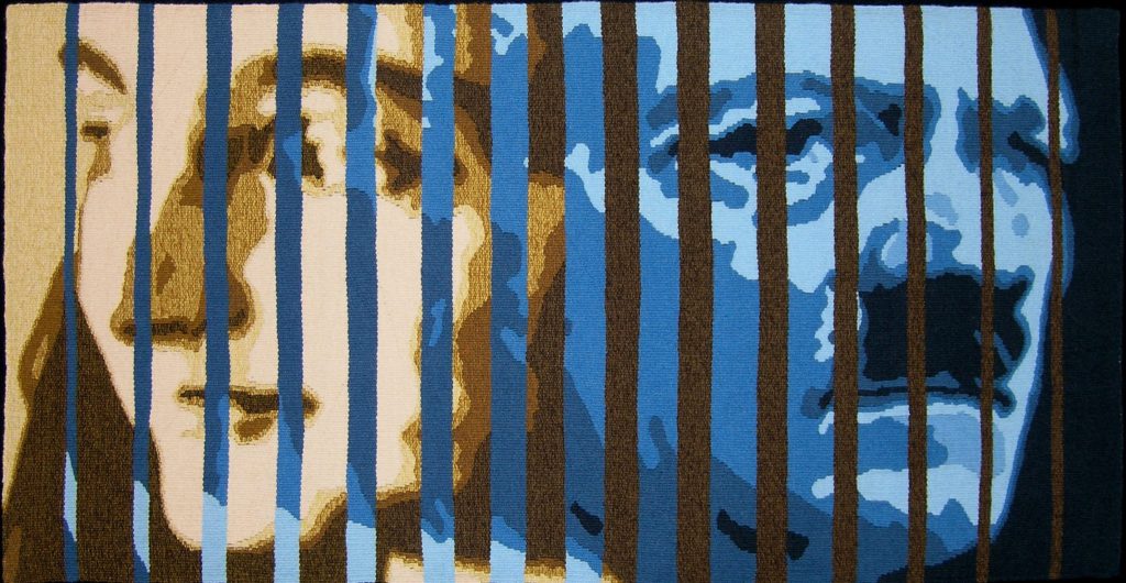
Homage to Anne Frank
Colour is predominating in your work coming before texture discuss.
Colours connect us to our feelings in a unique and memorable way, which makes them powerful. I strive to use this power in my work. When we see a colour, we have an emotional response toward that colour. My goal is to intensify that response, adding another level of significance to my work.
When choosing colours, my favourite part of the design process, I work intuitively, allowing my instincts to lead me while keeping colour theory in mind. I go to my huge stash of yarn and pull out balls, skeins and cones and I experiment. I always sample on the loom to see how each colour looks in relation to its neighbour and in the entire design.
My designs rely on colour and shape with some blending. For me the texture is usually a given, within the parameters of the medium. I do have one new tapestry, Béa, where I used a different texture to create a border in the same colour as the background. I think this was successful and may try it again in the future.
The size, your work is mainly larger than life, why?
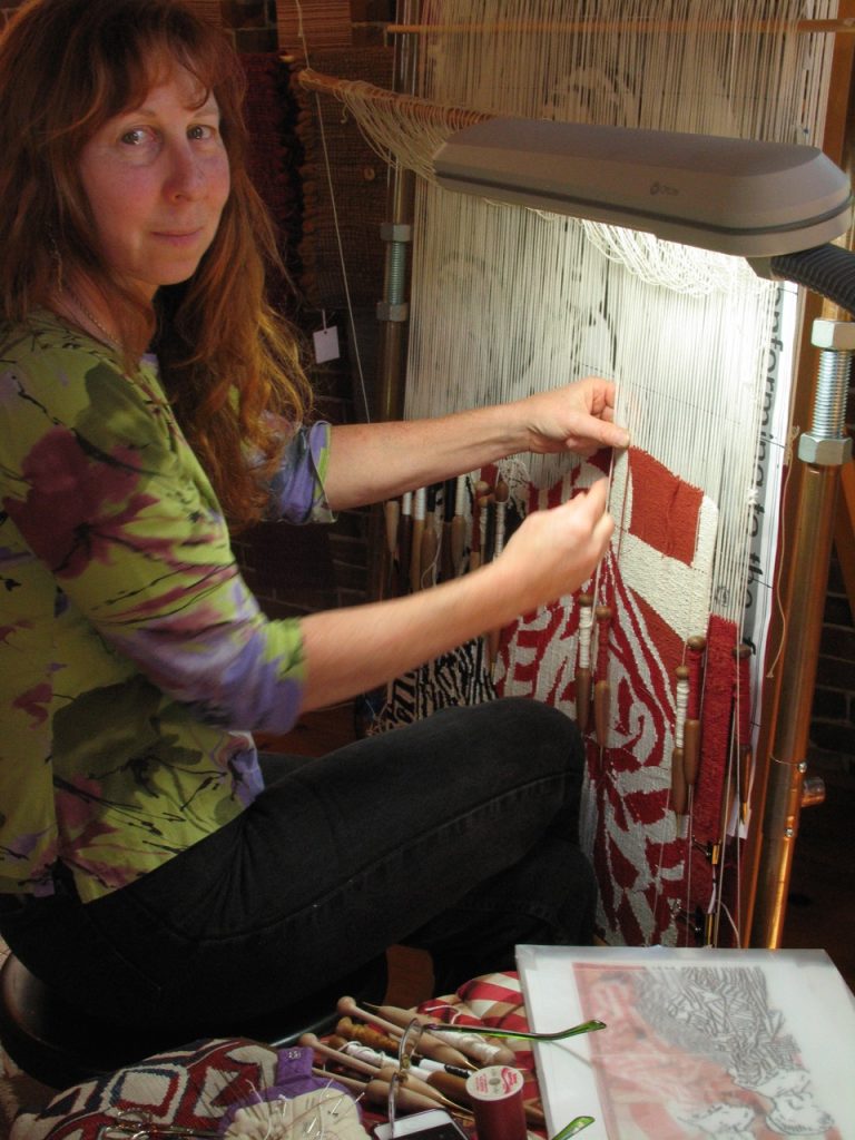
I studied tapestry with Archie Brennan and Susan Martin Maffei for more than a decade. They both had a great influence on my work, Archie in particular in relation to my size preferences. He suggested viewing my design using an overhead projector, moving it back and forth from a wall until I found a size that works for the design. I prefer the impact of the larger image, I want to grab the viewer’s attention and take them out of their ordinary reality. There are occasions when a smaller, more intimate size works too.
How are you restricted by size?
I don’t feel restricted by size. I can make a loom as large or small as I need from pipe. That said, I don’t have a desire, at this point in time, to weave anything huge or minuscule.
Expand on the historical and contemporary found in your work?
I love early tapestries for their underivative style. Once painters became involved in tapestry design the whole look of tapestries changed as they tried to emulate paintings, going from 20 or so colours to hundreds, weaving in finer setts and deemphasizing the steps between the warps. Not that they aren’t spectacular, skilful works of art, however, they are recreations of paintings in fibre.
I see my work as an amalgam of historic technique (predating the advent of painter’s involvement) and contemporary use of image and colour. This concept was instilled in me by my teachers. I am working on a grid, and when I create a shape there is a natural step that occurs as I move up and over in the warp. There are techniques to minimize the effect and smooth the steps out, or I can work with the steps and emphasize them. Choosing between these options is a deliberate, conscious decision. I have come to appreciate these steps, and less and less, I attempt to minimize them as I get bolder with my colours.
You have studied and worked in costume and textile conservation, can you explain one work that has come directly for your conservation work?
I can’t say that any of my designs have come directly from my interest in conservation. However, I do consider the longevity of my work, using conservation techniques for hanging and storing. I generally use natural fibres and try to choose light fast dyes so colours won’t fade.
You personally have a HUGE studio and workroom, tell us about it?
I designed my studio in our new home. It’s sunny and spacious with room for my books, yarns, looms and sewing machines. The focal point of the room is the 16-foot-long yarn cabinet organized by colour. It has six tall, antique glass doors that slide to maximize space with drawers below. In an anteroom is the dye area which includes a sink, stove and old kitchen cabinets painted turquoise.
The cathedral ceiling allows me to work on tall tapestries. I build pipe looms, in the style of Archie Brennan, made to size for each tapestry. The loom for Sophie was eight feet tall including legs, with plenty of height to spare. I prefer to see the whole tapestry as I’m weaving. Having the high ceiling makes this possible.
The studio is accessed from the upstairs hall of the house and via a spiral stair coming up from a small gallery and entrance on the ground level. The gallery affords me a space to exhibit some of my work and is a private entrance for visitors without walking through the house. I also have a south facing porch off the studio. Out the windows are views of woods, my garden and the New Meadows River where I can watch the lobster boats go by.
You use text in many of your works expand on this?
I’ve experimented several times with text by weaving a tapestry twice, once with text and once without. I did this with Golda and King Amenhotep II. In those two instances I found I preferred the tapestries without text,. I prefer the simplicity of the image alone in those pieces. The first time I tried my hand at text was in Margaret Sanger. I included text because I thought people probably wouldn’t recognize her or possibly know who Margaret Sanger was and I wanted to emphasize her importance by including her name. I thought if a viewer didn’t know who she was they could look it up. Historically it’s not unusual to see text in early European tapestries and stained glass to identify people.

Margaret Sanger-Spring, 8.5 x 10 inches.
Another time I included text was with Sophie, a commission I completed in 2015. Sophie, the granddaughter of the woman who commissioned the tapestry is standing on the words “RAISED BY WOMEN WHO ARE STRONGER THAN YOU KNOW.” This is a line from the song “Family Hands” by Mary Chapin Carpenter. It has significance to the woman who commissioned the tapestry. I think it makes a strong statement having the child stand atop those words.

Sophie
Revolution originally had words around the border. I wove most of the border before I decided the words did not improve the composition. It’s not always easy for me to know when I have too much in a design. I tend to put in ‘everything’ and then remove. Fortunately, I was able to unweave the whole border and reweave it without the words.
Expand on your work, Margaret Singer and Golda.
Historically
Use of colour
Use of these two women
My mother and was a staunch believer in women’s rights and social equality. She taught me to respect my individuality and think for myself. I bring those values to my work. My desire to portray people who are historically or personally compelling to me stems from my mother’s influence. It’s fitting that I chose Margaret Sanger for my first historic portrait. Sanger, the founder of Planned Parenthood in the US, believed women should have a choice in their reproductive lives. In Margaret Sanger I chose sepia tones to relate to her earlier activist days, but also to portray the limited options of women at the turn of the century. Women’s lives were still circumscribed.
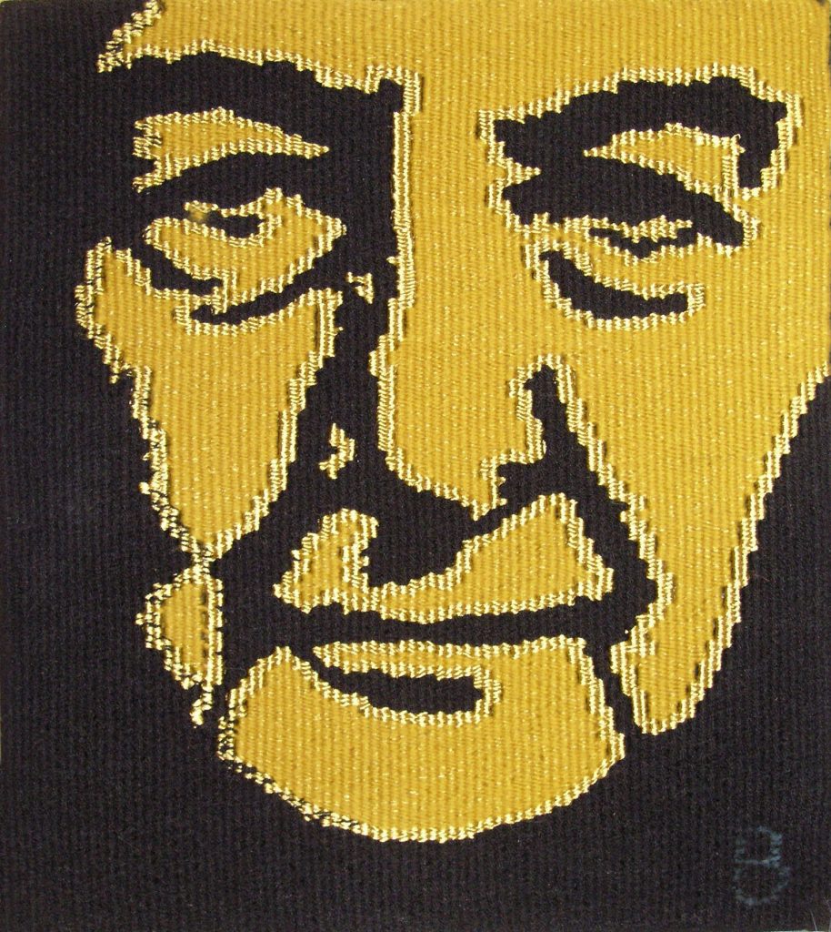
I decided to weave Golda I after seeing a one woman play about Meir. I was inspired by her story. When I saw the playbill cover with an image of her in gold and black I had one of those wonderful “Aha” moments. I chose to use black and gold for the tapestries because the combination of the two colours created such a powerful image. I think Golda II is one of my more successful tapestries.
Golda II
Like Golda I it has a black background, but I used two shades of gold for the face, one shiny and one flatter to highlight the shapes and add vitality and spirit to the piece, akin to the guts of the woman herself. The choice of gold also refers to the fact that “meir” means illuminate in Hebrew.
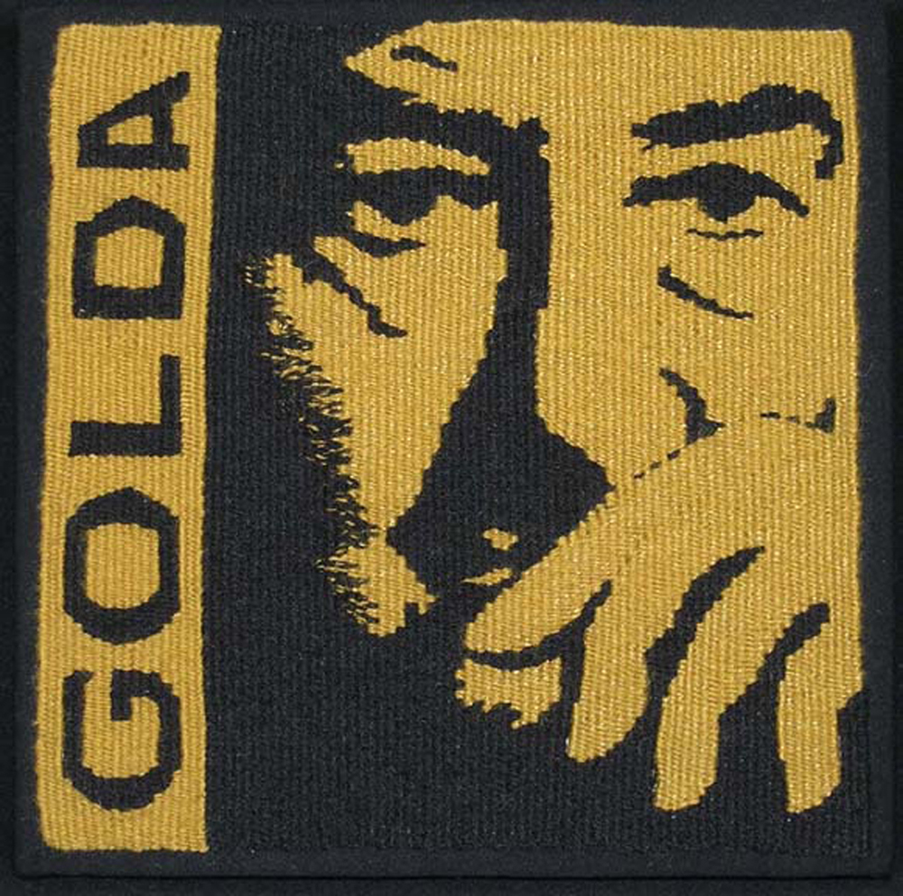
Golda I
You say, “I grew up surrounded by my mother’s collection of tribal Masks.” How has this influenced your work?
My mother’s masks fascinated me. I was surrounded by disembodied faces hanging on the walls. I loved that each one was expressive, mysterious and primal. I believe that this led me to my fascination with weaving faces. I would study them and sketch them. I used to carry a small sketch book all the time and surreptitiously sketch people’s faces when they weren’t looking. There’s so much going on in a face: the features, expressions, emotions. I love the challenge of capturing these and now, instead of pencil and paper I use fibre.
Explain how you have used Lewis Hine’s work in your own work?
I discovered Hine’s photographs after visiting a museum that focuses on people who worked in local mills; I did some research and came upon Hine’s photographs. He used his camera as a tool for social reform and I found his work quite compelling. I created a proposal for a tapestry which I presented to the museum. The design incorporates a Hine’s photograph of a very young girl working in a spinning mill. I wove the face of this little girl in sepia tones, similar to the photograph, to create an impression of the early 1900’s. I think the tapestry Little Spinner Girl is among my more successful tapestries. I was able to capture the sadness and despair in her face.
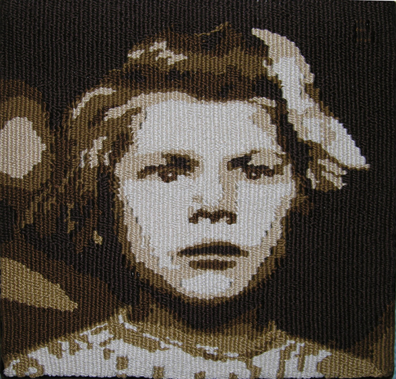
Little Spinner Girl
You lecture on tapestry; can you elaborate on this and the power of lecturing to bring a particular art medium to the public?
In the US, tapestry doesn’t have the cache that painting and sculpture have. People confuse tapestry with needlepoint and other fibre mediums. They talk of it as a dead art and are surprised to hear how strong the international tapestry community is. As tapestry weavers we are all ambassadors of our medium. I’ve been taught that we have to educate the public so they will understand and respect tapestry for the art form it is.
I realize not everyone who weaves tapestry has a desire to sell their work. As a weaver with the ambition to sell, I have found it difficult. I believe this is because people don’t recognize or have the same appreciation of tapestry as an art form on the level of painting and sculpture. Through my lecturing and teaching, I hope to contribute to an increased awareness and appreciation of tapestry as the art it is.
You are preparing some new exciting work. Can you explain your new direction?
My newest tapestry, Temptation, is a more complex composition than any I have created to date. It incorporates multiple images and tells a story. It’s the largest tapestry I’ve woven, approximately 48” x 41” and includes some of my hand spun yarn. I enjoyed working with colours like turquoise and lime green, balanced against black, white, greys, warm browns and pinks.
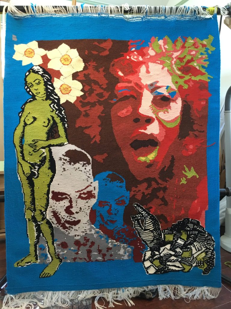
Temptation
The story behind Temptation is one of my more unusual adventures in the quest for a design. A friend and I went to a drag show. It was flamboyant and captivating. I became curious about the transgender subject in general and these folks in particular. I returned to the club a few days later accompanied by my 82-year-old aunt. With their permission I photographed a few of the performers as they prepared
their makeup and wigs for the evening’s show. From a few hundred photos I chose two to work with. The other elements I incorporated into the composition, a drawing of Eve, narcissus and a beribboned cuff and hand, along with my choice of colours, tell a story that I leave to the viewer to interpret. I look forward to seeing the response people have to this piece.
My next work will incorporate belly dance and burlesque dancers. I’ve created several designs using my photographs taken back stage at shows in which I have performed. This is part of my pursuit to expand beyond my comfort zone of faces.
Discuss the importance of expanding and extending your gallery of work?
It’s easy for me to stay with what I know works. This was important for me for a while as I became more proficient at weaving faces. Once I achieved a certain level of proficiency, I felt it was crucial to my development to expand my repertoire and weave full figures and clothing. It has been a struggle though. It takes great effort on my part to not crop down to a face. There’s something about the essence of a face that excites me.
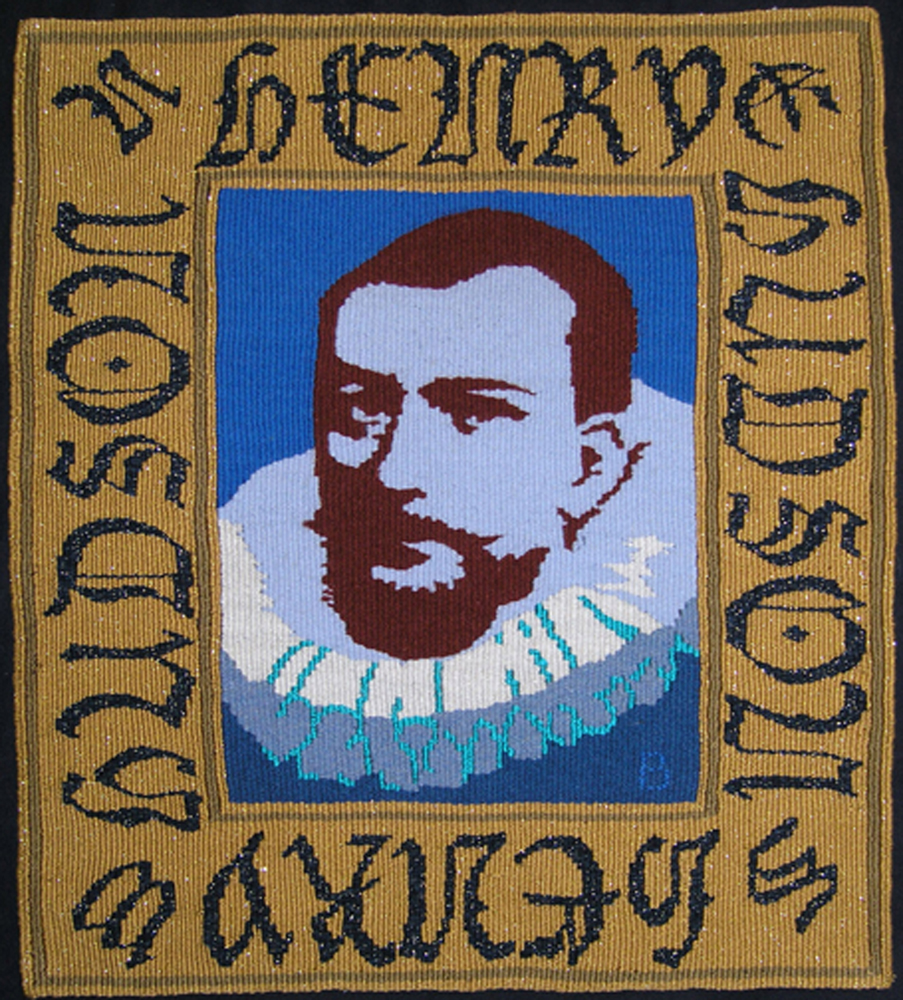
Henry Hudson
Back to those masks my mother collected. Revolution was my first successful attempt to expand beyond my boundary and grow as a designer. It was well worth taking that risk as ‘Revolution’ was a great success for me having won the prize for best traditional tapestry from Atelier 61 in Novi Sad Serbia. Temptation marks another step in that direction. The work now is in sustaining forward motion.
Contact details.
bburns174@gmail.com
Barbara Burns, Maine, USA
Interview by Deborah Blakeley, May, 2016
Think a colleague or friend could benefit from this interview?
Knowledge is one of the biggest assets in any business. So why not forward this on to your friends and colleagues so they too can start taking advantage of the insightful information the artist has given?
Other artists you may be interested in: