
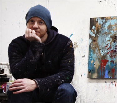
Henrik Simonsen
You speak about how drawing leads you to form the line which then has a magic of its own, making up the shapes. Can you expand on that?
Drawing is one of the most direct and simple mark making processes you have available as an artist. You move it across a surface and forms emerge and that creates positive and negative space and suddenly there is a 3D world on the surface what was blank before.
Although your work is abstract, the base is very natural. Do you think you arrive to this through shape and form, and also colour?
Most of my subject matter comes from the natural world but they are not presented in a traditional way. The colour and the way forms dissolve in places gives the work an abstract element.
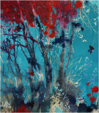
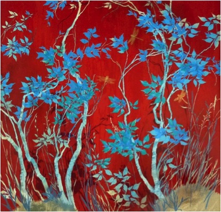
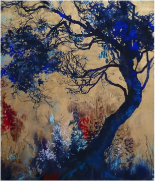
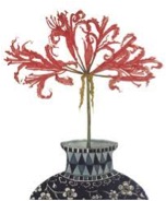
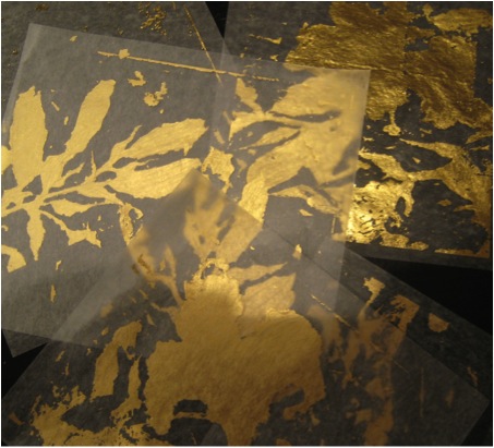
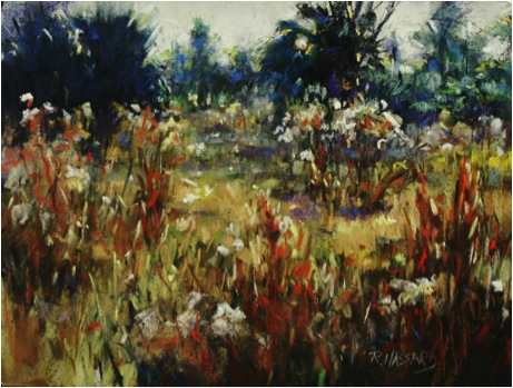
‘Red Leaves’
Coming from Scandinavia, how has this background influenced your work?
I think the work links into a long Scandinavian tradition of taking influence from the natural world. This comes through both in design, architecture and art. It took me moving away from Scandinavia before I felt I could engage with the tradition, maybe because so much of Western contemporary art is about braking with traditions that I felt I needed some distant between me and Scandinavia before I could give myself permission to pick up the tradition.
You are also very influenced by Rococo Art, can you expand on this?
The Rococo took its influence from the natural world. In a way it was images of images of nature. The original source like shells and plants were abstracted into the rococo ornaments we know. In a way I was doing the same even if I did it in a different way. I enjoyed playing with the rococo elements but they have to a large extent left the work now.
Tell us about the way you use such bold combinations of colour?
For a long time I worked only in black and white. When colour arrived it did so with quite some force. Working in black and white you think in contrast and when I started working in colours I continued to do so. Meaning the colours were played against other colours for maximum contrast and effect.
‘Light Blue Days’
Your work you has tiny insects. When do you add these (dragonflies) to you painting?
The insects are often part of the idea and are sketched in at an early stage but sometime they arrived when a piece is nearly finished and it feels like they should be there.
Shadow is an intrinsic part of your paintings, can you discuss this aspect?
I think this ties back to my interest in contrasts I talked about earlier. Shadows adds contrast to the lighter parts of the work. But also look at a tree and it becomes clear how much of it is in shadow. I think the effect of light breaking through leaves is truly beautiful.
You also add areas of gold, can you tell us about the actual gold you use?
It is gold pigment in an oil medium. I like it because it is subtle yet rich. I have thought that I would want to experiment with gold leaf but not found a piece that seemed to really want that yet. I am sure it will happen.

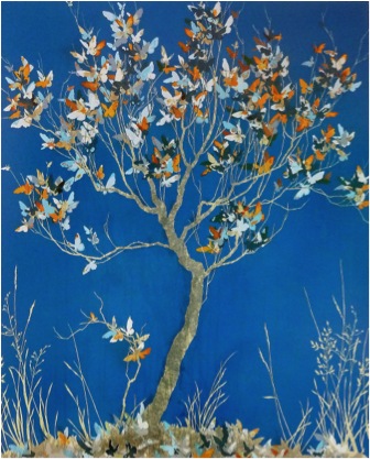
‘Dissolve’
On the flipside, you work in monochrome. Can you explain how you are able to work in two such different colour ways?
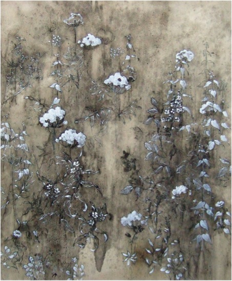
‘White Delicates’
You can get as much contrast in a very limited colour range. You just need to work a little harder for it.
Can you discuss ‘Fragile’- both technically and the inspiration behind it?
‘Fragile’
I am very lucky to be working with some excellent printers. They are called Artizan Editions and they also do Bridget Riley’s prints among others. I arrive at the workshop with ideas for work that I am fired up about and they find ways of making them happen. Sometimes that means finding new ways of printing. Fragile was a complicated print to pull off but I am very happy with the result.
Through history the butterfly has been used in art as a symbol of the human soul. Something not of this world but existing in it. In fragile I used that idea to talk about people (or souls) that spent their whole lives hanging onto the branches of a tree because they don't trust their wings or can't find the courage to let go. The butterflies under the tree are meant to represent our mortality ... so the point is that we all fall into the grass eventually but how sad to be a butterfly that never found the courage to use its wing and take flight. So the print is a reminder to fly and to live.
Take ‘Yellow and Blue’- this painting looks so random but it is full of control with hidden areas for the viewer to explore. Is this your intention?
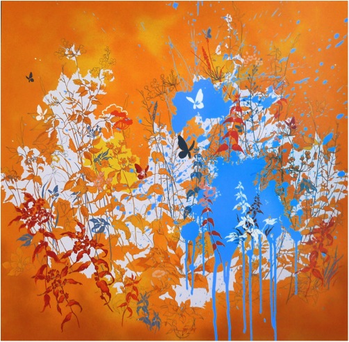
‘Yellow and Blue’
I wanted something that captured the explosion that natures goes through in summer. With the vibrancy and heat of a summer day. Nature is never out of control in works to its own systems and logic and there is always much more than what you see at first glance and that is what I hope the print captures.
Have you always worked with originals that are then made into Limited edition prints?
No, I try to avoid that. All the prints I have made have a source of inspiration in a painting or other work I have done but they are all done as original screen prints. Meaning that for each colour on the print I have made an art work that is transferred to a silkscreen and then printed. To me it’s a much more interesting way of working as you are not trying to make a print look like an original. You are creating something that is an original but in a print medium.
For your next exhibition in the USA, how many painting do you have to prepare?
‘Twisted’ part of the NYC exhibition at Wally Findlay
The exhibition is with Wally Findlay, which is one of the oldest galleries in NYC. They also have a very large exhibition space so I need to have around 20 paintings ready. It can feel daunting to start on a project on that scale but then you get into the studio and it becomes about working and individual paintings rather than an exhibition. I work every day. A day does not feel right if I don’t make it into the studio. That helps as well when you have a large exhibition to get ready for.
Can you discuss the importance of exhibiting to your work?
I paint just for me in the studio but I enjoy sharing the work once I am happy with it. I do not enjoy visits to my studio; it feels too exposed to have people looking at unfinished pieces. It feels like having guest coming to your home when your family is still in various stages of undress.
As a fulltime artist you need to exhibit and you need to have someone sell the work. I don’t think I am any good at selling my own work. I am far too close to it. Exhibiting is part of being an artist. There are pros and cons about the experience but I don’t think it is possible to avoid it, nor would I want to. Of course you can feel nervous about the reception of new work but that is part of it and it motivates you to do your best for each exhibition.
Contact details:
Henrik Simonsen - www.henriksimonsen.com
Henrik Simonsen, Berlin, Germany
Interview by Deborah Blakeley, August 2013
Clare Bigger
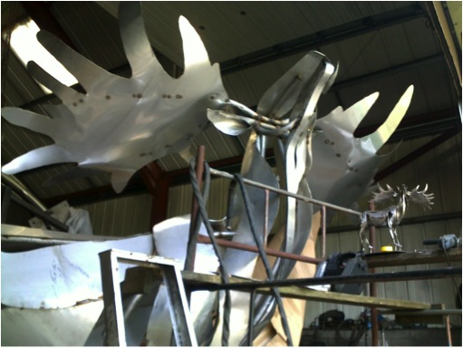
Can you tell us about your sculpture the Irish Elk?
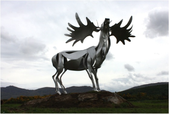
‘Irish Elk’
The commission
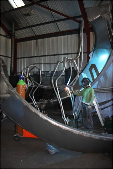
The “Irish Elk” was commissioned by Mourne Heritage Trust, Warrenpoint, Northern Ireland. This was a collaboration with Irish Artist Paul Regan, who conceived the idea and managed the project. I designed and manufactured the Elk at my workshop in England and then shipped it to Northern Ireland once completed. It arrived in Warrenpoint by ferry
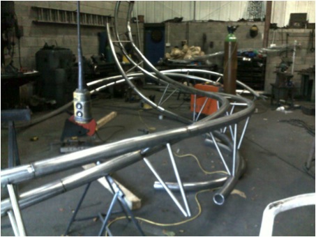
The time it takes to bring a huge project like this together.
On average the whole process from conception to installation take about 1 year or so. The actual build time takes 3 – 4 months.
How you work in collaboration with other sculptors on projects?
It is unusual for me to work with another artist. Paul Regan and I worked well together sharing relevant parts of the project. Together we also offered a community art workshop in the area as part of a community engagement plan.
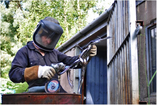
How much help do you require to produce large scale pieces?
Sculptures up to the size of the Irish Elk I can build single handed with some outside help with the structural welding. I do not like to hand over the fabrication of my sculptures to someone else preferring instead to do as much as possible myself. However larger pieces are a two man job and for these projects I move into the much bigger premises of Trapp Forge which has overhead lifting gear and work with one of the blacksmiths. This works really well for me in that it allows me to preserve the feel of the original design and ensure that nothing is lost in the scaling up of the sculpture. Having made 20 or so large commissions at Trapp Forge, they are used to me completely rehashing something that they thought was finished the day before!
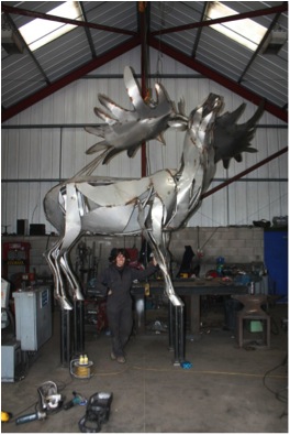
Clare with ‘Irish Elk’
Can you discuss the different space – studio, foundries you need for your work?
I have a small studio at Trapp Forge, in which I make all of the smaller pieces. Trapp Forge is a lovely place, set in the rolling landscape of Lancashire. Next door to my studio is a local blacksmiths forge which does blacksmithing and steel fabrication.
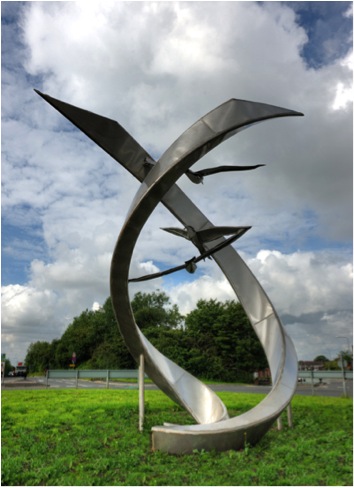
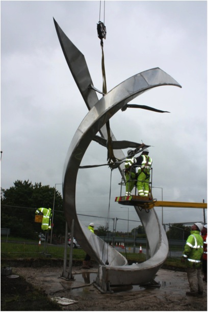
Can you discuss the commission of ‘Climbing to New Heights’ and your thoughts on the importance of sculpture in public places?
“Climbing to new heights” was commissioned by Wigan Council. It is located on a new roundabout which is part of a business park development. It acts as a landmark for the local area, giving a pride of place. It is for these reasons that I think art is important in public places. Also, providing easy access to art – you can see it for free without having to go into a museum or art gallery.
‘Climbing to New Heights’
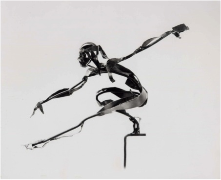
Can you tell us about ‘Gymnast’?
‘Gymnast’
This relatively small piece stands 12” high and is made of mild steel which has been lacquered. It was quite an early piece. I have always been inspired by sports people and how they can train their bodies and minds to perform such amazing feats. When I was young my heroes were people like Olga Korbut and Daley Thompson.
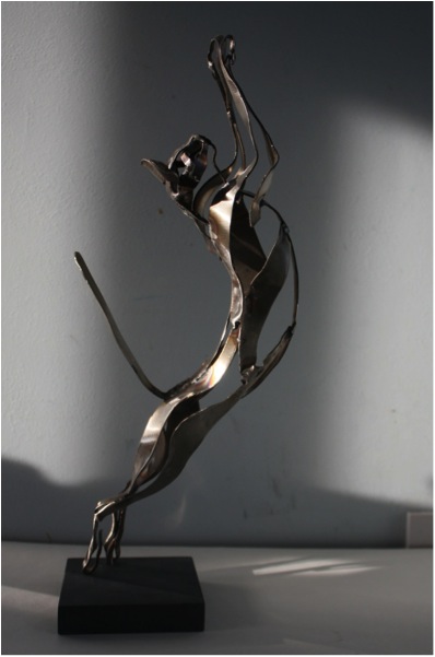
The human body plays a large part in your work can you discuss how you can achieve such movement out of metal?
The form is loosely based on the musculature of the human body. I pick and choose which muscles I think will enhance the feeling of movement and create a flow within the body.
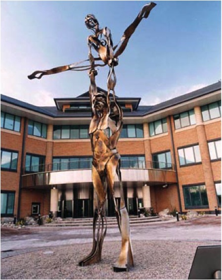
‘The Champions’
How forgiving is the material you use to the bending and manipulation you place on it?
When I first started making sculptures at Art College I was often frustrated by the fact that sculptures made out of clay and plaster collapsed. The metal work technician suggested using steel as an armature. When I tried out steel I knew that I had found the perfect medium for what I was trying to achieve. I could cantilever off balance sculptures using the smallest of supports. I use pliers, forks (long handled levers) and vices to help me bend the metal without having to use heat.
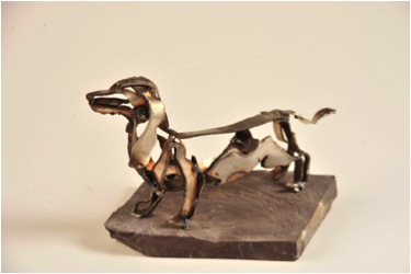
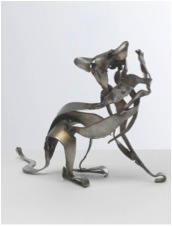
You have also made smaller scale work that is similar to larger pieces. Can you discuss this in relationship to cats and dogs?
I have recently started making smaller cats and dogs. I love making these pieces which are so immediate. The lighter material means that it’s like sketching in metal. A quick twist here and a bend there can be done effortlessly.
‘Figaro’
‘Petite Psipsi’
‘Flycatcher’’
When making larger pieces, I usually start by making a maquette and scale up from that. I try to retain the flow and spontaneity of the original piece.
When and how do you decide to use stainless steel or mild steel?
I tend to use stainless steel for all my pieces now. It can be placed outside without any need for extra treatment and also gives a wider colour range.
Can you explain the difference between the two steels and the weathering effects it has on the finish piece?
Mild steel rusts unless it has been powder coated or lacquered. Stainless steel doesn’t rust and is perfect for outdoor pieces.
How restricted are you by the available sizes of the steel available and also the cost of steel?
Gibfield Park framework
Stainless steel is much more expensive than mild steel, but requires far less after care. I’m not particularly restricted by availability of sizes of steel. I’m more restricted by what I can and can’t do at the Forge. For example, I can roll and bend tube with a hydraulic pipe bender but only up to 2”diameter. Larger pipe has to be rolled elsewhere but they will only roll in one plane. To achieve a 3D effect I have to cut the pipe, twist it and then weld it up again.
I am also limited by my strength. I can manipulate plate up to 4mm thick using levers but after that heat or hydraulics would have to be used.
When you are making a piece, what are some of the technical decisions you have to make both for the studio space and the final commissioning of the piece?

Installing Gibfield
The overall height of the piece determines whether it can be built indoors or has to be fabricated inside on the floor and then put together outside. Because of the nature of my designs, I prefer to build them upright. This allows me to see them from every angle and make adjustments throughout the process.
Installing Gibfield
Transport to site is also a major consideration. There are height and width restrictions so most sculptures have to come apart and be bolted or welded together again on site. Also we have to give a thought to the way the pieces will be craned into place.
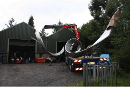
Transporting ‘Climbing to New Heights’
A structural engineer will always be involved in the bigger projects and will advise us on material sizes to ensure strength and longevity of the structure.
How did a nice girl like you come into the huge steel world?
When I first left Art College and was trying to make ends meet I worked for someone who was building polystyrene sets for the film and TV industry. It was really exciting work, very varied and often on a huge scale. Maybe this gave me a belief in my abilities to do things on a larger scale. Then in 1995 I was asked to make some smaller sculptures for the newly built head office of Birmingham Midshires Building Society. The gallery that I was dealing with asked whether I could also make a larger piece to be sited outside the offices. It was a challenge but I felt that I could do it. It was a steep learning curve but I had the help of an excellent structural engineer who gave me a lot of good advice. On that first piece I enlisted help from my dad and brother. Over the years and the many projects, I have learnt a lot from the blacksmiths and steel fabricators at Trapp Forge. Apart from blacksmithing techniques, I have picked up a few good tricks of the trade for manipulating sheet metal and pipework as one or two of the fabricators had previously worked in industry making tankers.
Contact Details:
www.clarebigger.com
Email: clare@clarebigger.com
Clare Bigger, Lancashire, UK
Interview by Deborah Blakeley, August, 2013
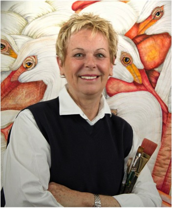
Velda Newman
You began your artistic life as a painter: explain how this helps you now with your quilts?
I think the most important thing about being an artist is that it gives you confidence in yourself and your decisions towards your art. Having taking many classes on the principals of design, colour and composition, I took those skills and applied them to fibre. In art classes, you are always encouraged to experiment, so using paint, ink, resist and bleach etc, when making quilts these aspects all seemed the natural thing to do.
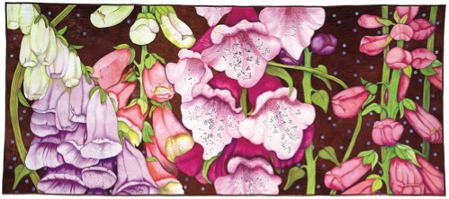
‘Foxgloves’
Can you explain the technique you use to make your quilts?
First, I'm looking for inspiration for the project. What interests me most is something from the natural world, beautiful fruit, birds, and of course my favourite subject, flowers. I want to be excited by the colour choices, possible shapes and interesting texture choices which could go into the process of creating the piece. As I start the composition, colour is always one of the first considerations. Few things elicit a more immediate or stirring response. Colour can sell a product, elevate a mood and evoke emotion. It's reassuring to know that with all its power, effective use of colour does not require a degree in colour theory. Great colour combinations are all around us and nature is our greatest teacher.
After colour, I focus on shape. Shapes are the building blocks of design. Each shape is broken down and simplified, and made into a working pattern. In my quilts the challenge lies in giving a flat piece of fabric three dimensional characteristics.
By determining how the shapes relate to one another in scale, colour, perspective and balance, you can achieve a convincing composition.
Once the drawing is complete, I use an overhead projector to scale up to a full size drawing. This is what I call a "master pattern". Individual patterns are made using the "master pattern" as a guide.
Next, fabric is dyed. I usually dye a range of colours. For instance, if I am using a medium pink, I will dye one yard pieces ranging from pale pink to deep fuchsia. I like to have five or six colour choices to pick from. Sometimes I make appliquéd quilts (shapes stitched to a background) but more and more I am making "collage" quilts, each shape is stitched to another shape, and there is no "background fabric". For the ZINNIA quilt, each flower is composed of many petals, each is cut out of fabric, assembled into the flower shape and stitched together. All edges are basted to the back side. When all flower shapes are completed in this manner, they are pinned to the design wall to check the final composition as drawn. Any adjustments can be made at this time. These shapes are then stitched together. Once the top is complete, I add in decorative stitching and any ink work that I want to add.
From here, the work is backed and stitched together.
Size – this must be discussed early: how do you both produce work on this large scale and how do you enlarge such small natural objects without them losing their beauty?
Producing large scale work is always challenging, plus it takes a large commitment of time. Any mistake is magnified big time. It's hard work and takes lots of muscle power to move all of the fabric around. You need a LARGE table and wall to work on. Sometimes I use the classroom at the local quilt shop. Most of all, you need persistence, dedication, and a vision. By enlarging small natural objects, you have the opportunity to add lots of detail with colour and texture. This adds interest and provides a look into the natural object that would otherwise go unnoticed. The centre of a flower or the mottled colours on the seashell are good examples.
You do an extensive amount of teaching, how important is this aspect of your working year?
I love to teach. The interaction with the students is wonderful, they always bring ideas to the party! Teaching cuts into your studio time, but I think it's time well spent.
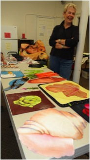
Velda in the classroom
Exhibitions: how do you decide when and where to exhibit?
The first question I always ask, does the venue have LARGE, WHITE walls! That's the most critical objective to show my quilts to their best advantage. Right now, I have a solo exhibit at the Shelburne Museum in Vermont (USA). They had room for all of the really large pieces without crowding, white walls and the show runs for six months. May - October, 2013.
Cropping is a very important part to your design. Can you expand on this?
Instead of a straight-on "picture frame" perspective with borders, I employ the concept known as "point of view". An eye level view puts you face to face with the subject. This invites the viewer into the design. To some extent, I do this through scale, if the shapes are large, you naturally feel close to them.

'Geranium’
When did you find your own style and how did you know that you were ready to make this move?
I had always been aware of quilts, but never had made one, when I read about a quilt contest. I thought it might be interesting to enter. I drew up a simple design, made a quilt out of it and entered the contest. It won a "Judges Choice Award" given by Jean Ray Laury and $50.00. This was my first time to view a quilt exhibit. When I walked in and saw the "sea of quilts", I knew I had to do something to make my quilts stand out from the rest. That's when I started making large scale quilts. My second quilt won Best of Show @ Houston, TX and I have never looked back.
Working with textiles: how do you deal with the colours you need?
That the easy part. I hand dye all of my fabric and love doing it! I also use paint, ink, pencils, resist and colour remover. Anything to get the look that I'm after.
'Sunkissed’
What have been some of the obstacles you have had to cope with in your textile career?
I think "time" is the biggest factor, never enough time! Large pieces can take one or two years to complete. And I would love to have a dedicated "dye" studio connected to my stitching studio.
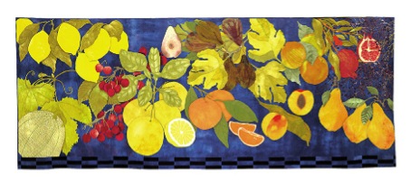
Can you discuss 3 quilts?
AMERICAN WHITE PELICAN.
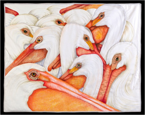
While on vacation at the beach in California, I had an opportunity to photograph these wonderful birds.
They look almost prehistoric and even comical to some degree. The technique is "collage" style and measures three feet by four feet. The majority of the texture stitching has been done on the machine. Paint and ink were used. Cotton sateen and cheese cloth are used. Hand quilted.
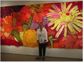
ZINNIA
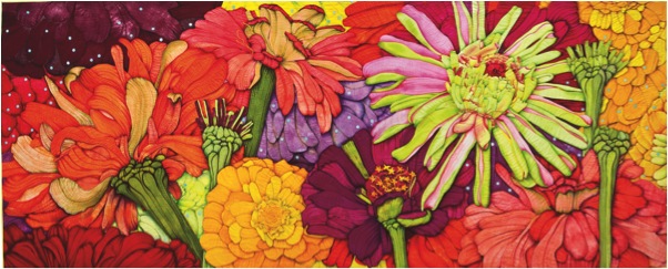
This is a quilt made in the "collage" style. It is eight feet by eighteen feet wide. This piece took two years to complete. It is hand stitched and hand quilted. The inspiration for this piece came from Zinnia's growing in my backyard. I photographed them when they started blooming and continued until they were done. The turquoise dots represent floating pollen. Paint and ink were used. Fabric is cotton sateen.
HYDRANGEA
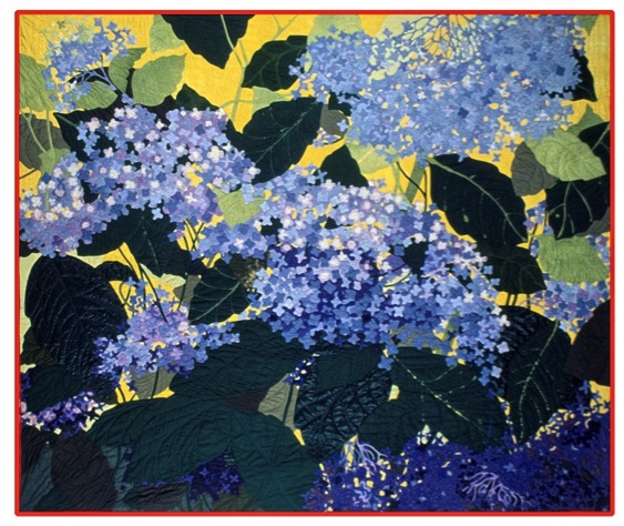
This is an Applique quilt, seven by eight feet. Hand stitched and hand quilted. This quilt presented several problems; first, hand dying enough different blues to get the depth needed to separate the blossoms. Second, capturing the delicate look of the blooms and thirdly, finishing this quilt in my lifetime. Each blossom was cut like a four leaf clover and is the size of a silver dollar. The HYDRANGEA quilt is in the collection of John M. Walsh, it was an honour to have this piece chosen as one of the top 100 quilts for the 20th Century.
Your studio, everyone loves to know about an artist studio. Can you tell us about yours?
My studio is small and compact. The one thing I cannot do without is my twenty foot design wall. I don't need a lot of fabric storage space. I have a few bolts of "prepared for dye" fabric, a place for my computer, an ironing board and a 36" X 72" table.
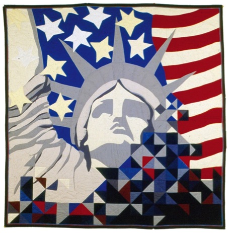
‘Freedom is Fragile’
Explain one of two tips you would give to new artists?
I think the most important thing is to find your own path and follow it!
Look at all kinds of art. I love to go to museums whenever I travel.
Try new things, there is lots out there to explore and experiment with.
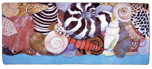
‘Shells’’
Contact details.
Email: veldanewman@mac.com
Web: www.veldanewman.com
Velda Newman, California, USA
Interview by Deborah Blakeley, August, 2013
Ivan Lardschneider
During 1999 – 2004 you worked as a Journeyman can you explain that this involved?
During this time I worked under two different masters. One worked with religious sculptures and the other made modern-baroque sculpture. While working in these two areas, I realized that I should allow my imagination to run wild. Maybe if I did I would begin to produce something that no one else has done. I would become my very own artist. As far as I know there is no other artists working with plants to carve Stylart.
This is a completely different type of work. Can you enhance on this part of your art?
Yes that was done during my time as an apprentice under my master. We made these sculptures, religious statues of saints of every size and style ...
You exhibit you’re work internationally. How important do you find exhibitions for your artistic growth?
This is very important to exhibit internationally, because you learn so much from a lot of different people who come for other cultures. It is so important for a young artist to gain this experience and to be able to do it in such a short time. I find it very rewarding to be represented in many exhibitions. Currently my work is in four galleries in Italy, Miami and Germany.
Your work is very much your own.
Yes, that in my aim.
Can you discuss the material and size of your work?
The material that I use is Linden Wood and I can get it in varies sizes.
Material : Linden Wood
The sapwood of basswood is smooth white to pale brown, while the heartwood is a smooth white to more of a pale pink-brown in colour. The species has a straight and fine grain. The wood is of a fine and uniform texture
Size : my plants are between 15 cm and 220 cm high
‘Opss’
Can you please expand on this piece?
‘Opss’… that tells you when something falls to the ground, and in this case the head is dropped and I will pick it up again because it is very difficult to exist without it in position.
Was it made for someone or for an exhibition?
No, basically I'm doing almost all my work and it is this - just as the ideas come to me - in the head.
The choice of materials you use - how do you make this choice?
I work with wood, the wood is lime, and sometimes with bronze but this is already a precious material. Other materials I will use as I maybe in the next few years as the whim takes me.
Boy with a Water Ring’
Can you tell us about this piece?
I made this piece several years ago but it is still interesting as it goes into the meaning of pray. Children pray differently from adults, they are not as aware as perhaps we adults are. They do not know what they are really meaning.
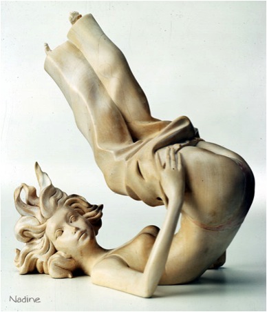
Can you explain about Nadine?
I made this piece from a photograph in a special Stylart. Is it 45cm.
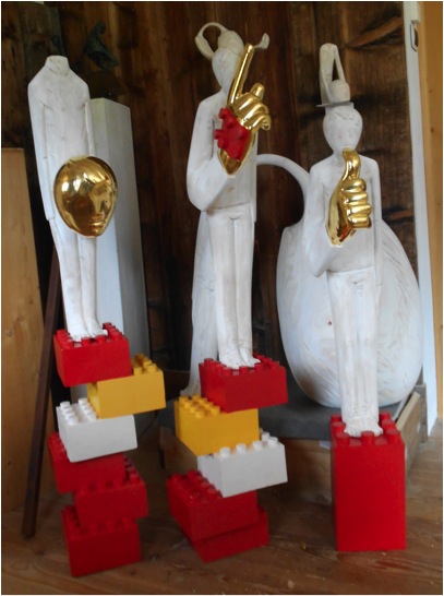
What are you currently working on?
Currently I am working with different materials, quite different plants like these ones where I use wood and add other objects such as "Lego" and gold.
Can you take us into your studio and explain your tools and the area you work in?
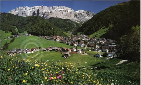
My studio, it is very light, with beautiful views of our mountains.
I work with wood, and my tools are designed for using with this materials; scalpels, saws and many wood rasps.
It is after I have a good idea that I am able to create. I am always working simultaneously on several at a time and it appears to become at times like a factory waiting to the pieces to be finished.
I always take photographs as the work is finished and put the photos on Facebook or other sites. This allows me to have a huge audience out there and I am happy to present my work to the world. It is so encouraging if viewers out there write or click. Please if you see something new from me always respond.
Contact Details:
Larciunei, 6 - 39048 Selva / Wolkenstein
Val Gardena / Gröden - Italy
Tel.(0039) 0471 342204
Email: info@ivanart.it
Ivan Lardschneider, Val Gardena, Italy.
Interview by Deborah Blakeley, August, 2013
Jean Bardon
Your printmaking began in the Netherlands - can you explain the importance of your training in Amsterdam?
It was completely central to my future development as an artist. It marked my first exposure to fine art printmaking. Having just graduated from Dun Laoghaire College of Art in Dublin, I then went to Amsterdam where I found work in a graphic design studio. I enrolled in an etching class at De Werkschuit, at that time based on one of Amsterdam’s many houseboats, moored beside the Amstel Bridge. I instantly found myself fascinated by the process of drawing on copper or zinc plates, etching them in acid, thereby creating a plate from which an image could be printed, using a printing press which was almost identical to the one I had seen in Rembrandt’s house. I realised then that I had found my medium, although it would be many years before I would have the opportunity to return to printmaking at the Graphic Studio Dublin.
Is there a connection between Dutch and Flemish old masters to how your botanical art is represented?
I don’t think there is a particular connection - obviously I had a lot of access to the art of the Dutch and Flemish masters, and admired them for their light, and the calmness of their composition and colours. Holland is a country where, to this day, interiors are very important to people - they care a lot about the things they surround themselves with in their homes and seem to have an innate sense of good design and very individual style - that has certainly been very important to me, and something I took from my time there. But as regards my work, influences come from Asian and Islamic Art, formal Botanical Art and the 14th century paintings of Siena and Florence, where stamped gold backgrounds are commonly used.
'Illumination 1’
Trade and the Dutch East India Company brought the East to the West. Did a similar combination come about during your time in Amsterdam?
I have always loved fine detail and pattern, in a way, it was at this time that I began to develop an awareness of the use of pattern in Asian Art - the blue and white delftware, a more affordable version of the Chinese porcelain imported by the Dutch East India Company displayed in the Rijksmuseum, sparked an interest that is very apparent in my prints today. I first came across Japanese woodblock prints in the collection of the Van Gogh museum, and was impressed by the wonderful fluid lines, flat colours, use of pattern and the composition of the pieces, which frequently cut into the side of an image - it was all very different to the Western tradition in art that I had grown up with, and seemed to fit better with my own aesthetic concerns.
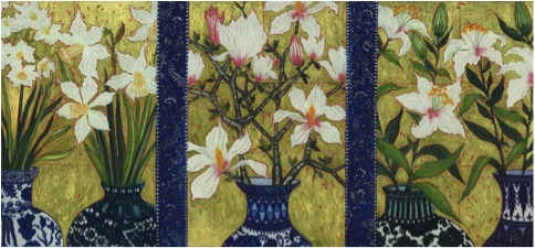
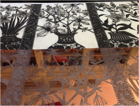
Wherever I go, I am always looking out for blue and white vases or ginger jars. I have a small collection at home, I cut out pictures of them in magazines, I have books with photos of them, and I sketch or photograph them in museums – Musee Guimet in Paris has a wonderful collection. But in actual fact, very few of the vases in my prints actually exist in real life – I take details from one, a border from another, make up patterns myself, and put them together in a fairly random way. I use Charbonnel etching inks for the blues – they have a fabulous selection – their Oriental Blue and Concentrated Blue are particular favourites of mine.
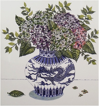
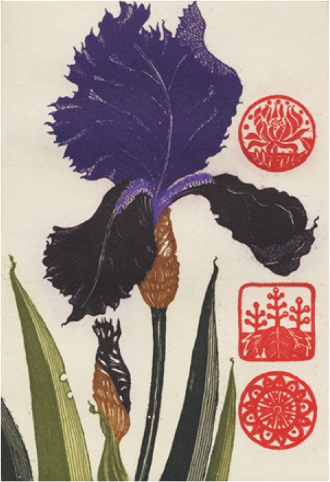
Blue Dragon and Hydrangea’
Can you briefly explain the techniques involved in your printmaking process?
The process of producing an etching is a long, complicated and painstaking business! The techniques involved are virtually unchanged since medieval times. In this age of Digital prints, it is important to stress that all my etchings, from start to finish, are produced entirely by hand.
From the initial drawing made with a pointed drawing tool, on an acid resistant 'ground' which I will have applied to a copper plate, which I have cut to the size I wish to work on, to the biting of the lines I have drawn by immersing the plate in nitric acid, to applying powdered resin (the Aquatint process) to the plate in order to create tones, then biting it further in ferric acid, to fix the tones, and finally colour proofing and printing the final image - all is done in the age old traditional fashion. An edition number is decided on - I normally print editions of 30 - and then, each time I pull a print, it must be inked up entirely by hand, sometimes using as many as 14 colours on the one plate, before rolling it through the printing press.
All this takes time and patience. Only the truly dedicated persist.
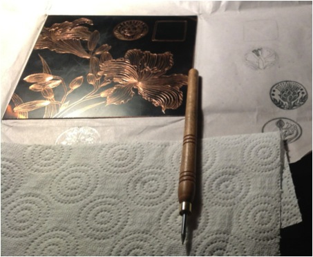
Etching plate
Gold leaf is a major part of your work - can you expand on the technique you use of gold leaf in your work?
I buy my 22 ¾ carat gold leaf from Cornelissens in London. It comes in small squares, and there are 25 sheets in a book. The type I prefer is referred to as “transfer” leaf - the gold squares have been stuck very lightly to a slightly larger square of tissue paper, which makes them much easier to handle than the more traditional non-transfer type, which tends to fly away from you if you so much as breathe on it! Basically, when I have finished printing an etching, and the ink has completely dried - which can take a week or two (some colours are slower to dry than others) I paint the area that I want to gild - in my case often the background of the piece - with red watercolour. This is in order to provide a rich base for the gold, rather like the “bole” used in medieval works. Then, using an acrylic metal leaf adhesive, which is water soluble, I paint very carefully the areas I wish to apply gold leaf to. I like to leave a few gaps here and there free of glue, in order that small areas of red will show through. The next step is to apply the sheets of gold to the print - I use an agate burnisher to encourage the leaf to stick to the print. Finally, I burnish it very slightly, just using a small piece of cotton wool through one of the pieces of tissue paper from the gold leaf book, moving in a circular motion, to smooth it out and give it a bit of glow.
You also use palladium - a material perhaps not as widely known. Can you explain its properties and the way you use it?
The method of applying palladium leaf is exactly as I have described above for gold leaf. Palladium is a soft, silver white metal much used in catalytic convertors apparently. To the eye, it appears identical to silver. It has however one very important characteristic which distinguishes it from silver in that it will not tarnish with time. Any examination of Mughal miniature painting, for example, will show you beautifully detailed works, with a pond or river perhaps, portrayed in the foreground, which would originally have been embellished with silver leaf, but this over the centuries has tarnished, and now appears black.
I have not used palladuim as extensively as gold, as so far I have not had as much success in making it work with my colour palette which seems to suit the warmer tone of gold better, I think palladium seems to require a gentler more subtle colour range, but I always have it at the back of my mind to try again.
The large red seals on many of your prints, can you explain the meaning of these?
This is a question I am frequently asked. The original inspiration comes from Chinese painting, where red seals are traditionally used by the artist to sign his or her work, and subsequently by collectors of the work. I really like the idea of a piece being finished by an artist, stamped, and then changing hands over the centuries and new seals being added by each owner. Some paintings have as many as 20 different seals on them, and they in their way become very much part of the work to the extent that it is hard to imagine what the original looked like before anything was added. The fact that they were applied quite randomly and yet actually enhance the work is quite amazing. And, of course, it is a godsend for art historians, who are then able to trace the story of the painting through identifying the seals. My red seals are part of the original composition rather than being added at a later stage in that I draw the designs onto the plate and etch them into it. They are purely decorative, usually stylised plant forms and for me they are a way of adding a “shot” of red to a print, it immediately lifts the other colours. Contrary to the Chinese model, I am very careful as to where I place them in the composition, to maximise their impact. And I am not averse to the idea that someday, someone might acquire one of my etchings and add their own collectors seal to it.
You discuss “My love of decorative detail has from the beginning been a feature of my work.” Can you comment on this statement?
The term “decorative” when applied to art is often used in a rather condescending fashion. I was particularly aware of this during my art school days – the development of pattern and decorative detail in my work were the elements that I was most attracted by, but it was not really encouraged and at that time was not regarded as being compatible with “fine art”. It took a long time to shake off the lack of confidence in my ideas that this attitude engendered – to this day I feel somewhat apologetic about making what is often regarded as decorative art. As my horizons broadened and I travelled I became aware of the esteem accorded to decorative work in the eastern world, and this in turn made me reconsider the value of my earlier influences, and so I returned to my roots.
You have already been commissioned by the National Gallery of Ireland for their 2014 Diary. Can you tell us about your part in this commission?
In 2008 I was part of an exhibition in the National Gallery of Ireland called “Revelation”. In collaboration with Graphic Studio Dublin, 29 contemporary artists were invited to make a print taking the collection of the NGI as a starting point. My etching for this show, “Annunciation Lilies” is now to feature in the NGI diary for 2014. I feel quite honoured to be part of this, it is a little unusual for contemporary living artists to have their work included in a publication of this sort. Our national gallery, as in most countries, tends to lean heavily on its prestigious collection of nationally and internationally known names, so I feel I am in good company!
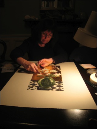
Jean guilding the ‘Annunciation Lilies’ print featured in the 2014 NGI Dia
Can you expand on the work ‘Holy Show Chester Beatty Library 2002'?
Holy Show – Irish Artists and the Old Testament – took place in the Chester Beatty Library Dublin in 2002, in association with the Graphic Studio Dublin. The title of the show is a bit of a play on words – in an Irish context, someone drawing attention to themselves in an adverse way would be regarded as making a ‘holy show’ of themselves! The library’s huge collection of prints, manuscripts and works on paper, put together by Alfred Chester Beatty (1875-1968) and bequeathed to the Irish nation following his death, mark it out as the foremost museum in Ireland with an association with printmaking. The Old Testament was identified as a potential subject for artists to draw inspiration from – the collection of the CBL includes some of the rarest surviving examples of many biblical texts. Invited artists were given access to Old Testament related material in the library, written and visual, although artists were encouraged to engage with the text of the bible, rather than existing images.
For lo, the winter is past
the rain is over and gone;
the flowers appear on the earth;
The allegorical imagery employed in the Song of Solomon has frequently proved a rich source of inspiration for artists. Reading and re reading the text, I was repeatedly drawn to the descriptions of spring.
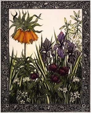
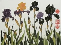
The flowers I have shown are known to have grown in biblical lands in springtime – Crown Imperial, Iris, Tulip and Narcissus. The border design brings to mind early manuscripts.
Your work is botanical but not formally botanical - can you explain how you developed your own style?
Really there was no conscious decision making involved – my style has evolved over time, influenced by formal botanical illustration, especially earlier examples such as the works of Besler, Ehret and the Bauer brothers. These, while being botanically accurate, are quite stylised in form, which appeals to me. In Asian art, it is considered more important to in some way distil the essence or the spirit of a flower rather than depict it with scientific rigour. I endeavour to bring something of all these traditions to my own work.
Prints – can you discuss the decisions you need to make about the number of editions and do you destroy your plates?
The number of prints in an edition is entirely up to the individual artist. Etching plates will stand up to printing editions of several hundred, with no discernable deterioration of the quality of the image. My editions are generally limited to between 10 and 30, although occasionally, if a specific project dictates a number, it can be larger. When an edition is completed, it is also usual to print some APs (artist’s proofs) and PPs (printers proofs) There is a tradition, generally adhered to, that says the number of APs should be in the region of 10% of the entire edition. In an edition of 30, I have the option of printing 3 more, which are signed as APs, plus I would print one or two PPs.
Although I have finished printing many of my editions, I have not so far, had the heart to destroy the plates. They are a thing of beauty in their own right!
Cropping - you crop your images heavily, unlike many botanical artists. How do you make these cropping decisions?
‘Tall Lily’
I don’t actually crop as such, it is simply that I often allow my work to flow over the edges of a plate, so that it appears a little as if a detail of a larger piece has been selected and focussed on. I am very conscious that when I am working with flowers as a subject, there is a danger of the finished piece appearing twee. I think for me that mentally zooming in on the subject creates a stronger composition which I can manipulate the balance of, and creates a work that I hope is more than just a study of flowers. This practice is of course common in Asian art.
You are a member of the Graphic Studio - can you explain the importance of this membership?
It would be impossible for me to overstate the importance of Graphic Studio Dublin and the artists I have crossed paths with there. Quite apart from the well equipped studio and the technical support it offers to professional printmakers, being a member there has also opened doors for me and others through its association with other cultural institutions. I have been given an opportunity to exhibit at a level which would have otherwise been very difficult to achieve.
The Visiting Artist programme it operates, where well established Irish and international artists who are not printmakers are invited to make a print in the studio with the help of technical assistants, has also been a very inspirational experience. Working alongside artists of all persuasions who are at the top of their game is a real privilege, often challenging your perceptions and helping to develop a discerning eye.
Etching plate and image, “The image prints in reverse, something that has to be factored in when you work” JBr
All this botanical art leads me to ask about your own garden. Are you the gardener?
Yes! We live in the centre of a small coastal town, half an hour from the centre of Dublin, with the Wicklow mountains half an hour away to the south, Very much the best of both worlds. Our garden is a very typical small town garden, intensively planted and looked after by me. I do quite a bit of drawing from the plants I have grown, coming back year after year to the same ones and redrawing them – working from photographs initially doesn’t work for me, I need to see the flower in the round, although I use photos for reference at a later stage.
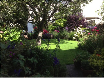
Jean's Garden
Contact details
Website: www.jeanbardon.com
Email: jeanbardon@gmail.com
Jean Bardon, Dublin, Ireland
Interview by Deborah Blakeley, July, 2013
Lise Bech
Tell us about your local landscape and how this has affected your art?
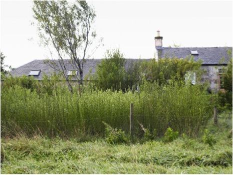
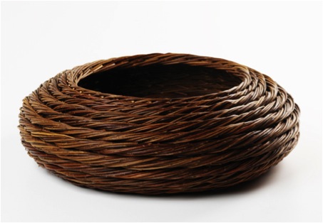
When we moved to ‘Wee Darhunch’, a remote shepherds cottage over 28 years ago it had the potential to fulfil all our dreams: an acre of land, private water supply, no neighbours, no traffic and land to grow food, trees and willow for basket making and not forgetting a solid stone house, barn and the head of the River Ayr at our side.
We wanted to create a sanctuary for ‘man and beast’ having four dogs at the time in this green desert of constant sheep grazing, moor-burn and grouse shoots.
‘House and harvest’
Photo by Tara Fisher
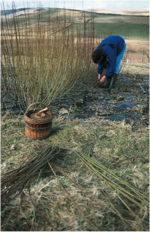
You began making baskets as a way of making objects using organic material can you expand on this?
Having just begun basket making in Ireland under the tutelage of Alison Fitzgerald, I arrived with 100 willow cuttings ‘to keep my hand in’, which were planted instantly through a mulch of black plastic intended to keep the local grass at bay and giving the 12” willow stick a chance to send out roots.
We had no idea how well they would do as there was only one tree in the garden and over one mile till the next one…! In their first year willow slips need a lot of water but as that was coming out of the sky a plenty a bit of weeding was all the care they needed apart from a fence to keep the sheep and rabbits out.
The willow turned out to be the ideal pioneer plant with over 99% success rate and bringing in so many small birds. Over the years our postage stamp of land has become very bio-diverse micro woodland with four willow beds placed strategically to catch the sun and soak up the water. As the rods are planted 12” apart both in the rows and between the rows a small area can contain close to 500 plants, the close proximity forcing the new shoots to reach for the light and grow long and slender
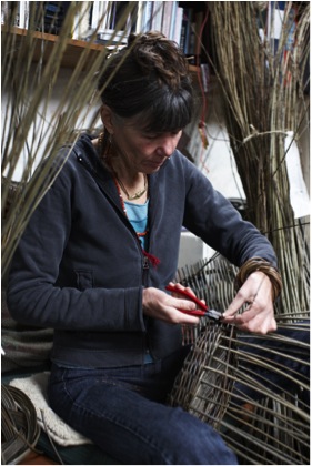
‘Lise Bech - Harvesting’
Photo by Shannon Tofts
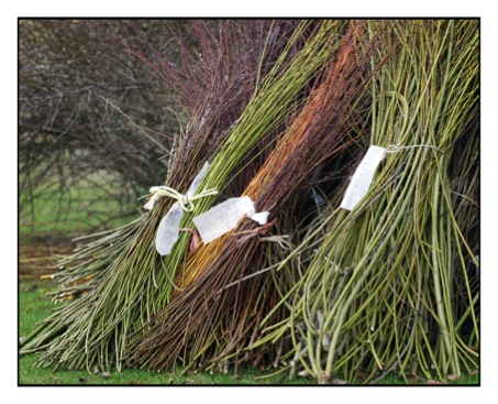
You personally grow your own willow how have your learnt how to produce the best material?
Over the years I have collected several varieties of willow with the intent of creating the broadest palette of natural bark colour available in the willow family. I have stopped at 25 different ones ranging from purple through browns, greens to golden and cream.
‘Willow bundels’
Photo by Lise Bech
How long does the process take from growth to having the willow ready for weaving?
They all get harvested / coppiced during the winter while the leaves are off and the plant is dormant. Harvested by hand using a pair of secateurs and cut one variety at a time, bundling them up and labelling the harvest straight away. I have never found an outdoor labelling system that survives, weather, weeds and dogs. I constantly refer to my notebook of planting schemes to get it correct.
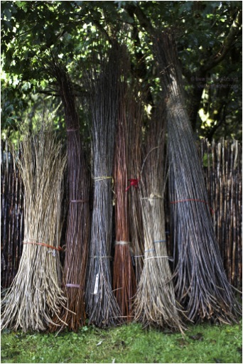
‘Harvest Range’
Photo by Tara Fisher
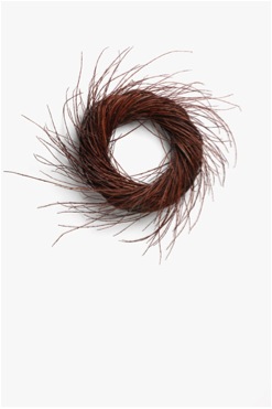
‘Garland’
Photo by Shannon Tofts
By the end of February the harvest is usually over and it is time to grade the willow by length. I do this by standing the bundle in a deep barrel and pull out the longest rods first and work my way down to the smallest which could be 8’ – 2’. At this time the willow is heavy but delightfully flexible being 40% water. It should not be used for regular basket making as the resulting work would become very loose and rickety on the water has evaporated. However, I can make some art work pieces, garlands at this time.
The rest of the harvest is brought into the open barn where it will dry out over the following 6 – 8 months depending on the weather and the nature of each rod.
Storage and temperature must be a critical part of this process. Can you discuss this?
My making process does not involve drawing or a sketchbook. The traditional basket involves maths and forward planning as the size and height of the final piece determines the selection of materials. One of the wonders of willow is that it can have its flexibility restored by being soaked in cold water! This is possibly the most difficult aspect of basket making to get right let alone to teach as the length of the rods, the variety of willow and the temperature of the water and it can take from a few days to two weeks.
Please take us inside your studio and explain some of the special features you need for your art
I share my working area with the power tools, the dog beds, laundry and boiler. This space was previously the cow byre and the only accommodation that has been made to facilitate my work is under huge roof windows that let in light from three sides. The raising rafters give me the height for tall work, while the rafters form ideal storage area and add scent and ambience to the space.
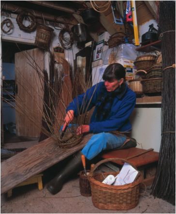
Photo by Shannon Tofts
I work on a low bench with my tools in the basket to my right and the willow on the floor within easy reach. Depending on what I am making I work on a sloping plank resting on my legs or the work is placed on a swivelling stool; this is also useful for appraising the work as by rotation it you can easily view it from many angles. As the larger pieces grow I have to stand and use my weight to form the undulations and make the border.
Can you tell us about Scottish willow and basketry from a historical perspective?
Margaret Fairnie in working clothes showing creel up close.’
‘Putting Creels on the tram ’
In the Scottish Basketmakers Circle we have for many years been aware that we are the receptacle of many stories about willow and basketmaking culture and for a long time we have thought a book was needed to hold on to it all. However, last year we got a grant to do formal research such as visiting all the museums and studying their collections and create a website which can be updated along the way. At an international conference in St Andrews in August 2012 the website was launched: www.wovencommunities.org
Having made a variety of replicas and reconstructions over the years working from a very worn and frail creel a friend and I worked out how the basket was made and made a pair of Eriskay creels for a woman who keeps ponies on the Isle of Eriskay.
Historical images from:
Woven Communities
Basketmaking Communities in Scotland
You received a Scottish Arts Council award, how this has affected your own work?
My early basketmaking was definitely a hobby, but in the process of wanting to learn I realised that the traditional makers had more or less died out and while on a courses we were learning from other hobbyists. Somehow this was not enough for me, so I went to meet Colin Manthorpe from Great Yarmouth, a man in his 60ies just retired form 45 years in the trade. I took as many classes from him as I could. This increased my confidence sufficiently to pass on my skills. At this time basketmaking was in the decline, the Scottish Basketmakers Circle was formed to prevent its death… Subsequently interest grew, sales and exhibition opportunities were explored and my teaching schedule became such that the day job could be ditched. This was a completely unexpected tangent which brought much joy and many new friends but over the years the teaching led me to a creative desert. A grant from the Scottish Arts Council enabled me to study with Klaus Seyfandg in Germany and Kari Lanning in California and to take time away from the order book for several months to develop new work which allowed the willow to speak its own language being; flexible, undulating, forgiving and kind, surprising… After 8 months I had moved away from the geometric forms of traditional baskets and before me a body of work, sculptural, asymmetric, organic forms which reflected both my surroundings – the lowland hills and my material and ultimately me as I rediscovered the joys and adventure of early basketmaking days and reconnected with the therapeutic value for which basketmaking is often derided, but has such potential in today’s world.
‘Hedgerow Cauldron’
Photo by Shannon Tofts
You take courses in basketry can you expand on this?
Most basketmakers live and work in isolation and often in rural areas with considerable distances to a neighbouring maker. I find essential to meet with others several times a year and I budget for Professional Development
‘Celtic Coil Couldon’
Photo by Shannon Tofts
Traditional basketry is still part of your work, how important is this aspect to you?
Without the skills that I have learnt from traditional basketry I could not make the new forms as they employ advanced versions of the basic techniques. Returning to make log baskets and shoppers, is as enjoyable as the adventures of contemporary work.
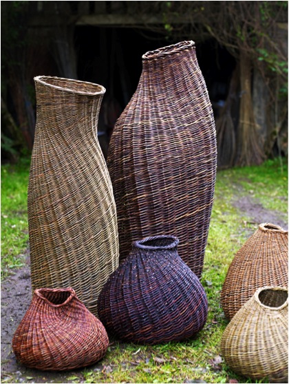
Photo by Tara Fisher
Many of the photographs of your work are done by Shannon Tofts. He added a wonderful artistic angle to your work. Is there much discussion between you both?
Early in my career when attending courses for emerging makers it was always stressed that having good photos was essential. I went to Scotland’s foremost craft photographer, Shannon Tofts. He took instant Polaroid images, so we could discuss angles, lighting before the final shots were taken. With digital this preparations has become easier. Over the years I have benefited much from both his craft connoisseur’s eye and his professional sill in capturing the essence of a piece. I now record the work I make from week to week employing insights I have learnt from Shannon. For important catalogues and the website I go back to Shannon.
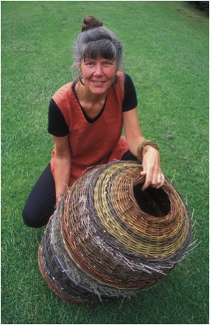
‘Lise Bech - Basketmaker’
Photo by Debbie White
Contact Lise Bech
www.bechbaskets.net
Lise Bech, Southern Uplands, Scotland
Interview by Deborah Blakeley, July, 2013
Ray Hassard
When we use the words "Plein Air" in art, we immediately think Impressionist. What they were painting was the scenes they were witnessing. Can you discuss this in relation to your own plein air art?
The Impressionists are largely thought of in terms of landscape painting, but they also did scenes of people at work, at train stations, relaxing in public places—the activities of their time. One of the great things they taught us is that art supersedes subject—that is, anything is worthy of being painted, not just religious or historical themes. But “common” subjects must be painted in a way that makes them reveal themselves as meaningful, worth contemplating, even beautiful. My painting heroes, Sargent, Sorolla, and Degas, used all the resources they had--values, colour, bravura brushwork, etc.—to bring out the transcendence they found in the commonplace.
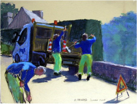
‘Road Menders’
How do you choose your subject?
In plein air painting, it is mostly the light and the arrangement of big shapes I see while squinting that attracts my attention. And those are important elements at the start of any painting, plein air or studio. Beyond that, though, there has to be an idea, or concept, no matter how simple. When I know why I’m painting a subject, I should be able to know how to paint it.
One of my main motifs is people doing things--working or playing—and I get excited by areas full of busy activity. The architectural setting is important too, whether it be a shopping mall, the tents at an outdoor market, or a huge construction site.
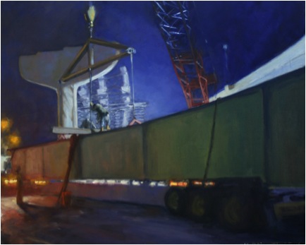
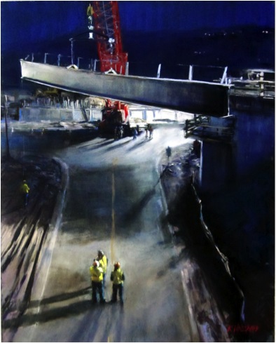
‘Centering the Beam’
Can you compare 3 images that show the diversity of you plein air work and discuss?
Lengthening Shadows:
Primarily a landscape painting with lots of water, which I love to paint, this piece was done with a group here in Cincinnati that meets weekly to paint en plein air. A fellow artist obligingly sat on the bench long enough for me to get a figure in it. This was a relaxed, contemplative, kind of painting, and is more “finished” than a lot of my plein air pieces.
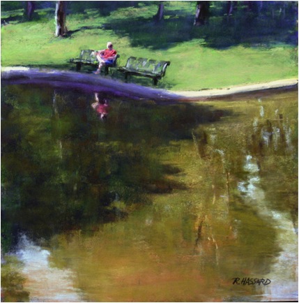
‘Lengthening Shadows’
Balloonhead:
This was done during a “Quick Draw” event in Richmond, Virginia. Painters had a very limited amount of time to complete (and frame) a painting and subjects were to be chosen from within an area of only a few city blocks. I picked the farmers’ market for the colours of the tents, and the young man making another balloon hat looked like he wouldn’t leave too soon. It was a rushed, almost frantic, painting, involving a great deal of sketchiness and simplification of a very complex situation.
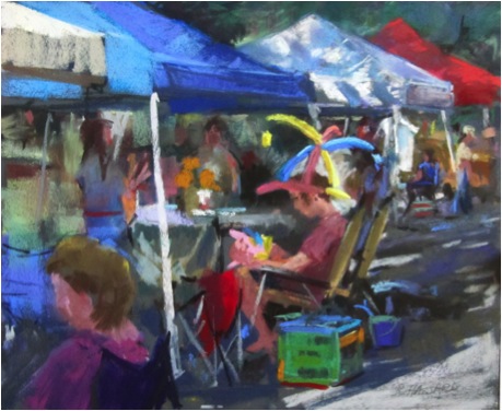
‘Balloonhead’
Allahpattah #6:
Every winter I spend some time in Florida to get away from the cold and a favourite painting place is Allahpattah Wildlife Management Area. Like much of Florida, it was originally swampy, then drained and cleared for raising cattle. Now it is being returned to its original state, but still has the character of a savannah, with wide open areas of grass and palm trees in the distance. I usually go there very early in the day and it is often very foggy. This painting was done on a very clear morning and the sun, barely above the horizon, was illuminating the seed heads on the weeds. I knew it was very fleeting and that I would be looking right into the light and hesitated a bit, but I couldn’t resist the challenge. With the help of a large umbrella pulled down in front of me that I could peek out from, and working very quickly, I captured the scene as best I could.
‘Allahpattah #6’
As a pastellist, can you share some technical tips that you have found particularly useful?
I have found that different painting surfaces make a huge difference, and after working with different grounds for years, I have settled on some favourites, some workhorses, and a few more exotic grounds for special occasions.
When I travel overseas, my workhorse is Colourfix by Art Spectrum, which comes in many colours. I bring a couple of 9” x 12” “Rainbow” packs containing all the colours they make. Nearer to home, I like to travel with Ampersand Pastelbords: a rigid board coated with an unaggressive sanded surface. It is a favourite for working in the studio too.
PastelMat, a relatively new product with a very different, almost slick, surface produces a different look. Despite the surface feel, it holds layers of pastels beautifully and firmly. (La Maltesse, 9” x 12”)
‘La Maltesse’
La Carte is one of my more exotic surfaces with a very different, nubby sort of texture—it reminds me a bit of the feel of rough commercial carpet! I like to use it for figure studies, leaving the beautifully rich textured surface showing as much as possible. (Portrait Study 12-29-11, 10” x 12”)
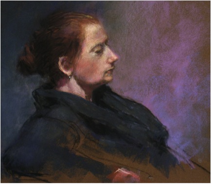
‘Portrait Study’
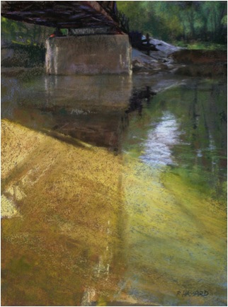
Recently a friend has been making me some super rough panels. They are an all-over even roughness, but can eat up sticks of pastel in no time. For some subjects, they are ideal, but they work best with few changes and reworkings. (Flood of Light, 16” x 12”)
Can you discuss the pastels you use and how and why you make specific choices?
I use just about all the brands of professional quality pastels available, from the very hard NuPastels and Cretacolours, to the ultrasoft Great American brand. In fact, that is one of my favorites, and since it is made here in Cincinnati, it is easy for me to replenish my stocks. I generally start by blocking in my darks with a NuPastel blue-violet and my lights with a NuPastel light tan. From there I start to block the local colours in loosely with hard pastels and then slowly move over to the softer ones as I develop the painting. I do not use fixative as I work or when I finish, since a good textured surface can hold the pastels quite well.
I make my choices based on local colour and value first. Then I consider how soft it must be to get the effect I want. A hard pastel is more transparent because the binder holds pigment more firmly. So I can get a “wash” of colour if I use the right pressure over an existing colour with a hard pastel on a sanded or textured surface. Softer ones are great for spontaneous marks and strong, pure, accents.
Recently you have been on a residency in France. Can you expand on this and the work you did during this time?
I was Artist in Residence in Dinan, a wonderful medieval city in Brittany, for the month of June. The artist Yvonne Jean-Haffen (1895-1993) bought a large house, La Grande Vigne, high on a hill overlooking the river Rance in the mid-1930s. She lived and worked there until her death. La Grande Vigne is now a museum and the residency program Mme. Jean-Haffen established is administered by a group called Les Amis de la Grande Vigne. I was given the use of a small house at the bottom of the hill next to the main gate, which was probably a gatehouse or caretaker’s house once. At the end of my stay one piece was selected for their permanent collection.
Living in one place for a good amount of time was a different travel experience for me, and one I loved. I came to know people in the area a bit, got good advice from people about subjects and places to paint, and had the luxury of revisiting locations at all times of day and in different weather conditions. I found the banks of the Rance an endless source of inspiration and went up and down the river on foot and by car. Also, to my delight, there were often people working on the road, just outside the house! (Road Menders, 9” x 12”) By the end of my stay I had 36 pieces in various stages, in both watercolour and pastel, for the committee to choose from.
The weather was mostly grey and overcast, often rainy, while I was there. The muted greens, greys, and blues were a far cry from the vibrant colours of India and the colourful landscapes of the US Southwest. Coming to grips with the values and searching for the small colour notes within the overall scheme became my biggest challenge there.
You do an amazing amount of travel - can you discuss several works from different Continents, discuss colour and light and how it varies in different places?
I love to travel, have loved it since I was a small child when my grandparents would take me on road trips. Painting in a new place can recharge artistic batteries, restore flagging spirits, and revive interest in all manner of things, as well as offering an experience beyond that of just being a tourist.
Halfway up a mountainside in Bhutan is this stunning view of a monastery where two rivers meet. High mountain light with low humidity gave clear distances and good strong colours.
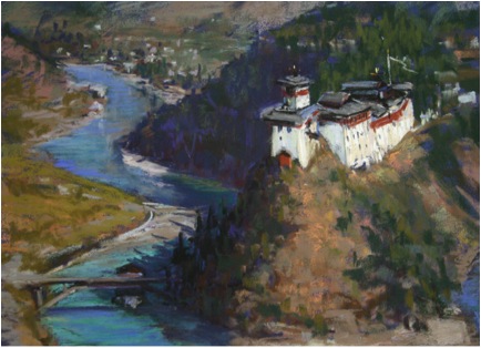
‘Wang Dzong’
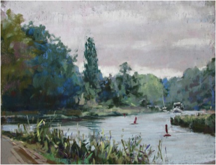
Rance—reflections 12” x 9”
By the time I finished this painting, it was starting to rain. High humidity, soft edges and colours and overcast skies were often the case in Brittany. I probably overstated the value contrasts here—I’m still coming to grips with grey days!
‘Rance—reflections’
High humidity again across the river from Niagara Falls, but this time on a clear crisp day. The water colour is completely different from the Rance, not brown and cloudy, but clear, as it flies over the lip of the falls, with a fabulous blue-green colour I have only seen at Niagara.
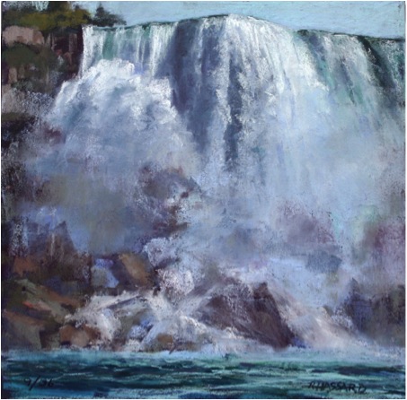
‘Thunder’
Can we discuss ‘The Project’ and the masculinity of these works?
I’m interested that you call these “masculine”. I never thought about it in those terms, though I can understand how it would come to mind with road construction. Certainly, there are a lot of women working there, including the fore(wo)man who is my liaison in many ways. To me, it is just a fascinating area of massive, interesting shapes, bright colours, and constant activity and flux. It brings to mind thoughts about the past being replaced by the present, the meaning and idea of “progress”, and the continuum of history through public projects, past, present, and future.
I haven’t shown the paintings much in public yet, but some of the most positive comments have been from women. Most are surprised at the subject; most are delighted to look at something they have not paid much attention to before.
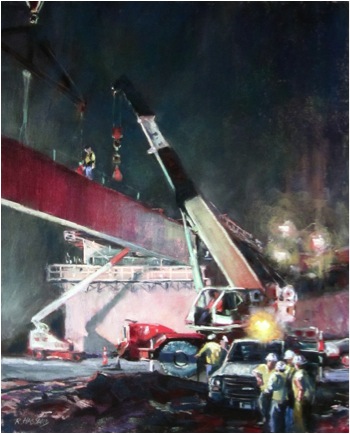
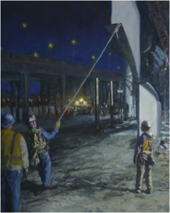
About 5 miles down the road I live on, an automobile viaduct from the 1930s needed to be torn down and rebuilt. The area is one on the edge of the city that once been middle class, but had declined greatly. The old structure and the buildings it rose above interested me from the time I moved to Cincinnati in 1985. When workers began clearing the area in 2011 I found the huge equipment and changing landscape fascinating. I decided I had to start painting this, almost as a documentary. Once they started working at night, the drama, scale, and visual excitement were over the top for me. It wasn’t really possible to set up and paint in the midst of it all, but the workers have been very good about letting me run around and take photos.
I have done some pastels at the site “Curves”,
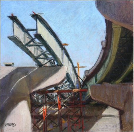
Mostly they are studio pieces. Besides the pastels like “Flying the Beam”
“Convergence” (both 20” x 16”), I have done a number of larger oils. The scale of the project calls for larger sizes than I am like doing in pastels. So, “Pull”, “Centering the Beam” and several other oils are 30” x 40”. “Shadows” is 24” x 36”. The scale of this project is huge and has more than a year still to go, so my work is cut out for me!
A number of the pieces have won major awards in different competitions and shows. Recently many of them were on view in Cincinnati and one critic wrote “Ray is one of those rare painters who can see the poetry in almost anything. Look for his poetic paintings of bulldozers, mud, steel and concrete scattered throughout the show”.
The three galleries that represent me, on the other hand, were not as enthusiastic. One suggested that if I put the construction company’s name on the machinery they might be able to sell some of the pieces to the company. Maybe, but that is not the reason I am doing this and I didn’t make that change. Nothing else I paint has the sheer excitement and abstract dynamics that these construction scenes abound in, so I’m painting these for myself. A few years ago, I did a series of 6 or so paintings of people riding bumper cars at amusement parks and fairs. Everyone loved them--no one bought them, my galleries couldn’t sell them. It may prove to be the same with this construction series. I am looking to have at least 100 viable pieces by the time this project comes to an end, in various mediums and sizes, and to show them together. I am hoping this show will travel a bit, but nothing is firm yet on that score.
Painting on ordinary streets in India, I was often told by people that “there is nothing of interest here to paint”. I got a similar response from the workers and management when I started, followed by excitement and even joy of seeing their daily work as art. Now I am known by a lot of them and they always ask how the project is coming along.
Some of your figurative work you do in Charcoal. Comment on how the absence of colour affects this work?
I think that black and white often carries an emotional load that colour sometimes softens. I believe strongly in the value of life drawing as an exercise and skill developing discipline, and I do love working in black and white. The absence of colour really makes me pay close attention to subtle value changes, and in realistic painting or drawing, values are usually the most important thing. Learning to see and understand them better is a lifetime’s work in itself.
“Chili Parlor Man” is a pastel, but using only black, white, and greys.
Ray Hassard, Ohio, USA,
Interview by Deborah Blakeley, July 2013
Katharine Morling
You see each of your pieces as being “embedded with stories” - can you take this further?
For me, the starting point for each piece is entirely personal, for example ‘A Stitch in Time’ is about my childhood memory of getting a wicker basket that I then turned into a sewing case, which led to hours of making and creativity.
I was particularly pleased with how the keys came out, the heat of the kiln had moved the keys just enough to create a sensation of how I feel as a dyslexic with words. To me it summed up my feelings, and I didn’t feel the need to tell people what the piece means to me. Now the work has a new life of what it means to other people.
As I was making this piece I decided to put a rabbit in the basket, for me this is adding the element of surprise and delight, but for others this enables them to look at the work and overlay their own memories and fantasies of what this piece means to them. Often people will tell me a story of their own childhood or something very personal to them in response to the piece.
Last year I exhibited two small pieces at the Royal Academy Summer exhibition and found that the tape measure in particular, created a very strong emotional reaction with the viewer. I have my own personal reasons for creating measuring equipment but this was something that chimed very strongly with many of those that bought one of the series of 100. I received many emails and letters about what this piece meant to them with responses ranging from a life of domesticity, to a seamstress, to one man who felt that this summed up the measure of his life.This is where I feel a story is opened by me and continues with the viewer.
Your work is taken from everyday objects; can you discuss three pieces?
Poison pen
Poison pen was a direct reaction to my feelings about being dyslexic. I find that the words moving around my feelings of slight panic with anything to do with words. This piece is technically quite challenging, being one of the largest pieces I make from porcelain. It has an inner structure as porcelain will sag at high temperatures. Another challenging aspect was controlling the movement of the keys so that they have the illusion of appearing to wobble but without them falling over.
I was particularly pleased with how the keys came out, the heat of the kiln had moved the keys just enough to create a sensation of how I feel as a dyslexic with words. To me it summed up my feelings, and I didn’t feel the need to tell people what the piece means to me. Now the work has a new life of what it means to other people.
Plenty
Originally, I thought that this piece was about money, and then as it developed I thought it was about friendship. Actually I have no idea what this piece is about. Some pieces reveal themselves to me many years later. I am still waiting to know about this one.
On a technical level, this was slightly more challenging than Poison Pen as the piece had a cross work section inside to hold up the rounded front of the till.
As I was making the work, I kept adding more and more coins and even though it ended up having coins over the floor, it wasn’t enough. Maybe this piece should have been shown with half a room full of coins!
Morling and the Hoard
Morling and the Hoard was a project that I was very unsure about working on; it was a public art commission. My work is very personal to me, led by my personal narrative and this project was very much about responding to something from the 7th century, which I didn’t feel had a connection with.
As we progressed with the work I realised this project is very much connected to me because each piece that I work on, takes a part of me into it. As I designed the pieces and created them in clay, I really formed a relationship with them and am very happy with the finished works.
Technically the pieces were very difficult as they were large-scale sculptures. However I found that the main technical difficulties were to do with managing the studio. I had to employ several other people to assist with the project and we had several other commissions running con currently. Studio management and balancing artistic direction was the most technically difficult part of this work.
Many viewing your work here will not realize the size, can you discuss this aspect of your work?
The first piece I created in my current style was a pair of scissors in porcelain. They were ‘life-size’ and created just the feeling I was looking for.
Very quickly I moved onto making a full size chair and table. I often like to work on large scale pieces but at the same time, I really enjoy working on tiny intimate pieces the size of a coin, a pin or a needle.
I enjoy the fact that some people will come to see my work expecting small table top pieces and discover a full size tree, a life size chair or figure. There is a lot of delight in their reaction.
Due to the size of your work, can you please take us into your studio space and explain some of the specific requirement you have for this space?
My studio is on two floors, I have a large kiln in the basement and studio space on the second floor, which is light and airy. The large scale pieces are created on wheelie boards. These are the same height as my kiln.
When I finish a piece, I move it downstairs while it is still in its green state to dry in the basement by the kiln. The work is built on kiln shelves with several layers of cardboard underneath. This means we can then slide the work on the shelf straight into the kiln. The smaller pieces are made in the studio and fired in a smaller kiln.
There is a great stop motion video that we made during Morling and the Hoard of the making process, which gives you an insight into the creation of the large works.
http://katharinemorling.co.uk/projects/stop-motion-video-of-morling-and-the-hoard
Originally your work was coloured, when and why did you move to monochromatic work?
I found that my current practice, no longer represented me emotionally and I wasn’t feeling connected to it, something was missing. I decided to apply to the Royal College of Arts to explore new directions and to re-connect with my work. There Felicity Alieff helped me to discover this new aesthetic.
You have done many projects. Can you expand ontwo of your projects?
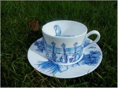
Waddesdon Manor – for the National Trust
I worked on the Waddesdon manor project while at the RCA. We had several live projects which means that there is a professional side of them. Sometimes this is creating work for an exhibition or in the case of Waddesdon Manor creating a product for their shop.
I went to WM and looked around and get a feel for the place. I found the house quite opulent and didn’t know where to begin but I loved the garden space so I started to draw it.
As I was drawing with my inky blue pen, it started to rain and I got quite smudgy drawings, which were quite pleasing.
I showed my tutor the drawings thinking that we would come up with an idea for a product, instead she turned to me and said “This is great, let’s get the drawings onto a plate or a cup…go back and do more drawings”. I was surprised and delighted that they loved my drawings and put them into production a cup and saucer and two plates.
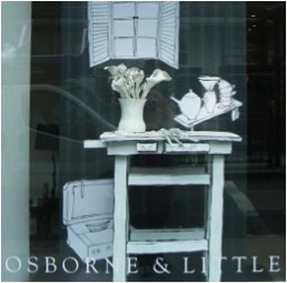
Osborne & Little – London Showroom
In conjunction with the Crafts Council, I was asked to put some of my work in a Kings Road shop. I decide to show part of ‘Stilted Life’, one of my large installations before it went to be exhibited at the World Crafts Council Second European Triennial of Ceramic and Glass in Mons and then to its permanent home in the Balman Collection. I received a lot of interest from Kings Road shoppers from that exhibition.
For the collector you also do smaller pieces. Can you expand on this part of your portfolio and these pieces?
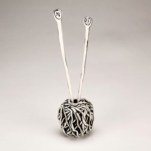
Ball of Wool and Needles
All the small works start life as part of a big installation. For example Chair maquette is a very small 10cm chair, which I would make in different designs before making a large scale chair. Often people will come in my studio, and see the smaller maquettes and ask to buy them. This gives the maquettes their own independent life, becoming part of the group of small works.
Ball of Wool came originally from A Stitch in Time. I have been asked for all the elements of the installation to be made individually for people.
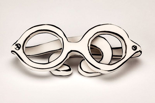
Glasses
Glasses originally started as part of Poison Pen and once again I was asked to create each piece to be available individually.
You do make pieces to order (commissions). How does this work?
Commissions work in two ways, all of the work I make is in a series. Large pieces are in a series of 10 and small works tend to be in a series of 100 or 200. This is really straightforward and anyone can commission the next edition in a series. The collector will then get a timescale of when the piece can be delivered.
The other route of commission is when I am given a brief to interpret or as with my work with the Balman gallery I am given a budget to which I create my own brief, which has been a very generous way of working.
On some commissioned pieces you add personal dedications - can you share one or two funny or clever ones?
Unfortunately no, dedications tend to be very personal often to do with a passed love one. Though I have had to do the odd 60th Birthday message!
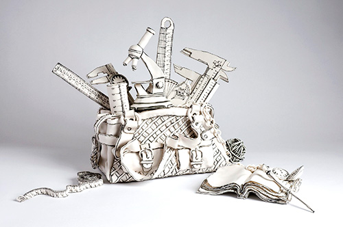
Handbags – tell us about them?
Containers and vessels, contain more than just food and water. For me, they are containing emotions. The bag is a great place for my baggage.
Everyday Exploration for example contains all the measuring equipment for measuring and understanding life. However many devices I stuff into my handbag, some situations seem immeasurable.
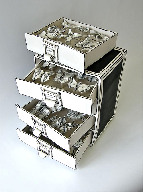
Your exhibition in Munich, “Cabinets of Nature and Curiosity", can you discuss this?
I showed a piece called Butterfly Drawer, this was created in porcelain and black stain. For this piece, I was very interested in the concept of being close to nature and the feeling of dead and alive. I was approached to exhibit a piece of my work in February. The curator Dr. Michaela Braesel had seen some of my old work and was interested in my new pieces and thought they would sit well in the exhibition.
You also do classes - can you expand on your Design Making course?
For the DesignMake course, I teamed up with three other makers at Cockpit Arts, two textile artists and a glass maker to offer a range of creative courses. My sessions are actually less about designing and making and more about the feeling you get and the quietness that comes from touching clay.
My approach to teaching is entirely simple. I believe that everybody has innate creativity and that clay is a fantastic material to quieten down the mind, ground you and take you to a place where you can enjoy your creativity. I don’t teach this, it just happens.
Contact Details
Katharine Morling
Studio 205
18-22 Creekside
Deptford
London
SE8 3DZ
www.katharinemorling.co.uk
katharine.morling@network.rca.ac.uk
Katharine Morling, London, UK
Interview by Deborah Blakeley, July, 2013
Debra Oliva
You have a background in the arts but did not turn to clay until 1988, can you explain how this came about?
I was a child the first time I saw someone throwing on the wheel and it was a mesmerizing experience. At that moment the desire to work in clay was ignited. However, art opportunities in my community were virtually non-existent. During my university years there were a few clay experiences in the curriculum I was pursuing but working with clay in earnest would have to be put on hold. Much later, after marrying and moving to Michigan, the opportunity to work in clay finally presented itself. I was fortunate to be living in an area where there was a potter’s guild with a fully equipped facility, excellent instructors and one space remaining in the upcoming session. I took a series of classes followed by an advanced program and eventually became a member. I continued my education attending artist workshops, a practice I continue.
Most of your pottery is utilitarian at the base but you then add aesthetics, explain the importance of this combination in your work.
Good functional design should perform properly, be comfortable to use and clean easily. An appealing form and attractive, cohesive decorative elements enriches the experience of the user. Its place in the users life will become something more than simply the performance of a task. My design challenge is to pull those elements together in each piece. In the process to that end, decisions and compromises have to be made as to the degree of importance each element retains in the final piece.
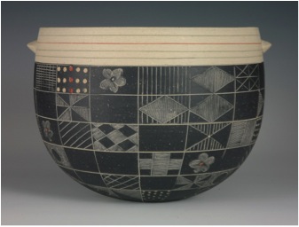
You gain the most pleasure from work that leaves the ultimate use of the piece to the owner, can you expand on this?
I enjoy discovering unique ways to use objects so I am pleased when I create a more versatile piece which might encourage the user to engage their own creativity with respect to its purpose.
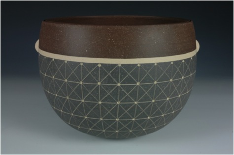
Textiles are very important to you. How do they bring inspiration to your work?
I have had a long standing passion for textiles. What interests me is the way individual threads are so skillfully combined to produce color, pattern and a wide range of textures. The combination of textiles as in garments is a favorite source of inspiration.
Can you explain the way you hand colour your work before glazing?
After the design is etched, the piece is bisque fired. Custom coloured slips or under glazes are then brushed onto the etched areas and the excess is wiped away, leaving colour behind in the recesses. In some cases additional bisque firings are necessary to fix the previous colour before adding subsequent colours. The interior is glazed and the piece receives a final firing to vitrification. The exterior remains unglazed to expose the texture of the clay body.
There is a lot of etching involved in your work, please discuss this?
The etching process came about as a way to represent the threads of woven textiles. To achieve that effect, I created a simple tool from household items that would allow me to work within small areas. The etching is done when the piece is at the leather hard stage. I may work freehand or use motifs drawn onto tracing paper that I position around the piece. The motifs are transferred to the clay by lightly tracing over the designs with a pencil leaving an impression in the clay. I then follow with the etching tool to enhance the designs.
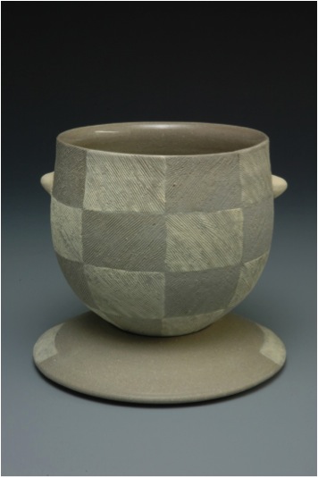
Pattern can be found in most of your work both textile and environmental, can you discuss the importance of repetition?
I often use repetitive geometric designs for their quiet, restful rhythms. Other designs such as floral motifs are more energizing. I use them in a way that implies repetition in that the viewer sees only a portion of the pattern and the eye travels around the piece in search of more.
Can you discuss the pattern, shape and colour in your Grid Bowls?
Grid patterns appear in many craft traditions, across many cultures throughout history. Many examples can be found in textiles. I employ these patterns for simplicity and visual stillness. Full, round bowl forms provide a clean, continuous surface that is perfect for showcasing designs. Pattern and color give a piece a particular mood and flashes of intense colour energize the design.
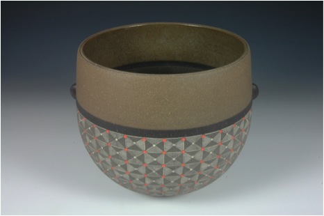
There is a very strong influence of Asia in your work, can you expand on this?
My sensibilities align closely with Asian notions of beauty, particularly that of the Japanese. In that aesthetic I most appreciate the integration of simplicity and complexity, subtlety, serenity and fine craftsmanship. I work to create personal expressions that possess the same spirit and temperament
Teapots are also a part of your work. Can you expand on the importance of teapots to ceramics?
Among the objects for domestic use, the teapot is a special object to those who use them and those who make them. As a user, it is the pleasurable ritual of serving tea from a beloved vessel. As a maker, it is the technical challenge and unlimited creative potential of the teapot that attracts me.
Can you show us a teapot and discuss?
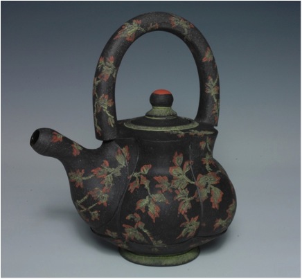
The teapot pictured is inspired by historical Asian ceramic techniques and motifs. The clay is custom coloured as are the slips and under glazes used. The form and parts are thrown on the wheel and are altered and assembled when the clay is in the leather hard stage. The surface decoration intends to invoke a memory of embroidered silk enrobing the teapot. The design was developed free-hand to conform to the shape of the pot. Once etched and bisque fired the colours were hand painted into the etched areas and the excess wiped away. After the final firing, the exterior is waxed and buffed to a soft sheen.
What have been one or two of the highlights of your career?
Teaching is always a very rewarding experience. There have also been a few awards along the way. Most recently, juror Elaine Henry honoured me with a First Place award at CeramACom 2013, at Blue Line Arts in Roseville, CA, USA. It is always encouraging to be recognized in that way.
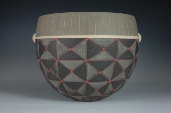
You have taken heaps of classes and now you teach classes. How important are both aspects for your artistic life?
To be sure, not having art opportunities available to me in my youth is a big part of why I teach. It is important to me to contribute to the continuation of this craft tradition just as others have shared so generously with me. Over the years, I’ve taught classes to children and adults. Regardless of the age of the student, they all bring enthusiasm and a fresh point of view to the experience. I gladly share what I have learned in exchange for that!
Contact Details
www.debraolivaceramics.com
Debra Oliva, Michigan, USA
Interview by Deborah Blakeley, July, 2013
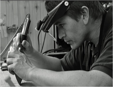
Richard Kennedy
Your work is creative and ornamental can you take three pieces and discuss them and the techniques you have developed to create them?
Much of my work is created on a foundation of simple lines. Proportion is critical to a
successful piece and finding the right balance is essential. Although many of my pieces are now pierced and carved, everything I create is underpinned by the pursuance of good proportion.
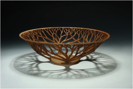
Copse
Uneven wall thickness can lead to the wood splitting as the thicker wood loses moisture slower than the thinner areas. Wall thickness variation is a common fault in pieces that have splits and cracks in them. Creating even thin walled vessel takes a lot of practice. At 2mm thick wood is extremely flexible; it can be pushed out of shape with the gouge whilst cutting resulting in an uneven cut or even the piece
blowing apart on the lathe. Any flaws in the wood can result in a similar outcome.
Similarly wood that is not dried properly, or that contains tension due to the position
where it grew in the tree, can produce warp during turning all of which must be taken into consideration.
From this foundation I have been able to learn and develop techniques to allow me to make more and more enclosed forms. As the rim of a bowl is brought back
towards the centre, the opening through which to hollow the interior becomes smaller and smaller. The smaller the opening the more restricted the access to the wood that needs to be removed. Hollow form turning is done blind as the interior is hidden from view by the exterior of the form.
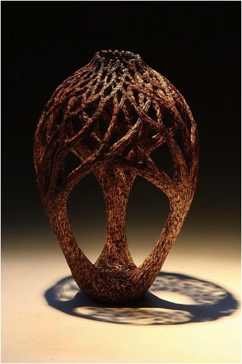
‘Under Greenwood Trees’
‘Under Greenwood Trees’ takes hollow form turning and adds a twist as I used a hollow form shape as a canvas to carve trees. In this instance I have developed techniques to be able to abandon the wall thickness rules enabling me to create more realistic trees. Using Pyrography (hot wire work) I burnt texture into the branches in an attempt to create the effect of bark. Using a variety of texturing and burning allows me to add depth to a piece. Cutting away the wood allows light to permeate through the piece casting shadows as would occur in nature.
I like the idea of representing trees in pieces, harkening back to the materials origins.
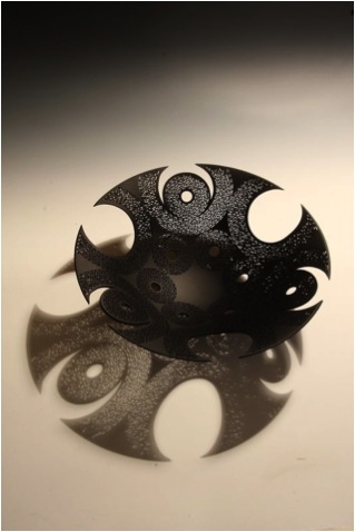
‘Anatir’ is an example of my most complex pieces, each of these takes several
weeks to create.
Combining the skills developed in thin walled turning and adding
painstaking precise piercing creates items that are inspired by ancient Islamic architecture. Working with light provides another dimension to these pieces as the shadows they cast add drama to the work. Piercing is done freehand using a tiny milling burr, care has to be taken to group the holes tightly together and because of this, the process takes the majority of the time. It is imperative that the original bowl isperfect in terms of its wall thickness and that the design is carefully plotted.
The finished piercing is then painted to accentuate the light that filters through. The paint also removes the distraction that is created by having both grain and the piercings visible which can confuse a viewer’s eye. The black centre provides a resting place from the complex design, another important factor in creating a balanced piece. The final stage is to cut through the rim to reveal the horseshoe openings; this is a very critical and delicate part of the process. Having spent up to 4 weeks piercing this final stage, before paint, is fraught with danger. Any damage at this point is irreparable and the piece would be scrapped. These artistic pieces, although fragile, provide an example of some of the amazing things that can be achieved using the fabulous medium of wood.
There is as much detail in what is missing. Can you discuss your use of cut work?
I am fascinated by light. From the science of photons to the beauty of shadows, light is a beguiling subject. The pierced work I make stems from a trip I took to Southern Spain, to the ancient Mesquite in Cordoba. An amazing example of Moorish Architecture, I was inspired by the patterns, in the architecture, the decoration and by the intricate windows, a myriad of stars and shapes that cast incredible shadows deep into the interior of the building. Returning home I was unaware of the significance this trip had made, in my mind until; I had finished “Comet” and “Harmattan”.
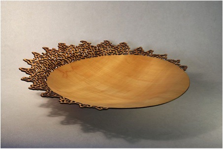
Comet
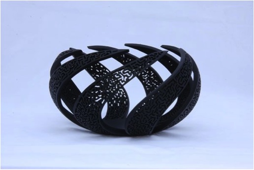
Harmattan
These piercings were very large but again I was struck with the way thelight interacted with the piece and the area around it. The shadows seemed to add another dimension to the work connecting it with the ground. This balance, the connection between earth and sky, still appeals to me now and whilst the holes havebecome more compact I still have excitement when I finish a piece and get to see the shadows it casts.
I love your black work, what type of wood do you use?
The pierced work is normally created using either Sycamore or Lime. Both woods are very good for carving. They have very straight grain and as a result cut cleanly which makes life much easier when trying to create a dense pattern of holes. In addition they can have very bland grain which I don’t mind concealing with paint. I love the patterns created by the grain found in wood, and whilst some of my work is
coloured with bright stains, or covered in black and white paint, I will always try and create a piece of work that showcases natural beauty. Nature is the planet’s greatest artist.
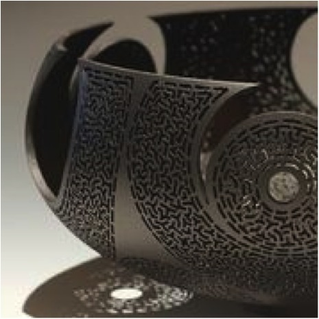
You are a member of the Association of Woodturners of Great Britain and the American Association of Woodturners. How important do you find being a member is to your work?
Being a member of an organisation is very important. Being a member of a network such as these provides a place to go for support and assistance and a platform to display work amongst knowledgeable interested people. The world of the woodturner
is a pretty small one, there are few recognised wood artist’s world-wide and so most interested turners have heard of their names and seen the types of work they make. Many of these top turners are also members of these organisations and as such offer advice, support and criticism of work. This is so important when finding your way. These organisations are built on the principals of sharing experience in a way that some may find unusual. The AAW is the largest network and offers great youth training in America as well as a superb symposium where collectors and turners can meet each other. In addition, the organisations do a lot of work promoting wood as an artistic medium, as an organisation with a large membership they have a much stronger voice. When I was a novice turner I received great support, asking other
members for help was essential in my development. Now I kind of know what I am doing I can share some of my knowledge with the next generation which is wonderful.
Recently you have been awarded, Silver in the 2013 Craft & Design Magazine can you elaborate on the award and it meaning to you?
Receiving the award was a great honour. Recognising skilled makers across a variety of disciplines, the awards provide great exposure to the general public and boost confidence in those awarded. Receiving a silver award in my group (wood and metal) is wonderful recognition that I am moving in the right direction with my work.
Being self-taught and having never seen the inside of an art school I have had to findmy way through mainly trial and error. This award has gone a long way to make me appreciate that my work is good enough to stand alongside more established makersin a wider world of art and craft. There is something of a paradox that I am trying to
promote wood as an art form but am more than happy to be recognised as a
craftsman in this way. For me I see a good artist as being someone who utilises a craft to express an idea. The old chestnut of art versus craft in my eyes has more to do with a balance between the two rathe than one over the other. Without the craft element no art would exist. This award means a lot to me it is something I will treasure and will use to promote the concept of wood art to a wider audience.
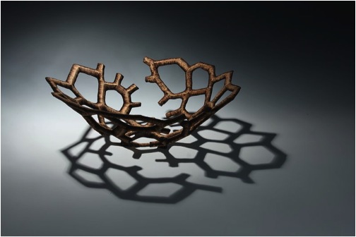
Acanto Metamorphic
You are passionate to raise the profile of woodturners and the principal that something made from wood can be seen as art, discuss?
The art craft debate has divided critics for many years. Here in the UK artists such as
the Turner Prize winning Grayson Perry have widened the debate by challenging
perceptions and blurring the boundaries between the two concepts. Historically
woodturning has been seen as a functional craft, the making of treen. Recent
developments in technology and practice have seen a paradigm shift in the attitudes
of some makers. Started in the USA a small group of woodturners started to make
items that were not just functional but had an intrinsic beauty. These makers refined
these pieces over many years until it became more accepted that wooden items
could be valued as objects of beauty rather than of practical use. Today the wood art
scene is vibrant across all corners of the globe however it is still a small network of
makers that produce this kind of work. As a result many galleries and museums have
not been exposed to this type of work as opposed to ceramics and glass, both of
which have a longer heritage in terms of being seen as pieces of art. To this end one
of my passions is to raise awareness of this new version of woodturning. I would love
to see wooden objects displayed alongside those of the other disciplines. In my
opinion wood has a huge potential to be shaped and cut, ways that are out of reach
of glass and clay. As a medium it is a fantastically malleable material which has, to
some degree, been overlooked due to its usefulness in making practical items. I
hope that my work and that of other talented people is able to find new niche in an
already crowded art marketplace.
“Working with nature rather than against it”. Can you comment on this statement?
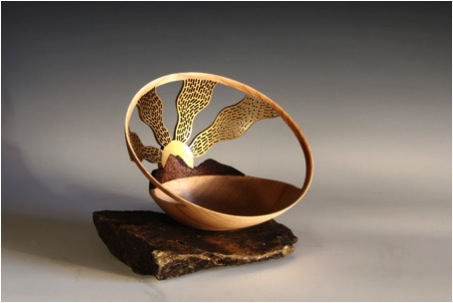
Fires of Bel
I believe in balance. Gaining equilibrium in all areas of my life is something I try to
achieve. In my work this is demonstrated in a number of ways. The tree was a living
thing that in its life was in balance with its surroundings. It lived in harmony with its
fellow trees drinking enough water and nutrients to grow but not over consuming
nature’s resources. Trees act as giant filters absorbing carbon dioxide and releasing
oxygen trying to keep the atmosphere in balance with itself. When I work with a
piece of wood I maintain a respect for how it grew. I may have an idea to cut a
certain way or to create a particular shape. On attempting the cut I can find that the
wood doesn’t cut cleanly, the grain will tear or tensions in the wood will distort the
shape hampering my efforts. I have learnt to adapt my approach to change my
design to work with the piece of wood. I sometimes describe it as a conversation and
I have found that often the tree will demand the last word. The final shape of a piece
is often a result of the release of tension in the wood. Green wood that is freshly cut
timber is full of water. As it dries out the wood can shrink this can lead to cracking; it
can be seen on the end of cut logs but it is something that, as an artist, I want to
avoid however, with careful planning, this shrinkage can lead to the creation of
incredible shapes. As a child I remember being told the story of Michelangelo who
believed he was releasing his sculpture from within the block of marble. Whilst I
understand the scientific rationale underpinning movement and shrinkage in wood,
allowing the tree to express itself in this way and describing it as a conversation is
something that gives me great pleasure.
During the months of May to October each year you are in Kilberry, at Bole the Gallery. Can you expand on this part of your year?
Kilberry is the reason I became an Artist. The Gallery is created every year in what is
the garden room of my family’s holiday home. I built the house with them and it was
during this process that I realised my love of working with my hands. Situated in this
remote village, the gallery mainly relies on passing tourist trade who travel along the
single track road to see the amazing views of the islands of Jura and Islay. For me it
is the perfect place to work as there are few distractions save the incredible views,
wildlife and plant life that continue to inspire me. The gallery gives me the
opportunity to display work and to interact with members of the public who, in many
cases, may not have seen work such as mine. It is wonderful to be able to gauge
their opinions on pieces and to introduce them to the concept of wood art. I am also
able to contribute to the local area by displaying work by other talented local artists
and promoting an open studio event called Artmap Argyll. Through this network I
have met several other artists who again provide inspiration and support. Having the
gallery is a vital part of my life.
What lead you to woodturning?
As I mentioned, my work building our house in Argyll was the catalyst for my interest
in woodturning. I had always been practical – the chief fixer in the house but had
never considered a future as a woodturner, indeed I wasn’t really aware of the
existence of such a job. I was at University studying business when the family
decided to look for a holiday home. A search for a house to renovate became a
search for a plot of land. We had no real idea of the complexity of building our own
place but under the somewhat naive impression it couldn’t be too hard we embarked
on the build!
At the same time I began my work placement year for my degree. I
soon realised that office life was not for me and that I was loving the building
process. I finished my degree but knew that I was not going to follow that path.
During the build it was the joinery that really pleased me floors and stairs, door
frames and skirting I liked the way the wood could be manipulated and shaped to fit
all these different applications. I looked briefly into furniture making but recognised
that I would have to go back to college. In the meantime I started a night class in
basic furniture making the project was to make a wall unit with two drawers. Making
the drawer handles was my first experience of turning and I loved it. There was a
speed and excitement, an immediacy that interested me. It quickly consumed me, I
could think of nothing but turning, so my journey began.
Photographs of your work are done in the most artistic way can you tell me about how you achieve this?
From very early I recognised the importance of producing good photography. Being
self-taught, I learnt a lot from pictures of other peoples work either those found in
books or on the internet. It quickly became apparent that a good picture adds
another dimension to a piece. Often a photograph is all a potential customer has
from which to judge your work. Lighting is of the utmost importance as well as the
basics of a sharp shot and an uncluttered background. As a result I spent a long time
researching camera techniques and photography set ups. I couldn’t afford expensive
lighting and studio facilities so I looked for ways to achieve these results in a more
basic form. Having said that one of my best investments as an artist was in a good
quality digital SLR camera. Having a camera with full manual controls makes it much
easier to take photographs of objects using lens filters can reduce the glare of glossy
items and being able to extend to shutter speed means that I can achieve results
which would require much more expensive lighting at a fraction of the cost. My
current set up consists of a graduated background and two angle poise lamps fitted
with daylight bulbs all attached to a wooden frame I constructed myself. This very
basic setup combined with a lot of trial and error, and a steep learning curve,
enabled me to create the dramatic photographs you see.
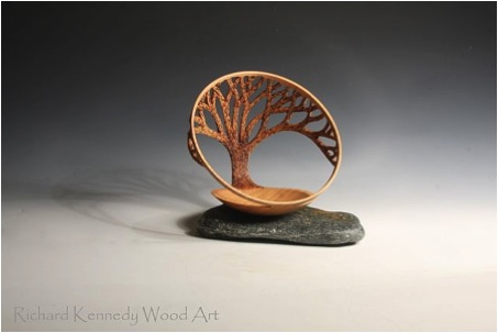
The Tree
You must have an amazing workshop, take us inside and tell us about both the space and the equipment?
My workshop, my studio, my shed! It is all these things but mostly it is my haven
where I can do what I love. It is a tiny space only 3m x 3m which I share with a chest
freezer, but for me it’s almost perfect! All of my work starts on the lathe, the
workhorse of my creative life. Using the lathe is fast and exciting; the spinning wood
is shaped quickly using the variety of tools that line the wall. These need to be kept
razor sharp. I do this using the other vital piece of equipment, a grinder. Working in
such a small area requires a high degree of organisation in order to maintain a safe
working area, however, I am not a tidy person. The lathe produces massive amounts
of shavings that I have to regularly sweep up and dust which is dealt with using a
variety of extractors. I have divided my space into three main areas, the lathe space,
a sharpening area and, finally what I call ‘Carving Corner’ Here I keep my texturing,
carving and piercing tools. I probably spend 70-80% of my time working in this
space. My piercing tools have developed from very unwieldy multi tools to adapted
beauticians nail polishing tools to finally dedicated powerful carving micromotors.
Again dust is an issue and so dust masks and filters are essential. I do try to keep it
organised but when ideas are flowing cleaning is not a priority!
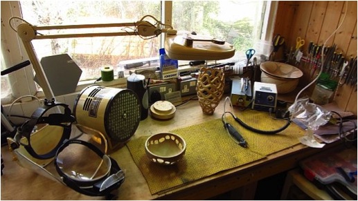
Carving corner
Is where you live the perfect place for accessing both wood and the right environment to be doing your art?
In many ways it is and in others it isn’t! If I could make a living just from making work
I would think it perfect but sadly, some of the time I need to be selling. The peace
tranquillity and beauty of the area is fabulous I can focus on the piece at hand with
minimal distraction except the odd dog walk! The dramatic scenery provides me with
food for thought and I am able to take the time I need to think about what to do and
how without distraction. However from a marketing point of view I am a long way
from other galleries and the buying public. The gallery has provided me with a
welcome venue to sell my work and is very successful, however there are times
when I need to visit other galleries and develop other markets for my work. The
internet is a great tool however the access is patchy due to my location and the slow
speed is frustrating making sending photographs a very difficult time consuming
task. Buying the raw material for my work is difficult as it is not always as simple as
popping out with a chainsaw to stock up. For many of my pieces I like to use kiln
dried wood that has been felled carefully and then cut and stored properly
sometimes for many years. This is a very important stage of the process. Done
incorrectly, this initial stage can produce cracked wood and staining of the timber.
Wood needs to be treated with respect and failure to do so will invariably lead to
issues during the making process. Whilst I am able to source some of my raw
material here in Argyll some has to be brought in from further afield.
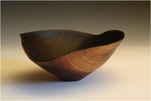
Elm wrap
Contact details:
Richard Kennedy, Argyll, Scotland
Interview by Deborah Blakeley, July, 2013
Lester Hall
How important has your work with Maori and Pacific artefacts at the Auckland Institute and Museum been to your art?
Contact with actual artifacts was hugely important. As a person being brought up in any household we are set into the paradigm of our parents and schooling. As a white Kiwi I was taught that Maori were naughty savages and stone age… not in a really nasty sense, just that their culture had nothing to contribute because it was grass skirts and a language that was useless. Crashing into the incredible sift, woven garments I had in my hands to display at the museum let me know clearly that I would have been warm and comfortable, if in the chiefly class anyway. Being inside the museum walls also taught me that elegists were presumptive, arrogant and passive aggressive creating a self-righteous "knowing" of things that might not even be true. It also taught me that display had for decades been the first idea rather than understanding. This was the place where I truly understood I needed to stand apart from what anyone was telling me and ask the questions of myself and then search for answers.
Cheeky Little Darkie
Do you think that your art has brought about improved racial relations in New Zealand?
In a small sense, yes, I absolutely work towards a "tipping point" of generated interest in the society as a whole.. I say my work is social commentary first, expressed through pop art… pop art… I am trying to make the conversation between Maori and Pakeha the most interesting and important for us all, because I think that is the truth.
Am I correct that your work initially (at first sight) is to amuse and only on deeper observation to question?
Yes. It is the lure and catch principle used in any hunting…. put this on your wall… look at it…. allow yourself to think and discuss with friends… feel a connection to your ideals and move forward through context, truth and conversation…
Kia Ora Cook
In your work you use actual accounts from historical journals, not history text books. Can you expand on this?
Sure, I prefer to read firsthand accounts. While I understand these people first hand writers are very affected by the paradigm of the time I try to look through the adjectives to the facts… "I saw someone eaten. It was a female slave. She was killed by her owner instantly having offended and was being eaten within two hours." I think all historians are coloured by the times and politics they live in and espouse… so, after the facts have been interpreted by four or five generations of thought what is fact really?
Wikitoria
Queenie
Can you take Wikitoria, Climb Every Mountain and Tiki Mouse and discuss?
Okay, Wikatoria was drawn up as a balance statement against the romantic image of Elizabeth and "Queenie"; this is because they are both wearing the same clothes, suggesting the royal lineage and connection to power. I think the idea with this work is very basic and self-explanatory. It says to my audience, do not forget the fact this woman, Victoria, sat as the crown for almost all of the truly egregious ramifications the collision that Maori had with colonial effect. The image uses an old stamp style to create statement rather than possibility, Maori motifs with be clear about what part of the dominion and those few choice words for specific rather than cryptic inference.
Climb every Mountain is a far more specific piece for New Zealand. I say this because I used the Wikatoria stamp to create my "Abbo Queen" image…. the same things can be said about the Australian experience but far worse, right? In, Climb Every Mountain I am espousing a specific philosophical, not factual conversation with Maori and Pakeha alike as the assertion that only Maori are Tangatawhenua, or "the people of the land". My stance is that all New Zealand citizens should enjoy this status as it is a spiritually based concept, not just a political label.

It addresses the conversation around difference and sameness and difference suggested as fact because of race. This conversation is specific to apartheid and who I am in my own land. I assert that I am Tangatawhenua, even though I am Pakeha. I chose Hillary on which to tattoo the title because he is the Pakeha icon of this nation… suggesting that if he is not Tangatawhenua then no Pakeha is. This also challenges Pakeha conservatives who would hate the suggestion or give it any importance or relevance. In approaching Maori with this statement, I am saying I am willing to discuss a spiritual and philosophical idea in depth meaning that I have to interpret their language and their history and their stance now. This conversation suggests I am invested deeply in my nation in a way that defines who we each are to each other… Not a "you did, you didn’t" tit for tat argument but a broadening of the mind and possibilities for society sense…. Also, in symbolism he was a mountaineer, the image is based on a photo that was used for a very well known and loved five dollar bill and the specific understanding I am talking about is the societal mountain I suggest is the most important for us to climb to achieve, trust, equality and forgiveness.
Tiki Mouse is another confrontation for Maori in the specific sense of appropriation and respect of culture. I utterly reject the notion that any cultural mores are sacrosanct from comment or even humour. Once one cannot laugh one is closed down and cowered. It is a celebration of a favourite New Zealand child's toy, morphed through the styles of the Tiki and references another pop artist ubiquitous work on the subject. It is a beautiful work in its simplicity and direct love of what it is to be Kiwi in the design sense. No matter who a Kiwi is, once traveling the most obvious styles and imagery we can assert our origin with are Maori. This is represented by the kowhaiwhai patterns of the field or sky. Technically this is the first image that is totally computer generated... by that I mean that although I painted it, scanned it and placed it back in the computer I overlaid colour on every part of the image. This creates an exactness that is wonderful on this style of image, not so much for the portraiture in regard to historical facts… they are very important but all must be taken with some salt… I encourage an investigation about history as a narrative, as characters, as myths. allow some second guessing, learn to love the stories and give or take truth so the subject has some life in it. The Museum taught me that historical fact is open to interpretation often and that cultural paradigms can be so powerful that truth can in fact be different to two minds... So, look for the similarities and celebrate those. Look for the sameness and celebrate the differences but most of all realize it is us, the citizens and not the historians and politicians and activists and lobbyists that make up day to day life. Beware of those tails wagging the dogs...
Finally a specific word about text. The stamp styles and the sports card and book covers I am about to do allow text….. wonderful for getting a non-cryptic message across. While I say non cryptic I do not suggest they are obvious. To be obvious these artworks require the audience not to be ignorant……. so they encourage learning curves, something that all societies need.
Do you provide an explanation of the background with each print?
Yes, every print comes with a narrative sticker for the back when framed. I am not interested in what commentators think of my art... these images are about my specific thoughts and ideas. I have worked too long and hard to leave what they mean in the hands of other minds.
Your prints are widely available throughout New Zealand; do you think the average tourist fully understands what they are buying?
I think the ones that buy probably do for the most part because of the specific descriptions. I also have a very in depth and growing website explaining my thoughts in depth.
Te Rauparaha
As well as single prints you sell your work in smaller sizes to be like a Postage series set, can you expand on this aspect of your work?
Many people have a collecting gene… we love to see things in a group... they are stamp style and so suit the line up of image. This also allows more of a story to be told through the use of multiple images.
Can you explain where you do your printing?
I print every work in my studio.
Can you expand on the actual printing technique you use?
I use a seriously wonderful high end ink jet printer and chromium inks and rag paper. I do this because it gives me power and creative freedoms that simply cannot be achieved off site.
Do you do specific new work for exhibitions what format does it take?
New exhibitions are usually formatted around several new works, an original or two and woven pieces. the woven pieces are made by an expert in Maori Neolithic tech and require two version of the image to be cut up and woven back together. I also do odd prints for exhibitions. These may be "faulty" or "double printed" images, stamp out like real stamps reflecting the philatelist's love of the mistake. I also allow a lot of play with framing for shows.
Te Tai Tokerau Tiki Ttour
What are you currently working on?
Currently I am creating a series of Pakeha or white fighters of Maori in the wars. It is being produced in the manner of sports cards and they as a group with be titled the Pakeha Dream Team. I am doing this to refute the idea that Maori have some specific, exclusionary hold on the title of warrior as they are inclined to do in NZ... These works also suggest it is important to retain good understanding of the men and women who created the nation if they are politically correct this season or not. I detest the myopic viewpoints that are created by lobby groups and those who get into institutional power such as museums. This series will be followed by the Maori Dream Team too of course…
Contact details
www.lesterhall.com
Lester Hall, Kerikeri, New Zealand
Interview by Deborah Blakeley, July, 2013
Ben W. Heineman Sr. Family Gallery of Contemporary Glass
Tell us about the location of Ben W. Heineman Sr. Family Gallery within the Corning Museum of Glass?
The Ben W. Heineman Sr. Family Gallery of Contemporary Glass is often the first gallery within the Museum that visitors encounter. The Corning Museum is home to the world’s most comprehensive collection of glass with nearly 50,000 objects, including the finest examples of glassmaking spanning 3,500 years. The glass collection galleries explore Near Eastern, Asian, European, and American glass and glassmaking from ancient Egyptian and Renaissance Venetian masterpieces to works by contemporary artists. The Heineman gallery is an introduction to contemporary glass with a focus on vessels, objects, sculptures, and installations made by international artists over the last 30 years. The purpose of the gallery is to show the different ways in which glass is used as a medium for contemporary art. Large-scale work is complemented by smaller-scale objects and non-functional vessels in a variety of glassworking techniques, including blowing, casting, kiln forming, flameworking, laminating, stained glass, beading, and assemblage. The gallery features unique objects, rather than limited-edition or mass-produced products.
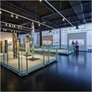
In 2005 the museum was given a major collection of contemporary glass by the Ben W. Heineman Sr. Family. How large is this collection?
Over the course of 30 years, American art collector and former Chairman and CEO of Northwest Industries, Ben W. Heineman Sr., and his wife, Natalie G. Heineman, thoughtfully assembled one of the largest and finest private collections of contemporary studio glass in the United States. The Heineman collection includes 240 objects, dating from 1969 to 2005, by 87 international artists including Howard Ben Tré, Dale Chihuly, Michael Glancy, Stanislav Libenský and Jaroslava Brychtová, Harvey Littleton, Richard Marquis, Klaus Moje, Joel Philip Myers, Tom Patti, Lino Tagliapietra, Bertil Vallien, and Toots Zynsky. The gallery was named in honour of the Ben W. Heineman Sr. Family gift, and it contains objects from the Heineman Collection as well as objects from the Museum’s collection not given by the Heinemans.
Is there funding attached to the donation for further purchases?
No, but when Mr. and Mrs. Heineman were alive, they often gave funds towards the purchase of contemporary glass that the Museum wished to buy.
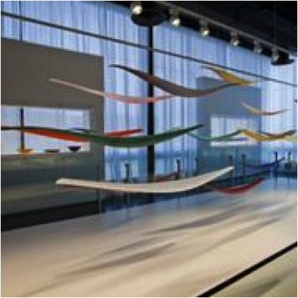
Does it fund any training of artists or other scholarships?
No, but the Museum is fortunate to have other donors who are committed to funding scholarships to the Museum’s Studio, which offers year-round instruction in all kinds of glassworking.
Is the family still involved with the Gallery?
The family is very interested in the Museum’s programs and activities, but like Mr. and Mrs. Heineman, they do not get involved. The reason they gave their collection to Corning was because they admired the Museum and its programs, and they expect the staff to do the best job they can.
How often is the gallery space changed?
Recently, every three or four years, we have changed the gallery entirely, which is a months-long undertaking. New objects are constantly added to the gallery, or certain cases may be changed, which is easier to do than change the entire gallery. For example, we have a series of six wall cases that were recently changed to feature examples of contemporary design.
Lighting is very important in all galleries but particularly to the display of glass can you comment on this?
Glass will take all of the light you can give it, so there is no such thing as too much light for contemporary glass, but guard against the heat that light creates. Often, when I see glass displayed, it is under-lit and it does not look as good as it could.
Wherever you display glass, what you want is a relatively constant temperature and humidity, with no extreme fluctuations from hot to cold. People like to display glass in windows on top of a radiator: this is a bad idea because the glass can crack or break. Glass in a window is fine, as long as it does not get too hot. Glass is very stable but two things can easily cause it to break: dropping the glass object on a hard surface (we all know that) and moving glass from a very warm environment to a cold one. This can cause thermal shock and breakage unless you have glass that is specifically tailored for these kinds of changes, such as glass ovenware.
Can you discuss three pieces from the collection?
Three of our visitors’ favourite pieces in the contemporary collection are:
Fern Green Tower (1999, reconfigured in 2013) by the American artist Dale Chihuly
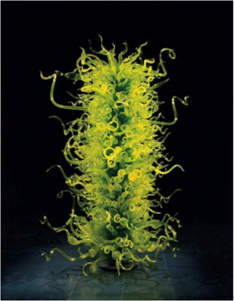
Fern Green Tower is 4.5 meters high (15 feet)
Evening Dress with Shawl (2004) by the American artist Karen La Monte
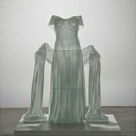
Evening Dress with Shawl is life-size
Red Pyramid (1993) by the Czech artists Stanislav Libenský and Jaroslava Brychtová.
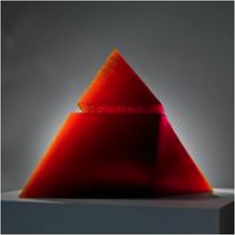
Red Pyramid is 1.2 meters wide (4 feet).
These are large sculptures. Fern Green Tower is 4.5 meters high (15 feet); Evening Dress with Shawl is life-size; and Red Pyramid is 1.2 meters wide (4 feet).
Tina Oldknow, as your gallery is within a museum, how do you see your role as a curator?
The entire museum is devoted to glass, and contemporary glass is only part of that story, and only one (albeit the largest) of many galleries. (Of course, we do not sell artwork from any of the Museum’s galleries, which may seem obvious, but it is surprising how many people think that museum objects are for sale). I work with the director and the other curators, who work with the Museum’s collections of ancient and Islamic glass, European glass, and historical American glass. Although much contemporary glass intentionally breaks with the past, many objects are inspired by history. My gallery is not separate from the rest of the Museum, but closely connected to it.
You have formal training in Art History; what lead you to specialize in Glass?
I became interested in glass when I was studying ancient art, but there has been no formal training in glass or other decorative arts offered in the States until recently, and even now there are only a handful of programs that specialize in it. Most art history programs do not include decorative arts or design. However, it is important for anyone involved in the arts to understand the larger chronology of the history of art, and that means painting and sculpture. For my job, knowledge of contemporary art and design is essential, from painting and sculpture to video and installations to functional objects because glass is now used in so many ways.
For a new collector of glass what would you suggest as an excellent foundation book and/or website?
Of course, the Corning Museum of Glass website is excellent and we all work hard to make it that way. There are many books about contemporary glass, including those offered by the Museum, and you can easily search for books online. They usually have “contemporary” or “studio” and “glass” in the title.
How important do you think it is to have specific galleries / museums (e.g. Glass)?
I think it makes sense for the city of Corning to have a museum devoted to the material that its historic, Fortune-500 company, Corning Incorporated, has made famous. I think that niche museums provide a wonderful opportunity to go deep into a subject, whether they are focused on geography (such as American or Australian art or contemporary art or folk art) or a material (glass, ceramics, textiles). I enjoy the big encyclopaedic art museums, and I enjoy the smaller, focused ones. We need all kinds of museums, and the more variety, the better.
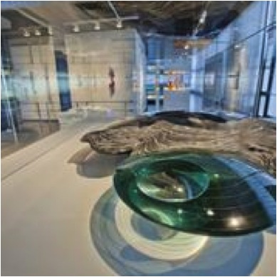
How is collecting different for an institution and a personal collector?
There is a huge difference! Collectors buy what they want, although the best collectors I know are very focused and do not buy just anything. Like curators, they need to be very knowledgeable about their subject. Although my taste and judgement will always influence me, I am also aware of the public. I need to balance the objects I believe are important in our own time with what we know that the public enjoys. This is not very challenging. I have found the public is very responsive to all kinds of contemporary art in glass, and that people are more open-minded and intelligent than they are credited as being. About half of our Museum’s visitors have never been to a museum before. Glass is a great place to start to learn about contemporary art, because it is accessible: there are thought-provoking ideas but it also can be just very beautiful.
Can you very briefly discuss the importance of a good eye to the $ value of a piece?
To be a good curator, you have to love objects more than anything else. Some people like to research and the objects are secondary for them, whether it is the history or the ideas that they are interested in. You need both though: you need a great object and a great idea. Monetary value fluctuates and is subject to economic pressures that have little to do with the making of art. The Museum has bought amazing objects for very little money and amazing objects for a lot of money. In any display case, you might find an object valued at several hundred dollars nearby something valued at many thousands. Although curators are expected to know the market value of their objects, they do not collect for investment but for cultural and historical importance. There are always speculators, but most serious collectors do not collect solely for investment. They grow to love the work because they spend a lot of time learning about what they are collecting. In terms of investment, the wisest advice I have heard is to know about what you want to collect (that is, read, read, read) and collect the art you love.
How important are new techniques to contemporary glass making?
New techniques and ideas – all kinds of innovation – are always important. However, there are many ground-breaking artworks made with very traditional (that is historical) glassworking techniques.
When you do exhibitions do you bring artists together with a theme or do you only exhibit work the Museum owns?
The Museum does both. We have exhibitions that feature works drawn from the permanent collection, which is a wonderful way to bring artworks out of storage, and we create loan exhibitions that bring together objects that may have not been seen together before, and possibly may never be seen together again. The Museum’s permanent collection galleries are organized chronologically, and its loan exhibitions are always thematic.
Since you began at Corning Museum of Glass, can you give two highlights that have happened?
The Museum’s permanent collection galleries were renovated in 2000, which means that all of the glass in the Museum was taken out and put back in a different configuration with new exhibitry. This was a big project and very exciting. Not all curators get to do a project like that. Now, we are working on new galleries for contemporary glass, which will open in late 2014. This is also very exciting: the new galleries will display contemporary glass in addition to the existing Heineman Gallery, which will be completely changed. I feel very fortunate to have been able to work on these major projects.
Has the Corning Museum of Glass brought a glass arts community to the area?
It has, and one reason is because the Museum hires quite a number of artists. That is the best way to bring artists into an area: give them jobs. Many artists cannot make a living from their work alone, or they work to make money to set up their studios. It also helps that Corning has very reasonable real estate prices.
How important are relationships between artists and the curator of a Gallery such as yours?
Very important, I could not do my job without cultivating relationships with artists. They are tremendously supportive of the Museum.
In your opinion what makes a gallery a place visitors what to return to?
It should be exciting, surprising, and beautiful, the staff should be friendly and open, and there should be a lot to do. The most popular activity at our Museum is the narrated glassblowing demonstrations. People really enjoy seeing how glass is made and then looking at objects in the art and science galleries. The Museum even offers visitors the opportunity to make glass themselves. It is a holistic experience: you can see glass, watch it being made, and do it yourself. I think it is the varieties of experience that people can have at the Museum that make it a special place: there is the opportunity to be very actively engaged, or contemplative. And there is great shopping too.
Details for visiting
Website: www.cmog.org
Address: One Museum Way –
Corning, NY 14830
Phone: 800.732.6845 or 607.937.5371
Located in the heart of the Finger Lakes Wine Country of New York State, the Museum is open daily, year-round. Kids and teens, 19 and under, receive free admission.
Tina Oldknow, Curator, Corning NY 14830, USA
Interview by Deborah Blakeley, July, 2013
Maria Francesca Batzella
Can you explain about the name LerènieS?
LerènieS is an anagram. I leave it up to curious minds to solve its meaning.
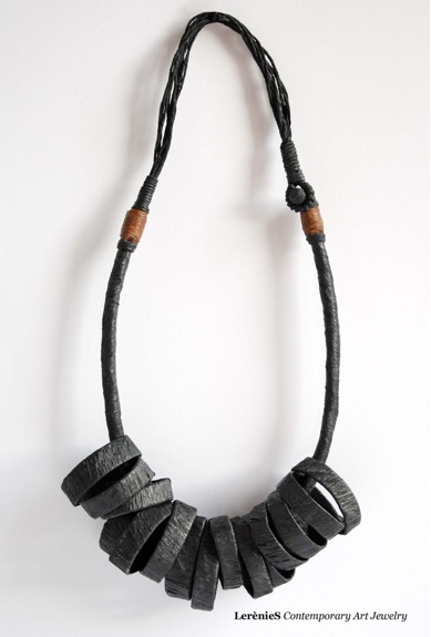
How long have you been making your paper jewellery for?
LerènieS started at the end of 2010, but the first jewel, called “Infinito”/ Infinity was “born” a year earlier - in 2009.
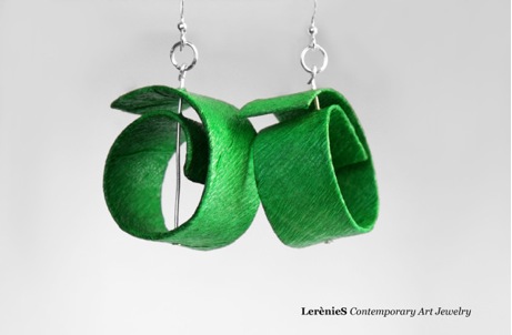
“Each creation is not really an end in itself, jewellery,but a sculpture” can you expand on this comment?
Each of LerènieS creation is unique and treated with individual care as a sculpture.
I manipulate the matter (in this case – the paper) in order to materialize an idea first as a sketch and then literally by hand, gradually developing the form and being flexible and sensitive to all changes. I have no modules, no pre-made patterns; for me this process is a pure art, and I treat it as such. The priority here is ART, which means that its functionality or dimensions are of more like of “an added value”, and what is more important is its originality and its artistic value.
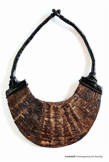
My necklace, a bracelet or an earring are not created simply to be used as ornaments, but these are fine-art sculptures that always have something to tell to a keen eye.
How did the idea come about?
The idea was born during the course of design at the Academy of Fine Arts in Florence. At the Academy I had participated in a competition for Contemporary Design, specializing in paper. I created my first piece of jewellery, called “Infinito” (Infinity), which has been much appreciated and was chosen for the final show. After having lots of success with this first piece, I decided to continue working in this direction and hence the LerenieS was born.

You graduated from the Academy of Fine Arts in Florence. Can you discuss how this training has helped you to develop your art?
I cannot say that my work has been at all influenced by the Academy. I am entirely self-taught and the project LerènieS comes directly from my mind and experience.
What jewellery training do you have?
I have three years of experience making my original jewellery all by myself.
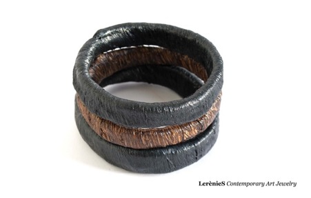
You come from Sardina - how does the historical and archiolgical aspects of your home Region influence your work?
Sardinia is an ancient island: vast and underpopulated and in some ways it is still rather “wild”. The land itself is very attached to its beliefs, deriving from distant times, and still in a "silent" way follows its ancient traditions and rhythms. All of this has undoubtedly unconsciously influenced all of my works. Clean original modern design, evoking ancient "archetypical" symbolism offers another depth of aesthetic interest – immortal sacred shapes which once again become adorned and important.
You use recycled paper: can you expand on the different types of paper you use?
Usually I start my work with a piece of recycled carton, create several layers of scrap paper, until I reach the thickness I want. For example, an old box from salt, rolls of paper towels, or the pages of old books rendered useless for reading. The paper that I prefer is the crepe paper, but I don’t limit myself in experimenting with different other types of paper (at times also adding other organic materials) that come across my hand.
How do you give the paper a waterproof covering that is needed for the jewellery to be worn?
To make sure that the paper does not deteriorate when in contact with water (or body sweat), I treat only the outer surface of my creations with a solution based on acrylic polymers (similar to the product used for the reconstruction of nails).
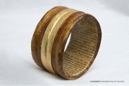
Can you take three pieces that have given you great pleasure on completion and discuss each piece?
Necklace, Guindalu “wrapped up”
Dimensions: Total length: approx. 94cm.

Inspiration: traditional Sardinian fine jewel-button of silver or gold in a shape of double-calotte (historically, Sardinian jewellery is strictly tied to the traditional costume). More than any other jewel, this one maintains the deep ethnographic meaning. This piece of jewellery, present both in masculine and feminine traditional costumes, possesses an aesthetic and archaic purity: reproducing a stylized feminine breast, it recalls ancient symbols of fertility and procreation, related to the neck in various ways, or simply worn at all of its length, as a necklace. Phoenician goddess, Tanit
Technical description, design and the choice of paper: the inferior part is composed from 13 elements (all from recycled paper) and 26 paper cords rolled from crepe-paper (black); Exterior part is composed of 52 chords of paper (crepe, black) all intertwined and 26 stripes of rolled crepe paper (red). It may either be wrapped around
Necklace, “Sollevami” Lift Me Up
Materials: Crepe paper, paper taken from pages of old books, gold imitation,
Egagrophiles (fibres of Posidonia sea-plant), vinyl glue diluted with water.
Dimensions: Total length: approx. 94cm.
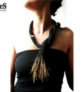
Technical description, design and the choice of paper: this necklace is composed of 213 chords of crepe paper rolled and joined in their length. Every single chord at its end has Egagrophiles wrapped around the chord and held up by a little bit of vinyl glue. There is also a unique chord, containing three little paper boats (covered with imitation gold), which unites all other chords and gives a visual flow to this necklace.
Inspiration: this piece was thought of and created specifically for the Biennale Habitat 2013 - Venezia (Biennial Habitat 2013 in Venice, Italy) and The Five Days of Mediterranean Community - (the theme was: The Sea...between dreams and reality).
Lift Me Up is an appeal in itself, it invites to be aware and to reflect the sad reality of the corporative contamination of the sea. Golden ships sail in the sea of black (recalling also petroleum, a.k.a. “the black gold”) leaving behind (ignoring) the spectrum of the sea – egagrophiles, the sea-plant, which reflects the purity of environment and does not grow in contaminated zones.
Bracelet, B 035: Mamuthones and Issohadores
Materials: recycled cardstock, crepe paper, coffee, gold leaf (imitation leaf), vinyl glue diluted with water.
Dimensions: Ø.: approx. 6 cm. W.: approx. 7 cm.

Inspiration: ISSOHADORES and MAMUTHONES (one of the most antic and striking masks of ancient Sardinian rituals, held annually in Mammoiada (Nuoro) in the central region of Sardinia).
The rite begins with two parallel rows of Mamuthones, who move at a slow pace of an ancient ritual, ringing the bells attached to their backs. The master Issohadore gives orders to Mamuthones and gives rhythm to the procession, while the other Issohadores, throw their lasso-rope (“soha”) trying to capture the persons from the audience (it is considered a sign of good luck and fertility if one gets caught by Issohadores). It is such an ancient tradition, that no one knows with certainty what the original meaning of this rite was – not even the people, who actually perform as Issohadores and Mamuthones.
Technical description, design and the choice of paper: the bracelet is divided diagonally in two halves– the first one (Mamuthones) is composed of many black chords of crepe paper, of approximately 1cm length with application of imitation gold leaf (applied irregularly and only found at the tips of chords – addressing the theme of bells, attached to domesticated animals - lined up in a way to imitate an appearance of an animal fur.
The second part is composed of 56 chords of crepe paper (white) placed horizontally (mask of Issohadores). The horizontal line, which divides the bracelet and represents the lasso of Issohadores (soha – in Sardinian language means “the rope”), and is composed of crepe paper - treated with coffee, in order to obtain the colour similar to that of “soha” (rope) – intertwined and stopped from both external parts with chords of red crepe paper (the colour of the jacket of Issohadores).
What is the philosophy behind LerènieS?
Today in the age of modern technologies and mass production, when there is a growing need to protect one identity and one’s culture, LerènieS wants to differentiate itself from the "world of mass-produced", in order to create individual works of art (made entirely by hand) and of fine craftsmanship (mainly composed of unique pieces or limited editions), characterized by the philosophy of "beautiful and well-done" that has always distinguished the fine "made in Italy" brand.
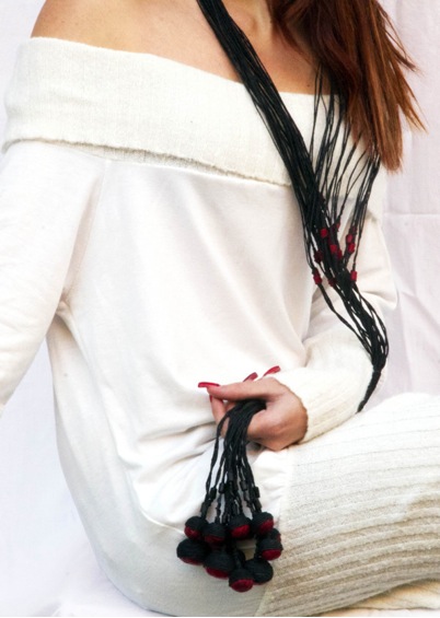
Can you discuss the importance of shape: circular, spiral, and herringbone to your work?
If you look carefully at the findings of prenuragic (450000-1800 BC) and nuragic (1700 BC-second century BC) periods – and I am referring to the objects of daily use as well as items used for religious means – you will note that these forms are repeated, almost unchanged, and this kind of symbolic language occurs in different cultures in diverse parts of the world, as if it were a single and universally understandable language of signs. It is this aspect (a common and universally understood unconscious language of symbols), which gives a meaning to the choice of shapes and form in my work.

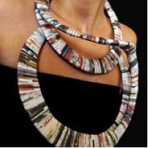
All your pieces are ‘limited editions’ due to the fact that they are handmade, you also have several pieces that are only made once. Can you discuss how this decision is made and when?
Essentially, all of my works are unique. There are few cases in which I have created limited edition pieces. I have to clarify that my limited editions come up to a maximum of 3 pieces, and each piece still differs from another for decorative reasons (i.e. in LE 007 series, one pendant differs from another by its decoration choice) or differs in size (LE 005 bracelets, LE 010) or keeps the shape, but differs in colour (LE 017 earrings, bracelets LE 012, LE 013, LE 014)
You also exhibit your work. How important are exhibitons to the development of your art?
I think it is of utmost importance to show your artistic work. Every art requires comparison, and without exhibitions art becomes an end in itself.

Where can your pieces be bought in Italy and perhaps internationally?
In Italy at:
Poncif Torino, Piazza Vittorio Veneto 5
Poncif Firenze, Borgo degli Albizi 35R
An joy, Via Eugenio Colorni 14, Roma
In Germany:
Aversente Arte Flowers / interior design, Frankfurt-am-Main
In USA:
Once In A Blue Moon Gallery, Edgartown, MA
Your work is done in yearly collections: how far ahead to you need to be?
The annual collection is intended as all work finished within a year. Whenever I conclude one piece, I immediately catalogue it and place it on my website.
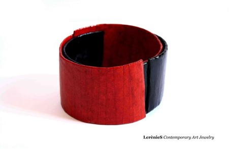
How does fashion influence your jewellery design?
I am not inspired by anyone in particular. My approach is artistic, I process and rework what I observe, trying to keep it as natural and “from within” as possible.
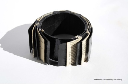
Contact details.
Website: http://www.lerenies.com
Maria Francesca Batzella, Florence, Italy
Interview by Deborah Blakeley, June, 2013
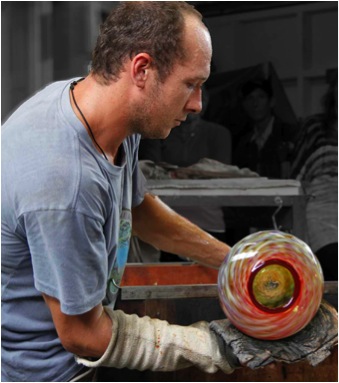
Justin Culina
Can you explain the technique/s you use for your glass making?
I use traditional glass blowing techniques which have been used for centuries.
Glass blowing techniques have not changed much in the last 2000 years, I create my own unique take on these through the use of colour and form.
As I am largely self-taught I have my own adaptations and interpretations of age old techniques like cane roll ups, murine, incalmo, filigree, latticino.
The process of achieving and sustaining the high temperatures required to blow glass has been refined to the point where it is now possible for one person to run a hot shop; whereas it used to be necessary to work as a large team.
Colour is a huge part of your work, please expand on this?
I tend to prefer the use of transparent rather than opaque colours because of the way the light transmits through the glass. I sometimes even find myself blowing opaque colours until they are translucent. I am generally attracted to cooler tone colours however I find myself constantly experimenting with a new colour and the way it reacts with glass. Each colour has its own unique properties
I am fascinated by the chemistry of colour in glass work and the many ways you can manipulate colour through chemical reactions and heat exposure.
Where do you get your inspiration from?
The glass blowing process is quite inspiring on its own,I also take daily inspiration from my natural surroundings. I live in a beautiful spot with the ocean, bush and wildlife on my doorstep.
Colour
The way colours combine harmoniously together in nature fascinates me. I love the way the coloured glass plays with the light and almost any colour can be appealing used in the right way.
Form
Molten glass, being so liquid, allows for fluid forms to be created. The smallest changes in shape can change the look of the overall piece dramatically.
I feel I am in partnership with the glass allowing it to have a say in the final form.
Clean lines are very important in my work.
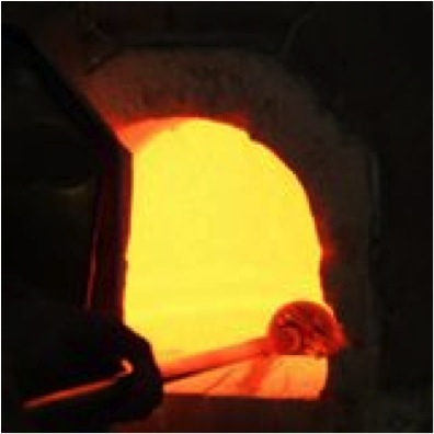
How did getting your own hot glass studio affect your work and output?
Five years ago I started Culina Glass, which has changed my focus from ‘glass blower’ to ‘glass blower/business owner’. I have had to diversify my range to incorporate high end one off pieces and to put more emphasis on production work.
A hotshop’s running costs are very high. To keep costs down I have built much of my own equipment. This has broadened my knowledge of hot glass equipment function, and maintenance. It has also allowed me to customize my equipment to best suit my needs.
Owning a hot glass studio and being in the studio everyday has given me more time with the glass, so my learning has progressed more quickly and I have pursued more design options.
Having my own hot glass studio has changed my life.
Are people encouraged to visit your studio?
My hot shop is in a rural setting and therefore has very little through traffic. However 2 or 3 times a year I have an open studio weekend, showing my new work, glass blowing demonstrations, refreshments and studio sales. These are very profitable and well attended and it is always fun and gratifying to share my craft and workspace with the interested public. I also welcome visits by appointment at any time.
Take us into Culina Glass and show us around explaining the equipment and other specific spaces you need?
The heart of Culina Glass is the furnace which is the kiln I use to melt sand into clear glass, the material I use to make all my work. It runs between 1100degrees C and 1300 degrees C 24 hours a day. Arranged around the furnace is the pipe warmer, large and small glory holes, toaster oven, pick up kiln, annealing kiln, marvers, glass blowers bench, torches, assorted hand tools, and coloured glass rods.
In the next room is the cold working equipment which includes a flat bed grinder (for polishing the bottom of the pieces to make them sit dead flat), a vat of acid etch for achieving a satin finish on my work. A dremmel tool for signing the work. My coldworking equipment is minimal as I prefer to complete the pieces as much as possible in their hot stage.
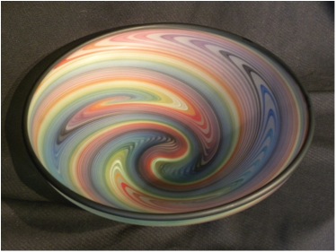
I also have a lampworking area for jewellery and smaller components.
In the final room is a small gallery space where the finished work is on display. Before shipping, I photograph each piece.
Music is also a very important part of my work environment.
Can you explain safety issues around your art?
Working in a hotshop can be dangerous and toxic to one’s health if precautions are not taken. Everyday risks include: heat exhaustion, deterioration of vision, lacerations, burns, high toxicity levels, and potential inhalation of particulate matter. However my hotshop is safe as!
If proper safety precautions are observed (such as use of respirators, proper ventilation, didydium glasses, heat shields, a clean shop) and a sensible work schedule is maintained a hot shop can be a fun and safe place to work.
Do you work with others in the studio?
I have some processes which require two people and I employ an assistant on these occasions. Generally I work by myself.
Sometimes I have New Zealand and international glass blowers come to rent the hot shop and I try to always make time to create some pieces with them while they are here. We share our love of glass and learn from one another.
It’s a bit like dancing with someone else instead of by yourself.
Are exhibitions an important part of your diary or do you just send small amounts to many galleries?
I enjoy exhibiting, especially the feedback I get. I stock many galleries and would like to participate in more exhibitions.
Take three pieces and discuss them.
Incalmo Vase
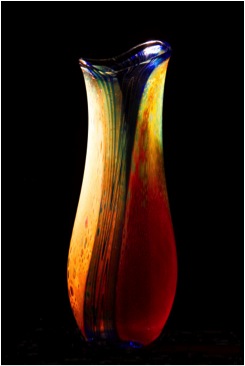
The Incalmo technique is the process of joining two or more glass cups that have been individually designed to create a vase with strong definition between colours and patterns.
I use a variety of contrasting colors for the Incalmo vases.
Though the design is complex the completed vase has a very fluid organic shape.
It is a vase which is functional but mainly used as a decorative piece of art.
Roll-up bowl
This is an old Italian technique of rolling up fused canes of glass to create a linear design to the piece.
I make these roll up bowls in a range of colours. Two distinctive colour schemes I have been using are the colours of the rainbow and my ‘Pacific Rim’ range which features bold black red and white.
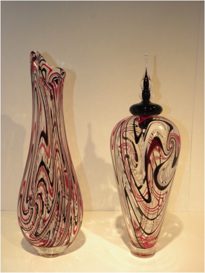
The form of this style of bowl varies from a deep rounded bowl to a nearly flat platter shape. These are functional pieces and I encourage people to use them.
Spirit Vase
A Spirit Vase is a simple coloured blown glass bubble with a stopper which is made separately.
I make spirit vases in every colour of the rainbow.
In concept of form but not actual form the spirit vases represent people in their variety of shapes and sizes. The spirit vases are as diverse and individual as the people of our world and I like to illustrate this by grouping the contrasting forms together.
These are conceptual pieces. I like to think they inspire people to enjoy the diversity of our surroundings.
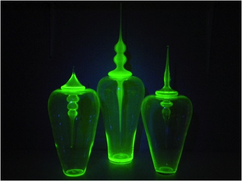
How important is it to have your pieces functional?
Function is not necessarily a requirement in my work.
However, I do enjoy making functional work as glass is such a beautiful medium to make useful things out of. I enjoy the challenge of mastering age old glass blowing techniques, for example the process of making a goblet has been perfected over thousands of years and yet every hand blown piece is still individual. My respect for the traditional methods and designs inspires me to try to create my own unique take on them.
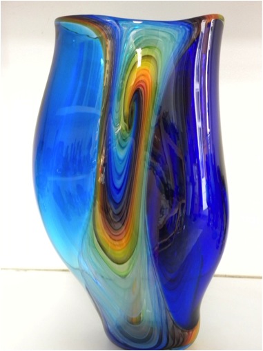
Packaging, can you discuss this?
As I courier my work throughout the country and overseas, packaging is an important issue for me. I have always used cardboard boxes, large quantities of recycled newspaper and recycled bubble wrap to pack my work for shipping. Over the years I have only lost a handful of pieces.
Can you explain how your glass should be cared for after purchase?
Glass should not be cleaned with any abrasive material, as it could scratch the glazed surface. It should not be heated or cooled abruptly as thermal shock could occur, causing cracks. Glass will last many centuries, if well looked after.
Can you discuss pattern in your work?
The patterns I tend to focus on in my work are dictated by the processes I use to create them. For example, when canes are used the piece has a linear colour pattern and if I use frit colour the colour placement is random.
How large can you make your pieces or what restrictions do you place on size?
The size of my work is limited by my personal abilities, my chi on the day and the diameter and height of my equipment. Weight becomes a huge factor when working on my own. Five kg of weight is a lot of weight to manipulate on the end of a 4’ blow pipe.
Contact details.
Email: culinaglass@clear.net.nz
Address: 167 Te Rongo Road, Whangarei, Northland 0148
Justin Culina, Whangarei, New Zealand,
Interview by Deborah Blakeley, June, 2013
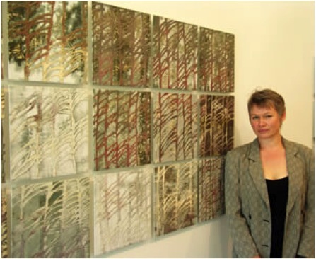
Maiju Altpere-Woodhead
You have only been doing ceramics since 1993, what made you follow this medium?
I was born and grew up in Tallinn, Estonia, during the soviet occupation. In the early 1980s I was trained as an animation artist in the local cartoon animation studio ‘Joonisfilm’. Estonia was considered the most ‘western’ of the republics in the Soviet Union and the experimental film studio had an almost dissident reputation. It was an exciting place to work and I also tried my hand as an illustrator. After moving to Australia in 1992 I initially found it difficult to find my feet while literally living upside down. I discovered ceramics quite accidentally through an art course in the local TAFE and was immediately drawn to its materiality and processes, its rich possibilities and history.
‘Soul’s Garden 02’ detail ’
As a new immigrant to Australia the art course in Nowra gave you both a feeling of belonging and a connection to your new medium. Can you elaborate on this?
At a time when the migration experience had seriously challenged my sense of identity and belonging, ceramics offered a sense of permanence, solidity and continuation. I suppose initially it was a healing process as the act of making followed by the transformative power of firing had a grounding effect on me. Soon, however, I realised that it was much deeper than that. I had found a new creative voice, an intimate language that I had been lacking in the foreign cultural and lingual context.
You have continued with a more formal education at the ANU can you explain this?
In Estonia I had missed out on an opportunity to formally study art whereas in Australia mature age students have an equal place in tertiary education. The Canberra School of Art at ANU offered a BA course in visual arts majoring in ceramics and I was accepted. For me it offered a possibility to learn from and interact with some of the best Australian and international art professionals and academics. After the completion of the BA degree, I also completed MPhil in Art Theory and Cultural Studies. The subject of my research was the relationship between material objects, craft based cultural production and migrant identity.
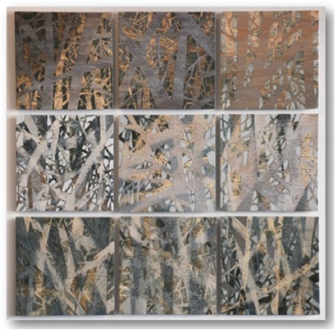
Soul's garden series
mono-printed porcelain, oxides, erosion
100 cm x 100cm
How has your education helped in your artistic development?
From the outset of my study I had a rather clear vision of my long term goal as a practicing professional artist. That gave me the incentive to not only apply myself 100% to the given tasks but to seek additional challenges and opportunities that tertiary study can offer. Also, being a mature age student gave me the advantage of life experience to draw from. The course at TAFE had already provided me with good practical skills and technical understanding which are fundamental to any materials and processes based medium such as ceramics. University study added the conceptual and analytical skills which have allowed me to explore and expand beyond the boundaries of my own medium.
Ole Lislerud introduced you to mono-printing can you explain how you have adapted this technique to ceramics?
In 1997/98 I was fortunate to win a travelling scholarship and undertake a semester of study at the National College of Art and Design in Oslo, Norway. I had admired from afar the work and philosophy of both Arne Ase and Ole Lislerud who at the time led the local ceramics department. Now I had the fortuity to personally interact and learn from them. During my study in Canberra I had already started to explore the possibilities of combining various printing techniques with ceramic materials. Ole introduced me to ceramic mono-printing and a modular approach as a way to dealing with the size and scale limitations that ceramics inevitably poses.
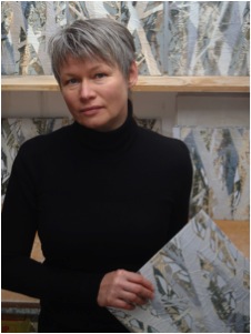
Can you explain how you use plaster moulds and relief prints to transfer onto a ceramic surface?
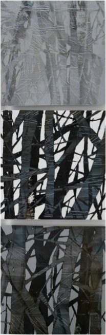
‘Soul’s Garden 01’ detail
The ceramic mono-printing technique that I use in my work combines elements of two classical printing techniques. It utilises the spontaneous painterly qualities of monotype which is unique for producing only one print of an image. At the same time I also borrow from the classical intaglio techniques in which the image is incised into the printing plate resulting in multiple prints that replicate the graphic markings and textures of the plate. I start with a smooth plaster slab (the ‘printing plate’) that I cover with incised linear imagery. Over this matrix of graphic markings I start painting layers of coloured slips (these are my ‘printing inks’), scraping parts of them back much like in classical monotype. It is a spontaneous and rather intuitive process as I keep covering previous layers while working on the composition from front to back. As the surface imagery is built up layer by layer it also becomes an integral structural component of the resulting porcelain tile or any forms that I may be using it for. Finally I cast a thin (3-4 mm) backing slab of liquid porcelain which will act in place of ‘paper’ and lift the printed image. Once I have the print I usually work back into the surface by masking areas of it and carefully eroding the rest, revealing underlying layers of embedded colour.
Layers…. Your work requires many, many layers. Explain how you know when enough is enough, either added or removed?
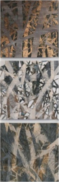
‘Soul’s Garden 02’ detail
I use the physical layering of porcelain slip as a metaphor for memories and meaning, how they are created and re-created, arranged and re-arranged in a process with no finite beginning or end nor a set hierarchical order. I think memories in many ways are permanent. We don't know when they actually enter and they don't seem to leave, just go into dormancy to surface somewhere else. While I use the physical layering of different coloured porcelain, it is also about layering of memory, where you can dig and find something quite unexpected. I work quite intuitively rather than to a strict plan. I guess the basic sense of when to stop layering or eroding comes from both experience and the general idea I have for each piece. However, just like memory is never static, my approach fluctuates from piece to piece.
Colour and imagery are hidden in your work. Can you explain how you manage to work both upside down as well as having the insecurity of firing?
This is what I like about printmaking, working front to back and in mirror image. I like the way it removes me from my comfort zone and induces spontaneity. As I work I have an image in my mind, but I am very open to the element of the accidental that is the result of the processes and materials I have chosen. Firing is the most profoundly transforming part of my process, it can be both liberating and confronting. I have learnt to not be overly precious. If I wanted to just transfer or replicate an image, I would be working on paper.
Can you discuss your choice of colour palette?
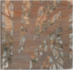
I guess my colour palette is a reflection of my general aesthetic preferences. I have always been drawn to rather muted tones with an infinite range of subtle hues. I grew up in a Nordic country, where light and darkness have different rhythms and intensity to that in Australia. The twilight hours of short summer nights, the pervasive darkness in late autumn and winter, the blanketing whiteness of snow have all had an effect on how I relate to colour. Another, more practical reason is that I am working with high fired porcelain and only a number of colouring oxides can withstand the high temperatures (1300C)
Explain your work both technically and artistically?
I have always been interested in the reciprocal relationship we have with our natural environment and the natural rhythms that influence our life. Alterations and changes to that relationship have a profound effect both individually and collectively. That effect is not necessarily always negative, but often we only notice it, if it evokes a crisis of some kind. While the imagery of my work can be read as a reference to landscape or natural environment, it is not intended as literal representation of any particular location. Rather, it acts as a trigger for various abstract associations with natural phenomena and cultural expression. In the Soul’s Garden series I was contemplating the relationship we have with life and death, how different cultural notions and perceptions have been assigned to these realities. I chose the image of criss-crossing tree trunks and branches to create an abstract, pattern-like overall impression. It is not clear whether the trees are alive or dead or may be just dormant. Death, too, despite all its finality and devastation, can be beautiful. I remember driving through Snowy Mountains after the recent fires that had killed large parts of the snow gum forests. Seeing the vast swathes of white tree skeletons gently shrouding the mountains was overwhelming, both with its awfulness of what had happened and its visual beauty. I frequently use repetition to visually link individual tiles and whole series. It may be the obvious repetition of a motive eg. the branch or the more subtle accidental repetition of the incised linear imagery that comes from the continuous rotation of the printing plates. Another element that is characteristic to all of my work is the open boundary, where the image does not end at the edge of the tile. It is this aspect that I find most playful when assembling the fired tiles to create visual flow and imaginary space. As I make tiles in batches they are part of an initial composition. However, in the final assembly I tend to mix things up a lot and they rarely end up in the same order.
Can you explain the importance of place to your work?
Migration is a process of dislocation and transplanting, thus containing an element of existential crisis. It was that crisis that brought the notion of ‘place’ to my full attention and ever since I have been intrigued by the ways recollections of other places influence and inform one’s relationship with present surrounds. As new impressions are embedded into the existing web of sentiment and experience, the boundaries between past and present, old and new become blurred. Familiarity is found or formed through elusive associations with occurrences from the past and these associations themselves change from context to context.

‘Soul’s Garden 02’ detail
The size of your work – what are the restrictions?
Scale has always been the most frustrating aspect about ceramics for me, as the size of the work is directly dependent on the size of the kiln. Not many have access to large industrial kilns to fire monumental pieces. That is why I have resorted to working in modules. Combined with my interest in 2D expression, the tile is the perfect solution. The modular approach also allows for another element of my process, the post-firing assembly, when I work out the final composition. The basic process and technique remain the same whether I work on a single 33x33 cm tile, a 1m²piece or a 100m² composition.
Can you elaborate on the surface of your work?
The mono-printed and eroded surfaces have a painterly quality, superimposed with textured and defined graphic markings. The visual spaces resulting from this combination are complex yet undefined, with permeable layered depth. The fired porcelain obtains a tactile, almost seductive quality due to the raised relief against the smooth satiny surface. While the imagery of my work can be read as a reference to landscape or natural environment, it is not intended as literal representation of any particular location. Rather, it is to act as a trigger for various abstract associations with natural phenomena and cultural expressions.
Your studio: can you explain one or two aspects that are very important to you within your studio space?
Since 2004, I have been working from home in a garage converted into a studio. While space is rather tight (it also has to house a gas kiln) it is a wonderful place to work in. It is very private and filled with natural light. Light is probably the most important aspect of it for me, as my relationship with a place is greatly influenced by light.
Contact Details
www.maiju.com.au
Maiju Altpere-Woodhead, Canberra, Australia
Interview by Deborah Blakeley, June, 2013
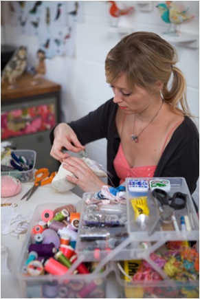
Abigail Brown
Originally you were introduced to textiles by your grandmother, was this what lead you to becoming a textile artist?
From a very early age I was surrounded by fabric, threads and the sound of the sewing machine they became very familiar to me. As I grew and developed an interest in making and drawing, cutting and sticking, fabric would often find its way into what I created. When I got to Art College I felt happiest in the textiles room. Combining my interest in drawing with stitch and fabric; so going onto study a degree it was obvious to choose Surface Decoration which would allow me to work with both.
I enjoyed my degree but longed to be on the Decorative Artefacts course with my housemate. She would come home with all kinds of wonderful experiments in fabric, clay, and latex… all explorations into finding the medium she would use to create her final body of craft pieces. I learnt from her that that whole world existed and that it was possible to be part of it so coming out of university I started to explore what I could make myself and that’s where it all began.
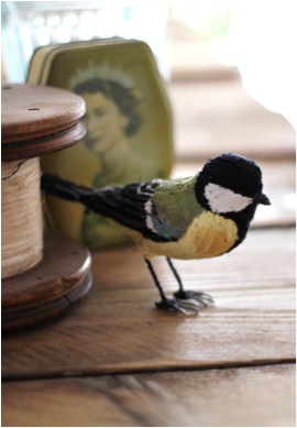
Great Tit
Can you explain how studying for your BA in Surface Decoration and Printed Textiles lead you to make bird sculptures in textiles?
It was through explorations in fabric that I brought drawings of animals to life, more as little characters, stylised illustrations that became plush toys. A friend asked me if I could make her a bird to go in a cage she’d been given and that was the first one I made. It wasn’t any more complex than that!
Since moving to London you have a studio at Cockpit Arts. How important is this location to your work and success?
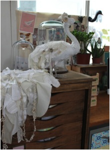
Cockpit Arts has a wonderful reputation for housing some of the best designer/makers the UK has to offer, so instantly being in here gives you stamp of approval. Having a central London location is helpful and the twice yearly open studios; opens us up to the public which in turn brings success.
There is a business mentoring system in place here which is covered by our rent and that can be invaluable help for makers getting started in business. It’s tough, so it’s great to have help at any step of the way.
Can you take us for a peek into your studio space?
It’s usually very messy; I can’t tidy as I go so until I’m finished with an order it will be chaos in here! I like to surround myself with work I’ve made and inspiration from wherever I’ve found it. I’m enjoying building a little plant collection too so I can see some green when I’m working long hours.
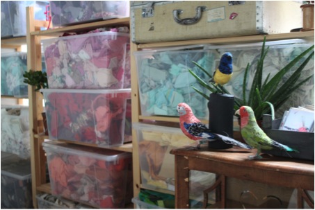
My fabrics are all categorised by colour which helps me locate what I need quickly. The plastic boxes that house them aren’t very pretty but it’s the only way to do it really.
I share my room with 3 other makers and enjoy their company hugely. We share ideas, help each other through tricky patches and share tea rounds! I’m very lucky to be where I am.
How do you go about preparing a new bird sculpture?
I start with internet research, pulling off photos of the bird from all different angles from this I can get an idea of its form in full.
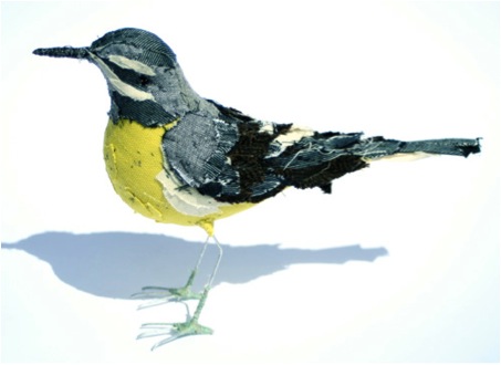
Grey Wagtail
From that I sketch out my body template and sew this in fabric. The body has a wire insert to form the beak and legs and around that is the stuffing, toy stuffing packed very very tightly so that it creates the body shape. The rest is a process of cutting, sticking and layering the fabrics, constantly referring back to the photos to get the colours and patterns as close as I can. Finally I stitch in the detail, which secures the fabrics a little better and really brings it to life.
Birds are recognizable by their shape and colour, can you expand on this?
I research new birds all the time and unless I have a theme to work to, will just make whichever most appeals at the time.
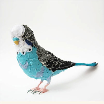
Blue Budgie
How do you decide on the size of each bird you make?
I research new birds all the time and unless I have a theme to work to, will just make whichever most appeals at the time.
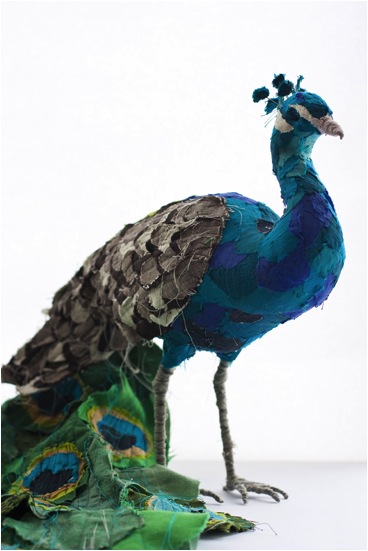
Peacock
Why birds?
I do make other animals but in recreating as true to life as possible, birds allow me to use so much colour and vibrancy which I love. Animals don’t generally venture past grey, white, black and brown. Also the forms are so much more complex and would be far more costly as finished pieces, I doubt I’d sell that many if I made them with the same techniques!
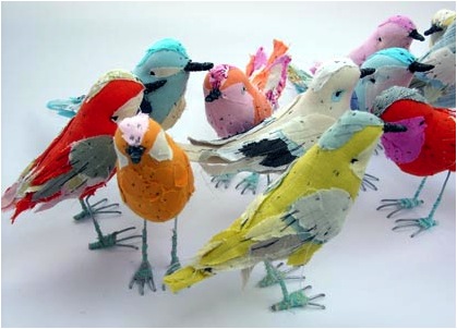
‘The Flock’
Do you do commissions to customer’s specific request of a bird?
Yes, a lot of my work is recreating a customer’s favourite bird. It’s nice to do that, they’re often very excited to see the results and it’s more of a surprise as they can’t yet imagine how it will be.
Do you have a time limit for each bird?
I work to time limits reproducing species I’ve already made so that they come out at the same time and cost, but making new pieces it takes what it takes and if it’s too expensive for anyone to buy I get to keep it for myself!
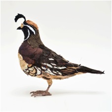
Quail
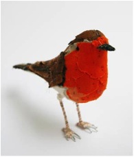
Robin
You do workshops. Can you explain how these operated and details for places?
I don’t do this very often and it’s not something that will become a big part of what I do. But it’s nice to pass something onto somebody and see them enjoy it.
I have run a series of small workshops from my London studio and it’s been very enjoyable if a little exhausting!
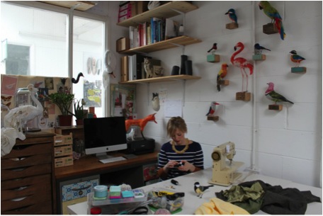
Contact details.
Email: Abigail@abigail-brown.co.uk
Web: www.abigail-brown.co.uk
Abigail Brown, London, UK
Interview by Deborah Blakeley, June, 2013
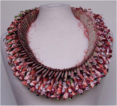
Luis Acosta
You have exhibited in both solo and group exhibitions in most European countries, Argentina, USA, Japan and South Korea. What are you exhibitions in 2013?
| 12 Mar - 2 Jun | Recent Jewellery Acquisitions, Museum of Arts and Design of New York |
|---|---|
| 12 - 28 Apr | NDF Bijoux Atelier, Verona – Italy |
| 3 - 19 May | INTENTION PAPIER 2013, Carré des Coignard, Nogent sur Marne, France |
| 22 - 28 May | Ian Gallery, Seoul, Korea. Korea Craft Designer Association, Annual Exhibition |
| 16 Jun - 8 Sep | Galerie help u zelven, Winterswijk, Netherlands |
| 6 Sep - Dec | Valtopina Museum, Valtopina (Perugia), Italy |
| Nov | Autoría BsAs, Buenos Aires, Argentina |
This list gives you a snap shot of how far and wide Luis Acosta’s work is going; and this is only 2013!
Do you find exhibition gives you motivation to look for new ideas?
To prepare for an exhibition is a 'big job' also a great incentive. You see everything that has been done and it may or may not generate new ideas.

Quipus
How far ahead do you have to work to keep up with your exhibition timetable?
The programming is highly variable, running from 2-18 months. Whenever I have works available I like to present a few new pieces as the public may be totally different from a country to another.
How can people see your work apart from exhibitions?
Several galleries have works in stock like Spain, Switzerland and here in The Netherlands. Unfortunately, the economic crisis has affected me since 5 of the galleries I used to work with have to close their doors.
Although much of you work is jewellery it is often exhibited as instillations can you elaborate on this?
I always think of forms and ways to repeat them. From this starting point I can present my jewellery as an installation. Although the components of an installation may be the same, the setting is different in each space.
When I work I do not think of installations, I really think to exploit as much as possible the use of the same shape. For example the installation "Quipus" Consists of 5 different figures folded each in to 5 different ways. In results in total 25 pieces.
The fundamental basis of my work is my skills as a weaver. Already observe jewellery or textile installation, the pattern repeat element is always present. For example, in the use of colour in jewellery, I base myself in the iridescent twill.
‘Installation- Quips’
You have your work in many museums and galleries. One piece is in the Museum of Arts and Design (New York, USA) can you tell us about this piece and the importance of this purchase?
It is important to be represented in this museum and at this international level. It was a surprise for me to get there. I worked with a gallery in New York; one of thier clients was interested in my jewelry and commissioned and donated the pieces that are now in the permanent collection of MAD.
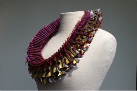
Necklace Collection MAD
How important is it to have your work in major collections?
It is the wish of any artist, to be represented in museums of international relevance.
It might or might not lead to new contacts.

Bracelet Collection MAD
You teach textile design and designing of women’s accessories can you elaborate on your teaching?
Students are not expected to create a finished object during the short duration of the workshop. The main purpose of the exercise is to enable students to develop or interpret their own ideas from a basic starting point.
Workshop "Perception of design (jewellery and accessories)"
This workshop attempts to approach the design from two points of view: design with a specific purpose and free form design.
1. Design with a specific purpose e.g.: bag, hat, jewellery, etc. Here there is a particular objective, but multiple ways in which it can be attained. All forms are acceptable.
2. Free form design. In this case the work consists of cutting and joining pieces of paper until a desirable form emerges.
Examples: The letter "L" (of Luis) inspired me to model one of my hats, which received "Special Mention" in 1988 in Stuttgart (Germany), during the International Competition of Textiles and Fashion Designers and is now part of the permanent collection of the Costum Museum of Buenos Aires (Argentina) and Textile Museum of Tilburg (Netherlands).
Workshop "Design of weavings" (own method)
1. The combination of colours to use in the warp (basically stripes) and the passage of a colour to another in an almost monochrome form (gradient) in warp and/or weft.
From the beginning, I assign each colour a number. I repeat this number combination until the design is finished and it is only at this moment that I place the colours to be used in the right position.
2. The technique to design a pattern of weave (following my own method).
For the making of these designs, at least four shafts are necessary. The result is a fabric of a lot of texture and movements.
The content of this workshop was published in the Spanish and Dutch magazines Oficio y arte (nrs: 11, 13, 15 and 17) and Textiel Plus (nrs: 141, 142, 145 and 146).
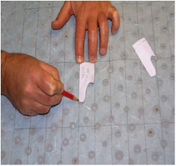
Apart from you jewellery you go large 2D and 3D textiles and instillations in paper, weaving and textiles tell us about these? Take one and expand on the technique and inspiration.
From my early work I was interested textile three-dimensional. First I wove tapestries with reliefs playing with different warps, later on a common loom I wove two-dimensional with three-dimensional effect. I worked thinking of this effect and all my work this concept is visible. The cube, in all its forms, is my inspirational figure.
‘Brooch’
You have used history for the inspiration for the ‘Quipu’ series. Can you explain how this came about?
Through study, I tied a rope with knots that corresponded with the drawing of rapport. Over the years I realized that I had found nothing new; the Incas had used the same system before. So from then on all my work has focused on the Quipus.
'Brooch'
For example, in the series “Quipus” (knots in Quechua language) that the Inca’s used for their administration, each “knotted” object is made of paper threads presented in various ways.
'Brooch'
Quipus
Can you discuss the technique and design aspects of your necklaces?
To make a necklace of paper I should draw first each module that will integrate a necklace. Once the drawing is completed I add to that sheet of paper, six others. I sew (none of the papers are glued), then cut and stitch each module, one followed by the other, to form the necklace.
‘Necklace’
Instead, for a paper thread necklace, I draw a shape that will serve as a model for each link. Each of them is formed with the principle of the Möbius strip, which I will incorporate one Quipu (knot). Drawing, I copy while I sew the paper thread. I then proceed by engaging one by one to form the final necklace.
Quipus Necklace
When you use paper where do you source it from and what qualities are you looking for?
Bracelet
Every city I visit for the first time, the first thing I do is visit a paperwork store to see if there is paper that I can use. I buy just one or two sheets of each class.
I always use 6 layers of paper. The numbers 1, 3, 4 and 6 are usually handmade papers that come from Thailand, India, Japan, etc.. The numbers 2 and 5 are double-sided wrapping paper from Switzerland. These are the papers giving the desired rigidity to the pieces.
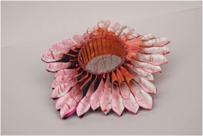
Bracelet
How durable / wearable is your jewellery?
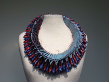
Necklace
The jewellery is made of paper, therefore, requires more care than other materials and with the passing of the years you may notice small changes as a result of use. It is quite sensitive to the influence of light.
You often mention the importance of form and how colour follows, can you elaborate on this?
For me, shape and color go together. For each piece I compose I first think about the module shape and then starts the long journey to choose the right combination of colors. Everything I do is designed to the smallest detail. If the public finds an error; my apologies.
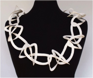
Necklace
Contact details.
Website: www.luisacosta.nl
+ 31 30 2938229
Email: ansacost@lombok.nl
Luis Acosta, Utrecht, The Netherlands
Interview by Deborah Blakeley, June, 2013
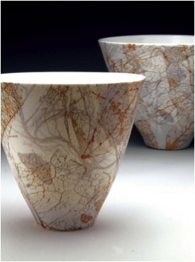
Mollie Bosworth
You use laser prints and imagery can you expand on how you use this on your ceramics?
I develop my images using Photoshop and print them onto waterslide decals using a laser printer. They are transferred onto the polished clay surface after the first firing (bisque) and then fired to porcelain temperature - 1300oC. The iron oxide in the toner is all that remains and this produces a sepia colour image.
You also use your own photographs. Is this a recent, new approach?
I have been developing images from my collection of photos, particularly flora. These are altered and overlaid in various ways. I also use a scanner to develop images of leaves and flatter objects.
Many of the themes are related to your environment – tropical Australia. Can you describe how this inspires you?
Living within the rainforest and being a passionate gardener is sometimes reflected in my work, not always in a direct way. I have a love of layering images and colours reflecting of the abundant growth in my surroundings. I like to pick up on the subtle aspects of my environment - the small details.
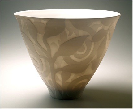
‘Forest’
The colour of your environment is very bright and your ceramics are very subdued, can you discuss this?
My work is often driven by the attributes of the materials and processes I choose to explore. Most of my work uses pure white porcelain with very little use of glaze in recent years. High fired colours are often more subtle. Some of my series use coloured clays or water soluble colours, both materials giving fairly subdued colour on unglazed surfaces.
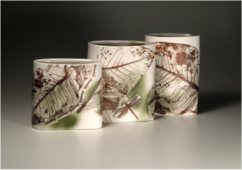
'Remember the Evergreen’
Can you discuss three pieces that have recently given you great pleasure, both in the working and as finished pieces?
Magniflora
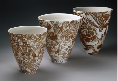
‘Magniflora’
This was my first complete design developed from images of flowers in my garden. The design was inspired by a Qing dynasty all over design, 'Hundred Flower Ground'. I have printed it with different magnifications, and it is always a jig saw puzzle to fit on to a curved surface.
Fragmentation
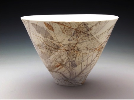
‘Fragmentation’
This series was the result of research with layering laser decals and porcelain slip over the image. They were fired up to 6 times, and I like the way the light reveals the hidden layers.
Copper Acid Drops
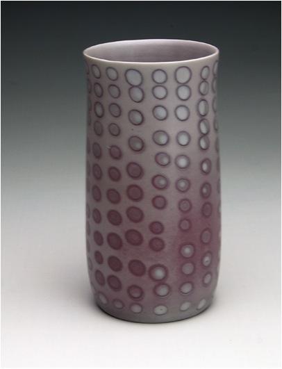
‘Copper Acid Drops’
In my last reduction firing, I had a few vases with a pattern using a soluble copper colorant. This technique is difficult to apply, difficult to fire and results are unpredictable so it great when I get a lovely surprise.
The surface of your work is highly polished, can you expand on why you use this technique?
I use mostly Southern Ice porcelain which after firing is very smooth, dense and vitrified. Polishing the surface both after the bisque and glaze firings with wet and dry sandpaper gives a very satisfying smooth and tactile surface. It is a very different feel to a glazed surface. Also the colour, translucency and aesthetic of the work are enhanced by the polished surface.
Your work is very translucent, how are you able to get this very fine work and still have pieces that are practical?
The pieces are thrown as thin as possible and then 'turned' when leather hard. This is where excess clay is shaved off and the form is refined. Porcelain fired to 1300oC is very dense and strong even though thin. Not all my works aims to be 'practical' in the functional sense and especially not the unglazed pieces.
Pattern: can you expand on two patterns you have used and where you gained the inspiration?
Indigo Mesh
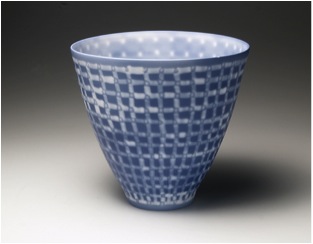
As the work with cobalt chloride and resists, resembled Indigo dyed fabric, I was inspired to further research the patterns made with indigo in traditional societies and bring some of that pattern making to my work.
Botanicals
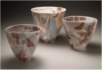
This series was my first venture into laser decals. I have collaged images from 'Queensland Flora' published 1900, images I have developed of insects and butterflies with botanical text.
You are a member of the Australian Ceramics Association; how important is the membership to your exposure?
It is the peak national body for ceramics. Membership benefits include inclusion in the ACA online directory and affordable public and professional liability, both being valuable to my arts practice. I have also had exposure in the Journal of Australian Ceramics that is published by the ACA. Being selected to participate in a curated members exhibition in Sydney in 2011, gave great exposure to my work. This year the ACA are organising an 'Open Studio Ceramics Australia Showcase' (17th & 18th August, 2013) where potters all around Australia will open their studios on the same weekend. This will receive nation-wide publicity and raise the awareness of handmade ceramics, how it is made and where potters are located.
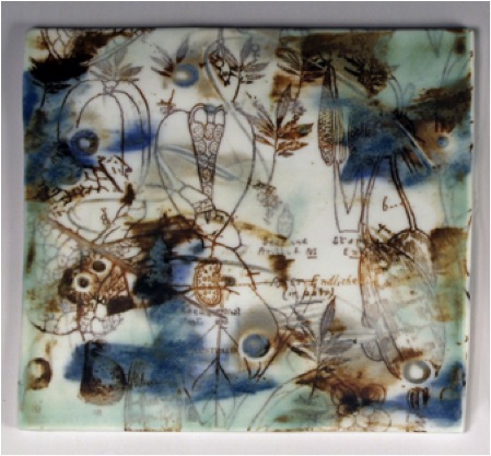
‘Seed Narrative’
You did your ceramics training in Canberra. This was a very deliberate decision. Can you explain how this came about?
I was mainly a self-taught potter with little access to formal training. My practice was centred on functional work for many years until there was a decline in sales as cheap Asian imports moved in. I was ready to move on and explore new areas and work on more researched exhibition work. I wanted to hone my skills and reflect on what I was doing, so I took the opportunity to do the distance course offered by Australian National University. The networking and exposure to a range of techniques and tutors was excellent for ceramists like myself working in isolation.
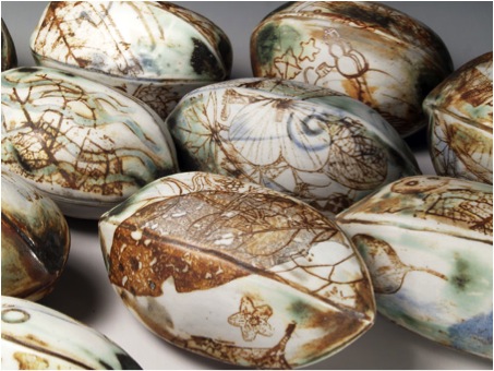
Seeds from ‘Scattered Possibilities’
Can you take us inside your studio and explain the area and equipment you use?
My studio is concealed under one section of my house, looking out onto the garden. I have added on an extension in recent years to house the kiln increasing my work area. The space is mostly enclosed but I get occasional rats and pythons passing through. I use a medium sized gas kiln. I have 2 pottery wheels, a slab roller, extruder, several tables, benches and a sink with running water and lots of shelving for storage. I need to keep a lot of materials on hand as the closest pottery suppliers are 1600 kilometres away.
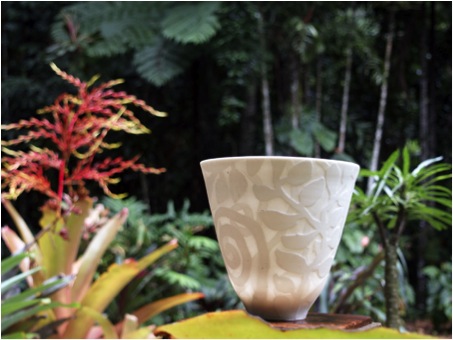
Contact Details
www.molliebosworth.com
www.facebook.com/molliebosworthceramics
Mollie Bosworth, Queensland, Australia
Interview by Deborah Blakeley, June, 2013
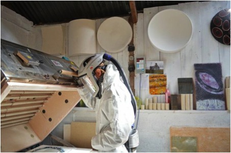
Amanda Simmons
You have been working with glass powders. Can you explain the affects you are achieving using this method?
Using glass powders has changed the direction of my work from semi-functional to sculptural. It is still a very process led practice but one where I am constantly challenging the glass to be at its very limits. Using very thin layers of glass powders instead of sheet glass I can create paper thin delicate glass vessels that still have integrity of form but possess balance and some movement in their unrestricted profiles.
I can use many more layers of colour and enjoy blending my own mixes from the extensive Bullseye range of powders playing very much with contrasts in tone and shades. I am also finding the marks I now make in the powder are much less restricted and more gestural that work well with the gravity stretched forms.e movement in their unrestricted profiles.
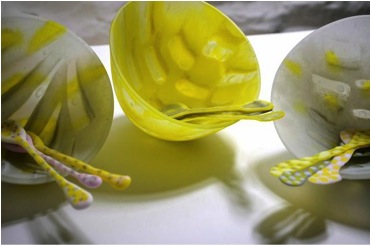
Candy Group’
Your work although functional almost defines gravity. Can you expand on this?
The work has become less and less functional due to its fragility and balance but I would say gravity very much defines my work. I can, to some extent, control mass, heat and time but gravity and hidden depths in the glass define the passage the vessel form will take in mid-air through the firing process. I have been playing with these forms almost exclusively now for 7 years and I’m still learning with every new body of work and always come out with more questions than answers...so they keep growing and changing form. I find it fascinating that the process of mass, heat, time and gravity has shaped our Universe and that it is these methods are my main focus in my work, and ideas that I’m now researching along with contemporary Cosmic Philosophy.
Can you explain about cameo glass and how you work with this method?
Cameo engraved glass is a technique of engraving through layers of glass to reveal the colour beneath. I use mainly opaque glass in my work but love using engraving to bring more light and colour through in places of the vessel. The technique works really well in terms of using diamond tool marks in the glass that stretch and change when the vessel is formed.
Colour is very important to your glass can you elaborate on this?
Colour is a large part of the ‘visual language’ I apply when designing my work. As I produce mostly 3D forms I’m also thinking about how the colours will blend and react with each other when seeing the piece as a whole with light. I like to have bold colours and contrast in my work as the processes of slumping and sandblasting the glass mutes and dilutes colours, but generally I just love colour. I set myself a challenge a few winters ago as I felt I had got stuck in a rut with colour choice; choosing to look at colour combinations from nature I produced a range of vessels directly inspired by the garden birds and started to use yellow, reds and oranges which had never made an appearance up till then. This small experiment, opened up my colour choices (and made quite a fun piece).
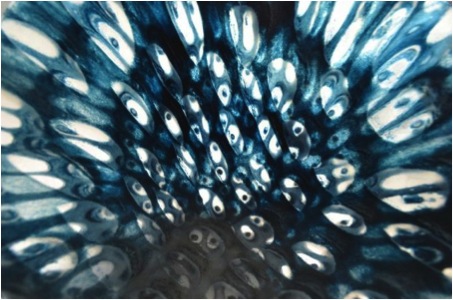
Powder design
Exhibition work is a huge part of your work. Why do you like working within exhibitions?
It wasn’t planned. When I first started out (and sure it’s the same for most people) I had no idea where I wanted this new career to take me; originally I started with architectural glass but didn’t enjoy the long timescales involved in these projects and quickly realised I liked making objects for the gallery market. I have never produced many pieces in one range and prefer to make one-off objects so it made sense to work towards exhibitions where I could work on small collections of work that had room to grow and change from one exhibition to the next.
You had 8 exhibitions in 2012 and already you are working on 6 for 2013. How do you keep up with the demands?
It’s a 24/7 type of job; I work from home and can fit other obligations/life around my working schedule. I’m lucky that I can just walk up the garden to my workshop to check on a firing or do short bursts of work in-between keeping up-to-date of the business side of things. I’m passionate about glass and enjoy progressing and working through technical and metaphorical issues and feel this is life not a job. I left a very stressful full-on medical job to become an artist, a very conscious decision to change my life, so although it can be very hard sometimes to keep up with the physical demands of the work or when things go wrong, I know I wouldn’t want to be doing anything else!
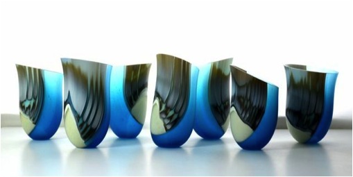
‘Cupid’
Do you work for solo or group exhibitions; can you expand how each works for you?
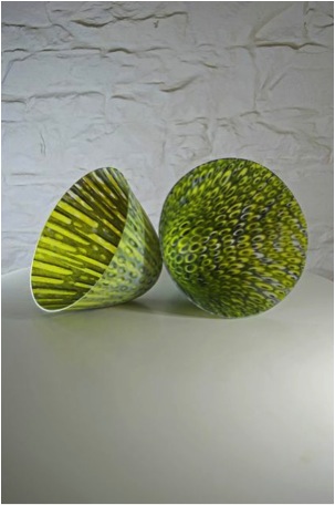
Expansion
Titles and themes mostly hinder! I tend to only take on shows that have a resonance for me like my three most recent exhibitions; ‘Coalesce’ at London Glassblowing I thought worked perfectly as my work is built from many parts coming together. ‘Colour’ at New Brewery Arts in Cirencester speaks for itself I think; and a collective show of artists from my local region of Dumfries and Galloway showed at Bianco Nero Gallery in Yorkshire.
The images you have are beautiful. Can you explain the importance of professional images for your work?
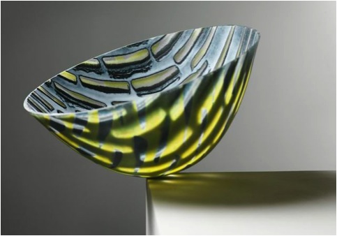
'lost at Sea' - Shannon Tofts
Thank you....I mostly take my own images as I’m forever working right up to the delivery deadlines and of course I need a reference of my work and like to have images to help advertise the show. I find more galleries now want images of all work so that it can go on-line for their own publicity. I’ve been interested in photography since a child (almost becoming a freelance photographer for bands and live performance) but the technical side never interested me but I do like playing with lighting and placement to make my work look in context. The professionals I have used over the years including Shannon Tofts ( www.shannontofts.com)) and Colin Tennant (www.colintennantphotography.co.uk/) have been brilliant to work with and just wish I could get more organised to do this more often. It’s so important in this business to represent your work well.
Colour and shape, please discuss this. Perhaps you could take 2 or 3 pieces and discuss this using them as examples?
The technique I employ most in my work, slumping glass through hand-built suspension moulds can create many different forms depending on the variability’s of mass, heat and time (and colour and opacity to some extent)...[starting with fusing layers of glass together to create ‘mass’, playing with colours and textures at this stage which affect the form of the vessel, then this piece goes back in the kiln placed over a mould that has a ‘hole’ cut in the middle, at around 650 degrees centigrade the glass starts to soften and slumps through the ‘hole’ creating the vessel shape – controlled by heat and time. The work is finished by a variety of coldworking techniques such as flat bed diamond grinding, diamond wheel lathe engraving and sandblasting]
My favourite form I’m working on at the moment is ‘Expansion’ and ‘Expansion Theories’. I’m trying to investigate the formation of the Universe and understand some of the most current theories using the same universal physics of mass, heat and time. The vessels become very thin through the stretching process, just a few millimetres all over but having gone through a very rigorous coldworking regime to finish, still safe objects to display.
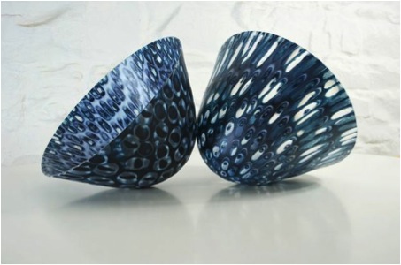
Expansion Theories
They can take a few hours to form in the kiln (on top of the heating up to top temperature and cooling stages) and it’s important that I’m close by to watch the progress of the slump; different colours, opacity and weight can make this process longer or much quicker.
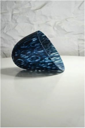
Expansion Theory
The other forms I’m enjoying are the larger ‘platter’ type vessels which take the slumping process to the extreme. These pieces are finely balanced over the mould and with careful manipulation of top temperature and speed of getting there I make the glass fall through the aperture, often manipulating the glass with heatproof accessories to change the form as it cools. I’m looking for ‘organic’ fluid shapes in these pieces and like when they fold in on themselves.
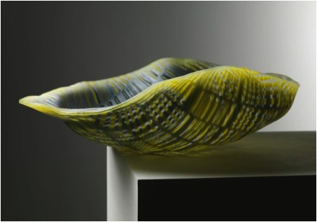
'Platter'
I’m looking for a bold but uncomplicated form that creates a balance between the inside and out.
You have been working with glass for over 10 years, can you discuss 2 highlight in your career during this time?
I’ve enjoyed every step of the way, the people I’ve met, the countries I’ve travelled to and the organisations and galleries that I have worked with throughout the years have all added to a wonderful growing experience. The two highlights of my career so far though would be exhibiting at Collect at the Saatchi Gallery in London and taking part in a residency at North Lands Creative Glass in Lybster, Caithness, Scotland.
I was accepted as part of a collective to show on the Craft Scotland stand at Collect 2011. This is the largest exhibition of International craft and applied objects in the UK and a show I had visited since my student days for inspiration, education and fuelling of my passion for contemporary crafts. Seeing my work exhibited at this type of show made me realise that I had made the right decision to change my life, taking the huge risk of leaving a good salary and trying to make it in this world as an artist. It opened other ‘doors’ for me in the business and helped greatly in getting a good audience for my work.
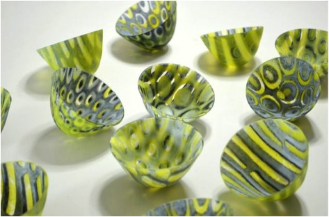
‘Lost at Sea’ Small Kilnformed Glass Vessels
My other highlight is on a more personal development level and an event that I feel totally changed my practice and the way I work...in just 10 days. I was invited on a residency of professional glass artists by the American artists Steve Klein and Richard Parrish based at the internationally renowned glass centre, North Lands in Caithness. This was an intensive 10 day residency focusing on kiln formed glass in architecture which I thought I may re-visit (in fact it helped me realise I was definitely a gallery based artist). We visited very traditional but derelict Scottish buildings around Lybster and then time and space to realise ideas. A round table discussion of the entire group started our days along with trips further afield in the region. I was very kindly sponsored on the residency by Lani McGregor, one of the owners of Bullseye Glass in Portland, OR in return for a glass piece inspired by the residency and surrounding area; this level of support from Lani, a pioneer in the glass industry, gave me a huge amount of confidence in my work and helped me realise that I produce my best work when I feel passionate about a subject and spend more time researching and thinking.

‘North Lands’ – Paper samples
Tell us about your studio and the space you need to have?
I have a large, tall tin shed that I have added to over the years to suit my needs (wood burning stove and insulation as it can get very cold here in the Galloway hills, a new mezzanine storage level and some new roof panels to let in more light). I have a lot of equipment, 3 kilns, coldworking tools (grinder, lathe, sandblaster) and sheet and powdered glass storage and as I’m not the tidiest of people many portable work benches to store work in progress. I think with craft practices we work to the space we have available and to the size of the equipment. I’m limited in the size of my pieces to the size of my kilns but have on occasion rented out bigger equipment to make one-off pieces. Working any larger than I am now would get too physical for me on my own and I am limited by the electricity supply to my workshop so no bigger kilns!
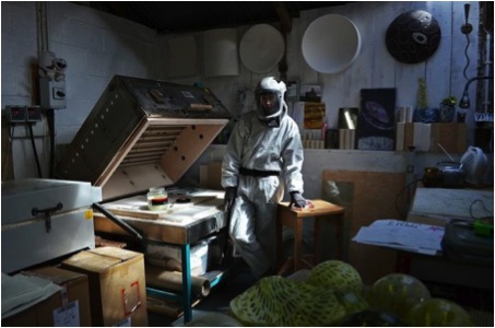
Amanda Simmons in her studio
You must have an excellent work ethic to produce the work you do. Discuss the division of your time in the studio, and teaching?
In 2012 I took on a lot of teaching as the invites kept coming and it was a wonderful way to travel the world and meet many more glass artists. However, it did impair my own practice as it left no time for the development of my work. Lesson learned; this year I’ve postponed many of my invites (including USA and Denmark) and will certainly take less on in the future. I like teaching and passing on the knowledge I’ve gained and it’s great to get out from the studio now and again but I mostly prefer working alone in my studio in this beautiful part of the country. I work most days but to my own timetable and have to limit the physical side of my practice due to health issues but find there is always plenty to do on the computer.

Teaching takes you to many places can you elaborate on your teaching and how people can catch up with classes with you and the standard they need to be at?
I teach a little at a local level which is mainly beginner/hobbyist level. All the teaching I do away from Dumfries and Galloway has been specifically my version of kiln formed glass vessels and although beginners can learn this easily it does help to have fusing and slumping experience (also previous coldworking practice is very useful). Hopefully I’ll be heading to the states next year and will advertise these when confirmed on my website/blog/Facebook. I would love to visit Australia one day as there are so many exciting glass artists based there.
You are a member of The Contemporary Glass Society. Can you discuss the importance of the membership to you?
CGS is a wonderful organisation that continues to grow and gives a huge voice to glass artists in the UK and abroad. As I work mostly on my own (although there is a great network of artists in my region, there a very few working with glass) being a part of a glass society lets you know what’s going on in ‘glass world’, helps with making connections with other artists and organisations and encourages participation of exhibitions that they promote.
How could others become members?
Membership is open to all and the benefits for membership include the opportunity to participate in CGS workshops, exhibitions (including on-line), conferences and other events; a regular magazine with information about glass-related events and exhibitions in the UK and abroad, and to which members can submit articles, topical notices and advertisements; inclusion in the Membership Directory, accessed via the CGS website, with a link to members¹ sites where appropriate...and many more
Full membership is £55 (plus £5 for overseas members) and student rate of £30 (again plus £5 for overseas students) all available from www.cgs.org.uk

'Candy'
Contact details.
Email: amanda.simmons@btinternet.com
Web: www.amandajsimmons.co.uk
Amanda Simmons, Corsock, Dunfries & Galloway, Scotland
Interview by Deborah Blakeley, May, 2013
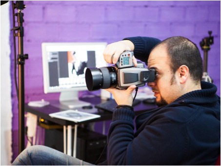
Iban Montero
I became aware of you photography through ‘Limited Paper’. Can we begin there?
'Limited Paper'
How did you come to work with Ane Lopes on ‘Limited Paper’?
I met Ane working on a shooting of the crew for the blog she works on. Ane Lopes is a fashion designer and needed photographs to show her collection. When I wanted someone to make my Limited Paper project real I immediately thought of Ane. She was my first choice. I am so pleased she agreed, we both had a great time as we worked on the project together.

The whole shoot has a 1950’s iconic fashion look can you discuss this?
I love classic photographers and designers work. I feel It is the zenith of elegance. I keep going back to the past for inspiration in my art. I feel that the past is much better than the present... I admire Avedon´s work (and others) and I always try to have their work in my mind.
This is my tribute to the past and their art, the magic of the dense greys in photography. It is a challenge to forget colours. I have worked only with volume and used the same material for the background as the dress.
How important was it to find the right model, Natalia Iturrequi? What look did you want?
After looking at Avedon’s work I wanted a model that could immediately be recognised as the iconic look of Dovima. Natalia Iturrequi was very charatoristic of Dovima.
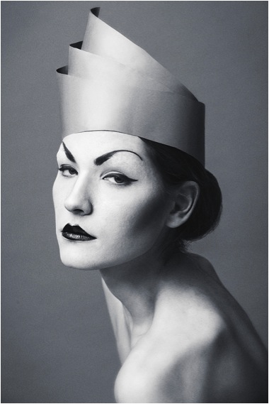
How difficult was it to work with paper and yet get so much movement?
As it is not fabric, it is very rigid and at the same time delicate. That’s why dresses are made of fabric and not paper. In the hands of a genius like Ane, she is able to make paper look so good. The paper that we used was seamless, like the background paper we use in the studio.
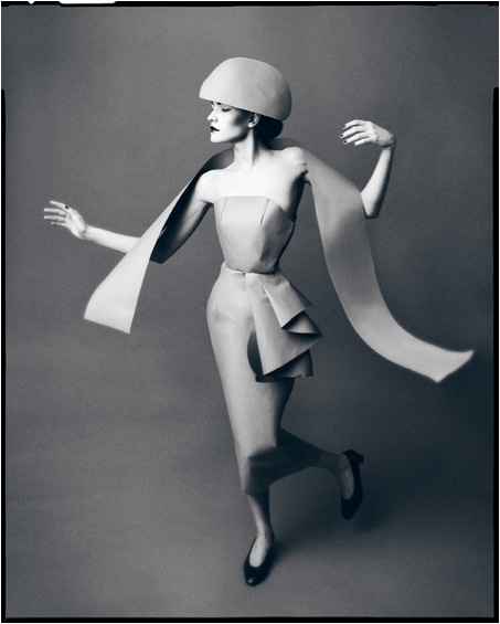
Were there any tears (crying) and tears (rips) during the photo shoot?
To be honest, we enjoyed the shooting a lot. It is a pleasure to work with great professionals. It was a flawless morning of work. We had wached “Funny Face” (with Audrey Hepburn and Fred Astaire), specially the part where Dovima appears, as I wanted to show Natalia the style of the movements and poses the models used in in the 1950’s in the fashion industry.
I usually have everything sketched and planned to make shootings easy for everyone. At the end we had a big ball of paper made up into dresses. Imagine how the dresses were wrinkling and breaking as Natalia moved and posed.
The photographs are all in black and white, why?
I think it is necessary - to achieve that 50´s look, the photographs have to be done on black and white film. Artisticly I reason that, to get depth and to play with volume, you need to get rid of colour.
What or who was ‘Limited Paper’ done for?
It is one of my own projects. You can call it a personal project or a portfolio project. I needed to make my ideas reality to keep my creativity sharp.
You have a video of the ‘Limited Paper’ photo shoot and you share it?
Lighting
As a photographer, I am not very interested in the technical aspects of photography. It is not about the equipment or the settings. It is all about the feeling, the atmosphere, the look... it is what you get from your subjects, not how you light them.
Black and White or colour
The ambiguous answer would be: it depends... sometimes colour works better and sometimes you need black and white. That is true, but I definitely love Black and white.
Fashion
Are most of your fashion photographs done in your studio?
I’m very familiar with neutral backgrounds. Sometimes it is better to state simplicity, minimalism, elegance... or to emphasize feelings or ideas. The "Less is More" mantra works sometimes.
Are most of your fashions photographs done without background and why?
Of course they are intimately linked. One should develop at the same time as the other and they can’t stand alone, they need each other.
Your name is often connected to Richard Avedon can you discuss how you feel about this comparison?
Overhelmed, but honoured! It is a great success for me if 1% of my work reminds people of a genius like Avedon.
Iban Montero, Bilbao, Spain,
Interview by Deborah Blakeley, May, 2013
David Monahan
When did you come up with the idea of “Leaving Dublin”?
My relationship with migration was so close that I never even noticed or acknowledged it until about 3 years ago. When the feelings came I was chasing the idea of making a big project and so decided to do something about it. And Leaving Dublin was born.
Let me explain, my mother was one of 5 children and at the age of 17 all of her family had moved to Bristol in England. She was left alone in Dublin where she married her love (my dad) about 2 years later.
He was at the young end of a family of 7 children. Three of the seven left for a new life leaving the older section of his family behind. Growing up in Dublin, I had no family on my mother’s side, and of those on my fathers side there where 2 cousins of a similar age to me. I saw it as normal, although as a young child I do remember a sadness that my mother showed occasionally, especially around Christmas time.
Moving into the eighties things where very bad economically in Ireland so all of my siblings left town. I was in Dublin without any of them. One returned in 1999,
my dear brother Ian.
Still I felt this was all normal!
In the 2000’s, things were changing; we arrived at a point where no one had to leave Ireland. Unless it was their wish. I had an emotional response, one of happiness for the future.
Aoife Mooney
When the crash came I became retrospectively sad.
Seeing all the progress being washed away and things returning to the way they were for
hundreds of years before, I realised what awaited families in the future, I knew all about the thwarting of inter familial relationships caused by even the shortest of distances.
It was then that I made up my mind to give a face to those about to depart and to celebrate them as people, not mere statistics.
Alan Pentony
There are several links between all the photographs. Can you expand on
these?
There are several unifying factors that hold the work together as a series.
The invisibles being scale, perspective and composition.
The visible being the People and the suitcase.
Night
All of the work is made at night and purposefully lit in an effort to make them as
dramatic and theatrical as is possible.
Jennifer and James
Location, background
Locations are chosen by the sitter and it is always a place that has a special
significance to them. The background is carefully chosen in collaboration with the sitter.
Let me explain: they give me a location; I go there on the lookout for a suitable
background usually at night. I make several tests and send these off to the sitter with my suggestions and leave the choice of the exact scene up to them.
The Suitcase
The suitcase itself came to me via my brother who used it as a table when he lived with his then girlfriend In London during the late eighties, early nineties. It was last stamped in at Tilbury Docks in 196I and for me it represents the waves of Irish migrations that went before this one. It makes this work with an eye to the past
and for me this suitcase is a nod of inclusion to those millions in this process.
Graham Ford
How did you go about getting the participants?
In March 2011 I put the following add up on my blog ‘Lilliputian’:
"It is my wish to photograph people (of all nationalities), who have made the decision to move from Ireland for economic reasons. In and around the city, juxtaposed with landscapes that are significant to their pasts.
If that sound like you, or you know of somebody who is about to move, please bring my proposal to their attention.
I want to make these works monumental, to show those depicted in a true heroic spirit. For after all they are making a huge jump into the void of uncertainty and this needs to be commemorated perhaps like never before!!"
"Please contact me if you wish to work with me on this project."
This was my starting point and it grew from there. From the start to the finish of the project I have made a really big effort to stick to the principles laid out in this proposal.
Jade O’Callaghan.
You have given a photograph to each group that sat, what do you think this has meant to them?
Yes! I have made a special sitters edition of 2 prints of each scene and although I have not given them to every sitter as yet, a significant number have prints and they do provide a very happy memory of a moment when someone intervened in their life to sit and celebrate in the quiet of the night, a very special passing.
Claire Weir
How many photographs did you have to select from?
Were you able to use all the sitters?
For the Melbourne show there was a total of some 70 images to choose from.
31 was the final edit and the only criteria involved in the edit process was trying to create an exhibition that hung well together. The show needed a good number of Australian immigration subjects - there were 8 in total. As it is a manifestation of the work in a particular place, for me the work is as a whole inclusive. Once shot a work is part of the piece. It appears in my chronological journal and on my blog as a post with information about the shoot and the sitters. When the work is finished and a book is published every image shot will be in the final publication.
The age demographics of the sitters in the photographs, can this be related?
Only in the case of Australia I suppose, there are different criteria in different
countries. For example there is free movement within the European Union for all Irish and European citizens. In this case age would not be a barrier, just language.
Keiko Furamoto
What period of time did the whole project take?
The Project has been active for the last three years and I am feeling it is about to come to its natural end. While in Australia I started to rephotograph sitters. I hope to continue this process into the future. The next step is dependent on the first, the process in actually ongoing.
How did you make the connection with the Melbourne Immigration Museum?
The immigration Museum had their eye on me after a news story about my work in The Age newspaper. In December 2011 there was also a feature in an Irish newspaper which gave an exhibition date in Dublin for the work. Within days of that
announcement I had an exploratory email from the Fantastic Lisa Collins at the Immigration Museum and the rest as they say....!
Can you tell us about the sponsorship for this exhibition in Melbourne?
The costs involved in the mounting of the Melbourne exhibition were born on the large part by Museums Victoria. Assistance was provided by the Irish government
via culture Ireland, who assisted with payment of the costs associated with the transporting of the works and other travel related items
Is the exhibition travelling anywhere else?
I am working on that right now and hope to announce another southern hemisphere venue soon!
Have you been to Melbourne to see the exhibition?
As this show has been the highlight of my photographic career to date, I was not going to miss the opportunity to be there for the Opening last October.
Jacinta
There is a video; can you discuss the making of this and its importance to the exhibition?
The video was made by video journalist John Francis for the museum. It is an integral part of the Melbourne presentation as it brings the works to life, tells each person’s story. Helping to direct the viewer towards the exhibition, which fills the brief of the Museum: to tell and share histories of migration.
Has there been any suggestion of a book?
In my head it’s always been a book but I feel we are about a year away from a realisation of this, I can’t wait!
Darren Crook
What were 2 or 3 things that you were told during this whole process that you
would like to share with us?
The trip to Australia for me was a huge experience. Looking back on my time there it seems like a dream. Many a beautiful thing was said to me during that period. To be honest seeing and hearing the emotional response of people in the space is something I will carry for a long time. My work connected, job done!!
Paul Horace
Contact details
Email David Monahan: dmon@mac.com
thelillipution.blogspot.com
Online portfolio at: davidmonahan.viewbook.com
Mobile: +353(0)87 2247020
http://museumvictoria.com.au/immigrationmuseum/whatson/current-exhibitions/leaving-dublin/
David Monahan, Dublin, Ireland
Tim Probert
Before we talk about “New York, Phew York” can you discuss the three different areas of your work?
Book illustration
Sure! In addition to illustrating ‘New York, Phew York’, I’ve also illustrated ‘Pickle: The (Formerly) Anonymous Prank Club of Fountain Point Middle School” for Roaring Brook Press and contributed to the anthology ‘Chocolate Chips & Rocket Ships’. Illustrating books is something I really enjoy and I hope to do many more.
Animation
I have done animation and production art for several different clients. I designed and animated short bumpers for Cox Sports that would play after commercial breaks during college basketball games. For the Providence French Film Festival, I designed and animated an introduction video. That animation plays before every movie they screen at the festival. I also created an animation for the Cable Car Theatre in Providence that was used to promote a successful Kick starter campaign.
‘Monster’
Graphic Art
Most of the graphic art I have done relates to advertising. I have illustrated for billboards and designed t-shirts. I have also designed websites and icons for software.
“New York, Phew York” by Amber C Jones with illustrations by Tim Probert
How did this book illustration deal come about?
Amber was looking for an illustrator for the book and a mutual friend recommended me. Amber checked out my work and reached out to find about me working on the book. I did a couple samples and we went from there.
‘Yellow Cab’
How did you and Amber connect?
We worked on the book via email and phone calls.
Where did you actually do the illustrations, in your studio or on the streets of New York?
I did the illustrations in my studio, but I did lots of research on the streets. I’d take photos, do some sketches on the streets, etc. Though I’m from New York and live there now, I was living in Providence at the time, so in a pinch I could use Google Street View to get a feel for the layout and types of buildings in certain neighbourhoods. The majority of research was done on location though.
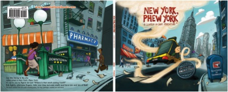
‘Wrap Around Cover ‘’
“As we walk through the streets we’re excited to see all the neighbourhoods that make up New York”
Who’s perspective are you drawing from, the boys, his parents, or the reader?
Most of the images are from the perspective of the boy. I was hoping to capture that feeling of how huge, wonderful and sometimes overwhelming New York City feels, especially to a child. There are a few pages from other points of view though.
Your illustrations actually take account of the time of day. Was this part of the brief?
Yes. The story takes place over the course of a couple days, so the changing time was factored into the illustrations from the beginning.
‘Broadway’
How involved was Amber C Jones involved in the drawing process?
Amber would often have ideas of things that needed to be included in the image, sometimes an object for the smell or a specific place in New York, but other than that she let me go wild. I would do rough sketches, send them to Amber for approval and then move on to the final illustrations.
‘Chinatown’
Added to the magic of the text and illustrations is the use of smell.
How was this decided?
Amber had a list of smells from the beginning. Every page had its couplet and an associated smell.
How long does the smell last?
The smells are engineered to last a long time.
Did this sensory aspect help you with the illustrations or did the smell come later?
The smells were decided first and then I would brainstorm images based on the text and the smell. Sometimes it was obvious and sometimes incorporating the smell was a little tricky. Smell areas on opposite pages couldn’t touch when the book was closed, so that had to be factored into the layouts of the illustrations. It was like a puzzle.
As a New Yorker, are the smells correct?
Yes, the smells are spot on.
This book was made possible by Kickstarter. Can you explain how Kickstarter works?
Kickstarter is a fundraising tool to help get projects made. You propose your project and outline everything involved. You also offer rewards based on how much a person donates. For instance, a certain donation amount got you a copy of ‘New York, Phew York’. You set a fundraising goal and you have thirty days to meet it. If the goal is met, all of the backers donate the money. If the goal is not met, then no money is donated. So it’s all or nothing.

‘Kickstarted’
How long did the project take you?
The bulk of the illustrations were done over the course of about six months. There were several more months of revisions, creating additional artwork for promotional material and putting together the final files for the printers.
How many illustrations are in the book?
About 40, plus the wrap around cover.
‘Cowboy’
‘King’
Do you have any storyboards related to the book?
I do have thumbnail drawings and rough sketches of every page.
‘Hockey’
How has this helped your book- illustration career?
New York, Phew York has been great for me. The exposure has been wonderful and going through the process of illustrating an entire book was an immensely valuable experience.
What are you working on now?
I recently finished an animation for the Cable Car Cinema in Providence, RI and I’m always on the lookout for the next big project. You can see my current work on my website, timprobert.com.
Amber C Jones
Author “New York, Phew York”
You are a first time children's author and a full time concierge in New York City, how did the combining of these two pursuits come about?
The joy of my job comes from helping people every day. It's incredibly rewarding and I feel a personal responsibility about how people leave New York feeling about New York. It's a responsibility I take very seriously.
The book came about when I was walking home one day. I was captivated by the smell and look of pizza in a window and didn't notice I was walking behind a horse!! As I went to the corner to make sure I didn't step in anything unfavourable, I was overwhelmed by the smell of shish-kabob smoke. It's THEN I thought, here should be a scratch and sniff book of the city!
I realized with all the outlets we have to enjoy NY: books to read about it, pictures to look at, soundscapes to hear there was no way to SMELL New York and that is such a huge part of your experience here. Because we live in close quarters, dense with people, restaurants and shops, literally every corner has a different smell.
'Amber c Jones, in New York’
I was excited to bring this element to a sweet story of a family on vacation that befriends the hotel concierge who tells them all the neighbours to visit. The book ventures into 19 neighbourhoods, uncovers 23 smells of the city and is nothing short of a love letter to New York.
When I did scout for an illustrator I posted a flyer asking for a submission of a picture of a cab going down a New York City street with a child looking out the back window and a license plate that said NYPY. I knew Immediately Tim was the guy when he sent 4 amazing and different variations of the submission request. It just spoke volumes about his skill set, but also his personality. I couldn't have found a better artist or person if I had searched for years. I only wrote the words...it's his work that brought them to life.
How important was publicity to the selling of "New York, Phew York"?
TThankfully, "kickstarter" worked out to not only be a way for us to fund the project but it also became a good gage as to whether other people (outside of friends and family) thought the project was a good idea. Being that the book was such unique an idea and looking for funding, it got picked up by the news --then from there, very quickly spread into other mediums. The overnight popularity of the book took us all by surprise. Though we were incredibly excited, it was also a bit intimidating to have such a high demand for a book that didn’t even exist yet.
Will there be more, and what cities will they highlight?
Yes, there will be a series of scratch -n-sniff city books. The next will be Los Angeles (SMELL.A), then San Francisco (San Franstinko )
How can we buy a copy?
The book is available at www.scentsationalbooks.com and www.amazon.com as well as other retail outlets like the MoMa Store, W Hotel Gift Shops, Pylones and Hudson News in LGA and JFK airport
‘Subway’
Contact details.
www.timprobert.com
Tim Probert, New York, USA
Interview by Deborah Blakeley, May 2013
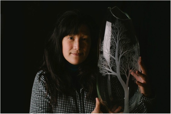
Kayo Yokoyama
When you began your study at the Sydney University did you know then you wanted to be a glass artist?
Yes, I started blowing glass a year before attending Sydney University; I had a clear mind about studying art in glass.
Your glass is known for the engraving you do, on your own hand blown glass. Can you explain this technique?
Glass engraving is an old decorative glassworks technique. I use hand-held motor drills with small diamond tipped burrs, just like dentists use. Glass engraving is considered by many to be a dying art form; however I do not believe it is.
Lonely Tree
When you create a piece do you work toward a specific audience or exhibition?
Most of time, there are no particular reasons or audiences. Making comes from inside of me, to fulfil my desire.
Your medium glass is both fragile and hard can you discuss this?
Glass is a solid material and yet brittle. It is ensitive to temperature but is not easy to break by hand. I have a furnace which contains 220kg of molten glass, just like honey. When glass is hot, it can be cut, twisted and stretched but once it reaches certain temperature, it can’t be changed. It is a fascinating material.
When you engrave on your work you combine this along with meditation. How and why do you do this?
Buddhist Zen Master Dogen’s philosophy of concerning self-awareness and enlightenment is the core of my practice. His theory supports the discovery of the ‘self’ through meditation and mindfulness, and encapsulates an emphasis on providing greater understanding of the self. There are a few layers to this in my art practice: one of layer is when I engrave, it is a meditative process that directs my consciousness outside myself while the images create themselves.
‘Legacy of the Day’
Homeland series
Your collection “Homeland” is all about space. Discuss how you achieve a landscape within a glass object?
The trees in my work represent real trees as well as being symbolic of a higher consciousness in the journey of the growth of my identity. My engraving of trees on the glass objects' surface recalls me to a place of strength inside me. They suggest the fundamental order of the world and my place in it - my homeland. My feelings towards my homeland will be different from those of others, but through the use of shared symbolism my hope is that the others will find their own homeland through these artworks. My intention is similar to Master Dogen’s theory, ‘Let the object speak for itself’
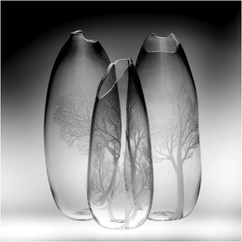
‘Homeland World Heritage’
Why have you added the chairs?
I use chairs as a metaphor for the self. A chair signifies the absence and the presence of a person. This idea is exemplified by a story from a Buddhist tale where the God ‘Mara’ sends his daughters and his army to distract the Sakayamuni (Buddha before he was ‘awakened’) when he sits in meditation under the Bodhi trees. One doesn’t see the person of the Buddha, only an empty seat, symbolizing his presence. It is dependent on the viewer what interpretation they give to the empty chair.
Do you make the chairs?
Sometimes; I have made them in silver nickel, silver, ceramic, glass and wood.
By using furniture you have been able to make your pieces take on the feeling of vast space. Can you discuss this?
As I described before, chairs are the symbol of myself / ourselves and I do use many other objects, not only furniture. There are ladders, rocking horses, crystals… anything to make it home.
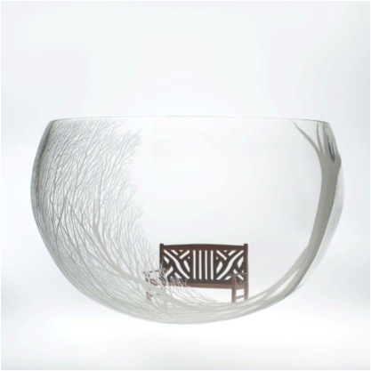
‘When You Smile’
How important is the Australian landscape to your work?
When I first arrived in Australia, I was astonished by the size of the land. In the Australian outback you can see 360 degrees of horizon. The land allows trees to grow huge, yet they do not cover the land completely. The landscape and trees are a motif for my transition to my new homeland. They represent a combination of continuation and change. In Australia, I live among trees: trees are an essential factor for me to feel connected and at home. This experience reminds me of a childhood memory of being among trees, with dappled lights shining between the leaves and branches creating new patterns on the ground.
“Delightful and enlightenment” are two words you use to describe your work can you please elaborate on this?
Martin Heidegger describes language as the ‘house of being’. Language creates us because it creates the way we think of things. We do interact together, we exchange our thoughts and values, we can’t think about something that has no name in the world of matter. It is easy to mistakenly use these associations of cultural background and cultural value to understand the art works on display. I do not wish an audience to judge my works and myself from the cultural background nor its predicted value. My wish is that viewers gain enjoyment and enlightened experiences through viewing my works
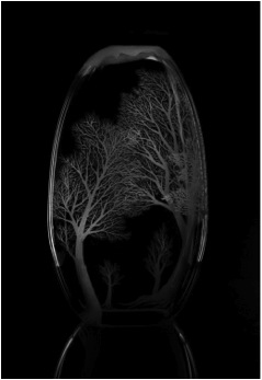
Glass blowing is a very heavy job. Can you explain how you cope with this aspect of your art?
Just like working in any field, in the office, selling clothes or using the computer every day, you get used to it.
You need very specialized equipment for your craft. Can you discuss both the equipment and the space you have to work in?
I have a few hand held micro motors and diamond drill burrs. My work space for engraving is a very small area with a sink and water.
My glass blowing studio is in a large warehouse space with many different type of kilns, furnaces, tools and equipment.
Contact details.
Kayo Yokoyama
P.O.Box 219
Blackheath
NSW 2785
Australia
Kayo Yokoyama, Blackheath, NSW, Australia
Interview by Deborah Blakeley, April, 2013
Tim Clinch
When did you first realize the impact food could have on your photography?
I’ve always loved cooking, and always been interested in food so it was a logical progression. You must remember though that I’m quite an old bloke and have been a photographer all my working life. When I left art school in the 70’s, food photography was not fashionable and nor, for that matter, was cooking. There were few food programmes on the telly and the concept of the “TV Chef” and dedicated food magazines hardly existed. Hard to believe these days, but food simply wasn’t ‘fashionable’
I would assist on a few food shoots but back then it was all false. A ‘roast chicken’ would be a raw one, coated with used engine oil to make it look ‘roast’ and with cigarette smoke blown over it for the steam! And ice cream, under all those hot studio lighting was made with instant mashed potato!!!
Even back then I thought this was weird, so I started my career as an advertising still life photographer and had various different studios in London, before moving on to interiors, food and travel, which is what I do today.
Not all your food photography is taken in the kitchen: you transport us to villages and markets. Can you expand on this?
I would say that very little of my food photography is taken in the kitchen. Food for me means travelling and finding out about new foods, new cultures and new ingredients. My ‘philosophy’ of food photography (without trying to sound TOO pretentious!!!) can be summed up by this piece I wrote about the workshops I run…
“What exactly IS food photography?
Well…in the ‘food photography’ workshops I run, this is the main point I’m trying to get everyone to think about.
Ok, a plate of cooked food alongside a recipe is definitely ‘food photography’. And how about the raw food, before it’s cooked? Well, I guess that’s ‘food photography’ as well, right?
Ok, so how about a beautiful picture of a clove of garlic, on an antique linen background? Well, yes, I suppose so, but it’s verging towards still life isn’t it?
And how about the field where that garlic was grown? In Gascony. At dawn… with the sunlight just hitting the tops of the young garlic, ready to be harvested? Yeah, ok, but isn’t it landscape photography really?
And the picture of the farmer who grew the garlic, arms bulging with a huge bundle of freshly picked produce? Well, OBVIOUSLY a portrait!
And the picture of the farmer’s grandmother sitting in the outhouse at the farm, studiously plaiting the leaves to make the beautiful bunches of spring garlic the family have been selling at the local market for the last fifty years?
A portrait too I hear you cry!
Discuss the close up work of the produce you photograph?
There’s not that much to discuss. I believe that in food photography the star of the show should be the food… and close-ups merely serve to highlight that.
As discussed above, the seller/producer is a vital part of food photography. I’m not a studio based food photographer working on the perfect drip or dribble. There’s nothing wrong with that type of photography but I want my pictures to take you on a journey, and showing where the food comes from is a vital part of that.
Many photographers prefer to work in black and white most of your work is about colour. Please discuss this?
Well…I LOVE B+W photography! In fact I’m a columnist and regular contributor to the world’s biggest selling magazine devoted to black and white photography ‘BLACK + WHITE PHOTOGRAPHY’ magazine. It’s a great magazine and I’m proud to be associated with it. However, the one thing I have never managed to photograph sucsessfully in B+W is food! The very essence of food photography is that it should excite the senses and make you hungry, and this just doesn’t seem to work in B+W. I’m talking here, by the way, about cooked food. Plated food. I have many a wonderful picture of funny looking vegetables or flaky heads of garlic that are beautiful in B+W…
What is it about Europe and food that makes us all want to photograph it?
I am European and I love Europe with all my heart! If someone were to say to me that I could never set foot outside Europe for the rest of my life, I would die a happy man! There is so much to see and so many cultures and traditions to explore that I’ll never tire of it. I moved to Spain 25 years ago and lived there for nearly ten years. When I went there it was not fashionable. The food was relativelty unknown and many people I knew were baffled. Now of course, Spain and Spanish food is the most fashionable in the world. But it was not always so.
The exciting thing for me now is the opening up of Eastern Europe. Many people I know will go on holiday to Provence or Tuscany (two regions that I do NOT ever want to visit again as they have become devoid of real life and ended up as glorified theme parks… ”Provence-Land”… “Tuscany-World”) but never THINK of visiting anywhere else. I’ve just moved to a village in rural Bulgaria where the food and wine is amazing, the countryside is beautiful and there is not a Swiss investment banker in sight! The thrill I get every day is the same thrill as when I first visited France in my early teens. It’s foreign, and exciting, and about as far from the tourist trail as it’s possible to get.
Food photography just keeps on growing. Recipe books are now a work of art, both for the taste buds and visually. Can you expand on this comment?
Has it grown too far? Has it got just the teensiest bit… boring? Possibly. There is an absolute wealth of wonderful stuff out there, but it’s in danger of becoming overwhelming. I think the important thing nowadays is to be selective. Buy the GOOD cookbooks. Read the GOOD blogs. Don’t feel you have to buy or read everything. You don’t. There’s more to life than reading about someone else’s dinner.
Can you explain about your work: Chefs?
Yes, I have, over the years, spent a lot of time photographing in professional kitchens, and have worked with some amazing chefs. And, every time I do, I realise what a solitary profession photography can be. I get a kick out of the ‘team buzz’ that goes on in a kitchen… each member of the team reliant on the next. They are pressurised places and the looks of concentration and the sheer pleasure on some of the faces are a joy.
Michel Troispros instructing his staff, Restaurant Troisgros, Roanne, France
Let's take a step back from the kitchen and table to your work with interiors of hotels. There is usually still a hint of food in these photographs. Can you tell of one or two exceptional hotel locations and the shot?
Well, last February, I was commissioned to shoot the amazing ‘Faena Hotel + Universe’ in the Argentine capital Buenos Aires. It was an amazing and beautiful hotel and I was delighted with the results the downside of my trip was that, having spent my life wanting to visit Argentina, in a twelve day shoot, I spent exactly half a day outside the hotel…ho hum. I hope I’ll get back there one day.
Faena Hotel + Universe, Buenos Aires, Argentina
I’m also very proud to have worked closely with the famous French chef Michel Guerard and his designer wife at their incredible ‘Empire’ in Eugenie-les-Bains in South West France for many years. Proud, because over the years their hotels and restaurants have been photographed by just about every magazine and every photographer worth their salt. And the photographer they commissioned to take the pictures for their own website was me (puffs chest out slightly!)
Your work takes you to many locations and leads you to take travel photographs – can you share one or two great places and photographs?
Yes, I’m a lucky man. I have visited some wonderful places. And been paid to do so! As I explained earlier, I’m particularly excited about Eastern Europe. I’m English, and there are so many places to explore a couple of hours away from England, but so few people visit Bulgaria, Slovenia, Slovakia, Hungary, Serbia… the list goes on, and yet most people couldn’t point out these places on a map! The most exciting place I’ve been to for many years though is Ukraine. In particular, Western Ukraine, and more particular still the wonderful city of Lviv and its surrounding area. We just came back from a truly memorable two week trip, the highlight of which was a visit to the Carpathian Mountains. It was like being in my own personal episode of “The Hobbit’! I felt like the lord of the Shire!
Traditional Hutsul house in the Carpathians, Western Ukraine
However, as to my favourite country in the world? It would have to be Spain. My home for nearly ten years and an endlessy fascinating and delightful place. From the baked plains of Andalucia, through the wonderful capital, Madrid and on Northwards to the misty mountains and the wonderful food of the Basque country. I love it.

Ironmongers shop, Hondarribia in the Spanish Basque Country
You also do still life photography. You can make the simplest objects into piece of beauty. Can you expand on this?
Simply because most simple objects ARE beautiful. We just don’t take much time looking at them. I love the sheen and patina of old tools for example. Taken out if context, and put on a simple background they take on a life of their own.
Now you have completely tantalized us, can you explain about the workshops you run?
Where
OK…things on the ‘Tim Clinch Photography Workshops’ have changed a bit. For the time being I’m not doing any workshops in Gascony. I hope, at some point in the future that they will be revived but, for the moment, I’m concentrating on two locations. My new base in the fascinating country of Bulgaria, and in Southern Spain.
What is planned
Some exciting new things! I’ll be running several workshops on food & travel photography in and around the beautiful city of Veliko Turnovo in Bulgaria. It’s an endlessly fascinating place and completely different to what a lot of people will have visited. I’m planning some exciting adventures for 2014 and will be announcing them all in November.
I will also be running 2 or 3 workshops in southern Spain. I’ll be doing one at the beautiful Finca Buenvino in the Sierra de Aracena, and one (or two) in the province of Cadiz concentrating on the incredible fish the area has to offer.
Details will be announced in November 2013
A bit about what a reader might need to know to book.
Everything will be under one umbrella now, so keep checking in on the workshops page on my website www.timclinchphotography.com
All booking details and prices are there.
I will also be undertaking ‘bespoke’ workshops. If you, or you and a group of friends, want to visit Europe on a ‘learning tour’…let me know where and when you want to go and I’ll organise it…all.
The percentage of photography, eating and visiting the location.
Well, the workshops are billed as ‘Food & Travel’… take a look at what I’ve said about food photography earlier in the article.
I firmly believe that you’ll never be a better food photographer without becoming a better PHOTOGRAPHER…so, visit beautiful places, cook and eat amazing fresh food, discover new wines, learn new recipes and improve your photography and post production skills and benefit from my thirty five years of experience all at the same time… what’s not to like!
Contact details.
Website: www.timclinchphotography.com
Email: tim@timclinchphotography.com
Tim Clinch, England, France and Bulgaria
Interview by Deborah Blakeley, November, 2013
Audrey Grant
In 2002-2003 you took a figure painting course at Leith School of Art. Can you explain how this has affected your current work?
I have always been fascinated by the human form and its study I feel is a very important grounding of any artistic training. I joined the course after a period of absence from creating work so it was a good course to reconnect to what was important to me and cemented my interest in the figure.
Dance Figures
Can you discuss your involvement in the Edinburgh International Festival?
I have worked for the Edinburgh International Festival for many years in various capacities but in the last 10 years as an artist working on some of their schools education projects. Although this year I received a creative commission to work alongside writer Mary Paulson-Ellis, which will culminate in a small exhibition during the August Festival called -The Evolution of a Creative Idea.
You have had your first solo exhibition at UNIONgallery in Edinburgh elaborate on the amount of time and work this has taken you for this solo exhibition?
“This exhibition was a ‘sell out’, marking Audrey Grant an artist to watch for.” Deborah Blakeley
Showing at the Union Gallery is a great experience, there are just two of them (Rob and Alison) but they manage a pretty ambitious monthly programme of exhibitions. They are incredibly supportive and considerate towards their artists creating very positive working relationships. The new work came as a result of what came before and has been germinating since my last show there in 2011. Well over a year but also a lifetime of one's experiences.
You have recently won the Anne Redpath award. Please explain about this award and your painting “Man III”?
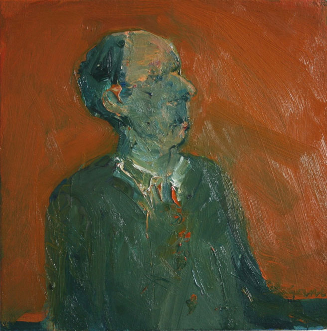
Man III
The Anne Redpath Award is for painting and is awarded by Visual Arts Scotland at their annual exhibition. All paintings in the exhibition are eligible. I was delighted to receive such a prestigious award for Man III which is a small painting of the head and torso of a man.
You have also won the Tom McGrath Trust’s Maverick Award and David Memorial Award how important have these been to you career?
Yes awards are really important, they often have money attached and they can get you noticed. The Maverick Award was initial recognition and funding for the project I am now doing for the Edinburgh International Festival. Working with the writer Mary Paulson-Ellis, this is a very different project to painting and involves documenting the evolution of an idea (for a Children's picture book). The David Gilchrist Award was made for a painting in the annual exhibition of the Royal Glasgow Institute of Fine Arts.
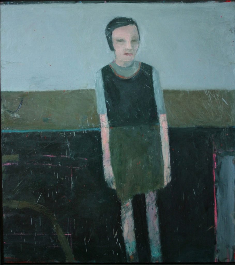
Standing Woman and Landscape
The backgrounds on your paintings, can you elaborate on them?
The backgrounds are painted surfaces, unspecified but sometime look like horizons/landscape. I have been very interested in the work of Anselm Kiefer and also Antoni Tapies and the idea of the wall - building layer upon layer which reveals a history. So I scratch the surface, splash on to it and so forth in an attempt to create an animated surface.
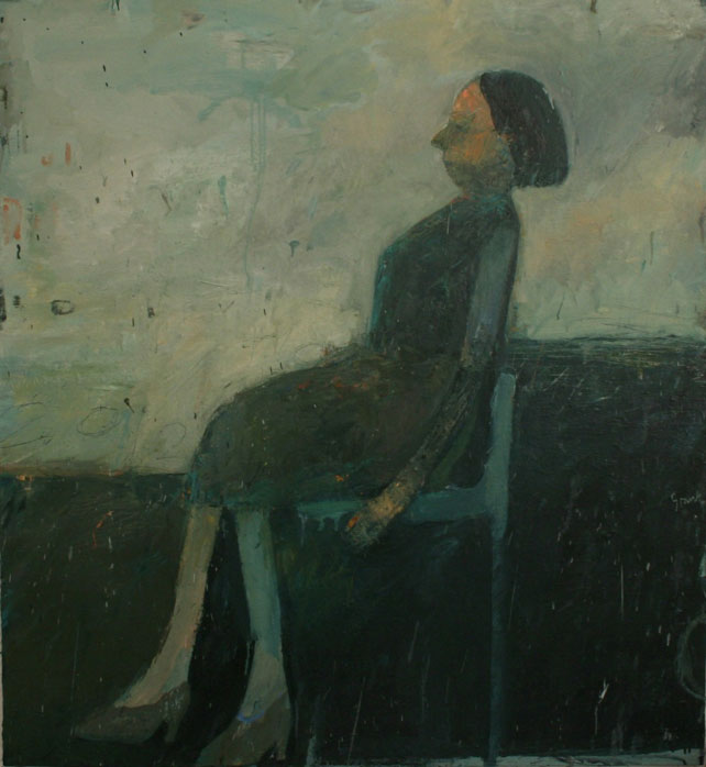
Woman on Chair
The horizon plays a huge part in your work. How do you decide on these and your use of colour?
It is more about trying to find a unity of form and space, so dividing the space helps with that process. I often lay bright colours on top of darks, and also apply glimpses of colour in the background and in the figure which emit a sort of light.
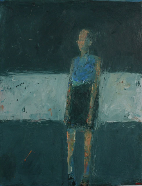
Figure Walking II
Tell us about your figures?
The figures are invented / imagined and grow out of an intense dialogue with the paint. Where paint is laid on and scraped off until something starts to work and a figure begins to assert itself.
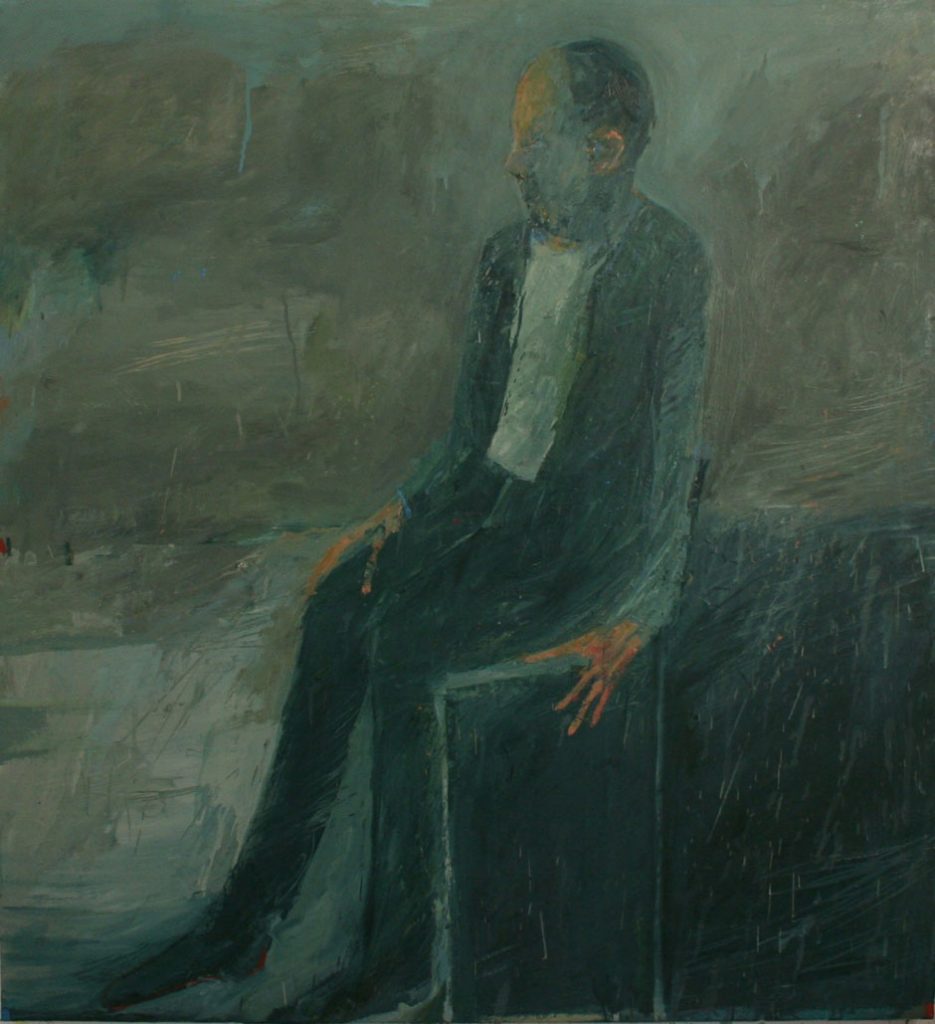
Seated Man
Do you use models?
Up to about 2008, early 2009 all the time. In fact I worked with a select group of sitters over a period of time, so working on the same drawing or painting for weeks and months. I was interested in what would happen in long durational works. I stopped working like this in 2009.
Do you take life drawing classes?
Yes I have taken many, many over the years but not now. I think it is good to move away from the model to see what direction your work can take.
Your work is very intense; with you wanting to participate. Is this your aim?
I suppose my work is intense, I never think of it like that. But it is certainly a long and intense process. My hope is that it conveys some kind of human feeling and if people react on a feeling level then I am very pleased.
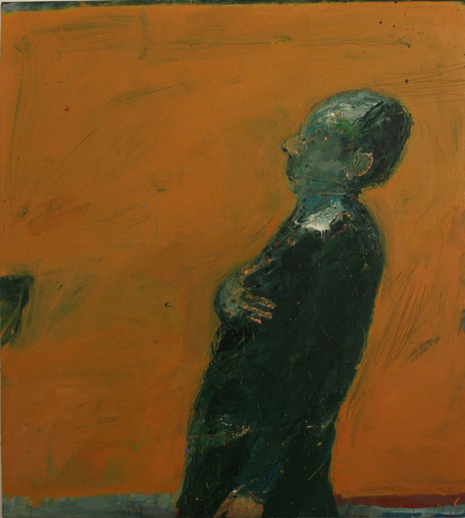
Man with hand on chest
Can you take the work “Man with Stick” and take us technically through this as well as your emotional input into this work?
The feeling behind the gesture as you lay paint on is important to me, so I am quite a physical painter and there is something about the physicality of the painter's gesture that interests me. I think Rembrandt knew all about this. Man with Stick is invented although I think that kind of figure exists everywhere. But in saying that the stick may have come about in order to balance the composition. And as a result of that process a human feeling thing happens too.
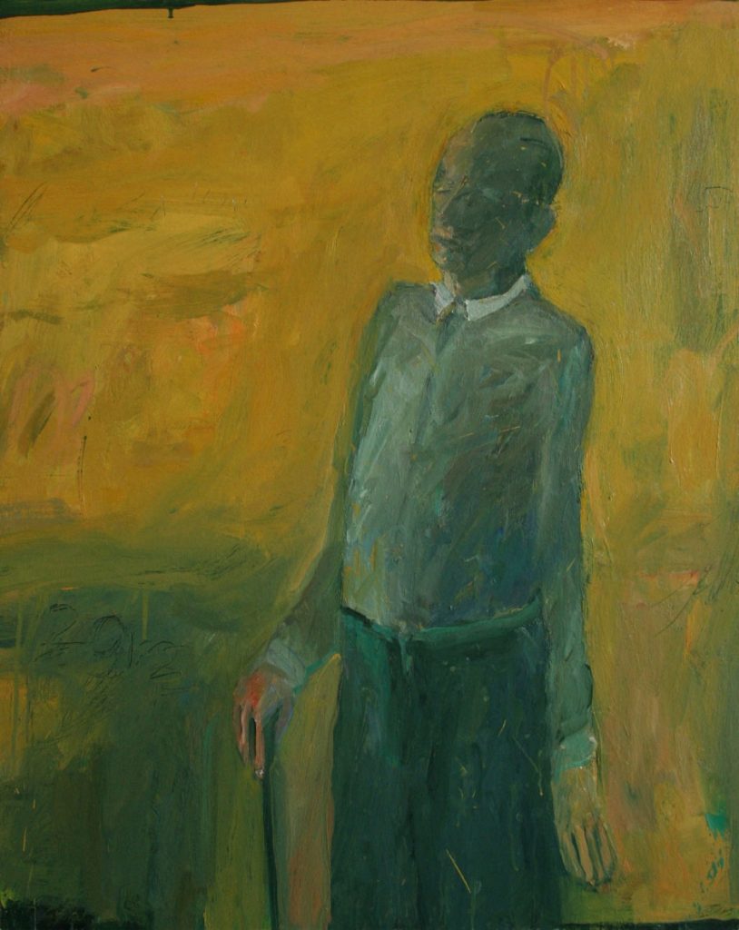
Man with stick
Can you discuss the choice of size of your work?
I work in a range of sizes, the largest only around 110/120cm. Bigger pieces take longer to resolve and usually make way for a body of work so they are really important to make a breakthrough to new things. But small paintings are good too, easier to manage because of size but very tricky because small.
Your figures are usually solitary; they portray an austerity. The minimal movement of the figures allows the humanity to show through. Can you explain your thoughts on this comment?
You put it really well in your question; I am interested in how the simplest of gesture can seem to reveal something much deeper, with a history even. I suppose it is a kind of vulnerability that I am drawn to.
A little inside knowledge, can you tell us about your studio?
My studio is in a complex of artist studios run by an organisation in Scotland called WASPS. It is not that big but has a huge windows and a very high ceiling, half the studio where I paint is quite messy as paint tends to get splashed around over the wall and floor. The other half of the studio is where I can draw, drink coffee. I often listen to music when painting - classical and opera so there are certain composers who I particularly relate to and maybe the feeling evoked in certain pieces of music also connect to what I am painting.
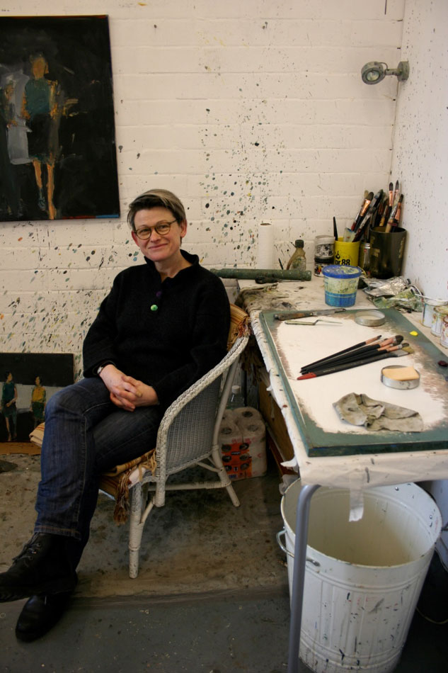
Contact details:
Audrey Grant
Edinburgh, Scotland
Interview by Deborah Blakeley, April 2013
Heather Shimmen
Can you please discuss the influence going at 14 with your family to Papua New Guinea has had on your art?
Travelling to and staying on my parents farm in Papua New Guinea through my teenage years was quite a revelation, not only for the work I was to make in the future but profoundly, on a personal level. Those experiences did not translate or become evident for some years. I think it was an experience that percolated within me for a long time. Even though it is many years ago now, since I was last there, it is still a vivid living memory.
After contemplation, I realize my interest in body marking, including scarification tattooing and piercing, had its origins from this time when I first encountered tribal people who had all, or some, of these forms displayed on their bodies. It was very confronting for a sheltered white middle class girl from a Melbourne suburb in the 1970's.
Today, you might see in evidence on the streets of Australia and other Western countries, body sculpture and decoration. Instead of bones pierced through noses you will see stainless steel pins and spikes on most parts of the body and face while the tattooing can be incredibly eclectic and not restricted to tribal marks.
Both tribal and western approaches might be fundamentally about a connection with tribe, or even purely for decorative reasons. It is certainly a human practice seen across many societies from the earliest human groups throughout human history.
References to some of these practices of piercings became more in evidence with two small linocuts I made about 13 years ago. One is called 'Beauty Spot' the other 'Pierced'. In both I attempted to bring together a number of disparate elements in cohesion. There are references to witches and piercings, both in tribal cultures and those seen in our society - from the punks of the 1970's to the mainstream youth culture of today. My piercings are not conventional and include broomsticks and fish hooks, although there are some safety pins - invented by the Etruscans and found in the ears of individuals from Papua New Guinea, the UK, Australia, the USA and elsewhere. I like the play with time, history and culture.
In the last couple of years I have introduced a stronger entomological element into my work. Much of this stems from my experiences up close and personal with some very large and many legged creatures found in Papua New Guinea. One that has always stayed with me, and is derived from that time was my encounter with a hillside moving with arthropods - centipede like creatures, all about a foot long. I had gone down to retrieve a ball at a friend's farm, which was partial rainforest. Needless to say I didn't linger there for very long!
Your training was at RMIT University, how has this influenced you?
When I studied at RMIT it was quite a small Fine Art Department but it was populated by large personalities in the teaching staff and my fellow students and contemporaries. It was quite a rarified place then as many of the lecturers were well known artists of the day who for the most part opened up ways of making and considering art and challenged our preconceptions about this and other aspects of life. Most of the lecturers were masters in their fields and although a painting major I became enthralled with printmaking from my first class. With people like George Baldessin, Greg Moncrief, Tate Adams, Graeme King, Jan Senbergs and many others who imparted not only technical expertise but some of them became mentors in many ways and have supported mine and numerous other ex student's careers.
The institution felt like a family in a kind of a way especially by third year. We socialized with our lecturers and subsequently I am still friends with many of them. Over that period when I was a student many committed artists came out of this University many who are still making art and some exhibiting all these years later.
Both those lecturers and contemporaries have been very supportive all along the way. I have exhibited, shared studios, houses, worked, travelled and had life experiences with many of these people I encountered first at RMIT as a student.
![]()
’Going Native’ Linocut on paper and organza
You have also taught at RMIT, as an artist did this role help your art?
It is a very different place now in terms of the departments and faculties however there are still a couple of familiar faces around the place. It has grown to be a much bigger institution. I teach and have taught in many other places besides RMIT from TAFE, private providers, Monash University and the Catholic University. I find that attempting to impart enthusiasm, a sense of exploration, a curiosity and professionalism that was passed onto me by my lecturers from the past is rewarding and often challenging.
The students also give back a great deal and it is the interaction with many and varied people, their stand points and the way in which they view the world is something to learn from. It's a two way encounter.
Of course, being part of an institution which has a body of staff and fellow exhibiting artists, often results in invitations to exhibit. When time allows there is also the opportunity for discussions with people who specialize in my field of printmaking .It is in the office or studio, where recent technologies and new work by contemporaries is viewed, that problems might be thrashed out. It is also a very supportive environment.
Can you expand on three pieces of your work and in doing this show the development of your art and also explain the technique you have used?
1. 'Lost 1, 11 and 111' - Linocut on felt
I have made a number of works around 'The Lady of the Swamp’ and 'Lost 1, 11 and 111' are a small suite of works of same dimension, treatment and concept as part of a series. They draw on the story of Margaret Clements who disappeared in mysterious circumstances in the 1950’s from her almost submerged mansion, ‘Tullaree’ in South Gippsland. It is an alluring and fascinating tale.
The story is one of a ‘riches to rags’ tale. The female protagonist lives an indulged and hedonistic lifestyle (including travel in the grand style).This life deteriorates into poverty and destitution.
Margaret was last known inhabiting the crumbling edifice surrounded by the lapping of the encroaching swamp. No remains of her have ever been found!
A mythology and preoccupation of the ‘female’ within the Australian landscape is a central theme in the work. There are many stories long since forgotten. The colonial woman suffered much hardship, often weighed down by the trappings of the fashion of the time, most likely existing, forgotten in an isolated environment.
2. 'Cry' - linocut on paper and organza
There is something intangible that I respond to in birds. There are many things that drive me to make images of them. It is a duality, in part their fragility versus the endurance they seem to posses.
Within human mythology and folklore this dual aspect is evident in many cultural stories; evil versus good, death versus life, foolishness versus wisdom and so on.
Dreaming of birds is said to be a portent of important happenings in one's life. There are many potent stories.
Birds have an unmistakable outline - one that is beautiful and completely contained and yet when placed in a forested setting this embodiment metamorphoses and becomes embedded in its surroundings. An image created entitled ‘Cry’ typifies this. The bird’s solidity falls away into a curtain of twigs that indicates a body, or does it. I like to evoke ambiguity!
It is some of this quality and an attempt to capture something of the essence intrinsic to birds within this image. The bird in this case is a curlew, a water bird with a distinctive beak and eye (I have studied them myself by hiding in the mangroves so as not to scare them.)
This image has inhabited my imagination for some time and is translated onto paper as a linocut incorporating organza.
3. 'Swarm' - linocut and ink on paper 2011
This work is made up of multiple panels and is both linocut and calligraphic washes of ink and very loose stencil shapes of flying insects. It brings together elements of a narrative, both personal and historical and even a micro social statement as well.
In this work like many I have made, the female takes a central role. I strive to make these females of the species appear as imbued with strength and power and a touch of introspection. I like them to appear ambivalent, as I think this female does, it is an unbalanced and even unsettling image.
I am sure my way of portraying the female image comes from many places - from the strong matriarchal element, present in my family background, from my love of both Goya's and Velasquez's portrayal of women, to my interest in the many infamous and famous historical women who appear in both literature and portraiture, often based on real life saints, courtesans, witches and heroines. I think I am a little in awe of these kinds of women.
In part, this image is in collision, in terms of narrative and its fractured treatment. It is not one story but a few, one of which derives from the story narrated earlier on in this conversation. Its origins come from South Gippsland where I mostly now live and from a real tale of mystery. In one episode the female protagonist Margaret Clements and her sister lived in a once luxurious but now crumbling mansion in a swamp. One night there was major flooding with hurricane like weather systems and they were stranded and overrun by all manner of creatures both large and small. As they huddled on their beds an army of these insects, snakes etc flowed like an avalanche and joined the women on their refuge from the water lapping in the rooms of the house. It was this story that evoked a strong response and was an influence on the image.
In combination with this true tale are others that have been amalgamated within the image, including my own personal response to the experiences of the two sisters. There are other stories of beguiling women entertainers like Lola Montez and her infamous 19th Century Spider Dance that has echoes in the creation of 'Swarm'.
I have been developing a female character that encompasses and encapsulates much of these kind of women over the last 8 years, she is called 'Matilda' and has been represented waltzing at times and perhaps there is some of her in this work.
She has been devised in response to the famous representations of male heroic figures including Burke and Wills and Ned Kelly by artists, at least well known in Australia, such as Sydney Nolan and Arthur Boyd.
Winning the Silk Cut Award in 1998, how important has this been to your career?
Winning the Silk Cut Award has had a profound effect on my career and also myself, personally. To begin with it was quite a shock to win and one that had positive implications. It seemed like a big metaphorical tick for the work I was making (at least by the judges at the time) and set me off in quite a new direction for my practice in terms of process, imagery and concept.
Until that time around 1998 I had predominantly made paintings and drawings, although in the late 1970's and 80's I had produced many etchings and had made a number of linocuts but had never exhibited these. I was at a turning point where I had recently left my job teaching printmaking at NMIT and decided to enter the Silk Cut Award. I had the time and mental space to do so. It also fitted in with my family circumstance. I had a young child, 2 cats and a partner and nowhere to keep chemicals in my studio or house safely. Lino printing is great in terms of these issues and is relatively safe compared to some other printmaking processes.
There was some kind of synchronicity happening at that moment in time as the imagery I was exploring and the process of linocutting came together and since then I have almost exclusively been making linocuts. It was a moment in which the process was the vehicle allowing the visual ideas to manifest in a concrete way. The fact that I make my work as Lino prints is not so crucial to me. The images might be made as drawings or paintings but it has become important in as much as it is a way to express my ideas better than they might if created by other technologies.
You have travelled extensively in Australia, in particular in Northern Australia, how has this inspired your work?
I am a natural collector of flotsam and jetsam as I am with ideas that inform my work. Part of this collection comes from travel and like any life experience they are ones that slowly emerge.
A number of years ago myself and my partner were in the northern parts of Australia, around the Darwin area and environs and went out to a place in Arnhem Land called Arrmoduc. It entailed a flight in a small plane, then a very bumpy truck ride followed by wading through swamp accompanied by a man with a gun to shoot at animal attackers e.g. pigs and/or crocs. Finally we scrambled up out of the swamp onto extensive rock escarpments. It was an amazing place, not only was every rock face covered in layers of ancient ochre paintings of spirit figures , hand prints , dreamtime figures and images of Macassan ships but there were many burial sites in sheltered rock alcoves. One of the most outstanding experiences entailed visiting a cave completely full of human skeletons which evoked memories of my visit to the Capochin caves in Rome - also crowded with human skeletons stacked and often arranged in decorative formations.
It was the overlaid imagery on the rock escarpments that I felt a connection to. Serendipity and the accident of the overlay, as each layer transforms the whole over millennia. I have seen this in the form of graffiti on other more contemporary walls in Melbourne from the 1980's (I participated in this), and particularly now in central Melbourne. Also, other cities like London and Paris and most particularly on the wall that divided east and west Berlin.
I spent a lot of time documenting all these walls in still and super 8 film images. Inadvertently this has manifested itself in my work and whilst initially I layered my paintings with both multiples of paint and meaning, I now endeavor to translate this as a Linoprint.
You often work with other artist in exhibitions can you explain how you find this?
Luckily, so far I have always had very good experiences with the people I have exhibited with and have learnt much from the processes that happen when negotiating exhibition spaces and the actual hanging and installation process.
I have made collaborative work in the past with a group of three other female artists and we titled ourselves 'Refluxus'. Not only did we make quite a large body of work together but we exhibited our wok in both the Bendigo Art Gallery and in Melbourne. It was loosely based on the notion of the Surrealists Games called 'The Exquisite Corpse' in which each participant devised a set of rules resulting in a work in some form in which we had all been part of making. My favourite amongst many was the Monica Lewinsky dress (of Bill Clinton fame) and the 125 rolling pins that sang and were constructed in many and varied ways.
Most recently I have done a residency with Mandy Gunn at the Art Vault in Mildura where we collaborated using printmaking techniques and referencing local culture, flora and fauna. It was a wonderful experience in which a lot of work was produced. It will no doubt influence my other work in the future in ways in which are hard to quantify.
During the process of the collaboration, experimentation and play with media and image was free form - in which the accident brought up some interesting and unexpected results.
Can you explain how you fuse entomological images with historical work?
I made a work titled 'Kanguru' in which there is an amalgam of the historical and the insect - in this case butterflies. The work is a fractured and reconstructed image based on the iconic creature that is the Kangaroo. The idea derives from an original drawing made on Captain James Cooks' first voyage to the Antipodes by Sydney Parkinson. When back in England, Joseph Banks (also on this voyage) passed the drawing on, plus a skin of the animal to George Stubbs the renowned painter of horses. He subsequently made a painting in a somewhat heroic style and further to this the engravers of the day reinterpreted this image for the many broadsheets of the day. Mine is another reinterpretation into a contemporary context.
The ‘butterflies’, which appear centrally in the work, are an important element. They represent something that occurs in both the natural and human worlds, a migration of sorts. In part they reflect the atmospheric phenomenon, in which upper wind currents carry material over great distances - anything from spores and seeds of plants to, sometimes, even creatures like butterflies and frogs - in the process facilitating an unintentional colonization from one land mass to another. My ‘butterflies’ arrive carrying those plant particles, small animals and also humans in an inevitable, inexorable migration. In this case they reference the Australasian region where, over time, movements of plants, animals and people have altered the landscape and environment with sometimes devastating effect.
There are shadows that flit within this work, indicating the possible unseen consequences of human and other alien interactions that might infect or affect this unique Australian animal.
![]()
‘Kangura’ – Linocut, ink and tea on paper and organza
You work beyond the boundaries of a printmaker, can you explain how you work beyond paper?
I think like a painter and am always considering other and alternative ways to develop my practice. I do like to get the print off the page and so have been open to other surfaces and other ways to explore this media.
I work on fabrics that are both opaque and transparent. The transparency allows an increased dimension to the work and a play with image.
The other fabric I have incorporated into my work is the felt used in blankets for etching presses - after it has been used for this purpose. It's not something I can buy from a shop! The idea to print on it happened while working at a TAFE College where students were using some blanket off cuts for rags. I could see the potential and luckily was correct when, after experimenting, discovered it printed beautifully from the block.
![]()
'Hoot' - Linocut on Felt, 2011
You have a done a series of pop up books, tell us about this aspect of your work?
The pop-up books had their genesis many years ago when I worked in TAFE and landed the unenviable job of teaching a group of disparate individuals including a group of teenage boys, a design subject. One of the last projects I set turned out to be the most memorable and successful and it was based around the concept of the pop-up book. I made it very open and experimental with the only proviso that they be oversized. The students took to this topic with gusto and produced wonderful work, one I remember being entirely created with sticky tape!
The idea and desire to make some myself has been with me since this time and when I was invited by Dr Ruth Johnston of RMIT Printmaking to participate in a Summer Residency at the University this seemed the perfect opportunity to further my experiments in making something loosely based on this paper technology.
I had made one prototype previously, which had been exhibited at Gallery 101, Melbourne, called 'Anthology'. Using this as a starting point and with much marquette making and experimentation I began and eventually made a group of works exhibited at Project Space, RMIT, Australian Galleries and NETS Victoria travelling show, under the title 'Suspended Anima'.
My intention was to not make a conventional book but one that could be suspended, had elements of pop up three dimensionality and that was shaped in a form that I hope suggested an animal/insect form. I considered a number of possible ways in which to construct the 'books' and ultimately decided on using a very heavy weight, high quality paper. I was able to play with media, process and construction techniques.
![]()
'Suspended Anima'
Linocut and pop up elements on paper
I have made them, each following a methodology in the way I cut the outlines but within this perimeter, experimented with variation. I wanted them to be slightly scary as insects are when looked at closely and considered as if they are many times their actual size. I have always been fascinated by the creatures that lurk under pieces of wood or in crevices within the spaces we cohabit, that inexplicably scare us, considering we are giants in comparison.
Your recent work at the Art Vault has a Historical French, feel am I seeing this correctly?
A French feel is not one that is intentional but rather incidental. I do reference women's costumes and fashion from a time when, in Europe, the epitome of design was centered and radiated from Paris. I do collect images of women from a wide demographic - including a range from aristocratic through to the peasantry of the period around the French Revolution. I am fascinated in the way the ladies of the elite class adopted the costume of the poor women of the time (as did Marie Antoinette herself) whilst living a hedonistic existence. They seemed to yearn for a simpler existence without comprehending what this existence really entailed. Some of this may be infused within the work but I am not intending it to be an overriding theme.
Tell us about your studio space?
I am very lucky and currently have two very different spaces. One is in my house in Balaclava, Melbourne, which is a classic old terrace house circa 1880. I am not the neatest of people but keep it to an ordered disorder - otherwise I become distracted if chaos overrides the space completely. It is a large room made larger by demolition of a lath and plaster wall (destroyed the vacuum cleaner) and the studio faces north. I have an etching press which is medium sized which has been used to print my smaller works over the years. Much of the Lino cutting is done in my kitchen, cooler in summer and with all amenities close at hand.
My other new temporary space is a shack, in the bush on our block in South Gippsland. We are currently relocating there and will be building a big printmaking studio. I have recently purchased a large etching press on which I can print my larger blocks. Until recently, Monash University has kindly allowed me to print on their large electric press, which has allowed me to make my works with larger unbroken areas of Lino. Sometimes I have cut the blocks down into smaller sizes and then assembled as larger works. This presents different problems and other kinds of outcomes in imagery and possibly, in the reading work.
Your work is owned in major Public Galleries. How does it feel to get the call telling you they have purchased your work?
It's very exciting when a major collection, either private or public purchases my work. Of course it is a sale, which is great, but also an endorsement for myself and the work I make. It is especially pleasing when regional, state and national collections purchase.
What are you working on currently?
I am currently working towards an exhibition in October at Australian Galleries and two group exhibitions - one at La Trobe Gallery, Bendigo, in May and another at Maroondah Gallery in October. At present I am making Linocuts that will be printed on paper and am considering some other unorthodox techniques which have not yet been entirely formulated. The themes continue on from older work but transform, I hope, into new outcomes.
Contact details
enquiries@australiangalleries.com.au
Heather Shimmen, Melbourne, Australia
Interview by Deborah Blakeley, April, 2013
Deborah Phillips
Deborah Phillips from Dundee, Scotland; work just makes me want to smile. She brings the Scottish countryside alive with acrylic paint. You feel as though you are there with Deborah, peeping through the meadow grasses and flowers to the landscapes beyond.
“I enjoy all aspects of creating a painting, from going out into the stunning Scottish countryside to collect reference material, priming the board on which I will paint, squeezing paint from the tubes and watching it glisten on palette holding the well-used brushes, mixing the squelchy colour and applying it in swathes, varnishing, framing and then seeing the finished article on a gallery wall every stage gives me a thrill." Deborah Phillips
Zoneone Arts is delighted to bring Deborah Phillips to you...
‘White Gables near Nigg’
You first exhibited at the very young age of fourteen. Can you explain how this came about and how did it affect your choices to become an artist?
I was born into a very creative family my father being a painter and my mother very musically minded. I was encouraged to draw and paint from the moment I could hold a pencil and brush so it was inevitable that I would take up a career in art in some shape or form. My father submitted my work, without my knowledge, to the Royal Scottish Academy and the Royal Glasgow Institute annual exhibitions when I was 14 so when my work was accepted and hung it was quite a thrill.
Wheeling Gulls over Sandend
Your father was a well know artist, did you work and exhibit together?
Sadly my father passed away last year. He was a great talent, a wonderfully accomplished and versatile artist. We would often gather subjects and reference material together however; we had our own separate studios to work in. We did regularly exhibit together in mixed shows and on several occasions we had joint 2 person shows. Although no longer with us, I have another 3 joint exhibitions with him in the pipeline.
How has he influenced you and your artwork?
My father was the most wonderful mentor and encouraged me from the word go. I can’t remember a time that he didn’t encourage me to draw and paint. He was always ready to give constructive criticism but was generous with his praise and encouragement too.
The Road to Dornoch
When I look at your work I feel as though I am crouched down beside you. Is this how you want the viewer to feel?
Yes! My husband and I very much enjoy the Scottish countryside and we take long drives to explore new places. All the time, I am on the look-out for new subjects and ideas so he is regularly told to ‘Stop!’ while I jump out of the car and into a hedgerow at the side of the road to make a sketch or take a quick photograph. Inevitably the foreground weeds and wildflowers make it into my paintings.
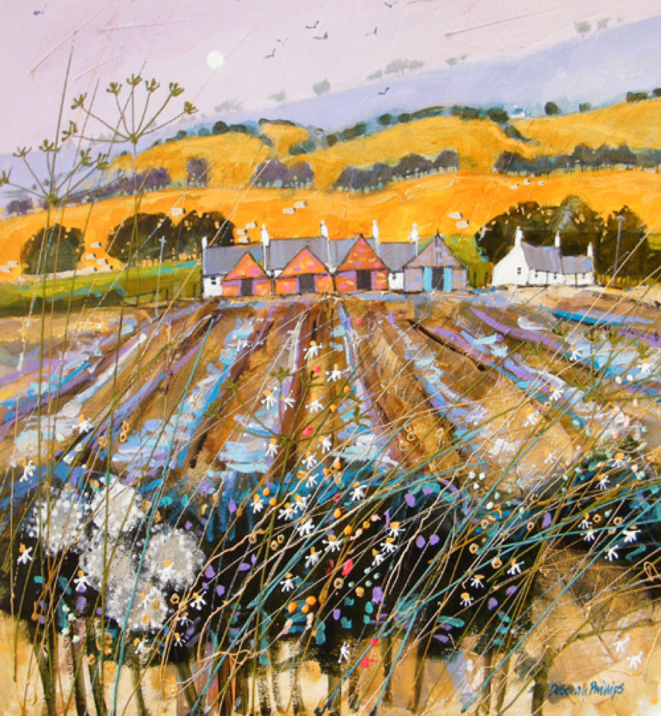
Wet Furrows at Drumeldrie
Do you paint the same places at different times of the year or day?
I try not to revisit the same subjects too often however, there are some compositions that are just too good not to revisit and reinvent. However, when I do repaint a subject, there is always something new to add whether it is a change in light or colour palette. No two paintings ever are the same.
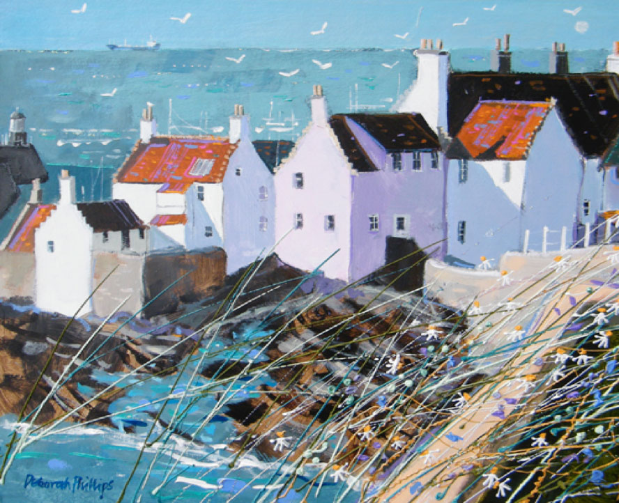
Morning Sunlight Pittenweem
Discuss the importance of the seasons to your work?
Just now I am painting the crisp late winter sun with the contrast of strong light and dark shadows on the white and coloured buildings of the East Neuk of Fife (an area of Scotland filled with picturesque fishing villages) As the year progresses I shall move onto spring greens and come summer the palette will change to harvest yellows and golds.
Colour is very important to your work. Can you expand on your use of colour?
I love using complimentary vibrant colours to add a real fizzy zing to my work. However, I equally enjoy putting together gentle, sympathetic colours too to convey distance in a rolling landscape. I initially trained in Printed Textiles at Duncan of Jordanstone College of Art in Dundee which I think has given me a good eye and appreciation of the juxtaposition of colours, shape and texture.
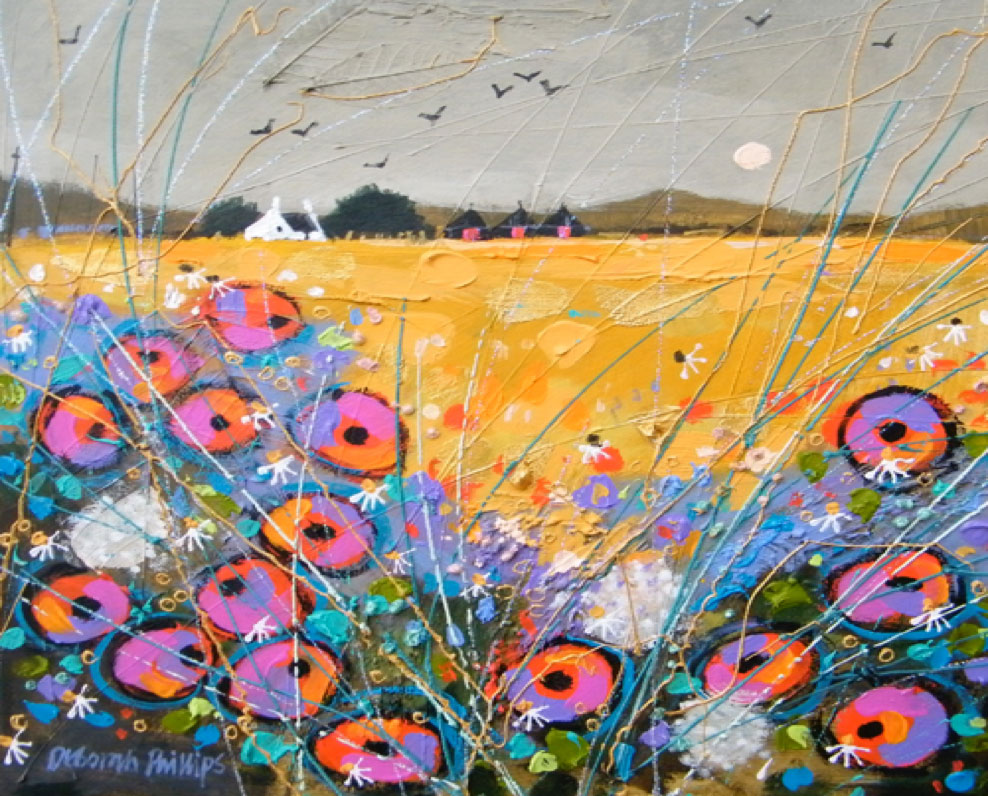
Harvest Poppy Patch
‘Golden Autumn Duirinish’ makes me smile. You bring so much into this painting. The knowledge of being part of the meadow while being aware of the domestic scene beyond. Can you discuss your techniques in this and other similar paintings?
Although I very rarely include figures in my work, I like to convey a sense of life and movement in my work, hence the windblown weeds, fluttering laundry on the line, buffeted birds and gulls in a blustery sky and puffs of smoke on the breeze from cottage chimneys. All these elements come together to
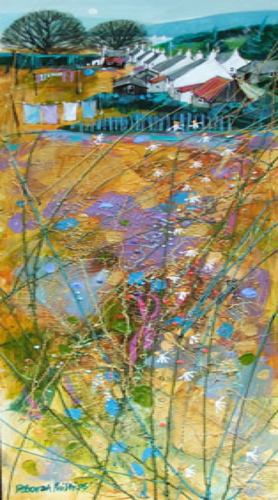
Golden Autumn Duirinish
How do you do your paintings? Are they done in your studio or plain air?
I always paint in the studio. I have everything I need set up around me, my paints, my music all conveniently placed around me and of course my easel which is situated right beside the window where I can look out over the rooftops of central Dundee to the River Tay and Fife. Bliss!
Please discuss the size of your paintings?
My paintings range from tiny tiddlers of just a few inches across to much, much larger pieces, however, on the whole, the bulk of my work is normally around 18” x 18” and 22” x 22”. I know it sounds crazy, but I like to paint sizes that will fit in the boot of my car! From a purely practical point of view, it makes delivering to galleries so much easier.
The area in the foreground is very important for your work. Can you tell us about both the content and the technique you use?
Yes, I love doing the foregrounds and spend a lot of time layering, dragging and splattering paint. It’s a technique that I’ve developed over a period of years and which I will no doubt continue to evolve further.
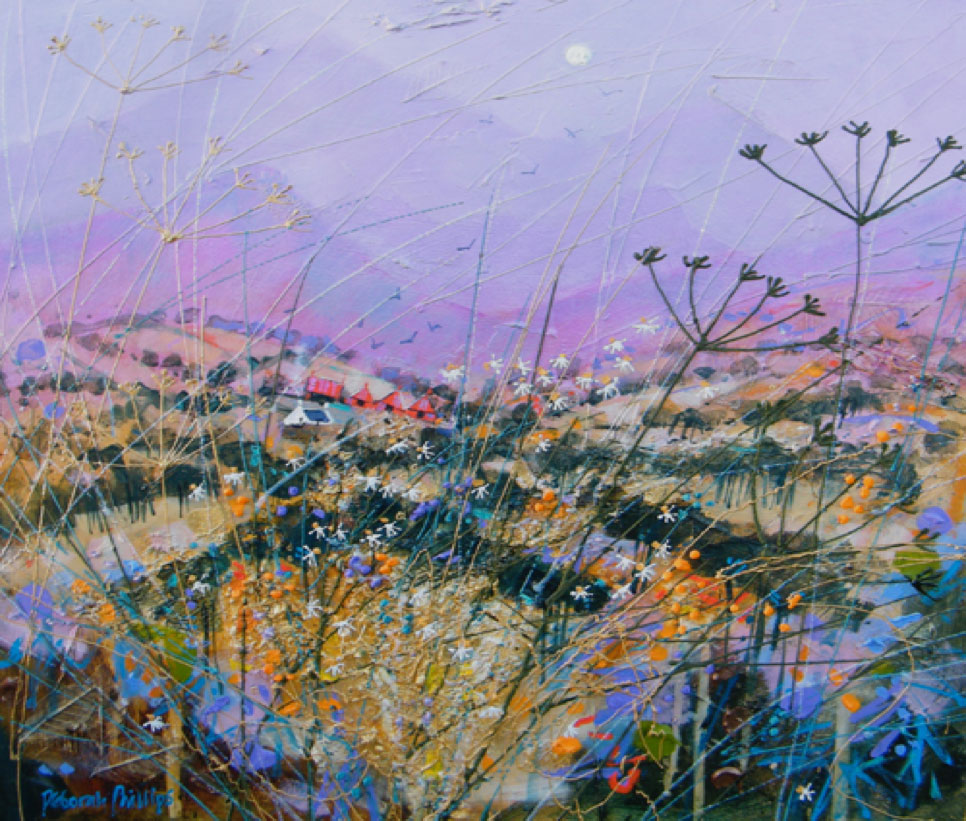
Pink Highland Harvest
Your images are timeless. Is this your intention?
“Timeless”, thank you, that is quite a compliment indeed. My intention is to produce images which can happily be lived with for years, paintings that can evoke a feeling and can lift spirits, change a mood - an image that draws the viewer in. I suppose then, they are timeless.
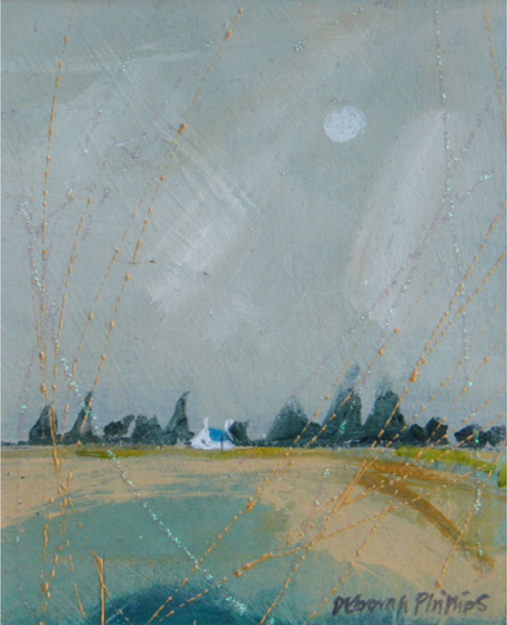
Low Horizon
When your work is not full of colour you restrict you palette to one or two colours using tones. Can you explain this?
These paintings which use quite a restricted palette tend to those which I want to evoke a feeling of distance, rolling countryside at dawn or dusk.
Your work leaves me wanting to add the sense of smell. I can almost smell the grass and flowers, the freshly turned earth, the making of hay. Have others commented on this?
Actually yes, I have had a number of people telling me that they can imagine breathing in cool Highland air, can smell the saltiness of the sea, sniffing the field-edge daisies and even the peaty smoke from a cottage chimney. I’m delighted that my work can covey so much more than merely an image.
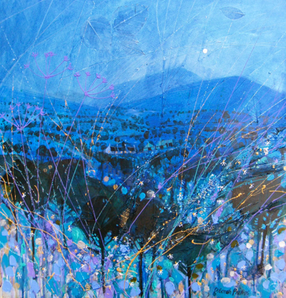
Cool Night Air
Can you describe your studio and the way you allocate out your time to your painting?
There is one word for my studio - chaotic! Every so often I have a massive tidy-up and then I can’t find anything for weeks, therefore, I do prefer to keep my organised chaos. I tend to deal with all my administrative stuff in the mornings updating the website, gallery correspondence, visiting the framer, wrapping paintings for delivery, etc.
Dealing with all these necessary chores leaves the afternoon through to the early evening clear to get down to the important stuff - painting.
Contact:
Deborah Phillips
www.deborahphillips.com
info@deborahphillips.com
Facebook: www.facebook.com/pages/Deborah-Phillips-Artist
Twitter: @PhillipsFineArt
Interview by Deborah Blakeley, March 2013
Barbara Franc
Your initial training included life drawing, how important is this to your current work?
I used to attend Morley Art College for one a day a week in the early days whilst I was still working with the BBC. My tutors included Maggie Hambling and John Bellany, both well established artists here in the UK. They were both very passionate about drawing from life and encouraged students to express themselves through whatever medium they chose to use.
Life drawing did play an important part in my own work at the time but I now tend not to sketch on a flat surface at all and find it more immediate to draw with wire. I think that’s just because I find I look at things three dimensionally and prefer to recreate the form straight away, I’m just too impatient to translate it into 2D first.
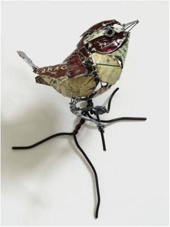
Mary Orrom is your mentor; can you explain the value of having a mentor as an artist?
I am very lucky in the fact that every Thursday I meet up at Mary Orrom’s house with a group of other sculptors and we just ‘workshop’ together with Mary being the guiding force. She is hugely inspirational and will give just the right advice at the right time about a developing piece of work. Her own work is constantly innovative and boundary pushing, she successfully uses materials in a very intuitive, beautiful and thought provoking way.
I owe a lot to my long standing friendship with her.
One inspiration of your current works, is based on an injured crow “Edgar” can you explain how this relationship came about and how it come into your work?
A couple of years ago, Edgar literally just walked into our lives. I was at the front of my house sweeping away some leaves when a black, tatty crow just walked out from under our car and stood there looking at me. I then heard a lot of ‘cawing’ in the surrounding trees and two other crows started to fly down to mob him. As this crow in front of me seemed unable to fly and was not afraid of me, I picked him up and checked him over to see if he was injured but could find nothing wrong with him that was obvious.
He seemed remarkably tame and I wondered if he had been hand reared, so we took him into our back garden and fed him to see if he would get any stronger.
This went on for a couple of days during which time he would come into our conservatory when called, he was quite perky but still made no attempt to fly.
During this time I contacted several wild animal rescue sites, they all offered advice but said they could not take him in as he was so tame and would not be able to be released back to the wild. I then found some wonderful people who rescue crows and other corvids and if they cannot go back to the wild will bring them into their family as pets, one lady even had her Jackdaw talk down the phone to me!
So Edgar went to live up North with some other crows, his new owner had him for a while and eventually he died from a lung infection, she estimated that he was probably about 30 years old. She then explained to me that after having looked after him she was fairly sure that he was a wild bird and that some crows are smart enough to turn to human help when they start to get old. He had been mobbed by his fellow crows because of his age and frailty, nature at its cruellest.
It had been such a privilege to have had him in our lives for even a short time, I made a whole series of sculptures based on him all from old black plastic that had been distorted by heat. It just seemed the right material to use for that wonderful but hopelessly tatty old bird that stole our hearts.
The pictures here are of the two pieces that I have kept here at home.
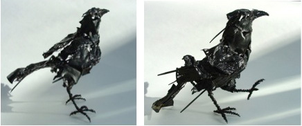
As well as 3D work you also do 2D pieces. Can you tell us about both techniques?
The 2D pieces I have made are not totally flat as I do allow the tin to emerge slightly from the surface, for example the ruff collars of the Cholmondely Sisters. This particular piece is my own copy of one of my favourite paintings that hangs in Tate Britain, I love the composition of this work, and it is so different from anything else painted in that era and has a wonderful sense of humour. What a shame that the painter still remains anonymous.
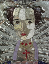
I worked on this particular piece whilst suffering from the recent bereavement of my father, it really helped me get through that difficult time and appreciate that life will always run its course and start anew. The technique to make a piece like this is fairly straightforward, I mark out the picture on a large piece of wood, cut pieces of tin to shape and just tack them onto the wood base, the fun is finding the right colour and also injecting some humour with the choice selection of words from script on the recycled tin.
One baby has ‘jelly baby’ and sweet tins on its body, the other the words ‘celebration’, I thought the use of champagne packaging on one of the mothers was also appropriate.
This piece is now in a private collection and I do admit to missing it.
Matisse is another of my favourite artists and I have made homage pictures of his works as well.
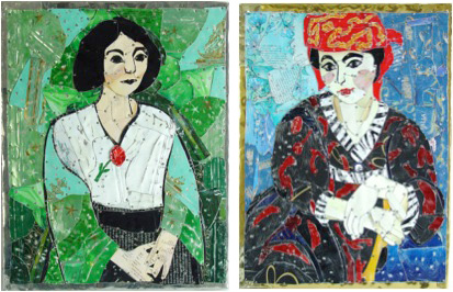
Can you explain about your British Birds and birds from further away?
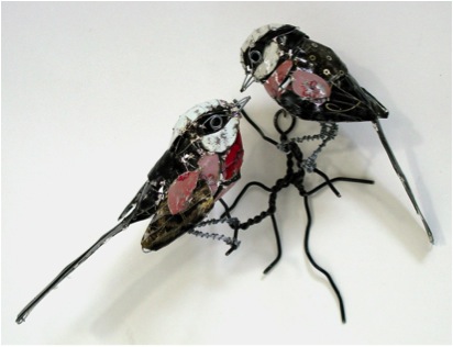
The bird’s series came about when One Church Street Gallery offered me a solo show but asked that the theme be ‘birds’. I took to this idea like the proverbial ‘duck’ and have never looked back; I really enjoy the form and endless diversity in this animal group.
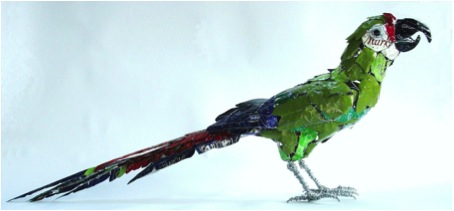
My use of coloured tin dates back to this show as I wanted a medium to express the wide range in plumage. I try to make most of the birds approximately life size as I think that scale suits them the best.
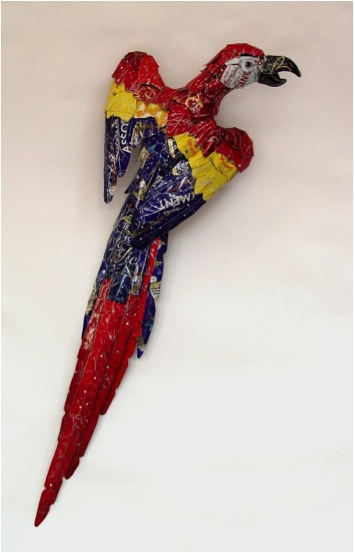
Where do you get your recycled materials from?
I find a lot of my pieces literally on the streets, charity shops, car boot sales and I have a small army of my mother-in–law’s friends who tirelessly supply me with old biscuit tins!
Looking at your Highland Hares the use of recycled materials is more evident please discuss?
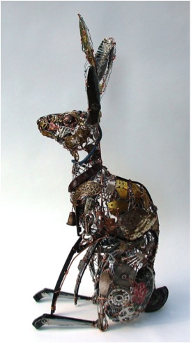
I have two methods of working at the moment, the first as described for the birds with a fine wire armature to which tin is soldered onto, the second method is similar but far more time consuming. I will make a loose armature from wire netting and start to add bits and pieces of detritus to it with copper wire. Windscreen wiper blades might become a leg, an old colander becomes a rib cage, a draught excluder becomes a horse’s ‘hogged’ mane. I will spread my work surface with hundreds of found objects and select from them. I could spend a whole day just offering up pieces to the sculpture and still not be happy with the result and then suddenly the right piece presents itself!
Working with recycled and found objects makes me accept the individual qualities of the various materials they are made of, I have to adapt to them, not the other way round. It’s a bit like assembling a jigsaw with no picture and all the pieces keep changing shape before I can get them under some sort of control!
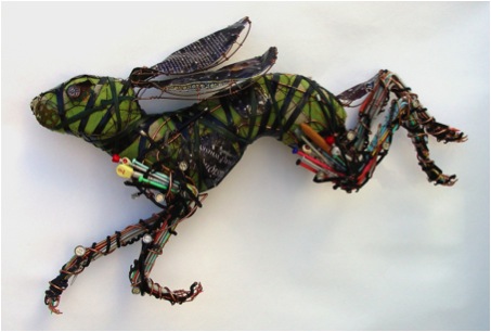
How do you decide on an animal or bird to do a series?
The choice of what I work on can come down to a straightforward commission, or I might go on a walk and see something like a Hare bounding in front or I might find a bottle top that suggests a cat’s eye to me.
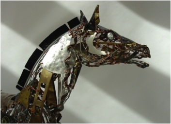
Where does your inspiration for your Kimonos come from? Can you please explain how this work is done and expand on how you have also framed some of this work?
The kimono series started after my daughter went on a trip to Japan and brought one of these beautiful garments back for me. I went to the V&A Museum to research their collection, I was intrigued not only by the garments but also how their display. They were suspended by poles through the armholes and I just find this a really pleasing sculptural form, it was as if the garments took on a life of their own whilst patiently waiting to be worn.
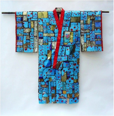
I started to construct my own kimonos, using my one for the dressmaking pattern, the life size ones made from pieces of tin stitched together with copper wire and hung from bamboo poles. After the large garments I then made a series of small ones that are either individually framed or as a group.
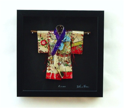
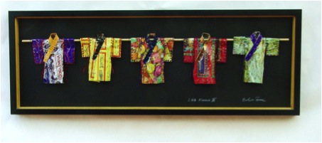
When you have a solo exhibition what lead time do you need?
It is always wonderful to be offered a solo exhibition and it depends on the venue as to how many pieces they would like and what size but I do like to have a year to be able to think and plan out what I would enjoy making for the show.
You have an upcoming exhibition, is this the only work you will do until it is complete or do you add other work for diversity?
With my upcoming show I will almost exclusively work towards it with perhaps now and again doing some smaller pieces to commission for a bit of variety and also income!
Do you exhibit outside the UK – would you like to?
I haven’t exhibited outside the UK and apart from the obvious logistics of transporting work, customs etc. I think I would welcome the challenge of showing to a wider audience. I do take commissions from abroad I am just about to make a pair of Chickadees to fly off to Canada.
You do commissions, can you explain how someone can give you a commission and the criteria you have to accepting?
It’s very easy for anyone to just contact me directly through email; I’ll always try to answer promptly. I like to discuss a project through with the client to make sure we are both happy with a project, but if it’s something I don’t think I can do justice to or is suitable to my method of work, I will say we shouldn’t pursue it.
Contact Details:
Email: Barbara.franc@btinternet.com
Barbara Franc, London, UK
Interview by Deborah Blakeley, March, 2013
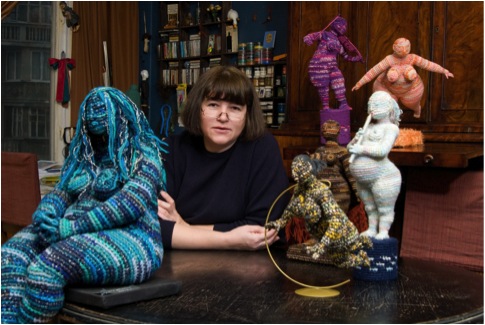
Yulia Ustinova
Do you call your women ‘big women’ or do you have a special name for them?
I prefer to call them ladies or ‘plumpies’. Originally, instead of “plumpies” Iused the Russian word “tetki” – it means uneducated and ungroomed women. Maybe there is a more appropriate word for this – it depends on their image and my mood.
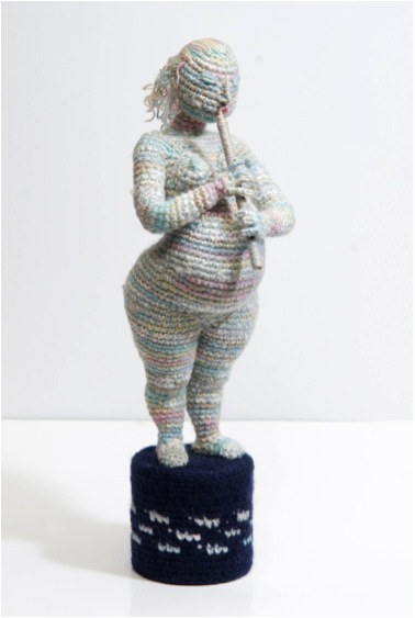
Can you tell us how you came to crochet your women?
I was born in an artistic family. My mother is a sculptor, my father is a book illustrator. My mother is very good at handiwork, so she has taught me how to crochet when I was 5 years old. At 11 I entered a professional artistic school learning the Academy of pictorial arts. There I used to practice painting, graphics, sculpture, and during my spare time – crochet. I`ve crocheted everything – clothes, simple toys, things for interiors. I don`t know exactly how, but when I was already working as an illustrator, an idea occurred to me. I thought about setting a doll vertically, that is how carcass and plinth appeared . That way I have combined sculpture and my love for crochet.
Your women are not dressed. Why?
I am more interested in plasticity and shape. Clothes make my works look more literary, closer to dolls. And I’m doing something like a parody of “classical” sculptures.
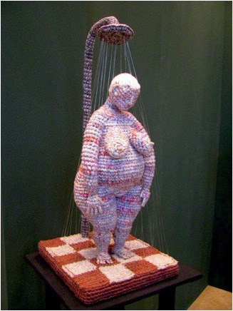
All your women are doing daily tasks. Can you explain how you decide on the positions?
I am taking all my ideas from real life which surrounds me, from my reflections about some events. Sometimes plasticity dictates the plot, sometimes, on the contrary, feelings and impressions from real life get shape in my works.
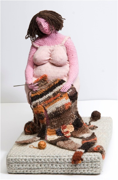
Do you use models for your work?
I don`t use models. Almost always the model is me. All the positions of the hands, legs, and head com from looking in the mirror, even if I am making women with another figure or even a man...
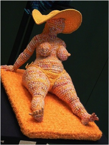
Do you do life drawing exercises?
Sometimes I can make a little sketch, if an interesting idea suddenly occurs to me. I like to make sketches on a beach, but it is hard, I don`t like to confuse people. So I put on sunglasses and pretend that I am drawing the sea.
Where do you get your women from?
They are all around me, my friends, my acquaintance, almost every one of them has problems, and lots of them have a difficult personal life, or are unfortunate in love. Something concentrates and the lady or plumpie (tetka) appears.
What size are your crochet sculptures?
They are about 25cm to 60cm in size. I’d love to make them bigger, but there is a metallic carcass in them and it`s quite hard to hold in my hands and turn the heavy and barbed construction.
How solid are your figures?
Works are crotcheted very tight and solidly filled with cotton wool. So they are quite solid.
Do you always use variegated wool?
Always, for the last 10 years. Previously I`ve crocheted with pink and flesh-colored threads. But it really made my works more doll like. I am making variegated threads myself from 4 or 5 strands. I need colors to work for my idea.
You have a degree, from Moscow Printing Arts, When did you get this and how has it helped you with your current work?
I`ve got it after school and I earned money as a children books illustrator. So it helps me a lot. I appreciate the fact that crocheted sculptures are my hobby, and I can crochet when I want to, and when I have control over my works.
Where have you exhibited your work?
They are not exhibited constantly, except in Olga Okudzava`s museum of author dolls. Often I have periodic exhibitions at The Central House of Artists.
How can people get your work?
I sell my works quite rarely, they only go to good hands or to the museums. In Russia I am selling them during exhibitions. I`ve never sent them to other countries, but now I am getting a lot of such requests, since I`ve made my page on Facebook.
Do you do specific commissions?
I`ve made a work for a request only once, for my regular customer, whom I couldn`t refuse. I think that it wasn`t great, because I prefer to work with my own ideas.
Contact
Email: ustinova1961@gmail.com
Yulia Ustinova, Moscow, Russia
Translation by Mikhail Melnikov-Vorreiter.
Interview by Deborah Blakeley, March, 2013
Charlotte Sale
You first exhibited at the very young age of fourteen. Can you explain how this came about and how did it affect your choices to become an artist?
I was playing around with plastic at school in the art department and asked if I could melt it and bend it and my teacher wasn’t so keen on this idea and sent me to the science department where they made the scientific glass… I was in awe from that day on!
Can you tell us the importance of art school to your art?
Art school is hugely important in finding yourself, and finding your ‘comfort zone’. They allow you to try out all different materials in all different areas. I was taught theatre design and fashion through to graphics and 3D design. There were areas that I loved that didn’t even know existed.
You have always been involved in exhibitions. How have exhibitions helped your artistic development?
Yes I was involved in exhibitions from the day I left University, where they prepare you for exhibitions and getting your work out to the public.
Exhibitions put your work in different settings, as well as they have a ‘theme’ to an exhibition which allows you to develop your work in directions you otherwise may have not considered. Not to mention the colour variations they want from you.
Can you talk about the size of your work and the restriction you have with size?
Blowing glass is an extremely hot and heavy game. All your energy is consumed in one piece from any thing up to a few hours! So when you know you have to make a large piece you either restrict your time to one a day or you get in more assistants to help you manage the scale.
Each of your series is very different while they have very strong links. Do you still produce all of your series or is there a time when you say “no more”?
I have to develop my ideas in the glass hotshop. I find it really difficult working pencil to paper. I always come out with interesting ‘mistakes’ when working with glass and this always develops on to the next series. Yes I produce all my series still – as there is always someone saying I love Deep Blue, can you please make one for me in purple etc. So I like to keep my options open. It is also nice to have variety in my business, otherwise I think you can get a jaded.
In 2005 you developed your “Deep Blue’ series, can you expand on this?
This was inspired by my scuba diving experience in Malaysia – so this series was inspired by the underwater patterns and textures. I used colour overlay and then blew in to different structures to create different textures. I cut through these layers to create different patterns. These were such fun pieces to make. I went in to the hotshop with an idea and came out with something quite the opposite! You do have to be spontaneous in the glass world at times!
By 2009 you were working on “Aqua Lichen” series this is the series where I see the linking with ‘Spritz’ and ‘Acorn’ happening am I correct?
Yes, I was looking at fungus, moss and lichen growing on trees. I was trying to get a detailed texture on a smooth surface. This developed in the hotshop through playing with different tools and creating different ways of applying the texture. I started to apply the texture to different parts of the smooth vessel – which one I got far too hot and spun it really quickly creating the ‘spritz’ series, which I perfected over time. This lead to the Acorn cup and also the Papaver series (below).
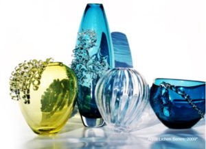
In 2009 – 2010 you also went in a complete different direction. Discuss both series ‘Curiosities’ and ‘Natural Science’ series.
I was asked by a gallery to create some miniatures for their new themed exhibition. This lead to curiosities and then I developed them with gold plated insects in Natural Science. I loved this way of working – with new materials and also working on the torch (which is a smaller scale glass blowing).
Why did you work in clear glass during on these series?
I went back to my scientific glass days and was playing around with borosilicate glass, which is made on a torch/lamp. I wanted to keep it simple as I was working with a lot of colour with the other series. I also thought that bringing in the gold touches would compliment them. I have made some pieces in black to another exhibition I was involved in (image below).
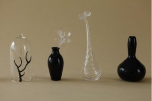
‘Spritz’ series in 2010 - you are still pursuing nature but nothing tactile rather water. How did this come about?
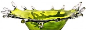
This was a happy accident in the hotshop and I wanted to develop them in to more functional pieces, as well as being decorative, but cutting back on lots of texture, just simple delicate touches.
Again you have introduced colour. How and which colours?
I used all the colours under the sun! I didn’t want to limit myself. I started off making teal, yellow and black and this developed as time when on as my clients were asking if I would make one to match their lounge or dining room… now I am more in to a mix of colours, as you can see on my home page.
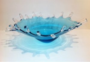
By using colour we still see the water. Why do you think the form over rides the colour?
Glass is a beautiful material, that when you let it do what it wants to do (i.e. the Spritz series) it has so much energy and life about it. I think that the colour comes down to personal environments, but the shape is what draws people in more.
By 2011 you have introduced ‘Acorn Cups’, how did these come about??
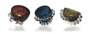
This was developed from an exhibition I did at the Royal College of Art, which was about cups and tactile pieces. It is based on the acorn – the smooth pod in the textured cup and I played around with this idea applying hot glass and snipping it reheating to smooth it off. I liked the way they could sit in any direction, they are fun pieces with their own characters.
What is it about Acorn cups that gives them such a tactile appearance? I want to hold them. While, ‘Spritz’ I am afraid to brake the moment with touch.
I think the fact that the Acorn cups are smaller and made to hold in the hand. Everyone picks them up and wants to play with them. Whereas the Spritz everyone does say ‘I would definitely break that’. The Spritz are finer pieces of glass ware and I think with the droplets coming out, makes the piece slightly more vulnerable. The Acorns are more condense and sturdy.
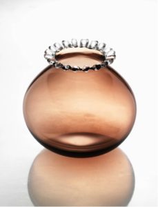
Your work is available throughout the UK and online. Are you interested in selling in other parts of the world?
I have shown and sold my work worldwide, but it always comes down to postage. The postage seems to cost as much as the piece itself. I would love to sell more worldwide… I wish I knew a cheaper courier for worldwide delivery!
Tell us about your studio and the equipment you need?
The glass equipment to make blown glass is very, very expensive and you have to be very dedicated, passionate and willing to throw your whole life into it. I have not got the confidence to do this! So I hire other people’s equipment. It allows me to have days where I need to make and days where I can play around with new ideas. It also takes the pressure off having to cover huge costs every month. I like the fact that I can take a holiday or take on a commission and work on things month by month rather than have to make to pay the bills. It is a slightly more relaxed way of working, but over the years I have realised that it seems to work better this way for me.

Can you talk about the size of your work and the restriction you have over size?
Restriction is only down to how much I can physically hold, and how large the kiln is! There are always big strong glass blowers willing and able to help out when I need it and going abroad is always an option for larger commissions.
Contact details.
charlotte.sale@network.rca.ac.u
www.charlottesaleglass.com
Charlotte Sale, London, England
Interview by Deborah Blakeley, March, 2013
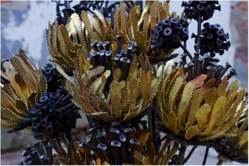
Stacey Lee Webber
Can you discuss the two influences on your art, your childhood from a family of tradesmen and your arts educations at both Bell and finally your Masters, at the University of Wisconsin-Madison?
I did not grow up going to museums and art galleries. I am an artist, raised in the Midwest by a strong German Catholic family who believes in family values and working hard for everything they have. My roots influence what kind of person and am and what kind of artwork I am interested in making.
My education in the arts has shaped my life. I fell in love with metal smithing and jewellery after taking an introductory course at Ball State University. I have always been ‘artsy’ but after my first swing of the hammer on the anvil…I was head over heels.
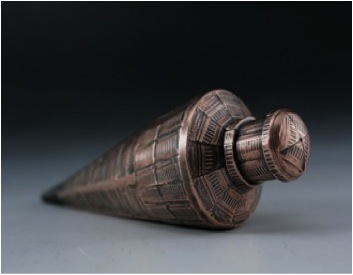
“Plum Bob” image by Joseph Leroux
I have been fortunate to have amazing teaching in my education and been encouraged and pushed to reach beyond what I thought was possible. After getting a BFA in metals and went straight to graduate school at UW-Madison where I really got a chance to learn more about art and what type of artist I want to be.
You make exciting pieces of jewellery using American coins. Can you expanded on Custom made:
- Guitar Pic Holder
This piece was thought up by a customer from Philadelphia who appreciated my artwork, and wanted a custom piece. He was getting jewellery for his wife and daughter and son and it was all to be made from vintage coins from his families’ coin collection. The customer had seen my coin lockets and it hit him that he could have a larger style locket with a larger coin and the guitar pic was appropriate for his son.
Guitar pic holder custom made entirely out of heirloom Morgan silver dollars
- Abe Chain Necklace
The pennies are solid copper and date pre-1982. Each penny has a tiny hole drilled, the blade of a jeweller’s saw is laced through the hole and Abraham Lincoln is hand cut out and linked together!
This linkage system has been a classic for me in designing coin jewellery. I cut out the coin leaving Abraham Lincoln and the rim around the coin and link multiple units together. I use this linkage for bracelets, earrings, and singularly in cufflinks.
- Silver dollar hoop
The silver dollar hoop earrings were designed after making many screw hoop earrings and wanting to make a hoop style in coins. The silver dollar was a nice bolder, larger sized coin and I had not yet used it in my jewellery line, so it seemed perfect.
Two antique silver dollars are hand cut to form subtle coin jewellery with the reeds fashionably on the outside of the hoops.
Do you make pieces using coins from other countries?
I do! Different coins are different alloys of metal depending on years, countries, etc. So sometimes it is difficult to use a variety of coins when you are unfamiliar with their melting temperatures, hardness scale, etc. But I have been able to mould coins so that I can have a workable metal that still looks like the original coin or I can cold connect foreign coins (no heat required). On the ‘installation’ section of my website, staceyleewebber.com, check out ‘The Grand March’.
The Craftsman Series takes coins from small personal jewellery to larger objects. Where did the inspiration for this series come from?
The Craftsmen Series, Silver Collection: Hammer
Materials: silver mercury dimes
All of the coin work started with this series. The Craftsmen Series was inspired by the struggling US blue collar worker during the economy crisis in 2007. The series highlights the decreasing value of hand labour in the United States by fabricating US pennies into traditional hand tools.
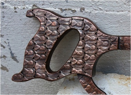
“Penny Hacksaw” Image Joseph Leroux
Are the pieces made to scale? If not how do you decide on the size?
All pieces are made to scale.
Can you expand on the making of ‘Tape measure’?
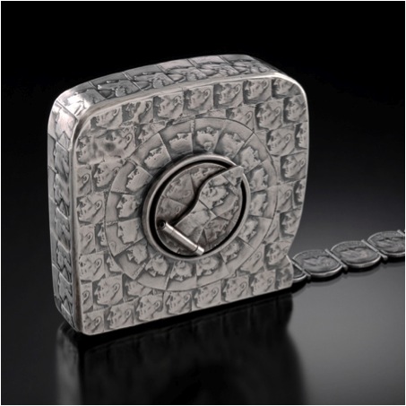
”Tapemeasure” Image Larry Sanders
I was commissioned to make the tape measure with a collector’s personal vintage coin collection. While researching tape measures I came across a vintage Craftsman tape measure which had a low-tech mechanism for rolling the tape in and out- a small hand crank. I fell in love with that tape measure and used its design to fabricate the tape measure sculpture. For the tape I decided it was important for it to articulate, so I soldered hinges onto each dime, to create $5 worth of dimes that roll out and roll back in.
How do you decide when to use copper or silver coins?
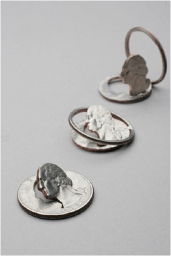
George Coming Out Series: Pop Out
Materials: quarters Image Tom McInvaille
For the silver series, they are mostly all commission pieces. The silver coins are very expensive and cannot afford to make them without funding. I think of the pennies sculptures as more political statements and the silver sculptures as monuments or celebrations of the objects.
Moving from coins to hardware.
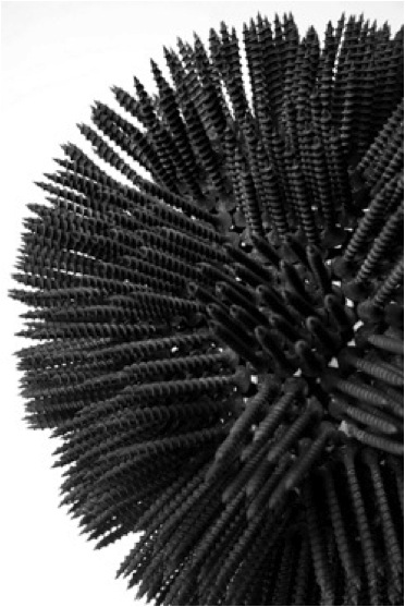
“Screwball: Spiked” Materials: drywall screws, Image Joseph Leroux
Do you only use screws?
So far only screws. I tend to find it more interesting to stick to a specific material and expand people’s minds on what its possibilities are.
The material you use is so familiar and then you insist that we look beyond. Is this what you are wanting in ‘Screwball’ pieces?
I think of the screwballs as large samples. Often times I make small samples of the zillions of different possibilities of the material and with the screwballs I upped the scale a bit. They have always reminded of spool of yarn or basketballs…they are a cross between a lot of different objects, which is why I kept making more- different viewers saw different aspects to them.
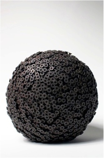
“Screwball: Pushed” Materials: drywall screws, Image Joseph Leroux
Then you take us further away and make flowers so beautiful out of such masculine materials. Discuss this work?
The screw flowers are my newest pieces. They are celebrations of the working class families and are extensions of ideas surrounding The Craftsmen Series, but delving more into the family life of blue collar America.
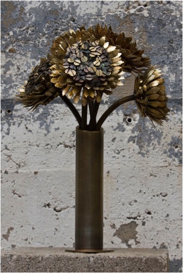
“Portraits of Post Industrial Americans” Sunflowers, Image Joseph Leroux
Where do you get your materials?
Most of the coins are bought from EBay or my local bank. The screws are bought in bulk from EBay also.
I love EBay!
What is your studio space like to enable storage and art space?
I spend most of my rent on my studio space; it’s huge- 2,500 square feet attached to a 500 square foot apartment. I am a bit of a studio rat, and have always loved to be fiddling away on something in a shop type environment. I have decked my studio out with a large screen TV, radiant heat, and many more luxuries to make it as comfortable as possible and to keep me hard at work.
Does working at Worth Street, continually nurture your work because of the heritage of the industrial space?
Definitely. I pass by huge industries going home and live in a thread dye factory that was closed down in 2005 and turned into creative studio spaces. My neighbourhood is hugely inspirational and the long history of industry in Philadelphia.
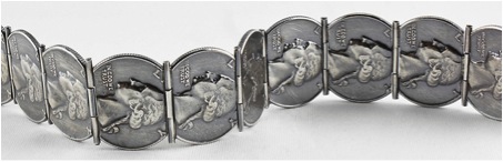
Vintage silver quarters with handmade hinges soldered together to form a reticulating bracelet
Contact details.
317-363-7808
Stacey Lee Webber, Philadelphia, USA
Interview by Deborah Blakeley, February 2013
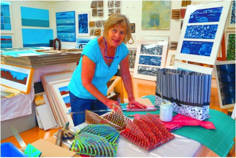
Mandy Gunn
When did you leave conventional textiles and start work with recycled medium?
I started weaving in about 1971 initially using giant heavy hand spun and dyed wool to make large sculptural works but even back then I made pieces from recycled film tape and raw materials like sisal so I think there was always that interest in the different natures of found material, their textures and the way they can tell stories. I definitely was never interested in weaving fabric! From loom made pieces I have progressed over the years to include many hand cut assemblage works which are really based on the woven grid form.
Tell us about being chosen for the 2010 Tapestry Triennale in Poland and the work you sent?
Three artists from Australia were recommended by Valerie Kirk Head of Textiles at ANU and we all received official invitations from the Triennale Committee.
The work I sent was made from hand shredded and woven Melbourne Yellow Pages and hung from the ceiling in a cascading waterfall shape over suspended Perspex rods and then came to rest on the floor.
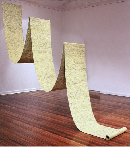
Scroll
It was 10 metres in length and 60 cm wide. Snippets of text and colour appeared through the weaving which was like a durable fabric tightly beaten down on the loom and with the overall look - as one viewer put it- of yellow slub silk. The material was such a familiar one but people were intrigued and fascinated by its nature and only had inkling of what it was when they examined it really closely! I really like it when a work can be viewed one way from a distance and quite differently at close quarters.
I called the work “Scroll” in reference to the ancient way of transmitting information but also because the work’s surface is similar to the pixilation’s of a computer screen. I also had woven - in yellow cotton - small triangles similar to the computer screen scroll sign-at intervals the whole length of the fabric.
The beauty of working with such ordinary everyday materials is that they comes in unlimited quantities so you can experiment quite a lot and make a few pieces from them.
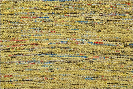
This work started me on an ongoing investigation between TEXT and TEXTILES. Text is usually explicit and obvious; textiles are understood in a more cultural, unstated way. By making Text into a Textile where only minute pieces of text render any meaning unmeaningful the boundaries between the two become blurred and the viewer has to look at the work differently.
Because I am fascinated with the use of recycled materials in your art I would like to ask the questions slightly differently. I will ask about different materials and if you could explain your use of them in your art.
Met Cards – these are public transport cards
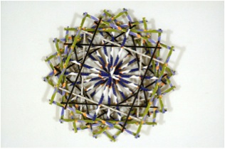
Yes Metcards - which will be replaced by the automated Myki system - are Melbourne’s public transport tickets. Over the years many of them were designed and produced to advertise Melbourne venues and events such as the Flower Show, the Art Fair, the Olympic Soccer, Luna Park so they are an archive of what has gone on in the city over a number of years. At one time, for quite a few years, I travelled on the train into Melbourne every day and I started a ticket collection but it took me quite a while to come up with an idea for how to use them. Eventually I started to collage them on to recycled cardboard and then cut them into strips and reconstruct them into 3 dimensional grid like forms making reference to the construction system of weaving as well as transport grids and lines. By the time I really got into this work, while I was doing a Masters degree at the Victorian College of the Arts, people were also saving tickets for me and even sending them in the post! I made a huge number of these pieces which have been shown all over Australia as well as the Philippines and are in quite a few public gallery collections.
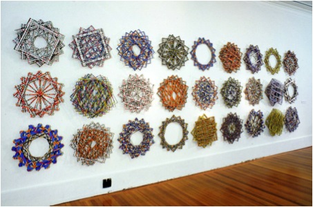
City Circle
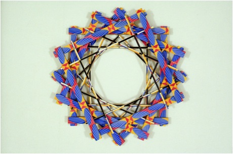
Inner Circle #2
Oxford Dictionary
After I had woven Scroll, I looked around and found I had an old Oxford Dictionary as well as various inherited Bibles and prayer books which I thought I would I would try cutting and weaving. All these type of books are made from thin strong tissue like paper which stands up to shredding and manipulation and compression during the weaving process. This launched me into a big series of woven books, including various classics. The work is sculptural and can be arranged in a few different ways as well as being a textile, an artist’s book and a work with paper so I have been able to exhibit in many different types of exhibitions and somewhat to my initial surprise the woven books have ended up in a lot of public and private collections
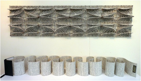
The Unconcise Oxford Dictionary
Various books, magazines and paper
I love working with cast off paper-it comes in so many guises, is readily available and is easy in a hands on way to work with. My best loved studio tools would have to be cutting mats, steel rulers and snap off blade knives plus of course weaving looms. I think I would have cut kilometres of various papers collaged on to cardboard and woven a similar amount of cut up strips of paper!
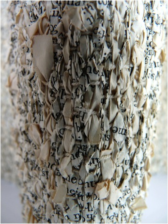
Detail of Woven Book Pages
All this work of course makes reference to the terrible amount of waste produced by our society as well as the importance we place on printed matter.
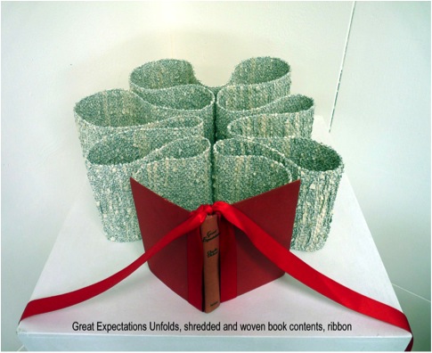
The grid like forms initially used in the Metcard series have become much more experimental and reinvented themselves into all manner of curves and sculptural shapes. In the past 2 years I have been combining the small cut paper grids together into larger repetitive shapes and installing these as a wall component with the woven book forms. “Patterns of Speech, the Complete Works of Shakespeare’, a large installation piece recently shown in the National Works on Paper at the Mornington Peninsula Gallery in Victoria is one of a number of these works. “Between the Lines” is another large series of smaller individual works shown installation style which uses collaged grid forms from disparate printed waste.
Inner tubes
I began collecting inner tubes while travelling on camping trips around the outback as the roads are littered with burnt out specimens and I thought I would be able to cut them up by hand with scissors while sitting in the car-a sort of transportable studio workplace.
This began a series of woven works in which short thin pieces of tube were overlapped, with the ends of each left hanging out to create a spiky effect.
The time of making these coincided with the recent terrible Victorian bushfires and I began to see the work was similar in form and appearance to the burnt out blackened bush.
The Firesticks series, consisting of thin long strips of woven spiky material sewn around wood batons to make them rigid, lean up against the wall and make reference to the burnt out landscape as well as the traditional indigenous practice of Firestick Farming where areas are periodically burnt off to encourage new growth and prevent wildfires. This practice has now been taken up in areas such as the Kimberleys where aerial firebombs are seasonally dropped into remote country to burn off thick vegetation.
Natural and man-made objects? (emu eggs, pine needles and tacks)
Over the past 15 years I have worked quite a bit on environmental sculpture installations. I spent a month one year at Bundanon, Arthur Boyd’s property on the Shoalhaven, in NSW, working exclusively with naturally occurring materials-sticks, rocks, seed pods, berries, plant material etc. This was mostly ephemeral work and left to disintegrate back into the landscape in time.
I have also collected various objects such as emu eggs to which I applied carpet tacks to create an all over ‘Unnatural History” look- a reference to the Victorian practice of collecting emu eggs as curios which were then carved and mounted in silver settings as examples of weird colonial fauna. Like the Yellow Pages, viewers aren’t quite sure what the prickly looking objects are, even though they look vaguely familiar.
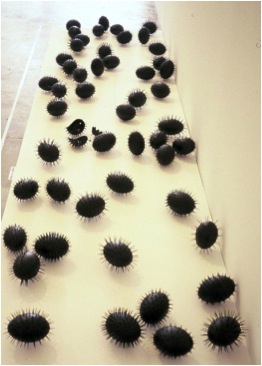
I have shown these pieces singly, mounted in Perspex boxes as well as en masse in nests of pine needles-and of course pine trees are not native to Australia so are also Unnatural History.
Other collections include dead road kill echidna from which I have extracted the spines to weave into necklace like lengths; hundreds of bracken sticks woven into 10 metre lengths and then twisted into spirals to install on the edge of Lake Cootharaba as part of the Floating Land event at Noosa, Queensland, in 2009.
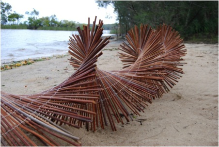
Rusted strapping from old mine shafts around Broken Hill, NSW which I cut, wove by hand and riveted then twisted into wave like lengths and also rusted fence droppers from farm tips built up into balanced constructed edifices.
I have always been a collector and hoarder and enjoy the challenge of re using materials to create something new which has its own inbuilt history and references from past uses.
The process of making is initially very experimental to find out what you can do with these different things, so I am quite open minded and don’t come at the work with preconceived notions until I hit on some process which works and seems meaningful to me.
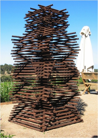
Fence/Defence, stacked steel fence droppers
Can you tell us what you are currently working on?
Twelve years ago I saved a couple of beautiful printed paper shopping bags to do something with and lately I have added considerably to these with the help of friends’ donations. Again they have been collaged onto cardboard and cut into a large grid installation series which I plan to show at a residency I am doing at the Art Vault in Mildura in February, 2013. As more bags keep arriving I have the feeling that this series will keep growing!.
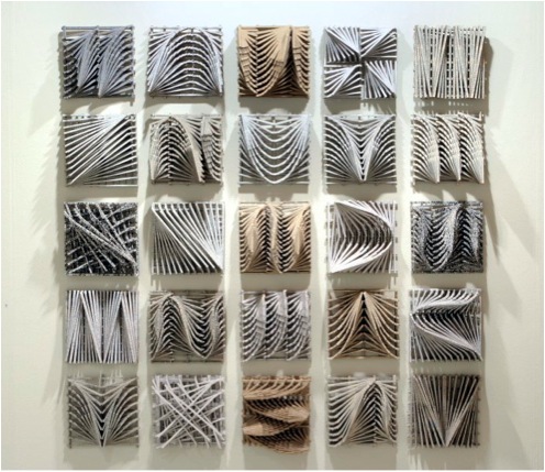
Cut between the lines
Contact Details
www.mandygunnart.com
Mobile: 0411257045
Mandy Gunn, Victoria, Australia
Interview by Deborah Blakeley, February 2013
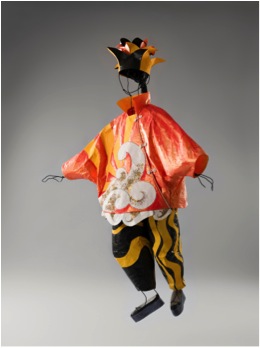
Isabelle de Borchgrave
What is the name of this exhibition?
Les Ballets Russes, Homage to Diaghilev
Can you tell us how this exhibition came about?
The Ballets Russes is a passion. I love the music, dance and of course the costumes. Those costumes were often designed by great artists like Picasso, Matisse, Derain, Delaunay. I love the drawings these artists made of the costumes, they were one of my greatest inspirations for this collection.
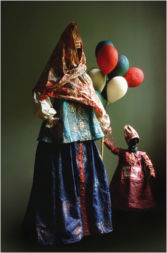
Petroushka, 1911 image by René Stoelite
Can you give the places and dates of its travels? Do you know where the costumes will go at the end?
This exhibition won’t be on show in 2012. Maybe in 2013 but we do not know yet where it will be exactly.
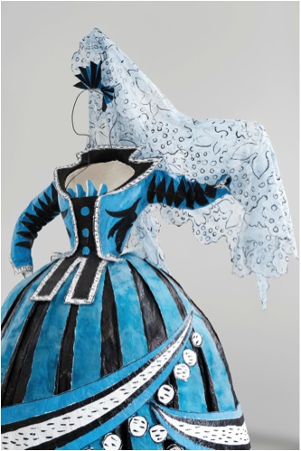
You have made forty costumes for this collection.
Some of the Ballets are : Firebird, Petroushka, The Bal, L’Oiseau Bleu. Those costumes were designed by Picasso, Matisse, Bakst and other great artists.”
We know that many of the original costumes were kept in very poor conditions from the 30’s to 1967 and beyond. Slowly they have been acquired by leading Galleries around the world. How do you see your role in presenting a “fresh” paper collection?
My role is only to tell an exciting story about modern art thanks to my medium. I do not see myself as a conservator. It is an explosion of colours and the creations that created Modern Art.
How did you decide on forty pieces?
I chose them because of the beauty of the costume, the interest in the shape, the creativity and the colours. All the things that are passionate to me and inspired me!
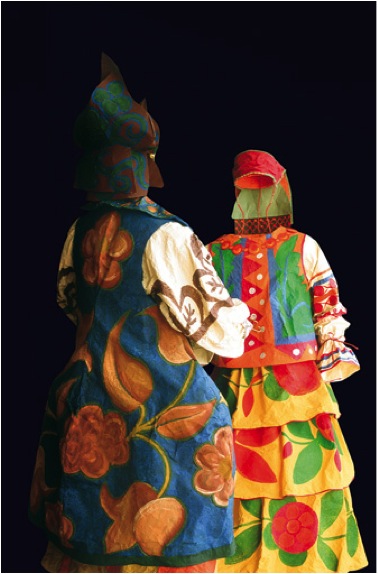
Le Coq D’Or, 1914 image by René Stoelite
Did you have access to many of the original costumes or drawings?
No, all my research was based on the books I have. Of course I had the chance to see some of the original costumes while travelling and visiting museums, but everything was based on books. Museums didn’t help us for this collection, it is a personal project.
Many of the original costumes are owned by the National Gallery of Australia. (Canberra). Several of the costumes and drawings are always on view. Here are the ones I saw in January 2013.
Ballet Russe Costumes on display at the National Gallery of Australia, image Deborah Blakeley
How was the decision made to have the costumes mounted, as they are not on the usual forms?
The mannequins are mounted on iron wire. We created them in my atelier making sure they will take the form we wanted to enhance the costumes as I wanted it. The costumes do not touch the floor, they all are dancing, turning, .. to give a dance effect to the visitors. Actually the visitors will make the costumes dance with their own move.
La Péri, 1912 image by René Stoelite
Which has become your favourite costume and why?
The next costume is always my favourite, because it is always a new challenge and that is fascinating.
Tell us about the importance of layering in the costumes?
It is the beauty, the generosity, the multiplicity, the designs, the volume, the shape and the movement!
La Péri, 1912 Detail image by René Stoelite
With forty costumes, were they done individually or did you work on many at a time?
Several costumes at a time were made. Three stylists are working with me, so each of them work on a particular costume. They are helped by the 6 artists and interns working in the atelier too. It took us one year and a half to finish the costumes. We are now working on different sets that will go with the costumes.

Website: www.isabelledeborchgrave.com
Isabelle de Borchgrave, Brussels, Belgium,
Interview by Deborah Blakeley, January, 2013
Debra Luccio
Your current body of work was done from within two studios, The Australian Ballet studio and your own studio both in Melbourne, Australia. Can you explain?
Over the last 2 years I have spent time at The Australian Ballet studios, drawing and sketching the dancers in class and in rehearsal. I also took photos to be able to capture additional information for more detailed monotypes and paintings. Back in my own studio I used all of my reference to create drypoints and etchings, monotypes and paintings of the dancers.
‘Time Lapse’ Detail
How were you lucky enough to be given this amount of sketch time with The
Australian Ballet company?
David McAllister with Debra Luccio
A lovely gentleman, Ian McRae who
was recently retired from the board of
The Australian Ballet visited one of my exhibitions. He enjoyed my work and introduced me to David McAllister.
How often did you attend their practice sessions?
My first stint with The Australian Ballet was for 3 weeks early in 2011. I have since been back a couple of times for a week at a time.
How did the dancers feel about your presence in their studio?
The dancers were happy for me to be there. I quite literally sit in a corner on the floor so as not to interfere with them in any way. In all of my experiences I have found the dancers to be incredibly warm and friendly.
What comments did they make about your work of them?
The dancers are always very kind. Not many have time to look through my sketchbooks while I am in their studios as they move on to their next appointment. I don’t take breaks either. I continue to draw in different sessions which means there is not much time for dancers to see the sketches. However I do try to take some of my finished artwork in to the dance studio’s to show the dancers what I am working on and how they have inspired me. I am always surprised at how much they connect with the work. Some of the dancers are very insightful. I am very lucky to have this response and experience.
This isn’t the only ballet studio you have sketched in; can you expand on your ballet sketching in both New York and Brisbane?
In 2007 I spent a lot of time watching the New York City Ballet. I drew the dancers in rehearsals and performances. We were invited to watch a class at the School of American Ballet as well. While in New York I was introduced to the Tiffany Mills Company, a contemporary dance group. I drew and photographed them in final rehearsals of ‘LandFall’. I then spent a couple of years creating artwork of the Queensland Ballet and in 2010 worked with the Rebecca Kelly Ballet in SoHo, New York.
Why Ballet dancers?
I have always had a great interest in the human form. Before our trip to NYC in 2007 I had not considered dancers as a subject. In hindsight, I don't know how I could have missed the connection. With dramatic lighting and beautiful,
strong, muscular bodies, it seems obvious that dance would be a focus for my artwork.
Whilst in New York I learnt about the NYC Ballet. I had not considered working with a ballet company because I was concerned that traditional movement such as the pointed toe, the plie and the pirouette may not be expressive enough to satisfy me, but this company was different.
The philosophy of the NYC Ballet was that the body of the dancer was an important aspect of the expression of the dance. The Ballet Master, Mr Peter Martins referred his dancers to Michelangelo's 'Slaves'. I became hooked. I also quickly learned that watching highly talented dancers performing traditional ballet is beautiful and expressive – truly inspiring.
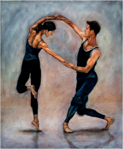
‘After the Rain’
Tell us about the marking on the background of your prints and why you do this?
For my most recent drypoints I used older copper plates to scratch my images onto. I felt the accidental scratches and marks on the plate added movement and depth to the image of the line of the dancer.
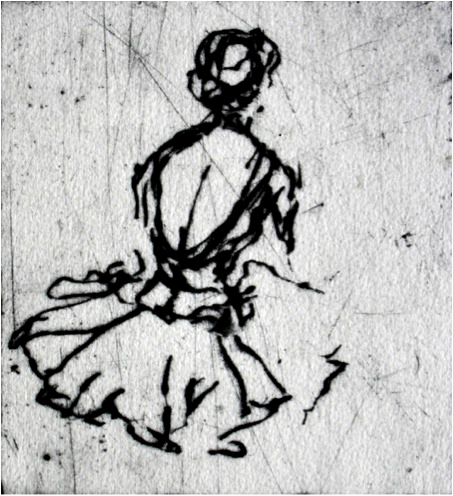
‘Tutu in Repose’
‘Nanasca’- Monotype on Velin Arches paper
When I am working on my monotypes I find that I am working with great determination. I want to keep my lines and marks fresh and energetic. Even from my first marks of rolling thin layers of colour onto the plate, I have decided to allow those marks and movements to remain evident to give a sense of energy.
The physical process of making a monotype allows me to push the artwork even further, letting the marks created by the roller emphasize the movement of the dancer. Working with a sense of self-imposed urgency in the studio has helped me to not ‘over-think’ the artwork and has allowed the marks I create to remain fresh.
‘Nanasca’ was inspired by a dancer in the background of one of my photos of Madame Butterfly rehearsals. Karen Nanasca’s pose caught my eye. There was something special and fleeting about her – I could almost sense her breath as she pushed her chest forward. I felt that the energy of the monotype might help me capture the ‘moment’ while still suggesting movement and space in the image.
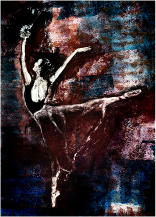
Monotype ‘Nanasca’
‘Ty’ - Oil on linen
I thought this image was perfect for an oil painting. I wanted the light of Ty King-Wall’s shoulder to be luminous and I wanted time to capture the musculation of his neck and face. This to me is a very strong moment it time. Even though the dancer is in ongoing movement and this was only a second in a performance, it was very powerful and resonated with me.
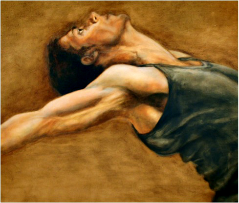
Oil on linen ‘Ty’
‘Timelapse’ - Charcoal on paper
I wanted to draw with charcoal. It is charcoal rub-backs that inspired me to work with monotypes. The rub-back method involves covering the page with charcoal and using an eraser to sculpt out the light of the image.
I was very lucky to be drawing a class that David McAllister, Artistic Director of The Australian Ballet, ran. My idea with ‘Time Lapse’ was to capture a Ballet Master teaching a class, moving throughout the studio while the students watched him and responded to his instruction. The Ballet Master is repeated 3 times in the image and one of the students is also repeated, to illustrate the lapse of time.
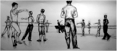
Charcoal on paper ‘Time Lapse’
As I drew I allowed myself to make mistakes and correct, so that the ‘pentimento’, the marks underneath, would act as a memory of movement.
Can you explain the special qualities that dancers give to your life drawings??
When the dancers are rehearsing their entire body expresses the emotion of the performance. When I sit in the studio watching them I see every part of their body responding to an emotion, from their face to their fingertips. They have a great ability to physically extend their bodies into shapes that communicate so much. It is important to me that I capture something expressive or dynamic in my work. To be inspired by the extensions and forms that the dancers can physically express with their bodies is exciting. When watching the dancers I see lines and shapes that inspire me so I try to capture these in my own work to create movement and dynamics.
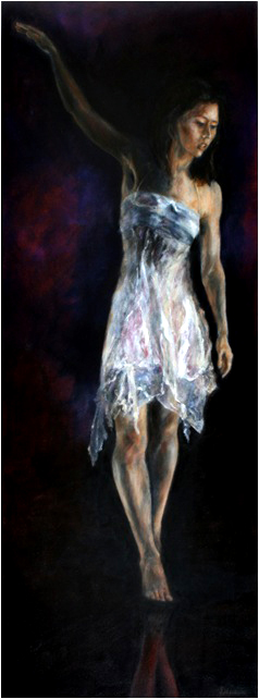
‘Laura’
Dance is an art that encompasses many of the senses. A performance can steal you away into another world filled with music, light, colour, movement and emotion. A performance is a highly visual experience and even though the experience can live with you for a lifetime, it can only be seen for the time you are at the performance. I hope that my artwork contains a sense of my own experience.
For me personally, before anything, dance is about the body – the dancer’s ability to use their body to express so much.
Tell about the type of sketchbooks and pens/ pencils you use and the method of drawing you take?
I use acid-free spiral bound sketchbooks in A4 and A3. I have a large variety of drawing materials to allow me to use what I most feel comfortable with on the day. I have graphite pencils, mainly 2B and 4B, black fineliner and ballpoint pens, sanguine conte, willow charcoal and compressed charcoal, normally ‘soft’.
When I draw the dancers I barely look at the page. My eyes watch the dancers and my hand draws the lines that I see.
Can you explain the three printing processes (briefly) Monotype, Dry point, Etching.
Monotypes are a form of printmaking – a one-off piece. No scratches or marks are made on the plate. The copper sheet is cleaned once the monotype is printed, and a new monotype may be made.
The monotype is known as the most painterly method of printmaking. There are many techniques and methods of creating monotypes. I use a rub-back or reduction method and was inspired to experiment with layers of colour after spending time with the Renaissance paintings in Florence and Paris in 2005 and being fascinated with their glazes. I wondered if the heavy etching inks would retain some of their individual qualities if I layered them together on a sheet of copper, and they do.
I roll thin layers of coloured rich sticky etching ink onto a copper sheet. I then wipe away the ink and push it around with a cloth wrapped on my finger to create the light, tone and form the dancer on the plate. The copper sheet is then run through a printmaking press with a piece of prepared Velin Arches paper laying on top of it. The image is transferred from the plate to the paper.
I never know exactly what will happen – there is a strong element of chance involved, but the process creates a sense of urgency and immediacy that pushes me as an artist.
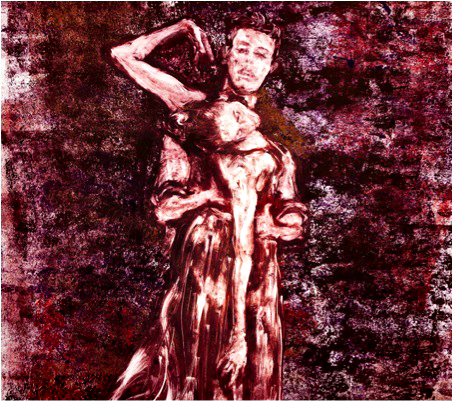
Monotype ‘In Red’
Drypoint is a method of printmaking. No acid is used, hence ‘dry’. The marks made are reliant on the direct pressure of the artist scratching onto the plate.
Using my drawings from the ballet class, I have scratched the drawings directly into a copper sheet. The copper sheet is then inked up by hand with rich, sticky etching ink. It is wiped, leaving ink in the scratched lines and on the burr of the scratched lines and removing the ink from the rest of the plate.
A piece of prepared paper, soaked and blotted dry, is placed over the plate and run through a press. I use Velin Arches - it is a beautiful paper with wonderful qualities. The line is transferred to the paper. The process can be repeated and the image editioned.
My Etchings are made by scratching the drawing onto a protected sheet of zinc. The line is scratched through the protected layer. The zinc plate is placed in acid and the acid eats into the scratched line. The plate is then inked up and wiped, leaving only the ink in the lines created by the acid.
A beautiful piece of prepared Velin Arches paper is placed over the plate and it is run through a press. The line is transferred to the paper. The process can be repeated and the image editioned.
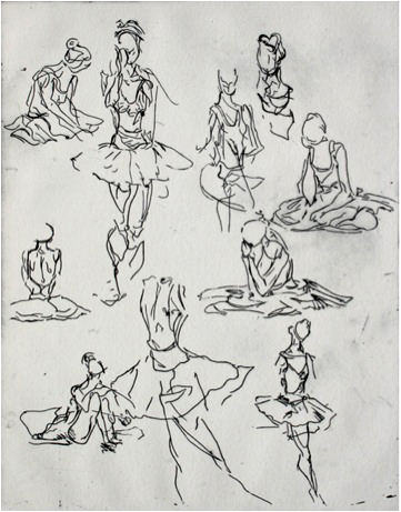
‘Tutu in Rehearsal’
The drypoint line often appears a bit furry due to the burr, like a line of charcoal. It is rich and very interesting. The etching line is clean as the acid eats away the metal, rather than it being gouged into and bits of metal being lifted as in a drypoint. The etching plate is also lovely to draw on as it doesn’t require any pressure from the artist’s hand. The drypoint method is a lot more difficult to scratch into the plate but gives a raw, gutsy line.
You are also taking classes at the National Gallery of Victoria (International) these classes will coincide with The Australian Ballet’s 50th Anniversary and Ballet and Fashion and exhibition at the NGV. Tell us about these classes?
Event Code: P1302
Information & bookings: 03 8662 1555
Sun 3 Feb, 10.30am–2pm: Costume Drawing
Be inspired by the costumes of Ballet & Fashion. Discover how to capture light, shape and form drawing directly from the costumes. Improve your skills and create drawings that capture proportion, craftsmanship and the attention to detail that adds to the story-telling of the dancers on stage and the way the costumes were designed to enhance the performance of the dancers.
Sun 10 Feb, 10.30am–2pm: Life drawing with nude dancer
Working with a ballet dancer and using the charcoal rub-back technique you will create a large resolved figure drawing that displays depth, form and dramatic contrast. In addition, you will discover how to make a series of quick expressive drawings that capture the dancer with power and expression. There will be an introduction and a study component of examples at the start of the class. After the gestural drawings we will move into the longer pose. Covering the page with charcoal, you will then erase into this covered charcoal ground to lift out the light from the dark to create beautiful contrasts of modeled flesh tones. In varying degrees of intensity, you will then apply more charcoal to create depth and add structure to your drawing.
Sun 17 Feb, 10.30am–2pm: Introduction to monotypes – Inspired by Degas
Monotype is a seductive, painterly and powerful method of creating art. Degas created some of the most memorable, striking and powerful images of dancers in the history of art. The method of monotype was one of his favourite mediums. Learn how he did it, and why he enjoyed the technique. You will explore three techniques of monotype and learn how to make monotypes at home. Look at examples of artwork and discuss additional techniques and ways you may create monotypes in your own home, with or without a printing press. If you have had the opportunity to attend the earlier classes, bring in your drawings to work from. Otherwise we will provide all types of materials for you to draw from, including costumes and Degas images.
Debra, where to from here?
I am continuing to work with The Australian Ballet and will also work on some separate projects. I believe that working with different mediums and subjects will help keep me fresh and motivated, and bring a different perspective to the artwork I create with the dancers. One such project I am working on this year is landscape photography to be exhibited at the Maitland Regional Art Gallery in October 2013.
Gallery details
Melbourne:
Port Jackson Press
Steps Gallery
Sydney:
Rex Livingston Art Dealer
Contact details
P: 0448 026 643
W: www.debraluccio.com
Debra Luccio, Victoria, Australia.
Interview by Deborah Blakeley, January, 2013
Caroline McGlinchy
Jo Grove and Caroline McGlinchy, have built up their jewellery business, Smash Palace following a great act of support following the 2011 Christchurch earthquake. They went to help people repair their lives by taking broken, crockery and memories and transforming it into a piece of jewellery.
“Everyone has a memory of china from their lives. For a lot of those people in Christchurch it was something like a vase that had been sitting on their grandmother’s windowsill for years, then their mother’s, then theirs. Well, now they can hand it down, too.” Caroline McGlinchy
Before you tell about your time in Christchurch, can you tell us about the actual technique you use to make jewellery from crockery?
We use a variety of mosaic and glass working techniques most are done in water. We use a variety of machinery and hand tools there is a lot of elbow grease involved.

How long have you been working together?
We met in Wellington both working as art tutors in 2000. Five years later we started having kids. In 2009 we first started making china jewellery

What training do you have?
Caroline Teaching Dip, Dip art and creativity, Art and design dip majoring in sculptural textile and fibre.
Jo, Studied hot glass ceramics painting and drawing in Whanganui and Dunedin, Dip Art and Creativity

Going to Christchurch to do a 3 day workshop, how did this idea come about?
When the earthquakes happened it was an obvious connection we knew so many people would have been affected but the request came from the people of Christchurch.
A woman came to our stall at a fair after the quakes and broke down crying and said “I can’t believe you could make something beautiful from our broken lives”
That was the clincher for us we knew that we needed to make it happen and fast.

Can you tell how others – sponsors helped too?
Wellington businesses like Interislander Bunning’s peoples coffee TheLarder really got behind us. Wellington individuals baked, sold raffles, helped anyway they could. Everyone was so affected by the tragedy in Christchurch and were thrilled to be able to do something tangible to help.

Explain about the overwhelming response you had during the three days?
Wow! we had no idea just some silly guesses they got blown out of the water on the first day when people started to queue an hour before we opened.
Initially we were concerned about the length of queues and peoples patience. This was alleviated when walking amongst the crowds we heard talking laughing sharing stories and many tears.
The atmosphere was incredible. We ended up making over 700 pieces over the three days, which is a record we hope never to beat.

Can you expand on how important this project has been in the grieving process of many in Christchurch?
We hope that we were able to help in some small way the grieving process. From our perspective it appeared to be very cathartic for many people to have the opportunity to grieve their broken and lost things and to celebrate their transformation.

Can you talk about the oral history and how you feel about this aspect in hindsight?
In hindsight we would have loved to have an oral historian there to record peoples stories and history behind the china. The snippets people wrote and told us about were so moving/fascinating and they deserved to be shared.

Can you tell us about the Earthquake Exhibition?
Te Papa The National Gallery of New Zealand is compiling a collection from the earthquake and has asked for some of our pieces to be included. This will be an online exhibition until an appropriate time in the future.

This gesture of kindness that made your hobby into a business. Can you elaborate on this?
With or through the unexpected and overwhelming response everything changed overnight. We were compelled to continue to help but we were in no way set up to manage the dramatic change in volume and process/time required Managing this around two families and other jobs has taken a good year to continue refining this..

Tell us about your current studio?
Chaos creative mad
We operate out of Caroline’s garage that has a 450mm degree slope down at the back. Like most creative ventures the workshop spaces are not ideal and we constantly fantasize about our dream workshop/space including gallery and shop for a very reasonable rate !!!

What are your plans for the future?
- Jo has baby number 2 on the way.
- We would love to return to Christchurch and create a visual explosion book or movie regarding the oral histories
- Workshops/team building events
- Keep on refining our products
Your jewellery goes beyond this. What have been 2 memorable commissions you had done?
The cliff Richard mug, 500 year old priceless Japanese Satsuma ware.
Porcelain dolls cheek turned into heart brooch and the eyes into earrings.
Have you had many pieces that you have had to question what the customer really wants?
We may not be able to initially see the true beauty in what people send or bring to us but time after time we realize these fragments mean the world to someone who has lost everything.
The cliff Richard mug, 500 year old priceless Japanese Satsuma ware.
Porcelain dolls cheek turned into heart brooch and the eyes into earrings.

You must be experts in crockery am I right?
Our knowledge has certainly grown since this started and we are both developing large collections of china. We have become those china spotters you may have tried to avoid in the past.

What are some of the oldest pieces you have worked with?
We work with a lot of Victorian era china every day the oldest we know about was the 500 year old Japanese Satsuma teas set. Christchurch people had some china we worked with that came out to NZ on the first four ships.

What do you do with the scraps?
We are very good at using every part possible hair clip sizes are the smallest size we can work with.
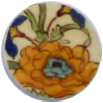
How international has your business become?
We were astounded by the worldwide interest from media at the time. Our Facebook page has followers from all over. One fan in Canada came to the rugby world cup and was told in no uncertain terms the only gifts she wanted from NZ was smash palace jewellery. We are increasingly getting more sales through our online shop from England and Australia.
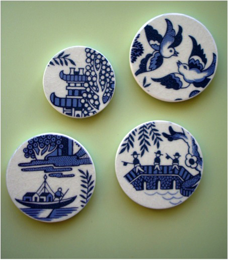
Visit Smash Palace online: http://www.smashpalace.net/
Smash Palace, Wellington, New Zealand.
Interview by Deborah Blakeley, December, 2012
Further information about the Christchurch, 2011 Earthquake below.
The February 2011 Christchurch earthquake was a powerful natural event that severely damaged New Zealand's second-largest city, killing 185 people in one of the nation's deadliest peacetime disasters.
The magnitude 6.3 (ML) earthquake struck the Canterbury region in New Zealand's South Island at 12:51 pm on Tuesday, 22 February 2011 local time (23:51 21 February UTC). The earthquake was centred 2 kilometres (1.2 mi) west of the town of Lyttelton, and 10 kilometres (6 mi) south-east of the centre of Christchurch, New Zealand's second-most populous city. It followed nearly six months after the magnitude 7.1 Canterbury earthquake of 4 September 2010, which caused significant damage to Christchurch and the central Canterbury region, but no direct fatalities.
The earthquake caused widespread damage across Christchurch, especially in the central city and eastern suburbs, with damage exacerbated by buildings and infrastructure already being weakened by the 4 September 2010 earthquake and its aftershocks. Significant liquefaction affected the eastern suburbs, producing around 400,000 tonnes of silt. The earthquake was reported to be felt across the South Island and the lower and central North Island.
In total, 185 people were killed in the earthquake, making it the second-deadliest natural disaster recorded in New Zealand (after the 1931 Hawke's Bay earthquake), and fourth-deadliest disaster of any kind recorded in New Zealand, with nationals from more than 20 countries among the victims. Over half of the deaths occurred in the six-storey Canterbury Television (CTV) Building, which collapsed and caught fire in the quake. The government declared a state of national emergency, which stayed in force until 30 April 2011.
The total cost to insurers of rebuilding has been estimated at NZ$15 billion, making it by far New Zealand's costliest natural disaster, and the third-costliest earthquake (nominally) worldwide.
The earthquake was the most damaging in a year-long earthquake swarm affecting the Christchurch area. It was followed by a large aftershock on 13 June (which caused considerable additional damage) and a series of large shocks on 23 December 2011.
From Wikipedia, the free encyclopedia

Christine McCarthy
Your print making began in 1976 at the South Australian School of Art. Can you explain the importance of Barbara Hanraham in your artistic career?
Barbara Hanrahan was a South Australian printmaker who moved to London in the late 1960.. She was also a novelist.
In my second year at The South Australian School of Art, I was majoring in Painting. Barbara Hanrahan was a resident artist that year in the Printmaking department before returning to London. I was amongst a small group of students doing an elective with her.
She would set us a project and then continue with her own work. Under her influence she established a creative and productive environment. Being able to watch her and see how she went about her prints was very inspirational. I was doing mainly black and white etchings then.
When I had finished my studies I saw an exhibition of Barbara’s work including some hand coloured etchings. It was after this I started experimenting with painting my black and white lino prints.
You also have been greatly influenced by Horoshige can you explain this?
Hiroshige is considered one of the leading exponents of the ukiyo-e landscape view. Many of his prints take as their subject places of beauty in and around the capital, Edo (modern Tokyo). He was influential on European artists including Van Gogh and the French Impressionists. I particularly appreciate his compositions, leading the viewer’s eye into the composition.
His prints were very popular amongst the rising middle class of the time.
In 2000 and 2002 you exhibited in Tokyo, Japan. What was it like to be an Australian taking Lino Prints to the Japanese?
I felt it was quite an honour and humbling to be exhibiting my lino prints in Tokyo, especially considering the Japanese are such masters of woodblock printing, which lino printing has evolved from.
Of course I was able to see many of Hiroshige’s prints, which were on exhibit in Ginza very near to where my exhibition was. It was a great experience learning more about the Japanese culture and the different protocol in the gallery system there. The artist is expected to be present each day of the exhibition. I decided to carve a lino block while I was present at the gallery each day.
It offered me the response to my landscapes and the depiction of space and the fact that the horizon is important in most of my landscapes. People in Tokyo often don’t see the horizon. They were also responsive to my prints of Australian native flora.
Australian flora is a major part of your work. Where do you get the flowers and leaves from?
I am fortunate to live near several parklands which have many native trees and plants in them. The city of Adelaide is bounded by parklands. There is always something in flower. I also have a keen interest in Banksias, I usually purchase these from nurseries which specialize in growing them. If I discover unusual plants at the markets they will be included in a still life. At Corny Point we grow native plants most suitable to the coast which I also like to include in my prints.
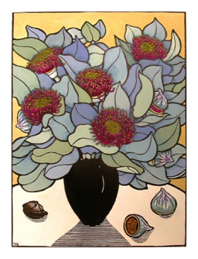
Eucalyptus Macrocarpa
Being Australian is very important to your art. What does capturing Australian flora mean to you?
I have developed a keen interest in Australian native plants over many years. I try to capture the colour, pattern and rhythm of the Australian flora. It is around me and a part of my everyday it is important to express this in my work.
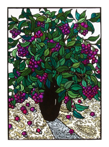
Lilly Pilly on Paisley
Beyond the window, can you tell us about three landscapes you have done recently?
I drew this picture at Mambray Creek in the Flinders Ranges. I wanted to include the Yellow-footed Rock-wallaby which prefers a rocky environment to inhabit. It has recently been taken off the endangered species list. I love the movement of the she oaks and the xanthorrhoea in the foreground. I wanted to show the native plants local to this area and how they survive amongst the rocks.
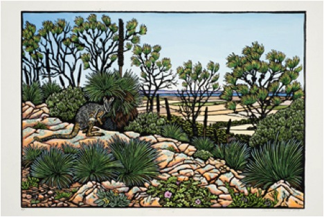
‘Mambray Morning’ 2012
The Mallee fowl’s nest is a work of art in itself. The birds are very shy and create this large mound as an incubator for their eggs. The nests are well hidden in the Mallee scrub. This nest is in Innes National Park on Southern Yorke Peninsula.
I love the Mallee scrub and wanted to illustrate the beautiful pattern of the birds in their environment.
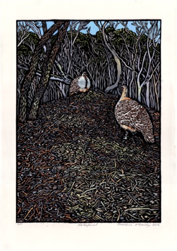
Mallee Fowl 41x30 2012
In this picture I wanted to show the diverse vegetation of the wind swept coast at Corny Point. I marvel at how the plants survive the prevailing winds. The vegetation forms its own tapestry. One often sees Pelicans flying by, appearing to hover overhead. Such majestic birds!
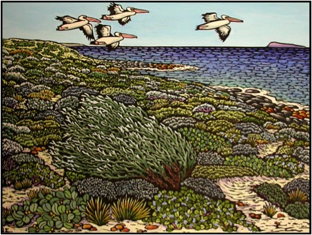
Wedge Island 41x56
Can you briefly explain the process of relief printing?
I transfer the image on to a piece of lino (in reverse – so the image when printed will appear the correct way).
Using a variety of carving tools I carve away the areas which will be coloured in the final picture. This leaves a raised outline and areas of carved textures and patterns. Like a large stamp.
I roll ink over the top of the carved piece of lino (called a block).
The raised areas come in contact with the ink and the carved away areas remain white.
I place a piece of paper (which I have lightly dampened with spring water) over the inked lino block and apply pressure by rolling it through the printing press. This transfers the ink onto the paper.
You don’t need to use a printing press but can apply pressure by rubbing the back of the paper with a wooden spoon or a traditional Japanese barren.
Once the print is dry I paint the first print, which becomes my artist proof.
I then paint the rest of the edition of prints (usually 20 prints) referring to the artist proof. Each print then becomes individual.
You use a Farley Proofing Press, the biggest dilemma to print makers is space and equipment, can you explain your studio situation?
I have a studio in North Adelaide. My work is very transportable. In fact if the weather is fine I prefer to carve outside as the sun softens the lino making it easier to carve. I am able to take my lino to Corny Point when I am there and carve. I also paint my prints at both places.
I am co-owner of an art school, The Ruth Tuck Art School, and although I do not teach any more I have my printing press there. I am fortunate that I have a large space where I can print, especially when I am edition my blocks. I usually do an artist proof in my studio at home first, rubbing the print by hand with a wooden spoon.
Technical information about Printing.
THE PRINTING PROCESS
Relief printing is the most ancient method of taking an impression from one object and putting it on to another.
The earliest form of relief prints were found in China in the 7th Century.
It was used to spread Buddhism.
• I choose to do my images with lino as I like the contact with the surface in each step of the process. The carving of the lino takes the initial image beyond the drawing and adds a further dimension to it for me. There is the excitement of ‘pulling’ the first print and the hand-colouring, makes it come alive with colour.
• I transfer my drawing (in reverse) onto a piece of lino.
• Using carving tools with various blades, I carve away the areas. I don’t want to print. This forms a relief block, like a stamp.
• I then roll black ink over the carved lino block. The ink comes into contact with the raised areas of the lino.
• Paper is then placed over the inked lino and pressure is put onto the back of the paper by rubbing with a wooden spoon or through a printing press. This transfers the ink from the lino block onto the paper.
• When the print is dry I paint the areas that I have carved away to produce the final image.
• The first print I paint becomes my ‘artist proof’. I then print an edition of 20 prints, which I paint referring to the artist proof. This makes each print individual.
• The prints are on 280gms ‘Magnani’ 100% rag, acid free paper.
I print with Van Son rubber based printing ink and paint with Gouache.
Linoleum is a natural product made from linseed oil and wood flour.
Zoneone Arts would like to thank Christine for giving this printing information to our readers.
Your work has been acquired by many private and government institutions. Can you explain about one or two of these and the impact of these sales have had on your career?
At my first exhibition at The Royal Botanic Gardens in Sydney a member of the Prime Minister’s Department came and purchased three of my works for The Prime Minister’s Department. I don’t think this has harmed my career, I can’t say exactly what affect it has had. At another exhibition in Sydney a person from Japan was very interested in my work and purchased several, which led to my first exhibition in Tokyo.
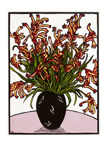
Kangaroo Paws
You work has been in many wineries has it always been on the walls or have you had your work used on wine labels?
I like the rhythm and pattern that the rows of planted vines make on the landscape. It interests me to contrast this with the natural landscape surrounding the vines. Recently I was commissioned by a winery in the Hunter Valley of NSW to do a hand coloured lino print for their label ‘The Pavilion’
How important are exhibitions to your work?
I work all the time because I have ideas I want to interpret into lino prints. Having an exhibition deadline increases the pressure to complete a body of work. It is always interesting to see the framed work up on the gallery wall for the first time. I sometimes discover links between the different images I wasn’t fully aware of before. It takes me about 2 months to complete each image, so to fill a Gallery space is usually 18 months to 2 years in preparation.
How do you organize the numbers of prints you produce? Do you destroy the lino cut after printing?
I usually print an edition of 20 prints.
I like seeing the edition lined up after printing.
There is something pleasurable in seeing the multiple prints, I hand colour each print. I have found this is the number I am happy to hand colour.
Traditionally each carved block should have a carved line cut through the block and then printed to show the block has been destroyed and no additional prints can be made.
For me, I find the carved block an artwork in itself.
Some blocks take 30 to 40 hours to carve.
It is such an important part of the creative process for me. I cannot bring myself to destroy them.
As each edition is sold out (I keep very accurate records) I write on the back of the block the date it has sold out and store them away.
Where an artist lives has a huge impact on their art. Can you explain the impact of living in Adelaide (city) and Corny Point on the Yorke Peninsula
(Coastal) both in South Australia?
I would be an artist wherever I lived.
Living in North Adelaide is conducive to going for walks – into the city, to the parklands, to Adelaide oval for the cricket. Walking gives you time to stop and look. All these places inspire me and something triggers an idea I record to develop into a lino print. A continuing theme for me is the contrast between the manmade and the natural environment.
As having a place on the coast I have become more interested in the changing seasons and the farmed land against the natural coastal vegetation.
My interest in Australian flora is a constant in both places.
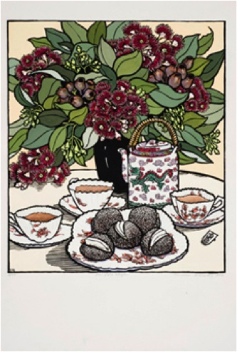
Year of the Dragon
Christine McCarthy, Adelaide, Australia.
Interview by Deborah Blakeley, November, 2012
Jackie Cardy
Do you get your inspiration from your garden, Elizabethan flowers, or from further a field?
I think I get inspiration from everywhere, my garden and the wider environment. When I walk in the woods near my home I see at a particular time of year, willow leaves criss-crossing the paths in all shades: lime, jade, yellow, brown and its stays with me.
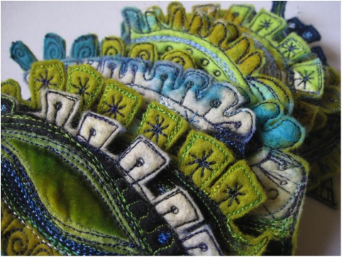
I love the colours of the skies especially in winter. I remember in spring, seeing a leaden grey sky and the sun behind me shining on a sycamore tree in bud, grey trunk, ochre leaves. I suddenly realised I’d made a brooch in these exact colours. I think I absorb all these images and they come out in my work. I have been particularly inspired by places I travel too and last year a lot of my work was based on the colours and textures of the Burren in the west of Ireland. My first pieces after that trip were strange little stitchings on felt I had made in the colours that stayed with me.
I just love looking and then making.
I’m also a big fan of mid 20th Century design and recently made a number of wall pieces inspired by the style. It came easily because it’s the era I grew up in so the designs just fell out of my head!
These were made on silk paper, which is made in a similar way to making felt but with adhesive to hold the fibres together.
A lot of my work is spontaneous and intuitive which is why it varies and sometimes I am ‘in the zone’.
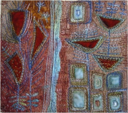
Do you make your own felt?
Yes, I make my own felt. I have been making felt for some years and more recently I became a founder member of a group of felters who meet once a month. This has led me to use felt in different ways and I am very comfortable with it. I love to mix the colours and come upon what I like to think of as little episodes of surprise and delight where two colours meet and blend in an unexpected way.
Do you dye your fabrics?
I dye the velvet I use. I only do it once in a blue moon and it lasts me for years as I use tiny pieces. I HATE the process of dyeing fabric but I love the effect that I get. Again delicious surprises where colours merge.
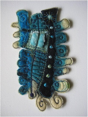
Tell us about your time at City and Guilds and the input that has had on your work?
Well! Where do I begin? City and Guilds, which I finished in 1997, was the very best thing I ever did in my creative life. It taught me lots of new techniques, and ways of designing and above all it gave me the tools to explore my own ideas. I loved it but when it was finished I felt ‘unleashed’ and ready to start my textile journey with confidence. I must admit that now I hardly ever sit down and design but I think I am designing in my head all the time.
Do you take classes?
Occasionally, maybe three or four a year. (see entry under Purses)
What classes do you do and where?
I usually wait for requests from embroiderer’s guild branches, textile groups and so on. I don’t run my own classes speculatively.
I can do technique-based classes such as free motion embroidery, or feltmaking, as well as playdays with transfer paints creating backgrounds.
I have a few ‘project’ classes where students make an item I’ve designed but with their own variations. For example the ‘High Profile Faces’ based on a piece I did for my city and guilds. These are faces in profile embroidered by machine on Hand made felt and finished by hand.
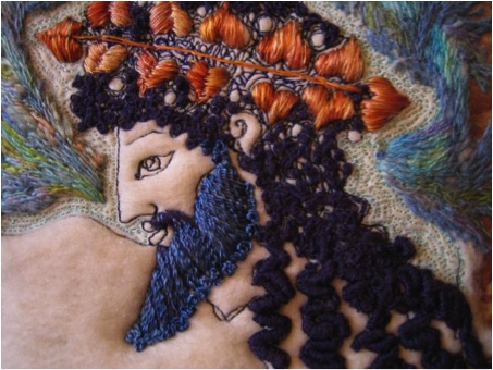
The profiles I did all came from Ancient Greek vases but it can be adapted to make profiles of friends or family.
I don’t teach my current technique though.
Are you open to doing international classes?
It’s not something I’ve thought of. But I’m willing.
Tell us about your leaf and flower brooches and how important colour is?
Well I think you can see how much I love colour! My ‘studio’ aka the ‘spare room’ is very small and as a result its can get quite untidy. This can be a good thing! When a bit of velvet falls onto a bit of felt a new colour combination is born!
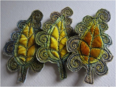
I rarely plan the colour combination for the brooches. I make the felt at the felt group and then I stitch it at home. I rummage in my velvet pile and might find a bit I haven’t seen for a while and try it.
However, when I made my pieces inspired by the ‘Lake Isle of Innisfree’ by WB Yeats I was using specific colours I had seen in County Clare. These were the colours of the water, rocks and seashore. So they were planned.
The felt bowl I made was the embodiment of the feeling of being in West Clare. I love it.
I was going to add stitched motifs but it looked so serene and peaceful with a smooth surface that I left it unadorned. I call it my ‘Peace’ bowl. All this works relates to the poem “The Lake Isle of Innisfree” by WB Yeats.
I had been very stressed when I went to County Clare and I remember standing on the edge of the sea feeling ‘peace come dropping slow’ as in the poem. I made a whole series of related pieces for an exhibition.
The one below is a series of motifs to illustrate the line ‘Noon a purple glow’.
When Yeats wrote the line he referred to the heather reflecting in the water, I made my pieces seaweed shaped to reflect the coastal element.

I love making the brooches and the fact that people want to buy them gives me a good reason to do it. I have recently offered them as unfinished ‘patches’ or ‘motifs’, which could be used as starting points for your own pieces. They are opportunities to experiment with colour and stitch.
Can you explain about the size of the brooches?
The brooches are usually about 3 inches long. Sometime they are a bit smaller. The large corsages are over 4 inches and are on a big pin for use on knitted or felt garments.
How important is fabric to the finished piece?
The fabric is what it’s made of! And stitch. I even have them backed with liberty fabric or similar. The textures of the fabrics give the brooches a unique look, the velvet is so sumptuous and rich and in very small pieces it looks wonderful against the felt.
Can you tell me about the importance of “a splash of colour” – black with olive?
That particular piece was quite a surprise. I had an uninspiring bit of darkest green and black felt and I just thought I might try it, (someone might like it) matched it with limey ochre and fell in love with the combination. Now I need to make some more of that ‘horrible’ felt! (Which I now love)
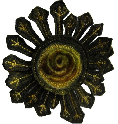
Larger work
Can you tell me about your larger work inspired by the interior of Charleston Farmhouse, Sussex?
The Process
This started as a piece of felt made at the felt group. Because I make the brooches to sell I have to make them appeal to different tastes so I strive to make felt in colours I wouldn’t ordinarily choose. I made this piece and as soon as I saw it I realised it was the palette of the décor of Charleston Farmhouse. (This was the home in the early 20th century of Vanessa Bell and Duncan Grant and some of their ‘Bloomsbury’ group. They decorated almost all surfaces of the interior-from cupboard doors to the side of the bath- with what was then very Avant-Garde style. )
I looked at this piece of felt for ages not wanting to do ‘the usual’ with it and when I needed to make a piece for an exhibition I decided to use it to make a garden inspired piece.
The Composition
I made a number of small pieces in the same way as I make the brooches but allowed myself to wander around the shapes with my sewing machine almost doodling patterns and shapes using velvets and threads of matching shades.
When I had enough pieces I played about with the composition and decided I liked it in a circular format on a background of felt. I made a piece and attached them and didn’t like it so nothing daunted I unpicked it all and made a more neutral piece, which I like.
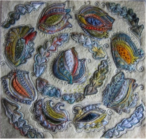
The Fine Detail
Once I’d attached the pieces I felt they needed something to connect them visually with the background so I used a selected few hand stitches. I love running stitch and made lines to make the motifs flow on the background, and finally used the sewing machine to create texture in the background.
Purses
Talk about the purses you make.
I don’t make purses so much now. Perhaps if I have a stall at a Craft event, but I don’t do that often. I love embroidery and purses are all about construction, but I love to combine velvet with Harris Tweed and as a result have made Harris Tweed bags, very simple, with velvet embroidery, and some smaller purses. The velvet goes so well on the tweed.
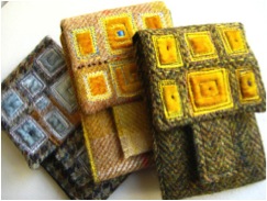
I made some small ‘Petal Purses’ some years ago and now sell a pattern on my Etsy site for people to make their own. I also offer this as a workshop.
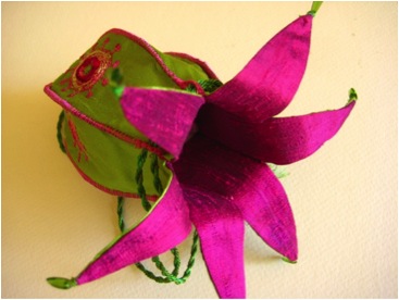
Contact details.
jmcardy@gmail.com
Galleries and web places where your work is available
http://www.etsy.com/shop/dogdaisy92
Lazyhill Gallery, Abbotsbury, Dorset, UK
The Platform Gallery, Clitheroe, Lancashire. UK
The Chapel Gallery, Ormskirk, Lancashire, UK
Jackie Cardy, Lancashire, United Kingdom
Interview by Deborah Blakeley, August, 2012
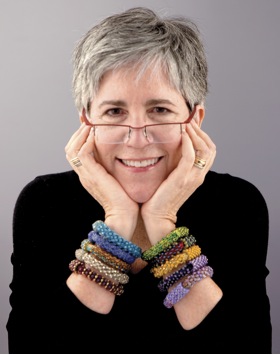
Betsy Hershberg
You have been knitting since you were eight years old, and have studied with some of the world’s best known knitters. Can you tell about one or two techniques that they have passed on to you?
The inimitable Lily Chin is actually responsible for setting me on this path as she is the instructor who taught me the basic techniques of bead knitting. I will be forever grateful. The most important thing I have gathered from the wonderful instructors I’ve been privileged to know is not a technique however: it is to listen to and trust my own voice. Once you start creating work out of a desire to please others, your own voice can easily be lost.
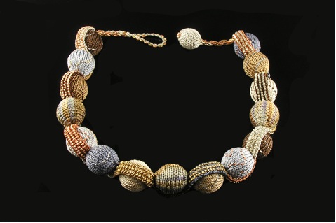
Meander 1
In 2002, now ten years ago, your knitting world was “turned upside-down.” Can you explain what happened?
I wish I knew HOW to explain it. I took a six hour class on basic bead knitting and from then on, all I’ve wanted to do was play with beads and fibre. After thinking of myself as an accomplished knitting technician for all of my knitting life, something about what seemed to be the endless possibilities for combining these two materials unlocked a creativity capacity for knitting that I had never imagined existed in me. I am intrigued by the contrast between hard (the beads) and soft (the fibre) and love the challenge of using them to create wearable, three dimensional forms from techniques that most often result in two-dimensional fabric.
You think of yourself as “left brained.” What do “you” mean by this?
Along the lines of how science defines people who are left-brained dominant (almost everyone has some characteristics of the opposite side of the brain), it’s a way of categorizing how I think and work. My sister describes me as “concrete, linear, sequential” and that pretty much sums it up. I describe myself as pathologically organized and often, to my dismay, pathologically symmetrical. But as I get older and I watch my work evolve, I am learning to accept and even appreciate my natural way of doing things. I also recognize that it’s unlikely I could change, even if I wanted to.
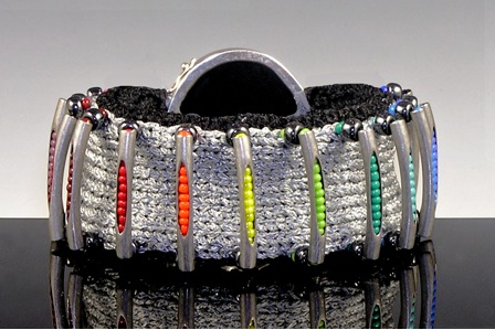
Barre Exercise
You get inspiration from many places. Can you elaborate on this?
I just think that all too often we rush through the world, taking notice only briefly of the things that catch our eye every day. If we would take just a few extra minutes now and then to not simply notice what things in our visual field we like or dislike, but try and ascertain WHAT IT IS we like or dislike about these things and then try to remember, even mentally catalogue them, we would be overwhelmed with more inspiration than we could act on in a lifetime. As a result of learning how to take time to notice things, I have an enormous number of visual images I use regularly when I work to translate the techniques I bring to my work into the components of bead knitted jewellery and accessories. I often say that my brain feels like an airport runway, with ideas just waiting in line to take off. It’s why I love making one-of-a-kind pieces. So many ideas to work on. Next!
Can you explain the importance of the word “Art” in your work?
My friends know of my lifelong struggle with what I call the “A” words. I just don’t understand the use of the word: who gets to decide what gets called art, who gets recognized as an artist and why. It all feels so loaded. It was in the process of writing my book that I came to terms with the fact that I can’t control what people think of my work - is it art? is it craft? - and in the end it doesn’t really matter. My obsession with “A” words had become an excuse for not trying new things - this worrying about what others would think. It’s been very liberating to let go of that struggle.
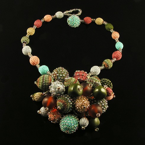
Andromeda
Your Work
Are all your pieces for sale, one-of-a-kind?
Most of my pieces are one-of-a-kind and I sell them only at juried craft shows or occasionally at trunk shows offered in conjunction with workshops or book signings. I know this makes it hard to acquire them, but I really feel like they need to be tried on before purchase. So while I do display them on my website, I have only rarely sold them after an inquiry from the site. I have a limited edition bracelet design and bead ball necklaces, both displayed on my website, that I do sell on request. I am hoping to add an e-commerce component to my website early next year (2013) where people will be able to order both finished work, new design patterns and materials kits.
Can you talk about your work?
Wavelength (2012): hand-dyed tassar silk, monofilament, Japanese glass beads, Chinese turquoise beads, sterling silver/foiledglassclasp
My favourite thing about this piece is how it is a mish-mash of so many different techniques and yet still works as a whole. If you only knew how many previous "reincarnations" it had before reaching this final version. I often change directions in the middle of working on a project, but this may be the only one so far that I had completely finished and assembled in different way and then disassembled and without too much additional work, re-engineered it into the format you see now. It's also notable that there is no pre-strung bead knitting in this piece. Lots of weaving beads into knitted fabric and stringing many, many beads which are then manipulated into the shapes and patterns I wanted. It's also interesting to note that although you can't tell from a photograph, the three larger Chinese
Turquoise beads are each able to rotate within their space so you can view the lovely matrix of each in its entirety.
Morning Glory (2011): hand-dyed tubular rayon ribbon, perle cotton, monofilament, Japanese and Czech glass beads
This piece resulted from one of my favourite "Ah hah!" design moments. I love the effect of using spirals in my work and had tried for years to figure out a way to make knitted I-Cord spiral without success. While working on projects for my book, I asked myself why knitters always work I-Cord using knit stitches. Why not use purl stitches? Could you even make I-Cord with purl stitches? So I cast on a few stitches and tried it. About 20 rounds in, the cord started to naturally spiral on its own and I had made my Eureka discovery. This lariat combines a bead knit spiral I-Cord, sewn bead embellishment, spiral bead weaving and four original off-loom bead-woven flowers.
Silver Orbits (2012): metallic cable thread, Japanese glass seed beads, wooden beads, sterling silver hoop earring findings; bead knitting.
Photo: Alexis Xenakis, XRX Books, 2012
I think this little earring is a testament to the power of simplicity. So much of the work of making what I do is sourcing the materials that will work with the techniques, materials and tools I use. This extraordinarily strong yet flexible fibre, which is available only in silver and gold, is so much easier to knit with than wire and yet the finished fabric looks to me exactly like precious metal. And this incredible photograph, shot for my book by Alexis Xenakis, shows off every fine detail of the workmanship in a unique and evocative way. I love this photo and this piece.
Silver Ribs (2008): polyamide/viscose fibre, Japanese glass beads (triangles), sterling silver clasp
This bracelet was made several years ago and is a wonderful example of why I tell my students that for me, technique is at the root of all strong design. The way I began to experiment with bead knitting after I first learned the basic techniques was to take every knitting technique I knew and play with it by combining it with beads. So many possibilities for each technique! This bracelet is based on the knitting technique known as welting, which creates 3-D tubes on the face of a piece of knitted fabric. I decided to alternate colours, knit pre-strung beads onto the silver welts and this bracelet idea was born. Again, simple but strong.
Is your work very warm to wear? Does it work better in the cooler months of the year?
I rarely use what people would consider “warm” fibres - like wool or alpaca - for my work as to my eye they don’t suggest some of the inherent qualities of jewellery. I most often use silk, rayon and tencel, all of which work well with beads and often have a bit of sheen to them. I also knit with some very fine synthetic fibres more often used for embroidery or surface embellishment. What often surprises people is that with very few exceptions, my work is extraordinarily light weight. It is very easy and comfortable to wear.
Can you discuss the importance of new yarns that are coming onto the market and how they affect your work?
Despite the fact that I have several favourite, “go-to” fibres that I love to work with, I am ALWAYS on the lookout for new ones that will surprise me and inspire me to create something especially for their use. I am very fortunate these days that as a result of the success of the book, yarn manufacturers now often let me know about new fibres they think might work for me.
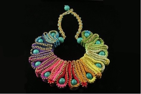
Meander II
Beads vary greatly, so how do you choose the beads you use?
I’m quite fond of the definition that says “anything with a hole in it can be considered a bead.” However, the range of beads that will work for my designs is considerably narrower. While I’m always excited to find unusual beads to use as focal pieces, I prefer to work with Japanese glass beads manufactured by Miyuki, Matsuno and Toho. The quality of these beads is unparalleled in the industry. And I am always thrilled when I can find good vintage Czech glass from the 20’s and 30’s.
You say, “I am proud to call myself a knitter.” Can you elaborate on this?
I am a knitter first, last and always. In some circles, knitting is still given short shrift, thought of as something that only grandmothers do and do badly. I hope that my work demonstrates a small part of what knitting CAN be.
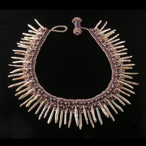
Pearlburst
In every piece I make, the knitted stitches are visible somewhere. I want people to be able to recognize that my work is knitted. Even though my design work grew out of my discovery of the possibilities inherent in adding beads to knitted fibre, as long as I have the proverbial two sticks and a string I’ll be happy.
Book and classes
You are now sharing your knowledge in your beautiful book, “Betsy Beads: Confessions of a Left-brained Knitter.” Can you explain how the book gained a life?
I had been approached by several publishers who had seen my work and wanted me to do pattern books and I really had no interest in that. Then XRX Inc, publishers of Knitter’s Magazine and beautiful craft books and the organizers of the popular Stitches Expos here in the United States asked if I had any interest in writing a book. They had published several of my patterns in the magazine and I had been teaching classes for them for several years. But it was only after another year of teaching, and realizing how many of my students shared my earlier struggles with thinking of myself as a creative knitter, that the idea for this book took hold. I wrote it to share what I have learned about a creative process for left-brained folks like me and then used my teaching and design experience to illustrate that process with technical instruction and lots of exciting patterns. This book would likely not have been written or published without the understanding of the team at XRX. They read my proposal and instantly got what I wanted to say and do and supported it.
Can you also explain the need for excellent photographs for publication?
That’s simple. Especially given the amount of small detail in my work, without the eye of a gifted photographer, work like mine could not possibly come to life on the pages of a book.
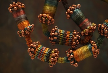
Alexis Xenakis, who was my photographer for the book (and who has helped me learn to improve the photographic skills I use to shoot my own work) is a genius in my opinion.
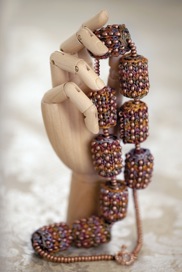
When I saw what he had done in capturing my work for the book, I sobbed in gratitude. I call him “The Illuminator”

Photos by
Alexis Xenakis.
How can readers get their own copy of your book?
It’s available in yarn stores all over the US. I don’t know if it has reached Australia yet although I do know of several students I have “down under.” The easiest way to buy it is through Amazon.com or other online retailers I believe.
You also teach classes. Can you tell us about both classes “Brilliant Knit Beads” your online video class and classes you teach face to face?
The “Brilliant Knit Beads” class is 5 hours of online, streaming video available through Craftsy.com, a relatively new US company that has taken the craft world by storm. They offer classes in all kinds of crafts and once purchased the class is yours forever, to watch as many times as you’d like on your computer or tablet device. In addition, Craftsy instructors interact with our students as they are able to ask questions, post project pictures and create a wonderful new community. The class can be previewed at http://www.craftsy.com/class/brilliant-knit-beads/98
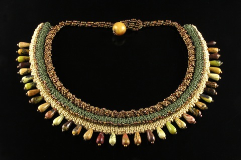
It is through my Craftsy course that I have “met” my students around the world, including some really talented ones in Australia! In addition, I teach live classes all around the US at large expos, yarn stores and guilds. Upcoming class information can be found on my website, on Ravelry.com and soon on my Craftsy instructor page. I also have a Ravelry Group (Betsy Beads Fans) where I interact with and try to help bead knitters from all over the world.
Visit Betsy Hershberg's website: www.studiobknits.com
Betsy Hershberg, Pennsylvania, USA
Interview by Deborah Blakeley, December, 2012
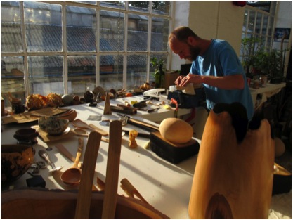
Nic Webb
You initially trained in fine art at Brighton College from 1991 -1994, when did you move into your craft of spoon making?
I made my first spoon about four years ago from Lime that I collected in the woods of Suffolk. In a few months I had made several spoons and was invited to show them in a gallery in London. I imagine that I have made some 500 spoons…
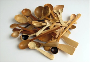
Some 'Woody' questions.
Why do you prefer to work with green wood?
Green Wood is fresh living wood that has yet to begin to season. Green wood is much softer to carve and more malleable. As wood dries it can move and twist, giving unexpected form to each spoon made.
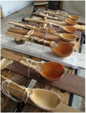
Why do you prefer deciduous woods?
The Conifers will commonly have a resin or sap that can impart a taste to food and Conifer wood is not readily used for food preparation. There are a wide variety of deciduous woods that are non-toxic and food safe. This has always been a consideration when making spoons. That said I am always happy to work any wood if only to experience the properties of the differing trees.
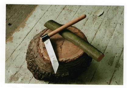
Can you explain where you get your wood from?
Green wood is a material that must be sourced as it is rarely for sale in shops. Tree Surgeons are a great starting point and are generally happy to see the wood going to be used. London parks have many interesting trees, allowing access to woods that would not commonly grow in England.
Much of the wood I receive comes from friends having pruned trees in their gardens.
When walking in Britain I am always on the lookout.
Always ask before taking…
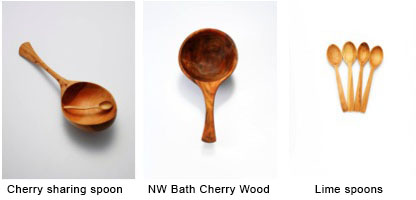
How do you store and catalogue your wood?
I have a lot of wood stacked up at the studio. Some wood in the dry and some out in the wet.
I have a good selection to work with. There is no cataloguing. I like to recognize the different woods and remember from where the trees came.
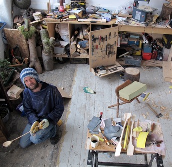
You don’t only work with wood but combine materials, wood, ceramics and metal. Can you expand on this?
I have always been interested in all kinds of making and the combination of materials. When working with metal, clay, wood and stone you experience the similarities and differences in materials and can explore ways in which they can be successfully combined
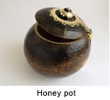
You have a range of spoons that you made especially for Fortmun and Mason’s can you tell us about this commission?
I was asked to produce a range of Jam and Pickle spoons for the shop in 2011.
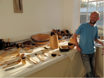
About your spoons and utensils…
What other wooden utensils do you make?
Tongs, slicers, ladles and bowls.
When starting a new piece of work I am keen to look at the grain and shape of the wood to suggest design possibilities.
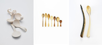
Thin pieces may well become slices, large pieces might become bath spoons. The spoon is a versatile tool with many uses. It is fun to explore its function.
The bowls that I make are also a response to the natural features in wood and are rarely symmetrical. For examples of the work please see my website.
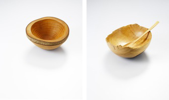
Can you explain what a birth spoon is?
Birth spoons are a take on the Christening spoon that would be given to a child at birth.
I was keen to have a name for these pieces that was non denominational and the birth spoon was born.
You only use traditional tools, many handed down to you from your grandfather. Are the tools you use all hand tools?
The majority of my tools are traditional woodworking tools and are the backbone of my work. My great-great Grandfather was a Journeyman in Devon in the late 1800’s and many of my tools have been handed down to me.
For larger pieces and the bigger bowls I do use modern tools to rough out shapes but very quickly in the making process I return to the hand tools for the most efficient aIs it harder to make a small or a large spoon?
Is it harder to make a small or a large spoon?
Both sizes have their difficulties but my experience is that the small spoons are harder on your hands and fingers.
Nic, you also take classes teaching others how to craft spoons, can you tell us about your classes?
My courses offer students a complete guide to the making of a wooden spoon using greenwood and traditional wood carving tools.
Through demonstration and tutoring, each step of the making process, from the selection and cleaving of green wood, the use of hand axes, chip knives,
gouges and cabinet scrapers, to the final finishing processes involved in spoon making.
The course also covers safe practice, sharpening and tool maintenance, suitability of woods and the reasons and potentials for the use of greenwood.
The course is tailored for those with no experience of making through to those with a high level of wood working skill.
Through out each step of the making process each student will receive one to one tuition to suit their level of ability.
On completion students will have a good understanding of green wood making and the knowledge to confidently continue making in an untutored environment.
I am currently teaching greenwood working skills at a number of London Colleges, at West Dean College, Chichester and run courses from my studio in Camberwell, London.
Can you please give us a brief history of the spoon?
Spoons have been found across the world from as early as the Neolithic period. They have had a place in many cultures as objects of function and ceremony and may well be one of Humanities earliest tools.
The word spoon stems from the Norse word ‘sponn’ meaning chip or splinter of wood. Perhaps any piece of wood or bone that acted as a utensil to aid eating would have in time been refined, and has led to the huge variety of objects that have been made through the ages.
The spoon is a wonderful object that exemplifies human making and our connection with materials we find in the natural world.
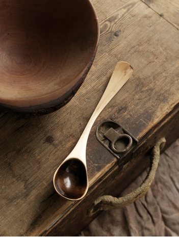
You have had many exhibitions in the UK and around the world. Can you give us some of the highlights?
It is a great privilege to exhibit your work and provides good focus to complete a show.
I have had shows in London and across Europe but a recent highlight was a five week trip to Japan and Seoul to have two shows with the Korean Ceramicist Hyejeong Kim. I was invited to hold workshops in Tokyo teaching spoon carving and met many other makers and wonderful people.
I will always take the opportunity to travel with my work.
Do you have any current exhibitions?
I currently have a show at West Dean College, Chichester and am working towards two shows in London next year.
As well as exhibitions, and sales from your site you have wonderful images of your spoons for sale. Can you tell us about this side of your business?
Many of the images on my site have been taken by Michael Harvey and
Tif Hunter, two London Based Photographers.
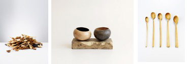
Please contact Nic should anyone wish to purchase works or photographic prints.
www.nicwebb.com
Nic Webb, London, UK,
Interview by Deborah Blakeley, October, 2012
Tom Hill
You have been working full time as a wire sculptor since 1994, winning the Setting up Grant from the British Council in 1994.
What did this grant do to help you establish yourself?
The grant helped in two ways. Firstly a small living stipend and equipment grant definitely helped at the outset of my career. Secondly, and I think more importantly, it really helped to build a professional network... The Crafts Council helped to promote my work and really got me on the crafts radar. My work was included on the "Index of Selected Makers" which led to public and private commissions. I showed work at the Crafts Council Gallery shops, both at the Crafts Council itself and at the Victoria and Albert Museum, took part in Chelsea Craft Fair a number of times and generally felt very much part of the UK craft community.
When and why did you move to San Francisco, USA?
I moved here to San Francisco from London in 1999. My partner, Mike Holmes is one of the owners of Velvet da Vinci Gallery, here in SF.
You continue to have many commissions in both the UK and the USA can you expand on two?
The BBC Symphony Orchestra (1996)
BBC Symphony Orchestra - Drawing
This commission came from having work on the Craft Council's Slide Index… I was approached by the Orchestra and their graphic design company and produced a series of drawings and two dimensional wire pieces, which were photographed and used in publicity, posters, brochures and advertising for two seasons. I attended a number of rehearsals, making drawings of the players in a less formal situation than the concert hall would provide.
Hyatt Regency Hotel, Tampa, Florida USA (2006)
I've been lucky enough to have been commissioned to make a number of large scale bird commissions. The Tampa project is situated in a restaurant called "Oystercatchers" separated from the main hotel, in a bungalow style building right on the salt marshes and tropical mangroves of Tampa Bay. The commission consists of about 40 individual birds, of varying size and complexity. I think my work functions well in these kinds of projects on two levels. Firstly the open and visually "light" nature of my pieces allows for a large number of pieces in a space without the danger of the work becoming overwhelming. Secondly I arrange the pieces in a way that leads the eye around the room and animates the space, softening the hard straight lines and hopefully in bringing a little of the outside world in.
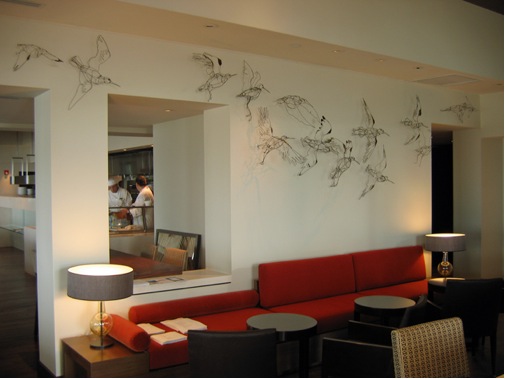
Hyatt Regency Hotel, Tampa, Florida USA (2006)
You call yourself a draftsman and metal worker, why?
I think of my work as illustrative. My work doesn't have a strict narrative I am as concerned with conveying character and gesture as I am in describing form and texture. I'm not particularly interested in metal working techniques, the image is the important thing and the technique aspect is secondary.
Stork Drawing #1
Tell us about the process your drawings take in the production of your work?
Drawing is always my starting point. I work in sketch book, preferably from life also from stuffed specimens or from photographs. At this point have an extensive library of images to work from.

Stork Drawing #2
I tend to make a sculpture using a number of drawings of the same thing, different angles, poses and details.
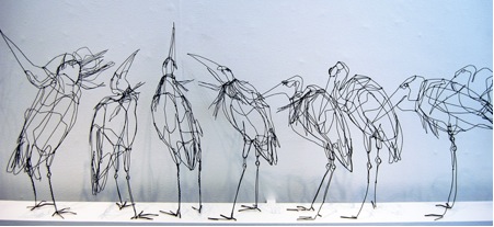
Detail "Stork Sequence"
I love the freshness that drawing from life brings to my work… I try to keep my work varied and interesting, for myself as much as for my clients. I think getting out of the studio and drawing is essential for this. I make new drawings all the time and return years later to drawings and use them to make objects.
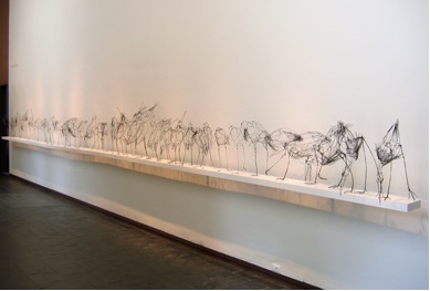
"Stork Sequence"
Eadweard Muybridge 1830-1904 had a profound effect on your work can you expand on this?
I was introduced to Muybridge's photographs by the enamelist Ros Conway, who was one of my art school tutors and Muybridge has continued to be a huge inspiration to me. His photos convey movement and gesture in such a thrilling way. They are beautiful as an end in themselves. I have been drawing and re-drawing from them for the last 18 years. I have also worked with a life model and re-created the human poses, working directly in wire from the model.
I guess the main aim in my work is to make staid objects the imply movement and in this Muybridge and myself have and had pretty much the same goal.
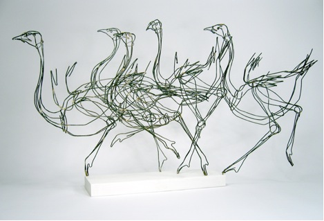
Muybridge Ostriches.
In more recent times, with the advent of digital technology, I have made my own videos of birds in motion, stop framed the video and made my own sequences a la Muybridge, drawing from the images on my computer screen and making sculptures from those drawings, this really opens top a world of new work and images.
One of my bigger exhibits was a solo exhibition at the Fuller Craft Museum in Brockton MA. (Just outside Boston). The show was called "Drawing on Muybridge" and I exhibited work based directly on Muybridge sequences, horses, ostriches and elephants in addition to a 40 foot long sequence using my own video of a crane displaying at San Francisco Zoo.
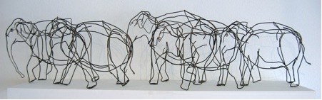
“Muybridge Elephants”
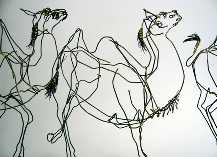
“Muybridge Camels”
Your work with birds and you explain about the work of several of them?
Roosters
I've been making roosters and chickens for years. They have a great combination of physical beauty, amazing plumage and balletic stance with a capacity for tremendous cruelty to each other. The skin on their heads is both beautiful and slightly repellent.
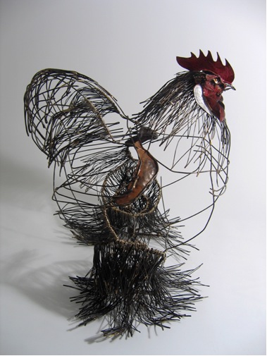
“Chochin Rooster”
There's this great book published every year for well over 100 years by the American Poultry Council, called, if you can believe it, "The American Standard of Perfection" which in air-brushed photographs portrays the ever unattainable standard for each variety of chicken, the correct stance, angle of comb to head, numbers of tail feathers etc. I have a lovely copy from the 1930's, with photogravure plates of roosters and hens in perfect matched pairs.
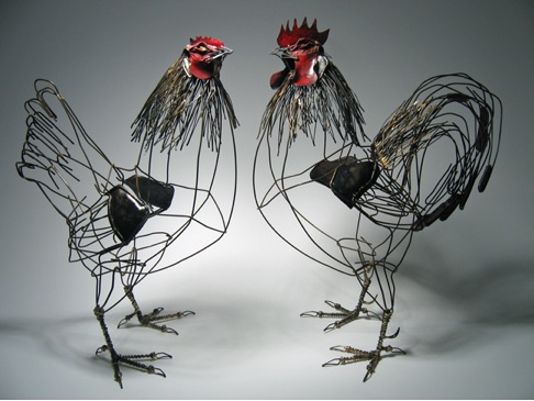
“Cock and Hen”
I like this ugly / beautiful axis, and have also made a number of insect pieces which have a similar feel.
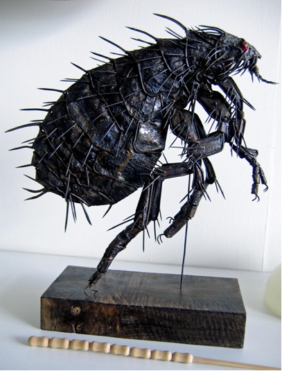
“Flea”
Ostriches (particularly your sub sequential ostriches.)
One of the things that I can imply in sculptural pieces which Muybridge was less able to convey is speed. I've experimented, especially in my ostrich pieces with spacing and overlapping … the denser the placement the faster the implied movement, the more spaced out the slower. I've always been more drawn to the long legged birds, cranes, herons, ostriches etc. I like the feeling of a body precariously balanced, then forcefully propelled forward, sometimes partially airborne, sometimes touching one toe on the ground
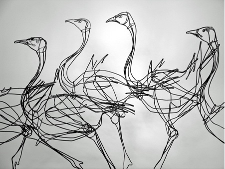
Detail Muybridge Ostriches
Your early training was in jewellery. When did you go big?
I studied Jewellery at Middlesex University in London in the late 80's early
90's. at that time the program was very much focused on large scale, body related sculpture type work. The faculty included Julia Manheim, Pierre Degen and Caroline Broadhead, so that, while we did have to learn traditional bench technique, the real focus was on alternative materials, appropriateness of materials and making, a personal exploration of form and ideas. I did make some jewellery and continue to produce jewellery on occasion.
The first of your work I saw was a Blue Bird with Orange beak, made of wood, recycled timber, stencilled enamel paint, ink, brass, and steel. He is so quirky. How did you come to this series?
For years now I've been making what I call "Bound Wire Birds", a dense wire body with a carved wood beak, gestural and fun and using poses from drawn studies in a freer kind of way.
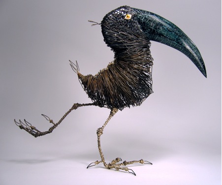
“Bound wire bird”
More recently these have developed into a body of work making carved wood pieces. Having worked in black so much it's been fantastic to use colour!
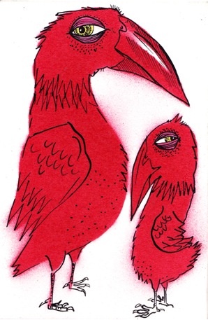
“Red Bird" Drawing
Can you tell about your birds eyes, they seem to watch the viewer so intently?
So much is conveyed by gesture … in humans as well as animals. The turn of the head and the sudden beady eyed look can speak a thousand words!
“Wooden Birds”
You also do animals from life drawings can you elaborate on this?
“Sheep”
I do make other animals, but am always drawn back to birds as my primary inspiration.
“Birds In A Tree”
Tell us about your studio space?
I have a pretty large studio in the basement of the building I live in. It opens out onto the garden and I have a commute of about 1 minute! I don't share my studio with any other artists, but I do have two dogs who mostly hang out with me at work, unless it's sunny in the back yard in which case it's full on canine sunbathing …
What are you currently working on?
I'm currently working on a commission of 20 or so birds for a private residence.
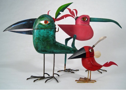
“Salt Cellars #1”
Earlier in the year I made a group of 15 carved wood salt cellars in the form of birds so it's a nice change to be back working with wire again.
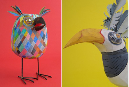
Salt Cellar Owl and Salt Cellar White
Email: thomaswhill@earthlink.net
Tom Hill, San Francisco, USA,
Interview by Deborah Blakeley, September, 2012
Isabelle de Borchgrave
Your work is all done with paper.
Can you explain the size and type of paper you use?
The paper I use is the common pattern paper that the stylists use in their atelier. I just don’t buy sheets of paper but huge rolls because I need a lot of paper to make a dress, several meters. This paper is really amazing because it is very malleable and resists very well to the paint I use. The width of the paper is always the same as I use the same roll for all the dresses: 150 cm. The length will depend on what I am going to do.
Each costume takes many processes to get to completion.
Can you explain briefly the process you use?
The first step, and one of the most important parts of the work, is research. I have to be very careful not to make a mistake … I have to study the period of the costume, the history of the character if it is a portrait, … Research can take weeks. After the choice of the model of the dress, one of the stylists working in my atelier creates a white pattern that will be fixed on a mannequin to see how to recreate the dress. When the white patterns suits, we paint the background on to the huge pieces of paper. When it is finished I paint the details, the trompe l’oeil, … Sometimes we rumple the paper to give it some volume. When the paper is prepared, we cut it and we put together all the pieces on the mannequin. At this time we begin to create all the accessories and details: wigs, laces, collars, bags, jewels, shoes, gloves,
Elenonore de Tolede by Isabelle de Borchgrave. Photo: Andreas von Einsiedel
Your work is taken from very famous paintings in galleries. Do you take photographs or make drawings in galleries?
I visit a lot of museums and galleries when I am travelling but I do not usually have the time to sit in front of a painting and draw it. I have a lot of books (more than 3500!) and catalogues of the exhibitions I loved … When I am doing my research I remember what I saw. Museums also give me very good reproductions of the paintings they want me to recreate if I do not have enough information in my books. I never do exactly the same dress as the one on the image. I have, it is an interpretation with other dresses of the same period. On a painting you never see the full dress: if you have the front you do not have the back … So I have to recreate a lot.
Elenonore de Tolede by Isabelle de Borchgrave. Photo: Andreas von Einsiedel
Often in the painting we only have one view. Your work takes from the 2D painting to 3Dsculptured form. Explain how you fill in the missing elements?
This is a really exciting part of the creation. It is part of imagination, Fashion History and History. With my stylists we do a lot of tests, we try different things we imagine how it had to be at the period when the dress was worn. Sometimes it is easy, sometimes it isn’t. A lot of research in fashion books has to be done for that part of the creation. We sometimes ask the help or just the confirmation of museums to be sure we are not making mistakes.
What painting did you base her from?
This costume is inspired by a portrait painted by Bronzino in 1545 : Eleonora of Toledo with her son Giovanni de' Medici; Oil on wood.
Where is the painting?
In Florence (Italy), in the Uffizi Galleries
What access did you have to this work?
I visited the Uffizi several times, and I have a lot of different books representing the portrait.
Eleonora of Toledo with her son Giovanni de' Medici Bronzino in 1545, Wikipedia.
Please describe the fabric of her dress and the pattern?
The real dress of Eleonore de Tolède doesn’t exist anymore. The only thing remaining is a little piece of fabric with the black and gold stencil that you can see on the dress that I recreated. We had to work with only with the painting. I had to be very careful to respect as much as possible the design of the stencil that I recreate in my studio because that was the only thing remaining, “a kind of homage”.
Eleonore de Tolede by Isabelle de Borchgrave. Photo: Andreas von Einsiedel
“ Primavera, Flore – 1482, Spring of Sandro Botticelli , known as Allegory of Spring, Wikipedia.
This is a very different costume as the fabric is light and sheer. How do you manage to get the transparency?
For that dress there are two different papers used. One is the normal one, and the other is a transparent one very difficult to use because it is very fragile. So when I paint on it, I have to be very careful not to tear or damage it.
How do you make the decision on details like the hair on Flore which is neutral?
As I said, a good part of my work is imagination. It is an interpretation. If I feel it like this I will do it like this. Those dresses are not only fashion or history, they are pieces of art. Those dresses are not mannequins, they are paper sculptures.
Primavera by Isabelle de Borchgrave. Photo: Andreas von Einsiedel.
Explain the importance of details like the flowers in the hair and around the shoulders of Flore?
This character represents the allegory of Spring … It was important that nature was all around her. She needed to represent nature, spring, life, … That is why the flowers make a great part of her costume. Flowers and transparency, because the transparency represents the lightness of the season.
Medicis Trio - Enfants by Isabelle de Borchgrave. Photo: Andreas von Einsiedel.
The Medici work, was it the first time you had to work with large neck ruffles?
No, I had to do neck ruffles for the Papiers à la Mode collection, for the dress of Elizabeth I for example. With the Medici collection it was the first time we did ones with so many details, so sophisticated, so precious.
Where are all of the Medici pieces?
Some of them were exhibited in the Palais d’Egmont in Brussels for the National Day the 21st of July. That part of the collection is now in my atelier, and the rest is in boxes waiting for their next exhibition, which is not decided yet.
You have children as well as adults in your collections.Can you describe the work on ‘Les Filles de Charles Emmanuel III’ 1730?
Charles Emmanuel III’s Children 1730. Maaria Ciovanna Clementi 1690-1761.
Photo Odejea Chambery Museum.
The children are 123 cms high. How do you decide on the scale of your work?
They are 123 cms! Which is a normal children size for their age … For The Medici collection we did something quite different from the other paper dresses collections : all the mannequins are higher than the normal human size. Everything is bigger, it is to accentuate the majesty of the characters.
The detail on all costumes must determine the base model. Can you discuss the way you decide on the model you use for each collection?
The model is usually chosen with the museum if it is an order. The museum asks me for a particular dress which is based on a painting or fabrics from the museums personal collections.
The paper dresses collections I created with my team (Papiers à la Mode, I Medici, Forrtuny, Ballets Russes) are different. I chose to reproduce what I liked, it is more personal. Of course it has to be appropriate with the subject: for the Medici collection for example all the dresses are ceremonial dresses.
Enfants de Charles Emmanuel III by Isabelle de Borchgrave.
Photo: Andreas von Einsiedel.
Not only do you work on the actual clothes, you have the details of wigs, handkerchiefs, jewellery and shoes.
Can you discuss the importance of these extra details?
All those details make a big part of the costume. They make it alive. It helps to recreate the context where the costume was worn. It is very important. It can also help to add a little fantasy to the costume, or it just helps to make the costume more realistic.
Enfants de Charles Emmanuel III by Isabelle de Borchgrave.
Photo: Andreas von Einsiedel.
One of the more modern pieces I would like you to share with us is Jackie Kennedy’s wedding dress.
Paper Art of Jackie Kennedy’s Wedding dress, by Isabelle de Borchgrave.
Photo: Ghislain David de Lossey
How did you get this commission?
There was a big exhibition in Chicago on Jackie Kennedy’s dresses. An American, Jamie Becker (who worked at that time for Marshal Fields) had the idea to ask me to create this wedding dress in paper.
Where is it on permanent display?
It is exhibited in the Kennedy Memorial in Boston since 2004.
Who was the original designer of the dress?
The designer was Ann Lowe.
Paper Art of Jackie Kennedy’s Wedding dress, by Isabelle de Borchgrave.
Photo: Ghislain David de Lossey
Is there a copywriter problem when you are working with current costumes?
There could be a copywriter problem; that is why I always ask for authorization for this kind of dress. Caroline Kennedy gave it to me at that time.
Paper Art of Jackie Kennedy’s Wedding dress, by Isabelle de Borchgrave.
Photo: Ghislain David de Lossey
Tell us about the work involved in Jackie Kennedy’s veil?
The veil is also in paper. It is created from a drawing of the veil of the Bouvier family that Jackie Kennedy wore during her wedding. It is made in “papier non-tissé” and it is very fragile. All the designs are stencils that I recreated for the veil.
You also work on fashion shoots; explain how much freedom you have with this type of work?
I do not really work on fashion shoots. I did three fashion shows for a social organization called “Les Petits Riens”. I really liked it and all the artists doing it at the same time could do what they wanted. It was really interesting. I once did the background of a Dior Fashion show (huge paper flowers). Arte International also asked me to create five dresses with their mural paper and they photographed them on real mannequins. It was a great experience but it is not something I am looking for. My dresses are art sculptures before being fashion.
Your designs are also worn on special occasions.
Tell about your Royal commission.
Our Queen, Fabiola asked me to create something in paper for her to wear for the wedding of one of her nephew in Spain. I did a jacket and a hat, and I also painted a fan. The funny thing is that it was raining that day! A bodyguard had to carry an umbrella for the Queen the whole day and followed her everywhere.
In September you are opening up your studio. Explain how this is going to work?
From September 2012, I will be opening my studio to visitors.
On the first and third Monday of the month, visitors will be shown around the premises for an hour and a half and learn about my life and career. They will also have the opportunity to admire the works as they are being created in the studio.
Films about the different collections of paper costumes will be screened, giving an insight into the work being carried out by Isabelle and her team.
A complimentary drink will be served to round off the tour. At this point, visitors can also look around the shop adjoining the gallery.
Visits will only be in French.
Where can we currently see your work?
Prêt-à-Papier
The Exquisite Art of Isabelle de Borchgrave"
Hillwood Estate,
Museum and Gardens
Washington, USA
16/06/2012 to 30/12/2012
Le Singe de la Mode
Neues Palais
Potsdam, Germany
28/04/2012 to 28/10/2012
Website: http://www.isabelledeborchgrave.com/
Isabelle de Borchgrave, Brussels, Belgium,
Interview by Deborah Blakeley, September, 2012
Mimo Khair
Mimo, you first came to my attention with your project 365° from the archive. Can you tell us about this project.
This project started in January 2011 when I embarked on tasking myself with taking photos daily and posting one photo accompanied with contemplation at the end of each day. It was a self-imposed training in discipline and in pushing my limits where photography and writing are concerned, both great loves of mine.
I am currently in the second year of this project which is slightly different in that I called it ‘365° from the archive’ because I am delving into the stories and images of my past journeys and posting one image per day as opposed to having the images taken on that day in the present.
Rwanda refugee girl in Goma
Getting your images out to your blog is not always easy. How accessible is the internet – some of the highs and lows?
Keeping the rhythm of the daily post has been a priority of mine during my travels and even though I may not always succeed with the internet availability, I do prepare my posts daily and wait to post them as and where I can. I find the constancy of this exercise as soothing as it is challenging because something in our human complex loves the repetition of the exercise that mirrors our heartbeat and the never failing rising of the sun every day.
Sunset

Angkor wat – ta phrom
To get a good photograph of a scene must be easier than a person in an unknown place. Am I right?
Yes, very true. But I always opt for photographing people as a first principle. I love how local people are able to mirror the place and how they carry the essences of the land they live in. You can see a place in a person’s eyes, especially in the uncorrupted personalities of children.
and then we age…
The close ups of faces you take are wonderful. How co- operative are people especially when you can’t speak to each other?
Photographing strangers feels to me like a sacred dance between two people, and most of it is done with eye contact, body language and the seeking of agreement without words. It is a marvellous thing when it happens and the smiles come naturally as well as the expressions.
Kindness
I always know at the moment when it is right to click the shutter of the camera and it is a very exciting thing to know that a special twinkle of an eye is being recorded.
Of course there are other cases when I end up meeting people and having conversations that lead to different kind of posed photographs.
Demobilised child soldier with guitar
How safe to you feel when in remote locations?
I love being in remote locations and I feel quite safe even in war zones like Congo. I build connections with simple people who always lead the way and I have never felt threatened or unsafe in any of my travels.
How do you choose to make your image in Black and White or colour?
I enjoy the editing process of my photos as much as taking them. I spend a long time with my music and my computer going through the images and let them tell me what look they need to metamorphose into.
Street child with a yellow door.
I only stop when it feels right and when the image ends up telling the story of the moment it portrays.
Do you always put a caption with your images? Do you do this straight way of after deciding to use your photograph?
I put captions with the images that I choose for my project on the blog. It is always a long process that leads to the right image and the words appear with it. Sometimes this happens before and it leads me to the image or the other way around.
What type of camera do you use?
I am using at the moment a Canon 5D mark 3 body, with a variety of lenses. I have used in the past manual film cameras (Pentax and Nikon) and only changed over to digital in the last 8 to 9 years.
How did you come to be a photographer?
I have always seen things and associated to experiences visually. I have been drawn all my life to poetry and have found myself in attracted to ancient cultures, the unseen worlds and different religions and philosophies. I tried first to express myself with drawing and sketching, later with studying theatre and finally while traveling in New Zealand’s south island, I was gifted with my first film camera and it led me to photography.
What training do you have?
I am very much self- taught except for a few hours spent with a Vietnamese photographer friend in New York City, who taught me the basics and showed me how to use the dark room for printing images from film. Since then I have been working non-stop at finding new ways in photography to help me express the way I see the world.
Do you exhibit your work in galleries?
Green eyed girl in Tashleurgan
I have exhibited work in New York, Shanghai, London and in Switzerland where I had a solo show representing Lebanon in Lausanne. These works were not shown in traditional galleries, but in other venues and media. I have been approached by several galleries but have not found the right one the right fit yet for my work. I am in working in collaboration with various projects around the globe, mostly on the side of humanitarian work.
Where can people find your work?
I show regularly in Shanghai and my prints are sold through special requests.
The links to my work:
http://www.flickr.com/photos/mimokhair/
http://mimokhairphotography.com/
http://www.facebook.com/pages/Mimo-Khair-Photography/123714310980247
Many of my images are sold on Getty images under Mimo Khair Photography.
You have embraced a fairly new (this century) art form and then extended it even further making full use of digital. Tell us about the importance of technology to you?
I think of photography as a form of communication and expression and with it I am able to ‘speak’ to others, to be inspired and to inspire. I love the availability of technology and how closer it brings every one of like minds together. I find that it bridges a gap in time and space and moving with it is the only way to remain connected.
What lead you to be based in Shanghai?
I came with my husband and 2 year-old daughter to Shanghai in 2006 for work reasons and we have been enjoying the various Asian cultures immensely.
How do you plan out your travel over a year?
I set some goals but remain very flexible throughout the year to allow for family responsibilities, but I try to travel as much as possible and every free chance I have.
Do you have a mentor?
My very dear friend Mark Siegel, who is an accomplished author, artist and illustrator and his lovely wife and author Siena have been always there throughout my journey with photography and with art and I have always respected their mentorship and their sound advice and supportive guidance.

Wishes in the Wind
Tell us of one special place your photography has taken you too, and why it is so memorable?
One of the most life changing journeys I was ever on was to the Democratic Republic of Congo where I met and interviewed young demobilized child soldiers and street children for a project called “by art we live” that I initiated with Mark Siegel. I will never be able to forget the expressions that war carved on the innocent faces of children and the urge it planted in me to strive and make this world a better and a safer place for our future generations.
Young child soldier in Goma
Website: http://mimokhair.wordpress.com
Mimo Khair, Shanghai, China
Interview by Deborah Blakeley, September, 2012
Suzie Zamit
You began your study at the London College of Fashion – film/theatre make up in 1980-83, how did this lead you to Sculpture?
I was always more interested in the body painting and special effects/character makeup side of the work- modelling false noses and creating skin eruptions etc. - great fun!
It seemed like quite a natural progression - working on a head in clay; with the added benefit of not having to get up at 5 am for a film shoot!

Alice
While you were studying Sculpture @ City and Guilds of London Art School, you won the Tussauds Excellence Award and a travel scholarship to Florence. Can you explain how these propelled your career?
It was great in terms of confidence boosting and confirming my direction. It was a difficult time making representational, skill based work in the 90's at Art School - swimming against the conceptual tide. Going to Florence and immersing myself in Renaissance art reaffirmed my drive to get as good as I could at modelling the human form.
You state, “The face seems to contain the essence of personality”. Can you expand on this comment in relationship to your work?
Probably because of my background I am particularly drawn to faces and eyes are especially compelling in a portrait. You can read so much and subsequently express so much of that person's character and mood. However it is the whole stance of the head, neck and relation to shoulders that makes a piece really come to life

You teach and also continue to take classes yourself can you tell us what you get from both sides?
I started teaching as soon as I left college - and I found not only that I really enjoyed it, but it greatly improved my own work - having to look at a class of 12 clay heads and work out exactly what's wrong and how to rectify that really sharpens the eye. It’s also a great buzz to be in a room full of fellow clay modelling enthusiasts.
How large is your studio in North London and what have you had to have fitted?
Iit's way too small but has wonderful north light which enables you to really see the form - much harder to 'see' properly under fluorescents etc. it has lots of shelving and LOTS of half-finished clay heads wrapped in plastic .. And a whole range of different height stools, chairs and boxes. I also use the room next door for all my books/office etc., and most of the garden is an extended workroom.

Studio Shot
Can you explain some of the processes you go through in your work?
Working from the sitter:
We discuss scale; pose etc. and then I have them sitting on a swivel chair a metre in front of me and turn every few minutes. I sit and kneel and stand
To get a range of different angles. I keep the clay really soft and elastic. If they can’t do many sittings I take photos from all sides and under and over.
Working from photographs:
Much harder, and prefer not to but I would take some basic skull measurements if possible and sometimes use a model who looks like them for initial stages.
How do you work through the process from model – clay – firing – casting in either plaster or bronze?
If I am going to fire the piece then I would not use any armature wire inside - just model onto a straight post wrapped in plastic. When leather hard I cheese wire the top of the head off (hidden in the hair) and hollow out then replace top of head by crosshatching and slip on the surfaces. If casting, then a silicone rubber reusable mould (I have a friend do this part) inside a fibreglass or plaster jacket is made which allows you to take multiple copies. I do the plaster casts myself and swill mould them and often put some pigment into the plaster mix. For bronze - all done at a foundry - they have to make a wax version first from the rubber mould.
‘The Kiss’ is plaster and pigment can you expand on this technique?
I soak the plaster so it isn’t too porous and experiment with painting on water colour and sponging back... I've naturally progressed to making up my sculptures.
The Kiss
In 2009 you were commissioned by the Royal Mint for the Charles Darwin Coin and more recently the Britannia Bullion Coin. Tell us about these commissions?
For every new coin the Royal Mint ask approx. 5 artists to submit up to 10 designs on paper... they then choose several to be developed further, and then finally 3 are chosen to be made into plaster reliefs... they then choose the final design. So it's quite a lengthy process and lots of research. I was lucky enough to get to the final stages on both of the above. However it is not a medium I enjoy - I made the reliefs approx. 30 cm wide and had about 2 mm height to model in - very frustrating!

Charles Darwin
Can you take two or three busts you have sculpted and give us some of the background to these works?
Well, following on from last question... after poring over photos of Charles Darwin for this millimetre high relief, I just had to get to grips with him in the round - so no commission, just made him for my own enjoyment.
Bruno Manini is a fellow sculptor and friend who I asked to sit for me; he has such a wonderfully sculptural head - I generally enjoy doing non-commissioned portraits much more as you are not trying to interpret someone else's vision.
Bruno Manini
'Richard' is a fast sketch made on top of a polystyrene cup - I like the vitality and life in maquettes and often prefer work in the first 30 mins when it is fresh - it's all about knowing when to stop!
Richard
You also work in terracotta when does this seem to be the best medium?
I love the feeling of modelling in clay... it suits flesh so well and is so fluid and expressive... so works well on sketchier pieces like 'Richard'.
Some of your work is life size plus while others 30cms or less. Can you expand on this?
I like to play with scale and find that sometimes a head can be more powerful condensed into a smaller scale... more of a presence. I also have a small studio!
‘Florence Parsons’ was my introduction to your work. Who is she and how did you manage to give her such personality?
Florence Parsons
I was looking around for someone who was 100 for a millennium exhibition...
I found her after one phone call in an old peoples home two streets away, she was even born on Jan 1st 1900 - so it was meant to be.
I couldn’t work in clay in her room as it's too messy so we chatted for a while & I took lots of photos.
On a much larger scale ‘The Pieta of a Fallen Soldier’ exhibited in the Winchester Cathedral you have taken from a known and familiar sculpture by Michael Angelo to the much more personal knowledge of a mothers love for her son? Was this your intention?
Yes... my children are in their early 20s and at the time had friends who were fighting in Iraq and Afghanistan. Young men dying in the prime of their lives are in the news daily and it is very affecting when you have a son the same age.
All this intricate, highly demanding work must be very physical; you stretch and relax by doing the tango. Tell us about your other life?
There's not a lot of time outside sculpture and tango! My husband is a musician - my daughter does improvised comedy, my son - recently walked from our house to Spain..! and the most important member of the family - a grumpy little terrier called Ringo.
Can you please explain the huge importance of being a member of the Society of Portrait Sculptures has been to you personally and your career?
It has helped in so many ways- support from fellow sculptors - commissions - contacts - and an annual show in a prestigious London gallery... which now attracts work from all over the world and is the only platform solely for showing portrait sculpture. It really gave a focus to my life post art school - thank you SPS!
On a much lighter note, tell about your work being used by Ralph Lauren for the opening of his London, home store?
They contacted me wanting to use some clay figure studies for the launch of their new stores... torsos, reclining nudes etc and I managed to come up with quite a few from my shelves.
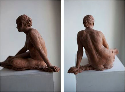
Used at the Opening of the Ralph London, Homestore
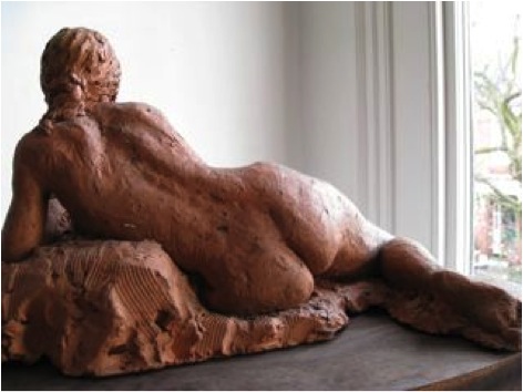
Used at the Opening of the Ralph London, Homestore
Website: www.suziezamit.com
Suzie Zamit, London, UK.
Interview by Deborah Blakeley, August, 2012
Fi Douglas
How were you encouraged to develop your personal approach at Glasgow School of Art?
I was so lucky at Glasgow to have a tutor who really believed in me – he was able to pinpoint where my design heart lay and really encouraged me to develop my florals and experiment with my painterly approach.
Can you explain the role NESTA played in your development?
At art school creativity is greatly encouraged unfortunately graduates often leave with little or no understanding of how to run a business day to day. Nesta provided guidance on the nitty gritty with invaluable courses and of course, helped make me aware of and apply for funding.
You commenced working with a leading fabric company, what made you take that leap of faith and commence Bluebellgray?
A desire to produce your own work can never be underestimated as a driving force. My industry experience was great, but there was a real yearning to design from my heart and for myself.
Tell us about the growth from you kitchen table and a one woman show to the company, Bluebellgray is now?
Well, it’s not easy I have been very lucky from the beginning to receive great press. This in turn brought opportunities to me from great stockists and so things evolved over time. As the orders grew so did my staff and also premises. I pinch myself sometimes now when I look around the studio to see a team of great girls! A real high point for Bluebellgray was being invited to be a part of the John Lewis Design Collective - to sit alongside other well-respected designers and in such a well-known store really cemented for me that Bluebellgray is ‘here’.
My signature Zoneone Arts question – what are the most important design elements?
The Bluebellgray signature style always seems to shine through. Bright, fresh colour is prevalent and also the painterly watercolour style. It’s so important to me that these designs are then produced using printing technology which allows for every brushstroke to be captured, allowing a sense of the designer behind the designs to shine through.
Where do you get your inspiration?
Inspiration is all around; especially when I visit my hometown in Northern Scotland, I am surrounded by wild flowers and sometimes sunny days, even in Scotland! Travelling abroad always reignites my passion for texture and pattern and it's impossible for me to return from Turkey without an overflowing case.
We all visualize Glasgow as bleak, gray and damp, your work is the very opposite. How?
Firstly, your impression of Glasgow is only 50% accurate! Glasgow is wet but this allows for a wonderful flourish of growth and colour in the spring. At Bluebellgray we keep the studio a light and bright space which always allows for fresh ideas to come to the fore and provides a clean base for the explosion of colour at work in my mind!
Interior design has been so stark and “New York” - your designs are an explosion of colour. Can you explain how you work up a range?
I like to think of Bluebellgray as an antidote to mass production – when I design I really follow my heart and paint with colour intuitively. A range develops naturally, usually beginning with one painting and from this point a colour range evolves.
How many ranges do you produce each year?
We aim to produce two ranges a year but with the occasional extra piece being released in-between.
You have a wide range of products tell us about the process of adding a new product to your range?
It might sound funny but this is a very organic process as well. Often it seems to me that there is something in my life which would benefit from the Bluebellgray treatment. Most recently we produced a range of wash bags and makeup bags which was simply born from a desire to use them myself. Following my heart has never let me down and so I ask myself, ‘Is this something I would use/want?’
Your philosophy of an eclectic mix has long been a signature of English interior design, how do you achieve this into a happy marriage?
A collection of pieces and colours evolve over time and change naturally as my taste develops. I think it's important not to become rigid with your style; you have to go with what you feel looks right.
You currently have several designs that are exclusive to stores; can you explain their development?
Occasionally exclusive designs are requested and we think it’s lovely to be able to offer customers something extra special now and again. The development is different depending on the occasion but as an example – we designed the Limited Edition ‘Chelsea’ cushion for Peter Jones in London to coincide with the Chelsea flower show. I wanted to experiment with a very pink and purple palette to reflect the true floral heart of the show and chose large blooms which are always a customer favourite.
How many countries now stock your designs?
We are proud to be stocked in excellent department stores and design boutiques all over the world; from The Design Collective in John Lewis and Liberty London in the UK to Le Bonne Marche Paris, Bloomingdales Dubai, Lane Crawford Hong Kong and Mitsukoshi Japan. Bluebellgray is currently stocked in 17 countries and continues to grow!
www.bluebellgray.com
Fi Douglas, Glasgow, Scotland.
Interview by Deborah Blakeley, August, 2012
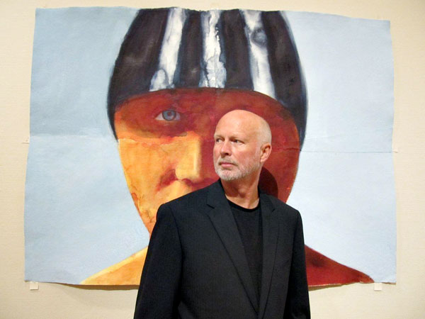
Graham Dean
Where did the initial idea for this exhibition come from?
Jon Bennington contacted me to see if I was interested in putting on a solo show around an Olympian theme. That was two and a half years ago – Waterhouse and Dodd came on board a bit later. I was due another solo show with them so it seemed a good idea to combine the two and have it around the time of the Olympics. A summer show is a strange one for me, it’s usually the ‘downtime’ but I guess this year is different.
Can you explain about the exact wording for the title for this exhibition; ‘Fitter, Quicker, & Longer’?
High Jumper
Hum...... the titIe was a bone of contention. I had the original title in my head as soon as I started the works and that was ‘Faster, Higher, Stronger’ – the Olympic motto. It was only a few months ago that we found out that LOCOG, the official Olympic body, had secured rights to a long list of Olympian words –‘gold, silver, bronze, the games, Olympic etc etc. This included the motto. They were quite assertive in threatening anyone who used these words and I really couldn’t risk a libel action against the gallery or the Museum .So I invented a phrase like it –‘Fitter, Quicker, Longer’, it has a slight tongue in cheek quality to it and some people have said it sounds like a condom advert. This is very ironic if you knew the stories behind condom use at Olympic Games. In Beijing, 400,000 were given out to athletes in the village and each one has ‘Faster, Higher, Stronger’ printed on them!
How do you feel about preparing for and exhibition that needs to work in two sites?
Working for two different exhibitions for two different sites was quite a daunting task and it was also two and a half years on the same topic. A feat of endurance you might say. I think there is somewhere in the range of 90 paintings to choose from for these two shows. Not too sure if I would do it again but it has been enjoyable and the exhibition in Bath allows me to play around with groupings of paintings – more like an installation – as it’s such a big space.
Two and half years is a huge commitment, tell us about some of the highlights?
I really didn’t know how to get into this exhibition. I discussed many ideas with Jon ranging from flags, to a show dedicated only to Jessica Ennis. This all seems odd looking back, as I don’t as a rule do portraits and I wasn’t interested in a celebrity type show but I was having trouble. I was unsure that I made the right decision in taking up the invitation. Then one day when I was researching and looking around for ideas, I read about an American art critic who wrote to say that ‘he had never seen a good painting on the theme of sport hanging in a museum ‘. If I need a spur then that was it.
You have been to so many trials and meets how did you record this?
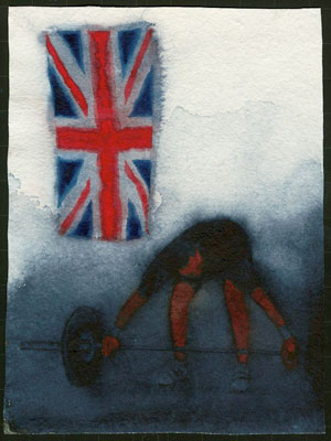
Weight Lifter
I travelled to many places over the two and a half years – Weight lifting in a sparse hall in South Croydon with a Union Jack pinned up (looked like a film set). I came in the wrong door and found myself ‘backstage’ in their warming up area. That was interesting in itself. Other venues were weightlifting along the South coast, athletics in Birmingham, sea swimmers in Brighton and Paralympians in London.
I also went to the Oxford/Cambridge boat race; this was the first time of being put into the photographer’s pit which was a bit of a scrum. I started looking one way, taking photos making notes, doing drawings and the bank of photographers all with mega lenses were pointing the other way. This was to be the pattern for the next couple of years. In the end I stopped liking this and decided to attend smaller events – with the same athletes - where I could get very close to them and I was left alone to do what I wanted. This is the only way I can work really. There is a strong streak of the maverick in me that has been there all my life.
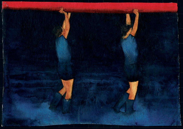
Rowers
How many sketch books and albums did you make up for this exhibition?
I work in a variety of ways but always from life. That is important to me; I like to hear my model breathing. I then draw, make notes and take photos. All these elements are important and people may be surprised by the amount of words that use – possible titles or springing off points for ideas. These exhibitions are a slight diversion for me and I have adopted a more ‘recordist’ approach then I normally do. In fact I don’t tend to record at all, most of my paintings end up being invented, they just take many paths and diversions on route. I still ask myself every time I paint if the painting has a ‘feel’ to it. A simple phrase but I know of no other way to describe such an abstract concept. I should say that my working method is; I’m told quite unique. I overlap several sheets of handmade paper when drawing up the image. I then paint each sheet separately so the studio looks like an odd collection of hands, arms, legs, torsos, heads etc. Then I ‘jig-saw’ the work together overlapping the sheets and ripping and tearing the composition into place This gives me the opportunity to stretch or contract the final image until it looks right.
How many works are at the exhibition?
There are about 90 works in total which we choose from. The two shows comprise of about 75-80 paintings. I can’t say as yet as we haven’t hung London.
Can you discuss the size of the works and how you made the decision on the sizes you would exhibit? How involved have the curators been?
I always start small though I don’t call them studies - they are small finished works in their own right, in fact sometimes if I feel that I have said everything that needs to be said in the small work then I won’t do the big one. The large works are all between 6 and 8 feet in height. For watercolours they are monsters, and people often don’t believe me when I tell them the medium. I did set out 20 odd years ago to ‘re-invent’ watercolour on a large scale and remove it from the world of the leisure painter and flowers and landscapes. What I’m doing is far more contemporary and has a relationship more towards artists like Peter Doig , Marlene Dumas , Tony Bevan , Hughie O’donaghue etc etc. The curators have played only a small part in the selection of things – after 38 years I have a good understanding of which works fit together for a show and I like a certain degree of control!
Swimmer
Colour must be a vital part of this work. I know that here in Australia our eye is honed to spot the green and gold. Are all your athletes British?
Colour is vital but I feel your question might be too literal. I could write a whole chapter on how colour has influenced my work but for these shows I visited the huge sorts of emporiums that are now in the malls of the world. Many years ago sports clothing came in white. It’s now a multi-colour selection of day glow colours and I set out to use some of these colours in the work. The paintings have been described as colourful which slightly surprises me as people should really visit an athletics meeting and see the bright array of colours from sports kits to sponsors signs. It’s a corporative world and I wanted to use some of that. I think the athletes came from all over the world; I didn’t make a note of who they were or where they were from. This was irrelevant to me as I didn’t want a personality themed show.
Runner
As an artist to be so involved in sport, especially at Olympic standard, can you explain how you approached the physical form?
The athletes themselves were a source of physical fascination. Firstly, the skin was amazing on many of the women. Jessica Ennis for example looks like bronze – most had incredible glowing healthy skin, the best I had ever seen. Then I came across short, compact, stout, taut weightlifters and wrestlers. Large backed swimmers and flat chested female runners. In fact I was surprised how lean and small in stature that the athletes especially runners were. The television paints a different picture as it often does with peoples bodies. It seems to like smaller people of finer features as does photography.
“I said..I was in the the last lap of making these works or I can see the finish line” Graham Dean. How do you now feel at the end of all this work?
There was an audible sense of relief at finishing this series. I can’t wait to get back to my other work and try out some new ideas with a model and see what come out of it. But first I’m spending a while at my other house in Italy with friends to energize myself again.
On a more personal note, are you going to any events at the London Olympic games?
You will find my answer to your last question amusing – I’m actually booked on a plane out of London on the day the Games start. I may watch some of it on my i pad but I’ve worked with these people for a long time and now I want a break! I’m keen though to see the opening ceremony and to see what Danny Boyle has done with it. He has accepted such a difficult job and hats off to him if he pulls it off.
Graham Dean, Brighton, UK
Interview by Deborah Blakeley, July 2012
Angela Betheras
What made you decide to place alpacas on your farm?
I grew up in Labertouche, my parents had beef cattle, I couldn’t handle them on my own nor could I afford the acreage. Since I was interested in textiles I wanted a fleece animal. Sheep are not that enjoyable and have too many jobs to be done. Met an alpaca, met the alpaca industry, fell in love with both and purchased my first alpacas in 2004
Can you explain some of the ‘special’ charm of your girls? – they are all girls?
No not all girls, sometimes you get boys! I could go on all day about the special charm of the animals. Their charm is intelligence, personalities, their love of being part of all that is happening on the farm, and their calming influence.
What can you tell us about the fleece and it extra qualities of alpaca for both weaving and felting?
Alpaca fleece is softer, warmer, and lighter than sheep wool and it doesn’t prickle. Weaving creates a very soft weave as it does with the felt. The felting can be a little hairy and many will want to mix wool with the felt and so with all the textile work it can be combined with other fibres such as silk and cotton.
My signature Zoneone Arts question – what are the most important design elements?
Being a photographer by profession, I would say that the negative space is the most important design element in the composition.
Tell us about your design work in alpaca?
 I felt, knit and crochet for my shop therefore it has to be a bit more conservative in order for it to sell. I must pay the mortgage. I do mainly accessories such as scarves, bags, wraps (large and small),
I studied millinery for 12 months at the Melbourne School of fashion so I can get carried away with my hats. I am just starting to work on coats both long and short
Can you expand on the winning of the Victorian Rural Woman of the Year and your current involvement with alpacas and China?
2011 was a wonderful year. RIRDC Victorian Rural Woman of the Year, must winners tend to come with an agricultural background.
It is an award given for a future project to enhance your industry rather than being based solely on what you have done in the past.
My project is investigating the possibility of taking my textile art and art done by other female alpaca breeders to China to sell in their boutiques. The year also involved over 30 speaking engagements so it didn’t leave me much time to plan my trip to China. Those engagements don’t seem to be stopping but I hope to get to China before Christmas 2012.
Tell us about a place you have visited because of your award in 2011?
As a Black Saturday survivor I hosted a morning tea/afternoon tea at my business donating all the food and coffees and a percentage of my sales for the day to raise funds for the women who were flooded in Charleton in 2010. I won the award and soon after that, the Charlton community invited me to visit their region and to speak at a Ladies Day. It was a great couple of days.
Tell us about your green packaging?
I am part of the “Leaf Program” in Baw Baw Shire. This means my business has been assessed to be environmentally sustainable business, not just about the green packaging. Nickelby at Darnum and four other businesses who are Creative Yarragon, don’t use plastic bags or paper bags (none made in Australia). I use acid free tissue paper and since my customers just have their cars in my car park I often don’t wrap items such as creams, cards and sometimes the smaller garments, I encourage them to wear those home.
You have become one of the West Gippsland representatives please tell us about your area.
West Gippsland in my opinion is one of the most beautiful areas in Victoria. We are known for our rolling hills and green. 1 hour from Melbourne, 1 hour from the beach, 1 hour from the snow. It is a small country community so it means you can be in Collins Street at 9am for a business meeting and back home on the farm by 2pm.
Once you leave Melbourne and get on the freeway you can make it to West Gippsland without having come across any traffic lights. We have wonderful schools, the largest regional arts centre with the largest stage outside of Melbourne. We have a huge artist community and when we hold our arts month in May it is larger than anything else in Victoria.
We have wonderful wineries and fabulous restaurants and beautiful 4star and above B&B’s to welcome you and of course we have Nickelby At Darnum!

Jennifer Gould
Tell us how your time in Japan studying weaving in a kimono factory influenced your artwork?
It was a goal of mine to go there as a student, which I did in (1971-1972). I came away from that year with an appreciation of pattern-on-pattern design, especially in combining fabric. This is evident in kimono and obi wearing: both pieces are usually patterned and the combination of colours and woven or painted images can be extremely graphic or highly subtle. I was fascinated! I studied kasuri (ikat) weaving at the Yuukistumugi kimono weaving factory This factory is extremely famous for their unique and complex warp and weft patterns, indigo dye vats, I knew how to weave, but this was a world of centuries old techniques that were completely new to me. It opened up a world possibilities from which I am still exploring and benefiting every day.
What made you move from hand spinning and weaving to making dolls?
I realized that hand spinning as a career was not right for me. I visited my hand spinning teacher who ran a shop selling Shaker reproduction furniture as well as Shaker inspired doll clothing that fits a Barbie doll. I took some cat dolls that I'd made, seeing those dolls, she asked me to design an all-fabric doll; so began my career in designing dolls!
Can you explain how you get such charming faces on all your dolls?
 I've worked really hard at achieving a face that I find lovely and serene while contemplative or even dreamy. I have a hard time getting away from that pretty face. I developed a flat needle-sculpted face on which, I think; those are more expressive and quirky. Like anything, practice is what makes it happen.
You are a member of many organizations in the textile world. Can you explain the value this has had on your work?
I really value the textile organizations I belong to, most especially my local fibre arts guild and the Michigan League of Handweavers. My local fibre arts guild, especially, gifts me with so many close friends who I can do “textiles and fibre talk”. The Surface Design Association (state, national and international), FAN (Fibre Arts Network of Michigan), and the Handweavers Guild of America have also been very important in my textile journey.
Do you have a doll that you simply cannot sell? If so, why?
No, I really make all of my dolls to sell.
You have been written up in “500 Handmade Dolls.” Can you tell about this experience?
A photographer friend mentioned that Lark Books was looking for entries. I sent images of my favourites, that I thought were the most inventive and inspiration. They were a triptych entitled, “Self-Portraits: 7 th , 8 th , 9 th Grades.” If you keep producing and creating, your best work will happen---and then it will be ready at the right time to be published. (My art faculty advisor once said, “From quantity comes quality.” He was so right!)
You have sent your work to Australia twice. Explain how this has helped you?
I am assured that having a website for exposure is absolutely important since that's how you found me! For my 2012 exhibit, Deborah Blakeley suggested using gum tree leaves in some of the dolls and that brought a whole new dimension of plant life (Eucalypts) to me.
You do classes. Why?
I love teaching; I've had students who arrived at a class swearing that they were scared and just didn't think they could do “it,” they came out with THE most wonderful work! Encouraging students to experiment, play, and create is so gratifying, also passing on what I've learned about working with fabric. The money, of course, is nice, too.
Where do you get your inspiration?
My eyes are immediately drawn to the world of nature, texture of pattern that inspires me. I also love three-dimensional work and actually have a hard time keeping things flat.
My signature Zoneone Arts question: What are the most important design elements to you?
The initial elements are shape and size. The outline of the shape, for me, needs to be simple so that the patterning can be highly complex. I have developed a number of doll shapes that I consider my personal canvas and those shapes I repeat often. Early in my doll making career I made life size figures, I soon found them uncomfortable for me to work with. The size I use may seem small I have found it to be both intimate as well as a comfortable size for my hands. I'm a touchy feely person, so holding the piece while I'm working is very much a part of the final product. Within the shape and size, all the other design elements come into play: color, value, visual movement and texture, line and ultimately composition.
Website: www.jennifergoulddesigns.com
Jennifer Gould USA,
Interview by Deborah Blakeley, June 2012
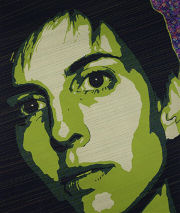
Lauren Camp
When you first wrote your poetry it was to accompany your art work. Can you explain how this worked?
Early on, exhibitors of my artwork asked for 50-word “blurbs” to accompany the works. I had been a magazine editor and knew how to write clearly about my processes, but the effort and end result felt dull. Gradually, the blurbs became more poetic, and these writings became important to each project. No piece was complete until I had written the poem.
Now, I separate the two – writing poems for certain subjects and creating artwork for others.
You now work with jazz and experimental musicians, can you tell us about that?
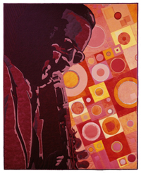
‘Just Swing’ ©2001, threadwork on dyed and layered silk, cotton, lame and ultrasuede, 50” x 41”
I have had a number of chances to read with musicians in front of an audience. With the combination of their sounds, it becomes thrilling to hear my poems become something fuller, something that moves.
Jazz has long been an inspiration for me. I was first introduced to jazz as an adult, and began to want to shape it, creatively. This was how my fiber art series, “The Fabric of Jazz,” came to be. I began with a desire to visualize the vivid sounds of seminal jazz trumpeter and singer Louis Armstrong in fabric and thread. For 12 years, I continued creating portraits of musicians and their instruments.
Each piece required great research into the musician’s life, but also into his or her music. It was a chance to self-study, to listen, to travel back in history — quite an education for me. After I had made two portraits, I knew I wanted to do a whole series and that I wanted them to travel. In 2000, “The Fabric of Jazz” began a four-year tour of the United States. It was on exhibit in 10 museums and art centres. Thousands and thousands of people experienced these portraits, and saw the colours and shapes of each sound the way I see hear them.
When the series began travelling, I pulled back from creating any more jazz works, but I missed that extensive study of the music. The logical next step for me was to interact more with the music itself. I got involved in my local public radio station as a disc jockey, and began broadcasting jazz each week, mixing different eras and melodies together. Ten years later, I still air jazz with poetry and world music on a show entitled “Audio Saucepan.” The show energizes me, and keeps me very much attached to music.
I also write poems about jazz musicians. Here’s the beginning of a poem called “Satchmo’s Mouth”:
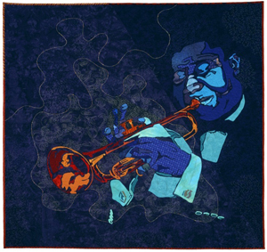
‘So Black and Blue” ©1997, threadwork on layered cotton, 50” x 48”
In the collection of Mack Avenue Records, Detroit. MI
Satchmo I said can I crawl inside your mouth the temple, the tempo of grunting sunlight dry gravel self against self the gritty timbre of time
Several of my jazz portraits have gone into intriguing collections. Mack Avenue Records, a Detroit-based jazz label, owns two of the works. Art in Embassies, a program through the U.S. Department of State, has twice requested works from the series. My portrait of Benny Goodman is in the U.S. Embassy in Kiev, Ukraine right now, and four prints are permanently housed in the embassy in Bamako, Mali.
Can you share with us some of your art processes?
My art processes vary widely. Every choice I make is based on the end result I see in my mind. Recipes elude and frustrate me, so when I dye fabric, I do it without exact need, and am delighted by what results — shoving it neatly on my shelves until the right occasion to use it comes along. My current work often immerses me in detail and repetition, and usually some mathematical patterning or determination of spatial considerations. Any process is reasonable to me – though crazy to others – because I am moving toward a specific vision.
Even though I haven’t been creating jazz works lately, I think all my work has movement and rhythm. That’s the goal, and I move exhaustively toward it again and again.
My signature Zoneone Arts question – what are the most important design elements?
Space, depth and patience.
Books by Lauren Camp
This Business of Wisdom
Published by West End Press in 2010
Website: www.laurencamp.com
Lauren Camp USA,
Interview by Deborah Blakeley, June 2012
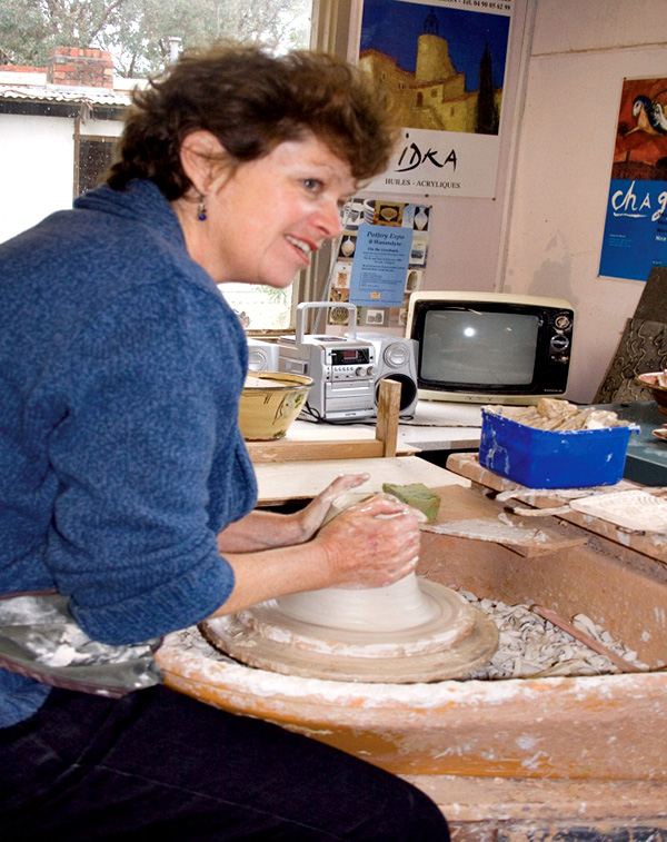
Jane Annois
How would you describe your own pottery style?
I work in two styles: in raku, originally a Japanese firing technique but adapted to modern equipment and desired results. These pieces are more sculptural or decorative where I explore surface textures, contrast of colour and play with form.
The second style is “terre vernissee”, French tableware using traditional honey, green and blue glazes. These pieces are intended for everyday use and reflect the colours and style of the south of France.
What art qualifications do you have? How did you decide to become a potter?
The qualifications came after the decision to become a potter. I was always interested in pottery, making things with my hands, the practical and creative nature of pottery, and subsequently the history, cultural differences and the science behind pottery. I was already working as a potter when I decided that if I wanted to pursue it further professionally, and learn more about the processes, I needed a qualification.
I studied for a Graduate Diploma in Ceramic Design at Monash University in 1988/89. With ceramics I never stop learning. I attend workshops by my favourite artists, attend conferences and have learnt a lot from my involvement and work with the French ceramic artists.
Explain about your time in France where you learnt you craft?
I went to France in 1997 to work in a pottery studio and visit other ceramic artists. I was a French teacher in secondary schools in Melbourne, then taught English as a Second Language part time and worked as a potter part time. I went to France to use and improve my French and discover the French ceramics scene.
I spent a month working in a studio with artist Sylvie Deverchere in Bourgogne, throwing, decorating and learning how it works in France. I was able to meet many ceramic artists not only in Bourgogne, but also at La Borne, a ceramics centre in the middle of France, in Provence and the Rhone Alpes. I assisted at several ‘marches de potiers’ where I was inspired to begin a similar event in Melbourne. Since forming these friendships I have returned annually to France, to visit the potters, participate in the marche de potiers and eventually exhibit in galleries in France.
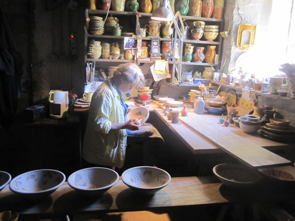
Pottery workshop at Cliousclat, Isabelle decorating.
Is there an artist who has influenced you?
There are several artists who have influenced me. In the raku technique and style it would be South Australian artist Jeff Mincham who pushed the boundaries with raku, creating large forms with intriguing textures. The other raku artist is Frank Boyden from USA, who introduced me to the technique of terra sigillata in raku, which instantly struck a chord and I have been pursuing it ever since. Jeff Mincham also said to me once, that ceramics enabled him to travel the world, sharing his knowledge, meeting some wonderful people and sharing his common interest. This has also inspired me and I have been fortunate to have had similar experiences.
With terre vernissee, my French friends Yves Gaget and Jean Jacques Dubernard from the Rhone Alpes ,have influenced and taught me a lot about the techniques. Jean Nicolas Gerard has inspired me in his freedom and strength of his work.

Participating in raku workshop at La Grange Dimiere with Fran Brunet
Explain how your knowledge of French culture, and the people has developed into tours of France where you network with French artists? Tell of several special moments that you have had during one of your tours?
I have always been a Francophile, majoring in French at University, spending a year in France before beginning a career as a French teacher.
I began taking Australian ceramic artists to France to visit ceramics studios, potters markets, and rural areas. This has taken off as the beginnings of a cultural exchange, which continues strongly today.
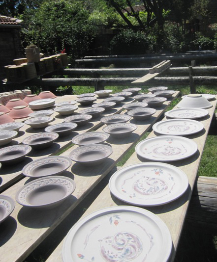
Pots drying in the sun at Cliousclat
Having participated in many French potters markets in the years leading up to the tours, I had met potters from all over France, and visited some of the most spectacular parts of France. During these markets, I stayed at the local potters homes, shared meals and enjoyed their company. The tours allow me revisit and maintain the contacts with all these people, introduce them to the Australians and vice versa.
The tours are quite personal where we are welcomed into artists’ homes.
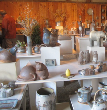
Visiting the pottery studio and showroom of Jean and Catherine Mercion
Each time I go to France, I take time to visit new areas, take part in new events, and explore further options.
Many who have come with me, wished to return again but visit different regions of France
![Where we stay on the lavender farm in the Drome [June 2012]](https://zoneonearts.com.au/wp-content/uploads/2015/03/jane-annois-lavender-farm-drome.jpg) | 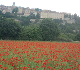 |
Where we stay on the lavender farm | Poppies at Sault, Provence |
I have diversified to run tours with a music focus, going to the wonderful summer music festivals in France, particularly Jazz at Vienne; wine- visiting the Beaujolais, Bourgogne and Alsace regions; art- taking a professional artist as tutor, a mix of exploring the background of various French artists/museums/galleries and hands on painting and drawing, in Provence, the Dordogne, the Loire Valley and in Brittany [4 tours]; a gourmet tour with a French chef, gardens etc. However all the tours enjoy local cuisine and wines, artists, rural villages. I now have some people returning for their fourth tour.
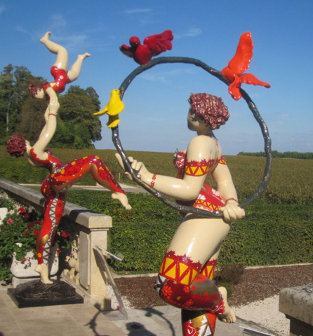
Chateau Pommard
The tours go to the Rhone Alpes, Drome, Provence, Camargue, Dordogne, Loire Valley, Borgogne, Alsace, Languedoc, Cote d’Azur, Brittany and more.
As the tours are small, [max 8 people] we are able to be spontaneous, and take advantage of local events and surprises.
During the recent fete de la musique, the evening of the summer solstice where there are free music performances in the streets all over France, Jacques Long, husband of ceramic sculptor Brigitte Long, played guitar and sang the blues with fellow singer Elisa and band. I then asked Jacques and Elisa if they would perform for our Australian group. The special moment was our wonderful evening at Brigitte and Jacques’ house, a private performance, we all brought food and wine, just loved the music, all joining in at the end.

Music tour: Jazz at The Facteur Cheval: Robyn McKelle [June 2012]
Another special moment happened when we visited Montelimar, initially for its nougat, but then discovered the museum of contemporary art. One of our group was admiring a painting when the artist passed and struck up a conversation. He invited us to his solo exhibition in the countryside. After a few twists and turns, we came upon a Roman aqueduct carrying water to what was once a silk factory, of which there were many in the area during the 17th and 18th centuries. This ancient building, remarkable for its architecture, housed his exhibition and that of another sculptor. Again a privileged experience, in an extraordinary environment.
Explain some of the similarities and differences between pottery in France and Australia.
We are all individual artists, each working in our own studio. The French say that we are free from the history and tradition, which can underpin and influence their work, that we are not restricted in any way. However the French artists may be informed by their history in their initial studies, but generally use the medium of ceramics to express themselves freely. As Australians we still look towards Europe and Asia for inspiration from ceramic history, and often follow similar trends and styles. Many regions of France do have distinctive styles derived from local clay deposits, traditions in kiln firing etc, but contemporary ceramic artists both French and Australian have moved beyond regional specifics to reflect concepts rather than location.
The main difference between the two countries is that the French are professional potters. They do not have a second job. Their sole income is from ceramics. Most have a “salle d’expo” or gallery showroom attached to their studio. Their sales come from the potters markets, galleries and their home gallery. In Australia there are very few who can make a living from ceramics alone. Most have a second job – often teaching.
Having said that the French are finding it much harder since the economic crisis, and may be forced into restructuring their work life.
Pottery studio of Isabelle Gatineau at Pelussin
Explain about the pottery expo, how it came about and how we can become involved?
The French could not believe that we did not have a potters market in Australia. It is an essential part of being a potter in France. It is a showcase for not only the public but for galleries and commissions. It is an opportunity for networking and socializing for a solitary occupation.
It provides a major percentage of a potter’s income. Work is selected and must be of the highest standard. Therefore it raises the quality each time, as it is difficult to be accepted. It is like the Olympics of the pottery world.

Jane at the Pottery Expo at Federation Square, Melbourne Australia, December 2011.
Yves Gaget and Jean Marc Plantier came to Australia in 2001 to help me get the first Pottery Expo off the ground. While in France I learnt the do’s and don’ts of the market. First it must be a Pottery Only event. High quality, exhibition standard. Beautiful natural setting where the public will come, free entry. Educational component. Clay hands on activities. Food. And so on …….
Also your favourite galleries in Melbourne and a gallery/ies in France that you recommend?
In Melbourne, I explore Fitzroy and Collingwood galleries. Potier in South Melbourne, Lighfactory in Eltham.
In Paris Galerie Helene Poree near Odeon and La Celestine in rue St Paul, le Marais, Nadia B in Dieulefit in the Drome.
What does success mean to you?
Being able to live my desired lifestyle; to be able to share the best of France with others, and introduce new experiences; To make a difference. It is a thrill when people say that the trips have changed their lives.
I feel successful if I can spend summer in France doing all the things that I love and then summer in Australia. In between trips I can work in my ceramic studio and prepare the Pottery Expos.
My signature Zoneone Arts, question – what are the most important design elements? Please answer this question.
Harmony of surface and form. The contrast of texture and smoothness. Tactility. In a functional piece, it would be functionality and form. Simplicity, harmony of decoration/glaze with form. Balance.
How do you see your art evolving?
I am currently working collaboratively with two artists, I see my work as becoming more sculptural, preparing the surface for line drawings, developing textural surfaces.
The other style “Terre Vernissee” I would like to develop more in France, working alongside some of the French ceramic artists in this field. Ideally I would like to immerse myself for a few months and allow myself to experiment with techniques I have learnt. Who knows?
Inside Fondation Maeght, Vence
www.potteryexpo.com
www.zestefrenchtours.com
Jane Annois, Victoria, Australia,
Interview by Deborah Blakeley, August, 2012
Corrie Allegro
My signature Zoneone Arts question – what are the most important design elements?
A combination of design elements come together in this genre of books to create a visual and tactile experience for the reader. The play of interaction with 2 dimensional elements into 3 dimensions by turning a page, pulling a tab, even moving into time and sound becomes magical for old and young.
Here design is using words, graphic illustrations, different printing techniques and assorted paper stocks to create in mass publications or in very small limited editions beautiful books. And, which at the final stage are put together by hand through folding and glueing little bits of paper into books that can and have lasted hundreds of years.
In our growing digital age the illustrated 'book keeps reinventing itself.
What started you on the collecting of Movable & Pop-Up books?
My wife Nancy and I were taking an extended world trip in the late '70s and as a book enthusiast as reader and a graphic designer for profession I'm always looking for inspiration and ideas.
In London I came across a cheap pop-up book on dinosaurs and thought this is different and can I use it for work. It has opened a whole new field of study and 34 years later a consuming hobby has evolved into a history of 'movable' books dating from 1797 to the present.
Do you still have your very first pop-up book?
Yes. But there are many, many others!
Where do you keep your books?
They are in a room on bookshelves to the ceiling on three sides with some shelves behind glass.
How do you protect your collection? eg archival paper
The antiquarian books and a few one-offs are housed in mylar acid free sleeves.
I keep sunlight and heat at bay! But hey, I'm not paranoid...
What book is still elusive?
The hunt and gathering can and does take patience and money.
There are always books from the past and current artists to chase.
Tell us about a place you have visited because of your collection?
Over the years I have been lucky to meet artists and paper engineers around the world working and creating books of beauty.
In 2010 I gave a talk in Portland, Oregon at the Movable Book Society, (3 day conference held every two years). And yes, I thought I was different but there quite a lot of unusual book people.
Tell us about your current favourite paper engineer and why?
In a small field of only a couple of dozen professional paper engineers in the world there are many favourites. There's Kees Moerbeek in Holland, Robert Sabuda, Matthew Reinhart, David Carter, Andy Barron and Bruce Foster in the US.
David Pelham, Ron van der Meer, Corina Fletcher and others in Europe...and I have to aknowledge the creators from the past. These and may more give their own magic and unlimited imagination to create a printed book that at the end is hand made.