
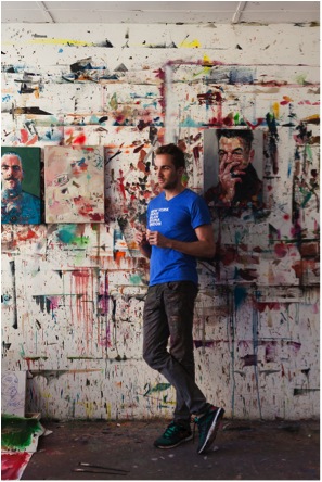
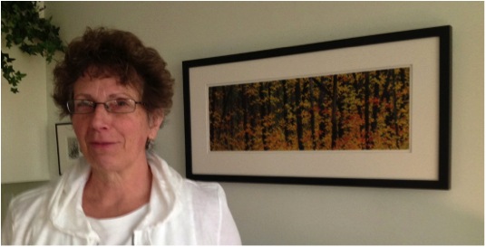
Ewan Clayton
It is hard to believe that as a small boy you had such bad handwriting. Discuss the implications this had on you at the time?
As a twelve year old it was impressed on me that my handwriting was a problem not simply because it was unpleasant to look at and hard to read but because it meant I would not be able to go to the school my parents had chosen for me. At thirteen I would have to take the entrance exams and because of my bad handwriting they were worried that I would fail. I was placed back in the junior class of the school, alongside the 8 year olds, to relearn how to write, it was very embarrassing!
On the flip side, your mother gave you a calligraphy set. Can you tell us how this was to alter your life?
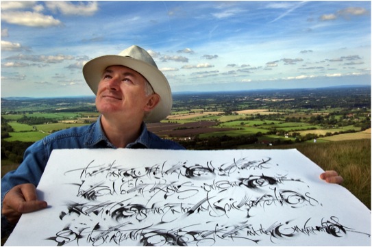
It was the italic nib that did it, I saw that it was possible to make really beautiful letters, it was not difficult to do, and one could learn how to do it. But I was very lucky, I had been born near the village of Ditchling in Sussex. The calligrapher Edward Johnston had lived there. Today he is known as the man who revived calligraphy in the English-speaking world in the early twentieth century. He is also known as the designer of the famous London Underground typeface and logo.
My grandparents knew him (my grandmother used to go Scottish Country dancing with Mrs Johnston). She gave me a copy of Johnston’s biography to read. I was entranced, it showed me one could have an entire career involved with letters. With my new pen set I wrote out ‘’The Pen is Mightier than the Sword’ and swopped it for a 3d postcard – my first commission.
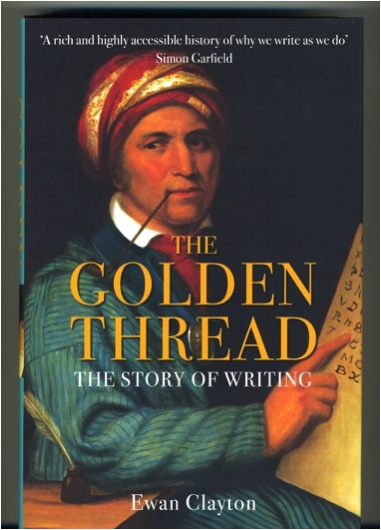
Can you explain what lead you to write your book ‘Golden Thread’?
I think the germ of it came to me one day when I was discussing calligraphy with the Libyan poet and artist Ali Omar Ermes. He was asking me about my tradition and I remember telling him it all went back to Roman Capitals and I described how various styles followed on - gothic, Italic etc. And then I asked him to tell me about his tradition. He said ‘I would have to start in a completely different place, I would show you the different aspects of society that use writing: the law, religion, scholars, merchants and then show you how certain forms of letters and styles of writing and documents were generated from those needs and communities’. I realised in a flash that this was a much deeper understanding of writing than my own community exhibited and realised this was the kind of history I wanted to write for the Roman alphabet.
Can you take one aspect, for example Book keeping traditions of the East India Company, and expand on the way this writing was done and why you have included this in the book?
It may seem paradoxical, for printing was invented in the 1450’s, but actually the seventeenth and eighteenth centuries are key for handwriting. In these later centuries it was handwritten documentation that generated our entire financial system and enabled the spread of trading on a global basis. Handwritten accounts of the first-hand observations made by astronomers and early scientists also lay behind the whole project of the enlightenment. As Miles Ogborn shows in his book ‘Indian Ink’ (2007) the history of the East Indian Company provides us with a marvellous account of how this worked in practise. Worried that their employees would go ‘native’ in India and run their stations for their own profit, the Company developed sophisticated document keeping systems that made their employees accountable to each other. In the age of sail they managed to keep parallel sets of documents in London and India. The company’s expansion rested on the careful procedures they established for handling decision-making. This included a handwritten account of their meetings, displayed in public at each of the companies ‘stations’ for all to look at and signed after each meeting by each employee as an accurate reflection of their discussions. This is just one example of the continuing power of the handwritten document in an age often characterised as one where printing had finally triumphed over handwriting.
Discuss how important you feel it is to combine both historical knowledge and current technology?
The computer is a new writing tool in succession to the typewriter and the quill pen. It is a no brainer really. The future always develops out of the present, the present develops out of the past by understanding one we can have genuine insights into the other. Doing history is a thought experiment, just as is speculating about the future, both can inform the other. I believe however that this point is a wider one. This mixture is also needed in human communities at a social level, a community only of the young lacks something – it can literally burn itself out. A community only of the elderly is equally fragile but in a different way.
You have worked very closely with Xerox PARC and their digital communications explain this professional relationship?
The Palo Alto Research Centre of the Xerox Corporation invented much of the technology we take for granted today, the first commercial mouse, networked desktop computers, the ethernet, laser printers, the graphical user interface that we see on our laptops and smartphones. But because Xerox thought of itself as a photocopying company it never capitalised on these inventions. After the event the company realised it had to get a vision of itself that was non-technologically specific, so they came up with the idea of Xerox – the Document company. The document could be anything from a past technology or a future one, the company would never go out of date.
But then Xerox realised they did not know what a document was. So I came in with a lot of other people (anthropologists, linguists, philosophers, artificial intelligence experts, business historians etc.) to try and wrestle with that: what is a document and how we use them? I worked there of and on, on a consultancy basis, for 12 years.
Can you discuss how your calligraphy was picked up during your Monastic time?
In my late twenties I fell ill and when I recovered realised I had several unlived goals – one of which was to try life as a monk! I thought I would have to give calligraphy up but after a year the Abbot discovered I was a calligrapher and I got to work at it making large-scale work for the church, orders of services etc. The Abbot found out because his favourite sister came to visit and she recognised me, unknown to me she had once been the secretary of the Society of Scribes and Illuminators to which I belonged! My secret was out!!
Explain what being named the UK’s Craft Stills Champion of 2013 means to you both personally and professionally?
I was given this award for my role in the wider work of education in the crafts. Some years ago I was commissioned to write a substantial report on the state of the crafts in Britain which was used to guide the policies of the various charities set up by the Prince of Wales. The ideas it contained proved influential, they helped create the atmosphere that led to the establishment of an organisation for Heritage Crafts in Britain, a mapping of crafts across the country and various schemes to encourage apprenticeships in the Crafts. During the mapping exercise we discovered that the Craft industries combined are as financially important to the British economy as the British Petro-Chemical industry – this has given craft considerable additional leverage politically. Personally the prize came with money for training and materials. Japanese paper makers have been some of those who have benefitted from my spending!!!
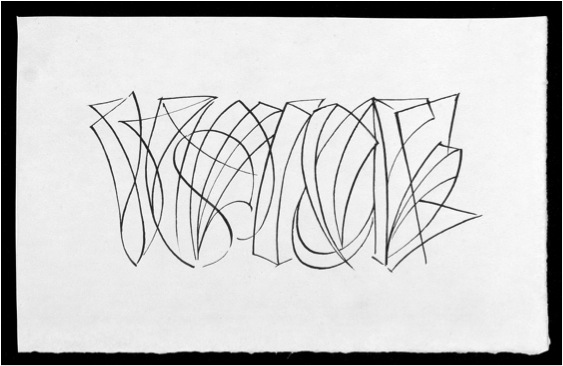
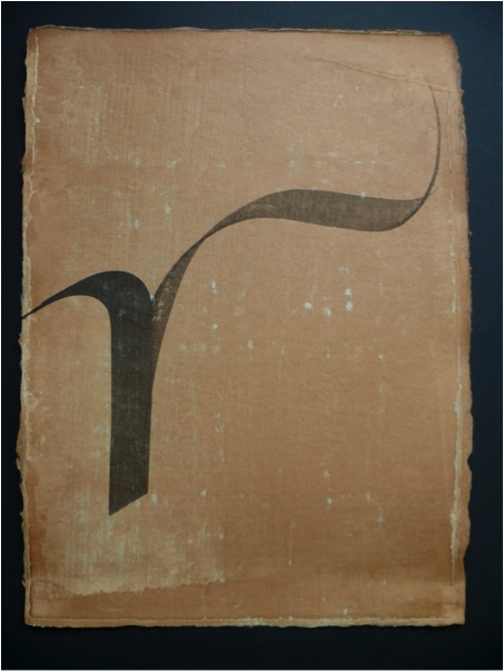
‘Voice’
“Voice, written in 2010 with a goose quill using sumi ink on Chartham Vellum handmade paper. I love trying to get depth in to the picture plane in various ways, here I simply use lines”
Can you explain the importance of Guilds in UK’s craft history and how you feel the decline of Guilds will effect crafts and art in the future?
I am not sure that Guilds are on the decline anymore, in fact there are various suggestions at the moment for a revival in Guild structures and training. Some Guilds, like that of the Goldsmiths in London, have been very innovative in their thinking in this area. Guild’s guaranteed standards in workmanship and they may yet have a significant role to play in this area. One fundamental of the guild system was apprenticeships, these too are seeing a comeback with government support in the UK increasing significantly. A while ago I heard one government minster talking of his dream that one day parents would have framed photographs of their sons and daughters getting their apprenticeship awards alongside those of their siblings getting their degrees. This is what we need, making things and skills to be as valued as concepts and thinking. For making IS thinking, under a different mode.
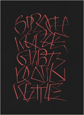
'Sprachkurze gibt denkweit' Jean Paul Richter
A poem by Rumi 1997. Written with a speedball pen and red wax in gouache on Black Arches Villin Noir. Rumi invented the whirling dance of the Dervishes. I wanted this piece to disorientate people as they read it. The work was a commission from the Crafts Council for their National collection
How many different surface has your calligraphy been applied to?
Vellum, paper, glass, stone, cloth, wood, ceramics, metal… but I would love to do something organic, something growing!
Can you share 2 of your works that have given you great pleasure?
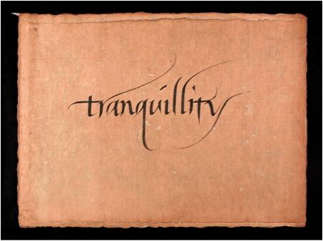
‘Tranquillity’
Written with a wood veneer pen on Kozo firre paper died with persimmon juice.
Tranquillity was written at the end of a long days teaching in Tokyo. The students had all left and I was alone in the classroom. I wrote the word about 5 times before writing this one. It was written slowly and peacefully and with a sense of continuous flow, none of my movements were hurried. I still enjoy looking at it very much. It is written with Japanese sumi ink, a pen made of wood veneer on Kozo fibre paper stained with persimmon juice.
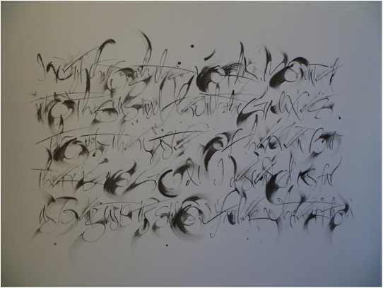
‘The Sermon of the Dead Christ’
This piece takes a rather different approach! It is written with a quill and the fingers and palms of both hands. The words are from the German Romantic writer Jean Paul Richter, the sermon of the dead Christ. I wanted to create depth in the picture plane, but to do it calligraphically, using just the tone of the ink that I smeared out with gestures from my hands the very moment I had written the stroke. Writing the piece was a performance, every gesture had to work and add up into a whole, there was no chance of going back. There was a real sense of having completed a journey with immense risks once done, the concentration had had to be enormous to complete it. Quill pen and sumi on Royal Watercolour Society paper.
Discuss your work with Calligraphy students from all levels, beginners to experts?
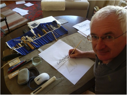
I enjoy teaching at all levels of experience and have done so now for nearly 30 years. I particularly enjoy working over a number of years with an individual, this is the most rewarding kind of teaching. I have been lucky enough to work in several places, the University of Roehampton and most recently with Sunderland University, where we could take students at degree level for several years. I have been concerned to make sure calligraphy has a place both at degree and post graduate level, to raise the status and intellectual content of the subject. But I also work with entry level classes so students have a really good start with some sense of what is possible from their very first day.
‘The Letter R’
The letter r, illustrating the first verse of Rummi’s Mathnawi.
“Listern to the reed, how it tells a tale complaining of separations.”
Your calligraphy has taken you too many different overseas destinations. Can you take one and tell us about that time?
Ah - there are really too many to choose from, but… the first that comes to my mind is that I loved teaching in the ancient monastery at Bobbio in northern Italy. It used to house one of the great scriptoriums of northern Europe and while we were there they held an open air film festival in the cloister with all the glitterati coming up from Milan. We worked in the old refectory painted with medieval murals. In the town itself there was an ancient roman bridge crossing the river (which people swam in during the lunch break) and when we needed to get more energy we could cross the street for a quick expresso. For the year following the teaching I enjoyed many dinners using the dried porcinni mushrooms that were picked in the mountain forests around the town and which are sold is large baskets outside many shops. I also bought my favourite jersey in the market place there. But then there is also Japan - which I have now visited eight times.
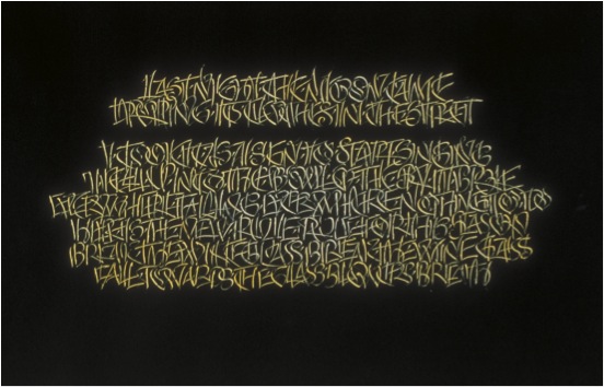
'Last Night the Moon Came'
Discuss your signature?
My signature is nothing special, I guess the only distinctive part is the E which I like to write because it can be done in one swinging movement.
Can you explain your involvement with the Ditchling Museum?
Back in the 1920s, my grandfather moved down to Ditchling to become part of the Guild of craftsmen Eric Gill had established in the village. Many artistic people visited or lived there at one time including the painter Frank Brangwyn, the poet David Jones and the weaver Ethel Mairet. By the early 1990s all these people had become very famous but their work was being lost to the village. Two sisters, in their 80s, banded together to stop this happening, they bought the old village school and turned it into a museum. I had known these two women since I was a child and like many people in the village wanted to help them. At about the same time the Guild I was part of closed down and many of our precious things were given to the Museum. So over the years I have supported it. It has some of my earliest pieces of calligraphy in its collection (from when I was teenager) for the Bourne sisters would commission work from me even at that age. They encouraged me hugely. Today the museum has just been rebuilt and was one of the finalists in the National Art Fund’s Museum of the Year Awards.
In 2014 you were awarded the MBE. Can you explain the classification of the award and your feeling of receiving this honour?
Officially it is an ‘order of chivalry’, I am rather a lowly member, one up from the bottom!! But it was lovely to receive it. I won the award both for calligraphy and for my work with Heritage Crafts. It was a great day when I received it at Buckingham Palace in a ceremony presided over by Prince Charles. I could invite three guests, we went out to lunch afterwards. But then I had to dash to the airport as I was also receiving the award of a Golden Pen, the first Karlgeog Hoefer Prize, the next day at Offenbach in Germany. I left my guests eating the desert.
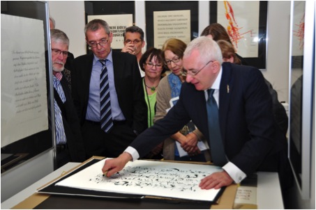
The presentation of the Kalgeorg Hoefer Award to Ewan Clayton
Your book ‘Golden Threads’ describes the history of the word. Could you give a description from a much closer and personal level, the way your father’s letters to you and your siblings can show how technology has changed the way we write?
Yes my father has written a letter to all of my five brothers and sisters every Monday for 47 years. They began on small sheets of notepaper with the address printed in type in the top right hand corner, then he moved to A4 size sheets on a type writer using carbon paper. Then, when the local library got a photocopier, he copied the original (which my mother corrected by hand) and we got personalised photocopied sheets. Today they are emailed from his Mac. For his 80th birthday we gave him a digital movie camera so now we sometimes get images and short films as well! He has had to master a succession of technologies in his life in order to remain literate. This is true for us all and indeed has always been so, what it means to be literate at any one moment is constantly changing. Just today I had to check I had the correct postage for a card I wanted to mail (the rate had recently changed), I helped my Dad sort out a new virus on his computer that was blocking his email, I had to work out how to print out a licensing agreement for a typeface that I had to initial and then see if I could download a 1.82 gigabite file (on one computer I could and on the other I could not) and finally had to confront postal regulations about how to send some emergency prescription drugs to a friend in Tel Aviv – this is just one day’s experience of learning what it means to be literate in my world!
Contact details.
ewanclayton@btinternet.com
Ewan Clayton, Brighton, UK
Interview by Deborah Blakeley, September 2014
Alex Friedman
You have a BA, Art History / Fine Art degree. How has this influenced your tapestry? What was your artistic background?
As a child I loved to draw. I spent hours drawing imaginary places and animals but, quite practically, I also made a number of floor plans for houses I would like to live in!
I studied both Art History and Fine Arts as I found each field offered insights into the other. Both sides of my brain were stimulated by the offerings and I learned to look at art from many different cultures over the centuries to understand why they looked the way they did. My final year I had a class that examined architectural history and this rekindled my childhood interest in buildings.
‘Full Moon Fancy’
After my formal education I considered architecture school but decided first to find a job in the field to learn more about it. I was hired as a librarian in a medium sized firm in Cambridge, Massachusetts, to catalogue building codes, blueprints, and archive boxes of building samples from the different projects. (This included door knobs, glass and brick samples, colour chips and a large range of assorted elements that could fit in the box(es), amusing work for a librarian!) I also built scale models and did some interior design. It was a very varied job that I liked after a few years I realised that I wanted less administration more hands-on creative opportunities.
I was encouraged by friends to take an evening weaving class at the YWCA. Three six-week classes of beginning weaving convinced me I had found a new direction. I loved the handwork, the vast array of colours, the planning the possibilities. I was fascinated by the endless patterns, the magic of it all. Still no sign of tapestries on my horizon but that came the following year.
Your initial introduction to tapestry was at Michelle Lester’s Studio, working on a large commission for jumbo jets. Can you discuss this introduction and how it has inspired you?
In 1973 I moved to New York City and joined a local guild to meet weavers and find a weaving job. The fates were smiling because soon after I was hired by Michelle Lester (1942-2002) to weave tapestries for a new fleet of 747s. Michelle, who had a weaving studio in the Garment District of New York City, also had a connection with a gallery that secured this very large airline commission. I had not yet woven a tapestry but I must have seemed very self-assured and willing to learn because I was hired on the spot!
I must backtrack here to say that the only tapestry I had seen to this point was a dreary verdure that belonged to my great aunt. As a child I remember thinking it was an ugly thing to hang on a wall. My slow to arrive tapestry epiphany came when I subsequently realised that tapestries could be colourful, dynamic and they did not have be mural size.
Eventually four weavers were hired to work on this project. Each jet plane was to have 6 tapestries on it; two to cover the movie screens and four to make up the first class cabin bulkhead that included two closet doors in the centre, and the fuselage shaped panels on either side.
The project took over 18 months and was well paid. The tapestries were not complex in design but they did have to be carefully woven to fit the shaped patterns they were to fill. They were repetitive and there were regular deadlines to meet. To keep it interesting, we would each weave six of one of the panels and then switch and weave six of another. By weaving the same ones over we got much faster and could anticipate where problems would arise. For example, one of the screen covers took me about three plus weeks the first time I wove it. In the end I could weave it in 5 days because I was so familiar with it, I realised that much of the time saved was all about the decision making. Doing a repeated project would seem to be boring but in fact each time the weaving developed a personality and, like children, they were a little different each time. Altogether we made an edition of 37 sets for 36 planes. There was an extra set in case one series needed to be cleaned or repaired.
This was my first trial by fire tapestry experience. After this experience I continued to work for her on other smaller commissions. She gave little tutoring in tapestry technique but I enjoyed problem solving and discovered many tricks of the trade. I recognised that I needed more direction and over the early years took workshops from many other noted artists.
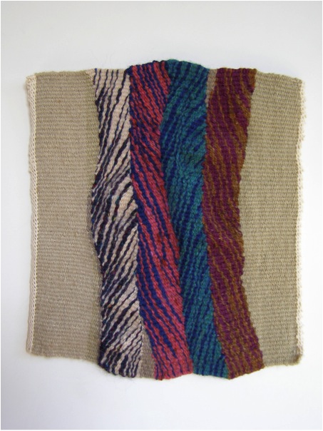
Can you explain what the construction aspects are that make a work tapestry?
Unlike painting, to which tapestry is so often compared, the construction of a tapestry requires one to make the art and the structure for the art simultaneously. As a medium it is very simple as there are only two main elements; the warp which is kept under tension and provides the skeleton, and the weft which lies perpendicular to the warp and becomes the body of the tapestry design.
Tapestries are often described as ‘weft faced’ meaning the warp is not visible. Compare with most fabrics, sheets, jeans, oxford shirts, in which there is a balanced weave where both warp and weft are visible. The options for the weft are wide open. Artists have used wool, silk, cotton, as well as feathers, wire, synthetics, grass, newspaper, etc. I use wool, cotton and/or silk mainly because tapestries take a long time to weave and I consider the archival aspects in choosing materials since it is a big investment of my time.
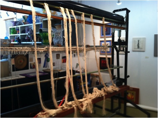
To begin, the warp is threaded on the loom. Once it is checked over for correct threading, tension is added to make it ready for weaving. With a temporary weft I make a foundation that serves to spread the warp from the small knotted bundles into a properly spaced warp.
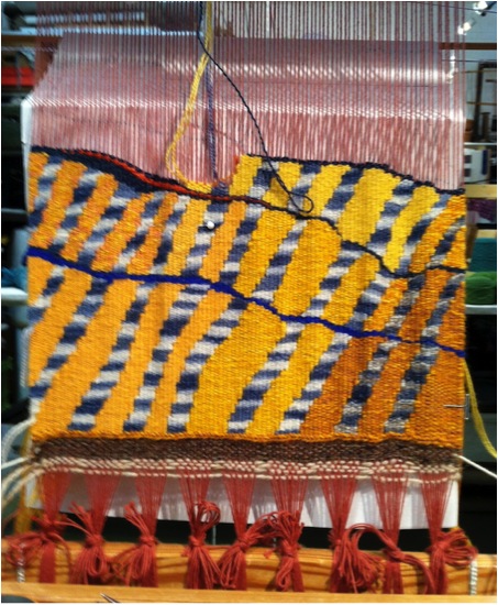
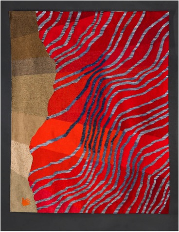
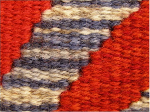
Warp tie up detail from Strata, Strata
Wefts are generally woven in one at a time in a specific area according to the design. I will weave a few inches of a colour area and then start a new colour and weave a section slowly building up the design. In the image here, I began at the lower right with the dark yellow.
The next weft is the one to the left, a striped blue which leans on the yellow, and so forth across the hemline. Unlike machine looms you may have seen, where the weft travels levelly from one selvage to the other, in tapestry, areas of one colour can be built up the warp so the next colour can be woven over it. The design will dictate the order in which colours are laid in because of this.
'Terra: Wheat and Grass’
Another difference is that there are marks you can make in tapestry that are unique to the medium. This includes certain kinds of patterns that would be tedious for a painter but easy for a weaver. Archie Brennan, from whom I have had several workshops, often, spoke about this to his students. It is something that I strongly considered when I started working with more dimension, that is that tapestry should be more about ‘textileness.’
Your work goes beyond 2D. Expand on the possibilities this has lead you to?
Some of the rules of traditional tapestry include keeping your edges straight and your surface flat and controlled. While this is important to learn at the outset, I was restless to experiment.
For me making a tapestry is a construction project. One starts at the foundation building up the shapes layer by layer. Because of this “construction” mode I wanted to create more dimension.
Initially I started with manipulating the tapestry elements. I did a small series called the Flip Series. It was about ten small pieces in which I constructed the elements that I subsequently manipulated.
I considered them studies for large scale pieces but in the end did not pursue because I was concerned that over time the 3D elements would sag and I did not want to add armatures to support them. These were quite successful at this scale and I went on to explore more dimensional work.
Big soft flips
I began working with an eccentric weft; for non-weavers, it is a weft element that is woven at an angle rather than the traditional weft which is 90 degrees to the warp. I began to have some interesting surprises.
These eccentric wefts were made in bands and went right across the tapestry. It was an interesting design but when I cut it from the loom the whole surface changed character and developed a new possibility.
Mini Flow
I have made a series of Flows in both large and small-scale format. I am intrigued how they enhance the image and create a more sculptural aspect in tapestry.
You have made the comment, “I have experimented to see what happens when the boundaries are pushed.” Discuss?
'Bound', detail
I have been working with these eccentric areas for almost 10 years and I have learned many of the quirks. There is a degree in the angle of the weft where the weaving looses its textile integrity and the tapestry fails but this is all part of the exploration. When it is successfully used the eccentric areas pop up after it is cut from the loom creating a dynamic surface tension. This is because of the release from the tension on the loom. I have made enough to know what to expect but sometimes I am surprised.
We have long seen tapestries in a 2D format that tell a narrative or explore traditional line, colour, shape, tone, and volume themes. I think that is limits what tapestry can offer.
Discuss the feeling of movement in your ‘Flow Series’?

'Flow 3'
All this movement takes tapestry from being a flat narrative format into a different way of thinking about the medium. Textiles are inherently fluid; they drape, they flex, they respond to their environment and by recognizing that possibility in a tapestry they offer more for the view to consider.
'Flow 6'
I want to respect the tapestry tradition but at the same time move away from the long narrative role it has played in our western culture. I am happy to celebrate its “textileness.”
Discuss nature and how it inspires your work?
How can one not be inspired by nature? I walk a lot and all my life have been observant of my environment.
That may come from my mother who was a scientist. She gave me a microscope as a child and we looked at lots of dead bugs, flower pods, and many other organic materials. For those who have looked it is a fascinating world. I find the shapes and colours provide me with a lot of ideas for my art and they become indirect interpretations ideas and need some time to evolve.
'Flow Unfathomed'
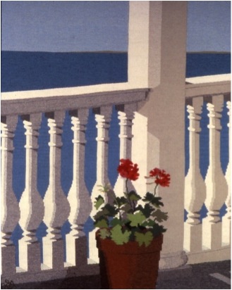
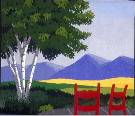
Along with your contemporary work you do pieces that you refer to as ‘Representational Tapestries’. Can you explain both aspects of your work?
My representational pieces are from an earlier part of my career. 1990- 2005. They generally included a lot of architectural details such as stairs, windows, entry ways. I worked from memory and incorporated shadows which gave the tapestries a tromp l’oeil feel to them.
'Beach Stairs'
Once a man saw a photograph of me sitting in front of my tapestry of a staircase at a beach house. He asked if it was my summer cabin. I replied, “Yes, but it is only a centimetre thick!”
'Three Graces'
What yarn do your work with and why?
I am currently working with three strands of Paterna, a fine plied wool in most of my tapestries. With three strands I can blend a new colour and make subtle colour transitions. I was very lucky that another tapestry weaver was closing her studio and selling off her huge collection of yarn.
I usually can make the colour effect I want from the yarns I have on hand but from time to time I need to dye a colour. I love this process because it is so magical and honestly, quite addictive.
'Here Today'
Discuss the dyeing of your yarn and also the availability of commercial yarns?
I really enjoy dying yarn but do it infrequently because Paterna has a very wide range of colour. Yet there is always a colour in my mind’s eye that I need and I am usually able to dye it. For my last projects I have space dyed some of the yarn to get a special effect in my work.
Space dye detail
How do you hang your work?
After I hem my tapestries top and bottom, I line them so that the backs are neat and clean. I attach the loop side of a Velcro strip across the top and I make a lathe strip with the matching hook side Velcro. The lathe is attached to the wall and the tapestry is then attached to the lathe. Because they are flexible, tapestries can also be hung on curved walls and I use a similar method in that case. In some cases with pieces that have shaped tops, I will add a flexible plastic section to maintain the erectness.
Size, what restrictions do you have to the size of your work?
I work in both large and small formats. I have an 8 foot (2.5m) Shannock loom which gives me lots of possibilities for size. I also have a six foot Regina Glimakra rug loom that I use for smaller projects. And I have used smaller, travel size copper looms for mini projects. Overall, I most enjoy being absorbed in a large format tapestry on the Shannock loom.
Shannock Loom
Can you show and tell us about your studio?
I share a large studio in an industrial building just north of San Francisco. There are over 50 studios which means an environment of many creative people. There are two Open Studios a year and this is an opportunity to teach visitors about tapestry.
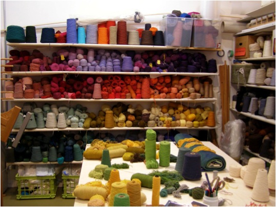
Wooll Wall
You teach, where and when do you fit this into your timetable?
I teach irregularly both in my studio space and outside venues mostly when I am invited. I enjoy it and think I should do it more often but I find it hard to pull away from my projects. Teaching is always a great way to really think about your own art. It helps to me to distil all the thoughts that are brewing in my mind.
Can you discuss one piece that you have done that has been sold and how this sale then effected you both as an artist and in your artistic career?
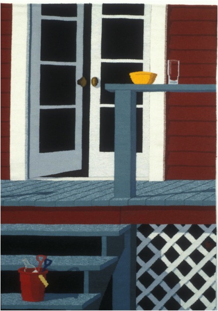
When my youngest child started kindergarten I decided to rent some studio space for a three year stint to see if I could make a go of it. I was designing colourful abstract tapestries which received some success. I was feeling impatient with the random expression of my abstractions and decided to challenge myself to make a realistic interpretation of a porch scene. Again going back to my architectural interest I looked at a lot of sketches and photos and came up with a design.
‘Summer Shadows’
Three weeks after I completed this piece it sold. I decided to make more of these realistic pieces and this attracted many clients for whom I did private commissions.
Champlain Valley was a commission for a house in Vermont. The client asked for many things to be included in the tapestry. Like many commissions there is a lot of back and forth until there is an agreement. It worked out well and we were both pleased with the end result. It was very satisfying to do something I love and make people happy at the same time. A treat.
‘Champlain Valley’
As well as your own tapestry work, you are involved in ATA – American Tapestry Alliance. Can you explain the importance of ATA to tapestry and your own work?
I was very involved with the ATA for many years. When my children left for college I had some more time and was asked to be a co-director of ATA in 2000. Earlier the alliance had begun to lose its way and a few members had taken it on themselves to put together a whole new organizational plan that refocused the needs of the membership and how ATA could be more supportive.
Without realising the scope of what I was volunteering for, I signed up as a Director. I was living in London at the time and most of the volunteers were in the US so there was an avalanche of emails. We needed new chairs for the different jobs including a new co director and the organization had to adapt to digital format.
It was hard work and very left brained but I was constantly impressed how much time and energy the volunteers gave especially since we hardly knew each other. It was very exciting to see the changes appear and to see ATA start growing from the 200 members at the time. I wanted to see more international members and that too has significant growth.
I was active on the board until 2008. I have not been so active in recent years but do volunteer on smaller projects when I can. I am more active with a smaller local group, the Tapestry Weavers West that puts on regular exhibits and supports tapestry education.
‘Trellis’
Discuss your comment ‘…tapestry has the power to bring peace and harmony into any space.’?
From my studio experience I like to watch people enter and start looking at my tapestries on the wall. There is a sort of calm that comes over them. I am not sure how to explain this but I do think people have an inherent love of textiles, they never go a day without contact to some form of cloth. The softness and the colour may seem comfortable and welcoming to them than the hard edged world we are surrounded by.
Contact details.
Alex Friedman Tapestries
www.alexfriedmantapestry.com
Alex Friedman, California, USA
Interview by Deborah Blakeley, August, 2014
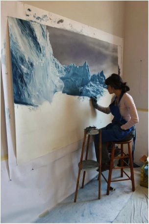
Zaria Forman
After attending Skidmore College in the USA, Zaria Forman developed her own technique. Not only does she use her fingers but her work is on a large scale.
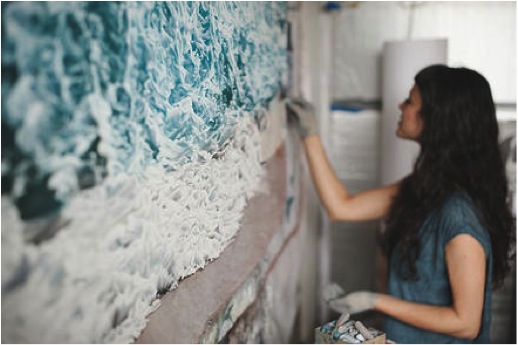
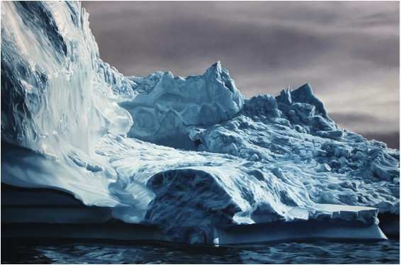
Image by Francois Lebeau
In her paintings she is able to capture both freezing cold seas and icy seas.

All of this is done with soft pastel.
Travel has always been a large part of Zaria’s life. From early childhood, she has travelled with her family to many of the world’s most remote landscapes. Travelling with her mother, who was a landscape photographer, lead Zaria to a very early understanding of seeing the view.
It was because of this that Zaria was lead to fulfill her mother’s dreams of gathering together family, friends, artists and scholars into one team. She took them on the voyage, following in the steps taken by William Bradford in 1869, when he sailed the northwest coast of Greenland.
Zaria said that the feelings she had were. “…both the power and the fragility of the landscape in Greenland. The sheer size, majesty and beauty of the icebergs is humbling."
In August 2012, Zaria led the expedition, called ‘Chasing the Light”, up the NW coast of Greenland. “It was the second expedition the mission of which was to create art inspired by this dramatic geography. The first, in 1869, was led by the American painter William Bradford. My mother, Rena Bass Forman, had conceived the idea for the voyage, but did not live to see it through. During the months of her illness her dedication to the expedition never wavered and I promised to carry out her final journey.”
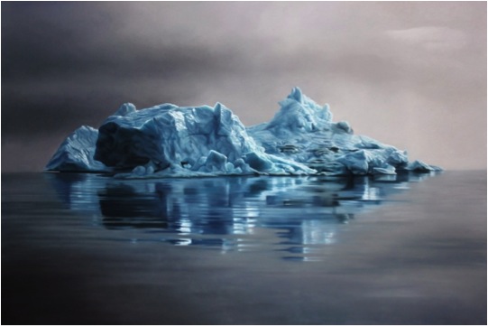
“Documenting climate change, the work addresses the concept of saying goodbye on scales both global and personal. In Greenland, I scattered my mother’s ashes amidst the melting ice.”

“I am deeply grateful for the team of talented artists and scholars and the Wanderbird captains and crew for helping me carry out my mother's wishes and realize her dream.”
A percent of all Greenland drawing sales will go to 350.org.
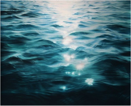
The Maldives
This was not to be the end of Zaria Forman’s work with climate change. She moved from melting Polar Regions in the Arctic to the equator, and more especially to the Maldives. “I followed the meltwater from the Arctic to the equator. I spent September 2013 in the Maldives, the lowest and flattest country in the world, collecting material and inspiration to create a body of work celebrating and representing a nation that could be entirely underwater within this century.”
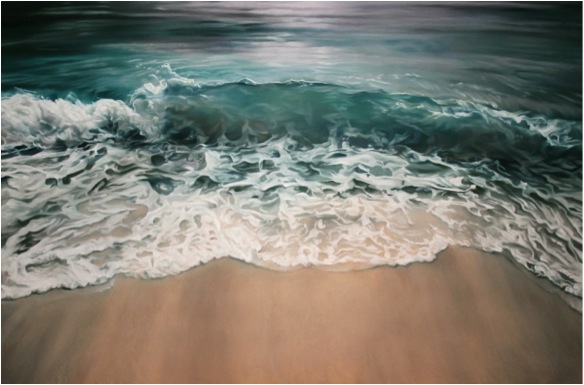
Zaria travelled with two award-winning artists who participated in the Greenland expedition, Chasing The Light. Joining her in this venture: Painter Lisa Lebofsky, and director, filmmaker, and actress Drew Denny.
“I hope my drawings will raise awareness and invite viewers to share the urgency of the Maldivians’ predicament in a productive and hopeful way. I believe art can facilitate a deeper understanding of crises, helping us find meaning and optimism amidst shifting landscapes.”
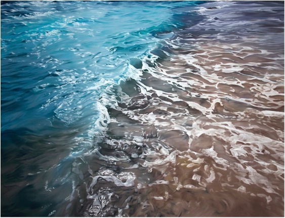
Thompson Lake
“Wherever we live, we need water to survive. Not only is the human body sixty percent water, but water is also essential for producing the things we need like food, clothing, and computers; moving our waste stream; and keeping us and the environment healthy.”

“And yet, while water scarcity is an abstract concept to some, it is a stark reality to many--some regions seem flush with fresh water, while others face drought and pollution. Myriad environmental, political, economic, and social forces produce this water scarcity.”
“During the summer of 2010, I visited Thompson Lake in Casco, Maine. One of the most pristine lakes in the state, this 12-mile-long lake is situated next to the Poland Spring Aquifer. I was struck by the silky, smooth quality of the water. Sipping it as I swam, a sense of gratefulness overcame me. The purity of the water here is no accident.”
“Through education programs and monitoring of the lake and its watershed, The Thompson Lake Environmental Association preserves the lake's natural beauty, water quality, and biological diversity. Such practices set a prime example of how we might effectively conserve and manage the fresh water we have on our planet.”
Again Zaria commits to the charity that is the most appropriate to the work she has done, so 10% of all sales from this body of work go to water.org.
Contact details.
ZariaFormaninfo@gmail.com
For a full list of available works and price list, contact Zaria Forman at the email above.
Zaria Forman, Brooklyn, USA
Interview by Deborah Blakeley, August 2014
Tracey Bush
Can you explain entomology in relationship to your work?
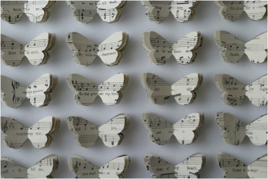
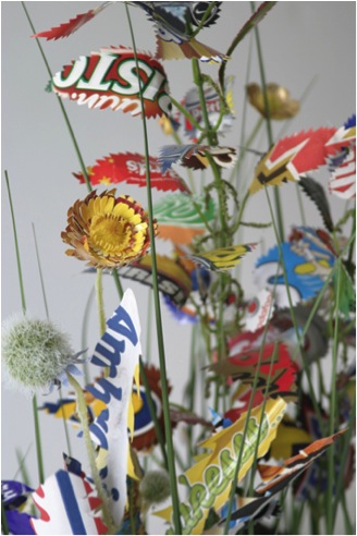
I created scrapbooks for many years as a way of collating and editing my ever expanding collections of found papers: beer labels, music scores, fragments of letters, tickets, packaging. Whilst researching the idea of a collection in book form in I happened upon the idea to create a collection of books in the shape of butterflies and moths. It reconnected with my childhood interest in insects; I even had a pair of entomological forceps!
Nest and Eggs
You commenced your art career with a strong interest in natural history. Can you discuss this link?
From the age of 8 I drew flowers and insects. I wanted to be a natural history illustrator. When I began my studies at Art school I was guided into a different programme of study, but now have come full circle.
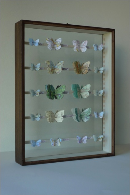
Please discuss your British butterflies.
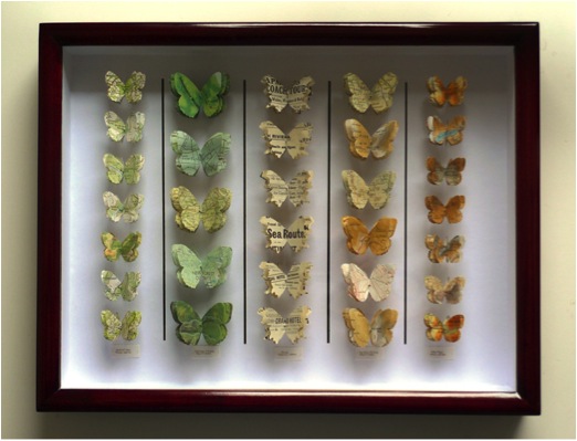
British Butterflies
Can you tell us about the different paper you use?
For British butterflies I usually use out of date maps and atlases of the British Isles. I enjoy working with both the range of colours: browns, greens, ochres and the evocative place names.
Discuss the different shapes of the butterflies and why you choose them?
The butterflies are all real species; the templates are cut actual size. When there are moth species called ‘The non-conformist’ and the drinker, there’s no need to make them up!
White Box
Discuss the link between the butterflies and paper?
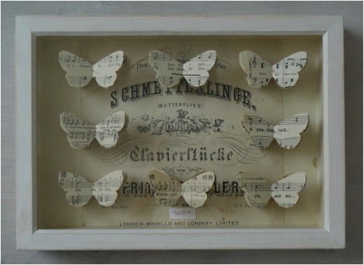
There is always a link between the species’ common name and the material I use. For example, the moth ‘Beloved Underwing’ is made from vintage love song scores. The ‘Atlas Moth’ is made from an atlas title page.
'Beloved Underwing'
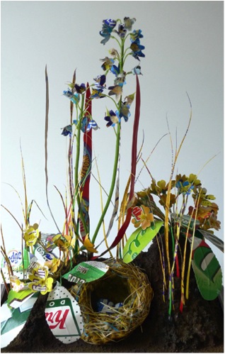
Explain your work with ‘Nine Wild Plants’ project and how it has propelled your art career?
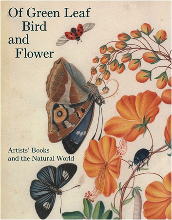
In 2005 I was awarded an arts council funded exhibition opportunity by Craft Central, London which enabled me to spend more than a year researching, preparing and promoting the exhibition ‘Nine Wild Plants’ the impetus for the project began with reading that the average Western adult can identify less than 10 wild plants, but more than 1000 brands and logos. I collected responses to the question: which 9 wild plants could you identify and then collated the answers into a small artists book, the resulting ‘top 9’ plants were then used as the models for drawings with collage and 3D paper sculptures using branded paper packaging. The exhibition was featured in several publications, including Elle Decoration, Garageland, and Resurgence magazines. I had a really strong response to the exhibition, the Yale Centre for British Art acquired drawings form the show, and the work generated was also exhibited at Art Fairs, and curated exhibition: Precious, recycling in Art and Craft at the Hove Museum and Art Gallery (UK) Most recently the project was featured in the book: ‘Of Green Leaf, Bird and Flower’ published by the Yale Centre for British Art to accompany the exhibition (2014) of the same name. I am continuing to work with the herbarium format, although the plant species I am using have become wider than the original list of 9.
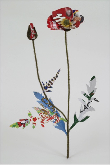
Poppy
After doing this project, can you discuss your own thoughts about the diminished knowledge we currently have on indigenous flora and fauna?
I’d like to say that I’m not making a criticism, just an observation. It simply reflects the culture we are immersed in.
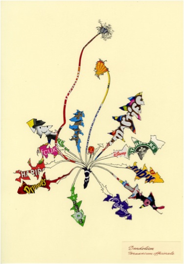
Dandelion
Have you considered doing a similar project here in the Southern Hemisphere with an Australian artist? “It would be interesting to see the results” - Deborah Blakeley.
It would be difficult for me as I’d not know the common names of any of the plants. It is an idea that could travel though.
Can you discuss, ‘The Little Clod of Earth’ from a technical aspect?
When making ‘The Little Clod of Earth’ (2008) I collected and pressed specimens of daisies, nettles and dandelions. I used these as models for the shapes of the leaves, sepals and petals. They are all handcut from paper and card packaging.
The Little Clod of Earth
The leaves and flowers are attached to fake plastic stems, and these are pushed into a solid sculpted Styrofoam base. The foam base is painted with pigments and fake soil. Everything you see is a construct! It was presented in a taxidermy case, and is now in a private collection.
Explain your use of taxidermy cases in your 3D work?
This links to Victorian conventions of collecting and displaying the natural world.
The Little Clod of Earth, Detail
You do commissions of butterflies using the paper provided by the commissioner. Discuss this part of your work?
Usually the paper is significant to the commissioner; maybe a wedding invitation or a fragment of a dress pattern. Most recently I was asked to make a butterfly collection by a NY knitwear designer, using her collection of vintage colourful knitting patterns> I found a species called ‘The Queen Cracker’ which clicks its wings when it flies, it reminded be if the click of knitting needles.
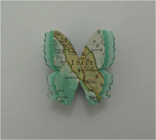
Map Butterfly
Discuss the installation of your work in the Members Room at the Natural History Museum?
The installation I made at the NHM London was called ‘The Ephemeral Imago’. It was a while back in 2002, and was the first time I exhibited my now signature butterfly box pieces.
You have a close relationship with the Natural History Museum. Can you expand on their commission in 2006 of 24 Butterfly Boxes?
In 2007 the Natural History Museum in London commissioned a set of 24 butterfly boxes for the development committee of the Darwin Centre 2. This was when the entomological collection wad ‘decanted’ into a new state of the art building. I was asked to create eco-friendly collections of butterflies and moths to be pinned in reclaimed entomology boxes. When working with the vintage cabinets I admired the skilled craftsmanship of the woodwork, but was glad I wasn’t squeamish, as I often found legs or insect parts from the previous occupants!
Expand on the importance of accuracy in your work? “Each butterfly is an actual species”?
By this I mean that I make templates from actual size species. The shape is authentic, although I edit the body, legs and antennae. If the species were made up I would feel that the butterflies were simply a decorative symbol, which is not my intention.
Dyffnyn Fernant
Why are butterflies such an important environmental indicator?
They are affected by climate change very quickly as they seem to move locale as the temperature rises. In Britain many species are becoming more northerly in range.
Can you discuss:
‘Two Moon Moths’
Indian Moon Moths Actias selene are the most frequently bred in captivity because they have a beautiful elegant shape, and are quite large. I have cut mine from a vintage map of the surface of the moon.
‘Beloved Underwing’
This species, Catocala ilia is also called ‘The Wife’. I cut these moths from vintage love song scores, and have fun rearranging the fragments of songs to create new meanings.
What work do you have in the Tate Gallery Library?
How has being in collections such as the Tate Gallery Library, the Museum of London and Jaffe Collection (Florida, USA) influenced your art status?
I have some artist’s books in the Tate Gallery Library and Archive. Being collected by the Yale Centre for British Art has significantly influenced my art status. My work is currently on display at Yale, in the exhibition ‘Of Green Leaf, Bird and Flower’, curated by Elisabeth R. Fairman. The exhibition is accompanied by a gorgeous catalogue, which takes its inspiration from an antique field guide.
‘Of Green Leaf, Bird and Flower’. Publisher: Yale University Press (23 May 2014)
ISBN-10: 0300204248
Please discuss a piece you are currently working on?
‘A Spoonful of Earth’ is a plastic takeaway spoon, which appears to have scooped up a tiny clod of earth. Amongst the daisy plants is a garden snail, its shell adorned with the Starbucks logo. My daughter had the inspired idea of using yellow glass seed beads for its eyes. I’d like to create an installation of ‘free range’ snails. It would be a fun way to fill a space.

'A Spoonful of Earth' (with Snail)
Contact details.
Tracey Bush
Alverstoke, Hampshire, UK
tracey@traceybush.com
www.traceybush.com
Tracey Bush, UK
Interview by Deborah Blakeley, August, 2014
Mikyoung Jung
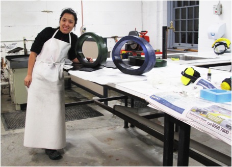
You combine both glass and other metals and materials in your work can you expand on how this came about?
‘Beyond’
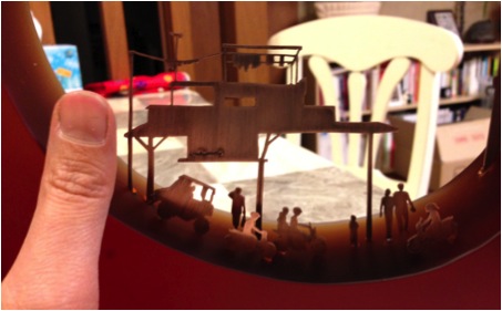
As a border-crossing artist, I think my experience of displacement through constant migration has had a profound effect on my art works. My continuing migration from South Korea to Canada, England and Australia as well as living and travelling in different countries as a ‘nomad’ has encouraged me to develop ways to communicate and articulate my feelings beyond the traditional conduit of speech, while also re-defining the boundary between myself and others from different cultures. As I constantly move from place to place, I wanted to explore these spaces that I have visited in the past with colours and appearances by using the material’s fundamental beauty and unique characteristics. While I was seeking my own way to express my observations of the new spaces in which I was residing, I was not reluctant to mix materials even though my art practice has been primarily focused on glass making, particularly kiln-formed glass and casting. Later, I realized the effect my multi- cultural background and previous undergraduate art education in South Korea has had on my current practice. During my B.F.A in South Korea, although my major was in glass, I was fortunate to receive a well-rounded exposure in many different materials such as wood, ceramics, metal, print and mixed media. Thus, it was more natural for me to explore different materials. In my current practice, I mainly use metal and glass. I use metal to emphasize my personal sensory perception of new space in which I am currently residing in or observing, and glass is a great resource that allows me to be able to create boundaries of space in sculptural form with colours. Glass and metal together allow me to be able to create the internal and external space within my practice perfectly. sculptural form with colours. Glass and metal together allow me to be able to create the internal and external space within my practice perfectly.
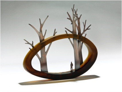
‘In the Shadow of Giants’
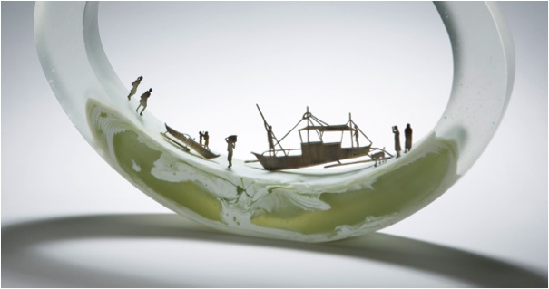
Your work is truly 3D, it makes the viewer want to walk around it and view it from all angles. Can you expand on this?
My works are based on real scenery, explored by a creative process through the ‘Journaling’ of my past experiences. Incorporating catalogued data in the form of pictures of experienced landscapes and moments in time, I then start to draw the scenery by using Adobe Illustrator computer software on top of pictures to engage in exploring contemporary human life. I often incorporate metal in my works. Using Adobe Photoshop and Illustrator together before I cut metals, I sometimes collage a few pictures to create the moment as I experienced it.
metal placement planning
When I place metal in my work I stagger the pieces that tell my story at different distances on the glass form, so although the metal figures are 2D it appears as a 3D image when it is placed in space. I also modify the size of each metal piece as well as the angle so I can make objects appear larger or smaller depending on distance. The process from planning the placement of the metal to cutting it is honestly quite time consuming and labour intensive I really enjoy doing it. It makes me feel like I am playing with the characters in my story. It possibly feels more real for some people who have shared a similar experience because my works might give them a chance to look at their current reality or look back on a previous experience in their lives and that is the power of my visual ‘journal’.
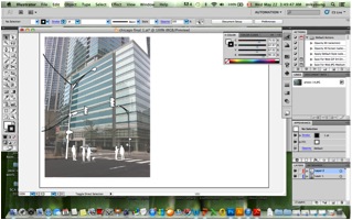
Metal cutting planning with Adobe Illustrator Software
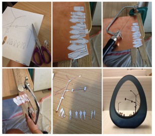
Metal cutting process
Can you discuss the size of your current work?
My current works are in various sizes from small to large. Larger works are approximately 560mm long and 330mm high whereas small works are approximately 350mm long and 190mm high. I send most of my works overseas; I have found it is very difficult to ship works internationally if they are bigger than 600mm. I try to keep the size less than 600mm unless the works are being sent within the country I am currently working in.
‘A day in the Park’
‘Sunrise Sunset’
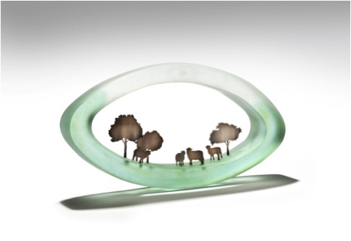
‘City from a distance’
Your comment “the old world and the new, east and west, citizen versus outsider” How is this reflected in your work?
‘Hanging on by a Thread’ and ‘The Daily Commute’
My current work called “Hanging on by a Thread” and “The daily commute” might be a good example in explaining the contrast between citizen and outsider. I recently travelled to the Philippines with my husband and while visiting a small island called Bohol, we came upon a long bridge made from Bamboo connecting one side of a village to another.


At first sight, the bridge seemed fragile and insecure and I was very hesitant to cross. I watched a few travellers cross the bridge visibly nervous. I finally gathered up the courage to cross this bamboo bridge, I noticed a local boy balancing a heavy sack of rice on his head nonchalantly crossing the bridge totally absent of fear from the opposite side. At that moment I realized that two people, albeit from different environments, experiencing the same location in very different ways. Observing the moment as an outsider allowed me to archive this experience into my current work.
Detail of ‘Unbridled City’
Detail of 'By the shore’
How has your work altered between the two western locations, Sunderland and Sydney?
The place where I lived in England was the city of Sunderland, located in the north east of England and it was not as multi-cultural as Sydney. It was a difficult time where I felt exposed and like a stranger. Also, at this time I could not yet speak English as well as I can now, so my works were more focused on the differences between ethnicity and language.
‘Outside and Inside I, II’
‘As a stranger’
After my studies were completed in England, I came back to South Korea, staying for about two years while sharing a small studio with a former glass artist friend in Seoul . Since Seoul is a very busy densely populated city, I was always surrounded by high buildings and traffic.
When I moved to Sydney, Australia, it was my first time living in a tropical climate and more raw, wild landscape. I was really inspired by the unique animals and flora of Australia’s nature, particularly its variety of vivid colours. I started to makes works which portrayed the different animals, trees, and plants of Australia.
'Fixture of Suburban life-Urban Jungle’
'View from above’
Can you discuss two pieces of work?
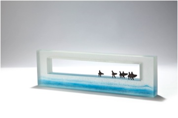
Country landscape
Bristol landscape picture
As I constantly move from place to place travelling to different locations I try to reflect the different landscapes which I have seen from different places into my works. Since I was born and grew up in Seoul, I had always lived in high level apartment blocks surrounded by huge buildings. Therefore, when I travel, especially to the countryside, this inspires me to reflect that moment in my work. One of works that I exhibited at SOFA Chicago last year, called “The pastoral life” was made based on a picture I took while working and travelling in Bristol, United Kingdom.
‘The pastoral life’
City landscape
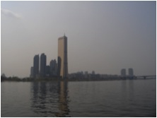
Seoul landscape picture
When I come back home, the scenery which I have witnessed and stored in my mind makes me look at my current reality, that of the city, from a different perspective. The piece called “Ephemeral City” was made just after I returned to Seoul from England and was based on a picture I took on the way back from the airport.
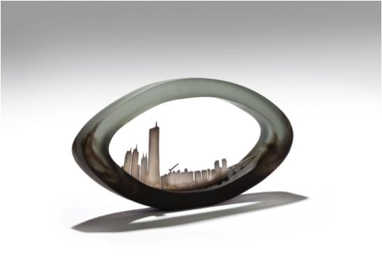
‘Ephemeral City’
Can you discuss the way you choose to colour your glass? Some pieces are completely coloured, others partially coloured while others are clear?
'On the Coast’
I try to explore works with different colours and incorporate the colours I found in the pictures of a given moment. I think the colour of a moment really brings out my feeling of that moment and reflects my emotions. My choice of colour really depends on the work. Sometimes, works made in one solid colour better reflect the moment. In some of my old works, I built lines with flat coloured glass and stacked them into a mould to create levels in the pieces to create multiple layers to reflect the age of the land and create a layering effect to better illustrate water.
'The Still City’
Where are you currently exhibiting your work?
My work is currently being exhibited in four locations:
| Melbourne,Australia | Kirra Galleries |
| Pittsburgh, U.S.A | Morgan Contemporary Glass Gallery |
| Denver, U.S.A | Pismo Gallery |
| London, U.K | Zest Gallery |
I have also completed a new work which is going to be exhibited at
The 8th Cheongju International Craft Biennale in Cheongju, South Korea in
August 2013.
Detail of ‘Old meets New’
Exhibitions are an important aspect for artists; can you explain how you choose where to exhibit?
I try to submit my work to be exhibited in glass art conferences, symposiums, and craft biennales as well as if there is an exhibition where I believe it will allow me to show my work to a wider audience. Besides that, I get calls from galleries asking me to exhibit when they have a group show going on with a certain theme that would suit my work. It really depends on the time.
What are one or two recommendations that you would tell a new artist to keep in mind?
As I learned from my mentor, I think it is very important for an artist to keep informed about information of upcoming competitions and exhibition opportunities in order to be ready to apply for ones that will fit your work. When you apply, having good images of your work will assist you in being selected for these opportunities since for almost all competitions, only images of your work are evaluated in the first round.
Many art students think it will cost too much money to have a professional image, I think it is a worthwhile investment as it brings you good opportunities.
If you use your images well, it really is worth it in the end.
Contact details.
Studio Address:
Joon Glass Studio
824-37 Daeja-dong, Deogyang-gu, Goyang-si, Gyeonggi-do
ZIP:412 480, South Korea
Website: www.mikyoungjung.com
Email: mikyoung.glass@gmail.com
Mikyoung Jung, Gyeonggi-do, South Korea
Interview by Deborah Blakeley, August, 2013
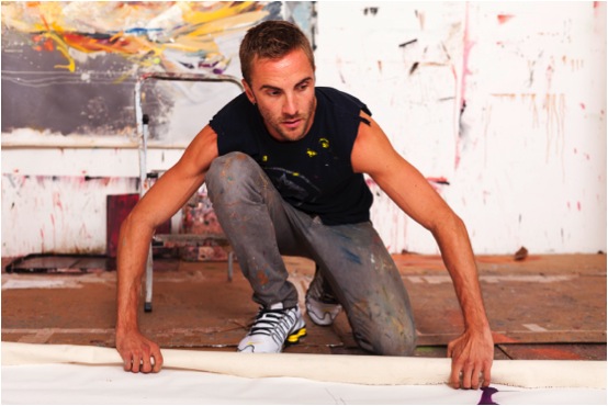
Andrew Salgado
The size and scale of your images is huge. How do you physically cope with this aspect of your work?
One of my favourite painters is Daniel* Richter, and I recall as a student artist at the University of British Columbia (Vancouver, Canada) being familiar with his work but being rather ambivalent about it; one day I saw an exhibition of his paintings at Helen and Morris Belkin gallery on campus, and I was completely blown away by the monumental scale of the paintings. As a young painter, it was a cathartic moment; one of those rare shows that not only asks you to rethink the work of the artist in question, but rethink how you consider painting as a whole.
For me, scale is an important aspect of the identity I have forged for myself as a painter. I have to remind myself to hold back sometimes, and challenge myself to work on a smaller scale. My last solo exhibition (Variations on a Theme, NYC) purposely included very large work as contrasted by very small work. I like what this polarity suggests, and for me, it’s the mid-range pieces that are almost irrelevant. If it weren’t for the limitations of my studio (ceiling height and the logistics of getting work in and out) I think I would like to even go bigger.
There’s a certain power with scale, and the freedom to move about and explore the canvas, where your brushwork actually becomes a record of movement in time and space. I am drawn to the grandeur of scale, the suggestions where a torso becomes twice the size that it should be; it is almost a sublime experience looking at a figure that is unnaturally large.
Conversely, I find small paintings challenging because it’s easy to be ‘important’ on such a large scale, but it is difficult to make a bold statement when you’re working with such confines. I also notice that I become a very different painter when I work small-scale, but that’s to be expected.
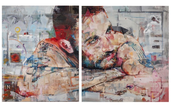
Big, Bold, and Brash is the feeling I get when viewing your work, is this your aim?
I’m not sure that brash is a good thing. To me, it seems like a cheap trick. I think there’s a confidence in the new work, and a freshness that I’ve earned as I mature as a painter. The work also comes from a politicized source. As a gay male and a victim of hate-crime, the work has a message that goes beyond big-for-big’s-sake. The work is aggressive because it is asking the viewer to consider and challenge something beyond what is immediately visible. I know a lot of big, bold, and brash artists but to me these adjectives recall something almost pejorative: like a big tacky sign. I like to challenge myself and my viewer, and I don’t like to make work that sits comfortably; something is always off-kilter, waiting to be deciphered. I do think from time to time the work is bombastic, but with each successive body of work I tend to focus on an adjective that subconsciously comes up and guides me. For my Cape Town exhibition it was ‘intimate’. For NYC it was ‘purposeful’. And for London (opening October 4th at Beers Contemporary) it’s ‘deceptively simple’. So I think for many painters it can be quite easy to pull off ‘big’ and ‘brash’, and I think it is challenging to be subversive when you’re playing with scale and aggressive, politicized themes. I also think the work is changing, rapidly, and markedly. On one level I’m still the same painter that I was before, but on another level, I’m entirely not the same painter that I was before.
You use many mediums as well as oil, spray paint, collage, text, and video discuss how you know when to stop?
There was a foray into video during my Masters at Chelsea College in London in 2008, spurred by necessity as a result of insufficient studio space and a (painter turned performance artist as the) course Director who tried telling me I was a performer and not a painter. However, even those videos were ultimately all about paint. When I left the degree I also returned to painting, which is really where my love-affair lies.
Everything else has been quite causal. I believe in being informed by your immediate surroundings. After a particular commission I was erroneously given a box of spray paints; they stared at me in the studio for some time until I thought ‘screw it’ and began incorporating them into the work. However, their use is always quite subversive. Spray paint has this tendency to be a very immediate, very loud media, but I use them in a method where they’re almost indecipherable. This to me is almost a form of trickery; the viewer is pulled right into the piece – endlessly looking. Earlier this year I began using them to stencil the my materials onto the piece – the silhouette of a brush or a palette knife, for instance; and eventually this evolved into actually sticking the actual object onto the canvas in its entirety. Sort of a self-referential act, where I’m constantly trying to remind the viewer that this is a reconstruction, a creation, there was a process involved, a fiction… I like to draw attention to my materials and this was just an evolutionary step, it was never intentional, it just happened.
If it becomes a gimmick - then so to do the paintings - and it is funny, because my most recent work has pulled back entirely…they’re only oil on canvas again. I’ve retreated back into the cave, just me and brush, but I still have some tricks up my sleeve.
How do I know when to stop? You have to listen to the intuition because you can’t pull out to early, either. But for every successful painting there’s probably a failed idea or unfinished work somewhere as well.
You make the comment, “my studio is my paradise and my prison”. Can you expand on this?
Art is a give and take exercise. As artists we play with fire, and from time to time you risk getting burned. I think as artists we need to know when to ‘cool it’, and step away from the work altogether. We need that impetus to create, and sometimes it’s simply ‘not there’. I work alone, usually 6 days a week, at least 8 hours a day. If you’re not careful, this creative space can become a draining space. But there’s nothing quite like that feeling when you’re in the studio, and everything seems to ‘click’ and you surprise even yourself. However as artists we need the crises, the failures; they are what help us grow and learn and improve.
Your exhibition in NYC was a sell-out – Discuss how and why your work relates so well to NYC?
I don’t think its NYC in particular that my work relates well to…I would like to think it has an appeal that transcends any particular location. I’m Canadian, half Mexican, but I live in London. So I’m a bit of a mixed bag myself. In fact my last 6 exhibitions were all sell-outs, which is amazing, but also brings with it a new series of anxieties. There is a demand now for me to constantly trump myself: each show has to be better; the work more important; and of course we don’t want the ‘winning streak’ to end. So that’s definitely a pressure for me but I try not to think about these things because the real importance is the paintings. If the paintings are spectacular, everything else will fall into place. I broke through a glass-ceiling with the paintings for the NYC show, and as an artist it’s an incredible feeling to surprise even yourself. The paintings were sharp, and fresh, and crazy, and I do think that a NYC audience responded to their immediacy. I’m hopeful, as well, because the initial paintings for the London show are off to a promising start. There’s another change, and the works are a little more complex but also a lot more subtle, and I think a London audience will respond to that aesthetic.
Can you discuss the importance of space, lighting, freight, and location for your exhibitions?
I think all are really important, and there are some great spaces I would love to work with. The space in NYC was amazing because there were quite literally no constraints to any of these factors. Obviously shipping is a pain, but a reality that I suppose I have to consider… In reality though, it’s my job to make the paintings, and I let other people worry about logistics. One thing that many people find interesting is that I plan an exhibition around the gallery space. I go see the space, get a feel for it, and then think about the scale of the work and the number of pieces I want, and work to ‘fill in the blanks’.
The full show was a portfolio of 14 works. What timeline did you work with?
Is there ever enough time? I never count the time taken per work, but rather allot myself a specified amount of time for a particular body of work. I had initially given myself over 4 months for 9 or 10 paintings. I never do more than 12. I was approached by Kevin Arpino at Rootstein to do an additional show to outfit for their windows, the dates to correspond to my NYC show. So suddenly I had 5 more paintings to do in the same time-frame. I did my exhibition first, then the Rootstein works. I didn’t want overlap. To me, while related, they were two bodies of work. This was pretty crazy, but I always welcome a challenge. For London, I had 5 months, but I took a month ‘off-studio’. I tend to work well under pressure, though. But no…never enough time. I’ll rest when I’m old…right now, I feel like have work to do.
At another level, can you discuss your work with Rootstein, who’s philosophy is “constant innovation and boundless creativity” with an open canvas, - mannequin. What did this commission lead too?
Actually I was already working with the idea of sculptures falling apart…disjointed body parts, floating limbs, so making work for Rootstein couldn’t have fit better into how I was already painting. The resulting works were entirely my decision; I won’t work with any commission where they tell me what to do because that never works. I’m close friends with the CEO, Kevin Arpino, and he just said “I trust you”. And it worked. Kevin is incredibly inspiring and I learned a lot from him as well. He’s a true visionary and I think their philosophy is brilliant.
How often do you add work such as Caravaggio’s Bacchus to your canvases?
There are a lot of references lurking within my paintings. Some paintings have more obvious references, such as the painting of Bacchus in the background of Green Dionysus, or the reference to Botticelli in ‘1486’, but other paintings have sly nods: the presence of a contour line to reference Chavannes; another painting a response to “Whistler’s Mother”; another painting borrows from Doig; another from Gauguin. Sometimes it is just a subtle thing: a colour, the gesture of a hand, the composition, even the title, but I think as an artist I have a responsibility to the history that came before me, and an onus to be responsive to that. As a painter I don’t work in a vacuum, and I’m keen to draw attention to this, even if it is just knowledge for me to carry.
How do you find the sitters? Are many commissions?
I now avoid commissions like the plague. I don’t want to be told who or what to paint. It sounds awful but you can’t hire inspiration, no matter how much cash you throw at it. I’ve stopped taking commissioned work and I feel more honest as a result of it. I find my sitters anywhere, but typically I don’t like to know my sitter too well. I don’t like to think of them as portraits, and if they bring too much of ‘themselves’, I can’t use them the way I want to. I always say that ultimately what I do is very selfish, because I take what I want from my subjects, like conduits, to express something for me, and then I move along. It’s like a horrible mantra: love ‘em and leave ‘em.
Currently you are supporting Cancer Research in both Canada and the UK with your work on a T shirt. How did this happen? How can a reader purchase one?
I work with a lot of charities worldwide, and I believe in giving back. Artists can be so self-indulgent and solipsistic, they often fail to realize that there is a world with real issues beyond the confines of their studio walls.
I was contacted by Maison Twenty, who wanted to use my imagery for a t-shirt. Originally I was not keen on this idea until I asked them about if we could give all the proceeds to charity. I chose MacMillan in the UK and the Cancer Society in Canada and I’m splitting the proceeds to either. To purchase, you can go to Maison Twenty’s website.
Contact details.
www.andrewsalgado.com
www.facebook.com/andrew.salgado.artist
For sales inquiries: info@beerscontemporary.com
All other inquiries: amy@andrewsalgado.com
Andrew Salgado, London, UK
Interview by Deborah Blakeley, August 2014
Martha Fieber
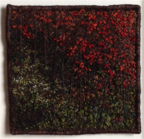
You call your work, ‘Landscapes in Thread’. Can you discuss this?
My work is all landscapes. Some are realistic and some abstract. By far, the majority of materials used in my finished image is thread. I use hand dyed linen for backgrounds and the entire picture is made from thread of all kinds. I use some hand dyed silk and ribbon yarn for the tree trunks. The underlying message threaded through my work is that nothing is quite what it appears.
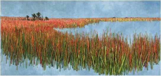
‘Red Reeds'
You use layers and layers of thread, while restricting your work to four stitches. Can you expand on this?
I use straight stitches, french knots, couched threads, and chain stitch. Straight stitches and french knots make up most of each image. Occasionally I will use chain stitch for a different texture or level separation in the picture. I have not used couching in some time, but there is the occasion that it makes a perfect line definition that I need for effect. The straight stitch and knot can do so many things. Straight stitches are like drawing with a pen or pencil. French knots are so versatile. They can have any number of twists to make their size. They can be piled upon each other for texture and dimension. I love using them and find myself going to them as a basic.
Texture plays a large part in your work. Please explain the technique you use to create you work?
I start with linen that I have hand dyed. It adds dimension and colour variation to the background and lends to the depth of the finished image. If the piece is to be a forest scene, I then start with crosshatched straight stitching to give the depth and interest to the background. I continue layering slightly variegated colour thread while adding silk or cotton trees and branches. At the same time I am adding french knot leaves and more cross hatching until I have a deep background with dimension and texture. 90% of my images I consider background. Only when I am adding the foreground trees and leaves, do I have my finished picture. I try to get all of the depth into the background from the start since I cannot go back under to add more later. I am thinking like a painter, going from distance to foreground. Lots of my stitches get covered up, but there is always a little of everything peeking thru on the finished piece. Using hand dyed silk ribbon for dimensional leaves in the foreground adds depth, texture, and dimension to my work.
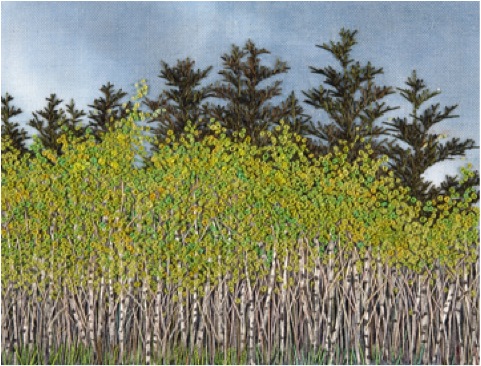
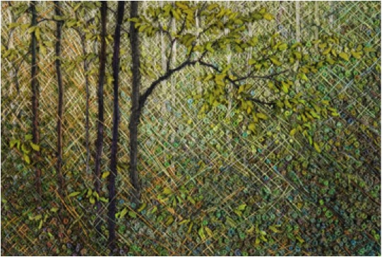
'Aspen Spring'
What lead you to give up a career in engineering for art in 1999?
After twenty years in engineering, I needed a change. I had been doing my embroidery and rug hooking as hobbies during that time. I found working within the parameters of the engineering world frustrating and longed to work for myself in the art world. My husband is a furniture maker we felt that we were in a good position to make a change to full time artists as all of the children were then out of college. We decided to take the big leap to working for ourselves in 1999. It took a few years to get established, but things have worked out well for both of us.
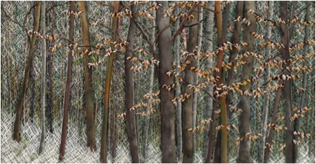
Can you discuss composition by comparing ‘Catching Light’ and ‘Dogwood Spring’?
From a distance, it is impossible to tell how my work is constructed and what materials I am using, so composition is what draws the viewer to get close to my work and experience its complexity.
“Dogwood Spring” and “Catching Light” are two very different pieces. Both take your eye into the distant woods, but one is a fine, misty, mysterious, light, distance and the other is close up bright forefront and deep dark distance.
'Dogwood Sping’
“Dogwood Spring” draws the viewer to the lighter distance using bright green grasses on the horizon from a shaded grassy and tree area with blossom foremost. Grey greens in varying shades make the long boundless distance disappear. This piece is matted which is a contrast to the open area of the undefined distance.
“Catching Light” uses bright red, white, and muted greens in the foreground and draws the eye to the dark enclosed distance. The edge treatment on this piece is stitched. That gives a dark border and is shadow box mounted to give contrast to dark distance and it makes the entire piece pop.
'Catching Light’
Your inspiration is nature. Can you explain this in relation to your work?
Nature is beautiful and peaceful to me. My work strives to bring the outdoors in and keep us connected to our world. I also want to remain aware of our fragile environment. The scale and exquisite quality of my work brings that to mind. I want to keep the viewer aware of the beauty of the moment. I live in the woods so I am surrounded by beautiful scenery every day and show it to the viewer in my work.
Explain the size of your pieces?
My pieces are small. They start at 3” x 5” for the image. My largest has been 9” x 30”. I use the horizontal format because it is easiest to work with. Vertical format is cumbersome for me. I like to work with a size I can hold instead of using a stand. Time is also a factor. My work takes a long time and anything larger than the above sizes would take too long to complete. Scale is also a factor in the size I work with. I do my best work in small scale. Materials that I use, like using only one strand of thread at a time, makes my work small scale to start.
'Sun through Woods’
You do your own dyeing and hand painting of thread, as well as commercial threads. Can you discuss this aspect of your work?
I dye my linens, threads, silk fabrics, and ribbons with water based dyes and set the colour in the microwave. It is so quick. I do not use specific formulas for colour. I just mess around some colours that I know will work for either trees, grasses, leaves, etc. I do get some ugly colours at times, but they end up being perfect for something later on, like mud coloured thread. I buy bulk linen and ribbon and dye big batches of pieces to use later. I look for threads at the thrift stores and overdye them. Sometimes I buy bulk threads and dye them. Dying my own gives me more natural colours and more subtly variegated materials. They blend together more naturally and easily than using solid colours. When I start a picture, I go to my stash and pick out the colours that will work best for the piece I have in mind.
Do you feel that being a self-taught embroiderer has allowed you to have a greater scope?
Yes, I think that being self-taught has allowed me do go my own direction and use unconventional techniques while at the same time using conventional stitches in a traditional craft. I am not restricted by perfect spacing, perfect stitches, colour combination charts, or the neatness of the back of my work. The backs of my works are abstract versions of the fronts. I put stitches anywhere, in any combinations, whenever I desire. My process is so slow that I can change at any time or go in another direction that works better for the composition. I am not working toward a specifically defined finished pattern, I do have a finished image in mind before I start.
'A Dusting’
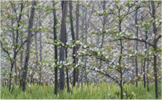
Can you discuss ‘Spring Birch’
'Spring Birch’
‘Spring Birch’ has many examples of techniques I use.
This piece starts with hand dyed linen in grey blues. Next I paint the distant hills with water based, heat set, ink. Then straight stitch grey blues in darker shades make up the near distant hills. Then, lightening up the nearer hills in straight stitch grey blues. I am then using a straight stitch to make different size and distant pines. At this point I start to put in some grasses and bushy areas. Next, the birch trees are put in using white cotton gima inked to look like birches. The high birch branches are next. Last is the leafy front bushes and enhancing the french knot leaves of the bushes before and behind the birches. I am sewing in all of the foreground grasses, bushes, and leaves during the last few steps.
This piece has a bright, dramatic foreground of birches and leaves as the focal point, then leads the eye to the distance with darker colours, greyed shades, different weight threads, and different material threads. Cotton and silk give either flat or sheen to the area which works to separate and define. Since I work close up, I am constantly putting the piece at a distance so that I can gauge composition.
This piece is 6” x 14”. It is presented matted, in a black simple frame that is 12” x 20”.
Contrast and colour can be inspiration to me. I used a birch stand near a local lake as a reference. As you can see, I changed the lake to distant hills.
Your work comes in three categories. Please expand on this?
I have found that my technique lends itself to forests, fields, and flowers. I do have water scenes, close up forest floor scenes, and abstract scenes, but most of those subjects are still in development stages.
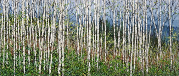
Forest
Crosshatched stitching lends itself to making the woods look deep and to making trees recede into the background. My hand dyed silk fabrics make really good tree trunks. I also paint birch tree trunks. So, materials define a good portion of my works.
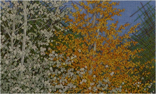
'White Poplar'
Fields
Using one strand of thread at a time and stitching in both directions makes realistic looking fields and makes the grasses separate. There are so many new materials to stitch with, like gima, novelty thread, different weights and sheens of threads, different twists, ribbons, that can add dimension and depth to my work and lend themselves to varied grasses.
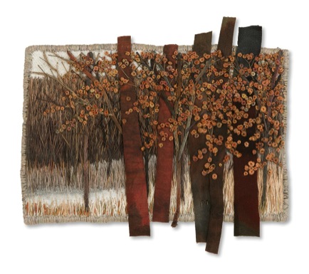
'Greys and Browns'
Flowers
French Knots make good flowers. Silk Ribbon can also make a different type of flower. Flowers add colour. They add another dimension and contrast to my pieces. This is another example of colour and texture of the materials determining my subjects.
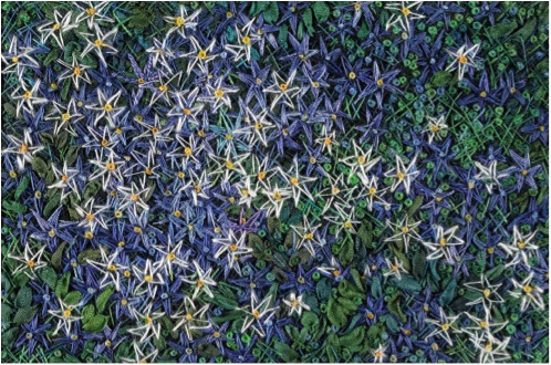
'Blue and White'
How has your combined knowledge of weaving and embroidery helped the current work you are doing?
My combined knowledge of weaving and embroidery probably helps the most in colour combining and layers. I’d say that my embroidery experience with different materials influences my weaving more than the other way around
Contact details.
marthafieber@yahoo.com
www.marthafieber.com
Martha Fieber, Michigan, USA
Interview by Deborah Blakeley, July, 2014
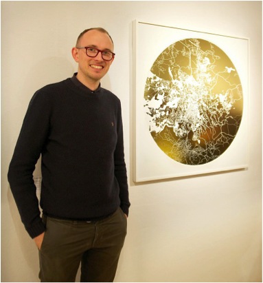
Ewan David Eason
Your early work was involved in the exploration of colour, and more concisely the colour concepts that were introduced by Paul Cezanne. Can you expand on this?
In the summer ’96 (when I was 16) I went on holiday to France with a copy of Robert Hughes’ book The Shock of the New, using it as a guide to paint. Every day I would go into the countryside with a canvas, foldable easel, oil paints and brushes and paint the scene I was in using a different ‘ism’ to the previous day working my way through Impressionism, Fauvism, Modernism and so on right through to when the book was published in 1981. I kept returning to Cezanne’s use of colour in his painting of Mont Saint-Victoire from 1887.
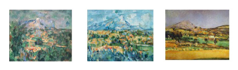
He in fact painted this Mountain about 87 times over his career. His palette mainly consisted of white, red, blue, yellow, purple, orange and green. Over the next 2 years I explored how these colours could work together or oppose one another either mixed or as solid forms. At around the same time I visited Charles Saatchi's Sensations Exhibition at the Royal Academy. As a result of seeing Gary Hume’s hospital door paintings and Hirst’s ‘dot’ paintings as well as studying more established artists like Patrick Caulfield, Patrick Heron, Bridget Riley and Michael Craig-Martin I concentrated more on the opposition of unmixed primary and secondary colours. Not only was I interested in colours opposing I also became interested in opposing forms, structures, concepts and how these opposing forces could highlight or subdue the other.
This theme of opposites continued throughout University. I became more aware and interested in current artists and like what University does, I discovered more of who I was as a person and the more of my personality I put into I my artwork the more passionate I became about creating the work.
I started looking into artists who dealt with appropriation. Artists like Richard Prince, Cindy Sherman and Sherrie Levine. One series by Sherrie Levine from 1981 called After Walker Evans is a reproduction of a selection of Walker Evans photographs taken in 1936, whereby she rephotographed and re-exhibited a portrait from one of Walker Evans exhibition catalogues; appropriating it as a partial reclamation of Art History for women. Like Prince and Sherman, Levine was re-authoring the image.
From a very simple level I saw it as a sort of ping pong game between opposites, male and female. The ball was now coming my way. So I rephotographed her image and exhibited it as one of my own, calling it After Walker Evans, After Sherrie Levine by Ewan David Eason. It wasn’t that I wanted to reclaim the male status back, it was more about the cheekiness of me doing it. Silly as it was though, it did start my interest to create opposite appropriations. Like Sherman I wanted to include myself in the work and like Levine I sourced the works from artists. I created pastiches of artists work through various mediums such like video, painting, photography and other forms of print making.
‘Mappa Mundi’
Your ‘Mappa Mundi’ prints come in four sizes.
How did you decide on the sizes?
When did you decide to compare the print size with the logo of a man?
It started with the 36 x 36 cm size, any smaller than this the detail of the artwork deteriorated.
I knew I could print up to 150 x 150 cm but didn't want to limit myself to just 2 sizes.
The sizes in between; 69 x 69 cm and 104 x 104 cm were incremental size progressions.
Do you have a Limit to your print run?
Yes, definitely. I don't want to create a commodity with an unlimited edition. By limiting the amount I make, the artworks become more and more rare.
Mappa Mundi Moscow
Is the gold actually gold leaf?
I use 4 types of gold; 24 carat gold leaf, imitation gold leaf, brushed imitation gold dibond and gold thermal ribbon.
How did the opposite theme translate into your current Mappa Mundi series?
In 2011 I was invited by the artist Tom Helyar-Cardwell to exhibit in an exhibition called Celestial Architecture. At the same time I had looking at the work of Bernard Cohen and his use of loose and rigid styles. I started cutting out straight lines in my sketchbook which I could then lay on top of other patterns. Unlike what I was expecting, the stencil itself inspired me rather than the new images it created with the drawings beneath. It reminded me of interlocking roads on a city map. Rather than creating new road maps in my sketchbook I began to cut up an A-Z London map. I also began to look at older maps suchlike the circular Mappa Mundi’s; medieval maps of the world commissioned by landed gentry of the time. It hadn't been established that the world was circular at the time however the artists drew reference to a verse in the Bible, Isaiah 40: 22 which talks about He (the Lord) sit(ting) enthroned above the circle of the earth. The most famous of these maps and the largest still in existence is the Hereford Cathedral's Mappa Mundi which reflects the medieval church with Jerusalem at the centre of the world.
Mappa Mundi Manhattan
Continuing to look at maps I came across Charles Booth’s Descriptive Map of London Poverty from 1889 or more commonly known as his ‘Poverty maps’. Booth set out to define levels of poverty or wealth in London, street by street using a colour coded system. Examples of these colours included Black; defining Lowest class; Vicious, semi-criminal. Middle class would be defined with Red and Upper class as Yellow. I found the colours, rather than street names or area titles, became an abstract image in itself. In the same way that I created my original pastiches of other artists work I started considered how I could pastiche these maps.
Rather than defining people into different groups with multiple colours, I decided that I would oppose this by selecting one colour, a sacred colour that drew on the egalitarian nature of people rather than defining us as poor, middle class or rich. I chose Gold for it sacred and precious quality.
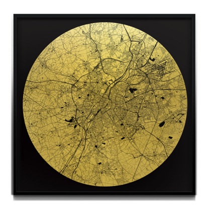
Mappa Mundi Brussels
What is the exact distance (land to sky) your maps show?
It really depends on the city that I am creating. Essentially I want the final image to look like a well-balanced abstract intricate pattern. Some of the maps cover many miles, however others may cover just one.
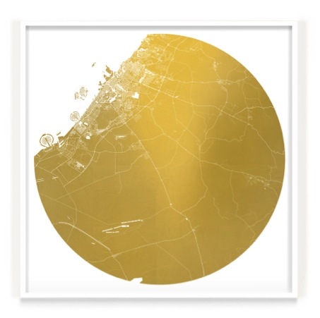
Mappa Mundi Dubai
Are these images easier for us to perceive because of our knowledge of space maps and now google maps? Discuss.
Yes I think so. Most people have access to any city at a click of button. I have however found it fascinating when I remove all the names how difficult it can become to distinguish the area or city due to people becoming so familiar that waterways are blue, roads are multi-coloured (depending on their size) and land mass is a light yellow ochre (on google maps). When all the colours are removed and made the same it becomes anonymous patterns of interlocking shapes.
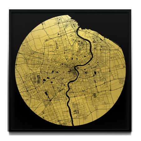
Mappa Mundi Shanghai
Removal is an important part of this series. You remove all the colour and street names, why do you do this?
Rather than defining people or areas by names or colour I wanted to emphasise that we are all the same; sacred.
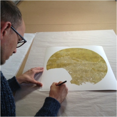
Maps have developed since medieval times to today’s electronic maps. Your maps are still representations of places that have meaning for you. Can you expand on this?
When I first started making the London map I decided that I didn’t want to just create a gold map of London, I wanted to make the map more personal. Like the original Hereford Mappa Mundi being centred on Jerusalem I decided to centre my map on a significant place to me; where I proposed to my now wife. All the maps I have completed since have either been centred on a significant place to me or the person commissioning the artwork.
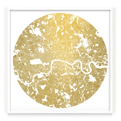
Mappa Mundi London
Can you discuss why you choose Venice as there is so much blank? Is this map more graphic when compared to a map of London?
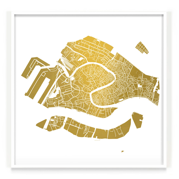
Mappa Mundi Venice
To learn to paint like Cezanne I started painting Venetian scenes from photographs that my father had given to me in 1996. Looking through the photographs and intensely studying them in order to capture re-portray the essence of the scene I became obsessed with the beauty of the city. On the occasions I have visited I am always left wanting more, which I why I chose to include it in my selection.
Compared to most of the other cities I have created it certainly has the most amount of water represented and becomes more graphically abstract however I felt it was important to keep it in due to the nature of city. I’m also very interested in exploring the idea that familiar places become abstract images once distinct colours or names are removed. On most occasions I find that it isn’t what area is covered that defines the image, it is what I think looks well balanced.
Discuss some of the wonderful locations your ‘Mappa Mundi’ has been exhibited in? How did these exhibits come about?
As a result of entering one of my pieces to the gallerist Cynthia Corbett’s Young Master Art Prize in 2012 she exhibited my artwork in some very well established art fairs around the world as well as BFAMI’s charity auction exhibited at Christies and Camden’s Round House.
I also have some really great Galleries and Art Consultants who present my work on my behalf, most notably A Space For Art, Fawn Art Consultancy, Annabel Cary, Peter Benjamin, Art Unified (in LA) and Store Street Gallery in London. They have helped get my work seen in The Barbican (London), Christies, private members clubs, various public locations in LA, and many other established venues around the world.
It has also been such an honour to be selected to exhibit in the Royal Academy in 2012 as well as in 2013.
You have been selected twice by the Royal Academy. Can you explain both the process and the importance of the selection to your career?
Like most selecting processes, the process of applying for the RA Summer Exhibition requires a lot of patience and suspense. You apply in the January, then told a week before it opens to the public in June that you have been chosen to exhibit. Being selected is an honour and has been incredibly helpful for me in getting my work exposed to a larger audience
How much time does it take and where do you go to research old maps?
I go to a lot of museums and libraries. Living in London I am spoilt having the National Archive as well as the the British Library, both of which have given me access to very rare maps.
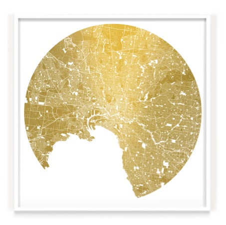
Mappa Mundi Melbourne
Another aspect of your work is your current series, ‘Fractal Reactor 1'. Can you discuss this series?
Still using the opposites as my starting point; rather than looking down onto the earth I am now experimenting with images looking up into the sky. Rather than roads I am looking at fractal organic shapes and the patterns they create. I have also been studying Japanese art particularly the traditional paintings where the sun is always represented as red. Rather than a red foreground sun I chose to make the background red and the sun gold. Unlike the Mappa Mundi patterns being contained in the circle, I chose to bleed the fractal pattern outside. Like what the maps do, I am also experimenting with the theme of nostalgia so I chose to feature a tree outside my parent’s house that I used to climb as a child.
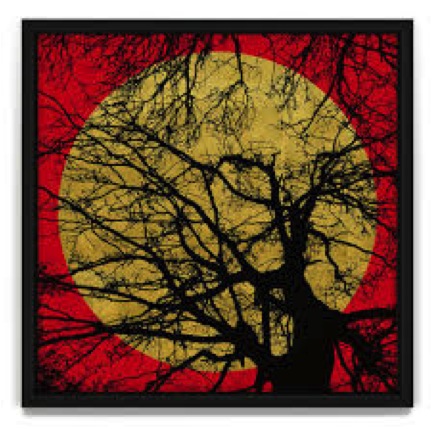
Fractal Reactor 1
Let's talk about your video:
Here’s a little explanation of why I created it:
Opposites is a structure that I return to create my work. With the chaos of life or maybe my dyslexia I like to create structures to work upon. Just like I had formed the structure of Opposites I began to think about structures that helped me or a viewer to in engage with art and what was a journey I could take to create it. I compiled this 11 point guide.
Nostalgia: The work evokes a memory of the past, maybe good, maybe not.
Movement: As I walk past a piece or maybe I press a button it creates a different shape, a different sense, a different sound.
Humour: The piece makes you laugh. Punchline, or maybe the narrative is random.
Technical ability: The piece is technically impressive. How has this person done this?
Relationship with artist: You know them by reputation or you know them because they are a friend.
Pity: You feel sorry for the artist or you feel sorry for the cause of the art.
Journey: It takes you somewhere you’ve never been before. It takes you on an adventure.
Colour: It is your favourite, maybe least favourite colour. Maybe the colour goes with your furnishings.
Status Symbol: The piece is famous. Maybe the piece has been made by somebody famous, maybe you’ve seen it somewhere famous.
The Unknown: It is strangely alluring. You look at it and you go somewhere else with your thoughts.
Familiarity: You are familiar with the line of work and you want to invest into it.
Essentially, it is a reflection of my/your personality, your interests.
Contact details
info@ewandavideason.com
www.ewandavideason.com
Ewan David Eason, London, UK
Interview by Deborah Blakeley, July, 2014
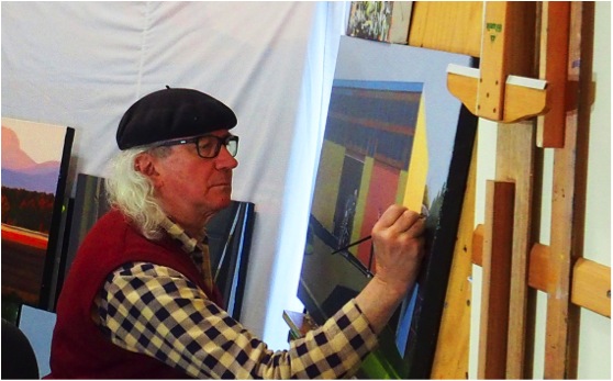
David Lake
Can you explain how you use colour to capture the time of day in your work?
Work is often initiated and inspired by some reflection or catch light; when painting this is emphasised. The vibrant colours of some objects seen are inviting as well. The use of high quality primary colours seems to give a brilliance.
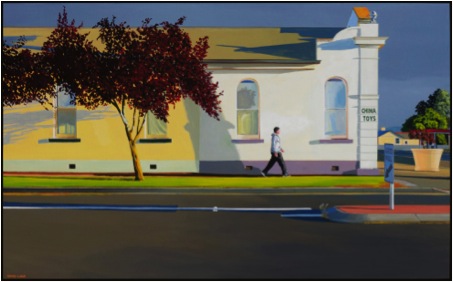
'High on Summer Morning’
Discuss the importance of light and sky in your work?
Light is of great importance; it brings the picture to life. As to sky: it can so often take over. Sometimes I minimise the area of sky within the picture, other times the sky is given weight to contrast with surrounding objects.
You paint things that interest you, your work is not what you know will sell. Can you explain the importance of this in the growth of your art?
Given the advice separately by two well established artists some years ago to ‘paint what you like’, one has discovered the clear direction this has offered, both as to choice of subject and towards refinement in execution. The advice continually grows in significance; it is returned to and referred to often.
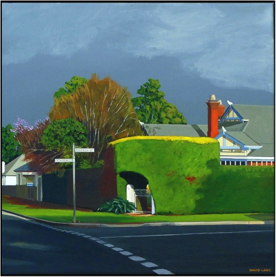
'Sunday Morning'
All artists have high and low moments. Can you explain how both have influenced your work and your career?
Dissatisfaction with work is common and indeed a friend; there is a continual striving to improve, to reproduce the mindful vision, the vision becoming more apparent as the picture evolves. Such is useful, it drives the ‘learning to see’ process. I allow the ‘highs’ to pass; there is always room for improvement.

'Friday Night'
Discuss some of your recent Awards and the value they have given to your artistic career?
Recognition is always a lift. Income from painting sales is useful; I do like to eat!! However, there is a deeper satisfaction that comes from the recognition of beauty in any work. The beauty is not mine, nor can it be owned or attributed to anyone in particular. I believe that beauty exists to uplift; an important organism in a world so often adrift.
When I spoke to you earlier this week, you commented that you had an hours work to do on a painting and this was your priority. Can you explain the timeline you give to your art?
I work most days and often for very many hours, usually working on several paintings at once. Drying time is needed, as is the stepping back and review of a work in progress. Then there is the stretching of canvasses and making frames, all from home milled profiles. Time away from the easel is also enjoyed. I live with a delightful and most understanding wife! She is used to me stopping the car, reversing and leaping out with sketchbook and camera.
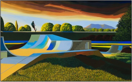
'Air on an Autumn Evening'
What are you currently working on?
I have a solo exhibition opening at the beginning of October this year at Gallery Pejean, (who represent me) I am quite focussed on that. Much to be done and little time!
Size - can you discuss this in relationship to your work?
I really enjoy a size around 61 x 99 cms. It is a practical consideration, as I only have a very small area in which to paint at present. At the moment there are six canvasses around that size and then several up to 2.28 metres wide; it’s crowded. Larger canvasses are a joy however; bring a freedom which invites accuracy and an apparent presence.
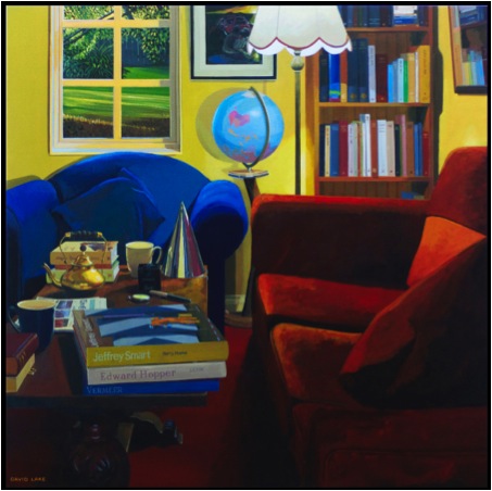
'Window, Sphere, Party Hat and Friends'
You also work on portraits, can you take one that has given you great pleasure and discuss this technically?
Particular personalities are often included in landscape paintings. Often people who are seen by many, the folk who give colour to the community, even sometimes those on the margin of humdrum society. In the picture ‘1950 Hobart Road’, a particular well recognised woman is included; she walks almost incessantly around the city of Launceston, pausing in a café here and there for a cup of tea. I expressed interest in painting her to the proprietor of one of her regular tea stops and soon was to meet her in the café. With her permission I sat a few tables away and sketched her, twice. In her slow, deliberate voice she decreed ‘I like that one best, it has more life’; she was right! Having been an artist herself (did not know previously), there was a serendipitous aspect about it all. This is often the way pictures evolve. The composition is established early and remains, unless the picture is painted over. I always attempt to capture harmony in composition. This picture was entirely ‘constructed’: though the house exists with its 1950’s architecture things have been moved around, the car and the 1950’s van added, the bus stop made to be of the period, as is indeed, Merryl
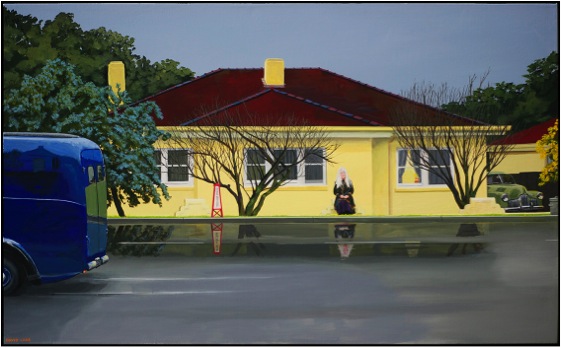
'1950 Hobart Road'
Many of your recent works are from the perspective of the driver. Can you explain how and why you have used this?
Very simply, pictures arise from glimpses seen as one gets about, usually driving. My dear wife says I have a fondness for gutters and garbage cans; there is no dispute regarding this. The modest can be so full of beauty. Beyond the contrast of colour, I enjoy contrast of the made with the natural and bright colours are always a bonus!
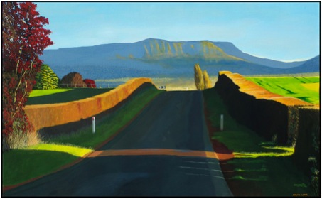
'Autumn Lane'
You discuss the special moments, as “that glimpse” can you expand on this in your paintings?
It happens in a flash. Seen in a luxurious moment, the location is often sketched quickly and a snap taken. Usually return to the place ensues and often several times, just to look at aspects of light and possible composition. Pictures are usually constructed to suit composition and therefore could never be photographed.
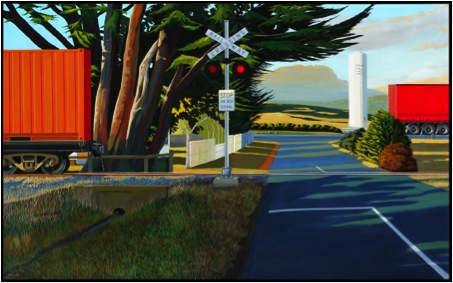
'Degree of Permanence'
You do both Solo and Group exhibitions, can you expand on the benefits of both?
A Solo exhibition is demanding, as I am seldom satisfied with a work soon after it is ‘finished’. In this regard, as mentioned earlier, the experience drives improvement on several levels. In comparison, the group event even approaches fun! Both are good; best of all is the act of painting, I experience joy in the work.
Tasmania is your home, in many of your landscape paintings you give the viewer a new perspective to a known place. How important is this to you as an artist?
It doesn’t really matter where the place is, as beauty fortunately is not confined. Certainly ‘in the eye of the beholder’, the phenomenon is enjoyed without boundary. Those who seem to be drawn to my pictures are seeing them from within themselves. If they have happen to have worked hard all their lives, accumulated vast wealth and choose to spend it on one, or many of my modest efforts, then I will not argue their choice! The ‘perspective’ is a viewpoint which quietly arrives and inspires; however again, it’s not mine, it is there for all to see.
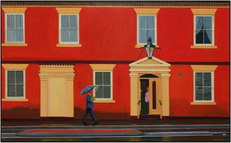
'Earnestly Persuing Universal Knowledge'
You are a third generation Tasmanian. Do you think this connection to place has helped your insight?
Great Grandmother and Grandfather (I don’t recall them), Grandmother, and Grandfather (I found them really interesting) all lived in Tasmania. Father may have for a short while. I do prefer to live here in Tasmania out of all the possibilities in Australia, it is cooler and the sun has a low trajectory - these things suit me. I rather like miserable weather; indeed there are places where I would prefer to live that have far greater miserable weather. However I’m here and, it works.
Contact details.
Via website http://davidlakepaintings.com/
Gallery Pejean http://www.gallerypejean.com.au
David Lake, Longford, Tasmania, Australia
Interview by Deborah Blakeley, July 2014
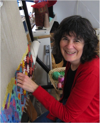
Barbara Heller
Explain how you personally have promoted tapestry both locally and internationally?
The most visible way I promote tapestry is by weaving in the corner window of my studio on Granville Island, an area of Vancouver that many tourists and locals visit daily. For 5 hours a day the studio is open to the public and I and my partners meet and educate people (and sell our work).
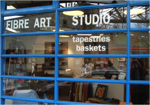
‘Fibre Art Studio’
After teaching myself tapestry in the 1970’s and weaving and exhibiting for a number of years, I ventured out to take a master class in California and to connect with other tapestry weavers at conferences and symposia. In 1992, I was one of five Canadians to be invited to an international event in Poland and was asked to give a slide lecture about Canadian tapestry. The contacts I made through finding artists in every province and soliciting slides of their work led to an informal newsletter and then to the Canadian Tapestry Network newsletter which is published three times a year.
At the Polish conference someone wondered aloud how we could meet again soon and I, not knowing what was in store for me, said I would put on an event in Vancouver the next year. That resulted in Making a Place for Tapestry, several exhibitions, and a book. I do believe that if you want something to happen, you should just plunge in and make it happen.
Also locally, I founded the British Columbia Society of Tapestry Artists (BCStars) a non-profit to support the art of tapestry through lectures and exhibits. Our first project was a large community tapestry woven at the main library in downtown Vancouver and then donated to the Aids Centre.
I have been a member of the [North] American Tapestry Alliance for many, many years and have served on their board and, more recently, as their Distance Learning (mentoring) chair. As tapestry is not a common vocation, the passionate weavers around the world have found each other and formed what my husband calls the ‘tapestry mafia’ – I can travel almost anywhere around the world and find another tapestry weaver to connect with.
Explain briefly the technique you use for your tapestries. Beginning with the cartoon to the final cut off?
For me, the image is always paramount and the method serves the image. I usually work from my own photos, often collaging images together to support the message and emotional impact I am looking for. I then project the images on the wall at a relatively small scale (say 18”x24”) and work out the basics, making many drawings. When I am satisfied, I have the drawing blown up to final size and re-draw to make it weavable. This is the cartoon that goes behind my loom. I know a computer can be used to do much of this but I think that drawing and re-drawing allows me time to know the cartoon intimately before I start to weave.
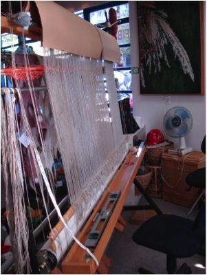
Loom Warped
I weave on a high-warp 6’ loom with linen warp at 8epi though I may weave areas at 4epi to use my hand spun yarns for texture. I hand-dye the majority of my weft yarns because colour is so important to me. I mark my cartoon with the values (light to dark) of the various areas but choose my colours from the wool, not by painting the cartoon beforehand. It can take months and months to weave a large tapestry and intuitively choosing colours keeps me interested and engaged. Thus, I often have to stop to dye a new colour. I believe in serendipity and the unusual solution.
Weaving a tapestry is like building a brick wall. You start at the bottom and weave decreasing shapes one area at a time until you reach the top. That is, if all goes smoothly - and it rarely does. I sometimes have to reweave an area after I progress up several inches as my original idea or colour choices do not work in context.
When the top hem is woven, the tapestry is cut from the loom and left to rest for a few days. Then there is still much finishing work to do and, as I regard my work as woven paintings, I also stretch and frame them.
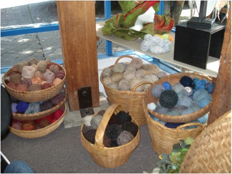
Yarn Baskets
Size, explain the size of your work and why?
Originally tapestries were mural art to warm cold castle walls or educate the public in church, like stained glass windows. I have done some very large commissions for public buildings but now only weave tapestries up to the 6’ my loom allows. That said, it is the image that is important and some need to be small (12”x12”) and some need to be mid-sized.
Expand on your comparisons with tapestry and computers within a historical perspective. Up/down - On/off - Punch cards
The ‘Future Reliquary’ Series deals with three apparently separate but, in my mind, connected histories: weaving, computing, and religion.

'Future Reliquary’
Weaving is a binary system of up/down, just as computing is a binary system of on/off. The first computer was a jacquard loom complete with punch cards instructing the loom to raise or lower warp threads depending on the position of the holes in the cards. The most intricate and expensive brocades could be woven cheaper and faster by machine following a binary code. Weaving was now one step removed from the human hand. Today’s computers are merely fast jacquard looms programmed in binary code, thinking is now one step removed from the human mind.
Religion is not only a story of faith, it is a story of history and social values. In the middle ages, the sale of shards of the bones of saints and pieces of the True Cross became a large commercial enterprise. These holy relics were housed in beautifully sculpted metal reliquaries and displayed in churches to be worshipped as the concrete symbols of faith and history. I am particularly fascinated by the reliquaries that hold the arm bones of saints, shaped like a hand and arm, usually in gold and often encrusted with jewels.
Today, we are creating a new religion, worshipping the technology we have created. Some years ago, I bought a new computer and wanted to recycle the old one, not just throw it in the garbage. Recycling depots for e-waste were not yet in existence, so I took the computer apart to at least recycle the plastic shell. What treasures were revealed within! I took apart a keyboard. I took apart a radio, then a mobile phone, a CD player. I saved the innards, the future relics of the saints of the connected society.
These tapestries depict the future holy status of today’s e-junk in the context of the ancient fabrics that gave birth to the binary system. In these tapestries, one code of up/down (weaving) morphs into the other code of on/off (computing). The pattern of the mother board or silicon chip morphs into the pattern of a traditional ethnic textile - contemporary computer parts as the concrete symbols of the birth of a religion. And the slits in the woven arm as the receptacles connecting the computer tower to the outer world.
Ethnic textiles are still woven all over the world by hand. No machines intervene as the weavers record their personal stories, their faith, and their culture in the patterned cloth. Complex stories are told in simple binary form.
Discuss the importance of location in your work? (using ‘Habibi’)

'Habibi’
Location is very important in my work. The right colours, time of day, part of the world – it must all work together to support the message, the subject of the tapestry.
‘Habibi’ came from photos taken on a trip to Egypt and was part of a projected series of works about children displaced by war (but I only wove two). This young toddler (apparently unaffected by the violence and poverty around him) gazes out at the world while the mother turns away. A gun rests casually against the doorpost and a colourful carriage passes by. What will this child’s future be? Will he rise out of the poverty of his home? Will he grow to be a soldier? Will he travel to a new life? An exotic locale gives us the distance to contemplate these questions, but they apply to everyone everywhere.
Can you discuss your statement, “My themes are becoming more demanding and as the news becomes more depressing, my tapestries are becoming more explicit.”
When I started weaving, my messages were more subtle, hidden within the beauty of the yarn and the images. But since the millennium, as I view the state of the world and become increasingly upset by what I see, my work is more confrontational – dead birds, land mines, plastic pollution, the degradation of the environment. I want to make people stop and think about what they are doing, and perhaps to seek a new way to live in harmony with each other and the earth.
Expand on your use of dead birds and their symbolism in your work?
I have incorporated dead birds in many of my tapestries as a personal icon representing senseless killing by both animals and mankind. The first dead birds that I wove were a series of requiems for the birds my cat was killing and not always eating. As a vegetarian and a pacifist, this carnage was difficult to deal with. As I wove this series, I listened to the radio – news of the first Gulf War on CNN and CBC. Images of dead bodies and of bombs dropped with the aid of remote sensing technology became mixed in my mind with images of dead birds viewed through the lens of a camera. As I sat at my loom weaving images of death, my purpose in weaving these tapestries grew from simple blessings for the souls of the birds to encompass my response to all ritual killing.
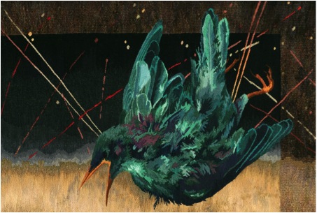
'Ozymandias, detail’
I continue to use this image but the dead birds (or parts of birds) now stand for many things. It is a symbol that everyone seems to relate to and view through their own interpretations. For instance, in ‘Ozymandias’ some people feel the bird is an avenging angel while others have said it is coming to rescue the world. I try to work with universal symbols that reach people on many levels.
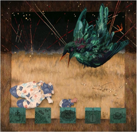
'Ozymandias’
Can you explain how 9/11 has influenced your work?
I have woven one piece explicitly about 9/11, ‘Still Life…with Bird,’ though acts of terror are a continuing horror. In that tapestry, the skeleton of the world trade centre, the skeleton of a bird wing, and actual bones are all testaments to terrorism as a tactic of war. The orange sky evokes the aftermath of 9/11, the bones evoke museum displays. Bones are precious; they can be buried in a cairn or burned in a crematorium or buried in another sense in a dusty museum drawer. Think of the native tribes seeking to recover the bones of their ancestors. In future ages will archaeologists dig in what was once New York and wonder at what they find? The stories of bone fragments of truly minuscule size being used to trace the person they belonged to through DNA affected me deeply.
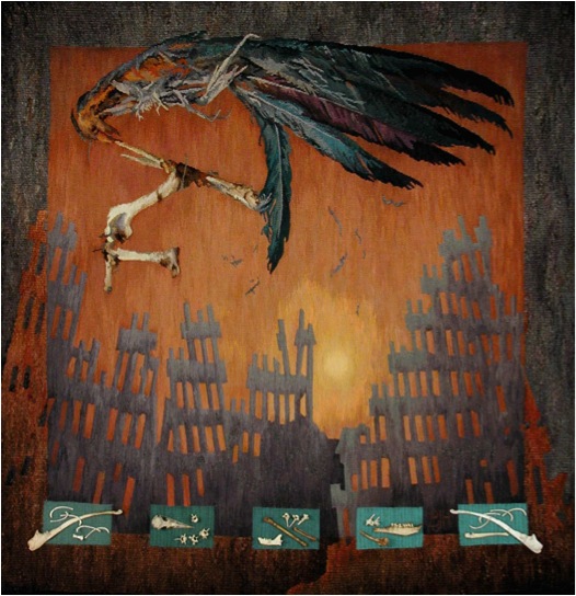
'Still Life…with Bird’
You have many exhibitions at the Elliot Louis Gallery can you expand on this particular Gallery’s interest in tapestry?
This gallery has recently closed but still exists virtually: the website is still viable and the owner, Ted Lederer, sells online. I was thrilled to find a local commercial gallery owner who regarded tapestry as an art form and was willing to promote my work. He also exhibited the work of several other fibre artists.
Can you discuss your ‘Cover Up’ Series? How did you choose the 9 portraits in this series?
"We are locked into other people's perceptions of who we are, he thought. We are none of us free to live our lives unseen."
Timothy Findlay in "Pilgrim"
"A man in a uniform...or a man in a robe, for they are the same things, is not a man but a cipher, but a function, but a walking idea; his clothes walk and speak for him. And under cover, who knows who he is or what he does."
A.S. Bayatt in "Babel Tower”
The ‘Cover-Up’ series is comprised of 9 portraits in which the bodies and faces of the people depicted are obscured by their costume. While each stares straight out of the tapestry at us, a sense of tension arises as we strive to make eye contact but cannot. In the absence of facial expression to reveal character, we search for other clues to personality and revert to stereotypes to assign identity.
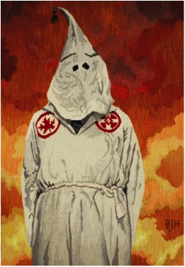
Canadian Klansman
I did quite a lot of research to find the images, wanting to depict men and women, ethnic and western individuals. I chose the ones that spoke to me most. Some are collaged, some are used with the permission of the photographer, and the surgeon and the bride are my own photos.
I have purposely made the body language of the figures belie the normal interpretation we put on their costumes to increase our level of discomfort. The ‘Canadian Klansman’ presents as an innocuous elfin businessman complete with paunch and old school tie. His hood even has a tassel.
The downtrodden ‘Afghani Woman’ whose chador covers her hands making her even more powerless, stares out in a strong, almost intimidating manner. Even though we cannot see her eyes, we are moved to lower our own.

Afghani Woman
The ‘French Foreign Legionnaires’ stand in fashion model poses. I wanted to make the viewer stop for a moment and open a dialogue with these covered-up individuals. If the stereotypes are not true, who are these people?
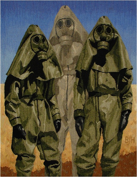
French Foreign Legionnaires
In times of terrorist attacks and racial profiling, can we afford to “judge a book by its cover”? Genetically programmed to make split second decisions as to whether an individual is friend or foe, I hope the viewers’ thwarted assumptions lead them to take a few more seconds to question their reactions.
Can you discuss background in your work, e.g. ‘Bedouin Woman’
In tapestry one weaves the background and the foreground at the same time. One is not superimposed on the other and so both have equal importance.

Bedouin Woman
In the ‘Cover Up’ series I tried to create backgrounds that would provide context for the figures and enhance the message. In ‘Bedouin Woman’ the background is woven in warm tropical colours in shapes reminiscent of palm trees; in ‘Canadian Klansman’ the background is fire - the world is ablaze; in ‘Afghani Woman’ she stands before a cold grey stone wall like a prison.
Discuss your passion with stone, stone walls and your tapestries?
I have always been drawn to stonewalls, especially ones made without dressing the stones or using cement - walls, often from ancient ruins, that could crumble and no one would ever know they had been there. Whenever we travelled I would photograph them. To me they were symbols of man living in harmony with his surroundings and I saw the spirit of the makers in them. This idea led to a series where I placed a transparent figure, often taken from old family photos, in front of a wall. And as I said above, weaving a tapestry is like building a stone wall so I can smile at the idea on a meta level as well.
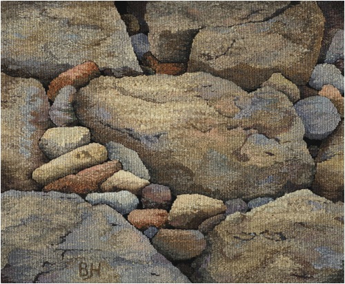
Stonewalls #20 Stonewall Blues/p>
On a more mundane level, I love their abstract nature. My hand-spun, hand-dyed yarns is perfectly suited to translate them into tapestry. Weaving stones gives me the opportunity to play with colour and texture and these tapestries are a wonderful break from more depressing subjects.
This spring, after working on three large works about the environment for a solo show, I wove two more stonewalls, bringing my total to twenty-two.
How important is poetry to the inspiration of your work?
Reading both prose and poetry often inspires a work or seems relevant to illustrate an idea. My husband writes poetry and there are several of his poems about my tapestries on my website. They give the tapestries another layer of meaning.
Discuss the work, ‘Shiva Dances’
‘Shiva Dances’ is based on Hubble telescope images of a distant nebula. Nebulae arise from black holes, the site of both the destruction of stars and their creation. Shiva is a Hindu God/Goddess often depicted dancing; she is goddess of both creation and destruction, as the two are inextricably intertwined and are constantly evolving one from the other (yin and yang).
‘Shiva Dances’
These days, all we seem to read about is destruction. I feel life is a cycle and we need to find ways to turn this destruction into an opportunity of new creation, into a more harmonious way of life.
Tell us about the changes that have taken place in your work through three images?
All the Diamonds (1982) | The Last Resort (1992) | Detritus (2014)
I work in series: sometimes several tapestries in a row explore a theme, sometimes a theme recurs over and over again through the years (as in the Stonewall series). In a previous artistic incarnation I was a printmaker, but I became allergic to the chemicals and had to abandon the medium. Tapestry was another way to make images and explore ideas and my first tapestries were very graphic in nature. I wove landscapes (or seascapes) as in ‘All the Diamonds,’ a commission for a law office. Here three photos from three different perspectives were collaged together with imaginary elements to reinforce the beauty of sunlight on the ocean.
In subsequent years after the birth of my son, I was drawn to family history, family stories, whether true or misremembered, and old family photos. ‘The Last Resort’ is based on a photo my father took of his father when he was on a family vacation at the age of thirteen. I loved the gesture my grandfather made to ward off the budding amateur photographer and it became, for me, a symbol of the old order trying to ward off the new.
‘The Last Resort’
The title is a pun as is that of its partner piece, ‘Right of Passage’ which is also based on a photo taken by my father on the same day. In that tapestry, space has opened up between the bathing tents and my uncle looks at the viewer and at a new life.
My current work arose from my concern over what we are doing to our environment. ‘Detritus’ is based on photos I took four years ago as I walked along the beach beside Caesarea in Israel. I had visited there many years before and the crumblingstones of the ancient site had inspired a series of tapestries of transparent people against stone backgrounds. Now, though, I found the spirituality of the place desecrated by the bits of plastic intermingled with seashells and stones. Over the centuries, the site had seen invaders come and go over; they had built imposing edifices that could crumble into dust and be reabsorbed by nature, but today’s plastic will take millennia to disintegrate. I added a feather as my call to attention, a remnant of my dead birds, a reminder of the fragility of the ecosystem. We are all detritus thrown up on the beach.
‘Detritus’
Explain how and why you use windows in your work?
I am drawn to doors and windows, the liminal area between two actual places or spiritual states. A door or window is a frame to isolate a figure or emphasize an act. It is an entry point for the viewer who cannot see the other side and can therefore let their imaginations roam. It is a link between worlds.
In ‘Sarah Rebecca,’ for example, a woman larger than lifesize is framed by the window of a shack found in the American Southwest. She is from another time and place judging by her clothing and hairstyle. How did she come to be there? Is she real or a ghost? She represents all the people dislocated from home by fear or hope. They have travelled through time and space to find a better life and their spirits linger on in their homes and in our memories.

‘Sarah Rebecca’
‘Dreams –Left Window’ and ‘Visions – Right Window’ are the outer panels of a triptych inspired by slides I took in the old Jewish quarter of Krakow, Poland. The tapestries deal with the power of memory to distort and to preserve and to keep a culture alive. The windows in the tapestries with their broken glass and crumbling wood are peopled by the spirits and stories of the generations who inhabited these now-disintegrating buildings. The woman on the left is from a photo by Roman Vishniak, the man on the right is my great-grandfather. They are all our ancestors who live in our memories.
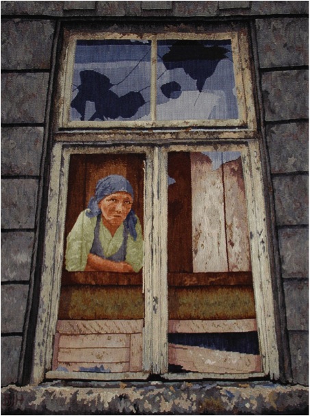
‘Dreams – Left Window’
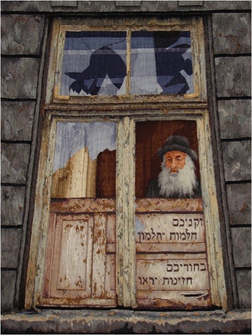
'Visions – Right Window’
‘New Art of the Loom’ is group show curated by Dirk Holger, who arranged the tour and who is also publishing a book of the same name. He invited people to send him slides of large scale tapestries and chose work from that submitted. The weavers come from many countries and continents and only shipping costs have prohibited the exhibition from travelling outside North America.
‘Falling from Grace’ is a solo show curated by Barbara Duncan and includes all my tapestries dealing with bird imagery as well as a few others. She liked my work and invited me to show in her public gallery and the tapestries in the show were chosen by her. It is currently on exhibit at the Maple Ridge Art Gallery (until the end of July) and we hope to have it tour to other venues. There is a catalogue available with curatorial and critical essays and images of the work in the show.
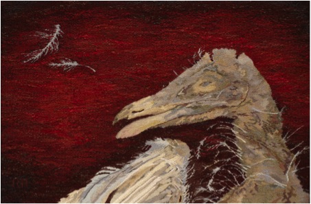
'The Patriot’
Contact details.
bheller@telus.net
www.barbaraheller.ca
Barbara Heller, BC, Canada
Interview by Deborah Blakeley, July, 2014
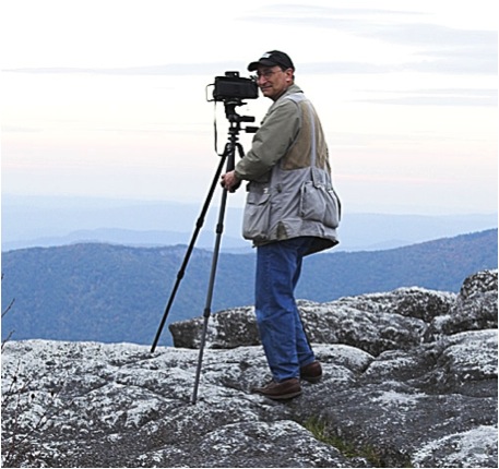
Ben Greenberg
You thank the birth of your son for the start of your photographic life. Would you expand on this?
When my oldest son, Jeff, was born in 1970, I had had no experience at all with photography. Like any new father, I wanted to photograph my son. I didn’t even own a camera. So, my brother-in-law came through for me, lending me a Kodak Retina C. This was a basic camera without a single automatic feature. I had to learn photography from scratch and I had to do so quickly. I became fascinated with the process and it wasn’t long before I purchased an inexpensive used camera that allowed me more flexibility with its three lenses. I started photographing not only my son but the world around me, especially when I purchased a new 35mm Nikkormat in 1972. I was beginning my journey in photography.
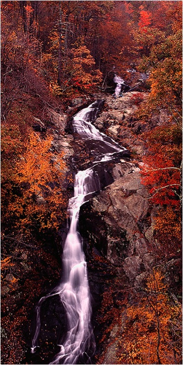
'Whiteoak Canyon Falls No 1, Shenadoah National Park, Virginia’
In the past forty years as a photographer, there have been great technological changes. How has this impacted your photography?
You are absolutely correct about the great technological changes in the field of photography during the past forty years, but even my shift from 35mm photography to medium format photography with a Pentax 67 camera system pales in comparison to the shift from film to digital photography. I made that transition to digital photography in two stages. I was very cautious about this shift. I was getting such wonderful quality with my medium format slides that I didn’t want to take a step backwards.
In 2003 I purchased a computer and a printer that would allow me to work with scans of my slides. I quickly recognized the wonderful advantages of the digital darkroom over the traditional black and white and colour darkroom that I had for more than thirty years. This was particularly true for the preparation and printing of colour photographs, which I had done previously with the cibachrome process. For the next four years I scanned my slides with a rented and later purchased Minolta Dimage Multi-Pro scanner and I printed them on my Epson 2200, my first colour printer. I soon realized that with my medium format slides, I wanted to have the capability to print my images larger than the 2200 printer would allow.
I purchased the Epson 7800 printer that allowed me to make prints that were two feet by whatever length they needed to be. I was thrilled with the printer and wondering when I would be comfortable shifting to a digital camera system. Two events in the summer of 2007 conspired together to help me overcome the last hurdle; that of shooting digitally. I contracted with a real estate developing company to photograph their new community they were building. I realized that it would be faster and easier to do the shooting and meet their needs with a digital camera. It just so happened that Nikon had just brought out a new full frame digital camera, the D700. This 12.3 megapixel camera was less expensive than a number of other full frame cameras, I was unsure if it would give me the quality I demanded of my photographs. I decided I would need to conduct a test.
I shot the same outdoor scene with my Pentax 67 system and with the Nikon D700. I processed each set of images normally and prepared large prints from each. The results went far beyond what I expected. The prints from the D700 were sharper, had a wider tonal range than the photographs from the Pentax 67 and they had a perfect colour balance. I was immediately sold on the new Nikon and I immediately began my shift to becoming a digital photographer. I have since expanded my camera system with the Nikon D3x and its 24.5 megapixels and a set of lenses for my landscape photography.
'Blue Mountains’
Can you discuss how so many people do not realize the time it takes to get just the right shot?
I love finding new locations to photograph, locations that have great potential for the dramatic photographs of the natural environment I seek. Finding out about such places and researching them helps me prepare for the opportunities of photographing them. When I explore a location for the first time trying to take advantage of the early morning or late afternoon light, I feel very fortunate when all the elements of a dramatic landscape photograph come together at just the right time for me. It is even possible that I am able to find several possible images at the same location and of the same subject matter. Unfortunately, such opportunities don’t always present themselves. It is quite common that I recognize the potential for a wonderful image at a specific location but I must visit that location numerous times before the light, weather and subject matter come together in a way that inspires an image worthy of sharing with others. There are specific locations in my book, Natural Virginia,that I visited numerous times over eight to ten years before I captured the moment I had been seeking. There are other images in the book that were the result of several hours of waiting until the light was just right. There is little doubt that landscape photography has taught me the very important practice of patience.
'Chincoteague Bay Sunset’
While you are well-known for your landscape photography, can you discuss your architectural photographs?
Over the years I have recognized that while natural landscapes are my first attractions for photographing, I also enjoy finding unique images that feature architecture. This is primarily true of the University of Virginia, where I graduated from college and also attended graduate school. The University features unique architecture that is recognized around the world as the product of Thomas Jefferson, our third President and former resident of Albemarle County, which surrounds the city, Charlottesville, where I live. Just like natural landscapes, photographing architecture requires an interesting subject, strong lighting and positive weather conditions to be able to obtain a photograph of which one can be proud.

Would you explain the importance of timing in your work with the example of your image titled “Great Blue Heron on a Misty James River, Richmond, VA"?
'Great Blue Heron on a Misty James River, Richmond, VA’
One might not realize how critical it is that one is photographing at just the right time for a special image. A good example is what has become my favourite photograph and one that is on the cover of my book. This image features a beautiful misty portion of the James River that runs through Richmond, Virginia. The sun had not yet come up. In fact, when I arrived it was still so dark that I needed to use a flashlight to find a spot along the river where I wanted to set my camera and tripod. I set my camera up pointing toward the place where I expected the sun to eventually rise.
Before long it became light enough for me to see a great blue heron who was approximately fifty feet away and walking back and forth across a ledge in the river, apparently fishing for his breakfast. I had been to this spot other times but I had never seen a heron exhibiting that behaviour before. The conditions were perfect for a beautiful photograph except for one problem. The light was dim and I needed a faster shutter speed if I was going to be able to obtain a photograph of the heron where it would be recognizable and sharp. The heron’s movement would have ruined a photograph shot with a slow shutter speed.
Under those circumstances, fearing that the great blue heron would fly off, I decided to begin shooting with my film camera (this was approximately ten years before I converted to digital photography) and hope that I could time a photograph when the heron was moving only minimally. The film I was using was faster than the ones that I usually used, so the slightly higher shutter speed it permitted gave me hope. The only problem was that I only had one roll of that film which would give me twenty-one shots. I took those photographs and when I finished, unlike when one is shooting digitally, I did not know if my efforts would result in the photograph I sought. I wouldn’t know until the next day after the film was processed that I succeeded in getting the special shot I sought in the very last frame of the roll.
As you also work in black and white photography, why and when do your use this approach rather than colour?
Early on in my photography career, I was primarily a black and white photographer. I loved taking photographs with black and white film and translating the colours of the natural scene into dramatic shades of black and white and grey. I exhibit and show primarily colour images these days and my book, Natural Virginia, only has colour panoramas of my home state’s natural environment; however, I have never lost my interest in black and white images. In fact, I plan to focus some serious time on my black and white work this year. Interestingly enough, now instead of shooting black and white film, I can photograph the scenery in colour with a digital camera and modify the images in software so that they can be converted to black and white. It is not a difficult process to do but I think it can be difficult to convert the colour photograph into a really strong black and white image. That can take some significant time, effort and experience.
In this way, I can have the same photographs in both colour and black and white, and I love how so many scenes can look wonderful both ways, sometimes for different reasons. When I was shooting with medium format film from 1982 to 2007, I frequently loaded colour slide film in one Pentax 67 and black and while film in another Pentax 67, and I would photograph some scenes with both. The black and white photographs allowed me to focus my attention on the light, composition and subject matter without being overly influenced by the natural colour. Things have changed so that I can now shoot in colour and be able to enjoy the image in black and white as well.
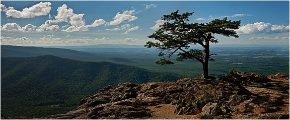
'Ravens Roost in the Afternoon Light’
Can you show and discuss one of your photographs that you feel symbolizes Virginia, its long history dating back to 1607 and the state where eight Presidents have been born?
I believe Virginia and Ohio are the two states from which the largest number of Presidents have come, eight each. Virginia does have a remarkable history, one that features the very beginning of the permanent European settlements in North America. The foundation of our country literally began here.
The places that represent the history of the United States, places like Jamestown, Williamsburg, Richmond and the like, continue to attract photographers who seek to capture those aspects of the state. While I have experimented in such photography, it has not been a significant focus for my work. The primary exception to that statement is the University of Virginia, where I went to undergraduate and graduate school.
The University was founded by Thomas Jefferson, our third President and one who lived in the community in which I live. It is a highly respected public university, one of the best in the United States, but what still attracts me to the school is its remarkable architecture and the joy I have in photographing it. The Lawn, around which are the original buildings (for example, the Rotunda) and living quarters for professors and students are the best known visual elements of the University and ones that I never tire of photographing. I did maintain some self-control and only included one image of the University in Natural Virginia.
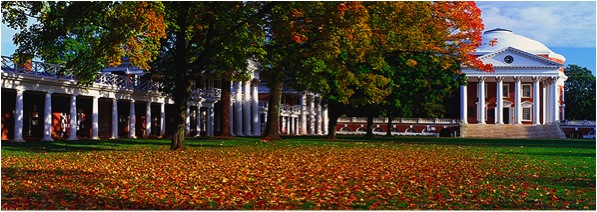
'Fall Panorama on the Lawn, UVA’
Can you share with us how the photographs in your book, Natural Virginia, illustrate the four seasons in your home state?
Not only am I fortunate to live in a state that has remarkable diversity in its environment, I feel even more fortunate to live in one that features dramatically different seasons during the year. I love being able to photograph Spring, Summer, Fall and Winter, all in my own community and throughout the state. I have included four images below that represent the four seasons of the year found in Natural Virginia. Each one also represents the important qualities of my panoramic landscape photographs and the differences that are so visible at different times of the year.
"Little Stony Creek in Spring, Giles County, VA"
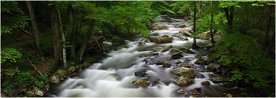
'Little Stony Creek’
Discuss the image, its location, composition, the importance of timing and lighting and other important aspects of the photograph:
“Little Stony Creek in Spring, Giles County, VA” was photographed early one spring morning in southwest Virginia after a drive from home that was approximately three hours long. I knew if I could reach the trail that led to the creek not long after sunrise, the mountains on both sides of the creek would provide the perfect shady lighting conditions with no bright highlights created by the sun. In that light and with the need for a small aperture setting on the camera to give me maximum depth of field for sharp focus, I also knew that I would be able to shoot with a slow shutter speed creating a silky look to the flow of the water. I particularly liked being able to compose the photograph from a bridge crossing the creek, allowing the water to flow straight to the camera. The other important element of the photograph is the spring green colour of the leaves on the trees. I love to see the variations of that colour during that time of the year.
“Almost Sunrise on a Pond, Stanardsville, VA”
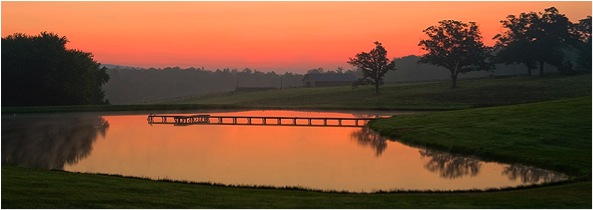
'Almost Sunrise on a Pond, Stanardsville ’
Discuss the image, its location, composition, importance of timing and lighting and other important aspects of the photograph:
“Almost Sunrise on a Pond, Stanardsville, VA” was shot just before sunrise on a clear summer morning. I had discovered the pond on a recent drive when I was scouting for possible locations to photograph. I came across this pond when I was driving through the town of Stanardsville on the main road. I pulled over and determined that the pond had the potential for an outstanding photograph for several reasons. First, it was easily accessible for shooting just off the road. Second, the pond was high in elevation without trees or anything else that would prevent the sky from being reflected and visible in the pond. Third, I determined with my compass that the sun would rise each morning directly behind the pond. These things coupled with the beautiful setting of the pond with the dock and the trees that would be visible reflecting in the lake convinced me that there was great potential for a wonderful photograph. The pond was at least a half hour from my house, so I woke up early and drove there well before sunrise. I set up my camera and tripod and waited. Before long the sunrise began to light up the sky, creating colourful reflections in the pond. Composing the image in the camera was a simple matter given the elements around the pond. I love the serenity of the scene I captured.
“Early Fall Morning from the Blue Ridge Parkway, Nelson County, VA”
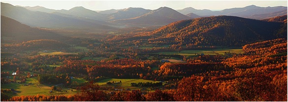
'Early Fall Morning from the Blue Ridge Parkway’
Discuss the image, its location, composition, importance of timing and lighting and other important aspects of the photograph:
“Early Fall Morning from the Blue Ridge Parkway, Nelson County, VA” was shot from one of my favourite overlooks on the Virginia portion of the Blue Ridge Parkway. It was shot during the peak of fall colour in Rockfish Valley, which is surrounded by the Blue Ridge Mountains. Being there shortly after sunrise with the warm sunlight from the east permits one to capture an image with almost perfect side lighting that creates shadow patterns that add significant interest to the photograph. This lighting, which adds to the fall colour, gives a greater sense of depth and perspective to the photograph.
The composition is simple to achieve as I let the natural patterns of mountains that almost surround the valley create a perfect frame for the pattern of farms below. The fact that this location is within thirty minutes of my home makes it even easier to capture and enjoy the photograph.
“Snowstorm Panorama on Pantops Mountain, Albemarle County, VA”
'Snowstorm Panorama on Pantops Mountain’
Discuss the image, its location, composition, importance of timing and lighting and other important aspects of the photograph:
“Snowstorm Panorama on Pantops Mountain, Albemarle County, VA” was difficult to obtain due to the winter weather conditions that I was encountering. Early one afternoon in my hometown there began an intense snowstorm that was expected to last several hours at least. I immediately went to a nearby location with a natural environment that I hoped would provide me with some outstanding scenery to photograph. When I arrived I was delighted with the opportunities to photograph that lay before me. The snow was falling with such intensity that there was already the look of a winter wonderland. It was such a heavy snowfall that there was no colour in the area to be seen. The snow converted the entire scene to the look of a black and white pen and ink drawing.
I obtained several strong photographs that afternoon, this image is particularly pleasing to me. I went to a location that gave me a clear view of this line of trees that I had photographed previously in fog one fall morning. It was a relatively simple photograph to shoot once I got my camera and tripod set up properly in the correct location so that the composition was properly set. The intensity of the snowfall caused me to use an umbrella to protect the camera from the moisture. Making sure the line of trees was level in the photograph was particularly important. The exposure was also important because I wanted the snow to be white but not too bright. Because I wanted enough depth of field with a small aperture and the fact that the light was dim during the snowfall, my shutter speed had to be set slow enough for a correct exposure, thus helping to yield subtle streaks of snow throughout the image.
Discuss how important it is for you to help preserve Virginia’s scenic wonders?
I think my photographs can be enjoyed on many levels, but one of the most important is helping people understand not only how important it is to celebrate the natural environment but also its preservation. We live in an endangered world. We live at a time when we are beginning to wake up to the potential environmental dangers we face, but we have to wonder if it is too late to act and prevent those dangers from becoming a reality. I want people to recognize the importance of protecting our natural resources. I want people to recognize that they can make a difference in our efforts to do so.
I am very proud of the fact that nine state wide environmental organizations in Virginia, the organizations that are making a significant difference in our environmental protection efforts, have all expressed their support for Natural Virginia, and they have been kind enough to purchase copies and help inform their members and supporters about the book. They recognize the contribution the book is making to our environmental movement. In return I am also making my images available to the organizations for them to use in their marketing and public education efforts. I feel this is just one way that my photographs can help make a difference. This means a great deal to me.
I dedicated Natural Virginia to my two sons and five grandchildren. I did so expressing my hope that they and future generations will be able to fully experience and enjoy the environmental treasures that inspired me to create the book.
Would you discuss why your photographs reflect minimal human contact?
I like to say that I enjoy photographing Mother Nature at her finest. Minimizing the possibility of people being in my photographs would be consistent with that approach. If I am going to photograph the natural environment while minimizing the impact of humans on that environment, It seems to me that my photographs should limit to the extent possible people actually being in the photographs. In some cases I cannot avoid a person being in a photograph or an object that is manmade. In such cases, there may be a recognizable size that does add significant information to the viewer. This helps one understand the actual dimensions of that which is photographed. That isn’t always important, but there are landscapes I photograph in which that would be informative to the viewer. In one of my photographs, I have a truck on a spit of land going out into a lake. While I would prefer not having the truck in the photograph that was not possible at the time and its inclusion gives a real sense of scale to the photograph. I have a waterfall photograph that is not in my book that has two persons sitting on a large rock near the top of the waterfall. It is difficult to understand the height of the waterfall without their presence, but they are so small in the image that it is extremely difficult to even see them. So, while I want to minimize the presence of people so as to not interfere with the viewer’s appreciation of the image, I do understand that such presence can, under certain circumstances, add valuable information for the viewer.
“I have a love affair with the state of Virginia. I treasure its natural and remarkable diversity.” - Ben Greenberg.
Can you discuss the diversity of Virginia and how it is reflected in Natural Virginia?
I want to say how fortunate I am to live in a state that has the diversity of natural environments worthy of photographing that Virginia has. We have the Eastern Shore that is not connected to any other part of the state with the Atlantic Ocean to the east and the Chesapeake Bay to the west. Further west is the mainland of Virginia. There is the Tidewater area with its many rivers that are tidal up to the fall line, then the large Piedmont area in the middle of the state (Piedmont meaning foothills), the range of the Blue Ridge Mountains immediately west of the Piedmont, the famous Shenandoah Valley west of the Blue Ridge, and the Alleghany Mountains at the border of Virginia and West Virginia. Each of these natural environments and their significant differences provide the photographer with almost totally different experiences in trying to capture memorable images, images that represent the essence of the state that I have always called home. This diversity gives the landscape photographer wonderful opportunities, in fact virtually unlimited opportunities to photograph. I feel very fortunate indeed to live in a state like Virginia. While there are other states on the east coast of the United States with some similar characteristics, I don’t think any other state has the full range of photogenic scenery found in Virginia and it is clearly reflected in the 122 photographs found in Natural Virginia.
Contact details.
Ben Greenberg
Email: ben@bengreenberg.com
Websites: www.bengreenberg.com
www.naturalvirginiabook.com
Ben Greenberg, Virginia, USA
Interview by Deborah Blakeley, June, 2014
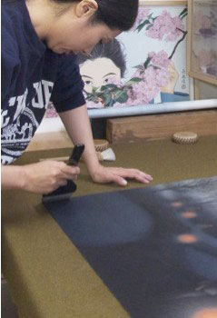
Lan-Chiann Wu
Can you discuss your East and West arts education and the fusion of both in relations to your BFA with highest honours from Taiwan and your MA from New York University?
Throughout my study in the fine arts, I have worked with different paint media, such as watercolour, oil and acrylic paints both in Taiwan and in New York. However, I discovered that I have strong connection with ink painting. Ink painting allows me to express a deeper meaning that goes beyond the image you see. This is the same way with poetry, which has deeper meaning beyond the rhythm and beauty of the words. Ever since I was very young, I have been attracted to western painting, especially with regard to the use of perspective, light, and representation of volume.
At the Chinese Culture University, I was trained in the ancient tradition of ink painting. It is very typical in this field that artists first learn from studying and copying old masterpieces. The traditional way of learning Chinese ink painting encouraged artists to use their own wisdom to understand the spirit of the masters and then, over the years, use that knowledge to become independent, so that the artist eventually would make his/her own creative work.
Studying art in New York City rounded my artistic formation and gave me the opportunity to further explore blending Chinese ink painting with Western modes of representation. Both Western art and Chinese art have unique qualities, which I equally value and embrace.
To me, art is a universal language. Art is often an unspoken language, which can be understood intuitionally by people across time, space and culture. Making painting is a calling to me, and creating work that focuses on the significance of universal humanistic values is my mission. I hope my work provides people with a moment of contemplation on the beautiful and meaningful moments of life.
Discuss how your earlier training as an assistant under Au Ho-nien influenced your training?
One of my high school teachers suggested that I seek out the Chinese Culture University in Taiwan, which at that time, had one of the best painters in the country, and I chose to learn from him. His name is Au Ho-Nien, and is one of the greatest living masters of the Lingnan School of painting. I studied four years with him. He is a great master, who is still very active in the field today. I was very fortunate to have been his student. I also had the opportunity to study with other masters at the Chinese Culture University in Taipei, who taught me several different styles of ink painting that included very fine, detailed brushwork.
I have had several excellent teachers who helped me advance my painting skills and understanding of life. In particular, my mentor, Au Ho-Nien, has been extremely generous in this regard. In my earlier work, Solitude (1994), you can see the influence of his Lingnan style artwork in mine.
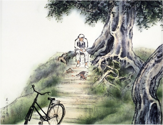
As I mentioned before, I have always been attracted to the use of perspective and light, more commonly found in Western painting. Therefore, in some of my earlier work, you can see a mixture of Lingnan and Western schools as, for example, in my work Old Street in Sanxia, which I created while I lived in Taiwan in 1993. Today, I have moved on from Lingnan, not because I reject it (in fact I think it is incredibly beautiful and expressive), but because I wanted to find my own direction.
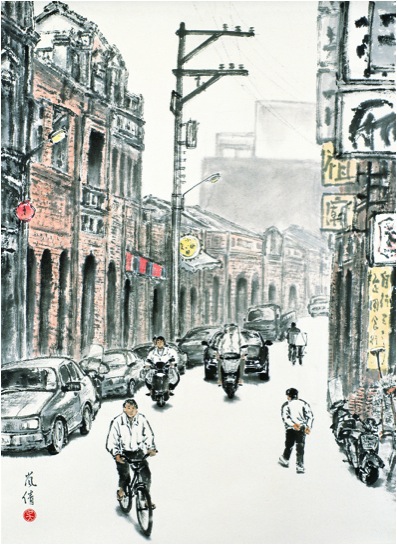
'Old Street in Sanxia’
One of your older paintings ‘Old Street in Sanxia’ (1993) reminds me of similar work by He You-Zhi, ‘Long Tong Life in Old Shanghai’. Please discuss?
In my work, I am often influenced by my direct surroundings. In addition, I have always been attracted to the use of perspective. Therefore, in some of my earlier work, you can see a mixture of Lingnan and Western schools as, for example, in my work Old Street in Sanxia, which I created while I lived in Taiwan in 1993. .
Sanxia is a village in Taiwan, which was strongly influenced by European culture. In a historical context, Sanxia is similar to Old Shanghai in China. I can see how my work Old Street in Sanxia reminds you of He You-Zhi’s ‘Long Tong Life in Old Shanghai’.
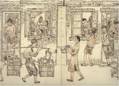
He You-Zhi’s ‘Long Tong Life in Old Shanghai’.
Your work centers around the exploration of Chinese Ink Painting. This brings with it great historical skills and techniques. Can you discuss one aspect: ‘Brushes’ the different shapes, sizes and hairs that you use?
In the Chinese ink painting, the quality of the brush stroke carries tremendous importance. It has to be strong and controlled, yet dynamic, fluid and delicate. Painting on mulberry paper with watery ink requires absolute mastery of the medium, because mistakes cannot be corrected. Any errors are unforgiving; the moment a brush touches paper, ink is absorbed and what has been painted cannot be undone. Consequently, in this medium, free expression can only be achieved through mastery of the medium and techniques. More than a thousand years ago, Chinese landscape painter, Kuo Hsi (ca. 1020-ca.1090) summarized this up as: “a painter should be master over, and not a slave to, his brush and ink.” The quality of Chinese brushwork is another aspect that makes ink painting so special to me.
There are mainly three types of brushes that I use; soft brushes made of sheep’s hair, mixed hair brushes made of deer and wolf hair, and hard brushes made of horsehair. I use various sizes and shapes of these brushes in my work, depending on the subject matter and expression that I wanted to achieve in my painting.
You sometimes teach and demonstrate Chinese Ink Painting. Can you discuss the importance of explaining this technique to both other artists and others interested in the arts?
In looking at ink painting throughout Chinese history, I find the depth of content and the strong personal connection the painters had to their subjects deeply fascinating. The renowned Six Dynasty Southern Song (375-443) landscape painter and philosopher, Zhong B’ien said: “I am here surrounded by creation, my eyes see the things that surround me, that’s why I paint the shapes captured in my heart, that’s why I paint the colours I feel in my heart.”
For me, the essence of Chinese ink painting remains exactly as the ancient masters described it; not an actual representation or an imitation of nature, but rather nature represented through how the painters experienced it through their souls. The intellectual painters of China made a conscientious effort to represent nature according their own values and aesthetic principles. In each of my paintings I develop a meaningful relation with the subject matter, and express my response with ink on paper. I consider my work sometimes as “mindscapes”. For instance in my 1994 painting Memory of My Roots, the scene is of my grandmother’s birth village. I was always very close to her, and the subject is therefore deeply personal. However, I did not paint the actual village, but rather how I felt the connection with this special place.
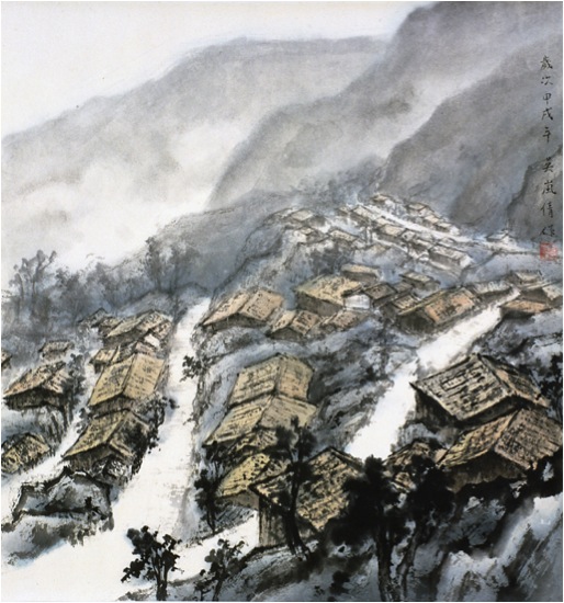
'Memory of My Roots'
So, when I speak to people about my art, this is the very essence of what I want to convey.
One of your earliest talks was related to ‘Imaging the Orient’ at the J Paul Getty Museum in LA. Can you briefly discuss this topic?
In 2005, I was invited to give a ‘Point-of-View’ artist talk to discuss the ‘Imaging the Orient’ exhibition at J. Paul Getty Museum in Los Angeles. ‘Imaging the Orient’ was quite a fabulous exhibition. It showed how the visions of exotic lands fed the imagination of 18th century Europe. The exhibition explored how European artists were influenced by Asian art. They adapted motifs in imaginative and whimsical ways to produce Chinoiserie, a French term for objects that are decorated with Western fantasies of the exotic East.
I was particularly fond of discussing a pair of ewers (Chinese porcelain with French mounts, about 1745-1749, the maker unknown). These two Chinese vases were enriched in Paris with gilt bronze mounts to adapt them for a fashionable French interior. As I had discussed with the audiences, the original objects were two hard-paste Chinese porcelain vases with minimal decoration; simplicity and elegance from the height of the Qing Dynasty. The heavy and highly decorative French mounts completely changed the intent of the original maker. I found the different cultural aesthetic values and needs deeply fascinating.
How do you view linking the past and present, through your art?
I have always been fascinated by the universal values and principles of life that are inherent to every society. Over the past two decades, I have created a body of work inspired by themes that connect people across place and time. My paintings are often inspired by the work of others, who share similar values, for example, in a poem, a story, or a novel. A good example here is a painting I made in 2009 that is based on Night Thought, a poem by Li Bai (701-62).
“A bright moon shines before my bed,
I wonder … is it frost on the ground?
I raise my head and gaze at the moon,
then lower it and think of home”
I named this painting Li Bai’s Moon. As Northern Sung dynasty Landscape Painter Kuo Hsi said, poetry is a picture without form and a painting is a poem with form. When I read Li Bai’s Night Thought, I wanted to picture his poem, as his words vividly described an image before my eyes. Night Thought emphasizes the umbilical connection that we have with our roots; it is a universal theme. What really captured me is that after 1300 years, the poem’s meaning still remains current, as we will always be connected to our roots no matter what century we live in.
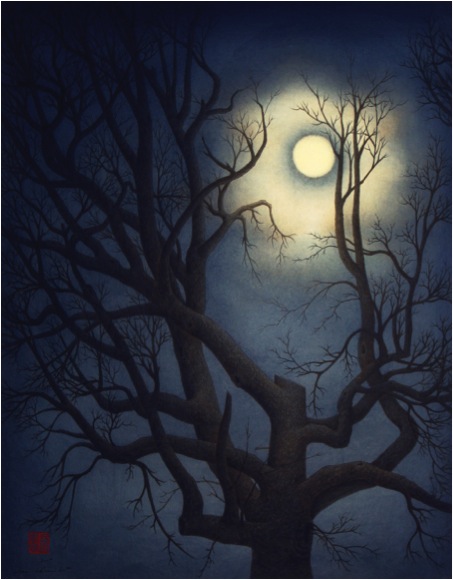
‘Li Bai’s Moon’
Your work is not restricted to China and Taiwan as seen in ‘Reflections of the Past’. Please discuss?
The recurring use of light, or sometimes only glimmers of light, in my work are metaphors for human resilience: the love, hope, and strength that we each person carries within. It is a central theme in my art. My painting Reflection of the Past (1999) is a good examples. Resilience is an innate strength we all share, which helps us during each phase of our lives.
‘Reflection of the Past’
Reflection of the Past was inspired by the Japanese summer festival of remembrance, called O-Bon. O-Bon is an annual reminder of the importance of family ties, of respect for those who have gone before us, and of the brevity and preciousness of our lives together. Japanese people welcome home of the souls of deceased family members by floating paper lanterns on water. I am keenly aware that everyone carries within his or her souls memories of past love ones like precious glowing lights, see for example Precious Light (2012). I believe that it is a universal feeling that I expressed with these painting through the use of lit lanterns.
‘Precious Light’
Discuss your work in relation to distance that separates you form your birthplace?
Much of my inspiration comes from daily life, but always centres on universal humanistic values and themes. In my work, I seek to create a connection between people and place. My creative ideas often inspired by my direct environment, such as when I lived in New York. For example, my painting Snowflakes Quietly Descending (1999) was made in Manhattan, New York City, where I then lived.
'
Snowflakes Quietly Descending’
‘Snowflakes Quietly Descending’ does not appear Asian, but still it gives this feeling, could you explain this?
The painting Snowflakes Quietly Descending is a view of Fifth Avenue looking south from the Guggenheim Museum on 89th Street. In this particular painting, I aimed at capturing a quintessential New York City ‘landscape’ during a light winter storm. I used to live close to the Guggenheim, and the painting expresses my love of the city. A Broadway actor, who lives on the Westside, collected Snowflakes Quietly Descending, and I feel therefore that a part of me never left New York.
I stood in the snow and watched the snow falling on me for several days. I was observing the scenery, making sketches, taking notes, and was experimenting with painting techniques. Then, I brought my study materials back to my studio to complete the composition. The original work is quite large, so when you stand in a certain angle it is as if you can walk into the avenue. While I captured the scene on Manhattan, I developed a feeling for the city analogous to how painters of the past described their connection to places, such as philosopher Zhong B’ien said in the 5th century
‘Li Bai’s Moon’
Another good example here is a painting I made in 2009 that is based on Night Thought, a poem by Li Bai (701-62). For this work, I sketched an old tree that I walked by every day here in Los Angeles.
Could you discuss ‘Lantern Festival I’ in relation to darkness and light?
My painting Lantern Festival I, which I made after a visit to Florence in 1997. Fascinated by the architecture of the city, I made several sketches looking down from one of the widows of Palazzo Vecchio. To express my special feeling for the city, I tried to give this painting a mesmerizing quality by creating a night scene. I tested this effect with charcoal and a basic composition, before I completed this painting. During the creation of this work, my imagination brought me to my childhood’s favourite festival in Taiwan. At that particular moment, I realized that no matter which city (East or West) you visit, a city’s energy is universal, and that is what I wanted to express in Lantern Festival I. This painting too, shows my interest in perspective and light, and illustrates that I make conscious connections between people and place across cultures.
'Lantern Festival I’
Your project, 'Cycle of Life' is to consist of sixteen paintings. Could you explain the project and its basic concept, and elaborate on the relation to the four seasons and the stages of human Life?
Inspired by John Keats’s sonnet The Human Seasons, Cycle of Life will consist of sixteen large-scale ink paintings, designed as four groups of four paintings each. Each group represents one season of nature, which I will use to juxtapose the human stages of life.
In Cycle of Life, I will explore the human seasons to create a visual context for the different stages we pass through in life. In this project, I will use the rhythm of nature as an allegory for the human cycle of life. That said, I envision the season in my very personal way. For example, I may imagine Spring, as human beings coming to this earth with unknowing destinies, similar to an early morning that announces a day filled with expectation. To explore this idea, I used my sketch Leading the Way Home (2004) as a base, and developed it into a study for Spring called A New Dawn.
'Leading the Way Home’
Spring: Birth and Renewal
Spring: Birth and Renewal;
Summer: Exploration and Growth
This stage of life is a playful period of exploration and growth. Youth is attracted to different directions and wants to experience life in many ways.
Autumn: Maturity and Confidence
Autumn is the golden stage of life. This is the time of accomplishment, but it may also be turbulent as the last stage is approaching.
We come to this earth alone and depart alone. This is time for reflection, for looking back, and perhaps contemplate afterlife.
We come to this earth alone and depart alone. This is time for reflection, for looking back, and perhaps contemplate afterlife.
John Keats’ The Human Seasons has great depth:
“Four Seasons fill the measure of the year;
There are four seasons in the mind of man:
He has his lusty Spring, when fancy clear
Takes in all beauty with an easy span:
He has his Summer, when luxuriously
Spring's honied cud of youthful thought he loves
To ruminate, and by such dreaming high
Is nearest unto heaven: quiet coves
His soul has in its Autumn, when his wings
He furleth close; contented so to look
On mists in idleness—to let fair things
Pass by unheeded as a threshold brook.
He has his Winter too of pale misfeature,
Or else he would forego his mortal nature.”
Keats’ poem evokes several strong images with me, and I have begun with laying out ideas for individual paintings and finished several study paintings, and I am preparing sketches for the overall work.
While the work is in progress, I will also be developing exhibition ideas and programs for Cycle of Life with the local, national and international communities. To-date, I have spoken about my work and sources of inspiration at the Southern California Historical Society in Los Angeles, presented on the same subject at the Huntington Library in San Marino, and at Bowdoin College in Maine. It is an ambitious project for which I am seeking external financial support, and I hope to complete the entire series of paintings by the end of 2015.
‘A New Dawn’
Are you working through the series in a chronological order?
I am not working on the paintings in chronological order. I explore visual ideas when they come to me, which can be in any order. But I do have the larger picture in mind and I will fit each component together like pieces of a puzzle. It is a process I tremendously enjoy, but it is also challenging because of its scale.
Could you explain the involvement of NYFA, and NYFA as an organization?
Cycle of Life is a sponsored project of ARTSIPRE, a Program of the New York Foundation of the Arts (NYFA), which acts as fiscal sponsor for the project. Many people think that ARTSPIRE or NYFA commissioned Cycle of Life, but this is not the case; they provide fiscal sponsorship. Sometimes, people or organizations are reluctant to support artists directly out of concern for lack of oversight on how their funds are expended. As fiscal sponsor, ARTSIPRE guarantees that any donations to the project (thus not directly to the artist) are used for eligible expenses. It is a great way to support artists with making projects they cannot fund themselves.
ARTSPIRE is a 501(c)(3), tax-exempt organization founded in 1971 to work with the arts community throughout the United States to develop and facilitate programs in all art disciplines. ARTSPIRE receives donations and grants on behalf of Cycle of Life, and ensures that the use of grant funds is in compliance with U. S. regulations. ARTSPIRE provides program or financial reports as required. As project director and independent artist, I will be responsible for executing and overseeing the project. My work will include: executing the art project and overall project management, expanding professional networks, working with external consultants, outreach, etc.
Recently, you worked very closely with Wu Man. Can you expand on this connection and also the connection with the Huntington Library, Art Collection, and Botanical Gardens?
Wu Man and I are interested in expanding the appreciation of traditional Chinese culture in a contemporary context. In 2012, when June Li, Curator of the Chinese den at the Huntington heard that Wu Man and I wanted to collaborate on a project that involved Chinese painting, music and poetry, she was keenly interested to work with us. June invited us to give a talk as part of a special public program at the Huntington. Our presentation was called: “An Evening with Wu Man and Lan-Chiann Wu” held on June 18, 2013.
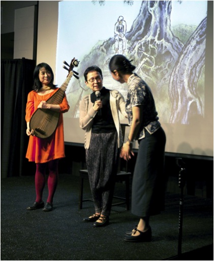
‘Wu Man & June Li, with Lan-Chiann Wu’
At the event, Wu Man and I shared what inspires us to make art in our respective disciplines, and gave demonstrations of our art forms. We were sharing how we transform poetry into painting and music, especially because we had discovered that we both created a work inspired by 8th century poet Li Bai. I am referring to Li Bai’s Night Thoughts. It is a poem that all Chinese children have to learn when they are in second or third grade; they have to remember it by heart. When you are very young, those words don’t really mean a lot to you. You have to recite it and that’s it. But after you move away from your home, or in my case, immigrate to another country, the poem takes on a poignant meaning.
So when I re-read Li Bai’s Night Thoughts his words made a deep impact on me. When we discussed the poem at the Huntington event, it also resonated strongly with the audience. After the lecture, many people expressed to me that they felt uplifted and inspired to further explore Chinese culture. The Huntington has released a video recording of An Evening with Wu Man and Lan-Chiann Wu. They captured the entire event, and its complete footage can be found on YouTube:
Our humanity, our core values and principles, is what binds us together as one people across time and space, and this is the main theme in my art. Therefore, my paintings are not mere images; they are layered with content and represent universal themes that each and all of us experience in life. As a visual artist, I enjoy sharing my vision through my painting as well as through speaking about my art.
Contact details.
Lan-Chiann Wu
Website: www.thetranquilstudio.com
Facebook: www.facebook.com/TheArtofLanChiannWu
Cycle of Life:
https://www.nyfa.org/ArtistDirectory/ShowProject/caeb6d9f-f3da-47be-99ec-f5b82147f964
Lan-Chiann Wu, California, USA
Interview by Deborah Blakeley, June 2014
Peter Clark
How did this amazing collage work happen?
My collage work gradually developed out of my illustration work, bits/areas creeping in, growing and developing. I began to love doing the paper collage a lot and adored finding the different papers
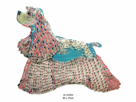
When did you decide to create your work from a palette of paper?
When people began noticing the collaged bits and passing on encouraging remarks about them.
Do you usually work on a ‘Series’ eg. dogs, garments?
Yes and no. I kind of grow into certain subjects, some take me over for periods of time and I like to occasionally revisit them and hopefully improve them.
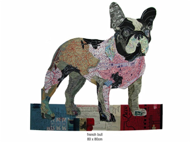
Which comes first: the paper or the piece?
Sorry to be vague but it is both. I have ideas for a certain piece and begin to find the appropriate papers however other times I have some particular papers which yell out to be used for a certain image!
Can you discuss how and when you use maps?
I use maps all the time, for colour reasons, for information or joke reasons
I use the linear qualities within them sometimes to ‘draw ‘with, they are so versatile… can be very specific or used in an abstract way. I love them, they enable one to instantly play and change scale!
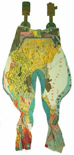
Very simply can you explain the process you take?
Very simply can you explain the process you take?
Arrange them roughly in order to achieve colours/scales, tear then cut and fold the pieces; glue them down, hey presto!
If it works… great, If not start again making changes till I’m ok with it.
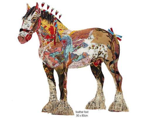
What size is your work?
Varies from perhaps A2 to 2 or3 times that size or even bigger depending what I am trying to achieve or what I am working with.
ow about the size of your papers?
It is all OK papers come the size that one finds them.
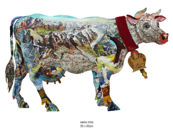
Where do they come from?
God only knows! I find them everywhere I go, on the street, flea markets, and car boot sales. Paper fairs are places that I love going to and searching around, I go to markets wherever I travel.
How do you store them?
In many Muji transparent boxes and drawers
How do you remember and then find the piece you are looking for?
I remember where things are but importantly I rely on my assistant Dan to find me what I ask him for….mostly I have something in mind!
Can you discuss ‘Too – 2 – Step’ and this series?
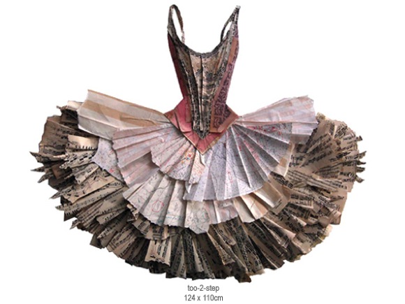
This is a dress in a series of ballet tutus where I tried to do the bodice quite tightly showing the body shape and using in the main some sheet music covers for info.
Then in the ‘skirt part I intended it to be looser showing movement using and tearing and folding techniques which allowed it to be free and more 3D in contrast to the bodice. Using also sheet music and free flowing hand drawn lettering etc.
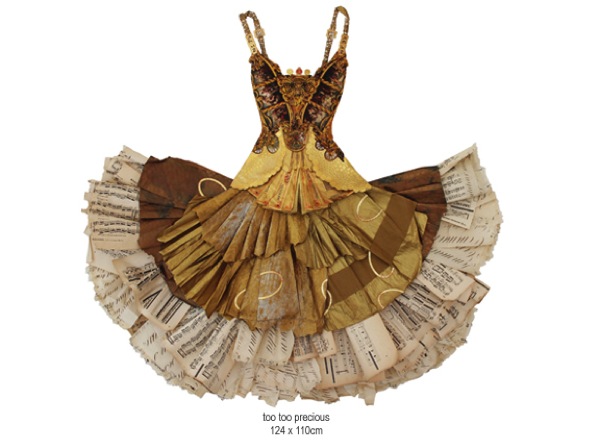
These are also 3D work. Can you expand on how you make the decision on when to add folds, layers etc.?
As above…it’s partly spontaneous and what I feel looks right. Having fun, letting the papers speak!!!!!
You exhibit around the world; can you expand on how you work up to an exhibition?
Think of an idea with subject matter, play a sound track, plan it and do it. It is down to a strategy really.
Can you comment on Stewart Collins statement, "There is nothing so enlivening as looking at a piece of art and laughing out loud"?
Not really but I like it that he feels that way!
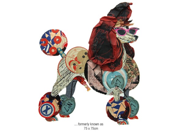
You also add humour to your work by the choice of paper, for example your Hell’s Angel Jacket is made up from old Bibles and prayer books. Can you discuss this?
I try to inflict what amuses me onto my work!
Depth, firstly perspective within the piece then the further depth found within the papers you use, expand on this.
I prefer the pieces to have different levels, and allow shadows to play within them. Less boring and predictable that way, I don’t like things to be too worked out, I am not interested in that type of thinking.

Is one of the prerequisites that the work will bring a smile to you first?
Preferably!
Deborah Blakeley:Peter has released a book called Paperwork: Peter Clark by Matthew Sturgis. The book was so popular it has SOLD OUT!
On a more personal level you are recovering from a stroke. How has your art help with your road to recovery?
Simply it saved my soul and reintroduced some order and purpose into my days, initially just doing watercolours as I could only use my right hand.
Slowly and slowly I am reintroducing my body into doing collage [physio in itself] which requires using both hands and exercising patience
So far it’s going well; I am regaining my confidence and the energy to do it
So…onwards and upwards!
Contact details.
www.peterclarkcollage.com
Peter Clark, UK
Interview by Deborah Blakeley, June, 2014
Luanne Rimel
Discuss why you tend to work in series?
The content of my work deals with Time, i.e. the passage of time, memory, remembrance, decay, and even persistence. When I become absorbed an idea, I seek out forms that resonate this idea. I begin to photograph in various sites and build a collection of images from each location. Then, one piece leads to the next and I explore how to make my thoughts into a visual expression. I work on several pieces at a time, feeling that they “speak” to each other and inform my creative process. Since the photograph is a primary component of my work, I look for compelling objects and forms that will eventually be part of my textile constructions. I am often asked, “How do you know when a series is completed and it’s time to move onto other imagery?” That is a difficult question and I am not sure I know a concise answer. When I notice that I am photographing a series of different objects or forms, I know I am being led in a new direction, and it’s time to begin a new body of work.
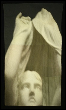
Your current series, that I saw at the Smithsonian Craft Show in April 2014 is very monotone. Discuss the photography in this context?
This current series involves detailed photographs of statues, with many taken in cemeteries. Even though they are color photographs and printed in color, the images appear monotone due to the materials used for the statue. Sometimes green moss or blue sky enters into the imagery, but mostly it is stone. I like what happens here because I think the subdued tonality of the photograph enhances the quiet simplicity and strength of the imagery.
You also place several images within the one image. Can you explain when and why you do this with some of your pieces but not all?
I do not have a studied background as a quilter, but I occasionally like to explore simple piecing and look for images that relate to one another. The earliest works in this series were pieced with multiple images. One work, “Silent Sound”, includes all images from cemeteries in New Orleans, Louisiana. The larger central image is of a statue and it is surrounded by a shadow image of iron fencing, and some colourful graffiti on the crypt of Madame Laveau, the celebrated Voodoo Queen. The smallest piece is a statue evoking the “silence” I refer to in the title. I also explore working with a single, powerful image for the entire work, as in “The Watch”. If one looks closely, they will notice the seams and realize they are also pieced in the same manner but with segments of the original photo.
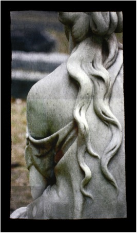
‘The Watch’
What background cloth do you use and why?
I am interested in the intersection of domestic practices and contemporary technology. In my current work, I use repurposed flour sackcloth dishtowels, as a metaphor for memory, women’s work, and family.
The act of washing and drying dishes has mostly disappeared in many 21st century families. I am the second oldest of six children and my sister and I would wash and dry the dishes for a household of eight every night, alternating the tasks from one week to the next. My memory of this chore includes singing along to pop music on the radio, telling jokes and laughing. When first married to my husband, (many years ago) on visits to his family, I would help his mother with the dishes after dinner. Only allowed to dry, not wash, I was instructed to get a dishtowel from the drawer and I have a vivid memory of the clean, neatly folded, bleached, white, flour sackcloth textile, with subtly embroidered birds or flowers at the hem. Once the task of “doing dishes” began, my quiet mother-in-law- would begin to converse about her memories of family, her children, my husband. The dishtowel, to me, represents a conduit to conversation and to memory. The images I print on this textile also become imbued with the history of this cloth. I could, of course, choose any cloth to print on and stich, but I am interested in the symbolic reference of this fabric and it is part of the content of my work.
Discuss how you use selected segments of your photographs (crop).
When I find and photograph a statue, I do try to imagine the textile piece I will create. I look for the best angle, the best light, the carved hands and carved folds of cloth. I may take several shots and then select the best for the final piece. In a Photoshop program on my computer, I crop the image to focus on the hands and cloth and select just the part that, to me, coveys a bit of mystery.
If one looks closely, they will see that every piece I make has one or more small hand stitched “patches”. There is no tear in the fabric; rather this is a symbolic gesture. I copy a small part of the original image and print it onto the cloth so it can be layered and stitched along with the quilting. This “patch” is symbolic because, for me, it is a reference to mending and repair, as seen in Japanese Boro textiles, my grandmother who darned socks, patched and reused textiles.
Can you give us a close up of the stitch work and discuss?
This is a detail of piece called Pensive. I begin the stitching by following the contours of the hand. Here you can see that the thread color matches the colors of the image so when it is pulled through the cloth, it becomes embedded in the slight puckers and is not immediately visible. These are running stitches, carefully places and gently stitched without any hoop or quilt frame. The repetitive hand quilting across the surface creates shadows and textures and alludes to the marking of time. Each piece takes its own shape beyond the original square format as the threads are gently drawn and pulled through the cloth.
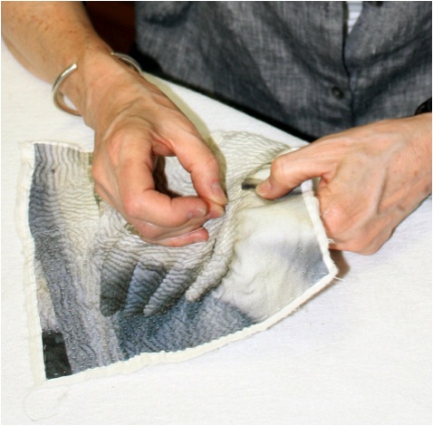
How about the thread you use?
I try to use hand quilting thread whenever the color is a good match. I have also used machine quilting thread and other threads – it’s all about the color.
Tell us about the backing technique you use and why?
Since my hand quilting stitches are small and close together, I find that it is best if I only stitch through two layers of cloth. That way, the cloth responds to the needle and puckers a bit. Creating the texture. I use an heirloom cotton and bamboo, thin, quilt batting, and hand-baste the entire top cloth to it. Then I stitch, and stitch, and stitch. After all of the quilting is complete, I turn down the edges and hand stitch a backing cloth
The stitch direction?
As one works on a body of work, discoveries are made, and before long, you find yourself repeating an experiment so it becomes a technique. Several years ago, I was fortunate to be able to take a workshop with Dorothy Caldwell, where she introduced us to Kantha Textiles where the intricate stitched thread becomes imagery. I was already working with photographic imagery on silk, with some limited stitching and piecing. Following this workshop, I discovered that I enjoyed the mediative aspect to repetitive stitching and found myself experimenting more and more with needle and thread. I began following the forms of the photograph with the stitches and found that shadows were created depending on the direction of the stitch – then the experiment became a technique.
Do you use the stitch direction and closeness of the stitch to make use of shadows or do you vary the colour to the thread?
That is an interesting question - it’s a bit of both. I intentionally change the color of the thread to match the photograph, whenever possible, so that the imagery is foremost - its not an embroidery technique. The shadows the stitches create always surprise me and change with the light of the surroundings. I always begin with the hand, my focus, and stitch following the contours of that part of the photo. I then follow a more horizontal pattern for the rest of the image. The closeness of the stitching creates and almost hyper-realism in the photograph – the threads are buried in the folds of the cloth - and I am not aware of that until I pin it to my studio wall and look at from a distance.
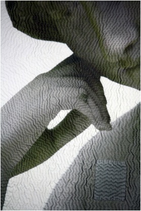
Pensive
You have an emphasis on hands can you elaborate on this?
Many years ago, I was exploring the use of the hand image in other cultures and the various meanings it conveys, including identity and protection. Hands are so expressive, used in verbal conversations and as signed words for the deaf. I found that I was compelled to work with this imagery because it was imbued with so much symbolism. I did a series of photographs of the hands elderly women as they performed a routine chore, such as mending or washing dishes. I think that Time is reflected in the hands. That series is what led me to photographing the carved hands of statues.
You put an emphasis on hands. Can you elaborate on this?

Studio wall image
Travel has come from your art. Can explain two places it has taken you to?
Several years ago, I visited New Orleans and walked through the renowned cemeteries, taking photographs of the architecture and beautiful statues that inhabit those silent “cities.” The images from that trip are now part of many of my quilted pieces. For my last birthday, I wanted to seek out a cemetery in the US that has great statues. That request led me to Savannah Georgia and the Bonaventure Cemetery. That is where the piece, The Watch was photographed. I have received many suggestions from people who also appreciate the richness of the sculptures in cemeteries so I now have list of places I would like to visit one day. (On the top of the list is the Père Lachaise Cemetery in Paris!)
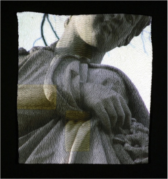
'The Glance'
Your images are printed with an Ink Jet printer. How lasting will this be?
Inkjet printing has come a long way in the last 15 years. When I first researched this process the large format printers were still using dye based inks that ran if water touched them and did not work with fabric unless it was treated with another substance to “set” the dye. I spent over 2 years just researching and experimenting with this process. Now many of the printers have what are called “100 year” pigment inks – they do not even run when water touches them and they are much more colourfast. I look at this work as any drawing – keep it out of direct sunlight. The inks on works from over 15 years ago are just as they were when first printed.
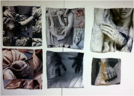
Your printer gives you size restrictions? How do you overcome this?
This has been an interesting, and satisfying, problem. When I first researched inkjet printing of cloth 15 years ago, in graduate school, I was working on very wide printers and printing pieces that were three feet wide and seven feet long. I was not hand quilting those at the time, but creating whole cloth and layering.
When I needed a printer for my own studio, for financial reasons, I selected a much smaller printer that only has the capacity to print 17 inches wide. At first I worked smaller and within the parameters of the printer. But slowly I began dividing the photo on the computer and making much larger pieces, just printing in sections and then carefully assembling them together, as in a pieced quilt. I discovered I like the slight inconsistency of colour and the barely visible seam lines. Also the fabric I use, the flour sackcloth dishtowels are not large and work perfectly with my printer – a satisfying problem!
Do you feel that by transferring the the image onto textiles, especially old textiles, you are giving a warmth and softness that is not on the original image?
The photograph does get transformed on cloth. The print is softer as the inks migrate on threads a little bit more that they do on paper and it does soften the image. Depending on the thread count of the textiles, the results will differ, but I like what old lines and flour sack cloth do to a photo– there is some “nubbiness” inherent in the cloth. This adds to the imagery I think, and yes, give it a softer glow and warmth.
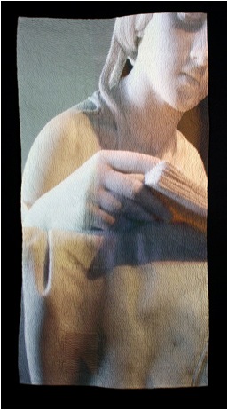
The Reader
Discuss how and where you do your hand stitching.
The hand stitching is actually the last step in the process. My studio is in my home, with a room for the fabric work and another room for the printer and computer. I will spend several days preparing the images on the computer and preparing the fabric to go through the printer. Then I print a few pieces, parts of pieces, and hang them on the walls in my studio. The larger images are pieced together, stitched and all are layered with the batting. I then hand baste the entire surface so the cloth does not migrate when I hand quilt it. The smaller works 10”x10”, are very transportable and I can actually work on them in a car when we travel. The larger pieces are quilted in the studio, slowly and methodically – it’s like a meditation for me.
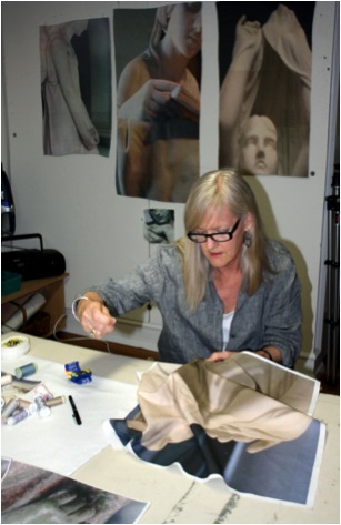
Your botanical work is vivid and full of colour, expand on this?
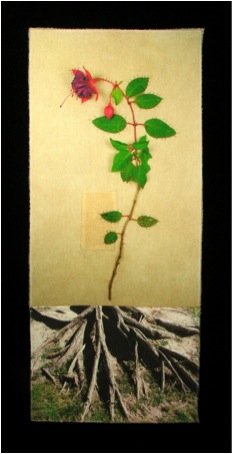
'Fuchsia – Faithful'
I don’t alter the colour of any of my images so the botanical series is comprised of photographs of actual flowers from my garden or the garden of friends. I had been working with shadow images for some time and it was nice departure to surround myself with colour for a while.
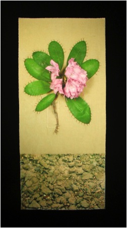
‘Rhododendron –Beware’
Explain about your Solo Exhibition at the Missouri Botanical Gardens?
I am an avid, amateur gardener and began the Botanical series when my husband, a metalsmith, and I were going to exhibit our work together. His work is about the land and I wanted to compliment this idea in my work. Following our smaller exhibit, I was invited to show my work at the Missouri Botanical Gardens in a much larger, public space. I created over twenty pieces for this exhibit, some large quilted silhouettes of flowers and the others were the colourful single flower images with hand quilted accents and stitched elements. It was a very large body of work and thrilling for me to see it presented in a garden environment.
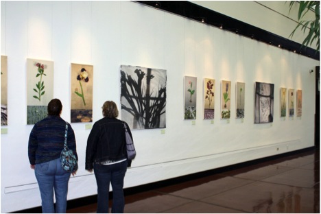
Many of the flowers you use are chosen for their historical and symbolic meaning. Can you expand on this?
When developing this series, I was inspired by the classical botanical illustrations of the 18th and 19th centuries. I researched the meanings associated with flowers from the Victorian era and selected those flowers, many of them growing in my garden. (Such as Rhododendron-Beware, and Iris-Inspiration) .

Luanne Rimel's Garden
Still working with my concept of time and memory, I cut a single flower, took it to my studio and carefully stitched it to a vintage dishtowel. I then pinned it to my wall and photographed it, sometimes waiting a brief period of time as the flower relaxed on the cloth. Then the process of printing this image onto another white flour sackcloth dishtowel began. The flower images were stitched to another image that represented the land. Some smaller areas were layered and quilted on the surface and included hand written text about the history of the flower.
Discuss the classes and workshops you do?
I teach photo transfer process both with and without a wide format inkjet printer. Some methods involve certain liquid gels and papers that allow a copied image to adhere to the cloth. Another, the one I mostly use, is preparing the fabric to go right through an inkjet printer. The image preparation is key to this method and time is spent on leaning to select the image or images that fit the student’s concept or idea and figuring out what will work best with the cloth. Last summer, I taught a weeklong workshop at the Arrowmont School of Art and Craft in Gatlinburg, Tennessee. It was intense, amazing and filled with creative and wonderful people who explored the many possibilities of these processes. Here at home, I often teach weekly classes on photo imaging on cloth at a local art center and about finding your “voice” in your work.
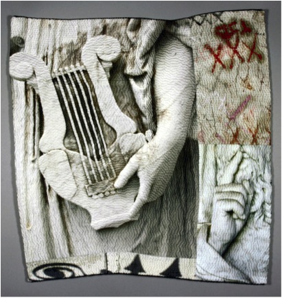
'Silent Sound'
In your class, ‘Out of the Linen Closet’ you teach how to transform household textiles into artworks. Explain the importance of history and memory in your work?
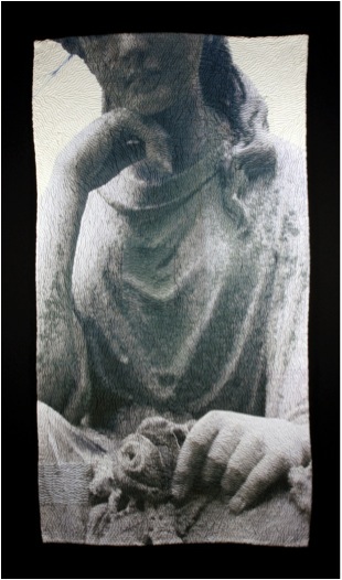 'Enigma With A Flower'
I have always been interested in ontology. I am excited about new discoveries in space, new planets, and conversations about the origin of the universe. By observing this vast picture, I look at the nature of the brief human existence and the bits and pieces that say, “We were here.” I believe that cloth holds memories, in smells, folds, stains. Old linens can tell stories of a life lived. I use cloth for those reasons and the rich history of cloth in many cultures. Cloth is also responsive and malleable. The slow, deliberate and repetitive stitches I use are symbolic for marking time, and memory, as they shape the final work. The images I choose are also about time and memory, from elusive shadows, to fading flowers and commemorative statues.
Discuss the importance of expanding photography from paper to textiles and how you came to develop this idea.
Putting images onto cloth is not new – (Robert Rauschenberg printed images to cloth in the 1950’s with screen prints and solvent transfers) – but towards the end of the last century and the beginning of this one – digital imaging processes became accessible to artists in all media. There were, and are, darkroom techniques that enable textile artist to create blue cyanotypes, or brown prints, and some photographers were developing their images on treated alternative materials such as wood and clay. However, the newer digital technology allowed for greater possibilities. From “iron-on” transfers to gel medium transfers to what I do – directly printing on cloth, the last 15 or 20 years have opened doors that were never perceived possible.
My goal was to have imagery on cloth that would retain the soft “hand” of the cloth. When I was in my late 40’s, I went back to school to get an MFA in textiles. This was about 1998. In 1999, the university I was attending was able to acquire a new wide format ink-jet printer for their Graphics Department. I received a research grant to explore this technology with alternative materials and my path then appeared. I was hooked, and experimented for another year before embarking on creating images on silk that were three feet wide and seven feet long. Photography stepped out of the darkroom for me. Cloth responds to the photographic image in a very different way than paper does. One has to be able to let the cloth speak, and soften the colour or the edges of the image. The photograph for me is not the end result but part of the overall process. The stitching enlivens the image, creating shadows and textures that are not possible on a paper photograph. There are artists that put images on cloth and there are artist that obsessively hand quilt for texture – I explored combining the two processes and my current body of work evolved from there – one step at a time.
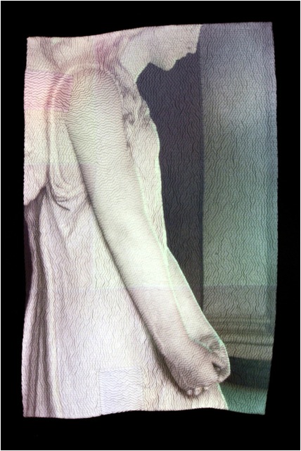
Contact details:
Luanne Rimel
Website:www.luannerimel.com
Email:lrimel@mindspring.com
Luanne Rimel, St Louis, USA
Interview by Deborah Blakeley, June, 2014
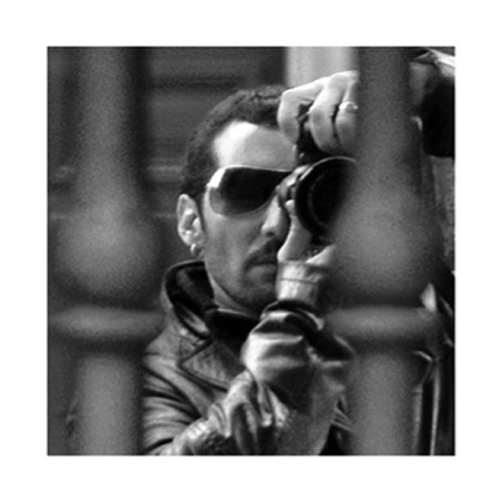
Guillermo De Angelis
When and where did you learn and begin your photographic career?
It began in Argentina, in the city of Rosario, and that was before I realized. If you mean, when it started to manifest almost urgently, it was during the years I lived in Madrid as a way to stop time.
Originally you studied Architecture. How has this influenced your photography?
It influenced to study the space, the environment, for the abstraction. To study Design, to get interested for the fine arts. To learn to look.
Your comment, “I try to get the expression through the economy of resources.” Can you please discuss this?
I confess I have a weakness for detail. The essence is contained in a brush stroke, in a gesture. I’m sure that if it was beautiful singing, it would be in a low voice.
Light plays a huge part in your work. Can you discuss this in relationship to one or two of your photographs?
Light is fundamental to photography in general. In my case, sometimes, I try to do scenography images, where light is the main ingredient. In other situations I obtain photographs of details or situations that seem to me urgent with any temperature of light or any kind of light.
Can you discuss the subtle use of colour in your work? Eg. ‘Aquella Vieja Rebeldia Animal’
These photographs are the ones I like, they just happen. It’s a sunset in the outskirts of the city of Rosario, Argentina. The subtlety can come in many ways. In this case, I chose the color.

You use full colour in ‘Buoy’. It is not the colour we are drawn to, but the composition. Can you expand on this?
In this image the primary colors almost go unnoticed, they occupy a small area in relation to the overall image. That’s why they don’t become substantial, the composition and the arrangement of the elements are the foundation of photography.
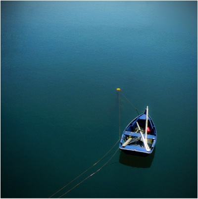
lease discuss composition in your work - is this done on location or back in the studio?
When you have the need to take pictures, when there is a mimetic reaction between yourself and what’s photographed, work in the studio is always a slight formality.
How important are Photoshop or similar programs to a modern photographer?
Photoshop is a lawful work tool. It’s like an ax, useful but you have to use it with caution.
Your series ‘Diégesis’: this work is full of abstraction. Please discuss?
After doing architecture, design and philosophy I dove into photography. With the sort of enthusiasm that drives you to move forward, or better still, inwards. Hoping to discover within, rather than outside myself, what I am trying to show. I choose to take pictures not prepared. I try to get the expression through the economy of resources. Focusing on the details that strike me as essential. Suggesting clearly, presenting without describing.
Can you take two photographs and discuss why in one you have used black and white and the other colour and your choices of medium?
With the black and white we look beyond of we see at first. We are interested in the world of concepts.
With color, we look for sensations in spite of being rookies in the use of color. Generally, I prefer black and white.
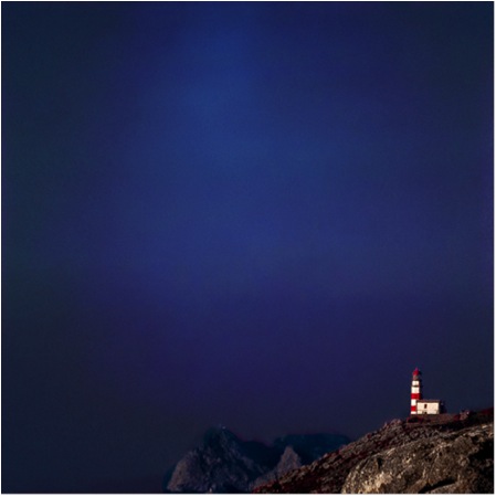
‘Winter Song’ didn’t just happen. Can you tell us about the set up for this photograph?
This image has been taken at “Parque del Retiro” from Madrid, a winter day on which it was snowing in an unusually way. Sometimes the opportunity is like a "smug miss" who doesn’t appear if you’re not willing to wait for her.
Can you explain the technique you used for your work ‘Loneliness’?
Is a double exposure photograph. A horizontal motion blur and other fixed.
Discuss your photographs and symmetry?
Many of my photographs are symmetric due to the square format. Is a classic composition for this type of format. I prefer square because elements and composition are critical for the capture.
Discuss how you are able to represent the sense of feeling into your work?
I think the best test to transmit a sensation is to experience it myself. I don’t pretend to generate something specific with my images; this would be the pretension to anticipate a result. If any of my images generates something, I was the first touched.
Expand on the equipment you use and your studio space in Madrid?
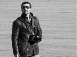
My equipment consists of a Nikon with several objectives, the one I use more is 24-70 2.8mm. My Fujifilm X20 that comes with me everywhere, a Lumix, always faith full and my phone or whatever you can take a photograph with. In my studio I have a Mac, some of my favorite music and little more.
Contact details.
Facebook: https://www.facebook.com/guillermo.deangelis.1
Email: deangelis.guillermo@gmail.com
Guillermo De Angelis, Madrid, Spain
Interview by Deborah Blakeley, June, 2014
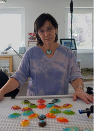
Dolores Barrett
You were introduced to glass art and its beauty in 2002. Can you explain how this changed your artistic life?
It really was quite literally a life change. I was a choir director at my local church as well as a piano teacher for 20 years. My interest began to sway to the arts in 1999 when I started porcelain portraiture. I had no previous training in art. I followed some online instructions, purchased some supplies off the internet, and dove right into what I was told was the hardest discipline to master; that being a miniature portrait. The results were encouraging enough that I wanted to delve deeper. I segued into glass after experimenting with ways to use it with my porcelain work. The seductive qualities of the material very quickly took over thereafter.
That was my first major success (and nothing succeeds better than success or at least the taste of it). I became aware of the possibilities this medium had to offer. I enjoyed being a part of such a prestigious community of artists. It made me want to push all the more to stretch the medium to its limits and beyond. I wanted to go wild with the ideas churning in my imagination.
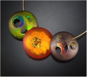
‘Atomic Orbs’
How did your residency at Pilchuck Glass School during the summer of 2008 work?
I had been part of an online glass forum for several years, and had heard many stories and experiences in regards to Pilchuck. It was generally acknowledged as the go to place for any serious glass artist. I applied for, and received a scholarship for a session under the tutelage of David Chatt. Once I abandoned the idea of trying to “produce” something, I was truly able to enjoy and grow from the experience of networking, discussion, and absorption. A lot of the little things I learned there still work for me in my studio today. I continue to enjoy designing a special piece each year for their annual auction. I get to meet up with many wonderful artists at the event, as well as support future artists who wish to attend these enriching summer sessions
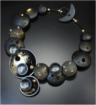
Can you expand on your ‘Gallery Showpieces’ and one-of-a-kind work?
My artistic showpieces are where I pour the heart and soul of my imagination. These are generally made specifically for exhibitions, commissions, and/or special events (like the “Fly Me To The Moon” neckpiece). This is also where I am able to experiment with a variety of alternate materials and fabrication methods. It’s a “no holds barred” situation and my creativity can truly go wild. I am able to tap into all the inspirations and design ideas that have accumulated in my head over many years from childhood onward.
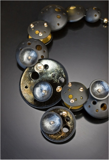
‘Fly Me To The Moon’
The process
It’s a process of internal reverse engineering really; I am introduced to the parameters required and instantaneously envision the finished product, then I must break it down to figure out how to make it a reality. I sketch the concept and proceed to a full scale paper model before beginning the work on moulds for the glass. Many times I find myself moving into completely uncharted territory where I must fabricate all the metal connectors, hanging mechanisms, and findings, as the glass pieces are very specialized and none exist in those configurations.
The design aspects
Of course, being functioning art wear, one must always consider wearability. This is precisely why I always make a model first. Not only is general appearance important, I must also consider the symmetry, potential weight, stability, and comfort of the design. I check for potential rough edges and or intrusive features. I also need to consider whether the work in its physical form conveys the intent I had in mind.
Your Precious Bead series is a combination of materials, discuss the combinations?
I really love working with gold and gold loves fusing with glass. They are quite a happy couple. With my Precious beads, I was seeking a way to “preserve” the gold for perpetuity. I cut layers of heavy gold foil and fuse them between the sheets of clear and coloured glass, then slump them into hand-carved moulds. I sandblast the exterior for a satin smooth finish, but choose to leave the coloured interiors in their luscious liquid-looking state. The dichotomy is enticing.
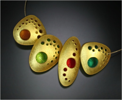
‘Precious Beads’
Your Orbit work is very 3D, can you discuss this?
The entire Orb Series, as well as its variations, was originally inspired by the Pantheon in Rome. I was watching a TV special on that famous landmark, and the sight of the sun shining through the enormous oculus onto the marble walls just struck a chord within me. I strive to create not only fully dimensional work, but also work that highlights the mysterious quality of the opening which instantly draws the viewer into the piece. Achieving this in fused glass was a great challenge especially since many people mistake my kiln-fused glass for blown glass or torch work. I rather enjoy blurring the lines between these different vitric disciplines.
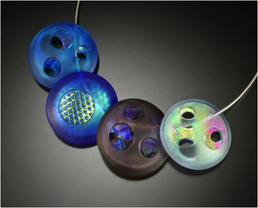
‘Cool Atomic Orbs’
Discuss the use of colour in your work?
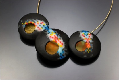
‘Pixel Nebula’
Colour is key in most of my work. It can evoke a feeling, even a genre (as in my Mid-Century inspired designs). I have, however, explored the use of light in black and clear glass and especially enjoy the use of colour gradation, just look to my Pixel Series. As evidence of this love affair, I often arrange the projects on my workbench by their place within the colour spectrum. I find the ordered blend of colours inspiring.
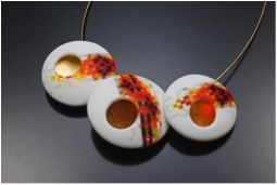
‘Pixel Flame’
You have your work in many galleries. Can you discuss the importance of a good relationship between an artist and gallery?
Gallery and artists have a symbiotic relationship and it’s essential to remember the importance of our respective roles. We provide the needed product and the gallery in turn provides the conduit to potential clients. Of course good communication is crucial, and we need to be willing to work this symbiosis into our working style.
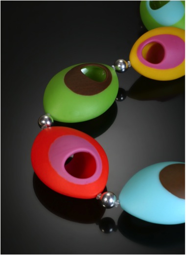
‘Mod Necklace’
Can you explain how your studio works and the type of equipment you have in it?
Since I deal primarily in jewellery, I am able to condense the bulk of my materials and machinery into my backyard studio building. In order of the production process: a design desk where the plans are drawn, a large movable central table for cutting glass, several kilns of various sizes for fusing and slumping, a grinding and drilling station for shaping the components, a pencil blaster for making those satin smooth matt surfaces, and an assembly area for finishing touches.
Discuss the care of your jewellery, both to wear and clean.
Glass is a very sturdy material. It will literally last for centuries. The advantage to fusing the glass into shapes is strength. The dome of the Pantheon has survived for thousands of years after all. One need only wipe it with a damp cloth and rub simple mineral oil on the surface to revive the satin finish.
Can you take two recent pieces you have made and discuss the inspiration and technique involved?
‘All Eyes are Upon You’ Necklace
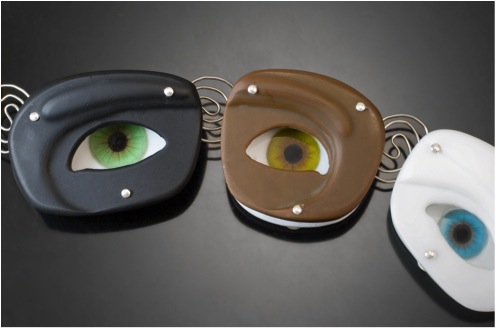
This was inspired by an early childhood memory. I was riding in the old family station wagon when I spied a clown face optical illusion painted on the wall of a passing building. The eyes appeared to move along with me as we drove by (yes, creepy I know!). A few months back, I was seeking a way to combine my porcelain painting with my glass work, so I fused and painted the realistic eyes on the surface of the glass and fashioned textured matt glass orifices that “float” over the top. The illusion works eerily well.
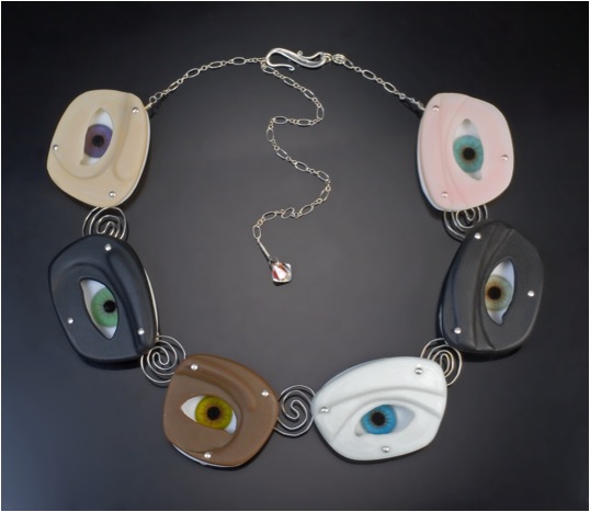
'All Eyes are Upon You’ Necklace
'Mod' necklace
I have long had a love affair with Mid Century Modern design and architecture. Recently, I was able to attend Modernism Week in Palm Springs, California and designed this piece with hand-made marquis shaped moulds. It captures the essence of the movement in shape as well as classic colour combinations
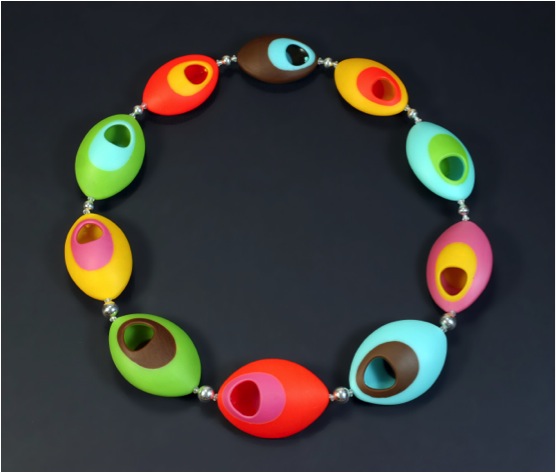
‘Mod’ Necklace
Discuss the different types of jewellery you make, eg rings, necklaces, etc...
The core of my work focuses on neckpieces and earrings. I have, however, delved into other types of adornment such as rings, watches, brooches, hair sticks, bolo ties, bracelets, and even belts.
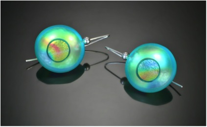
‘Atomic Earrings’ - Aqua
Contact details.
Email: barrettart@verizon.net
Web: www.barrettart.net
Dolores Barrett, California, USA
Interview by Deborah Blakeley, May 2014
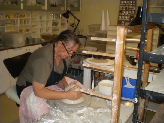
Sandra Black
While writing this conversation you will be in China at a residency. Can you explain how this came to be and what you are learning now?
I am currently in Residence at “The Pottery workshop” in Jingdezhen, famous for its fine porcelain production. I was initially introduced to this residency by two Canadian artists Trudy Golley and her husband Paul Leathers. They persuaded me to do my first residency with them at the pottery workshop in 2010 after we had exhibited and worked together in Perth in 2009. As to learning I have come to the residency both the first time and now with an open mind and no particular plans. I have found in past residencies if one had a specific goal in mind it was often thwarted by technical issues with materials, kilns or distracted from by all the new possibilities new clays, tools, technologies , techniques and what other artists had to offer and be inspired by. I like to learn from my fellow artists and craftsmen around me through observation, conversation and practical demonstrations. Particularly important is to learn about the culture and history of the country I am in.
How important are residencies to your professional development?
Residencies are very important in that they give me time out from the normal home studio, work routine. They allow me to engage in new cultures explore new materials ideas etc. They allow time to reflect, relax and experiment. It also creates new friendships and connections which leads to further opportunities to exhibit and teach overseas. There is also a reciprocal relationship established with fellow artists where I have been able to invite international artists to work, reside and exhibit within our Australian ceramic communities. It’s also about absorbing and observing ways of working collecting ideas. I am not so interested to making lots of works but rather give myself precious thinking time. It’s when I go home and sit in my own studio where things can be controlled that I find what I have learned will start to emerge in my work. New works will come sometimes a couple of years after the residency.
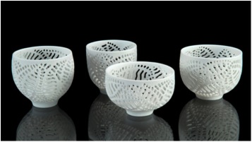
Image by Victor France
Your residency in Canada was to have a huge effect on your ceramic art. Can you expand on this?
There were certainly a number of effects on my own work. Initially I had gone to Canada to do a workshop in glaze making with Robin Hopper at the Metchosin International summer school in British Columbia. I had chosen to do mid fire glazes but on seeing some lovely high fire white glazes and celadon’s come out of the test kiln I was immediately enamoured by them. On returning home I started experimenting with them. It was also my first time to experience a Canadian spring and the physical landscape of Canada from the mountains of Alberta to the prairies of Manitoba. Being spring I also experienced seeing the snow melt water runoff from the mountains, into the rivers and streams, the numerous lakes and the vastness of sky and plains.
As a result I started in my Red Deer College residency in Alberta a small series of pierced and glaze in filled leaf cups. Later on my return to Australia I installed a gas kiln and started to work on a series of “Ripple vessels” based around the issue of water. Works reflected the colours of water plus the shapes water ripples and the rain tanks we stored water in on our farm.
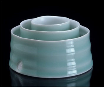
Oval Ripple dishes 2005
thrown porcelain with satin White and celadon glazes
Photographer Victor France
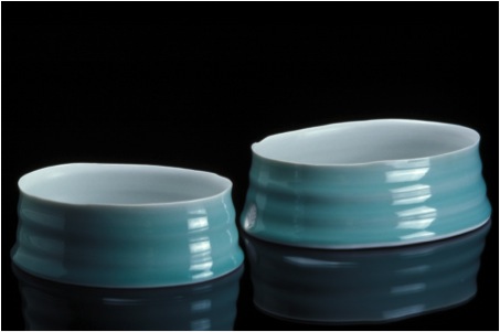
Photographer Victor France
Your work is functional. Can you discuss this aspect?
Some of my work is functional, but not all. During my nearly 40 years as a maker I have had to constantly reinvent my practice to survive. This was particularly necessary during the early 90’s when our economy took a dive and people stopped buying my art pieces. The market interstate was not selling and people only purchased items that were functional. As a result I employed a thrower Warick Palmateer to make bowls and cups for me which I trimmed, decorated and sold locally. These were enough to keep me going until the market recovered 3-4 years later. I also took on some workshops as well to help out. More recently I have made small runs of work in high fired celadons and clear glazes that can be used both functionally and decoratively. I enjoy using other artists work in my own kitchen so appreciate the value of beautifully made functional ware.
Although you work takes on a lace like appearance, it is from nature that you gain you inspiration. Please explain this?
I grew up on a farm in East Gippsland in the state of Victoria so from an early age felt close to the land and nature. Bush walking and nature study were favourite activities. My early career choice was to become a marine biologist as I loved the minutiae of freshwater water and ocean life. I also kept a freshwater aquarium from the age of 12 to observe the animal life plus had a small microscope to study with. A relocation from Eastern Australia to Western Australia in my early teens threw my plans out as the adjustment education wise was quit traumatic. As a result I ended up studying art more and entered teacher training to become an art teacher. My love of nature never left and so over the years this has translated visually into my work. Over the years I have observed the environmental changes as our climate in Western Australia dries out and have tried to reflect this through the delicacy of my pierced work.
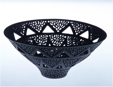
You do not use glazes, can you discuss this?
I generally don’t use glazes on the finely pierced work as they conceal the carving and piercing and it looks too shiny and rather nasty. I like the tactile ivory like surfaces of the polished form. It gives softness to the elaborate carving rather than a harsh bright surface. I have however used glaze when the piercing has been minimal in nature as in the polished in filled glaze works as in the Meander pouring bowls below. I do of course use glazes in and on my functional work.
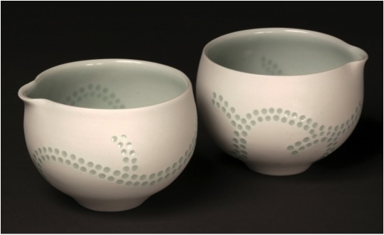
Meander Poring Bowls 2011
Thrown turned pierced and glazed porcelain
Photographer Peter Zuvela
When did you decide to use polish rather that glaze?
As soon as I started piercing back in the very early 1980’s the clay I was using looked much better without any glaze. I never felt these works needed glaze. The tactile pleasure of the polished surfaces is akin to polished waterworn stones.
What is you colour palette?
For the pierced works I like white, cream or black porcelain bodies. I have also experimented with soft browns.
For the glazed works I like clear glazes with a faint hint of blue or green from a reduction firing. I also enjoy classic celadons in blue and greens plus a beautiful satin white. Recently I have been making a couple of small works with a classic dark black Tenmoku. This came out of a Gallery 523 Residency in 2012 In Hai-an China. The porcelain body was badly specked through with iron so a classic Tenmoku was used to cover up. I liked the result.
Recently I have also been playing with deconstructed decals from China and introducing some imagery and colour to simple bowl forms.
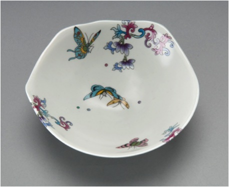
Jingdezhen Butterfly and Flower bowl 2012
Thrown Porcelain and white satin glaze with decals
Photographer Peter Zuvela
You have a large list of galleries with your work. How have you built up this following?
I started locally putting work into West Australian galleries and shops after my work was shown initially in group exhibitions as a young artist. From there I attended conferences, workshops, taking samples of my work along and visited galleries to show them and some accepted me.
I was also very early on a member of the Crafts Council of Western Australia and Craft Australia (sadly both now defunct) who promoted Australian artists locally, interstate and internationally. From these promotions I was able to build up a number of galleries to represent me. I realised at an early stage in my career that having work professionally photographed was critical to exposing work successfully. I managed also using these images to get work and articles published in various craft magazines. Acquisitions of works into regional state and interstate and overseas museums, collections and art galleries also helped.
In 1999 you were part of a selected exhibition ‘Australian Craft to Japan’. Can you explain how this evolved and the importance it has to you personally?
This exhibition was organised by the Australian Crafts council but I can’t recollect any details of this show as it was some 15 years ago (I am not able to access my printed materials as I am away from home at present..) The Australian Crafts council now sadly defunct played an important role in promoting Australian crafts people overseas. This was a great confidence booster and a way of entering into the international arena with substantial government support.
Discuss how your tutorial work at many Universities throughout Australia fit in with your studio work.
The tutorial work largely came about as a result of having exhibitions in other states. My galleries have contacted local groups or educational institutions or I have done so as a means of connecting with my peers plus by having these workshops and giving talks I am further able to keep myself employed and financially solvent. I enjoy doing these tutorials as it gets me to travel and catch up with happenings in the ceramics world interstate. Perth in Western Australia is a huge distance from Australia’s other major capitals so we tend to often miss out on visiting artists and major exhibitions of contemporary ceramics.
Your work is in many collections, both public and private. Can you discuss one or two pieces and where they went that have given you special pleasure?
One of the happiest moments was the winning of the Fletcher Challenge award in New Zealand in 1988. The work “Rites of Passage” was acquired by the then Fletcher Challenge Company and given to the Auckland Museum and Art gallery in New Zealand. This marked a significant point in my career as it was a major international award giving me some great exposure in Australia and overseas at that time.
Rites of Passage
Can you discuss you work in relation to two actual pieces?
The pierced work below was made recently for an exhibition in Monsalvat arts community run by Skepsi Gallery in Melbourne. Technically these are very difficult works to make and the loss rate is quite high from distortion in the kiln and cracking during the making stage, I have been able to partly resolve the technical issue of cracking by the addition of a small amount of paper tissue into the casting slip.
The “ Hardenbergia is a native creeper found in our bushland and popular for home gardens. It has bunches of small purple pea shaped flowers in spring.
Hardenbergia - 2013
Cast carved pierced and polished porcelain
Photo Victor France
Architecture series 1
City of Perth Council House commission 2012
Photograph Robert Frith, Acorn Photography
The works above were commissioned for the 50 year celebration of the building of Perth City’s Council House. As a new style of building in the 1960’s it created a lot of controversy and during the 1990’s was to be demolished. A public campaign saved it and it has been beautifully restored. This was the first commission I had undertaken in many years so it was quite a challenge to produce. I chose the colours based on a 1960s palette plus the black and white abstracted decal to reflect the pop art movement of the time it was built.
Contact Details
Email: sandrablack@westnet.com.au
Web: ceramicartswa.asn.au
Sandra Black, Fremantle, WA, Australia
Interview by Deborah Blakeley, May 2014

Chris Maynard
You have been working with bird feathers since you were twelve. Can you discuss your love affair with feathers?
I still have some of the flamingo feathers from going to the zoo with my grandfather. They remain a fascinating gift from the birds. I love that they are essentially gifts because the birds naturally shed them about once a year and yet they retain their complexity and beauty. There is nothing else remotely like feathers.
I have written a tabletop picture and text book which is due out late this spring; Feather Form and Function, what they are, how they work, why we find them alluring. Over the years I gained a lot of knowledge about what feathers are how they grow and work. Writing this book stepped up the learning process; I am always interested to learn more. I delved into the meaning we associate with feathers in this book—another fascinating subject.
What lead you to creating your first bird feather art in 2010?
2010 was not my first feather art—I have worked with feathers in various ways all my life. Wanting to have a more tactile way for people to experience feathers than a flat photograph and express more themes, was one thing. Another was wanting to keep the feathers in their three dimensional shapes. Cutting out bird silhouettes was a logical progression in developing themes and meanings and telling stories.
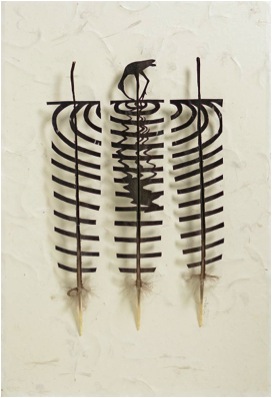
You mount your work in frames or as you call them shadow boxes. Please discuss this aspect of your work?
Feathers are naturally curved and I want to respect that. So I don’t; flatten them in one plane on the surface of the background. I set them away from their backing so the feathers can keep their curves thereby creating an added design element—shadows. A piece varies in its presentation by the direction, intensity and type of light shining on it.
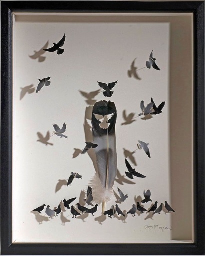
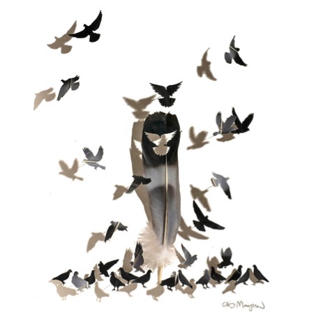
'City Park Pigeons’
Your feathers are mainly from natural moulting and collected from museums, zoos and private aviaries. Can you discuss the collecting process?
People pick them up on the floors of the pens and send them to me. I sort and label them, freeze them and store them.
Discuss the size of feathers you work with?
I like to work with feathers from the birds I am portraying. But small birds have tiny feathers so I have to use those of larger birds like turkeys and pheasants
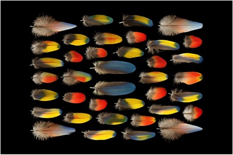
What cleaning process do you put your feathers through before using them?
I freeze them for 48 hours, at 0 degrees F.; then take them out for another 48 hours to allow any mite eggs to hatch, then freeze for another 48. That is it. I have a 20 year-old shadowbox of feathers that are in perfect condition. If any pest problem did develop, I would just freeze the feathers again. If they are dirty, I will wash them with detergent and gently dry them.
Discuss the legal ramification to your work?
I use only feathers that are legal to possess. Laws protecting birds which include possession and sale of feathers in both our countries are quite complicated. Not harming birds and supporting laws to protect them is in my interest as a major goal of mine is conservation.
Often your work is using a single feather that releases into a flock of birds. Can you discuss the combination of many small birds and the remaining original feather?
Birds do what we yearn to do—fly. That is a major theme in terms of what feathers mean to us. Delight the miraculous, escape from our circumstances, transformation, bridges between heaven and earth, here and a spirit world; all are themes associated with feathers. Drawing out that meaning using a central feather with birds cut-outs flying out has been a natural outgrowth of this idea.
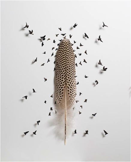
In other works you use multiple feathers in a series or sequence setting, can you expand on this approach?
I’m not sure what you mean here or which piece you refer to. I’ll take a guess using Red Tailed black cockatoo feathers. From US raised captive birds I have the most beautifully coloured tail feathers—the red-tail black cockatoo that I used in a couple of pieces. It pictured three feathers with a bird cut out in each perched in an oval cage. This piece tells a story which I elaborated on by writing a poem for a children’s book to go with the image [the book has not been published]:
Shall I go or shall I stay
Take to wing and fly away?
But it’s safe, my food is here
Choices are not always clear
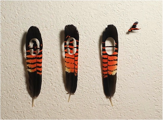
Can you explain how your work is titled?
Some titles I am happy with, others not so much. I like to capture the essence of the meaning or feeling I am trying to convey. The title may relate to the behaviour of a specific bird or to a general theme associated with birds or their feathers. For instance, my latest series is simply entitled, ‘Eat’. I am working on ‘Eat 7’, the seventh in a series. The idea is that bird feathers are reconstituted from what a bird eats metabolized.
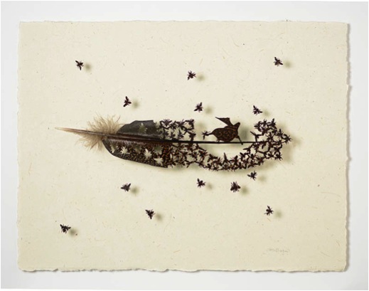
Do you work freehand or have you done extensive drawings before the first cut?
Extensive drawings are the rule. I draw initial sketches of ideas. When I choose one to pursue, I sketch it out in more detail; make mock-ups, and choose the right feather—I often have a feather in mind. If not; I search for the right one. Feathers are very limited in size colour and pattern.
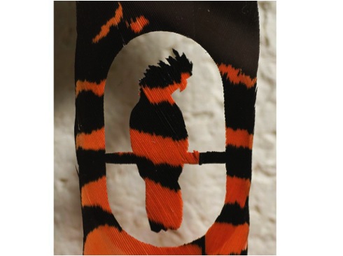
Please discuss your feather photography and some of your processes?
A lot of feathers are illegal to have in Australia as well as my country. Taking photographs means that one does not have to have the feather, just take a picture—this expands the kinds of feathers I can work with.
I have developed several ways to take pictures that bring out the details of the feathers. One is to have a completely black background which can be accomplished in several ways, photographically. Side lighting brings out the surface topography of the finely structured surface by casting small shadows.
Can you discuss your Feather Alphabet?
Off a bird, its individual feather patters are striking. On the bird, they provide camouflage and blend in. The meaning or what patterns remind us of is entirely made up—they are patterns we recognize from other things—like letters and numbers. They have nothing to do with the actual bird and mean nothing to the bird. They just help the bird to hide. But meaning is important to us so we will persist in this kind of endeavour.
This bird has the most varied patterns in its feathers of any bird on Earth. All colours are made by the most common colouring pigment in bird feathers: melanin. This makes the russet browns, browns, blacks and greys. In the alphabet, they make for a rather subtle effect—you really have to take some time to look for some letters and numbers as the letters may be inverse. I thought it would be good for school children as they learn the alphabet but I have been told by early childhood education specialists that the younger children need more defined letters for learning. I was told by a writing specialist that when children are older and have learned the alphabet, say ten or eleven, that looking at this feather alphabet can expand their thinking and seeing—because they really have to look—they are drawn in.
I have relationships and friendships with aviary owners. They are busy people and usually only able and willing to pick up the larger feathers to send to me.
Discuss your membership of Artists for Conservation and its importance to you?
Conservation issues are at the heart of my work. I want people to see the world through feathers in a new way; take a moment to breathe, appreciate life. I hope by appreciating feathers and birds by seeing them in a different perspective, that these creatures will get more respect and therefore concern for their welfare.
I am a new artist member with Artists for Conservation. I plan to write for their blog and just gave them my first of what I hope to be a series of three articles on feather coloration which has applications for all artists.
I am not new to advocacy for conservation issues. Currently I am working as an artist with the Macaw Rescue Foundation based in London and Ontario to provide a piece for fundraising to reintroduce a species of Macaw to the forests of Bolivia. I just gave the annual talk to the Audubon Society in the USA on the topic of feathers. My talks follow the contents of my new tabletop picture and text book, Feather Form and Function: what feathers are, how they work, and why we find them alluring.
Contact details.
Website:www.featherfolio.com
Email:chris@featherfolio.com
Chris Maynard, Olympia, WA, USA
Interview by Deborah Blakeley, May, 2014
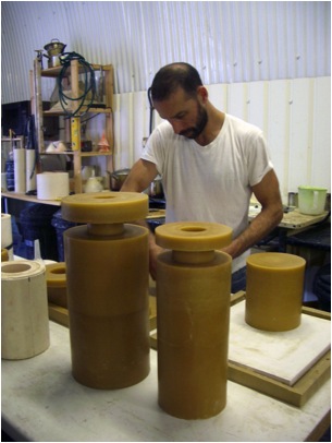
Bruno Romanelli
You first became aware of art glass as a medium at Straffordshire Poly. Can you explain what captivated you and what lead you to follow this medium?
I went to Staffs Poly to study Surface Pattern, thankfully the course was a multi-disciplinary design course and I had the opportunity to work in other disciplines before choosing a specialism. Glass was one of the disciplines on offer and I decided to try it, as it sounded really interesting and unusual. Interestingly, it was a 4 week block in glass-blowing though that seduced me enough to make me specialise in glass for the rest of my degree. It was only later that I discovered glass-casting which opened up my eyes to what was possible with this material. The material qualities of transparency/translucency and fluidity/transformation along with the process of making that captivated me all those years ago and still do today.

‘Ty1’
Inspiration comes from many directions, nature and man-made objects. Please expand?
I look at many things to give me inspiration, from the mundane to the sublime. What interests me most is light, form and colour and how these three elements combine to give infinite possibilities. All around us in our daily lives we see this interaction, I attempt to distil this in my work. I use very geometric forms that require absolute control and precision making, to achieve what appear to be quite simple forms, and then add the more spontaneous/less predictable material to the equation to give ‘life’ to the piece, which often results in wonderful combinations of ‘organic’ and man-made.
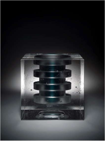
‘Bunda’
Control of form, light and colour is the cornerstone of your work. Can you discuss this?
I use geometric forms as the vehicles for the ideas in my work. I use geometric forms because they allow me to exercise precision control in order to achieve them, and because of their simplicity, they do not fight with the other elements of the piece, rather they are complimentary. Within these geometric forms I use various methods and glass types to ‘interfere’ with light as it interacts with the piece. Optical, translucent, opaque, cloudy, coloured, tinted, and combinations of these effects are used to create each individual piece.
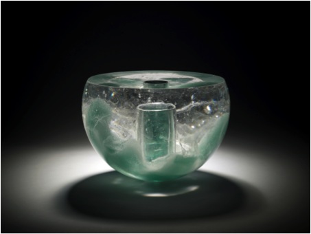
Can you discuss your wonderful collaboration ‘Glass Masterworks Series’ with Peter Layton, Wrightson & Platt and yourself? How the collaboration and the pieces themselves came about?
This is a series of work that I first developed when I was at the Royal College of Art with a glassblower, Graeme Hawes. They were a complimentary line of work alongside other work I was making at the time, which was focused entirely on the hand. At this time the hands were modelled in clay.
More recently, Peter Layton asked me if I would be interested in some kind of collaboration and I jumped at the chance. As I work with Wrightson & Platt quite closely on their range of life-cast glassware, I thought it would be really great to revisit these pieces and work as a three-way collaboration by life-casting my hand for the pieces.
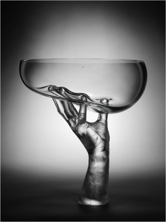
‘Single Handed Vase’
Discuss one of the pieces you have made for ‘Modern Masters’ in Munich?
Mimas – This piece utilises a common format in my current work with the rectangular main form with the cylindrical inserted colour, which opens into the hollowed abstract vessel at the top of the piece.
The main body uses optical bk7 glass, which devitrifies when heated to create the combined clear and veiled effects. The process of casting introduces the movement into the piece as the devitrified surfaces stretch and twist as they flow into the mould. This is then polished to reveal the internal qualities of the piece and the optical properties of the glass.
Colour is introduced by way of the cylindrical insert, which penetrates the main body and the vessel form which sits atop the piece. As light flows through the coloured elements it tints the colourless strands of devitrified glass within the main form creating a dynamic and harmonious effect.
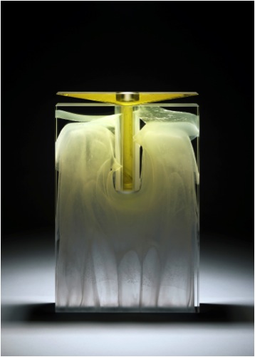
‘Mimas’
Following are some questions related to the video ‘Titan’ by Julian Langham.
How large is your studio are in South London?
Around 1200ft sq
What equipment do you need and do you share this with others?
Kilns, rociprolaps, air-tools, flat-bed grinder, sand-blaster, whirler (lathe).I have an assistant that also uses my equipment to make his work
What ‘Health and Safety’ issues do you need to keep in mind?
Mainly dust from silica based moulds. Sharp edges! And acid harzards.
Does the size of your equipment restrict the size of your work?
I don’t feel restricted size-wise. If I wanted to make larger pieces I would find a way.
Does the outside temperature affect your work – it is often very wet work?
No, outside temperatures do not affect my work.
Once you have a mould, how often do you use it?
Silicone moulds can be used endlessly for making waxes, casting moulds are used once only.
Can you discuss the signing, numbering and dating of your work?
Each piece is signed: B. Romanelli, with a sequential number B(for Bruno)XXX and then the year it was made
You have work in many collections, take one in particular, the Victoria and Albert Museum. Can you discuss the work they entail and the how important it is to you to be in their collection?
The V&A have a piece from 2001, which was a piece from a series of work I was doing entitled ‘Boxed’ which explored ideas of masculinity, identity, sexuality and perception.
I think it’s hugely important to have work in major museum collections as it brings your work to a much wider audience as well as helping to elevate your status within the art world. I’ve lost count of the number of times someone has randomly told me that they saw my piece in the V&A glass collection.
As artists we use these collections as a historical resource as well as an inspiration for our own works, not just the glass collections, but all the interesting objects that can be found in places like the V&A can inspire in otherwise unexpected ways - so to be included in such a world-renowned collection is truly an honour.
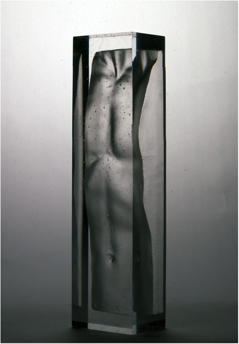
‘Boxed V111’
The majority of your work is for exhibitions. Can you explain how you decide the when and where to exhibit?
Most of the work I make is shown through my Art dealer, Adrian Sassoon, at the major art fairs around the world such as TEFAF in Maastricht, Collect in London and SAD in New York. I also show in other exhibitions and judge the merit of each show based on my knowledge and experience within the glass world. At this stage it is important to have my work seen in the most prestigious events.
Contact details.
Email: info@brunoromanelli.com
Bruno Romanelli, South London, UK
Interview by Deborah Blakeley, April 2014
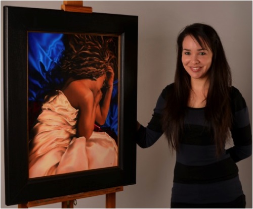
Nadia Lazizi
You say you are a figurative artist. Can you explain how you understand this term in context to your work?
For me, to be a figurative artist is to work with the human form in one’s own work. I have always found an affinity in working with the female form in particular, as a means of self expression.
A favourite pastime of mine was sitting cross legged on the floor in life drawing classes and immersing myself in studies of the human anatomy. It brought with it not only the challenge of attaining anatomical correctness of form in a practical manner but also cleared the mind of all distractions and became more of a meditative process.
Recently you have become a selected member of the International Guild of Realism, USA. Explain how this membership is achieved?
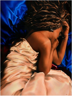
‘Equilibrium’
I was very pleased that my application to IGOR was accepted. If one wishes to make an application to them it is done through their website. They request that if you happen to know anyone on the admissions board, that you state this clearly along with your application to keep the judging process impartial. If an artist should wish to submit an application for membership to the Guild they will need to supply them with several images of their work at high resolution, a link to their website and other necessary information such as contact and image details. The application itself can take a few weeks to be reviewed by the charter members of the board.
When and why did you decide to specialize in painting women?
It wasn’t a conscious decision as such. It was more of an organic process that evolved from my love of studying the human anatomy at College/University, coupled with an exploration of my mixed cultural heritage and place within society as a young woman.
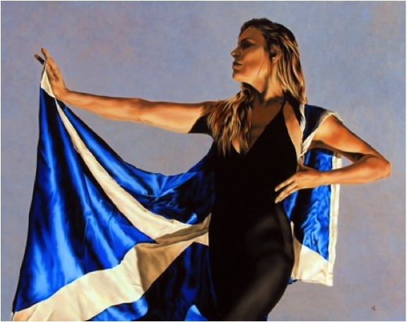
'Breakaway’
Can you expand on your use of flamboyant fabric in your work?
I predominantly use silks within my works. The reason is twofold, the first being that it is a real pleasure to paint, the colours are vibrant and I adore the way it interacts with the light that I use in my paintings. The second is because I find it to be a very sensual and feminine fabric.
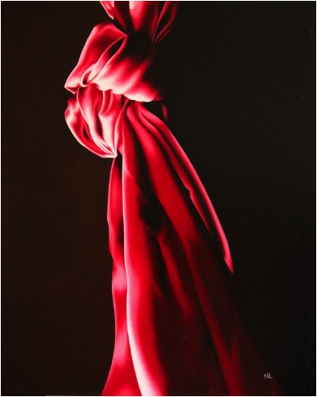
'Forget Me Knot’
You also paint just fabric. Can you discuss this work?
Several of my works are solely of silk, yes. This came about because I needed to take some time to reflect on a few matters and I find that painting silk is a very calming, meditative experience.
‘Haven’ and ‘Reticence’ give a more modern insight. Why does clothing have such a dating impact on the viewer?
Although my work is grounded in realism, it is far too stylized to be considered entirely so. I would refer to it as Aesthetic Realism, influenced by not only the classical fine arts of the Renaissance but also contemporary illustrators and digital photographers. With ‘Reticence’ and ‘Haven’ as well as ‘Shelter’ and ‘Timid’, I sought to further enhance the modern, illustrative quality of my work by making the clothing a distinct feature, even though it is very simple and dark. It is further enhanced by the lighter backgrounds which the clothing is very clearly defined against. Clothing is indicative of the times we live in or the times we, as artists, wish to represent. The particular time period in history one is depicting also brings with it a sense of the values and perceptions of the people of that particular age.
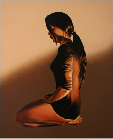
'Reticence'
A large number of your works have very dark backgrounds. Expand on this use and also on that of light in your work?
I have always used my work as a way of exploring my feelings and place within the word as a young woman, given my mixed cultural heritage. Since my work has a very personal source I have always been concerned about how much visual information to convey to the viewer. The use of negative space and ambiguous backgrounds is intended to focus the greatest attention upon my subject, the solitary female and her emotional experiences.
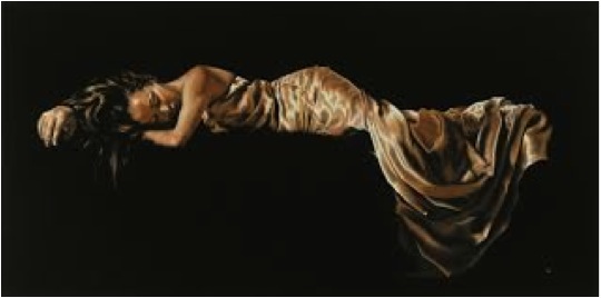
‘Linger’
Mood and atmosphere is carefully constructed through the deliberate juxtaposition of the central figure against an ambiguous background. In turn, the image is further defined by the use of intense artificial lighting and a restricted colour palette. The play of light and shadow conveys an effect that is both welcoming and remote. In brief, it intensifies and ephemeral moment in time which the viewer can interpret in light of their own personal experiences, yet being guided by the ambience and composition of the image as a whole.
Can you discuss how you are able to show such sensual poses without them becoming sexual?
I have always been acutely aware of the fine line between ‘sexual’ and ‘sensual’. I want to portray the draped female figure, whilst still retaining the element of ‘modesty’ which was instilled in me from a young age. This can be a balancing act, and one which mirrors my own personal circumstance.
Many of my works represent a dream world or moments of quiet reflection, contemplation or introspection, where one can delve into the subconscious and attempt to understand one’s own place within the greater scheme of things. I seek to represent and capture a fleeting moment in time, a transient image of contemplation that is a combination of dreams and reality, a tasteful balance between sensuality and femininity, suggesting emotions and feelings frozen in time. They are illusions, drawn from an unreal reality based on the commonly purveyed Western depiction of women in an idealised form.
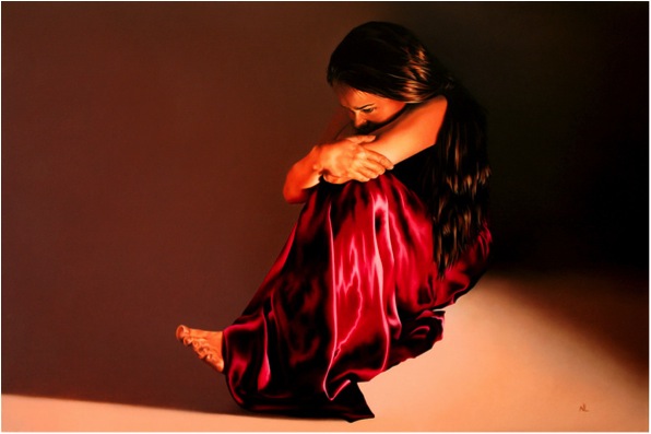
‘Hesitation’
There is often a feeling of tumbling and falling in your work. Can you explain this?
It comes from the subsequent feelings of being influenced by two very different cultures. My upbringing in what is generally considered to be a democratic and liberal Western country meant that there were inevitable clashes between two polar opposite cultures throughout my life and search for my own identity. Often this led to feelings of isolation, confusion and frustration. I found a means of expression through my artwork, and deep reflection upon my circumstance. This is not something that someone would automatically garner from my work but these feelings are conveyed to the viewer on a very subtle level.
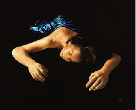
'Night Flight’
‘The Seeker’ is very different from your other work. Can you explain the inspiration for this work?
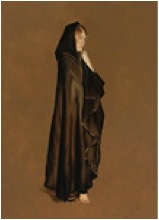
‘The Seeker’
The Seeker was a commission, and as such was painted according to the client’s wishes, which on a serendipitous level also related to my own exploration into identity issues and multiculturalism. The model herself is blonde and fair skinned but she wears the traditional Islamic garb and is, albeit hesitantly, setting out on a journey of discovery.
Can you explain the process of your work, from inspiration to completed canvas?
I seek to define a particular emotion and capture it on linen. My work is very controlled and this mirrors my own nature as I have always had to walk a fine line between two very different cultural expectations and perceptions of womanhood. It has led to a very natural and methodical approach to my paintings and I work slowly, allowing each layer dry before the addition of subsequent layers of paint are added. This often means that I am working on several paintings at once. I work with an array of photographs and sketches, attempting to capture the anatomical correctness of form, which is very important to me. (Unfortunately the costs of working with live models make it impractical for me to work with them on a consistent basis throughout the whole process). After I use the photographs/sketches to establish the figure, I begin to stylize the image as a whole. The works poses a contemporary tone which is achieved through the integration of dry brush techniques, glazing and chiaroscuro, combined with an illustrative edge. Because of the way that I work, it often takes several weeks to finish a painting and as such, I am now working with small canvases, which allows me to work through my ideas at a much faster pace.
Once the work has had time to dry, I use a retouching varnish to protect the painting.
In ‘Cascade’, the curl of the body appears to bind in all her secrets. Please discuss this?
Yes, she is also shrouded by her hair that cascades freely over her shoulders. The idea behind this is again twofold. Her hair protects and hides her from the viewer but it also gains her attention for this very reason, as she sits on the floor reflecting upon her thoughts. The symbolic significance of hair in different cultures prompted this as the Islamic perception is that covered hair symbolises modesty whereas the Western woman does not acknowledge a similar constraint. The models hair flowing over her body illustrates that she is both protected and trapped by these opposing views and presumptions of how a woman is perceived within these respective cultures.
From a technical point of view, I have always found loose hair to be a pleasure to paint. I also feel that it enhances a woman’s sensuality, but that is something that I was always encouraged to ‘contain’. All of my work deals with similar issues and cultural contradictions.
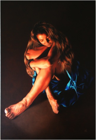
'Cascade’
You were involved in an exhibition, “Women Painting Women”. Can you discuss this particular exhibition and working with ten other women who paint women?
The Women Painting Women movement began in the USA with Sadie Valeri, Alia El Bermani and Diane Feissel who created an online resource detailing the work of other contemporary women artists working with the female form.
Since its inception in March 2009 the site has grown and featured the works of many female artists practicing today. A desire to promote works and create opportunities led to a series of Women Painting Women exhibitions running concurrently across the globe. It was a wonderful show of solidarity and a thoroughly successful event for all concerned. I myself took part in the Glasgow exhibition which was represented by Art Exposure Gallery, which is one of Glasgow’s mainstay galleries that were founded over 20 years ago.
It was a pleasure to work with such a wonderful group of inspirational ladies at various stages of their artistic careers.
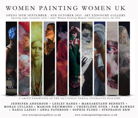
On the flipside, you photograph wildlife. Again, this takes so much time and patience. Can you show 2 images of your bird photographs and explain how the images were taken?
‘Baby Owl’
Yes, certainly. Last year I developed a very bad case of painters block due to some emotional turbulence and as such, I had to take some time away from the easel to clear my head. I wanted to use my time constructively and I have always been an animal lover who believes that the best way to regain inner balance is to spend time in the natural world. So I took my camera and pursued this as a way of not only interacting with wildlife but also in learning to gain a better understanding and control of my photographs.
‘The Valture’
I took a one day photography course with the Wildlife Heritage Foundation in Kent and I would recommend this experience to anyone. It was wonderful and I gained a much better understanding of the workings and capabilities of my camera. Subsequently, I pursued this line of inquiry by documenting the raptors at the local Safari Park, thanks to the help of a kind group of falconers who work with the birds throughout the year.
‘Tiger’
Contact details:
Email: www.Nadialazizi@hotmail.com
Website: www.Nadialazizifineart.com
Nadia Lazizi, Edinburgh, UK
Interview by Deborah Blakeley, April 2014
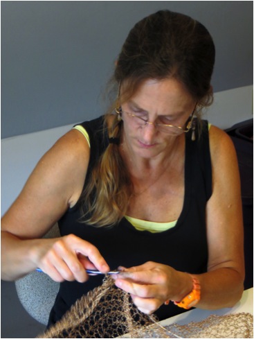
Tracy Krumm
Childhood experiences passed on by Grandmothers have influenced the direction of your artwork, please comment?
By teaching me to crochet, tat, embroider and sew, my grandmothers introduced me to the legacy of women's work. These activities bonded us across the generation gap and introduced me to a world of creative practices that embraced beauty, labour and connections between cultures--and women--all over the world.
You have a definite connection between combining math and the natural sciences. Can you discuss this?
My interest in ecology and environmental studies has always been a huge influence on my artistic practice. My love of math and other linear and non-linear systems gave me an immediate connection to textile-specific practices. The fact that the very nature of textile structures and surface design are rooted in pattern and sequence made textile studies a viable approach to making art when I first began to be interested in the idea of being an artist as a profession as opposed to just a pastime. The natural sciences and my particular love of botany provided me with a background to understand the essential nature of the materials I was attracted to. Being able to analyse things from an academic standpoint, both scientifically and culturally, has influenced my art making practice far more than the history of art or the work of other artists.
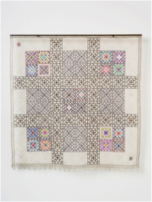
‘Squared 9 Patched’
A combination of need and serendipity happened simultaneously during graduate school. I found a spool of wire in a free box in front of a science lab. It immediately solved a problem of how to unite the found materials I was working in a way that felt more physically substantial than using a fibre-based material. After experimenting further, I realized metal--soft, annealed metals of all types--could be used to construct textiles with qualities and characteristics similar to fibre-based textiles. But they had this edge, this potential, to do something different in terms of structure and texture and colour. My excitement in discovering this love for metal is still with me--that's why I continue to use it.
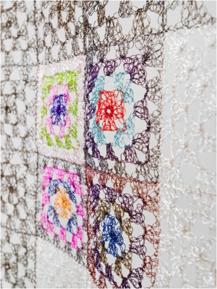
‘Squared 9 Patched Detail’
Your first exhibition was in 1988 at the “Young Americans”. Since then you have been involved in over 150 exhibitions; can you discuss 2 or 3 highlights and how they influenced your work?
"Young Americans" at the (former) American Craft Museum was a huge show for me because of the tremendous exposure. It really allowed me to start my career as a studio artist. My work has changed significantly from that period--it was 2-dimensional mixed media based in weaving and papermaking at that point. The next big "aha" moment that set me on the trajectory leading me to where I am now was a show at "Plan B", a hipster renegade art space in Santa Fe. There were several teams of local artists invited to do installations for a show called "Airships and Submersibles" and this exposure evolved into a long relationship with Linda Durham Contemporary Art in Santa Fe. Around the same time, I was selected to participate in the Betonac Prize, which opened in Belgium and toured Europe, so that got me over to Europe for the first time to scope out the contemporary art scene. Lately, it has been a move back to Minnesota after teaching college for 10 years--where winters are snowy and cold and where I now control my days instead of students and administrators-- and recent travel to Peru and Hawaii that have provided the physical, spiritual and cultural extremes that seem to fuel my work. Combining this with the fact that I have been lucky to have continued commercial success keeps me productive in the studio.
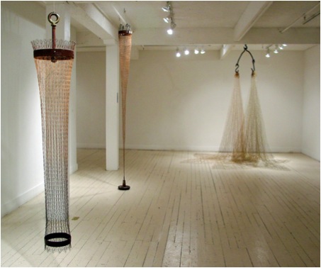
Installation
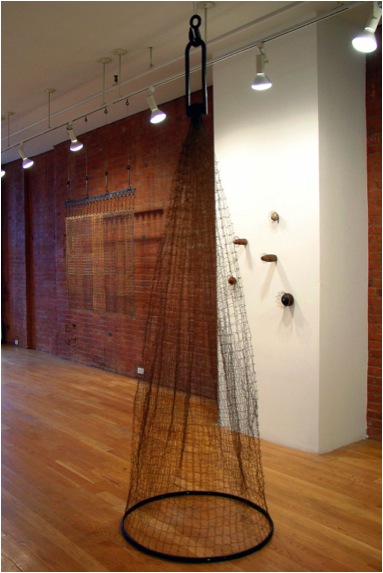
Installation
How difficult has it been to have your work accepted in mainstream galleries?
I mentioned my relationship with Linda Durham in Santa Fe. She was a huge supporter of my work and for over a decade, her gallery was pivotal in placing my work in a contemporary fine art context. I was lucky to have her and a number of other excellent contemporary art dealers take my work to significant art fairs in the US and Europe. My current gallery relationship with Andrea Schwartz in San Francisco has been essential in keeping my work where it needs to be. I have put enormous trust and faith in my dealers and then stepped back and let them work their magic. Having the right dealer at the right time is super crucial--and does not always happen.
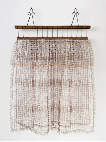
‘Draped (Screwed)’
You have received two grants from the Museum of International Folk Art in Santa Fe. Can you discuss your thoughts on current Folk Art?
What constitutes folk art could be up for debate; to me it has always meant simply work made folks engaged in cultural production. We can discuss intention, training and utilitarianism as factors; it is generally work that is driven by the human hand, channelling creative energy. This means everyone can be a participant. My projects at the museum in Santa Fe allowed anyone who wanted to contribute to a several installations that could not have been realized by me alone.
The sheer amount of work meant many participants were needed and the processes used had to be simple to ensure participation by everyone, no matter their abilities. This act of making as a community tied us to cultures all over the world that rely on shared values and community engagement to get work done. Creativity is a powerful force because it lives in everyone.
How important is it that the craft of crochet lives on?
Like so many other important craft processes, the language of crochet has connected so many generations of people and so many different cultures for the past 150 years or more that I can't imagine it will ever disappear. Cultures all over the world engage with it as a practice for making objects of both utility and beauty, and artists around the world choose it for its ability to create structure in a certain way and for its ability signify particular conceptual content. I cannot imagine a world where there is not a discussion about the both the hand and technology and where these two things meet and don't meet. Crochet and other hand constructed textile practices will always be part of this conversation.

‘Strapped (funnel)’
Can you discuss how crafts are defined by the generation that produces them?
Every generation has to define things in terms of itself or it won't be understood if it isn't in the right context. This is what keeps things fresh and alive. We are not always seeing things take on a radical physical transformation, as all craft processes seem to have some defining essences that resonate around the world and withstand the tests of time. As someone who has been involved in discussions about craft for over 30 years as student, teacher, production weaver and professional artist, I have seen the reinvention of the wheel over and over. Folks are still crocheting, forging and stitching "just like in the olden days" but every generation has new reasons for doing it. The crafts could be seen as benchmarks that are constantly being related to current social conditions and the relationship of every generation to what craft is becomes part of its history. It is a constant learning process for all of us involved and the field gets broader every day. You really can pick where you want to be in the discussion, whenever and wherever--there is no right or wrong place to be.
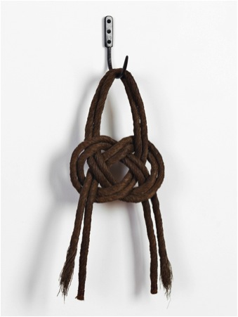
‘Steel Chains(Carrick)’
Your work is all about connection. Can you discuss this relationship in your work to 1 or 2 particular pieces?
Ideas about connection are both physical and conceptual parts of my work.
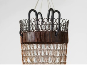
‘Tapper (Anchor)’ Detail
The joining of materials is often the visual focal point of a work.
This crossing or momentary joining of some sort of duality exists in everything I do. It is the point of intersection and accommodation that I love to play with, where strength and weakness come together and you don't know which is which.
In "Taper (Anchor)", the metal armature is encased in the crochet. The connection of the materials has an interplay that is totally significant to the structural integrity of the sculpture. It's not just decorative, it's essential and it's highly calculated.
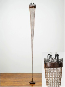
‘Tapper’’
Discuss how you use shadows in your work?
Shadows give the work an extra dimension that can either attract or distract. I try to keep the shadows to a minimum in my individual portfolio photographs. But in an exhibition, shadows can add an extra layer of depth and intrigue to the work. They can be used as a non-permanent drawing, record or impression of the work and can expand the boundaries and complexity of the work. Of course, if that is not part of my intention in an installation, then they are just a nuisance. It all depends.
Discuss the importance of hanging space for your work?
My work has an aspect of flexibility built into it. Every piece becomes a part of something greater that comes together to activate space in a certain way. Each space dictates the nature of how a group of work can come together to be displayed. The pieces have to play off each other in a way that makes them all worthy of being there. I often fabricate multiple armatures or hanging devices to accommodate whether a piece needs to be on the wall, hanging in space or freestanding. Many pieces can be shortened or lengthened to some extent without losing integrity. I get to make this call each time I do an installation and it helps keep the work fresh for me.
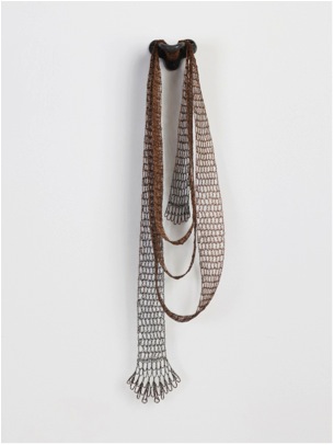
‘Strip (wrapped)’
Take both a 2D and 3D piece that you have enjoyed working on and discuss?
I think the pieces that have an unexpected resolution are always the most satisfying to work on. The 3D piece "Lure (Pouch)" came from taking two other unsuccessful pieces apart and working off them to create a new, hybrid form that was much more dynamic.
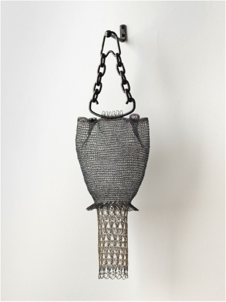
‘Lure (Pouch)’
The same thing happened with the 2D piece, "Plaited". It came together as I took apart a larger net from an older curtain-type piece, crocheted it back together and then started to crochet a series of strips to weave through it. The hand labour involved makes me not want to waste any of the material so I recycle my own work. I also love combining process, like plaiting and weaving, into my work. And I love to work using multiple elements, since I can finish several of these every day, which is gratifying. Then when I have a pile of them, they can come together to make something bigger and better--something I might not have been able to conceive without the parts to the whole in front of me.
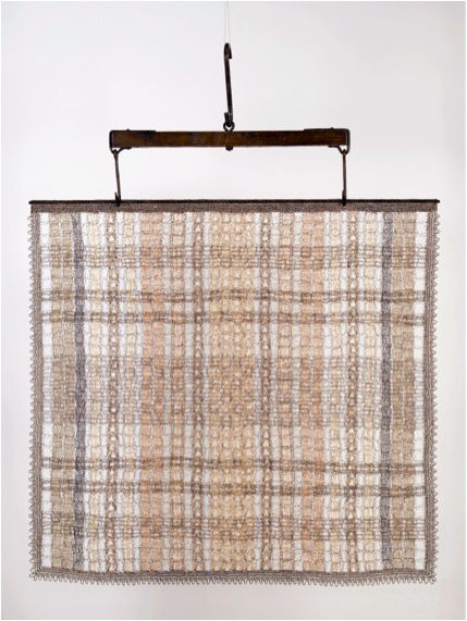
‘Plaited’’
Often crochet conjures up small pieces made by Grannies, whereas your work is large and sculptural. Can you expand on this?
Personally, I love the image of the small pieces made by grannies. It is so nostalgic these days. Who makes a doily anymore when you can buy one at either the discount or the antique store for $2? Now there's a cultural contrast! I think it is partly this desire to seek out compelling contrasts that led me to make work on a large scale and partly, it takes me a long time to figure out what I am doing so I have to embrace this thinking-through-making sensibility. I am labouring away, making material, not always knowing what it is going to be until the pile is quite large and then the reality of what it needs to be comes together.
Can you explain your involvement with the Cultural Exchange through Visual arts and the US Department of State?
The US State Department's Art in Embassies maintains an on-line artist registry, where over a decade ago I submitted images for consideration. My first contact with them was back in the 1990's when we were still sending out slides and my work was still two-dimensional. They have excellent curators who are constantly looking for new work for loan to their embassy exhibitions. I was fortunate enough to have work selected for the new American embassy in Djibouti and to have the work purchased permanently for the collection.
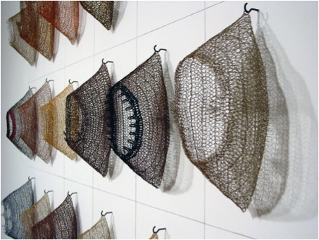
‘Table (Husks)’ Detail: The US State Department's Art in Embassies
You work in your studio full time now. Can you explain how being able to give your time fully to your art has given growth to your work, inspirationally and in new directions?
There has been a lot more time to think, to fret and to sift out bad ideas. I do not have to approach my work with the desperation of time constraints. You make decisions very differently when you have more time. I don't know if this is good or bad, it just is and takes some getting used to. I spend more time thinking about whether or not the work I am doing is worthwhile and if it is true to my nature. I have dabbled in a lot of other materials and processes in the recent past, but none of them has suited me yet. Maybe as my lifestyle continues to change, something that appears to be a more radical shift will click. For now, I am trying to take more time appreciating my surroundings to soak in new inspiration and to establish some meaningful relationships with my new community in the Twin Cities. It doesn't get any easier as you get older. There is a lot more weight and effort involved in everything I do right now.

Tracy Krumm, Blacksmithing
Everyone loves to see inside an artist studio. Can you show yours and explain how you have had to adapt things for storage and your specialist needs?
My studio has always been pretty spartan and I am not a huge stockpiler, as I have moved so many times in my life. I have always been extremely organized, as my studio usually doubles as some other type of living space. Everything has its place and gets packed away in a plastic tub when it is not being used. I tend to have several piles on my worktable at a time, as I usually work on several pieces at once. And fabrication equipment always lives in the garage. I try to keep it simple. Think "pile of wire and crochet hook in a tote bag" and I am good to go!

Tracy Krumm, in the studio
Contact details.
Website:www.tracykrumm.com
Email:tracykrumm@gmail.com
Tracy Krumm, St. Paul, Minnesota, USA
Interview by Deborah Blakeley, April, 2014
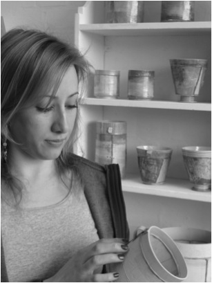
Emily-Kriste Wilcox
One major emphasis in your work is your subtle colour and design. Can you expand on this?
Painting plays an important role in my process and I make many studies of the sky and landscape which feed into the development of the 3D ceramic work. Firstly, walks are documented with photographs, small paint studies and notes in my sketchbook. Larger paintings further explore and inform colours and textures, which are then developed on into the ceramics. This is an ongoing process, and is a continual source of information for the ceramic work. These elements go hand in hand.
For the ceramics, layers of decorating slips are applied to build up the surface and create a depth that holds similarities to misty skies, or walks across the hills, which in turn allows the pots to create a sense of place – sometimes this can be a memory of a walk or a view across the sea.
Colours are cohesive; often tonal on single pieces and this control over the colour palette enables me to bring each of the differing elements and panels of clay into harmony with each other. Some may have text on, or richer textures/patterns; some are more muted. Some pots make direct references to walks; many are more abstract and open to interpretation. The numerous sky and landscape studies play a large part in this focussing of my colour palette allowing me freedom to then introduce other colours or textures when I’d like to expand on the investigation.
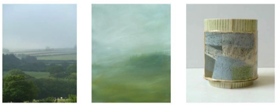
You are currently researching 18th Century tea caddies. Can you explain how this study is directing your work?
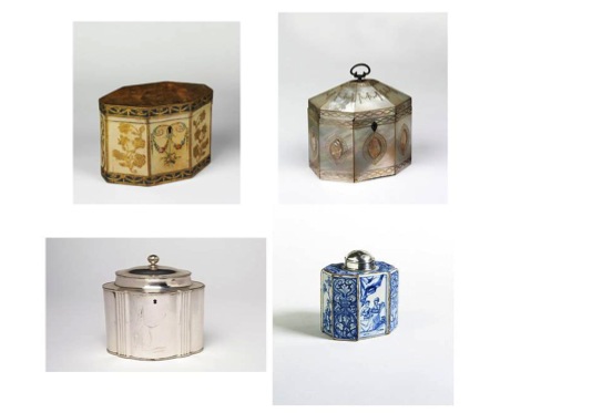
A selection of tea caddies in the V&A collection *(Victoria and Albert Museum, London)
I have been intrigued by the *V&A collection of tea caddies because of the use of faceted panels similar to my own method of construction. Often the straight edged panels were divided or joined by solder or silver yet combined through connected imagery or motifs. There is an added notion that these were highly decorated and intricately worked containers to hold the prized tea; and therefore often displayed for their aesthetic value as well. This all resonated with the way I work, and inspired in part, the oval shaped pieces I have been making in recent years.
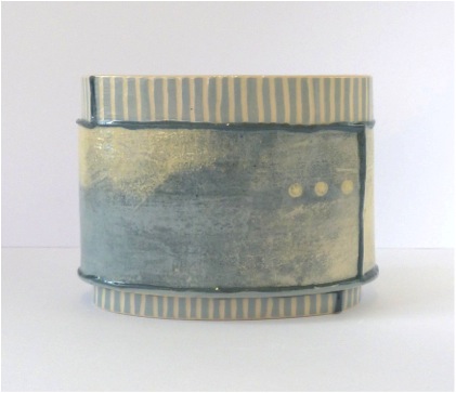
small oval vessel - SO13, H11cm
The final pieces have been worked over with many layers. Can you explain your technique?
Each piece goes through a number of firings to achieve the desired depth of surface. Firstly layers and layers of coloured decorating slips are applied in a painterly manner using brushes and newspaper. This is worked alongside more controlled sgraffito techniques, sometimes in order to ‘contain’ the painted surface, and other times to continue it. This can be seen most predominantly on the rim/foot of my pieces. I also have a collection of hand-carved printing blocks that I use on some pieces. Others have underglazes, transfers or lustres applied.
Each piece is individual and I approach it in this way. I find it is vital to have a conversation with each one, focussing my energy and concentration on one piece at a time. Reflecting and evaluating throughout. I talk to them – do you need a touch more white here, or perhaps a darker section / strip there?
I continue to refer to my 2D paintings and documents of walks to help with this process. Often I know from the offset whether it will be a piece predominantly green or navy blue for example; and can use the painting studies to help achieve the layering of blue/white clouds or whether I’d like to try to capture the splash of white or yellow where the sun hits the water.
Each is an interpretation not a representation. A painting in clay.
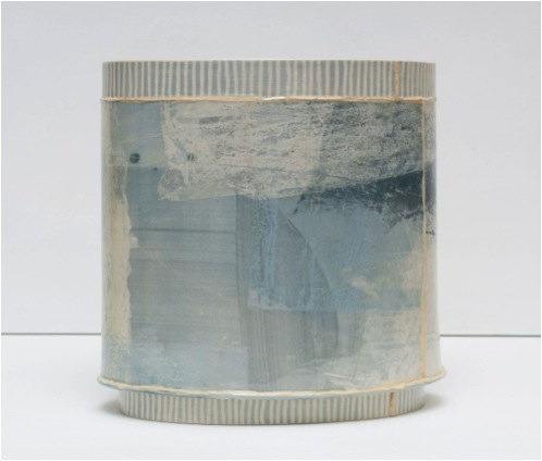
large oval vessel, LO13, H24cm
How long have you been working using this hand-building technique and why this method?
I started with coiling 14 years ago, which is a very versatile way of working. Not restrictive for the forms. To see something build from the bottom up is very satisfying – seeing it ‘grow’ bit by bit & with time to reflect /adapt on the direction of the form as you go.
I still continue to hand-build, perhaps in part for this reason. Hand-building is my specialism, but my work has developed over the years and now I use panels of clay treated to layers of decorating slips to build up a depth of surface. Although the form is very important, with the structures challenging to build; the surface is more of a focus for exploration at the moment. I like to treat each piece of clay like a painting.
I do not make them for an intended ‘function’ other than that of aesthetics. I create pieces that are an interpretation of our surroundings. Many have commented they are a piece of calm and tranquillity for them, which I find very touching.
I love the fine trims you add to your pieces, as well as the grids and narrow bands. Can you discuss this detail of your work?
The coloured trims are the joins between each panel of clay. The panels are all treated individually first as flat pieces, then constructed. The join/trim can act as a divider but also as a continuation of the juxtaposed elements within my work. They can also be seen as creating windows onto the view beyond.
There is a lot of historic investigation with regards to my construction techniques and a variety of factors feed in to the multi-faceted pots you see today. Therefore it is difficult to single out one as the starting point – it has been much more of a continuous stream of investigation. However one major reference has been dressmaking patterns which have informed, in part, the goblet and bowl shapes as illustrated.

goblet, g21, H15cm
On several of your pieces you have handwriting, can you elaborate on this? For example, how and when is it added? What does it read? Where do you get the text?
Text is included in some pieces – often to reference a walk, map, dressmaking pattern or poem. I use these in a variety of ways – sometimes as a direct quote from the directions of a walk, a line from a poem; or a strip of an OS map. On others it is more abstracted and I limit the use to initials of place names or the number of miles walked/ distance travelled.
To apply the text, I either use hand carved stamps on leather hard clay, or ceramic transfers after a glaze depending on the piece.
The ‘265 m....’ that is imprinted on SV8 refers to the distance (in miles) from my house in Birmingham to St Ives, Cornwall – one of the places I return to regularly in order to walk and paint.
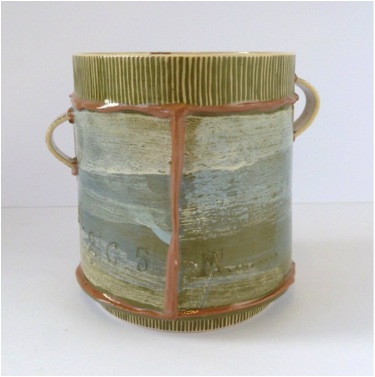
small vessel- SV8, H10cm
Each of your pieces calls to have it twisted to a new angle, giving it a whole new dimension. Can you expand on this?
Yes, the numerous facets make up a panorama, although not always ‘aligned’. With each piece of clay I explore the surface much like the composition of a painting - so all the elements of the 3D are as important as each other. The surface continues in, around, out, under and through.
The inside of your vessels, some have tiny dots - explain the importance of the inside?
The small dots come from maps, dressmaking draft paper and fabrics. Many people have commented they add a contemporary twist. For me, it also adds to the juxtaposition of different elements that inspire me ie sky, landscape ,dressmaking, fabrics, boats; yet in using blue coloured dots this is in keeping with the rest of the tonal variations within the pieces.
The inside is for me just as important as the outside, as I make my vessels as pieces to be explored – some are small enough to be hand held. I use surface decoration not as an afterthought, to be integral to the whole process. Often the inside is treated much softer with thin washes of colour and can be likened to the ocean/sea; with the outside of the pot holding more reference to the sky and the clouds. Some of the directional lines continue in and out – which also continues the conversation you have between the piece and the viewer.
Not only dots on the inside, dots and circles are apparent on most works. Have they become a trade mark?
These have developed in part from my early drawings of maps/boats and buoys on the water, as well as an interest in buttons. Sometimes these dots are directional, ie to follow a map or walk, or the continuation of stitch. Sometimes they represent a row of lights on the horizon. These have been abstracted, drawn from the paintings and sketchbook information, not as representational imagery.
Can you show your makers mark underneath every vessel and tell us how its design came about?
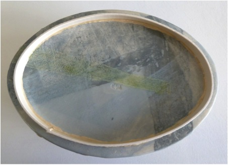
underneath of short oval vessel
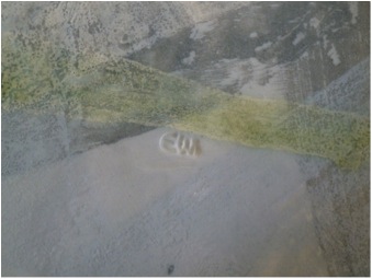
close up of stamp on the base>
The underneath of each vessel is also painted because, for me it is as important as any other panel. The stamp I use is hand carved and a variation on my initials (makers mark reads EWi although for my paintings and for future ceramics it is EKW). I keep it simple so not to distract from the work.
What is the size of your work?
The range evolves in terms of size and scale. I have made tall vessels throughout my professional career. Investigations into the history of the teacup and drinking vessels, including jugs etc, have continued to inform the shapes I make today. Some are handheld (h10cm) and range up to the large oval (h24cm) and the tall large vessel (h34cm). The short oval (h9cm) opens up the inside more to the viewer whereas the goblet / bowls add an extra challenge of balance throughout the construction.
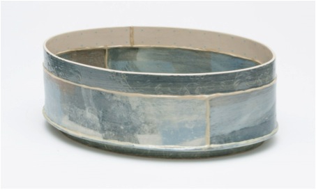
short oval vessel Sh.O2, H9cm
You won the Craft and Design, Silver Award in 2012 (ceramic category). How important have awards been to your career?
Receiving awards for my work always gives me a boost, as it is an amazing recognition. The Craft and Design silver award in 2012 was a public vote which is really special as it means people like it enough to vote for me! I feel supported by that; that the works speak to them.
The recognition of craftsmanship by people in the industry is also invaluable. To know that they value my contribution and my explorations is a huge encouragement to continue.
Your paintings have the same colour and use of your local environment. Can you discuss 2 paintings?
‘Early Morning Mist Study I’ Devon
I watched the mist rise on holiday in Devon and made a series of sketches, notes, photos in my book. I was mesmerised by the misty colours. Within minutes the mist had risen; the sun had hit in one of the fields in the distance highlighting a bright yellow strip. This was in contrast to the colour of the surrounding rolling hills; no buildings in sight for miles. It felt fresh and invigorating, yet peaceful. Early Morning Mist Study 1, is the first of a number of paintings in response to this.
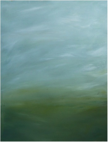
‘Cleeve Hill Cloud Study II’
I have been walking up on Cleeve Hill several times, where the view changes dramatically. I wanted to capture some of that texture and tone as there are lots of different variations of green across Gloucestershire. I am a member of the Gloucestershire Guild of Craftsmen, and have a number of connections in Cheltenham so Cleeve Hill holds a special place in my heart.
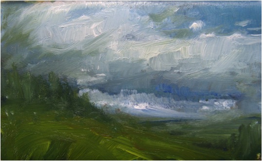
Your environment is infused onto your vessels and paintings. Can you explain the importance of environment to your work?
The environment has become a large part of my process over the years, I find painting helps to explore colour and texture. The ceramic investigations are endless with regards to this, and I love to explore different variations in tone using the raw materials.
Each piece I create is a piece of me; a moment in time, as such each is completely individual. They reflect my own experiences and the environment I walk in, the walks I find vital to keep fresh air in the lungs; for vitality and for invigorating the senses, to clear the head. Getting out of the city to these open spaces is important for me.
There is a newspaper clipping on the wall of my studio which has the headline ‘I couldn’t work without gazing at the sky’
I think that sums me up! Where will it take me next?.......
Contact Details
Emily-Kriste Wilcox,
Studio238, Scott House, Custard Factory, Birmingham, B9 4AA
07763 400 527
Email:mailme@emily-kriste.co.uk
Web: www.emily-kriste.co.uk
Emily-Kriste Wilcox, Birmingham, UK
Interview by Deborah Blakeley, April 2014
Terri Colledge
Can you explain what cameo glass is?
Cameo glass is layers of different coloured glass that are made into a vase or a perfume bottle, etc. If the co-efficiency between the layers is not right the blank could crack when the glass starts to cool down.
Can you briefly explain the process of cameo glass?
The process of cameo glass is: firstly I draw a design on a resist (a sticky backed plastic). It is all hand drawn. The image is cut out and adhered to the glass. The blank is then sandblasted so that the top layer of coloured glass is worn away by the grit. I use a flexi drive drill to engrave the details. The deeper I go down the more of the colour beneath shows through.
How many layers of glass are usually fused? Is there a limit?
I usually use three layers of glass. I have used four but it does depend on the expertise of the glass maker.
Who produces your blanks for you? Is this seen as a partnership?
Richard Golding (of Station Glass, Leicester) makes my blanks. Richard was actually the first person who got me involved with cameo glass and he was my mentor.
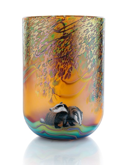
Can you tell us about a very old and special piece of cameo glass, The Portland Vase, and your involvement?
No records exist of how the Roman Portland Vase was made but it is known that approx. 14 Roman Cameo pieces still exists worldwide. The Original Portland Vase is now displayed in the British Museum, London, along with another Roman Cameo item of the same period – the Aldjo Jug. The first glass Portland Vase Replica was made here in Stourbridge 1865, the engraver John Northwood took three years to engrave it. The method he used is different to the one I used for the 2012 Portland Vase, whereas he used bitchumen as a resist and then used hydrochloric acid to erode the white layer away.
The 2012 Portland Vase was a fantastic project to be involved with. A team of twelve experts contributed with their experience and expertise. I was the one who engraved the Portland Vase. As well as the Portland Vase we recreated the Amphora shape Portland Vase, the Aldjo Jug, and the Disc.
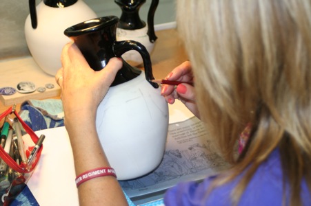
How important is it to be able to reproduce historical pieces like The Portland Vase?
What we wanted to demonstrate is the fact that the skills are still in the Stourbridge area and we were fortunate to have the craftsmen and craftswomen to work on such an important historical piece as this. That was the pinnacle of my career so far.
Can you discuss the importance of documenting your work on The Portland Vase?
From the very beginning we were fortunate to enlist the services of biographer Graham Fisher MBE who documented every stage of the creative process. Also, we were fortunate to have the making stage of the 2012 Portland Vase recorded on video.
You originally trained as a ceramic artist. Has this helped you with your new art form?
It is just that I have always been interested in drawing and painting. I think my interest in pencil drawing has helped me with cameo engraving.
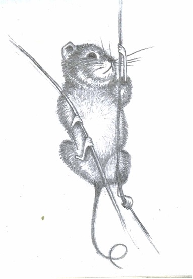
‘Field Mouse’
What lead you to be interested in cameo glass?
I joined Okra Glass Studios, Stourbridge (which was Richard Golding’s company) in 2001. Richard was very interested in cameo glass and made blanks. He asked me to try the engraving. I visited Broadfield House Glass Museum (http://www.dudley.gov.uk/see-and-do/museums/glass-museum/) to see the Cameo Room. It was an eye opener for me; I was fascinated by the cameo pieces, and inspired by them.
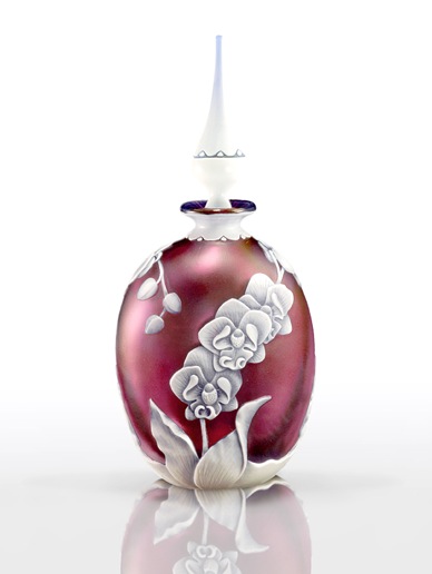
How did you teach yourself this method?
Richard gave me 15 minute tutorial. It seemed to be similar to pencil drawing and that is how I embraced the process.
How important is it to you to make sure your knowledge is carried on and how are you doing this?
It is important that it is carried on but we live a fast pace of life and the work I do is very time consuming. People want quick results and find it hard to devote so much time to one project.
How did you become an associate fellow of the guild of Engraving?
I joined the guild as a craft member. It was after an exhibition that I became an Associate Fellow.

Can you discuss your perfume bottle with the fuchsia design?
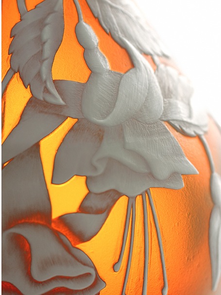
I have always had an interest in nature and colours and the shapes of the flowers. I spend a lot of time deciding on what image would suit the shape best. Different colours work well with different subjects. However, I am never sure how the underlying colours would look until I have sandblasted the piece. Sometimes I do pencil drawings of the images but as I am working on the piece it comes alive and it seems to evolve.

You also produce work in egg shapes. Can you discuss your ‘Grasshopper' glass?
That was a paper weight that was commissioned. I really enjoyed engraving the Grasshoppers. I did a pencil drawing first, and I saw the detail of the grasshopper which triggered my inspiration.
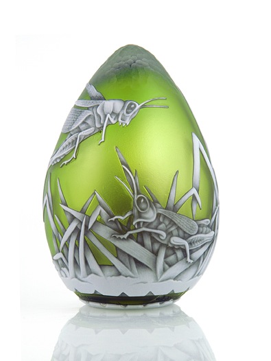
Your designs come from nature, both plant and natural. Is this due to the historical background you have brought to your work?
I was initially inspired by George Woodall (http://www.glassassociation.co.uk/sites/default/files/WEBSITE%20CAMEO%20-.pdf) whose work was so beautifully detailed. However, maybe I have a contemporary angle that I bring to my pieces.
Do you find doing jewellery gives you great satisfaction due to the fact that is smaller and therefore more affordable and within the reach of many?
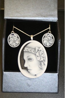
Yes it does! I love doing the jewellery it is a very rewarding process.
Unlike my other work the amount of time I spend working on a piece of jewellery is less (e.g. it might take only two days to finish a piece).
The jewellery pieces I make are accessible to more people and are, hopefully, a portable talking piece.
Are all of your pieces one off?
All my pieces are unique and that is part of what I enjoy about cameo glass. Even if I do a repeat design there is always something that would be individual about it because all my work is hand drawn. Most of my pieces are commissions.
Where have some of your commissions gone to?
Canada, Australia, Belgium, as far as I know.
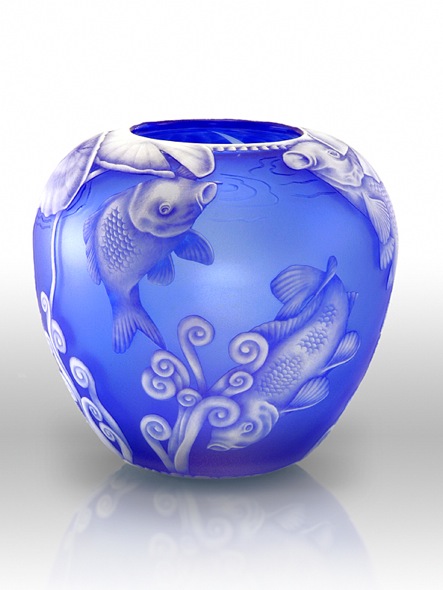
Can you explain how your work is signed and dated?
At first I used to sign them on the bottom with a flexi drill. Now I changed my style and drill my initials into the glass (on the side) because in this way it cannot be removed. Each piece comes with a signed certificate of authenticity.
Contact details.
Website:http://www.terricolledgeglass.com/
Email:Terri_lc@yahoo.co.uk
Mobile Phone:+44 774 8881818
Terri Colledge, Amblecote, UK
Interview by Deborah Blakeley, March 2014
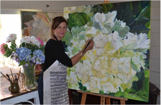
Helena McConochie
What has your painting taught you - have you developed new techniques?
I don't believe my style has changed as such, I am amazed at how much more detail I see in a flower now. This might be a combination of consistent painting and generally growing; which goes hand in hand with this amount of work I do. I have developed a stronger interest in light and shadow not wanting to over work the flower.
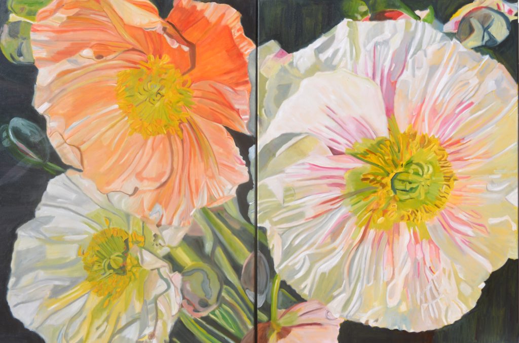
Canberra Poppies
I paint almost every day. My work hours are 10-4.30 seven days a week…
I continue to give my paintings female names as I came from a family of girls and had four daughters.
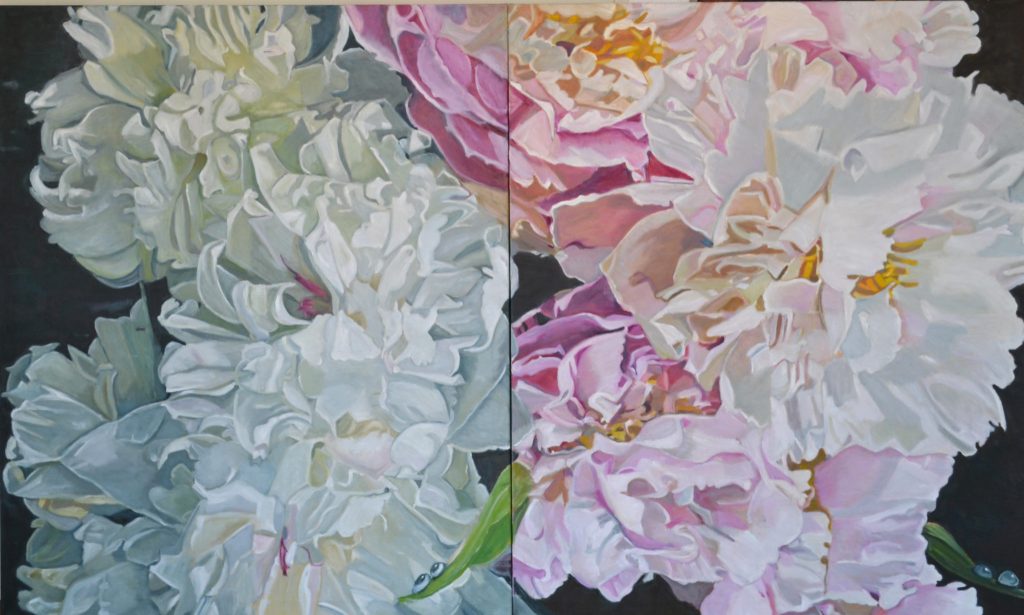
Patricia and Millie
Are you seeing flowers in a different way?
Absolutely – the detail of a flower intrigues me.
Margaret Olley proclaimed, "Flowers can be appreciated by the viewer as just a flower
or can be explored deeper almost as a Landscape"
I am obsessed by my love of flowers and colour. My limited palette system consisting of white and three prime colours that I to mix to natural hues, shades and tones. I create light, shade and dimension in colours that appear remarkably real. I place waterdrops on my paintings as an encouragement to people to conserve water.
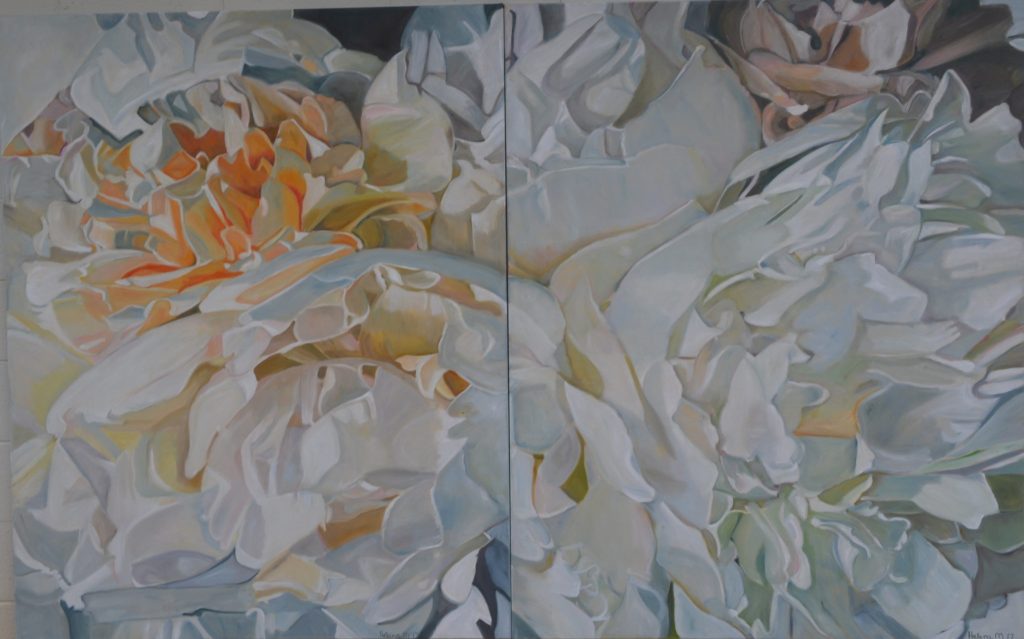
Katrina for Melbourne
Expand on the relationship/s you have built up with your galleries.
My Galleries are all amazing. They are so supportive of my art and I am continually getting work.
I am represented by Art 2 Muse, Double Bay where I have an annual Solo exhibition – this year’s Exhibition is from 2nd - 15th October 2018.
I am represented by Aarwun Gallery Canberra. Riley Gallery in Manhattan Beach and McsartofLiving in Montreal and Memphis.
I have another Exhibition in Colorado this year – the 100th Anniversary of the Migratory Bird Treaty Act, June 22nd – July 13th 2018. The theme of the show is based around avian and botanical related imagery in a celebration of this year being the 100th anniversary of the Migratory Bird Treaty Act, a piece of legislation that protects countless aviary species each year. With this special commemoration, The National Audubon Society has teamed up with National Geographic, Birdlife International, and the Cornell Lab of Ornithology, to make 2018, “The Year of the Bird”. Our aim is to acknowledge this observance with an exhibition of contemporary works focusing on birds, the flora and fauna found in their natural habitats.
What have been two highlights over the past four years.
- Being approached by three Galleries in the USA
- Editorial in both Belle Magazine and House and Garden.
- I also had a small preview in The Wentworth Courier leading up to my Exhibition.
- Donating Paintings in the new Dubbo Base Hospital Maternity Ward- not all women receive flowers and not all results in the Maternity ward are great.
 Dubbo Base Hospital Maternity Ward
- Starting my Soft Furnishing Line.
What have you learnt not to do?
I have learnt to say NO. I have been extremely busy since our last interview with exhibitions and commissions. Buyers certainly know what they want, I am such a worrier if it’s not exactly what they ask of me. I use a Limited Palette – which means I mix all my own colours. It is impossible to get exact.
A Collection of 2017 paintings
Why does your art still give you such great daily joy?
The great daily joy for me is at the end of the day relaxing and critiquing my achievement. I set my painting in the family room, with a glass of champagne and enjoy what I have achieved for the day. My family help me critique it and that is such fun- particularly the Grandchildren who are sooo honest.
If you have enjoyed reading this update please re read the interview Zoneone Arts had with Helena McConchie in March 2014. It is so interesting to see the development of Helena's work and how she now has solid representation in Australia and the USA.
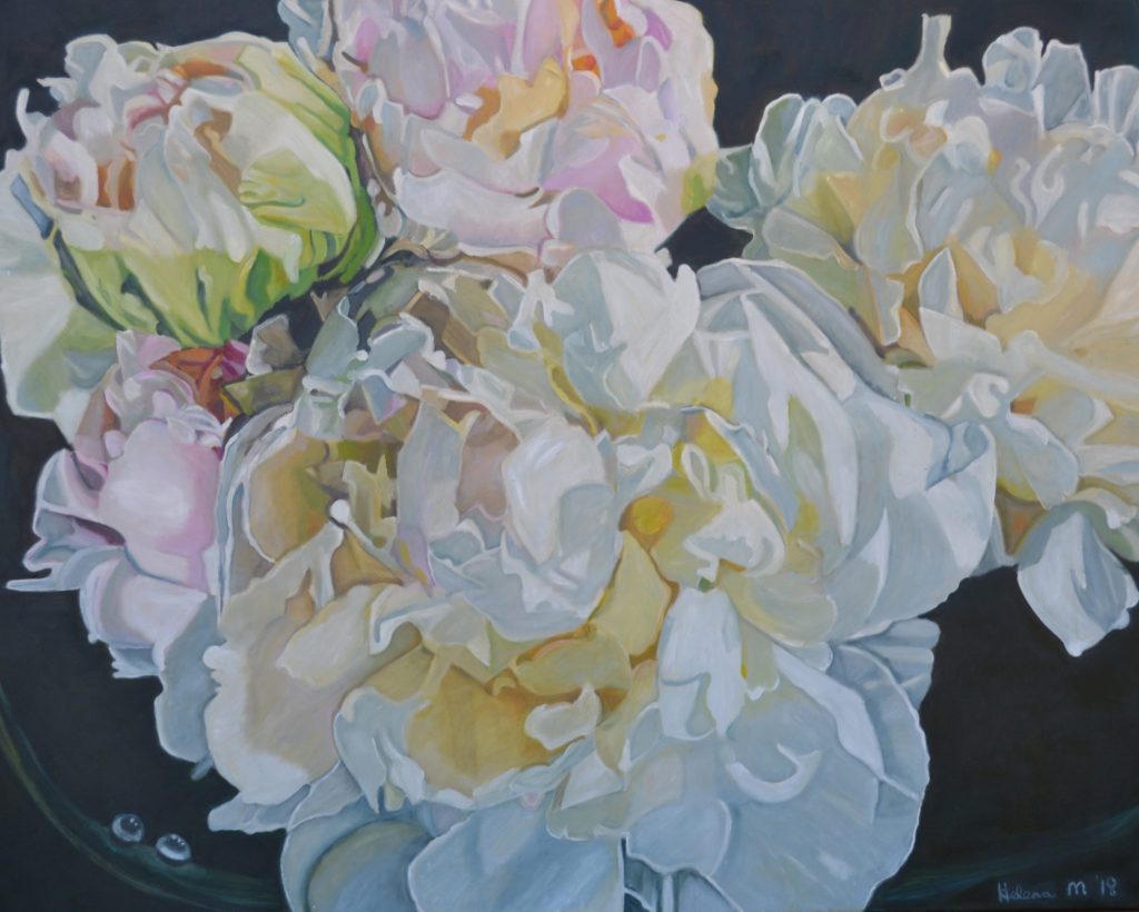
Katrina and Shayne
Contact details:
Website: http://helenam.com/art.html
Email: ‘helenamay@bigpond.com’
Helena McConochie, Dubbo, NSW. Australia
Interview by Deborah Blakeley, June 2018
![]()
March 2014
You have been a mature aged student. Can you expand on how you came to take up painting after your children left home for University?
I was a mother of four daughters which left me absolutely no spare time until they left for University. I was a statistic of “empty nest syndrome” I soon realized that my children had to fly and explore the world and I had to develop some interests of my own. I was very fortunate to have a connection and love of beautiful flowers and art..
I started art lessons with a local artist I soon realised that I wanted to learn a lot more so I enrolled in a Fine Arts Course. This was a whole new world opening up to me. Painting Drawing, Art History, and Photoshop. I was completely absorbed in the course and achieved Distinctions at Diploma Level.
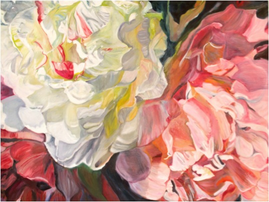
You have always been interested in design. How has this influenced your work?
In the past designing to me consisted of guttering a whole house, rebuilding it, painting and decorating it. I have done this seven times. The excitement I feel when the paint is applied to the walls and the house is transformed into a beautiful masterpiece.
Transforming these old wrecks of houses back to a beautiful, liveable home came very naturally to me.
The work was extremely hard and I can compare the creative side to my canvas, preparing the canvas, drawing and then applying the paint.
When or how did you decide to crop the floral image?
It was not deliberate decision to crop my flowers. I would use my viewing frame and rotate the flower until I achieved the image I wanted. Also with my photographic skills I have been able to take macro shots while the flowers are in season. Georgia O’Keeffe was very fortunate that her partner Albert Stieglitz, was a photographer and took macro shots of her flowers. Georgia was also influenced by Paul Strands cropping method.
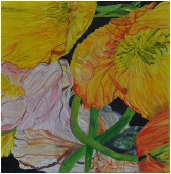
How large are your works?
My works vary in size. I try to vary the sizes to accommodate galleries and homes but the largest painting I have done is a Tryptich of Poppies which are 110 x 110 but placed together 330 x 110 cm
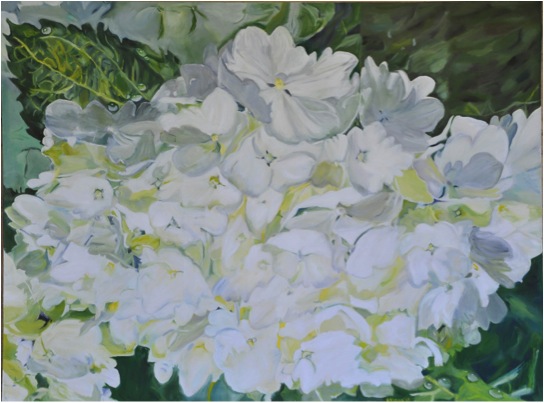
Your recent solo exhibition was close to a sell-out. Can you explain how this has propelled your art?
MI have actually had three exhibitions in six months. I spent twelve months completing a body of work that consisted of approximately 14 paintings and proceeded to go on a roadshow with my art. Whenever I had a sale, the art had to be replaced for the next exhibition. Whist it was exhausting the feedback has been amazing.
You are a gardener. How do you prepare for a work, by photographing the flower or painting from life?
Both, my problem is that my flowers are seasonal and not available when I need them . I do like to take macro shots of the flowers and seeing them up close. This is not always the result I want. I do have silk flowers and take photos of them and from memory place the veins and marks on the flowers.
I have a huge collection of photographed flowers. The anticipation of spring and painting a flower that has just opened is certainly the better way for me to paint.
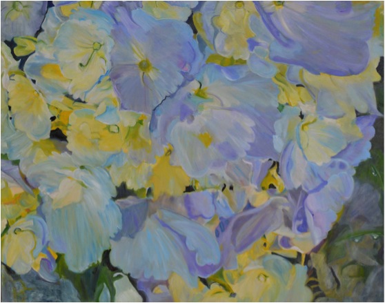
Discuss nature and her amazing palette in relationship to your work?
Flowers bloom in almost every colour of the spectrum and appeal not only to the visual sense, but to the olfactory too. The fine texture and lines of a flower can easily be obtained by careful brushstrokes forming the shape, modelling them, introducing the colour and creating transparency in the flower. One of my favourite artists, Georgia O’Keeffe, her abstract pieces demonstrate beautiful work of rhythm, movement, colour, depth and form and that is what I am trying I am bringing into my work.
You take commissions. How flexible are you with these?
I don’t have any problems with commissions, I do set a deadline to have them finished so the customer is not waiting. .I am fortunate that I can get the painting very close to the original painting and quiet often it is better than the last. I send an image off to the client or arrange for them to be viewed.
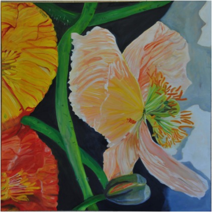
Does living in rural Australia affect your work?
Not at all. We have an apartment in Sydney that we stay in regularly. We are an hours flight to Sydney. A lot of artists are living in rural areas as is Tim Storrier who lived in Bathurst and now Bowral.
Can you expand on the influence Tim Maguire has had on your work?
Growing up I have always been surrounded by amazing gardens. The families favourite flower is a Poppy which was grown every year. When I was introduced to Tim Maguire’s poppies I was amazed. I studied Tim Maguire and Georgia O’Keeffe in my Fine Arts Course.
I am extremely impressed with the scale of Tim Maguire’s flowers and it has encouraged me to get out of my own comfort zone.
Tim’s poppies are quite loose where mine are tight, I also place water drops on my flowers and when people tell me how lovely they are I let them know there is actually a strong message behind them. The message is that water is the essence of life and we should all be looking after it (we are in a drought at the moment).
Can you explain your interpretation of the term and your technique of abstraction?
My interpretation of abstraction is a concept which the subject is represented by shapes and patterns and can be slightly unrealistic.
My paintings are a mixture of the above and are slightly cropped and presented in a way that the viewer can still recognise the subject.
How do you fit both gardening and painting into your life?
We have three acres of garden and over the years I have designed my garden to have very little maintenance. I mostly have large trees, flowering trees, a rose garden and an awful lot of lawn. We have a sprinkler system and a lawn contractor. Before spring arrives I mulch the entire garden to lower maintenance and encourage growth.
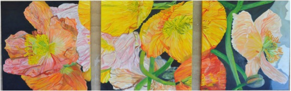
Flowers give so many, so much joy. Is that a major inspiration for your work?
Absolutely, you should witness me after a long cold winter and then spring has sprung. I am like a child in a lolly shop. The excitement of watching the deciduous trees get new leaves, poppies ready to bloom and not knowing what colour you will be presented with. Looking out my window I can see the Red Canna Lilly flowering next to my White Crepe Myrtle tree. My stayed in a villa in Tuscany and was amazing with red and white flowers all through it. I came home with some great ideas.
Where to now?
I am presently working on 3 paintings for the Archibald , Wynn and Sulman Prize. I have entered before with 600 other hopefuls, and it is a great experience. I will enter in the Paddington Art Prize and The Mount Eyre Art Prize. I intend to exhibition in Melbourne and when I visit New York City this coming April I will endeavour to research exhibitions in Hampton.
Contact details:
Website: http://helenam.com/art.html
Email: ‘helenamay@bigpond.com’
Helena McConochie, Dubbo, NSW. Australia
Interview by Deborah Blakeley, March 2014
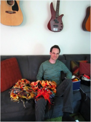
Patrick Ahern
How did you break down this major misconception about who does crochet?
I never thought crochet was something I could not do because it wasn’t what men were supposed to do. When I first started crocheting, I did it to impress a girl – so I wasn’t thinking at all! The only thing I knew to make were clothes and accessories – which was harder for men to understand than women. Luckily, I was bad at sizing and I only used unwearable wool so I did other things with crochet. But I do feel it is more accepted for me to crochet art rather than scarves.
Do you see your art as breaking gender barriers?
My artwork is very much a craft to me and craft has no gender barriers. It is exciting to see crochet accepted as a powerful medium. It can make complex mathematical models and an afghan. But I do hope to inspire other men and boys to start crocheting because I think everyone should learn how. My artwork seems so far removed from popular crochet that I think the tapestry is seen more as a finished piece without really thinking of it as crochet.
When did you decide that crochet would be your art medium?
I wasn’t good at making wearables. My favorite fiber is wool, which does not work well with most people who are used to soft, machine washable materials. The only art I made was music, so I only made art with crochet when I was looking for something different to do with it.
As well as crocheting you are a musician. Can you expand on how the two relate?
They both involve numbers and patterns. In crochet there is your foundation row, and in music there is your time signature. I then use patterns and improvisation based on those restrictions to make art and to make music. Crochet lends itself very well to freeform, like music, since it is not restricted to a grid like weaving of knitting. Crocheting and music also go very well together!
How did your mum come to teach you how to crochet?
Very patiently - I asked her if she could show me how to crochet a small bag. Whenever I teach someone how to crochet, I think of that time and I remember that it was very hard for me to see what I was doing. She taught me to focus on my work and pay attention to the stitches. Eventually, you begin to see the stiches and how they work and then you can make anything.
Your mum still helps you by creating the backings for your work. Can you expand on this?
Sarah Crow is a fascinating woman. She designed the backings for all of my pieces. She knows her way around a sewing machine and serger much better than I ever will, so I don’t even try to do what she does. She lives back east now, so I sporadically get her dimensions, she whips one up in a few, and ships it out. It is a very efficient collaboration.
You have done a portrait of your mum,can you discuss this work?
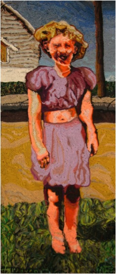
My mom looks exactly the same today as in that image taken around 1950. She has the same face and even my nieces look like her now. It is a dedication to her spirit. I reckon it was taken somewhere in Napa, CA – where she grew up. The photo I used was her holding hands with an unknown girl. I took the girl out of it and changed the background to have a new-suburb feel. I like the grass because it’s crocheted with the ends left out.
Can you discuss ‘Chloe Dancer?’
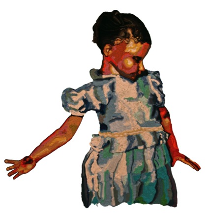
This was inspired by my sister, Chloe. I had a photograph when she was young in this interesting pose. I think she was grabbing or setting down a drinking glass, so that is why her right hand is open. It looked like she was dancing or spinning, so that’s what I went with. I named it Chloe Dancer after the Mother Love Bone song. She is also a huge Pearl Jam fan, so it was fitting since Mother Love Bone became Pearl Jam – it was an inside joke.
What brought you to transfer the art of 2D tapestry to crochet?
After being discouraged with my hats and things I didn’t know what to do. I always liked to crochet so I was looking for other things to make. I had a picture of Clara Bow so I decided to try to crochet it. I had other ideas in my head for images, so I just crocheted them.
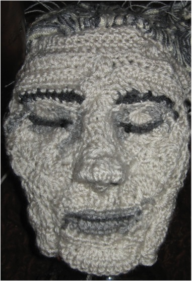
As with a tapestry, do you work with a cartoon?
I work with photographs and drawings. I take parts here and there, and arrange them into a final image. I use the image as a guide for proportion and color.
Why is tapestry yarn so suitable to your work?
Tapestry yarn is typically wool and it comes in small yardage – so they are much like paint tubes! My stuff involves a lot of yarn changes, which means a lot of snipping of yarn. I don’t work well with multiple skeins at a time because it all ends up in a big knot.
How do you create the ‘right’ colours?
I love bright colors, but most of the time I am looking at value. It does not matter which color goes where, as long as the shadow and light look right to the viewer. Yarn comes in so many colors and variations that I just try different thing and even combinations of yarn until it works for the image.
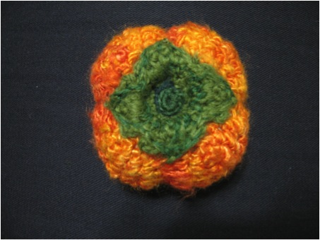
In the ‘Orange Papa’ you combine wool and acrylic yarn. Do they have substantial differences?
Yes they do. I also use different weights of yarn so my tapestries can undulate too much if I am not careful. What I like about wool is its rich color and it is much easier to break than acrylic when I need to change the yarn! Most of the acrylics I use have more sheen to them than wool, so it makes for interesting effects.
Can you discuss ‘Yarn’?
Inspiration
This was an image I had in mind for a long time. The image is me, taking a break from writing – lost in a daydream. It’s usually when I snap out of it that I realize that I haven’t got any work done!
Technique
I made this one quickly – in about a month. I used my photograph as a reference and made the book and pen later. I made one other face before that I scrapped because it looked nothing like me. There is a lot of thick wool tapestry yarn in there for the yellow background.
Use of colour
I used very bright oranges, yellows, & greens for this one. It is a lot brighter than it appears in images – almost like a blacklight poster. One of the reasons I tossed the first face I made was because there were little changes in the oranges of the face, so it looked washed out.
Discuss how you are now developing 3D in your work?
I have been crocheting many fruits and vegetables. It’s a good break from the tapestries since they are involved and time consuming. If I can feel challenged in making something in 3-dimensions I become a better artist. I still want to make more 3D faces, fruits and vegetables, and toys but I have my hands full a lot of the time!
Contact details.
Website:www.patahernart.com
Email:www.padurn@gmail.com
Patrick Ahern, Woodland Hills, CA, USA
Interview by Deborah Blakeley, March, 2014
David Royce
At the age of 15, what lead you to be an apprentice at a local glass shop?
I had always wanted to try glass blowing since I first saw it at the Renaissance Festival when I was about five years old. We were visiting a family friend who owned a community ceramics studio and I remembered there were glass artists upstairs in another part of the building. I walked into the studio and asked how old I had to be to be an apprentice and they told me that I needed to be eighteen. I told them I was fifteen and they told me to come back the next day, which I did. I worked with them through high school for the next two years.
Explain about your residence in Taiwan and how it influenced the directions you then took?
Actually Taiwan was a point where I turned away from glass for a little while. I had decided I wanted to try something different and so I studied abroad in Taiwan when I was 20 and decided to change from being an art major in glass art to changing schools and studying Chinese. After the change of schools and majors it was just a couple of months before finding out about Foci Glass and starting to volunteer my time there.
What was it about the FOCI Minnesota Centre for Glass that allowed you to work full time as a glass artist?
I stepped into Foci Glass at the right time in the organization. At that point the organization was run by one artist, Michael Boyd, and had grown into a place where it was neither just his private studio, but not yet a fully public studio. I soon found myself helping manage the studio every day, firing up for renters and fixing equipment etc. In return I was given a few hours a week to work at the bench. After finishing school I started to use that time to build a body of work and get my feet underneath me in the business. I applied to a few shows and boot strapped my way into them. From there the business grew steadily. It would have been very challenging at the time to have to purchase all the blow time as well as make the necessary investments in the business.
‘Art Glass Bottles’
Can you briefly explain the techniques you use in your art practice?
My work is primarily blown; some pieces are simply studies in discipline and form like the studio series for example. Other pieces are sculptural in nature and usually involve many layers. Those layers are carved, diamond point engraved and sand etched in the cold shop to reveal layers underneath. Some of the most exciting pieces to me use metal, wood and light to augment the pieces.
Can you take one of your sculptural one of a kind pieces and discuss the technique you have used?
The piece above is approximately 8 feet tall and comprised of glass and steel. Each of the two pieces of glass was blown and the glass was layered carefully to create places for me to carve through. Each piece was then carved until the design was achieved. The centre section was hand carved in solid steel to match each of the top and bottom pieces. The pieces were then cold assembled and I made a cradle for the piece out of steel. The steel sits in a stand I then created also out of steel. The piece is kinetic and spins slowly.
The carvings on your work – how do you achieve this and allow it to give the feeling of a band?
The carving is all achieved by wheel cutting which is an old Italian technique of grinding away the surface of the glass with diamond grinding wheels. I personally really enjoy working cold on glass, originally I didn’t think I would, but there’s so much you can do in the cold shop that I really find it enjoyable to grind the glass. The elemental series, by contrast, is one of the first series I did with glass which is really playing around with the chemical properties of different glass colours and achieving an interesting reaction on the surface and doesn’t really have much to do with carving.
‘Orange with a Band’
In your 'Studio Series' pieces, the prevailing impact is colour. Can you elaborate on this?
The studio series is really about discipline for me. Achieving perfect form is paramount. I wanted to create a series that was modular in nature with each piece relating to the one next to it, but each one being a unique piece in its own right. The idea is to create small vignettes with colour and
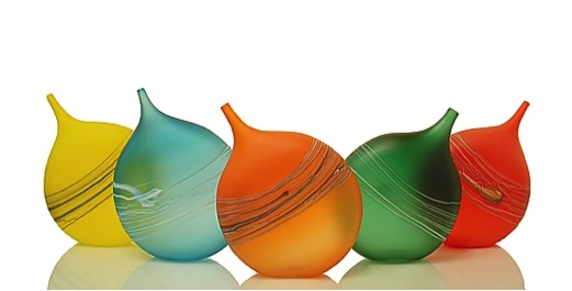
'Tipped Bottles’
The photographic images you have give great justice to your work. Discuss the importance of lighting, background and excellent photography?
I should say that I do all of my own photography and that it is really important. I don’t have any formal training in photography, but I’ve had to do so much of this in this business that I’ve learned a few things about it. All of my pictures are taken on a white backdrop which helps also create a uniform look on the website. Also the images all look uniform on slides for shows which is helpful.
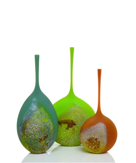
'Elemental Pieces’
Shape is so important to glass art - can you expand on the clear clean modern shapes you achieve?
Ever since learning to blow glass when I was fifteen I was in pursuit of perfect form. I think that Plato’s idea of archetypes is relevant here; each piece has, in my mind, a perfect form that I’m trying to achieve and the idea is to discipline your hands so that they can create what’s in your mind. When I first started blowing glass I was just trying to, for example, keep a vase basically a vase and not have it turn into a bowl or vice versa. Now I focus on smaller and smaller minutiae within each form to keep trying to achieve perfect form. I really do constantly break down the process, re- examine it and find a small improvement here or there almost daily.
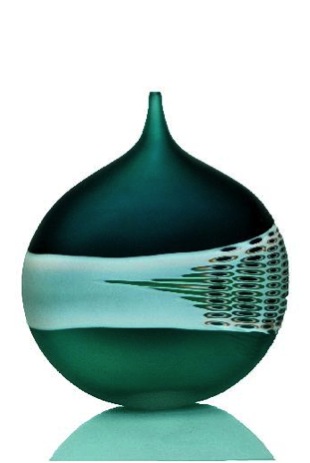
‘Green with a Band’
Can you explain your work ‘Shadow Boxes’?
This is a new series I’m working with. It occurred to me recently that most of the work I did simply was placed on a surface and didn’t necessarily have an environment it belonged to. I wanted to create pieces that felt as if they had a home. I was inspired by the way that a rare butterfly collection might be displayed in cases. Also one of the reasons to work with glass is that it can transmit light. Each case is lit by LEDs to create an interaction between the piece and light. The subject matter for the series is still abstract, but the objects to me feel futuristic in nature and that they are perhaps specimens from a far off civilization.
'Red Relic’
How long do you work with a series?
I suppose one of the best things about being an artist is that you can reinvent yourself when you want to. I typically work with a series for a couple of years or until the series feels like it’s been exhausted. I believe your audience can tell when you, the artist, feel the series has been exhausted.
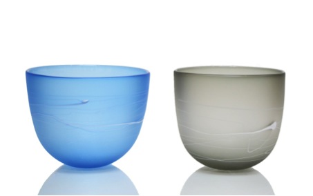
Can you comment on your need to have an interested community and other artists nearby?
You need both an interested community as well as connections to other artists to continue down this path. Certainly you need an interested community so that you can continue to financially do the work and other artists because you need to bounce ideas off them about shows, or building equipment etc. But the other key ingredient for me is having a studio set away from other artists and the community so that your ideas can develop without influence from others.
Your statement, “For me, glass presents a unique technical challenge because of its ability to transmit light.” - Can you comment on this?
I had a good friend once tell me he would ask himself “why make this piece in glass?” because glass is a difficult and expensive material to work in. Why not make it in clay or in draw it on paper etc. One property about glass that is really unique to glass is its ability to reflect and transmit light. As I design pieces I try to ask myself the same question to make sure I’m utilizing the material to its fullest potential.
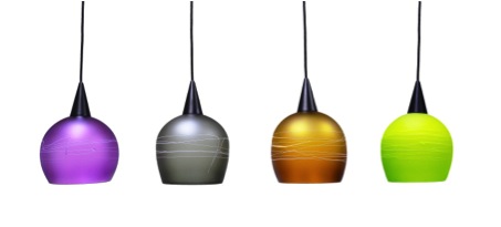
‘Lights’
Contact details.
Website:www.davidroyceglass.com
Email:Royce.dave@gmail.com
Phone:# 651.283.9494
Address:2885 Country Drive #180
Little Canada, MN 55117
David Royce, Little Canada Minnesota, USA,
Interview by Deborah Blakeley, March 2014
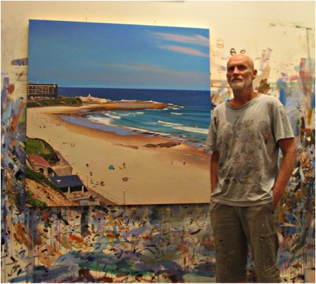
John Earles
You are the ‘Australian Man’, born and breed in Newcastle. Do you ever tire of your country?
We can all tire a little of the environment which we see every day. It is hard to tire of the ever changing NSW coastline, especially Newcastle. Newcastle is my favourite city anywhere. It is a cultural centre, as are most cities, but doesn’t have any of the grinding big city problems. The beaches are among the best in the world. That’s good if you like to swim or surf.
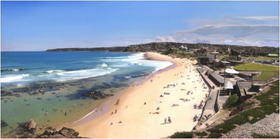
‘Bar Beach to Merewether’
Newcastle is on the coast and not far from Sydney. The majority of you work is bathed in sunshine. Can you expand on this?
It is true that for many years most of my landscapes were painted on a regular sunny day. The last decade especially I have been seeking out more atmospheric options as well from very; very grey storm scenes to dawn and twilight. I will often respond to a subject when I come across it, whatever the circumstances.
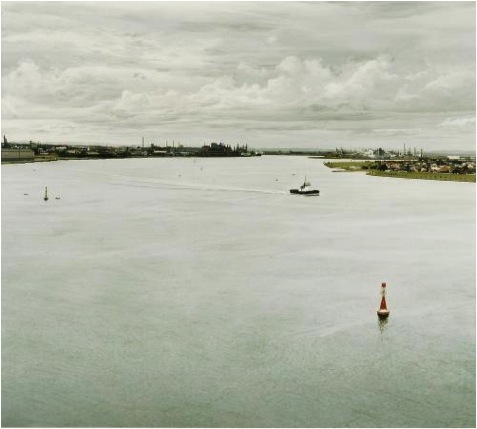
‘Newcastle Harbour’
You paint the iconic images of Sydney. Can you discuss two locations where you have recorded the Sydney CBD?
Many of my paintings of Sydney are around the CBD, the harbour or city Beaches....Neilson Park, Hyde Park....some years ago I did two very large paintings of the city as seen from Vaucluse, the harbour in the foreground. The first was a commission, the vaguely stormy sky was not to the client’s liking, so I painted another which had no spooky sky (it was for a real estate corporation and they had thought the partially grey sky was too indicative of the current real estate market). In the end they preferred the first painting with its extra drama. The second painting sold too.
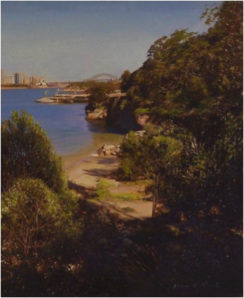
'Sydney Harbour from Taronga Zoo’
My landscape painting over the years has mainly been of Newcastle and Sydney. The last few years I have been travelling to Melbourne and surrounds, also concentrating on the coast but doing some CBD paintings of that city as well.
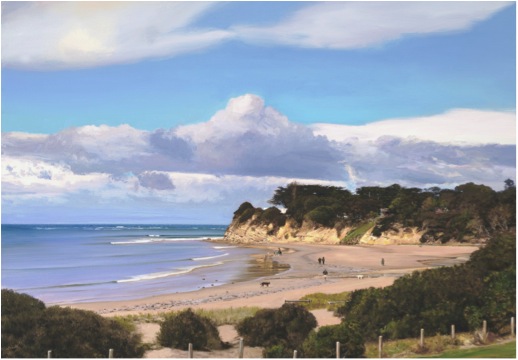
'Fisherman’s Beach’, Torquay, Victoria’
I guess I represent those subjects that I’m closest to. I’ve always been attracted to the coast and find many good subjects there. The harbour is the same, both Newcastle and Sydney, not a bad starting point with the colour of the water and the boat activity. I really like rural landscape subjects as well but rarely find myself too far from the coast.
Many years ago I drove to Melbourne through country NSW and did paintings of Lake George, Bathurst landscapes and others. I’ve done a few paintings of the Hunter Valley. There is a Glass House Mountains view I keep on meaning to paint, maybe after my next visit to the Sunshine Coast. I’ve painted landscapes of California, London, Bali, the Maldives.... it is just a matter of where I happen to be.
Do you paint ‘en plein air’ or in your studio?
I paint both ‘plein air’ and in my studio. I think that the way a person draws en plein air, or by eye, without any photographic assistance is a good indicator of one’s natural style. I have always drawn quite realistically from life, not like a photo producing machine, but with a kind of classic realism style. The use of photographs in bending this style towards photo realism is something that just happens. I do not aspire to be a photocopy machine, or someone who reproduces photographs in paint. The plein air work or any painting done without the assistance of photographs is to me something that refreshes my realistic landscapes. My taste in art is usually more towards the abstract, not usually realistic landscapes, but there is something about my paintings that seem to go beyond the ordinary. I try to borrow from the great landscape artists that I admire....among them are Lloyd Rees, Conrad Martins, William Delafield Cook, William Turner, William Dobell.
Every decade or so, I leave my landscape painting and spend a few years doing more contemporary, hard edge abstracts and semi abstract paintings and sculptures. Although I very much like this work, which has a dynamic kind of shininess, I sometimes feel that this work can be beautiful, but frivolous there is something about the no-nonsense solemnity of a straight landscape painting that I like. It’s close to impossible for an artist to represent two opposite styles, although I have done so in the past. The next time I show any non- landscape work I will probably do so under a different name, trying to keep the John Earle name as one associated with landscape and realism.
Take us down to the beach there, along with the sunbathers.
Any of my beach scenes are things I’ve seen that appeal to me and that I have represented in a literal fashion.
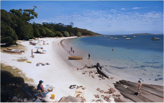
'Dutchies Beach, Nelson Bay, NSW’
You have also painted ‘Newcastles Children’s Pool’, can you expand on this site?
Looking down on the Newcastle Children’s Pool presents a readymade, ideal landscape composition in a generally oval form. There is usually something interesting in each corner, in the centre and around the periphery.
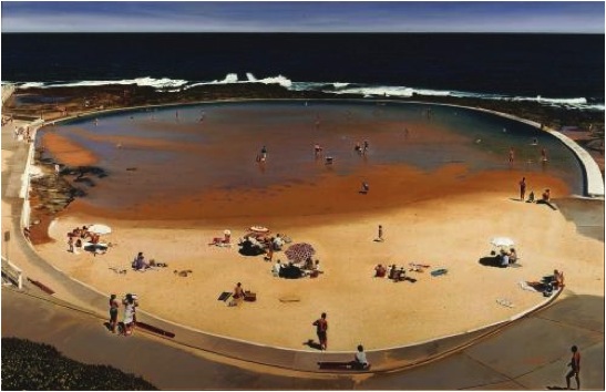
'Newcastles Children’s Pool'
Water and the coastline are prominent in your paintings. How do you find the right aspect? Please discuss the composition of your work.
I generally look for an elevated aspect whatever the subject. Occasionally I’ll be painting a subject from ground level but I’m always trying to find a bit of elevation from which to view the scene, even if that is just getting on top of a rock to view a scene. The higher you can get usually the composition becomes less horizontal and more squarish, often creating a pleasing composition for a more squarish canvas.
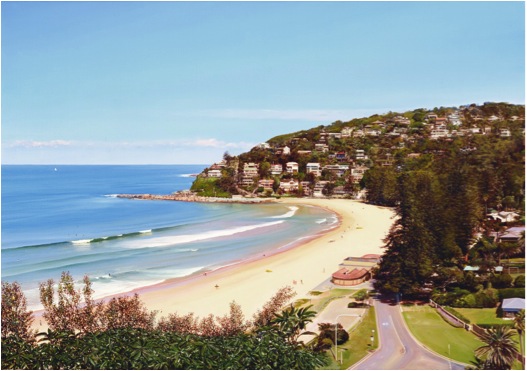
‘Palm Beach, NSW’
Looking at your work, it gives the impression of endless summer days - but the profusion of your work tells another tale. Can you expand on your work day?
Well, hopefully it is ‘endless summer days’, even in winter and when it’s raining, just from the perspective that we all want a nice productive, carefree day whatever the weather. Since my first year of exhibiting paintings in 1981 I have tried to build a regular work practice. Maybe it’s not important for everyone. It’s something that is talked about in most fields of endeavour, but not usually in art. Perhaps the one artist I remember articulating his own work ethic was Salvador Dali. I read some of Dali’s writing whilst still a student and I think that helped me try to put that into practice. There are many artists that work very hard and very well who don’t talk about that but can be an inspiration by example. I’m a very stay-at-home person, more so, in my old age (I’m 58). I have a very nice daily routine of waking up late, making breakfast with coffee, have breakfast in bed watching the news of the day on TV, get any chores of errands done and out of the way, hopefully have a surf or a swim in the ocean and then get to painting in the mid afternoon and knock off sometime after midnight. It’s a routine that I have had for many years and that I enjoy. It simply helps me find the hours that I need to do my work.
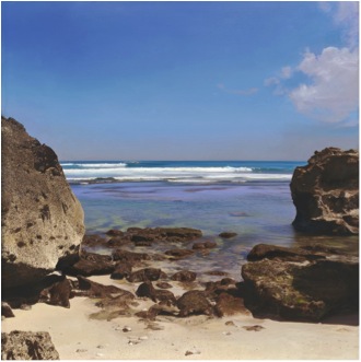
‘Uluwatu, Indonesia’
You sell your work as prints also; can you discuss how you decide on the quantities and sizes of your prints?
As for quantities, I think you want to go for a number that you can completely sell out. There is no point having a massive edition where you wouldn’t sell more than a small percentage. We generally do an edition of 100 to 150 and find that we will sell an edition like that over a few years and then they are gone and will not be repeated. My work can look a bit too photographic if an image of a big painting is reduced to something smaller. These days I am trying to do reproductions of smaller paintings which have been enlarged somewhat, hopefully to where brush strokes have become visible. Even a finely painted original is easy to detect as a painting, but not so easy to do when the image is reproduced on paper or canvas hence some enlargement is an advantage in this way.
With modern technology, colour in prints is so accurate. Has this technology allowed you to extend your paintings into prints?
Yes, the general precision, light fastness and quality papers that are available now allow for a high quality product in reproduction prints. Generally, the colour issues are more complex and not as straight forward as any of the other aspects of making a print. Amanda and I do many proofs and adjustments to settle on something that we are happy to edition. The print is usually its own animal and we don’t so much try to mimic the original as create a print image in its own right, where the colours, etc., are working best as a print.
Do your prints allow you to reach a much broader market?
Prints have been great for us here in Newcastle where my work is known and appreciated the most. Often when I try to introduce my prints to a new market it’s seen as being photography. That has shown me that any prints I make need to be identified as prints of paintings and not photography. So the style of print needs to be right, to fit a certain market. Handmade prints, like screen prints and etchings are a good way to go as well....much more labour intense for a multicolour picture, but always worth the effort.
You have staff in your Gallery. Does this allow you to concentrate on your art?
Although I have had a few studio assistants over the years, my wife and business partner, Amanda Pitcairn and I manage to cover all the bases these days. Our children are grown up now and it’s a very much a two person operation at the Studio. Amanda is instrumental in the production of many things, including the prints. She is typing this now as I speak, what I can’t do she can do and vice versa. It would be very tough working to the same end without the combined efforts of two of us.
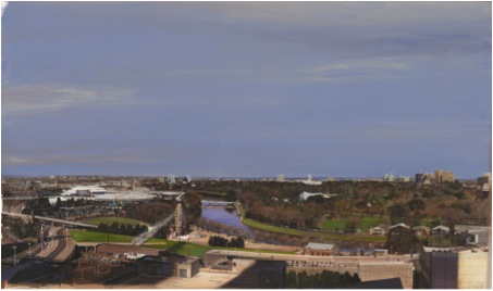
‘Melbourne, CBD’
Can you discuss your "Elioth Gruher Prize for Landscape", Art Gallery of NSW in 1980 and how prizes can propel an artist's career?
Yes, that prize - which is for Tertiary Students -helped propel my career. It was my fifth and final year as an art student in 1980 and I was finally producing some good quality canvasses. The prize and some good paintings helped me get started. I was booked in for an exhibition at a quality gallery and the little bit of local publicity like I say, some good paintings helped me kick off with a bit of a bang. At the time there was even a local TV show that reviewed films and arts; I remember a good review of my first show and all that helps. I was picked up by a really good Sydney gallery at that time as well.
Commissions - how, when, and why do you take them on?
Commissioned paintings are a standard part of our business. There is not much I knock back, even just to be helpful....I was touching up an antique clock face recently....I mean, who else is going to take that on? I do remember one painting many years ago where I did as asked, made a painting from a provided photo, made it as good as possible, but it wasn’t much of a painting. I try to make sure that doesn’t occur again....the client may be happy, but I want every painting I do to be better than good, no doubt a few average ones have slipped through. That one may be better than I remember if I see it again.
When do you say “No”?
I say no if it’s not something that I can be proud of, but I will usually try and bend it towards something that is worthy.
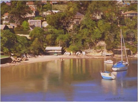
'Sirius Cove, Sydney’
Your pop surrealism is so different. The focus is on the explosion of colour rather than the dominance of light in your fine art. Is it your way of expressing your gleeful, more impish side?
Yes, the ‘pop surrealist’ works probably reflect best my taste in art for my own walls. It has been my aim to be my own favourite artist, or at least top ten, doing these works has helped me to achieve that. I like and respect my landscape work and want to add what I can to the genre of realistic landscape painting because I don’t see too many other people doing so. Much of the landscape work is homage to early traditional landscape painting that, again, doesn’t seem to be well represented in the contemporary art world. I sometimes think of Goya and his regular gig of portraiture in the Spanish Courts, but what would we think of Goya without his other side....his war drawings and his occult paintings. I think one style builds an appetite for the other.
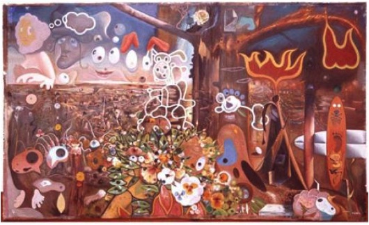
‘Bushfires at Sunset’
Contact details:
J O H N E A R L E S T U D I O G A L L E R Y
126 Glebe Rd, Merewether, NSW, 2291
PH 02 4965 3121![]() 02 4965 3121 | M 0402997231
02 4965 3121 | M 0402997231
Email: johnearle@bigpond.com
Website: www.johnearle.com.au
John Earles, Merewether, NSW, Australia
Interview by Deborah Blakeley, March 2014
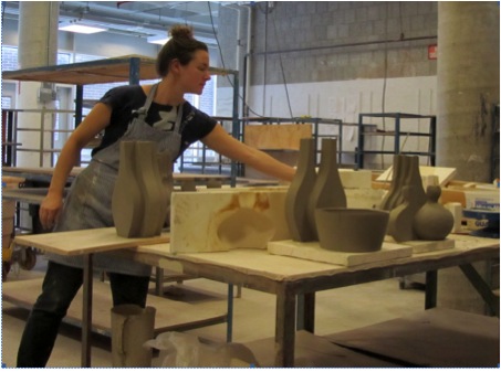
Kala Stein
Kala, when did your first come upon the idea of using double and multiple units?
It came directly out of the process of slip casting and mould making. When one makes a mould of a round object, like a pot, it must be divided into two parts. My ideas evolved from this essential division of the form.
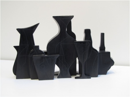
Can you explain the technique you use for your ceramic work?
I make multi-part moulds from clay models- the models may be made on the wheel or on the table as a slab. In many cases I make more than one mould part off of a single model so that I can repeat the shape within one form.
All of the mould parts are then clamped or strapped together each time the form is cast. This way I can make “one-offs” by rearranging the parts of the mould differently each time.
How has the title “Emerging Artist” helped your career?
It was an honour to have earned the title Emerging Artist with Ceramics Monthly magazine. Many artists, teachers, and students read the magazine so it helped me to be widely seen within the ceramics world.
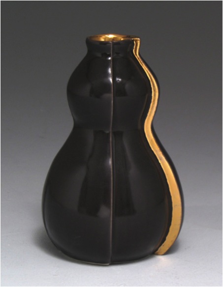
Can you expand on your interpretation of ‘archetypal form’?
The archetypal form is the prime example of a form. A classic or easily recognizable form, often from history.
Is your work usually sold in units? Is this flexible?
No, the unit is not flexible because it is one object, of course, I prefer for people to purchase more than one! The units are designed to be able to fit or group together infinitely.
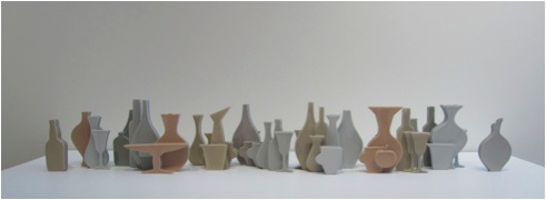
Can you discuss your ‘White Goblet Vase'?
The White Goblet Vase is taken from the large installation, Convivium, and presented as a pair of goblets functioning as a vase. The symbolism of the goblet is celebratory and convivial.
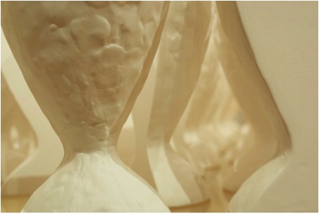
You produce your work in limited editions. Can you expand on this aspect?
Because my work is primarily slip cast, I prefer to limit the number that are made. This helps to define a body of work adding a beginning and an end. It also gives others a better understanding of the value of the work when it is made in small batch editions.
Can you discuss ‘Form and Plenty?’
The inspiration for Form and Plenty comes from the paintings of Georgio Morandi. I am attracted to the feelings of nostalgia and stillness that he captures in his still lives. The pieces in Form and Plenty are functional as vases.
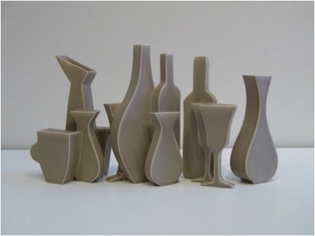
Each unit has an opening and the whole piece holds water. In these vases, unlike my other vases, flowers are unnecessary. I was aiming to capture a dusty, nostalgic feel with the limited and muted palette. The palette helps to merge the forms together into a stronger composition. The combinations of form come out of formal play of one silhouette against another. I always try to compose them in a way that is dynamic yet familiar. In this series I designed some of the forms to look more traditional and some to look more contemporary.
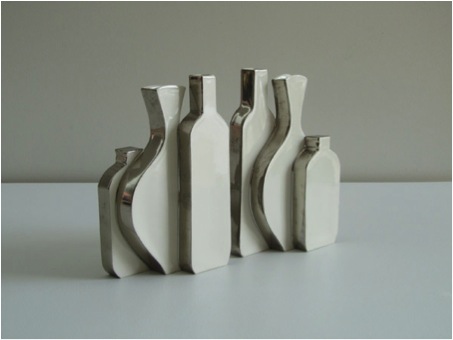
'Promenade' allows the florist in us all to succeed. Have you been inspired by Ikebana or was it more simply a bunch of flowers just needing the right artistic setting?
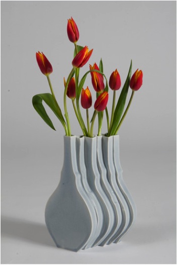
I believe the flowers help to complete the piece, activating it with components of the natural world.
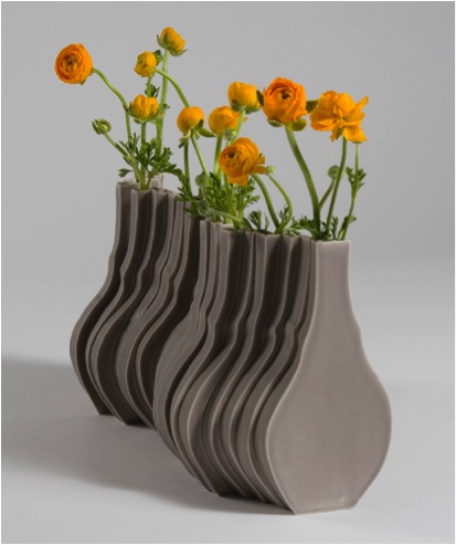
We don’t often think of small ceramics in the context of an installation. Your installation ‘Convivium’ is a photographers delight, please discuss?
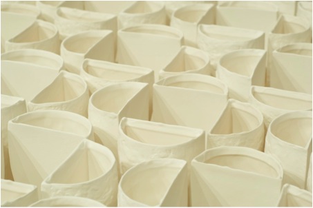
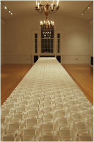
The idea is a monoculture of one form- like a field of crops, rows of corn, etc. The pattern becomes a sea, almost infinite. As one walks around the piece, the pattern changes as the viewer’s vantage point is different.
What a brilliant idea, Cuisine Culture, pottery and food in action; can you tell us more about this?
I can see this as a great TV series! Comment by Deborah Blakeley
This concept was born out of the need to educate our public and expand our following. By pairing food and pottery through a dining experience, one can see how the meal is enhanced with handmade dishes.
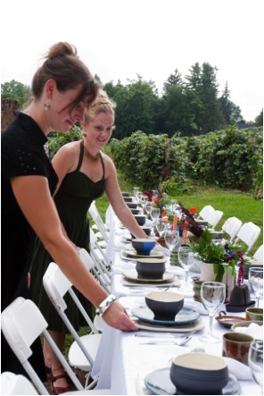
This leads me to ask, what requirements are needed for ceramics and food safety?
The glaze has to be chemically stable and have no toxic chemicals in it. The clay must also be vitrified and dense.
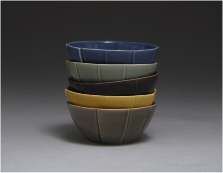
Can you tell us more about your ‘Finger Lakes Tiles’ and how they relate to the area between Candice Lake and Honeoye Lake?
The Finger Lakes Tile shows the region’s unique lakes. I live between Canadice and Honeoye Lakes, up on the ridge. Water is a vital part of life in this region and attracts many tourists, artists and farmers.
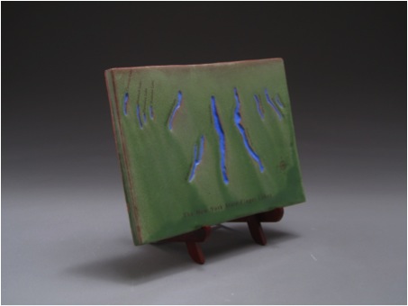
If these tiles entice the reader perhaps they need to totally immerse themselves in Evergreen Trail. Can you give a small picture of how they can also experience a piece of your wilderness?
One can come and rent a cabin in a retreat like setting! We own an old camp that was built in 1959. 3 cabins have been renovated for guests and sit under a stand of towering Norway Spruce Trees.

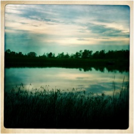
In fact, if there are any artists in your country that would be interested in a house-swap-vacation….contact me!
Contact Details
Email:kalastein@mac.com
Web: www.kalastein.com
Phone: 585-590-1019
Kala Stein, Canadice, NY, USA
Interview by Deborah Blakeley, February 2014
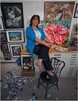
Eileen Downes
When did you first start to work in collage?
I have a background in technical illustration and graphic design first working for a local Engineering firm before later starting my own Graphic Design company.
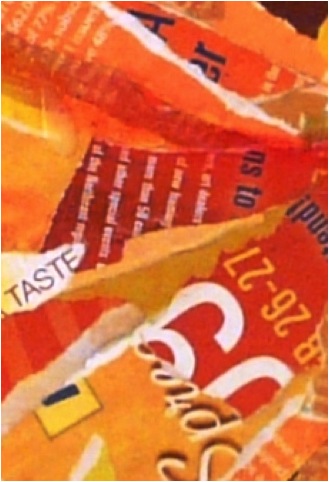
Detail of letters and how they form highlights
I am fortunate to be able to devote all of my time to the fine art medium of collage which I have been doing for the last 10 years. I think it is my early training in graphic design and specifically my exposure to a variety of “text” and “letter forms” that attracted me to use the medium of collage in my fine artwork. I see something different from what other people see in simple magazine pages or advertisements. I see the shapes and curves in letter forms as potential “paint brush strokes”…or I see long grass in a black and white magazine photo as perfect shading for under the cheekbones of a face…or I see part of a word printed in light colour ink as a reflective highlight for the curved surface of a pumpkin, for example. If you look closely at my layered paintings you can see portions of words and letters used in that way.
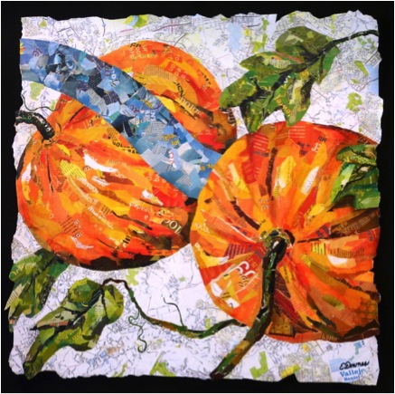
‘Pumpkins’ Corporate Collection, Vallejo, CA
The layering of paper, can you explain how you use this technique?
I have developed a unique process of building up the surface of the painting and consequently forming the image by adding and subtracting tonal values of paper used to create it. I use the total values found in the magazines, exactly like a traditional painter uses paint brush strokes on the canvas…to build the image, create shading, form, shape, highlights, and depth of field. Since my collage paintings are composed of many layers the finished works are about ¼” thick in some places. I try to remember certain words that are in the under-layers, so when I rub the surface to remove tones, these words again become visible. Sometimes I am surprised by words that appear almost magically between the torn edges as if they are part of the creators of the work.
Do you actually tear the paper or cut it?
Primarily, I tear the paper because I enjoy the organic feel of the torn edge which lends a relaxed and flowing quality to my artwork. I will, however occasionally and purposely utilize a cut edge of paper for a specific reason, such as to delineate the crisp line of a shoe lace. It is this intricate combination of both the torn edge and the cut edge that give my work complexity within the layering.
How do you store your paper?
I organize my paper by colour in many tiny drawers in my studio. I also categorize specific imagery I may want to use in the collage by subject as well as colour.
Where do you source the paper from?
Files of Collage Goodies
Recycle…Recycle…Recycle! I have established arrangements with many professional offices in the Sacramento area that save their waiting-room magazines for me. I am selective about the printed quality of the magazines I use. The thickness and finish of the paper, the chemical make-up of the printing inks, and the amount of recycled pulp in the paper are all very important to consider as they directly affect the outcome of the layered collages. Again, my background in the graphic arts has helped me here.
You add a small amount of oil pastel. Can you explain this process?
I often rub the nearly-finished collage surface with a bit of oil pastel that catches the high spots adding to the textural feel of the pieces.
Do you give your work a final layer of sealant?
Typically, about 5 coats of matte finish added after the last layer of collage is applied in order to seal the surface.
Can you explain the size of your work?
The smallest pieces I sell are 18 x 24. Most pieces are 30 x 30, 40 x 60, or 48 x 72. I once made a piece 30x 270.
Can you share you studio?
I feel very blessed to work in a wonderful studio space located within my home. My husband and daughters built my studio for me with their very own hands; I have fond memories of my youngest daughter removing staples from the old flooring before installing the very durable asphalt tiles.
Eileen Downes in the hall of her Studio Gallery
image by Kurt Edward Fishback
My studio space features overhead adjustable white-lighting, a sink, a large a plywood working wall, flat-file drawers to store my Giclee prints, lots of tiny drawers to store my torn magazine papers filed according to colour, a huge drafting table, a light table, a carpet covered framing table, and sliding glass doors that open to my backyard patio for ventilation…and my very important studio kitty, Emmy.
Emmy on the papers
Much of your work seems to be part of Corporate Collections. Can you discuss that aspect of your art business?
Most of my art business involves making custom commissioned pieces for Corporate Collections like hospitals, medical clinics, banks, and large corporations. I am usually brought into a project early on in the design phase, working with the architect, art consultant and interior designers. I am often asked to walk the construction site where I can gather measurements, and absorb the general feel of what the building will be like. I then create the custom site-specific work for the building. For example, the four very large custom works I created for the 9th Floor Main Corridor of the Owensboro Hospital in Kentucky, feature produce that is grown in the area.
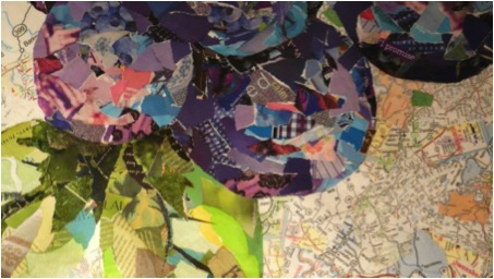
Owensboro Hospital, ‘Blueberries’ Detail
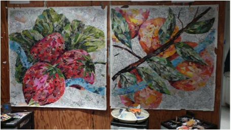
Owensboro Hospital, works in progress
When making such custom work I also include elements that are specific to the area, such as local maps and photographs of city icons.
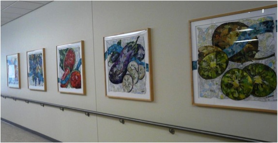
Installed, Kaiser Vallojo Floor
Many pieces in Corporate Collections are from my ‘Stepping-Up Series’ as well.
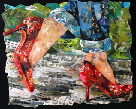
‘High Style Lady’
Please expand on your ‘Stepping-Up' series.
The Stepping-Up series is an on-going collection of whimsical collage paintings embracing the diversity of human personalities, lifestyle choices, and attitudes by focusing on the different types of shoes people wear such as cowboy boots, ballerina slippers, sexy high heels, children’s sneakers and more. The styles of the shoes are used as symbolic imagery. Inter-personal relationships and family dynamics are also explored in this series as the positions of the feet in relation to others in the works help tell a narrative.
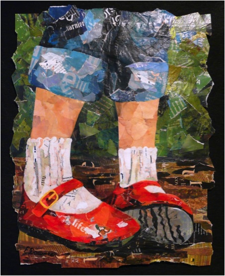
‘Nattie’s Red Shoes’
Can you discuss your ‘Beauty and the Brain Series’ from the ‘Neuro-Art Project’?
This project is very personal and dear to me, as my husband has been battling brain cancer. It has been a difficult struggle for him, for me as his wife, and for our three children. I felt compelled to build something positive out of our situation, so I did what I do best – I made art. I designed the ‘Neuro-Art Project’ as a way to honor select Neurosurgeons. The ‘Beauty and the Brain Series’ consist of very large collage paintings featuring colour saturated florals juxtaposed with scientific illustrations of the brain. I select top-notch neurosurgeons from nominations made by their patients, caregivers, staff and other sources, and I gave the paintings to these neurosurgeons as a gift of appreciation for their skill, compassion, and caring demeanour. These pieces have been given to doctors in many states including California, New York, Ohio, Arkansas, and Oregon. It is a great blessing for me to be able to use my creative talent in this way. The doctors are quite surprised when they receive my letter telling them about the project, and that they have been nominated to receive one of my paintings as a gift. I have not met any of them, (except, of course for my husband’s doctor). Several neurosurgeons have written me heartfelt thank you notes, but really the “thank you” goes to the doctors, and the paintings are really from their patients, not from me. You see, it is their patients who are appreciative of the doctors’ skill, expertise and care.
‘Beauty and the Brain’
Can you discuss one of your museum acquisition pieces?
The Museum of Biblical Arts in Dallas, Texas holds my piece titled, ‘Open Door Policy’ within their permanent collection of Contemporary Art. This piece is a large interactive collage painting featuring a real antique door which the viewer must touch and open in order to reveal the layered collage painting on the inside which displays intricately layered views of heaven. It is the only piece within the museum that viewers can touch!
Eileen Downes next to ‘Open Door Policy’
Please discuss your two flower paintings?
‘Tickled Pink’ is a 30 x 30 collage painting and part of my Hawaiian Summer Exhibition scheduled for July and Aug 2014 in Folsom CA. This piece is one of my favourites; in fact a Giclee print of it currently hangs over my own fireplace. I adore Hawaii, especially the tropical flowers that grow there; the saturated colours and delicate petals inspire me. During my yearly travels to the islands I take many photographs of the lush gardens, especially at the Kula Gardens in Maui. I use these photos as reference, not really duplicating them, but using the photos as a “jumping off point” to create the compositions. ‘Tickled Pink’ actually has those very words, “tickled pink” hidden within the collage layers.
‘Tickled Pink’ Detail ’

‘Tickled Pink’
‘Kula Garden Bloom’ is another collage painting size 30 x 30 for my Hawaiian Summer Exhibition. It is from my favourite garden in Maui, and features a prominent mid-mature blossom of a Protea Flower. This species of Protea are found only in this one location in the entire world…the up-country near Kula, Maui
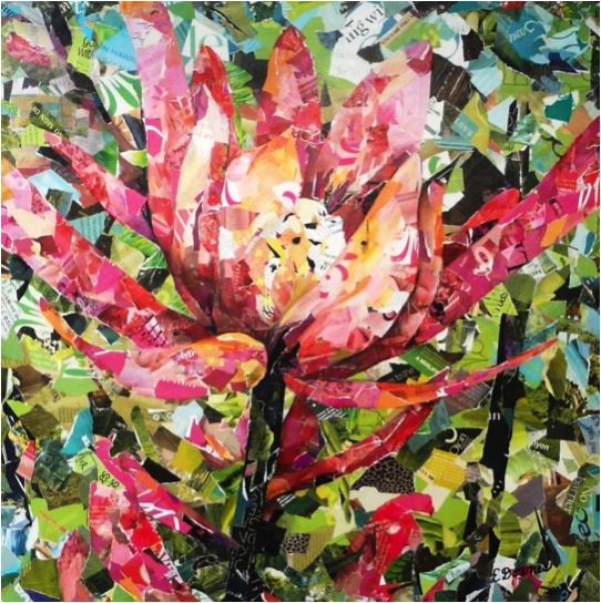
‘Kula Garden Bloom’
You have an exhibition ‘Hawaiian Summer’. Can you tell us a bit more about this?
The exhibition, Hawaiian Summer, is scheduled for the Summer of 2014 at Natoma 48 Gallery in Folsom CA featuring new work from my Hawaii Floral Series…large, square collage paintings of tropical blooms. I have been working on this series for over a year now, and I will exhibit at least 30 new pieces for the show. I will be showing with another artist, Wade Koniakowski from San Deigo CA as our work complements each others. Hawaiian style food and drink will be provided, as well as Ukulele music and maybe even hula dancers!
How do you connect your pieces to relate within an exhibition space?
I was invited to show here, and toured the exhibition space early on in the process. I always ask for a plot diagram of the space showing measurements so I can plan for a “flag ship piece” for the main focal area of the gallery, and I can also plan sizes and quantities for the rest of the space. I make sure the traffic flow is good through the space, that it has professional lighting, and a terrific staff. My series will have a very cohesive look throughout the gallery.
The materials you use are not only magazines. Can you tell us a bit more about what else you use?
Although magazine papers are what I primarily use, I often use other materials, especially for custom commissioned pieces.
‘Women & Children’s Centre’, Roseville
Can you share with us the story behind a commission piece?
Please allow me the honor of sharing the story behind the custom commissioned piece I created for a very special lady, Cate and her family. Cate had lost her husband about a year earlier, and she asked me to make the art as a special "memory piece" in the family's honor. Actually the honor was all mine, as it was a privilege to be able to create this piece for them. The artwork is titled, ‘PS...I Love You a Lote’ (and yes, "lot" is spelled incorrectly on purpose). You see, hidden within the collage is a hand-written love note that Cate's darling little girl wrote to her daddy declaring that she loves him a lot..."lot" is sweetly misspelled, as young children do.
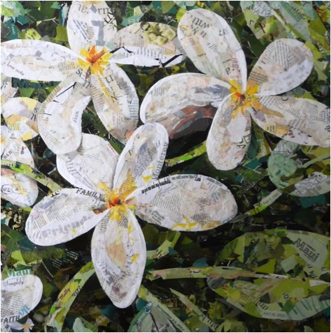
‘PS I Love you a Lote’
Upon close observation you can also see charming illustrations that she and her brother had made, family photos, travel mementos, special words, meaningful dates, some wedding dress lace, a beloved Bible verse, a wedding photo (copy of course)
where the curve of the bridal veil makes up the highlighted edge of the Plumeria flower...I even included a photograph of a magnet from the family's refrigerator door that declares "One Day at a Time." The Plumeria blossom, which is one of Cate's favorite flowers, reminds her of one of her favorite places, Maui. The soft tones of greens, yellows and whites where chosen to harmonize with the colors of the room.
Although the piece has a bold graphic feel when observed from a distance, it is my hope that when the family gazes into the details of the artwork they will see tidbits of family treasures and be comforted by a very special family bond
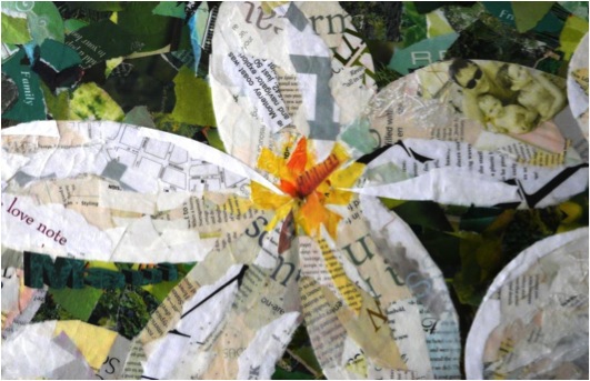
‘PS I Love you a Lote’ Detail
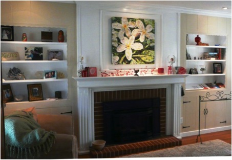
PS I Love you a Lote’ Installed in Collectors Home
Contact details.
Eileen Downes
www.eileendownes.com
(916) 761-0510
eileen@eileendownes.com
Eileen Downes, Sacramento, USA
Interview by Deborah Blakeley, Fabruary, 2014
Susan Longini
You have been working with glass for over 30 years, what have been some of the greatest technical improvements?
For the work I do, there are 2 huge game changers.
Computerized controllers allow me to create large-scale, delicate work using long and accurate firing schedules. When I got my first kiln everything was manually con-trolled, with external pyrometers and “infinite switches” that fed the kiln varying amounts of power, but did not accurately control the rate of heating. My pate de verre work is extremely temperature sensitive: there is no way I could do what I do without computerized controllers.
The other biggie is the development of compatible glass*. Bullseye Glass Co. is a pioneer and leader in the field, and their relentless research and development of a number of different forms of compatible glass have become the basis of my work.
'Harmony Quilt' in progress
*Compatible glass - where the rate of expansion and contraction in heating and cooling is the same across different glasses 'Harmony Quilt’ elements in the kiln
Your glass technique is kilnformed glass. Can you briefly explain this particular technique?
Kilnforming refers to glass that assumes its form in the kiln. It can mean fused glass, where layers of compatible glass are laid on a kiln shelf and fired, fusing together at about 1500º F. Often these fused works are then laid on a mold and slumped to con-form to the shape of the mold. The slumping is at a lower temperature than fusing, so it is a separate process.
Kilnforming can also mean work that is kiln cast, as opposed to hot-cast glass ladled from a furnace. Hollow refractory molds, usually a plaster-silica mix, are filled with glass chunks and melted and annealed over a long period of time, days to weeks, to form a solid sculpture. Sometimes a reservoir is placed on top of the mold, filled with the glass chunks, and when the temperature is high enough, the melting glass runs into the mold through a hole in the bottom of the reservoir. This process gives a clearer look to the final piece.
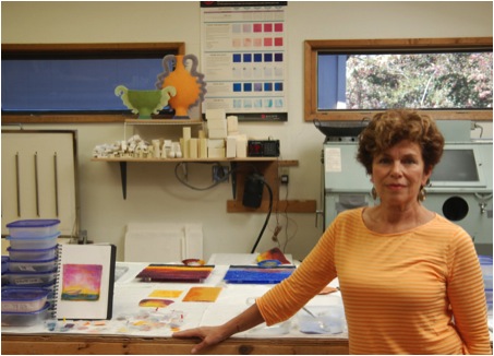
My process is called pate de verre (literal translation: paste of glass) and is a little different than either of those. I use glass powders and small glass frits, about the size of sand, and mix them together with a binder. The powders are intense colors, and the frits are either clear or lightly tinted. By mixing them together I can create my own colors and tones, which is important to my work. Then I form the mix by hand into the desired shape, either directly in the refractory mold or on a kiln shelf, and fire it. Often it will be re-fired later in combination with other pieces. The color becomes more intense with each firing, so understanding what happens in the kiln is critical.
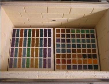
Explain the importance of heat on your work?
Glass is such a versatile material. It can be clear and shiny, opaque and matte, mas-sive, delicate and more. Much of this variation depends on time and temperature. My style of pate de verre is very time/temperature sensitive. I work with “low heat”, 1200º F to 1300º F, and a very short time span for the peak temperature. The work is often made up of “elements”, thin strips or wafers, combined together in subse-quent firings. They retain texture in the firing, which depends on not only accurate temperature and time, but also placement within the kiln. I have 3 different kilns with different configurations, and each requires a different firing schedule to achieve the same result. I have kiln logs for each series of work, including the failures…and yes, it seems that each time I try something new, there is a learning curve!
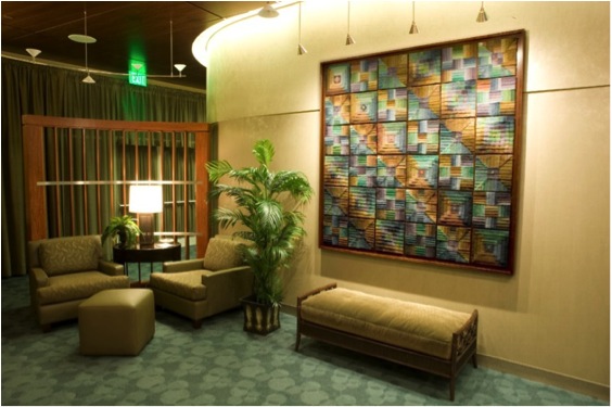
‘Harmony Quilt’ Installed’
How large are some of your pieces and what are the limitations of size to your work?
I love to work large, but my large work is really made up of smaller elements. Most of my recent work is on the wall, which has its own particular parameters. So I have had temporary installations up to 12’H x 30’W, but my biggest permanent installation is 4’H x 28’W. The idea of growing very large pieces from smaller elements is some-thing that appeals to me on a number of levels. The work can grow to any size and any configuration. It can accommodate curved walls. The pieces “speak” to each other, creating an installation with depth and complexity. Each element is no more than 2’ in any one direction.
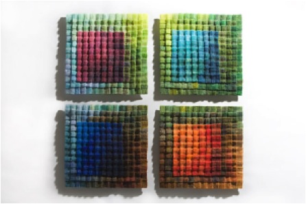
‘Four Seasons Quilt’
You created 3 major pieces for the Washington Hospital Women’s Center; can you discuss this commission and the process it took you through?
Washington Hospital Health Services in Fremont, CA was building a new state-of-the-art Women’s Center. The CEO firmly believes in the healing power of art, and wanted the atmosphere to be calming and serene. The hospital was looking for a regional artist to create the major installations.
Fremont is a unique place: we have no majority ethnicity, but do have many ethnic-ities. People work together. When my kids would have friends over, it looked like a mini United Nations.
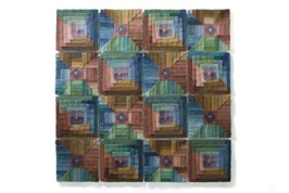
I wanted to honor this multiculturalism in the signature piece for the patient waiting room. The result is a luminous glass quilt, which is an art form that has traditionally been the domain of women. Harmony Quilt, 72”x72”x1.5” is made of 36 glass quilt squares, with 6 different patterns. A single pattern could be repeated 35 times to give a lovely finished quilt. However, in this case, the 6 different quilt square patterns rep-resent our different ethnicities. When the squares are installed together, they form an entirely new pattern, one that is richer and more vibrant than if a single pattern was used. That is the fabric of Fremont.
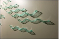
The Voyage Wall installation is kiln laminated glass, where the individual layers are still visible, along a 30’ curved wall leading women from registration to the dressing area. The glass waves, installed at approximately shoulder to head height, are meant to accompany the women on their personal journey to an unknown destina-tion (diagnosis), and give them a smooth voyage.
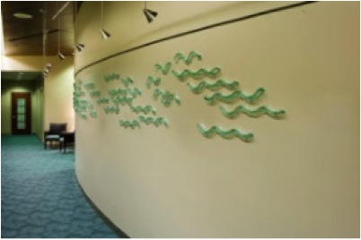
'Voyage Wall’
Concurrently with building out the Women’s Center, WHHS also built a new Imaging Center, which is accessible through the same reception area. Knowing that I could work on curved walls, I was asked to create an artwork on a curved wall that greets patients as they enter the facility.
'Shadows' is a dichroic glass installation, with 1” stand-offs, allowing the cast shad-ows to become as much a part of the piece as the glass itself. With dichroic glass, the glass itself changes hue depending on the angle, and the shadows are a differ-ent color than the glass…to understand the nature of dichroic glass, you need to see the shadows. I thought it was a fitting metaphor for the tests administered in the Imaging Center, where careful reading of the lights and shadows of the CT and MRI images, taken at various angles or levels, reveals the nature of the image viewed.
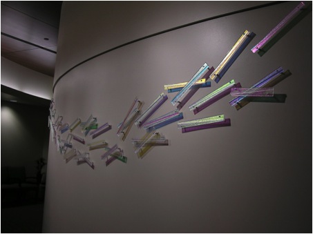
‘Shadows’
I have been told that in the Women’s Center, some patients want to stay longer than they need to, sit and have a cup of tea and look at the installations. And patients have stopped short on entering the Imaging Center, exclaiming on the beauty of the installation (how can you go wrong with dichroic glass???). The CEO is right: art calms and gives optimism to people facing a potentially fearful procedure.
Can you discuss how the colour of the glass changes with the light, both natural and artificial?
Glass color and luminosity is absolutely light dependent. However, one of the motivators for working in the method I do is that low-fire pate de verre works in a variety of lighting situations. Since it is on the wall, it is usually front lit. Most commercial settings use halogen spotlights that give luminosity and sparkle to the work; often there is no natural light.
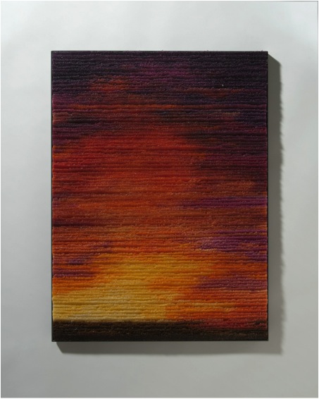
'Canyon Sunset’
Residential settings are more varied, with work not directly lit at all. It still is successful, with a quieter appearance than a piece that has focused lighting.
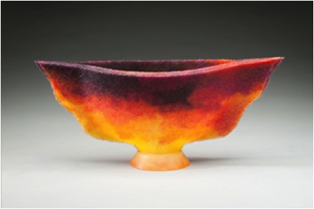
'Sunset'
Natural direct light on wall installations gives more luminosity and brightness while still being softer than halogen. I have started experimenting with LED (light-emitting diode) backlighting, which gives a completely different experience than front lit work. While it’s still not ready for prime time, I am excited with this direction.
Discuss your ‘Vessel’ work and how you developed it.
I spent some time in Europe as a child. Knowing that this was a temporary situation, my parents dragged me to every museum and ancient site they could find. Amazingly, it has had a profound and lasting effect on my work. What interested me most were the ancient, reconstructed pieces. They had broken, fallen apart, and were pieced back together, sometimes still missing parts. They were incredibly beautiful and mysterious. Their “imperfection” made them even more attractive. I also found a real connection with vessels, which were gorgeous in shape and utilitarian in pur-pose.
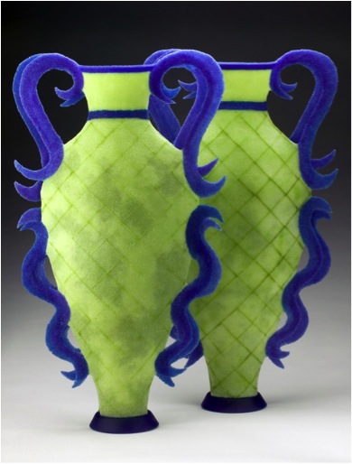
'Amphora Grande Crosshatch, Spring Colbalt’
My Vessel series started as a statement of the vessel as a feminine receptacle for our aspirations and relationships: seeing women as vessels, carrying children to birth, holding families together and being the daily utilitarian vessel. The vessels are made of two parts, not fitting together perfectly, but working together harmoniously, like a relationship. The pate de verre is porous, so in fact can’t be utilitarian; it should be viewed as a metaphor.
Colour in your ‘Vase Analogy Series’ is much more refined. Can you expand on this?
My early vessel series referenced traditional vessel forms using contemporary colors. I used the same frit/powder mix ratio for every hue. Since I wanted the colors to be consistent in a piece, I mixed more than enough of each color to finish a work and ended up with lots of small quantities of left-over frit/powder mix, like small scraps of cloth. Having collected antique quilts, which I love because they create rhythm and order from many small random pieces, I realized that these leftovers were the start for making glass quilts. I mixed some of the color, sometimes adding new frit to make enough material, and the results were very rich and nuanced. After a few quilts, I understood that the tonal nuances would translate very well to the Vase Analogy Series.
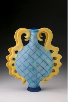
‘Crosshatch Amphora – Turquoise’
Again your colour palette changed during your Residency in Lybster, County Caithness, Scotland Can you discuss how location has influenced your inspiration and work?
I have lived in California since 1981. A friend from here who moved to the Midwest longingly described California as a technicolor world, where colors are vivid, the sun-shine and dry atmosphere make horizon lines sharp and clear, and flowers bloom year-round. My work reflects all of that. So it was something of a shock to go to Northern Scotland, to a very different environment of infinite grays and indistinct horizons. In that far north latitude it is daylight almost round the clock in the summer, so even with the gray skies, gray water and black cliffs, there was a mystical light filter-ing through. Beyond that, the area has a long, hard history and is now rather de-populated. Lybster, the village where Northlands Glass Center is located, once had 15,000 residents. Now it’s about 800. I was captivated by the place and the history and hope that my work reflects that.
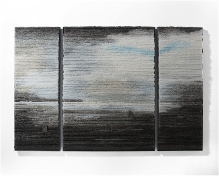
‘Caithness Neighbors’
Explain the use of shadows in some of your work?
Shadows can give as much information about a work as the piece itself, and they expand the complexity and scale as well. So sometimes I want to work simply and let the physical object be half the intended piece, with the shadow being the other half.
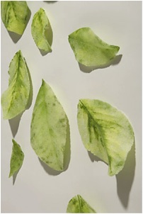

‘Falling Leaves – Green #4’
Can you explain your ‘Canada Geese’ series?
That was a Public Art commission for the Fremont Animal Services building. The office hub was in the middle of the building, and they wanted some separation from the public without being completely out of sight. The building is located next to a lake with a large resident flock of Canada Geese. I wanted to remind everyone, both employees and the public that they were in a very special spot and also speak to the function of the building.
So I spent a lot of time by the lake observing and drawing the geese. The resulting 8 deep-etched plate glass panels, each about 39”x39”, tell a vignette of the geese feeding, hearing the calls of other geese, flying to a new spot, and feeding again. A red-wing blackbird, also a resident of the lake area, is observing the sequence.
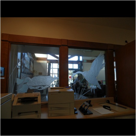
Can you discuss how your work through commissions has developed your work?
Commissions are extremely gratifying. The artwork is a result of a conversation, and really collaboration between myself and the client. There are certain questions to address in a commission: What is the function of the space? What would benefit people who are in the space? What is the aesthetic of the surroundings? What is the appro-priate material for the environment? What can I do for the given budget? Fortunately, when given a commission, there is already a green light as to my own general aesthetic and to glass in some form. Because each commission is unique, I try to push myself and offer something that expands on what I have already done. In that ex-pansion, I learn something and the client receives a one-of-a-kind installation.
Can you take a current work and expand on it?
A recent commission was for a home overlooking the Pacific on the Big Sur coast. The environment is breathtaking! The couple had seen one of my pate de verre leaf installations at a gallery and loved the idea of a scattered leaf installation in their bedroom. So I took the actual leaves that I make molds from, magnolia grandiflora leaves, climbed on a ladder and with a fan at blowing at low speed, dropped the leaves on the floor. The resulting configuration was the basis of the installation. I used the leaves to make molds and transform them into the final work, 48 pate de verre leaves covering an area 12’H x 8’W. Installed, they are cascading down a wall from a skylight toward the glass door that opens onto an ocean view.
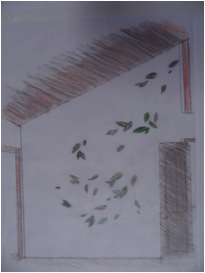
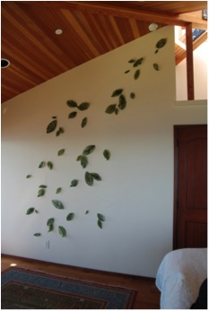
‘Big Sur’
For gallery work I continue to look to the sky. The Caithness series allowed me to focus on the infinite nuances of our celestial realm. I am interested transitions, and the sky embodies that change, especially at sunrise and sunset, and each time it looks a bit different. The analogy is that change is really the only constant in our lives, and that it can be viewed as beautiful and inspiring.
As well as being a glass artist, over the years you have also seen the need to be an educator and administer in your field. Can you expand on this aspect?
Teaching is a wonderful learning experience. To successfully convey an idea or technique, one needs to understand both the how and why of that idea or technique. So I had to study to make sure I was clear on the assignments. As a professor at Ohlone College in Fremont for 17 years, every semester I had the benefit of 25 or so minds working on various challenges and coming up with 25 different answers each time. Art is a fabulous critical thinking field: there are many ways to successfully cre-ate work. I loved getting the results from my students, and they often came up with solutions that I could not have envisioned myself. That was exciting.
You are a Juror. Please give the reader some tips on what you look for in this role?
As a professor I emphasized presentation, presentation, presentation. As a juror, this is one of the highest priorities; artists should present well-crafted work cleanly, without background, in high quality images with proper lighting. The exception to that is if it is a site-specific installation that interacts with its environment. If several images are submitted, they should form a cohesive body of work so the jurors understand the artist’s style and message. Use titles; the title can summarize an idea in a word or two.
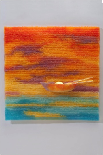
‘Dawn Boat’
Contact details.
Website: www.susanlongini.com
Susan Longini, Fremont, USA
Interview by Deborah Blakeley, February 2014
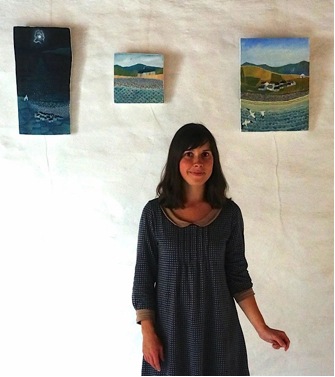
Valériane Leblond
You have been in Wales since 2007, how did this move come about?
I met my partner, who is Welsh, in Britany and after a few years together in France we decided to move back to his country.
Do you feel as a ‘newcomer’? Bringing the Welsh countryside afresh to your audience?
I probably bring something different, but I don’t know if it is because I am from a different country or because I see things differently.
There are many aspects that you are painting, can you elaborate on 3 with an image and discuss?
Women
I like painting people at work and who are leading a simple life, fulfilled by the daily routine.
Cottages
When I first arrived in Wales, I was really impressed by the way people had built their dwellings in a practical way, from the materials they had available on the direct land. For this reason, cottages are completely part of the landscape; they are made of it and melt into it.
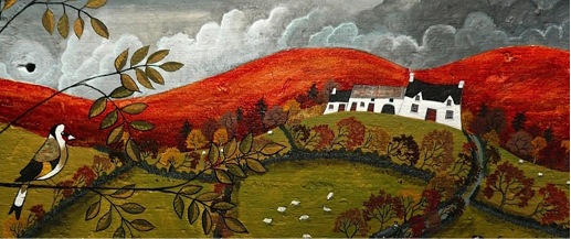
Windswept seas
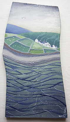
There is something very moving about the sea, especially in hostile places that haven’t been spoilt by tourism - you wonder what is laying underneath, what secrets it keeps.
Can you discuss how and why you work on wood?
Wood is a wonderful material for my work, always different, and unique, each piece has got its own character.
When I start a new painting, I first chose a plank, and then by observing the grain, the knots and the specific shape, decide what I should paint on it. I work mostly with acrylics and oil paints, tiny brushes and needles.
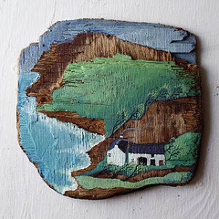
Does the shape of the wood give you some of the inspiration to the particular work?
Yes, it does.
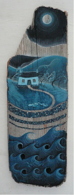
Discuss how your work is framed?
My work on paper is framed, but for wood, I only paint the sides and the back in bright white and leave it as simple as possible. I don’t think frames work with wood paintings, and I like the odd shapes that the wood has.
Is collection and storage of the wood a problem?
Not at all, I enjoy looking for new pieces of wood, through beach combing and ruin hunting. I also have some wood especially cut and sawn for me, and it is all very easy. For storage, I have a rather large studio, and I am tidy enough to keep it all sorted and use what I have before looking for more!
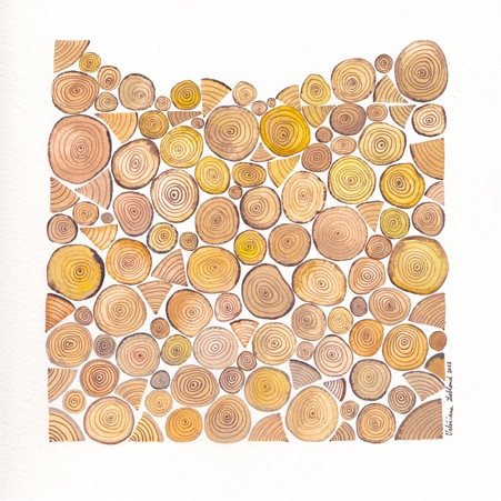
Can you explain how your tiny wooden cottages came about?
One day I found a tiny little piece of driftwood which had just the shape of a house with the angle of the roof. I decided to paint it simply, just for fun, and I was very happy with the result, so I asked a friend if he could make me more little cottages with his saw and some reclaimed wood.
I really enjoy painting them, they don’t ask me too much thinking, and I have always loved miniature objects.
Expand on your "Jen Jones" series and how this developed?
I’m interested in Welsh quilt the way I am interested in Welsh cottages : they are a reflection on how to make something useful, needed, with very little material, all found on the spot.
I first made a picture featuring quilts for an exhibition in Aberystwyth, and Jen Jones’ curator saw it and it is how we started to work together. She has the most amazing collection of quilts, and she understands perfectly what I am trying to do.
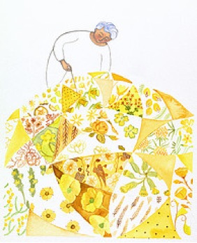
I love painting quilts, people, cottages and landscape, and show how these four elements are part of each other in the Welsh culture.
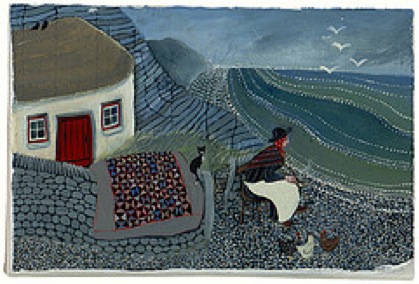
Where is it printed?
It is printed in the National Library of Wales.
What sizes do you have printed?
Mostly A4 and A3, but I can print other sizes if requested.
What is the print run?
I always do limited editions of 25; all print are titled, signed and numbered. It allows me to keep my shop fresh, with new prints coming all the time, and makes my prints more valuable as there are only 25 of them.
Discuss how you choose which work will go to the printer and also the sale of the original?
When I am particularly happy with a painting, and when the shape of the wood is not too odd (a print will go in a frame, so it is better to have a rather square/rectangle shape), I have it professionally scanned and printed. Original artwork is sold through galleries or through my online shop.
Do you often have a series printed?
No, but if I work for an exhibition, I will try to have some prints of the original paintings for sale as well.
Can you enlarge on the comparison between your paintings and quilting and how this came about?
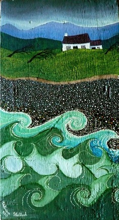
While quilting has a useful purpose (making an object that will keep you warm at night), there isn’t much use to my artwork, but I think the way I work could be similar to what a quilter does, with tiny stitches, holding pieces together, and drawing a pattern with thread.
Also, the Welsh landscape, with its enclosed fields has an obvious look of a patchwork quilt!
The titles of your work, how do they come about? Also, can you elborate on your choice of using Welsh or English?
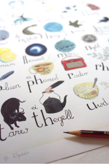
Titles of my works are all in Welsh first, never in English (only if they have been translated). I sometimes have an idea of something I wanted to say, something I thought about while painting, and sometimes I ask my partner to find a title for me, this brings a different angle to the picture, and makes it more interesting.
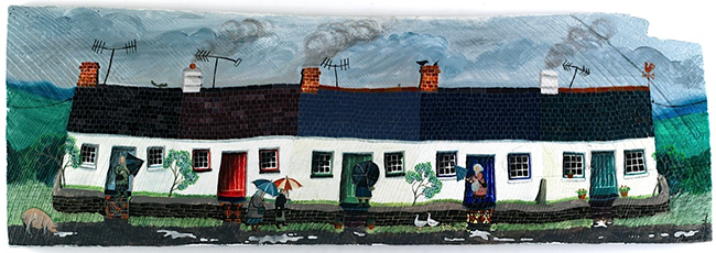
Contact details.
Website:www.valeriane-leblond.eu
Email:contact@valeriane-leblond.eu
Valériane Leblond, Aberystwyth, Wales
Interview by Deborah Blakeley, February, 2014
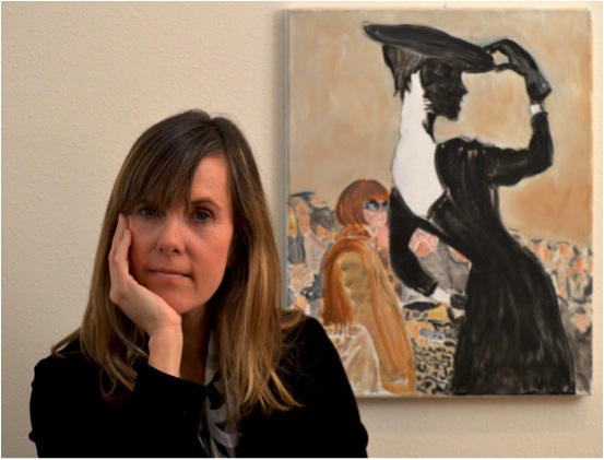
Denise Boineau
You have come from a fashion background, can you discuss ‘Vintour’, both the main frame and that ‘special’ viewer?
Two things make fashion designers (at least the ones I know) anxious and very anxious, respectively: mention of influences or predecessors and the front-row presence or absence (the latter is somewhat worse) of Anna Wintour, Vogue’s long-time editor. I have always been fascinated by silhouettes. I also have a thing for fashion icons and vintage designs. All of which help explain, at least in part, the painting “Vintour.” The composition juxtaposes fashion’s present and fashion’s past and sets the scene in an ambiguous spatial setting. We first encounter the vintage silhouette. Behind her sits Wintour, well-defined and fully filled-in. And behind her and to her sides the rest of the audience seems to dissolve into the background. I would have been surprised (maybe even amused) had I been in attendance. Anna? Always the professional: you won’t find out until the next issue..
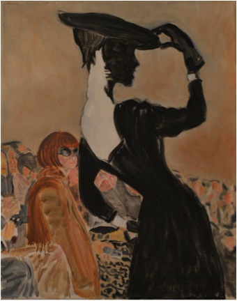
‘Vintour’
In your work ‘Retro Chic’ you have added Blue. Can you expand on this technique?
What do we see when we look at ourselves? What do other see when they look at us looking at ourselves? These two questions were the catalyst, of sorts, for “Retro-Chic.” The painting is a snapshot of a strong, confident woman, in mid-toilette, betraying her soft, feminine side, and a touch of hesitancy, possibly doubt. And between the lines, it is also a reflection on the aging process and the place beauty has within our own personal stories. “Old age,” Collet confessed, “is an uncomfortable piece of furniture.”
The toilette? You stand in front of a mirror—it is you and the dress. You look and imagine, and concentrate. You want objectivity. You remove yourself from the equation. The dress takes centre stage. But, in the end, it is you in that dress. You take off the black one, try the blue one on and you tell yourself: today, for this occasion, for how I feel, this outfit “works.” In a few years it may no longer work. And not necessarily because it has gone out of style, but because that older you, in that same dress, would be “trying too hard.” When you get back home, you may again stand in front of the mirror. You reassess, nod in approval, you may even gloat. That’s how the blue got into the picture—it worked on her and held its own against the ochre.
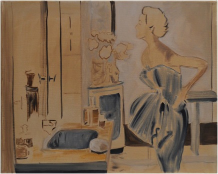
‘Retro Chic’
Can we discuss your equine paintings?
The people both as spectators and riders
Let me begin with a recent painting “Takeoff,” which combines my interest in fashion and horses. The painting is really two paintings conceived as one. On one canvas a rodeo rider on a bucking horse holds on. The before and after involved a well-choreographed, reverse spooning between a very annoyed horse and a spat-waving, stylishly dressed cowboy. Behind him, the half-hidden body of a rodeo-hand leaning against the bucking chute’s gate, relaxed, maybe looking, maybe not. In the stands, a judge sits, subtracting points for style and keeping time. Somewhere in the stands across, I am taking it all in through a camera lens, thinking ahead. On the other canvas, an arm-waving fashion-conscious free spirit is in mid-dance. Her hair keeps up rhythmically, as it covers her eyes. Both the rider and dancer are self-absorbed; they do not inhabit the same space. But their bodies seem in sync.
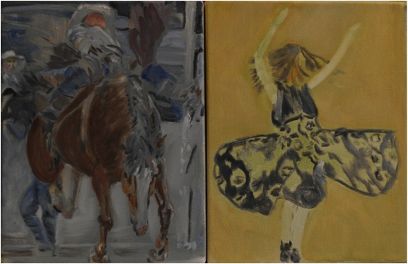
'Takeoff’
How do rodeo riders learn to follow the horses lead? How does the rider, in a millisecond, fall into rhythm with the bronco? What does the latter do to break that wave? I am not sure I know. But the relationship between horse and rider in “Takeoff” is very different from that in the polo and horse racing paintings.
Polo players
I came to polo through my love of horses, but also through fashion. In polo, the players, the ponies, and the crowd take fashion seriously. Aside from the clothes, what makes a good polo player? Strength, endurance, guts, good balance, keen eyes, a highly manoeuvrable neck, a sixth sense to keep tabs on their pony, and a special language to guide its every move. The ponies are also good athletes; the good ones know what they are up against and can anticipate.
In “The Reach,” I tried to portray the inherent danger in a sport where players make split-second decisions while riding fast-moving ponies and waving long mallets. The player up front may or may not be avoiding the other’s mallet.
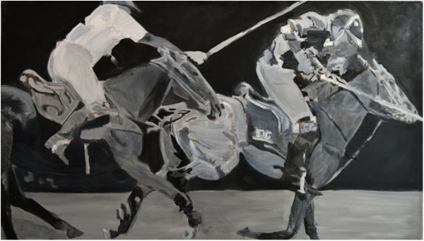
'The Reach’
On the other hand, the painting “The Other Side” captures a deceptively leisurely moment, a gentlemanly, “please go ahead” understanding dictated by the rules of the game. Ponies and mallets capture the fact that nothing has really stopped.
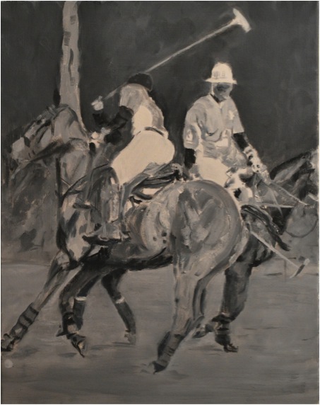
'The Other Side’
In “George Meyrick,” the ponies are charging right at the viewer. Meyrick is up front, teammates and opponents are in close pursuit, and hooves, when they are touching the ground, are in search of traction. It is moments like this that make polo an exciting sport to watch, polo players and their ponies special athletes and partners, and painting them challenging, but rewarding.
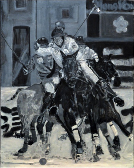
'George Meyrick’
Where you combine both the spectators and the players
The spectator at the polo match, horse race, rodeo, or fashion show is there to look at the players: the riders, the horses, the clothes, the photographers, the press, the celebrities, the rich, the not so rich, the models, the cowboys, the designers, the entourages, and the other spectators. I am often behind a camera lens, which limits what I can look at, or defers it until a later time.
The players in “Palm Beach Spectators” face a crowd. Some of the spectators are attentive; others are not.
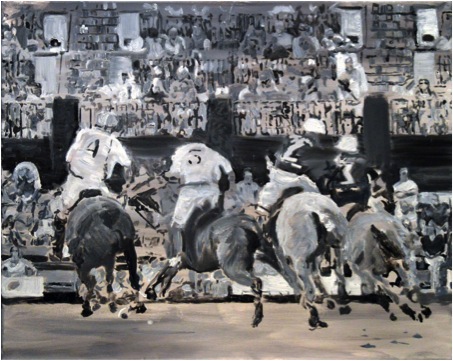
'Palm Beach Spectators’
In “The Pass” the spectators are seated on the ground looking up. This was at a
Charity match and the spectators have a “this-is-a-nice-way-to-spend-a-fall-afternoon” kind of look.

'The Pass’
Horse racing
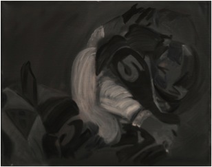
‘The Edge’
The gates open. Horses gallop tightly in a pack; they bump and jostle. Jockeys keep an eye on the track ahead and on the horses that are gaining ground. In “The Edge,” the jockey turns his head ever so slightly towards the horse to his right, which is either pulling close or falling back. For this brief moment, it is their race.
“The Call” is about ceremony, history, and goose-bumps (I feel them every time I hear the call to post for the Kentucky Derby).
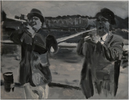
‘The Call’
You grew up on a farm and rode. Please discuss how this has influenced your equine work?
My mother bred and trained thoroughbred horses. From a relatively early age I was interested in the process of breaking in horses, getting them ready for a life with bits and saddles and riders. My horse, Chantilly Lace, and I had a special bond. I remember coming home from school and being dropped off down by the barn, where she would be waiting for me. I would jump on her bare back and ride.
In my equestrian paintings I try to capture the special relationship between the rider and horse. I sometimes find it helpful to visualize—putting myself atop the horse, eyes closed, so I can feel it in my gut. That’s what I did, for example, in “At the Gate.” I wanted to get a sense of what the horses feel when they are locked into the starting gate.
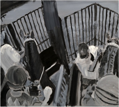
‘The Gate’
Many of your paintings are monotone. Please discuss this?
I lived in New York while working in the fashion industry. During the first few months, my senses were constantly overloaded, and my body and mind felt it. Eventually, senses become selective. You see yellow when you are crossing the street (survival first). You take in the sounds and smells as you make an evening out of it. The next morning you walk down the same streets, over the same grates, oblivious to the rushing subway underneath or the residual smells of the night. The same thing happened at work. After a few months, I could look at a rack of 100 dresses and see only the black ones, the blue ones, or the ones with patterns.
Beauty and glamour and grit and every other message we try to send when we put ourselves in front of others is about selectivity and stripping down (metaphorically) to the essentials. I think that is why I have embraced a monochromatic pallet. I say, I think, because I did not set out to do so. It felt right, at the time, for what I was trying to do.
In “Doppelgänger,” models back-stage are transformed so they properly “accessorize” the garments they will wear on the runway. The limited palette makes it difficult to tell where one model ends and another begins.
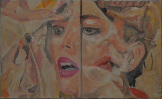
‘Doppelgänger’
You worked at Calvin Klein and learnt an important fact: “Colour matters only when you cannot make your point in black and white”. Can you expand on this in relations to your Horse/Man series?
Jockey silks are colourful—to allow the spectators to know who’s who. In “Chasing Diamonds” the silks are stripped of their colour, as is everything else. My aim was to emphasize the horses and riders rushing towards the viewer and their bunching up, given that they are forced to stay within the four corners of the canvas. By painting the diamonds in the leading jockey’s silk in black and white and grey, the ambiguity in the title is emphasized.
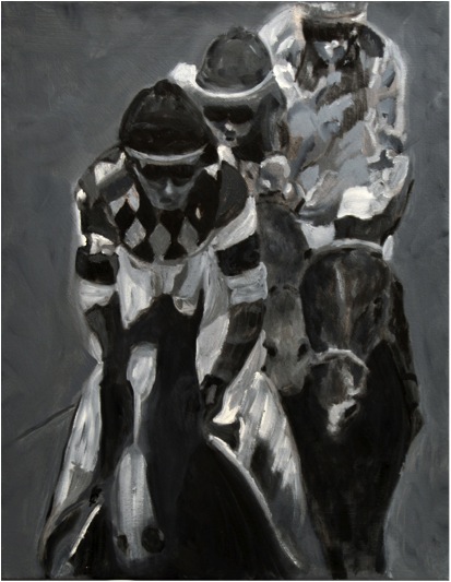
‘Casting Diamonds’
Can you discuss the importance of storytelling in your paintings?
I try to hide things. And leave bread crumbs—not all necessary leading to the same place. As with colour, I try to err on the side of saying less. In “The Return” a cowboy rides towards the viewer, and gets so close that his head no longer fits within the canvas. The horse takes centre stage. There is no background. There is no sunset. The horse looks like he can continue for another hundred miles.
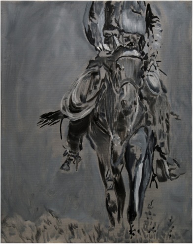
Sometimes we reveal things inadvertently. Driving down to Miami recently I came across a sign at an RV park that said: “Stay the Night. Easy Hook-Ups.” Intended? Maybe. In “Gate Bound” the horse and trainer sport the number “9.” Is the rider on the right horse? A Freudian slip.
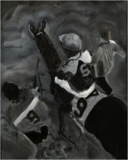
‘Gate Bound’
You say you paint “to share”. Can you expand on this statement?
When painting, I try to rein in my emotions, but not in the name of letting my brain do all of the work. Instead, I try to see the extent to which I can share certain feelings. I do so not necessarily to elicit identical feelings in the viewer, but rather to make the viewer’s first encounter with a painting mean something at a visceral level, before they try to start making sense of it in their heads.
My father would always tell me: “Give it to me straight”—a difficult task for a kid, and I think an even more difficult one for an artist. I do not want it to be straight—except for that initial encounter, and even then, there is not a specific emotional message that I am trying to share. I am not sure how successful I am at sharing, but I have found that I am more likely to be effective if I consciously try to keep my own feelings in check. An example, at least of the process on my side, is “Helios.”
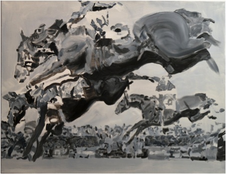
‘Helios’
Can you explain where you get your inspiration?
Quite often it is from watching the interaction of people in their own relationships. I observe….I look for patterns. I find beauty and truth in many places. On being a woman artist: Camille Claudel. On being a woman: my mother. On seeing the top, even when you are at the bottom: Anna Wintour. On staying on top when others have other thoughts: same. On finding truth through a lens: Walker Evans. On finding puns through a lens: Man Ray. On creating coherence out of contradictions: Calvin Klein, who in 1981 made a splash by encouraging women to wear their Calvin’s au naturel, and in 1982 made even a bigger splash by encouraging men that they should invest in expensive underwear.
Your work is taken mainly from the ‘thoroughbred’ and high society; expand on this in relations to your art work?
We consume fashion and art, and in doing so we attach value to the specific objects we desire. And we are taught to desire them and to feel good about doing so. Piaget, Maserati, and Veuve Clicquot definitely want spectators at polo matches to pay heed. While all this is true, I am more interested in pointing at it, than at pointing fingers. (I would be unable to do so without pointing squarely back at myself.)
“The Match” takes the riders out of the picture altogether. The spectators at a polo match sit on the sideline, some watching attentively, a couple in the background, stand inside a tent, the woman looking straight at the viewer, or possibly trying to get the attention of the waiter charged with serving the champagne. In the foreground sits a stylish, possibly overdressed, but nonetheless glamorous woman. She sits higher, on a stool, most likely. She is sipping her champagne and staring into the distance, in a different direction from those following the match in earnest. These are obviously good sideline seats. The clothes look expensive; their wearers have the air of being able to afford them. Even the umbrellas have a custom-made feel. The champagne glasses are lined up, and another one is about to be served.
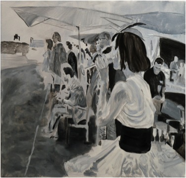
‘The Match’
You use the French proverb: “I seek and find wisdom in old French proverbs”. Can you explain the importance of this proverb?
It is a nod to my late father, who bestowed me with the name Boineau and made numerous pilgrimages back to the Dordogne is search of good water and distant relatives.
Contact details:
Email: ddboineau@comcast.net
Website: www.deniseboineau.com
Denise Boineau, Florida, USA
Interview by Deborah Blakeley, January 2014
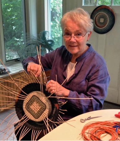
Kari Lønning
I keep coming across ‘encaustic’, which is taking on a ‘new’ life. Can you explain how it is part of your work? How does this affect the colour process? How have you adapted encaustic into your basket weaving?
Encaustic painting was used as far back as 100-300 AD in Egypt. The wax was heated up, pigments were added and the mixture was applied to a surface. I use clear beeswax and demar resin mixture on my finished baskets.
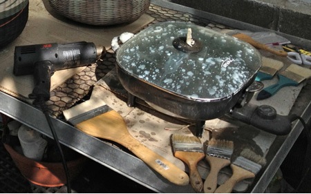
Encaustic pan, brushes, gun
Where you do this and why?
I work on the encaustic in my greenhouse where a ventilation system was set up to remove excess heat from the plants. The fans work to draw off the wax/resin fumes as the medium is heated up. The process involves brushing the liquefied wax onto the outer and inner surfaces of the baskets. A heat gun is then used to melt the gloppy mess into the fibre of the rattan. The wax seals out air borne pollutants (which in turn keeps the natural reed white), protects the baskets from potential mildew, makes the colours appear richer and adds strength to the walls./p>
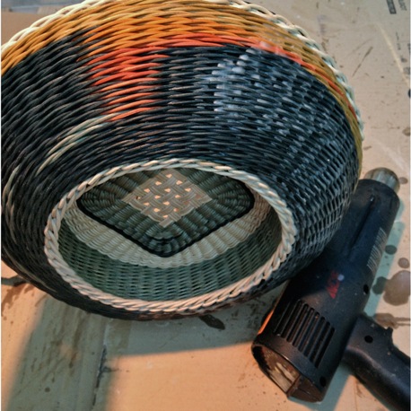
Encaustic on 2 sided Gem
What materials do you use in your baskets and where do you source them?
I use round, rattan reed which I buy directly from a wholesaler. He gets it from China, where it is milled to size and bleached.
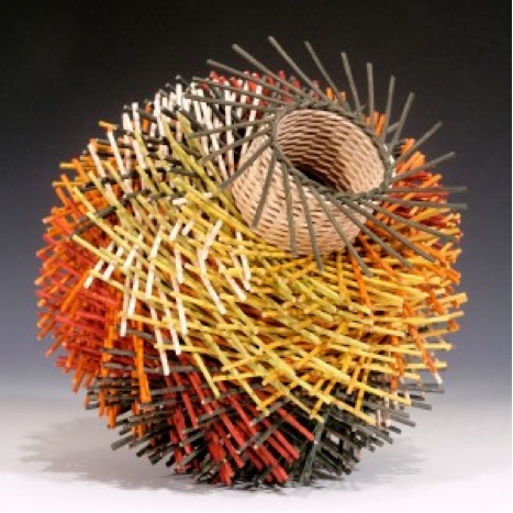
You do commission work; can you expand on this process in relationship to the client who sent you a grey and orange tile?
The client who commissioned a basket to go with her ceramic tile, found me at a craft show last fall. We discussed which baskets she liked and why they appealed to her (patterns, colour usage, texture). She sent me the tile and the dimensions for the location where she wanted to place the basket. I began dying reed. When I got colours I thought she’d like, I sent her samples of the four dye lots I did, with a design sketch. (I use procion textile dyes which are water safe and as light resistant as the best upholstery fabrics.)
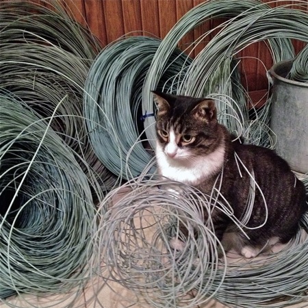
Kitt, the Cat and reed
She liked the colours so much she asked if I’d make her two baskets. She wanted them to be different designs, but to have them work as a set. I started with one basket, and sent her photographs. We narrowed down her preferences; she preferred less orange used as an accent, you can see in the detail below. I followed up with two more baskets.
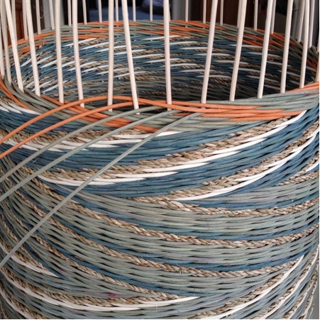
Note: The 2 orange and 3 grey-green weavers above. I refer to weaving with 5 weavers.
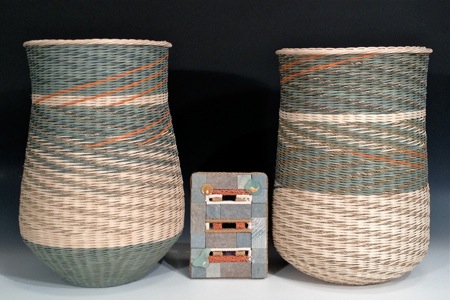
‘Zafron Baskets’
Can you take us through the process of your work?
The wall pieces I make begin with a grid where the back half of the reed is carved away. This allows for a tighter beginning and a flatter surface. Rows of tapestry are woven back and forth in order to build up the flat sides of the square, transitioning the square into a circle. To begin the spiral pattern, I add 3 more blue weavers and 1 natural one. After a few rows, I replace one of the blue weavers with a second natural and weave a few rows. I continue replacing blue with natural until all five weavers are natural. This creates the pinwheel effect. The orange accents are added using a tapestry technique. A weaver is cut and replaced with a short piece of orange for one weave-step.
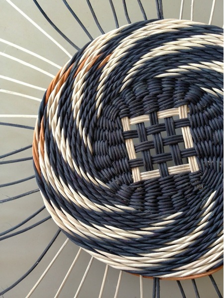
‘Sage’
The orange is then cut and replaced with the original colour. This process happens every time the orange appears. Ends are tucked into the weave, hiding where each reed starts and stops.
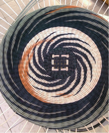
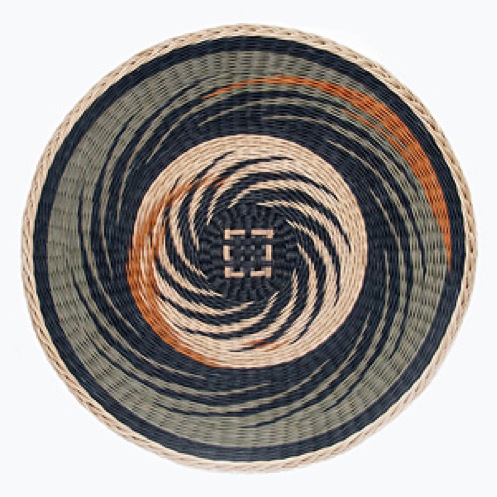
‘Sage’
“My whole output comes from one divisible creative force…” can you expand on this statement?
I believe the idea you are referring to has to do with a comment I made saying that my whole life is about creating; be that creating a basket or a garden, or a photograph. I see colour and design, and inspiration all around me. For me, creativity and inspiration are everywhere and touch every aspect of my life.
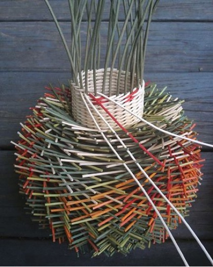
Your former training – how has this influenced your artistic journey? Can you explain the different shapes your work takes?
In college I studied ceramics and textiles. Throwing clay on the wheel taught me about form and gave me a feel for the spirals in the flat wall pieces. Weaving on the loom taught me about the structure of fabric, and about designing patterns. Together, they prepared me to weave the vessel forms and the spinning wall pieces I create.
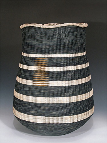
'Wavy Top'
You have a term ‘Hairy’ can you expand on this?
Technically - Your inspiration
The “hairy” technique is a method of alternating rows of weaving, with rows of short pieces inserted one at a time, behind each spoke, to create texture. The idea came from my wanting to weave a nest for my cousin’s aviary. The basket needed texture in order to sit in the branches and muted colours to blend into the leaves. My cousin wouldn’t put the nest outside, so I made a second one, saying that one was for the birds. After making two ‘nests,’ I understood what the birds had known all along, how to weave a textured surface using materials; they had at hand. For me, that was dyed reed. I had discovered a new way to work with colour.

Discuss the importance of photography in your work?
Inspiration/Colour
Photography is a passion. I use it to capture moments and details around me, as well as a way to network with artists and friends around the world. In the garden and woods, I take pictures of colours and nature’s designs. These photos are often used for basket inspiration and for creative editing. I use a photo sharing app called Instagram, where I learn, share and get feedback from other photographers. The photo below shows how the colours used in a Norwegian friend’s photo, were the inspiration for a basket.
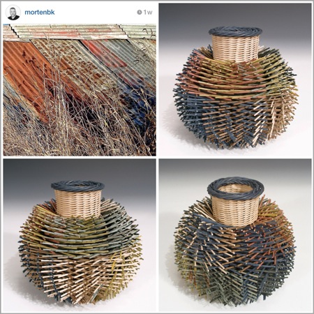
‘Mortenbk Hydrangea'
inset photo used with permission from @mortenbk on Instagram
Importance of good photography for your completed work
Good documentation of artwork cannot be stressed enough. The physical work can only be seen by a limited number of people and once the piece is sold, all one has left is the photograph. Galleries and the press are always looking for good photographs. Collectors and museums look to photographs for reference. The better the photography, the greater the opportunities. As an example, the image below is a collage of photographs from different times. The carrot photo was the inspiration for the basket featured with it. I used an app on the iPhone to make the grouping in order to show the different sides of the basket. This photo was chosen by the National Basketry Organization to feature on the cover of their current magazine. The photo on the left was part of the first page of their article. By documenting my work as I went along, I was prepared for the feature article and, could print this small poster to have at craft shows.
Gardening is also a passion, can you discuss this?
Being in and around plants and nature has always been important to me. As a child, I was more of a collector. I would dig up wildflowers and plant them in a little garden near the house. As an adult, I still collect, but after 30 years of being in the same house, most of my land is covered by perennials or bushes. As the plants have matured and multiplied, I’ve become more of an active observer and caretaker. As an alternative to the control I have over my baskets, I am content to stand back and let Mother Nature design as she sees fit, with minimal interference on my part.
You work with dyes and hard vegetation materials. How do you care for your hands?
Not a very interesting answer; when I use procion dyes (fibre reactive textile dyes) I use light weight rubber gloves. While I’m weaving, I pay attention to what’s about to wear out and use my hands differently. Since I use my hands differently while weaving “hairy” baskets and the ones with flat surfaces, I often alternate between the two styles, finishing one then beginning a new one. This keeps the different parts of my hands from wearing out.
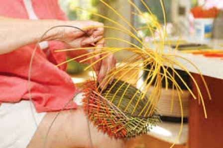
Photo by Amy Dolego
You also give workshops. Can you explain the direction these take?
I don’t teach often, but when I do, the high point comes in watching people who often have never seen themselves as “artists,” glow with pride as they are able to make a basket. My joy has more to do with students discovering their own abilities, than in having them complete a project. I teach technique and not “projects.” I give students the information to design and weave their own baskets, and the results are as different as they are.
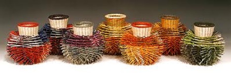
Contact Details
Website: http://karilonning.com
Blog: karilonning.blogspot.com
Facebook: facebook.com/karibaskets
Kari Lønning, Connecticut, USA
Interview by Deborah Blakeley, January, 2014
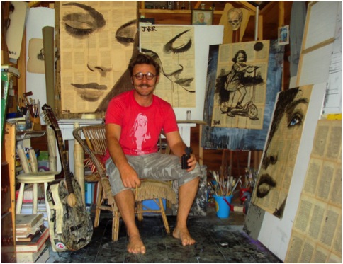
Loui Jover
You comment, ‘I paint, I draw, I do this every day.’ Can you elaborate on this comment?
The comment you refer to in your first question can be taken literally in the sense that ...I "do" draw and or paint everyday.....I am not saying this is extraordinary but have made it a kind of 'catch phrase' or mantra or even an affirmation of sorts. I have made drawings be it cartoons or elaborate inks for as long as I can truly remember, I do not use this as a cliché the cliché was born form people like me...drawing is the very life blood that keeps me whole and sane and happy as well...some folk climb mountains, some need to gorge on fine food...I need to draw....'everyday'.
Your inspiration and work is often taken from everyday activities, riding a bike, the joy of a ride on a swing... Can you expand on this?
I can only guess that this may be a direct result of the first questions answer for apart from drawing I do not do much of this other stuff, I do like to ride a bike and swing however a lot of the things I draw are directly a reaction to a nostalgic need to stay connected to some ideal of youth, but then there is this whole other side of me that wants to jump into the now and use gel pens and sparkles to make up contemporary pop drawings......I have a real creative Dr Jekyll and Mr Hyde thing happening.
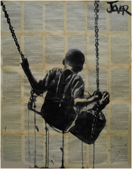
‘All Things Pass’
Can you discuss your Ballet series; both the drawing and the background of the sheet music?
When I was an adolescent I had the thrill of attending a production of the nutcracker suite at the Australian Opera House I am not sure which company it was but I think it was visiting form overseas it may have even been the Bolshoi on one of their rare tours??....it was a school thing but only a few people went...a teacher and six or seven kids, it was a lot of money back then for the ticket but my parents thought it worth it even though they were quite frugal and skimp. I remember thinking it was a lark really and did not take it seriously beforehand at all, it was a way of getting off school...but then when I sat and watched these people with sinewy strong bodies bobbling gracefully across the floor as if held up by strings I was thrown into another world, I did not follow the story or the music even it all became secondary and a mash but I fell in a trance for these dancers on a personal level they blew my mind with their ability and line and beauty. Until one has seen actual ballet of quality in front of their eyes they have no right to comment on the merit of this form at all. So I am a life time fan really but again I need stress not for the stories (I mean really the whole swan thing is a children's fold out book...lol) but for the form and line my interest is purely buried in the artistic side of the figurative beauty of these dancers and in short I love the look of old sheet music and the two seemed to complement each other well.......simple as that really.
I think this is more about looking inward rather than out ward!
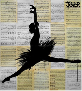
‘Odile’
You add one colour to give the final drama to the work: how and when do you decide to use this technique?
I add a colour or tone when it asks to be added...really I am not trying to be pretentious but at some point the work asks for this thing itself...unfortunately sometimes it is a long time after it has existed as a finished piece....lol..I have looked at some works from long ago and though... "hmmm I wish I would have made her eyes brown and not just left them".... I think artists have always done a little of this thing for all history...I remember seeing a Rembrandt sketch in the London art gallery where he had added a touch of hue to a small portion of an overall unfinished study and it just made it pop, it wasn't even a strong colour like a primary but just some sepia, but it made the eye zing around the work looking to feed on more of this surprise and thus taking in all the detail...I think too many artists hide behind great swathes of colour it is a sign of weak drawing ability and un sure composition...only the greatest of colour composers can master colour in its entirety ...like the great impressionists or Matisse or turner...etc...over all colour can be used as a cloak to fool the innocent observer who really may just want something decorative....I like drawings with minimal colour for you can then see the bones and see the truth of the image. Spot colour can be dramatically effective even Spielberg knew this when he did so in Schindler's List, it was a little corny but it worked well and is remembered.
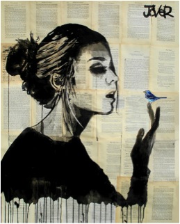
'Bluebird’
Can you explain the importance of the text behind many of your pieces?
The text behind my drawings does not have any overall relevance to the image, happy accidents happen and an association seems to create itself at times but other times the words in the background are purely an aesthetic aspect this can be seen by the text being sideways or even upside down, people can make of the association with their imaginations between word an image what they will. I personally and this is just an opinion of course fond that when an 'obvious' connection is pushed between image and textual background that this begins to nudge towards a commercial art and is patronizing to a certain extent. It is like "oh look how clever I am!...I made a drawing of Marilyn Monroe on a bunch of clippings about Marilyn Monroe...now isn't this clever of me?" ...personally it is the happy paradox of the meeting of image and word that works best for me personally.
As well as working on the recycled paper as the background, you also use college and further text and drawings in your work.Please expand on this?
‘Faith Is Torment’
I do enjoy using mixed media a lot...I find this is a direct visceral reaction to society as it stands around us right now......there is so much information and so many things going on...in design we may like minimalism in a personal sense we may meditate to clear the mind but over all its an onslaught out here so my use of many differing aspects of visual imagery is a direct result of the conduit effect I feel at times as an artist...there are moments I want to say a little about one thing and others that I want to say a lot about much....like driving in the country as opposed to driving around the city streets.
Your drawing is mainly figurative, where do you get your models from? Or explain the inspiration behind them?
I do mainly work in a figurative style because ultimately I personally find the abstract visual language to be limited simply because one need start to repeat themselves in a visual sense....it is limited as to where one can go after a time that is why many artists have explored in both directions of painting...I did much abstract work in my younger days and still hold a fondness for it but I do feel it becomes a way of expression that is self-indulgent and ion need of explanation at times, I hate to have to explain the reason behind an image otherwise abstract art is a great way to accentuate the lounge room furniture. I like to tell stories and figurative work allows me to; more readily.
I use any means of inspiration and model, from life, from film, from books, magazines from pictures...art is a dialogue one should use anything required to express their expressive need, art has no real rules that's why it is so great and why I love it.
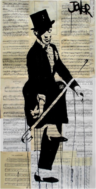
‘Hard Shoe Shuffle'
Eyes are very predominant in your paintings. Can you explain how you have developed them into your work?
For me the eye is a window and a source of all connection. Even for the blind the eye is pivotal to all reason, the minds eye. Seeing is feeling, and without feeling there is only a void. Visual art cannot be without the eye it is non grata without seeing. The eye is a major motif in my expressionistic need to convey emotion like the umbrella is for me a major image for the conveyance of romance........I think the first thing I can recollect drawing in my memory as a child is the eye...I guess it has stuck.
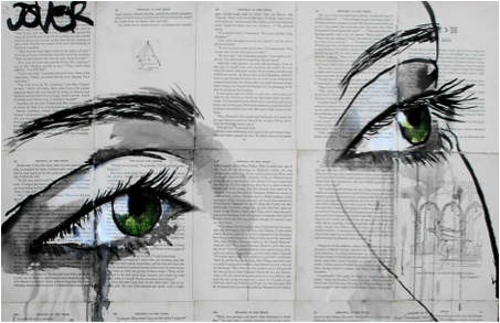
‘Hard Shoe Shuffle'
You break the boundaries by overworking on faces.Please discuss this?
Sometimes I work the face for hours then pour water over the paper till it is sodden and obliterate all I have drawn....other times I will sit and just stare at a face I have made and think "shit...this is like a dead person or something, like one of those faces that self important hotel lobby artists make on oversized canvases for the sake of the cosmopolitan philistine set, so I take the drawing outside and lay it on the wet grass and throw dirty ink wash over it and spray my brush across it and generally abuse it...lol....at times this makes a new thing, a new living persona on paper other times it ends up in the frustration file...the bin. Finally there are the faces that I make watching the negative space in between the lines and they are finished in moments and have worked in a strong graphic and emotive way these are surprises to me and I am not sure how they come about.
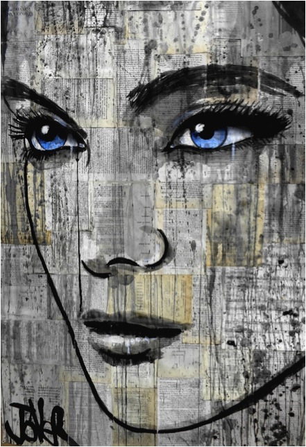
‘Danube'
Can you discuss your distinctive signature and how this has evolved?
My signature has been the same from childhood and I stole the whole premise off Picasso...his signature struck me as a separate entity from a very early age...it was a graphic on its own...a trademark...I liked this idea.... I use my signature to balance a composition and to add to the work....it is my finger print, I think artists who do not sign their work are in two camps those who are not willing to compromise on the composition with their name emblazoned across its surface and those who are too ashamed to admit alliance with the image. then there are those that sign their works in an awkward way such as this little scripted name that looks out of place or fragile to be included too unsure and elaborate and makes for a friction on the surface of the composition......I am proud of the works I finally sign (or at least I think I am...lol), it is my final curtain...the epitaph once that name goes on that's it the work has closure for me.
Let's talk about he size of your work: what are the restrictions?
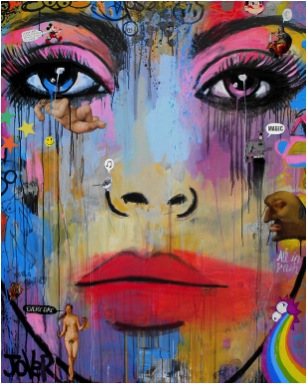
The only restriction on my work as far as large size goes is all to do with the room available, I like working big and with the right space, help and equipment I would like to tackle some massive works while I still have the stamina and passion when I am older I will work small...lol
Women play a huge part in your art. Please discuss?
I like women better than men. I think they are more pleasant to spend time with, are far more clever and even adventurous than men. They have been handed a raw prawn throughout history and have become somewhat stilted as a result, men quash womanhood it can be seen everywhere in every echelon of existence. I like the way woman express emotion openly and are sensuous and natural. If men are dogs, the woman is certainly the cat. Certain men scare me others I am perplexed by, others I just want to fight and kill...(lol) and I hate the whole sport thing..... Women fit my art better because of the first thing I said....I like them better, they are attractive and tactile. Men are brutish and stiff.
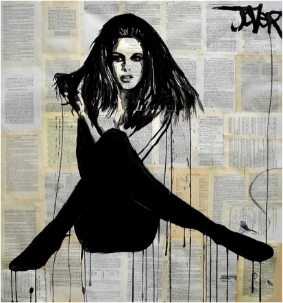
‘La Femme'
Going back in time, in 1989 you joined the army and worked as an official military illustrator. Can you expand on both this work and how it has affected you current work?
I worked as an illustrator reprographic and regimental photographer in the army for a number of crucial years, crucial for the development and discipline of my art, It was a mechanical process when I joined, computers were just beginning to become a personal device with graphic potential so all the artwork I produced was cut and paste and hand manipulated with set squares and compasses. It has helped me develop a solid foundation for my work. I am thankful for this period It was an apprenticeship rare to find now days...I did screen printing and etching, terrain model building, dark room procedures, technical drawing, graphic art and offset printing as well as so much more and was paid to do it all!
What are you currently working on?
Flourished of late.....other than that I am making women; I am working on drawings still, but am enjoying and making larger canvases of the mixed media variety, I am interested and enjoying the wave of surrealistic pop art that has faces as usual.
Many of you works are made into prints, where and how can they be purchased?
My prints are still largely an untapped resource and are still sold in a lucid way; there are no print runs or controls in place. I have licenced off some images to a major U.S. company and sell prints on http://www.saatchionline.com/profiles/portfolio/id/284005. They do well for me, however, I am yet to fully address this side of my output but am sure there will be much opportunity to do so in the future for now I am happy to be at the coal face and actually drawing...lol... in turn building up a large folio I can milk later if need be or given the opportunity.
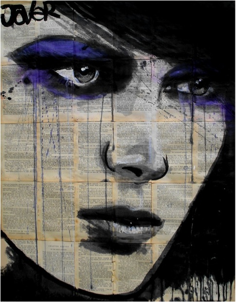
‘Nepenthe'
Contact details:
louijover@hotmail.com
https://www.facebook.com/lojoverart?ref=hl
Loui Jover, Gold Coast, Australia
Interview by Deborah Blakeley, January 2014
Tom Berry
The ‘London Circles Series’- how did these come about?
There were a number of things that made the ‘London Circles Series’ happen - Firstly I wanted to explore using elements of colour and screen printing more.
Secondly, I had already done smaller circular cities, mainly of Bristol (which is where I grew up) and one for the cover of CAPITAL by John Lanchester, so it was really an extension of these. But the overall idea was to depict the same city, within the same size circle, in different and imaginative ways.
Can you expand on your illustration for John Lanchester’s books?
Eleanor Crow at Faber & Faber commissioned this illustration after seeing my circular Bristol images. We had a few edits and to-ing and fro-ings, and came out with the final image relatively quickly. I got a lot of exposure from the project, and the book did pretty well too.
Where did the idea of putting London into a Wardian Case come from?
I saw a news article about a man who had kept a bottle garden for 25-odd years and thought that London could work well inside one - In many ways it has a climate and atmosphere all of its own, so I wanted to reflect that.. Wardian Cases were the first sealed containers of plants and were invented by a Victorian Londoner called Nathaniel Bagshaw Ward. The flowers in the print all now grow in the Victorian glass houses at Kew Gardens in London, where Wardian cases were once used to transport rare and exotic flora specimens.
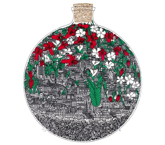
Wardin –Case’
You usually work in one colour but in Wardin Case you have added red and green. Please explain?
Very simply because these bold colours complement each other, and the blacks, golds and browns in the rest of the picture.
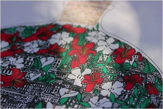
‘Wardin –Case’ detail
Can you discuss the size of this series and also your other work?
The ‘London Circles Series’ are all on 50x50cm. Usually I stick to A-sizes for simplicity but in this case a large square fitted with the London circles much better.
I can't go too big as the level of detail in my drawings is pretty high, so I tend to keep around the A2 size-mark.
Discuss London Lore - A map of the Capitals Lost in relations with Wardin Case?
London Lore is the wildcard of the ‘London Circles Series’- The linework is printed in an ox blood red rather than a black, and it depicts many myths and stories of London, from the remains of woolly mammoths being found underneath Trafalgar square, to the druid origins of the site where Saint Paul's Cathedral is now built. It was immense fun to research and to draw.
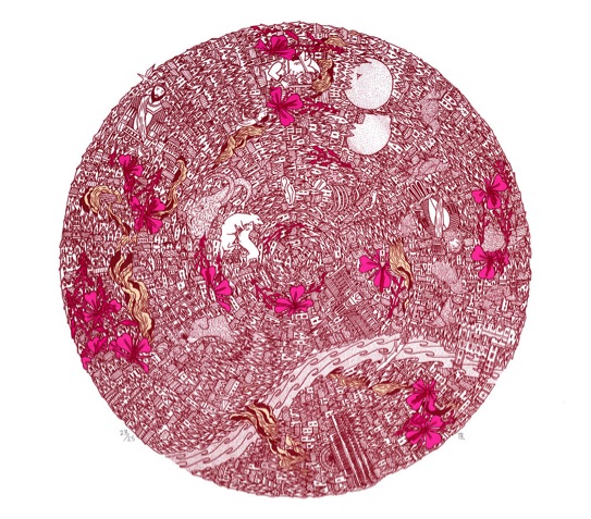
‘London – Lore’
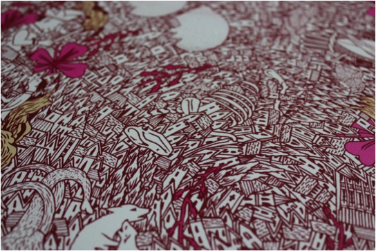
‘London – Lore’ Detail
Just as we are coping with the previous work you add a bird. Discuss “A Roost for Every Bird?
Well, the bird is a magpie, and they're pretty common here - they have a habit of collecting sparkly objects like sweet wrappers, but also jewellery and other shimmery things... I choose the magpie as I thought they share a lot in common with
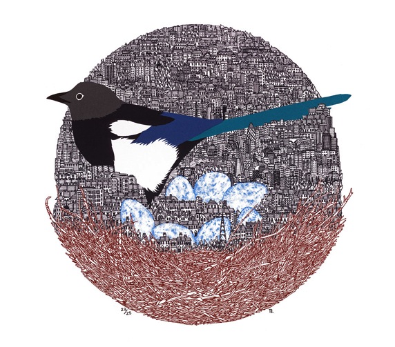
‘A Roost’
Londoners, who seem to be quite materialistic and attracted to sparkly things! (I included) Also I like the quote 'London is a roost for every Bird' from Benjamin Disraeli, as it implies that anybody can make their home here. Actually there is another earlier image that I drew with the same name - I really like the idea of a city growing from a nest.
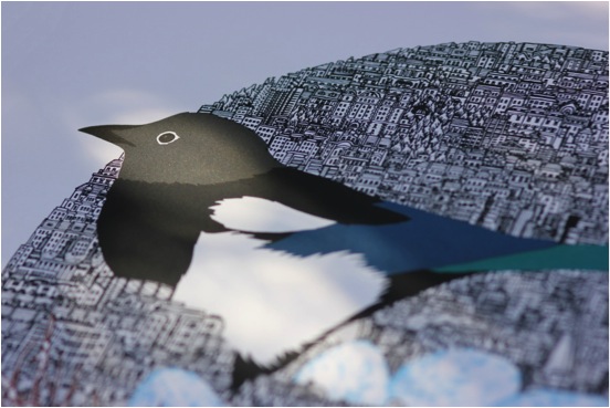
‘A Roost’
‘Gromit Unleashed’ You don’t always work in 2d. Can you discuss your sculpture of ‘Gromit Unleashed’?
Gromit unleashed was a fundraising project for the Bristol Children's Hospital in conjunction with Aardman Animation. Seventy huge fibreglass sculptures of Gromit were made, and seventy artists commissioned to decorate them. It was quite difficult adapting my typical tiny black and white lines, usually drawn on flat paper, into very thick colour ones on very curvy fibreglass. I kept myself from going too elaborate and kept to quite a simple design, and in this way was able to overcome many difficulties.
‘Gromit’
Explain about the process of the show and the sale of the work?
Each Gromit sculpture was shown outdoors for ten weeks this summer as part of a giant arts trail. After that, they were auctioned and all the proceeds went to the Children's Hospital, I think the amount of money raised was something ridiculous, like £ 2.3 Million..
‘Drawing 3D Gromit’
Do you always do your prints in Editions of 25?
No, Just the London Circles. For the others I have done runs of 100, 60 and some smaller open editions too.
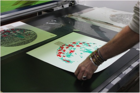
Case Printing
What do you do with your plates after the print run?
Depends on what the printmaking technique is - most of my pictures are giclee editions of original drawings, but with the London Circles, I cleaned the screens after making the edition. So aside from a few proofs I made at the time, there can never be more of these made, ever!
Do you do all of your own printing?
No, I do some myself and work with a few secret veterans of the print industry who have more patience, skill and interest in the technique than I do.
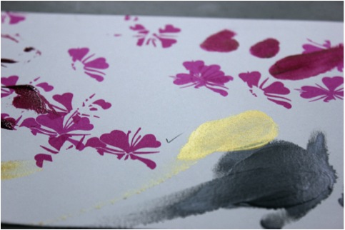
Colour Test
Can you explain where your studio is and please give us a peek inside?
No I can't! I’m moving house and staying with family and have no dedicated space at the moment. I'm trying to move to a place with my partner and my sister, which if it all works out will have a decent space to work and create some beautiful pictures in, so fingers crossed.
Exhibitions – How do you plan this part of your time along with your illustration work?
I have generally tried to organise my own shows around Christmas, and I exhibit with other galleries at different times. To be honest whenever an illustration project comes in I usually have to do it straight away, so I just fit things in as and when they happen - there isn't any way of predicting this, so I just have to be ready to go as and when.
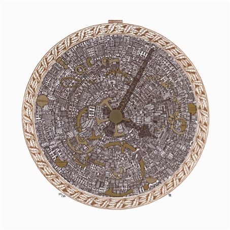
London Circles Series: London Time
Contact details.
www.tomberryart.co.uk
Tom Berry, Bristol, UK
Interview by Deborah Blakeley, January 2014
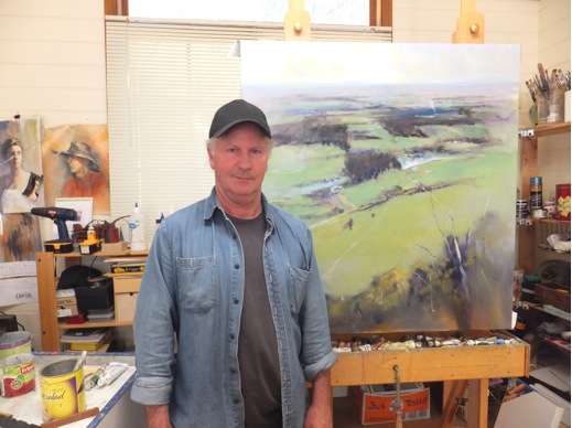
Robert Knight
What lead you to a career in art?
I remember from a very young age I loved to draw. My first painting set was given to me when I was about 10 years of age.
I started an apprenticeship in signwriting when I was sixteen, I was always drawn to the graphics side of the trade, pictorials etc.
In the early 80s I had some painting lessons with the late Terry Collins, after this all I wanted to do is paint. I started to sell my work in the mid 80s and gradually my art career started to take off. I am mostly self-taught.
Your approach is very similar to the lens of a camera, where only one part is truly in focus drawing the eye to the part you want to show. Can you comment on this?
Yes this is a very deliberate approach on my part. I use this method to maximize the impact of the focal point.
I like mostly to have the focal point in clear focus and then the further I get towards the edge of the canvas the more abstracted the images become.
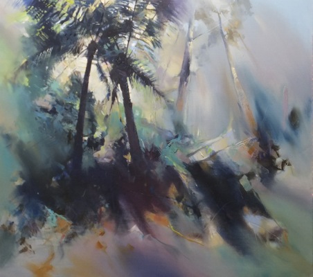
Your nature images are also close ups of the natural world along with a deep understanding of colour. Can you discuss this in relationship to the work, ‘Forest Floor Composition’?
I guess my use of colour in “Forest Floor Composition” is a combination of things. One is what I see looking at the subject, and the other is probably more complex and has a lot more to do with painting the feeling I get.
I think this is more about looking inward rather than out ward!
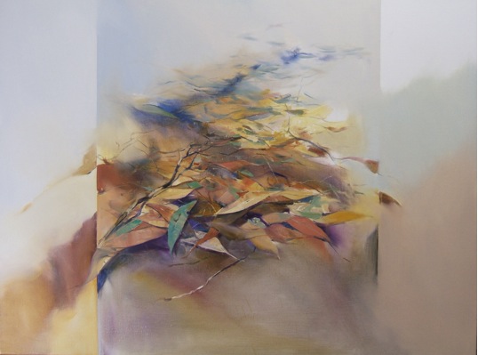
‘Forrest Floor Composition’
There is an oriental take in ‘Pond’. Is it due to the content?
I am very drawn to the simplicity of the subject, and I really admire the oriental approach of a minimal and harmonious composition, in colour and form… Simple, but not always easy to achieve.
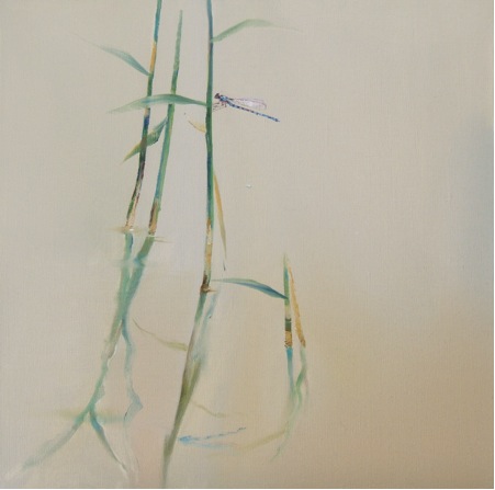
'Pond’
From the close up of nature you also choose to capture the man-made. Your cityscapes have great compositions. Can you discuss – looking down and through?
In just about all of my paintings I try to think a little outside the box; that is I think about how I can make my picture somewhat unique , i.e.: looking up , looking down, into and beyond. This has become a bit of a characteristic of my work. Sometimes in my composite works I use all of these in the one painting.
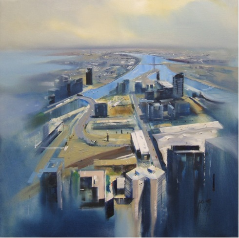
‘Docklands, Melbourne’
When do you see it as important to add figures in your work?
Most of the time I add figures to my work to give the viewer a feeling of scale whether it’s on the top of a cliff or walking along a busy city street. It gives the painting the feeling of the hustle and bustle of every day city life.
I also use figures in my paintings to create the illusion of perspective in the scene.
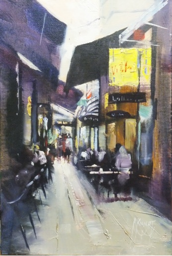
‘Cafes’
Melbourne is known worldwide for its laneways. Can you expand on how you technically do this work? Is it done on site? Do you use photographs or sketches? How do you cope with the passers-by?
Melbourne has so many laneways all with their own characteristics; I often paint these vibrant places. The method I use for these busy areas is to photograph them. I use the photograph as a stimulus, I also draw and then combine this with my memory, I think it’s very important to take my own photographs, so I have always been to where the location is. I can essentially paint the memory and hopefully capture the essence of the subject.
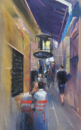
‘Arcade 1 Melbourne’
Landscapes have so much variation from the craggy Grampians, flat vineyards. rivers, and open planes. Can you discuss how you choose a location?
To me this is not a very difficult thing to do, most of the time it’s not me that chooses the location, in my travels the location chooses me. I like to observe and paint the beauty of the things I see and experience in my day to day travels. Whether it’s a trip to the beach, mountains or to the top of a tall building, “It’s all a part of my art journey”.
Painting the way the light falls on the landscape, or the abstract patterns I see.
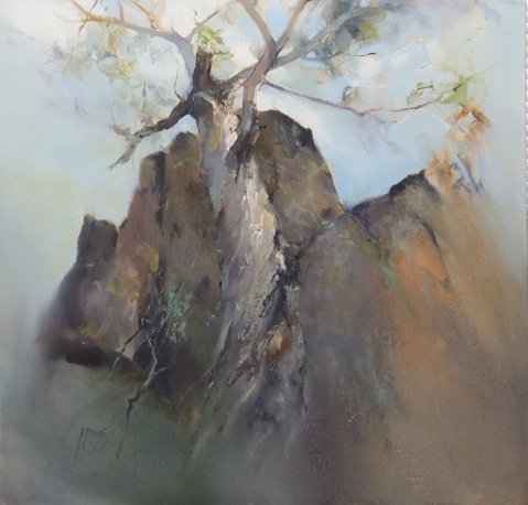
Colour is very important in your work and yet very variable. Can you expand on your use of colour?
I work with quite a limited palette; about six to eight colours, plus white. All my paintings are done with this palette, whether the painting appears to be grey and moody, or bright and vibrant. With this method it’s amazing the amount of colours you can mix. I find this a very harmonious way to obtain balance in my colour composition.
Your seascapes are often at low tide, why does the tide play such a large part in this work?
I’m rather drawn to painting low tide scenes. I find the shapes in the rock pools interest me as a compositional tool; often leading the eye through the painting to the focal point, or actually being the focal point itself.
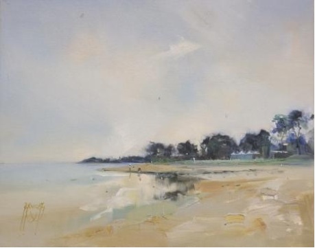
Your city is built around a bay. Can you discuss the combination of water and city expand on this?
Yes, I’m a Melbourne person, and often travel into the city. Sometimes I like to take a small aircraft and fly over the city and along the bay. I then take the photos back to the studio, where I can draw and compose the aerial scenes.
I like to paint scenes from around the bay, looking from Williamstown, across to the city. There are so many places like that around Melbourne.
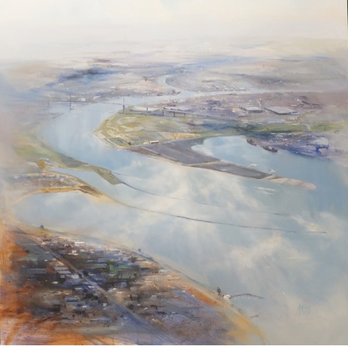
Most of your work is done within Melbourne and Victoria, and you have exhibited beyond. Can you discuss this?
Most of my work is done from Melbourne and its surrounding countryside and beaches.
My work has been exhibited in Canberra, South Australia and the United Kingdom.
For a number of years I had exhibitions in Canberra. I also tutor workshops all over Victoria and into NSW. I usually gather a lot of my painting references in my travels.
My work is in private collections in the UK, USA, Canada and Japan.
What are the sizes of your work and why do you choose these sizes?
I paint in various sizes from 6” x 8” through to 6ft x 8ft, and any size in between. I love the sense of scale I can portray on a large canvas, and the detail on the smaller formats; it’s all relevant to the subject I’m painting.
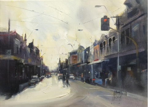
Can you discuss your signature on your paintings? how do you do this technically? It is a beautiful addition!
My signature is something that has developed along with my paintings. It’s probably become a lot more flamboyant as my confidence in my paintings has evolved.
I just paint it with a rigger brush (being a sign writer for 30+ years does make it pretty easy).
I also use my signature to balance my paintings; I sometimes put it on the right, and sometimes on the left side.
Contact details:
www.robertknight.carbonmade.com
rknight_art@yahoo.com.au
Robert Knight, Victoria, Australia
Interview by Deborah Blakeley, December 2013
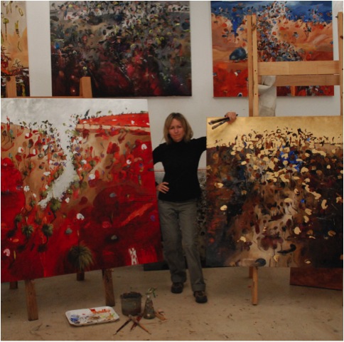
Anita West
Your current work is very different from your landscapes. Can you discuss your work ‘Banksia?’
This is the first painting in a new direction for me. Instead of using aerial views with horizon lines showing vast distances, I wanted to create works that explore the idea of being intimate with the bush, to feel as though the bush is very close. So the composition and space describes the experience of walking through the bush. Also I wanted to change focus from using the horizon line to making the distinction between sky and earth disappear. I am also using the random flow of transparent acrylic paint in the first layer to inform the composition. So I never quite know what is going to happen and I find that really exciting.
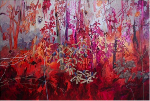
‘Banksia’
How did you develop this new work?
I think that after 10 years of living in a house that looks out across a strong foreground, middle ground and background that is defined by gum trees, native bush, flowers and a creek I have finally figured out a technique that has endless possibilities and more importantly it feels authentic and personal.
Inspiration for ‘Banksia’
Can you discuss the importance of colour in this work
I just visualised this colour in my mind before I began, possibly because I didn’t want to end up with a painting that looked similar to any of the resource photos I used. When I choose a colour that is purely emotive, it keeps the feeling quite distant from the reality of the bush and then all of those romantic and emotional connections can be readily tapped into without having to resort to representation.
Your beach-scapes are full of the Australian beach imagery, expand on this?
I have always enjoyed paintings that tell a story. I live such an ordinary life as a mother and wife living in the suburbs and I suppose the only advantage I have as an artist is that my experiences of family holidays at the beach with children are much like that of most other families, so there is an immediate connection with the love we have of the beach and our celebration of living in such a beautiful country.
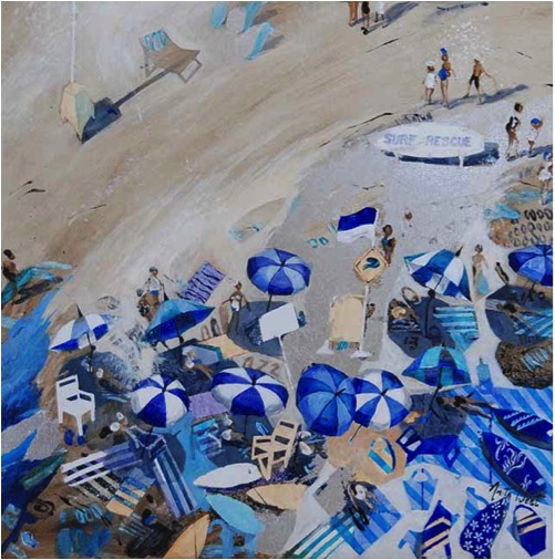
‘Blue Chairs’
Discuss the composition in relationship to people, beach and sea?
I have all sorts of fun changing the compositions and perspectives of the works. They are often quite jumbled up and many of the rules of composition are broken, proportions are deliberately changed and the horizon line and viewers perspective are often not formally accurate. I use odd angles and some completely nonsensical imagery, but I think that it just adds to the fun and life of the beach. I don’t have a really tight formula, so I get to play with composition all the time – which is always the most important principle behind my paintings. The more beach paintings I create, the more ideas I come up with until summer is over and I start thinking about bush landscapes.
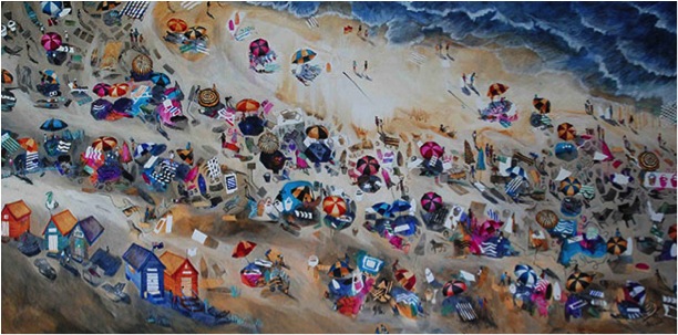
‘Walking the Beach’
Discuss how you use perspective so strongly in all your work?
Sometimes I use the typical western perspective with horizon lines, vanishing points and colour intensity varying into the distance. Other times I use a more eastern idea of perspective or ‘stacked space’ where imagery at the top of the painting is read as being in the distance and imagery at the bottom (although the same size) is read as being in the foreground. I love Egyptian art where motifs are flattened, objects are stylized and symbols become hieroglyphic. I am inspired by so much, I want to put it all in! It is difficult to work out what to leave out, and that is why so many of the beach paintings are very busy.
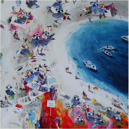
‘Tranquil Bay 2’
You have lived in both Australia and America (East Coast), how has this tuned your use of colour in your art work?
Colours in Australian landscape are so different from anywhere in the world. There is so much grey-green in the Eucalypt bushland and yet the hills in the distance are such a vivid blue because of the eucalypt haze and the sky is so clear. I am always looking up at the sky especially the cloud formations which are just spectacular in Australia. I don’t notice the skies so much overseas because the light is softer and often more quiet.
‘Bush Quarry’
You are very comfortable with colour. Can you discuss this in relation to…
‘Wild Berry Beach’
Sometimes, to keep myself challenged, I choose a colour scheme that does not readily find truth in a subject. To use an analogous palette with predominantly pinks requires considerable forethought. The best approach I have found when working with a limited colour palette is to choose a style of painting (mostly abstracted patterns stencilling in these) that suits the mood of the colour which in turn complements the subject of the beach. Using a grey scale also offsets the pink and primed linen is untouched in some areas. There has to be strong tonal variations in the colour to enhance the design. I have used mostly stylized compositions and flattened spaces in this series of 16 small paintings.
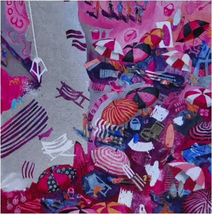
‘Wild Berry Beach’
‘Turquoise Bay 4’
I am comfortable using colour, but I mostly limit my colour palette to predominantly one or two colours with variations in tone and texture. I don’t like being confused by too much colour as it is such a powerful emotive tool. My beach scenes are mostly blues and neutral sand colours with a set of minor colour combinations that I use to play with decoration and pattern. In this series of four paintings I have used a palette of bright spectrum colours in the patterned objects to create a vibrant atmosphere. I use colour to bring a specific mood into the work, tones to bring out form and space, and then texture to enhance patterns and rhythms. But I want the paintings to be mostly about the story or narrative.
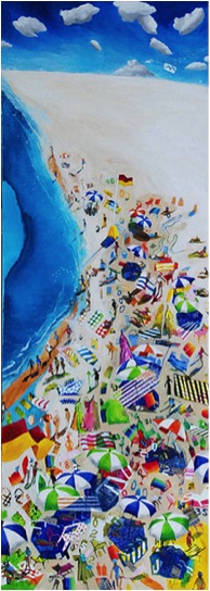
‘Turquoise Bay 4’
Your work is becoming more abstract, explain?
I have never considered myself to be an abstractionist. I like having an anchor of reality somewhere in the work. Some years I gravitate more towards the abstract, but then I swing back into representational work to become grounded again. I like having the flexibility to move in between different stylistic approaches, so that I don’t pigeon hole myself and limit those choices. So I firstly decide how I want a painting to feel - what mood it will have - and then I use composition to give structure, colour and tone to create the mood, then I use subject matter, form and shape to give the narrative. If abstracting areas helps to create this feel then that is what I use, and it is a great way to discover new ideas.
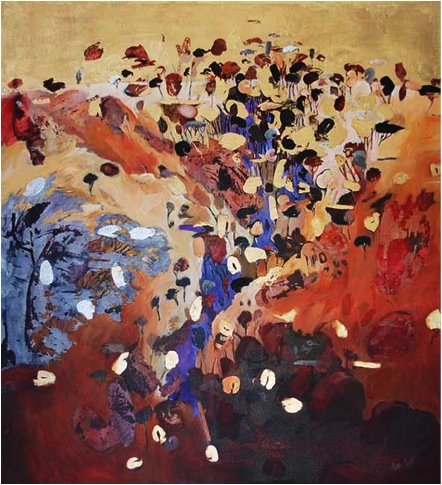
‘Desert Acacia’
How have other Australian Artists influenced your work particularly your landscapes?
Studying how other artists view the landscape gives me leverage on what has been done before and the infinite ways of expressing it. I am very conscious of where many of my marks, perspectives and colours are gathered and am always happy to acknowledge those influences. On a more general level, I am most inspired by artists who find their own voice and reach out to reveal something surprising and mysterious. I have a long list of Australian artists who have inspired me but I love the Aboriginal Art Movement in particular, maybe because as a non-Aboriginal artist I know that I can never access those stories. I also tend to like artists whose work is completely different from my own but I can see that they are attempting to navigate similar ideas about the land.
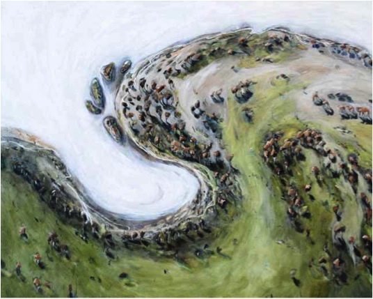
‘Salt Lake and the Motorbike Track’
Your images of the bush (landscape) are an impact of colour – Australian colour. Can you discuss this?
I spend a lot of time walking in the bush and I have grown to love the subtle earthy colours of eucalypt scrub, the bleached colours from the midday sun, the harmonious soft colours at sunrise and the dramatic, mysterious colours of twilight. I am trying to paint how I feel when I am immersed in the bush. It is the place where I feel the most connected with life, with nature, and it nourishes my soul. And I know that for most of us, being in the landscape whether its camping, going for drives into the mountains, or out in a boat, we feel something that is difficult to express or describe. How do you paint that? I don’t know and I am not sure if I will ever be able to, but I keep trying.
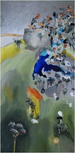
Hillside with a Rockpool’
Can you explain about the commission you have recently had for Soul Apartment Tower on the Gold Coast, Australia?
This commission was inspired by Blue Lake on North Stradbroke Island, a place that we visit on family holidays. Blue Lake is a sacred Aboriginal site but is open to the public to enjoy. To get there you have to walk through some beautiful banksia and grevillea shrubs with lots of scribbly bark eucalypt trees and white sand. The lake is a vivid blue because it is so deep and it is part of the water source for the mainland.
Size – what is the average size of your work?
This varies so much, I used to paint and embroider miniature pieces in earlier years and still enjoy making intimate works, a lot of my larger pieces have intimate vinaigrettes of stories that make up a whole. The largest paintings are around 2 metres in length and smallest around 40cm. So the average would have variations of around 150cm. I love painting big as it is such a commitment to the idea and has such a powerful effect if I can get it right.
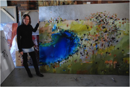
Medium – what various mediums do you use?
Like most artists and teachers, I have used just about everything possible to explore all the elements of art. These days I paint mostly in acrylics and permanent inks. I use dry media like charcoal or pencil for drawing then build up layers with glazes and use opaques more sparingly as final layers. Sometimes I add gold or silver dutch metallic papers to represent the sacred or preciousness of the landscape. I also still enjoy painting in oils and I always add a small group of these in a show.
Your work is a true travel log. Can you discuss the importance of travel to your work?
Travelling invites the unexpected. I like that because it gives pause to our lives and can change the way we think and behave. It helps me to become more conscious of my place in the world and reflect on the bigger picture. My travelling has been regular and important for my work, especially travel within Australia because it confirms the reason why I paint landscape. It helps me to feel excited and unafraid of losing control on the canvas and inviting serendipitous elements and letting big ideas flow. I would like to travel more as the children get older, and I like the idea of looking into doing some residencies.
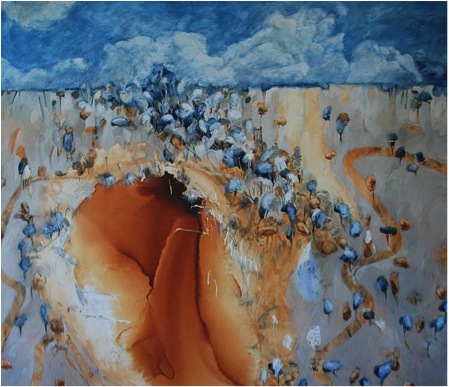
‘Brown Lake’
While travelling, how do you record?
I use a small visual diary that I write and draw notes in. The camera is a godsend, but mostly I just use my memory as a filter. I have never liked the idea of seeing the world behind a camera so I try to soak up those momentary experiences when I am there. Sometimes I don’t think about recording anything when I am travelling, I give my creative brain the time to empty itself of ideas so it has a chance to soak up some new ones.
Everyone loves to see and hear about an artist studio. Would you share yours?
Everyone loves to see and hear about an artist studio would you share yours?
In March this year I decided I needed to find a place to work with other artists, so I have rented a small studio space in a renovated warehouse that is run by a talented group of academic artists who paint and teach classical drawing. There is a wonderful sense of camaraderie amongst the artists, teachers and students and I love the energy of the place. However, It is a 40 minute drive from my home so I only work there 3 days a week. This is where my new direction began, and I wonder if it is because I have removed myself from the immediate bush surrounds of home into an industrial setting.
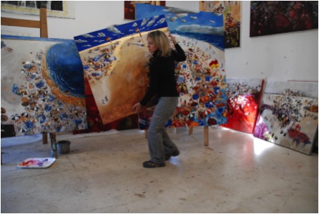
Working from a home studio for over 20 years has its ups and downs. I have certainly learnt techniques needed to avoid prolonged procrastination! Also I have become strong enough not to succumb to the continual distraction of my two gorgeous children and family duties. But the greatest advantage of which I am very thankful for, (and I am only now becoming more aware of) is the opportunity to truly focus on finding direction, meaning and sustenance in my art without the direct influence and crutch of other artists, tutors or academic spheres. Being alone in a studio for a sustained amount of time has given me considerable scope to produce an immense body of work that keeps developing and growing.
And the wonderful thing about renting a studio with other artists is that I don’t feel so alone! I love being connected with other artists on a daily basis, it is a wonderful antidote to the isolation of being at home.
How influential are your galleries to the output of your work?
An interesting question and one which I contemplate often. When I am in my studio I consciously try to put aside the business of art and gallery influences and commitments. I take one day at a time, one step at a time, and think about only what it is that I am trying to express on the canvas. Nothing else matters then. Going down the road of making art designed to sell or designed to somehow predict the chances of selling is a tricky business and one that is fraught with danger and disappointment. As my gallerist Trevor Harvey says to me; “ You are the driver, take people along for the ride, you could be surprised”.
You have had many sales? And has there been one that gave you that boost you needed?
Probably the first corporate sale through Robertsons Interior Design about 15 years ago propelled me to paint more work which ended up turning into a 7 year contract to produce 25-30 feature paintings each year for their showroom. I had to work very hard late into the night because that is the only time I could find. My children were still in nappies!
The best thing about selling work is, knowing that in a very direct way I have made a connection with another person and that they will get joy out of something that I have created, just as I do when I buy artwork from other artists. Making a living from painting sales is very validating, not because of the recognition but simply because I am sharing my love of Australia and how I perceive my place within it. I must also mention how important it has been for me to find and be represented by TVH gallery who have been very supportive and work hard to represent their stable of artists. It is a vital component in the link between artist and client.
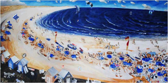
‘Beach Huts on the Broadwalk’
Discuss the increasing development of Australian awareness to the environment and how this is affecting your work?
I have been doing a lot of reading about human consciousness and our behaviour towards each other and to our planet. I am becoming more aware of how so many other artists are making art about this. Not just visual art, but through music, dance, theatre, movies, books, food, and all art forms. I think that good art is about giving us pause to explore our own consciousness and to increase our awareness of how we can live a life of love, compassion and respect.
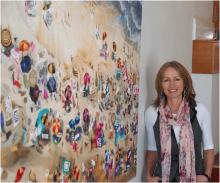
Contact details:
a_west@bigpond.net.au
www.anitawest.net
Anita West, Brisbane, Australia
Interview by Deborah Blakeley, December 2013
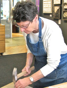
Carol Talkov
Carol Talkov says, “My professional life has always been about putting pieces together.” Working with Mosaics she now puts pieces of minerals and gems together to create works of art.
Zoneone Arts is delighted to bring Carol Talkov to you…
In your Virginia studio you have a dress model. Can you explain about its history to its current form? This is such a great story about your professional journey.
My early training was as a pattern maker for theatrical costumes. My undergraduate degree was in theatrical design and I my graduate work was specifically in costume design and fabrication. I was always more interested in how things were put together and when I finished with my academic training I went to New York City not as a designer but as a fabricator. I was very fortunate to arrive at a time when there still were a few pattern makers in the costume industry in New York who were European trained and learned my trade from them as “draper” of women’s costumes. A draper is one who makes a pattern on a dress form as opposed to a tailor who makes a pattern on the “flat”. For 10 years I had the opportunity to work from many designers’ drawings making patterns and supervising the fit and fabrication of the costumes for Broadway theatrical productions along with opera, dance and film. When I left New York I was given a dress form (model) that many years ago been made specifically for Elizabeth Taylor when she was a younger woman. This was not an uncommon thing since most “stars” of her calibre had their own figure reproduced for a draper to work on.
Many years later when I was just starting working with mosaics I wanted to do a sculpture in my garden. I honed up my patterning making skills and draped the dress form using metal mesh. I then removed the metal mesh and “sewed” up the pieces to create the same shape as the dress form. I then mortared it and applied broken ceramic pieces to it. The sculpture represented the costume of a circus performer and I called it “The Snake Charmer”. It lived in my garden for 10 years.
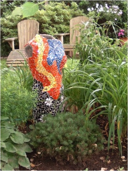
This past year I started seeing some damage on the piece and decided to remove the “tesserae” (pieces) from the sculpture and rework the design. I was planning on doing something that would reflect more of my current artistic sensibilities, more abstract.
As I was removing the tesserae I was very excited about how it looked with just the imprint of the pieces and decided to paint it instead. After 3 different layers of different colours of paint I was satisfied with the final results. Unfortunately now that it is painted with interior grade paint it cannot be placed in the garden anymore. “Elizabeth” in now a constant companion in my studio.
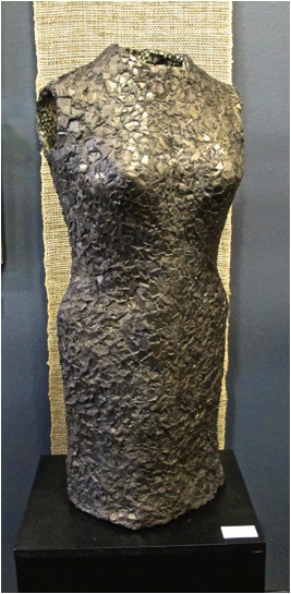
You have had 2 previous careers, one in the professional theatre and one in the interior design industry. How have your previous careers transferred over to your current creative endeavour?
After 10 years of working in NYC I moved to Washington DC and started a manufacturing business catering to the interior design trade. I took the same skills of interpreting a designer’s sketch, creating a product that not only technically met its requirements also reflected the personal style of the designer. I was using the same “tool” in both professions, which is the process of assembling pieces to create a product.
The definition of “mosaic” in Wikipedia is:
“Mosaic is the art of creating images with an assemblage of small pieces of coloured glass, stone, or other materials. It is a technique of decorative art or interior decoration.”
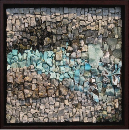
To be attracted to mosaics is a logical selection for me to express my own personal voice. I find that there is a great similarity between all 3 disciplines. I use the familiar principals of relationships between textures, colours, and line to create tension or harmony depending on what I want to piece to be about. I also have an instinctual sense of scale and composition. I think that skill has been achieve after spending so many years deciphering and analysing many different designer’s renderings.
You have travelled to Italy to participate in workshops over the past 10 years. What attracts you to Italy and why study there?
I have been fortunate enough to go to Italy and be exposed to not only the influences of Roman and Byzantine mosaics but also contemporary mosaics. The typical first exposure to the art of mosaic in America is either in the context of the architectural, religious buildings or public art or interior decoration done in back splashes and bathrooms. In Italy there is a cultural tradition that goes back thousands of years as an early form of decoration and expression. It is everywhere. You become immersed in the culture. The tesserae (pieces) materials used are the traditional ones, stone or glass smalti. Smalti is a type of glass specifically made for mosaics and is what the Byzantines used. Both of those materials are cut with a hammer (martellina) and hardie. The hardie is a blade coming upward out of a piece of wood and the steel hammer has sharp edges at each end. The weight of the hammer is important because you are not cutting the material, you are fracturing the material. This method of cutting has been done for more than 2000 years. I felt Italy had the best offerings for learning this technique. Though now in the US it is more widely taught.
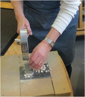
Why did you decide to incorporate minerals and gems into your mosaics?
When I started to learn about working with stone as a material for creating mosaics I found myself responding to the natural richness of those materials. I was in a constant state of wonder every time I cracked open a piece of stone. It is the unique quality of each piece that intrigues me. When I started working solely in stone I wanted more variation in colour and reflection then what the traditional materials of glass and stone offered so I started looking for another natural elements to incorporate. I wanted to continue to work with organic materials so that led me to minerals and gems.
Where and how do you source the materials you work with?
It is much easier today than when I first started doing mosaics 12 years ago. The Internet, EBay specifically, allows me to travel all over the world to amass different minerals and gems. I also go to mineral and gems shows and stores. I find discontinued and damaged pieces of marble, granite, travertine and other stone samples from distributors and fabricators of flooring and counter tops. I am an avid collector of stones especially when I go traveling. On this most recent trip to Italy when I was attending a workshop we had the opportunity to go to the Taglimento River and collect stones. This riverbed is known for the rocks that are brought down from the Alps on their way to the Adriatic Sea.
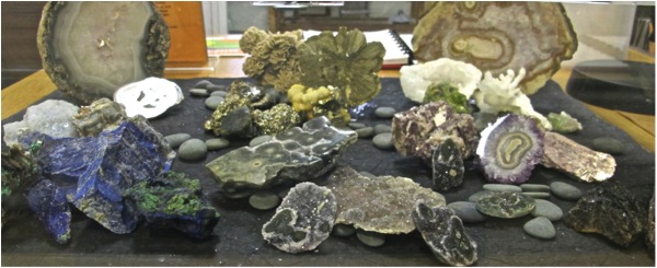
You use your artistic eye to create pattern(s) using minerals and gems. Is it often one stone or a group of stones that inspires you? Would you take one stone that has inspired a whole work and discuss it?
Most of my work is about “relationships”, how one piece relates to the next piece creating the whole. Sometimes it is just one piece that intrigues me but ultimately it is a group of pieces that speaks to me. I start off forming a “nucleus” selecting “anchor” pieces that lead me in a direction.
In the examples shown below it is the pieces of ruby fuchsite, the titanium points and the large actinolite crystal mass.
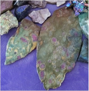
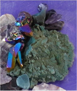
As I start to collect other materials that relate to those pieces I start to form the composition.
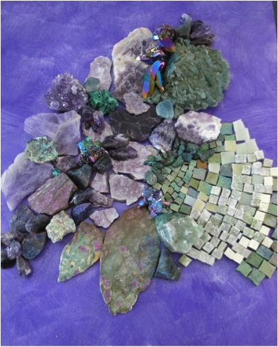
By now I have added 5 different types of amethyst along with lepidolite, fluorite, malachite and other minerals and gemstones. This is when I start experimenting with the contrast of colour, texture, and balancing those elements. After I am satisfied with the focus of the piece I determine the “andamento”, how the tesserae is placed, creating the flow and movement of the piece. It is the relationship of the pieces that form the narrative of the artwork. I rarely have a narrative in mind when I begin a piece because the process of creating the work, the journey, is what I am experiencing.
As the work progresses I started to feel the energy radiating away from the nucleus, an explosion propelling outward. Therefore I chose an andamento pattern that visually reinforced that movement. Each of the elements in this piece has singular sources of energy, but when grouped together it becomes very powerful. I wanted to convey the force of that power.
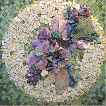
'In the Beginning'
You work in both 2D and 3D. Can you expand on one of each?
I like to explore all options available to me; I work with materials that can be used in either of these forms I don’t feel I have to declare one or the other as my vehicle of expression. Because of the nature of the materials I can make a 2 dimensional piece with many of the same characteristics as a sculptured, 3 dimensional piece.
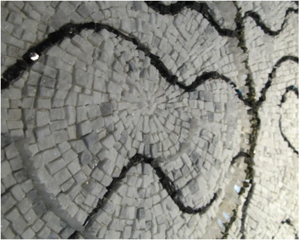
“Wired” detail
When working on “Wired” I wanted to have a great deal of movement by emphasizing the wavy and amento of the black tourmaline by undulating the substrate, supporting the radiating and amento from the centre of the pyrite and optical calcite circle using the Bianco Carrara marble tesserae. As opposed to applying the tesserae to a sculpted form.
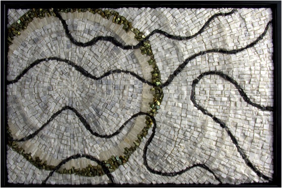
“Wired” 2011
“What’s Inside?” 2012
In “What’s Inside?” the tesserae are emphasizing the form with a series of 3 andamento spirals of travertine limestone. The spiked sea urchin legs create a halo accentuating the form.
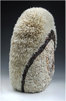
Size and weight are always a part of the equation. The traditional materials that I use are heavy and are applied using thinned cement. The 3 dimensional pieces have substructures of polystyrene. Mosaics are frequently done in public spaces and can be quiet large. I choose to do smaller scale pieces because I feel my work is intimate and needs to be experienced close up. I use a percentage of repurposed materials, which allows me to use more expensive minerals and gems and still keep the cost down.
Presently my preferred size to work in is between 8” – 12” square or 7” x 28” rectangular. I like both the formats because they lend themselves to groupings. I have been working on a group of small pieces that relate to fabrics. Below are images of 2 series. One titled “Silk” and another titled “Tweed”. All are 8” x 8” and approximately 3 lbs. each.
"Silk" 2013
"Tweed" 2013
For both of these series I have focused on colour and texture. The feeling of woven fabric along with soft colour fades.
Mosaic Art is one of the oldest Art forms but relatively ‘new’ in the current contemporary art market. Discuss how the promotion of your art is happening in galleries today? Where can someone go see great mosaics today?
Mosaic art today is slowly finding its way into the contemporary art dialogue. People still associate the word “mosaic” with either architecture or as a technique of decorating items such as frames or mirrors. Therefore mosaics today are commonly categorized as “mixed media”. It will take re-educating the art viewing public to accept the term “mosaic” in the context of fine art unencumbered by its history. Having mosaic artists included in electronic magazines such as Zoneone Arts helps people to acquire a different point of reference. There are exhibitions focusing on mosaic art all over the world and you can look for them on line. In Italy contemporary mosaics are very visible in towns such as Ravenna and Spilimbergo where there are many educational institutions devoted to contemporary mosaics.
"Tweed"
Contact details.
Website:caroltalkov.com
Email:caroltalkov@cox.net
Carol Talkov, Virginia, USA
Interview by Deborah Blakeley, December, 2013
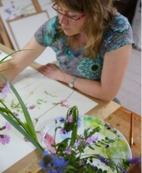
Jenny Matthews
When or what made you decide to specialise in painting flowers?
I have had an interest in wild flowers since childhood holidays in the Scottish Highlands. When I was studying Drawing and Painting at Edinburgh College of Art, I chose to take Botanical Illustration as an elective subject. Dame Elizabeth Blackadder taught this at Edinburgh’s Royal Botanic Garden. Therefore much of my work at college was flower-based, and it’s a subject I never tire of. Fortunately people enjoy my paintings, so I am able to pursue this interest.
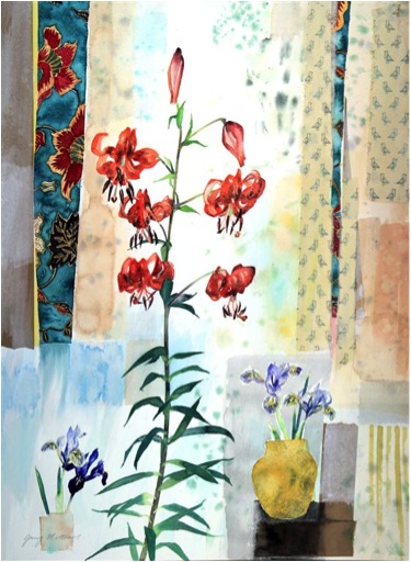
‘A Little Bird Told Me’
As a mother of two and a highly sought after artist, how do you fit it all into 24 hour day?
My studio is on the top floor of our townhouse, so my commute time is very short! Once everyone has gone off in the morning I can go up there to work in peace until late afternoon when the family starts to return. Of course, a typical day is also interspersed with other more domestic duties, but I thrive on limited time and deadlines.
When did you take the risk of turning the pretty into the pretty amazing and developing your own style?
I was fortunate that from my first exhibition during my degree show people were buying my paintings. My style is constantly evolving because I enjoy exploring new ideas and methods. Although I do not seek to paint what I know will sell, I am aware that if I take an avenue which results in me ceasing to sell work, then I cannot justify spending my days creating art which remains unsold. There is a balance between creating intuitively and earning a living. I am fortunate that what I paint does not compel me to live in a garret.
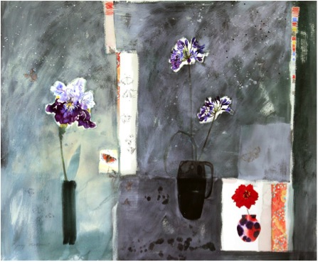
‘Tortoishell and Dahlia’
Can you discuss the ‘splodge’ backgrounds to your work?
Watercolour is a wonderful medium in itself, regardless of the subject matter being described. The effects it creates as it dries are fascinating and it results in curious abstractions. The colours for my backgrounds often come from nature: sky, light effects, combinations of colours glimpsed together ... and I like to celebrate the characteristics of watercolour whilst depicting a subject literally.
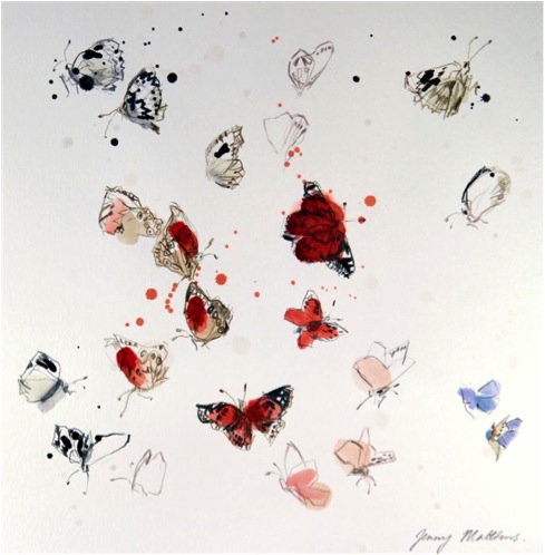
Butterflies –sketches from France with paint
Discuss the composition of two or three paintings?
‘Tarves Sampler’ (63 x 71 cm) is a still life which incorporates a family heirloom. This sampler was stitched in 1866 by my great grandmother who lived in Aberdeenshire in a small village called Tarves. I am always on the lookout for interesting bits and pieces which can spark an idea. My still lives are not literally set up in front of me as I work, but the components are put down in a sketch and brought together using colour, in this case coming from the sampler, to become a painting. ‘Tarves Sampler’ was painted in the spring, so I used some early miniature irises which I had in the studio to accompany the sampler.
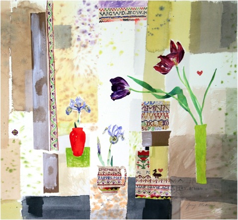
‘Traves Sampler’
‘Flight of the Butterflies’ (90 x 120 cm) shows some life size irises from my garden. I never work from photographs, so sometimes I either cut the flowers and bring them into the studio, or work outside, depending on the weather of course. Here, I experimented with some graphite pencil in the background to create some texture.
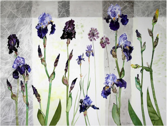
‘Flight of the Butterflies’
‘Knock Me Down with a Feather’ (63 x 53cm) was for an exhibition called ‘In the Company of Birds’ in central Edinburgh. I explored various themes to do with birds, including feathers. Because I was outdoors looking for feathers, wild flowers seemed a natural choice to be included. These flowers were all sketched in Scotland.
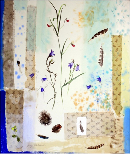
’Knock Me Down with a Feather’
‘Wet Weather Tulips’ (86 x118 cm). This painting of life-size tulips was created from some paintings I made in the garden in 2012. It was a very wet spring and a bad year for tulips. The background represents the showers of rain which cut short my painting!
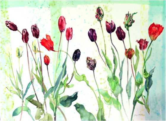
‘Wet Weather Tulips’
You also travel – how do you record during your travel?
One of my current interests is butterflies and insects and I take a small cartridge sketch book and coloured pencils with me when I go travelling, not to mention my binoculars. Sometimes I visit an area with the intention of finding subjects: wildlife reserves for example, although we have very few species of butterfly in Scotland. In the summer of 2013 in France I spent a lot of time sketching butterflies and saw about 12 ‘new’ ones: capturing their movements and attitudes is important, and I try to do as many sketches as I can so that I have plenty of material to use later in paintings.
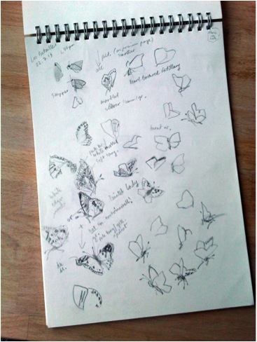
Butterfly sketches in France
If heading out to neighbours’ gardens can also be considered ‘travel’, then I take an Imperial sized piece of watercolour paper prepared on a board, my paints and palette and a stool to paint on location. I have a friend close by who has an enormous collection of tulips which fill her garden every May. If I’m out walking in the hills then I will usually have a sketch book and binoculars in case I see something interesting.
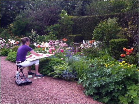
Ann’s Garden
You do many commissions. Can you discuss how you have developed this part of your work?
Commissions form an important part of my work and they are requests from people who have a space to fill of a particular size/ want their collection of garden flowers brought together in one painting/ have seen a painting which has already sold or have a favourite flower they wish depicted. The commissions are very often to be gifts for weddings or special birthdays. However, customers are never obliged to purchase the finished painting if they are in any way disappointed, so this removes a potential obstacle.
Many would not expect that you would do commission of wedding Bouquets and other simple domestic requests, explain this aspect of your commissions?
I enjoy the challenge of finding a way to fulfil a customer’s requests while remaining true to myself. Occasionally I have been asked to paint something which I’m not comfortable with and in this case I don’t accept the commission: I need to be able to create a painting which is still a ‘Jenny Matthews’, and that is normally what the client wishes too so they’re never too prescriptive in their brief. It’s interesting to discover what people are looking for in a painting, and to be party to that.
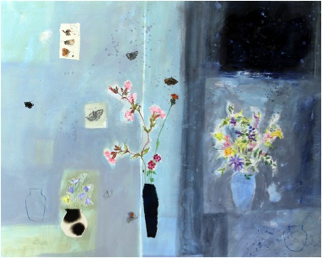
‘Wild Bouquet Strathdon’
You say you don’t like ‘bitty flowers’ - can you expand on this comment?
I am attracted to flowers with strong silhouettes and forms. I will sometimes incorporate a ‘bitty’ flower, for example Forget Me Not, into a painting, and the juxtaposition of different scales and forms can work really well in a composition, but if I painted only what I am attracted to then I would always go for irises or tulips and other bold forms! Wild flowers tend to be ‘bitty’ too, but I love painting them.
Discuss the influence Dame Elizabeth Blackadder has had on your work as a tutor and mentor?
Elizabeth lives in Edinburgh, as I do, and I remember when I first heard of her when I was still at high school. Subsequently, when I was at art college, I was steered towards her botanical illustration course. From then on she was hugely influential to me: not only because she worked alongside us as we worked, but also because she uses watercolour which I love above all other media. Elizabeth unashamedly paints beautiful things for their own sake, and creates decorative images which give pleasure to the viewer, and I admire that. She is also someone I can get along with and feel comfortable with, which obviously helps.
You are not restricted to the demands of formal botanical painting. Can you discuss this?
Botanical artists are required to measure and record with perfect accuracy the flowers they paint. Their work is used in identification, so accuracy is of the utmost importance. What I enjoy is the ‘character’ of the plant, and trying to record my response to it.
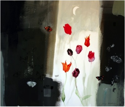
‘One Moth’
You are not afraid to leave the ink and crayon marks on your work rather allowing these to take a part in your work, explain this?
What I like to see in a piece is how it came into being: the process and some evidence of the creator’s hand. It’s ‘paint’ as well as ‘a painting’.
You now also teach. Can you expand on your teaching?
I have actually given up teaching in any regular way. I don’t really have time any more, although I do occasionally give one-to-one tutorials in my studio. I used to teach adult classes in Botanical painting, watercolour and drawing in the days when I had more time and less success (or should that be children?)!
Do you exhibit beyond the UK?
Not yet! Exhibiting beyond the UK is an ambition of mine and something which I am pursuing! Any suggestions?
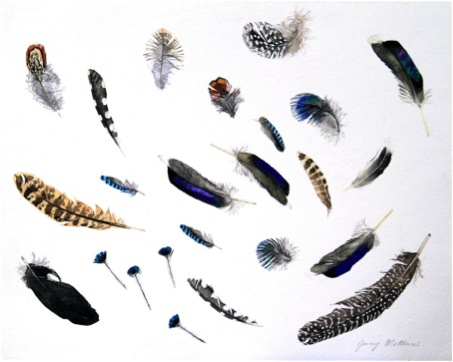
‘Birds of a Feather’
Do you see a strong relationship between the fragility of watercolour and flowers?
This is me speaking as a Scot in a Scottish climate! However, I do feel that watercolour lends itself to the depiction of flowers more than other media.
Your format is not in bowls rather as if the flowers have just been picked and scattered on the table. Explain this approach?
It’s a continuation of botanical illustration, with my own take on the tradition. Durer, one of my favourite artists, did the same. I like the idea of painting a flower’s portrait.
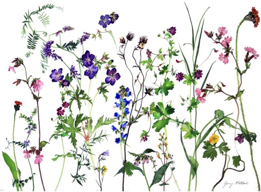
‘Where the Wild things Grow’
Contact details:
jennymatthews@blueyonder.co.uk
www.jennymatthews.co.uk
Jenny Matthews, Edinburgh, Scotland
Interview by Deborah Blakeley, November 2013
William Linford
As a boy you grew up in rural Australia. You are still keeping this image alive today. Can you discuss ‘Mum Gets a Bat’ in this context?
I come from a large family in a country town. All sports were a prominent part of our lives as we grew up. Games of all sorts were played but ‘backyard cricket’ dominated much of our spare time over the long hot summer months. The warm hues of this painting help represent the heat which was sometimes quite stifling during our cricket sessions. Everyone in the family participated in these events, including Mum..
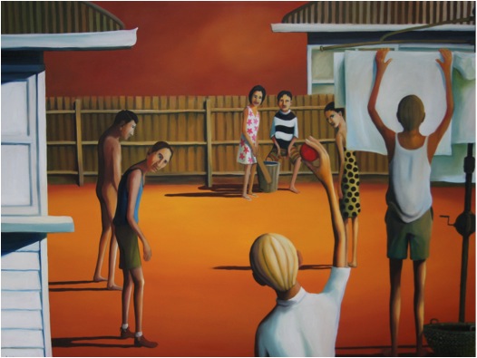
‘Mum Gets a Bat’
Cricket plays a huge part in your work. Can you expand on the importance of the sport in your work?
Cricket is an extremely popular spectator sport in Australia. At first glance spectators will often comment that it contains little action. My cricket paintings could also be misinterpreted in this way however I believe that much can be read into each one. I have always been fascinated by the mix of colour that makes up the backdrops of cricket settings. I love the contrasts of cricket whites against lush green pitches and colourful crowds. My cricket paintings are reflective of Australian beach, backyard and park culture.
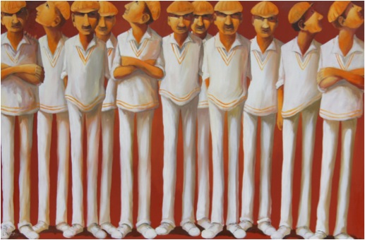
‘2nd Eleven’
That elongated figure – how did it evolve?
The works of famous Australian artists such as Russell Drysdale and John Brack have always appealed to me so perhaps at some subliminal level I have been influenced by their techniques. However, my elongated figures were never intended to mirror these styles; they have just become part of my evolution as an artist.
Hats are part of sunny Australia. Can you expand on the use of them in your work?
‘Saleyard’’
Not only do you paint sport but you add to it the importance of team. Discuss this?
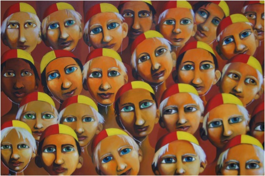
'Nippers'
Each team member operates as part of the whole but I aim for my paintings to reflect individuals that stand out from the crowd in a variety of ways. When you study paintings such as ‘2nd Eleven’, ‘Saleyard’ and ‘Nippers’ you will notice many similarities between each character but you will also be struck by the idea that each has a unique story to tell.
You have been living on the coast for over 20 years. Can you explain both the importance of Surf Life Saving and its role in you painting?
The Surf Life Saving movement is an iconic thread in the Australian societal fabric. I have a great appreciation for the volunteer work that they do along the coast. I am incredibly grateful that my family has been able to live in such a beautiful coastal region. I hope that my paintings reflect my admiration for this ever changing environment and for the people who protect the coast and its visitors.
Many paintings display mateship, discuss?
Mateship in Australia is often linked to the shared experiences of returned war veterans and sporting teams. I have enjoyed the camaraderie that comes from being a team member that shares experiences and laughs with others. I hope that my sense of fun and larrikin humour permeates through my work to the observer.

'Bench Cricket'
Discuss your circus paintings and where the inspiration for this series came from?
The colour and constant action of the circus has always appealed to me. In recent years I have also utilised circus themes to reflect my thoughts surrounding contemporary political scenarios.
Everyone loves to know about an artist’s studio: tell us about your studio, your storage space and the time you spend in this space?
Large, north facing windows flood my studio space with light at all times of the year. At first glance this space may appear to be a chaotic collection of canvasses, pallets, photos, books and memorabilia. At any one time I will be working at three easels with several other paintings at various stages drying against the studio wall. Although I have experimented with other mediums I seldom use anything but oils.
Most days I spend six hours painting. I can easily become lost to the task and very seldom suffer from painter’s block. I feel incredibly lucky to have found a pursuit that gives me so much pleasure.
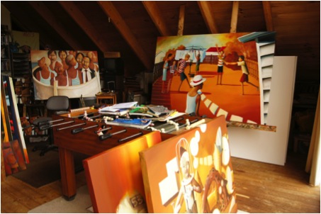
You often exhibit in group exibitions. Can you discuss the way you deal with this?
I enjoy solo as well as group exhibitions. It is very rewarding to exchange conversations with like-minded artists and to have the opportunity to appreciate the work of others.
Group exhibitions encourage a wide range of people who have eclectic tastes in art. I enjoy being able to challenge traditional attitudes to painting and to bring my work to a diverse audience.
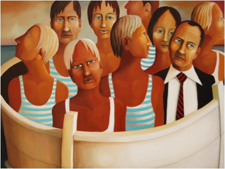
‘Nine in the Tub’
Your work has been sold around the world. Can you explain one or two sales that have meant a great deal to you?
I was quite excited the first time I was contacted by an International collector. Having first seen my work in a magazine and then researching my website, the Hong Kong based business person subsequently purchased two large pieces. Not only did this give me a great sense of pride but also a boost to my confidence.
The second most memorable International sale was when the CEO of a large International company acquired two of my paintings when he and his family were relocating to Denmark. He selected my work as he felt that they represented the Australian way of life and would act as a reminder of home.
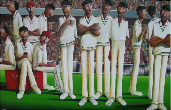
‘Another Break at the ‘G’’
Contact details:
William Linford
613 5255 4919
Email: linford@westnet.com.au
www.williamlinford.com.au
William Linford, West Victoria, Australia
Interview by Deborah Blakeley, November 2013
John Wheeldon
Can you expand on several aspects of your ceramic work and how you use these techniques?
Copper Matt
During the 1980’s I had developed a way of working that involved applying precious metal lustres to both the surface of a textured black stoneware clay and to a translucent white porcelain. The lustres were applied using hand-cut rubber stamps and the designs built area by area until the piece was finished. These techniques resulted in an important body of work for me and were successful both creatively and commercially. I eventually reached a point, however, where I felt the creative development of what I was making had slowed to where it was becoming rather repetitive and needed a new direction.
I found this in Copper Matt Raku which was a very different way of working to what I had been used to. It involved real fire and smoke and an unpredictability that was appealing after many years of formal pattern making.
I had been shown the Copper Matt process by a friend who had seen it in America and I sensed that this was a new road to explore with scope for substantial development and refinement.
Many months of practice, note taking, failures and increasing successes followed and as a result I stopped making the lusterware and became a Raku potter specialising in Copper Matt pieces.
Copper Matt is essentially a Raku process using a simple glaze composed of Copper oxide with an addition of ten percent Alkaline Frit. The difficulties involved in producing it however occur in the firing.
Success relies on very close control of all the variables involved in the firing and relies on being able to repeat every time the correct formula.
I continued to make the work for several years but became aware that I again needed a new creative impetus as I had taken the Copper Matt as far as I could and I felt it was becoming repetitive.
The new idea dawned as I was conducting a workshop in Norway. One of the students was working with terra sigillata and was also aware of the work I had done with lustres in the 80’s. She asked me if lustre would work on Raku fired Terra Sig. My initial reaction was that I didn’t think so but we would give it a try. The results were encouraging, not amazing but definitely containing the seeds of a possible new investigation.
On the flight home I made plans to develop this further. I had the raku techniques, I had the forms and I had the lustre tools and materials, all I needed was Terra Sigillata.
This came by way of my friend Richard Godfrey who gave me clay samples and a formula to make Terra Sig. And so I returned to making lusterware again but this time on a Raku surface.
Lustre
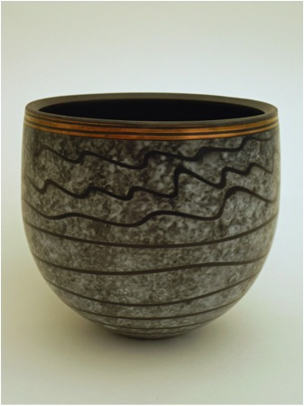
My present way of working involves throwing and turning the pots using thin steel ribs to ensure a perfectly smooth surface. I use very smooth stoneware clay which enables me to achieve this fine finish.
The pots are dried, coated with 3-4 layers of Terra Sig applied using soft brushes and biscuit fired.
The lustre is then applied, as before using small rubber stamps, building up the pattern area by area until the piece is complete.
The lustre is then fired in an electric kiln to harden on the decoration.
The final part of the process involves sponging on a resist slip [similar to those used in the naked raku technique] over the lower part of the vessel using either cut and shaped foam to produce a geometric pattern or a natural sponge, usually used in conjunction with latex trailing to create lines, giving a marbled finish.
Raku firing using sawdust completes the process.
The heavy smoking modifies the colours of the lustre and creates a dense black background to the pattern which helps intensify the effect.
Raku
I do make a small quantity of what could be termed ‘standard raku’ glazed with crackle glazes and smoked with sawdust. I produce mainly tea bowls using this method and enjoy it for the freedom it gives me to throw and turn loosely as opposed to the fine surface needed for the lustred pots.
Can you expand on how you began to use pattern and how it has evolved over time?
Before I started to make the lusterware in the 1980’s I made tableware decorated using foam stamps to apply coloured glazes onto the pots and the rubber stamps I used on the lusterware evolved from these, essentially they were just much smaller and made from a different material.
The patterns themselves come from many places [most of them forgotten] but I’ve always found historic architecture, particularly English cathedrals a rich source.
In evolutionary terms the pattern has, over time changed, mainly as a result of the individual elements becoming smaller. This has resulted in a denser, richer overall surface. The colours themselves haven’t changed being composed of gold, copper, silvery blue and purple.
Can you discuss the gold base lustres you use?
The lustres are commercial resinate lustres from Heraeus in Germany. They are supplied ready to apply in liquid form which I allow to stiffen slightly as it makes application easier.
Can you expand on the importance of history to your work?
I cite history as one of my influences and it is indeed very important to me. I’m not sure however that there is an obvious link apparent in my work beyond the links with architectural details in my patterns. My signature vessel form however has its roots in Bronze Age storage jar in a local museum although it may not be apparent in its present form.
How important is traditional ware to your studios output?
Strangely, if you had asked me this 12 months ago I would have replied as it being almost nonexistent having concentrated solely on Raku for many years although I did, as I mentioned earlier, make tableware early in my career.
However, over the last year I have begun to reinvestigate tableware [if that is what you mean by traditional ware] and for about 6 months have not made Raku at all.
I decided to take time to look afresh at what I was doing and incorporate into it elements of the ceramic history I am interested in. So, I have the beginnings of a new range of work drawing on research into early 18th century Staffordshire ceramics.
I am hoping that this new work will be ready by Easter in time for next year’s shows and so far the people who have seen the early pieces have been complimentary.
Shape is a large part of ceramic ware. Discuss one or two of your personal favourites?
The form I have used for many years, the narrow footed, rounded vessel was derived from a Bronze Age pot I saw in a Museum many years ago and has long been a special piece for me. There’s something about its generosity of form and the way it grows when it’s thrown on the wheel that appeals to me.
I’m also a fan of the large slipware dishes made by Thomas Toft and Ralph Simpson in Staffordshire during the 1600’s. Also, in the 1700’s before the full effect of industrial production there were a group of potters using predominantly hand methods but with a new found sophistication such as Wedgewood and Whieldon and I am presently finding inspiration from this source and using it in my new work.
When leather hard the slabs are joined to form a 3D object. This is the most exciting stage in the making process and results in a piece which unifies colour, form, texture and design.

You also make boxes. Can you explain these and the technical aspects that must be taken into account in the making?
I’ve made boxes for many years. I enjoy them as they are like a small, flat ‘canvas’ ready to decorate, each one can be different and can have a variety of uses. They are a small individual piece and don’t need to be made in matching sizes. I aim to fit the lid as precisely as possible by accurate throwing and careful turning as the fit and feel of the two halves is part of their appeal.
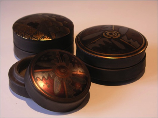
Your work has a very masculine look. Do you think this is achieved by the use of dark colours and strong pattern?
I am sure this is the case but it has never really been a conscious decision.
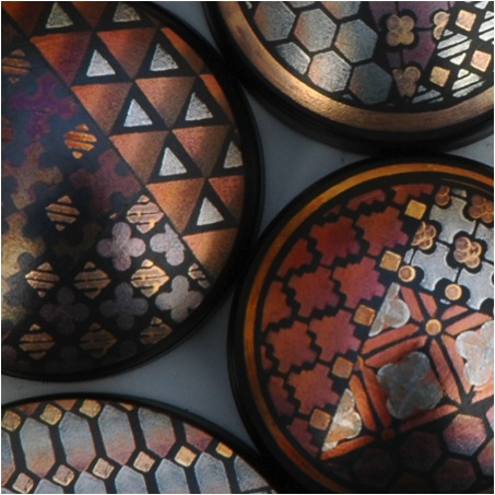
Raku courses are part of you art practice. Can you expand on the classes?
I have run the courses for several years now and continue to refine them year to year .Presently they are a two day course and cover Classic Glazed raku, Copper Matt and Techniques for Burnished surfaces. I don’t cover lustre owing to the expense involved, gold is very expensive. I provide suitable pots although students can bring their own, good coffee, tea, biscuits and a substantial lunch
You are represented in the UK and Europe. How important is it to have good representation?
Very important! Most of my pots are sold through galleries in this country as well as several of the potters fairs both here and in Europe. As well as actual retail sales the value of networking at these events, contacts with galleries etc. and keeping up with friends is of great importance.
Contact Details
John Wheeldon,
4 West End,
Wirksworth,
Derbyshire, DE44EG,
UK
Web: johnwheeldonceramics.co.uk
Email: j.wheeldon@tiscali.co.uk
Also : ejw@johnwheeldonceramics.co.uk
John Wheeldon, Derbyshire, UK
Interview by Deborah Blakeley, November 2013
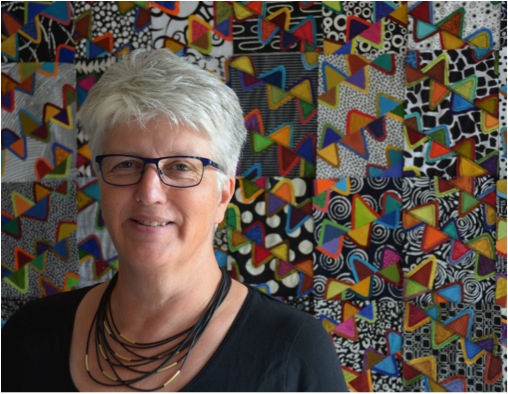
Maryline Collioud-Robert
There has been a strong and consistent growth in your quilts from the 1980’s through to today. Can you discuss how you keep developing your style?
I have no drawn path in front of me. I like to work in series, and it's usually in the middle of creating a quilt that surges a bright idea for the next one. I do not produce many quilts, so I have series dating from years behind, I would like to add on to. I'm always 20 quilts in advance in my head, and curse time flying and everyday life taking so much time out of creation!
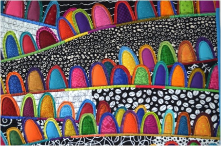
‘A Happy Place – detail’
Between 1980’s and 2000 your work was very colourful but piecing was the dominating factor, please expand on this?
I have always loved piecing and still do. There is magic in the math of patchwork, as well as a meditative and soothing effect in the repetition of blocks.
Between 2000 and 2010 you went beyond the boundaries. Explain how your work was no longer restricted by borders and templates?
Over the years, the quality of the surface, the colours and shapes have taken over the fascination of the puzzle inherent to patchwork piecing.
By 2006 and 'Collage 2' you have developed your own style. Can you explain the process you now use?
I appliqué/fuse fabrics to a background; I have hundreds of fabrics already fused, ready for use, and I choose among them, like I would choose colours for painting. I cut out the shapes by hand, and arrange them together until I get the intense colour surface I want.
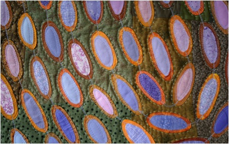
‘Gujarat – detail’
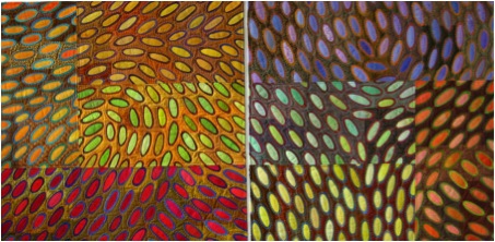
‘Gujarat’
With a work like ‘Fragments 3’ you have had to work at colour while also tone. Can you explain the importance of the knowledge and use of tone in your work?
I teach a colour workshop where I bring a large suitcase containing over a thousand different fabrics for the students to make collages with. At the end of the course, I collect the scraps, some as tiny as postage stamps. I use the small pieces of fabrics and I freely piece them to make the Fragments series./p>
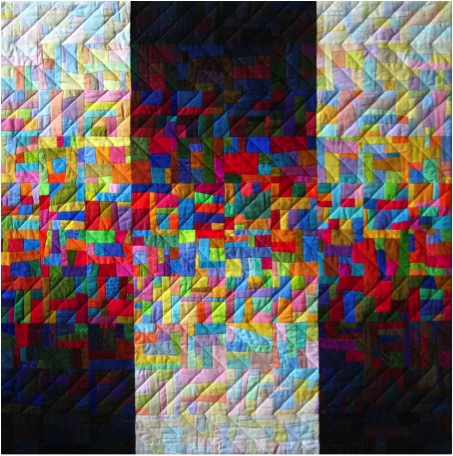
'Fragment’
I love to make colour to colour or light to dark progressions. I always teach these progressions to my students, because one learns so much about colour in trying to make them.
Going from light to dark in one colour range is a lot easier than going from light to dark mixing all the colours. Quite a challenge, but I like to do that, it's relaxing. It drains my brain of everything unwanted! I call this series, (Fragments), my yoga series!
In your recent work you use pattern in the background, as we can see in ‘Riflesso’. What has allowed this breakthrough?
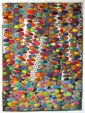
'Riflesso’
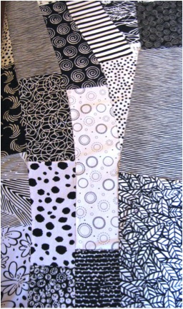
I've been using black and white fabrics for a while, because I like the intensified contrast it brings to the whole. For some reason, black and white fabrics are much more interesting, pattern wise, than some other fabrics created in other colour ranges.
I love my black and white fabrics, (I have built an impressive collection over the years) and I have a sketchbook where I sketch down some more inspiration to create new black and white fabrics! Maybe one day!...
You also combine machine and hand stitch – How do you know when enough is enough?
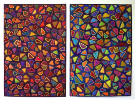
'Epieces’
I've recently turned back to some hand stitching around my fused shapes, after coming back from India. Indeed, I was very lucky to take part to a trip to Gujarat, in the Kutch area, along with a group of textile lovers.
There, we visited several ethnical groups who each did a different kind of embroidery. I was struck by such beauty and expertise, although I'm not an embroiderer, and probably never will be. Some embroiderers were making incredible designs, and once finished, they went around the design with tiny white stitches. It's in honour of their incredible work that I started hand quilting again.
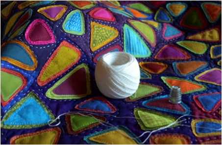
Can you discuss the piecing that you now use that creates such movement in your work?
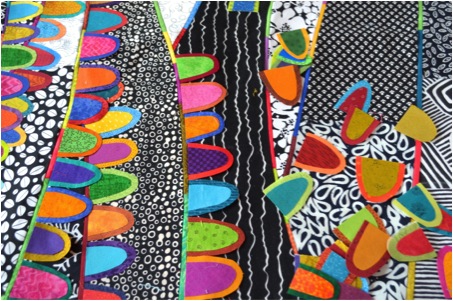
Working on ‘A Happy Place’
I build movement in the quilt by freely piecing background fabrics. The seams will then be the "stems" along which the shapes will be fused.
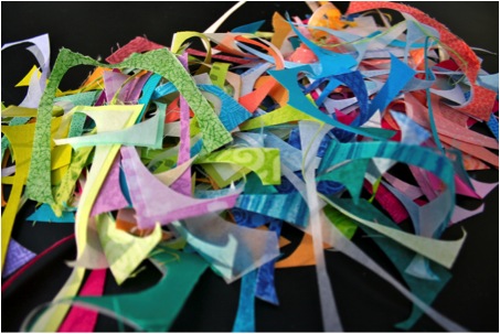
After cutting the shapes….
Colour is so important in your work. Where do you source your fabrics?
I've been buying fabrics for over thirty years, therefore I have a large choice. I'm not interested in printing or dying my own fabrics. (Perhaps in another life!). Going into shops all over the world and discovering new colours and new patterns is a great joy!
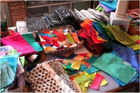
Maryline’s studio
‘Paysage Imaginaire’- how important is the colour wheel to your palette?
Sometimes I like to work within the colour wheel, such as in this red/green complimentary colours quilt. But I usually let myself be surprised by colour combinations I see around me. I used to carry a tiny notebook in which I described colour combinations I found on my way, using words as precise as possible, so I could recreate the combination once at home. Now I use my smartphone!

‘Passage Imaginaire’
You have travelled throughout the USA to discover quilts, can you tell about one or two very memorable events?
I was studying humanities at the University of Neuchâtel, while already creating quilts. I decided to go to the States to study quilts a little deeper, taking workshops, meeting artists, and visiting museums. This trip took over a year to prepare, as there was no internet then, and I remember writing over 200 letters to different people to organise my trip.
I also remember carrying in my suitcase, for months long, a tremendous amount of material for one workshop I was to take in Los Angeles. But on the week-end of the workshop, all we used was a sheet of paper and a pencil!
This trip was memorable. I was lucky to meet such wonderful artists such as Michael and Judy James, who became dear friends.
Exhibiting is a very large part of your studio time. How do you choose where to exhibit and how often?
It may seem like I exhibit quite a lot, but no, not so much. Quilting, at least the way I make quilts, takes an incredible amount of time, and to achieve a whole body of works for an exhibit takes ages.
Also, galleries in Switzerland are totally closed to exhibiting textiles. It's hard to find convenient venues.
I belong to a professional Swiss quilt artists group, called fabric-connection.ch, and we have organised a few well received exhibitions, in Switzerland and in the States.
I also take part in international group exhibitions, whenever possible.
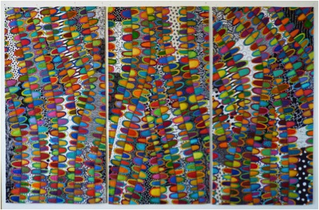
‘Ciao Bella!’
Everyone loves to see inside a studio. Can you share yours?
The main piece of furniture in my studio is a huge chest of drawers holding my fabrics. But I also have tons of fabrics outside of the main drawers as well!
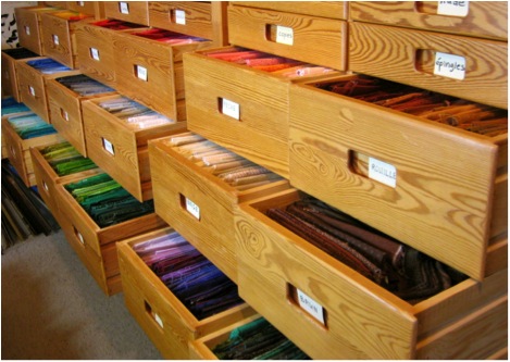
Can you tell us more about your teaching?
You have four classes can you share what each class brings to your students - “This workshop is especially convenient for people wanting to set a foot outside traditional quilting and wanting to develop some more personal work”?
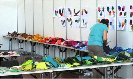
Teaching is one of my favourite occupations, besides making quilts. I love to transmit my love of colour and textile, share my enthusiasm about fabrics and to bring people to discover new worlds.
Most beginner feel secure making traditional quilts, which is perfectly all right, but I try to lead them a little bit outside their comfort zone. I also offer numerous exercises to make them discover new colour combinations, and I teach them how to use colour theories, everyday environment or just chance to be inspired.
Where do you teach these classes?
I'm lucky to go all over Europe to teach. Guilds, textile festivals, or private groups invite me.
It fuels my battery to be in a creative environment with eager students. I get to travel, make new acquaintances and get out of my lonely studio for a while!
What do you mean by the term 'ephemerical quilt'?
No fear of the white page in my colour workshops! I give students instructions to work on an element (sometimes a quilt block) and all the blocs are then pinned to the wall. With a large surface obtained in a short amount of time, it's easy to discuss colour, design, what could be changed, etc. The "group quilt" is photographed and then another one takes its place.
How important was it to your development to give up templates?
I think not only I, but many quilters have more or less given up templates. Nowadays, some incredibly creative people have developed quick, clever machine piecing techniques, and most important, shared their discoveries with the world, allowing everyone to be more spontaneous and more creative.
Can you share your photography with the blocks of colour?
My theory is that everyone, making even a very traditional quilt, will end up with a masterpiece, if they use variations of one colour, instead of just one colour.
I often advise people to buy 20 small pieces of different red fabrics rather than 2 meters of one single red fabric. I illustrate this every week on my blog, in choosing three colours taken out of one of my pictures, and working these three colours in "Vibrations". The same can be done with combinations including more than 3 colours.
Can you explain how you use your photographs for inspiration?
Whenever possible, I carry my camera with me. I'm a very visual person, and I'm mostly inspired by things I see, rather than by things I hear or read.
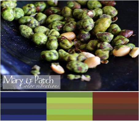
Colours, textures, nature, are my main inspiration.
What are you currently working on?
I'm working on a large quilt, black and white with coloured appliqué forms, arranged in a zig zag movement.
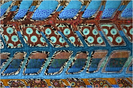
I'm also working on a new series, using reverse appliqué. That is sewing several layers of fabrics or whole patchwork surfaces, on top of one another, and making holes in the upper layer to reveal what's underneath.
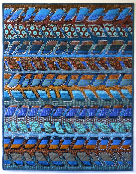
‘Spring’
Contact details.
m.collioud@me.com
www.marylinecollioudrobert.com
http://maryandpatch.blogspot.com
Maryline Collioud-Robert, Boudry, Switzerland
Interview by Deborah Blakeley, November, 2013
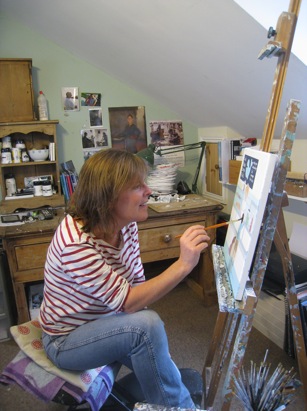
Sasha Harding
Your aim is to capture the moment. Can you discuss this aspect of your work?
I sometimes think of my paintings as snap shots a brief glimpse of a situation. I like the idea of representing moments that are familiar to all of us and also of more private, quite moments.
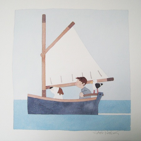
Narrative is inspirational in your work. This is not something that many artists say, can you explain?
I often start with a title rather than an image, I have pages and pages of lists of titles and ideas, the sketching out of the idea comes after the words. I have a vivid imagination and tend to think in terms of a story or narrative rather than a specific image, using my own memories of child hood or something that has accrued in my daily life.
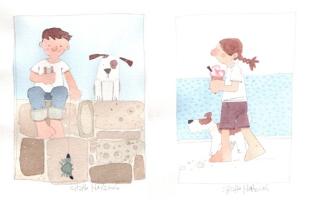
You limit yourself to three colours and white. Why and how did this come about?
It was as simple as being penniless at college and only being able to afford a few paints! Over the years I have grown so used to my palette that I am loath to change it, sometimes I will add a new colour for a while but always go back to the three colours. I am much more interested in the content and story of a painting than the colour and so like to keep it simple.
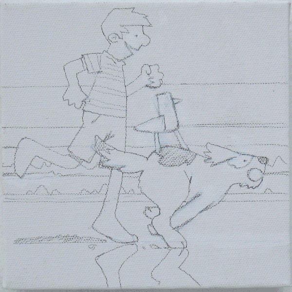
You have been absorbing Cornwall since 1973. How did location have such a large part in your work?
I was actually raised in Dorset but have lived in Cornwall for the past 18 years. Both counties have played a huge part in my work, the sea is an ongoing fascination of mine and very much part of my daily life, be that walking by it or fishing or being out in my boat.
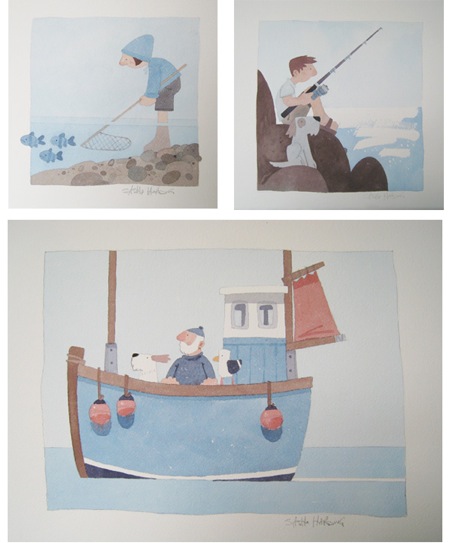
Exhibiting your work is an integral part of our artistic life; can you expand on the importance of exhibiting to you?
I think exhibiting is important because it gives you an opportunity to paint a large coherent body of work that will be shown as a whole, it is also really important for meeting the people who buy my work and chatting to them about it.

You have recently completed commissions for Canada and America. Can you discuss the stimulation commissions give to your work?
Commissions are so different to my normal work, there is a brief to stick to and I have to be aware that I am painting for someone rather than for myself! They are a blessing and a curse and can be more stressful than my usual work .put it this way I am really enjoying having a month off commissions!
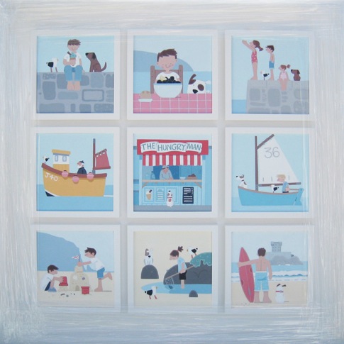
Can you discuss your Aquarelle Collection?
Aquarelle are a small company that specialize in very small runs of limited editions. Quality is paramount and this is why I decided to do some work for them. Prints are a good way of making my work more accessible to a wider public.
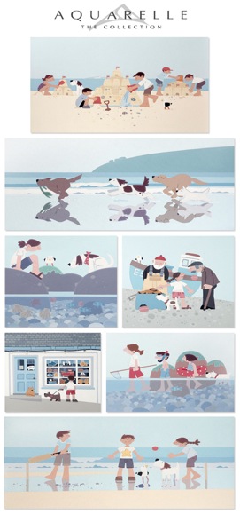
Currently you are working on the illustrations for your own book. Can you tell us a little more about this?
I have always wanted to write an illustrate my own book and having completed the south west coast path this time last year I realised it was the perfect subject. I have completed the hard part, a 65000 word manuscript (quite an achievement for me) I am now looking forward to illustrating it. This all ties in very well with my liking for a narrative and it seems a natural progression for me to do a book. Now all I need is to find the time to do it!
You do a very novel idea with “A Painting A Day”. Please explain this?
It is not my idea! I heard about this movement called “a painting a day” online: artists would paint a picture a day and put it on eBay or their own web site for a certain amount of money. Some of these artists have been doing it for years. Normally they paint still life or landscapes .I thought I could do something for a month and see what the reaction was.
The paintings were selling within seconds of being put on my website, it was very exciting and unlike anything I had done before. I love the immediacy of it; I paint the picture and put it online just like that. The small size of the images means they are much easier to buy without having to take out a second mortgage, so people can snap them up as soon as they appear. I may do one this November, but as with everything it is finding the time, also it is quite tricky thinking up 30 different pictures one after the other.
Do you like to do your work around a thematic approach? As you know I love your paintings of dogs - can you expand on how you work up these images and also the importance of having a pet in your life?
I grew up with dogs and as soon as I could I got myself a rescue dog, my new dog is very much part of my life (we did the walk together) and my day seems to revolve around her needs! Walking is where I get nearly all my ideas so my dog is essential to my painting.
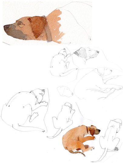
I love painting dogs ,they add an extra presence in a painting ,innocence, or a comedy element.
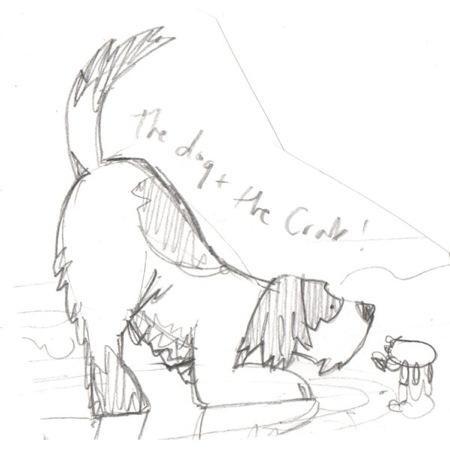
Often you draw your figures in water but you allow us to see both above and below. How did this method come about?
It’s funny how people often end up doing things in adult hood that they did in childhood; I used to paint long pictures of underwater scenes with coral and sand and seaweed, I would paint and cut out fish and crabs and shell and then play for hours placing the cut out images in amongst the back drop.
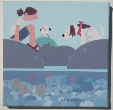
Here I am years later still fascinated by showing the hidden things under the sea. I always loved grubbing around in rock pools and I love the fact that I can paint them and other people like them.
Sketchbooks are a major part of your work. How does this lend itself to your outdoor days and studio days?
I use my sketch books to draw out and plan a painting, much like cutting out image as a child I now draw out the images I want to use in a painting and cut them out, I then offer them up to the blank canvas and draw around them when I am happy with the composition, in this way I can plan everything in advance rather than doing all the working out on the canvas. I have draws full of little cut out figures and boats and dogs .Most of my pictures are from my head and so I don’t tend to sketch whilst out and about ,but use the books for planning and honing an image.
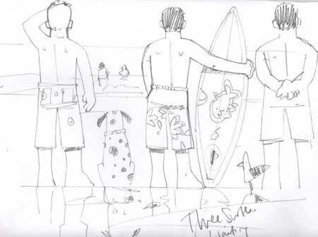
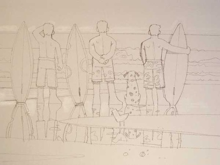
Fishermen and children are major players in your art, explain why?
My husband was a fisherman and I always loved the idea of being a fishwife!
I know I have a romantic vision of fishermen and the very dangerous job they do but I am more interested in the image of the fisherman, the beard, the thick blue jumpers and big boots, the scruffy little ships dog.
Children represent all of our childhoods, if we are lucky we have fond memories of childhood (I know I do). I want to capture that innocence, that time in life before jobs and bills and stress when looking into a rock pool and seeing a hermit crab is the most amazing thing in the world.
Your studio is so neat and tidy like your work, am I correct?
Yes it is!
I am not a mucky artist although nearly all my clothes have paint on them and I often seem to end up with paint in my hair! I like to work in a fairly ordered way hence the working out and planning in my sketch book, not all over the clean, white canvas. The most important thing for me is cleaning up at the end of the day so when I go to work the next day it feels like a fresh start.
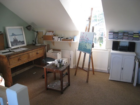
Very rarely is someone alone in your paintings, they always have company or a pet. Please discuss.
I like to see the way people interact with each other, I do paint people on their own but they are pensive, quiet pictures and normally I am an outgoing sort of girl and so paint what I like: people.
Finally, you also use a completely different composition: tiny figures and in the foreground seaside plants. Can you discuss this method?
It is fun to paint in a different scale, I loved the idea of the plants taking the centre stage, but as with all my paintings there has to be a human element, no matter how tiny.
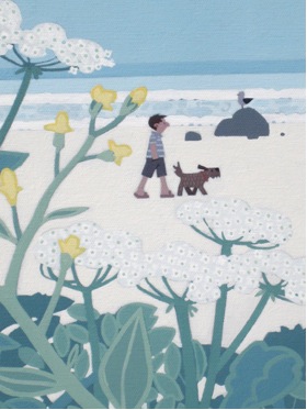
Contact details:
Email: sashahardingartist@gmail.com
Sasha Harding, Cornwall, UK
Interview by Deborah Blakeley, October 2013
Yvette Kaiser Smith
Can you explain ‘simply’ the technique you use to produce your sculptures?
Fiberglass as a finished product is a fibre reinforced plastic. Fiberglass as raw material is a fibre made from spun glass. It is white, opaque, pliable, and behaves as a heavy cloth. It is commonly combined with polyester resin, a liquid plastic. Normally, the resin wetted cloth is laid into or over a mould until the material cures into a hard, translucent surface.
I start with a form of fiberglass called continuous roving or gun roving. Gun roving comes as a large spool of clustered continuous strands of fiberglass. I crochet the roving with a regular crochet hook to create my own cloth. The “J” hook is just big enough to pick up the mass of the roving. Using a variety of traditional stitches, I crochet flat geometric shapes: circles, rectangles, squares. For the next step, I use a hard finish polyester resin. This is polyester resin with 5% styrene wax. As the resin cures, the wax comes to the surface for a hard finish which is sand able, and eliminates the perpetual surface tack and smell of regular laminating resin. I do not lay my wet fiberglass into a mould; rather I use gravity to create simple geometric shapes. When laid into a mould, the crocheted cloth loses its dimensionality, it becomes flat and ugly.
Fibreglass roving
Summary of process basics:
- • Commit to a number sequence
- • Work out form and colour in drawings
- • Crochet flat shapes
- • Build a jig for draping and forming
- • Pour out the resin, add colour in form of dyes, add hardener, apply resin to crocheted cloth with a 1” or 2” brush
- • Hang resin wetted cloth on jig and recover shape by gently pulling out the edges until it starts to set (between 15 – 30 minutes)
- • Let it harden for 24 hours
- • Cut the edges and make cuts to correct form
- • Sand body and edges of forms
- • Recoat with coloured resin, usually 2 or 3 times
- • Sand down drips
- • Touch up sanded areas with more resin.
If a work is made from several units that are fused together, I now have to:
- • Figure out how to make them fit and temporarily hold together in proper place with cable ties without going insane
- • Sew parts together with the roving
- • Apply resin
- • Sand
- • Recoat with resin
- • Polish with ArmorAll vinyl upholstery cleaner using a 1” brush.
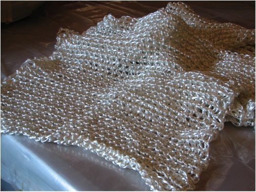
Crocheted Cloth
Can you expand on the mathematics involved in your work and how this came about?
It started with Tim, my husband. Tim is a mathematician by education and a complete math nerd to the core. While driving me from install to install, during long highway trips, Tim used to amuse himself by working out the square root of the multi-digit numbers on the back of big trucks or by trying to deduce whether these long numbers were primes. Or while on vacation or visiting family in the country, Tim would drop to his knees, while all others walked on, to count the leaves on plant life new to his eyes; that number was always a prime. His constant curiosities made me see that math is a part of life, all of life, and cannot be separated from “identity” dialogue.
My reference to math started slowly with an obsession with prime numbers. Utilizing a unique number that is only divisible by 1 and itself was a natural addition as a conceptual tool within identity narratives. Whenever possible I pushed the number of components, or rows, or columns to the nearest prime number. I was convinced, and still am, that repeating nature in this way, that is, fixate on primes, produces a more balanced visual experience.
In 2001, I was working on a show for a university gallery. A wall sized piece takes 3 hard months to produce. I had 2 weeks left and one more large wall to fill. I crocheted 80 plus 10” circles and had the idea to make them ‘the same but different’ in the way that I am same but different from day to day. This involved snapping a graphite grid on the wall to control placement. (I love grids. I have always gravitated towards artwork utilizing grid, I just never found a natural way to bring it into my work.) I wanted to space the circles in a seemingly random, asymmetrical pattern. I asked Tim for a random pattern generator. He said: why don’t you use pi! I said: pi?! Simple interpretation: on the grid, 3 fiberglass circles, space, 1 circle, space, 4 circles, space, and so on. I installed the same piece in 4 different venues, always on a wall that was quite different from the others, I mimicked the wall proportions with the grid, so that I had something like 3 rows by 17 columns or 10 rows by 10 columns. Always I followed the beginning sequence of the infinite number pi, staying true to the number, and always the composition worked!! It was balanced, it was asymmetrical, it was not predictable, and it was beautiful. So now I am obsessed with prime numbers and using pi sequences to generate random patterns. From about 2000 on, most of the work was large and in one piece. Large they were but still limited by standard doorways in the short dimension; and both Tim and I were really fed up with moving these things. From the beginning of this ‘abstracting identity narrative’ stuff I depended on some level of narrative as the source for decisions about material, colour, form, movement, etc.. In 2007 I started working on a solo show for a new, beautiful gallery with a few very large walls. Like a 5 year old, I see a huge wall and I want to fill it. I planned a 10 by 10 foot square. This meant modules. In the thinking / drawing stage, one thing led to another and I thought: Articulate the digits!! Let the number make the work. Grid!! This gave the natural organic feel of the crocheted fiberglass a structure that was missing. And it really felt true in my gut. Everything since then has been number generated.
It was at this time I rummaged through my notes and found small scraps of paper on which Tim suggested, years ago, that I could also use e, another infinite number, and Pascal’s Triangle. I used pi, e, and Pascal’s Triangle to create all the work for the DIGITS show at Alfedena Gallery in 2008. Sequences from pi and e can produce completely different rhythms. There is nothing more true than maths and physics. If I commit to a number sequence, I stay true to it. If it doesn’t quite work for that particular form or idea, I try several sequences on paper until it does what I need it to do.
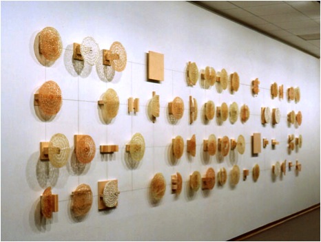
First Pi Piece
People hear math and run away. My math use is stupidly simple. The numbers are my referent, my source, the thing that creates the work. I am from Western culture so naturally I run sequences from left to right, top to bottom, with some exception. Larger works are straight forward, more obvious, interpretations of each digit, while the source math in the small works is less evident.
Identity Sequence e 4 (2007) is based on the beginning sequence of the infinite number e. It is constructed from 323 small units, 17 rows by 19 columns, to look like an enlarged section of a microscopic organic blueprint. Flesh toned units directly articulate each digit. The four molecule sequence of human DNA determined the use of four alternating colours which serve as the space between each flesh toned digit.
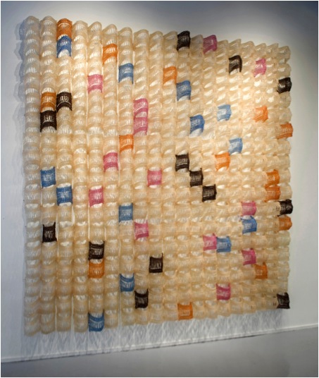
Identity Sequence e
Identity Sequence e Black (2007) is based on the first 49 digits of the number e. I wanted it to feel like a small section that seems to be cut away from a much larger one. Grid is constructed from 49 units in 7 rows by 7 columns. Here the digits are articulated by two systems: tonal gradation of the black where the darkest colour value represents the 9 digit and no colour represents 0; and the distance each unit pushes away from the wall, where units representing the 9 digit push 32” away from the wall and the zeros barely pooch up.

Identity Sequence e Black
Identity Sequence Pascal’s Triangle Green and Red (2007 / 2008) are based on digits from the first six rows of Pascal's Triangle. Blocks of the same colour represent each digit. The form of each triangle in Pi in Pascal's Triangle Square and Pi in Pascal's Triangle Round (2010) is based on the first four rows of Pascal's Triangle. Four colours are distributed using the first 30 digits of pi. Meaning: I assign colour 1, colour 2, colour 3, colour 4, and then use the digit to drop the colour. For a pi sequence, I count 3 and drop colour 1; count 1 drop colour 2; count 4 drop colour 3; count 1 drop colour 4; and so on. Again, I run the sequence on paper in different colour order because the look of the work, in varied colour distributions, can be quite different.
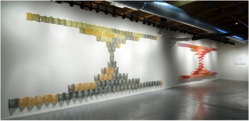
Identity Sequence Pascal’s Triangles
Size - discuss the size of your work?
Early on, in BFA School I began to understand that every material and process has its own language, its own way to articulate words and ideas. This is one of the principle drivers that took the seminal “I want to abstract narratives of identity” question (1992) to the current crocheting fiberglass into abstract, geometric, minimal number generated forms.
Part of the challenge of understanding a specific material or conceptual language is finding the right scale for that particular form. And, yes, there is always the ‘right’ scale. This is why most of the work from 2000 to 2008 was very large. It took me years to find it and years to explore it. I still believe that the crocheted fiberglass language based on narrative needed to be in that large scale in order to be successful. The number generated work from 2007/2008 changed that. Grid came in. Modules came in. Small components came in. The older, more organic forms needed the scale. The structure of the geometry and pattern released me from that, although the first few number generated works are big.
Strands – small work 40x40x7
While making the DIGITS show, I ran out of time, had two small walls, the systems I was developing allowed for a successful 3 x 3 foot and 2 x 5 foot. Six months later I had opportunity to set up an artist booth at The Artist Project art fair. Small walls, actually thinking about selling the work, the new systems allowed and happily resided in this 4 x 4 and 3 x 3 foot scale. These things moved so I stuck in the scale. The work got a little bit smaller as I started using USPS to ship overseas.
Moving (selling and shipping) the work necessitated the scale down which would not have happened without the math structure.
Part of the beauty is the shadows; your work casts comment on this?
At first, the shadow was just a by-product. I soon realized that the shadow, the act of being projected through a solid form, really played into the identity dialogues: which is you, the core of you, is it the body or that which flows through the body and imprints on your environment, that is, your behaviour or even a soul; that kind of stuff. And the shadows were cool. I saw some as drawings. Some had the look of photograms. I enjoyed the reference. With this new conceptual anchor, I wanted to create forms that maximized the shadow drawings, so that the expectation of a certain shadow reaction dictated the form creation and construction. Now that the forms work off of the numbers, a shadow of a curve anchored to a wall can serve as another dimension to complete or close a form. In the more architectural panel pieces, the shadows can draw out or elongate or even create additional elements.
Primary Structures
Discuss your involvement in the Art in Embassy Program?
Art in Embassies creates permanent and temporary art exhibitions in over 200 diplomatic venues worldwide. The temporary group exhibitions are curated by incoming ambassadors or their representatives, usually for the duration of their term.
A significant larger work, Daisy Chain (1999), was curated into the art loaned to Spaso House, the American Embassy in Moscow, Russia for a 4 year period (2002-2006). Also during that time, a smaller work was part of the exhibition at the American Embassy in Ankara, Turkey; this was a 2 year loan. From this exposure, in 2006, I was able to sell a large existing work to be a permanent part of the American Embassy in Abuja, Nigeria. And, Daisy Chain was the month of August in the 2004 Embassy of the United States wall calendar!!

Daisy Chain in Spaso House, Moscow
Comment on the connection between your work, culture and history?
The search for numbers went on for thousands of years; in this respect, numbers represent the human search for knowledge. And, just about every culture, current and extinct, has and had its own lace or knotted cloth tradition. The tradition of crochet and the process of crocheting both embody passing of time, human labour, and innovation and creativity. The narrative based crocheted fiberglass as well as the math driven crocheted fiberglass reference culture and humanness; they represent time and community; the work highlights our connectivity. If identity is a hybrid of our heritage, then lace is, as tradition of time, labour, and creativity, one tiny point of intersection that connects us all.
Your work, due to the base structure, is seen a feminist, how do you feel about this?
The base structure is the logic of geometry and spatial relationships created by number sequences, thank you for acknowledging the math! Oh, you mean the crochet!! Is the work feminist because I am female crocheting? If the same work was created by male would it still be seen as feminist? The work does surface gender issues, but perhaps not the expected. At most, I’d call the work quietly subversive. But I suppose subversive and feminist reside in the same house.
13 Pi Line - detail
It is seen as feminist because of the gender of the maker. I prefer for the art to be received for what it is: objects that are products of an active, long-term material and conceptual exploration; minimal, geometric abstractions that are not generic in form but resonate through specificity. The structure, form and colour distribution within the object is created by math; base materials are fiberglass and polyester resin, industrial and nasty to work with; the technique I use to create my own sculpting material is a craft traditionally attributed to female. That is one out of three key components.
I explore the nature of relationships and identity using formalism while striving for specificity. I began ‘abstracting narratives’ to go beyond the generic in my minimal abstract forms. Identity was a vehicle used to construct the DNA (specificity) of the initial work and then process took over. The work is not feminist, it is formalist and referential. It is a hybrid that defies conventional out-dated labels.
Crochet and lacework is very European does this connect you to your homeland and ancestors?
I was born in communist Prague. Moved to the United States 7 weeks before my 11th birthday. I don’t remember any experience with lace or crochet. In 1999, 30 years later, my Mom and I went back to Prague for the first time. By this time, I was crocheting fiberglass for about 3 years, the forms were on the large end of medium, I was not yet handling the material in the best way, I only used simple stitches, and my identity concepts were still limited.
The trip back home had a significant impact on my studio. What I saw was that Czechs are known for, and are proud of, the best beer on this planet, Czech crystal, and lace!! I, for the first time, realized that Czechs have a tradition of gorgeous lace everything. Every home we visited was inundated with lace: concentric circles on interior door glass; lace curtains; plastic lace on plant pots; lace runners; basically lace everywhere. On the streets, the old ladies seemed to have a sort of uniform which consisted of four items: blouse, slacks or skirt, vest, and shawl. Three of these were usually in pattern, the fourth was solid. This overload of patterns should not have worked but it did.
When I got home, my work exploded. Somehow, recognizing that my heritage comes with a lace tradition, I felt a permission to exploit it more fully. I also realized that, although I was claiming to “articulate narratives of identity in the language of crocheted fiberglass”, I was not utilizing the fullness of the crochet language. I bought a book that catalogues many of the traditional stiches, patterns, and formats and began to exploit this resource more fully. I learned that the more complex stiches created a stronger form and allowed me to work larger. While immersing myself in pattern, I finally began to think outside of the body and saw identity in terms of pattern: internal and external; nature vs. nurture; DNA; social behaviour, how groups affect the individual. The identity dialogue evolved into greater complexity. The sculptures reached their proper large scale. Reaching this scale forced me to develop better handling of the material. All this happened because I went back to Prague, saw lace, and reconnected to that culture and place.
Your work is sculpture: does it become sculpture due to its solidness or size? Please discuss
It doesn’t become sculpture, it is sculpture. Sculpture can be in any scale; it can be solid or hollow. Sculpture is not flat; it possesses mass and volume, as does my work. My forms hang on a wall but they reside in three dimensional space. The wall dependency began as a material / scale necessity and later became part of the material language. Sculpture manipulates and activates space. The sheets of handmade, not prefabricated, fiberglass are manipulated to create forms that break into three-dimensional space. The forms manipulate space by pushing into it, by holding it, by folding it, by squeezing it. Some of the forms are so active they command the entire room in deep three dimensional relief, Etudes from Pi in 5 Squared (2011) for example. Some quietly hover in shallow relief, like Pi Line 22 in 5 (2012), yet they still activate a shallow more personal space. In terms of construction, mine is both an additive and subtractive sculpting process.
Etudes from Pi in 5 Sq.
Which came first: the fibreglass or the crochet?
The fiberglass.
The ‘abstracting of identity narratives’ stuff began at onset of MFA School (1992). That work explored more common sculpture-student materials like iron wire, lead sheet, copper sheet, plaster, bees wax, wood. I was all over the place. My forms were restricted to body metaphors. I still did not understand scale. I had a copper sheet and iron wire form that did not work on the floor or in any relationship to the wall. As a desperate act to salvage the piece, I brought polyester resin, fiberglass matt, and fiberglass insulation into the studio to make a small stand. During my 1st year, a then 2nd year cast fiberglass cloth into moulds; probably why it came to mind. I knew immediately that fiberglass was the material to explore. Not only for its versatility but also for its natural translucency and skin like splotchiness.
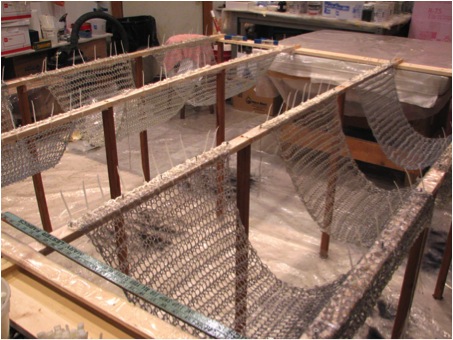
Resin Applied Panels
During the next three years, my studio focused on material exploration, trying to understand the language of fiberglass and how to use it to articulate my conceptual agenda, which was still stuck in one individual, within the body. During this time, I found the roving. Having used iron wire in school for forcing a shape by binding, I bought a spool and began to play. It was all stupid. I shoved the roving in the corner and forgot about it.
Around November 1996, I was starting to work on my first 2-person show, my narrative was still limited to the body, dichotomies a large part of the dialogue; I was at an all-night grocery at one o’clock in the morning, running by the meat counter, from the corner of my eye, I saw tripe!! I stood there frozen in time as thoughts rushed through my head. I saw fat, I saw lace; beauty and ugliness; identity!! Without recognizing why, I associated lace with crochet. The next day I found a hobby store, purchased a book that teaches you how to make pot holders and baby booties, every size of hook available, and began to crochet. It took another 3 years or so before I began to understand the material language of crocheted fiberglass vs. the language of the prefab matt and cloth.
What are you working on currently?
I am making new work for a small solo show here in Chicago at ARTexhibitionsLink’s Gallery Uno that will go up the first week in October. Right after that I begin a 3 week Artist Residency at Ragdale. During the past 3 years, I have been trying to squeeze in time to transition to 2D by experimenting in ways to map the math via Encaustic work. This is what will continue at Ragdale; but my mind is already distracted by the possibilities.
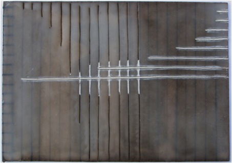
Fibonacci
How do you physically cope with the resin process in you studio?
My studio has a large roof exhaust. I have a full face respirator with two options for filters; a great disposable glove supplier; my body is always fully covered; and at this point, it’s just a normal circumstance of my work.
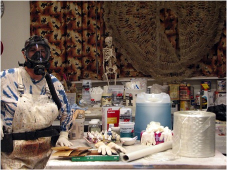
Studio Basics – Wearing Resin Gear
It is the most maddening stage of the material process. With the time constraint of the initial curing time; the full gear I wear, especially in summer when it is 90 in the studio; the sticking to everything if in resin all day; trying not to lose 2 weeks of crochet in one day by not being able to control the form; this is what I call my Three Stooges stage because the resin session can easily turn into dark, one-person Three Stooges episode. If ever I scream in panic, it is in resin application.
It’s just part of the process. It is what it is. I am committed to this process, I believe in it. Much more unpleasant is the sanding!!
Originally your exhibitions were all in Chicago. This year 2012 you have an exhibition in Germany. How did this come about?
In late 2004 I went to a local gallery to hear an artist talk about her work. There I sat next to another artist who was actively working with ARTexhibitionLink, an art organisation founded by art historian Barbara Goebels-Cattaneo, which links the contemporary art scene in Chicago and Berlin. Barbara asks: “Do artworks show geographic or historical adherence or has contemporary art become a global issue, dealing with comparable problems, working with similar standards?”
In March 2005 Barbara was in Chicago; my new artist friend introduced me; I had a show up; Barbara liked the work; that fall she included me in a 3-person show (also featuring my new artist friend) that hung in an alternative gallery in Rome and later in Berlin. We reconnected in 2010; Barbara took my work to Berliner Liste art fair. In the booth across the aisle was Kunsthandlung Huber & Treff, a gallery from Jena, Germany. They listened to me talk about my work, non-stop, for 4 days. The following year Huber & Treff became the curators for an exhibition space in the lobby of Jenoptik Corporation in Jena which was unused for several years. They invited me to be the inaugural show.
A take away from this story is (although I am mostly a recluse) artists leave your studios!!

Jenoptik - Lobby
Artists are becoming global - can you expand how this is affecting your art work?
The shipping difficulty of moving sculpture in terms of cost and dimensional restrictions led to two things. It made me think in modules (the first work I made for ARTexhibitionLink in 2005) which pried open the door to the number generated work. And it continues to challenge me to make smaller, more compact, yet still somewhat intelligent works, which are easy to ship. I like barriers, they push the work where I would not go on my own.
When I travel, I, like many artists, take too many pictures, often of interesting colour combinations or patterns in architecture. Before each project, whether the fiberglass or the 2D work, I run through my sources for inspiration. Math is universal, but I think that the character of a specific geography can be transported through colour and/or rhythm.
Contact Details:
Website:www.yvettekaisersmith.com
Email: yvette@kaisersmith.com
Yvette Kaiser Smith, Chicago, USA
Interview by Deborah Blakeley, October, 2013
Sylvain Guenot
What are some important things that you need to go through with the sitter to get the best results?
I spend quite a lot of time with the sitter(s) before the actual start of the shoot. First I show them samples of my work to remind them the specific nature of my portraiture so that they "understand" what I expect of them. Then they show me round inside and outside the house so that I can spot the places with potential. Finally we choose together the clothes to be used to match best the various places. This is a very intimate time to build up the necessary confidence needed for a successful shoot: intimacy between photographer and sitter is a key thing in my experience.
Of course you also work in colour, can you discuss why colour is important for these prints?
In both these photos the link between sitter and surroundings is made by colour mainly, in these two cases black and white would have diminished the impact rather than enhance it. In quite a few of my colour photos the main feel remains monochromatic, sometimes there is somewhere in the picture a little splash of brighter colour
I actually mainly work in colour nowadays although I do think monochrome extends the artistic dimension of an image providing it is the right type of image. Some images have to be colour otherwise they become pointless.
Composition is a very important part of you photography, can you expand on this aspect?
Yes, composition is essential in my images: there is actually a lot of geometrical shapes involved whether they are around the sitter or the sitter. My aim is to make them talk together in an harmonious way to produce a successful image. To do that, at the composition stage in my viewfinder, I consider the sitter (actually the space he/she occupies) as an abstract shape taking no more importance than everything else around background and foreground. I regard the whole thing as an abstraction of the reality which I then photograph. The image comes out of it where the sitter and the rest cannot be visually dissociated they are bits of the same working machine.
If you take out what is around the sitter, the portrait is poor, or alternatively if you take out the sitter, the image is incomplete and cannot live by itself. Interestingly enough, some people who see my work for the first time in an exhibition ask me if it is painting or a photograph?
Can you discuss the sitter’s reaction on seeing the final image?
Sometimes some of them who have not fully "understood" my approach might tend to only look at themselves not being able to take the whole thing in one go, so it can disturb them a little bit….
This is Sir John Houghton, he is a scientist who received a joint Nobel Peace Prize in 2007 for his team work with Al Gore about climate. This portrait was commissioned by a publisher for the front cover of his biography which is coming out in September 2013. The brief was to illustrate the "Conflict" our planet is facing through the voice and work of this highly respected scientist. Again use of foreground and background.
What do you mean by the word “peoplescapes”?
This is what I call "peoplescape" a word I feel I have invented but probably already existed before… I mean an image which contains a person or more than one but which goes beyond showing that person. It is an artistically pleasing image altogether which creates an emotion. Being supported by somebody' s presence in association with abstracted surroundings suggesting (often in a subliminal way) rather than informing in a 'documentary" way
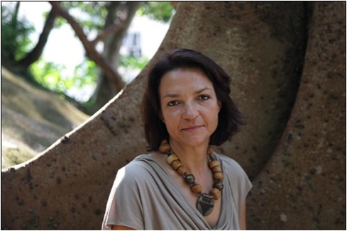
The abstracted background is used in a way to suggest Chinese calligraphy for this French Woman who is temporarily experiencing the life of an expat in Hong Kong
You see beyond the image and want to capture the character, can you expand on this?
Yes, the particular use of background/foreground I make, inevitably (and intentionally), reveals character in a subtle, non explicit way which makes the portrait more appealing and more interesting. I feel each image has a psychology and I try to use it to serve the sitter's character in the image.
Here the surroundings are made of a foreground on top right corner (lampshade) echoing shape wise with the yellow collar of the shirt but also merging with metal staircase and windows in the background to produce a kind of disturbing/distressing feel which serves character for this young Danish expat girl in Hong Kong.
This man is an English high level cage fighter, I am aiming at showing his strength and also vulnerability, first layer of fragile green twigs acting as a foreground and second one as background, together suggesting subtlely the cage he fights in. Note how the shapes of the twigs replicate those of the shirt and therefore assemble sitter and surroundings in one working image.
You also use light in your work?
The combination of the strong side light with the settee designed cushions create an appropriate Dickens type of atmosphere to portray that little rascal.
Your major work is portraiture. You have also completed “The Hong Kong project” - can you discuss this project?
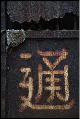
I took these photos on my numerous trips in Hong Kong between portrait commissions, I was fascinated by these derelict walls whose natural abstract patterns tend to evoke an infinity of concrete things depending on the way your mind decides to look at them. Interestingly enough the photographic process there was to transform abstract forms into more real looking ones as opposed to the "peoplescapes" which are about abstracting real things. Both processes complete each other and require the same artistic vision and abilities.

Do you have other projects that you are working on or have done?
I currently have an exhibition of portraits of famous American Contemporary Dance dancers in New York and I love the idea of doing a similar thing with UK dancers at The National Portrait Gallery in London but I will have to convince NPG first….The NYC exhibition is called "inAction, The Virtuosity Of Presence", my challenge was to show the virtuosity of the dancer through a "portrait" where this dancer is not dressed as a dancer, not performing, not even in a dance environment.
Topaz Arts Inc 55-03 39th Avenue Woodside, NY 11377 for “inAction: the Virtuosity of Presence” new portraiture featuring 40+ New York-based dancers & choreographers photographed by Sylvain Guenot.
‘Carmen de Lavallade’
I am also in the middle of setting up a commercial project consisting in getting Asian people to come and have their wedding (or rather pre-wedding) photos taken in England and France. A coffee table book of portraits of famous people around the world is also in the pipeline, it is too early at this stage to reveal more about the project.
How has photography changed for you since digital and software such as Photoshop?
It has changed dramatically and for the better: first I was very reluctant to leave my film camera as I was convinced digital technology would never enable me to produce such good black and white, black and white being the only way for me…. Not only it did a very good job in that respect but it also gave me a chance to discover colour and find myself loving it to a point I nearly only produce colour work nowadays. I actually find it difficult to convert colour digital files into black and white when I previously photographed the scene with colour in mind. Also digital technology has enabled me to take more work on as it makes it possible to work much faster and more efficiently than in the darkroom. Finally I love the control on the image you get through Photoshop or any other software of that kind.
How large can you have you prints processed?
I always do my own printing because I want to keep control of the image until the final stage, interpreting my digital file in a similar way I used to with my negative in the darkroom. My Epson 3880 printer allows me to print up to A2 (60.5 cm x 43 cm). Much larger prints can very easily be achieved with my high resolution files (Canon 5D Camera)
Can you explain to the reader that as a professional you don’t expect to get that one image with one photograph and it isn’t simply a case of being a professional, you too need to take many to capture the perfect image? Discuss?
Absolutely right! First I need to find the idea which means the right place in the right light with the sitter wearing the right clothes. With the experience I have become good at working out quite quickly (sometimes a bit instinctively) which combination of these elements would have the potential for a successful image. Then it is a question of trying it and sometimes it can take many shots indeed to get the one(s) providing the expected pleasing result. I would advise to always work with an idea in mind, working randomly is rarely fruitful.
Contact details.
Website: www.portrait-photographer-gloucestershire.co.uk
Office: 0044 1453 764849
Mobile: 0044 777 98 19 602
Sylvain Guenot, Gloucestershire, UK
Interview by Deborah Blakeley, October, 2013
Regina Heinz
You have done many residencies in the UK and beyond. Can you expand on the importance of them to you work?
Residencies are a great opportunity to push the boundaries of one’s work. They provide time, space and usually good facilities and thus encourage to experiment, try a different scale or introduce a new technique.
All my residencies have worked in this way. Two of them were particularly beneficial: At the beginning of my career I spent three months at Cleveland Crafts Centre, Middlesbrough, England and in 2011 I was invited as part of the British contingent to create work for the Fule International Ceramic Museum in Fuping, China.
‘Dress’ Brushed Lithium Glaze, Middlesbrough
‘Middlesbrough’’
Middlesbrough is an industrial town in the North East of England not far from the lovely rolling landscape of the Yorkshire Moors. I was startled by the stark contrast created by industrial plants eating into the natural environment. This prompted me to “cut” into my organic pillow shapes and to introduce “manmade” right angled elements in order to visualise this contrast.
Since then I have cultivated this contrast. Balance and juxtaposition of precise geometric components and softly undulating sensual forms is one of the main characteristics of my visual language.
The residency in Fuping took place in a brick factory and not only provided a huge working space but also the opportunity to work with prefabricated elements.
‘Fuping Residency’ – New Roof
The factory produced curved roof tiles amongst other products. I used 70 of them to create the large relief sculpture “A New Roof”, displayed on the floor of the British pavilion. This sparked off ideas of creating my recent body of large scale wall based work, 3D undulating wall units, cast in Stoke on Trent, hand painted in my South London studio, which can be combined in different ways to create installations for interior and exterior settings.
New Roof- detail
Are there any special tricks to winning residencies that you are willing to share?
It is always good to indicate why you are applying how and in what way the residency will benefit your work. Usually residencies have certain criteria when looking for in suitable candidates. If you want to apply find out as much as possible about the residency and in your application try to fit the criteria.
Exhibiting of you ceramics: how, where and why?
Exhibiting and selling my work is a form of communicating and thus vital for my professional life. I am grateful to have been able to exhibit in many different venues all over the world, including galleries, competitions, museums exhibitions and ceramic and interior design fairs. All these venues demand different types of work and target a different audience, one off pieces and special pieces are best exhibited in galleries and museums, my recent wall based work also fits the criteria of architectural ceramics and has been successfully exhibited in interior design fairs over the past years.
Architectural Ceramics ‘Collection Flow’
Your initial training was in painting. Can you explain how this can be seen in your current work?
All my work is essentially painting onto a 3-D surface. I love colour in general and the richness depth and texture of ceramic colour in particular. I also love the act of brushing and when decorating I am building up layers of colours and textures.
Oxides, glazes, biscuit slips, washes of ceramic pigment and most recently ceramic transfers and gold enamels are applied in sequence and juxtaposed and very often fired on in between in multiple firings, thus creating depths and vibrancy which adds to the richness and sensuality of the organic form. Bits of the layer underneath are very often left exposed thus emphasising the act of painting.
Most recently in my high firing range I have discovered shades of colour and natural phenomena like a sunlit moving water surface are translated into a ”carpet” of different coloured tones, golden highlights and bold patterns.
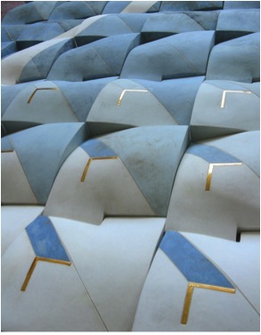
‘Flow Collection ’ Brushed Stoneware Glaze
We see a lot of rhythm and repetitive pattern work, please discuss?
As with my colour palette also my patterns have been derived from nature and observation of natural phenomena.
The movement of water is one of my main sources of inspiration and is translated into undulating forms and wavy repetitive patterns and designs.
Over the years my focus on the landscape has undergone an interesting change. Overall views have been submitted to a process of “zooming in” and “blowing up” of smaller and smaller areas. Close ups of surfaces, details of natural and manmade environments now serve as starting points.
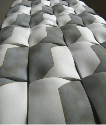
‘Cityscape’ each tile 20x15x3cms
Your work is hand built. Can you expand on your technique?
All my hand built work is constructed from soft slabs in order to emphasise the sensual and tactile qualities of clay.
The process can be compared to “tailoring”, the designs are developed on a flat surface, then slabs are rolled out, cut and incised similar to pattern cutting. The slabs are shaped while still soft by gentle pressure applied from above or underneath to create an undulating surface. I always try to manipulate the slabs as little as possible and to retain their original surface texture, cracks, markings, newspaper creases etc. to the highest possible degree. This technique is paramount to my work and requires both spontaneity and control. The soft slabs react immediately to every touch, every movement of the hand and are easily over-worked, in danger of losing their elasticity and freshness.
When leather hard the slabs are joined to form a 3D object. This is the most exciting stage in the making process and results in a piece which unifies colour, form, texture and design.
I use grogged Stoneware clays for technical and aesthetic reasons. Grog provides tactile and visual texture as well as strength for better control during the forming process.
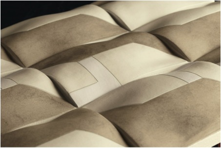
‘Cityscape Collection’
Can you explain about both your studio and the importance of an arts grant to help you set it up?
Maintaining a professional studio is an essential part of working as a ceramic artist.
I received a setting up grant from the British Crafts Council when I started out. The help was invaluable, I was able to equip my studio with a proper kiln, pug mill and slab roller and turn it into a functioning ceramic studio. The grant also kick started my career as my work was included in the promotional campaign run by the Crafts Council for all the grants recipients.
Your work is suitable for internal and external display. Can you explain how these differ?
I have two firing and glaze ranges.
The decoration of my low firing indoor range consists of a Lithium glaze fired to 1035°C and various oxides, washes of ceramic pigments and biscuit slips.
The final effect is the result of multiple firings; layers of colour are fired-on between applications.
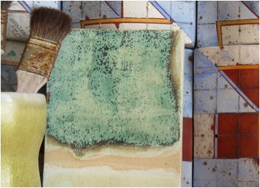
The high firing range uses a stoneware glaze with a high China clay content that generates a beautiful mat fresco like surface, well suited to “clothe” the organic undulating forms. Oxides and stains are added in varying quantities to achieve shades of colour. My high firing colour palette comprises warm tones, browns and ochre as well as blues, greens and greys.
How are your wall sculptures physically hung?
The wall sculptures are mounted on boards, either glued for a permanent fixture or screwed on using cavity screws for a non-permanent installation.
If required the modules can also be glued permanently to the wall using a tile adhesive.
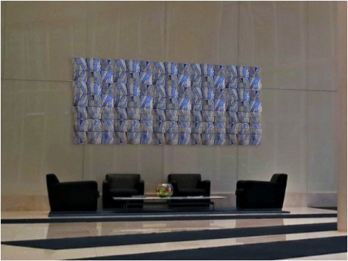
‘Flow’ 300 x 140 x 5 cm
Colour and pattern is intrinsically part of your work. Please expand on this?
The Austrian painter Gustav Klimt is very well known for his highly decorative and ornamented art nouveau portrait paintings of high society ladies in Vienna around 1900.
Perhaps less well known are his beautiful landscape paintings he created during several summers when he stayed on the lake “Atter” (Attersee) in “Salzkammergut”, Upper Austria, the same lake where I used to stay during my child hood summers.
Lake Attersee, Upper Austria
I particularly love the paintings which depict the lake. Though observed from nature the different shades of blue and turquoise of the water surface are represented by single brush strokes in different colours, which when looked at in isolation, remind me of abstract paintings. The visual impression of glittering light, reflection and movement has been translated into tessellations of colour, very similar to the process I am using in my work: Observation from nature are simplified, abstracted and distilled into colour, patterns and forms.
Water Surface Island Donthe, Lake Attersee
Water surface – inspiration for ‘Flow’
What are the sizes of your work?
I love to work in groups or to themes, large scale, and for particular sites Therefore depending on the circumstances or commissions there are no size restrictions. My sculptures start from usually 30 cm, my largest free standing sculpture so far was 160 cm high, restricted only by the size of the available kiln.
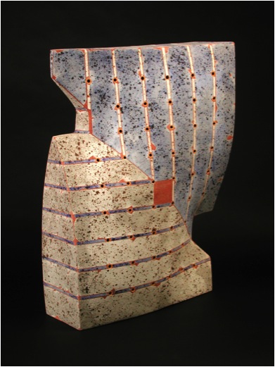
‘With a Twist’ 63x55x30 cms
The modular nature of my wall based work lends itself to large scale and can easily be extended to whole interior or exterior walls. The largest piece so far was 2 x 2 m and was created for an exhibition display for the American company Ann Sacks.
You comment that you get inspiration from the mountainous landscape of your homeland, Austria, how?
My work is biographical and topographical and draws from my early memories of growing up in a particular beautiful mountainous part of Austria. Rather than telling stories and incorporating a narrative I am conveying my feelings and visual impressions in a more abstract way and encourage the spectator to create their own stories and memories. Very often I use the camera as a vehicle to explore my surroundings. Photography is part of my creative process, with the image abstracted, tessellated and integrated into softly undulating ceramic forms. Like photographs my pieces are impressions, “3-D snapshots” that capture moments in time.
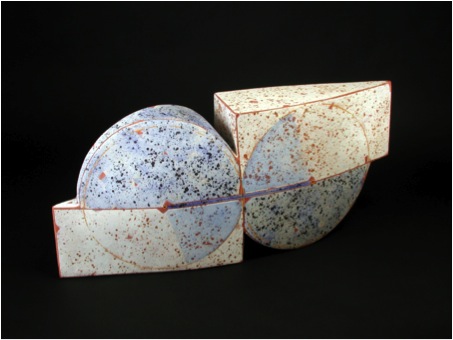
‘Engaged’
You have your work in many UK and international galleries. Can you explain how you have been able to develop this network and also how you keep up with the work load?
I am a member of several professional associations including the British Crafts Council, the British Craft Potters Association and the International Academy of Ceramics. This helps with networking, getting to know key figures in the ceramics world and obtaining important information regarding galleries, exhibition opportunities, competitions etc. I have also always proactively researched and applied to suitable galleries, presented my work at fairs and most recently started a newsletter sent to my contacts on a regular basis. In general I try to “communicate” my work through exhibitions, publications, competitions and taking part in workshops and symposia. In 2011 I demonstrated at the International Ceramic Festival in Aberystwyth, which also has greatly extended my network.
As to the work load it is important to be organised, to plan ahead and to prioritise the most important events. Occasionally I also employed an assistant and had help in the studio from students and interns.
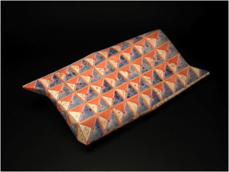
‘Keeping Time’
You have had to develop a way of packing and freighting you work around the world. This would often be a problem that stops other new ceramic artists, can you share some of the secrets?
Shipping is not really a problem. There are now very good online shipping companies available who offer competitive rates all over the world.
The real secret is packing. I had very few breakages over the years. One has to allow for plenty of space around the piece filled with protective fillers like polystyrene. Using double boxes is also very good and in general packed like that the piece will arrive safely and sound.
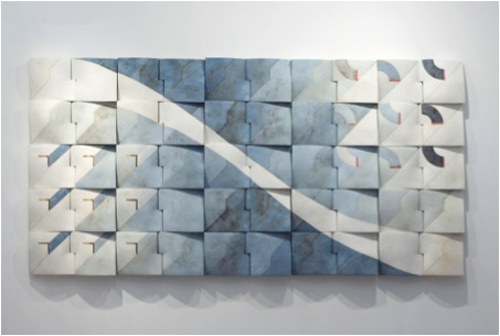
‘Flow’
Your work is in many collections, can you take one or two that have given you particular delight and why?
It gives me great pleasure to know that my work can be found all over the world. Two collections stand out:
One is the private collection in California. Paul F. Dauer is an enthusiastic and knowledgeable collector of British studio ceramics, and I am very proud to be part of this fine collection.
The second one is Museum of Modern Ceramic Art, Gifu, Japan. Two of my ceramic sculptures were added to the collection this year. Created in 2000 the museum focuses on modern ceramic art and aims to represent both functional and non-functional international ceramic art in a beautiful setting, making it to one of the finest ceramic art museum worldwide.
What are you currently working on?
My most exciting project at the moment is designing panels to be included in the art work for a large cruise ship. Apart from developing new designs, patterns and shapes the project also involves working with the architect, managing suppliers and being involved in the whole process right from start, all of which is an exciting new departure.
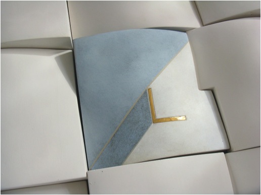
‘Flow’ detail
Contact Details
Regina Heinz, London, UK
Interview by Deborah Blakeley, October, 2013
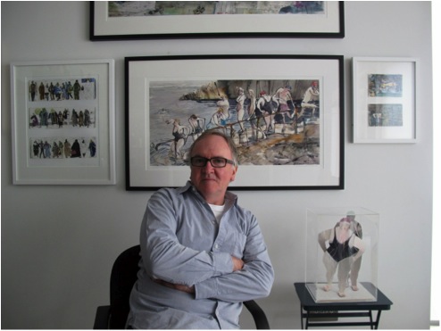
John Short
Sketchbooks are an intricate part of your artwork, can you expand on this?
All through my college years and to date I have used sketchbooks for a variety of functions, the most important one is familiarising myself with the drawing, shapes, foibles and movements of my subjects be they people, birds or animals. I also use them to experiment with arrangements and compositions. In these pages I can experiment with colour and collage. I have always believed that the act of drawing and visualising something means that, however slight, that my idea has become crystallised on paper. That’s really important and I never edit them as the drawings which don’t work out are often the ones that you learn most from. I work with a variety of sizes, shapes and paper surfaces of sketchbooks. They are not regular visual diaries, nor are they meant to be, but places where I record subjects as they unselfconsciously appear in life. At this stage I have many, many volumes and often comb through them for useful fragments in finished paintings back in my studio. I often think of finished paintings as large immediate sketchbook pages.
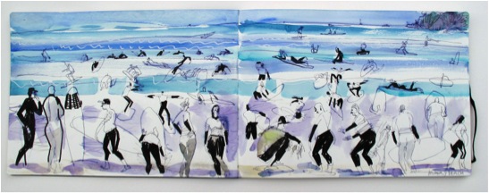
‘Manly Beach’
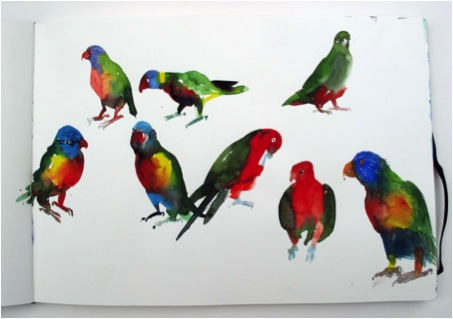
‘Birds'
I also followed a lot of the truly exotic bird life around; a highlight was a flock of pelicans at Noosa in Queensland.
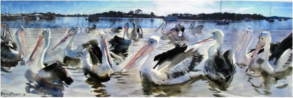
‘Pelicans at Noosa'
Also a series of drawings done during a musical concert in the Hayden Orpheum in Cremorne, a beautifully restored Art Deco movie theatre.
The plan is to return to Australia next July/August to explore and do more now having taken in a lot of potential locations. I bought a beautiful gigantic A3 moleskin watercolour sketchbook in Shanghai which I used specifically for my Australian travels. I also filled a couple of pocket sized sketchbooks.
You have sketchbooks, but what other documentation do you do of your work?
My work methods are fairly simple I will draw my living moving subjects in sketchbooks and use my digital camera for use in recording background locations. Recently I have been working on combining photo transfers (digital images) and ink and watercolour drawings. This has been very interesting technically and I make a lot of use of my camera and colour printer. I have to also keep my website up to date with scanned 2D and photographed 3D works.
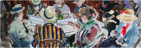
'Bloomsday, Ukelele Band'
When you do your initial sketches composition is high on your agenda. Can you elaborate on how you get such variation of composition?
When I was a student in the Royal College of Art in London I set Sundays aside for visiting galleries and studying composition and colour in paintings. I have always been a big fan of Degas, Hockney, Bruegel, Singer Sergeant, Utamaro and Sydney Nolan to name a few. It helps to study how others construct effective compositions as well as developing and formulating your own.
How do you manage you work load between teaching, travelling, sketching and time in your studio?
I think the answer to that is to combine a lot of these things. My teaching involves a fair bit of travel and I work in cooperation with a colleague, Tom Kelly, who is a highly experienced photographer. We work together teaching image making (includes drawing, illustration, photography) with visual communication students in Dublin Institute of Technology (DIT) and this has involved a lot of location work, regularly in Morocco and China.
Our teaching method includes us producing work on location with the students and followed by a public exhibition of the results of their work and ours. One of the highlights of this practice was a six week location project with our students and students of Shanghai Institute of Visual Arts documenting the gigantic EXPO world fair in China. Otherwise I work in my studio whenever and as much as I can. I’m lucky as I work relatively fast after a lot of preparation and visual research.
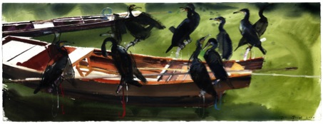
'Cormorants, China'
Place is very important to your work, you get great inspiration while away. Can you discuss how you combine travel and teaching?
As with the recent trip to Australia for me travelling is always inspiring and it’s not difficult to be inspired and inspire students when on locations abroad. It’s easy to forget how influential these field trips can be for students who often use the wealth of visual research material they collect towards other project work on their return. It must be said that for me it’s very interesting seeing what inspires the students on site also. I’m proud to say that the work we do with the students has been described as a showcase for our School of Art and Design in DIT.
‘Moroccan Sketchbook’
Water is in many of your paintings, can you comment on the mirror effect of painting water?
Reflections and wave patterns are lovely things which are fairly difficult to handle. Water changes so much and the effect of reflected light, colour and shadow can be managed if you can control ink and watercolour allowing them to flow and do what they naturally want to do, what I mean is that they are perhaps the most appropriate and subtle media for this subject. Again it helps if you look at how other artists handle water reflections; the American artist John Singer Sergeant for instance did a series of beautiful watery watercolours of boats in Venice. In watercolour, unlike oil painting, it’s easy to see how it is done. It’s incredibly difficult to do it of course but the trick is to make it look effortless.
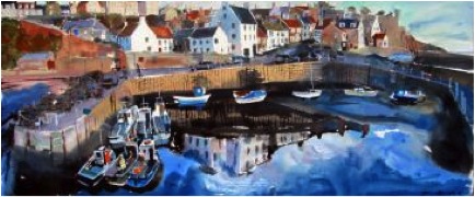
‘Scotland #3’
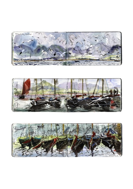
‘West Ireland Sketchbook’
Earlier you had commissions from both newspapers and magazines. How has this work developed the work you do today?
I worked for several years as a freelance illustrator for newspapers and publishers in London and in Dublin and I enjoyed the challenge of each job as they came in. I had no idea what might be asked for subject wise from portraits to editorial, to court room drawings, to food illustrations, to book jackets and posters. It was all very demanding but I certainly learned a lot and was able to successfully work from photo libraries and on site to create material for reproduction. I haven’t done any commissioned illustration for many years now but I still enjoy doing family watercolour portraits as commissions. I certainly could write another article about that whole area.
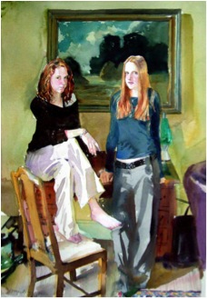
You are the Senior Lecture in Drawing and Image making at the School of Art & Design, at the Dublin Institute of Technology. Can you share one or two pieces of advice that you give your students?
It is all about basics and the basics are the same for Drawing, Illustration, Image making and Photography. It goes without saying that being professional is essential and remembers that the world is endlessly hungry for new and original images and ideas. Make sure that you understand what is required in a brief and anything of yours that your mother likes – tear it up!
Many of your paintings are made into prints can you discuss the decisions that must be made in this process?
A selected and limited amount of my paintings have been successfully reproduced as digital prints, or giclee prints as the process is technically known. It’s a highly faithful reproduction of original artwork which is something that you either like or don’t like however there is no denying the beautiful quality of the printed image. Opinion is clearly divided and some gallery owners and collectors can be very sniffy about them but for me a limited edition print can be much more affordable alternative for a lot of people. The decision to print an edition is something I always discuss with the owner of the original. It is true to say that most sales via the website are prints. To distinguish the original from the print I make a point of reproducing it to a slightly smaller size than the original. They are expensive to produce and you need therefore to consider the edition sizes as well as price. With this kind of printing the print companies charge often by the square centimetre and a once off charge for photographing or scanning.
You do wonderful work capturing the everyday, can you discuss this?
Observing how people move and interact, their body language, their costumes, their shapes and all their imperfections are intensely human and it’s this I find endlessly fascinating and entertaining. In unselfconscious moments people can be very revealing and honest.
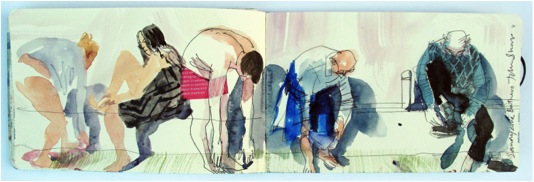
In different locations and cultures the everyday becomes exotic, please discuss?
For me it is like theatre with lives being acted out in similar ways but in different costumes and locations. People do interact and behave in different social ways and have exotic cultures but underneath they are all still people who have their own individual foibles which are unique. Those are the pearls which you have to look for no matter whether you are here looking at bathers in Ireland or Australia, dancers in China or shoppers in Morocco.
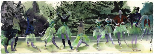
‘Ballet Class in the Park, Shanghai, China’
Discuss the use of current technology in your art?
I am always looking for new ways to change and develop my work, particularly with the technologies available that are developing at a dynamic pace. It’s all highly seductive of course but what you need to understand is that it all has to work for you and your demands. I use digital photography via software and my printer to achieve what I want to do. Right now its photo transfer and combining media in images but I would love to have time to animate drawings, perhaps that is the next thing? I have done some work in 3D drawings and I would like to experiment with some 3D sculptures on a 3D copier.
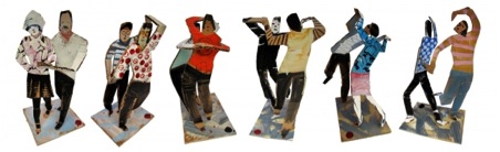
Can we look at Forty Foot: please explain the name?
Nearby to where we live is a public outdoor bathing place where people swim all year round, summer and winter, I guess for all sorts of reasons, mainly health and life affirming but it’s a real local tradition and has quite understandably become something of a tourist attraction. It’s a natural deep rock pool in Dublin bay which, it is said was named after the Highland regiment 40th of foot who were stationed there in a Napoleonic fort in the 19th century, but its origins are fairly obscure.
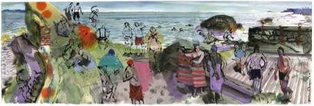
Inspiration?
For a charity fund raising event some years ago I was asked to contribute a few paintings that I put together from sketches I had made of bathers at the Forty Foot. They proved to be very popular and I began to supply prints and more paintings to a local gallery and the combination of my quirky drawings and quirky subjects really struck a cord.
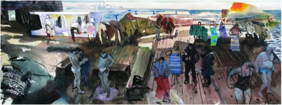
‘Winther Bathers - New Year’
Location?
The specifics of location are really important to my work. They are all places which are accessible and I think that their charm is that aspect and my visions of those places, that’s why I think that the fusion of media with photographic elements and drawing works and is worth developing. After all photographs have a function and drawings have a function in imagery.
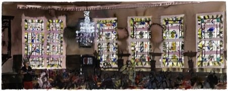
‘Bewleys Café, Dublin, Ireland’
You have also made 3D images can you explain about this work and in particular related to Forty Feet?
I have made a few series of 3D figurative sculptures from packaging card inspired by the simplicity of Picassos’ simple folded card figures. I worked on a series of local bathers and also a series of couples practising ballroom dance moves from a park in Shanghai. This was a new and enjoyable departure from 2D to 3D and as a French friend of mine said, that it must be very interesting for me to walk around my drawings. Working with cheap materials really appealed also, it makes them somehow more honest and to use that word ‘quirky’ again. There is certainly a lot more development work needed on those but so far so good.
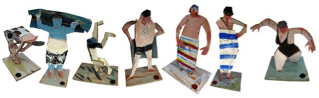
Your aim is for your work to look spontaneous and unplanned but this is not really the case. Please expand on this?
Some time ago I ditched the ubiquitous bouncy castle at one of our son’s birthday parties in favour of having the kids all sit individually for small watercolour portraits, which they all got to take home with them in their goody bags. It really was great fun, it’s a bit of a real party trick actually and at one point as I was painting one of my sitters, I was conscious of a boy watching over my shoulder and nearing completion he called the others through to look and said ‘Wow! It starts of crap and then it’s cool’
Actually sounds like a metaphor for my career.
Otherwise…
Giving the impression of spontaneity is important in my work. Being casual and relaxed certainly helps through much practice and draughtsmanship. Often the quickest seemingly throwaway and most immediate use of materials can often capture more than a few too many strokes. Make it look effortless, controlled and well observed.
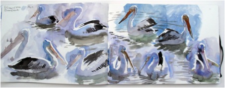
‘Pelicans, Noosa, Australian Sketchbook’
Contact details:
Email: John@johnshort.ie
Website: www.johnshort.ie
John Short, Dublin, Ireland
Interview by Deborah Blakeley, August 2013
Kathy Venter
You use very traditional techniques of hand coiling and pinching in you work, can you elaborate on your technique?
I began hand building by using the coil method. The application of a thick coil of clay around the circumference of the upper edge of the form and then pinching this coil to blend into the clay form below and upwards to extend and resemble the wall below. To follow the outer line of the form more accurately, I later used smaller lozenges of clay pinched into place. I’ve adapted this method to suit the specific challenges of creating figurative life-size work. Unlike many of my contemporaries, I don’t make use of any life casts, moulds into or over, or modelling over an armature. I finish the shaping of the area I built the day before by bending and paddling the wall – then add a new area of rough form above this and repeat the process.
The model poses for me throughout.
Kathy in her studio
Currently you have a huge installation at the Gardiner Museum. Could you tell us about your relationship with the museum? How ‘Life’ came about? The time line you had to prepare for this whole exhibition?
The Gardiner Museum is the largest museum of its kind in Canada and attracts visitors from all over.
The head curator – Dr. Charles Mason visited my studio having an idea in mind for a large scale exhibition which would be a strong and full use of the new space for contemporary ceramics being built onto the Gardiner at that time.
When he saw my work in person he felt this was an answer to the headache of whether a vessel form could ever be referred to as sculpture. The popular theory defined a vessel as any ceramic form enclosing a space – and sculpture not. The popular definition of the vessel as craft is seriously challenged in my art as the hollow clay form created in the making of these sculptures had no practical function and the outside form is obviously sculpture, i.e., fine art. But the technique of pottery making is the fundamental process in creating these works. I have a respect for the basic fundamentals of craft existing in the sculpture of all societies. The argument of art versus craft has traditionally had very little relevance in most societies and I believe that this argument has run its course in the contemporary debate. We have to remember that the work “art” comes from the Greek “ars”, which means craft. So during a period of high art, the best craftsmen were valued. In fact, my sculpture, because of the medium, consistently straddles what could be considered craft and what could be considered fine art. My work has only been exhibited in contemporary fine art galleries.
I had three years to prepare for the show, but this extended into six years because of other commitments for the Gardiner.
As well as the exhibition, there is a beautiful catalogue: can you discuss how this catalogue came about and your involvement in its production?
I had good documentation of all my work and Deon, my artist husband, put the catalogue together with the images relating to the text. The biography was compiled using images of our early life in South Africa as well as our immigration to Canada in 1989 and subsequent exhibitions.
Can you discuss the importance of humanity and community to your work?
'Coup d’oeil #5'
In the installation Coup d’Oeil the subject of our collective humanity and community is most evident. These young women are all friends and have been part of this community for most of their lives. Looking at them grouped in the sculpture they could have lived ten thousand years ago or they could be from our times. My intention is for these figures to have the appearance of life itself, in its own process of coming to be. They’re universal. I take the approach of depicting the living persona, without generalization or objectification. Artists have the freedom to also show the enduring qualities in humanity, the strength within society as well as reveal our spiritual capacity. In this way the themes of our humanity are the visions of our poetic intuition and define our emotions. The human body is a universal for all cultures. Our past is linked to our present and all cultures through our humanity.
Ceramics and Sculpture are both part of your art practice, can you elaborate?
During my years at art school sculpture was my major and ceramics one of my subjects. I loved both and discovering an affinity with clay, I joined them together.
Your work is life size how do you get this to work taking into account shrinkage and breakage during firing?
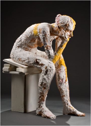
'Even Telling'
I build the figure approximately 15% larger than life size to allow for the shrinkage during drying and firing.
The Salt Spring women: can you discuss your relationship with these women?
Also your relationship with the tribal children in the Ciskei region ? Inspiration, location and artistic issues?
Using models of young women, from my community in the transition stage between child and womanhood, I could draw inspiration from my visual knowledge of the same stage of development in the tribal, Xhosa society in my area of the Eastern Cape in South Africa. There is a duality in the human form at this stage, sometimes both child and adult are evident, then again, only one or the other. In the Hogsback near our hometown of Alice in the Republic of the Ciskei I encountered children who made tiny figures of kudu and wild boar. Their sculptures were an immediate response to the primary experience of life there, with no exterior or learned referencing. About seventeen children supported their village by making these small clay images of animals. Walter Batiss, a local professor of art and painter, gifted some of these to Picasso who admired and collected them. Even if these sculptures were made on site with no knowledge of what art is, or potentially can be, these sculptures are high art and ultimately spontaneous. These children are creating forms in response to their own cultural matrix and yet they can be understood by all cultures. These sculptures are an unselfconscious response to life, part of a live culture. For these children mystical realism and mythology is not separate from daily life. There is no dividing line.
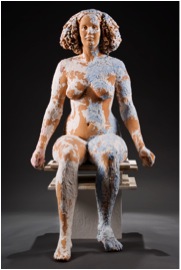
'Present Elements'
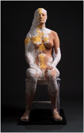
'Here and Here'
The use of the veil – how does this relate to reveal and conceal?
Metanarrative is a story within a story – I use it as a personal idiom suspended on the grid of an ancient tale or legend. In this work I use myth as the symbol of existence, of life itself and its essential meaning beyond the contingent occurrence of events.
The veiled woman is in stasis, the powerful emblems of national strength crumbling around her, unable to interpret the metaphor of rebirth and promise lying at her feet in the form of the infant child. The baby represents the woman’s progeny, our progeny, and is an embodiment of the future.
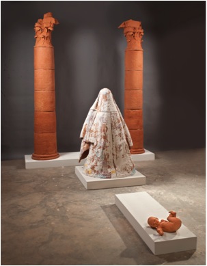
‘Metanarrative’
In complete contrast with the rest, this form is small, fragile, organic, moving, reaching outward. As a reconstruction of an idea of civilization Metanarrative suggests we conceive of cultural or historical values as constructs just as this scene is a construct that merges human figures with architectonic elements. More important, as personified by the child, is the living heritage we pass on, and a living culture, no matter how fragile or young. Any cultural dialogue, this sculptural installation Metanarrative implies, is a living dialogue with eternity.
Can you discuss ‘Woman Drawing’ and how this evolved?
This sculpture builds a narrative using the physical communication between two figures. It is a metaphor for the process of making art – the reality of experience. The woman drawing is on her knees in front of the subject – the position describes the subjective attitude – an essential part of making an image of the live model – a reverence for the magnificence, complexity and diversity of the human form. Within this, there is no space for preconceived ideas or visual clichés on the part of the drawer – there is only receptive, careful observation and a delight in the resulting discoveries. In face of this – both figures are nude, exposed, one physically and the other intellectually. The dynamic tension, implicit in the way these two women interact, is defined by the self-assured confidence and passivity of the observed and the tight, energetic form of the observer.
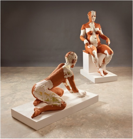
‘Woman Drawing’
The immersion Series presents figures floating in suspended space. Discuss the inspiration for this series?
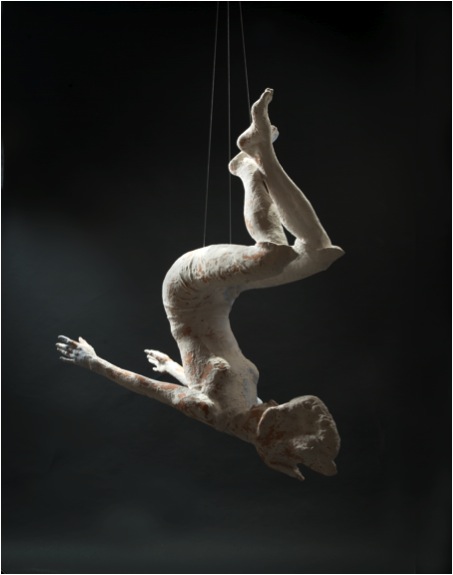
‘Immersion #15’
These sculptures are made from studies of my models underwater. Water refers to another dimension, an altered state of consciousness.
Figures in water react differently to sound, light, gravity, and movement. The human experience under water is cocoon-like – as if transformed back to the womb and in a private world of its own. The effect of gravity on the figure is diminished; there is free movement of the limbs and evidence of pressure from the surrounding water on clothing, hair and face
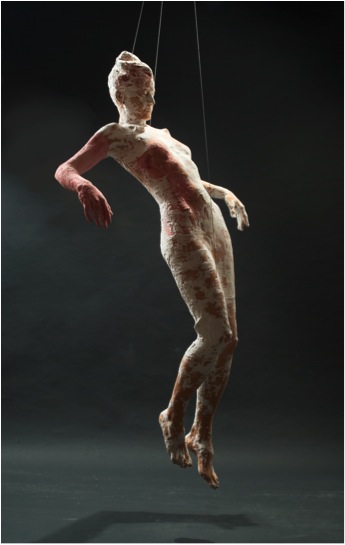
‘Immersion #17’
Suspended by cables in space the sculptures can be viewed from all angles – including underneath – freeing the work from the traditional pedestal, form, mass and weight of grounded sculpture.
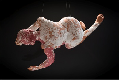
‘Immersion #14’
Your art is influenced by many ancient works discuss the importance for you to look back to be able to move forward?
Whether in installation, performance, or sculpture, or any one of the many forms conceptual art takes, many artists today, including myself, believe that our rich visual heritage is a good source for reintroducing and advancing the language of art. From the dawn of time there has been the narrative: by the Shaman, by the Egyptian artists, the Chinese and European artists to tell their stories and to engage fully in the religious and spiritual world. I am adherent to the philosophy that the well-made object, by the artist, has an intrinsic value and is the preferred method for extending the language of art. In the process of making the sculpture – new things are discovered. This growth and transference cannot be accomplished by an intermediary. We often, now, search for inspiration in obscure influences rather than re-evaluating the accomplished examples achieved in the great periods of classical Rome, Egypt, Greece, the European Renaissance, and the Sung Dynasty in China. I understand that the past and present are always in flux. There are two ways of reconstructing the past – that of intuitively and mythically aims to define our emotions and experiences in view of the eternal concepts in ancient art. I walk a fine line between tradition and contemporaneity, I don’t re-create forms from the past, instead I reinvent and rephrase them using models from my own community on Salt Spring Island, British Columbia.
Is there a definite thread that connects you series?
Yes. The thread which connects all the series could best be described as “Metanarrative” because the five series have their initial concepts drawn from the great stories of our humanity, stories of myth, religion, ritual, and legend. At the same time these sculptures are equally derived from my immediate surroundings and experiences on Salt Spring Island. I am creating a story within a story so to speak. I’m rethinking how to tell the stories of today without overlooking the rich visual and conceptual history of the past.
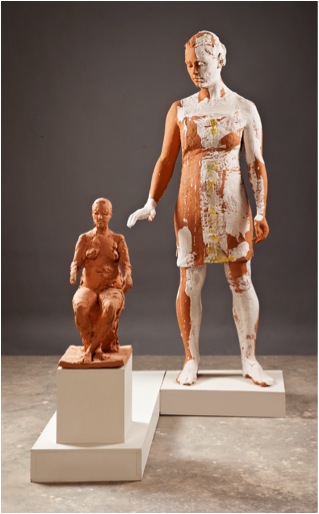
‘Girl with Maquette Pan’
Can you explain the importance of your initial training in South Africa?
My art training began with one year of drawing. After this I chose sculpture as my major and ceramics as one of my subjects for my MFA. My ceramics lecturer, Hylton Nel, would show me a Chinese sculpture or bowl and simply say “look at this.” The language of art is visual. He taught me to build on that. Hylton was very connected and eclectic. There was always this excitement of discovery about him.
I watched the apparatus of state at a point of collapse. That is why I sought an even balance between beauty and truth. I needed to think that way in the studio in contrast to what I was experiencing out there in life. As a South African the issues of the day have influenced my artwork more than contemporary sculpture has. The experiential knowledge of living with such violence, poverty and suppression has and will always inform my artwork. It afforded my work a respect for context and truth and my work is different from my peers as a result.
As a child you were interested in ballet, do you think this was the initial link with your interest in the human body and the movement of the body to your work?
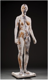
‘Batavia’
It’s the same thing, whether it is focusing and developing the movement of my human body or the clay figurative form to describe an attitude or tell a story, I learned through both disciplines the eloquence of the body and how receptive we are to interpreting even the smallest movement or positioning of the head or hand and, in antithesis, how responsive we are to weak, insincere or superficial rendering of the figurative form. The most important, early, lesson I learned from ballet was discipline itself. Staying with the idea and honing it for years until it says a little of the depth I see in nature.
How do you title your work?
These come from places in my past that I have loved or have been important to me in some way. They could be words lifted out of books I’ve read, concepts about the subject/content, or references to ancient political systems.
You have been very lucky with the beautiful catalogue – do you personally document your work?
Thank you. The photography of the artwork for the catalogue was done by a fellow islander – David Borrowman – and the rest were taken by Deon.
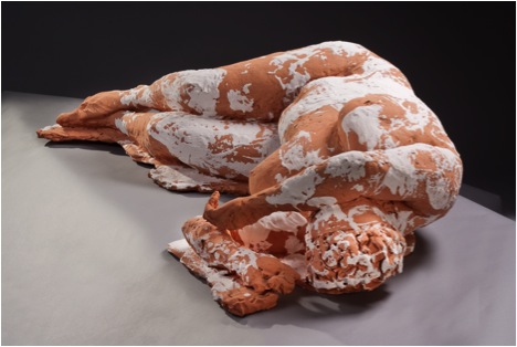
‘Tokai’
How important do you think it is for an artist’s actual daily feelings about their work to be documented for history?
My own daily feelings are irrelevant to my work and haven’t been influential, because, in the studio, there is no mystery of heightened awareness – only work and thought. There is the participation in the life of the subject, a view of the collective through the singular, within the silent dialogue between the model and myself. There is an ancient discipline of creating an artwork between artist and model and it is one which can never be fully explored, in face of the limitless diversity of the human form and psyche. The individual, her presence and attitude are life affirming. I also don’t think of my work in terms of individual, completed pieces. The ideas in one work will flow over into the next and inform the development there. All my work is one process that will never reach completion. It is this process that interests me. I’m satisfied with that.
Can you discuss one of your much earlier works ‘Renata’ 1997 and the progression of you work?
The model for this sculpture was a transient young woman from the Czech Republic. She seemed to feed her mind only, not her body. She would save every penny, sleep in the bush, bathe in the lake, then buy expensive tickets to the opera. She embodied the resilience of her country, such a desire for cultural development in spite of difficult circumstances, and the lack of funds to support it. I admire her combination of strength in frailty. I choose models who embody qualities that are often overlooked in our fast paced culture. Character and intrinsic beauty is deep seated and it is a thrill to find where this is visible in the body of the person I’m looking at.
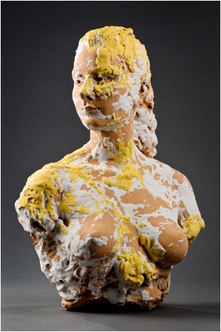
‘Only Now’
On a more simple level, can you discuss your studio space and what you require technically?
Deon and I each have a beautiful studio space. I don’t require much room for working in clay – but there is a good deal of equipment such as kiln, sand-blasting booth, compressor, dust extractor, fans, benches, banding wheels, boxes of clay, bags of sand and a hydraulic lift.
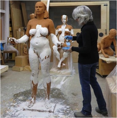
‘Kathy in her studio’
You have very good contact with curators, gallery directors and museum directors. Can you give some insight into how you have fostered these connections?
I was very fortunate to win the eye and support of Dr. Charles Mason. He has shown so much enthusiasm and respect for my work and, although he is no longer with the Gardiner Museum, this support together with countless months of assistance, support and advice from Deon, has led to the success of the exhibition Life and its future travels to other museums.
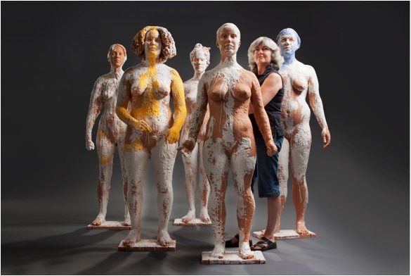
Kathy with 'Coup d’Oeil
’
Contact Details:
Website: www.kathyventer.com
Email: dkventer@gmail.com
23 – 315 Upper Ganges Rd.,
Salt Spring Island, B.C.
V8K 2X4
Canada
Kathy Venter, Salt Spring Island, Canada
Interview by Deborah Blakeley, September, 2013
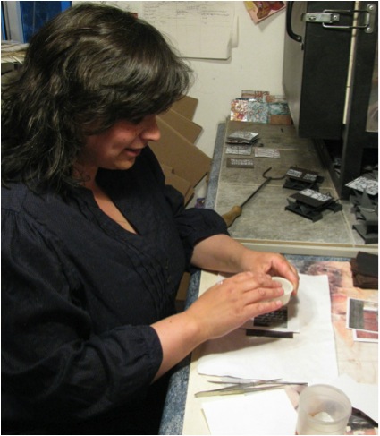
Janine Partington
How did you initially become involved in enamel work?
It was after the birth of my second child. I wanted to get out of the house for an evening a week. My husband Matthew was working with Elizabeth Turrell at the University of West of England, UK. Elizabeth is an internationally renowned enameller and he had done some workshops with her. Matthew thought that I might like to try enamelling too and there was an evening class at our local school of art and design which unusually specialised in making panels. I tried it and fell in love almost at first try – I think it’s the immediacy of it and the quickness of the process.
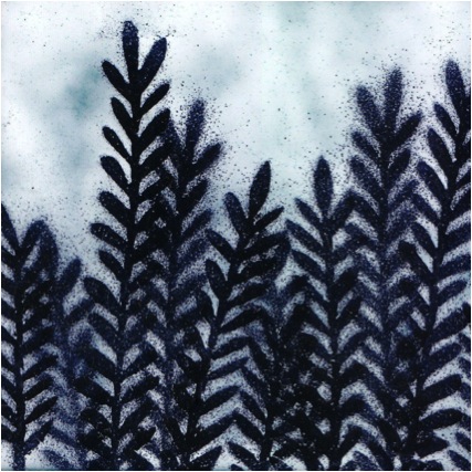
Can you briefly explain what is involved in making an enamel piece?
Enamelling is the art of fusing glass on to metal. I create intricate hand-cut stencils that I then lay on to a copper.
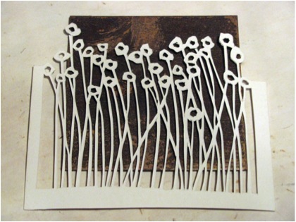
Placing the stencil
My stencils are inspired by trees, flowers, seed-heads and the landscape.
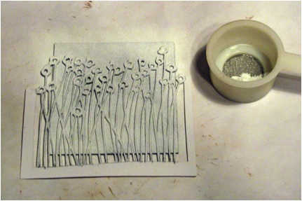
Shifting over Stencil
After sifting the powdered enamel over the stencil, the stencil is lifted and the panel is placed in a kiln at around 800 degrees for a minute or so. Firings are short, and repeated depending on how many colours I am using.
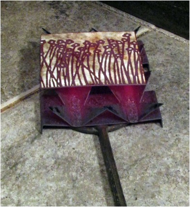
First firing
Can you discuss the commission you had in 2012 for Frenchay Hospital NHS Trust, in Bristol?
I believe it is unusual for a commission in a public space such as a hospital not to involve tenders or workshops with staff or patients, but I was invited to make a piece for an interior exterior courtyard and given free reign. I was inspired by the leaves that had blown into the courtyard from the outside of the building, and took the leaf shapes and related seeds and cones etc and supersized them for the large wall. The pieces were waterjet cut for me by Swansea University and then I enamelled the pieces in my kiln. I made the pieces so that they were the largest size that would fit in my kiln. I chose the copper coloured images so that they would reflect the light during the course of the day.
Shape is very important to your work, can you expand on that?
I am definitely interested in form and design as much as, if not more than, the process I use. Many enamellers will talk to you about the chemical composition of the enamel, the temperature, high firing etc, but I am all about the design. I do like to use the copper surface of the panel in my designs, and include this in my still life and fragments of landscape series as well as the my ever popular copper series, but I also like the very graphic nature of the images I create when using black and white in my monochrome series. I don’t really think about shape and line when I am drawing a new design, I think it’s just how I draw.
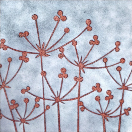
‘Seedheads’
You have a large collection of cards with your designs, how did this section of your work come about?
This came about by chance. I have been selling cards for a number of years that I make by printing off images and sticking them down in the evenings at shows. They are inexpensive and sell well. The collection that is sold through Almanac cards was brokered by an online gallery that had been selling my work. No formal agreement was made for them to become my agents, it just sort of happened. I’m pleased with how the cards have sold – they are my designs, but the foils they have used and format of the cards is entirely created by the card company with no input from me. I am increasingly meeting people who have purchased these cards and more and more come to me to buy original panels. So it’s a great way of promoting my work. However, I do not sell the cards myself preferring to continue with my inexpensive range which I only sell at shows.
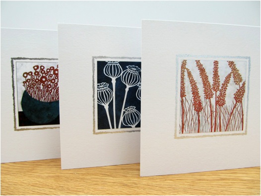
Discuss how you use nature for inspiration by reducing the known to an abstract form?
My designs vary from the fairly accurate to the very abstracted and imagined. I don’t make a conscious decision as to how I create a new design, I just start drawing. It depends on my mood and what I am doing at the time.
Glimpses 11’
How important has the relationships you have with your galleries been to having your craft seen as art?
I am not sure that my work is seen as art. I struggle to get my work included in art fairs, though many galleries in the UK do have a mixture of art and craft. I don’t really like the distinction as I’d rather think of all art and craft as simply things that are made. Whilst on my website I do refer to myself as an Enamel Artist, I actually refer to myself in everyday life as a ‘maker’ and if I am asked what I do for a living I simply say ‘I make things’.
In 2009 you were elected a full member of the British Society of Enamellers - can you explain both the process and the importance of this membership?
It’s always good to be a member of groups and associations, and I was very happy to be elected a member of the BSOE. However, if I am honest I do not take an active part in this association. I am also a member of the Guild of Enamellers who hold AGMs which combine with skills workshops and I have been to several of these. My most important membership has been The Devon Guild of Craftsmen. This is one of the best craft guilds in the UK and has a purpose built gallery space as well as a large shop and café. I have had mini solo exhibitions there and taken part in many themed exhibitions that have contributed to changes in my work. For example, I created a panel with cups for an exhibition called ‘Cup’ and out of the success of that panel I have created a whole series of Still Life panels. I also made my standing figures for the first time for a Christmas exhibition there.
Your monochrome series is beautiful in its simplicity, please discuss?
I like the very graphic nature of the monochrome palette. Using the same imagery as my copper series, the tone of the piece can be entirely different when created in monochrome. These pieces do not have the ‘life’ of a copper panel, but they do have a very striking presence.
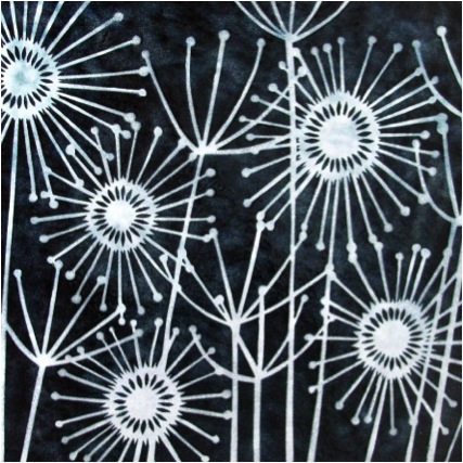
Fragment of Landscape series introduces colour - can you expand on this?
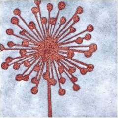
When I started enamelling I was making panels which might be six or seven firings of eight or ten colours. When I was trying to put together a collection to get into shops and galleries I pared down my colour palette to copper and white and black and white. Whilst I still use a very limited palette I have re-introduced red, blue and green with the Fragments of Landscape and Still Life series.
I am slowly re-introducing yellow at the moment. I have always loved colour and so it was bound to creep back in eventually.
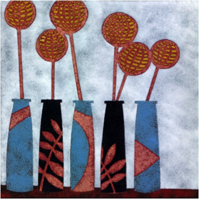
‘Still Life with Yellow’
Standing figures - when and how did these come about?
The standing figures came out of need to do something a bit different. Every year I try to think of something new to show in exhibitions and in craft fairs so that the customers who see my work year on year see some development and there is something new to engage them. I did these for a Christmas exhibition at the Devon Guild of Craftsmen.
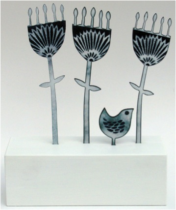
‘Among the Flowers’
How did you come to work with this technique and what have you learnt from doing it?
Since 2010 I have become increasingly interested in one aspect of the process of my main practice – the stencils that I use to transfer my designs from the drawing board to my enamel panels.
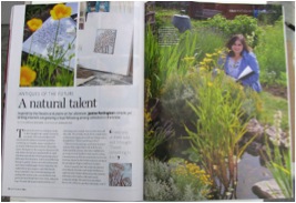
Following a photo shoot of my enamel studio in 2010 for BBC Homes & Antiques magazine, I spent some time examining the preliminary photographs taken of my stencils piled together, as they generally are in my workspace. I realised that one of the most pleasurable parts of my artistic practice was the hand-cutting of these stencils and was fascinated by the layering of the pieces. Consequently I have begun to explore this hand-cutting in more detail using both abstracted and natural images to highlight the play that can be had from the revealing and obscuring of parts of different layers and the building up of textures that this creates. I will be continuing to explore these relationships through hand-cut paper cuts over the coming months and years alongside my usual studio practice. However, I do not do many paper-cuts as time is seldom permitting.
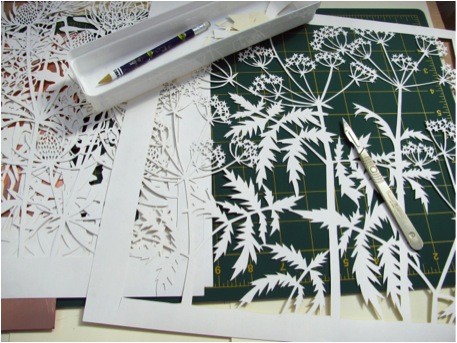
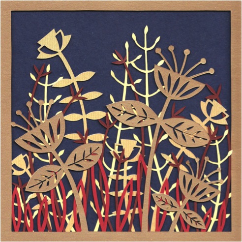
‘Golden Series – Golden Flowers’
Exhibition is a very important part of your work, how and where do you exhibit?
Galleries and shops are very important to the sale of my work. Not only are they the biggest sales tool I have, they also promote my work so that when I have the opportunity to make direct sales through craft fairs and online my work is not an unknown. I would say that 85% or so of my direct sales are made to people who have seen my work previously or have purchased previously. I get a lot of people who will purchase my work at an exhibition and then decide they want more and come directly to me.
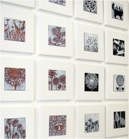
When I started out I would apply to a few galleries to get my work out there. Now, I am usually approached by a new shop/gallery. I am sometimes asked to take part in solo or group shows, but I still apply for many of these as well as craft fairs. Some shows I get to take part in year upon year, some I can never get into. Whilst I am doing well, any rejection is always hard to take. I often use exhibitions as an opportunity to try something new. But then also many galleries want what they know will sell, so there is always a degree of compromise.
Contact details.
mail@janinepartington.co.uk/
www.janinepartington.co.uk/
07742 740642
Janine Partington, Bristol, UK
Interview by Deborah Blakeley, September, 2013
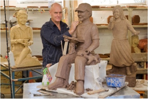
Graeme Foote
The very first career change was from large to small, stone masonry to jewellery and silversmith, what brought about this change?
In 1967 I became an apprentice stonemason, I learnt a lot of skills but I wasn’t making any sculptures most of the work was focused on the domestic market or very plain gravestones, so changed direction and got an apprenticeship with renowned Finish Silversmith and Jeweller Tor Schvank and became a jeweller and silversmith I got the opportunity of making fine silver sculptures.
A large part of your career was with Angela Foote in establishing “Gargoyles and Dragons”. This was a move that related to the times. Can you explain about the 1980’s and Australians fascination with Federation and your role in this?
My wife, Angela, and I were renovating an Edwardian Home and could not get a terra cotta dragon for the roof of our home, so I set about learning to make them. Once I had successfully put our first dragon on the roof I was approached by builders and home renovators to make them a dragon. We moved house and started another renovation project and could not get any terra cotta finials or ridges to match our roof, so I set about to make some myself, this did take quite a bit of developing till I was happy with the end product, this opened a floodgate of orders from builders and tilers throughout Australia, and all of a sudden the Terra Cotta work was taking over from the jewellery. Angela and I decided to start up ‘Gargoyles and Dragons’ together in a fulltime capacity, which grew to us employing up to 6 staff at a time. Four years ago I sold this business to one of my long time employees so that I could focus on my artwork fulltime. I am very proud of the contribution we made to the restoration of Federation Homes around Australia with the introduction of our terra cotta building products, allowing our heritage to continue for future generations in it is true glory.
Is your current work usually based on a theme? Why do you find this works so well for you?
My current artwork over the last 10 years has been based on the human body with a focus towards humanity and love, as I see a need for more of both in the world at the moment, I see my work as a social conscience and hopefully reminding and enlightening the viewer to stop and think more.
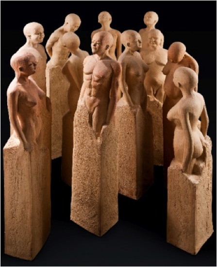
‘Humanity’’
How far ahead do you need to prepare?
I am always thinking of new ways to take my art and would generally be working on the next two years of exhibitions.
Your current exhibition is based on books can you expand on this?

Hawthorn Studio & Gallery,
635 Burwood Road,
Hawthorn East Victoria Australia
My current exhibition ‘Book Memories’ came about after my previous exhibition ‘Humanity’ which was looking towards the future and how we all need to work together, from there I thought on how I got to that point? After much reflection I realized it was though the books I had read in the past, so I wrote down the books that had inspired me over my life and was able to see a path from the past to current time. I then wanted to portray the books of most significance and bring them to life; the exhibition is a tribute to the authors of the books and the power of the word.
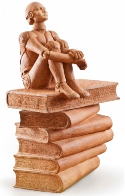
'Robot Versions'
One of your other series was "6 Influential Australian Women". Can you explain the logistics of this series?
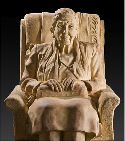
'Dame Elisabeth Murdoch'
This exhibition came about through my mother who made the statement to me one day about how she felt invisible as a woman in society and on the street once she was over 50 years old. I then researched sculptures of woman in Melbourne and found there was very few, most portrait sculptures were of sportsman, war hero’s, explorers and pioneers. I then thought how many women were just as strong role models but were given no recognition with a sculpture in society.
How did you choose the 6 women?
I then thought of current women who were great positive role models in our current society and came up with my top 6. I approached each of these ladies who all agreed to meet and sit for me to sculpt life size sculptures in stoneware of them.
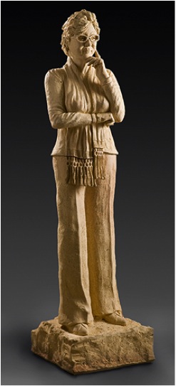
‘Janet Holmes à Court’
All 6 women had given their valuable time to help humanity in various ways, I found them to be selfless, good people that society could all learn from.
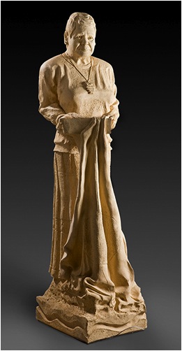
‘Lowija (Lois) O’Donohue’
The women sculpted were Dame Elisabeth Murdoch, Janet Holmes a Court, Lowija (Lois) O’Donohue, Jeanne Pratt, Stephanie Alexander & Christine Nixon.
I chose to sculpt them in relaxed poses.
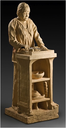
‘Stephanie Alexander’
Editor’s note:
Dame Elisabeth Joy Murdoch AC DBE 1909 – 2012, was an Australian philanthropist.
Janet Holmes à Court, AC, 1943 is an Australian businesswoman,
Lowitja "Lois" O'Donoghue, AC, CBE, DSG 1932 is an Aboriginal Australian retired public administrator.
Jeanne Pratt, Victorian of the Year 2013, philanthropist.
Stephanie Ann Alexander OAM is an Australian cook, restaurateur and food writer,
Christine Nixon 1953 was the Chief Commissioner of Victoria Police 2001- 2009.
You do commissions, how do these fit into your timetable?
I always make time for private commissions, as I love the sharing of ideas between myself and the client to form a new artwork and often in a direction that I may never have experienced; it is exciting to have a stranger share their thoughts and ideas.
Your studio is at the rear of your Gallery. Can you take us into the studio and discuss some of the special equipment and spaces your art needs?
As most of my art practice is large sculptures that dictate the layout and equipment that I need, starting with my most loved hydraulic lift table, which saves my knees and enables me to move large pieces on to other trolleys of different heights. From the studio I can move pieces over to the fork lift to load them into the kiln. The kiln is a large trolley kiln that I built with my son, Ryan.
Another interesting technique is a combination of ceramics and resin. Can you expand on this work?
I really like using other mediums with ceramic. I have been embedding some of my ceramic artwork in resin which gives the artwork another dimension, it gives the illusion of looking into water or ice and the sculpture is distorted so that you have to study the piece to see into it, the resin carries light and colour into the sculpture.
What technical improvements have happened since the 1970’s and how have these changed your work?
My ceramic practice is different to many ceramicists as I start with a large built up block of clay and then carve into the block, I think this technique comes from my stonemasonry background. I carve a shape then hollow out the sculpture then finish the detail. Carving tools are still mainly wooden tools which are similar tools that have been used for hundreds of years. The only improvement in recent years has been the hydraulic lifting equipment now available.
Contact Details:
www.graemefoote.com
www.hawthornstudiogallery.com.au
Graeme Foote, Melbourne, Australia.
Interview by Deborah Blakeley, August, 2013