
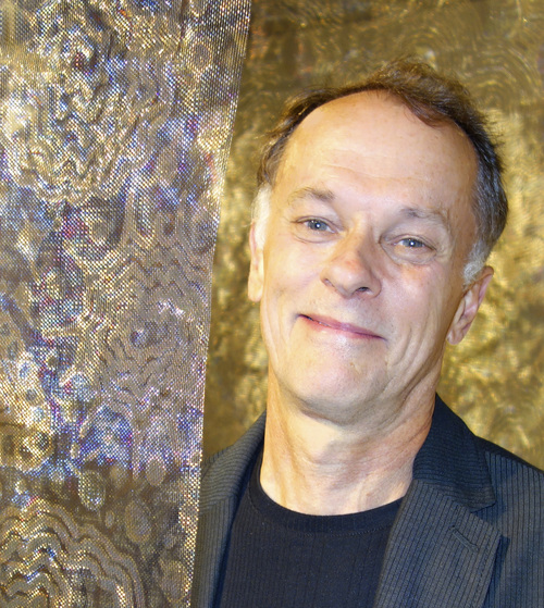
Lanny Bergner
When do you decide which of your work will be large pieces or installation pieces?
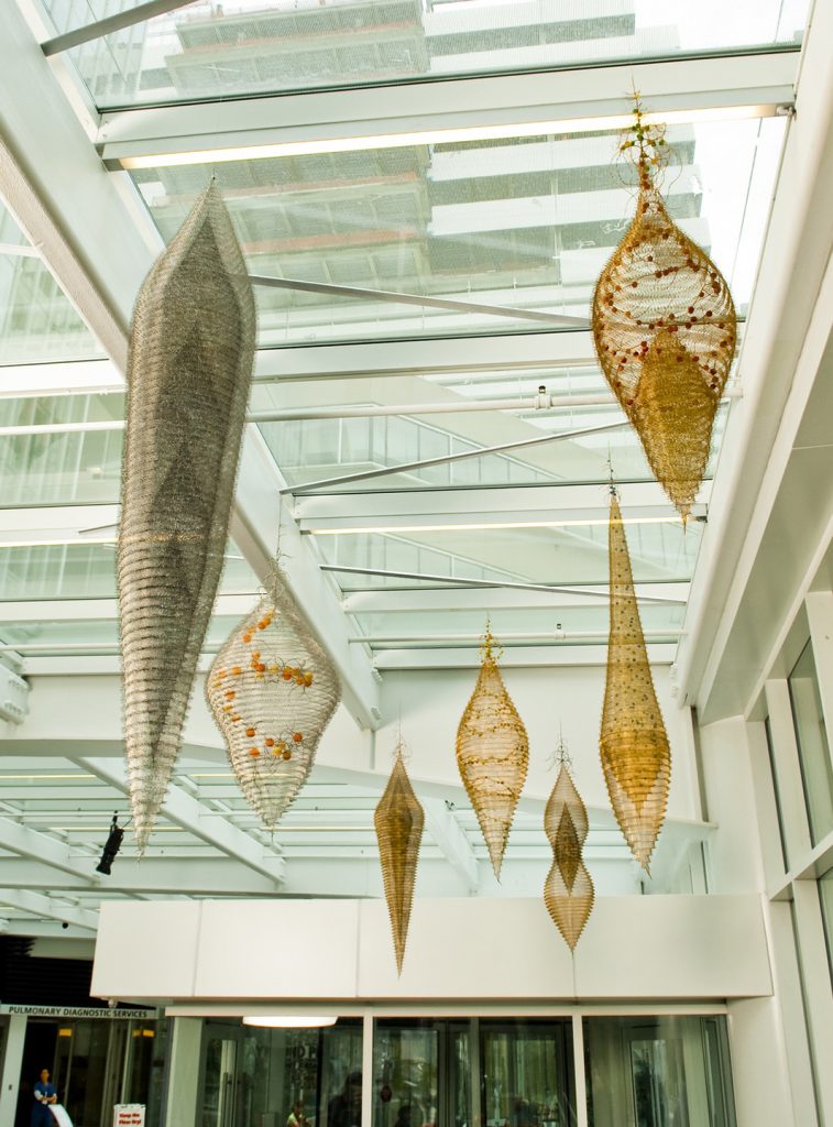
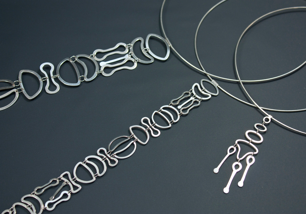
This varies depending on the exhibition venue. Sometimes I will do site-specific installations that are made for a particular space. At times I will do a series of small individual works, but given the opportunity I will turn them into an installation. This began long ago when I first started making suspended mesh works. I found that they could have a singular presence and they could also visually interact with one another. The Perelman installation is a good example of that.
‘Perelman’ –Installation
Can you discuss the work and technique you used in your installation of suspended mesh at the Perelman Centre for advanced medicine?
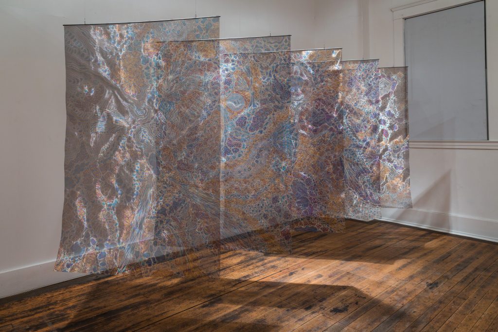
The seven suspended pieces at the Perelman Centre were made as individual sculptures, but installed as an installation. The Perelman is a healthcare facility so the feeling I wanted the installation to invoke was one of healing and peacefulness.
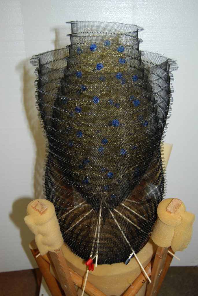
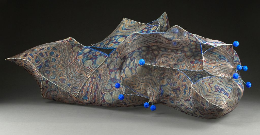
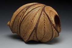
Twisting the frayed edges of long strips of aluminium, stainless steel and bronze mesh together with flat-nose pliers is how the pieces are made. They are all done in a spiral formation. Some of the pieces have loose frayed brass wire inside and/or vine-like stands of wire and tiny balls of glass frit and silicone. I exhibited some of the Perelman pieces before in an installation I did at SOFA Chicago (Sculptural Objects and Functional Art).
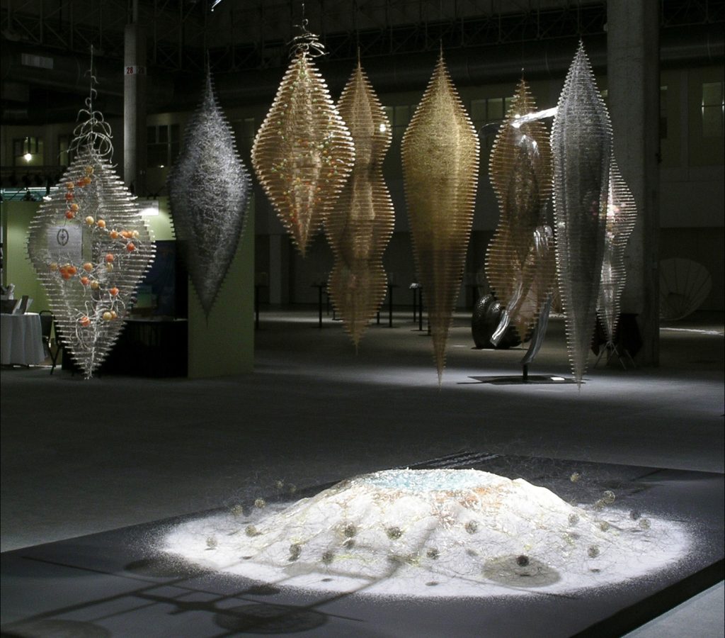
SOFA Chicago Installation: ‘Ground Swell’
You have work represented in Art in Embassies Program discuss the work and where it is?
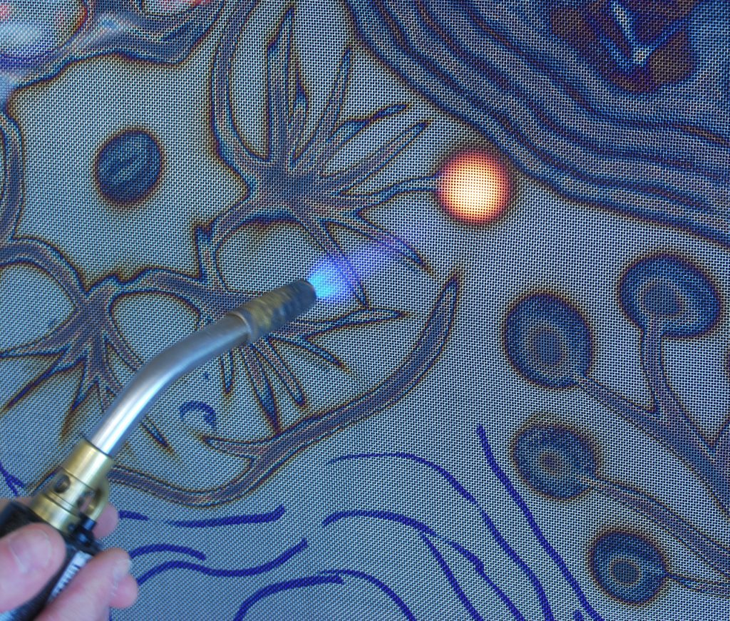
“Primordial Vessel” is the piece being exhibited in the Art in Embassies Program. The painting/drawing on the mesh is created by flame-treating stainless steel mesh with a propane torch. It is being exhibited as part of a basketry exhibition at the US Ambassador’s residence in Tirana, Albania and will remain on view for the three-year term of the Ambassador’s appointment.
‘Primordial’
Can you expand on contemporary basketry and how it is being accepted in the current art world?
It is well accepted in the fibre art and craft world, but to a lesser extent by the “fine art” world. Basketry is pretty much a subgroup in the fibre arts, but it does have its own group of collectors and exhibition venues. There are overlaps of course and many times basketry is shown in broader fibre venues. Basketry has a long ancient tradition behind it and now artists and basket makers are using contemporary materials to create works. I came to the basketry arts by serendipity through sculpture (that is my formal university education) having received a BFA and MFA in sculpture. I believe this has given me a degree of freedom in my approach to basketry and art making. The basketry world has been embracing of artists who push out the boundaries of the medium and explore new approaches. There is much more cross fertilization going on in the art world today with contemporary artist using techniques and materials once confined to the fibre and basketry arts. This intermingling is healthy for all the arts.
Can you discuss the use of one district colour or colour group in your work?
‘Ocean Deep’
Lets take “blue.” This happens to be one of my favourite colours and as it turns out, blue is one of the two main colours I can create while torch treating stainless steel mesh. The other is light to dark amber with the dark end almost a burgundy. So, these colours by default have become the main palette for the “flame painted” imagery on the mesh.
Flame painting
Explain the materials you use and how modern materials continue to fascinate and become part of your current work?
My primary material is metal mesh. I started out using common aluminium insect screening that I could buy at a hardware store. Now, I primarily work with stainless steel mesh. Stainless steel mesh is much more versatile for me because it comes in so many different gage and grid spacing types. This means I can work on a larger scale and create different types of forms depending on the mesh I selected.
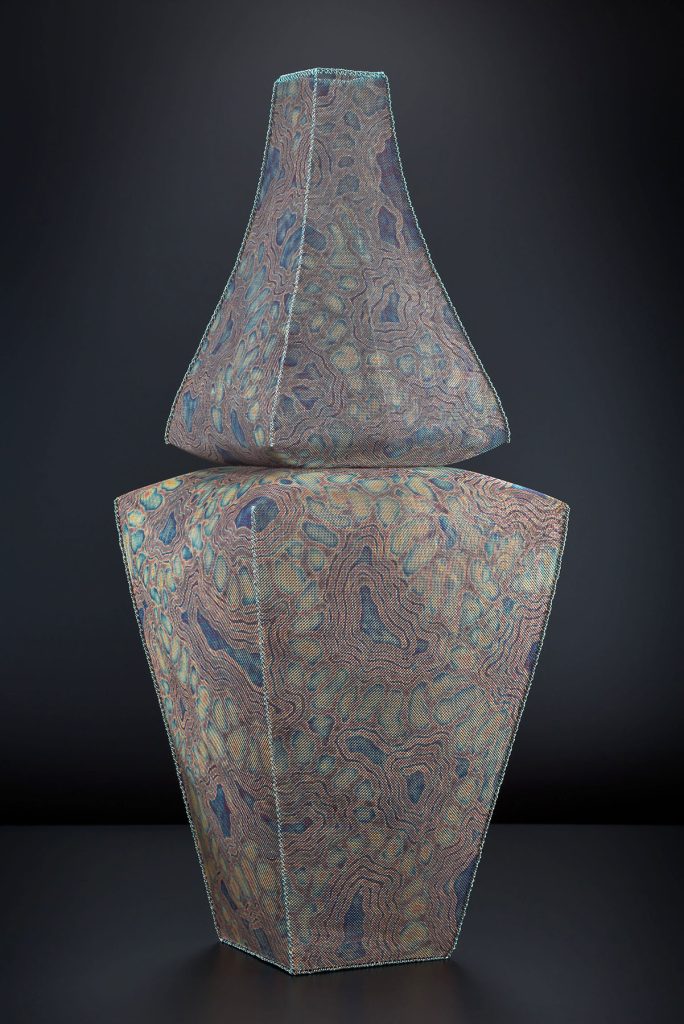
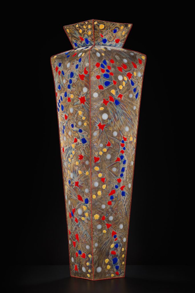
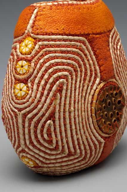
‘Celestial Vessel #8
I sort of accidentally come upon a material and then it gradually works its way into my artwork. That is what happened with silicone. I first used it as glue and then I began using it for visual effects. The most recent evolution of my use of silicone is mixing it with powdered pigment and then pressing it through the mesh and letting it dry. This has allowed me to add more colour to my work.
Detail of ‘Celestial Vessel #8
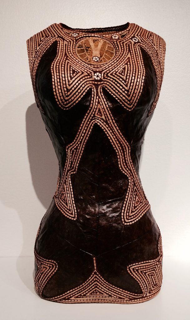
Explain how you work, where one piece is within another?
‘Blue Eliexer’
Several of my suspended “Pods” have interior elements. I first make the bottom half of the exterior casing. Then I make the lower portion of the interior form. When that form is high enough I attach it to the exterior casing. Then I bring the two forms up together and finally attach the two near the top of the piece. This is how “Blue Elixir” was made.
How important is lighting to the display of your work?
In some cases lighting can be very important. For installations I use lighting for dramatic effect and to bring out certain qualities of the mesh. In my “Primordial Muse” installation at the Whatcom Museum in Bellingham, Washington I worked with the exhibition designer to create a mysterious dimly lit display. We were able to highlight the shimmering blue light reflective quality of the mesh, making them appear almost like sheets of ice.
‘Primordial Muse’ –Whatcom Installation
Discuss your work ‘Life in the Universe’…
Inspiration?
‘Life in the Universe’
The initial inspiration came from a book documenting the monographs of radiolarians by 19th century naturalist, Ernst Haeckel. The book “Art Forms from the Ocean” was a jumping off point for the imagery. The first body of work inspired by the book was the “Primordial Muse” screens. Further development of the imagery resulted in the larger “Life in the Universe” screens. These represent my musings on the infinite variety of life forms that must make up the universe. When I exhibit “Life in the Universe” or “Primordial Muse” I like to present them so the viewer can traverse the screens, as if they are being enveloped in the imagery. Colour? The colours range between grey, amber and blue. This is the range of colour I can achieve with direct torch burning on the mesh. How fast and close I run the flame over the mesh determine the colour and tone.
Technique?
The screens are torch treated using a propane torch. So, the flame is what creates the painting/drawing on the mesh. I did not do any preliminary drawing or use any templates to produce the imagery.
Size?
Each screen is 183 cm in height x 122 cm in width. I exhibited them with about a 50 cm space between the screens parallel to one another and set at a diagonal orientation to the wall. That way the screens partially overlap one another. Location? I exhibited them at the Anchor Art Space in Anacortes, WA and at Snyderman-Works Galleries in Philadelphia, PA. A single companion screen from the series is permanently installed at Emory Healthcare, St. Joseph’s Cardiology Clinic in Atlanta, GA.
How do you organize the hanging?
I let the room and lighting arrangement determine some of the parameters of the hanging. I’m not particularly interested in what particular order the screens are hung in.
Take three pieces of very different sizes and expand on them in relationship to size.
“Terra Un-firma” is a small piece made out of frayed charcoal aluminium mesh, various pins with coloured heads and some recycled ground plastic used for sandblasting. It fits in the palm of your hand and has a miniature asteroid-like appearance. The piece evokes a sense of intimacy, but at the same time gives the impression that you are gazing at a larger world through a distant lens.
“Celestial Vessel #7” is 154 mm tall; I wanted the form and scale of the piece to relate to the figure, with the vessel suggesting a human receptacle.
‘Celestial Vessel #7
“Above Earth Below Sky” is an installation I did for the 2007 Cheongju International Craft Biennale in Cheongju, Korea. The suspended black mesh piece is almost 2 ½ meters tall, so the scale is larger then human size. This too relates to the human form, but on a grander and more elevated scale.
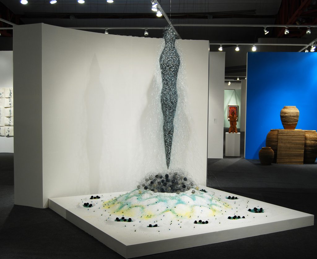
‘Above Earth Below Sky’
In 2016 you will be coming to Australia…
Explain how this invitation came about?
A workshop student of mine, Pamela MacGregor recommended me to Anne Kempton at Timeless Textiles in Newcastle. Pamela had recently come back from Australia giving her own workshop at Timeless Textiles and thought I would make a good fit for the program. Several months later Anne contacted me asking if I would like to have a show and conduct a workshop there.
Where and what will you be doing while ‘Down Under’?
The planning is still in the early stages, but I do know I will be spending time in Newcastle and hope to visit some other places in Australia, perhaps New Zealand as well. I wouldn’t mind finding an additional workshop venue “Down Under’, so something like that could help shape travel plans. There is a possibility my wife/artist, Eve Deisher, will also be exhibiting in Newcastle at the same time. If all goes well we both plan to make the journey and we hope to turn it into a business trip/vacation.
Where will people be able to see your work?
My exhibition at Timeless Textiles is scheduled for July 20 – August 14, 2016 and the workshop “The Art of Metal Mesh Working: Techniques and Process” will be held July 23-24. www.timelesstextiles.com.au
On a broader scale your work is in many public places can you discuss two pieces that are accessible to the public and why being there has given you such pleasure?
“Forest Sky” was a commission I did at the library in my hometown of Anacortes, WA. The library was built on the site where the old hospital used to be, which is where I was born. It’s even possible that “Forest Sky” is right above the location of my birth. I moved back to Anacortes in 1994 and I frequently visit the library and it is always a pleasure to see “Forest Sky” in the library’s entry lobby.
“Pattern Play” was a Washington State Arts Commission project I did at an elementary school in Snohomish, WA. The site is also a library. This is one of my favourite installations because of the enthusiasm of the school’s advisory committee and how they embraced the project. They even scheduled a daylong program where I met with each class to demonstrate how I made the installation and to answer their questions. I was exhausted by the end of the day, but it was a rewarding experience.
‘Pattern Play’
Can you give your thoughts on why Installations are becoming so well received by public galleries?
Installations are an exciting addition to a progressive exhibition program and they can transform a space into something wondrous. I believe this generates more interest in the gallery.
Contact details.
Lanny Bergner http://www.lannybergner.com/
email: lbergner@wavecable.com
Lanny Bergner, Washington, USA
Interview by Deborah Blakeley, April, 2015
Flo Snook
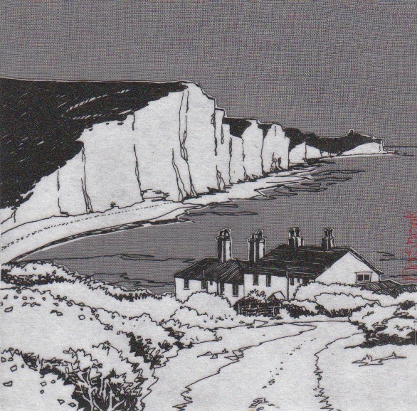
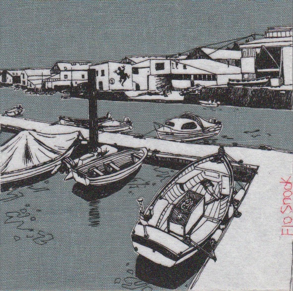
It is not just the sea but the influences made by man to the coastline e.g. piers, fishing cottages that are represented in you work, discuss.
I am fascinated by people's relationship to the sea. I love to observe how we live and work with it, how we try to impose our will on such a powerful force of nature, with the building of piers and sea defences, harbours and fishing ports, but ultimately it is Nature who will outlast us all. I often stay in a cottage by the sea in South Devon which is perched on the headland above the crashing waves, which I can hear as I fall asleep. This gives me a strong sense of the relentless power of water and weather acting on the rocks and headlands around me, and how temporal we are in the face of it.
Can you expand on the ‘textile canvases’ and the technique you have developed?
It was while I was completing my Textile Degree in 1994 that I created my first textile canvas. I was also creating vibrant landscape paintings at the time, and I wanted to create a canvas with hand dyed fabrics that would stand up in it's own right as a piece of art, and not be dismissed as a 'wall panel' with little of the same value as a painted canvas. This piece was exhibited alongside my paintings in my degree show in the Mall Gallery in London. 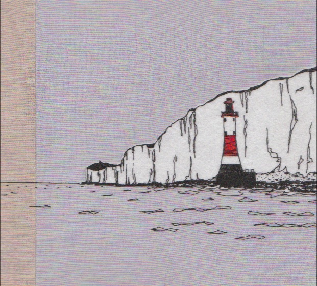 As my career progressed, I refined my style to a more restricted colour palette, using natural linens to express the colours I observed in the coastal landscapes. My starting point for each canvas is my sketchbook, where I create pencil sketches using the 'partial peek' method; I love the way it gives the drawings a fluidity of line as my eye travels around the landscape. I also take photos, and from these together with the sketches I create pen drawings to work from. At first I hand stitched and appliquéd all my images from these drawings, but this was far too labour intensive and I developed joint pain. So I began transferring the drawings onto silk screen so that the image can be printed onto white vilene, which I then appliqué onto the background fabrics, adding hand stitched details. This makes each canvas unique despite the printing process. More recently I've been framing my canvases in tray frames. This had added another layer of value to them and I've found that this has meant that they have fully broken into the fine art market. I am now selling in a London gallery on the Kings Road, Kensington.
Explain your embroidered signature, both style and colour?
I've always been inspired by Japanese prints, with their simplicity of line and muted colours, but always with bright accents of colour here and there. They often sign their prints with a red stamp, positioned on the side of the image. It's for this reason that I always hand stitch my signature in red thread on the side of my canvas. Flo Snook is my maiden name which I decided to keep for my artwork, particularly because it is such a feature of my work, and it has to be said that Flo Scott just doesn't have the same ring to it and isn't so memorable! 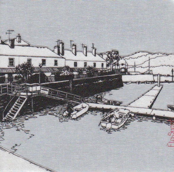
Is all your embroidery done by hand?
Yes. I embroider and hand-stitch once the canvas has been stretched on the frame. I've never liked machine embroidery - for me it takes all of the joy out of stitching.
Many of your textile pieces have two or more coloured backgrounds, explain why you use combinations and how you deal with the seam?
When you look out to sea, the colours are always changing. As clouds cross the sky, their shadows create varying shades and tones which I like to capture in my work, by sewing together strips of background fabrics.The more strips of colour I use, the more challenging it is to machine sew them together perfectly parallel and then stretch them on the wooden frame so that they remain parallel. I like this challenge. As I stretch the fabric, I make sure the seams are open and pressed flat against the frame.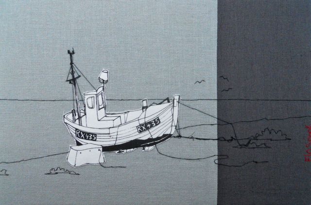
Your textile work, how is it mounted?
My canvases are stretched over a wooden frame (44mm deep) and then framed within a deep tray frame, giving each one depth and weight. I also create smaller textiles fixed to board, which are window-mounted and framed behind glass.
‘RNLI Salcombe’ discuss the use of red and gold in this piece?
I often like to pick out colours in the piece I'm working on to either draw the eye to the focal point or to let the eye travel around the composition. The RNLI piece was commissioned by the RNLI and I wanted to pick out some of the colours of the boat to draw the eye there, and make it come alive.

Your work is 'less is more'– discuss
I've realised that I am a very sensitive person and I find loud colours, busy places and clutter overwhelming. I often retreat to my studio when I find the world stressful and overpowering, in order to escape into the landscapes I create. I find it soothing to re-interpret the world I see into it's calm basic components. Perhaps I'm trying to re-educate the world into seeing the way I do? Perhaps I'm attempting to scrape away the layer of bling and overstimulation to reveal a way of honest simplicity underneath? I find our current capitalist society to be a delusional lie we tell ourselves; the belief that economic growth can continue at the expense of the environment indefinitely, is absurd. Nature will always win, and ultimately we'll need to curb our unrealistic consumer lifestyles and learn to live more simply. So I like to tell the story that 'less can be more'.
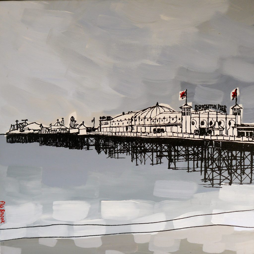
Your combination of printing and acrylic paint in ‘Brighton Pier’ discuss this aspect of your work and other pieces?
This was an exciting development of my work: I realised that I could paint with acrylic onto canvas to create a background on which I could silk screen my drawings. Although I've only created a small collection of these paintings so far, featuring Brighton and Dungeness coastal views, it's something which I'd like to expand on in future with my Devon and Cornwall work.
When and how did you introduce your accessary range?
It was through creating cushion covers initially that I found my style, so in a sense it was the accessories that came first. Over time however, I found it was important to me to be recognised as an artist, with the focus on my canvases. But occasionally I enjoy creating a useful 'product' that is more affordable than a canvas and makes a good gift for weddings and other events.
Tell us about your coastline linen cushions?
I created a range of cushions which depict the coastline (literally) of the UK in 2012, the year of the Queen's diamond Jubilee. I wanted to express something very British in this cushion design, so each one has a panel of patchwork with suggestions of the red white and blue flag. The coastline itself is silk screen and I hand embroider my name on the side of each one. These cushions have been popular with expats and look at their best with a feather filler.

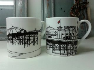
On your mugs, again you have used your signature to bring a smile, expand on this, especially the placement?
The mugs were a collaboration with interior designer Terri Prior who owns the shop 'One In The House' in Brighton. She wanted to create a couple of mug designs that would be popular with tourists and with people with a strong connection to Brighton. In Brighton we have two piers; Brighton Pier (formerly called 'Palace Pier') and the West Pier, now sadly collapsed and burned down, a mere skeleton of it's former self, but which is still a very strong local landmark. So I created a pair of mug designs from drawings of both piers, with red accents on the flags. Terri decided to put my red stitched name motif on the inside of the mug to add character to the drawings and to catch your eye as you drink your tea!
Sketch books play a huge part in your art practice discuss….
The size of the sketch books you use?
I use a range of sizes. For carrying around with me when I'm out sketching, I have a small hardback book. For a majority of my pen drawings I have a 20x20cm sketchbook that I keep safe in my studio, these can be scaled up for canvases up to 40x40cm. For commissions I often use an A4 sized book or A3 depending on how big the drawings need to be. When I created a textile canvas of the West Pier for Zoe Ball and Norman Cook (aka Fat Boy Slim) I used a large sketchbook for a large more detailed drawing. 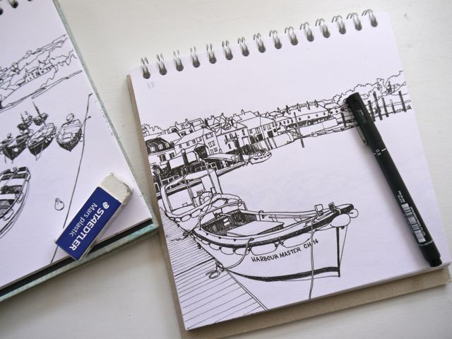
Do you take a new sketch book for each location?
That's probably a good idea! No I usually carry on with the same book.
What materials do you draw with in them?
I'm not fancy. All I need for sketching is a good 2B pencil, a rubber and scalpel for sharpening my pencil. For my pen drawings I have a range of 1-8mm pen nibs.
On the top left hand side you have a numbering system, can you explain this?
Ha ha! You noticed my code system for referring to the photos I took of the same view which I refer to when drawing in pen.
Discuss the importance of the environment in both your work and the materials you use?
I am a big campaigner for protection of the environment and for raising awareness of better ways of stewarding the land and sea. I am also a Permaculture Designer (see my other website www.permaculturedesigner.co.uk) and I like to apply permaculture to all areas of my life. It is a design system that attempts to mimic nature so that we can live in harmony with our biosphere. For this reason I prefer to choose natural fabrics that have less damage to the environment in their production as compared to some cottons and artificial fabrics, and where possible I use up-cycled fabrics too. For a time I found an organic white cotton with a very close weave that I could use as my appliqué fabric, but unfortunately they stopped producing it, so I'm back to using Vilene for the time being. Felt would have been a good replacement with less of a 'footprint' but I found that it didn't give me the crispness of line that I wanted. I use FSC rated wood for my frames and have used water based inks for my prints. In my work the environment is everything. By continually drawing the land and sea, I am falling into a deeper and deeper relationship with my beloved island, and I hope that I can draw the viewer into a deeper relationship with it too. The more we develop a connection to the land and coastal areas, the more we care for them and protect them.
You are very generous with your art work to charities can you expand on one of these?
I am currently holding a silent auction to raise money for Parkinson's UK with three of my paintings. I'm conducting the auction by email and through Twitter and Facebook. Sadly my father passed away last year after 8 years of living with the disease and Parkinson's UK were such a supportive charity to us during that time that I wanted to say thank you and give something back.
Can you explain the importance and recognition of textiles in today’s art market?
I feel it's really important for textile artists to be accepted as artists in their own right and not pigeonholed into the crafts market. It has taken me years to build up recognition as an artist just because textiles has been my main choice of medium. Last year I applied for the Brighton Art Fair, and I was accepted (as an artist) and I exhibited in September. I had applied for this art fair in the past, only to be told to re-apply for the craft fair, much to my dismay! I noticed that there were many other textile artists now exhibiting at the art fair also, so I am hoping that this is part of a trend of welcoming textile artists into the art market. This is great because textiles has so often been undervalued in the past, but now it is holding it's own.
Contact details.
www.flosnook.co.uk
studio@flosnook.co.uk
Flo Snook, Brighton, UK
Interview by Deborah Blakeley, April, 2015
Vicky Forrester
Can you briefly explain the techniques you use to create an original piece from sketch book to completion?
I’m quite playful in my approach to developing new pieces. Sometimes I’m inspired by the behaviour of a particular material, and I look for ways to exploit it. Other times ideas can evolve through extended experimentation with a particular technique.
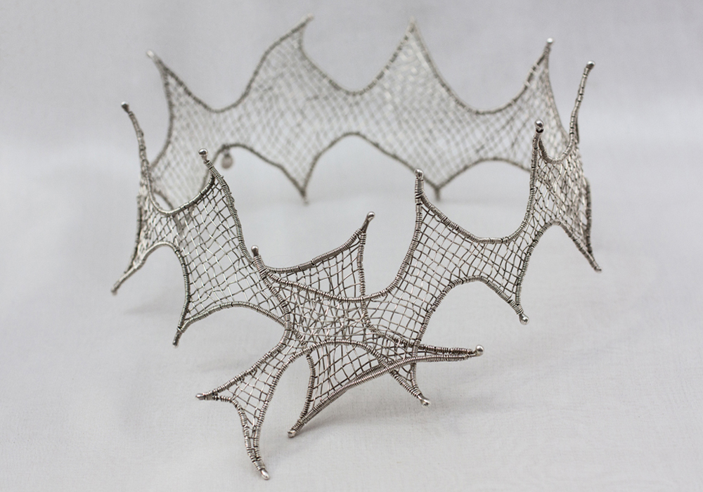
'Mystery'
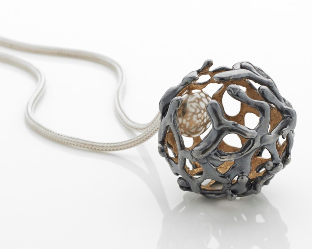
In either case, beneath this process-led practice there is always a conceptual undercurrent that informs the outcome. This undercurrent is a distillation of all my experiences - thoughts, desires, feelings, perception – but especially strong for me is a connection with the elements, and my jewellery always alludes to natural form.
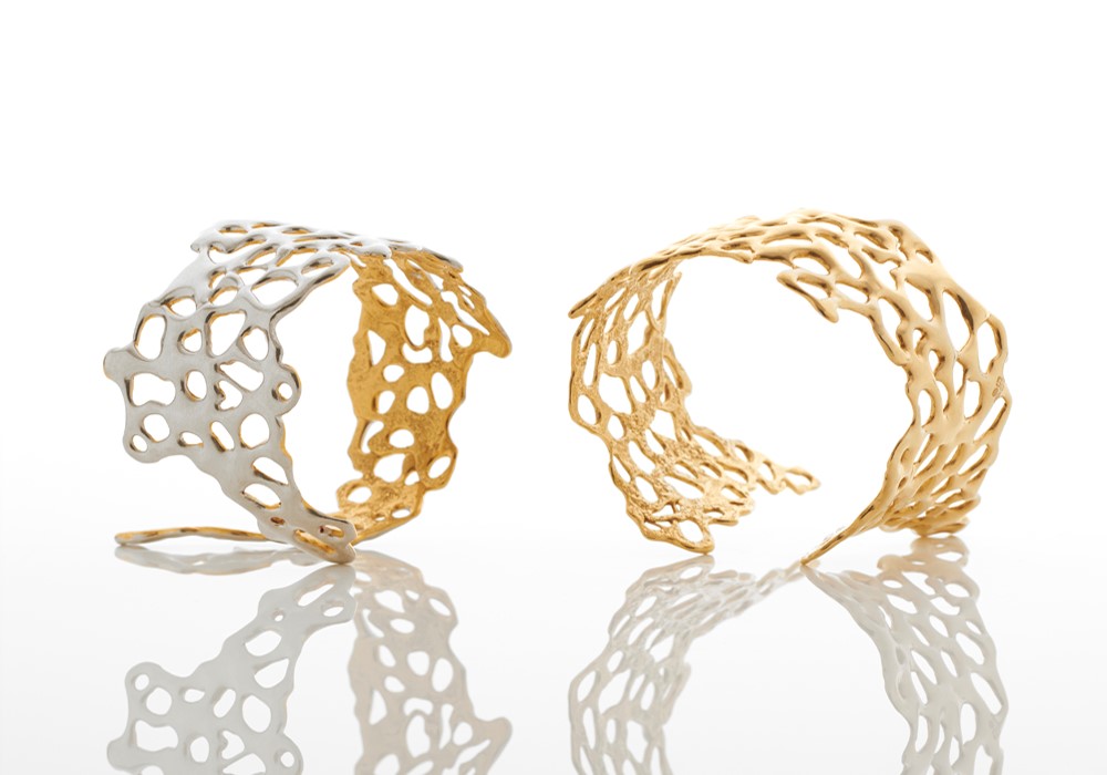
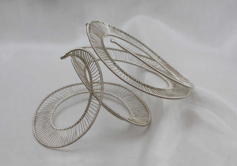
Cuffs
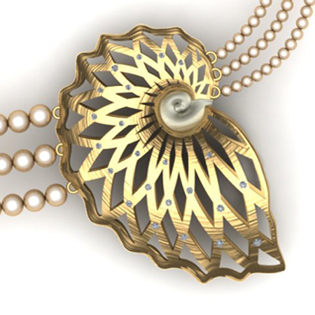
The development of the Siren Neckpiece is a good illustration of my working practice.
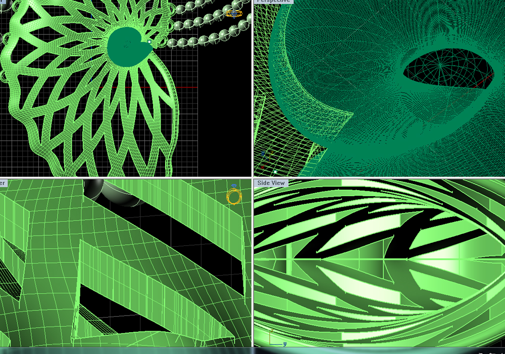
It’s a project that came about through taking the challenge to experiment with new technology - Computer Aided Design.
I was curious to explore how CAD might deal with my essentially organic aesthetic. I joined a course to get to grips with the technology, and while I had anticipated I would end up producing a model ready for rapid prototyping – thus the fear of putting the maker’s hands into early retirement - actually I was surprised to realise that my resulting design would be far better made in the workshop using traditional means.
The process itself – designing in Matrix - resulted in my creating a piece of fine jewellery that I wouldn’t otherwise have envisaged and I’m impressed to be able to view and show the piece accurately from every angle through 360˚- before it ever gets made.
I was interested to find that when designing jewellery with CAD you must already have a good knowledge of subject-specific materials and making processes to be able to factor in the quirks of materials and processes eg understanding construction techniques, the impact of scale, and all the tolerances required.
The Siren Neckpiece began with a family day out to Margate. The daytrip provided great inspiration for my CAD Project.
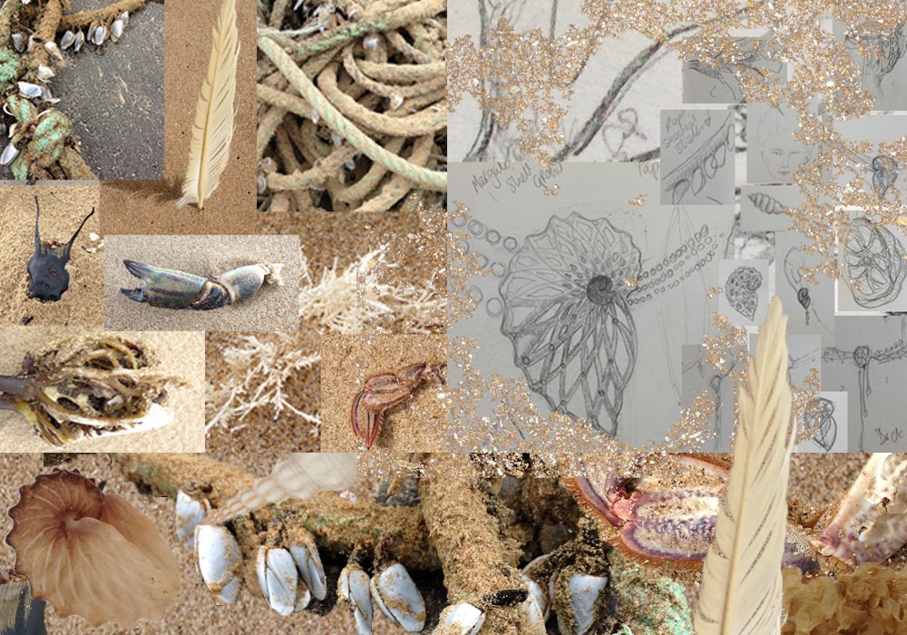
I was interested that the Shell Grotto in Margate has no known beginning though many stories abound. Discovered accidentally in the 1800’s, it became a popular Victorian attraction and the lamps they used to light the underground passageways produced soot that has inhibited the carbon dating process. It has been suggested that the Phoenicians built the grotto 3000 years ago, to worship the Goddess Tanit – hence also the locally named ‘Isle of Thanet’. But perhaps it was a Victorian Folly, or a Pirate’s treasure store – or maybe even a Siren’s haunt!
Using these thoughts, experiences and images as source materials I looked to develop some designs that I could explore using CAD….
I’m pleased with the final outcome; the Siren Neckpiece still maintains some fluidity of the organic approaches I would normally use – it can sit comfortably amongst my existing pieces - and I’m interested to find that through the choice of materials it has tipped me towards a fine-jewellery quality that I have not previously explored.
Expand on the importance of ‘one off’ pieces in your work?
When I explore a technique or material I’m particularly interested to understand how the protocols of that medium can be best exploited to make something that cannot be easily made in another way. So for example, with my growing understanding of CAD, now I see that it is less interesting if used to design an object that might be equally well carved in wax; it’s pretty cool as a rendering tool for showing a 3D experience of your intended design, but it gets really exciting when you develop very complex 3D designs to output using the ‘sintering’ process, where a laser passes through gold dust to make solid your dreams!
So, in relation to my preference for making one-off pieces of jewellery (and small batch production runs), my mind is always working in this way, seeking out new and better ways to exploit the chosen medium and technique, to more precisely express my intentions. Thus each piece I work on is an evolution of the last. For me this interaction is important. It runs counter to the tide of popular jewellery/craft/design culture that now encourages ‘production’ with a more/cheaper/faster approach. I think my clients enjoy that the pieces I make for them are unique.

It also requires an element of trust from my clients. If you see a coral ring that you like on my website, I can make one for you. It can be similar, but not the same, because I must sculpt it in your size in wax before casting it in your chosen metal. I will need to interact with you; you can guide me towards a preferred characteristic and I can put love into the making of it because its materialisation is not some hands-off series of standardised processes that get us from A to Z. It will inherently carry with it the accumulated knowledge and experience of every coral ring I have made before it. It will also be an expression of the maker thinking about you. It will be uniquely yours.
‘Totem’
I find an interesting challenge in the use of technology where it’s inherent nature leads to multiple production. I’m not averse to exploiting this character to further explore a theme – as with my Totem collection.
In this instance, the concept evolved from thoughts of the body, our bone structure and movement. Early pieces were an expression of this articulation; a long column of links became an external vision of the spine; conversely pulled straight by gravity the column causes an exaggerated view of the body’s movements. Each of these links was made by hand and so it was a slow process to develop the concept. Laser cutting provided a means to create multiple units that I could then use to explore new assemblages, hence ideas were able to evolve faster, and in new ways.
You gained your BA Hons. In silver smithing in 1990 what stands out now, 14 years later that you wish you had either learnt or appreciated earlier?
My years at college gave me the freedom to lose and find myself; In discovering that there are no rules to the creative process my ideas became free and flowing, but I think perhaps I was prone to taking life a little too seriously. I hadn’t yet understood that I was allowed to play, and I could have spent more time just doing rather than thinking about it. I came across a quote the other day (courtesy of my favourite Yogi tea) that would have served me well at that time: ‘Stop playing serious and seriously play.’
‘Embrace’
You describe your work as Powerful, Precious, Playful can you expand on each in relation to your work?
Jewellery is magic! When worn it becomes a powerful entity that can instantly transform your mood and your energy levels. It’s also a powerful communicator and so much can be expressed through (and read into) in the kind of jewellery you choose to wear.
‘Spirit Ring’
The notion of preciousness goes beyond material; it describes the relationship we have with our jewellery. Jewellery becomes precious only when we choose to engage with it and for me it’s about it’s history intertwined with your own story. It’s such a personal experience.
I love that it has this ability to transform the wearer and in my jewellery designs I like to exploit this element of play. I seek ways to create versatility in my pieces so that my audience will find numerous ways to wear and enjoy them.
Explain about your ‘Mark’ on your jewellery?
Design
Seeded in nature – the world that engaged me through childhood - my curiosity has always found creative expression through physical form. The tactile and physical elements hold equal importance to the visual. My ‘mark’ is an articulation of the ‘now’ – my current perspective formed as consequence of all accumulated thoughts and feelings – in relation to those ‘natural’, “tactile’ and ‘physical’ undercurrents. Because the creative process is a narrative of my experience (thoughts and feelings, fantasies, realities, my joyous moments in life) this affords me freedom to explore simple and complex ideas, to make drama, all-show pieces, and quiet, powerful pieces too. Over 30 years this has lead to the emergence of 6 distinct collections, each one answering to a particular intention, mood or desire. Distinct and yet distinctly related, I continue to develop new work for the collections as I am drawn to explore these same themes from ever evolving perspectives.
Importance and the meaning of the Mark on jewellery?
A walk through any museum will show you the importance of jewellery in deciphering our history, back to the most ancient of times. Materials, techniques, concepts – all record the evolution of our species, since the beginning of our time. Humankind has always held it precious, hence it survives as a record keeper of our stories, our values, our relationships, how we lived, where we died. It’s an unparalleled communicator. This most ancient of art forms continues to fullfil our primitive urge to express, empower, protect.
‘Joy’
With this perspective then, as makers of jewellery we have the capacity to engage with humanity on many profound levels. Through our personal mark we are in a position to add our unique voice to this conversation. Fired with the maker’s intentions, our jewellery becomes invested with palpable energy, meaning and value that can carry information far into the future.
Where do you go for your inspiration?
Actually I think all my daily experiences, even the most mundane, seem to find ways to influence my ideas; I’m not sure it’s possible (or desirable) to turn off the creative or curious mind, once engaged?
But my ultimate battery-charging, spirit-lifting, soul-feeding place to go is the seaside. I have strong family connections with the south west coast of Ireland and west coast of Scotland and most of my formative years were spent in one place or the other. The tides, like a breath, wash the city grit from between my ears. In, out, to the end of time. Scrambling across incredible rock formations to find rock pools teaming with jewel-like life-forms; palm trees and gorse beside golden sandy beaches, crystal clear waters, wind in my face, pockets full of stones…. Up from the shore, the damp-sweet smell of bog myrtle and bracken, raspberry picking along the hedgerows…home to family. Happy days!
My camera is an all-the-time essential tool that I use to capture, record and document the interesting moments in life. Before the camera, experiences were committed to memory, and I visit them frequently when my eyes close. Now they’re all on my phone-camera. I hope it’s not making me lazy.
Tell us one or two special story / stories of a piece you have made on commission?
I love the collaborative challenges of working to commission; It begins with a jumble of fragments, and between us the client and the maker must conjure them into dazzling solid form.
Usually the client brings an ephemeral element - a wish, a passion, a story. Often there is a physical element – a precious stone, an unwearable inheritance, a preference for material. The third element is the maker’s aesthetic. All of these ingredients must be drawn together, mindfully working with the material, it’s behaviours and the processes required to transform it. Metal is an endlessly forgiving material to work with; it yields sonorously to the hammer, can be pushed, scraped, filed and polished into form, or entirely transmuted through fire to a new vision of beauty. I like that the process often begins with recycling. A broken chain, an heirloom ring, all are given a chance to become something new, to live with relevance!
Here is a constant reminder of the transient nature of all things. I hope that my creations will be enjoyed and treasured, that they will be lovingly passed from one person to another with an endlessly expanding story. However I must accept that one day a new owner may give more value to the metal than to the form I have given it. The narrative of its changing form may be carried on through generations, and perhaps also at a molecular level there remains an ionically- bonded memory between the metal and it’s long history!
‘Flowing Ring’
Flowing Ring, recycled from the client’s unwanted 18ct white gold jewellery. The old rose-cut diamonds, also inherited, came from a beautiful and dazzling tiara that had no place to shine in these modern times.
Discuss your Medusa Range?
Inspiration
The first pieces I made in this collection were inspired by ‘material’ – I loved how this fabulous chain coiled and twisted, and I looked for ways to exploit this behaviour.
'Rattlesnake’
Subsequently I came across this woven leather cord and it provided a means to create more structured forms that could defy gravity or wrap the body. By adding sterling silver elements to my structures this gives sharp contrast to the soft appearance of the leather, meanwhile also suggesting latent power, perhaps a little dangerousness to the resulting pieces.
The name ‘Medusa’ derives from ‘metis’, or sovereign female wisdom. I chose this name for the collection because I found these pieces seductive, and hypnotic. As the collection grew I sought to understand this primal connection. Unlike the image portrayed of Medusa, I felt empowered by my snake-like forms, and so I sought out her deeper secrets… The story of Medusa as told in Greek Mythology is a neat exercise in the subjugation of female power, and her story, pertinent as ever, echoes through the centuries and through every culture. A woman is ravished because she is too beautiful to resist; on discovery, she is blamed for her beauty. She is cast out as temptress who must be punished and she is eventually slayed. In naming this body of work ‘Medusa” I look beyond the traditional mythology of the snake-haired, petrifying gorgon to reclaim her roots as Snake Goddess, who’s beauty is her soul. Powerful she, who holds in her hands the timeless cycle of life.
On photography

Photo by Rowan Papier
When I photograph my work I tend to take quite neutral shots that try to show the sculptural element of the pieces. Sometimes, as with this collection, this isn’t enough. These works needed to be seen in context, and I gave the photographer free reign to portray the Medusa collection as he felt inspired. I love this raw, charged imagery that he produced. The model, his muse, has an intense energy that draws parallels with Barbarella and the feminist view of Medusa (female rage) all at once.
Dressing up or Dressing down
Of course, not everyone who wears the Medusa Neck wrap chooses to make this, along with well-drawn smoky eyes, their only item of attire!

The playful element is an important aspect of this collection, and each piece can be worn in as many ways as you want to try them. The medusa ring can be worn as one coil on the thumb, or twisted to coil across 2 fingers for a more dramatic look. Or perhaps you need a little something to hold your scarf in place. I twist these Medusa pieces into my loose-knit jumpers too.

Discuss in more detail ‘Medusa Arm Wrap’
The Medusa Arm wrap has a similar versatility; Stretched out the piece of leather is almost a meter in length, so the multiple coils can be used to give three-dimensional structure, or to coil around any part of the body.
Discuss Helix and the inspiration of this work?
The Athene collection also explores how coils can be used to create structure. In this instance the collection was seeded from exploring ‘process’. Using binding techniques I wanted to create forms in silver that would be light and structured, that would also respond well to the body’s movement. Spirals and tendrils seemed to be a natural outcome to the slow process of binding, (hence Helix) and through experimentation I began to understand how the desired three dimensionality of form could be dictated by working around a shaped, internal framework.
I chose the name for this collection because Athena was known as both warrior and weaver. The pieces evolve through a similar repetitive process, creating structure and dimension from threads, and the final outcomes seem to me fierce and proud.
‘Athena’
Your piece the ‘Venus Rose’ has been designed to be worn in different ways. Discuss the importance of the versatility of piece.
It’s actually quite some challenge we jewellers face to make an item of jewellery that absolutely anyone can wear. Before we even touch on style and preference for a ring, necklace or cuff we must pay attention to the dimensions of wearer. ‘Average’ measurements, as with fashion, are never accurate enough for a well fitting neckpiece, and so in the Venus Rose I wanted to explore ways to make it so that could fit anyone.
‘Venes Rose’ (desire)
The solution I found was to weave the thorny form in one long length, thus creating a wrap that can interlock at any chosen point. In the process the piece becomes ever more versatile so it can be worn high as a choker or loose, more like a collar, depending on the clothes you want to wear with it. And of course being a single length of woven material, it can be used to wrap around any part of the body!
How do you think jewellery should be documented by the owner?
Jewellery should be purchased for wear, should be worn and enjoyed, and passed on with love. I like that jewellery is held most precious for the story it carries; certainly it grows richer, gathering a new kind of energy as it lives through the experiences of the wearer(s).
My Great Aunt left little notes in the boxes of the jewels she felt to be precious; other items held their value in Chinese whispers, though time (and the internet) often revealed another story, certainly in the case of the treasured Lake Como pearls that in years proved flaky and faux. Perhaps she had meant: ‘from the pearl of Lake Como’ and not ‘pearls from Lake Como’ as we had understood it!
What details should be recorded for future generations or owners?
Of course, the hallmark tells a small part of your jewellery’s story – the maker, the date, the place of making, the type and quality of metal it’s made from. The living history – myth and fact interwoven – holds the greatest room for mystery, intrigue, delight. Where does your mind go at the mention of Kohinoor? Passing on the stories behind a piece of jewellery will always have the greatest relevance. Queen Victoria had the Kohinoor’s original rugged beauty cut and polished into her vision of beauty. Only the ‘now’ owner knows the true value of their jewellery regardless of the perceived material or historical value. Ultimately if they don’t like it, if the story feels irrelevant, they may have it melted, just as so many of my clients’ commissions have begun, to be re-fashioned into something with greater personal resonance. This leads me to embrace the ephemeral nature of all things; everything worldly is a constantly shifting arrangement of the same atoms and molecules. As a jeweller, I am pleased if somebody can enjoy my various atomic arrangements. But it’s only ‘now’ matter. Tomorrow it could be transformed into someone else’s dream.
What lead you to opening Flux Studios?
My own journey into becoming (and surviving as) a jeweller gave me insights into the challenges and pitfalls that you must face when first setting out as a maker. It’s not an easy commitment to make, and I applaud anyone who makes that tough decision to follow their creative path.
I’m a big advocate for adult and community education, especially in the creative field; it provided me with a route into finding my passion for jewellery, and I know first hand the many benefits that result, on a personal, social and communitywide basis. For this reason I have always held the teaching element of my working practice as a vitally important link in my creative activities. In 2008 I decided to take a leap, to leave a part time teaching post and to use the redundancy money to set up a studio where I could marry these two major influences together. My aim was to produce my own work, and to provide a fully equipped working environment where other jewellers could develop their practice in a supported, mentored, community environment, and where I could continue to offer classes and courses in jewellery for the local community.
‘Peace’
Flux has proven to be a very successful model, and there’s a real sense of community here that has taken on it’s own inspirational dynamic; although the business is fundamentally mine I describe the activities and achievements here in terms of ‘We’ and ‘Our’ because without the willing participation and generous contributions of the people who use Flux Studios, it could not exist.
How does Flux operate?
Flux Studios is a specialist jewellery studio and jewellery school combined. Our remit is a simple one – to provide a platform where expertise, enthusiasm and the open exchange of ideas combine to inspire creative genius! In practical terms this means:- We provide opportunities for people to explore and expand their creative potential using jewellery as a medium, through jewellery classes, courses and workshops. We provide a dynamic studio base for aspiring jewellers to explore their business potential and achieve success, offering a fully equipped jewellery workshop, extensive library, mentoring and support network, learning and teaching opportunities as well as exhibitions and promotion – all through our membership scheme. We achieve a unique dynamism in the Studios by integrating classes and workshops in jewellery-making alongside professional jewellers who are carrying out their activities to develop their business. In this way students are inspired to develop better skills, and the professionals develop their communication skills and gain feedback on their work as it evolves. Audiences are developed and skills and knowledge shared.
Combining a teaching environment with a professional working studio Flux has a skills pool that makes the whole far greater than the sum of its parts. Because we are small we can focus on the unique individual need, inspiring people to achieve excellence. In providing a home to both aspiring professionals and the interested public we have evolved a holistic creative studio environment where the individual skill sets of all our users are valued and shared to enrich this community as a whole.
Discuss, membership to Flux?
Anyone with a passion for making jewellery, and the skills and training to work autonomously and safely in the workshop, can apply to join. Flux membership acts as a proving ground for future jewellers; in sharing expertise the group has the potential to be greater than the sum of its parts and ultimately this improves the probability for each member to create successful businesses and enriching careers in jewellery.
Flux members have access to our exceptional facilities, mentoring, exhibition opportunities, skills development, teaching opportunities, community interaction and audience building, and our network of Flux Alumni that now spans the globe, all for a nominal monthly fee. When a new member joins at Flux I encourage them to feel a sense of equality and ownership within the studio, right from the start; this gives members autonomy in (and respect for) the space and this instils real confidence to grow, share and learn.
This also makes it a great place to work!
Have you thought of E coursed for those of us who don’t live in London?
Ah, if only there were more hours in the day, more days in the week! But in the meantime I can recommend a great book…
Elemental Jewellery by Vicky Forrester
ISBN 9780956438270
£18.99, from all the best book stores.
Or order your signed copy direct fro the Author
Contact details.
Vicky Forrester, London, UK
Interview by Deborah Blakeley, April, 2015
Jan Hopkins
Can you discuss the way you continue to use organic materials such as, plant pods, flowers, and peel?
I love the challenge of finding new materials that I can use in my work. I continue to find better ways to use and preserve materials that I work with now. When you find your own materials that haven’t been used before, there are no rules that inhibit exploration.
‘Agave Within’
How does symbolism play a large part in the use of special materials in your work?
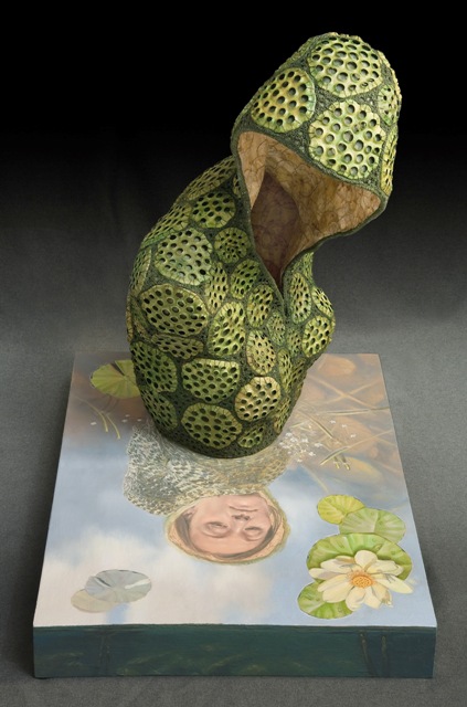
Symbolism played a larger part in my earlier work. “Young at Heart” that is described in a paragraph below is a good example. “With Child” is piece that I used Egyptian symbolism by using colour and emblems significant to life, regeneration and fertility. I used lotus seeds and lotus pod tops symbolic of rebirth, the frog symbolic of fertility and regeneration. My choice of colours are also symbolic, green to new life, red of life and victory and black of fertility and life.
‘Young at Heart’ Detail
Discuss the difference of being an urban collector is?
I think I understand your question to be; what is the difference between traditional foraging and gathering alternative materials that have been undiscovered. In many ways, they are very similar. The difference is historically, hunter/gatherers searched for the best materials to use to make clothing, utilitarian tools, vessels, etc. The materials were experimented with and processed to make articles that were needed in everyday life. I work with materials that are not ordinarily used, but that I can find in abundance.
I find ways to use them to create artwork. The materials I use do not have to stand up to utilitarian use, but I have to experiment, process and preserve my materials to be strong enough to withstand time.
‘Old – Soul’
How valuable was your reading disability to your artistic career?
With any type of disability or adversity in life, it makes you stronger. It challenges you to overcome and think differently.
What was the initial magic you saw in basket making?
Native American Baskets at the Heard Museum in Arizona caught my eye. I was fascinated by the fact that the baskets were made of grasses, roots and bark that were processed and refined to make beautiful utilitarian vessels. The moment I saw them, I felt that I needed to find out how to make them. It was an immediate passion.
You have visited museums extensively to view baskets – discuss the importance of these visits to your knowledge?
When I go to museums, I look at all types of art, but I am drawn to fibre and three-dimensional objects, not necessarily strictly basketry. Going to museums and galleries are always important source of inspiration.
Do you have a favourite museum that you know will always have a great display awaiting you?
I enjoy all types of museums, but, my favourite museums are fine craft museums that display work that I relate to.
Do you feel that this is an area that is under rated in museums collections?
Not at all, I believe that contemporary basketry has a solid place in permanent museum collections and private collections. I have been fortunate enough to be included in several museums in the U.S.
‘Vibrant’
How important is touch to your work?
As the artists?
My work is very tactile, so I would say that touch is a very important part of my work.
‘Oh Canada’
Can you discuss 4 of your works that will allow others to understand the depth of your work?
All of my work is narrative in one way or the other. In the beginning the narrative was identified by the title of the piece. As discussed previously, I delved in symbology. But my newer work includes words and quotes.
‘Tolerance’ by Jan Hopkins, photo by Ken Rowe
For instance, the pair of shoes titled “Tolerance” has the word “judge her when you’ve walked in her shoes”. The story behind this piece was about a soccer mom of three. After an unexpected divorced she had to find a way to make a living. She became an exotic dancer in the evenings so that she could care for her children during the day.
A piece from the Child torso series “Young at Heart” The piece is about aging and time. I used silver dollar pods and skeleton leaves and the time consuming quilting technique all relating to life, time and aging. The quote inside this piece is by William Butler Yeats, “The innocent and the beautiful have no enemy but time”.
‘Young at Heart’
“Oh Eleanor” is from the “Women Icon Series” and it is a homage to Eleanor Roosevelt, one of the most outspoken women in the White House, known for her intelligence and concerns for women’s issues and human rights achievements. She was an excellent speaker with a quick wit. I chose the quote: “Women are like teabags. We don’t know our true strength until we are put in hot water” to portray her personality and her ability to speak clearly to get her message across. "Oh Eleanor" is more whimsical than my previous pieces that I have created for this series and intentionally a bit sassy.
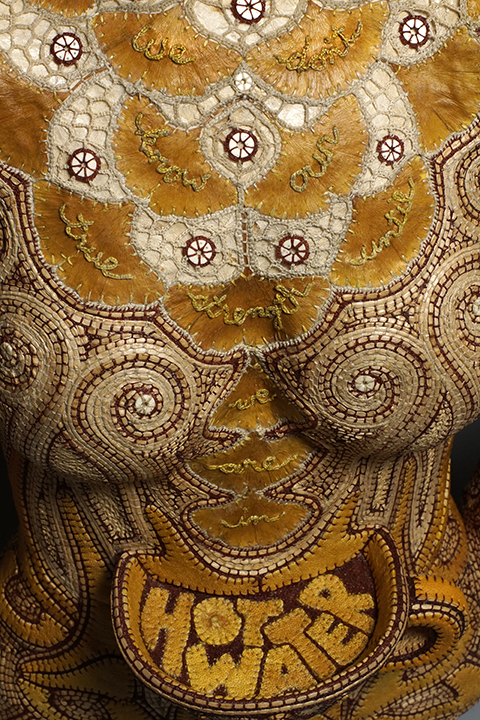
It is made part human, part teapot. The complex design is made to look like art nouveau flames moving up from the base of the piece (made of grapefruit peels) and steam coming off the flames (made of thinly stripped and stitched cedar bark). Ginkgo leaves were used to symbolize teabags dropping into the teacup. I used these on the top part of the bodice along with lopped lacy waxed linen to also visually create a period style dress form. The spout and handle (arms) design is asymmetrical to visually create the feeling of a teapot rather than arms.
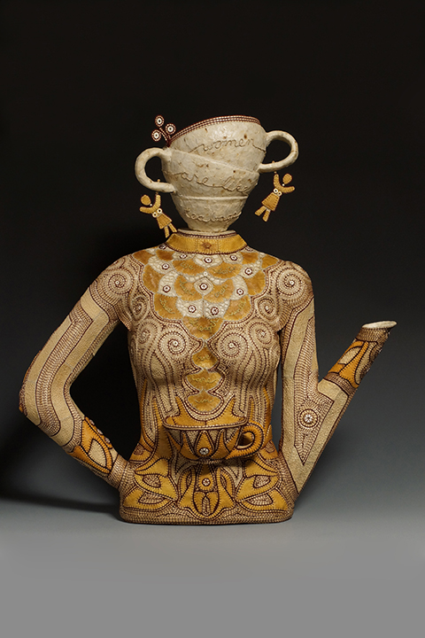
‘Oh Eleanor’, photo by Ken Rowe
I worked on collaboration with my husband on a series called “Reflections”. The piece entitled “Reflections: The Dance” gave a new dimension to how I work which was more illustrative and did not include quotes or words. Chris created the paintings included in the pieces and the concept, design and organic materials was my contribution to the collaboration. The statement that I wrote for this piece is as follows: I hear the phrase “an act of nature” to describe the devastation caused by floods, tornados, hurricanes and other “natural disasters”. But, are the changes in our weather our interaction with nature. We view nature a force apart from us and struggle against it rather than being a part of it. This piece reflects a hope that we learn to become part of nature rather than be in conflict with it.
Much of your work requires hand sewing can you expand on this?
All of my work is hand sewn. My tools are paring knives, scissors, sewing needles and waxed linen thread. I have used a sewing machine on bull kelp, but I ruined my machine. Hand sewing and using the looping technique is a “signature” style that I have used over the years.
You have exhibited at SOFA (Sculptural Object Functional Art and Design Fair) in Chicago and SOFA, NYC, since 1999 expand on the importance of being able to exhibit there?
It is an International Exposition that over 30,000 art lovers and collectors attend within a 4 day period of time. It is highly competitive between the galleries and the artists that are chosen by the gallery to feature.
Tell us how tickets to The Lion King changed your art practice?
A friend gave my husband and me tickets to the Lion King in New York. As a child, I wanted to be a fashion designer. When I saw the costumes, I thought that costume design was my true calling in life. The next day, we went to the Metropolitan Museum of Art and viewed the Papua New Guinea basket masks. It was an epiphany for me to combine both basketmaking and fashion and that is when I decided to make figurative vessels.
How important have you found the need to balance your other life – and your art life?
Both are very important to me. It was more of a struggle when we had a houseful of children. My husband is also an artist so it was about trading off and making equal time for both artist and personal life. It is easier now that we are empty nesters. We schedule time to be together. When you do art, you get wrapped up in it. If we didn’t schedule in personal time, we would probably never see each other.
‘With Child’
Thomas Jefferson has also helped your career; with this paraphrased quote, “the harder I work, the luckier I get” expand on this?
People have often said that I am so lucky to be an artist. I have to agree, but luck really has nothing to do with it. It is many hours and hard work. Nothing glamorous, no luck involved…just passion and hard work.
Contact details.
www.janhopkinsart.blogspot.com
Jan Hopkins, Washington, USA
Interview by Deborah Blakeley, April, 2015

Larry Renzo Lewis
Symbols/Pictographs:
Expand on your use of Symbols/Pictographs/Icons in your work?
I use symbols/pictographs as a secondary means to convey message. Symbols have been around since the beginning. Now after hundreds of years after the introduction of the alphabet, we still depend on symbols for rapid recognition in everyday life – restroom icons, warning signs, on and off function, identification. A form of communication that spans time, culture and language. It seems to fit with the message of my work.
![]()
Is there a symbol you use in your work you find more important than others?
Yes, a circle divided into four equal parts or a square separated in the same manner. This was a marking I was using in my work even before I was made aware of its meaning. During the time I was residing in Yelapa, Mexico I was informed by a western person that studied shamanism and by a Huichol shaman. The symbol was used by a group of people in the Amazon in similar fashion as the Ying Yang symbol is used in Asian culture. Instead of being separated in two parts for good/bad or right/wrong, it was separated into four parts referencing good/bad or right/wrong adding time and dimension. I was amazed at this concept. To think a primitive group of folks would consider “dimension and time” in their belief structure.

Closer to our cultural times you have used modern mathematical and physical symbols. Expand on this in relations to your work?
I believe the language of mathematics and physics to be universal. It seems appropriate to include them in my offerings.
Stone:
Closer to our cultural times you have used modern mathematical and physical symbols. Expand on this in relations to your work?
I believe the language of mathematics and physics to be universal. It seems appropriate to include them in my offerings.
Discuss the way you use stones in your art both sculpture and painting?
I chose stones/rocks because I perceived them to be a most basic element – unpretentious, solid, hard, heavy, of the earth, foundational. I use them as metaphors for thought, memory and emotion. In doing so, I can offer a physical presence to that which is intangible.
.
Discuss your comment “Everything is connected”
Wrapped around stones, stones bound together, wrapped around the wrists and ankles of my figures, and figures bound together. I do this as a representation of my belief – “Everything is connected.” All things in our known universe share fundamental common bonds. In my work I bring this to light by the representation of physical binding.

‘An Emotional Partially Obscured’
Nudity:
Clothing gives a historical point, therefore why is Nudity so critical to your work?
Clothing / adornment makes a statement of not only historical but social, cultural and even religious status. I wish to make statement void of these elements, poignant only to humankind as one.

‘Balancing Nature’
Masks:
Explain the importance of masks in your work?
In my life experience, I’ve found that everyone I have come into contact with at some point in time has put forth a facade. Whether camouflage or deception, I find this to be a practiced human trait. Just one of the many things that separates us from being mistaken for lawn chairs.

Your late wife studied archaeology and anthropology how has this effected your work?
I perceive the effect slightly. Accompanying her on a few digs. It simply added support to my thoughts, seeing artifacts unearthed which held meaning of a prior time while offering importance of a time in the future.

‘Adrift with my Memories’
There are many similarities in very different cultures. You have lived with indigenous people; discuss how this has influenced your work?
I agree with your previous statement and believe that when one experiences a different culture it enhances their ability to better perceive their own culture. I would hope the influence is apparent when viewing my work.

How do you decide on making a work into a painting or sculpture?
In my youth I was privy to a quote from Ansel Adams – “there is nothing worse than a brilliant image of a fuzzy concept.” I approach all my work in the same manner. Conceive the concept, develop and complete.
Do you use the same subject in both mediums?
If you are referring to subject matter “Yes.” Subject in regard to models “No,” with painting I use models. Regarding sculpting, I rely on sketches and or composites.

‘Neo – vision’
Your own strict religious upbringing, how has it influenced your life and work?
Wow, big question! To this day, I am still attempting to sort that issue out. I have come to view organized religion with ill repute. I live and work in accordance with the content of my character and the faith that there exists something greater than I, and greater than my understanding, that fuels the cosmos.

‘Emotional Temptation’
Contact details.
Renzo aka Larry Lewis
rockbound666@gmail.com
Represented by – Masterpiece Publishing Inc.
www.masterpiecepublishing.com www.winnslavin.com
Larry Renzo Lewis, Nevada, USA
Interview by Deborah Blakeley, March, 2015

Miki Kubo
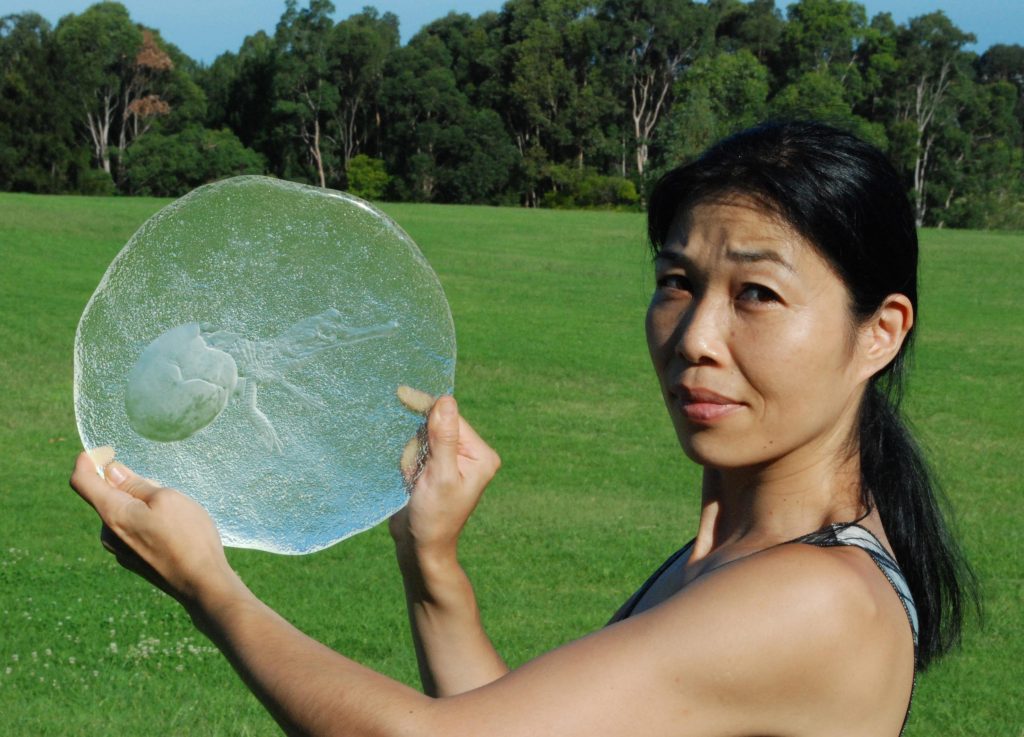 Miki Kubo, Japanese Artist in Australia photograph by Henry Rust
Zoneone Arts is delighted to bring Miki Kubo to you…
You take great inspiration form nature please discuss this?
When I look at Nature, at Life, I see a purity and connectedness that I long to be part of again. I feel that I am out of it, and I yearn to with my true self, my song. I want to feel the harmony with life that I see there. I want to cut through the noise to have a direct experience of the music of life.
‘Cosmos’ photograph by Henry Rust
Does your Japanese background give you a different connection with nature and animals to the one you have developed since arriving in Australia?
This is a question I am asked all the time as a Japanese artist living in Australia. I feel that my attitude as an artist and the fundamental approach to my subjects were formed and cultivated in my early teenage years in Japan. It might sound strange to Westerners, but we are encourage to be Westernized in so many ways especially after WWII. Many famous Western literatures are translated in Japanese and have been published repeatedly for children and adults, and J.D.Salinger was one of them. His book “Franny and Zooey” - it has guided me to be an artist who practice “see the subject for exactly what it is” and focus on “An artist’s only concern is to shoot for some kind of perfection, and on his own terms, not anyone else’s.” in my work. After school, I devoted all my time doing pencil drawings on white Canson paper…not much homework was done.
Animals you meet in Sydney tend to be more impudent and brave than the ones you come across in Japan. Australian sunlight is much brighter, which produces plenty of flowers in all seasons and trees seems to be much happier, but short lived. There are much more opportunities for me to study Animals in Australia and people’s passion for nature appears to be much stronger and direct. Being in the unfamiliar, forces me to focus in more strongly and recognise the subject.
Discuss your use of Australian flora and fauna in your work?
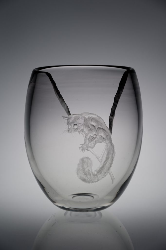
‘Sugar Glider’ photograph by Henry Rust
Australian flora and fauna designs were my engraving teacher Anne Dybka’s forte. When she closed her studio business due to her age and eye illness, she had introduced me to her distributers. During my engraving training with Anne, she made sure that I was able to engrave Australian flora and fauna in my interpretation so that I could carry out her legacy.
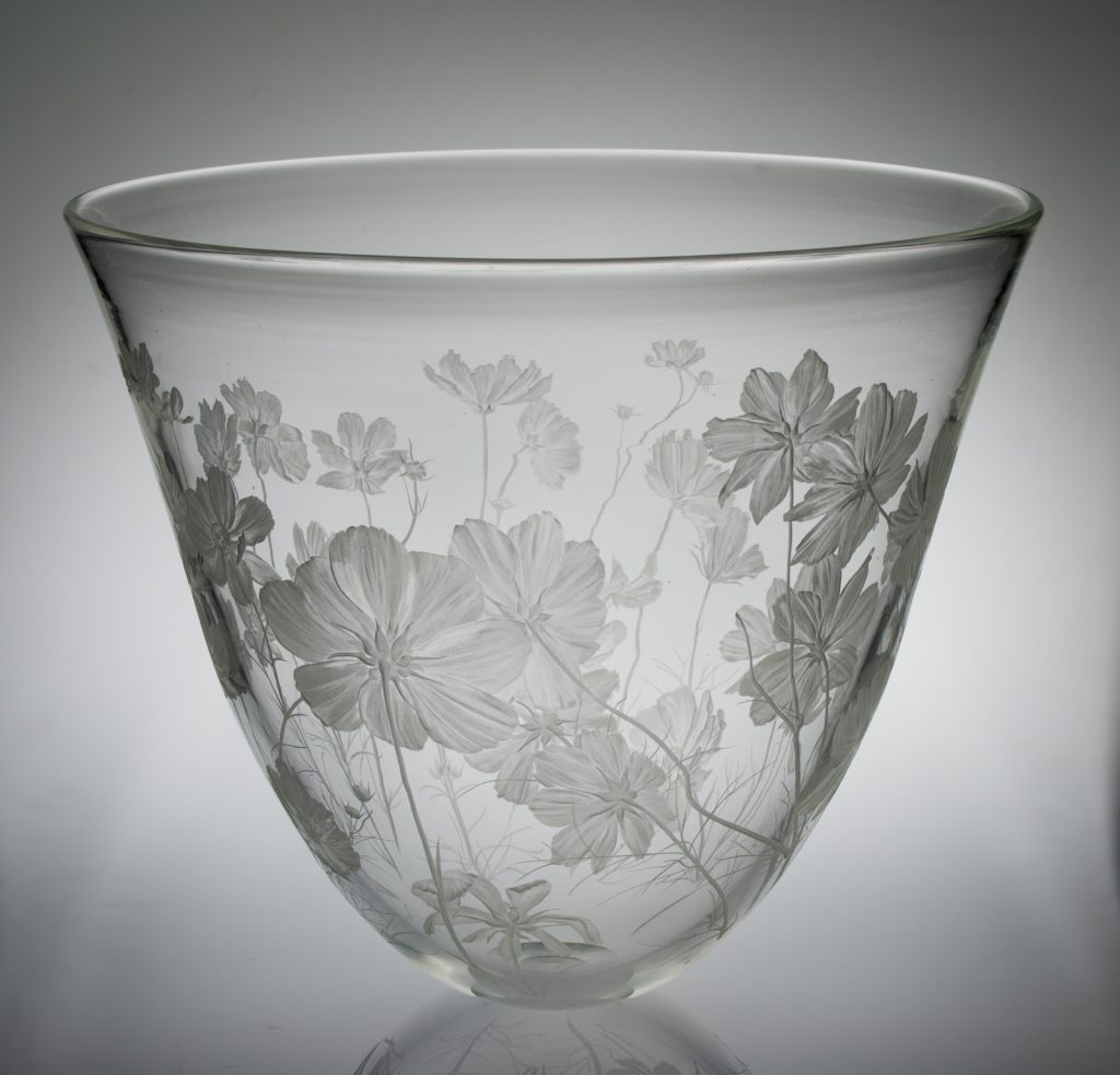
How important is the engraving (or carving) aspect of your glass art in your current work?
Engraving requires great focus and is extremely important in my artwork. Mistakes can’t be erased. The spinning bit demands deep concentration. Ear-muffs reduce outside distractions. Constantly running water means that I can’t see the surface where marks are being made.I trust in my connection with the subject and in the engraving process and focus goes deeper and deeper, allowing the work to come into existence.
Engraving on glass brings three dimensions, and the play of light and shadow, to the work. This is what makes it so appropriate as a medium for representing life. Each motif is its own self. I can’t own, or possess it, or take it away from what it is meant to be. All I can do is honour and wonder at its perfection. I do this through glass engraving.
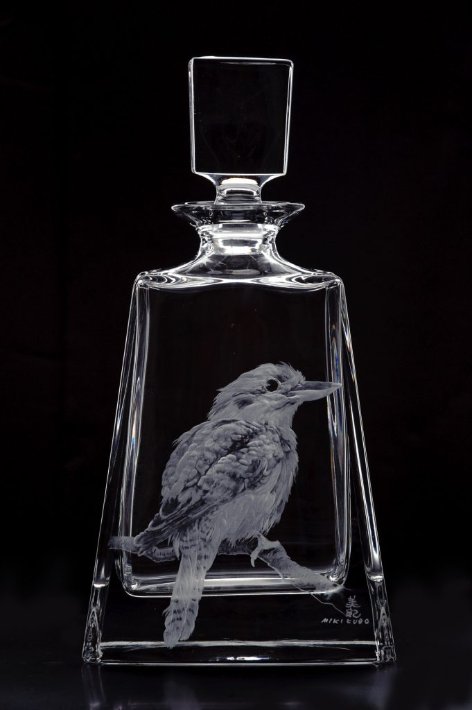
‘Kookaburra’ photograph by Henry Rust
How you would like to see the pieces used?
My work is done in homage to the Life Force. In making a piece I touch the core of me – I reveal what I worship, who I am and what I aspire to be. I hope that through my work, others can find some of the peace, truth and joy that I find there.
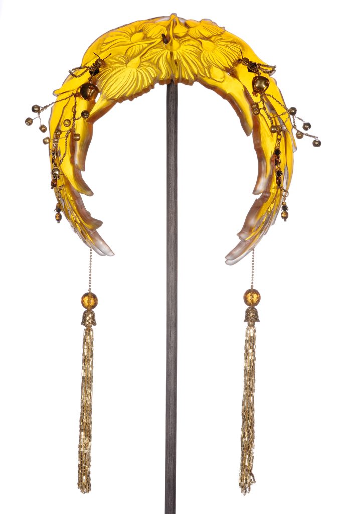
Pieces that are culturally very different are your Hair Decoration Series can you expand on this series?
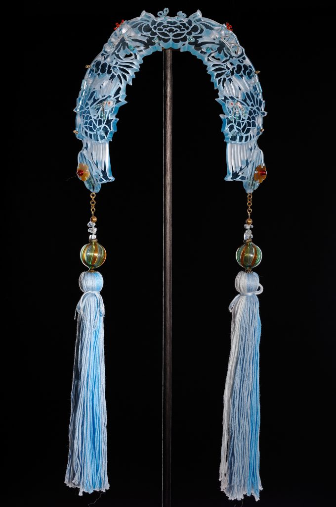
‘Small tiara with Phoenixes’ photograph by Henry Rust
This series is inspired by the “Chinese Kingfisher Hair Dress” from the Qing dynasty. I wanted to speak about the ’Power of Object’ through this series. I believe the original Kingfisher Hair Dress crowns were rented to decorate many young Chinese brides who were about to meet their unknown husbands under their arranged marriages. There was a time that tradition and family ties had so much power over people’s lives, so much in fact that there was no space for an individual’s feelings. Although we might have more freedoms now, compare to their past, we can still relate to those people who had to perform their act as what they were expected to. Otherwise we wouldn’t say “the show must go on” and drink from a cup that says, “Keep calm and carry on”.
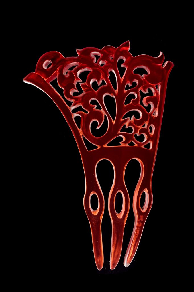
‘Three teeth comb’ photograph by Henry Rust
On slightly larger piece in this series is ‘Bees and Flowers’ head dress discuss this piece?
‘Bees and Flowers, Head dress photography by Henry Rust
This particular headdress was dedicated to an Australian woman I saw in Queensland, we were at her late partner’s funeral ceremony. She was stood straight during the entire ceremony, wearing a golden eucalyptus flower branch on her hair.
Colour is so important to glass artist work tell us about your passion for colour?
I started my glass practice in a small glass-blowing company in Japan, in which we manufactured our own glass colours. Mixing glass colour from sand involves serious calculation based on chemistry and heat expansion technology. We had to sync the expansion rate and shrinkage in every colour so that the glass was compatible. It was time consuming, temperamental and an expensive process, and usually the recipes were kept in secret by the colour engineer in the same company. Therefore we had a very limited colour palette - red, orange and yellow were extremely rare to us. In Australia, usually the colours (for glass-blowing) come from New Zealand. Their colour ranges are - as many as nail polish, transparent and opaque in both! Now all the subtle colours in glass are accessible to me in Sydney.
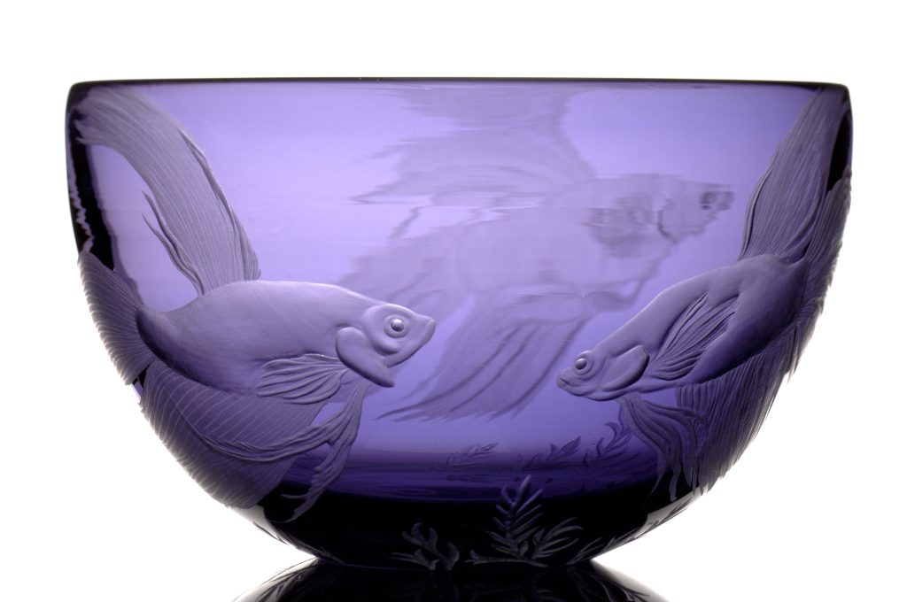
‘Siamese Fighting Fish’ photograph by Henry Rust
However, as much as I love coloured glass, I enjoy working with non-colour and plain clear glass. It has its own attraction in that the engraved surface displays a much fine grade in shadow.
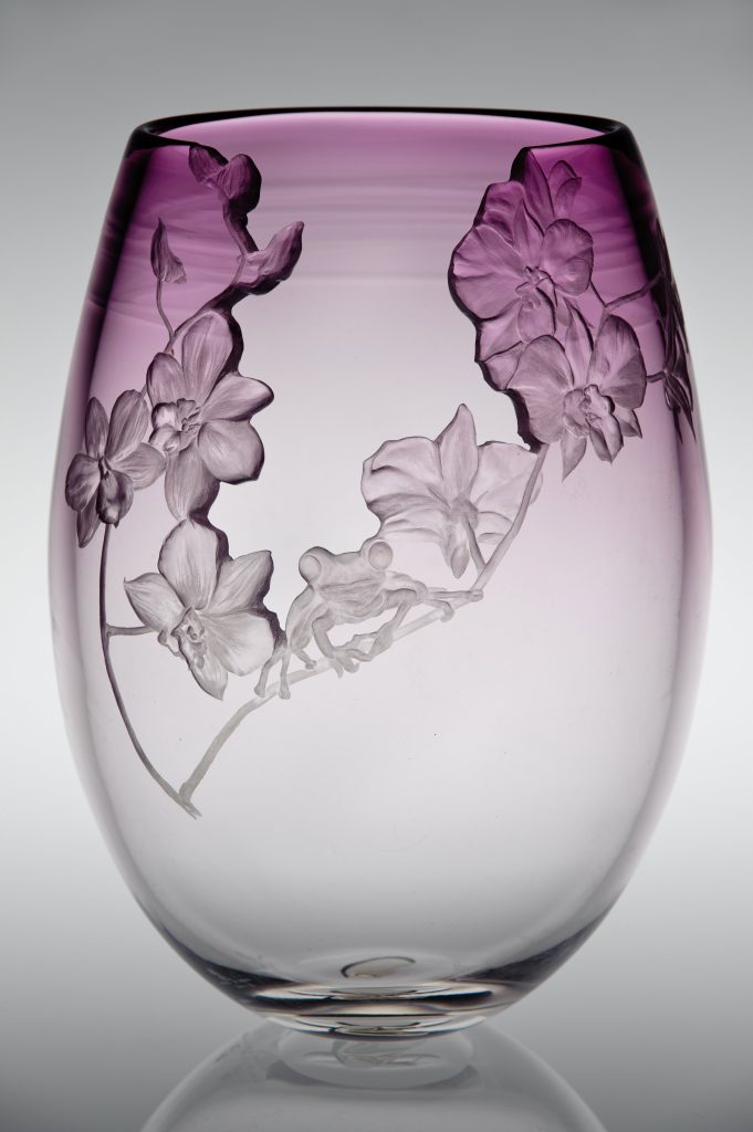
‘Frog and Orchards ‘photograph by Henry Rust
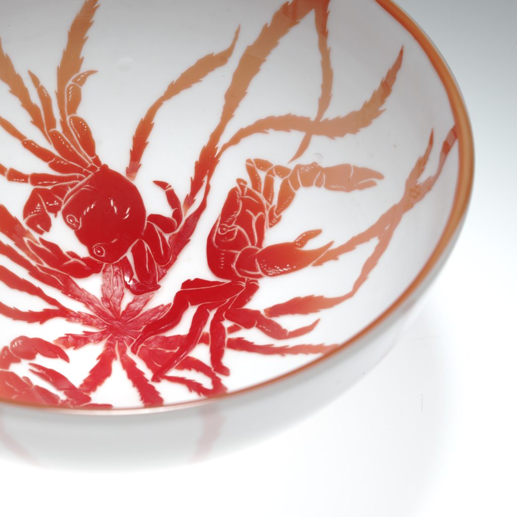
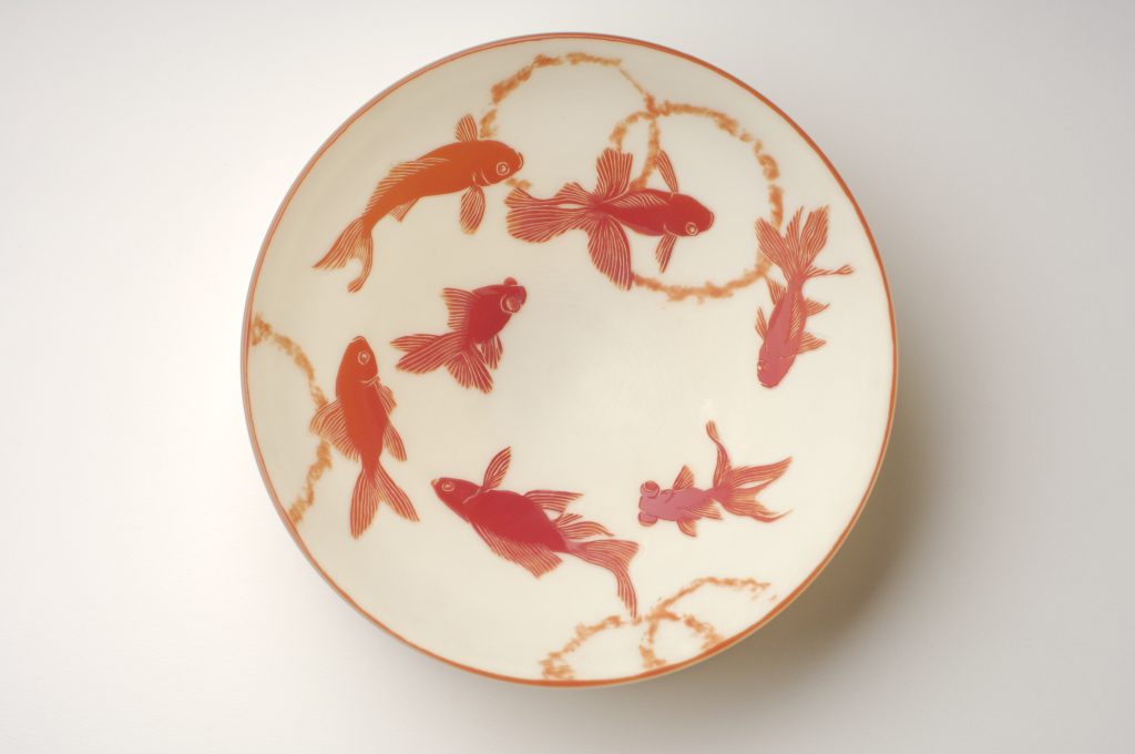
Shapes is predominate in your work, discuss shape in relationship to the piece, ‘Goldfish’?
The composition of glass is in its liquid form not solid - in the state of not hot enough to move, or it is moving but too slow to see. In this reason I like watery motives to go with glass and goldfish are on of them. Goldfish are man modified creature from many generations of mutated Crucian Carp which cannot exist in wild. It needs special, human controlled environment to survive. I’d like to keep them in safe bubble shape so that we can study their tranquility.

‘Goldfish’, aqua photograph by Henry Rust
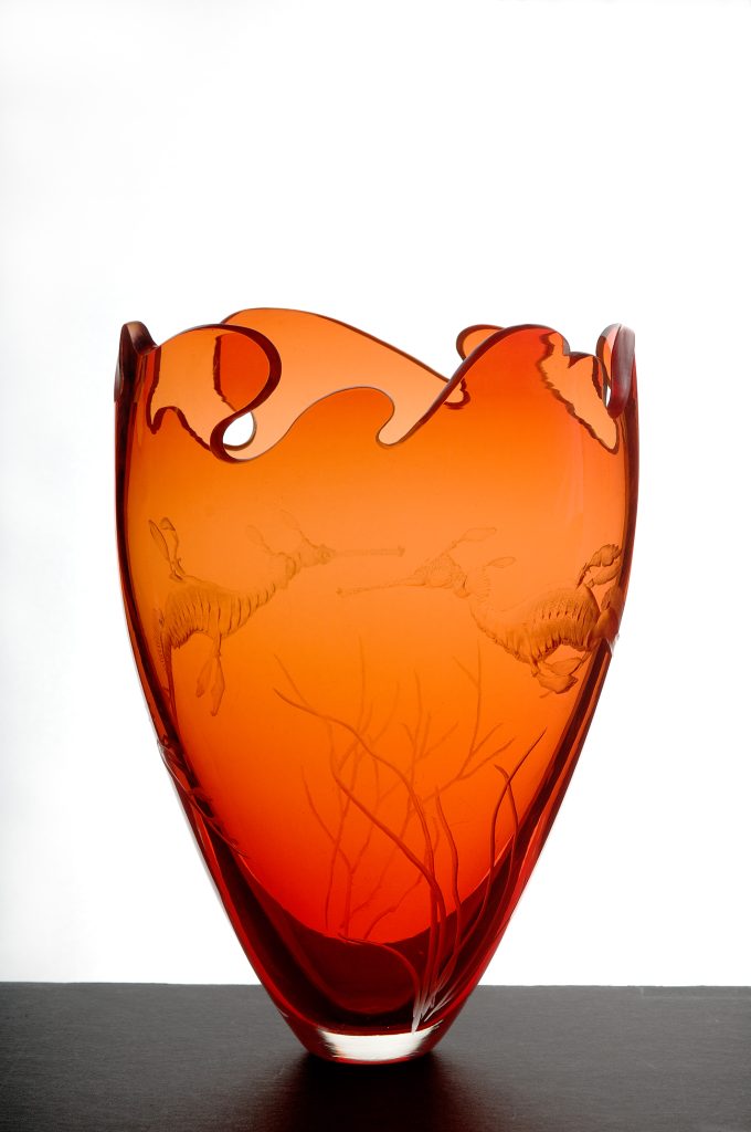
Your piece ‘sea Dragons’ can you explain where you study the shapes and details of the animals you use?
I had a plastic Sea Dragon toy that I was hoping to use as a reference for a particular engraving, however it didn’t do justice to live Sea Dragons. I am very fortunate to be able to visit wild parks or aquariums as part of my job, to observe animals. At the Sydney Aquarium in particular - there were only ‘Weedy Sea Dragons’ exhibited at that time, but now you can meet ‘Weedy Sea Dragons’ and ‘Leafy Sea Dragons’ both at the Aquarium. When I engrave an animal, it is a portrait of that animal. It is not ‘a Sea Dragon’, it is that specific, personal Sea Dragon. Every individual animal is its own spirit. Each piece I make is an individual portrait of that animal, of that spirit.
‘Weedy Sea Dragons’ detail, photograph by Henry Rust
‘Weedy Sea Dragons’ detail, photograph by Henry Rust
Fragility is part of your work explain how important the openings are and how what is missing is such an important part of the whole?
Nature does not like to be disturbed. Pretty much everything we touch, we destroy.We break the perfect balance of nature and call them fragile.
In terms of my Glass bubble openings and why I like to design the edges into the motif’s - it is purely for the form of the Artwork - the carved glass edge adds light to the engraving and pushes the engraving out at the viewer. Also I get toapply two different kinds of engraving technique in one subject - intaglio engraving to carve in the motif and relief engraving to carve out. It is not about what is missing - it is more about emphasizing what is there.
Can you expand on the time you spent with Anne Dybka and how this time to influence your work today?
Between the year 2003 and 2005, every Saturday morning I was at Anne’s studio on Argyle Street in The Rocks. The lesson went usually two hours, it start off with me explaining to Anne what motif I will engrave and how I will approach it. The rest of the class we just talked about animals we both related to. There weren’t many things in common between us, but the strong feeling toward animals that really connected to us, was solid. She was an animal activist, born Greenie. Once she expressed me how she felt about Japanese whaling.
As her field of vision got smaller and darker, she shared many stories of her life to me.The job she had during the War in England, the big farm house she had lived, her passion about horses, her children’s toy stories, the egg fight her children and neighbour’s kids caused, her boarding school time in Switzerland, about the after-life,and about her mother. I was extremely fortunate to be able to spend time in her studio, she had shown me her affection to nature, her joyful and rich world through her work. When I engrave glass, I constantly imagine what Anne would do and what she would say.
Cameo work is very time consuming explain this method and how you use it?
Imagine an apple, a gorgeous red skin apple. When you peel the red skin, you find white fruit under it. To make a cameo piece, you will need a glass just like an apple. One colour on top of another, and sometimes triple layered glass. Usually, the skin- the first layer colour will be the motif you leave out. You carve the background area in order to make the motif lift up. This carving technique for cameo is called relief engraving. My Cameo bowls are interpretation of traditional hand-painted Porcelain in Asia.
‘Crab’ Cameo detail photograph by Greg Piper
You are a member of the Guild of Glass Engravers UK, what has been the value of a worldwide membership to you?
My initial reason for joining the GOGE was to follow the footstep of Anne - she was delighted when she heard the news I have been excepted to be a member. The GOGE offers vast information in engraving to all the public, promote artists and hold annual guild exhibitions. By being a member, it will gives you a great opportunity to connect with glass engravers worldwide. They hold assessment once a year by request and help you with developing your engrave practice. I found them very supportive, encouraging and full of warmth.
You have your work documented and photographed, discuss why and how this is done and why you would recommend this to other artists?
For many practical reasons, documentation of each piece is necessary for the artists who work with galleries under a consignment basis. Not just the detail of your work, the information such as, which gallery is selling it, for how much and how long. If I know who has bought it, I will record that too. Also when I take commission, having the list of previous pieces I worked on helps to come up with a fair quote for the future piece. Personally, engraving is a very intimate process. I spend at least few days extending my awareness towards the subject as best I can, so it feels like my mind is fused into the subject within the glass. Sending a finished work to the photographer is an important ritual, give a proper cleaning to the piece and pack in a box. It is the time that telling myself I am finished with this work, the piece is now ready for everyone’s interpretations and experiences.
Can you tell us about your work studio?
Being a Japanese Artist in Australia and travelling a lot has given me the privilege of working with many fine Sydney Glass Artists and sharing their work Studios. I have also worked in Sunshine Coast, Adelaide, Perth and Canberra Studios often as well. As I travel a lot, I usually take my portable Glass engraving table set up that I constructed, so I am able to do my engraving anywhere.
‘Goldfish’ cameo photograph by Henry Rust
What is your advice to Collectors of glass?
When I was in a glass company in Japan, our retail manager who sold our glass use to say “I don’t need to know the difficulty of glass technique, what I need, is the eyes that can tell what appeals to customers and the experience to know how much people will pay for it”. she was in charge of pricing all our work. I can only half agree to that! I do not wish my work to be defined and evaluated only by its technicality although I admit it is fascinating to know how the work was made. I imagine everyone has their own motivation and passion to collect objects. To collect something you will usually do some investigation in the field. What I do is a hand-made artwork, not machine made mass-production. Handmade art reflects the heart and soul of the artist. This is my best advice to a collector.
Contact details
www.mikikubo.com
Miki Kubo, Japanese Artist in Australia
Interview by Deborah Blakeley, March, 2015
Mariolina Mascarino
Can you discuss your thoughts on the overlapping of design and fashion in your work?
In my mind design and fashion are true art forms which are worth taking into consideration especially when it comes to jewellery and body adornment. Also, I think of my jewellery as something which is always evolving and changing together with the new trends.
When I start working on a piece I always need to have clear in my mind that what I’m going to make is not only art but also, and above all, a jewel. Here is where the need of making something that fits into the fashion trends overlaps the need of expressing myself as an artist. What I want to do is to make something unique but comfortable and wearable as well.
Colour is very important to your work. Can you discuss this?
The use of colour plays an important role in my work. I believe that colour gives personality to a piece or, better yet, it “makes” the piece. I am happy to work with paper because I have so many shades and colours to choose from, also I never run out of newspaper pages with words and pictures on them which help me to achieve even more unique results. Often, when I can’t find the color I have in mind, I paint the pieces myself, using water based paints and mixing colors together. In those cases, I’ll always end up with a special shade, which I will not be able to create again and this also contributes to the uniqueness of the piece.
Compare two pieces of your jewellery showing both glamour and simplicity, and the need for both in your collections?
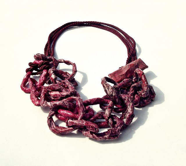
I’d like to compare a glamorous necklace like the “charcoal and gold chain” with a more simple one called “corolla”. They are two completely different pieces: the first one designed to be worn at night or on special occasions, while the second one, with its minimal, fresh style, is perfect for everyday wear.
'charcoal and gold chain’
charcoal and gold chain: kraft paper, painted newspaper scraps, crocheted cotton yarn, cardstock. Water based paints and glues. Colors: charcoal, gold. Total length: 130 cm – 51.2 in.
corolla: crepe paper, waxed cotton cord, water based protective varnish and glues. Approx dimensions: around neck 46 cm – 18.1 in, total length: 51 cm – 20.1 in.
Corolla
Having both simplicity and glamour in my collections is not only a need but a choice. I like to offer a woman the opportunity to always be herself, following her personal style. I want her to feel, free to wear accessories the way she prefers, choosing simplicity or glamour according to the mood or the occasions. In other words, I want her to be unique in every moment and with every outfit.
Why have you chosen to use paper as your main medium?
Paper is interesting in many ways and it allows me to express myself at my best. Not only is it an environmentally friendly medium, which can be easily recycled, but it is also extremely versatile and shapeable according to my needs. Working with paper of all types (crepe and tissue paper, cardboard, cardstock, kraft paper…)
I have the possibility to continuously explore new textures and combinations, while creating original, one of a kind jewels. Also paper looks very fragile, but it actually hides a great strength and flexibility, two qualities that make it ever-challenging.
‘folds’ Black and White Earrings
Can you expand on how two women can change your jewellery by the way they wear it?
When a woman wears jewellery she wears it in her own peculiar way, adding something unique to it. I’m not talking about the color of her hair and eyes or how she looks, but rather about her inner essence, something special and inexplicable which belongs to her only. It is this “added value”, this “inexplicable something” that, in my opinion, makes all the difference.
Discuss your paper bangle ‘chances’?
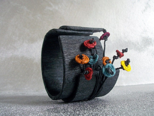
‘chances’
Inspiration
I saw a tiny flower growing through the asphalt and I went closer. It looked as if it was happy to be there and totally careless to the surroundings. It was given the chance to bloom on the road and it simply took it. This little flower made me think about the many opportunities we miss every day, just because we don’t want to take risks or we think we don’t have a chance, but in doing so, we sometimes lose the juicy part of life. My asphalt color bangle, with nine flowers “growing” out of it, aims to be a reminder of the endless opportunities afforded us every day. Opportunities that can appear everywhere, like a flower blooming on the road.
Size
Adjustable - Inner diameter 6 cm – 2.4 in.
Weight
50 g – 1.7637 oz.
Colour
Black, dark orange, dark red, teal, yellow, purple.
Many of your bangles are designed to be worn in groups, can you discuss this?
Whenever I start working on a design, I already have the final result in mind. I like to anticipate how the piece, be it a necklace, a bangle or a ring, will look like when finished. The sets of bangles are generally created to be worn in groups simply because together they work better. This may be due to the color mix or the shape, but every time, one way or another, they “cooperate” and complete each other.
‘round brown bangles’
Expand on how you combine your paper jewellery with semi-precious stones and eco friendly supplies?
When I started the “quasi caramelle” project I was looking for an environmentally friendly material. My choice went to paper because it can be easily recycled and reprocessed, offering an excellent result. The decision of using semi precious stones and other eco-friendly supplies, such as natural fibers and post industrial waste, came as a natural consequence. Eco-consciousness is as important to me as a unique style and that’s the reason why I’m always looking for a balance between the two.
‘stones burgundy’ Ring
Discuss the use of paper with text in your work?
Sometimes I can’t help being tempted by paper with text. Using words on my pieces gives me the illusion to communicate better than just with colors or shapes. Newspaper scraps always convey a message, and sometimes even a single word may be enough. It may be something that, if you pay attention to, can make you look at the piece from a different perspective, and through your interpretation, it even enables you to become part of the piece.
'pebbles' ring
Your chain necklaces are solid to look at but have the advantage of lightness due to the material : paper. Please discuss this?
One of the reasons why I like to work with paper so much, it allows me to make statement and solid pieces while being very light and comfortable to wear. A good example is the “blue chain” necklace. I made it using newspaper pages and tissue paper which I painted, glued and coated with a finish to make it solid to the touch. I added a silk cord and a clasp which is made of cardstock and paper as well. The design is simple: there are three chains which count respectively 19, 16 and 18 rings and every ring has a diameter that measures between 3,5 cm - 1.4 in - and 1,5 cm - 0.6 in - for a total length of 67 cm - 26.4 in. Despite that, it only weighs 60 g – 2.1164 oz. This is one of the advantages of working with paper.
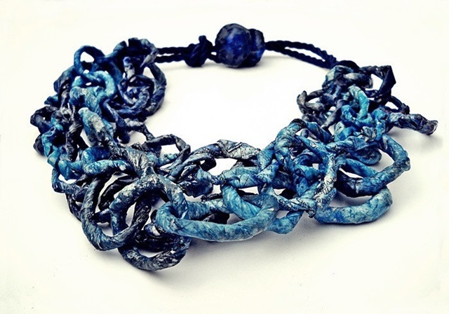
'blue chain’ Necklace
The use of geometric shapes in your work is so simple while at the same time being so elegant. Can you discuss?
The American designer John Maeda states: “Simplicity it’s about subtracting the obvious and adding the meaningful”. I totally agree with him. I think that simplicity always adds something instead of taking something away. Being simple it’s not being easy, but it’s having clear where you want to go, it’s reaching to the heart of things, understanding what’s essential, and then letting it shine in a new light. I like to consider simplicity an “added value” and I like to think that this is what makes my simple geometric shapes look so elegant.

‘square grey and white’ Bangles
Do you design jewellery for men?
All “quasi caramelle” pieces are meant to be worn by women, but sometimes men appreciate them as well. It generally happens with the square/round bangles or with some rings. A good example is “plain”: a brown and light brown ring. It is made of cardstock, kraft paper and crepe paper, with a very simple and solid design.
Your comment “Let your uniqueness be inspired”... can you explain this?
Women are all unique and special in their own way. By creating one of a kind jewellery I’d like to inspire all of them, guiding their true essence and singularity towards fulfillment. I want them to feel free to choose the piece which most harmonizes with their soul, with the guarantee that it will always be as unique as they are.

'Tria’ Bangles
Tell us one story about a piece you have made that has given you and your career a huge boost?
The bangle “chances”, which I have described above, has been much appreciated especially in the artistic field. It is featured in the 2014-2015 edition of the “Contemporary Jewellery Year Book” by Grupo Duplex - Spain - and was exhibited in “Madrid Joya” and “Espaijoia Barcelona” - two events which were part of the Spanish project. However, I cannot say that this particular piece has influenced my career more than others. I’d rather look at my career as a work in progress, a sequence of moments, some good, others bad, but all very important to my growth and creativity.
You work out of Italy – discuss the importance of fashion and statement pieces to Italian Women and how they wear jewellery?
What’s important, though, is that they not only look for something original and unique, but they also want it to be comfortable and easy to wear. That’s why all my designs, whatever the inspiration, are translated into tactile, and durable pieces with subtle textures or more complex and layered finishes.
Contact details.
Web: www.quasicaramelle.weebly.com
Email: quasicaramelle@gmail.com
Mariolina Mascarino, Asti, Italy
Interview by Deborah Blakeley, March 2015
Jenny Bowker
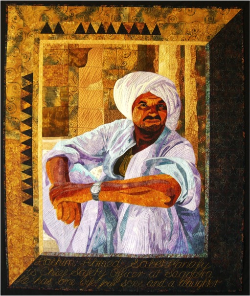
‘Hashim’ - image by Patricia Bolto
Can you discuss your former training in science and the direct advantages this has played in relation to patchwork?
I worked for thirteen years in the field of Electron Microscopy, first in research on bees’ eyes and how they work, then as part of a service unit doing a range of varied and interesting work.
I think the incredibly fine work we did with electron microscopy preparation works well with patchwork. We used to use a cleaned eyelash fixed to a slim glass capillary tube with dental wax to handle the slices of prepared tissue as they floated on a water bath – they were so small. Getting corners to match after this was a piece of cake! Not that I do much traditional work really – and I have relaxed a lot on how perfect work has to be.
Discuss specifically ‘Radiolarian Drift’ in relation to science?
Radiolaria are tiny protozoans that drift in the ocean, and we know them really from their skeletons. I had been working on a project identifying and photographing the skeletons and was fascinated to realise that the tiny line of foam that a wave leaves on the sand is packed with tiny lacy skeletons – constantly redrawing our coastline.
‘Radiolarian Drift’ - image Andrew Sikorski
I wanted the work to reference science but not to be too specific so it is a generic radiolarian that no-one would recognise, drifting up from the deep crevasses of the ocean. The quilting added movement and I quilted in silver. The background was a rough heavy indigo blue silk.
This piece was the first I made that melded my life in science to what I had thought of as a nice hobby.
You have spent over 15 years in Arab and Islamic countries. How has this influenced your art?
I think it has influenced my subject matter more than technique. I have made a series of quilts based on Egyptian men. They were a response to a moment of sheer frustration when a friend – no – not a friend but an acquaintance - commented on the fact that you could not trust Arabs – they were all terrorists.
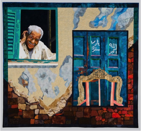
‘Abu Ali and the Gilded Chairs’
I realised that I could talk my head off. I told people how gentle and kind most Arabs were, how they were generous beyond reason even when they had nothing, how they would drop all walls when they decided that you were a friend, and that friendship would last for life, and how in Egypt particularly, they struggled to make the best of the level of income they had because they truly believed that it was their task to make the best life they could within their means. The talking had little effect.
David Shipler, in Arab and Jew, Wounded Spirits in a Promised Land, wrote “They will not find peace in treaties or in victories. They will find it, if they find it at all, by looking into each other's eyes.”
I decided to work in ways that showed men with their work, and men who were straight and honest and kind, and who were proud of what they did. I have always loved watching people work when they are truly competent. They had to be photo-real so you could see their expressions and look into their eyes.
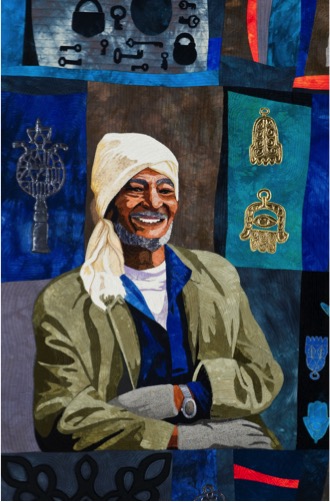
‘Hashim, Ittayer and the Friday Market’
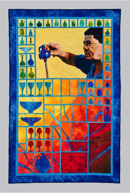
‘Hassan and the Glass’
You have taught in over 22 countries. Can you discuss some of the similarities?
Usually I am working with women and women’s issues are the same worldwide. Family and children usually come first, then work if they have it, then a hobby like patchwork. In some countries where I work life is a struggle and the patchwork is actually a source of income – sometimes the only source of income. That changes the pattern radically and I have to teach in ways that are fast to make, and target things that are quick and saleable. We do not make any queen size quilts in these countries.
Otherwise classes are similar. I leaven the instruction with humour and stories, and vary instruction techniques as some learn by seeing diagrams, others by seeing it - in Iran women were fast with mathematical ideas, they saw patterns that would occur at block corners before I pointed them out – and they were completely new to patchwork.
Detail of ‘Al Amish’
‘Al Amish’
In Ramallah the women worked incredibly hard – they were all to graduate as patchwork teachers after our one-month course, and it was important to them. They also worked brilliantly in teams with no concerns about who owned the piece that six women were making together. I cannot imagine that happening in the west. We only had two sewing machines in each class of twelve – so it was by far the quickest way to work. The teams were finishing tops in an hour and a half.
A small group with a finished top in Ramallah
How do you cope with language and interpretation when in other countries?
Even when I have a bit of a language I work with an interpreter. It can be challenging and I try to make sure they can also sew. One of these occasions turned into something wonderful. In Australia my husband had been working with the Centre for Defence and Strategic Studies. It was made clear that Australian wives were expected to do something for the wives of foreign generals on the course.
I announced a patchwork class and most of the twenty attended on the first week. By week five we were down to four. Three lasted a long time and one – a Thai friend who became one of my ‘sisters’ stayed all year. Vanida Navakul fell into patchwork as if she had been born to do it. Each week we met at her house. I taught patchwork and she showed me a new dish for a Thai lunch. I told her she had to go back to Thailand and teach – she was really gifted and hated the seamstress work she had been doing.
When I needed an interpreter in Thailand I asked for Vanida. I knew she had not started work in any way and was too shy to promote herself in patchwork. After a week of my classes I could see shop owners looking at her in amazement.
She was not just interpreting – she was moving around the classes helping students in Thai while I demonstrated in English. She had bookings for weeks at the end of it and now has a very successful business in Bangkok – with two long arm machines operating from her shops. It is a marvelous feeling knowing that for one of my dearest friends I really did teach her something that changed her life.
Expand on one of your many textile tours ‘Postcards from Cairo; Do you want to come to Syria and Egypt with me?
I LOVED doing these tours. They have stopped at the moment. Syria is out – for my lifetime at least. Egypt is struggling a little still and it is hard to entice people to go there even though it is probably fine. We limited numbers so we could all fit in a small bus and so I did not lose people in long walks through tiny alleys in suqs.
I ran three tours. The final one was two weeks before Egypt had its first revolution and the mobs were in Tahrir calling for Mubarak to resign – and he still had not when I decided to switch it into Jordan.
One of the best highlights was a night in the house of Widad Kawar, who is known as Umm l'ibas al-falastini—the mother of Palestinian dress. She wrote the following wonderful books and I particularly recommend Threads of Identity.
- Kawar, Widad: Threads of Identity: Preserving Palestinian Costume and Heritage ISBN 978-9963-610-41-9 Rimal Publications. 2011
- Kawar, Widad: Pracht Und Geheimnis - Kleidung Und Schmuck Aus Palästina Und Jordanien ISBN 3-923158-15-7 Rautenstrauch-Joest Museum Munich. 1987
- Kawar, Widad and Tania Nasir: Palestinian Embroidery : Traditional "Fallahi" Cross-Stitch ISBN 3-927270-04-0. Munich, State Museum of Ethnography. 1992.
- Widad Kawar and Shelagh Weir: Costumes and Wedding Customs in Bayt Dajan. "biography". Kawar Arab Heritage Collection.
Widad Kawar and tour group
Widad dressed us all up in the costumes of different areas of Palestine. It was a really wonderful night – and she had seen us at incredibly short notice.
On another part of the trip in Syria between Palmyra and Damascus I had rung ahead and asked a tiny desert coffee truckstop to hold milking their sheep until we arrived so my travellers could see it.
Although it had nothing to do with textiles it was mentioned by many as one of the great experiences of the trip.
On earlier trips that were able to go to Egypt visits to Wissa Wassef Tapestry Project and the stitchers employed by the Anat Foundation in Syria who live in the tiny village area of were highlights.
A Large Tapestry at Wissa Wassef
Wissa Wassef treats its weavers as artists. There is no pressure on them, they choose their own designs and subjects, and they are not pushed to work. Their work is spectacular.
Detail of the tapestry
Jebel al Hoss
In Jebel al Hoss the women live with their families in mudbrick beehives. It is bleak country – freezing and windswept in Winter, and scorching and windswept in Summer. It is in the area we used to call a ‘plant and pray’ area. They do exquisite embroideries which are marketed as bags and clothing to the rich and privileged in Damascus – and worldwide.
Can you explain ‘Sandstorm over White Dessert’?
This quilt uses a combination of raw edged applique and simple piecing. Many of the fabrics are hand dyed or painted. Sandstorm over the White Desert is the sixth quilt in the series. Magdy Badrmany became a friend of ours while we lived in Egypt. He is a Bedouin guide in the White Desert and we were impressed by his professionalism, his driving skill, his sense of humour and the way he simply and quickly set up our camps and cooked wonderful food for us.
On one camping trip a sandstorm blew up on the horizon. We watched it approaching in some trepidation. I did not want sand in my SLR camera so I memorised the changes. I was fascinated as we watched the ominous approach, and saw the way the shadow of the storm changed the colours of the white desert. As we watched, creams and warm golds became silver and mauve.
‘Sandstorm over the White Desert’
Magdy was calm and unworried – as always. I added a brief text in my own hand writing at the quilting stage, explaining very simply who Magdy was.
I made the quilt and sent Magdy a text to tell him to check his email. In Bahariya Oasis, where he lives, there was only one possible internet connection for him – the local coffee shop. In Egypt women do not go to coffee shops. I had sent two tiny picture files – one of the quilt with me in front of him so you could see that it was life sized and one of just the quilt.
Magdy took his wife. She wore full Nekeb to go there – a face cover with just slits for her eyes. As the images started to download – very slowly on the dial up modem – Magdy went to get coffee. Next thing she was hitting his shoulder.
When he asked why she pointed to the screen where it looked as if Magdy had his hand on my bottom – real me, quilted Magdy. Luckily the other image cleared things up. I realised why she did not realise it was a quilt – in the tiny file the pieced sky just looked pixelated.
The offending image
Discuss your photographic technique to quilt making. Perhaps you can use ‘Mohamed Sa’ad – Caretaker of the Mosque’ to explain this technique?
Detail, ‘Mohamaed Sa’ad.
I used composites of several photographs for this piece. The face had to be accurate, but I wanted to use him in front of the magnificent silver and bronze medallion on the mosque door.
‘Mohamaed Sa’ad.
I traced different elements separately and put them together. I then make the drawings bigger, scaling some up more than others. I outline every different colour, not just every different value. These become pattern pieces for the raw edged applique. Each piece is matched to a piece of fabric, cut out and ironed down with a fusible webbing. Stitching holds it securely and adds a lot more linework. Then quilting adds another level. I do not want a quilted groove on each change of colours on his face – the quilting is contouring and often ignores the colour changes.
For the mosque door I pinned foiled jersey over the almost-finished quilted quilt. I stitched the lines of the intricate design, then cut it away with a soldering iron and restitched it.
Explain your project 'The Tentmakers of Old Cairo'?
Our move to Egypt was the time I moved me into an orbit I already knew. In 1981 I had visited Egypt during the Gulf War. One of my strongest memories was a visit to the Street of the Tentmakers. The Street of the Tentmakers is colourful and vivid but the work is slowly dying as an art. It had lost its Egyptian audience as wealthy Egyptians wanted French tapestries, and poorer ones were just not interested.
Street of the Tentmakers
The tentmakers are men who used to – and still do - make tents. However they are best known for the exquisite applique they use – and originally it formed the inside of every wall of a tent. They now use printed fake cloth for the tents as people are usually unwilling to pay for the full handmade applique. They make panels for people to hang in their homes, or to use as quilts. The work is made with solid coloured cottons, and it is ornate and beautiful.
Textile by Wael
Subjects range from the purely decorative to calligraphy and storytelling.
Tarek Abouelenin explained to me that he and his company had invested fifteen years of savings to go to a Furniture Expo in Holland. They had completely failed to increase the business and companies who ordered wanted 3,000 piece in two weeks, and they just did not have the stitchers to do that.
As he was talking I was thinking – it is the wrong audience! You need to be seen by quilters or textile workers who understand exactly how wonderful you are and the difficulties of your work.
An invitation from Expertise Events to teach and speak at the AQC in Melbourne was the trigger. Judy Newman selected a talk about the Tentmakers, and Beutron offered to sponsor an exhibition space. I took two men – a translator to help to sell, and a master stitcher, Ahmed Naguib.
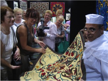
Ahmed Naguib at AQC in Melbourne
I knew Australians would be blown away by the work and it would sell like hot cakes. I had not expected the changes it brought back to the street in Cairo. Ahmed Naguib talked about how he was received, how people used video, how he was in the newspapers, how women clapped when he finished a flower – and I watched the street start to realise that what they did really mattered in a larger context.
They have now been to seven countries with exhibitions, and sometimes several times to each country.
Hany Abd el Khader, one of my friends in the Tentmakers’ Street made an applique piece to remember the first Egyptian Revolution. That was sold to the Museum of Oriental Art in Durham when we took it there for an exhibition at the University. It has a double historic importance – both far greater than anything I could make. It is work by an Egyptian about an Egyptian event of huge importance, and using a craft which has never been used by its workers for political commentary.
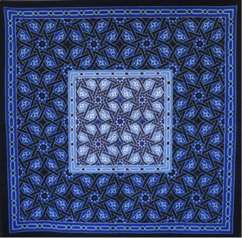
By Hosam
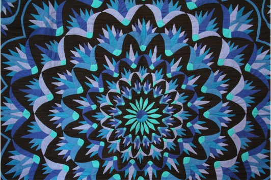
By Mohamed Dendon : Detail
Discuss colour and how you use hand painted fabrics and other techniques to achieve the colour you need in your quilts?
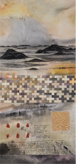
‘Water Mountail’
I tend to freshen and brighten colours for many pieces – that is just a matter of personal taste. It also has the effect of drawing attention from the softer greyed quilts around mine in a quilt show – so there is an element of deliberation to my colour choices.
I did a lot of the work when living in Egypt dyeing and painting of fabrics became a necessity. I could get large bolts of cheap white cotton, but never colours that I wanted. It was easier to buy whites and work from that, augmenting with other fabrics from my stash. I mix everything. Working in Ramallah and Iran told me that you use what you can get. Patchwork came from making do with what you had and we have almost forgotten this.
You are a member of tACTile, discuss the importance being a member of this group has been to you personally and professionally?
Working with tACTile has been very important to me. The group are good friends. The others are all so incredibly talented that I often wonder if I really belong there. We have had exhibitions every two years for the last twelve years. In each exhibition we have basically made our own work, but within a broad and elastic theme. There are times when I race towards deadlines swearing I will never do it again, but it has opened doors that would have stayed closed for me as a single quilter.
Discuss the importance that a quilt maker can be in capturing time and place?
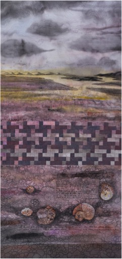
‘Ammoni’
I think that a Quiltmaker can be considered an artist in the way of other artists – it is only the medium that is different. Our work has significant advantages as I can fold twenty large quilts into a suitcase and carry them on a plane to an exhibition.
I think pictorial work of the kind I make can freeze a moment. However, decisions like choices of colour and patterning are subject to fashion and can lock the work into an era and that might not be such a good thing. I was looking the other day at advertising with men in bell bottoms and crocheted vests. We were laughing because they truly looked funny. It made wonder if my work will date in the same way.
Your husband’s Diplomatic placements; how have these helped you as a quilt maker?
I would not be a quilt maker if it were not for my husband’s career. When I married Bob I knew that I could not keep on working in electron microscopy. I drifted in the first postings – I taught kindergarten at the American School in Damascus, Syria, had two extra children in Kuala Lumpur, Malaysia, then started to study with a Palestinian painter in Amman, Jordan - and loved it.
finished a degree in Visual Arts just as my husband left to work with the UN in Gaza. I had done the degree with the intention of taking discreet groups of diplomatic wives into the landscape to learn to paint. I made a couple of quilts – for fun – and followed him to Jerusalem. Then there was a moment of realisation that quilting was simply a medium, that I could do anything with it that I could do with paint.
Textiles feel extraordinary to work with. People reach out to touch textiles and never do that to paint or photography. From the moment we are born we are wrapped in cloth. We step naked from the shower into cloth, we sleep between sheets, and blankets are used for warmth and comfort. There is an immediacy to textiles never found in paint. Colours are richer too as reflections do not usually affect fabric.
Our postings have also supplied me with incredible – sometimes unbelievable life experiences. Some find their way into my work, some I just hug to myself. The travel has supplied subject matter, though I only use places that mean a lot to me, not places I trip through briefly. I think the best art has to come from feelings – not just the idea that something looks pretty.
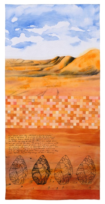
How has patchwork and quilting helped you when you have had to move to a new posting?
Yes – though there is always a period before the luggage arrives where I use the time to explore and get to know a new country. Moving to a new place can actually be devastating, regardless of how exciting it sounds.
I think we all have so many facets. We show a different side of ourselves to different people. My parents see me in one way, my children are shown another. I am a professional in the workplace with peers, somewhat subservient to my boss, a partner to my husband, and different again with female friends.
When you move – you are suddenly only a mother and wife. I have even been introduced as “The new Brenda Dodsworth” – naming the wife of the officer Bob had just replaced. It is a frightening loss of identity and I think you have to slowly replace each facet, finding people who see you in different ways. With my work I keep another facet throughout, and it gives me a sense of purpose in a brand new country where I am isolated by language, by the fact that I do not know anyone, and to a certain extent by my husband’s high status. He was the Australian Ambassador in the last few posts and an ambassador’s wife loses freedoms just because she is there with the representative of our country. You are never out of that role, regardless of where you go or who you are with. In our first posting with that title – day one – I turned at the checkout in a Jordanian supermarket and picked up my plastic bags of shopping. “No, said the owner. He said, “I have to talk to you.” He lead me to the restaurant part of the supermarket and ordered two coffees.
“In this country you are the wife of an ambassador. If you carry your groceries you are saying your country is rubbish. You can never, never do that here. When you shop you turn and walk out. You will know that your groceries will follow you.”
That was one of the hardest adjustments for an independent Australian to make – but during the next few years I heard enough gossip from Arab friends to know that I had been given great advice.
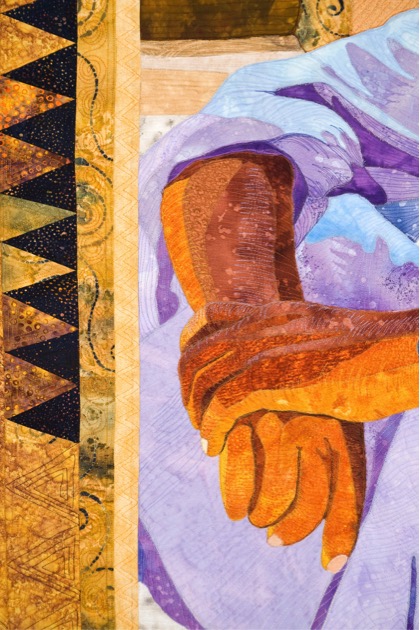
Hashim ; Detail - image by Patricia Boulton
Recently you have had issues with copyright, please explain what you have learnt about this aspect of artistic ownership?
Recently you have had issues with copyright, please explain what you have learnt about this aspect of artistic ownership?
I did so little. One of the quilts I had made back in 2002 was a traditional style of quilt. I had been in Singapore and a friend and I had shared a pile of sarongs which we cut up and divided. The front panel – or my half – of each sarong was so lovely that I did not want to cut it smaller. I designed a way to use triangles to make the pieces shimmer – and it helped quite unrelated prints to sit comfortably together.

A few years later I repeated the quilt in another lot of fabrics and it was so popular that I started to teach it as a class. Then I made two more. By this stage people were starting to copy it.
I was a bit miffed, as it looked traditional but it was not a known traditional block. People started to ask for patterns and I started – slowly and through chemo, to put a pattern together. A friend, Cassandra Philpot, spent several days with me taking process photographs to use in the pattern.
I never make patterns. Everything I teach is aimed at moving away from dependence on others’ designs, and making original work, so this was a very different path.
I negotiated with an Australian company to print it and do the distribution. And waited. Five months.
Then someone on a Facebook list posted the quilt they had made in a Shimmering Triangles class! I contacted the teacher and pointed out that she could not teach my design and my class without permission. She was nice – used the excuse that there was no pattern so she ‘had to write her own,’ but happily agreed to have her students buy mine in future.
Within two weeks I had withdrawn the pattern from the slow publisher, given copies to a group going on a quilting retreat who promised to test it, and after a few tweaks that they suggested I slammed it up on an internet selling site for crafts as a downloadable pdf file.
Then the real drama started.
A shop announced its BOM. This is a Block of the Month. Sales of these are almost infinite. Each month everyone who signs up gets a pack of fabric and instructions for that one section. By the end of eight months – or five or how long it takes – they have the whole quilt made. The shop can make a huge amount of money from this. They did not use my pattern – they cited my name and the fact that the first one was made in 2002 but said they had designed their own pattern from a Pinterest board.
I wrote a polite letter pointing out that this was a breach of copyright. No answer. I waited a month. Then the second advertising letter came out and they had removed my name and credit.
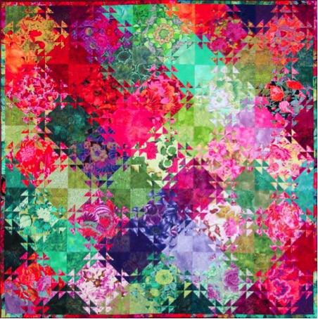
At this point I write a letter saying I was organising a Cease and Desist letter form a lawyer. I located a lawyer in the lady’s hometown and wrote to them.
I told two marvelous internet groups what was happening and they pulled in hard behind me. QuiltArt and SAQA are both offshoot chat lists for professional organisations – one from Quilts Inc in America, the other an international organisation centred in America called Studio Art Quilt Associates.
I named and shamed, but somewhat reluctantly as I was afraid of possible repercussions. Because they offered, I asked my friends to write a note or put a comment on the shop’s blog or Facebook page. Interestingly – Australia was blocked from the shop’s Facebook page. I asked people to stay cool, professional and accurate, and not to risk exaggeration or name-calling.
At the end of twenty four hours I stopped them as I was feeling sorry for the shop. I know they had hundreds of emails and comments and the owner had spent most of the day taking them off her blog as they appeared. Within half an hour of my stopping the emails the BOM was withdrawn with an apologetic note saying the maker did not realise that she could not draw her own pattern for an original quilt.
The internet really has incredible power. I was able to stop the lawyer letter before they had taken the top of the pen, and this did not cost me anything.
As a nice bonus – the pattern has been surprisingly successful – but that is another story!
Contact details.
Jenny Bowker
Email jenny.bowker@gmail.com
Website www.jennybowker.com
tACTile website http://www.tactilequilts.net/
Blurb book, Pack and Follow http://au.blurb.com/b/2578726-pack-and-follow
Pattern for Shimmering Triangles:
http://www.craftsy.com/pattern/quilting/home-decor/shimmering-triangles/122321
Jenny Bowker, Canberra, Australia
Interview by Deborah Blakeley, March, 2015
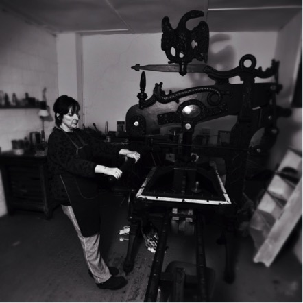
Gail Kelly
You studied print making in both Ireland and America. Can you discuss the differences and similarities?
I studied print making in Belfast at what was then the Ulster College of Art and Design. There was less emphasis on the academic side of things then and although we did attend lectures and had to write essays I remember most of our time being spent in the print workshop throughout the three year course. We had tutors who were passionate about their own work and great visiting lecturers. We learnt what I consider to be ‘proper’ traditional print making techniques and focused on developing the content of our own work throughout our time there. I mostly concentrated on etching and screen printing but did get an introduction to stone lithography at another print workshop in my last year.
While I was in America studying for my M.F.A I worked for Louisiana State University teaching undergrad classes and as a technician in the print workshop. I also worked editioning prints for established artists, all of which was good experience and helped me build up my CV. I mostly worked in stone lithography and etching there.
The print making department at L.S.U. had a great litho area and was altogether a much bigger set up than we had in Belfast. As grad students at L.S.U. we all had our own little studios which was a big difference from the shared desk I had in Belfast.
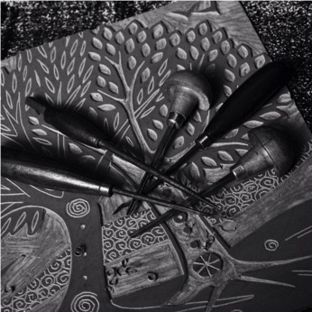
After returning to Ireland from America, did you find the landscape sharper to your eye?
I lived in America for seven years but I came home to visit every year so I never lost touch with the landscape here.
Please expand on ‘Fairy Bridge’ both the content and your use of colour?
The ‘Fairy Bridge’ depicts a little bridge my father often took me to see when I was a child. It was along a path, through a clearing in the woods. We loved going along that way. The whole area seemed secret and undisturbed. I don’t think many people knew the little bridge was there. The colours I used in this lithograph are the colours I remember from those woods – the autumn leaves lying untouched for years on the forest floor, the bright green of the new leaves on the beech trees above our heads and the misty mountains in the distance.
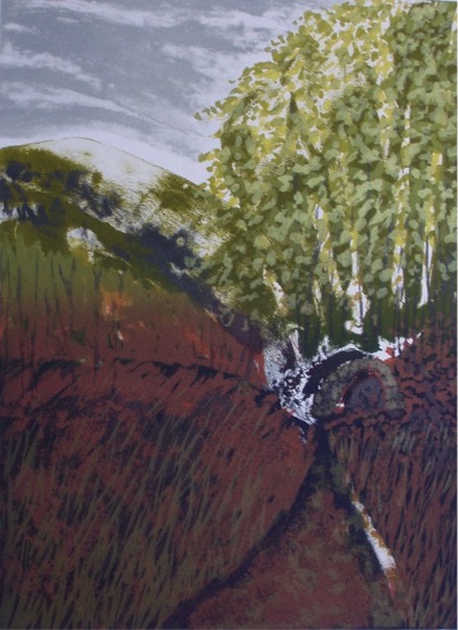
‘Fairy Bridge'
How do you decide whether to use monochrome or colour in your prints?
I chose whichever I feel will suit the image.
Can you discuss ‘The Immigrants Bridge’ and the historical content?
Also known as ‘The Bridge of Sorrows’ or ‘The Bridge of Tears’, it is on a small road in Gaoth Dobhair (Gweedore), County Donegal which led to the port in Derry. The population of this Gaeltacht (Irish speaking) area was badly affected by the famine and evictions. Many people left Ireland at this time, heading for America. Their friends and relatives would walk with them as far as this little bridge where they would say their goodbyes. The folk staying walked back to their homes and those leaving walked on to get the ship, all knowing that they would probably never see each other again.
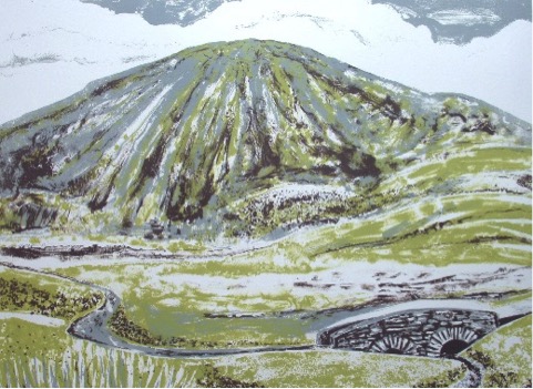
'The Immigrants Bridge’
Can you expand on your work in relation to trees and the seasons?
I live in the country now, in County Down and I am always very aware of the weather and the changing seasons. I have a big garden and I keep ducks and hens so I’m in and out all day long between one thing and another. The Tree series developed out of my interest in nature and the landscape where I live. Folk lore and traditions have always been an influence in my work. I like the idea of remembering and respecting the old ways of doing things, whether daily activities or annual events.
You made a calendar for 2013. Could you expand on this?
A few years ago I had a commission to do a calendar for one of the banks here in Ireland and I had been meaning to do one of my own ever since. I tend to work in series’, often in 12’s, so made sense to use some of these images for calendars. It has become an annual project now and I’ve produced my own calendar for the last three years. I used my Tree series for the first one, then my Gardens for 2014. For the 2015 I used a mixture of images, all my linocuts printed on linen.
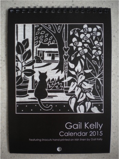
Can you discuss your Linen Prints and how and when you started to print on linen? Does it have any restrictions?
I started printing on linen about 15 years ago. It really suits my linocuts which I print in black on natural linen. I like this colour combination and I think it works well. Working with linen can be a bit tricky as it creases easily and has to be ironed and starched.
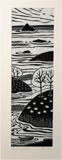
'Sail Away with Me’
Discuss your ‘Emigrant Series’?
This series refers to people who have left their native homes and long to return. Although I enjoyed my time in America I eventually became homesick and moved back to Ireland. I was lucky in that it was only a flight away and these days if you have the money for a ticket you can be back in no time at all. Years ago when people left it was often a one way journey and many never had the chance to return. When you are away you are more likely to think about home at certain times of year such as Christmas (‘Coming Home’) and I imagined in the past people wondering how the family would manage the farm without them (‘Harvest Time’). The title of ‘Promises to Keep’ comes from the Robert Frost poem where someone is travelling and has to keep going along their way. ‘Sail Away with Me’ refers to young couples moving away to start a new life together.
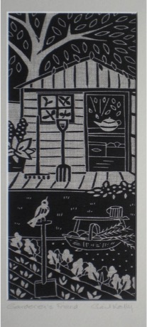
'Gardener's Friend'
You also have a ‘Bird Series’. Discuss: ‘Gardener’s Friend’ and ‘Garden Girls’ in relation to each other and as a part of a series?
I feed the wild birds in my garden and enjoy watching them every day. ‘Gardener’s Friend’ is about a robin which is always nearby when I’m working outside. I keep hens and ducks for eggs and ‘Garden Girls’ refers to some of my little banty hens and chicks. The images in this series are a combination of the patterns of garden trees and flowers along with an element of storytelling depicted by the birds.
You attend Craft Fairs - can you explain the importance of these to presenting your work.
I usually take part in 2-3 trade shows a year where I wholesale my linen prints and greetings cards to galleries and shops throughout Ireland and the UK. The retail craft fairs are quite different from the trade shows as they give me the opportunity to meet the public and sell directly. I enjoy the peace and quiet of rural County Down but it is also nice to have the buzz of excitement at a busy show. I have made some good friends among the other exhibitors over the years. It’s interesting to chat with customers too and build up a connection with them. I like travelling and taking part in the shows. It gives me the chance to see other parts of the country and I plan for a day or two off to go exploring whenever possible.

Discuss how important it is for you to represent your country through your art?
The landscape of Ireland is obviously very important in my work and has always been the main influence over the years, even when I was living abroad. I don’t feel I represent my country as such. I depict the elements of it which hold my attention and these could be anything from a scrap of ancient folklore to mountains and fields to the shape of a tiny leaf. My imagery is not intentionally ‘Irish’ but once people know where I’m from they see the strong connection I have with the land here.
Contact details
www.alganarts.com
www.gailkelly.co.uk
gail@alganarts.com
Gail Kelly, County Down, Northern Ireland
Interview by Deborah Blakeley, March, 2015
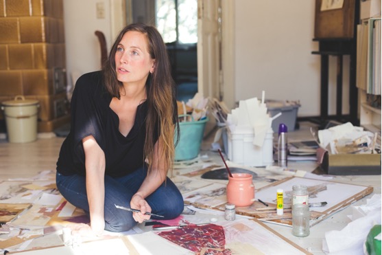
Ute Rathmann
Expand on the importance of looking at the work of past Masters in your work?
I am very inspired by the work of past Masters. I tend to arrange my work in series with scenes reminiscent of masters such as Gustav Klimt. A model is dressed up according to a particular theme. This is the visual basis. The end result, however, is not directly connected to the depicted subject but takes on a life of its own.
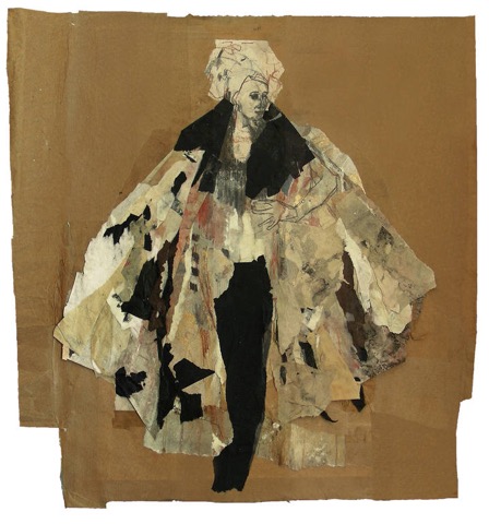
‘Hommage à Gustav Klimt X111’
How do you describe your art medium?
It is a vivid mix of all sorts of mediums. I use pencils, watercolours, pastel, pigments, crayons, etc. Important is their compatibility with paper – and I do not like to use colours that have a chemical smell.

‘Hommage à Degas XXI’
Can you explain how you use Collage in ‘Ewig’?
This special piece is a bit different then most of my other abstract collages. I work with this medium for many, many years and my whole studio is crowded with tons of pieces of paper that are glued together and then torn apart again. From time to time some of those pieces that emerge by accident happen to be so beautiful that I want to use them just the way they are. For “Ewig” I found this one single piece and I just glued it with wallpaper paste on a cardboard.
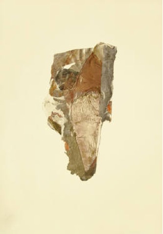
‘Ewig’
Can you take us through the before and after process of ‘Hommage à
Goya XV’?
First of all there was the figure – a draw over a collage. I thought a faint background would fit the best, so I started to use paper in different shades of white. My aim was to show a development from the colourful skirt to the subtle head. I used the paper for the background to create a sharp silhouette of the skirt and I made the skirt longer and more vivid. The upper body stayed the way it was from the beginning.
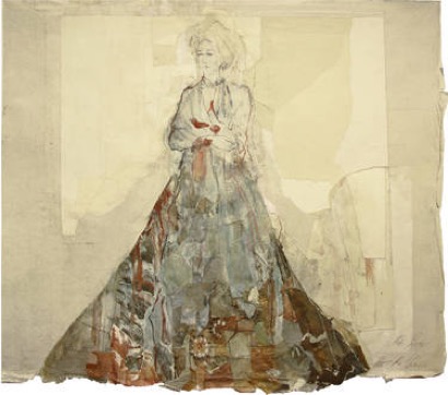
‘Hommage à Goya XV’
Discuss where less is best using Hommage à Degas XXVI.
To me, “Hommage à Degas XXVI” is a very light and soft picture. It always reminds me of “Sternentaler” (“The Star Money”), an old fairytale by the Scandinavian author Hans Christian Andersen, in which a poor girls gives everything she owns away until her gowns and then the stars fell from the sky turning into golden thaler.
‘Hommage à Degas XXVI’
When do you decide to add colour?
Drawing is a very intuitive thing to me, therefore I do not really `decide` to add colour, it is always a result that just seems to happen.
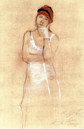
‘Hommage à Ingres XI’
Can you explain where and when you use gold pigment?
I discovered a box with gold pigment while cleaning the studio of my deceased professor Christine Perthen. Since the very beginning using this medium, I fell in love with it. I apply it with a dry brush to achieve a blurred surface area or draw lines with a wet brush. In any case it must be fixed with a very strong spray afterwards.

‘Hommage à Botticelli XIII’
Discuss ‘Tribute to James Goldstein VIII’ and the use of collage and shaped paper?
Usually, I tear the figure out of the drawing to creating a perfect surrounding that highlights the figure. With this piece it was a bit different I did not compose a background, I just used black paper and put some small pieces of silver paper around to combine the background with the figure.
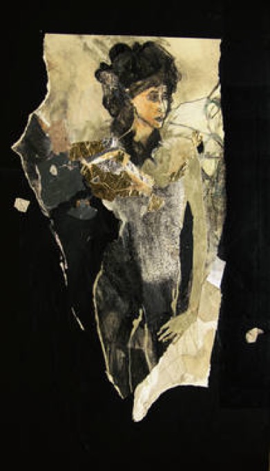
‘Tribute to James Goldstein VIII’
You teach Fashion Illustration. Can you explain the changes you have noticed in the area of art?
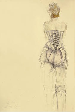
Some years ago, the perception for an artist who deals with fashion in his artistic work was considered as a bit frivolous. But now, there are more and more artists like me, whose work may be described as “fashion art”. It is not “fashion illustration” because it is not created for the purpose of promote and selling fashion. It is more an artistic involvement with fashion.
Fashion is iconic and timeless in your art, can you discuss this?
I have studied fashion-design at the Kunsthochschule Berlin-Weissensee because there has always been a very strong fascination for clothes, costumes, fabrics, patterns, etc. It took me quiet some time to realize that I did not want to design clothes. Instead my artistic aim is to create a special kind of setting I could use as a visual basis for my artworks by using clothes and costumes in combination with a human model.
You also draw nudes – discuss this in relations to being a woman and the depiction of other women?
I also draw male nudes, it makes no difference to me. At this moment I start drawing I am always turning into some kind of a neutral being excited only about the beauty of the composition.
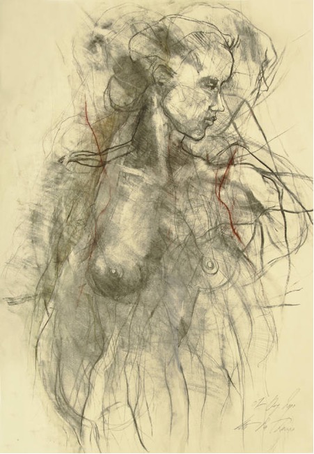
‘Nude IX’
Composition is very important in your work. Please expand on this?
The composition is like a perfectly fitting frame for an artwork. First, there is the figure and then I try to create a surrounding that presents the figure the best.
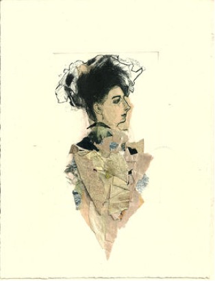
‘Hommage à Cranach III’
Explain about your titles and the numbering system you use?
I sort my works by the name of the Great Masters that inspired the setting. The numbering is not really chronologically because I work so much that somehow I lost the overview. I try to keep at least the series together which are made at the same time.
Do you sign and date your work?
Yes, I do. I sign and date the front or the back of my artworks.
Discuss the use of signed Certificates of Authenticity?
It is very important for my collectors to get a hand signed Certificate of Authenticity. An artwork is something you probably want to leave to your heirs and they might need the Certificate for the eventuality of selling the artwork.
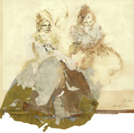
Hommage à Watteau XII’
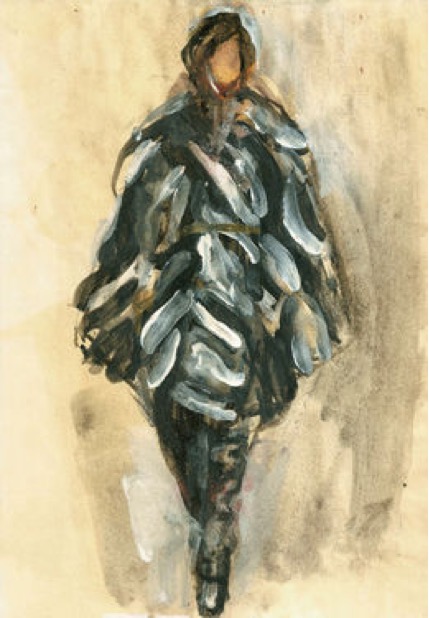
‘Fashion Illustration’
What is the magic of fashion and art – discuss?
I guess it is all about feeling and not about thinking. When I was younger, I felt quiet unsure about my work. I always wanted to capture poetic and magic in my work. A lot of people told me that my drawings are somehow not “serious” enough, too decorative, etc. but the older I became, the more I trust in my own feelings.
Contact details.
ute@uterathmann.com
Ute Rathmann, Berlin, Germany
Interview by Deborah Blakeley, February 2015
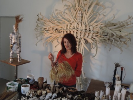
Sally Simpson
Can you discuss the ritual and ceremonial rites in your installation ‘Precipice’?
The background to all of my work is an interest in ‘power figures’ and ‘votive objects’ used in many cultures as mediators between humans and nature. In addition I refer to the tradition of using materials at hand to make such objects. However my sculptures embody personal questions about the contemporary relationship between humans and nature, in an era of many confusing and contradictory value systems.
Why was the exhibition called Precipice?
The anchor piece for the exhibition held at ANCA (2013) and Gallery Smith Project Space (2014) was ‘Precipice’, consisting of 9 figures poised along the edge of a bench. The figures kneel and extend empty hands, inviting interpretation by the viewer. Kneeling is associated with a position of last resort, whether in prayer, submission or despair. The exhibition held at Gallery Smith Project Space included 5 kneeling figures carrying empty cow horns. The idea underlying this body of work is that a precipice is a moment in time when an individual or group faces an unknown future.
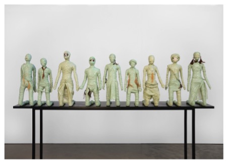
How many figures were exhibited together in this exhibition?
ANCA showed ‘Precipice’ plus 9 individual figures. Gallery Smith Project Space showed “Precipice’ plus 5 new individual figures.
Discuss the collaboration between the Gallery and yourself in putting this installation together?
The delight of working with a commercial gallery is that they are experienced with installation. Emma Benichou and Marita Smith spent a lot of time deciding on the best display, and although they consulted me often I was happy to trust their judgement. For example I agreed with their decision to remove all drawings planned for that show, which made it far more visually powerful.
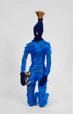
Discuss the use of found objects in your work?
In the past I’ve used objects found at particular sites and these materials have inspired the forms created. For Precipice the materials relate to my life on small farms over the last 25 years. I like to begin with the soil or vegetation of the area, as traditional sculptors began with clay or timber. For several years I worked only with clay so I still find modelling comes naturally. Now I include any found objects as I build and model, as these embody both the site and the issues I’m working with.
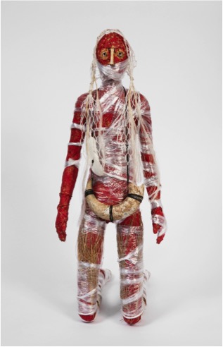
Within the found objects, do you always combine natural and man-made objects?
So far that has been the case because it is my way of merging the process with the ideas. However I can imagine an idea might lead to a decision to use either one or the other.
Do you think living in the country has brought a stronger Eco influence to your work?
Most definitely. Issues such as revegetation of rainforest, water and power sources, and the potentials and limitations for a local, organic and sustainable lifestyle are part of daily life. Which is not to say that I live according to ideals but rather see how complex the issues are.
Discuss the relationship between human and the land in your work?
I hope I raise questions rather than convey opinions. Land changes constantly, and so do our values about land. The issues today are complex so it’s important that people consider as much information as we can to form our own opinions and act on them as best we can.
The making of ‘faces’ from fish bones, lace and mud. Can you explain why you have used this particular combination?
The objects made for ‘Venerated Remains’ are examples of the materials dictating the form. After I had collected mud, irrigation pipe, fish bones and a lace curtain from the dried out bed of Lake Mokoan I tried putting them together in many ways.
The early works exposed the irrigation pipe and used other found objects. Over time the lace began to wrap the irrigation pipe, and the fish vertebrae happened to fit perfectly at the end of the pipe and acquired a different character when used in that way. When the final form suggested mummified fish it embodied layers of meaning regarding Lake Mokoan.
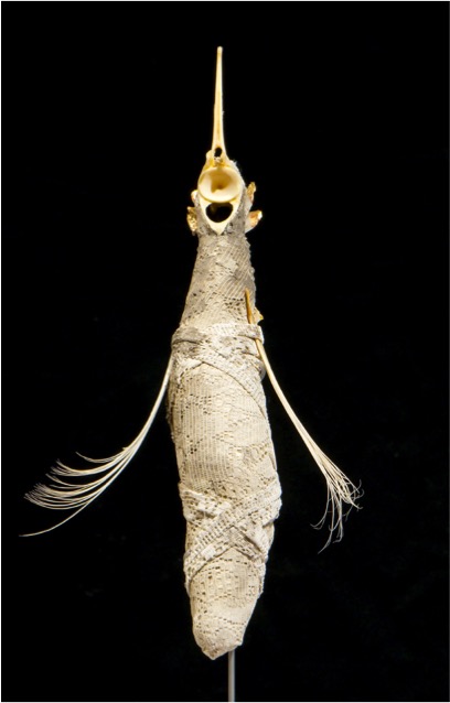
‘Veneraated Remains’ -detail
Can you explain the Meroogal Women’s Art Prize and how it affected your art practice?
This prize is named after a group of women who ran a property in the early settlement of Nowra. At the time I wanted to make a piece about the drought, and a watering can that could not possibly hold water, made from the dried out ribcage of a kangaroo, was decorated with chicken bones and stitching to reflect upon the harsh Australian rural lives of women settlers. Although I had been collecting bones for many years this was the first time I made a sculpture using them, and it was the beginning of a mode of practice that has continued since.
Can you expand on your ‘The Berry Series’?
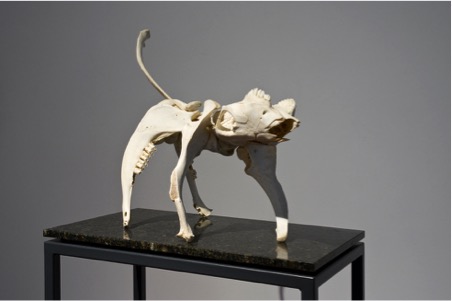
‘Cattle Dog 2’
It was appropriate to use cattle bones for this series as I lived on a former dairy and had observed Berry change from rainforest and cattle farming to retirement and holiday homes in the time I was there.
I intended to express a type of memorial to the former farming life, so used graveyard imagery of the cross and totems. The ‘Cattle Dogs’ were more affectionate and playful, made specifically for ‘The Dog Show’.
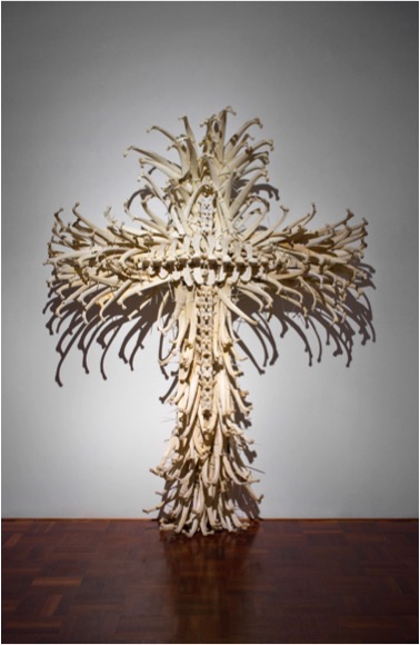
‘Cattle Cross’
How has your Master of Philosophy in Sculpture influenced your work since 2012?
The rigour of researching and writing about my ideas within the Australian National University sculpture department established a more professional approach to my work.
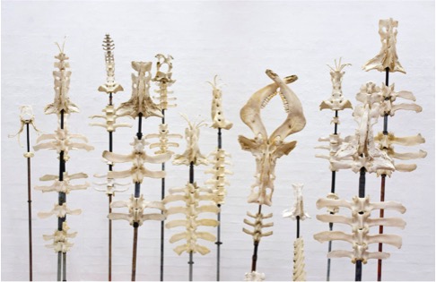
What are you currently working on?
I’ve just completed 2 more kneeling figures using quite different materials for ‘Imaginarium’ curated by Amanda Stuart at Belconnen Arts Centre. These are probably the last of the kneeling figures, but the materials, wax and thread ‘hybridising’ the bones of many different animals feel like the beginning of a new direction.
Contact Details:
Website:www.sallysimpson.com.au
Email: salsim6@bigpond.net.au
Sally Simpson, Canberra, Australia
Interview by Deborah Blakeley, February 2015
Ailsa Black
Recently you held a solo exhibition at The Stirling Smith Art Gallery and Museum. Your work was mounted on ‘RED’ walls? Can you talk a bit more about that? Did you know that the walls would be red before you began?
I had been to visit the gallery so I knew the walls were red. Because it was a Xmas exhibition I thought it would be very festive.
'Hedgehog Of Happiness"
How did the red effect the work you sent for the exhibition?
I just painted using the same palette I normally do. I have overheard people talking about buying a piece of work at my open studio event and trying to decide whether it would match the curtains. I’m not squeamish about these things but I wouldn’t paint anything to match a wall colour just like I wouldn’t choose a painting to match curtain colour. I just paint what feels right at the time!
Your work is small. Can you discuss this in relationship to the space?
Yes my work is generally quite small. I trained in Illustration so I’m not used to working on a huge scale. I just carried on working the way I normally do. I think it gave a good variety of work and a depth of subject which you wouldn’t be able to cover if you did fewer but larger pieces of work. Also it makes them more affordable. I think because I had over 70 pieces if filled the space quite well in the end.
Humour plays a huge part in your work. Please discuss this?
The humour is something that has just evolved. My paintings always include animals or birds and I think there is a lot of communication going on between them that we as humans are not aware of. I imagine they have conversations like I image I converse with my dog. The communication is there I think it’s just that we don’t always recognise it and animals understand a lot more than often we give them credit for.
'Hoo Many Snowflakes’
Part of the humour in your art is held within the titles, ‘Broon Coo’, ‘The Offering’, ‘Biding Time’, ‘Pep Talk’. Please discuss the title and these works.
'Broon Coo'
I suppose the titles reflect the capture of a moment in time and an insight into the companionship of the creatures and people in the painting.
'Biding Time'
Your work is so light hearted.Can you expand on this?
I grew up in rural Scotland with chickens, ducks, doves, cats, mice, cats, rabbits and so on. Animals have always played a part in my life. The titles come from the conversations I image animals are having with their contemporaries or with us humans. Animals bring so much pleasure to our world...we couldn’t live without them.
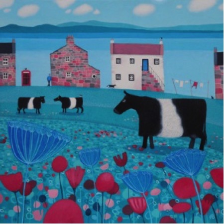
‘Mooching an’ Mooing’
Discuss ‘One More Wee One’
Inspiration: The lovely Belted Galloway Cow
Size: 20cm square
Use of Colour: Deep red, paynes grey, white and some brown for the robins
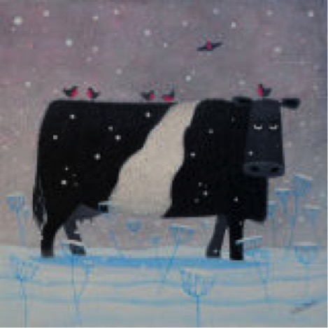
'One More Wee One'
You use a limited colour palette Can you explain why?
I think if you throw in too many colours to a painting it can look like a big dog's dinner! It gets messy and disjointed. I like my work to have a coherence which the colour helps bring together. I suppose I like to work compositionally to be well balanced and the colour is another facet of that.
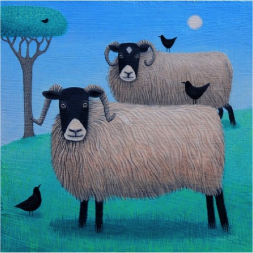
‘Woolit Beasties’
Can you discuss the process your work takes, from idea to completion.
I start with a sketch often just something done quickly and roughly. Then I work the sketch up on to a canvas board which has been painted with layers of modelling paste and primed. Then I start to layer the paint up. Often it will take 3 or 4 layers of paint to get the effect I like. Sometimes I put it on in fairly thin washes and quickly wipe it off again before it dries so you can see the lower layers of paint underneath. All my work is then photographed and some of it goes to be made in to greetings cards or prints which are either published by myself or licensed out to publishers.
Discuss your use of a sketchbook?
I don’t do a great deal of sketching from life but I do use sketchbooks for working out ideas and playing with new compositions. They are useful for information gathering but pressure of time means I don’t use them as much as I could.
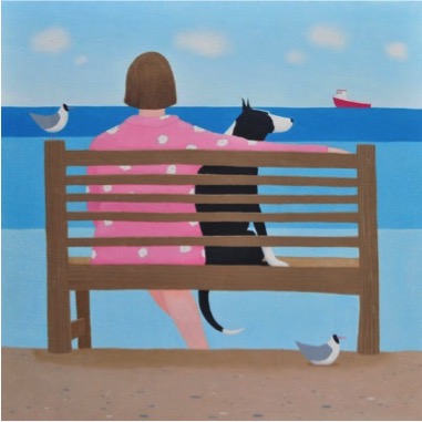
‘Maybe One Day’
Discuss the way you decide on what will be original and what will be made into prints and the edition numbers?
Oh it’s not very scientific…I just pick the ones I like most. Sometimes I can gauge whether something will be popular by the reaction I get on social media which is a useful tool for gathering public opinion!
‘Waiting Game’
You participate in Open Studios, can you give us your thoughts on the pros and cons of being part of Open Studios?
I love our annula open studio event. I am very lucky because I live in a part of the country where there is a formal event which artist are selected for. It is very well organised and I always have a good footfall. I use my local village hall because my studio is really too small. The local community run a café over the weekend and serve soup and homemade cake so it becomes quite an event!
Can you take us into your studio?
Where is it?
My studio is in the converted attic on the 2nd floor of our very old house. The house was built around 1800 and is a bit cold and draughty but has the most fantastic views facing the sea. I love living in a small coastal village. I know everyone who lives here and we all help each other out when the weather is bad. There is just a row a houses, a bus shelter, a phone box and a pub! The pub is an important hub to meet friends and socialise especially in the winter evenings when it is dark and cold. It’s a 26 mile round trip to the nearest supermarket and you can’t order a take-a-way. There is a mobile post bus which comes to a village about 6 miles away so even posting something becomes an outing.
How important is this space to your work?
Well I look down on to a stretch of beach and sea. From the studio I can see otters, porpoises, seals and lots of bird life. It is my inspiration even when the rain is battering off the window!
What you love about your studio?
I love the big windows, the light and the views.
‘Maybe two Day’
Contact details.
E-mail: ailsa.black@btinternet.com
Website: www.ailsablack.com
Ailsa Black, Dumfries and Galloway, Scotland
Interview by Deborah Blakeley, February, 2015
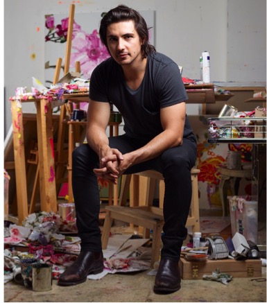
Alesandro Ljubicic
Alesandro at his easel
Explain how your relationship with Sean Cook (Sydney florist) began?
Our working relationship began when Sean enquired about one of my paintings that was in the window of Art2Muse Gallery, which is directly opposite Sean’s florist. We then met and started discussing the idea of a collaboration.
Discuss how your large current floral paintings have developed since meeting Sean Cook?

Since working with Sean, my way of viewing floral arrangements has changed dramatically. Sean has introduced me to flowers in such amazing colours, textures and shapes, and what makes them even more amazing is the way Sean skillfully puts them into beautiful arrangements that I could only dream of.
How did you and Sean work together for your latest exhibition at Art2Muse in Sydney?
Every month Sean and I discussed ideas for colour palettes and shapes for my next painting. From here Sean would take what we discussed and come back to present me with an amazing arrangement (which never ceased to blow me away!) I would then begin sketching and coming up with idea on how I would best represent my take on Sean’s marvelous creation.
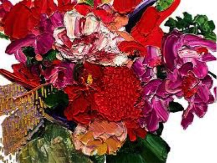
Inspiration comes from many places. Can you discuss the connection between the marriage of George Clooney & Amal Alamuddin and your flora painting?
This was actually just a simple coincidence! About a week after I finished painting that particular painting, the photos of George and Amal were shown around the world.
I couldn't believe my eyes when I saw how similar the composition and palette of Amal’s dress was to my painting so I had to share it!

Your works ‘Jaune Violet’ and ‘Naples Italian’ are very different from your current floral paintings. Discuss how you have developed your work?
My new work is more exciting for me as it’s created with more emotion, which I express through large, bold, gestural marks.
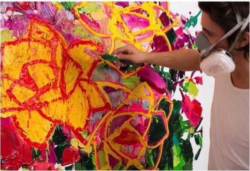
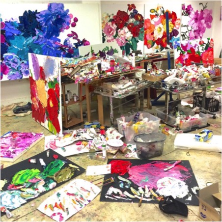
Expand in the technique you have developed by layering paint to create a 3D effect?
The key to the 3D effect is to keep adding more layers of pure oil straight out of the tube with minimal mixing to keep the colour vibrant and clean.
Discuss the importance of winning the ‘William Fletcher scholarship and an exhibition at Xavier Art Space propelled your art career?
Winning really gave me a confidence boost and made me realize that art in this country is so well received and respected by all, and it made me see that I wanted to be a part of it.
You have also started The Sydney Art Store, this must be similar to being a kid in a lolly shop! Can you discuss this?
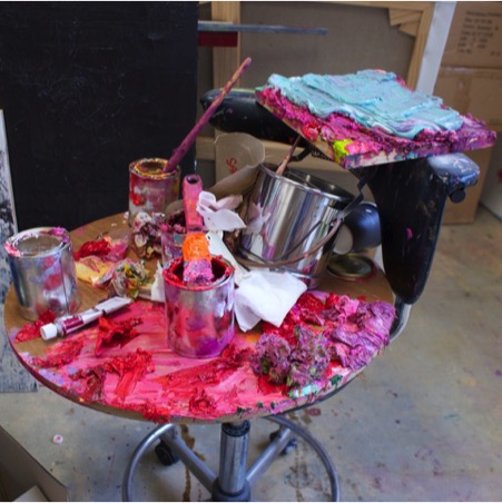
You have hit the nail on the head! It’s exactly like being a kid in a lolly shop, but don't be fooled, I still have to pay for the paint!
Your studio is above your business, how do you separate your time?
From 9am-6pm every day, I work with other artists at The Sydney Art store to help them solve the issues in their work while at the same time relating my work back to theirs. In the evenings I get away from this and move to my studio where I spend several hours on my own paintings.
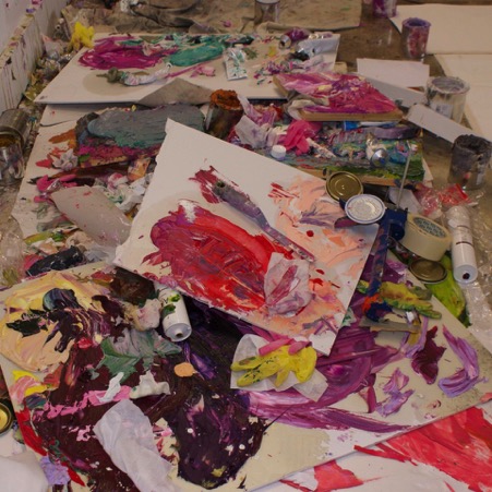
Discuss your colour studies and the relationship with a particular painting?
The colour studies for me are very important as they give me answers to how paint can be sculpted whilst at the same time gives me an understanding of how certain colours work together.
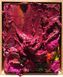
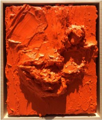
Alesandro using colour
Can you tell us about the Archibald Prize?
In 2013, I was lucky enough to be working with George Gittoes while he was in Australia.
For me this was so, inspiring as I wrote essays and studies about Georges Art whilst in High School and to have an opportunity to be working with him side by side in his studio was beyond anything I could ask for.
The Archibald Prize is regarded as the most important portraiture prize in Australia. It was first awarded in 1921 after the receipt of a bequest from J. F. Archibald, the editor of The Bulletin who died in 1919. It is administered by the trustees of the Art Gallery of New South Wales and awarded for "the best portrait, preferentially of some man or woman distinguished in Art, Letters, Science or Politics, painted by an artist resident in Australia during the twelve months preceding the date fixed by the trustees for sending in the pictures. Source: Wikipedia
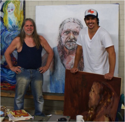
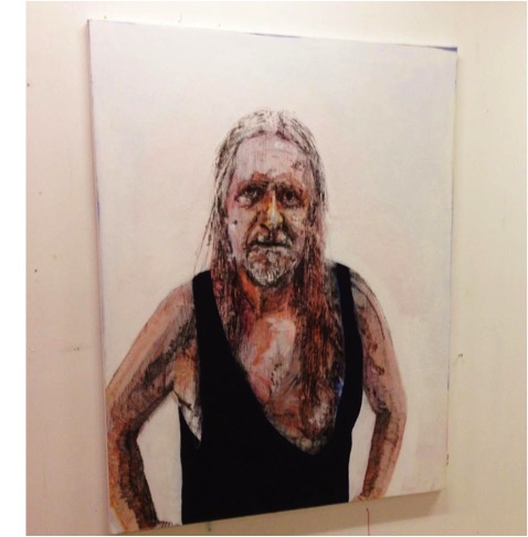
Contact details.
mail@alesandroljubicic.com
Alesandro Ljubicic
Studio
940 Bourke St
Waterloo, NSW 2017
For a full list of available works and price list, contact Zaria Forman at the email above.
Alesandro Ljubicic, Sydney, Australia
Interview by Deborah Blakeley, February 2015
Tracy Luff
What lead you to use cardboard?
It all started when I was studying art. We were given a task to create sculpture or artwork from recycled materials. I think I actually forgot to bring some materials so I simply took some old cardboard boxes from the industrial bin. That is where it started but there is more too it. Working with the fluted cardboard I soon discovered that beneath its surface was a dynamic and interesting medium. The variety of textures I discovered and the variations possible, simply by cutting it a various angles was amazing to me. I also loved the earthy and humble colours the cardboard came in. The more I worked with it, the more excited I became.
'Pivotal'
How do you store your collection of cardboard?
I have never thought of my stock pile of cardboard as a collection. Since I needed so much of it, I was always on the look out for the right kind of cardboard. They all vary so much in quality, from soft weak cardboard that is not durable enough for my work to really hard or even brittle cardboard which is also unsuitable. I quickly discovered the brand names associated with the best cardboard – that is the brands of whitegoods or car part manufacturers etc that use the cardboard for their packaging. So I soon had a store of the best cardboard that I simply store flat in a waterproof shed.
How important is the print on the outside of cardboard boxes to your work?
'Hill"
Generally speaking, the print on the cardboard is not important in my work as it is the exposed cut edges that are predominant in creating textures and visual effects. Occasionally the printed colours do show through in my work, usually in an accidental kind of way rather than by design
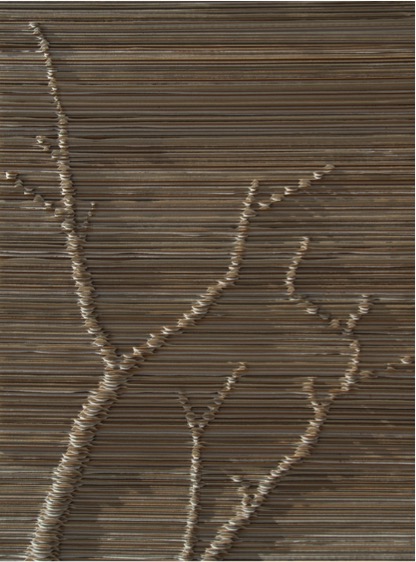
'Bare Land'
Discuss your feelings about the importance of using recycled materials in your art?
I don’t set out to voice an environmental message; although due to the nature of the medium that message or interpretation is always there. It is challenging to create work that surpasses that basic environmental message – I mean that I want my work to say more than speak simply of the medium it is constructed of. Having made that point, I still have strong feelings about re-using and recycling resources. I grew up in a culture that held those values more or less out of necessity. We never threw things away that could be re-used or recycled in some way
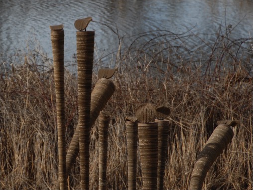
'TDO'
Explain how your artistic career has developed since your arrival in Australia in 1997?
I actually arrived in Australia in 1985 but didn’t formally study art until 1997. As a child I was always very creative, in fact I often recycle materials to create craft works. In 1997, I commenced formal studies in fine arts at the Newcastle TAFE. I studied everything from drawing, painting, print making, sculpture and photography at the Diploma level. When I enrolled for the Advanced Diploma course, I focussed on painting and sculpture. It was my work in fluted cardboard that attracted the most notoriety so as much as I loved to paint and sculpt in a variety of mediums, my work became dictated by this humble yet powerful medium. In my early years my focus was on gaining as much exposure as possible and I did this by entering as many competitions an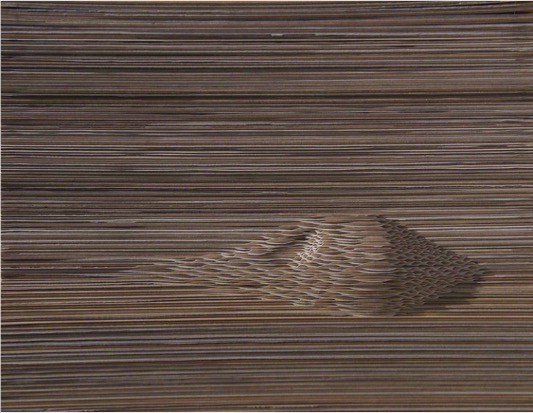 d group exhibitions as I could. …..
Discuss the process your work takes from inspiration to the finished piece.
Inspiration for my work can come from literally anywhere. Often I am creating work as a response to a theme presented to me by a curator, other times I am designing for a particular space where the work will be exhibited. Also the medium itself talks to me, i.e. I respond to the way the medium feels or looks as I manipulate or shape it. Often I get ideas for new works when I am working on current work. I always make notes for future reference. All my ideas pass through a visual diary where I sketch to develop ideas and inspiration can also be a product of this process. I have often woken at night and found myself madly sketching ideas that came to me during sleep.
Once I have developed my concept for a work I nut out the finer details like proportion and scale using mainly drawing, but often by manipulating images on my laptop. I nearly always produce a Marquette, especially for large scale work. A lot of my projects cannot be assembled in my studio so the Marquette is essential to get an overall 3D image of what the work will look like.
Planning the production of the work sometimes requires the use of a spread sheet program to calculate sizes and quantities of individual cut pieces. Depending on the work, steel frameworks, internal support structures, suspension methods, attachment or joining techniques need to be designed and made. There is rarely a project that doesn’t require some level of technical problem solving to accomplish.
Production of the artwork components is quite laborious and time consuming. I get lost in the repetitive processes of marking out, cutting and sorting the individual pieces before assembly. It really feels like factory work to me and transports me back to my younger years when I worked in factories during my school holidays to make extra pocket money.
'Rising Tensions'
Assembly of large works requires a well-organised space and sometimes that means outside in my back yard. Most of the time I will also pack my work, transport and install it myself – with the aid of my Husband.
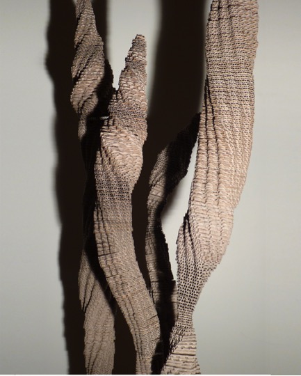
'Shoots'
How about durability, is this a question you are often asked?
Most of my work is designed to be in doors and the main question of durability related mainly to the archiveability of the work. Fluted packing cardboard is not archival and not designed to last forever. As I had not been using it for very long, I couldn’t be certain about its longevity either. I investigated it through industrial chemists and by looking at examples of cardboard used in art going back a long way. I concluded that it would last quite well under relatively stable conditions – the kind of conditions most artworks would be kept in. I was curious about how it would cope outside in the weather so I created an installation called “The Different Ones” and installed it by a lake where it endured wind, rain and the hot sun over a period of six weeks. It did survive admirably and to this day that work is still in my garden after five years weathering gracefully.
Discuss the importance of having a good gallery space for your work?
It is important to me that my work is exhibited at its best and this means the space needs to be good. In most cases, I will install the work personally so that I am happy with the way it is presented. I work hard to create the work so I want people to see it at its best. Often I will check out the gallery space before I create the work so that in essence I make the work for a particular space.
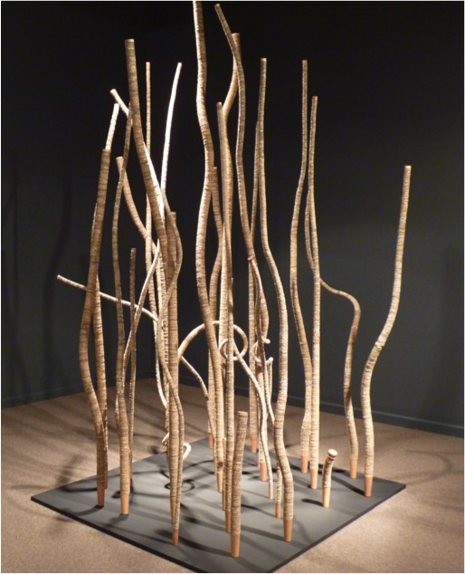
'THe Sticks'
Discuss the relationship between your medium cardboard and your organic shapes?
I have always been conscious of the origin of cardboard. It comes from trees and trees are organic living things. The cardboard still contains the DNA from the trees it came from. I have never seen cardboard as originating from a box – it has always meant more to me than a utilitarian packaging material. Initially, I wanted people to see the link between my work and the medium’s origin and also to be able to look beyond the flat surfaces and right angles of a cardboard box. I wanted people to look below the surface and beyond the obvious – towards the hidden beauty within.
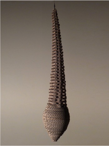
'Waiting'
Do you always work in series, e.g. Paddock?
I think series’ of work reflect the excitement I feel when working in this medium. I just can’t stop at one, and each new work develops a little further, or I discover a new nuance that I want to explore. Sometimes I create a series of works simply to fill a space – to create a bigger impact or prevent a small work being swallowed up by a large space.
What are you currently working on?
I am currently working on an installation for the CODA Museum at Apeldoorn, Netherlands. The exhibition, titled CODA Paper Art puts paper and cardboard centre stage as a material. It opens on 7th June, 2015.
Contact details.
art@tracyluff.com
Tracy Luff, Goulburn NSW, Australia
Interview by Deborah Blakeley, January, 2015
Peter Randall-Page
You grew up in the country. Do you think, if you had been a city boy, your work would have been different?
Very much so, I was quite a solitary child and spent my days exploring the countryside, collecting natural objects and being rather self-contained. This fascination at looking at the world around me and my place within it has informed my artistic practice ever since.
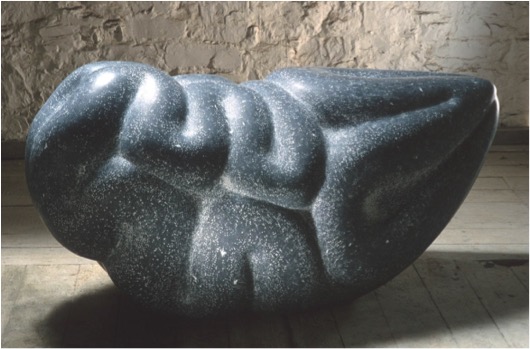
' Beneath the Skin, 1991, Kilkenny limestone '
photo credit: Chris Chapman
Can you expand on the way you have used continuous coils to create works?
When one looks at a coiled object it conveys the potential to become something more: what happens when it unravels, uncoils, unsprings? The idea of conveying that latent dynamic tension within a material as dense as stone appealed to me, what might be below the surface? What is being concealed? I hope to engage the viewer in a dialogue of what might be beneath.
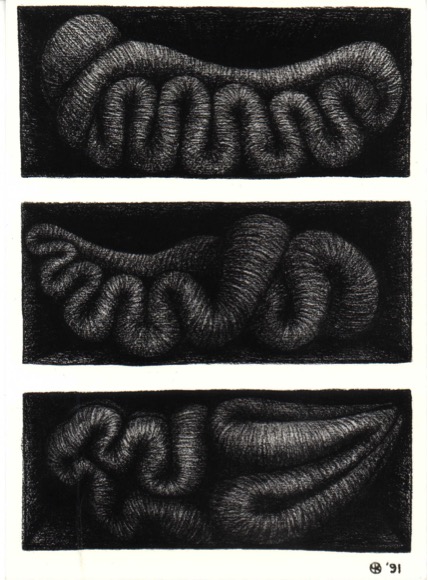
'Three Dormant Objects, 1991, charcoal on paper'
Can you discuss how you run a parallel between your drawings and your sculptures?
Drawing has always been an important part of my practice as a sculptor.
I always carry a sketchbook and use drawing in many different ways:- objective drawing as an aid to memory and analysis, drawings for sculpture, technical drawings to help explain my ideas to architects, engineers and clients, and other drawings which are not preparatory to anything but works in their own right.
Some ideas reappear over the years in countless sketchbooks before becoming sculptures and conversely, sometimes I have a frenzy of drawing activity for the pure delight of mark making, such as the recent ink flow series. Both approaches are vital to my work.
'Ink Flow series, ink on paper, 2013
photo credit: Steve White'
Can you expand on geometry and pattern in your work?
Initially, some of my sculptures were quite literal interpretations of natural objects but in recent years my work has been preoccupied with the underlying principals of growth and pattern formation in natural phenomena: exploring pattern and form, order and randomness, geometry and morphology.
Shapes in the Clouds, 2014 Rosso Luana marble
photo credit: Steve White
You have had three had Individual exhibitions in 2014: London, Devon and Plymouth. We all have 24 hours in a day. How are you able to achieve SO much?
I did have a rather exciting 18 months! What was lovely for me was that each show had a very different feel and dictated a different focus. Due to floor loading restrictions, there aren’t many galleries which can show large heavy sculptures and so it was a fantastic opportunity for me to exhibit at Peninsula Arts, Plymouth, to be able to produce a new body of work without worry of constraint. The exhibition at the Thelma Hulbert Gallery, on the other hand, couldn’t have been more opposite, a domestic and intimate space, it was all about works on a small scale for which I produced a new body of prints. Then the Pangolin show was different again, working with Pangolin Editions.
I spent several days playing at the foundry and they converted these musings into the Inside Out series. Of course, it would be impossible to make all these works single-handed and as well as the technical brilliance of the foundry I also have the support of a very good team here at the studio.
'Inside Out 2014 bronze'
photo credit: Steve Russell
'Natural Order' at Purdy Hicks Gallery in London was a group show with seven artists. How did you collaborate, or was this done by the gallery?
I have exhibited with Purdy Hicks Gallery both as a solo artist and in group shows for a number of years, they approached me with the idea of Natural Order and it appealed to me.
Did you know all of the other 6 artists before the exhibition?
Yes indeed, which is why I had no hesitation in agreeing to the exhibition.
What are your criteria for a Group exhibition?
I think there has to be some cohesive whole created that makes the exhibition more than the sum of the parts.
Can you discuss your thoughts on the value of working in group exhibitions?
I think when group shows work well there is a spark created which adds a frisson to the whole: allowing space for the unexpected to happen.
Your work is in many Public Collections, can you take one that you remember as giving you a huge boost to your career?
Honestly, I am still delighted every time a work of mine is entering a public collection but without question, the biggest boost was when the Tate bought Where the Bee Sucks.
'Where the Bee Sucks', 1991 Kikenny limestone
Discuss the importance of Public Art:
- In relation to the surrounding it will be placed in?
'Give and Take', 2006 granite and associated hard landscaping
For me, public art is at its most successful when it is integrated into its environment rather than being an ‘add on’: sometimes a development can be near completion before the public art element is addressed. With the commission I undertook for Silverlink Properties in Newcastle I was involved from the initial stages, working with Southern Green landscape designers, to problem solve the different ground heights, need for seating and creating a calm, intimate environment within a busy urban square. I feel we achieved something that wouldn’t have been possible if I’d been called in later in the day: this sculpture went on to win the Marsh Award for Public Sculpture.
- The visual impact it will add to the space?
Often, specifically with urban developments, so many considerations such as parking, transportation, access, utilities and emergency procedures have to be addressed that a sense of human scale and interaction can be lost. Public art can transform an environment, creating a focus and allowing the viewer to indulge in a moment of reflection.
How the sculpture will cope with the weather conditions?
This will naturally vary according to the artist and the artwork: with my granite works I can imagine an archaeologist of the future uncovering a destroyed city and my sculptures will be more or less exactly as they were when they were installed!
- How the sculpture will cope with the public?
My sculptures cope well with public handling: though ‘Seed’ at the Eden Project is beginning to be polished at around 1.5 meters high as the hands of visitors caress the bumps, adding an unexpected but rather lovely aspect to the work.
In Mind of Monk, 2008 marble
Can you give your thoughts on the importance of large Sculpture Parks, like the Yorkshire Sculpture Park, in the life of a sculpture?
Several of my sculptures are made to commission and go directly from the studio to their final home. Showing works such as In Mind of Monk at the Yorkshire Sculpture Park allows these pieces to be seen by thousands instead of a few.
Contact Details:
Website:www.peterrandall-page.com
Email: contact@peterrandall-page.com
Facebook: https://www.facebook.com/pages/Peter-Randall-Page/46843490580
Peter Randall-Page, London, England
Interview by Deborah Blakeley, January 2015
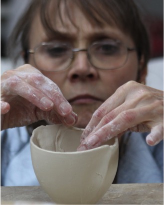
Antoinette Badenhorst
You did your training in South Africa. Was this very different from the training available in the USA?
I did a few workshops in the US, but taught mostly. I did a lot of research on the internet about the direction I was following and consulted with several potters that are more advanced than I am. They were always very generous with information.
Explain the “porcelain” in your work?
Porcelain clay is made up from pure raw materials found form different sources from across the world, thus manmade. The main ingredients of porcelain is silica ( the glass former), feldspar ( the melting agent) and kaolin (the actual clay, which in itself is not very plastic) These raw materials have a larger particle size than other clay bodies, due to the fact that it is mined at, or close to the place where it is formed. Clay manufacturers add different plasticisers to make the clay more workable these days, but often at the expense of one of the pure qualities of porcelain, which is translucency and/or whiteness.
I love the true qualities of the medium, because it reminds me of the unpolluted country in which I was raised.

Envelope
Discuss the importance of the translucent quality of your work?
I was raised in a country, where one could see mountains a 100 kilometres away on a clear day and where I learned at an early age what the differences between real water casting and mirages was.
As a child I often observed the translucency of the sky and clouds, lying on my back on the grass behind our house on the farm where I was raised.
Many days I would walk on the hillsides and this is where I became aware of rain approaching in a translucent curtain, until it poured all over me.
I dreamed my study hours away in front of the of the window of our study hall in the dorm where I lived during the week, observing how the clouds over the Khomas Hochland Mountains changed from oranges and red to purple and pink before the sun sinks behind the mountains. When the moon and stars finally appeared, it came so close and clear, that one could almost pick it from the sky.
These are qualities, among others, that I like to bring out in my work. Porcelain that is worked like clay, but are fired to a glasslike matter, allows me to do that.
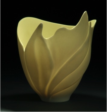
Your work is both hand-built and thrown. Explain the techniques in relation to a piece using each particular technique?
I love working on the potter’s wheel. The way that the clay moves always fascinated me, but it was years before I realized that the movement of clay, resonates with my whole philosophy about life, nature and the interaction between our physical and emotional lives and how everything goes around in circles, cycles and seasons.
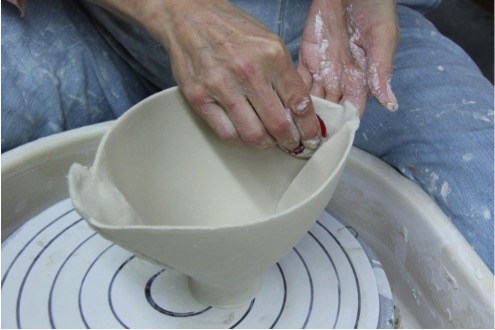
Just throwing on the wheel however, limited my vision. Not everything in life spins in a perfect circle. In fact, it spins out all the time. As humans we are affected by things that happen to us and our interaction with people around us. It brings seasons of happiness and sadness to our lives. We live and become successful in life, but then we grow old and make room for others to take our place and when we die, new babies are born.
So my original perfect wheel thrown pots had to break out and find its own way. Just as in real life, our centres do not always start from the centre, I had to find ways to “misplace” the centre and my envelopes were born.
These envelopes are formed in press moulds, which are basically shells that I put together to form an enclosed oval form. It allows me to take it in any direction that I wish to take it.
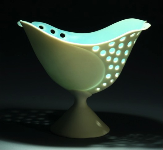
Can you explain the design process you take to make a new piece?
Much of what I do comes almost automatically, just because I am experienced with my designs, but all designs begin with some inspirational object or event, mostly directly or indirectly (a saying or a song) from nature or the lives of people around me. From there I have to either make a model or have to draw it.
This would only be the beginning, since the effectiveness of an object drawn, or modelled change as it becomes alive. I see these design processes as permission to change and re-design as I create.
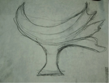
Explain how you incorporate the very old technique of pinch pots into your current work?
Pinching clay is a very underestimated and under used clay technique. I think the reason is that potters often see it as a technique to train beginners.
Just the opposite is true for me. To be able to pinch and shape a piece of clay by hand to the point where its limits are pushed and it still has a beautiful flowing quality, is a very advanced technique.
Pinching is often just the connection that is needed between two clay slabs or to extend a wheel thrown pot. It is tricky to pinch a raw piece of clay into these “smooth” surfaces and make a smooth transition. The way that one’s eye has to flow (or has to get interrupted) over a clay form, is a very important design quality that I like to use effectively and pinching clay helps to achieve that.
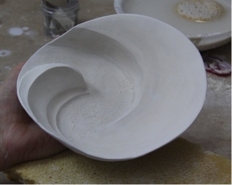
Discuss the processes you made in the firing to get the colour and glaze you require?
It is relatively easy to create porcelain glazes for high firing. The basic raw materials that will mature at 1260 are often found in porcelain clay that matures at the same temperatures. Other than stoneware and earthenware, porcelain clay and glaze becomes a single layer. The interaction of glaze and clay materials when fired to maturity makes it the strongest fired clay medium, despite its fragile appearance.
I created a few basic glazes that have a matt, satin or glassy appearance. To these basic glazes I add mason stains. I like to work along with the fashion colours of the season. I know it is not how artists are “supposed” to work, but I believe there are much more to creating art than only what I believe in. Firstly, there is no right or wrong way, but a comfortable and effective way. Art only becomes art when it resonates with someone and if colour is what attracts people, so be it.
Secondly I am personally very affected by colour. The subtle nuances of colour as it find its way through the walls of my vessels is intriguing.
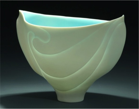
When I have to come up with a new colour, I would seldom start from scratch with a basic glaze. I would use the older mixed up glazes (I seldom mix more than 1 litre of glaze at a time) and alter it to get the required colour. An example is a soft green glaze would become a bright lime glaze the next season, just to become a yellowish old gold the year later. The challenge lies in the “reading” of the colour nuances.
It is a rule not to put more than 10% colorant into a basic glaze, so I have to keep filling the bucket up with a basic glaze. I am not always successful, but I do see one failure as an opportunity to do better next time.
Please discuss the mark you use on your work?
I allow the form of the basic vessel to lead me. Due to the nature of porcelain, I would often allow a form to find its own direction within my original design thereof. I want the viewer’s eye to move comfortably and with pleasure over smooth lines.
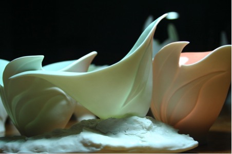
How did you develop the mark?

I use a charcoal pencil and draw lines over the leather hard clay and keep doing that until I find a pleasant line. From there I carve clay away to form a soft rounding.
Sometimes I will re-wet the clay (one of the beautiful characteristics that porcelain will allow the maker to utilize) and push parts of the wall out to place emphasis on these areas.

Where do you normally place the mark?
It depends on the form.
Sometimes I will cut parts of the rim away and follow up with incising into the wall as I described above. If it is a plate or a shallow bowl, I will carve the interior. When it is a taller object that may be seen from the side rather from inside, I will place the emphasis on the outer wall. The effects will differ, since some of it may be glazed over the marks and others will show shadow and light, mingled with colour as it seeps through the wall with the translucency.
Lately I started to carve in and out, but it is tricky, because in the translucency that may shine through, these lines has to work together to make the design successful.
What is the importance of the use of an artist’s mark?
It took me a while to develop that mark, but I believe that is what defines my communication with my viewers. I have a story/message to tell.
Nothing under this sun is new, but if I would not develop my own honest body of work within that frame, but copy someone else’s, I will not be honest to myself or anyone around me.

I trust that by looking at my work, the viewer can directly recognize an “Antoinette Badenhorst”
Can you expand on the two pots you have in the collection of the Mississippi Museum of Art?
I have one piece in the Mississippi Museum of Art collection and one in the Gumtree Museum of Art, Mississippi. The Mississippi Craftsmen’s Guild also has work in their collection.
These collectors pieces stems from my early days in the USA. At the time I was working with porcelain in a different way. I used the porcelain qualities to obtain fine
I also have works in private collections of celebrities and in Enzogama in Biei, Japan and in Museums in South Africa.
Teapots
I guess any true potter is attracted by the teapot making process, since it is a great theme for expression. It has its own design challenges and if it needs to serve as a utilitarian object too, it becomes even more complicated. Some potters will only use it as an object of ornamentation or sculpture.
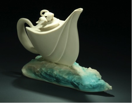
‘Teapot’
Inspiration?
Teapots fit very well into my overall theme of circles, cycles and seasons. The emotional feelings that we have often influences those around us and vice versa. It “flows” from or too us. The body of a teapot that receives liquid through an opening and then pours it out through a spout conveys the same idea.
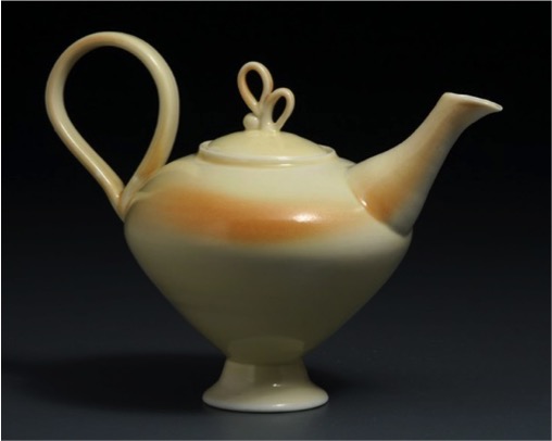
Problems in the process?
Oh, teapots have many design challenges, because it has so many parts to it that has to balance. A misplaced handle or spout will make it difficult to get a nice flow of liquid, but at the same time it may also limits a nice flow of the viewer’s eye.
Any kind of spout requires fine planning, because liquid must organize itself to move from a hollow body into a spout and out without dripping and splashing everywhere.
I have a problem with potters making heavy, oversized teapots that does not function well. Too often we may use the excuse that a heavy teapot is meant for a sculpture, but I disagree with this approach. If it looks like the real deal, it should function like the real deal.
The importance of a snug lid?
You ask questions that may get me into a very unpopular situation. LOL!

By measuring the diameter of the opening where the lid will fit and then making the flange 3/4 of the length of the opening diameter, will secure lids from falling out when pouring tea. It is a simple rule that is often ignored by teapot makers with the excuse that one should hold a teapot with both hands; on the lid and by its handle.

A frail person may prefer to hold it by its spout (there is often a little lug on the spout to help pour tea this way) and handle and not worry about a falling or spattering lid.
A snug lid with an extended flange is much more attractive than loose fitting lids. It is however important to have a little hole on the lid to allow stream to escape, or else the pressure may force it out the opening. That may cause a burning hazard.
Southern Ice Porcelain Envelopes - please explain this series?
The envelopes allow me to make larger sized pieces, without taking up too much space on a table surface. My clients like to place against a wall on a mantel or a narrow space in a cabinet or window sill. The fact that I can elevate the piece on a pedestal or stand, allow the message to grow in importance.
As a potter, I admire ancient pottery. I think the forms of my envelopes developed from antique Roman cups on pedestals, although I never hand the intention to make any replicas of any ceramic form.
There is a challenge in working with porcelain, particularly Southern Ice Porcelain. The challenge is raised with envelopes, particularly in the firing.
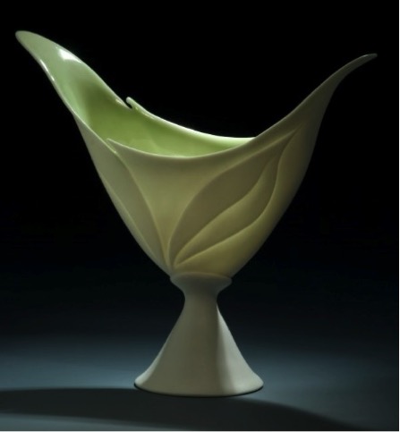
When porcelain is fired, it has a tendency to move in the kiln, because the clay becomes soft (pyro plastic). For that reason the walls of porcelain should be of even thickness and the lower parts should be stronger and sturdier to support the higher parts. My envelopes are carried by its “stem” and when it becomes soft in the firing, the top heavy part can swing into any direction and even topple over. I had to overcome this challenge by learning how to fire these pieces so that I can manipulate the movement. I love the fact that I can leave some of the movement to develop in the fire. That is part of the relationship that I built with the porcelain clay medium, but I have to be very careful in how I place the work in the kiln and not allow the “Diva” to take over completely.
As far as my marks are concerned, I use the same approach as with other clay techniques.
Do you always have a Christmas range?
Not always. In South Africa Christmas is summertime. We did not place that much emphasis on Christmas trees. Here in the States, lights brighten our days and I started out with series of ornaments some years back.
Explain your 2014 Christmas flags?
There is no true challenge in the making of it for me. I used a design that is recognized anywhere in the world, but that carry the triumph of overcoming the difficulties of immigrating to the USA. Every American that owns one of my flags, celebrate that triumph with me!
Can you tell us a little about your e-courses?
We love it. I had people contacting me from across the world to ask questions about porcelain and it is often difficult to explain, while it is so much easier to show.
In 2014 my husband Koos, who is my manager and also the person behind my porcelain images and website, and I put a curriculum together for our first “Understanding Porcelain” e-course. We decided that we want to present a workshop to potters, similar to those that I present live at ceramic schools and institutions. We knew we had the ability to bring our classes to people around the world and particularly those that may never have the opportunity to learn in another way than through the internet.
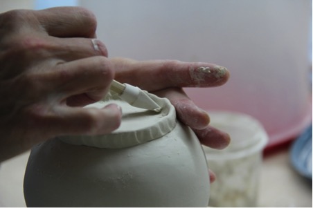
We realized that we can give every student a front row view with videos, but we also had to compete against so many “how to” videos that roam the internet.
We created a forum online through which our students can communicate with us and ask questions. We make it as personal as the internet allows us and by the end of this year we created 2 more courses; “hand building porcelain” and “hand building porcelain dinnerware” Each of these courses was per request of our students. The next logical follow-up will be “Wheel Throwing Porcelain Dinnerware” that we will launch after the re run of “Understanding Porcelain that starts January 5th.
Our classes are set up in a way that it place the emphasis on porcelain, but do not exclude students that want to work in other clay bodies, but would like to learn about clay techniques in general.
We hope to continue with more of these courses in 2015 and even expand it beyond our own studio.
“It is my ongoing task to encourage young and upcoming artists to strive for those elements in their work.” Please discuss?
I was a beginner once in my life. I try to remember that when people ask me questions. I remember how many times I opened a kiln and wanted to throw the towel in. I remember how long it took me to find my way. Other than what people often think, pottery is one of the most difficult mediums to master, because there are 3 main parts to it: learning to master techniques, learning the science behind the medium and learning to express oneself as an artist through clay. Apart from that, there is physical labour involved in pottery making, but the three parts mentioned cannot stand loose from each other if one wants to become successful as a potter.
I love to be a mentor for those potters that take their work serious and that want to grow in and through their clay work.
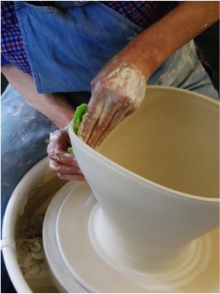
You do international workshops. Can you expand on your workshop in South Africa?
We were traveling through South Africa and Namibia over a period of 6 weeks in 2014 and had the opportunity to meet with old pottery friends and met new ones while I was presenting demonstrations and hands-on workshops in Port Elizabeth, Cape Town and Johannesburg. We stayed with potters and had a very enriching experience.

It was a great opportunity to give back to a potter’s community that raised me as a potter. I was honoured to present the knowledge that I gained here in the USA over the past 15 years to people that was previously my teachers and mentors and as it always is when one give yourself unconditionally, I got so much more back from these people that what I gave them.
Discuss salt in your work and how it relates back to cooking and your daughter?
This relates back to the science of pottery. Much of what I know today was from research that I did as a young potter. In those early days of making pottery, the whole clay process was overwhelming to me. When I learned that by using salt (as it relates to salt firing)can make a simple glaze, I thought the salt that is referred to, is the scientific name for some difficult-to- explain clay medium.

Our middle daughter is a celebrity chef. She gave me some rocks of salt that makes a beautiful display on my kitchen counter. It often reminds me of my early days, when I randomly put salt in the kiln to see what would come out, without knowing how to use it.
I also believe that salt is associated with sincerity as it is described in the Bible.
Can you discuss your thoughts on the importance of the connection between potters and chefs?
Practicing pottery as I mentioned before, is a difficult medium to master. Potters are very passionate creatures as it must have shown in my answers to you by now. Therefor we do not always realize the implications of making things that become permanent objects. Once a piece of clay is fired, it is as hard as rock and even when we break it to pieces; it will stay on earth for as long as it would take for a rock to erode.
As potters we have a responsibility towards our clients. If a food container is carrying a health hazard in some or other way, we should distance ourselves from it.
On the other hand there is something hearty and very personal about eating from a handmade plate. Just like we have our own doctors and therapists today, people had their personal potters before the industrial revolution.
There is a reliving of the art of cooking and to grow our own fruit and vegetables, so it is a perfect time to let the pottery object in households relive too. To become successful, potters should work with chefs to learn what their needs are. After all; potters, chefs and the eating public can create a perfect balanced relationship.
I have the perfect opportunity to learn from my daughter what is needed to present to chefs a perfect container, while she has the perfect opportunity to learn from me what a plate should not be.

Contact Details
www.porcelainbyAntoinette.com
Antoinette Badenhorst, Mississippi, USA
Interview by Deborah Blakeley, January, 2015
Shelley Jones
Can you discuss the journey you have taken with your three techniques to get to the combination you are currently using?
I started as a graphic artist, doing mostly print media work. During that 18 year period I seemed to have little time for making art for my own pleasure. I switched careers, getting a degree in social work, and started silversmithing as a hobby. I only had time to make jewelry at night, and had little interaction with other artists. I decided I needed to find a less cumbersome (for me) and more socially interactive medium. I began to work with glass beads and fell in love with the colors and textures. I explored a range of beading techniques on my own and in workshops. I found bead crochet and free-form beading most appealed to me. I especially like the portability of beads and the ability to work on projects as I travelled for work. I tried to include my silversmithing, and eventually took up silver metal clay, finding I could mold the silver in a way that worked for me. But I still could not quite fit the silver and beads together in a manner that was all my own.
In 2004 I took a basic felting workshop at a beading exposition and got a taste of felt. I found the colors and textures of wool spoke to me as beads had earlier. I experimented with wool, trying to make it do things I was not sure it could do, but enjoying its malleability. I began to add felted elements to my beads and silver and found the perfect combination of elements for my ongoing work.
Discuss the weight aspect of your felted jewellery?
As I continued to explore what felt could do, I especially liked the very light-weight quality of the felted work. As I added beads to the work I was pleased with the contrast between the hardness of the glass and the softness of the wool. I liked the sense of weight and playfulness in the work that I seem to always end up with.
Discuss the combination of felt and beads?
Expand on the technique you have used to create a necklace?
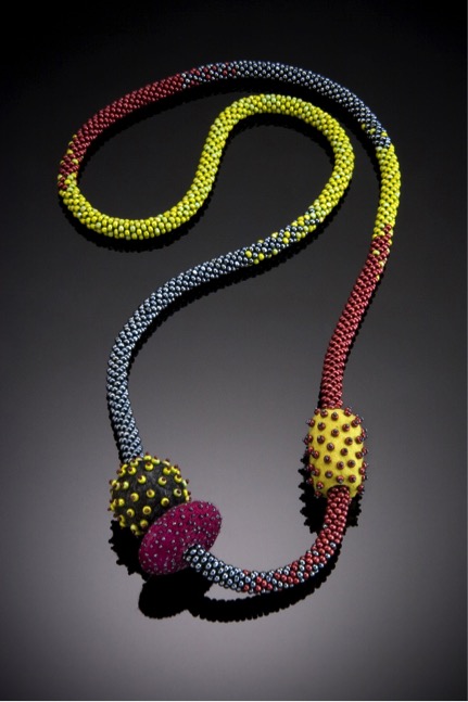 ‘Tricolor Rope’
For my crochet ropes, I wanted to embellish them, and the addition of felt helped add dimension, yet kept the weight of the piece down. I use mostly charlotte seed beads because they have a cut side to the bead which catches the light. My choice of beads and colors tends to the less vivid and shiny, with the cut bead adding only a subtle flash of light. I often use a contrasting thread, most often an embroidery weight polyester thread that has little stretch and great strength. I must sketch out and count my beads for each design, and find I am often reflecting the colors of natural elements and creatures.
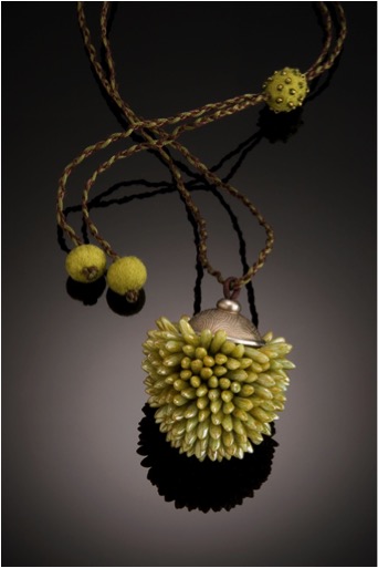 ‘Prickly Pear Neckpiece’
I also love dagger beads, which come in such a range of colors, many of which remind me of my garden. These are used in my dagger bead pieces, which I often top with fine silver. They have a core of felt into which I stitch the dagger beads. The cord is adjustable and embellished with felt. So I am able to use all three of my favorite mediums to make a nicely weighted neckpiece.
Can you discuss 'Bangle with Spikes'?
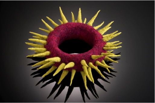 ‘Spike Bangle’
This was one of my first successful ventures into felt jewelry. I wanted to use colors that make me happy and make a piece that was playful, yet stretched me. It is made of merino wool and has a copper wire armature, since I was concerned it might fall out of shape. I no longer have this concern for such a simple design.
You also use semi-precious stones, such as pearls. Can you discuss the use of pearls in your work?
I am always drawn to the patina of pearls and have added them to some of my pieces. They provide such a subtle sheen and texture to felt. The gemstones I have added are also the types that have a subtle light, yet add that contrast of hardness of the gemstone to the softness of the felt that appeals to me.
 ‘Pod Brooch’
You also make vessels in felt. Can you expand on one or two of your vessels?
Recently I have added decorative vessels to my repertoire. Each is made of hand-felted wool, and often decorated with stitching, beading and sometimes fine silver. I am particularly drawn to teapot inspired designs.
Roadrunner is made of hand-felted merino wool, hollow formed using a multi-level resist. The top is removable and has a fine silver base to the lid. Hand stitching with a heavy weight polyester thread I find very dependable when working on wool felt finishes off the piece. It is 12Hx11Lx4W inches in size.
 ‘Roadrunner’
Hot Pot was inspired by my forgetfulness in leaving the burner on under my tea kettle. It is hand-felted merino wool with a flame red underfelt that bleeds into the burnt grey “steel” and cerulean blue ‘enamel”. Embellished with glass seed beads to catch the light and hand stitching to attach the handle and spout. It is 12.25Hx9Lx5.5W inches in size.
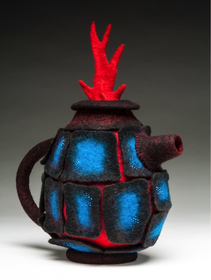 ‘Hot Pot’
Discuss the use of colour in your work?
Intuitea came about by covering a wire armature made from millinery wire with hand-felted merino wool, expressing my idea of the gridlines for a teapot. The corner beads are vintage glass nailheads. It is 9.5Hx13Lx7W inches in size.
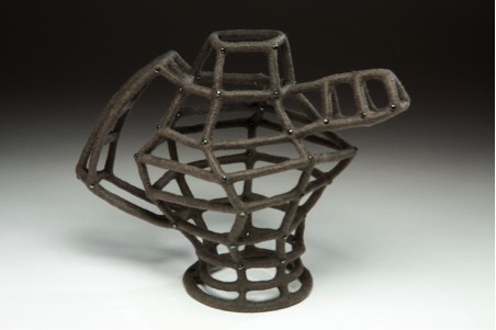 ‘Grid Teapot’
Colour is a large part of your felting, do you do your own dying?
My pieces are relatively small, I prefer to buy wool that is already dyed. I find I can blend colours with my drum carder and layering techniques that have satisfied me so far. When I find a dyer willing to part with unusual colours or blends I take full advantage!
Please take one or two of your most current pieces and discuss the work?
My larger teapots made me think of smaller ones, so I have started a series of small teapot brooches. About 4 inches wide, they are also hollow formed and topped with a detachable lid with a fine silver base.
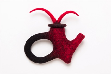 ‘T pot Brooch’
A fairly new series I am working on arose while looking at some old tools and found gears to be most intriguing. So I made some simple felt bangles in non-industrial colors. They are fun to stack on the wrist.
 ‘Gear Bangles’
With your rings, what are your care suggestions?
My rings require little care other than that required of jewelry in general. A piece may get wet, but that is not a problem. It was made with soap and water. Just let it dry naturally and all is well. If it gets soiled it can be gently cleaned with a damp cloth. The colors will not bleed, since this has been addressed in the making of the piece. The beads are stitched using strong thread, so they would only loosen if forgotten in the pocket and tossed in the washer and dryer!
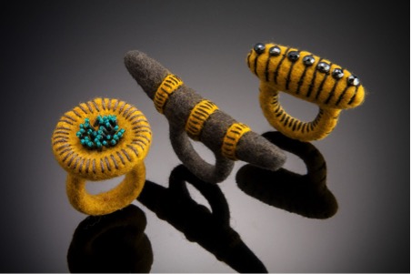 ‘Three Rings’
Explain your teaching and where this is done?
I teach only a couple of workshops each year: beginning felting classes and a range of wire and bead classes. I teach at the Virginia Museum of Fine Arts Studio School and in my studio at my home.
Contact details.
Shelley Jones, Richmond, Virginia, USA
Web: www.shelleyjones.net
Email: shelley1448@gmail.com
Shelley Jones, Richmond, Virginia, USA
Interview by Deborah Blakeley, January 2015
David and Jennifer Clancy
What lead you to move from being a weekend glass artist to having a full time studio and company, Clancy Designs?
David and I both value the time that was spent learning the craft of glass and working for other artists. In earlier times artisans spent years and years working under the masters before forging their own path. Once we felt we had established an aesthetic and a proficiency with the glass it was only a matter of time before we we’re going to reach for the goal of having our own studio.
David & Jennifer at work
Is it important that much of your glass is functional?
One of the seducing qualities that the material glass offers is its magical relationship with the maker. This fluid that turns into a solid is given life and shape through the breath. The bubble’s natural expansion with the breath is a rounded shape that calls out to the hands for holding. The day after making one’s first vessel it is ready to be held in the hands of the maker and used in everyday life. A hand-blown drinking glass, especially of one’s own making, is one of the most decadent ways to experience a simple glass of water.
No matter how elaborate, technically challenging, or beautiful our Nature Sculptures get I don’t think we’ll forget the basic pleasure of using our glass every day.
Discuss the importance you share for providing customers with unique pieces in their everyday life?
Before building our glass studio, David and I spent several years renovating our 1787 home. With lots of help from family and friends we were able to do the project ourselves which was fortuitous as with not very much money we couldn’t have afforded to hire the task out. Being that intimate with the project really allowed us to pay attention to every nook and cranny of our space. This was to be our home why not take the opportunity to make it really ours, to make it special. In the end the renovation ended up being an expression of David and I’s creative nature, in and of itself it became our art. This experience has stayed with us and it is one we hope to share with all of our clients. When we work with them on a project or a custom piece we want our glass to contribute to the creation of a space that is a deeper expression of themselves. We hope our work helps transform their physical shelter into more of a home. We hope our work brings light, life, and joy.
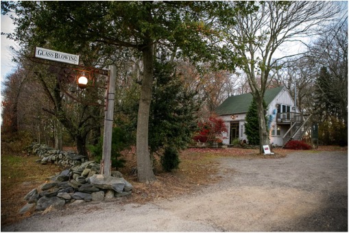
In 2004 you opened your own workplace. Can you explain how this happened?
After finishing the renovation of our home the time was right for starting on the glass studio. Luckily for us a friend who has a talent with post and beam structures offered to work with us on building our studio. David had the pleasure of working with him for weeks shaping the posts, beams, and carving out the pegs. In an afternoon a crane and a handful of helpers pulled all the pieces together and we were on our way.
Running, maintaining, and paying for a glass studio is a truly daunting task, but the commute across the lawn, past our beautiful gardens to a job we love is priceless.
Can you discuss your work Superfruit.
The Superfruit Line of tableware was designed by David before he and I met. It uses an Italian technique (pulling glass cane and cutting it into dots) and is a simplified version of Millefiori called Murrini. The goal with this line was to create functional pieces that are bright and cheerful in colour and comfortable in use. It is our most extensive line and for many years quite popular with our clientele.
Many customers have told us (separately and without knowing each other) that they call this line their “Happy Glass” and use it joyfully and frequently.
Take two of your drink ware collections and discuss the inspiration for their design?
Pops!
The Pops Tumbler was developed to offer people a physical experience with the glass. In this piece the shape takes the lead. In what I have always thought of as Venus like curves the Pops Tumbler fits directly in the hand following the natural curve of the palm when the hand is partially closed. It is a satisfying feeling to see the look of pleasant surprise on the customers face when they first hold a Pops Tumbler. Of course we always strive for each piece to have its own physical relationship with the user, but this particular line takes the gold! We kept the Murrini for decoration because people love the spots so but made the colour more subtle so the spots wouldn’t try and steal the show.
River
The River line developed when we were looking for a way to express a stripe. After years and years of dots they began to take a visual toll. Our solution was to trail colour up and down the piece thus giving it something stripe-like but also allowing the clear glass to provide a canvas for the study of colour. Each colour is represented with its neighbour on the spectrum as an accent. For example the green tumbler also has gold and blue and the blue tumbler also has green, indigo and purple. As an added bonus the trails of colour also provide ridges so all the way around the glass there is texture for the hand to enjoy.
Discuss you Hoop bowls and the way you have used colour in them?

The Hoop Tumblers, Bowls, and Carafe decoration came to us while experimenting.
Experimentation in the studio is a very important part of the process as it allows for the conscious mind and the subconscious mind to play in a sort of three dimensional sketch book. Every year we hope to add an additional design to our Drinkware Line.
We have a strong representation of the dot and the vertical line but not of the horizontal line. The Hoops allow us to do that and as well, like with the River Tumblers, play with colour relationships. Although from a distance each piece seems to be “a” colour, up close one can see more complexity. For example the Red Hoops are composed of 4 different threads of coloured glass – pink, tangerine, red, and cranberry giving the overall appearance of Red a bit of contrast and vibration enriching the visual experience. On occasion we have an opportunity to play with more disparate colour and create, usually on bowls, quite unusual combinations that create beautiful and unique palettes. One of our more popular pieces gave off a vague purple hue, with a bit of earthiness thrown in. Upon closer inspection it shows threads of turquoise, lime, brick red, tangerine, purple, lavender, and off-white. In this line the combination of a clean tight shape and graphic coloured lines truly makes for a striking piece.
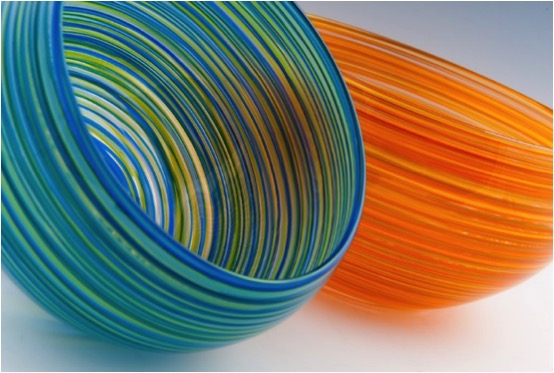
Can you explain your piece called "Hosta"?
The Botanical Series came out of a love David and I have for nature. We have several gardens on our property and get much joy out of creating and tending them. It was a natural step for us to pay homage to our local flora.
Outside of the glass studio on the way to the house is a large grouping of Hosta. Every day we walk past them. They are touchstone for each season from breaking out of the soil in the spring, leafing out in the summer, and blooming early fall to dying back in the winter letting us know another year has passed. It was easy to want to try and replicate these wonderful plants with their interesting leaves and delicate spires. Trying to capture the essence of a plant provides us a challenge we can really get our teeth into. Although we are never able to create plant life as detailed as Mother Nature does, it certainly is fun trying to achieve all those nuances.
Can you explain how you have used steel and light in your work "Prairie Grass"?
I have long been taken with grass, almost to the point of obsession. One of our first botanical pieces was grass. I love the way each blade contributes to the whole of it creating the “lawn” or in the case of a prairie the “sea” of grass.
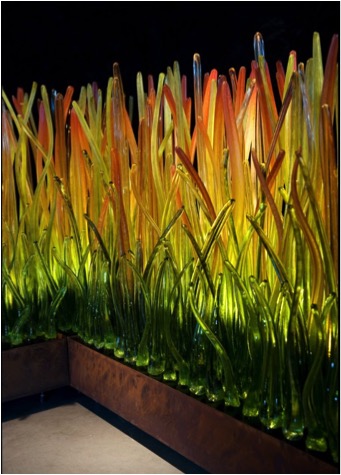
When we do it correctly one can almost image it swaying in the wind.
One of the challenges of the botanical pieces is to create a base that holds the individual pieces in place without taking away from the whole sculpture visually. In Prairie Grass the base is one of the lowest to the ground we’ve used, in the hopes of keeping the viewer’s eye on the grass itself. With the application of a patina to the steel base creating earth tones (aka “ground”) I think we have achieved that end. The beauty of the Carex Testacea (Prairie Fire Grass) is that at a certain time of the year the tips turn golden and red. Showing this piece in front of a floor to ceiling window with sunlight streaming through is quite an experience to behold but when night comes or if we’re showing it in a gallery setting back lighting with artificial light has really brought the piece to life in a powerful way - almost as if it really were on fire.
Colour is held so well in glass. Can you comment on this statement?
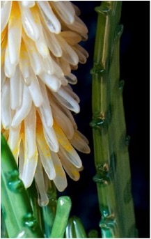
Nature provides us with an unlimited amount of colour. Some of it is bold, some subtle but all of it is alive shining from the inside out. For me glass is the only medium that captures that essence. When light shines through glass and glows it such an impactful experience on the eye. Anyone who has had the pleasure of seeing sunlight shine through rich cobalt blue glass can never erase that experience from the memory. Even frosted glass has a certain play with the light, where you can almost hear a sort of humming from the colour.
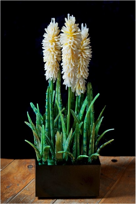
You also make custom pieces for the home and work with designers, discuss this aspect of your work?
David and I took so much care with creating the spaces we move through, both in the home, studio, and yard that we wanted to be able to do that with and for others. For a long time we’ve had home owners and designers commission sculptures and/or lighting from us. Every now and then a space needs a focal point or an added accent to what has been created there. We take this job very seriously and always enjoy getting to know the owners taste and the designers style that we may work in concert with them creating a piece of art that is ours but nods to all the members of the project and respects the space.
Expand on the importance of ‘Handmade’ to you both.
David
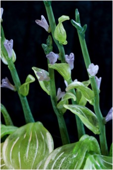
I am reminded of a quote when you ask about handmade:
“When buying from an artist/maker, you’re buying more than just an object. You are buying hundreds of hours of failures and experimentation. You are buying days, weeks, and months of frustration and moments of pure joy. You are not just buying a thing, you’re buying a moment of someone’s life. Most importantly, you’re buying the artist more time to do something they are passionate about.”
Jennifer
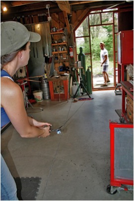
I cannot express enough how passionately I feel about the handmade. Machine made items are necessary for our lives but, they will never be able to provide the user with the kind of personal experience that a handmade item can. The handmade object has a life to it, some may even call it a spirit. Handmade items provide a depth of experience when holding or using that touches all the senses. The act of making is also important and an experience that everyone should have in order to express their own creativity and truly understand the value of other handmade objects.
Contact details:
David & Jennifer Clancy
Clancy Designs Glass Studio
382 North Road
Jamestown RI 02835 USA
401-423-1697
www.clancydesigns.com
glass@clancydesigns.com
David and Jennifer Clancy, Rhode Is, USA
Interview by Deborah Blakeley, December 2014
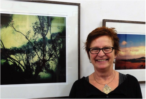
Kerry Spokes
Explain your involvement with mobile photography both the limitations and advantages it has given your art?
Four years ago I bought my first iphone, since then I have concentrated on using mobile devices to create imagery (iphone, ipad and apps), striving to extend the boundaries of what is possible with digital collage using photographs and apps on my ipad only.
I like to print some of my iphone work on a large scale and with the limitations of camera quality in a mobile device I have explored the use of photo and art apps to overlay filters, enhance some areas, etc to ‘mask’ over those limitations of photographic print quality, thus creating a more ‘painterly effect often.
The digital medium has become a useful tool for developing and recording ideas and concepts I want to portray, and in turn is informing my latest drawing and print works. This has been a huge advantage in my processing and recording of ideas into visual images in a quicker timeframe than my current lifestyle would otherwise permit.
'Flotsam & Jetsam'
Please discuss the techniques you have used.
There are a number of apps and techniques used to create my digital collage like the Domestic Bliss series. I usually lay down a background in an app called Superimpose, often overlaying a few to achieve a base or if I want a room with walls and floor as a background or perhaps a landscape I have taken an image of.
I take many photos of objects, animals, flowers etc, then mask around them to delete the background around these items, save them to a mask library enabling me to use them in any number of ways in compositions. I also look for imagery on the internet that is free to use; images of particular objects etc. I may not have to hand.
Apps which specialise in applying layers of texture and/or colour along with enhancement tools are usually employed throughout this process of merging objects to build up an image.
Flock
Please discuss the importance of colour in your work
My printmaking and drawing art practice has largely been based around black and white, so I have thoroughly enjoyed introducing colour to my digital works. In fact, I have hardly touched black and white as a genre of iphoneography. Colour is an all important aspect of my digital work, often altering the light, introducing shadows, higher concentrations of contrast and colour saturation, with a focus on the relationship of colours and the visual ascetics of colours working together.
Where do you get your inspiration?
The Domestic Bliss series is inspired by the idea of creating a suite of images which depict domesticity in a humorous and contemporary way, and of also using the huge number of collected items I have (often picked up enmasse in secondhand shops) and putting them to good use. I guess its a justification for being a bit of a hoarder of interesting objects, homewares, machinery, books etc etc....
'Cooking Up a Storm'
Can you comment on your work ‘Pass the Salt’?
This work is one of a suite of images I am working on based on objects in a landscape. This body of work will be reproduced as photogravure prints for an exhibition in late 2015.
I have used a local scene of Tarwin River and introduced a domestic scene reference of stirring a large pot of soup, so to speak. It could also be interpreted as a reference to the conservation of our waterways. I often like to have an element of social comment coming through my images, however subtle or not.
'Pass The Salt'
As we get closer to Christmas can you expand on ‘Xmas Pudding Paddock’?
I have been making a line of Christmas cards for many years with a comical and distinctly Australian bent. Prior to my digital iphone works, small drawings and paintings were reproduced onto cards for sale. I have a bit of a thing about the commercialisation of Christmas, finding it rather obscene and out of control. I like to take a subtle dig at this in my Christmas cards.
‘Xmas Pudding Paddock’, one of 8 new designs I have released commercially this year making up a group of 12 Christmas themed cards, is based on the idea of large round hay bales sitting in paddocks ready for collection and storage. This farming activity occurs in Australia where I live, at Christmas time. Using a Christmas pudding instead of a hay bale was an obvious choice really.
http://www.kerryspokes.com.au/#!xmas-cards/c19b8
Can you explain the term Digitally Modified in relationship to photography?
I use the term ‘digitally modified’ at times rather than the term ‘iphoneography’ which is often used in American mobile photography circles.
‘ Digitally modified’ in terms of my art and in relation to photography, means photographs which have been altered in any way using filters and overlays of texture, colour, pattern and objects etc. What is termed ‘photography’ encompasses such a broad and diverse array of image making, and has merged with contemporary printmaking practices quite successfully, making for exciting times in the digital arena of art making.
'Cry Baby'
You enter many exhibitions, can you discuss why you see this as such an important aspect of your art practice?
My art practice had a pretty big interruption when I was bringing up three children over a number of years. Exhibitions in my local area were a way of getting my small output of artwork shown without having to worry about producing a complete exhibition of works.
I still enter a number of local art shows, with the belief that contemporary art has a place in country art shows and opens up diversity of styles to the general public.
I have noticed a shift with country art shows to using more contemporary judges with sound credentials, and feel that it is important to encourage contemporary artists to be more involved in this important aspect of cultural and artistic identity.
I enter a number of selected and/or prize winning exhibitions, both nationally and internationally based on mobile photography. I have had a couple of iphone works selected for showcase exhibitions in Melbourne and Canada as part of the Mobile Photography Awards as well as a few highly commended pieces in the 2013 MPA Awards.
For me at this stage in my career as an artist using digital iphone imagery, it’s important to get my work shown on the international stage. The mobile photography movement in Australia is still in a fledgling stage I think, and I initially connected into the iphoneography scene through an American based iphone art based site called iphoneart.com where I ‘met’ many creatives also discovering the potential of iphone apps for creating artworks based on their photographs. There are a number of mobile photography competitions and exhibition opportunities in various countries worldwide, it’s just a matter of deciding which ones to pay to upload images to with the hope that they are selected for consideration of either an exhibition or prize.
‘Late Afternoon at O’Grandys Ridge’
What are your thoughts on the importance of an artist taking up the latest technologies available and why you have embraced them?
My art practice is partly informed by the exploration of medium and technique, and mobile digital art is another ‘tool’ I am exploring in my art making. The latest technologies used in art making sit side by side other more process driven art forms and for me create an exciting mix that doesn’t necessarily lock one into a particular genre of art making.

‘What Makes a Smart Meter Man’
Your original training was in printmaking and painting. How has and does this help you in your current practice?
I was always fascinated with drawing and from an early age I practised hour after hour teaching myself how to draw from looking at life, images in books and my imagination.
Form, light sources, image placement, colour relationships and a narrative are all components I employ in my printmaking, drawing and painting, and carry through into my current digital work. The more labour intensive and process driven mediums of printmaking, drawing and painting are integral to my overall art practice, whilst the more immediate digital works can be created in just about any situation – an extremely mobile art form!
‘Tarwin River 11’
How do you use commercially available apps in your work?
I use commercially available apps in my digital work to build my digital collages from a base photograph I have taken or a background from an app I have downloaded. I also use apps for particular editing tools such as shape of images, filters, basic enhancements, and with the collage works, digital masks I cut from images.
I usually know the size I intend to print the images, so once I have completed an image I upload them to Photoshop on my laptop and resize them for print.
‘Summer Grass on O’Gradys Ridge’
Can you comment of the importance of printing on Digital Rag paper?
The archival properties of the digital rag papers are of importance for artists who sell their works. I treat my digital work as I would my printmaking works, editions of a smallish size, all printed to a particular size on a particular paper.
Often my images are intended to look somewhat like paintings, and the rag paper I use mostly, Moab Entrada Smooth 290gsm has a beautiful, almost smooth suede feel to it, picking up the colours of the ink in a lovely intense way. It suits a lot much of my work, although I also use a metallic finish paper for some – Slickrock by Moab Entrada.
My works are printed on a large format Epson inkjet printer with pigment based archival inks.
You also teach. Can you tell us a bit more about your classes?
I have a studio at the end of the property of Gecko Studio Gallery, set up with 2 etching presses, and where we have had a vibrant workshop schedule with guest tutors, and myself giving workshops in printmaking techniques.
I have recently begun iphoneography workshops after many enquiries from people asking for them to be made available. I guide participants through learning how to use apps for a variety of different effects.
In the future the workshops will be geared towards learning about specific apps for particular effects. There are camera apps, editing apps, apps with special effects you can apply, art apps giving painting, drawing, pens etc tools, and of course the ‘collage’ apps
At the end of a workshop, participants go home with a whole new array of creative tools to employ in their art making if they choose to, and will have created at least one image which I print for them on photo quality paper.

'Unnatural Selection'
You are the co-owner of Gecko Studio Gallery in rural Victoria, how do you balance your art practice and the Gallery commitments?
It’s a constant desire of mine to have more time for my art practice, and I am gradually working towards this each year, allowing myself time to fit in my art around my commitments with the gallery as well as community arts which I am involved in to a degree.
Over the eight years we have been operating come January 2015 as a small contemporary art gallery, picture framing and artist supplies business, we have steadily grown busier in all areas.
We host monthly exhibitions of contemporary art by local or national artists. Our framing is of a high quality and we employ a gun framer who we never want to retire. I used to be the framer for Gecko, but have found I am needed in the gallery daily for quotes, computer design work, art material orders etc.
We also operate a small boutique accommodation called the ArtHouse, behind Gecko, and is becoming busier as people discover the town of Fish Creek whilst looking for an artistic cultural experience as well as the amazing lush landscape and coastline of which Wilsons Promontory National Park is a part of.
I feel extremely fortunate to be in the position I am today with a business based around art and my own art practice gaining momentum as I put more time and energy into creating. To have access to an array of art materials, processes and techniques through workshops, along with meeting many interesting artists and lovers of art through the gallery, is a very rewarding way to live one’s life.
'Rapt 1'
Contact details.
Kerry Spokes
15 Falls Road Fish Creek
Ph: 0423 721 593
E: kerryspokes15@gmail.com
W: kerryspokes.com.au
Kerry Spokes, Fish Creek, Victoria, Australia
Interview by Deborah Blakeley, December, 2014
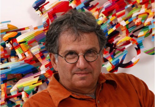
David Gerstein
Your work is all about movement discuss?
Movement is indeed essential in my sculpture works and it has to do with the special technique that I am using which render itself very well with elements of motion. One of my early inspiration was comic films while the moving figures are cut out on the celluloid and move along the background. The repetitions of the figure while moving the body was used in my metal cut outs to create the sensation of movement that was lack in almost all the art works that I came across except in the futurist movement from the early years of the 20th century and that was abandoned for more than 50 years .When I abandoned paintings for cut-out sculptural images I enjoyed the freedom of the body detached from its background that always made it stable and motionless. Than my bicycle riders started to flow and many runners joggers, football players and others sport images became the centre of my interest. Since then I used many different motives most of them had the sense of movement.
'Champion'
How and when did you take your work from 2D to 3D?
After I finishing my studies of paintings I was immersed in figurative painting, rather narrative, that dealt with my own personal life and surroundings as well as childhood memories that need to be released to the world. I did a great deal of water colours as well as oil paintings in large formats.
'Jogwoman'
It was unusual for a young ambitious artist not to join the very dominant conceptual or minimalistic styles in fashions at the early 70ties and I was considered as an artist away from the main stream. However I believed and insist on my ideas and paid the price for being unpopular by some one–track-mind critics. My heroes at that time were Hockney, Kitaj as well as Hopper, Lucian Froid and Picasso on top of all and they gave me the courage to do what I did. When I felt after 10 year the need to go on and find my own language I made my mind to search through sculpture a way to get my image a sense of volume and not merely illusionary. My intuitions led me to cut out the images from wood or cardboard separate them from the background and placed them in space while painting them from both sides. I also joined them together with other cut outs and enrich the scene so the viewer has to encircle the piece in order to see it all at 360 degrees and enjoy a bigger experience than what a flat painting could provide. From that moment on painting seems to me dull compare to the new possibilities the 3D could provide.
Your wall sculptures, how large can you make them?
The wall sculptures could be as large as I wish them to be. When the size grows I use thicker material to keep the strength and also could build them in parts so they joined on the wall to the required size.
'Surfer'
Can you discuss how your wall sculptures are hung?
They are joined together by screws that go through the holes I provide in every layer. Normally it hangs by two hangers that are placed at the tip of the top screws. Mostly two hangers are enough and then I provide two screws (hooks) on the wall and hang the wall sculpture just as a painting.
A different look is ‘Sharing a Cup Cake’. Please discuss?
If you mean the bronze sculpture of the 3 pigeons sharing a cup cake then it is a comment about the street pigeons eating all day long some dry pieces of bread given to them by people walking by. The cup cake was probably left by a child and becomes a first for the hungry pigeons. It could be regarded as a comment on our society: what is kicked by one - it is a find for the other.
'Sharing a Cupcake'
You have 5th Avenue - do you have any other district places?
No, the name came up as a memory I had from visiting New York but it could applied to any other city in the world: Beijing, Hong Kong or London. The world becomes very crowded and it's the mirror to reflect our life in big cities.
'5th Avenue'
Bicycles, do you ride? Where did this idea or inspiration come from?
'Bicycles' started as an early memory of my mother riding at the age of 3 or 4 years old. Later I became a rider myself at school and I continue to ride even today. The image developed before it became a big trend worldwide. I love the integration between a man and the machine which manifest itself so beautifully with the bicycle. I also like the groups riding at great speed which looks like some kind of animal with many heads making its way through the open landscape. It's a beauty. It became for me the meeting spot between colours and shapes and motion with emotions.
‘Tour de France' - Horizontal
Your work ‘Sun on the Beach’ has a limited edition of 150. What is your normal limit or do you do specific sculptures in limited editions?
The cut-outs in metal are done by a laser cutting technology and once it is designed (which take a great deal of time and thinking) it seems to be such a waste to do only one piece .So I decided to create a limited edition in which every piece will be hand painted differently. It also helps to reduce the price and reach to bigger audience throughout the world. It is in fact still an original painting but not one of a kind. Beside that I do one of a kind paintings or sculptures as well.
'Sun on the Beach'
You also differentiate the forms by having one part black, giving stability while the flight or moment is full of colour. Can you discuss this in relation to ‘Happy Hours’?
The idea behind that composition is to create a tension within the art work between sketch-drawing and painting, black against colours, all together are moving elements in a different media. It is all about painting which start as a drawing and ended by applying colours to get more volume. The viewer can continue the painting of the two cyclists in his mind or enjoy the lightness of the drawing. The butterflies are getting more attentions and dominate the image leaving the riders on a lower scale.
'Happy Hours'
Can you explain your installation outside the stadium in Taiwan?
How the commission came about?
What was the brief?
How was this constructed?
How was it delivered and constructed on the site?
Were you there for the construction?
Discuss the Opening?
The commission came as a result of an open international competition that I was asked to take part in and went through a few stages. My work passed the first screening and I had to do another final stage with five other finalists. Then I built models from cardboard and came to Taiwan to be interviewed by the committee which had to decide on the winner. After I got the commission I made a proper design with the help of engineers to construct it as strong as possible to make it stand any wether condition and to prevent it from collapsing.
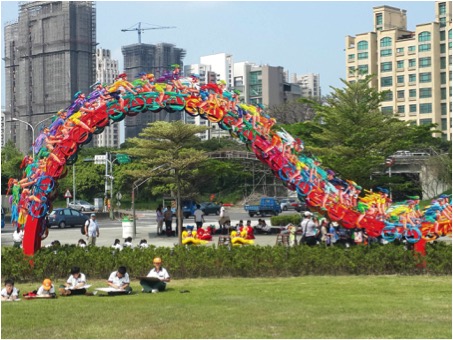
All the metal works were done in Taiwan and took about 3 months and I came from Israel with 4 assistants to do the complicated painting on the parts. We spent a month doing it and then the construction specialists assembled all the parts to erect it and made it possible.
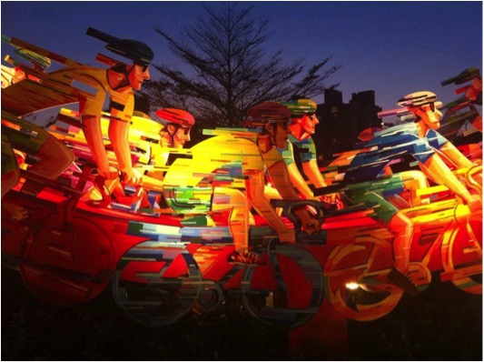
I watched the progress through pictures that were sent to me by mail and was amazed by the high quality that it was made when I finally saw it...
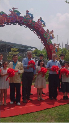 The opening was a great first with the participation of the Mayor of Sinchu and the Israeli Ambassador together with all the people who took part in the realization including my agent Ms. Virginia Hui-Ting Chen from Taipei that made it all possible. There were different performances and choral singing together with speeches in the event that lasted about 3 hours.
Have you ever been asked to do your work in neon?
No, I never used electric lights as part of my works and never tried it so far.
Your ‘Window’ pieces remind me of Matisse, can you discuss this?
Matisse is definitely one of many artists that inspired me throughout the years and I am sure it is rooted deep in my mind, Therefore I could only be pleased that it came out in that particular piece. I see myself a small part of huge Art machine that is shaping our understanding of the beauty of life and defines our place in the universe
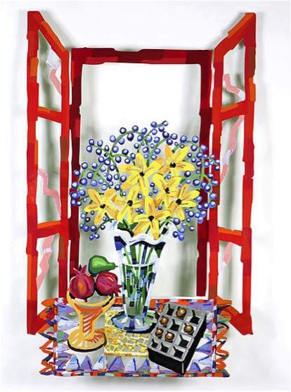
‘Table with Chocolates’
Your work is not always colour, colour and more colour. Expand on your Silk Way Sculptures in Ovda?
Using strong fresh colours is important part of my thinking and creation. In recent years it took more volume and people recognize my works from a mile away by that .However in many cases and other periods in my carrier other elements were more dominants and colours were used scarcely. In Ovdat project colours were out of the question because it was all about archaeology and ancient ruins and I wanted my works to integrate with the special atmosphere. I use colours where it is needed and not as a rule. I would even dare saying that drawing gives me more pleasure than painting.
Your work is sold in 21 countries around the world. Can you expand on one or two pieces that have given you great joy to know where they have gone and why?
It is a great pleasure to be recognized in many countries and to realize that the world accept my ideas and art without putting borders. When it appeals to a Chinese as well as someone in South America it means that I touch a mutual point that is common to human kind and that feels me with pleasure. My works speaks at eye level and are simple to understand at any level because it is honest and unpretentious. I believe that great music or literature could touch people anywhere if they reveal certain truth and reality. Sure it could not reach every one and luckily there are so many different tastes but having big audience is a great privilege.
My biggest sculpture so far is Momentum in Singapore and it brings me many regards from different people on many countries. This is why I like so much to do public works that everyone can see and experience.
‘Momentum’
Picasso said he never searched but he finds, I like that phrase. I would say that my art comes from what my mind produces without forcing it. I let my ideas float and goes with the stream of my imagination. Places I see, things that catches my attention, art that I like, things that I read or discuss, music I listen to, all inspire my creation and help push my creativity. I do not think there is one method for stimulating the mind, it depends on every person’s personality and it is perfect as long as one listen carefully to himself.
david-g‘Jazz in the City’
How do you record your ideas?
The only way I know is to draw in my sketch book. I  do it constantly almost every day and sometimes more than once. Than the ideas that I sketch could be forgotten even for some years and pop up again while I look through it and get excited again.
I also take photos all the time wherever I go, it is so easy today with cameras integrated in the mobile phone. The pictures reveals precious moments and reminds me of past experience or ideas that caught my attention and surely helps creativity to come to life.
I like to show my works to some people and listen to remarks, it does not mean that I would consider what people have to say but it helps to define my position and test my new ideas if they are ready to be delivered.
And last thing is that having no ideas is a good way to create something new. It throws the mind into chaos from which a new order comes out and surprises.
What are you currently working on?
I was invited to show next year in an imported museum in China and I am trying to crystallize my past ideas. On the other hand to recreate myself again, in other words to come up with something fresh and surprising .Let it be!
Contact Details:
Website:http://www.davidgerstein.com
Email: david@davidgerstein.com
David Gerstein, Jerusalem, Israel
Interview by Deborah Blakeley, November 2014
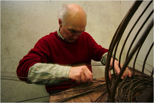
Joe Hogan
Your move to Loch na Fooey in 1978 was a complete life style change. Moving for more than just a ‘tree change’ you now have a rural life and also speak in Irish. How did this work?
I was drawn to basket making because I wanted to grow my own willow (the raw material for baskets) and I sensed that this involvement from growing through to making would prove deeply satisfying.
The opportunity to live rurally and develop a real understanding for a particular place was very important to my wife and myself. We wanted to farm and grow our own food and live in a beautiful environment. The area of the North West Connemara where we live is very beautiful and it is a real privilege to be able to live here. When we moved here Irish was still the first language of most of the community. My parents had spoken Irish to me when I was young so, although my Irish was rusty, it was not too difficult to begin to speak it again.
It is true that it was a life style change as had both met at university so it was not the obvious choice of things to do.
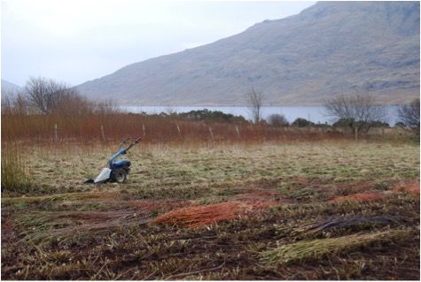
Discuss the importance of finding full-filling work and life balance, through basketry?
It seems to me that to find useful and fulfilling work is one of the most important things we can do in life. Initially I used to also spend a lot of time working on our small farm but gradually I began to find basket making more and more absorbing as I became more proficient at it. We also grow a lot of our own food so with the gardening, farming and willow growing are a contrast to being inside in the workshop.
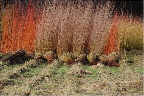
How was Tommy Joyce so instrumental in the early days in Lock na Fooey?
When we moved here I was able to make baskets but there was nothing particularly Irish or indeed personal about them. Tommy introduced me to the very rich heritage of traditional Irish baskets by showing me how to make a creel. This is a type of donkey pannier which is begun at the top or mouth of the basket with the base being formed last by interweaving the uprights. This was a revelation and it still informs my work as this method of working upside down allows me to make pieces with collars of bog wood and the like.
How has living close to the sea (The Atlantic) influenced your basket making e.g. lobster pots, skibs?
Although the Atlantic is only about 4 miles as the crow flies it is about 8 miles by road so it has not had such a profound impact. It is true that I was able to find one of the last people making lobster pots because I lived in the right place to be aware of him. The skibs are potato baskets and as such were used inland as well as by coastal communities. My own workshop overlooks a lake and the presence of water has become hugely important to me but I cannot say whether it comes through in any way in my work.
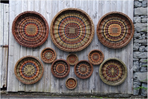
Skibs
Discuss how your understanding of ecology has affected your craft?
Over the past number of years I have become increasingly aware of how fragile this planet is.
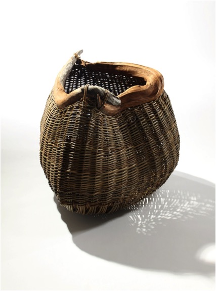
‘Swirling Root’ photo by Rory Moore’
This has largely been the impetus for working in a more artistic manner. I am currently involved with six other makers- in an exhibition called “This Beloved Earth” which is currently at the Barony, West Kilbride, Scotland www.crafttownscotland.org/thebaronycentre. This exhibition encapsulates a lot of my ecological concerns and focuses on the need to look at the earth more as an organism.
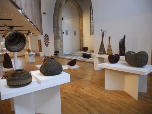
You use many local materials like bogwood. Can you explain how these are incorporated into your work?
I believe the idea you are referring to has to do with a comment I made saying that my whole life is about creating; be that creating a basket or a garden, or a photograph. I see colour and desigI find the bog wood in an a nearby area of bog land where the peat has been cut away for fuel leaving the root systems of these ancient pine trees-they are more than 3000 years old- exposed. I wanted to incorporate them in my work as I find them amazing.n, and inspiration all around me. For me, creativity and inspiration are everywhere and touch every aspect of my life.
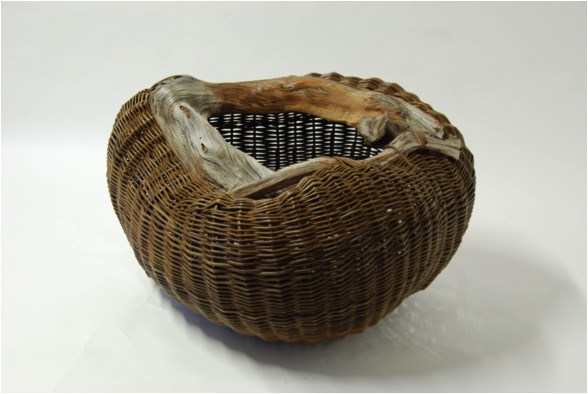
‘Ripe'
Do you only work with natural willow colours?
Yes. There is a very rich variety of natural colours of willow.
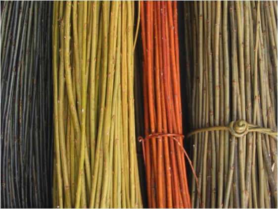
Can you explain your use of Lichen, Hazel Catkins in your work?
Again it is a fascination with the material. I really like the look of it and then I see if I can weave with it.
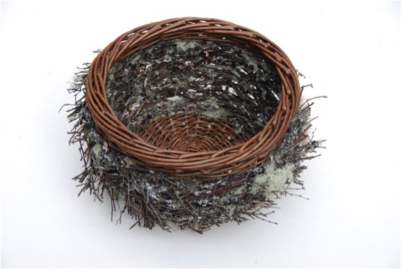
Lichen Bowl with Harrison’s Willow on the boarder
Can you explain the technique you have used in ‘Larch Bowl’?
The larch twigs are harvested in winter. I look for twigs with a good number of cones on them. I planted a good few larch trees in 1978 when we first moved here so I have a fairly good choice. I almost always use a long ladder to cut the branches I want. The twigs are then dried, soaked to make them flexible and steamed to increase the flexibility. Then it is a case of weaving them carefully to ensure I don't knock the cones off in the weaving process.
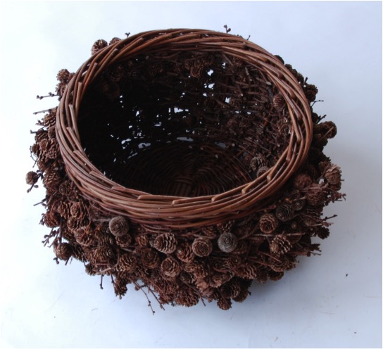
‘Larch Bowl’
How small and how large are your baskets?
Many of the baskets using bog wood are up to a metre in length. I do try to make some smaller work as well. The bowls are about 50 cm wide. I tend not to make very small work though lately I have been making a series of nests and some of these are only 10 cm in diameter.
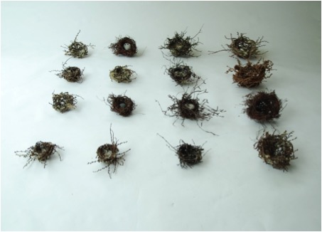
Group of Nests 10cms to 25cms Birch and Lichened Twigs
How does poetry play a part in your craft?
I find it a wonderfully rich source of inspiration. It seems to me that poetry and music can offer insights which go beyond what is purely rational or sensible towards a more intuitive view of the world.
I am influenced by environmental concerns and feel that the changes we need to make as a race will become possible only when we go beyond a merely rational analysis and begin to encompass the worlds of poetry and art to imagine new – and more responsible- ways of being in the world.
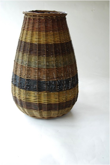
Tall Vessel 60 x 60 x 100cms
Can you expand on the importance of repetition in your craft?
Repetition is crucial in developing crafts skills. In the case of basketmaking the techniques are relatively easy to learn but one really has to practice a lot to perfect them. I think this is true of many things in life and there is great satisfaction to be gained from making better work.
You still make traditional baskets and have expended these skills to your contemporary work, discuss?
The artistic work grew out of the functional work and these baskets would not have been possible if I did not have the fluency which I developed making functional work. Even the technical solutions needed to make the bog wood baskets are informed by traditional techniques.
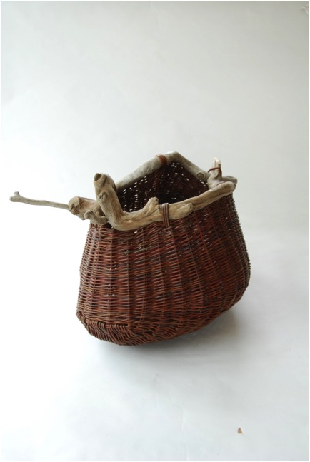
Drift wood pouch, drift wood and willow rods
Explain about your collaboration with Joanne Haynes and her 2011 Autumn / Winter collection?
Joanne was looking for something eye-catching to compliment her work and suggested a twig hat as she has seen my birch twig bowls. Once the idea was there it was not difficult to figure out a method to make it work.
Photo by Brian O’Sullivan
Your son Ciearan is also a basket maker. Do you work together?
No. Ciaran has his own workshop in Spiddal craft centre near Galway city and he makes functional work. He did spend the best part of a year working with me a few years ago to develop his skills.
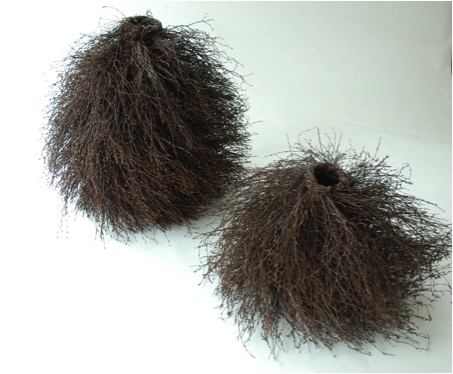
Two Birch Vessels
Contact Details
Email: joe@joehoganbaskets.com
www.joehoganbaskets.com
Joe Hogan. Loch Na Fooey, Finny, Clonbur, Co Galway. Ireland
Interview by Deborah Blakeley, November, 2014
David Frazer
You have always wanted to be a songwriter, but realized that you were more suited to Printmaking. Discuss this in relation to you comment. “I think of my work like a songwriter would produce an album”?
I wanted to be famous due I suspect to insecurity, I wanted to be popular and adored like Elvis, ha ha. I wanted to write beautiful heart felt songs and move people to tears. I really wanted to connect with people; I probably found it hard to do that the normal way. Anyway I tried song writing but couldn’t do it, I became an occasionally funny karaoke act. After art school I had discovered printmaking and found it more suitable than painting. When I saw reason and quit showbiz I decided to get back into art and focus on printmaking. I went back to art school to do an honours years in printmaking. There I discovered wood engraving and found it to be as close to song writing than any other medium. It suited poetry, narrative and storytelling. I also found I could do a series of engravings, even had some text and bind them into a book. Also what I discovered was that suddenly I had a subject. My years of trying and failing in the world of showbiz gave me that. Topics of yearning and alienation, failed ambition etc. still form the basis of my work. I’d won half the battle.
Together Alone’
You have also worked in collaboration with songwriter, Paul Kelly please expand on this and the book ‘Little Aches and Pains’?
It wasn’t really a collaboration, as Paul said when opening the launch of the book, all he did was say yes. I used the lyrics to a song he had already written for his most recent album “spring and fall”. I just found it refreshing to use someone else’s words to interpret. I also felt an affinity to the theme of a frustrated guy reminiscing about an old love or friendship that went wrong and wondering how life could have turned out different. I love the beauty in sadness and human frailty.
You have a strong formal arts background, though it has not always followed in the school - study - work pattern. Can you discuss this?
I’m not sure I understand the question. I also dispute that I had a strong formal arts background. Sure I’ve got a few letters after my name but any idiot could have got them. I learnt practically nothing in art school. I could have in first year where I was at Caulfield tech (now Monash) but I was an idiot and didn’t think I needed to learn technique. I then stupidly went to Phillip institute which was a complete waste of time. I learnt a bit back at Monash when I did my honours years. At that time there was a lot of practising printmakers there and I learnt a lot then. I stayed on there for ten year employed as a part time tech where I learnt a bit. During that time I did a masters and got a scholarship, not sure how much I got out of that but I suppose it did help me formalise my themes and approach a bit. About ten years ago I worked as an edition printer for port Jackson press and I learnt a lot there about printing. Still, I don’t exactly feel like an expert in printmaking; maybe that’s a good thing?
How do you decide on the medium you will use, eg paint, sculpture, engravings?
I’m pretty much focusing now on graphics. I struggled for years trying to paint and it felt like an exercise in torture and for all that time and effort I had a pretty small success rate. I settled on using the paintings as the scenic art, the stage for my characters and narrative that I portrayed with my prints. Seemed like a good system but in the end I just got sick of the struggle to paint. To be a good painter you have to be obsessed with paint and you have to work really hard at it, and want to. You have to be interested in aesthetics, with colour, with how you apply the paint etc. and I really didn’t give a rat’s arse about any of those things. I am only interested in the narrative really and I figured I was kidding myself trying to be a painter.
‘Skinny Man with an Axe’
Please discuss the size of your work and what the restrictions are?
Most of my prints have been small. Wood engravings are usually small due to the nature of the end grain boxwood. The smallness gives the work an intimacy, it forces people to go up close to the work and take in the detail, and maybe the poetry or narrative. I recently have started doing large scale linocuts which end up looking like huge wood engravings and provide quite an impact! It’s actually become an exciting development for me and the first big one I did “waiting for rain” sold out the edition of 50 in a year and gave me more money than I ever would have got for a painting that size. The down side is that they take ages to do. That work took me 3 months to cut, and it’s really tedious monotonous work! Still, I’d take boredom any day over the emotional torture of trying to paint! Also, I find it quite easy and I have a confidence that I never got with painting. That actually tells you something; but sometimes it takes a while for the penny to drop.
‘Another night on Earth’
In 2007 you took part in the International Print Biennale in Guanlan, China, where you became a major prize winner. How did this influence your career?
It gave me the confidence to know that my prints were technically good (at least sometimes). It was a real confidence boost getting that acknowledgement on an international stage where no one knew me from a bar of soap. I’ve been back regularly since for other biennials and artist in residencies. They think I’m a world famous artist and it’s nice to be treated like royalty once in a while. The last time I was there I was giving a show and I even got a billboard on the street, you don’t get that every day! Also it was good not only getting to meet other international artists and seeing their work but also seeing what the Chinese printmakers are doing. It was their big wood cuts that inspired me to try large scale linocuts.
‘Waiting for Rain’
Let's discuss your prints:
The number of editions you make?
I used to do small editions but it’s really annoying when they prove popular and you don’t have enough to sell so now I do at least 50-70. I got to make a living.
What you do with the plates after the print run?
Sometimes I take my old copper plates to the metal yard as you get good money for copper now. I usually keep my wood blocks, sometimes I get them resurfaced so I can use them again. I’ll probably donate the blocks from my Paul Kelly book to the state library of Victoria.
‘Lost Dog’
Your work is mainly about place. Can you discuss this common thread?
I love the duality of loving a place but wanting to escape it. I grew up in country Victoria, son of the school principal and a blow in (I’ve always been a blow in). The Wimmera where I lived in my primary school years is flat, with a certain melancholic beauty. It seeped into my system somehow and that landscape became the setting for my art. That environment though can be stifling and I used that to expand on the desires to escape it, to be somewhere more exciting and to be someone more exciting. Also I love the idea that you are afraid of leaving, and afraid of success. I used to often portray a figure flying over the landscape called “mr vertigo” who wanted to fly but was afraid of heights.
When to use colour and when to work in monotone, please discuss?
I’m on a bit of a black and white thing at the moment. Colour just distracts from the detail and the image I think.
'Sweet Dream’
Can you explain the figure often seen on your roofs?
As a kid in the Wimmera I used to spend a lot of time sitting up a tree or on top of our roof, dreaming (I like to imagine) of escape. Also maybe it’s the Launchpad for flight.
'Lonely Boy 111’
You have your work in many Galleries. Did you introduce yourself or did they approach you?
A bit of both. I was very lucky early on and galleries approached me. I’ve actually approached some galleries recently and met with rejection, it doesn’t always work out and it’s a very tough game. Also it will be harder for me now as most commercial galleries aren’t interested in taking on a printmaker. I have a couple of commercial galleries I’m with, one in Canberra, Sydney, Hong Kong and London. Port Jackson press in Melbourne sell my work and I have it spread around a fair few regional print galleries.
I’m freelancing a bit more now, most commercial galleries want you to be exclusive to them in that city and many now I find are getting worse at actually paying you and you get pretty sick of forever hassling galleries to pay you your 60%
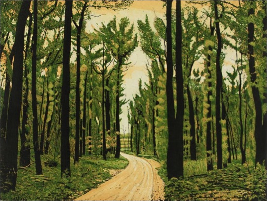
'New Life’
Explain the importance of entering acquisitive and award winning exhibitions?
I admit I’m pretty competitive so prizes have that attraction for me. It’s a lot of work though and it means bugger all really. You do get your work seen though and often it helps you to get into collections if you get acquired.
'Holding On’
Can you discuss your iconic caravans and how the first appeared and why?
There’s several things I love about caravans. One we had one as a kid and we used to have many a happy holiday in it. Also it’s such a loaded image, you can make them ambiguous, like is it for a holiday or is it a home? It creates that tension I love, like is it happy or sad, safe or menacing? They are also so humble. As well as those things they are great shapes with great colours!
'Lost’
Discuss your work ‘Lest We Forget’. Are we likely to see a similar theme as we had on the 100 year anniversary of WW1 and our current involvement in war zones?
That image happened by accident. In 2007 the ABC (Australian Broadcasting Commission) did a doco on me as part of the artist at work series. In mine I went back to my old home town of Murtoa and go over my old haunts and make some art from it. It just happened to be Anzac day and so we filmed the formalities and the march. I loved the character of the old digger who led it and I knew it would make a great image. I intended the image to mean not just lest we forget the diggers but the old days and the old ways, the old dying towns, the old climate. It was a very moving experience. A couple of years ago that old digger actually died on Anzac day.
'Lest We Forget’
Humour plays a large part in your work. Please discuss?
Humour makes sadness much more powerful and accessible. I do a lot of images now on hopelessly confused and bewildered men. It’s a fertile subject, one I find sad yet also funny.
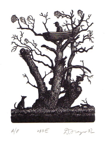
You are currently building a new home in rural Victoria, Australia. Will it include a studio? If so, what are a few of the must haves? If not, where is your studio and why do you choose not to work from home?
I’ve lived up here in Castlemaine for nearly 7 years. I was very lucky to be able to buy a relatively cheap double block with an old converted stables on it. I built a studio up one end and last year I sub-divided the place and sold the old stables. I made a bit on it and am now nearly finished building a new house. The studio is a big tin shed with a mezzanine and I’m a very lucky man. Its good working at home but the danger is that daily life issues can distract you.
I am fascinated with the daily timeline of artists, what would be a typical working day or week for your in the studio?
I try to be disciplined. I usually get into the studio by 9 and try to work a full day. I have young kids though half the week and have to do school pickups and shopping and cooking etc. My plate is pretty full! Every second weekend I have the chance to do some work too. I’m not very good at working at night. I usually just crash out in front of the telly and go to bed pretty early.
You also find time to teach. How and where are these classes held? Are you open to offers to teach in Australia or overseas?
 I have run lots of workshops in recent years, mostly wood engraving but sometimes linocutting and etching. I do one or two a year in my own studio and often at other peoples. I’ve done them all over Victoria and sometimes interstate. Sometimes in Sydney and Adelaide. It’s usually fun and a good way to supplement my income. I have a little press I can take in my car which means I can do a workshop anywhere (and I am happy to consider offers).
Contact details
defraz1@bigpond.com
www.dfrazer.com
David Frazer, Victoria, Australia
Interview by Deborah Blakeley, November, 2014
Elisa Confortini
Discuss your ceramic technique
What is it about clay that give you such pleasure in the creating?
What types of clay do you use?Where do you source your clay from?
Can you discuss the techniques you use with very high temperatures and how this achieves the results you want in your glazes?
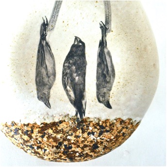
Although in Italy there is a long tradition of Majolica, and I also began using this kind of ceramic, I always loved the material resulting from high temperature firing: the color, the hardness and the strength of the earth, its sounds, and the natural colors of glazes. I use stoneware, porcelain and refractory clay, often combined as I love the contrast and the tensions that are created: the cool white of porcelain with the warm tones of the clay and the smoothness of the glaze.
The origin of the clay is various: stoneware from Germany, porcelain from France and refractory clay from Spain.
The process is manual, but in some cases I start with basic shapes, obtained in the mold, which then I complete or modify. I personally produce the glazes, preferring whites and soft colors, shades and those small imperfections that make the glaze alive and material.
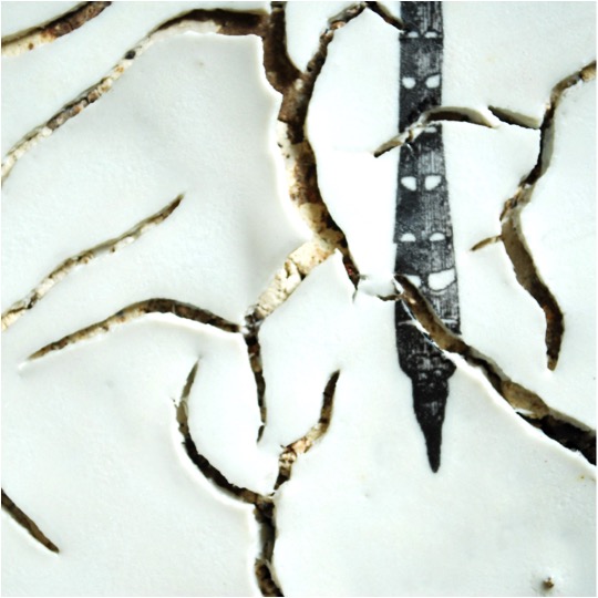
Detail
Your work has a very organic look and feel, please discuss?
I have a particular interest in exploring the sensorial, emotional and expressive qualities of natural materials. I'm passionate about collecting things even without an instant logic, listening to their form, their material, and I believe that this kind of feeling comes out even in my works.I work with synthetic and basic structures, because the primary element allows creativity to be free.Even in the world of forms there is space both for complexity and simplicity. Usually in my works complexity is delimited. Two opposite states of human soul: one calm and static, the other strong and dynamic.
Can you explain the sizes of your work?
When making pottery, dimension of your work depend directly on dimension of the kiln you have. This could also be a limit. I realize unique pieces ranging from ten to about seventy centimeters. But I like to conceive my works as groups, combinations, starting from a theme I’m interested in and then creating a series of small changes. This allows me to go through an interesting research study, on structure or material, and to develop the creative process even during the final phase of my work. This way the pieces can have their own life either individually or as a part of a whole installation.
How did your residency in Fupling, China develop your work?
In 2008, I stayed at the Fuping Pottery Village in China. This experience was the award of the ICMEA International Ceramic Magazine Editors Association contest for rising artists. I was included in a group of Italian pottery artists working there from April to May. It was a very strong experience from both human and professional point of view. It was my first trip into a reality of life and work so different from mine and it was a turning point in my work and in my life. The people I met that time led me to new and unexpected tracks.
During the summer of the same year, I moved to Genoa for love, and not far away from the city, I started to spend time in the workshop of the sculptor Adriano Leverone. I consider him my mentor and the motive of an important professional growth. I was able to begin a research on high-temperature clays and glazes and I approached a different material - bronze - which I started using to realize some of my works.
Discuss the importance of working with Enrica Negri from Milan to your art?
In the mid-90s, with Enrica Negri, my passion for ceramic material began. At the time I was working in the studio of a photographer and I remember flipping through a magazine and being fascinated by the work of this potter from Milan. I contacted her and I took a pottery class from her. I later attended other workshops, other classes but she represents my beginning in the world of ceramic, as well as Adriano Leverone has meant that in the world of sculpture.
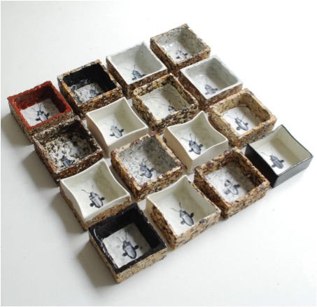
‘Entomological Collections’
Discuss the importance exhibitions have, and continue to have, on your work?
Exhibitions, biennials of pottery are the opportunity to present my work but also a comparison, a discovery. It is the way to get into the game and out of the atelier, to see my work in another context and obtain new inspiration. I consider this a fundamental moment of professional growth.
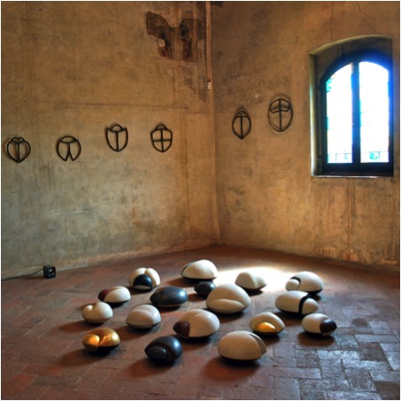
Expo Contreta 2010
Your studio
What lead you to open your workshop “Atelier99”?
How many people work in the workshop?
Can we have a peek inside the workshop?
Discuss the size (space) and the equipment
At first, I worked at home or in my garage with an outside gas kiln, or at other pottery makers. These conditions were temporary, and finally in 2011 I managed to open my workshop “Atelier99”. The room belonged to an old butcher shop, where I saved the hooks that are still on the wall. I redecorated everything to create a neutral, white space, very bright, perfect for working and highlighting the volumes and the tones of the sculptures. I work alone, the space is not very big but enough for two working tables, the 200 liters kiln, the wheel, the spray booth, and a small exposition area.
Explain the logo you have for your workshop?
The name and logo of my workshop comes from a discovery: an old iron rack for bottles found in a country house. One hundred hooks available, but one missing: that’s why 99; 99 spaces for 99 cups. A number that becomes infinite as infinite is the variety of forms, colors, dimensions, textures to be created.
A simple object as starting point, always present, to characterize and recall the infinite possibilities. And the cup: essential, useful, universal, primordial, it bonds and becomes the symbol of present and potential creativity that accompanies us in any place and in any time.
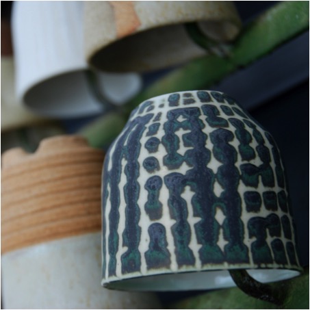
Can you discuss your current work and the addition of ‘Bug’ in the work?
Entomology has always fascinated me; I also studied it at the agricultural school. It has always been with me and now that I work with forms, it has come back to me powerfully.
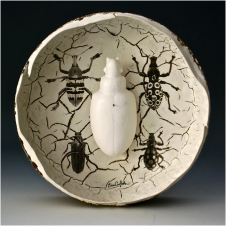
I'm fascinated by the incredible perfection, structure and variety enclosed in such small beings. They are fundamental in the balance of the world but they are considered insignificant or annoying, useless or harmful, to be eliminated or collected, but always to be killed. This is where my work starts with them: an ecological and environmentalist reflection on the use and the exploitation of living beings.
My “bugs” will lie on the ground, preserving just the memory of an event lived only by the primary spectators, leaving to everyone’s imagination the mental reconstruction of what it used to be and what it’s not anymore.

What are you currently working on?
I’m currently caring on the work about decals for the “Collezioni Entomologiche” (Entomological collections) by extending the theme to other creatures.

This way I’ve created “Vasi da Esposizione” (Pots to be exposed)
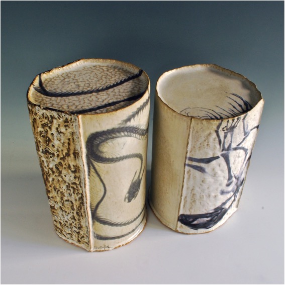
Vasi da Esposizione
“Nidi Violati” (Desecrated nests). Right now I’m working on images of birds’ skull, a meditation on the beauty and the weakness of life, between abstraction and memento mori.

Contact Details
Email:info@elisaconfortini.it
Elisa Confortini, Genova, Italy
Interview by Deborah Blakeley, November, 2014
Amy Nguyen
Please comment on your relationship with Mary Edna Fraser and where it has led you?
Mary Edna Fraser and I connected after I graduated from college. I had decided to stay in Charleston SC to work and was custom sewing for a local company. Mary Edna Fraser needed someone to sew her hand-dyed fabric into dresses for her daughters for a special occasion. I was inspired by her beautiful batiks after visiting her studio. When she visited my small studio and saw my paintings, she posed the question of putting my artwork onto fabric. I loved colour and creating on a blank surface and had grown up around textiles, so the idea was a terrific fusion of both. She planted some important seeds in my head that year and I am forever grateful to her.
I’ve seen Mary Edna Fraser just a few times since leaving Charleston. We connected at the Peabody Essex Museum, north of Boston, in conjunction with the World Batik Conference. At that time, she gave one of the best piece of advice: always do something new, no matter how small a change. I do try to practice this often. Slight changes keep me from becoming stagnant in my work.
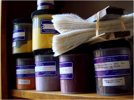
Discuss the importance of shibori in both your early and current work?
In the beginning, shibori was the primary focus of my work. I experimented with a wide range of mark-making and colour-mixing. Now, my work is a balance of shibori and subtle textural components through stitch. The complexity in the work continues to grow. My stitching adds a layer of dimension to each piece. I will always enjoy shibori mark-making, but I will likely always enjoy, even more, the challenge of taking that traditional surface down a different path.
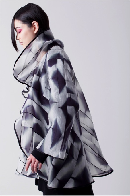 Do you still take Jason Pollen’s advice, to carve out a small bit of time each day to experiment with no outcome in mind?
I really try to. Sometimes I’m not able to carve out as much time as I’d like. The business end of the arts can take an enormous amount of time with all the moving parts. But, I certainly appreciate the importance of carving out time to experiment and I come back to it as often as I’m able. I find it is always a good way to center myself when I don’t know where to begin.
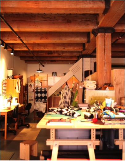
Where has one of these small pieces of time lead?
These small experimentations have ended up in my sample books, to which I often refer. Each one leads to a slightly different textural technique. If I end up with a lot of the same grouping, or pieces that work together, I will use those pieces in a one-of-a-kind garment. Every thread is precious. I recently sold a one-of-a-kind coat to a favourite collector and she exclaimed, as we were admiring the piece, that it felt old and special. She had sensed the age of the fabric behind it. She sensed the soul of the piece. I suppose when you think of this question on that level, one could realize the collective importance of small things.
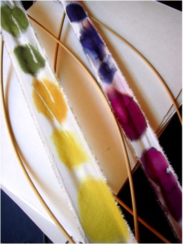
You work with a very limited palette, can you discuss this?
My early work was all over the place. It was not developed. I was beginning. In many ways, I feel like I stopped and went back to square one with black and white. I started to create shibori using a very limited palette. This allowed me to further develop my techniques, as limiting materials allows for more creativity in my artistic development.
I’ve always loved black and white, the contrast, the dimensionality, the tension between both. I go through periods where I love colour, but I often come back to black and white. While living in Boston I will always remember some time spent with Saundra Lane and her collection of black and white photography. Adams, Stieglitz and Weston pushed boundaries with only black and white. There is much to explore with everything and with nothing which these two opposing “colours” represent.
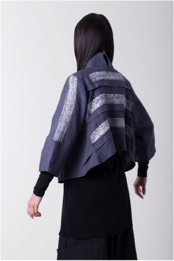
Explain your own shibori method of second layering?
Second layering is not part of the shibori dyeing process. I suppose it’s more abstract. It is my second part of process, or layering of process, when I deconstruct and remake the shibori by piecing, layering, tearing, or other methods of fabric manipulation. The dyed cloth is so beautiful on its own, but I find this compulsion to add weight, to make the fabric feel more grounded and to put my own mark on it. Thread is that weight. Stitching helps the piece to feel real.
What base fabrics do you use?
I love all natural fabrics. Mostly I use linen, silk, cotton and wool. When I first began creating shibori, I used man-made fabrics that could be heat-set to change the structure of the fabric. I don’t mind using man-made fabrics if they are recycled or repurposed, though the hand of natural fabrics is what I love most
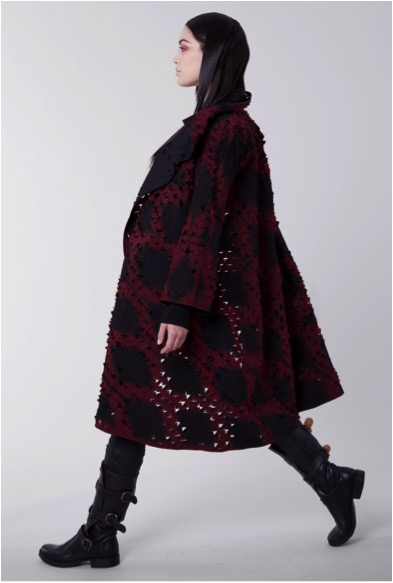
Can you discuss the blending and balancing of the artistic, spiritual and physical in your work?
When I am deep into a day of dyeing and sewing, the process is very physical and repetitive and this allows me to meditate. I have recently started to practice tai chi and I find I am most focused after a class. I often find myself back in the studio. When my head is clear, artistic inspiration can spring up from doing the most basic daily things. Artistic, spiritual and physical all can become one in a moment of flow. Or, they can at least influence each other. There is a balance that must exist in order for me to create.
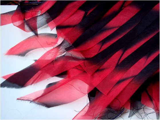
Explain your thoughts on keeping age old textile traditions within modern fashion?
I believe we have a need to retain tradition, pride in our community and our history. Modern fashion must exist as well, but with careful consideration of its effects on the environment. There should be a balance of old and new. For example, my dye techniques are by hand. Some of my stitching techniques are by machine. We are small-scale and care about every piece. It shows.
I don’t agree with disposable fashion. We have become a society of much waste and fast-paced consumption that is affecting the earth. I like the idea of having few pieces, well-made that express who you are. I certainly recognize that items like socks, underwear, leggings, basic black clothing need to be affordable. These items can be mass-produced as long as the company that is producing them stands behind protection of the environment, sustainable practice, and fair pay. As consumers, we should be asking where things were made, how they were made, who made them? In order to keep some of the old tradition, we can ask these questions of designers and support those who work the most fairly. We can support local stores. We can support smaller stores. And when we buy those particular pieces to express who we are, I think we should buy less of them…and really cherish what we have.
You emphasise the importance of handmade in your work. Why is this such a major part of your textiles and finished garments?
I’ll never forget the collector who recognized the soul in the coat I’d made – who sensed there was older fabric in the piece. Part of the cloth that went into that particular piece was from my mother’s stash of sewing fabrics. It was a beautiful silk/linen ivory cloth intended to be a suit she had wanted to make but never got around to making. This was a special moment for me – to have someone truly understand the soul of a piece. That is also why part of my work is handmade. There is an inexplicable soul in anything made by hand. I firmly believe in this. It is in direct opposition to fast consumption. We slow down – not just those making it, but those wearing the pieces as well.

Explain your interpretation of ‘Slow Textiles Movement’?
Slow movements, in general, represent a cultural shift towards slowing down the pace. The slow food movement has gained considerable momentum and now, I believe, slow fashion is following. We should know where our food comes from and how it was handled. We should know who makes our clothing and where it comes from. It really is just about being more present and more aware of the world that surrounds us. This is the main premise behind the slow textiles movement. I’m also paying attention to how we work in the studio, what I pay my interns, what we recycle and, most importantly, the quality that is going to a collector.
There is another layer to this for my work. Many of the pieces that we create are considered wearable art. Additionally, they involve an aspect of art, of craft and of fashion. These pieces have emotion behind them, they are made up of highly skilled technical craft and they are relevant today. Adding all of these additional layers creates pieces that are true works of art. They are authentic and people deserve this.
Couture is a word that we relate to high fashion. Your work has that very high finish. Can you discuss the importance of this?
Many processes, technical skill and collaborative work are all certainly a part of the pieces created here in the studio. The same could be said of couture. We have 4 different aspects of process and each one is of equal importance. First, the creation of the surface design work – the dyeing of the cloth. Next, the fabric manipulation and intricate stitching of the cloth. Third, the patternmaking of the garment shapes – turning two-dimensional into three-dimensional. And last, the finishing or very detailed final touches. Couture pieces are a true reflection of the artist. I feel each piece made should be both a true reflection of myself as well as of my respect for the craft and history behind each aspect of process.
The photography of your work is beautiful. Can you explain how you achieve such wonderful images?
In the beginning, my husband and I took our own photographs, which were flat and lacking in dimensionality. After viewing numerous headless shots with mediocre lighting, I came to the realization that we needed to collaborate with professionals who understood the emotions I was trying convey. I strive to create masterful work in the studio. Each person with whom I collaborate is doing the same in their own field. When great collaboration happens, it’s because the ego disappears and each person understands their role and yet has respect for each other. This ensures that each photograph evokes the feeling that existed in the creation of the piece. My goal is to seek the best in every aspect of what we create and to know that I cannot do it all. I’m not the photographer or the artistic director or the stylist, yet we all have a similar vision. In that room, I am only the artist/designer, one part of the whole.
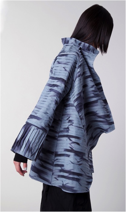
Do you design seasonally? How do you add to the collection?
I add to the collection as process develops or changes or if something inspires me. I don’t create collections such as fall, resort and spring. Most of my pieces can be worn at least three seasons in different ways. That’s what I like in my own clothing. I find the less clothing I own, the better I feel. When I update a piece in my own wardrobe, another piece gets donated. I find it’s best to have pieces that work well and can be worn often that are loved each time they’re worn. When we love our clothing, we possess a wonderful energy. I care more about creating the garment with thought and care then making sure I have a collection available on a particular date. Each season does influence us some and I always offer some aspect of work that makes sense within the season. I love linen, for example. People say it’s only for summer. What about quilted linen?
What is one basic garment you would not be without?
A wrap (which can become a garment). I use one in the summer, in the winter crinkled and bunched as a scarf and during meditation.
Contact details.
amynguyentextiles@gmail.com
www.amynguyentextiles.com
Amy Nguyen, Boston, MA, USA
Interview by Deborah Blakeley, October, 2014
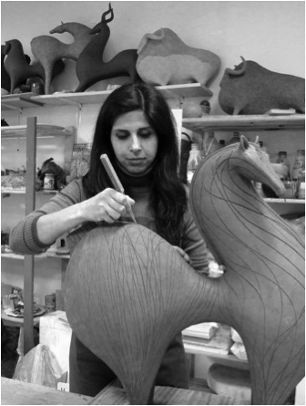
Athena Jahantigh
Poetic Gazelles - series
Can you discuss the way you have been able to use simple gestures of the gazelles, to give different characters to these beautiful animals?
I started with a gazelle first with its head turned backwards. It was a slightly different reproduction of a model I had previously made in porcelain. Here I wanted to change, I wanted to give it a little bit more movement while remaining close to the main forms of the first model. I wanted it to have the look of a true gazelle turning its head down, looking left or right or raising its head etc... I had fun changing the movements of my imaginary gazelle in an exaggerated way and that's where we can realize the power of imagination in creation.
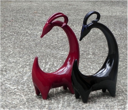
The size of the work:
The tallest gazelles in the series "Poetic Gazelle" can reach 30 cm.
The technique you have used to make the gazelles:
The gazelles are made in black faience and hand built, from clay slab strips. I always start with the legs and I finish by the horns or ears...
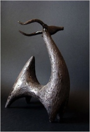
What animals do you use in some of the series?
To date, the animals I've made are categorized as follows: horses, gazelles, bulls, rams and goats, and birds. Apart from these few animals, I made a cat one time. I think that there are cultural and symbolic reasons.
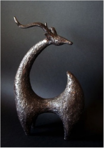
Why not make an elephant or a rabbit? I can say that I love almost all animals in the nature, some because of their beauty, and others for their strength. Some amaze me with their intelligence and others by their affectionate or extraordinary side. There are too many things to see, to observe and to feel to be able to express them in a sculpture. I don’t see any point to present in my work all kinds of animals because I make animal sculptures, I prefer to focus on those that have a special meaning to me. The four legs (the general term I use for some of my animals) mentioned above are animals that have existed for thousands of years in Iran, my land of birth. They are drawn and made in sculpture since the time of my ancestors until today. Of course there are others, but here comes my choice and my personal desire.
Where did you watch and study gazelles?
During my art studies in Iran, for the theoretical part of my thesis, I studied the drawings on ancient pottery in Iran. One of the cities studied, "Shahr-e Soukhteh" (meaning Burnt City) which was founded in 3000 BC, had many drawings of gazelles with a characteristic: the tail of these gazelles raised up. It is from these drawings that I imagined and drew my first gazelles.

Shahr-e Sukhté (meaning "[The] Burnt City"), also spelled as Shahr-e Sukhteh and Shahr-i Shukhta, is an archaeological site of a sizable Bronze Age urban settlement, associated with the Jiroft culture. It is located in Sistan and Baluchistan Province, the southeastern part of Iran, on the bank of the Helmand River, near the Zahedan-Zabol Road. In July 2014 it was placed on the World Heritage List of UNESCO.
The reasons for the unexpected rise and fall of the Burnt City are still wrapped in mystery. Artifacts recovered from the city demonstrate a peculiar incongruity with nearby civilizations of the time and it has been speculated that Shahr-e-Sookhteh might ultimately provide concrete evidence of a civilization east of prehistoric Persia that was independent of ancient Mesopotamia.
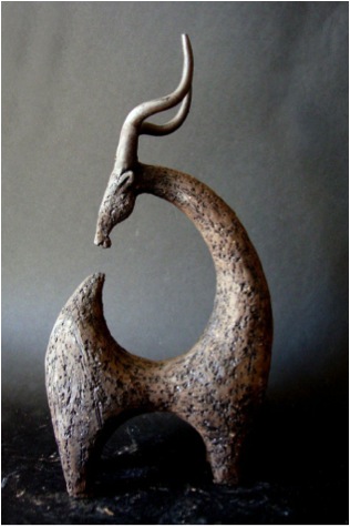
Do you work from sketch books or photographs?
Sometimes I study pictures of animals or observe them in real and near. But there is above all the legacy left generously by our ancestors all over the world (and particularly in Iran for my work): designs on pottery, on the cave walls, large and small sculptures or containers in the shape of animals. That forms a magical mix that whets my imagination and allows me to draw. My work is never made from a specific drawing or photo, although sometimes consciously or unconsciously I’m close more or less to an already existing form.
From Legs without Leg – series
Your series ‘From Legs Without Leg’ - where did this simple but exciting idea come from?
My animals are divided into two groups: birds and four legs. "Four legs without legs" was a series made for an exhibition in Paris. It started with some stylized rams up to the point that their legs disappeared and then some goats and other animals in the same spirit, they were different from those that I used to achieve. So I decided to name them by their differences.
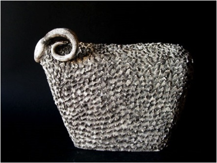
Through the use of texture and curved horns you have allowed the viewer to know the animal. Can you expand on this idea?
The horns, in addition to being beautiful and delicate, are also the symbol of the strength of the animal. But it is the hair and the texture created to imitate them that make this animal looks like a ram or a goat instead of a gazelle or antelope. Although in this series the horns and the hair texture are two main elements to recognize the animal, in the end, it is a whole set of elements that reminds us of a particular animal. For example, I do not see myself making a gazelle with a rectangular body.
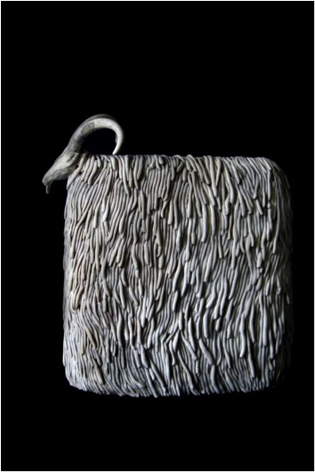
What is the material you have used?
Most of the pieces in this series are half- glazed white faience. The enamel is used to give more color to the piece but particularly to bring out the texture.
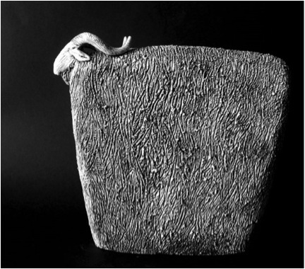
Can you discuss the size of this work?
The height of the pieces of the series varies from 20 cm to 40 cm.
Discuss, the simplifying of shape in this series?
In "The four legs without legs" series, I tried to remove a maximum of detail in terms of shape, as when we are watching a herd from a distance: details are gone. The body of a “four legs” can practically fit into a rectangle. The fact that some “four legs” have hair such as a ram makes it easier to make their legs disappear and get them into this rectangular shape, and this accentuates at the same time their skin and texture characteristic .
Birds - series
Are they actual birds or rather representations?
My birds are only representations and do not correspond to a particular species. Some are limited to a form which can remind us of a bird. Since nearly always, a bird is the symbol of freedom, especially the flying bird, I prefer to represent it sitting, resting or asleep. These symbols of freedom will remain forever at rest and at peace: they do not need to fly to be free.
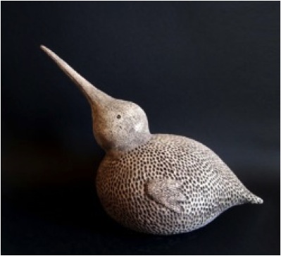
Again explain the importance of texture to get the feel of feathers?
One of the first reasons I added a texture to a piece has been to overcome a technical problem. At first, I didn’t have the opportunity to work sandstone, only faience. I didn’t like the texture of the pottery after firing, and I prefer sculptures without enamel and without patina. I looked for another solution to cover the works: texture. In the end, texture had become an indispensable part of my work, as if not adding any texture left the animal naked. A passion that requires to be patient, and I continue to used it in my work even on sandstone
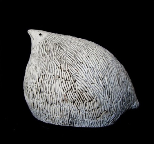
Sandstone Animals - series
Can you discuss the difference in your sandstone animals?
My latest works are presented in the series of sandstone animals. My inspiration travels between past and present, between my roots and my imagination. My sources have not changed, regards the technique, there was a big change.
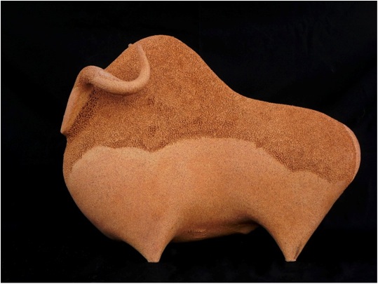
Thanks to this new clay, I was able to significantly increase the size of my works, limited only by the height of my oven (71 cm). There are different colors of clay that are beautiful, but as I mentioned above, it has become difficult for me to make a piece without texture, so most of the time they are “dressed” with texture. These are often created by repetitive movements cutting or adding material and they do not take precedence over the main shape. The texture becomes the poem offered to the earth…
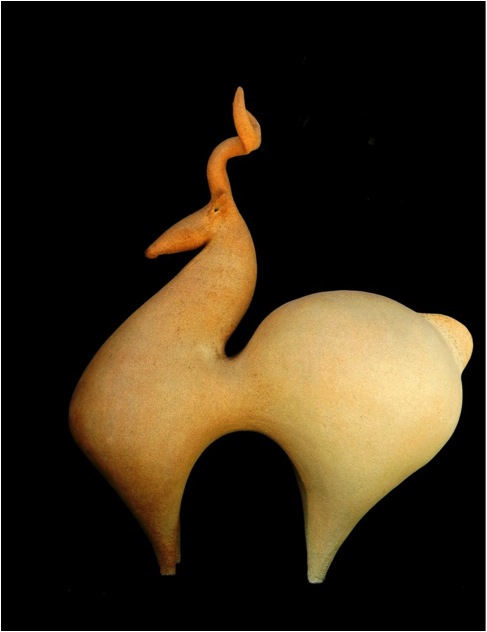
The pieces are fired at 1280 ° in a gas oven with oxygen reduction. They are manufactured and hand-modeled with clay slab strips. I always start with the legs and I finish with the ears or horns.
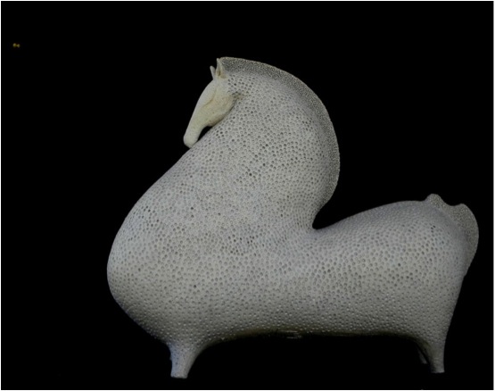
You began your studies in Iran, can you briefly discuss the academic availability for yourself in Iran up to 2006?
I studied Art for four years in Iran. My father, a painter and art teacher, allowed me to have some knowledge about art and gave me the desire to go on in this way. I started my studies in 1996 at the University of Art in Iran, during which I specialized in ceramics.
What was the factor in you going to France to study at the Sorbonne in 2005, and then to go onto your Masters of Fine Arts there?
Since I was young, I wanted to go to France or Italy to study. At that time, the history of Art in these countries, their museums and cultures fascinated me, especially France, which I had read several historical novels. Finally, I had the opportunity to come to France to follow at first a master of fine arts in 2005 and then a doctorate in fine arts that I got in 2012. At the beginning, I wanted to do graduate studies in ceramics, which was not possible in France. I chose the visual arts, a choice I do not regret because it allowed me to know other artistic universes.
Discuss the importance of Art and international travel for a woman from Iran?
It is not always easy to go to another country to study, especially from Iran. I think the opportunity to make art and to travel to learn more and be able to interact with strangers, whether you are a woman or a man, regardless of where you come from, it's an extraordinary chance.
About fifteen years ago, an unmarried Iranian woman needed the permission of her father to get out of Iran. Today this law no longer exists, and there are many more girls who are studying art than boys.
Can you expand on your own position as an Iranian woman artist in today’s climate?
Being an artist in Iran is not at all difficult. Art and poetry are an inseparable part of our culture with all its ups and downs. Whether, you are a man or a woman, you can continue your art without any worry under the condition; that the object of your art does not criticize the current politics or religion, also your art is not about nudity.
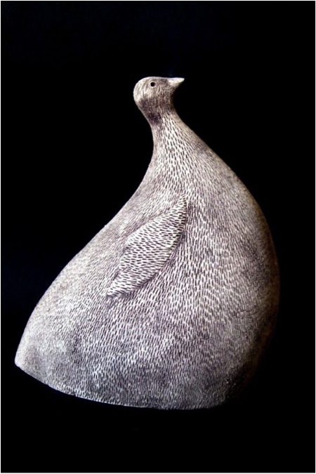
Contact Details
Email: athenajahan@gmail.com
Web: http://www.athenajahan.com
Athena Jahantigh, Iran & France
Interview by Deborah Blakeley, October, 2014
Meg Little
Explain the importance your move to Cornwall, in the UK, was to the development of your art in rug making?
I moved to Cornwall in 1984 right after getting my Masters Degree from Rhode Island School of Design. I walked into Plymouth College of Art and Design and introduced myself to the Crafts faculty and I eventually taught there. One of the lecturers told me that there was another American weaver living nearby: Grace Eckhert. She was a tapestry weaver who was beginning to experiment with hand tufting. We became friends and she let me use her tufter while she was on holiday. I had taught myself to weave in high school and have two textile degrees but in those years I’d also started to paint. Painting is more immediate than weaving and using the tufter gave me the same freedom as painting but in my preferred medium. It was a revelation. We spent 6 years in Cornwall and I do feel as if I also absorbed some of the design sensibilities of other UK artists.
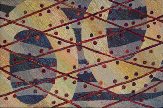
'Sudd’
Can you discuss the relationship you see between rug making and tapestry?
In both traditional tapestry and woven pile rugs, one makes the web of the cloth while also laying in the design which covers up the web. Hand tufting is actually more like embroidery; one decorates the previously woven web. This means that the design is not laid in on a grid and is free of that underlying structure. Weaving is a very linear process and any design gets built in that way. With hand tufting that constraint is lifted.
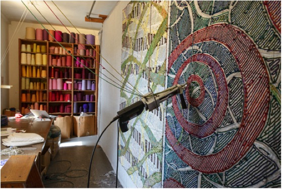
Explain the actual mechanical process of tufting, as you do it?
Hand tufting is the way that commercial area rugs are made if they aren’t woven. My tufter is electric and has two hollow needles that the yarns slide between. The top needle has a point that spreads the web of a backing cloth which is stretched tight on a frame, and the bottom needle has a tongue that shoots the yarn into that space. In front of the needles is a foot like on a sewing machine that helps advance the tufter forward. The yarn is shot into the cloth in a continuous loop following the direction of the foot.
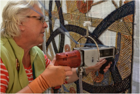
Meg at work in her studio
Discuss how this process has allowed you to use textiles as your paint brush?
The cloth can be filled in with whatever gesture one likes. I personally use a forty-five degree angle to fill in for the most part, which is similar to the way I sketch. Although the process is nonlinear it differs from painting in that the details are applied first and the background goes in last. And unlike weaving, there is the possibility to change elements after they have been layer in which I couldn’t do with my weaving.
The process is very similar to the French Tapestry method – you work from the back. Can you show how the work looks from both sides, how you manage to work “back to front” and why it is done this way?
Working from the back is dictated by the technology.
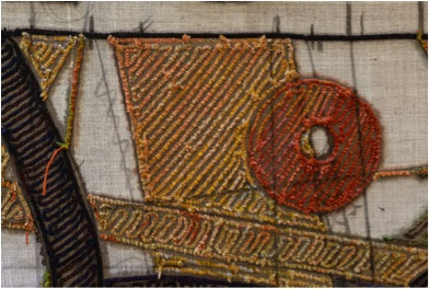
Back of the work
I always reverse my drawings so that the front of the rug is true and I tend to run around to the front frequently to see how things are progressing.
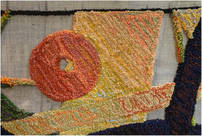
Front of the work
You work on a horizontal loom and not a vertical loom. Can you explain why?
They aren’t woven- no loom. I work upright so that I can get to the middle of the rugs and so I can see the front easily. The tufter really couldn’t be used any other way.
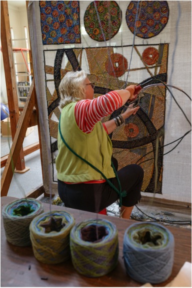
Meg at work in her studio
What type of yarn do you use and why?
I use 2 and 3 ply rug wools made specifically for carpets and rugs. I mix all the yarns in very complex color combinations blending four balls of yarn together in the tufter. Each ball has a different combination of related yarns, sometimes with some very surprising “wild cards”. As a former weaver I can never resist a complex optical color mix- more is more! Each color mix has about twenty-five different yarns in it.
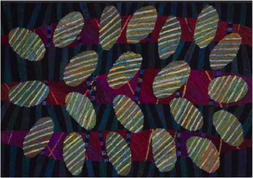
'Arborvitae'
How about the dying of the yarn, do you dye or purchase pre dyed yarn?
All the yarn is commercially spun and dyed for the carpet industry. Hand tufting is an industrial process and I follow industry standards in making my work. I may make them myself but the rugs are definitely meant to be walked on.
Discuss the limitations of size in your work?
I can make any size rug up to 15’ x 20’. The cloth that I buy from Germany for hand tufting comes 17 1/2’ wide so one dimension needs to be 15’ or smaller. I put a cap at 15’ x 20’- that seemed a good place to draw the line. I’ve made one rug that big and it was a beast! I’ve made lots of big rugs, including round rugs up to 10’ diameter and hall runners as long as 25’. Recently I had an exhibition of only room sized rugs. It was wonderful to see them on such a grand scale.
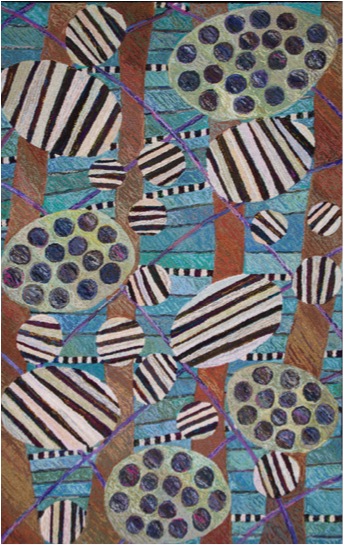 'Paradise'
Expand on how you are now constructing the “whole” rather than working a design on the background.
I came to hand tufting with very little idea of what to “put on” a rug. My previous weavings were minimal sculptural pieces although very concerned with color. I had very little recent experience with pattern although I’d been apprenticed to an ecclesiastical embroiderer before going to Tyler School of Art in Philadelphia. As I found my way, I discovered that through every culture and across all time there’s a common pattern language. The building blocks are the dot, the line, the square, the circle. I was delighted to find examples from every corner of the world and I have explored all the permutations. I love that I can be a part of a long continuation of makers and that my work reflects an ancient decorative tradition or some other part of the world.
For the past dozen years I’ve only been interested in the expressive geometric. As I mined the various combinations and re-combinations of these shapes I became aware that even though my designs were constantly evolving that one thing hadn’t changed. It goes back to the idea of embellishing the backing cloth. I usually took my wonderful jazzy circles, stripes etcetera and put them on some kind of mostly static background. I don’t necessarily think of “decorative” as a dirty word, but I did recognize eventually that there was something missing. If you think of the way music is layered, it was as if the bottom notes were missing. After that thought I began to demand more of the backgrounds. I didn’t wish for the rugs to become more pictorial, I just wanted the whole band instead of the trio. It gave me endless possibilities for the good old circle, square, spot and stripe to meet up in new and surprising ways.
'Taiga'
Some of your rugs have text - how and when do you use text and why?
I’ve been using text off and on since the beginning. It’s a challenge; the letters are all put in backwards and also sometimes upside down. My interest comes from an admiration for the Bayeaux Tapestry which has written commentary and for Matisse’s cut outs which sometimes included words. The words are another form of pattern and a narrative too. On the last rug I made with words the only way to read it on the floor is to walk all the way around the edge. This seemed appropriate since the rug is a journey through the four seasons. I’ll let you in on a secret- along with the initial charcoal underdrawing on the backing cloth I sometimes include poems or prayers. You’ll have to get an x-ray to see those!
'Another Year'
Your rugs are designed to be walked on but many are hung. Can you tell us your thoughts on both and also the method you suggest to hang a rug?
I love the way my rugs look on the floor. They get better looking as they get older and they are very luxurious under foot. I know my work has changed a lot from the days when the rugs were just artful to now where they are considered art. The rugs may now have a more profound meaning but they’re made the same way as when they were strictly decorative. So it seems specious to me to say they are “too pretty to walk on”. They are still perfectly functional and why wouldn’t you want something beautiful under your feet?
Hang it or don’t, it’s up to you, but as to hanging- it’s easily done with some carpet tack strip and some tiny nails.
'Cassiopeia'
You are very interested in having handmade around us. Please expand on this?
When I was writing my Masters thesis I researched why humans spent the extra time to decorate objects for us when it would have been quicker to make plain things. The answer seems to be that there is a human drive to make things “special”, to make the ordinary extraordinary, to celebrate and consecrate our daily lives. Even if you go back to prehistoric times you will find special objects for use including fancy bits of weaving.
People buy my work because it was made by a person and more so, one that they’ve probably met. That’s the kind of object I want in my house and I know I’m not alone.
Do you exhibit?
I exhibit as often as I can. Besides museums and galleries I show my work at high end retail craft shows- about a half dozen a year.
Do you do commissions?
A lot of my work has been commissioned. In the early days there was a lot of tinkering by my clients. Now that the work has such a distinctive look the requests are generally for a special size. I love working with people and seeing their houses if possible. It would be great fun to make a giant piece for the lobby of a building either floor or wall!
Explain the importance of Sketchbooks to the development of your work - from inspiration to finished piece?
I keep at least one sketchbook on the go at any time. I draw in pencil with a yellow No. 2 pencil (for those not in the States- that’s an HB with an eraser). In fact if we can only take one thing on the spaceship to Mars, that’s what I’d take. I draw to scale: an inch to a foot. No color- that comes later when I gather the yarns. I used to feel weird about that until I read that Bonnard would go for a walk, make his pencil sketch and then pick a palette from one of his porcelain plates of color. He’s got to be up at the top in terms of color.
I’ve had the habit of keeping a sketchbook since my undergraduate years at Tyler. Some days are good drawing days and I’ll make a whole series of sketches. I spend a lot of time gathering inspiration by looking at other artists and cultures. It all ends up in my sketchbooks. I’ve found if the drawing is good, then the rug will be good. If the drawing is unresolved then I usually leave it. When I’m ready to make a new rug I’ll riffle through the drawings and find one that speaks. At that point I decide the mood of the colors. I consider the drawing to be the bones and the color to be the meat. Recently I’ve realized that I treat my smaller sized rugs, the 3’ x 5’ size, as an extension of my sketchbook. This is where I try out new color combinations since they’re pretty quick to make.
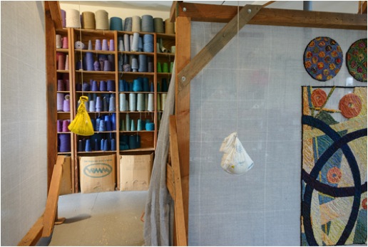
Contact details.
www.meglittle.com
onthespot260@gmail.com
Meg Little, Rhode Island, USA
Interview by Deborah Blakeley, October, 2014

Gráinne Cuffe
Can you discuss the techniques you are currently working with?
I am currently working with traditional etching techniques: aquatint and line. I use Ferric acid, and work on copper plates.
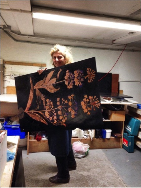
Over the years you have taken inspiration and academic direction form far and wide. Discuss the importance this diversity has had on your art?
Especially as a younger person, I felt a huge need to leave the comfort zone of familiar surroundings, be that studio or home town. An appetite for academic direction led me to the Tamarind Institute, in New Mexico, where I successfully completed a Master Printer course in Lithography. In hindsight, even more formative an influence than the Tamarind experience was the Fulbright Scholarship with was a brief visit to Gemini Editions in Los Angeles, where I saw gorgeous huge etchings of David Hockney’s beautiful simple silhouettes, profiles of heads. These etchings were approximately 4 Feet x 4 Feet. Plus an exhibition of James McNeill Whistler’s etchings, in the Boston Museum of Fine Arts, which I saw on the return leg of the Tamarind trip to the States, was also a huge influence.
Every studio I have ever worked in has its own ethics and set of reverences. In Giorgio Upiglio’s Grafico Uno in Milan, an Italian government Scholarship, I was intensely impressed by the woodcuts of Mimo Palladino, their graphic sophistication and simplicity, and mostly the intensity of saturated colour, and their large scale. While Central St. Martins in the late eighties opened my eyes to tonal value with aquatint.
Coming in more closely, can you comment on the influence Norman Ackroyd had on you art?
 Norman’s theory was that you could get all the colour you wanted using black ink, and white paper. He was strict about this. He taught me for 2 years at Central St. Martins, London. I added a touch of blue, or green to the black, to survive the restrictions. He wanted us students to push those tonal values as far as possible, and using tone to make light/colour. This generated a love of the mesmeric qualities of aquatint.
 The Chester Beatty Museum is a worldwide must-visit while in Dublin and a generous supporter of the art world. Discuss the exhibition and your involvement with the Chester Beatty Museum?
How did you become involved?
From my first visit as a 12 year old to the Chester Beatty Museum, I had felt a strong connection to the graphic work I had seen there, especially an iconic Japanese screen of staggered irises, a show of Albrecht Durer’s etchings, Mughal paintings, and many precious and beautiful watercolours and prints from Japan. Frequent visits to the Museum never fail to amaze, always feeding the visual appetite for more...this collection has fired the imaginations of many members of the Graphic Studio, and the delights of gardens seemed to be an interest common to both the collection, and to our members.
We felt that collaboration between the two institutions could benefit both, and make for a successful show. Hugely generous with their time, curators of varying sections of the collections introduced the artists to pieces we had not seen before.
What it was like to become a co-organizer of Gardens of Earthly Delight?
It takes a lot of meetings to organise a show like this. It is great to work out all the many details together, and exciting when the show is up and selling. It feels like one is giving back to the Studio. It was a hugely successful show, and a wonderful collaboration between 2 iconic Dublin institutions.
Can you tell us a little about the Chester Beatty (for those who don't know about its collection)
Sir Alfred Chester Beatty 1875 -1968 collected treasures of beauty and wonder dating from 2,700 BC to the present day. Egyptian papyrus texts, Japanese woodblock prints, European medieval and Renaissance manuscripts, Books of the Ancient world…now in this vibrantly run, small Museum. Housed in a purpose built building within the confines of Dublin Castle in the City Centre, The Chester Beatty is always an inviting treasure chest to visit.
What's it like having your work in their collection?
It is a huge honour and I am extremely proud and pleased to have 2 pieces of my work in the Chester Beatty Collection.
You joined the Graphic Studio in 1979. Explain the importance of both the studio, and collaboration with other printmakers has and still has on your art?
The Graphic Studio offers me all these positives:
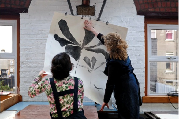
- Sharing technical information about the work.
- Being in an atmosphere of work.

- Exposure to approaches radically different to one’s own to the making of an etched image.
- A wide variety of visual language in terms of the final image.
- The talk about the making of an image.
- The enthusiasm about visual language.
- The shared love of paper, colour, the end effect.
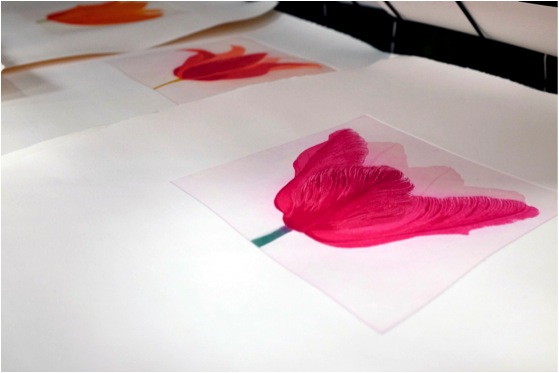
- The shared fascination of the progress of an etched image from start to finish.
- Constantly meeting Painters and Sculptors who come there to work collaboratively with Master Printers on the Visiting Artists program.
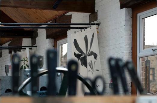
The Graphic Studio Gallery which the Studio owns, show my work.
Collaboration with other printmakers in my case currently means I need to work with another well trained printmaker on the larger pieces because it would be physically impossible to achieve the printing a successful print on my own. The weight of the large plates is considerable. They need 2 people to handle them. It would be counter- productive to work on these on my own. It is at the colour proofing and editing stage that I need to ask a skilled printmaker to work with me. Inking up the plate may take hours, and you have to be time-aware, because some ink colours dry and will not print properly.
Your work is described as BIG can you explain the constrictions that size place on your art within the printmaking field?
The main constriction is the size of the press bed in Graphic Studio. My metre square plates fit easily, with ample room around the plate. As I use my studio in Wicklow for working on the plates, I have recently invested in a wonderful new acid bath from Polymetaal, Holland, which easily fits the larger plates. I love BIG. The generosity and expansiveness is good.
Expand on your work ‘Delphinium 11?
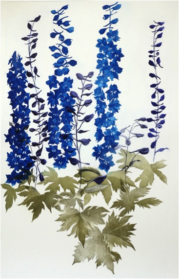
Thinking I was totally finished with Delphiniums, recently having completed Delphiniums I, Delphinium II was inspired by a large stand of wondrously stunning delphiniums on a sunny June day in a neighbour’s garden. The leaves articulation is different to Delphinium I, more 3dimensional, and with a variety of bright greens. The blues and purple-blues are also different. In that garden, I felt a bit more could be said to honour the Delphinium statement. I felt I hadn’t said it all, yet.
You call ‘Clematis orientalist’ “the big one”. Can you explain this?
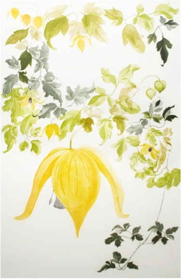
Clematis Orientalis III is a large rectangular 4’6”high x 3’wide etching. I have made 2 smaller etchings of the same plant, for A Natural Selection - a show which was originally a fund raiser for the Studio, 100 artists contributing a limited edition print, image inspired by National Botanical Gardens, Dublin.
You work with both plants and flowers how would you categorize your work?
In describing my work, the most accurate words are: Loosely Botanical.

That might be a category?
By adding that Georgia O’Keefe, the American painter, has been an influence will give a sense of clarity.
I have never been able to describe my work with accuracy, using words.
Your work has such a very strong Botanical aspect, discuss?
 Adding in explanatory elements of visual interest is a nod towards Botanical illustration of the past, where much information is on the page. My extra elements are there because they balance a composition, and are very carefully balanced in themselves. They are not intended to be botanically accurate. Some plant elements are extremely sensuous visually and although tiny, are magnificently beautiful: wonders of design, and the Bauhaus principle ‘Form follows function’.
When working on both exhibition layout and print size how do you decide on the size of the work?
 Exhibition layout is usually a balance between large and small works, depending on the constraints of the gallery. In deciding about the size of an etching, if I feel an image of a plant will make an adequate visual impact, then the large format will work. At the drawing stage this is assessed. Drawings may start on a small scale, then develop into a larger format. The plant also has to have enough visual drama to hold its own on a large scale. Often, holding a magnifying glass to a plant is the only way to see the detail.
If you want this detail to be a part of the image, scaling up is the only solution. Degrees of admiration and wonder and recognition of a magnificence [to do with the visual impact] play a part.
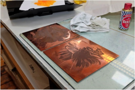 Where do you find your subjects (plants and flowers)? Are you, like many, a keen gardener?
As a great admirer of the world of plants and flowers, yes, my subjects are mostly from my garden. If I was to let myself get swallowed up by my very wild garden and the notions it inspires, I would never get an etching either started or finished.
 Many of your works can be found in hospitals and also at the Dublin Family Law Courts. Do you see your work as calming? How would you describe it?
Some of my work is calming. I relish calm. In calm, I get space to think thoughts, have new ideas, and make progress with the etchings.
Calm lets people breathe about the goodness of themselves, potential for happiness and positivity of life.
When the ingredients of balance, calm, sensuousness are at an optimum in a piece that is when I feel it is acceptable. A visual harmony has been worked towards and concluded.
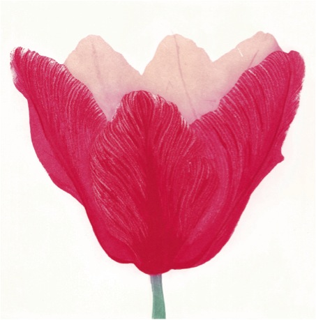
Although being collected by Museums etc. is wonderful, having my work in places where people are stressed is important to me. I have had excellent feedback about my work in the above; a settling down of upset and raw nerves.

Contact details
grainnecuffe@gmail.com
http://www.grainnecuffe.ie
Gráinne Cuffe, Dublin, Ireland
Interview by Deborah Blakeley, October, 2014
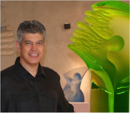
Latchezar Boyadjiev
Originally you worked in the field of optical glass, can you explain this process and the type of work you were able to produce using this method?
The term optical glass comes from using optical glass to create my sculptures.
I was using glass segments to construct my pieces. They were mostly clear optical with inclusion of coloured glass segments to bring a little life to the coldness of the crystal.
Each segment was cut according to my drawing and ground, fine ground and polished. After finishing the sections I was gluing them together with an opticly clear adhesive.
Why did you change to cast glass?
I was limited by this technique regarding size and colours. I wanted my work to be more dynamic and have great impact on the viewer.
I always wanted to try kiln casting and after a visit to the Czech Republic in 1996 I started casting my work there.
It was a in collaboration with the Czech Foundry that lasted about 15 years and is still going even though I started casting my work in my studio in California.
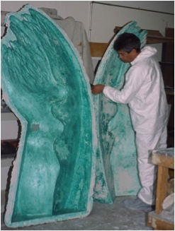
Can you take us through the process you use now from drawing, clay modelling to the final cast glass piece?
First and most important is the drawing. I spend a lot of time drawing on a craft paper with charcoal. When I like the particular sculpture I start modelling with clay. After the clay is done I make a negative plaster mould and then cast the original in plaster.
I grind and make the plaster positive perfect as I want it to look in glass. From the plaster positive I make another negative mould for glass using silica sand and plaster.
After the mould is dry I place it in a kiln. Than I measure the right amount of glass needed and load the mould with coloured glass billets which are in a shape of 8”x8”x1” thick tiles.
Then I program the kiln computer to adjust the temperature and annealing times depending on the thickness of the glass – the thicker the glass the longer the annealing is. It usually takes two to three weeks to melt and cool a sculpture.
After the piece is done than the hardest part is to finish the surfaces. It involves a lot of grounding, fine grinding with diamond tools, polishing, sand blasting and other finishing techniques.
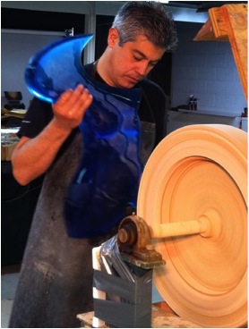
You personally take your plaster positives to The Czech Republic, why?
I have been doing that for 12 years. It was easier to pack four plaster models in two boxes and take them as a luggage than to ship them. Also I wanted to talk to the foundry people in person choosing the right colours and finishes for the pieces.
Not only has your glass changed from optical to cast, your drawing material has also changed from pencil to charcoal. Can you tell us why?
Pencil drawings are great for smaller designs. When you get to draw life size of three, four feet sculptures the pencil becomes an obstacle – it slows me down.
Can you discuss the way you use a combination of glass and metal in ‘Radience’ / 'illumination'?
I wanted to introduce a light in my sculpture and designed a stainless steel structure with a built in LED light. The light is shooting up through the glass and illuminates it. It comes alive – almost like fire in a torch.
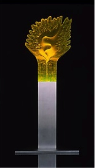
‘Illumination’
Shape and colour describe your work; can you expand on this?
Glass is a cold material. I am trying to soften the crystal structure appearance of the material. Giving it dynamic shapes, combined with fluidity and vibrant colours to express my feelings and emotions. You can take any two pieces of my work and find out about it.
The piece ‘Pursuit’ shows the control you have over glass and how you have the flow of colour within the piece. Please discuss?
The flow of the colour is achieved by controlling the thickness of the glass – the thinner it is lighter and the thicker – the darker.
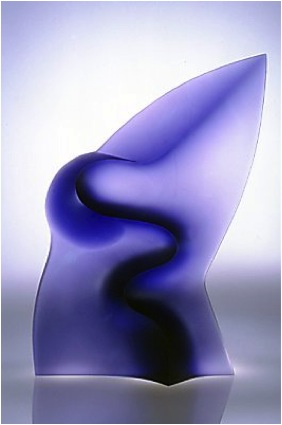
‘Pursuit’
It is well know that you deflected to the United States via Italy in 1986. How does it feel to have to come from this position to having your art in residence at the White House, in Washington DC?
It is my dream come through. I came here after being in a refugee camp in Italy for few months. Arriving with $65 in my pocket and very limited English. Finding work with glass right away and opening of my studio in 1988 was very hard but rewarding.
Being part of museums and private collections including the White House was very rewarding.
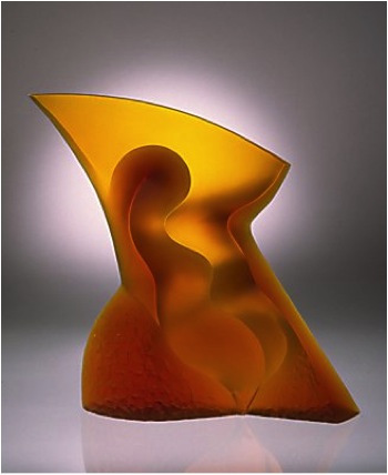
‘Creation'
Your work was first introduced at SOFA in 1996 - how has this affected your career?
Actually it was 1991 and the time was named New Art Forms. It became one of the highlights for the year along with the solo shows I had in galleries representing my work.
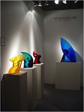
'SOFA display 2003’
For those who do not know, can you explain about SOFA?
Sofa is the most prestigious art fair for contemporary Sculptural and Applied arts around the world. The top galleries from around the world are exhibiting their top artists. The show is only four or five days in the Navy Pier Convention Center in Chicago.
With a piece like ‘Emotion’ you have had it cast in many colours. Explain how many castings you make and how you choose the colours?
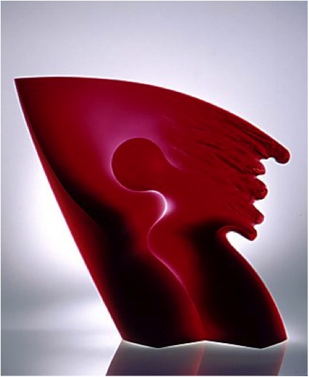
‘Emotion'
I do up to six castings of the same design but in different colours so no piece is ever the same. Some designs are only a single casting, some two or three. It is very rare to have 6 castings from the same design.
Your statement, “I want my work to become a part of modern architecture and a contemporary environment to reflect the era we live in”. Can you expand on this?
At the moment I am working on developing and finishing larger castings up to 7’ in my studio in Marin County. Ultimately they will become part of modern architecture and be viewed by many people and not only by few selected collectors.
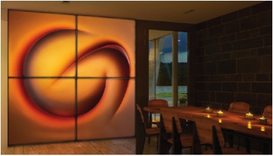
Can you discuss one of your Commercial pieces and one Residential piece?
I do not make any difference between both. Each one is my work and I put my best to achieve whatever the task is.

In 2008 you had an exhibition at the Academy of Art in Sofia, Bulgaria This took you full circle; how did this feel?
It was great to come back to where my roots are and where I began drawing and sculpting.
It was covered by all media extensively and was the first large exhibition of glass sculptures in Bulgaria ever.

‘Quest'
You constantly exhibit, how far ahead do you work with your exhibition program?
I work with year to two ahead scheduling exhibitions and planning my future work.
I always plan ahead but I am ready to face any challenges that always come when you are pushing the limits or the economy affects the sales.
One of my favourite mottoes is:
“Plan for the best but prepare for the worst!"
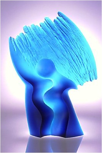
‘Stream'
Contact details.
Latchezar Boyadjiev
5498 Nave Drive
Novato, CA 94949
415-883-2025
Website: www.LatchezarBoyadjiev.com
Latchezar Boyadjiev, California, USA
Interview by Deborah Blakeley, September, 2013
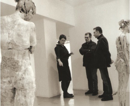
Vally Nomidou
Your exhibition ‘Let it Bleed’ is made up of female forms. Can you explain the vulnerability you have been able to portray?
Fragility is the way women artists insisted to present as a plastic value in the 20th century. I worked out my figures spontaneously with the intention to show the mental state of ‘'between’. Between different trends, orientations, routes, decisions. The situation to be between and to do connections, fragile connections with a variety of possibilities, with uncertainty. Without a final decision. With tyranny. The difficulty, the sensitivity, the contrary emotions that coexist, the agony, the empathy, the cowardice, the fear. The game and the pleasure to express all this situation sometimes gently and sometimes hard. That wonderful 'embarrassment' in routes which you discover surprisingly. All these are a fragile world written on the female body which I build.
How many figures were in the exhibition?
There were seven figures in the exhibition, two small heads and a flower hand as well.

Can you expand on the use of stitch in the work?
Stitch as the meaning of the word describes, can be sewing, stitching (difficult, unnatural union) suggesting wound: wounds and holes (an emptiness). Mental gaps, wounds, difficult compounds that can be shown as wild jewellery, as strange rhythms on the figure. Stitches, episodes of soul and form.

Explain the building process in your figures?
I choose the person and I think with my senses what is that I want to show. I imagine postures and I try postures suggesting an unbalanced situation. We photograph all around the figure. I get molds partially from different parts of the body. I photograph gaps and compounds of the molds. I collect my molds on a table. At this stage I start my paper sculptures.
I create a colored palette collecting papers. Toilet paper, handmade paper and old newspapers. I make layers from paper inside the molds with acrylic glue and paintbrush. That means that I decide before which colour my figures will have.
With a specific printing tool I stick cardboard inside my mold. After drying I get my figure out of the molds .At the end I have many parts of paper forms. Then I start building. I connect the parts using cardboard till I create a whole figure. The difficult and beautiful work starts now. I use wooden tools to work with my figures. Knives, rasps, files. I work the whole form adding and removing again and again.
Who are your sitters and the personality of your figures?
People I know, anonymous people, simple people, children, (my son, a refugee girl, a lonely girl with a famous family) an abnormal dancer...
Why have you placed some figures onto forms?
They are abandoned and beautiful bedded in morbidity.
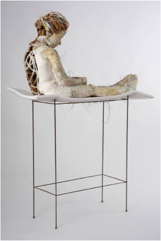
Can you discuss the personality of your figures?
All of them have something vulnerable. They are personalities under formation, defenseless against their fate. The women usually have a narcissism covering their despair.
Explain the fragility of #15 by both her age and position?
The same person express the abandonment, placed on the shelf, on high level, marginally placed on the edge.
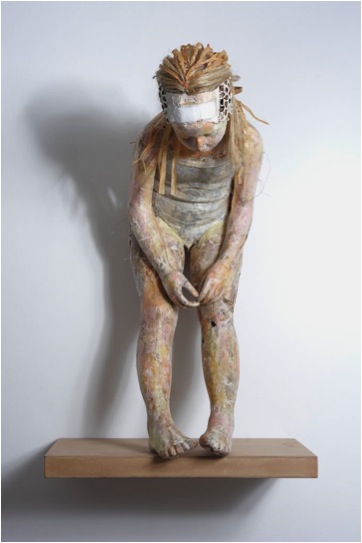
In #19 you have left a large area showing the base, discuss this?
It is the same person again, created without any purpose to hide something or to become a plastic value. It is abandoned so to be exposed her draft construction of her structure. With that way it is given a tension to the breakdown of her personality and her individual construction. There is an emphasis to the coincidence and the deficiencies that create that image. That drama is emphasized by the base, which is a working base, and as a memorial stand. It is a contrast, an exaggeration. Let's say it is a hymn to those who face difficulties and harm in their childhood.
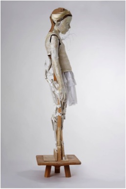
Also on #19 colour is more prominent, can you explain why?
All the material on that sculpture are unique and natural, as I found them. With their own identity and colour.
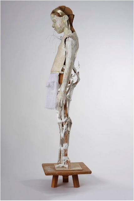
#20 and #21 you have not constructed whole figures rather a head and hands discuss this part of the exhibition?
#21 is a symbol. These parts of the figure are changed and separated from the whole sculpture. #20 is a small head another version of my figure portrait.
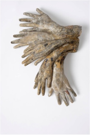
#20 is a small head another version of my figure portrait.
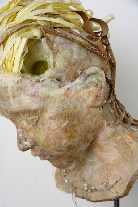
What lead you to limit you work to paper?
I love paper and its history. I like it because it comes from East and from the European Middle Ages tradition. It a light material. (It’s not belong to the traditional culture of sculpture). I reminds me maps, miniatures sensitive and light objects that show and describe real and imaginary worlds. It is light, recyclable and it has history. I love its discretion.
What are you currently working on?
I am working on projects, work on paper and some artist's books (thoughts and feeling diaries) and botanical drawings.
Contact Details:
Email: nomidouv@yahoo.gr
Vally Nomidou, Athens, Greece
Translation by Apostalia Tasiou
Interview by Deborah Blakeley, September 2014
Gary Drostle
How did you come to work in this particular medium?
After leaving Art College in 1984 I knew I wanted to work outside the gallery system, in public spaces, this was for me a rejection of what seemed a narrow and elitist system. I began to paint murals, but working outside on the street is a much harsher environment than a gallery and issues of durability and lightfastness became important issues. When I discovered mosaic art in 1990 this immediately solved those problems. I hunted for all the information I could find about most and basically taught myself from books to undertake my first mosaic commission. Initially I continued to work as a mural painter whose medium was mosaic but increasingly, as I have used and explored the medium of mosaic further, the medium of mosaic has gripped me and drawn me in. Mosaic has so much more to offer than the simple translation of a painting, it contains a beautiful and mesmerizing world full of patterns, textures, light, pure colour, expressive use of cutting and laying, the cohesion and breaking apart of the image… So much more to yet discover.
Discuss the different techniques that are required for mosaic. The distinction is not really about 2D or 3D but about flat mosaics verses not flat mosaics.
All floor mosaics need to be flat, and sometimes wall or panel mosaic are wanted flat too. The technique I used to achieve a flat surface is known as the paper-faced indirect technique. This process really begins with the cartoon, a full size drawing of the design on paper - however the design is drawn in lateral inversion (mirror image). Once this is prepared the mosaic tesserae are cut by hand and individually glued faced down onto the paper design using a simple flour and water paste. The mosaic is constructed in this way, if it is large it is cut between the tesserae into manageable sections as it is completed. Once the whole mosaic is complete it is transported to the site where it is flipped upside down and placed into fresh cement on the floor or wall. The paper, now on the top, is then damped, releasing the glue. The paper is then removed and the mosaic is left bedded in the cement. It just remains then for the mosaic to be grouted and cleaned.
This is a great technique for making mosaics, allowing construction in the comfort of the studio at any time of the year.
The technique used for 3D and for 2D mosaics that one wishes to have texture is the traditional direct method. Nothing could be simpler than pushing the tesserae directly into the setting mortar. It is the essence of pure mosaic making, giving ultimate control of texture and light on the work and allowing the artist to express the physical nature of mosaic directly with the hand. It is a beautiful way to work in mosaic.
It was through your work, ‘The River Life’ that I became aware of your mosaic work. Can you discuss the meaning behind the work, how long it took to lay and the number of people involved in the project?
The River of Life mosaic was probably my favorite work to date, perhaps particularly because the client, The University of Iowa, really showed great trust in me to create a work that I believed would work best. A committee that is willing to have faith in its appointed artist is unfortunately very rare, but I do believe that giving the appointed artist freedom to create the best they can is the way to get the best work and Iowa University was such a client.
Like most of my public, site specific commissions the starting point for this project was the site itself. I began looking at the function of the building, the campus health and fitness center, and its philosophy of Wellbeing. Then I looked further out and the terrible floods in Iowa City that instigated the building of the new center, and the meandering river itself, then to the communities around it and in particular to their textiles, the Amish quilt making and the First Nation Iowa people and their textiles, also the basket weavers of the local area.
When it came to drawing all this information together it began as a struggle but then there was one of those eureka moments (as I sat staring at an aerial picture of the Iowa River) when everything just fell into place. For me the River of Life sums up these diverse ideas all together with so much more. I imagined the source of the river being birth, with the life lines of people’s lives running along the river as individual courses of tesserae. The pattern fields of the surrounding countryside formed the background through which the river flowed, made up of those textile patterns. The central golden section of the patterns represented Wellbeing, a life in balance, whilst the grey outer sections represented life out of balance. The life lines of the river tracing their way through, sometimes bursting its banks as some lives go ‘off the rails’. It all fitted together beautifully.
As this was a large mosaic I needed help to construct it. I worked with a varying team of about five at any one time during the six months construction using the indirect paper face technique in my London studio. For the installation I and one other came from London and we were joined by two US mosaic makers to install the work over the course of two weeks.
For me this project was a great success as it worked on so many levels from the design to the technical and most importantly the functional success of the work for those who use the center.
Can you discuss one of your earlier works and the importance it has played in your career?
When I think of past mosaic works that may have marked changes in my work two pieces spring to mind, the Sunburst mosaic for Islington in North London and the Fishpond mosaic for Southampton East Park.

The Sunburst Mosaic was my first mosaic. It was commissioned by Islington Council and was basically an extension to an earlier painted mural commission to the extensive underpass network. Islington Council showed great trust in allowing myself and my colleague for that commission, Ruth Priestley, to create a mosaic based purely on our painted commissions. We made the vitreous glass mosaic in the attic of my father’s house using the paper faced method, it was a huge learning experience and set us both off on a new voyage of discovery and love for mosaic art.
The mosaic for Southampton East Park was commissioned in 2005 and was significant for me for one particular reason. The commission through a landscape architect was to make a 9 meter diameter mosaic which was to be designed by another artist, Caroline Ishghar. The commission came at a point when I was working with artist Rob Turner and our studio was doing well, we were confident of our design, fabrication and installation of our own mosaics.
When the design for Southampton arrived in the studio it was a small loose painting, unlike our designs to that point it paid no heed to the palette of available colours or any ideas of classical andamento - this was a big challenge but the process of translating the design into mosaic made me realize how much more was possible in the medium and it became realization of a new freedom in creating mosaics offering a greater freedom for future designs.
Can you explain the logistics needed to produce ‘Entwined Histories’?
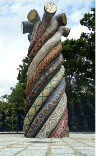
The ‘Entwined Histories’ mosaic sculpture was commissioned by Poplar HARCA, a public housing developer in east London.

For me this commission was great fun and I hope a good example of how site, history, creativity and community can come together to realize an artwork that is truly site specific. As always the commission began with research into the local areas history, in this case picking up on the fact that the area was the former site of the major rope makers for the London Docks. The other factor that was important about the local area today was the large Bangladeshi community. This area of London, because of its proximity to the docks and correspondingly its large stock of poor housing, has always been a focus for migrant communities coming to London dating back many centuries including the French Huguenots, Irish Weavers, Chinese Sailors and Ashkenazi Jews. These communities settled in east London and made it their home, many often working in the textile industry. This of course sparked links to the earlier River of Life project. So I designed this large rope form, with each strand of the rope representing a different community in the area using a textile pattern associated with that community. I saw this as a perfect expression of how the larger community worked, each through its own strand keeping its identity but all binding, uniting to form a stronger whole - I was happy with this positive view of our multi-cultural neighborhoods. At the top of the sculpture the strands turn out to the world revealing a golden interior, I saw this as the result of the nurturing community enabling its members to grow and aspire to greater things.
Making a sculpture like this is always a challenge. I carved the polystyrene form around a stainless steel frame and then coated it with glass reinforced concrete. Once this was dry the mosaic process began, working directly onto the form the tesserae were cut and stuck to the sculpture. Once the mosaic work was finished the sculpture was grouted and cleaned. The sculpture included a lifting hook in the top and a fixing plate on the base allowing it to be hoisted out of the studio, transported to the site bolted into place.
Discuss the importance of the Mosaic Arts International exhibition to your career?
SAMA’s annual Mosaic Arts International exhibition is significant for me because it is the only regular juried mosaic exhibition that has recognized the importance and value of architectural mosaics, which after all is really the essence and birthplace of mosaic art. They do this by allowing photographic entry into their juried exhibition. I am extremely grateful to SAMA for their commitment to architectural mosaics in this way and am very proud that my work has been selected for many of their exhibitions - really it is the only opportunity for me to showcase my work to a larger audience and also to my peers. One of the great things about the world of mosaic art is the very open and supportive nature of mosaic artists, it is a friendly and passionate community.
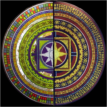
Explain the overlapping of your work in modern London and the Roman mosaics found throughout the UK?
The Romans were the greatest exponents of mosaic art and there have been over a thousand Roman mosaic floors found in Britain alone. Obviously as a modern mosaic maker I am very aware of our Roman heritage and greatly admire these works. The Romans have a lot to teach us about mosaic making, in particular I admire the economy of their work, the way in which they balance the amount of labor, the detail of design and the cutting of the tesserae. As well as trying to use this knowledge in creating my own mosaics I have referenced Roman mosaics as part of acknowledging the history of a specific site and even just created Roman style mosaics for specific commissions such as those for Chester’s Roman Gardens which were realized in close co-operation with the city’s archaeologists.
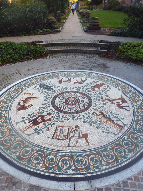
‘Woolwich’ has a very personal association for you. Please discuss this?
I was born in Woolwich and have lived there most of my life, indeed I would still be there if it had not been for the loss of my family flat to the recent riots, which was quite a tragedy forcing me to move out of the area. I have a great affection for this unique corner of London. Woolwich has always been a poor working class area, far from the glamour of central London, but it has an amazing history and some wonderful architecture combined with a great multi-cultural community, the whole world is in Woolwich and I feel it keeps me grounded. It is home…
Expand on your personal thoughts about the importance of public art in contemporary life?
For me pubic art is about democracy, it’s about seeing art as a part of all our lives, it’s about seeing all the arts as a vital part of humanity and civilization - we are here not just to work and survive, life is actually about love and play of which art is an essential part. Unfortunately, like much of life now, art is being ‘privatized’, a commodity to be traded, something reserved just for those who can afford it. Genuine public art is the antithesis of the arts combined, it is site specific so cannot be traded, it is open to all. I’m not saying that only public art is worthwhile, far from it, all the arts, painting, sculpture, music, dance, drama, they are all vital. I would like to see a future where art is more prevalent than advertising on our streets, art that fills our world. The problem with public art at the moment is that it is too precious, because of its rarity, and this preciousness leads to over caution. Like the rest of life there is also a battle going on in ‘public art’ as corporate ‘public’ art threatens to replace art generated from communities.
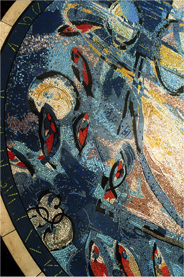
Contact details.
Website:www.drostle.com
Email:gary@drostle.com
Gary Drostle, Central London, England
Interview by Deborah Blakeley, September, 2014
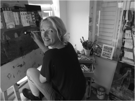
Kathryn Matthews
Your art training has been in two countries, The Netherlands and the UK. Can you discuss the differences and how this shows in your work?
The Dutch are more open minded about art in general and painting is not as elitist as it is here in England. I had my first abstract painting classes in Holland which terrified me as I went there straight from A-level college in the UK which is all about painting as realistically as possible.
Your studio is in Shoreham-by-Sea. Can you share both your studio (inside) and explain the effect living by the sea has on your art?
My studio and my gallery are both virtually on the beach about 6 miles from each other. From both I have an incredible view of the sea and the south coast. It is ever changing. The beach outside my studio is quite wild with lots of beach flowers. From May – July, the beach is a wash of pinks, purples and blues. In the summer months I swim a lot which helps me focus on my work.
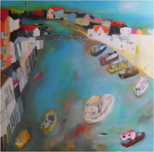
Shoreham
Discuss both the sea and colour in your work?
I am quite well known for my use of colour. I use very high quality oils with a high pigment ratio which I think is important to make my colours ‘sing’. Occassionally I treat myself to a certain blue which is prohibitively expensive but it looks incredible. My obsession with the sea began whilst studying at Rotterdam Art Academy. My studio overlooked the harbour and I became fascinated by the shapes and colours of the boats.
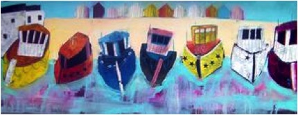
Boats1
You work from, “Quick sketches”. Can you discuss the stages your work takes?
My sketches have become quicker since having children as they don’t let me sit still for long! However, the speed of the sketches mean that the lines are fluid and not overworked which I hope carries through onto my paintings.
You exhibit around the world, both solo and group shows. Can you expand on how this had developed over the past 20 years?
I began by doing all the big art fairs in London, selling the work myself until I got picked up by several agents and galleries who offered me exhibitions and gallery led art fairs in London / Dubai / Paris and New York. I’ve always worked very hard and it took a lot of perseverance in the early days to get my paintings out there.
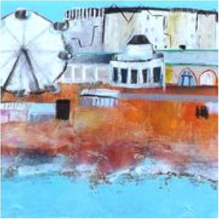
The Wheel
How important has the internet become for your artistic career?
The internet has brought a whole new audience. I now have customers across the world seeing a painting on my website and having it shipped out across the globe. In fact I have quite a few customers in Melbourne who have done just that!
You have done several commissions in particular for P&O Cruises, can you expand on this?
This was really fun as the paintings were huge. There were lots of very specific guidelines though for example everything had to be certifiably fireproofed so I couldn’t paint on board as normal, I had to paint on a special canvas that is used in theatre set building!
How important is commission work to your career?
It is an essential part of my career but it can be quite nerve racking when you bring the client in for ‘the big reveal’! Thank goodness I have never yet had someone who didn’t love what I’d done but it can be terrifying!
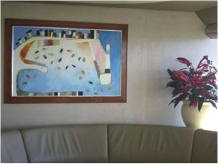
Commission Piece
Discuss your thoughts on the importance of art in hospitals?
I spent some time in hospital a few years ago when my baby son needed heart surgery. It’s a difficult time for parents and so if in any way I can help make the time pass more easily, I am happy to do that. I remember once going to meet a consultant and the room looked dreadful with a half torn Mickey Mouse poster on the walls. It shouldn’t have been important but it did make me worry about the standard of the place.
You also present your work in the form of prints. Please discuss?
My paintings are not for everyone’s budget so I am glad to be able to offer a cheaper option if someone really likes my work. I do both signed Giclee prints and also limited edition handmade silk screen prints.
When did you first start using this medium?
I trained as a print maker at university.
Seagulls On The Rock
How do you decide which works become prints?
I choose the most popular paintings to turn into giclee prints. With screen prints it is completely different though. There is no original – The print is the original in its own right. It isn’t a copy of a painting.
How many do you have printed per Edition?
The screen prints have a maximum of around 75.
Norfolk
Can you discuss your involvement in the Two Kats and a Cow Gallery?
I set up Two Kats and a cow Gallery in 2001 with friends and fellow painters Katty McMurray and John Marshall. We’d all been painting on the seafront for a few years but felt like Brighton was lacking a good contemporary art gallery. We completely renovated it ourselves and built it up to be what is now a major gallery in the South and a popular venue on the Brighton Tourist trail.
Brighton Pier
Can you discuss your work, ‘Mevagissey Morning’?
Mevagissey morning was painted this year and sold almost as soon as I hung it. It all came together really well. Sometimes a painting just flows and everything worked with this one from the word go.
It is quite a large painting; 90 x 90 cm plus frame. Its oil on board.
I’m a huge fan of both Cornwall and the Cornish artists of the 2oth century. In particular the St Ives Group – Peter Lanyon, Roger Hilton, Alfred Wallis.
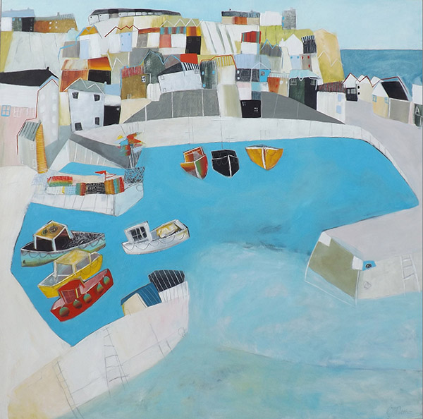
Mevagissey Morning
In you 2014 Collection you have work from the Souk. Can you discuss both the place and the inspiration it has given you?
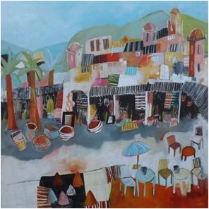
Entrance to the Souk
I took my boyfriend to Marakesh as a surprise 40th birthday present. He ended up suprising me by proposing to me whilst we were there so this painting has lovely memories for me. Morocco is so inspiring. The souks especially are such an explosion of colours – it’s a painting paradise.
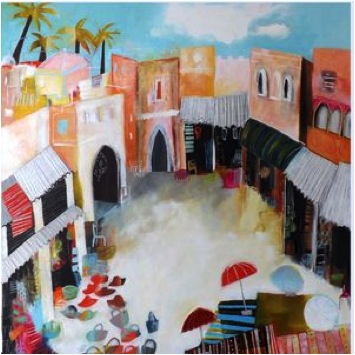
The Hat Shop in the Souk
Contact details.
www.kathrynmatthewsartist.co.uk
www.twokatsandacow.com
Kathryn Matthews, Shoreham-by-Sea, UK
Interview by Deborah Blakeley, September, 2014
Jon Barlow Hudson
Can you discuss your thoughts on where and with whom the “Behind the Scenes’ drawings etc. for a public art piece are stored for prosperity?
This is a very broad question and one I cannot really answer as I am sure that of the hundreds of public art entities deal with such things in different ways. Sometimes they might want the drawings or whatever that lead up to their piece to be part of their documentation of a project and others might not care at all. An unusual example is that I not long ago donated all my structural engineering papers and others to the Queensland State Library in Brisbane relative to my two major sculpture projects for the World Expo 1988, held in Brisbane. The Minister for the Arts Ian Walker received the donation into the library. Following that I offered the stainless steel sectional maquettes of the 100 foot high sculpture PARADIGM, to them also, to fill out their Expo collection. Often such items and donation might simply go the relevant public art committee.
Discuss your thoughts on world exposure to your sculptures career?
I attribute my work as an artist to having grown up traveling and living around the world from a very early age. All that I have seen, experienced and done, overseas in particular, has made me the unique person and the artist that I am: without which I would be a totally different person. The shape and meaning of my sculptures is the fruit of this experience. My first large--scale public sculpture project overseas was the commission of two very large scale stainless steel sculptures for World Expo 1988 in Brisbane, Australia. Following that project, I continued to receive commissions for projects in, 27 different countries. If I could say that one project led specifically to another, I would. I can only surmise that each and all of these overseas projects and international and intercultural experiences has contributed in one way or another to ‘My life, my sculpture and to my career’. Back in ’86 when I first made contact with Expo, to my perception there was not much attention to overseas projects by national artists. Given my life experience, it made eminent sense to focus outward and pursue overseas projects since my sculpture and my aesthetic sensibility is based upon universals and the timelessness of art and creativity, I was charged with expanding around the world with my sculpture. This has in turn immeasurably enriched my life not just by the experiences, but through the friendships and personal contacts that I have encountered throughout these overseas adventures. I probably know more international artists and friends than I do State—side, all of whom have made some contribution to my life and career.
ASWAN SYNCHRONICITY & TS’UNG TUBES
2001, 2002, Aswan granite. Aswan International Sculpture Park, Aswan, Egypt
How important was your time with Charles Ginnever in Vermont to your later professional life as a sculptor?
I greatly value the year with Ginnever both for his friendship and for the experience of being around a professional “New York” sculptor whose friends and colleagues were/are DeSuvero, Chamberlin, Kaprow, Forakis, Downsberry, Weiner and others. I helped make his large scale steel sculptures and helped with his exhibits, such as with the Louis Kahn maquettes and his sculpture models. It provided a creative, adventurous environment in which to explore and develop my own sculptural ideas.
Towards the end of the year, his friends Allan Kaprow and Paul Brach, among others, were helping form the California Institute of the Arts in LA, which led to my attending Cal Arts for its first two years, resulting in my BFA and MFA in 1972. Had I stayed in my home town working in my studio, or returned to Germany or elsewhere, my life would have been totally different. My time with Ginnever let to Cal Arts, which led to the 2 years working at a gold mine in northern California, then to New Mexico and on. He lives in my mind as a quintessential American sculptor, making wonderful sculpture, on a par with his contemporaries.
DANTE’S RIG, Chuck Ginnever
Aluminium, steel & cables. About 3 m. hi.X 4 m. L. x 2 m. wide. c 1966 aprox.
Discuss how your art has been influenced by your travels?
My first five years were on the plains of Wyoming. The American First Nations peoples say that these years are a time that is very important in one's formation, so they ask about your upbringing during these years. Following this we moved east, then about a year later we continued on east to the deserts of Saudi Arabia for three years: still formative years. My world travels began then and continue today. That early experience in the Mid East and other places between here and there, exposure to ancient stone architectures and distinctive, impressive natural environments, have been a constant inspiration in my being, my relation to the natural environment of the world, to previous cultures and creative products of both ancient and contemporary times---and of the sculpture I make today. As a kid, to climb around Baalbek, Petra, Jerash, Rome, Machu Pichu, puts one in touch with earlier peoples---one receives a communication from them. While I began my public art "career" working with stainless steel, a rather contemporary material, I tend to prefer working with stone: both as a way to work with nature, but also to do as the makers of Baalbek did, and speak to peoples down thru time into the future.
You have a strong background in the fine arts. Discuss your thoughts on how an academic background supports an artist
Creativity takes as many forms as there are artists. Each artist must follow and create their own path. For some it may be as an independent, “folk” or “non-academic” artist, as an artist nevertheless. Such folks often have a strong sense of discipline and vision, so are easily at work rather than not. My lot was to grow up going to school, then on to college, transferring to the Dayton Art Institute, then Stuttgart Art Academy, Ginnever’s farm studio, finally Cal Arts, eventually teaching art at university. My trajectory was academically based. It provided me with a broad education and experience in making art in a wide variety of media and a broad study of the history of the various arts. My intention was to teach art, and for that the academic foundation is necessary. Interest changed and I focused on making sculpture as an independent artist. However, I consider that a broad education is important in teaching critical thinking, an open and inquiring mind and providing useful training and discipline for whatever creative endeavour one might choose.
Can you discuss the commission of ‘FIREWALL?
A state-wide competition was set up calling for a firefighter memorial for this country region. My past work got me chosen to make a proposal, which was the one selected.
FIREWALL
c 2010, Steel powder coated, stainless steel, aluminium, brick, 5 meters high x 15 m. x 15m. Miami Valley Firefighter/EMS Memorial
FIREWALL was commissioned to be a memorial for fallen firefighters and emergency medical service people. I wanted to create something that was an obvious reference to firefighting and that was different from other such memorials. I also wanted to create something that was an outdoor environmental work that created a special and sacred space for memorial services to take place. The triangular shapes were arrived at in order to symbolize fires, and of course the colour red. There are numerous firefighting symbols within the work, along with a silhouette of a firefighter. This was inspired by a Jain icon of the Buddha—the figure being empty space. The brick precinct within which the three triangles are installed includes the firefighting symbol of the axe and hose nozzle.
The memorial is installed in a natural park setting with a path made of cobble-stones from an old fire station. As one approaches the memorial down the pathway, one will see the three fires/triangles, then the silhouette of the fallen firefighter cut out in the bright aluminium diamond--plate in the centre of the large triangle—which material is found in the middle of many fire trucks. Then as one enters the precinct, one is surrounded by the three fires—much like the experience of the firefighter performing their duties.
On both sides of the silhouette are attached the names of currently 68 fallen firefighters & EMS personnel. The sculpture is 5 m. hi. The largest triangle and the three of them are installed on a brick precinct 15 m. on a side. The triangles are made of welded steel powder-coated red, with parts in aluminium, stainless steel and brass. It is installed in Stubbs Memorial Park, Centerville, OH, USA, 2010.
‘Double Helix’ is a mathematical piece and it is also viewed daily by professional mathematicians. Can you discuss this?
HELIX was commissioned for the Wright State University Diggs Life Science Laboratory in an Ohio state percent for art project 2008. Their theme was the bio-sciences, as well as mathematics and geometry, given that the math building was next door and some of their funds were involved. After much thought and research into these disciplines, I arrived at the idea of a double helix constructed of dodecahedra, which are Platonic solids constructed of 12 pentagonal shapes. They are welded together, with the welds ground down and away, so that the geometry remains clean and clear. They are assembled in the configuration of two helix which intertwine but do not touch. They are large enough for people to walk through them and sit on them. This project was designed in relation to the environment of the bioscience building courtyard and other surrounding buildings.
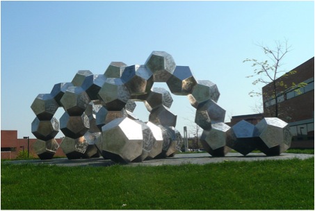
The sculpture is constructed of welded stainless steel with sanded surfaces, each pentagon being unique and is installed on a berm of grass covered earth with a black brick surface just under the sculpture. It is 2.6m. hi. X 2.6m. w. x 8 m. Long.
As the viewer walks around HELIX they will see how the two helixes intertwine and rotate in a flow of geometric form. The many different surfaces reflect the light in many different angles so the light and colour is multifaceted. Most double helix sculptures look more like the DNA molecular structure, whereas this one is more abstract, the two helixes are not connected together and the use of dodecahedra is not normally associated with DNA double helixes. As the viewer walks through the canter of HELIX they will be surrounded by dodecahedra, as if in the world of geometry.
I have not had feedback as to specifically what mathematicians think about it, but what I have heard has been positive. When I was installing it, one of the bio science professors came out and screamed for the installation to stop, because the vortex was turning in the “wrong” direction. I was later told that DNA helix turn in both directions: Z-DNA. In any case, this is poetry and not an engineering or scientific model.
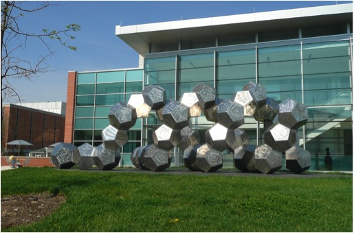
DOUBLE HELIX
c 2008, stainless steel, 3 m. hi. x 3m d. x 8 m. long. Ohio Arts Council Public Art Project, Diggs Life Science Lab., Wright State University, Datyon, OH
PARADIGM is also mathematical. Explain this work within a mathematical context.
PARADIGM is the sculptural expression of the DNA molecular structure, the double helix being the notable feature—here indicated by the spiralling pattern of the tube forms emanating from the body of the sculpture. The other important meaning of the sculpture is that it is the “axis mundi”—world axis, the metaphorical axis around which the world turns, the “still point of the turning world”, which is Brisbane during Expo.
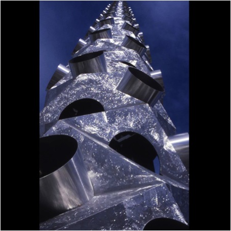
PARADIGM Detail
A paradigm is a pattern, example, or model, for example, of a particular world view during a certain time period. In my vision, the oscillating/spiralling aspect of this sculpture represents the changing, flowing, cycling of various aspects of the world along the continuum of existence. There is a pattern to events on the macro-cosmic perspective, more difficult of vision on the micro-cosmic level. On a rather micro-cosmic level the monocoque structural form and pattern of the sculpture is very reminiscent indeed of a “cholla” cactus “skeleton” from the Arizona desert, where I lived for a year. Even though it is a very geometric form it is nevertheless a very organic form in its essence.
Speaking of skeletons, another reference that PARADIGM indicates is that of the vertebral column, which, while practicing Tai Chi or other martial arts, must always be very straight so that the energy may flow freely. Thus PARADIGM is a “vertebral column” between the earth and heaven thru which the energy of the universe flows. I think of PARADIGM as representing another aspect of existence—that each segment represents the conscious awareness of each present moment of being on the continuum of the progression of time, extending up into infinite space and time. The segments are designed with both yin and yang aspects to their form -- the protruding cylinders and the round openings to the interior. This later aspect leads to yet another realm of meaning, inspired by the ancient Neolithic Chinese jade ritual objects called a “cong” or “ts’ung tube”, symbols of the unity of heaven and earth. They are generally square forms, often segmented horizontally, with a round, tubular space drilled through the entire stone: the square representing earth, the round space heaven. These are wonderfully intriguing and archetypal artifacts.
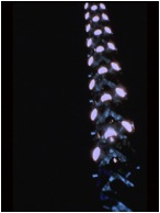
PARADIGM is 100 feet high by 8 feet diameter and about 42,000 #’s in weight. It is constructed of type 304 stainless steel—the body of the piece is built with 5/16” thick plate and the tubes are 1/8”. The interior structural elements are all of mild steel, painted with a heavy coat of PFI PF300 Savinite epoxy primer, a high-zinc paint developed for Rockwell International airplanes. The sculpture is built in 7 sections which are bolted together: I believe they are numbered in sequence, which is important due to the structural specs on each successive unit. It was engineered for 110 mph as requested by Expo 88. It has been in storage since Expo, for most of the time under a bridge nearby the river in Brisbane. It was moved to an interior space in advance of my arrival in Brisbane, in 2014, to inspect it and to further the reinstallation of PARADIGM in Brisbane. This is an ongoing challenge. Its companion Expo sculpture, MORNING STAR II, a 15 foot diameter mirror polished stainless steel geometric “diamond” or “star”, was after Expo reinstalled in the Brisbane Botanical Gardens close by the Parliament Gate. A sectional stainless steel maquette of PARADIGM has been offered to the Queensland State Library and was accepted, but awaits shipping. I have been lobbying anyone in government and otherwise regarding its reinstallation since the end of expo, most often the Lord Mayor. The current Lord Mayor has indicated his support for the reinstallation, but discusses the need for a suitable context and funding. As a result of not altogether proper storage, it now will require a bit of maintenance.
A wonderful gentleman in Brisbane, who has become a good friend, Mr. Peter Rasey, has been very energetic in promoting the reinstallation of PARADIGM. He is a committee member of the Lord Mayor’s Parks Advisory board and an advisor to the Lord Mayor and others, on special interests regarding tourist projects for Brisbane and the G20. So the fate of a powerful, meaningful, beautiful, landmark sculpture the equal of any other one cares to stand next to it, is still at risk.
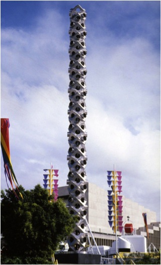
PARADIGM
c 1988, stainless steel & 66 airplane lights. 30 meters high x 2.6 m. dia.
Commissions for overseas must present logistic problems. Can you explain one or two of them?
For PARADIGM and MORNING STAR, I had to pre plan their construction taking into consideration the size limit for over—road transport, railroad and sea transport and the size of the steel land—sea shipping containers. MORNING STAR had to have a wooden crate built around it once it was about 80 % complete, not over 12 feet high, so it could go as one unit. PARADIGM had to be designed into 7 sections, so that they could all fit within the shipping container, both length--wise and width—wise. Since it would be constructed in seven sections, over a five month period and had to be constructed horizontally, it was never fully assembled prior to its Expo installation—it stood as straight as an arrow! The shipping had to be coordinated thru a state—side shipping agent and in cooperation with Expo. Once on site, I worked with two New Zealanders to complete MORNING STAR.
Another logistic experience was the commission, thru an architect in Hong Kong, for three large scale sculptures for a project in Jakarta in 1992. Once I had the sculptures completed, in order to ensure payment to me, and for the client to be assured that what they were paying for was indeed three sculptures, I had to have an SGF inspector, as part of the VCS (voluntary control system) come and inspect the sculptures at the fabrication facility, as to their voracity as sculptures conforming to what was ordered by the client in Jakarta. Once that was satisfactorily completed, arrangements were made with the shipping broker to truck the three large crates to the port for sea shipping. Upon their arrival in Jakarta, and damage to one of the sculptures, I spent a couple of weeks on site overseeing repairs of the sculpture and construction of the foundations, along with a stout case of Lord Ganesh’s revenge.
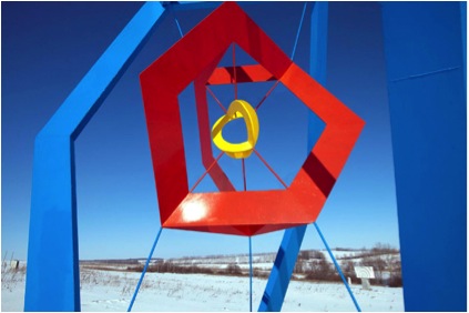
EIDOLA II
c 1992, mirror polished stainless steel, 4 meters high. Mulia Tower, Jakarta
Atrium sculptures must need different design techniques. Discuss one of your atrium pieces and the importance of the positioning in relation to the viewers.
The atrium installation TS’UNG MUSIC was designed for the four story atrium of the Emery Northlake office building just north of Cincinnati. The distinguishing characteristics of the space were the three glass walls surrounding the atrium, with all their mullions and the fourth wall was elevator balconies. On the wall opposite it, were two floor—to--ceiling columns and the ceiling contained a square grid of 25 square skylights, 5 to a row. I was charged by the architect to design a sculpture to work with the given environment of the atrium, so on one hand I had the round columns, on another the windows with all their mullions—lots of horizontal lines and vertical as well. I began working with a rough cage concept and I had the column shape to think about as well. Serendipitously I happened upon an Asian Arts magazine and on the cover was a photo of the Neolithic jade “cong”, or “ts’ung tubes” from ancient China. The author, Lars Berglund, explained that the jade ritual objects represented the unity of heaven and earth: the square outer form being earth, yin, and the round space boring through the square from end to end, is heaven, yang. On the outside surfaces of the square form are often found some vertical motifs and many horizontal incisions. Upon seeing these jade objects, it immediately brought my cage and my column forms together, the latter inside the former. Additionally, the concept of the unity of heaven and earth seemed appropriate for a sculpture suspended in space within a building.
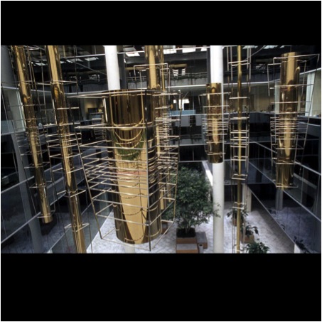
TS’UNG MUSIC
c 1986, photos JBH. Stainless steel & brass. 9 units, from 3’hi x 3’dia. To 27’hi. x 3” dia. Installed originally in Emery Industries/National Distillery Corp., Cincinnati, OH.
Once I had the basic form, what to do next? In looking at the space and how one is to suspend an atrium sculpture, one has to attach it to the ceiling. Given that there are 25 skylights, how to relate to them? What logic to work with? Perhaps in studying the ts’ung tubes, there I think was some mention of the magic square of alchemy and how that relates to the plan of the ts’ung tubes. There are 9 numbers in the square, from 1 to 9: even number in the corners, five in the centre and odd numbers on the sides. This set of numbers fits into the skylight grid of 25 in a diamond plan. So I then had 9 skylights from which to hang nine elements. (Far too many for the budget!) So if the number one position is the skylight for number one element, how to distinguish each from the other 9 elements? Thus 1 became 3 feet high by 3 feet diameter with each number progressing longer by 3 feet and each number progressing smaller in diameter by 3 inches, making number 9 the longest and thinnest. Then how to place them?
The cage design allowed me to utilize the Fibonacci numerical series in the spacing between the horizontal bars, but rather than start at one end, I started in the centre of each element, going both up and down, which allowed for them all to be placed within the space with the centre of each on the same plane, which was I think around the third floor more or less. They had to be high enough above the ground floor pedestrians yet not too high within the atrium. Thus each floor had a unique perspective on the installation.
New owners took over the property in 2008 and for some reason wanted a different “décor” so had the sculpture removed and destroyed, without contacting me or anything of that nature. This was my second Cincinnati atrium sculpture that was destroyed by the Taliban.
Your installations are not always metal. Explain you installation 'Felt Hat Body Install' and relationship of the work to you wife and creative partner, Debbie Brush Henderson PhD?
My wife decided to go for a PhD. in costume history, with a focus on the history of the man’s hat, an area not previously studied. We travelled the country interviewing hat makers and sellers and visiting the few remaining felt hat making factories; in the UK and France as well. The steps of making felt hats are pretty much as they have been for a few hundred years, since “modern” machinery has been involved. The initial steps in forming the felt hat is a machine the blows the fur fibres along a tube, then into a space within which the air is circulated, carrying the fibres, round about a metal cone shape about 30 inches high or so, with holes in it so that the vacuum below it will pull in the circulating air carrying the fibres, which will then build up on the surface of the cone. This is done for a specified length of time to get the required thickness of fibres built up on the cone. It is then removed from the space, dipped in hot water, the felt hat body is then slipped off the cone and folded into a flat cone shape, rolled in a cloth dipped in cold water, beat about a bit, dipped in hot water, beat about a bit, for a few sequences, then moved on to the next steps. Down the line it has been pretty well “felted” together and also died a colour in many cases, so it is then fit over a machine that with steam will form the felt hat body into its first iteration in a hat shape. These are then inspected for potential imperfections and those that don’t pass are set aside and disposed of.
At a factory making such hats, I was provided with about a hundred of these felt hat bodies that did not pass inspection, with which to make a sculptural installation. While there are countless ways to assemble such shapes, I really like the cone shape and that, since it is the fundamental birth formation of the felt hat, and the hat is itself a sort of cone shape—the earliest hats were just that—it seemed to me a reasonable logic with which to assemble the felt hat bodies into a sculptural installation. The hats create a cone texture on the overall shape of the cone structure of their assembly. I chose the hanging cables in deference to the elliptical cable arches which Antonio Gaudi utilized in some of the construction of his great church, the Sagrada Familia.
Debbie chose a topic that we could do together, allowing us to travel widely in search of hats, hat makers, hat factories and the concomitant history. The project resulted in a museum exhibit, as I write this we go tomorrow to take down the 8th museum venue. Debbie also wrote four published books on the subject. We grew to be totally enthralled by the subject and its people and history. I even developed my own collection of hats to wear.
I would like to do more, but I also have a thing about making sculpture out of more permanent materials, like granite. While Debbie does not help with the making of the sculptures, she is my design partner.
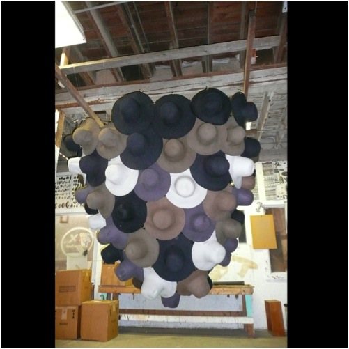
FELT HAT INSTALLATION
c 2007, 90 felt hat bodies and nylon lines, about 2 m. dia. X 3 m. hi.
You have work in 27 countries. How do you keep track of everything?
Sculptures are not sacrosanct. They get both taken good care of and not, sometimes vandalized, stolen, destroyed, pushed aside. Just the other day I went with this same friend to see one of my 1985 sculptures in the basement of the bldg. where it was originally installed, for a moved away corp. Thankfully it has been saved, but needs to have the clear lacquer removed, to be repolished and recoated.
Many of the overseas projects are just too far away to hope to deal with, and pertinent individuals that might have something to do with them are either long gone or out of touch. Occasionally, if I am lucky, I might hear from someone regarding a sculpture someplace. Of the two Expo sculptures, MORNING STAR is safe in the Botanical Gardens, though needs wash. PARADIGM, while now in a more secure and weather resistant storage facility rather than under a bridge, is still at risk. The Lord Mayor of Brisbane has indicated his interest in seeing it reinstalled, but how it gets paid for and what context within which to place it has yet to be determined. I have lobbied everyone I could find in Queensland since Expo to get PARADIGM reinstalled. Even seeing it in a dark storage building, laying unassembled in its individual sections, it is still a powerful and impressive sculpture. A great loss to the community not to be reaping the value of it installed.
FIRE IN THE HOLE!
c1986, mirror polished stainless steel. 4 m. dia., Civic Centre Plaza, Omaha, NE
Do you feel that public art is dependent on the mood of the public or the financial directors?
The public is certainly involved, both as viewer and as tax payers and voters. Most projects tend to become accepted, but occasionally something is not and that can sometimes lead to its removal. The Tilted Arc wall sculpture in the courthouse park in New York City by Richard Serra being a notable example. The public is also part of the public art process as public art committee members, supporters, funders and the like.
They come and go, the type of art that is supported can also change. Today, as the use of computers increases in various aspects of design and construction, there seems to be quite a bit more works that are very much computer derived.
As for the financial directors, one would have to define who they are: whether public art committee members, city officials, community philanthropists, federal government officials or whomever.
Take one of your sculptures that you feel has a strong emotional effect on the viewer and why you think it has?
Probably the most comments I have received back, since the sculpture is in my home town, is for TREE OF KNOWLEDGE. Several community members thought we ought to have one of my sculptures here in town, since the rest of the world was getting them, so they set about raising funds and setting up the project. Once the commensurate funds were available, I set about making the mock-up.
TREE OF KNOWLEDGE
c 1992, bronze, 3.6 m. hi. x 2.6 m. dia.
Public Library, Yellow Springs, OH. Plan grant from the Ohio Arts Council
In order for the project to develop, I worked up a proposal for them and for fundraising. In thinking about the town, we already have a “yellow spring” iron orange, which has been in use since the First Americans were here. The stone work around the spring was built up into a recognizable form in the early 50’s. In wondering how to represent the village in all its qualities, I got to thinking about the character and history of the village, I noted that we have had educational institutions here since the beginning, Antioch College was founded here in the 1850’s, there was also Antioch Publishing, Antioch Grade School, and history of educational experimentation, many writers, educators, artists, scientists and engineers, due to nearby Wright Patt AFB.
The common element of all these folks is books and book learning and the other characteristic about the village is its trees: we have the 1000 acre Glen Helen from the College, Bryan and Clifton State Parks, a serious Green Space program around the village and a dedicated Tree Committee, thus the tree became a likely contender for significant signifier. The first tree form I made, using book shapes, was just branches; it was too much like a dead tree. Then I was driving along in my car thinking about it and the tornado from the Wizard of Oz came to my mind’s eye and that provided the logic for constructing a tree of books. Since a tornado is a vortex, and one often sees large trees with a vortex structure to them, the vortex became the operative motif. I designed the trunk to be constructed of books in a helical plan and at the top, books continue spiralling out from the trunk to become the foliage, thus a moving tree form of books.
The vortex is found throughout nature, from the micro- to the macrocosm and is very indicative of life. The trunk of the tree is made from real books – real books were stacked up in the helical form then a latex mould made of it, then eventually cast in bronze. The foliage books were fabricated from sheet bronze, then welded into place. In the foliage area there is a “tree house” and also a “book plate” – Antioch Publishing used to print book—plates. On the trunk there is a “book worm”, with glasses, and various other items, like tape recorders and cassettes, some of the books were leather bound with great textures, I did not have a computer to include, so the tree is rather engaging for those willing to take time to explore. I just asked poet Amanda Williamsen to describe why the tree works so well.
“The books appear to take flight like birds: it is a celebration of books that come alive from the ground up, that anyone, regardless of art education, can easily perceive: it shows that learning is not static but growing: the roots of the tree – books which cover the actual hold down bolts – are not stodgy: the tree has motion in all its parts.”
What more can I say………..
Space. The space that a work will fit into must have a huge influence on the work you produce. Can you expand on this?
Some of my earliest works were found tree constructions in the nearby Glen Helen forest – form and space. Of course my early small scale sculptures were/are more about space and form as sculptures, often enough implied expansion beyond the confines of their material forms. As I grew into making large scale sculptures and finding ways to get them funded, that meant working in a wide variety of architectural, environmental and cultural situations. This in turn meant the question of how to integrate the sculpture into that particular project context. How to relate the sculpture to the forms, spaces, colours, textures, uses of the spaces, both interior, exterior and surface, and the broader cultural contexture. Such spaces can be a wall surface, atrium space, interior or exterior ground surface, natural setting, and street scape, each one of which requires different relationships to gravity and to affixing the work to whichever surface will be doing the support work. I am always working with gravity, whether consciously or not, secondly, structure, which is basically about gravity in any case, to the functional situation, the material with which to make the work, relative to all of the above, or some other aspect altogether. I think all of the above pretty much holds true whether you are working with stone, steel, lights, fabric, glass, water, plants, whatever. I have particularly enjoyed the challenges of creating sculptures that relate to many different spaces.
SHIVA : SHIWANA
c 1980, stainless steel, 5 meters dia., HQ of the National Radio Astronomy Observatory – Very Large Array, on the Plains of San Augustine, west of Socorro, NM.
One project I particularly enjoyed was for the National Radio Astronomy Observatory – Very Large Array, west of Socorro, NM. Given that it is what it is and listening to outer space, I wanted to include outer space in my sculpture, as well as the location on the ground. The telescopes are moved around on three rail road tracks, in a Y configuration. The telescopes are listening to objects in outer space, many of which are more or less “round” or symmetrical, as are a number of manmade objects orbiting the earth. Thus I came to the tetrahedral structure as one that could, first, reflect the Y configuration of the site rail tracks that could represent “spherical” bodies orbiting earth and also the celestial orbs filling outer space which the telescopes were listening to. My sculpture, SHIVA : SHIWANA, is fairly liner in format, which allows the three outstretched “wings” to reach into outer space. Though standing on one leg, like Shiva, it is totally symmetrical, it could easily be one of those objects floating freely in space. Within the ends of the wings, are shapes that utilized on buoy radar reflectors, which reflect the radar signal back to the sender of the signal, the sculpture is a listener to outer space just like the telescopes.
The name Shiwana, comes from the local Native American Tewa tribe, if I recall correctly, which is used to designate a healer that has received his powers from being struck by lightning. We have references to space both ancient and modern.
Discuss your thoughts of the importance of public art in public spaces? What would you like the public to gain form the experience?
Given the history of art and that it has been so much a part of virtually every culture since recorded time, within their public aspects as well as more private, it is pretty self-evident that it plays an important role in every society. It has even been used for negative ends in some cases due to its importance. For me, there is no question, there are always nae sayers and the Taliban who will blow up Buddas and destroy my atrium sculptures and such, and politicians that want to cut funding to the arts, all the studies show the importance of the arts not just to the cultural and social life of society, but to the economic prosperity of society as well. Almost every country round the world today has a sculpture symposia, as just one small example, the results of which contribute to the local communities where they take place.
When I started creating public sculpture in the 70’s in the States, you could count the number of public art programs on two hands – today there are hundreds. Another example is China – in the 70’s they were still doing social realist worker art yet today there are many artists creating wonderful art for public places throughout the country, such as the spectacular works of Ai Wei Wei. Having such a dragon to confront has given him the opportunity to probe the depths and rise to the challenge. He is their Michelangelo.
The public, if they desire, has everything to gain from having works of art within their communities. This has all been written about countless times before and no doubt better than I can do, so I will not labour the subject.
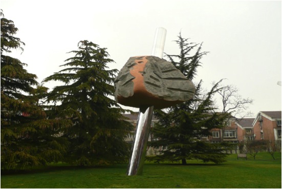
CLOUD & RAIN
c 2010, stainless steel and stone, 5 m. hi. x 2m. x 4m.Commissioned for the 30th Anniversary of détente between China and the USA. Installed in the Wanshou Park, Xuanwu dist., Beijing, China.
Do you feel that governments are giving the right patronage to the arts?
Patronage in the States has improved, over the years, not without plenty of hard work on the part of the supporters of the arts. Of course there could be more and broader support. Seeing today hundreds of public art programs across the country, supporting all the arts, and how supportive the public is of the various arts, I believe that there is ongoing improvement in this country. Though two local arts museums are having financial difficulties due to changes in the economy nationally and locally. The number of public art projects that I see and learn about in many different countries is very reassuring. I have been to 27 different countries to create sculpture in a wide variety of public settings, so I am very positive about the state of public art round the world. That is not to say that there are a good many countries that could do a lot more to support the arts, but even some of those that are hard pressed do provide some support. Each place, each country, is unique in this regard. I think the overall trajectory is positive.
Contact Details:
Website:http://www.hudsonsculpture.com
Email: jon@hudsonsculpture.com
Jon Barlow Hudson, Ohio, USA
Interview by Deborah Blakeley, September 2014
Alison Lowry
Your initial interest in textiles was fostered both by family heirlooms and your study of textile through City and Guilds. Can you discuss this?
During my (Foundation year) when I was 19, I didn’t start the three year Hons course at that time. I knew I wanted to work with my hands, but didn’t like working with clay, and that seemed to be the only other option. Glass wasn’t an option at that stage- as it wasn’t (and still isn’t) taught at the University of Ulster. I changed tack completely and worked fulltime for about the next 10 years. During this time I always had this idea of going back to do my arts degree and did several short courses- The City and Guilds I creative textiles being one of them. After I got married and had my first baby I knew the time was right and I enrolled into an Art and Design BA (Hons) course at the University of Ulster. This course allowed me to flit between many disciplines- sculpture, time based media, printed textiles. In my third year I decided I wanted to work with glass- I don’t know where this desire came from! Even though we had no glass course at UU I attended a short beginners glass course off campus and then had an uphill struggle to make the glass do what I wanted. It was a battle of wills! I knew I had found my medium. The picture above is me at the opening night of the degree shows (pregnant with number 3!) with my degree show work ‘Christening Robe (for Oisin)’. My textile back ground was never very far away
Your work has a very strong link between birth and death discuss these within the context of your art?
My mothers’ side of the family there is a very strong textile tradition. My mum has some beautiful Irish linens which would have been stitched by distant relatives – eg tablecloths that have been hand embroidered with traditional Irish whitework. During my City & Guilds in embroidery and creative textiles I knew how long it would take to embroider something so beautiful. It made me think about how fabric could tell a story. The women who had stitched this cloth had embroidered through all the bad times of her life and all the good times. The fabric was now a part of her story. Embroidery is such a lost art form, at the time it was regarded as ‘womens work’. Not ‘high art’ nor even craft. I am interested in redressing that balance through my work.
‘Memories c.1843’, 2010
During my degree I was having more children- James was born in between year two and three- and the children were being christened. The family christening robe hung in my room for a while waiting to be used. This Robe was a beautiful piece, cared for very carefully by my mother and grandmother before her. I began to think of all the children who had christened in it. It tied me to the past and my lineage. About this time my grandad, who we think was the first wearer of the robe in 1911, died and all of a sudden this robe took on added meaning. It began to symbolise life and its cycle of birth and death and how the states of birth and death are similar in their fragility and vulnerability.
You make the statement, “’Empty’ dresses hang like skeletons in closets, bound with the memories the (absent) body still holds.” Can you expand on this with the use of images.
I am interested in the space that the body leaves behind and how some clothing can frame the absence. I like the subtly referencing the body, and what leaving it absent can insinuate.
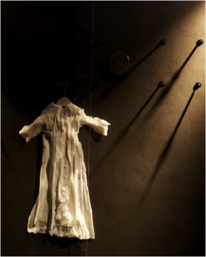
Empty Dress’, 2012, part of installation ‘Memory Vault’, at Galerie Format, Bergen
I am interested in how certain clothing- a wedding dress, a christening robe can hold special memories and every time you open the closet you instantly remember that day or that moment again.
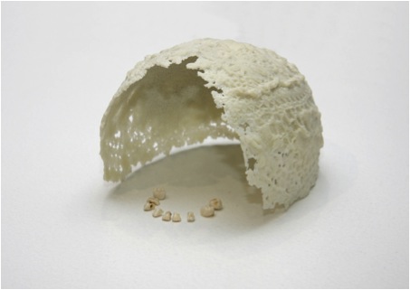
‘Jack Fell Down’ - 2011
You use glass in conjunction with photography, print making and textiles. Can you discuss this?
I think I’m always trying to find ways to express the qualities of textiles through the medium of glass. To me there’s something very similar in both materials. They both have an ‘everyday - ness’, occasionally an ‘extraordinary-ness’. There is a delicacy with both materials.
During college I realised I loved process - I don’t think there was one technician that didn’t know me by the end of the three years! I made a conscious decision early on to use only several techniques and try and get better at them… there are just too many things I would like to try! I’m not in the studio full time because of the children, so I constantly compromise what I can realistically achieve with my work at this stage of their lives.
I’m drawn to print techniques and photography because I am interested in the image. Casting photographic images into glass makes these impermanent fleeting moments permanent. I also use repetition a lot in my work, and printmaking makes the reproduction of the same image again and again very easy.
'Pate de verre' is a glass mould technique you use, can you discuss the technique and when and how you use it?
Pate de verre is the technique of pushing crushed glass mixed with a little glue into moulds. The result is generally thin walled vessels. The advantage of this technique over other glass casting techniques is that you can place colour very precisely into the mould and because of the relatively low firing schedule it stays in that place during firing.
I was lucky enough to learn pate de verre from Deborah Horrell after winning the Warm Glass prize in 2009. I have used this technique ever since and find it great to recreate old documents (see below) or garments.
‘Born on a Monday’, 2010
How is box casting different and what have you used this technique on lately?
Box casting involves the layering up of sheet glass, damming them up in the kiln and fusing them into a block. I use ceramic decals which allows me to build up several layers of imagery throughout the block or screen printed enamels to give a similar effect (see below).
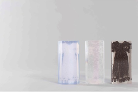
'Dolly Mixtures II’, 2013
Finally, lost wax technique is one you are now using. Can you tell us how and why?
Lost wax allows me to make a 3d object in glass that I would otherwise be unable to achieve using open face casting. I use wax to create the ‘positive’, cast it up with a plaster mix and steam out the wax using a wallpaper stripper. This leaves a negative cavity that, in the kiln, the glass is melted into. In this example below it’s an old pair of child’s shoes.
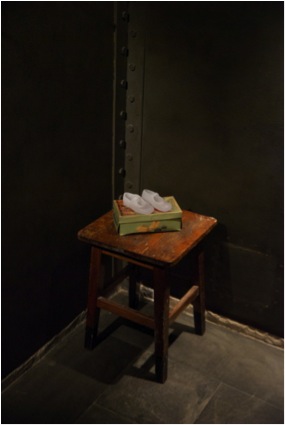
‘Found (and lost)’ , 2012. Part of installation, ‘Memory Vault’ at Gallerie Format in Bergen
‘Body Talk’ in Denmark would you explain the work you have had at this exhibition: the work load involved in the exhibition?
This exhibition is a group show which is being organised by the museum itself. They have chosen the piece, ’jack fell down’ to be a part of it. I am really excited to have been selected to be a part of this exhibition.
Off the back of it I have just heard my proposal had been accepted to show a new body of work at the start of 2015 in The Glass Museum at Ebeltoft, Denmark in ‘The Study’. The Study is a space for smaller, more experimental work or ‘works in progress.’ This is a really big development for me, as I have never had a solo show before and I hope I will also get a few more venues to take the exhibition closer to home.
You had a touring exhibition: ‘Vessels of Memory’ with Rachel Dickson. Discuss the pros and cons for both a joint exhibition and the mechanics of a touring exhibition?
Rachel and I were curated together for a joint show in CraftNI’s gallery in Belfast in 2010. We really hit it off and felt our work complemented each other, so we managed to acquire a little funding and toured the show around Ireland and the UK.
‘Worn Out’ ‘Vessels of Memory’ Rachel Dickson.
The pros for this approach are many: I wouldn’t have had the nerve to approach galleries and exhibition venues with our proposal alone. It felt safer to team up with someone else. We learnt a lot about the process of dealing with different venues and curators, how to set up and curate a show in the many different venues we went to and how to talk about your work to a variety of people. It was also interesting how the work developed and deepened as the shows went on.
‘Marjorie’s New Shoes’

‘Vessels of Memory’ Alison Lowry
I really can’t think of any cons… we had an absolute blast!
We will be exhibiting together again next year during ‘August Craft month’ at Flowerfield Arts Centre in Portstewart, Northern Ireland. I’m really looking forward to that.
You also teach at the University of Ulster, Belfast. Can you discuss this role?
My studio has been based in the ceramics department in UU for the past two years. Within this role I have tutored students who may be interested in working with glass. We still have no specific facilities or tutors to support students who may wish to work with glass, so I have been helping them out with the technical aspects of working with glass. I also teach short courses in the University, summer courses and night classes.
Your work is in many International collections can you take one piece and expand on the when, how, why and where about this piece?
‘Shades of Grey’ 2010
This piece, ‘Shades of grey’, is in Interpol’s public art collection in the Hague.
Interpol were moving into a new office and were inviting artists from Europe to come forward and submit proposals. They were only looking for a few pieces of sculpture- maybe only 6- so I was amazed when they picked my proposal. I started straight away as this is a large piece of (box cast) glass, and the deadline was quite soon. This piece is really thick-many many layers deep. I think it might have been in the kiln for 2 weeks annealing! It was also really hard to cold work, due to the size and weight of it. My husband and I took turns on the flat bed to get it polished and off. I think we worked right up to the deadline, but it’s a great thing to have on your CV!
Can you discuss your work 'Christening Robe'?
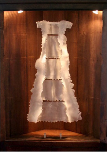
Inspiration:original antique Christening Robe ( a family heirloom)
Size: h 110 x w 80 x 15 cm
Technique: pate de verre, sandcarving
Colour sandblasted clear glass- it has the appearance of being white
Presentation: hung/suspended in cabinet.
Currently part of Arts Council of Northern Ireland Collection
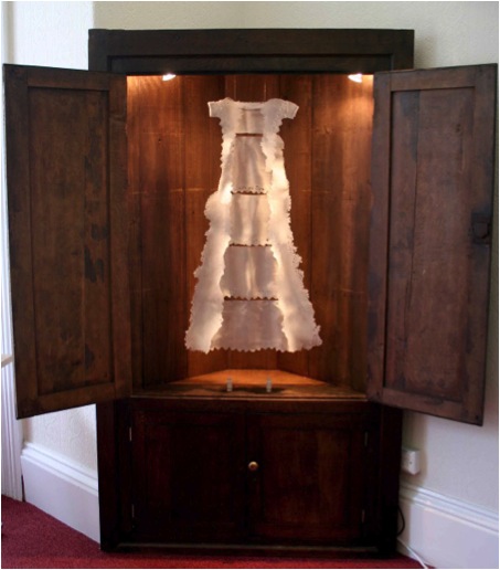
Your 95% series - can you expand on ‘Broken Record’ and how you have done these pieces?
One (in 9) refers to a statistic that one in 9 children in the UK are abused. I created nine glass skittles- I like playing with glass’s material preconceptions- and housed them in wall mounted boxes. They tell a story of an abuse and its consequences. ’Broken Record’, illustrates how people with mental health issues- for whatever reasons- can become trapped a revolving cycle.

‘Broken Record’ 2012
(detail from ‘One in 9)
Broken Record was created in two halves with bits of box cast that had text from psychologist’s reports on the layers. The text is mashed up and trapped instead the skittle.
The 95% series also refers to a similar statistic- that 95% of women who are raped will never come forward to the police. I have used multiples of a small dress- a faceless, yet identifiably ‘female’ image- in a variety of different ways.
Although I do not advertise the meaning behind individual pieces of work- I would prefer that the viewer can create their own narrative- I do believe that applied art can have a voice and address larger issues.
Can you discuss the commission you did for the Arts and Business, Belfast?
Arts and Business commissioned me to produce a series of awards for their annual awards night. I produced a prototype and they gave me lots of feedback, which was really useful, and not something that I have had before on award commissions. I was invited to the awards night – a very glitzy and glamorous evening- and it was great to see them being given out!
Contact details.
Website: www.alisonlowry.co.uk
Twitter: @AlisonGlassArt
Facebook:Alison Lowry Glass
Alison Lowry, Belfast, Ireland
Interview by Deborah Blakeley, August, 2013
Ewan Clayton
It is hard to believe that as a small boy you had such bad handwriting. Discuss the implications this had on you at the time?
As a twelve year old it was impressed on me that my handwriting was a problem not simply because it was unpleasant to look at and hard to read but because it meant I would not be able to go to the school my parents had chosen for me. At thirteen I would have to take the entrance exams and because of my bad handwriting they were worried that I would fail. I was placed back in the junior class of the school, alongside the 8 year olds, to relearn how to write, it was very embarrassing!
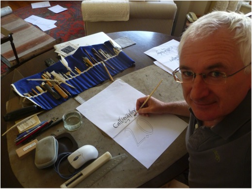
On the flip side, your mother gave you a calligraphy set. Can you tell us how this was to alter your life?
It was the italic nib that did it, I saw that it was possible to make really beautiful letters, it was not difficult to do, and one could learn how to do it. But I was very lucky, I had been born near the village of Ditchling in Sussex. The calligrapher Edward Johnston had lived there. Today he is known as the man who revived calligraphy in the English-speaking world in the early twentieth century. He is also known as the designer of the famous London Underground typeface and logo.
My grandparents knew him (my grandmother used to go Scottish Country dancing with Mrs Johnston). She gave me a copy of Johnston’s biography to read. I was entranced, it showed me one could have an entire career involved with letters. With my new pen set I wrote out ‘’The Pen is Mightier than the Sword’ and swopped it for a 3d postcard – my first commission.
Can you explain what lead you to write your book ‘Golden Thread’?
I think the germ of it came to me one day when I was discussing calligraphy with the Libyan poet and artist Ali Omar Ermes. He was asking me about my tradition and I remember telling him it all went back to Roman Capitals and I described how various styles followed on - gothic, Italic etc. And then I asked him to tell me about his tradition. He said ‘I would have to start in a completely different place, I would show you the different aspects of society that use writing: the law, religion, scholars, merchants and then show you how certain forms of letters and styles of writing and documents were generated from those needs and communities’. I realised in a flash that this was a much deeper understanding of writing than my own community exhibited and realised this was the kind of history I wanted to write for the Roman alphabet.
Can you take one aspect, for example Book keeping traditions of the East India Company, and expand on the way this writing was done and why you have included this in the book?
It may seem paradoxical, for printing was invented in the 1450’s, but actually the seventeenth and eighteenth centuries are key for handwriting. In these later centuries it was handwritten documentation that generated our entire financial system and enabled the spread of trading on a global basis. Handwritten accounts of the first-hand observations made by astronomers and early scientists also lay behind the whole project of the enlightenment. As Miles Ogborn shows in his book ‘Indian Ink’ (2007) the history of the East Indian Company provides us with a marvellous account of how this worked in practise. Worried that their employees would go ‘native’ in India and run their stations for their own profit, the Company developed sophisticated document keeping systems that made their employees accountable to each other. In the age of sail they managed to keep parallel sets of documents in London and India. The company’s expansion rested on the careful procedures they established for handling decision-making. This included a handwritten account of their meetings, displayed in public at each of the companies ‘stations’ for all to look at and signed after each meeting by each employee as an accurate reflection of their discussions. This is just one example of the continuing power of the handwritten document in an age often characterised as one where printing had finally triumphed over handwriting.
Discuss how important you feel it is to combine both historical knowledge and current technology?
The computer is a new writing tool in succession to the typewriter and the quill pen. It is a no brainer really. The future always develops out of the present, the present develops out of the past by understanding one we can have genuine insights into the other. Doing history is a thought experiment, just as is speculating about the future, both can inform the other. I believe however that this point is a wider one. This mixture is also needed in human communities at a social level, a community only of the young lacks something – it can literally burn itself out. A community only of the elderly is equally fragile but in a different way.
You have worked very closely with Xerox PARC and their digital communications explain this professional relationship?
The Palo Alto Research Centre of the Xerox Corporation invented much of the technology we take for granted today, the first commercial mouse, networked desktop computers, the ethernet, laser printers, the graphical user interface that we see on our laptops and smartphones. But because Xerox thought of itself as a photocopying company it never capitalised on these inventions. After the event the company realised it had to get a vision of itself that was non-technologically specific, so they came up with the idea of Xerox – the Document company. The document could be anything from a past technology or a future one, the company would never go out of date.
But then Xerox realised they did not know what a document was. So I came in with a lot of other people (anthropologists, linguists, philosophers, artificial intelligence experts, business historians etc.) to try and wrestle with that: what is a document and how we use them? I worked there of and on, on a consultancy basis, for 12 years.
Can you discuss how your calligraphy was picked up during your Monastic time?
In my late twenties I fell ill and when I recovered realised I had several unlived goals – one of which was to try life as a monk! I thought I would have to give calligraphy up but after a year the Abbot discovered I was a calligrapher and I got to work at it making large-scale work for the church, orders of services etc. The Abbot found out because his favourite sister came to visit and she recognised me, unknown to me she had once been the secretary of the Society of Scribes and Illuminators to which I belonged! My secret was out!!
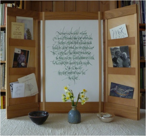
Explain what being named the UK’s Craft Stills Champion of 2013 means to you both personally and professionally?
I was given this award for my role in the wider work of education in the crafts. Some years ago I was commissioned to write a substantial report on the state of the crafts in Britain which was used to guide the policies of the various charities set up by the Prince of Wales. The ideas it contained proved influential, they helped create the atmosphere that led to the establishment of an organisation for Heritage Crafts in Britain, a mapping of crafts across the country and various schemes to encourage apprenticeships in the Crafts. During the mapping exercise we discovered that the Craft industries combined are as financially important to the British economy as the British Petro-Chemical industry – this has given craft considerable additional leverage politically. Personally the prize came with money for training and materials. Japanese paper makers have been some of those who have benefitted from my spending!!!
‘Voice’
“Voice, written in 2010 with a goose quill using sumi ink on Chartham Vellum handmade paper. I love trying to get depth in to the picture plane in various ways, here I simply use lines”
Can you explain the importance of Guilds in UK’s craft history and how you feel the decline of Guilds will effect crafts and art in the future?
I am not sure that Guilds are on the decline anymore, in fact there are various suggestions at the moment for a revival in Guild structures and training. Some Guilds, like that of the Goldsmiths in London, have been very innovative in their thinking in this area. Guild’s guaranteed standards in workmanship and they may yet have a significant role to play in this area. One fundamental of the guild system was apprenticeships, these too are seeing a comeback with government support in the UK increasing significantly. A while ago I heard one government minster talking of his dream that one day parents would have framed photographs of their sons and daughters getting their apprenticeship awards alongside those of their siblings getting their degrees. This is what we need, making things and skills to be as valued as concepts and thinking. For making IS thinking, under a different mode.
'Sprachkurze gibt denkweit' Jean Paul Richter
A poem by Rumi 1997. Written with a speedball pen and red wax in gouache on Black Arches Villin Noir. Rumi invented the whirling dance of the Dervishes. I wanted this piece to disorientate people as they read it. The work was a commission from the Crafts Council for their National collection
How many different surface has your calligraphy been applied to?
Vellum, paper, glass, stone, cloth, wood, ceramics, metal… but I would love to do something organic, something growing!
Can you share 2 of your works that have given you great pleasure?
‘Tranquillity’
Written with a wood veneer pen on Kozo firre paper died with persimmon juice.
Tranquillity was written at the end of a long days teaching in Tokyo. The students had all left and I was alone in the classroom. I wrote the word about 5 times before writing this one. It was written slowly and peacefully and with a sense of continuous flow, none of my movements were hurried. I still enjoy looking at it very much. It is written with Japanese sumi ink, a pen made of wood veneer on Kozo fibre paper stained with persimmon juice.
‘The Sermon of the Dead Christ’
This piece takes a rather different approach! It is written with a quill and the fingers and palms of both hands. The words are from the German Romantic writer Jean Paul Richter, the sermon of the dead Christ. I wanted to create depth in the picture plane, but to do it calligraphically, using just the tone of the ink that I smeared out with gestures from my hands the very moment I had written the stroke. Writing the piece was a performance, every gesture had to work and add up into a whole, there was no chance of going back. There was a real sense of having completed a journey with immense risks once done, the concentration had had to be enormous to complete it. Quill pen and sumi on Royal Watercolour Society paper.
Discuss your work with Calligraphy students from all levels, beginners to experts?
I enjoy teaching at all levels of experience and have done so now for nearly 30 years. I particularly enjoy working over a number of years with an individual, this is the most rewarding kind of teaching. I have been lucky enough to work in several places, the University of Roehampton and most recently with Sunderland University, where we could take students at degree level for several years. I have been concerned to make sure calligraphy has a place both at degree and post graduate level, to raise the status and intellectual content of the subject. But I also work with entry level classes so students have a really good start with some sense of what is possible from their very first day.
‘The Letter R’
The letter r, illustrating the first verse of Rummi’s Mathnawi.
“Listern to the reed, how it tells a tale complaining of separations.”
Your calligraphy has taken you too many different overseas destinations. Can you take one and tell us about that time?
Ah - there are really too many to choose from, but… the first that comes to my mind is that I loved teaching in the ancient monastery at Bobbio in northern Italy. It used to house one of the great scriptoriums of northern Europe and while we were there they held an open air film festival in the cloister with all the glitterati coming up from Milan. We worked in the old refectory painted with medieval murals. In the town itself there was an ancient roman bridge crossing the river (which people swam in during the lunch break) and when we needed to get more energy we could cross the street for a quick expresso. For the year following the teaching I enjoyed many dinners using the dried porcinni mushrooms that were picked in the mountain forests around the town and which are sold is large baskets outside many shops. I also bought my favourite jersey in the market place there. But then there is also Japan - which I have now visited eight times.
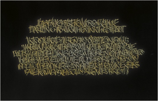
'Last Night the Moon Came'
Discuss your signature?
My signature is nothing special, I guess the only distinctive part is the E which I like to write because it can be done in one swinging movement.
Can you explain your involvement with the Ditchling Museum?
Back in the 1920s, my grandfather moved down to Ditchling to become part of the Guild of craftsmen Eric Gill had established in the village. Many artistic people visited or lived there at one time including the painter Frank Brangwyn, the poet David Jones and the weaver Ethel Mairet. By the early 1990s all these people had become very famous but their work was being lost to the village. Two sisters, in their 80s, banded together to stop this happening, they bought the old village school and turned it into a museum. I had known these two women since I was a child and like many people in the village wanted to help them. At about the same time the Guild I was part of closed down and many of our precious things were given to the Museum. So over the years I have supported it. It has some of my earliest pieces of calligraphy in its collection (from when I was teenager) for the Bourne sisters would commission work from me even at that age. They encouraged me hugely. Today the museum has just been rebuilt and was one of the finalists in the National Art Fund’s Museum of the Year Awards.
In 2014 you were awarded the MBE. Can you explain the classification of the award and your feeling of receiving this honour?
Officially it is an ‘order of chivalry’, I am rather a lowly member, one up from the bottom!! But it was lovely to receive it. I won the award both for calligraphy and for my work with Heritage Crafts. It was a great day when I received it at Buckingham Palace in a ceremony presided over by Prince Charles. I could invite three guests, we went out to lunch afterwards. But then I had to dash to the airport as I was also receiving the award of a Golden Pen, the first Karlgeog Hoefer Prize, the next day at Offenbach in Germany. I left my guests eating the desert.
The presentation of the Kalgeorg Hoefer Award to Ewan Clayton
Your book ‘Golden Threads’ describes the history of the word. Could you give a description from a much closer and personal level, the way your father’s letters to you and your siblings can show how technology has changed the way we write?
Yes my father has written a letter to all of my five brothers and sisters every Monday for 47 years. They began on small sheets of notepaper with the address printed in type in the top right hand corner, then he moved to A4 size sheets on a type writer using carbon paper. Then, when the local library got a photocopier, he copied the original (which my mother corrected by hand) and we got personalised photocopied sheets. Today they are emailed from his Mac. For his 80th birthday we gave him a digital movie camera so now we sometimes get images and short films as well! He has had to master a succession of technologies in his life in order to remain literate. This is true for us all and indeed has always been so, what it means to be literate at any one moment is constantly changing. Just today I had to check I had the correct postage for a card I wanted to mail (the rate had recently changed), I helped my Dad sort out a new virus on his computer that was blocking his email, I had to work out how to print out a licensing agreement for a typeface that I had to initial and then see if I could download a 1.82 gigabite file (on one computer I could and on the other I could not) and finally had to confront postal regulations about how to send some emergency prescription drugs to a friend in Tel Aviv – this is just one day’s experience of learning what it means to be literate in my world!
Contact details.
ewanclayton@btinternet.com
Ewan Clayton, Brighton, UK
Interview by Deborah Blakeley, September 2014
Alex Friedman
You have a BA, Art History / Fine Art degree. How has this influenced your tapestry? What was your artistic background?
As a child I loved to draw. I spent hours drawing imaginary places and animals but, quite practically, I also made a number of floor plans for houses I would like to live in!
I studied both Art History and Fine Arts as I found each field offered insights into the other. Both sides of my brain were stimulated by the offerings and I learned to look at art from many different cultures over the centuries to understand why they looked the way they did. My final year I had a class that examined architectural history and this rekindled my childhood interest in buildings.
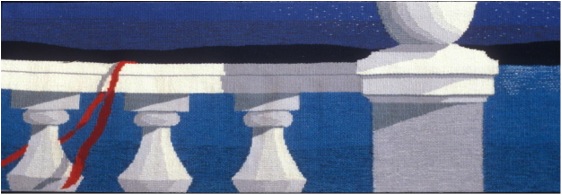
‘Full Moon Fancy’
After my formal education I considered architecture school but decided first to find a job in the field to learn more about it. I was hired as a librarian in a medium sized firm in Cambridge, Massachusetts, to catalogue building codes, blueprints, and archive boxes of building samples from the different projects. (This included door knobs, glass and brick samples, colour chips and a large range of assorted elements that could fit in the box(es), amusing work for a librarian!) I also built scale models and did some interior design. It was a very varied job that I liked after a few years I realised that I wanted less administration more hands-on creative opportunities.
I was encouraged by friends to take an evening weaving class at the YWCA. Three six-week classes of beginning weaving convinced me I had found a new direction. I loved the handwork, the vast array of colours, the planning the possibilities. I was fascinated by the endless patterns, the magic of it all. Still no sign of tapestries on my horizon but that came the following year.
Your initial introduction to tapestry was at Michelle Lester’s Studio, working on a large commission for jumbo jets. Can you discuss this introduction and how it has inspired you?
In 1973 I moved to New York City and joined a local guild to meet weavers and find a weaving job. The fates were smiling because soon after I was hired by Michelle Lester (1942-2002) to weave tapestries for a new fleet of 747s. Michelle, who had a weaving studio in the Garment District of New York City, also had a connection with a gallery that secured this very large airline commission. I had not yet woven a tapestry but I must have seemed very self-assured and willing to learn because I was hired on the spot!
I must backtrack here to say that the only tapestry I had seen to this point was a dreary verdure that belonged to my great aunt. As a child I remember thinking it was an ugly thing to hang on a wall. My slow to arrive tapestry epiphany came when I subsequently realised that tapestries could be colourful, dynamic and they did not have be mural size.
Eventually four weavers were hired to work on this project. Each jet plane was to have 6 tapestries on it; two to cover the movie screens and four to make up the first class cabin bulkhead that included two closet doors in the centre, and the fuselage shaped panels on either side.
The project took over 18 months and was well paid. The tapestries were not complex in design but they did have to be carefully woven to fit the shaped patterns they were to fill. They were repetitive and there were regular deadlines to meet. To keep it interesting, we would each weave six of one of the panels and then switch and weave six of another. By weaving the same ones over we got much faster and could anticipate where problems would arise. For example, one of the screen covers took me about three plus weeks the first time I wove it. In the end I could weave it in 5 days because I was so familiar with it, I realised that much of the time saved was all about the decision making. Doing a repeated project would seem to be boring but in fact each time the weaving developed a personality and, like children, they were a little different each time. Altogether we made an edition of 37 sets for 36 planes. There was an extra set in case one series needed to be cleaned or repaired.
This was my first trial by fire tapestry experience. After this experience I continued to work for her on other smaller commissions. She gave little tutoring in tapestry technique but I enjoyed problem solving and discovered many tricks of the trade. I recognised that I needed more direction and over the early years took workshops from many other noted artists.
Can you explain what the construction aspects are that make a work tapestry?
Unlike painting, to which tapestry is so often compared, the construction of a tapestry requires one to make the art and the structure for the art simultaneously. As a medium it is very simple as there are only two main elements; the warp which is kept under tension and provides the skeleton, and the weft which lies perpendicular to the warp and becomes the body of the tapestry design.
Tapestries are often described as ‘weft faced’ meaning the warp is not visible. Compare with most fabrics, sheets, jeans, oxford shirts, in which there is a balanced weave where both warp and weft are visible. The options for the weft are wide open. Artists have used wool, silk, cotton, as well as feathers, wire, synthetics, grass, newspaper, etc. I use wool, cotton and/or silk mainly because tapestries take a long time to weave and I consider the archival aspects in choosing materials since it is a big investment of my time.
To begin, the warp is threaded on the loom. Once it is checked over for correct threading, tension is added to make it ready for weaving. With a temporary weft I make a foundation that serves to spread the warp from the small knotted bundles into a properly spaced warp.
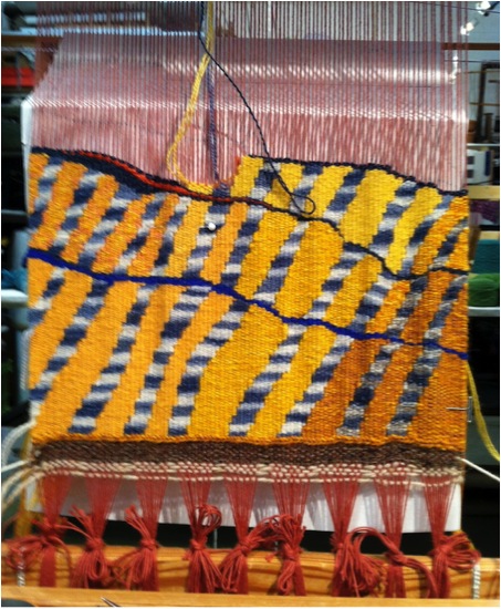
Warp tie up detail from Strata, Strata
Wefts are generally woven in one at a time in a specific area according to the design. I will weave a few inches of a colour area and then start a new colour and weave a section slowly building up the design. In the image here, I began at the lower right with the dark yellow.
The next weft is the one to the left, a striped blue which leans on the yellow, and so forth across the hemline. Unlike machine looms you may have seen, where the weft travels levelly from one selvage to the other, in tapestry, areas of one colour can be built up the warp so the next colour can be woven over it. The design will dictate the order in which colours are laid in because of this.
'Terra: Wheat and Grass’
Another difference is that there are marks you can make in tapestry that are unique to the medium. This includes certain kinds of patterns that would be tedious for a painter but easy for a weaver. Archie Brennan, from whom I have had several workshops, often, spoke about this to his students. It is something that I strongly considered when I started working with more dimension, that is that tapestry should be more about ‘textileness.’
Your work goes beyond 2D. Expand on the possibilities this has lead you to?
Some of the rules of traditional tapestry include keeping your edges straight and your surface flat and controlled. While this is important to learn at the outset, I was restless to experiment.
For me making a tapestry is a construction project. One starts at the foundation building up the shapes layer by layer. Because of this “construction” mode I wanted to create more dimension.
Initially I started with manipulating the tapestry elements. I did a small series called the Flip Series. It was about ten small pieces in which I constructed the elements that I subsequently manipulated.
I considered them studies for large scale pieces but in the end did not pursue because I was concerned that over time the 3D elements would sag and I did not want to add armatures to support them. These were quite successful at this scale and I went on to explore more dimensional work.
Big soft flips
I began working with an eccentric weft; for non-weavers, it is a weft element that is woven at an angle rather than the traditional weft which is 90 degrees to the warp. I began to have some interesting surprises.
These eccentric wefts were made in bands and went right across the tapestry. It was an interesting design but when I cut it from the loom the whole surface changed character and developed a new possibility.
Mini Flow
I have made a series of Flows in both large and small-scale format. I am intrigued how they enhance the image and create a more sculptural aspect in tapestry.
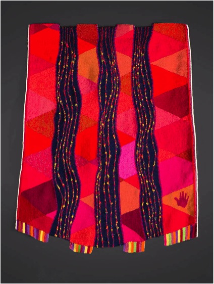
You have made the comment, “I have experimented to see what happens when the boundaries are pushed.” Discuss?
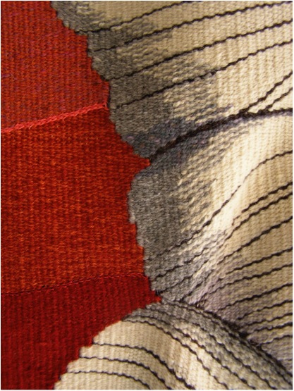
'Bound', detail
I have been working with these eccentric areas for almost 10 years and I have learned many of the quirks. There is a degree in the angle of the weft where the weaving looses its textile integrity and the tapestry fails but this is all part of the exploration. When it is successfully used the eccentric areas pop up after it is cut from the loom creating a dynamic surface tension. This is because of the release from the tension on the loom. I have made enough to know what to expect but sometimes I am surprised.
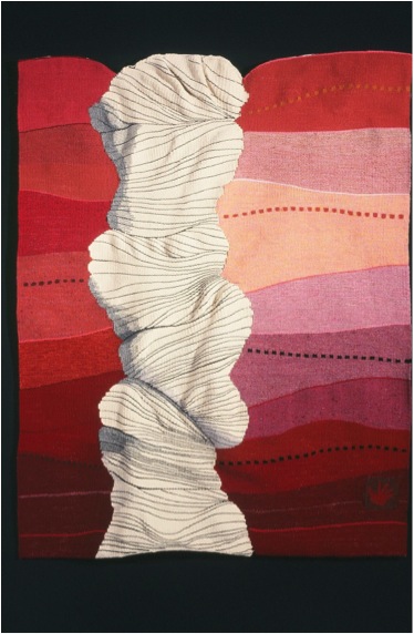
We have long seen tapestries in a 2D format that tell a narrative or explore traditional line, colour, shape, tone, and volume themes. I think that is limits what tapestry can offer.
Discuss the feeling of movement in your ‘Flow Series’?

'Flow 3'
All this movement takes tapestry from being a flat narrative format into a different way of thinking about the medium. Textiles are inherently fluid; they drape, they flex, they respond to their environment and by recognizing that possibility in a tapestry they offer more for the view to consider.
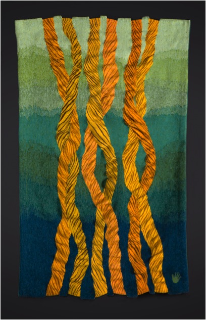
'Flow 6'
I want to respect the tapestry tradition but at the same time move away from the long narrative role it has played in our western culture. I am happy to celebrate its “textileness.”
Discuss nature and how it inspires your work?
How can one not be inspired by nature? I walk a lot and all my life have been observant of my environment.
That may come from my mother who was a scientist. She gave me a microscope as a child and we looked at lots of dead bugs, flower pods, and many other organic materials. For those who have looked it is a fascinating world. I find the shapes and colours provide me with a lot of ideas for my art and they become indirect interpretations ideas and need some time to evolve.
'Flow Unfathomed'
Along with your contemporary work you do pieces that you refer to as ‘Representational Tapestries’. Can you explain both aspects of your work?
My representational pieces are from an earlier part of my career. 1990- 2005. They generally included a lot of architectural details such as stairs, windows, entry ways. I worked from memory and incorporated shadows which gave the tapestries a tromp l’oeil feel to them.
'Beach Stairs'
Once a man saw a photograph of me sitting in front of my tapestry of a staircase at a beach house. He asked if it was my summer cabin. I replied, “Yes, but it is only a centimetre thick!”
'Three Graces'
What yarn do your work with and why?
I am currently working with three strands of Paterna, a fine plied wool in most of my tapestries. With three strands I can blend a new colour and make subtle colour transitions. I was very lucky that another tapestry weaver was closing her studio and selling off her huge collection of yarn.
I usually can make the colour effect I want from the yarns I have on hand but from time to time I need to dye a colour. I love this process because it is so magical and honestly, quite addictive.
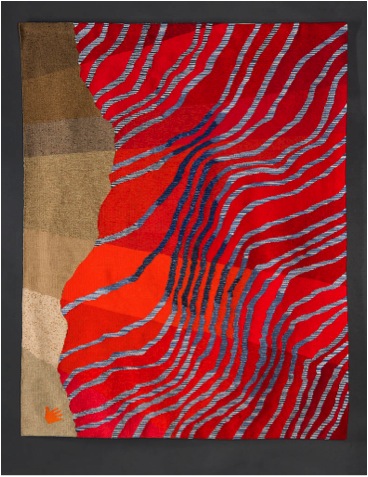
'Here Today'
Discuss the dyeing of your yarn and also the availability of commercial yarns?
I really enjoy dying yarn but do it infrequently because Paterna has a very wide range of colour. Yet there is always a colour in my mind’s eye that I need and I am usually able to dye it. For my last projects I have space dyed some of the yarn to get a special effect in my work.
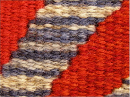
Space dye detail
How do you hang your work?
After I hem my tapestries top and bottom, I line them so that the backs are neat and clean. I attach the loop side of a Velcro strip across the top and I make a lathe strip with the matching hook side Velcro. The lathe is attached to the wall and the tapestry is then attached to the lathe. Because they are flexible, tapestries can also be hung on curved walls and I use a similar method in that case. In some cases with pieces that have shaped tops, I will add a flexible plastic section to maintain the erectness.
Size, what restrictions do you have to the size of your work?
I work in both large and small formats. I have an 8 foot (2.5m) Shannock loom which gives me lots of possibilities for size. I also have a six foot Regina Glimakra rug loom that I use for smaller projects. And I have used smaller, travel size copper looms for mini projects. Overall, I most enjoy being absorbed in a large format tapestry on the Shannock loom.
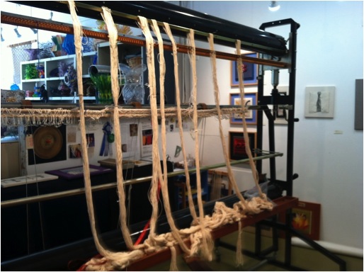
Shannock Loom
Can you show and tell us about your studio?
I share a large studio in an industrial building just north of San Francisco. There are over 50 studios which means an environment of many creative people. There are two Open Studios a year and this is an opportunity to teach visitors about tapestry.
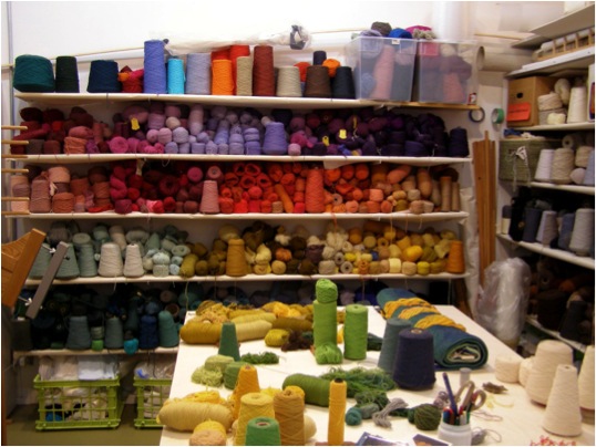
Wooll Wall
You teach, where and when do you fit this into your timetable?
I teach irregularly both in my studio space and outside venues mostly when I am invited. I enjoy it and think I should do it more often but I find it hard to pull away from my projects. Teaching is always a great way to really think about your own art. It helps to me to distil all the thoughts that are brewing in my mind.
Can you discuss one piece that you have done that has been sold and how this sale then effected you both as an artist and in your artistic career?
When my youngest child started kindergarten I decided to rent some studio space for a three year stint to see if I could make a go of it. I was designing colourful abstract tapestries which received some success. I was feeling impatient with the random expression of my abstractions and decided to challenge myself to make a realistic interpretation of a porch scene. Again going back to my architectural interest I looked at a lot of sketches and photos and came up with a design.
‘Summer Shadows’
Three weeks after I completed this piece it sold. I decided to make more of these realistic pieces and this attracted many clients for whom I did private commissions.
Champlain Valley was a commission for a house in Vermont. The client asked for many things to be included in the tapestry. Like many commissions there is a lot of back and forth until there is an agreement. It worked out well and we were both pleased with the end result. It was very satisfying to do something I love and make people happy at the same time. A treat.
‘Champlain Valley’
As well as your own tapestry work, you are involved in ATA – American Tapestry Alliance. Can you explain the importance of ATA to tapestry and your own work?
I was very involved with the ATA for many years. When my children left for college I had some more time and was asked to be a co-director of ATA in 2000. Earlier the alliance had begun to lose its way and a few members had taken it on themselves to put together a whole new organizational plan that refocused the needs of the membership and how ATA could be more supportive.
Without realising the scope of what I was volunteering for, I signed up as a Director. I was living in London at the time and most of the volunteers were in the US so there was an avalanche of emails. We needed new chairs for the different jobs including a new co director and the organization had to adapt to digital format.
It was hard work and very left brained but I was constantly impressed how much time and energy the volunteers gave especially since we hardly knew each other. It was very exciting to see the changes appear and to see ATA start growing from the 200 members at the time. I wanted to see more international members and that too has significant growth.
I was active on the board until 2008. I have not been so active in recent years but do volunteer on smaller projects when I can. I am more active with a smaller local group, the Tapestry Weavers West that puts on regular exhibits and supports tapestry education.
‘Trellis’
Discuss your comment ‘…tapestry has the power to bring peace and harmony into any space.’?
From my studio experience I like to watch people enter and start looking at my tapestries on the wall. There is a sort of calm that comes over them. I am not sure how to explain this but I do think people have an inherent love of textiles, they never go a day without contact to some form of cloth. The softness and the colour may seem comfortable and welcoming to them than the hard edged world we are surrounded by.
Contact details.
Alex Friedman Tapestries
www.alexfriedmantapestry.com
Alex Friedman, California, USA
Interview by Deborah Blakeley, August, 2014
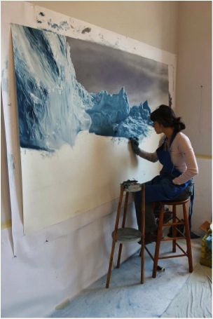
Zaria Forman
After attending Skidmore College in the USA, Zaria Forman developed her own technique. Not only does she use her fingers but her work is on a large scale.
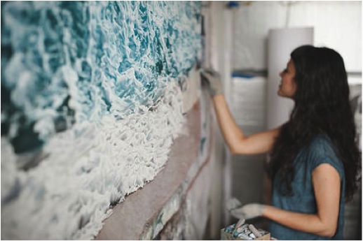
Image by Francois Lebeau
In her paintings she is able to capture both freezing cold seas and icy seas.

All of this is done with soft pastel.
Travel has always been a large part of Zaria’s life. From early childhood, she has travelled with her family to many of the world’s most remote landscapes. Travelling with her mother, who was a landscape photographer, lead Zaria to a very early understanding of seeing the view.
It was because of this that Zaria was lead to fulfill her mother’s dreams of gathering together family, friends, artists and scholars into one team. She took them on the voyage, following in the steps taken by William Bradford in 1869, when he sailed the northwest coast of Greenland.
Zaria said that the feelings she had were. “…both the power and the fragility of the landscape in Greenland. The sheer size, majesty and beauty of the icebergs is humbling."
In August 2012, Zaria led the expedition, called ‘Chasing the Light”, up the NW coast of Greenland. “It was the second expedition the mission of which was to create art inspired by this dramatic geography. The first, in 1869, was led by the American painter William Bradford. My mother, Rena Bass Forman, had conceived the idea for the voyage, but did not live to see it through. During the months of her illness her dedication to the expedition never wavered and I promised to carry out her final journey.”
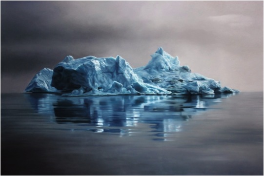
“Documenting climate change, the work addresses the concept of saying goodbye on scales both global and personal. In Greenland, I scattered my mother’s ashes amidst the melting ice.”
“I am deeply grateful for the team of talented artists and scholars and the Wanderbird captains and crew for helping me carry out my mother's wishes and realize her dream.”
A percent of all Greenland drawing sales will go to 350.org.
The Maldives
This was not to be the end of Zaria Forman’s work with climate change. She moved from melting Polar Regions in the Arctic to the equator, and more especially to the Maldives. “I followed the meltwater from the Arctic to the equator. I spent September 2013 in the Maldives, the lowest and flattest country in the world, collecting material and inspiration to create a body of work celebrating and representing a nation that could be entirely underwater within this century.”
Zaria travelled with two award-winning artists who participated in the Greenland expedition, Chasing The Light. Joining her in this venture: Painter Lisa Lebofsky, and director, filmmaker, and actress Drew Denny.
“I hope my drawings will raise awareness and invite viewers to share the urgency of the Maldivians’ predicament in a productive and hopeful way. I believe art can facilitate a deeper understanding of crises, helping us find meaning and optimism amidst shifting landscapes.”
Thompson Lake
“Wherever we live, we need water to survive. Not only is the human body sixty percent water, but water is also essential for producing the things we need like food, clothing, and computers; moving our waste stream; and keeping us and the environment healthy.”

“And yet, while water scarcity is an abstract concept to some, it is a stark reality to many--some regions seem flush with fresh water, while others face drought and pollution. Myriad environmental, political, economic, and social forces produce this water scarcity.”
“During the summer of 2010, I visited Thompson Lake in Casco, Maine. One of the most pristine lakes in the state, this 12-mile-long lake is situated next to the Poland Spring Aquifer. I was struck by the silky, smooth quality of the water. Sipping it as I swam, a sense of gratefulness overcame me. The purity of the water here is no accident.”
“Through education programs and monitoring of the lake and its watershed, The Thompson Lake Environmental Association preserves the lake's natural beauty, water quality, and biological diversity. Such practices set a prime example of how we might effectively conserve and manage the fresh water we have on our planet.”
Again Zaria commits to the charity that is the most appropriate to the work she has done, so 10% of all sales from this body of work go to water.org.
Contact details.
ZariaFormaninfo@gmail.com
For a full list of available works and price list, contact Zaria Forman at the email above.
Zaria Forman, Brooklyn, USA
Interview by Deborah Blakeley, August 2014
Tracey Bush
Can you explain entomology in relationship to your work?
I created scrapbooks for many years as a way of collating and editing my ever expanding collections of found papers: beer labels, music scores, fragments of letters, tickets, packaging. Whilst researching the idea of a collection in book form in I happened upon the idea to create a collection of books in the shape of butterflies and moths. It reconnected with my childhood interest in insects; I even had a pair of entomological forceps!
Nest and Eggs
You commenced your art career with a strong interest in natural history. Can you discuss this link?
From the age of 8 I drew flowers and insects. I wanted to be a natural history illustrator. When I began my studies at Art school I was guided into a different programme of study, but now have come full circle.
Please discuss your British butterflies.
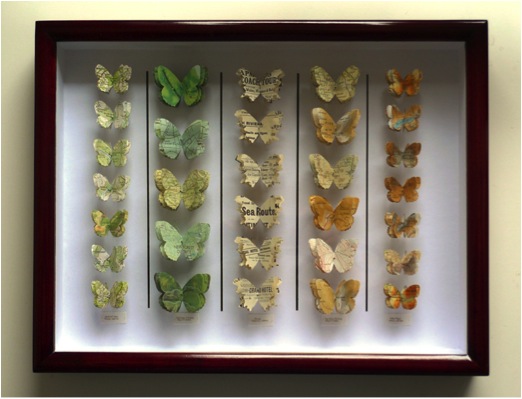
British Butterflies
Can you tell us about the different paper you use?
For British butterflies I usually use out of date maps and atlases of the British Isles. I enjoy working with both the range of colours: browns, greens, ochres and the evocative place names.
Discuss the different shapes of the butterflies and why you choose them?
The butterflies are all real species; the templates are cut actual size. When there are moth species called ‘The non-conformist’ and the drinker, there’s no need to make them up!
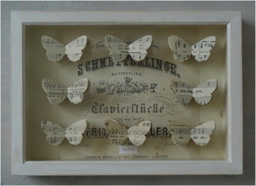
White Box
Discuss the link between the butterflies and paper?
There is always a link between the species’ common name and the material I use. For example, the moth ‘Beloved Underwing’ is made from vintage love song scores. The ‘Atlas Moth’ is made from an atlas title page.
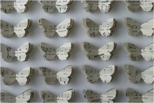
'Beloved Underwing'
Explain your work with ‘Nine Wild Plants’ project and how it has propelled your art career?
In 2005 I was awarded an arts council funded exhibition opportunity by Craft Central, London which enabled me to spend more than a year researching, preparing and promoting the exhibition ‘Nine Wild Plants’ the impetus for the project began with reading that the average Western adult can identify less than 10 wild plants, but more than 1000 brands and logos. I collected responses to the question: which 9 wild plants could you identify and then collated the answers into a small artists book, the resulting ‘top 9’ plants were then used as the models for drawings with collage and 3D paper sculptures using branded paper packaging. The exhibition was featured in several publications, including Elle Decoration, Garageland, and Resurgence magazines. I had a really strong response to the exhibition, the Yale Centre for British Art acquired drawings form the show, and the work generated was also exhibited at Art Fairs, and curated exhibition: Precious, recycling in Art and Craft at the Hove Museum and Art Gallery (UK) Most recently the project was featured in the book: ‘Of Green Leaf, Bird and Flower’ published by the Yale Centre for British Art to accompany the exhibition (2014) of the same name. I am continuing to work with the herbarium format, although the plant species I am using have become wider than the original list of 9.
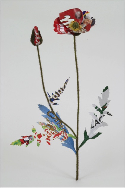
Poppy
After doing this project, can you discuss your own thoughts about the diminished knowledge we currently have on indigenous flora and fauna?
I’d like to say that I’m not making a criticism, just an observation. It simply reflects the culture we are immersed in.
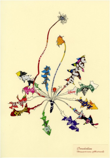
Dandelion
Have you considered doing a similar project here in the Southern Hemisphere with an Australian artist? “It would be interesting to see the results” - Deborah Blakeley.
It would be difficult for me as I’d not know the common names of any of the plants. It is an idea that could travel though.
Can you discuss, ‘The Little Clod of Earth’ from a technical aspect?
When making ‘The Little Clod of Earth’ (2008) I collected and pressed specimens of daisies, nettles and dandelions. I used these as models for the shapes of the leaves, sepals and petals. They are all handcut from paper and card packaging.
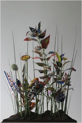
The Little Clod of Earth
The leaves and flowers are attached to fake plastic stems, and these are pushed into a solid sculpted Styrofoam base. The foam base is painted with pigments and fake soil. Everything you see is a construct! It was presented in a taxidermy case, and is now in a private collection.
Explain your use of taxidermy cases in your 3D work?
This links to Victorian conventions of collecting and displaying the natural world.
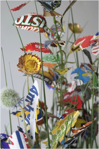
The Little Clod of Earth, Detail
You do commissions of butterflies using the paper provided by the commissioner. Discuss this part of your work?
Usually the paper is significant to the commissioner; maybe a wedding invitation or a fragment of a dress pattern. Most recently I was asked to make a butterfly collection by a NY knitwear designer, using her collection of vintage colourful knitting patterns> I found a species called ‘The Queen Cracker’ which clicks its wings when it flies, it reminded be if the click of knitting needles.
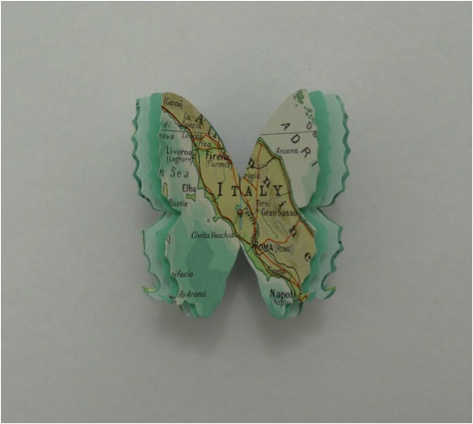
Map Butterfly
Discuss the installation of your work in the Members Room at the Natural History Museum?
The installation I made at the NHM London was called ‘The Ephemeral Imago’. It was a while back in 2002, and was the first time I exhibited my now signature butterfly box pieces.
You have a close relationship with the Natural History Museum. Can you expand on their commission in 2006 of 24 Butterfly Boxes?
In 2007 the Natural History Museum in London commissioned a set of 24 butterfly boxes for the development committee of the Darwin Centre 2. This was when the entomological collection wad ‘decanted’ into a new state of the art building. I was asked to create eco-friendly collections of butterflies and moths to be pinned in reclaimed entomology boxes. When working with the vintage cabinets I admired the skilled craftsmanship of the woodwork, but was glad I wasn’t squeamish, as I often found legs or insect parts from the previous occupants!
Expand on the importance of accuracy in your work? “Each butterfly is an actual species”?
By this I mean that I make templates from actual size species. The shape is authentic, although I edit the body, legs and antennae. If the species were made up I would feel that the butterflies were simply a decorative symbol, which is not my intention.
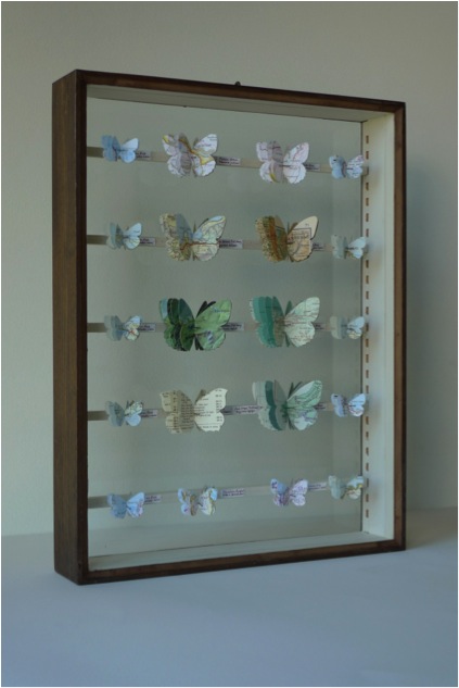
Dyffnyn Fernant
Why are butterflies such an important environmental indicator?
They are affected by climate change very quickly as they seem to move locale as the temperature rises. In Britain many species are becoming more northerly in range.
Can you discuss:
‘Two Moon Moths’
Indian Moon Moths Actias selene are the most frequently bred in captivity because they have a beautiful elegant shape, and are quite large. I have cut mine from a vintage map of the surface of the moon.
‘Beloved Underwing’
This species, Catocala ilia is also called ‘The Wife’. I cut these moths from vintage love song scores, and have fun rearranging the fragments of songs to create new meanings.
What work do you have in the Tate Gallery Library?
How has being in collections such as the Tate Gallery Library, the Museum of London and Jaffe Collection (Florida, USA) influenced your art status?
I have some artist’s books in the Tate Gallery Library and Archive. Being collected by the Yale Centre for British Art has significantly influenced my art status. My work is currently on display at Yale, in the exhibition ‘Of Green Leaf, Bird and Flower’, curated by Elisabeth R. Fairman. The exhibition is accompanied by a gorgeous catalogue, which takes its inspiration from an antique field guide.
‘Of Green Leaf, Bird and Flower’. Publisher: Yale University Press (23 May 2014)
ISBN-10: 0300204248
Please discuss a piece you are currently working on?
‘A Spoonful of Earth’ is a plastic takeaway spoon, which appears to have scooped up a tiny clod of earth. Amongst the daisy plants is a garden snail, its shell adorned with the Starbucks logo. My daughter had the inspired idea of using yellow glass seed beads for its eyes. I’d like to create an installation of ‘free range’ snails. It would be a fun way to fill a space.

'A Spoonful of Earth' (with Snail)
Contact details.
Tracey Bush
Alverstoke, Hampshire, UK
tracey@traceybush.com
www.traceybush.com
Tracey Bush, UK
Interview by Deborah Blakeley, August, 2014
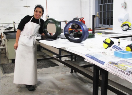
Mikyoung Jung
You combine both glass and other metals and materials in your work can you expand on how this came about?
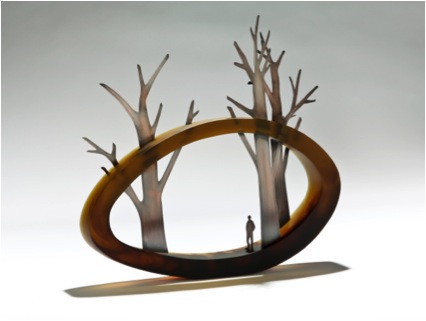
‘Beyond’
As a border-crossing artist, I think my experience of displacement through constant migration has had a profound effect on my art works. My continuing migration from South Korea to Canada, England and Australia as well as living and travelling in different countries as a ‘nomad’ has encouraged me to develop ways to communicate and articulate my feelings beyond the traditional conduit of speech, while also re-defining the boundary between myself and others from different cultures. As I constantly move from place to place, I wanted to explore these spaces that I have visited in the past with colours and appearances by using the material’s fundamental beauty and unique characteristics. While I was seeking my own way to express my observations of the new spaces in which I was residing, I was not reluctant to mix materials even though my art practice has been primarily focused on glass making, particularly kiln-formed glass and casting. Later, I realized the effect my multi- cultural background and previous undergraduate art education in South Korea has had on my current practice. During my B.F.A in South Korea, although my major was in glass, I was fortunate to receive a well-rounded exposure in many different materials such as wood, ceramics, metal, print and mixed media. Thus, it was more natural for me to explore different materials. In my current practice, I mainly use metal and glass. I use metal to emphasize my personal sensory perception of new space in which I am currently residing in or observing, and glass is a great resource that allows me to be able to create boundaries of space in sculptural form with colours. Glass and metal together allow me to be able to create the internal and external space within my practice perfectly. sculptural form with colours. Glass and metal together allow me to be able to create the internal and external space within my practice perfectly.
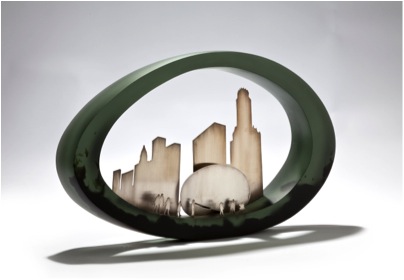
‘In the Shadow of Giants’
Your work is truly 3D, it makes the viewer want to walk around it and view it from all angles. Can you expand on this?
My works are based on real scenery, explored by a creative process through the ‘Journaling’ of my past experiences. Incorporating catalogued data in the form of pictures of experienced landscapes and moments in time, I then start to draw the scenery by using Adobe Illustrator computer software on top of pictures to engage in exploring contemporary human life. I often incorporate metal in my works. Using Adobe Photoshop and Illustrator together before I cut metals, I sometimes collage a few pictures to create the moment as I experienced it.
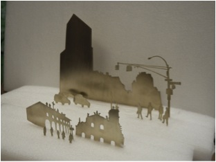
metal placement planning
When I place metal in my work I stagger the pieces that tell my story at different distances on the glass form, so although the metal figures are 2D it appears as a 3D image when it is placed in space. I also modify the size of each metal piece as well as the angle so I can make objects appear larger or smaller depending on distance. The process from planning the placement of the metal to cutting it is honestly quite time consuming and labour intensive I really enjoy doing it. It makes me feel like I am playing with the characters in my story. It possibly feels more real for some people who have shared a similar experience because my works might give them a chance to look at their current reality or look back on a previous experience in their lives and that is the power of my visual ‘journal’.
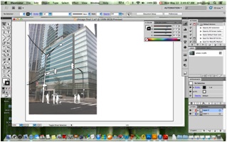
Metal cutting planning with Adobe Illustrator Software
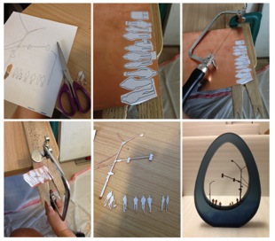
Metal cutting process
Can you discuss the size of your current work?
My current works are in various sizes from small to large. Larger works are approximately 560mm long and 330mm high whereas small works are approximately 350mm long and 190mm high. I send most of my works overseas; I have found it is very difficult to ship works internationally if they are bigger than 600mm. I try to keep the size less than 600mm unless the works are being sent within the country I am currently working in.
‘A day in the Park’
‘Sunrise Sunset’
‘City from a distance’
Your comment “the old world and the new, east and west, citizen versus outsider” How is this reflected in your work?
‘Hanging on by a Thread’ and ‘The Daily Commute’
My current work called “Hanging on by a Thread” and “The daily commute” might be a good example in explaining the contrast between citizen and outsider. I recently travelled to the Philippines with my husband and while visiting a small island called Bohol, we came upon a long bridge made from Bamboo connecting one side of a village to another.


At first sight, the bridge seemed fragile and insecure and I was very hesitant to cross. I watched a few travellers cross the bridge visibly nervous. I finally gathered up the courage to cross this bamboo bridge, I noticed a local boy balancing a heavy sack of rice on his head nonchalantly crossing the bridge totally absent of fear from the opposite side. At that moment I realized that two people, albeit from different environments, experiencing the same location in very different ways. Observing the moment as an outsider allowed me to archive this experience into my current work.
Detail of ‘Unbridled City’
Detail of 'By the shore’
How has your work altered between the two western locations, Sunderland and Sydney?
The place where I lived in England was the city of Sunderland, located in the north east of England and it was not as multi-cultural as Sydney. It was a difficult time where I felt exposed and like a stranger. Also, at this time I could not yet speak English as well as I can now, so my works were more focused on the differences between ethnicity and language.
‘Outside and Inside I, II’
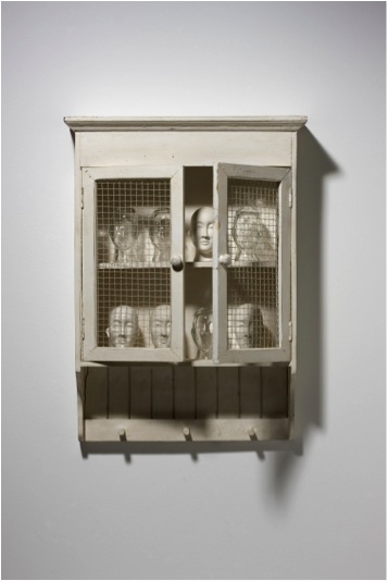
‘As a stranger’
After my studies were completed in England, I came back to South Korea, staying for about two years while sharing a small studio with a former glass artist friend in Seoul . Since Seoul is a very busy densely populated city, I was always surrounded by high buildings and traffic.
When I moved to Sydney, Australia, it was my first time living in a tropical climate and more raw, wild landscape. I was really inspired by the unique animals and flora of Australia’s nature, particularly its variety of vivid colours. I started to makes works which portrayed the different animals, trees, and plants of Australia.

'Fixture of Suburban life-Urban Jungle’
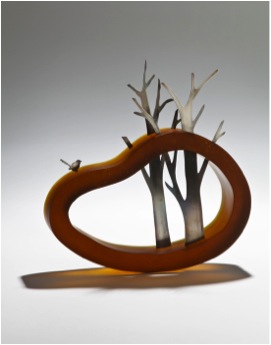
'View from above’
Can you discuss two pieces of work?
Country landscape
Bristol landscape picture
As I constantly move from place to place travelling to different locations I try to reflect the different landscapes which I have seen from different places into my works. Since I was born and grew up in Seoul, I had always lived in high level apartment blocks surrounded by huge buildings. Therefore, when I travel, especially to the countryside, this inspires me to reflect that moment in my work. One of works that I exhibited at SOFA Chicago last year, called “The pastoral life” was made based on a picture I took while working and travelling in Bristol, United Kingdom.
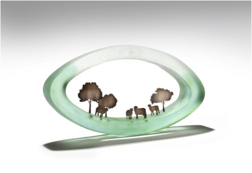
‘The pastoral life’
City landscape
Seoul landscape picture
When I come back home, the scenery which I have witnessed and stored in my mind makes me look at my current reality, that of the city, from a different perspective. The piece called “Ephemeral City” was made just after I returned to Seoul from England and was based on a picture I took on the way back from the airport.
‘Ephemeral City’
Can you discuss the way you choose to colour your glass? Some pieces are completely coloured, others partially coloured while others are clear?
'On the Coast’
I try to explore works with different colours and incorporate the colours I found in the pictures of a given moment. I think the colour of a moment really brings out my feeling of that moment and reflects my emotions. My choice of colour really depends on the work. Sometimes, works made in one solid colour better reflect the moment. In some of my old works, I built lines with flat coloured glass and stacked them into a mould to create levels in the pieces to create multiple layers to reflect the age of the land and create a layering effect to better illustrate water.
'The Still City’
Where are you currently exhibiting your work?
My work is currently being exhibited in four locations:
| Melbourne,Australia | Kirra Galleries |
| Pittsburgh, U.S.A | Morgan Contemporary Glass Gallery |
| Denver, U.S.A | Pismo Gallery |
| London, U.K | Zest Gallery |
I have also completed a new work which is going to be exhibited at
The 8th Cheongju International Craft Biennale in Cheongju, South Korea in
August 2013.
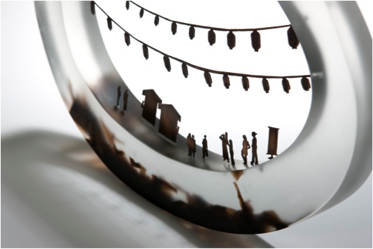
Detail of ‘Old meets New’
Exhibitions are an important aspect for artists; can you explain how you choose where to exhibit?
I try to submit my work to be exhibited in glass art conferences, symposiums, and craft biennales as well as if there is an exhibition where I believe it will allow me to show my work to a wider audience. Besides that, I get calls from galleries asking me to exhibit when they have a group show going on with a certain theme that would suit my work. It really depends on the time.
What are one or two recommendations that you would tell a new artist to keep in mind?
As I learned from my mentor, I think it is very important for an artist to keep informed about information of upcoming competitions and exhibition opportunities in order to be ready to apply for ones that will fit your work. When you apply, having good images of your work will assist you in being selected for these opportunities since for almost all competitions, only images of your work are evaluated in the first round.
Many art students think it will cost too much money to have a professional image, I think it is a worthwhile investment as it brings you good opportunities.
If you use your images well, it really is worth it in the end.
Contact details.
Studio Address:
Joon Glass Studio
824-37 Daeja-dong, Deogyang-gu, Goyang-si, Gyeonggi-do
ZIP:412 480, South Korea
Website: www.mikyoungjung.com
Email: mikyoung.glass@gmail.com
Mikyoung Jung, Gyeonggi-do, South Korea
Interview by Deborah Blakeley, August, 2013
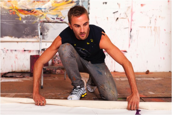
Andrew Salgado
The size and scale of your images is huge. How do you physically cope with this aspect of your work?
One of my favourite painters is Daniel* Richter, and I recall as a student artist at the University of British Columbia (Vancouver, Canada) being familiar with his work but being rather ambivalent about it; one day I saw an exhibition of his paintings at Helen and Morris Belkin gallery on campus, and I was completely blown away by the monumental scale of the paintings. As a young painter, it was a cathartic moment; one of those rare shows that not only asks you to rethink the work of the artist in question, but rethink how you consider painting as a whole.
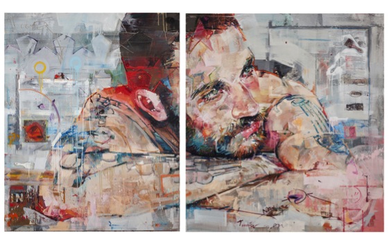
For me, scale is an important aspect of the identity I have forged for myself as a painter. I have to remind myself to hold back sometimes, and challenge myself to work on a smaller scale. My last solo exhibition (Variations on a Theme, NYC) purposely included very large work as contrasted by very small work. I like what this polarity suggests, and for me, it’s the mid-range pieces that are almost irrelevant. If it weren’t for the limitations of my studio (ceiling height and the logistics of getting work in and out) I think I would like to even go bigger.
There’s a certain power with scale, and the freedom to move about and explore the canvas, where your brushwork actually becomes a record of movement in time and space. I am drawn to the grandeur of scale, the suggestions where a torso becomes twice the size that it should be; it is almost a sublime experience looking at a figure that is unnaturally large.
Conversely, I find small paintings challenging because it’s easy to be ‘important’ on such a large scale, but it is difficult to make a bold statement when you’re working with such confines. I also notice that I become a very different painter when I work small-scale, but that’s to be expected.
Big, Bold, and Brash is the feeling I get when viewing your work, is this your aim?
I’m not sure that brash is a good thing. To me, it seems like a cheap trick. I think there’s a confidence in the new work, and a freshness that I’ve earned as I mature as a painter. The work also comes from a politicized source. As a gay male and a victim of hate-crime, the work has a message that goes beyond big-for-big’s-sake. The work is aggressive because it is asking the viewer to consider and challenge something beyond what is immediately visible. I know a lot of big, bold, and brash artists but to me these adjectives recall something almost pejorative: like a big tacky sign. I like to challenge myself and my viewer, and I don’t like to make work that sits comfortably; something is always off-kilter, waiting to be deciphered. I do think from time to time the work is bombastic, but with each successive body of work I tend to focus on an adjective that subconsciously comes up and guides me. For my Cape Town exhibition it was ‘intimate’. For NYC it was ‘purposeful’. And for London (opening October 4th at Beers Contemporary) it’s ‘deceptively simple’. So I think for many painters it can be quite easy to pull off ‘big’ and ‘brash’, and I think it is challenging to be subversive when you’re playing with scale and aggressive, politicized themes. I also think the work is changing, rapidly, and markedly. On one level I’m still the same painter that I was before, but on another level, I’m entirely not the same painter that I was before.
You use many mediums as well as oil, spray paint, collage, text, and video discuss how you know when to stop?
There was a foray into video during my Masters at Chelsea College in London in 2008, spurred by necessity as a result of insufficient studio space and a (painter turned performance artist as the) course Director who tried telling me I was a performer and not a painter. However, even those videos were ultimately all about paint. When I left the degree I also returned to painting, which is really where my love-affair lies.
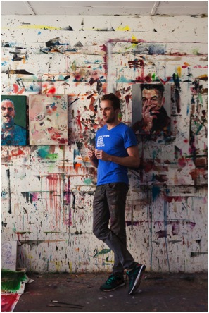
Everything else has been quite causal. I believe in being informed by your immediate surroundings. After a particular commission I was erroneously given a box of spray paints; they stared at me in the studio for some time until I thought ‘screw it’ and began incorporating them into the work. However, their use is always quite subversive. Spray paint has this tendency to be a very immediate, very loud media, but I use them in a method where they’re almost indecipherable. This to me is almost a form of trickery; the viewer is pulled right into the piece – endlessly looking. Earlier this year I began using them to stencil the my materials onto the piece – the silhouette of a brush or a palette knife, for instance; and eventually this evolved into actually sticking the actual object onto the canvas in its entirety. Sort of a self-referential act, where I’m constantly trying to remind the viewer that this is a reconstruction, a creation, there was a process involved, a fiction… I like to draw attention to my materials and this was just an evolutionary step, it was never intentional, it just happened.
If it becomes a gimmick - then so to do the paintings - and it is funny, because my most recent work has pulled back entirely…they’re only oil on canvas again. I’ve retreated back into the cave, just me and brush, but I still have some tricks up my sleeve.
How do I know when to stop? You have to listen to the intuition because you can’t pull out to early, either. But for every successful painting there’s probably a failed idea or unfinished work somewhere as well.
You make the comment, “my studio is my paradise and my prison”. Can you expand on this?
Art is a give and take exercise. As artists we play with fire, and from time to time you risk getting burned. I think as artists we need to know when to ‘cool it’, and step away from the work altogether. We need that impetus to create, and sometimes it’s simply ‘not there’. I work alone, usually 6 days a week, at least 8 hours a day. If you’re not careful, this creative space can become a draining space. But there’s nothing quite like that feeling when you’re in the studio, and everything seems to ‘click’ and you surprise even yourself. However as artists we need the crises, the failures; they are what help us grow and learn and improve.
Your exhibition in NYC was a sell-out – Discuss how and why your work relates so well to NYC?
I don’t think its NYC in particular that my work relates well to…I would like to think it has an appeal that transcends any particular location. I’m Canadian, half Mexican, but I live in London. So I’m a bit of a mixed bag myself. In fact my last 6 exhibitions were all sell-outs, which is amazing, but also brings with it a new series of anxieties. There is a demand now for me to constantly trump myself: each show has to be better; the work more important; and of course we don’t want the ‘winning streak’ to end. So that’s definitely a pressure for me but I try not to think about these things because the real importance is the paintings. If the paintings are spectacular, everything else will fall into place. I broke through a glass-ceiling with the paintings for the NYC show, and as an artist it’s an incredible feeling to surprise even yourself. The paintings were sharp, and fresh, and crazy, and I do think that a NYC audience responded to their immediacy. I’m hopeful, as well, because the initial paintings for the London show are off to a promising start. There’s another change, and the works are a little more complex but also a lot more subtle, and I think a London audience will respond to that aesthetic.
Can you discuss the importance of space, lighting, freight, and location for your exhibitions?
I think all are really important, and there are some great spaces I would love to work with. The space in NYC was amazing because there were quite literally no constraints to any of these factors. Obviously shipping is a pain, but a reality that I suppose I have to consider… In reality though, it’s my job to make the paintings, and I let other people worry about logistics. One thing that many people find interesting is that I plan an exhibition around the gallery space. I go see the space, get a feel for it, and then think about the scale of the work and the number of pieces I want, and work to ‘fill in the blanks’.
The full show was a portfolio of 14 works. What timeline did you work with?
Is there ever enough time? I never count the time taken per work, but rather allot myself a specified amount of time for a particular body of work. I had initially given myself over 4 months for 9 or 10 paintings. I never do more than 12. I was approached by Kevin Arpino at Rootstein to do an additional show to outfit for their windows, the dates to correspond to my NYC show. So suddenly I had 5 more paintings to do in the same time-frame. I did my exhibition first, then the Rootstein works. I didn’t want overlap. To me, while related, they were two bodies of work. This was pretty crazy, but I always welcome a challenge. For London, I had 5 months, but I took a month ‘off-studio’. I tend to work well under pressure, though. But no…never enough time. I’ll rest when I’m old…right now, I feel like have work to do.
At another level, can you discuss your work with Rootstein, who’s philosophy is “constant innovation and boundless creativity” with an open canvas, - mannequin. What did this commission lead too?
Actually I was already working with the idea of sculptures falling apart…disjointed body parts, floating limbs, so making work for Rootstein couldn’t have fit better into how I was already painting. The resulting works were entirely my decision; I won’t work with any commission where they tell me what to do because that never works. I’m close friends with the CEO, Kevin Arpino, and he just said “I trust you”. And it worked. Kevin is incredibly inspiring and I learned a lot from him as well. He’s a true visionary and I think their philosophy is brilliant.
How often do you add work such as Caravaggio’s Bacchus to your canvases?
There are a lot of references lurking within my paintings. Some paintings have more obvious references, such as the painting of Bacchus in the background of Green Dionysus, or the reference to Botticelli in ‘1486’, but other paintings have sly nods: the presence of a contour line to reference Chavannes; another painting a response to “Whistler’s Mother”; another painting borrows from Doig; another from Gauguin. Sometimes it is just a subtle thing: a colour, the gesture of a hand, the composition, even the title, but I think as an artist I have a responsibility to the history that came before me, and an onus to be responsive to that. As a painter I don’t work in a vacuum, and I’m keen to draw attention to this, even if it is just knowledge for me to carry.
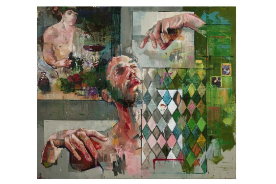
How do you find the sitters? Are many commissions?
I now avoid commissions like the plague. I don’t want to be told who or what to paint. It sounds awful but you can’t hire inspiration, no matter how much cash you throw at it. I’ve stopped taking commissioned work and I feel more honest as a result of it. I find my sitters anywhere, but typically I don’t like to know my sitter too well. I don’t like to think of them as portraits, and if they bring too much of ‘themselves’, I can’t use them the way I want to. I always say that ultimately what I do is very selfish, because I take what I want from my subjects, like conduits, to express something for me, and then I move along. It’s like a horrible mantra: love ‘em and leave ‘em.
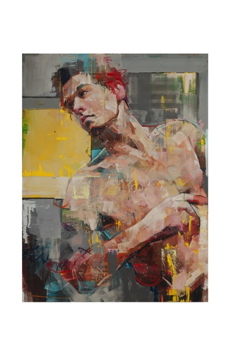
Currently you are supporting Cancer Research in both Canada and the UK with your work on a T shirt. How did this happen? How can a reader purchase one?
I work with a lot of charities worldwide, and I believe in giving back. Artists can be so self-indulgent and solipsistic, they often fail to realize that there is a world with real issues beyond the confines of their studio walls.
I was contacted by Maison Twenty, who wanted to use my imagery for a t-shirt. Originally I was not keen on this idea until I asked them about if we could give all the proceeds to charity. I chose MacMillan in the UK and the Cancer Society in Canada and I’m splitting the proceeds to either. To purchase, you can go to Maison Twenty’s website.
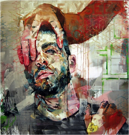
Contact details.
www.andrewsalgado.com
www.facebook.com/andrew.salgado.artist
For sales inquiries: info@beerscontemporary.com
All other inquiries: amy@andrewsalgado.com
Andrew Salgado, London, UK
Interview by Deborah Blakeley, August 2014
Martha Fieber
You call your work, ‘Landscapes in Thread’. Can you discuss this?
My work is all landscapes. Some are realistic and some abstract. By far, the majority of materials used in my finished image is thread. I use hand dyed linen for backgrounds and the entire picture is made from thread of all kinds. I use some hand dyed silk and ribbon yarn for the tree trunks. The underlying message threaded through my work is that nothing is quite what it appears.
‘Red Reeds'
You use layers and layers of thread, while restricting your work to four stitches. Can you expand on this?
I use straight stitches, french knots, couched threads, and chain stitch. Straight stitches and french knots make up most of each image. Occasionally I will use chain stitch for a different texture or level separation in the picture. I have not used couching in some time, but there is the occasion that it makes a perfect line definition that I need for effect. The straight stitch and knot can do so many things. Straight stitches are like drawing with a pen or pencil. French knots are so versatile. They can have any number of twists to make their size. They can be piled upon each other for texture and dimension. I love using them and find myself going to them as a basic.
Texture plays a large part in your work. Please explain the technique you use to create you work?
I start with linen that I have hand dyed. It adds dimension and colour variation to the background and lends to the depth of the finished image. If the piece is to be a forest scene, I then start with crosshatched straight stitching to give the depth and interest to the background. I continue layering slightly variegated colour thread while adding silk or cotton trees and branches. At the same time I am adding french knot leaves and more cross hatching until I have a deep background with dimension and texture. 90% of my images I consider background. Only when I am adding the foreground trees and leaves, do I have my finished picture. I try to get all of the depth into the background from the start since I cannot go back under to add more later. I am thinking like a painter, going from distance to foreground. Lots of my stitches get covered up, but there is always a little of everything peeking thru on the finished piece. Using hand dyed silk ribbon for dimensional leaves in the foreground adds depth, texture, and dimension to my work.
'Aspen Spring'
What lead you to give up a career in engineering for art in 1999?
After twenty years in engineering, I needed a change. I had been doing my embroidery and rug hooking as hobbies during that time. I found working within the parameters of the engineering world frustrating and longed to work for myself in the art world. My husband is a furniture maker we felt that we were in a good position to make a change to full time artists as all of the children were then out of college. We decided to take the big leap to working for ourselves in 1999. It took a few years to get established, but things have worked out well for both of us.
Can you discuss composition by comparing ‘Catching Light’ and ‘Dogwood Spring’?
From a distance, it is impossible to tell how my work is constructed and what materials I am using, so composition is what draws the viewer to get close to my work and experience its complexity.
“Dogwood Spring” and “Catching Light” are two very different pieces. Both take your eye into the distant woods, but one is a fine, misty, mysterious, light, distance and the other is close up bright forefront and deep dark distance.
'Dogwood Sping’
“Dogwood Spring” draws the viewer to the lighter distance using bright green grasses on the horizon from a shaded grassy and tree area with blossom foremost. Grey greens in varying shades make the long boundless distance disappear. This piece is matted which is a contrast to the open area of the undefined distance.
“Catching Light” uses bright red, white, and muted greens in the foreground and draws the eye to the dark enclosed distance. The edge treatment on this piece is stitched. That gives a dark border and is shadow box mounted to give contrast to dark distance and it makes the entire piece pop.
'Catching Light’
Your inspiration is nature. Can you explain this in relation to your work?
Nature is beautiful and peaceful to me. My work strives to bring the outdoors in and keep us connected to our world. I also want to remain aware of our fragile environment. The scale and exquisite quality of my work brings that to mind. I want to keep the viewer aware of the beauty of the moment. I live in the woods so I am surrounded by beautiful scenery every day and show it to the viewer in my work.
Explain the size of your pieces?
My pieces are small. They start at 3” x 5” for the image. My largest has been 9” x 30”. I use the horizontal format because it is easiest to work with. Vertical format is cumbersome for me. I like to work with a size I can hold instead of using a stand. Time is also a factor. My work takes a long time and anything larger than the above sizes would take too long to complete. Scale is also a factor in the size I work with. I do my best work in small scale. Materials that I use, like using only one strand of thread at a time, makes my work small scale to start.
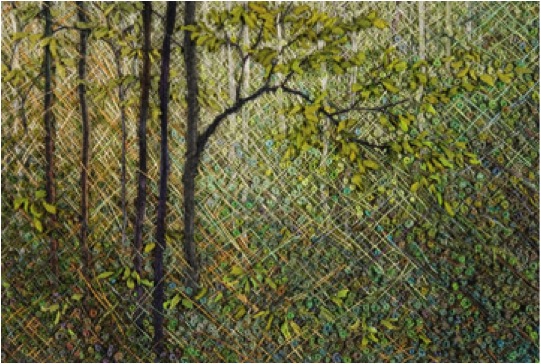
'Sun through Woods’
You do your own dyeing and hand painting of thread, as well as commercial threads. Can you discuss this aspect of your work?
I dye my linens, threads, silk fabrics, and ribbons with water based dyes and set the colour in the microwave. It is so quick. I do not use specific formulas for colour. I just mess around some colours that I know will work for either trees, grasses, leaves, etc. I do get some ugly colours at times, but they end up being perfect for something later on, like mud coloured thread. I buy bulk linen and ribbon and dye big batches of pieces to use later. I look for threads at the thrift stores and overdye them. Sometimes I buy bulk threads and dye them. Dying my own gives me more natural colours and more subtly variegated materials. They blend together more naturally and easily than using solid colours. When I start a picture, I go to my stash and pick out the colours that will work best for the piece I have in mind.
Do you feel that being a self-taught embroiderer has allowed you to have a greater scope?
Yes, I think that being self-taught has allowed me do go my own direction and use unconventional techniques while at the same time using conventional stitches in a traditional craft. I am not restricted by perfect spacing, perfect stitches, colour combination charts, or the neatness of the back of my work. The backs of my works are abstract versions of the fronts. I put stitches anywhere, in any combinations, whenever I desire. My process is so slow that I can change at any time or go in another direction that works better for the composition. I am not working toward a specifically defined finished pattern, I do have a finished image in mind before I start.
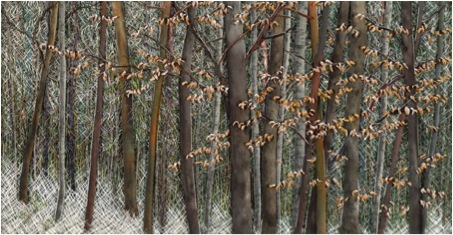
'A Dusting’
Can you discuss ‘Spring Birch’
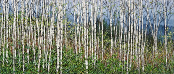
'Spring Birch’
‘Spring Birch’ has many examples of techniques I use.
This piece starts with hand dyed linen in grey blues. Next I paint the distant hills with water based, heat set, ink. Then straight stitch grey blues in darker shades make up the near distant hills. Then, lightening up the nearer hills in straight stitch grey blues. I am then using a straight stitch to make different size and distant pines. At this point I start to put in some grasses and bushy areas. Next, the birch trees are put in using white cotton gima inked to look like birches. The high birch branches are next. Last is the leafy front bushes and enhancing the french knot leaves of the bushes before and behind the birches. I am sewing in all of the foreground grasses, bushes, and leaves during the last few steps.
This piece has a bright, dramatic foreground of birches and leaves as the focal point, then leads the eye to the distance with darker colours, greyed shades, different weight threads, and different material threads. Cotton and silk give either flat or sheen to the area which works to separate and define. Since I work close up, I am constantly putting the piece at a distance so that I can gauge composition.
This piece is 6” x 14”. It is presented matted, in a black simple frame that is 12” x 20”.
Contrast and colour can be inspiration to me. I used a birch stand near a local lake as a reference. As you can see, I changed the lake to distant hills.
Your work comes in three categories. Please expand on this?
I have found that my technique lends itself to forests, fields, and flowers. I do have water scenes, close up forest floor scenes, and abstract scenes, but most of those subjects are still in development stages.
Forest
Crosshatched stitching lends itself to making the woods look deep and to making trees recede into the background. My hand dyed silk fabrics make really good tree trunks. I also paint birch tree trunks. So, materials define a good portion of my works.
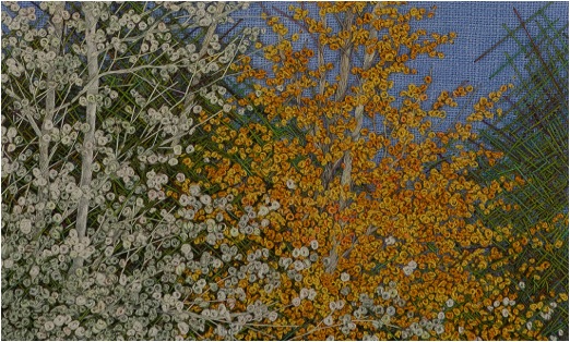
'White Poplar'
Fields
Using one strand of thread at a time and stitching in both directions makes realistic looking fields and makes the grasses separate. There are so many new materials to stitch with, like gima, novelty thread, different weights and sheens of threads, different twists, ribbons, that can add dimension and depth to my work and lend themselves to varied grasses.
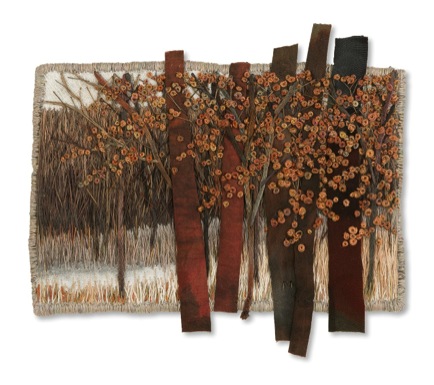
'Greys and Browns'
Flowers
French Knots make good flowers. Silk Ribbon can also make a different type of flower. Flowers add colour. They add another dimension and contrast to my pieces. This is another example of colour and texture of the materials determining my subjects.
'Blue and White'
How has your combined knowledge of weaving and embroidery helped the current work you are doing?
My combined knowledge of weaving and embroidery probably helps the most in colour combining and layers. I’d say that my embroidery experience with different materials influences my weaving more than the other way around
Contact details.
marthafieber@yahoo.com
www.marthafieber.com
Martha Fieber, Michigan, USA
Interview by Deborah Blakeley, July, 2014
Ewan David Eason
Your early work was involved in the exploration of colour, and more concisely the colour concepts that were introduced by Paul Cezanne. Can you expand on this?
In the summer ’96 (when I was 16) I went on holiday to France with a copy of Robert Hughes’ book The Shock of the New, using it as a guide to paint. Every day I would go into the countryside with a canvas, foldable easel, oil paints and brushes and paint the scene I was in using a different ‘ism’ to the previous day working my way through Impressionism, Fauvism, Modernism and so on right through to when the book was published in 1981. I kept returning to Cezanne’s use of colour in his painting of Mont Saint-Victoire from 1887.
He in fact painted this Mountain about 87 times over his career. His palette mainly consisted of white, red, blue, yellow, purple, orange and green. Over the next 2 years I explored how these colours could work together or oppose one another either mixed or as solid forms. At around the same time I visited Charles Saatchi's Sensations Exhibition at the Royal Academy. As a result of seeing Gary Hume’s hospital door paintings and Hirst’s ‘dot’ paintings as well as studying more established artists like Patrick Caulfield, Patrick Heron, Bridget Riley and Michael Craig-Martin I concentrated more on the opposition of unmixed primary and secondary colours. Not only was I interested in colours opposing I also became interested in opposing forms, structures, concepts and how these opposing forces could highlight or subdue the other.
This theme of opposites continued throughout University. I became more aware and interested in current artists and like what University does, I discovered more of who I was as a person and the more of my personality I put into I my artwork the more passionate I became about creating the work.
I started looking into artists who dealt with appropriation. Artists like Richard Prince, Cindy Sherman and Sherrie Levine. One series by Sherrie Levine from 1981 called After Walker Evans is a reproduction of a selection of Walker Evans photographs taken in 1936, whereby she rephotographed and re-exhibited a portrait from one of Walker Evans exhibition catalogues; appropriating it as a partial reclamation of Art History for women. Like Prince and Sherman, Levine was re-authoring the image.
From a very simple level I saw it as a sort of ping pong game between opposites, male and female. The ball was now coming my way. So I rephotographed her image and exhibited it as one of my own, calling it After Walker Evans, After Sherrie Levine by Ewan David Eason. It wasn’t that I wanted to reclaim the male status back, it was more about the cheekiness of me doing it. Silly as it was though, it did start my interest to create opposite appropriations. Like Sherman I wanted to include myself in the work and like Levine I sourced the works from artists. I created pastiches of artists work through various mediums such like video, painting, photography and other forms of print making.
‘Mappa Mundi’
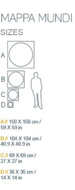
Your ‘Mappa Mundi’ prints come in four sizes.
How did you decide on the sizes?
When did you decide to compare the print size with the logo of a man?
It started with the 36 x 36 cm size, any smaller than this the detail of the artwork deteriorated.
I knew I could print up to 150 x 150 cm but didn't want to limit myself to just 2 sizes.
The sizes in between; 69 x 69 cm and 104 x 104 cm were incremental size progressions.
Do you have a Limit to your print run?
Yes, definitely. I don't want to create a commodity with an unlimited edition. By limiting the amount I make, the artworks become more and more rare.
Mappa Mundi Moscow
Is the gold actually gold leaf?
I use 4 types of gold; 24 carat gold leaf, imitation gold leaf, brushed imitation gold dibond and gold thermal ribbon.
How did the opposite theme translate into your current Mappa Mundi series?
In 2011 I was invited by the artist Tom Helyar-Cardwell to exhibit in an exhibition called Celestial Architecture. At the same time I had looking at the work of Bernard Cohen and his use of loose and rigid styles. I started cutting out straight lines in my sketchbook which I could then lay on top of other patterns. Unlike what I was expecting, the stencil itself inspired me rather than the new images it created with the drawings beneath. It reminded me of interlocking roads on a city map. Rather than creating new road maps in my sketchbook I began to cut up an A-Z London map. I also began to look at older maps suchlike the circular Mappa Mundi’s; medieval maps of the world commissioned by landed gentry of the time. It hadn't been established that the world was circular at the time however the artists drew reference to a verse in the Bible, Isaiah 40: 22 which talks about He (the Lord) sit(ting) enthroned above the circle of the earth. The most famous of these maps and the largest still in existence is the Hereford Cathedral's Mappa Mundi which reflects the medieval church with Jerusalem at the centre of the world.
Mappa Mundi Manhattan
Continuing to look at maps I came across Charles Booth’s Descriptive Map of London Poverty from 1889 or more commonly known as his ‘Poverty maps’. Booth set out to define levels of poverty or wealth in London, street by street using a colour coded system. Examples of these colours included Black; defining Lowest class; Vicious, semi-criminal. Middle class would be defined with Red and Upper class as Yellow. I found the colours, rather than street names or area titles, became an abstract image in itself. In the same way that I created my original pastiches of other artists work I started considered how I could pastiche these maps.
Rather than defining people into different groups with multiple colours, I decided that I would oppose this by selecting one colour, a sacred colour that drew on the egalitarian nature of people rather than defining us as poor, middle class or rich. I chose Gold for it sacred and precious quality.
Mappa Mundi Brussels
What is the exact distance (land to sky) your maps show?
It really depends on the city that I am creating. Essentially I want the final image to look like a well-balanced abstract intricate pattern. Some of the maps cover many miles, however others may cover just one.
Mappa Mundi Dubai
Are these images easier for us to perceive because of our knowledge of space maps and now google maps? Discuss.
Yes I think so. Most people have access to any city at a click of button. I have however found it fascinating when I remove all the names how difficult it can become to distinguish the area or city due to people becoming so familiar that waterways are blue, roads are multi-coloured (depending on their size) and land mass is a light yellow ochre (on google maps). When all the colours are removed and made the same it becomes anonymous patterns of interlocking shapes.
Mappa Mundi Shanghai
Removal is an important part of this series. You remove all the colour and street names, why do you do this?
Rather than defining people or areas by names or colour I wanted to emphasise that we are all the same; sacred.
Maps have developed since medieval times to today’s electronic maps. Your maps are still representations of places that have meaning for you. Can you expand on this?
When I first started making the London map I decided that I didn’t want to just create a gold map of London, I wanted to make the map more personal. Like the original Hereford Mappa Mundi being centred on Jerusalem I decided to centre my map on a significant place to me; where I proposed to my now wife. All the maps I have completed since have either been centred on a significant place to me or the person commissioning the artwork.
Mappa Mundi London
Can you discuss why you choose Venice as there is so much blank? Is this map more graphic when compared to a map of London?
Mappa Mundi Venice
To learn to paint like Cezanne I started painting Venetian scenes from photographs that my father had given to me in 1996. Looking through the photographs and intensely studying them in order to capture re-portray the essence of the scene I became obsessed with the beauty of the city. On the occasions I have visited I am always left wanting more, which I why I chose to include it in my selection.
Compared to most of the other cities I have created it certainly has the most amount of water represented and becomes more graphically abstract however I felt it was important to keep it in due to the nature of city. I’m also very interested in exploring the idea that familiar places become abstract images once distinct colours or names are removed. On most occasions I find that it isn’t what area is covered that defines the image, it is what I think looks well balanced.
Discuss some of the wonderful locations your ‘Mappa Mundi’ has been exhibited in? How did these exhibits come about?
As a result of entering one of my pieces to the gallerist Cynthia Corbett’s Young Master Art Prize in 2012 she exhibited my artwork in some very well established art fairs around the world as well as BFAMI’s charity auction exhibited at Christies and Camden’s Round House.
I also have some really great Galleries and Art Consultants who present my work on my behalf, most notably A Space For Art, Fawn Art Consultancy, Annabel Cary, Peter Benjamin, Art Unified (in LA) and Store Street Gallery in London. They have helped get my work seen in The Barbican (London), Christies, private members clubs, various public locations in LA, and many other established venues around the world.
It has also been such an honour to be selected to exhibit in the Royal Academy in 2012 as well as in 2013.
You have been selected twice by the Royal Academy. Can you explain both the process and the importance of the selection to your career?
Like most selecting processes, the process of applying for the RA Summer Exhibition requires a lot of patience and suspense. You apply in the January, then told a week before it opens to the public in June that you have been chosen to exhibit. Being selected is an honour and has been incredibly helpful for me in getting my work exposed to a larger audience
How much time does it take and where do you go to research old maps?
I go to a lot of museums and libraries. Living in London I am spoilt having the National Archive as well as the the British Library, both of which have given me access to very rare maps.
Mappa Mundi Melbourne
Another aspect of your work is your current series, ‘Fractal Reactor 1'. Can you discuss this series?
Still using the opposites as my starting point; rather than looking down onto the earth I am now experimenting with images looking up into the sky. Rather than roads I am looking at fractal organic shapes and the patterns they create. I have also been studying Japanese art particularly the traditional paintings where the sun is always represented as red. Rather than a red foreground sun I chose to make the background red and the sun gold. Unlike the Mappa Mundi patterns being contained in the circle, I chose to bleed the fractal pattern outside. Like what the maps do, I am also experimenting with the theme of nostalgia so I chose to feature a tree outside my parent’s house that I used to climb as a child.
Fractal Reactor 1
Let's talk about your video:
Here’s a little explanation of why I created it:
Opposites is a structure that I return to create my work. With the chaos of life or maybe my dyslexia I like to create structures to work upon. Just like I had formed the structure of Opposites I began to think about structures that helped me or a viewer to in engage with art and what was a journey I could take to create it. I compiled this 11 point guide.
Nostalgia: The work evokes a memory of the past, maybe good, maybe not.
Movement: As I walk past a piece or maybe I press a button it creates a different shape, a different sense, a different sound.
Humour: The piece makes you laugh. Punchline, or maybe the narrative is random.
Technical ability: The piece is technically impressive. How has this person done this?
Relationship with artist: You know them by reputation or you know them because they are a friend.
Pity: You feel sorry for the artist or you feel sorry for the cause of the art.
Journey: It takes you somewhere you’ve never been before. It takes you on an adventure.
Colour: It is your favourite, maybe least favourite colour. Maybe the colour goes with your furnishings.
Status Symbol: The piece is famous. Maybe the piece has been made by somebody famous, maybe you’ve seen it somewhere famous.
The Unknown: It is strangely alluring. You look at it and you go somewhere else with your thoughts.
Familiarity: You are familiar with the line of work and you want to invest into it.
Essentially, it is a reflection of my/your personality, your interests.
Contact details
info@ewandavideason.com
www.ewandavideason.com
Ewan David Eason, London, UK
Interview by Deborah Blakeley, July, 2014
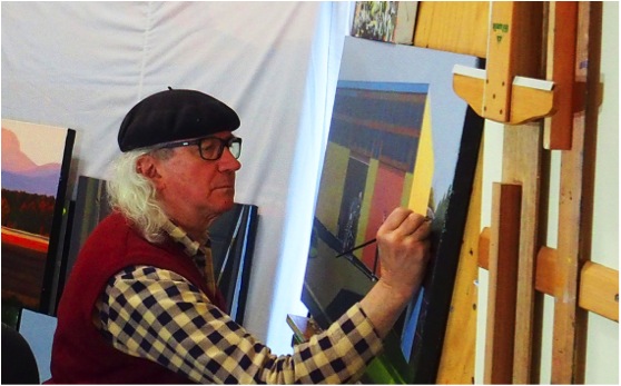
David Lake
Can you explain how you use colour to capture the time of day in your work?
Work is often initiated and inspired by some reflection or catch light; when painting this is emphasised. The vibrant colours of some objects seen are inviting as well. The use of high quality primary colours seems to give a brilliance.
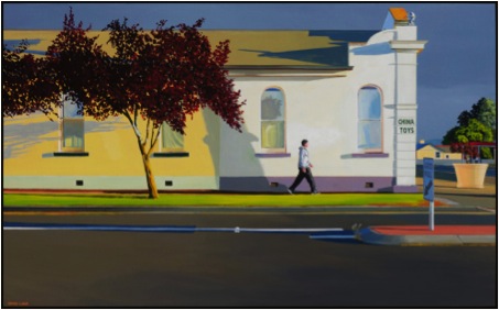
'High on Summer Morning’
Discuss the importance of light and sky in your work?
Light is of great importance; it brings the picture to life. As to sky: it can so often take over. Sometimes I minimise the area of sky within the picture, other times the sky is given weight to contrast with surrounding objects.
You paint things that interest you, your work is not what you know will sell. Can you explain the importance of this in the growth of your art?
Given the advice separately by two well established artists some years ago to ‘paint what you like’, one has discovered the clear direction this has offered, both as to choice of subject and towards refinement in execution. The advice continually grows in significance; it is returned to and referred to often.
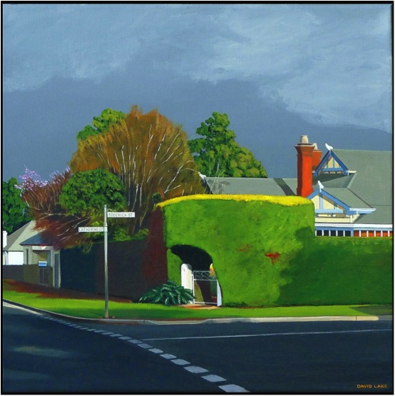
'Sunday Morning'
All artists have high and low moments. Can you explain how both have influenced your work and your career?
Dissatisfaction with work is common and indeed a friend; there is a continual striving to improve, to reproduce the mindful vision, the vision becoming more apparent as the picture evolves. Such is useful, it drives the ‘learning to see’ process. I allow the ‘highs’ to pass; there is always room for improvement.

'Friday Night'
Discuss some of your recent Awards and the value they have given to your artistic career?
Recognition is always a lift. Income from painting sales is useful; I do like to eat!! However, there is a deeper satisfaction that comes from the recognition of beauty in any work. The beauty is not mine, nor can it be owned or attributed to anyone in particular. I believe that beauty exists to uplift; an important organism in a world so often adrift.
When I spoke to you earlier this week, you commented that you had an hours work to do on a painting and this was your priority. Can you explain the timeline you give to your art?
I work most days and often for very many hours, usually working on several paintings at once. Drying time is needed, as is the stepping back and review of a work in progress. Then there is the stretching of canvasses and making frames, all from home milled profiles. Time away from the easel is also enjoyed. I live with a delightful and most understanding wife! She is used to me stopping the car, reversing and leaping out with sketchbook and camera.
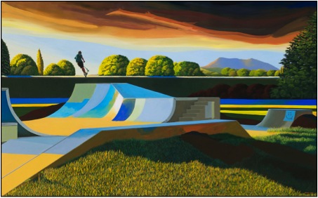
'Air on an Autumn Evening'
What are you currently working on?
I have a solo exhibition opening at the beginning of October this year at Gallery Pejean, (who represent me) I am quite focussed on that. Much to be done and little time!
Size - can you discuss this in relationship to your work?
I really enjoy a size around 61 x 99 cms. It is a practical consideration, as I only have a very small area in which to paint at present. At the moment there are six canvasses around that size and then several up to 2.28 metres wide; it’s crowded. Larger canvasses are a joy however; bring a freedom which invites accuracy and an apparent presence.
'Window, Sphere, Party Hat and Friends'
You also work on portraits, can you take one that has given you great pleasure and discuss this technically?
Particular personalities are often included in landscape paintings. Often people who are seen by many, the folk who give colour to the community, even sometimes those on the margin of humdrum society. In the picture ‘1950 Hobart Road’, a particular well recognised woman is included; she walks almost incessantly around the city of Launceston, pausing in a café here and there for a cup of tea. I expressed interest in painting her to the proprietor of one of her regular tea stops and soon was to meet her in the café. With her permission I sat a few tables away and sketched her, twice. In her slow, deliberate voice she decreed ‘I like that one best, it has more life’; she was right! Having been an artist herself (did not know previously), there was a serendipitous aspect about it all. This is often the way pictures evolve. The composition is established early and remains, unless the picture is painted over. I always attempt to capture harmony in composition. This picture was entirely ‘constructed’: though the house exists with its 1950’s architecture things have been moved around, the car and the 1950’s van added, the bus stop made to be of the period, as is indeed, Merryl
'1950 Hobart Road'
Many of your recent works are from the perspective of the driver. Can you explain how and why you have used this?
Very simply, pictures arise from glimpses seen as one gets about, usually driving. My dear wife says I have a fondness for gutters and garbage cans; there is no dispute regarding this. The modest can be so full of beauty. Beyond the contrast of colour, I enjoy contrast of the made with the natural and bright colours are always a bonus!
'Autumn Lane'
You discuss the special moments, as “that glimpse” can you expand on this in your paintings?
It happens in a flash. Seen in a luxurious moment, the location is often sketched quickly and a snap taken. Usually return to the place ensues and often several times, just to look at aspects of light and possible composition. Pictures are usually constructed to suit composition and therefore could never be photographed.
'Degree of Permanence'
You do both Solo and Group exhibitions, can you expand on the benefits of both?
A Solo exhibition is demanding, as I am seldom satisfied with a work soon after it is ‘finished’. In this regard, as mentioned earlier, the experience drives improvement on several levels. In comparison, the group event even approaches fun! Both are good; best of all is the act of painting, I experience joy in the work.
Tasmania is your home, in many of your landscape paintings you give the viewer a new perspective to a known place. How important is this to you as an artist?
It doesn’t really matter where the place is, as beauty fortunately is not confined. Certainly ‘in the eye of the beholder’, the phenomenon is enjoyed without boundary. Those who seem to be drawn to my pictures are seeing them from within themselves. If they have happen to have worked hard all their lives, accumulated vast wealth and choose to spend it on one, or many of my modest efforts, then I will not argue their choice! The ‘perspective’ is a viewpoint which quietly arrives and inspires; however again, it’s not mine, it is there for all to see.
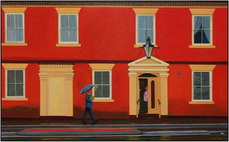
'Earnestly Persuing Universal Knowledge'
You are a third generation Tasmanian. Do you think this connection to place has helped your insight?
Great Grandmother and Grandfather (I don’t recall them), Grandmother, and Grandfather (I found them really interesting) all lived in Tasmania. Father may have for a short while. I do prefer to live here in Tasmania out of all the possibilities in Australia, it is cooler and the sun has a low trajectory - these things suit me. I rather like miserable weather; indeed there are places where I would prefer to live that have far greater miserable weather. However I’m here and, it works.
Contact details.
Via website http://davidlakepaintings.com/
Gallery Pejean http://www.gallerypejean.com.au
David Lake, Longford, Tasmania, Australia
Interview by Deborah Blakeley, July 2014
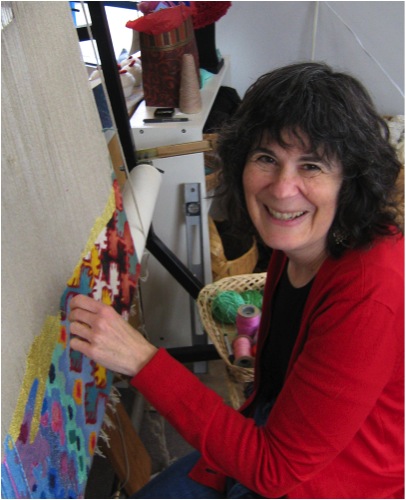
Barbara Heller
Explain how you personally have promoted tapestry both locally and internationally?
The most visible way I promote tapestry is by weaving in the corner window of my studio on Granville Island, an area of Vancouver that many tourists and locals visit daily. For 5 hours a day the studio is open to the public and I and my partners meet and educate people (and sell our work).
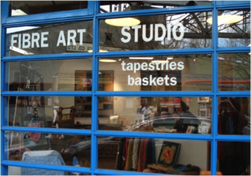
‘Fibre Art Studio’
After teaching myself tapestry in the 1970’s and weaving and exhibiting for a number of years, I ventured out to take a master class in California and to connect with other tapestry weavers at conferences and symposia. In 1992, I was one of five Canadians to be invited to an international event in Poland and was asked to give a slide lecture about Canadian tapestry. The contacts I made through finding artists in every province and soliciting slides of their work led to an informal newsletter and then to the Canadian Tapestry Network newsletter which is published three times a year.
At the Polish conference someone wondered aloud how we could meet again soon and I, not knowing what was in store for me, said I would put on an event in Vancouver the next year. That resulted in Making a Place for Tapestry, several exhibitions, and a book. I do believe that if you want something to happen, you should just plunge in and make it happen.
Also locally, I founded the British Columbia Society of Tapestry Artists (BCStars) a non-profit to support the art of tapestry through lectures and exhibits. Our first project was a large community tapestry woven at the main library in downtown Vancouver and then donated to the Aids Centre.
I have been a member of the [North] American Tapestry Alliance for many, many years and have served on their board and, more recently, as their Distance Learning (mentoring) chair. As tapestry is not a common vocation, the passionate weavers around the world have found each other and formed what my husband calls the ‘tapestry mafia’ – I can travel almost anywhere around the world and find another tapestry weaver to connect with.
Explain briefly the technique you use for your tapestries. Beginning with the cartoon to the final cut off?
For me, the image is always paramount and the method serves the image. I usually work from my own photos, often collaging images together to support the message and emotional impact I am looking for. I then project the images on the wall at a relatively small scale (say 18”x24”) and work out the basics, making many drawings. When I am satisfied, I have the drawing blown up to final size and re-draw to make it weavable. This is the cartoon that goes behind my loom. I know a computer can be used to do much of this but I think that drawing and re-drawing allows me time to know the cartoon intimately before I start to weave.
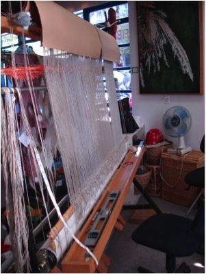
Loom Warped
I weave on a high-warp 6’ loom with linen warp at 8epi though I may weave areas at 4epi to use my hand spun yarns for texture. I hand-dye the majority of my weft yarns because colour is so important to me. I mark my cartoon with the values (light to dark) of the various areas but choose my colours from the wool, not by painting the cartoon beforehand. It can take months and months to weave a large tapestry and intuitively choosing colours keeps me interested and engaged. Thus, I often have to stop to dye a new colour. I believe in serendipity and the unusual solution.
Weaving a tapestry is like building a brick wall. You start at the bottom and weave decreasing shapes one area at a time until you reach the top. That is, if all goes smoothly - and it rarely does. I sometimes have to reweave an area after I progress up several inches as my original idea or colour choices do not work in context.
When the top hem is woven, the tapestry is cut from the loom and left to rest for a few days. Then there is still much finishing work to do and, as I regard my work as woven paintings, I also stretch and frame them.
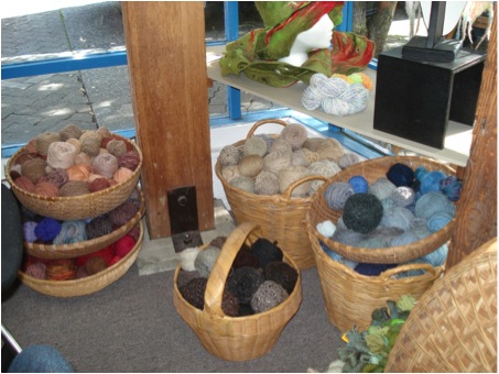
Yarn Baskets
Size, explain the size of your work and why?
Originally tapestries were mural art to warm cold castle walls or educate the public in church, like stained glass windows. I have done some very large commissions for public buildings but now only weave tapestries up to the 6’ my loom allows. That said, it is the image that is important and some need to be small (12”x12”) and some need to be mid-sized.
Expand on your comparisons with tapestry and computers within a historical perspective. Up/down - On/off - Punch cards
The ‘Future Reliquary’ Series deals with three apparently separate but, in my mind, connected histories: weaving, computing, and religion.

'Future Reliquary’
Weaving is a binary system of up/down, just as computing is a binary system of on/off. The first computer was a jacquard loom complete with punch cards instructing the loom to raise or lower warp threads depending on the position of the holes in the cards. The most intricate and expensive brocades could be woven cheaper and faster by machine following a binary code. Weaving was now one step removed from the human hand. Today’s computers are merely fast jacquard looms programmed in binary code, thinking is now one step removed from the human mind.
Religion is not only a story of faith, it is a story of history and social values. In the middle ages, the sale of shards of the bones of saints and pieces of the True Cross became a large commercial enterprise. These holy relics were housed in beautifully sculpted metal reliquaries and displayed in churches to be worshipped as the concrete symbols of faith and history. I am particularly fascinated by the reliquaries that hold the arm bones of saints, shaped like a hand and arm, usually in gold and often encrusted with jewels.
Today, we are creating a new religion, worshipping the technology we have created. Some years ago, I bought a new computer and wanted to recycle the old one, not just throw it in the garbage. Recycling depots for e-waste were not yet in existence, so I took the computer apart to at least recycle the plastic shell. What treasures were revealed within! I took apart a keyboard. I took apart a radio, then a mobile phone, a CD player. I saved the innards, the future relics of the saints of the connected society.
These tapestries depict the future holy status of today’s e-junk in the context of the ancient fabrics that gave birth to the binary system. In these tapestries, one code of up/down (weaving) morphs into the other code of on/off (computing). The pattern of the mother board or silicon chip morphs into the pattern of a traditional ethnic textile - contemporary computer parts as the concrete symbols of the birth of a religion. And the slits in the woven arm as the receptacles connecting the computer tower to the outer world.
Ethnic textiles are still woven all over the world by hand. No machines intervene as the weavers record their personal stories, their faith, and their culture in the patterned cloth. Complex stories are told in simple binary form.
Discuss the importance of location in your work? (using ‘Habibi’)

'Habibi’
Location is very important in my work. The right colours, time of day, part of the world – it must all work together to support the message, the subject of the tapestry.
‘Habibi’ came from photos taken on a trip to Egypt and was part of a projected series of works about children displaced by war (but I only wove two). This young toddler (apparently unaffected by the violence and poverty around him) gazes out at the world while the mother turns away. A gun rests casually against the doorpost and a colourful carriage passes by. What will this child’s future be? Will he rise out of the poverty of his home? Will he grow to be a soldier? Will he travel to a new life? An exotic locale gives us the distance to contemplate these questions, but they apply to everyone everywhere.
Can you discuss your statement, “My themes are becoming more demanding and as the news becomes more depressing, my tapestries are becoming more explicit.”
When I started weaving, my messages were more subtle, hidden within the beauty of the yarn and the images. But since the millennium, as I view the state of the world and become increasingly upset by what I see, my work is more confrontational – dead birds, land mines, plastic pollution, the degradation of the environment. I want to make people stop and think about what they are doing, and perhaps to seek a new way to live in harmony with each other and the earth.
Expand on your use of dead birds and their symbolism in your work?
I have incorporated dead birds in many of my tapestries as a personal icon representing senseless killing by both animals and mankind. The first dead birds that I wove were a series of requiems for the birds my cat was killing and not always eating. As a vegetarian and a pacifist, this carnage was difficult to deal with. As I wove this series, I listened to the radio – news of the first Gulf War on CNN and CBC. Images of dead bodies and of bombs dropped with the aid of remote sensing technology became mixed in my mind with images of dead birds viewed through the lens of a camera. As I sat at my loom weaving images of death, my purpose in weaving these tapestries grew from simple blessings for the souls of the birds to encompass my response to all ritual killing.
'Ozymandias, detail’
I continue to use this image but the dead birds (or parts of birds) now stand for many things. It is a symbol that everyone seems to relate to and view through their own interpretations. For instance, in ‘Ozymandias’ some people feel the bird is an avenging angel while others have said it is coming to rescue the world. I try to work with universal symbols that reach people on many levels.
'Ozymandias’
Can you explain how 9/11 has influenced your work?
I have woven one piece explicitly about 9/11, ‘Still Life…with Bird,’ though acts of terror are a continuing horror. In that tapestry, the skeleton of the world trade centre, the skeleton of a bird wing, and actual bones are all testaments to terrorism as a tactic of war. The orange sky evokes the aftermath of 9/11, the bones evoke museum displays. Bones are precious; they can be buried in a cairn or burned in a crematorium or buried in another sense in a dusty museum drawer. Think of the native tribes seeking to recover the bones of their ancestors. In future ages will archaeologists dig in what was once New York and wonder at what they find? The stories of bone fragments of truly minuscule size being used to trace the person they belonged to through DNA affected me deeply.
'Still Life…with Bird’
You have many exhibitions at the Elliot Louis Gallery can you expand on this particular Gallery’s interest in tapestry?
This gallery has recently closed but still exists virtually: the website is still viable and the owner, Ted Lederer, sells online. I was thrilled to find a local commercial gallery owner who regarded tapestry as an art form and was willing to promote my work. He also exhibited the work of several other fibre artists.
Can you discuss your ‘Cover Up’ Series? How did you choose the 9 portraits in this series?
"We are locked into other people's perceptions of who we are, he thought. We are none of us free to live our lives unseen."
Timothy Findlay in "Pilgrim"
"A man in a uniform...or a man in a robe, for they are the same things, is not a man but a cipher, but a function, but a walking idea; his clothes walk and speak for him. And under cover, who knows who he is or what he does."
A.S. Bayatt in "Babel Tower”
The ‘Cover-Up’ series is comprised of 9 portraits in which the bodies and faces of the people depicted are obscured by their costume. While each stares straight out of the tapestry at us, a sense of tension arises as we strive to make eye contact but cannot. In the absence of facial expression to reveal character, we search for other clues to personality and revert to stereotypes to assign identity.
Canadian Klansman
I did quite a lot of research to find the images, wanting to depict men and women, ethnic and western individuals. I chose the ones that spoke to me most. Some are collaged, some are used with the permission of the photographer, and the surgeon and the bride are my own photos.
I have purposely made the body language of the figures belie the normal interpretation we put on their costumes to increase our level of discomfort. The ‘Canadian Klansman’ presents as an innocuous elfin businessman complete with paunch and old school tie. His hood even has a tassel.
The downtrodden ‘Afghani Woman’ whose chador covers her hands making her even more powerless, stares out in a strong, almost intimidating manner. Even though we cannot see her eyes, we are moved to lower our own.

Afghani Woman
The ‘French Foreign Legionnaires’ stand in fashion model poses. I wanted to make the viewer stop for a moment and open a dialogue with these covered-up individuals. If the stereotypes are not true, who are these people?
French Foreign Legionnaires
In times of terrorist attacks and racial profiling, can we afford to “judge a book by its cover”? Genetically programmed to make split second decisions as to whether an individual is friend or foe, I hope the viewers’ thwarted assumptions lead them to take a few more seconds to question their reactions.
Can you discuss background in your work, e.g. ‘Bedouin Woman’
In tapestry one weaves the background and the foreground at the same time. One is not superimposed on the other and so both have equal importance.

Bedouin Woman
In the ‘Cover Up’ series I tried to create backgrounds that would provide context for the figures and enhance the message. In ‘Bedouin Woman’ the background is woven in warm tropical colours in shapes reminiscent of palm trees; in ‘Canadian Klansman’ the background is fire - the world is ablaze; in ‘Afghani Woman’ she stands before a cold grey stone wall like a prison.
Discuss your passion with stone, stone walls and your tapestries?
I have always been drawn to stonewalls, especially ones made without dressing the stones or using cement - walls, often from ancient ruins, that could crumble and no one would ever know they had been there. Whenever we travelled I would photograph them. To me they were symbols of man living in harmony with his surroundings and I saw the spirit of the makers in them. This idea led to a series where I placed a transparent figure, often taken from old family photos, in front of a wall. And as I said above, weaving a tapestry is like building a stone wall so I can smile at the idea on a meta level as well.
Stonewalls #20 Stonewall Blues/p>
On a more mundane level, I love their abstract nature. My hand-spun, hand-dyed yarns is perfectly suited to translate them into tapestry. Weaving stones gives me the opportunity to play with colour and texture and these tapestries are a wonderful break from more depressing subjects.
This spring, after working on three large works about the environment for a solo show, I wove two more stonewalls, bringing my total to twenty-two.
How important is poetry to the inspiration of your work?
Reading both prose and poetry often inspires a work or seems relevant to illustrate an idea. My husband writes poetry and there are several of his poems about my tapestries on my website. They give the tapestries another layer of meaning.
Discuss the work, ‘Shiva Dances’
‘Shiva Dances’ is based on Hubble telescope images of a distant nebula. Nebulae arise from black holes, the site of both the destruction of stars and their creation. Shiva is a Hindu God/Goddess often depicted dancing; she is goddess of both creation and destruction, as the two are inextricably intertwined and are constantly evolving one from the other (yin and yang).
‘Shiva Dances’
These days, all we seem to read about is destruction. I feel life is a cycle and we need to find ways to turn this destruction into an opportunity of new creation, into a more harmonious way of life.
Tell us about the changes that have taken place in your work through three images?
All the Diamonds (1982) | The Last Resort (1992) | Detritus (2014)
I work in series: sometimes several tapestries in a row explore a theme, sometimes a theme recurs over and over again through the years (as in the Stonewall series). In a previous artistic incarnation I was a printmaker, but I became allergic to the chemicals and had to abandon the medium. Tapestry was another way to make images and explore ideas and my first tapestries were very graphic in nature. I wove landscapes (or seascapes) as in ‘All the Diamonds,’ a commission for a law office. Here three photos from three different perspectives were collaged together with imaginary elements to reinforce the beauty of sunlight on the ocean.
In subsequent years after the birth of my son, I was drawn to family history, family stories, whether true or misremembered, and old family photos. ‘The Last Resort’ is based on a photo my father took of his father when he was on a family vacation at the age of thirteen. I loved the gesture my grandfather made to ward off the budding amateur photographer and it became, for me, a symbol of the old order trying to ward off the new.
‘The Last Resort’
The title is a pun as is that of its partner piece, ‘Right of Passage’ which is also based on a photo taken by my father on the same day. In that tapestry, space has opened up between the bathing tents and my uncle looks at the viewer and at a new life.
My current work arose from my concern over what we are doing to our environment. ‘Detritus’ is based on photos I took four years ago as I walked along the beach beside Caesarea in Israel. I had visited there many years before and the crumblingstones of the ancient site had inspired a series of tapestries of transparent people against stone backgrounds. Now, though, I found the spirituality of the place desecrated by the bits of plastic intermingled with seashells and stones. Over the centuries, the site had seen invaders come and go over; they had built imposing edifices that could crumble into dust and be reabsorbed by nature, but today’s plastic will take millennia to disintegrate. I added a feather as my call to attention, a remnant of my dead birds, a reminder of the fragility of the ecosystem. We are all detritus thrown up on the beach.
‘Detritus’
Explain how and why you use windows in your work?
I am drawn to doors and windows, the liminal area between two actual places or spiritual states. A door or window is a frame to isolate a figure or emphasize an act. It is an entry point for the viewer who cannot see the other side and can therefore let their imaginations roam. It is a link between worlds.
In ‘Sarah Rebecca,’ for example, a woman larger than lifesize is framed by the window of a shack found in the American Southwest. She is from another time and place judging by her clothing and hairstyle. How did she come to be there? Is she real or a ghost? She represents all the people dislocated from home by fear or hope. They have travelled through time and space to find a better life and their spirits linger on in their homes and in our memories.

‘Sarah Rebecca’
‘Dreams –Left Window’ and ‘Visions – Right Window’ are the outer panels of a triptych inspired by slides I took in the old Jewish quarter of Krakow, Poland. The tapestries deal with the power of memory to distort and to preserve and to keep a culture alive. The windows in the tapestries with their broken glass and crumbling wood are peopled by the spirits and stories of the generations who inhabited these now-disintegrating buildings. The woman on the left is from a photo by Roman Vishniak, the man on the right is my great-grandfather. They are all our ancestors who live in our memories.
‘Dreams – Left Window’
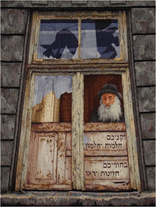
'Visions – Right Window’
‘New Art of the Loom’ is group show curated by Dirk Holger, who arranged the tour and who is also publishing a book of the same name. He invited people to send him slides of large scale tapestries and chose work from that submitted. The weavers come from many countries and continents and only shipping costs have prohibited the exhibition from travelling outside North America.
‘Falling from Grace’ is a solo show curated by Barbara Duncan and includes all my tapestries dealing with bird imagery as well as a few others. She liked my work and invited me to show in her public gallery and the tapestries in the show were chosen by her. It is currently on exhibit at the Maple Ridge Art Gallery (until the end of July) and we hope to have it tour to other venues. There is a catalogue available with curatorial and critical essays and images of the work in the show.
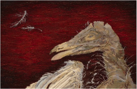
'The Patriot’
Contact details.
bheller@telus.net
www.barbaraheller.ca
Barbara Heller, BC, Canada
Interview by Deborah Blakeley, July, 2014
Ben Greenberg
You thank the birth of your son for the start of your photographic life. Would you expand on this?
When my oldest son, Jeff, was born in 1970, I had had no experience at all with photography. Like any new father, I wanted to photograph my son. I didn’t even own a camera. So, my brother-in-law came through for me, lending me a Kodak Retina C. This was a basic camera without a single automatic feature. I had to learn photography from scratch and I had to do so quickly. I became fascinated with the process and it wasn’t long before I purchased an inexpensive used camera that allowed me more flexibility with its three lenses. I started photographing not only my son but the world around me, especially when I purchased a new 35mm Nikkormat in 1972. I was beginning my journey in photography.
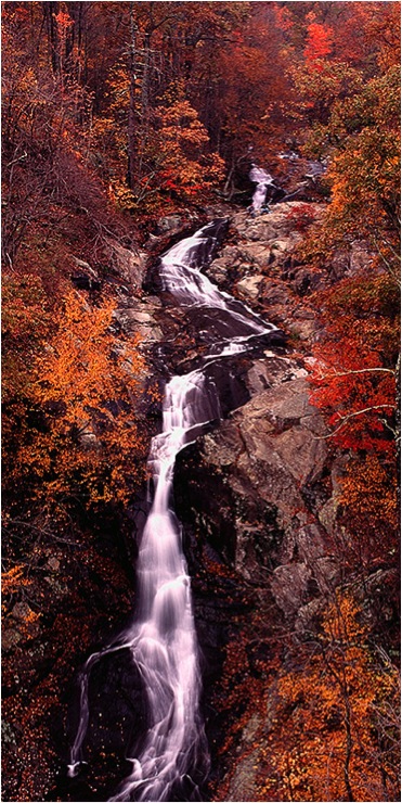
'Whiteoak Canyon Falls No 1, Shenadoah National Park, Virginia’
In the past forty years as a photographer, there have been great technological changes. How has this impacted your photography?
You are absolutely correct about the great technological changes in the field of photography during the past forty years, but even my shift from 35mm photography to medium format photography with a Pentax 67 camera system pales in comparison to the shift from film to digital photography. I made that transition to digital photography in two stages. I was very cautious about this shift. I was getting such wonderful quality with my medium format slides that I didn’t want to take a step backwards.
In 2003 I purchased a computer and a printer that would allow me to work with scans of my slides. I quickly recognized the wonderful advantages of the digital darkroom over the traditional black and white and colour darkroom that I had for more than thirty years. This was particularly true for the preparation and printing of colour photographs, which I had done previously with the cibachrome process. For the next four years I scanned my slides with a rented and later purchased Minolta Dimage Multi-Pro scanner and I printed them on my Epson 2200, my first colour printer. I soon realized that with my medium format slides, I wanted to have the capability to print my images larger than the 2200 printer would allow.
I purchased the Epson 7800 printer that allowed me to make prints that were two feet by whatever length they needed to be. I was thrilled with the printer and wondering when I would be comfortable shifting to a digital camera system. Two events in the summer of 2007 conspired together to help me overcome the last hurdle; that of shooting digitally. I contracted with a real estate developing company to photograph their new community they were building. I realized that it would be faster and easier to do the shooting and meet their needs with a digital camera. It just so happened that Nikon had just brought out a new full frame digital camera, the D700. This 12.3 megapixel camera was less expensive than a number of other full frame cameras, I was unsure if it would give me the quality I demanded of my photographs. I decided I would need to conduct a test.
I shot the same outdoor scene with my Pentax 67 system and with the Nikon D700. I processed each set of images normally and prepared large prints from each. The results went far beyond what I expected. The prints from the D700 were sharper, had a wider tonal range than the photographs from the Pentax 67 and they had a perfect colour balance. I was immediately sold on the new Nikon and I immediately began my shift to becoming a digital photographer. I have since expanded my camera system with the Nikon D3x and its 24.5 megapixels and a set of lenses for my landscape photography.

'Blue Mountains’
Can you discuss how so many people do not realize the time it takes to get just the right shot?
I love finding new locations to photograph, locations that have great potential for the dramatic photographs of the natural environment I seek. Finding out about such places and researching them helps me prepare for the opportunities of photographing them. When I explore a location for the first time trying to take advantage of the early morning or late afternoon light, I feel very fortunate when all the elements of a dramatic landscape photograph come together at just the right time for me. It is even possible that I am able to find several possible images at the same location and of the same subject matter. Unfortunately, such opportunities don’t always present themselves. It is quite common that I recognize the potential for a wonderful image at a specific location but I must visit that location numerous times before the light, weather and subject matter come together in a way that inspires an image worthy of sharing with others. There are specific locations in my book, Natural Virginia,that I visited numerous times over eight to ten years before I captured the moment I had been seeking. There are other images in the book that were the result of several hours of waiting until the light was just right. There is little doubt that landscape photography has taught me the very important practice of patience.

'Chincoteague Bay Sunset’
While you are well-known for your landscape photography, can you discuss your architectural photographs?
Over the years I have recognized that while natural landscapes are my first attractions for photographing, I also enjoy finding unique images that feature architecture. This is primarily true of the University of Virginia, where I graduated from college and also attended graduate school. The University features unique architecture that is recognized around the world as the product of Thomas Jefferson, our third President and former resident of Albemarle County, which surrounds the city, Charlottesville, where I live. Just like natural landscapes, photographing architecture requires an interesting subject, strong lighting and positive weather conditions to be able to obtain a photograph of which one can be proud.

Would you explain the importance of timing in your work with the example of your image titled “Great Blue Heron on a Misty James River, Richmond, VA"?

'Great Blue Heron on a Misty James River, Richmond, VA’
One might not realize how critical it is that one is photographing at just the right time for a special image. A good example is what has become my favourite photograph and one that is on the cover of my book. This image features a beautiful misty portion of the James River that runs through Richmond, Virginia. The sun had not yet come up. In fact, when I arrived it was still so dark that I needed to use a flashlight to find a spot along the river where I wanted to set my camera and tripod. I set my camera up pointing toward the place where I expected the sun to eventually rise.
Before long it became light enough for me to see a great blue heron who was approximately fifty feet away and walking back and forth across a ledge in the river, apparently fishing for his breakfast. I had been to this spot other times but I had never seen a heron exhibiting that behaviour before. The conditions were perfect for a beautiful photograph except for one problem. The light was dim and I needed a faster shutter speed if I was going to be able to obtain a photograph of the heron where it would be recognizable and sharp. The heron’s movement would have ruined a photograph shot with a slow shutter speed.
Under those circumstances, fearing that the great blue heron would fly off, I decided to begin shooting with my film camera (this was approximately ten years before I converted to digital photography) and hope that I could time a photograph when the heron was moving only minimally. The film I was using was faster than the ones that I usually used, so the slightly higher shutter speed it permitted gave me hope. The only problem was that I only had one roll of that film which would give me twenty-one shots. I took those photographs and when I finished, unlike when one is shooting digitally, I did not know if my efforts would result in the photograph I sought. I wouldn’t know until the next day after the film was processed that I succeeded in getting the special shot I sought in the very last frame of the roll.
As you also work in black and white photography, why and when do your use this approach rather than colour?
Early on in my photography career, I was primarily a black and white photographer. I loved taking photographs with black and white film and translating the colours of the natural scene into dramatic shades of black and white and grey. I exhibit and show primarily colour images these days and my book, Natural Virginia, only has colour panoramas of my home state’s natural environment; however, I have never lost my interest in black and white images. In fact, I plan to focus some serious time on my black and white work this year. Interestingly enough, now instead of shooting black and white film, I can photograph the scenery in colour with a digital camera and modify the images in software so that they can be converted to black and white. It is not a difficult process to do but I think it can be difficult to convert the colour photograph into a really strong black and white image. That can take some significant time, effort and experience.
In this way, I can have the same photographs in both colour and black and white, and I love how so many scenes can look wonderful both ways, sometimes for different reasons. When I was shooting with medium format film from 1982 to 2007, I frequently loaded colour slide film in one Pentax 67 and black and while film in another Pentax 67, and I would photograph some scenes with both. The black and white photographs allowed me to focus my attention on the light, composition and subject matter without being overly influenced by the natural colour. Things have changed so that I can now shoot in colour and be able to enjoy the image in black and white as well.

'Ravens Roost in the Afternoon Light’
Can you show and discuss one of your photographs that you feel symbolizes Virginia, its long history dating back to 1607 and the state where eight Presidents have been born?
I believe Virginia and Ohio are the two states from which the largest number of Presidents have come, eight each. Virginia does have a remarkable history, one that features the very beginning of the permanent European settlements in North America. The foundation of our country literally began here.
The places that represent the history of the United States, places like Jamestown, Williamsburg, Richmond and the like, continue to attract photographers who seek to capture those aspects of the state. While I have experimented in such photography, it has not been a significant focus for my work. The primary exception to that statement is the University of Virginia, where I went to undergraduate and graduate school.
The University was founded by Thomas Jefferson, our third President and one who lived in the community in which I live. It is a highly respected public university, one of the best in the United States, but what still attracts me to the school is its remarkable architecture and the joy I have in photographing it. The Lawn, around which are the original buildings (for example, the Rotunda) and living quarters for professors and students are the best known visual elements of the University and ones that I never tire of photographing. I did maintain some self-control and only included one image of the University in Natural Virginia.

'Fall Panorama on the Lawn, UVA’
Can you share with us how the photographs in your book, Natural Virginia, illustrate the four seasons in your home state?
Not only am I fortunate to live in a state that has remarkable diversity in its environment, I feel even more fortunate to live in one that features dramatically different seasons during the year. I love being able to photograph Spring, Summer, Fall and Winter, all in my own community and throughout the state. I have included four images below that represent the four seasons of the year found in Natural Virginia. Each one also represents the important qualities of my panoramic landscape photographs and the differences that are so visible at different times of the year.
"Little Stony Creek in Spring, Giles County, VA"
'Little Stony Creek’
Discuss the image, its location, composition, the importance of timing and lighting and other important aspects of the photograph:
“Little Stony Creek in Spring, Giles County, VA” was photographed early one spring morning in southwest Virginia after a drive from home that was approximately three hours long. I knew if I could reach the trail that led to the creek not long after sunrise, the mountains on both sides of the creek would provide the perfect shady lighting conditions with no bright highlights created by the sun. In that light and with the need for a small aperture setting on the camera to give me maximum depth of field for sharp focus, I also knew that I would be able to shoot with a slow shutter speed creating a silky look to the flow of the water. I particularly liked being able to compose the photograph from a bridge crossing the creek, allowing the water to flow straight to the camera. The other important element of the photograph is the spring green colour of the leaves on the trees. I love to see the variations of that colour during that time of the year.
“Almost Sunrise on a Pond, Stanardsville, VA”
'Almost Sunrise on a Pond, Stanardsville ’
Discuss the image, its location, composition, importance of timing and lighting and other important aspects of the photograph:
“Almost Sunrise on a Pond, Stanardsville, VA” was shot just before sunrise on a clear summer morning. I had discovered the pond on a recent drive when I was scouting for possible locations to photograph. I came across this pond when I was driving through the town of Stanardsville on the main road. I pulled over and determined that the pond had the potential for an outstanding photograph for several reasons. First, it was easily accessible for shooting just off the road. Second, the pond was high in elevation without trees or anything else that would prevent the sky from being reflected and visible in the pond. Third, I determined with my compass that the sun would rise each morning directly behind the pond. These things coupled with the beautiful setting of the pond with the dock and the trees that would be visible reflecting in the lake convinced me that there was great potential for a wonderful photograph. The pond was at least a half hour from my house, so I woke up early and drove there well before sunrise. I set up my camera and tripod and waited. Before long the sunrise began to light up the sky, creating colourful reflections in the pond. Composing the image in the camera was a simple matter given the elements around the pond. I love the serenity of the scene I captured.
“Early Fall Morning from the Blue Ridge Parkway, Nelson County, VA”
'Early Fall Morning from the Blue Ridge Parkway’
Discuss the image, its location, composition, importance of timing and lighting and other important aspects of the photograph:
“Early Fall Morning from the Blue Ridge Parkway, Nelson County, VA” was shot from one of my favourite overlooks on the Virginia portion of the Blue Ridge Parkway. It was shot during the peak of fall colour in Rockfish Valley, which is surrounded by the Blue Ridge Mountains. Being there shortly after sunrise with the warm sunlight from the east permits one to capture an image with almost perfect side lighting that creates shadow patterns that add significant interest to the photograph. This lighting, which adds to the fall colour, gives a greater sense of depth and perspective to the photograph.
The composition is simple to achieve as I let the natural patterns of mountains that almost surround the valley create a perfect frame for the pattern of farms below. The fact that this location is within thirty minutes of my home makes it even easier to capture and enjoy the photograph.
“Snowstorm Panorama on Pantops Mountain, Albemarle County, VA”
'Snowstorm Panorama on Pantops Mountain’
Discuss the image, its location, composition, importance of timing and lighting and other important aspects of the photograph:
“Snowstorm Panorama on Pantops Mountain, Albemarle County, VA” was difficult to obtain due to the winter weather conditions that I was encountering. Early one afternoon in my hometown there began an intense snowstorm that was expected to last several hours at least. I immediately went to a nearby location with a natural environment that I hoped would provide me with some outstanding scenery to photograph. When I arrived I was delighted with the opportunities to photograph that lay before me. The snow was falling with such intensity that there was already the look of a winter wonderland. It was such a heavy snowfall that there was no colour in the area to be seen. The snow converted the entire scene to the look of a black and white pen and ink drawing.
I obtained several strong photographs that afternoon, this image is particularly pleasing to me. I went to a location that gave me a clear view of this line of trees that I had photographed previously in fog one fall morning. It was a relatively simple photograph to shoot once I got my camera and tripod set up properly in the correct location so that the composition was properly set. The intensity of the snowfall caused me to use an umbrella to protect the camera from the moisture. Making sure the line of trees was level in the photograph was particularly important. The exposure was also important because I wanted the snow to be white but not too bright. Because I wanted enough depth of field with a small aperture and the fact that the light was dim during the snowfall, my shutter speed had to be set slow enough for a correct exposure, thus helping to yield subtle streaks of snow throughout the image.
Discuss how important it is for you to help preserve Virginia’s scenic wonders?
I think my photographs can be enjoyed on many levels, but one of the most important is helping people understand not only how important it is to celebrate the natural environment but also its preservation. We live in an endangered world. We live at a time when we are beginning to wake up to the potential environmental dangers we face, but we have to wonder if it is too late to act and prevent those dangers from becoming a reality. I want people to recognize the importance of protecting our natural resources. I want people to recognize that they can make a difference in our efforts to do so.
I am very proud of the fact that nine state wide environmental organizations in Virginia, the organizations that are making a significant difference in our environmental protection efforts, have all expressed their support for Natural Virginia, and they have been kind enough to purchase copies and help inform their members and supporters about the book. They recognize the contribution the book is making to our environmental movement. In return I am also making my images available to the organizations for them to use in their marketing and public education efforts. I feel this is just one way that my photographs can help make a difference. This means a great deal to me.
I dedicated Natural Virginia to my two sons and five grandchildren. I did so expressing my hope that they and future generations will be able to fully experience and enjoy the environmental treasures that inspired me to create the book.
Would you discuss why your photographs reflect minimal human contact?
I like to say that I enjoy photographing Mother Nature at her finest. Minimizing the possibility of people being in my photographs would be consistent with that approach. If I am going to photograph the natural environment while minimizing the impact of humans on that environment, It seems to me that my photographs should limit to the extent possible people actually being in the photographs. In some cases I cannot avoid a person being in a photograph or an object that is manmade. In such cases, there may be a recognizable size that does add significant information to the viewer. This helps one understand the actual dimensions of that which is photographed. That isn’t always important, but there are landscapes I photograph in which that would be informative to the viewer. In one of my photographs, I have a truck on a spit of land going out into a lake. While I would prefer not having the truck in the photograph that was not possible at the time and its inclusion gives a real sense of scale to the photograph. I have a waterfall photograph that is not in my book that has two persons sitting on a large rock near the top of the waterfall. It is difficult to understand the height of the waterfall without their presence, but they are so small in the image that it is extremely difficult to even see them. So, while I want to minimize the presence of people so as to not interfere with the viewer’s appreciation of the image, I do understand that such presence can, under certain circumstances, add valuable information for the viewer.
“I have a love affair with the state of Virginia. I treasure its natural and remarkable diversity.” - Ben Greenberg.
Can you discuss the diversity of Virginia and how it is reflected in Natural Virginia?
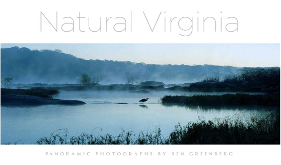
I want to say how fortunate I am to live in a state that has the diversity of natural environments worthy of photographing that Virginia has. We have the Eastern Shore that is not connected to any other part of the state with the Atlantic Ocean to the east and the Chesapeake Bay to the west. Further west is the mainland of Virginia. There is the Tidewater area with its many rivers that are tidal up to the fall line, then the large Piedmont area in the middle of the state (Piedmont meaning foothills), the range of the Blue Ridge Mountains immediately west of the Piedmont, the famous Shenandoah Valley west of the Blue Ridge, and the Alleghany Mountains at the border of Virginia and West Virginia. Each of these natural environments and their significant differences provide the photographer with almost totally different experiences in trying to capture memorable images, images that represent the essence of the state that I have always called home. This diversity gives the landscape photographer wonderful opportunities, in fact virtually unlimited opportunities to photograph. I feel very fortunate indeed to live in a state like Virginia. While there are other states on the east coast of the United States with some similar characteristics, I don’t think any other state has the full range of photogenic scenery found in Virginia and it is clearly reflected in the 122 photographs found in Natural Virginia.
Contact details.
Ben Greenberg
Email: ben@bengreenberg.com
Websites: www.bengreenberg.com
www.naturalvirginiabook.com
Ben Greenberg, Virginia, USA
Interview by Deborah Blakeley, June, 2014
Lan-Chiann Wu
Can you discuss your East and West arts education and the fusion of both in relations to your BFA with highest honours from Taiwan and your MA from New York University?
Throughout my study in the fine arts, I have worked with different paint media, such as watercolour, oil and acrylic paints both in Taiwan and in New York. However, I discovered that I have strong connection with ink painting. Ink painting allows me to express a deeper meaning that goes beyond the image you see. This is the same way with poetry, which has deeper meaning beyond the rhythm and beauty of the words. Ever since I was very young, I have been attracted to western painting, especially with regard to the use of perspective, light, and representation of volume.
At the Chinese Culture University, I was trained in the ancient tradition of ink painting. It is very typical in this field that artists first learn from studying and copying old masterpieces. The traditional way of learning Chinese ink painting encouraged artists to use their own wisdom to understand the spirit of the masters and then, over the years, use that knowledge to become independent, so that the artist eventually would make his/her own creative work.
Studying art in New York City rounded my artistic formation and gave me the opportunity to further explore blending Chinese ink painting with Western modes of representation. Both Western art and Chinese art have unique qualities, which I equally value and embrace.
To me, art is a universal language. Art is often an unspoken language, which can be understood intuitionally by people across time, space and culture. Making painting is a calling to me, and creating work that focuses on the significance of universal humanistic values is my mission. I hope my work provides people with a moment of contemplation on the beautiful and meaningful moments of life.
Discuss how your earlier training as an assistant under Au Ho-nien influenced your training?
One of my high school teachers suggested that I seek out the Chinese Culture University in Taiwan, which at that time, had one of the best painters in the country, and I chose to learn from him. His name is Au Ho-Nien, and is one of the greatest living masters of the Lingnan School of painting. I studied four years with him. He is a great master, who is still very active in the field today. I was very fortunate to have been his student. I also had the opportunity to study with other masters at the Chinese Culture University in Taipei, who taught me several different styles of ink painting that included very fine, detailed brushwork.
I have had several excellent teachers who helped me advance my painting skills and understanding of life. In particular, my mentor, Au Ho-Nien, has been extremely generous in this regard. In my earlier work, Solitude (1994), you can see the influence of his Lingnan style artwork in mine.
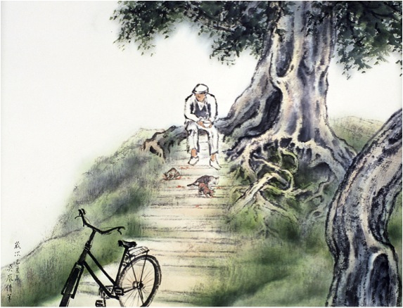
As I mentioned before, I have always been attracted to the use of perspective and light, more commonly found in Western painting. Therefore, in some of my earlier work, you can see a mixture of Lingnan and Western schools as, for example, in my work Old Street in Sanxia, which I created while I lived in Taiwan in 1993. Today, I have moved on from Lingnan, not because I reject it (in fact I think it is incredibly beautiful and expressive), but because I wanted to find my own direction.
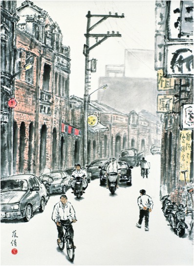
'Old Street in Sanxia’
One of your older paintings ‘Old Street in Sanxia’ (1993) reminds me of similar work by He You-Zhi, ‘Long Tong Life in Old Shanghai’. Please discuss?
In my work, I am often influenced by my direct surroundings. In addition, I have always been attracted to the use of perspective. Therefore, in some of my earlier work, you can see a mixture of Lingnan and Western schools as, for example, in my work Old Street in Sanxia, which I created while I lived in Taiwan in 1993. .
Sanxia is a village in Taiwan, which was strongly influenced by European culture. In a historical context, Sanxia is similar to Old Shanghai in China. I can see how my work Old Street in Sanxia reminds you of He You-Zhi’s ‘Long Tong Life in Old Shanghai’.
He You-Zhi’s ‘Long Tong Life in Old Shanghai’.
Your work centers around the exploration of Chinese Ink Painting. This brings with it great historical skills and techniques. Can you discuss one aspect: ‘Brushes’ the different shapes, sizes and hairs that you use?
In the Chinese ink painting, the quality of the brush stroke carries tremendous importance. It has to be strong and controlled, yet dynamic, fluid and delicate. Painting on mulberry paper with watery ink requires absolute mastery of the medium, because mistakes cannot be corrected. Any errors are unforgiving; the moment a brush touches paper, ink is absorbed and what has been painted cannot be undone. Consequently, in this medium, free expression can only be achieved through mastery of the medium and techniques. More than a thousand years ago, Chinese landscape painter, Kuo Hsi (ca. 1020-ca.1090) summarized this up as: “a painter should be master over, and not a slave to, his brush and ink.” The quality of Chinese brushwork is another aspect that makes ink painting so special to me.
There are mainly three types of brushes that I use; soft brushes made of sheep’s hair, mixed hair brushes made of deer and wolf hair, and hard brushes made of horsehair. I use various sizes and shapes of these brushes in my work, depending on the subject matter and expression that I wanted to achieve in my painting.
You sometimes teach and demonstrate Chinese Ink Painting. Can you discuss the importance of explaining this technique to both other artists and others interested in the arts?
In looking at ink painting throughout Chinese history, I find the depth of content and the strong personal connection the painters had to their subjects deeply fascinating. The renowned Six Dynasty Southern Song (375-443) landscape painter and philosopher, Zhong B’ien said: “I am here surrounded by creation, my eyes see the things that surround me, that’s why I paint the shapes captured in my heart, that’s why I paint the colours I feel in my heart.”
For me, the essence of Chinese ink painting remains exactly as the ancient masters described it; not an actual representation or an imitation of nature, but rather nature represented through how the painters experienced it through their souls. The intellectual painters of China made a conscientious effort to represent nature according their own values and aesthetic principles. In each of my paintings I develop a meaningful relation with the subject matter, and express my response with ink on paper. I consider my work sometimes as “mindscapes”. For instance in my 1994 painting Memory of My Roots, the scene is of my grandmother’s birth village. I was always very close to her, and the subject is therefore deeply personal. However, I did not paint the actual village, but rather how I felt the connection with this special place.
'Memory of My Roots'
So, when I speak to people about my art, this is the very essence of what I want to convey.
One of your earliest talks was related to ‘Imaging the Orient’ at the J Paul Getty Museum in LA. Can you briefly discuss this topic?
In 2005, I was invited to give a ‘Point-of-View’ artist talk to discuss the ‘Imaging the Orient’ exhibition at J. Paul Getty Museum in Los Angeles. ‘Imaging the Orient’ was quite a fabulous exhibition. It showed how the visions of exotic lands fed the imagination of 18th century Europe. The exhibition explored how European artists were influenced by Asian art. They adapted motifs in imaginative and whimsical ways to produce Chinoiserie, a French term for objects that are decorated with Western fantasies of the exotic East.
I was particularly fond of discussing a pair of ewers (Chinese porcelain with French mounts, about 1745-1749, the maker unknown). These two Chinese vases were enriched in Paris with gilt bronze mounts to adapt them for a fashionable French interior. As I had discussed with the audiences, the original objects were two hard-paste Chinese porcelain vases with minimal decoration; simplicity and elegance from the height of the Qing Dynasty. The heavy and highly decorative French mounts completely changed the intent of the original maker. I found the different cultural aesthetic values and needs deeply fascinating.
How do you view linking the past and present, through your art?
I have always been fascinated by the universal values and principles of life that are inherent to every society. Over the past two decades, I have created a body of work inspired by themes that connect people across place and time. My paintings are often inspired by the work of others, who share similar values, for example, in a poem, a story, or a novel. A good example here is a painting I made in 2009 that is based on Night Thought, a poem by Li Bai (701-62).
“A bright moon shines before my bed,
I wonder … is it frost on the ground?
I raise my head and gaze at the moon,
then lower it and think of home”
I named this painting Li Bai’s Moon. As Northern Sung dynasty Landscape Painter Kuo Hsi said, poetry is a picture without form and a painting is a poem with form. When I read Li Bai’s Night Thought, I wanted to picture his poem, as his words vividly described an image before my eyes. Night Thought emphasizes the umbilical connection that we have with our roots; it is a universal theme. What really captured me is that after 1300 years, the poem’s meaning still remains current, as we will always be connected to our roots no matter what century we live in.
‘Li Bai’s Moon’
Your work is not restricted to China and Taiwan as seen in ‘Reflections of the Past’. Please discuss?
The recurring use of light, or sometimes only glimmers of light, in my work are metaphors for human resilience: the love, hope, and strength that we each person carries within. It is a central theme in my art. My painting Reflection of the Past (1999) is a good examples. Resilience is an innate strength we all share, which helps us during each phase of our lives.
‘Reflection of the Past’
Reflection of the Past was inspired by the Japanese summer festival of remembrance, called O-Bon. O-Bon is an annual reminder of the importance of family ties, of respect for those who have gone before us, and of the brevity and preciousness of our lives together. Japanese people welcome home of the souls of deceased family members by floating paper lanterns on water. I am keenly aware that everyone carries within his or her souls memories of past love ones like precious glowing lights, see for example Precious Light (2012). I believe that it is a universal feeling that I expressed with these painting through the use of lit lanterns.
‘Precious Light’
Discuss your work in relation to distance that separates you form your birthplace?
Much of my inspiration comes from daily life, but always centres on universal humanistic values and themes. In my work, I seek to create a connection between people and place. My creative ideas often inspired by my direct environment, such as when I lived in New York. For example, my painting Snowflakes Quietly Descending (1999) was made in Manhattan, New York City, where I then lived.
'
Snowflakes Quietly Descending’
‘Snowflakes Quietly Descending’ does not appear Asian, but still it gives this feeling, could you explain this?
The painting Snowflakes Quietly Descending is a view of Fifth Avenue looking south from the Guggenheim Museum on 89th Street. In this particular painting, I aimed at capturing a quintessential New York City ‘landscape’ during a light winter storm. I used to live close to the Guggenheim, and the painting expresses my love of the city. A Broadway actor, who lives on the Westside, collected Snowflakes Quietly Descending, and I feel therefore that a part of me never left New York.
I stood in the snow and watched the snow falling on me for several days. I was observing the scenery, making sketches, taking notes, and was experimenting with painting techniques. Then, I brought my study materials back to my studio to complete the composition. The original work is quite large, so when you stand in a certain angle it is as if you can walk into the avenue. While I captured the scene on Manhattan, I developed a feeling for the city analogous to how painters of the past described their connection to places, such as philosopher Zhong B’ien said in the 5th century
‘Li Bai’s Moon’
Another good example here is a painting I made in 2009 that is based on Night Thought, a poem by Li Bai (701-62). For this work, I sketched an old tree that I walked by every day here in Los Angeles.
Could you discuss ‘Lantern Festival I’ in relation to darkness and light?
My painting Lantern Festival I, which I made after a visit to Florence in 1997. Fascinated by the architecture of the city, I made several sketches looking down from one of the widows of Palazzo Vecchio. To express my special feeling for the city, I tried to give this painting a mesmerizing quality by creating a night scene. I tested this effect with charcoal and a basic composition, before I completed this painting. During the creation of this work, my imagination brought me to my childhood’s favourite festival in Taiwan. At that particular moment, I realized that no matter which city (East or West) you visit, a city’s energy is universal, and that is what I wanted to express in Lantern Festival I. This painting too, shows my interest in perspective and light, and illustrates that I make conscious connections between people and place across cultures.
'Lantern Festival I’
Your project, 'Cycle of Life' is to consist of sixteen paintings. Could you explain the project and its basic concept, and elaborate on the relation to the four seasons and the stages of human Life?
Inspired by John Keats’s sonnet The Human Seasons, Cycle of Life will consist of sixteen large-scale ink paintings, designed as four groups of four paintings each. Each group represents one season of nature, which I will use to juxtapose the human stages of life.
In Cycle of Life, I will explore the human seasons to create a visual context for the different stages we pass through in life. In this project, I will use the rhythm of nature as an allegory for the human cycle of life. That said, I envision the season in my very personal way. For example, I may imagine Spring, as human beings coming to this earth with unknowing destinies, similar to an early morning that announces a day filled with expectation. To explore this idea, I used my sketch Leading the Way Home (2004) as a base, and developed it into a study for Spring called A New Dawn.
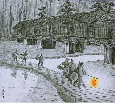
'Leading the Way Home’
Spring: Birth and Renewal
Spring: Birth and Renewal;
Summer: Exploration and Growth
This stage of life is a playful period of exploration and growth. Youth is attracted to different directions and wants to experience life in many ways.
Autumn: Maturity and Confidence
Autumn is the golden stage of life. This is the time of accomplishment, but it may also be turbulent as the last stage is approaching.
We come to this earth alone and depart alone. This is time for reflection, for looking back, and perhaps contemplate afterlife.
We come to this earth alone and depart alone. This is time for reflection, for looking back, and perhaps contemplate afterlife.
John Keats’ The Human Seasons has great depth:
“Four Seasons fill the measure of the year;
There are four seasons in the mind of man:
He has his lusty Spring, when fancy clear
Takes in all beauty with an easy span:
He has his Summer, when luxuriously
Spring's honied cud of youthful thought he loves
To ruminate, and by such dreaming high
Is nearest unto heaven: quiet coves
His soul has in its Autumn, when his wings
He furleth close; contented so to look
On mists in idleness—to let fair things
Pass by unheeded as a threshold brook.
He has his Winter too of pale misfeature,
Or else he would forego his mortal nature.”
Keats’ poem evokes several strong images with me, and I have begun with laying out ideas for individual paintings and finished several study paintings, and I am preparing sketches for the overall work.
While the work is in progress, I will also be developing exhibition ideas and programs for Cycle of Life with the local, national and international communities. To-date, I have spoken about my work and sources of inspiration at the Southern California Historical Society in Los Angeles, presented on the same subject at the Huntington Library in San Marino, and at Bowdoin College in Maine. It is an ambitious project for which I am seeking external financial support, and I hope to complete the entire series of paintings by the end of 2015.
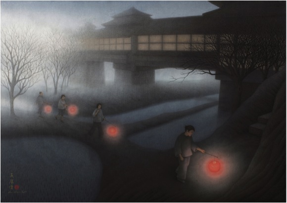
‘A New Dawn’
Are you working through the series in a chronological order?
I am not working on the paintings in chronological order. I explore visual ideas when they come to me, which can be in any order. But I do have the larger picture in mind and I will fit each component together like pieces of a puzzle. It is a process I tremendously enjoy, but it is also challenging because of its scale.
Could you explain the involvement of NYFA, and NYFA as an organization?
Cycle of Life is a sponsored project of ARTSIPRE, a Program of the New York Foundation of the Arts (NYFA), which acts as fiscal sponsor for the project. Many people think that ARTSPIRE or NYFA commissioned Cycle of Life, but this is not the case; they provide fiscal sponsorship. Sometimes, people or organizations are reluctant to support artists directly out of concern for lack of oversight on how their funds are expended. As fiscal sponsor, ARTSIPRE guarantees that any donations to the project (thus not directly to the artist) are used for eligible expenses. It is a great way to support artists with making projects they cannot fund themselves.
ARTSPIRE is a 501(c)(3), tax-exempt organization founded in 1971 to work with the arts community throughout the United States to develop and facilitate programs in all art disciplines. ARTSPIRE receives donations and grants on behalf of Cycle of Life, and ensures that the use of grant funds is in compliance with U. S. regulations. ARTSPIRE provides program or financial reports as required. As project director and independent artist, I will be responsible for executing and overseeing the project. My work will include: executing the art project and overall project management, expanding professional networks, working with external consultants, outreach, etc.
Recently, you worked very closely with Wu Man. Can you expand on this connection and also the connection with the Huntington Library, Art Collection, and Botanical Gardens?
Wu Man and I are interested in expanding the appreciation of traditional Chinese culture in a contemporary context. In 2012, when June Li, Curator of the Chinese den at the Huntington heard that Wu Man and I wanted to collaborate on a project that involved Chinese painting, music and poetry, she was keenly interested to work with us. June invited us to give a talk as part of a special public program at the Huntington. Our presentation was called: “An Evening with Wu Man and Lan-Chiann Wu” held on June 18, 2013.
‘Wu Man & June Li, with Lan-Chiann Wu’
At the event, Wu Man and I shared what inspires us to make art in our respective disciplines, and gave demonstrations of our art forms. We were sharing how we transform poetry into painting and music, especially because we had discovered that we both created a work inspired by 8th century poet Li Bai. I am referring to Li Bai’s Night Thoughts. It is a poem that all Chinese children have to learn when they are in second or third grade; they have to remember it by heart. When you are very young, those words don’t really mean a lot to you. You have to recite it and that’s it. But after you move away from your home, or in my case, immigrate to another country, the poem takes on a poignant meaning.
So when I re-read Li Bai’s Night Thoughts his words made a deep impact on me. When we discussed the poem at the Huntington event, it also resonated strongly with the audience. After the lecture, many people expressed to me that they felt uplifted and inspired to further explore Chinese culture. The Huntington has released a video recording of An Evening with Wu Man and Lan-Chiann Wu. They captured the entire event, and its complete footage can be found on YouTube:
Our humanity, our core values and principles, is what binds us together as one people across time and space, and this is the main theme in my art. Therefore, my paintings are not mere images; they are layered with content and represent universal themes that each and all of us experience in life. As a visual artist, I enjoy sharing my vision through my painting as well as through speaking about my art.
Contact details.
Lan-Chiann Wu
Website: www.thetranquilstudio.com
Facebook: www.facebook.com/TheArtofLanChiannWu
Cycle of Life:
https://www.nyfa.org/ArtistDirectory/ShowProject/caeb6d9f-f3da-47be-99ec-f5b82147f964
Lan-Chiann Wu, California, USA
Interview by Deborah Blakeley, June 2014
Peter Clark
How did this amazing collage work happen?
My collage work gradually developed out of my illustration work, bits/areas creeping in, growing and developing. I began to love doing the paper collage a lot and adored finding the different papers
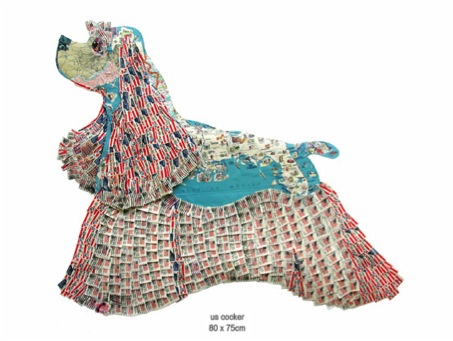
When did you decide to create your work from a palette of paper?
When people began noticing the collaged bits and passing on encouraging remarks about them.
Do you usually work on a ‘Series’ eg. dogs, garments?
Yes and no. I kind of grow into certain subjects, some take me over for periods of time and I like to occasionally revisit them and hopefully improve them.
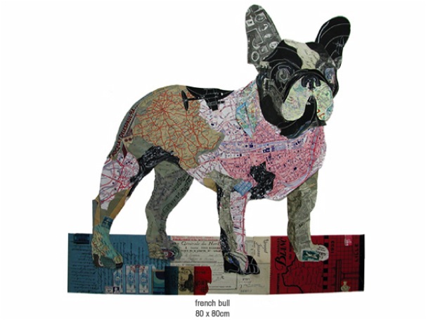
Which comes first: the paper or the piece?
Sorry to be vague but it is both. I have ideas for a certain piece and begin to find the appropriate papers however other times I have some particular papers which yell out to be used for a certain image!
Can you discuss how and when you use maps?
I use maps all the time, for colour reasons, for information or joke reasons
I use the linear qualities within them sometimes to ‘draw ‘with, they are so versatile… can be very specific or used in an abstract way. I love them, they enable one to instantly play and change scale!
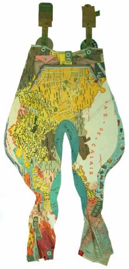
Very simply can you explain the process you take?
Very simply can you explain the process you take?
Arrange them roughly in order to achieve colours/scales, tear then cut and fold the pieces; glue them down, hey presto!
If it works… great, If not start again making changes till I’m ok with it.
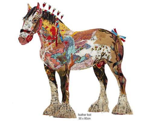
What size is your work?
Varies from perhaps A2 to 2 or3 times that size or even bigger depending what I am trying to achieve or what I am working with.
ow about the size of your papers?
It is all OK papers come the size that one finds them.
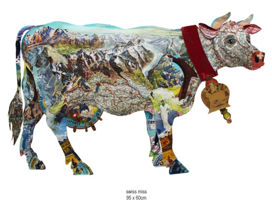
Where do they come from?
God only knows! I find them everywhere I go, on the street, flea markets, and car boot sales. Paper fairs are places that I love going to and searching around, I go to markets wherever I travel.
How do you store them?
In many Muji transparent boxes and drawers
How do you remember and then find the piece you are looking for?
I remember where things are but importantly I rely on my assistant Dan to find me what I ask him for….mostly I have something in mind!
Can you discuss ‘Too – 2 – Step’ and this series?
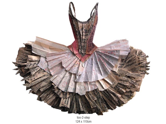
This is a dress in a series of ballet tutus where I tried to do the bodice quite tightly showing the body shape and using in the main some sheet music covers for info.
Then in the ‘skirt part I intended it to be looser showing movement using and tearing and folding techniques which allowed it to be free and more 3D in contrast to the bodice. Using also sheet music and free flowing hand drawn lettering etc.
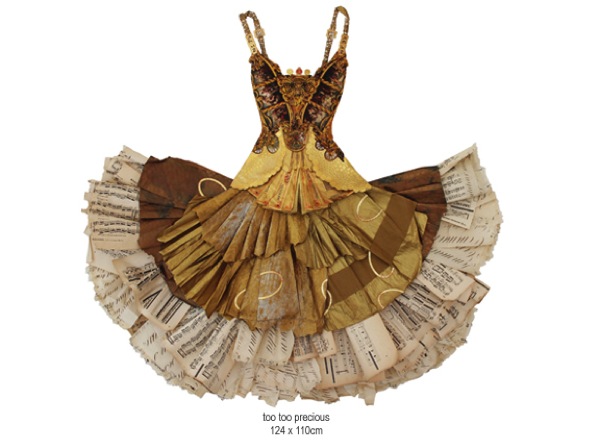
These are also 3D work. Can you expand on how you make the decision on when to add folds, layers etc.?
As above…it’s partly spontaneous and what I feel looks right. Having fun, letting the papers speak!!!!!
You exhibit around the world; can you expand on how you work up to an exhibition?
Think of an idea with subject matter, play a sound track, plan it and do it. It is down to a strategy really.
Can you comment on Stewart Collins statement, "There is nothing so enlivening as looking at a piece of art and laughing out loud"?
Not really but I like it that he feels that way!
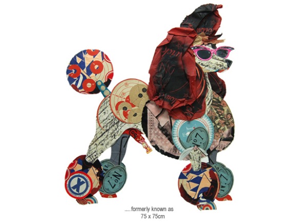
You also add humour to your work by the choice of paper, for example your Hell’s Angel Jacket is made up from old Bibles and prayer books. Can you discuss this?
I try to inflict what amuses me onto my work!
Depth, firstly perspective within the piece then the further depth found within the papers you use, expand on this.
I prefer the pieces to have different levels, and allow shadows to play within them. Less boring and predictable that way, I don’t like things to be too worked out, I am not interested in that type of thinking.

Is one of the prerequisites that the work will bring a smile to you first?
Preferably!
Deborah Blakeley:Peter has released a book called Paperwork: Peter Clark by Matthew Sturgis. The book was so popular it has SOLD OUT!
On a more personal level you are recovering from a stroke. How has your art help with your road to recovery?
Simply it saved my soul and reintroduced some order and purpose into my days, initially just doing watercolours as I could only use my right hand.
Slowly and slowly I am reintroducing my body into doing collage [physio in itself] which requires using both hands and exercising patience
So far it’s going well; I am regaining my confidence and the energy to do it
So…onwards and upwards!
Contact details.
www.peterclarkcollage.com
Peter Clark, UK
Interview by Deborah Blakeley, June, 2014
Luanne Rimel
Discuss why you tend to work in series?
The content of my work deals with Time, i.e. the passage of time, memory, remembrance, decay, and even persistence. When I become absorbed an idea, I seek out forms that resonate this idea. I begin to photograph in various sites and build a collection of images from each location. Then, one piece leads to the next and I explore how to make my thoughts into a visual expression. I work on several pieces at a time, feeling that they “speak” to each other and inform my creative process. Since the photograph is a primary component of my work, I look for compelling objects and forms that will eventually be part of my textile constructions. I am often asked, “How do you know when a series is completed and it’s time to move onto other imagery?” That is a difficult question and I am not sure I know a concise answer. When I notice that I am photographing a series of different objects or forms, I know I am being led in a new direction, and it’s time to begin a new body of work.
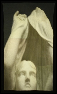
Your current series, that I saw at the Smithsonian Craft Show in April 2014 is very monotone. Discuss the photography in this context?
This current series involves detailed photographs of statues, with many taken in cemeteries. Even though they are color photographs and printed in color, the images appear monotone due to the materials used for the statue. Sometimes green moss or blue sky enters into the imagery, but mostly it is stone. I like what happens here because I think the subdued tonality of the photograph enhances the quiet simplicity and strength of the imagery.
You also place several images within the one image. Can you explain when and why you do this with some of your pieces but not all?
I do not have a studied background as a quilter, but I occasionally like to explore simple piecing and look for images that relate to one another. The earliest works in this series were pieced with multiple images. One work, “Silent Sound”, includes all images from cemeteries in New Orleans, Louisiana. The larger central image is of a statue and it is surrounded by a shadow image of iron fencing, and some colourful graffiti on the crypt of Madame Laveau, the celebrated Voodoo Queen. The smallest piece is a statue evoking the “silence” I refer to in the title. I also explore working with a single, powerful image for the entire work, as in “The Watch”. If one looks closely, they will notice the seams and realize they are also pieced in the same manner but with segments of the original photo.
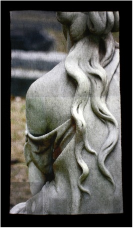
‘The Watch’
What background cloth do you use and why?
I am interested in the intersection of domestic practices and contemporary technology. In my current work, I use repurposed flour sackcloth dishtowels, as a metaphor for memory, women’s work, and family.
The act of washing and drying dishes has mostly disappeared in many 21st century families. I am the second oldest of six children and my sister and I would wash and dry the dishes for a household of eight every night, alternating the tasks from one week to the next. My memory of this chore includes singing along to pop music on the radio, telling jokes and laughing. When first married to my husband, (many years ago) on visits to his family, I would help his mother with the dishes after dinner. Only allowed to dry, not wash, I was instructed to get a dishtowel from the drawer and I have a vivid memory of the clean, neatly folded, bleached, white, flour sackcloth textile, with subtly embroidered birds or flowers at the hem. Once the task of “doing dishes” began, my quiet mother-in-law- would begin to converse about her memories of family, her children, my husband. The dishtowel, to me, represents a conduit to conversation and to memory. The images I print on this textile also become imbued with the history of this cloth. I could, of course, choose any cloth to print on and stich, but I am interested in the symbolic reference of this fabric and it is part of the content of my work.
Discuss how you use selected segments of your photographs (crop).
When I find and photograph a statue, I do try to imagine the textile piece I will create. I look for the best angle, the best light, the carved hands and carved folds of cloth. I may take several shots and then select the best for the final piece. In a Photoshop program on my computer, I crop the image to focus on the hands and cloth and select just the part that, to me, coveys a bit of mystery.
If one looks closely, they will see that every piece I make has one or more small hand stitched “patches”. There is no tear in the fabric; rather this is a symbolic gesture. I copy a small part of the original image and print it onto the cloth so it can be layered and stitched along with the quilting. This “patch” is symbolic because, for me, it is a reference to mending and repair, as seen in Japanese Boro textiles, my grandmother who darned socks, patched and reused textiles.
Can you give us a close up of the stitch work and discuss?
This is a detail of piece called Pensive. I begin the stitching by following the contours of the hand. Here you can see that the thread color matches the colors of the image so when it is pulled through the cloth, it becomes embedded in the slight puckers and is not immediately visible. These are running stitches, carefully places and gently stitched without any hoop or quilt frame. The repetitive hand quilting across the surface creates shadows and textures and alludes to the marking of time. Each piece takes its own shape beyond the original square format as the threads are gently drawn and pulled through the cloth.
How about the thread you use?
I try to use hand quilting thread whenever the color is a good match. I have also used machine quilting thread and other threads – it’s all about the color.
Tell us about the backing technique you use and why?
Since my hand quilting stitches are small and close together, I find that it is best if I only stitch through two layers of cloth. That way, the cloth responds to the needle and puckers a bit. Creating the texture. I use an heirloom cotton and bamboo, thin, quilt batting, and hand-baste the entire top cloth to it. Then I stitch, and stitch, and stitch. After all of the quilting is complete, I turn down the edges and hand stitch a backing cloth
The stitch direction?
As one works on a body of work, discoveries are made, and before long, you find yourself repeating an experiment so it becomes a technique. Several years ago, I was fortunate to be able to take a workshop with Dorothy Caldwell, where she introduced us to Kantha Textiles where the intricate stitched thread becomes imagery. I was already working with photographic imagery on silk, with some limited stitching and piecing. Following this workshop, I discovered that I enjoyed the mediative aspect to repetitive stitching and found myself experimenting more and more with needle and thread. I began following the forms of the photograph with the stitches and found that shadows were created depending on the direction of the stitch – then the experiment became a technique.
Do you use the stitch direction and closeness of the stitch to make use of shadows or do you vary the colour to the thread?
That is an interesting question - it’s a bit of both. I intentionally change the color of the thread to match the photograph, whenever possible, so that the imagery is foremost - its not an embroidery technique. The shadows the stitches create always surprise me and change with the light of the surroundings. I always begin with the hand, my focus, and stitch following the contours of that part of the photo. I then follow a more horizontal pattern for the rest of the image. The closeness of the stitching creates and almost hyper-realism in the photograph – the threads are buried in the folds of the cloth - and I am not aware of that until I pin it to my studio wall and look at from a distance.
Pensive
You have an emphasis on hands can you elaborate on this?
Many years ago, I was exploring the use of the hand image in other cultures and the various meanings it conveys, including identity and protection. Hands are so expressive, used in verbal conversations and as signed words for the deaf. I found that I was compelled to work with this imagery because it was imbued with so much symbolism. I did a series of photographs of the hands elderly women as they performed a routine chore, such as mending or washing dishes. I think that Time is reflected in the hands. That series is what led me to photographing the carved hands of statues.
You put an emphasis on hands. Can you elaborate on this?

Studio wall image
Travel has come from your art. Can explain two places it has taken you to?
Several years ago, I visited New Orleans and walked through the renowned cemeteries, taking photographs of the architecture and beautiful statues that inhabit those silent “cities.” The images from that trip are now part of many of my quilted pieces. For my last birthday, I wanted to seek out a cemetery in the US that has great statues. That request led me to Savannah Georgia and the Bonaventure Cemetery. That is where the piece, The Watch was photographed. I have received many suggestions from people who also appreciate the richness of the sculptures in cemeteries so I now have list of places I would like to visit one day. (On the top of the list is the Père Lachaise Cemetery in Paris!)
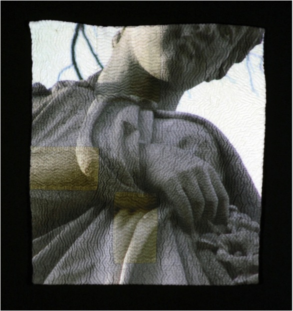
'The Glance'
Your images are printed with an Ink Jet printer. How lasting will this be?
Inkjet printing has come a long way in the last 15 years. When I first researched this process the large format printers were still using dye based inks that ran if water touched them and did not work with fabric unless it was treated with another substance to “set” the dye. I spent over 2 years just researching and experimenting with this process. Now many of the printers have what are called “100 year” pigment inks – they do not even run when water touches them and they are much more colourfast. I look at this work as any drawing – keep it out of direct sunlight. The inks on works from over 15 years ago are just as they were when first printed.
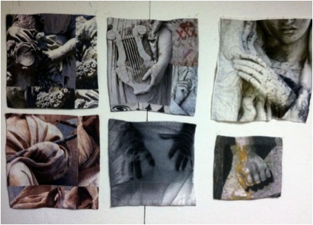
Your printer gives you size restrictions? How do you overcome this?
This has been an interesting, and satisfying, problem. When I first researched inkjet printing of cloth 15 years ago, in graduate school, I was working on very wide printers and printing pieces that were three feet wide and seven feet long. I was not hand quilting those at the time, but creating whole cloth and layering.
When I needed a printer for my own studio, for financial reasons, I selected a much smaller printer that only has the capacity to print 17 inches wide. At first I worked smaller and within the parameters of the printer. But slowly I began dividing the photo on the computer and making much larger pieces, just printing in sections and then carefully assembling them together, as in a pieced quilt. I discovered I like the slight inconsistency of colour and the barely visible seam lines. Also the fabric I use, the flour sackcloth dishtowels are not large and work perfectly with my printer – a satisfying problem!
Do you feel that by transferring the the image onto textiles, especially old textiles, you are giving a warmth and softness that is not on the original image?
The photograph does get transformed on cloth. The print is softer as the inks migrate on threads a little bit more that they do on paper and it does soften the image. Depending on the thread count of the textiles, the results will differ, but I like what old lines and flour sack cloth do to a photo– there is some “nubbiness” inherent in the cloth. This adds to the imagery I think, and yes, give it a softer glow and warmth.
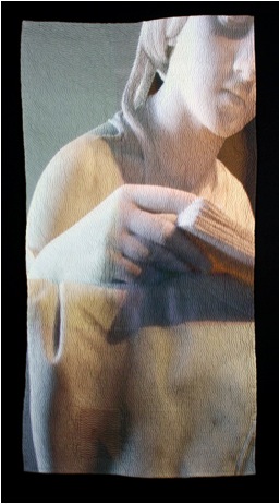
The Reader
Discuss how and where you do your hand stitching.
The hand stitching is actually the last step in the process. My studio is in my home, with a room for the fabric work and another room for the printer and computer. I will spend several days preparing the images on the computer and preparing the fabric to go through the printer. Then I print a few pieces, parts of pieces, and hang them on the walls in my studio. The larger images are pieced together, stitched and all are layered with the batting. I then hand baste the entire surface so the cloth does not migrate when I hand quilt it. The smaller works 10”x10”, are very transportable and I can actually work on them in a car when we travel. The larger pieces are quilted in the studio, slowly and methodically – it’s like a meditation for me.
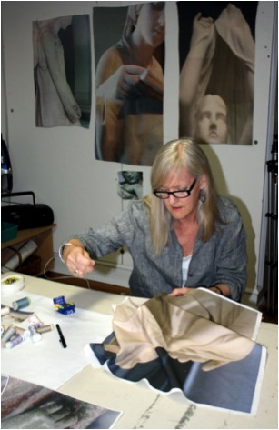
Your botanical work is vivid and full of colour, expand on this?
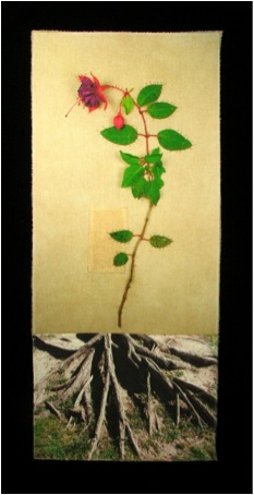
'Fuchsia – Faithful'
I don’t alter the colour of any of my images so the botanical series is comprised of photographs of actual flowers from my garden or the garden of friends. I had been working with shadow images for some time and it was nice departure to surround myself with colour for a while.
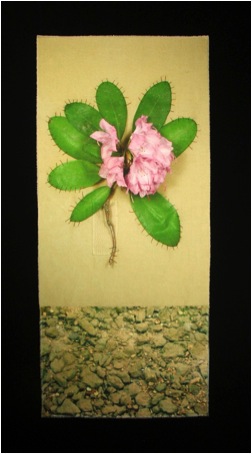
‘Rhododendron –Beware’
Explain about your Solo Exhibition at the Missouri Botanical Gardens?
I am an avid, amateur gardener and began the Botanical series when my husband, a metalsmith, and I were going to exhibit our work together. His work is about the land and I wanted to compliment this idea in my work. Following our smaller exhibit, I was invited to show my work at the Missouri Botanical Gardens in a much larger, public space. I created over twenty pieces for this exhibit, some large quilted silhouettes of flowers and the others were the colourful single flower images with hand quilted accents and stitched elements. It was a very large body of work and thrilling for me to see it presented in a garden environment.
Many of the flowers you use are chosen for their historical and symbolic meaning. Can you expand on this?
When developing this series, I was inspired by the classical botanical illustrations of the 18th and 19th centuries. I researched the meanings associated with flowers from the Victorian era and selected those flowers, many of them growing in my garden. (Such as Rhododendron-Beware, and Iris-Inspiration) .

Luanne Rimel's Garden
Still working with my concept of time and memory, I cut a single flower, took it to my studio and carefully stitched it to a vintage dishtowel. I then pinned it to my wall and photographed it, sometimes waiting a brief period of time as the flower relaxed on the cloth. Then the process of printing this image onto another white flour sackcloth dishtowel began. The flower images were stitched to another image that represented the land. Some smaller areas were layered and quilted on the surface and included hand written text about the history of the flower.
Discuss the classes and workshops you do?
I teach photo transfer process both with and without a wide format inkjet printer. Some methods involve certain liquid gels and papers that allow a copied image to adhere to the cloth. Another, the one I mostly use, is preparing the fabric to go right through an inkjet printer. The image preparation is key to this method and time is spent on leaning to select the image or images that fit the student’s concept or idea and figuring out what will work best with the cloth. Last summer, I taught a weeklong workshop at the Arrowmont School of Art and Craft in Gatlinburg, Tennessee. It was intense, amazing and filled with creative and wonderful people who explored the many possibilities of these processes. Here at home, I often teach weekly classes on photo imaging on cloth at a local art center and about finding your “voice” in your work.
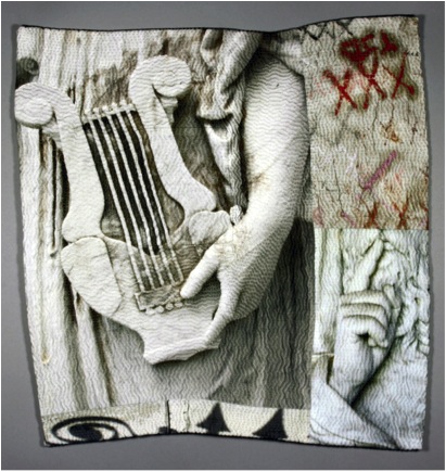
'Silent Sound'
In your class, ‘Out of the Linen Closet’ you teach how to transform household textiles into artworks. Explain the importance of history and memory in your work?
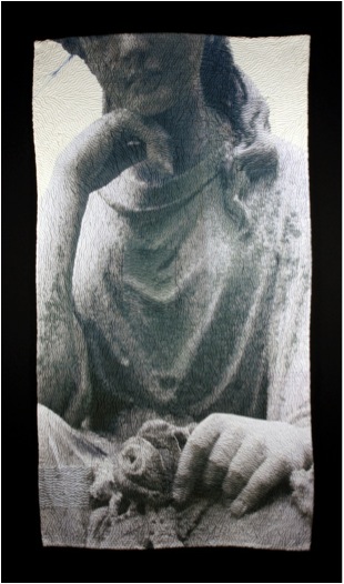 'Enigma With A Flower'
I have always been interested in ontology. I am excited about new discoveries in space, new planets, and conversations about the origin of the universe. By observing this vast picture, I look at the nature of the brief human existence and the bits and pieces that say, “We were here.” I believe that cloth holds memories, in smells, folds, stains. Old linens can tell stories of a life lived. I use cloth for those reasons and the rich history of cloth in many cultures. Cloth is also responsive and malleable. The slow, deliberate and repetitive stitches I use are symbolic for marking time, and memory, as they shape the final work. The images I choose are also about time and memory, from elusive shadows, to fading flowers and commemorative statues.
Discuss the importance of expanding photography from paper to textiles and how you came to develop this idea.
Putting images onto cloth is not new – (Robert Rauschenberg printed images to cloth in the 1950’s with screen prints and solvent transfers) – but towards the end of the last century and the beginning of this one – digital imaging processes became accessible to artists in all media. There were, and are, darkroom techniques that enable textile artist to create blue cyanotypes, or brown prints, and some photographers were developing their images on treated alternative materials such as wood and clay. However, the newer digital technology allowed for greater possibilities. From “iron-on” transfers to gel medium transfers to what I do – directly printing on cloth, the last 15 or 20 years have opened doors that were never perceived possible.
My goal was to have imagery on cloth that would retain the soft “hand” of the cloth. When I was in my late 40’s, I went back to school to get an MFA in textiles. This was about 1998. In 1999, the university I was attending was able to acquire a new wide format ink-jet printer for their Graphics Department. I received a research grant to explore this technology with alternative materials and my path then appeared. I was hooked, and experimented for another year before embarking on creating images on silk that were three feet wide and seven feet long. Photography stepped out of the darkroom for me. Cloth responds to the photographic image in a very different way than paper does. One has to be able to let the cloth speak, and soften the colour or the edges of the image. The photograph for me is not the end result but part of the overall process. The stitching enlivens the image, creating shadows and textures that are not possible on a paper photograph. There are artists that put images on cloth and there are artist that obsessively hand quilt for texture – I explored combining the two processes and my current body of work evolved from there – one step at a time.
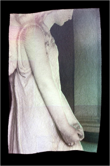
Contact details:
Luanne Rimel
Website:www.luannerimel.com
Email:lrimel@mindspring.com
Luanne Rimel, St Louis, USA
Interview by Deborah Blakeley, June, 2014
Guillermo De Angelis
When and where did you learn and begin your photographic career?
It began in Argentina, in the city of Rosario, and that was before I realized. If you mean, when it started to manifest almost urgently, it was during the years I lived in Madrid as a way to stop time.
Originally you studied Architecture. How has this influenced your photography?
It influenced to study the space, the environment, for the abstraction. To study Design, to get interested for the fine arts. To learn to look.
Your comment, “I try to get the expression through the economy of resources.” Can you please discuss this?
I confess I have a weakness for detail. The essence is contained in a brush stroke, in a gesture. I’m sure that if it was beautiful singing, it would be in a low voice.
Light plays a huge part in your work. Can you discuss this in relationship to one or two of your photographs?
Light is fundamental to photography in general. In my case, sometimes, I try to do scenography images, where light is the main ingredient. In other situations I obtain photographs of details or situations that seem to me urgent with any temperature of light or any kind of light.
Can you discuss the subtle use of colour in your work? Eg. ‘Aquella Vieja Rebeldia Animal’
These photographs are the ones I like, they just happen. It’s a sunset in the outskirts of the city of Rosario, Argentina. The subtlety can come in many ways. In this case, I chose the color.

You use full colour in ‘Buoy’. It is not the colour we are drawn to, but the composition. Can you expand on this?
In this image the primary colors almost go unnoticed, they occupy a small area in relation to the overall image. That’s why they don’t become substantial, the composition and the arrangement of the elements are the foundation of photography.
lease discuss composition in your work - is this done on location or back in the studio?
When you have the need to take pictures, when there is a mimetic reaction between yourself and what’s photographed, work in the studio is always a slight formality.
How important are Photoshop or similar programs to a modern photographer?
Photoshop is a lawful work tool. It’s like an ax, useful but you have to use it with caution.
Your series ‘Diégesis’: this work is full of abstraction. Please discuss?
After doing architecture, design and philosophy I dove into photography. With the sort of enthusiasm that drives you to move forward, or better still, inwards. Hoping to discover within, rather than outside myself, what I am trying to show. I choose to take pictures not prepared. I try to get the expression through the economy of resources. Focusing on the details that strike me as essential. Suggesting clearly, presenting without describing.
Can you take two photographs and discuss why in one you have used black and white and the other colour and your choices of medium?
With the black and white we look beyond of we see at first. We are interested in the world of concepts.
With color, we look for sensations in spite of being rookies in the use of color. Generally, I prefer black and white.
‘Winter Song’ didn’t just happen. Can you tell us about the set up for this photograph?
This image has been taken at “Parque del Retiro” from Madrid, a winter day on which it was snowing in an unusually way. Sometimes the opportunity is like a "smug miss" who doesn’t appear if you’re not willing to wait for her.
Can you explain the technique you used for your work ‘Loneliness’?
Is a double exposure photograph. A horizontal motion blur and other fixed.
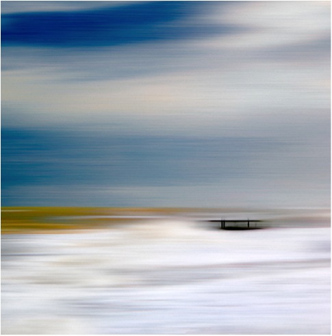
Discuss your photographs and symmetry?
Many of my photographs are symmetric due to the square format. Is a classic composition for this type of format. I prefer square because elements and composition are critical for the capture.
Discuss how you are able to represent the sense of feeling into your work?
I think the best test to transmit a sensation is to experience it myself. I don’t pretend to generate something specific with my images; this would be the pretension to anticipate a result. If any of my images generates something, I was the first touched.
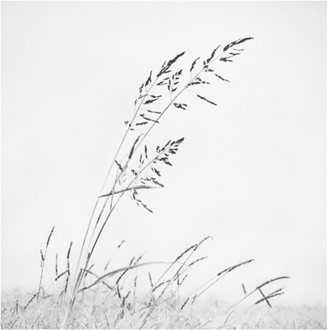
Expand on the equipment you use and your studio space in Madrid?
My equipment consists of a Nikon with several objectives, the one I use more is 24-70 2.8mm. My Fujifilm X20 that comes with me everywhere, a Lumix, always faith full and my phone or whatever you can take a photograph with. In my studio I have a Mac, some of my favorite music and little more.
Contact details.
Facebook: https://www.facebook.com/guillermo.deangelis.1
Email: deangelis.guillermo@gmail.com
Guillermo De Angelis, Madrid, Spain
Interview by Deborah Blakeley, June, 2014
Dolores Barrett
You were introduced to glass art and its beauty in 2002. Can you explain how this changed your artistic life?
It really was quite literally a life change. I was a choir director at my local church as well as a piano teacher for 20 years. My interest began to sway to the arts in 1999 when I started porcelain portraiture. I had no previous training in art. I followed some online instructions, purchased some supplies off the internet, and dove right into what I was told was the hardest discipline to master; that being a miniature portrait. The results were encouraging enough that I wanted to delve deeper. I segued into glass after experimenting with ways to use it with my porcelain work. The seductive qualities of the material very quickly took over thereafter.
That was my first major success (and nothing succeeds better than success or at least the taste of it). I became aware of the possibilities this medium had to offer. I enjoyed being a part of such a prestigious community of artists. It made me want to push all the more to stretch the medium to its limits and beyond. I wanted to go wild with the ideas churning in my imagination.
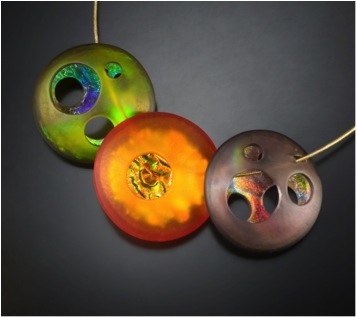
‘Atomic Orbs’
How did your residency at Pilchuck Glass School during the summer of 2008 work?
I had been part of an online glass forum for several years, and had heard many stories and experiences in regards to Pilchuck. It was generally acknowledged as the go to place for any serious glass artist. I applied for, and received a scholarship for a session under the tutelage of David Chatt. Once I abandoned the idea of trying to “produce” something, I was truly able to enjoy and grow from the experience of networking, discussion, and absorption. A lot of the little things I learned there still work for me in my studio today. I continue to enjoy designing a special piece each year for their annual auction. I get to meet up with many wonderful artists at the event, as well as support future artists who wish to attend these enriching summer sessions
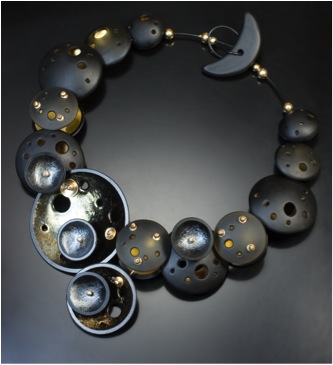
Can you expand on your ‘Gallery Showpieces’ and one-of-a-kind work?
My artistic showpieces are where I pour the heart and soul of my imagination. These are generally made specifically for exhibitions, commissions, and/or special events (like the “Fly Me To The Moon” neckpiece). This is also where I am able to experiment with a variety of alternate materials and fabrication methods. It’s a “no holds barred” situation and my creativity can truly go wild. I am able to tap into all the inspirations and design ideas that have accumulated in my head over many years from childhood onward.
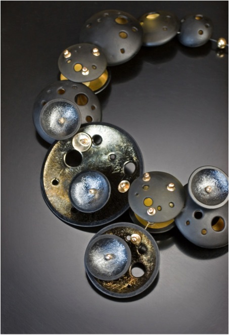
‘Fly Me To The Moon’
The process
It’s a process of internal reverse engineering really; I am introduced to the parameters required and instantaneously envision the finished product, then I must break it down to figure out how to make it a reality. I sketch the concept and proceed to a full scale paper model before beginning the work on moulds for the glass. Many times I find myself moving into completely uncharted territory where I must fabricate all the metal connectors, hanging mechanisms, and findings, as the glass pieces are very specialized and none exist in those configurations.
The design aspects
Of course, being functioning art wear, one must always consider wearability. This is precisely why I always make a model first. Not only is general appearance important, I must also consider the symmetry, potential weight, stability, and comfort of the design. I check for potential rough edges and or intrusive features. I also need to consider whether the work in its physical form conveys the intent I had in mind.
Your Precious Bead series is a combination of materials, discuss the combinations?
I really love working with gold and gold loves fusing with glass. They are quite a happy couple. With my Precious beads, I was seeking a way to “preserve” the gold for perpetuity. I cut layers of heavy gold foil and fuse them between the sheets of clear and coloured glass, then slump them into hand-carved moulds. I sandblast the exterior for a satin smooth finish, but choose to leave the coloured interiors in their luscious liquid-looking state. The dichotomy is enticing.
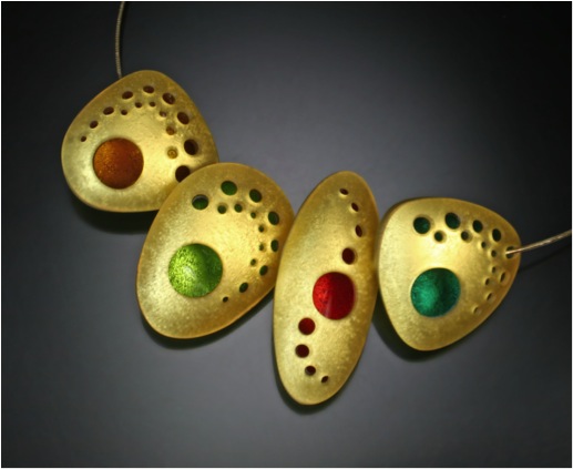
‘Precious Beads’
Your Orbit work is very 3D, can you discuss this?
The entire Orb Series, as well as its variations, was originally inspired by the Pantheon in Rome. I was watching a TV special on that famous landmark, and the sight of the sun shining through the enormous oculus onto the marble walls just struck a chord within me. I strive to create not only fully dimensional work, but also work that highlights the mysterious quality of the opening which instantly draws the viewer into the piece. Achieving this in fused glass was a great challenge especially since many people mistake my kiln-fused glass for blown glass or torch work. I rather enjoy blurring the lines between these different vitric disciplines.
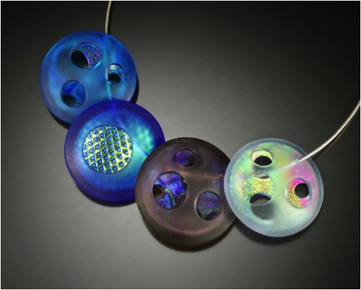
‘Cool Atomic Orbs’
Discuss the use of colour in your work?
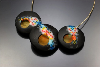
‘Pixel Nebula’
Colour is key in most of my work. It can evoke a feeling, even a genre (as in my Mid-Century inspired designs). I have, however, explored the use of light in black and clear glass and especially enjoy the use of colour gradation, just look to my Pixel Series. As evidence of this love affair, I often arrange the projects on my workbench by their place within the colour spectrum. I find the ordered blend of colours inspiring.
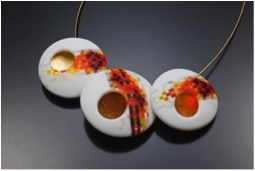
‘Pixel Flame’
You have your work in many galleries. Can you discuss the importance of a good relationship between an artist and gallery?
Gallery and artists have a symbiotic relationship and it’s essential to remember the importance of our respective roles. We provide the needed product and the gallery in turn provides the conduit to potential clients. Of course good communication is crucial, and we need to be willing to work this symbiosis into our working style.
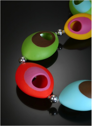
‘Mod Necklace’
Can you explain how your studio works and the type of equipment you have in it?
Since I deal primarily in jewellery, I am able to condense the bulk of my materials and machinery into my backyard studio building. In order of the production process: a design desk where the plans are drawn, a large movable central table for cutting glass, several kilns of various sizes for fusing and slumping, a grinding and drilling station for shaping the components, a pencil blaster for making those satin smooth matt surfaces, and an assembly area for finishing touches.
Discuss the care of your jewellery, both to wear and clean.
Glass is a very sturdy material. It will literally last for centuries. The advantage to fusing the glass into shapes is strength. The dome of the Pantheon has survived for thousands of years after all. One need only wipe it with a damp cloth and rub simple mineral oil on the surface to revive the satin finish.
Can you take two recent pieces you have made and discuss the inspiration and technique involved?
‘All Eyes are Upon You’ Necklace
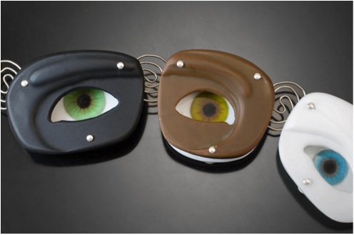
This was inspired by an early childhood memory. I was riding in the old family station wagon when I spied a clown face optical illusion painted on the wall of a passing building. The eyes appeared to move along with me as we drove by (yes, creepy I know!). A few months back, I was seeking a way to combine my porcelain painting with my glass work, so I fused and painted the realistic eyes on the surface of the glass and fashioned textured matt glass orifices that “float” over the top. The illusion works eerily well.
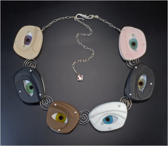
'All Eyes are Upon You’ Necklace
'Mod' necklace
I have long had a love affair with Mid Century Modern design and architecture. Recently, I was able to attend Modernism Week in Palm Springs, California and designed this piece with hand-made marquis shaped moulds. It captures the essence of the movement in shape as well as classic colour combinations
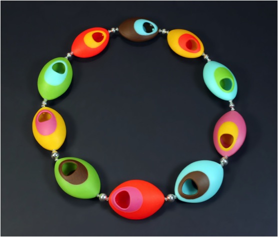
‘Mod’ Necklace
Discuss the different types of jewellery you make, eg rings, necklaces, etc...
The core of my work focuses on neckpieces and earrings. I have, however, delved into other types of adornment such as rings, watches, brooches, hair sticks, bolo ties, bracelets, and even belts.
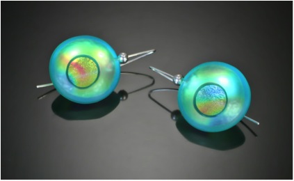
‘Atomic Earrings’ - Aqua
Contact details.
Email: barrettart@verizon.net
Web: www.barrettart.net
Dolores Barrett, California, USA
Interview by Deborah Blakeley, May 2014
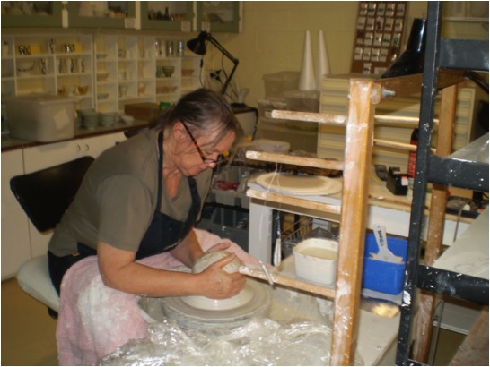
Sandra Black
While writing this conversation you will be in China at a residency. Can you explain how this came to be and what you are learning now?
I am currently in Residence at “The Pottery workshop” in Jingdezhen, famous for its fine porcelain production. I was initially introduced to this residency by two Canadian artists Trudy Golley and her husband Paul Leathers. They persuaded me to do my first residency with them at the pottery workshop in 2010 after we had exhibited and worked together in Perth in 2009. As to learning I have come to the residency both the first time and now with an open mind and no particular plans. I have found in past residencies if one had a specific goal in mind it was often thwarted by technical issues with materials, kilns or distracted from by all the new possibilities new clays, tools, technologies , techniques and what other artists had to offer and be inspired by. I like to learn from my fellow artists and craftsmen around me through observation, conversation and practical demonstrations. Particularly important is to learn about the culture and history of the country I am in.
How important are residencies to your professional development?
Residencies are very important in that they give me time out from the normal home studio, work routine. They allow me to engage in new cultures explore new materials ideas etc. They allow time to reflect, relax and experiment. It also creates new friendships and connections which leads to further opportunities to exhibit and teach overseas. There is also a reciprocal relationship established with fellow artists where I have been able to invite international artists to work, reside and exhibit within our Australian ceramic communities. It’s also about absorbing and observing ways of working collecting ideas. I am not so interested to making lots of works but rather give myself precious thinking time. It’s when I go home and sit in my own studio where things can be controlled that I find what I have learned will start to emerge in my work. New works will come sometimes a couple of years after the residency.
Image by Victor France
Your residency in Canada was to have a huge effect on your ceramic art. Can you expand on this?
There were certainly a number of effects on my own work. Initially I had gone to Canada to do a workshop in glaze making with Robin Hopper at the Metchosin International summer school in British Columbia. I had chosen to do mid fire glazes but on seeing some lovely high fire white glazes and celadon’s come out of the test kiln I was immediately enamoured by them. On returning home I started experimenting with them. It was also my first time to experience a Canadian spring and the physical landscape of Canada from the mountains of Alberta to the prairies of Manitoba. Being spring I also experienced seeing the snow melt water runoff from the mountains, into the rivers and streams, the numerous lakes and the vastness of sky and plains.
As a result I started in my Red Deer College residency in Alberta a small series of pierced and glaze in filled leaf cups. Later on my return to Australia I installed a gas kiln and started to work on a series of “Ripple vessels” based around the issue of water. Works reflected the colours of water plus the shapes water ripples and the rain tanks we stored water in on our farm.
Oval Ripple dishes 2005
thrown porcelain with satin White and celadon glazes
Photographer Victor France
Photographer Victor France
Your work is functional. Can you discuss this aspect?
Some of my work is functional, but not all. During my nearly 40 years as a maker I have had to constantly reinvent my practice to survive. This was particularly necessary during the early 90’s when our economy took a dive and people stopped buying my art pieces. The market interstate was not selling and people only purchased items that were functional. As a result I employed a thrower Warick Palmateer to make bowls and cups for me which I trimmed, decorated and sold locally. These were enough to keep me going until the market recovered 3-4 years later. I also took on some workshops as well to help out. More recently I have made small runs of work in high fired celadons and clear glazes that can be used both functionally and decoratively. I enjoy using other artists work in my own kitchen so appreciate the value of beautifully made functional ware.
Although you work takes on a lace like appearance, it is from nature that you gain you inspiration. Please explain this?
I grew up on a farm in East Gippsland in the state of Victoria so from an early age felt close to the land and nature. Bush walking and nature study were favourite activities. My early career choice was to become a marine biologist as I loved the minutiae of freshwater water and ocean life. I also kept a freshwater aquarium from the age of 12 to observe the animal life plus had a small microscope to study with. A relocation from Eastern Australia to Western Australia in my early teens threw my plans out as the adjustment education wise was quit traumatic. As a result I ended up studying art more and entered teacher training to become an art teacher. My love of nature never left and so over the years this has translated visually into my work. Over the years I have observed the environmental changes as our climate in Western Australia dries out and have tried to reflect this through the delicacy of my pierced work.
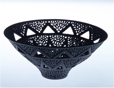
You do not use glazes, can you discuss this?
I generally don’t use glazes on the finely pierced work as they conceal the carving and piercing and it looks too shiny and rather nasty. I like the tactile ivory like surfaces of the polished form. It gives softness to the elaborate carving rather than a harsh bright surface. I have however used glaze when the piercing has been minimal in nature as in the polished in filled glaze works as in the Meander pouring bowls below. I do of course use glazes in and on my functional work.
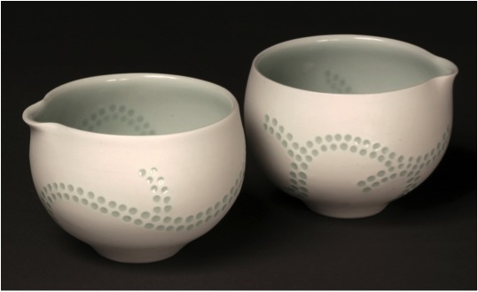
Meander Poring Bowls 2011
Thrown turned pierced and glazed porcelain
Photographer Peter Zuvela
When did you decide to use polish rather that glaze?
As soon as I started piercing back in the very early 1980’s the clay I was using looked much better without any glaze. I never felt these works needed glaze. The tactile pleasure of the polished surfaces is akin to polished waterworn stones.
What is you colour palette?
For the pierced works I like white, cream or black porcelain bodies. I have also experimented with soft browns.
For the glazed works I like clear glazes with a faint hint of blue or green from a reduction firing. I also enjoy classic celadons in blue and greens plus a beautiful satin white. Recently I have been making a couple of small works with a classic dark black Tenmoku. This came out of a Gallery 523 Residency in 2012 In Hai-an China. The porcelain body was badly specked through with iron so a classic Tenmoku was used to cover up. I liked the result.
Recently I have also been playing with deconstructed decals from China and introducing some imagery and colour to simple bowl forms.
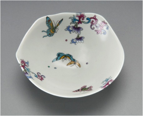
Jingdezhen Butterfly and Flower bowl 2012
Thrown Porcelain and white satin glaze with decals
Photographer Peter Zuvela
You have a large list of galleries with your work. How have you built up this following?
I started locally putting work into West Australian galleries and shops after my work was shown initially in group exhibitions as a young artist. From there I attended conferences, workshops, taking samples of my work along and visited galleries to show them and some accepted me.
I was also very early on a member of the Crafts Council of Western Australia and Craft Australia (sadly both now defunct) who promoted Australian artists locally, interstate and internationally. From these promotions I was able to build up a number of galleries to represent me. I realised at an early stage in my career that having work professionally photographed was critical to exposing work successfully. I managed also using these images to get work and articles published in various craft magazines. Acquisitions of works into regional state and interstate and overseas museums, collections and art galleries also helped.
In 1999 you were part of a selected exhibition ‘Australian Craft to Japan’. Can you explain how this evolved and the importance it has to you personally?
This exhibition was organised by the Australian Crafts council but I can’t recollect any details of this show as it was some 15 years ago (I am not able to access my printed materials as I am away from home at present..) The Australian Crafts council now sadly defunct played an important role in promoting Australian crafts people overseas. This was a great confidence booster and a way of entering into the international arena with substantial government support.
Discuss how your tutorial work at many Universities throughout Australia fit in with your studio work.
The tutorial work largely came about as a result of having exhibitions in other states. My galleries have contacted local groups or educational institutions or I have done so as a means of connecting with my peers plus by having these workshops and giving talks I am further able to keep myself employed and financially solvent. I enjoy doing these tutorials as it gets me to travel and catch up with happenings in the ceramics world interstate. Perth in Western Australia is a huge distance from Australia’s other major capitals so we tend to often miss out on visiting artists and major exhibitions of contemporary ceramics.
Your work is in many collections, both public and private. Can you discuss one or two pieces and where they went that have given you special pleasure?
One of the happiest moments was the winning of the Fletcher Challenge award in New Zealand in 1988. The work “Rites of Passage” was acquired by the then Fletcher Challenge Company and given to the Auckland Museum and Art gallery in New Zealand. This marked a significant point in my career as it was a major international award giving me some great exposure in Australia and overseas at that time.
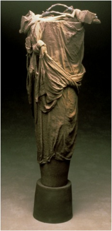
Rites of Passage
Can you discuss you work in relation to two actual pieces?
The pierced work below was made recently for an exhibition in Monsalvat arts community run by Skepsi Gallery in Melbourne. Technically these are very difficult works to make and the loss rate is quite high from distortion in the kiln and cracking during the making stage, I have been able to partly resolve the technical issue of cracking by the addition of a small amount of paper tissue into the casting slip.
The “ Hardenbergia is a native creeper found in our bushland and popular for home gardens. It has bunches of small purple pea shaped flowers in spring.
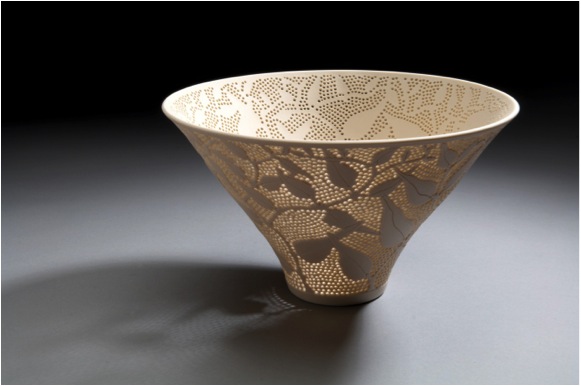
Hardenbergia - 2013
Cast carved pierced and polished porcelain
Photo Victor France
Architecture series 1
City of Perth Council House commission 2012
Photograph Robert Frith, Acorn Photography
The works above were commissioned for the 50 year celebration of the building of Perth City’s Council House. As a new style of building in the 1960’s it created a lot of controversy and during the 1990’s was to be demolished. A public campaign saved it and it has been beautifully restored. This was the first commission I had undertaken in many years so it was quite a challenge to produce. I chose the colours based on a 1960s palette plus the black and white abstracted decal to reflect the pop art movement of the time it was built.
Contact Details
Email: sandrablack@westnet.com.au
Web: ceramicartswa.asn.au
Sandra Black, Fremantle, WA, Australia
Interview by Deborah Blakeley, May 2014