Sidhart Sodhani
How did the Dye School coming into being?
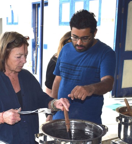
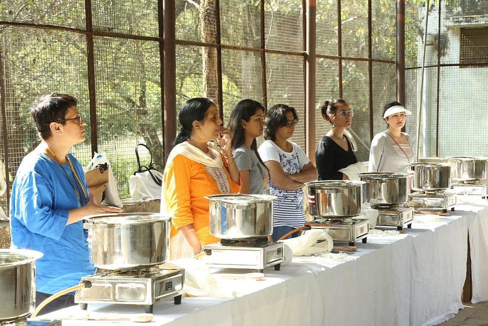
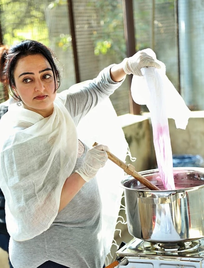
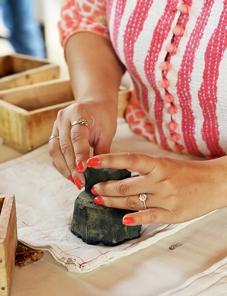
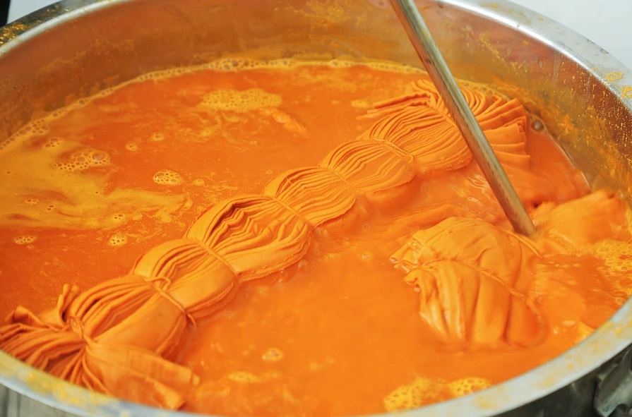
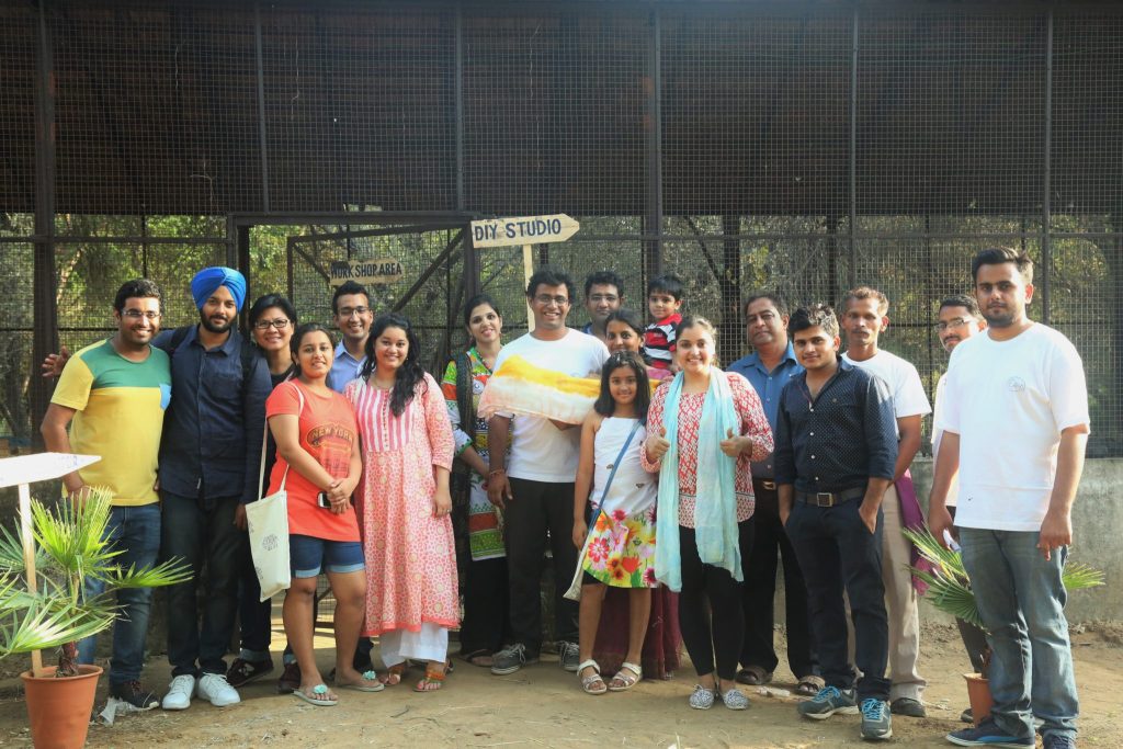
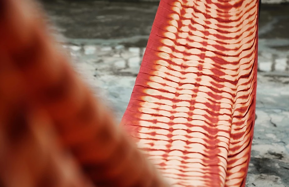
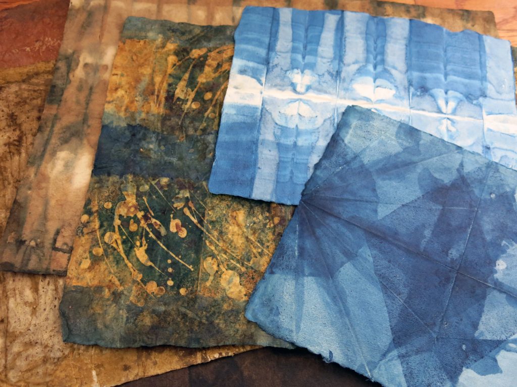
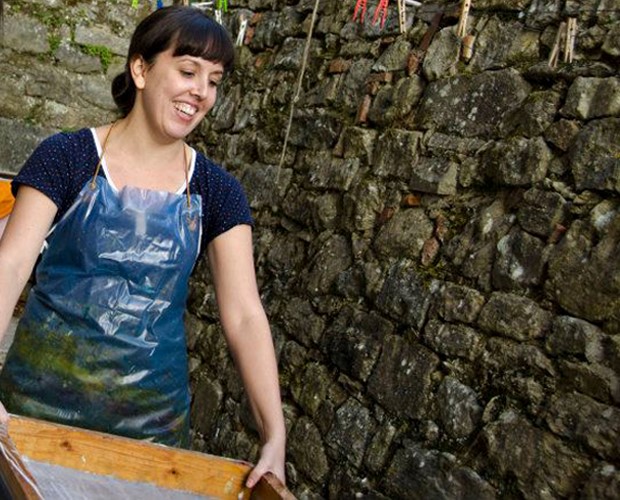
I have been running a natural dye manufacturing and retail business over the past four and a half years and in 2016 when I felt that not enough people knew about natural dyes and natural dyeing, my brother and I, Sankalp came up with the idea of DiY – Dye it Yourself. One thing led to another and we held the first workshop in September 2016. The main objective of the workshop is to promote dyeing and other textile art forms like shibori and block printing as a fun activity and encourage people to take up these lost art forms. We impart knowledge on how easy it is to dye fabrics with the wastes generated in daily lives. One of the other major reasons of starting the workshop was to make the resources such as natural dyes available to the masses. What I had noted in 3 years of my business was that the market for natural dyes was very niche and the products were being sold as a luxury, which most certainly they weren’t.
At DiY we aim to reduce the impact of pollution caused by the chemical laden industry. Till January 2018 we have conducted more than 10 such amazing workshops with more than 50 participants in total.
You state that “Your aim is to make dyeing a habit.” Explain this statement.
As I said above, our aim is to make dyeing rather natural dyeing a habit to reduce the burden of pollution from the chemical laden dye industry. We have been striving to promote dyeing and use of waste household items for dyeing. The end objective is to provide a sustainable source of colour to the world that would not harm the environment and also get the work done. For this we have been spending a lot of time in researching on natural dyes as well. Our parent company, Sodhani Biotique has various biotechnologists who have been working tirelessly to work out a permanent solution for making natural dyes accessible to everyone.
The idea to inculcate the habit of dyeing in mindset of the people is what we are trying to achieve through this workshop. We show participants that natural dyeing is not rocket science and how they can at their home, dye their own fabrics.
What do your students learn about natural products that can easily be found in the home?
We have created several videos for the workshop that we show at the beginning. These videos basically shows our participants how natural dyes work and set the base to make them realize that all the products shown in the videos are easily achievable at their own homes.
Some of the examples that we run during the workshops are for:
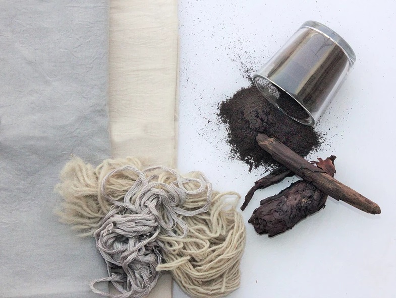
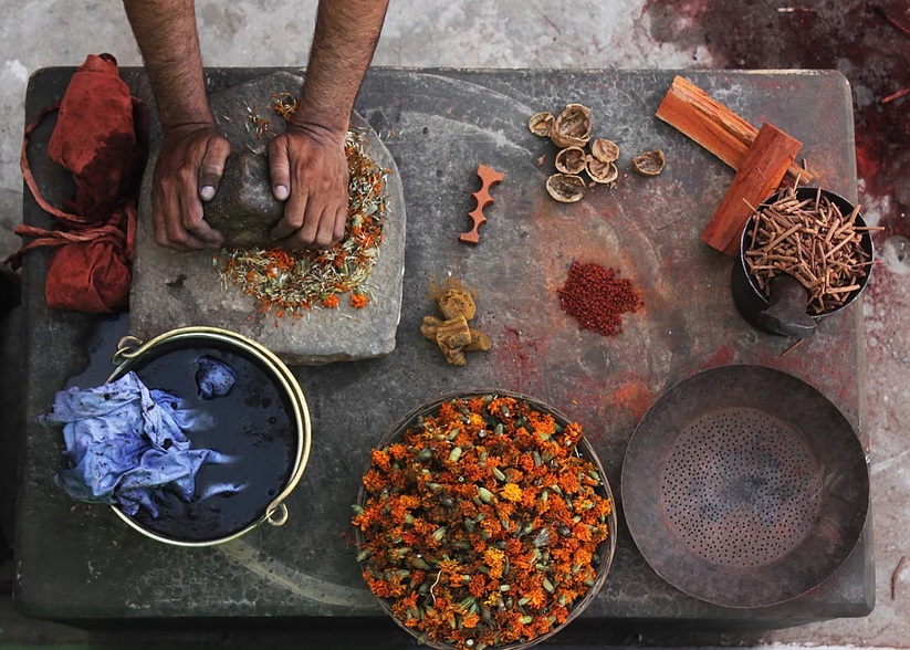
Onion Peels, Walnut Shells, Turmeric, Pomegranate Peels
These are classic examples of how common products which are found at every home can be used to create natural dyes.
For e.g. – Onions peels when powdered and mixed in water will give you a beautiful pink shade on fabrics, Pomegranate peels grinded to powder and mixed with water to create a dye bath will give you different shades of yellows, Grinded walnut shells dye batch can give you a light brown shade.
We also have these products displayed at the workshop so that participants can get a firsthand experience of using them to dye fabrics.
Why should a tourist or locals take time out for a workshop with your company?
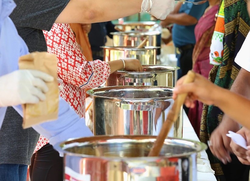
Primarily, because they are in for a fun packed day. So basically, we would recommend people even if they are not so much into textiles to attend the workshop because just like any other informative workshop this one is a super fun one. In addition to the fun that you will have, you also get to learn a lot about natural dyes, tie and dye and block printing. You get to play around with a bunch of natural colours and unleash your creativity on the fabrics/ garments.
One of the highlights of the workshop is that you get one organic cotton garment, one organic cotton bag to dye during the workshop. Additionally as a participant you are free to being as many garments/ fabrics to dye during the workshop.
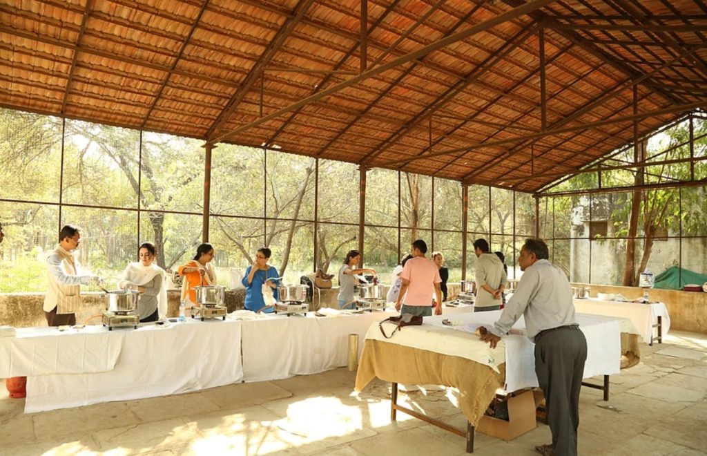
Apart from this every workshop has approx. 5-6 participants which makes it a personalized workshop and our instructors are at the disposal of participants during the whole workshop which makes it interactive and interesting.
When we think of printing and India we naturally think Block Printing. Can you explain briefly the history of how India gave the world block printing?
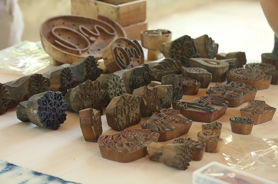
Interestingly enough, Jaipur/ Bagru’s block printing is appreciated across the world and is a major highlight for all textile enthusiasts across the world. When we talk about India, you will get to hear about the bagh print, Ajrakh print, dabu print etc. which are majorly related to printing designs on a dyed fabric and similar to block printing in one way or another.
Block printings though suggested by historians to have originated in China has made its way to India. In India it flourished during the 12th century when it received a royal patronage from the ruling kings. Bagru, I would say has kept the lost art alive and has moreover revived it and distinguished it across the globe.
Block printing has commercially been successful since the manpower required in India is well trained and available in abundance. Therefore India has been able to make block printing successful. As the block printing became more successful and more commercially viable more and more highly skilled local craftsmen quickly mastered the textile art form.
Discuss the importance of colour to fabric in India?
Colours to fabric in India are as important as anywhere else in the world. However, I would like to say that we as Indians are more colourful than the rest of the world. Anyone who has been to India would agree to this statement.
We would always prefer a coloruful shiny dress in comparison to a plain solid one. We also believe that colours have a demonstrable psychological effect. Specific colours have specific meanings. Apart from this the lost list of festivals that India have, you are better if you have variety of colours in your wardrobe. All these factors when combined make India a colourful country. To wear coloured fabric you need to make colourful fabric and that’s what businesses do.
Expand on how your company has been able to employ local people, in relationship to the area you are in.
Local talent and artisans are the real heroes of the workshop. Faruq, who has been associated since our very first workshop is a master tie and dye artisan. His family has been in the trade for the past 5 decades and he himself has been practicing and doing tie and dye for more than 2 decades.
Without local artisans I am pretty sure that our workshop would not have flourished.
Be it block printers, tie and dye artists or the master dyers they have been an essential part of the workshop.
Our aim is to make sure that we employ local artisans in the workshop as they are definitely the authentic ones and you can rely on them to make each and every workshop interesting with new designs and new techniques.
Currently we have more than seven locals who are involved with the workshop. Some of them handle the operations part and the others are the artisans. Funny part is that one of our drivers tried his hands on dyeing and was pretty good at it as well. So now, he is also practicing to dye with us and soon will be dyeing fabrics for us.
Contact details:
Sidhant Sodhani
Dye it yourself Workshop
Dyeityourself@outlook.com
Sidhant, Jaipur, India
Interview by Deborah Blakeley, February 2018
Caroline Bullock
Can you briefly explain the process of cyanotype and how you use this technique?
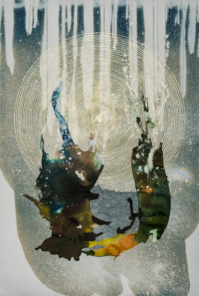
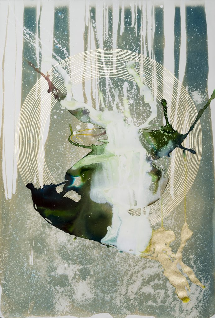
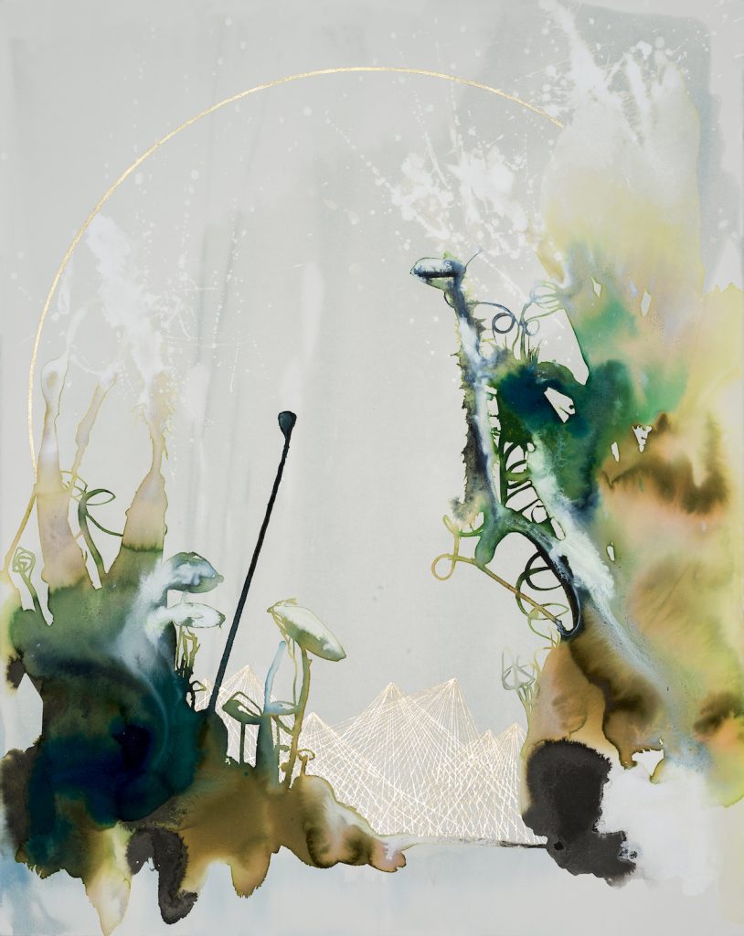
Cyanotype is a photographic printing process that produces a cyan blue print through the use of light sensitive chemicals, UV light and either large format negatives or objects. The selected substrate (I use paper) is coated with the light sensitive solution, allowed to dry, then exposed to UV light with the negative and/or objects. I apply the liquid to the paper in random patterns and then expose the paper in sunlight using elements of nature such as sand, water and rocks to create the imagery or feeling I am trying to evoke. Once the image is exposed I rinse the paper, allow it to dry, and then tone the print with different methods to achieve the more muted, grey and golden tones I desire. For example, the blue/grey celestial background imagery you see in All Possible Worlds (Channel) is the cyanotype.
All Possible Worlds (Channel) Watercolour, ink, gouache and cyanotype on paper, 44 x 30 inches.
Your comment- “I am interested in how we attempt to create our perceived human reality with complex systems of mathematics, science and technology.” Discuss this in relation to your art.
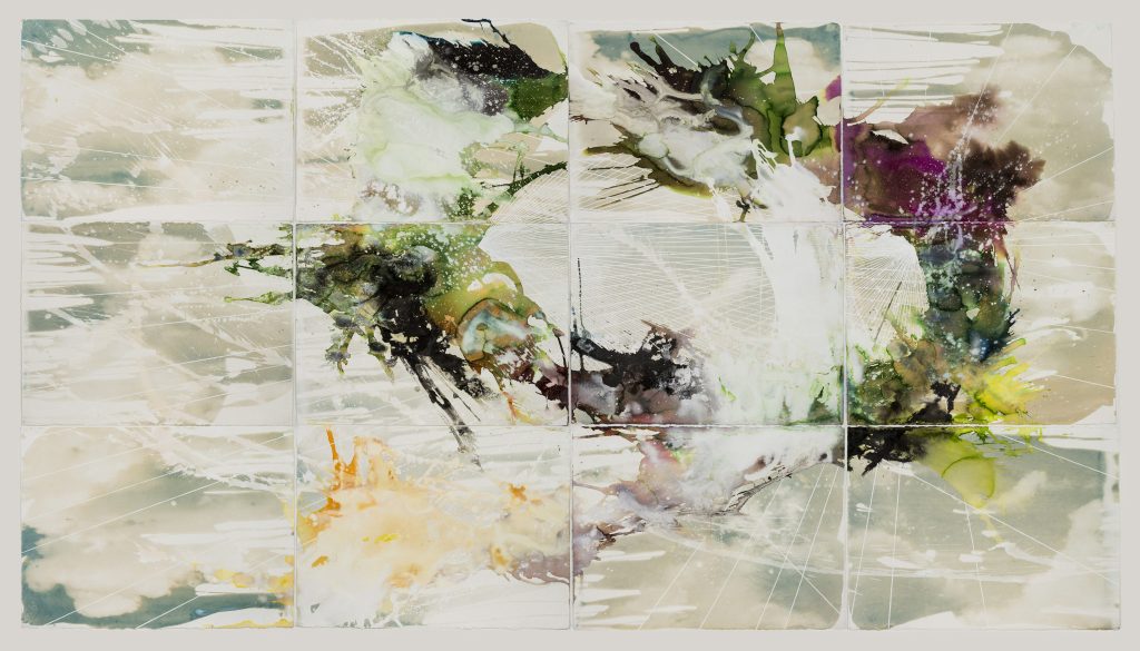
I am interested in what lies beneath the surface of what we perceive to be reality. Mathematics is the language of nature, but it also distorts the perception of natural beauty and mystery. Technology allows us to explore the universe, but also encourages us to manipulate nature to our peril. The paintings I make attempt to address this conflict with processes that seem diametrically opposed: random and free flowing poured passages of paint and more planned intentional areas of geometric forms and shapes. My intent is to combine these two conflicting processes in a way that creates a unified representation of my vision of the universe.
All Possible Worlds, Watercolour, ink, gouache and cyanotype on paper, 66 x 120”.
You do a lot of work for large hotel chains; can you expand on how these commissions came about?
I sell my work through a gallery and a variety of art consultants. Many years ago, various art consultants from different art consulting firms approached me after seeing my work in some group shows and it’s evolved from there. Some consultants work for private collectors or corporations and others primarily represent the hospitality industry. The consultants that work for the hospitality industry are almost always seeking a certain size of work that demands commissions or reproductions. For many years I was producing only original commissioned work based off of existing work that had either sold or wasn’t the size a project demanded. More recently, and I suspect due to the rise and capabilities of digital technology, I am primarily selling high volume reproductions (giclees) of my work to the hospitality industry or am contracted to produce an original that can then be scanned and printed at a desired scale.
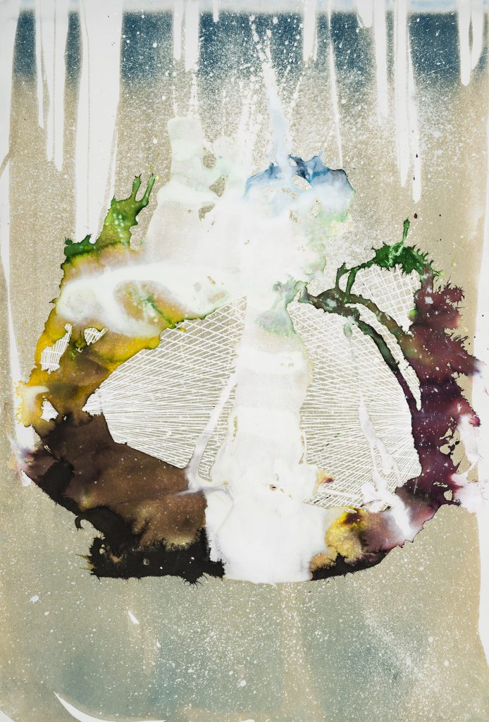
All Possible Worlds (Tempest) Watercolour, ink, gouache and cyanotype on paper, 44 x 30 inches.
Often your work has multiple circles, expand on this aspect.
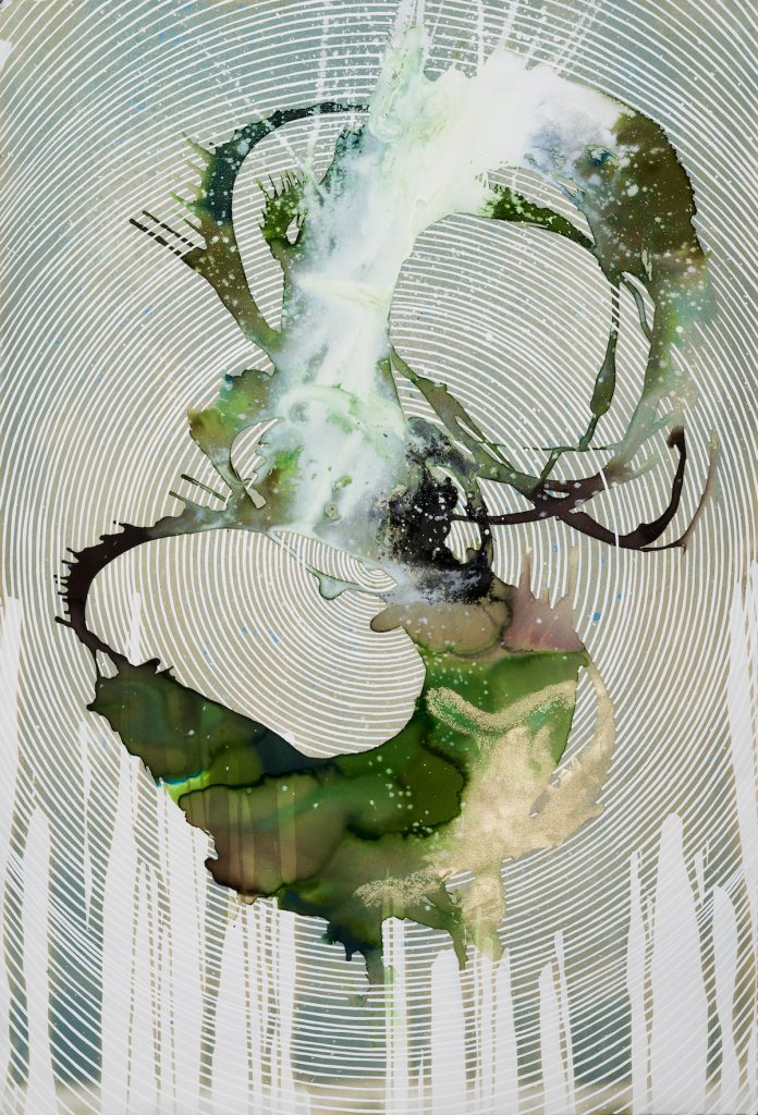
I use the circle in my work primarily for its extensive symbology. In my work the circle can represent portals or it can symbolize the infinite nature of the universe. Concentric circles in my work can symbolize the vibrational pattern of all that we see and cannot see in the universe.
All Possible Worlds (Faunus), Watercolour, ink, gouache and cyanotype on paper, 44 x 30 inches.
Expand on the series of work All Possible Worlds
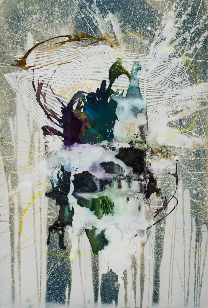
My most recent work is inspired by my interest in the multiverse or “many-worlds” theory of quantum mechanics. The idea that the 3-dimensional world may be just an illusion resonates with me as a painter who makes paintings that are, in their very essence, nothing but an illusion. The paintings in the All Possible Worlds series juxtapose multiple mediums, that rely on both randomness and intention, with more direct elements such as photography and mechanical, geometric drawings. Inks and watercolors blend and react, creating forms that become almost organic in nature— flowing, bursting, seething, or vibrating—while the geometric drawings, intertwining amongst the ink pools, connote the structure as well as the energy of the forms, creating new and different worlds unto themselves. The process often seems in conflict, but my intent is to bridge these conflicts in a method that is primarily unexpected and always enlightening.
All Possible Worlds (Lacuna) Watercolour, ink, gouache and cyanotype on paper, 44 x 30 inches.
Take ‘All Possible Worlds – Conservatory’ and discuss the number of layers that this one artwork has. Also discuss the importance of layering to your work.
This piece consists of several layers of media like the rest of the pieces in the series: cyanotype, watercolor washes, ink washes, graphite drawing and gouache detail work. The cyanotype is the first layer and this forms the background imagery of the piece. Next I lay down areas of water and watercolor washes to form the shape I am inspired by or desire. I then work with the gouache and ink in different ways to see how they flow together and form new colors or react and create unexpected but exciting passages of shape and color. Lastly, I sketch in the geometric forms and paint these with the gouache.
I don’t really think about layering in my work although generally multiple layers create more depth and I think this often makes the piece stronger visually and conceptually. That said, some pieces are created rather quickly with only one ink or watercolor passage. It’s a delicate balancing act of how to know when to stop and I think most artists can relate to this challenge.
All Possible Worlds (Conservatory) Watercolour, ink, gouache and cyanotype on paper, 44 x 30 inches.
What is the drying process involved and is buckling a problem with the paper?
Watercolors and inks dry within hours which is why I enjoy using them as it keeps the work fresh. Buckling isn’t really an issue for me as I use a medium weight printmaking paper for my pieces primarily because I need a paper that will stand up to the cyanotype process which involves multiple washings in water.
What type of paper do you use and is the weight or other factors in your paper choice?
I use Rives BFK printmaking papers not only because they’re beautiful, but also for their ability to withstand multiple washings during the cyanotype process. I’m also looking for a specific “bleed” effect of my watercolors and inks and after much trial and error this paper seems to suit my needs best.
All Possible Worlds (Supernova) Watercolour, ink, gouache and cyanotype on paper, 44 x 30 inches.
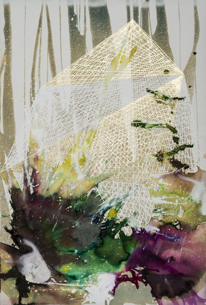
‘All Possible Worlds’- Swamplands gives such a feeling of the blending of man and nature, discuss.
This was one of my first pieces in the All Possible Worlds series. I wanted to create a piece that reflected peering through a portal or looking glass into another world. I had a vision of the beginning of time and creation arising out of the primordial muck, such as swamps and marshes that are so teeming with life, and then exploding into the atmosphere. The geometric shapes in the background reflect my interest in the underlying mathematical, geometric structure of nature and these shapes could be read as representations of mountains or hills in the distance.
All Possible Worlds (Swamplands) Watercolour, ink, gouache and cyanotype on paper, 44 x 30 inches.
You worked on your ‘All Possible Worlds’ series in 2017 what does 2018 hold?
I plan to continue to work with this concept in 2018 and will also be experimenting with different mediums and substrates. I want to try and create some large canvas pieces in addition to the works on paper. The work and challenge there will be experimenting with new mediums and how these translate to canvas. Some sculpture isn’t out of the question either.
Contact details:
Caroline Bullock
Caroline Bullock, Atlanta, USA
Interview by Deborah Blakeley, February 2018
Nathalie Hartog-Gautier
You comment,’ My work is focused on the voyage between people and their environment ….’ Can you explain this in relationship to your art work?
My first major exhibition “Of Global Appearance” was based on the Quarantine Station at Manly, NSW. When I started researching this project, I really wanted to know the stories before and after the migrants arrived in Australia.
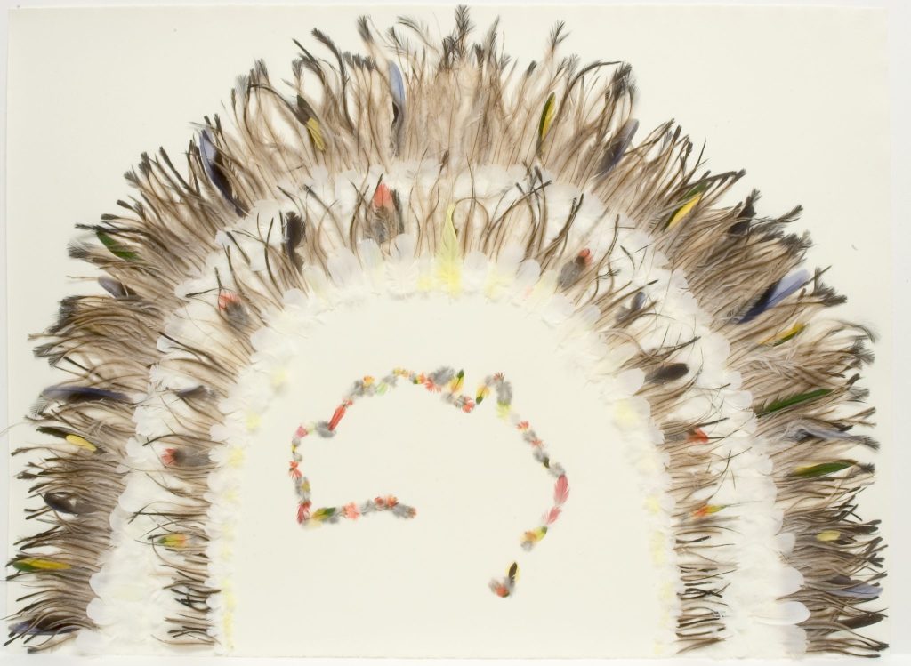
The Gift of Feathers
The more I researched the project the more I realised the place was a micro representation what Australia is today. It accommodated waves of migrants, but also refugees from the Vietnam War, gave a refuge to homeless people from Cyclone Tracey in Darwin but also those deemed to be illegal immigrants waiting to be deported.
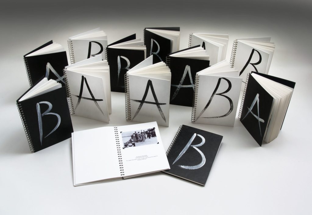
I collected about 100 stories of people who experienced the Quarantine Station and whose ancestors experienced the Quarantine Station. I asked them where they came from and where they are today. All those stories where bound in 14 books titled A and B, which was the classification of people coming to Australia, A for Alien and B for British.
Of Global Appearance – 14 Books
This notion of connection with a place became very important theme in my work. As a French migrant to Australia, it was very important to belong and to create connections. The environment, the landscape became a theme in my work, the journey between two cultures, two different landscapes, to be like a navigator, an explorer into my new world. I looked at past explorers’ journeys, such as Lapérouse. I researched their connections with the land and the meaning of the exchanges they established along their long journey around the world. The list of the objects taken on boards as gifts, such as botanical specimens, feathers, pigment, buttons etc was fascinating, linking to rituals and its meaning in society.
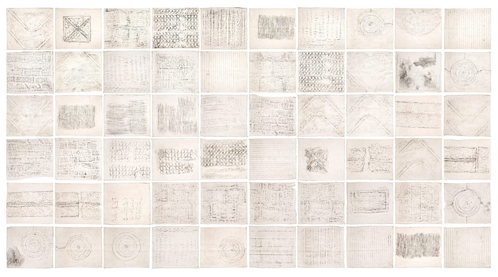
Of Global Appearance,- 60 grouped rubbings
This research was then translated into my work, such as the creation of imaginary maps and botanical specimens or with natural pigments extracted from the plants.
You have had residencies at Murray’s Cottage at Hill End please discuss how these residencies have influence your work beyond the residency.
I had three residencies at Hill End, two runs by Bathurst Regional Art Gallery (BRAG)
and one with the National Art School, it was such a great experience I could go back any time.
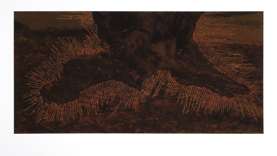
Earthlines Remembrance – Hill End
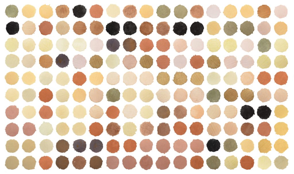
The place encapsulates the different themes in my work. It relates to migrants coming for the gold rush, the migration of botanical specimens by Louis Beyers who missed his European landscape and planted European trees forming a large avenue leading into the village of Hill End. I collected all the different colours of clay I could find around the village and I used them as a relief print medium. They are the same colours found in the paintings Russel Drysdale, Donald Friends, Margaret Olley, Jeffrey Smart, Jean Bellette who all stayed at Hill End. All except one, the grey colour clay, found underground. The one I printed with in “Remembrance” was found at a depth of 400m.
Colour of Hill End, plant and earth pigments on 170 hand made paper,
each 18 x18 cm
I collected plants and extracted their pigments to create of another botanical landscape.
Caryard 2, relief print with clay, clay and ink drawing, 110 x 90 cm
This work influenced two projects I am working on at the moment on the Blue Mountains looking at the impact of coal mining and for the Museum d’Histoire Naturelle in Le Havre in France working with plant pigments.
Discuss other overseas residencies you have been involved in and for each give a brief outline of how the environment has influenced your work.
I was awarded two residencies at the Cité Internationale des Arts (CIA) in Paris. The studio at the CIA is fully furnished and it is also a working space, a base to come back to. The building is in a fantastic location, it is right in the middle of Paris and provided me with a unique opportunities to visit as many museums and galleries as I could. There is nothing in Australia such as Le Louvre, Quai Branly or Musée d’Orsay for example.
Retracing Scanning Memories, Gouache on archival digital print, detail of an autochrome, 50x50 cm
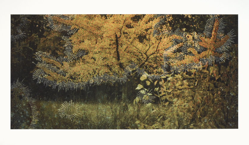
Travelling III, gouache writing on archival digital print, detail of an autochrome 50 x 100 cm.
Explain your work in the Manly Artist Book Award, and the process you took to create your book?
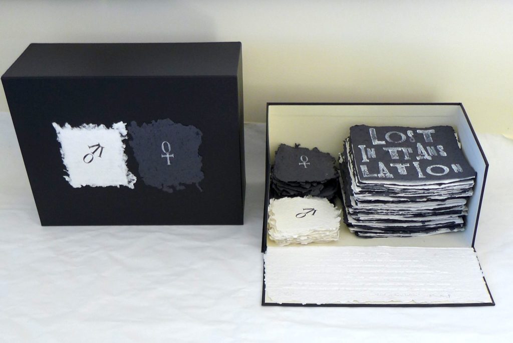
The work I entered for the Manly Book Award was originally created for an exhibition with the group of artists called the Sydney Printmakers. The work had to answer the theme of “Fun and Game”.
I was born in France and, as a French speaker; I am fascinated by the double meaning words can have from French to English or English to French. In the game “Jeu de Dame” in French or “draughts game” in English, when the player reaches the far edge of the board the piece is crowned and becomes a “Dame” in French and a “King” in English whence the title of the work “Lost in Translation”. I made a chess board with 64 hand made paper squares, 32 black and 32 white squares, with 24 smaller pieces. All the pieces were stored in a Solander box. I attached 2 pieces of hand made paper to the top of the box, black and white, with the female (for “Dame”) and male symbols (for “King”) relief printed on two small pieces of hand made paper. The Manly library bought the work for their artist books collection.
Lost in Translation
Briefly expand on the type of printmaking you are currently doing?
At the moment I am mixing my printmaking techniques. My last work is an installation mixing relief and digital print with drawings and hand casted paper.
Installation – North Head Project
In collaboration with Penelope Lee we developed a project titled “Imaging the margin” we used gilding tools to press the texts into large hand made pieces of paper, an other way of printing. The work reflects on the current marginalisation of refugees forced to flee their homes and cross national boundaries to escape war and persecution. I made collages and drawings that were then put together into a video projected on 5 large hand-made, watermarked, paper panels.
“Imaging the Margin” still from a video.
Currently I am working on a project to be exhibited at Orange Regional Gallery in June. I am drawing in gouache the Jali patterns on the photographs I took in Rajasthan, India. The “Jali” is constructed from geometrical patterns and used as screens on windows.
“Jali” Gouache on archival digital print
You continually used Archives as a source for your work. Can you discuss the process you to using the Archives in you work Quarantine Station in Manly?
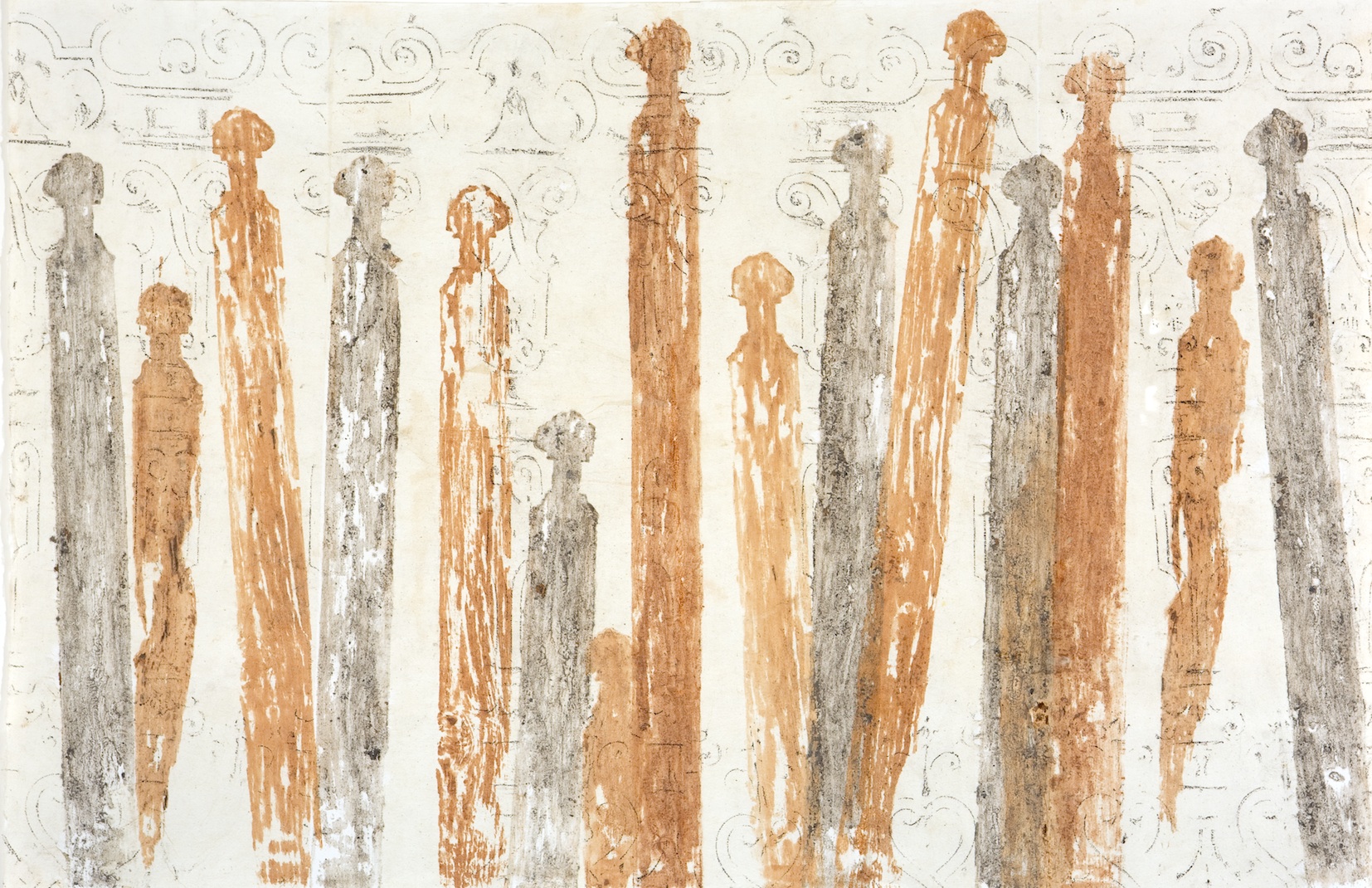
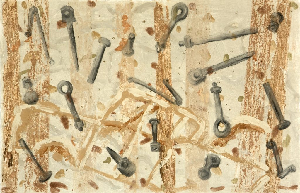
Because my work is about journey, I was very interested to find more information about the place, I don’t use all the information I gathered but it informs my work, TO trigger imagination or bring on more questions! When Katherine Roberts invited me to be part of the North Head Project I thought, great! I could use all the research I did about 20 years ago. With the 10 artists involved in the project, we had a 2 days residency at North Head and stayed at the Quarantine Station. We had a tour of the Quarantine Station with rangers and a tour of North Head Battery with an historian. In the end I started a new body of work, a continuation on my previous exhibition. If I used the Archives extensively with the first exhibition the Health Department website provided me with a lot of information I needed. I would say the initial research helped me with a strong knowledge of the place and made it easier to summarise and focus on the disinfecting shower one of the key buildings I chose to work with. All migrants, who stayed at the Quarantine Station had to have a carbolic acid showers. I suppose I am the one creating the archives by recording the surface of the shower blocks. I have chosen to work with hand-made paper: it is not only a surface on which to write and draw, but it adds the layer of memory of my hand casting the paper, reading like Braille on different surfaces. It allowed me to record the shapes and details of the place, evocative of words: casted corrugated metal from the shower recess, bolts and nuts are punctuations of migrants’ stories.
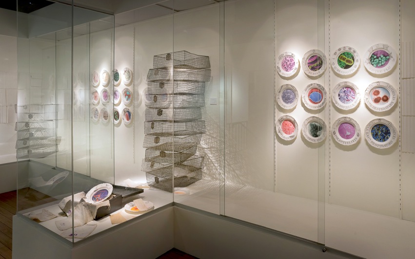
Part of the work is a set of plates telling the stories of viruses. Their images as well as the drawings of the animals responsible for carrying those different viruses, look intriguing served on a plate. I wanted the overall experience of looking at them no to be perceived as a threat but similar to the first mouthful one eats: it is only when you get close that you realise it is too late.
Away from paper you have uses Perspex, but you have continued to use words discuss.
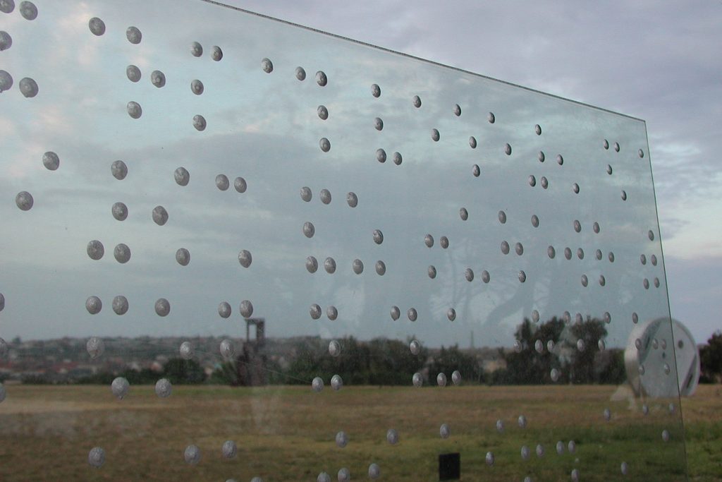
Invisible Pathway of Words, - detail
I have used Perspex only once in my work so far apart from drypoint on Perspex plate. The work was about the two senses, the sight and the tactile. The text was written in Braille on the Perspex, the transparency of the surface was a very important element of the work. Only a person visually impaired could understand because the surface needed to be touch to be understood and someone who could see couldn’t read the text. I titled the work “the invisible pathway of words”.
Contact details:
Nathalie Hartog-Gautier
hartog7@bigpond.com
Nathalie Hartog, Hardys Bay, Australia
Interview by Deborah Blakeley, February 2018
Karen Beauchamp
You original training was as an architect, how has this influenced your current artistic work?
My architectural training is something that I am thankful for every day.
The course taught us to think in a different way, to analyses a problem from a practical point of view also to think from the foundations upwards.
The other thing that has influenced my career is spatially awareness, I am not sure if this is a learned skill or a natural one, but it is very useful.
Can you expand on your change of direction in 1978 and setting up your own company producing hand painted wallpaper?
My life has been full of crossroads and opportunities, and I have rarely gone for the safe option.
I had moved to the Isle of Man (of TT Races fame) with my partner and at the time and subsequently looking for a job. I thought that it would be easy as there was a building boom and several architectural practices on the island. However, there were no vacancies at all, I was recounting this to Phil the carpenter who was repairing the windows in the house we bought. He suggested that I met two of his friends who he played in band, both graphic designers - George and Charlie. They had a very small business making T-shirts and posters for the Manx businesses. We got on well and decided to join forces set up a graphic design and printing company. My role would be to go out and get business and attend to the administration.
After a few weeks I was also helping with the artwork and making screens as well as my other tasks loving every minute of it. One Saturday the ‘boys’ were supposed to come into work and finish a job for the local hotel, who were sponsoring a sporting event that afternoon. They had, had a late night with the band and did not turn up. I was forced to pick up the squeegee and make my very first screen print!!! I managed fairly, well and delivered the shirts on time. I was completely hooked from that moment on. All I wanted to do was print!
I worked on as many print projects as I could, leaving George and Charlie to do the design and artwork while I took over the printing.
One day an old acquaintance from London popped in, he was an antique dealer but unbeknown to me an avid collector of historic wallpapers. He asked me if I would reproduce some wallpapers for him. I had no knowledge, but I said that I would have a go!
I knew how to do the colour separations, after that it I was in virgin territory.
I had to solve the problem from the foundations upwards and in those days ‘You tube” did not exist. I set up a “Stick and String “printing station using the beautiful Sias flatbed screen printing bench, we had just bought together with the drying rack and hair dryers hanging from the ceiling, two broom handles to hold the roll of paper. I worked out how to register the colours and the consecutive prints - leaving one and then printing one all down the roll and then printing in the gaps in such a way that you would not notice the joins. All skills that I have now perfected over the years with experience.
The next task was to mix the colours to match the faded casein colours of the old block prints, this was the most enjoyable thing for me and later when I was able to train and employ a printer I continued to mix all the colours.
I did ten jobs for David the antique dealer until he decided he had enough paper for the house he was doing up, I was bereft, as I had really found my passion. I went down to London, made appointments with interior designers who commissioned work, some of whom are still in contact today forty years later. I also made an appointment with English Heritage - their interiors specialist Pamela Lewis, was my last appointment. I remember the day, it was cold wet and gloomy, and my spirits were not that high, as I had not really had any success only a few nice comments. Pamela was very quiet while going through my portfolio and I thought that she was not that impressed until she said that ‘I had a good eye” and that she would give me a commission; which was - Osbourne house. Late Queen Victoria’s house on the Isle of Wight - they were renovating the nursery
This was the real start - I was on my way!
Having commissions from Osbourne House and Frogmore would be both rewarding and confirming discuss.
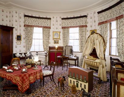
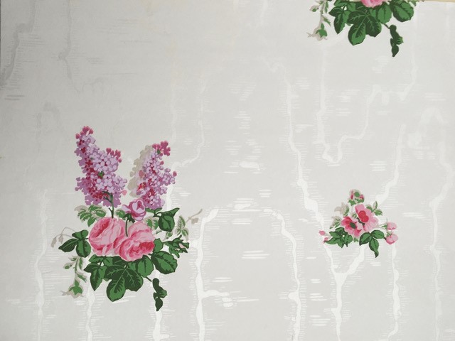
Osbourne House was a twelve colour screen print over a block printed mica moire ground and I was asked to collaborate with Denis Hall at Cole & Sons who were to make the ground. This gave me the opportunity to both visit Coles and to meet Denis who was a legend in the wallpaper industry.
The Nursery at Osborne House
The job took a long time as the specification were very exacting, the results were well received.
Therefore, English Heritage commissioned me to make two further papers for Frogmore House.
Frogmore is a private family house in the grounds of Windsor Castle - built for George III and Queen Charlotte, it is now a retreat for current royals.
Frogmore House and Gardens open to individuals in aid of three different charities chosen by The Queen.
Paper for the Music Room at Frogmore
The spaces in the house are large and the ceiling height is four or five meters, this provided a huge challenge for me as there are many technical aspects of printing paper for such a large space. One being shading, where there is a slight shift of colour density from right to left of the paper and this can also occur in the other direction. The other being, physically making enough colour and seeing that it remained the same consistency all through. We also numbered the rolls so that they were hung in the same order as they were printed.
Queen Charl0tte's Drawing Room paper, Frogmore
I was terrified when I visited to see the result and walked into the room backwards! However, the paper had been expertly hung and looked good and this was a huge relief and joy to me.
Comment on your personal thoughts on the value of companies having archival collection?
Archives are wonderful and very beneficial for companies to own, they are expensive to maintain, and accountants do not necessarily see their true value. The fact of the matter is that they should be viewed on many different levels.
The first level being the original authentic designs printed or made in the traditional way. A recording of the history of the company, design and manufacture. They also provide details such as colour and balance.
The second and most important level is in the inspiration that they provide. Looking deeper into a design and adapting from the original according to the mood of the current day, by editing, simplifying, rescaling or radically changing the colouring. There is so much that can be reused.
The third level is one that fascinates me and that is the texture and fine detail on the original documents either created by the traditional process or by age.
Archives are a constantly changing source of inspiration a fact that is not always appreciated.
How do you keep your own records for the future?
I have a large store room for my wallpaper books and rolls on racks that have been specially built. I also have boxes and boxes of bits and pieces of inspiration and I am constantly collecting new and interesting things - but my headspace is also important as I am blessed with a lateral thinking mind!
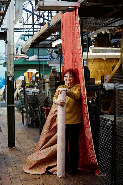
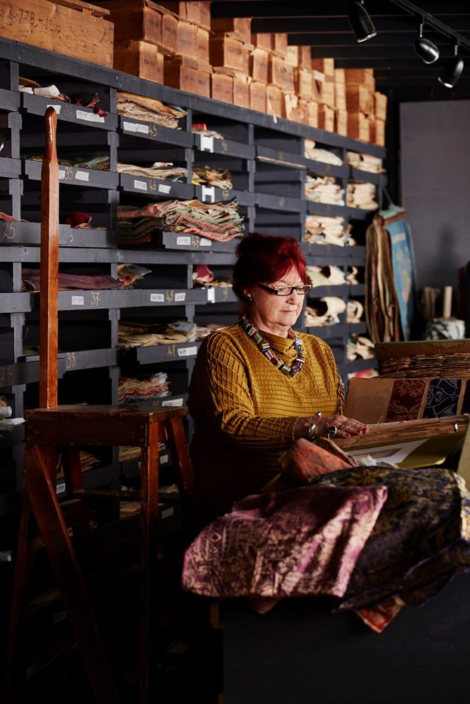 Karen Beauchamp working on the Renaissance Collection for Gainsborough Silk Weaving Company, and in their archive.
You are a member of the Wallpaper History Society. Expand on the importance of this niche society in a modern context.
Today most people think that they are seeing so much in the shops, on tv and in magazines that there is nothing new to see.
I can say from experience that when I have shown original pieces of historical wallpapers to friends and colleagues who are not in the wallpaper business they are very often blown away by the originality and skill, also by the complexity, colour and delight that old wallpapers can bring.
The wallpaper History Society was set up to hold the information and knowledge by bringing together a group of highly enlightened and interested people from all related spheres.
The society is interested in expanding the world of wallpaper and bringing in new, young and skilled members to participate.
Wallpaper is a reflection of social and cultural history on walls.
Isidore Leroy collection
Can you discuss design and bling, and introduce your YouTube video, ‘Swarovski Elements’?
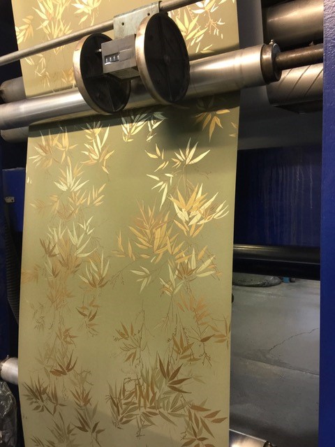
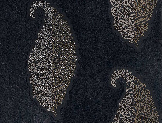
In 2010 after leaving Cole & Son, I was asked to work with Swarovski to pull together a collection of bejewelled wallpapers.
Swarovski are world renown for their bling and for crystals of quality. My aim was to unite the crystal world with the interior design sphere by using the unique quality of the crystals but allowing them to have a warmer more seductive quality for interior use.
The inspiration for the collection was decadent old Venice. By introducing the textures of satin (mica on wallpaper) Flock, leather and suede effects, the crystals would sit more harmoniously in many different types of interior.
At first the company did not understand the importance of texture especially the flock, but once the first piece came off the printing press it was obvious that we had something special.
I really enjoyed working with the company they have an amazing repertoire of
products and it was such a joy to play with so much potential.
SWAROVSKI ELEMENTS wows London with new Wallpaper Collection
SWAROVSKI ELEMENTS wows London with new Wallpaper Collection
Click above to view the Youtube
Discuss your ‘Colour Series’ and how you use details of the landscape in this series.
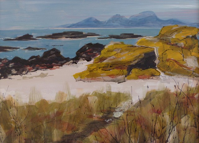
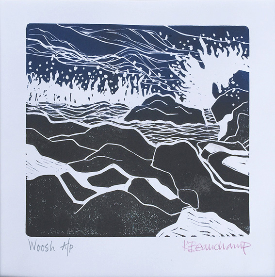
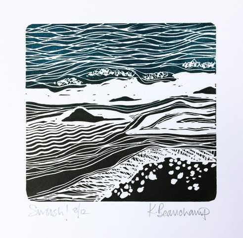
Living on the west coast of Scotland, I am constantly stopped in my tracks by the beauty of the colour around me. The more I look the more I see, that applies to shape and texture as well.
The Colours of Kintyre, Mixed Media painting
The topography here is astounding - the rocks are extraordinary, there are long deserted sandy beaches - rolling breakers and raised beaches. Views of islands like Jura, Islay and Gigha, wide expanses of sea between and mega skies. Every day is inspiring whatever the weather.
Winter is the best season, as the light is very blue and the colours very clear. Generally, the weather is good in winter, like today two days after Christmas and the landscape is rich. The trees are bare, and their structure is there for all to see, soft grey trunks against rich inky blue hills. I could go on forever.
When I sit down to paint outside or inside I delve into my box of tricks. I love experimenting with colour - I often paint in just two colours my favorites at the moment are Burnt Sienna and Ultramarine. There is a wealth of possibility there, from warm to cool and lots of fabulous neutrals.
I tend to be totally obsessed by a subject now it is seaweed. I love the texture, colour and the shapes. I have rocks and seaweed hanging up all round my studio, they are like huge musical instruments.
I will paint from them for colour and make lino prints for shape.
I very much enjoy taking out the students who come on my painting holidays on location - they are all completely absorbed by the environment and we can spend whole days out painting and drawing with a traditional picnic lunch.
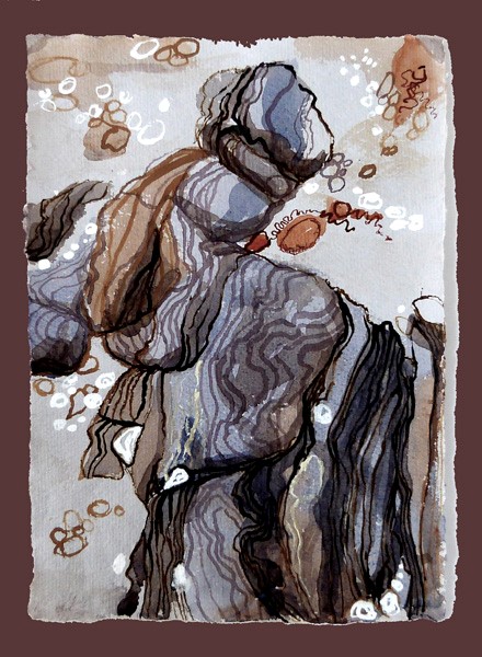
Rocks and Pebbles series
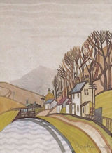
You have three works in the Crinan Canal Prints by your mother, Kaye Marris, explain the importance of connection of place and family to these prints.
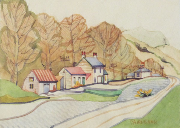
Cainbaan Canal, April 1942, Kaye Marris
My father was Scottish and came from north east Scotland near Wick and Thurso, I never visited the area when I was young as he lived most of his life in Surrey.
When my daughter decided to go the Glasgow University, it was my excuse to visit Scotland. Eventually she married and became a farmer’s wife on the west coast south of Oban which is the gateway to the Hebrides. This is when I started to understand the beauty of this part of the world.
In 2009 I sold Cole & Son, deciding it was time to buy a house in Scotland after lots of searching I found a glorious Arts and Crafts house forty miles south of my daughter.
My Mother died in 2010 and while going through her papers I found her portfolio, in which were five paintings of the Crinan Canal, it was instantly recognizable. I subsequently found out that she had visited my Step Father at the army internment camp he was in charge of in Crinan and I gather from correspondence that she was there for about three months (all before I was born) during which time she did these paintings.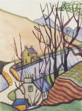
Cainbaan Bridge, April 1942, Kaye Marris
The irony is that Crinan is exactly halfway between where my daughter lived and where I live! Life is very strange. My daughter now lives on the canal.
We all love the Crinan Canal - the most beautiful short cut in Scotland.
Discuss the importance of space in relationship to design found in your work.
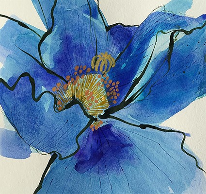
Meconopsis
Space in painting gives point to the work and it is challenging to portray, working with colour and balance, especially where the sky is the dominating feature including rainbows and shafts of sunlight. I am always stuck by the spatial relationships in the landscape and well as in the interior.
Contact details:
Karen Beauchamp
Whitehouse Studio (Art Holidays)
Karen Beauchamp, Argyll, Scotland
Interview by Deborah Blakeley, February 2018
Helen Earl
You currently are currently exhibiting work as part of The North Head Project curated by Katherine Roberts at Manly Art Gallery & Museum. Can you explain the process that takes place to produce artworks for a curated exhibition that respond to place?
This exhibition emerged from a partnership between Manly Art Gallery & Museum and the Q Station. Ten artists were invited to consider the entirety of the North Head area that is situated on the northern headland at the entrance to Sydney Harbour. It is a large area with a complex Indigenous and cultural heritage, environmental significance, military history and unique migration and quarantine stories.
The artists were brought together in February 2017 for two days, staying overnight in the old nurses quarters of the Q station. During that time stakeholders from the Aboriginal Heritage Office, Manly; the Sydney Harbour federation Trust, North Head Sanctuary Foundation, Q Station Manly and NSW National Parks & Wildlife Service led the artists all over the site. We descended underground into the old military tunnels, visited the historic quarantine facilities and walked amongst the endangered ecological community, The Eastern Suburbs banksia scrub, (ESBS).
The experience was an invaluable immersion for developing a conceptual response to the site and the multiple narratives it presents. Being together with other artists heightened the experiential response to the site.
The exhibition opened on December 8 and it runs until February 18, 2018. I am exhibiting 5 works.
Stripped Bare, photo by Greg Piper
Stripped Bare, is a response to the practice of cleansing newly arrived immigrants with hot water infused with carbolic acid (phenol). The old quarantine station shower block is a sparse, institutional building. Carbolic acid is a skin irritant that on contact with the skin causes whitening of the exposed area and subsequent peeling.
Stripped Bare, detail, photo by Greg Piper
Skin Deep responded to the eerie ghost tour experience and subsequent research about the old hospital and morgue. Knowledge of the causes, methods of transmission and the treatment of infectious diseases was scant in the nineteenth century. Diagnosis of diseases such as cholera, typhus, scarlet fever, measles, smallpox and bubonic plague was based on physical symptoms and skin appearance.
Skin Deep, detail, photo by Greg Piper
In Memoriam reflected on the idea of absence and presence of past lives – the original aboriginal inhabitants, the immigrants who died of disease and Australians who served in wars but never came home to rest.
In Memoriam, Installation, 550 x 750 x 2000cm
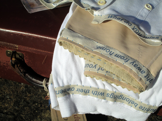
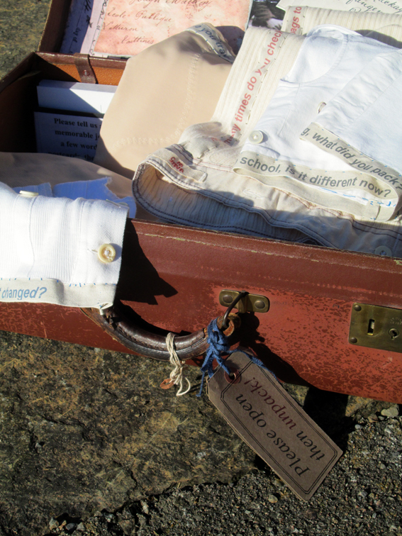
In Home dressing table heirlooms packed in an immigrants suitcase become poetically entangled with North Head Sanctuary indigenous botanical and animal forms. I suggest to the viewer that creating a new home in a new place can displace the homes of other species or alternatively subsequent generations of immigrants come to love a new land and the objects inherited are mere relics of the past. The North Head Sanctuary is a tangible reminder of the Eastern Suburbs Banksia Scrub (ESBS) ecological community. Home is a reminder that a safe habitat is important for all life and finding solutions to preserving biodiversity should become part of our daily rituals.
Home
How much lead time to you usually need for an exhibition?
Anywhere between three months to a year as I like to have plenty of time to do background research about an initial idea I might have. In my research I am looking for the small or perhaps incidental historical, scientific or environmental narratives in order to reflect upon grander narratives of our cultural life today and the natural world in which we live
What is your criteria for an exhibition?
An interesting brief or space or place where I can make whatever I feel like.
Expand on the use of found objects (natural) as part of your ceramics practice.
The found object is always a referent to time and place and has it’s own history. The natural object references deep time, the time it takes for a seed to germinate, grow into a plant or tree, maybe suffer a storm event and drop a branch that floats down a river and gets washed out into the sea and then washed back onto a beach near or far. It already has a story that is just waiting to be told in conjunction with my experience of a particular time and place.
How has one of your beachcombing pieces lead to a completed art piece?
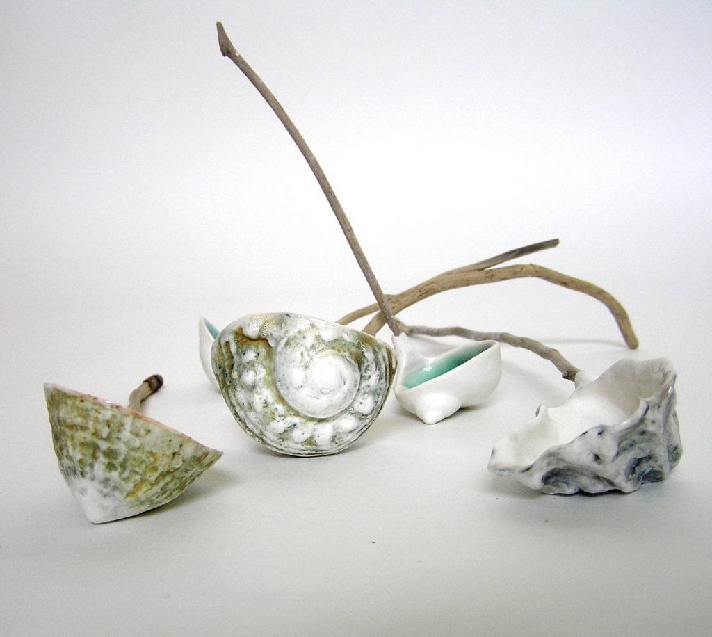
Midden spoons, one of my earliest works using driftwood I collected on my favourite beach on the mid coast of NSW references the complex cultural history of the first settlement of Sydney and colonial misinterpretation of the cultural practices of indigenous people.
Midden Spoons
Very little physical evidence remains of the Cadigal people, the coastal indigenous inhabitants who were the original custodians of the land on which the Botanic Gardens Sydney is sited. The Cadigal based their subsistence economy and cultural practices on the use, access, sharing and trading of marine resources. It was a highly cultivated relationship with the environment.
These marine resources provided food, tools, utensils and body adornment. Marine life was an integral part of their spiritual connection to the land.
Shell middens are the remains of seafood meals eaten by coastal Aborigines. Middens are usually found in easily accessible places where there are plenty of shellfish. One can surmise that the shoreline of the Botanic Gardens Sydney had middens because map evidence suggests that lime kilns existed near the Sydney Opera House Gate. Shells were roasted to make lime for mortar used in constructing building works and middens were an easily accessible source of shell material.
In the work, Midden Spoons the objects are arranged scattered like shells in a midden pile. The use of handles of found sea soaked plant material suggests to the viewer the interconnection of land and sea in the daily lives of the Cadigal. Alternatively, the spoon form suggests the early attempts of the British to civilise some of the original inhabitants, such as Arabanoo who dined with Governor Philip. In 1789, Arabanoo died of small pox infection and was buried in the Governor’s Garden.
Your series Dustpans, expand on the relationship of this work to the environment.
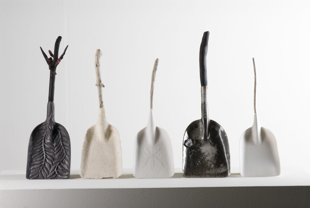
The dustpans were part of my Masters by Research body of work. I view the dustpans as liminal objects that suggest the interrelationship of two realms of lived experience. I use the dustpan and other tool forms as poetic metaphor for connection to the environment.
The overlapped and inserted imagery of ordinary tools and tasks with fragmented imagery of the natural world in my artwork is designed to prompt the viewer to recall their own experience of natural environments.
Dustpans for Oceanic Oil Spills - Bushfires, Photo by Greg Piper
The dustpan and its companion brush are familiar tools in the landscape of human endeavour. Dustpans are a domestic and industrial work tool used to collect debris that has accumulated on a floor or pathway. A dustpan and brush is an invaluable tool for cleaning up anything as harmless as toast crumbs to extreme hazards such as spilt mercury. The dustpan form is essentially a projection and technological mimesis of a cupped hand.
After The Fire dustpans were in response to a controlled burning of the bushland adjoining my home. There is much beauty in a burnt landscape after fire where the dense undergrowth has been swept away by flames, seemingly magically replaced by a black and white carpet of burnt material and the furniture forms of tree trunks and sandstone boulders. Bushfires are part of Australian domestic life. Many Australian species of plants need fire to enact the release of their seed and yet the devastation to human life and property in an intense fire event is heart wrenching.
The After the Oil Spill dustpans were in response to an article published about a locality in Japan affected by a massive oil spill back in 2009. The local people so distressed by the enormity of the disaster rushed to help authorities clean up the mess and used their own buckets and dustpans to help clean their beach and waters. I made these dustpans pure and white or full of holes as covered in black oil it would suggest the futility of human endeavour in the face of large scale environmental disasters.
Explain your work Auntie’s Kitchen and the combination of The Botanical Gardens, Sydney and the humble Casuarina and Allocasuarina?
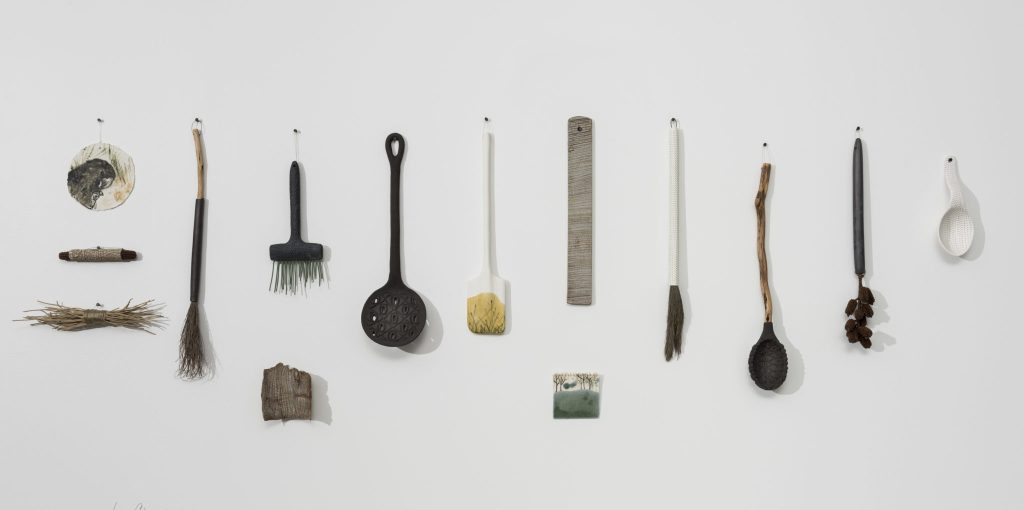
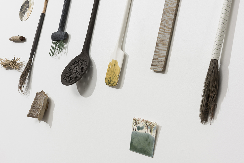
Auntie’s Kitchen refers to narratives of human interaction with the genus of trees, Casuarina and Allocasuarina, both commonly referred to as the She-Oak. The tool and utensil form again become a poetic metaphor for the concept of connection by exploring the idea of sustenance within our daily lives and the natural world.
Auntie’s Kitchen, Photo by Greg Piper
According to the Australian Government’s department of Environment and Energy, approximately 17,000kms of Casuarina forest has been cleared since European settlement yet the various species of the genus are important to sustaining biodiversity in the Australian landscape.
Auntie’s Kitchen,detail, Photo by Greg Piper
The idea for this series first began when I was Artist in Resident at the Botanic Gardens, Sydney. I was told that the Casuarina glauca trees that grow in the Botanic Gardens Sydney are ‘suckers’ from the original shoreline vegetation that pre-date settlement by Europeans. As very little evidence remains of the original inhabitants of this area, the Cadigal people, the trees are a tangible link to a previous history of nature and culture.
It is said that the British Flag was first raised on the trunk of a Casuarina tree but was cut down much to the dismay of Governor Macquarie. The wood of the tree was the preferred material for roof shingles in the early years of settlement. Although not the original roof shingles, Cadman’s Cottage in the Rocks area of Sydney (one of the oldest residential building in Sydney) has a roof made from forest She-Oak. The works, Stumpy Brush and Bark Shingle reference the idea that colonisation ‘redecorated’ the landscape of Australia clearing the bushland and creating a more European centric view of landscape. There are other narratives of interconnection I have addressed in this body of work such as the fact that endangered Glossy Black Cockatoo feeds only on certain species of Casaurina trees or how they mark the Springtide line warning people not to build too close to the coast and risk loosing homes in major storm events.
Can I use your video? Could you please introduce it to the readers, remember this is a world audience?
This film was made to support the Australian Design Centre exhibition, Clay Intersections. It presented work by eight contemporary makers who take a range of innovative approaches to making and working with clay. The exhibition is going to become a touring exhibition to regional galleries in NSW & ACT over the next two years. The Hawkesbury Regional Gallery is the first on the February 9, 2018. I am currently making a whole new body of work, Auntie’s Kitchen 2 and new She Oak vessels for the travelling exhibition.
Clay Intersections: Helen Earl on Vimeo
https://vimeo.com › Australian Design Centre › Videos
Discuss the importance of excellent photography?
Excellence of the photographic image is important to do justice to hours spent toiling in the studio. It is expensive to get professional images taken of one’s work and it is often done before the work is fully completed if it forms part of the publicity for an upcoming exhibition. For me this can be a problem in terms of deadlines as each work I make is unique. I also find now it is important to take images of the work installed in the exhibition space as this can provide imagery for use on your website and applying for other exhibitions or residencies.
She Oaks Vessels 2 photo by Greg Piper
How you choose a photographer?
Word of mouth and a look at some of their images taken of other object makers artwork.
How much are you involved in the process?
I usually hang around in the studio or exhibition and assist the photographer.
She Oaks Vessels 1 photo by Greg Piper
Explain your connections with Josiah Wedgewood, Sir Joseph Banks and Governor Phillips and how these three famous men lead to a combination of the past and your modern art practice?
During my residency at the Botanic Gardens, Sydney I read many historical accounts of early Sydney as the Gardens was the first site of settlement. I was fascinated as am artist who works mostly in clay to discover that in 1788 Governor Phillip had clay dug from the foreshores of Sydney Harbour and exported to his friend Sir Joseph Banks. Banks in turn, sent the clay samples to his friend, Josiah Wedgewood. In 1789, Wedgewood produced what is now known as The Sydney Cove Medallions in pale cream, brown and black. The colours reflected the different clay samples collected.
Sydney Cove medallion, 1789 by Josiah Wedgwood State Library of New South Wales
In the artwork, Tideline I reference this connection but also question the colonial attitude to land and resources. Components in the artwork appear like wrack washed up by the sea. The porcelain spoons of blue clay with white sprigging are an appropriation of Josiah Wedgewood’s iconic Jasperware, which he developed in the 1770s. The blue and white is not the colour of the land but references the flotsam and jetsam of the colonial conquerors sailing into Sydney Harbour.
Tideline
The porcelain detritus is composed of shell fragments and the leaves of Actinotus helianthi, the flannel flower one of the species of flora collected by Banks (a good friend of Wedgewood) and Solander at Botany Bay in 1770.
A tideline is the mark or line left by the tide when it retreats from its highest point and Australia has long been a nation in its own right. Australia, however, is still marked by the colonial stains of the past and these narratives of historical interconnection speak of two very different attitudes to land and resources that still resonate within Australia today.
Contact details:
Helen Earl
https://australiandesigncentre.com/clay-intersections/
Helen Earl, Sydney, Australia
Interview by Deborah Blakeley, January 2018
Peter Hayes Bath
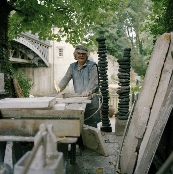
Your studio is in a very ‘special’ place can you share your studio and showroom with us?
I converted the old toll house on Cleveland Bridge into a studio in 1982, after returning from a 10 year stint travelling in Africa, Japan, India and Nepal, in order to settle down and try to put all my ideas, techniques and vision into clay.
The artist studio is a very special space, it evolves with the artist. I always remember visiting Takashi Yuhdas’ studio who also lived in Bath. His studio was like a surgeons operating theatre with every tool in its right place, not a speak of dust, so calm and minimal and so correct, his studio reflects his work. As for my studio I seem to work in complete confusion with everything all over the place. It is my own space and it all seems to work out.
Expand on the excitement you find in seeing indented fingerprints in old pots?
As a child my mother used to pack me off with a bungle of sandwiches for the day and I usually ended up at the Birmingham Museum. Pending hours wandering through the galleries, I always ended up in the Archaeology department and was fascinated with the how and why things were made. Sometimes you could see the actual potters finger prints pressed on the side of some of the pots or a cats paw imprint on a roof tile which has been made and laid out to dry a thousand years ago.
Discuss your own clay chart of finger prints.
Clay itself is a wonderful material and each type has its own character and tolerances.
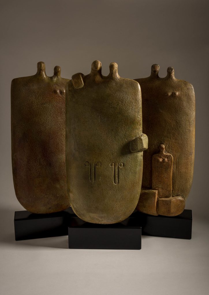
Couple Series
And it is up to the artist to discover how far it can be pushed to its limits. I use many different types of clay, from the very fine bone china and porcelain, to the rough and gritty brick clays. I still enjoy digging my own clay. When the Bath canals were cut in the early 1790, the navvies used to dump a cartload of puddle clay every third of a mile beside the tow path just in case any leakage or break down would occur. This clay has weathered with rain, frost and snow and baked by the sun for 150 odd years.
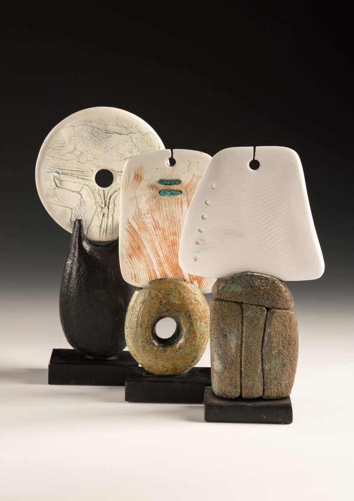
Porcelain Forms
You have travelled widely and continue to visit and revisit galleries and museums. Discuss the importance of learning from old traditions and how you use them in your own work.
Travel has always been integral to my work. I have been fascinated by the way and how things are made. Why some, long ago African potter would spend hours decorating beautiful designs on cooking pots, why a 3500 BC Cycladic sculptor, would carve a marble figurine using only an obsidian blade and polishing it using sand, only to be buried with him as he passed on to the other world. This art was passed down from father to son for a thousand years with very little change of the sculpture.
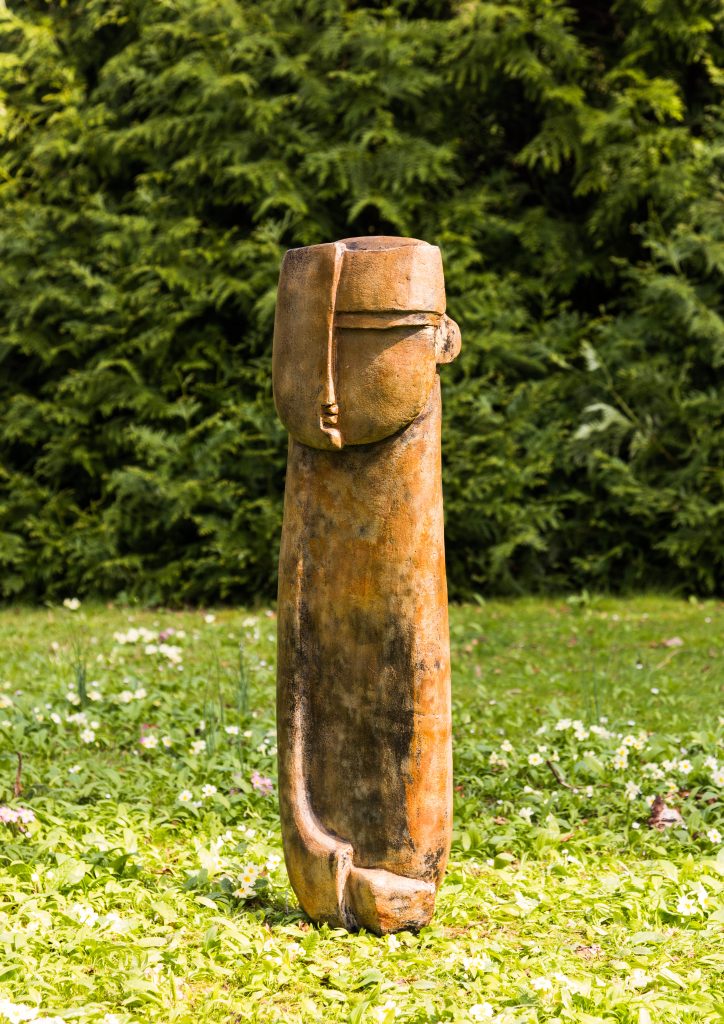
Head Figure
You say, “My aim is that the work should not compete with the landscape.” Please expand on this comment and use one or two of your pieces to explain this.
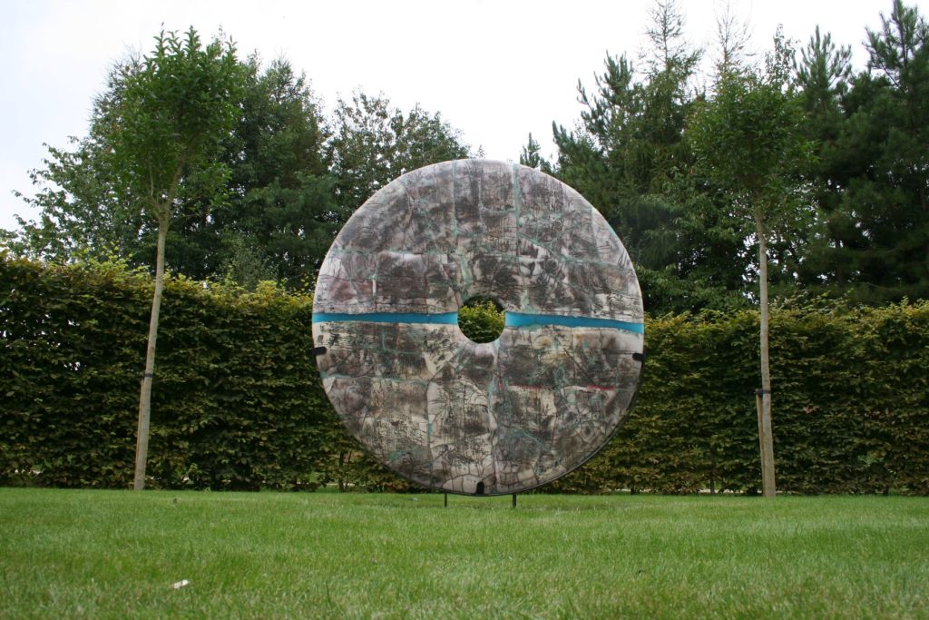
Sculpture in the landscape has many challenges to overcome. Putting the right sculpture in the right place, to small and it looks insignificant, to big and it can dominate. In my view work should not compete with the landscape, but somehow settle into it.
Raku Disc, Private Collection
When does a ceramic become a sculpture?
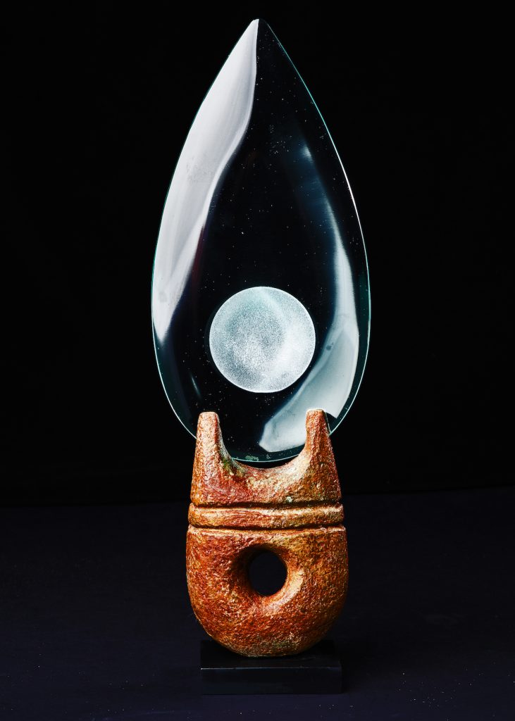
I am often asked when does a ceramic become a sculpture, I think it is a difficult question to answer. If one would look at say Picasso, whose output in ceramics was possibly more than his paintings, he spent his summer on the Core d’Azor in the South of France, where he collaborated with local ceramicists at the Madovra pottery. An ordinary jug came from the potters wheel, handed to Picasso and he would, with a few pinches of the wet clay, a few strokes of the paint brush and would create a wonderful sculpture of birds or fish or bulls, or even a dancing female, using the handle of the jug as one her arms.
Glass Blade
You now also spend time in Udaipur in Rajasthan, India discuss how India and this part of India has influenced and inspired your work.
My studio in Bath is very important to me, its my space where I can develop my thoughts and ideas into actual pieces. In a practical way being right next to the river Avon it gets very cold in the winter months and breaking ice off the top of my clay bins before start working is not much fun. So for the last few years I have escaped the winter months and headed for Udaipur, Rajasthan India, where I have a studio. This has given me the opportunity to work with other materials, meet and collaborate with other artists and craftsman and of course to explore this wonderful part of the world.
Explain the way you combine different materials to make the whole.
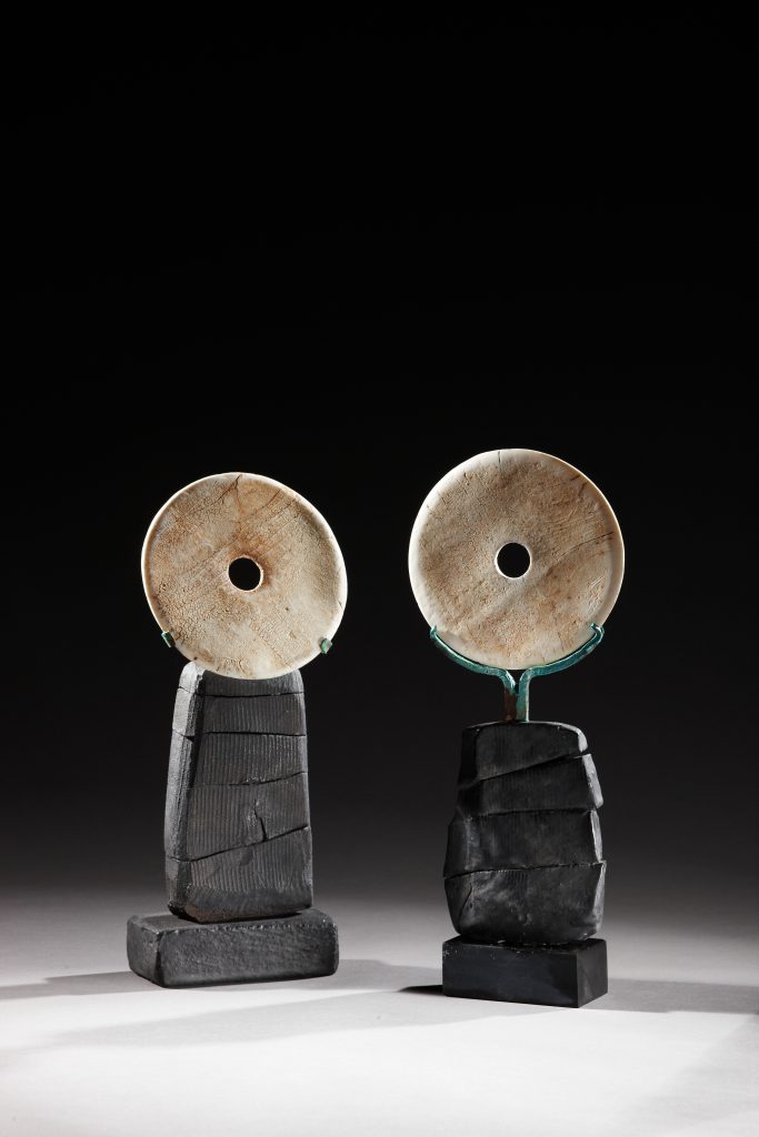
I have always enjoyed the idea of combining different materials together, using clay and metal, glass and acrylic, each being a part of the story of the finished piece.
Discs
I also have fun making a piece, then breaking it and firing the shards in different parts of the kiln. I then put all the fragments together, creating an almost archaeological feeling to the finished work.
Many years ago I took a few old pots down to Cornwall with the idea of throwing them into the sea. As I always enjoyed beach combing and picking up fragments of old Victorian shards that have been tossed by the waves and polished by the sand.
With this idea in mind, myself and Johnny Leach took an early morning stroll and donated pieces to the sea. Some pieces were ceremoniously buried under rocks and little canals. All this was great fun and then forgotten. Several months later, when I returned, quite by accident I uncovered a piece that I must have taken some time to conceal. It had taken on a wonderful patina, I was amazed how the copper surface of the piece had been affected by the sea.
You also comment, “It is my job to push it (ceramics) to the limit”. Comment on this especially for new artists.
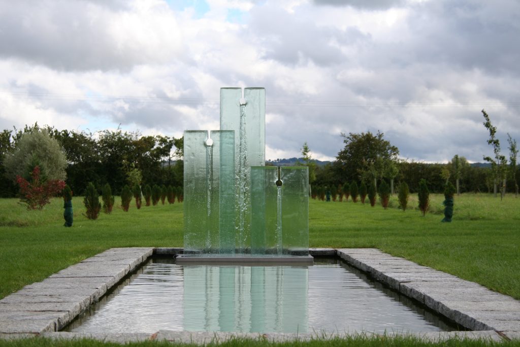
Many up and coming makers are taught the rules and boundaries of clay, the limits and what one can except. I believe it is essential to learn the basics first and then be able to break the rules and experiment with different techniques and ideas. It is like learning a musical instrument, only by practice and experimentation and taking the sounds to the limit of the instrument that one can achieve a higher level of making.
Glass Water Feature, Private Collection
Take two very different sculptures, Bronze Bench, Jerwood foundation, Boulders with Blue Wave, Glaxo Smith Kline.
I always remember as a small boy going to see a Henry Moore exhibition and been thoroughly told off by a peaked hated guardian for touching and stroking one of the sculptures. From then on I was determined that anything I make in the future would hopefully be good enough to touch. If you visit the Vatican in Rome, there is a sculpture of St Peter by Arnolfo di Cambio, the foot has been worn away by 600 years of kissing.
Henry Moore loved seeing his sculpture out on the Yorkshire dales with sheep finding shelter and rubbing their backsides on them.
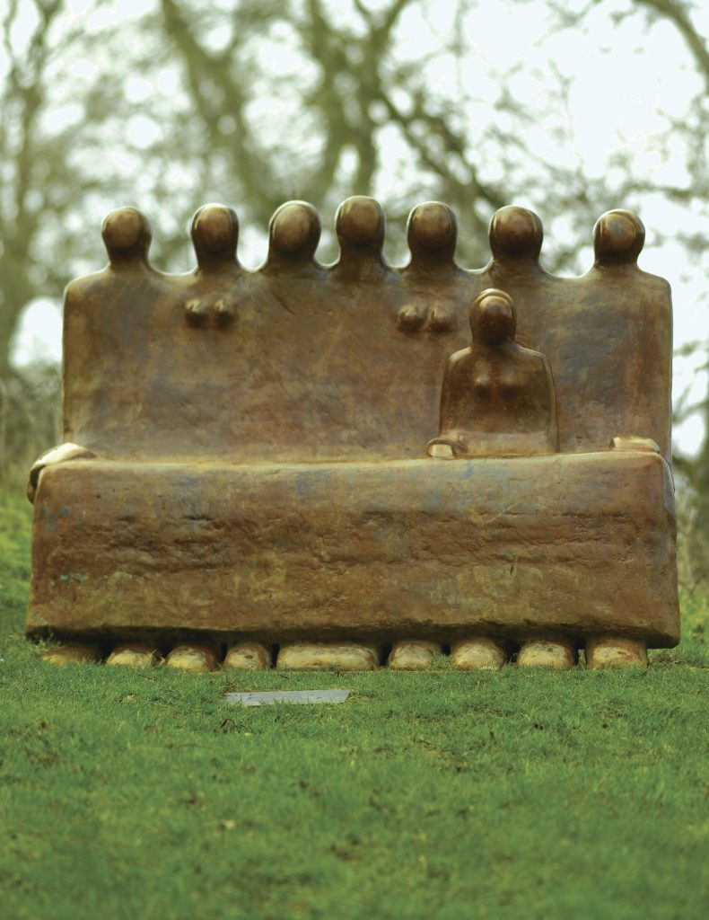
With this in mind, when I was commissioned to do a bronze sculpture for the Jerwood Foundation the title of the work was important to me. The sculpture itself is a group of seated figures or family scene. I decided to call it The Bench to encourage people especially children to sit and even climb over and hopefully with enough time would help polish the patina.
Bronze Bench, Jerwood Foundation
Another commission for the board room of Glaxo Smith Kline gave a different thought. I wanted to create something calm and simple.
Boulders with Blue Wave, GSK, London
The idea of beach washed pebbles came to mind. That increased to boulders and to hold on to the beach, I added transparent blue waves through them.
Contact details:
Peter Hayes
peter@peterhayes-ceramics.uk.com
http://www.peterhayes-ceramics.uk.com
Peter Hayes Bath, UK
Interview by Deborah Blakeley, January 2018
Nick Hollo
You are not only interested in location but the vegetation and land surface, expand on this and your work North Head Triassic Formation?
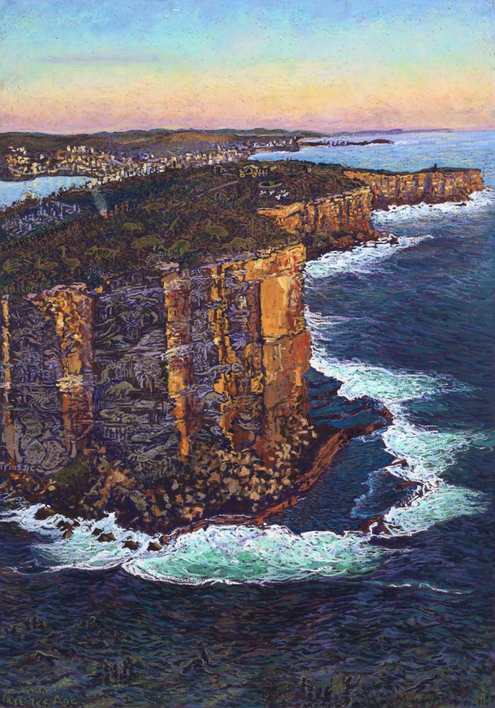
North Head Triassic Formation, Pastel,84 x 59cm
We all think our environment is beautiful but there is very little understanding of the forces that have shaped it. Without articulating the special qualities of our surroundings, we are unable to protect it nor to encourage the right measures to improve it. I started to make pictures that try to express the underlying forces that have shaped the land and the life it supports.
One can’t really know Sydney and its harbour without understanding its geology. In North Head Triassic Formation, which is part of The North Head Project exhibition at the Manly Art Gallery and Museum until 18 February 2018, I am trying to express the significance of the geology that makes Sydney what it is. The picture depicts the ancient layers of sandstone exposed on the cliff face. What look like the erosion patterns on the cliffs are contrived to show life forms that existed in the Triassic period 220 million years ago when a vast river delta laid down the sediments. These layers of sediments were compressed over time to form the sandstone we have today. In the bottom left corner of the cliffs, the erosion patterns are contrived to show the configuration of the continents at that time. As the continents drifted, the sandstone layers warped, bent, cracked and parts were uplifted forming the escarpments - along the coast and along the Blue Mountains. Fine, windblown sand created dunes on top of the tilted sandstone monolith since the Pleistocene era, going back 1.8million years. It supports the delicate heathland we have today. In the textures of the heath, I have shown the mega fauna that lived during that time. On top of that, I have shown the Anthropocene,- our impact on the land. Below the sea, you can see hints of the life during the last Ice Age, when the harbour and the coastal shelf was dry land.
Our sandstone land is commonly thought of as mere quarry, but it is ancient and special. Everywhere you look around Sydney’s coastline, you can see the land is tilting away from the rugged cliffs on the coast towards the west. Sydney is a young landscape on an ancient landform. It is a flooded river valley formed at the end of the last Ice Age.
You have been a member and Deputy Director of the Sydney Harbour Federation Trust, expand on this position and trust and how many of the sites are now being used by artists?
The Sydney Harbour Federation Trust was established by the Australian Government to rehabilitate and open up to the public, redundant Defence lands around the harbour. It was established in response to community opposition to the sale and redevelopment of the lands. The sites include Cockatoo Island, the former Artillery School at North Head, various former army bases at Middle Head, Woolwich Dock & the former submarine base at Neutral Bay, amongst others.
We firstly had to earn the trust from the understandably suspicious communities. I was part of the team that developed a plan, based on a lot of consultation, to conserve the sites and establish new uses of the numerous military buildings. In addition to my work, I started doing pictures of the sites that helped illustrate the qualities of the sites that were valued by the community.
We sought new uses that suited public access and improved the public’s appreciation of the harbour locations. Some of those new uses include artist studios, at Lower Georges Heights and at North Head. In other locations, such as Cockatoo Island and the World War II fuel tanks at Mosman, they provide venues for performances, art installations and events. There are other important tenancies besides artists, such as the Sydney Institute of Marine Science, established at Chowder Bay by four universities. Their work is invaluable in improving our understanding of the marine environment of Sydney Harbour (previously not very well known or co-ordinated).
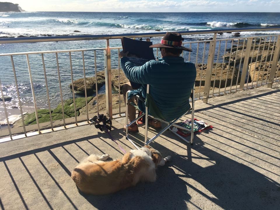
Nick drawing at Bronte, photo by Elizabeth Farrelly
Take one or two of these sites and show how you have interpreted the vista.
The first step is to pick the right view of an area so that I can bring together the main qualities or issues that I want to communicate.
For example, in the picture of Chowder Bay through the Angophoras I chose a view from across the bay. It depicts one of the major, unique characteristics of the harbour: industry and shipping within bushland. Through the statuesque rose-hued trees, one sees into crystal clear water (perfect setting for marine research). Yet, there is an industrial jetty with a massive oil tanker. The cluster of timber sheds provide a village like ambience, stepping down to the water’s edge. Unlike other waterfront developments that have become yachting marinas, the Harbour Trust sought to use these terraces for a mix of social gathering places. The marine environment is for research, visiting boats and kayaking.
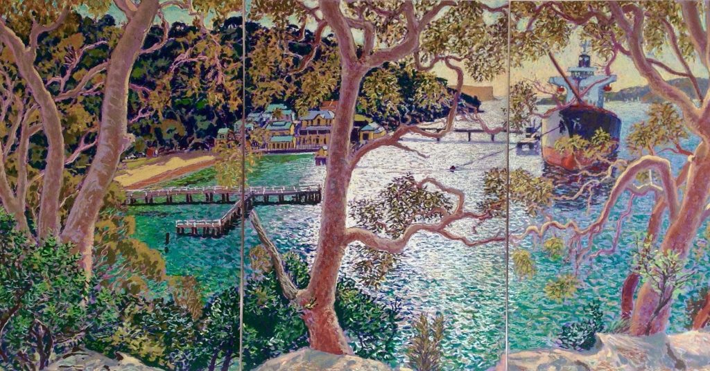
Chowder Bay through the Angophoras, Pastel, 59 x 126cm
The view tells us not only about Sydney but the story of Australia. We were the only colony that started after the industrial revolution had commenced. Consequently, the harbour is a sequence of industrial waterfront industrial villages surrounded by bush, connected initially by water and the ridge roads.
Another example is the dock at Woolwich. Again, it is a maritime industrial precinct within a rocky, natural setting. For a brief period, it was the largest dry dock in Australia. Part of its magic is that the end of the dock culminates in a cave, to accommodate the bow sprits of large, square rigged tall ships. So, I chose to draw the dock from within the cave. The contrast of the natural and man-made forms is a feature of our industrial waterfront. There is a wonderful sense of calm at the end of that dock, even when maritime maintenance is taking place. We, at the Harbour Trust, made it part of the network of harbour coastal walks.
Because Sydney Harbour is a flooded river valley, large ships could be berthed or built or off-loaded along the shores of the headlands. It was not a harbour that relied on constant dredging.
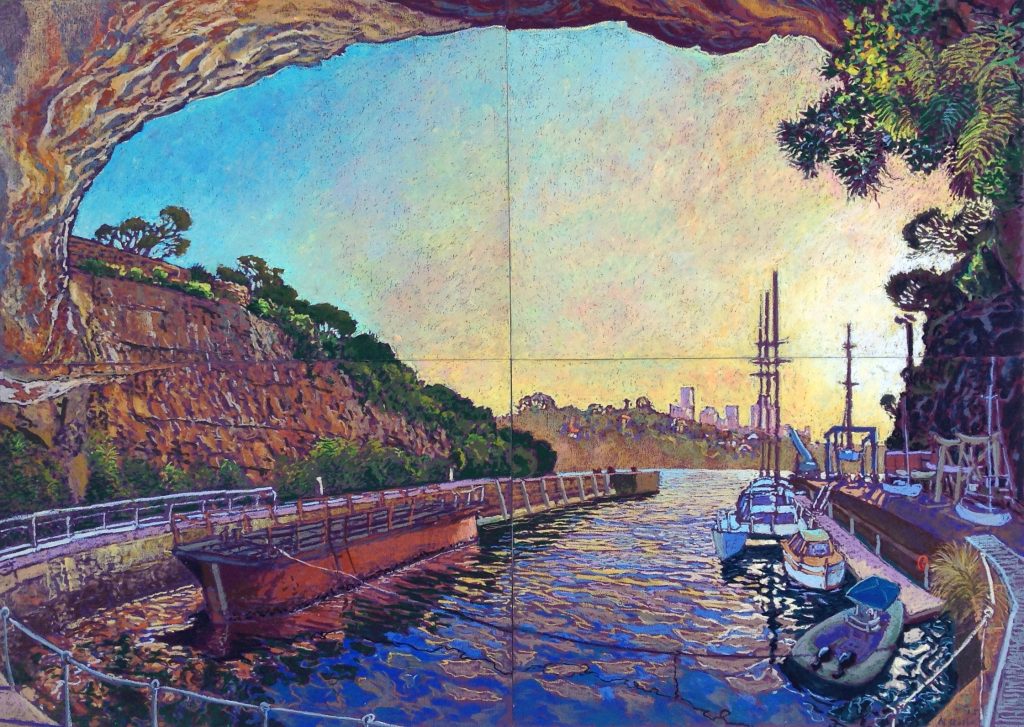
The Cove at Woolwich Dock, Pastel, 84 x 119cms
Your medium is pastel how did you come to this medium?
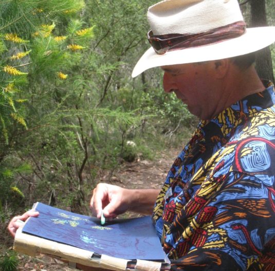
I came across oil pastel by accident. With the stress and pressure of my fulltime work and young children, I started going out to sit and sketch for short periods of time for a break.
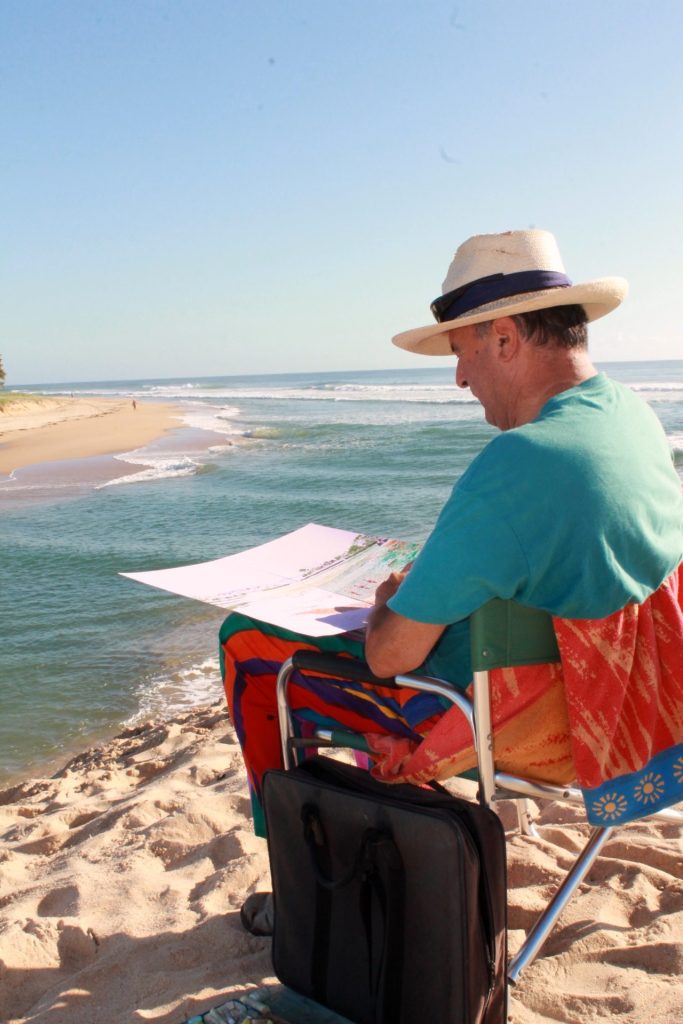
Nick drawing at Currimundi beach, NSW, Australia
I discovered that by using oil pastels, pens and coloured paper, I could instantly create in full colour. After fifteen or twenty minutes, my mind completely switches off and, yet I produce something. The process is more important than the result. I was initially just interested in the air and the water: the light, the reflections, the ripples and the shadows. I soon became more interested in the landscape. Drawing with oil pastels became my way of savouring what I saw, caressing the scenery. It made me really look in a way that I don’t think I would have done otherwise
Discuss pastels and using them outdoors?
Using oil pastels requires little preparation and it is easily workable. Colours can be mixed, light can go on top of dark (unlike soft pastels) and yet it doesn’t smudge easily. You can have clear edges and forms if you want, or meld colours together. All I need is a shoulder bag containing a flat box with separate compartments for the various colours of oil pastels, folders of heavy, acid free coloured papers, brush-tipped pens. I carry a fold-up chair and I wear a wide brimmed hat. I take polaroid sun glasses and look at what I draw with and without the sunglasses. I can consequently walk and set up in small, often precarious positions. Because I draw on the papers I can carry, many of the pictures go across multiple panels (sheets) of paper. So, I firstly have to work out how the scene is to be arranged over the series of sheets. Initially, I draw across several papers to make sure the light is captured across the whole picture. I hold them on my lap and try to line them up with each other as best I can.
Have you had any ‘special’ or strange comments made to you while drawing on location?
People are mostly very considerate and polite. Some watch quietly and don’t say anything. Some ask, “Excuse me, do you mind if I watch you?” They don’t realise this is more disturbing than if they just did so, but they just don’t want to be rude. Some people want to take a photo of me with the picture or as part of their selfie. Surprisingly, none of this disturbs me… I can easily slip into my trance-like state of drawing again and again. I sometimes excuse myself for not talking to them. Occasionally my dog comes with me and sits with me. He is good at absorbing the attention that would otherwise be focusing on me.
Your initial training was in architecture, how often does a building call out for you to draw it?
Drawing is very important in all the phases of design and construction. It is an important tool for designing three dimensionally. I often start with a sketch of the space/spaces and then work out how they would be arranged in plan and elevation. I don’t think one can design effectively by only drawing the spaces after one has set out the plans - it needs to be the other way around. Drawing helps to tease out the main idea/ideas behind any design - expressing the forces that shape it. This isn’t necessarily what it looks like, so you need to be careful not to fool others or fool yourself. Finally, drawing is also an important way to convey what the building and spaces would be like. People need to see that properly and accurately - most people can’t read plans.
Although I was trained in Architecture, most of my work was in planning and urban design. I was and still am more interested in the spaces around buildings and the impact of buildings on our environment and society.
Take Harbour View over a Thousand Flowers and discuss the triptych from left to right and top to bottom.
This is one of my favourite views in Sydney.
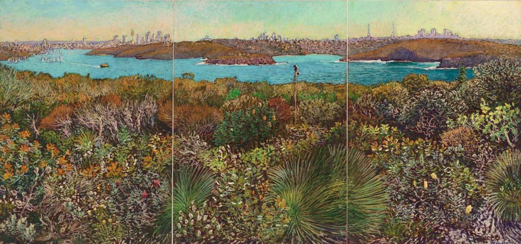
Harbour View over a Thousand Flowers, Pastel, 59 x 126cm
I chose to draw it because it shows the winding harbour recede into the distance over a foreground of the undulating textures and colours of the coastal bush. The name is a tongue in cheek reference to the orderly “mille fleurs” (thousand flowers) setting of late Medieval tapestries, such as the Lady and the Unicorn. Here, we have the real thousand flowers in wild nature. What is more, this scene is late autumn. I drew the picture over several weeks, in three sittings. I tried to show that here we have perpetual spring. There is always something new flowering.
So, the foreground is a sequence of rolling dunes with higher and lower bushes, ground covers and grasses. It is an endangered plant community known as Eastern Suburbs Banksia Scrub. The new shoots of the banksia, on the left, are a golden colour whilst the rest of the serrated foliage is silvery green. The lambertia formosa, a lantern shaped red flower was still in bloom and many white and yellow flowers were starting to come out. The golden brown, spindly leaves (flowers) of the casuarinas and the tea trees form a backdrop to the low flowers in the foreground. A bird landed on the spear of the xanthorea (grass tree). The fine, white sand that underlies the dunes is occasionally visible at the base of the picture on the right.
Seeing the harbour from this height gives an enormous depth of field. From left, one sees from the entry to the harbour to the city over the succession of headlands of the north shore. Then, around the point at Middle Head you can see Balmoral Beach and on into Middle Harbour. The ridge line is so important, yet we pay such little regard to what is built there. The landform and bushland of the outer harbour remains. The former military areas have defended the city not from some external enemy, but from our own rapacious development.
Where these divisions or three panels, obvious from the start or did they become more apparent with time?
When I pick the view that I want to draw, I work out how to arrange it on the paper, so I start at once with all the panels that I intend to use. In the case of the thousand flowers picture, I started with the three A2 panels and established where the scene in each panel would start and end. They don’t necessarily join seamlessly, but I don’t think that matters.
Elevated Wetland Overlooking the Northern Beaches, you ask can you see the heron?
Do you often do this ‘Where is Wally?’ in you work?
Do you have a hidden bird in all your work?
I draw what I see at the time I am there. Most birds, reptiles, animals appear cautiously and do not like to be seen, so I draw them that way - inconspicuous, partially concealed.
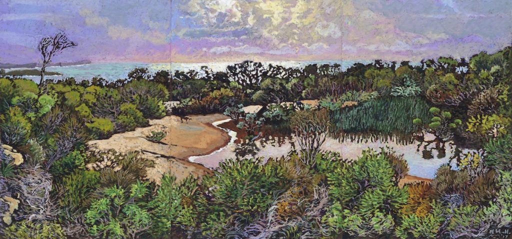
Elevated Wetland Overlooking the Northern Beaches, pastel, 42 x 89cms
Sky and sea are very important in your work – do you start with the horizon line?
Although my pictures have content and some even have a message, underlying all this, is merely my love of the nothingness and ambiance of space and light. I love the sea and the sky for that reason. I could just draw that quite happily, except it’d become boring and I think it is important to communicate about our environment.
I do start with the horizon line. It is how I tie together the picture over a number of panels. Although I distort the perspective and scale, I make it believable - you can’t tell when I’m cheating.
Your colours are very dependent on the time of day, discuss the effect of colour palette to light in your work.
The colours and forms are very dependent on the quality of light. I choose my colours intuitively - I don’t think about it, it just seems to happen. I often find that very bright light over sparkling water, requires a strong, dark (or red) background. We have to create the illusion of light. The landscape around us emits light. Our pictures don’t, so we have to create the illusion of light emanating from them. This needs contrast and other forms of trickery. Getting the sky to glow requires layers and layers of oil pastels - white, cream, green and pink graded and melded together with the peripheral blue. Reflection in the water has to glow. I use white and cream over the dark shadows that gradually give way to the translucent colours of the water as you look away from the glare. The shape of the reflections conveys the movement of water. In subdued light, there is always a predominant colour in the light or in the landscape. I seldom use grey or black, but create the effect through a combination of opposite colours like purple and green.
Is the size of your work dependent on the paper you use?
Yes, to some extent it is. I am limited by what I can carry. I use A2, A3, A4, and A5 paper. But I use multiple panels to make bigger pictures. The pictures that I make at home, when I want to compose the scene myself, are often made up of larger papers. The North Head Triassic Formation, for example, is one A1 sheet.
Expand on your own thoughts on the importance of artists as recorders in a historical sense.
As the world around us is changing, I believe it is important to document what we love about our surroundings. Over time, such pictures become a record of how things were. One can use drawings to accurately record the historical features of buildings and places, but I choose to “draw” out the significance of places. This may require subtle exaggeration and deliberately including or excluding some elements. I try to depict the ambience and quality of light. I do so because that is what I love, but it is also a useful vehicle through which I can communicate that love of the place to others. Drawing helps and encourages me to explore the background to the nature of things, what makes them the way they are, and consequently, to help identify what is precious about the place and in need of protection in the way we go about changing it.
The underlying message is that we have enormous power at our disposal and consequently, an enormous impact on others and on the environment. I believe we need to use that power wisely and gently.
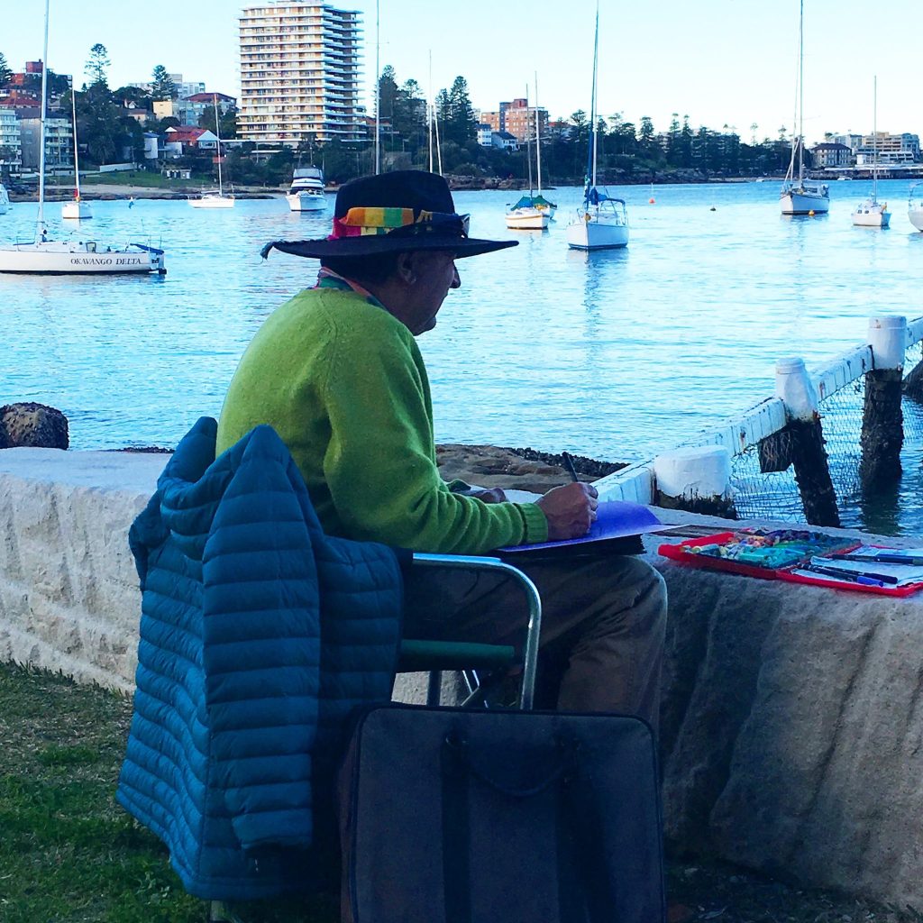
Nick drawing at Forty Baskets beach, NSW
Contact details:
Nick Hollo
Nick Hollo, Sydney, Australia
Interview by Deborah Blakeley, January 2018
Katharine Coleman MBE
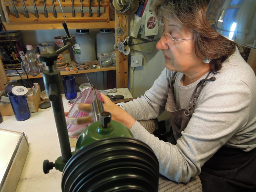
Discuss the very close and precise position you take up in your studio to do your work?
I have a small studio, some 10ft x 9ft (3m x 2.5m), which neatly fits two benches, side by side, one slightly higher carrying my lathe – with a motor mounted under the bench – and the other bench is for drawing and drill work, as the working height/seating required for the latter is significantly lower. To the side of the lathe bench is a small shelving unit on which my spindle rack sits so that I just have to reach out to change spindles. Behind the seating is a shelving unit that takes a few boxes of kit – my little Glastar flatbed grinder, my gilding kit, teaching gear etc etc. I work long hours in the studio, usually at least ten, so the seating has to be just the right height so that I don’t get back or shoulder problems, especially when lifting heavier glass pieces.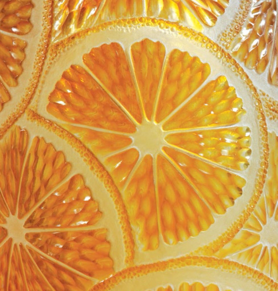
Marmalade, detail
Expand on the importance of consistent light and tools in your art practice.
Light: The best light of all is natural daylight (but not flickering sunlight), which is hard to get, especially here in London in winter months and sunlight is insufficiently consistent. I therefore generally use a couple of halogen flood lights and extra angle poise lamps which can be adjusted according to the job in hand.
Tools: I don’t economise with tools. If I need more copper wheels, I take the time to make them the right size. It’s such a false economy trying to make do with slightly the wrong size of wheel. If I sell a good piece of glass I might invest in another sintered diamond wheel or some more good Polpur polishing wheels from the Czech Republic. Using Polpur wheels instead of cork and pumice for polishing work with the lathe is much quicker and more efficient as there is no mess or loss of detail. A small Polpur wheel may cost about 20 $NZ, but it saves time and earns its keep. For the drill, once the diamond coated burs are worn, I put them aside for delicate work and use fresh ones, which is possibly extravagant but gets the work done.
When I first started learning wheel engraving, I had to beg my teacher at Morley College (Peter Dreiser) to teach me as he had some 12 students to deal with (all drill engraving) in two hours on Monday mornings and afternoons and copper wheel engraving is very teacher-labour intensive. The idiot student botches a wheel profile in seconds. So he insisted I get a lathe for myself at home. Like learning the piano, practice is key with wheel engraving. The Spatzier lathe, motor and 75 spindles cost more than a small car in 1985, the German Mark was high and the British pound sterling depressingly low. But it is probably the best investment, tool wise, I ever made. It is still in perfect condition and has increased in value now that Richard Spatzier GmBh have ceased trading.
You came to your art as an older student expand on this in relations to your family life and their support in your aims.
I came to glass engraving by chance. I had recently lost my post at London University where I was teaching in a junior capacity and researching in the Geography Department (Spanish American colonial urban development) and I just happened to glance up and see some amazing work by Alison Kinnaird in a gallery window in London when I was taking my small children to a museum behind the Royal Academy. There was just one place available on the only glass engraving course in London, so I persuaded my husband to take a day’s leave to look after the children so I could camp outside the college doors to ensure being through them first and enrol on the course. My husband was very supportive about my learning as it took a few years to become competent with the lathe and we were not wealthy. The children sometimes got frustrated if I spent too long engraving rather than playing. For several years I worked part time as a secretary to avoid having to take boring commission work, runs of paperweights and celebration glass. I preferred just try to make my own designs, sell them and with each sale, get a fresh piece of glass blown.
Commissions play a large part of your work, discuss one commission and why it is so meaningful to you?
No, I find commissions difficult. They usually require extra expensive special glass blowing (over and above the annual week spent blowing my glass stock for the year) and so I only take one a year these days. I prefer to work for myself.
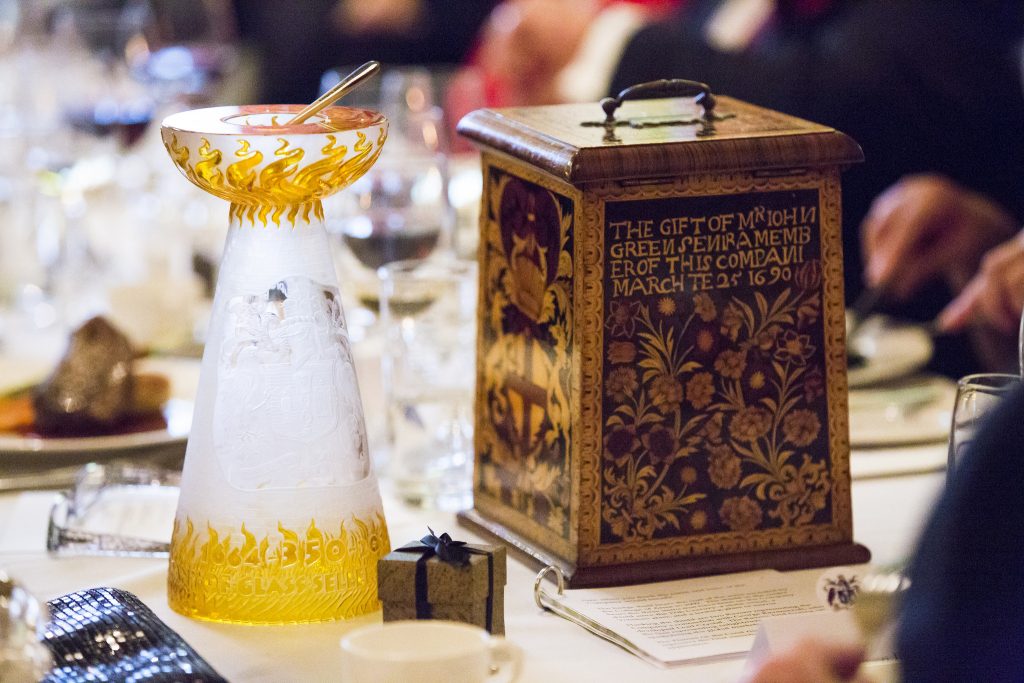
Salt Cellar with the Poor Box
However I have done some interesting commissions for the royal family and livery companies in the City of London. I was recently commissioned to make a ‘salt’ for the Worshipful Company of Glass Sellers, the livery company that covers glassmaking, for the Master to have on his high table at special dinners in the Mansion House (home of the Lord Mayor of London) and other grand events.

Traditional factory cone in Stourbridge, The Red House Glass Cone
I designed it as a cone in the form of a traditional glass factory with the flames below and then, from the coat of arms of the company, a sun shining from above as the bowl sitting on the top, holding the salt.
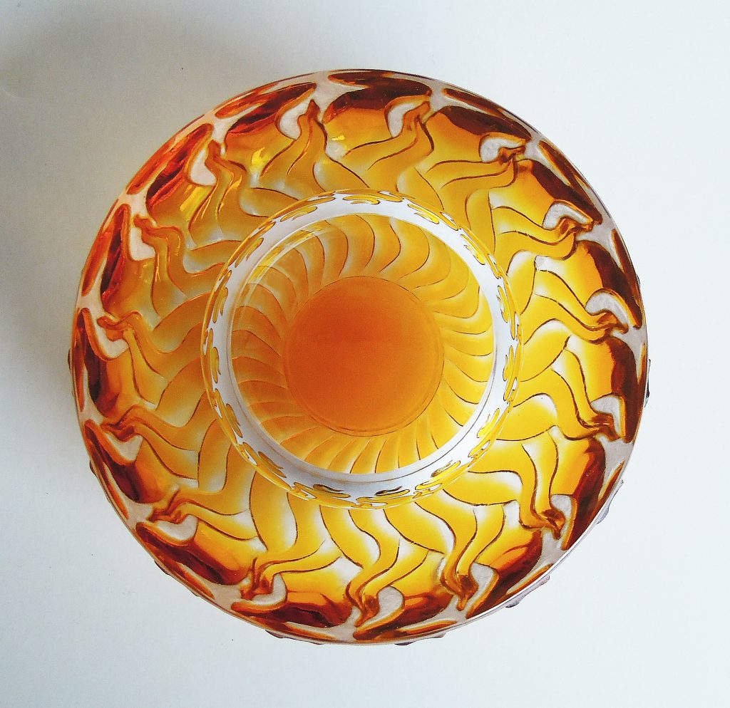
Top of the Glass Sellers Salt, 4cm H x 12cm D
The glass had to be blown in two pieces and then cold laminated together which was very risky for such a high profile piece. The specialist who did the gluing for me used a little too much UV cured glue which began to crack the top off the whole piece as it dried. I rushed down to Bermondsey in South London to Peter Layton who has a diamond saw to cut the pieces apart to stop the crack any further. The whole piece had then to be re-engraved and the top hand ground to fit the base once more, only two weeks before the presentation – not an experience I would wish on anyone.
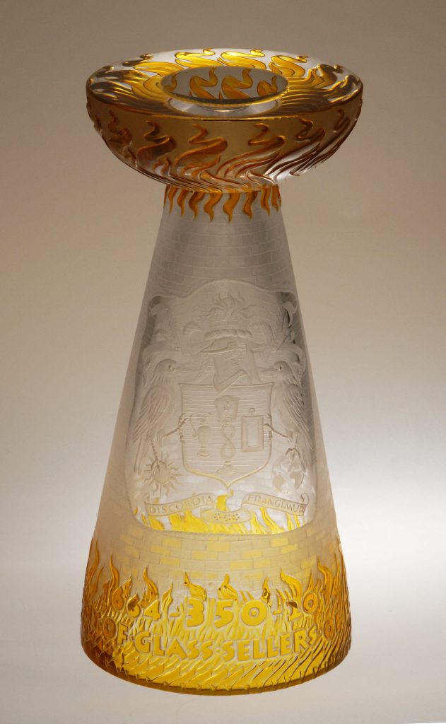
Glass Sellers 32cm
Can you briefly explain the technique of a glass engravers work?
There are several techniques used by glass engravers: point engraving, using a diamond or tungsten point in a scriber by hand; drill engraving, using a pendant drill or micromotor with diamond coated burs or stones; wheel engraving, a scaled up version of the same, using interchangeable wheels mounted on spindles on a lathe; sandblast; acid etching and now, water jet. I seldom get the chance to use any of the last three. I don’t particularly need sandblasting for the scale of my work is relatively small. I use diamond or stone wheels or burs to cut away the clear or coloured glass surface to make my design and then, if polishing is required, finer stones and polishing compounds. There is an excellent book by Peter Dreiser & Jonathan Matcham: Techniques of Glass Engraving, 2nd edition, A&C Black, London 2006 which describes most of these techniques in detail and with exercises. The second edition is better illustrated and updated from the original first edition which was published in the 1980s.
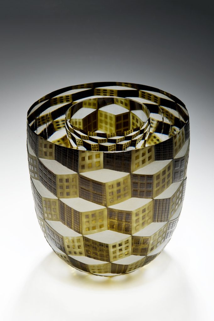
City of London, 17.5cm x 16cm, Photo Ester Segarra
Discuss the collaboration with other artists in your work?
I could not work without the help of the expert glassblowers Potter Morgan Glass in Cornwall.

Andy Potter blowing my work with the help of a nearby farmer, Jim
They realise my designs in lead crystal with colour overlays. Andy Potter is an overlay expert, using the Swedish method, fastidious in the quality of the lead crystal. These days it is rare to find a glassblower prepared to work in lead crystal in a separate pot and he is also prepared (at a price) to anneal the glass for a week afterwards to make sure it is absolutely secure. My designs usually require very thick glass which takes a long time to anneal. I send him drawings in advance so that he can get the requisite coloured glass from Gaffer or Reichenbach and do all the compatibility tests. I like to be in the studio when he is blowing my work so that we can adjust the shape and size of the glass as it is formed. Sometimes there may be a bubble which needs cutting out and the change in the glass size or shape can be an improvement. When the glass is annealed, I take it to Steve Frey in Frome in Somerset, marking up where to cut the tops off the blown glass, leaving it with Steve for most of the polishing work. Steve has factory scale polishing wheels and used to work as the main cold worker for Dartington Crystal, later for Neil Wilkin. He is a master of coldworking and polishing and although he is expensive, it saves me a great deal of time and tears trying to do the work myself. I have learned to my cost in the past that trying to save money on blowers or polishers is a totally false economy.
Can you show a piece blown by Sonja Klingler and the variations that you embellish to their base work.
When I began having glass blown for me rather than buying glass from galleries and shops, I used Neil Wilkin Glass. Sonja Klingler was one of his assistant blowers at the time. When Neil went to Australia, Sonja set up a small studio in Frome nearby Neil’s old studio and I still occasionally use her to blow small work for me as she is so fastidious with small pieces, such as little Japanese tea bowls. Her furnace is not sufficiently reliable for blowing large work and she would need considerable help with such pieces, but she still blows small bowls and plates for me from time to time. I do not embellish her base work, she blows to my design when I need glass from her.

Tea Bowl 10cm x 11cm, blown by Sonja Klingler, with green overlay
Your work is not traditional which usually comes to mind when the words, glass engraver comes up – discuss.
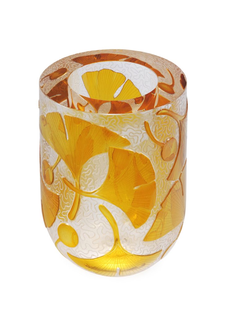
Golden October, 17 x 11.8cm
Many people still hold a preconceived idea of glass engraving – both within and outside the studio glass world. Glass engraving has a particularly bad reputation with the latter, for being highly figurative on clear glass, photographic likenesses of animals, lettering, florals, often on commercially sourced or factory made glass. This doesn’t mean that such work is inherently bad – there is never an excuse for a weak design or poor execution. I just simply prefer to work with colour overlays on more sculptural pieces that have been blown to shapes I like and which refract the designs right inside the glass itself.
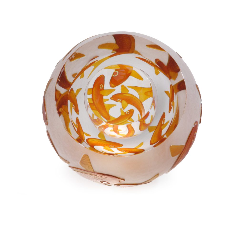
Fishbowls, 12.2 x 15cm
Sadly the poor reputation of the traditionally focused work of glass engravers has done little to save the craft from near oblivion. There is little demand for such work and none of the colleges in the UK teach engraving any more, possibly because of this. I teach at the college where I learned but it is only on an evening class, hobby level for most students’ interests.
There is a small group of European glass engravers who also believe in contemporary glass engraving, freed up from the need to be figurative per se and in a contemporary context. The Glass Engraving Network was formed in 2013 and we keep in touch through our Facebook page: www.facebook.com/glassengravingnetwork. During 2015-2016 we organised a touring show of work by some 31 contemporary engravers from many European countries that went to galleries and museums in seven countries over eighteen months and this did a great deal to arouse interest in the potential that glass engraving genuinely has to offer contemporary studio glass.
General Meeting, September 2013
Can you take us through the process of Marmalade?
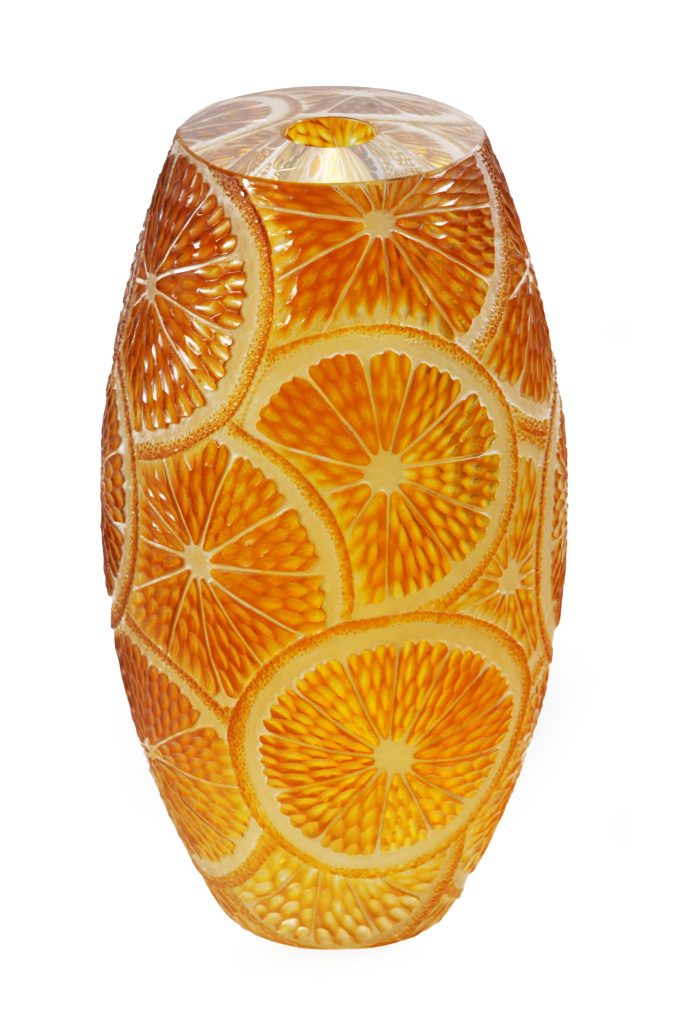
Mamalade, 20 x 11cm
For this I first made several drawings until I was sure of the shape and colours required. I sent a technical (cross-sectional) drawing, specifying overlay colours, to Potter Morgan Glass who blew the vase with a double colour overlay – Gaffer Extra Ruby (a favourite ruby) over a Kugler yellow topaz – over clear lead crystal (24% lead, Dartington cullet). Each overlay was ca. 0.5mm thick and it was beautifully blown. The top of the vase was cut off and polished by Steve Frey. Then I drew on the design with permanent ink pen, adjusting until I was satisfied with the scale of the design. It is useful to stand back, away from the glass and decide on the effect of the design at this stage as it is too easy when working so close up to the glass to get the design too small and too fussy. I marked the main outlines on the glass with a small diamond bur in a drill, just to fix the design before cutting on the lathe. Each small juice sack was cut as a simple nested olive battuto with a diamond wheel and then individually prepolished, using an aluminium oxide or corundum stone wheel before Polpur polishing each one out, finishing with cerium oxide. Engraving the peel was much more difficult and time consuming, requiring very small circular polished zest detail. Where the glass appears white, it is simply where the colour overlays have been entirely removed back to the clear glass or crystal.

Please introduce us to the video The Art of the Wheel – Katharine Coleman.
This video was filmed by another cold worker, Anthony Scala, who is also a very talented film maker. Anthony works part-time for Peter Layton at London Glassblowing. He made the film in my small studio as part of the celebration show for Peter’s 80th birthday. It shows me working at my lathe, talking rather a lot, mounting a fresh copper wheel on a steel spindle, knocking the end of the spindle over the hole in the copper wheel to form a rivet. The oil and grit mix makes a grey mess on the glass which many people find disconcerting – it is what puts students off wanting to learn full copper wheel, which is a shame as one can have many more copper wheels than expensive diamond ones and copper is so much more versatile, though slower.
The Art of the Wheel – Katharine Coleman.
You also teach, discuss the importance of passing on technique and the love of your art.
The late Peter Dreiser spent a great deal of time and patience teaching me glass engraving with the lathe and I am very anxious to pass on what I learned from him. Quite a lot of the technique can be achieved with a drill but on a smaller scale. It is really good to be able to run in and out of both techniques. Learning lathe engraving takes a little time – not a lot – to start with and for this reason, a couple of hours a week is not a good way to pick it up. I do prefer teaching students intensively for a couple of weeks or so at a summer school so that the student can get beyond the panic of not seeing the point of contact between glass and wheel, can start making predictable, confident marks from which to start building up simple engraving patterns and shapes. Now that I am getting older, I find that it is often – but not always – the older students who are more patient and interested in such skills. Glass engraving requires intense concentration which is often a welcome surprise and distraction for those who come from busy lives.
Why do I prefer it to sandblast and drill engraving alone? Wheel engraving is more versatile, it requires one to simplify complexity and look to the kernel of a design, it is crisper and sharper and smoother and finer. It is not faster, it is not easier, but when I see a beautiful piece of wheel engraving from any century or studio, it gives me a shiver of appreciation that the flatter, overworked fussiness of detail in drill work fails to inspire.
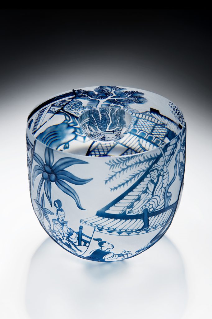
Broken China Bowls, 14.4 x 14.8cm, photo Ester Segarra
Glass engraving with the wheel is older than glass itself, being a variation in the techniques traditionally used for cutting hardstone seals and treasures. Throughout history, from Roman times onwards, when glass engraving began, the techniques have nearly died out and then, centuries later, enjoyed a renaissance. I fear copper wheel engraving techniques are certainly in danger of dying out for a bit. But there will always be a corner somewhere in the world, where there is a patient enthusiast keeping the flame alive.
Question: Do you have much contact with Australian and New Zealand glass engravers?
I only know a few, all of them amazingly good artists. I was lucky to visit the late Anne Dybka at her home in The Rocks, Sydney on my one and only visit to Australia a few years before she died. Although well known in Australia, her work was also admired greatly over here in Europe. There has been very little Australian glass shown in the UK for some time now. I wish we could see more Australian and New Zealand engravers’ work. Alasdair and Rish Gordon from Western Australia have been well known here – partly because they studied originally at Edinburgh before migrating to Scandinavia and then settling in Australia. Alasdair’s classic wheel work and Rish’s sandblast techniques are highly admired, but we could do with seeing more of it. One of the most promising glass engravers of all must be their son, Kevin. His work is astonishing, original and just knocks the spots off most of what’s happening here.
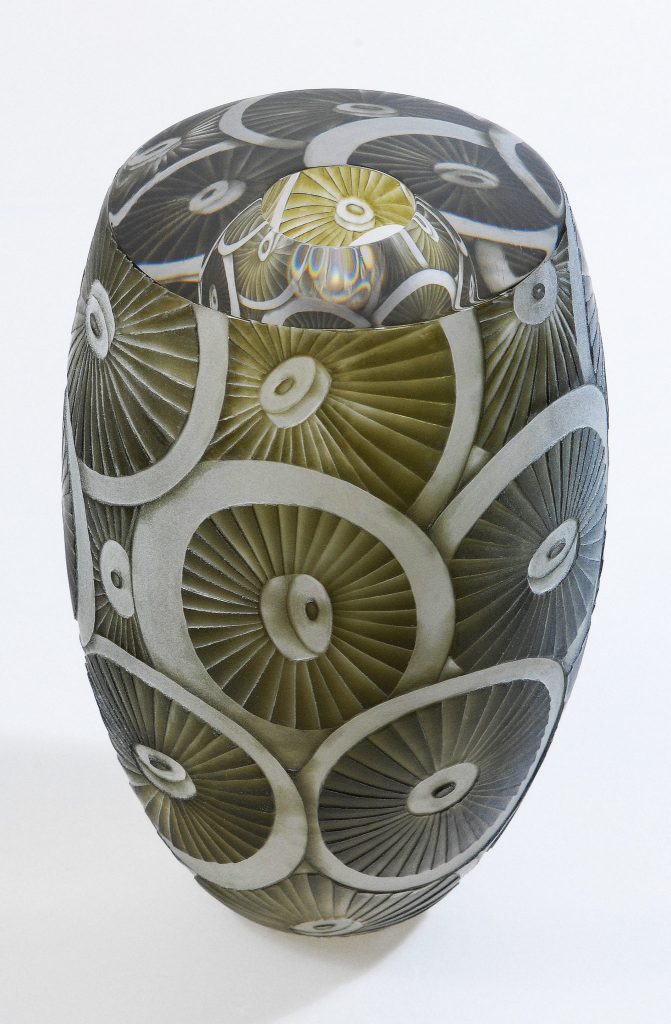
September Mushrooms, 17 x 11cm, Photo Ester Segarra
Contact details:
Katharine Coleman
email: Katharine@katharinecoleman.co.uk
Katharine Coleman, Isle of Dogs, London, UK
Interview by Deborah Blakeley, January 2018
Annika Ekdahl
Why did you specialize in tapestry?
All throughout my childhood and teens I drew and painted, but the Green Wave winds in the 1970s awoke my longing for natural materials and a wish to master what previous generations had been able to. I learned how to spin yarn, dye it and weave pictures from it. The only thing I missed in those days was a sheep of my own. (Eventually I got problems with moths and went over to industrially produced yarn.)
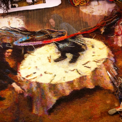
Graduation, 400 x 400
What lead you to doing your Master’s degree in Textiles?
My university studies began in the mid 70’s with the intention of becoming a teacher. After three children and a lot of thinking, I decided to apply to study arts. I was accepted into the textile art program at The University of Gothenburg, School of Design and Crafts. I’m very grateful for those five years, even it meant many days away from my family and lots of hours on trains.
Can you discuss how you use an old / Renaissance method but include modern digital technology?
There are different ways of looking at the woven surface. When I realized it is built up from picks, dots, pixels, and not just areas of colour next to each other, I associated it with digital images. (Which is not very far-fetched, since looms and computers have a common history.) So, if I could find a way to vary every pixel, I thought, I should be able to create any image I want. I use three threads of different colour/shades at a time. If I twist and turn them around when I weave, I can make different colours visible. That means I can change the colour of almost every pick. And then, when mastering the technique, the most important question appears: What do I want to tell? What’s my story?
Can you discuss the series “The Baroque Party”?
It all started with a book in a Polish used-book store. It had a leopard’s head on the cover and showed images of an extensive tapestry collection at the Wawel Castle in Krakow. I bought the book and nothing has been the same since. I fell in love with these tapestries, with the colours, the ornaments, the animals, the angels, their attitude and pride, the show off. They were far from the first historical works I had seen but for some reason they changed my view on the medium. And I knew I wanted to develop things in my own art practice. I wanted to find that special joy and obvious delight in the beauty that I saw in Wawel. And I wanted to go up in format, to get space for investigating the medium’s narrative potential.

Darlings and Definitely
Why did you divide it into five tapestries?
My first idea was to make four large tapestries, each with an artistic as well as a formal challenge. I began with “The Baroque Party”, exploring the concept of the traditional mille-fleur backdrop (but with more dining attributes than flowers). It was scary to go so decorative, but also a relief to do what I wanted. It was followed by “The Wedding in Queens”, experimenting with a colour scale like in old European paintings. And for the first time I used gold, a real venture. When I was invited as a research visitor to The University of Newcastle, I brought a smaller tapestry and finished it in the universities fibre art studio. I gave it the title “Darlings” after the river in New South Wales. The tapestry shows family members and friends, but it is also dealing with scale. I wanted to see how small but still personal characters I could do. In the next project, “The Theatre in the Park”, I used the experience from that test. Finally, in the last piece, which I call “Definitely Gold”, I went completely the other way. One huge figure fills the space, surrounded by objects, flowers, animals, and ornaments. I ended up where I started – with embracing what I from childhood have found beautiful.
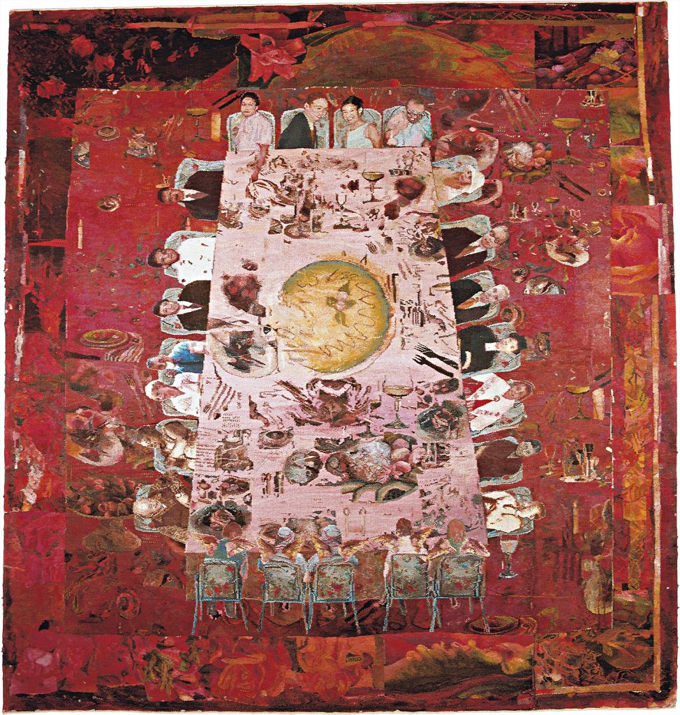
The Baroque Party
How do you feel about the five tapestries being sold to different owners and thus the series being separated?
To me that’s not a problem. I mean, the alternative would be not to have them sold at all, wouldn’t it? No one buys so many square meters of tapestry, not even big museums. But I’m very happy for the retrospective exhibition going on right now in Stockholm. It’s emotional and fun to see so many of my pieces reunite in the same room. A big, big party.
Discuss the importance of winning the Nordic Award in Textiles to your career?
Well, that was also a party. The Nordic Award in Textiles is distributed every two years by the Foundation Focus in support of culture and health care.One day in December of 2012, the secretary of the jury called and informed me that the jury had decided to give me this large amount of money. That was unreal. At first I thought it was a mistake. But when I had put all doubts aside, I was overwhelmed and proud. The jury's motivation was about the clash between history and our own elusive time. The secretary read it to me in the phone:"The tapestries balance the weight from the Baroque with digital volatility, which results in multifaceted stories about human existential conditions", he quoted.Nice words. An exhibition in Denmark many years ago came into my mind. The Baroque party was shown for the first time abroad and a journalist asks:"Why are you so involved in the production of kitsch?"Some see kitsch, others see stories about human existential conditions. Perhaps these two impressions are not completely incompatible.The celebration festivities, the exhibition, the prize money and all the media has meant a lot to me, of course. It encourages the art form and confirms that what we do is not completely worthless. We are actually doing something great.
Can you expand on your Verdure tapestry and how it is woven around your life and your mother’s life?
Well, that’s a long story. The word verdure originates from French and originally from Latin. It means green, lush and blooming. Verdures are a group of tapestries with forests, parks, gardens, plants and animals, produced in the 1500s to 1800s.
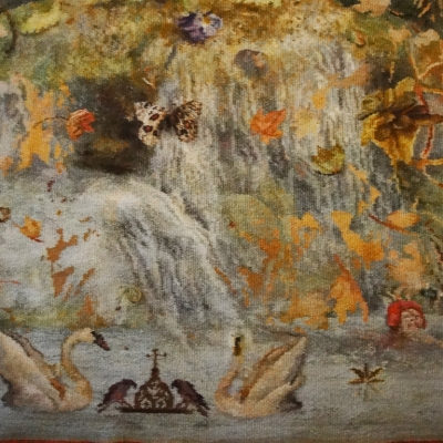
Road Movie Mum 400 x 400
When my interest in verdures awakened, I wanted to make myself. In September 2010 it was finished. “Road Movie (verdure): Visiting Mom” on the loom “Road Movie (verdure): Visiting Mom” is about a road trip from Kyrkhult to my mother’s grave up north. All the details in the composition come from photos taken during the trip through the summer landscape. Personally, this tapestry deals with relationships, lasting and lost. Historically, verdures are woven bestiaries and visualizations of paradise. “Road Movie (verdure): Visiting Mom” finished
Explain the technique you use to make your tapestries and how the European techniques differ from the methods used in Australia?
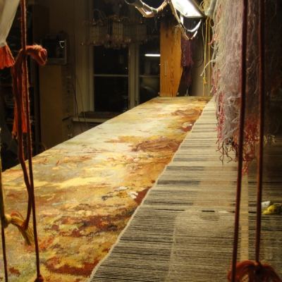
That’s a complicated question which can be approached from different angles. The “new”, “young” or “inventive” is not constant. Soon it’s part of the establishment and eventually even old. I come to think of the American writer Robert M. Pirsig who wrote a very famous book in the 70’s. The title is “Zen and the Art of Motorcycle Maintenance: An Inquiry Into Values” and I recently reread it. Let me quote some sentences:
”What’s new?” is an interesting and broadening eternal question, but one which, if pursued exclusively, results only in an endless parade of trivia and fashion, the silt of tomorrow. I would like, instead, to be concerned with the question ”What is best?”, a question which cuts deeply rather than broadly, a question whose answers tend to move the silt downstream.”
The tapestry technique is a cultural craft, still practiced today all over the world. And it can only be executed by hand. I like that. The design on the other hand, the “cartoon”, doesn’t necessarily have to be made in any old fashion way. I nowadays sketch digitally, but I’ve never been strategic about that. I just found it much more practical to collect all fragments of paintings, photos, drawings at the same place – in Photoshop. I can zoom in and out, learn from my laptop how colours can be blended, etc. The digital technique is my co-worker, which feels totally safe since the outcome of the process is nothing but super analogue.
Tapestry weaving is simple when it comes to technique and equipment. You can wrap strings around a shoe box and make yourself a loom, suitable for the most delicate images. The basic technique would still be the same. So, I’m not sure I have the answer to whether it’s important to have both the new and the old, or not. To me, tapestry technique is not old – it’s just very, very…basic. The weft goes over, under, over, under the warp threads. No new technology can change that.
Graduation - Jane
Discuss the fibres you use and dyeing techniques you use?
Australia produces high-quality woollen yarns. So does Sweden, and many other countries. But since the time of my studies I weave with a Norwegian yarn. When a colleague in Oslo told me that the producer plans to put down some of its production, I ordered in panic so much that it probably will be enough for my entire life. The yarn, made from Spelsau wool, has the perfect quality and lustre for tapestry purpose. Not soft and woolly as a sweater, not stiff and unattractive as a fire blanket. I dye it with synthetic dyes, which garantees the quality better than plant dyes.
Are your tapestries only woven by yourself or do you use several weavers especially on large scale works?
I weave my tapestries by myself. There are so many ad hoc decisions when trying to visualize an idea via warp and weft. It wouldn’t be possible to communicate these unorganized winding thoughts – I think.
Discuss how you share your studio with guest artists?
Usually I don’t have guest artists in my studio/our house, which is situated in a small town in the countryside. It’s remote and isolated, but suitable for someone interested in a peaceful surrounding. But three years ago, I invited an artist from Seoul to spend two months in my house. The artist, Boa Jung, spent the time on a project of her own on a smaller tapestry loom, while I was busy with a commission on a bigger loom. We had an absolutely great time.
Silvios Hands
Tapestry weaving is contemporary art making but also a cultural heritage. (For example, the tapestry related activities in Aubusson, a town in central France, was in 2009 listed by UNESCO as an intangible world heritage. The unbroken tradition of spinning, dying and weaving workshops in Aubusson is word famous.)
For years, I ignored the historic tapestries. I wasn’t interested in going into the heritage. But things changed. So, what does it mean to enter these textile archives? What is in there for us, what makes sense today? I imagine me walking along a road, trying to orient myself and at the same time bringi all my own stuff with me. I go further in, meet historical people and greet them. Yes, here comes Hannah Ryggen, a Swedish-Norwegian weaver with great influence on Scandinavian tapestry artists. She died in the 70’s but here, in the archives, we stop and talk a little. With some of the historic persons I get quite good contact. Here comes Raphael, for example. He has been to Pope Pius X with the cartoons, the tapestry sketches, for the Sistine Chapel. I pass several houses. Suddenly I stand in front of a giant building called the Middle Ages. It is illuminated and I see people moving around inside. In the past, I was pleased to peek through the windows and then keep on walking, because I was on my way somewhere else. But nowadays I walk into the buildings and stay there for a while and listen to the conversations.
How are new technologies influencing old crafts and why it is important to have both?
That’s a complicated question which can be approached from different angles. The “new”, “young” or “inventive” is not constant. Soon it’s part of the establishment and eventually even old. I come to think of the American writer Robert M. Pirsig who wrote a very famous book in the 70’s. The title is “Zen and the Art of Motorcycle Maintenance: An Inquiry Into Values” and I recently reread it.
Let me quote some sentences:
”What’s new?” is an interesting and broadening eternal question, but one which, if pursued exclusively, results only in an endless parade of trivia and fashion, the silt of tomorrow. I would like, instead, to be concerned with the question ”What is best?”, a question which cuts deeply rather than broadly, a question whose answers tend to move the silt downstream.”
The tapestry technique is a cultural craft, still practiced today all over the world. And it can only be executed by hand. I like that. The design on the other hand, the “cartoon”, doesn’t necessarily have to be made in any old fashion way. I nowadays sketch digitally, but I’ve never been strategic about that. I just found it much more practical to collect all fragments of paintings, photos, drawings at the same place – in Photoshop. I can zoom in and out, learn from my laptop how colours can be blended, etc. The digital technique is my co-worker, which feels totally safe since the outcome of the process is nothing but super analogue.
Tapestry weaving is simple when it comes to technique and equipment. You can wrap strings around a shoe box and make yourself a loom, suitable for the most delicate images. The basic technique would still be the same. So, I’m not sure I have the answer to whether it’s important to have both the new and the old, or not. To me, tapestry technique is not old – it’s just very, very…basic. The weft goes over, under, over, under the warp threads. No new technology can change that.
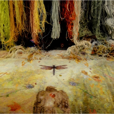
Contact details:
Annika Ekdahl
www.annikaekdahl.se
Annika Ekdahl, Kyrkhult, SWEDEN
Interview by Deborah Blakeley, December 2017
Emily Jones
You refer to your art as ‘Contemporary Representational’, can you expand on this?
Yes, I use this term as my work is a synthesis of traditional classical training fused with contemporary realism. I have developed my own style through a combination of my passion for figurative painting; formal portraiture; and urban landscapes. It works for me. My classical training gives me the freedom to realise the vision in my head and create fresh ideas that are real to my 21st century existence.
I enjoy exploring themes of 'light and life'; 'isolation and connection'; 'joy and melancholy'; and 'identity and place’. Although my work is realistic, I enjoy adding moments of abstraction. In fact, when I plan a painting I begin on the abstract level because if it works as an abstract composition, I know it’ll work as a finished representational piece.
You have a young family, explain how painting your own children has taught you the joy of capturing those precious family moments?
I return regularly to those around me for inspiration and it is a joy to paint them. My husband, daughter and cat have made repeated appearances in my work. They are handy models.
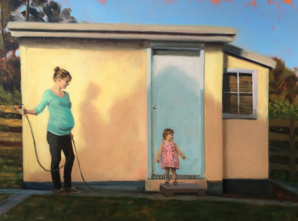
Watering,(Unfinished) 60 x 70cm, Oil on canvas
They appear as characters in my visual narratives, and yet I find their inclusion brings a special joy to the creation. It works on a deeper, and more beautiful level for me, such as in Watering Unfinished and Horizon. Tabitha Unfinished is a formal portrait that serves as a reminder that my daughter is not just a child but a person, a small human. A person with two years, experience of life.
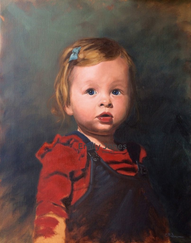
Tabitha, (unfinished) 40 x 50cm, Oil on canvas
Every day with her is a scary privilege. She is a wonderful, frustrating, unfinished work of art. This is a particularly poignant painting for me, as Tabitha’s entry into my life inspired me to pick up my brushes and work at my craft. She became my artistic catalyst. I am more prolific than ever. I dithered before but she clarified my time and choices. I now have a newborn son; I wonder what joys his arrival will bring to my practice?!
Discuss how your portrait training with The Florence Academy of Art, and Martinho Correia from the Angel Academy has influenced your work?
I have been fortunate to have trained with a number of master instructors and institutions, including six weeks of intensive learning at the Florence Academy of Art. This was an amazing opportunity to hone my craft in the most beautiful city in the world, Florence; the crucible of the Renaissance.
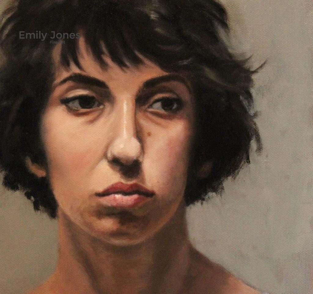
The Florentine Model, 25 x 30cm Oil on linen
This training influenced my work by giving me a broader range of skills to bring to my paintings. It really was helpful to work under a range of teachers, as it taught me that although there are guiding principles, there is still flexibility in technical application. They also provided me with helpful wisdom on making my ideas come to life beyond the picture plane.
How has your training with Steve Bowden been influential?
Several years ago, I was artistically frustrated and unable to move beyond my self-taught skills, until a friend introduced me to Steve Bowden and his traditional tonal painting method. It was a revelation to my practice! The training focused on the tonal techniques handed down from the Australian ‘Tonal Impressionists’, such as the great Max Meldrum.
In class we moved through a series of exercises that trained the eye to truly ‘see’ and understand the subject from a tonal perspective before employing colour. This transformative method has got me to the point where my technical ability matches my creative drive, where I can now confidently create what is in my head.
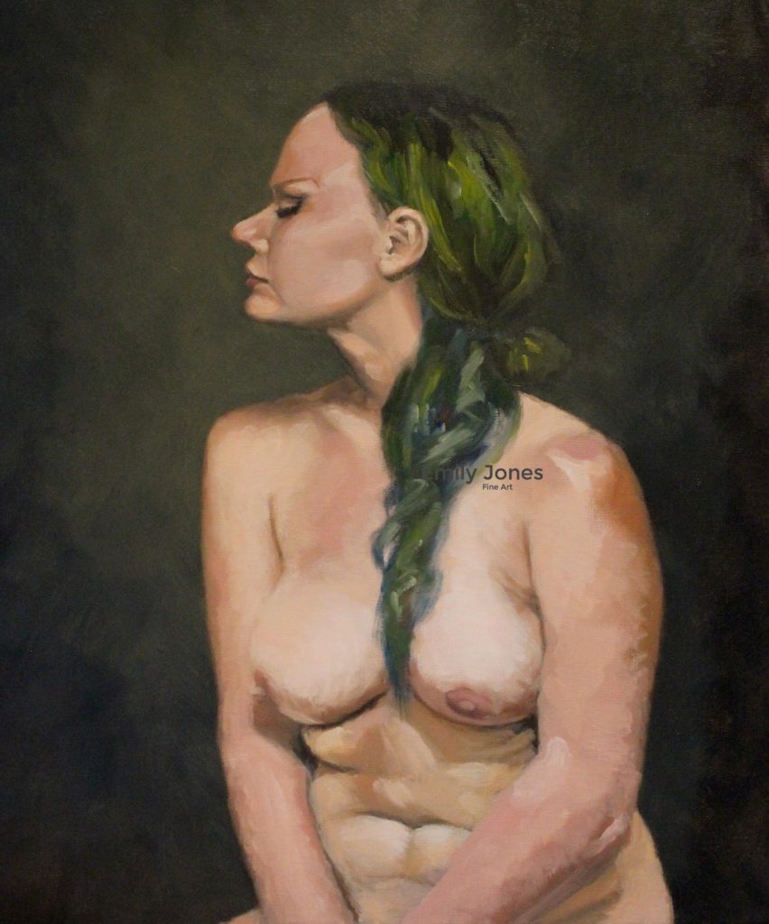
Nude with Green Hair, 40 x 50cm, Oil on linen
Steve Bowden, has been a finalist in the ‘Archibald’ can you explain the importance of this prize in the Australian art world, for my international readers?
Established in 1921, The Archibald Prize is this is the most famous portrait prize in Australia. It has a long history of controversial portraits winning the prize, as the boundaries of portraiture are pushed beyond recognition, for example, an invisible figure won a few years back.
How does your environment influence your urban landscape work, with London and Tasmania as your backdrop?
Australian artist, Clarice Beckett, looked to her local urban surroundings for inspiration. The time she was able to dedicate to her art was curbed due to the full-time care of her elderly parents. So too, my phase in life with two young children does not allow me to venture far to paint.
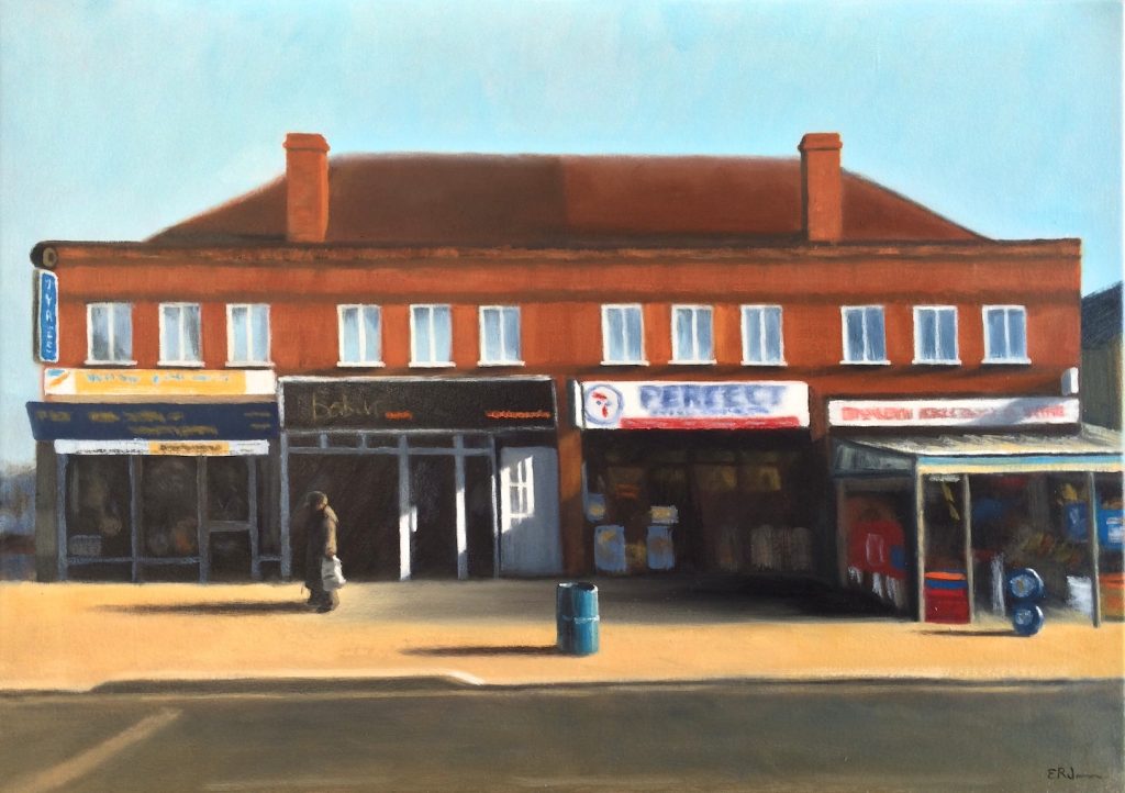
Perfect Fried Chicken, 50 x 70cm, Oil on canvas
Life is complex and time is scarce, perhaps more so for the female artist. However, rather than finding this limiting, I find my immediate environment offers inspiration. My place is my landscape; my every day, ordinary view. I explored my home environment in a recent exhibition entitled ‘Person and Place’ with two other female artists. Examples from this exhibition included Intersection and Watering Unfinished.
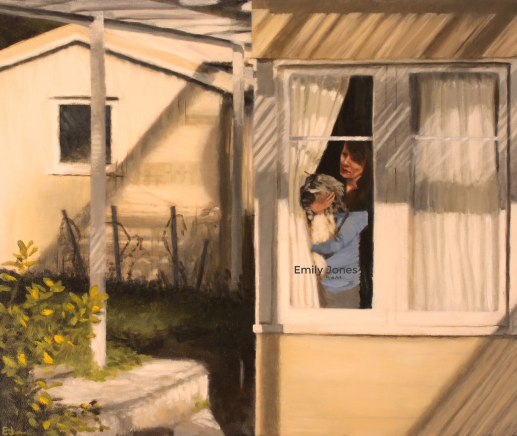
Intersection, 50 x 60cm, Oil on canvas
I also created a series based on my sojourn in southeast London, living in the vibrant, multicultural suburb of Brockley. It was a great privilege to have three of these paintings exhibit in New York City recently, as part of the Chelsea International Fine Art Competition Exhibition.
Take your work ‘Things off in Shadow, Half way in Light’ discuss your use of tones in this painting.
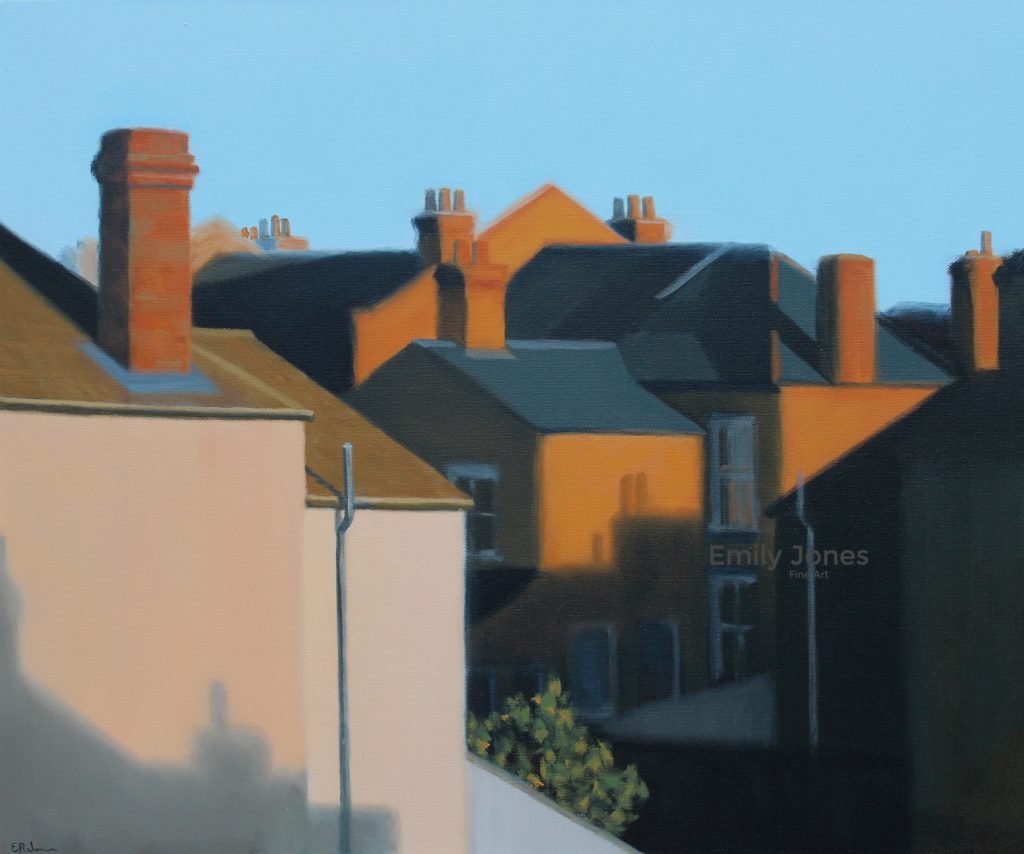
Things Off in Shadow and Halfway In Light, 50 x 60cm, Oil on canvas
The view from my London flat captured my attention one sunny afternoon. The light illuminated the densely built up area and highlighted some amazing shapes. I pushed that composition to emphasize the shapes and make it work on an abstract level not just representational one. I then used my knowledge of tone (light and dark) to capture both the depth-of-field also represent a deeper theme. The tension between light and shadow, interior and exterior domestic spaces. The eye is attracted to light, and this brings joy; yet there is a melancholy in the shadow; the quality of life.
In your artistic training, why have you replicated portraits using famous portrait Artists work, discuss.
A powerful way to learn new skills from the Old Masters is to observe their work, and there’s no better way to observe than to copy one as an exercise.
The value of such close work at this level for you the artist?
Working so closely with a master painting forces you to observe their handling of paint and brushwork, colour palette, and composition (John Singer Sargent is a wonderful teacher of these art principles). You can’t help but ask yourself questions like, ‘why did they choose to sit their subject in this pose?” or “What does that reveal about their character?”
Copy after John Singer Sargent, (detail) 2016, 50 x 60 cm, Oil on canvas
Working with eyes using Vermeer’s work?
Eyes are tricky, there are many curves, textures, skins folds and subtle colour changes. It is easy to get them wrong; a cross-eyed Girl with a Pearl Earring would look rather funny. Therefore, by closely observing the nuanced paint handling of a Master like Johannes Vermeer, I am able to take these lessons and apply them to my original portraits.
Copy after Vermeer
Explain how working on a ‘Self Portrait’ impacts on your work, e.g. Intersection, Watering Unfinished, Artemis (Self Portrait)?
When I was training with Steve Bowden, the first portrait we attempted was a self-portrait using a mirror. It was technically difficult and confronting to have to stare at my own reflection, and then reproduce my image on canvas. However, it was a great learning experience, and any painting attempted after that one has been an easier challenge in comparison.
Artemis (Self Portrait)) 50 x 50cm, Oil on canvas
Using self-portraiture helps me explore themes as mentioned earlier, such as 'isolation and connection'; 'joy and melancholy'; and 'identity and place’. I have even painted myself as the Ancient Greek goddess, Artemis. Beyond these general themes, I tend not to speak too openly about individual paintings. I like my work to have a little mystery; to draw the viewer in and to create their own narratives, much like the work of Edward Hopper or Mary Cassatt.
Do you work from life when portrait painting?
I work from either life or photographs when painting. Working from life is a wonderful experience and an important way to hone portraiture skills. It is (mostly!) a rewarding challenge to observe the human form while working within a limited time frame and overcoming the challenge of subtle movements in the model. However, there are other times when I must work from photos, either for cost or time constraints, or the sitter is unable to sit still longer that a few seconds (such as kids!).
Horizon, 60 x 80 cm. Oil on canvas
Discuss one portrait commission that you have done recently and the response on completion from ….
I completed a portrait commission recently for a client who had seen my artwork in the Tasmanian Portraiture Prize. It was quite a touching story, the client had an illness and he wanted a portrait painted of his beloved wife. She was not as keen to see herself up on the wall but she came around in the end. He wanted me to capture her soft and caring nature.
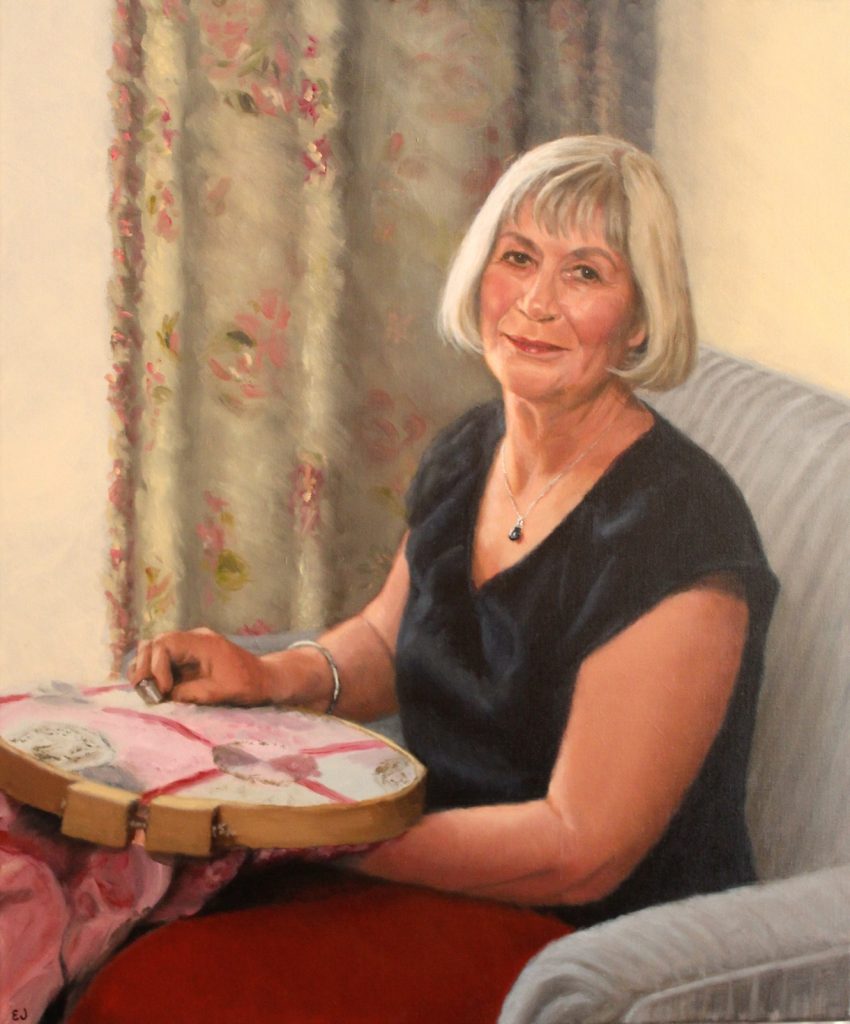
Beloved, 50 x 60cm, Oil on linen
Yourself: I was pleased with the outcome particularly as this was the first commission completed after the birth of my daughter; a satisfying accomplishment. It was a formal pose but has personal and comforting touches the reflect the sitter, such as her fondness of quilting.
The Commissioner: I like to work in consultation with my clients throughout the process, however, he was also a wonderful client to work for as he had faith in my artistic decisions.
The sitter: And his wife, the sitter, was happy with the final result, which was the greatest relief to me!
Contact:
emilyjones83@gmail.com
www.emilyjonesfineart.com
Emily Jones, Tasmania, Australia
Interview by Deborah Blakeley, October 2017
Karen LaMonte
Rather than ask Karen LaMonte to repeat herself by answering my questions Zoneone Arts knows you will be enthralled by watching the video as Karen captures and fascinates your attention through this Video about her exhibition, 'Floating Worlds'. Karen has taken the form of the Kimono and used three mediums, clay for its humility, bronze for its tradition, rust for its transitory and glass because it embodies the contradiction of presence and absence.
Karen LaMonte spent a total of eight years building the whole body of work that she called Floating World.
Taste of Thunder, life size
Floating World — The mezmerizing kimono sculptures of Karen LaMonte
Enjoy the next 6 minutes as you learn about this wonderful artist and her work.
https://youtu.be/8nE4ilXoPBw
Zoneone Arts is excited to be able to share these videos with you...
Contact details:
Karen LaMonte, USA
WEBSITE http://www.karenlamonte.com/
Interview by Deborah Blakeley, October 2017
Francesca Vitali
How did you first become involved with paper?
I have always folded paper since I was a kid. My parents' store, among other things used to run a lotto stand and the play-slips were everywhere and they were perfect to make really everything my mind could think about out of paper. That’s where I started folding and playing with paper.
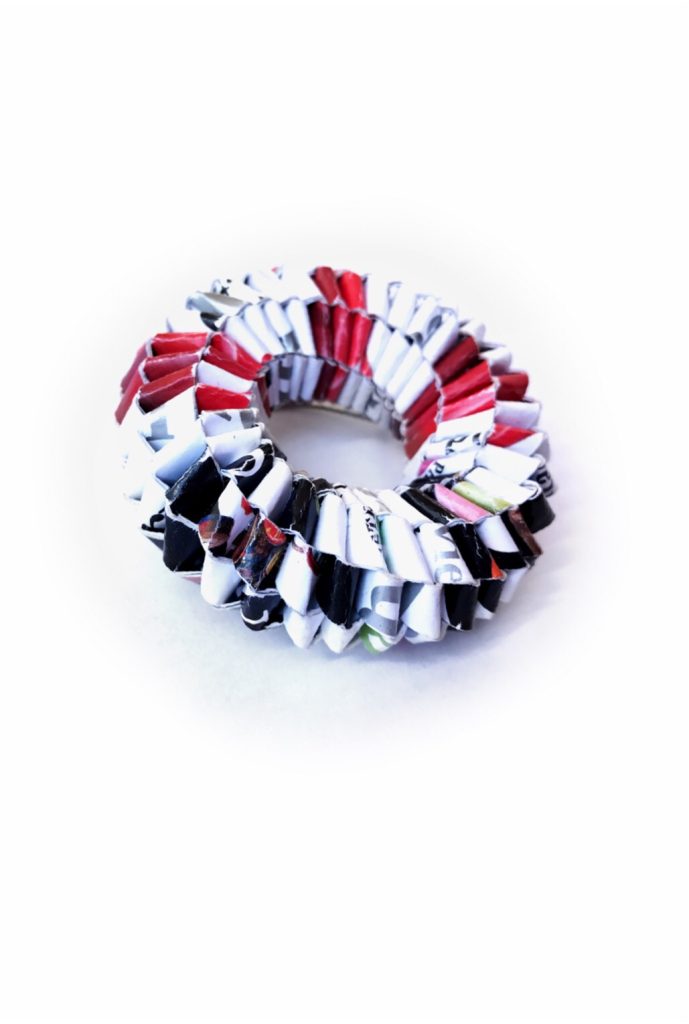 How and where do you mainly source your paper?
I have been collecting paper for very long time. I even moved to the States with a suitcase full of paper (as if I wouldn't have found paper here, I know crazy!!). I'm not very selective about the source, meaning I like to use any kind of paper. What attracts me to a certain kind rather than another are the colors and the story behind it. The memory that it carries.
I also have a paper bag collection that I started without even thinking and now it has bags from all over the world, because that’s what friends bring me back from their travels. Each piece made with those bags are very special to me.
Discuss the importance of folding in the construction of your jewellery.
Folding is the foundation of the work. It is what gives the structure and the strength to each piece. It is based on the repetition of the same movements over and over, each piece can easily contain 1000 folds and more. Definitively it is the most time consuming part of each piece but it is also the step that I love the most, the core of each piece, when an idea becomes an object. Pure magic to me!
Does the number of folds give the strength or is it the grade ?
I know it will sound counter intuitive, but the short answer is neither.
The number of folds has more to do with the shape of the piece. And as for the grade of the paper I rather work with thin paper in multiple layers that thick (stronger if you will) paper.
You also use metals along with paper in many of your jewellery pieces, Expand on the combination of metal and paper.
At the beginning of my professional carrier I felt I needed metal as a way to increase the perceived value of the paper itself, as if paper was not enough. Later, I switched completely to no metal at all. It felt like I was betraying my beloved raw material (we can call it the I don't care what you think about my work period ;) )
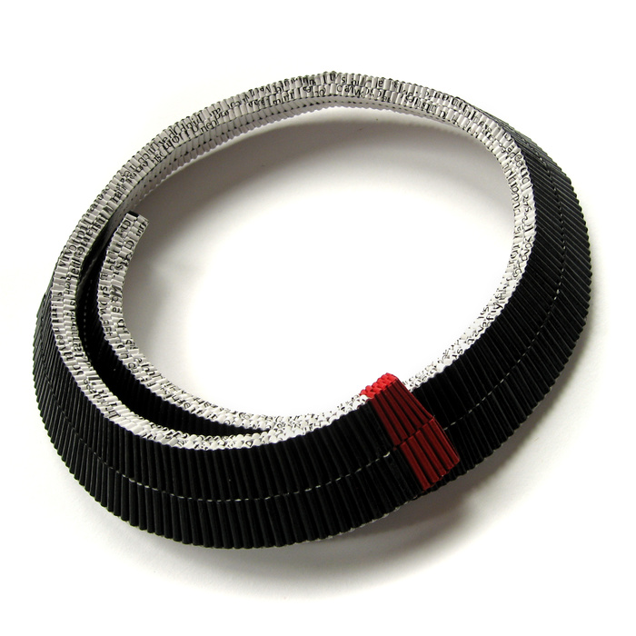 Today, I'm less worried about the value or the perceived value of my work. You can say I'm more confident in my collectors, I know now that they understand and love paper as much as I do. Therefore I started to use some metal again as part of the design when and where it is esthetically required. And I find myself using more and more steel. I love its sturdiness its color combined with paper.
Can you discuss your bracelet ‘Solido’ and briefly explain the technique used in this piece?
This bracelet is one of my very first piece that I have made only with paper, and I keep going back to it. I love everything about it, the simplicity of the shape the minimalism if you will, but then if you look closer you can see each single fold and how intricate it really is. And I love that I can play with colors and color combo and paper patterns while making it. It has endless possibilities to my eyes. But what my collectors like the most about it is the light weight despite the size especially when you wear more than one.
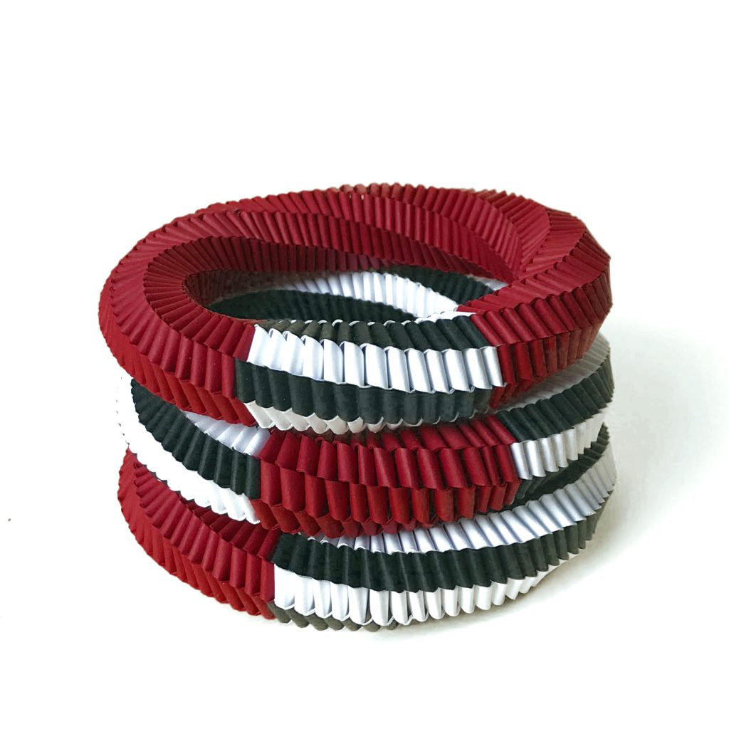 Wearability is often the question with paper jewellery. What is the best way to look after your pieces especially bracelets?
It is actually very easy to care for the jewelry because they are very sturdy and very durable. Once the piece is completed the paper is treated with acrylic medium which makes it water resistant, so every piece can be worn in the rain.
Expand on your jewellery and how you have used the natural shape of a spiral?
My formal training is in science (I have a PhD in organic chemistry) and my mind works very 'mathematically', and I'm attracted by repetition and math problems and more often than not my designs are informed by chemical structures and molecules in a very subconscious way. And that's where the spiral comes from.
Discuss your use of colour and the movement through one colour to another.
Sometimes this is a very controlled process where I use strictly mathematic formula to blend colors and sometime I just let the paper (especially the recycled one) do the work for me, and when I do that I have to restrain myself from controlling the final result. It can be very hard, because I don't know how the final piece will look like until the end, and there is no guarantee I'll like it.
Your most recent pieces you have added gold leaf, is the applied before you start to fold?
The gold leaf is applied after the weaving and before the sealing.
You are currently debuting this new necklace at the Smithsonian craft show, in Washington DC. Explain a bit about this show.
In terms of craft shows in US this is one of the best, it is very competitive and to be juried in is considered a Medal of Honor and a privileged among the craft community.
Size The show is pretty small I think 120 artists
Discuss the importance of transformation from recycled paper to beautiful jewellery.
Paper is a media that allows me to play with memories in a totally different way than other media. Paper comes to me with its own story, and it is up to me to preserve it or sometimes even destroy it.
What is there not to love about it?
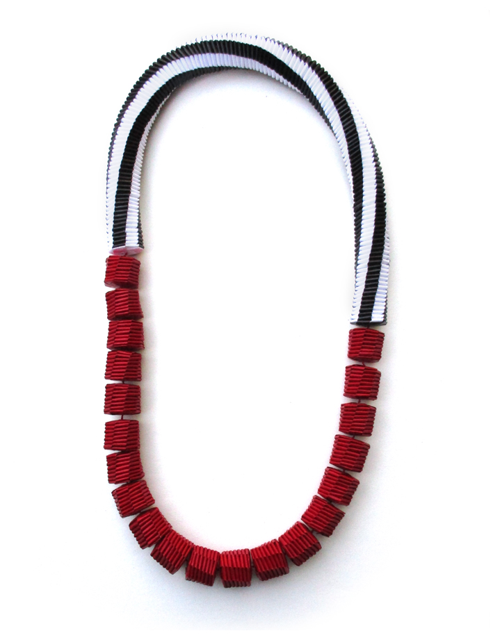 How often does your jewellery surprise people – by this are they always aware that the material is paper?
Very often, I have been asked if my work is 3D printed, if it leather, plastic or even wood. And then when they start looking closer at the paper, every single person will try to understand what kind of paper it is, which to me is great, I can see how connected people are with such an humble and everyday material, we all have stories about paper, it is so familiar to us. And this is what I love about it!
Is print a problem?
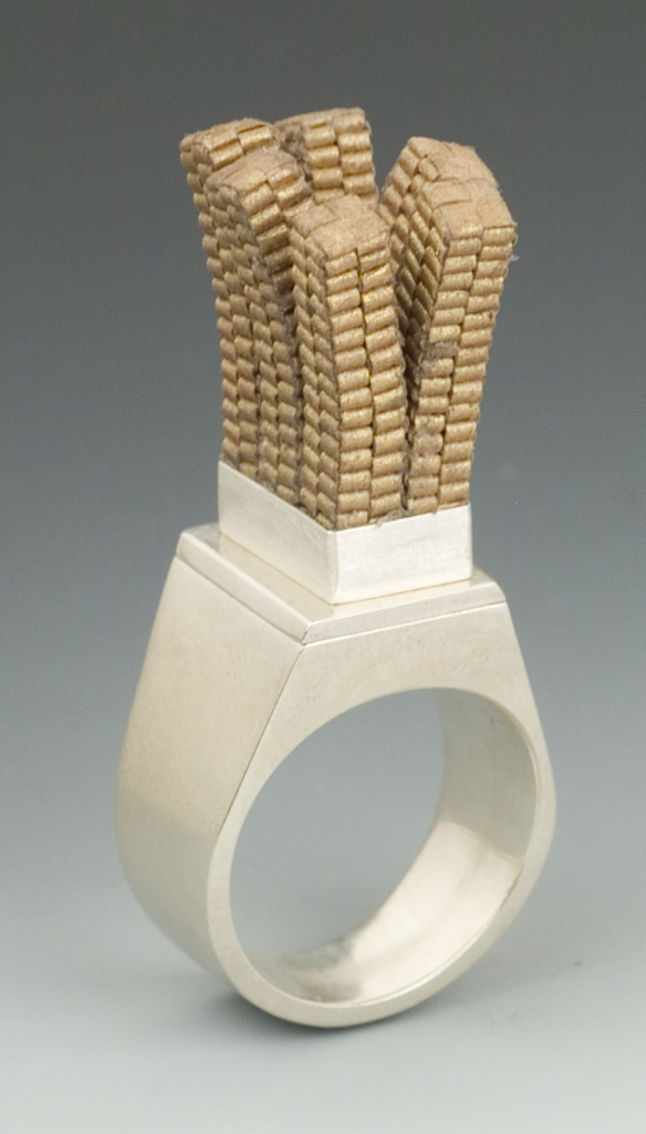
Not at all! I actually have a body of work that is all made with an Italian poem that I printed over and over and then cut in strips and used for all the edges of the pieces.
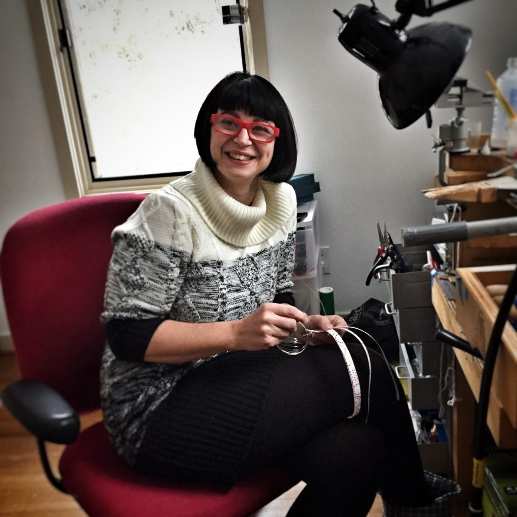
Contact details:
Francesca Vitali, USA
WEBSITE http://francescavitalipaperjewelry.com
INSTAGRAM @FrancescaVitali.PaperJewelry
FACEBOOK http://m.facebook.com/FrancescaVitali.PaperJewelry/
Interview by Deborah Blakeley, September, 2017
Carol Milne
Although it seems absurd, as an artist, I am much more interested and involved in the act of creation over the finished product. And it makes me laugh when I think of finished work that celebrates the unfinished.
Zoneone Arts is delighted to bring Carol Milne to you…
Can you explain simply the technique you use to cast your pieces?
The technique is basically lost-wax casting. It’s the same process used in bronze casting and jewellery casting. These are the five basic steps:
- I make something in wax.
Making a wax
- I make a heat tolerant mould (plaster & silica) around the wax.
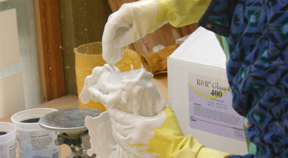
- I steam the wax out of the mould, leaving an empty space where the wax had been.
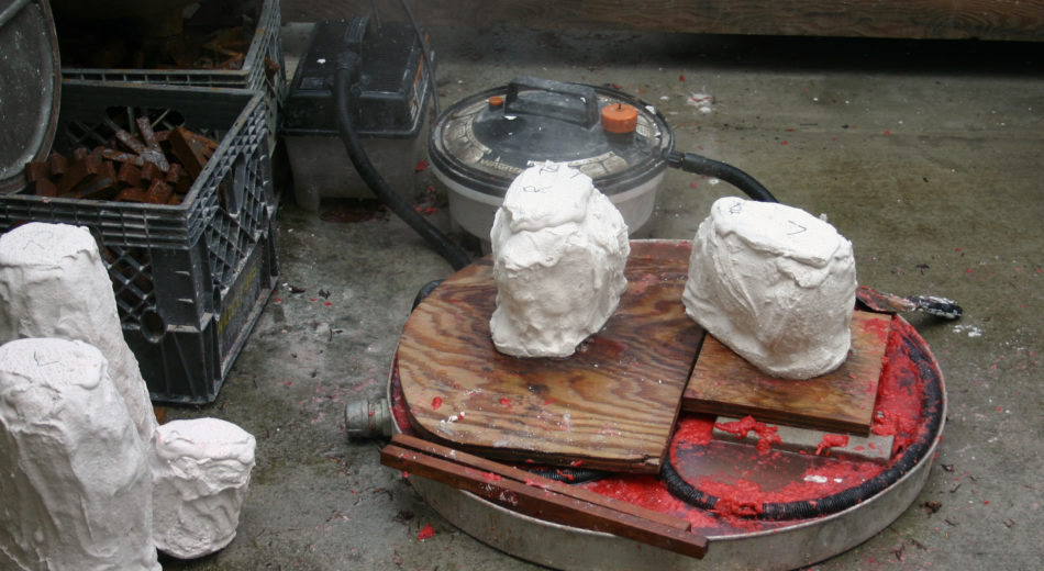 Steaming out moulds
- I put the mould into a kiln and melt glass into the empty space.
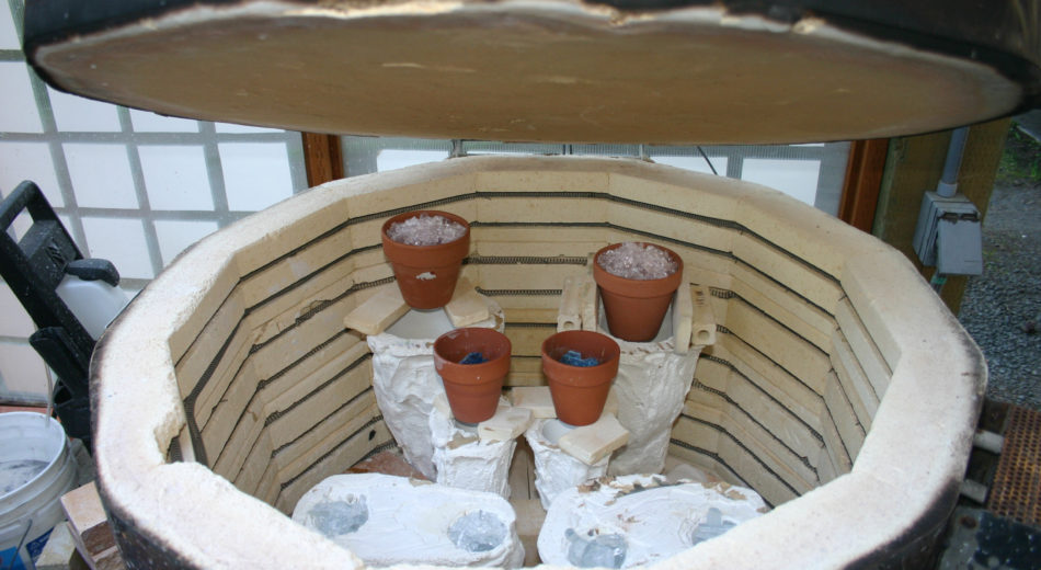
Moulds in the kiln.
- I remove the mould from the kiln and pick off (destroy in the process) the mould material to reveal the glass inside.
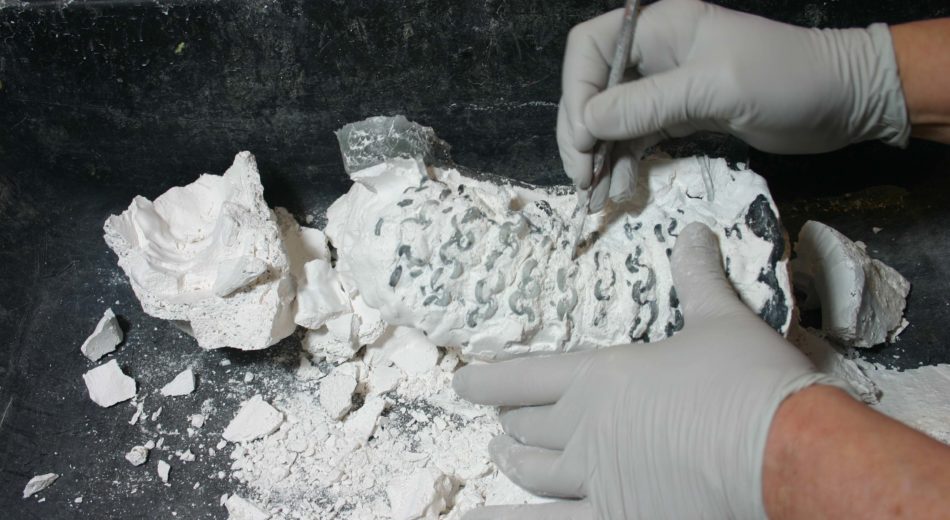 Removing mould
How did you first become aware of this technique?
I was a graduate student in sculpture at the University of Iowa, where we worked primarily in cast iron. Some of the casting was done using the lost wax technique.
How has this technique changed the diversity of your work?
My “twist” on the technique is that I knit the wax before I cast it. This is easier said than done. Since wax doesn’t stretch like yarn does, I can’t knit it with needles.
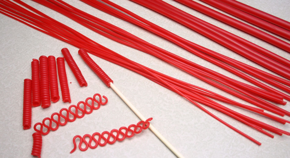 Wax Strands
I had to come up with a way to form the wax into stitches and then knit them together by hand. The added complication is that knitting is flexible – because the stitches are looped through each other, but are not attached. This is great for fabric, but not so good for glass. If the wax pieces don’t have a strong physical connection, the plaster will fill in the gap. Glass will only flow where there was wax. It will not jump gaps.
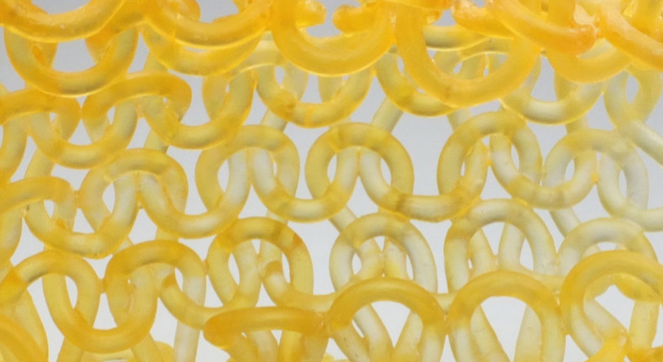 So I solder all the knitted joints together once the knitting is complete. This connects everything, but subtly. So the stitches still appear like they could move without actually being able to do so.
Discuss your first European exhibition?
Preparation:
In this case, the gallerist, Sue Schiepers, wanted a sampling of work from different series I have created. That was easier and less time-consuming than creating a whole new body of work for the exhibition. I did create several new pieces, but not 20.
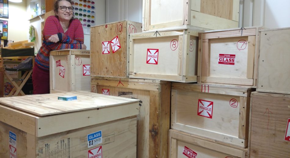 Carol Milne with the Crates for Schiepers Gallery
Logistics, especially for glass:
As I’m sure you know, glass breaks. To avoid breakage, I build wooden crates for all my work, and individually pack the pieces with 3” of upholstery foam surrounding the glass on all sides. I carve the foam to fit snugly around the work and number the pieces and layers. Assembly instructions with photos document the process, so the person unpacking and repacking has a map to follow to ship the work back or onward safely. This is very time consuming. It took several weeks to pack everything up and put together visual packing instructions for all the boxes. The rest was easy. A truck picked up all the work and it was shipped air freight.
How the exhibition came about:
I was contacted by Sue Schiepers of Schiepers Gallery via email in the summer of 2016. At that point she had not yet opened her gallery, but knew she wanted to show my work. I was hesitant, not knowing anything about her. But we emailed back and forth for a while. I did some research, and spoke with her on the phone. My gut reaction was positive. So I decided it was worth the risk.
Where else has your glass taken you?
I’ve been lucky enough to teach all over the USA, & Canada, and in distant and exotic places like Istanbul, Turkey, New Zealand and Tasmania, Australia.
Expand on the way you conduct your classes?
I have no interest in creating “mini mes”. I teach the basics of knitting and wax working, then let the students “go to town”. It is more challenging to have everyone do their own thing, rather than having a set project, but I find people are happier making what they choose. More importantly, the diversity of projects makes for a richer learning experience overall.
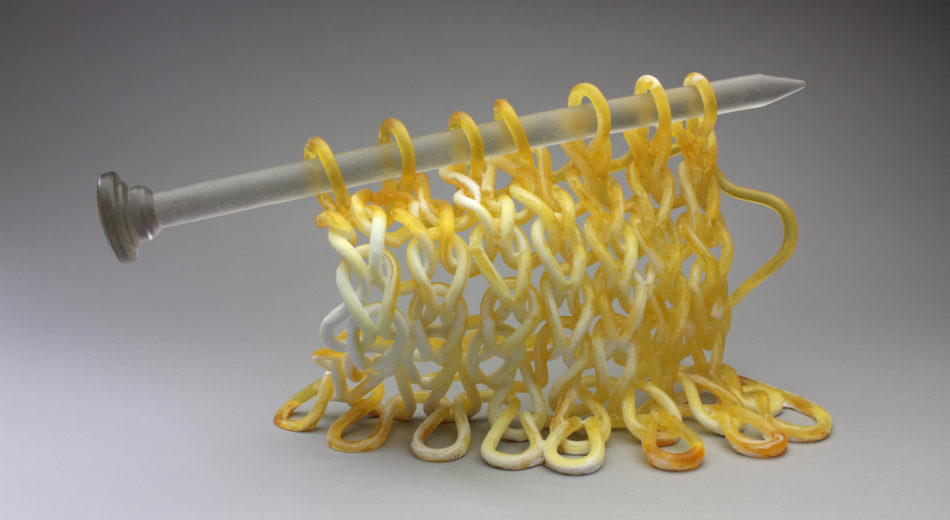
Continuous, 2017
Take one of your knitted pieces with needles and discuss.
In 2013 several key mentors in my life passed away. It started me thinking, “What does it mean to become your own mentor?” A series of hands knitting themselves was the result. The latest iteration of this is “Waterwings”. In it, the hands are knitting themselves, but also buoyed and buoyant, like the water safety gear worn by small children.
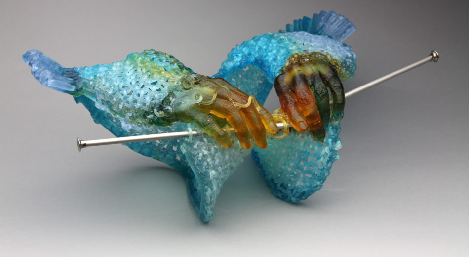 Waterwings
Take away the needles and take another piece and discuss.
“Queen of the Knit” was one of the most unusual and fun projects I completed.
It was a glass costume created for a glass fashion show at the 2016 Glass Art Society conference. I came up with a 2x3” piece which could be repeated and connected. It was based on Entrelac knitting. I connected the pieces with plastic washers and cable ties (so the clothing would still be somewhat flexible and the glass pieces wouldn’t be touching and break). There was a felt backing, with LED lights, Arduino controllers and small portable batteries sandwiched between. You can see a video on of the catwalk (worn by Kait Rhoads) here: https://www.carolmilne.com/glassfashionshow/2016/6/14/queen-of-the-knit
 Queen of the Knit
At a very different level comment on your Project ‘In the Name of Love’.
Sometimes art is simply therapy. I was disgusted when the US invaded Iraq in 2003. It was an unjustified war that left tens of thousands of civilians dead, cities demolished, homes destroyed, and lives in tatters. This started me thinking about bombs as gifts.
In the Name of Love
A gift has a giver and a receiver. It's usually given with good intentions, and received with joy. But are good intentions enough? When it's no longer welcome, is it still a gift?
I call my series of bombs as gifts “In the Name of Love”. The gifts are oversized (the finished pieces range from 8-15” tall) hot-cast grenades with bullet-shaped interiors. Kiln-cast bows adorn the grenades. The bows are held in place with removable pins.
At first glance the grenades look like fancy gift boxes.
Each piece is named (however improbable the name may sound) after an actual U.S military operation in Iraq. For example, “Operation Mr. Roger’s Neighborhood,” “Operation Spring Cleanup”, “Operation Rapier Thrust.”
It's heavy work (literally and figuratively) with a bow on top for levity.
Explain how your degree in Landscape Architecture has influenced your sculptural work?
The Conquistadors
Landscape Architecture is essentially the arrangement of objects in 3-dimensional space, so it really differs from sculpture only in the materials used and the scale. I often wish I had the facility to work larger in glass, since I could see some of my work as outdoor installations. In fact, in 2012, I proposed to enlarge one of my series of sculptures (The Conquistadors) into 8 foot tall pieces with knitted rope light instead of glass. I was astonished when the committee asked me to build them – then scrambled to figure out how I would do it. The resultant pieces, “Grow Lights”, are made of hybridized cement, covered with knitted, coloured rope with LED rope lights woven in (the LED rope light was expensive, and too stiff to actually knit).
Grow Light
Discuss Gaudi and his influence on your Tessellating Garden tiles.
I took a “Gaudi pilgrimage” to Barcelona, Spain and came upon an hexagonal tile sidewalk with a repeating pattern (designed by Antonio Gaudi) which inspired me to make my own design in glass.
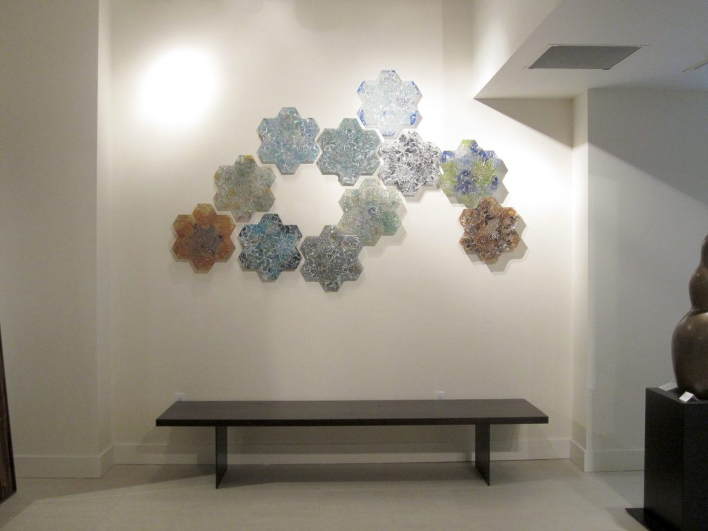
Garden Tiles
The description can get complicated if you don’t understand repeating pattern terminology, but essentially there are three designs, each composed of 1/3 of the hexagon. When you match the designs at the corners, they combine to create a larger design.
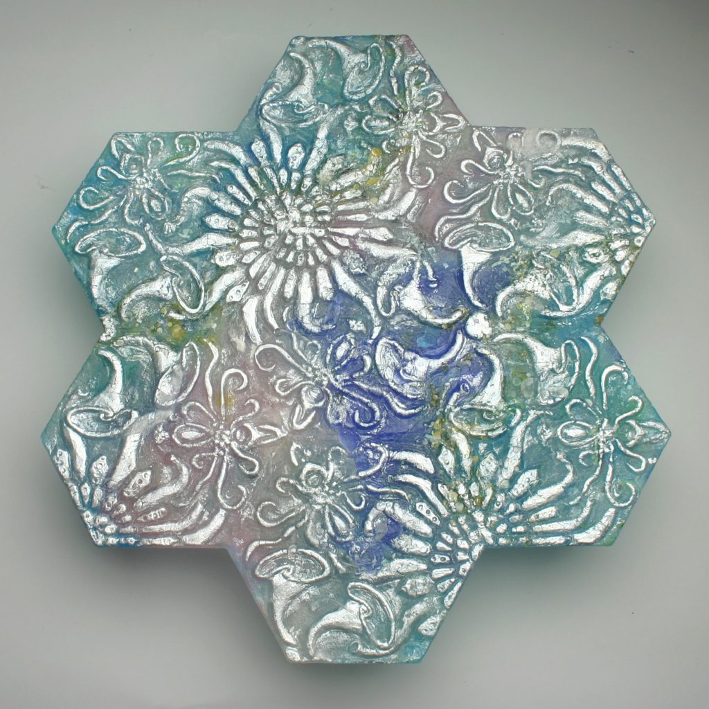
Garden Tile
My “Garden Tiles” are composed of 7 individual hexagonal tiles, so each of the three, plant inspired designs can be seen in full.
Discuss the value of knitting and the binding together in relations to your glass.
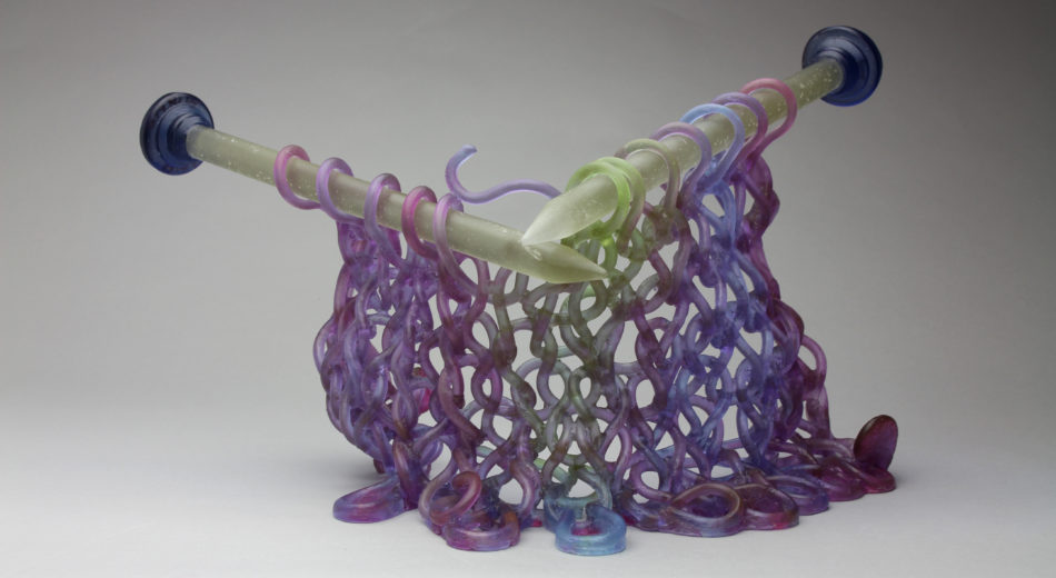 Purple Reigns
I see my knitted work as metaphor for social structure. Individual strands are weak and brittle on their own, but deceptively strong when bound together. You can crack or break single threads without the whole structure falling apart. Even when the structure is broken, pieces remain bound together. The connections are what bring strength and integrity to the whole and what keep it intact.
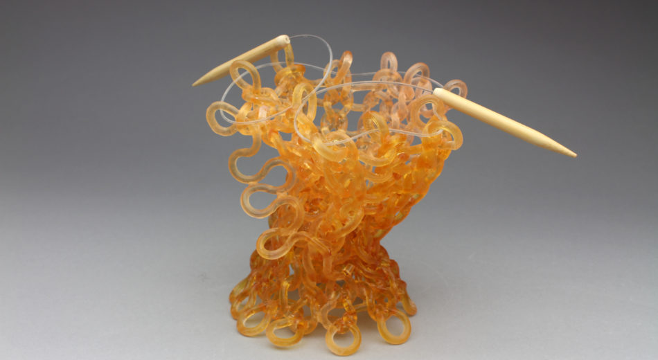 Every Which Way
Discuss how you use the depth of beauty found in the mundane?
Is knitting mundane? I like the irony of creating a finished piece of art that presents and celebrates a creative act – in this case the process of making/knitting something by hand. Although it seems absurd, as an artist, I am much more interested and involved in the act of creation over the finished product. And it makes me laugh when I think of finished work that celebrates the unfinished.
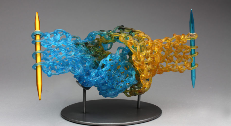
Mix and Match
Contact details:
Carol Milne
carol@carolmilne.com
www.carolmilne.com
Carol Milne, Seattle, WA, USA
Interview by Deborah Blakeley, August, 2017
Kevin Low
Your current exhibition is ‘Women and Men’ at Union Gallery in Edinburgh, discuss the title and how the exhibition was named.
The title chose itself really. I’ve spent the past two years exploring and experimenting / messing about with paint. My main discovery or what I realised I had to do, was to strip things away. There had been too many ideas crowding that one little rectangle. I’m a figurative artist, so when it came down to it, there was very little left other than the ‘Women & Men’.
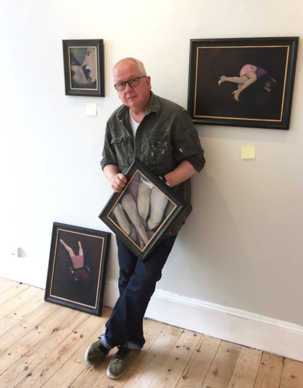
How many pieces have you had to complete for this Solo exhibition?
There are 21 paintings in the show… there were more, but these are the survivors. I promised myself when I began working on this show that I would be brutally honest with myself. If I am doubtful about a picture, I allow it to lie around the studio for a few weeks, then, if I can’t see a way forward with it, it’s off to the bonfire. Destroying unsuccessful work can be a fantastically creative thing; it stops your thoughts getting slowed down with all that gloop of the near miss and the wrong turn.
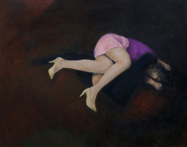
Sisters IV, Oil on board, 37 x 47 cm
Discuss the ‘domestic familiarity’ of one of your works.
This something I hadn’t realised. I was looking for an atmosphere rather than having a clear idea of the images I would make. I knew I didn’t want formal. I wanted to avoid show biz, the images to somehow be real, to catch mundane moments and find the tiny magic there is in them. My bodies are not those of gymnasts or fashion pages. I wanted, I suppose to look at a world that was believable not aspirational. There is always a bit of biography in my work, and this is how I remember things, without much daylight.
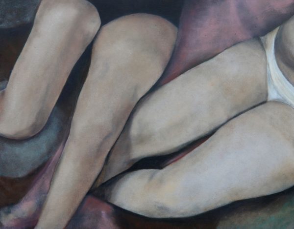
Pale Legs, Oil on board, 27 x 34 cm
The domestic aspect of your works, are reminiscent of Degas domestic paintings discuss.
…Yes, I can sort of see that sometimes. Photography was important to him as well, the realisation that a scene can be capturing without the necessity of completeness, that the viewer can imagine beyond the cameras frame, beyond the artists eye. His work took a step backstage, avoiding the front of house glamour to gaze at the mundane moments of dancers dressing and bathing.
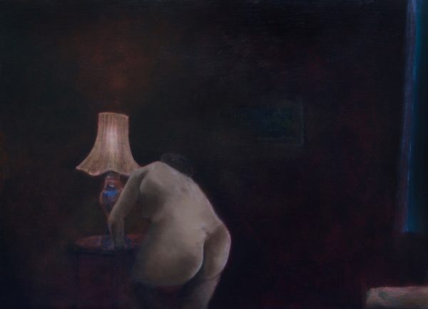
Woman Undressing, Oil on board, 37 x 47 cm
You also worked as a photographer. How does your photography influence the frame within your paintings?
The photographer Cartier Bresson was all about the ‘decisive moment’, the height of the action. Working as a theatre photographer, documenting an opera performance that ability was essential. In away what I’m searching for in my current work is the exact opposite. It’s the moments in between that I’m interested in, that ill defined awkwardness after the instigation of the action and before its resolution… let’s call it the mundane middle, there’s something special in there.
In your earlier career you worked as a Theatre Photographer explain what this involved?
I had a fantastic time. I was working and collaborating with a great variety of directors and writers. I was commissioned to produce images to promote their work and to document the performances. Very inspiring, but things became more and more frustrating. I was photographing other people’s work when I felt I should be creating my own. One day as I sat looking at my diary, pages mapping out the days documenting others work and I thought, no, can’t do it, and I jumped… it felt wonderful!
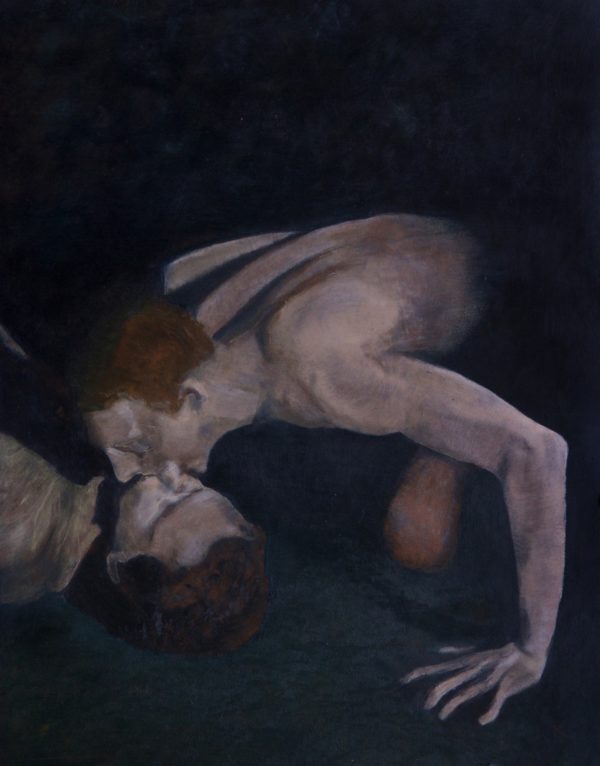
Untitled, Oil on board, 27 x 34 cm
Discuss the backdrop in your current work.
This is the first time I have shown work in a couple of years, things have changed. As I mentioned earlier I’ve spent a lot of time experimenting, playing with ideas. After a lot of false starts and sulking, but nothing that couldn’t be shaken off by bouts of swearing, loud music and coffee, I came across the thing, an atmosphere that I recognised as mine.
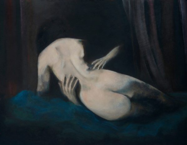
Woman and Man on a Blue Bed, Oil on board, 37 x 47 cm
The new work is oil on board, all my previous work has been digital. Life in the studio is now much messier, that’s part of it really; there’s a thrill in the wet and messy. I was finding that the moving around of pixels wasn’t giving me that spark in my gut. This is a bit of a cliché I know, but I became more and more aware of the ‘mark making’ in other artists work, their signature push and pull of the brush. I found that working digitally I couldn’t do that. The joy of an oil painting is those ‘mistakes’ the fumbles and alterations to the artists thinking, all that leaves little scars that I love. If I’d done that with a digital painting, it would have been faux. A mistake can be undone at the click of a mouse. Digital painting has the possibility of giving you seamless perfection, that’s its strength. When it comes right down to it, what I’m saying is that I wanted more of me visible.
Some people have looked at the work for this new show and have said, ‘That’s not just a shift in process, it’s a huge leap to somewhere else.’ And it is, sort of… but new work, for any of artist, is never a leap, no matter how seemingly radical the move. It is… it has to be, a culmination of everything that has come before, not just the art or the making. You’ve got all the nightclub nights, the broken hearts, the years of really terrible TV. It’s all there… and it’s now here, mangled and funnelled into ‘Women & Men’.
Contact details:
Kevin Low
Kevin Low, Glasgow, Scotland
Interview by Deborah Blakeley, August 2017
Joseph Austin
You use copper plate for your prints, discuss briefly
Copper is the best material for etching because its hard and durable, it also has manipulative qualities for the intaglio or engraving process.
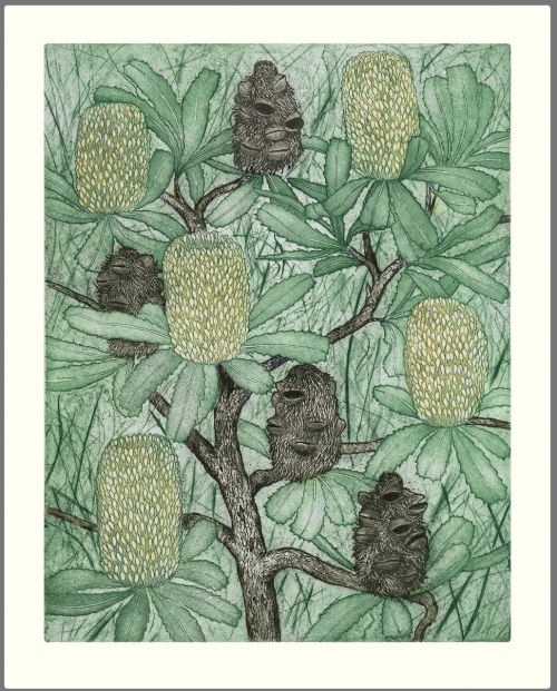
Banksia Old Man
The process
Making and an etching plate involves creating recessed lines and textures into a copper plate. First a polished plate is applied with a layer of acid resistant ground. A general technique of making a design involves drawing through the ground with a fine pointed tool exposing the metal. A modulated surface for tone effects can also be created on a plate. The exposed lines are later 'etched' away or corroded by placing the plate in a bath of ferric chloride. Once I'm satisfied with the depths created by the solution it is then wiped away with turpentine revealing an engraved plate. The finished plate can thence be applied with oil based inks for the printing process. When preparing etching plate for printing, ink is thoroughly applied into the etched lines and textures. The excess ink on the plate is then carefully wiped with a special cloth called 'tarletan' and final wiping stages can be made with thin paper and cotton buds. Finally the prepared plate is placed on the press bed and soaked art paper is placed over it. It is then moved between two high pressure rollers and a buffer of felt. The paper is moulded into the plate.
Why you especially choose this technique?
I didn't know what printmaking or etching really was until I took an elective at art school 22 years ago. A lecturer saw my drawings and said printmaking could be my thing. It appealed to me because I like or need to use my hands and etching in very labour intensive. When I begin, I know what I am looking for but the process of making it can take a few twists and turns and you can be surprised with the outcome. After all those years, sometimes I hate it because the longer I do it, more of a perfectionist I have become and that means re-working plates if I'm not happy with. Something I planned to complete in a week ends up being weeks. Reluctant devotion maybe. Luckily ones I go the distance with end up being quite successful. I see the potential and I just keep on going. Sometimes they just fall together.
Fish Eyes
How many prints will you take from each plate?
Usually 60. Can’t tell you exactly why. To be honest, I can make some money if its popular. Some I sell the whole edition which is great but then I’m ready to move on with new ideas.
What do you do with the plate at the completion of the Edition?
If an edition has been completed or discontinued, I use the other side for a new work. I once had so many used plates I took them to scrap metal yard. Im not that attached to them but some I keep because in themselves they look nice all polished up… I had one etching with an edition of 60 and it all sold within a year. I could sell that one many times over but once an edition is done its done. I do get asked that Question a lot.
Can you expand on your multi-plate etching?
I use 2-3 plates to construct an image for multi-coloured etchings. I can achieve layered colour effects and isolated colour. It can be much harder because of registration and there are more things to go wrong. If I’m printing multi-plate etching I need to be in the right frame of mind for the day. Nothing worse than spending up to an hour preparing the print only to muck it up wasting time, paper and ink. I”m not that great to be around if the day is going badly…the tones are wrong with my magpies or those lines are overlapping. An unwanted smudge can wreck a print. And it goes. It’s crazy and can be pedantic but like any product it has to made well. Our society is made up of so many components and that also means I can’t have that annoying smudge.
 Honey Eater
Recently you set up your own printing and publishing company, Discuss the process this has taken?
I started making cards about 12 years ago with humble beginnings by selling them at markets. I had some fresh designs but not graphically well produced. I decided a commercial distributor would be good idea and sent them away to 4 companies on spec. Only one answered which was Waterlyn quality cards. They bought all the stock I had, about $3000 and they decided to give them a go in the market place. After eight years they have bought thousands of cards and there in places such as David Jones and Dymocks. They have recently been sold to Henderson greetings which is an international company.
 Kangaroo Paw
Expand on the importance of cards in your art career?
Apart from selling etchings and the occasional painting, greeting cards are my main income. For the past 3 years I have gone into printing my own cards, art-prints and calendars with a Commercial printer I lease. I also invested in finishing equipment such scorers and a commercial guillotine. It’s given me a lot of independence and I can make my products to a standard and cost I need. I can be as finicky as i want without having to rely on a graphic designer or printer. First, I learnt computer design and layout skills at an Adult education course that gave me the confidence to do graphic layouts myself. Once I learnt that I could then do anything. This business model is dependant on my distributor and how much they order. Making art is only a component of my working life then rest is the other part manufacturing, marketing, printing etchings, making frames for my etchings etc. But it all begins with a design idea. It could come from just taking a walk or something and then if something comes to me I would think: Would that make a greeting card? Would people respond to it? Could people be interested in blue bottle jellyfish?
I work to time frames by releasing new designs twice a year for my distributor including August for my calendar.
Discuss your personal thoughts on the importance of hand written cards in our modern society?
It may sound terrible but I hardly ever send them myself. To my mother and sister of course or a special occasion for somebody. Maybe I’m like a fisherman who doesn’t eat fish very often. When I was younger I wrote hand written letters. As for the question; it’s encouraging cards are still popular considering the dominance email and FB are having on the way people communicate. Happy birthday on FB is ok but really what would we rather?
Park Swans, G Card
As a visual artist for me it comes down to a way of getting my pictures seen and generating an income. My pictures have positive content about nature and thousands of people share them. That must be a good thing.
What is the process you put into planning for a new exhibition?
I need a theme and a direction with the materials I am working with. Exhibitions are good for an artist, for me they can generate new ideas and results can evolve from the commitment of producing lots of work. I haven't put together an exhibition for several years mainly to do with time factors however I’m always open to an opportunity if one arises. We all need to make money so I can't afford to hang an exhibit in a dud location. That may sound blunt but a fair bit of investment goes into it andthere can be a lot to lose. Not that this hasn't happen to me in the past. I have had my share of bad choices and some pretty good. Because I mainly make prints, any printmaker will tell you its very hard to get a commercial gallery interested in a suite of limited edition etchings. I guess paintings and other mediums are more likely to generate the income in there business model. That is how I see it. I do better in provincial locations where a gallery will stock my work on an ongoing basis such as my one in Kyneton Victoria, Australia. I think galleries are in sorry state in Australia it must take a lot of business skill to run a successful one. I also don’t have much confidence with many galleries. Maybe because I assume a contemporary printmaking gallery in the inner-city would view my themes as not their thing. I admit this view blocks an aspect of my career which should be going better. I also loath openings all that anticipation on whose is going to show up or buy something. I understand for many artists that social aspect is part of what it’s about and that drives sales and their career. I find it hard to be outgoing in that way. It has not always been so because at art school in Hobart I would go to art openings with friends and I had some fun. My life is Sydney has been rather insular and I know only a few artists.
Can you expand on your work with underwater in relationship to Jellyfish and Coral?
Lace Coral
I’m working on a little sea anemone at the moment with its sensitive tentacles free in its aquatic space. Also an eight legged sea-star bright and visible through cluster of neptunes necklace. One of my hobbies is snorkeling so its a natural subject for me.
Seahorse and Coral
Discuss the importance of an Australian capturing both Australian flora and fauna?
Since I have been doing Australian nature in my themes I have found an affinity with our plants and animals. It interests me that we are an old continent and our animals and plants have evolved over such a long time to become what they are. I also learn a bit about my subjects and try to bring out their character as a species particularly birds.
Xanthorrhoea
Explain the amount of sketching needed for capture a bird?
Often from rough sketches. I could do several of the one figure and pick the must suitable. From that I might see and idea for an etching or painting and build. Some times I might have the idea floating around for a year before I start anything. I jot down ideas on a small note book so I never forget its origin. I could be lining up to buy groceries and I would be thinking how my little wren is positioned on that branch. My pictures would unlikely be considered political but I like to think a little native bird on on branch states some sanity in a mad world?

Pacific Black Ducks
Do you use sketch books or photographs as your reference?
I use a combination of everything, whatever to it takes to get my vision for a composition a reality. Sometimes I do a layout on paper or even strait from my imagination on to a etching plate without referencing an thing. I use photos to reference proportions, colour etc mainly for birds and animals. I use my own photos from field trips mainly because I know instinctively what I'm after. The internets handy for learning facts about your subject. Right now I doing some working drawings and layout for a new picture - unravelling ferns . My photos can assist in just getting the rhythms and shapes right for my composition.
Printmaking requires at least one press. Explain the equipment you have and how this has changed over the years?
I bought a old solid press off an artist in Tasmania for $300 22 years ago which I still have. I have had it repaired a couple of times by working it too hard breaking shafts. I have printed hundreds of etchings from it and sold most of them. My mother once said you paid $300 for that! I guess it looked like junk in the back of the ute. But she is one of my biggest supporters.
Discuss your studio area and how it is fitted out to give you the best use?
First impression of my studio could be a crammed mechanical garage not like an artist’s studio you might see on a tv program with their paints and brushes and everything just so. I currently hire a storage space on the ground floor. I have power and ventilation and they let me do my thing there. I am running out of space because in recent years I have accumulated so much stuff- a commercial printing set up, etching press and work benches,framing equipment etc then I have to try and store things. It’s expensive doing anything like this in Sydney and right now I feel like its closing in on me. My wife and I are in the process of moving from our tiny flat in inner-city Paddington and are heading up the coast of NSW away from the confinement and expense. I will be working from home hopefully in a double garage with extra room for drawing and an office. I also want room for a fishing boat.
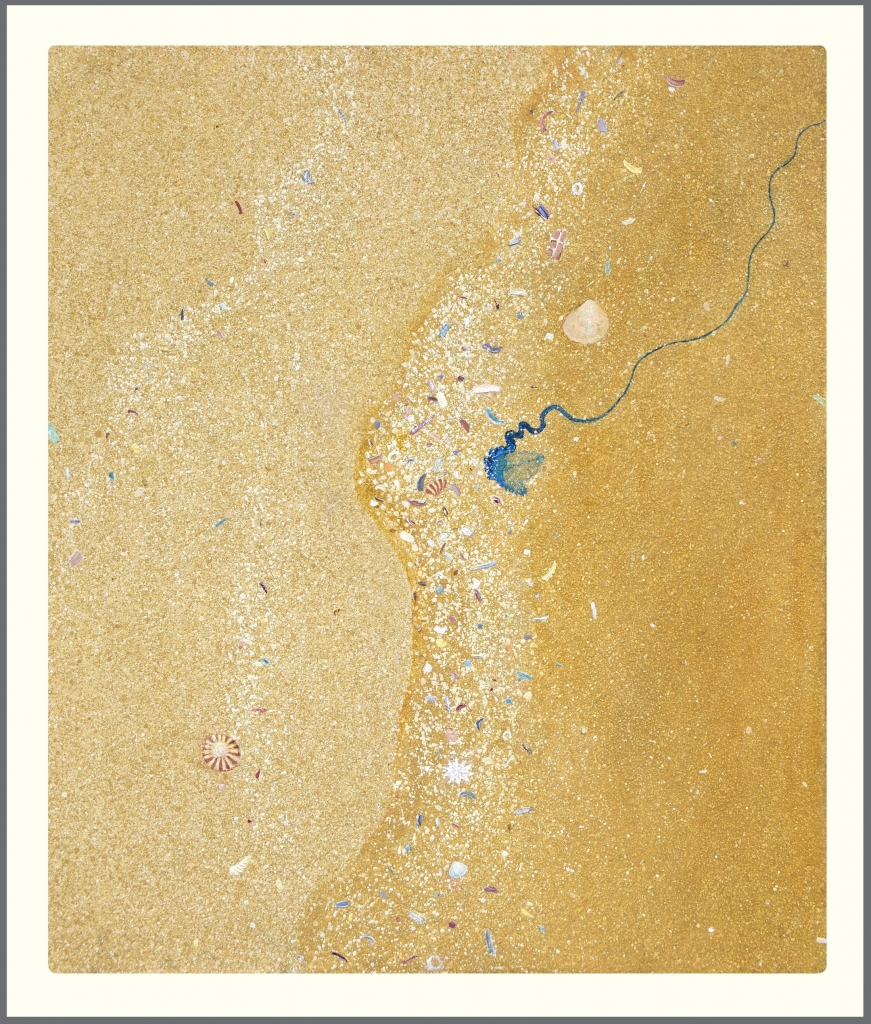
Bluebottle
Contact details:
Joseph Austin
josephart@optusnet.com.au
Joseph Austin, Sydney, Australia
Interview by Deborah Blakeley, April 2017
Samantha Bryan
Your comment, ‘I find myself preoccupied with everyday life, but not my own – that of the fairy’ can you expand on this?
Somehow I became a ‘fairy maker’, it certainly wasn’t intentional. I would not call myself a fairy fanatic. I have however always loved stories, characters and the details that make a tale special. I made my first fairy in response to a brief whilst still at University. It was quite a traditional interpretation of a fairy, something that you might put on top of your Christmas Tree.
That set the ball rolling.
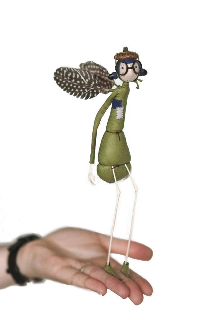
I started to focus on my character’s world. I took to the library to research folk law and stumbled on a book of Victorian gadgetry. It wasn’t what I was looking for and it felt like a distraction, but I was so interested in the items that people once thought were necessary.
I couldn’t help but to continue on this path of research. I was amused by the inventions that seemed so ridiculous to a modern world. Like the ‘self tipping hat’ for the polite gentleman. I was also taken by the wirey aesthetic of the gadgets.
It’s hard to track the path but I spent a lot of time in the metal workshop making gadgets out brass and copper. It took me a while to realise that I could fuse the two lines of interest together.
When did you first make your own fairy and how have they matured?
My early fairy character became heavily inspired by insects and plant life. I’d stitch jackets inspired by a beetle silhouettes, suits that borrowed form from plantlife. I used a lot of dried pods, seeds, shells in my early work. I would hand dye leather to look like something you’d find in the garden.

All those early influences and experiments formed the fairies of today. They are simpler, slightly less detailed and made out of materials that can be sourced with more ease. They are also more refined.
You have a ‘Species’ of fairies, discuss this idea in relationship to your work?
I have made many fairies over the years. Each one entirely one of a kind, but they share the same processes, materials…for that reason I think of them as a species.
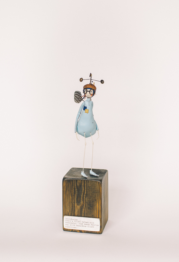
Anemometer Helmet
Does the fat bottom effect, influence the balance of each piece?
Ha…No it does not impact on balance because of how I construct them.
Discuss the organic and collected objects you use in your work.
I love to repurpose existing items. Acorn cups have become my standard issue fairy helmet. I collect all sorts of organic components to make helmets, earmuffs, wings and even nozzles. I sit making in front of my ‘treasure shelves’. These are stacked with all kinds of found items, buttons, seeds, old containers, lids, spoons. These become part of a sculpture as the need arises.
 Wind Indicator
When and how did flight become an integral part of your art practice?
I have always been interested in flying. I wanted to be a pilot when I was little. The first time I flew in an aircraft, I was 13/14. It was at RAF Finningley before it was decommissioned (now Doncaster Airport). It was in a Chipmunk (see below) and I had the biggest parachute kit strapped to my bottom. I had to be packed up with cushioning so that I could see out of the windows. (Imagine a Robin Reliant with wings). It has to be one of the most exiting, exhilarating and embarrassing experiences of my life (ill fitting parachute shame, I hated being small) . I still vividly remember the window rattles, the throbbing of the cockpit, the weight on my shoulders as we did loop the loop.
Dust Distribution Vehical
Discuss the titles of each of your pieces?
Each piece has a title that I type on one of my many typewriters (11 last count).
The title is designed to give a snippet of the piece narrative. So that the viewer/commissioner/buyer can fill in elements of the narrative themselves.

Fairies #8
You take us back in time, right down to using a typewriter, discuss?
I am interested in the old, I like to bring things back to life. I am able to transport people back in time by my material choices, the language used on my titles, the way the brass is chemically treated to look antique. Lots of aspects come together to contribute to the nostalgic feel of my work. My love for vintage naturally feeds into my choices and decision making.
Discuss the brief that you had with the Queen Elizabeth Grammar School for these classes?
I have worked with that Queen Elizabeth Grammar School a few times. The brief is to work with them to create a mixed media sculpture. As is always the case, the project begins with a ‘meet the artist’ session. A slide show and Q&A. With all my workshops the idea is to create your own characters based on your own ideas. This was the case here, but the theme was the Olympic Games.
Fuselarge, detail
How did the boys react to making Fairies?
With all my workshops the idea is to create your own characters based on your own ideas. This was the case here, but the theme was the Olympic Games. I teach them how to work with new materials, how to combine them how to manipulate wire and assemble.
I did find that boys in all boy classes can be much more open and less influenced by stereotypes. I found a love for glitter and the colour pink which was really refreshing.
Helicopter #8
Discuss the other aspect of your career, teaching.
I always intended to become a teacher, I had a place to study at Leeds after my Art degree. My degree show went much better than I could ever have imagined. It practically sold out and I have two offers for solo show before I even graduated. Consequently I decided to give up my place on teacher training and set up my first studio with money raised from degree show sales.
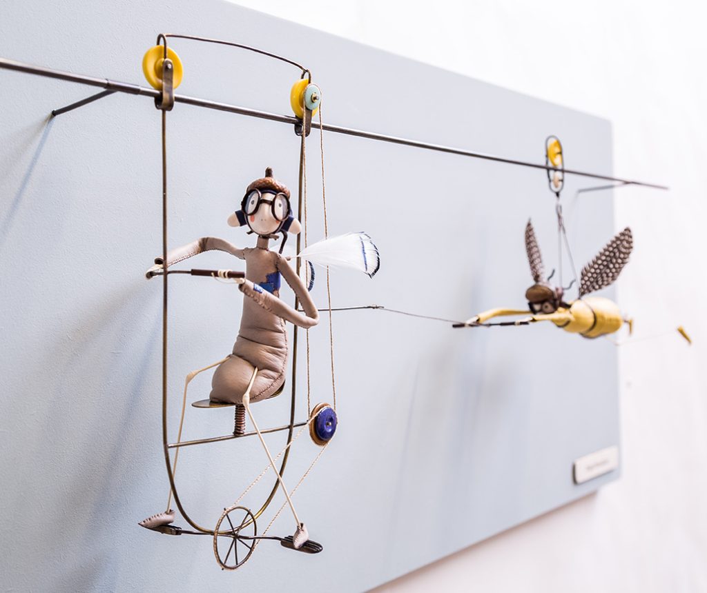
Flight Simulator
The desire to teach did not leave me, therefore I now have a great balance of teaching and making. I regularly work in schools running character building workshops for all ages. I also run specialist sculpture workshops for adults.
I share my processes and a little bit of my brain to help others to create their own creatures…whatever they may be.
The types of classes you take?
The skills needed for classes.
These are designed for all levels of ability. I tailor my workshops to the group that I am working with.
Where in the world have your classes taken you?
Across the UK, Australia and New Zealand.
Explain the process you have for Commission work?
I am fortunate in that much of the work that I produce is for commission.
Mostly I stay within my fairy narrative and this works well. Commissioning is a flexible process. Some come to me with an idea of what they would like based on pieces they have seen on display. Others (the most exciting kind) arrive with a budget and ask what ideas I have been working on.
Drawing
Leather samples
Deposit…
Discuss one or two commissions that have been challenging for different reasons.
Last year I worked with The University Of Sheffield’s Physics and Astronomy Department on a project for the Festival of the Mind. The process involved responding to the scientists research with sculpture. I collaborated with two Doctors who’s research was amazingly complicated. Designing and making sculptures out of something so significant was intimidating and completely out of my comfort zone, a real challage.
I always find making for very special circumstances particularly daunting. For example an engagement piece to hold the ring or a commemorative piece. It is such an honour to be selected for such a special piece. I can find people’s expectations weigh heavily on my mind. Particularly if the commissioners are makers themselves which was the case twice last year.
Expand on your nickname ‘Brain’.
‘Brain’ was a nickname given to me by the tutors whilst at university. I spent much of my time in the metal workshop wearing a white coat and goggles.
(Like the thunderbirds character). The nickname stuck and soon enough everybody called me brain. My work became known as ‘brains fairy aiding inventions’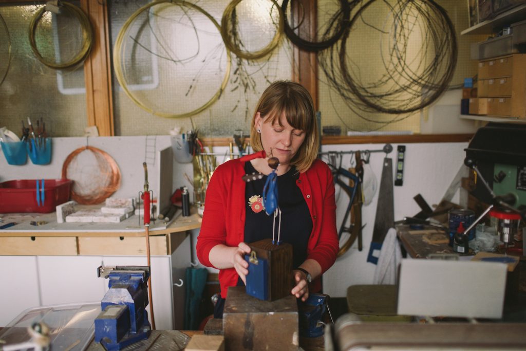
How transportable is your work?
I post work out all over the world. It just needs some strategic packing. It is lightweight so posts easily. I am also able to flatpack pieces when I travel.
Would you like to have galleries outside the UK represent you?
Yes certainly. I only work with a small number of stockists due to my work being so time consuming to make. But I am always happy to discuss exhibiting my work outside the UK. Fairies love to travel!
Samantha Bryan
www.samanthabryan.co.uk
sayhellow@samanthabryan.co.uk
Samantha Bryan, Sheffield, UK
Interview by Deborah Blakeley, April, 2017
Mary Fox
You comment that your work is ‘original art work to inspire functional wares to enhance your eating experience’, enhance on this comment.
To me, there is nothing nicer than using handmade dishes to eat or drink from. Though I no longer need to create functional wares, as I could make my living solely from my decorative works, I can’t imagine that a day would come when I would stop creating dishes for my table and yours. I think this quote from me sums it up: “When working on vessels created to adorn our tables, I derive pleasure from knowing that through the subtle intimacy that grows from their daily use, these pieces will become treasures in people’s lives.”
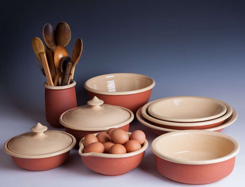
Peasant Ware
You work in both glass and ceramics expand on how you keep a balance?
Can you explain how you divide your time between the two mediums within your studio?
I started interpreting my forms in glass a few years ago. Working with glass blowers, Lisa Samphire and Jay MacDonell, has been inspiring and a lot of fun. There are forms that I have been able to explore with glass that I would have found challenging to throw. The more I create, the more ideas I come up with - one thing leads to another.
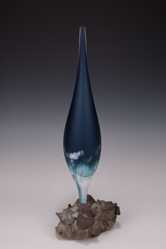
Glass, Torpedo Form, H 60cm
The glass work has led me to create slip cast chalices and has also inspired brighter, more colourful glazes. It’s easy to divide my time between the two mediums as I can’t blow very often so plan things around those dates. After the blow sessions, there is a lot of cold work that still needs to be done. It can be a few months before I get my hands on the pieces and start the process of finding the right rocks to mount them on. This is the time that I find most inspiring as I finally get to see the chalice finished, rising out of its rock base like a flower. The Torpedo forms have a different vibe to me; those feel like organic eruptions from the earth.
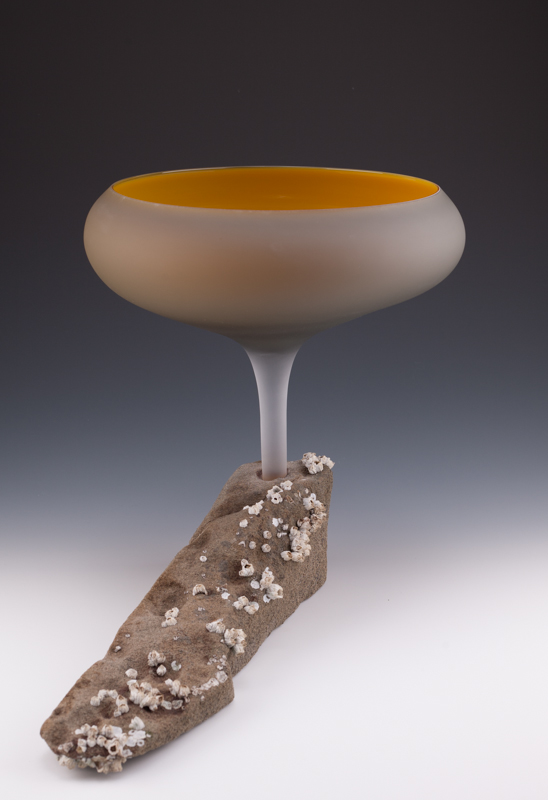
Glass, Chalice mounted in rock, H 39cm
You make non-functional forms that you refer to as Chalices, drawing on the historical symbolism of a chalice, discuss this aspect of your work.
The Chalice form is one of my earliest inspirations. As a young child, I went to mass with my family every Sunday and though I found the service to be boring, I would always wake up and pay attention during the offertory. I suppose it was the physical beauty of the chalice that drew me, but part of that beauty was how the energy of the priest changed during this part of the service. This is when the priest is, I think, most in tune with his god. I could feel the focus and reverence. After the offertory, the chalice would be lovingly cleaned and polished, adding more beauty to the ritual. Chalices for me represent offerings; interestingly when I looked up the definition of chalice I find it also referred to as ‘cup of a flower’.
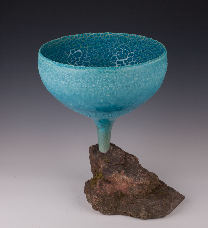
Chalice mounted in rock, H 38 cm
Explain your work that has been commissioned and is heading to Singapore.
Design brief
This has been a fun commission that involved a fair bit of discussion back and forth to settle on the final form. The client had requested 4 bottle vases like the image I use on my business card.
I made this vase in 2005 and though it may appear large in the photo, it is only about 7 inches tall. The clients wanted a height of at least 14 inches which would have meant working with a lot of weight. I realized that throwing it in one piece wouldn’t get them the height they wanted so I suggested I make the vase in sections and go for a slightly taller neck to get the desired height.
Quantity of the commission
I made a few vases in slightly different styles and we settled on this one. Throwing four pieces the same height and form is always a challenge, even more so when you are doing it in sections. I ended up creating 6 so that if any problems arose in the glazing I would have back up pieces.
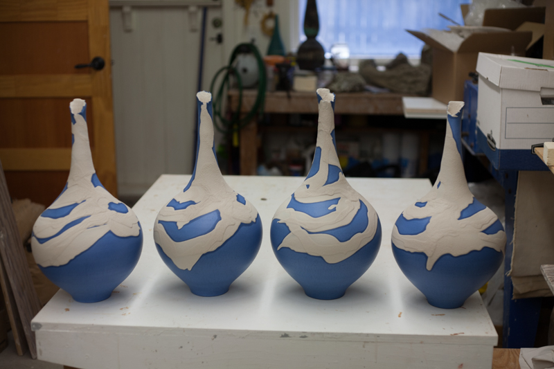
Colours used
The colour of slip needed to be tweaked to get the right tone for them. The first tests were too dark a blue so I made extra batches till I got the colour they desired.
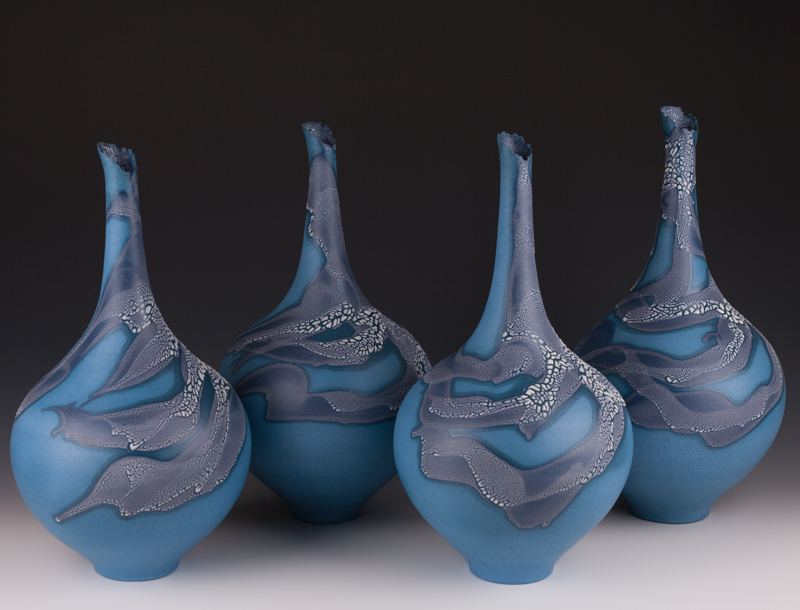
Technique used
Throwing in sections is a great way to get extra height. The bottom section was 10lbs, then left to stiffen up a bit before a 2 1/2lb donut of clay was added and the tall neck thrown. The bottom was trimmed by turning the vase upside down in a trimming chuck and very carefully the foot was made. When these bottle vases are upside down in the tall chuck it is the most unnerving part of the process for me as they kind of wobble around! So far, I’ve not lost any.
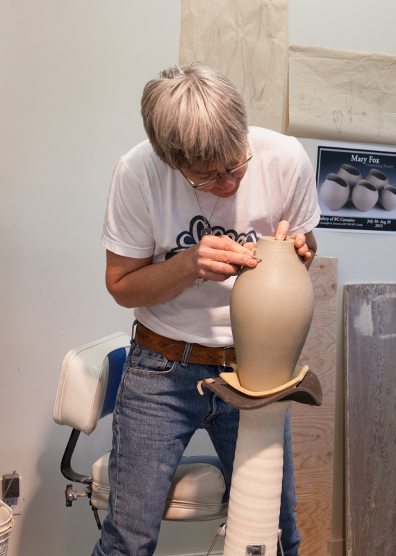
You work with your dogs in your studio with you. Discuss how this works and the benefits you have by their company.
Ahhh the girls...I can’t imagine not having the company of my girls as they add so much to my life. I love how they will be fast asleep, and then when someone comes in they spring to life. After they have said their hellos, they start to play tug with one of their toys...this is all done around the customer’s or my feet! Then it’s back to their beds till something else exciting happens, or I go into another room. Amy follows me everywhere; she’s the little white Poodle/Bichon x. Sasha waits to see what’s up. I find myself talking to them all the time and they are good listeners.
Sasha loves to groom Amy, Amy puts up with it unless it goes on for too long!
As soon as I turn my wheel on, the girls are there taking up position under the throwing bench. Throwing at the wheel is my church, I get a whole different vibe off the girls when I am throwing. I think it is like church for them too. I suspect they feel from me something akin to what I felt from the priest at mass.
Take on piece of your decorative art pieces and discuss.
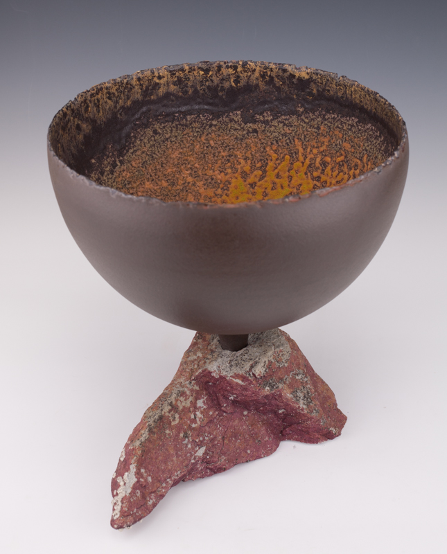
Size: 32cm T x 31cm W
Design: Chalice, wheel thrown
Colour Dark Chocolate Brown outside, Yellows, Orange tones and Browns inside.
I call this Chalice, Molten Beginnings as the interior is evocative of lava flow and how it emerges from the rock reinforces that feeling for me.
Your personal response to your Sculptural pieces this piece.
I have decided to talk about 2 sculptures and their commonalities. My approach to sculpting is very different to how I am when I’m throwing. The sculptures take me over and I work each day on them until I run out of energy. When sculpting it’s pretty much, eat, drink, sleep, work...
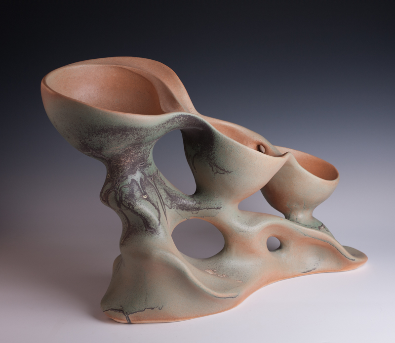
Casscading Tidal Pools H 42 cm W 70cm
The common thread in my sculptures is the flowing movement. Here on Vancouver Island we have beaches with beautiful sandstone formations that have been created over time by the constant erosion of water. The Cascading Tidal Pools sculpture series is my interpretation of that.
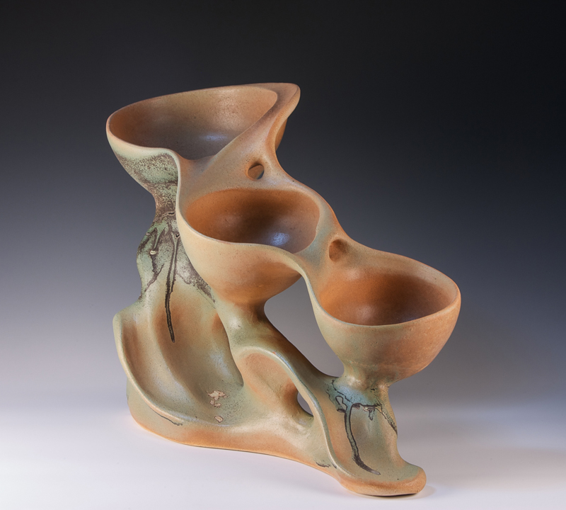
Casscading Tidal Pools H 42 cm W 70cm
The Valentine Vase series is inspired by the shapeliness of the female form and love. I go over and over the body of the piece creating the flowing lines, thinking about beauty and love all the while. To date, I have done 4 versions of the Valentines Vases and each one has sold immediately. I think the love and beauty that I focus on while creating these sculptures resonates in the work and people can feel it.
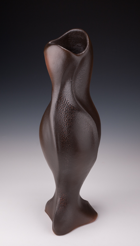
Valentine, Vase #3. H 53 cm
Explain the importance of having an excellent working relationship with the galleries who represent your work?
I enjoy working with Designers and Galleries. I see it very much as a joint Endeavor and I do what I can to make things as easy and professional as I can. I do all my photography in-house so have the added advantage of being able to photograph the work for the galleries. This saves them a lot of time and makes sure that the images that are being used are ones that I am happy with. More work for me, but well worth it.
My customers often ask how it works commission wise with galleries and are often surprised when they learn it is a 50% commission. They and some artists feel this is too high a rate. I disagree, I understand where they are coming from as they see the creating of the work as more valuable, but what they often don’t think to take into account, are all the costs involved in running a gallery. The gallery has a lot of responsibilities and their expenses aren’t small. Once they have covered the rent, salaries, utilities, insurance, exhibition costs and more, I don’t think there is a lot left over. One of my mottos, and I have many, is ‘everyone needs to make money’. Keeping this in mind, if I get a referral from a gallery that represents me, I send a referral fee back to the gallery. It is a small thing to do but shows that we are in this business relationship together.
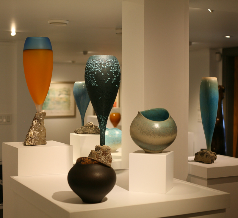
Primal Beauty, Winchester Gallery, 2016
Explain the most important factor you have learnt from the past year and how you have implemented it into your art practice or intend to.
Well, that is certainly an interesting question and gave me pause. After much thought, I realize it is how my approach to my work is changing in fundamental ways. I started out as a production potter and turned into an artist along the way. I remember many years ago saying to my late wife “wouldn’t it be amazing if I could create whatever I wanted to all the time and it would sell?” I am 57 now, have built the home / gallery of my dreams and this is the sweet time. I have people visiting my gallery from all over the world and everything I make sells eventually. I no longer need to rely on other galleries to make a living and this is very freeing. I really can do whatever I want creatively and the coolest part of it all is, that after all these years of potting, I have so much skill in my hands that there isn’t much I don’t think I could do.
I am focused on how fortunate I am and mindful of what an amazing time in my creative life this is. I do at times find the constant flow of creative ideas a bit much; there is so much I want to do...but I am an army of one! So, I do a lot of self-talk, reminding myself that this really is a great place to be in and to take it one day at a time. There is always more, it will never end.
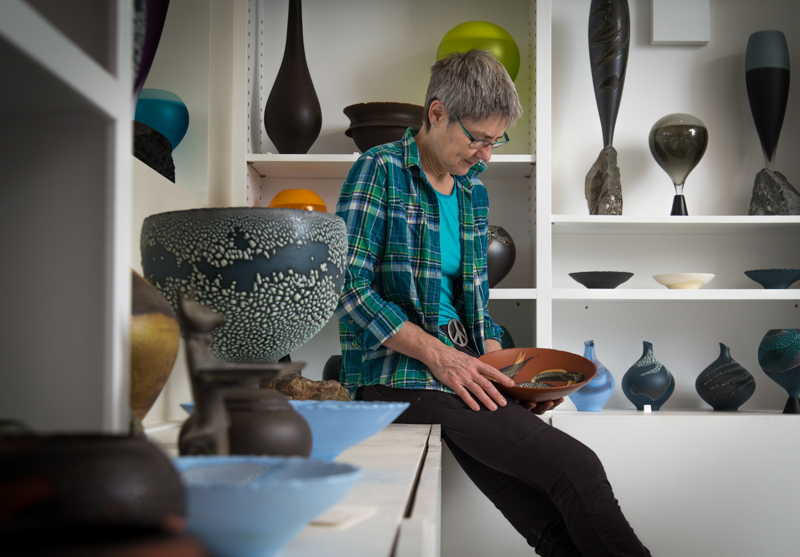
Mary Fox in her gallery
Contact details:
Mary Fox
mary@maryfoxpottery.ca
Mary Fox, Victoria, Canada
Interview by Deborah Blakeley, April, 2017
Henry Jabbour
You trained initially as a biologist and worked as a scientist, has this part of your past influenced your current art practice of painting people?
I am sure it has but sometimes it is very difficult to pinpoint how.
I firmly believe that the way I look at, and my empathy towards, the human figure is hugely influenced and informed by my past experiences (being brought up in Lebanon at the time of the civil war) and my subsequent education.
College Porter 2, Oil on Linen, 33 x33 cm
I think my training as a biologist and the skills that I have had to develop to be creative in my research have certainly served me well as I made the transition into the arts. I believe that the criteria for being creative in any discipline are fundamentally similar; perseverance, hard work, rigour, acute observation and the continuous updating of technical skills.
You state, ‘Each piece is a search beyond mere appearance’ expand on this statement.
I would say that as my practice developed I have become aware that may work is a constant struggle to subvert the specific in search for the universal. By that I mean, I am not looking to represent specific people but rather universal being. I want the viewer to be able to identify with my paintings at a personal level and to connect with them emotionally. I want my work to have a visual presence that is independent of me so that the viewer can continue the creative journey that I have initiated, with their own thoughts and emotions.
Morning Ritual 3, Oil on Linen, 40 x 45 cm
You were born and educated in Lebanon, Sydney and New York, and worked in many countries/cities including New Zealand, London, Paris and Edinburgh. Has this travel given you a deeper insight into the ‘sense of common and shared humanity’?
Absolutely – observing and connecting with people from different backgrounds and walks of life taught me how much we share in common. It also taught me the importance of friendship – my friends in many of those places became my family.
Woman in Yellow Top Holding Cup, Oil on Linen, 55 x 60 cm
What we value as individuals at a very basic level is very much in common irrespective of our background– we all want affection and love in our lives, security for ourselves, and those we care about. I also became aware of how important it is to experience different cultures, traditions and different and ways of living. It really enriched my life and my outlook on life.
In your oils do you do them as commissions or do you find interesting people and ask them to sit?
Most of the people in my paintings are people I know – friends or people who I meet that somehow I find emotive in the way they carry themselves. I work from observation but also from memory and imagination.
Woman with Flowers, Oil on Linen, 90 x 105 cms
I paint the same people over and over again at times – and by the end I am really relying on my memory of that person or their gesture. I need to be connected with the person I am painting otherwise I lose interest very quickly.
Your work, ‘Seated Man with Dog’ discuss the way the dog has become a very secondary presence in the whole piece.
Man Seated with Dog, Oil on Linen, 76 x 82 cm
That is a very interesting question. I was having work done in my garden and getting a studio built and one of the people who was doing the work used to come with his dog. I was very intrigued about his relationship with his dog that was very connected and dependent on him. Then I acquired a puppy and so the inclusion of the dog felt like a natural step. I wanted the dog to have a presence and connection with the viewer in that painting – It was like a present for the viewer. What is important here? The relationship of the dog with the seated man, or the relationship of the dog with the viewer?

Artist Henry Jabbour at his Union Gallery exhibition of paintings, Edinburgh. Pictured with Dennis the gallery mascot, and Henry's paintings including "Seated Man With Dog" (top right). Photograph by Colin Hattersley
Explain your paintings of choir boys.
Choir Boy 1 Homage to Soutine, Oil on Linen, 50 x 65 cm
Soutine is one painter whose work I admire hugely. I love his subject matter and am in awe of the way he applies paint. Also, I always loved his paintings of choirboys. I moved to Cambridge about a year and half ago and choirs are a big thing in many Cambridge schools and Colleges so I thought this is an opportunity to reference these works of Soutine.
A friend of mine works at a Choir School in Cambridge so she arranged for me to meet with the father of the boy in my choirboy paintings. Of course with his consent I was able to do the paintings. I added Homage to Soutine to the title because my paintings were a direct reference to Soutine and hugely influenced by his work.
Choir Boy 2 Homage to Soutine, Oil on Linen, 50 x 65 cm
Many artists find hands very difficult to draw and paint. Expand on your painting of hands.
In and Out of the Past, Oil on Linen, 110 x 90 cm
I used to find hands very difficult to paint and then one day something clicked. I studied the anatomy of hands- both bone and muscle and that helped a lot. But I think the breakthrough came when I stopped thinking of them as hands but was looking at shapes. I am no longer interested in drawing or painting hands with anatomical accuracy but am rather looking at the position and the weight of the hands in relation to the rest of the body.
Hands are very emotive and intimate and can tell you a lot about the mood of the person, their emotional state – whether vulnerable, fearful, joyful etc… In some of my work I was interested in the hands as a tool such as in the Peeling paintings or Morning Ritual paintings.
Morning Ritual 1, Oil on Linen, 40 x 45 cm
Explain the importance of colour in you oils.
I am fascinated by colour and its power and influence on our imagination. Most of the time my use of colour is very intuitive and I always try to surprise myself to find ways in which colours can interact.
Yellow Flowers, Oil on Linen, 76 x 82 cm
In my latest work, Yellow Flowers for example, I have started to limit my palette and explore how I can still depict form, mood and vibrancy. A lot of the time I work with oil paint wet on wet so that colours can mix and create new colours on the canvas. That excites me– both in terms of the sumptuousness of oil paint but also of what one colour can do to another colour when it is not pre-mixed or pre-meditated. I get excited by the element of the accidental and the unplanned in my work.
With an impressionistic, abstract method you are still able to capture the individual discuss.
I think it is because my work is still deeply rooted in observation. I paint, I draw and I make prints and all of these mediums are an important part of my practice. It is also important for me to be switching between these practices concurrently. I feel they influence each other in a very positive way.
Old Man with a Hat, Oil on Board, 26 x 21 cm
The individuals in my work are universal or at least that is the way I like to view them. Then the viewer can individualise them. The viewer can personalise them into something or someone that fits into their lives or imagination.
One of your first awards was the Eliza Clifford Prize.
That was a very rewarding award to receive because it was at the beginning of my art journey. We embark on our journeys not thinking about or chasing rewards like these but when they do happen they are pleasant and exciting. It was like a kind of acceptance of my work and efforts at the school where I was studying. It was an affirmation to keep going.
Eliza Clifford came into painting at the Leith School of Art as a mature student but sadly her life was cut short by illness. Her husband and the school set up this award in her memory.
You made a huge step to leave the scientific world and become a full time artist. What was the catalyst?
The organisation that I was working for lost its funding so it was closing down but then the University of Edinburgh offered me a professorship to continue with my work. At the time, I had been painting for several years, in the evenings and weekends and feeling more and more frustrated of not having more time to paint. I became aware that my passion for art was outgrowing my passion for science. But still it was a very big step to give up my career and step into the unknown. It took me several months to make the decision but in the end I knew I had to do it. I knew that in years to come I would regret not having had the courage to follow my passion for art. Once I made the decision, I felt a huge sense of relief and never looked back. My life is very full and I am happy it is led by creative pursuits.
Veronica Seated, Lithograph
How important is it to follow a dream and what pre-planning would you give to others planning on a career change to the arts?
I think this has to be a very personal decision depending on personal circumstances. For me it was very important. At the time when I was still not sure of whether to follow my dream or not, I remember reading this quote about commitment by Goethe.
"Until one is committed, there is hesitancy, the chance to draw back-- Concerning all acts of initiative (and creation), there is one elementary truth that ignorance of which kills countless ideas and splendid plans: that the moment one definitely commits oneself, then Providence moves too. All sorts of things occur to help one that would never otherwise have occurred. A whole stream of events issues from the decision, raising in one's favor all manner of unforeseen incidents and meetings and material assistance, which no man could have dreamed would have come his way.
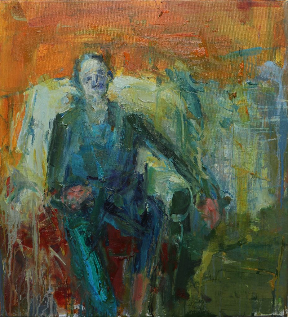
Seated Man – Orange Wall, Oil on Linen, 55 x 60 cm
Whatever you can do, or dream you can do, begin it. Boldness has genius, power, and magic in it. Begin it now."
That really was a catalyst in a way. And I find what Goethe says so very true. Boldness does have power and magic in it.
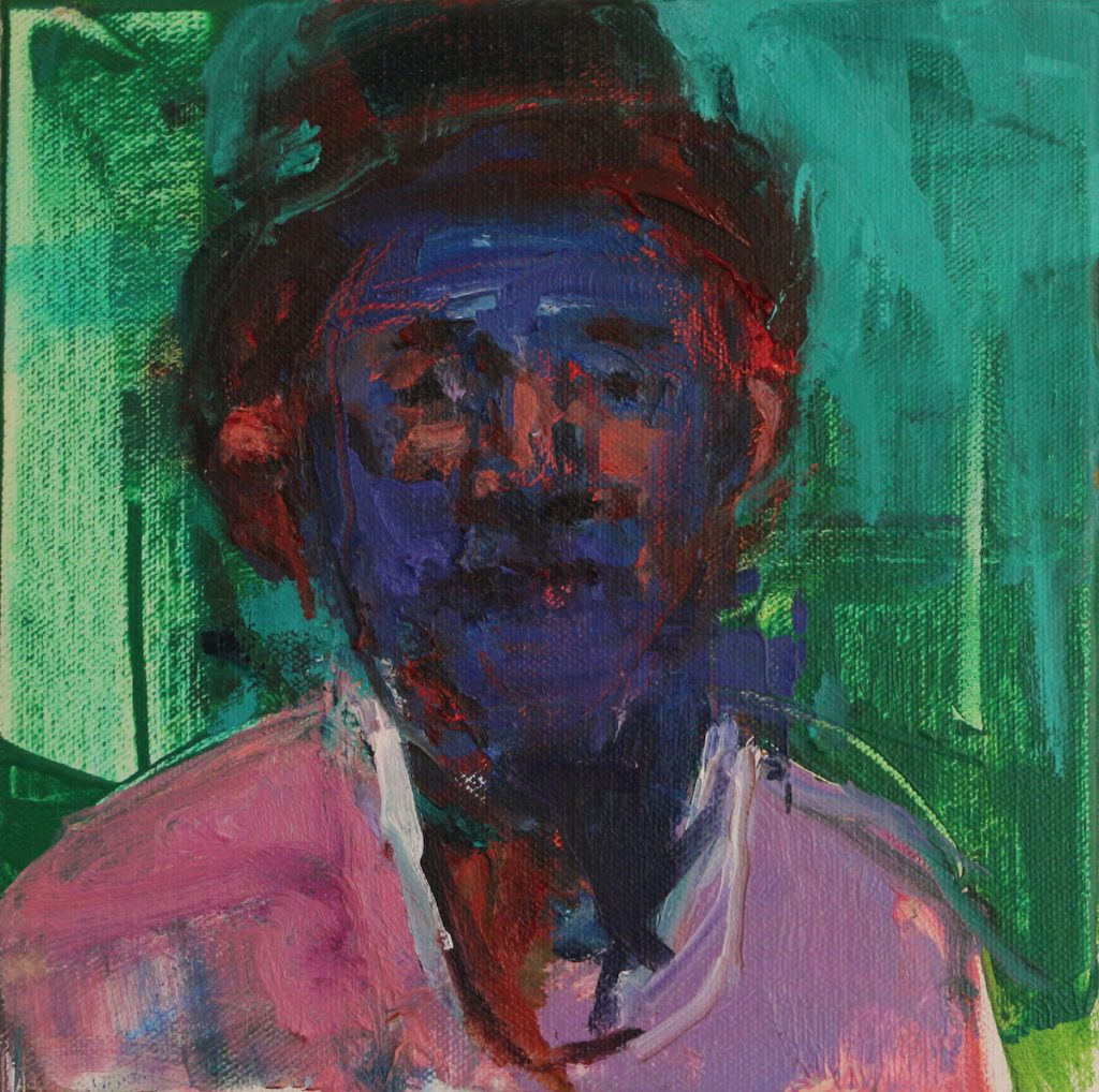
College Porter, Oil on Linen, 30 x 30 cm
Contact details
Henry Jabbour
www.henryjabbour.com
henryjabbour@gmail.com
Henry Jabbour, Cambridge, UK
Interview by Deborah Blakeley, March, 2017
Claire Molloy
You combine two techniques in your pottery, horsehair and saggar firing. Can you take one piece and explain both the combinations and techniques?
I am mainly known for the horsehair firing technique. This is where a piece is heated up inside a Raku Kiln (a small gas fired Kiln) once the kiln reaches about 800 degrees C the piece is taken out with a pair of tongs. Hair from the mane or tail of a horse is placed on the hot ceramic, the hair twists and turns in the heat and burns onto the surface to form a beautiful black line. As where the hair burns in cannot be fully controlled a unique pattern forms on each piece. It does not matter what colour the hair is it will always turn black as it is the carbon contained within the hair that leaves the mark.
I’ve also recently started to combine saggar firing with the horsehair. For the saggar I use different materials like Epsom salt, seaweed, ferric, sawdust etc on the piece, I then wrap it in tin foil and heat it up in the raku kiln. Again when the kiln is hot enough I take the piece out and add horse hair to the piece.
I really enjoy the unpredictability of this method and I think it complements the horsehair design.
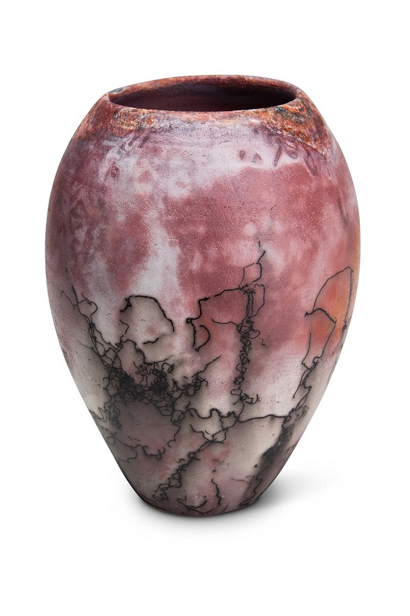
You don’t only use your own horse’s hair but use other horse owner’s horsehair, explain one of these commissions.
Yes I make special pieces for horse owners using hair from their own horses. I get many people contacting me to make pieces with hair from a favourite horse or dog. As a horse owner myself I know how special they can be in our lives. These pieces are a wonderful memento to celebrate this. My pieces can also have the name added to them to make them extra personal. The process is easy, I can be contacted through e-mail where I can send a catalogue of the different pieces I can do. Once a piece is chosen the hair can be posted to me to add to it and once the piece it finished it can be then sent to the customer. I have sent work all over the world form Europe, Canada and U.S to Australia and New Zealand.
I have also created pieces using hair from well-known racehorses and I have made a presentation piece for Paralympic Medallist Dressage rider Helen Kearney using hair from her horse Mr Cool.
Explain your background and current involvement with horses?
I grew up with ponies and horses. When I had ponies I was involved in pony club activities, competing and completing exams. When I grew into horses I took a particular interest in eventing and breaking and training young horses. I trained for a year in college doing horse breeding and training and have also worked excersing race horses and in Coolmore stud breeding race horses. I have also bred my own horses for eventing.
Now since my pottery career has become full time horses are more of a hobby for me. I currently have two mares which I used to breed and a gelding which I ride for leisure.
Can you give us a brief history of Horsehair pottery?
As far as I gather horsehair pottery was started by Native American Navajos. There is a lovely legend/ story that goes as follows:
‘A potter woman discovered this art form when her long hair accidentally blew and made an impression on the hot piece of pottery she was removing from the kiln. She was fascinated by what she saw and decided to try this technique with many other things like straw, pine needles, feathers and finally horse hair.
They found that the thicker and coarser horse hair left striking and clear impressions on the pot as compared to the finer human hair.’
Horses were very important to the Navajo people and they continue to this day to commemorate their horses through horsehair pottery.
When did you first decide to combine both of your loves, pottery and horses?
Horses and working with clay have always been two loves of mine, and I have been torn between the two of them. Growing up as a teenager I was horse mad but also loved art partially working with clay, so when it came to college I choose to do a degree in Fine art ceramics. This meant moving away from home and selling my horse as I didn’t have time to look after him while I was away. After finishing college four years later I really missed horses and took a job riding race horses which led me to do a one year course in horse breeding and training. I was then working with horses for a couple of years when I really missed the creativity of working with clay. I applied and got accepted into the Craft Council of Ireland’s Pottery skills and design course. On this course I really wanted to express my love of horses through clay but didn’t want to make sculptures of horses. I was looking for something more conceptual. For one of our projects I was looking at Native American pottery and I came across the Navajo technique of horsehair pottery. This ticked all the boxes of what I was looking for; I started experimenting with this technique and loved it. And still love it to this day.
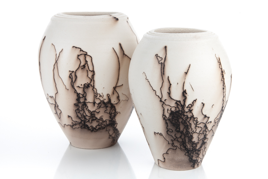
You also do pots with beautiful lids, discuss.
I love the challenge of making beautiful lidded pieces. To me it’s very important to have a well fitted balanced lid. When throwing the jar I have a callipers that I made on the crafts council course to measure the opening for the lid. This makes it easier when making the lid to get the right measurement. All my lids are turned so they are not too heavy. The Knobs or handles are then either thrown directly onto the lid or made by hand and then applied. I always take into consideration the size and shape of the jar when constructing the lid so it works well with the jar, to obtain a nice flow.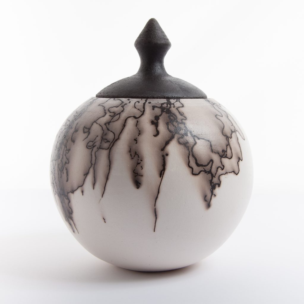
You also make jewellery (pendants) discuss.
I first made a horse hair embellished pendant for myself, purely because when explaining to people what kind of pottery I make using horsehair. Some people never heard of the technique and couldn’t imagine what it looked like, so I made a pendant to wear to show people the effects of the horsehair. People really liked my pendant and asked could I make them one too. So my line of jewellery started and developed into different shapes and then to brooches.
I didn’t know much about making jewellery but learned as I went along getting advice from jeweller friends. I like making simple shapes as the pattern of the horsehair is the main design. I make the brooches as nice and light as possible and with some of the pendants I’m careful not to have them too heavy for around the neck. For my jewellery boxes I chose black to reflect the colour of the horsehair pattern.

As well as jewellery you also make homewares. You have a collection called
‘The Equus Collection’ expand on the collection.
Along with making the horsehair ceramics I really love making functional everyday pieces too. I wanted my functional pieces to have some kind of connection with the horsehair ceramics, so I developed a range called the Equus collection. I commissioned equine artist Michaela Bosnegeanu to sketch some images of horses. The result was two images that I now use and love, The Irish Cob and The Arab. There are plans to develop more images in the future to add to the collection.
I love making large quantities on the wheel; you really get into the swing and rhythm of the process. I again keep the design simple with clean lines and at the moment just use a simple white glaze with a little brown speckling, as I want them to have a contemporary feel and also a focus on the images of the horses.
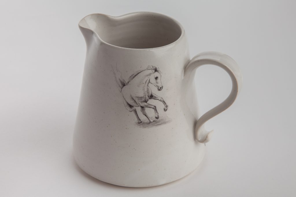
Discuss the importance of preserving a historical craft in our modern world.
In this age of mass produced ‘throw away’ objects. I think it’s important to appreciate hand crafted items for their quality durability and aesthetics. Historical craft is part of our history and a story of where we came form I think it’s important to keep historical craft methods alive to pass on from generation to generation and keep us in touch with our roots. It also shows what humans could do with very little technology and can give us an appreciation of what we have today.
Contact details
Claire Molloy
www.clairemolloyceramics.com
Claire Molloy, Rossenarra, Kilmoganny, Ireland
Interview by Deborah Blakeley, March, 2017
Melissa Selby Brown
Discuss your series, ‘Outback’, taking us through the process from the road trip to the completed paintings.
The prosaic fact of our daughter getting her learner drivers licence and having 120 hours of assisted driving stretching before us initiated the road trip. We started from the Sydney coast where we live and drove inland for 2 weeks.
Art materials are always in the luggage when travelling, as are the cameras. There is always plenty to see which calls out to be painted. Sometimes there is time to stop and sketch other times a rapid shot from the side window of the car can suffice for a record. I don’t do oil painting ‘en plein air’ as I prefer to take my time in the studio. So when I am sketching I use gouache. I prefer gouache to watercolour as I find it is more flexible either velvety opaque or luminous and translucent. From these sketches done in situ I continued working first in a series of gouache paintings in the studio and then on to oils.
We passed through a fair range of landscapes in that trip but the one I have returned to paint repeatedly, when back in the studio, is the Mutawintji Gorge where we camped. The riverbed is deeply etched into the plains creating a magnificent sinuous space. It has an aura of solemnity and gravitas.
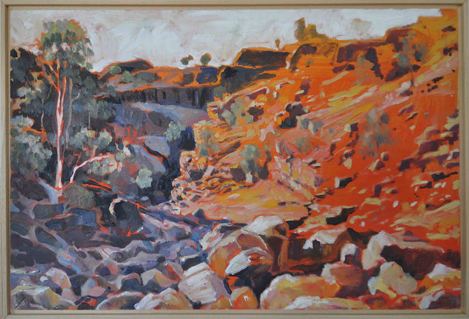
Gorge, Oil on Board, 40 x 60cm
Colour is important in your work both very bright and also muted colours, expand on this.
Capturing the mood is critical.
In the outback the stark midday sun drenches the landscape and bleaches the colour out of it.

Red River Gums, Oil on Board, 30 x 1200cm
In this painting I used a technique of building up layers of thin glazes. This has the effect of creating nuanced, subdued colour that has depth. The subtle tonality generates the stillness and awe I felt.
Later in the day the afternoon sun, lower in the sky, brings out the colours in the soil and rocks In this painting of the same gorge the paint is applied in a very different method. I used a vermillion background as a base prime. An echo of reality as the vegetation arises from the red earth. Although the oil paint is applied thickly the warm background hue still dictates the general tone. I found this a pleasing parallel.
You also understand the use of shape can you explain this using ‘Gorge’.
After travelling for many hours each day along dead straight roads on flat terrain, the gorge was an oasis, literally, as it is a source of water and shade but also a treasure trove to all the senses.
The chasm has physical depth and otherworldly deepness. The strength of the water inexorably inscribing its way through the ground is very present. The aftermath of sporadic flooding is evident in the chunks of rock lying at the base of the cliffs, and the fringe of river red gums. The void of the ravine is also very sculptural.
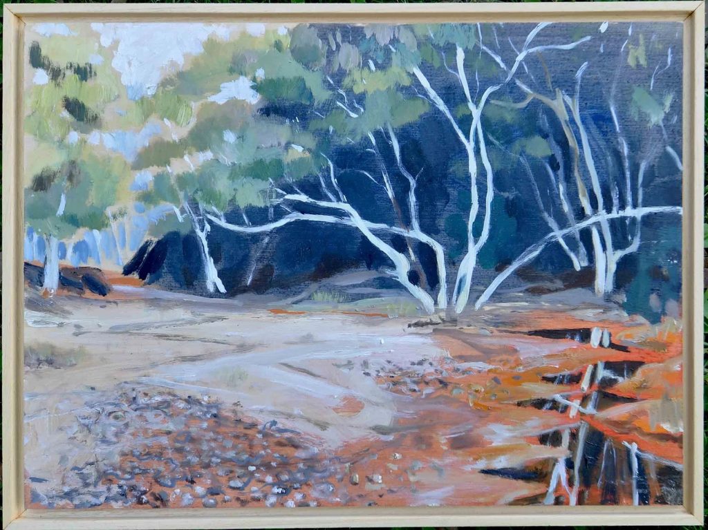
Gorge Creek, Oil on Board, 80 x 40 cm
In ’Gorge‘ all these elements were forefront in my mind. The cleft of the gully becomes a contrast of light and shadow zigzagging across the board.
The glow of the tree trunks and the forms of the boulders are features in the mid and foreground that give depth and scale to the picture plane.
How did ‘Art in the Corridor’ develop?
I wanted to do a series of one-day pop-up shows with other artist friends of mine, in any amenable spaces that became available to me. The first space I used was my own corridor. By organising these mini group shows it allows the artists to exhibit on a scale that is intimate. It also allows people to see art in a casual setting as opposed to the formal environment of a gallery.
By having a cohort of artists in differing fields it brings in different viewers and widens your audience. The participants have included ceramicists, jewellers, photographers and sculptors amongst others. Every event is different as the group of contributors varies and each venue brings its own atmosphere to the occasion.
You do both solo exhibitions and Group expiations discuss the pros and cons of group exhibitions.
The group show allows you to open up your vista see what other people are doing and work together with the same purpose. If it is an artist run show the economy of time and resources is significant. It can give the participants a broader scope in all the areas you need to cover from art making through to all the administrative, organisational and less interesting tasks.
It can be difficult to curate and to retain an overall direction or feel. Some works don’t benefit by juxtaposition with others et cetera
Discuss the importance of collaboration in your work.
I don’t collaborate in my work as a painter. I’m pretty much a hermit in that I paint on my own in my studio!
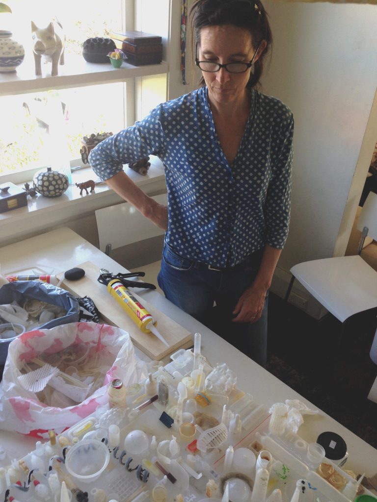
Your formal training was as an architect. How has this become an interracial part of your art practice.
I think the major influence has been in the subject matter of what I paint. Studying architecture requires a close inspection of the built environment. Not just visually but also in how it is used and inhabited. How different societies live in their buildings and the external spaces created between those buildings.
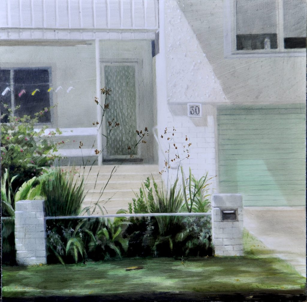
‘Coathangers’ Oil on Board, 40 x 40cm
How small details like the clothesline on the porch, the fibro cottage with the brick letterbox in front, are evocative of our culture and make that piece of urban fabric specific to a certain place, city country…
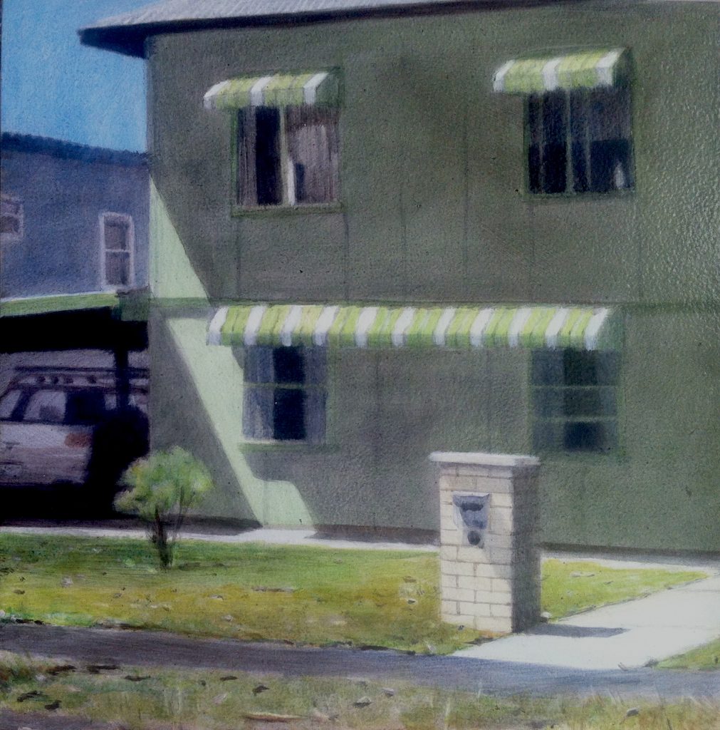
‘Fibro Beach House’ Oil on Board, 30 x 30cm
I actually enjoy driving to suburbs I don’t know and just walking around looking at the houses, the front yards, going down the back lanes, checking out the main street going into the mall. There is a wealth of material to translate into a series of paintings.
Have you had your work compared to Clarice Beckett?
Clarice Beckett, Beaumaris Seascape, c 1924
Yes, I love her work; I am interested in the ambience she creates so deftly and her portrayal of the everyday.
Melissa Selby Brown
You add traffic to many of your paintings discuss.
Traffic is all around me and it plays so much a part of our visual vocabulary I couldn’t paint the world I live in without having a vehicle loitering somewhere! They are as expressive of the urban weave as the buildings, the pavement, the pots on the windowsills and the street signage.
Anzac Parade, Oil on Canvas, 30 x 30 cm
Give your thought on the importance of painting the now, and its importance for the future.
I am attracted to the man-made, the good, the bad and the ugly. I paint what I see and what I feel is representative of today. I more often paint urban-scapes but even when I paint rural scenes I do gravitate towards the infrastructure; fords, bridges, fences, signage et cetera. I like to mirror what I feel is characteristic of here and now. How that will be interpreted in the future is not something I am really conscience of while I am considering what I want to paint, however I do choose to include details in my paintings that indicate the present day vernacular. The use of traffic is a good example because the style of a car really does define an era.
Pedestrians Access, Oil on Canvas, 40 x 120 cm
You also paint still life expand on this aspect of your work.
Painting objects in a still life gives a change of scale and control. You get to direct the show! Lighting, content, composition it is all up to you.
Two Boiled Eggs, 4. x 60
I generally use typical objects that we all recognise and use ourselves. In the series for the show ‘Assemble’ I used a collection of old drawers. I filled them with an assortment of objects, painted life-size, very accurately, in gouache.
Each drawer had its own story to tell some with children’s scribbles on them others with fantastic paper lining from the 60’s and 70’s. I used theses traces of the drawer’s ‘life’ as a springboard for choosing the types of items to fill them with ranging from the kitchen bake-ware through to children’s toys. In Stationary’ the ink-stained base of the drawer lead me to choose the ubiquitous ball point pen, lead pencil, box of paperclips, plastic ruler and so on and paint them directly onto the weathered board.
Stationary
It was fun tinkering with the difference between what was real and what was painted, for example sometimes painting false torn lining or placing the painted object strategically on a scratch or chip… I like the playfulness of the true to scale images on a found object that may have contained just those items.
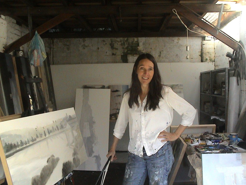
Contact details:
Melissa Selby Brown
http://www.msb-paintings.com
Melissa Selby Brown, Sydney, Australia
Interview by Deborah Blakeley, March, 2017
Helen Richman
You have an ancient craft that you give a modern take to doing bespoke pieces. Can you give some insight into a small but precious piece you have worked on recently?
I have recently finished writing a book on the embroidery technique known as Stumpwork. This is a technique which reached its height in popularity in the 17th century and was famous for its fun and vibrant colours, raised and three dimensional elements along with a jumble of charming motifs and designs. Today the technique remains incredibly popular and while I wanted to keep in mind the history and heritage of the technique, I also wanted to write a book which had a very contemporary feel. I was extremely fortunate to be able to study a number of historical examples and while doing so created my own illustrations and sketches which became a source of inspiration during the process of writing the book. Designing and stitching the ten small projects for readers to try at home was a joy and I really hope that I have continued the love of this technique by giving it my own interpretation. The book ‘Stumpwork Embroidery- Techniques and Projects’ will be published by The Crowood Press later this year.
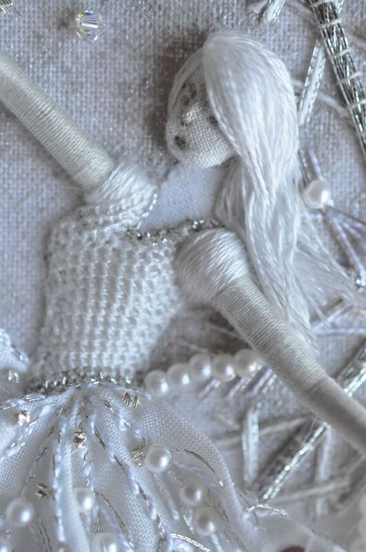
‘A Flourish of Frost’
Expand on your training as an embroiderer?
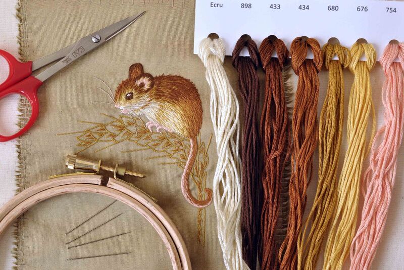
My love for art, textiles and embroidery started when I was very young, I would spend my summer holidays creating paintings, drawings, cushions and cross stitch kits. I chose to study Textiles and Art at GCSE level at school and continued Textiles, along with photography, at college up to A level. I then served a three year apprenticeship at the Royal School of Needlework which is based at Hampton Court Palace. There were six students in my year. During term times, we learnt a huge number of embroidery techniques and had to create a finished piece, each which we had to design, create and mount ready to be marked by our tutors at the end of term. Alongside this we created file work of our studies into the history of each technique and all of our technical notes and drawings. Between terms we worked alongside the staff in the school’s studio. We were shown and then practised various conservation techniques and helped with the creation of new commissions. We would occasionally assist the tutors with the running of weekend day classes which enabled us to gain valuable experience of teaching and passing on our knowledge to others.
Now that you are a teacher, what is one of your favourite classes and why?
It is so hard to choose! I really enjoy teaching the finesse and intricacy of goldwork, silk shading and crewelwork but I particularly love teaching the introduction to embroidery classes.
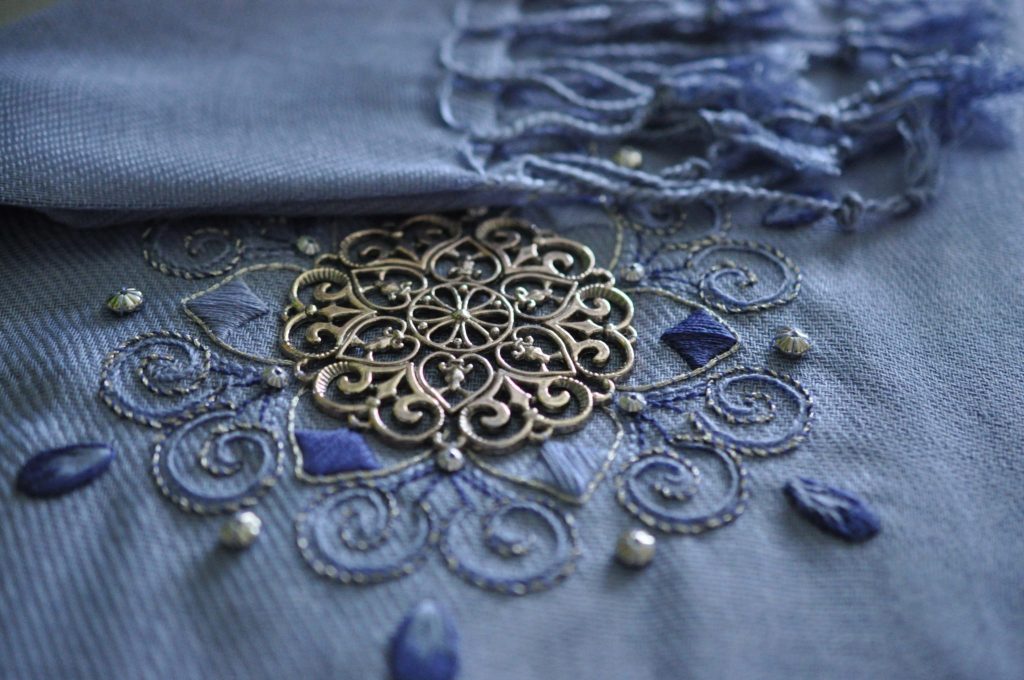
‘Filigree Medallion’ Introduction To Embroidery Class
I find it incredibly rewarding to have a class of students, some of which have never picked up a needle before, and to prove to them that they can also achieve beautiful results in stitch. I usually teach a range of about eight stitches in a day and it is lovely to see the students leave the classroom proud of their work and with the basic knowledge and confidence to have a go at more embroidery at home.
Explain your commission for a new set of vestment for St Andrew Compton Dundon?
Why it was commissioned
Members of the congregation and the church committee felt it was time to replace their old and quite worn set of green vestments. It was felt that a new and fresh set of green vestments would brighten up the church, especially with a design created specifically for them. The scrolling leaves and shades of bright green, yellow and brown reflected the beautiful rolling hills of the Somerset countryside surrounding the church. Yew leaves and birds make an appearance on the altar cloth to represent the ancient yew tree which sits in the graveyard. I chose to use a combination of wool, cotton and metal threads and utilised a number of techniques including applique, silk shading and goldwork.
The vestments were commissioned partly by the church and partly by Helen Thomas in memory of her late mother. I was already known by certain members of the church as I had assisted them with the creation of a red stole the previous year.
Compton Dundon Vestments
Time involved
The commission took about 18 months in total, from the start of the designing process through to the completion of the eight items.
Number of pieces commissioned
The set of vestments included a new altar cloth, burse, veil, lecturn fall, stole, chasuble and two collection bags.
stole
Discuss the collaboration need for this commission.
As this was a very large project it was decided to create the altar cloth, veil and collection bags as a collaborative project. I met with members of the local community on a regular basis to work on these items together. I chose to use a green fabric with a scrolling leaf pattern for the entire set of vestments and this enabled the ‘sewing ladies’ to cut out a number of leaves each and to decorate them with stitches and colours I had chosen for them and taught them during our meetings. The leaves were then collected and sewn to the side panels of the altar cloth once I had finished the large embroidery on the central panel. Extra leaves were created to decorate the veil and collection bags.
Discuss the connection with the 14th Century and your current work with the Ely Cathedral?
‘Ely Knot’
Ely Cathedral has a beautiful example of a cope which they have dated back to the 14th century. It displays 30 of the ‘Ely Knot’ motifs stitched in silk and goldwork onto a background of green velvet. The cathedral recently had a collaborative exhibition with the Royal School of Needlework on ecclesiastical embroidery and as part of it, wanted to have the cope on display. I was commissioned by the cathedral to recreate one of the ‘Ely Knots’ as a full size piece of embroidery to showcase how bright and impressive it would have looked when newly stitched. It was a fascinating project; I was privileged to be able have a close look at the cope and took notes and photographs in order to begin the process of researching the likely techniques and threads used to create it. I found a beautiful bottle green velvet to use as the backing fabric and sourced fine gilt metal threads along with silk floss to create the replica. This was framed and on display alongside the cope in the exhibition.
Still on a ‘Grand’ scale but not ecclesiastical, expand on the 2011 Royal Mail Year book?
Royal Mail
I was commissioned by the Royal Mail to create a piece of goldwork embroidery which was to be photographed and used as a title page in their special edition year book.

My embroidery introduces the chapter of stamps based on the crown jewels and the goldwork really sets the scene of opulence and glistening jewels. The design was created by an illustrator using a quote from Samuel Pepys and it was my job then work out how to recreate it as a stitched piece. I used a range of gilt metal threads and stranded cotton threads on a red velvet background.
Can you explain the need for archival preparation and care of your work?
It is of extreme importance to keep all embroidery work clean and secure both during and after the creation process to ensure that it will survive for many years to come. When I work on a commission I keep all of my notes, sketches and photographs as a hard copy and file them with order numbers. I also keep electronic copies as a backup. It is always useful to refer back to projects to remind myself how I created them, the design process and how I overcame certain problems. This system allows me at any given time to trace back all work connected with that particular piece should it be required in the future.
On pieces of embroidery which I create to be sold as artwork and in galleries, I add my stitched signature to the front of the design and will often write details on the back of the mount board when I am stretching the piece around the board ready for framing. Therefore if my work was ever to be restored by someone else in the future they would be able to see who created it, when, the threads and techniques used and how long it took.
Discuss the techniques involved in Silk Shading Orchid Branch.
Colours used:
‘silk shading orchid’
I began the process of creating this silk shading embroidery piece by finding several photographs of orchid plants and combined them to create my own composition to work from. I used one clear photograph in particular to help me to select my colours of threads. In total I used fourteen different DMC and Anchor stranded cotton thread colours in a range of pinks, reds and browns.
Combination of techniques - Stitch and paint
I decided to experiment with the idea of combining painting with embroidery.
I selected the largest flower in the foreground, along with the two larger buds and a section of the stem to work in silk shading and the rest I created with paint. I knew that the painted areas would appear flatter than the embroidered areas so would add a little more dimension to the design and the beautiful technique of silk shading would really highlight and bring forward those key areas.
I started by transferring the design onto silk dupion and then using opaque fabric paint, I built up the areas of the design, starting in the background and working each element in turn towards the foreground. I really enjoyed the challenge of painting straight onto the fabric and I think that the combination of painting and stitching has worked well.
How did The Bluebird Embroidery Company come about?
After I graduated from the Royal School Of Needlework I knew that I wanted to have a career in embroidery. I quickly became a freelance tutor, teaching day classes and workshops for groups such as the Embroiderers Guild and the West Country Embroiderers. I took on freelance work and started working on commission pieces and at the same time I returned to the Royal School of Needlework as a day class and weekend course tutor. Now I split my time between teaching select classes nationally and around the world, completing commission work, designing and selling embroidery kits and creating art work to display and sell in local galleries and on my website.
Discuss the use of kits and books in the company?
I create embroidery kits for sale on my website and are available for worldwide distribution; these are designed with full step by step instructions, progress photographs and all of the fabrics and threads needed to complete a project. The idea is to allow people to create their own beautiful designs without having to go to classes.
However, these kits began life as a teaching aid; I always produce a kit for each student in my class so that they can act as an invaluable reminder on how to create the stitches and finish the design after the student has left the class.
Discuss Fallow Deer – Original Hand Embroidery
Fallow Deer
Time
The fallow deer took 30 hours in total. I spent about 3-4 hours researching reference images and designing the composition, one hour framing up into a slate frame, twenty three hours stitching the piece and two hours mounting the work ready for framing.
Techniques
The fallow deer is from my ‘British Wildlife’ collection of pieces which were all created using the silk shading embroidery technique. I allowed my love for wildlife to inspire my work and to set the theme for this collection. I used a calico and ivory cotton felt backing and created the embroidery using a range of DMC stranded cotton threads. I started this piece by finding suitable photographs of Fallow Deer; I studied their movement as well as the texture, direction and colour of their hair. I created my own composition and began by creating shaded and colour drawings to familiarise myself with the form and the shading of the deer. I then tacked a basic outline onto the backing fabric before working the silk shading, building up the texture and colour as I went along. I used a total of twelve colours in this piece, a single thread of each inserted into a small size 12 embroidery needle.
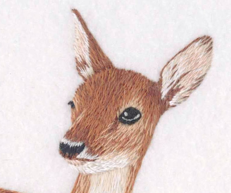
Mounting
Once I had finished the embroidery I removed it from the slate frame, mounted it tightly around thick acid-free mount board and stitched a backing fabric to the board. I always mount embroidery pieces in this way in order to prepare them for framing. Having the embroidery stretched around board keeps the fabric smooth and flat and prevents any damage to the piece.
Limited editions
All eight pieces from my ‘British Wildlife’ collection are also available to buy from my website as high quality giglee prints and greetings cards. I do not have limited editions of this collection but it is something I am looking forward to offering for future pieces of work.
Discuss the Role of the RSN in the promotion of embroidery.
History
The school was founded in 1872 but was then known as The School Of Art Needlework. In 1875 it received its royal prefix when Queen Victoria became its first patron and the word "Art" was dropped from the title in 1922. The aim of the school was to ensure the future of the beautiful art of embroidery while providing employment for educated women.
Apprentices
The school no longer employs apprentices; in fact I was in the last year that they were accepted. However, the school now runs several methods of study including certificate and diploma courses, a BA (Hons) degree, short courses and a future tutor programme.
Commissions
The studio at the school has worked on many large and exciting commissions throughout its history.
Two key examples include: creating the goldwork embroidery on the Robe of State for Her Majesty The Queen Elizabeth II in 1953
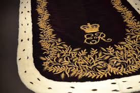
and appliquéing the floral lace motifs for the wedding dress of The Duchess of Cambridge in 2011.
Royal patronage

At the start of 2017 the Royal Patron of the school changed from Queen Elizabeth II to the Duchess of Cornwall.
Contact details:
Helen Richman
www.bluebirdembroidery.co.uk
Helen Richman, Somerset, UK
Interview by Deborah Blakeley, March, 2017
Roger Bennett
Discuss the use of colour in your work.
I colour my work with water-based wood dyes, and I finish with three applications of Danish oil which protects the colour and gives the surface a gentle sheen.
I love using water-based dyes: they work with the wood, highlighting and enhancing the natural figuring and grain patterns. A very bland piece of wood can come alive when the dye is applied, as different areas of the wood respond with subtly varied hues.
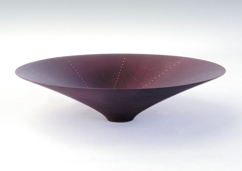
When did you decide to make your bowls coloured? And what led you to this decision?
A lot of my inspiration comes from ceramics: shapes, proportions, rims and bases, surface finishes... Lucie Rie is my all-time hero, and I love the work of ceramists such as Jennifer Lee, Sara Flynn, Pippin Drysdale. So for me the decision to start colouring my work was entirely natural.
Soon after I started turning, I saw the British woodturner Paul Clare demonstrate his colouring methods: that was a good technical introduction, and I immediately started experimenting.
Explain the stability of your bowls.
My bowls are usually very thin-walled and light. I like to accentuate this sense of delicacy by giving them small bases, so that they can seem almost as if they are floating, or kissing the surface beneath them. I am obsessed with clean lines and with level, regular rims, therefore in my work the stability of the wood is paramount.
To ensure this stability, I follow standard bowl-making practice. I first rough-turn each bowl from unseasoned wood, leaving the walls thicker than in the final piece, and then I weigh it, and air dry it indoors at room temperature. As it dries and loses moisture, the weight decreases; I weigh it at weekly intervals, and when it stops losing weight it is ready to finish.
The drying process distorts the bowl – it shrinks across the grain, becoming oval and boat-shaped, so when I remount it on the lathe I must turn off this distortion as I bring it down to the final profile and wall thickness.
Why do you favour sycamore?
Sycamore – acer pseudoplatanus – is my favourite wood. It is a perfect canvas for colouring: in appearance, it is pale, often quite bland; it is fine-grained, and is a forgiving wood, capable of accepting a lot of abuse without splitting. It is readily available, as it grows like a weed in Ireland!
I do occasionally use other woods, e.g. cherry, hornbeam, beech.
Can you expand on how you inlay gold and silver into your work? Explain how this is achieved and the patterns you use.
I inlay a lot of my pieces with dots of silver, and occasionally gold. To do this, I drill hundreds of little holes (0.5 – 0.9 mm in diameter) into – but not through – the wood, and carefully glue in short lengths of wire, holding the wire tightly in a pair of pliers. Then I snip off the protruding bits, and sand the metal flush with the wood. This is very careful, painstaking work – one mistake, and I have rather expensive firewood!
I draw many of my designs on computer with vector graphic editing and design software (CorelDRAW), then print out the templates. I like to create patterns which have an organic relationship with the shape of the bowl: for example, lines which radiate out from the centre like the spokes of a wheel, or which arc from the centre to the rim as if they have been curved by the spinning bowl's centrifugal motion.
I love spirals, the latent energy of a coiled spring contained within the bowl. I also love creating 'controlled random' patterns: hundreds of dots positioned freehand – but carefully – which suggest constellations of stars in a night sky.
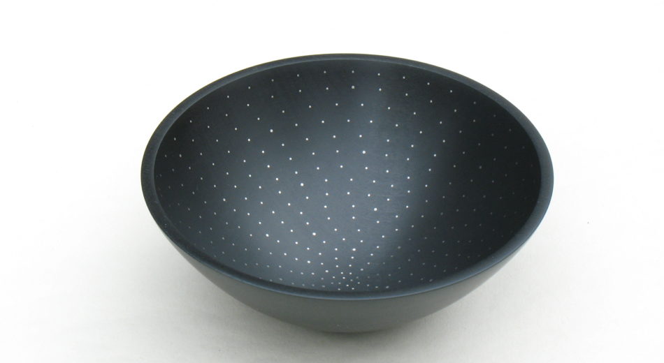 Coloured sycamore with controlled random pattern of silver inlay
What led you to wood turning?
In my previous life I was a teacher of English and French. In 1992 when I was on a career break, I saw a woodturning demonstration quite by chance. I was immediately transfixed, like a toddler on his first visit to the zoo! I had to try this! So I signed up for evening classes with a retired woodworker. The first piece I made was an eggcup, which I kept on my bedside table so that I would see it first thing in the morning.
I put up a little workshop behind our house, bought a lathe and some basic tools, and my life changed forever.
When and how did you take it to the next level – as a professional?
My career break was supposed to be for one year, but my employers kindly allowed me to extend it. I turned day and night, and I started selling my work, at first in a weekend market, then through shops and galleries.
In 1994-5 I got accepted onto a Crafts Council design and business course in Kilkenny, and this was crucial to my development. For that year, I was provided with a workspace and a living allowance, I had a business mentor, and there were very practical sessions on essential business skills such as marketing, book-keeping, pricing, product development. After all that, I just couldn't go back to my teaching career!
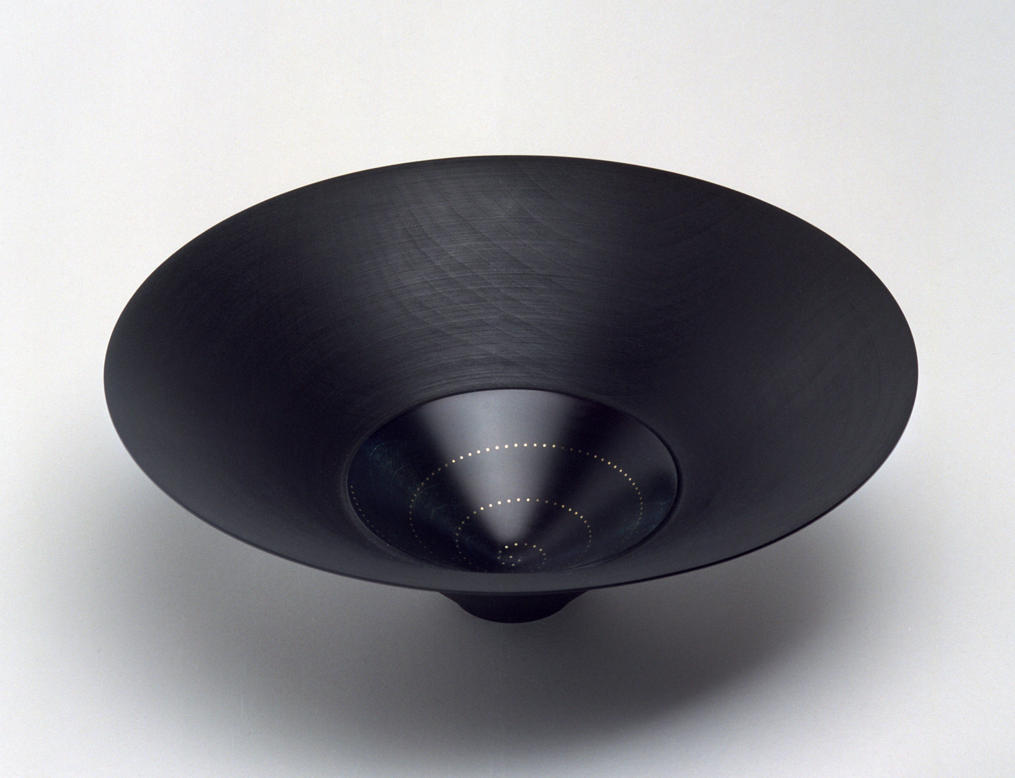
Coloured sycamore with spiral of gold dots
Discuss your feelings, when you learnt that Mary MacAleese (President of Ireland) had your work?
It is always thrilling to learn that a piece has been presented to somebody well known, especially to somebody so universally admired as President MacAleese. She herself told me when I met her at a reception a few years ago that she had recently given one of my bowls to the President of Latvia.
The National Museum of Ireland has four of my bowls in its permanent collection, and I have pieces in other museums such as the Museum of Fine Arts in Boston and the Honolulu Museum of Art. We makers can be prey to feelings of doubt, so this sort of purchase or acquisition is always a welcome boost to our sense of self-worth.
Discuss your text, 'I love wood …'
I was trying to write an artist's statement to put on my website, one which would capture and convey the essence of what and why and how I create and would express my dreams and aspirations. Woodturning is very physical, very tactile, but it can also be intensely spiritual. It is almost beyond words, the thrilling sensation of holding, touching, and caressing a bowl or vessel which is 'right', whether it be wood, ceramic, glass, metal…
I love wood, the uniqueness of each piece, the history of the tree preserved in the ring patterns and figuring. I delight in the daily interaction between maker and material, the magic of shaping, turning an argument into a conversation.
I dream of making a bowl as strong as an eggshell, as heavy as a whisper. Of capturing and fixing my favourite colours – drake mallard green, oil on water, midnight in midsummer, frosty night skies.
And with silver, I can indulge my love of order, impose my markings on the wood’s surface, complement the natural flows and eddies of the grain with my precise patterns of dots.
A completed bowl should satisfy all our senses.
Line and form above all else, traced by eye and hand from rim to base and all around.
The smell of wood and oil.
And when a bowl is right, it sings.
I enjoy writing: I am a member of a craft writers group, and co-editor of a marvellous online journal makebelieve.ie. I also write occasional articles and essays, mostly for woodturning and ceramics magazines; there are links to these from my website.
Discuss your thoughts on the promotion of woodturning within the current art scene.
I suppose woodturning can be seen as the Cinderella of the applied arts. It is an ancient craft, dating from at least the 6th century B.C., but artistic woodturning really only developed in the second half of the 20th century.
Is it being well promoted? Yes and no. The work of the leading turners such as David Ellsworth, Richard Raffan, Benoît Averly, Liam Flynn, is of astonishing quality and beauty, and more and more it is being noticed and written about and collected and exhibited. However, I think woodturning does still lag behind ceramics and glass, for example, in the perceived hierarchy of applied arts. But give it time...
 You also make wooden jewellery. Take one or two pieces and discuss them.
I started to make jewellery a few years ago. People often remarked to me at craft events that they would love to be able to wear one of my little bowls! In my jewellery range – pendants, earrings, cufflinks – I use colouring and inlaying techniques similar to those in my bowl-making. The Crafts Council gave me very welcome support, a funding grant to work on some of the technical issues with a brilliant jeweller, Erika Marks.
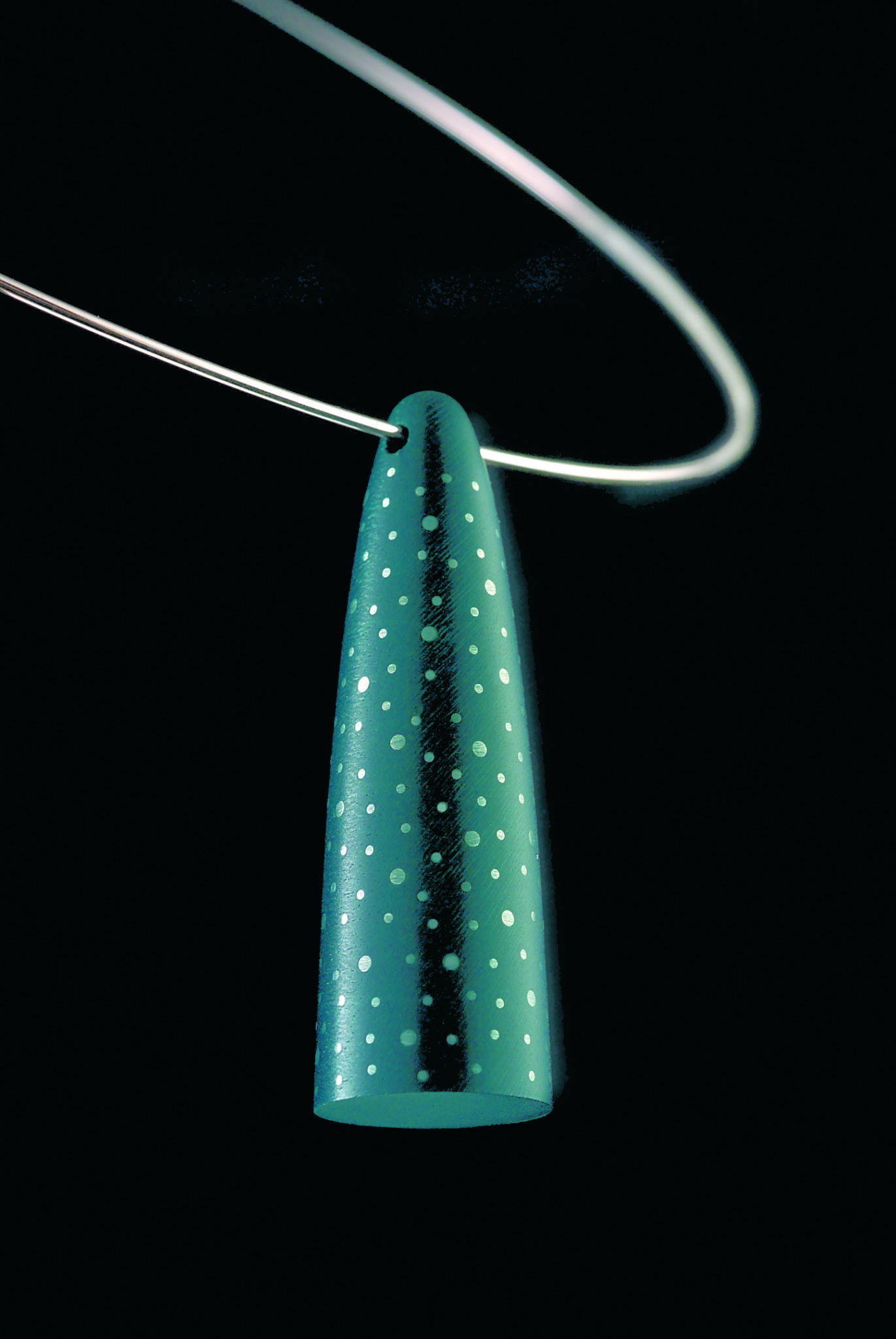
This is an early drop pendant on a silver choker, dyed sycamore inlaid with silver dots of two diameters.

My disc-shaped pendants gave me a new and interesting challenge: designing for a flat rather than a curved surface. These are turned from ebony: I love the strong black/silver contrast
Your wall pieces, discuss.
One thing led to another: my wall pieces evolved from the designs of my disc pendants. Again, customers' feedback helped to spark me into making these – I was told that everybody has some available wall space, but not necessarily shelf or table space, for display purposes.
Size (constrictions)
While my wall pieces are bigger than most of my bowls, the diameter is determined by the size of my lathe: I can't go beyond 50 cm.
When you use a frame effect or not on a piece
As with my pendants, I sometimes encircle the smooth centre with a darker, textured rim; sometimes I leave the disc unframed.
The amount of silver used
For the silver to make an impact on such a relatively big surface, I need to use a lot of it – often thousands of dots. It is very concentrated work; I wear a jeweller's magnifier, and take lots of breaks!
How are they hung?
The wall-pieces are hung on a cord, looped between two specially designed cast silver bails glued to the back.
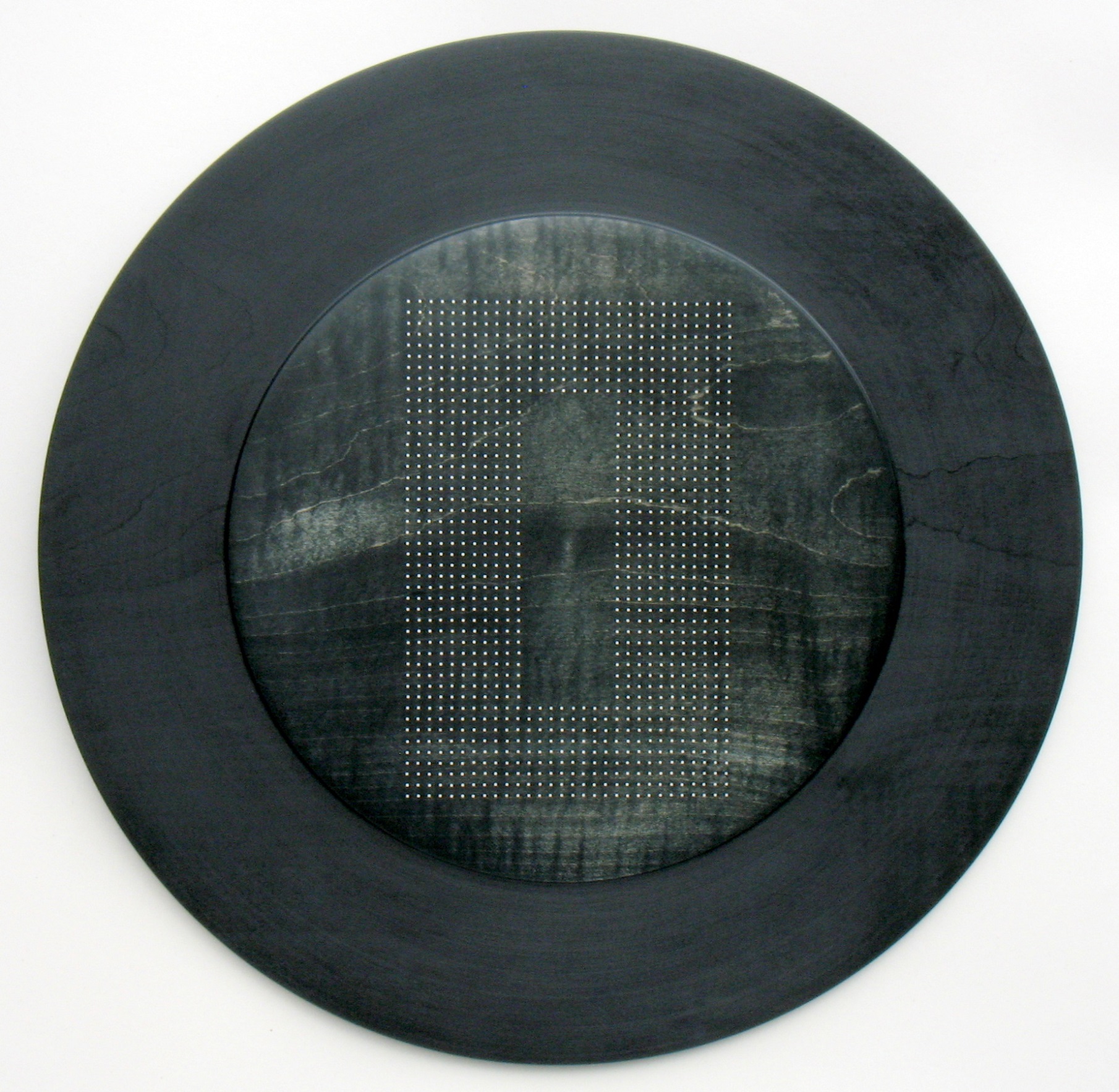
Coloured sycamore wall piece with hollow rectangle of siver dots
Do you exhibit them in groups or always singularly?
So far, I have only made individual pieces, but a group or series is a very interesting idea which I would like to explore.
Explain the role of RDS Craft Awards to your craft and other crafts.
The Royal Dublin Society was founded in 1731. It is a philanthropic organisation whose mission is “to see Ireland thrive culturally and economically ... by working across five disciplines: science, the arts, agriculture, business and equestrianism”. The annual RDS Craft Awards exhibition is a significant and prestigious event, with a prize fund of €30,000.
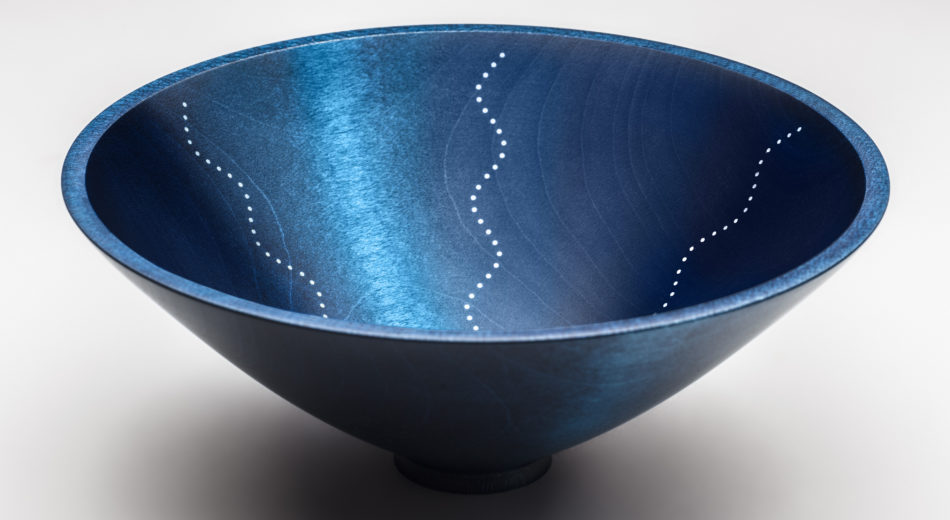
RDS Craft award-winning bowl
I was delighted to receive the 2016 Established Maker Award for one of my coloured and inlaid sycamore bowls, and to be part of a travelling exhibition with other prizewinners across a broad range of disciplines from basketry to silversmithing. Such awards give an invaluable lift to the profile and reputation of the winners. I recently took part in a big craft fair in Dublin, and I was amazed by the number of visitors who told me that they had seen my little prize-winning bowl.
Contact details
Roger Bennett
Email: parkbenn@gmail.com
www.rogerbennettwoodturner.com
Roger Bennett, Dublin, Ireland
Interview by Deborah Blakeley, February 2017
Shimara Carlow
Can you expand on your relationship to nature and in particular seed pods in your jewellery?
While studying at Glasgow School of Art in Scotland, our lecturers encouraged keeping a sketch book or scrap book, I went to what I knew, nature, and spent hours collecting, photographing and drawing found objects to fill these books.
I loved the simple forms and shapes created by nature, and the idea of seed pods, holding something precious, always resonated with me.
It was then a very natural process for this to heavily influence my work.
How has nature become such a huge part of all your collections?
I have always spent a lot of time outside foraging and collecting seedpods, shells, feathers and leaves as a child and as an art student. Going on long walks through the countryside and along the beaches in Scotland and Ireland, where I grew up. Or pottering around my mother’s garden or national trust gardens – I was never looking where I was going, always looking at small details instead.
Now with my own children, we spend most of our time out in the garden or walking along the waterfront – I am always outside!
Take two or three pieces to expand on the natural influences.
My Acorn cup design is the earliest – I first developed this at Art School, it is as simple as I was trying to recreate an acorn cup out of silver, without casting an actual acorn cup!
My Honesty collection is my response to the beautiful and delicate dried seed pods of the honesty plant, which grew all around our garden. I loved the silvery seed pods which hang in clusters from the plant. Using reticulation and acid to bring the silver to a white silver colour I have tried to recreate my initial response to the plant.
The Gum nut range is one of the few where I have cast direct from nature, I collected the original gum nuts on my first visit to Australia in 2006, while visiting Adelaide. I could not believe all the beautiful shapes and forms; they are so different from the seed pods back in the UK.
How influenced is your work with your childhood in Ireland and education in the UK?
Completely! I grew up on a rugged mountainside overlooking the Atlantic Ocean, we lived in a small cottage, surrounded by nature, and often at the mercy of the elements. We didn’t have tv I don’t remember many toys, we were outside exploring the mountains, or the peat bogs or the coastline, in all weather.
I went to an alternative School in Scotland, Kilquhanity House School, it was based on Steiner principles. So much of our education took place outside, the school was on a huge grounds in the country. The school was very arts focused with children of all ages taking woodwork, ceramic and art classes on a daily basis.
Your connections with the UK are still very strong as you have galleries in both hemispheres. Discuss how you keep both operating.
I had set up a good business while living in London, and I really didn’t want to give it up! I took part in trade shows and art fairs, and built good solid relationships with UK galleries which I was able to maintain when I moved to Australia. I guess because I make it easy for the galleries to have my work they are happy to keep me. My mum also runs a gallery in Scotland, I think having a UK base helps.
You currently work out Studio space in Melbourne discuss this.
I left the convent in 2014 when we moved the Western Suburbs, I converted the garage in our garden and work from there. It is a wonderful set up and allows me to be a full time mum and full time artist!
I like to keep my studio and exhibiting spaces separate, so don’t show work in my studio, but welcome clients to come meet me and discuss one off pieces and commissions.
You also work on larger pieces, bowls. Explain the work involve in these pieces.
My silver smithing work is very labour intensive, and as such I don’t get much of an opportunity to do it these days, I have also found there is very little market for it here in Australia, and I predominantly sell it in the UK.
My pieces are hand raised from plat sheets of fine silver, the process is very slow and physically challenging. Using a hammer and metal stake (former) I hammer the sheet over the stake in a circular motion, from the middle to the edge, taking it slowly from flat to domed, after each round the metal is annealed (heated until soft again, as it harden as you work it) left to cool and repeated, somewhere between 10 and 100 times depending on the piece.
Expand on the combination of metals (e.g. e Acorn Cup rings) and the use of both gold and silver.
I started incorporating 18ct yellow gold into my silver jewellery to add contrast, but also to add warmth. The gold beads in the centre of many of my designs, goes back to the theme of seeds and seed pods, or pearls in oysters.
In your larger pieces – neckpieces, you create a delicacy discuss the combination of metal and silk paper.
Taking the idea of layers of leaves and petals, or the woven forms of nests, I like to explore juxtaposition of the fragility and strength found in nature.
Can you expand on the use of silk paper in your jewellery?
I loved the versatility of the silk paper, which I moulded, using papier Mache technique. It allowed me to create form and shapes I could not achieve with metal.
Being a natural material it worked well with my designs, and in my endless pursuit of recreating nature, brought a delicacy to large sculptural pieces.
Discuss the process of your wrapped rings and the different sizes that you need to make so that they are just right for each wearer.
My Wrapped rings are formed from long lengths of hammered metal wire, bound in a nest like design. They are then soldered together so they can’t unravel. I make them 2-3 sizes smaller than I want them and once finished stretch them up on a ring stretch to make them tight and strong. In this way they can be made to fit any size, although the very small sizes are challenging!
You do commissions can you tell us of one that was different and lead you to a new idea?
The most recent one that comes to mind, was for a good friend who was proposing to his girlfriend. He wanted to buy a piece from me, I knew my style was not her thing, and so I designed and made a much more traditional engagement ring than I had ever made before.
I am now bringing out a whole range of wedding,engagement and eternity rings. They have a traditional look, but a tactile organic feel, achieved through textured hammers and a wonderful stone setter!
Contact details
Shimara Carlow
Shimara, Melbourne,Australia
Interview by Deborah Blakeley, February, 2017
Catherine Greene
Your work can be found around the world, where is one of the least expected paces you thought it would end up in?
There is work of mine in many collections and places but the least expected place happens to be Australia. I have not been there yet and have not established art links anywhere there. However, two years ago a visitor from Australia saw a small bronze in the window of Adams Auction house and they subsequently commissioned me to make a piece for their collection, (AJURIALAWERS|CONSULTING) Since a second client from Australia has come my way having seen work in a collection here. All this had happened in the last 18 months. And then I hear from you!
The second place I had never anticipated having work was in Fatima, as I am not a religious sculptor per say. And would not be known as such.
Your work ‘Figure of Christ’ expand on this commission.
The figure of Christ was a competition for the new Basilica in Fatima that was being built in 2005. The brief was to create the figure of Christ in the context of the very spare beautifully designed church. The overall size is 7 meters, which is the cross, the figure of Christ is 5 meters high. Apart from the aesthetics, the logistics were really challenging. Because the figure was so tall I could not make it in one piece working inside. We welded it as a whole and then separated from the hip so I could work in two halts and put it together outside, check it and work on it again. This was all done in clay and then transported to a foundry in Portugal. Where I spent several months working on the piece doing finer detail. Transporting it to Fatima from Oporto/Gaia meant getting a special transport license as the 7 meter cross with the Christ figure was driven down to Fatima in a specialized lorry at night. I worked with a wonderful engineer who understood my demand for the whole work to be suspended on one wire rope. I wanted the whole pierce to be as aesthetically light as possible.
Explain your own feelings in relationship to this most solemn religious moment?
The Basilica was beautiful and sophisticated in its simplicity and because Fatima has always been a place of devout pilgrimage it was very important to honour that.
I felt the figure of Christ should embrace peace and not suffering. I thought that the pilgrims should enter this space and be able to seek peace and redemption not through a suffering Christ but through a peaceful one. It is a 21st cent urn idea and I know that the more traditional Catholics particularly coming from Portugal have an issue with this.
How important was the mosaic background to your design of ‘Figure of Christ’?
The mosaic background was designed by another artist and the gold leaf warms the figure and adds to the overall narrative. I am not sure who he was except that he was a Jesuit, from Austria, I think.
Explain your work, ‘Thomas Francis Meagher’ and his historical meaning in Ireland. Also the amount of background research you need to do?
General Thomas Francis Meagher came about when Ireland held the presidency of the EU. Waterford City council wanted to honour the man who first brought the Tricolour flag from the French barricades to Ireland.
He is very important, because as a result of his actions we have our national flag today, the Irish Tricolour.
Interestingly, prior to being in France, he had been deported to Tasmania for his unpatriotic activities where he escaped from after seven years. He ended up as Governor of Montana in the USA.
Before an artist embarks on a project like this, the more information and context one can glean the easier it is to become part of the person or idea that one is trying to convey. So research is very important. Ultimately though, it’s the feeling that one gets about a person that gives the work a momentum and energy.
He fought on the Unionists side in America’s civil war and was wounded in battle, his front hoof is raised. That means he was injured but lived. In memorial military work that is the hidden language. So for example if General Meagher had fought and been killed, the horse’s two front legs would have been raised from the ground. (He was subsequently made governor of Montana by Lincoln)
‘Wolf and Men’ are mixed medium explain the different mediums you have used and why the choice?
Wolf and Men are executed in a completely different medium because they were not commissions, they were work that I needed to make for myself.
Bronze although beautiful is very expensive and most sculptors will only cast their work when it has been commissioned.
Working in this medium of welded structure plaster and wax gave me great freedom to explore a theme without the stress of bills. It meant if I was working on something and I decided to change it radically at the last second, I could. Not that one cannot do this for commissions, but the whole process is entirely different as prerequisites are solely yours. Think of Giacommeti whose life’s work was mostly still in plaster when he died.
Explain how you have achieved motion in Portal?
Portal is a work for the law faculty in University College Dublin. The whole idea was about leaving a past behind and moving forwards towards new beginnings. The movement is achieved by three elements. The static but staggered arch/uprights and the movement of the arms in a slow swing and the barest of contact on the ground of his back foot, where the ball is the only point that meet the ground surface. His front foot poised for takeoff.
The action and interaction between those three elements give the sense of motion. Intellectually it was the sense of motion that was integral to this brief. Students entering a University, shedding the past as they move forward and towards a new life.
You have photographed students walking past this work and how it adds to the feeling of movement in the photographs, discuss.
One of the reasons I have included the students in the photographs of this work is to give the overall site a context. I feel a lot of public sculpture is too removed from the humans who pass by. Which was the primary reason I places this youth directly on the ground, not separated by a plinth. The photographs with human begins give a sense of scale and a sense of how the sculpture lives in the environment. In this particular work the students walk through the portal and momentarily are an integral part of the dynamic, their motion echoing that of the figure.
As well as public art you do small pieces, discuss the joy of small.
The process of making small work is very different process because it becomes a way of fast thinking and exploration of new ideas. So I would be sitting at my desk with several small lumps of clay working on each simultaneously with only a vague idea of what I am trying to convey.
From that generally one or two stronger images keep cropping up and I move to the next phase which is to realise the sculpture scaled up finished small work which I would hope to cast in bronze. There is also the element of time, within weeks one can see a whole thought process when there are all these small works gathered together in the studio space. I work thematically, so this process allows overall vision.
In your smaller works you often have limited editions. Comment on the use of limited editions in your work.
I am very reluctant to cast an edition above 5 as I believe in the exclusivity when someone want to pay money for a work. I am conscious of each piece being unique and it becomes boring to try and recreate the same and besides it is never really possible as each wax becomes individualized by its fine tuning/modelling.
The smaller works that I make could conceivably be re-scaled upwards to make a large sculpture. I do believe that any smaller work that a sculptor does, should work in a larger scale. Although I have found that sometimes I would have to adjust an arm or even an angle of the body. For instance, when I scaling up the maquette of Ecce Homo, I found that there were elements of the smaller work that simply didn’t read well in the larger work.
Photography of your work particularly ‘Blue Moon’ is exciting discuss the photos in the mist and other images.
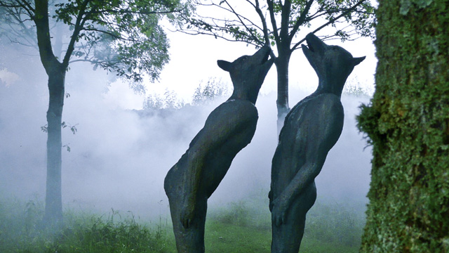
Photographing the Blue Wolves in the mist happened to be on be of those moments that I realise was perfect as it enhanced the mood and energy of the work. Photography is so important to me, and I realise to my cost that it is very hard for someone else to convey what I think is the essence of any of the work that I make. However, there are skills and cameras that I do not have, so for example a professional photographer took the shots for the Sutherland School of Law (Portal) and the figure of Christ for Fatima. I find it easier to shoot in a natural environment and the moments are more arbitrary. I think that for someone who has never seen my work the photographs should give a sense of the energy, recording the moment.
‘Ecce Homo’ how particular are you about the placement of each individual piece?
In Ecce Homo the placement of each individual figure was vitally important, and I thought about carefully, having tried other placements. The primary idea was to challenge our preconceptions about the importance of the animal in our human egocentric world. I wanted the wolf/man to be at the pinnacle and centre of the group of five. I do believe that we just happen to have cultivated a very sophisticated veneer above our essential animalistic souls. In each of the Blue Moon series man and animal exist in equal weight and measure. Ecce Homo was a culmination of this idea. In the 1800’s there were images of ape growing into wonderful human, the Darwinian ascent of man, I just wanted to upturn that idea a little.
Can you expand on the fragility of the wings of your Angels?
That is an interesting question as the fragility of the wings in my angels is always something that I have wanted people to notice. The angles that I have made were never about the heavenly beings coming down to dispense forgiveness, rather they represent a transition between the human and the difficult journey to another place. They also represent the fragility of the spirit. These angels are in a liminal place but essentially more human than heavenly, with all of our endeavor and imperfection.
Discuss your work shown at The Royal Hibernian Academy, Dublin and how they have voiced your political feelings.
I was an invited artist to the Royal Hibernian Academy and I wanted to make a comment on the plight of women having no voice in the Muslim world when it moves in to fanaticism. In 1968 there was a beautiful bur ironically sad photograph taken of a women going to market in Kabul with a bird cage filled with finches on her head. She was completely shrouded and hidden from the world. I saw this photograph in National Geographic and it stayed with me for many years.
I really felt compelled to make a statement about what I perceived as freedom. I had honestly hoped to provoke a discussion in a more public way but I think that there was a reluctance to go there as it might have seemed biased. Which was never my intention, my making of this work was simply a reaction to what I saw as prison.
The other political work that I have made is about war and how it affects women. Like “no caged bird sings” it is about lack of choice. Because there have been many remembrances about the great war in Europe and in my opinion rather idealised, and because we celebrated the Easter 1916 rising here in Ireland, I really wanted to make a comment about the physiological effects of that. For the most part men make war, they go away and sometimes when they return they do so only in body and their mind remains at war. The marriage dress represents all the hope that once existed, but now she is stuck in that place of conflict. Trapped, used the gas mask to emphasise the metaphor.
Contact details
Catherine Greene
Catherine greene.com
Catherine Green, Dublin, Ireland
Interview by Deborah Blakeley, February, 2017
Matthew Chambers
When did you first begin to add layers to your work?
The layering technique I use now began just after I left college in 2004. I have been way more interested in the sculptural over the functional in clay for many years, although it certainly didn’t begin this way, with a beginning as a production potter where function was the only way. During art school I was taught to look around, leave my past and take heed and I became inspired by form alone. Experimentation took me in many directions through education, although an underlying interest in constructivist formal qualities played a part in most things I did. My current technique was born from an amalgamation of these interests with my experimentation and learning whilst at college, but ironically and perhaps most importantly it happened because of my time in production and the repetitive and measured throwing technique I still carry in my mind and hands from then until now.
Discuss the assemble technique that you use to create a piece.
All work is constructed on the potters wheel. They are made up of a gathering of individual thrown parts, all joined in conformity to make the whole. Each section inside is measured and then joined to the last, with an aim to end with a pattern that creates an individual symmetry and rhythm within each work.
Where did you get your initial inspiration for the layers?
As said, it began with my time in production. I was a potter for 7 years, mass throwing cups, bowls etc in specific measurements depending on the style of pot that was being made at any one time. Although what I do now is certainly not this, to me the essence of it still really is, as the repetition and the measuring is just the same. It’s just that today I capture all pieces within one form to create an abstract expression in pattern, instead of placing each individually out on a shelf next to the last to create a function as I did in times past.
You began your training in Ceramics and Glass at the Royal College of Art. When and how did you know that ceramics was your medium?
I began my training in 1993 with my apprenticeship at the pottery. I was 18 and a little wayward in my life, and after previously being bad at pretty much everything I tried, ceramics came along and gave me direction. I had one thing to focus on and all the time in the world to get better at it, so I relished the challenge and began to love the medium. I urged myself on by constantly setting my own targets and striving to reach them, but after 7 full time years there I felt I’d hit the limit of improvement with the pots, so decided to apply to art school. I got refused from a few even without interview due to lack of a formal education or art foundation, but thankfully Bath School of Art took the risk and offered me a place and allowed me to find my own direction.
You had a residency on the Isle of Wight – How did this influence you?
The residency was so very important in so many ways. Towards the end of the RCA I was broke, and being broke also meant confusion of what would be the next step to take. I responded to an advert in Artists Newsletter magazine advertising the UK Arts Council funded ‘Setting Up Scheme’, giving 18 months free studio alongside equipment and maintenance grants at the Quay Arts Centre on the Isle of Wight. I’d only visited the Island on holiday a couple of times previously so I was a little unsure whether it would be right, but the urge just to carry on overtook all worries and I went for it. I settled in well with the change of pace and the freedom of not needing to earn throughout this time. I felt I could relax and just make, and thankfully and so very valuably it kickstarted everything and enabled the progression to where I am now. For some unfortunate reason the Arts Council gave up on the scheme a few years afterwards, which a real shame as most students need a bit of time after graduation just to begin and no money to do so. The Setting up scheme was the perfect key to enable a start.
Discuss how you combine colours in your work?
All colours are mixed into the clay body. Oxides and body stains are applied before the piece is constructed, with a variation of colour and shade dependant on the progression of the pattern in any particular piece.
Discuss the Studio on the Isle of Wight? (Its pros and cons?)
My studio’s in a beautiful location on the southern tip of the island at Binnel Bay, and its location feels very secluded and almost cut off from the stresses of everyday life, making it easier to deal with those that occasionally crop up in the making. I’m amongst a great community with 4 other artists sharing the building, and although we stop for a chat or a social every so often I’m pretty much left to it which is great as this is the way I like to work day to day. There aren’t many cons to be honest, and I’m happy living on the Isle of Wight. There’s a growing community of artists here and it’s close enough to London. Also the pace of life feels good for my family and for the way I live right now. If there is a con it would be the ferry to get off, the cost of it, and the occasional feeling of entrapment due to this.
Explain when and how you make the decision on single or multiple pieces?
Decisions on the work are all pretty instinctive as I move from one to the next, whether this is in the form or in the colour, I generally never work to a brief. Although I love the relative peace and tranquillity in the simpler forms, as I try to progress the technique ever more it’s probably the complexity and intricacy in the pattern that continues to pull me in more.
Expand on your comment, “It is a true love of the making process that drives the creation of my sculptures”.
I guess it's just an admission of the passion I have for my process - the key to the motivation I have to make every day. Professionally I've had 12 years in of full time throwing and constructing to build my work - repetitively and intensely, and I'm still not bored. If I'm working very hard or on a form particularly tricky I can feel exhausted, but I never tire of the thing that can sometimes tire me. The wheel is the tool that I love and what I have used for 23 years and still feel now that I will continue to make until I am physically unable or stopped by an exterior force. There still seems to be so many options left in my process, that there simply might not be enough time in life to do them all. For some my development might not be quick enough, but for me it is and I continually see change and every move however small still excites me and I am full of ideas within what I do. I believe that the idea of 'mastering' any ceramic process is a false concept as there seems not enough time in life to do so however much of a commitment it becomes, but one can always strive to get better and this is always my drive.
Discuss the commission for The Hyatt, Andaz Hotel, London.
The Andaz was a great commission which happened 8 years ago. It was arranged through a consultancy when the hotel was refurbished from the Hyatt Great Eastern into the Andaz Liverpool Street.
The commission consisted of making 3 large (50cm) pieces each sitting on its own black glass plinth in the lobby of the hotel viewed by all who pass through the doors there. It's pretty flattering to me that even after all this time they are still there and still seem happy with them
Contact details:
Matthew Chambers
Email: info@matthewchambers.co.uk
Matthew Chambers, Isle of Wight, UK
Interview by Deborah Blakeley, February, 2016
Anne Covell
You make a very different comment to many other artists; you are interested in the capacity of the artist to physically shape the environment. Discuss this.
As an artist, I am interested in the human capacity to physically shape the environment, and the subtle, observable ways nature adapts and responds. Put more simply, my work explores connections shared between humans and the natural world, and takes a critical approach to the impact of human involvement in natural processes.
As part of my artistic practice, I try to always be observant of my surroundings. I document and collect natural objects that I find that fascinate me. These objects, which often pique my interest for their aesthetic properties (color, shape, texture), typically have some deeper story to tell. For example, several years ago on a walk in Iowa City, I picked up a skeletonized leaf because I was attracted to its lace-like quality. I brought it home and studied it and through research I found that the form was a result of invasive insects that made their way to America on cargo ships over 100 years ago. Often, these small observations lead to deeper research that then translates into new work.
In making paper you are reconstructing from one mass to another. Discuss one of the techniques you use to make paper.
Paper is an incredibly versatile medium. I’ve created handmade papers for my work that ranges from delicate, translucent gampi to heavyweight, indigo dyed flax. Each project has its own aesthetic, which calls for different properties in the paper to be made.
As a hand papermaker, I have the ability to control how a pulp behaves through factors such as fiber preparation and beating time. For example, in my piece Cult of Relics,
I carefully and meticulously wrapped natural objects in handmade abaca. I chose abaca because it is a fiber that through overbeating (in this case, 12 hours in the beater) becomes incredibly high shrinkage and will conform anything it is wrapped around. In order to cover the forms, I first made a post of sheets and pressed them in a hydraulic press to remove the excess water. At this point, while they were still wet, I tore small sections of the wet sheets and wrapped the forms piece by piece, using methyl cellulose as a bonding agent. As the paper dried, it shrank to conform to each object.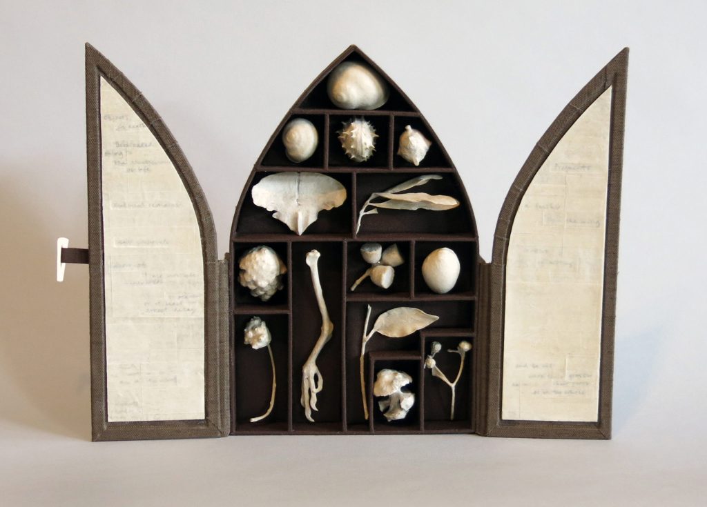
Artists Books are not always ‘books’ discuss this in relation to ‘Cult of Relics’.
Cult of Relics is a reliquary that houses paper-wrapped natural objects. I tend to think of it as both a book and a sculptural object, because of the different ways it can be experienced by a viewer. On exhibition, it is typically displayed open as a triptych and viewed as a whole. However, when handled, it is most often placed flat on a table and opened. The doors contain text that can be read and experienced in relationship to the objects, so in this way it operates more as a traditional book than as a sculpture.
What lead you to doing a MFA in Book Arts?
My path into the field of book arts has been somewhat circuitous. After graduating from college, I worked for several years in the education department at the Museum of Contemporary Art San Diego. In contemplating graduate school I looked for a program that would have education as a central theme, but that would also allow me to work with my hands creatively. I chose the University of Iowa for its unique joint program that would allow me to receive a masters in library and information science with a graduate certificate in book studies and book arts. I knew very little about book arts at the time, but the prospect of studying the book both conceptually and creatively intrigued me. I fell in love with the program at the Center for the Book. Several years later, when the Center for the Book transformed into an MFA program and offered recent grads the opportunity to return to advance their graduate certificate to an MFA, I jumped at the chance to come back.
Expand on the importance of Timothy Barrett in your art career?
While at Iowa, I had the privilege of studying Asian and Western papermaking techniques with Timothy Barrett, a renowned papermaker and MacArthur Fellow. Additionally, during my tenure at Iowa, I worked as a production papermaker at his Oakdale Research and Production Paper Facility. Tim has been a guiding force in my career as an artist. In addition to teaching me this skills required to become an adept papermaker, he has also become an incredible mentor, and a good friend.
Take us through the journey of ‘Towards a Just Landscape’ from conception to completion.
My mother’s side of my family hails from Whitefish, Montana, which sits just outside Glacier National Park. Each summer that we would visit, we would take the Going-to-the-Sun Road to the top of Logan Pass. Glacier National Park is part of the larger Waterton-Glacier International Peace Park, which spans the international boundary between Montana and Alberta.
In 2012, my family and I decided to explore the Canadian side of the park, and it was on a boat excursion along Upper Waterton Lake that a tour guide pointed out the clear-cut swath demarcating the international boundary.
Prior to that point, I hadn’t given much thought to the border, but its image haunted me. After some research, I learned that the clear-cut I had witnessed spans the entirety of the US/Canada border, some 5,525 miles. I began to think about all the land this swath cuts through and its impact upon its surrounding environments. In 2014, I set out on a research trip that took me from my home in Iowa City, Iowa to the Alberta/Montana borderlands, skirting the 49th Parallel along the way. At each border crossing I documented the swath. In Waterton, I hiked down to the border and camped alongside the clear-cut. After two weeks, I came home with a mountain of information and began working on what would become Towards a Just Landscape.
This project is comprised of three artists books housed in a deluxe clamshell box. Each piece uniquely explores the political and ecological impact of the US/Canada border clearing on its surrounding environment. While Boundary Vistas studies the varying landscapes along the 49th Parallel at the macroscopic level to comment on the scale and enormity of the clear-cut, A Field Guide to New Growth, by contrast, focuses more microscopically on the swath itself and what can be found growing in the wake of destruction. Vanishing Point envisions the clear-cut as a physical representation of a deeper disconnect over how to achieve peace and justice in the Alberta/Montana borderlands.
Many of your works are Limited Editions, can you expand on how you make up to 15 editions?
The majority of the artist books I produce are printed in limited edition quantities. I print my work primarily on a Vandercook letterpress, which is a type of proof printing press designed for editioning, or printing multiples. One of the factors I decide when I start a new project is the edition size, because it is a major factor in determining both cost and time. Because my projects often involve making the paper by hand or other specialty work such as papercutting or pochoir, my editions are small in size and range between 10-25. Natural Order: A Game of Pairs, as an edition of 50, is one of the larger editions I have done.
At a different level you have used your techniques to make ‘Natural Order’ A Game of Pairs. Discuss this work.
Natural Order: A Game of Pairs is a play on the childhood game of memory or concentration wherein the goal of the game is to match like pairs. However, in this game there is a twist - the goal instead is to match symbiotic relationships as they are found in nature. The game consists of 30 cards (15 pairs) and a learning guide that teaches about not only mutually beneficial relationships, but also commensal and parasitic relationships in order to better understand the complexity, diversity, and often brutal severity that brings order to the natural world.
Would you consider taking commissions for Game of Pairs?
Natural Order: A Game of Pairs is a limited edition set of 50. It was letterpress printed from original drawings using polymer plates. I have had the idea for some time to make an offset print edition in order to offer the game at a more affordable price. If I do decide to do that, I will let you know!
You use French Chipboard. Can you explain what the properties of this product are and where you source it?
French Paper Company is an independent US paper mill that specializes in natural and colored cover stock and text weight papers. They produce a durable chipboard with a strong fold endurance that was perfect for strength required for the playing cards in my game Natural Order: A Game of Pairs.
Presentation and packaging is a large part of your art please give details of this aspect of your art.
Typically, when I begin a project I start by doing several mock-ups that include those for content, structure, and materials. As these decisions are made, other elements come into play, such as how the piece will be covered and whether or not it will require an enclosure. My work often involves delicate papers such as kozo and gampi, and because of their fragility, these books often require protection. When a book requires an enclosure, I like to think of the enclosure as part of the reading of the piece. When a reader opens a box or enclosure, they are taking in visual clues that affect how the book is experienced. Therefore, I attempt to think of the book and its enclosure as a whole, so that the collective work is harmonious and in tune with the content of the piece.
You do classes can you take one class and briefly describe the technique you teach and the importance of the basic understanding of a student to complete the class.
I teach on a wide range of subjects that include bookbinding, hand papermaking, letterpress printing, and natural dyeing. One course I enjoy teaching in particular is titled, “Pulp Ecology: Papermaking with Plants, Pigments, and Dyes.” In this class, students begin by learning the fundamentals of papermaking (sheetforming, couching, pressing, and drying) through exploration of cotton, flax, hemp, and abaca fibers. Later, I teach techniques for immersion and vat dyeing wet pulps with dyes such as indigo, logwood, and cochineal for a wide range of colors. Students have the opportunity to learn how to manipulate dyed pulps on the paper’s surface through mark making techniques, as well as how to embed materials between sheets and how to create thin veils to conceal and reveal elements. After sheets have dried, students learn further techniques for working their sheets through natural processes of rusting, bleaching, and resist dyeing. In the end, each sheet becomes its own work of art.
Explain about the work you and Steph Rue and Radha Pandey.
While at Iowa, I had the opportunity to collaborate with fellow artists Steph Rue and Radha Pandey to create a piece for Hand Papermaking Magazine’s portfolio, “Negative Space in Handmade Paper: Picturing the Void.” We chose to collaborate because of our mutual interests and similar aesthetic. For this project, we attempted to embed a grid of threads between two sheets of handmade abaca that gradually shifted from dark to light and subtly disappeared into the paper itself.
This was easier said that done. In order to accomplish this, we created a lightweight frame out of balsa wood and meticulously threaded each frame with 250 overlapping threads. However, the difficult part came when it was time to sandwich the grid between two freshly couched sheets of abaca. This required tremendous patience and a gentle touch. Two of us held the grid while the other pulled loose threads taught and sighted the frame to land centered on the wet sheet. In the end, we created 25 sheets using this method and learned a tremendous amount about collaboration and teamwork in the process.
Discuss your involvement with Kazuko Hioki and the work she is doing with historical Japanese block printed books.
Kazuko Hioki, a conservator at the University of Kentucky Libraries, has been researching the physical traits of historic block printed books from the Edo period in Japan for some time. Several years ago, she and I began a collaboration to attempt to recreate the cover papers for these soft-bound side-stitch bindings from the information available. These cover papers were likely created from layers of poor-quality recycled paper covered with an outermost layer of thin, high-quality dyed paper that was either burnished or embossed for decoration. However, due in part to its designation as a lowly craft, little of the process used to create these covers survives in the historic record. Kazuko, not a papermaker herself, enlisted me to try to replicate these uniquely soft and flexible cover papers. My research has focused on historic recycled papermaking methds, lamination, and processes for burnishing and embossing patterns into these papers using carved woodblocks.
Discuss the importance of Historical books and bookmaking to a contemporary book artist?
I feel fortunate to have studied at Iowa, because, for me, the strength of their program lies in the equal attention they give to book history and book arts. There, I not only studied the history of the book, but researched and recreated historical models. At the same time, I also focused on creating a body of work as a contemporary book artist. Along the way, I realized how significantly these two approaches to the book had merged in my work. Like any art form, knowledge of the past informs the present. The contemporary structures we use as book artists are all drawn directly or indirectly from historic specimens.
Contact details
Anne Covell
Sin Nombre Press, Proprietor
Annecovell.com
Anne Covell, San Diego, CA, USA
Interview by Deborah Blakeley, January, 2017
Tina Puckett
You call your work ‘Woven Art’ can you expand on this choice of words?
My mother gave me a gift of a class on weaving an Egg Basket in the fall of 1982. I had decided that I would weave basket for Christmas gifts that year. I had woven about 5 baskets when my parents stop by with a friend before Christmas. She spotted the baskets and I told her that I wove them. She asked if she could purchase them and I said Yes! I wove some more baskets and brought them to a handmade gift store and they purchased and order. So, I named my new business Tina’s Baskets!
After weaving for a few years’ traditional baskets I started getting bored and that when I started experimenting with vines. That process changed my baskets to One of a Kinds. The bittersweet vine became my favorite because it gave me these incredible visions of what it wanted me to create. And from these visions came wall hanger, sculptures and furniture. The bittersweet created the frame work and structure of the piece and I wove in between. Tina’s Baskets no longer described all that I was creating and being in business for several years it was hard to let “Tina’s Baskets” go. So, I asked myself what words describes my work and that’s how “Woven Art” came about. Tina’s Baskets and Woven Art!
Purple flowers
At 90 your grandmother said to you, “You are about to begin the most important years of your life, so do what you are meant to do”. What have you done since this conversati?on
My grandmother’s words of wisdom, “You are about to begin the most important years of your life, so do what you are meant to do.” That conversation took place 15 years ago…I was living in Litchfield, CT at that time so I rented a suite on the second floor of a building that was part of the Main Street shopping. I divided the room into a show room and a work area. After three years there I wanted to even expand the business more and to do so I knew that I would have to go on the road and do Arts and Craft Show all across the US. I gave up the suite in Litchfield and moved to Winsted, CT to a house with a barn and I turned the barn into a work shop and went on the road. Being on the road was like being gypsy 4 to 6 weeks on the road and I was in a different city every week. End up coming home for about 4 weeks and create new work and full filled commissions. After living that style of life for ten years it was once again a time to change. I stayed in Winsted but moved across town to an old Mill that has one building that was renovated to apartments and another building that was renovated into Studios. This makes it very convenient to live and work.“
Indian Blanket
Expand on what you call, the humble egg basket?
The humble Egg Basket is made quite differently from any other baskets. This basket can be made of a variety of materials; many of the materials can be wild and indigenous. It starts out with two round hoops. The top of one of the hoops will be the handle and it is sometimes decorated with a patterned weave. The two hoops are held together by weaving an Eye of God which appears on some Appalachian (USA) splint baskets but is not seen on European ones. The Eye of God holds the ribs which are the frame work and determines the shape of the basket. Then in a traditional weave it is woven under and over the ribs.
Why the word “humble”
You ask why I say “humble” Egg Basket. Well, it was originally woven by workers and by gypsies. It was excellently made, a pleasure to look at and it was essentially a working basket for agriculture or fishing. And professional basket makers rarely wove them.
How do you incorporate ‘doodling’ into your art practice?
I never draw out what I am going to weave because I get visions from the Bittersweet and able to manifest the woven art piece from the vision. I have always “doodled” when the opportunity was available. I have two favorite doodling, one is flowers and the other is non-conforming lines that create spaces and would alternate filling in the spaces. One day I was talking on the phone and was doodling a flower and then I was wondering if I could weave one. That was the birth of the Woven Flowers. The other doodling is the wall hangers Waves and Whimsical.
You studied Set Design how has this influenced your art in particular size?
Studying Set Design has influenced my woven art work in so many ways. I learned how to create from my imagination. I was taught how to understand the importance of color and how to mix colors to create a different color. Also, I learned carpentry. When we did set design we always had to create the set to a size were the audience from the first row to the last row could see it clearly. I follow this same practice with my woven art. For example: when I get a commission for a piece to go over the fireplace mantle, I take in to consideration the space of the wall from mantle to the ceiling, how large is the room, where is the setting area in proportion to the fireplace and were the entrances are to the room. These criteria determine the size and weave of the Woven Art piece.
You catalogue your work into 4 sections.
Baskets, bowls, Sculpture, and Wallhangings explain about the categories and also when they overlap.
I have categorized my woven art into Baskets, Bowls, Sculpture, Wallhanger, Flowers, Landscapes and Furniture. When you go on my website you will notice that I have categorized my woven art into Baskets, Bowls, Sculpture, Wallhanger, Flowers, Landscapes and Furniture. I have been weaving since 1982 and started with baskets. The more I wove the more shapes and functions came from my weaving and to make it easier for my clients to find what they are looking for to categorize my work. The names I choose for the categories are self-explanatory. Can the categories overlap? Yes, I think so.
Bluebonnet
Discuss ‘Whatz Up’ and where the basket and art piece overlap.
I created a basket named “Whatz Up”. The definition of a basket is a container used to hold or carry things. She can definitely hold thing and has a handle. She is also an Art piece because she sits on her side which is non-conforming to a basket. Also, there are very beautiful pieces of Bittersweet vines that are placed throughout the basket that gives it a sculptural look.
Neasts 5
Discuss the use of the bright colour in this piece and your work with bright colours.
There are two bowls, Paneled Bowl and Beating Heart that are a perfect example how I like to combine colors. Paneled Bowl has rich earth tones such as wine, orange, yellow and brown. Beating Heart has brilliant yellow, red, pink and purple. I always look upon our planet to see the different colors nature has put together. The earth tones actually come from our foliage in New England, USA. The brilliant colors come from the beautiful flowers, nature combines such pretty colors in flowers. These two bowls are woven on the inside and the outside. I weave with reeds and there is a good side and a ruff side of the reeds. So, usually the good side goes on the outside of the basket or bowl and the ruff side on the inside. By creating a double wall the bowl has a good side on the inside and the outside.\
Revisited Fiesta
Discuss the use of colours and the variation in the material choices in your work.
Two Walls is under freestanding sculptures. This piece is actually made with one branch from Harry Lauders Walking Stick. It allowed me to weave two separate walls with a thinner branch delicately twisting and turning in between the two walls. I choose earth tone colors of rust and dark blue and accented it with yellow wooden beads. I love how it is supported by the branch giving it empty space on the bottom.
Forever Changing
Compare ‘Wallhanging 4’and Wallhanging 2’ highlighting the size, materials and the different number of piece in each Wallhanging.
In the category of Wallhanger there are subcategories: Pocket, Whimsical, Circle and Curves and Waves. The Pocket Wallhanger is actually functional in that it can hold stuff and they are woven indifferent sizes and patters. Whimsical comes from my “doodling” and if you look at them there is no begging or end in the panel that is woven like ying and yang. In my collection of Bittersweet vines there are some pieces that have grown around themselves in some what a straight branch and I wanted to accent this piece of bittersweet and yet mimic the twist. That was the creation of the Circles and Curves. Waves also comes from my “doodling”. Bittersweet vines are creating the frame work and allow me to weave panels in between the vines. I love this technique because there is so much motion when you look at piece.
If this was not enough you also use your techniques to make furniture. Discuss, Simplicity (Coffee Table) and how you have had to adapt your techniques to make large piece.
Flowers and Landscapes were originally woven in a traditional weave. When I studied set design I also learned how your eyes preserve what you are seeing. So I took a closer look at the flowers and landscapes and realized that they are not a solid color but slight variations of the color. That is how my own technique of weaving was created and I named it “dimensional weave”.
One day in the woods forging Bittersweet vines I came across some really thick and interesting pieces. The vision I got was that it wanted to be a coffee table. With the knowledge of carpentry from set design I knew that I could create a coffee table. My favorite coffee table is The Four-Level Coffee Table which can be found on my website. The piece of Bittersweet vine that is sticking straight up from the center of the table was the piece that gave me the vision and it told me it wanted to be the center of the attention. From the coffee table I went on to making End Tables and Tiki Bars.
You open your studio every weekend. Why do you do this and how has it helped you to develop and expand your art?
I consider myself a professional Artist. I absolutely love weaving and am willing to do it all of the time. I am prepared and have been for many years to commit my time, energy and money to make a living from my woven art. I have developed a unique style and constantly developing new body of work. I am also willing to promote my work every chance I get. With that said you can understand why I choose to live and have my studio in the same location and have set hours on the weekends and by appointment or chance in the weekdays. At this time my studio is the best I have ever had. It has a beautiful show room and work area all in one.
Jumping
Contacts:
Tina Puckett
Tina Puckett, Conneticut, USA
Interview by Deborah Blakeley, January, 2017
Joanne B Kaar
Explain your involvement with Chrysalis Art?
Fabric of Place is a community based, artist in residence project which Chrysalis Arts Development has developed as part of the company’s Slow Art strand of artistic activity. I have been invited to take part as lead artist.
The project focuses on the distinctiveness of Reeth and the surrounding area of Swaledale. Artists will use creative processes and activities to explore different aspects of the area, its communities and their relationship with where they live, to create a series of artworks and offer a range of opportunities for residents to participate. This two-year project will culminate in a touring exhibition in late 2018 and a community artwork that will ultimately be housed in Reeth.
As lead artist, I conducted a two-week research visit in October 2016. In March 2017, I will return to Reeth for a further two weeks and community activity on the project will begin.
Each artist will be working on the theme ‘Outside In’ over the two-year project. Their own work and work they produce with community groups will form part of an installation made to look like a room, but with a twist!
Joanna B Kaar working on an earlier project
You are about to work on a 2-year slow art residency, explain what a slow art residency is?
Slow growing, slow art - Many residencies are short term, blocks of time, blink and it’s finished. This residency will allow time to get to know the area, and develop ideas. We’ll also use some techniques that are quite slow, and may not be suitable in a residency that’s only a few weeks long.
Tell us about your residency in Newfoundland in 2016?
Newfoundland has been on my list of must-see places to visit for a long time, so when I saw the craft residency opportunity with the Craft Council of Newfoundland and Labrador, in Woody Point, Gros Morne National Park, I decided to take a deep breath and fill out the application form.
A winter residency, my usual natural materials of choice would be limited (under a few feet of snow). I couldn't bring natural materials with me through customs. Travelling light, making sure I didn't need specialist tools or materials when I arrived as Woody Point is an isolated 'out port' with a population of around 200, and a day's bus away from the capital St. John's.
Most of all, I wanted to learn something about Newfoundland, its customs and traditions that connected my home of Caithness in Scotland with Newfoundland and would make people smile. With all of this in mind, I focused on the ancient folklore tradition of 'buying the wind' in 3 knots of thread, rope or fabric, to be undone as wind is required, but the mariner is instructed on no account untie the third knot, as it may start a hurricane. A 'job' that probably started in Finland, but has been documented in Scotland, mostly in coastal areas and the islands, 'wise' women would sell a fair wind to mariners. I discovered that Meg Watt from Duncansby was one of the Wind sellers for Caithness. In Orkney, Sir Walter Scott met wind seller Bessie Miller in 1814. She became the inspiration for one of his characters in his novel, The Pirate. Folklore and traditions travelled with people to Newfoundland. Transcripts from oral history recorded in the 1960s and 70s in Newfoundland by the Intangible Cultural Heritage of Newfoundland and Labrador recount stories of buying the wind Rope continued to inspire.
Newfoundland’s coast is scattered with ‘outports’, many were easier to access by boat, with fishing at its heart. As people moved, either by personal choice, changes in family circumstances or the governments resettlement programme, they often took their house with them. Archives held photos and accounts of houses being pulled with a rope by people over frozen bays.
Others showed dozens of small rowing boats towing a house, half submerged in water. All of this is within living memory, and many people in Woody Point had either helped or witnessed house moves, indeed many of the houses in Woody Point had been re-located (often more than once).
Inspired by these incredible stories and photographs, I made a huge rope from old clothes donated by the people of Woody Point. The rope made from clothes represented a community on the move.
With snow on the ground and the temperature about minus 20 degrees, I invited locals to help ‘move’ a house! Over 50 locals turned out to simulate the event.
This house ‘move’ brought all ages together, triggering memories of the past which were shared in the warmth of temporary studio. The event was captured on film and camera by Tom Cochrane of Old Crow Magazine. Jigging for cod.
I use a hand-line at home to fish for cod, and cover my fingers with plasters to protect them from blistering while hauling in the line. In Newfoundland they wore hand-knit mitts, called ‘jig’ or ‘trigger’ mitts.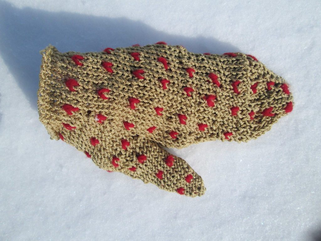
They’re a combination of a mitt and a glove – designed to keep your hands warm while still being able to haul in your fishing line. There were other designs too, all equally unique – thrummed, nippers and stalls. The lobster mitts were made at least three times the size of a hand, designed to shrink-to-fit when used at sea, making them felted and extra warm.
Inspired by archaeological evidence that the Norse visited Newfoundland, I designed a series of hand-protections, each telling the story of over 1000 years of fishing in the waters around Newfoundland, through design, construction techniques and materials used:
I combined the ancient Norse technique of nalbinding and traditional Newfoundland fishermen’s hand protection designs with modern golden fishing line I purchased in one of the only 2 stores in Woody Point.
This residency was funded by the Craft Council of Newfoundland and Labrador, and Gros Morne National Park.
Explain the Angus McPhee shoes?
Replica of Angus McPhee’s shoes and Joanna B Kaar’s shoe
Who was in Angus McPhee?
How are the shoes made? Why did you make them?
A few years ago I visited Joyce Laing in Pittenweem, Fife, to take a closer look at the grass garments made my Angus MacPhee. I had seen his incredible work while it as on display in Stornoway many years ago. Angus was a crofter. He lived in South Uist, but spent almost 50 years in Craig Dunnain psychiatric hospital in Inverness. He chose not to speak, instead he made garments from grass and leaves growing in the hospital grounds, twisting the plants into a rope or simmans. A traditional technique he would have learnt at home in Uist. When he’d finished making, Angus just discarded them and started another one. It was fortunate that Joyce Laing discovered Angus and saved some of his work.
Grass Man
Angus became known as ‘the weaver of grass’.
Joe Kaar and Joyce Laing at ’Art Extaordinary’
Exactly how Angus made his garments was a mystery Joyce wanted to solve. I’ve plenty of grass in my field to experiment with!
The grass ‘weavings’ made by Angus are now old and fragile. With the help of my husband Joe, who made a sketch of the construction by looking at a patch of more open weave, and the information from Joyce with her first had experience of seeing Angus work, I made notes and took measurements in my sketchbook. Next, with a ball of cotton string, I made a few test pieces.
Back home, I drew out a full size paper template to work from. Starting at the waistline, I made a grass rope to fit the width, then, by opening up the rope at regular intervals, I made a series of loops, threading the grass rope in and out of the gaps.
I’m using dried grass a this will help hold the twist in the rope.
Using a looping technique, I worked upwards towards the neck of the garment, the same direction as in the original. The loops were small and pulled tight at the waistline, getting larger towards the chest. I used my fingers as a gauge and pulled the rope to the size I wanted. Whilst keeping the same number of loops in each row, the garment widened at the chest, because each individual loop was bigger. This made a flat section for the front of the garment. The arms were to be added later.
Working with a short length was easier, as didn’t have to pull so much rope through the loops. When I ran out of rope, I simply made it longer by twisting in more grass. The cuffs of the sleeves and base of Angus’s garment were deliberately frilly. The loops on these parts were too matted and confusing to understand how they were made. So I decided to use the same looping technique for everything as this was the only one I was sure he had used. Working from the original waist band, I made two large loops into every one in the row before – this instantly made it wider and uneven. Working from the waistline down, I followed the paper template and adjusted the loop size to complete the front side.
Making the back of the garment was easier. I started with a waistband as before, but at the end of each row, I looped through the sides of the front piece, connecting the two halves together as I worked back and forth, leaving gaps for the sleeves and neck.
The construction technique is easier to see on these larger loops.
The garment was getting quiet heavy, so I made the sleeves separately. Again, starting with a rope I made a series of loops, but this time I tied it into a circle, the same diameter as the sleeve, working in the round, not two flat pieces. This was stitched with a grass rope to the main body section. It’s difficult to see on the original garment if the sections were made in the round, or sewn together later. I used a combination of both.
The sleeves attached and only the neck to do. I worked this in the round, picking up loops from the back and front of the garment until it was finished.
So now we know how Angus made these incredible garments, but not why. Joyce Laing has now retired and her collection of Art Extraordinary, including my replicas, are all now housed in Glasgow Museums.
How do you use historical material to inspire you? Use your involvement with the Royal Botanical Gardens, Edinburgh to explain this.
Wearing a swallowtail coat, jeans and a chimney-pot hat, Robert Dick often had children following him from his bakery in Thurso, as they were curious to know what he was doing on his walks.
He was not only a baker, but also a renowned self-taught botanist, a geologist and naturalist. Interested in entomology, he collected moths, beetles, butterflies and bees. To bring the samples home he pinned them to the inside of his hat.
Robert Dick’ folded paper sample
Robert Dick was born in Tullibody, Clackmannanshire in 1811. In the summer of 1830, Robert Dick also travelled to Thurso where he set up his own baker’s shop.
Dunnet Head was one of his favourite places to walk, describing it as having a forest of ferns. Dunnet Head Lighthouse was built in 1831, an event Robert Dick must have witnessed.
Robert Dick saved old letters, envelopes, newspapers and documents to keep his collection of small plants and mosses in. His Herbarium collection is now in Caithness Horizons Museum, Thurso, and contains around 3000 specimens. Robert Dick died in 1866.
Inspired by the landscape, and its rich heritage, I have been collaborating with Joanne Howdle, curator at Caithness Horizons Museum, digitalising their now fragile Robert Dick Pressed Herbarium Collection.
Liz O'Donnell, laying out plants for a pressed herbarium.
The Robert Dick Herbarium Collection was in need of remedial conservation treatment. In 2001, the bicentenary year of Robert Dick’s birth, Caithness Horizons received funding for remedial conservation work to be undertaken on 85 of the pressed herbarium sheets, and arrangements were made for them to go to The Scottish Conservation Studio in South Queensferry near Edinburgh.
It was the combination Robert Dick’s job as a baker, the beautifully pressed plants, hand written notes on herbarium labels and a whole variety of papers which provided a rich source of inspiration for my artwork.
I exhibited this new work, ‘Paper wrappers and Herbarium sheets’ in the gallery at Caithness Horizons in 2001. I up-dated Robert Dicks bakery to give it a contemporary feel, adding information about his work and personal life with aprons, flour bags and biscuit tins. A few of the recently conserved herbarium sheets were on display as part of my exhibition.
In 2012 Caithness Horizons received funding from Museum Galleries Scotland and Creative Scotland’s Iconic Artists in Iconic Places fund, for the next art project.
Again, working in collaboration with museum curator, Joanne Howdle and inspired by Robert Dick’s original metal, moss collecting box, I designed a scaled up version, using reclaimed metal but full of surprises inside.
Robert Dick’s moss collection box
On opening up, it reveals flowers which pop-up hidden, insects, drawers to pull and flaps to lift. A portable museum of curiosity which invites you to explore.
The images inside tell the story of what happened to the plants after Robert Dick picked them. Panels show images from his collection, the variety of papers he used and the beautiful herbarium sheets with his hand written notes detailing the places where the plants were collected.
Flaps can be lifted up to reveal more about why he cut out place names from newspapers, and why he was asked for so many samples of the Northern Holy grass by other collectors. You can discover why there are herbarium sheets from other collectors in Robert Dick’s collection.
A drawer opens to reveal a branch with a few leaves and blossoms from a lime tree which once grew outside his childhood home in Tullibody.
Other drawers pull out to reveal beetles which are responsible for damage in many museum herbarium collections, and also tools of the trade for conservation work.
Fold down this flap to find a list of activities you might like to try, including playing this board game inspired by the Robert Dick collection.
As part of research, we (Joanne Howdle Caithness Horizons museum curator) visited the herbarium at the Royal Botanical Gardens in Edinburgh, to learn more about the importance of a pressed herbarium. We also found that they have a handful of Robert Dick’s pressed herbarium sheets. I was subsequently invited to give a presentation about my work at the AGM for the Botanical Society of Scotland at RBGE and also exhibit in the John Hope Gateway Gallery at RGBE.
My research continued and have since made an exciting discovery.
A big name in the botany world was found as we, documented the Robert Dick pressed herbarium collection.
The team of Joanne Howdle, curator at the museum, and three volunteers, including me, are aiming to record electronically as much as possible about each herbarium specimen of UK plants.
While I was going through some of the sheets I found 12 with the name Hooker on them.
Recognising it as an important name among plant collectors, I set about finding out whether it could be the real thing, sending photographs of the sheets to the various people who would know.
This set off a string of excited exchanges between experts working at the Manchester Museum and the Royal Botanical Gardens at Edinburgh and Kew, and it was confirmed the sheets are of a father and son who were both eminent botanists and directors of Kew.
Sir William Jackson Hooker (1785-1865) is the father of the two, who showed an early interest in botany and, in 1809, with the encouragement of Sir Joseph Banks, made an expedition to Iceland.
In his early years he laid the foundations of his herbarium which later formed the basis of the herbarium at Kew.
He was knighted in 1836 and in 1841 was appointed Kew’s first official director. William’s son, Sir Joseph Dalton Hooker (1817–1911), travelled the world surveying flora and sending back specimens to Kew. In 1865 he succeeded his father as its director. Joseph was also a close friend of Charles Darwin who sent his herbarium sheets and specimens to Professor Henslow in Cambridge while on the Beagle’s voyage of 1831-1863. Joseph married Henslow’s daughter. I was extremely excited to have made the discovery although the plants may not all have been picked by the Hookers themselves, they must have passed through their hands at some stage. I photographed all of the herbarium sheets and only now have found the time to go through them. I’ve been sitting and looking at the images in detail, but there are a few thousand of them so it would take a while to get through them all. We’re digitising them so everyone can see them.
The museum is also trying to raise funds to have the herbarium specimens conserved and mounted for display as each specimen can only be displayed for three months every five years. So far, 200 specimens have been conserved.
Suddenly a name popped up at me because I’ve been looking at other herbarium collections and I thought it sounded like something I’d read before. I didn’t know which Hooker was which, but the folk at Kew Gardens helped out and it turns out 11 of the sheets are Joseph’s and we’ve got one of his father’s.
William’s sheet dates to the 1850s, so that would be when he was director at Kew. It’s possible it came from Kew Gardens. It’s all really exciting because there are lots of little clues and we have to put them together.
The collection would have been looked at a long time ago, but people must not have realised what they were seeing. The botanists had an "exchange club" to fill the spaces of plants not in their collections by swapping them with another collector and this is why so many different names can be found in Robert Dick’s herbarium.
Portable Museum, by Joanne B Kaar
As Manchester Museum and other places started digitising their collections, over the next few years’ lots more of Dick’s work might be found as no-one is sure what they have until they scan them all.
Portable Museum, by Joanne B Kaar
I started in 2008 when I was asked to make something based on an object in Caithness Horizons and I chose the Robert Dick collection, the portable museum came out of that and people all over the place are still borrowing it.
As we dig a bit deeper we don’t know what we’ll find. Some of them don’t look like anything but, if you pass through them quickly, that’s how things get missed.
You never know – we might find one of Darwin’s!
In 2015 you worked on a project on vintage underwear. Discuss this project and the skills you had to learn to be able to achieve the final outcome.
Strathnaver Museum ‘Open then Unpack’ by Joanne B Kaar
Commissioned by Strathnaver Museum, this handling exhibit on the theme of journeys, is designed for reminiscence sessions. It was important to make the sessions fun to encourage chat. Taking the brief literally, I decided to fill a vintage suitcase with vintage underwear.
Working with the museum volunteers, we came up with the questions about journeys to start discussion. I printed the questions onto linen tape, and stitched them onto the garments. To read the questions you have to unpack the suitcase, which is causing quite a few giggles!
LIST OF QUESTIONS ON GARMENTS IN SUITCASE.
1.MUST DASH I'VE A TRAIN TO CATCH! WAS THERE EVER ANYONE IN YOUR FAMILY WHO WAS ALWAYS LATE? HAS THE WEATHER EVER DISRUPTED YOUR TRAVEL?
2.HOW DID YOU TRAVEL TO SCHOOL, IS IT DIFFERENT NOW? YOUR SCHOOL BAG, WHAT DID YOU PACK?
3.WHEN YOUR FAMILY WERE GOING AWAY ON HOLIDAY OR TO VISIT FRIENDS OR RELATIVES, WHO PACKS THE BAGS AND WHO ORGANISED THE TRAVEL ARRANGEMENTS?
4.WHAT DO YOU MISS MOST ABOUT YOUR CHILDHOOD HOME? HAVE YOU EVER RETURNED? HAS IT CHANGED?
5.BREAD, MILK, CHEESE, CLOTHES - WHERE DID YOU DO YOUR SHOPPING? DID A MOBILE SHOP VISIT YOUR VILLAGE? HOW HAS IT CHANGED OVER THE YEARS?
6.HAVE YOU TRAVELLED TO FAR AWAY PLACES? WHAT WAS YOUR MOST MEMORABLE ADVENTURE? DID YOU SEND POSTCARDS? HAVE YOU KEPT ANY POSTCARDS YOU'VE RECEIVE?
7.HOW MANY TIMES DO YOU CHECK YOUR POCKETS AND BAGS TO SEE IF YOU HAVE YOUR TRAVEL TICKETS OR PASSPORT? LOST LUGGAGE - HAVE YOU???
8.TELL US ABOUT YOUR ANCESTORS, WERE ANY OF THEM MOVED DURING THE CLEARANCES OR EVACUATED DURING THE WAR?
9.IF FOUND PLEASE RETURN TO------TO HELP REUNITE BELONGINGS WITH THEIR OWNERS, WERE NAMES EVER STITCHED OR WRITTEN INSIDE CLOTHES AND OTHER ITEMS?
10.TELL US ABOUT THE FIRST TIME YOU TRAVELLED OUT OF YOUR VILLAGE AND YOUR FIRST NIGHT AWAY FROM HOME.
11.DON'T FORGET TO WRITE! HOW DO YOU KEEP IN TOUCH WITH FRIENDS & RELATIVES WHO LIVE FAR AWAY? LET US KNOW WHEN YOU ARRIVE - PHONE - TEXT - EMAIL - WRITE, WHAT DID YOU DO?
Contact details:
Joanne B Kaar
Joanne B Kaar, Dunne, UK
Interview by Deborah Blakeley, January, 2017
Ruth Levine
Your art is about visual transformation of materials, discuss.
I’m not intentionally an eco-artist. I see discarded and new materials in a transformational way.
I synergise unrelated materials and thoughts into a new form.
What was it about Cradle Mountain in Tasmania, Australia that lead to a burst of creativity in you?
My ‘light globe moment’ happened at Cradle Mountain in awe of the King Billy Pine, so old, so magnificent: a symbol of survival. This became ‘the thought’
Returning to Sydney, my sons empty fruit juice bottles seemed to be congregating on the drainer and not making their way into the recycle bin. That particular brand’s bottle (‘the material’), inspired the possibility of totems and the idea of using discarded man-made objects into urban trees.
At the time, I had started experimenting with transferring photos of my textures onto canvas.
Textures of King Billy wrapped the stacked, glued fruit juice bottles and became the start of my totems: urban trees.
Ode to King Billy, 1720 x120 dia, 1620 x 120 dia ,1550 x 120 dia
The urban trees are now memory trees with images relating to places travelled and experienced.
They are mounted on a block of hardwood with a central steel rod, the base bottles are filled with concrete and wrapped in canvas or recycled denim then the surface patterning applied onto strips of recycled or unloved fabric and sealed.
Explain about your bowls, Brown paper nest bowls and Phoenix black bowls.
Wastage exists as a by-product of design and building.
With wastage I see inspiration.
From the Office:
The dreaded 5 year old paper archives (meetings, accounts, projects, forms, timesheets, contracts), shredded, soaked, mulched, combined with impasto medium and manipulated over moulds into bowls, platters and shields.
Pheonix- crater grey and charcoal bowl 630 x 600 x 230
I call this series Phoenix: Out of destruction comes beauty.
Its left in its natural/ grey white paper or painted, stained, applied with charcoal, string or imbedded with recycled aluminium coffee pod lids. They are strong, confusing the eye as to the weight and nature of the material, is it stone? Concrete? Ceramic?
Phoenix large black and white bowl 440 dia x 300
From the home, leftover scraps of fabric from new furnishings, old bedding, sheets, pillow cases, Jeans, T shirts, linen, string and spent Nespresso coffee pods.
George Collection bowl with Yarra River Flats paint details
(made from the contents of spent coffee pods) 320 x 280 x 40
Explain your personal relationship with totems?
From the building site I reuse concrete core holes (these are holes that are cut out of the concrete slab to allow for plumbing and services). The bits of iron and stone in the aggregate of the concrete is quite beautiful when polished up. I use these for my mini totems. Extending the concrete with cut up pet bottles, canvas, cotton, string.
Urban Wilderness – a group of 5 mini totems
Where is your studio?
I have a beautiful studio built up top of the double garage by my very considerate and patient partner! It’s near Centennial Park in Sydney. It’s white, bright, airy with large windows and a sky light. I work on a few pieces at a time as the works are process driven with drying time between layers. As an artist I am messy, I think that’s the nature of this type of work. I spread out and have long tables (yes recycled catering tables!) there is order in the chaos and I group different type of materials together and categorise the strips and cuts of leftover fabrics.
The best part is an enormous IKEA kitchen sink where I can soak the fabric prior to rubbing of the backing paper from the photocopies of the textures.
Storage of finished art is not an issue as it makes its way temporarily into my home or straight to an exhibition.
Moorish black denim bowl 220 dia x 170
How does your work as an Interior Designer influenced your art pieces?
I love textiles, textures, the balancing of clean lines with a handmade object in an interior. It’s usually one of the reasons people say, this room ’feels good’, the eye sees texture and the hand feels the texture.
The handmade object brings heart and history to an otherwise new living space creating an emotional balance. Perfection balanced with imperfection. Interior design is mostly about creating perfect spaces for Clients. The imperfection is the balance for my needs as a designer and artist.
StudioLEVINE resulted from my passion for design as an interior designer.
When a piece is purchased do you explain the material used and how to care for the piece?
When I sell pieces they are sent off with ‘adoption papers’- with care instructions! I love receiving photos of the vessels in their new homes.
What are you currently working on?
For February 2017, a new collection for Spence and Lyda, a beautiful and ethical furniture showroom in Sydney’s Surry Hills.
Also an exciting, combined exhibition ‘Synaesthesia’ July 7-21 2017, in Sydney’s Botanical Garden, The Palm House with painter Juliet Holmes a Court with and inspired by the poetic writings of Paolo Totaro. Paolo will be launching his new book featuring photos of Juliet’s paintings and my vessels. We are in the embryonic stages of planning and its taking my intellectual + creative energy to a new level.
Contact details
Ruth Levine
Sydney: Spence and Lyda, Surry Hills
Melbourne: Fanuli Melbourne, South Yarra
studiolevine.com
Ruth Levine, Sydney, Australia
Interview by Deborah Blakeley, January, 2017
Velma Bolyard
You make paper from many different natural sources discuss two very different papers and discuss the comparisons and differences between the two.
When I moved to New York’s North Country I was astonished by the cold climate and wild mountain feel of the place. One way I became familiar with the land here was by walking out and around, hiking and strolling and looking for plants useful to me as a fibre artist and papermaker. All three kinds of useful fibres for papermaking (leaf, bast, and seed) are found here.
A stark contrast can be found comparing milkweed (asclepias syriaca) and slippery elm (ulmus rubra). Milkweed bast is strong, lustrous, and easy to process. It can be gathered any time after the plant has reached full growth, field retted milkweed is very useful, as is freshly gathered fibre. The paper can be white, greenish, golden, or grey, depending on when it’s collected. Slippery elm can only be harvested in months that don't have Rs in them (May-Aug.). It yields a reddish-brown, fairly coarse paper that is delightful to work with.
Is the colour of the original material always predominant in the paper or are there many that come out unexpected?
There are no rules about the colours of botanical papers, you can always have surprises. Interestingly enough, many papers, especially if they are in the green range fade to lovely tans and browns. Chlorophyll green is not permanent.
Do you blend natural resources to produce a single paper?
Most of the time I don’t blend pulps, but often, at the end of a session when I have used several pulps in a given time frame I make what is called “badger paper”, a tradition that comes from European mills where they would mix the leftover pulps at the end of the day or week. This paper was considered inferior (because of the lack of consistency) but in fact it can be quite interesting.
Two wild Badger sheets, cotton rag, Hosta Koza and Honeysuckle
Where did you first learn to make paper?
I began making paper in 1977 in art school at SUNY College at Buffalo, where I was a fibre art student. Papermaking was in the beginning of a huge revival at that time, and I made a LOT of paper in my one class. After that it was a couple of years before I was able to set up a paper mill of my own. It was challenging to downsize to a studio as most equipment was industrial or for large hand paper mills, and only a few papermakers were making botanical papers, and one book by Lilian Bell was my guide. My early teachers include some of the “big names” in the handpaper world.
What is it about handmade paper that keeps a hold on you?
It has to be the combination of matter and spirit, processing a fiber that will transform into a piece of paper has NEVER lost it’s fascination for me. And I get to make beautiful work with my papers. I love finding new ways to make paper and books more and more beautiful: dyeing processes, sewing, printing, and spinning and weaving paper (shifu) are all what I am currently working with.
Joomchi Kozo with hand spun wool
Discuss how you weave with paper.
The blending of the two crafts papermaking and weaving.
Making shifu (a spun and woven paper textile) and kami-ito (hand spun paper thread) is something that a handful of people have been exploring; the art at its highest form is of course from Japan (where the words shifu and kami-ito are from). Because it takes quite a long time to make shifu, I weave only narrow widths, mostly in the 15-inch-wide or smaller range. The lengths vary according to need. I make some ¾ inch tiny shifu squares, too.
Shifu is made from a sheet of fine handmade paper, traditionally kozo (a Japanese mulberry), that is folded and cut into narrow 1-3 or 4 mm continuous strips that are then spun into thread called kami-ito. Kami-ito is then woven into cloth, shifu often has warp made from another fibre such as silk or cotton.
Making my paper expressly for shifu making is something I only do once in a while. I often use kozo or lokta for my kami-ito.
Expand on your Wooden Book series and how this evolved?
Sometimes I make books with wooden covers, usually with coptic bindings, but these do not contain shifu so far. My shaped shifu books are all bound in vellum or the shifu acts as the cover for larger book with handmade and printed pages. The larger books often are reinforced by sewing the shifu to a strong flax case paper.
You call your studio ‘My Mill’ expand on the terminology.
I have studio spaces in my house for dry processes and for dyeing.
The mill is a separate building, and houses all of my papermaking equipment, including the hydraulic press, moulds and deckles, fibre, a Hollander beater, floor drains and sinks, storage and drying boards. There is enough area and tables to teach in. I once squeezed in 24 people for a very amazing class.
Your paper has taken you to many places. Discuss the joy of sharing your knowledge through your classes?
Fibre and paper have been the vehicle for so much. It’s taken me to Canada and across the US and three times to Australia; I go again in March where I’m teaching a 6-day master class at the Grampians Texture, as well as a few smaller classes. I worked making paper alone for many years here in my mill, selling to a few folks who knew and loved my papers, making smaller works, and exhibiting mostly locally. I was a single mother and worked as a special education teacher for many years. It’s only been since the I began blogging that my work became known and I have been asked to teach in many venues in North America and Australia.
While travelling for classes how has the local flora influenced your art practice?
I usually bring along paper that I know will succeed for whatever work we’re exploring, and I am often teaching shifu and book arts so it’s imperative that I have paper that works. This year the 2017 Grampians class will focus on handmade papers, which will be a change. I look forward to using plants that I don’t know yet.
Hand papermaking is a sustainable process if you treat the harvest with respect personal thoughts?
This means several things:
-cultivating your own plants if you can
-asking your friends to give you their pruning’s
-never take from public lands without explicit permission
-never harvest any plant in excess unless you are eradicating an invasive
-always ask, always thank
-and that asking and thanking includes addressing the plants themselves.
Without gratitude we have nothing, without the earth’s rich plants we would die. It’s best to always remember this.
Contact details
Velma Boylard
velmabolyard.blogspot.com
Velma Boylard, New York State, USA
Interview by Deborah Blakeley, January, 2017
Amy Genser
‘The sources of my work are textures, patterns, and grids.’ discuss your statement in relationship to your work.
I love order and some form of hierarchy in artwork. Perhaps it from my work as a Graphic Designer. There has to be some underlying uniformity for a piece to work. In the case of my work, it is usually the material of the paper, and shape of the circles.
You look deeply into nature for your inspiration, beehives, barnacles, views from above and below. Discuss.
It is perfectly imperfect. I love all kinds of organic processes. They are visually intriguing and engaging. We spend a lot of our summers on the beach in Rhode Island. I love watching the water, the rocks, and the light. Our beach has rocks with these really neat barnacles and seaweed. Their colours are always changing. Sometimes there’s a lot of it, and sometimes just a little. It’s neat to watch the progression. One day when the seaweed was purple, brown, yellow and green, my husband made the awesome observation that nature never clashes. I love that.
Briefly explain the technique of your paper construction.
Pieces are cut or torn into about 12-inch strips of varying widths and then stacked with other colours from my stash of multi-coloured papers. I then roll them in a long tube to provide contrast and visual interest within each roll. I combine colours, treating the paper as pigment. The rolls are then sealed and cut into varying sizes for placement.
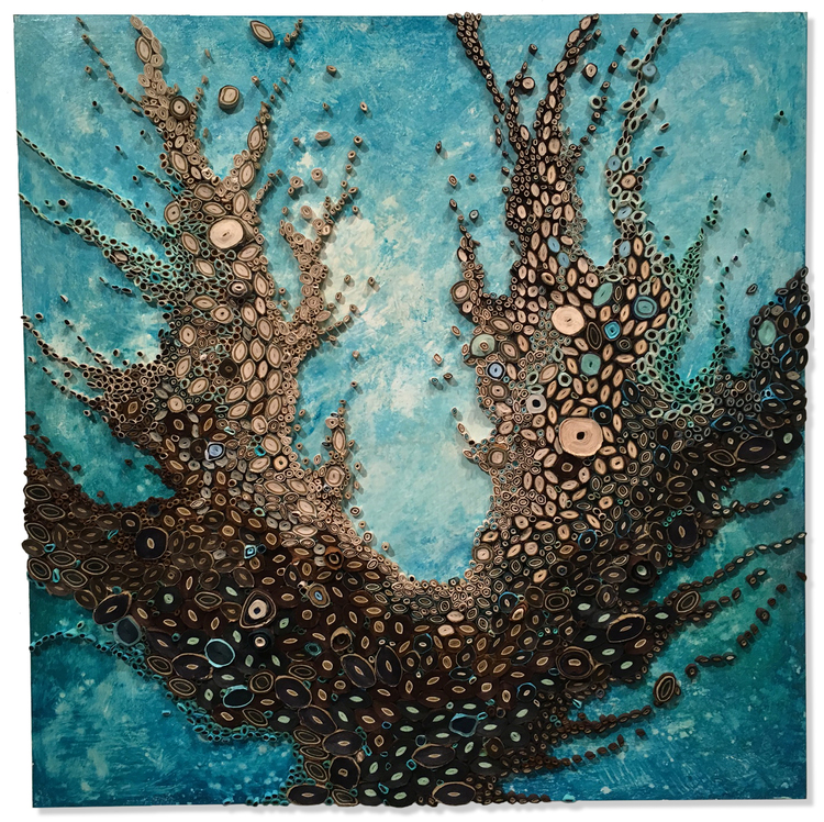 Big Celadon Roots, 30"x 30"x 1.5"
How did you become involved with paper?
I found my way to my medium while studying for my MFA at RISD. My plan was to become a graphic design professor, but I took a detour after taking a paper-making class. After graduation, I kept playing around with paper and making all kinds of sculptural forms. I wasn’t able to make my own paper anymore, but found lots of options available from all over the world. When I discovered the layered, circular form, I loved how I could use this one simple module to create worlds of compositions.
Where did you do your training and how well did it prepare you?
I trained as a graphic designer at the Rhode Island School of Design. It helped me to have a critical eye, how to talk about my work, and how to push myself beyond my comfort level. I was taught to take risks with my work.
Are you able to work on very large pieces or does your studio restrict you to size or are there other restrictions?
The largest piece I am able to construct in my studio is about 5' x 6'. Other than that, I either work in my living room, or rent studio space. When I was working on a 15'h x 10'h commission for the Nemours DuPont Hospital for Children in Wilmington, DE, I built the piece in a rented studio for 6 months. Even with that piece, it had to be constructed in panels. It was essentially a giant jigsaw puzzle that came together on my studio floor in Connecticut, then adhered to the wall in Delaware.
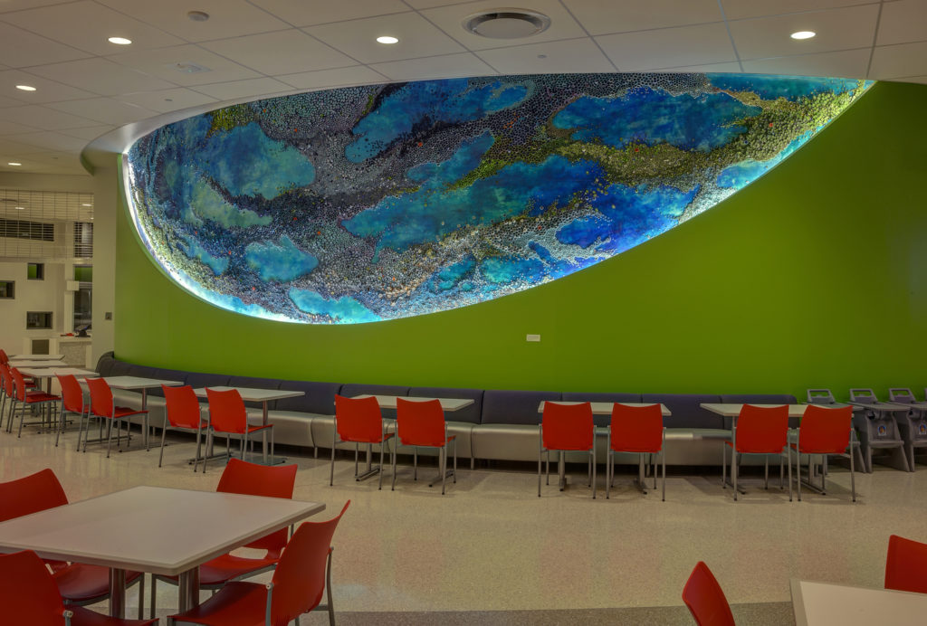 Flow, Nemours Du Pont Children's Hopital, 45' x 10'
How high can you build up the layers in your work?
I can build them up to about 12'. However, I am interested in doing more sculptural work that transcends the limitations of a flat substrate.
 Blue - Detail
Do you have recommendations for the preservation of your very fragile work?
The work is not as fragile as one might think. I layer the paper with several layers of varnish. This protects the paper from fading. It also hardens the paper into a solid. It is then easy to clean. The pieces are very strongly attached to their surface. Some of the pieces (usually the ones built on Masonite board) are framed. I use conservation glass on the frames to provide further protection.
 Lochness Landslide, 12" x 36"x 2", Paper and Acrylic on Masonite Board
Colour is very important in our work how do you achieve the colour?
Colour is definitely a main character in my work. It can illicit so many emotions. It can be vibrant or quiet. I will never get bored of playing with colour. Endless possibilities.
Can you expand on the tiniest additions of colour that you use to complete a piece? (a tiny bit of orange)
I always like there to be some kind of surprise in my work. This pop of unexpected colour usually does the trick. I want a viewer to keep searching the paper for many different colours stuck in the piece.
 Tanzanite Ruby, 18" x 18"x 2", Paper and Acrylic on Masonite Board
What type of paper / papers do you use?
I primarily use dyed Mulberry paper. I also use a lot of Japanese rice papers. I have papers from all over the world.
Titles are very personal but also very provoking. Which comes first the title or the work?
The work comes first. The final piece inspires the title. Sometimes my family helps me name my work.
Aqua Moon Series, 20"x 20"x 3"
Many of your most recent works are aquatic – discuss?
My favourite place in the world is next to the ocean. It is where I am at ease. I think the different colours of water are spectacular. I love the palette of the beach. It just feels good.
You are currently exhibition at Bergdorf Goodman. Expand in the importance of being within this prestigious space.
It was exciting to show at Bergdorf Goodman. They have an international clientele. Some of the work ended up travelling to other countries to their new homes. As one of the salespeople said to me, “shoppers always come to Bergdorf Goodman either first or last on their trips. They always come. We have the best stuff”.
 South Beach Sweep, 18" x 18"x 2", Paper and Acrylic on Masonite Board
Can you take us through a quick progression of your work since before 2009 to 2016 using 5 of your favourite or works that have propelled your career?
The work is constantly evolving. I started out doing neutral, graphic work, such as “Black and White Squares” 2009.
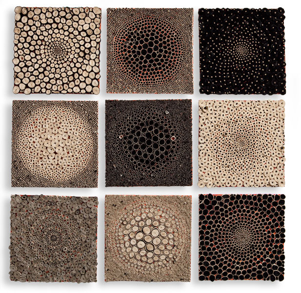
Black and White Squares, 18"x 18"x 1"
I was able to work with contrast and shape with these pieces. “Waterfall” 2009 was the first piece that set me off in my continuing aquatic themed work. Looking back, I can see that there are lots of spaces between the circles (I like them nice and condensed now). It also doesn't have the same level of size contrast of the papers. Also, it's more uniform colour-wise. Not as much variation with lights and darks. “I Pledge My Allegiance to the Circle” 2011 was an interesting piece for me.
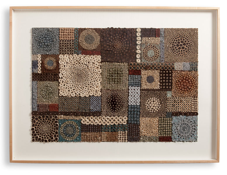
'I Pledge My Allegiance to the Circle' 2011
I was work became much more organic. I was also working with a lot of intense, vibrant colour. In 2012, “Float” was received with a lot of praise. It was this piece that really set off my aquatic work. It's my favourite colours. I always default to the aquatic turquoise colours. The most difficult challenge I've had work-wise was the installation “Flow”, 2014 at the Nemours DuPont Children's Hospital. It was much larger than anything I'd ever created. I had to figure out how to fabricate the work structurally, and how to make my teeny tiny paper pieces make a statement over that large space. It was pretty amazing to see it installed.
How do you feel paper art has developed within the art world over these years?
Paper art has definitely gained popularity as an art form. There have been paper shows all over the world. There are also several new publications featuring paper arts. However, I have not seen any work that is similar to mine. I am greatly inspired by the work of contemporary paper artists.
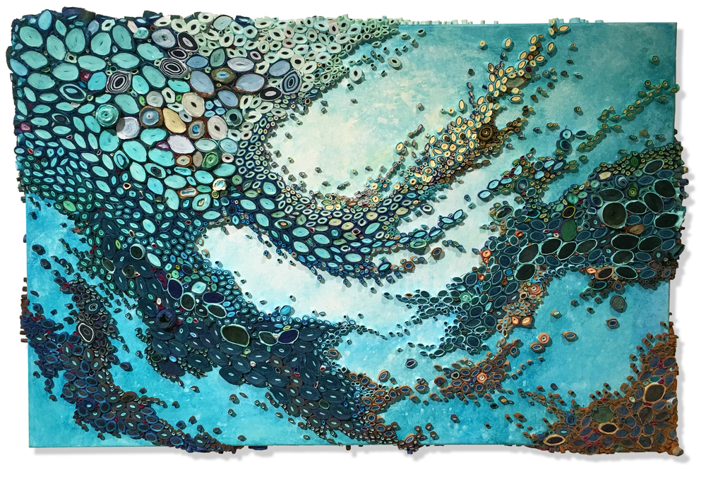 Pause, 24"x 36"x 3", Paper and acrylic on canvas
Contact details
Amy Genser
www.amygenser.com
amy@amygenser.com
Amy Genser, Connecticut, USA
Interview by Deborah Blakeley, December, 2016
John K Brown
Can you give a short timeline as to how you became involved in sculpture using salvaged materials?
I’ve always wanted to be an artist. As a child I used my imagination for entertainment. I drew, painted and made things, nothing made me quite so happy.

Frogs 6" x 5" x 3"
At school I loved showing-off my skill at drawing – it gave me a huge thrill to see peoples disbelief at what I could do.
I went to college, initially specialising in illustration and later going on a degree course in Fine Art Painting. After “dropping-out” from that course I got a bit disillusioned with the industry and moved away from it.
I tried sticking at numerous different jobs which I thought might satisfy my creative impulse, such as prop-making, decorating, working in antiques auctioning as well as many others before eventually “dropping-out” again and living in the woods for two years in a tipi. There I found a new connection with nature, a fascination with the cycle of growth/deterioration and had a magical restructuring of my values.
I then moved to Wales and worked on the land. My mum talked me into attending college once more where I studied sculpture and learned welding.
A few years into the course, my younger brother died very suddenly. A little over 2 years later my mother died also. I was already struggling to stay with the course when my son was born.
I “dropped-out” again.
I went back to felling trees with a chainsaw (now supporting a family) and made carvings on the stumps for extra money. With some of this money I bought a crappy welder from a yard sale and started making small sculptures for presents and my own amusement.
I started sharing pictures of my work with my friends on social media and the whole thing has spiralled from there.
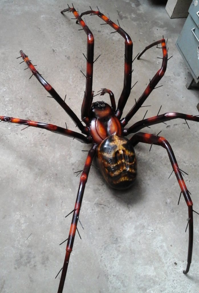
Cave Spider 8' x 5' x 2'
On one of the average pieces how many parts make up a whole?
Some of the smaller sculptures can incorporate as little as 11 parts, the biggest sculptures must have several hundreds.
What are your smallest sculptures?
I have welded butterflies that are life size and I also have welded grasshopper sculptures that are 3 inches long (including the antennae).
 Does the size of the work indicate the size in real life?
No, not at all, scale is a facet of the design that I really enjoy playing with. If the proportions of a piece are correct then it can be really difficult to tell from a photo what size a piece is – I’ve found that even first hand it can mess with the viewers perspective and sense of relative scale, this makes me feel like I have done my job.
Expand on the influence the Land Art movement has had on your work?
As an energetic and boisterous child growing up in the county of Wiltshire I had a passion for the landscape - being out in it, being part of it. The (natural) landscape, for me, represented escape from repressive human situations, freedom to move and think. I was always drawn to being outside and working with a connection to the natural world just feels like a progression to that.
When I first discovered artists such as Andy Goldsworthy and David Nash I felt an instinctive connection with their practices. Here were artists that had abandoned the studio and the gallery to use the landscape as their exhibition space. They were taking human notions of formality and transposing it onto natural spaces. There seemed to me something much more authentic about making art out of ones surroundings.
When I moved to Wales in 2006 it was because I wanted to live in a more remote place than I had known previously. I also saw it as an opportunity to start making pieces of land art for myself – I learned about green woodworking, basketry, timber –framing, woodcarving, anything I could. I earned money hedge-laying, thinning trees and landscaping by hand. In my spare time I walked, photographing and collecting interesting “objet d’art”, wood forms and rusted metal - fragments of machines and agricultural waste left to rot in the woods and on the beaches.
I started a sculpture course at Carmarthen School of Art and I naturally drew on these experiences and objects that had inspired me. This time I wanted to bring the authenticity I had encountered, which represented the cycle of growth deterioration, back to the studio, back to the gallery.
Discuss ‘Peacock Butterfly (chainsaw Butterfly) and Green Hairstreak Butterfly.
I have made Peacock Butterflies in a variety of different sizes. I have made several whose wingtips stand about 20 inches tall. So far this design is the largest.
The abdomen was made from (scrap) flat bar which was cold-beaten into rings that were then welded together. The tip of the abdomen is a sea-worn bolt (from the local sea defences that were replaced quite recently). The legs, antennae and proboscis were all made from a mixture of bolts, round bar and heavily threaded screws.
One of the main features of this piece was the fur around its thorax which I simulated using closely grouped rows of chainsaw chain. The undulating teeth gave it a “fluffy” appearance. I also enjoyed the contrast of this aggressive, industrial material with a subject that appears so fragile and serene. The other main focal point was the wings that were made from rusted-through wheelbarrow buckets, beaten flat and then painted with oil paints. This really embodies a process that is core in my work – taking rotten useless matter and by reframing, elevating it to a state of beauty.
The Green Hairstreak sculpture was made as a commission for someone who loved the Holly Blue Butterfly sculpture but was keen to have a green version. I am open to the input of others, but I was adamant that it should be an actual species. I looked at native British butterflies – of which, very few are green. This is what we decided on.
The abdomen, thorax, head, legs and antennae are a mixture of small pieces of scrap steel such as: nuts, bolts, nails, screws and ball-bearings. The legs and antennae of this species are quite stripey, so these were painted using rust-resistant paint.
The wings are made from a car panel from the scrap yard. I really like the notion that materials like these have an entire other history before their incorporation.
How accurate are you in the sculpting of your insects, bugs and butterflies?
Well, I try to be as accurate as I can be, within the context of the actual piece. With some pieces the finish or painting may be more important than the surface texture or other physical details.
Scale puts a restriction on detail. I made a horse that stood 10inches at the shoulder and so I specifically used pieces of metal that already had texture or shape to describe some of the detail. On the other hand I recently made a spider that has an 8ft leg span and I was able to weld the hairs on its legs using a load of 3 inch nails I got from a skip.
You also use oil paint on your work, explain when and why?
I love painting, after drawing it’s probably my strongest suit. I studied Fine Art Painting at Cheltenham College and I also worked (briefly) as an assistant to the mural painter Rodney Booth-Jones RA and for a time as prop-maker too, so I try and work it in where I can. I use it to embellish my sculptures with pattern and colours that would be impossible to achieve using just scrap. Sometimes I use colour as a contrast to the rusted surface of other components, sometimes it becomes the focal point of a piece.
Butterflies 9" x 6" x 9"
Painting gives me a broader range of possibilities as well as fulfilling something from within.
Can you discuss the iridescent colour on your ‘Praying Mantis’ and how this is achieved?
When stainless steel is heated by welding, the metal nearest the heat can change from being mirrored to a range of different iridescent hues. This depends on a number of highly variable factors but is mostly governed by temperature. The mirror finish of the stainless steel in this piece also reflects any colours around it. So the praying mantis sculpture changes colour with its surroundings in a chameleon-like way.
Praying Mantis 12" x 5.5" x 16"
Expand on your animals.
Horses
I have had a huge interest in horses since I was a child. Wiltshire and the surrounding counties are well known for horse breeding and racing. Horses were around a lot, so I think they have registered strongly in my unconscious. The area also has numerous “White Horses” – enormous horse effigies carved into chalk hills, some of which date back to the Iron Age. These incredible creatures have held special significance for so long, that for me they are irresistible as a subject and as a metaphor.
'Graze' 29" x 10" x 28"
In 2014 I made a small horse sculpture called ‘Poohka’ which was based on a character from Celtic mythology, a shape-shifter which favoured the form of a black horse. A benevolent spirit which could be even helpful to people, it was said to be capable of exacting terrifying vengeance upon farmers who took too much from nature.
I revisited the subject in 2015 when I made ‘Graze’ a thoroughbred racehorse made from scrap cutlery, and other scrap stainless steel including pans, knives and abattoir chainmail – all various objects and materials which might have been used to dismantle and fragment the horses which (notoriously) ended up in the human food chain here.
Dogs
Much like horses, dogs of all the domestic animals have one of the closest relationships with humans and their proximity is reflected by their place in our culture.
One thing that constantly intrigues me about dogs is that, despite many similarities, (many superimposed) is how intrinsically different their existential experience must be.
'Run' - life-sized whippet sculpture made from vintage bicycles
This year I made a sculpture called ‘run’ which is a running dog made from old bicycle parts. It represents a creature in the prime of its life: focused, alert – ready to hit top speed at any moment. The subject contrasts with the material – old redundant bicycles, which could be made to work again, but are considered worthless by the ever- expanding, modern, human world.
How important is location for your work?
Storage of materials
Inspiration
Suitable site for a studio
This location is everything to my work at the moment.
Wales is more wild, more remote and rugged than much of England, including where I grew up. Much of the land is undeveloped and too steep to farm, so to a degree protected and in turn, a habitat. The wildlife inspires me and the natural spaces facilitate a calm, creative mind. Scrap metal seems to be easy to acquire – although health and safety regulations prevent me from getting anything from the tip - which is madness in my opinion!
Storage of materials can be quite tricky due to having little space to do so and I work from a pile of materials that I think most people would think was impossibly small.

Adder - 38" x 22" x 8"
My studio is close to our home, which is great because I can spend the maximum amount of time with my partner and our son. This is a real bonus when I’m spending as much as 35-40 hours a week grinding and welding.
Birds – you don’t restrict yourself to native birds, of Britain, e.g. ‘Magpie’ discuss?
I won’t restrict myself to native birds, although I think that is all I’ve made so far. Some birds that people think of as intrinsically British actually have really global distribution such as the Kingfisher and the Magpie (yes we do have them here!) - although several American followers on social media have called the sculpture a “Bluejay”.
Kingfisher - made with scrap metal fragments (detail).
Many creatures such as birds and butterflies transcend political/national borders and are loved and recognised by people of many nations. This has become a theme in some of my recent work.
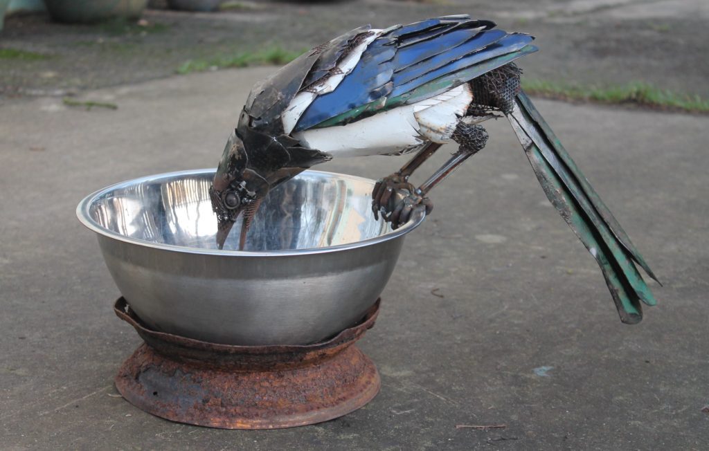
Magpie 20" x 10" x 14"
Do you do commissions? If so what are your boundaries?
I do presently undertake commissions, but I have to like/be inspired by the idea.
What are you currently working on?
I have a commission list that is as long as my arm (it’s nice to be popular!). I presently have a large piece of sculpture called ‘Swarm’ in Windsor Great Park in London.
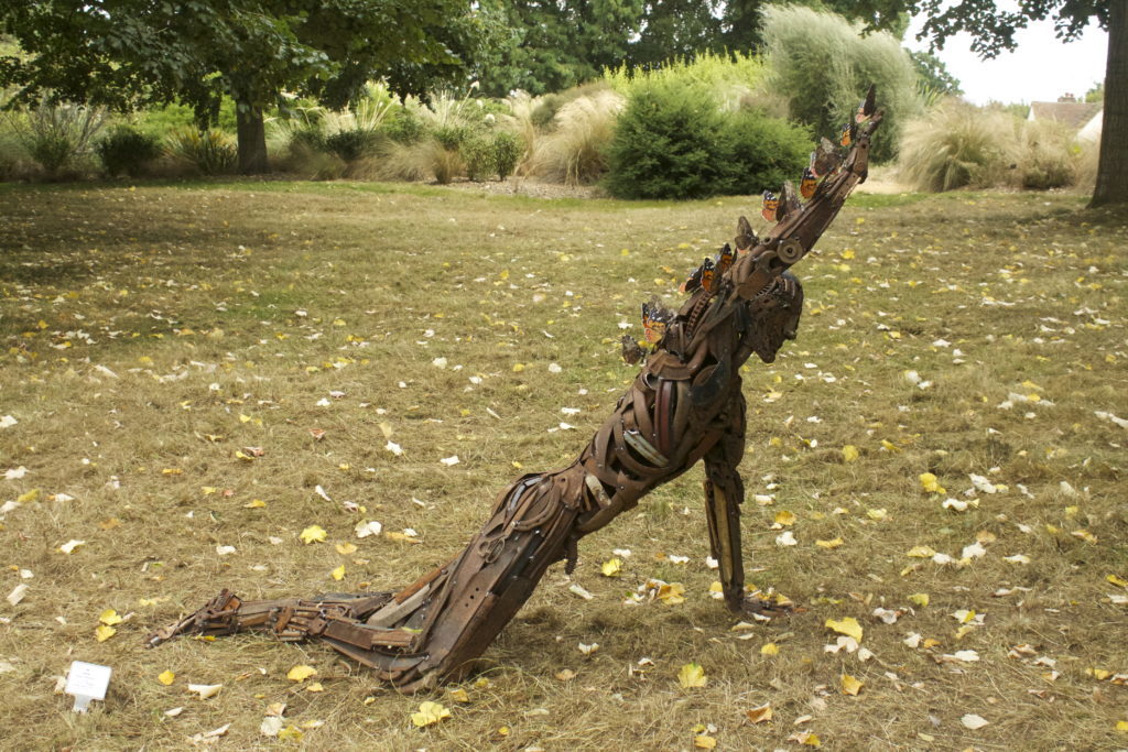
Swarm - 6ft x 1ft x 5ft (currently exhibited in Windsor Great Park)
I am also very pleased to part of a select group of artists from around the world exhibiting at Oil Gallery in Hungerford, Berkshire (UK) and this is giving me a chance to make some really quite special pieces of sculpture like ‘Graze’.
I am also currently discussing the possibility of a solo show next year.
Contact details:
John K Brown
Interview by Deborah Blakeley, December, 2016
Melissa Jay Craig
You make your own paper – what are the sources of your base materials?
More and more, the fibres I use are ones I harvest from my small yard, friend's gardens, Chicago's alleys or with permission from nearby nature preserves. Sometimes I make paper pulp with the harvest, and sometimes I use the fibre directly. When I need to buy fibre from papermakers’ suppliers, it is because I haven't (yet) found a local fibre that matches certain qualities I need, like the high shrinkage, translucency and toughness you can get by over beating Philipine abaca. I also purchase large sheets of Korean Hanji paper because I don't have a way to make that incredible material myself.
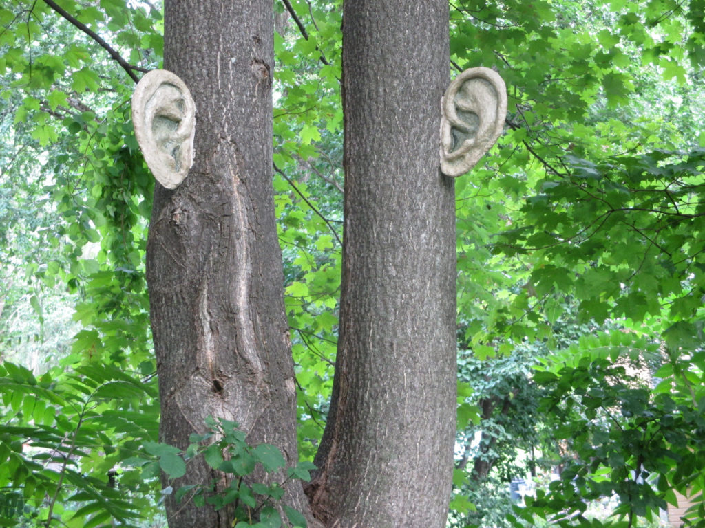 Can you give briefly the technique you use?
I'm not sure how to answer that because I use so many different techniques, often employing! Several in the same piece. I use whatever the particular work dictates, whether it's harvesting and processing local fibre, making a thousand (or just three) sheets of paper, or building special equipment or single-use armatures. I am always learning or devising new techniques as well.
‘Fungus is the agent of change’ comment on this statement.
One of the functions of fungi is aiding in decomposition, in breaking down defunct organisms, directly changing the environment by cleaning up, clearing away, making room for a new system or life-cycle. Recent research shows that networks of mycelium also function as communication devices for trees, passing along vital information as a sort-of fungal internet, affecting change in a subtler fashion.
Can you expand on (S) Edition 99?
The title
The title is an edition that is also seditious in a sense, by challenging some of the assumptions of what an edition of books might be. Books - and paper pamphlets - are also the traditional ways that seditious ideas were once disseminated, small things that toppled governments and rearranged social order.
Why the large installation size?
When the edition is exhibited in its installation form, I want to suggest the seditious gathering of the title. That required a large number of copies. I remembered a quote by Clive Philpott, “Artists’ books are not artists’ books unless they are in an edition of at least one hundred.” So, I decided to make 99.
What is within the content of each mushroom?
Only the implied suggestion of spores. (The connection with books!)
What made you choose Amanita Muscaria mushrooms?
When I was a child, the first time I had the intriguing feeling that the planet carried secret messages (texts, if you will), was when I came upon a group of Amanita Muscaria, huddled together in a dark, secret space under tall pines. Amanita Muscaria, also known as Fly Agaric, is a fungus that can be found almost worldwide. It is distinctive, clownish in appearance, the ‘toadstool’ of familiar fairy tale illustrations; a literary fungus.
But it has its dark side as well: Amanita Muscaria is psychoactive, and is sometimes thought to be the source of the ancient shamanistic drug of knowledge, Soma. Reportedly, it is still in use as a ritual sacrament in certain Siberian tribes, and its use has been mythically linked to many ancient religions, including Christianity. Most shamanistic spiritual beliefs embody what would today be called an environmentalist viewpoint; they are also mystical, and embrace and honour intuitive acumen.
‘We are always reading’ expand on this comment.
We’re taking in, processing and responding to information everywhere, constantly. Reading doesn’t just occur when we’re sitting and staring at a printed page or backlit screen. We’re reading each other’s faces, postures, and body language. If you can hear, you’re reading the tone of voice. We all make judgments and decisions based on those things, often much more than on the words spoken. Likewise, we “read the room,” the mood of a crowd. We read the weather. To me, our intuitive reading abilities are the most intriguing aspects of our intelligence. They fascinate me.
Discuss the importance of written work to a person with a hearing impairment. Using Manifest O, to explain.
Text can offer clarity to someone whose hearing has been lost, provided that person is accustomed to spoken / written language. For instance, I can’t watch films, videos or television programs unless they are captioned. However, this is not true for all deaf people.
Sign language can be very much clearer than text to someone who was born Deaf, or whose early exposure is to visually based language. I’m someone who was born and raised in the hearing world; my deafness came after I had acquired spoken and written language. In Manifest, O, I tried to present my own experience of hearing loss by contrasting that with the expectations you might have of reading a conventional book. When you page through Manifest, O, you see that holes have replaced the letterforms; the words have all dropped from its pages. The paper feels fragile, cockled and wrinkled. Its colours are dull and muddy, with shifting patterns of intensity that don’t resolve into anything. As you turn the pages, you can see the drawings of mouths appear mistily through the translucent paper; portions also show through the text holes. You come to a page with a mouth making its speech shape, which repeats slightly altered on the back of the page, then disappears. You wade through more confusion, searching for the next drawing, the next hint. It’s quite frustrating to someone who expects to be following a conventional linear narrative. That’s how I hear: reading lips through a dull haze of indistinct, mostly meaningless sound.
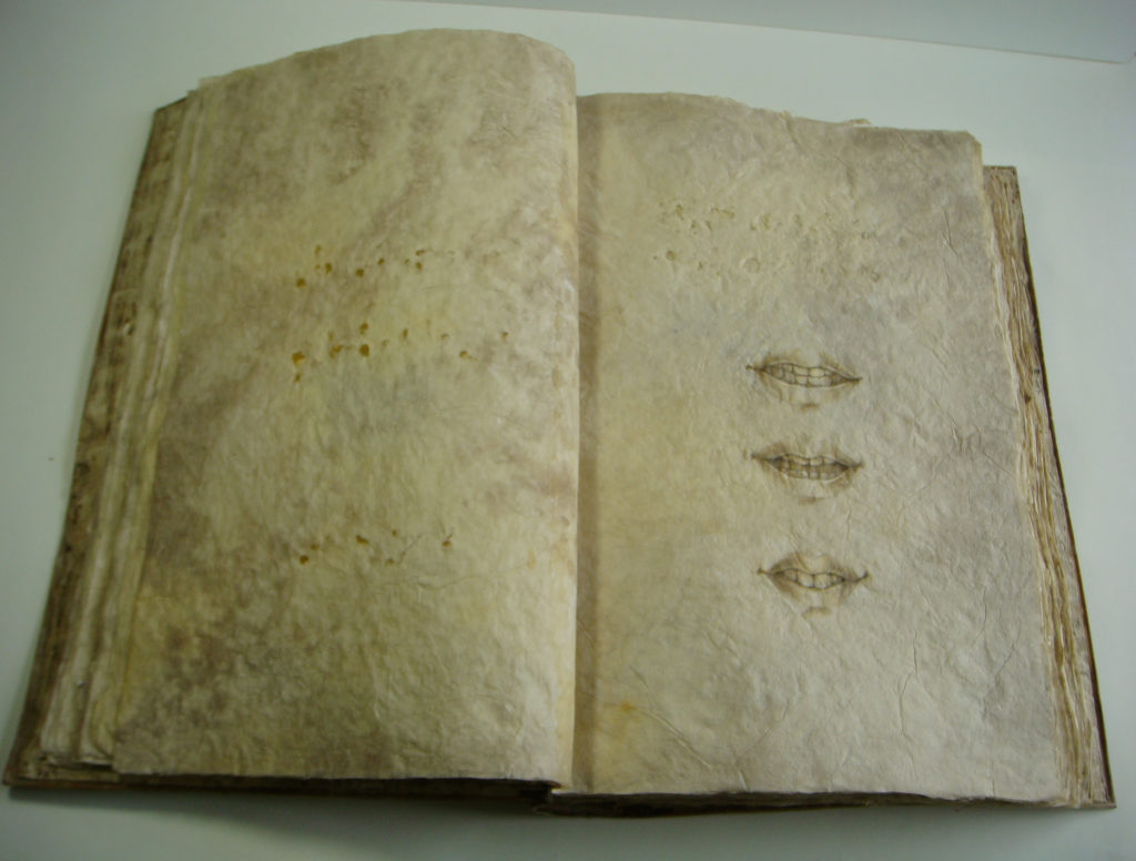 Can you tell about your involvement with Columbia College, Chicago?
I was involved with the Centre for Book and Paper Arts very early on, at an exciting time in its creation, and I also helped to develop the MFA in Interdisciplinary Book and Paper Arts degree program. I worked and taught there for fifteen years. I have taught at many other fine schools and arts centres as well. Though I do a lot less teaching now, it still remains a vital exchange to me, something that seems to be a natural extension of my own work.
Do you use the words on the paper you use?
Almost never, by choice, so that my work reflects my own movement through the world.
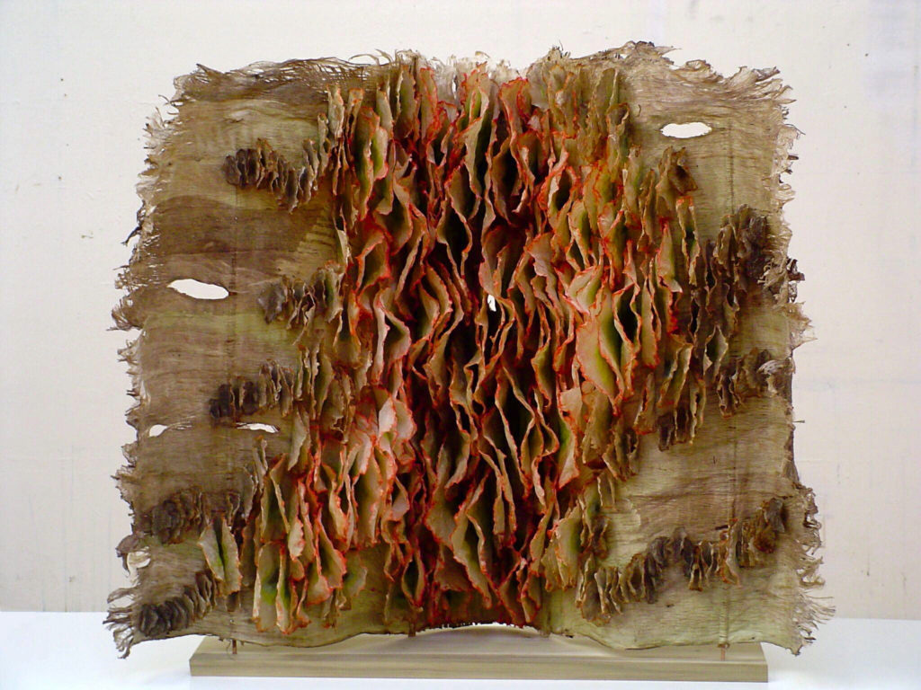 Discuss the importance of Installations in your work.
Installation has always been at the heart of my work. Even in the early days when I began making individual altered books, they all eventually gathered together into one large installation titled Library. I tend to think in visual, environmental and spacial terms. I even think of individual book works as being complete environments; you willingly walk into an installation, ready to read the elements you see there; you do the same when you open a book’s cover.
Perhaps I think this way because I derive my inspiration from complete environments. Lately I've been very pleased to be taking my work out into the landscape with the Monitors project and a few other experiments.
Contact details.
www.melissajaycraig.com
Melissa Jay Craig, Chicago, USA
Interview by Deborah Blakeley, November, 2016
Nick Chase
You bring both urban and natural landscapes to your glass work – discuss the technique you use?
Take ‘Street View’
Where is the street?
The Image on “Street View” is downtown Toronto at one of the busier intersections. At this point in my career, the city was still a very foreign thing to me so I looked for inspiration everywhere I could.
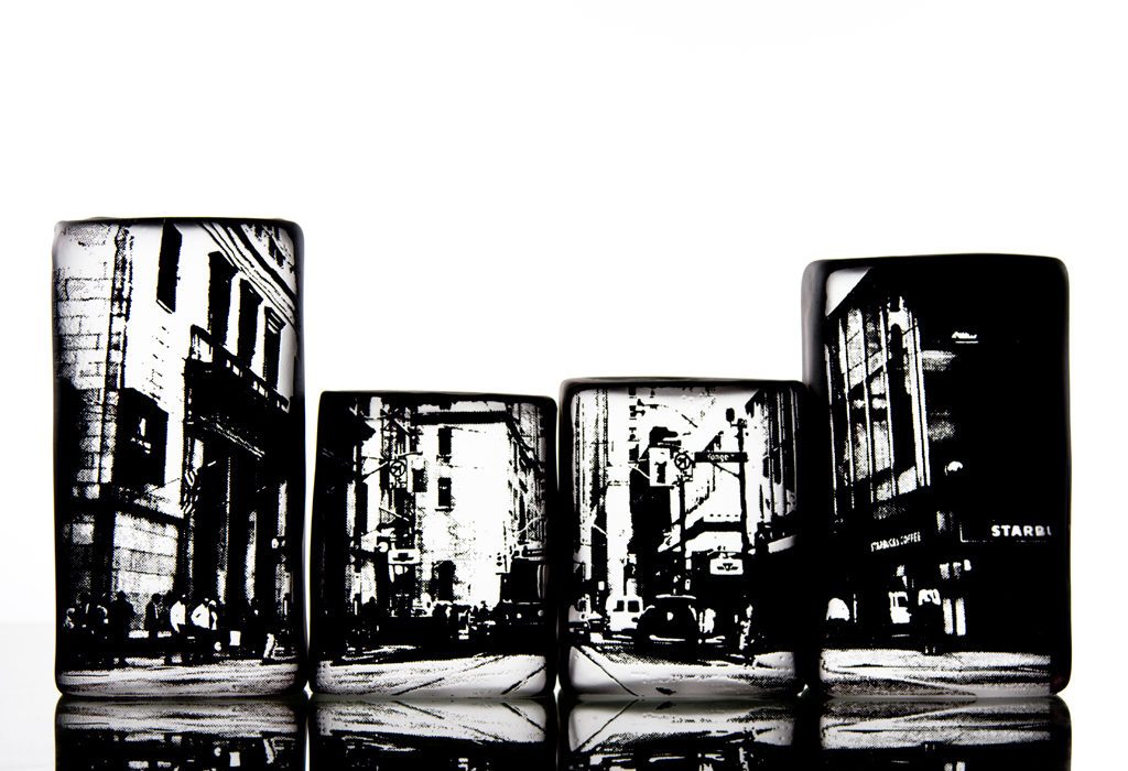 Photobox, Street
Discuss the size of the blocks.
Each block is 3.5” wide and between 6 and 8” high. I have a wooden mould that I blow in to finish the shape.
Why do you have varied sized blocks?
The blocks vary in height to represent the high-rises that surrounded me in downtown Toronto. The images on the blocks were photos that I had taken that spoke to me in one way or another.
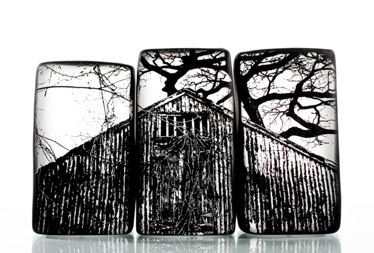
Photobox, Barn
Discuss how you use your photography.
The summer before I began college in Oakville, Ontario for Crafts and Design, I acquired a little point and shoot, digital Camera. Up until this time, I really had no interest in photography at all. That summer, I had that camera with me everywhere I went and it eventually became an extension of me. I always kept photography and glass blowing very separate. I would use the camera to record inspiration and glass to execute a final product based on colours and textures from these photos. During my residency at Harbourfront Centre, I began exploring the potential of photography and photoresist in my work. I began with my “leaf Vessel” series. Using macro photographs of leaf skeletons and transferring them on to the pieces as texture and pattern.
My photo box series is where I started using old photos that I had taken and transferred them onto the glass blown blocks. I wanted to use the boxes as a type of frame for the photos, using the transparency of the glass and breathing a different sort of life in to the image.
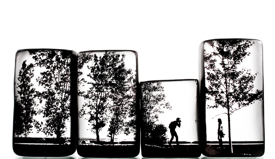 Photobox, Photographer
‘Photographer’ is this you and how do you get the images.
This shot was taking during a casual afternoon near Lake Ontario. It was just a candid photo of a couple out taking photos.
What lead to your enrolment in this particular College?
I actually enrolled in the Crafts and Design Program as a woodworker. The plan was to eventually move back to the east coast with a trade that would easily carry over in to a viable job in New Brunswick. Glass Blowing was my minor in the program and although I had no idea how I was going to make this in to a career, there was no other option but do everything I could to do so. It’s a beautiful material and I’m certain that most glass blowers you meet will have a similar relationship with it.
What was one aspect of your time that has been of great value to your current career? (is many be a very small skill or a big one)
There’s no question that my residency at Harbourfront Centre has been the most influential on my career to date. The artist in residency program at Harbourfront Centre allows artists to explore and develop their craft without a massive overhead that is usually involved, especially as a glass blower.
Discuss the intricacy of the work in you ‘Lace Tumblers’.
Honestly, I wish I had a really meaningful answer for why I chose lace for the bottom of my Tumblers, but I really don’t. Since that design, I’ve added a few more that I found quite attractive. Lace, Branch, Leaf, Scale. Again, all of these textures are drawn from home but hopefully the buyer will have their own story behind why they like a certain design.
Lace Set
Why do you have the lace in the base? Exactly where is it in the glass?
The patterns are sandblasted on to the bottom of the cups so you can feel the texture when they’re sitting in your hand. It’s quite comforting.
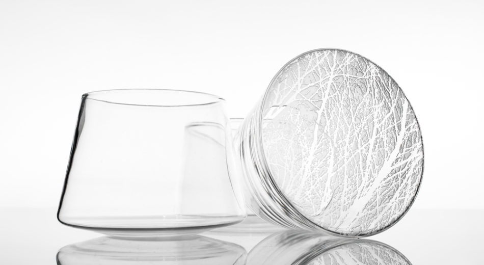 Stick Set
How influenced are you by the seasons and colour in your work?
When I look for inspiration, it’s in the muddy marshes, the abandoned farmhouses, lakes of granite, endless sandbars when the tide is low and yes, of course the colours of the seasons. The pieces that shows this the most are my leaf vessels. The deep blues, and reds represent mostly the change.
Discuss the importance in shape in your work.
I find that I am influenced by so many other forms of craft other than glass work. I’ve always been very drawn to the beautiful qualities that glass offers, but I have always wanted to push the material outside of its organic box and focus more on straight lines and sturdy shapes.
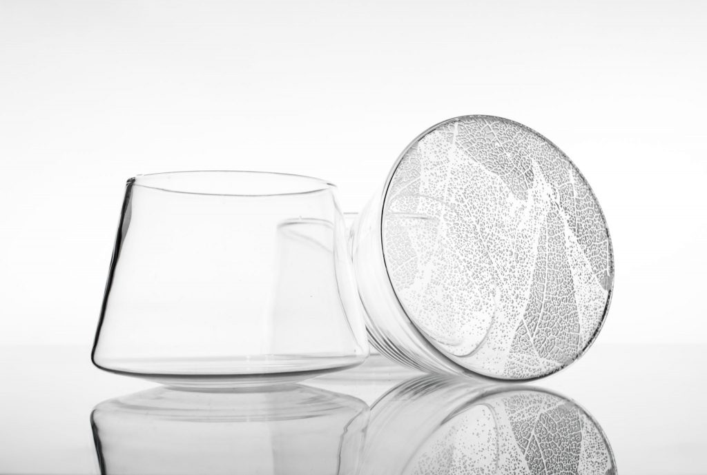 Leaf Set
Your ‘Bioa’ vessels are exclusive to Jeff Goodman Studio; can you expand on have a particular series with one supplier?
I’ve worked for Jeff Goodman Studio for over ten years now. As one of the designers at the studio, we each have a line of work that represents us as artists. We chose the Bioa because the form had a bit of my signature on it. You can also find my tumblers at Jeff Goodman Studio.
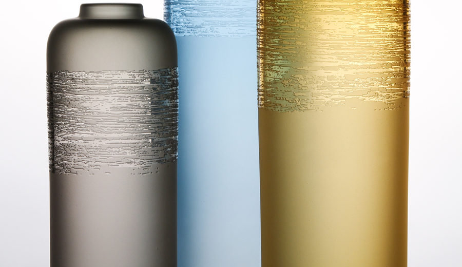 Bioa
Bioa
Explain about your collaboration with John Booth - How you know each other, How you came to work together?
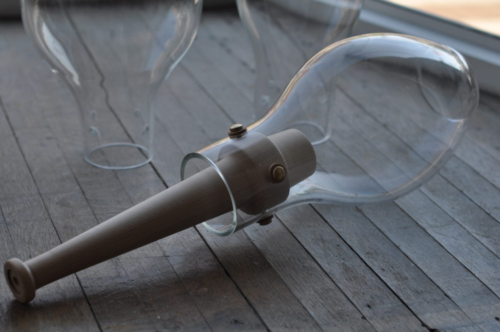
John Booth and I have done work together for a number of years now. He’s a really free spirit and also very a very technical and super talented designer. John has a very natural view of how the glass and wood should work together. Up until this point, I would always add colour and texture to the glass to try and reach a goal, where john strips it back and values the beauty of glass is it’s natural, clear state. I met John’s partner, Arrouna through Harbourfront Centre. She began carrying pieces of mine through there shop (Bookhou) and that’s where I met John.
John would come up with the design and I would make the glass. It’s a pretty easy relationship. I never question what he’s going to come up with. I’m a huge fan of whatever he makes.
Contact details
Nick Chase
info@nchasedesigns.ca
Nick Chase, Canada
Interview by Deborah Blakeley, November 2016
Marlene Kawalez
Can you discuss the way you are currently working using a combination two materials, glass and clay within one piece?
One of the most challenging issues working with the combination of glass and clay is determining the conceptual notion of what it is I wish to create. I feel that every piece must tell a story, express an idea or touch the viewer. It cannot be an empty vessel with no content or substance.
For most of my sculptures I draw from my own life experiences or from those I am fortunate enough to observe. Once I have found my intention, I aim to balance the two materials so they work together in expressing themselves through the concept. The clay, with its strong unyielding presence, represents the exterior or body of the sculpture. The glass, in reverse, embodies the inner voice or spirit of the piece. The contradicting qualities of these two materials never cease to amaze and challenge my work.
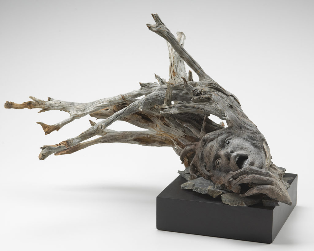
Demise
You are a member of the Ontario Clay and Glass Association can you expand on your own membership with this group and the importance of memberships to this and other associations.
I became a member of the Ontario Clay and Glass Association when I developed an interest in incorporating kiln casted glass with my sculptures. Within this organizations as well as others I have joined, there is such a vast reservoir of talented individuals that inspires me. Many of the memberships I have offer educational opportunities, call for entries in shows, member’s gallery and an annual conference to meet other artists.
You often combine materials can you explain the combinations used in ‘Flying’?
One of my earlier pieces was that of a young child full of joy and
wonderment. She had been sculpted out of raku clay than given a bronze patina. Monarch butterflies, which are very precious to me, became a part of this piece to emphasize sheer freedom. To bring more color and contrast to the sculpture, the butterflies were tinted with a bright orange and strategically placed around her.
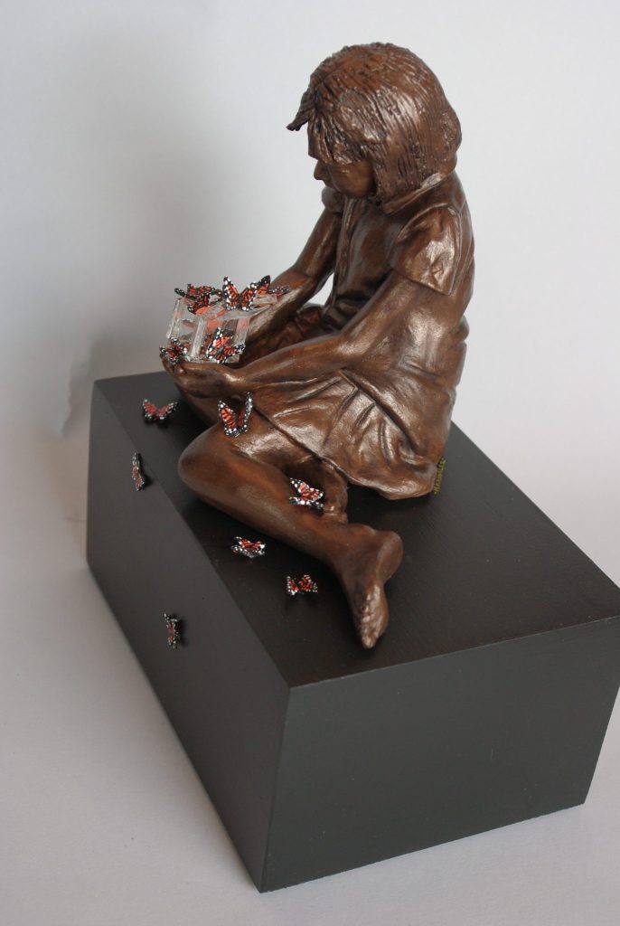
Flying
Expand on your artistic development in relationship to you work.
In the early part of my career my emphasis was dedicated to capturing the human form. I attended various workshops and used live models whenever possible. It was only when I felt comfortable sculpting the physical body did my attention resort to capturing the spiritual essence in my work. With the wisdom and assistance I received from internationally and local sculptors, I learned various finishing techniques that I presently use. Smoke, saggar and raku became a few of my chosen favorites.
With changes in my life and my personal directions,there became need to alter the direction in my work. To reach deeper and to go be beyond the surface to what the heart and soul needed to convey. In order to achieve my personal aspirations, I needed to find another medium that could amalgamate with clay, yet be totally distinctive. It was the translucent, ethereal properties of glass that captured my interest and my heart.
There was such a dynamic diversities between the two that it was necessary to educate myself in all its unique properties. I attended several workshops in Canada and the US to further my understanding.
At present I am involved in creating a body of work that fully integrate both media.
‘Twilight’ is made using raku clay and mixed medium can you explain the techniques you have used in the making of this piece.
Twilight was the first in a series to be created with the use of an extruder. The process involves a block of clay placed within this devise and long one inch coils are extracted. The coils are wrapped together and the form slowly starts to emerge. Unlike previous sculptures, I start assembling the piece from the base and progress upward towards the face. Internal clay structures are attached to the sides of the piece as it grows in size for additional support and tiny vents are left open to prevent trapped air from occurring. Once the piece has slowly dried, anywhere from weeks to a months, the piece is placed in the kiln than fired. The final patina was achieved by firing it through a smoke technique.
‘I have been creating pieces that often explore themes of loss, longing, and the peeling away of exterior layers to reveal internal complexities’ discuss this statement in relationship to two of your pieces.
“Twilight” was born in a period of great loss and sadness. The overwhelming feeling of grief paralyzed her and she goes within herself to find some comfort and solitude. Similar to many, she has tried to suppress all that is buried beneath the layer of denial and pain only to find her tangled emotion raising to the surface.
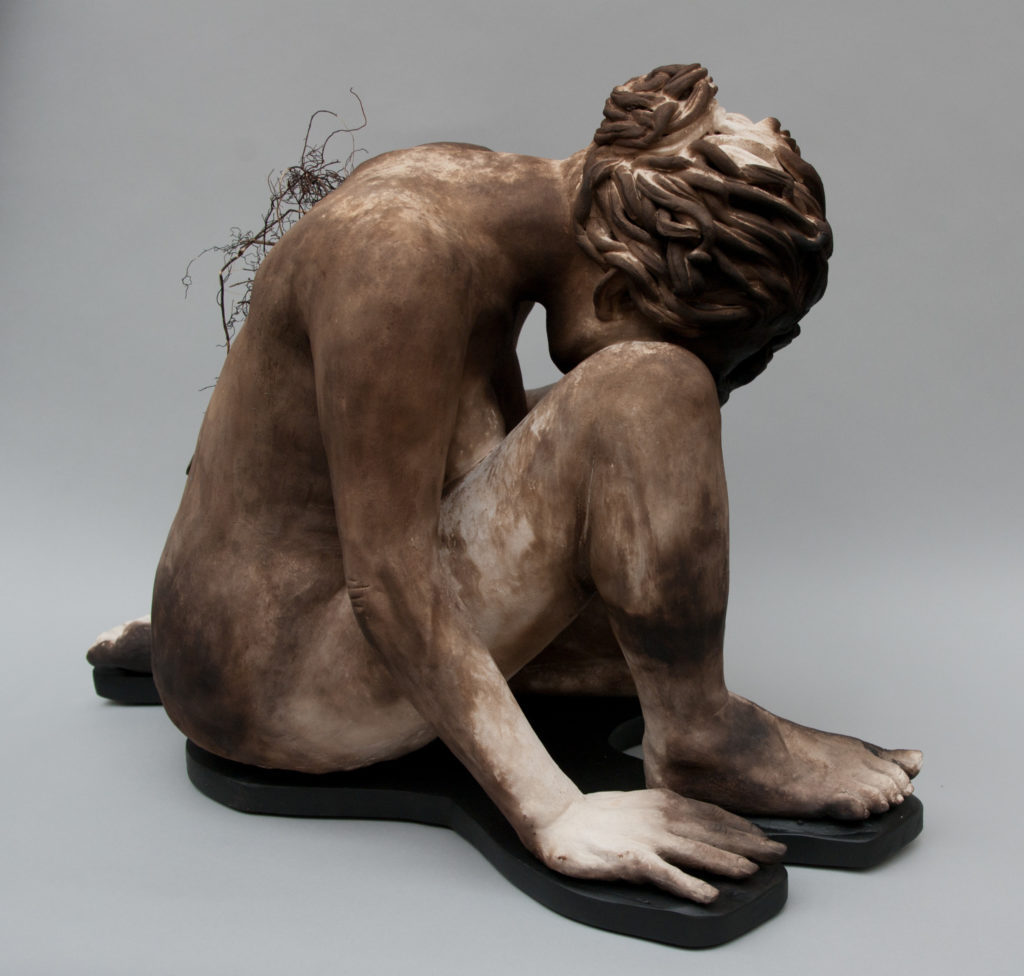
Twilight
“Cradled” The tiny fragile woman cradles herself seeking the comfort and love that is absent. She is filled with a empty loneliness and cannot find compassion only seclusion. Her eyes and heart have withered into hibernation and cease to feel the loving hands beneath her.
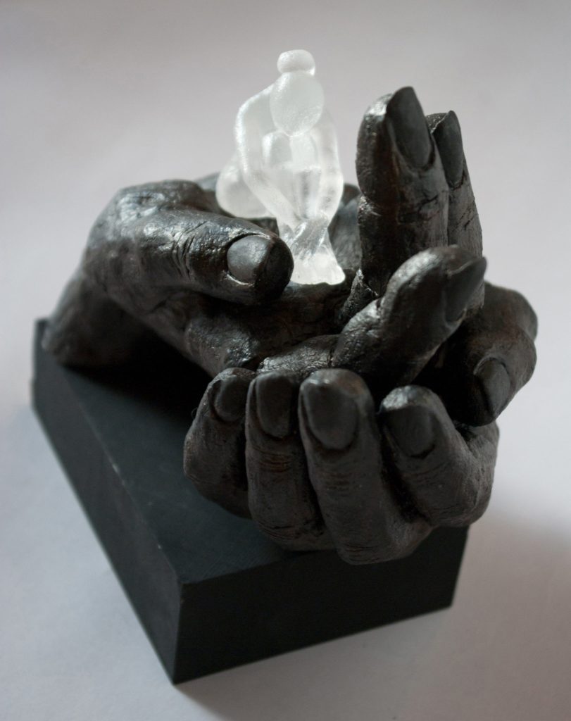
Cradled
Discuss; ‘Angel’
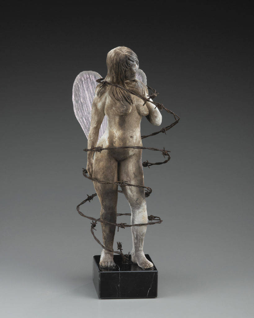
Size: Length 7” X Height 19” X Width 8”
Materials: Clay, kiln casted, glass,barb wire and granite
Inspiration: In the stillness of the cemetery a shroud of silence and lost secrets remain hidden by the simple historical church. It was once vibrant and alive with people and is now filled with the spiritual force of its past patrons.
Angel represents the guardian and keeper of these souls, standing in constant watch over them and forever bound to this place.
You have a full series ‘Ladies in Waiting’ discuss the series.
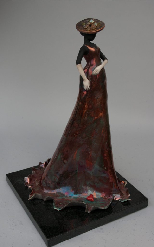
‘Ladies in Waiting’ was a series created for gallery shops. Each Lady was uniquely hand sculpted, resulting in one of a kind figurines. I created approximately 35 of these sculptures with the earlier ladies embellished with unique pieces of mixed media such as antique keys, barbwire, locks, hemp etc. Over time they evolved into a more tapered and nuanced form.
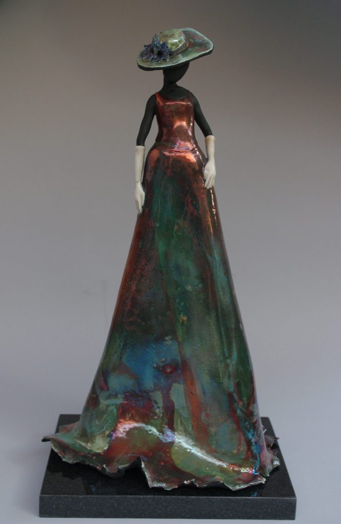
The earlier pieces were finished with glazes such as crackle, terra sigillata and crawl, however, I was soon inspired to use a more unique finish. The raku glaze created the most luminous spectrum of color that could not be replicated. The inspiration behind this series came from my fascination with simple gestures; how the tilt of the head or position of the hand, created a pervading tone and revealed a personal narrative.
Each Lady, unique in her appearance, had her own story to disclose.
You found wood to work with in ‘Uprooted’ where do you find your source material and how much to your store to future work.
In my nature series, I incorporated rocks, driftwood, moss, branches and many other elements into my work. Mother Nature was the best source for all of these elements. Throughout the countryside, forests and shores there is a bountiful supply waiting for that creative process. When I discover that wondrous rock or twisted piece of driftwood, I must have it. These treasures are stashed away in my studio for the next special project.
Uprooted
Discuss the importance of exhibitions to you and your work.
As an artist it is essential for me to exhibit my work. I enjoy sculpting and the invigoration of the creative process, but it is equally important to me to find an audience or that special person who can connect with my sculpture. It is those moments that inspire me.
Nailed
Tell about your studio and the specific needs you have for it to work for you.
Recently I have moved into a new studio with adequate room for 1 glass and 2 regular kilns. In addition, I was able to equip it with a sand blaster and drill press which has opened up new avenues for my artwork. However, in saying that, the most important features it possesses are the many windows and patio doors that offer natural light and a view of a thriving pond with all of nature’s creatures.
Contact details:
Marlene Kawalez
Email:
Marlene Kawalez, Ottawa, Canada
Interview by Deborah Blakeley, November, 2016
Steve Axford
You are known for your photographs of fungi, how did this come about?
By accident really. I had never been a photographer and I worked as, first a miner and then, for most of my working life, as a computer systems designer. I fell into photography in 2000, when on impulse, I bought an small, early model, Canon digital camera (1024x768 from memory). At about the same time I started travelling again. The instant feedback of digital photography was a revelation to me and I soon started upgrading my cameras until I bought a Canon 10D in late 2003, with a 1740mm Lens.
Since I loved bush walking it was inevitable that I would come across fungi, and, because I was intrigued, I started to photograph them. I then bought a Sigma 180mm macro lens that I could use for wildlife and for macro, with the 1740 for landscapes. I would take a general mix of photographs including landscape, wildlife (particularly birds) and macro of insects, plants and fungi.
White Throated Gerygone, Tara Ridge, Booyong
I was looking to get out of the computer industry, as it was becoming far too corporate for my liking, and several of my friends suggested I might take up professional photography. That sounded attractive, until I investigated it a bit and came to the conclusion that:
The pay would be terrible in comparison to the computer industry
I would probably have to take the photos that other people wanted me to take, rather than the photos I wanted to take.
Why give up a highly paid job I don’t like to take up a lowly paid job I don’t like?

I decided to just retire and make do with what I had. I continued with my photography and moved from Melbourne to NE NSW. Since there seemed to be no reports of fungi up here, I assumed there were none. I was very wrong in that assumption. The Northern Rivers and particularly the Big Scrub, is one of those places that could be considered a “hot spot” for fungi. I was in my element. I bought a small property near Booyong and continued with my hobby, to which I added rainforest regeneration.
In 2012, I got an email from an American blog called Thisiscolossal which calls itself an Art, design and visual culture blog. They asked if they could feature some of my fungi photographs. I didn’t give it much though but said yes as I was always happy for people to see my photos. Apparently they are followed by lots of magazines worldwide as from that point on I started to get dozens of requests to use my fungi photos in magazines. Thisiscolossal have now featured my fungi 3 times and each time there is a flourish of activity.
Also in 2012, my partner Catherine, suggested that we try some timelapse. Our first effort was clouds over Mt Warning, which proved to be remarkably successful. We then had the idea that the local luminous fungi might be an interesting candidate for time lapse. I, fortunately, had a spare shower which I set up as a darkroom and put some luminous fungi and a camera in it. The results, while not perfect, were spectacular enough to persist. I moved my studio from the shower, which could not have survived in the long run, to an old shed. I insulated and light proofed it and started taking time lapse of both luminous and nonluminous fungi.
![]()
At about this time, someone from the BBC had sent me an email on luminous fungi (I think they had seen one of my photos).They asked for information so they could film them. I ignored this for a while as we had an idea of doing a film ourselves, but our film seemed too difficult so I contacted them and showed them some of my timelapse. That got their attention very quickly and after several years work, my timelapse will now appear in Planet Earth II, which is be to be released in the UK in October and Australia early next year. There are also several other film makers who are interested and this is likely to be where most of my time is spent in the future.
Discuss the marvels of nature in particular fungi in relations to:
Colour
Shapes
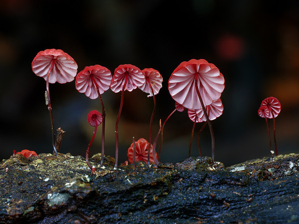
Where can I start. Fungi cover an incredible varieties of colours, shapes and sizes. I started off cataloguing my fungus photos by colour, but soon realised that that wasn’t very good taxonomically and anyway, some fungus species could change colour depending on the situation. Fungi are an entire kingdom of life, like plants or animals, so the variety is almost infinite.
You sell your photographs but the purchaser needs to have them printed.
Expand on this way of selling your photographs?
I don’t really sell my photos in the conventional sense, as that implies that I actively try to get people to buy them. Almost all the money I have made from fungi photos has been where people have contacted me with a view to publishing my photos in magazines or films or other projects. Occasionally people do want printed copies, but then I will send them a high res version which they get a local printer to print them.
How do you identify each fungus you have photograph?
When I first started fungi photography I had no idea what they were called. Then I bought field guides to help and now I also get expert help. The internet gives me access to thousands of people who know far more about fungi than I.
It is an amazing reference source and I am forever grateful to those who help me identify and learn about fungi.
Have you actually found many unknown and unrecorder fungi?
Yes, but it is often quite difficult to be sure that what you have found is new. You can only do that by asking a mycologist who knows what all the current species might be. It is actually quite easy to find new species, but very difficult to get them named.
Is there a difference between fungi and moss?
Yes. Moss is a plant and is green. Fungus is a fungus and is rarely green. Lichen on the other hand is often green and is often confused with moss. Lichen is a symbiot comprising two different fungi and an algae or cyanobacteria. The green is produced by the algae.
Can you discuss the camera and lenses you use?
I used to use Canon cameras and lenses, but I recently changed to Sony. I now use a Sony A7R2 with a Sony f2.8 90mm Macro G OSS. I have found that this camera and lens not only takes better pictures than previously, but also makes macro photography easier.
Discuss briefly the technique you use?
For still photographs I use a camera plus macro lens plus a tripod. I then use focus stacking to get the wide depth of field which is not possible with a single shot. Getting the lighting and background right is perhaps the most work.
Many fungi can be moved (try to put them back again) which allows you to choose the background. I almost always use natural lighting, which produces a really good look, but can be difficult as it is best when it is overcast or even raining.
Where have your photographs taken you?
To Moscow for 10 days on the invitation of The White Rabbit Restaurant. I also spent part of that time at Ecosystem, in a forest just north of Moscow, which is dedicated to teaching children about ecology and ecosystems.
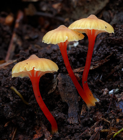
I have also been to Yunnan in China and two occasions on the invitation of the Kunming Institute of Botany. This has been to photograph mushrooms, primarily in the Nabanhe tropical forest reserve in Xishuangbanna. That has also involved travel to northern Yunnan (between Lijiang and Deqin) and to Chiang Mai in Thailand. Both trips were for about 1 month and were fascinating. This is a way to see some of the nontourist China.
You commented, “I take photographs of fungi because I love the forest and it gives me a great excuse to go there as often as I can.” Expand on this comment.
It is great to have a hobby that forces you to stop and really look at the forest (or anything else for that matter). There is infinite variety hidden inside a forest and it takes careful looking to find it. You just have to know where, and when, to look, and you only get that by time and experience. Photography is a great excuse to slow down and really look. I will often go for an hour walk that will take 5 hours. When I am looking for one thing I frequently find other surprises. Photography gives me an excuse to delve into all sorts of things, and to gain knowledge, that I would never have discovered otherwise.
Contact details:
Steve Axford
Email: stephen.axford@gmail.com
Steve Axford, Northern NSW, Australia
Interview by Deborah Blakeley, November, 2016
César Orrico
When did you first combine wood into your sculptures?
I have always been interested in research on the different materials applied to sculpture. During my career in Fine Arts I was very motivated to know the qualities offered by each material and is when I started experimenting with wood and the fusion with other elements such as artificial stone, iron or bronze. In my work I like to mix opposite characteristics, blending cool and warm materials.
In Gea you use the term ‘artificial stone’ what do you mean by this?
Artificial stone is a polymer with different stone grains. It is a material widely used in the field of restoration of sculptures by its resemblance to the stone since its characteristics are almost identical. It is a hard but fragile material at the same time, like stone. Has the same texture when it's cold is cold to the touch and hot weather is warm. It is a material with which I am very comfortable working as it gives me a great level of detail.
What lead you from using wood as part of the bust and plinth in Edith and Hikari while in Gea the wood has become a major function?
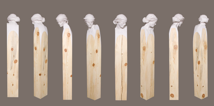 Edith, Artificial Stone, Iron and Wood, 180 x40 x40cm
In Edith the wood does not work simply as a plinth, is a synthesising of the body. In that case the wood also has its role. I select very carefully each piece of wood I use for each sculpture because the cracks, knots and forms, accompany and enhance the figure.
In Hikari, in addition to having this in mind, the wood not only functions as a synthesizing of the body, but also reduces to a few lines, which would be a kimono. With this in mind, Gea becomes the same as in Hikari, a representation in formal lines of a hat as a synthesis of part of its iconography.
 Hikari, Artificial stone, Iron and Wood, 180 x 40 x 40cm
Edith. Who is Edith?
Edith is the wife of Lot, a patriarch in the biblical Book of Genesis, which in his flight from the destruction of Sodom and Gomorrah, was warned not to look back and moved away from the city with his wife and daughters. During the flight, Edith could not help looking back and she became a pillar of salt.
 Edith, Artificial Stone, Iron and Wood, 180 x 40 x 8cm
Discuss the tactile qualities of this work
Edith like other of my works made with the same materials has the quality of being very soft to the touch. The finish of this part of the sculpture is extremely thin and polished as marble. This contrasts nicely with the touch that offers the wood, where you can see the cracks and imperfections of this beautiful material.
Why are her eyes hidden?
In this sculpture we are offered a challenging and provocative Edith looks back through a veil avoiding becoming a pillar of salt. It is a personal interpretation of history.
 Edith, Artificial Stone, Iron and Wood, 180 x 40 x 8cm
Discuss the complexity of sculpturing cloth.
Fabrics, clothes and folds in the sculptures always have much complexity as they work almost as organic volumes, which must fit perfectly and bring to figure balance and beauty.
 Edith, Artificial Stone, Iron and Wood, 180 x 40 x 8cm
How heavy is Edith?
Approximately 80 kilograms.
Where can we find her?
Edith is now in the hands of private collectors and some galleries with which I work, as Galerie Calderone (France).
CÉSAR ORRICO.Edith - YouTube
https://www.youtube.com/watch?v=4dxil511aK8
Proceso creativo de la escultura Edith del artista César Orrico.
Giro is completely out of Cherry wood discuss this departure in your current work?
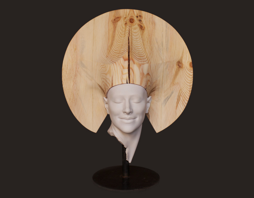 Geo, Artificial Stone, Iron and Wood 60 x 46, 40cm
I have created works only in wood, such as Ingrávido, as woodcarving is also a fundamental part of my job. Giro in cherry wood, corresponds to an artist proof who is part of an edition of 8 original and 4 artist's proofs, which is formed by pieces of different materials such as bronze, artificial stone or aluminium. As I said before, my work is closely related to research and fusion between materials, therefore my sculptures are always evolving.
How many sculptures can you produce per year? Or is it dependent on commissions or exhibitions?
My creative process is slow, I'm a very meticulous person and I like to work out the details. Obviously, the number of exhibitions and commissions influences my production. I could not give an exact number because production depends on many factors such as the complexity of the work, size, etc.
With Atlas how many editions did / have you cast?
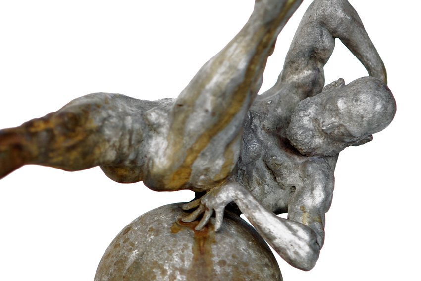 Atlas, Bronze, 15 x 22 x 10cm
Atlas belongs to an edition of 8 original and 4 artist's proofs. For this sculpture to be made of bronze by the process of lost wax smelting, I use cast. Like most of the pieces I make with these features, there are parts of the sculpture that I have to model again whenever founded a piece of the series, such as hands. The process of casting bronze sculptures such delicate is very complex since the exact temperature to properly register each of its parts is needed.
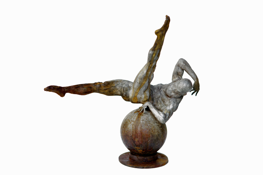 Atlas, detail, Bronze, 15 x 22 x 10cm
What do you do with your used casts?
Once I have produced all the sculptures of the edition, the cast is destroyed. My sculptures has a limited number that in no case be exceeded.
Was your 2012 ‘Baco’ the piece that lead you to wood? Discuss the wood like form that he is emerging from.
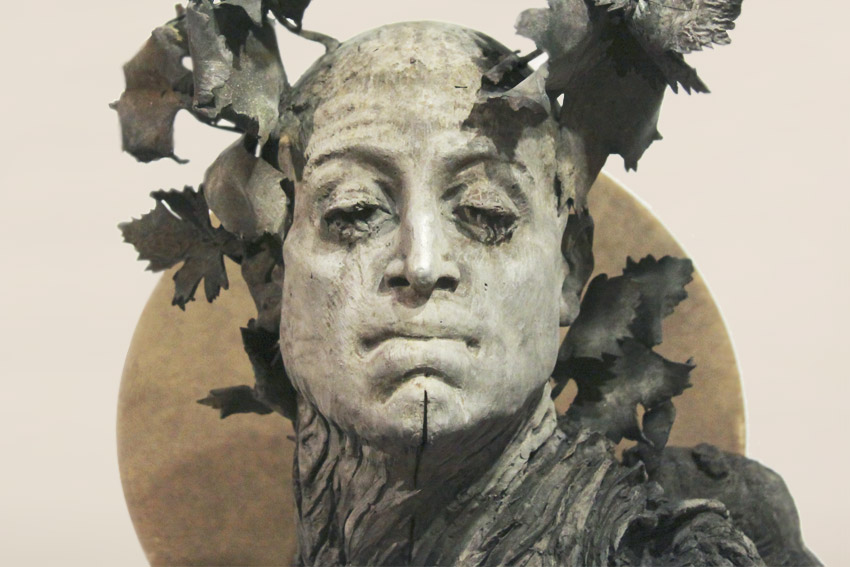 Baco, Iron and Bronze, 80 x35 x 35cm
Baco is a sculpture made entirely of bronze, although the bottom simulates the wood of a vine.
 Baco, Iron and Bronze, 80 x35 x 35cm
This form corresponds to the iconography of the god Baco (god of the grape harvest and wine) so it emerges from the plant that produces the grapes. The use of wood and the combination of different materials is much earlier than this sculpture.
 Baco, detail, Iron and Bronze, 80 x35 x 35cm
Can you explain briefly your doctoral thesis, in relationship to your current work. How do you get time to work both on your doctorate and your art practice?
My doctoral thesis is based on the search and experimentation with all kinds of materials applied to sculpture. Classic and contemporary materials adapted to new forms of production, where the materials are subjected to chemical and manual variations resulting novel processes that can be applied to the sculptural production. About the time, the first thing for me right now is my personal work. I take that processes performed to produce my work are closely linked to my doctoral thesis, which advances simultaneously.
 Rito, Bronze, 30 x 17 x 8cm
Discuss the studio space and the special needs you require for both stone and wood.
My workshop requires different separate spaces that are not contaminated with each other because the processes that took place in the production of my sculptures are sometimes incompatible to perform in the same room. Among other things, is essential a good ventilation, ample space to handle large sculptures, tools and appropriate machinery.
 Contact details:
César Orrico
Website: www.cesarorrico.com
Email: info@cesarorrico.com
César Orrico. La Rioja, Spain
Interview by Deborah Blakeley, October, 2016
Susan Wechsler
You can thank your mother for your mosaic art - explain.
My mom has always been a big influence on my creative life. She is an artist too at a time where she never thought she could make a living being an artist. But she has always encouraged me. I have a MFA from Tisch School of Art at NYU in costume design, so it was my mom’s suggestion that I mosaic dresses.
She was right, they are now my signature pieces.
How do you source the dresses that are the beginnings of a piece?
After my mom suggested I mosaic dresses, I had to find a form that would inspire me. When I saw hanging in a craft store, half of a dress in a metal form, I was inspired. I bought 50 to make a series. Because as my students can confess, they are addicting. Once you make one, you have lots of other ideas to make more. I now have them fabricated for me out of plastic by a local supplier.
Do you alter the palette but continue on a similar theme?
My creative mind works quicker than my hands do. I always have lots of creative thoughts swimming in my head. I gather my palette first from all of my china and discarded treasures in my studio. And from there I simply let go to the creative process and let the piece fly!
Discuss the storage of your source materials?
I love antiques and discarded treasures. The more unusual the more interesting they are to me. It is recycle art, bringing new meaning to something once cherished now toss aside. It is the challenge of bringing all of these textures and dimensions together into an art form that gets me excited.
I am a very organized person, have to be to do what I do. So my studio is lined with narrow shelves and drawers full of metal bits and beads, so that I can find everything I need once I begin my process.
You have recently left your old studio and moved to a new studio.
When you were looking for a studio what were some of the special criteria that needed to be filled?
I just sold my family house, kids went off to school & work, so now my husband and I are empty nesters- YA! We downsized and moved into the city of Denver. I have always had my studio in my home so I could raise our boys. I was now looking for an art community to be a part of. So I rent a studio in a large warehouse space in the Denver art district.
One of your series is ‘Memory Dresses’, can you explain this series?
Since I use discarded treasures to tell my visual stories, I also encourage commissioned dresses using your family history. So they are my clients “memories” which is what makes the work so meaningful.
While another is ‘Angels’ discuss this using 2 to 3 examples.
I have angels that guide me through my life. Angels who have passed but are always with me and angels who keep me in the creative zone while I am working. I feel a deep connection with my angels which is why I create them in my work. And it is the wings that I find so beautiful.
You give many classes in the States expand on how you present them?
I teach all over the globe because I love sharing my creative process. I am planning workshops in Australia and New Zealand for September/October 2017, so email me if you are interested in learning all of my mosaic secrets. Everyone knows what they like and what they don’t like visually. I teach mosaics as a process so that I can help everyone be successful in creating a meaningful piece of art for themselves and finding their own creative voice. It is very empowering to me to share what I love to do.
What is something that you have learnt from a student?
I learn as much from my students as they learn from me. Together we build community through my classes. Once you take a class from me you are forever part of a very special group of creative souls.
You also do online classes.
Yes, because not everyone can afford my classes or fly to be in one of my workshops, so I have created online classes for everyone who would like to learn my techniques.
Size – what is the smallest piece, and the largest piece?
I work very large because I have an art background. I begin with a sculptural form because my BFA is in sculpture. I love working with my hands and building substrates to mosaic, which is what makes all of my work so unique to me.
Do you take commissions?
Of course I do! I would love to make something very special just for YOU!
Contact details
Susan Wechsler
susan.wechsler@gmail.com
Susan Wechsler, Denver, USA
Interview by Deborah Blakeley, October, 2016
Ola Shekhtman
Explain your training in St Petersburg in Russia?
I was born in Siberia, but when I was 23 I moved to St Petersburg, worked as customs specialist in large Finnish factory. Till the moment when my husband said – you have to work in sphere you really like. He found St Petersburg Jewellery School, where I was studying goldsmith. I made everything by my hands – melting metal, rolling, sawing and soldering. I had legendary teacher – Lev Matveevich Epstein. Skills and knowledges I have- I owe him.
How often do you move to a new city and why is it so relevant to your current work?
After 6 years in St Petersburg I moved to Israel for few months. Then I relocated to US and lived in Virginia, Maryland, New Jersey, North Carolina and traveled a lot. This May I came back to Israel and not sure, what’s next. I like to explore new places, new architecture. When I see remarkable building, my imagination automatically shows me it in miniature on my finger.
North Carolina
In the making of a ring (London) how many iconic landmarks are there?
London ring it is 5 landmarks in all sizes - London eye, Gherkin egg building, Tower Bridge, Buckingham Palace and of course Big Ben. In Chicago ring there are more than 9 famous buildings. Usually I add new buildings to enlarge sizes.
London
By living in a city how do you choose the landmarks you will use?
Popular well know
Lesser known
Amsterdam
Usually I make buildings which I was impressed by. But I make also cities, where I never been before. Then I learn travel guides, google maps, choosing famous landmarks. It doesn’t work for Amsterdam ring. I visited Amsterdam, but I didn’t make particular attractions, I recreated only typical facades, that I remembered from my trip.
Amsterdam
Expand on the tiniest details – bike in Amsterdam, horse and carriage in Charleston.
I am trying to not only recognizable buildings of each city, I also like to catch spirit, mood, some specialty, of the city. In Amsterdam it is definitely a bike, in Charleston it is carriage, saxophone in New Orleans..
You originally worked completely by hand discuss the techniques you need to know and use?
When I learned goldsmith, I had a bench with tones of tools. It was desirable to have all these heavy machines for polishing, rolling, casting, lots of different hummers. I needed pretty large space for all of these instruments. I trained making old fashion jewelry style, all I made looked like my grandma’s treasuries. Comparing to what I do now, it was really hard, especially to make something that will like my teacher, was almost impossible. He is a huge perfectionist. And it is a big part of the recipe for success for jeweller.
Now you have embraced the most modern technology, 3D printing, explain this technique in relations to your jewellery?
I make only 3D models on my computer, then I upload file on the web site of my manufacturer (www.shapeways.com - one of the largest 3D printing service in the world). They use a complex five-step process. First, the model is printed in wax using a specialized high-resolution 3D printer. It is then put in a container where liquid plaster is poured in around it. When the plaster sets, the wax is melted out in a furnace, and the remaining plaster becomes the mold. Molten metal is poured into this mold and set to harden. The plaster is broken away, revealing your new product. The product is then carefully cleaned and hand-polished. I love this service for quality control on each stage. Then they pack my ring, ship and send me email notification with tracking number. Easy right?
Paris
Discuss the two techniques used in one piece.
High polish
Piecing
Silver cityscape rings are lightly hand polished to achieve a smooth finish of the raised surfaces. Inner surfaces still have texture.
Cityscapes printed in 14k or 18k gold go through extensive hand-polishing to give them a smooth shiny finish. Since cityscape rings are highly detailed, it is very important to not over polish, it may be a cause of loosing details and change first design idea.
Stockholm
How many cities do you have jewellery for?
London Pendant
For today I have 21 cities, three of them I turned into pendant. I plan to double this amount and want to “build” 40-50 cities.
Are they always worked in gold or do you use other precious metals?
The most popular metal I use is sterling silver. Rare I have orders on gold and I also had 2 orders on platinum rings.
Do you take commissions?
Of course, for now it is my hobby which pays my bills. But I don’t take custom orders, that’s why my prices are stable.
What city will be next? – Melbourne
I wish Melbourne will appear in my collection one day. But next are Philadelphia and Sydney.
How do you deal with size?
Finger size
Height in relations with the size of the fingers
Pretty often I get messages according size choice. I don’t take responsibility to advice something particular, I usually recommend to step by the closest jewelry store and measure finger with the wide ring sizer. Not everybody knows that wide band sits much tighter than regular narrow ring. I understand that and accept exchanges silver rings for better fit. With golden rings I am stricter. I ask to double check the size, because I am not able to change golden rings. Or offer to try plastic version of the ring and after that order ring in gold.
Who are your customers?
My customers are romantic persons. Most of them are women of course. I read stories that they were born, studied or felt in love, got married in that city. Pretty often I send presents for moms, sisters and girlfriends. Once I prepared 5 ring as a gifts for bride maids. All 5 rings were cities where each girl was born. But also I have quite many men, who are very hearty. They are looking for their spouse or girlfriend something special, heart touching, something that can arose delight memories. Great gift idea for anniversary. Once I had an order on wedding cityscape rings. That’s amazing to release that you are involved in such beautiful stories full of happiness.
Tell about the clever play on your name and your trademark?
Oh it’s easy) My last name is Shekhtman. But I am not man, I am woman, that’s why all my creations are made by Shekhtwoman.
Contact details
Ola Shekhtman
Pinterest: https://www.pinterest.com/olashekhtman/
Ola Shekhtman, Israel
Interview by Deborah Blakeley, October, 2016
Steve Graham
Discuss how lemons have been so good to you?
Lemon Coke, 30 x 30cm
One of my first paintings to sell many years ago was a simple bowl of lemons on a textured rendered surface. It sold quickly and I noticed interior magazines often used them as a prop. I decided they were not simply fruit, but opportunities for interior design paintings. Within a couple of years I had sold nearly 200 paintings through my gallery in Sydney. The paintings were all sizes and compositions. Sold them all – reasonably priced and perfect decorator pieces. They are what they are and I still do them from time to time.
Lemon with Berries, 30 x 30cms
How often do you use old trade makes in your work? (Mobil Gas)
I am an Art Deco poster fan. As well, some general design and utilitarian things like petrol pumps. I use these devices because I appreciate the styling that you don’t see these days. Not too many things have been designed with the consideration to style like the Art Deco era. I just like them so I use them whenever I can, usually about half my work will incorporate an old logo or sign. I have a graphic design and illustration background which influences much of my work.
Garage Wall, 122 x 90cm
Do you feel this helps to date the past within a modern work?
Absolutely. Years ago I acquired a book all about vintage Australian logos and preserved signs painted on the side of buildings and fences around cities and country towns. These images translate wonderfully into cityscapes. My way of helping preserve them I suppose.
You are also a book illustrator and have a background in advertising has this influenced your current work, Zebra?
Zebra Crossing, 60 x 100cm
Yes. I don’t seem to get away from commercial art. Not being classically trained as a painter, my design and commercial training can come out in odd and quirky concepts. Besides, I am not a gum tree person but more conceptual in some ways. While not painting in any metaphoric or dark subliminally sub-conscious way, my art is perhaps simply an attempt to capture a moment in time – past or present. Nothing deep. Paintings the buyer can relate directly to.
Give your thoughts on how paintings capture time and place (use 2 or 3) painting to explain this?
Fishing, 92 x 65cm
A good example would be a commission recently where a lady wanted me to paint her two 8 and 9 year sons while fishing, as in an existing painting of mine she had seen. I asked her to send me a photo of the lads viewed from the back as reference. I was astonished when she said a photo was no good as they were now 30 years old. She simply wanted to remember them as they were.
Brothers Fishing, 75 x 122cm
As well, I recently sold an old petrol bowser painting to a retired man who collected vintage cars – perfect addition for the wall of his huge garage.
You have exhibited your work in Canada and the USA how close and how different are the two audiences?
The USA is the best market as it is the biggest. Most internet sales are from there. I really can’t comment on Canada as there has been almost no interest in my art there. Enough said I guess.’
The Bus Stop 92 x 92cm
Discuss the use of light in your work.
When in New York I was encouraged by Bob Heindel, an illustrator and wonderful fine artist who broke it down to me simply… ‘’everything you paint is a matter of how the light falls and shapes the subject. Look at that first’’ Now that may seem self-evident, but years ago helped me to see. I like to use light to dramatize and suggest. Still learning there. A major breakthrough was when a fellow artist suggested there may be other colours in shadows. I never use black in shadows anymore. My viewing of a real life Monet ‘Haystack’ was an epiphany. I could not believe the combination of colours he used to get that result. I am a big fan of impressionism as well. There are still a few painters around that do it well.
The Red Bike, 92 x 122cm
My style originally was as a realistic airbrush illustrator and tight habits are hard to break. Still working on ‘getting those edges blurred’ as Heindel would say.
St Kilda Tram, 154 x 100cm
Briefly discuss on of your book illustration commissions
I have illustrated many books and magazine interiors and covers, but when offered a job to illustrate a version of ‘Jack and the Beanstalk” I grabbed it.
Jack
I love children’s book art and have a collection of “Wind in The Willows” books – one illustrated by Arthur Rackham. It is wonderful, but unfortunately only a second, not a first edition. I got hooked on this story when my grade 4 teacher read a chapter a day to the class. ‘
Grasshopper
I happened to meet an author who wanted this particular book illustrated and she was delighted with the final result. Knowing the story, it was not that difficult. Divine encounter you might say. I had an almost free hand in the illustrations so the job went very well.
Catapiller
The client often wants to meddle in the process and compromise, but not in this case. There have been a couple more in the works since then. As well, I am working on two children's books of my own – I fancy my chances here. How hard can it be?
Contact details
Steve Graham
E: stevegrahamart@gmail.com
Steve Graham, Melbourne, Australia
Interview by Deborah Blakeley, October, 2016
Severija Inčirauskaitė-Kriaunevičienė
Can you explain how you first began this combination of metal and embroidery?
I will admit that this is one of the most popular questions I get asked. Therefore, it is not surprising that you are asking me the same thing. So...
Art critics and journalist like to associate this particular technique with my parents. Both of them are artists and professors at the Vilnius Academy of Arts (Telšiai Faculty). My father mainly uses metal in his creative practice, he makes sculptures, medals, reliefs in metal, whereas my mother, being a professional calligrapher, combines this particular art with textiles. Thus, to the majority, it may seem that the art of their daughter is the synthesis between the creative expressions of both parents.
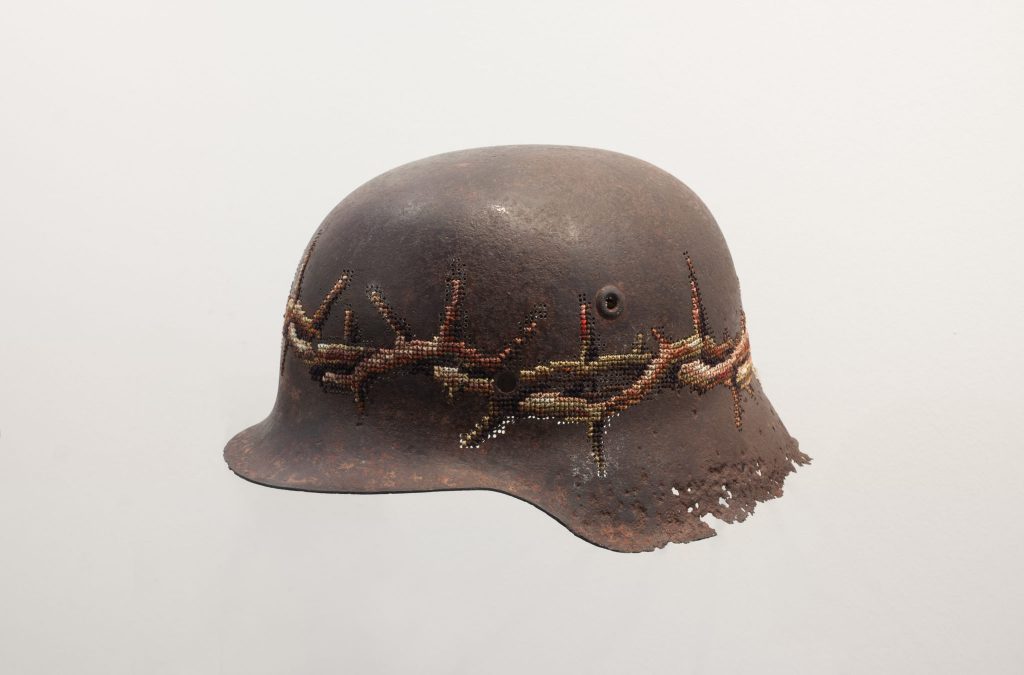
Kill for Peace, Photo by Vidmanatas-Ilčiukas
I cannot agree with this, I cannot deny it either. By the way, I should mention, that metal came into my creative practice only in 2004, before that and in my later works I have worked with different materials as well. Having grown up in an artistic environment where I saw my father creating these incredibly complex metal objects out of what may seem like a rigid and hard to yield material, I never had a fear of working with metal (for many people metal might seem like an insurmountable or resistant material), I always knew that you could make anything out of metal. All you need is knowledge and a wealth of experience (my father studied metal art at Telšiai Applied Arts School and later at Tallinn Art School, therefore he is a professional in this field). And the textile knowledge, like for many women of my and older generation is simply an integral part of daily life (even in first grade, assisted by my mother, I was able to knit myself an incredibly lifelike doll).
Although all of the aforementioned things really had a certain (perhaps unconscious) influence on my work, I have another explanation, which I believe is more important. I discovered metal after my Textile Art studies, and I can say that it was the Textile Art studies that influenced the appearance of non-textile materials in my creative work (for 5 years I studied Costume Design at Telšiai Applied Arts School, where both of my parents studied as well, although, in their time it was known by a different name (now it’s the Vilnius Academy of Arts, Telšiai Faculty), later for 6 years I studied for a BA and MA at the Vilnius Academy of Arts, Textile department, and after that for 2 more years in the postgraduate study at the same institution). I understand and know very well textile materials and all of their possibilities. The main qualities of textile, such as softness, permanent creasing and the instability of form always irritated me and seemed to be out of my control. During my years of study, I realised that for me the important thing was the three-dimensional form (not the flatness) and that in textiles it is difficult to create a three-dimensional shape. Although there is an area of textiles called “soft sculpture”, however, I am more interested in the strong, clear and stable form. Also, whilst studying I realized that in my creative practice the notion of re-making was very important, sometimes referred to as “ready-made” (when the meaning of an artwork is created out of existing objects). A lot of people like to link the re-making of objects with the ecological aspect, but for me, the use of an existing object in my work is important because of its unique history. A specific object can be itself a reference to the main idea of the artwork, tell us about the past and other things. In this way, already existing everyday metal objects quite naturally appeared in my work.
Explain how your work takes a ‘kitch’ technique and makes us relook and find the modern meaning and deeper current issues.
Every Stick has Two Ends
Cross-stitch technique is not kitsch by itself. This technique has old archaic traditions, but today, many people associate cross-stitch (and textile in general) with tasteless handicrafts rather than serious art. Indeed, the works performed by this technique are often banal handicrafts. I quote this public opinion on embroidery in my works, yet I create the objects that cast doubt on this established opinion. I strive to demonstrate that technique is only a means and everything depends on the attitude and the artist’s professionalism. A mere embroiderer will embroider a simple picture, while an artist may have a completely different approach. The handicraft technique may become a professional language of modern art.
Tarp Miesto in Kaimo
Where do you get your cross stitch patterns from?
In particular, all of the flower embroidery patterns I use in my works were taken from a type of “hobby” magazines (as I call them). Virtually all of my artworks, with embroidered flowers, were created using these unified schemes from women’s handicraft magazines. And, of course, I did this not because I didn’t know how to draw (I studied art for 13 years!). I use these patterns purposefully – the element of an already made-up embroidery pattern that is widely used by other people is very important to me as a citation of popular, mass and kitsch culture.
Daily Bread Give to us As Today, Photo by Modestas-Ežerskis
The flowers – what can be more banal than flowers? There isn’t a more banal symbol for “beauty” (perhaps apart from two white swans with their necks forming a heart). It is interesting that objects decorated with flowers (for example, such as floral fabrics) are the most commercially successful.
'Objects to Compare' Photo by Modestas-Ežerskis
Do you adapt the patterns?
Yes, I usually slightly adapt the patterns in terms of colour and composition. For example, I try to match the colours to the object found (if it is a rusty object, I use brown tones). Generally, I only use the pattern and choose the colours as a painter. I paint with threads.
Can you explain about your work on basic homeware metals, from the kitchen and the garden?
The main inspirations for my creativity usually comes from everyday life, from my environment, surrounding. Of course it doesn’t mean that I am only focused on my personal feelings, emotions and problems. Opposite, when I talk about my daily life I try to find dialogue with other people. Everywhere people are similar. Everywhere they are eating from plates, use buckets, watering cans, shovels, drive cars and so on. I see a lot of similarities everywhere and think that daily routine connects people. Objects from our daily life could be significant signs for international articulation. That's why I use many of them in my art. They disclose a lot of information and create artistic narrative or story. Our daily staff could be a symbol of our business or could show social status. Design of functional objects could be as a historical reference our disclose your personal taste. I use a lot of daily objects in my works. That's why "Readymade" method is my favourite and the most suitable for me.
I also want to stress that embroidery is not decoration of objects – it is a form of art. Therefore, I choose the objects for embroidery with a certain concept in mind and the object helps me to tell about it. Although the patterns are often similar visually, each work has its own idea and tells a different story. This is why each object has a name. For example, the Fall Collection (Rudens Kolekcija), comprised of rusty farm utensils, was created in 2005, when Lithuania (the country I live in) had just joined the European Union. At that time, the issue of identity was very relevant in my country (“won’t this membership destroy our uniqueness?”). The corroded utensils of Lithuanian farms (watering cans, buckets, milk cans, graters, ...) addressed the issues of Lithuanian identity related to agrarian culture. And the rust itself (the collection was comprised only of rusty items) was an essential element of the work: we have a lot of rain in Lithuania (we sometimes even call it the ‘country of rain’) and the corrosion process takes place in wet environment and therefore, the rusty objects served as a reference to the Lithuanian climate.
I have created a number of works related to the food topic. It is also an important part of everyday life also.
“MORNING TRIO” is one of them. I think it’s not necessary to comment, it’s very easy understandable work. “Three eggs for breakfast” is very universal composition. But it is a personal reference also - my family consist of three persons.
Or “GIVE US THIS DAY OUR DAILY BREAD... „ – here are words from the main Christian prayer (preer) “The Lord's Prayer”. This work was created during the global economic crisis in early 2009. Potatoes are the cheapest food of course and we (Lithuanian) have many national dishes with them. This work is ironic and serious at the same time....
When did you go even bigger?
The biggest piece format was embroidered walls. 2007 I embroidered wall of VAA Textiles gallery Artifex. Later collection of cars 2007-2008.
What lead you to embroider on car parts?
Installation ”A PATH STREWEN WITH ROSES” is one of the biggest collection which I created approximately 2 years. This collection consists of 13 really broken car parts. I started to develop this work since 2007. From that time I became a driver and exactly that year Lithuania statistically was the European leader with deadly accidents in the roads. This problem still is hot up to now. In Lithuania, we have a tradition to put plastic flowers in the places of the deadly accident. So, details from real accidents together with embroidered flowers are a reference to this big problem – “bad driving culture”.
There are different possibilities to exhibit this work: sometimes I expose separate details, but sometimes I put them on the real cars.
This installation was demonstrated last year in the famous graffiti artist Banksy project “Dismaland” (in GB) which really got a lot of attention. I tried to create a realistic impression of a car accident. And I think it looked quite realistic.
Can you expand on your exhibition of Helmets?
Where you sourced the helmets from?
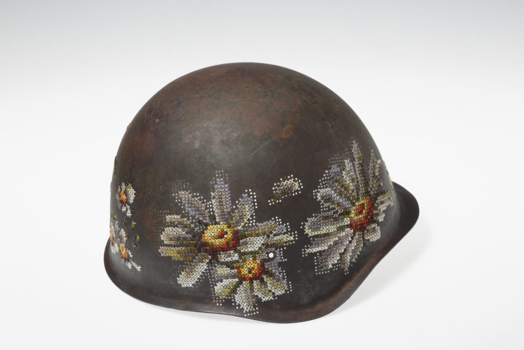
Kill for Peace, Photo by Vidmanatas-Ilčiukas
All helmets were collected in 20-21st century conflict hotspots: World War II, Vietnam War, Balkan Wars, Ukraine... They are from different periods and countries: German, Russian, American... Interestingly, when using my usual technique, perforation, I understood the differences in the attitude of different countries to the lives of their soldiers (some of the helmets were easy to perforate and some – hardly perforable).
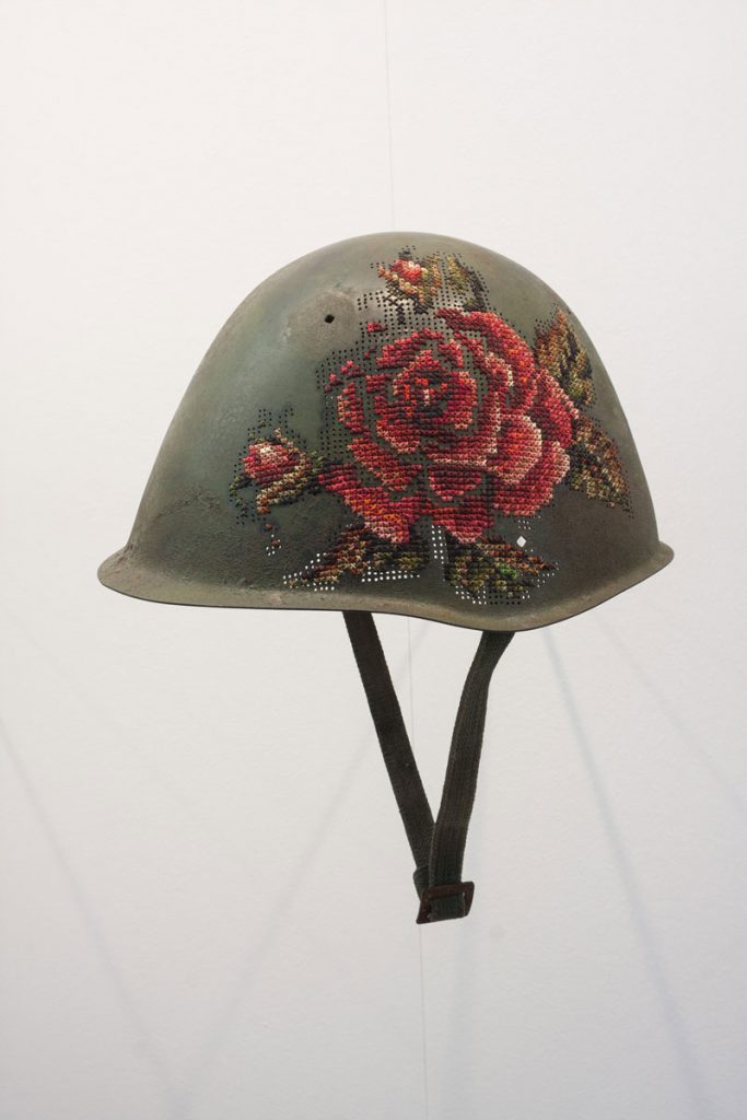
Kill for Peace, Photo by Vidmanatas-Ilčiukas
I received the helmets in different ways. For example, last year, one helmet came directly from the conflict spot in Ukraine and even had the nickname of the soldier inscribed on the inside.
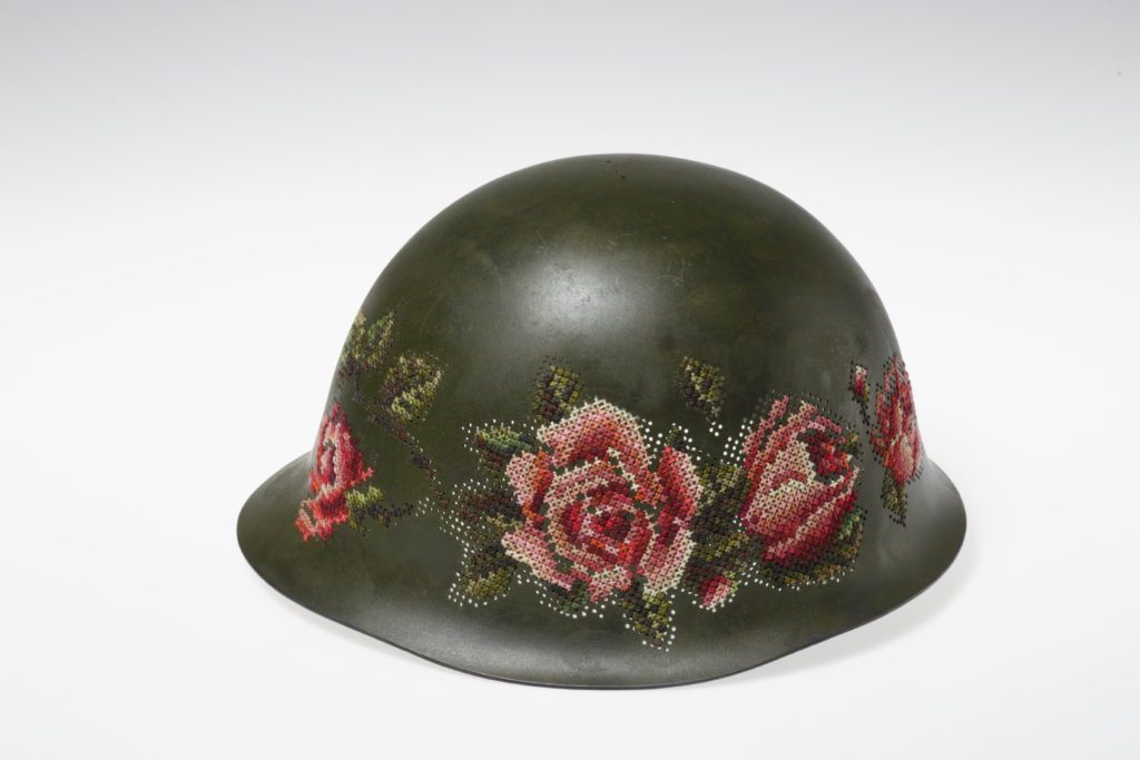
Photo-by-Modestas-Ežerskis
Additional props used in the exhibition
I also used military sweaters to create tapestries, which are hanged on walls and remind of military coats or tents...
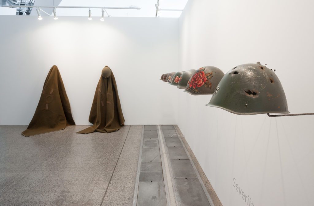
Kill for Peace, Photo by Vidmanatas-Ilčiukas
Discuss the way the helmets were mounted?
They are hanging in one line, the helmets remind us of a cemetery. They also show that all sides lose in military conflicts, death makes us all equal, and many innocent soldiers suffer.
Can you briefly explain the basic technique you use?
This is a very simple - drilling and cross-stitch embroidery.
When you are working on a larger scale how do you adapt the type of thread you use?
I just use a thicker thread.
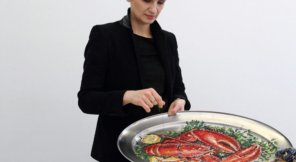
House and I, Magazine, 2016 Photo by Laura-Žaliauskaite
Where do you work?
Usually at home or in the gallery, sometimes in Art Academy.
Expand on the importance to you to making the ordinary into the extraordinary?
Extraordinary art speaks about ordinary lifestyle.
You also work as a teacher and art curator give us some insight into this part of your working life.
Currently, I also work in Vilnius Academy of Arts in two positions: as an associate Professor in Textile Department and also as head of Textile gallery Artifex (which also belongs to the Vilnius Academy of Arts).
I share my experiences with students by teaching and also coordinate exhibitions (most often, textile-related) in the gallery. It is quite complicated to find time for everything, especially for personal creation. But I like working with young people (I can often learn from them myself and find out the interests of young people) and working in the gallery gives me the opportunity to meet interesting artists. Of course, little time is left for personal creation, but all my activities are interrelated and I can manage for now.
Severija at Dismaland Exhibition in the UK
Contact details.
severijaik@gmail.com
Severija Inčirauskaitė-Kriaunevičienė, Vilnius, Lithuania
Interview by Deborah Blakeley, October 2016
Gail Dell
Your work is often described as ‘playful’ what are your own thoughts on this in relationship to your work?
I find that life in the studio requires a happy marriage of play, discipline and perseverance, but I think my determination to create stems from the challenge of not being able to have children of my own. After many years I have managed to turn this life-event into something happy and purposeful. So I imagine painting gives this part of me a voice and a physical presence that I otherwise wouldn’t have had. I like to think an indelible resonance of this joy rests in each painting – a playful part of me that will remain long after I am gone.
Late Summer, Mixed Media, on cradled board, 92 x 63cms
You make the comment ‘we should paint without resistance or self- criticism.’ Can you expand on this in regard to your art teaching?
As an artist we must learn to manage a whole new level of vulnerability. Silencing the voice of self-criticism can be our biggest challenge. This can adversely affect our work, one outcome being that our work becomes tighter and tighter. I wanted to facilitate a process, as much for myself as for other artists, in response to a comment I’d heard over and over again “I wish I could loosen up a bit”. I developed a workshop called ‘Fast and Loose’. It is more about changing cognitive and behavioural patterns than learning a new technique. The purpose was to unlock resistance and tame the inner critic by getting ourselves out of the way. Painting from the shoulder, large format exercises, large brushes, fast, uncalculated and free. It’s wild, unravelling and cathartic. It enables participants to paint with less resistance and move into exciting new territory.
How has John Cullingworth influenced your art practice?
I come from a big, happy family of artists. John, my father, is a well-regarded painter and traditionally trained and a master of design and branding. His guidance and encouragement has been invaluable to me. He instilled in me a deep confidence as an artist and gave me courage to try anything. How to see value, tone and structure in the environment - how to really look. How changing the tiniest thing changes the whole piece. He taught me to ‘suggest’ things in the work ‘let the mind make up the rest of the story’. I use that all the time and is probably the reason why I love painting in a semi-representational style. He taught me not to be prescriptive, but gave me confidence to suggest a narrative, to encourage exploration and invite comment and alternate views. He is 87 now and still critiques my work via skype. I have learned to value strong opinions, because of him. I love him especially for that.
Explain the way you use cropping in many of your floral works.
La vie en Rose, inks and pigments on fresco paste panel, 107 x 77cm framed
I love the Impressionists. Like me, they broke a lot of rules and moved the traditional focal point from the centre of the painting. These two paintings are the asymmetrical effects of cropping, meaning the design or overall composition and focal point is off-centre. Each of these elements helps to create a sense of motion and playfulness within a painting. The subject is less obvious and I like to suggest something beautiful by showing only part of it. I like to leave space for curiosity and for the viewer’s mind to make up the rest of the story and to evoke their own memories. These paintings were part of a series I did on marble fresco paste, where the pigments and washes sink into the surface and become part of the surface. A technique I love and learned overseas.
Dans le Jardin, inks and pigments on fresco paste panel, 107 x 77cm framed
How has the Australian coast affected your paintings?
The power of place is crucial to our identity as human beings. I came from Africa to make a new home in Australia 20 years ago. The process of painting the landscape has been integral to my sense of belonging and identity as an Australian. When landscape and people come together they create a place, but I find it takes a journey of time and experience to belong.
Matilda Bay, acrylic on canvas, 120 x 91cm
Australia is a land of such strong contrast - I wanted to explore the way the water and the land experience each other in my current series works. You will see these coastal paintings have strong structural areas of rock and stone. Even as the land meets the sea the colours are bold and defining. Unforgiving. From extreme temperatures - dry, hot land forms and resilient native bush land - to the soft cool movement of the ocean. My challenge was to marry the contrasting and multi-sensory experience of nature in an abstract way.
My Favourite Place, acrylic on canvas, 106 x 80cm framed
Can you compare the difference in the colours you use in your coastal and inland paintings and why?
The palette of coastal and inland work varies according to the region, the light and the experience. My earlier work is a response to the Kimberley region of WA from an aerial perspective. The environment is pristine and is bright orange to red gold with a coastal palette of pthalo hues and aqua blues.
The Lay of the Land, acrylic on canvas, 150 x 150cm
More recent paintings have a palette of blues, greens, umbers and siennas. As I paint nature the experience of how the environment occurs to me, informs my palette. Australia generously offers me a colourful jewellery box of delight to choose from.
Everlastings, oil over acrylic on canvas, 102 x 76cm
Where do you do your work?
I paint in my studio and work from my own mental notes. I paint spontaneously and expressively with bold sweeping brushstrokes that sum up whole passage of the landscape, seascape or floral work. I often rework paintings over 3-4 weeks until the conversation rests.
Off the Beaten Track, oil over acrylic on canvas, 120 x 91cm
I find it really challenging to paint en plein air or anywhere that isn’t still. I have learned that I need to paint without the distraction of a sensory overload. I love to gather data by looking and being in the environment. I routinely walk in nature and take photographs as a reference or as a trigger to remember a place, the smell, the feeling etc. Back in the studio a lot of time spent in contemplation to bring all the information together in a cohesive way. I have to allow the narrative to fall into place. I don’t mark up the work beforehand or work from a visual reference, I just begin and usually paint across 3-5 works at a time.
I need to get to a point where I am absent and my mind is quiet enough for the work to become present . I would say the bones of new work are born out of the quiet times, the abstract thoughts and gazes, the feelings and the remembered places.
What are some of the techniques you have developed in your more recent work?
Does discipline and hard work count? I am always on a steep learning curve and I am hungry for new knowledge and love putting new ideas into practice - I am never short of inspiration.
I recently tried a cold wax workshop and enjoyed the seductive nature of the medium. I like to scratch through surfaces (sgraffito) to reveal substrate colours using a palette knife or the back of a paint brush.
Using brushes and paint is luscious - I paint straight from the pot of paint or tube, I use very little water, if any. If I need to move paint around, I add a flow medium to it. I don’t mix much on a palette, I work directly onto the surface using an alla prima (wet on wet) approach.
Adding texture to the surface before it starts to dry – I like adding multiple layers, glazes and marks adding complexity and depth to the works.
Using a variety of mediums – acrylic allows me to express immediacy and spontaneity and to work quickly if I need to. I also use oil sticks and ink glazes, graphite and pigmented cold wax.
Working across a range of surfaces - paper, panel, canvas and fresco paste, which is like a thick marble gesso – a homemade recipe given to me by a retired Italian artisan.
River Crossing, Impasto acrylic and oil sticks, on cradled board, 91 x 91cm
You have representation in Australia and the UK, discuss the similarities and differences in these two markets.
The process of securing representation anywhere in the world is surprisingly similar. It takes an enormous amount of focused research to place your inquiry or submission correctly. I think a level of tenacity, perseverance and good grammar is necessary to manage a marketing platform overseas, or anywhere, for that matter.
It took me two years of hard work to get into the UK and be part of the hugely successful Affordable Art Fair (AAF) circuit. I am delighted that my abstracted florals have been selected for their innovative promotional campaign in September. Through boomf.com - they will print my artwork onto marshmallows ! I love the idea that visitors will eat my art !
Yes, the markets are different, and the level or art awareness is different too. I think you have to dive in and see where your work sits in the psyche of a place, before you know how to make the most of the opportunity. Creative flexibility and an ability to use constructive comment to your advantage, is invaluable. My work was full of light and strong colour – I learned that a winter show in London responds better to muted tones. The summer shows loved the colour. I learned the market is very seasonally responsive.
Painting in Australia I can be more experimental as I am innately in sync with the environment that I represent – and the viewer is able to identify with the work more easily.
Abstracted floral – Love is in the Air 90 x 76cm
Can you give some comments that you pass on to young or new artists?
It all depends on what you are aiming for. If you want to be a career painter I would suggest you find a mentor, anyone in the world that is a good artist whose work you love, that is busy and successful. ‘Friend’, ‘Like’, send them an email. Connect with them and start a conversation.
Learn as much as you can by trying new techniques. You don’t know what may grab you if you haven’t tried it. Be brave, make lots of mistakes. Magic and mistakes live in the same paint pot.
Develop a good understanding of digital marketing platforms and business administration. It’s a brave new world out there, be prepared to manage your own career path and success.
Opinions are valuable, don’t be offended, use them as an opportunity to grow. Infact welcome them. I say ‘thank you so much, I hadn’t seen it that way’. Build bridges.
Add your name to gallery mailing lists. Attend openings, talk to other artists, ask to visit their studios. I love talking to young artists that have made the effort to attend an opening or visit an exhibition.
When you visit other cities go to galleries that are a little ‘off the map’ too. Not all the exciting artists are in the national galleries and museums.
Stay curious and open. Never stop learning.
Contact details.
Gail Dell
Website - www.gaildell.com
Facebook - www.facebook.com/GailDellArtist/
Gail Dell, Perth, Australia
Interview by Deborah Blakeley, September, 2016
Stephen Knapp
Can you explain briefly the technique you use to produce your lightpaintings?
Working with shapes that I have drawn my assistants cut and polish laminated dichroic glass and other variations we have developed. The glass is then mounted to specially fabricated stainless steel brackets and this large selection of pieces becomes my palette. Using these pieces of glass, I physically manipulate the light on the wall or on panels, separating white light into pure colour and painting with light.
Into the Narrows, Light, glass, stainless steel, 13’x 11’x 1"
What is so different about dichroic glass?
Dichroic Glass is produced by a process called deposition coating or thin film technology. Sheets of glass are coated with multiple layers of metallic oxides in a vacuum chamber. The resulting material transmits one colour – wavelength – of light while reflecting the complementary colour.
In the daytime different changing images are created when the sun comes over the building and strikes the glass.”
Dark Victory, Light, glass, stainless Steel, panel (36”x 24”) 8’ x 5’ x 10”
Can you explain the different ways ‘The Definition of Possible’ is reflected in the day and that at night?
“The Definition of Possible” takes on many forms. Its most striking form, as created in the studio and at night, is made up of brilliant colours. Ambient light plays its part here as the lightpaintings will lighten or darken depending on the light that surrounds it. It can appear in full colour during the daytime when storm clouds come over and darken the area, and then lighten up again, only to deepen as it moves into night.
Daylight – what is the role of daylight in your work?
Daylight is a different matter. A lightpaintings can nearly disappear on a bright day, leaving wonderful, subtly glowing sculptural shapes in its place. When sunlight hits the glass directly brilliant colour appears once more, the length and width determined by the angle of the sun. This changes not only as the sun moves through the arc of the day but as the seasons turn the position of the sun moves, changing the image.
Light has been such an important aspect of art in the late 19th 20th and 21st Centuries in painting and photography. Now you have taken it to another level through technology, discuss?
From the earliest days people have expressed themselves in pigment and light has played an important role as they sought to capture it. Viewing paintings of the past few centuries one can see the importance of light. The ways to capture it has changed, mirroring the history of art. The difference for me is that instead of using paint to capture light I’m actually painting with light, taking it a giant step forward.
How are you able to control the distance (length – width) of each shaft of light in your work?
The length and width of each shaft of light is determined by the distance from the light to the wall and the distance from the light to the glass. For the reflected light I have developed a series of techniques to give me even more control..
‘Transformation’ copes with corners discuss.
In “Transformation” the act of bending light around a corner is an act of illusion, albeit an extraordinarily difficult one to do. Light travels in a straight line. I have “curved light” before but had never tried to make it look like the light was bending around a corner. Each time I create a lightpaintings I challenge myself to do something new, to push myself and learn more. “Transformation” was an idea that I knew would be difficult to accomplish. I just did not realize how difficult.
Transformation, Light, glass, stainless steel, 14’x 85’x 64’6"
How do you stop the light from protruding onto the ceiling?
Controlling how far the light goes happens in the creative process. Whenever possible I use ceilings, walls or floors as part of my canvas.
How does your work relate to wattage? (electricity)
Although it is counterintuitive, my lightpaintings are actually “green”. Lightpaintings use light so efficiently that I am able to work with architects and designers to lower light levels in a building to reduce electricity. Each light uses a 50W or 75W fixture and a single installation piece uses only one 75W lamp.
What colours can you achieve?
With basic dichroic glass there are limitations in colours. Working with manufacturers I’ve been able to greatly expand my palette. By mixing colours and using various twice reflected colours I’m able to achieve even more. I also use different techniques in the laminating process to add more shading. Surprisingly, coming up with a good range of greys has proven to be a more difficult task.
What Isn’t It, Light, glass, stainless steel, (panel 36”x 24”) 9’x 6’x 10”
Can you explain the difference between reflection and refraction of light?
Refraction is a change in the direction of light going through a medium, such as glass, crystal or water. With dichroics, it refers to the transmitted color caused by the light passing through the treated glass. Reflection refers to the light reflected back, as it would from a mirror.
Discuss how your work is used with music?
My largest installation is “Luminous Affirmations” at 80’ x 60’ x 20”. This project was sponsored by the City of Tampa, Florida as the first piece of what has become a very popular “Lights on Tampa” Program. Using the blank wall of City Hall as a backdrop, this 80’ x 60’ lightpaintings uses specially designed 300W ceramic metal halide fixtures. A signature public art installation for the City of Tampa it is often featured in overviews of the city in sporting events and other televised events.
First Symphony, Sursa Performance Hall at Ball State University, Muncie,IdianaLight, glass, stainless steel, 23’x 40’x 12
What is the largest installation you have done?
My largest installation is “Luminous Affirmations” at 80’ x 60’ x 20”. This project was sponsored by the City of Tampa, Florida as the first piece of what has become a very popular “Lights on Tampa” Program. Using the blank wall of City Hall as a backdrop, this 80’ x 60’ lightpaintings uses specially designed 300W ceramic metal halide fixtures. A signature public art installation for the City of Tampa it is often featured in overviews of the city in sporting events and other televised events.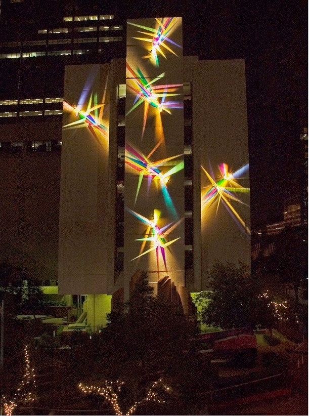
Luminous Affirmation, Light, glass, stainless steel, 80’ x 60’x 20”
In large installations how does the background (brick, concrete blocks, painted walls) effect your work?
Backgrounds are very important to my work. Instead of a shiny, reflective surface which many people expect, I look for the least reflective surface I can get. For interior spaces that is usually a flat light coloured paint. I’ve installed lightpaintings on stucco walls which create a bit of shadow which diminishes the saturation of the colour. Still very nice – just different. The best exterior surface I’ve found yet is the precast concrete used for “The Definition of Possible”.
Definition of Possible, detail
How do you classify your art?
I refer to myself as an artist, an installation artist who works with light, or a light artist – never a glass artist. Light is my primary medium; glass allows me to manipulate it to create lightpaintings.
Your work ‘Stories from Light’ at the Women and Babies Hospital in Pennsylvania.
“Stories from Light: started with a request for a stained glass ceiling – pretty interesting request for an artist who had never done stained glass.
I had just completed my first architectural scale lightpaintings and it just seemed to be a better answer for the space. When I realized that a lot of babies were born in this hospital the idea to add these sculptural abstract human elements coming out of a rainbow just spoke to me.
You have work inside and outside large galleries but also on large ships. Discuss the work on the Royal Caribbean Cruise Liners.
Royal Caribbean Cruise Lines has been an interesting client, one willing to take chances. My first commission for them consisted of two installations. The first, "Fragments of Time - the Explorer's Legacy", on Splendour of the Seas was a wall of kiln formed art glass and marble 4' 4" x 43' x 24". The second was "Answered Prayers and Mystery - the Night Sky Revisited", also on Splendour of the Seas, consisted of mosaic tile and stainless steel, 5' 6" x 65' x 2' 8". These led to my most recent commission, “Trailing Light”.
“Trailing Light”, is a 35’ x 50’ x 12” installation on an outdoor ceiling of Oasis of the Seas.
Oasis of the Seas.
One of the trickiest parts of this installation was setting it up so it could be installed in a shipyard in Finland without my presence. Although all my installations are created for exterior use, for this one the lights were double anodized for another layer of protection.
Your studio is so white, expand on this in relationship to the work you create.
My white studio is simply a blank page upon which I can create. It also is great to showcase the sculpture, mosaics, furniture and other work I have done.
My wife Frankie manages the studio and she oversees everything I don’t do. I usually have two assistants who do installations, glass fabrication, boxing, shipping and the rest of the work.
Keeping the studio staff small allows me the freedom to experiment and spend time on research. I find this a much better model for me than the larger studios of friends who complain about how they have to work constantly to “feed the beast”.
My work is computerized in terms of the business end of the studio. I use Photoshop for renderings or to help me block out a wall as far as light spread etc., which gives me starting points for the light locations on large installations. I do not use it for creating lightpaintings at all.
Do you see yourself as the creator of modern rainbows?
I actually don’t think of my work at all in terms of rainbows, except for “Stories from Light”. Ever since then it has been all about painting with light. A visit to my studio would show brightly coloured lightpaintings alongside monochromatic pieces and pieces with textured and patterned glass, all in the service of moving forward and learning more about this amazing medium.
Glass allows me to manipulate and explore light and illusion; perception and dimension. I revel in the purity of the colours, their breathtaking richness, yet I am most drawn to the edges and the soft shadows that overlay a whisper of colour and the borders that define space. It is here that mystery and depth and wonder can be found.
Perception and interaction lead to an act of mutual discovery, a universal bond of our existence. There is no right answer hidden within each piece, only a shared journey.
False Prophet, Light, glass, stainless steel, 13’x 15’x 1"
Contact details:
Stephen Knapp
“Lightpaintings by Stephen Knapp” documentary on YouTube
Stephen Knapp, Princeton, MA, September, USA
Interview by Deborah Blakeley, September, 2016
Pröstur Njálsson
How did you become involved in the exhibition Bræla ‘Rough Seas’ at the Reykjavik Maritime Museum?
I wanted to display my photographs from my job as a fisherman on an Icelandic trawler. It was my hope that by showing these photographs people could see what fishermen have to go through on a daily basis out at sea.
First I contacted the CEO, of HB Grandi, Vilhjálmur my employer and asked him if the company would allow me to take the photographs while at work and if they would be willing to help me to set up the exhibition. They helped with everything and through their sponsorship, everything became a reality. Bræla at the Reykjavik Maritime Museum became my second exhibition.

Explain the involvement of HB Grandi in this project.
I work for HB Grandi and they sponsored my project and my exhibition.
From Wikipedia
HB Grandi is a fishing and fish processing company in Iceland. HB Grandi's headquarters are in Reykjavík where its office and ground fish production are located. The company also runs fish processing plants in two other towns in Iceland, Akranes and Vopnafjörður.
The company currently operates three freezing vessels, four wetfish trawlers and three pelagic vessels and runs fish processing plants in Reykjavík, Akranes and Vopnafjörður. HB Grandi markets its products worldwide, products made from both ground fish and pelagic fish caught and processed by the company. In 2013 the company was awarded the Icelandic Presidential export award.
How many photographs were in the exhibition?
In all there were 19 photographs in the exhibition.
Can you explain a bit about the actual museum?
It is a museum about the history of Icelandic fishing and fishermen of Iceland. 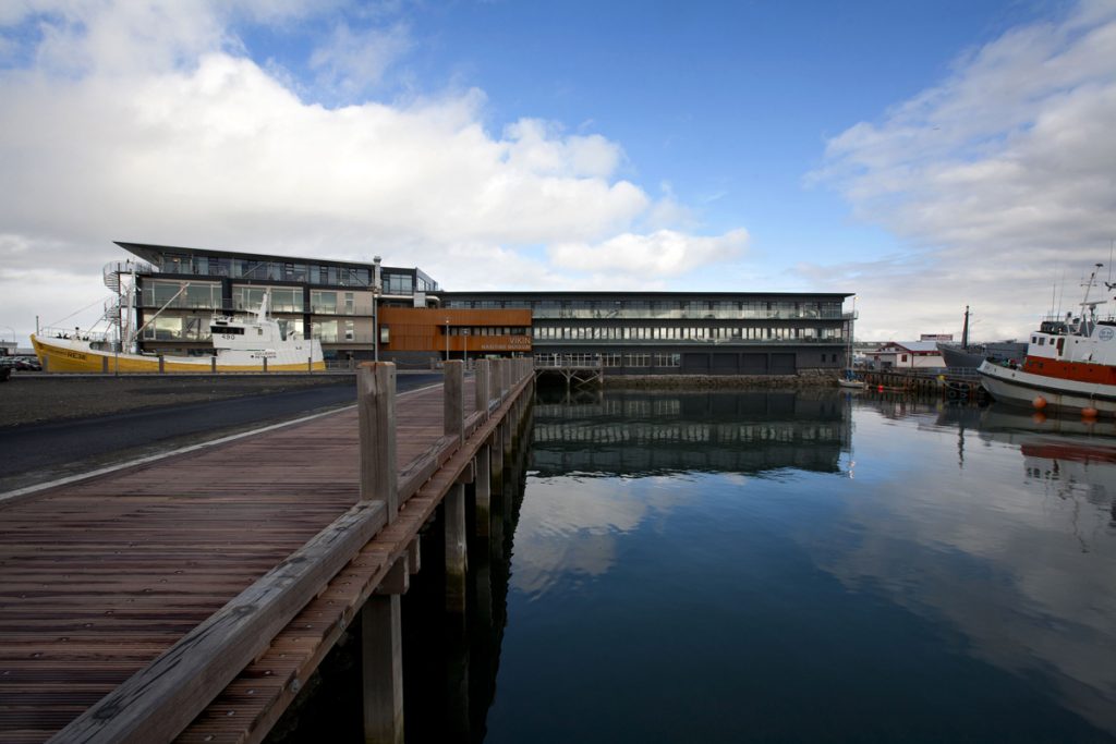
The Reykjavík Maritime Museum
The Reykjavík Maritime Museum is located by the old harbour in Reykjavík, in a building that was originally built as a fish freezing plant. It was founded in the year 2004, and opened its first exhibition in June 2005.
Icelanders have from the time of settlement depended on fishing. Settlement at Faxaflói Bay was founded on fishing and fish processing. Since the 19th century, the growth of the cities Reykjavík and nearby Hafnarfjörður was largely based on the fisheries, as well as improved living conditions in the 20th century. The fishing industry has been the foundation of prosperity in Iceland. The main purpose of the museum is to collect items and accounts that tell this story and make exhibitions that are based on those findings.
How long have you been a professional fisherman?
I have been a professional fisherman for thirteen years.
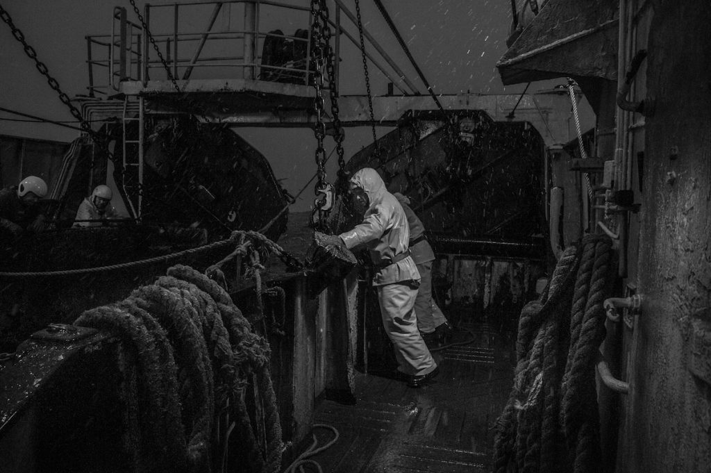
Are you from a family of fishermen?
My family have been fishermen for four generations and during this time life at sea has changed a great deal but always a fisherman needs to be part of team and constantly alert.
Explain how far out at sea most of the images were taken?
The photographs were all taken while I was a fisherman on the trawler Ásbjörn RE50, and working in the actual conditions that the photographs were taken. The photographs were taken from a minimum of 2 miles out to 20 miles out to sea.
It was my aim to give a unique insight into life on board a modern Icelandic fishing trawler through photographs that could only by captured by a veteran of the seas. I wanted the viewer to be taken to a world unknown to most, one that is rapidly changing as ships and automation processes become more and more advanced.
What weather conditions were the taken in?
The majority of the photographs were taken in really bad conditions with wind speeds up to 35 meters and waves up to 18 meters high.
How long are you at sea with each trip?
It is normal for us to be aboard the trawler from two days but up to six days out at sea.
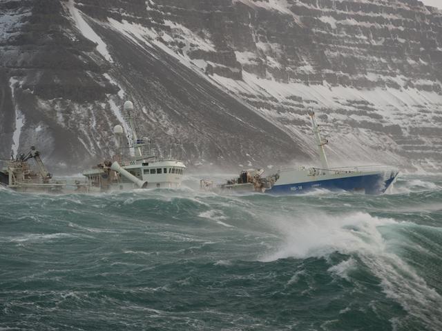
When was the first time you decided to take your camera on board with you?
I bought my first camera in 2011 and straight away I took it with me. I have always wanted to show others what my life at sea is like.
What has been the reaction of the rest of the crew to you taking photographs while at sea?
We are a strong team and need and want to be so. My photographs would not have been possible without them being happy to become a part. They are all very happy about it and they are all thankful that we have worked together to bring the photographs to an exhibition showing what we do on board.
What special lenses etc have you needed to waterproof your camera?
No I have no waterproof lenses for my photographs. I use a Nikon D800 and it is weather sealed I always that my gear is replaceable; so I take my chances.
This is your second exhibition what was the first about?
My first exhibition was about free diving and scuba diving which is another of my passions in life. I enjoy the images that are achievable through underwater photography and it is wonderful to be able to combine two of my passions.
What are you currently working on?
Currently I am work on getting together a photography book about bræla. I am hoping that it will come out in the summer of 2017.
As well as the book I am spending time photographing free diving and how it is now part of Icelandic culture, again I want others to see what I see but this time not at work rather under the sea.
Fishing is a vital part of the Icelandic economy – discuss the importance of recording it in the 21st Century.

What I am photographing is for there to be a record of the last of an era in Icelandic fishing history. The vessels that I currently work on and we still use today in Iceland are the last of their breed. Next year we are getting brand new fishing vessel. It will come with all the latest technology and it will revolutionize the fishing industry. Opening up a new era in Icelandic fishing history.
Contact details:
Pröstur Njálsson
Pröstur Njálsson, Hafnarfjörður, Iceland
Interview by Deborah Blakeley, September, 2016
Robert Kelsey DA
Can you expand on your involvement with the Paisley Art Institute?
I have been involved with Paisley Art Institute for over 40 years. The Institute hold an annual Open Art Exhibition and this was one of my major exhibiting opportunities in the early days. As years went on the Institute grew to be one of Scotland’s biggest and most successful Open Art Exhibition. I served on the committee for many years and I am pleased to see “The PAI“ thriving today. In many ways being an exhibitor at this show brought the opportunity to be spotted by many of the Art Dealers from major galleries who visited the exhibition to talent spot.
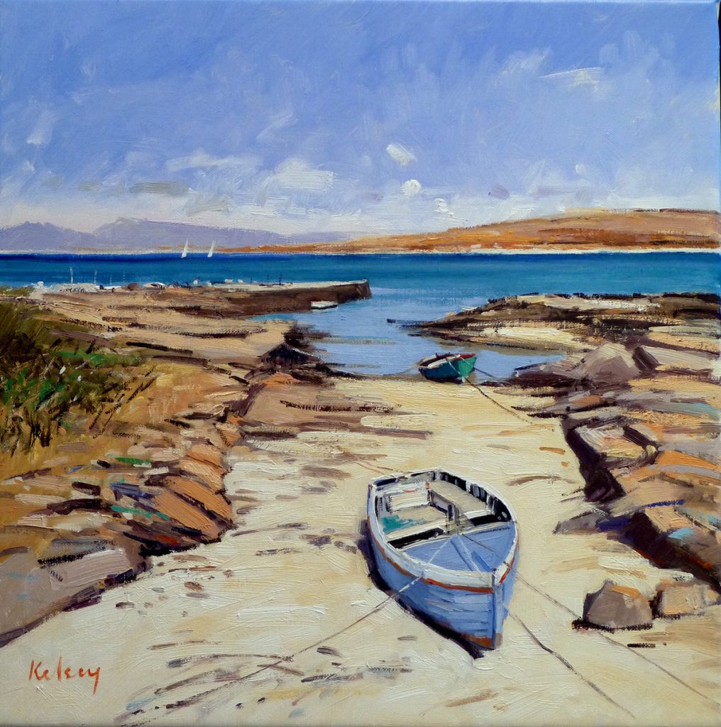
Safe Haven, Oil on Linen, 60 x 60cm
You trained at the Glasgow School of Art how has this influenced your art till now?
I was very lucky to have studied at the famous Glasgow School of Art in the late 60’s when it was an Art School in the true sense of the word. The syllabus was superb with the first two years being a wonderful general course of practical and liberal arts and history. This was perfect for a young man of 17 fresh out of school. During this first two years I studied under a very conservative elderly tutor who believed in teaching in the old tradition of drawing from the cast, studying perspective and learning about composition. Skills which have stayed with me all my life.
After two years general course I entered the Drawing and Painting Department and studied under a group of young men who were carving out a career as painters. I was in awe of these artists and they had a great influence on my creative energy. The inspiration I received from Alexander Goudie and David Donaldson has dominated my painting style to this day.
Due to your location in Scotland you truly get four seasons every year. Can you show us the seasons using four paintings?
Summer
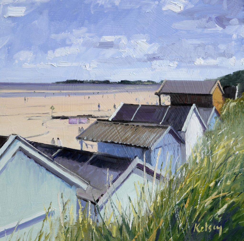
Beach Huts at Wells, Oil on Linen , 40 x 40 cm
Autumn
Evening Light, Portencross, Oil on Linen , 30 x 46 cm
Winter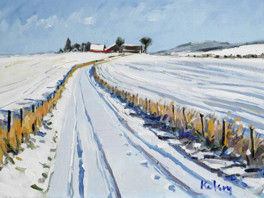
Farm Lane, Oil on Linen , 30 x 40 cm
Spring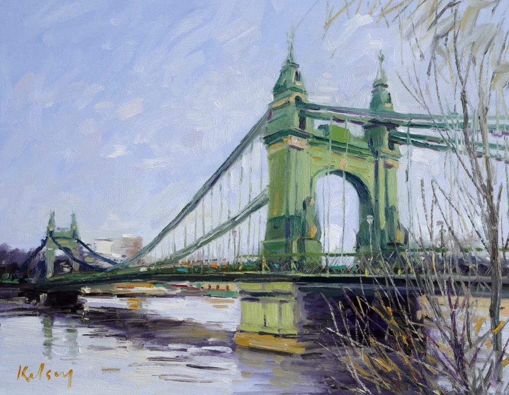
Hammersimith Bridge, Oil on Linen , 50 x 60 cm
For many years you taught art – during this time did you do much personal art?
I started teaching in a Six Year Comprehensive School, on the banks of the Clyde near the ship building town of Greenock straight after Art School at the age of 21. My Art Career had not even begun and could have withered and died at that point. What saved it, and me, was the attitude of the Principal Teacher of Art in the school. He wanted his teaching staff to remain creative, and allowed us to continue to produce our own art works alongside the pupils we were teaching. For a young man, just married and living in a small apartment, this was perfect. I continued to develop artistically, producing paintings at my desk in my classroom which I could then frame up and exhibit in local exhibitions, like Paisley Art Institute. We even held several Group exhibitions in Greenock Art Gallery as the Teaching Staff of the School.
This was great experience for a young artist but more importantly allowed me to continue to paint alongside my teaching career.
Your comment, ‘Light is generally the most important quality’ discuss.
As a landscape painter I am fascinated by the way light falls on and alters the environment. Light is constantly changing and altering the atmosphere of a view. Light affects the way a view appears. If the light is from behind the viewer the scene is floodlit and clear, with strong colours. If the same view was seen facing the light it would appear silhouetted and grey in colour. Light is even more dramatic at the coast where it can illuminate and reflect off water surfaces.
Light is so important in your art but it is also important in your studio. Expand on this aspect.
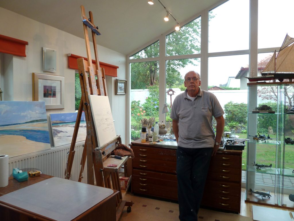
How do you prepare for a painting?
From several field trips per year I accumulate sketches, watercolour notes and photographs which I use to work up into completed paintings in my studio.
You often paint in remote places expand on this using 1 or 2 paintings.
I am drawn to the West Coast of Scotland and even beyond this to the remote chain of islands called the Outer Hebrides which sit on the extremity of the Scotland and the Atlantic Ocean. These beautiful remote islands have always been an inspiration to me. My grandparents moved from England to the remote island of Barra in 1900 to become teachers, and my father was born on Barra in 1906. This is my favourite Hebridean island and is a mixture of rocky coves and vast flat sandy beaches.
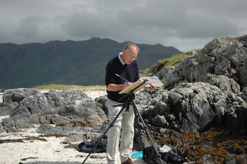
Another favourite painting spot is found near the village of Arisaig on Scotland’s north west coast. From the beaches here you can stare at the remote islands of Eigg and Rum which sit on the horizon.
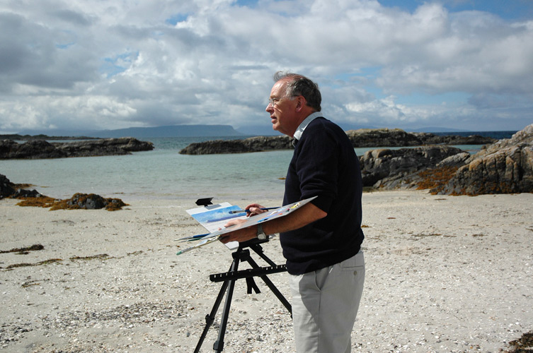
While you paint in remote places, your art has been sold and taken to many places. Can you name a few of the remote places they have gone to?
When you sell from a gallery it is not the custom of the gallery to tell you the name of the purchaser. Nevertheless, you do eventually get to meet some of your collectors. I have Corporate Collectors all over the world as far afield as London, Singapore, New York, Canada, France and Italy.
‘I love to put up a large white canvas, mixing some paint and applying that first big area of colour’. Explain your need to paint.
This must be something built into my genes as I have been artistic from as far back as I can remember. I think my Grandmother, the one who moved to Barra at the start of the 20th century, was artistic and I claim my art genes from her.
My main media is oil paint with which I have a great relationship. It feels as natural as breathing for me to mix oil paint on a palette and apply this boldly to a white canvas.
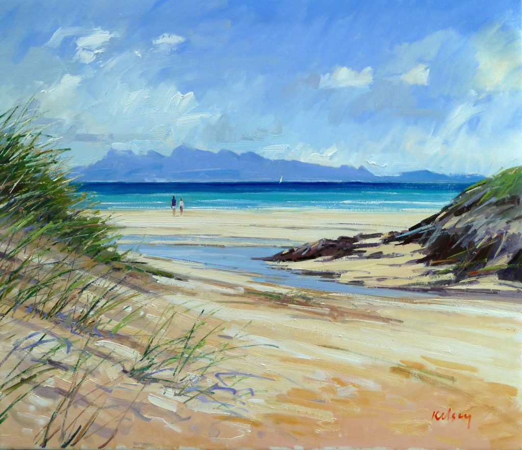
Beach Streams, Arisaig, Oil on Linen, 76 x 90cm
What a milestone; your 21st Solo exhibition with Thompson Gallery, comment on this long relationship.
Every artist dreams of living from his work and being shown in a top gallery. I was no different from this dreamer way back in the 70’s when I was a young teacher. I never once thought that someday I would become a full time professional artist. As I explained earlier, if I hadn’t been given the opportunity to continue to paint at this vital moment in my life I would not have been painting and exhibiting 25 years later when Thompson’s Gallery invited me to exhibit with them in their Mayfair Gallery in London.
John Thompson and Robert Kelsey
At first I was one of a stable of Scottish artists exhibiting in group shows. After a year or so Thompson’s invited me to have my first solo exhibition with them in 1994. This showed that they had faith in me to take on the huge task of painting for a large solo of 50 new works. I thrived on that faith and didn’t want to disappoint them.
My first show with Thompson’s let me see just how a quality Mayfair gallery operates. They produced a forty page fully illustrated catalogue, large adverts in Country life Magazine, and The Spectator, and more importantly, supplied a flood of collectors who wanted to purchase my paintings.
This was a dream come true. This first exhibition was a great success as were the others that followed over the next 25 years. John and Sue Thompson soon became more than Art Dealers and become good friends. My wife and I would frequently stay with them in their lovely home in Suffolk, and we got to know their family as they grew from children into young adults with children of their own. Their youngest daughter, Megan, who was only a small child of 8 or 9 in 1994 now manages Thompson’s Gallery in Marylebone, London.
In 2004 we were approaching my 10th anniversary of annual exhibitions and celebrated this with a quality show of 70 new paintings. The catalogue was a proper published book in a slip case, with a foreword by a top BBC Journalist and writer. We even managed to get articles promoting the exhibition in quality Homes and Interiors Magazines and better still a news item and interview on Breakfast TV with the BBC.
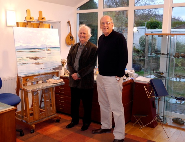
Ken Howard RA visiting at Robert Kelsey's Studio
All this hard work and preparation resulted in a most successful exhibition with around 60 paintings selling in 10 days.
Eleven exhibitions on and we were celebrating my 21st solo with Thompson’s in May 2016. This was great fun, especially as many of the wonderful gallery staff I had worked with over the years turned up for the opening party.
Bay Attic is a company that sell Giclee Prints of a selection of my Paintings through their website.
I have always considered prints to be less important than my original paintings but can understand that not everyone can afford to spend large sums of money buying originals. When I was approached many years ago and asked to license prints of my paintings I was happy to do so. I have little to do with the production or distribution of the prints and only receive a modest copyright fee on prints I sign and number.
I have about 30 paintings which are available to purchase as prints and these are in signed limited editions of 250. These are Giclee Prints of the highest quality printed on thick paper with inks that will last a lifetime.
You often paint snow; discuss the technique you use for snow landscapes.
I like to paint in all seasons but do love the colours and contrasts of a snowy Landscape. The secret of painting snow is to introduce warmth to the picture. I do this by bringing in orange or browns with foliage and grasses. Warmth can also be introduced in the purple shadows cast on the snowy surf
Contact details
Robert Kelsey
Robert Kelsey DA, MUniv, PAI, FRSA, Scotland
Interview by Deborah Blakeley, September, 2016
Karina Furhman
How often do you ask a person to pose for you?
I imagine sculpting everyone I see. Everyone has beautiful details either in the bone structure or in the muscles formed by certain facial expressions. In person I probably approach several people per month. I also look for models on modelling and dance sites.
Bronze Male
In general people’s faces fascinate me. Everyone has something very beautiful, a unique detail. In addition, how people’s faces change when going through different emotions fascinates me even further. A moment when someone’s face ignites in joy or someone tells you about something they are passionate about.
How long do you need them to pose for you?
Each modelling session is typically 3 hours long. Some models don’t mind taking a lunch break and doing another session in the afternoon.
Torrey
Can you give a general time frame needed for a pose to take?
For seated portraits I typically need at least 60 hours with a model and preferably during a continuous time frame. The time is either broken down into 3 hour or 6 hour sessions.
Standing poses are typically 3-4 hours sessions once a week. A life size figure may require a several month commitment. The model turns every 5 minutes and maintains the same pose with each quarter turn. There is a short break after each 20 minute session with a long break in the middle. I cherish my models so I always have treats, coffee and tea ready to go.
Do you have music playing in the background or do you talk together?
Music is always a must. I prefer certain upbeat tempos to work to but I always consider what the model wants to do. I prefer no headphones for the model as this keeps me better connected to them. I’ve had all kinds of music and comedy requests.
During this process what do you learn about a person and how does this effect the finished piece?
I find portrait work really fascinating because I get the privilege of really getting to know someone and observing a unique expression that fits their personality. A friendship always forms and I feel responsible to represent the person well and honestly.

Can you discuss the overlap your photography has on your sculpture work?
Photography has been a wonderful counterbalance to sculpture. I love action photography as a contrast to the lengthy sculpture process.
During the final stages of completing sculpture, and always running into the issue of lack of funds for as many modelling session as needed, I use photos to clean forms and prepare for mould making. I take photos in both direct and indirect sunlight from various angles. Working purely from photography on sculpture is dangerous. There is a big problem of lens curvature and that is why I don’t rely on it.
Can you expand on the technical process of one of your bronze sculptures?
I made a 2 minute video on how a sculpture becomes bronze: https://youtu.be/qgHSb7qfuDg
After all the modelling is completed the sculpture goes through the mould making process. Two layers are applied, designed to open and reveal the negative of the original. The original piece is recycled back into the oil clay bin and the mould is taken to the foundry for the “lost wax” process into bronze.
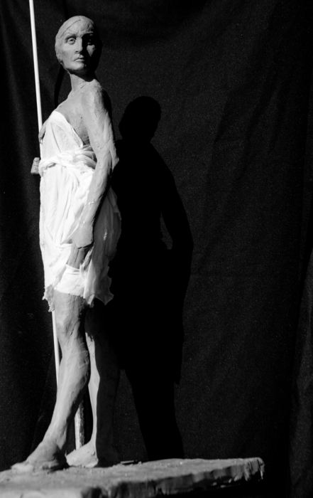
Female Chief
How have you chosen the Foundry you use?
I love ArtWorks foundry in Berkeley, California. The foundry owner brought over old classical techniques and they focus on quality. I am able to check the work at every step and make sure everything is exactly as I need it to be. It is wonderful to have ArtWorks as my partner.
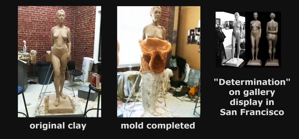
Discuss the size of your work?
I prefer to work life size and larger. I am focused on public monument work. For public art proposals I create smaller models (maquettes) that are either ½ or 1/3 life size.
You call some of your sculptures ‘Gesture studies’ explain what you mean by this title.
Gesture studies are a critical to keeping my sculpture skills sharp. A gesture study is a sculptural sketch of a figure, not intended to be completed, but rather to be an exercise. In general, the body is broken down in several large masses. Identifying and placing the large forms relative to each other on a particular individual and copying them quickly onto an armature with clay is something that I focus on.
Are there any historical people you would like to sculpt? If so who and why?
I admire so many people, it is difficult to pick.
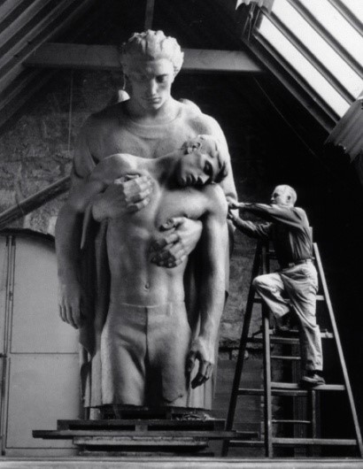
Walker Hancock During World War II, he was one of the Monuments Men, who recovered art treasures looted by the Nazis
You have studied sculptures from the past: Renaissance, Greek and Roman sculptures discuss how this has influenced your work?
How artists spoke through sculpture fascinates me. To see the dynamic development of this artform in historical context is incredible. The power of the Greek’s like Praxitalies, and Phidias, Michelangelo’s and Leonardo Da Vinci during the Renaissance, Carpeaux and Houdon during the 19th century, American Saint Gaudens and Chester French, to name just a few. I am always pushing myself to be better and look to my idols for lessons in anatomy, facial expressions and to learn how they communicated through their work.
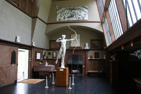
Saint Gaudens Studio
You are very interested in Studios, current and historical can you expand on this interest.
As Rodin said sculpting large masses correctly is key, I would add that if you can’t see them in good light then there will be trouble. Classical art is done in north facing studios. One can work in north light most of the day, it is constant and consistent. Most of the day direct sunlight does not enter the studio, and forms are illuminated well so that each plane change is easy to identify.
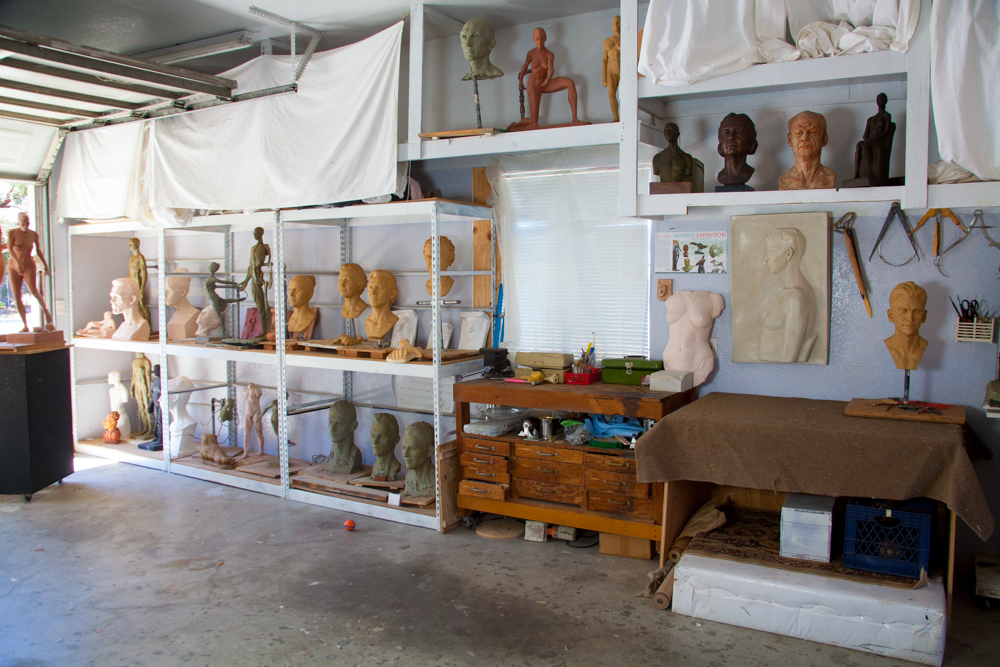
Karina Furhman's Studio
Take two artists and their studios and why they are of particular interest to you?
What fascinates me in general about studios is natural light. There is nothing better to work with and has been used by artists for thousands of years. A model placed at the right spot in north light makes forms so clear and modelling can be done quickly. For me working with a model in good light is a joy.
Photograph Studio in Paris
Discuss your interest in studio photography and paintings both current and historical?
I love photography. I see something I need to capture and I need to frame it just right. Portrait photography is lots of fun. I get to study a model’s face up close and try to portray them as beautifully as I can. I’ve had fun photographing a very wide range of events from small private events to drone racing, weddings, animals, kids. I like to study the poses from different angles and often have a model photographed before starting the armature process.
In addition to studying sculpture throughout history I’ve research and studied many painters throughout history. Historically figurative fine arts excelled in anatomical mastery and composition and communicated easily with the viewer. It’s wonderful to reference a certain detail of a piece located in the Louvre, and technology makes that type of study much easier.
Comment on your own studio and some of the aspects that you have introduced due to your historical interest in studios.
I am currently planning my own studio / urban art centre. The studio will be based on the classical north facing skylight and window lighting that will consistent all day natural light.

Contact details.
www.karina-sculpture.com
Karina Furhman, San Francisco, USA
Interview by Deborah Blakeley, August, 2016
Michaël Cailloux
Your work is often called jewellery for walls discuss this in relationship to your work?
I decided to call my sculptures “Wall jewelry” because I have always dreamed of having jewelry on walls... It's like a childhood dream. I am fascinated by the Art Nouveau jewelry and work of René Lalique. That's why I learnt the craftsmanship of jewelry, because I wanted to have jewels in my apartment. At first it was just for me… I make no concession in my work I am doing what I like without asking questions ... Everything starts from the observation of nature in general , and I also am inspired by old illustrations by redesigning my way ... I have a sketchbook and I felt drawn to anything that inspires me : plants, insects , frogs, amazing birds ...
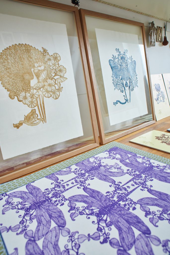
Image by Rodolphe Baras
Can you explain how you use of a bocfil saw in your art?
I use it to cut the copper plate . This is a saw that can be used vertically and which allows for the detail ... The bocfil saw is used in jewelery and decided to exploit it by etching to have the same finesse and precision. In fact it is a misuse of the technique.
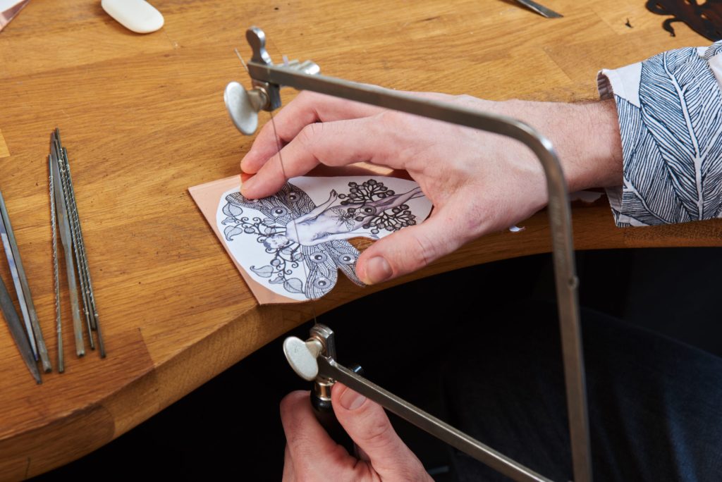
Image by Rodolphe Baras
Expand on the technique you use to create your walled Jewellery?
For my wall jewellry, I use the copper plate that I used to make my etchings at high water. Once I realized my etchings, I do not throw my copper plate. I worked with artisanal techniques for a hybrid object between sculpture and jewelry. I reappropriate the copper sheets used to print my etchings by working them according to classic jewel making techniques: bow saw, internal and external cutting, embossing and chiseling.
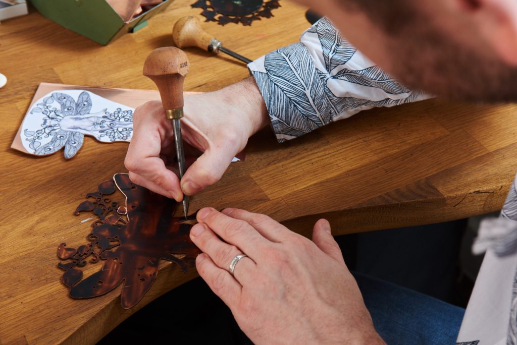
Image by Rodolphe Baras
How did the ‘mouches’ become a part of each work?
I've always been attracted by insects since childhood and particularly flies. They intrigue me and I find them attractive insofar as they come always disturb the eye. So I decided to make my memory about whether animals in the paintings of the Renaissance or the piece of taffeta that arose women on their faces in the 18th century to reveal their mood !
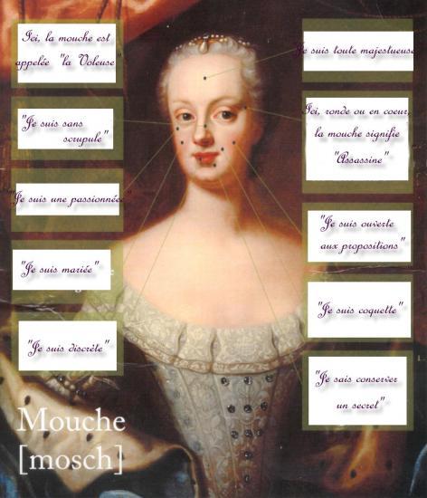 You also use your initial sketches to create other works, e.g. scarves discuss two of your scarves and their designs.
There are two that I particularly like because everyone told me they are unexpected : Forbidden Fruitsalad and Florilege.
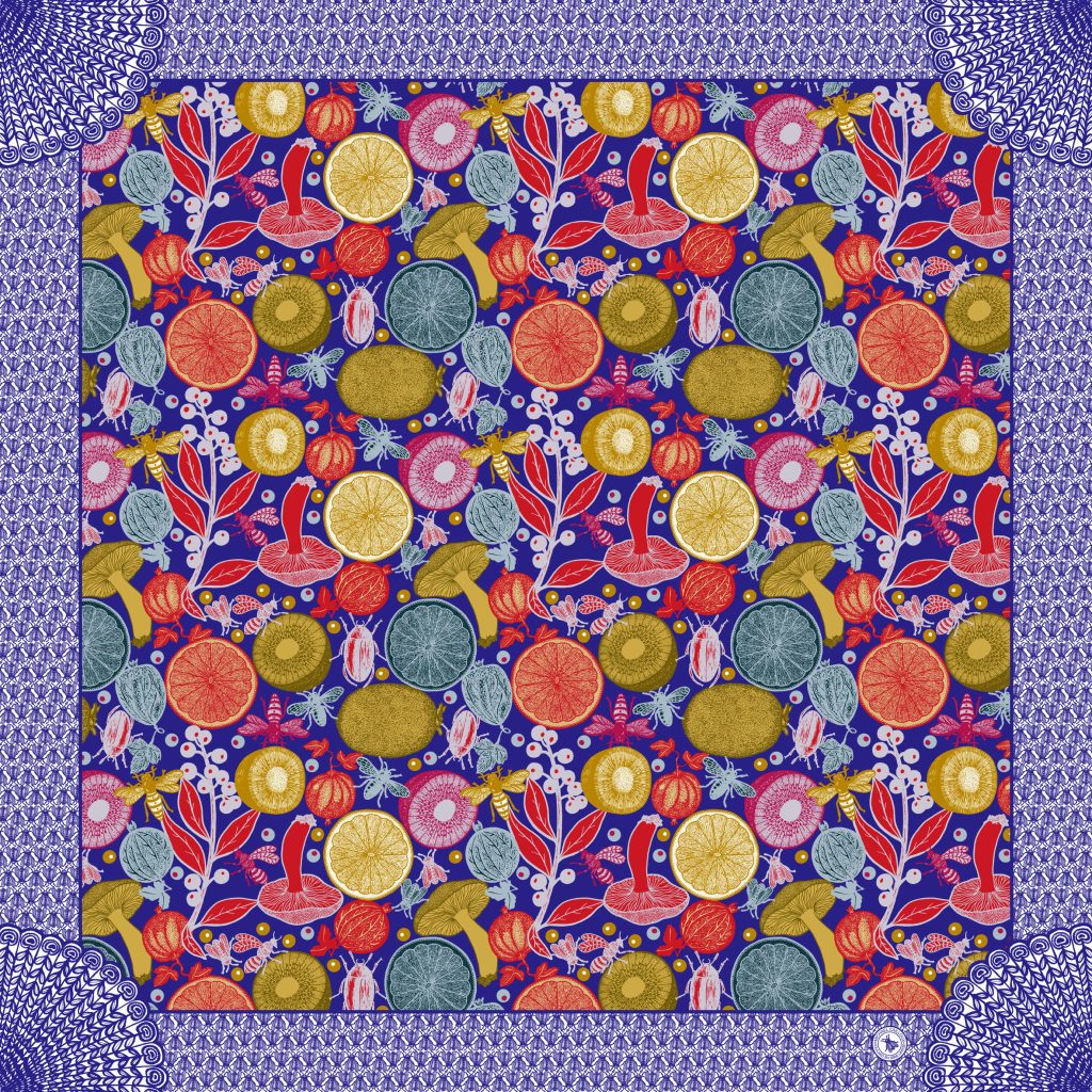
Forbidden Fruitsalad, Silk Satin Scarf.
Colours
Playing with colors is a passion for me! For these two scarves I am very pleased with the colours During my studies I was taught to be a colourist and I enjoy making vibrant colours to highlight the drawings. In Forbidden Fruit salad, I wanted something greedy and for Florilege I wanted it sparkles like fireworks, an explosion of colors.
Pattern
I want them to tell a story! Forbidden fruit salad tells the story of a garment we can never eat and Florilege, it's a mix of all my bugs, it's a little story of my passion, as an anthology.
Florilege, Silk Satin Scarf
Boarders
I make the boarder as a frame because I want my pattern are like paintings!
Printing onto fabric
Yes I print on 100 % silk
You also have a collection of wallpapers, discuss the importance of repeats in your wallpaper designs.
Wallpaper, Fragment – Infinite I turn the use of the classic wallpaper … I create all my wallpapers like paintings for tell stories. The size is 40 x 50cm. Originally they are not made to cover entire walls… I realize the "real" wallpapers only on a customer order.
Wallpaper, Fragment - Infinite
Expand on the combination of two skills, jewellery and etching and how this combination came about?
In fact, I've always liked high water etching and I felt pity to throw the copper plate. In my studio I looked for a way to showcase the plate. At first I was using zinc. And soon I had the idea to train myself to the art of jewelery for the wall jewels that I always dreamed of. I like the colour of copper and the fact that I can give him. I want us to be doubt over the date of the object as if it came from the past.
‘Cicada Head’
Take your etching ‘Cicada Head’ and explain this piece.
Size
28 X 40 cm
Number if prints (limited editions)
4 edition
Paper use for the printing
White Hahnemühle paper
Insects included
cicadas, beetles , bees and fly
Flora included
I draw flowers that do not exist. I manage to obtain hybrid, I mix different varieties.
Dragonfly
Can you explain the comb shape that appears in many of your etchings?
These are my first pieces… It is because I love the combs including those designed by René Lalique. It was my first source of inspiration. I love the combs, there was a beautiful museum in Paris, which has just close.
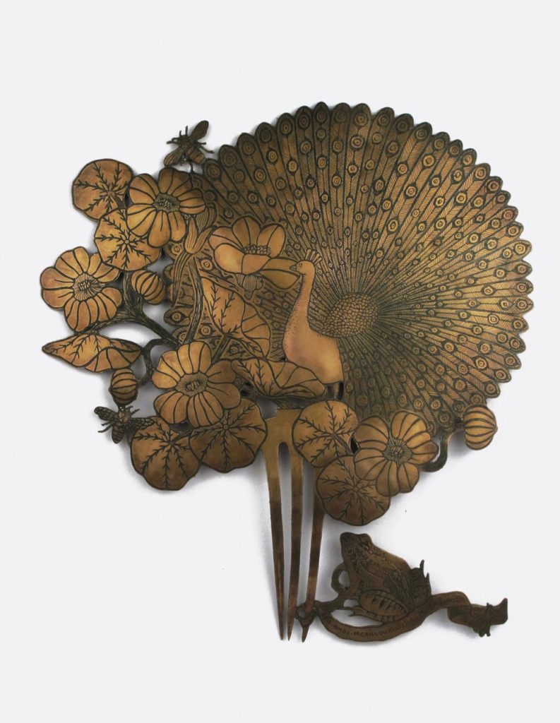
Detachment
Can you take us through the link between Anax imperator – wall jewellery, Dragonfly -Etching and Lace – wallpaper and how one has led to the other.
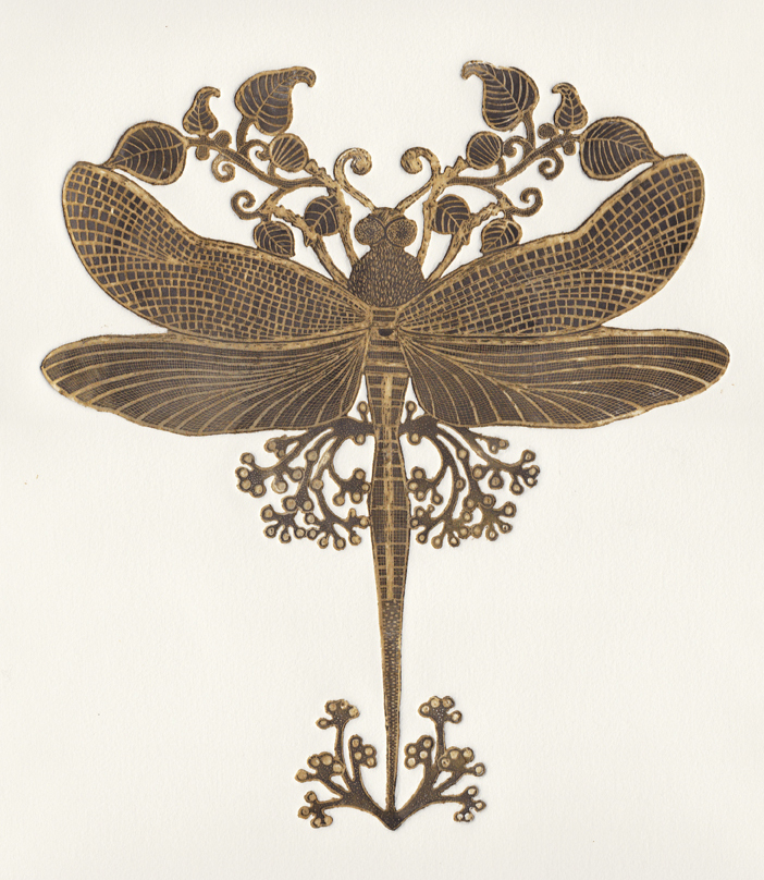
Etching, Anax Imperator
In fact, my work begins with the drawing. Everything starts from the observation of nature in general, and I also am inspired by old illustrations by redesigning my way ... I have a sketchbook and I felt drawn to anything that inspires me : plants, insects , frogs and Dragonfly... I can spend days drawing, and even nights.
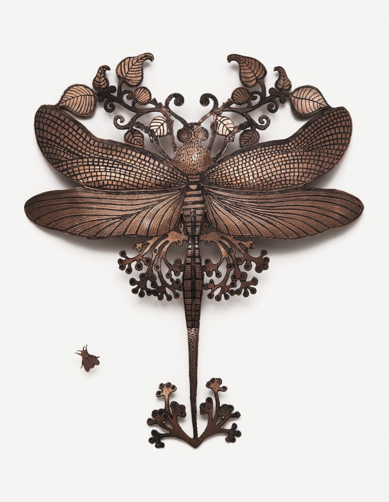
Wall Jewellery, Anax Imperator
I then glue this drawing on a copper plate to cut by hand, according to conventional techniques of the art of jewellery : Anax Imperator. Before, I print the plate in the technique of high water etching : DRAGONFLY. For wallpapers, I scan my drawings of my wall jewels computer to adjust, repeat patterns and put the connector : Lace. Wallpaper.

Fragment Lace.Wallpaper,
What are you currently working on?
I do not know to stop ;) I work a lot on the subject and body of the spider while adding insect and plant. In September I start my first umbrella collection, large paintings wallpapers 150X110CM and new big scarves 120X120CM
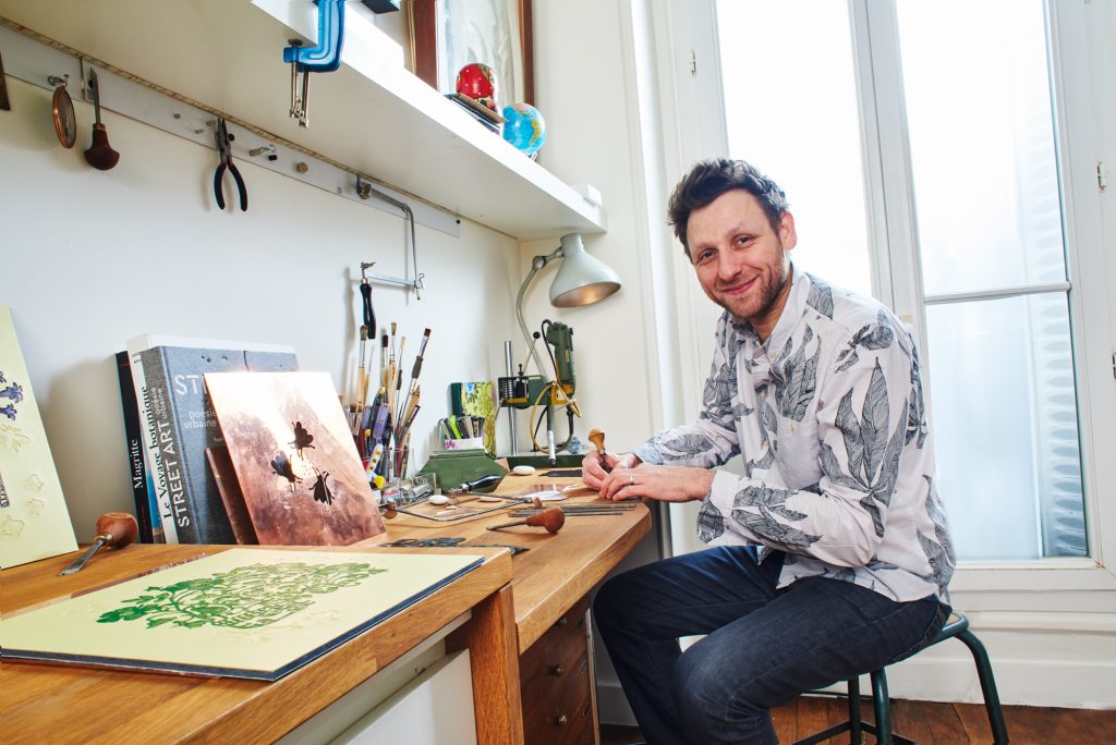
Image by Rodolphe Baras
Discuss the importance of Exhibitions to your artistic growth.
These are unique pieces or very limited editions. It is important to the stage for the release for public knowledge. It allows you to meet people who appreciate my work and want to work with me. For example, some galleries then sell my wallpaper or my scarves. Some clients ask me to perform the wall jewel they always dreamed of. exhibitions also force us to renew and propose new creations!
Spider
Contact details.
Michaël Cailloux
michaelcailloux.com
contact@michaelcailloux.com
Michaël Cailloux, Paris, France
Interview by Deborah Blakeley, August, 2016
Joan Waters
You began your art training in 1976 when did the use of welded steel begin and how?
Some background—I was born in England, and grew up in Baltimore, Maryland, where I earned my BFA at MICA, Maryland Institute College of Art (a combined major—painting/drawing/printmaking/sculpture, summa cum laude). I moved to Phoenix in 1989, and had my own graphic design business. After 9/11, when the economy suffered, my design business slowed and I decided to get a body of work together and start exhibiting my paintings.
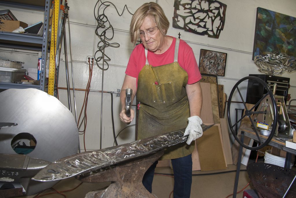
I enrolled in a Basic Welding class at Mesa Community College. I had always liked making designs with positive and negative shapes, and had been cutting them out of various types of paper and board over the years, though I was frustrated with how flimsy and delicate they were. I didn’t really respond to metal, until we started using the plasma cutter, and that’s when the light went on. Suddenly I was able to cut shapes out of thick sheets of steel with this 10,000-degree torch as if it were butter. And they were substantial and durable, unlike the paper cutouts. Because I’d been drawing my whole life, the lines I cut were as natural as making a line drawing with a pencil. For the next couple years, I focused on cut out positive and negative shapes with colored patinas, and gradually started to understand how to construct and weld three-dimensional forms.
I use industrial materials and processes to re-interpret conventional art practices. Large sheets of industrial, cold rolled steel, angle iron and solid rod are cut, hammered, welded and ground to become layered, organic forms. Although I work in a wide range of mediums, at the core I see it all as drawing and painting. For example, I’m using the mig welder and plasma cutter to “draw” on the metal, “erase” with the angle grinder, and “paint” with patinas on layered steel sculptures.
The experience of working in different mediums, say painting and metal, is that I can take a discovery in one medium and explore it in another. Consciously avoiding getting locked in to knowing the “right” way to do things, keeps the exploration process open and inventive.
As soon as you adopt the perspective that you know the answer, you’ve lost the element of exploration that keeps the imagination alive.
The Arizona Arts Commission has been very generous in providing Professional Development grants to you, discuss.
The advantage of these grants over a series of years. How the terms and conditions of the grants have influenced the direction of your work.
These are supplemental grants that support learning and development activities--I’ve used several of them to assist in attending sculpture and metal working conferences around the country. Because the grants supplement the artist’s own funds, they support the artist’s own commitment and provide a monetary boost. There’s no restriction on the work. I feel they’ve helped me broaden my perspective by attending these conferences and meeting artists from other parts of the world. It’s an honor to receive them, and the selection process also brings credibility to the work I’m doing.
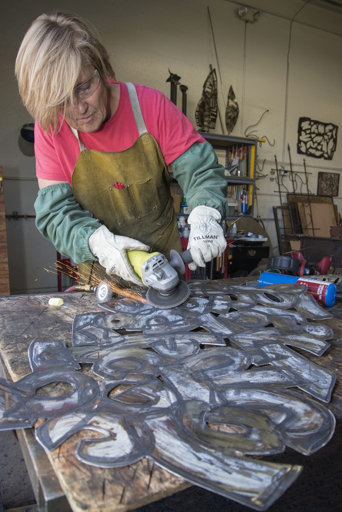
Your comment, “I do know the completed work sings or hums – there is a vibration that comes out of it.” Comment on this.
Explain the welding lines… Technique
Effect that it produces on your work
This quote was from my exhibition “Beyond the Shiny Metal Object: Reflecting on the Shadow’s Light”. These works were large steel sheets that I welded series of lines, patterns of concentric circles and lines onto. My process was to first cut and grind the entire front and back of the steel sheet, then make all the welded patterns in one big session. As the welding progresses, the heat collects in the steel so it is quite hot—it’s hard to work close to it for so long. Since I’m wearing a dark welding hood, my field of vision is very small—it’s like driving down a pitch black road at 60 miles per hour with a flashlight guiding the way. I’m relying on years of drawing practice to control my hand and guide the line. Where the patterns are concentric circles, I do it in one shot, and there is no going back to make corrections if I mess up the welding.
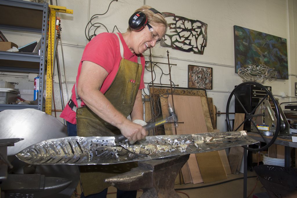
As the welded panel cools, it contracts and starts to curve and become concave, depending on how the welding was done. After much cleaning and grinding I apply patinas and then there is further finishing and refining with air tools, wire brush, etc. Both in the working process, and when the piece is finished, there is visually and acoustically an effect of sound or vibration being directed back towards the viewer from the concave surface of the steel.
You use energy patterns in many of your pieces expand on how and where you find the patterns?
I think these suggest energy patterns.
According to quantum mechanics, what we see as ‘solid objects’ are actually comprised of particles, discrete packets of energy with wave-like properties.
This body of work explores the similarities in these wave-like, energy patterns that are found in many different types of living beings and situations in nature. Ripples of water in a river, raindrops falling into puddles, growth rings of trees, vibrations, sound waves, and galaxies in outer space, are some of the forms suggested by these drawings of radiating lines and arcs. The process of making these pieces deliberately includes several elements of uncertainty and lack of conscious control, so that natural forces and patterns may become part of the evolution of each piece.
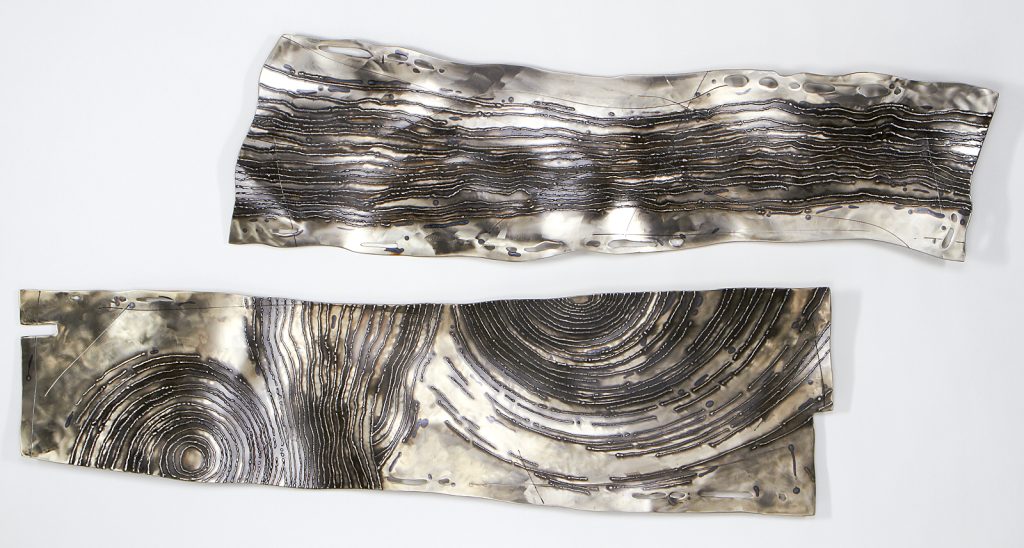
Eddies in the Stream, welded steelwith patinas, clar powder coating 17 x 57 x 3 In.
As the welded patterns overlap and run off the edges of the steel, it creates the impression that the piece of steel doesn’t contain the waves of energy, as much as it functions as a window which allows us to view these energy patterns found in the ‘objects’ around us.
Many of your pieces are designed to be seen from all angles discuss this.
In painting, there is a practice of viewing a work in progress from different directions, to make sure the composition is strong and well balanced. I often employ this practice in creating the work, but I have taken it a step further, and let it influence how the finished work is viewed. By choosing to hang a sculpture horizontally or vertically, the viewer is able to participate and engage with the work over time. I think what makes a piece worthwhile is if the viewer is able to engage with the work, and explore their own questions in it. Many of the compositions reference patterns and forms found in nature, and it is interesting to see the universality of these forms which are found in vertical and horizontal configurations.
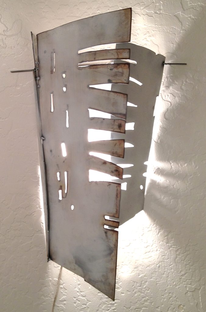
Steel Origami, welded steel, patinas, paint.
‘Passage’ is an acrylic on canvas while ‘Mariposa: Scaffolding for Growth’ is welded steel can you discuss the comparisons that can be found in both pieces?
Thank you for making the connection between these two.
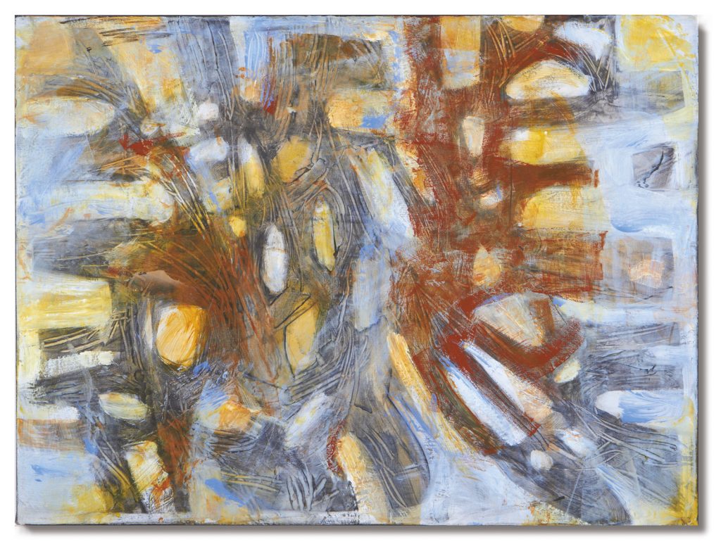
Passage, Acrylic on Canvas, 18 x 24in
They were not created concurrently, so I was surprised to discover the similarities in the two works-I believe the painting came first. Both works suggest these forms and light in space, looking through scalloped openings, and a sense of mystery, of something being revealed over time as the eye discovers new patterns and shapes. The sculpture has the added dimension and hidden “twigs” structure behind the front pieces, which invites exploration of the colors and shapes in its shadows.
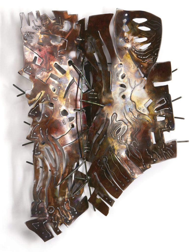
Mariposa: Scaffolding for Growth, welded steel, patinas, 29 x 19, 6in
You have been influenced by African masks, discuss this in relations to your work ‘Mariposa: Mask’.
Maripasa: Mask, welded steel with patinas, clear powder coating 20 x17 x 6 inches
Mariposa is butterfly in Spanish, and I prefer the Spanish title because it is free of the preconceptions we have with the word ‘butterfly’. The Mariposa series was influenced by Rorschach inkblots, where there is a mirror image coming off a central axis, and the viewer is left to create their own interpretation. This piece conceals a hidden layer within, which is also the hanging mechanism. When viewed from the back, the interior is smooth and finished, like a mask interior, and visually interesting in its own way. I called it mask because it seems to hide a second identity, the elements which are behind it, which is the ‘shadow’ of its outer presence. It is thick steel with welded markings. the edges are beveled and shaped with the grinder to reflect light on the different angles and create a sense of movement.
Light plays a part I your work ‘Shadow Branches’ and ‘Steel Origami’, these are both very different but both use light to complete the work, discuss.
Because we have so much sunshine here in Phoenix, I’m often thinking of light and shadow as important visual elements in my work. ‘Shadow Branches’ , made of hammered steel rods, float and intertwine in space, and cast intriguing layers of shadows on surrounding walls. These are constructed out of round steel rod which is hammered and bent. The individual branches can be configured into constructions from a few branches to entire walls. When the light is directed on them, the shadows become a dynamic element that twill change as the light changes.
Dendrites - Shadow Branches, welded steel, acrylic paint
‘Steel Origami’ uses thin sheets of steel with paint and patinas. I create folded, constructions, as if suggesting folded paper. When lit from within, the cut out areas throw shapes of light onto the wall.
‘Sammamish Totem’ has a very strong natural element expand on this.
SammamishTotem, 18 x 16 x 82 in
‘Sammamish Totem’ was inspired by some totems I’d made with Arizona desert motifs, but this one, a commission for a couple who live outside Seattle, Washington, suggests plants and animals that are indigenous to that region, known for its old growth forests, salmon and rainy climate. Ferns, birds, fish, a nest, mushrooms and viney undergrowth become totemic elements to the piece. It was built to enliven their back patio, set the forest trees.
Size is shown on your ‘Desert Heart’ pieces expand on both in relationship to size.
The smaller ‘Desert Heart’ was created first. It got its name from the curious dichotomy of living things here in the Sonoran desert—they can be quite alive, but appear dormant or dead at times. After a rain, they bloom with color and seem to spring to life. The duality of nature—its power to destroy as well as create—becomes part of each piece through the extreme amount of deconstruction, cutting up and taking apart, that is necessary before the work can be re-ordered as a unified organic presence.
Desert Heart, with LED lighting
In making this, I was curious to see how much of the steel I could cut and remove, which made the piece seem very fragile. I then hammered and bent it, curving it around into a dimensional form, and welded it in place. I took care to scale it up carefully, and add more detail so the larger version had the same feeling to it. The large version was donated to a fundraiser at the Desert Botanical Garden, and had an LED light rope behind it with changing colored lights, for a very dramatic effect.
Desert Heart, welded steel with patinas, 30 x 30 x 7 in.
Explain the process you have used in ‘Calligraphy in Space’.
Technique / Colours / Sizes
This series translates the energy of making a calligraphic drawing into the form of welded steel sculpture. Drawing, based on observation of objects in the environment, and the process of making marks and ephemeral gesture drawings, becomes the foundation for entirely new objects in space.
Calligraphy In Space, Hand cut steel with red powder coating,
The beginning is a sketch or vigorous gesture drawing with brush and colored patinas onto a large sheet of heated industrial steel. I trace around the marks and cut out freehand with a 10,000-degree plasma cutter. Through the process of grinding, welding, and layering the material with hidden spaces, I am able to re-configure the brush strokes into new abstract three-dimensional objects which suggest the dynamic energy and physicality of the original drawings. Some of the heat marks from the cutting remain in the colored patinas, which adds more depth to each work.

Calligraphy In Space; Black, welded steel with patinas, 40 x 37 x 3 In.
‘Desert Towers’ was a commission for a garden, discuss the commission and also working with both the landscape architect, homeowner and your own personal response to the pieces. How you were all able to combine and come to such a positive finished commission?
‘Desert Towers’ is a great example of the synergistic process of working on a commissioned project (if all goes well).
Desert Towers, Commission
I met the client at a studio tour where I was exhibiting, and as it was early in my working with steel, I wasn’t quite sure what I would design for him. He liked my work, and the positive and negative shapes cut out of steel. At first, the client was thinking of stone filled gabillons, which I’m glad we didn’t do, because he would not have been able to take them when he moved!
Desert Towers
I did a number of site visits, took photographs, and made sketches and some models which were part of the dialog and process with the client. A landscape architect wasn’t involved. The goal was to add character to the pool area, including at night, provide visual screening from the golf course, and increase privacy along the neighbor’s wall. I finally came up with the idea of constructing the towers to support the steel cut out designs, The variety of perforated and expanded steel, with bent steel rod creates an organic sense to the work. There is accommodation for the irrigation to be concealed within each structure, so the planter on top is watered, and the lighting at the base creates dramatic shadows, perfect for night time swimming.
Desert Towers
A note—I don’t use found objects or “recycled” materials in my work. Interestingly, most “new” steel is comprised of a high amount of recycled steel:
Steel is the most recycled material on the planet, more than all other materials combined. Steel retains an extremely high overall recycling rate, which in 2012, stood at 88 percent. The amazing metallurgical properties of steel allow it to be recycled continually with no degradation in performance, and from one product to another. Source: American Iron and Steel Institute (www.steel.org/sustainability/steel-recycling.aspx)
Contact details.
Joan Waters
website: www.JoanWaters.com
email: Joan@JoanWaters.com
Joan Waters, Arizona, USA
Interview by Deborah Blakeley, August, 2016
Judy Drew
Between 1976 – 1984 you spent time on Bougainville Island and Papua New Guinea discuss the influence of this time on your work?
In the beginning there were limited art supplies which forced me to experiment with what was available. I would make my own modelling paste from powder and PVA glue as a base for my oil paintings. Eventually I worked in all mediums and I did many pen and gouache drawings of the local people - especially the women and children. I think the isolation was an advantage. There were few influences and I was able to develop my own style. I learned a lot from reading as many art books as I could get hold of.
What lead you to pastels?
I had worked in all mediums, oil, acrylic, watercolour and gouache while living on Bougainville Island but when I bought my first set of Pastels (Schminke) I felt a real connection. They felt familiar like the crayons, pencils and chalks I had used as a child. I felt in control and they suited my indecisive temperament.
Half Naked Nude in Black
You have been strongly influenced by Degas – expand on this relationship to your own work ‘The Dancer’?
When I started to use Pastel over thirty years ago I began to study the Pastel artists of the Post Impressionist Period - in particular Degas. I have always been interested in figurative work and Degas' portraiture with its delicate line work, tendency towards understatement and often spare use of colour appealed to me. His works show such a powerful confidence of technique yet a highly sensitive understanding of how to capture the essence of the portrait.
Who are your models?
I have had a number of different models. Some who have posed for group Life Drawing Sessions and others I employ as models in my studio.
Can you comment on the importance of setting and fabrics in your portaits?
The setting isn't always important at the time of sketching the model. I usually choose to create the setting around the model when I am working on the piece in my studio. I find that is when the magic starts. When away from the model I can concentrate on colour choices, elimination of extraneous details, paring the work back to what are the important elements. Colours can change, certain elements can be exaggerated or understated according to what feels good to me. Sometimes I will have the model return to complete the work. The fabric choices are all part of this process.
The Cloche Hat
Your work in Charcoal
I love working in charcoal with a life model. I usually choose a compressed charcoal and enjoy the freedom it gives. Achieving an accurate likeness when doing a portrait is still important to me and I like the self-discipline it presents. However achieving a likeness should not be at the expense of the technique. If the work becomes tight and overly 'perfect' there's no soul. Making mistakes, making a mess, reworking can add life to the work. Allowing the process to show through - the rubbing out and the fidgety uncertain lines all help infuse the work with emotion. You learn a lot about colour working with tone as it teaches you to closely observe the subtle changes of light and shade which need to be considered when creating a coloured work.
Working with pastel
Working directly in colour with a life model takes a lot of self-discipline. I usually work on black and start in the centre of the face and work my way out. I have very few lines to indicated the overall composition but usually have a good idea in my head or in sketches done beforehand. My colour choices often develop as I progress and may change in the process.
The Pearl Earring
Do you take commissions for portraits?
If I am asked to do a portrait it will only be from a life sitting. I don't like to work from photographs. I don't want to do an exact rendering of a photograph. I feel a much better portrait can be achieved through the struggle of direct observation and individual interpretation.
You comment on the importance of the understatement and underplay in your work. Discuss this using two of your works.
I think if everything is 'described' - if all details are put down there is no room for the imagination. The temptation to complete in every sense takes away the spontaneity. It's easy to loose the essence of the work (ie not just what you see but what you feel). So paring back to the essentials I think is important.
When working on the pastel 'Girl in Orange and Green' I felt a limited palette and a simple composition gave the work sensitivity. Touches of contrasting bright orange enlivened the piece. The pastel 'Half Draped nude in Black' is a stylised interpretation of the nude, concentrating more on the simplified shapes of the black gown and the contrasting white shape of the figure.
'Girl in Orange and Green'
Many of your works have a very Japanese influence expand on the use of background and clothing that gives this “Japanese” impression.
I have learned a lot from studying the influence of Japanese Art on the Impressionists. It encouraged them to simplify the shapes, eliminate detail, distort the background, radicalise the composition, use flat unbroken colour and eliminate the shadows. This helped drag the work out of the dour, the traditional, and the predictable style of the time. I love that and I wanted to give my work the a similar 'lightness'. Japanese (written) characters, fabrics and clothing with their simple elements of design convey an elegant beauty.
Your mother was a dressmaker, explain how this has influenced your use of fabric in your art.
Mum worked as a dressmaker when she was young and sewed all of our clothes. There was always visits to fabric shops and piles of fabric stored in an old Japanese Chest my dad brought home after the war. We loved to watch The Zeigfeild Follies, or Fred Astaire and Ginger Rogers on Saturday afternoon TV matinees - all the Hollywood movies of the Golden Era. I vividly remember the colourful costumes, patterns, silks, tules, satins, and the glamour of it all. I loved it. However I look for Beauty rather glamour in my work. Beauty encompasses more than just the visual. All the emotions are involved and it's how it makes you 'feel'.
The Gold Satin Gown
How important was your time in Paris?
I was able to visit all the places I had read so much about. The Musee d'Orsay with its huge display of works of the Impressionists offered a good chance to see the influences each artist had upon the other. You felt the common bond they must have felt despite their often fragile, tumultuous relationships. I did several Life drawing studies there. The studios had quite a serious, disciplined atmosphere and I liked it. Perhaps naively I felt I had stepped back in time.
The Black Rose
How important has Mary Cassatt been to you as a woman artist?
Although I love Cassatts pastels and oils it's probably her block prints which appeal to me most of all. They show such a powerful Japanese influence and are still so fresh and crisp even today. She was a good friend of Degas and they visited the galleries together. You can see why he admired her work. I admire her strength of character which enabled her to produce such strong work in what was still a male dominated world.
Discuss the need for less in ‘Love of a Child, Being a parent’.
At the time I did this sketch I been watching the plight of the refugees in the news. The woman is based on a portrait I did some time earlier and I used artistic license to incorporate the child. I wanted to show the fear, trauma, emotion yet powerful physicality of the subject. I felt the detail and emotion in the face was enough and the body/clothing needed only to be indicated. To me it didn't need any more.
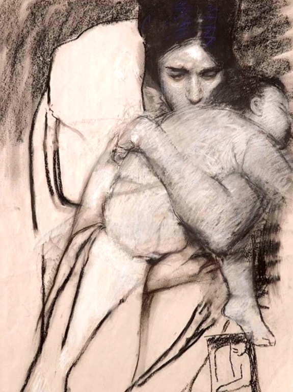
‘Love of a Child, Being a Parent’
Expand in how you develop feelings, passion and emotion to your work?
Emotion and drama can be conveyed through lighting and can create a sense of theatre. For example when the subject is lit from above. Eg The Gold Satin Gown. However when I'm working on a more light filled, simplified work where colour and shape dominate, the build up of strokes and texture can create a certain tension to the work. Eg The Cloche Hat. When working with charcoal, I get very messy using an eraser, my hands and fingertips. That physical involvement may help give the work a sense of emotion.
Contact details.
Judy Drew
Web: www.judydrew.com.au
Judy Drew, Melbourne, Australia,
Interview by Deborah Blakeley, August, 2016
Mark Stoner
h4>‘In collaboration’, can be said quickly and flippantly, but in your work it becomes an integral part. Can you expand on this in relation to ‘Water Course’?
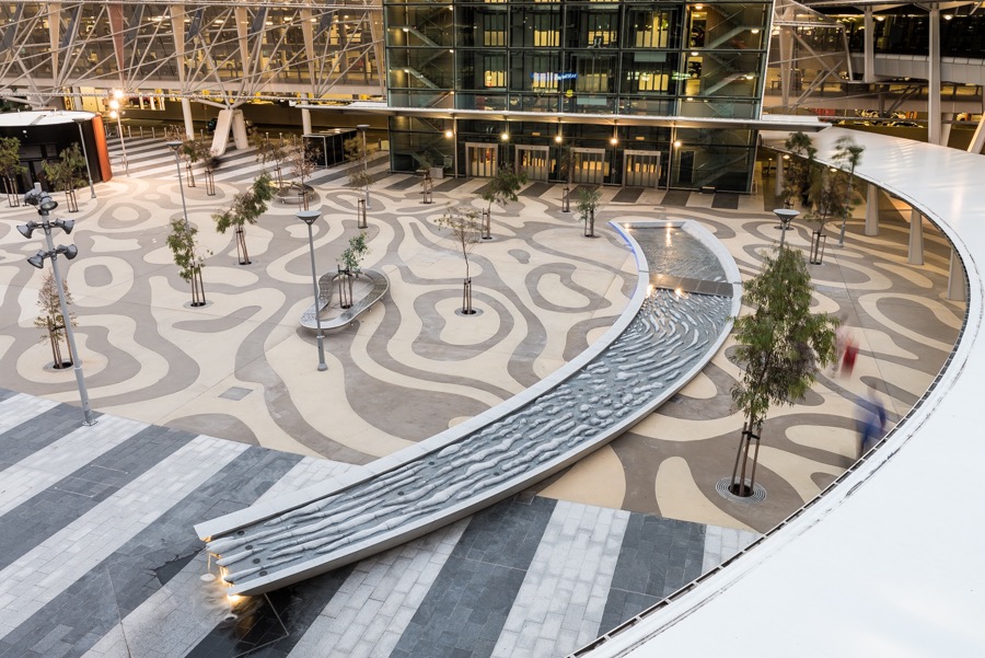
A collaborative project such as Watercourse at Adelaide Airport doesn’t just happen. In the case of Watercourse the collaboration stretched over several years. From go to whoa the project involved the client, their project manager, the landscape architect, the artist, a hydrologist, contractors, stone agents, stone carvers and stonemasons as well as OH&S consultants.
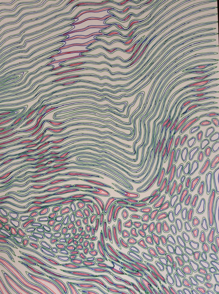
Watercourse is the outcome of my collaboration with landscape architects Taylor Cullity Leathlean (TCL). We have completed a number of projects over the last decade and have a good mutual understanding of our processes. For example, if I want to draw by hand a topography of every lump and depression of the 30 metre long watercourse they are OK with this and will then help to scan and adapt this into CAD.
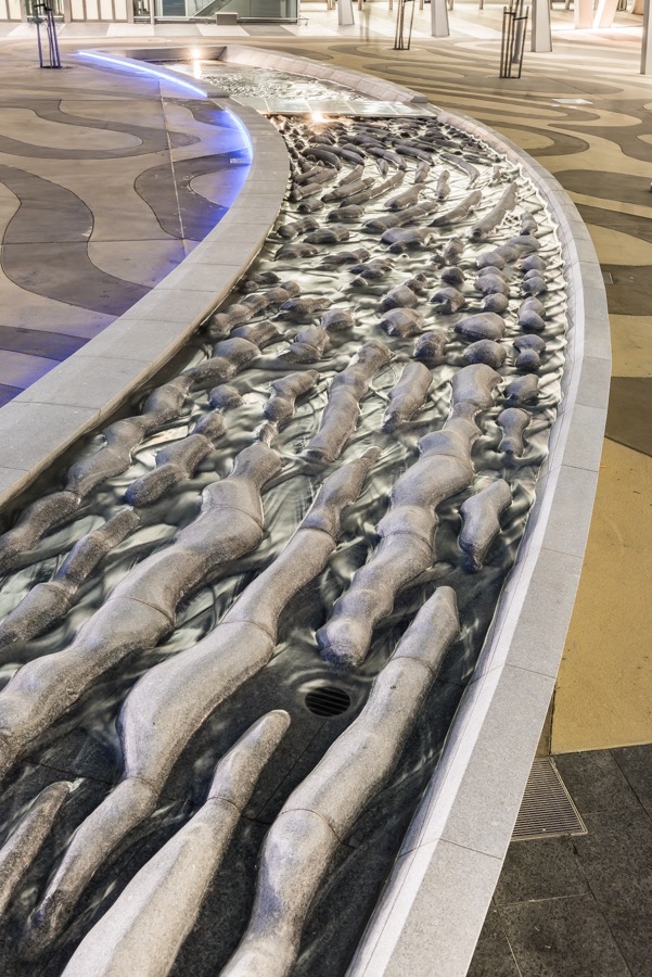
Discuss how you have used your art in the form of a memorial, 15 October 1970 – 15 October 2005
In 2004 I was part of a team together with Coomes, landscape architects, which won a concept proposal for West Gate Park.
The project was to create a memorial to the 35 workers who perished in the collapse of part of the bridge during construction on 15 October 1970. The site is bleak and windswept – a marginal site. It lies way below the bridge and overhead trucks and cars clatter constantly.
My proposal was a row of 35 concrete columns, minimal and severe. A relentless procession, one after another. As you walk the line you feel the number, you feel the extent of the disaster.
Your thoughts on the importance of sculpture in reminding the public of historical events?
Historical events can be examined in many ways and I think this can provide fertile ground for artists. The problem can be in that the commissioning body already has a didactic agenda that will more than likely be self-serving. An ideal commission will be open ended and allow for a thought provoking, and in the case of sculpture, a material, physical experience.
Public art plays a huge part in any city’s life, can you expand on the importance of public art opposed to gallery art.
Well at the risk of stating the obvious, public art is public. This immediately allows for a different accessibility. I believe art in the public domain can contribute enormously to the establishment of a sense of place.

North Corio Bay, Geelong, Victoria, Australia
The gallery space allows a specific context for the work to explore within a finite number of parameters. The public domain has many constraints and yet can be out of control in the sense of its accessibility and the time, light, mood, thoughts, activity of the viewer.
North Corio Bay, Geelong, Victoria, Australia
Does Australia give sculptors enough commissions to encourage young sculptors?
In Melbourne we love our label of ‘most liveable city’ that is due partly to our active arts environment. I am under the impressions that we give a lot of opportunity to young artists.
I taught in an art school for many years and it was often suggested that we should run a course in public art. My colleagues and I thought ‘NO’. Sure there will be problems inherent in working in the public domain and some artists will be better at this than others but why learn and develop art within parameters? Concentrate first and foremost on developing an art practice. If you decide to go for a commission or project, work out the problems and outcomes then.
"Composed not only of what lies before our eyes but what lies within our heads." D W Meinig. How does this comment resonate with your own work?
In Meinig’s article The Beholding Eye he proposes that if you took a small group of people to the same viewpoint and looked at the same time in the same direction we will not, cannot, see the same landscape. There can be ten different views and interpretations of the same landscape. This derives as much as from what is going on in your head as to what you see that lies before you. Essentially this goes for any person looking at anything. However, it is interesting to consider this in the light of the viewer and a work of art. It is within the capacity of the artist to open up this experience and the potential of the art encounter.

Ice, Onyx
You are very concerned; as are so many Australians with landscape discuss this in relation to your work?
Australian Gardens, Royal Botanic Gardens – Ephemeral Lake
This was a collaborative project with TCL landscape architects and artist Edwina Kearney. In the early design stages of the garden there was a desire for a body of water, a feel-good experience of the life source. We however, felt that without denying water, it would be more telling to indicate the presence and absence of water and to introduce ephemeral water as a key aspect of the arid Australian interior.
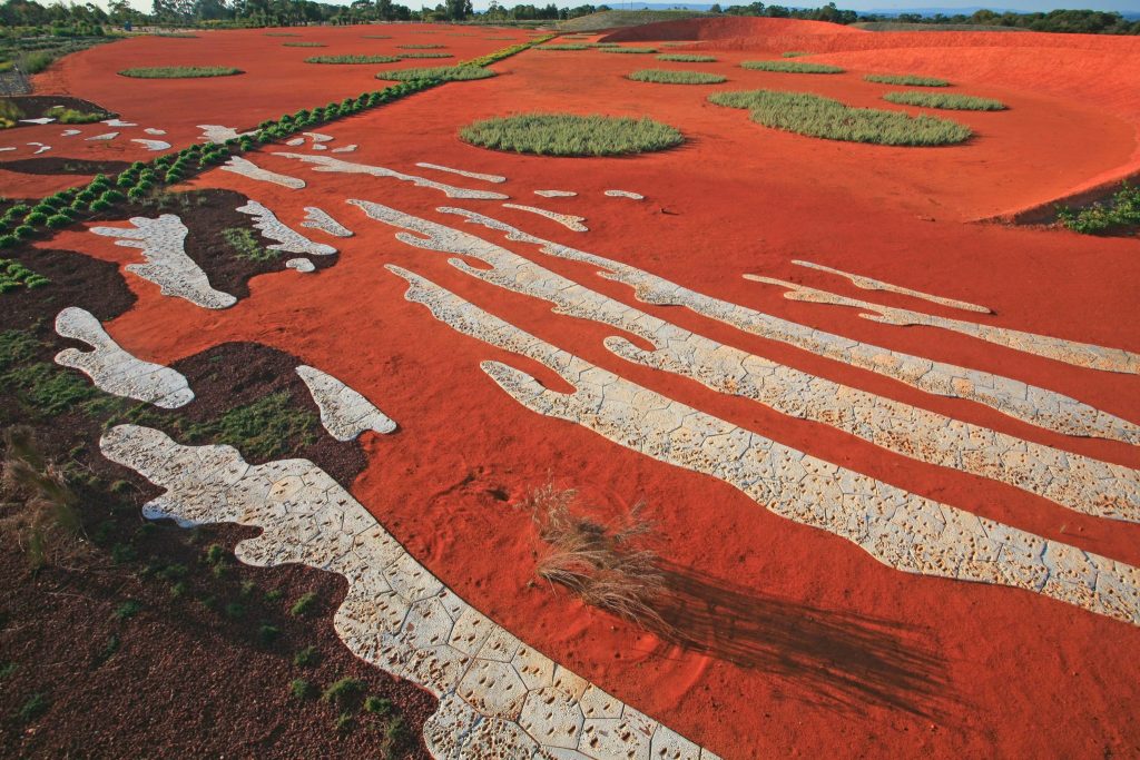
Saltpans, cracked earth impregnated with soluble salts, often stark white, were our departure reference for the creation of Ephemeral Lake – an installation of glazed ceramic tiles. Depending on the time of day and the angle and height of the sun, the installation can appear dry and stark, or as the sun lowers even wet and glistening.
I am concerned with how we see, understand and treat country. I am sure we all could say this, however as in Meinig’s example we all see things differently.
I feel the day, every day, I watch and feel the passage of the sun, the light, how the shadows move. I know the wind. I’m up at dawn, I walk the edge of the water. I know the tide and surf.
These are vital daily experiences for me and I try to bring aspects of these to bear upon my work.
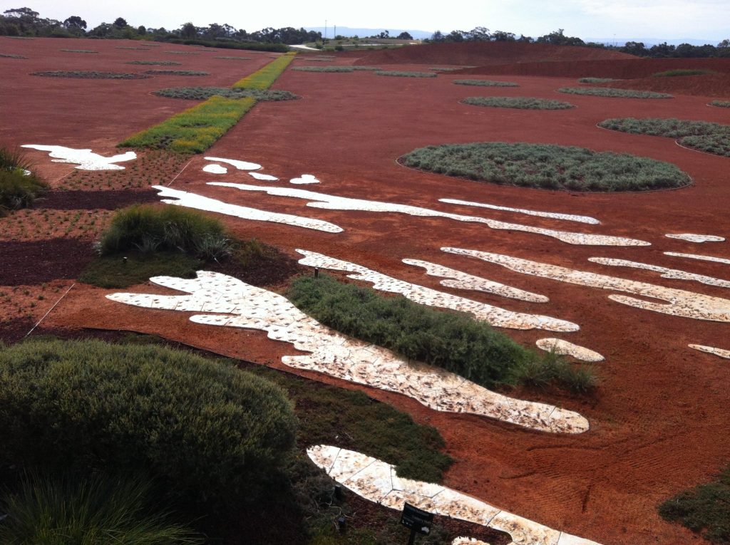
Norma Redpath is a name not well known to many can you enlighten us?
Norman Redpath (OBE) was an Australian sculptor. She lived and worked (when not in Italy) in the most beautiful bluestone cottage right opposite Melbourne University. Norma died in early 2013 and her studio was bequeathed to Melbourne University. Under the auspices of the Victorian College of the Arts (VCA), the studio will be maintained as a residential space for a sculptor.
Having worked at the VCA for a long time I was asked to be the inaugural artist in residence. This enabled the establishment of some protocols for the studio derived from a hands-on experience.
For an introduction to Norma Redpath and her life’s work please read Professor Ken Wach’s obituary which was published in The Age.
http://www.smh.com.au/comment/obituaries/australian-sculptor-who-was-enamoured-with-italy-20130122-2d5ko.html
Discuss the importance Residencies have had on your art career?
Residencies have provided me with fabulous opportunities and experiences.
There are two types of residences:
- Workshop residencies – high intensity experience with a number of artists from a variety of cultures and ages. Over 2 to 3 weeks with an exhibition agenda.
- Solo workshop – space to think and explore. Take in surrounds, history, culture, environment and art.
Both types of residences offer freedom from your everyday domestic life and offer you an opportunity to think and explore, free of constraints and to respond to new influences.
For me in particular a residency in Italy allowed for a consolidation and affirmation of the materials stone and ceramic as providing a vehicle of making. Embedded into the earth and by extrapolation a reference to the landscape from which it is derived.
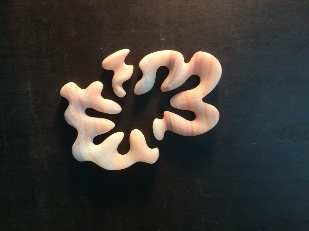
Rose, Onyx
You rescue rocks and retell their story, expand on this.
I try to work with rock so as to stimulate a way of seeing or engaging that is hopefully enlightening in some way. This is not dissimilar to Meinig’s 10 views – looking and seeing – understanding that there is more to life and things than what appears on the surface.
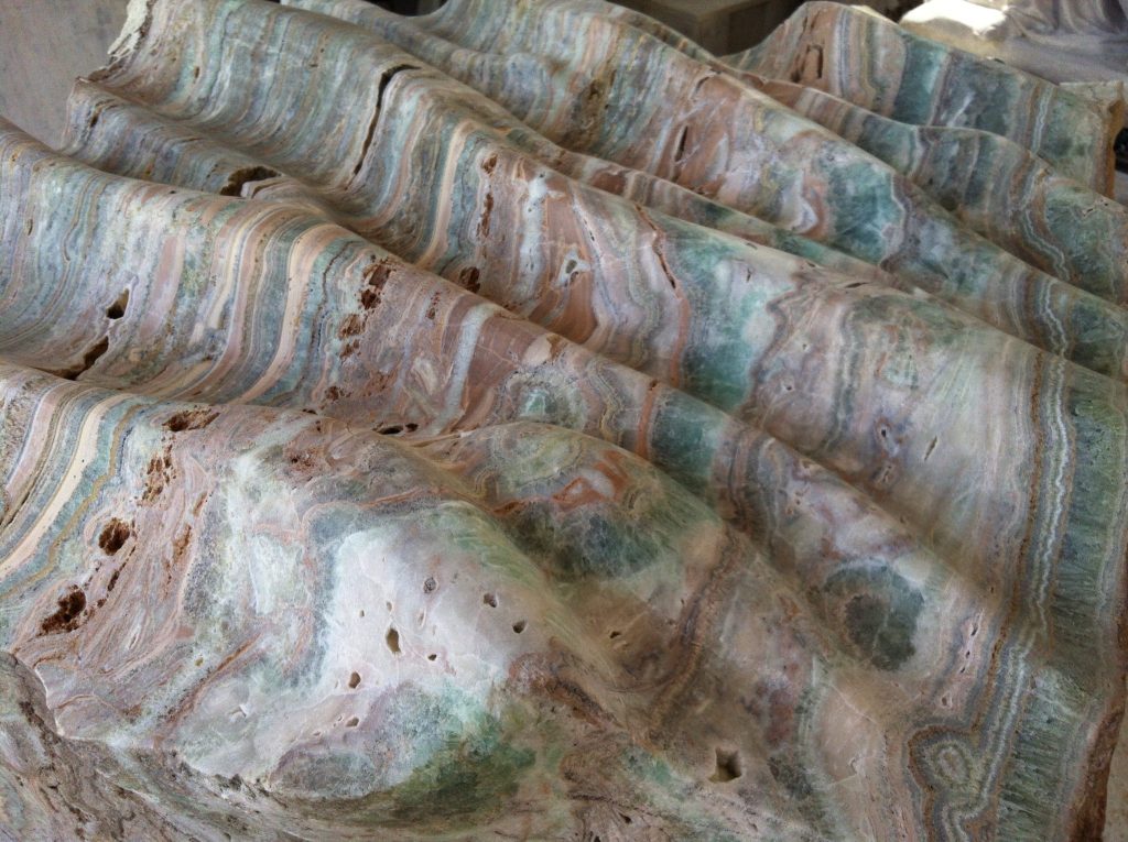
This is not so much a rescuing, perhaps more of a revealing, but I like that idea – the rock rescue. If I can rescue rock and save it from becoming stone that is a good thing.
Briefly take us through the process of a piece of work.
Victoria Harbour – The River Runs Through It
This project in the Docklands precinct in Melbourne had a good brief – it ticked the boxes as a responsible brief, mentioning history, uses, occupation etc of the site and then left the outcome wide open. Such a brief can sow some seeds in the artist’s mind but is in no way prescriptive. The site, on the city’s edge, on the river’s edge and in a corporate precinct begged for something organic and in some way referential of the original habitat. A site that was once a place of water, flow, tide, mangroves, sand, dunes, wind and sun.
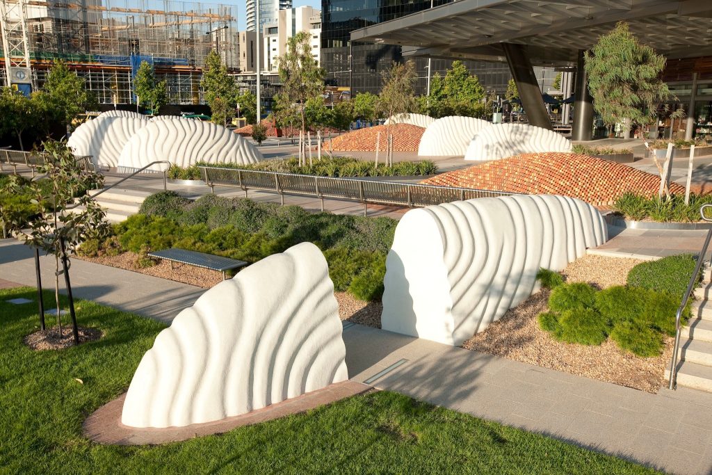
Public art for me should incorporate the viewer. A person should be able to enter within the spaces of the work, to engage with the materials, surfaces and textures. If I can provide a physical space and relationship I may be able to stimulate an emotional response as well.
The River Runs Through It is an expansive work, it covers a large area and steps down over two levels, there are 16 precast white concrete wave ‘forms’; 5 brick ‘dunes’ and the site is grounded and held together by a sweeping pattern of paving, ‘flow’.

Construction of this project required many people and trades. With the help of a small workshop I made all of the concrete forms. On site, there were months of brick and paving work as we constructed the brick dunes over high-density styrene forms.
Throughout this whole project I was greatly appreciative and dependent upon the occasionally tough project manager. This is the part where working in the public domain will not suit all artists. There is a certain pragmatism necessary around getting things done.
Siting of this work was complex. I had my ideas and managed largely to achieve them. However, others had ideas too. Melbourne Fire Brigade required a road through the centre. Citipower required semitrailer access in the event of a generator failure. There were OH&S requirements concerning spaces, potential trip hazards, climbing, BMX riders and skaters etc. Victoria Police were concerned about site lines and perceived safety.
For many these are compromises but to work in this way there is no room for a glass-half-empty attitude. These constraints are in fact your materials. You can still manipulate them, cajole and push. However, being a prima donna artist will not help.
You are in the process of building a new studio; take two aspects that you knew you must have.
After having resigned from teaching in an art school and a decade or more of working in the public art realm I am keen to revitalise a studio practice of making that is steeped more in craft and technique. Stone carving, bronze and ceramic work. To this end the studio now will have a well-ventilated outdoor workspace. It is also larger as I want to have space enough that I and visitors can see the work and view the studio process.
I don’t want to give up scale though and although the studio here is not sufficient I still want to make large stone works.
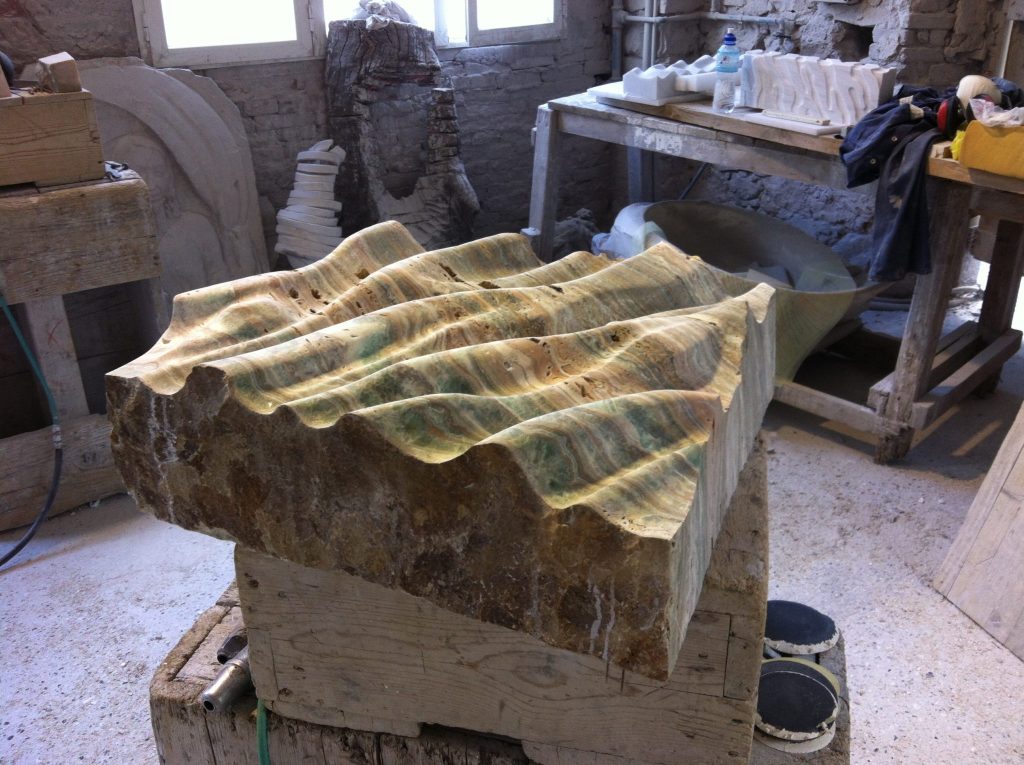
Where is your art taking you to next?
With the stonework I want to explore the rock. Here I mean to engage the geomorphology of the particular rock and in some way draw attention to its character. Onyx, alabaster, marble, each has unique characteristics and there are many variations that reflect geology, time, strata, minerals, climate etc.
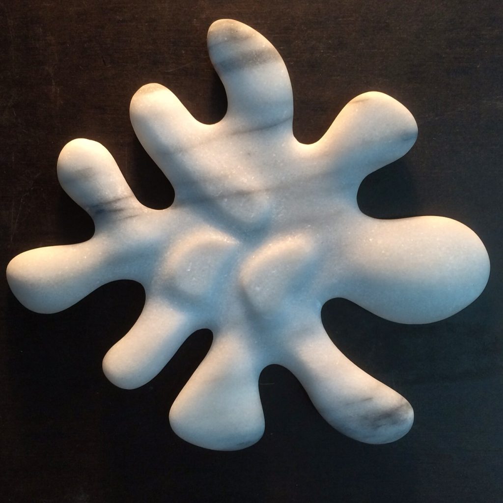
Splat, Marble
I of course want to be able to tell all these stories but if the work can allude to some of these aspects and raise a few questions that will do.
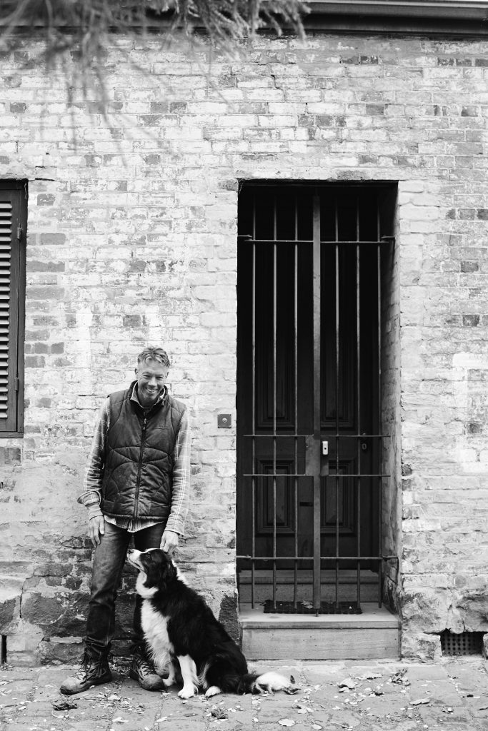
Photo, Cory White
Contact details.
Mark Stoner
Web: markstoner.com.au
Email: markstoner@me.com
Mark Stoner, Melbourne, Australia
Interview by Deborah Blakeley, August, 2016

