
Aino Kajaniemi
How do you portray ‘moments and atmospheres in a persons life’ onto fabric?
I see my art as symbols. In my tapestries I combine human beings and symbols together. The symbols can be animals, plants or an object such as clothing. They are personal, intimate objects which portray our similar common memory. My symbolist picture language is like international communication without words.
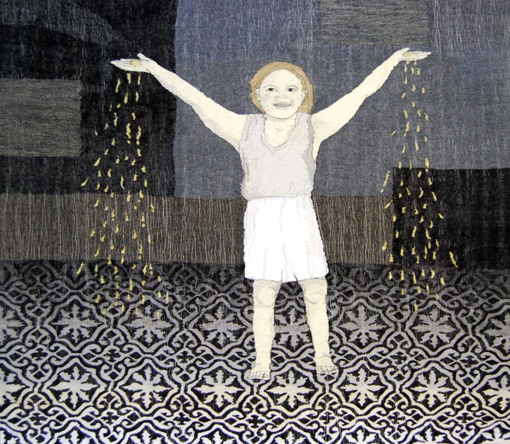
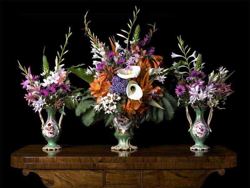
Golden Rain
There is something about the posture or facial expression of a human in relation to his or her environment that can create a memory or an association in my mind to something I have experienced; lives concrete feelings, moments and atmospheres.
Using, ‘Poppies’ and ‘Flora’, explain the differences but also the connections between these pieces.
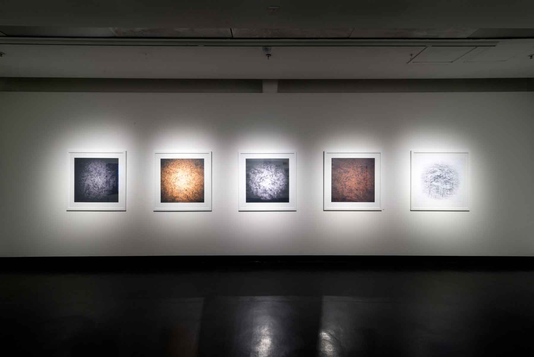
Poppies series is a colour study. I have used colours from the warm pallet but added their contrast colours as lines and shadows in the flower. I tried to create an impression of joy and energy.
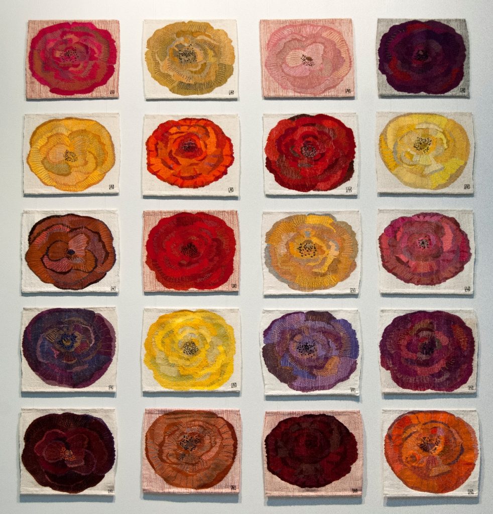
Poppies
In the Flora series the black background is very important. The plants have the main role: form, fragility, character and tones
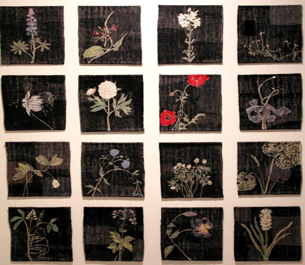
Flora
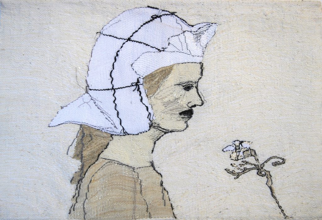
You use tone and a limited palette in your works ‘Beauty’ and ‘Innocent’. Discuss this whole series and how it came about and the need for such a subtle palette.
Beauty
When I was young I had lot of feelings that I held inside me. I spent all my energy to work out my emotional life so I didn’t want to have more feelings to handle through colors. The black and white world seemed simpler. I want to use shades more than colours. I feel that colours need a bigger space because they are full of energy. When I use strong colours I don’t want to tell a story in the work. Colour in itself includes messages.
Innocent
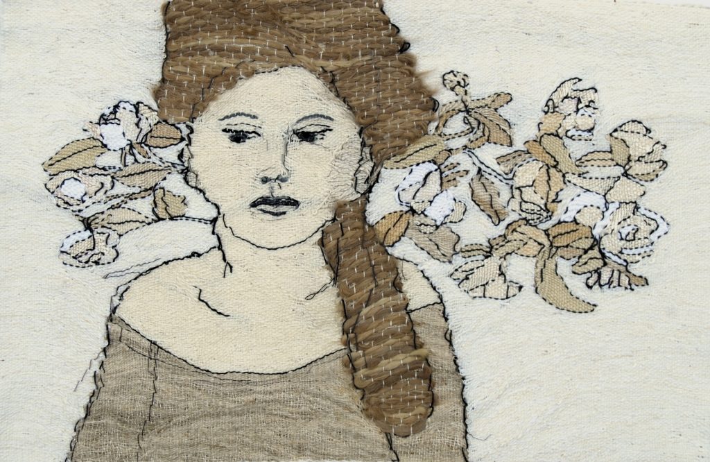
Comment on the techniques you in different hair and floral aspects in your work.
My tapestries are very graphic. Drawing with a pencil I have an idea of a certain kind of a line. As a contrast of the fine line I like to add rough materials like real human hair. I like rough and smooth materials, the disagreement and discussion between them.
Various plants can be symbols of life´s complexity and alternatives, discussing with their surroundings and the environment.
You have had several Church commissions. Take one that has given you a great deal of artistic scope.
The last Church textile commission I have done is Muurame Church. It was designed by the most famous Finnish architecture Alvar Aalto in the year 1929.
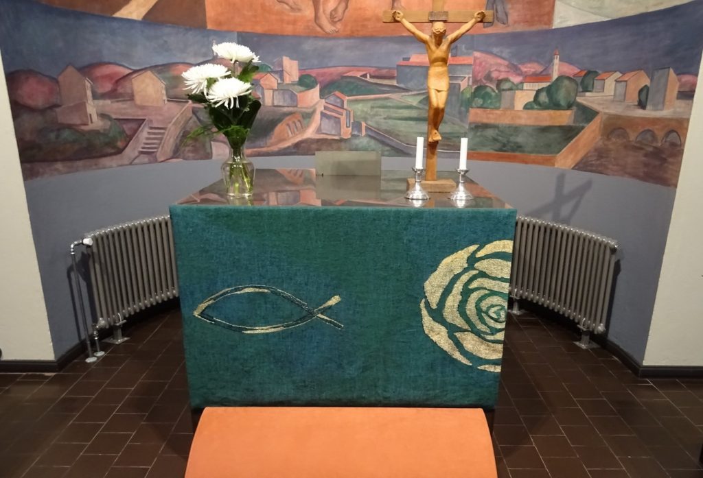
Alta Textile, Muurame Church
What was the initial brief.
The primary role of Liturgical textiles is to be a part of divine worship with metaphors communicating the Church's message. On the other hand they also have a clear function as the priest dress and Communion textiles. At the same time textiles "decorate", they are a part of the architecture of the church. In other words, church textiles are at the same time informational, utility articles and interior decorations. In addition to all this, they should also be independent works of art.
In Evangelic Lutheran church we use 5 or 6 colors in church textiles: White, red, green, violet, black and sometimes blue. I have done liturgical textiles for 7 churches. The colour of the textiles tells the time of the religious church year.
What is the meaning or symbolism within the piece.
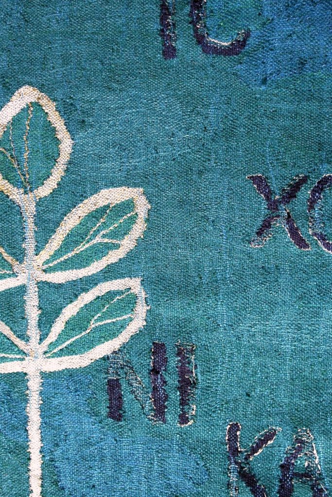
The main symbol in Muurame Church´s textiles is a rose. Different colours of the flower has a different meaning: love, purity, death, virginity, perfection.
A root, leaf and stem have many liturgical meanings. A fish is the symbol of the Christ.
The relationship between the tapestry and the space it is in.
Muurame Church was renovated to its original design in the year 2018. I tried to make modern, interesting and surprising but peaceful textiles which are in a balance with the architecture of Alvar Aalto and the strong colours of the interior.
What are your personal thoughts on the importance of contemporary textiles within churches?
I like the richness of religious symbols and try to use them as much as possible. In the church they handle the most important issues: birth, life, death, faith, truth, grace, holiness and love. If the artist succeeds to get this spirit into the textiles, it is art.
Pulput Textile
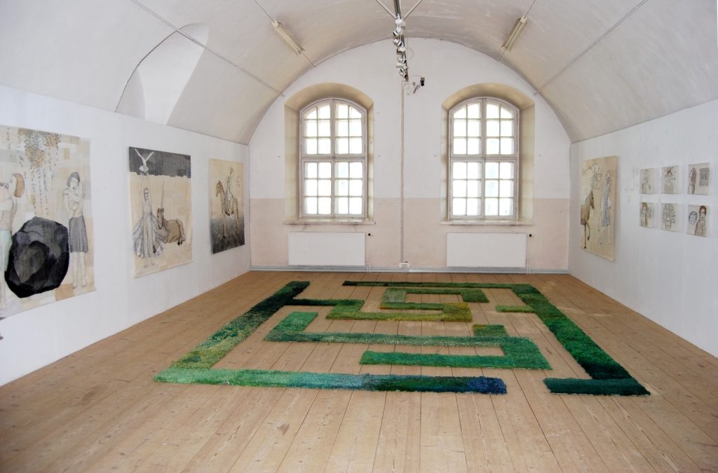
Your exhibition at the Helsinki Gallery Katariina, was big but solo. How did you manage this exhibition?
Scale, 60 square meters
Number of pieces needed, 21 pieces
The curation of the exhibition.
The gallery chooses from the applicants those who will have the gallery to exhibit their work.
I have had two big exhibitions with my daughter in the years 2017 and 2019 in big museums, Kemi and Kouvola. This has been both a challenge and a possibility. These museums are 800 and more than 1000 square meters big. My daughter, Aura Kajaniemi
makes spatial and two dimensional art works with bead embroidery.
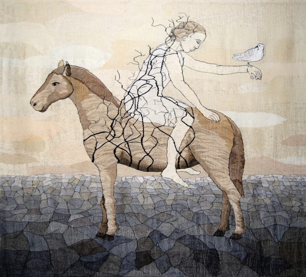
You also portray animals in some of your work. Discuss one or two of the animals you have used and why?
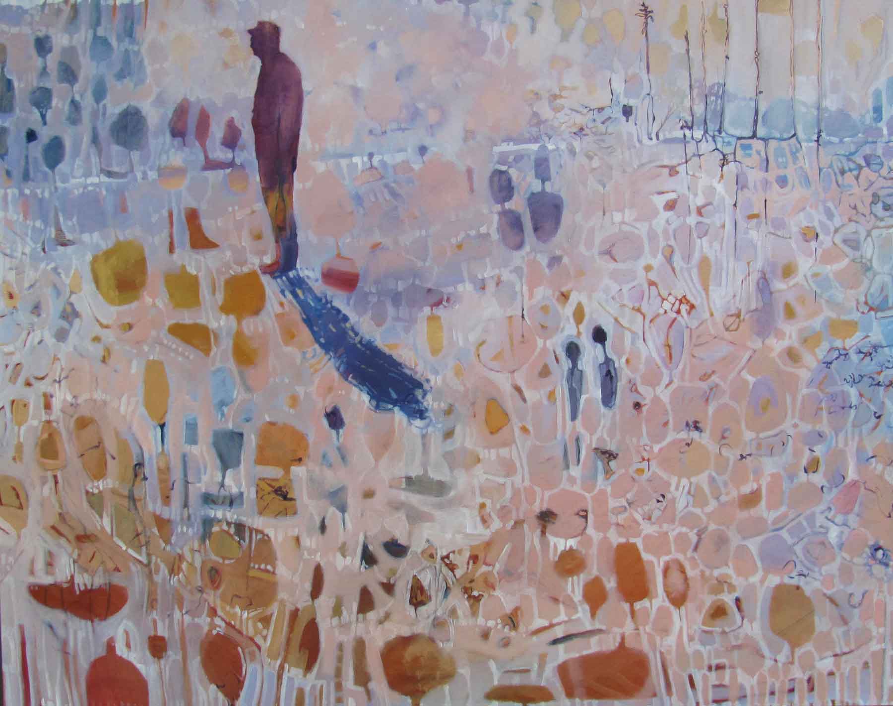
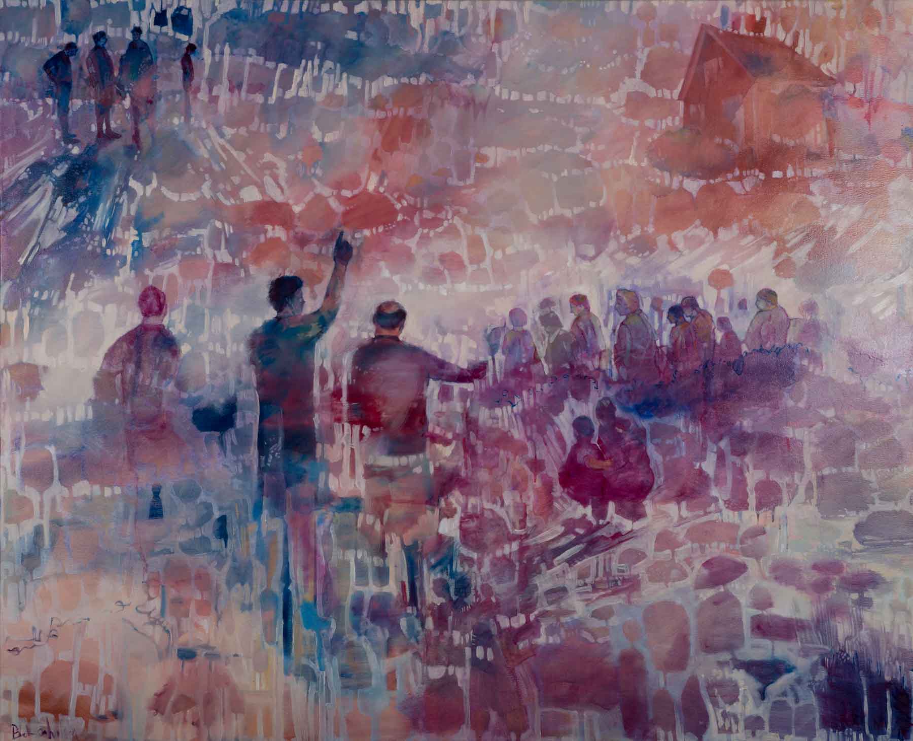
In year 2012 I stayed in Paris for 2 months. My idea was to get to know the world´s maybe most famous tapestry series, The Lady and the Unicorn and start to design my own large tapestry series influenced by the series. I combined the story with human beings in large tapestries. I made 10 big sketches. At first there was a unicorn, then the horn dropped off portraying a horse and finally no animal at all. Afterwards I have analyzed these tapestries and have found commonly handled questions: how a human being can find her/his place in the world, the reverses, fears, needing support and dreams.
Sounder
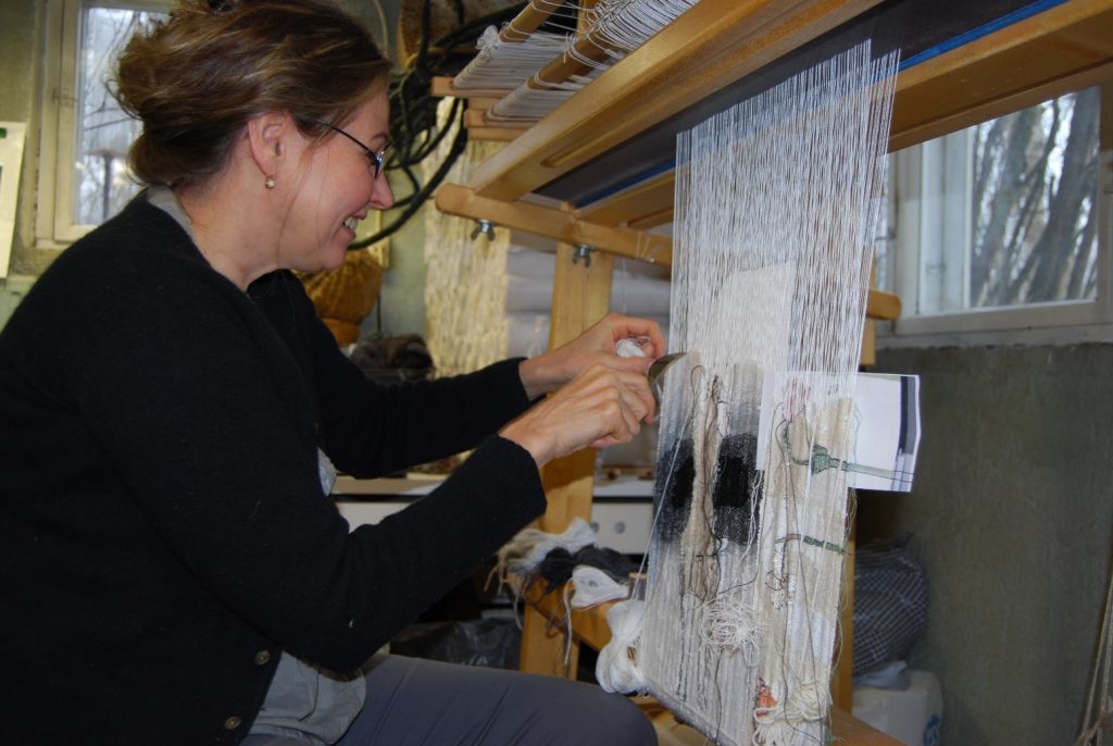
Take us briefly through the technical process from the first drawings to the final finished piece.
My work begins with drawing by a usual pencil on a paper. All my tapestries have a same-size sketch. I set it to the back of the warp and follow the pencil lines by weaving.
My weaving is not traditional tapestry weaving. I think that it can be expressed as impressionism in tapestry. I don’t know or care about rules but want to weave freely and quickly. I use vertical loom and fasten the weft with a common fork. I don’t want to hide the warp, like in a traditional tapestry because in my way of weaving the surface becomes livelier and you can see the structure of the fabric.
Weaving is about making decisions; how thick or thin threads to use, do I combine threads to form different tones or use original colors, do I want the surface to be shiny or rough, do I create structure and effects using thicker materials? Do I want the tissue to be so dense that it cloaks the warp threads or so that the texture of the tapestry stands out and the fabric becomes almost transparent?
Nowadays I get all of my weft threads from flea markets. That way surprising tones and materials appear in my color pallet. Weaving is also finding; even though I have practiced this technique almost 40 for years, I´m not in complete control of the threads. Chance has its role, for example when I weave a face, the threads may position themselves so that a smile turns into sorrow or anger becomes joy.
I like variable surfaces and use them as a part of the story of a work.
From Close to Far
The materials I have used are: linen, cotton, hemp, jute, sisal, nettle, viscose, acrylic, silk, wool, bamboo, bass, paper yarn and paper strip, horse hair and human hair, feathers, fishing line, metal wire, plastic strip and yarn, twig from a tree, birch park, lurex, gold thread and triacetate strip.
Flax is my favorite material; heckled flax in many thicknesses, tow flax, hand spun flax and even not at all worked flax fiber. In flax I can find all atmospheres from fineness to heavy burden.
Silk represents for me something luxurious and exotic, wool something homey.
Because I use an upright loom and not a frame, I use pedals so that I don´t have to pick up the leases. In my opinion this frees me to concentrate on what matters: being expressive and the choices it requires. I attach the weft to the texture with an ordinary fork.
Sometimes I feel like being a solid part of my handloom. The connection occurs in many ways; my feet pedal, eyes watch, head decides and hands interknit.
Where did you learn to become a weaver?
I studied first in a weaving school for two years and it was a good basis for my career. It is said that when you know the technique, you can forget it.
What lead you to tapestry as your art medium?
After weaving school I studied in the University of Art and Design in Helsinki and graduated as a textile artist in the year 1983. When I was making my final examination I showed my sketches to my teacher and she said: The only way to weave these is tapestry weaving. I had to create the weaving technique by myself; nobody really taught me how to weave a tapestry.
Discuss where your studio is.
I started to work as a free artist in 1990. The same year I moved to my childhood home to take care of my parents. My parents died and my second child was born at that same year. My family stayed in the house after my parents death. I still live and work there, in Central Finland, Jyväskylä. My weaving studio is in a base floor, drawing, sewing and office rooms at the second and the third floors.
What restrictions does your studio have or not have?
My house is designed for family life. The studio is planned for hobby and spare time working. It should be bigger and higher and there should be more storage places.
Do you think that living in Finland has influenced your need to have some artistic pursuit over the long winter days and nights?
There are many people who are very sensitive of the darkness. That isn`t my problem. I work regularly and with same daily routines all year long.
Contact details:
Aino Kajaniemi
www.elisanet.fi/aino.kajaniemi
Aino Kajaniemi, Jyväskylä, Finland
Interview by Deborah Blakeley, April 2019
Olivia Hickey
You are preparing for your upcoming Wilderness residency in 2019.
Can you explain?
I have been awarded a residency by Arts Tasmania for a 6-week residency based at Lake St Clair. This will be undertaken in two three week blocks to allow for a flow between the landscape and my studio. Its focus is to develop and refine techniques and materials to enable me to work in remote and wild landscapes. In 2016 I had a similar residency at Cradle Mountain that lead into my first exhibition that was focused on the land there and this residency is the next step in my explorations.
The residency is part of a larger project that will take me a year and a half to complete in which I plan to walk much of the land that you can see from the Overland Track than runs through Cradle Mountain- Lake St Clair National Park. It will involve a number of solo bushwalks from 3-10 days duration into some wild and inaccessible areas.
Being in place is essential in developing both my way of working and my art. The freedom to travel allows me to locate and record organic and geological source material without removal from place. This is incredibly important to me as I deeply believe that land should be left unchanged by my passing.
Recently you have had the horror of Australian bushfires, literally at your doorstep. What preparation did you have in place?
I live on an off grid property surrounded by bush and I had to evacuate for most of two weeks due to bushfires. I travelled around with much of my workshop in my car and returned to my studio in the safer moments to work on some wedding rings that had been commissioned.
Celery Top Pine, Topophillia
The hardest thing during this time period, was not only the threat of losing my house but watching the fires threatened and engulf the irreplaceable wild landscapes of this island. I found myself pondering the question that if somehow, I could have made a deal to lose my home in order to save the wild places, I know that I would have.
How have the past fires influenced your work?
The first body of work that I created was site specific to the Tarkine, the Central Highlands and in the South West. In the Summer of 2016, just as I was installing it in an exhibition as fires were burning and threatening all of the places that I had responded to with my art. This was a deeply powerful personal journey as it made me question what, in fact, my work was about.
The landscapes that I focus on are all vulnerable places, human land use and more importantly climate change. My work is focused on plants from the time of the Gondwana supercontinent I focus on rainforest and alpine areas and these plants have little or no ability to regenerate after the hot fires that we now experience. These plants were once spread out over large tracts of land but as a result of continents moving as well as the climate warming and drying what we have now in Tasmania is the last refuges of these particular plants. This pattern is repeating through all southern continents
When I did my Cradle Mountain residency I went and visited the February Plains and saw first-hand the impact of the fires on this landscape. My resulting tried to encapsulate the loss that occurred. I exhibited photographs of burnt Pencil Pine Trees and the remains of the last hide hut combined with a collection of jewellery that was made from cast Pencil Pine needles.
The deep understanding of the preciousness of these places is what deeply underpins my work. I aim to be able to immortalise, through metal, photographs and prints to create a tangible record of these places for maybe even in my lifetime they may no longer be there.
My work is about the love of and joy in these wild places and I create tangible talismans of these places that others can connect with.
Pencil Pine necklace.
What lead you to becoming a jeweller?
I was travelling in Africa many years ago and chanced upon a south American man who was making and selling jewellery. I was immediately entranced by the ability to make metal flow, bend and move. I apprenticed myself to him for a couple of weeks and learnt some basic skills and when we parted he gave me a couple of sets of pliers, a bag of stones and a roll of silver wire. I then travelled for another couple of months and supported myself by what I made. Life took me in different directions at this time as I focused on outdoor adventures including a 110 day solo walk traversing the South Island of New Zealand.
I’ve worked in the outdoors for most of my life in roles of guide, instructor and teacher and have been involved with this in order to help people connect to natural places in order to care about it.
I suffered a major injury which left me unable to carry a pack, I was living in the Blue Mountains in NSW at the time and was searching for a way to be immersed deeply in land without an ability to travel large distances. I did a couple of short courses in Jewellery making and was absolutely captivated. One of my teachers was Marisa Molin and her work linked natural places and jewellery and I suddenly saw my path. I moved to Tasmania in 2013 to follow it.
How is your environment captured in your work?
My work is created through direct impressions of landscape. Moulding for jewellery is done In Situ and then the mould brought back into my studio for development. I use Photography to capture the wider landscape as well as to create lines that are used in etching and a number of organic printing techniques are used in place to create direct impressions.
I like working with the detail and scale of the natural forms as creating them into different mediums gives a wearer or a viewer a different perception of place. It creates of point of connection for the wearer, a talisman of place. It is my hope that it can transport people to the places that they are connected to.
I am a multimedia artist and my exhibition work is a contract of 3 dimensional jewellery works capturing the textures and scale of land and I contrast these with 2 Dimensional work of photographs or prints to talk of the wider landscape
You comment, “I am enthralled by the hidden details within the land and find myself captivated by the complexity and the beauty in the small.” Comment.
There is an activity that I have done numerous times in my life when I have worked with people in the outdoors. I get them to study a small piece of land and just observe, the colours, textures, diversity and coming and goings of ants. When this process starts. I have noticed that people get immersed in their small piece of land. At the end of this I get them to lift their eyes and try and get them to imagine how many times that size plays out in the view that they see and the diversity within the land that they can see.
My way of seeing land is like this. I am familiar with the ‘big picture’ of land and easy to see it just as a forest or a mountain but once one slows down and starts to look it becomes incredibly diverse. My work aims to capture that, this fern, this leaf, these patterns on bark. I’m utterly fascinated. My moulding for jewellery is an extension of this.
Fugus pendants
Take one of your photographs that has helped to lead you a series of jewellery. Discuss.
I have been focused on the process of casting organic objects into metal. I observed that these cast forms were in many ways the opposite of the places that I was seeking to represent; permanent versus impermanent, ephemeral versus solid and fragile versus robust. This created a tension and became the focus of my investigation of how to accurately encode and communicate the landscape that they are a part of. I returned the cast pieces to Land and observed that although they were a different material they still belonged in Place. I photographed my work in place and discovered that only the action of placing it on the landscape of the body turned it into jewellery.
This discovery lead to a body of work ‘Topophilia’ that explored this theme. The cast pieces were turned into jewellery and exhibited within and removable from the photograph. The concepts behind this discovery remains the underlying concept of my work.
Celery Top earrings
Take your piece Lichen and explain briefly the techniques your use this this work.
I use the lost wax casting method to create much of my work. It gives me the ability to transmute organic objects directly into metal which then allows me to create wearable objects. I fill a flask with plaster encasing the organic object and place it in a kiln which burns out the organic matter. The cavity that is left is then filled with molten metal.
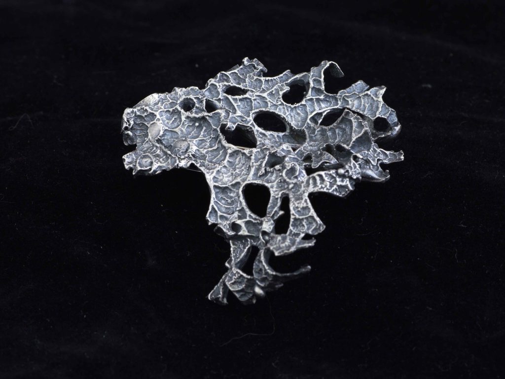
Lichen
Can you expand on your Tarkine fern rings?
I was involved in a conservation art project called Tarkine in Motion and I based myself in the rainforest in areas that were due to be logged. My eyes were drawn to the diversity of ferns in this landscape. I was experimenting with techniques to mould the forms in order to be able to take away impressions of these plants. I returned to my studio with the moulds.
These developed into a series of stackable rings and has expanded to a number of different plant imprints. When I created my first gold ring I realised that I found the medium to accurately encode the preciousness of place when I discover them in the bush.
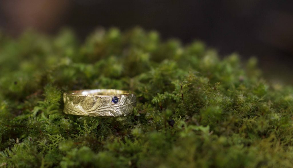
Gold Tarkine ring – Batswing Fern
Discuss the seasons of Tasmania and their connection to your work.
As I am a land artist and do much of my work in place the seasons directly influence my work. The warmer months combined with the longer days lend themselves to pack carrying journeys where moulding, photography and impressions of rocks can be taken. Winter is more of a time to go inwards and develop my ways of working as moulds cannot cure in time over winter and the weather is harsher. However, winter walks are a passion of mine and its where photography comes into play as it captures the essence of this land being a glacial landscape.
Passing Snow Flurries
Contact details:
Olivia Hickey
Olivia Hickey, Tasmania, Australia
Interview by Deborah Blakeley, April 2019
Deborah Blakeley
How did Zoneone Arts come about?
It was a slow process, beginning with TA@G, Textile Art @ the Guild. This was the Embroiderers’ Guild of Victoria, where I helped to organize a monthly textile speaker.
This went along for a long time but found its end.
It allowed me to know that there was an interest in artists and their art practice. My husband asked why not do a similar thing on the internet? He even suggested that I could take the idea further and go beyond Melbourne, even beyond textiles.
With much planning I prepared the site and Zoneone Arts was born.
I asked Lauren, a textile artist from the USA, if she would answer an online interview or conversation.
 Lauren Camp interviewed, June 2012
https://zoneonearts.com.au/category/textile/
Very promptly she said yes, she would do an interview, but could not have it done for a fortnight. Wow! I was so excited.
I was on my way. Perhaps it was also the words of wisdom that Lauren gave me, “get out of your zone.” I am indebted to her for that gentle push, or was it a great shove? But it worked.
What keeps Zoneone Arts going?
It is the fun of the chase. Where is the next interview? So many artists and so many different mediums. The list of mediums has grown along with the number of artists interviewed, coming from many countries worldwide.
Where do you find the artists?
Over the years I have been fortunate to have travelled extensively and I am always on the look out for interesting artists. For instance, while travelling in Iceland I saw this work by Valdis Harrysdotter, using handmade vegetable paper formed into bowls.
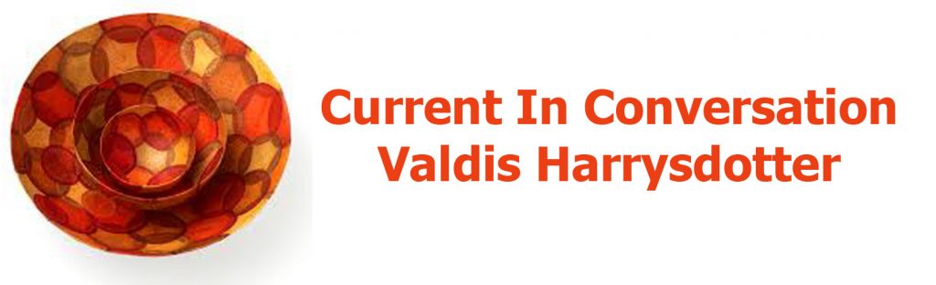
Valdis Harrysdotter, Interviewed September 2015
https://zoneonearts.com.au/category/paper/
There were three further artists I interviewed following my trip to Iceland, two painters and a photographer.
I am sent many invitations to exhibitions. With one gallery, Union Gallery in Edinburgh, and the gallery director, Alison Auldoj, I have built a close relationship. Alison Auldoj drew my attention in the very early days to the artist Barbara Franc with an interview in March 2013.
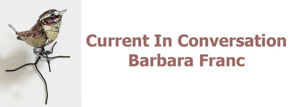
Barbara Franc, Interviewed March 2013
https://zoneonearts.com.au/category/sculpture/
Later Henry Jabbour, in 2017.
Henry Jabbour, Interviewed 2017
https://zoneonearts.com.au/category/painter/
Damian Callan, Interviewed, 2019
https://zoneonearts.com.au/category/painter/
Most recently Damian Callan in 2019. It has been these links and the building of friendships, often via emails, that has led to the introduction of such an array of wonderful and different artists. I cannot begin to express my debt to people such as Alison Auldoj.
Often it is an artist who shares another artist with me. They may be a friend or they may share a studio or have been to art school together.
Two places that have introduced great networking onto my radar have come from both ends of the world, London and Canberra. In London I have interviewed many artists who have had, or still have, a studio at Cockpit Arts, an amazing incubator for artists. They support each other, learn from each other and develop their art within the one space. Each artist is so different but I will name two. First Katharine Morling working in ceramics interviewed in July 2013. Katharine still works out of Cockpit Arts.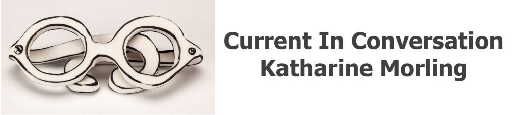
Katharine Morling, ‘Glasses,’’ July 2013,
https://zoneonearts.com.au/category/ceramic/
Secondly Eleanor Lakelin, working in wood, who shared her story with Zoneone Arts. in June 2018.
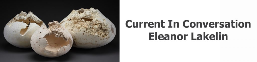
Eleanor Lakelin, Photo by, Interviewed, June 2018,
https://zoneonearts.com.au/category/wood/
Closer to home Canberra, Australia, and the wonderful Canberra Glass Workshop which allows the general public to visit and watch the glass artists at work. They also have a great residency program, that brings together both local and international artists sharing, learning and supporting each other.
Lisa Cahill was given a wonderful commission to celebrate the end of WWI for both Australia and France at the opening of the new Australian Memorial in Villiers-Bretonneux, north of Paris, and produced this glass ‘Rising Sun’.

Lisa Cahill interviewed May 2018.
https://zoneonearts.com.au/category/glass/
I am always going to galleries, as do many of my readers, visiting both local and international galleries. These can be exhibitions in private galleries or exhibitions held in large public galleries. I visited the Immigration Museum in Melbourne, my home city. I discovered the work of David Monahan. There were a large collection of photographs (36) by Monahan depicting Dubliners who were preparing to migrate, some to Australia. Hence the reason for the exhibition at the Immigration Museum. Each of the photographs were taken with the same old suitcase, but the Dubliner was set in a favourite or personal space that needed to be remembered before leaving Dublin.

David Monahan, Interviewed April 2013
https://zoneonearts.com.au/category/photography/
Explain some of the surprises that have come out of interviews.
This is easy, one of my best faux pas, was what I thought to be a simple question, that I posed to Peter Randall-Page.
Here is the question:
Your work is in many Public Collections, can you take one that you remember as giving you a huge boost to your career?
Here is Peter Randall-Page’s very honest answer. Also, he has been so forgiving to me in tactfully mentioning the many places where his work is in a public collection.
Honestly, I am still delighted every time a work of mine enters a public collection but without question, the biggest boost was when the Tate bought Where the Bee Sucks.
What a gentleman, thank you Peter.
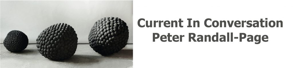
Peter Randall-Page interviewed January 2015
https://zoneonearts.com.au/category/sculpture/
What have you learnt in the growth of Zoneone Arts?
That art is always on the move, with different artists, different medium, different techniques within a discipline.
Technology has changed so much since the first artist, Lauren Camp, to the last, Robyn Stacey. Images are still so important but the images that artists now send to me are huge and the reproduction of them is beautifully clear.
Hopefully, I have learnt to ask deeper questions. This has been summed up so well by Vicky Forrester and I am wowed by the generosity of her comments.
Founder Deborah Blakeley is on a mission to expose the pulse of contemporary arts and crafts practice.
Through her in-depth dialogues with makers across the globe, from all disciplines, Deborah artfully brings to light the common threads that drive the creative spirit.
Deborah diligently researches the featured artists in order to elicit from each their deeper motivation. Often questions juxtapose elements of their working practice that, in answering, bring to light new connections for the artist-maker and audience alike.
The ever-expanding collection of interviews present a comprehensive view of the creative arts today, making for a fascinating and informative read for both appreciators and makers.
I am honoured and delighted to be a featured maker. Vicky Forester.

Vicky Forrester, interviewed April 2015
https://zoneonearts.com.au/category/jewellery/
I truly believe what Vicky has written so well; it is exactly what I have always endeavoured to achieve and will continue to do so in the future.
Are there any questions artists don’t answer?
Very rarely. Every artist is so generous. Sometimes they will combine questions, others they will have answered within another question. No! they just keep on giving.
Do you find language a barrier?
I am very fortunate that most speak and write English. An interview coming up in the next few weeks is with Steffen Dam from Denmark. Steffen was concerned that he doesn’t write or type easily. So together we were able to put together a wonderful interview. He happily added to my research. Steffen filled in the gaps.
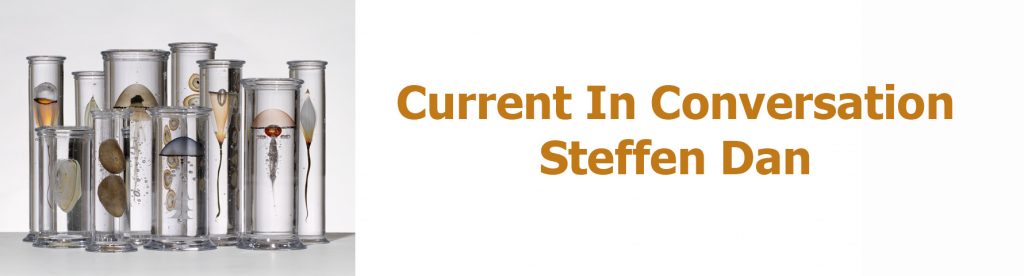
Steffen Dan, Interview interview, coming in 2019
https://zoneonearts.com.au/category/painter/page/1/
Talk about a few answers that have brought laughter with the responses?
I still smile when I think about a comment made by John Short.
I know it will make you smile and perhaps laugh too.
This shows just how confident the artists are and how they are so happy to share small stories with Zoneone Arts.
John said, “Some time ago I ditched the ubiquitous bouncy castle at one of our son’s birthday parties in favour of having the kids all sit individually for small watercolour portraits, which they all got to take home with them in their goody bags. It really was great fun, it’s a bit of a real party trick actually and at one point as I was painting one of my sitters, I was conscious of a boy watching over my shoulder and nearing completion he called the others through to look and said ‘Wow! It starts off crap and then it’s cool’
Actually, sounds like a metaphor for my career.”
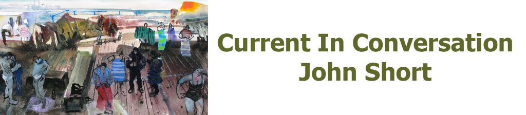
John Short, interviewed January 2013
https://zoneonearts.com.au/category/painter/page/2/
Discuss the people who have helped with Zoneone Arts?
Keith Marais from Comma5 who is always there for me, just an email away for any technical support. He has become not just my IT man but a valued friend.
Anna Harley for her proofreading for this interview Her continuing encouragement of Zoneone Arts.
My readers who often comment and many who will be unaware that their kind words of encouragement have kept me going.
All the 300 artists, without whom there would be no Zoneone Arts. Thank you from us all but especially myself.
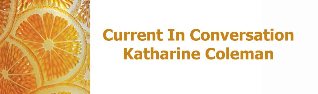
Katharine Coleman MBE, interviewed January 2018.
https://zoneonearts.com.au/category/glass/
My family who have always supported me throughout the life of Zoneone Arts, several times gently suggesting that I go back to the computer and find another interesting artist. Don’t give up.
Euan, my son, who every week patiently produces my In-Conversation signature that closes each week’s email. Thank you for always doing these with a smile and often a valued comment on the art.
My husband, John Blakeley, thank you for being my numero uno fan.
Deborah Blakeley from Zoneone Arts, "Take a seat and join me each week to meet a new exciting artist." https://zoneonearts.com.au/
Contact details:
Deborah Blakeley
Deborah Blakeley, Melbourne, Australia
Interview by Deborah Blakeley, April 2019
Robyn Stacey
What lead you to still life photography?
When I started working with historic collections the still-life tradition provided a working methodology to tackle their huge size and diversity. The four collections I worked had holdings of over a million artefacts consisting of specimens, objects, ephemera, and even properties, some collections named and categorised in Latin exclusively, so I needed a plan.
The First Cut
How has historical - still life painting influenced your work?
If you want to understand composition, still life is a great teacher. The compositions and the lighting in the best still life are a tour de force. The still-life qualities of rendering detail lovingly and creating a powerful mise- en-scene through lighting lend themselves brilliantly to photographic interpretation. The sharpness of the lens, and the control over lighting allows the photographer to reveal detail and invest both simple and intricate compositions with a heightened reality.
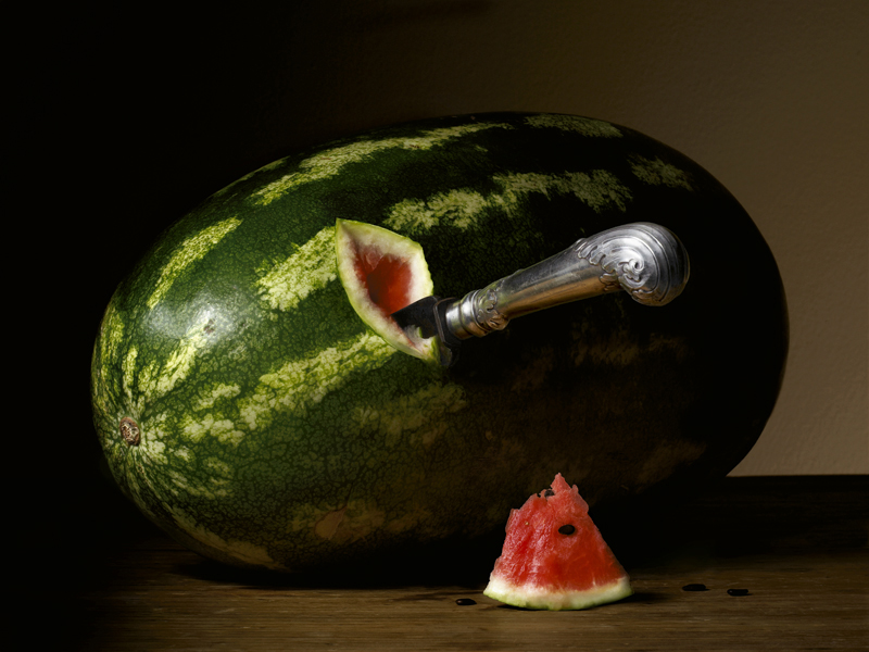
You state, “Still life is meant to be read” use this statement along with a photograph to explain the full meaning behind the work?
This quote offers a good insight into that statement “…Still life images captivate us with their close-up views of objects no longer living but far from lifeless. Yet, the sophistication of this genre hardly exhausts itself in the breathtakingly realistic reproduction of widely differing surfaces. On the contrary, every pictorial element can also convey some religious or moral content or serve as a reminder of time’s irreversible trickling...”
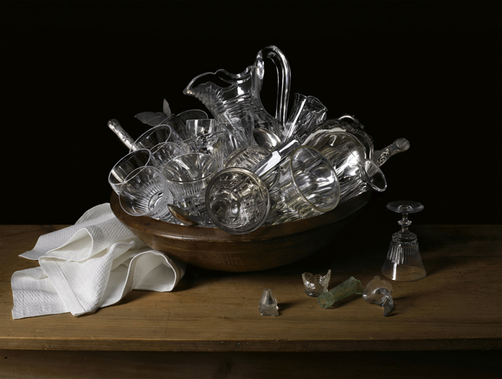
Miss Eliza Wentworth’s Glassware
The symbolic codes of the still life genre pose the recurring philosophical questions about beauty, truth, and wisdom, Miss Eliza Wentworth’s Glassware as well as being a particular set of glassware also references the fragility and precariousness of life. In the still-life tradition glass, particularly shattered or broken glass, refers to the frailty of life, but the still-life composition also served to demonstrate that by preserving the real object via an image permanence can be lent to the most fragile.
Expand on your approach and work processes when dealing with historical and scientific collections.
I began working with historic collections in 2001 with no particular aim except to produce a single exhibition. Both the exhibitions and books that have flowed from the initial research have naturally segue-wayed into each other covering the period from first white contact to the end of the nineteenth century. Each collection had its own challenges but with each of them I tried to minimize the handling and transportation of the objects to the studio. Sometimes the material couldn’t be moved and I had to photograph in situ, setting up a mini studio in the space. For example all of the Beau Monde images were shot in the Macleay Museum because nothing could leave the building.
I initially researched each collection, the history behind it, what’s significant about it, and tried to view as much of the collection material as possible with a curator or collection manager. At this stage making only lo-res digital files of everything in situ so that objects or specimens don’t have to be moved. This process enabled an overview of all the material in the collection to be developed, and an archive created that could be used to cross reference different parts of the collection and as a store of useful references to be used as the project developed. Research is undertaken into the historical imagery, style of compositions in vogue at particular periods etc., which could be relevant to constructing the final images.
I then decided where I wanted to start with the collection and what the first few images could be. I usually started with the more elaborate set-ups.
You have used your work and books to expand the availability of early Australian collections to the general public. Discuss.
The collections referenced in the exhibitions and books are historically, culturally and scientifically significant but little known outside a specialist world. The aim of the books was to raise awareness in the broader community about the significance and value of these collections. Given their scientific and historical significance and their physical fragility, only a small amount of the collection material at the Herbarium, the Macleay museum and Living Museums are accessible to the public and these collections never travel.
Herbarium the first book is based on the scientific collection at the Royal Botanic Gardens Sydney and was the first book with the author Ashley Hay. Starting with Banks and Solander arriving at Botany Bay on the Endeavour with Cook in 1770, Herbarium documents the plants that botanists, teachers, clergy, and hobbyists collected when they first arrived in Australia. Everyone in the colony collected and Saturday was known as Collection Day. In the Northern Hemisphere people believed a second act of creation had taken place in Australia so strange was the flora and fauna here. Specimens and plants were collected to be sent overseas which signifies the importance of the indigenous flora and fauna to the rest of the world.
Museum is based on the Macleay Museum and Macleay collections held at Sydney University. The earliest component of the Macleay Collection is its’ spectacular natural history collection housing a fantastic repository of Australian specimens. The Macleay collection is one of the few collections in the world that span all continents and most countries, the earliest specimen dating from 1756. It has a repository of more than 5,000 type specimens (the specimen from which all others are named) and more than 600,000 specimens in the insect collection alone making it internationally significant.
Rouse and the Cumberland Plain
House was based on a number of Living Museum properties and collections which focus on various domestic environments, from a farm at Rouse Hill to a Harbourside Palladian villa. Reflecting the habits, thoughts and aspirations of society in the nineteenth century colony the Living Museum’s collection bears witness to changes and trends in the community and tell us who we are and where we have come from.
Take a particular photograph, and briefly explain the meaning of the groupings of the items and the importance of them to the collection.
Garniture, Cape Bulbs
A garniture is a number or collection of any matching, but usually not identical, decorative objects intended to be displayed together. Complete sets of garnitures are exceptionally rare. A status symbol between the 17th and 19th centuries, garnitures later fell out of fashion. Sets were damaged or broken up and individual pieces sold off; few complete sets now exist, and even fewer survive in their original settings. In 1769 Wedgwood described the public’s insatiable appetite for vases as a ‘violent Vase Madness’ and by 1775 he made over 500 shapes available. They were never made in sets of twos, fours, or sixes, they were always made in odd numbers, of three, five, or seven. Recently there has been a revival of interest in Garnitures as demonstrated by the exhibition Garnitures vase sets from National Trust Houses held at the Victoria & Albert Museum in London (October 11, 2016 – April 30, 2017).
The floral arrangement of South African exotics, including arum lilies, clivia and watsonia flowers, and melianthus, are typical of those seen in early colonial views. The vignettes painted on the vases similarly depict blooms of contrasting forms and colours. Highlighting botanical diversity was fundamental to the Gardenesque style of planting popular at the time. All the flowers used in the composition are nineteenth century varieties, not contemporary hybrids.
Tell us the story behind ‘Leidenmaster 1’ and the specific collection this comes from and your involvement.
When I was undertaking a residency at the Herbarium of the Netherlands, at the University of Leiden I discovered that the book still life genre originated in Leiden and was at its height around 1620-1640; given Leiden’s significance as “the home of the book still life” it made sense to draw upon this genre during my time photographing the collection.
Leidenmaster 1 depicts some of the oldest books extant today. Many of these books also happen to be herbaria, containing plants pressed between their pages. Because books were portable it made them perfect for horseback travel and enabled people to collect as they journeyed – most early collectors were from the military, clergy, and doctors, because they were educated and they often travelled.
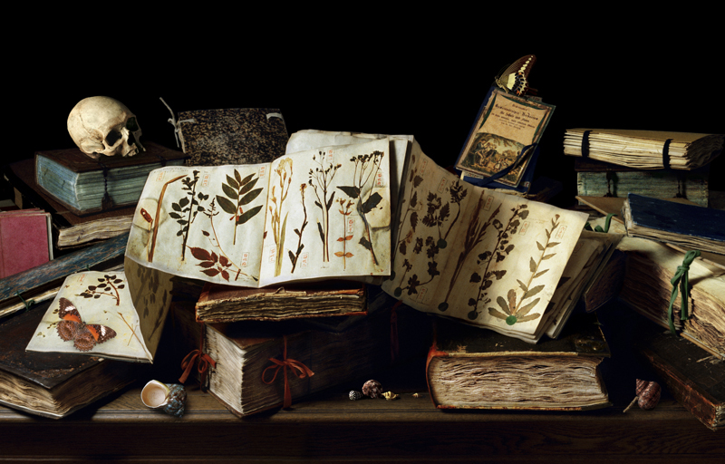
Leidenmaster 1
To understand the significance of the collection I have described some of the books in the image.
The book with the orange spine centre foreground is the Rauwolf herbaria, the finest among the very rare, still preserved sixteenth century herbaria. There are spoils of war from the King of Sweden, a Japanese scroll from 1860s, and some of the earliest plants collected from the middle east. The book with the pink ties may be the oldest Herbarium extant in the world. The Herbarium bears the title En Tibi Perpetuis Ridentum Floribus Hortum, which freely translated means as look here a garden in which the flowers smile upon you forever. The book was made in Ferrara (Italy) around 1542-1544. It is generally assumed that the idea to conserve plants by drying them under pressure for the use of scientific study originates with Luca Ghini around 1540.
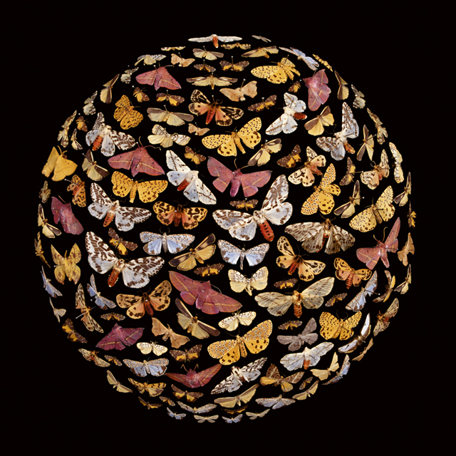
Explain the ‘Beau Mondes’, and the convex image?
Pink
The three Beau Mondes are a response to the globally significant Entomology collection housed in the Macleay collection. Some of these specimens date from the original collection that Alexander Macleay brought with him when he arrived as Colonial Secretary to NSW in 1826.
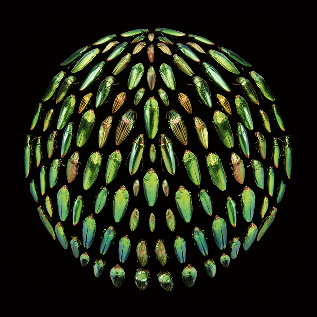
Green
During the nineteenth century Entomology was concerned with taxonomy, identification and classification, looking for similarities and difference between species. Specimens were arrayed on graph paper in perfect squares, displayed row after row, in endless columns. I wanted to emphasise the display and pinning of nineteenth century Entomology as well as reference the Victorian gothic hence the black velvet ball that the specimens are pinned on.
Yellow
Can you briefly explain the historical importance of Australia to collectors in the 19th century both in Australia and abroad?
In the late eighteenth century there was an explosion of interest in Europe in the newly discovered plants and animals from the strange and 'topsy-turvy' land full of 'antipodean oddities' known then as New Holland, Nouvelle Hollande, New South Wales, or just Botany Bay. These plants and animals were so rare and difficult to procure that they were looked upon much as visitors from the moon would have been.
Fontaine de Vaucluse
In the eighteenth and nineteenth centuries anyone who was anyone had to have a garden and /or a collection that included Australian plants and animals. From the King of Bavaria to Josephine and Napoleon, the flora and fauna of Australia created a popular and scientific upheaval in Europe. And anyone who had the time and money travelled here, making the early settlement in Botany Bay more sophisticated and cosmopolitan than might be expected, Palladian villas and Neo-Gothic estates doted the harbour while princes from Sri Lanka and European adventurers and noblemen came to trade and explore the country.
Using ‘Walnuts’ and Gorilla Skull discuss the difference in the two approaches to composition in the photographs.
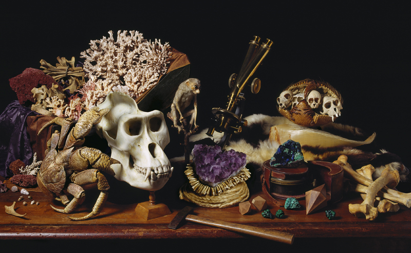
Gorilla Skull
The Dutch Still life tradition solved the problem of how you situate the giant purple jewel, the Gorilla Skull and the necklace made from human teeth next to each other in one composition. Gorilla Skull references the exotic specimens held in the Macleay collection and the three generations of Macleays who collected exotics from dealers and Emporiums, employed their own private collectors, and organised their own expeditions. The aim was to build a collection that reflected taste, accomplishment and curiosity.
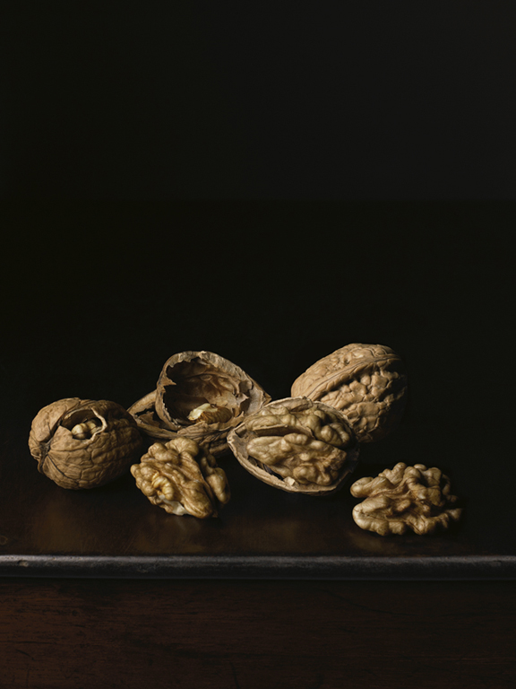
Walnuts
While the Dutch Still life tradition is the exemplar when it comes to dealing with excess in a composition, Walnuts demonstrates something completely different. Based on the Spanish Still life tradition that was more interested in elevating the overlooked, taking what could be considered mundane or commonplace and making it the focus of the composition with very little embellishment. The Walnut in still life also references the body of Christ, and the Trinity so can appear in the very complex still life compositions as well.
Contact details:
Robyn Stacey
Robyn Stacey, Sydney, Australia
Interview by Deborah Blakeley, April 2019

Preston Singletary
Can you expand how important, your glass art has been to your own Tlingit cultural heritage.
I cannot claim that my work is any more important than any historical objects from my Tlingit culture. I do feel that my art and perspective bring a new dimension to Indigenous art. I feel that it breaks out of the cultural corral that anthropologists would like to place our cultural art in. The materials that we use are becoming increasingly hard to acquire, for example - the large logs for totem poles and dugout canoes. I think you’ll see new materials being used for cultural art, and I just happen to be doing it in this new way. There were people who were before me, and there will be people after me. As the Maori say, “My work is not my own but those of many”, meaning that the ancestors who pioneered our cultural styles gave us a vocabulary to represent our history. Like the Aboriginal people have their “pattern laws”, it identifies them.
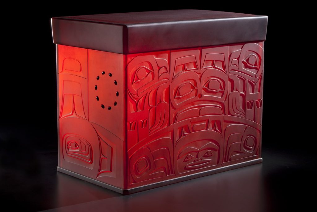
Spirit Box, Collection of Detroit Institute of the Arts, Cast and sand carved glass, 23 x 28 x 18"
As the formed lines and designs are cultural, how do you keep a balance between them and your own contemporary art?
I have studied hard and sought out mentors who have helped me with developing my work. I contend that since the European immigration to North America our art and culture has suffered in many ways. Our people were not allowed to engage in our culture that had governed us for thousands of years. The monetary system was effectively dismantled. There was a lot of knowledge that was lost during this time change and we are working to reconstruct it so that it will live on for generations to come. In the past it was the clan leaders who commissioned all the material objects to be made, such as totems, canoes, boxes, bowls, and spoons. Today the clan leaders are not financially empowered to commission art work as in the old days. It occasionally happens, but not as much. If there were no practicing/working artists there would be no good art. For this reason we are forced to go to the commercial market. I do feel that I am prepared to make strong work for my community when it’s asked of me.
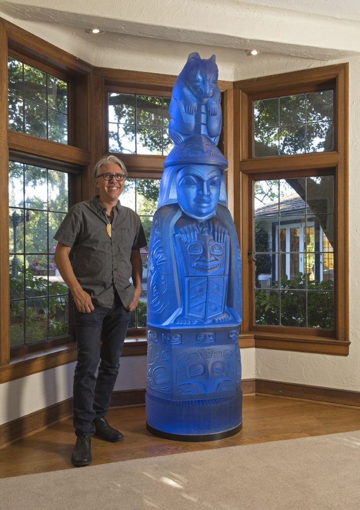
Family Story Totem, Kilm-cast lead crystal, 84 x 24 24" Photo James Prinz
Glass art would not have been traditional, how do your elders see and relate to your representation of your shared culture?
The first couple of pieces I made were the upside down Tlingit hat forms with a wolf design carved on them. I sent them up to Alaska for a group exhibition and one was displayed at the Museum of History and Art in Anchorage, it’s still on display there. Years later when I brought my work back to Alaska for a cultural art and culture gathering I think my work came way out of left field, but was received enthusiastically. Eventually I was asked to make a significant triptych for Sealaska Heritage, a cultural arts center in Juneau. This signified to me that my cultural peers were embracing and supporting my work. They told me as much, that they wanted our art to expand and grow. This was a very important right of passage for me and the work that I do.
Can you discuss how you have been able to inspire other indigenous artists to develop along similar lines especially glass?
I try to work with established Indigenous artists in a collaborative way, where they become the designers and I execute their designs by how they see it using the techniques that I employ for my own work. By doing this, I hope to expand the vocabulary of Indigenous art. To date I’ve worked with many Native American artists from around the country, as well as Maori of New Zealand, Hawaiian and Australian Aboriginal artists.
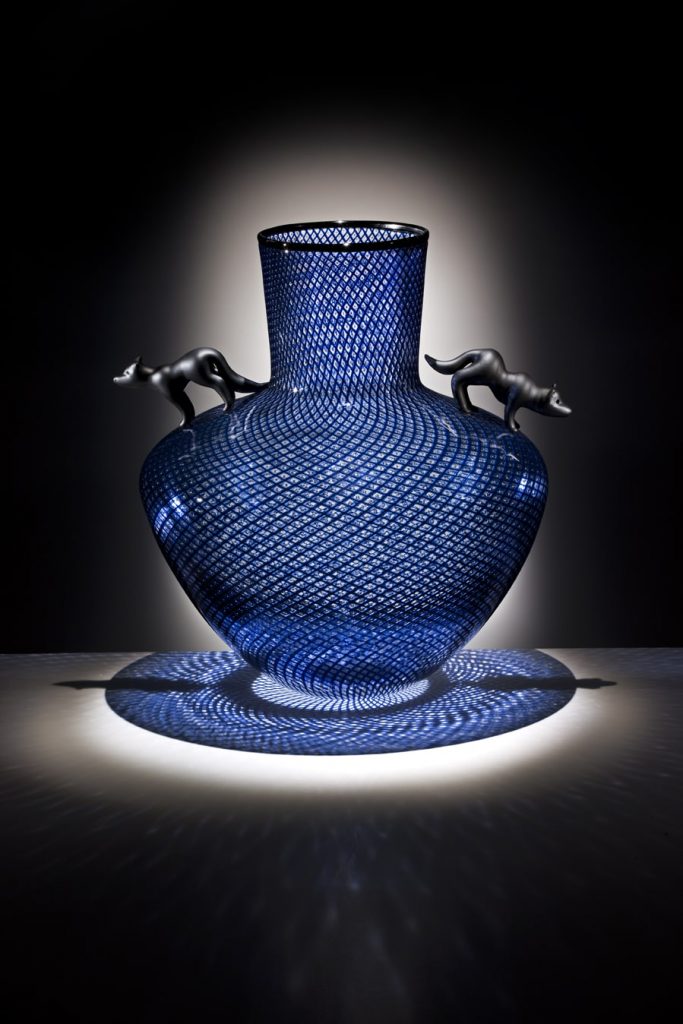
Spirit vase
There are plans to build a glass studio at the Evergreen State College where they have a strong Native Arts program and want to develop a Masters program in the arts for Indigenous people. This program would have a glass studio that would be part of that masters program. This to me would be an amazing opportunity to provide a place where Indigenous people could learn to work with glass.
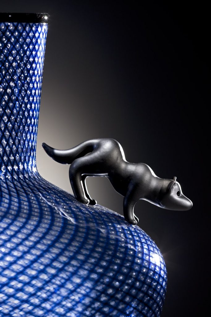
Detail of Spirit Vase
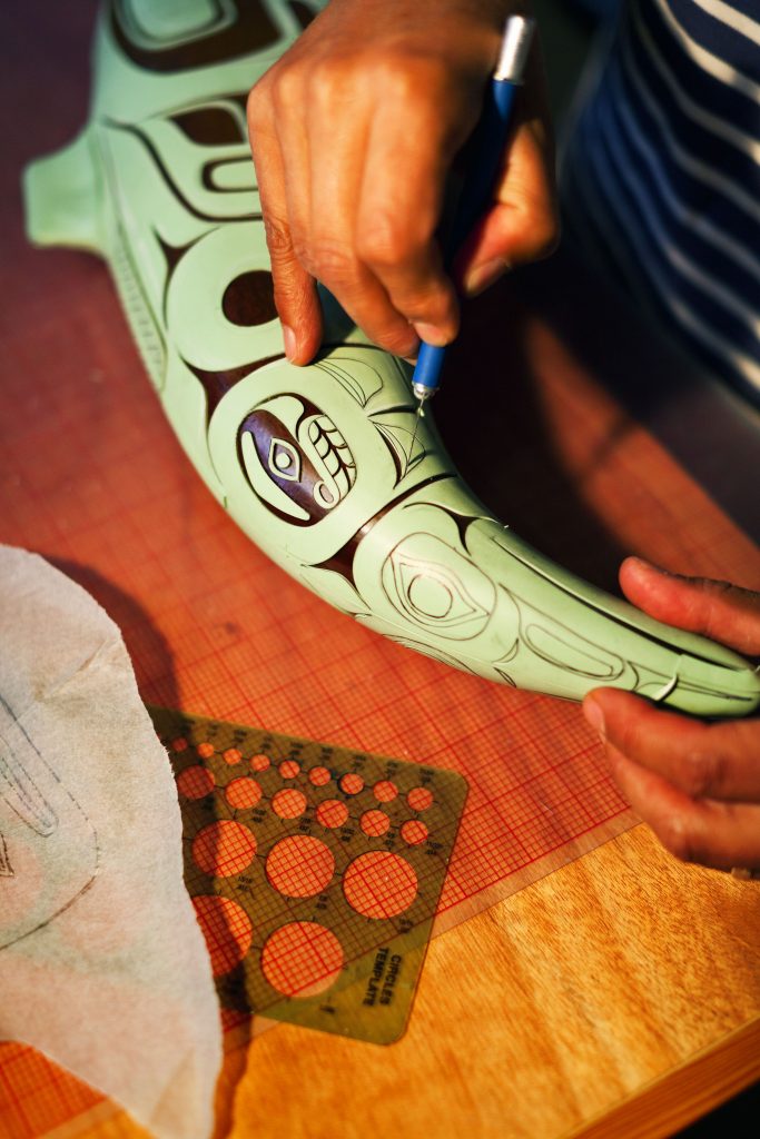
Explain the process of your drawings and artwork that is required before you begin work on the glass.
My pieces are inspired by traditional carved objects, 2-D design work and how it integrates on the 3-D piece. In the beginning I was mainly inspired by historical objects, but of course my glass pieces would not be regarded in the same way, so I realized that I had an opportunity to interpret them in different ways. Sometimes it’s an exaggerated scale of an object, and sometimes it’s inspired by the Modernist art of the turn of the century, Primitivism, Surrealism and even abstract art. Some of the ideas are generated on paper and some are conceived through the glass blowing process. In some cases I’ve had objects sitting around on shelves for years, and then one day I can see something in it and I’ll finish the form.
How did you first come to work on ‘Totem’ commissions?
I was first driven to make a glass House Post, which I made first. These are the door like shapes that people think of, but they are actually tunic designs and if you look at the scoop out of the top center you can imagine that. In any case, these were the first forays into making larger monumental work. I became driven to make a totem pole made of glass, and so I worked collaboratively with a good friend, carver and mentor David Svenson to make the first “Family Story Totem”. It’s a story that relates to my Great Grandmother Susie Johnson Bartlett Gubatayo. At the turn of the century she had a pet grizzly bear as a child and the bear developed a taste for taffy that was made by a Russian woman living in Sitka where Susie came from. She went to the forest to pick berries to sell to get Russian money so she could buy taffy for her beloved pet.
I was able to find clients and supporters to commission additional versions of this piece in different colors, three in total. Now I’m making a new “Killer Whale Totem” which is my clan symbol and will be even larger than the “Family Story Totem”, standing at over eight feet tall.
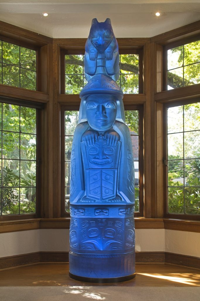
Family Story Totem, Kilm-cast lead crystal, 84 x 24 24" Photo James Prinz
Discuss your work ‘Family Story Totem’ and how this work took a further link and was cast in the Czech Republic.
Due to the massive nature of these pieces weighing 2000 lbs. I was having difficulty finding a studio to help me execute these pieces. I had another old friend, Charlie Parriott who had been helping people execute pieces in the Czech Republic. They have a lot of experience working in larger scales, they have access to lead crystal and they have a lot of skill with the cold working which is pretty extensive on these pieces. Also very exacting in the way that they are ground to stack up precisely.
What was their response to the story the Totem told?
The Czech’s were very intrigued with the idea of helping out with these pieces. I feel, in general, people were intrigued with the notion of Native art and culture. We have developed a very close working relationship today.
Comment on Tlingit Dancing Staff.
"This work explores the dynamic relationship between the wolf and the raven."
Tingit Dancing Staff, Preston Singletary and David Franklin, commissioned by Regional Arts and Cultural Council
This piece represents the Tingit Dancing Staff, which were used by the singers or dancers and were thumped on the floor to keep time or wavered in sync with the music.
Tingit Dancing Staff
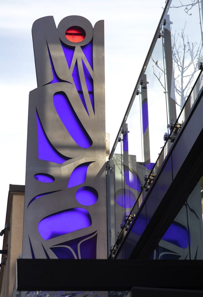
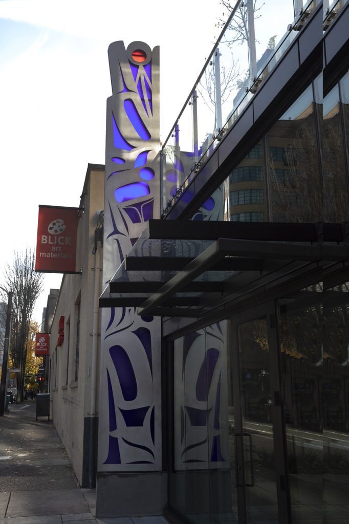
Public commissions are now a huge part of your work, can you expand on 'Transformations', commissioned by the Seattle University.
Transformations, commissioned by Seattle University, Admissions and Alumni Building
Aluminum and fussed glass, 7.5' x 5.5 x 1"
Size: 7.5 feet x 5.5 feet
Technique: Aluminium and fused glass inserts
This was one of the first public art pieces I did. They came to me directly and asked
me to make something for their campus. This was the first exploration with metal and
glass, and also abstraction on a larger scale. In the end it opened up some new
perspectives to approach and scale.
On a much smaller scale ‘Shelves & Baskets tell us about them?
Indian Curio Shelves, Blown and sand carved glass baskets, 9" 10" (individual baskets) Photo Russell Johnson
These pieces came about as an exploration of the basket form in general. At first I made them in earth tone colors to mimic the traditional pieces. Later on I decided not to limit myself to just the muted tones and started exploring different color combinations. They range from 4 x 5 inches, to 8 x 9 inches, and I have done very large ones too, as big as I could utilizing a big team. The designs are all traditional or at least historical. There was a time when baskets were made for the tourist trade and I’ve studied a lot of the designs through historical photos from Indian Curio Shops.
Indian Curio Shelves, Blown and sand carved glass baskets, 9" 10" (individual baskets) Photo Russell Johnson
In regards to lighting of the glass, of course lighting enhances the effect of the piece, but I feel too that glass is one of the only mediums that people make excuses for in terms of lighting. I feel that the glass has different effects in different light, but you
just need to play with it in different parts of the space it’s being viewed in. In the case of my hat forms, I do believe that the glass has a “spirit” in it, which is revealed when the lighting is right. Kind of like when people explored caves and found themselves standing somewhere with a ray of light coming down through a crack highlighting a petroglyph!
Can you expand on the history behind the traditional weaving and was it done by men or women? How has this history effected your work.
Traditionally weaving was done by women. It was gathered from cedar trees, the skin just under the ruddy bark. It was split, softened and then woven. Spruce root was also used by the Tlingit, Haida and Tsimshian. In my way, these glass baskets are an homage to traditional basketry.
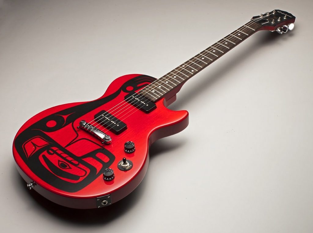
Briefly give us the inside story of ‘Martin Guitar’.
The Martin Guitar company had contacted Sealaska corporation, my tribal affiliate. They were brokering a deal to procure spruce wood from land that was controlled by Sealaska. Martin had expressed interest in producing an affordable/production guitar with an Alaskan Native design. Sealaska put me in touch with them. Melissa Post, a Curator from the Museum of Glass, contacted Martin to see if they could get a prototype to tour with an exhibition I had in 2009, and so they sent me a spruce guitar to paint a design on. The project was never executed, but I did get to keep the painted prototype.
Spirit Wolves. Fender Stratcater Bass, for the experience Music Project I, Science Fiction Hall of Fame, Photo Russell Johnson
Explain how your journey has been influential both personally and the importance of bringing your cultural heritage to the eyes and sensors of the general public in an artistic way.
Glass House Screen, Sealaske Heritage Institute, Alaska, 28 Kiln fired panels, 11 x 16' x 5" Posted 6' Tall
When I first got out to high school, I fell directly into glass blowing as a job. I thought it was a great day job, but music was my first passion. Later I went to the Pilchuck Glass School and realized how artists work with glass in many different ways. In an effort to find my own personal style, I turned to my culture. I never realized how fulfilling it would be. It brought me back full circle to my family, my people, my history and culture. The more I learn the more intriguing it becomes. There is really so much to learn. I have been adopted by important mentors and given additional names, which validated me within the Native community. I was given an honorary Doctor of Arts degree by The University of Puget Sound, and I felt that this validated me in the Western perspective. I also explore my culture through music, and I work with Native and non-Native musicians with my band Khu.éex’. We use Native singing, storytelling, performance art and spoken word using Jazz, Rock and Funk styles. In the old days of Tlingit culture, the stories, songs, dances and art were all one thing. So it is a very full life that I live and I’ll keep doing it as long as I can!
Contact details: Preston Singletary
studio@prestonsingletary.com www.prestonsingletary.com
Preston Singletary, Seattle, USA
Interview by Deborah Blakeley, March 2019
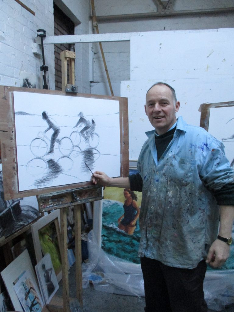
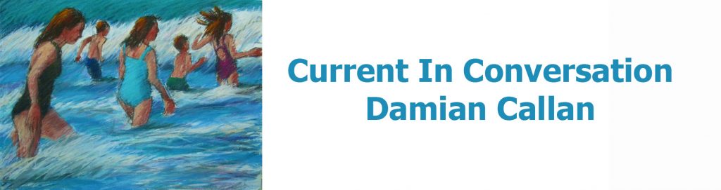
Damian Callan
You title your art as figurative art, discuss this using image to explain the terminology.
Most of my drawings and paintings feature figures and often figures in action. I tend to lose interest in images that are figure-free. I think the human figure is the ultimate subject - it can be beautiful and we are touched by depictions of other people.
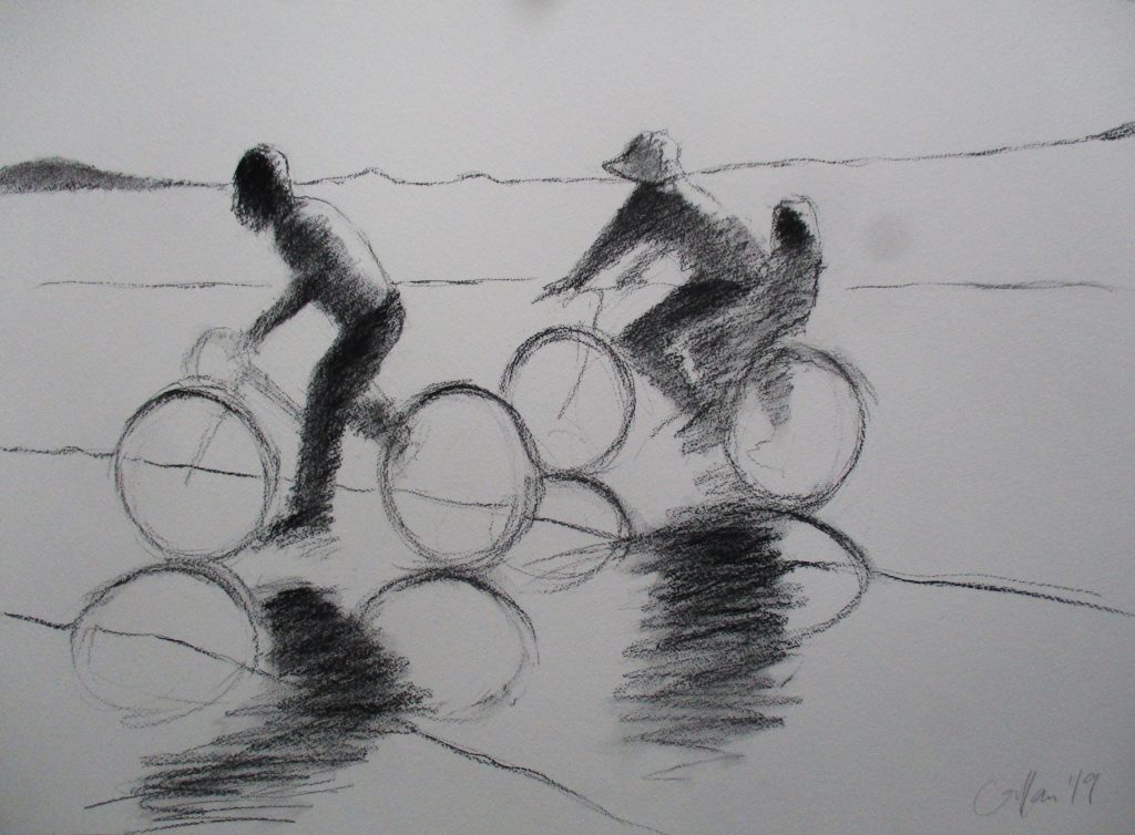
Bicycles Shadows, charcoal 55 x 77 cm
What made you leave science for art?
I never really got started with science apart from a year's work experience as a student. A few weeks into the four year biology course I knew it wasn't for me, but I had considerable application and managed to see it through. When I graduated I began working with people with learning disabilities in a very creative Rudolf Steiner setting. That led me to eventually take a second degree in Drawing and Painting at Edinburgh College of Art.
You have had an unusual residency in a hospital. Can you expand on what this time involved?
I spent time in the Liberton Hospital just outside Edinburgh and homed in on the occupational therapists and physiotherapists who were teaching stroke victims to walk and regain other basic motor skills all over again. It was miraculous work and very moving to witness. I produced a series of paintings of a man taking his first steps with the help of a therapist. These were done on seven small panels and decorated with an imitation gold leaf. I was aiming at an almost religious quality to the images.
Teaching is a part of your week – discuss this aspect of your painting week.
I teach 2 -2.5 days a week, mainly in my studio and also at The National Gallery. Students come to me to learn to paint the figure in oils. At the gallery I run a drop in event that encourages people to 'have a go' at drawing in public - something that seems to work through a kind of spontaneous magic and many have a revelation and experience a real breakthrough and say they want to take up drawing more seriously as a result. I enjoy teaching and learn a terrific amount in the process. I often find that I'm urging students to try a particular approach and then realise it would actually suit me very well to do the same...
![]() Best Dress III, III charcoal 35 x 25cm
Best Dress III, III charcoal 35 x 25cm
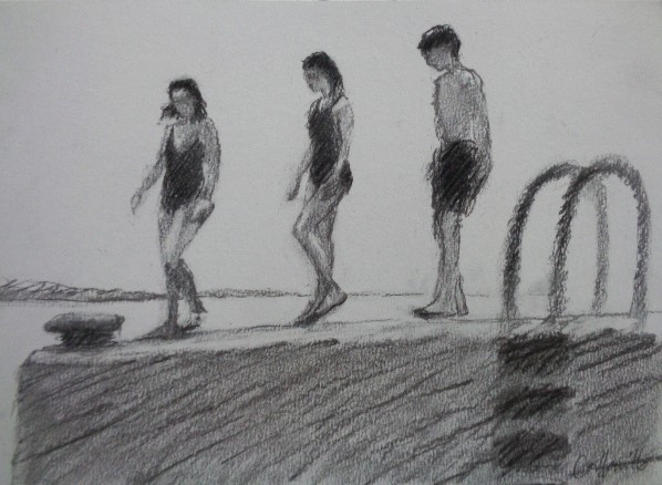
Location is a major part in your art teaching – Explain how you move from location to location to expand the joy of plein air painting.
One of the courses I run alternates between a day drawing at a particular Edinburgh location ifor example the swimming pool, the canalside, a hotel lobby, an auction house showroom and a then day in the studio with a portrait model where the students put together a composition based on the model's pose and their location drawings as a background for the figure. Its great fun going behind the scenes to these different places and there is always so much material for paintings. In the summer I take groups out in to the landscape and to the coast to produce plein air oil paintings. There is a wonderful compliment between the changing Scottish weather and working alla prima with oil paint. It is possible to change or modify your painting in response to the drama of the light and changing scene.
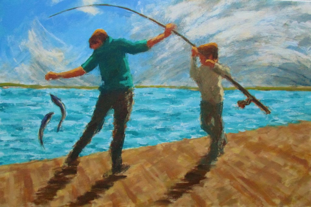
Catch, oil on canvas 61 x 91cm
When you paint with oil you work on board not canvas, why?
I work on a mixture of canvas, board and prepared paper. The weave of the canvas is great for allowing you to build up layers, but the hardness of board is helpful when applying paint with a roller (which I often do).
Movement is in your work, very often showing the pure joy that children show through movement, discuss this aspect of your work.
The one thing that I really learnt at Edinburgh College of Art was drawing the figure. We had regular life drawing classes and were taught anatomy by the great George Donald. This inspired me to work with the figure. But it wasn't until I started painting moving figures (based on bathers in a local pool that had a wave machine) that my work really took off. I think there is something in the elusiveness of a moving figure that helps me work in a more spontaneous and lively way. I continued painting swimmers and athletes for a few years until our children were born and then it just seemed perfect to start depicting them and their activity.
The children you paint are often your own children. How do they feel about your sharing them in this way?
I quote my daughter; she says she feels, 'Honoured and respected...' I suppose they've never really known anything else. When they were younger people would ask 'Don't you mind selling the paintings, wouldn't you rather keep them?', but I didn't mind because we still had the children. Now that they're growing up and leaving home, there are a few paintings I wish I'd kept.
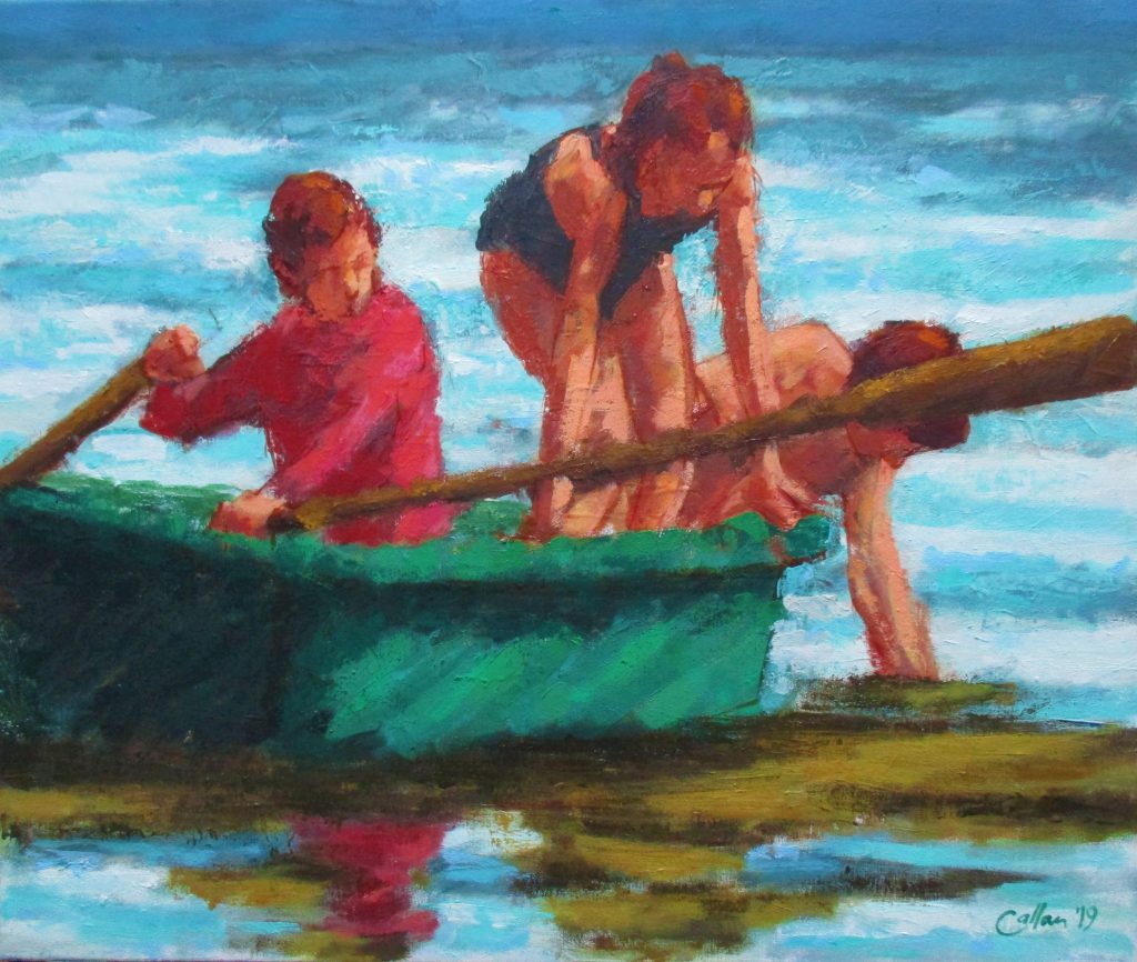 Leaving the Boat, oil on canvas 50 x 60 cm
Discuss the obvious comparison of your works Blue Dress I with the work of Degas.
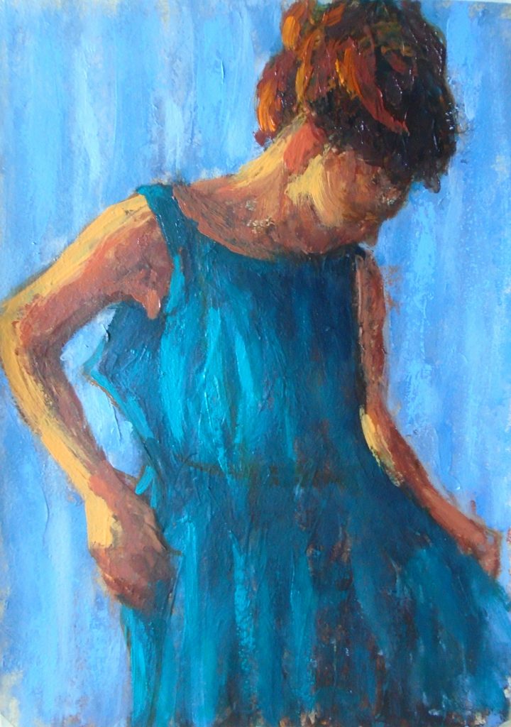
Blue Dress I, oil on paper 35 x 25 cms
I love Degas' work and was very lucky to be asked to produce a book describing and emulating his technique. I learnt an enormous amount by examining and exploring his different approaches in order to explain them to others. He described his technique as 'a series of operations' and was quite scientific in the way he experimented. I have tried to emulate this aspect and in paintings like Blue Dress I and II I have built up layers in stages often changing from loose colour to drawing lines in order to add definition.
Can you expand on your technique of drawing without lifting the charcoal from the page?
I encourage my students to begin their drawings with a single continuous line formed by not lifting the charcoal off the page. It is one of those right brain approaches; a more intuitive or instinctive way of working that not only creates livelier drawings, but often produces more accurate observation. I use this technique myself and try hard not to miss the beauty of the first unselfconcious marks that are generated. The challenge is to develop the drawing to make it more substantial without losing that initial delicacy.
Take ‘Harbour Wall’ and discuss your use of charcoal.
Like many families, one of our summer holiday challenges is to throw ourselves off the high harbour wall into the cold sea water, this often seems to happen just before tea time. The children were lined up waiting for everyone to have the courage to jump together and I was struck by how heroic they looked - like Olympians about to do something very brave. I sketched out the scene with the help of some photographs and using the continuous line start. Then gradually built up areas of tone and shade to solidify the figures. I wanted to show their tentativeness and anticipation through a lightness of touch and charcoal can be perfect for this sort of sensitivity.
Harbour Wall, charcoal 25 x 35 cm
You are currently having a solo exhibition at Union Gallery in Edinburgh…
How was the exhibition given its title ‘Moving Images’?
I wanted to be ambiguous about the movement in my subjects and the way they move me personally.
What lead you to fill the exhibition with so much sunshine and not a spot of rain?
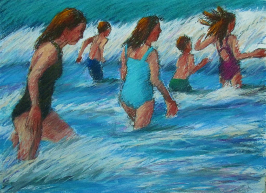
Swimming after the Storm, pastel 55 x 77 cm
Ah yes, 'Into each life a little rain must fall...' (especially in Scotland). I love the drama of sunlight and many of the scenes in these paintings are from the Hebrides where the weather changes so rapidly that sunshine can be short-lived and a reason to celebrate when it does burst through. When the sun comes out on the West Coast of Scotland there is no place on earth more beautiful - who wouldn't want to paint that?
Contact details:
Damian Callan
damian.callan@gmail.com
Damian Callan, EDINBURGH, Scotland
Interview by Deborah Blakeley, March 2019
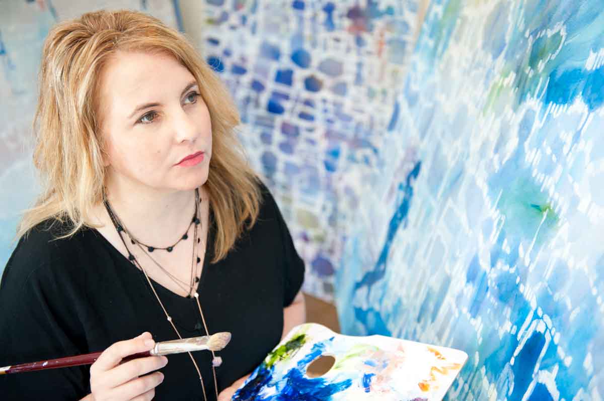
Belinda Wilson
Can you expand on your master’s Research, and relate the importance of art on current day issues – Climate change?
The Master of Fine Art by research (MFA) degree was undertaken through RMIT University in Melbourne. The degree took 4 years to complete (part time) as I was employed as the Deputy Head of School, (Vocational Education) in the School of Art, RMIT University. I have been working at RMIT since 2010 when I relocated from regional Victoria to take up this position. My current position at RMIT is a Senior Advisor, Learning and Teaching, Vocational Education.
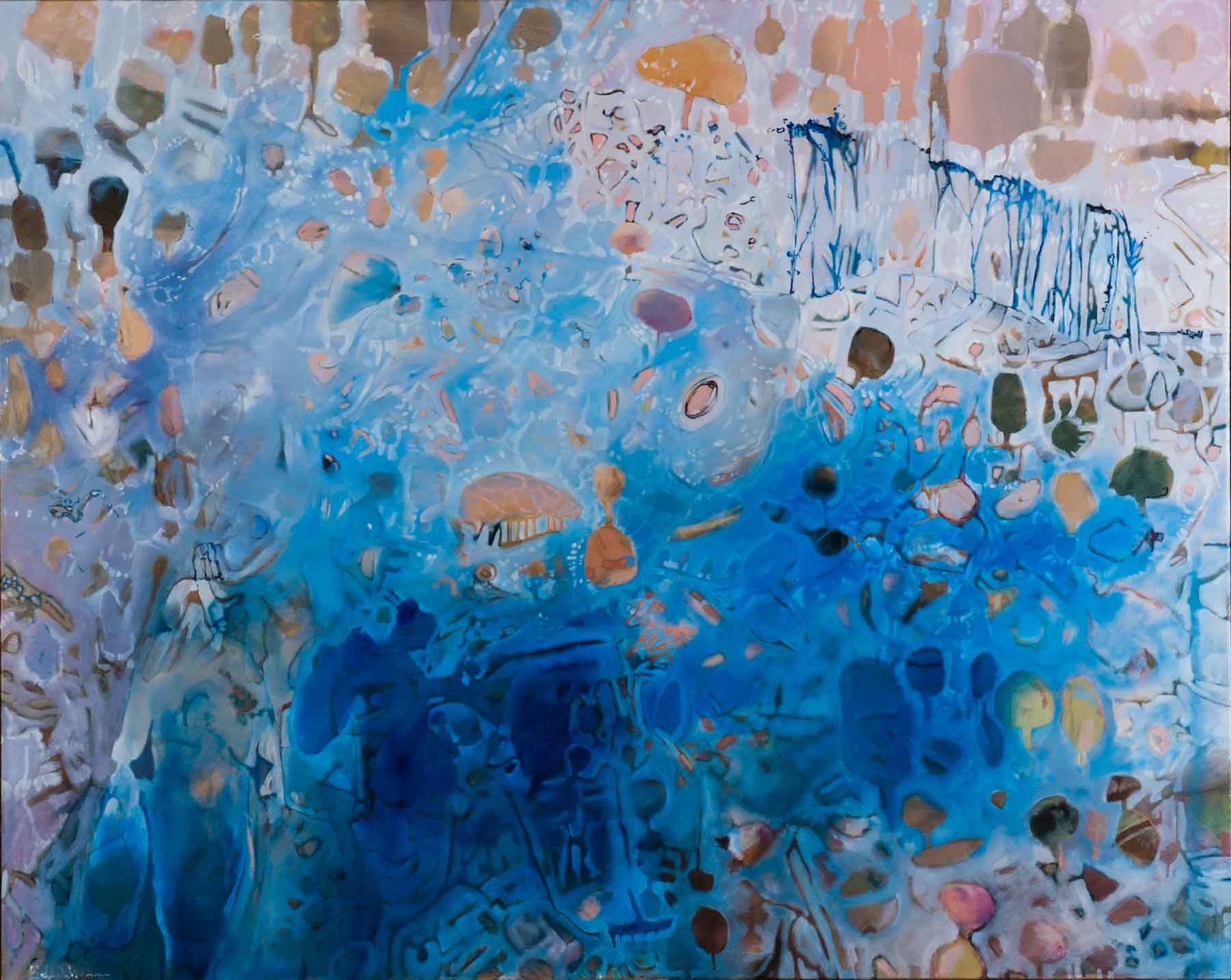 Searching for Ghost Gums, Oil on linen, 125 x 155cm
The practice led research undertaken through the MFA, emerged from a studio-based approach to landscape painting and drawing. I combined my own memories with selected personal experiences and historical accounts of others, to create a body of artwork that investigated extreme weather conditions. Primarily, I concentrated on the locations of Longwood, Wangaratta and Milawa in North East Victoria, Australia to narrate experiences of living through drought, flood and bushfire and how this affected inhabitant’s emotional wellbeing.
In recent times, the issues surrounding extreme weather conditions in Australia has come into stronger focus, as many regional communities are being devastated by the impacts of challenging weather conditions. How the extreme weather affected inhabitants in regards to their lifestyle and emotional wellbeing has been a critical aspect of my research project. The direct relationship between personal wellbeing and extreme weather are important factors when making the body of work for the MFA, as it is now evidenced that extreme weather does impact and influence how we feel. There can be obvious physical impacts on one’s environment such as losing a house in a bushfire or livestock destroyed as a result of drought. Ultimately the weather negatively affects and impacts on our wellbeing which was evidenced in my research.
Art has the potential to bring attention to many current issues that can sometimes be overlooked or misunderstood. For communities in regional or remote areas, art plays an important role in recognising these challenges and understanding what is happening in these communities.
MFA Exhibition, July 2018
Highlight three devastating conditions that continue to face Australians and your art. Comment on these 3 aspects as an Australian Artist.
Drought
Flood
Fire
Like many teenagers growing up in a regional town, the desire to leave is compelling and I left when I was 18 years old and moved to Melbourne to study fine art at University. I returned to Wangaratta in my thirties for family reasons and encountered a nine-year drought (2000 -2009) This was known as the Big Dry or Millennium Drought that was followed by extreme bushfires that created chaos and loss. The worst of these fires became known as The Black Saturday bushfires in February 2009. The Black Saturday bushfires caused 180 fatalities and burnt across Victoria throughout the month of February. These events made a significant impact on me personally, which influenced my art practice. In my landscape paintings, the environment was portrayed to not only have a sense of place but a reaction to the extreme weather conditions that surrounded me.
Your work has been in one Australian Embassy, South Korea, Costa Rica and New York City. Can you explain how each came about and briefly discuss a painting that went to each embassy and why?
I lived and worked in South Korea for 2 years (1996-1998) as both an artist and educator. It was an amazing time living abroad and discovering a new and exciting country that was rich in history and culture. Living overseas as a young woman in her 20’s was exciting but sometimes overwhelming and daunting. I knew no one when I arrived but the hospitality and friendliness of the Korean people and expatriates that I encountered was amazing. I lived in the city of Bucheon, a satellite city of Seoul, about 25 kilometres away.
During my time in South Korea, I was involved in an artist group called A-link (Artists living in Korea) which was founded by Mary E Roettger and Andrew Owen. “A-Link’s mission was to generate a new visual resource and exchange between Korean art students and Foreign/Overseas Korean artists” (Mary E Roettger 2000). One of the highlights from A-Link was an exhibition in 2000 at The Ilmin Museum of Art. The exhibition was organised by A-Link coordinator Raymond Hahn and curated by Mr Chang Dong-Kwang. The exhibition featured 17 Korean and international artists which showcased an exploration of artistic mediums from each artist whilst they lived in Korea.
Many of the expatriates in South Korea would meet at the Australian Embassy for Friday night drinks. I met the Manager of the Australia Centre; Clinton Jackal and we discussed an art exhibition to be the official opening of the Centre. The exhibition titled Quasi ideals: Images of Satiric Symbolism was opened in July 1998 by the Australian Ambassador Tony Hely. The artworks that were exhibited were created in gouache on water coloured paper and featured images that responded to my environment in Korea, the people I encountered as well as the culture and customs that I experienced.
After I left South Korea, I travelled to Europe and Central America where I lived in Costa Rica for a period of 6 months. I continued with my practice in landscape paintings which was exhibited in Costa Rica.
Several years later I would exhibit at the Sofitel hotel in Melbourne in 2003 with a solo exhibition that showcased the painted landscape from North East Victoria where I was living at the time. The exhibition also partnered with wine and food producers of the North East region and the local produce was featured at the Sofitel restaurant for the month the exhibition was on.
You work in many sizes how and why do you decide on the original canvas size?
There is a lot of planning when creating a body of work to exhibit. Many considerations come into play. The theme of the work, the style I want to relay, the exhibition space, art mediums and who the audience will be.
MFA Exhibition, July 2018
Currently, my preferred canvas size is 125 x 155cm. The larger canvas provides a freedom to explore. I don’t have to squeeze images and figures into a small area. The larger canvas allows for expressive brush work, detail and space surrounding the figures. The space between each figure on the canvas reminds me of distance when living in a regional community.
How do you decide on the amount of time you will spend on Exhibition/s work each year?
I am constantly creating new works, many are to be exhibited and some will never be seen outside my studio. These works are about exploration, idea building and seeing how they will ultimately develop. I work on multiple pieces at once, due to my time constraints with working at a University and having a family. Some artworks take many months to complete.
MFA Exhibition, July 2018
When exhibiting, I like to have a number of artworks to select from. Currently, I am showing with Brenda Colahan Fine Art in Sydney. This gallery representation commenced last year after I exhibited at The Other Art Fair, Sydney. This year I will again be exhibiting at The Other Art Fair in Sydney from March 14-17. Being exhibited in an art fair for the first time not only was an amazing experience but also reflected the years I have been a practicing artist. The atmosphere from the exhibiting artists, the audience and new clients that I met all provided a very successful experience.
As well as holding solo and group exhibitions you have University lecturing position, how do you fit it all in?
I have been working in the education field and on my art practice for many years. I enjoy working in the University sector, in particular the RMIT Art School as I was able to combine my love of art with education. Working with art students and other artists provides an environment for feedback, dialogue and reflection. I enjoy the company and rigorous conversations that is had at the University especially in regard to creating artworks.
MFA Exhibition, July 2018
I have always been hard working and I manage to juggle full time employment with an art career by having a supportive partner, family and well organised schedule. When it comes to time management, I am quite pragmatic. What is most urgent and what can wait. I work most days on my practice, sometimes in the evenings or when I have an exhibition coming up in the early hours of the morning before work. It is a labour of love and I am fortunate to have had the opportunities that have allowed me this. These opportunities have been created not through luck but tenacity and hard work.
Who is Mr Wilson?
Mr Wilson is based on my father as well as the many men and women who live and work in regional and remote communities. Mr Wilson is a silent, hard-working, stoic hero who is committed to family and the community. My father Michael Wilson has lived in regional Victoria all his life. His knowledge of the community and country living provided the impetus for many of the artworks that I have created.
Mr Wilson, Oil on linen, 125 x 155cm
When did you first introduce Mr Wilson into your work?
My Wilson emerged in my work in 2014. My father and mother have always been very supportive of my art practice. My father Michael agreed to be a model for a series of photographs that documented changing weather and temperature over a period of several hours. The photoshoot was taken at the foot of the Warby Ranges in South Wangaratta. I documented a change in climatic conditions over a period of six hours. This photoshoot was undertaken in January 2014 on an intensively hot summer’s day and established a creative vision for the MFA and many of the artworks created. These photos inspired a series of paintings and drawings and the development of digital artwork and animated drawings with sound.
Take ‘Relocation’ and discuss the deep layering of the work.
Many of my oil paintings such as ‘Relocation’ use a method of thin washes of oil paint to build up surfaces. I use a lot of thinning medium to dilute the oil paint. These layers provide a surface that can then be blocked out so images and shapes can emerge through the paint. The oil painting medium can be deceiving as it could be interpreted as water colour or inks. However, oil paint has the capacity to be more supportive for multiple layers of paint.
Relocation, Oil on Canvas, 125 x 155cm
Oil painting for me is a lot hardier and forgiving than watercolour. For many paintings, the images are worked out on the canvas, the layering method allows for this to happen. I may have sketches and photos that I base the work on, but it is how the paint moves and flows on the canvas that allows for the imagery to emerge and be finalised.
You use several mediums, expand on your many choices and why each has a place in your portfolio?
I am torn between painting and drawing. I enjoy using both mediums to create artworks. Drawing is actually, an easier medium to use for me, but I like the challenges that painting provides. I never really know how a painting will turn out, whereas in drawing my mark making is very definitely and I have a lot more control over drawing mediums. Recently, I introduced digital drawing into my portfolio. The beauty of digital drawings allows me to reproduce and manipulate images. I can scale them to be quite large but also very small. I usually produce limited editions of no more than 50 prints.
You were included in 20 Australian Women Artists over 20 Years Exhibition at the Brenda Colahan Fine Arts Gallery. Discuss.
Your feelings on being included along with 19 others.
I was thrilled to be included in this exhibition called 20 Australian Women Artists. The calibre of artists who I admired greatly, was one of my career highlights. For many years, I would view these artist’s artworks in many exhibitions. They are artists who have created a unique voice and identity in contemporary Australian art. Each artist provides a significant contribution to the art scene in Australia. They are recognised on both a national and international scale.
Which, of the other artists did you feel most formidable to be amongst?
I would say all of them. To be included in this exhibition with these amazing artists who have such a strong name in the Australian art scene was incredible.
To have my work alongside Tracey Moffat, Judy Cassab, Melinda Harper, Emily Kame Kngwarreye just to name a few of the exhibiting artists provided a remarkable experience for me as an artist. It was overwhelming to be exhibited along side these brillant artists.
Your personal feelings on exhibitions that are gender based.
This is a difficult question, as I don’t feel my art practice is based on my gender. I tend to make art as a commentary on issues both personal and environmental. Though I am a female artist, I don’t think this defines my work. To be included in a gender-based exhibition celebrates the contribution that each artist has made to the industry and showcases the diversity and range of work that is being produced by contemporary artists.
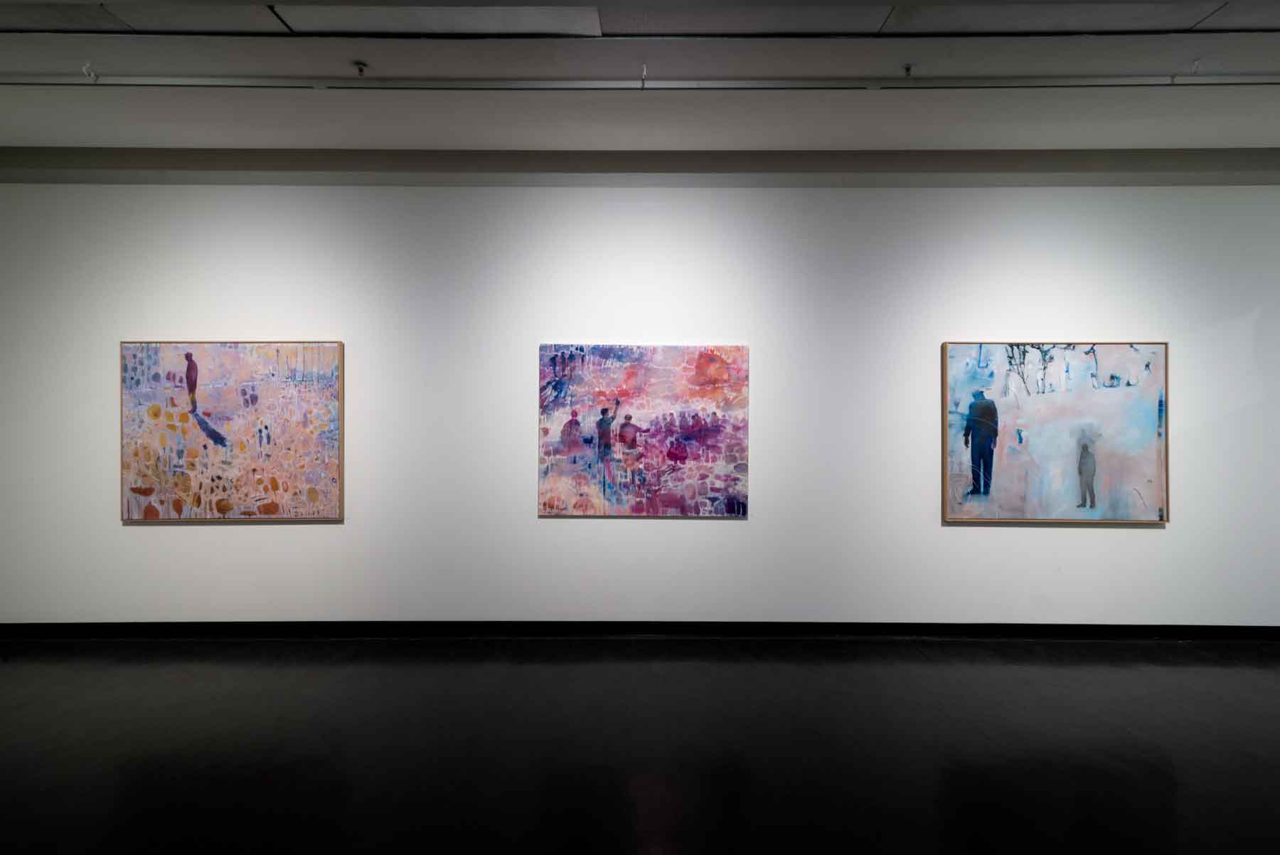
MFA Exhibition, July 2018
Have you ever exhibited with Aboriginal arts before.?
What did you learn from them?
How many pieces did you have to submit?
Expand on the diversity of this exhibition for you personally.
My work was included in the 20 Australian Women Artists over 20 Years Exhibition at the Brenda Colahan Fine Arts Gallery. This exhibition included Indigenous artist and non- Indigenous artists. The exhibition and artworks were selected and curated by Brenda. This was the first time my work had been included with Indigenous artists and I feel immensely proud to be included amongst the calibre of these great artists.
Can you give your own thoughts on the importance of having practicing artists work with students at a University level?
I think it is incredibly important to have industry professionals work in the education sector as this provides students with current practices, trends and understanding of what the industry requires. When I was Deputy Head in the School of Art, all my teaching staff were practicing artists that would exhibit throughout Australia. This taught the students not only the methodology about making art but also the business about being an artist. Each artist would provide their understanding of the art industry, the expectation of exhibiting, the ability to network and run a studio. I think this provides an art student with a better understanding of how to become a working artist. The educators at RMIT are very generous with their time, knowledge and experience with the students.
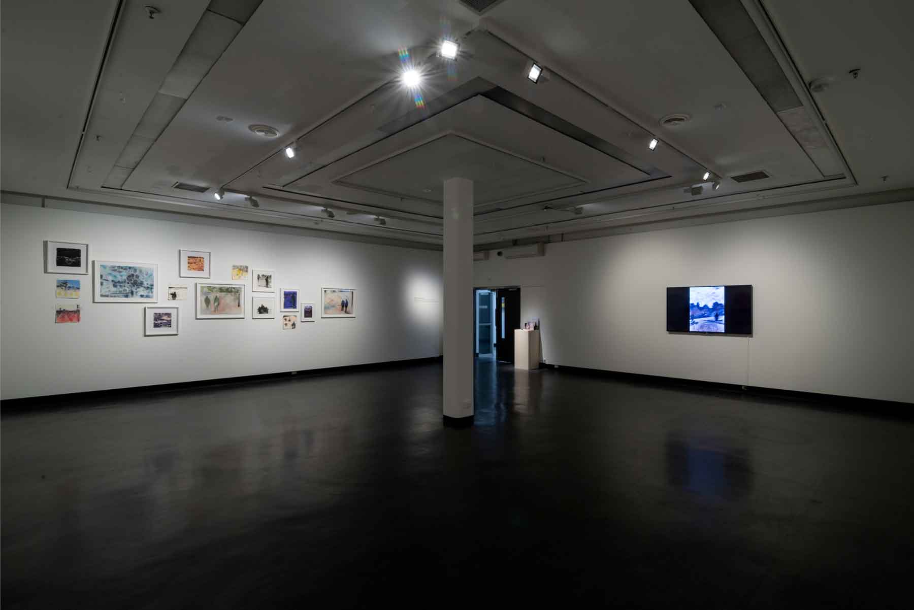 MFA Exhibition, July 2018
What do the students give you?
As an educator with many years of experience, I was constantly inspired by my art students. They provided a refreshing and energetic view of art making. They also knew about trends and ideas that were coming from the grass roots of the art scene. I think it is important to support visual arts education as in some instances funding can waiver in support for the arts. Visual arts education provides a voice and visual identity for our society. It is always exciting, changing and challenging.
What can the students gain from your art practice?
I think my 30 years-experience in the art sector can provide a wealth of knowledge and practice for students. I feel many educators including myself provide a very honest approach to be an artist, what some of the pitfalls are, what to watch out for, how to stay true to yourself as an artist, and working and exhibiting in a professional manner.
Contact details:
Belinda Wilson
https://www.instagram.com/belinda_wilson_studio/
https://www.brendacolahanfineart.com/contact/
Belinda Wilson, Melbourne, Australia
Interview by Deborah Blakeley, March 2019
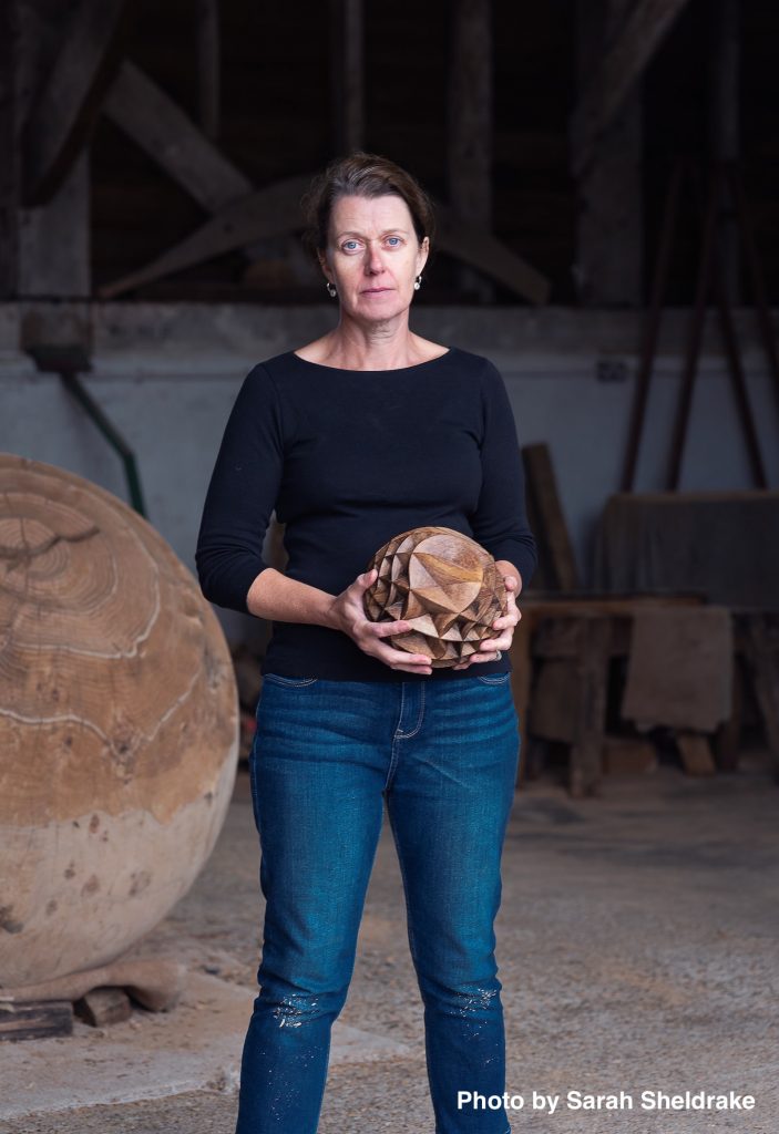
Alison Crowther
Can you explain how you came to be working with wood, especially at such a large scale?
I started working with wood whilst doing my first degree in Three-Dimensional Design. I did some research in to the ancient timber-framed houses in West Wycombe, Buckinghamshire and fell in love with oak. The scale has grown with experience and opportunity to use whole trees.
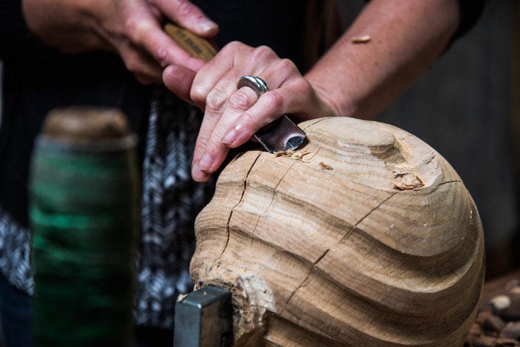
Carving with a small maquette, Photo by Matt Wreford
Why do you specifically use English oak?
It is native, readily available, lasts outside and is loaded with historical relevance - the druids worshipped at alters made of oak, Henry VIII’s tall ships that sailed the globe were built from oak sourced from the same woodlands I select timber from in West Sussex.
You use unseasoned oak; can you explain this for the lay person?
‘Unseasoned’ means fresh or ‘green’ timber, not dried or ‘seasoned’ by air or a kiln.
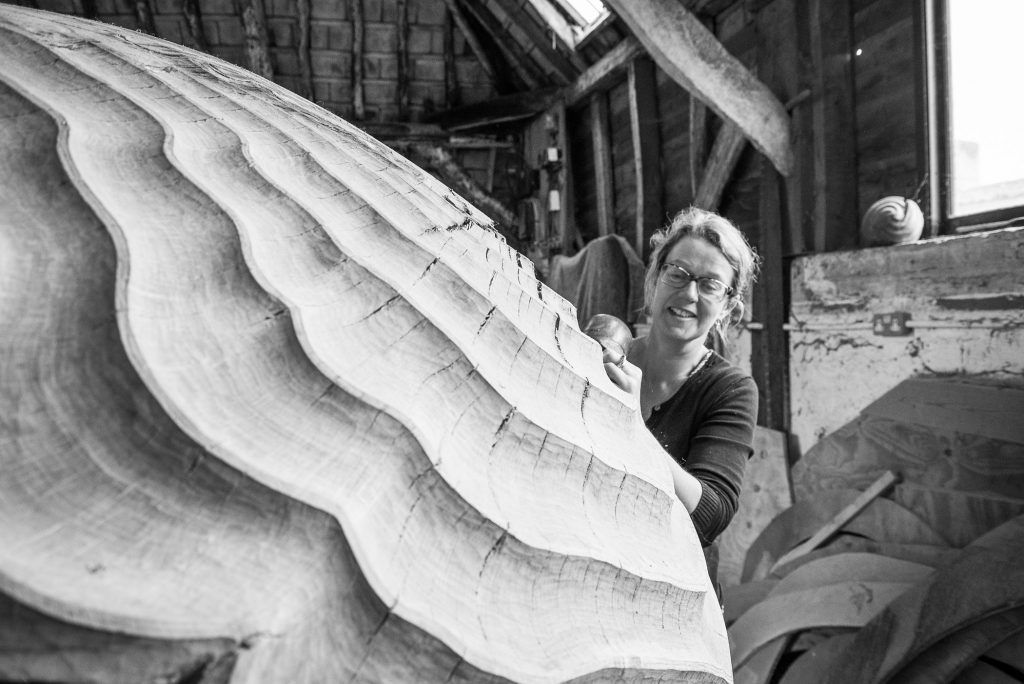
Working in the studio, Photo by Matt Wreford
Your thoughts, on the importance of the correct sourcing of wood and the associated ecological issues?
It is always important to me that the wood I use is sourced sustainably from well-managed woodlands as locally to the studio as possible. We have very high standards of forestry stewardship in the UK which ensures that the timber and woodlands are well cared for.
How does the natural character of the wood influence your work?
I am in conversation with the timber at every stage - from the tree’s habit that can influence the overall shape of a sculpture at the timber selection stage in the woodland, right down to the intricate carving of the finished surface in the studio which may warrant a particular focus around a knot or change in carving direction to accentuate compression ripples under a heavy bough.
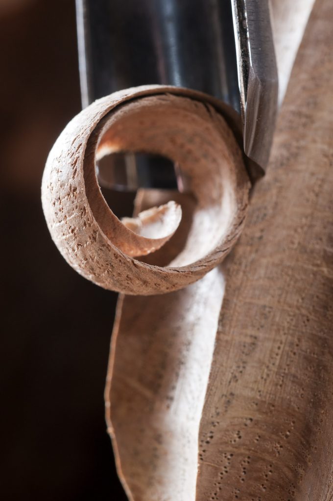
Close up of carving process, Photo by Jacqui Hurst
Take ‘Torpedo’
How you came to have this huge oak to work on and give a new life too?
The tree was offered to me as it had had to be taken down locally because of dropping one of its limbs. It was right on the side of a busy road, the old road to London from Petworth.
How many pieces did it end up being?
The log was 6 metres long and made three sculptures, the ‘Torpedo’ being the largest at 3m long, and two smaller pieces at 1.5m long each - one of which was shipped to a new hotel lobby in Heifei City, China.
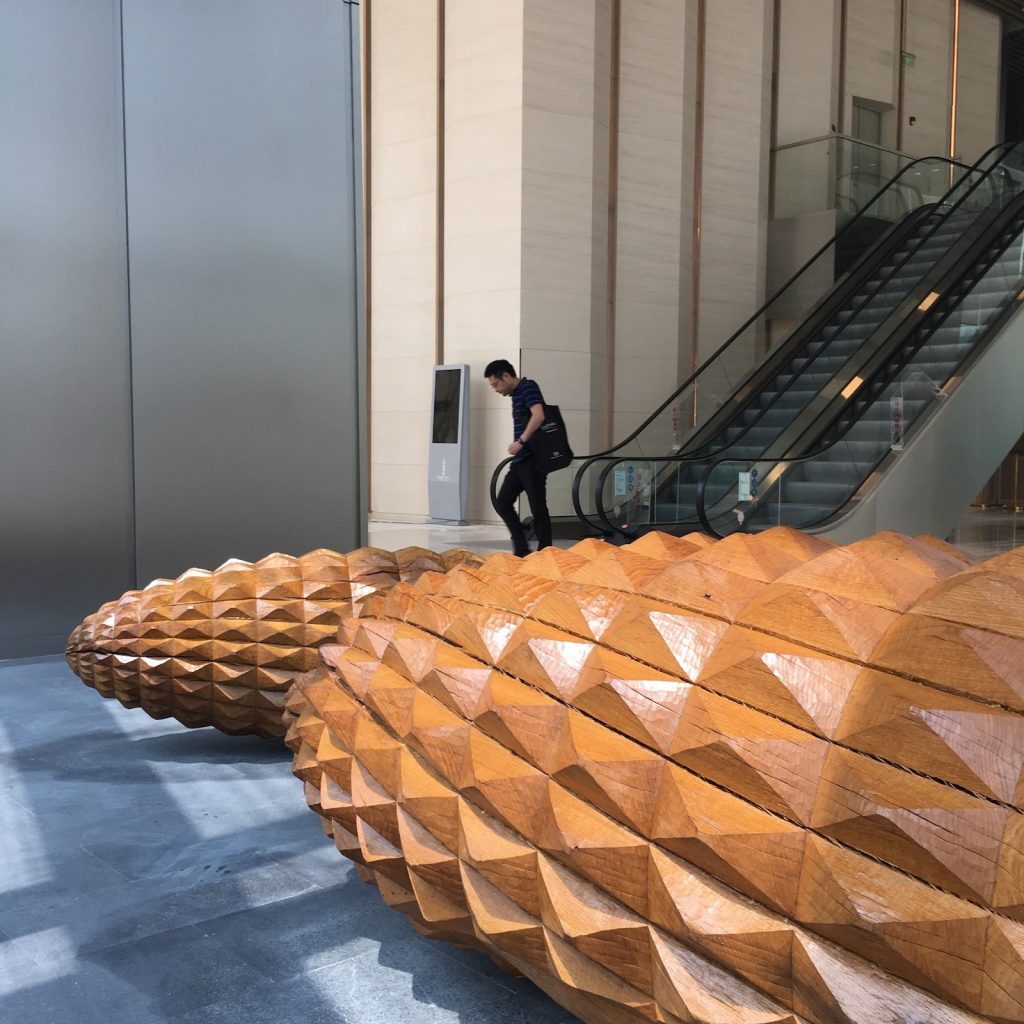 Scale Tree II and III
It isn’t essential to know the history, but it gives a rich narrative to support the aesthetic appeal. Sometimes clients are particularly interested to know the origins of the tree.
Expand on one of your large installations and why it stands out.
A recent tripartite commission, The Scale Trees, for the main lobby space, Tower 7, One Shenzhen Bay, China, was a joy to produce from the initial concept sketches and research, to the installation in partnership with transport company Mtec and art installers UAP.
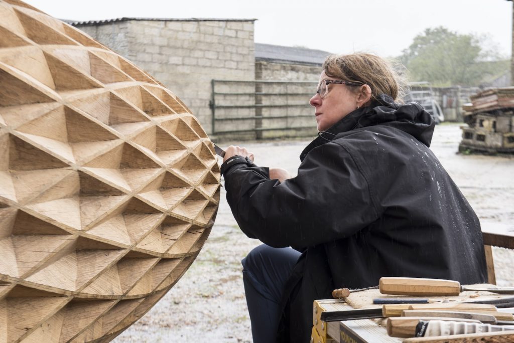
Carving, Scale Tree I
The surface textures of the sculptures were particularly satisfying to carve, they were a new design and involved working with several skilled carpenters here in the UK. Scale Tree I is also the tallest sculpture I have ever made at 5m high.
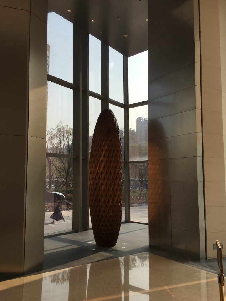 Scale Tree I, Shenzhen Bay, China
Scale Tree I, detail.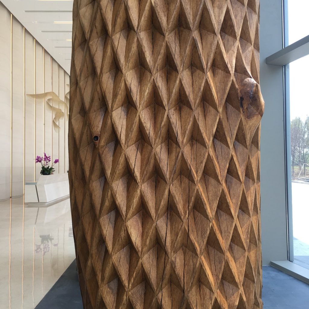 Scale Tree I, detail.
How do you balance exhibition work and commissions?
Good question! I try to factor into the year of commissioned work a couple of ‘gaps’ or opportunities to produce new work that could be exhibited in the future. It’s important to keep developing your work and trying new ideas.
Exhibitions are however a risk financially, I have to be careful that the studio can afford those risks and the commission work takes priority because we have to operate as a viable business.
Can you take us through the process of the “Kissing Bench’
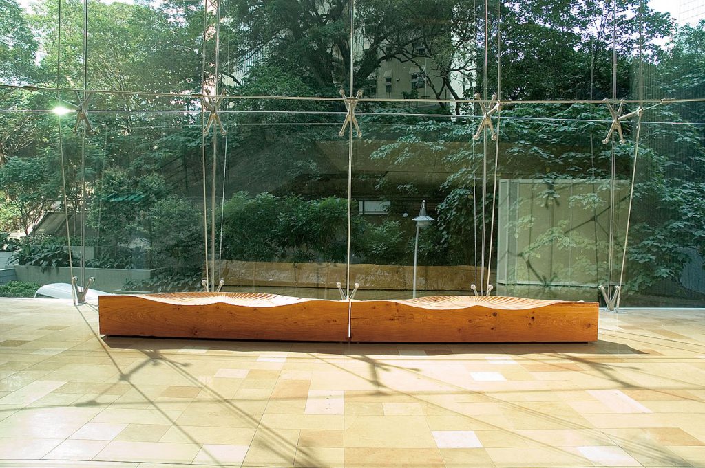
Kissing Bench 11
The original commission:
I was approached in 2006 by an art consultant based in Hong Kong to produce ideas for commissions for a new Swire Properties building, 3 Pacific Place.
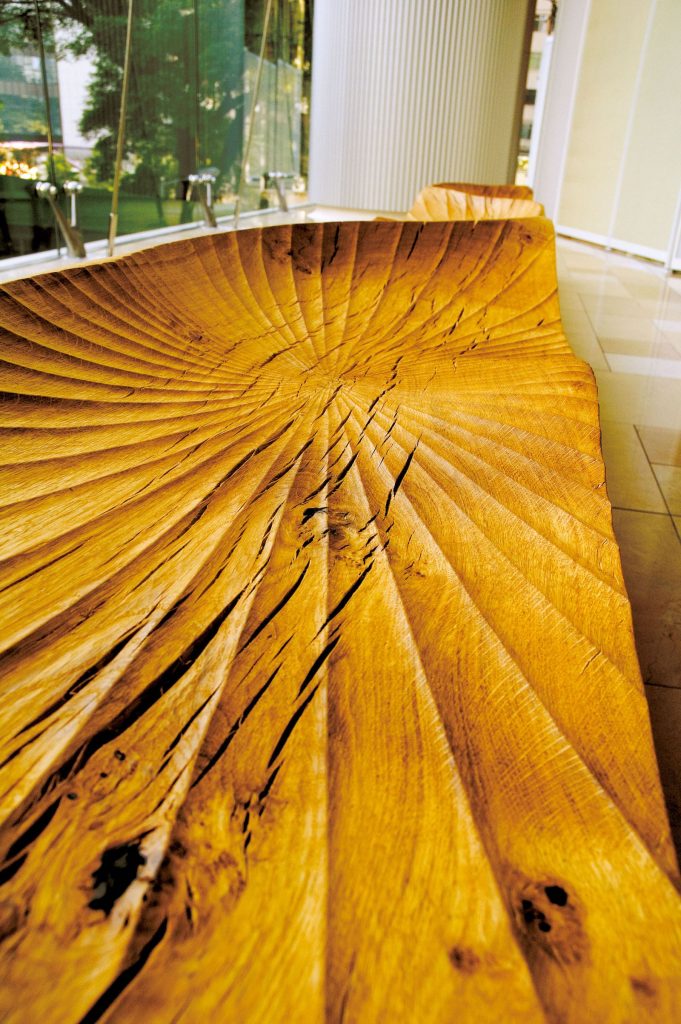
Kissing Bench 11, detail
Design:
The Kissing Bench design evolved from the traditional ‘kissing seats’ where a couple sit together facing in opposite directions enabling them to embrace or ‘kiss’.
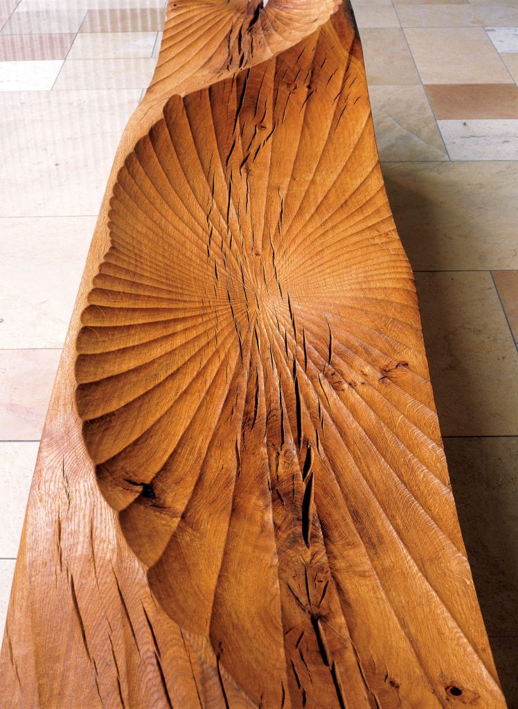 Kissing Bench 11, detail.
The process of getting it to Hong Kong:
I organised the shipping myself from the UK to Hong Kong. The art consultant dealt with a local art handler from Hong Kong docks to site.
The sculptures were carefully crated at my studio into wooden crates that were then loaded into a shipping container. The container, after being fumigated, went from Southampton docks to Hong Kong.
Discuss the wear factor of this type of work:
3 Pacific Place is a busy public area with people passing through this space from offices or the shopping malls to the parks, restaurants and cafes, so the benches are in constant use. The seat surfaces have built up a wonderful polished patina from the human interaction, the rubbing of clothing and contact with hands.
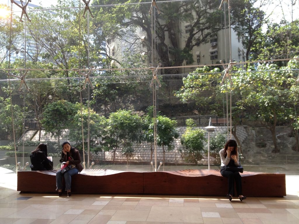
Kissing Bench, Hong Kong
After this a smaller but interesting commission Font 11.
Font II was commissioned for a small boutique hotel in Exeter. The architects were refreshing, keen to have a sculptural ‘reception desk’ to meet and greet rather than acres of polished desk top surface. The flat top needed to be the right height for clients to paperless ‘check-in’ on a tablet. A padded leather circle protects the top and provides a practical surface for signing any papers required.
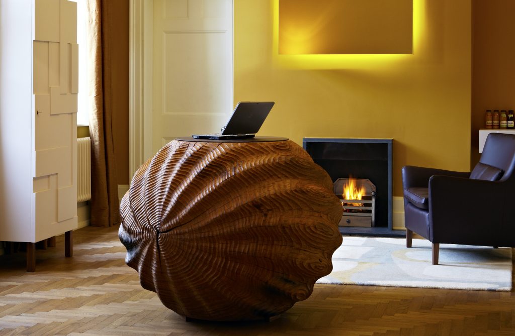
Font II, Magdalen Chapter Hotel, Exeter, UK
Can you take a recent pieces of work that shows your smaller work?
The ‘Walnuts’ are a series of small pieces that I carved last year from English walnut wood that was salvaged from a woodland clearance.
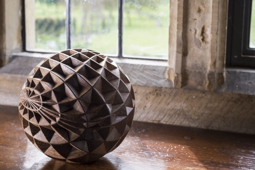
Incised Walnut I, Photo by Jacqui Hurst
The incised texture is intricate and required very sharp gouges to give a precise edge to the geometric patterns.
The lines around the small sphere, although based on a grid, follow the natural annual growth rings one way, almost like latitude on a globe, and the lines going from centre to centre, or pole to pole with longitude, follow the medullary rays, the cellular transport systems that run from top to bottom of a tree.
I’d like to experiment much more with these smaller works.
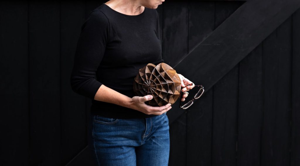 Incised Walnut 11, Photo by Sarah Sheldrake
Show and discuss one tool that you love using and explain the pleasure it gives you.
Oh! that has, to be my lignum vitae mallet. It’s just so reliable and never needs sharpening!
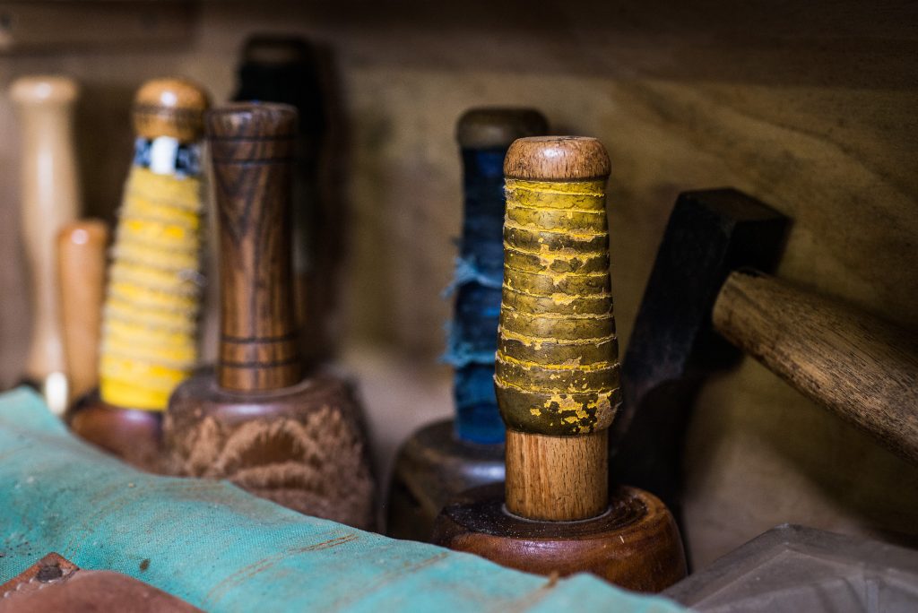
Mallets, Photo by Matt Wreford
You studied at the Royal College of Art, when during this time did you start to work with wood.
That was in my second year at the RCA when the projects became self-initiated. There had been a great storm in the south of the UK and there were hundreds of oak trees that had blown, down so I had access to free materials.
I’m not sure exactly what inspired me to start carving. Perhaps it was a reaction against the high-tech design led environment. Carving is so immediate.
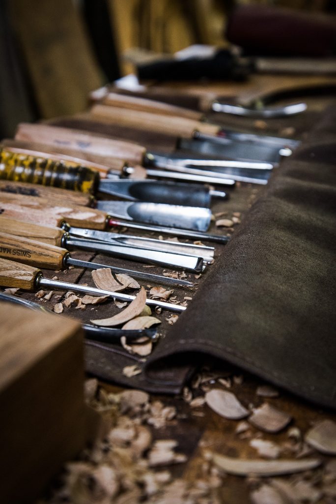 Carving Gourges, Photo by Matt Wreford
You are a member of the Royal Society of Sculptors are their many others who work solely in wood?
No I don’t think so. Wood isn’t a very fashionable material for sculpture in the 21st century and direct carving is probably more associated with the 20th century, but I think I bring a fresh way of approaching the material and the processes.
Can we take a peek into your studio and please explain why it is important to you.
I have worked from my current studio, a rented timber-framed barn, on a working farm at the foot of the South Downs for the last fifteen years.
It is about 150m x 2 in size and we use about the same area outside in the yard for storing large sections of timber and doing the roughing-out of new projects.
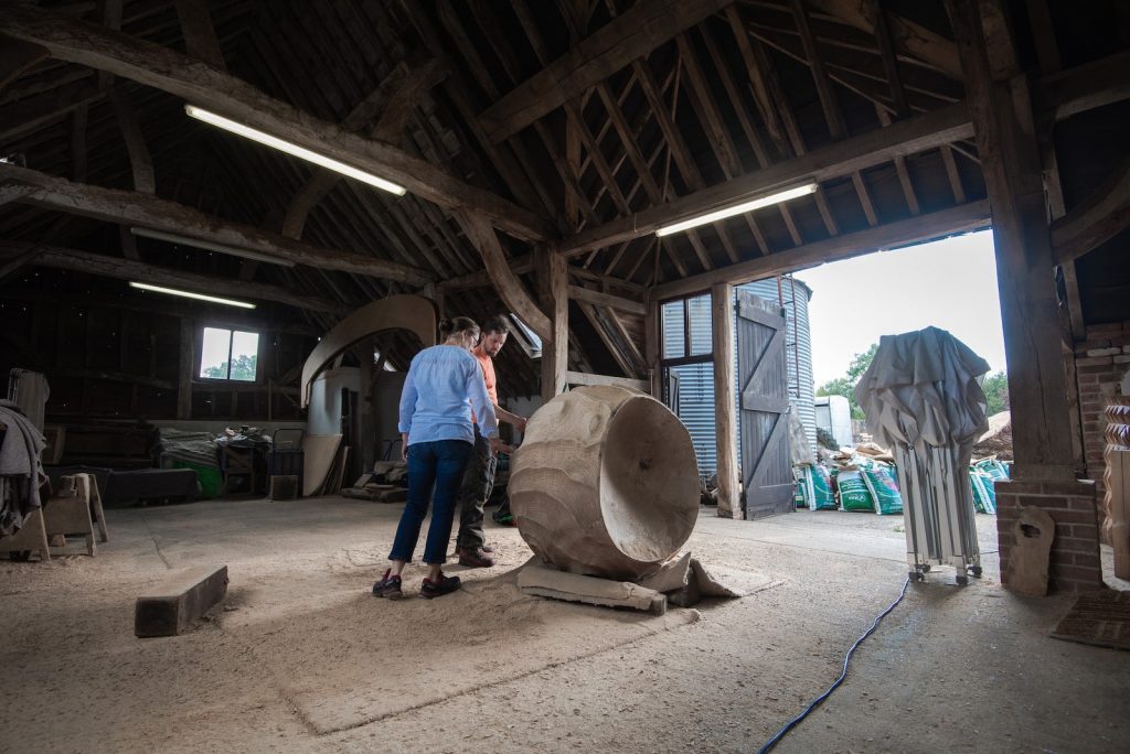
Alison Crowther Studio, Photo by Sarah Sheldrake
The building is timber-framed which dates, back to the 17th century at one end. It is imbued with a sense of history and of being built and crafted, by hand so it feels like an appropriate space to be creating my sculptures in.
Contact details:
Alison Crowther
www.alisoncrowther.com
Alison Crowther, West Sussex, UK
Interview by Deborah Blakeley, March, 2019
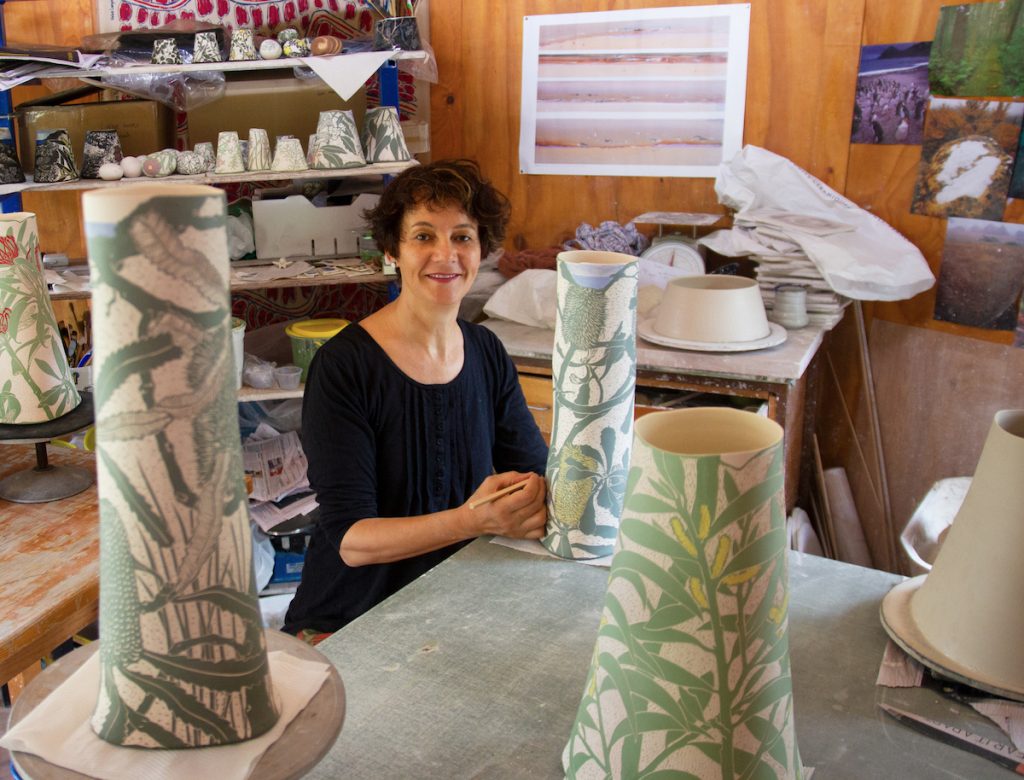
Cathy Franzi
Can you discuss how the Nelson Nichols Scholarship has affected your art practice?
I received this award in my first year of a Master of Visual Arts (Ceramics) at the Australian National University School of Art & Design. The scholarship was a generous donation from Gail Nichols and David Nelson supporting early career ceramic students. The scholarship gave me confidence in the direction my work was taking at the end of my first year at Art School, having already worked in the ceramics field for 15 years.
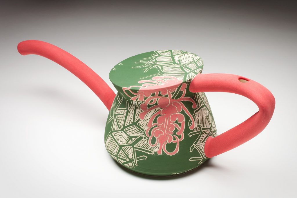
Maxwells Grevillea, From Endangered Series, 2010. Mid-Fired Clay,
wheel-thrown and altered, sgraffito, 16h x 32w cm. Photo by Stuart Hay
Where did the botanical interests come from?
I have always been fascinated in plants and was fortunate to have a childhood filled with camping holidays and bushwalks. My immersion in the Australian bush and my subsequent love of nature motivates my deep botanical and environmental interest. I followed this path through my first degree in science before I began a career in ceramic visual art.
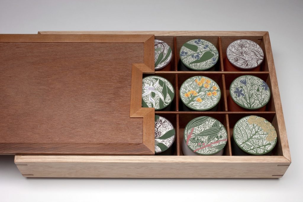
Mt Majura Seed Box, 2010, Porcelain, wheel-thrown, sgraffito,
recycled timber, 6h x 40w x 15d cm, Photo by Stuart Hay
How has your work given a new voice to Australian flora?
Currently there is a renewed interest in Australian flora in art and design, in part because of the extraordinary shapes and textures to be found, and perhaps because of increased awareness of our poor environmental health and lack of action. This is certainly from where my voice and activism lie.
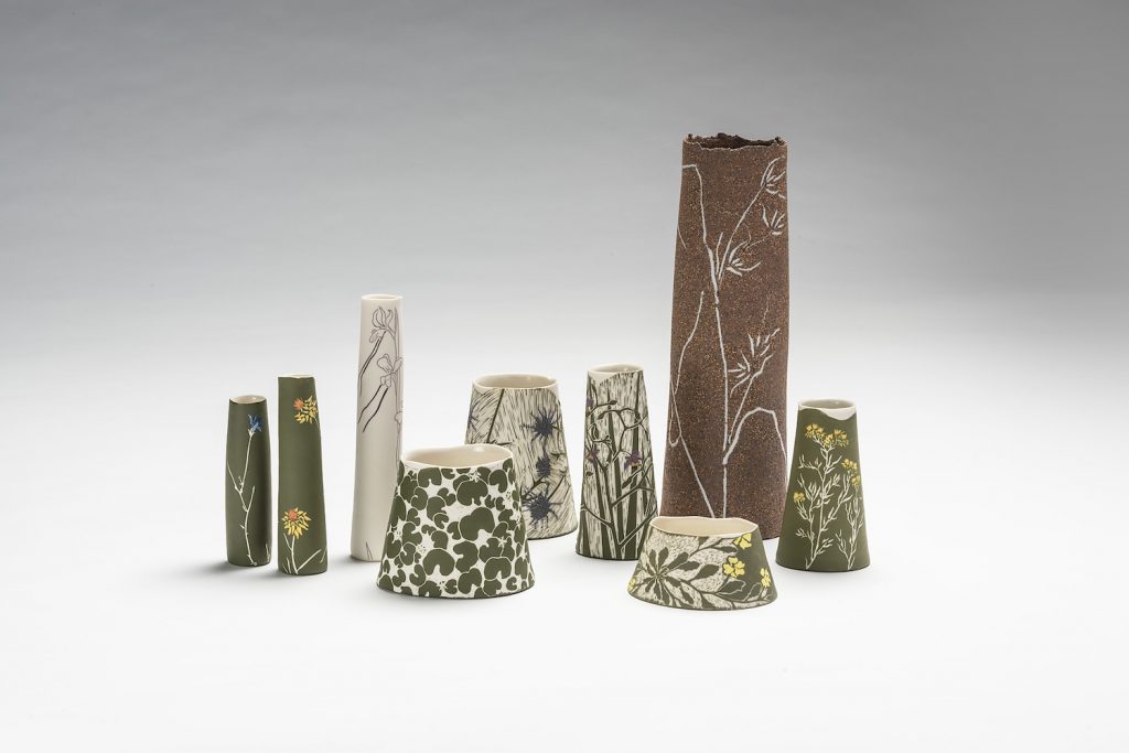
Natural Temperate Grasslands, 2015, Porcelain, stoneware wheel-thrown, sgraffito, and inlay, 37h x 40w x 16d cm, Photo by Rob Little, Digital image
How have your travels working in ceramics in Ireland, UK and NZ influenced your need to develop your own Australian style?
My experience working overseas and immersion in the history of ceramics through visiting the great museums and galleries of the world has deepened my appreciation of the way ceramics captures the materials, technology and culture of a place, time and people. This is what I aim to do in my own work.
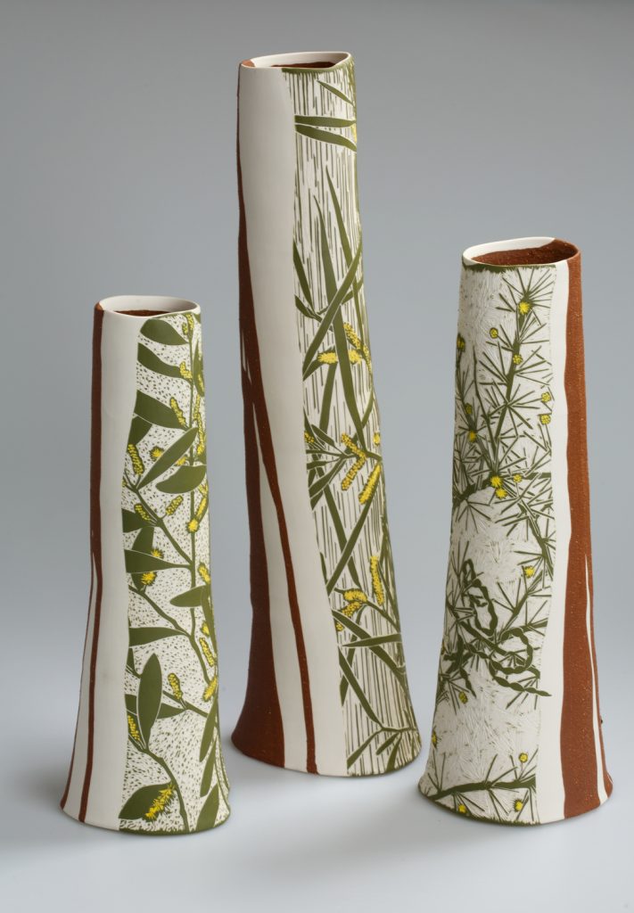
Arid-zone Acacias, 2016, Porcelain, 55.5h x 15.2w x13.3d cm,
Photo by Andrew Sikorski-Art Atelier
You have work in the Centenary Capsule in Canberra. Discuss
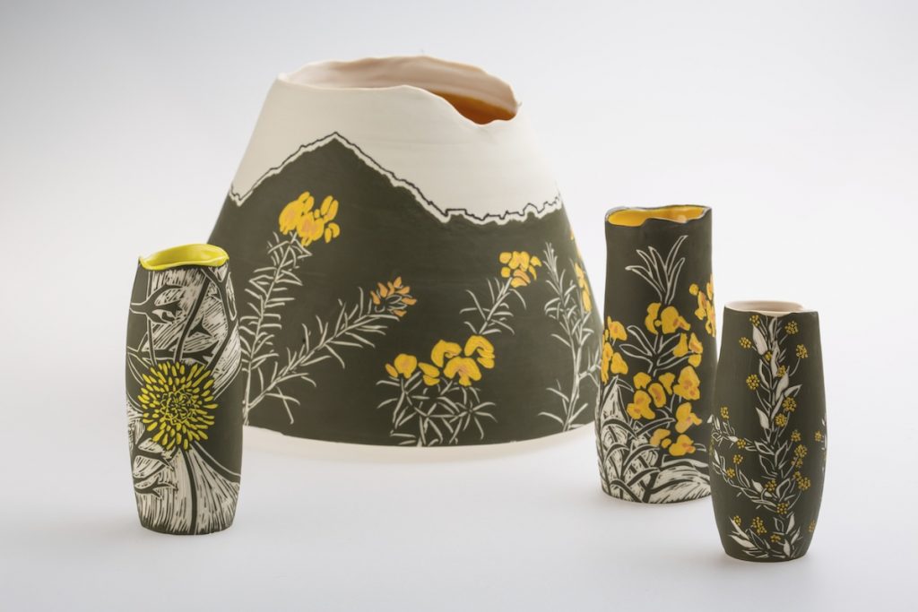
Golden Hill, Detail, 2013, Porcelain, wheel-thrown, 20h x 20w cm,
Photo by David Paterson
Canberra’s centenary in 2013 was acknowledged through a wide range of exhibitions and cultural events reflecting on its design history, architecture and landscape. During this year I created a solo exhibition based on Walter Burley Griffin and Marion Mahony Griffin’s plan to revegetate the hills of Canberra in single colour plantings of predominately flowering Australian flora. My research led me to Mahony Griffin’s colour-coded botanical notebooks held in the National Library of Australia. I followed this with research in the field to examine the species growing on each of the five sites. The exhibition ‘Painting the Hills of Canberra’ was shown at CraftACT: Craft and Design Centre and it was from this body of work, inspired by Canberra, that a small vessel decorated with a local plant was chosen to be included in the Time Capsule.
One hundred objects are in the time capsule providing a snapshot of life in Canberra in 2013 and includes all sorts of things such as artworks and photographs, letters, restaurant menus, and even a parking fine. Descriptions of the significance of each object is also sealed in the time capsule to be opened in 2113. I think it is a fascinating project and provokes our imagination to the future.
You have been awarded the Biennial North Queensland Ceramic Awards along with many others. Discuss this one in particular.
The actual award-winning piece.
The design
The actual botanical information
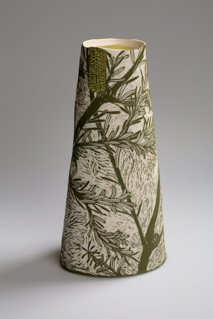
Silver Banksia, 2016, Porcelain, wheel-thrown, and altered,
38.4h x 19.5w x 11d cm,
Photo by Andrew Sikorski-Art Atelier
We are fortunate to have many competitions and awards specifically for ceramics. The Biennial North Queensland Ceramic Award has long aimed to increase public exposure to a high standard of ceramic visual art and displays the diversity of work currently being produced in Australia. I received the Scott Brickworks Acquisitive Award for the work ‘Silver Banksia’ based on the species Banksia marginata.
How do you research the plants on your vessels?
I am committed to understanding the plants I represent on my artwork. Where they grow, the ecology and environment in which they belong and the threats they face. To gain this knowledge I have developed a long-term engagement with botanical science.
Herbarium Dishes, 7 Endangered (detail), 2015, Porcelain, etched glass,
6h x 1600w x 22d cm,
Photo by Andrew Sikorski-Art Atelier
I spend time in the field researching plants and seek opportunities to work with scientists. For example, I am a volunteer with the National Seed Bank on their seed collecting expeditions. I research plants in the Australian National Herbarium, through databases and in Living Plant collections. Many of my exhibitions are based on specific plants in specific locations where I have had an involvement with botanists.
Are there any endangered plants on any of your vessels?
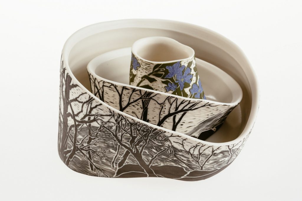
The Ephemeral Dampiera fusca: Tinderry Range, 2014, Porcelain,
16h x 28w x 14d cm,
Photo by Andrew Sikorski-Art Atelier
Unfortunately, many plants in Australia are endangered and in any ecosystem there will be plants under threat, if not the whole ecosystem. Therefore, I represent endangered plants on my work often. I am currently part of the project ‘Art of Threatened Species’ through the NSW Office of Environment & Heritage and Orana Arts. So far, I have been out in the field with Threatened Species Officers to study three endangered orchids, The Crimson Spider Orchid, The Sandhill Spider Orchid and Oaklands Diuris. My subsequent artwork will be part of a touring exhibition later in the year.
Are all the plants named on the vessel or just your mark?
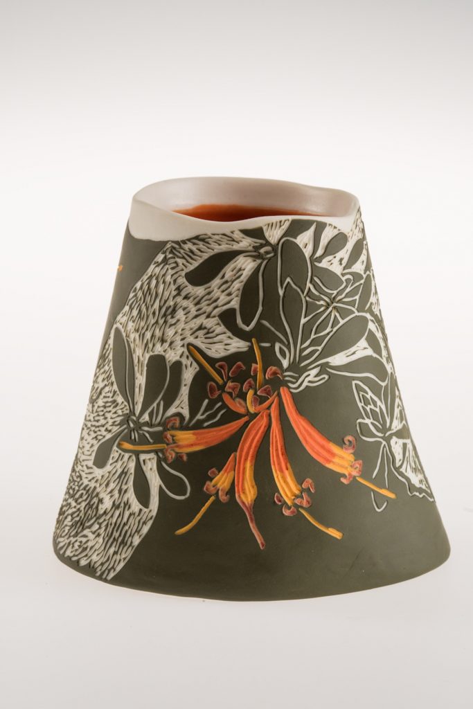
Lambertia inermis, 2017, Porcelain, wheel-thrown and altered, sgraffito, 10h x 12.5w x 10.1d cm, Photo by Andrew Sikorski-Art Atelier
I sign all my work with the name of the plant.
Do you find the buyers gravitate to specific plants or is it a design response?
I think it can be both. My aim is to find a way to capture the character of the plant in design, colour, technique and ceramic materials.
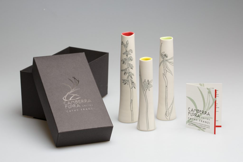
Orchid Set, Set of 3 Orchids from The Canberra Flora Series, 2017, Porcelain, wheel-thrown , ink inlay, 17h x 9w x 4d cm,
Photo by Andrew Sikorski-Art Atelier
Colour of Australian native plants are very distinctive. Discuss this using 1 or 2 pieces.
The colours of plants in Australia vary widely from olive green to the silver blue of some Eucalypts. I am constantly testing my materials to find colours that capture this. Ceramic materials only show their true colour after the final firing, which makes it very tricky!
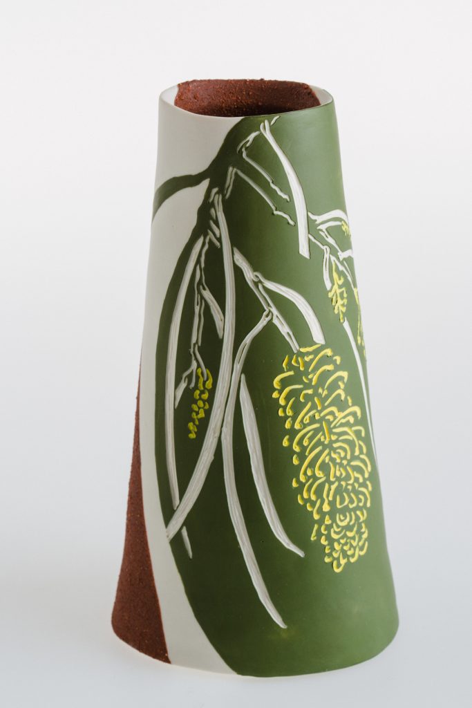 Hakea lorea, 2015, Porcelain, mid-fire slip wheel-thrown, sgraffito,
14h x 8w x 10.6d cm, Photo by Andrew Sikorski-Art Atelier
Size, what are the restriction on the size of your work?
At the moment I am restricted by the size of my largest kiln, which is 900 mm height by 600 mm width.
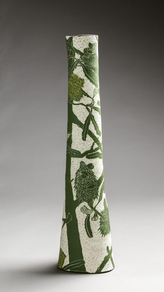
Saw Banksia, 2018, Porcelain, wheel-thrown and altered, sgraffito,
75.8h x 18.9w x 18.4d cm, Photo by Andrew Sikorski-Art Atelier
Take 1 or 2 pieces that you have made recently and discuss.
Design both shape and artwork
Technique (briefly)
What was it the excited you about the finished piece/s and why?
My last solo exhibition was at Sabbia Gallery in Paddington Sydney and was based on a residency I had at Fremantle Arts Centre earlier in the year. During my residency I went on a field trip with staff from the Threatened Species Seed Centre into the Stirling Range National Park in Western Australia’s biodiversity hotspot. We collected seed from the highly threatened Banksia anatona and it was this plant and 11 other extraordinary Banksias that I chose to work with for my exhibition.
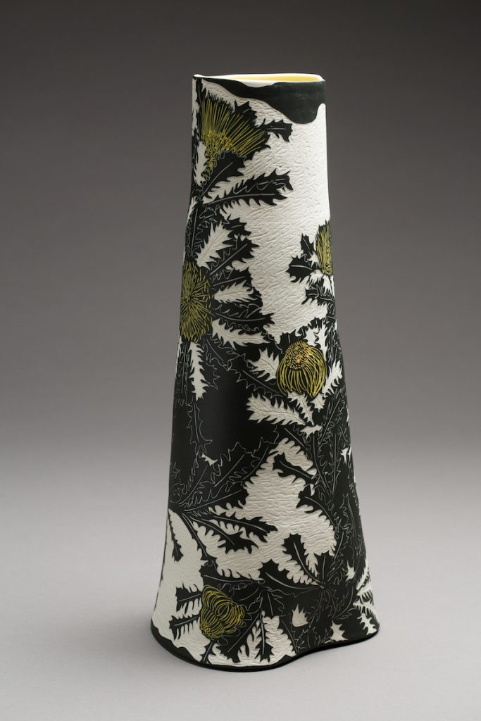
Banksia anatona, 2018, Porcelain, wheel-thrown and altered, sgraffito,
53.2h x 22w x 20.5d cm,Photo by Andrew Sikorski-Art Atelier
My vessel forms are thrown and altered on the potters’ wheel in porcelain. The technique I use is sgraffito where I carve the surface material away to ‘draw’ my design on the ceramic surface.
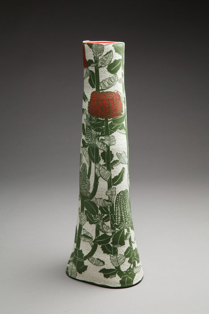
Banksia coccinea, 2018, Porcelain, wheel-thrown and altered, sgraffito,
66.4h x 23.5w x 20.5d cm,Photo by Andrew Sikorski-Art Atelier
Your work is in many collections, can you take one that has given your career a challenge?
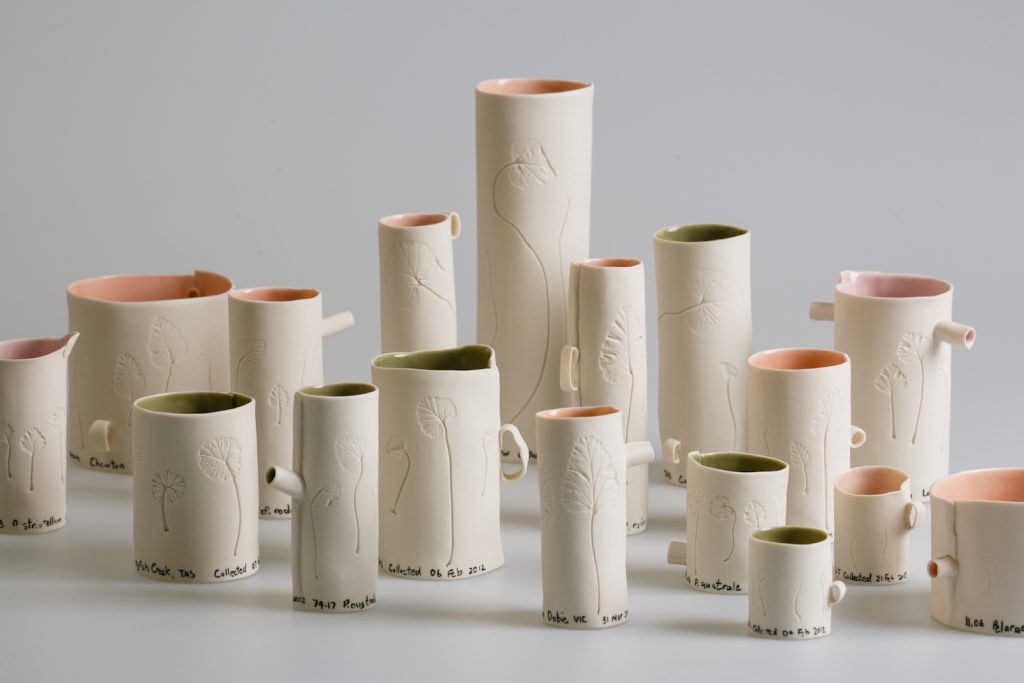
Patterns of Distribution, (In leaf shape of Australian Pelargonium species (detail) 2016, Porcelain, 16h x 108w x 36d cm,
Photo by Andrew Sikorski-Art Atelier
In 2016 I had a residency in the Australian National University Research School of Biology with Professor Adrienne Nicotra. I was awarded the residency through the prestigious Vice-Chancellor’s College Artist Fellows Scheme, as an opportunity for post-doctoral interdisciplinary research. In the Nicotra lab I engaged with their research on leaf form and function of two Australian plant species, Alpine Buttercups and Pelargoniums. My usual way of representing plants did not seem appropriate and so I experimented with new ways to be able to capture leaf shape and form with accuracy. The resulting artwork is now in the collection of the Research School of Biology.
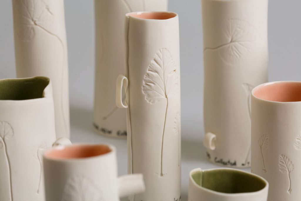 Patterns of Distribution (detail) (In leaf shape of Australian Pelargonium species (detail) 2016, Porcelain, 16h x 108w x 36d cm, Photo by Andrew Sikorski-Art Atelier
Comment on your thoughts on being an Australian artist working with such an Australian theme.
I see my practice as one that engages with contemporary issues, and my interest and concern is for our long-term biodiversity. I hope that my work is not capturing the last we might see of some magnificent and unusual flora.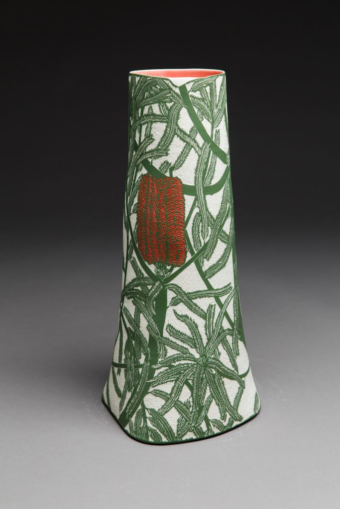
Banksia brownie, 2018, Porcelain, wheel-thrown and altered, sgraffito,
48.3h x 23.6w x 21.1d cm,
Photo by Andrew Sikorski-Art Atelier
Contact details:
Cathy Franzi
Website: www.cathyfranzi.com
‘Drawings’ Sabbia Gallery, 1 – 23 March 2019. https://sabbiagallery.com/exhibition/ceramic-masters-2019/
‘Coastal : Botanical’ Narek Galleries, 9 March – 27 April 2019. http://www.narekgalleries.com/future-exhibitions.html
Cathy Franzi, Canberra, Australia
Interview by Deborah Blakeley, February 2019
Cathryn Shilling
How did your move from the UK to the USA in 2001 lead you to your career in glass?
In 2001 my family moved to a small town on the east coast of the US, Darien Connecticut, chosen for its, close proximity to Manhattan. Until this move, I had a successful career as a freelance graphic designer. I was keen to find a creative outlet. I had always loved stained glass and owned a catalogue of contemporary pieces that was very well thumbed. So, when a studio nearby advertised their evening classes I signed up and began to study the art and craft of stained glass.
My years in graphic design allowed me to develop skills in a wide range of creative processes and products and the move to glass seemed natural and spontaneous. During this time, I began to develop my deep love of glass as a material, spending hours in the warehouse studying the exquisite sheets of hand blown glass. I found glass a fascinating and seductive material and in my practice I love to explore the fluidity of glass as a liquid, its sculptural quality as a solid as well as its transparency.
 Dissonance, Photo; Ester Segarra
On my return to the UK I signed up for classes at Kensington & Chelsea Adult Education College, fully meaning to develop my stained glass practice. But I soon realised that I didn't want to continue to design what other people wanted me to.
Instead I wanted to make my own ideas and I quickly realised that fused glass offered me that possibility. My research into contemporary art glass then lead me to glassblowing and I began to take classes in order to expand my knowledge of glass making techniques.
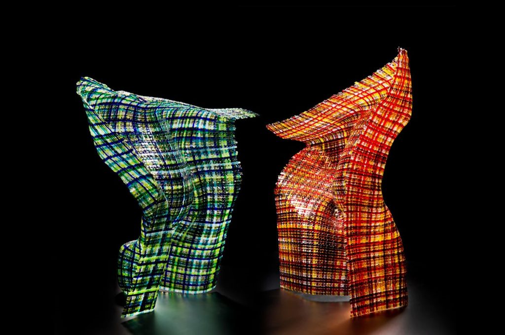 Standing Proud, Photo; Ester Segarra
Kiln formed glass is the perfect medium for my work. It gives me the creative and technical freedom to produce tactile, tangible and enduring pieces that explore the sculptural quality of glass. Hot Glass however allows me to investigate and work in a more immediate and direct way with my chosen material, drawing inspiration from its molten state in order to produce unique and tactile vessels.
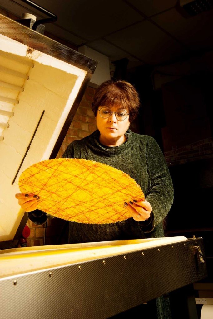 Cathryn Shilling, in her studio, Photo; Ester Segarra
You have worked in two countries and several Glass Studios can you expand on both the differences and similarities?
My experience of a stained glass studio in Connecticut was really only as a student. I soon realised though that there were quite a few differences between the way things are done in the US and the UK where the tradition of stained glass goes back centuries. I don’t think that this is the same for glassblowing, as the tools seem to be the same wherever you are, except that each studio is set up to suit the master glassblower. Artists working in London are faced with some of the highest rents anywhere in the world so our studios tend to be small and often shared. Through Instagram I have glimpsed studios of artists all over the world and am often envious of the space available to them.
Tell us about the 30 Most Amazing Glass Artists of which you are one?
The first I knew of this list was when a colleague sent me the link. I have no idea how I was included in such esteemed company but it was a lovely surprise. The work highlighted was my woven glass pieces, Synergy Series I. I remember a bit of chatter about the artists not included in the list on social media but that’s about it. However, I think it brought my work to the attention of artists and collectors internationally.
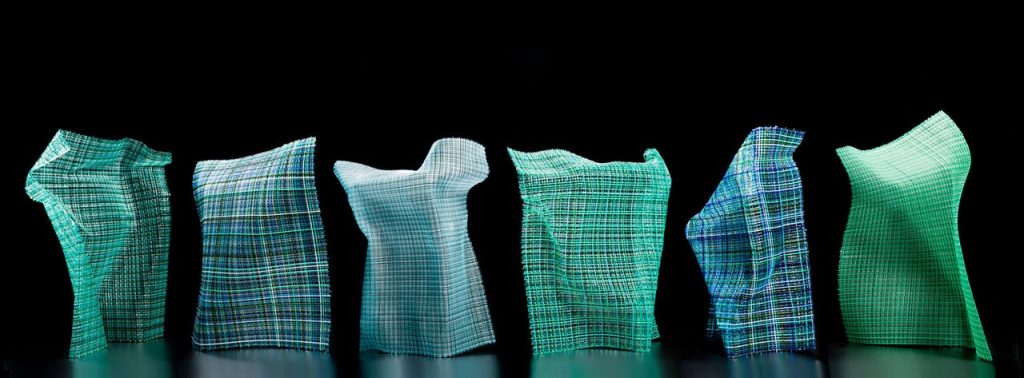
Synergy Series I, Photo; Ester Segarra
With all artists, the photographing of their work is imperative, but particularly with glass – discuss.
The captivating optical qualities of glass is what makes it notoriously difficult to photograph. When you submit work for exhibitions and competitions you are being judged on a photograph. I was lucky to have been introduced to Ester Segarra quite early on in my career, she is a very talented photographer and I feel that I owe her lot as she takes beautiful images of my work. These images have given me the confidence to enter all sorts of exhibitions and competitions.
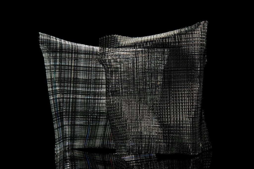 Synergy Series I, Photo; Ester Segarra
Glass is an undervalued medium but the rise of social media – Pinterest, Face Book and Instagram in particular means that it is now reaching a far larger and often very appreciative audience. One South American collector told me that he found my work by ‘driving through the internet.
How long have you been working with woven glass canes?
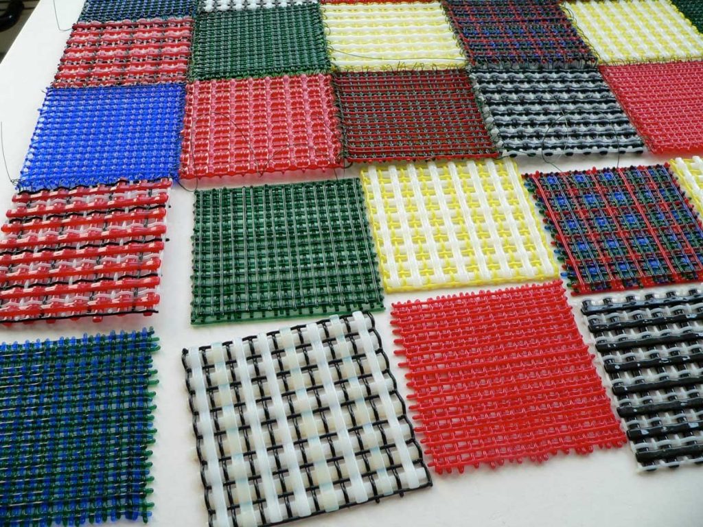
Early woven glass
While studying at Kensington & Chelsea College we went on a class trip to the Victoria & Albert Museum in London. This was in 2005 and I saw work by the then Artist in Residence, textile artist Sue Lawty and this completely changed the way I approached glass. Firstly, there was little of what I thought of, as textiles on display. She didn’t allow the title of ‘textile artist’ to limit her exploration of ideas, for example there were large wall pieces made from hundreds of pebbles that Sue had collected from different beaches. And some of the few weaving she had done were made of lead. They were in a showcase with other small woven test pieces. Seeing these little experiments that she had made from all different materials set me on a path that I am still exploring today. I went away and began making my first experiments fusing glass cane into sheets of woven glass.
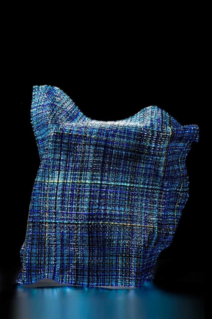
Hidden Gestures II, Photo; Ester Segarra
Using images can you take us history and process of your woven body of your work.
Back in the glass studio I started to make tests using any glass stringers and noodles that I could get my hands on - so please don't judge me for the colour selection! I was supposed to be making a light of some description that term so I justified these tests by sewing the squares together with wire and making it into a hanging piece. The idea being that it played with light when the sun shone on it.
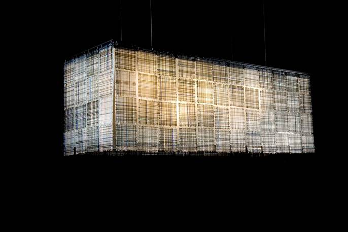 Glasswork Quilt Light, Photo; Ester Segarra
I called it Glasswork Quilt and I entered it into the V&A Inspired By competition that year. Peter Layton was the judge for the glass section and he gave it a Highly Commended, commenting that it required more thought! And I can’t really argue with that. In 2011 I was given the opportunity to return to this work and reimagine it as a large lighting installation, working with Angel Monzen of Vessel Gallery. It was great to have the opportunity of working with a product designer and take a previously unresolved idea through to fruition as a collaborative project. I learnt so much from this process.
I then began making my first experiments fusing glass cane into sheets of woven glass using Bullseye glass stringers. While at art school I had toyed with the possibility of studying sculpture but it was a very sexist age and I was told that ‘sculpture was for men, not for girls’! But fused glass rekindled my interest in three dimensional objects. Rather than slumping the woven glass sheets into a bowl or platter, I started to tentatively explore them in a different way and make them more sculptural. As I began experimenting with them, my aim became to create the effect of loose fabric gently blowing against a human form. I played with putting them in groups and called them Synergy Series as together I felt they evoked a stylised sense of human movement, like a sort of dance.
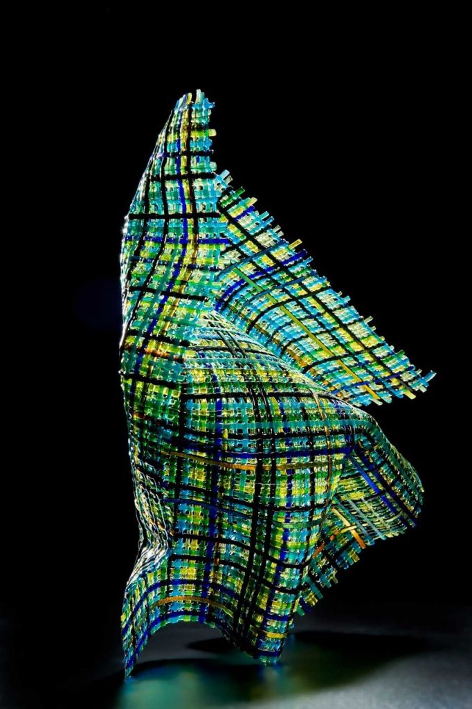 Blown, Photo; Ester Segarra
Mixing form and fragility, I make kiln formed works that imitate fluid fabric in glass. Sometimes incorporated with organic blown forms, I make pieces that emulate the body and its coverings. My Cloaked Collection are large, figurative pieces that are the culmination of the development of ideas and processes made over a long period of time.
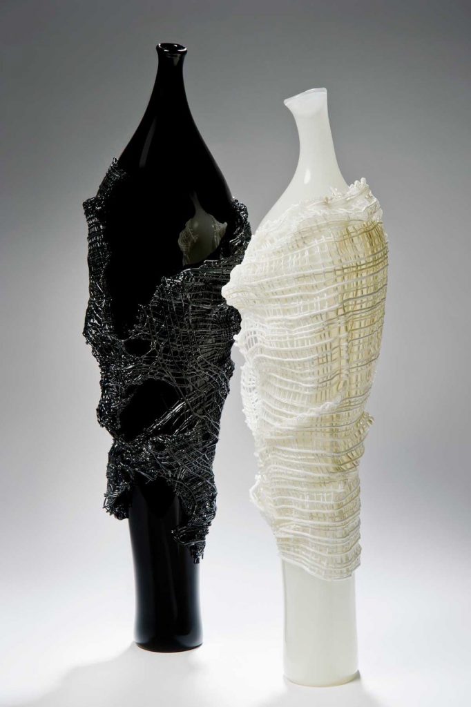 Clocked – Odysseus & Calypso, Photo; Ester Segarra
The process of slow, considered exploration of the material cold and rigid in the studio. The technical exploration of hot glass processes requiring quick judgements in order to create a form, drawn from observation. And the process of resolution, so by bringing these elements together, produces something that is greater than the sum of the parts.
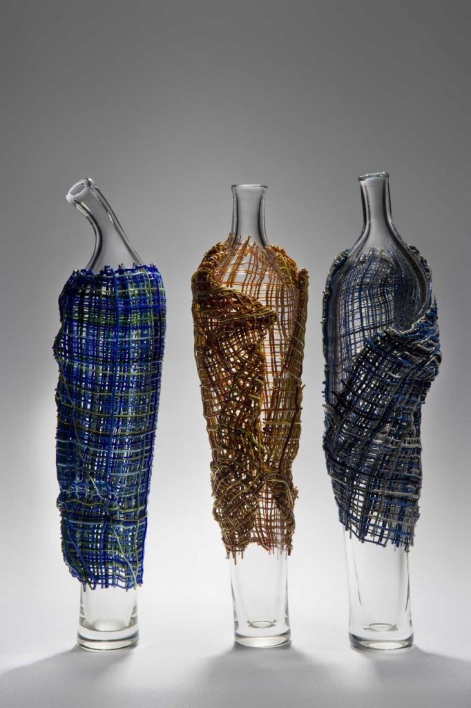 Clocked – Collection, Photo; Ester Segarra
The pieces stand tall like characters in a play, conveying the essence of inevitable tragedy to be found in life, love, war and death.
Cloaked - A film about the work of Cathryn Shilling
After your back operation many glass artists would have give up. How has your injury and operation given you glass art momentum?
Even before my operation in 2011 I had found that working with glass helped me through some very difficult times. My studio was a place of sanctuary. I wasn’t sure how able I would be after the operation, so I prepared my entries for the 2012 Bullseye Emerge competition and the British Glass Biennale and made the applications whilst still in hospital. Looking back I can’t really remember the early days, weeks or months after the surgery. I had to start by learning to walk again and it was jolly hard work. But it is probably being a glass artist and the desire and drive to continue to make my work that helped me in my rehabilitation.
Working as curator at London Glassblowing was also important to me in my recovery. It is a great feeling when all the preparatory work comes together to make a beautiful show.
How essential an element is, having a talented team to work with?
Since my operation I have had to change certain things about my practice, there is much I can still do but I have had to realistic about what I can no longer do. In a way this has been quite liberating because I no longer am restrained by my own quite poor skills in the hot shop. I have been associated with London Glassblowing since I was a glass student and I have always enjoyed the interplay between warm and hot glass techniques. Working with a very talented team, be it at London Glassblowing or at Devereux & Huskie has become essential for my blown work.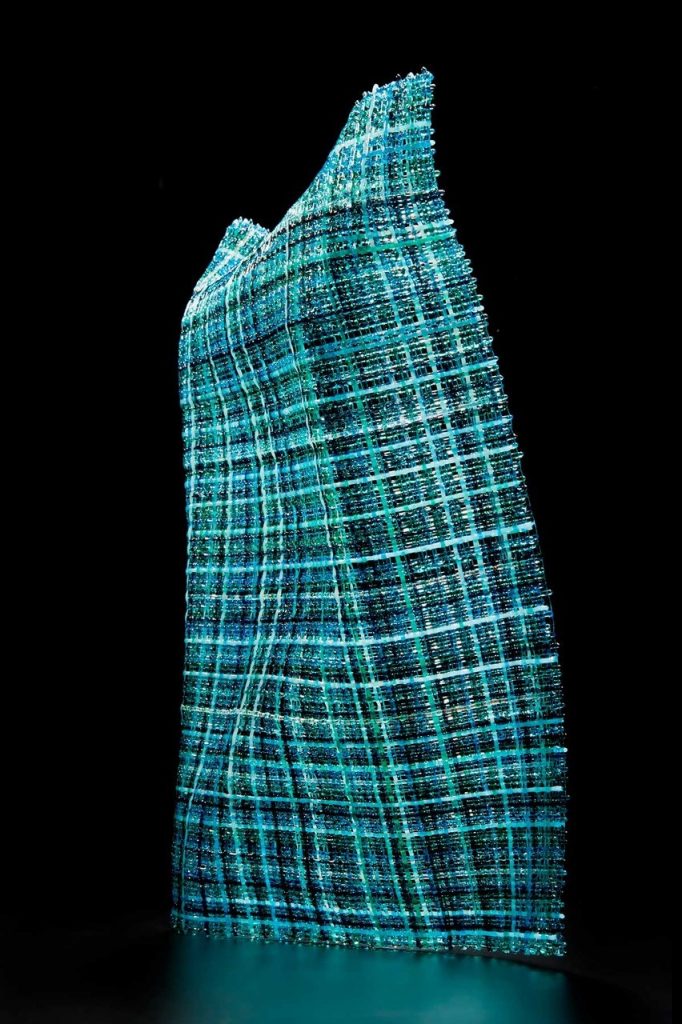
Hidden Gestures VI, Photo; Ester Segarra
My kiln glass is a different matter as I mainly work in a scale that I can manage for myself, although sometimes I need to use an assistant for logistical reasons. I find the most difficult and tiring part of my practice is packing work safely for shipping so I often need help with this.
Can you explain your collaboration with Bruce Marks using Tidal I and Tidal II and the whole series development together.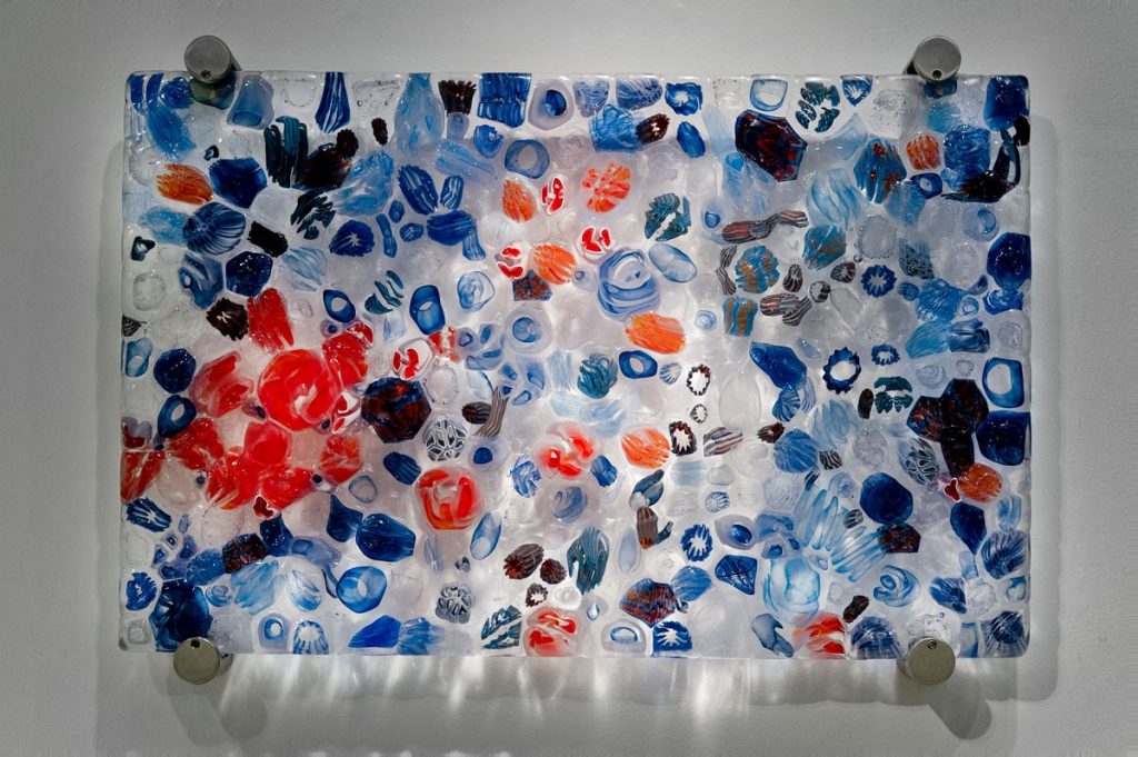
Cathryn Shilling & Bruce Marks, Tidal I, Photo; Ester Segarra
In 2017 London Glassblowing held an exhibition called Synergy that was all about collaborations. Bruce Marks is a glass blower and the Studio Manager and he asked if I would like to collaborate with him and make a piece for this show. The starting point for the work was a conversation reminiscing the joy of discovering the myriad of ocean creatures and plants in and around rock pools during childhood seaside holiday trips. Despite the fact that my holidays were in the UK and Bruce’s were in South Africa.
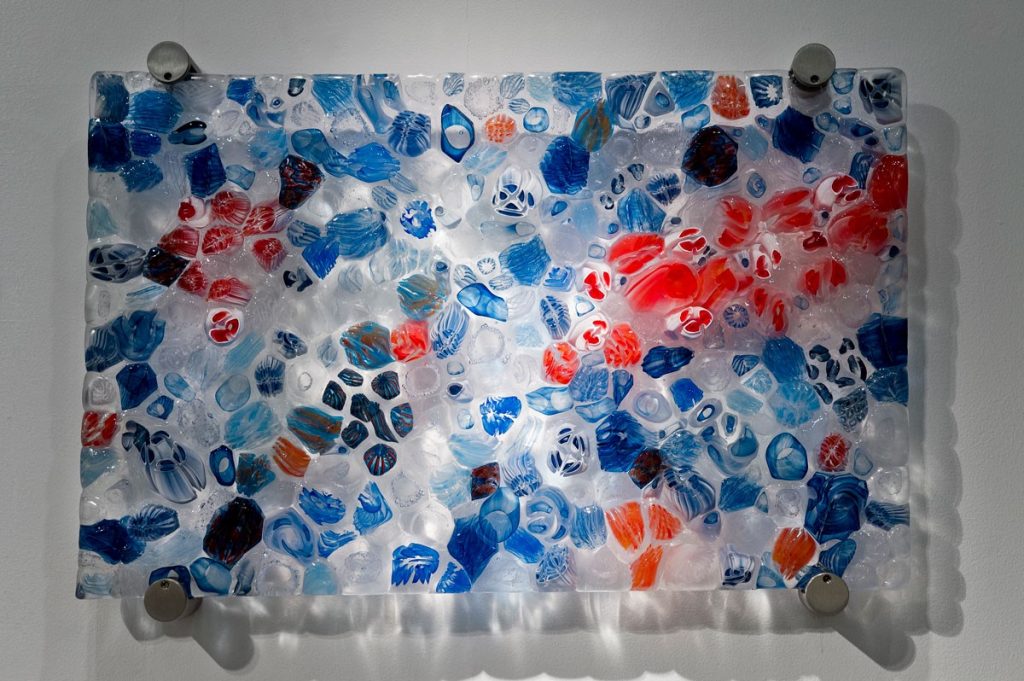
Cathryn Shilling & Bruce Marks, Tidal II, Photo; Ester Segarra
Rock pools are found in the intertidal zones around the world and are filled with seawater at high tide but become separate pools at low tide, revealing a whole new world, teeming with life. The flora and fauna that live in them need to be hardy enough to withstand the constant changes in their environment and are uniquely adapted to their conditions. These include sea anemones, crabs, sea stars, sponges, whelks, sea urchins , abalone and shrimps as well as seaweed and sea grass.
Tidal I and II are made up of many different complex canes, fused together, so that they give the sense of miniature marine eco systems. It is intended that through these pieces, the viewer is drawn into the detail and perhaps discovers an element that rekindles childhood memories and emotions from a past now dormant in the mind.
Discuss the Series ‘Hidden Gestures’
Hidden Gestures II, Photo; Ester Segarra
Kinesics is the study of Body Language by which humans subconsciously give and receive non-verbal communications. These physical expressions may reveal our true feelings by signalling the difference between what we say and what we mean. Body posture, and the position of a body in relation to others is an important indicator of feelings, attitudes and moods.
Through Hidden Gestures I strive to capture the quality of a particular human movement or behaviour through glass. This body of work is produced by fusing and slumping but it is not quite what it seems at first glance. By using texture, light and colour in an unexpected way my intention is to evoke a stylised sense of human movement, without literally recreating the form of a human within fabric.
 Hidden Gestures IV, Photo; Ester Segarra
The meaning stems from a dialogue the pieces share. The forms although separate, are interconnected through a continuous flow of movement from one to the other. This is underpinned by the use of the colour turquoise that is included in all of the pieces. Although these are individual pieces, my aim is to create a collaboration between a group free-standing entity, evoking a symphony of movement greater than that of the individual components.
Recently you had a residency at Northern Lands Creative, Scotland. Where has this residency taken you work?
The residency at North Lands Creative was an amazing opportunity and gave me time and space to concentrate entirely on my own work. At the beginning of the residency I was offered an exhibition in the North Lands Gallery. It is quite a large space but I was determined to give them a good show.
I followed three different threads of work during the residency, one of which involved using thicker clear glass cane than I’ve worked with before to make exhibition pieces on a bigger scale, experimenting with pushing the material beyond its usual technical parameters. I will be showing some of these pieces in a solo show at Vessel Gallery in London in June this year. Secondly, I was able to finally pursue an idea that had been in my thoughts for a long time, based on photographic imagery from the local area that I printed on silk as well as glass. The third thread was not planned for and evolved during the residency. My observations of the natural environment during my time at North Lands Creative has led to a completely new direction in my work. Through this work my aim is to capture, in a compelling and evocative way, the ‘Genius loci - spirit of place’, particularly where sky, land and sea collide. I am excited by the possibilities.
 Nestled, Photo; Ester Segarra
How has your involvement with Peter Layton influenced your glass and your career?
I first went to London Glassblowing in 2004 as a student of blown glass. In 2009 when the studio found a new home in the then up and coming Bermondsey Street, I began working in the new gallery space to help out. Then in 2010 Peter Layton asked me to curate an edit of the British Glass Biennale. I think my background in design has helped me immensely in my role as Curator, a position I am very proud to hold.
Although I still continue making fused glass in my own studio, the creative atmosphere at London Glassbowing has had an enormous influence on my work. The gallery has a rich exhibition programme each year that showcases Peter Layton and his team of artists as well as the very best contemporary glass artists currently working in the UK and beyond. Over the past ten years I can really see how much my work has developed with each exhibition opportunity that being part of London Glassblowing brings. More than once an exhibition theme has set me on a fresh and exiting path, especially when that involves collaborating with another artist in the team. I have learnt so much from my colleagues and watching both the glassblowers and the cold workers has broadened my creative horizons. Being amongst such talented people really keeps me on my toes.
Explain about The Gallery of London Glassblowing, where you are the Curator. Why should a visit to this gallery be a London must do?
Established in 1976, London Glassblowing is one of the longest running hot glass studios in Europe. It is unique in that visitors to the gallery are welcome to come and watch some of the finest makers in the world at work. To find such a hub of creativity and craft in the middle of London is so unexpected and exciting but it also helps people to understand the value of the work on display in the gallery. The gallery itself has a dynamic exhibition programme, featuring the finest contemporary glass artists from the UK and across the world, as well as work by Peter Layton and the team of resident artists. Consequently we attract visitors from all over the world.
Cathryn Shilling & Anthony Scala, The Fleeting Nature, Photo; Ester Segarra
Contact details:
Cathryn Shilling
www.cathrynshilling.co.uk[/vc_column_text][/vc_column][/vc_row]
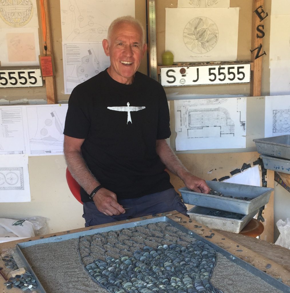
John Botica
Firstly, why pebbles?
My interaction and encounter with pebbles was purely coincidental. My first cousins here in NZ are very successful and established stonemasons and back in 2004 they had two clients who wanted to commission an artist for a pebble mosaic. At that time, I dabbled in conventional mosaics and these events led me to believe this was an exceptional opportunity to establish myself as a pebble mosaic artist. After 3 months of experimenting in this medium of expression I embarked on my first commission, a mosaic 3mts in diameter which was a huge success.
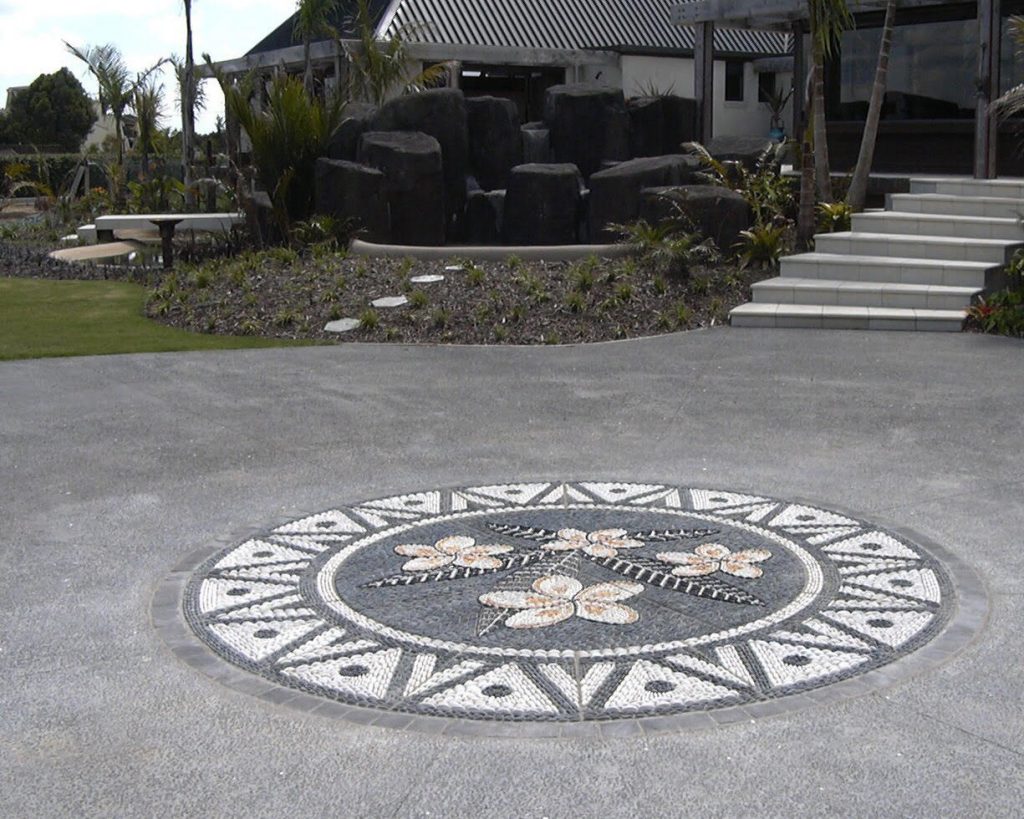
When you are commissioned to do a piece do you use local pebbles?
New Zealand has got the best selection of pebbles in the world and this is purely due to its geological attributes. Destruction of rocks takes place at such rapid pace creating multitude of pebbles excessively. There is a beautiful explanation of this activity on my website. I take a special pride in using explicitly local/NZ pebbles throughout my projects allowing me to become entirely independent on foreign stones if I choose to do so.
Discuss the size of your pebbles.
For majority of projects it is of utmost importance to have a considerable variety in size of pebbles especially when creating a background of a pebble mosaic. Gaps should be avoided at all costs and this is only possible if small enough pebbles are used to fill in the gaps. If you pay special attention to my technique you will have noticed that I create outlines of objects using the thinnest pebbles in existence enabling me to create the most intricate mosaics.
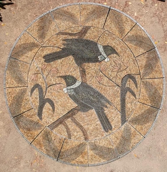
How does size and shape, needs to be taken into the narrative of your work?
Upon embarking on this most exhilarating journey of my life I had a clear vision what I wanted to achieve and how to establish this so called “point of difference”. I place tremendous importance on achieving precision and to be able to do this I use rather small and very thin pebble placing them on edge. In doing so a beautiful movement/rows of pebbles(and a mento) are formed so appealing to the eye. I am a staunch opponent of using flat stones since they rob a pebble mosaic of its “flow”.
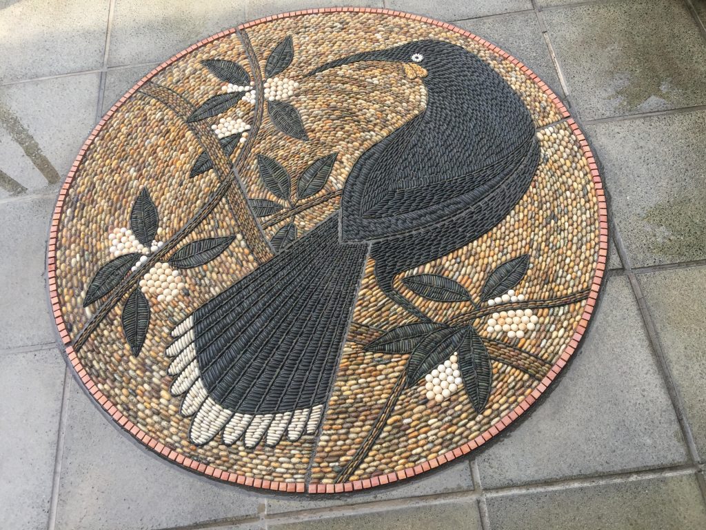
Do your pebbles need to be prepared?
As I have suggested previously, I am exposed to a great variety of pebbles which minimizes need for tumbling. I have considered this as a possibility especially with some rare stones like jasper for example which is red and very irregular in shape.
These questions of course lead to storage.
Where and how do you store them?
There is no need for me to store a great amount of pebbles since I sort and collect them specifically for each project. I do have some special stones put aside but this does not require a great amount of space.
Where do you collect special or specific pebbles from?
There is one incredible stone/pebble I am so fond of and it is a very dark/black stone originating from the most common rock formation on the North Island of NZ called argillite. Black pebble is almost impossible to find in mother nature’s pebble I collect from a beach located 40 min of drive from my home. In this regard I consider myself very fortunate.
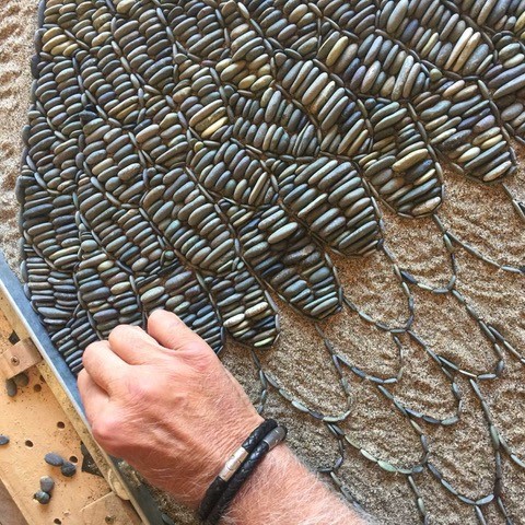
Take a very early Greek pebble mosaic that has either directly influenced your work or has led you to a style.
I have always wanted to develop my own style, but I have to mention The Lion Hunt pebble mosaic from Pella dating to around 320BC. This particular mosaic is so intricate and has been created with astonishingly small stones and it must have taken a long time to complete. This mosaic has convinced me of my ensuing mission which entails to strive for impeccable precision and putting preference on usage of smaller pebbles. The time required to complete a mosaic is not a factor. To adopt perfection and precision should be paramount.
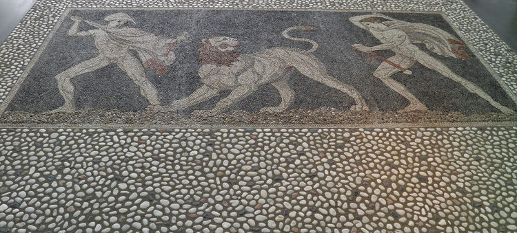
You are self-taught, but now teach and lecture internationally. Discuss your feelings and need to share your passion and joy with others.
A very important aspect of teaching the art of pebble mosaics is not to seek for financial benefits. Originally, I started teaching just to get out of my studio and create more diversion in my life by communicating with people. Creativity calls for a great degree of solitude. By teaching I have experienced a lot of joy and found myself to become increasingly passionate about it. Teaching is an act of conveying and perpetuating one’s knowledge not merely to enable others of achieving competence but to keep this art alive.
Take one big and one small piece and compare and contrast the differences that size has had on both pieces.
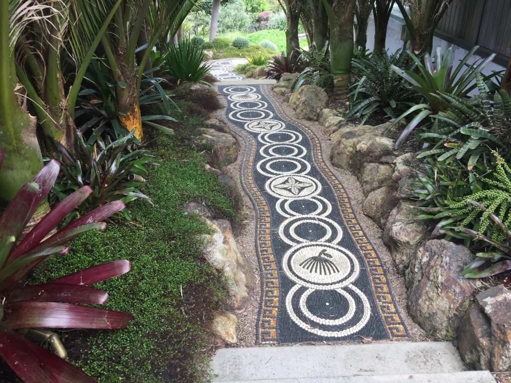
When you see a large mosaic anywhere in the world in Spain for example, they are very impressive due to their size predominantly. But if you look at them closely imperfection is apparent. I have created a lot of large mosaics appealing in size as well as small ones appealing in precision. To bring as much intricacy into a large mosaic as possible is something that I am striving for.
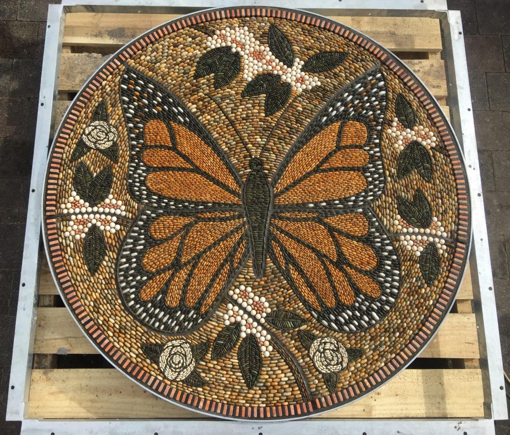
Give your thoughts on the need for public art
If you visit any impressive city in the world there is an interplay of beautiful architecture and exciting public art that enhances their image. We need public art to awaken beauty in our hearts to make our domicile more enjoyable. Life without art is not a meaningful one. What is actually art? Does it not entail that everything we do and see should be fulfilled with beauty and love ? Sometimes I observe people paying no attention to art in public spaces. This is worrisome. To be oblivious of beauty of art is disappointing.
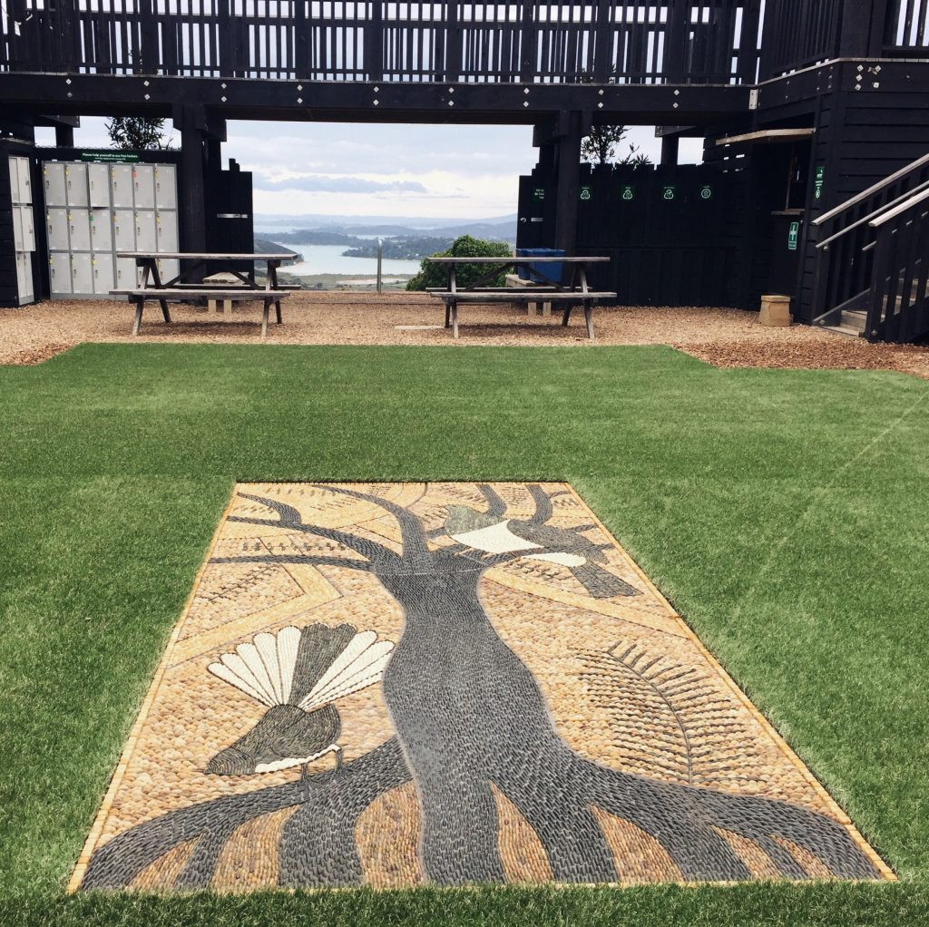
How important have commissions been for the growth of your career?
Very strong presence of commissions directly relates to your success as an artist. I have experienced a considerable growth in commissions lately. I have become more confident more secure and very powerful. I have become even more humble We are referring here to personal growth which is paramount for success in art. Your own satisfaction and results that you are producing make you feel more at ease. And when you are relaxed your ability to improve as an artist is greatly enhanced.
Expand on the patina on your work?
The term patina has been used indiscriminately to signify surface changes that supervene to artefacts either by human or natural contribution and in most cases resulting in increase of their value. However, with stone and pebbles patina addition by natural contribution is to be avoided in order to preserve their original appearance. In the casa of pebble mosaics avoiding damp and shady areas and installing them in areas with more exposure to the sun would greatly minimize patina addition.
Is there a difference to patina and wear in the Northern and Southern Hemisphere?
Obviously, addition of patina to stone surface by natural contribution is far greater in the Northern Hemisphere through colder and more damp weather conditions which I have discussed in the previous question. Also, there is an additional problem with water freezing and its expansion that result in stone/pebble destruction. Special sealers can be used to circumvent this issue and I use such a sealer on all if my mosaics to create this “wet’ look and to offset dirt and patina addition.
New Zealand is your “New Home”, how have you learnt about Mauri patterns, how have you bridged these cultural differences?
Yes, New Zealand is my adopted country and it has awakened a giant within me. New Zealand has enabled me to discover my own significance. By exploring the beauty of Maori and Polynesian motifs I was able to establish a new direction in pebble mosaic art. Maori culture and art are so prevalent in New Zealand and it is almost impossible not to be connected to it. I admire how New Zealand has embraced its indigenous people. My biggest dream and vision was to be able to collaborate with a Maori artist on a project. This dream was realised in 2016 by creating five mosaics at Bastion Point in Auckland arguably one of the most significant sites in New Zealand history.
Tell us how pebbles have taken you to a place that was completely unexpected?
To this very day I cannot comprehend this miracle of my becoming a pebble mosaic artist. It is inconceivable that this has taken place in a country of no apparent pebble mosaic tradition. The unexpected realm is the enrichment of my own soul and excitement of being able to touch human hearts with my art. I have experienced unforeseen transformation in my own character rewarding me with such personal satisfaction which I have never envisaged occurring. And to actually reach that stage in your life where your existence has got significance is a very powerful incentive to create better art. Like Stephen Covey said once:” To live, to love, to learn and to leave a legacy” us something that each one of us would be happy to witness.
Contact details:
John Botica
john@powerofpebbles.com
www.powerofpebbles.com
John Botica, Auckland, New Zealand
Interview by Deborah Blakeley, February 2019
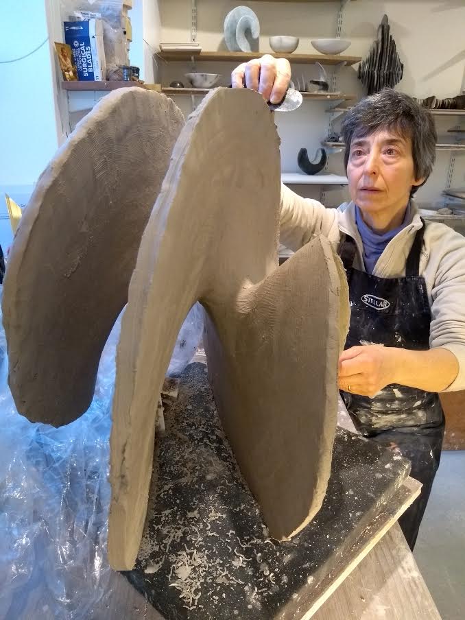
Antonia Salmon
Can we discuss the interesting past you have and how it has led and developed into the work you do today?
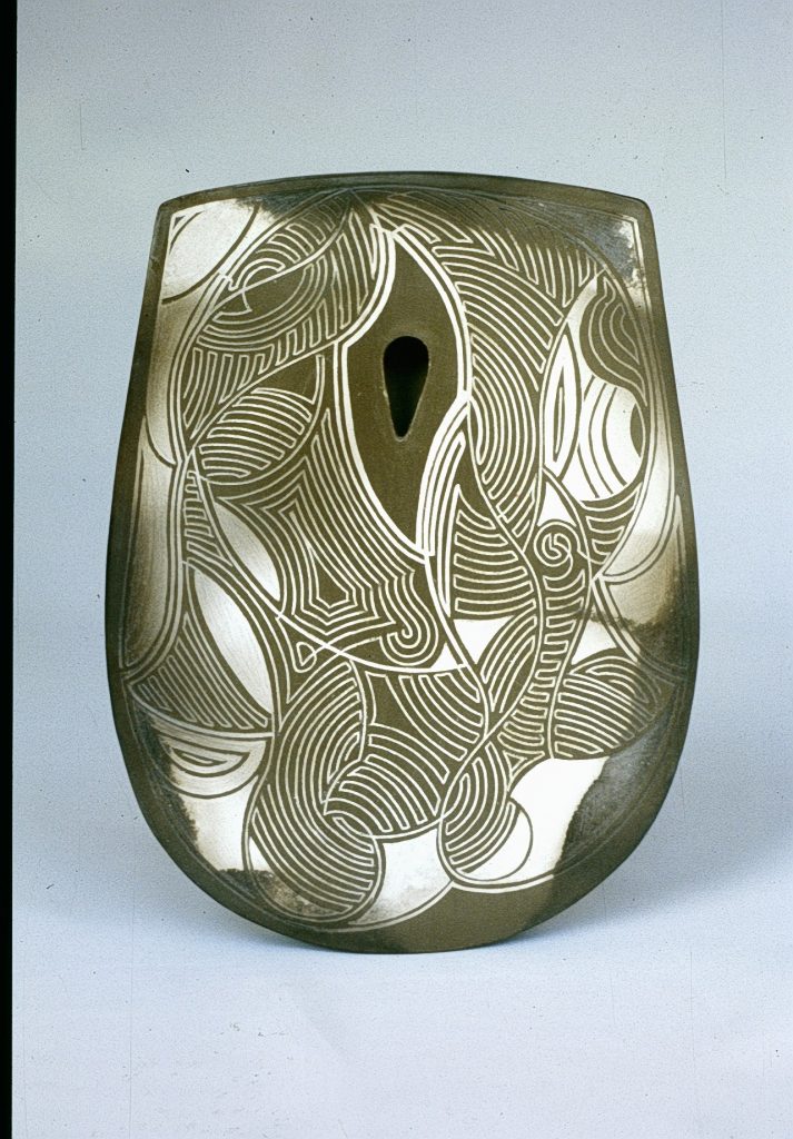
Labarinth Pattern Axe Head
Both my parents worked in the field of visual arts. My mother at 90 years old, is a practicing sculptor, and my father was an architect. I grew up in a home devoted to aesthetic consideration; holidays were spent looking at cathedrals or ancient monuments, drawing, walking, and painting.
The visual arts, beauty and visual integrity are a large part of my upbringing.
You originally went to Sheffield University and studied Geography and Geology. How has this influenced your work?
I chose to study Geography for several reasons: Since childhood I loved looking at maps and imagining journeys within them. I loved studying a subject that is all about human interaction with the natural world. I chose to study in Sheffield because it is near to a beautiful National Park – The Peak District - and I knew that walking in the country would be an important part of my relaxation. Walking over and in the ‘body’ of the landscape is like an immersive experience of contact with sculptural form. I see my sculptures as landscapes too.
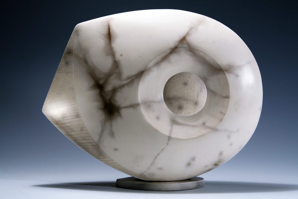
Moon Standing Form, H 29 cms
Then you trained at Harrow in ceramics, how did this career change happen?
I first became interested in working with clay at the age of 17 years. While at university I attended pottery classes for 3 years and spent every vacation working for as a potter’s assistant. By the end of university, I had a choice of continuing as a postgraduate in the study of geomorphology, or re-training in ceramics. My heart made the decision to follow ceramics and the love of land formation has remained an interest.
Following all of this you travelled for a year. Expand on the influence this has had on your work?
While at Harrow I became fascinated by the use, of geometry, particularly in the art and architecture of Islam. Before setting up workshop, I wanted time to spend exploring and drawing in the Middle East and India to extend this interest and widen my vision. A year travelling, painting and meeting many people nourished my creative spirit and shaped the essential focus of my work for many years. I realized that I wanted to make work that would speak to viewers at a deeper level than only the visual or tactile experience.
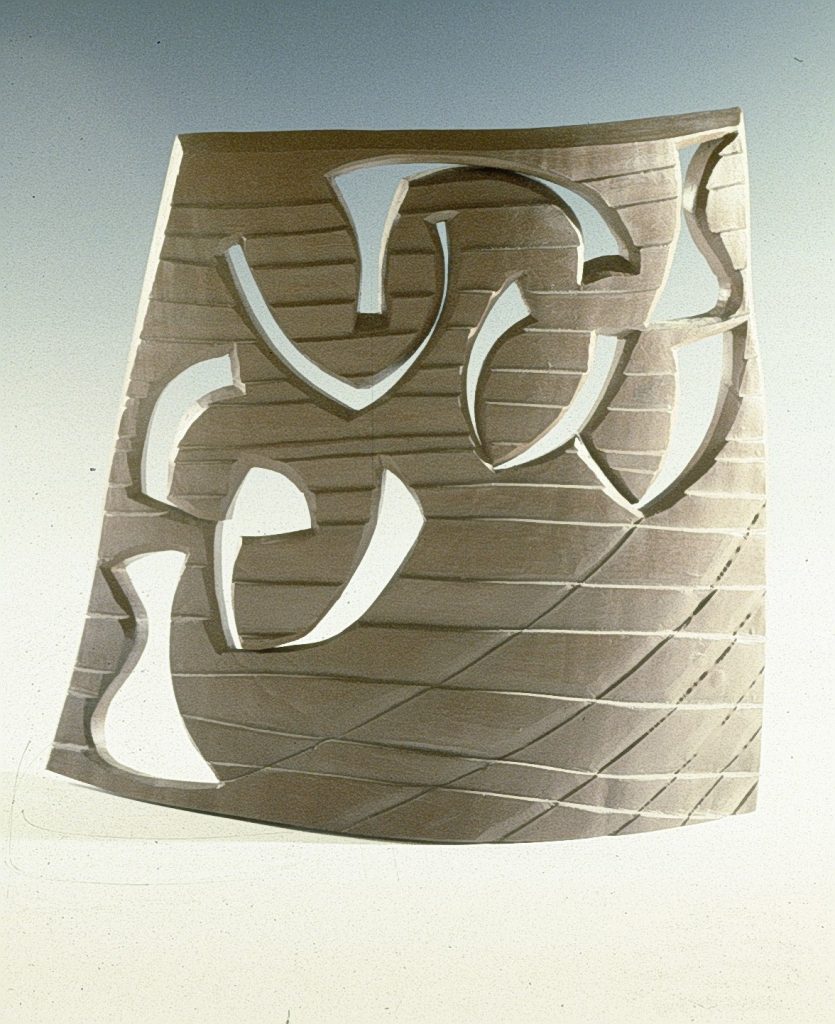
Burnished Screen
In 1989 you returned to Sheffield, comment on the importance of this landscape in you work?
Returning to Sheffield to live and work, meant a return to the local landscape which has became a source of spiritual connection and creative inspiration. I use the inspiration both as a visual reference and in recent years the sounds in nature (water, wind, bird calls, etc) have led to the development of the Surge and Wind Rush Series.
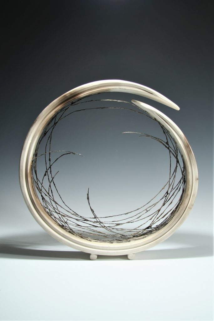 Large wind rush
Your comment, “The forms I am most drawn to have clarify of line or strong underlying geometry.” Discuss
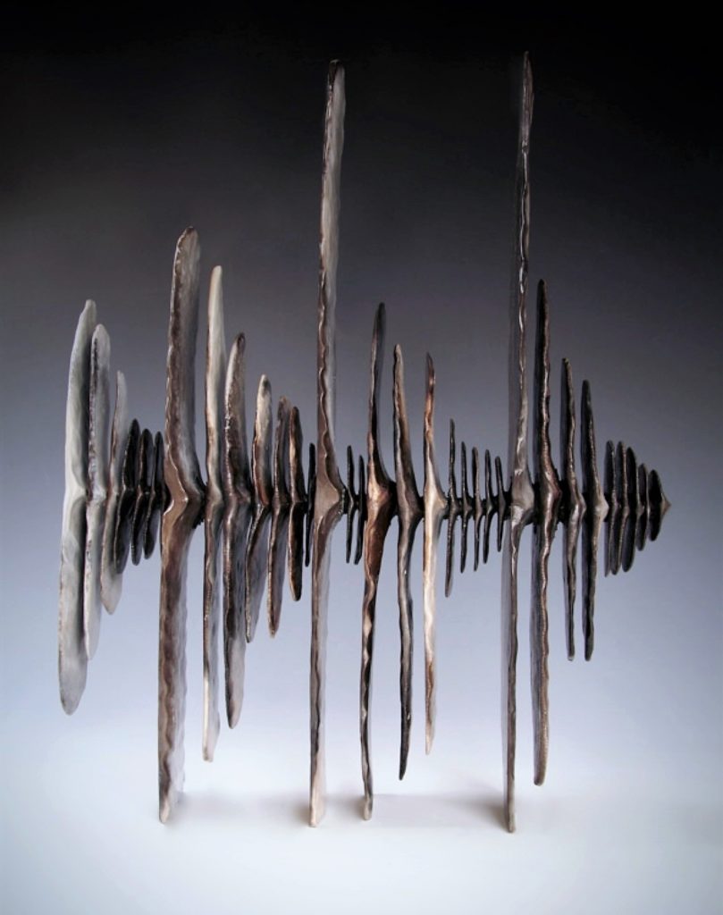
Echo, H 57cm
In nature, as in some of the most beautiful art work there is an unobtrusive fundamental geometry at work. To make sculptures that balance the discipline of geometry and the dynamism of the natural world is my aim. This is not about using geometry in a formulaic way, but as a structural basis.
What made you decide to work entirely on the abstract form?
For me, the best abstract forms speak at many levels of experience; from the sensual to transcendent qualities.
Explain the finished texture of your work?
Many of the sculptures are hand burnished. This is a process of compressing the clay surface repeatedly to give it a hard, smooth and shiny surface. Once burnished, the clay surface is ideal for impressing delicate textures. The contrast of smoothness and fine textured surface which is then smoke-fired and finally wax polished to give a gentle sheen, imparts a subtle timeless sense.
Dark Sail, H 42cms
Your work is in both the UK and Internationally take one piece and explain why this piece was so influential in your career?
Touch Point
I have always loved looking at the space between and surrounding a form as much as the solid shape itself. Touch Point is made of two separate similar forms, one sitting on the other as a reflection. As a whole the sculpture acts as a standing form, sitting with stillness. The surface is burnished smooth and then incised with groups of radiating lines that give a sense of vitality and sharp dynamism. The work says something about connection, stillness and dynamism all in one. It has attracted attention from private and corporate clients internationally and there are examples held in collections all over the world.
Can you explain the use of smoke firing in your work?
Smoke firing is an ancient process of firing pots in wood or shavings over several days. I love this way of firing for several reasons. There is spontaneity to this process, free of the human hand, which gives the work a timeless quality, and lifts it beyond any self-conscious decoration. It also means that the beautiful material of fired ceramic is not covered in glaze.
Take us through the process of your most current commission
My current commission is for two large Surge Sculptures which will be located, in the lobby of a Middle Eastern hotel. The process from initial enquiry to commissioning has been over 9 months. The main considerations and technical concerns have risen due to the size of the works which are 60cm in height and will be in a busy public setting. I have used a gritty clay and incorporated strengthening materials in order to build at this scale. The structure is complex and the process of making is over several months, with the most challenging process of firing, yet to come. One of the most difficult aspects is physically moving and the work because of its weight and fragility.
What is the importance of demonstration and lecturing for you personally? Why is this such an important part of your working life?
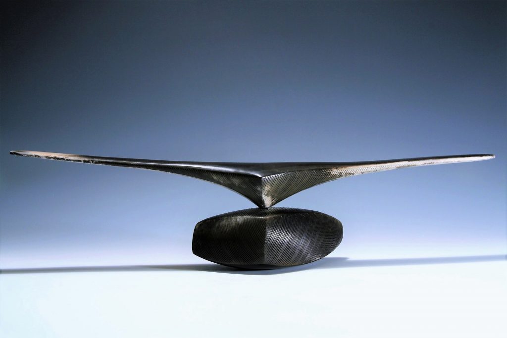
Winged Form, W 54cm
I am a very private person and the creative process is a private process. Demonstrating has therefore been challenging for me, always. I love to communicate about the source of inspiration and thinking behind the work. Increasingly, however, the most satisfying aspect of sharing the work is when someone really takes time to look, and there is a silent communication and understanding of the deeper connection being made, without many words. The knowledge about the sculpture would be incomplete without the willingness to engage with it.
Contact details:
Antonia Salmon
antoniasalmon.sheffield@googlemail.com
Antonia Salmon, Sheffield, UK
Interview by Deborah Blakeley, February 2019

Gunjan Aylawadi
Where did you first see paper art?
Do you mean my specific way of working with paper? It’s a technique I came up with while experimenting with paper. Growing up I was always drawn to paper…it was all around me and gave me the freedom to create whenever I wanted. Later in life when I moved to the US & had free time on my hands, I was creating a lot with paper…but was motivated by the desire to do something different, something I hadn’t seen before…and that’s how I began experimenting to come up with a completely new way of working with this beautiful medium.
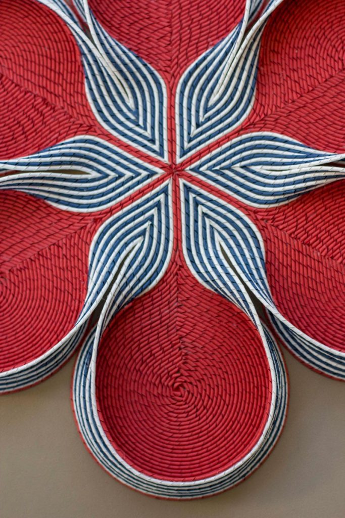 Formed in Fantasy
What led you to become a paper artist?
I was making a lot of work for my own pleasure…and just as my mind began to be switched on about it, I started seeing paper artists everywhere…each one with a unique way of working with paper…that’s when I decided to take my art more seriously and start showing at galleries & group shows.
Discuss briefly the technique you use in your work?
My technique is very simple with no complicated tools required…but the magic lies in repetition of a simple act. I first draw out the geometric plan I will be working with on the base paper. Then I take a sheet of coloured paper and cut it out into equal sized thin strips with a guillotine. I then tightly curl these strips around a piece of wire one by one. As soon as a strip is curled, I immediately take out the wire and the paper strip now looks like a string, which I quickly glue down on the geometric plan. I repeat this curling & gluing till I have my desired geometric form. Each sheet can have hundreds of these strings.
You work as an artist and mathematician discuss the way both are connected.
I am not a mathematician. I only use some geometric concepts to make my work. I am particularly interested in geometry because I love the certainty it offers…and I love clean lines.
Where is your studio?
I have recently had a baby and have a little space set up at home where I work when he sleeps :)
How much space to you need?
Not a lot if I am working on smaller pieces. Everything can be packed flat & is easy to store. I designed it to be this way because we were moving a lot & I wanted to be able to do work without space as a constraint.
What is one tool you could not be without?
A guillotine.
Discuss the 3D effect found in your work? Explain how you achieve this 3D work?
The 3D effect is inspired by 3D printing - where the basic principle is that a string of plastic is melted on top the previous layer to add height. I do the same with paper strings - I just glue one string on top of the other. Its very delicate work and took me a while to get it to be neat and seamless.
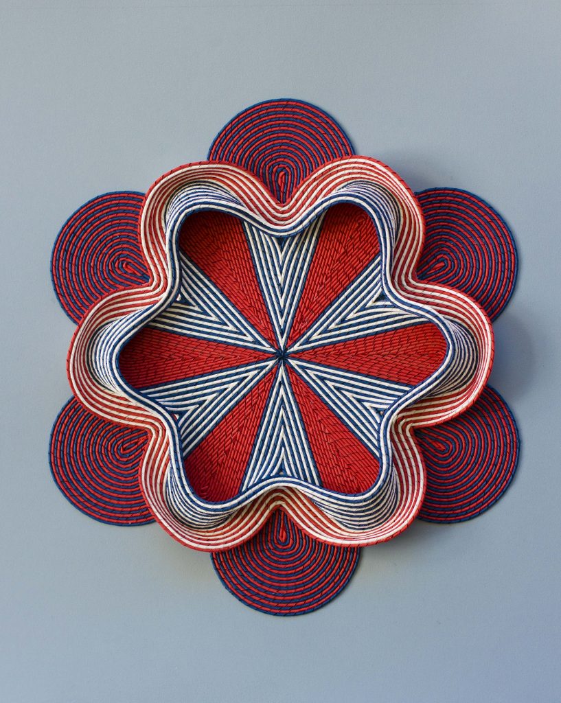
In Bloom
You call your work, paper tapestry, expand on how you come to this title?
That came about as away to explain this completely new technique for my work as I din’t have a name for it. I would show pictures of my work to people and they would say it looks like tapestry/carpets. It just became a helpful way of guiding people what to expect when thinking about my work.
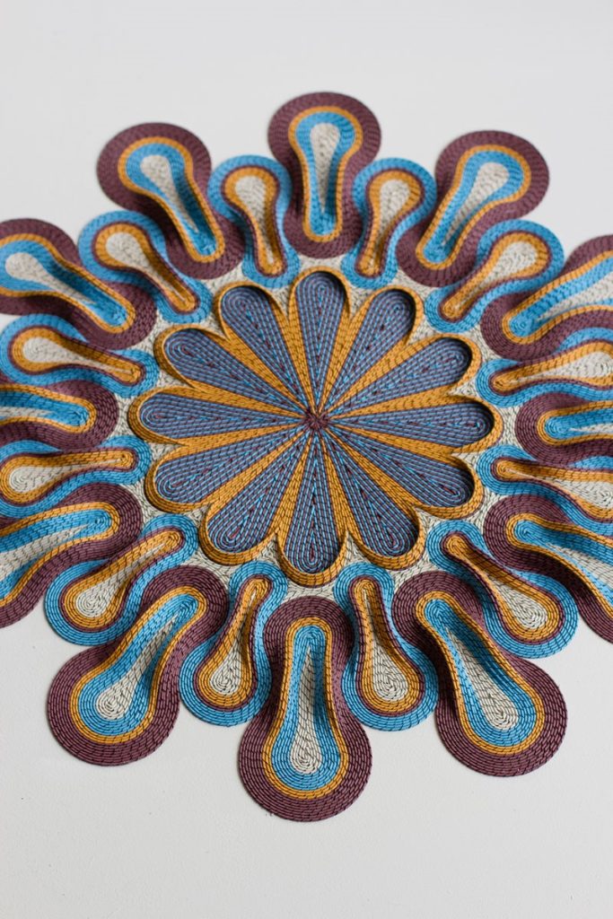
Marigold
Expand on your use of pattern and repeat patterns in you work.
I grew up in New Delhi which is a melting pot of religions in India. My family is Hindu so we visited a lot of temples; I went to a catholic school & there was a church next door to us and there were mosques all around the area.
I loved how different religions used geometric patterns to decorate their places of worship. They were divided by beliefs but connected at a more deeper level.
I’ve had a love for patterns since that young age. Watching endless patterns on the ceilings became the only reason to go to a temple for me. I could get lost in them and that was how I meditated and prayed.
I feel the same way about my work…the slow & repetitive nature puts me in a meditative state. It is like being back in the same place of prayer for me.
Explain your work, ‘Love It’?
It was made in response to what I was experiencing both as a reaction to my work & my reaction to things I was seeing. Being on social media platforms like Instagram, I was being exposed to a lot of images in a very short time. It had become a mindless habit to scroll through my feed and like something after seeing it for a few seconds and declare that I love it.
At the same time, a lot people would see my work for a few seconds and declare that they love it.
I just wanted to do something slow with such a throwaway term and create an opportunity to look at it differently
Discuss Hakk// CODA.
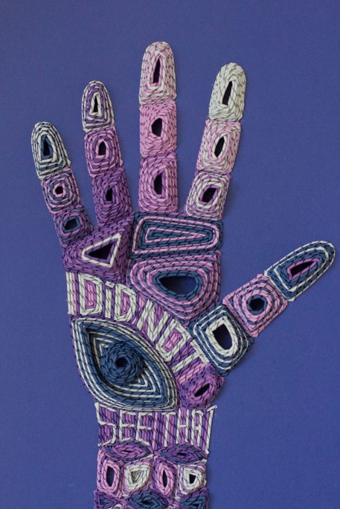
Hakk// CODA #5
The number of patterns - 9 different patterns
The number of repeats - 12 times each
The size of the work - 2.25 mtrs * 3 mtrs
‘Hakk' is to weave in Arabic. I drew on imagery I grew up with in India to make this work. I’ve spent the better part of my life in New Delhi - a city that’s home to people with different religious beliefs and diverse economic backgrounds. In spite all the differences, arabesque patterns repeat themselves over and over again in the temples, mosques, old architecture and contemporary design alike. This work proposes a place where faith, culture and individual identities meet. Correlating to our various identities and attempts to appear not as we are, the medium of paper appears to be fabric when it is not. On another level, all these identities in India, co-exist much as threads in a tapestry, where some differences are so striking and other boundaries so blurred that it is difficult to pin point where one faith and culture begins and another ends.
How have you been able to combine your past and heritage with your current art and your new country?
I’ve gone from making simple geometric patterns for the sake of experiencing the meditative state and sitting quietly with myself to finding a voice and the skills to say it through my work.
Some of my earlier works looked like this:
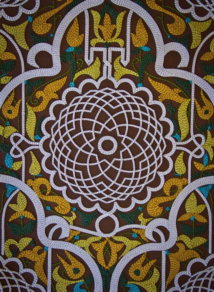
Rabie
They were arabesque patterns that I was interested in. But I had no clue where I was going with these. I then started to do works with texts hidden in them to get viewers to look closely.
As I began to get more comfortable with my own voice, my technique evolved into a third dimension and works became less literal and more evocative. My current works look like this:
Where does the Engineer leave, and the artist take over?
The engineer in me helps me with creating constraints & making plans & the discipline around making work…but that’s the extent of it. The artist in me is the one who has a voice and things to say and I am continuing to nurture that part of me.
Contact details:
Gunjan Aylawadi
gunjan.aylawadi@gmail.com
Gunjan Aylawadi, Sydney, Australia
Interview by Deborah Blakeley, January 2019
Chris Chun, Painter- Plus
Explain how you have your feet in both countries, Thailand and Australia?
My husband and I have been based here in Chiang Mai since 2010. Originally, we were only supposed to be away for a 6 month sabbatical but the charm of Chiang Mai crept under our skin and before we knew it…. 6 months had turned into 1 year, then 2 years, then before we knew it, its been 8 years here. Because we like the lifestyle here and the people/ culture, I decided to set up a studio here so I can work 2/3 of the year here and the rest away, either in Australia where I still have a home or traveling.
What made you decide to have your studio in Chiang Mai rather that Japan or Laos?
It turned out to be serendipitous because we both hadn’t planned to stay here. We found out later that Chiang Mai has a rich history of creativity; there is a big community of artists and craftspeople. Great coffee culture; it’s been described as the Portland of Thailand. There’s always exhibitions and things happening so I’ve found it incredibly inspiring.
It’s funny you mention Japan because I am actually planning to do a ceramics residency in Japan sometime this year along with a possible exhibition. I love Japan – I seem to go there every other year for endless inspiration whether it be the food, design, culture, gardens or shopping. Love it all.
Colour is such an important aspect of our art. Can you explain colour in relationship to images of Thailand and your work?
Colour is probably the most important part of work. Just from a pure visual standpoint, it’s the first thing that we notice when we look at everything. Colour provides an emotional, cultural and spiritual connection to our world.
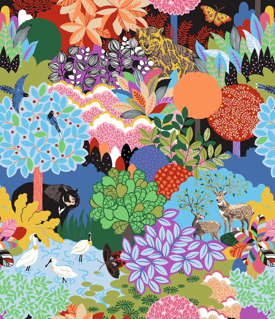
Formosan Wonderland – Textile design
Living in Thailand is really inspiring because I am surrounded by this incredible palette of colour everywhere from the orchids to the food markets to the temples. According to Thai customs, there is a colour for every day. The specific colour of each day depends on an astrological rule (influenced by Hindu mythology) and is based on the colour of the God who protects the day. So, you’re supposed to wear that day’s colour for luck.
Sunday – Red
Monday – Yellow
Tuesday – Pink
Wednesday – Green
Thursday – Orange
Friday – Light Blue
Saturday – Purple.
The King of Thailand is always associated with yellow.
In your opinion discuss the importance of being able to work / live art?
I really cannot imagine doing anything else. I love what I do so it doesn’t feel like work. I love to create and try new things. I think the key to any successful life is being able to follow your passion.
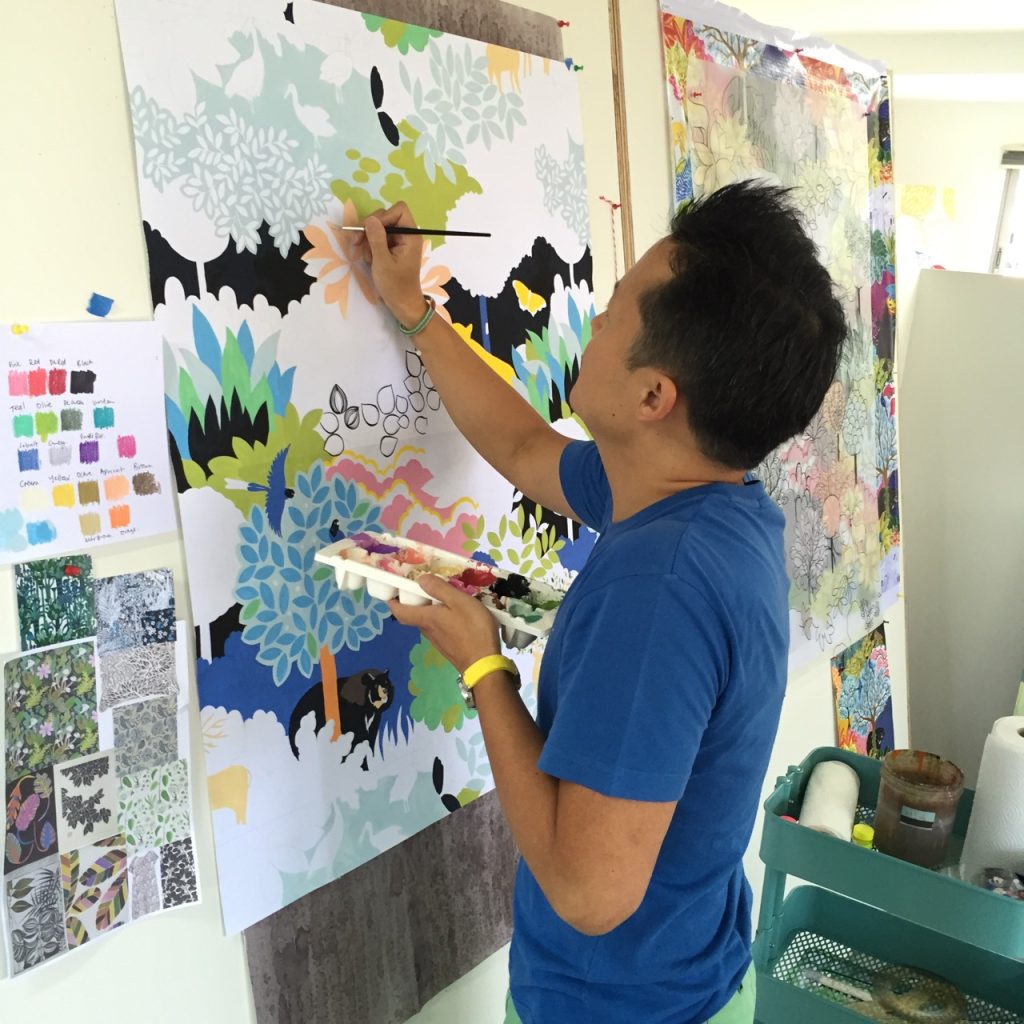
Expand on two of your resent exhibition pieces.
Paphiopedilum Callosum
Around the corner from my studio is Kamtieng Flower Markets. They have the most amazing variety of orchids – each have their own personality and characteristics.
 Orchard #1 Paphiodedilum Callosum
The Wise One
This etching was done in collaboration with Chiang Mai Art and Paper (CAP) Studio – Thailand’s first printmaking studio. It was set up by Kitikong Tilokwattanotai, an exceptionally talented and entrepreneurial artist who actually studied at COFA in Sydney. The Wise One is part of a series of 5 indigo etchings. I love owls – I find them completely fascinating. There is a mysticism about them.
The Wise One #4
On the flip side you have your work in the form of stationary, ceramics and textiles.
Why these other three products?
I have a definite affinity for these product areas. I love ceramics; love drinking and eating from them. It can be antique, hand thrown, sculptural. I love writing and receiving cards and notecard in the post. We need to do this more. And textiles, is always my first love. I studied Textile Design at RMIT.
Artize Hangzhou, silk scarves
How are they different from your exhibition work?
They are related but more commercial. When creating for products, I am more than not governed by manufacturing constraints (ie. How many colours I can use, how the design is reproduced onto the product, retail price). I work closely with my clients to ensure that the product is produced as exactly as possible to the artwork and tells a story.
Artize Hangzhou, silk scarf
With your textile art do you need to have repeats?
If your textile art is for commercial products, then definitely yes for manufacturing. If you are selling your textile art as inspiration for a company, then it doesn’t have to be in repeat.
How is it sold?
Usually, they are sold via trade fairs and face to face meetings with agents and sales people. If you can imagine they have these big textile fairs and in one of these halls (imagine the Royal Exhibition Buildings in Melbourne) would be filled with design studios all selling textile art to potential customers who travel from all over the world to buy the latest trends. These companies then use this textile art to create new designs and collections from these, every year.
When I worked for textile design studios in UK and Italy, we were churning out new designs every day. One day, I would be painting onto silk, the next day I would be embroidering beads onto velvet. Very inspiring and it was a good foundation for me to work fast and be creative at the forefront of fashion and interiors.
Do you have it make up into clothing or homewares?
If it is for my own brand, then yes. But usually when selling to clients, it’s either sold just on fabric or paper.
Take two or three of your floral designs and discuss them.
Hangzhou
Hangzhou This design was for a scarf commission. It was based off the botanical garden of Hangzhou in China. I researched the birds and native flora to create something that was factually accurate. I wanted to do something painterly and thought it would be elegant to paint the birds and flowers within a traditional Chinese trellis. I used acrylic paint for this and there are lots of layers of colour.
Artize Hangzhou
Formosan Wonderland
This all over pattern showcases some of the endangered animal species of Taiwan – the Formosan Bear, Formosan Leopard, Formosan Magpie, Spoonbill Bird, Sika Deer. I wanted to create a sort of forest wonderland that was contemporary and clean for home furnishings. I think it would be great as curtains or covering a small sofa. It’s painted in flat colour with gouache.
Formosan Wonderland
Siam
This Chinoiserie inspired pattern is done with inks and paper collage. It is a classic bird and flower pattern that can be used as wallpaper or fabric.
Siam Natural
How are you able to licence your art work and how does this work?
Creatively
Financially
I’ve been licensing my artwork since 2004 and in 2007/ 2008, I attended Surtex (the biggest art licensing fair in NYC). Since then, I have licensed my work to clients from Russia, Europe, Asia and Australia in a wide variety of product areas from greeting cards to home textiles to teapots etc. It is my main source of income but I think it is harder to get licensing contracts due to the current economy and more artists entering the industry. You need to have determination, grit and have a wide selection of good work that is distinctive and commercially attractive to clients (licensees).
Discuss the importance of elephants to you?
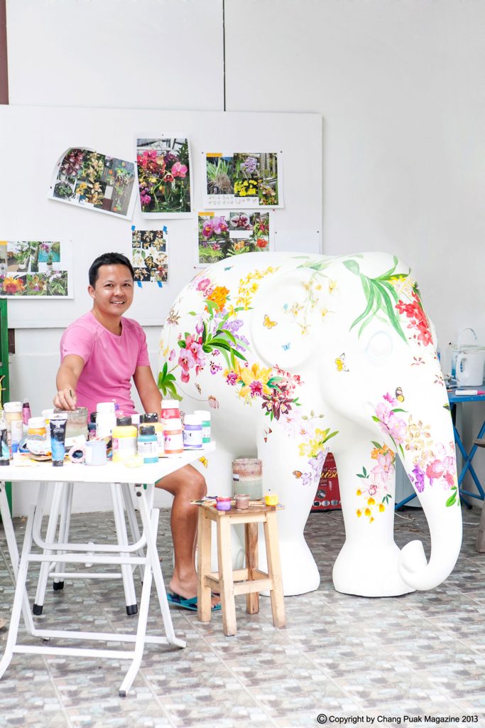
Chang, Puak Magazine, 2013
Elephants are the most incredible creatures. So intelligent and empathetic and kind loving. I have spent some time working and learning about Asian elephant/ elephant conservation through my involvement with Elephant Parade and their elephant conservation charities. I would like to see elephants protected and be able to live in a safe and healthy environment.
Contact details:
Chris Chun
info@chrischun.com
Chris Chun, Chiang Mai, Thailand
Interview by Deborah Blakeley, January 2019
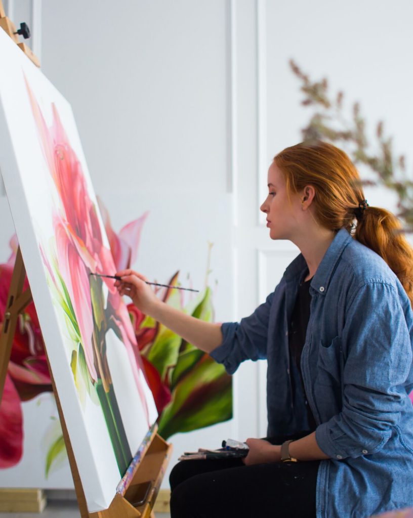
Freya Powell
How has your background in fashion and flowers influenced your art?
Before I started painting, my main interest was always fashion and textiles, from a young age. Studying fashion design and textiles, a lot of my work drew inspiration from natural forms, and sometimes the structure of flowers for instance. There are many comparisons to be made between the form, structure and three-dimensionality of flowers and fashion. Actually, I came to start painting because I wanted to learn how to paint so I could develop some printed textile designs that had painted motifs. Once I started, I realised that it was something I wanted to take further, and work in a much larger scale.
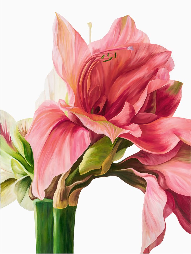
‘Amaryllis’ 75 x 100cm, Oil on Canvas
Tell us about a recent beauty in nature that has left you with that WOW!
At the end of, October I went to the Rhododendron Gardens in Blackheath, NSW. I missed it last year because the flowering season is so short, and I’m so glad I got to see it. The scale of the plants and the flowers themselves was quite something up close, taking a step back the whole place was alive with colour. I’m currently working on a Rhododendron piece which I’ll be showing at The Other Art Fair in March.
What lead you to flowers?
I’ve pretty much always had an interest in them, probably because I grew up in the countryside in England and my parents had a very classic cottage garden which was always spectacular in the summer. Probably as well because the weather and the winter is so bad and long in England, that when summer does arrive, everyone is so happy, and the garden and flowers bursting out suddenly just adds to that.
Discuss, composition and your painting.
I paint from images that I take of flowers, and I take quite a lot of them, then spend some time deciding which one to choose. I suppose the composition planning starts in my hand when I’m holding the flowers or arranging them. I try to find balance and interest, boldness or subtlety, in how they are composed. I usually leave white space around the flowers, at the moment I like the simplicity that comes with that, and it puts a focus onto the flower that is different to when the painting covers the canvas.
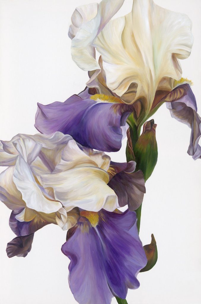
‘Sanguine’ 60 x 90 cm, Oil on Canvas
Take two pieces that are very different and explain the benefits of both.
I’ve done a couple of abstracted pieces where two types of flowers are merged together and combine shapes and petals. You can see that there’s flowers in the piece the focus is more on shapes and colour and transparency, and they are usually darker in colour.
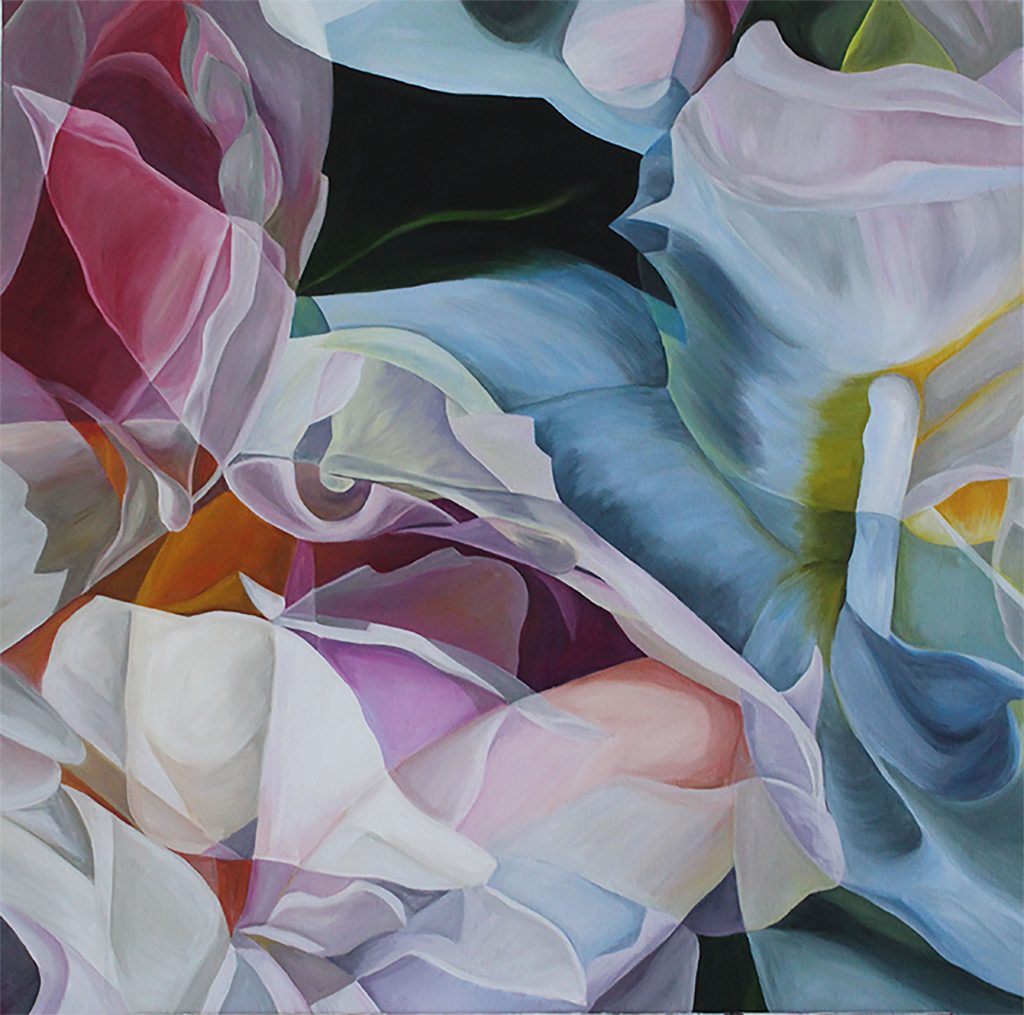
‘Oscillation’ 70 x 70 cm, Oil on Canvas
In this piece ‘Oscillation’ there are peonies and gardenias, it was the first painting I did in this style. I’ve done a couple of commissions in this style, but as it’s so different to my usual work I don’t do it very often. ‘The Beauty Spot’ is in my usual style, is just of peonies. They were so showy and bold I just wanted to paint them in the middle of the canvas, kind of like ‘here I am’.
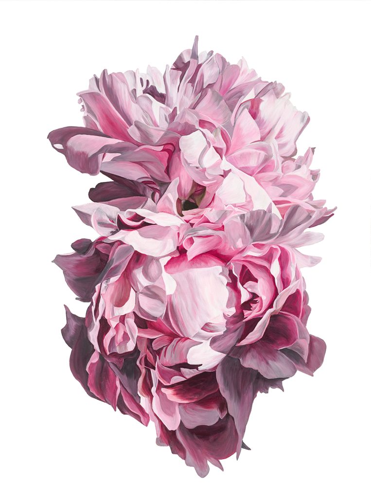
‘The Beauty Spot’ 70 x 100 cm, Oil on Canvas
Do you find certain colours reflect the current interior fashions?
I don’t really follow interior colour trends in my work, mainly because I generally just focus on what flowers are in season that I can get my hands on, and getting something that I’m just drawn to. I do end up painting a lot of pink, which has been very on trend recently, but that’s really to do with there being a lot of nice pink flowers! I can go to the flower markets intending not to get anything pink, then come back with lots of pink. As well, I think if you’re considering buying an original painting, most people would go with something they love and will have timeless appeal to them.
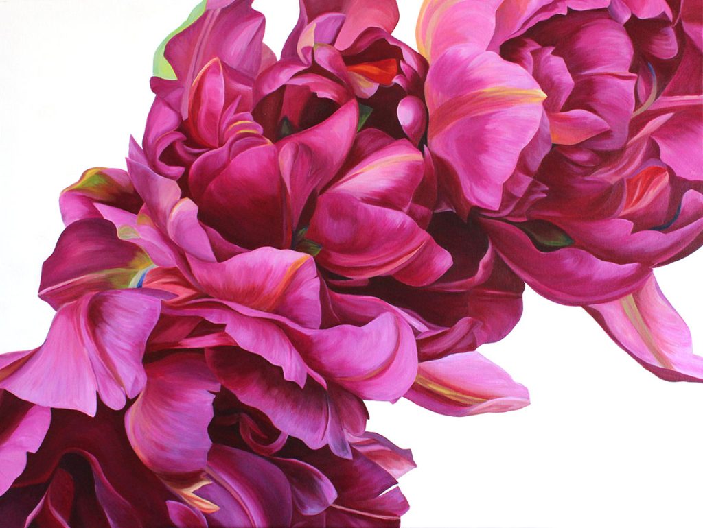
‘Effie’ 100 x 75 cm, Oil on Canvas
Are people looking for a ‘particular bloom’ for you to paint?
When I do commissions usually the client will come to me with a particular flower that they love, or at least the kind of flowers they like, and we go from there. Often, they have seen an existing painting of mine and want something similar. Peonies and parrot tulips are often popular.
Enlargement is a major part of your work expand on this aspect.
Yes I like to paint fairly large scale canvases that magnify the subject. Personally I find this kind of scale more enjoyable to work on, and it creates a painting that demands attention and takes you up close and personal to the flower. Lots of people have said that my paintings feel alive, which I don’t think happens if I work on a smaller scale.
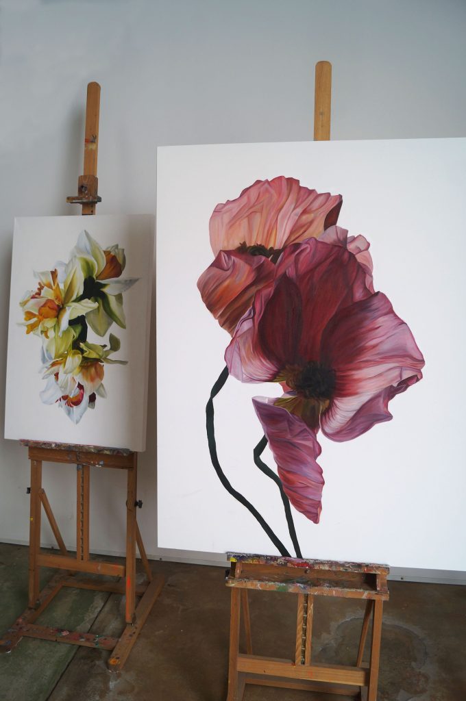
Narcissi and Flirtations
You also have limited editions. What is your print limit?
My prints are in editions of 100 and are fine art giclée prints.
Do you sign all your prints?
Yes they are all hand signed.
Do you haunt florist and gardens?
I always enjoy a quick dive into a florist to check out what’s in, but I normally get my flowers from the Sydney flower markets where there is a huge amount of choice. It does involve getting up very early though. I do like going to gardens, I’m going back to the UK next June and it’ll be prime flower, time so I’ll definitely be visiting some gardens then.
Discuss one painting that has been bought and why it stands out.
‘Fleur’ is a painting of David Austin roses that stands out to me because at the time it was the most technically challenging painting that I’d done.
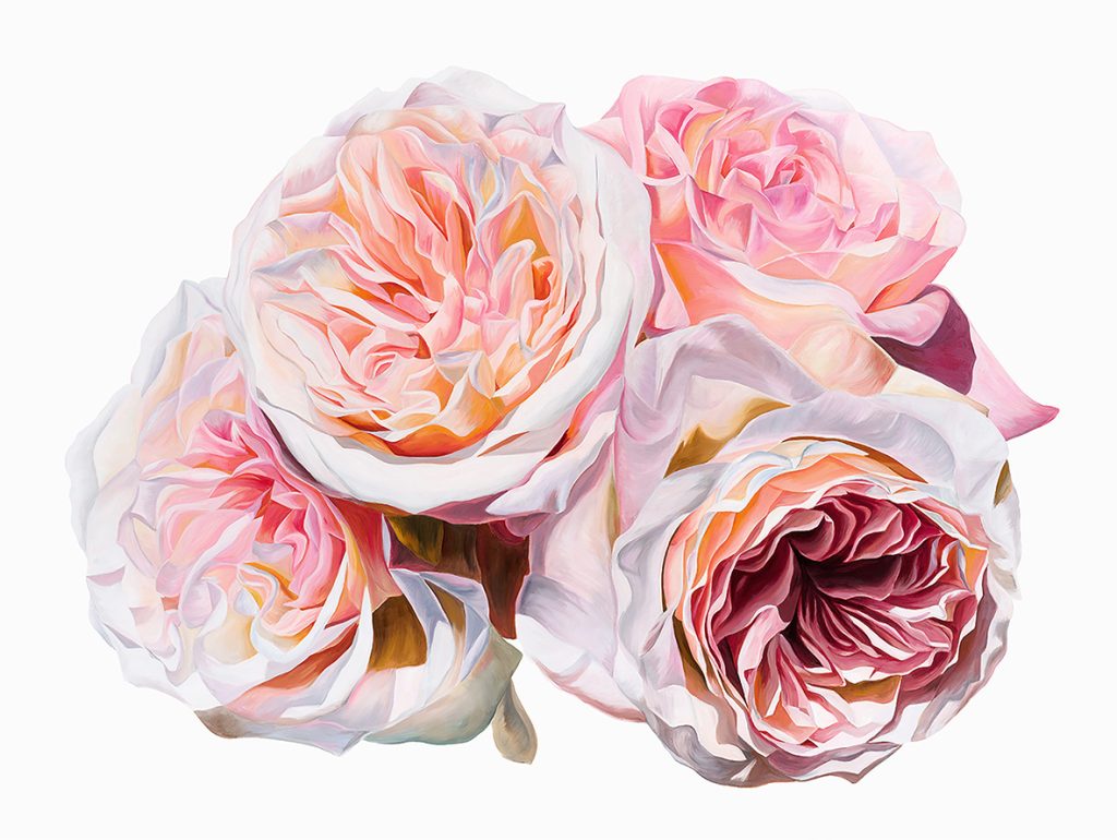
‘Fleur’ 120 x 90cm, Oil on Canvas
There are so many intricate petals and I photographed the flowers in quite bright sunlight so there are so many different colours in it. I had wanted to paint these tight David Austins for some time so I was quite pleased when I finally did.
Have you worked with only leaves?
I haven’t painted only leaves, but I am thinking about incorporating more greenery/less feminine elements into my work soon.
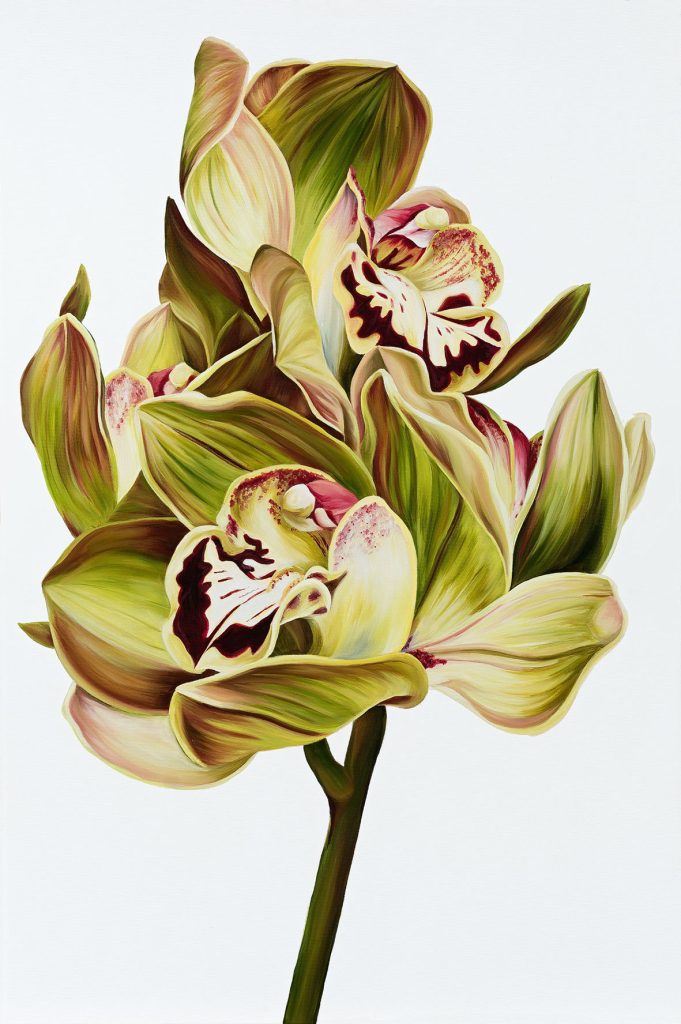
‘Reina’ 60 x 90cm, Oil on Canvas
Personally, how important is it that your art needs to bring beauty with it?
I think it’s, pretty important when you’re painting flowers. They are synonymous with beauty and in painting them and in creating a permanent portrait of them there needs to be beauty with that. Our surroundings are so important to us and by having a floral painting in your home you can bring a piece of nature and beauty inside.
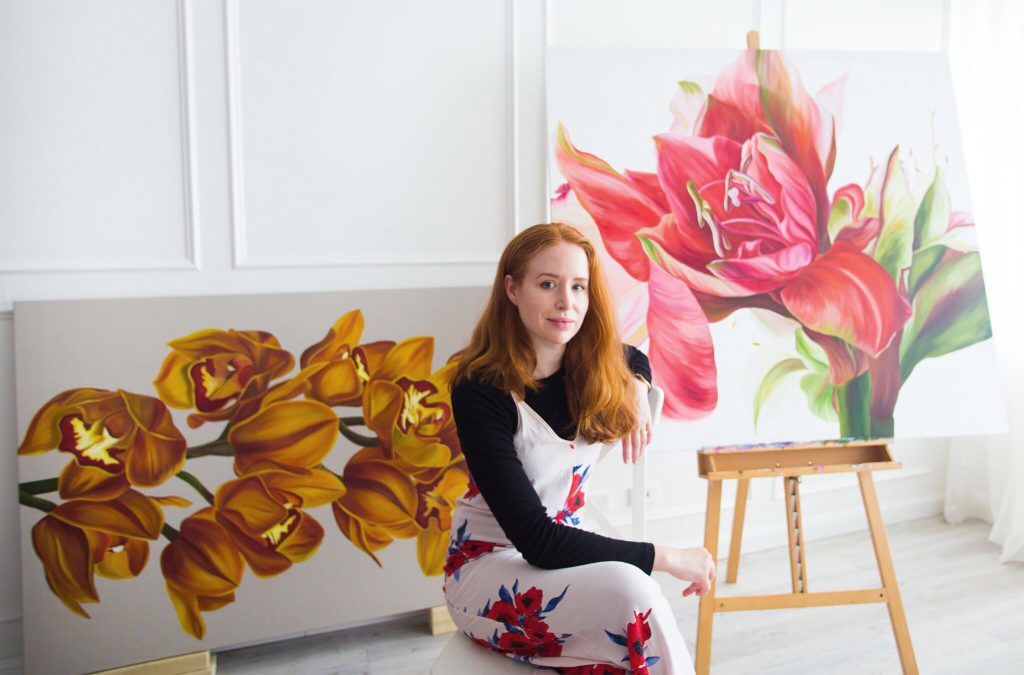
Contact details:
Freya Powell
Instagram: @freyapowellstudio
Email: hello@freyapowellstudio.com
Freya Powell, Sydney, Australia
Interview by Deborah Blakeley, December 2018
Nancy Newmen-Rice
Through lines, geometry, windows, parquet floors, staircases, contemporary buildings, gothic cathedrals, both internal and external, Nancy Newman Rice showcased them all in her art.
Zoneone Arts brings Nancy Newman Rice to you…
How did your residency to Paris after completing your MFA propel your art?
My residency in Paris happened 39 years after I received my MFA. Shortly after graduate school, I began teaching I at a city community college, St. Louis Community College, Forest Park, and an ex-urban university, Maryville University. The latter would offer me a full-time tenure track position. My husband was also in the early stages of his academic career and we had one young child, soon to be followed by another. Leaving home to participate in a residency was impossible, thus I waited until I took early retirement in order to not only paint full-time and also have the freedom to travel.
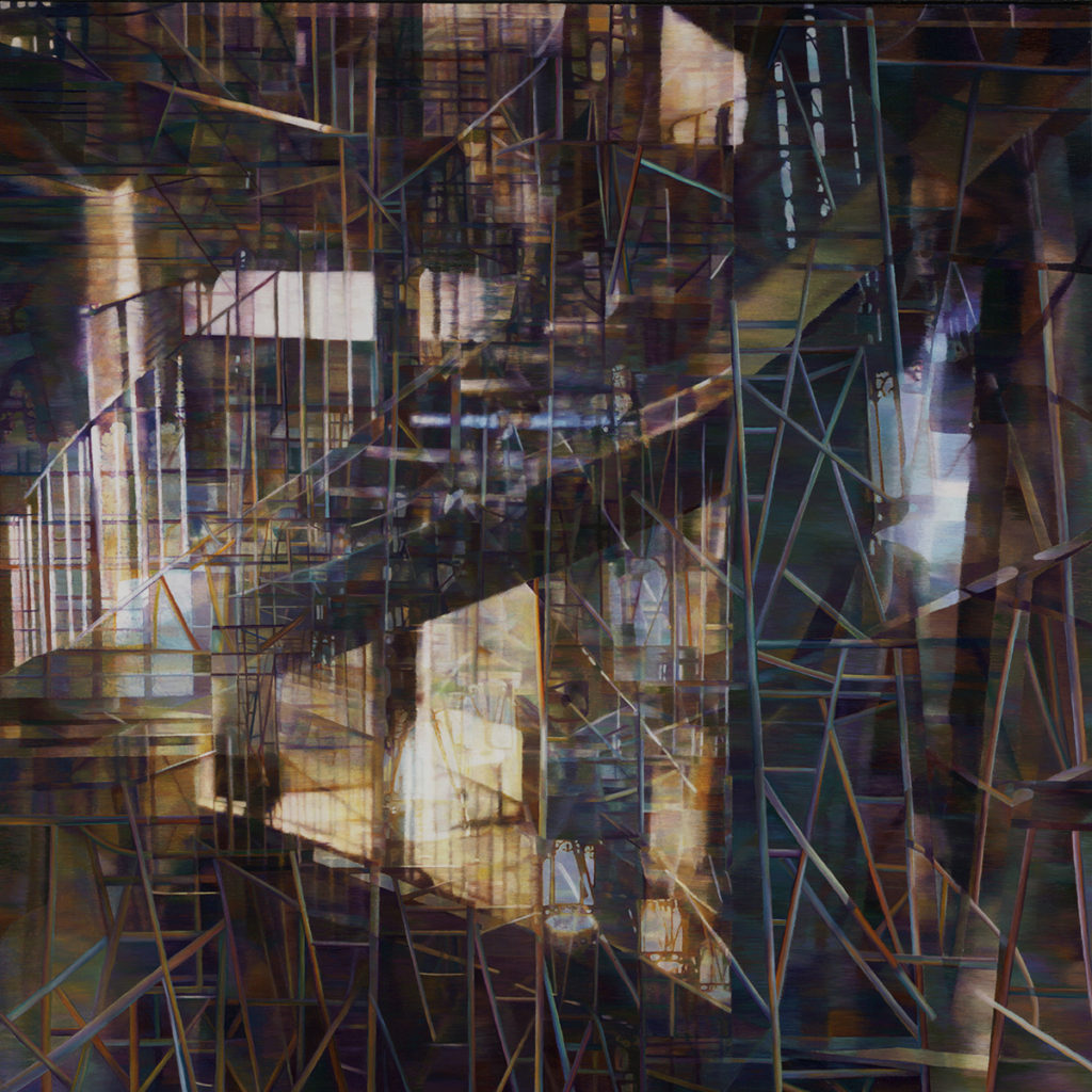
Ash Wednesday, 40x40” Oil on Canvas
Paris, a city like no other, has served as a subject and refuge for artists not only because it is beautiful but also because there is an aesthetic energy that seems to drive and effect he entire atmosphere. The essence of my application to La Cité des Beaux Arts in Paris, stated that my primary reason for wanting to live and work in Paris was to increase my collection of architectural imagery and experiences, by means of annotated drawings and photographs of the built environment. My days there, alternated with multiple visits to museums, cathedrals, churches and significant buildings, where I drew, when possible, or quickly photographed, and work in my studio. I collected images of windows, parquet floors, gothic cathedrals, (inside and out), and fantastic staircases. The spiral staircase in the Palais de Tokyo, which was at that time, a somewhat rundown cement commercial structure with countless of installation art opportunities. This staircase became an important element in my Ash Wednesday series, which was based on T.S.Eliot’s poem of the same name. The rhythm of the poem is one of climbing a spiral staircase each step a with reference to Catholic liturgy.
Your work has been represented by many commercial galleries in the USA, are there any collectors that standout?
I am fortunate in that I have been represented by commercial galleries, which have regularly exhibited my work. When my work was less complex, I was more prolific and able to have work exhibited in galleries around the US. Presently, my primary gallery, Duane Reed Gallery, exhibits my work in St. Louis and at international art fairs. Walter Wickiser Gallery represents my work in NYC.
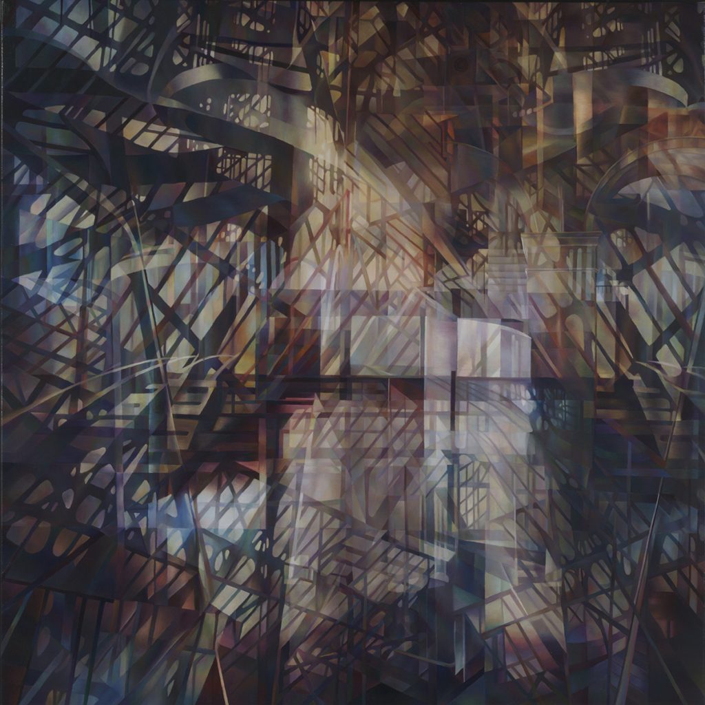
Parallel Place, 40x40” Oil on Canvas
What lead you to architectural landscape painting?
The simplest answer to the question, “why architecture?” it is my fascination with the geometry of the visible world and how we mortals have created our own geometric spaces in which to live, worship, learn etc.
I have lived in a city most of life and when I travel, I spend much of my time in cities, remembering events and where they took place is significant, and always involves a specific building and all the architectural elements that define its shape and interior space. My paintings are an amalgamation of those memories.
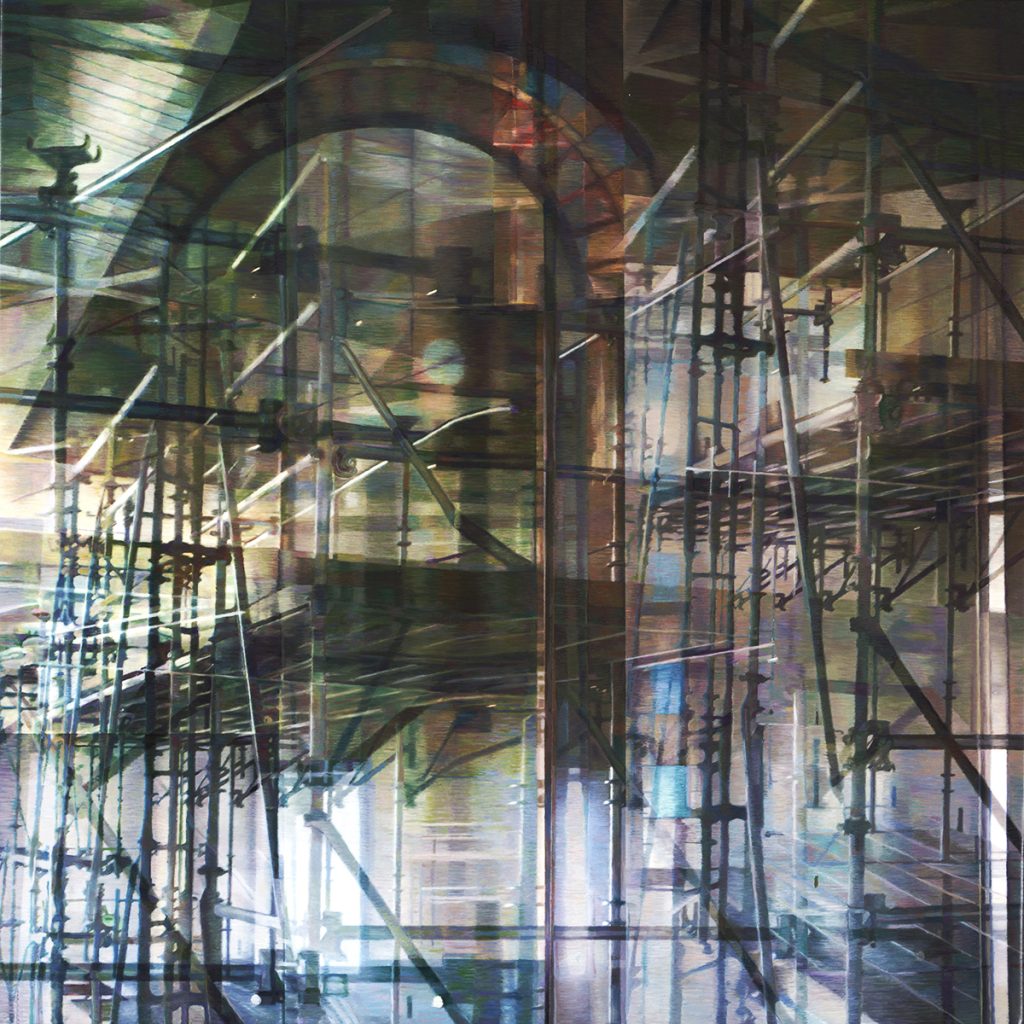
Arch with Scaffolding, 20x20, Oil on canvas
The evolution of my focus on architecture can best be explained as follows:
My husband’s PhD. Thesis was in differential Geometry, and his thesis advisor, a Jesuit, stated that God was a geometer. (He soon after left the Society of Jesus) I have to concur with him, as well as Cezanne, who said, “treat nature by the cylinder, the sphere, and the cone…”
My first years following graduate school, I painted floating masses of rotating dodecahedrons with translucent planes. I drew them first using linear perspective and became especially enamored with the construction lines, which I have never forgotten. My work evolved into patterns found in nature with an attention to fractal geometry. Eventually, I returned to plane geometry focusing on reflections and shadows as they define a room or a building. One of my earliest memories was tracking the passage of time as I watched a reflection move across the walls of our apartment in New York City, (typically three year olds were not roaming the streets of NYC). This early memory has affected my architectural paintings; illustrate the passage of time via the movements of shadows. Other compelling influences were the intricate patterns created by scaffolds and grid-like girders of unfinished buildings, these never ceased to draw my attention.
I collected photographs from newspapers referencing construction sites and among them was a small photograph in the New York Times of the interior of St. John the Divine Cathedral with a series of scaffolds inside the nave. It occurred to me that I could define interior space using the geometric framework provided by scaffolds. I did many graphite drawings from this photograph and finally a small painting on paper.
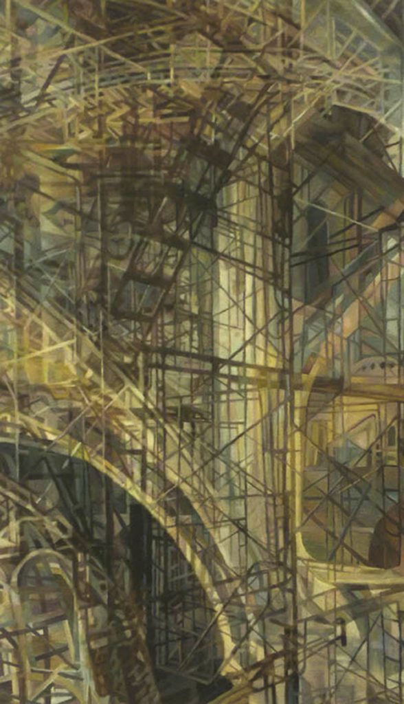
St John the Divine with Scaffolding, 14x17” Oil on canvas
My husband and I travel wherever he has an international conference, which gives me time to photograph and sketch a myriad of building styles. Initially these were the interiors of sacred spaces, churches, mosques, and cathedrals, into which, I constructed scaffolds that added a complexity to the space and a skeleton of sorts. For a while the buildings disappeared and I painted the remaining scaffolds, which were reminiscent of the skeletons that remain when a living creature dies.
My newest work is derived from a more recent collection of drawings and photographs depicting buildings. While looking through them I began to think about the liminal process of entering and passing through these spaces, drawing-by-drawing, geometric plane by geometric plane. I explain the resulting visual experience as a collection of built environments that define time, space, and motion, as my intention is to present each layer of architectural elements, shadows and reflections as if the viewer was visibly moving through time with me, or more graphically, what the nude sees as she slowly descends Duchamp’s staircase. I have geometrically deconstructed spaces, churches, train stations, airplane terminals, geodesic domes, and 19th century iron building façades, anything with a complex structure that lends itself to linear exploration. Some of the buildings are set against a night sky, a burning building, or a simple landscape and some of these settings become a significant part of the journey, others, not so much.
How do you use light in your work and how is it important?
Light is extremely important in my work, structurally and conceptually. It becomes the focal point as well as a method to define architectural structure via reflections and shadows. Although I am reluctant to discuss the spiritual implications of the light, briefly, it is meant to illuminate a path and a presence.
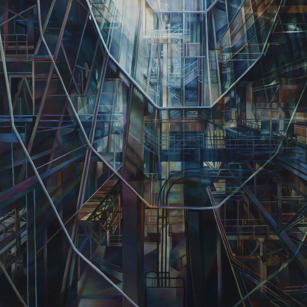
Ascent, 24x24” Oil on canvas
Discuss, line in your work
As I have mentioned earlier, the construction lines found in the perspective drawings, architectural drawings and mathematical models intrigue me; for the manner in which these complex collections of vectors intersect to form shape, mass, and structure and then continue on into infinite space, implies a sense of motion and time. Actually, the lines I paint are not done with machine-like precision; on close inspection the viewer can see that although they are straight, they are not perfect. I could use a ruling pen, but the result would be too machine-like; the difference between computer aided design and hand drafting and it is my hand that interprets what I see.
Your comment, “In my paintings the viewer observes but does not enter as the space is meant for contemplation rather than adventure?
In my artist’s statement, I write, “In my paintings the viewer observes but does not enter as the confusion of space is meant for contemplation rather than adventure.” There are a few exceptions, but for the most part my statement reflects the formal manner in which I construct space. Each layer may be translucent or transparent, and some depict receding site lines, but as the viewer moves from one plane to another, the realization sets in that the planes or memories are parallel to each other and could produce visual barriers, even though they are transparent or indistinct. Memories can also be impenetrable or unreadable for they are not always accurate, time is rearranged, aspects of one memory merge with another, and the result might produce an entirely new space. To further confound memory, are the places and events that reoccur in dreams rather than in our waking state.
You have written a book, “Fragile Memories”, tell us about the book
My book, Fragile Memories, was a sabbatical project. The university where I taught for 34 years required a specific project visits to sanitariums and beaches were not acceptable projects, even though well deserved. Because my work is derived from memories, writing about them, based upon my paintings, was an exercise in introspection as well as observation. A painting depicting the pattern of ocean waves, reminded me of my immigrant past, another with multiple shadows and two empty chairs visually translated into what remains when conversations or interactions are over. Ultimately, the chairs are standing in for people who are no longer here. My book also contains references to my children as well as remembered moments and observations.
Fragile Memories, Cover
Discuss your involvement with Mark Narins: the collaboration, the music and its effect on your work
Collaboration:
My collaboration with Mark Narins came about through social media. Mark, a friend from high school, was struck by a painting I posted on Facebook and it inspired him to create a musical composition based on his interpretation. He sent me a written version of what he understood to be the story behind the painting. His description was amazingly accurate and I am convinced that sensitive artists in any field are capable of understanding each other’s work if they are compelled to do so.
The music and its effect on your work:
The effect of Mark’s compositions, both musical and written, derived from my painting has provided the impetus to begin another book.
As an aside, I am one of those bizarre people with synesthesia, when I concentrate on a piece of music; I visualize lines that form patterns. For example, Bach’s Inventions create a very regular geometric pattern of connecting squares. The pattern becomes dense as the notes speed up, and less condensed as the notes return to the original theme. Notes in the Treble clef become small squares while notes in the bass clef expand.
I cannot listen to music when I paint, as it either interferes with my process or evokes memories that interfere with my ability to concentrate. I listen to books on tape, but not until the drawing has been completed and the colours established.
The audience reaction to the presentation
I was not present for the performance of Mark’s composition, but he sent me a recording, which I listened to several times. The tonal nuances seemed to coalesce with the subtle changes of colour and shifting planes of my panting which was projected on a screen behind the members of the orchestra. I never cease to be amazed by the ephemeral nature of music and how composers, like Mark Narins, transpose patterns of notes that may or may not refer to a narrative, into a time driven art form that only exists when it is played,
Discuss using two paintings, very different architectural spaces.
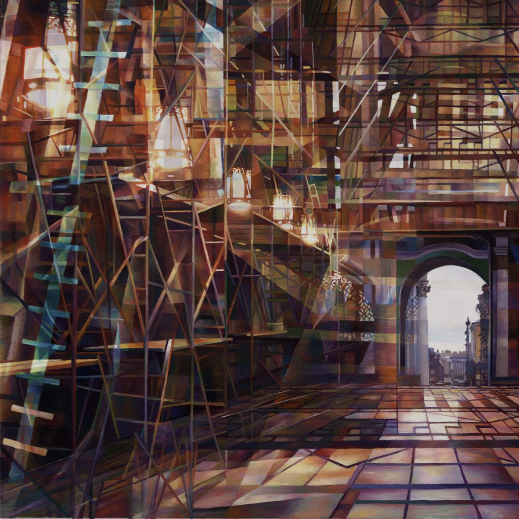
Journey, 20x20, Oil on canvas
My paintings are based on two different foci. The paintings such as Journey depict a deep space with an opening for escape, these paintings are about passing through a space and invite the viewer to run or meander through veils of colour.
–Tribute to Ferlighetti, present the viewer with a densely packed shallow space, permitting the viewer either an overwhelming glance at a haphazard arrangement of memories or the opportunity to investigate visual elements and their relationship to time, space, and light.
Composition:
The composition came about rapidly, which is how my mind works some days, other times I slog through many iterations of one image. In composing a painting, I often repeat a drawing I have used before in combination with others to produce an aesthetic effect, and/or enhance a somewhat arcane narrative; Unquiet Mind is an example of both methods.
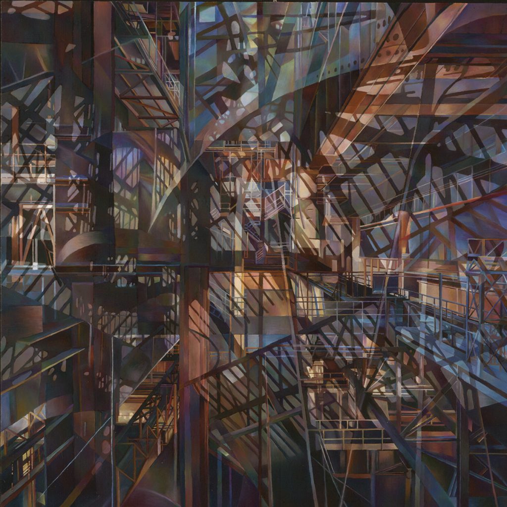
Coney Island of the Mind, 40x40”Oil on canvas
Colour:
The colour in this painting contains red, which in prior work has been absent or muted. For me, red is a disturbing and aggressive color; the red girders in this painting are threatening and either challenge the viewer to venture in or flee.
Light:
The light is scattered throughout the painting indicating multiple sources of escape or refuge.
Size:
The size, 24”x24” is practical, because it is the largest size I can paint in a month. All my paintings are square, for me, the square represents a perfect balance and source of containment for the complex constructions within.
I will add, that this painting is now in the collection of two psychiatrists in the UK.
How does your own physical environment influence your work?
My physical environment does influence my work especially the changing light throughout the seasons as it produces the shadows, reflections, and changes in colour all of which have an impact on my work. For example, a pattern I use in several of my paintings, a plane perforated by ovoid shapes comes directly from the reflection one of my studio lights projects on the ceiling; I noticed it one evening and found beautiful.
Wherever I might be happen to be, I have noticed and recorded phenomena that others might find less interesting, (the camera app on my phone has been an invaluable tool.) For example, there was an intricate scaffold outside La Chappelle in Paris, and as I were taking photographs people stopped, wondering what was more amazing than the opulent stained glass windows inside the chapel. I have also photographed scaffolds inside St. Patrick’s in NYC during a, two year cleaning and renovation, the outside of Sainsbury wing of the National Gallery in London, and the outside of some of the storefronts in my neighbourhood. I also take photographs of landscapes, which I might use at some point, although I am not sure about the role they might play.
Can I ask you to walk us through your career, a (mini retrospective) using these paintings?
I will explain the sources of the following paintings, without discussing the technical aspects of composition and colour. The paintings take a month to complete, in the case of Reflected Space, three months. The drawings are altered; the colours change, and elements are added to make the paintings work formally. As I told many painting students during critiques, “You can talk a good painting, but can you paint it?”
2012, The Arch with Scaffolding:
The Arch with Scaffolding, 20x20" Oil on canvas
This painting was derived from an interior arched doorway in a public building in Washington DC. The arch was comprised of brilliant stained glass, which memory faded. The scaffold was adapted from one I drew inside the Hirschorn Museum. I remember walking around it to get different views, hence the overlapping etc. These two structures became inseparable in my mind and unforgettable, unlike the numerous paintings of men in powdered wigs in the Portrait Gallery. I will add, that this painting is an example of a space the viewer cannot enter, can contemplate or simply deconstruct.
2013, Infinite Reflection:
Infinite Reflection, 40x40" Oil on canvas
The drawing for this painting was completed in Paris during my residency in 2013. The drawing started with the interior of Notre Dame Cathedral, which was across the Seine from my studio. I did numerous drawings inside and out. (Drawing, in Paris, is apparently a spectator sport.) After choosing one drawing I began to fill it with invented scaffolding, based upon some of my scaffold drawings. During Mass in Notre Dame, I experienced the enormity of this space, even though it was replete with congregants, and history.
I had to fill the cavernous space, horror vacui? The viewer cannot enter this space but instead is invited to walk on an invented reflecting floor and approach the impenetrable wall of memories and dreams.
2015 Entrance:
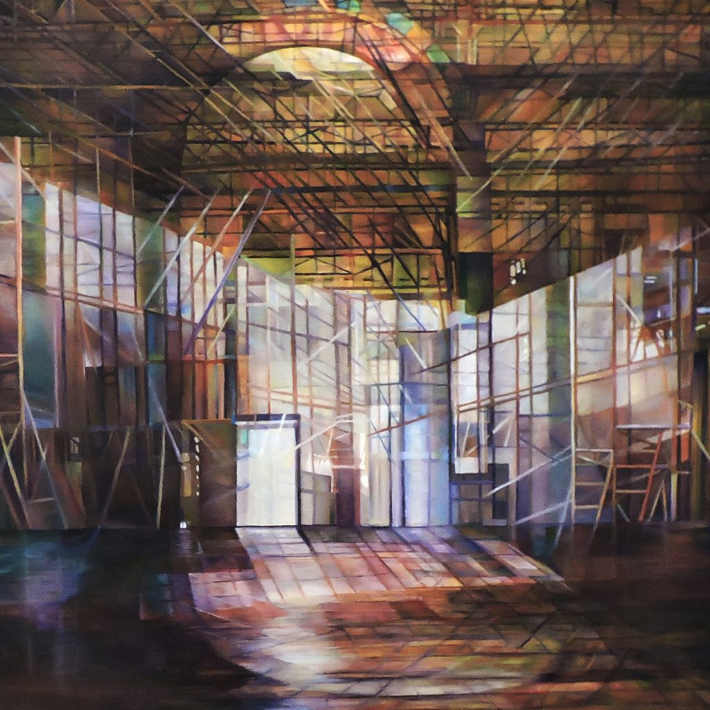 Entrance, 18x18" Oil on canvas
The paintings completed during 2015 followed my Ash Wednesday series, referred to earlier. After painting many versions of the spiral staircase, I became interested in progression through space via memories. Entrance is comprised of scaffolding, which has been moved against the walls, the arch from the Arch with Scaffolding discussed above, large windows from a glass interior, and a doorway leading to infinite space, or a place space imagined by the viewer. Doorways, portals and arches are ubiquitous in paintings of 2015; they provide a natural focus, not necessarily an end in the journey but rather an open door through which one could continue.
2017, Stargazing:
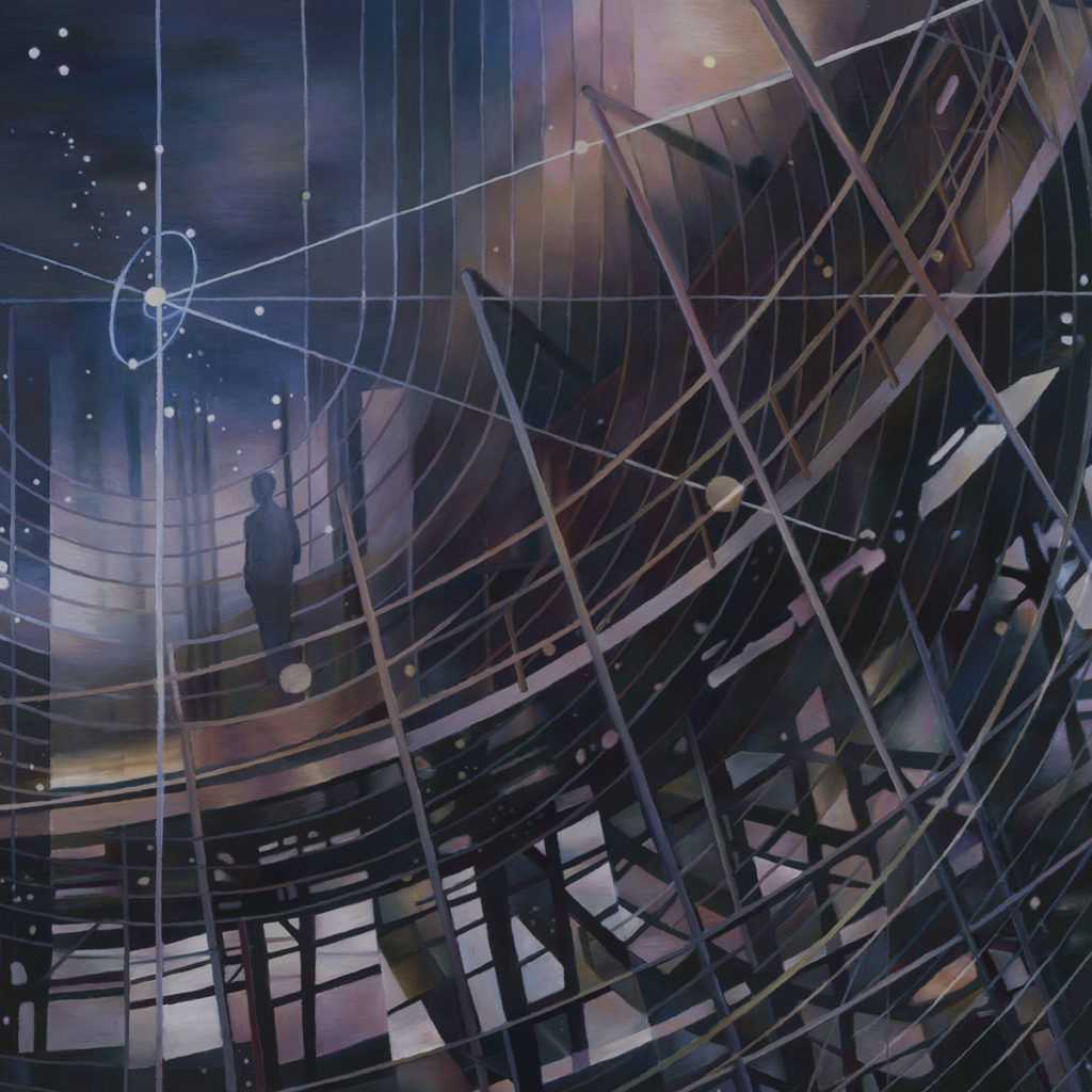
Stargazing, 20x20" Oil on canvas
This painting is part of a series specifically based on the passage of time. These paintings are among the only ones in which I have included a figure. The figures are really the translucent shadows of someone who might have been there to witness the changing sky as the hours progressed. The cylindrical construction with windows comes from a photograph I took in the atrium of the Miami FLA airport. I changed it to accommodate my concept of a revolving machine-like structure that provides an observation deck on which to view the sky. I found a night sky image with geometric delineations, in a textbook. It reminded me of some of the World War II paraphernalia my uncles stored in my grandmother’s attic, my uncle’s army binoculars in particular. They had concentric circles used to measure distances. I cannot imagine infinite space nor even comprehend the process of measuring it, but the concentric circles in the night sky are apparently an attempt to do so. This painting was chosen by St. Louis MO Metropolitan Transportation department to use on some bus shelters. In reference the second question about accessions of work, this painting was significant because it enabled me to share my work with people who might never venture into a gallery or collector’s house. The image also enabled and to connection with people I have yet to meet.
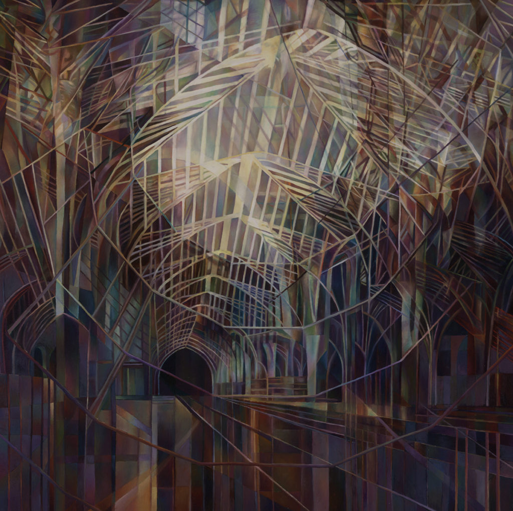
Ex Cathedral, 24x24"Oil on canvas
Contact details:
Nancy Newman Rice
Nancy Newman Rice, St Louis, USA
Interview by Deborah Blakeley, December 2018
Christine Aaron
Christine Aaron, Porchester, NY, USA
Making her mark in paper and wood with amazing effects.
Zoneone Arts brings Christine Aaron to you…
You call yourself a mixed media artist, have you always worked in mixed media and if so how or why did this come about.
Art is a second career for me. I got my Master’s in Social Work and practiced for over ten years. When my youngest was a year old I took a watercolor class. Within a year I was using poured inks and mixed media. At that time I realized that art stimulated me on every level, physically, emotionally, intellectually and visually and I made the active decision to work towards becoming a full time professional fine artist and engaged fully in that process.
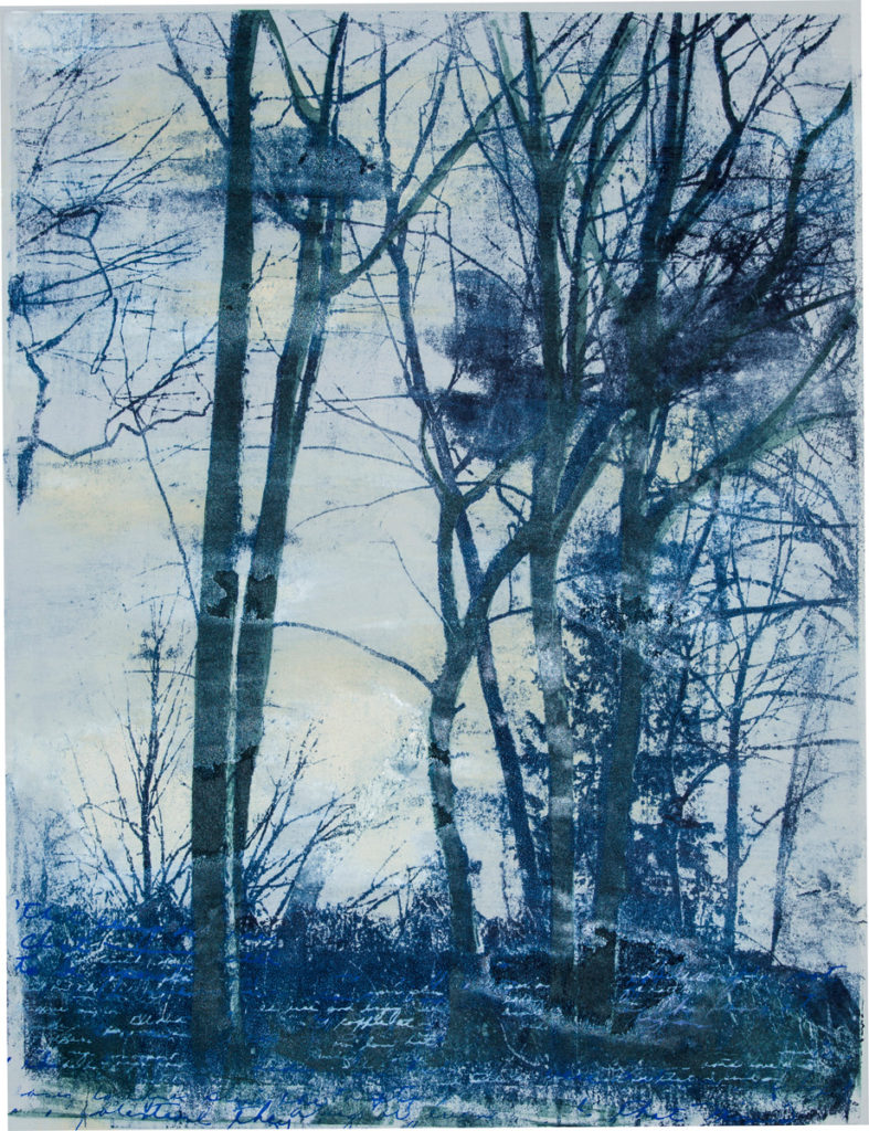
Storm, Monotype Print, 23x18''
Shortly after, I became involved with printmaking and that segued into experimenting with printing on more unusual substrates, such as mirror, copper and steel, and then aging those substrates as part of the evolution of the finished piece. I found I was becoming more physical with my materials and more interested in exploring what materials themselves could bring to the table in terms of content. I have moved into doing installation and some sculptural pieces, some with audio components, as well as continuing my practice with printmaking and painting.
You are very interested in the Gee Bend Quilters. Can you tell us briefly about them, their work, and how they have influenced your art?
I tend to be intrigued by outsider art, by art where the hand of the artist is evident, that is material based, visceral and emotionally evocative. I spoke about some of these artists in a “Fantasy Curation” I was asked to do for Vasari21 (https://vasari21.com/fantasy-curating-memory-and-materiality/). The Gees Bend quilts, created by women of little means, from scraps and for serviceable purposes, have always spoken to me. The impulse and innate creativity to make something beautiful, distinctive, and in one’s own voice shines through each quilt. They are graphically powerful, the colors and shapes visually play off one another…one can almost hear a contrapuntal jazz improvisation humming beneath the surface. They speak to resilience and the desire for beauty and order while becoming more than the sum of their parts.
Discuss how the two links Paper Connection and the International Encaustic Conference have come together in your work.
I started attending the International Encaustic Conference more than 10 years ago when I started incorporating encaustic (pigmented beeswax and damar resin) into my work. This annual conference, created by Joanne Mattera and now run by Cherie Mittenthal and Truro Center for the Arts, is a vital and information-packed several days, with a focus not only on materials and technique, but also on artist professional development. It is rich with networking opportunities, the formation of incredible friendships, and artistic collaborations that develop and deepen over time. As a printmaker first, I have an affinity for and interest in paper. There is a vendor room at the conference (heaven!) and one year Lauren Pearlman of Paper Connection International was invited. I met Lauren and was thrilled with the variety and range of papers offered and impressed with her deep knowledge of the properties of each paper. I had been using a tissue thin gampi for some of my work, but could only find sheets up to 22” x 15.” It was Lauren who told me she had this paper in 10” long, 36” wide rolls that ended up being the perfect solution for an installation I had envisioned.
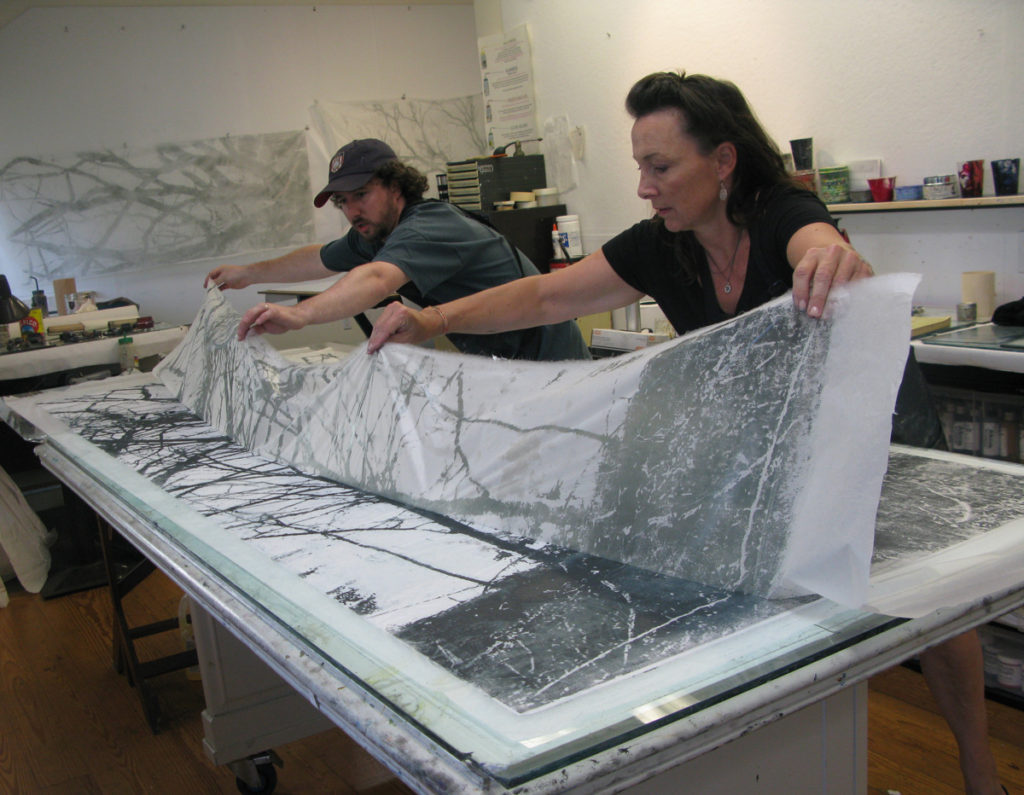
Pulling Gampi Print
We ended up striking up a friendship and since then she and all that paper Connection offers have been instrumental in helping me find the paper that best suits my creative needs.
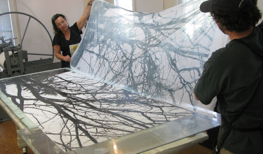
Christoper Shore and Christine Aaron pulling a print together
Expand on your large format works?
In order to create the large gampi panels I need help and more space then my current studio allows. I work with Christopher Shore, master printer at the Center For Contemporary Printmaking in Norwalk CT, USA. He and I experimented with ink viscosities and methods to translate my vision into reality. Using a method referred to as paper lithography, we hand ink up a 9’ x 3” toner copy of one of my images with oil- based printing ink modified to the right consistency. We then roll out the gampi and hand transfer the image onto the gampi using hand (mostly thumb!) pressure. Gently peeling back the print on gampi is always a bit dicey and nerve wracking as the gampi is relatively strong and resilient when dry, but fragile and prone to tearing when wet. But the results! Exactly what I had hoped. We used several shades of translucent grey ink, so that when lit from behind the image disappears, then reappears as the light shifts or is in front of the panel. They create a subtle whispered rustle when hung and moving and respond to the slightest air current that makes them seem alive. When viewers walk through the installation, the panels flow towards them and then shift away.
Explain about your involvement in community projects. Use ‘The Memory Project’ to expand on this.
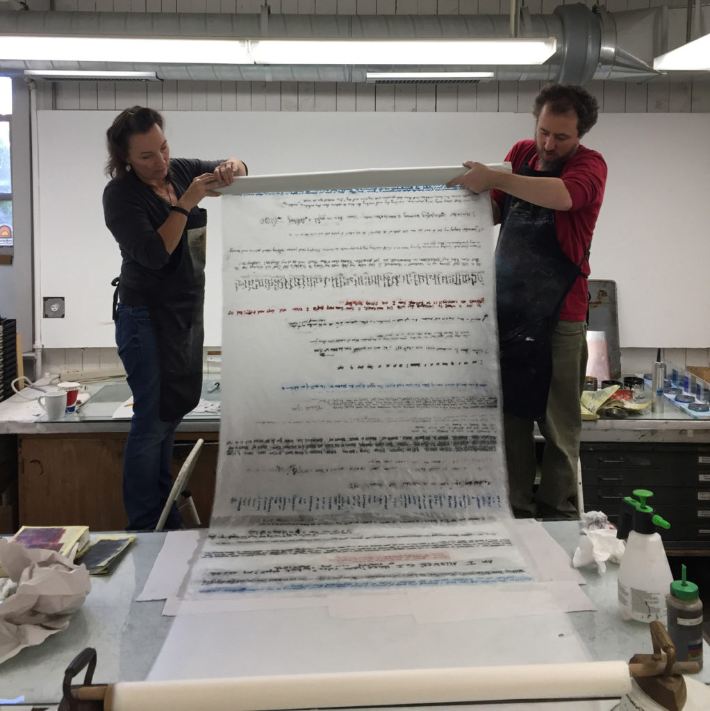
Holding a Print copy for The Memory Project
I received an individual artist grant through ArtsWestchester, a local art organization (funded through the New York Foundation for the Arts). One component was to offer a community event, such as a lecture or open studio. Having worked with themes of memory, loss, and the way in which humans are marked by their personal experiences, I decided I wanted the entire focus of the grant project to be a community participatory one.
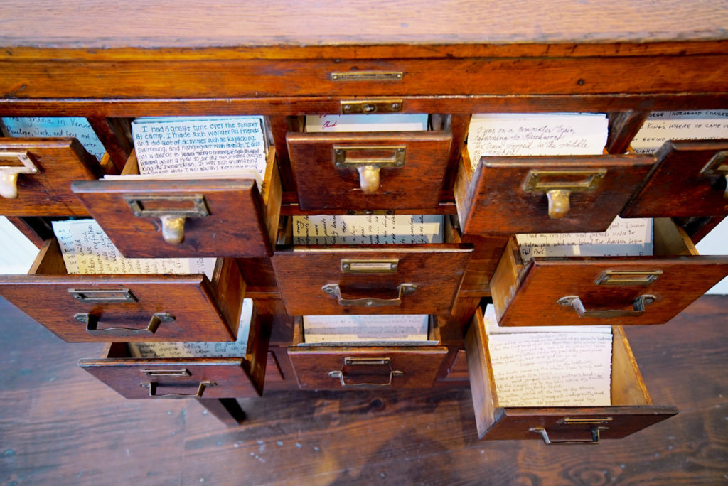
The Memory Project, card catalogue
I invited any person who had a relationship to the community to share a significant memory of their choosing. I involved local businesses, community libraries, a nursing home, a music academy, etc. in spreading the word and providing workshops. Participants were asked to hand write their memory on provided asian papers, or audio record a memory in their own voices. I used these to create several installations: hundreds of individual memories written on narrow paper strips, hand coated in wax and suspended on invisible thread from the ceiling; a vintage library catalog holding hundreds of handwritten memories so visitors could read and share them with one another. As the project grew I recognized the importance of the audience being able to read and/or hear all the contributed memories; so, unlike an earlier project where parts of the memories were obscured and layered, here, all memories could be read or listened to in full.
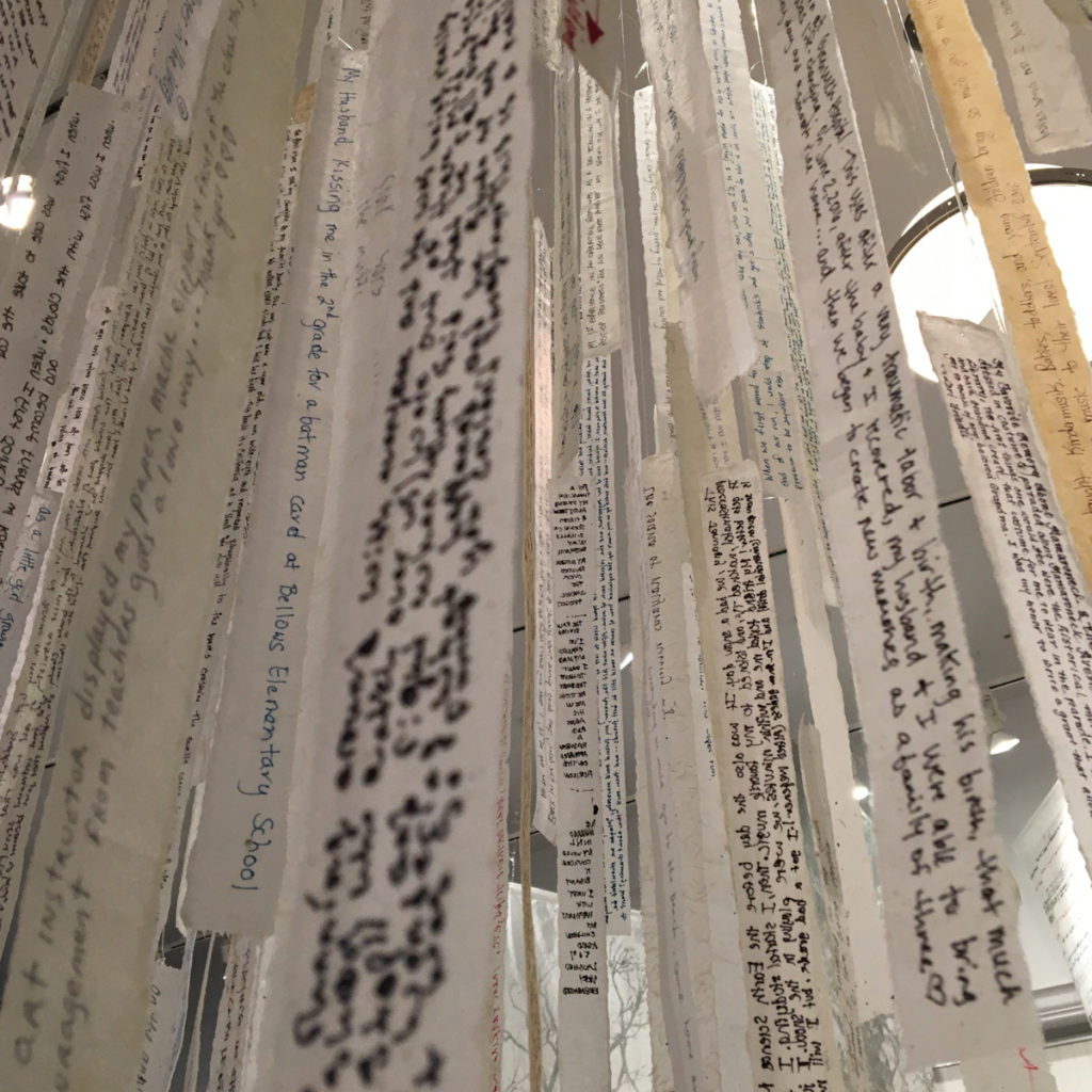
Installation, close up from The Memory Project
The audio recorded memories were interspersed with sounds from the local community, and played throughout the gallery, and could also be listened to on individual compact disc players while visitors wandered through hanging gampi panels and looked through and read the memories in the other installations.
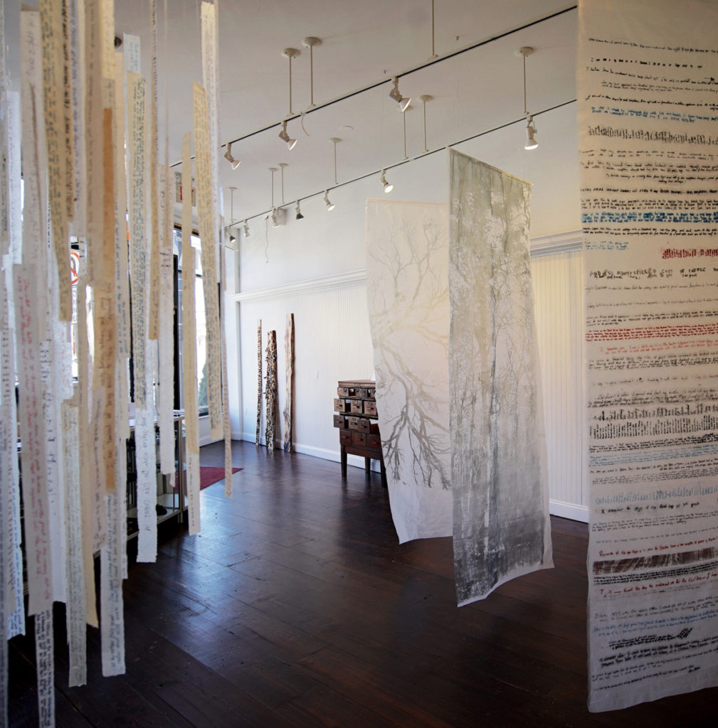
The Memory Project, Installation
I found people had a great need to share a piece of themselves with others and that the majority felt most comfortable in having specific authorship remain anonymous. It was an honor and a privilege to have these memories entrusted to me. They ranged from poignant to mundane to powerful to humorous. All the installations were created with an eye to being able to add to them and grow and I would love to travel this project to other communities. All the memories can be read and listened to through the website: https://www.thememoryproject.space. A catalog of the process and exhibit can be found here http://www.magcloud.com/webviewer/1448242?__r=569225&s=w
Please give us your own thoughts on the importance of art in healing.
That’s an interesting question. I think art can have the ability to connect people with one another as well as take them more deeply within themselves. People approach art from personal perspectives and see and experience different things as a result. Art can evoke a memory, a stirring of something within, empathy and a recognition. In places of stress and illness such as hospitals, I think art can soothe and offer emotional and intellectual escape.
What lead you to burn your work.
I was in this wonderful installation workshop with Judy Pfaff a couple years ago. Judy was an incredible facilitator and encouraged risk, trial and error and thinking outside of the box.
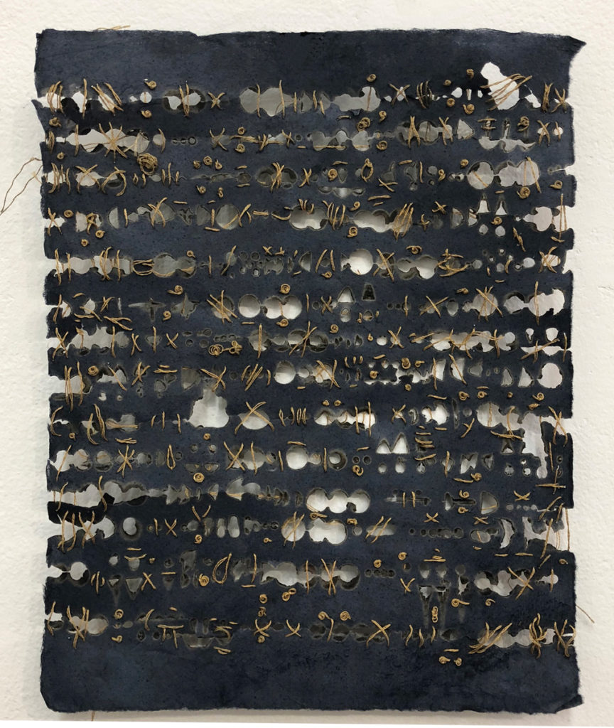
Secret II, Burnt, drawing with stitching on oak gall ink dyed paper, 10 x 8"
I started experimenting with drilling, staining, carving and burning wood panels. I was immediately struck by the mark making, and residue with which these methods infused the surface. That started a deeper investigation with fire.
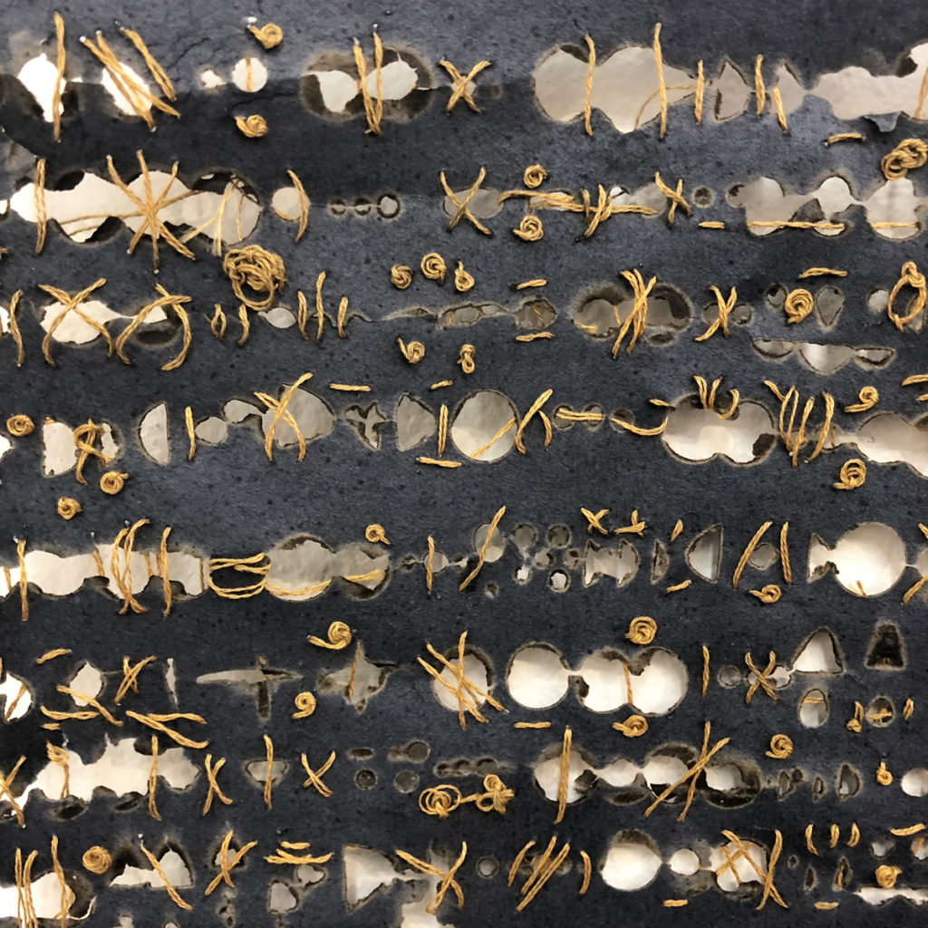
Secret II - detail
Burning, used throughout history to destroy, purify, obliterate and sanctify, evokes absence and presence, shadow and light. I started working with burnt drawings on paper, and the marks reference language, code, a mysterious unknown language, an attempt at communication, or resemble artifacts from another time and place.
Expand on the value of the missing in the burning process.
I think both the drilling and burning evolved to where I recognized that what was missing was as important and intriguing as the residue and mark making that remained on the substrate. The cast shadows become physical evidence of what was lost. When possible I like to incorporate light and shadow as part of the completed piece and the light as it changes, shifts those marks. Much as time, loss and experience affect and change our recollection and understanding of events.
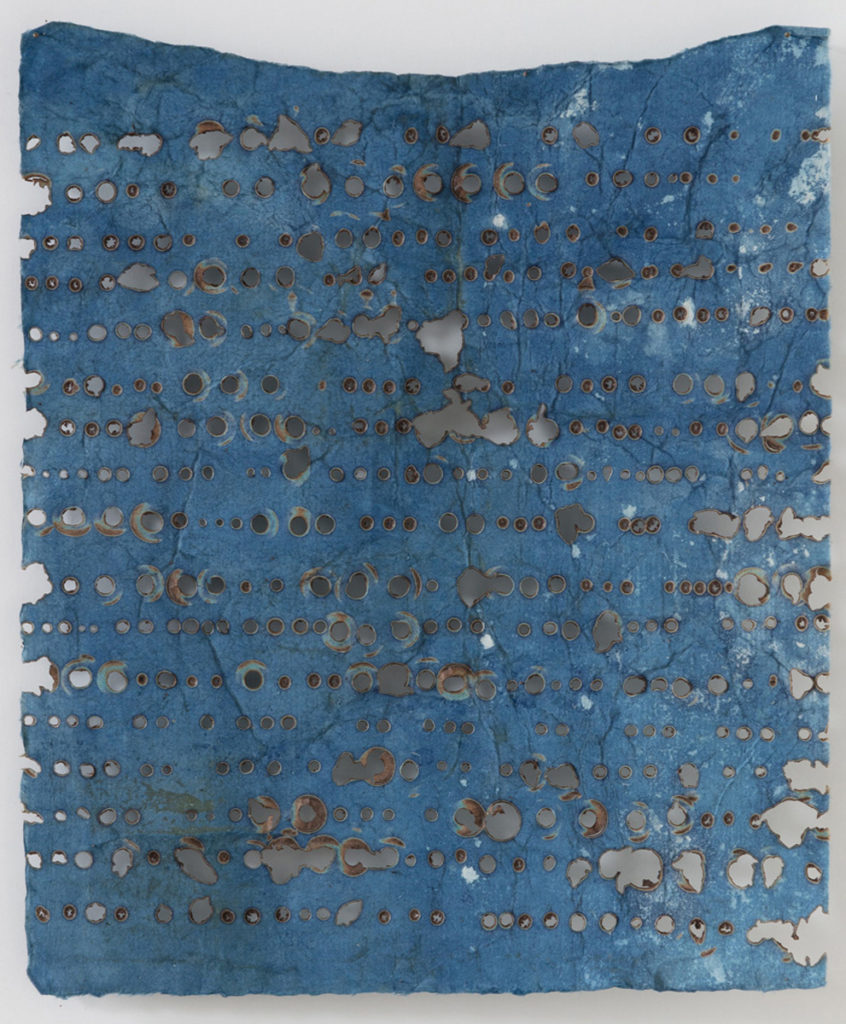
What We Keep III, Burnt on hand dyed indigo paper, 10x8"
I think losses impact and live within us, shape and mark us. So the ghostly presence of the cast light and shadows helps to convey the shifting relationships between perception, memory and experience. The patched together nature of what remains of the material/paper, speaks to the way in which we continue to make connections, create an understanding of the story/sense of the memory left. I am also drawn to materials and processes that have an immediacy and unpredictability. I am a chronic over-thinker. Working with materials and processes that are inexact, that are variable in their results, forces me to react to what is actually happening in front of me and act as an antidote to the over-thinking. Frequently the “mistakes” (burning that gets out of control, drilling that fractures the wood) speak better to my concepts than my preconceived ideas. Dying, printing, drilling, and burning are all inexact and often I “lose” much of what I began with, which naturally starts the process of reclamation and repair. In effect the things lost become as much a part of the piece as what’s retained, and that history haunts and inflects the work that remains.
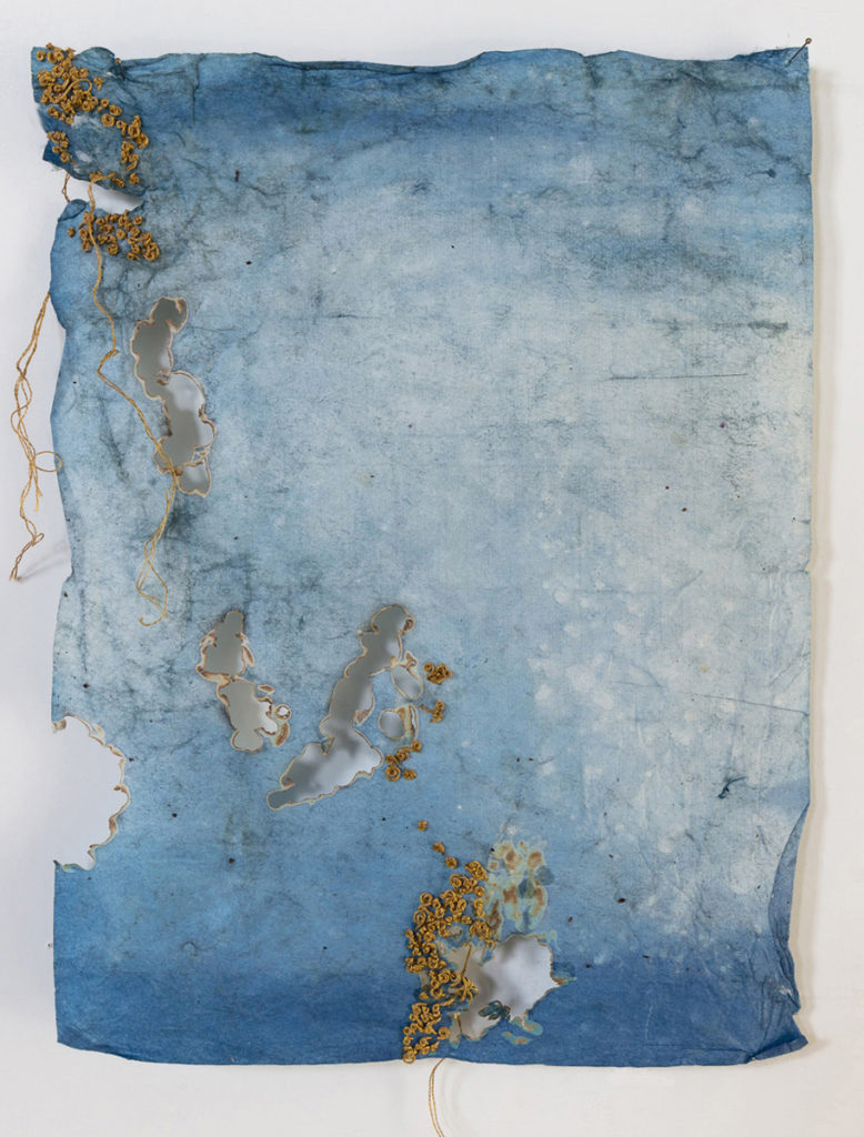
Repair II, Burnt, drawing on hand dyed paper with stitch, 10x8"
In “Remains” you have used hand dyed paper. Do you do the hand dying?
I took some classes in making natural dyes and used these to dye papers. Much like my processes of drilling, burning, and rusting there are elements of chance and surprise in these hand processes. Some of my work is on paper that I have dyed myself with oak gall ink, cochineal, walnut ink or indigo dye. Some is on paper that I have purchased from other artists who hand make, dye and sell paper.
As I become increasingly involved with the materials I use, wanting them to carry some of the “content” of my work, it leads me to investigate them more deeply. I recently took an introductory class on papermaking and am scheduled to take other related ones (i.e. in casting paper, embedding in paper). I want to expand my experience with and understanding of the nature of paper, whether I end up making my own paper, so that I can make more informed choices as to what I choose to use for future work.
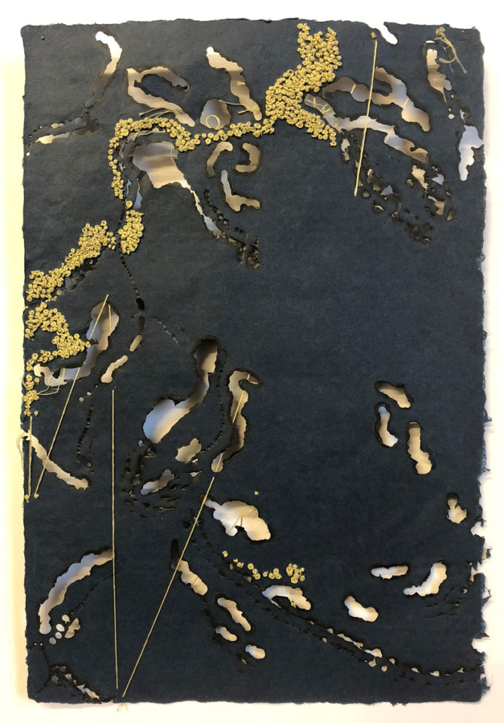
Vestiges, Burnt, drawing on Abaca Paper with Stitch, 18x12"
Comment on the statement made about you, “Trees, for Aaron, are a symbolic language.”
I’ve always responded to trees and particularly enjoy them in autumn when they are resplendent and in the winter when they are naked and calligraphic. They mark each year of their life in their rings, physical marks of their lived experience that remain hidden from view. After severe storms, where huge branches and whole trees fell, I would notice innards that had been rotted out or eaten away or damaged past the point where the limb or tree could survive. The day before, these limbs and trees looked healthy and complete. Other times I would notice thriving trees that had healed, grown over or through obstacles, a resiliency. The bare winter trees also call up life cycles, the periods of dormancy, of waiting, of transformation and annual renewal. To me it is analogous to human experience.
Vestiage IV
Beyond all that I find them beautiful in and of themselves. The “beautiful” in art has almost become a dirty word. It is not trusted. I do want to create beautiful art…but perhaps a beauty more complicated by being simultaneously bittersweet, unsettling, mysterious or evocative.
Discuss your subtle use of color also your use of bold hues.
I tend to use many blues and greys with a deep indigo-black as my favorite. Often color comes out of an instinctual response to what has been started. In the case of the lithographs I did on metals, the oxidation and patination of the metals as part of the composition, determine a beginning color palette, just as natural wood and dyed paper begin the color conversation. I tend to gravitate towards naturally occurring colors and want to reference the life cycle through color such as those of fungus, moss, blood, decay, rebirth. I think I use color to evoke an emotion, and a sense of mood and place.
Sulphur Branch II, Lithographic Monoprint on patinared copper, 24x 18"
You don’t always use paper as your base. Expand on some of the works you have made on other bases.
I started printing on more unusual substrates, such as mirror, copper and steel, and then aging those substrates as part of the evolution of the finished piece. I found I was becoming more physical with my materials and more interested in exploring what materials themselves could bring to the table. As I investigated and manipulated actual wood, I found the form shifted. In one particular critique group with Patricia Miranda, she pointed out that I was still handling the wood “on the surface” as if it was a painting. That was an “aha” moment to begin thinking about how the work intervened in and conversed with the surrounding space. Increasingly I am considering space and environment in my work to create a more immersive experience for the viewer.
Inquitude, Burnt plywood, gampi, encaustic, 24x18"
I went from using trees symbolically, to using actual wood, to a shift in other materials referencing the concepts I was exploring such as time passage, loss, memory, and the marks of human experience and connection. The processes I was using, from aging the materials, drilling, burning, and carving started to carry some of the content of my work, and also created new areas to explore. The drilling and burning and stitching evoked other things (trauma, wounds, healing, repair) and created cast shadows that spoke to absence and presence, memory and loss. Each exploration opened up other avenues to investigate.
What Remains II, Grainary, & Grainary II
Materiality and Process
In addition to the materials I choose, the processes I engage in are part of the overall concept of the work. For instance, with the stitched burnt drawings, the process represents (especially as a woman) that repetitive experience of doing, redoing, making, remaking, and propping up, repairing, connecting, the forging of strengths and networks despite fragility and inevitable decline; a determined resilience and piecing together of a meaningful life, through relationships and connections despite disappointments and loss. Loss shapes us more significantly than joy. I want to speak to the stubborn persistence of healing, repair and moving forward, forging ahead and finding beauty in the imperfect, the fragile, and the nature of being human.
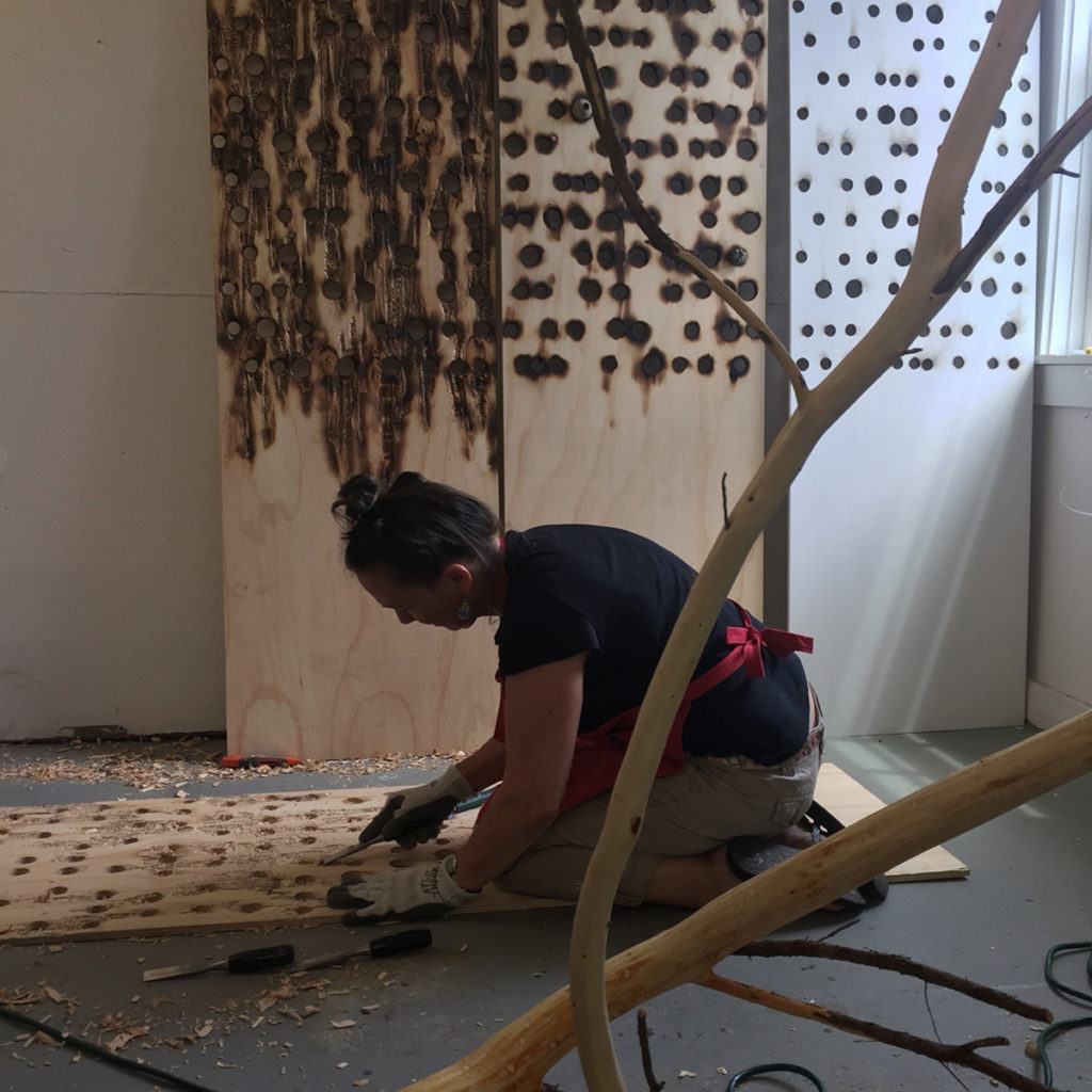
Carving into wood
I work to have the materials and processes I use carry some of the content in order that the work embodies rather than illustrates. The burned, rusted and stitched cloth and paper, the drilled and burned tree slices…are whole and beautiful despite of or because of their fragility and fractured or pieced together nature. Additionally, I think the hand wrought and manipulated nature of these materials validates the imperfect, the intimate, the individual mark, in contrast to the pervasive and impersonal electronic media and mass-produced items dominating daily life. That my work is open to various interpretations beyond my intent thrills me. My first sculptural pieces were these three-inch deep, 15’ wide wood slices with a rotted away center that I filled with shattered mirror.
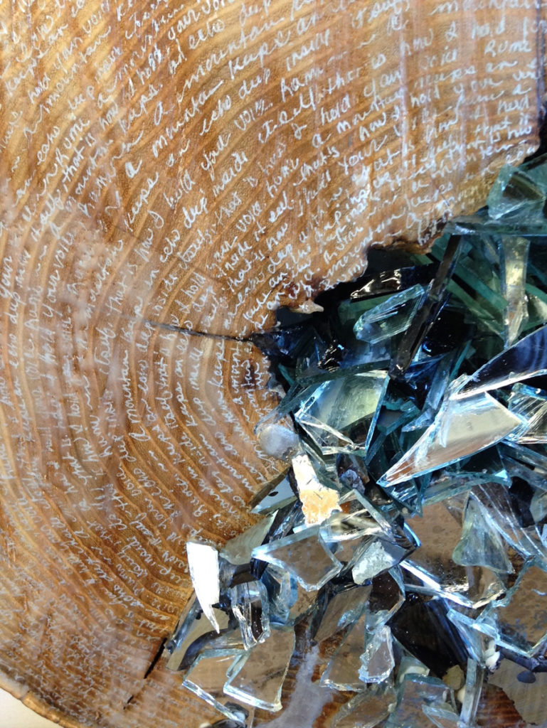
Vestiage V, detail
I was representing the fractured nature of memory and how each thing we learn or angle at which we look at or remember something, causes the memory to shift and change. Several people at the exhibit eagerly spoke with me about the work and their perceptions of it. One insisted that it spoke to man’s destruction of the environment. Another saw it representative of cancer, the “alien” organism taking over the healthy, but that the cancer threat was “contained.” Another just enjoyed the contrasting surfaces of the organic wood and the shimmering of the multifaceted mirror shards. It is exactly what I hope for, that each viewer relates to the work and finds meaning that resonates from his/her own experience.
What are you currently working on?
Currently I am creating more burnt drawings on dyed and stitched papers, experimenting with density and scale of the paper, mark making and burnt areas. I also have several much larger paper scrolls, roughly 48’’ x 5’ long, that I will be working on in the next few months. Additionally I will be learning more about paper making, dying, and casting paper to incorporate into my ongoing work.
Recently I applied to a number of residencies with the goal of using one to explore a full installation responsive to a specific space, incorporating both the larger scaled paper and the drilled and burned wood pieces. It would give me the opportunity to experiment with how these bodies of work interact with and inform one another.
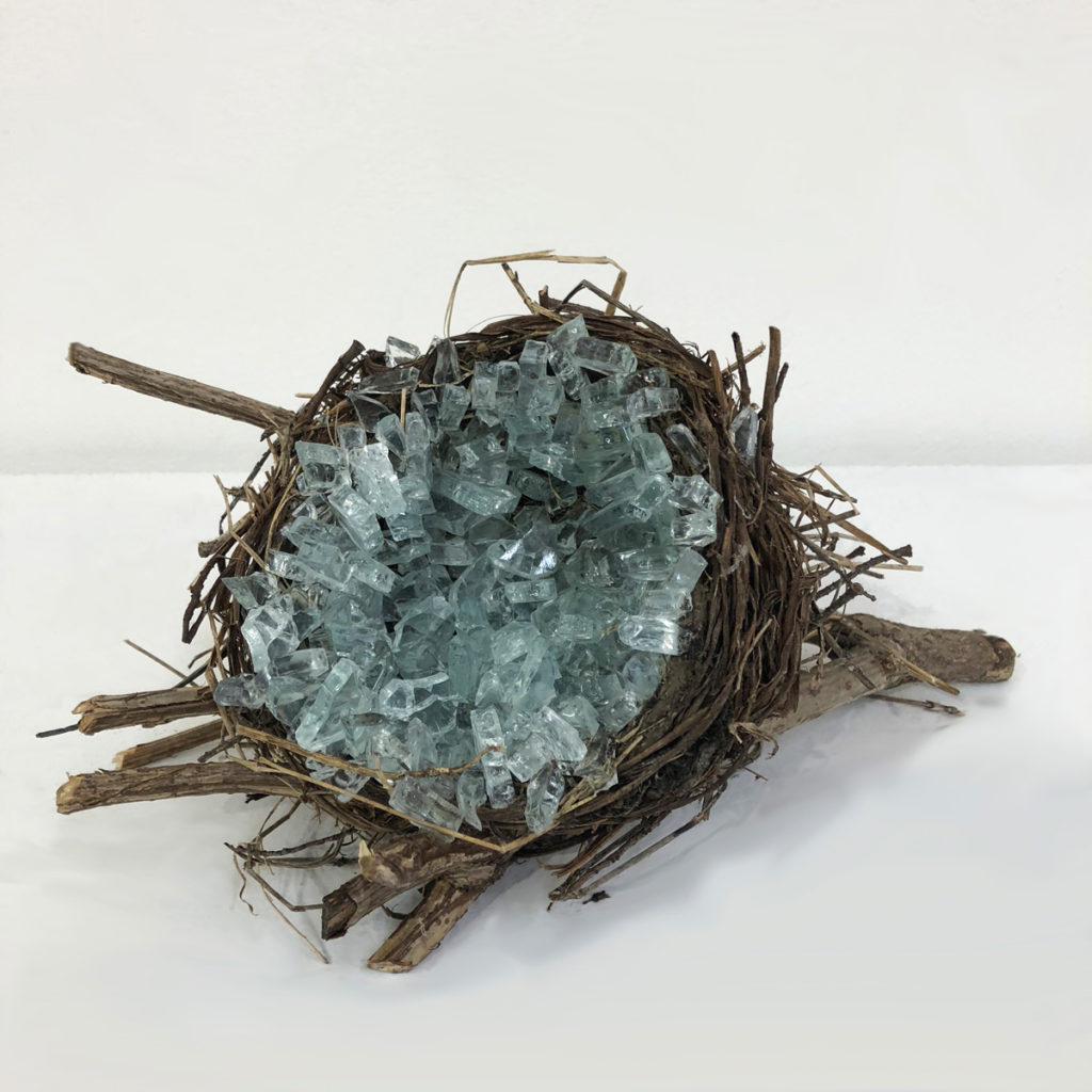
No Safety Nest, Found nest, shattered glass.
Lastly, I would like to start investigating other communities in which it would be possible to continue with and add to the memories in The Memory Project.
Contact details:
Christine Aaron
www.christineaaron.com
Christine Aaron, Porchester, NY, USA
Interview by Deborah Blakeley, November 2018
Reiko Miyagi
East meets West and Reiko Miyagi produces new ceramics
Zoneone Arts brings Reiko Miyagi to you…
Can you explain about your pottery training and work in Japan?
My decision to be a potter came while I was attending college in Tokyo where I was exposed to great and pottery in galleries, museums and nearby pottery towns.
I studied, contemporary art and museum curation, wasn't pottery related so after I graduated, I went to a ceramic school called Bunka-Gakuin. They had great teachers who had studied under National Treasure-level potters, so I was able to study a variety of outstanding styles and skills there.
At Bunka-Gakuin I learned functional pottery making skills for two years and I did an apprenticeship in the pottery town of Mashiko. Mashiko had a very open and diverse atmosphere compared to other traditional pottery towns in Japan, probably a result of the folk-art movement there in the 1920's lead by Shoji Hamada. I enjoyed interacting with many excellent artists who lived independent life styles in Mashiko, including quite a few people from overseas who came to learn pottery making.
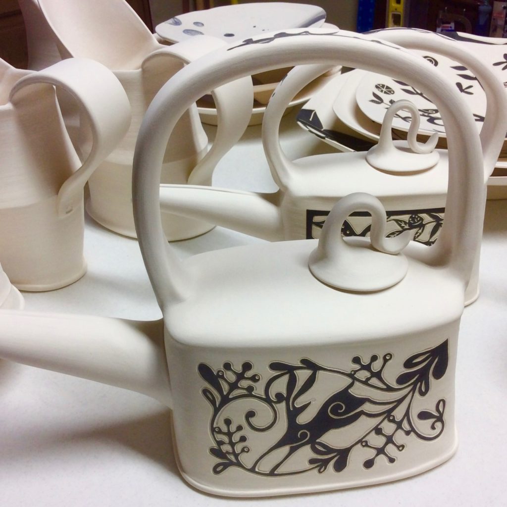
After my apprenticeship, I established my own studio nearby and started to make my own work. Unlike traditional Mashiko-ware it didn’t have the narrative imagery like my current work. Most of my work then had a simpler surface design on a dark clay body from gas firing with reduction cooling.
What were some of the most pronounced changes in ceramics that you found in the USA?
Over all, I feel that the US ceramics community is very open, casual and innovative. Pottery has been made in Japan since the Jomon period (15000 BCE - 2300 BCE) and many great styles were developed because of this long history. But a long tradition can result in inflexibility at same time.
Ceramics in the US on the other hand has a relatively short history and so has no enduring, solid traditions so it may lack some of the great character that comes from having a long history. But the upside, to being a young culture, is that it is very open, flexible and innovative.
![]()
For example the US pottery community is a friendlier environment for all levels of people who want to make ceramics. Workshops are held everywhere and are mostly open to anyone who is interested. Many successful and well-known artists here also have a very sharing spirit about their knowledge, too.
The tools, materials, kilns and firing methods are more innovative and diverse than in Japan. For example, the US has a variety of firing temperature ranges in electric firing, new styles of wood kilns and a wide selection of commercial glazes.
Expand on your move into Sgraffito Stoneware, and the technique for this work?
I was always attracted to ancient pottery with the sgraffito technique, such as the Chinese Cizhou ware, but never explored the technique to the level that I do now when I was in Japan. Partly because a gas reduction atmosphere firing didn't require a lot of intricate design to achieve an attractive surface. I liked to draw as a teen and in my early twenties but never drew anything so narrative as a potter. When I moved to the US I lost access to a gas kiln and that lead me to make my pottery in a different way.
The sgraffito technique makes it possible to achieve the expression that I like: the texture from carving and striking images from a high color contrast. This combination of textured and silhouette images gives a bold yet warm and rustic feel to the work.
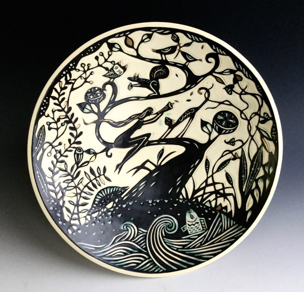
What special tools have you found to be the best for you to use in this technique?
I use all kinds of scratch tools, mostly made from metal, such as a needle tool, scratch board tools and an exacto knife. It really takes them all to make my work but since I'm also a metalsmith I like to modify my tools. For example, I like my loop tool because I was able to customise the shape for my needs by forging and filing.
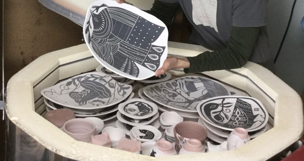
‘Tabula Rasa’ in Latin translates to, an erased slate. Discuss this in relations to your work.
I was first exposed to this expression when I bought the music CD, "Tabula Rasa" by Arvo Pärt thirty years ago. I chose it for my new studio name when I moved to the US because I was making a completely new start. I have interpreted the words in my own way which is, "every moment is unique and a chance for a fresh start," just like in Zen philosophy. We are easily distracted by thoughts of the past or future rather than being fully present in the moment but when I make my art and am having a good flow, I truly enjoy the feeling of this moment of "bliss."
Discuss how important you feel having ‘handmade’ objects in everyone’s home.
I think handmade objects are a good way to circulate joy to others. I certainly feel the joy when I make my work. I feel so fortunate that I have fun with what I do, that result can make other people who pick up my work smile.
I also put a lot of effort into my work. I always try to improve my craftsmanship and designs also choose my materials carefully to achieve unique colours and textures. Handmade items could never compete in price with mass produced items but handmade has these values, artist's effort, uniqueness and culture that is passed on from our ancestors.
Recently, a customer who bought my mug from my studio gallery said she'll remember her Asheville trip every time she uses it! A handmade object has the power to stimulate the user's emotions and to change an ordinary moment into a little ritual moment.
Explain about your Black and White pottery that you feel represents your work well. Discuss them.
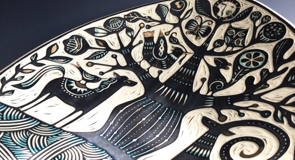
I wasn't making narrative works when I was in Japan. Shortly before moving to US I was traveling by myself to search my way for the future, visiting my friends on the West coast and Hawaii. One night, when I was swimming in the ocean at a quiet beach in Oahu, I had an experience as if the wave came into my body and the feeling of uniting with the Earth. This experience seemed to open up some part of my brain. I didn't have to sleep or eat much for a week and I came to many realisations. Eventually I moved to the SF Bay area and once I got access to ceramic making, I started to draw, draw and draw. I felt that I had just become more fluent with the imagery without trying.
I draw a lot of animals, trees and flowers. My culture has an animistic philosophy that all beings and objects have a spirit or godess within them. We call it "yaoyorozu-no-kami," or "millions of gods." After my experience in the ocean, the concept that we are all co-existing to in order to be what we are became more clear. Animals and flowers have complete beauty and it's like having a universe within so I never get tired of drawing these "millions of gods." I also draw a lot of musicians, too. They're also a symbol of "following the bliss and living in the moment," the theme of my studio name.
This piece is one of my "Tree of Life" plates. It's an image in use for a long, long time in many places. I'm very interested in the patterns and imagery that you can see in the different areas of world and time periods. Some images have literally travelled through but some are very similar but it cannot be explained why they have this similarity without any communications between them. Perhaps it comes from something humans are born with. Either way, I love looking at images and patterns that appear in historic and tribal work and play with my imagination of what they went through to express these images.
Your glazed work is very different discuss the use?
My narrative work makes a bold statement than my glaze work and I surely enjoy telling stories through it. But as a functional potter, I also like work that is subtle and nicely blends into the environment. I choose simple patterns and soothing glaze colours that people can imagine using to serve food or to decorate their walls as with an abstract painting.
Some of the geometric patterns might give a modern (and western) look but my intention is to use a Japanese aesthetic of organic shapes, empty spaces ('ma') and asymmetric images. These aesthetics are more common now but weren't traditionally used in Western craft and using aesthetics that I grew up with is rather natural for me.
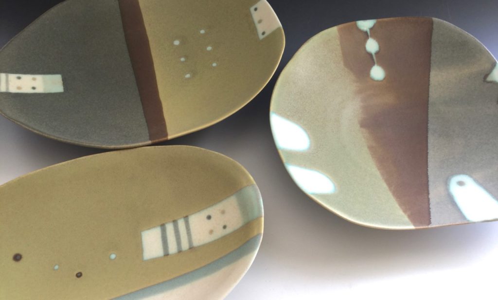
Using similar patterns, you have evolved a jewellery series. Expand on this and how you have become involved in enamel jewellery.
I had one enamel experience in elementary school but never had the chance to be exposed to jewellery making before I came to the US. I imagine it is because a tradition of wearing earrings and necklaces didn't exist until modern times in Japan so jewellery making as a craft wasn't common.
Simply, I'm the curious type so new skills are attractive and it is exiting to learn something different. Metalsmithing is a very challenging process and metal was new material for me, learning it was a stimulating experience.
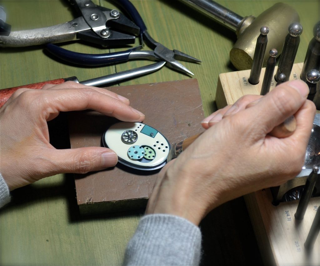
On the other hand, there are some things in common with ceramics. Glaze is a glass on ceramic while the enamel is a glass on metal. Both pottery and jewellery making are pyro-related arts. In away my enamel work is a bit like glazing on metal and playing with colours, I suppose.
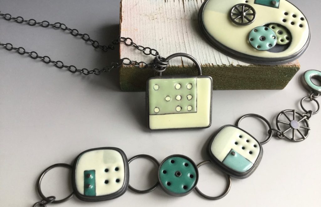
Holes are as much a part of your jewellery as the enamel, expand on the use of holes to achieve pattern.
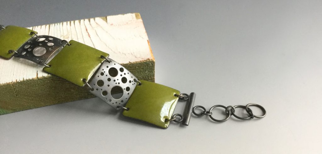
I use a drill and disk cutter to make each hole in the metal by hand. So each is one-of-a-kind and I can easily change the design by using a different hole size, number and positioning. Dots and circles are a very simple design element yet so versatile and I think a lot of people are hardwired to like it. Sometimes it's like a simple abstract painting, sometimes it's like a starry sky. It lets light pass through and can represent a three dimensional space, too.
Reiko Miyagi, North Carolina, USA
Interview by Deborah Blakeley, November, 2018
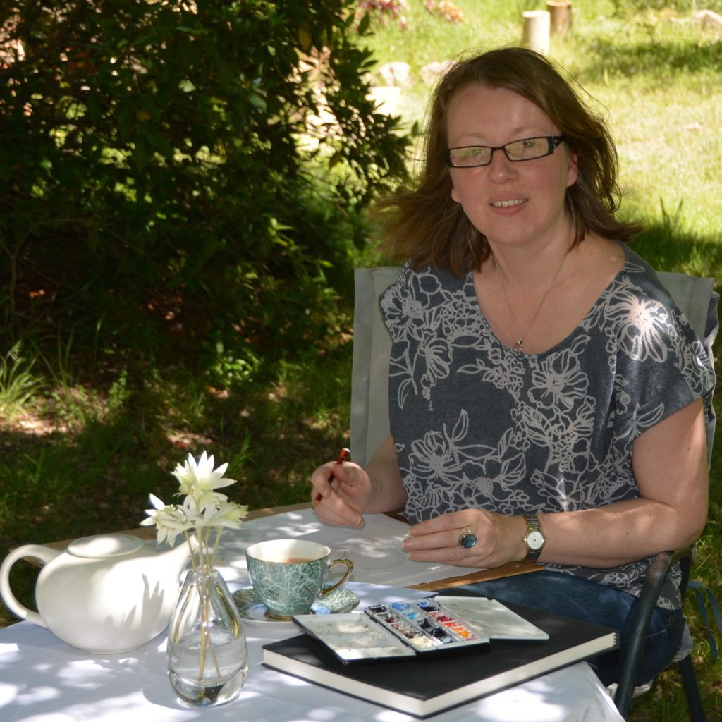
Denise Faulkner
Denise Faulkner, Mudgee, NSW, Australia
Nostalgia and Nature are captured together.
Zoneone Arts brings Denise Faulkner to you…
Mudgee is truly country Australia; how has this remoteness affected your art?
Beatrice, 2017, 45 x 31 cms
Coming from the city it is near impossible to be an artist, in Sydney especially. The rents are so astronomical, you really must work full time just to stay afloat, and then there is very little time for anything creative. I did very little painting from when I left the National Art School over twenty years ago to moving to Mudgee. I just didn’t have the time or the energy. When we moved to our bush block outside of Mudgee, I moved here without a driver’s licence, not needing one in Sydney, so was completely isolated. My partner was working, often travelling back to Sydney or Melbourne, so I would have weeks by myself just pottering around our property watching all the amazing birds which would visit our garden. I had never seen so many different sizes, colours and shapes.
Knave of Hearts, 2016, 62x46cms
Each with their own personalities so I set about trying to photograph and identify them. From there it seemed natural to try and paint them. Suddenly I was inspired, I had time to create and with our remoteness, not even being in Mudgee itself, I had no real distractions, except by my models as they flitted around the yard and splashed in our bird baths.
How did your years of working at the Art Gallery of NSW helped to train your own artistic eye?
I had a wonderful job at the art gallery of New South Wales being the book buyer for the Gallery Shop. I had access to what was happening in the art world both locally and internationally through what was being published, as well as being surrounded daily by the most amazing art in the gallery itself. Unfortunately, the downside was that being surrounded by so much amazing talent (and some not so amazing talent, if I am honest) made question my own skills. The things I wanted to paint and the way I wanted to paint them were not edgy nor controversial, my style was quite conservative, I found it quite hard to see where I could fit in the contemporary art market as I saw it. It did, however, give me a very clear idea of what I did and didn’t like, and I found that the artists who worked in and with nature were the ones which resonated with me the most. At that, time I had no idea that I too would be heading down that path. I was also always drawn to the few decorative arts pieces in the Art Gallery of NSW’s collection, wishing that we had had the extensive collection that the NGV had.
Murder of Crows, 2018, 45x31cms
I love your combination of birds and fine china. How did this come about?
Even though we are in the middle of nowhere we had a poor little scrawny stray cat turn up and mew pathetically at our front door. As we already had a cat, we gave him some cat crunchies in the only small bowl we had, a little china one decorated with Japanese blossom. The resident mother magpie saw this and came over to finish what was left in the bowl after the stray had left. I took lots of photos and set about to paint her as the “Magpie Thief” complete with pretty bowl.
Magpie Thief, 2015, 21.5x30.5cms
She was the one who started the whole series. From there it was not too much of a stretch to see our birds stealing sugar cubes and cakes, bathing in Victorian wash bowls, pretending to be a spray of flowers in a beautiful vase.
I have always been drawn to beautifully decorated objects and patterns, it is for me a kind of nostalgia, in a world where everything feels homogenised and mass produced, I find it very meditative to focus on the exquisite detail of the chosen pieces and appreciate all the work which has gone into them.
Are all your birds’ Australian natives? Or do you occasionally allow an immigrant in?
Most of the birds are ones which visit us in our yard, or are local to the area, as I use my own photographs wherever possible. They may even be birds from weekends away or on holidays. I spent a week in Noosa just before my first solo exhibition, so took hundreds of photos most of them of the birds prevalent in that area, bush turkeys and pelicans, which came in handy when getting ready for the show at Bundaberg Regional Gallery a few years later. Using my own photographs means that I have had a chance to watch the subject, often getting an idea of their personality and a connection with them, something you don’t get from a photograph on its own.
I have however had the pleasure of painting a commission for a lovely lady in the US last year who wanted a cardinal on a teacup to give to her friend.
Violet Cardinal, 2017, 22x15cms
It was such a treat being able to paint a different bird to the ones I usually paint. Even though I have never seen a cardinal, I knew they were related to our finches, so when I came to be painting the bird, I just imagined our little finches, dressed up in a red costume just so I could capture a connection and give the bird I saw in the photos some personality.
Sure, peacocks and flamingos are gorgeous birds and would be a treat to paint, I have no real connection with them, so would find it difficult to convey their personality, something I like to think comes across in my paintings.
Tea-Tottering Bunnykins, 2017, 45x31cms
I do, however, have plans to paint some sparrows, they are birds from my childhood in Sydney, which have been forced out of most Sydney suburbs by the larger, more aggressive birds, so when I moved to Mudgee and saw them still in the town I was delighted. I just haven’t quite worked out what mischief they will be up to yet.
Where do you source your china?
I source my china from everywhere. I have quite a personal collection growing, and no space to put it, but I also have friends send me photographs, I sneak into old wares stores and museums and take photos, there is also a truly fantastic cafe in Mudgee, Artisan on Lewis, where I had my very first solo exhibition. They have an amazing collection of old crockery and are more than happy for me to take reference photos. I also use books and the internet.
Making a Tower Bower
I will set up my still life tableau using my own tea sets, pots etc, to get the layout and shadows right, then transpose the designs taken from books, photos and the internet into my scene based on their aesthetics. I think of it as a painted collage, of sorts.
Have you considered using local ceramic or glass artists work in a similar way?
Being so close to Gulgong which is known for its kaolin clay there are so many amazing local ceramicists, but it is the colour and detail I love in the vintage porcelain pieces I paint, which does not seem to be in vogue amongst the local artisans. Don’t get me wrong, I love the rustic utilitarian style which is common here, and we have bought many local ceramics pieces, but it is the intricate detail which I find very meditative to paint. I also like that many of the pieces I choose are universally recognisable.
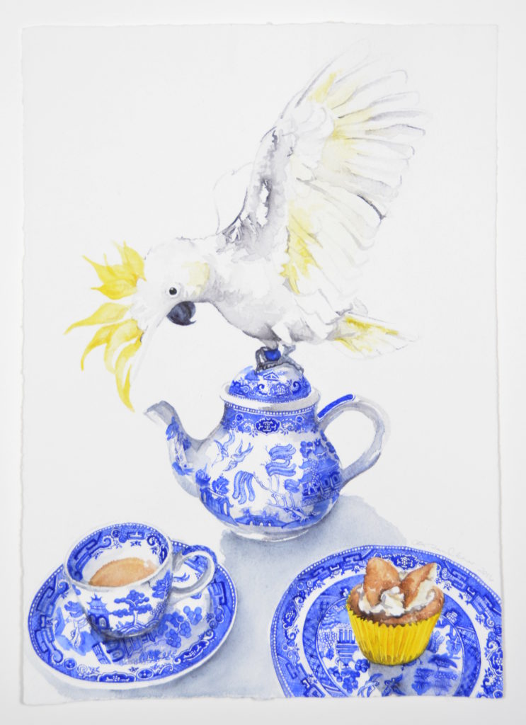
Mad Hatter, 2016, 62x46cms
My grandmother had a willow pattern dinner set, I now have a willow pattern tea set. Many of the comments I get on social media from people all around the world are about recognising a particular, tea set or piece, “My grandmother had that tea set” is a quite common comment. I want everyone to feel that connection, the same nostalgia I get from these pieces. They may not know the birds, especially if they are overseas, but they may recognise the designs.
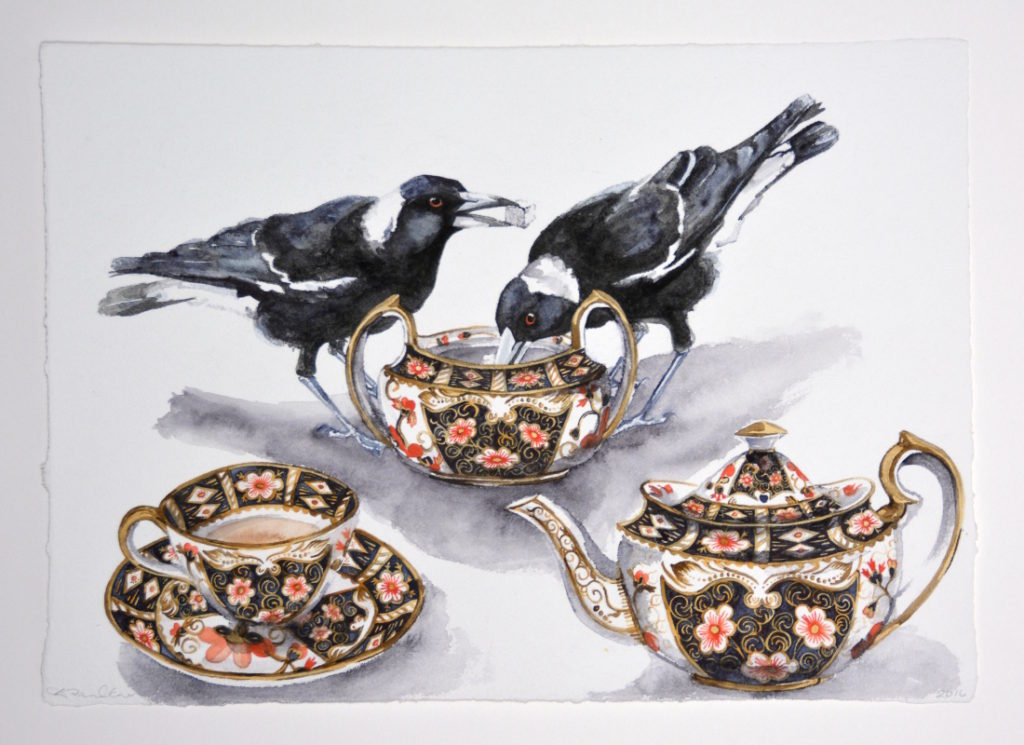
One Lump or Two, 2017, 46x62cms
What bird book do you use to identify your feathered friends?
I have a much loved and much thumbed “Simpson and Day Field Guide to the Birds of Australia”.
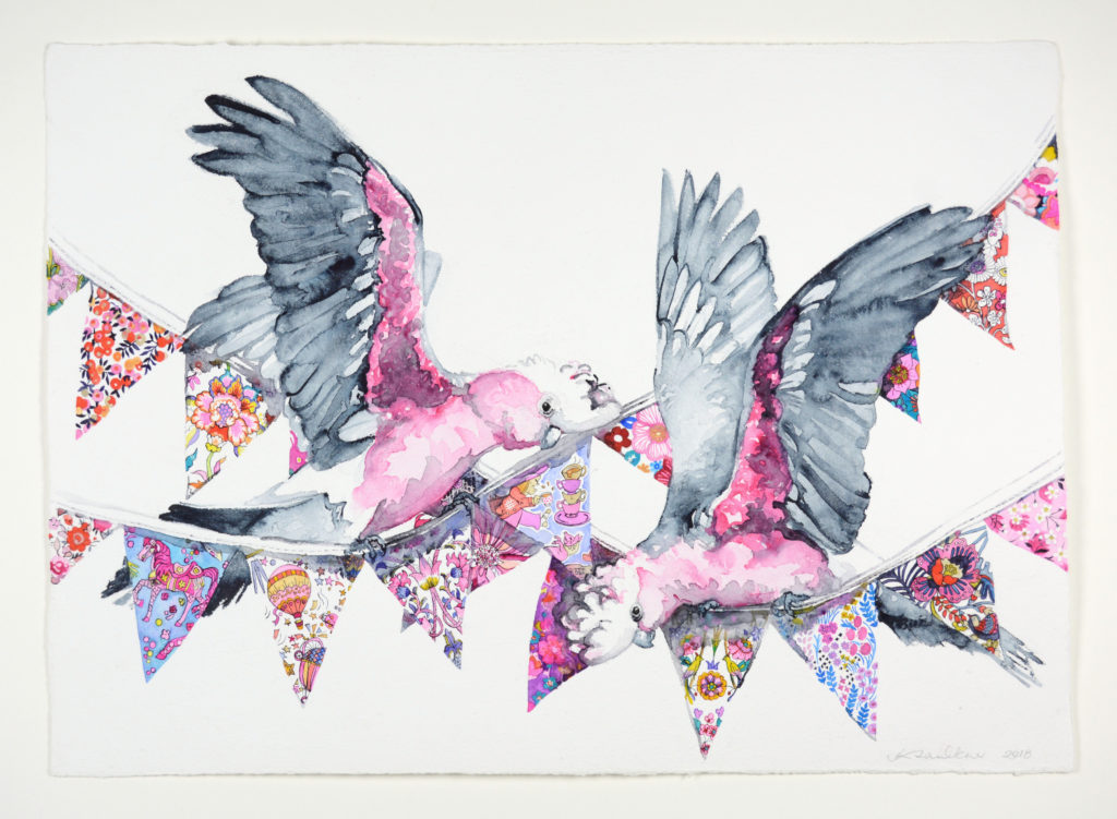
Such Galahs, 2018, 57x80cms
I do have many other books on Australian birds, but the “Simpson and Day” is our ‘go to’ bird book. That combined with a National Parks checklist to the birds found at Munghorn Gap, a nature reserve very close to where we live is how we try to identify most of our garden visitors. As a bird accidentally strays into our yard, often to use one of our many bird baths, I will attempt to photograph it, pull out the bird bible (as we refer to it) identify our feathered friend and then tick it off the bird list. It is a very exciting day when we can tick a new bird off the list. We are currently up to 74 birds in our own back yard alone, that is not including the ones we have seen in the region… and of course those we have been unable to positively identify. One day I am going to produce a book on how to identify birds from underneath or from behind, because really, that is how most of us get to see them, or as a fuzzy blob which flits past at great speed.
On you prints you use your bird logo. discuss this.
That bird logo is of my favourite of all the mini birds, the spotted pardalote.
Pardalote, 2013, 10x15cms
I was so excited the very first day I saw one and I managed to get an ok enough photo to paint his portrait from. Normally these tiny little birds spend their days in the tops of trees eating lerp, a type of sticky sweet crystallised honeydew often found on eucalyptus leaves. They only come down to nest, building burrows in retaining walls and riverbanks. I suspect that this little fellow had come down to see what his nesting options were. He was so sweet and unusual, and because I too have a sweet tooth, he became my little mascot, I even have a gorgeous hand painted porcelain one by local artist Margot Stephens dangling over my desk for inspiration.
I would use my painting of him on my business cards, on the back of my greeting card range in fact anything which warranted any sort of branding. When I decided to start producing fine art prints, I knew he had to be involved somehow. I reduced him to his basic elements and had him made into an embossing die. That way I can sign, number and emboss each fine art print as a way of authentication.
Discuss the tea themed group show that was held at the Bundaberg Regional Art Gallery and you part in it?
I had the absolute honour to be included in a group exhibition “You Me and a Cup of Tea” at Bundaberg Regional Gallery in early 2017 which celebrated all things tea. Curated by Zoe Blandford and including such wonderful artists as Beverley Budgeon, Susan Gourley and Kim Schoenberger, it also included ten regional artists who were asked to reinterpret a familiar Australian biscuit. I had fortuitously just been to the region the year before for a holiday, so had plenty of photos of their local birds, so when I was asked to be involved, I was able to include birds from that region in my paintings. I was then told that the gallery had quite a collection of vintage tea cups, so a couple of the paintings had tea cups from their collection in them. “Beatrice” and “Neville” featuring a major Mitchell cockatoo and a sulphur crested cockatoo, both birds found in the region featured tea cups from their collection and are now part of the permanent collection at Bundaberg Regional Gallery.
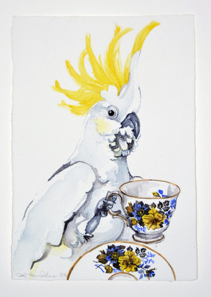
Neville, 2017, 45x31cms
Discuss how important Australian, Regional Art Galleries are to the local population and local artists.
Having a regional gallery gives a cultural identity to a town. Admittedly a lot of it is based on who the Director is, and what direction they take the gallery in, and what sort of exhibitions and public programs they engage in. But to me I feel it is very important to have a space in which you can just go and stop and look and feel and absorb. Something we often neglect to do in this busy day and age. Whether you like the work shown or not, often doesn’t matter. It is impossible to not be inspired, whether through wonder, or a desire to do better and often becomes a breeding ground of creative ideas.
I am still amazed that the Mudgee region does not currently have its own regional art gallery. Now, we have to travel to Dubbo, Bathurst or Orange. I know I was spoilt working in the Art Gallery of NSW for thirteen years. I could stroll around in my lunchtime and absorb the surrounds, the peace, the tranquillity which comes with looking at art. Also, the access to new art, new ideas, and out here the stories of Australia are very important. I spend a lot of time in the local history museums, which we have a wealth of, it gives me a chance to appreciate the local ingenuity, but it is the easy access to art I miss.
It is also often a space to showcase the local talent, and there are a lot of talented artists in Mudgee. You can afford to be an artist here as life is cheaper, but you can still get a good coffee. A must if you want to be an artist, in my opinion.
I moved into a town without a bookshop or a regional art gallery, two places I never thought I could live without. Living without a bookshop is probably healthy for my bank account, living without a regional gallery is quite difficult. It gives a place a cultural identity, stimulating thought and creativity. It shows both the visitors and residents of the region that there is more to life than just existing.
Explain your ‘Alice in Wonderland’ series. Was this a tribute to the book reaching the milestone of 100 years?
That was not intentional. I have always loved Alice in Wonderland, from childhood. It was an important book for me as a child. It was only when I moved out here that I realised that it would have been far easier for Alice to fall down a wombat hole, rather than a rabbit hole.
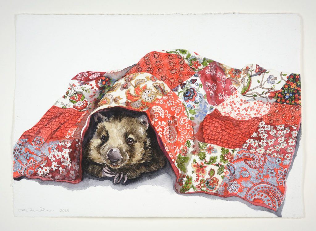
Wisdom of Wombat, 2018, 46x62cms
We certainly have a curious array of animals, just as fantastical as anything in Alice in Wonderland… When I was coming up with the initial theme for my first solo show, “10 Impossible Things” at Michael Reid Murrurundi in 2016it seemed appropriate to incorporate this in some way, especially as the then Director set me an ‘impossible’ task, to produce ten works in six weeks, as they had a hole in their exhibition schedule. It was an opportunity I could not resist. In Alice she could imagine as many as six things before breakfast, well I could imagine ten things in a rather short timeframe. Plus, I always wanted to do a kind of ‘Alice in Down-Underland’… I had already painted a crimson rosella eyeing off a berry tart, so it seemed obvious that he would be my Knave of Hearts, getting ready to steal that tart and the rest was easy. Our regular pair of galahs became Tweedledee and Tweedledum because they were always together and always up to mischief, and of course the Mad Hatter had to be a sulphur crested cockatoo with his crest as his hat, and the maniacal gleam in his eye to do the rest.
I followed that exhibition up with another Down-Underland influenced show “Curiouser and Curiouser” in 2017.
Explain how your greeting cards have changed your artistic life.
I would say they were the main contributing factor to where I am now, and I would recommend it as a promotional tool to anyone who’s work would translate well into a greeting card.
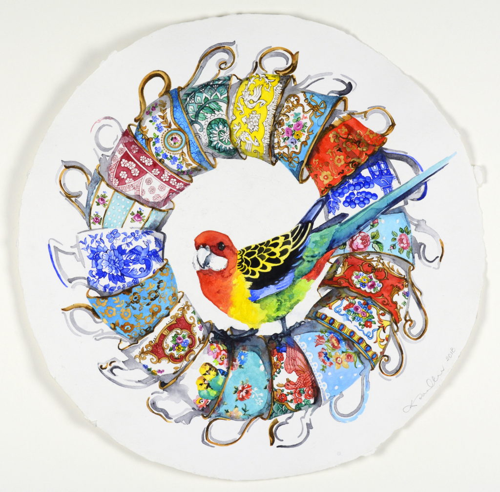
Ring A Rosie, 2018, 50 cms round.
If you are going to do it, you must do it well. If you can, print locally, that way, not only are you supporting a small local business such as yourself, but you can get test prints done to ensure the colours are as close as you can get them. Make sure you brand them to yourselves, if you have a website, put your website of the back or any sort of contact details. To me it is a type of business card, which people pay money for, and then they give them away, effectively distributing your ‘business card’ far and wide. Not everyone can afford an original artwork, but most people can afford a greeting card.
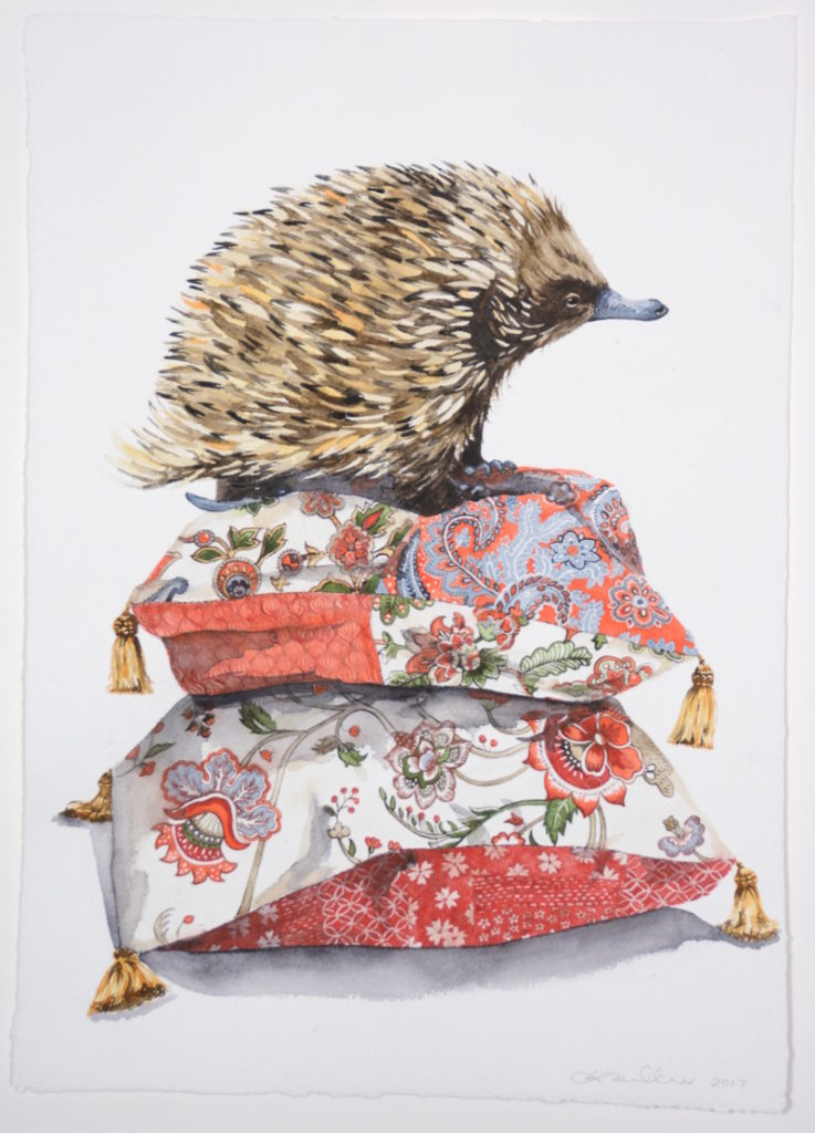
Pin Cushion, 2017, 62x46cms
It was by sending a promotional pack of my greeting cards to Michael Reid’s Murrurundi gallery that got me on their radar. They put some of my original works in their stockroom which ultimately sold, so they offered me an exhibition. And all it took was a pack of my greeting cards.
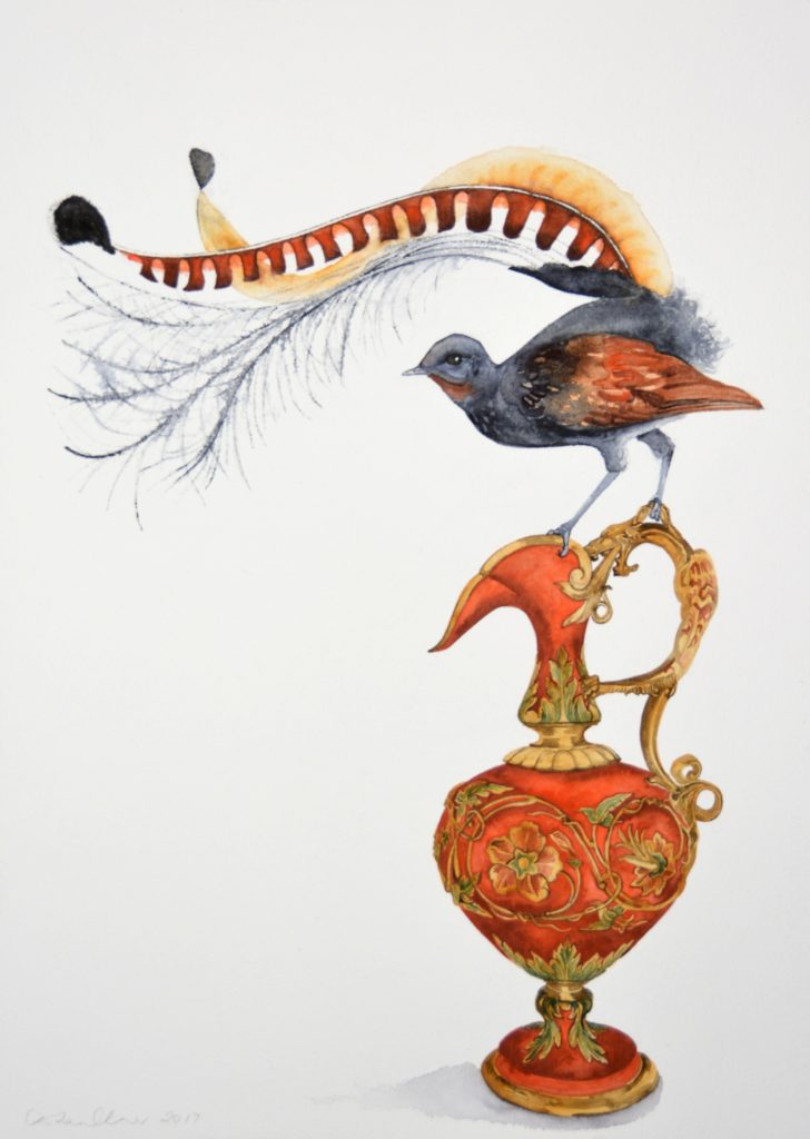
Pretty as a Pitcher, 2017, 80 x 75cm
Contact details:
Denise Faulkner
Email: denise@denisefaulkner.com
Website: https://denisefaulkner.art
Denise Faulkner, Mudgee, NSW, Australia
Interview by Deborah Blakeley, November 2018
Jessi Wong
Rolls and scrolls, of paper and printing.
Zoneone Arts brings Jessi Wong to you…
Your work is in many Corporate Collections, please take one and discuss how it has made a difference to your art practice, also how this commission has made you reflect on the work you were doing.
One piece that challenged me the most technically was a commission piece for a private client. The rice paper I use in my scroll works comes in 10 metre rolls with set heights, being 46cm, 69cm or 97cm, so to keep a nice deckled edge on my paper I make my work in vertical rolls at either 46cm, 69cm or 97cm high. In this way, the paper can roll naturally with the grain and it is a size that can be reasonably handled. This client wanted a piece that was 152cm high and in red, a colour that I hadn’t used very often and wasn’t familiar with. It sounds geeky but I find some colour inks print differently to others even if they’re the same brand. Maybe it’s something to do with the pigments, the batch, or the composition? Anyway, I decided to tackle it so I cut the paper and turned it sideways to make a vertical roll of 152cm. It was one of the most difficult prints I had to make. The paper had to be printed in two halves to get the proper pattern, it was difficult to handle a sheet of paper that size, the table wasn’t big enough, the rolls wouldn’t stay in place… but after some trial and error I made it in the end and I was pleased with the results. It has informed my practice because I had to consider the framing and installation, of all things, and the additional supports to keep such a large piece in place (ie, heavy duty magnets) is now used in my other works, even those 46cm in height.
Drying ink on rolled paper
While this work was a technical challenge, it has also informed a lot of my recent works. The offcuts of paper from this work are being used in other prints and collages that feature heavily in colour. The project I’m currently working on has been partially inspired by the remnants of this work, and others.
Discuss your resent installation at the Yarra Library – Richmond…
I can’t remember the exact size of the work at the City of Yarra Richmond Library but I would estimate it at 2m high x 4.5m wide. The art installation was a wall drawing and didn’t cover the entire wall top to bottom but was more an undulating shape from one side to the other. It also included three black and white framed prints previously purchased by the City of Yarra for their art collection, which were hung salon-style with the wall art drawn around it. Two of the framed prints measured about 50 x 60cm and one was larger at around 90cm x 110cm. The prints were woodblock and pen on rice paper and featured images of land masses, stick figure people on boats and migration. I used these methods to make serious issues seem comical as people are more receptive to receiving messages through satire and humour than essays or lectures, much like political cartoons with their sardonic humour. Holding a mirror up to society and making fun of human follies allow inner reflection and encourages contemplation about these issues. The works are primarily black with white on top giving it a sense of bleakness.
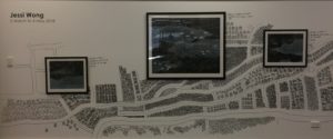
Installation at the City of Yarra Richmond Library
The drawing around the framed prints was done in black fineliner, markers, and texta pens directly onto white wall. I went through a few markers and textas as the fibre tips were progressively scratched off on wall and they became less fine for detailed drawing. There wasn’t much preparation needed as the wall was freshly painted. All I had to do was show up with my hammer and nails, hang up the framed prints and start drawing! The drawings were of houses, rows and rows of houses around twisting roads in a stick figure like manner, all outlines and childlike. These were black lines on a white background that gave of a sense of lightness and freedom. I wanted a juxtaposition of the framed prints with their sea and boats over the drawings with their land and solid housing to create a story of migration.
The staff at the library seemed interested in what I was doing. The work took several days to complete and I gave a few staff members the opportunity to hold the pen for a bit. Not all the trees drawn at the bottom of the wall belonged to me! It was fun working with them in a collaborative manner, all doing the same thing, drawing the same repetitive pictures.
Can you expand on your personal thoughts on the importance of Community Art.
Tell us about the Collie Print Trust Scholarship…
The Collie Print Trust Scholarship is awarded in conjunction with the Australian Print Workshop to Emerging Victorian Printmakers. It’s to encourage and nurture emerging talent and provides them with one year’s rent-free access to the Australian Print Workshop Open Access Studios, which include printing presses and etching facilities, culminating in an exhibition in the APW Gallery at the end of the year. Access to printmaking equipment can be difficult and prohibitive due to cost and space so an opportunity like this is valuable for graduating and emerging artists.
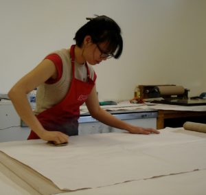
I received this in 2010, the year after I completed my Masters in Fine Art. My partner was studying at the time and we were living in a two bedroom house with another couple so space and money was very precious to everyone. Having rent-free access to the APW Open Access Studios made it that much easier to continue my arts practice and while I had experimented with rice paper in my postgrad, it was at APW that I developed and printed my first framed large-scale scroll works. I continued to use their facilities on their rental rates after my scholarship ended and until I could find a studio of my own.
What a coup to gain a place in the Beijing Museum of Contemporary Art. Discuss your work.
Youth Plus was an exhibition of 50 artists under the age of 40 in Beijing, each artist exploring cultural bridges between the East and West. It was an exhibition curated by Michael Suh, the now Executive Director of MoCA. I created a set of 4 works titled Blue Sky I - IV. They were blue and white abstract woodblock prints, each installed in 50cm x 50cm x 6cm deep acrylic frames. They were installed as vertical scrolls and were a modern interpretation of ancient Chinese scroll artwork. The installation was done using magnets and could be hung as a set of 4 in any configuration, vertical, horizontal or square.
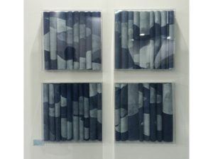
Blue Sky I -IV
Size is as much of an issue as weight. The paper is light and the installation is fragile so the artwork needs to be framed but acrylic framing can be heavy and crack easily so you have to find a balance between aesthetics, size and weight. Hanging methods can change depending on these factors. D-rings and hanging wire are the most popular hanging methods for framing but any large pieces tend to tilt forward slightly, making keyhole hangers the most suitable as they allow the work to sit flush with the wall but they require screws, precise measurements and a wall stud to drill into. Monkey grip bars are easier to install than keyholes but can be less secure if someone decides to bump into your work and it slides off the wall. For this particular work in this particular size I went with D-rings and hanging wire. I am making smaller pieces – less than 70cm - for this reason, as most galleries request D-rings. I wasn’t able to see the work installed but I did get some nice photos sent to me of the installation.
What are you thoughts on age limits on art prizes?
I haven’t really thought about it. I think it can be useful, especially if it allows for recognition of emerging talent. I think categories in career stages, such as early career or established is more useful for that but then again, trying to define what stage of your career you are at is subjective.
Take both pieces Flora and Fauna I and II expand on your use of layering and the paper you have used in this technique.
I have used several different wood plates cut out in hand shapes, and linocut bees all printed individually on both sides of thin floral-embedded paper.
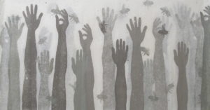
Flora and Fauna
I was given the paper as a gift from someone returning from a trip to China so I’m not exactly sure what it is called but I’m fairly certain it’s handmade. Each of these artworks is comprised of two sheets of paper, each printed on both sides with hands and bees cut out from lino and wood and printed in varying colours. I love the texture and depth you get from layering ink and the subtle way it shines from behind from the paper, enhancing it’s beauty. I’ve always loved paper, even as a child. I enjoy playing and experimenting with printing on different hand made ones, coloured ones with long fibres, thick textured papers, round paper, banana and silk papers, mulberry paper, and plenty of papers that I don’t have a name for. I find the best ones in art supply and calligraphy stores and overseas, particularly Asia.
Earlier in your career you introduced Scrolling technique, expand on this work take 2 or 3 pieces to explain the works.
I started off with buying rolls of hosho and rice papers, thin sheets that are often used in calligraphy. I use a large sheet of plywood for inking up and printing because it has a beautiful grain and the texture is picked up really well with rice papers vs. thicker printing papers.
New world, same history is one of the earlier ones I made. I started with a 46cm high roll of paper and printed the entire roll by moving each section of paper along the inked up plywood until I had a full 25 metre length of paper printed with a blue woodgrain pattern. I wasn’t sure what I was going to do with it at first but I thought it looked too blue so began printing white onto it using cut out cloud shapes. As I was doing this and handling the paper, picking it up and moving it around, rolling and unrolling sections, I couldn’t help noticing the way the paper fell and curled each time I lay it down to begin working on another section. And drying the paper? You can’t have it rolled up or it will stick together as the ink dries so I had to stand it up and separate the curls and rolls.
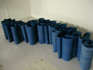
New World, Same History, In progress, drying papers
At the time I didn’t have any drying racks so this was actually the most space efficient way to dry the ink. The shapes it makes is so lovely to look at that I really wanted to do something to show off the paper. This blue work ended up becoming New world, same history.
I ended up using this method (a printing press and printing by hand with a baren) to create a series featuring black, white and grey landscapes for the exhibition Cataclysm with Anita Traverso Gallery. The series were printed using the same three plywood sheets and cutouts and a lot of torn up newsprint to block out sections between multiple layers of ink. Most scroll works are printed in varying shades and tones of the same colour, some stretching red to yellow, or black to white, or yellow to ochre as the tonal range gives a greater depth than a rainbow of colours and again, you get a soft tint as the paper is continually layered. There isn’t much planning while printing. I have a vague sense of the sort of outcome I want and just go with it. Much of it is abstract and I have learnt that it isn’t worthwhile stressing about minute details because most of the work is hidden under a fold and you never see more than a 5cm wide stretch at any time. From 1,000cm of printed paper I may get a scrolled work that is only 170cm long. If there is a section I don’t like, I can fold it under. I have tried installing individual small rolls side by side in a line but it doesn’t create the same floating ripples as folded and rolled sheets. The installation can be tricky.
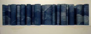
New World, Same History
The acrylic box frame has to be ordered first as the work is installed directly onto the inside backing of this frame. Adhesive magnetic strips are measured, cut to size and placed at intervals along the top and bottom of the frame. Working methodically from one end to the other, the work is rolled, scrolled and held in place by magnets before the acrylic frame is put back together. I’ve mostly kept to sizes that are in line with the paper size, that is 69cm high x whatever length the roll will provide but I find myself more interested in geometric squares and groupings of works at the moment so we’ll see where that ends up.
Often your work is hung in groups. Is it always sold in these groupings?
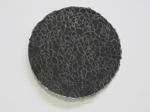
Handmade circle paper, printed both sides.
No. They look better as a group but most people don’t have the space for 4 so I haven’t sold many sets, mostly diptychs, pairs, and larger individual landscape pieces.
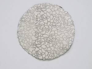
Handmade circle paper, printed both sides.
Discuss the issue as an artist on how to present and hang your work either as single pieces or a group work.
I’m not particularly fussy with the way my work is hung and presented. Once it belongs to someone else, it’s theirs, and the work is flexible enough that it lends itself to multiple arrangements. I have preferences of course, such as “please hang side by side with 5-10cm gap” or suggestions with the Blue sky set like “work does not have to be in sequence”. The Red sky series are smaller pieces of 46x46cm so they look better hung together but the larger ones of 1 metre or more are able to stand alone.
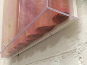
Contact details:
Jessi Wong
www.jessiwong.com
Jessi Wong, Victoria, Australia
Interview by Deborah Blakeley, November 2018
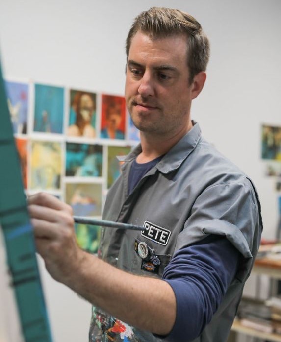
Pete Sack
Pete Sack, North Carolina, USA
Sack shows and explains how he creates his images through his seven stage process...
Zoneone Arts brings Pete Sack to you…
Where do you source your original material from? Do you have copyrite issues with this?
My source material comes from personal photos, old college yearbooks and photos from magazines. I don’t concern myself with copyright issues. I just look at the images as a means to an end. I’m altering the original to the point of making it almost unrecognizable, or I’m just taking a portion of a face and combining it with another face.
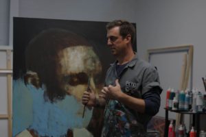
What is the technique you use in your art work?
Everything I do is on watercolour paper (140lb hot press). This is so I can create my watercolour base. I have done watercolour on canvas, it just takes so long to build up colour, so I opt for paper when I can. I buy rolls of watercolour paper for my large pieces and stretch them like canvas (after soaking it in a bath for 5-10 minutes). Once dry, I will paint a tightly rendered watercolour image, and then seal it with two coats of an acrylic gloss varnish to protect the painting. This coat also allows the oil paint to glide on a smooth surface.
I’ll add acrylic to block in shapes and again, to add another protective layer.
Oil paint is then used. This allows me to cover up, obscure and or glaze over the tightly rendered under painting with a loose, gestural application of paint. I enjoy the contrasting of mark making, allowing them their own time to shine on one piece of art.
Discuss the size of your work?
The size of my work varies. When I’m trying out new things or just need to paint something, I’ll work small (currently 11 inches x 8 inches). I can get these done in 2-3 hours and they are a fun way to be free, since I’m not devoting a lot of time into them. What comes from these studies can make their way into my larger work. Currently I am starting on a series that are larger (60 inches x 48 inches and 72 inches x 48 inches) and these will pull from the smaller experiments.
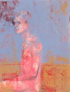
You state, ‘I paint a new painting every day’ discuss this aspect of your work.
This was a younger version of me, when I was pushing this new (for me) way of painting. The works were no bigger than a postcard, and for 2-3 years I created 800 pieces.
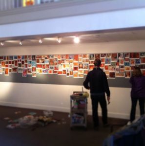
Most were pretty raw, just me getting comfortable with what I could get away with and how the paints would react and play with one another.
As I have gotten older, I have gotten more deliberate in what I am painting. So more thought goes into composition and colour combinations. Plus the size has gotten larger, so my one a day painting is now 3-4 a week for smaller works and 1 a week for the larger pieces. And I also have learned the value of taking breaks (months and weeks), to avoid burnout and recharge my energies.
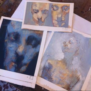
Discuss your movement from Watercolour to oil and now the combination.
The first painting medium I worked in with any proficiency was watercolours, when I was 12 or 13. I would paint baseball players all day long and unknowingly developed the skill of being able to paint a tightly rendered image quickly.
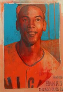
When I went to university, oil paint (and some acrylic) was king and therefore was all I used. I do remember one painting that I made in which I combined the two (watercolour and oil), but why I did that or which professor pushed that is lost on me.
My oil paint use went through my mid-twenties, but then something clicked and I restarted the combining of mediums. I like to paint fast, just get whatever I need out as quickly as possible, to avoid self-editing. So my wanting to paint a detailed portrait or figure and then add other elements of distortion just wasn’t possible with straight oil.
Can you discuss 2 works from your show at the Raleigh City Museum?
These pieces were part of a show that I had at the Raleigh City Museum, where they gave me access to their archived photos. There were hundreds of pictures to choose from, but the majority were dated from the 1940s-60s.
The photo of the boys swimming was of Chavis pool in Raleigh, which was the first integrated public pool in the city. I like the looks on all the swimmers faces, joyful and carefree, as summer should be.
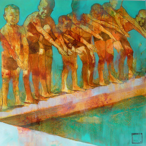
The other is a team photo of Shaw University women’s basketball team, which is a local Black university in Raleigh. This team went on to win their league championship, which was the reason for the photo.
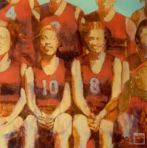
Expand on one of your close-up images.
I’ll show you a piece that I just completed, or at least is 99% done. It is 60 inches x 48 inches, stretched watercolour paper over stretcher bars.
- Pencil drawing of the images I want to use.
- The laying of watercolour paint. Because of the size, this took 2 days.
- Studio shot after day one of watercolour application.
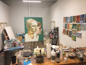
- Watercolour done. I then applied two coats of acrylic gloss varnish and in this photo I applied a muted green acrylic colour to surround the figures.
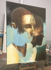
- The layering of oil paint starts. In this case I added a burnt umber over the whole piece and while away select portions. I find that oil paint reacts better to the paper on a thin (even wiped away) layer of oil.
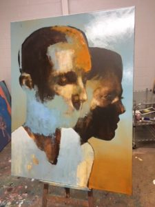
- At this point I’m just pushing colours and into the piece and seeing what sticks. Anything that doesn’t work I wipe off or paint over the next day.
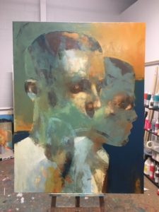
I hate to say I make it up as I go along, but it’s at this point that intuition takes over and I just know what is working and what isn’t. It can make for really “easy” paintings that tend to paint themselves, or really difficult ones that are a true labour. But if the foundation of an idea is sound and there’s enough to work with image wise, I like this struggle. Because once a painting clicks and comes together, it’s all worth it. And that sense of completion comes almost instantaneously, out of nowhere and you just know the work is done.
Discuss ‘Life on auto Pilot 1, 11, 111 expand on this.
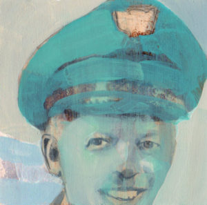
Once my thirties hit this sense of routine seeped into my life, as it happens to most people. Wake up, go to work, go to sleep and repeat. I’m not saying it’s a particular bad thing, (especially having a job that afforded me the luxury to paint, support and provide for me, etc.) it was just a moment when I was able to take a step back and reflect on this auto pilot haze makes life slip by faster. The days blend and are therefore marked by moments that get you out of the routine.
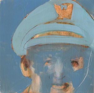
At this particular point, painting was the only real wild card that I had control over, in which I could change things up at a moment’s notice.
So I used that feeling of being on auto pilot to create a series that is very literal (a photo of a pilot) but also conveys the feeling of sameness mixed with a blurring and hazing of life.
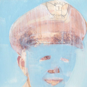
Comment on your signature. 
I’ve used my square box signature since 2001. The origin story is a little hazy, but it comes around the same time I visited Frank Lloyd Wright’s studio in Chicago. His work is so clean in line and intentional in thought.
I wanted a signature that wasn’t an afterthought, which also worked itself into the composition of the piece. Not to distract, but to help move the eye around by the shape and colour. I’m not a fan of artists not signing work or putting it on the back. My work is a part of me, so I’m going to put my stamp on it.
Do you take portrait commissions?
I used to, but now I only will do pet portrait commissions.
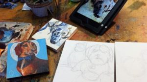
I’ve been doing portraits or paintings of faces for 25 years, so I’ve mentally moved on from having to recreate a portrait that bears any sort of likeness to an individual. It feel like homework and it comes across in the commission. So I don’t want to waste my time or the client’s.
Contact details:
Pete Sack
Instagram : petesack
Pete Sack, North Carolina, USA
Interview by Deborah Blakeley, October 2018

Ray Besserdin
With years of working with paper, Ray Besserdin's paper truly becomes sculpture
Zoneone Arts brings Ray Besserdin to you…
Can you discuss and compare your love of art and fascination with insects?
That’s something that a lot of people wonder about. Both started as a child. My mother was an illustrator and cartoonist for books and newspapers and created an extensive folio of aquarelle artworks she did of Melbourne’s historic buildings, many of which are gone now. Incidentally, I’m publishing a book of her art in 2019 as she passed away when I was 15 and I have all her works. I’ll let you know when it’s released.
My father was an engineer but also a very accomplished portrait painter who for a short time in his youth even studied art and wood sculpture. Both were active members of the Victorian Artist’s Society, so I grew up with art around all around me, and I suppose I take after both in different ways. Mum was a very freehand artist and dad very technically precise. I developed both ways.
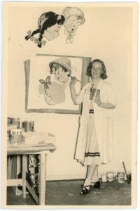
As a kid mum and dad used to buy me these books from which you could cut out and form models of cars, trains, planes and more. I absolutely loved them! Of course, they led to me figuring out how to make my own models from paper or cardboard. When I saw a blank sheet of paper, I saw opportunity to make stuff and couldn’t wait to get a pencil, scissors and sticky tape out, so I could go to work. I even make models from empty tissue boxes!
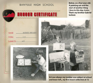
Later, I later started making pop-up greeting cards for the family, any old occasion would do, practicing both drawing and modelling n’ mechanics with paper. But interestingly, though I still have the very basic Origami book they bought me back then, and remember having some fun doing the exercises, I never really took a shine to it, as clever as I recognise Origami to be.
However, it all played its role in developing passion for paper and skills for working with it.
My father also gave me memorable encouragement to take interest in sciences. Combining my childhood curiosity for the all the insects I found exploring the vegetation in our garden, I steadily developed a hunger to learn all I could about them, and the more I learned, the more intrigued I became.
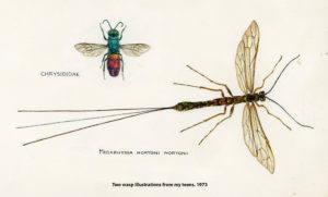
It developed into a heightened desire to pursue biological sciences at a university level and was the reason I chose to graduate in this field rather than Art. But here’s the funny thing, by the time I was completing my final undergrad year at La Trobe Uni, my assignments were becoming as much about content as opportunity to practice art! I knew by then that my science pursuits had run their natural course and that I really wanted to be an artist. But insects especially continue to intrigue me, so the obvious solution was to express my love of them in my art where the opportunity arose. I’ve done a couple in paper sculpture to set the course for a future exhibition, but I’m still a little way off it. With my current commitments and commissions out of the way, perhaps 2019 will see me get into it full swing. It really excites me! I’m also still an active council member of the Victorian Entomological Society, for whom I designed their current logo.
Regardless of insects however, nature is still the key subject to most of my art.
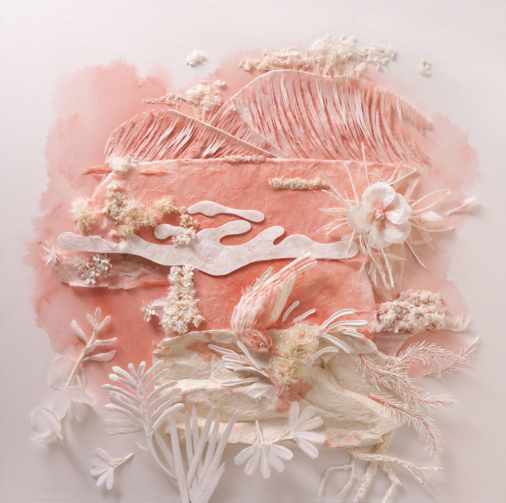
The Red Sands Garden
The exhibition collection I’ve called “Impressions of Melbourne’s Botanical Gardens in Paper Sculpture” is an example. Two of the planned six 915 x 915 cm pieces are now complete with the third begun. I’m aiming for that to be public about April 2019.
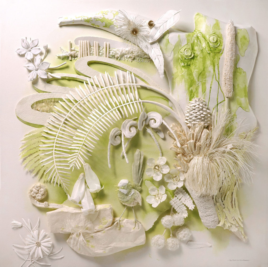
The Path to Gondwana
Awarded 1st Prize, in "Nature" Category 3D, at LightsSpaceTime, Gallery, Florida, USA
Expand on how your commercial design for Spicers Paper began your career in paper sculpture.
While I was going through Uni I picked up reasonably regular graphic design and illustration jobs for income when people discovered my art ability, so when I finished I could hit the streets with a good folio to show design studios, ad agencies and publishers. Before long, I landed a paid inhouse spot with a design business in Collins Street and then went on developing my skills in design and illustration full time. I especially practiced with a gadget called an airbrush. I could create artworks that were photo realistic and ad agencies loved it because it airbrush illustration was like today’s Photoshop in the eighties and nineties.
After six years, I left the design firm in late 1988 and went completely freelance. My first studio was a room I rented from a marketing firm in North Melbourne, and there were some good ad agencies nearby who I presented myself to. I can’t remember what they were called, but there was one that began to use me for various things on a regular basis, especially if their own art director was on holidays or otherwise too busy. One of their accounts was Spicers Paper and they were running a print campaign to enter a competition for a free trip to Chicago for the world Stationery Expo being held there. They needed a catchy logo and called me in to help design one.
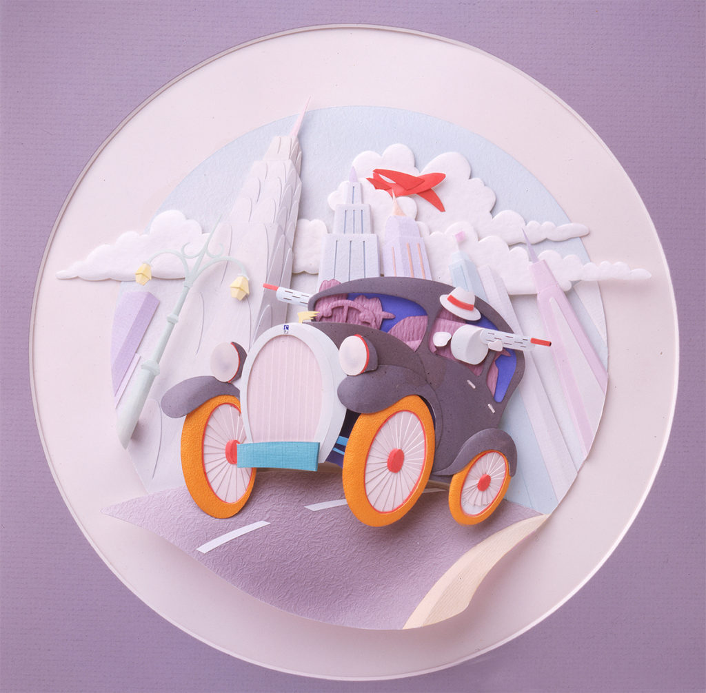 Spicers, the first paper sculpture
Trying to picture an image of Chicago I saw tall buildings and what stood out in my mind for all the 30s gangster movies I watched as kid. Then I had a flashback to my childhood days of making stuff out of paper, and bang(!), I could completely see what I would go back and present the agency. They loved the proposal, I went off and created the artwork, it went onto to play a key role in the campaign being the most successful they had ever run and I woke up to my future all in one! No one piece of art I had created to that point in my life inspired me so much as this. I couldn’t sleep just thinking of where I could this art, but I remember say to myself, “I’m going to push this into fine art”. And that’s where I am with it today.
From there I pushed my technique to every ad agency and publisher I could, being paid to develop the art. By chance, a couple of years later I discovered a book from America where there were artworks of various mediums, some in paper, similar to what I was doing. More interesting is that there were awards being held in New York. By the start of the new millennium, I had scored one gold, two silver and over a dozen bronze. Another gold from New York came through my work being entered by a client on my behalf. I had won major corporate clients like Macquarie Bank, Ford Motor Company, The Northern Territory Government and Amcor amongst others. Private commissions even came from Manhattan and over the Pacific in New Zealand, but Australia has been my major patron.
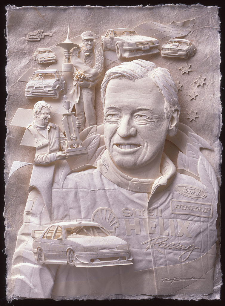
Johnston Tribute
A real knock out happened in 2000 when the NT Government came back after a number of things I created for them and asked me to come up with symbols of there iconic Saltwater Crocodile, Brolgas and Frilled Lizard all created in paper sculpture. What resulted were two 6.3m long by 3.8m high croc and lizard with 2.1m high x 3m wide dancing Brolgas in between. They were to become unofficially the world’s largest paper sculptures based on length by height. I say it that way because they were accepted for the Guinness Book of Records, but regrettably, I got so busy I missed completing the application provisions before they expired.
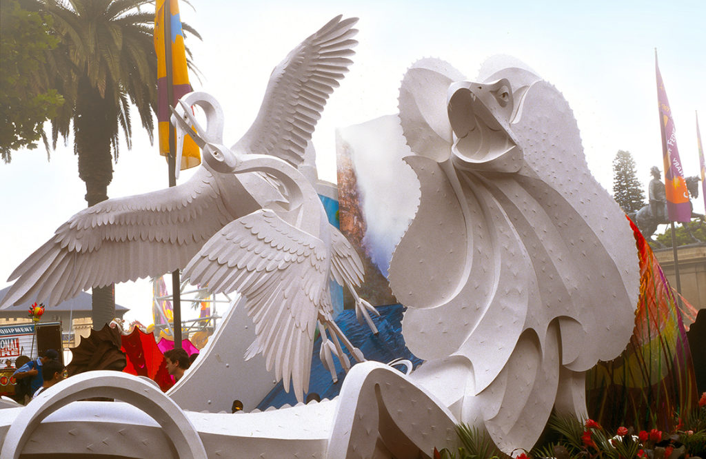 Frilled Lizard, Brolgas, Northern Territory, Australia
Since then I’ve continued to do commissions and win awards for advertising and publishing because they’re good sources of income besides the private and corporate commissions. The difference is they are always deadline based, but so are many of the corporate commissions.
One that stands out from 2015 is “Mother's Heart” which I created for Queensland Investment Corporation on behalf of their Watergardens Shopping Centre.
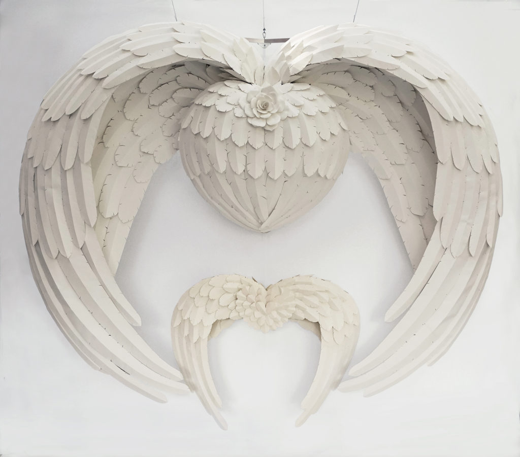
Mother's Heart
I had three months to design and build a piece that would hang in the centre foyer where mothers could have themselves with children photographed. It is 3.1m high x 3.6m wide and suspends from cables off the rafters. It had to be ready two weeks before Mother’s Day and left little time for sleep! It’s the second largest sculpture I ever built, hugely popular with the public and even brought a request from an art curator in New York to bring it over there!
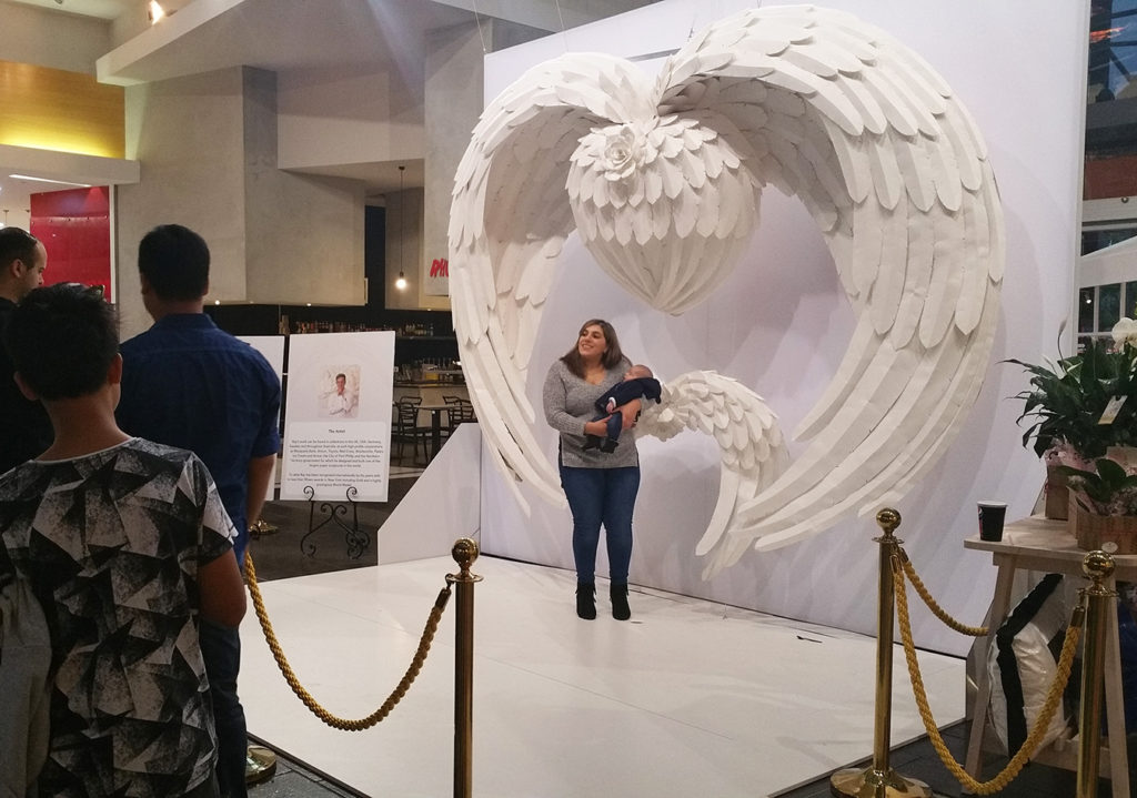 Discuss your thoughts on the importance of children having equipment and the freedom to simply make. How his effected your own artistic growth.
An interesting question Deborah. There is no doubt my past predicted my future, but it might not have done so of it were not for one thing I realised early in life, and that is listen to your heart. It’s your intuition speaking to you, and it’s built on all the things you found joy and purpose in when you were growing up. I believe you must keep the child’s wonder and excitement for life alive in you all your life. My parents gave encouragement to explore my skills and find what interested me through their example and then left me free to proceed my own way. They occasionally intervened to show their ways to draw, or how to mix colours correctly, but mostly they just brought me the raw materials and left me be. The only complaint was the mess I left on and under the table with all the cut paper, but I eventually got around to that!
Explain briefly the technique you use in your art work.
My art is based on forming paper from a flat two-dimensional sheet material into a three-dimensional object. Paper by definition is a flat formed sheet material created by pouring a water suspended mash of organic sourced, cellulosic fibres into a mould and deckle. The material derived from this process is what I use for my art, and I say it that way to keep it distinct from being confused with papier mache or cast paper. It is not quilling, and definitely not paper toll. Picture it this way. If you got a sheet of metal, you could bend, twist and bang and weld it into something that would make a stunning sculpture or even an object like a car. This is how I treat a sheet of paper and create my artworks. There is glue involved where with metal you weld because a sheet of any of these materials only has a limited capacity to being shaped, so you need to add one to another and handle the forming of each piece separately. With my medium I have the freedom to combine a huge variety of different papers to be worked together for added textures and colours, and I source them from all over the world.
What are the different types of paper you use, - how difficult is it to get exciting paper.
My favourite papers are essentially handmade cotton, linen or mulberry fibred papers from small mills around Asia and some of the traditional European Mills. My favourites tend to be Fabriano of Italy, one of Europe’s very oldest and still running, Germany’s Schoellershammer and Hahnemuhle, BKF Rieves and Arches of France and Saunders of the UK. But there are many others based on what interests me when I go scouting through the paper stocks of my favourite handlers. Most of the European papers are cotton based mould-made while those like Awagami from Japan where a vast range of my beautifully delicate mulberry papers come from, are often handmade. The one problem I face is sometimes not buying enough of a particular paper when I see it. I never know what I’m going to use a stock for, so there’s a gamble I may buy and never use something. I have plenty I bought twenty years ago and not touched as testimony, but then as other times happens, I wake up to what I can do with a selection I bought some time ago, get so I excited with it, use it up and curse that I didn’t buy more because I just can’t get it anymore!
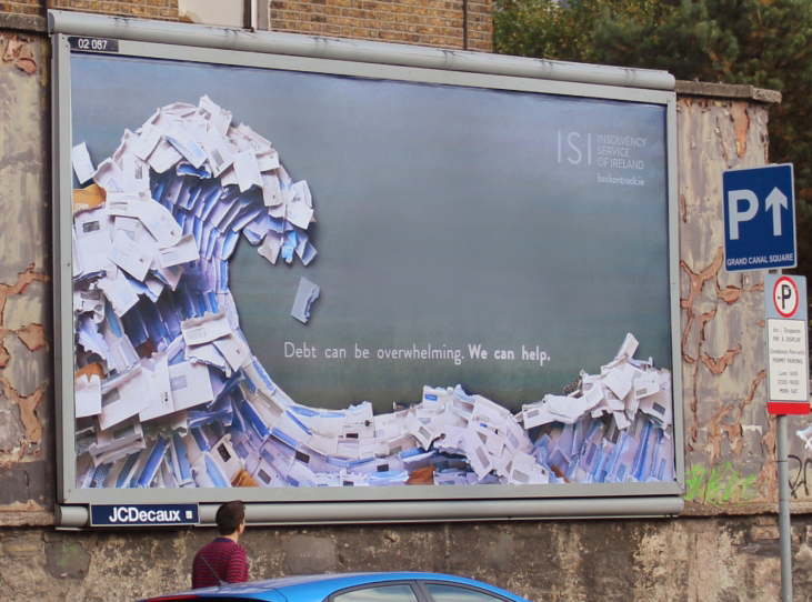
Envelope Wave on 48 sheet poster, Dublin
I don’t often use machine made papers that are based on short cellulose fibres extracted from wood because they have a distinct directional grain and though I will use that to my advantage at times, it’s usually a disadvantage from a sculptural perspective, because they have a polarised plain of strength and weakness. They also have boring textures as a rule.
How do you store your paper and your off cuts?
Ha! You must have an insight into my studio.
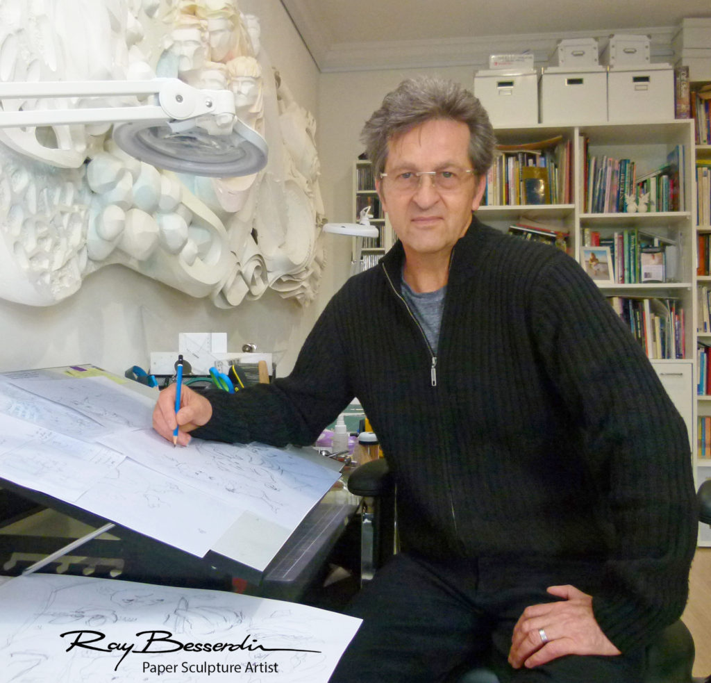
Actually, I wish I had more room because I would store them horizontally where gravity is a little more kind on them, but I designed and had specially built a vertical storage compartment that swings out. It’s very efficient and has vertical dividers that keep the various stock types separated but also prevents the more delicate papers from flopping over and getting kinked. It’s disadvantage is that they can slide down and get damaged, but overall, it works really well.
Discuss the importance of archival paper for the buyer of your work...
Archival papers and materials are critical to my way of art. I want my work to be there for the pleasure of generations to enjoy and I’d hate to think something I did fell apart or changed colour. In fact, I know this will happen with time regardless of how archival my materials are, because it’s in the nature of organic materials to alter with time even in stable temperatures and humidity. But, I want that to be measured in hundreds of years rather than ten or twenty and with the right approach to selecting materials, that’s very doable. And here’s where my undergrad chemistry comes in. I’ve greatly expanded my knowledge on paper and adhesives over the years thanks partly to an industrial chemist who invented the acrylic adhesive I use, the understanding my Uni days chemistry has given me together with further study I still pursue.
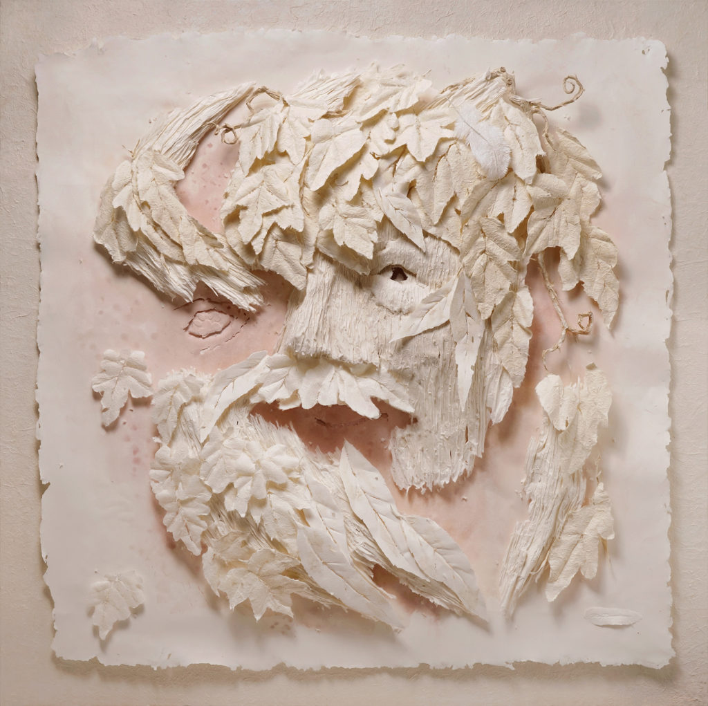
Dionisyan - Green Man, commission piece
All this means that when someone invests in my art, they can rely on it not just for its present-day aesthetics appreciation, but for its long-term increase in value too. An example is Flowing Synthesis which is about as pristine as the day I made it, yet it’s twenty years old and recently valued at about three times what it was commissioned for.
What lead you to leave realism for expressionism and impressionist?
This is a beautiful question Deborah. I will take you back again to my childhood and the difference between my mother and father. I think as I’ve gotten older and become more content with my technical abilities to manipulate my beloved medium of paper, which is my father’s side of me, I have become much more interested in being expressive and not letting the technical dominate my work, which is my mother’s side. At this point in my development I’m now really feeling free to just express myself while confidently in the background knowing I will figure out how to handle the paper so it gives way to a distillation of what I see and feel rather than being bound to technical accuracy and hard edges for example. Funnily enough, in many ways, it’s actually a lot trickier to do because it’s easy to fall back onto comfortable devices like a knife and mechanical folds, but I now strictly limit them. I want the nature of each of these beautiful papers to come out as much as possible and limit myself to basic requirement of first impressions to grasp what I’m portraying. I can’t compare myself to the French “plein air Impressionist painters”, and I don’t mean to but I refer to capturing an impression while not labouring to realistically represent what I see. As for the reference to Expressionism, well I pick one meaning out of that movement of painters in that I really want to raise emotional response from those viewing my art. So, my art, as a someone from the National Gallery once said is like nothing he has ever seen in that it is not the sculpture he knows, and it’s not painting, but something in between. And that leads to my aim to achieve in sculptured paper some measure of what painters do to capture a vision and raise emotion.
It a bigger challenge than doing a realistic representation because you can see the way forward, not so with how you elicit emotional response starting from a sheet of paper.
Discuss the importance of the Wow! factor in your art. Can you explain from the brief to completion you work, ‘Flowing Synthesis Triptych’.
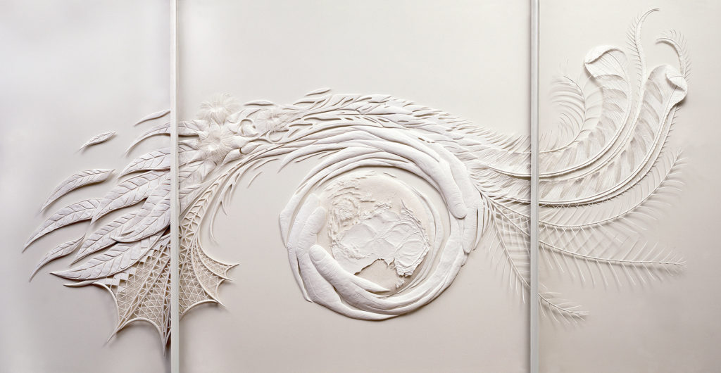
Flowing Synthesis
Flowing Synthesis was the real start to my fine art direction and proved the power of paper sculpture for vision. It began when I started approaching architectural firms to elicit response for an installation. Trouble is, I had never done anything of the type I was trying to talk them into commissioning me for. There was a visionary young lady working in a prominent firm in Collins Street who was designing the refurbishment of the foyer of 150 Lonsdale Street. They had already gone a long way to completing the work. Behind the concierge desk there were three panels that were going to take some sort of slump glass design. The architect said, if you can come up with something better than this and the Macquarie Bank, who owned the building and would purchase the art, approves you’re in. Red rag to a bull! That was the whole brief, so I stewed over it showed them my concept and what came out twelve weeks later won me my first Gold Award in New York, page 4 half page coverage in the Age newspaper and the real beginning of where I am today. The wow factor is something that comes from the beautiful flowing motion expressed over such a large scale of two metres high x three metres long and the simple beauty of the white on white paper. It never ceases to wow those who see it. It regularly brings a tear to people’s eyes because of the emotional response it elicits. It’s actually a synthesis of elements symbolic of Victoria starting with culture in the Arts Centre Spire in the bottom left, Botanical represented by the Mountain Ash leaves and flowers from left across the top to the Faunal symbol given by the Lyrebird tail feathers on the right. I also has an environmental message from my heart to preserve this precious globe we live on represented by the hands caringly encircling the globe, at the centre of which I put Australia, because that’s home. Incidentally, the reason it became a triptych is because of the glass panels it was put behind when it was first installed.
After 15 years in Lonsdale Street, the entrance foyer was remodelled, and the artwork granted back to me at no cost as Macquarie wanted a safe new location to install it but had no immediate solution. I gave it to my wife and it was the feature attraction in my Black Rock Gallery till it was recently closed when our lease expired. I don’t think it will move from our lounge again even when we find a new location closer to town for the new gallery some time in 2019.
You also do 3D work expand on one piece of 3D work that has given you both pleasure to work on and extended your art at the same time.
There is a piece that immediately comes to mind. It’s a huge 3m long work that was spread over about 11 years to finish. I worked on it in spirts, sometimes not revisiting it for months because it was technically incredibly difficult to solve, but it took me to another plain.
It’s called “The Infinite Source”. It’s a philosophical expression of what I believe is the infinite source of all we achieve: The Idea.
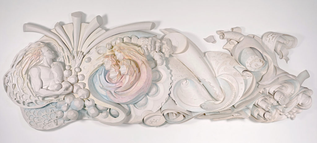
The Infinite Source
The energy of thought beginning like a glowing seed in the man’s head flows through his hands with amorphous masses being matter that we transform into everything and anything, and springs upward like an endless fountain. Symbolically of perfection, I created the man to look like a Greek God.
I put woman with nurtured family in the middle of a driving cog and coloured them to emphasis my belief that they are the centre of our existence. The faces-within-faces form is a reference to extended relationships with others including friends and colleagues, all of whom we depend on too, because we are social beings and do not do things alone.
The big cog drives all we create, in this case expressed in a paper industry, shown with swirling sheets of the material, references to electric motors, cutting mechanisms and other machinery. There are also references to digital intelligence with numbers and symbols spread throughout. It winds and twirls off in all directions into infinity.
It’s the only piece apart from the NT mega sculptures and Mother’s Heart that is not behind glazing. It’s an example of the impressive durability and strength of paper as a sculptural art medium and was a hugely complex task to solve for its shapes, forms and depth. Created in Australian Blue Lake Paper Mill, handmade 100% cotton rag papers weighing 1000gsm, it is surface sized and requires only regular dusting to keep clean.
Take a very small piece and discuss the work.
I’m not really big into small, pardon my play on words! Mainly because I love to be wowed by artwork, and somehow things become surreal when they’re really in your face. However, there are some very small things I’ve done for example like four children’s books I was commissioned to do by Hameray Publishing in Los Angeles. They tell of the Aesop’s Fables and they were a chance to again reflect on my mother I suspect.
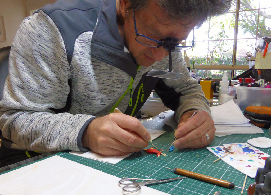
Aesop's Fables (in progress)
She was a great cartoonist and I always loved caricature, which these illustrations are based on. These books were a load of fun but really tested my eyes as there were times I had to work with magnifiers on my glasses to cut the tiny pieces like mouth parts, eyes and hands!! There’s a video of making these books on my website. Gratifyingly, they are the publisher’s best sellers in this category because the kids love the colour and dimensional reproduction of the illustrations. They are all originally a 3D paper sculpture that I photograph for reproduction in print.
On that topic, I also created a separate brand to exercise another lifelong love of caricature, something that was obvious in high school where I was one of the regular school magazine cartoonists. I trademarked in 26 countries these paper sculpture characters I called the Paperartzi® and printed them here in Australia on really colourful, premium quality greeting cards, environmentally responsible techniques of course. They have quite a strong following because they’re very different and make people happy. The idea sprung from seeing all these bits of paper on my studio floor, and I wondered what would happen if they came to life. So, I put faces on them, called them Rip-Torns and then went further and decided I should create a world of all objects paper coming to life and called them all the Paperartzi® I keep them separate from my fine art because it confuses branding but you can find the website or the Instagram page and see them all! And yes, they’re quite small at an average of around 100mm or less.
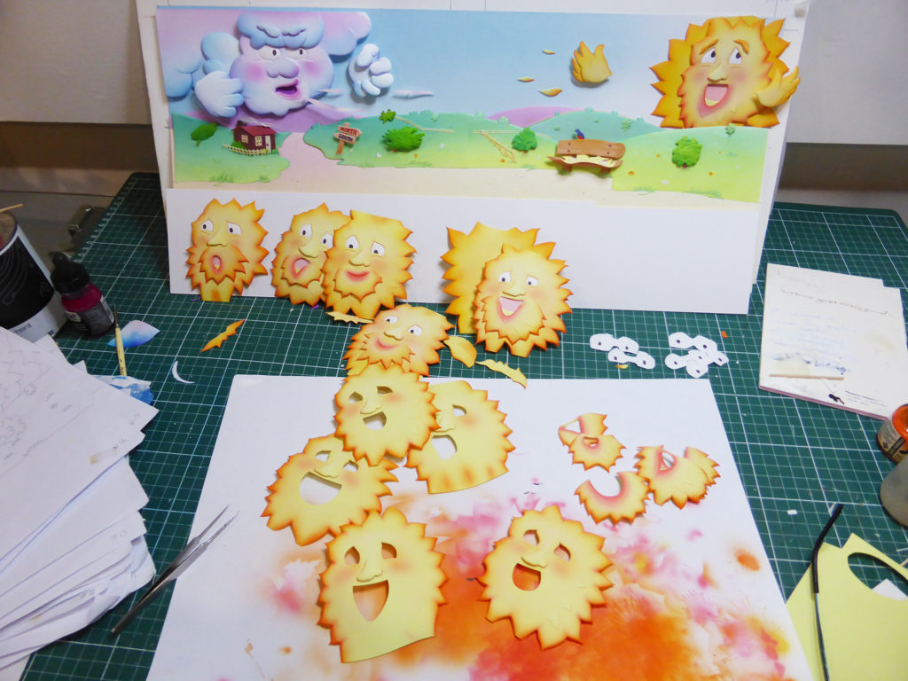
Making North Wind and Sun
Take on of your largest piece and expand on the technical difficulties you in counter due to size.
Well, this was a massive challenge because my works had never been so big, and they also had to faced exposure to the outdoors for a short time. What if it rained? What if it was really windy? When I accepted the challenge to create the NT mega paper sculptures I also had to figure out how to build them in my work shop, a converted basic single car garage where a car has never been parked. These sculptures would be too big to fit in one piece.
I got talking to one of my favourite paper mills, unfortunately not operating any longer, based in Mt Gambier. Kelvin the owner of Blue Lake Paper Mills made special sheets like never before, at 2.4 by 1.2 metres and weighing 1000gsm in pure cotton rag, sized both externally and internally to resist water. Geoff, my industrial chemist friend made about 40 litres of his super acrylic adhesive and I then figured out how to make the whole construction of each sculpture with such integrity, they are like the monocoque build of a modern car. Very strong.
The solution to the workshop restrictions was to make them in pieces and in fact I never saw them completed until they were assembled in situ. To my relief they fitted together perfectly and from design to delivery it was all done in just six months! The public was wowed, and the client thrilled. To my knowledge, they wound up in the Alice Springs Airport but I’m not sure if they’re still there.
Can you explain ‘Endeavour’s Hands’.
It’s an image expression of how I see our pathway in life.
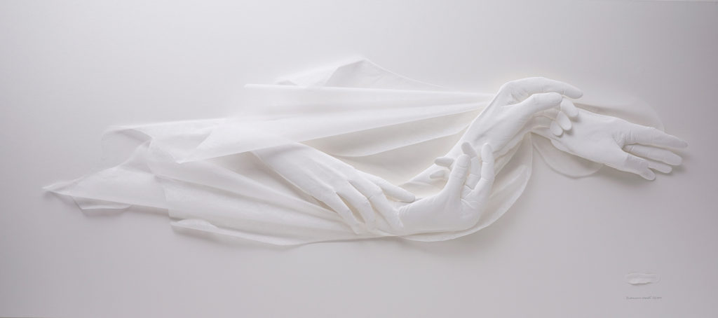
Endeavour's Hands
I love the expressive capability of hands and use them to show the similarity between the challenges of our endeavours with those of a flowing river. Life is not a smooth, straight path. We’re faced with continual learning and decision making, turning us this way then that way; reaching for the help of others or in turn offering them ours, yet always reaching forward.
Water flows with seemingly unimportant impact yet can cut its way through mountains. The visual metaphor of strength and determination of something so fluid as a river inevitably meandering toward and reaching its destination, overcoming its obstacles offers both poignant example and parable to remember.
Water here is represented by the delicate, mere 8gsm Japanese handmade, translucent tissue. The hands are of French, BKF Rieves 300gsm (NOT) cotton paper.
Dimensions: 160 cm H x 80cm W x 9cm D
The Award you won
Mornington Peninsula and Regional Gallery hold what they regard is the pinnacle of biannual exhibitions of works on paper, called the National Works on Paper, or NWOP. That means any kind of art including print making, photography and digital printing, painting and dimensional work.
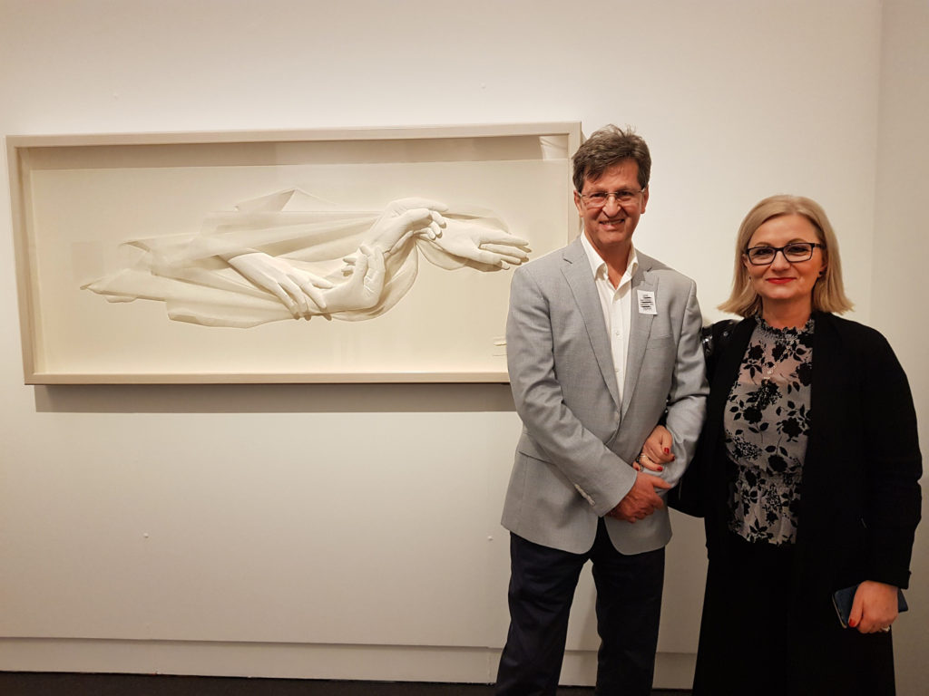
At National Works on Paper
Of the thousands of visitors to the exhibition that went from two months from July this year, the opportunity was there to vote for their favourite artwork. My paper sculpture entry had people intrigued going on the responses at the opening. No one had seen anything like it but winning the People’s Choice Award at NWOP, which came with a financial reward to boot was so satisfying because I was delighted by how it affected the public.
The importance of placing your work into art competitions.
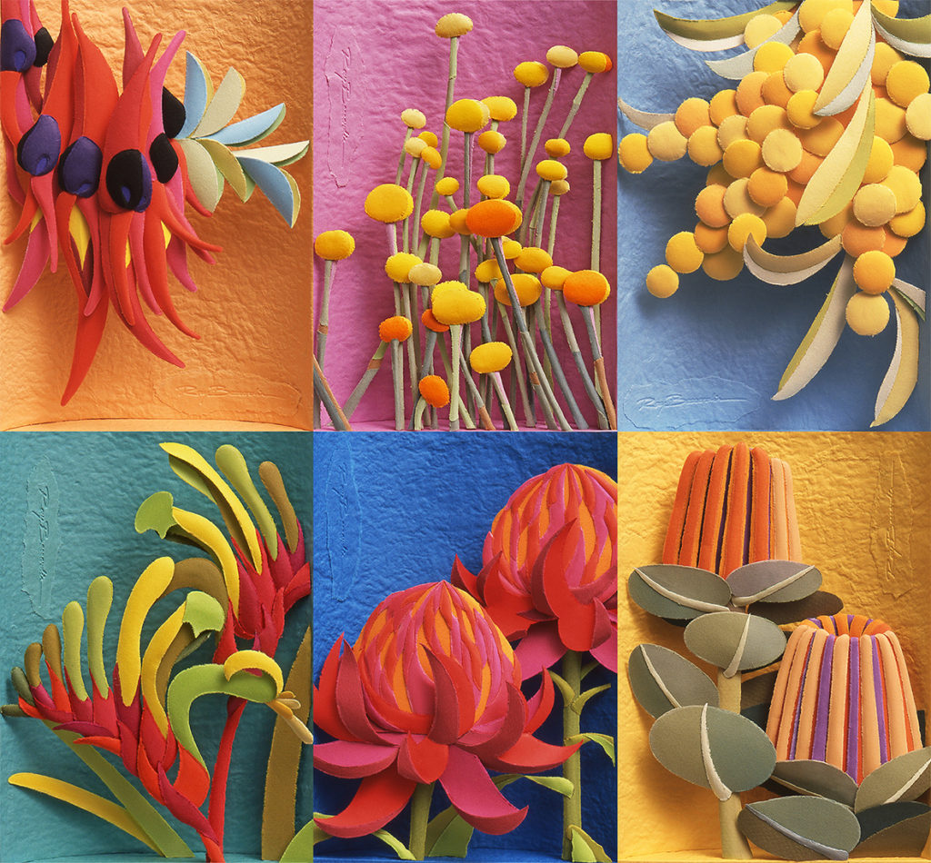
Australian Native Flowers
I love competitions for a couple of reasons. Firstly, they are a terrific chance to get my work out into public view, but the sort of public who love art. You also get valuable social proof that helps others have confidence to invest in your art and it fullfils an ambition of mine, which is to take to the public my love of paper, a medium so beautiful and enduring it deserves to be shown for what can be done with it.
Spider Hunter Wasp on bark: 100% sculptured paper
Just a little thing I want to add here and then I’ll finish. Over nearly 29 years I have managed to achieve so much with what started out as a little design for an ad campaign, and one thing just led to another. It makes me very proud to look back and see how I’ve progressed but it’s been through having vision and following my heart. It’s also been through courage, hard work and doing what I thought was right regardless of what was mostly understood, like painting and other traditional art mediums. I think art is about pushing boundaries, not just what you say about cultural matters for example, but also what you show can be done to express your ideas by means others hadn’t. And doing what I do with paper is creating just that sort of interest because it hasn’t been seen. Though I recently closed the Black Rock gallery, I will be relocating it in time. It was the only gallery of its kind in Australia and that was another very proud achievement that has given a great deal of pleasure to a great many public.
Black Rock gallery
I’ll finish with this, it’s my mission: To create works of art from sheet formed papers that will ever push the artistic expression, technical bounds and appreciation of this ancient, durable, incredibly diverse and stunningly beautiful medium.
The Swan the Protector
Contact details:
Ray Besserdin
Also
Ray Besserdin, Melbourne, Australia
Interview by Deborah Blakeley, October 2018
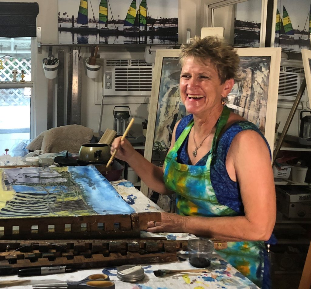
Muffy Clark Gill
Takes the old craft of batik; into contemporary art, giving it an new life.
Zoneone Arts brings Muffy Clark Gill to you…
I first discovered your work through ‘Wash Day: Habana Viejo’. Can you explain….
The technique of this work:
I created this painting on silk using the Japanese resist painting technique known as Rozome. I draw my designs based on my photography onto the silk fabric. I then use a soy/beeswax mixture that is heated and then drawn on the silk with Japanese sheep hair brushes. Acid type dyes that are used to dye Japanese Kimono fabrics are added in layers-- working from light to dark. Each color has to be covered with wax in order to preserve the color and drawing.
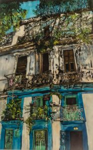
Wash Day:Habana Viejo is rozome on silk 43 x 30 in, framed
General composition:
I zeroed in on a view of an old building in old Havana that had clothing drying from the apartment balcony.
About the location:
I discovered this while walking the streets of Havana, Cuba
You are currently working on a series, ‘Wash Day’, expand on this series?
“Wash Day” comes from a series of photographs of laundry hanging out to dry in places around the world I have visited. I have always enjoyed looking and examining how people wash and dry their household articles. The one thing we all have in common around the world is washing our clothing—the interesting part is seeing the ingenious ways people will dry them! I had been thinking about this series for years and finally decided I had enough images and ideas collected so that I could put together a large body of work. The idea of creating a painting on fabric about fabric is fun! (While camping in Minnesota last week I was even photographing laundry hanging from a camping trailer!)
You also have some of your work made into prints: -
Is anything lost in the process?
Sometimes the colors are too saturated and I have to remind my printer to stick to the original image and format I had given them for printing.
What is the edition limit on the prints?
Usually no more than 100
Are all, of your prints numbered and signed?
Some of them are, but my current series featuring sea life is open ended.
Since the Wash Day series is so new, I haven’t yet decided if I will create reproduction images—if I do they will be numbered.
Discuss how you have connected the ancient art of batik with modern art techniques.
I enjoy using modern supplies such as soy wax and processed silk but rendering my artwork with ancient style tools: brushes, Tjaps, and Tjantings.
 My tools of the trade
Briefly discuss your timeline with Batik art.
I originally got interested in Batik art back when I was in high school. My mother and her friend took me along with them on a trip to Uganda to visit our friend’s family, who was stationed there working in a cancer clinic. Our friend’s daughter took us to see an exhibition of arts and crafts created in batik. I was so excited about it that I went home and experimented with crayon batik with my Girl Scout troop and continued working off and on with it over the years. I really started making it my primary medium over twenty years ago. I started working more in the rozome(Japanese wax resist) method after I took workshops with artist Kiranada Sterling Benjamin in 2014.
Expand on your Florida Tribes series.
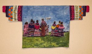
“Defender View” rozome on silk 27 x 61 in
I started creating paintings of our local Native Americans, the Seminole and Miccosukee tribes of Florida after attending Pow-wows in the late 1990’s. I then became interested in the historical aspects of these tribes and started collecting images of them from various state and local archives and translating them into batik paintings. I especially like my hanging shirts images—they were derived from Japanese Kimonos and created as stylized modern day men’s Seminole jackets. I first started creating a body of work in this series back in 2006. I had my first exhibition of the finished work in 2012. Since then I have showed them in museums and galleries around the eastern US. I will be having another four-month exhibition of the series at the Naples (FL) Depot Museum from January through April 2019.
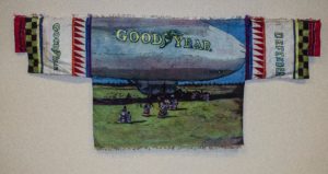
“1929 Defender” rozome on silk 27 x 61 in
Discuss your thoughts on the importance of the role of an artist in keeping history alive.
Over the years before there was photography, it was the role of the artist to record the world around them. These paintings and drawings helped describe people, places and things that we will never see again. In my American Native Series working from archival images is preserving the world that these people once knew so that we can still appreciate them.
Take two works that have led you onto new pathways and explain how this has happened?
"Agua XVI: Ripple" and “Wash Day: St. Lucia"have sent me in different directions.
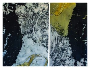
Agua XVI: “Ripple” rozome on silk 33.5 x 42 in
"Ripple" is an abstracted view of two photographs I had taken of a manatee breaking the water’s surface at a wildlife sanctuary in Florida and arranged as a diptych. The painting led me to creating more work abstracting subjects that happen right in front of us.
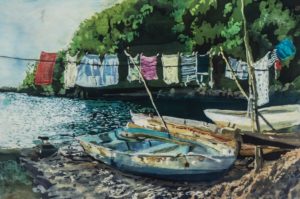
“Wash Day: St. Lucia” rozome on silk 26 x 34 in
“Wash Day: St. Lucia” was an experiment in seeing how I could recapture the setting sun in dye as it hit the boats on the beach with the clothesline hanging above them. It challenged me to look at how sunlight can affect clothing.
Discuss water in your work.
I grew up on a lake in New Jersey for over 18 years. Living on the lake really influenced my life—I love to swim, boat and observe animals and objects that need to thrive upon water. I now look at anything related to water or has water in it (Air, sea, and sky) and how I will describe it visually. The result is a body of work that is more abstract in nature than my American Native series.
You have recently returned from a road trip explain how you…
Record on the road
I kept a daily journal using Evernote so that I can write my impressions and match them up with the photographs I took that day. I also have a “One Sketch a Day” Diary. If an image really speaks to me from my photographs I recreate it either by doing a watercolour drawing or by drawing on my iPad or using the Procreate program with my Apple pencil.
Record and file on your return
Most of my photographs were taken using my iPhone. I then go through my photo files and sort the ones into albums after I mark my favorites and keyword the others so I can easily find them.
What immediately came from this trip.
I created three new pieces in rozome using the Katazome (Japanese stencil) process.
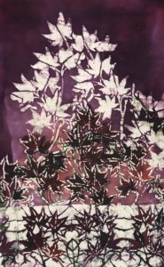
“Japanese Maples” rozome on silk
and at least ten watercolor sketches.
“These Boots Are Made For Showin’” watercolor sketch 7 x 10 in
I also worked on illustrations for a friend’s children’s book. I went back into the studio immediately afterwards and finished several small works for show and sell as well as starting another large painting in the “Wash Day” series.
“Wash Day: Havana” rozome on silk 38 x 26 in
Discuss the importance of leaving your studio for inspiration.
I can only stay in my studio space for so long. My new studio space is an old house with low ceilings and is hard to keep cool in the summer Florida heat. I really love to travel and recreate my travels in wax and dye as memories from my experiences.
Contact details:
Muffy Clark Gill, Florida, USA
muffyclarkgill.com
Jan Huling
Jan Huling, New York, USA
Beads, beads and more beads make up the art by Jan Huling.
Zoneone Arts brings Jan Huling to you…
What lead you to beads?
My sister came to visit me from Seattle years ago and brought a Pez dispenser that she had beaded. I thought it was so funny and adorable that I wanted to try to bead something as well. I started off with kazoos. The difference between what I was doing and what my sister had done was that I didn’t follow the basic colour of the object, I liked using pattern right off the bat
Discuss the use of repeated patterns in your work.
Kewpies - 16”x9”x5”
How do you see the marriage of craft and art in your work?
This is a very difficult question, the line between craft and art is so subjective. I suppose the vision is the art and the construction is the craft. But certainly for what I do, they are two sides of the same coin.
Discuss the planning techniques you use, before even the first bead goes on.
I don’t plan my work at all. I simply find an object or substrate that engages me and jump in. I might have a story I want to tell, but the colours and patterning come about as I go along, one line of beads inspiring the next. I was a commercial artist for many years and had to design to please a client. Now I please myself and if other folks like my work, I’m happy. I have a lot of confidence in my own vision and that allows me to “bead without a net” and just see what happens. I’ve rarely been disappointed in the results.
Discuss this in relations to one of your ‘Kewpie’ forms.
One day when I was still working as a commercial artist, I was in a client’s supply closet and found a large dusty box that had been stored in there for years. I pulled it off the shelf, opened it up and found six brand new Kewpie dolls, still in their boxes! Needless to say, they all came home with me. They were so darling, their form so simple and satisfying, the look in their eyes so mischievous, I fell madly in love with them. I had covered a few toys at that time, notably a My Little Pony, and had discovered how covering a shape entirely allowed me to see the elegance of a well designed form.
Pony, 9.25”x8”x3.5”
And in finding those six Kewpies, I was inspired to think of them as a series. Even though many have sold individually, a few collectors have multiples.
Kewpies - 16”x9”x5”
Can you tell us the history of a ‘Kewpie’?
This is from Wikipedia - Kewpie is a brand of dolls and figurines that were conceived as comic strip characters by cartoonist Rose O'Neill. The illustrated cartoons, appearing as baby cupid characters, began to gain popularity after the publication of O'Neill's comic strips in 1909, and O'Neill began to illustrate and sell paper doll versions of the Kewpies. The characters were first produced as bisque dolls in Waltershausen, Germany, beginning in 1912, and became extremely popular in the early 20th century
Kewpies - 16”x9”x5”
You have had a residency in Mexico. How did this, either expand or alter you work.
I’ve been lucky enough to have travelled extensively in Mexico, a country that I dearly love and have been inspired by. The residency at 360 Xochi Quetzal, my first, was very special to me particularly because of the wonderful people I met there. I was just coming off, of an extremely busy and emotional year and really needed the space to recharge. I spent the month thinking about my work and getting my head around grant writing as well as working with a Huichol Indian friend.
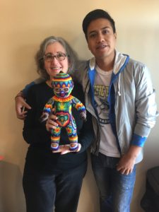
The Huichols are a Mexican tribe and one of the art forms of which they specialize is covering objects with glass seed beads. Like I do. But not. While I have been accused of appropriating this native work, we actually have completely different techniques and artistic vision. I wanted to put an end to these accusations and so I brought my Huichol friend, Xauleme Carrillo, a Kewpie doll to cover in his style and I covered a typically Huichol shape, a jaguar head, in mine. It was delightful to us both to see how the other one approached the work.
Jaguar Head - 25”x25”x8.5”
Discuss Das Bug using a detail image / images to show the complexity of your work.
Das Bug was so massive that I knew I would want to incorporate many different patterns to not only keep myself interested as I worked, but also to make the final piece exciting and surprising to look at. I love making paisleys and did that down his back and a stripe just goes with everything. But, as I said, nothing was planned out ahead of time.
Das Bug, Detail - 61” x 110”x 59”
Discuss Das Bug.
Das Bug is an eight foot long beaded praying mantis.
I found the substrate online made by a mannequin manufacture and knew immediately that I had to cover him. Of course, seeing him on my computer screen and having a gigantic bug set up in my living room where two very different things and I was so intimidated by his size that I kept putting him off!
Das Bug, Detail - 61” x 110”x 59”
When I finally decided to jump in, I had a lot of fun. He took about seven months to complete.
How did this work evolve?
When I go into my studio in the morning, I want to be surprised. I don’t want to have a clear idea of what I’ll be working on at the end of the day. My work is so meticulous and I work on things so intensely and for so long, particularly Das Bug, that if I knew what I was going to do and what it would end up looking like, I’d be bored to death. The work itself evolves. It tells me what it wants. I listen.
Are there other bugs?
I actually wish I could find more bugs in that massive scale, but I’ve had no luck so far. I really love insects, particularly praying mantises, along with bats they are my “power animals”. I have beaded beetles, real ones!
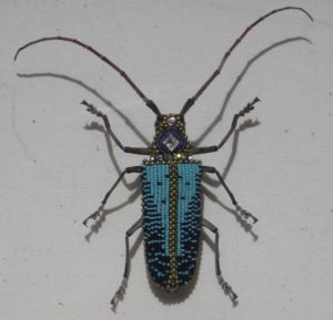
Alexander Beetle, 4”x4.5”
Explain about the different types of beads available and why you choose, Czech glass beads for your work?
There are different kinds of seed beads, the ones from Japan are very beautiful and absolutely perfect, each bead exactly like the next. The Czech beads are imperfect, which is why I love them so much. Some are thick, some very thin. Some are squished on one side and perfect for filling an odd space. I love how very human and warm they are. The Japanese beads are great for weaving and jewellery, but perfection has never been my goal.
Comment on the care needed for your pieces post sale.
My work is delicate, but likes to be dusted with a nice soft dry paintbrush.
Can you expand on your involvement at AVAM?
What a thrill and an honor it was so be in a show at the American Visionary Art Museum! My fellow beadists, Nancy Josephson, Betsy Youngquist and I had been wanting to show our work together for some time. Nancy had worked on several shows at AVAM and has a great working relationship with their director, Rebecca Hoffberger, so she approached Rebecca with our proposal. Happily, our ideas fit in nicely with the museum’s theme of Mystery.
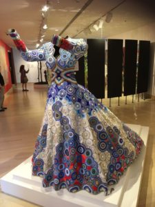
The Gown: Affinity - 62”x59”x81”
It is mind blowing the number of beads in Affinity. Discuss one small detail and a larger detail to show the intricate bead work.
Perhaps I should begin by telling how The Gown:Affinity came into being. I had gone to see the live action Disney film, Cinderella, and was enchanted! I came home and drew gown after gown, twirling and dancing and thought it would be great fun to bead one. So, I called my pal Nancy to tell her about it. She said, well, yes, that’s cool, but why? What does it mean? Why should we care? Good questions. I decided to put it on the back burner.
About a year later, my mother died. She had been a needlework artist, mainly a quilter, and a huge influence and inspiration throughout my life. When I got back into my studio after her death, I started thinking about the gown again and I realized what it meant. The gown was in my attic, it was the wedding gown that my mother and her two sisters had been married in. It was the gown that I’d been married in.
The first problem was how to solidify the dress so that I could work on it. My husband and I discussed it for weeks before I realized that the only thing that made sense was 3D printing. This was a first for me, so it took a bit of research. We ended up staging the gown by putting it on a headless mannequin and stuffing the skirt with boxes and fabric until I had the shape I wanted. Then it was scanned and those computer files were sent to Voodoo Manufacturing in Brooklyn where they have about 150 smallish 3D printers.
Over the next several weeks, the gown was printed out in 260 Lego-like bricks which were then assembled into a life size piece.
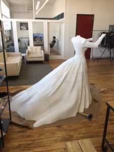
Then the real fun began! I knew that blue would be the major colour, it was my mom’s favourite. While I was gathering my blue beads together I started looking at one of Mom’s quilts which is mostly blue and red, a combination that was not one that I’d usually choose, but which challenged me to go beyond myself. I wanted my mom’s voice to be heard.
A motive that can be seen throughout my work is the mandala. I love to use a flat back cabochon and bead around it to make a flat circle of pattern.
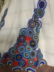
The Gown: Affinity, detail
For Affinity I used a lot of cabochons that were symbolic of my mother, her monogrammed pin, symbols of places she had travelled to and loved, J’s for my sister and brothers and me, tokens from her father’s oil business.
I also made my own cabochons by fitting photos into bezels and covering them with clear resin. My dear sweet cat died while I was working on the gown, so she’s represented in there. For fun, I put a Batman symbol on the gown and to my shock and sadness, Adam West (who played Batman on tv during my childhood) died the next day!
Very sadly, I am the only wearer of the Gown still alive. I would give anything to be able to show it to my mother and my two aunts.
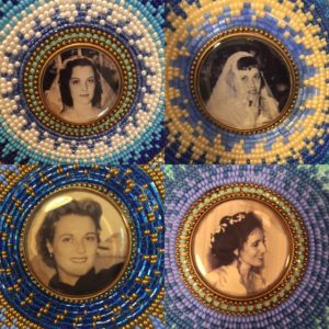
The Gown: Affinity, detail
But while I was working on it, I could feel my mom’s presence so strongly and I felt her pride and love in a way that, well, changed me.
The Gown: Affinity, - 62”x59”x81”
When she first made her presence known to me, I was listening to one of her favourite albums, Affinity by the Oscar Peterson Trio. I found the title so appropriate that I choose to use it in my title.
What is the life of Affinity.
Affinity spent her first year at AVAM and now she is set up at the Pen + Brush Gallery in New York City in a show that is opening next week and closes on October 27th. After that she’ll be in an exhibit called New Directions in Fiber Art at the Montclair Art Museum in New Jersey. And after that? I don’t know.
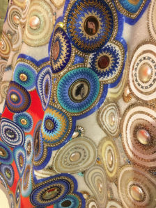
The Gown: Affinity, detail
I created Affinity in my home studio in Hoboken. She had to get through a few sets of double doors to get out of the house, we even had to remove some doors!
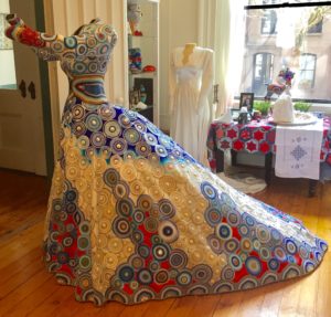
The Gown: Affinity, - 62”x59”x81”
We recently moved to a loft in Jersey City that doesn’t have double doors or any other way to get her in here, so I really must find shows, one after the other, for her. Or sell her. Or, ideally, have her permanently placed in a museum.
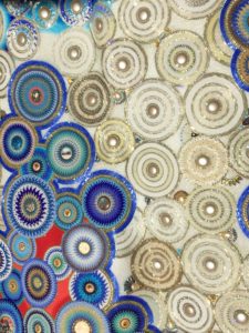
The Gown: Affinity, detail
How do you top this? What is next to come from your studio?
Good question! I’m hoping to create a bunch of animal-esque pieces that will work together as an installation but will still be able to stand alone as a cohesive works of art. I’d like to use substrates in a variety of sizes for this.
I’ve really enjoyed going big, the problem of course is that most collectors don’t want a huge expensive beaded sculpture, imagine that! Also, I work alone, so my gallerists need me to keep churning out work that can be sold rather that hole myself up for a couple of years to put together a collection.
Contact details:
Jan Huling
On instagram @janhulingbeads
Represented by the Duane Reed Gallery
Jan Huling, New York, USA
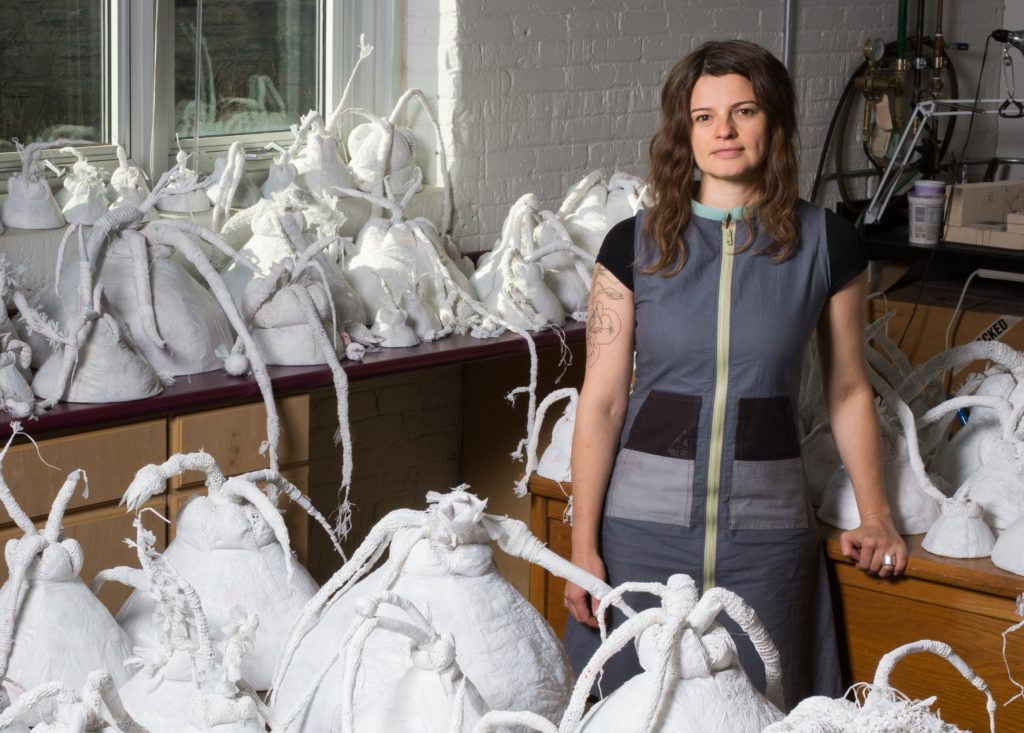
Yevgeniya Kaganovich
Yevgeniya Kaganovich, Milwaukee, USA
How does Kaganovich find the time? With this complex mix, Professor and Associate Chair of the Department of Art and Design at the University of Wisconsin – Milwaukee. Head tof Jewellery & Metalsmithing as well as Digital Fabrication & Design Areas. Added to this Collaboration with other artists and personal art work.
You say you are ‘an object maker’ can you explain this?
My work has developed in distinct, but related directions: jewellery that explores materiality and cultural/social functions of adornment, sculptural body extensions defined by the corporeal body and the social environment, and installations that attempt to locate th
Pearl Clasp Necklace 2, rhodium plated sterling silver, porcelain, silk thread: 8 x 8x 5/8 inches, detail, Photo Credit: Yevgeniya Kaganovich
sculptural objects related to the body,
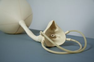
Detail, Double Mouth Piece 20, 6” x 5” x 1’ x 5”, Photo Credit: Yevgeniya Kaganovich
and object-based site-specific installations.
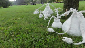
Grow, durational project finale, Lynden Sculpture Gardens, 2016, Reused plastic bags variable, Photo Credit: Yevgeniya Kaganovich
The physicality, the “objectless” of these projects is how I think through and communicate ideas, it’s how I understand and engage the world.
Throughout its various modes, my work is defined by my training and practice in Jewellery and Metalsmithing. My handling of the materials is informed by sensibilities that are prevalent in the making of jewellery and metal objects. The range of specific processes, methodologies and materials enhances my ability to engage in topics that are inherent to craft: wearability, the body, function, ritual, and preciousness. I firmly believe in the ability of creative objects to carry meaning and communicate ideas through their historical, social and cultural use. The advantage of originating in a craft discipline is the opportunity to utilize formats rooted within the applied tradition and employ craft strategies to create objects that explore and communicate ways of existing and making sense in the world. Craft scholar Lisa Norton stresses that craft has this inherent capacity to talk about “the stuff of life” through objects because craft, in general, is primarily about the body, use, and life1.
I strive to create objects and experiences, all in one way or another tangential to the applied tradition, whether it is through format, process, material, performance of labour, or the cultural implications of objects and locate them at the point of the body as the site of exchange. Through these objects, I explore ideas about being and making our way through life. The variety of material, format and process approaches allows me to address these concepts through objects, ultimately resulting in a hybrid practice.
Your work changes in scale what has led to this diversity?
The physical shifts in scale in my work coincide with shifts in modes of consideration of our bodies in relationship to objects meant for the body, our bodies in relation to each other, and our bodies in relation to our built or natural environment. jewellery is meant for the body, but it addresses ideas and functions in ways that are bigger than the body. I physically manifest this idea by, for example, manicuring small freshwater pearls into images of perfect large peals, albeit with silicone rubber. My sculptural body objects physically extend the ideas we have about ourselves and each other through connective rubber elements and inflatable volumes. And site-specific projects that engage our built or natural environments consider our bodies’ existence within them and project our effects on them.
Let’s start small.
Explain your fascination with pearls.
I am interested in the distance between “pearl “– the object and “pearl” – the cultural contract. Pearls have come to have so many different, sometimes diametrically opposing connotations: status, wealth, power, glamour, celebrity, purity, innocence, corruption, and seduction. The pearl operates as a signifier of these cultural constructs. But in reality, the pearl is this very unlikely object. Considering its origin, a pearl is a scar, an imperfection that has been glorified, elevated to a status of preciousness, and ascribed a high monetary value. For all of its cultural conditions, prestige and historical statue, it has meagre a beginning as a mere irritation, an anomaly. It gets even more complicated with cultured pearls: they are deliberate intrusions into live organisms, hybrids, mutants. And then there is nacre, the iridescent outer coating of pearls, which is a bit magical since its formation is not fully understood scientifically. It is secreted by a mollusc, its function is to smooth the shell surface and protect the soft tissues from debris/future pearls. The mollusc deposits successive layers of nacre onto a pearl all its life. We value the pearl based on how thick and lustrous its nacre is.
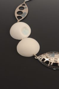
Pearl Clasp Necklace 4, 2012, Rhodium plated /sterling silver, porcelain, freshwater pearls, silk thread, glazed made by freshwater pearls fired to cone 13 lacquer, 8” x8” x5/8” Photo Credit: Yevgeniya Kaganovich
In my “pearl” work I attempt to think through some of these dichotomies. I examine the cultural value of pearls by transforming small freshwater pearls into an image of a large perfect pearl necklace. I juxtapose precious and experimental materials to question the cultural value of precious jewellery. Through blanking, silhouetting, inflating or flattening the image I am attempting to transform the work into iconic images of jewellery. These pieces are both literally and culturally images of a pearl necklace.
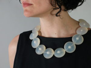
Pearl Necklace X, 2006, Potato pearls, silicone rubber, 14KW gold, silk thread, 81/2” x 91/2” x ½” Photo Credit Naomi Shersty
Expand on your findings on pearls during your residency in Hungary at The International Ceramics Studio.
I was fortunate to be included in a group of American and Hungarian jewellers who came together at the International Ceramics Studio for the “Sculpture to Wear” residency. Originally, I intended to work with porcelain as a precious material to explore the absence of pearls. I encased small freshwater pearls in thin porcelain disks, and my intention was simply to burn the pearls out, leaving an impression, a void of a precious jewel in a precious approximation of it. Instead, when fired, the pearls oozed out of the openings in a blue transparent glaze. I started firing whole and crushed pearls onto porcelain surfaces until I could control the amazing transparent blue droplets.
In the work that I subsequently made, freshwater pearls were transformed into puddles of lustre on the surface of an otherwise soft, slightly deformed large round porcelain forms. I slip-cast porcelain into images of pearls and give them “nacre” by melting actual freshwater pearls onto the surface. The fusing of the two precious materials, freshwater pearls and porcelain, changed both, creating a new kind of precious jewel.
This series utilized altered images of a traditional pearl clasp and porcelain “pearls”. I flattened, inflated, and graduated the clasps, disrupting their function in this transformation and making them into decorative elements. The title of this series, Function Fictions, refers to multiple dichotomies that I aimed to explore in this body of work: precious-non-precious, functional-decorative, jewel-setting/connectors/mechanisms.
In my mind pearls are almost mythical fictitious constructs. In this series large perfectly round pearls were approximated in porcelain, while real pearls serve as connectors. I was also creating a fictitious jewel by melting pearls onto the surface of porcelain. There was a lot of play with inverting and distorting the traditional functions of pearls as cultural, social and precious material constructs.
There was also a more direct inversion of functional elements, particularly the traditional pearl clasps, becoming decorative. They were inflated, graduated, fragmented, flattened, blanked out, and juxtaposed with negative silhouettes of pearls. Their decorative characteristics were played up to the point where they lose their use as mechanisms. Clasps became ornate decorative elements, hooks became “beads” and “pendants”.
You comment, ‘I am fascinated by the function of craft objects beyond utility’. Discuss.
The body is often the subject and/or the site, but function, whether it’s utilitarian, social, or evocative, is probably just as important to my practice.
In making jewellery I am interested in exploring the cultural and social functions of adornment. I am fascinated by the function of craft objects beyond utility. Specifically, I am interested in how jewellery functions to signal identity, power, fraternity and status as well as its ability to communicate ideas about the wearer, project the desired image, attract, and seduce. Much of how a piece of adornment functions is determined by the materials and the value attributed to these materials – this is the focus of much of my wearable work.
Throughout the long-standing series of body extensions, I address the complexities of inner personal and social interactions conditioned by the corporal body.
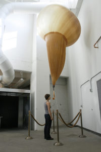
Balloon Mouth Pieces 11, cast rubber weather balloon, helium, plastic cord, stanchions, 22’ x 8”x 8” Photo Credit: Yevgeniya Kaganovich
I explore the absurdity of our attempts to express, perceive, communicate and understand. I think of the pieces I make as body extensions and as projections of mental habits and bodily knowledge. I aim to make objects that through their use comment on aspects of our existence, our experiences, our interactions, our bodies. I am interested in function as a point of access for the viewer and an opportunity to create meaning. It’s important that the work is not read as sculpture to be observed, but that it invites the viewer’s participation, whether actual or imagined. It’s through this engagement that the function and implications of each piece are considered.
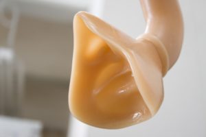
Balloon Mouth Pieces 11, detail, Photo Credit Naomi Shersty
While the objects I make mark the body as the site of exchange, in installation I attempt to locate the human body within architectural and cultural constructs and consider our existence within/effect on them.
You collaborate with other artists. Take a collaboration and explain how it evolved and how your work changed because of the collaboration.
Discuss your installation ‘Grow’
I’ve been really fortunate to have an opportunity to collaborate with a few amazing artists. While the subjects of these investigations are often consistent with my overall practice, collaborative work offers different and new ways to address these same ideas.
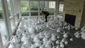
grow, durational project finale, Lynden Sculpture Garden, 2016, Photo Credit: Jim Charles
For me collaborations are always an exercise in letting go, giving up a certain amount of control for the sake of ending up somewhere new and different. My durational project grow, is probably the most extreme version of that. I was the initiator and the primary maker, but many other people, artists and non-artists, contributed their time, skills, and materials to the project. I developed the initial forms, processes and parameters for this installation, but I didn’t know how, where, or when it is going to end.
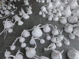
grow, durational project finale, Lynden Sculpture Garden, 2016, Photo Credit: Jim Charles
grow was series of durational installations in a number of public buildings throughout the city of Milwaukee and the surrounding areas. At each location, a system of interconnected plant-like forms, simulating a self-propagating organism in multiple stages of development, grew over time, utilizing reused plastic bags as a base material. The layers of plastic were fused together to create a surface similar to leather or skin, moulded into plant-like volumes, and connected with plastic bag "thread", creating a system made out a singular material. I set up official plastic recycling bins at each location, where I periodically collected the bags and added to each organism. Like weeds, these organisms grew into unused spaces: niches, stairwells, and other peripheral architectural elements.
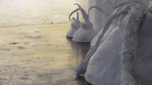
grow, durational installation project, Placing, the Golden Spike: Landscapes of the Antropocene, INOVA (Institute of Visual Arts), 2015, reused plastic bags, dimensions variable,
Photo Credit: Jim Charles
My goal in grow was to transform an artificial manipulated material into a seemingly unchecked, feral, opportunistic growth, to visualize and punctuate reuse by juxtaposing it with slow, methodical, labour-intensive making that plays with control, “craftiness”, and precision. Public involvement ranged from contributing plastic bags to the project to participating in workshops that I regularly held with my student assistants, who worked with me through a terrific undergraduate research program at my university.
The project launched in October 2012 at the Milwaukee’s Lynden Sculpture Garden. Since then there have been subsequent “plantings” at multiple locations throughout the city of Milwaukee, and also in Florida, Texas, and Pennsylvania.
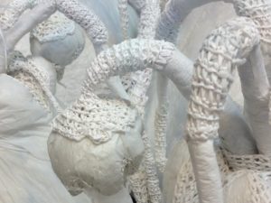
grow, detail, durational installation project, Aesthetic Afterlife, Haggerty Museum of Art, 2014, reused plastic bags, dimensions variable, Photo Credit: Jim Charles
From the beginning, I wanted to make something that was acting like an organic self-propagating organism, so I chose the most artificial material I could think of – plastic bags – and made “plants” out of it. Material is often at the centre of my practice: what it means, how it’s used, what can I do with it. I quite enjoyed the challenge of taking this ugly, unruly, disposable material and developing ways to work with it that would make is aesthetic, substantial, and convincing. These material contradictions, such as crocheting out of steel, casting feathers in concrete, or making walls out of actual feathers are often present in my work.
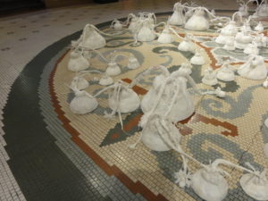
grow, Milwaukee City Hall, 2016, reusable plastic bags, dimensions variable,
Photo Credit: Yevgeniya Kaganovich
The way that this project was different from all other collaborations was that it necessitated the public engagement and I didn’t know where it was going to lead. I set up the parameters for the durational project, but within those, I had to give up quite a bit of control, be committed to incorporating all contributions, and just see where it was going to go. Polly Morris, the Executive Director of the Lynden Sculpture Garden, was instrumental in defining and encouraging the public component of growth, which was new to my practice.
My intent with the public component of the project was to help me tend to and grow and artificial organism. I wanted to make something that would not even exist without our care; it came into being by us propagating it. Interestingly, working with multiple students and workshop participants resulted intending to and growing a community. In the guise of tending to this artificial thing, I was really tending to and developing relationships.
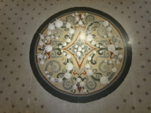
grow, Milwaukee City Hall, 2016, reusable plastic bags, dimensions variable,
Photo Credit: Yevgeniya Kaganovich
Public participation also underscored my intuitive sense of the project: no matter how much I’ve worked on this project daily, no matter how many people helped, no matter how long it took, we were never able to keep up with the speed of the refuse.
The installations varied greatly from one location to another, as all of them responded to the particular interior spaces. At the Milwaukee City Hall, in addition to filling in nooks and crannies with the sculptures, I installed them on the mosaic floor, confusing this “growth” with the decorative interior detail.
At all of the locations the forms could be moved around for cleaning or events; they could be treated very informally, but they had to be dealt with, they were in the way. This gave me an idea for the project finale. When all forms were transplanted back to Lynden for a final installation, instead of subsequently recycling them as was originally intended, we had a “come get your grow transplants” weekend. Many people came, got their transplants, took them home, and then had to figure out what to do with these consequences of our actions. Even though we transformed a huge amount of refuse into these material and labour dense objects, we still had to deal with them. It didn’t solve anything.
The final installation at the Lynden Sculpture Garden was largely defined by how many forms existed at that point. I was able to “plant” a very dense field of the “bulbs” in the Lynden’s Garden Room. I also took them outside and situated them between trees and the modernist sculptures that reside at Lynden, emulating how things grow in nature relative to one another and to build structures. This final outside iteration of the project landed it solidly between nature and sculpture.
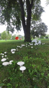
grow may yet have another lifecycle. I am currently working as part of a mycology focused artist collective, which includes three other artists: Lisa Moline, Lane Hall and Jim Charles.
Expand on your SGS/HED series. Discuss ‘How the objects have a sense of being both for and of the body and have both artefact and specimen qualities’.
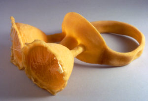
SGS / HED eyepiece 1, 2003, latex, nylon, food colouring, 4” x 11” x 12” Photo Credit: Yevgeniya Kaganovich
With SGS/HED series I strive to create objects that are ambiguous in their nature, their function hindered, their use frustrated and their origin unclear. In making a reminder of a hyped experience, I leave loose ends and don’t complete the total condition of the objects. I fuse the specimen and the artefact qualities to the point where it is impossible to identify the objects. Did they come off the body or are they meant to be applied to it? Are they tools or outgrowths? Are they prosthetics of some sort or interfaces meant to heighten a sensory experience?
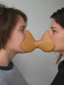
Double mouth pieces17, 2009, rubber cast; 4”x 61/2” x 4”
Photo Credit: Yevgeniya Kaganovich
These objects appear to be vulnerable and aggressive, fragmented and self- contained entities, all at the same time. The fusing of the artefact and the specimen qualities within a single piece lead to these objects having a sense of being both for and of the body. I render it as a tool and an outgrowth, as a device and an organism, all at the same time. These dualities result in a hybrid object that is frustrating and unclear, which allows for multiple readings of the work.
The more recent additions to this series retain this dual quality, are more explicitly devices rather than outgrowths. I have been focusing on implications of function, its possibilities and potential as a rhetorical device. In this work, I aim for the function to be transformative, not simply self-defeating, serve as key to understanding the objects.
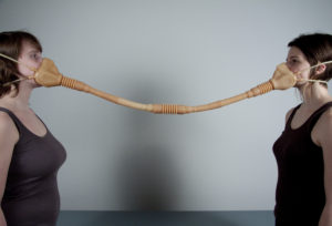
Double Mouth Piece 19, 2010, cast rubber; 4’3” x 5” x 7” Photo Credit: Yevgeniya Kaganovich
Double mouthpieces are sets of objects with impressions of a face on each end. Because of the absence of the straps, the only way to use the objects is for two people to stand in a very close proximity to one another, wedging the object between their faces, which can be uncomfortable or even suffocating. These objects undermine themselves through their own use; they beg engagement between two people only to reveal the difficulty of it. Thus, the physical challenges of using these objects uncover the social discomfort with such proximity.
The double mouthpiece connects two masks by a hollow tube. On each mask, the nostrils are open, which makes it possible to breathe into the piece. When in use, two people share the finite amount of air within the piece and their lungs, urgently connected and kept at a certain distance by the device.
The double mouthpiece has an inflatable volume to which two masks are connected. The openings of the mouths are equipped with one-way valves so that the air/sounds/words that go into and mix in the balloon do not come back out. This device puts two people in proximity but at a distance, the physicality of which is compounded by the psychological distance that is created by the complexity and the awkwardness of engaging the object.
balloon mouthpieces 11-14, are seemingly self-sustaining but ultimately self-defeating closed off systems.
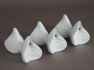
Double Mouthpieces 22 -24, 2010, porcelain, 33/4” x 6”x 33/4”
Photo Credit: Yevgeniya Kaganovich
They are inflated with helium, elevating the masks to a face level of an average height person. The pieces are tethered to stanchions which demarcate an area open on the entrance side. As with other work in this series, they orchestrate the viewer’s engagement through their specific directives: the height of the mask, the stanchions open on one side and the vinyl footprints on the floor are meant to solicit the viewer’s physical or intellectual participation. I shift the scale with these objects significantly, while still retaining the relationship to the body. Exaggerating the size creates tension between the imposing presence of the object and the minuscule details created by the bodily imprint, causing the viewer to constantly zoom in and out between the macro and the micro. Because of the exact indexing of the body, the object is quite specific in how the viewer is to engage with it, but the purpose and implications of this interaction are quite uncertain: does the viewer provide the object with breath, or does the object supply the viewer with some substance? This carefully orchestrated exchange remains ambiguous. The resulting object is unsettling, unclear, threatening, self-conscious and necessary. Whether the viewer acts upon it or it acts upon the viewer, the engagement is compulsory.
Plastic – is becoming a BIG topic and problem worldwide, how as an artist can you influence the appropriate use of plastic?
With grow, I wanted the “organism” to appear as a plausible ecological development; something that grew out of all that plastic debris, something feral overtaking its surroundings. This idea resonated particularly well once the forms were installed outside, making this speculation physical. The unfortunate thing is, a version of this is actually happening. Plastic has made its way into the geological layer: there is now volcanic rock with plastic compounds in it. My work is often a visualization and a reminder of these processes, physically placing objects in our way for us to deal with.
My projects that utilize reused plastic bags are not very effective in taking out a significant amount of this material out of circulation, nor do they process the waste in any way that is not going to be problematic to the enrolment in the long run. Seemingly, the function of the grow bulbs is to propagate and to reuse as many plastic bags as possible. But in that goal, we facilitate their growth, we propagate them, and we don’t take out plastic bags out of circulation to an extent that would matter. This attempt at reuse is ultimately futile.
This futility was built in to the project from the very beginning: even though these are super dense objects (8-300 bags each), no matter how long I work on the project, no matter how many students are a part of it, no matter how many workshop participants help, we are never able to keep up with the speed of refuse.
This project performs the act of reuse, it visualizes and punctuates it. We collect and process a lot of bags, making these dense labour-intensive things. grow makes this reuse visible, makes us slow down, sit down, work, think, and talk through the process. In the guise of tending to an artificial organism, grow ends up tending to a community that comes together for a conversation about reuse.
Show 2 or 3 pieces of your plastic jewellery and how it has evolved over years.
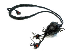
Red Berry Necklace, 2012, plastic bags, 34” x 6” x 21/4” Photo Credit: Michael Bernard
I started making wearable pieces, utilizing the materials and processes I’ve developed in making grow as a way to balance the durational project that took four years with finishing some concrete individual objects. It was also an opportunity to use all the colour plastic bags we were collecting. Some pieces became inside jokes on the rarity or abundance of certain plastic bag colours, such as All the Blue Bags and Some of the Red Bags necklaces.
In making the wearable pieces, I am expanding on the fabrication methods developed earlier, with more attention to detail, and a greater variety in textures and colours. I’ve used the leathery colour plastic bag sheet to make objects that look deflated. The inherent properties of the material make it possible to fuse the seams, have movable joints. I often articulate the hinges with a different colour.
In addition to working through the physical properties of these materials, I am thinking about what it means for us to carry the weight of this refuse on our bodies. Some of the latest pieces literally become weights. Relatively small in volume, they are heavy, they are physically weighed down.
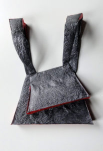
Deflate 3, 2015, reused plastic bags, plastic, 22” x 81/2 ” x 1 Photo Credit: Jim Charles
I am interested in using my making skills, developing new onces appropriate to the materials, and employing traditional craft processes. During a summer residency at the University of Oregon, Jovencio de la Paz, a fibers artist and faculty, taught me how to weave. Some of the latest wearable pieces are an accumulation of sheet, crocheted and woven surfaces.
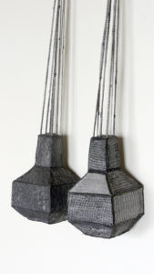
Gray/ Gray, Neckpiece, 2017, reused plastic bags, copper shot, 21” x 51/2” x 21/4”
Photo Credit: Jim Charles
Expand on how you work in three art practices, jewellery, sculpture, and installations.
As discussed above, physicality, “objectness”, material investigation, the body, function, and connection to the applied tradition link the various modes of my practice.
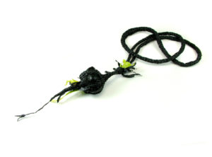
Green sprout Necklace, 2012, plastic bags 31”x 51/2” x 2” Photo Credit: Michael Bernard
I try to choose the formats that let me develop any particular idea in the most appropriate and effective way.
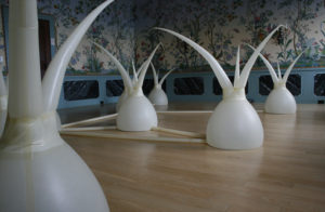
Yevgeniya Kaganovich with Nathaniel Stern, Strange Vegetation, 2011, installation, latex, plixiplass, air compressor, arduiono, prototype platform, relays and diodes, solenoid valves, ball valves, servo motors, computer and custom-built software, dimensions variable, Photo Credit: Naomi Shersty
I seek out venues and sites for my projects that make the ideas resonate, I look for communities that will find the ideas relevant and engaging.
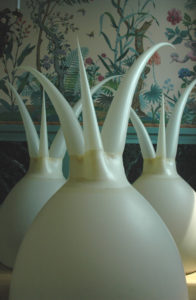
Strange Vegetation, 2011, detail, Photo Credit: Naomi Shersty
You are an Associate Professor in and Chair the Department of Art and Design at the University of Wisconsin – Milwaukee, how do you see your role in the growth of your students and courses available to them.
I am currently a Professor and Associate Chair of the Department of Art and Design at the University of Wisconsin – Milwaukee. I head the Jewellery & Metalsmithing as well as Digital Fabrication & Design Areas.
As a researcher, I see my role as contributing to the development of the craft field, expanding the understanding of the applied tradition and challenging its existing boundaries. The hybrid and collaborative nature of my practice necessitate proficiency with multiple processes, a range of approaches, and engagement with a variety of contemporary critical issues. This diversity of approaches to research has proven to be an asset to my teaching, as it allows me to bring a range of technical, conceptual, and critical perspectives to the classroom.
While at UWM, I’ve been particularly invested in curriculum, program, and facilities development. My role as an educator is to continuously improve our program and update the curriculum to keep it current and relevant to the contemporary discourse. To maintain and improve significant and positive student outcomes, I make sure students have access to a robust curriculum, safe and productive spaces, and a supportive and vibrant community. I focus on our students’ professional development and overall preparedness for a number of creative pursuits through competitive exhibitions, visiting artists events, and community engagement programming. I strive to develop relationships with students that foster their individual development, provide Opportunities that support their interests, and encourage them to contribute in an innovative manner. One of the most rewarding parts of my job is advocating for my students and the work that they do.
1 Norton, Lisa. “Individuation of Craft”, Craft in Real and Virtual World panel, College Art Association Conference, 2001
Contact details:
Yevgeniya Kaganovich
Yevgeniya Kaganovich, Milwaukee, USA
Interview by Deborah Blakeley, September 2018

Tasha Lewis
Tasha Lewis, New York, USA
Tasha Lewis explains how she showed her art around the world. The Swam went from the South Pole to her home city, New York.
Zoneone Arts brings Tasha Lewis to you…
Discuss the work you are producing for Ebb Tide at the Magic Garden in Philadelphia.
Number of pieces
The show will take place over two gallery spaces and in one courtyard which connects them. I will be presenting 16 figurative works and 29 vessels of varying forms and sizes. For the first time I created a concrete translation of my process, so one of my largest vessels will be outside.
Tidal Bather II 18 x 37 x 15 inches
The story behind the work
In my representational sculptural practice, I use fiber techniques to articulate a female mythology driven by imperfect and resilient female figures. I have chosen fabric as my central material because like the skin, it can be pierced and sewn, adorned and torn; its surface acts as a ground for storytelling. I am specifically drawn to the symbol of the female bather because bodies of water denote liminality, vulnerability and oneness. I reclaim the poses of Greek Goddesses by recreating them with casts of my own body. Further, I install these life-sized bathers alongside plaster vessels replicating classical pottery shapes associated with water and cleansing ceremonies.
The element of water is itself present in my work through hand-dyed color gradients. By dyeing each form with varying shades from their feet up, they bear the mark of a waterline reminiscent of a rising or falling tide. While distant in some ways, Classical Greek culture was not so different from our own; we still live in a patriarchal system that imposes rules and expectations on women’s bodies. Like the sea’s effect on coasts, this caustic atmosphere is manifest through an erosion of form and through my beading and embroidery. These embellishments simultaneously conjure jewelry, nets, and armor. I seek to conjure a complex vision of contemporary female experience by connecting my practice with previous generations of women who also sought self-actualization through their stitches.
Silver Crown, 19 x 25 x 17 inches
The techniques you have used
The primary technique for this show is mixed-media sculpture, some mostly cardboard and newspaper others mostly plaster, covered in a hand sewn skin of dyed fabric. For a few pieces the skin is a cyanotype print of a gradient, but for most it is an ombré achieved by applying various colors / intensities of a dye paste with a silk screen.
Most of us have, to quietly admit that we haven’t competed reading James Joyce’s Ulysses. Discuss your eight weeks with James Joyce.

How did it come about?
Ulysses is one of my favorite books, and since I graduated from University in 2012 I have observed Bloomsday, June 16th, which is the day on which the novel is set and during which I attempt to re-read the entire book. I don’t succeed, but it’s a fun way to focus in on a text that has so many layers and nuance. In any case, the book was bouncing around in my head one day in the spring of 2014 while I riding the NYC subway. I just casually thought that if I were ever to illustrate the text I would attempt to translate visually the various literary styles that Joyce uses for each chapter. There are 18 Chapters so I would need 18 different means of image creation that reflected the tone, context or key symbols present in the text. I made some notes in my notebook to pass the time. It became clear that to do this fantasy project I would need access to a print shop and a lot of time, neither of which I had at the time in my NYC life, so I shelved the idea for about 8 months. I found a call for entry from an artist friend for a residency in Eastport, Maine. They were looking for ambitious print-based projects that would inaugurate their 8 weeks fall residency in October and November of 2015. I proposed that I would illustrate every page of James Joyce’s Ulysses in 18 different styles and the rest is history.
What did you learn from the eight weeks?
The concentrated nature of the residency was such a blessing. I would not have completed this project without being totally immersed in Joyce. Almost every waking moment of the day I was reading Joyce or compiling images. Additionally, in the fall of 2015 I was still getting used to working full-time, so having this eight week test really helped me hone a routine and nurture my self-discipline when it comes to my studio practice.
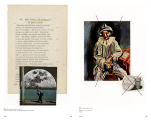
What were some of the highlights?
I think the best surprise was how beautiful Eastport, Maine is. The town and its waterfront actually became a character in my watercolor illustrations (for chapter three) and a stand in for Dublin. I had the same sounds, many of the same smells: marsh grass, seaweed, gulls etc. I am sure that these elements added both to my serenity and stamina (because I love the ocean) but also allowed me to access new dimensions of the novel.
Another highlight was the open studio atmosphere, and indeed the studio itself. It was located right downtown across from a small pier. I could walk out and in 30 seconds I was above the crash of waves and looking out onto the water and the islands off the coast. It was a truly unique experience. I also had many curious visitors- some locals even started reading Ulysses while I was there. It was fun to engage with the community and force myself to stop for a few minutes and get out of my head. I have always found that in talking about my work I am actually continuing to process my ideas, and so even answering the most basic questions can lead to new epiphanies.
What gave you the most trouble?
There were a few chapters that were troublesome, but Circe was the most pronounced. Circe is probably the biggest hurdle in the text. It might seem like an easier chapter at first because it’s written in the style of a play and so it is less dense than some of the previous chapters, but a reader soon finds themselves swept into a quicksand of Dublin at midnight, a brothel, memories, hallucinations, dreams, and drunkenness. It’s chaos. The stage directions are grandiose and the characters keep shifting. I knew each of the illustrations would have to focus on a very specific element from the page, but I also wanted the chapter as a whole, to reflect the unstable, gritty nature of the section. In the end I was inspired to use a process I had never even heard of before called silk screen mono-printing. Essentially you draw on a silkscreen with pastel, water soluble crayons or markers and then take a clear ink base and squeegee the image onto your paper through the screen. The results were unpredictable. I worried about how constrained I felt in my drawing. I worried about how my images would translate. I worried about a lot of things until I realized that this chapter, which is such a slog to read, should make me feel all its anxieties. Indeed, I decided to just embrace all the unpredictability in the material and I think it made the images all the more striking, especially when viewed as a whole.
What was your final reaction?
I was very pleased with the final book. I was a bit amazed that I was able to complete the full suite of 644 pages plus 18 title pages in just over seven weeks.

If anyone is curious to find out, it is available on demand through my publisher:
https://store.bookbaby.com/book/Illustrating-Joyces-Ulysses
Look at the relationship between your Studio Art and English Literature degree and this project.
My dual degree is always part of my art practice, but the project to Illustrate Joyce’s Ulysses really was a dream combination. In school I often focused on writing about the art references in literature, so it was very exciting to have the opportunity to flip that and create my own visual responses to one of my favorite books. I should say also, that the format of the project is very researched. I chose each visual mode for the 18 chapters in order to reflect an essential piece of that section of the narrative. I drew on key themes, and the excerpted text is a reasonable abridgment of the book because I ended up being drawn to the most important moments or images of each page. I have presented the final work to academics and students, and their response has been quite positive. My hope is that it will become something that students use to access the text in a new way during their literature courses.
How did the book evolve?
Right as the residency concluded, I laid out a version of the book that was purely visual. All the images were in the correct order, but there was no text present. While I had selected the excerpts during the creation of the images, I had not yet digitized that hand-annotated text, and it would take me another few months to layout a new edition that included both text and image on each page. This eight pound edition feels quite like a text book, but it allows for the relationships between the text and the image to be assessed in real time by the viewer.
Can you take us through the process you use in your sculpture?
My sculptures are full of various media, but at the moment most of my work starts with a plaster gauze cast made from molds. I made a bunch of molds from my body and molds of vessels which I use as the bases for my current bodies of work. The plaster gauze is much stronger than plaster of Paris, and can be used to make hollow forms that are less prone to puncture or fracture if dropped. I further reinforce my work with inner skeletons of wood, wire, and mesh. There are also parts of my forms that have embedded felt so that when I stitch in the final skin I can stitch directly into the form. This is key in elements of concavity- belly buttons for example- or in small forms like toes or ears.
Kekythos III 7 x 18 x 7 inches
Separate from the sculptural practice, I also develop the surface design for the skin of the sculpture. While in previous bodies of work this was limited to cyanotype prints on cotton, I now work mostly with fiber reactive dyes applied with a silk screen. Where before I created negatives, I now work in color palettes and developing technique for ombre blending in the screen. While I will always have a place in my practice for cyanotype, the range of color I can achieve with the dye is quite magic, and it is really driving my practice forward at the moment.
Once I have the form and the raw textile I begin the patchwork of the skin. Depending on the pattern, I may need to cut shapes of fabric to work together to maintain a color gradient working up the pieces, or define a horizontal high tide line, or just create a solid base for further embellishment in the final step. In every case I place each patch down with a little bit of archival tape on the edge, stretching it around the form. Once I have placed the majority of patches, I will begin stitching them to each other. During the sewing process most of the tape is removed as it was only there to keep the tension even across the patchwork. The stitches are not fancy, I consider them a meditation and generally melt into the background once the layers of embellishment are added.
The final step in many of my sculptures is additional beading or embroidery. The beading has become especially important in my practice because the hard shiny elements create a stark contrast with the sewn fabric surface. The pearls came into my work as a kind of invasive species. Like barnacles, I saw them as taking over the skin of objects lost at sea. As I continued this body of work, the came also the represent our societies invasive and caustic environment toward women’s bodies. While I mimicked ancient artifacts with missing arms or heads, I was also attempting to capture the grating nature of societal pressure. Yet I did not want my female forms to surrender to these incursions. They may be partially ground down, but they are resilient. The beading and embroidery come to also represent forms of armor and jewelry.
Lekythos III, 7 x 18 x 7 inches
Discuss how you use stitch in your work.
Stitches are part of both the background and foreground in my work. Many pieces combine thread of varying weights, others have utilitarian stitches juxtaposing stitches used as purposeful mark making, still others have thread that was sewn into designs by an embroidery machine. The stitch is almost always a part of a meditative process with imbues the surface of the work with my labor and time.
Lekythos IV 4.5 x 15 x 4.5, Lekythos V 4.5 x 14.5 x 4.5, Lekythos VI 4 x 13 x 4,
Lekythos VII 4 x 13 x 4, Lekythos VIII 4 x 13 x 4,
Take two pieces using stitch to show the variation stitch can make.
In the top piece the stitch is used to mimic leg hair, the second it is used to mimic pubic hair. In both there are more utilitarian stitches that connect the patchwork base for the skins.
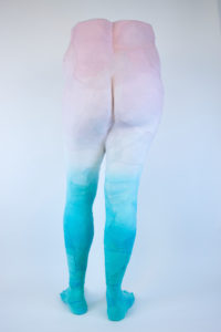
Tidal Bather VI, 20 x 45 x 14 inches
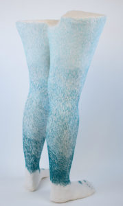
Tidal Bather VII, 16 x 31 x 14 inches
You left PA after your course and moved to New York, what instigated this move?
I moved both to be with my partner who had moved back to NYC and to pursue a studio residency at an artist run gallery space in Newark, New Jersey. I still have my main studio there five years later.
What has the move given you?
The fall after I arrived in NYC I was invited to participated in the Artist in the Marketplace program at the Bronx Museum. This professional development group became key to connecting with an artist community. Like most artists I have a complicated relationship with my adopted city. I am happy to be living on its periphery (in Jersey City on the other side of the Hudson) and to continue to work in Newark. I have a large space there and it has allowed me to tackle large projects and commissions I would have otherwise had to turn down.
Discuss ‘The Swam’
How are the butterflies made?
The butterflies are made from a double-sided cotton cyanotype print. By that I mean the image has been printed onto both the front and verso and the are registered together so that when the individual butterflies are cut out the image of the wing appears to go through the cloth. Once the cyanotypes are printed I dry them out and the cut out each butterfly by hand. The insects are then stiffened with a little fabric glue to give them a little weight. Once dried, I can sew a small magnet onto the belly. It is similar to sewing on a button.
The final result is a small blue creature that can alight on magnetic objects (iron, steel, tin etc.). Once I made the first 200, I just continued to add to them for 2 years.
Why have you use the word ‘swarm?
The Swarm began as a personal investigation of ephemeral street art in the summer of 2012. Swarm is both chaos and purpose. When animals swarm it is not random, it is often for the purpose of migration. There is huge cultural capitol in the symbol of butterflies, but in the end they are also strikingly beautiful. The blue, makes them almost alien, but also very attractive.
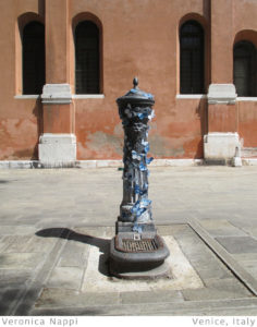
How did you use kickstart for this project?
After selecting the 220 participants in over 45 different countries I knew I would need to crowd source the international postage. The scope of the project was much bigger than I expected. Because of geography, some people’s postage dues would be triple or more that of others. I wanted to project to be accessible to everyone, so I set out to raise $10,000 to offset the country-to-country shipping with DHL. I incentivized donation with awards including postcards and butterflies from the project once it finished. It was successful and that money helped launch and sustain the project for its three year duration.
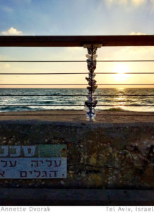
Where did you take / send the 15 packets of 350 butterflies?
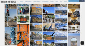
I sent 15 packets of 350 butterflies to 15 geographic regions which each included 10-25 participants. The areas were: South America, Central America, West coast of North America, Central North America, Southern US and Caribbean, Eastern North America, Norther Isles, Iberian Peninsula, Central Europe, Africa, Northern Europe, Eastern Europe, South East Asia, Oceania, and Antartica.
https://vimeo.com/74792179
How did you organise the images and videos of your swam?
I coordinated both a tumblr site and a dropbox site in order to archive the project. The first was public and each participant had access to upload content. The second was private and was used to gather larger resolution images that were used in the final publication.
In the book I decided to organize the images geographically by region. Within those chapters I grouped the photographs by theme, contrasting contexts, similar or complementary color, scale or contrasting scales. I was focused on rhythm and flow from page to page.
What was the public’s reaction?
The public response was very positive. I think people enjoyed it now only for how expansive it was, but also how personal the symbol of the butterflies could be. The participants were particularly enthusiastic to collaborate with me and toe share the experience with people all over the world.
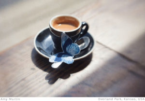
Why blue butterflies?
The butterflies are blue because they are made with the cyanotype process which naturally creates a blue and white image. The butterfly felt like the perfect symbol for such an ephemeral, yet global, project. These insects are resilient, beautiful and represent metamorphoses, rebirth and bring joy to many people. The image certainly brings joy to me.
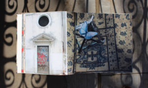
Where are all the butterflies now?
About 2,000 of the 6,000 hand-made butterflies I sent out came back. Obviously many were lost, some in the mail some in the wind. The final swarm was divided into packets of 10 butterflies and is sold as part of a collectors edition with a signed and numbers hard cover copy of the book. They are available direct from my studio or through the Colossal store.
What was the effect of movement in this installation?
Because the main way people experienced this project is through still images, I set it up so there was dynamism in every other element. You would think that having blue butterflies in every picture would get boring, but my participants worked hard to find and showcase beautiful elements in their local environments.
With Botanical Beast, discuss your knitting together of sculpture and fabric techniques.
In the past 6 years I have honed my sculptural technique, specifically the inner armature, and the Botanical Beasts represent a key turning point. This suite of works is made entirely with plaster gauze casts, wood, mesh and wire.
This collection is made up of 14 small heads and two large ones.
They are covered in botanical cyanotype prints made from pressed leaves and both the antlers and the thread I used to stitch them glow-in-the-dark.
Botanical Beast Group, Dark
What are your thoughts on combining techniques in a modern context?
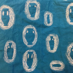
I have always been driven by the combination of techniques, and I am so excited by the ‘maker movement’ and the new tools, especially the lazer cutters, which are available. I think it is such an exciting moment to be a sculptor. For me it is all about fit. I want to make elements of my work with my hands, but if a computer can cut out complicated shapes better than I can, I will use it. I have just scratched the surface of what is possible with iron-on laser cut fabric appliqué and computerized embroidery machines. In my next wave of work, I plan to focus on integrating even more of those elements.
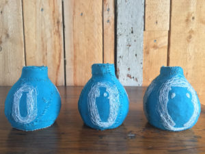
Contact details:
Tasha Lewis
@TashaLewisArtist
http://illustratingulysses.com/
Tasha Lewis, New York, USA
Interview by Deborah Blakeley, September, 2018
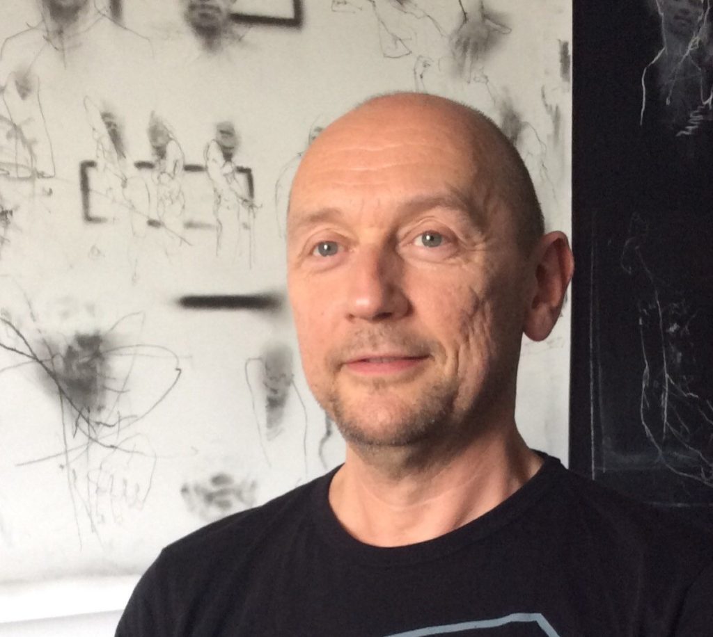
Ian Hodgson
Ian Hodgson, Brighton, UK
Graphite has been used in art since it was discovered in 1564. Ian Hodgson’s graphite drawings take us into the 21st Century.
Zoneone Arts brings Ian Hodgson to you…
What lead you to working with graphite?
I have always drawn with pencils but started using graphite blocks about 20 years ago. I find the versatility and expressive mark making potential of graphite both stimulating and rewarding.
Can you briefly explain the technique required to use graphite?
I use graphite blocks (Derwent XL very soft) which I use in their original state but also grind into powder and apply to the paper using using stencil brushes and fingers and remove and manipulate with erasers and chamois leather.
Discuss the layering of your work?
I don’t tend to plan any layering in my work it generally develops through the drawing process as I add and remove the graphite. As the drawing develops and builds, the application of different techniques and processes remain evident and can be seen as a kind of layering.
Your work is about less. Discuss the way you rub, sand and use an eraser to perfect your work?
I’m not sure if my work is about ‘less’, I find that the actions of rubbing and sandpapering creates texture and the manipulation and erasure of the graphite opens up passages of space. I think that these processes add to the work rather than take away.
The ‘fingerprint’ expand on this in your work.
How did it come about?
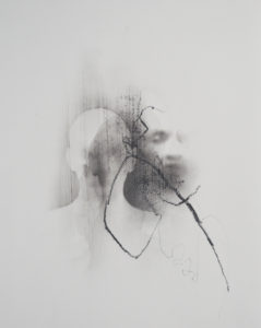
Headside, Graphite on paper, 40 x 30cm
Studying the ‘politics of identity’ during my art degree, the fingerprint became an obvious motif to visually represent some of the issues I spent time engaging with. I enlarged an image of my own fingerprint (left index finger) to be able to see it more clearly and then perfected how to draw it’s pattern and structure until I developed the stylised version I use in my work
Is it always there?
I do use the fingerprint a lot, mainly in my figurative drawings, but its not included in all works.
Is it always the same size?
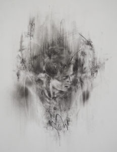
Suspend, Graphite on paper, 40 x 30cm
As every fingerprint is hand drawn they always differ in size, I scale each one according to the drawing they’re a part of.
Compare two works one negative and one positive.
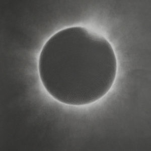
Black Star, 65 x 65cm
‘Black Star’ and ‘I Feel Love’ are both drawings of the mirror ball, an object that I have often re-visited and re-worked and both have their roots in my music passion. As a youngster, the video to Blondie’s Heart of Glass had a huge impact on my psyche. I fell in love with Debbie Harry, the band and the mirror ball, a very heady combination! The decision to create the almost negative ‘Black Star’ in contrast to the light, sparkly ‘I Feel Love’ had been on the back burner for a long time but came to fruition at the time of David Bowie’s death and the release of the poignant video to the song of the same name.
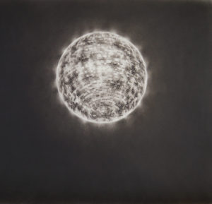
I Feel Love, Graphite on paper, 65 x 65cm
Expand on your use of composition
For both pieces I was exploring angles of light and dark with reference to the concept of some kind of horizon or eye line. With ‘Points of Light’ I place the ‘horizon’ high on the picture plane of the square composition to create some breathing space before reaching the compression and intensity where the light meets the darkness.

Points of Light, Graphite on paper, 40 x 40cm
With ‘Gable’ the light contrasting with the blackness is placed midway within the elongated rectangular composition to create a sense of intimacy and draw the eye line to the suggestion of a rooftop and hazy horizon.
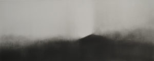 Gable, Graphite on paper, 20 x 50cm
Discuss both ‘Boundary’ and ‘Wing and a Prayer’.
‘Boundary” and ‘Wing and a Prayer’ are both studies of the 1912 Peace Statue which is situated on the Brighton and Hove border just down the road from where I live and work. I have always loved the strength and elegance of the statue, the rendered detail and beauty of its wings and how it stands majestically high on the seafront facing my chosen home town.
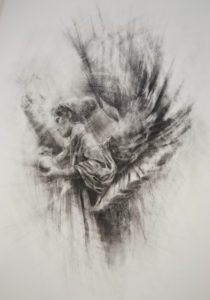
Boundary, Graphite on paper, 100 x 70cm
Although ‘Boundary’ is a slightly more direct representation of the statue I still wanted to capture the sense of potential movement, as if the angel could come to life at any moment and take flight. The layering of contrasting lines, density and open passages give ‘Wing and a Prayer’ a less grounded feel and create a sense of ethereality.
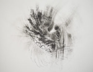
Wing and a Prayer, Graphite on paper, 65 x 80cm
On a similar vein, discuss ‘Acanthus’ and ‘Blackboard Work’.
The neo classical architectural detail of the Regency Square where I live provided the subject matter for these pieces.
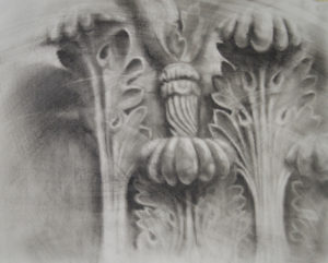
Acanthus, Graphite on paper, 65 x 80cm
‘Acanthus’ was given the usual graphite treatment but I wanted to see how similar subject matter would work given a different treatment and as I really enjoy working with chalk on blackboard I gave this a go.
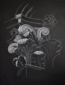
Blackboard, Chalk on blackboard, 160 x 120cm
I like the contrast of the white marks against the blackness and how easy it is to blend, erase and add more chalk. The inevitable impermanence of this kind of work adds an immediacy to the drawing and, as with all of my blackboard works the original drawing has long since been erased and only exists in digital format now.
Discuss the use of red in ‘Unseen’.
On an aesthetic level the use of red in ‘Unseen’ provides a contrasting addition to the monochromatic grey tones of the drawing. On a symbolic level the colour red carries multiple meanings - a warning sign, seeing red, anger, alarm, danger, heat, love, passion, blood - and with its inclusion I hoped to create ambiguity in the reading of the drawing.
Unseen, Graphite on paper, 60 x 48cm
When else have you used colour in your work?
I find that I can express most of what I want through line, texture and mark making without the need to add extra colour to the many grey tones provided by graphite. The occasional bold addition of red or subdued golden hue may appear within certain works but as a general rule I steer clear of colour to retain the clarity of the drawing.
What grade of paper do you find works best for you?
I have found that Fabriano Accademia 200 g/m2 responds the best to all my demands.
Does the size of the paper limit your work?
I usually work with a fairly average 50x65cm sheet and when I occasionally find this slightly restrictive I expand on to larger sheets. Obviously there are limitations to whatever size of paper is chosen but I can work ‘big’ on small pieces and ‘small’ on large pieces so maybe the limitations are more psychological.
What type of fixative do you use? Discuss the importance of finish in your work.
I use Daler Rowney Perfix Colourless Fixative, it holds the graphite in a reasonably stable state without any apparent change in appearance. Ideally, I would prefer my drawings to be seen in their raw ‘finished’ state with nothing between the viewer and the surface but obviously works on paper benefit from the protection of being behind glass so conventional framing is usually the way to go.
Comment on your portraits?
Band, Graphite on paper, 30 x 30cm
Although I have done a great deal of life drawing in my time, the figurative/head/face pieces I produce are not portraits in the conventional sense, I am attempting, with the use of a generic a male face/body, to represent an emotional state or sense of identity through physical gesture or expression. More psychological landscape than portraiture.
Chalkboard, Chalk on blackboard, 120 x 80cm
Discuss a commission or exhibition that has both excited you and lead you to go beyond your usual boundaries.
A few years ago I was invited to submit a piece as part of a pop-up drawing show in London. All works were to be hung salon style and unframed so I chose one of my ‘worksheets’ (large scale paper I fix to my studio wall to work out ideas, almost like a big one-sheet-sketchbook) not really intended for public display.
Worksheet
Seeing the piece hanging unframed in the show in all its rough and ready state felt quite exposing but also incredibly exciting. This show made me realise that these worksheets, despite their preparatory and experimental nature, could also be considered as complete pieces. The space, where my ideas are unselfconsciously worked out can create drama, insight and narrative, and, ultimately, contain even more interest than my some of my ‘finished’ drawings. A cathartic and liberating experience.
Contact details:
Ian Hodgson
Contact details:
Ian Hodgson, Brighton, UK
Interview by Deborah Blakeley, September, 2018
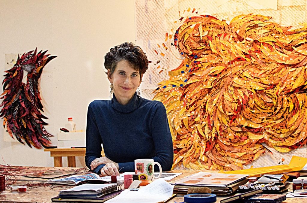
Deborah Kruger
Deborah Kruger, Chapala, Mexico
Deborah Kruger’s inspiration is taken from bird migrational patterns. Kruger’s work is a story, interwoven with beauty, glamour and a social conscience.
Zoneone Arts brings Deborah Kruger to you…
Explain where and how you developed the idea of ‘Feather Art Series’?
Where did the idea come from?
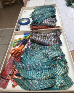
Box of fused plastic feathers
Like many artists, ideas often emerge unconsciously and organically. For many years in the late 90s, I restricted myself to using a triangular format. In one piece, I found myself using scraps from an earlier piece and attaching them in slender triangular flaps. There was something featherlike that appealed to me and I began to use this concept in subsequent pieces. Over time, I identified these strips as feathers and their shape slowly changed from triangles into undulating feather-like shapes. Since I am an abstract artist, I haven’t sought to create realistic feathers, but rather to evoke the sense of a feather.
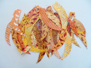
New feathers, screen printed on fused plastic bags.
How did you come across it?
Back in the 90s, I was a single mother, working full-time at a day job and had almost no studio time. To maximize those few precious hours a week, I gave myself a rather strict assignment as a way to eliminate decision-making and focus my creative output. The assignment included the following aspects:
Shape: needed to be triangular (an outgrowth of earlier art quilting work)
Colour: used a palette that evoked a forest floor
Materials: used encaustic, oilstick and waxed linen thread because they were sensuous and pleasurable
Concepts: limited myself to no more than five visual concepts per piece
Evaluation: forbade myself from explaining what the work meant
These restrictions were intended to streamline my creative time and I adhered to them for 10 years. The ensuing body of work was visually cohesive, and I succeeded in eliminating obstacles to creativity.
What mediums have you used?
Until recently, I used drawing, stitching and painting as my primary mediums. I dabbled in art quilting, soft pastels and mixed media before settling on using encaustic and oilstick.
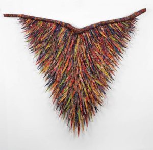
Enrapture, 2008; 99 x 107cm; fibre, encaustic, oilstick, waxed linen, wire threa
Can you expand how you combine textiles and encaustic?
Most encaustic artists use this wonderful media in a painting context. Since I have such strong roots in fibre, it seemed natural to combine these materials. For me, encaustic was always more textural than simply a form of painting. I enjoyed using it for gestural mark-making. My experience using natural dyes early in my career laid a foundation for mixing my own encaustic colours rather than using pre-mixed colorsticks. I never seem to do things the easy way! Mixing encaustic allowed me a more nuanced approach to colour.
Discuss how you are using recycled materials rather than textiles in your current work.
As my work and ideas evolved, I realized that the abstract mark-making on my feathers was not speaking clearly about the issues of habitat destruction, migration and bird extinction. Although it was very painful to leave what I was doing, I had to stop and reconsider how to create work that spoke more specifically about these issues while remaining abstract, no easy task! It took me a year of research to develop my current technique of screen-printing on fused plastic bags. During this time, I also developed designs based on drawings I did of endangered birds. By incorporating these images, I was able to embed real information about my concerns. When I cut up these sheets of printed plastic into feathers, I can offer the information and text relevant to my concerns in an abstract format that satisfies my aesthetics. The new work is neither painting nor sculpture, but an amalgam that is layered, textured and visually appealing while carrying its subliminal message.
Expand in the text within this work, include in this some background into Rachel Carson.
I read Silent Spring for the first time as a teenager and it made an indelible impression. I was shocked to learn about how DDT was killing birds. I lost my innocence as I realized that corporations put profit before principles with no thought to the impact on the world we all shared. The book forged me as an activist and futurist. Sometimes ideas need a long gestation period before taking root. Now it’s easy to see how it lodged in my system and gave birth to my current work.
Silk screen of Rachel Carson
Expand on the legal aspects of using Rachel Carson’s quotes.
Technically, Rachel Carson’s work will enter the public domain in January 2019. I am using fragments of her work in text that I overprint on my feathers. Like a writer, I use my text as footnotes to my work but as an abstract artist, the text is not meant to be read, but rather to evoke the spirit of her work and imbue it in mine.
What are your favourite quotes from Rachel Carson that keep you working?
“The question is whether any civilization can wage relentless war on life without destroying itself, and without losing the right to be called civilized.”
― Rach Carsonel
“The more clearly we can focus our attention on the wonders and realities of the universe about us, the less taste we shall have for destruction.”
― Rachel Carson
Briefly take us through the process of ‘Flourish’.
Flourish is an important transitional piece in my current series. As I began to use the fused plastic feathers, I imagined a long horizontal piece constructed of several 76 x 76 cm squares. I always need to think ahead about shipping, so I thought it would be easier to pack a stack of smaller squares that would hang as a larger piece. It looked like a good concept on paper, but I was not pleased with the actual string of pieces, so I abandoned the idea. As I started developing the map shapes I am using, I wanted to experiment with texture since that has always been so important to me. I pulled out some of these earlier squares and decided to play with them. I cut one in half and started tying in waxed linen and wire thread, a technique that I love using because it creates a haze of colour and texture. Slowly the piece began to curve. Since I was not attached to the outcome, I carved into it and let Flourish evolve into its eventual curving shape. I believe that pieces have a life and intelligence of their own and that at some point, you need to allow them to become what they want to become without trying to control the process (kind of like a child!). Flourish is a great example of how I work with my creative process.
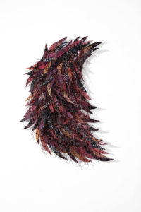
Flourish; 2017; screen-printing on fused plastic bags, sewing, waxed linen, wire thread
You have won many Grants, Honours, and Residencies, discuss one that has had a dramatic influence on you career.
Spending a month in France for the first time in 2016 at La Porte Peinte Centre pour les Arts (http://laportepeinte.com/) located in Noyers-sur-Serein, a medieval village in the wine country of Burgundy was a turning point for me as an artist. I run an artist residency program here in Mexico (www.360xochiquetzal.com) and at that point, I had not achieved the work/life balance I now enjoy. I needed uninterrupted time to do more research about endangered birds and think more deeply about my work. Being away from my home and work responsibilities was profound. Although I hadn’t intended to make art, but rather think about it, I was nonetheless pulled to draw these rapidly disappearing birds. It felt like I was drawing them back to life. I completed a series of 18 drawings during that month and they have become the basis of many of the subsequent silk-screen designs and other related work.
Drawing of Shoe Billed Heron
Talk about your own migration pattern and what lead to your move to Mexico.
I come from an Eastern European Jewish family that migrated to the United States and Argentina to escape persecution. Jewish history is shaped by similar migrations, so I imagine it is ingrained into my DNA. I grew up in New York City, but migrated to New England for work in textile design (before that field migrated south and eventually to Southeast Asia). I spent most of my adult life in Western Massachusetts until I moved to Mexico in 2010. At that time, it seemed like Mexico would be the answer to some serious financial setbacks. Now, however, I look back and see it differently. It’s as if the universe was conspiring to push me out of the United States and into a country and culture that would allow me to finally realize my dream of working as a full-time studio artist.

Lake Chapala
Birds migrate in numbers but there is a similarity to the Textile community, discuss this by taking 2 other textile artists who have influenced your current work.
Once you look at the work by Naomi Wanjiku Gakunga (https://naomiwanjiku.com/), you will see why it inspires me. In fact, Naomi herself has been a personal influence and mentor. Born in a little village in Kenya, Naomi observed how the new sheet metal roofs aged, and she mirrors these weathering effects in her own artistic process. The impact of this local material has resurfaced in her artwork in a similar way as the impact of Rachel Carson’s writing bubbling up in mine after many years of lying dormant. Her early exposure to African aesthetics and various textile techniques has given way to sophisticated work in aged and painted sheet metal that still manages to have a textile sensibility. Naomi initially came to the United Stated to attend graduate school at the University of California, Los Angeles, and has made San Antonio, Texas her home.
The Girls Dance by Naomi Wanjiku
Naomi Wanjiku Gakunga | Ndumo- The Girls' Dance (2015)
https://goo.gl/images/9NCfgr
Olga de Amaral has been a major influence and inspiration for over thirty years (www.olgadeamaral.com/). Born and educated in Bogota, Colombia, Olga had the opportunity to study at Columbia University and Cranbrook Academy in the United States. After her marriage to sculptor Jim Amaral, they lived and worked in Spain and France for many years. Olga’s work evolved from loom weaving to complex sculptural artwork. The influence of her country of origin is deeply embedded in her work, especially the works using gold and silver. Her exposure to international art and artists has positioned her as a major leader in the field of contemporary abstract fibre. She has returned to Bogota and is considered a national treasure in Colombia.
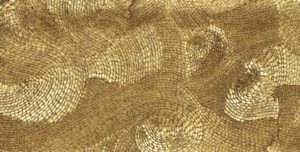
Image: Olga de Amaral
Nohra Haime Gallery: Olga de Amaral - galleryIntell
https://goo.gl/images/PtGbVz
You comment, “Whenever I travel, I try to tuck in visits to galleries and museums that nourish me creatively” discuss the importance of this to your work.
I live in a small pueblo where there isn’t a big art scene. I feel very inspired when I spend time seeing art in museums and galleries. If I love the work, it incites me to make more. If I hate the work, it challenges me to make better work. Either way, I get to see what artists are doing. It helps me to think outside the box and imagine larger and more daring work. Recently, I have begun to use Instagram to follow artists throughout the world. Some of my favourites are in Australia like Avital Sheffer, who is an exceptional ceramic artist working on the North Coast of NSW.
How has your move to Mexico allowed you to do BIGGER work?
Mexico has provided me with resources that I never had in the United States. I built a huge studio that can accommodate large-scale work and sculpture at a fraction of the cost. I have a team of six Mexican women who help me sew, fuse, silk-screen, cut out and organize my feathers. I pay them handsomely for their work, provide a safe and enjoyable work environment and expose them to the artist’s life. I can afford a full-time studio assistant who handles correspondence, proposals, design projects and prototyping, managing my production team. None of this would have been possible in the U.S. Being here has allowed me to realize work that had only previously existed in my imagination.
Deborah and studio team
Have you thought of transferring your art into smaller wearable art?
Many people have asked me about creating wearable art or jewellery. Although I studied at FIT, I wasn’t in the fashion end of design and don’t feel drawn to these forms. However, my latest show has a floor installation made with broken plates that I designed with images of endangered birds and that has given me the idea to create a line of home décor using my drawings. Stay tuned!
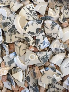
Broken; 2018; 203 diameter x 28; shards of hand-painted ceramic plates and building rubble
How has your formal training in textiles influenced your work over the many years?
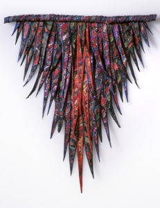
Plumage 2; 2003; 37 x 37; fibre, encaustic, oilstick, paint
I not only studied textile design at FIT in New York City, but I also come from a family of sewers, knitters and designers. I made all my clothes until I had a job. Like migration, textiles are in my blood. I am drawn to the texture, hand and smell of fabric. Although I am now using plastic, it is still sewn, and textiles continue to echo through the work.
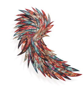
Halcyon; 2010; 50 x 33; fibre, encaustic, oilstick, paint
Your work is so fluid and tactile how do you recommend the owners care for it?
Now that my new work is made with plastic, it isn’t framed but can easily be dusted. The plastic doesn’t fade like fabric and is less sensitive to light exposure. I think it’s a better option for most homes and businesses.
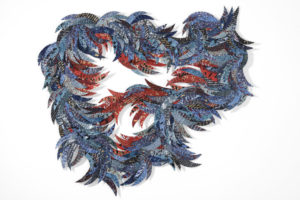
Missing; 2018; 118 x 132 x 2.5; screen-printing on fused plastic bags, sewing
Deborah has just finished a documentary about her work and it Zoneone Arts is pleased to share it with you.
https://www.youtube.com/watch?v=fzUzWZI5w1A&t=5s
Contact details:
Deborah Kruger
Email: deborahkrugerstudio@gmail.com
Website: www.deborahkruger.com
Deborah Kruger, Mexico / USA
Interview by Deborah Blakeley, September 2018
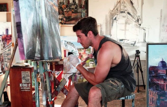
Sean Flood
Music, impacts on Sean Flood's art, depending on the rhythm or beat playing as he paints. We are aware of movement and sound in all his urban landscapes.
Zoneone Arts brings Sean Flood to you...
You comment that you use ‘music, the rhythm of the city, and canvas’. Discuss this in relationship to your current work?
Music is my main source of inspiration. Music fuels my mark making approach. I try to visualize rhythms and sounds that I listen to and apply it to my paint. I enjoy listening to a variety of instrumental beats from jazz-hip-hop-drum and bass. Depending on what speed I am looking for during painting. These genres of sound blend well with the urban environment and the physicality of my painting expression.
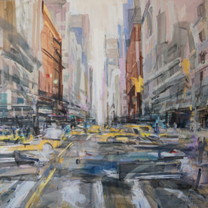
Expressions in the Street, 61 x 61 inches, Oil on Panel
When did you decide to paint cityscapes?
I was exposed to architecture and building at a young age. I grew up with it. My father has always been a carpenter/ builder all his life. Starting around the age of 11 he would take me to the city to work, that is what first sparked my interest in the urban environment. Over the years I had different types of construction and roofing jobs which only further involved me into city subject.
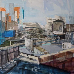
LIC, 48 x 48 inches, Oil on Canvas
You use many straight lines in your work, even to the extent of the use of a ruler, discuss this technique.
I enjoy the mechanical quality to straight lines. But I certainly appreciate a whole spectrum of line work from organic brushwork to jagged ruler guided marks. I try to incorporate a variety of line work in one piece.
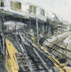
Broadway Junction, 48 x 48 inches, Oil on Canvas
Your paintings are taken from many different aspects, the street level to rooftops. How do you get access?
A lot of times in the past I would sneak up on rooftops. Sometimes it was somewhere I worked, and I could go back later. Many times, people I got to know had some sort of connection to certain buildings and they would get me access. Rooftops were a major focus of mine for years.
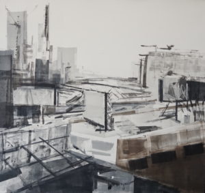
LIC, 29 x 31 inches, Monotype
Your work, is a collection of layers – explain the technique you use?
Working in layers helps me convey the motion and speed I aim to express in my subject. I paint layers in sessions. I usually work on 2-3 paintings at a time and give them a four-hour session each. That way they can be drying at different points so that I always have a dry layer to work on top of. Almost like starting a whole new drawing over the previous layer. It’s exciting for me to work this way and partly derives from my graffiti days where you literally are going over and over previous drawings. The goal is to intertwine and edit each layer as one.
Explain your residency from The Stobart Foundation, and what you hope to gain from this time.
The Stobart Foundation was a grant I received that came in very helpful during my second studio stay in NYC. I just completed a studio residency at the School of Visual Arts in NYC. This was an amazing and intense 4-week program where we had a critique each day with a different faculty while also working amongst 14 other fellow residency artists. This program was an amazing experience that stirred inspiration and new ideas for my work.
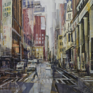 Broadway Streets, 60 x 60 inches, Oil on Panel
You have very catchy names for your exhibitions – where do they come from? Discuss two or three names.
I choose titles that are relevant to the body of work I am presenting at an exhibit. I keep it simple but want to define the main concept in the work like my solo show at Childs Gallery in Boston titled- “Residual Layers”
You have work in many public collections – discuss what has given you a real buzz and expanded your career.
I feel very fortunate that my art career has been a successful journey thus far. I work hard to continue to develop my work and I think that all my experiences in my artistic life have helped push it along.
Discuss your work on paper and how it assists in your portfolio.
Over the past 3 years I have revisited printmaking since undergrad in 2004. I have completed a combined 4 print residencies with Contemporary Center for Printmaking in Connecticut US and Lesley University in Boston, US. This has been a huge impact on my current work. During undergrad I focused on etchings and aquatint printing techniques which I loved. Since starting these residencies my focus was monotype printing.
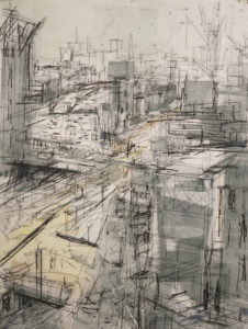 Kings Roof 23 x 15 inches, Monotype
At the first couple residencies I was trying to emulate my painting approach which turned out well. Now I find that I approach my paintings differently the more l do with plates and stages in the print room. This has been very exciting!
Explain the importance of drawing the viewers eye into your bustling world.
I am passionate about my environment and my paintings are collections of what I feel while making observations in the world. I enjoy when I speak to someone looking at my work and they understand the feeling I am trying to convey.
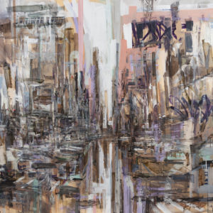 Expressions in the Alley, 61 x 61 inches, Oil on Panel
Your work is so current, explain your thoughts on your ability as an artist to capture the history of your city.
I have an intimate relationship to Boston an in my older work I think that reveals itself in the piece. After 3 years of painting and working in NYC I feel that same connection/relationship developing.
The size of your work is varied, how do you decide on the size of a canvas?
Over the years I have increased the scale of my work. I love to work large and plan to work even larger. It is important for me to display the physicality of my mark making and working large is appropriate to do so.
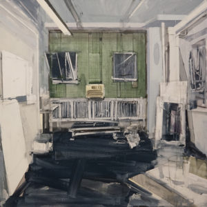
Reis Studio, 36 x 36 inches, Oil on Canvas
They say you can’t take the country out of the boy. How do you relate to this saying, by replacing the word country and replace it with URBAN life. Discuss.
I have always loved the urban environment. I will continue to focus on this subject as long as I feel I have continued to develop the work. I may not paint this subject for ever and do have other subjects in mind but for now I have some new directions I will take the urban environment in.
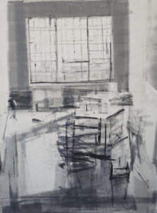
LIC Studio, 41 x 30 inches, Monotype
Contact details:
Sean Flood
seanfloodpaintings@gmail.com
Sean Flood, New York, USA
Interview by Deborah Blakeley, August 2018
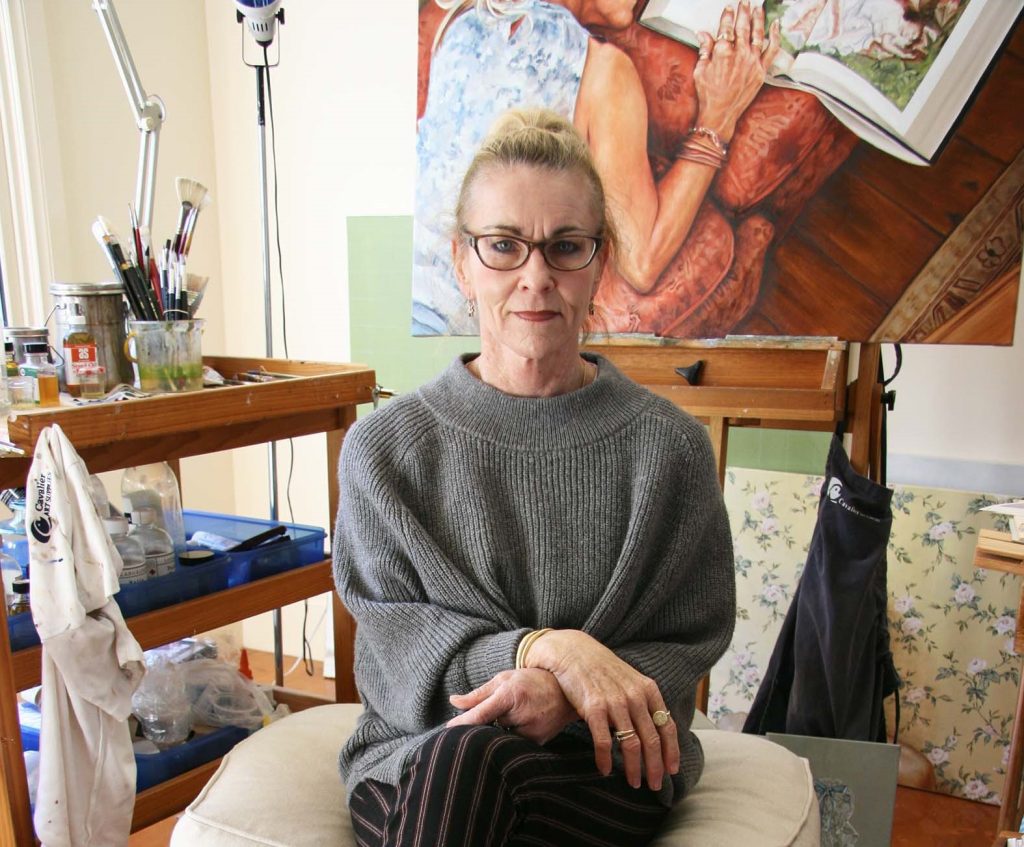
Trudi Harley
Don't give up your dream to paint - Trudi Harley testifies to this, proving the need to paint exists. Harley paints with honesty and maturity, finding a safe harbour in her art.
Zoneone Arts brings Trudi Harley to you...
Your educational path has been long but very focused on the arts. Discuss how this has lead you to your current work practice.
I gained my Bachelor of Education Arts and Crafts in 1984 and taught in Government and Independent schools for 10 years after that. During this time I had a small hiatus in China where my husband had been stationed for work. I managed to collect a small gathering of expats from Hong Kong who employed my services as a portrait artist. I also spent some time in Sydney where I worked at Macquarie University in Administration. Though it sounds cliché I had a recurring dream where I envisaged I’d not finished my year 12 certificate, I read into this a failure to fulfil my potential in education.
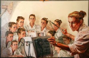
Self-Painting Selves –Oil on Canvas 152cmw x 102cmh, 2007
On my return from Sydney to Melbourne my marriage broke down and I started to question what my own needs were. I gained employment as a sales executive in an art supply company, ignoring for a while the pull toward extra knowledge I dabbled in my own artistic adventures. Entering in the Portia Geach Portrait Award in 2007 I was selected as a finalist and was also selected for their online gallery.
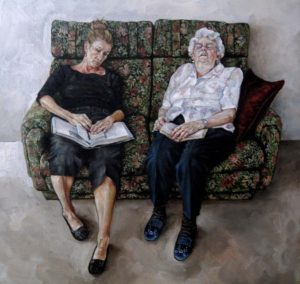
Becoming My Mother – Oil on Linen 30cmw x 30cmh, 2008
This gave me the encouragement I needed to return to University and in 2008 I enrolled in a Bachelor of Education Visual Arts Honours. The course allowed me to explore more fully my interests in the genre of portraiture. I drew on my experience as a teacher and used my knowledge of Art History which strongly influenced my work at this time.
After completing my Honours, I returned to University in 2010 and enrolled in a Master of Arts Visual Art - Research course. Here I explored my interpretations on the individuals understanding of reality and the importance of the inclusion of the mundane as a stabilising constant in everyday life.
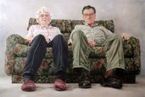
The Couple – Oil on Canvas 168cmw x 110cmh, 2008
You have a constant ‘thread’ in your work. Discuss how and why you paint objects that are on a thread.
The theme
Towards the end of my study in 2011 my father passed away. As I finished my research in 2012 I was drawn away from portraiture for a while as I looked for ways to immortalise my father’s memory. Initially I began to look at ways his life had influenced mine and what sort of connection we had established over the years. I had strong recollections of an object that he used in many of his construction tasks around the farm. The ‘Plumb Bob’ entered in to my repertoire of still life objects as it seemed both the ideal artistic motif and a symbol of my father as a constant and stabilising influence.
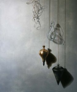
Reminiscence IV – Oil on Linen 50 x 60cm
Around this time, I came across the Spanish Bodegone Painters and more specifically the work of Juan Sanchez Cotan where I observed the practice of hanging foodstuffs from a string in order, to extend and preserve the life of the produce.
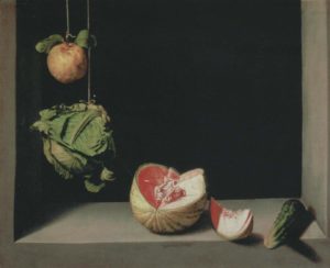
Juan Sanchez Cotan. Quince, Cabbage, Melon and Cucumber, 1602
Still Life by its very nature is based in the past. The ‘string’ or ‘thread’ in my work is a physical connection to those objects of my past and, as explained, is used as an analogy to extend and preserve those memories evoked by the object of which it holds. For an example ‘Reminiscence IV’ is specifically related to the memories I had of my father. Around this time I purchased a Plumb Bob, one which as closely as possible resembled the one my father owned (as I didn’t have the original). I also found a decorative glass ornament which in comparison of size and appearance looked very similar to the brass Plumb Bob I had obtained. However one was heavy, solid, strong, would survive if it fell to the ground, the other glass object was transparent, lightweight, and fragile and would smash if it fell. When you watch someone fight cancer you watch the strength drain out of them and they become a mere shell of what they once were.
The objects
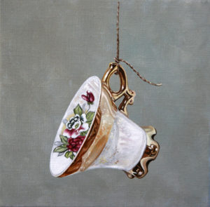
Cup XI – Oil on Linen 20cmw x 20cmh, 2017
The subject matter evolved, and I began to focus on happier interpretations. Growing up, the kitchen was considered one of the prime social gathering places of life on the farm, particularly afternoon tea. My father would often comment on the best cups to drink tea from, what made a good cup of tea, how hot it should be etc, etc.
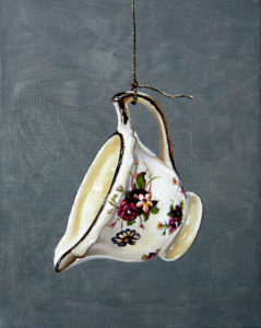
Milk Jug - Oil on Linen 20 x 25cm, 2017
Coming from a rural background I thought this sort of environment would have been reflected in many of the families of the time, I worked toward painting objects that would touch a broader audience and establish a sense of shared community with the viewer. Hence teacups, spoons, jugs, forks, knives, handkerchiefs - any object that we perhaps take for granted but in effect is an essential part of our everyday.
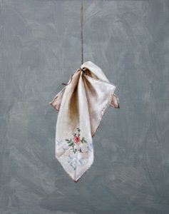
Handkerchief - Oil on Linen 20cm x 25cm, 2017
Comment on the difficulties of painting glass. As you are painting something that we can see through.
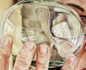
Through A Glass Bubble – Oil on Linen 35cmx 35cm, 2016
I’m not sure on the ‘difficulties’ of painting glass just as I’m not sure on the ‘difficulties’ of painting anything. I don’t mean to sound conceited but in my mind I tend not to paint a particular ‘thing’. I think the only time I tend to get into difficulty is of the object or thing that I am trying to paint so rather than concentrate on the glass I concentrate on the elements of the glass instead, i.e. the form or shape, the colour, the line, the tone etc and how these each relate to each other. By painting the smaller elements, the larger picture establishes itself.
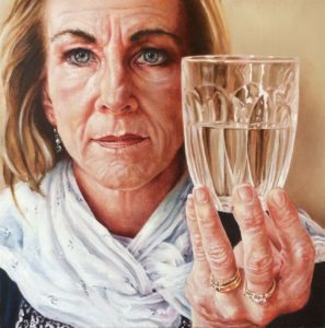
As You Like It – Oil on Linen 35cm x 35cm 2017
Then to a glass you have added a wilted rose, comment on the formatting of a still life.
I tend to play around with space as one of the main elements when constructing a painting. I look at the main elements of the picture and what I want to be the main centre of interest and where this should be placed in the picture frame in order to create the most acceptable layout. It is also necessary to work out where shadows fall and how this interplays with other objects within the arrangement. Where objects sit in the picture plane is one of the most important elements and to where your line of vision is drawn to – i.e. a shallow space created by moving the line of sight high on the picture frame or low to create more a more open space.
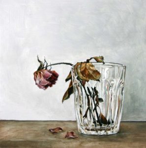
The Sick Rose – Oil on Wooden Panel, 20cmw x 20cmh, 2016
Your work ‘Fallen’ discuss this work from the conception to the final place where it is now held.
In my honours year I was looking into the theory of ‘esperpento’ and its interpretation in terms of my work. Esperpento (a description formulated by the Spanish Playwright Ramon del Valle-Inclan) is a Spanish word meaning ‘exaggeration’ or over emphasis often venturing into the grotesque, this may involve unusual viewpoints or the exaggeration of reality. As a theory I had been contemplating the significance of perceived expectations we may feel placed on ourselves by others and how this may affect the individual. I was examining ways to pictorially represent a failed sense of achievement, if perhaps we felt expectations had not been met. It is often advantageous to look at someone else’s life from another viewpoint or to look at a situation from another angle. I felt this work best emphasised the conclusion of my honours work, that often a fresh look at a problem from a different angle is beneficial and that judgement should be reserved until we have a full understanding of what we are dealing with.
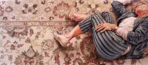
Fallen – Oil on Linen 152cm x 66cm, 2009
It was exhibited at the University of Ballarat’s Eye Exhibition and purchased by the University of Ballarat. The exhibition showcases works completed over the course of the year by the Camp Street Arts Precinct students.
Discuss the importance of self-portraiture.
Historically (how it has affected your work)
Your own work
I didn’t think about portraiture much until I went back to University, but I do recall buying a lot of art books when I was doing my Bachelor Degree. One artist that I took a particular liking to was Goya, I was very impressed with the fact that he didn’t flatter or embellish his sitters. I also liked the work of William Dobell and Amedeo Modigliani. They appeared to have an insight into their sitter and could convey this through the portrait rather than by just delivering a photographic likeness. Having said that I still like a realistic interpretation of the sitter but for me a portrait must tell some sort of story or convey more than just an image.
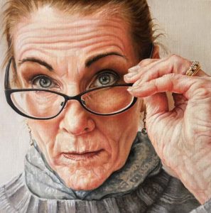
Self Portrait: With Glasses - Oil on Linen 35cmw x 35cmh, 2016
As to Self-Portraiture I was always a reliable sitter when I needed a subject. I was interested in my own journey as an artist and how this may be captured through the genre of portraiture. Self Portrait in a Convex Mirror typifies my process at the time. As explained I was looking at ‘esperpento’ and Portraiture and in my honours year and I was looking at the various ways artists had tackled this issue before. I recalled the work of Parmigianino and considered how a modern day take on his work might look. Where might you see your own image so distorted, under what circumstances would you see it and how would I make the work of Parmigianino relevant to my own in terms of his influence?
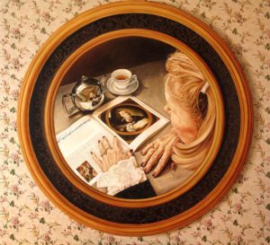
Self Portrait in Convex Surface – Oil on Canvas 112cmw x 112cmh, 2009
Many artists will not attempt hands. Expand on your painting of hands especially old hands.
I don’t see the point in steering away from something because you may not be good at it. If we are not constantly challenging ourselves and the way we think I’m not quite sure what the point of art is. I recall being given an exercise in year 8 or 9 at school which required us to go home and draw our hands and feet, though the exercise was difficult it opened up a whole new avenue of insight for me. It consolidated my thoughts on drawing what you can see and not what you know to be there. So many times we let the logic of our brain take over to depict what we think should be there rather than what we can physically observe. Yes, the many variances associated with hands do make them difficult to draw or paint if you allow them to. These two works were completed roughly around the same time. It was a comparison work to show the perceived passing of time. The first example was of my mother’s and her sister’s hands, the second was of my and my sister’s hands.
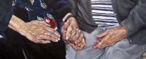
Hands 1 - Detail
Hands are the tools we use to ‘make’, ‘play’, ‘do’, ‘change’, ‘alter’ the very many tasks we complete each daily. As the daughter of a seamstress mother and woodworking father, I see our hands as our creative implements. Our age and our experience can be told through the appearance of our hands, so the older we become the more interesting the tools of our trade become.
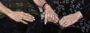
Hands 2 - Detail
You also use two mediums portraiture and still life how do you combine the two both artistically and how the object is part of the portrait.
When painting a portrait I often think about what the person does, not just for a living but in their everyday life, what is it about this person that needs to be ‘told’?. Here I would consider whether some form of object would best be included in a painting to challenge the observer to ask questions. It’s not merely enough to place something in a painting when it states the obvious, the audience needs to be engaged.
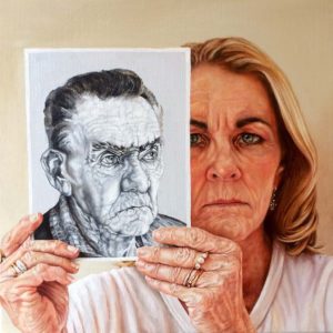
I Am My Father’s Daughter – Oil on Linen 35cm x 35cm, 2017
You often draw and paint the same object. Expand on how the same piece can change due to the medium you use.
When I look at people and objects I often envisage how I would go about painting or drawing them. There seems to be a particular aura that people and objects give off and I try to pick up on this. Finished works probably tend toward drawings or oil paintings as these two mediums are the ones I feel most comfortable with and most probably have the most control over.
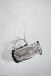
Glass Jug – Watercolour, 20cm x 25cm, 2018
I would consider asking myself several questions about the colouring of the subject matter, what needs to be included/subtracted in the work in order to convey the strongest message. However, I have recently introduced myself to the medium of watercolour and I am enjoying the fact that I don’t have as much control over the medium and that watercolour has an immediacy that is lacking in oil painting and in drawing.
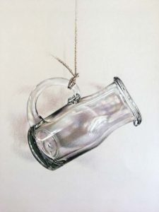
Glass Jug – Coloured Pencil 25cm x 30cm, 2018
Contact details:
Trudi Harley
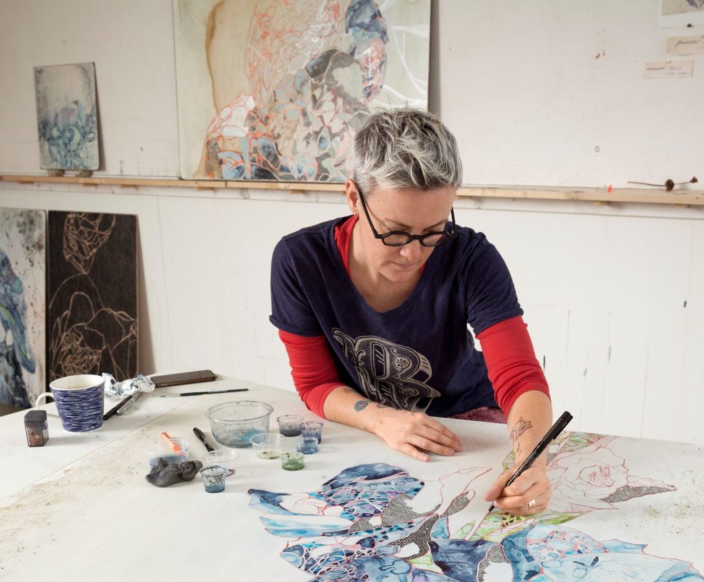
Belinda Fox
Travel influences Belinda Fox's art. Living in Singapore brought bright colours, while pairing back colour in The Netherlands. Belinda Fox causes great enthusiasm and eagerness in her work.
Zoneone Arts brings Belinda Fox to you...
You majored in printmaking and spent time at Port Jackson Press do you see this as your major genre?
Printmaking informs the basis of how I work and is a big influence but I would not call myself a printmaker. I mainly paint but I work with many mediums in 2d and 3d. I guess I am a multi discipline artist these days...
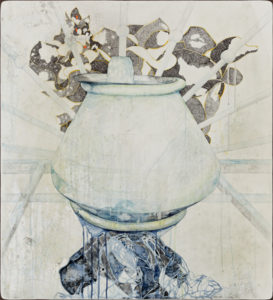
Belinda-Fox-Pedestal-2018-110x100cm
Discuss line in your current work?
In my latest show in Berlin the line plays an important role of tying and unifying, connecting the paintings and the printed backgrounds. I wanted the audience to have a full experience of how I create by feeling totally immersed in the work. You have lines that are quite brutal from the woodcut panels, to the soft watercolour, to the printed woodcut line with incidental lines on delicate Japanese paper. These webs of lines intersect and contrast each other giving the viewer a full experience of how I create.
Your work currently is showing in Berlin is very light – pale discuss.
I think the change in environment from living in Singapore to The Netherlands has created a paired back palette perhaps. It is unconscious really.
Can you take ‘A few Moments 1’ and expand on the work.
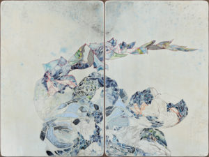
A few moments w 2018, Watercolour, drawing, collage, encaustic wax on board, 91.122cmPhoto Credit: Bernd Borchardt
Size: 92x122cm
Composition:
Based on the gladiolus flower, the theme for the show and this work was ‘remembrance’ and historically the gladiolus can be symbolic of horror and remembrance. With this work the flower is abstracted to a point of departure from its origins. It hints at perhaps leaving a stem on a head stone. My daughter sees it as a scorpion tail! The idea of the show is to highlight the importance of remembering our past mistakes in order for us not to repeat them.
Introduction of boarders:
Yes this is a new idea. The fluro orange border is designed to create an urgent jolt – like a signpost to stop and look. The natural wood is just for pure beauty and to revert our thoughts back to the wood that is also present in the printed woodcut and the actual woodcut boards. It is all connected through material and application.
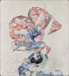
You Never Say,2017, watercolour drawing, collage, encaustic wax on board 110 x 100 cm
Photo Credit: Bernd Borchardt
Discuss the texted in ‘Drawing a Line’.
I have collaged elements into the paintings from various books that are about wars. In particular the Richard Flanagan Book ‘Narrow Road to the Deep North’. This is a physical reminder of past wars and terrible pasts that we must not forget and certainly not repeat. Current milase of human rights and morals makes me worry about this a lot!
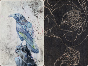 Drawing a line 11, 2016 Watercolour, collage, drawing, encaustic wax, wood cut on board, 91.5x122cm Photo Credit: Bernd Borchardt
Expand on the importance of having Michael Reid in Berlin, has been for you personally and other Australian artists.
I feel Michael having a presence in Berlin is an incredible asset to Australia and the artists he represents. It is brave and it is a big task to have galleries in two countries. I feel extremely lucky to have an opportunity to show in Berlin. It is of extra benefit for me living over in Europe. I am trying to gather interest over here so this show is very important for my future aspirations.
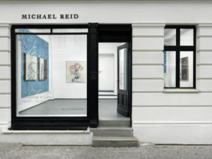
Michael Reid Galerie, Berlin Photo Credit: Bernd Borchardt
Explain the Asian influence in your work.
I guess Asian aesthetics has played a role n my work for a very long time from years of travelling in the area. Textile traditions and picture making in these regions have long inspired and influenced my work. In the ‘Tilt I’ a pigment print showing currently in ‘Size Matters’ in Singapore an Asian method of depicting the raging sea has been drawn upon. This is to abstract the scene which is very graphic and distressing of refugees fleeing a sinking ship.
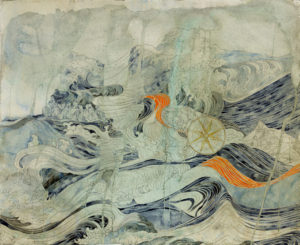
Still Life V (i feel my heart is burning) 2016, Drawing, painting, acrylic on paper 120x 150cm
You still see the need to enter Prizes such as the Swan Hill Prints and Drawing Award explain this in your current career.
I am very particular these days about what competitions I enter. I set myself a limit of 2 per year. And I only enter something if it is good enough, or relevant to the award. They are very hard to get in to and are often an extra expense that does not always pay off! But I think awards can be great to expose your work to new audiences if you get selected in the finals. If you also win that is a big bonus. Its important not to take them too seriously though. It is highly subjective and not a reflection on your worth as an artist.
You are currently living in The Netherlands; can you tell us how your work went to the Australian Ambassadors Residence in Deg Haag.
This was a small thing and the Embassy were very kind and asked me to contribute to a show they had planned after hearing I was living here. The work was made for this exhibition with ANZAC day in mind and I also knew it would then go to Berlin after the show in Den Haag was over.
Explain how your globetrotting life has affected your work?
An artists life affects their work no matter what you do. So it has informed my work immensely. I am very lucky to be living in different parts of the world and learning and discovering things along the way. Where I am living affects the work I make. It’s been quite a defining aspect of my practice I guess. It’s also such a blessing to live such a varied and unique path.
Discuss your collaboration with Neville French. How did you came together?
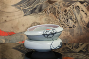
Tilt 12,2017, 30x32x20cm, Collection Manly Art Gallery, Photo credit: Silversalt photoghraphy
Oh! this is a whole extra interview! We have worked together for many years now. It is a wonderful and exciting ongoing conversation that I am sure will continue for a long time. We love what coming together brings out in our work. It is totally unique having two minds working towards a shared goal. It is a very special experience – when it works! Our last show was a particular high point for both of us. We combined my printmaking and the ceramics to create a full room installation. It was a very interesting and rewarding project for us. I look forward to our new adventures.
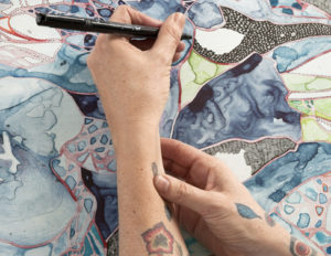
Belinda Fox, Photo credit; Hein van Liempt
Contact:
Belinda Fox
insta: @foxbelinda
Belinda Fox, The Netherlands
Interview by Deborah Blakeley, August 2018
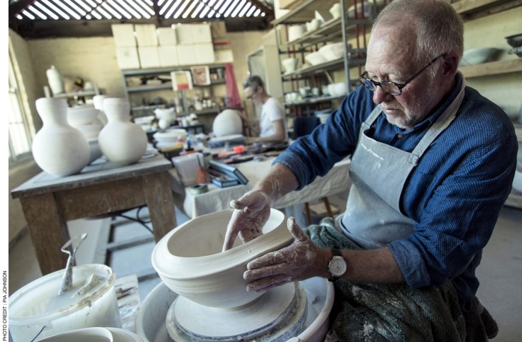
Neville French
Sumptuous-lavish, luxurious, opulent, magnificent, resplendent, lush, lavishly… These words only begin to introduce you to Neville French’s ceramics.
Zoneone Arts brings Neville French to you…
Since you have left your position as a University Lecturer, how has this extra time for art changed the input you can give to your own work?
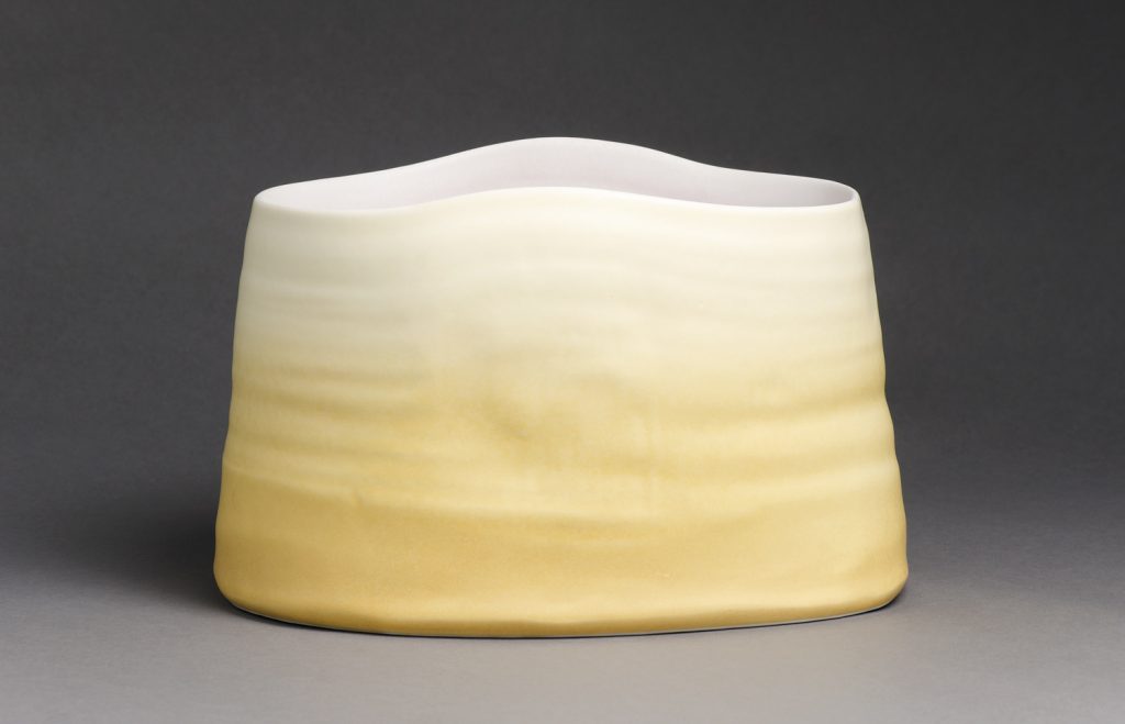
Mungo Light 11 2014, 24x 31 x27 cm. Wheel thrown and altered porcelain fired 1320c
Photo credit: Terence Bogue,
It has enabled me to spend more time in the studio and to work on some exciting projects. I developed a new series of large porcelain vessels for the Alcoso Vitrify National Ceramics Award in 2012 that were inspired by the vast landscape and light at Lake Mungo in southern NSW.
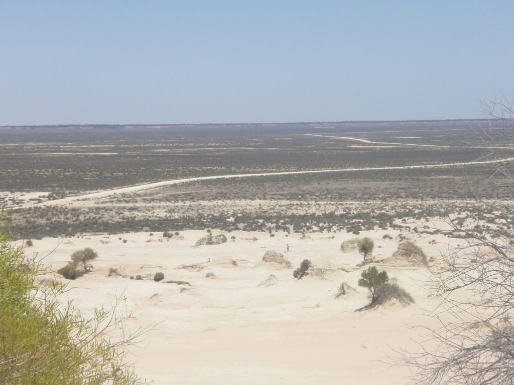
Lake Mungo Basin, Photo Credit Neville French
This significant environment was also the inspiration for the large wheel throw and altered vessels I created for the Cecily and Colin Rigg Contemporary Design Award at the National Gallery of Victoria in 2012. I have worked with artist Belinda Fox on major collaborative exhibitions: ‘Give & Take’ at Beaver Galleries in Canberra 2012, ‘Hua Ping’ at The Cat Street Gallery in Hong Kong 2013 and ‘Tilt’ at the Manly Art Gallery and Museum 2017.
I have also had more time to further develop my interest in functional tableware and experiment with the use of coloured glazes incorporating local granite, feldspar and wood ash and to fire my bourry- box wood burning kiln.
Do you miss the interaction with the students?
It is a pleasure to work with highly motivated students and I enjoy the shared learning and inspiration that happens in a great learning environment. I enjoyed the discussion of different ideas, the research investigations and achievements of students. I am pleased to be able to focus my attention more fully on my own work though and have found an ideal balance with teaching one day a week at a private art school in Melbourne (SOCA). This has been a wonderful experience and provides a perfect balance. There is a strong emphasis on the investigation of materials and shared discovery as a foundation for the development of ideas, techniques and individual work at SOCA and I have been assisting students to develop their knowledge and understanding of stoneware glazes and forming techniques as a basis for innovative tableware and sculptural vessels.
You often exhibit with other artists and more recently with Belinda Fox. Discuss the process you need to have to collaborate at this level.

Belinda Fox and Neville French at Buninyong Studio, 2016, Photo credit: Pia Johnstone
I have collaborated on two person shows such as ‘From the Landscape’, with Cathy Franzi, where our different work and landscape references complement each other and expand the theme. This collaboration involves a juxtaposition of our individual works.
When I work with Belinda Fox we collaborate on the ideas and work together on the creation of the ceramic pieces.
We have completed four major projects since 2010. I enjoy the challenge of working together and the potential of our combined expertise. It requires courage to collaborate in this way as we take risks with each other’s work and respond intuitively to the development of forms and surfaces.
We accept the possibility of failure and we are candid with each other when evaluating results and we remain open to new ways of thinking about the work. When we work together we explore a shared vision and integrate our skills to create new work. We began our most recent project, ‘Tilt’ at the Manly Art Gallery & Museum in 2017, with discussions about humanity and the plight of refugees that are forced into dangerous situations through circumstances and the lengths people will go to be safe.
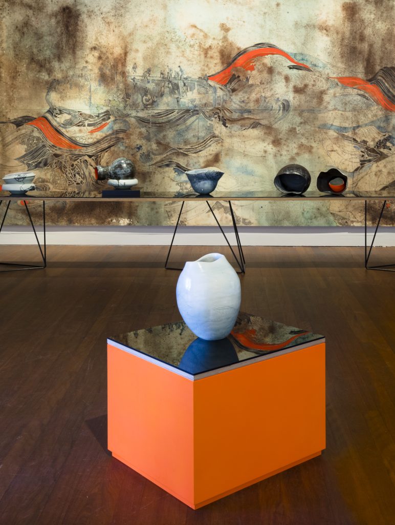
Tilt 12, 2017, 30x32x20cm, Collection Manly Art Gallery, Photo credit: Silversalt photography
The exhibition installation was designed to evoke a sense of unease in the viewer and draw attention to the dilemma of displaced people. It’s a joy to share the development of ideas and work with someone who is masterful in their art. Belinda has exceptional skill in drawing and a willingness to experiment and push the boundaries. There is sensitivity in her work and material beauty and when she works on my pots she adds a dynamic play of lines and spaces that’s very engaging.
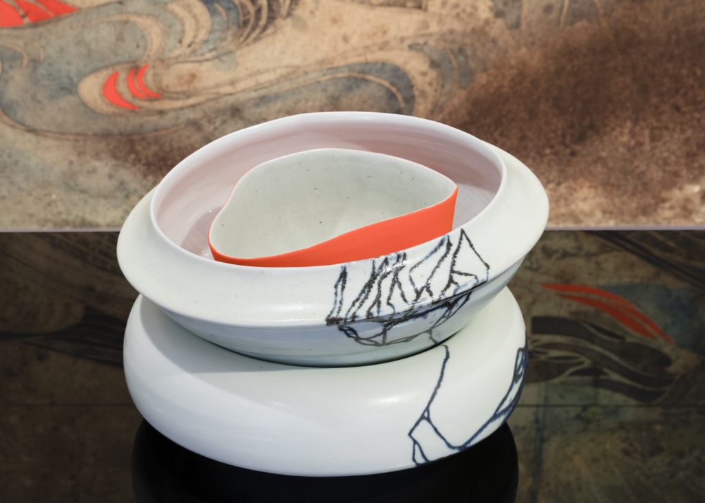
Tilt installation 2017, Manly Art Gallery and Museum, Photo credit: Silversalt photography
Expand on the relationship of a collaboration of painting and ceramics. Were many of your pieces bought together with Belinda’s work?
The ceramics that we create together have a strong affinity with Belinda’s drawings. The pieces are often grouped in relation to paintings or prints to add a sensory and tactile 3d element to enhance the expressive intent of the work and the overall theme of the show.
The ceramic pieces are fully resolved and often sold individually but we are always pleased when works are acquired together as they retain that unique connection.
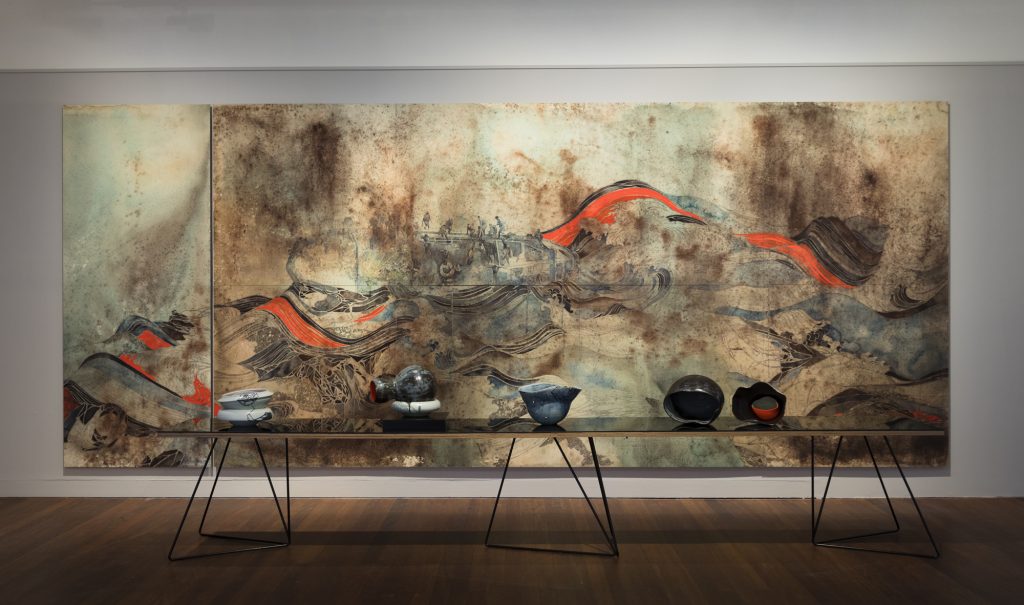 Tilt 9, 2017, Slips with woodash and limestone glazes, Photo credit: Silversalt photography
You have your work in many Australian Galleries – expand on one piece that really gave you a buzz and why.
One work that I am particularly pleased with is ‘Mungo Light 6’ 2012.
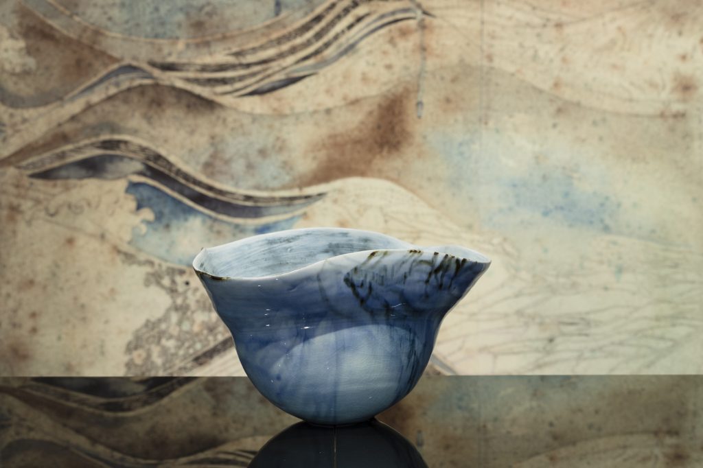
NGV, Mungo Light 6, 2011-2012, Copyright photo credit: NGV
This pair of large wheel thrown vessels was created for the Rigg Design Award at the NGV in 2012 and is now in the Ian Potter Museum of Art at Melbourne University. The pieces were scaled up, cut, altered and reassembled to evoke the flowing contours and surface of the weathered Lake Mungo lunette dunes.
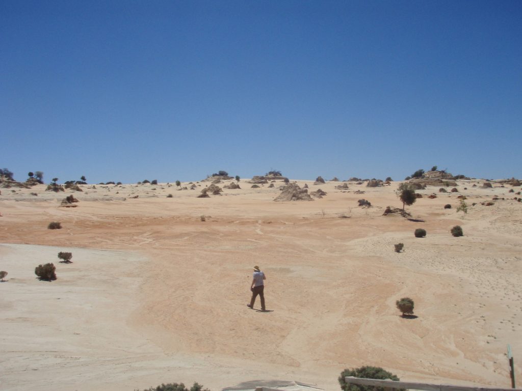
Lake Mungo lunette, Photo credit, Neville French
It was a risky challenge and I pushed the porcelain to its limits. My intention was to distil an essence of the extraordinary landscape, space and light. It is a place of great spiritual and cultural significance. The transparent, opaque and crystalline glaze surface is semi matt and built up with multiple thin layers of glaze to capture the parched and weathered surface of the dunes and the subtle shifts of colour, light and shade. I like the space between the juxtaposed forms and the luminous glow of the contained space that shifts with changes in the ambient light ... it is evocative. The nuanced texture creates different affects of reflection and absorption of light and alludes to a depth of space. I feel the work evokes a poetic sense of the quiet, vast topography, the lunar quality of the dunes and captures the visual and sensory experience. It induces a feeling of reflection and reverence. It was the technical challenge and in the end captures something of the ephemeral effect of light and a sense of this special place.
What are some of the comments that have come about your work internationally?
Peter Schmitt MA, former director of the Landsmuseum in Karlsruhe, Germany says. ‘Neville French’s bowls form a unit of form and colour which does not compromise function but gives symbolic added value. Yet this is retained even if the observer does not know the title of the work or its reference to a specific location: “True beauty radiates from a light within”. (Eduard Morike)’’
Earth, sky, colour, light – Neville French- a master of glaze from New Ceramics, Oct,2009.
Nancy Margolis gallery director NYC says, ‘… colours and forms are so soft and luscious’.
Taken from a letter to Neville French
Artist Gwyn Hanssen Pigott says, “These are rare bowls: words like tender and generous, like temperate and powerful, spring to mind. They need to be absorbed slowly, and still they challenge summation. They are lovely empty; they would be lovely filled, say with lemons, in the afternoon light. I suspect they will surprise and nourish again and again. Like good friends. Like oases.”
Neville French: Thought and Action in Tune, Ceramics Art and Perception No27 1997
Do you see a deep and obvious Australian feel to contemporary Australian Ceramics?
Australian ceramics is diverse and vibrant and generally informed by international practice now with the advances in overseas travel and easy access to the internet. I don’t think there is an Australia aesthetic although the unique Australian landscape provides inspiration for many artists and influences the colours, shapes, scale and imagery to some extent. The land also provides raw materials and a tangible link to places. Interestingly there has been a return of interest in the use of local raw materials for clay bodies and glazes and a continuing interest in wood firing and Japanese ceramic aesthetics.
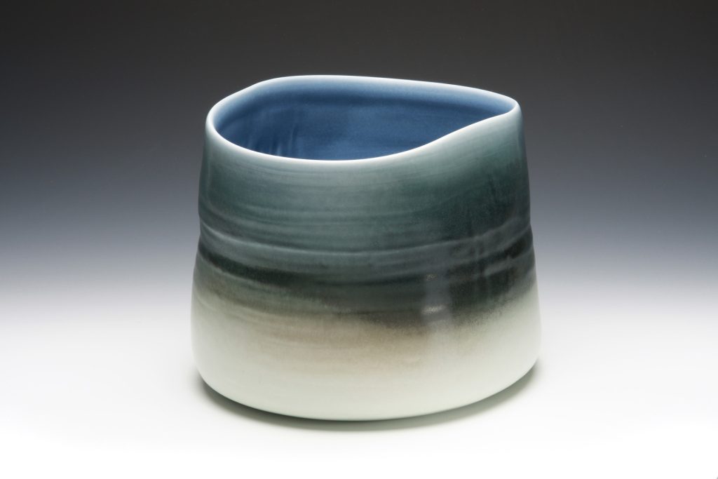
Winter Vessel, 2008, 29x28x23cm, photo credit: Terence Bogue
How do you see the change in both your work and Australian Ceramic generally?
My work is continually evolving, and I spend a great deal of time developing forms and colour glaze blends that can allude to the personal and meditative aspects of local places. I use the idiosyncratic nature of glaze to stimulate the imagination and evoke associations with environments. There have been some highly skilled and generous pioneer potters in Australia that have shared their hard-earned knowledge and made significant contributions to the standard of work being made here. I am very grateful to Ian Currie for his correspondence glaze course, Steve Harrison for his kiln building skills and research into local raw materials and Gwyn Hanssen Pigott who was my mentor and inspired and guided me in professional practice.
A decline in opportunities for students to study ceramics at diploma and degree level in recent years has led to the establishment of private schools that now assist students to gain the necessary skills. The growing interest in the community in handmade tableware and more meaningful and sustainable products has revived interest in handmade ceramics for use and given many potters viable career opportunities.
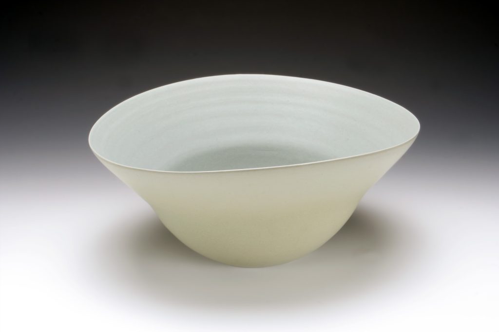
Enfield Bowl, 2007, 32x19x22cm, photo credit: Terence Bogue
Is there a definite feel for the land that can be seen in your work?
I grew up in Maryborough in central Victoria and my grandparents owned a farm at Eddington on the Loddon River across the Charlotte plains.
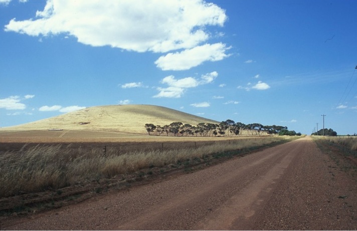
Charlotte Plains, Photo credit: Neville French
I spent a lot of time in this vast landscape and the big domed sky, vast horizon and silent spaces have left a lasting impression. Perhaps this is why I am drawn to vast meditative spaces in the environment.
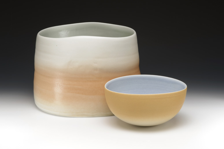
Mungo Light 13, 2014, Photo credits: Terence Bogue
Discuss your work in relationship to shape.
I particularly admire the fresco paintings of the Italian renaissance painter Piero della Francesca. His work impressed me profoundly when I first saw them 40 years ago. They confirmed a sense of beauty and mystery for me … the monumental solidity and simplicity, the softness, clarity of light and quiet, the colour palette. In the Arezzo frescoes I saw echoes of my local hill country, in the soldiers’ helmets from the legend of the cross. I inverted the shape to create a bowl. This wheel thrown shape was then cradled and scraped to smooth the surface and create taut contours. The silky matt glaze I developed fuses closely with the porcelain body and creates a luminous depth that evokes a sense of space and light.
Another influence on the shape of my work is the human figure. I taught life drawing to visual art students for 40 years and time spent analysing the subtle contours of the body, the soft texture and tones and teaching students about structure and relationship of parts has influenced the form of my vessels.
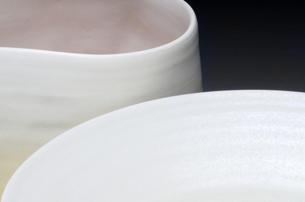
Mungo Light 5, 2012, Collection Art Gallery of South Australia
How do you manage to allow such a hard material to continue to have that feel of movement?
I try to exploit the natural characteristics of porcelain when I throw on the wheel and create soft undulating forms. I then alter the vessels to extend the movement and poise. When the wall of vessels has plasticity and dense weight you can achieve certain qualities and create movements of form and surface that can be further developed at the leatherhard stage of drying when it is possible to accentuate the spring of the taut contours. There is a high shrinkage with fine clays and they appear to lose something of their vitality as they dry. The glazes I have developed have a silky shine at high temperatures similar to the surface quality of the freshly thrown porcelain and this gives the high fired porcelain vitality.
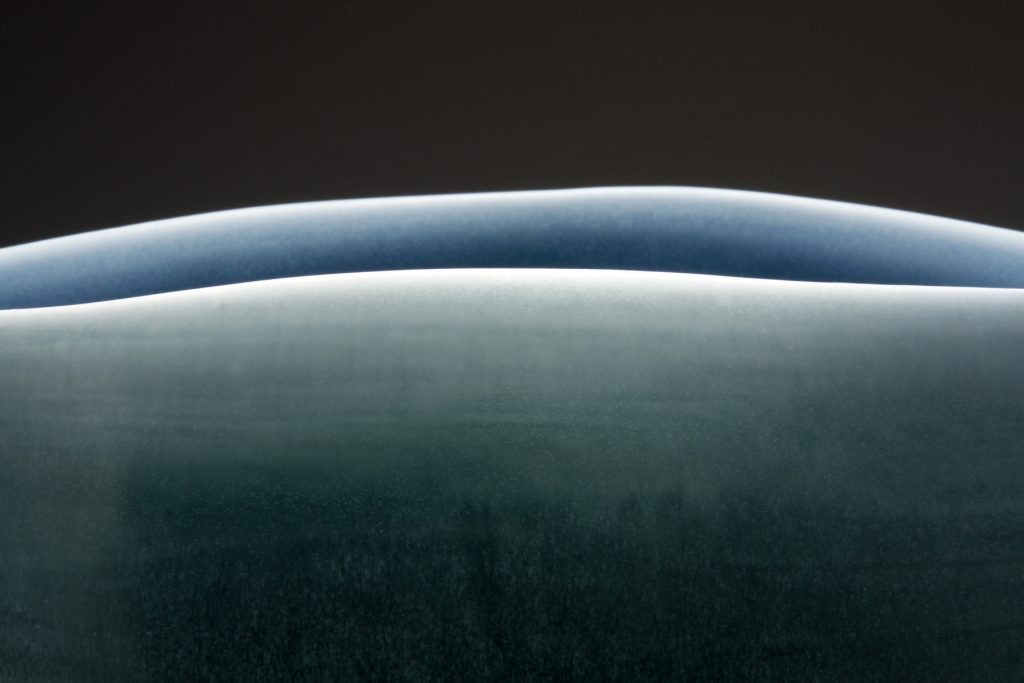
Winter Vessel, 2008, detail, Photo credit: Terence Bogue
Colour in your work is very subtle; expand on this aspect of your work?
Colour is an important element in my work for its emotive power and ability to trigger memory. I studied the German Bauhaus colour theory exercises of Johannes Itten (Art of Colour), Vassily Kandinsky (Point and Line to Plane & Concerning the Spiritual in Art) and Paul Klee’s lecture notes (The Thinking Eye & The Nature of Nature) as a way of developing my colour knowledge and understanding. My Masters degree research involved the development of a structured vocabulary of coloured glazes. I developed a palette of primary colours plus black and white in matt transparent glazes that could be layered and blended to create subtle nuances of colour and mood and give control over the emotive and expressive quality of the ceramic glaze surface.
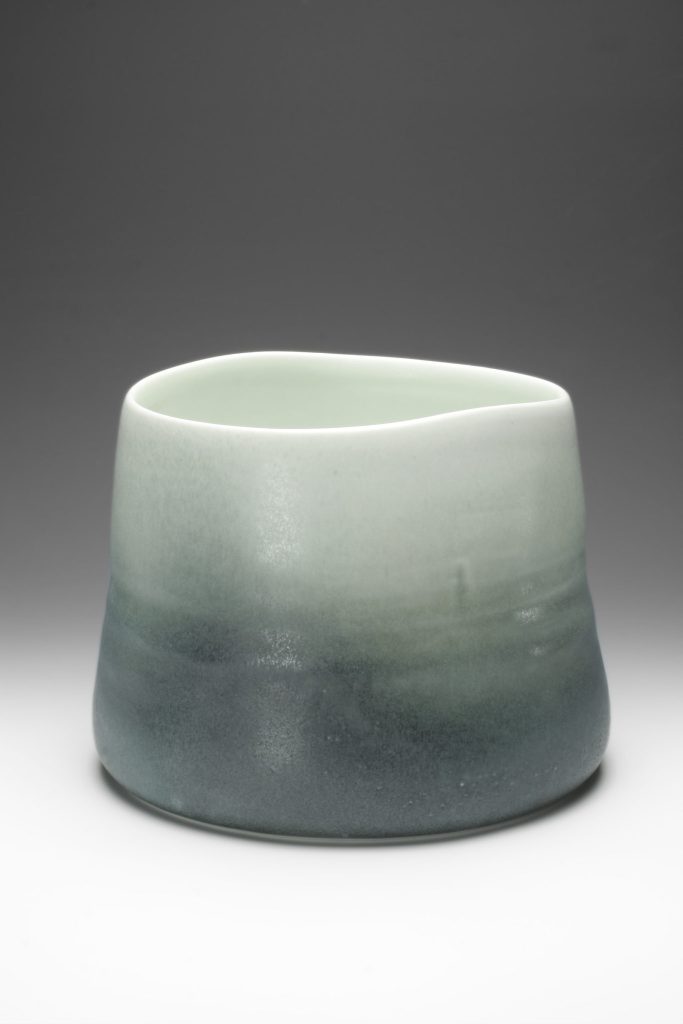
Winter Vessel, 2007, 27x22cm, Gold Coast Art Gallery collection, Photo credit: Terence Bogue
You are influenced by the landscape, has this developed due to your relationship of living in the country?
Yes, I have lived most of my life in country Victoria and observed the space, forms and shifts of colour and light on the land through different seasons, weather and time. For the past 40 years I have lived at Buninyong outside Ballarat and the grasslands and local rounded hills are an inspiration. I have also expanded my way of seeing and expressing the land by studying artists that I admire like Sean Scully and Richard Diebenkorn who create a wonderful sense of mood and place in their work.
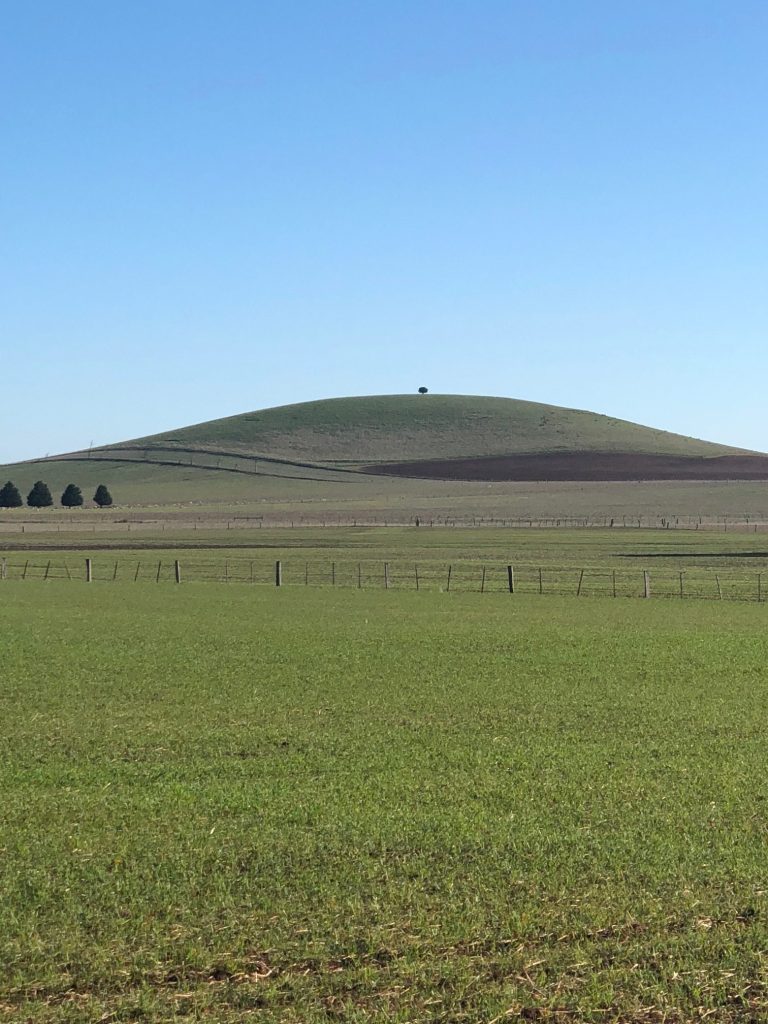
Ascot landscape near Ballarat, Photo credit: Neville French
Can you briefly tell us of ‘Your adventure’ in ceramics?
I went to art school to study painting but became fascinated by the alchemy of ceramics in my first year. I went on to major in ceramics although I continued to study painting and sculpture as well. I worked with artist John Gilbert for a year and developed skills in the creation of large coil built sculptural forms before travelling overseas to study art in the great museums. I returned to Australia with the understanding that I needed to study ceramic techniques in much greater depth to achieve the quality of work I had seen. I enrolled in a glaze correspondence course that Ian Currie he was trialling from the Brisbane College of Advanced Education in QLD and attended workshops and conferences to learn more about woodfiring. I was employed at the School of Mines Ballarat (TAFE) to establish a new ceramics diploma course and privileged to have the opportunity to be involved in the design of the new purpose built facilities. Prue Venables and I developed the new course and I enjoyed 30 years teaching and co- coordinating the program. I built a house and studio with a woodburning kiln at Buninyong and I have continued to develop my art practice from there for 30 years.
My work has been exhibited at the V&A in London, and the Grassi Museum in Germany as well as leading galleries in the USA, Germany, Korea and Hong Kong. Work is represented in many State and regional public collections in Australia including the National Gallery of Australia.
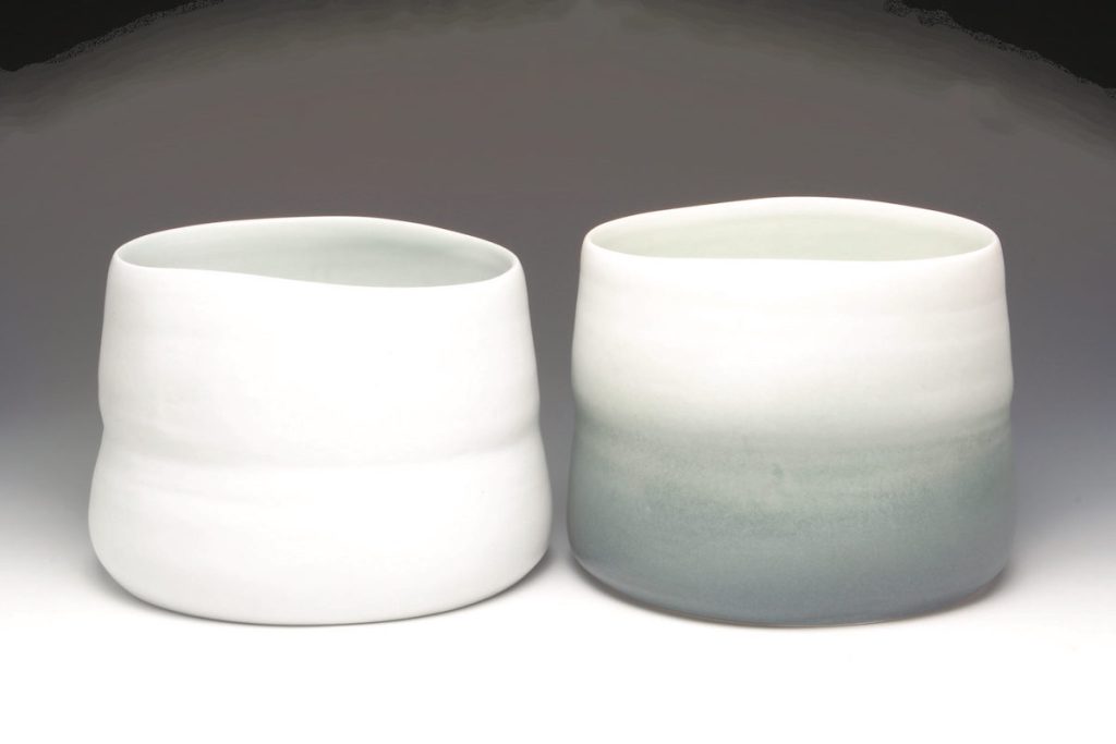
Large Winter Vessels, 2006
Discuss your thoughts on the collector. How should a new collector head into collecting ceramics?
This would of course be, to have at least one of your works.
A collector should invest in works that they like and artists whose work evolves over time … artists that have a strong commitment to a vision. It could be a single artist where the realization of the artists work can be observed and appreciated by the collector as it evolves. Perhaps another approach could be to collect a variety of artists work that relates to an aesthetic theme such as woodfired bowls. The collector could then develop expert knowledge and appreciation of variations and nuances. One valuable pleasure would be the opportunity to handle pieces and experience the weight, balance and material qualities.
I like pots that have a quiet and powerful presence and are beautiful, calm and evocative… poetic and mysterious vessels.
Pots can be intimate sculptures and through their use and visual presence can help provide respite from the chaos of daily life and expand and enhance life.
Contact details:
Neville French
nevillefrench.com
E: nevillefrench@bigpond.com
Interview by Deborah Blakeley, August 2018
Eleanor Bolton
Sailors, Scouts and Girl Guilds all know about knots, now Eleanor Bolton uses historical knotting and coiling techniques to make contemporary jewellery. Eleanor Bolton keeps these traditional crafts alive and relevant, while pushing the boundaries in her jewellery.
Zoneone Arts brings Eleanor Bolton to you.
You studied at the Royal College of Art and on graduation, started your own label. This is a huge step to make please discuss this monumental move and your belief in your art?
It was a really natural transition, I got commissions and invites to exhibit off the back of my MA graduation show so I just did it. I networked, gained contacts and some loyal customers whom still sell to today. There was no plan, when I started I was also working part time in a shop to pay the rent and made jewellery from a little table in the corner of my lounge. I think the momentum I had during the last year of my masters spurred me on and not so much my belief in my work, but others wanting to purchase or exhibit it that kept me going. After about a year I set up my first studio and have continued ever since.
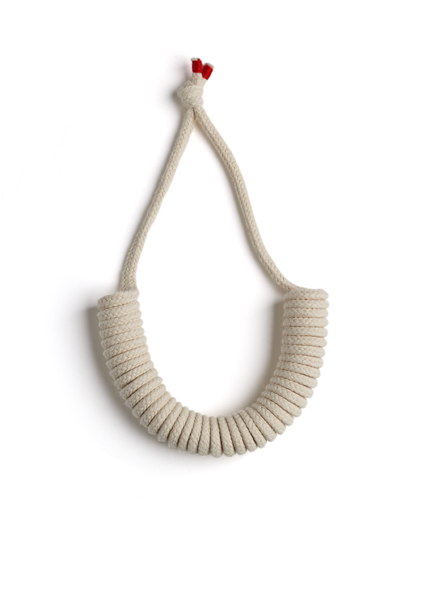
Half Coil
Your jewellery is full of line and details discuss?
My designs come from a focus on an intuitive and sensitive approach to the micro details of making processes, as well as to the precise scale of the pieces. This attention to detail, combined with the innovative use of the materials define my approach. The simple line is a key detail across the work, combined with blocks of colour, this is what I think gives it strong aesthetic appeal.
When and how did you decide to combine coiling and hand stitching, also how were you introduced to these techniques?
While I was studying at the RCA I found I got frustrated with metals which where to that point were the main materials I worked with. I started to play with textile techniques and fabrics, ropes and cords and enjoyed creating 3D forms in a more direct way. Playing with stitching into the rope and forming it into coils came from this experimental period.
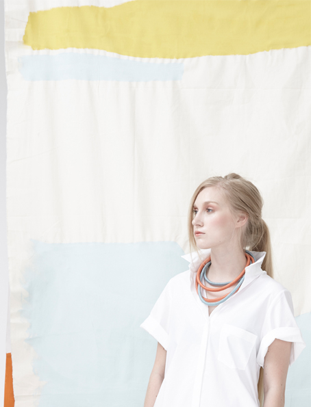
Can you comment on your colour combinations?
Colour inspiration for the collections often comes from fine art and the bold use of colour and textile techniques marry to create statement tribal and nautical inspired jewellery. When I’m designing I tend to start with a colour palette which is often inspired by a painting or artwork or artist. For example the colours for the Paint Box collection was inspired by the works of David Hockney and Friedel Dzubas. The colours both artists used are bold and also reminded me of hot summers in mediterranean countries. I wanted a summery feel to that collection and looking at those artists works provided the colour palette of turquoises, blues, rusty oranges, mint greens and yellows, which formed the starting point for the the collection. Previous collections have also been inspired by the colours of Mondrian and Sonia Delaunay to name a few.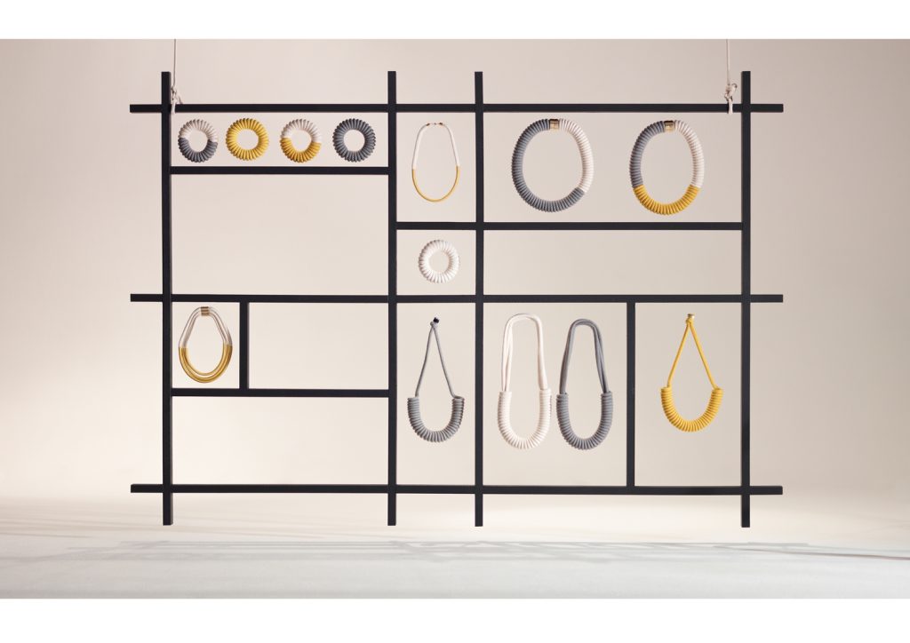
Mondrian Collection
Expand on the use of pattern through the coiling?
I wouldn’t say I use the coiling as a pattern as such, but more as a way to create three dimensional form, take the line of a piece from 2D to 3D. It allows me to create sculptural yet lightweight tactile jewellery. There is a simplicity to the coiling that I find so pleasing. It mimics many forms found in nature.
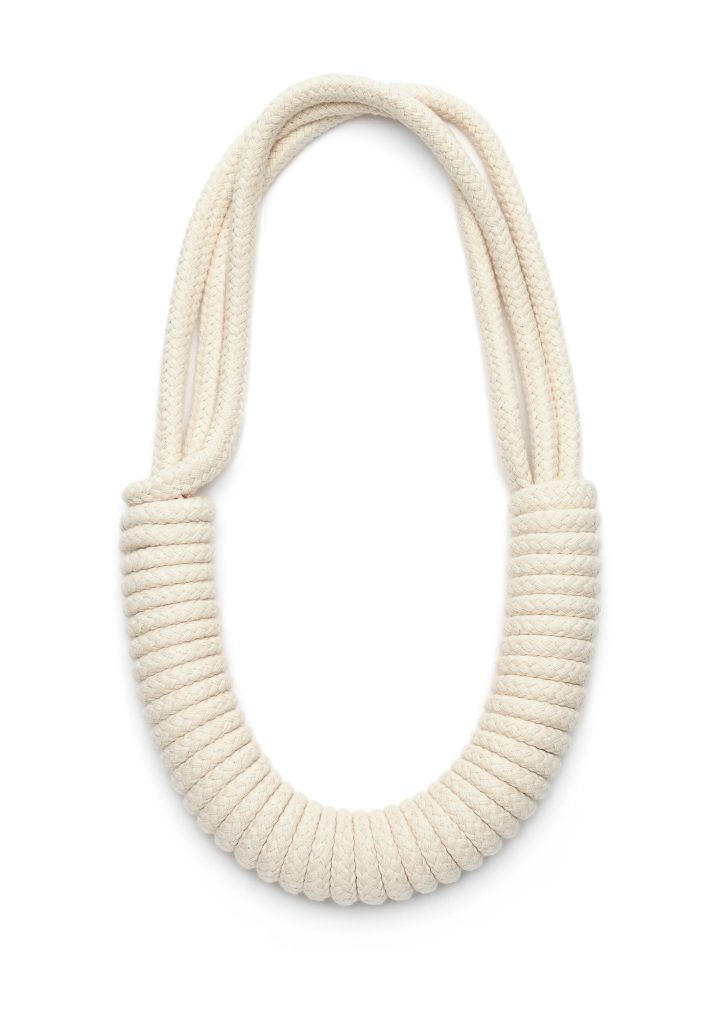
Multi Strand Necklace, Natural
Discuss the way you have used and added metal to your pieces?
The metal elements often form a point of contrast - the shiny hard gold or silver against the soft matt finish of the cotton rope or yarn is part of playing with textures and highlighting the materials different qualities. Sometimes however metal elements are also added purely for functionality. Sometimes only a metal clasp will do!
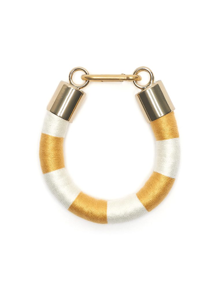 Thick Stipe Bracelet, Honey and White
How influenced do you need to be by current fashions and colours?
Not consciously, I don’t go out to follow trends with my work. However as a person in the world I am always taking in what I see and so inspiration may come from a current fashion or trend colour fuzed with another idea or visual reference.
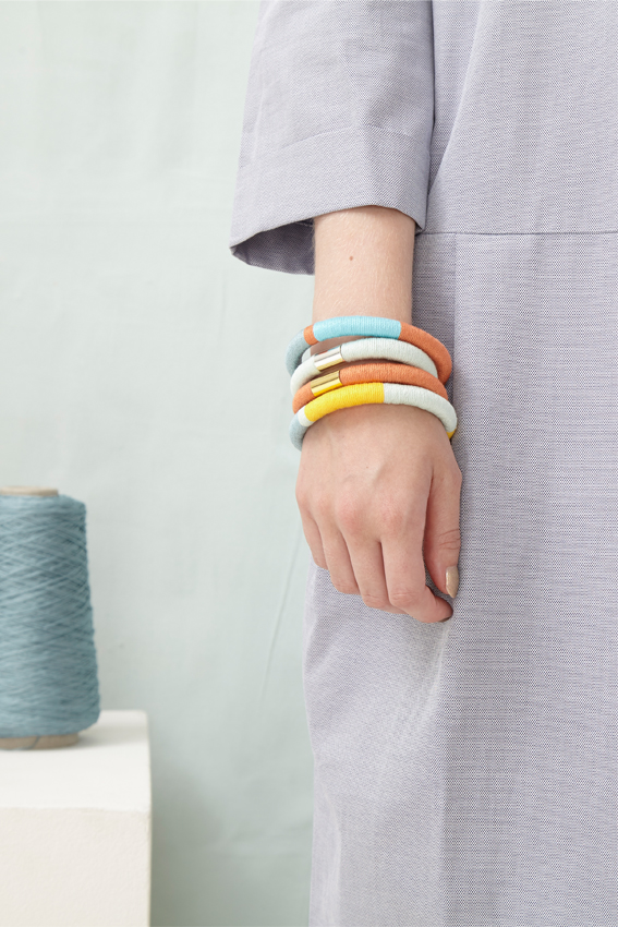
Bangles stacked
When do you use bright colours or is it seasonal?
Bright colours come and go depending on the inspiration for a collection and the materials I am using. For a while I was enjoying working with some fluorescent rope -really bright reds and yellows. But I’m currently favouring more muted tones.
Comment on the fine details in Dora?
The Dora is a short necklace combining either a block of sandstone or honey coloured yarn flanked by dark grey and white stripy sides and finished with a gold plated or silver ends and clasp. I love playing with combining yarn colours in this way, the stripes especially - a hint to the nautical associations of the rope core.
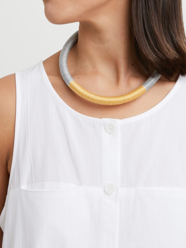
Dora, Honey
You have also collaborated with other brands and their collections. Discuss you work with Wéngko and Molé.
Resort wear brand Wéngko Molé approached me about collaborating on a range of rope belts to work with their digitally printed silk garments. It was a lovely project to work on, I worked closely with founder Christina Pistofidou to develop the collection that complimented their prints and worked across the collection.
Not only is your work beautiful and unique you are happy to share your techniques through classes – expand on this.
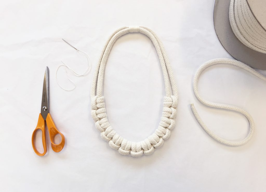
Half Hitch Necklace
Teaching the creative workshops is a chance to share my knowledge, it’s fun and inspiring seeing the how the students take on different aspects of the techniques and take them in different directions. I don’t teach all of my techniques, I do keep some back for myself and the workshops are definitely just a taster session, a starting point for students to be creative with the textiles for jewellery under my guidance.
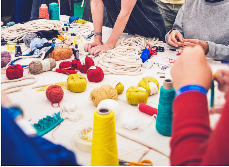
Please give us your thoughts on the importance to foster old crafts in a new way.
It’s so important, when you work with traditional crafts and materials putting a new spin on it keeps it fresh and exciting. Keeps them relevant. But it also sets you apart as an artist to be taking the traditional techniques and using them in new ways, trying to push the boundaries of the materials you use or using them in new ways.
Contact details:
Eleanor Bolton
studio@eleanorbolton.com
www.eleanorbolton.com
Instagram - @eleanor_bolton
Eleanor Bolton, London, UK
Interview by Deborah Blakeley, July 2018
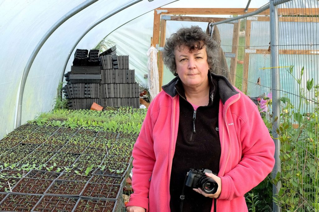
Tessa Bunney
Can you expand on FarmerFlorist Exhibition?
How did you become involved?
I have been working on FarmerFlorist for just over 2 years – prior to that I had been living in Laos for four years enjoying travelling and photographing both for various clients and my own projects all over southeast Asia. Although I wasn’t really looking for a new long, term project I happened to notice a nearby farmer’s market in Hovingham, a small village nearby my home in Yorkshire, UK. There was a list of stallholders one of them being Ducks and Daffodils, an artisan flower grower and florist who was based nearby. I noticed that they are a member of Flowers from the Farm, so I got in touch with Gill Hodgson who set the up the not-for-profit network in in 2011 and the project developed from there.
From the series Farmer Florist
The importance of British Flower Week?
British Flowers Week is the annual celebration of British flowers and the UK cut flower industry. It is the initiative of New Covent Garden Market, London’s original fruit, veg and flower wholesale market and has been running for six years with the aim to promote British flowers, their growers and the independent florists working with them. It provides a focus for celebrations and events of course British flowers are available all year round. It seemed like an appropriate time to launch my project.
The importance of making people aware of British grown
We are a nation of farmers, of gardeners, of flower lovers and our cut flower industry is worth 2.2 billion pounds a year. Flower farms were once a familiar feature of the British countryside and market gardeners grew flowers among their vegetables. In the 1800s, larger farms sprang up as transport links improved and daily trains carried violets from Dawlish, snowdrops from Lincolnshire and narcissi from Cornwall. Flower productions has always necessarily been linked to transport, and with planes came distance. Now we can have any flower at any time of year, flown in from the equator, or hothouse in vast Dutch greenhouses.
From the series Farmer Florist
Recently several smaller British flower farms have sprung up, fuelled in part by the wider, resurgent interest in locally produced, seasonal, sustainably grown produce.
“Nothing is exotic, they are all flowers that have been grown here for centuries. The issue is that people have got so used to a diet of chrysanthemums, carnations, roses, lilies and gerberas that there is a whole generation that don’t recognise anything else”. Gill Hodgson, Fieldhouse Flowers.
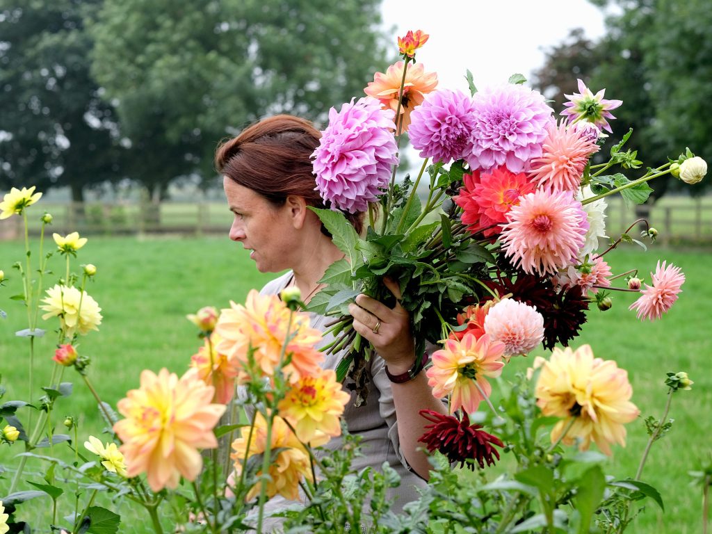
How did you choose the growers?
To start with I used the Flowers from the Farm website to discover flower farmers both in my area and further afield. They are quite social media savvy and many of them have wonderful Instagram accounts, so I found others through that. I asked for recommendations from other growers. There are so many to choose from (over 500 members) it has been very difficult aside from my local growers whom I visit regularly I am looking for a wide geographical spread. Recently I have expanded the project to include larger scale commercial growers in Lincolnshire who operate a different model of flower growing, but equally as fascinating.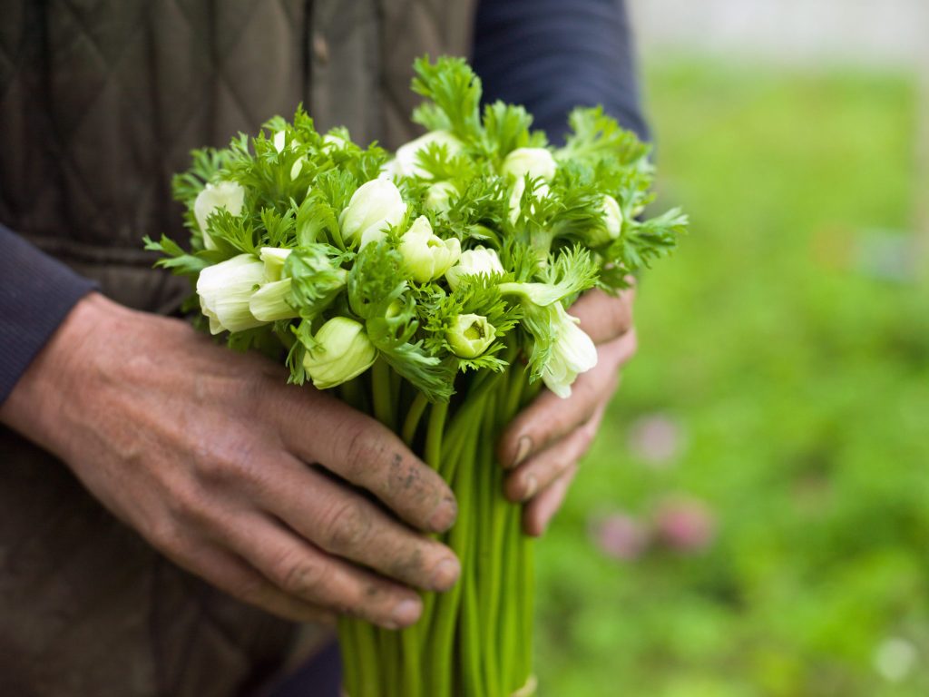
SE Warner + Son, Spalding, Lincolnshire
Can you comment on your role as a photographic – Artist.
I hope that my role is a collaborative one where the communities or individuals I work with share their stories with me and I use my photo skills to interpret them.
I employ a long-term art-based practice to address some of the wider issues of landscape. This offers an alternative approach to conventional news journalism with its tendency to ‘parachute in’ on issues for a fast story. Instead, I adopt the growing practice of slow journalism, which advocates sustained relationships between photographer and subject, working closely with local people to enable more meaningful and complex stories about landscape and development to emerge.
Even with difficult subject matter for example photographing people doing something I might not be totally comfortable with, then I try to present the issue in a respectful way and allow the audience to make up their own mind.
For whatever reason, people generally find it easy to open up to me – as an outsider, a photographer, it’s quite remarkable what people will tell you and then I have to decide about what I should share further.
Your images are also works in sociology, discuss this aspect of your work.
Unlike other photographers I am not a sociologist by training or in fact in any other subject other than photography, so any sociological aspect is literally achieved by spending a long time talking to people and working in the field and allowing the story or issue to emerge in time. I often work within countries or with issues I originally knew nothing about. I prefer to start the work and allow the issues to surface and then follow up with academic research to validate my own findings. My projects very rarely start with that kind of research, my ideas are more likely to come from a radio feature (Hand to Mouth), a map (Home Work), a commission (Moor and Dale) or inspired by someone I meet or exploring a landscape.
You travel to remote places, for example Romania’s Carpathian Mountains discuss how you prepare for a trip like this.
For my project in the Carpathian Mountains – I travelled firstly on a brief research trip, so I had no set ideas about what exactly the project should be at that point or what was possible. However, I was particularly interested in shepherding and during the research trip I tried to discover exactly when activities such as the Measurement of the Milk Festival would take place, so I could plan to be there at times. I returned 8 times in total, each time I went back to the Maramures region and then to somewhere else in the mountain range so that I had the mix of getting to know several villages and people within the villages well as well as the excitement of exploring new areas. I went at different times of year and responded to the yearly cycle of the seasons. There was very little formal planning other than transportation, booking a translator etc.
Tessa Bunney
Other countries I have worked in especially Communist countries such as China, it has usually been necessary to prepare a detailed itinerary in advance in case of being stopped at army/police check points. Although not usually too rigid, this is difficult with the way I work as it doesn’t allow for the random exploration which I enjoyed in Romania and other European countries.
Expand on how you build up a relationship that allows you to take portraits especially in remote places.
This might differ country to country or how much time I or they have. For my own projects, in general I try to spend as much time as possible chatting to people or photographing them working – and then make a portrait at the end of the day or some other appropriate time during their activities. Sometimes I might meet people briefly whilst wandering landscapes and villages, make their portrait and then go. At times if I am travelling remotely especially on foot, the only way to have time with people then I need to stay with them as a guest in their homes. When I am working on personal projects, I’ve found, as many other photographers have, that the more remote you go, the harder the journey, the more authentic or unique the experience will be. There are many ethnic minority villages in Laos and elsewhere along roads where tourists stop often and then the experience is different. However, it can be more challenging if you meet someone who has never seen a camera before or has a set idea of what a photo should be normally because their only experience is in a formal portrait studio. Overseas, I always use a translator so that they can explain who I am and what I am doing.
Generally, though if I have to work in a rush or I feel the person is uncomfortable then the photo won’t be any good anyway, so I will leave it.
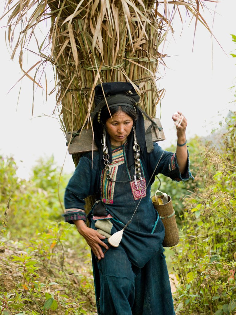
This image of an Akha women spinning cotton as she returns from the field is one of my favourites from my time in Laos – we (me and a local guide/translator) had just arrived at the edge of her village after a boat trip and an exhausting six-hour hike uphill, we turned the corner and she was there, my heart skipped a beat. We stopped to chat to her briefly, Sivongxay asked her if it was OK to take a photo, I took a few versions taking no longer than a few minutes and off we all went on our separate ways.
This portrait of puffin hunter Jakob Erlingsson was taken in Iceland.
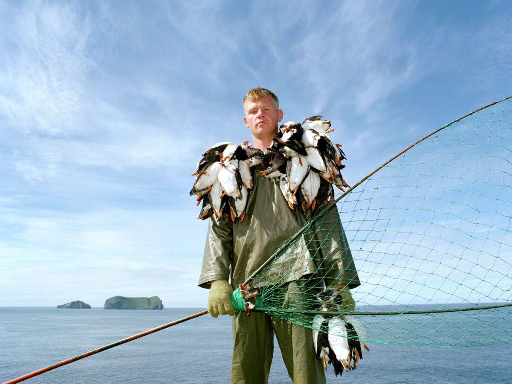
I had heard about puffin hunting and got in touch with the tourist information office in Vestmannaeyjar to see if they could put me in touch with someone which luckily, they were able to. I spent a few days photographing Jakob at work, at first the weather was terrible and then eventually some days later it cleared up and I asked him to pose for the portrait after a mornings hunting. Taken in 2001 this image already has value as a historical document as by 2011 and 2012, breeding failures had taken such a toll that puffin hunting was banned in Vestmannaeyjar. In 2013 a five-day puffin-hunting season was allowed at the end of July. Now I believe there is now another complete ban
This is a portrait of a member of Old Glory Molly - Molly dancing is a form of English Morris dance and is one of the traditional dances from the fens of East Anglia. It traditionally only appeared during the depths of winter as a means of earning some money when the land was frozen or waterlogged and could not be worked. The original "ploughboys" blackened their faces as a disguise to escape recognition and the consequences of their mischievous actions.
Here I set up a portable studio at ‘A Day of Dance’, the largest annual gathering of Molly dancers in the UK – I watched and photographed them dance and then asked them if they would pose for me one by one in front of my backdrop.
Discuss your landscape work using ‘Tidal Pools’ as your reference.
Although my work is about landscape, I don’t really consider myself a landscape photographer, I’m not interested in photographing wilderness or ‘peopleless’ places when I look at a view, I want to know who lives there and how it operates.
I’m very interested in land issues and how we use it. I’ve also got little patience for waiting for the ‘perfect’ landscape shot in terms of light, if I am somewhere then I will take the photograph if the conditions are ‘right’ for the purpose.
This image of Mousehole tidal pool was the first image I made in this series – taken whilst on a family holiday in Cornwall. I just happened to be there by chance, the light, the tide and the activity was just perfect and luckily, I had a camera with me. The incongruous nature of the concrete within the natural landscape fascinated me and when I got home I did further research and realised there were a number around the coast of the UK. I then pitched the idea to the Financial Times magazine and they commissioned me to work in southwest England for a week to photograph more tidal pools – quite a bit of research was involved to make sure I arrived at low tide otherwise the pool would not be visible! People and activities were of course the crucial element which depended on luck and waiting around.
So many of your projects are whole stories in themselves. Can you expand on both the photographs and the story behind your Oxfam Portraits for The Telegraph?
This was a very short story (for me) which was taken whilst on an assignment for Oxfam – shot in only a few hours but I guess the idea was germinating during the week I was working with them on Bantayan Island in The Philippines. On an early morning walk I bumped into the woman carrying a bowl of fish on her head and then devised a project around her activity which commented on the fishing industry in Pooc village post Typhoon Haiyan.
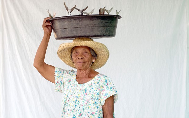
You have four books. They are all in editions of 1000 discuss both the books and the decision to limit the edition.
1000 copies seem to be the standard edition for photo books in the UK unless it is a very populist or commercial subject matter.
My four books have been produced to accompany exhibitions and as standalone publications of bodies of work. Much of my work, especially personal projects are supported and funded by a combination of a gallery, Arts Council England and self-funded and often a combination of all three. Some series are also part funded by editorial commissions. I love working editorially but discovered early on in my career that as I liked to work slowly and spend time with communities arts funding enabled me to do this more successfully.
Moor and Dale and Hand to Mouth were produced to accompany exhibitions and were funded by the galleries.
The bird man holding a brace of pheasants on a shoot at Swinton Estate, Nidderdale, North Yorkshire, UK
Home Work was published by Dewi Lewis with funding from Arts Council England, this was the first book where I chose the designer and had full decision-making control over how the book should look, what should be included and worked closely with the designer, James Corazzo, on the edit etc.
Järvenjää/Lakeice was self-funded and was more of an artist’s book with an edition of 250 produced as a lasting legacy of a residency in Finland.
In all these publications, use of text in different ways to accompany the images was a much discussed and considered element of them. I love maps and information but in each book these elements were handled differently depending on how much it was though that the images should speak for themselves (as in Hand to Mouth with extra info at the back of the book)
Contact details:
Tessa Bunney
www.tessabunney.co.uk
Tessa Bunney, North Yorkshire, UK
Interview by Deborah Blakeley, July 2018
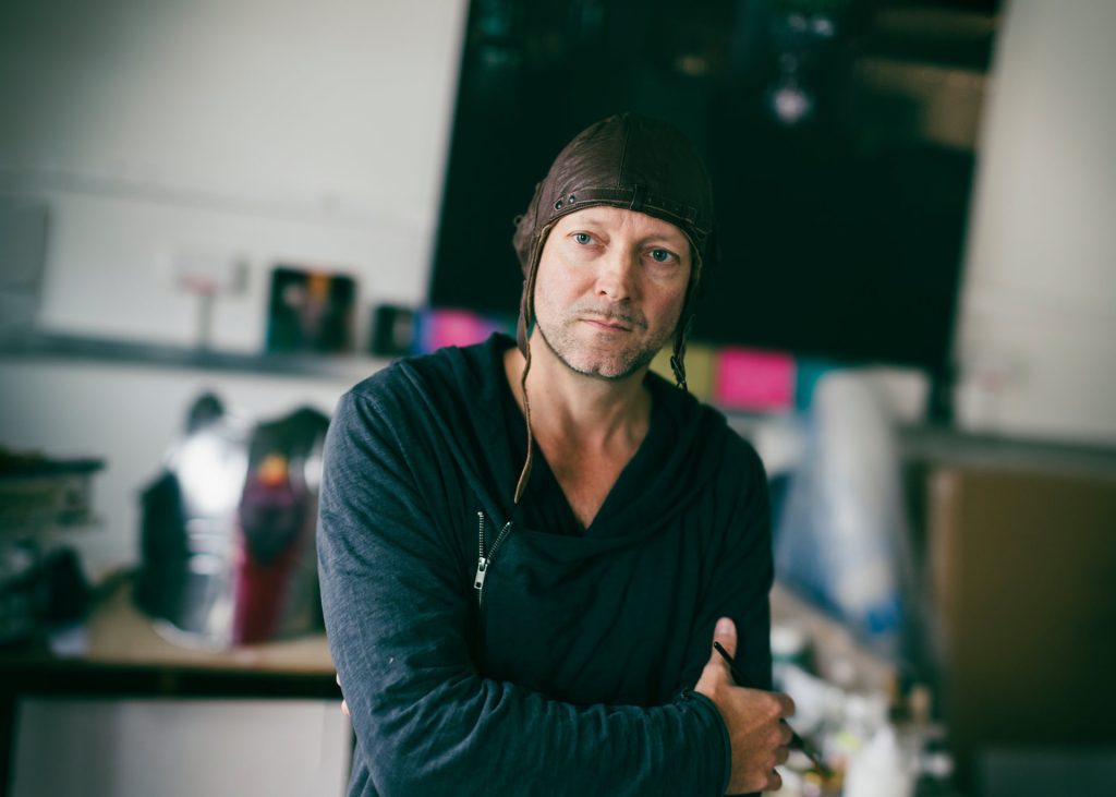
Chris Kettle
What has been the importance of looking closely at old masters in relationship your own work?
Before I started referencing the Old Masters my Still Life were more formal, contemporary, sometimes even clinical so I think I was looking for the opposite of that - some 15 years ago there was very little dark and brooding Still Life around, it wasn't something anyone was addressing so I found it incredibly inspiring rediscovering the Old Masters. I am always in awe of the beauty of their technique and poetic compositions. I can only really hope to capture a little of the spirit of those works, and yet try to remain contemporary in my own approach to painting.
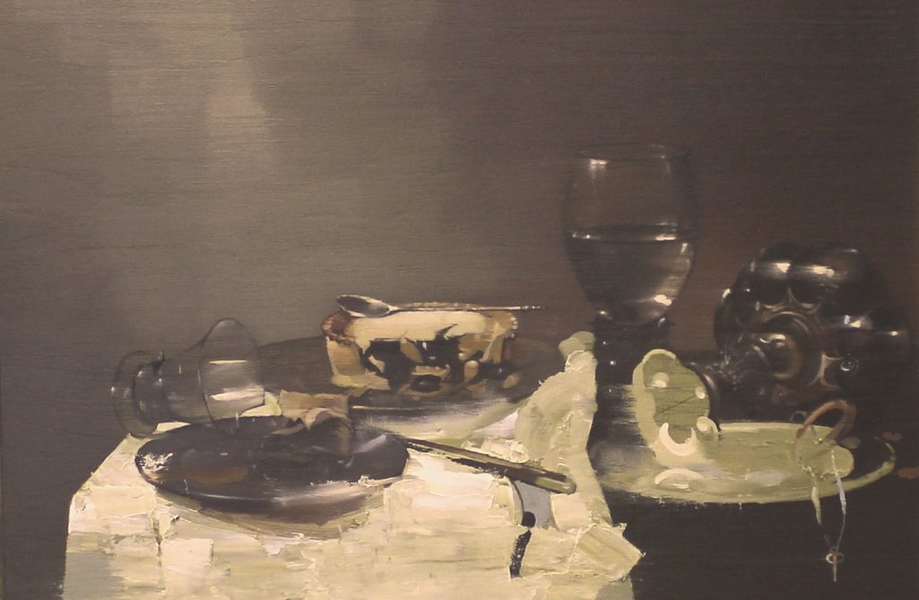
Still Life Study with Blackberry Pie – After Willem Calf
What details have lingered and lasted from your viewings of old masters’ still life paintings?
I think many details have lasted from viewing Old Masters such as Willem Calf and Jan Davidsz de Heem - oddly there is a lingering frustration that in many ways their paintings cannot really be improved upon - they are kind of untouchable and one has to make peace with the fact that in terms of pure painting, they can't be bettered, only reexamined or 'homaged' as I call it. There's a good reason for the continuing survival and popularity of these paintings, century after century.
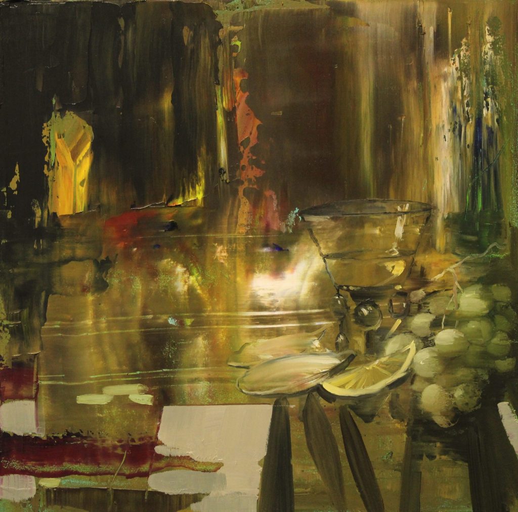
Still Life Study – After Jan Davidz De Heem
How do you set up for your still life work?
For my own arrangements such as the 'Festoon' series, I take a day to find the best items needed - (generally an 'exotic' fruit store!) and gradually arrange the subject matter and then photograph hundreds of images in various, different lights until I feel I have enough to work from.
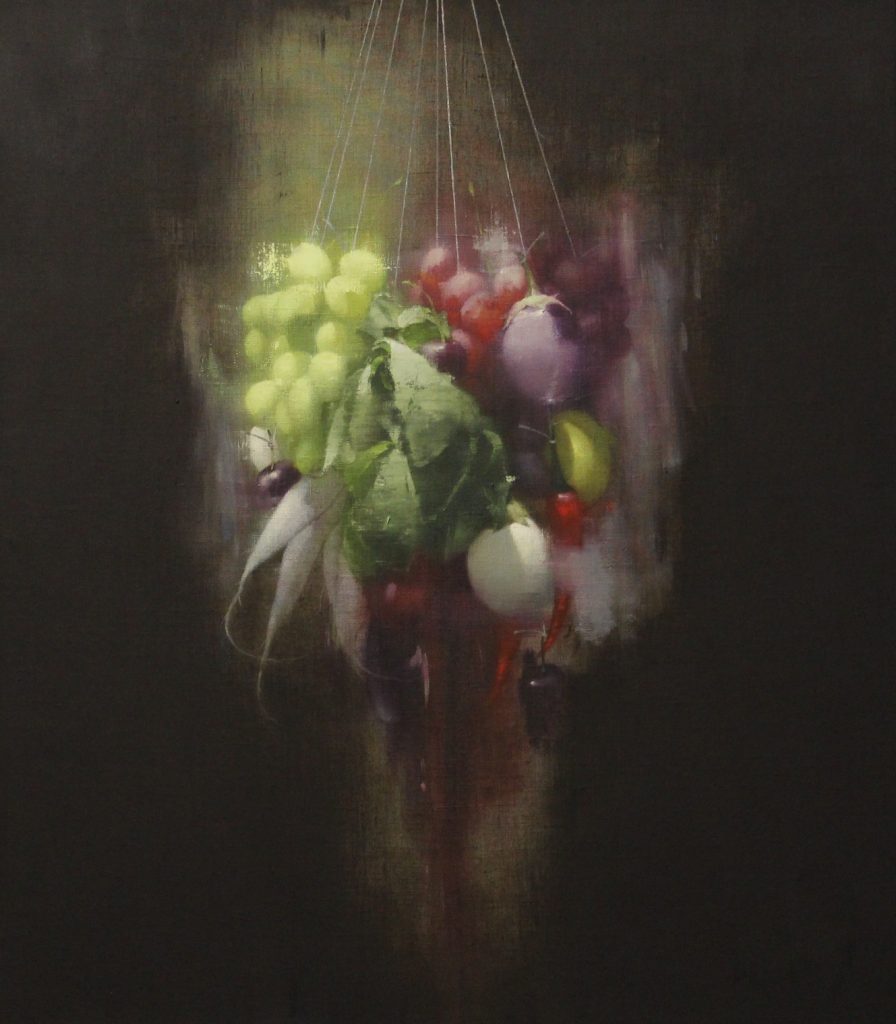
Festoon #7
What lead you to consideration on Still Life Painting?
Well, I used to paint portraits - which I loved doing but I really found that Still Life challenged me personally a bit more, there was something about projecting human emotion onto inanimate objects that seemed almost absurd - I think I was sold at that point!
What techniques are you adding or adapting in your work currently?
For me even a tiny change can make a considerable difference - recently I started using broader, angled brushes again and my recent few paintings definitely have a different feel to them as a result. I'm also rediscovering raw Linen, I'm enjoying the texture and colour of it and allowing some of it show through the paint surface.
Both colour and light are a major aspect of your work, discuss.
Yes, I hope so... I am, definitely interested in the drama of painting when it comes to lighting - I don't think I've been the same since seeing Caravaggio's grapes, I also think that darker backgrounds in painting definitely lend themselves to this, the idea of light and colour penetrating the darkness, I find it a hopeful thing as a metaphor...
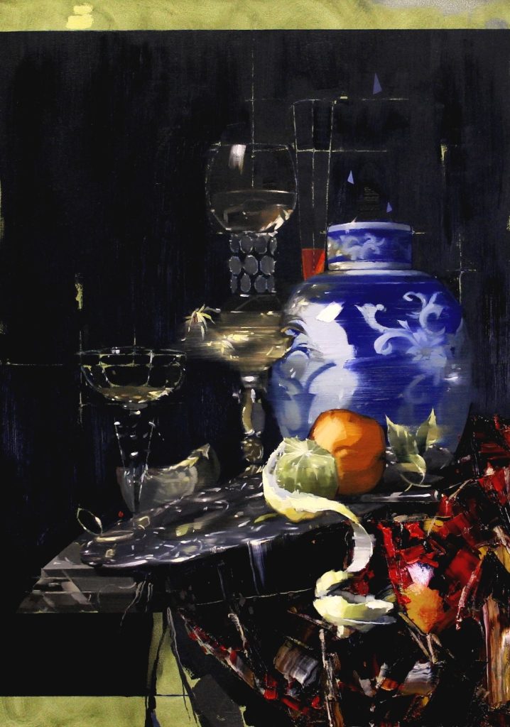
Still Life with Porcelain Jar – After Willem Calf
You also produce Limited Editions. Can you expand on this aspect of your work?
I know a few very good printers and I gradually drifted into it - I have to say! Over the years I've had to hone the instinct of picking paintings that would be popular enough to make print editions of - I still mostly only produce small editions mostly of 25, but never over 50, I think people appreciate the exclusivity of the smaller runs.
It's also more agreeable to the buyers and collectors who may want to own an image that they love, yet the original painting may have sold already. Prints a generally a great thing to be able to offer as anotherform of art to run alongside the paintings.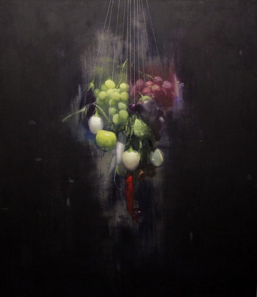 Festoon #8
Discuss your shows / exhibitions that have been international.
The complexities of transporting your work.
To date I've been lucky enough to have been approached by Galleries who have arranged transport of works abroad, but I find it nerve-wracking leaving any paintings in the hands of anybody else and it is always a risk in terms of how couriers handle the Art, the best results have come from handing works to one courier who takes the work all the way to the country/gallery in question. I've learned that the problems arise when paintings are loaded and unloaded multiple times by unknown handlers!
Finding and working with international galleries
It's difficult finding any galleries generally I think - I guess we have to be open, but it's all about the right gallery who loves and believes in your work. I have a suspicion that Galleries would rather 'discover' artists, than the other way round - though everyone has their own approach to this.
The thrill of leaving your work sold in other countries
It's definitely a real buzz leaving your work sold in another country! That's real confirmation of the language of Art crossing boarders both, physically and culturally.
Explain the presentation of your finished work.
More recently, with my afore mentioned Oil on Linen paintings I have started to leave these particular pieces unframed - it's about showing the Linen, allowing the surface to sneak through a little, and even the edges of the stretcher look great in their raw linen state. That is the way I choose to present them, but if a buyer wanted to enhance them again by framing, that's fine.
I generally 'tray frame' all the study paintings, or works on Board, which are sometimes on 10mm thick panels - so they need more 'presence' - and framing gives that.
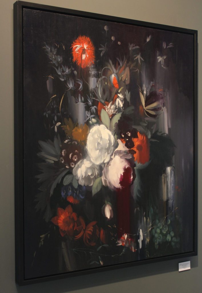
Take one of your floral paintings and discuss the layering of your work.
A recent more floral piece would be 'Still life of Fruit & Flowers - After Huysum' I think (Van) Huysum had a real eye for drama, and layers of subject matter.
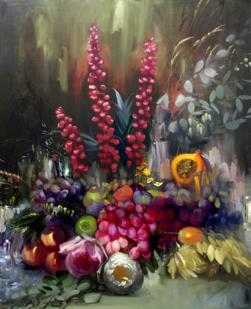
Still Life of Fruit and Flowers 11
I really loved the direct light onto the pale Roses near the centre of the painting and then the gradual layering of flora and fruit working in harmony... Almost framing the Roses, which are clearly the stars of this piece, with accents provided by the red/orange punch of the surrounding carnation-like flowers.
Explain the difference between your ‘study pieces’ and paintings and the technology behind the terminology.
My 'Study' paintings are an avenue of my practice that have become really important to me in a few ways. They are generally more looser, freer paintings that sometimes allow me to experiment a bit more than the works on Linen or Canvas. I can literally have fun making these, without any pressure for them to be a perfect finished piece at the end - I don't tend to make pencil sketches, so these are often my version of that - sketches in paint. With this free approach I think comes a kind of joy that can only be achieved if I am not always thinking of a perfect end result. They have become pretty popular over the last few years, and although the word itself 'Study' hints at 'unfinished' or an exercise, some of them are (in my humble opinion!) as good as the larger more accomplished works, yet also much more affordable.
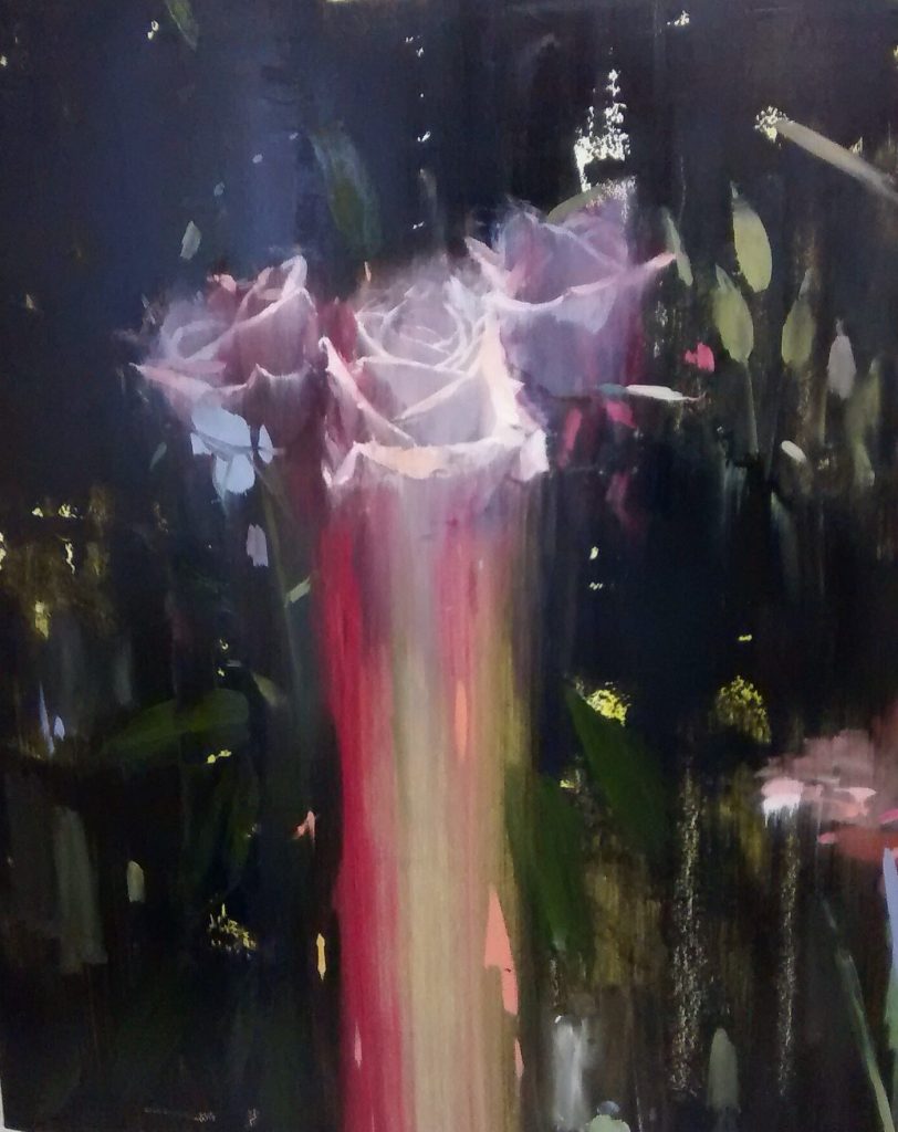
Rose Study 11
Comment on the need for artists to understand the history to begin to break the rules.
I think it's an advantage to know some of the history of art - although during my college years we barely covered the Dutch Masters - I guess it's good to be exposed to as much art in our formative years as possible, it gives a sense of perspective of who we are and where we can go, as artists. I actually feel I have a pretty basic knowledge of Art History and tend to respond more instinctively than on any great academic level.
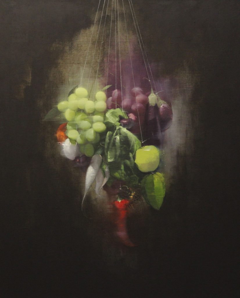
Festoon 9
But yes, to break or twist the rules, and to play with accepted traditions - you have to know a few of those rules...
Contact details:
Chris Kettle
Chris Kettle, Brighton, UK
Interview by Deborah Blakeley, July 2018
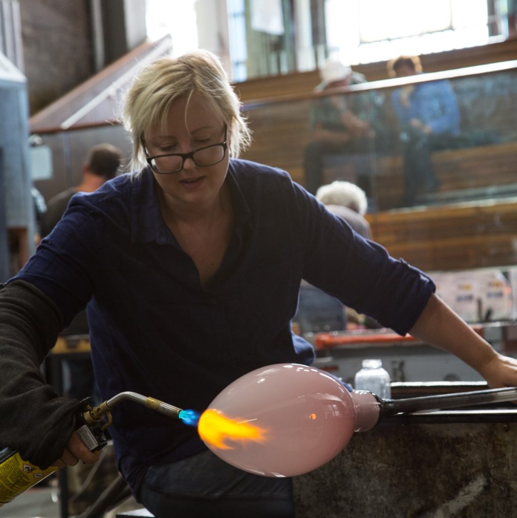
Kate Nixon
Give us your thoughts on the importance of collecting and having handmade objects large and small?
Edith Wharton once said “an object is always more than what it is: a chair is never only a chair, a spoon never merely a spoon. It travels through social worlds and carries forward a history, belonging first to those who produced it, and later, to those who bought, used, altered, sold, traded, or discarded it.” Handmade objects, in particular, connect you to those stories of people and place. The more meaningful an object is to you, the more you respect it and look after it, and you will get more joy from using it. Plus, there is nothing better than drinking from a handmade cup.
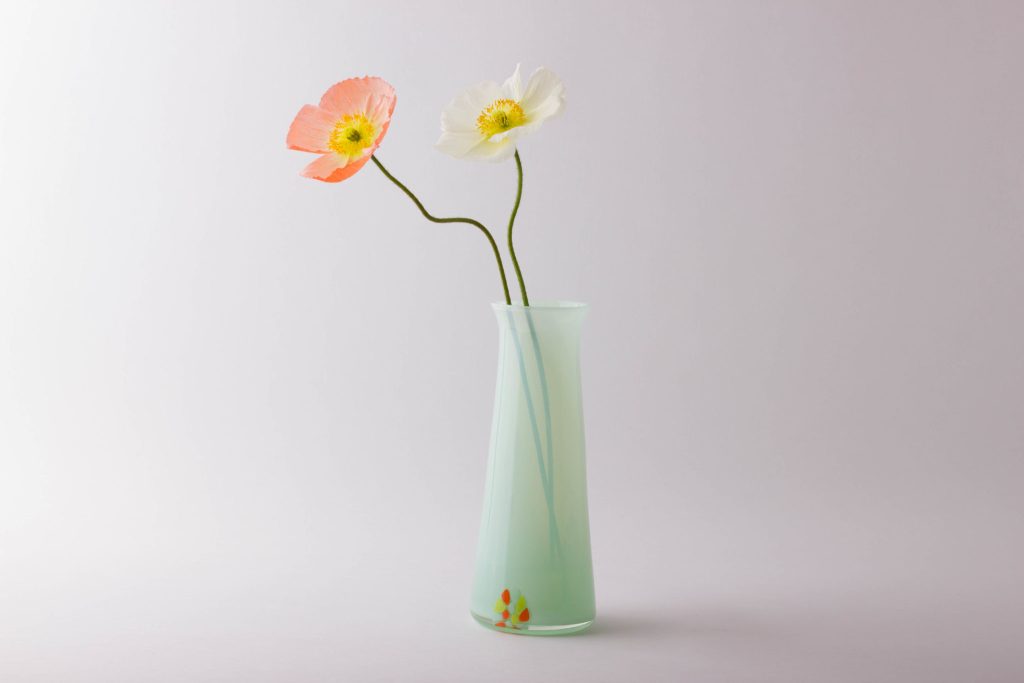
Mint Murrine vase, Photo Anna Fenech
Expand on your honours degree at the School of Art at the Glass Workshop.
I had the privilege of completing my honours degree at the ANU School of Art Glass Workshop under Nadege Desgenetez and Richard Whiteley, and the expert technical guidance of Philip Spelman. My work explored the burden of objects and the material mass we accumulate and will eventually leave behind. My work was inspired by a unique museum collection in my home country of New Zealand. I used my honours year to investigate this theme using a wide range of materials and processes from water-jet cutting to lost wax casting to mosaic.
How did you come to be working on the ‘For Collection’ series?
I was recently a Visiting Artist at the ANU School of Art and Design Glass Workshop, which I used as an opportunity to develop some new work. These were a series of glass mosaics based on rubbish bins, trashcans and recycling bins. My work has always been concerned with what happens to the ‘stuff’ we leave behind and the transformation of value in those objects. In some ways it was inevitable that it would ‘end up in the bin’, so to say.
What are your thoughts on recycling and the ability to use, used materials in an artistic way.
Like having to kill and butcher your dinner, when you are intimately involved in the production of objects you end up with a deep respect for the materials and process, and you try not to take it for granted. Like many makers, I struggle with the footprint of making and the idea of bringing more objects into an already crowded world. It is really important to me to recycle and re-use materials in my work and to celebrate and honour the life of those objects.
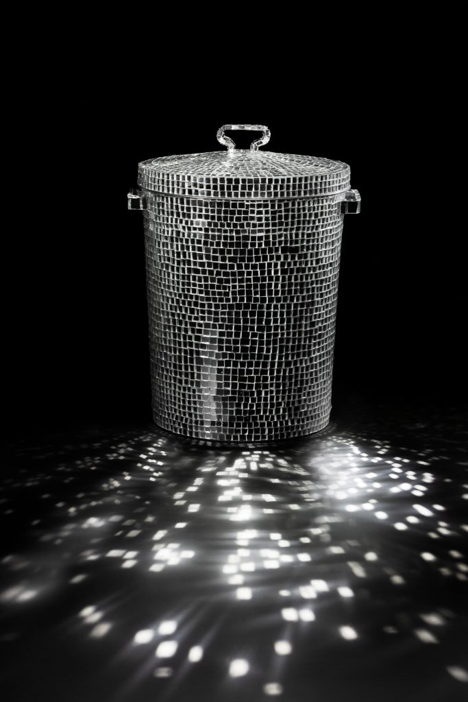
For Collection, Glass mosaic, galvanised steel, Photo Adam McGrath
Where do you get the pieces you use?
I like to use a mix of found and made materials. In this series I used a lot of scrap glass and op-shop frames. I find it difficult to throw things out, so I often find I have a stash of something somewhere in my garage.
Expand on the technique used in Bric-a-Brac.
Using the frame of an old single bed, the size as well as form references the body and the domestic, but can also be read as a final resting place. Depicting a gaudy 1970s floral wallpaper pattern in oranges and browns, my intention was that the viewer would be at once attracted and repelled by the playful nostalgia and seduced by the transformative sparkle of the 10,000 hand-cut pieces of glass. The flower, an emblem of beauty, also becomes a vanitas symbol, reminding us of the fleeting nature of life.
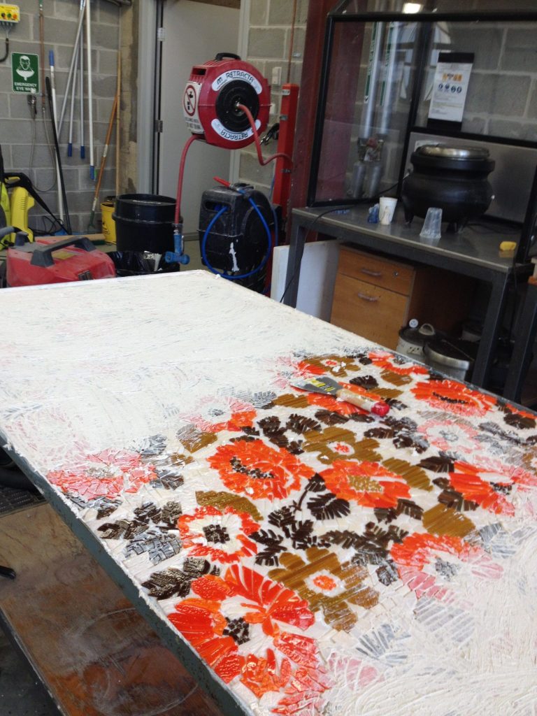
Bric-a-Brac, process, photo Kate Nixon
I used an indirect method whereby the mosaic was created backwards like a mirror image. This method involved temporarily fixing the mosaic pieces to a removable backing (contact paper) which holds the design together. When completed the whole mosaic was then transferred onto the base. I hosted a ‘Mosaic Party’ where I invited a bunch of friends over and we all spent the evening drinking wine and mosaicking our hearts out. Thankfully, mosaic is one of the only glass processes you can do while drinking wine.
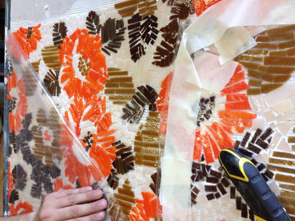
Bric-a-Brac, process, photo Kate Nixon
Discuss the connection of glass and mosaics.
For me, the process of mosaic references the act of collecting; each one a collection of pieces, painstakingly assembled with a bigger picture in mind. The art of mosaic has a rich and long history, decorating countless palaces, cathedrals and mosques, often on a grand scale. However, in counterpoint to this, mosaic also developed into a popular craft activity during the 20th Century, decorating everything from garden tables to picture frames, with a distinctly ‘low art’, ‘kitsch’ or ‘hobbyist’ aesthetic. Glass, a common medium used in mosaic, also often straddles high and low art. I am interested in this tension inherent in the material.
Discuss your series ‘Flower Girls’.
The ‘Flower Girls’ series was one of the first production items I created during my time as an Associate at the JamFactory. They were a continuation of the themes I had been exploring in my honours work, a playful take on the Memento Mori of the flower, but with a kind of retro sensibility. They are small intimate domestic objects, in colours reminiscent of the 1970s – ambers, aubergines and steel blues. They make lovely little vessels for cuttings and succulents, but they have their own flowers ready to go.
Flower Girls, Photo Fernada Pardo
Your glass paperweights, explain the technique that you use putting glass inside glass.
My ‘Uno Fiori’ paperweights are basically built from the inside out. I begin by creating the coloured centre out of ‘canes’ of coloured glass. These are set-aside in a heated kiln. On a gather of clear glass, I create the stem, and then add the petals using small blobs of coloured opaque glass. The last thing I add is the cane centre, and then layers of clear glass are built up on top. The lens of the clear glass magnifies the flower inside.
Uno Fiori, Photo Fernada Pardo
There is a growing Glass Society in Canberra that has developed around the Canberra Glass Workshop – discuss.
Glassmakers have always gravitated towards geographically connected communities, given the necessities of working with such a challenging, resource-intensive material. Traditionally, these were tied to access to fuel to run furnaces, so we get things like ‘forest glass’ emerging in the middle ages. Contemporary glass communities are often formed around open access studios like the Canberra Glassworks and the JamFactory in Adelaide, so resources can be shared. The roots of Canberra’s glass community lie with the ANU Glass workshop founded by Klaus Moje and the visionary makers that came out of that program who fought for a facility that would give makers in Canberra a place to work once they were out of the academic program.
Gathering Dust, Photo Adam McGrath
The importance of having other glass artists to bounce your ideas and techniques. How does this work for you?
One of things that is so precious to me about glassblowing is the informal dialogue you have while involved in a collaborative process. Whether you are the Gaffer or the Assistant, there is always a sharing of information and ideas. I have the privilege of working with some incredible artists like Annette Blair, Ben Edols and Scott Chaseling, who I greedily mine for information, and they generously indulge me.
You are a Glassblowing Assistant how does this work?
Most glassblowing is very difficult to do on your own and complex or large work is often done in teams of three or more people. A glassblowing team is led by what is known as a Gaffer, who is the lead glassblower and directs the process, and one or more assistants. It is a bit like sailing a boat, where the gaffer is the captain of the ship and the assistant is the first mate.
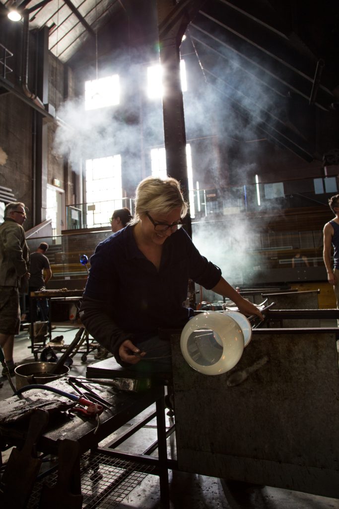
Kate Nixon in the Hotshop, Canberra Glass Workshop, Photo Wendy Dawes
Discuss how important your assistants are to your current work.
Assistants are critically important in blown work and I have been really lucky to have been assisted by some of the best glassblowers working in Australia today. However, we all had to start somewhere and I am eternally grateful for the opportunities I was given as a beginner glassblower to assist. It is nice to be able to pay that forward and give other emerging glassblowers opportunities too.
You have had a great deal of contact with Germany and German glass artists, expand on this link and how it has influenced your art and career.
I was lucky enough to receive a commonwealth ‘Endeavour Fellowship’ in 2016 to travel to Berlin, Germany for a four-month residency at Berlin Glas, the first hot glass studio in Berlin. There is a beautiful, entwined connection between Canberra and Germany. Klaus Moje, moved from Germany to Australia to establish the Canberra School of Art Glass Workshop, and this fellowship was a way of continuing that legacy of exchange. There is a long history of glassmaking in Germany and it was an incredible honour to be able to experience that history firsthand by working in and visiting traditional German glass factories. This profound history was beautifully contrasted with the contemporary art scene in Berlin. Berlin Glas is at the nexus of these two worlds. Glass is a truly global community and opportunities like this to work with people from different cultures, all over the world, is one of the true privileges of working with glass.
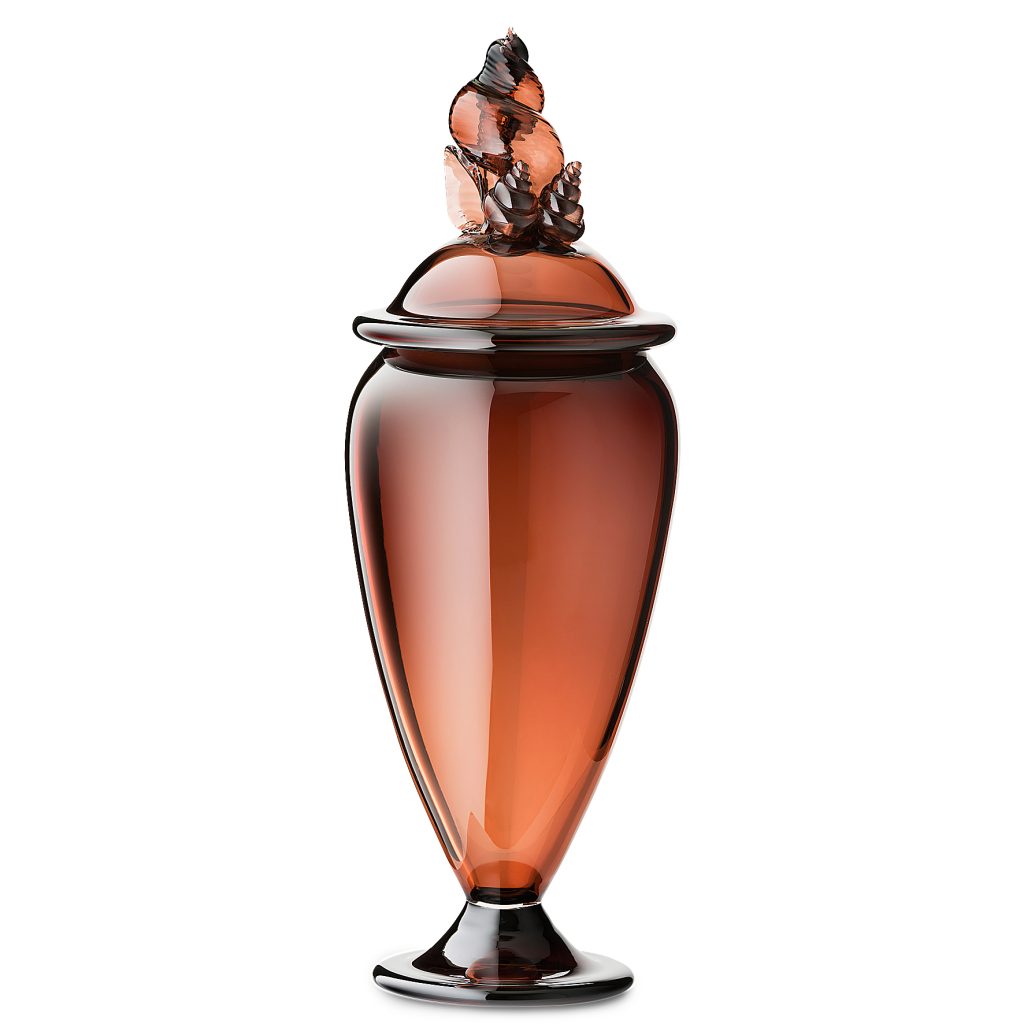
Afterwards, Photo courtesy of Jam Factory, South Australia
Discuss the importance of private collectors and how you see collectors expressing themselves by their collections.
Private collectors are a critical element in the glass ecosystem from both a financial and social perspective. As an artist, rejection is a part of life; you spend a lot of time applying for grants and residencies and entering competitions that you will inevitably not win or receive. You spend a lot of time in your own head and you often pour your heart and wallet into your work for what seems like little in return. Especially as an emerging artist, having a collector show interest in your work is incredibly motivating and affirming.
I think collectors all have their own interests, motivations and desires that they express through their collections. Jean Baudrillard once said “it is invariably oneself that one collects.” Collections have a habit of becoming mirrors into the self, reflecting us back to ourselves.
As well as your glass art you are involved in DESIGN Canberra Festive, tell us about it and your part.
My current practice is split between working as a practicing glass artist and working at Craft ACT: Craft + Design Centre. My main role at Craft ACT is to Project Manage the annual DESIGN Canberra Festival, which is Craft’s major outreach program each year. Now in its fifth year, DESIGN Canberra is an opportunity to celebrate the incredible community of makers, artists and designers in the Canberra region and connect them to new markets and opportunities.
![]()
Contact details:
Kate Nixon
Website: katecnixon.co
Instagram: katecnixon
designcanberra@craftact.org.au
Kate Nixon, Canberra, Australia
Interview by Deborah Blakeley, July 2018
Jennifer Krause Chapeau
You were a finalist in the Luxembourg Art Prize, - Can you explain… about the Luxembourg Art Prize?
Yes I was one of 12 finalists selected for the 2017 prize. I heard about it from a facebook posting from another artist. I was intrigued, it sounded interesting, the finalists would get to travel to Luxembourg, all expenses paid, to be in a group show at a gallery, and a panel of judges would pick one artist for the large cash prize. It was an international competition so I didn't really think that I had a chance and I debated about whether it was worth the time, effort, and application fee. But in the end I said to myself I may not have much of a chance but if I don't submit an application I will have ZERO chance. So of course I was in a state of disbelief when I found out I was chosen as one of the finalists. In fact I was taken by surprise because once I finished the application I more or less just put it out of my mind and forgot what the announcement date was. My first notification was by text message, and I thought ,is this for real? I didn't believe it till I saw it on the website the following day. Naturally I was thrilled but was still in a state of disbelief for awhile. It ended up being a great experience, I got to travel with my husband to charming Luxembourg city, and meet interesting and cool artists from all over the globe. I very much enjoyed meeting the gallery owner Herve Lancelin and spending time with all the other artists while we were in Luxembourg. So although I didn't win the large cash prize, it was an invaluable experience that I won't soon forget.
Colza Field 11, 26 x 34 inches,Oil on Canvas, Luxembourg Prize painting
What does this mean to New Jersey?
I was one of two finalists from the United States and I currently live in New Jersey, but other than that I'm not sure.
Tell us about your time as a scenic artist on major motion pictures?
I became interested in film and video towards the end of art school and did an independent study in video, working at the local television station. It was the early days of M-TV and music videos were taking off, I decided that film/television was a creative field that I could actually get a job in to support myself as an artist. Once I started working in New York I saw very quickly that I needed to be in a union, because all the network tv shows and big feature films used only union crews. I took classes on the weekend in scenic painting, because my schooling was in fine arts. This prepared me for the union exam, which was a rigorous process involving a month long take home, test to do four large paintings, and then an 8 hour practical test where the judges watched, as you executed on the spot the painting and drawing exercises that were given. I was fortunate and got in on my first try, and was one of only six artists admitted that year to United Scenic Artists Local 829.
Working as a scenic artist was a perfect job for me, I had health insurance and other benefits, but the work was freelance so I had time off between jobs to work on my own painting. I worked for 17 years mostly on feature films and network tv. The work was very wide ranging and I learned to work with all different kinds of materials and techniques. I liked the big scale that we usually had to work on, and we could make anything look like the real thing. I painted lots of faux marble and woodgrain, and made things look rusted and old, anything the set designer wanted. One of the most memorable sets I worked on was for a Woody Allen movie called “Shadows and Fog” where we created an old European town, on a stage, complete with real cobblestone streets, and multiple story buildings. The people I worked with were great, I even occasionally got to meet some of the stars, which added to the experience.
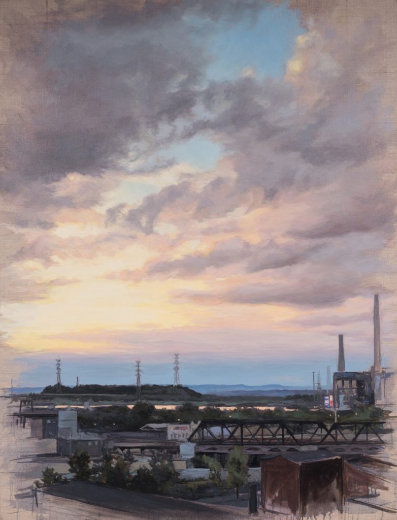
Studio View, 42 x 32, Oil on Linen
How has this former work influenced your current work practice?
I think primarily it has made me a more facile painter. I can work with any kind of paint or sculpting material on any scale. I had to be able to do precision work like painting lettering on a sign, and then also be able to paint very broad, loose, and fast to say “age” the whole side of a building. So being forced to paint in all different kinds of ways gave me the experience and confidence to be able to paint however I choose. A lot of the scenic work involved creating believable textures, and I think this did influence my work in the 1990's where I used lots of textures and materials and made paintings that verged on relief sculptures.
‘From the Road’ exhibition is a collection of images taking fruition over the past 10 -14 years discuss the unfolding of this exhibition.
Essentially, I worked with the curator and we just picked work that spanned from the (then) present going back ten years or so to the beginning of my “road series” paintings.
Eolienne 1, 18 x 24, Oil on Canvas
Discuss the ‘blur’ aspect of this work.
The paintings are all essentially landscapes from the vantage point of a moving car or train. The blur of the foreground is what gives them a palpable sense of motion. But beyond that it is an interesting formal property to explore, the blur abstracts parts of the painting and gives me a new visual texture to work with. I also feel that it symbolizes the fluidity of the present, while the distance is what lies ahead in the future, or is left behind in the past. It makes a landscape painting fresh for me and I continue to use it today.
Eolienne 11, 14 x 11, Oil on Canvas
Your comment, ‘I think the solitude of driving alone for long periods allows your mind to really wander.’ Discuss both the comment in relation to this collection of works.
I started to make the road series of paintings during a time when I was driving back and forth between Nashville, Tennessee and Hoboken, New Jersey.
The Gold Coast, Hoboken, 32 x 72 inches, oil, acrylic and sand on canvas, mounted on wood.
This was a 16 hour drive so I had lots of time to think and look out the window. By myself, I would have lots of good music to listen to and a camera at hand. I found it to be very meditative especially when I was in the country with hardly any traffic. You are cruising along at highway speed so you have to keep focused on the road but your mind is still free to wonder, and the landscape just rolls by like a movie.
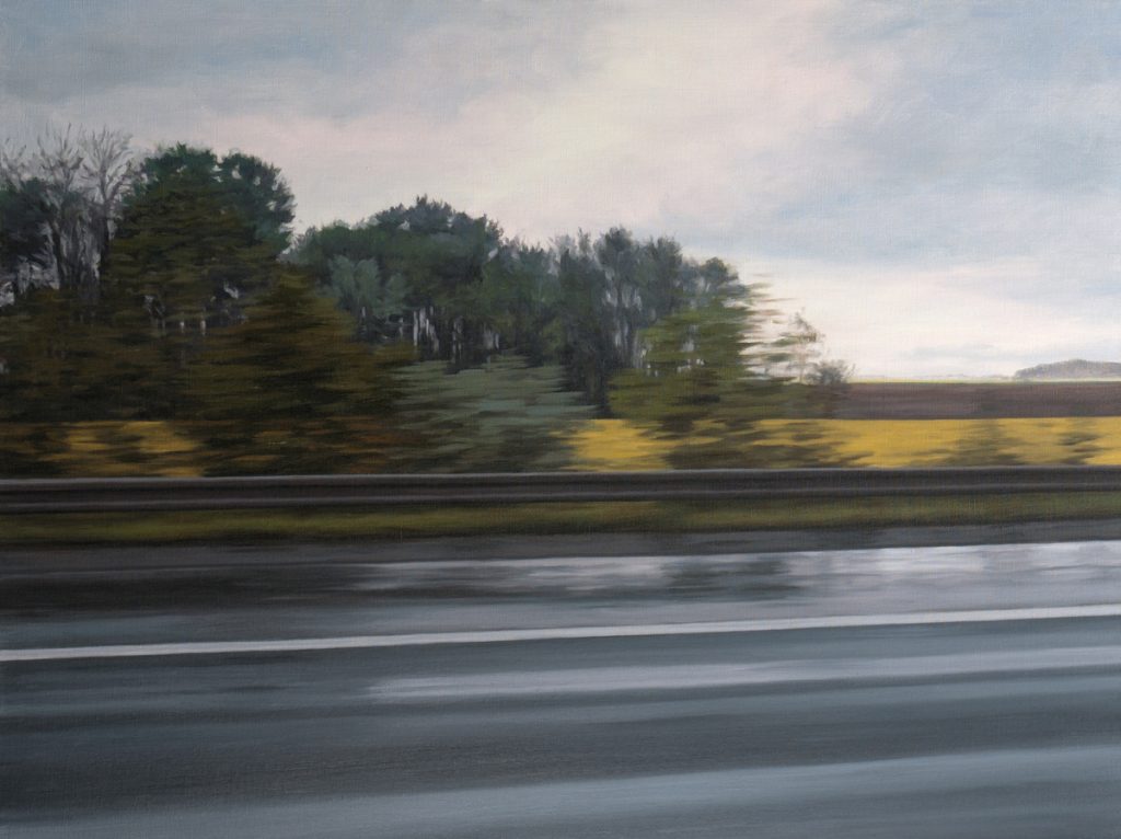
After the Rain, 30 x 40 inches, Oil on Linen
Your works emphasis the relationship of landscape and weather.
I am primarily inspired by qualities of light, and color, and those are of course a product of the weather. I am partial to fog, I love the way it minimalizes the landscape, making parts disappear off into nothingness. And of course cloudy skies create an endless array of colors and moods, from glorious to ominous, that I just can't resist painting.
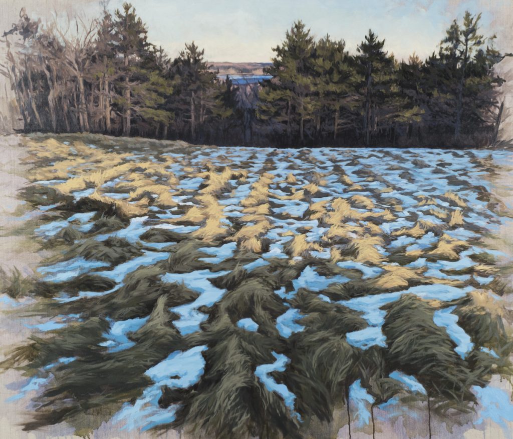
Hibernal Rays 36 x 42 inches, Oil on Linen
Your water colours are all small, 7 x 10 inches, discuss.
Yes the water colors tend to be small because I use them mostly when I am traveling and painting outside. So they are easy to transport and I can finish a small watercolor in a couple of hours.
What is the base of your sketch book drawings, watercolour and or photographs?
I use my photographs as sketches for my moving landscapes, that I then paint back in the studio. I shoot spontaneously as I am traveling, not knowing what I will see as the road unfolds. I am interested primarily in the juxtaposition of the man-made and the natural world.
I do keep a sketch book, but it is mostly to keep a record of the paintings I am working on, each one has a page or so where I make sketches and keep any notes I have about them. It also helps me remember when I started and finished a painting, because I always have a few going at the same time.
You also use pastel on paper expand on when and why you choose a particular medium.
I use pastels sometimes to do fast sketches from life, like. I use the watercolor. I also sometimes use them to do large preliminary drawings for paintings when I need to work out a composition or some other element that I'm not sure of before I start on the canvas.
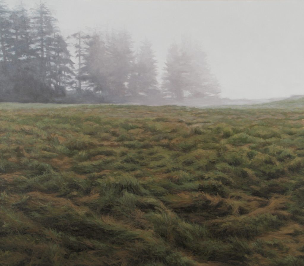
Field and Fog, 40 x 46, Oil on Linen
Can you explain your personal thoughts on the importance of the artist in recording time and place.
We all respond in one way or another to the times we live in. I think an artist can respond in many ways to contemporary culture, without necessarily documenting it.
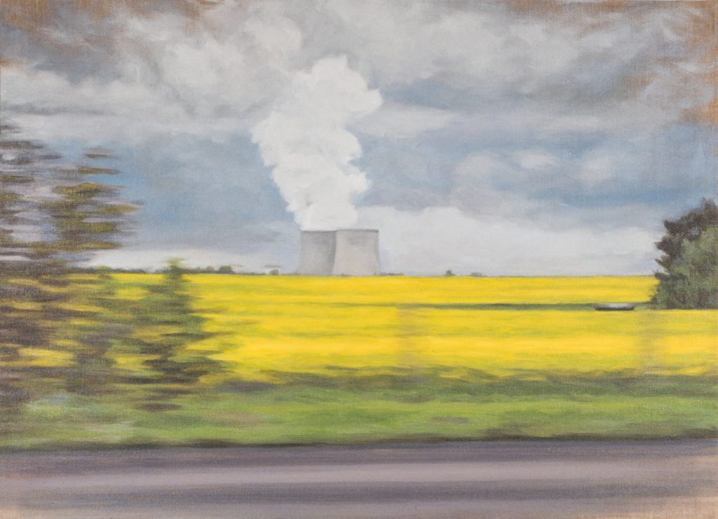
Nuclear and Colza Plants, 26 x 36 inches, Oil on Linen
I personally do like to record my experience and what I have seen in a particular time and place, I like to reflect back something of my personal experience of contemporary life for people now and hopefully in the future to ponder. I do think it is one of the important things artists have done and should continue to do, but art is deeply personal and can provoke thought about many things in many ways and there is room for it all.
Contact details:
Jennifer Krause Chapeau
Jennifer Krause Chapeau, New Jersey, USA
Interview by Deborah Blakeley, July 2018
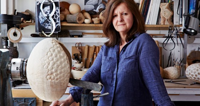
Eleanor Lakelin
What lead you to work with wood?
I grew up in a very rural part of Wales surrounded by hills. Roaming through woods collecting natural things, particularly gnarled wood coloured and textured by time and the elements, was a big part of my childhood. After teaching in various countries in Europe and Africa, I retrained as a furniture-maker between 1995 and 1998. I then worked for many years making theatre sets and designing and making furniture. In 2011 I changed my practice to concentrate on creating sculptural vessels and objects in wood – work informed by those early experiences looking at natural processes and landscape.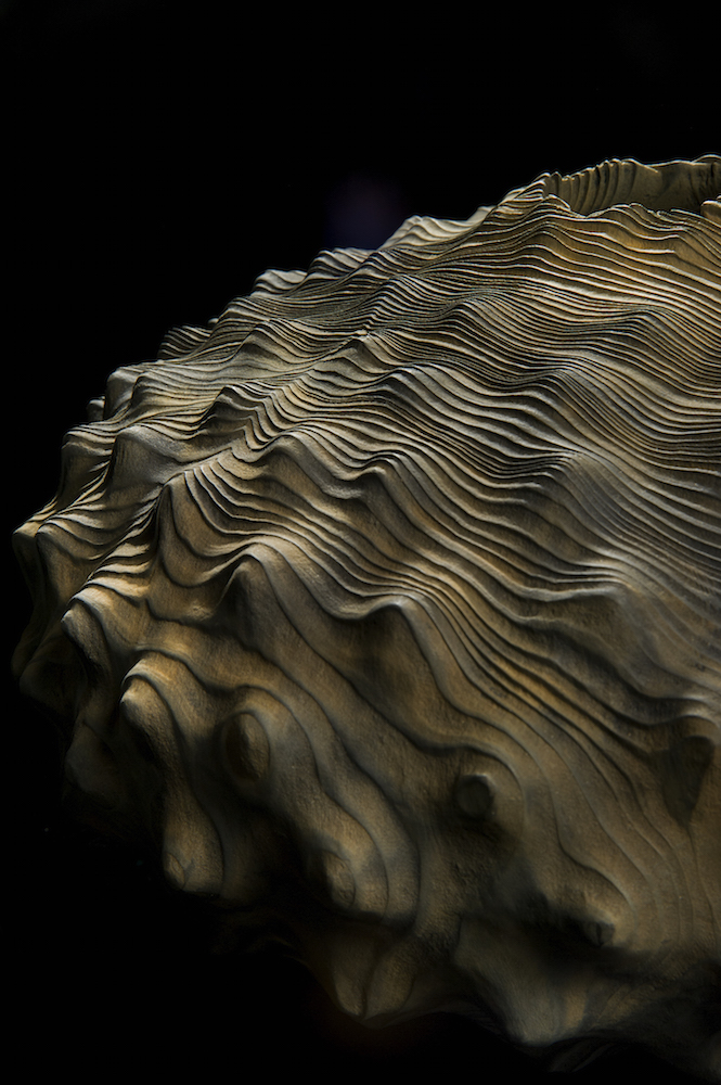
Ferrous Shift, detail, Photo Ester Segarra
You use trees felled in the British Isles – How do you become aware of trees that are either coming down or are down?
Locally, tree surgeons phone me or drop trees off but now that I mainly sell through galleries and tend to create pieces in a series, I have certain trees that I look for. I buy a lot of wood from a village sawmill next to a large country house estate which means a selection of large parkland trees that have had to be felled. I also spend a lot of time emailing forestry and arboreal companies to find particular burred wood I like to work with.
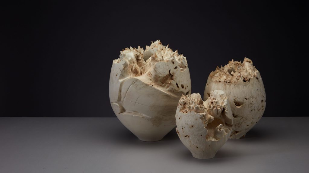
Void Vessels, Photo Jeremy Johns
Can you tell us about the work that went to British House Rio?
I was asked to make a collection of pieces that would be displayed at British House - the place to celebrate Team GB’s sporting performance and a cultural showcase for the best of the UK at Rio 2016. During the Olympics, British House was located in the centre of Rio de Janeiro at historic Parque Lage, adjacent to the iconic Christ the Redeemer statue and within the Copacabana cluster of the Games. Other artworks on show include a dramatic paper chandelier by Zoe Bradley as well as pieces by Theresa Nguyen, Insley and Nash and Alexandra Llewellyn.
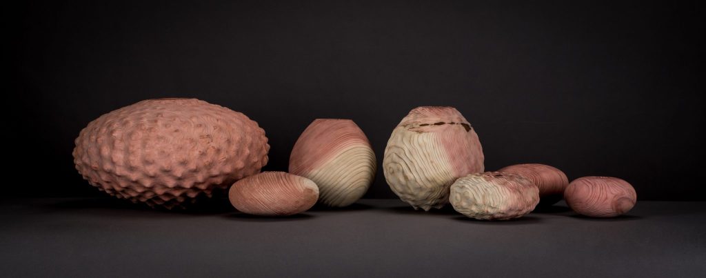
Rio Olympics, Photo Jeremy Johns
I had recently started working with Sequoia, grown in Britain after the seeds were brought back from California in the 1850’s and recently felled due to decay. It seemed fitting to reimagine and recreate this material into pieces that would be returned across the Atlantic 160 years after the seeds arrived, reflecting something of the global nature of the event. The collection of eight vessels, linked by material but using different forms and texture, returned to Britain after the Olympics and were sold to collectors.
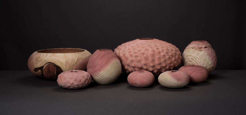
Rio Olympics, Photo Jeremy Johns
For your project with the National Trust -Discuss the Great Cedar tree and its historical importance.
I’m always fascinated by the provenance of my materials and how this shapes my process and work. In the summer of 2014, a great cedar tree planted by the Duke of Wellington in 1827 had to be felled at the National Trust property Kingston Lacy. I was asked to create a collection of vessels from this beautiful, historical tree, to mark the 200th anniversary of the Battle of Waterloo in June 2015.
Where are the three pieces that were added to the National Trust Collection?
An open bowl form and two hollow carved forms were purchased to be displayed at Kingston Lacey, the National Trust Property where the tree was planted. The works are showcased as part of a collection in the Spanish room of the house, as apparently it was during his time in Spain that the once Lord of the Manor, William Bankes, collected Art and cemented his friendship with the Duke of Wellington.
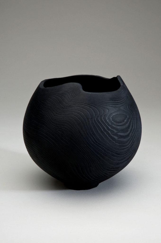
National Trust Commission, Photo Stephen Brayne
How many pieces were you able to make from this one tree? I made between eight and ten pieces including a very large piece called the Wellington Bowl which was part of an exhibition called ‘Bowls of Britain’ in 2015.
What drying process had to take place before you could commence?
The tree had already been felled some time before but was still relatively green. I turned the pieces quite thin so that they would dry quickly as by the time the project was agreed and organised, there was very little time before the Bicentenary celebrations in June 2015.
What happened to the other pieces you made?
All of the vessels were sold. The smaller pieces were made available to purchase from the National Trust with proceeds helping to fund conservation works at Kingston Lacy.
Discuss your personal thoughts on history being kept in a contemporary art form?
It is not unusual for contemporary art to look to the past for ideas, inspiration or designs whether they be used to agitate for change, to look at differences or ways forward in the present. Much of what I do is about material and stories – visualising an idea in a form. This was an interesting material and a great story.
Expand on how and where you keep your wood?
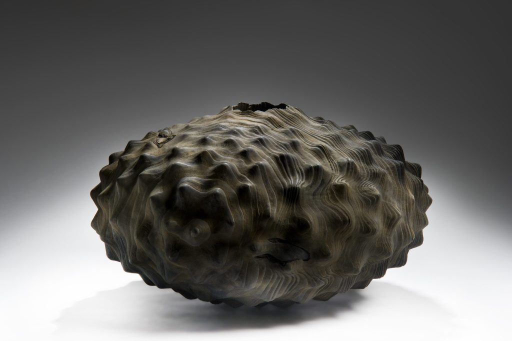
Ferrous Shift, Photo Ester Segarra
I keep wood everywhere – in sheds behind my studio, in the car park, in my workshop, in storage, behind the saw, on the shelves, in my garden, in my basement, in my garden shed, wrapped in cotton, wrapped in plastic, under tarps, under beds – it’s an obsession . . there is no end . . .
What is one special tool that you love working with and why is it so valued by you?
It is almost impossible to choose one tool but I suppose my lathe is the most central tool to my work at the moment. I spend ages carving off the lathe and sandblasting or scorching wood but the lathe is where I start with hollow sculptural vessels. For most pieces I use a Vicmarc lathe, manufactured in Queensland, Australia – it is very old, very heavy with no frills but reliably does what is needed.
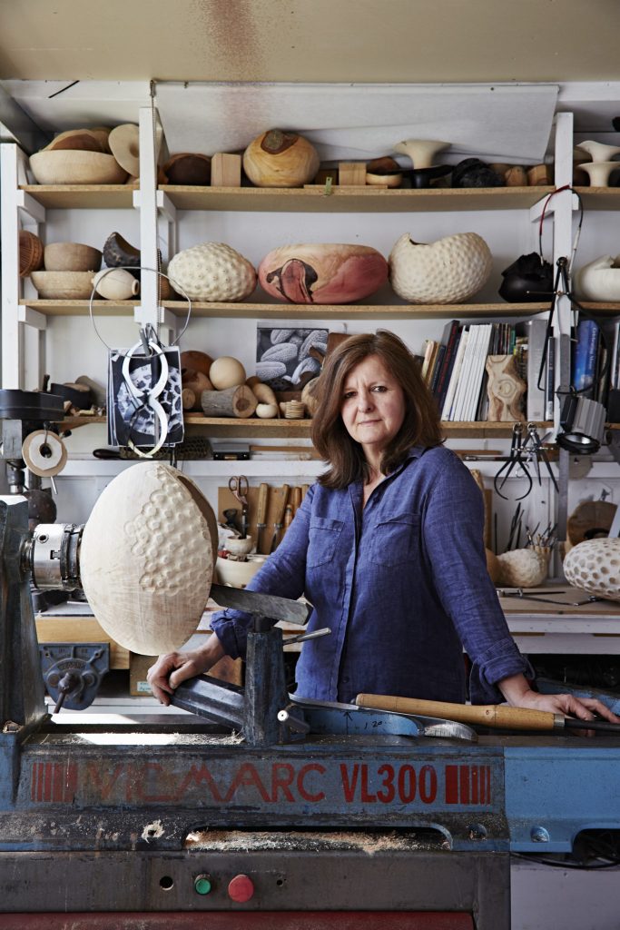
Eleanor Larkelin, Photo Alun Callend, Courtsey of Cockpit Arts
What information do you provide with each piece?
My work is mainly sold through galleries but if people are interested I provide them with information about the provenance of the material, its age and properties, techniques used and the inspiration behind the pieces. 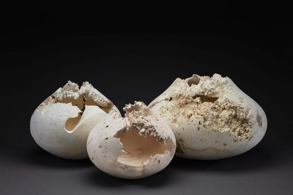
Void Vessels, Photo Jeremy Johns
Your comment, “I’m fascinated by wood as a living, breathing substance with its own history.”
I’m particularly inspired by the organic mayhem and creative possibilities of burred wood, which I work with exclusively for the ‘Contours of Nature’ series. This proliferation of cells, formed over decades or even centuries as a reaction to stress or as a healing mechanism is a rare, mysterious and beautiful act of nature. The twisted configuration of the grain and the frequent bark inclusions and voids are challenging to work and the forms difficult to hollow but the removal of the bark reveals a secret landscape, unseen by anyone before.Wood grows at a different density during different times of the year. In the Time & Texture series I sandblast across the surface to create a kind of speeded-up erosion. Time itself feels etched into the fibres of the material. By carving to different depths within the piece and then sandblasting through another layer, a moving, sinuous pattern is created which speaks of natural movement – of wind, sand, rhythm, flow and of time.
Expand on your work in relations to large installations?
I’ve been exploring working at a larger scale and I was thrilled that my Time & Texture Installation at Forde Abbey recieved a Wood Award, within the ‘Bespoke' category. The works formed part of ‘A Landscape of Objects’, a site-specific exhibition set in the gardens of Forde Abbey, curated by Flow Gallery. The brief was to reference both the shapes, colours and texture of the gardens and buildings and the importance of water on the site.The installation was formed of three hollowed vessels on rusted plinths and four solid forms designed to show how natural elements erode and work away at materials. Through building up layers of texture through carving and sandblasting away the softer wood, it is possible to show how natural elements and processes layer and colour wood. The sequoia and sycamore vessels were turned on a lathe and hollowed out through a small hole. The four solid pieces are sculpted from English oak and cedar and the spherical form was chosen to reflect the natural shapes in the garden and in the landscape.I’m keen to explore Installation ideas further and have an invitation to visit sculptor Mark Lindquist’s studios in Florida to explore a new body of larger scale works.
Explain on your pieces ‘Basaltes Vessels’ and the rock formation you based this work on.
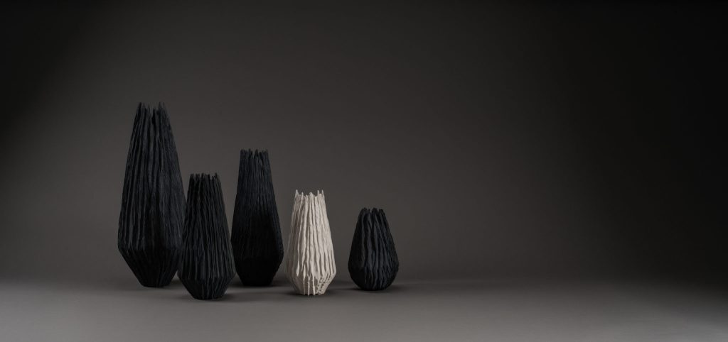
Basaltes, Vessels, Photo Jeremy Johns
Also part of the ‘Time & Texture’ series - these new, elongated forms are turned and carved in a freer way using an angle grinder and chainsaw wheel. A natural ‘slate grey’ tone is drawn from the wood using an iron solution (iron being a property of Basalt) or the wood is ‘pickled’ white.Basalt is a fine-grained, igneous rock which makes up a significant part of the oceanic crust. The distinctive columnar topology or ‘fractures’ are created during the cooling of a thick lava flow - forming a ‘random cellular network’. Basalts weather and erode relatively fast compared to other rocks and the typically iron-rich minerals can oxidise rapidly in water and air.The pieces were created not necessarily to look like basalt but to give a sense of the erosive power of natural elements as they texture, colour and break down material over time.
Contact details:
Eleanor Lakelin
eleanor@eleanorlakelin.com07944 811675Studio 011
Cockpit Arts
18-22 Creekside
London
Eleanor Lakelin, London, UK
Interview by Deborah Blakeley, June 2018
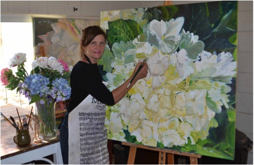
Helena McConochie
What has your painting taught you - have you developed new techniques?
I don't believe my style has changed as such, I am amazed at how much more detail I see in a flower now. This might be a combination of consistent painting and generally growing; which goes hand in hand with this amount of work I do. I have developed a stronger interest in light and shadow not wanting to over work the flower.
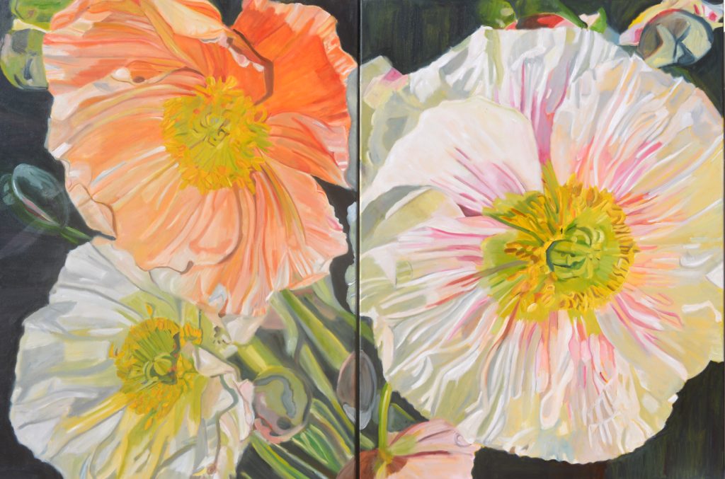
Canberra Poppies
I paint almost every day. My work hours are 10-4.30 seven days a week…
I continue to give my paintings female names as I came from a family of girls and had four daughters.
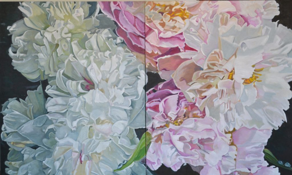
Patricia and Millie
Are you seeing flowers in a different way?
Absolutely – the detail of a flower intrigues me.
Margaret Olley proclaimed, "Flowers can be appreciated by the viewer as just a flower
or can be explored deeper almost as a Landscape"
I am obsessed by my love of flowers and colour. My limited palette system consisting of white and three prime colours that I to mix to natural hues, shades and tones. I create light, shade and dimension in colours that appear remarkably real. I place waterdrops on my paintings as an encouragement to people to conserve water.
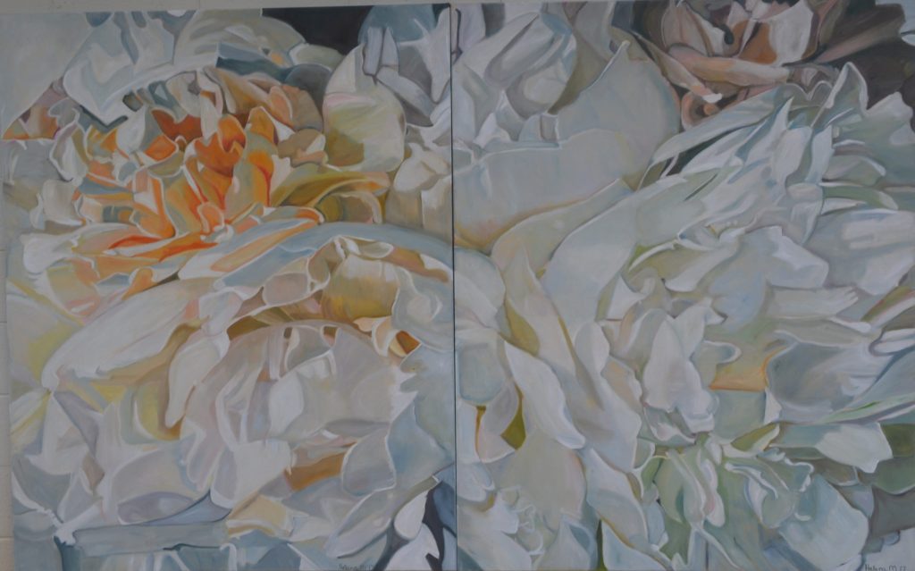
Katrina for Melbourne
Expand on the relationship/s you have built up with your galleries.
My Galleries are all amazing. They are so supportive of my art and I am continually getting work.
I am represented by Art 2 Muse, Double Bay where I have an annual Solo exhibition – this year’s Exhibition is from 2nd - 15th October 2018.
I am represented by Aarwun Gallery Canberra. Riley Gallery in Manhattan Beach and McsartofLiving in Montreal and Memphis.
I have another Exhibition in Colorado this year – the 100th Anniversary of the Migratory Bird Treaty Act, June 22nd – July 13th 2018. The theme of the show is based around avian and botanical related imagery in a celebration of this year being the 100th anniversary of the Migratory Bird Treaty Act, a piece of legislation that protects countless aviary species each year. With this special commemoration, The National Audubon Society has teamed up with National Geographic, Birdlife International, and the Cornell Lab of Ornithology, to make 2018, “The Year of the Bird”. Our aim is to acknowledge this observance with an exhibition of contemporary works focusing on birds, the flora and fauna found in their natural habitats.
What have been two highlights over the past four years.
- Being approached by three Galleries in the USA
- Editorial in both Belle Magazine and House and Garden.
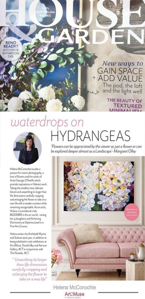
- I also had a small preview in The Wentworth Courier leading up to my Exhibition.
- Donating Paintings in the new Dubbo Base Hospital Maternity Ward- not all women receive flowers and not all results in the Maternity ward are great.
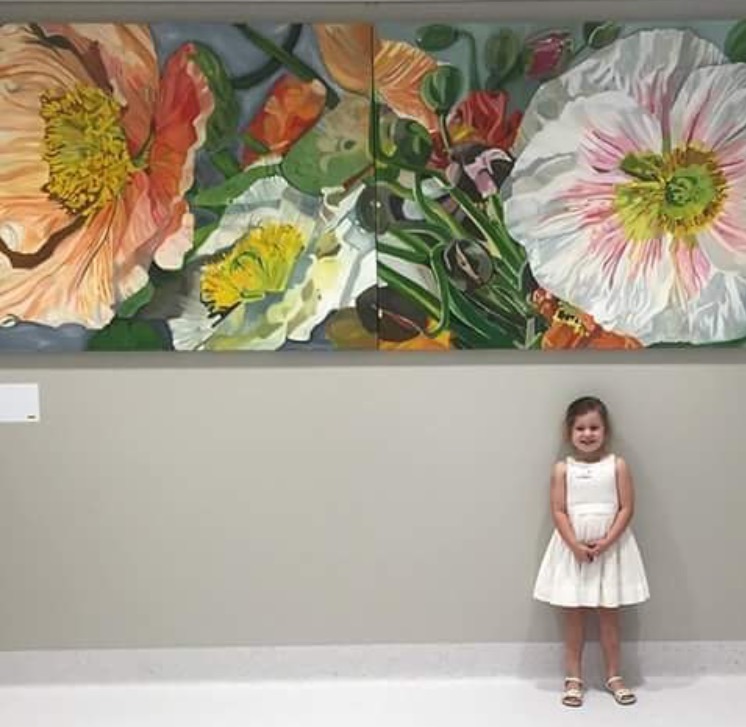 Dubbo Base Hospital Maternity Ward
- Starting my Soft Furnishing Line.
What have you learnt not to do?
I have learnt to say NO. I have been extremely busy since our last interview with exhibitions and commissions. Buyers certainly know what they want, I am such a worrier if it’s not exactly what they ask of me. I use a Limited Palette – which means I mix all my own colours. It is impossible to get exact.
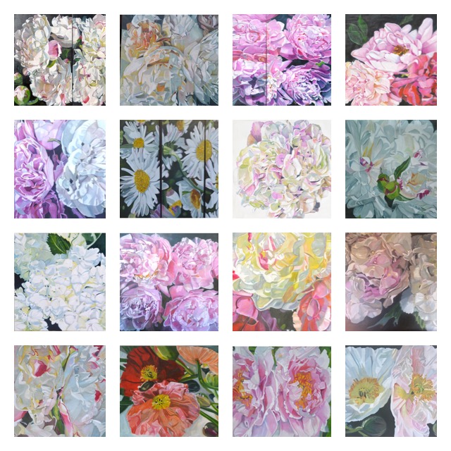
A Collection of 2017 paintings
Why does your art still give you such great daily joy?
The great daily joy for me is at the end of the day relaxing and critiquing my achievement. I set my painting in the family room, with a glass of champagne and enjoy what I have achieved for the day. My family help me critique it and that is such fun- particularly the Grandchildren who are sooo honest.
If you have enjoyed reading this update please re read the interview Zoneone Arts had with Helena McConchie in March 2014. It is so interesting to see the development of Helena's work and how she now has solid representation in Australia and the USA.
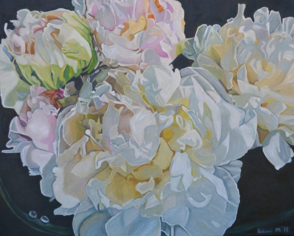
Katrina and Shayne
Contact details:
Website: http://helenam.com/art.html
Email: ‘helenamay@bigpond.com’
Helena McConochie, Dubbo, NSW. Australia
Interview by Deborah Blakeley, June 2018
![]()
March 2014
You have been a mature aged student. Can you expand on how you came to take up painting after your children left home for University?
I was a mother of four daughters which left me absolutely no spare time until they left for University. I was a statistic of “empty nest syndrome” I soon realized that my children had to fly and explore the world and I had to develop some interests of my own. I was very fortunate to have a connection and love of beautiful flowers and art..
I started art lessons with a local artist I soon realised that I wanted to learn a lot more so I enrolled in a Fine Arts Course. This was a whole new world opening up to me. Painting Drawing, Art History, and Photoshop. I was completely absorbed in the course and achieved Distinctions at Diploma Level.
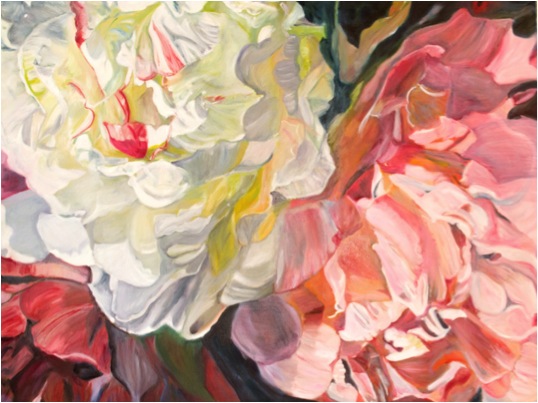
You have always been interested in design. How has this influenced your work?
In the past designing to me consisted of guttering a whole house, rebuilding it, painting and decorating it. I have done this seven times. The excitement I feel when the paint is applied to the walls and the house is transformed into a beautiful masterpiece.
Transforming these old wrecks of houses back to a beautiful, liveable home came very naturally to me.
The work was extremely hard and I can compare the creative side to my canvas, preparing the canvas, drawing and then applying the paint.
When or how did you decide to crop the floral image?
It was not deliberate decision to crop my flowers. I would use my viewing frame and rotate the flower until I achieved the image I wanted. Also with my photographic skills I have been able to take macro shots while the flowers are in season. Georgia O’Keeffe was very fortunate that her partner Albert Stieglitz, was a photographer and took macro shots of her flowers. Georgia was also influenced by Paul Strands cropping method.
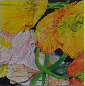
How large are your works?
My works vary in size. I try to vary the sizes to accommodate galleries and homes but the largest painting I have done is a Tryptich of Poppies which are 110 x 110 but placed together 330 x 110 cm
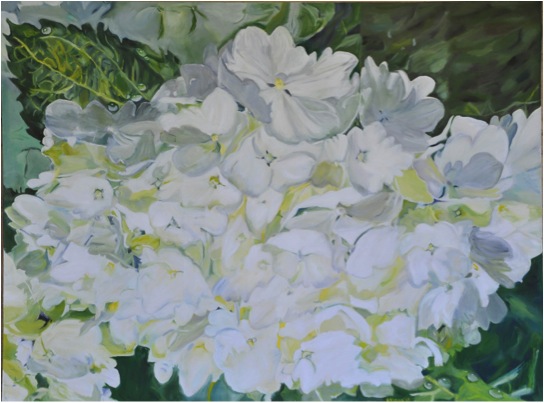
Your recent solo exhibition was close to a sell-out. Can you explain how this has propelled your art?
MI have actually had three exhibitions in six months. I spent twelve months completing a body of work that consisted of approximately 14 paintings and proceeded to go on a roadshow with my art. Whenever I had a sale, the art had to be replaced for the next exhibition. Whist it was exhausting the feedback has been amazing.
You are a gardener. How do you prepare for a work, by photographing the flower or painting from life?
Both, my problem is that my flowers are seasonal and not available when I need them . I do like to take macro shots of the flowers and seeing them up close. This is not always the result I want. I do have silk flowers and take photos of them and from memory place the veins and marks on the flowers.
I have a huge collection of photographed flowers. The anticipation of spring and painting a flower that has just opened is certainly the better way for me to paint.
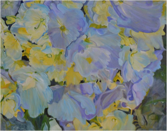
Discuss nature and her amazing palette in relationship to your work?
Flowers bloom in almost every colour of the spectrum and appeal not only to the visual sense, but to the olfactory too. The fine texture and lines of a flower can easily be obtained by careful brushstrokes forming the shape, modelling them, introducing the colour and creating transparency in the flower. One of my favourite artists, Georgia O’Keeffe, her abstract pieces demonstrate beautiful work of rhythm, movement, colour, depth and form and that is what I am trying I am bringing into my work.
You take commissions. How flexible are you with these?
I don’t have any problems with commissions, I do set a deadline to have them finished so the customer is not waiting. .I am fortunate that I can get the painting very close to the original painting and quiet often it is better than the last. I send an image off to the client or arrange for them to be viewed.
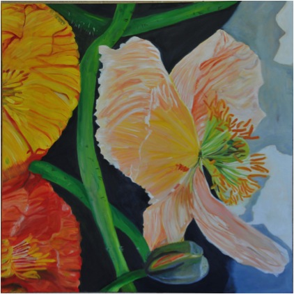
Does living in rural Australia affect your work?
Not at all. We have an apartment in Sydney that we stay in regularly. We are an hours flight to Sydney. A lot of artists are living in rural areas as is Tim Storrier who lived in Bathurst and now Bowral.
Can you expand on the influence Tim Maguire has had on your work?
Growing up I have always been surrounded by amazing gardens. The families favourite flower is a Poppy which was grown every year. When I was introduced to Tim Maguire’s poppies I was amazed. I studied Tim Maguire and Georgia O’Keeffe in my Fine Arts Course.
I am extremely impressed with the scale of Tim Maguire’s flowers and it has encouraged me to get out of my own comfort zone.
Tim’s poppies are quite loose where mine are tight, I also place water drops on my flowers and when people tell me how lovely they are I let them know there is actually a strong message behind them. The message is that water is the essence of life and we should all be looking after it (we are in a drought at the moment).
Can you explain your interpretation of the term and your technique of abstraction?
My interpretation of abstraction is a concept which the subject is represented by shapes and patterns and can be slightly unrealistic.
My paintings are a mixture of the above and are slightly cropped and presented in a way that the viewer can still recognise the subject.
How do you fit both gardening and painting into your life?
We have three acres of garden and over the years I have designed my garden to have very little maintenance. I mostly have large trees, flowering trees, a rose garden and an awful lot of lawn. We have a sprinkler system and a lawn contractor. Before spring arrives I mulch the entire garden to lower maintenance and encourage growth.
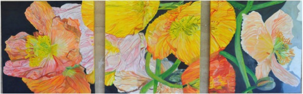
Flowers give so many, so much joy. Is that a major inspiration for your work?
Absolutely, you should witness me after a long cold winter and then spring has sprung. I am like a child in a lolly shop. The excitement of watching the deciduous trees get new leaves, poppies ready to bloom and not knowing what colour you will be presented with. Looking out my window I can see the Red Canna Lilly flowering next to my White Crepe Myrtle tree. My stayed in a villa in Tuscany and was amazing with red and white flowers all through it. I came home with some great ideas.
Where to now?
I am presently working on 3 paintings for the Archibald , Wynn and Sulman Prize. I have entered before with 600 other hopefuls, and it is a great experience. I will enter in the Paddington Art Prize and The Mount Eyre Art Prize. I intend to exhibition in Melbourne and when I visit New York City this coming April I will endeavour to research exhibitions in Hampton.
Contact details:
Website: http://helenam.com/art.html
Email: ‘helenamay@bigpond.com’
Helena McConochie, Dubbo, NSW. Australia
Interview by Deborah Blakeley, March 2014

Anita Laurence
Explain how your career in art and printmaking began?
I studied Fine Art Painting at Prahran College and when I met my husband printmaker Bill Young I had access and encouragement to make prints. Prints were easy for me to make while I was raising a family, I could work at the kitchen table. Unlike painting which for me was all consuming, making prints fitted in to the routine. Bill and I work together, we share a studio with space for my painting and for the three now four presses. I did not always have a studio. I like to remind people of this especially artists starting out. I made art where and when I could. Bill operates a custom printmaking workshop, so I have always had access to a press. I was once given the book Significant Others and I feel Bill and I fit that title – we work together, supporting each other in what we do. Over the years I have helped in many ways from paper prep to wiping plates. Bill does the majority of my editioning the exception being my reduction prints which I print myself. Bill also makes my frames from reclaimed timbers some from local trees and more recently from Kauri Pine floor boards .
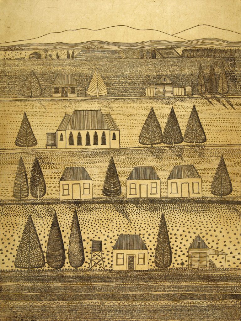
Our Place, 56 x 76 cm, Etching
You live in country Victoria, Australia how does the environment effect your work?
I paint and make prints about my locality, it is my inspiration. I live in the very beautiful King Valley in North East Victoria. The landscape is ever changing with the time of day and the seasons. I have lived here for 30 years and I am still inspired by my surrounds – each season is different, and the colours inform my artwork.
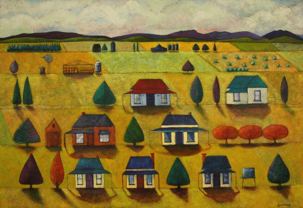 On the Edge of Town, 68 x 99 cm, Acrylic and Ink on Blue Lake cotton paper
Discuss your visit to Ireland and one or two works that came from your visit plus the difference from Australia?
Ireland was my first experience of visiting another country. In 2008 Bill and I went to stay with friends and family in Cork and spent time at the Cork Printmakers. As with most people the experience of travel and another country is inspiring and eye opening.
The linocut 'Corcaigh', the Irish name for Cork City, was made later when I was artist in residence at The Art Vault in Mildura. It was quite incongruous to be in hot Mildura and creating images of wintry Cork City. Like most of my images they are stylised and representative, based on memories and my feeling for a place. I will make sketches and take photos but I prefer to let my imagination inform the image making.
My King Valley images are stylised layered landscapes – with iconic trees and buildings, rivers in the foreground and hills and mountains in the background. My visit to Cork City had me thinking about how best to represent a city, it's my memory of walking the steep and winding streets, lanes and alleys from where I was staying in Turner's Cross.
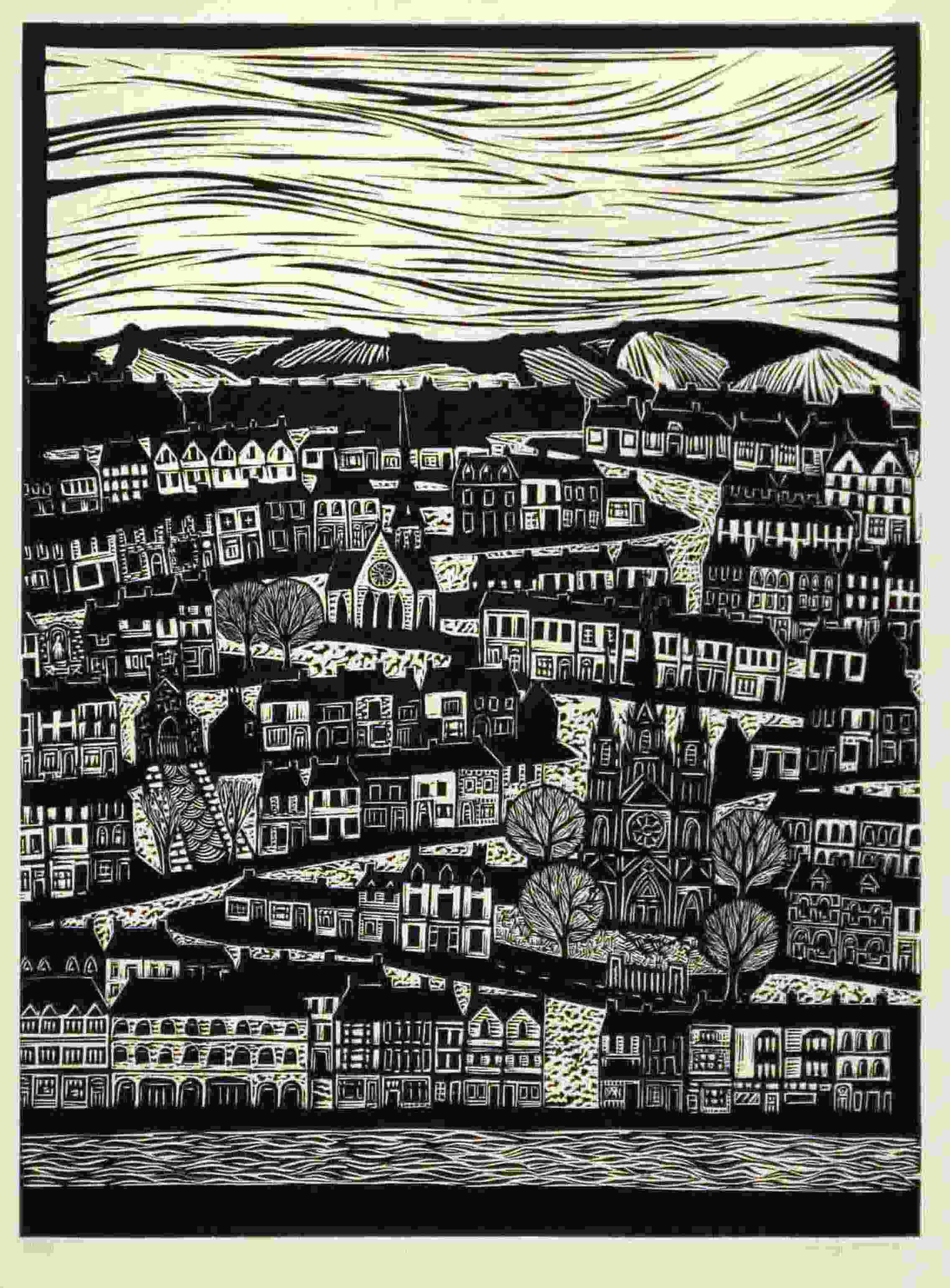
Corcaigh (2009) 56 x 42 cm, linocut
Expand on the importance of having your early prints, printed by Port Jackson Press?
In 1985 David Rankin, owner of Port Jackson Press was working with Bill in the Middle Park studio when he noticed the relief etching cards I was making, he was taken by them and invited me to produce some limited edition prints. Having an outlet for my work, meant that I was productive in my art practise while raising a young family, an important esteem building time for me. Through PJP and then Chrysalis Publishing my work was distribute to galleries all over Australia, exposing my work to a greater audience and being purchased for the collections of The Parliament House Art Collection, Canberra; National Australia Bank and the Peter MacCallum Cancer Centre collections to name a few. I had this outlet till about 1998.
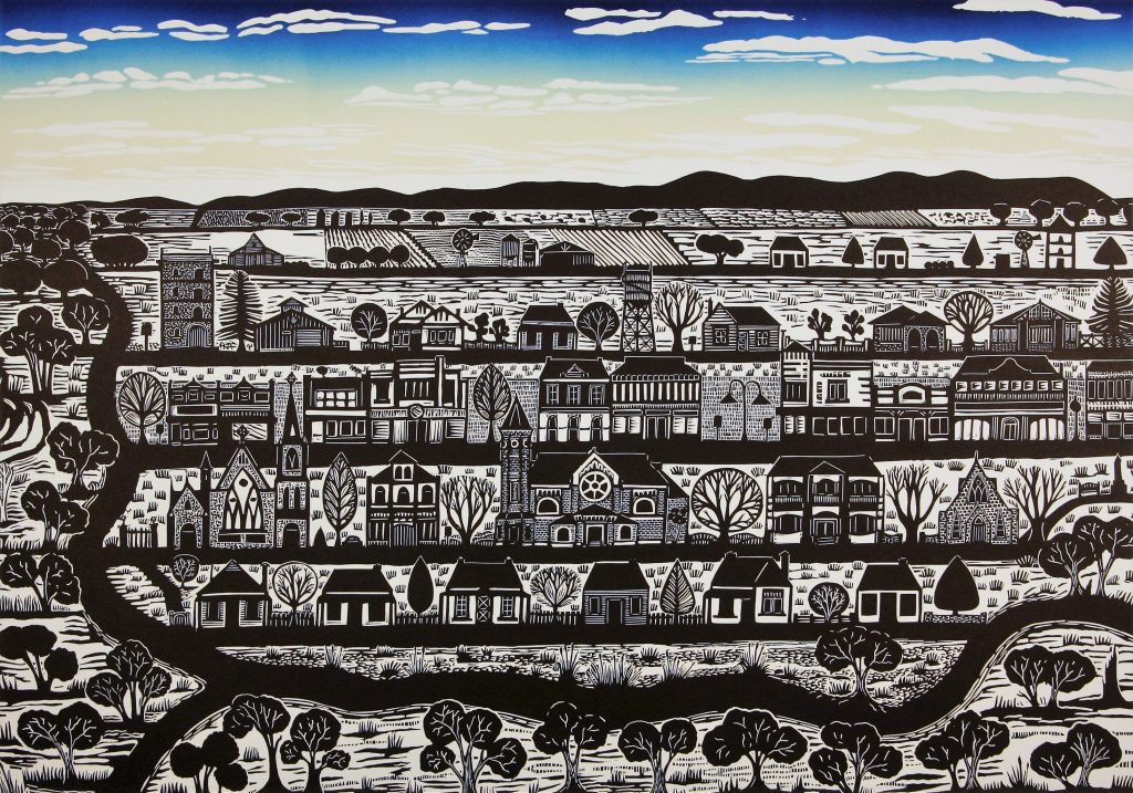 Under a Blue Sky, 60 x 80cm, linocut
Country art galleries have supported your work. Discuss the importance of country and regional galleries to both the artist and residents?
Country and regional galleries offer opportunities for local artists to get involved exhibit their work. I have been represented by The Muse Gallery of Milawa since 2004 till 2016 when it closed and The Art Vault in Mildura since 2009. A new gallery Off Centre Gallery + Studio opened in Milawa which means my artwork is still represented in the region. The Muse Gallery and now Off Centre showcase local contemporary art giving the community an opportunity to see and support their local artists. The gallery is situated in a tourist hub giving visitors an enriching experience of seeing artworks they might not see in the cities, artworks relevant to the region.
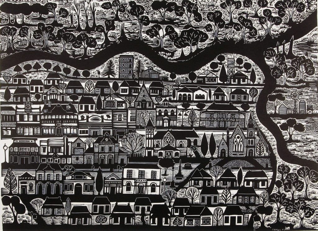 Where the Rivers Meet, 56 x 76 cm, linocut
It's an honour to exhibit my work in my community. Not only am I supported by the gallery I am supported by the people of the region who come and purchase my artworks for themselves and as gifts to send further a field. I love it when people comment that my artworks makes them see their landscape afresh, seeing things in it they hadn’t noticed before. Or that they recognise my buildings or trees in the landscape, and that those trees do really exist! I think a lot of local people feel a sense of pride in seeing their region and home in my work.
Regional and country galleries showcase that the arts are alive and well away from the city centres.
I live in a community that values its artists and the role they play in the enriching the community. I have been involved the King Valley Art Show for nearly 20 years and the growth and appreciation of this show from the local businesses and the community is quite astounding. Each year we have been able to offer 17 awards to the value of $17,000 and though it might not sound like a big amount in some circles it is a token of how the arts are valued.
Often country galleries give the viewer a chance to see work that isn’t shown in the city. I love that these galleries make art accessible to all. I have found this especially so at The Art Vault where anyone who walks in is treated with respect and encouraged to enjoy what is on offer. A place that is inclusive and tries to demystify and educate about the process of printmaking.
I exhibit at other Victorian country galleries, Lauriston Press in Kyneton, Queenscliff Gallery and Workshop and Cascade Art in Maldon.
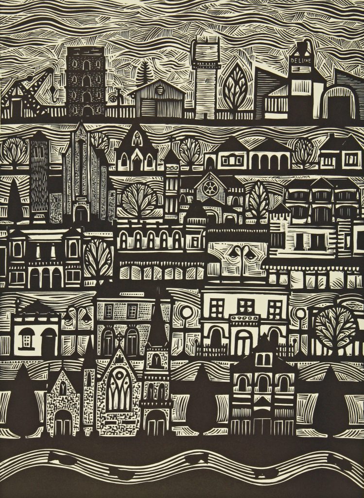
Wangajazzaratta, 52 x 42 cm, Linocut
Wangaratta Art Gallery is my nearest regional gallery (which is a public gallery) and over the years has offered me opportunities to be part of themed group exhibitions- and was instrumental in putting me in contact with other artists thus enabling me to become part of arts groups in my region.
When I travel around the country the first place check out is it's regional gallery, and I love it when they are exhibiting work of locals and of the locality.
Discuss your work ‘Our Town’ linocut in relation to your printing technique?
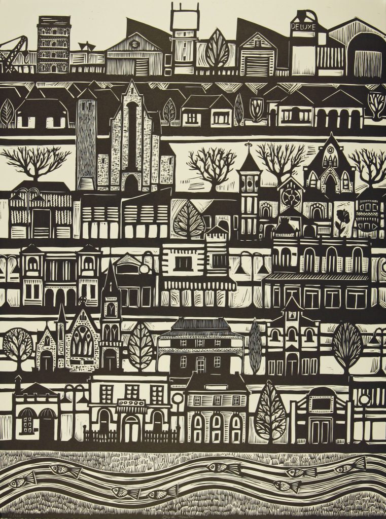
Our Town, 76 x 56 cm, Linocut
Having made paintings and prints about my rural landscape and the cityscapes of places I'd visited as Artist in Residence, lead me back to Wangaratta my own rural city. In 2014 I was invited by Wangaratta Art Gallery to make an artwork to celebrate the 25th Wangaratta Jazz and Blues Festival. I realised that it’s easy to be in awe of a new city or landscape and that I should look with fresh eyes at a place I was so familiar with and perhaps took for granted. Wangaratta had lost a lot of its historical buildings to 'progress', and was not as aesthetically beautiful as near by historic Beechworth. When I took the time to look I found the old buildings in amongst the new and that there were many iconic buildings still standing strong within the town. I took the time to investigate the town’s history much like I did in Mildura when on residency. ‘Our Town’ and ‘Wangajazzaratta’ were the result. I have gone on to make more prints about Wangaratta. 'Under a Blue Sky' and 'Where the Rivers Meet' are two such linocuts.
Expand on the use of colour or limited colour in your printmaking?
My linocuts of recent years have been mainly black and white, I like the contrast and strength of the black and white. It is also very immediate for me, I have made multi block and reduction prints in the past which I loved making but find I am impatient and have been happy to work in black and white. My paintings are very colourful and compensate for lack of colour in my linocuts, saying that I have made some reduction linocuts, more recently, these colour prints are more personal and private and tend to stay in the drawers. I was inspired by the Japanese printmaker Hokusai to add colour back into my skies. Powlett River a very limited edition multi block print I made in 1996 is still one of my favourite works it is full of rolled blended colours, looking at it now it’s sky was probably inspired by Japanese prints.
 Powlett River, 38 x 128 cm Triptich, Multi-Block, colour, Linocut
Your ‘Millewa Series’ discuss the two different mediums you have use together in this one exhibition.
The Millewa series was made after one of my residencies at The Art Vault in Mildura. I was invited to visit a wheat farm 70 km south of Mildura – driving through the landscape past majestic wheat silos standing tall against the sky, I was intrigued by the arid natural beauty of the landscape, with Mallee trees and vast red soil. I wondered how a wheat crop could grow. From shared stories I began to get a feel of the place and I tried to envisage a way to show the landscape which was so different from the lush green rolling hills and valleys of where I lived in. The black and white prints are about shape and pattern in the landscape- the farmer in a tractor that has driven over every inch of the land for fifty years in all seasons, it was an insight to their special bond to the land. I also created paintings of the landscape enjoying the use of rich reds, oranges and pinks and sage green/grey of the landscape and the expanse of vivid sky blue. I paint on a handmade paper and incise lines and scumble paint over the top of a colourful ink base to create a luminous effect.
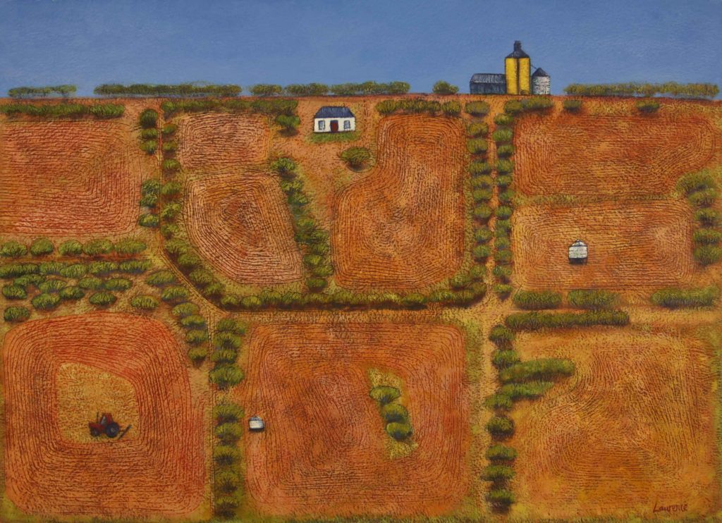 The Millewa, 56 x 76 cm, Arylic and ink on Blue Lake cotton paper
With your limited editions discuss the numbers you print and your protocol at the end of a print run.
When my prints were published by Port Jackson Press and Chrysalis Publishing the edition size was dictated by the publishing house, most often 60. My self published linocuts are editions of 40 and my etchings 15 or 20. We don’t print the complete edition, we print in batches as required. I’d need another storage space if we did (not to mention a bank loan in paper costs). I don’t follow the protocol of cancelling a plate or block at the end of a print run. I hate the idea of disfiguring a block or plate that I have spent hours making, it seems a shocking desecration. If an image is popular I would not hesitate to do a second edition and name it as such.
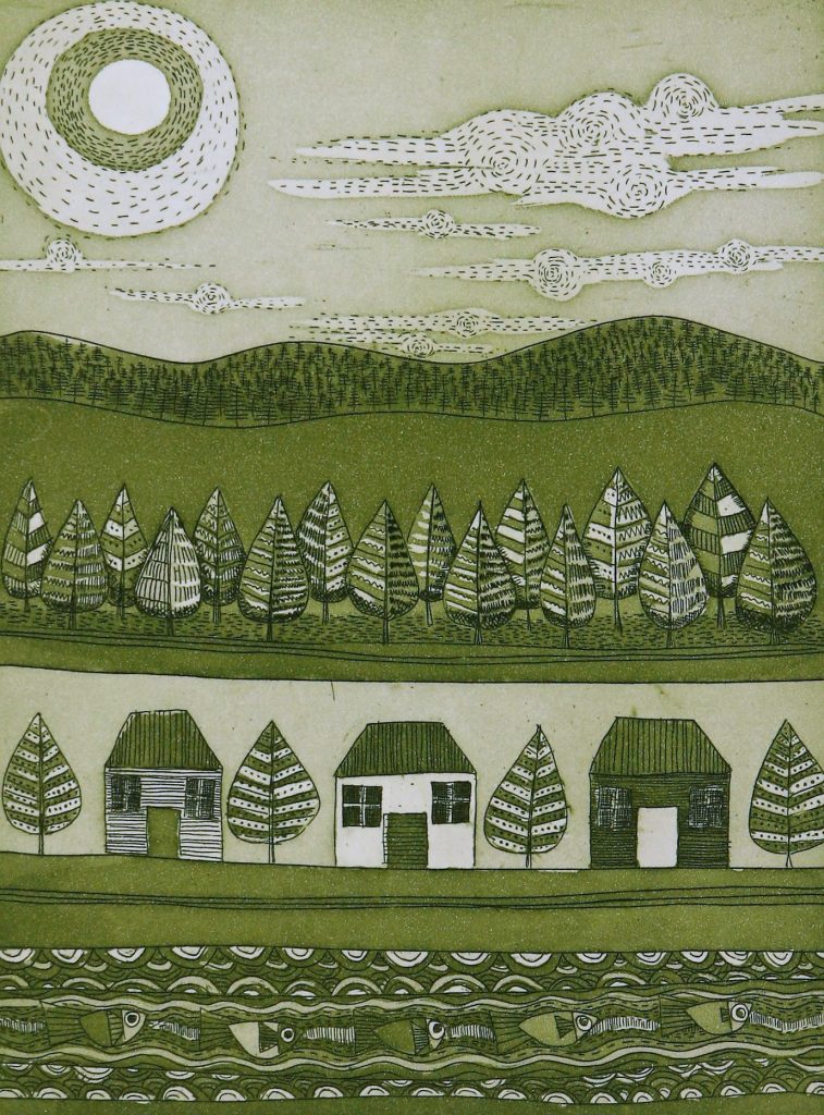 The Valley 1, 20 x 15 cm, Etching Aquatint
Contact details:
Anita Laurence
Anita Laurence,Victoria, Australia
Interview by Deborah Blakeley, June 2018
Lisa Lloyd
Discuss the importance of natural patterns in your work?
I’m blown away by the total beauty of nature: incredible patterns, symmetry, colour, geometry and texture. I love the detail.
Chameleon
How has your experience in animation lead to your current paper art?
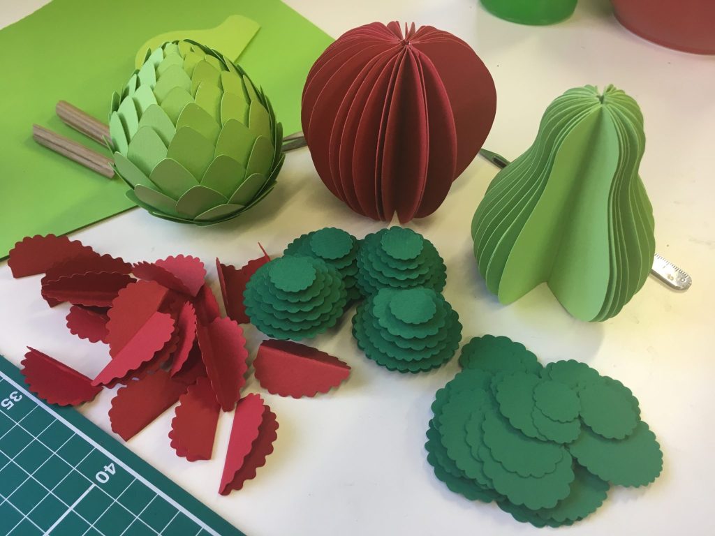
I was exposed to lots of different materials while working in animation: fabric, plasticine, wood etc, but I found paper the most pleasing to work with. I love the tactile quality of paper and the vibrant colours and textures you can find. It feels very simple, you don't need a lot of tools or expensive equipment to make something.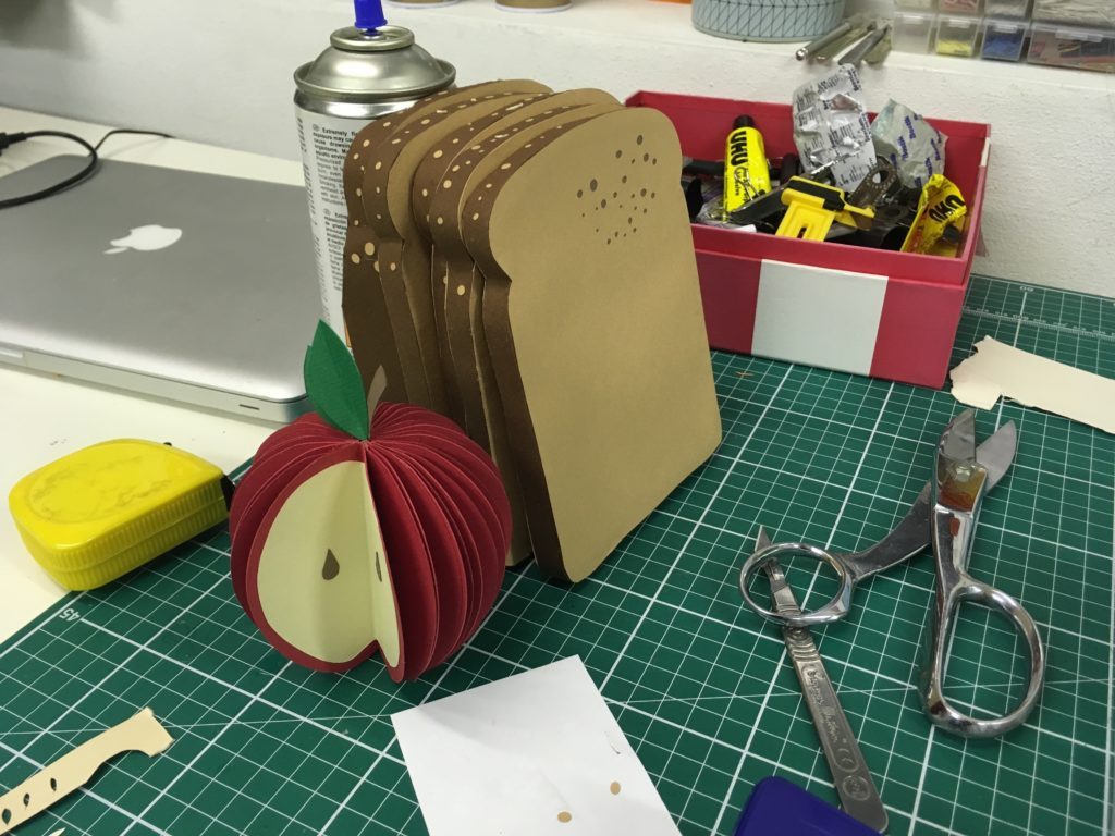
I was asked to create all the food out of paper to make it eye catching- something out of the ordinary for people to engage with. People are really used to seeing food in this way, but it makes them do a double take to see it made in paper.
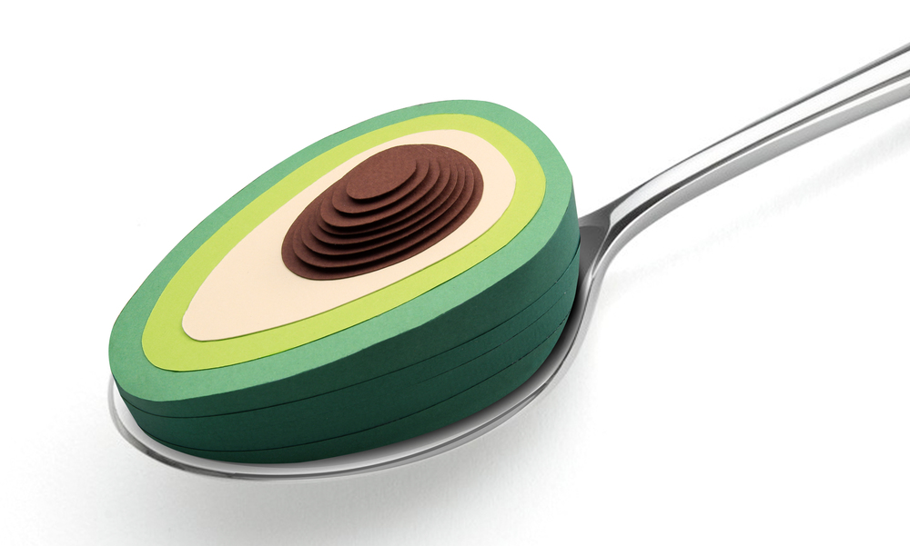 Avocado a Day
Can you expand on your commission with the British Heart Foundation?
Size of the commission:
The final image was used in a printed magazine - the double page spread was around A3 dimensions.
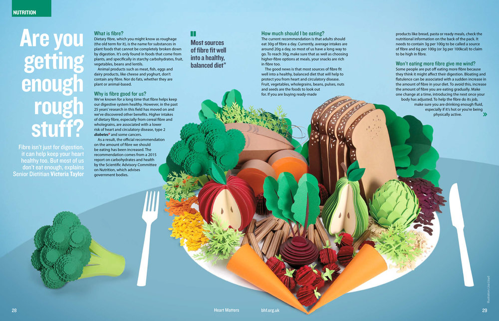 Size of the actual work:
All laid out together the food covered an area of approx 60cm x 40cm
Lead time for you the artist:
I had about 3 weeks to make it from concept / sketching stage to shooting and art working. I take all the shots myself and do the art working in Photoshop for delivery.
The importance of sending out a good message:
I’m always really happy when I get the chance to work on something positive, especially when it’s a challenge like this one. I love the idea that I can make people feel something, I think that’s why my work is colourful - I think it’s to make myself feel happy!
Discuss fashion and your work particularly ‘Neon Flowers’.
 Moon Flowers
I love the excitement of fashion - it feels totally free. Dramatic, soft, sculptural, hard, textural - just like nature. I think that’s why I love the idea of combining the two worlds. So many fashion designers are inspired by nature, so it’s fun to continue the circle back to nature but with a little paper twist.
Neon flowers was a personal project in which I wanted to deconstuct the flowers into geometric shapes. Mix up 2D vector elements and have a play, I wanted it to feel vibrant and alive.

Can you expand on the physical sizes of your work?
I can work on really tiny intricate pieces and really big sculptures.
Take 2 works one small and one large. Discuss the techniques of both plus the advantages and disadvantages.
Large: I once made a 2 meter high bottle of Asahi.
It needed to be transported around a lot, so I needed to make the basic structure of the bottle in wood. I then needed to pattern cut foam board to create the curves of the bottle. This was then followed by sticking hundreds of pieces of paper to create the texture. I needed help from my lovely studio buddy Tabitha to get them all stuck in time, she also helped to laser cut the intricate label graphics. All these things took more time than usual as we needed to climb up and down a step ladder all the time, for measuring, testing, sticking etc. It also took more time when you realised you’d forgotten the glue or scissors at the top and would need to go back down again!
 Small: Making tiny things is tricky because you’re dealing with fiddly bits of paper, so you need to use tweezers and be very careful with the glue.
 It can get very messy very quickly if you’re not concentrating.
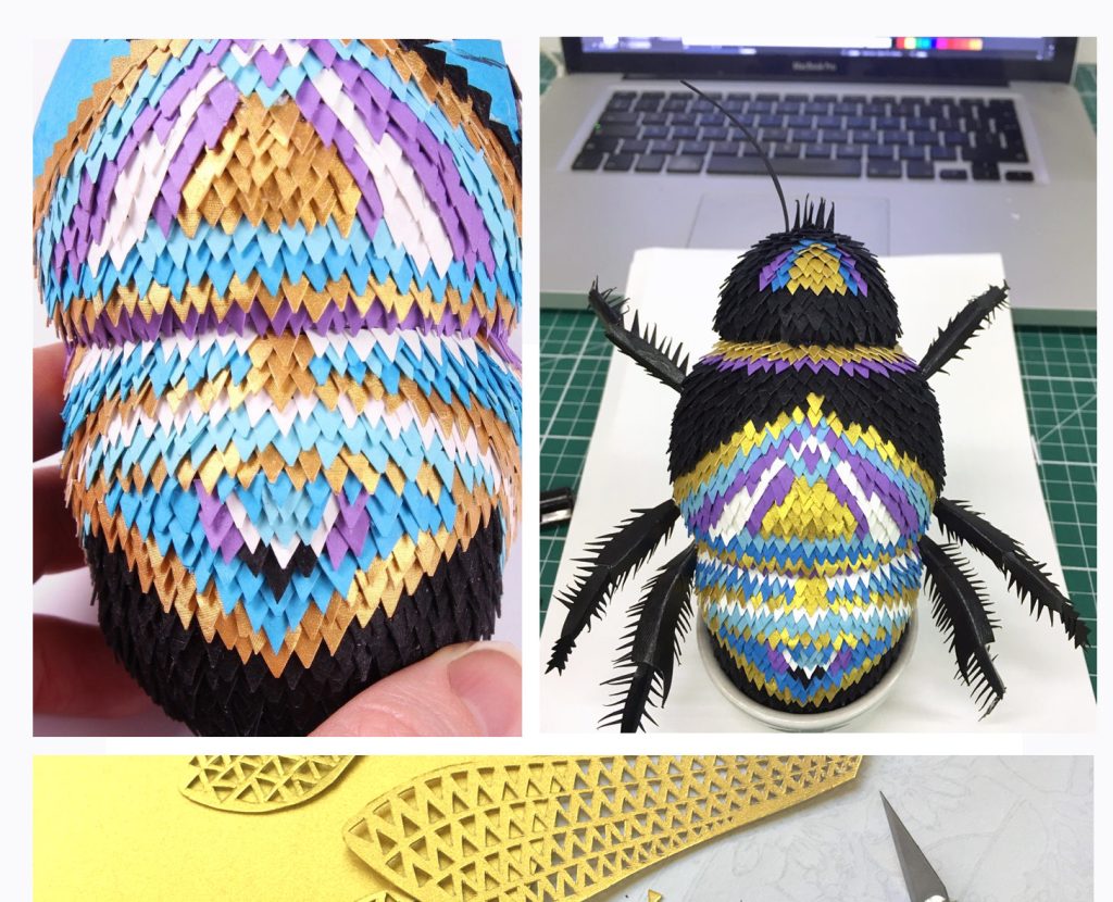 The benefit of working on smaller projects is you need less materials and a smaller workspace - you also don’t need to keep going up and down a stepladder!
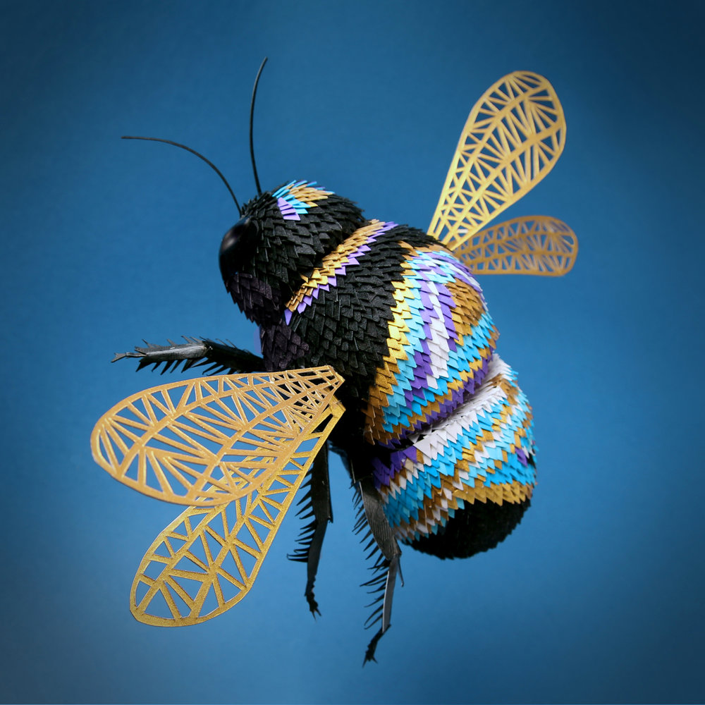 Discuss your Limited Edition work.
I love the immediacy of computer based work and it can be done anywhere - but these days I do really love being off the computer and working with my hands. I still think my graphic design experience informs my design choices when I’m working with paper. I love it when my work feels graphic - I want it to have a bit of impact.
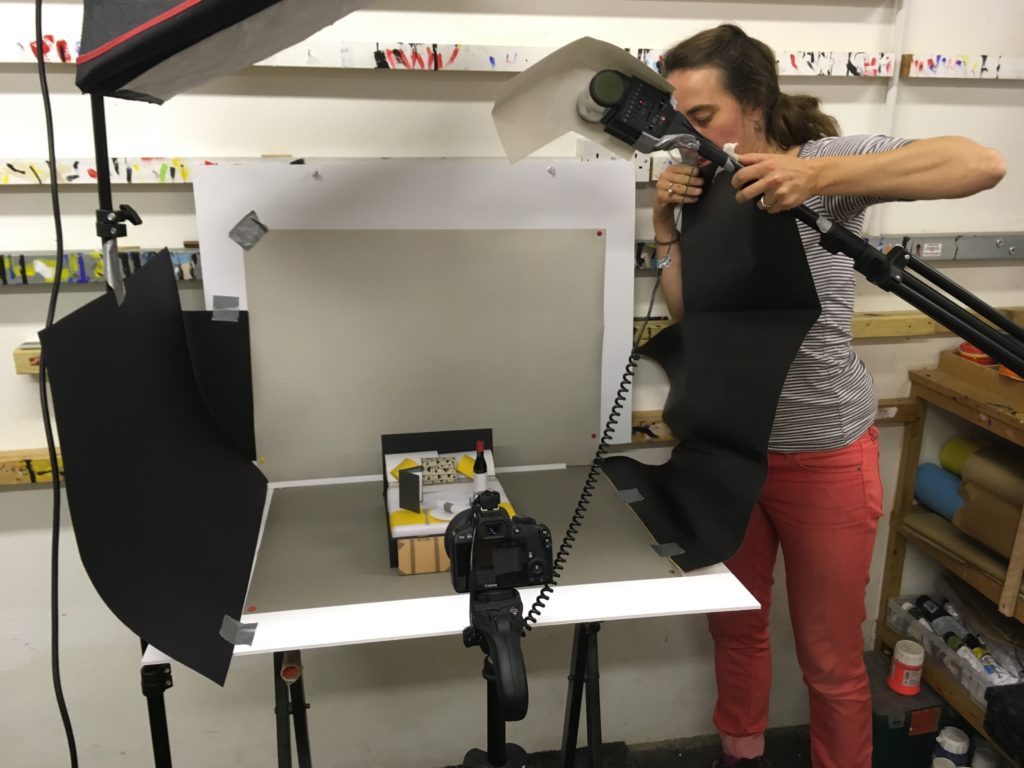 I had a few people get in touch asking about prints when the bluetit image was in a competiton for 5 waitrose readers to win one - I thought why not set up a store!
I decided to limited edition runs of 50 which are signed and dated.
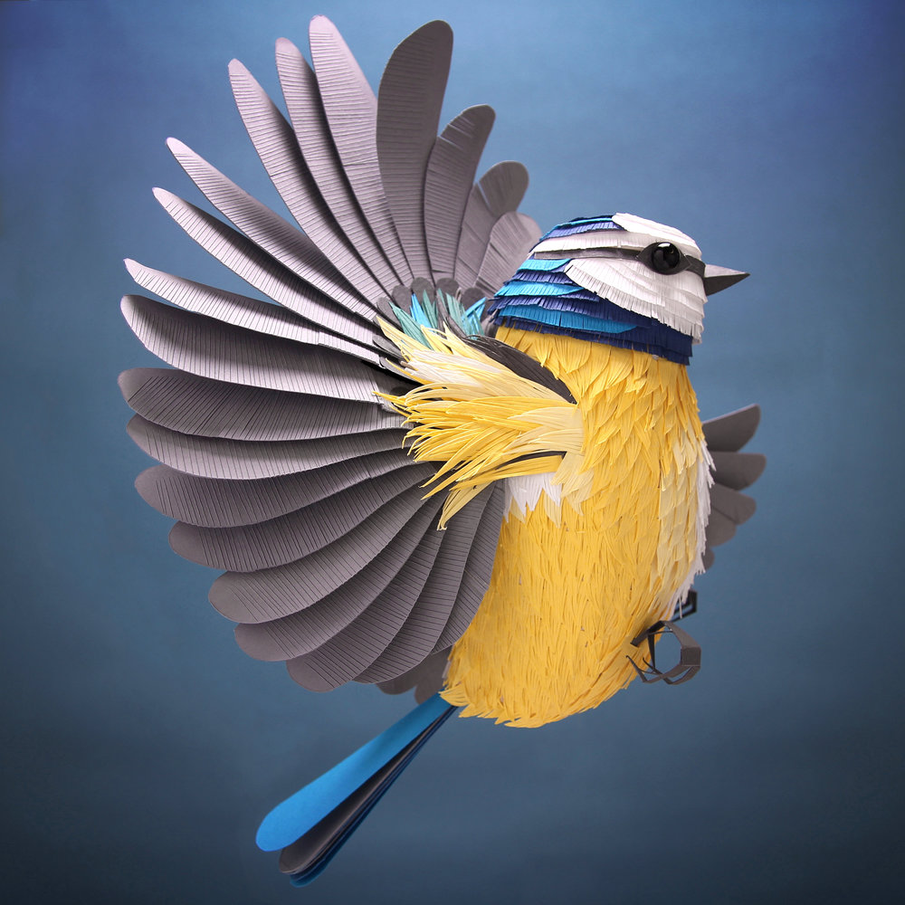 Discuss the type of paper you use for your 3D work?
I use normal paper weights and card - really I’m drawn by the colours and textures.
You share a studio with other artists, how does this help or influence your artistic momentum?
When I worked on the Asahi bottle, the studio owner ‘Hend’ let me use his space to build the bottle. The guys in the workshop ‘Workhaus furniture’ helped me make and design the wooden structure. Anna Pugh a fabulous bag designer showed me how to pattern cut to make the bottle curves and Tabitha Bargh an amazing lampshade designer helped me create the bottle and laser cut the paper tabs and label graphics. All these people are specialists in their field and they all helped me to get the bottle made- I learned so much and it was totally inspiring.
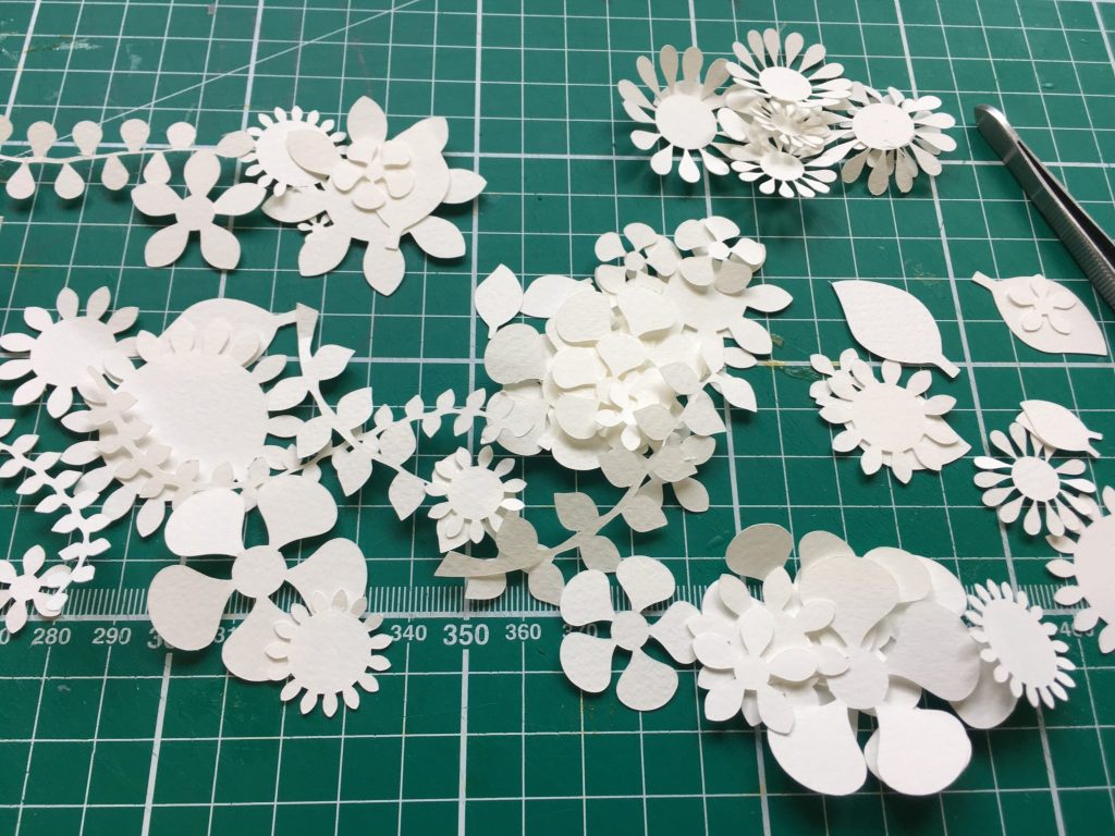 I also share my studio space with a fine artist called Chris Kettle. It’s really inspiring watching him work, choosing his colours and working the paint. I feel really lucky!
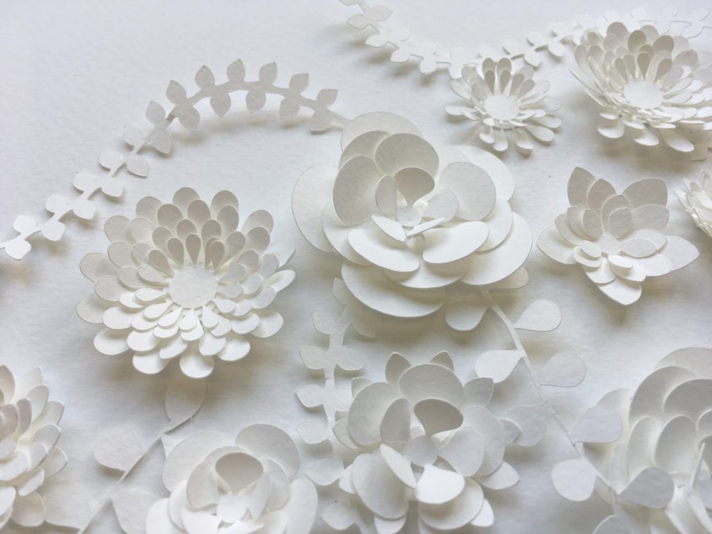
Take one of your current works and discuss…
I’m currently working on a collaborative project between the Paper Artists Collective (that I’m member of) and Langley’s gin. We’ve all been asked to make gin related pieces of work in our own style.
I’m creating an exploding paper cocktail from a paper cocktail shaker.
I’ll be creating it using a mixture of 3D and 2D paper elements, I’m hoping to have lots of texture and colour.
Size: - approx 50cm x 40cm
Why this work has excited you?
It’s fun, colourful and I like cocktails!
Contact details:
Lisa Lloyd
website: www.lisalloyd.net
email: lisa@lisalloyd.net
Lisa Lloyd, Hove, UK
Interview by Deborah Blakeley, June 2018
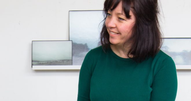
Lisa Cahill
What lead you to glass making?
A love of design let me to Glassmaking. I never even considered Glass as a medium until I chanced upon it at an open day at the School of Art in Canberra. I had always imagined I would be a painter or a jewellery designer but as soon as I realised I could learn how to manipulate glass to make my artworks I was hooked.
You work with a variety of glass techniques, etching, engraving, lathe work and carving through opaque and transparent layers. Can you give us an image that shows each technique and a very brief explanation of the technique?
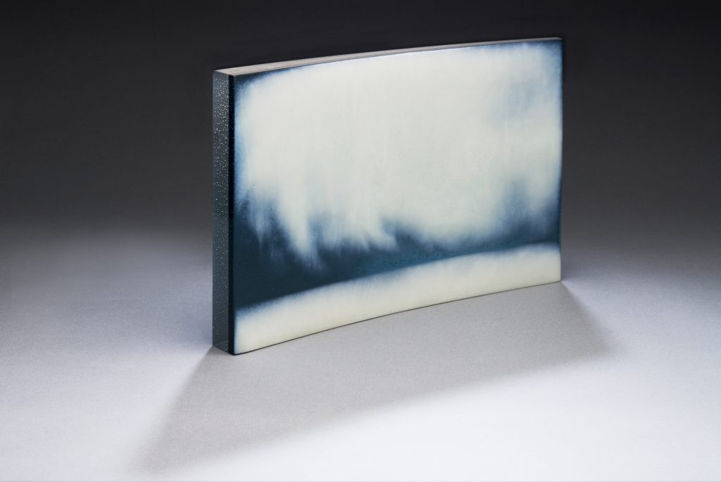
In “Virga #2” 2014 kiln formed and carved glass 28 x 48 x 6 cm Photo Greg Piper
I used the disc grinder to carve through an opaque layer of glass to reveal the transparent colour beneath.
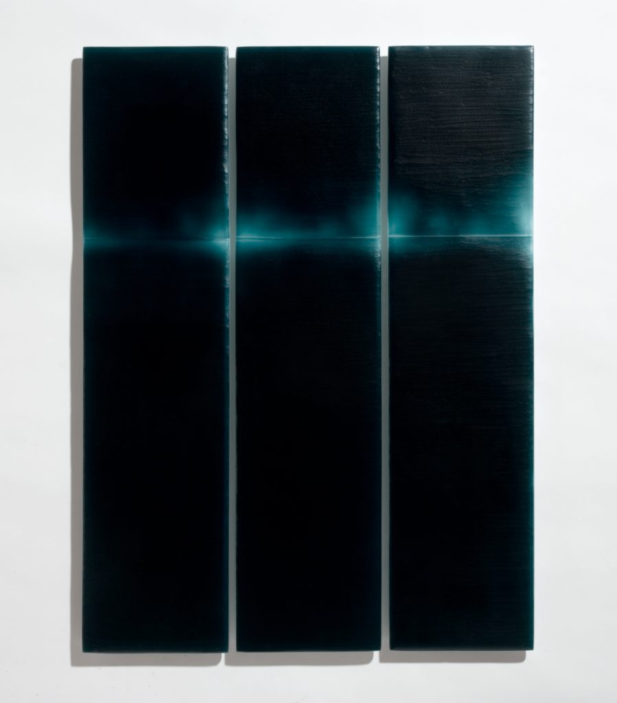
Catching Light #4, Kiln formed and wheel carved Glass, 67.5 x 50 x 1 cm, Photo Greg Piper
In I used a lathe to carve through the transparent layer.
Can you expand on your large, 36 sq. metre art work made up of 1000 postcards?
“Breathe” was a commissioned for a complete refurbishment of a corporate building at 151 Castlereagh St in the Sydney CBD. It is 6.6m high and 6.6m wide and sits out from the wall 10cm.
The architects asked me to put in a design proposal for a large artwork for an internal void. I was making very labour intensive work at the time so it took some time to come up with a design that could be produced on large scale. I wanted to be able to make the work in components that I could produce in my kilns and were easy to install. I also had to work within a budget which meant that the work I was doing at the time, layers of fused glass that was then carved back, the materials alone would have wiped out the budget. I scaled the work back and thought on a more simplified way what I could achieve the same aesthetic that would have an impact on a large scale.
I made a small maquette of a carved glass landscape and used it as the inspiration for the larger work.
Each piece has been cut, polished and then slumped in custom moulds in the kiln to take on the shape of crumpled paper. The graduating shades of amber were designed to be evocative of a fading sunset inspired by he location of the building in the Sydney CBD, known for its beautiful harbour and stunning beaches. The individual glass panels were to appear to be paper blowing in the wind. I used around 100 moulds to create 1250 panels. The whole project from conception to installation took several years but the actual making of the work took 6 months to make and 1 week to install.
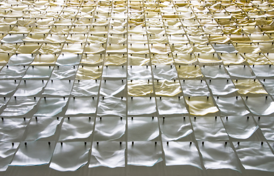
Undercurrents, 2018. Kiln formed glass, stainless steel, aluminium backing board. 1590 h x 2260 x 100mm deep. Photo Greg Piper
Discuss your work in relation to collaboration with other artists.
I can’t say I have really done a lot of collaboration as such. I have fabricated artwork for other artists and I have had artists fabricate components of my artworks. I think it’s very important to acknowledge the difference. I believe when collaborating you should both be involved in the design and concept stage. In a fabrication/gaffer situation one person with specific skills is fabricating another artists design. I have enjoyed being in both roles and am always very grateful that I have so many talented artists around me that I can draw upon to realise an artwork. I would love to do collaborations in the future.
How has the Danish landscape influenced your work?
Definitely, the cold winter landscape has had a very big impact on me. Being exposed to the Danish landscape from a young age has made me acutely aware of the contrasting Australian landscape and my connection to it. The Danish winter landscape was a big influence in my early works but more recently I have been very drawn to light and landscape and the mountainous landscape around Canberra.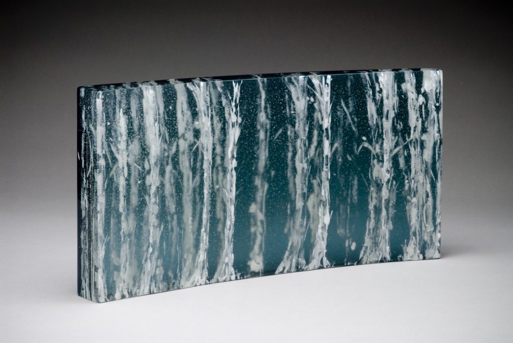
Between the woods and Frozen Lake 2011 Photo Greg Piper
How has the Australian landscape influenced your work?
‘Beneath the escarpment’ my most recent body of work was inspired by the Illawarra Escarpment which I often visit.
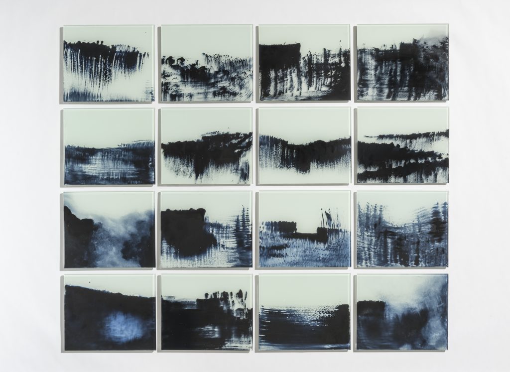
Beneath the Escarpment, 2018, kiln formed and enamelled glass - set of 16 wall panels, 1100 h x 1300 w x 10mm Photo Greg Piper
Can you explain your close association with the Canberra Glassworks?
I have been involved with the Glassworks since it opened in 2007. I have stocked the retail outlet since it opened and have been a regular hirer, exhibited regularly in the Gallery and have had several artist residencies there including a twelve month fellowship that I will begin this July. Since I moved to Canberra in 2011 I have been an active member of the Canberra Glass Community and the Glassworks is a great hub for this community. I have just returned from installing a commission I completed for the Sir John Monash Centre in Villers-Bretonneux in France that was commissioned by the Department of Veterans Affairs through the Canberra Glassworks.
Expand on your most current commission for the Sir John Monash Centre?
Where is the centre?
The centre is behind the Australian Memorial in Villers- Bretonneux, North of Paris, France. Designed to sit behind the Memorial it has been dug into the earth to resemble a war time bunker and not overshadow the existing memorial.
Why is it there?
The Centre has been built to commemorate the 100 Centenary of the end of the first world war. The original memorial was designed by Sir Edwin Lutyens in 1935 to commemorate the 300,000 Australians that served and the 46,000 that lost their lives on the Western Front in World War I.
Discuss the importance of the centre and when it will be opened?
The Sir John Monash Centre is a museum and interpretive research centre that commemorates the Australian Servicemen and woman who served on the Western Front during the First World War. It was officially opened on the 24th of April 2018 by the Australian Prime Minister Malcolm Turnbull. Through interactive media installations the centre tells the story of Australia before the war, why we went to war, what we achieved and how being involved in the War changed Australia.
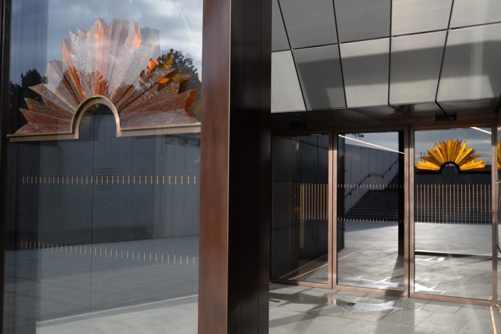
Photo Tim Wiliams, Architect
The design and scope of the centre? The building was designed by Cox Architecture with Williams, Abrahams and Lampros. Photo Tim Wiliams, Architect
Costing $100 Million dollars, The, one thousand square metre centre is designed to be "subservient" to the war memorial and has been described by one of the architects, Joe Agius, as "almost an anti-building, connected to the monument from an abstract and geometric point of view".
Your input into the Centre?
I was commissioned to make a Glass rising Sun inspired by the ANZAC emblem. The Sculpture sits in a 4 meters high Bronze totem as you exit the building creating a beacon of light drawing you out after the harrowing and moving experience inside.
What and for who did the commission come from?
The DVA enrolled the Canberra Glassworks to put out a national call for artists to submit proposals to make a Glass Rising Sun inspired by the ANZAC emblem.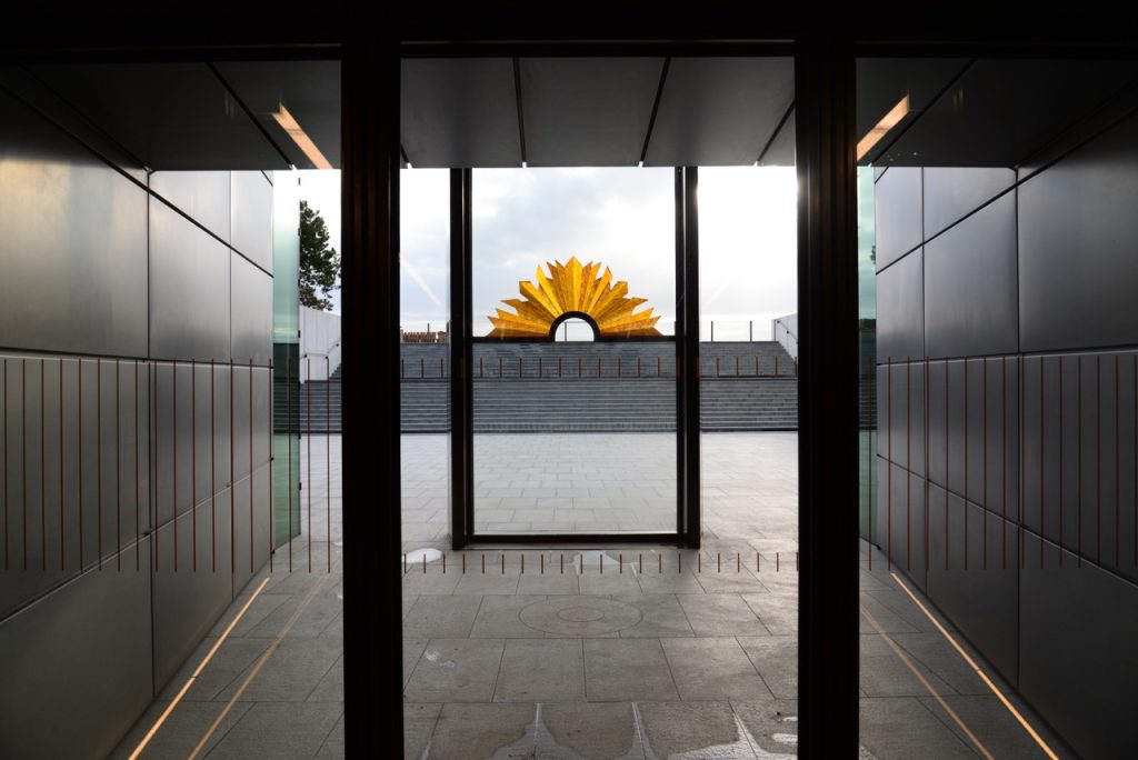
Photo Tim Wiliams, Architect
How structured was the commission?
The brief was very structured in that it had to clearly resemble the Rising sun Symbol designed by Sir Edwin Lutyens on the Tower of the Memorial. They wished for the artwork to be made of glass but the final design, what type of glass and techniques used were entirely up to the Artist.
Discuss the importance of the Rising Sun to Australians and the world?
The original Anzac badge used upturned bayonets to create a symbol that would come to represent the spirt of Anzac (the Australian and New Zealand Army Corp). Travelling to the other side of the world these diggers had a sense of camaraderie and commitment that helped them battle through rough conditions and unknown territory.
How important are Government Departments to the careers of Australian contemporary Artists?
Commissions like this one can be very important to the careers of Australian artists. It is also important for them to support our creative community as it is through art, design and architecture, music and literature that our story is told. Years into the future these artworks, plays and novels will tell the story of our time. Government departments have an obligation to enable that story whenever possible. Commissions like these also create exposure for artists to connect with a wider audience and one that you would not normally have exposure to. And they can also expand the public’s appreciation of new forms of artistic expression.
Not everyone can commission or buy big, discuss some of your small pieces?
I have always made a production line of bowls, plates and jewellery to supplement my arts practice. I enjoy making the smaller works as it is less labour intensive due to the scale but also allows me to have fun and experiment with aesthetic alone rather than getting caught up with the conceptual side so much. I also love that I can make a product that is affordable and I can connect with people through this work that might not have room in their homes or funds to purchase my exhibition works.
Plate and Spoons, Photo Greg Piper
What is your opinion on the importance of beautiful hand-made pieces in the home?
I have always appreciated handmade pieces in my home as they have always given me joy. Even more so when I have known the maker and know the work that has gone into that piece and that my purchase has helped them to keep making more beautiful work. Having handmade work in your home has a more genuine feel and creates a more personal space. Buying local handmade work enables you to contribute to sustaining your creative community.
Contact details:
Lisa Cahill
lisa@lisacahill.com
Lisa Cahill, Canberra, Australia
Interview by Deborah Blakeley, May 2018
Joseph Genova
How does your connections to Italy influence your art?
Ever since I was a little boy in Italy, art took centre stage in my life. I was attracted to the paintings, murals, and statues that are abundant in churches and palaces.
I began drawing at an early age and continued when my family immigrated to the US. I longed to be an artist ever since I can remember.
Discuss the inspiration you take from the 17th Century artist Michelangelo Caravaggio?
My first exposure to the paintings of Caravaggio was when I was about 10 years old. I was in a public library looking through an art book on the Italian Renaissance. When I turned a page and saw Caravaggio’s “The Calling of Saint Matthew,” I literally froze. I had never seen a painting like that before, with its dramatic theatrical lighting, bold colours and composition. I decide then that I wanted to paint like Caravaggio.
Caravaggio, The Calling of Saint Matthew
Apart from your Italian background how does your current New York life effect your art?
Living in New York has exposed me to all manner and styles of art. If something is new and different, you’ll see it first in New York.
The city gives an artist a holistic perspective, which forces you to compare your art to what’s new and popular in the market place.
You paint fabric, discuss where you source the fabric and what draws you to each piece?
I started painting fabrics about two years ago. Since today’s market is going more and more modern, I wanted to find a way to be more modern while still, remaining representational.
The colour, texture, and pattern of the fabrics is what draws me to each piece. I spend a lot of time arranging a piece of fabric until I get the folds and composition that I want.
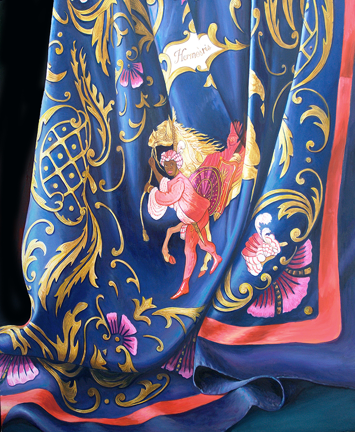
Hermès #1
Take one or two fabric pieces and discuss your interpretation into your paintings.
I was attracted to the beautiful design, colour, and silky texture of one of my wife’s Hermès scarves. In arranging its folds, I tried to emulate the image of water flowing over rocks since that’s what the design reminded me of. The most difficult part of the painting was capturing the texture of the silk.
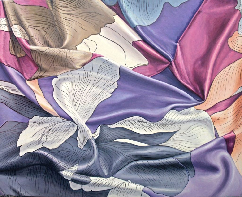
Hermès #3, 24 x30 inches, Oil on canvas
What different techniques come into play when you paint two very different fabrics, e.g. tapestry and silk?
There are certain fabrics that couldn’t be more different. With silk, you need to use a very light touch with your brush to capture its fine texture. I glaze many areas to help with the tonality of the colour.
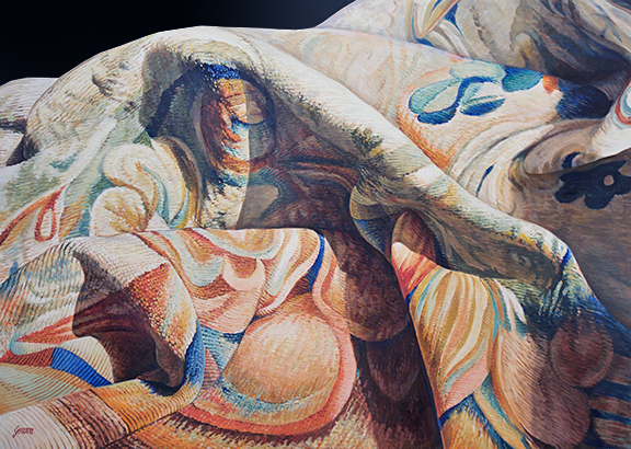
My Tapestry, 27 x 36 inches, Oil on Canvas
In painting a tapestry, I use a different approach. Since the texture is much coarser, I mostly use hog bristle brushes. For the fine detail, I depend on red sable.
Comment on the importance of water in your work.
Water is wonderful to paint because it’s transparent and reflects every object that’s beneath it and around it. I love painting water because it reflects nature in its own distorted and beautiful way. Water is also quite mesmerizing; it captures our thoughts and brings us peace. I find painting water very therapeutic.
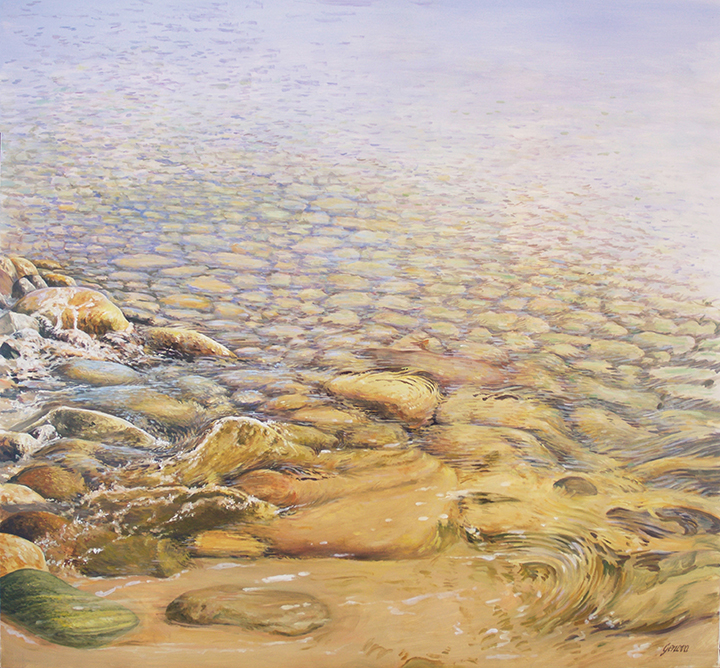
Tranquillity, 33 x 37 inches, Oil on Canvas
With your painting ‘Gondolas at Rest’ what are your thoughts on painting places people know and recognize?
Gondolas have always been a very popular subject matter for many painters. Like many other artists I, too, am drawn to their romance, beauty, shape, and colours, and I can’t help but paint them. In “Gondolas at rest” I recreated an image of a group of gondolas that stuck out in my mind. I remember seeing a lot of blues, which initially attracted me. When I looked closer, I noticed the contrast between a rough canvas cover and the oily-looking water around it. A piece of red fabric in one of the gondolas also jumped out at me, and I instantly knew I just had to paint this powerful image.
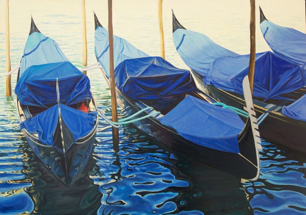
Gondolas at Rest, 27 x 38 inches, Oil on canvas
Discuss your botanical work.
What I love most about flowers is the delicate structure of the petals, their beautiful shapes, and the vast array of hues. I’m often amazed at how many colours it takes to capture the beauty of a white peony. The transparency of a flower’s petals is something to behold. So many colours reflect upon them, and they have such a delicate composition. The sensuality of a flower is what I try to capture.
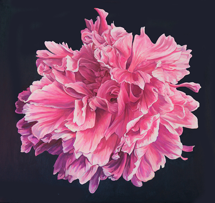
Peony from Michelle's Garden, 28 x 36 inches, oil on canvas
Size: Most of my botanical work is large, a typical piece is 26 x 30 inches
Background: I use black in most of my botanicals to give it contrast
Use of composition: Composition is most important; I try to view a flower from an unusual angle.
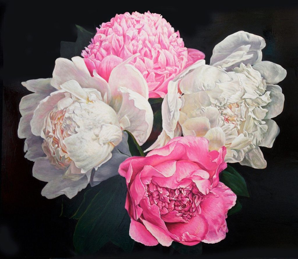
Peonies, 30 x 35 inches, Oil on canvas
Use of enlargement: I photograph most subjects and work from my computer
Discuss how lighting influences your architectural works.
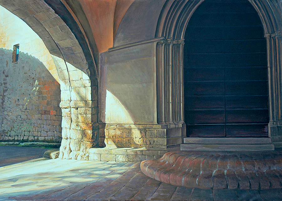
The Chapel at La Badia, 24 x 36 inches, Oil on canvas
In painting lighting is everything. When I travel to Europe to find architectural subjects, the early morning or late afternoon light is the light that gives the structures the dramatic light that I’m looking for. I never bother to look for subjects in the midday light because it is flat and boring.
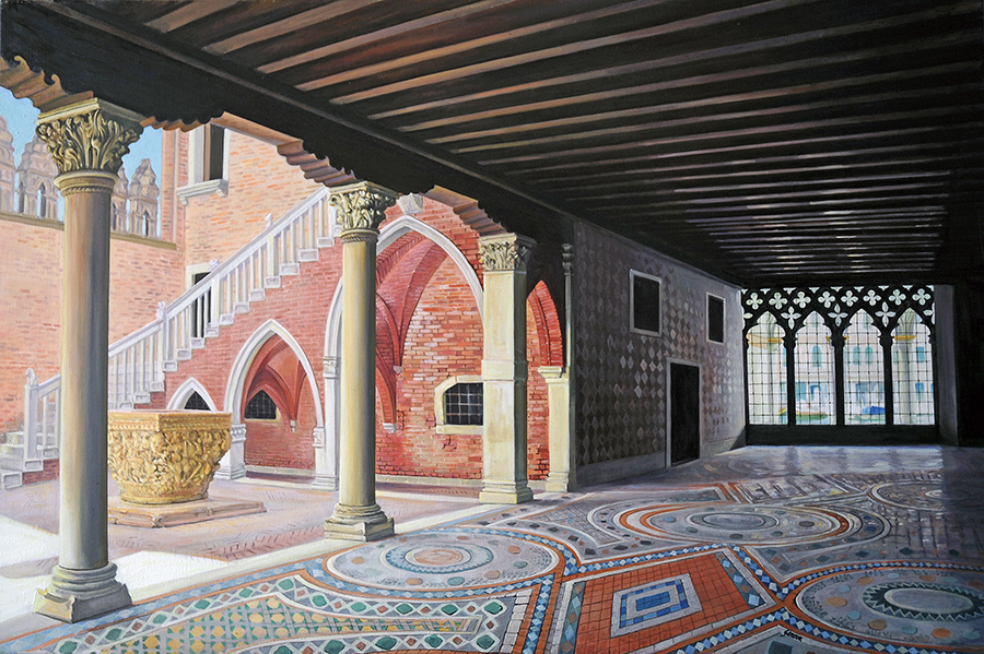
Ca d’Oro, 30 x 42 inches, Oil on canvas
Contact details:
Joseph Genova
http://josephgenovafineart.com
joe@josephgenovafineart.com
Joseph Genova, New York, USA
Interview by Deborah Blakeley, May, 2018
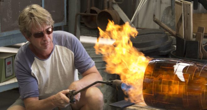
Kevin Gordon
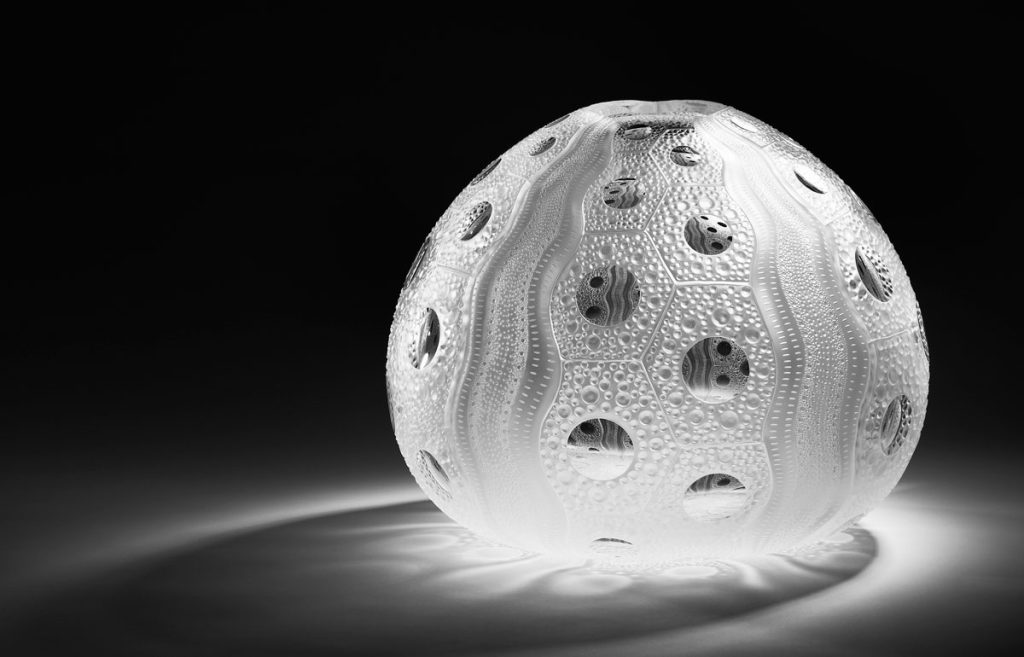
Clear Sea Urchin
Expand on the influence your parents have had on your glass career?
With both parents being artists, I guess they laid the seed, I was always heading towards a creative career it took a while before moving into glass and fully appreciating it as a medium. I worked with my parents, part time for a year or 2 before I set up business working in architectural glass for 4 years before I moved to Victoria to set up a cold working shop alongside my sister glass blowing studio which is when I started to produce exhibition/gallery work. I was in Melbourne for 3 years before returning to Perth. In my family we have all help and influenced each other in our work and we are all quite individual in our style and use of glass. In the early years in Perth glass as an art form was almost non-existent, when I returned to Perth a glass blower David Hay also arrived in Perth, we became the nucleus to establishing the glass blowing studio there and my parent studio became the very important in the cold working side.
Shape can be found in both the form and surface of your work discuss.
In my work I enjoy natural lines in the forms that have balance.
In the design process of my work I look for how nature evolves, I look for the underlying logic and formulas that create natures designs, not so much to imitate but to look how it is formed. I use this by breaking down the design to the basic elements or fractals which repeat in a form of mathematical formula which build up to make the whole design.
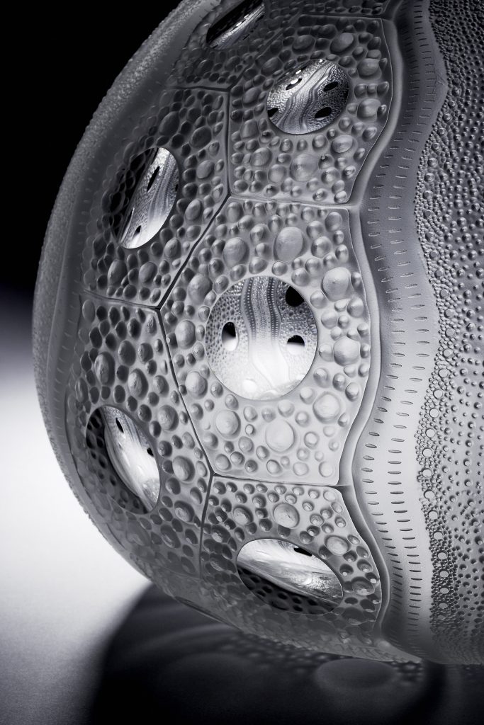
Clear Sea Urchin, detail.
Your glass is housed around the world. Take a piece and discuss where they are now and what it has meant to you and your career.
To my mind the most important piece is the large colourless Sea urchin that is housed in the NGA, this piece was purchased from the sea form exhibition i had Form Gallery "Systema Naturae" this piece was the largest work I had completed and was the centre piece for the exhibition, it was also the first of the sea urchins that I had used only using the qualities of the glass without colour.
What made also special for me was when it was first exhibited in the NGA it was displayed very well, it was displayed in a big glass case in a small black room by itself with lighting only on the work, my niece on school excursion to the NGA after told me she was so excited to see it and to hear it was like the Jewel in the pink panther movie the way it was displayed.
Clear Sea Urchin
Has your series ‘Sea Form’ come from the Australian Coast?
The sea form exhibition arose from an exhibition I had at form gallery in Perth, it was a progression of work I did in the study of the use of fractals in my work which sea form designs are made of... the research was mainly from the time I got access to the natural museum in Perth where I got to explore and study their collection of marine life.
Discuss Rainy Daze
Rainy Daze this was one of the first works where I used lens as a feature in the piece which has become prevalent in many of my works, this work is held in The USA at Mobile museum of art.
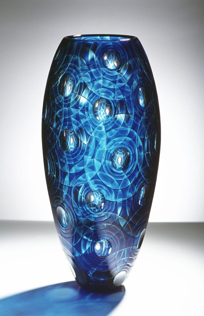
Rainy Daze
Colour and glass go hand in hand – explain your use of colour.
Colour has always played an important element in my work, I did a year course on colour theory when I was studying painting in my early years which in much of my work I use this knowledge when I use multiple layers of colour then to cut back through the layers. the understanding of the colour wheel is important to make colours, for example if you put blue over orange it will become a gray because of them being opposite on the colour wheel they cancel each other out.
Expand on your work Deep Forest
Deep Forest, this work was a piece which I used three layers of colour on the internal and three on the external surface which I worked all surfaces so the outside colours shaded to the inside and the inside to the outside colours. after I had finished carving I pre-polished by hand and then we fire polished it which was at the time experimental process where we reheat the carved piece back above annealing temperature and the reattached to the pipe and then into the glory hole to melt the surface to a high polish.
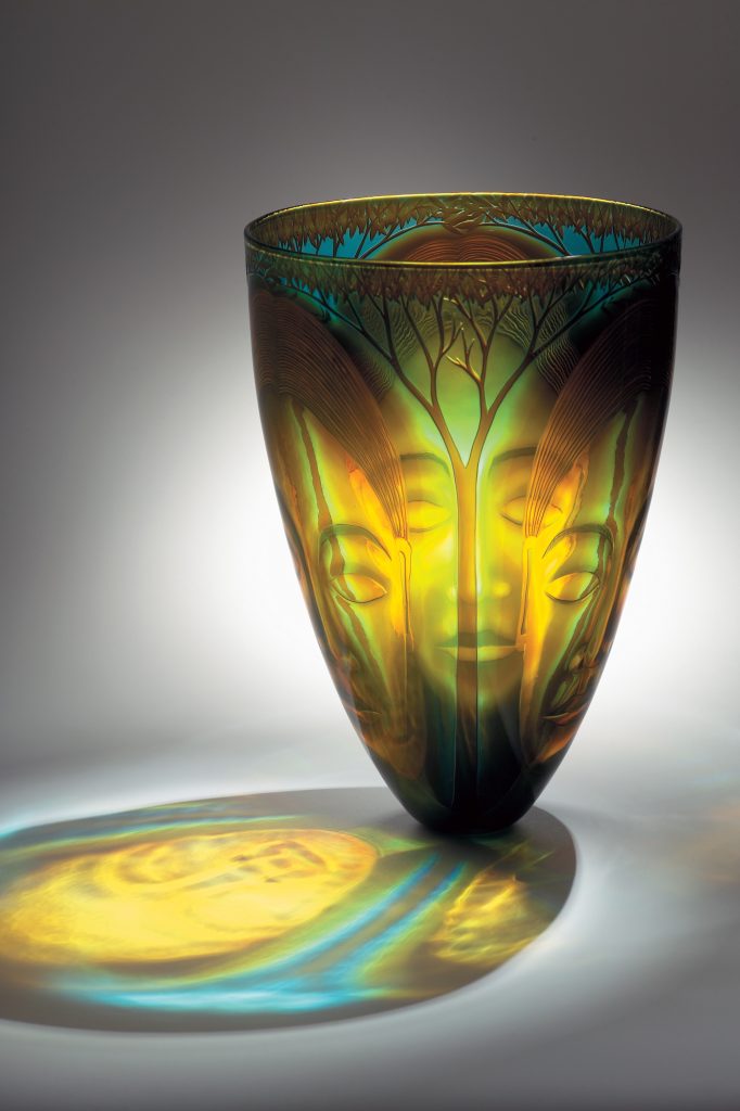
Deep Forest, 420 x 280 mm
Graal – can you expand on this term?
Graal technique is a process I occasional use... it is a two stage process where we blow egg shape form with an overlay of colours which we call the embryo, at this point we take it off the pipe and anneal it… once cooled I carve design through the colours, then reheat the piece up slowly over night and once above annealing temperature we reattach to the blow pipe and gather more glass over it and then blow it into its form leaving the design suspended within the glass.
Explain the use of colour in Southern Lights.
Southern Lights this was a set of three works in what I would call my colour fractal vein of work, these works are about colour, also have work colour on inside and outside surfaces and then fire polish with the use of lens to give depth to the work… this set was exhibited in Sweden at the Steninge World Exhibition of Art Glass, Steninge Palace.
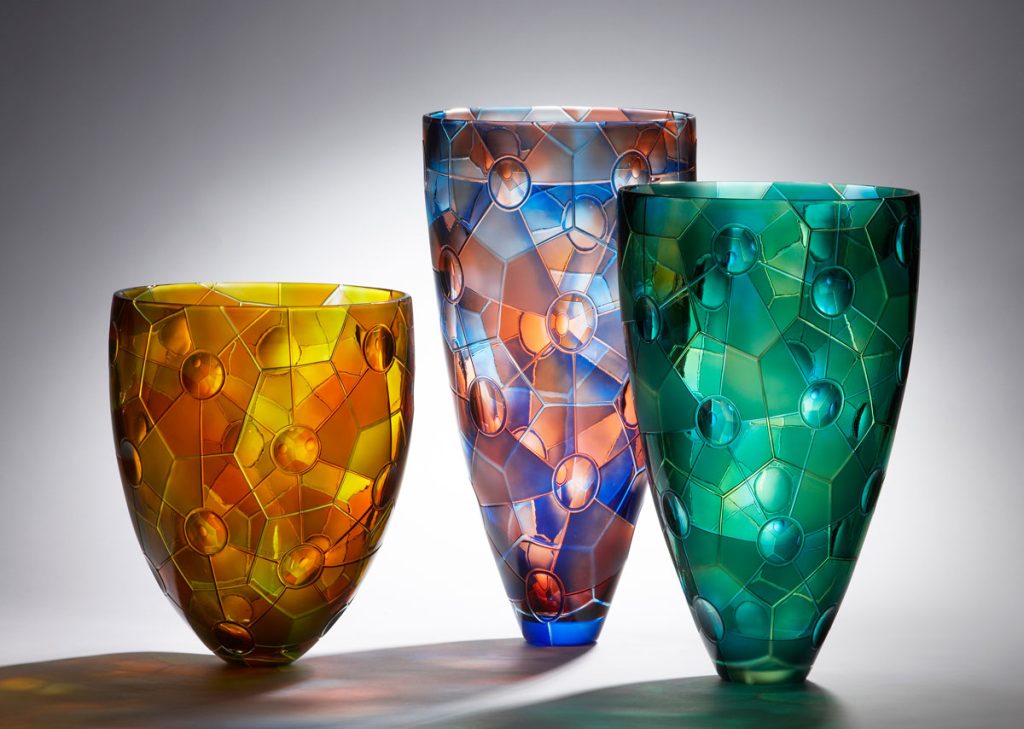
Southern Lights
Discuss the complexities of Humanity.
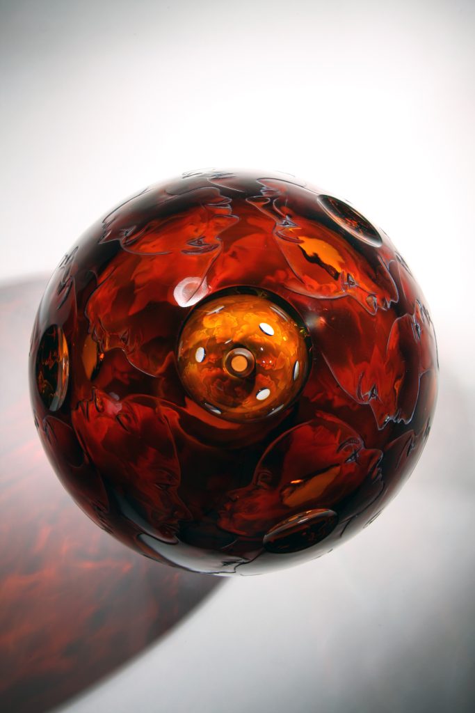
Humanity
Humanity, this work with engraved faces covering the surface, this is a small piece but quite solid with an internal bubble to reflect the faces when looking through the lens. the faces are engraved into triple overlay of colour and then hand polished.
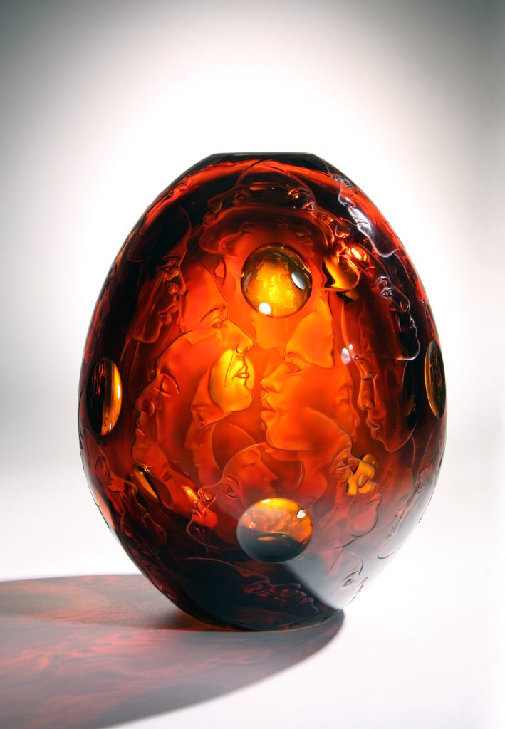
Humanity
How do you like to have your work displayed?
Lighting is important with glass and each piece needs to be considered individually to how best to light… some enjoy natural light while others look best in a darken space with a spot light above or reflecting from wall behind. it is nice to see a work given space sitting on a plinth.
Contact details:
Kevin Gordon
mail@kevingordon.com.au
http://www.kevingordon.com.au/
Kevin Gordon, Red Hill, Victoria
Interview by Deborah Blakeley, May, 2018
Anton Thomas
Can you discuss how important research and preparation is to your work?
I estimate that some 35-40% of my overall labour time is research and prep, the rest being time spent drawing. This may seem a high amount for a completely hand-drawn artist, but my goal is to make maps that are as informative as they are artistic, so I spend a great deal of time with real-world data. I’m drawing real places, that real people live in, so it’s critical that I research properly to ensure I capture something of the feel of a place.
Southeast, USA
To make sure content is accurately geolocated within a region, I have to spend a lot of time prepping the area. This involves plotting out where everything must go, creating a pencil blueprint that I can then fill in.
You make the comment, ’By vividly illustrating geographic data, I hope to bring attention to dynamism and mystique of our world.’ Discuss.
Maps have always been a critical lens by which we view the world, and it never fails to amaze me how quickly anyone gets immersed in a map of an area they know well. Show someone a map of their country and they’ll quickly start telling stories about their lives and travels while tracing their finger along highways and coastlines.
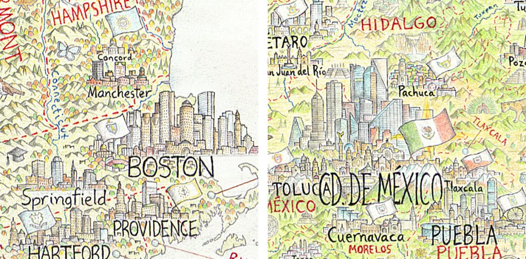
Capital Cities
There is a big demand for good maps, but in the age of the smartphone there is less and less practical need to peruse a map - we can just be navigated around with ease. I’m by no means a luddite about this, I’m a big fan of these tools. Nonetheless, this is causing a decline in societies (already shaky) geographic literacy, and I feel the space has been blown wide open for compelling traditional cartography to reconnect us with geography. Our Earth is more magical, awe-inspiring, treacherous and mysterious than any world conjured up by the great fantasy authors. I feel that by illustrating a map with true data, drawn in an elegant and fantastical way, it can capture anyone’s attention while educating them about geography.
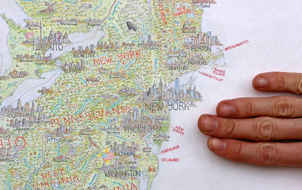
Hand scale, East Coast, USA
You are currently working on a huge map of The North American Continent, can you take two cities from your over 600 cities and towns, discuss their complexities as an illustrator?
San Francisco. One of the most famous cities in the world, with dozens of iconic features to choose from, SF is a good example of how complex things can get.
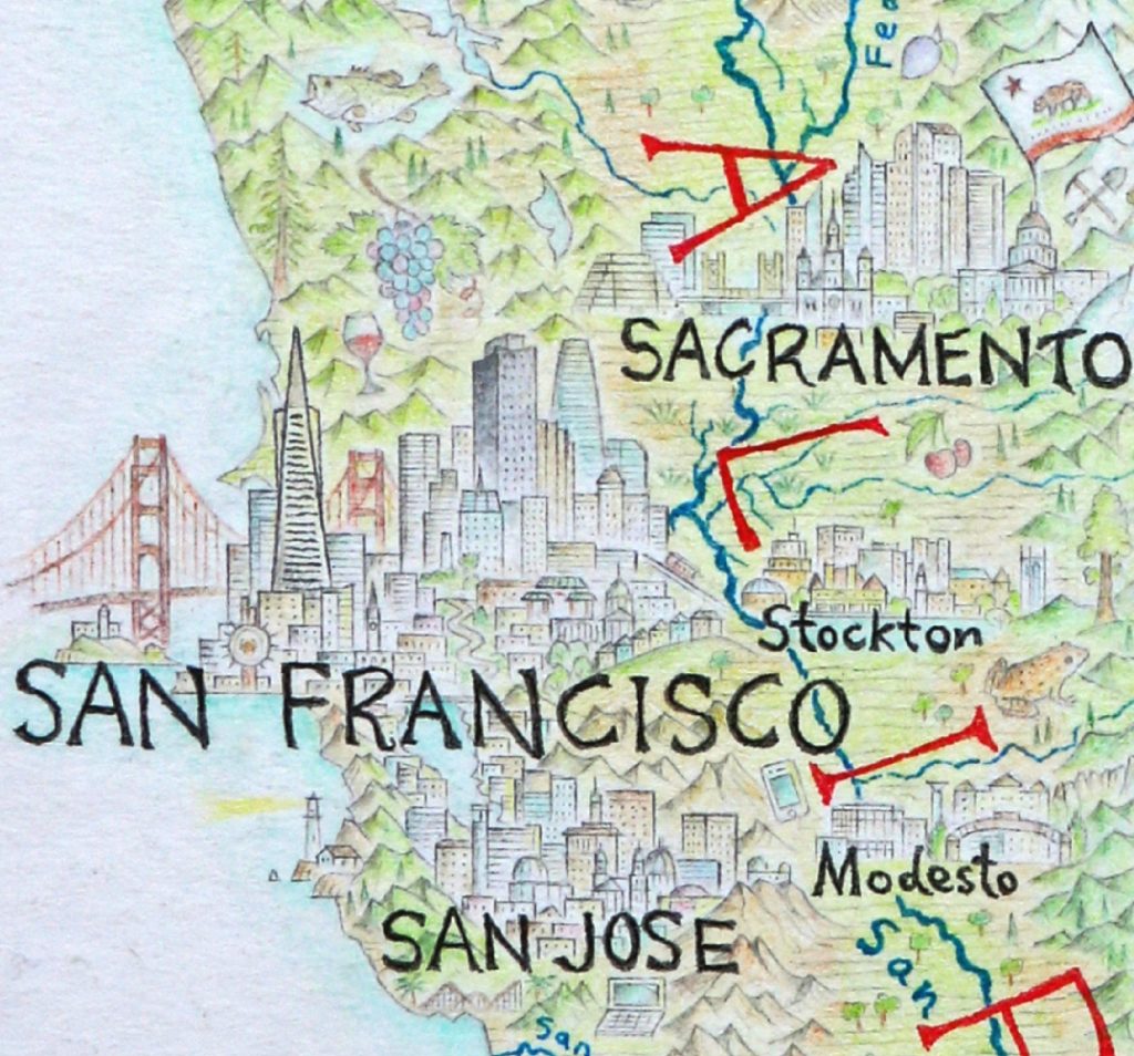
The approach I take with most cities is to build them somewhat like the cross-section of a forest. I have the tallest buildings of the skyline – the canopy – towering in the background and creating the shape. Meanwhile the foreground is where I build an understory of content, and have a chance to include the smaller, more finessed landmarks of a city. In the case of SF, I managed to fit Fisherman’s Wharf, the Ferry Building, Nob Hill, winding Lombard Street, Chinatown gate, City Hall, a tram, and a row of painted lady houses. The background has the tallest most distinctive buildings creating the skyline, along with the Golden Gate Bridge and Alcatraz. This one city alone took many hours of research, prep, and drawing.
Port-au-Prince, Haiti. Some cities have such unique specifications that I have to really think outside the square. Port-au-Prince was devastated by the Haiti earthquake in 2010, which destroyed many buildings, including most of its iconic civic landmarks.
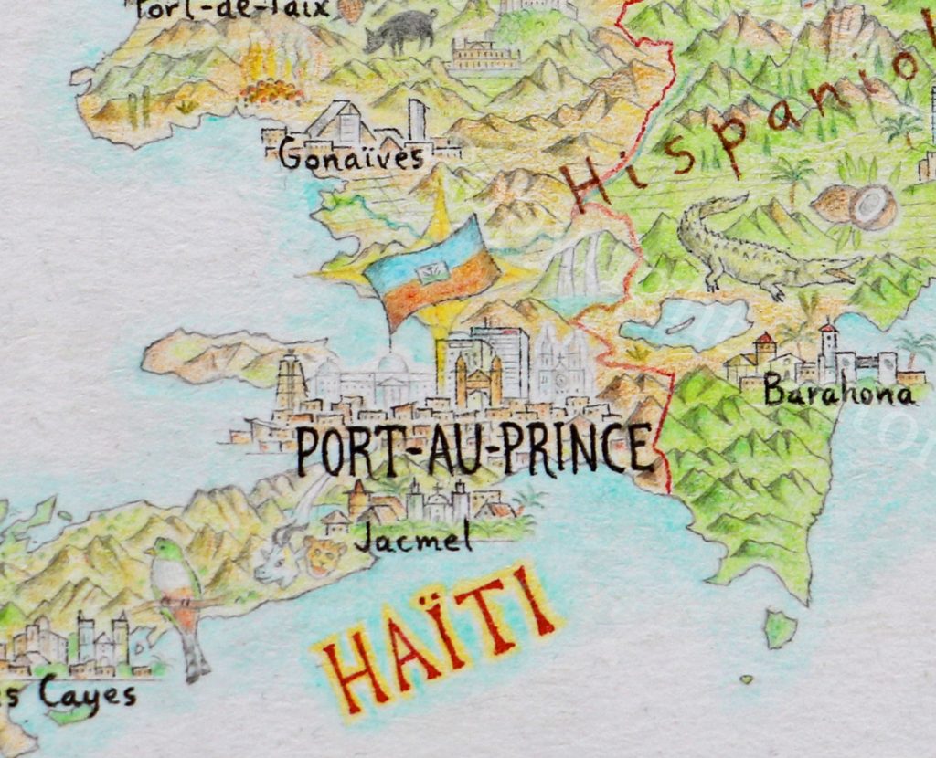
Port-au-Prince, Haiti
So, the kind of features I normally look for are simply not there anymore. This includes the National Palace, which as the seat of government is the building I usually draw a nations flag upon. After a lot of research to determine what iconic buildings still remain and what was lost, I was unsure the best way to handle a portrait of the city with the finesse and care required to do it justice. Finally, I chose to draw two of the iconic buildings that were destroyed – the National Palace and the Cathedral – in a light, ghostly style to create a contrast with the other buildings that still stand. I wanted to reference the earthquake, which left an undeniable mark on Haiti’s contemporary geography, while also showing that the spirit of the city lives on.
When and how do you decide to add a town to your map?
When do you decide not to include a town or city?
This has proven to be one of the most controversial elements of my map, and there’s no easy way around it. It’s controversial because if someone’s beloved home city is missing, it may well frustrate and annoy that person… which is understandable. I have a population criteria to determine city inclusion, which goes something like this. If a city has more than 100,000 people in its metropolitan area, it gets included. At the large scale of my North America map, I usually choose the hub city of a metropolitan region rather than try to include everything – I simply don’t have the space. For example, Seattle is just Seattle, I did not attempt to squeeze in Tacoma, which is its own city but is still considered part of the larger Seattle metropolitan area.
In the northern 90% of Canada, as well as Alaska and Greenland, I dropped the city inclusion right down to 1,000 people to correct for a much lower population. Otherwise, there’d be no towns to draw up there at all.
Finally, all capital cities are included, with the flag of their entity flying above the legislature buildings. This goes for both international capitals, and state/provincial capitals of the US, Canada and Mexico.
What have been some obvious landmarks that people will be looking for?
For anyone who is from North America, they’ll naturally go straight for their home city or region, and it’s always fascinating to get feedback from a local. I’ve had people tell me that I drew the building they work in, or the church they were married in, and that’s always so exciting. Overall however, the most commonly searched-for features would include the cities of New York, LA, San Francisco and Chicago, along with Niagara Falls, Mt Rushmore, the Grand Canyon, Yosemite, and more recently, Trump’s wall along the Mexican border… which no, I will not be drawing.
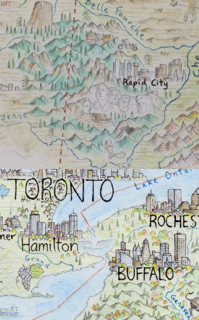
Rushmore, Niagara
When you add animals how do you decide when and where to place them?
Every animal is a little different. The vast majority are wildlife, rather than livestock, so I take great care to ensure that I’m putting animals within their actual range. If I want to draw a tarantula somewhere in Arizona to give it more of that desert southwest feel, then I’ll look at the different species of tarantula found in the area and make sure I get the right one in the right place.
Some animals are chosen based on their symbolic significance, as animals often have important roles in regional iconography. I especially love anything that has multiple layers of meaning behind its inclusion. For example, the Californian red-legged frog in northern Cali is 1) the official state amphibian of California, 2) endemic to that region, 3) drawn in Calaveras County, which is most famous for Mark Twain’s book The Celebrated Jumping Frog of Calaveras County, which 4) lead the county seat of Angel’s Camp to being nicknamed “Frogtown”. So right there are four reasons why this frog made it onto the map.
Californian red-legged frog
Why did you decide to add Cuba, Jamaica, and The Bahamas?
The map is called The North American Continent, so it’s all about the entire region. North America as a geographic region includes Central America all the way to the Panama/Colombia border, it includes Greenland, and it includes the Caribbean – hence the focus on Cuba, Jamaica and The Bahamas. Also as the bulk of my print sales will be in the US and Canada - certainly the lions share of the continent - I want Americans and Canadians to learn about and consider their wider neighbourhood.
 North American Continent
Discuss the differences involve in depicting Arctic landscapes onto you map?
The Arctic has been a fascinating region to focus on, and required a different approach to the rest of the map. For one thing, being a frozen tundra landscape, the base colour is the paper: white. I had to be very creative with my colour pencils, using a lot of blues and purples for shadows, and yellow or ochre for highlights. It was a region I could move comparatively quickly through, because of the lack of cities, which was nice after punishing slogs through Central Mexico or the American Northeast. There were big challenges though. Simply finding content at all was not always easy, and I had to learn to let the map breathe.
Arctic
To be okay with wide open spaces that had infrequent features. And while the Arctic has many wonderful animals, I did cycle through the basics quite quickly (polar bears, arctic hares, seals, walrus, artic wolf, arctic fox, lemmings, muskox, caribou etc). Also challenging were the coastlines of the Canadian Arctic and Greenland, which are some of the most complex in the world. Trying to get the fjords of Greenland and Labrador accurate felt like I was playing 3D underwater chess.
I loved learning about the Arctic at the level I did, where I was reading all about these Inuit hamlets that few people have ever heard of, learning about the culture and lifestyle of peoples of the far North. Pangnirtung, Kugluktuk, Grise Fiord, places that boggle the mind to think about. Places that have days or nights that can last months, places that you’ll kayak on one day, and weeks later could be dogsledding the exact same spot. Places that seemed like another planet to the world I know, yet others call home.
Expand on the importance or use of red on your maps?
I use red fine-liner pen for any political divisions on the map. I label entities with it, and draw all my borders. International borders use an unbroken red line, while subnational borders (US and Mexican states, Canadian provinces) are delineated with a dashed red line.
Discuss Cruz de la Parra and why you have chosen to add this historical cross?
The Cruz de la Parra is located in southeast Cuba, and is a cross that was apparently erected by Christopher Columbus himself.

Cruz de la Parra,
This is an extraordinarily rare and historically significant relic. While the arrival of Columbus spelled doom for so many millions of indigenous inhabitants of the Americas, there’s no question that it was one of the most significant moments in world history, and the legacy of his landing is felt in every corner of the continent I’m drawing. I also featured his ship – the Santa María – landing at the Bahamas. I was surprised to come across a relic that was so directly tied to Columbus, and it’s a major tourist attraction in this region of Cuba.
When did you first become fascinated in cartography?
I can’t pinpoint the exact moment, but somewhere around age 6 or 7 I suddenly found myself obsessed with maps. I would stay up late and draw the coastlines of New Zealand (my home country), the world, and my own fantasy lands. I believe it was something to do with the remarkable geography of NZ, and some of the beautiful flights I took between Nelson and Wellington. Also I’d been drawing animals and landscapes even younger than that, but they didn’t really merge into pictorial maps until many years later.
What lead you to have a career in cartography?
You live in Australia but are working on a North American map. How did this come about?
At age 21 I moved from NZ to the USA with a one-way ticket, and ended up spending almost 2 years moving around North America, taking all kinds of jobs – from cooking to laying grass sod, as well as playing a lot of live music. It was the first place I ever went overseas, and I was blown away by the geography of the continent. I could not believe the variety and sheer scale of it, and it reignited my deep passion for cartography. Toward the end of my travels there, late 2012, I was living in Montreal and my housemate asked me to draw him something as a keepsake before I left. He’d noticed I was half-decent at drawing, and encouraged me to do so… on his refrigerator. We had this crappy old fridge that had rust stains on it, and after he painted it over with white house paint he suggested that that could be my canvas. So, I proceeded to draw a map of North America freehand on the fridge with pen, in which I drew little skylines for each of the major cities. I absolutely loved the process, finding it to be creative, stimulating, and fun. Meanwhile, everybody who saw the fridge loved it too, so I thought hey – I ought to follow this up.
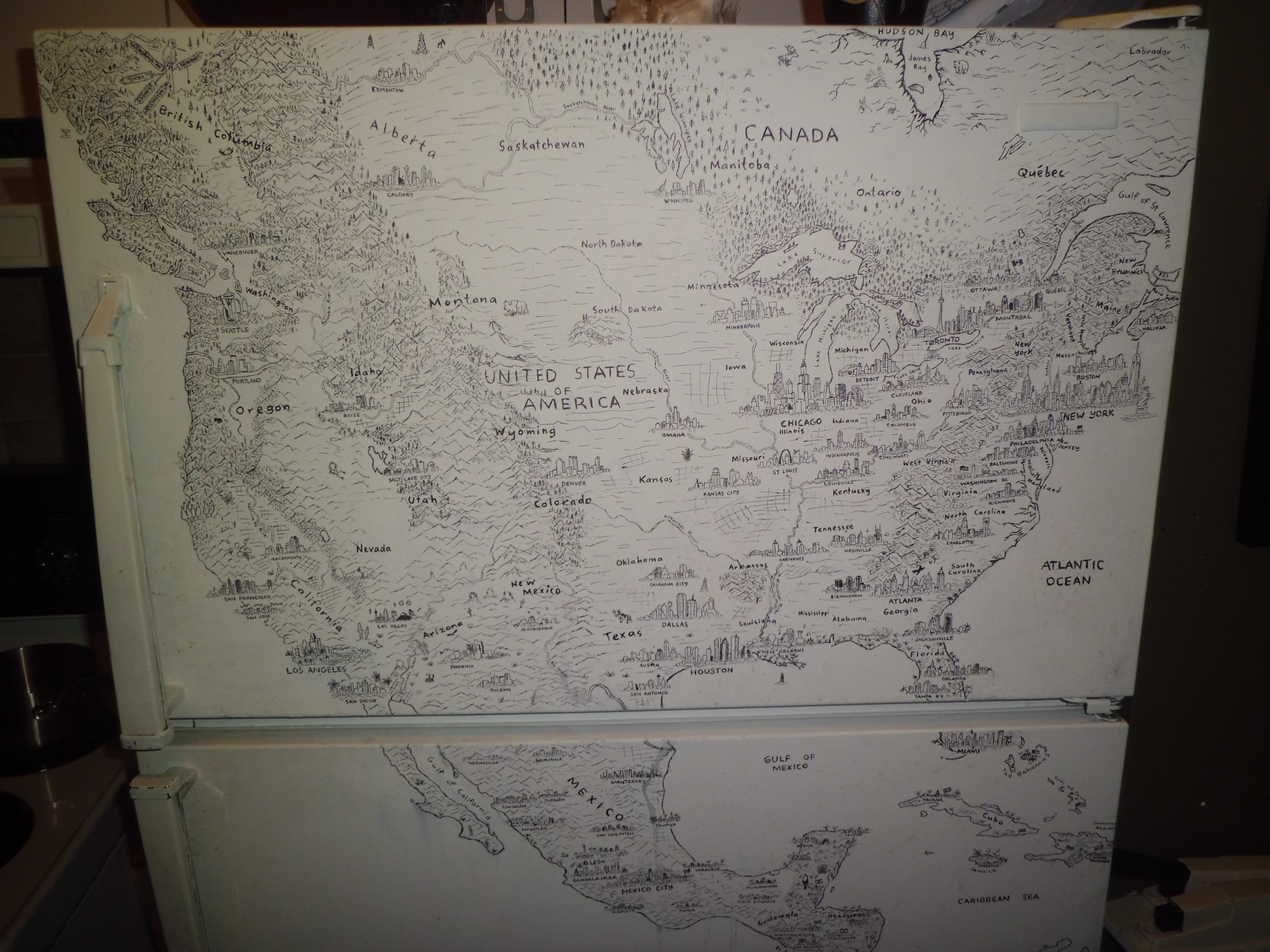
Montreal Fridge
Six months later I’d moved to Perth and I got to work drawing a map of South Asia and Australasia (on paper this time), teaching myself to use colour pencils.
South Asia and Australasia
This gave me the skills and confidence I needed to draw North America properly, which I commenced upon moving to Melbourne in early 2014. It has been almost four years since I began The North American Continent, it is my love letter to a remarkable part of the world… a place that taught me to think bigger, and to try something different. In 2016 I got a huge amount of exposure from a feature on National Geographic’s Best Maps of 2016, which expanded my reach and showed me that there was a big market for what I’m doing. I spent much of last year developing upon this, while trying to finish the map, and embarked on a lecture tour throughout the US and Canada. Here is one of my talks from a cartography conference in Montreal. Moving into 2018, I’ve quit my dayjob and am now mapping fulltime. I expect to finish The North American Continent in a few months, and hope to have the first round of prints to market before Christmas.
Contact details:
Anton Thomas
Anton Thomas, Victoria, Australia
Interview by Deborah Blakeley, May 2018
Rogan Brown
Expand on your comment, “Walking a narrow and sometimes contentious line between fact and fiction, observation and imagination”
When I say that my work is inspired by science it raises certain expectations particularly in relation to the question of accuracy; in simple terms how factually accurate are the sculptures I make? In reality, that question is far from simple because what I depict in my work are subjects that are mostly invisible to the naked eye and that can only be glimpsed through electron microscope images or alternatively through technical diagrammatic representations. Both these forms of representation are accurate to a point but are also misleading: a cross sectional diagram of a cell for example simplifies and schematises what it represents, and electron microscope images often use coloured filters which distort the reality of what is being depicted. I make use of the aesthetics of both diagrams and micrographs in, my work but they are only a starting point; as each piece progresses it is transformed through the creative process and embellished by the imagination because what I'm seeking to convey is a poetic essence and truth rather than a factual one. The difference between a fine artist and a professional scientific illustrator. It is the difference between understanding a landscape by looking at a map and understanding it by looking at a painting by say Monet; both are schematised representations, but one seeks to convey factual truth, the other a poetic, emotive truth. In my work I try to find a bridge between these two approaches.
Reef Cell, 83 x 83 cm, Laser cut paper
The humble chestnut husks have been very influential in your work, discuss.
Kernel, detail
I lived in a chestnut forest for 10 years and became fascinated by the strange surreal beauty of the tree's fruit: the sharp spikes of the husk, painful to touch, protecting the shiny mahogany fruit inside; such a stunning contrast of form and texture. This dynamic interplay between interior and exterior is seen throughout nature where skins or shells contrast with what they cover and protect. We see it in anatomical drawings of the human body, (another great source of inspiration) where the smooth skin is pulled aside to reveal the formal complexity of the organs and branching arterial systems that it covers. Likewise, the structure of the spiky orb of the chestnut can be seen repeated in other contexts, for example, on the microbiological level, in the shape and form of certain viruses. It's these structural echoes, parallels and patterns that fascinate me in nature and I constantly research them, trawling through satellite images of the earth and telescope images of the planets, microscopic images of bacteria and pathogens, electron micrograph images of cell structures, anatomical drawings, as well as pictures of birds, insects, reptiles, fish, crustacea, mammals...constantly searching for shapes, patterns and structures that are repeated at different scales and in different contexts: symmetry, fractals, branches, bubbles, waves, spirals.... These are the aesthetic building blocks of life, the architecture of the natural world and I use them to create hybrid sculptures, chimeras that make multiple visual references simultaneously.
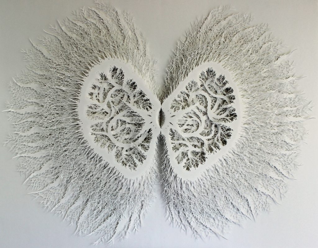
Kernel, 137 x 107 cm, Hand cut paper
Can you briefly explain the process and technique of your work?
Every piece starts with drawing, the finished work is really a layered three dimensional drawing. I start with small sketches then work these up into detailed full scale drawings that are then cut either by hand with a scalpel (eg “Cut Microbe” and “Outbreak”) or alternatively with a laser (eg Magic Circle Variation). Each cut is then mounted on hidden card and foam board spacers of 1 or 2 cms depth and finally each layer is mounted on top of the other, glued and pinned in place. The process is therefore long and labour intensive especially for the larger hand cut works that can take several months to produce.
You call your work sculpture rather than 2D work discuss this in relations to your work.
The pieces are in fact base relief sculptures that can be anywhere between 7 and 20cms deep. Although paper is the principal medium the essential element is light and by making them monochrome I maximise the interplay of light and shadow. The photos you see freeze the works at a specific moment with a particular lighting set up but in reality they change and move according to the changes in ambient lighting.
For me sculpture creates a more powerful, direct visual experience than 2D work because it is not the representation of an object, it is the object itself and asserts its own autonomy.
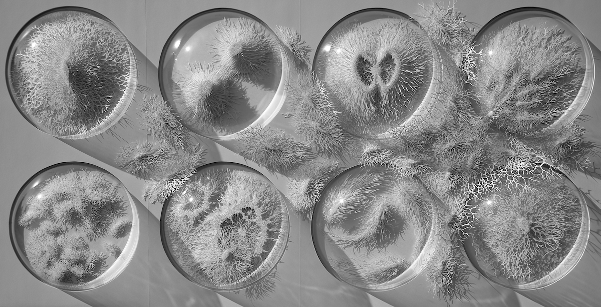
Outbreak, 147 x 79 x 20 cm, Hand cut paper
You have worked with scientists explain how this came about and one or two connections that have strongly influenced your art career?
I was invited to collaborate with a group of microbiologists who were in the process of working on a Wellcome Trust funded permanent exhibition focusing on the Human Microbiome, that is the vast colony of bacteria that live in and on our bodies and that scientists are only beginning to understand thanks in part to inexpensive DNA analysis. I was one of a group of artists asked to make work inspired by bacteria. I think the experience made me realise how large the culture gap is between the two disciplines; there is a sense that science is dealing with the hard edge of reality, with results changing and improving our lives in very practical, measurable ways, whereas art is really a little bit of entertainment, embellishing our lives but not fundamentally altering it. At a certain level this is not easy to argue against, art does not make planes fly or cure infectious diseases and its contribution to our lives is impossible to measure, but for me it is an equally valid reflection on the nature of the world we live in, teaching us to see the world in new ways or to see familiar things in a fresh light so that we become aware of the act of looking and seeing. As such the arts are just as crucial as science in helping us explore the meaning and purpose of our lives and in helping us maximise the experience of being alive.
In relations to science expand on how you use ‘Escherichia’ coli and enlarge this single bacterium into a large paper sculpture?
The exhibition that this sculpture is part of is called “Invisible You” (www.edenproject.com/visit/whats-here/invisible-you-the-human-microbiome-exhibition) and all the artists who contributed to it try in different ways to help us conceptualise and see in a new way something that is crucial to our existence and our health but which we most often regard in a very negative way, namely bacteria. Humans are symbiant beings, that is to say we live thanks to a mutually beneficial relationship with an unimaginably vast colony of bacteria that helps us in myriad ways, such as breaking down food in our gut and extracting all the good nutrients from it. Taken as a whole bacteria is not only good for us, it is essential to our survival but occasionally it can harm and even kill us, and it is these latter aspects that sadly tend to dominate public consciousness.
The object of the exhibition was therefore to educate the public about the benefits of bacteria and to try to change public perception. My personal aim was to try to make the words “beautiful” and “bacteria” associate in the mind of the viewer, so I set out to create a sculpture of a single bacterium that looked as beautiful as possible. I chose ecoli because it is more aesthetically interesting than other bacterial forms as it is covered long hair-like appendages called flagella that allow it to swim through our bodies and I knew I could use these to create a sense of movement and rhythm that would maximise its visual impact. Ecoli is also well known to the public as a bacteria that causes illness and I wanted to use that negative connotation to create a contrast with the beauty and elegance of the representation that I hoped to create.
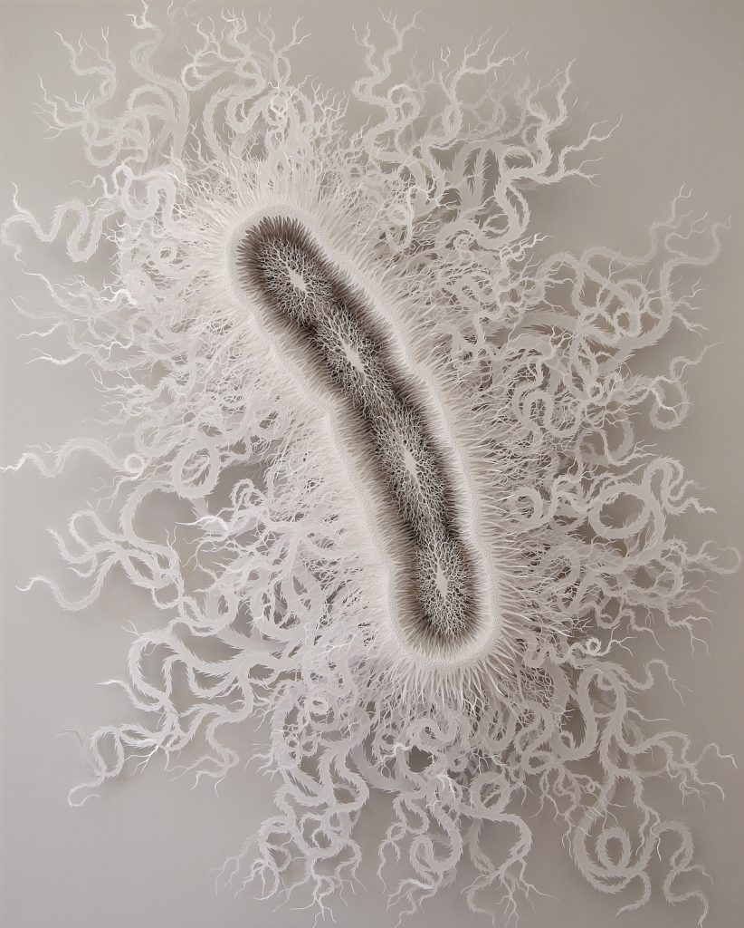
Cut Microbe 2, 112 x 90 x 20 cm
Discuss the size of your work and the restrictions you have with size due to paper?
Paper's obvious fragility means that the sculptures need to be placed under glass or perspex in order to protect them. All the pieces are framed in bespoke deep rebate box frames under glass which are heavy and consequently difficult to transport so this limits the scale at which I can work. The largest pieces I've created are 150x150cms. Scale is a crucial aspect of my work. I'm drawn to subjects that defy our limited human capacity to imagine scale, for example bacteria which individually are unimaginably small but which, in terms of number, are unimaginably vast.The same is true of the neurons in the human brain, a subject I'm exploring at the moment. I try to reflect this contrast of scales by taking a very small subject such as a bacterium or cell, expanding it in size and then rendering it in minute detail.

Light must be a huge problem – how do you get this just right in your studio?
I live and work in the south of France which is very light all year round and my studio is flooded with light.
In other works of mine, the goal was to alter viewers negative perception of bacteria” discuss.
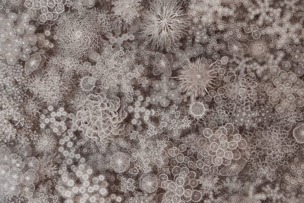
Magic Circle Variation, detail
In the “Magic Circle Variation” series I continue to play with the aesthetics of the bacterial world but here I try to create a visual representation of a bacterial colony. Diverse forms are arranged together in a circular composition that refers to the shape of the petri dish and also to Buddhist mandalas, those intricate sacred images that represent the harmony of the universe. The bacterial colonies that inhabit us are also diverse but work in unison to keep us functioning and create harmony in our bodies. “Magic Circle” is an attempt to communicate that sense of diversity and harmony.

Magic Circle
Give your personal thoughts on collaboration between scientists and artists?
I think such collaborations are crucial; we live in a world dominated by science and technology but sometimes as non-scientists we can feel marginalised, ill-informed and excluded. Artists can play an important role in engaging with science and making it accessible to a non-scientific audience, not in terms of explaining the mechanics of the science but rather by giving a personal, individual response to what is often such a large scale collective endeavour. Art can therefore build a bridge between science and the general public. There are some very exciting but also slightly terrifying developments taking place in science which need to be discussed and debated by the whole of society and not just the scientific community. I'm thinking principally of the development and implications of something like Crispr technology which allows us to alter DNA cheaply and easily for the first time. The ethical issues raised here are enormous but there is little or no public debate about how we should employ such technology. Chinese scientists are already conducting human tests but may be opening a Pandora's Box as they do so...
At the same time I disagree with the notion that the only role left for art to play in society is as a vehicle for exploring socio-political issues. I still believe in the pursuit of beauty as a key driving force in art; but we must look to other branches of knowledge and research in order to find new ways of achieving and expressing that beauty.
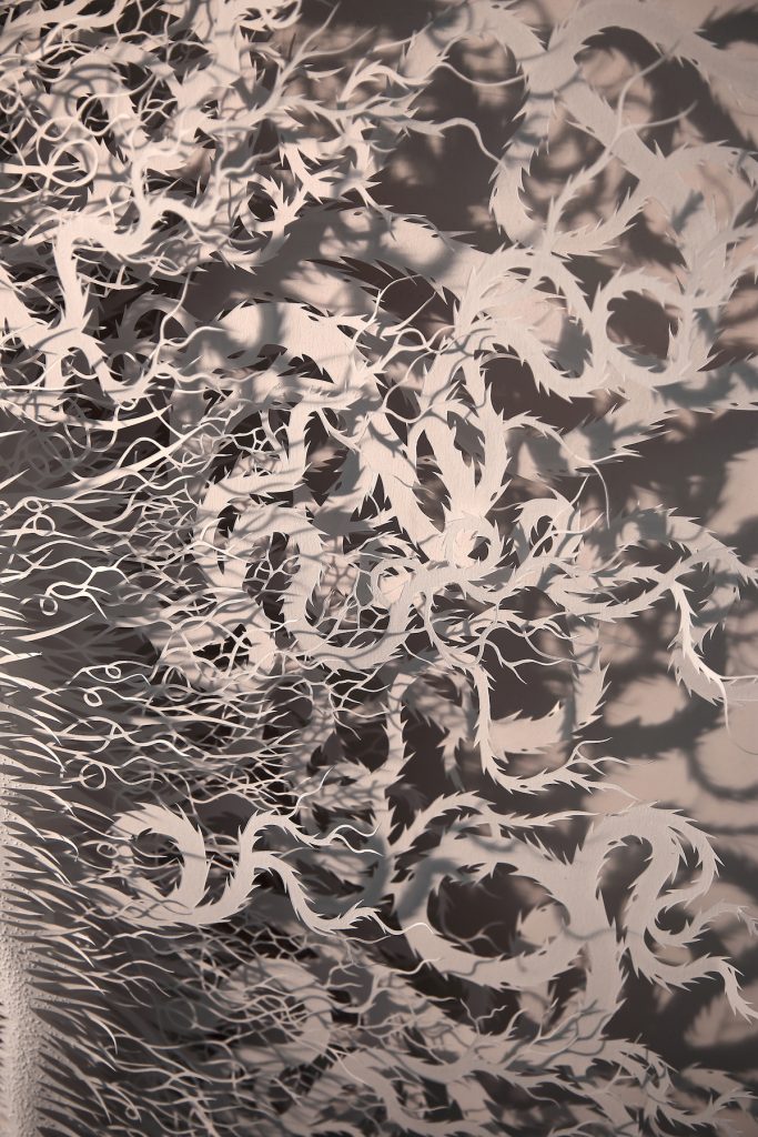
Cut Microbe, detail
Contact details:
Rogan Brown
http://roganbrown.com
Rogan Brown, Languedoc, France
Interview by Deborah Blakeley, May 2018
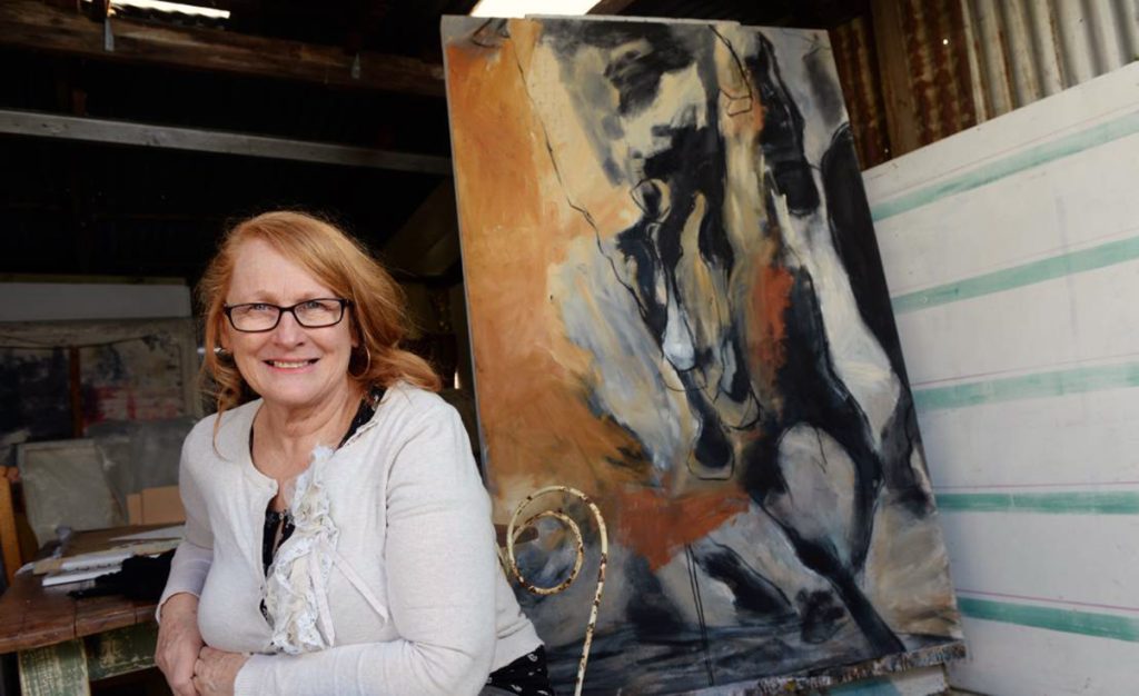
Susan McMinn
Explain how you managed to link your PhD to a visit to Israel?
My PhD research was around the horse in war during the Palestine Campaigns of WW1. After researching stories about the Australian war horses concerning their plight during this campaign in the WW1 Light Horse Soldiers diaries, particularly that of Ion Idriess’, and various artworks including paintings by Australian War Artist George Lambert, I realised that I needed to go to Israel to look at and experience the Anzac trails and the landscape in which the horses travelled to understand the topography and hues of the land. Visiting Israel led to an understanding of the land – through creating many small watercolour studies which was important in the development of my paintings.

Underslung Horse, Print
When did you first become aware of George Lambert?
I became aware of George Lambert and his work during my PhD whilst researching at the Australian War Memorial. I was interested in the way in which he portrayed the animal in war and his use of colour. I was also drawn to investigating his work as a point of reference to the detailed stories found in the diaries. They gave me a visual compass if you like in understanding where the horses travelled.
George Lambert work as a war artist in WW1
Explain a little about George Lambert as a War Artist?
George Lambert and Septimus Power, whose work I also looked at during my studies were both chosen as war artists during WW1. Whilst Power was sent to the Western Front, Lambert was send to Middle East. During this time, Lambert used a visual diary to create small studies of landscapes and figures and animals, from which he created his paintings. He was very concerned with the colours of desert landscape, obvious in his statement regarding the colour of the land, although it could sound outdated, still rings true today. He stated:
A word to those who would paint this country. Leave your gay pigments at home. Approach nature with a simple palette but an extravagant love of form. The sand hills take on shapes and curves, cuts, concave, convex, in an entrancing pattern, interwoven sometimes here sometimes there jagged eccentrically opposed.
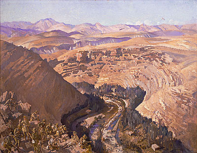
George Lambert, Barada Gorge, 30th Sept. 1918, 1921,1927, Oil on Canvas
My most favourite part about Lambert was that he rode a horse around the country of Israel and arrived at the scene he would paint some weeks after the incident had occurred.
How do current war artists differ from war artists working during the First World War?
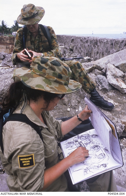
Australian War Artist, Wendy Sharpe.
Current War artists such as Wendy Sharpe and Ben Quilty engage with the soldiers and personnel and perhaps understand the war experience to a greater extend. Their portrayals of war are different in that Wendy Sharpes work created in East Timor captures what she experienced, much like a diary entry.
Whereas as Ben Quilties recent exhibition 'Ben Quilty: After Afghanistan'reaches into the human experience and the absolute gut- wrenching emotions of war.
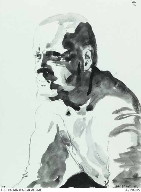
Sergeant M, Special Forces, Tarin Kwot, Ben Quilty
However, artworks by the earlier war artists such as such as Lambert and Power typically represent the harsh war-torn landscape, whilst Ivor Heles work conveys the human struggle.
Discuss George Lambert’s most recognizable WW1 war portrait, ‘A Sergeant of the Light and how it has effected your work?
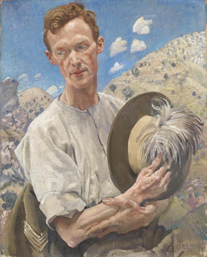
George Lambert, A Sergeant of the Light
My work was based on the Australian horse in war and not so much on the human entity. I try to convey in my work the body language of the horse under war conditions. Because of this I looked at the landscape and the animals that Lambert painted rather than his portraits.
Discuss the landscape of George Lambert Palestine paintings and what you found when you retraced his steps.
The colours Lambert used in his paintings are reflective of the colour of the landscape in Israel. One of the most significant things that the horses and soldiers battled during this campaign was the sand from the Sinai landscape. They often complained of the sand blazing into their eyes. Lamberts work captures this sand in the hazy mauves and muted tones in his paintings. There is a profound contrast between the beauty of the land and its colours, and the harshness of the elements, something which Lambert captures. His impressions of the horse and dead animals are also very poignant. One particular painting Tel El Saba, conveys dead camels and horses, which demonstrates the distorted shape and form shape and form of the carcass. I travelled to Tel El Saba and found the location recognisable because of this painting.
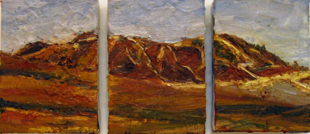
Tel El Saba
Explain the value of retracing another artist with your own impressions and paintings?
I travelled to Israel after I had studied the diaries and lamberts paintings. I found that I needed to then actually look at the landscape myself. I was very surprised that some of the Landscape that Lambert had painted was identifiable. I made a lot of watercolour sketches and then when I returned back to my studio in Australia, I completed a series of landscape paintings whilst the colours of the landscape were still visible in my mind. When you are studying and painting a period of history all you have to rely on are the Archival and personal stories, past artworks and photographs.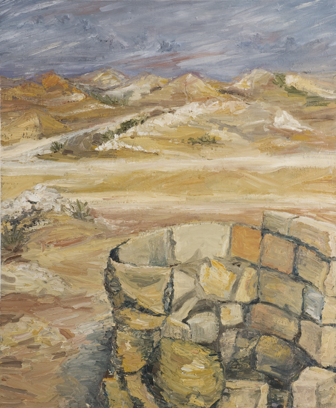
Bir sluj
Can you discuss the honour of your upcoming Exhibition, Battle of Beersheba, Historical Memorabilia and Contemporary Artwork?
I am very thrilled to have my work exhibited alongside that of Sidney Nolan and George Lambert. Especially since I have studied their work in relation to my PhD studies. I also studied Chauvel’s letters to his wife which I found very moving. I feel very honoured to be part of this exhibition.
What does it feel like to be exhibition with such renowned Australian Artists?
It is amazing. It is like my PhD research is on display at the Shrine, having studies each of the artists works and the letters written by Chauvel.
When did you first start of paint horses?
I started painting the horse during third year of my fine arts degree at La Trobe University. During this time my paintings investigated the charge of Beersheba. As I was an avid horsewoman I used my understanding of the shape and form of the horse to create works. I also went to a small farm in Bendigo and drew horses onsite within their environment.
Expand on your word, ‘Horstory’?
The term Horstory is a play on the words horse, narrative and history.
Can you expand on your 2009 animation, ‘The Last War Horse’?
My work was very focused on movement and I was fortunate to win an animation bursary to create a three minute hand drawn animation. This work loosely reflects the following:
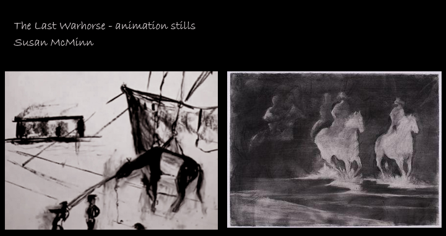
During the Palestine Campaigns of WW1, Australia sent approximately 130,000 horses to the Middle East. During war service these horses suffered night treks of up to 90 miles at a time, carried weights beyond their normal capacity, died of exhaustion, suffered thirst and hunger, were shot, blown up and finally the remaining horses were left in the Middle East at wars end. Companion, Soldier, animal in service. The Australian horse is 'The Last Warhorse', depicted in this three minute charcoal hand drawn video.
The Last Warhorse won the best Australian Student film at the Australian International animation festival and was the only student film shown during the WIFT (women in film and television screening) and can be seen in the permanent collection of the Melbourne Shrine of Remembrance.
What lead you to do your PhD in Fine Arts?
I started studying art later in life in my early 40’s. I completed my degree with honours and decided to go onto study a Master’s degree focusing on the horse during WW1. On advice from my then supervisors and I upgraded to a PhD due to the sheer volume of work and research that this subject matter generated.
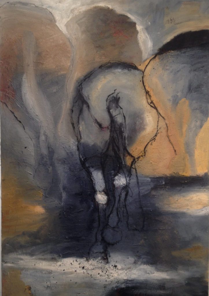
Morry and Stan 2016 < Oil and mixed media on canvas - 6'x 4'
You use colour very strongly, and in relation to the environment, discuss.
The colour I use is representational of not only the land where the horses travelled but also where they fought and died. In addition, the paint and materials including sand are thickly layered. It was as if, during the painting process painting, that I subconsciously released the horses back into the landscape by etching their form into the rich textures and tone.
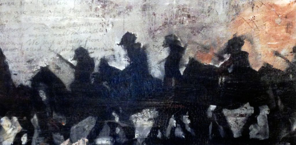
Bloody Night, March 1
Does living in the country strongly effect your art and the themes you work on?
I now live in Bendigo however I grew up in the small dairy farming area of Ballendella, 1 hour north of Bendigo. It wasn’t always easy. I guess growing up in the country effects my art in that I am fairly pragmatic and I have a very strong work ethic. Therefore, I am attracted to themes that are tangible and possibly connect with Australians who have endured difficulty to some degree. My relationship with the horse certainly incited an interest in the story of the Australian horses that went to war. I used to ride my horse to my friend Kathy’s house on the weekends some ten miles away from my home, and I often recalled this experience when I read about the horses carrying the soldiers for miles as they travelled through the night in Palestine.
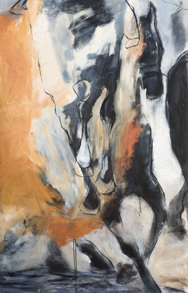
The Desert March, Mixed Medium on canvas
Discuss some or your other current art work?
My current work involves explorations into technology and the use of digital technology, word and painting. I have been completing digital paintings that relate to one word. They are lots of fun and the colour is very vibrant when printed.
I will also be undergoing a new project with the Bendigo RSL. I will be researching the Victoria collection and looking at notions surrounding the war vets and families return from war.
I will create a body of work that will be exhibited at the new Bendigo RSL Museum Gallery in 2019.
Rising Sun, Lest We Forget, ANZAC Day 25th April
Contact details:
Susan McMinn
Susan McMinn, Bendigo, Australia
Interview by Deborah Blakeley, April, 2018
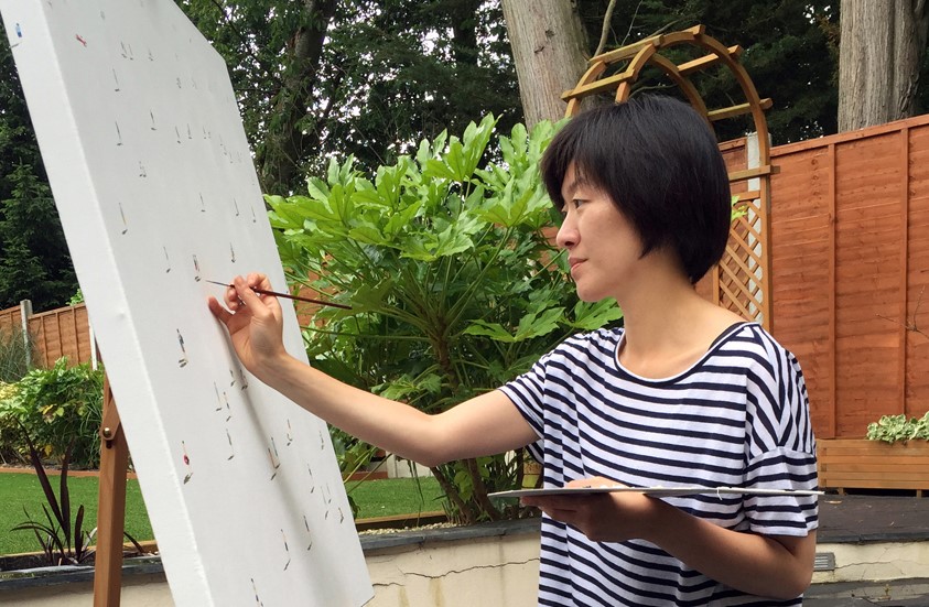
Stephanie Ho
Can you discuss your style and the style of Lowry?
People often said my works reminded them of L. S. Lowry, an important English painter in the mid 20th century, famous for his landscape peopled with human figures.
Lowry's works represent life in the industrial district of England while I have chosen metropolitan city lives as my subject.
There's a lack of weather effect in Lowry’s works so no shadows are used to represent light. On the contrary, weather plays an important role in my works. The use of shadows is an essential tool in my works to represent time, location and movement.
The crisp white background of my paintings gives a more uplifting, happy feeling, compared to the more melancholic atmosphere of Lowry’s work.
Lowry is only one of the many artists that I admired. My works are also inspired by contemporary artists such as Gerhard Richter, Julian Opie and Alex Katz.
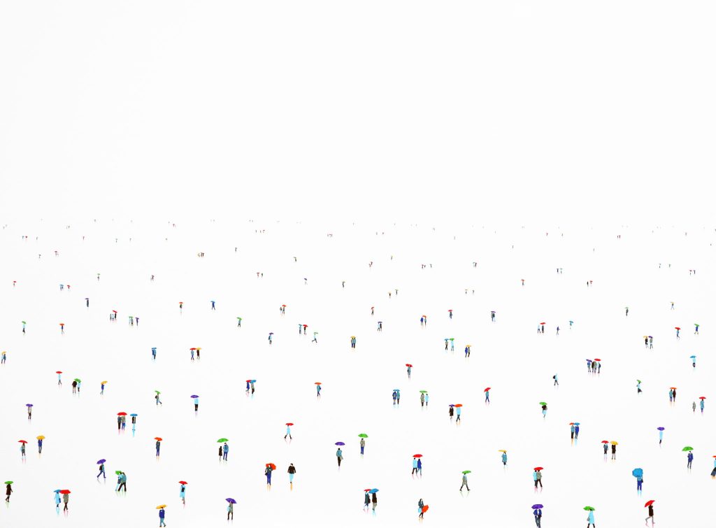
Rain - Bow, 11, 90 x 120 cm
You have taken part in many exhibitions discuss the importance of exhibition to the growth development of your work?
Social media is now playing a large part in showcasing artworks. However, I do enjoy visiting exhibitions, especially being present at my own shows and art fairs. It is a great way to communicate with other art lovers.
I believe conversing directly with spectators can give the artworks a different dimension, they will remember not only the picture, but the story and inspiration behind as well.
I also take this opportunity to find out what people think about my work. Listening to comments help me improve and develop new theme and style.
You have a degree in Museum and Gallery Management, how has this background helped in your art career?
My Museum and Gallery Management degree is actually my stepping-stone to becoming a full-time artist.
I talked to a lot of gallery owners, curators and critics during the course of my degree. They have given me an insight to working in the contemporary art world and make me appreciate the hard work that galleries put into behind a successful exhibition.
I realised that I enjoy creating artworks much more than promoting other artists’ work and organizing exhibitions.
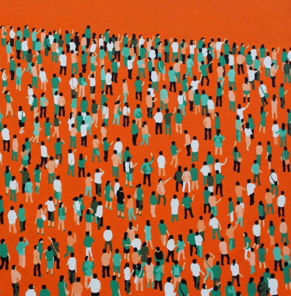
Derby 01, 90 x 90 cm (earlier work)
Discuss the use of shadow in some but not all your work.
The Still Frame series, my earlier works, are inspired by postmodern art and artworks by Chinese contemporary artists, the colours in this series are more vibrant; figures are more repetitive and distributed evenly across the canvas like a pattern. That's why I feel shadows are unnecessary.
The introduction of shadows in my later series, Human Planet, enhanced the reality of space, time, location and motion. It gives life to the paintings, bringing them to a new dimension.
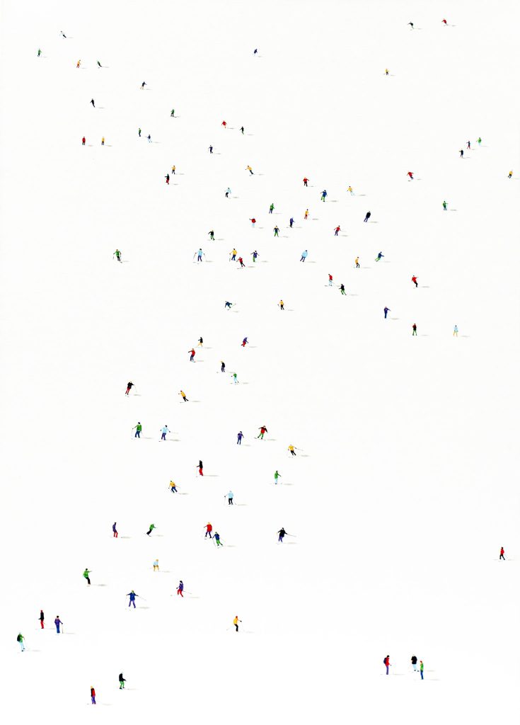 Frozen Planet 29, 100 x 70 cm
Your comment, ‘Just like composing a piece of music, with notations hanging across the lines, creating melodies, conversing with the spectators.’ Discuss.
I believe paintings and music are both art forms that converse with the spectators in their own very special language. From afar, the tiny figures in my paintings look like small dots on an empty sheet. The process of placing figures carefully and precisely on the white background resembles the composition of a beautiful piece of music.
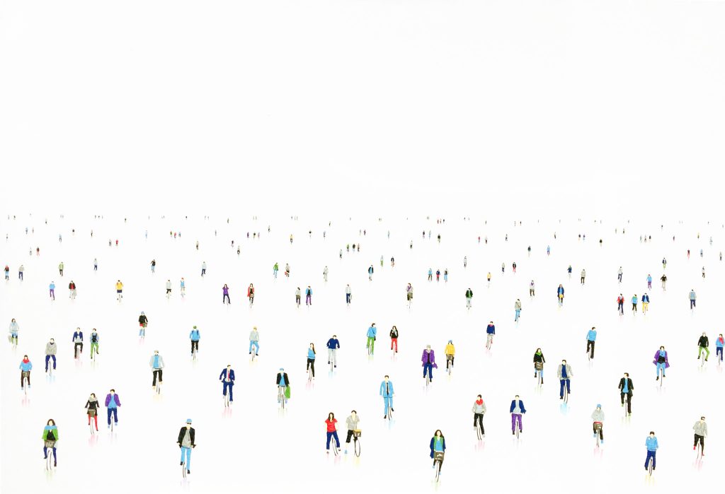
2 Wheels 03, 70 x 100 cm
How does weather effect your work?
The changing seasons and weather play an important role in my works. I use colours and shadows relating to the weather to portray the behaviours, moods and activities of the people in the painting.
I purposely leave the background colourless so the viewers can have the freedom to fill in the missing information.
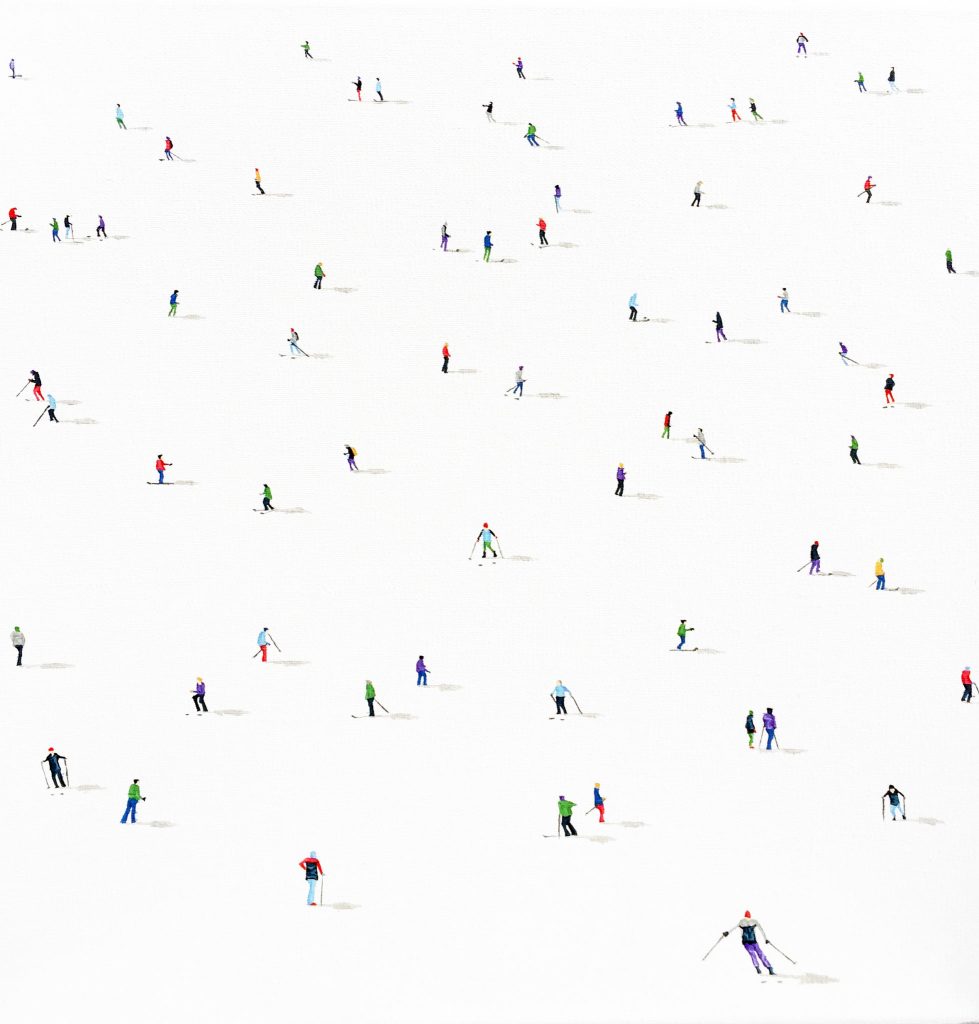
Frozen Planet 20, 30 x 30 cm
Can you expand on the techniques you use in taking the painting right around the canvas to the sides?
Also, the placement of your signature on you work?
Painting right around the canvas to the sides can give my artworks continuity and life. I want my viewers to look beyond the obvious, not restricted by the size of the paintings. They will be surprised how much more there is to discover.
Putting my signature on the side will allow viewers to concentrate on the composition of the painting initially. In order to discover the artwork’s identity, they have to get close to the work and look into the details.
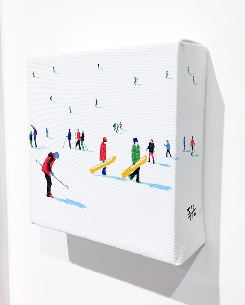
Frozen Planet Nano 19, 12 x 12 cm
Contact details:
Stephanie Ho
stephaniesyho@gmail.com
www.stephaniesyho.com
Stephanie Ho, London, UK
Interview by Deborah Blakeley, April, 2018
Jess Dare
How did you get from playing in the yard with berries and bugs to interpreting them in glass?
There are more than 25 years of experiences, opportunities, adventures, misadventures, love and heartbreak that fuel the answer to that question.
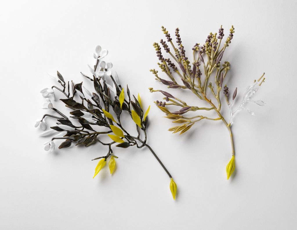
Conceptual Flowering Plant Series, 2013 Flamework Glass, Photo Grant Hancock
But the impetus behind creating my first major collection of glass plants in 2013 was the passing of my dear Grandfather, Dean Hosking. He was an incredibly passionate gardener and after he died in 2011, everyone in our family became passionately obsessed with their gardens. It was as if they were returning to the earth to be close to him. This collection of glass plants became my garden, in reflection it was a very cathartic, healing process.
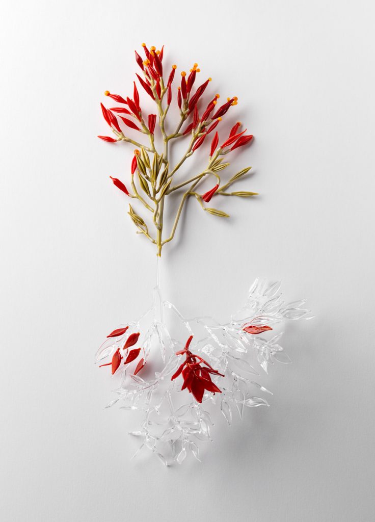
Conceptual Flowering Plant Series, 2013 Flamework Glass, Photo Grant Hancock
Explain about your residency in Bangkok, Thailand, in relations to their national floral garlands?
In 2014 I was granted an Asialink artist residency in Bangkok, Thailand, supported by Arts SA and hosted by Atelier Rudee, International Academy of contemporary jewellery. The main objective was to learn the traditional craft of Phuang Malai (floral garlands) and to translate this into my work using glass and metal. Phuang Malai is traditionally an ephemeral craft using flowers strung in different patterns and formations for different meanings and occasions.
I was initially drawn to this craft as it is used to honour “seen and unseen beings” alike, echoing the themes of memory and honouring past loved ones that is core to my exhibition work.
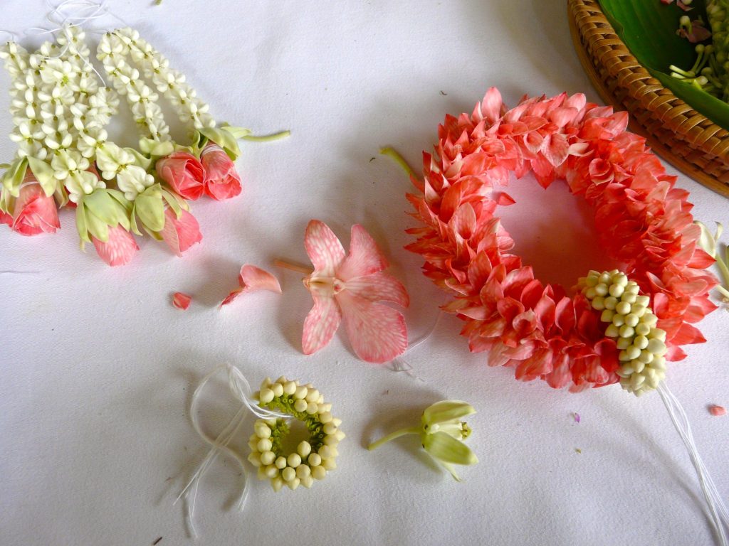
Lesson in Pak Kret: showing elements ready to assemble. Hand dyed orchid petals, crown flower, Jasmine. Photo Jess Dare.
My residency took me all over Thailand, from moulding cow dung in a remote village in the province of Ubon Ratachathani to casting bronze bells the same way that has been done for over 4000 years, to working with delicate orchids in the Museum of Floral culture. Threading hand-cut leaves in Pak Ret. Planting rice, ‘back to the sun, face to the earth’. To holding up Traffic on a photo shoot in the streets of Bangkok. Even a short week-long residency with famed ceramic artists Wasinburee Supanichvoraparch in Ratchburi at his family’s ceramic factory, Tao Hong Tai.
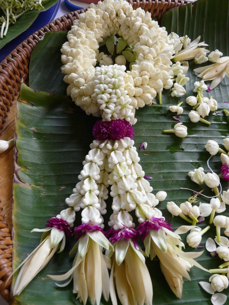
First traditional Phuang Malai I made using Jasmin, Crown flowers, Amaranth and Magnolia. Meaning: Never ending love. 2014, Photo Jess Dare
The residency, the experiences I had and the people I met, opened a new world for me, a rich source of inspiration, a new way of working and thinking about my work. I feel like the experience will feed my practice for many years to come. I actively chose to expand my vocabulary and my practice by travelling to another country to experience new skills and way of making, immerse myself in another culture. And I would encourage anyone to undertake an artist residency, to extend your physical borders, push your personal boundaries and comfort zone, challenge yourself, question your making, explore the unknown and then see what happens next….
Explain the importance of Garlands throughout the world?
Yikes this is a huge question! I can only speak from the experiences that I had in Thailand and by no means am I an authority on Garlands.
There are several shapes and styles of Phuang Malai with a variety of functions that fall in to the 3 main categories: offering, decoration and gift. The functions range from offerings to Buddha or for hanging around the neck or the wrist or to hold in the hand, to being tethered to boats, cars and buses for a safe journey home, there are types for ceremonies like wedding and funerals, whilst some to simply hang in the windows of houses for scenting the breeze with jasmine. I was particularly interested in the role that they play in paying respect, and as offerings.
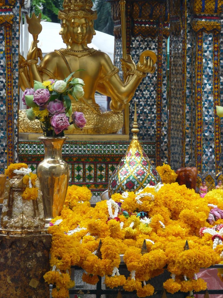
Offerings at Erawan Shrine, Bankok, 2014, Photo Jess Dare
I love Phuang malai, I appreciate them aesthetically as well as sentimentally and spiritually but if people are interested in reading more about garlands I would highly recommend the Garland website (www.garlandmag.com) where you will find articles about the stories behind what people make alongside numerous articles about garlands and leis from all around the world.
Personally, I feel that they break down barriers, if you have ever been given a garland perhaps you will share this sentiment. I have always felt humbled, a tradition steeped in rich history, something hand crafted, especially the Phuang malai of Thailand made of fresh flowers which are literally wilting as they are being strung, they are not meant to last, they are meant for just a moment.
Explain the meaning of flowers and how this effects your work?
Flowers mean different things to everyone. Historically there is a rich language, symbolism and meaning of flowers. And whilst sometimes I reference these traditional meanings I am very much a sentimental gardener and maker, so I often use flowers which have a personal significance to me, for example the Magnolia. This is a flower that comes up time and time again in my life and also my work. It is one of the last trees I planted with my grandfather, it is used often in Phuang malai at the base of the uba and is the floral symbol of Shanghai where I did a residency in 2015.
In general, I use flowers as a metaphor for the transience of life. To me flowers are a constant reminder that life is ephemeral, ever-changing, momentary and precious.
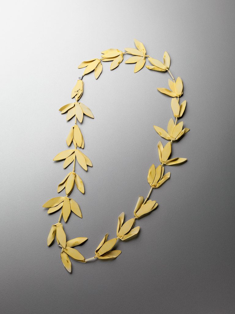
Wilted, powder coated brass, stainless steel cable, sterling silver, 2016
Photo Grant Hancock
Can you expand on the Jean Francois Turpin’s conceptual flowering plant of 1837?
Turpin’s Conceptual flowering plant of 1837 was a type of teaching aid popular in the 19th century. It depicts an imaginary plant that incorporates the characteristics of many diverse flowering plants, with various kinds of stamen, leaves, stems, bulbs, tubers and even leaf gals.
The series of glass plants I created in 2013 entitled conceptual flowering plants were plants drawn from my imagination and my memory of plants, they incorporated elements of different plants and yet they still felt familiar. I loved hearing people point out different plants and vehemently explain that that plant was a lavender or a snowberry etc.
Please give a brief explanation about the technique of lampworking and how you use it in your work ?
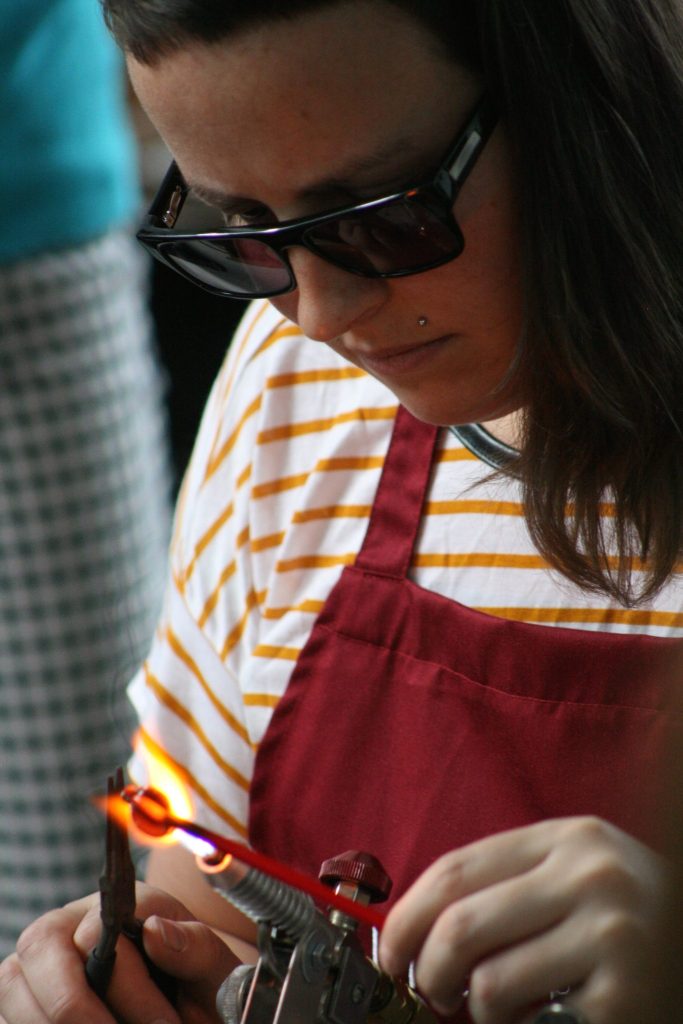
Flameworking demonstration, photo Annalies Hofmeyer
‘As a jeweller I have always been drawn to the miniature’ discuss this comment.
As a Jeweller I work on a very small scale, generally working in a zone no more than 300mm from the tip of my nose. It's a small field, it is a private, intimate space, my own little world.
I am drawn to the minute details of things as it’s the scale that is familiar, comfortable.
My fiancé finds it infuriating to go for walks with me as I am always one hundred steps behind him, taking photos of little things, little details, plants etc I find along the way.
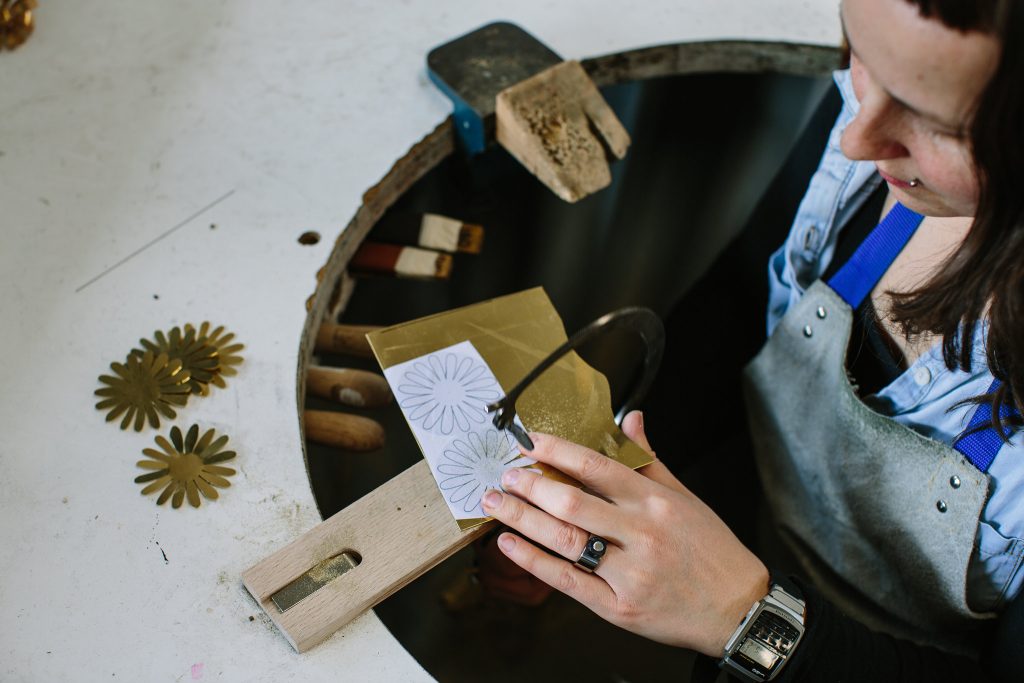
Working at the bench, photo Jessica Clark
Discuss your involvement in the memorial for the 2014 Martin Place siege?
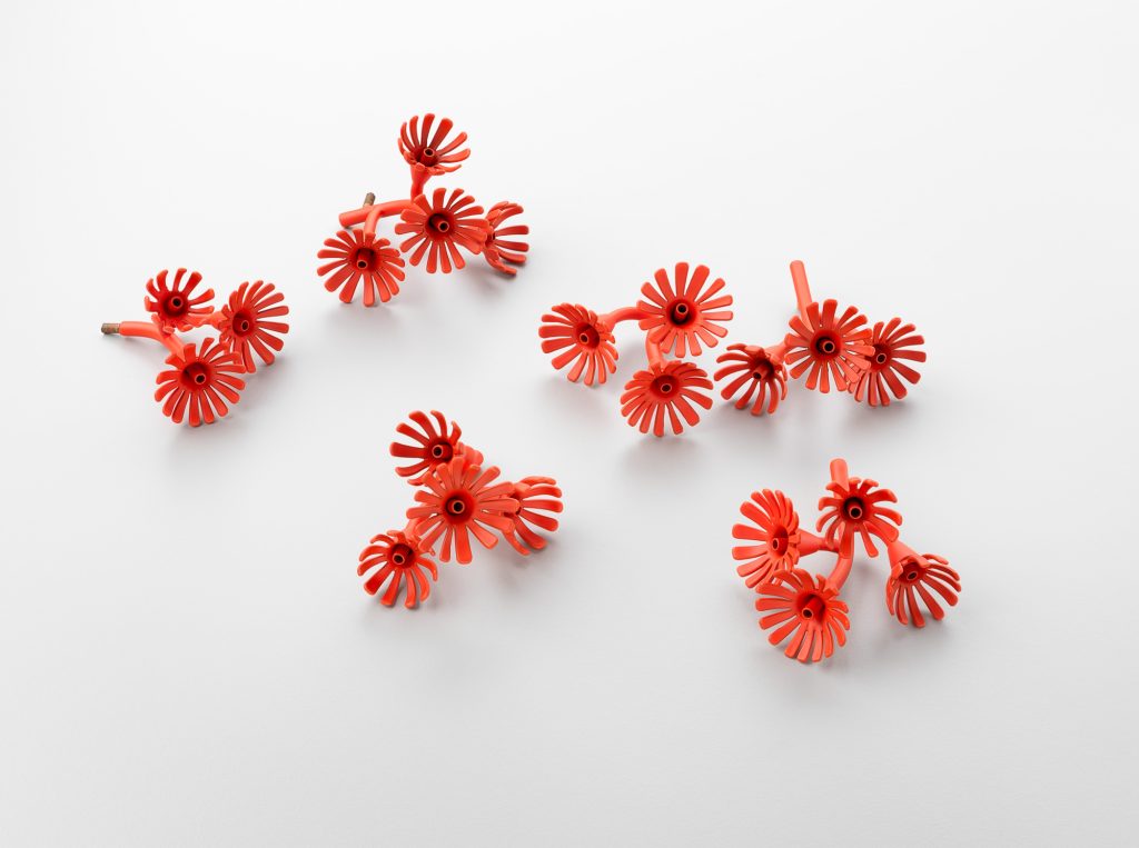
Flowering Gum, photo Grant Hancock
I was approached by Professor Richard Johnson AO who designed the memorial to develop a concept for the flowers which would be housed in the mirrored cubes to be inlaid into the paving of Martin Place. After intense research I then designed, and hand made all the brass flowers.
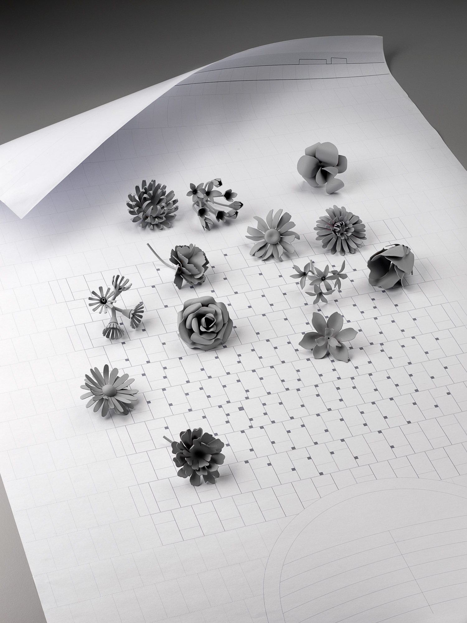
Initial flower models, Grant Hancock
Why are there 210 flowers in this project?
The 210 individual flowers represent the sea of flowers that filled Martin Place in the days and weeks following the siege in December 2014 and capture the carpet of colour and movement of the more than 100,000 bunches. They reference the community’s spontaneous outpouring of grief and compassion in the aftermath of the siege.
The centrepieces of Reflection are a cluster of 5 aqua hydrangeas and another of 5 yellow sunflowers, memorialising the two bright young Australians tragically killed in the siege, Katrina Dawson and Tori Johnson.
200 flowers are arranged in a Starburst pattern radiating out from these two central clusters to form a circle, a field of flowers.
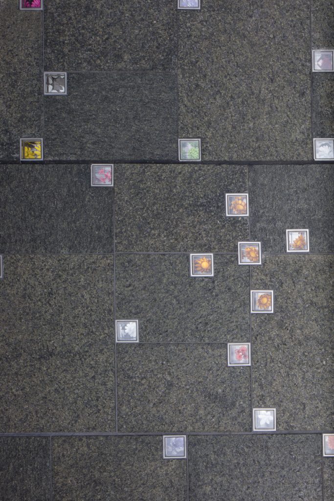
Reflection, Martin Place, 2017, photo Brett Boardman
The 210 flowers are made up of 12 varieties in 19 different colours. Each flower is unique, each cut and formed by hand, creating all these beautiful nuances, little variations, a slightly curled or ruffled petal a bend in the stem etc. Inviting people to spend time looking at individual flowers and exploring their subtle variations.
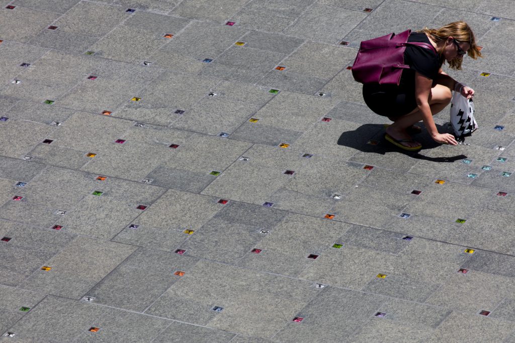
Reflection, Martin Place, 2017, photo Brett Boardman
In two of your series, you use wilting and waning flowers, can you expand on this?
In Thailand I began photographing decaying Phuang Malai that I found in the street, their intended destination unknown to me, perhaps dropped, offered to a spirit house or temple, or strung on a car rear vision mirror. I was intrigued by the brilliant coloured ribbons and decaying, browning petals, flattened by passing traffic, shrivelling in the heat and wondered had these objects reached their intended destination? Someone took care to string these delicate petals and crown flowers together. I marvelled at the journey these objects had taken and what brought them to this place.
Decaying Phuang Malai, Thailand, 2041, photo Jess Dare
The wilting and waning series of flowers are made of brass, powder coated and scratched back in parts. The colour white references decay, hastening the passage of time, alluding to the disintegration and sun bleaching of the once brightly coloured flowers. After a Phuang Malai is offered it will eventually decay leaving behind only the act of offering, these enduring objects represent this passage.
When you sell a piece for example, from Epicormic and Xylem Series, does you work come with a botanical explanation?
No I don’t provide a botanical explanation, some of the galleries I sell my work in provide an artist statement and of course if anyone asks I am happy to provide that information but I don’t like to over explain work, the titles and artist statements hint at its meaning but I think it’s important for the viewer or owner in some cases to have the space to bring their own interpretation to the work.
You also work with leaves and petals, discuss this in relationship to colour?
I work with all parts of plants, roots and internal structures.
In terms of colour I have been increasingly using white and clear bleached of colour to suggest transience in the way flowers wither, loose colour and die.
Most of your work is very fine and detailed, expand on the importance of ‘less’ in your work?
Actually, I think my glass is very fine, delicate and detailed but my metal pieces are often very minimal, reducing organic forms to more geometric simplified forms.
I choose the material that best suits the concept I am working on or trying to explore.
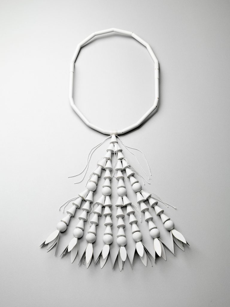
Offerings: Elementary Phuang Malai, brass, copper, cotton thread, 2105, photo Grant Hancock
In terms of ‘Less’, A mentor of mine once said “the art is knowing what to leave off”. I often think about those words, less is more, leave room for the viewer to bring their own interpretation, don’t over explain both literally and visually, I think hints can be more powerful that the glaringly obvious.
Contact details:
Jess Dare
jessdare@bigpond.com
Jess Dare, South Australia, Australia
Interview by Deborah Blakeley, April, 2018
The Melbourne Map
Melinda Clarke
Can you tell us briefly of the history of the 1st Melbourne Map?
Original: In my mid 20’s I headed off to explore the world and spent a couple of years backpacking around Europe and the USA. Along the way I collected some fabulous illustrated maps and upon my return to Melbourne I searched for one of Melbourne. The only map I could find was a beautiful illustration by A.C. Cooke, later engraved by Samuel Calvert for inclusion in the Illustrated Australian News in 1880.
I put a business plan together based on the idea of producing a modern illustrated map of Melbourne and searched for an artist to collaborate with. As serendipity would have it I met Deborah Young through a friend and we worked at nights and weekends from a converted garage at the back of my mother’s house. Over 7,500 research photos were taken and developed, many from a hot air balloon. It took us over 4 years to complete the research and illustration and eventually I took out a $50,000 loan with the ANZ bank at 22.5% interest so Deborah could leave her full time job and complete the drawing.
Once the line drawing was finished it was printed as a limited edition print of 1,000 on to archival rag paper and we went about selling the prints at $250 each.
Coloured
A year later two other artists joined the project (Heather Potter & Mark Jackson) who made some updates to the original drawing and a limited edition of 25 was screen printed by Larry Rawlings. One of those prints was then meticulously hand coloured (watercolour) referring to the original research photos. It took 8 months to complete this stage.
I printed and marketed a full colour poster in several sizes, a jigsaw puzzle, gift cards and post cards.
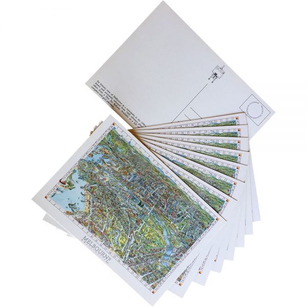
It was an extraordinarily popular image, made even more intriguing as people poured over the “Can You Find?” list and tried to find all the buildings, transport, people and events included in the illustration.
The whole team had such a great experience creating The Melbourne Map and I think this transferred on to the illustration and to the end user. The map appealed to all ages and adorned the walls of homes and offices here and abroad.
What lead you to do a second Melbourne Map?
It was a multitude of things the seed was set when I made a decision to clear out the back shed which housed all the photos and memorabilia I had stored for 25 years. Instead of moving and discarding I found myself pouring over all the photos and journals I had kept of sales.
I did a quick search on the internet to look for any new maps of Melbourne. Not only could I not find any new maps, I couldn’t find any images of our Melbourne Map so I took some photos of the print and shared them on pinterest, facebook and Instagram. The response was amazing from people who loved the first map and for some insane reason I contemplated producing a new one.

I wrote another business plan entailing considerable research and financial planning and spent a year gathering information on new technology, setting up a website and social media, talking to “Melbourne” people and businesses and contemplating the mammoth task ahead.
Briefly discuss how you have funded the second map?
Whilst still having employment I took out a loan against my home. Having exhausted this first $100,000 I then produced a crowd funding campaign which has enabled us to gauge the popularity of The (new) Melbourne Map, pre-sell copies and share the map making process with our supporters. Raising these funds has also enabled us to meet the ongoing costs of the completion of the artwork which is due for release later in 2018.
We will print giclee Limited Edition prints in two sizes which will be numbered, embossed and signed by the artists (black & white and colour versions) and unlimited smaller art prints and jigsaw puzzle. We will endeavour to recoup the costs of the project (around $250K) and fund our next map which will be of Geelong.
Discuss your relationship with Deborah Young and the first and current Melbourne Map.
Deborah and I spent an extraordinary amount of time together working on the project to complete the first black & white illustration. We both pursued other careers ‘post map’ but kept in contact over the years.
Deborah and Melinda, 1990
When I announced to Deb that I wanted to create a new Melbourne Map we discussed the project over some time, to work out the production challenges and Deborah’s capacity to commit to this huge project given her current life commitments.
I had also entered into discussions with Lewis Brownlie whom I had met after discovering a Melbourne Buildings colouring book he produced back in 2015.
We all met and worked out the best solution for The Melbourne Map which was for Lewis to take on the role of chief illustrator and draw the lions share of the map including roads, buildings and gardens etc.
How did Lewis Brownlie become involved in the current Melbourne Map project?
I met Lewis after discovering his work in a Colouring book of Melbourne. I contacted him because I thought he might like to see a copy of our first line drawing of Melbourne published back in 1990. As it turned out Lewis lived not far from me and we organised a meeting.
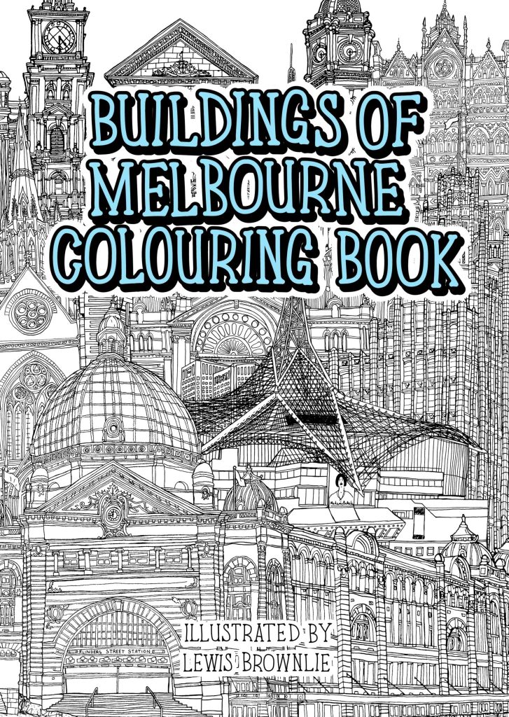
After several more meetings I invited him on to the project and he enthusiastically accepted. It has now taken up a big chunk of his life having worked on the illustration for nearly 18 months so far. It has certainly taken way longer than we both anticipated but it is such a fantastic project to be involved with and an important historical record of Melbourne, at this point in time.
It is a map that will be referred to for centuries, just like we pour over old maps of cities drawn in the 15th-21st centuries. I always tell purchasers of the limited editions that this will be the artwork their great grandchildren will be wanting to have.
Why are you so passionate about maps?
The visual appeal of an illustrated map, the details, the stories, the endeavour to create them.
Initially I was in my own ‘map bubble’ creating the first Melbourne illustration, having no idea how to go about completing such a project, no rules to follow and no map making experience nor background in cartography.
It became very evident after we published the first illustration, just how much this artwork meant to people who lived in and visited this beautiful city. The sense of connection and achievement the map has given me has shaped my life.
I’m over the moon to have taken the leap 28 years later to publish The Melbourne Map 2.0 I hope it inspires a new generation of illustrated map makers to invest in documenting their cities.
Deborah Young
Discuss the comparisons between your involvement in the first and current Melbourne Map.
The first Map published in 1991 was originally drawn by me including the design, streets, the text and buildings and character illustration such as people, boats, planes etc.
This time the 2018 updated Map of Melbourne’s streetscape and layout are being drawn up by Lewis Brownlie whereas I am drawing street names and character illustrations. This includes the Chinese dragon, the Phillip Island Penguins, balloons, planes etc. and people on the streets.
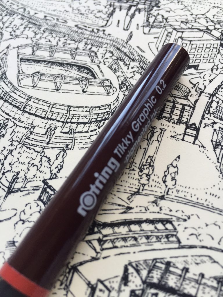
1990 Melbourne Map, Pen and Ink.
You are currently working on the human, animal and transport illustrations. Can you take one or two and discuss the actual drawing and where and how they fit onto the map?
Each day Melinda sends me requests for new additions to include in the drawings; such as the people who have paid to be individually represented, sometimes by their car, their favourite location or as with Frazier Film production unit, their distinctive trucks which will be shown on Dandenong Rd.
These are drawn using photographs the owners have taken; otherwise the images are those we’ve all agreed need to be recorded from our travels, such as the Portarlington Ferry where the boat is photographed and located on the drawing where it is usually housed.

Explain the technique you use to put these drawings onto the map from the early stages to the final placement.
It would be a logistic nightmare for both Lewis and I to draw onto the Map at the same time - and because of the wonders of modern technology available to us, I am drawing and recording every character separately using a rotring graphic 0.2 pen onto tracing paper which are placed over carefully scaled and photocopied sections of the drawing. These images will be digitally scanned into the completed scanned image of the finished original drawing ready for print.
Why do you feel the map needs to have these animations?
Originally on the ‘91 Map I wanted to give life and personality to the drawing and the many characters illustrated turned out to have enormous appeal. It became fun to record the many incidental and distinctive scenes and characters and landmarks in our travels.
One such example was the fellow shown practising golf (blissfully ignorant of the “No Golf” sign beside him) in Williamstown. We’ve always wondered if he ever realised that he was “sprung” and immortalised in our work!
What makes your additions ‘so’ Melbourne?
The characters within the drawings are actual and as such represent and characterise the City we love. Each city has a particular street culture typified by the style of the local public transport. We have our iconic trams and to a degree our trains to help codify chain themes.
Our quirky landmarks make the location easy to recognised such as the giant flag at the top of Elizabeth St in the north of the CBD, Little Audrey the Vinegar Skipping Girl in Richmond, or the Vietnamese Gateway on Victoria St Richmond. Others include the Ted Whitten sculpture (one of Melbourne’s particularly famous football sons) or, Puffing Billy, a generically Melbourne icon.
Other characters such as joggers, helicopters, balloons, rowers are more typical of all Australian cities but these elements in their recognised locations make it uniquely and especially Melbourne, seen by locals every day and looked for by visitors.
When locals see their city drawn in loving detail, it gives it a certain credibility and credence in their mind’s eye.
Lewis Brownlie
What is your art background?
I studied Fine Art at Rochdale College, then at John Moores University, Liverpool. My first art related job was as a gallery technician at Bolton Museum, in Lancashire. I was also experimenting in different art mediums, hosting and exhibiting in exhibitions with fellow artists, often doing illustration jobs for skateboard companies in England.
About 5 years ago I went travelling through South East Asia drawing from life every day for about four months, drawing inspiration from the surrounding architecture, landscape, people and things that go on (from climbing mountains sitting in buses for hours). This took me through Thailand, Vietnam, Cambodia, Malaysia and Bali, before landing in Sydney and travelling down to Melbourne via train to visit friends. In Australia I continued my tradition of continually drawing my surroundings, wanted to send some bits home to family and friends. So I made postcards from my drawings. I was inspired to start art busking in the town centre of Melbourne, whilst working away on drawings, I would sell prints at the same time. It was a “win’, win”. This led on to my ‘Buildings of Melbourne’ Colouring book and consequently to meeting Melinda and finding out about The Melbourne Map project.
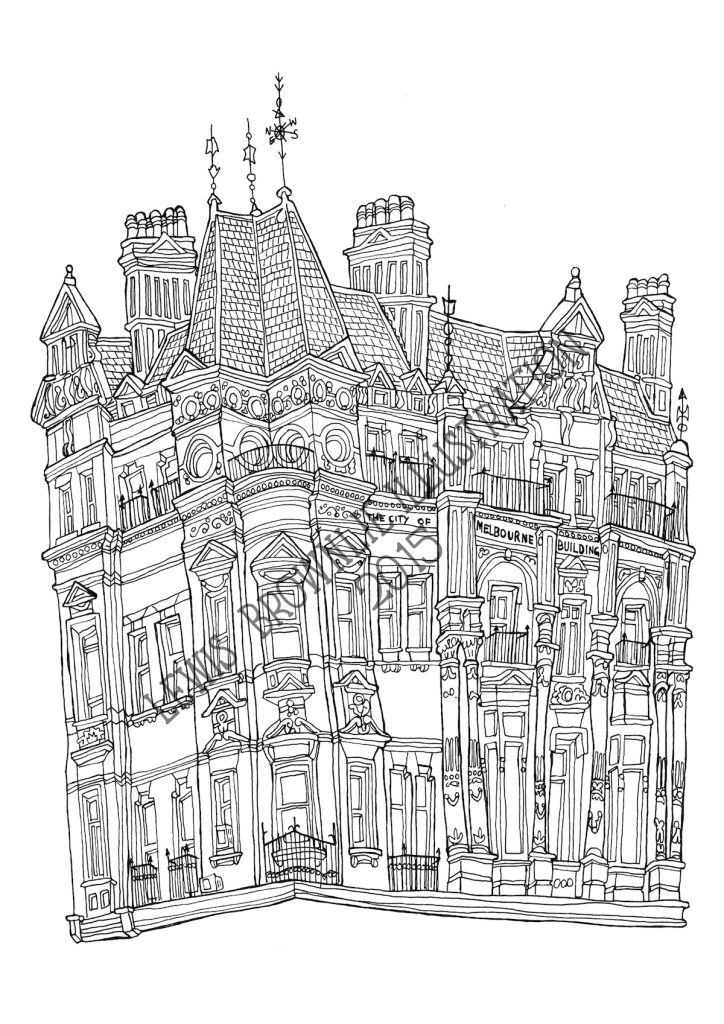
Can you expand on your original time estimate and how long the project is take you to illustrate?
When I first met Mel and discussed the project I thought that we could achieve the completed line drawing within at least 6 months. I have now been working for about 18 months and probably have another 8 to go. (3 months on ink, 1 on digital production and 4 on colouring) The project is way more detailed than we both anticipated and we made some artistic decisions along the way to expand the parameter of the map and do a major re-draw of some sections.
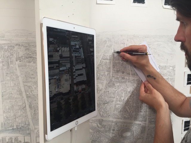
Take 2 or 3 buildings or areas you have had a strong bond to and why?
I worked on a small book for the City of Melbourne about the Fitzroy Gardens. It was really great to re-visit this area of the Melbourne Map and create more detail in the drawing.
Flinders Street Station was the first building I drew when I arrived in Melbourne, I was sat on the steps of the young and Jackson pub waiting for a friend. The copper dome is very impressive, that and Federation square are the central point of Melbourne on our map and most likely will be the first thing people’s eyes move towards.
Discuss the frustrations of building and planning in Melbourne and illustrating a map?
It's cat and mouse, on the ever, evolving city scape. There are currently 165 cranes on Melbourne’s skyline and in terms of research it is a bit of a logistical nightmare keeping up with the construction, what a building is going to look like when it is finished and whether it will be included on this version.
Cranes of Melbourne
This is the first map I have attempted on this scale so there is a lot of learning along the way. We are anxious to complete the project as soon as possible but at the same time take the time to be accurate and true to Melbourne’s essence and character.
Explain the importance of the actual dimensions in this work?
The original size of the illustration is 1.5 x 1m. Sometimes I wish I was working on a piece of paper double this size so we could fit in even more detail.
There is significant detail in each of the major landmarks and buildings which I am able to capture with a 0.05 Uni Pin. Mitsubishi Pencil Company who make the Uni pin heard about our project and sent us 4 boxes of the pens – we will probably use every one of them on this drawing.
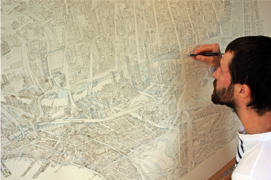
What are some of your favourite buildings; and why?
Modern
I love the Arts Centre, the many triangles of the spire was great to draw.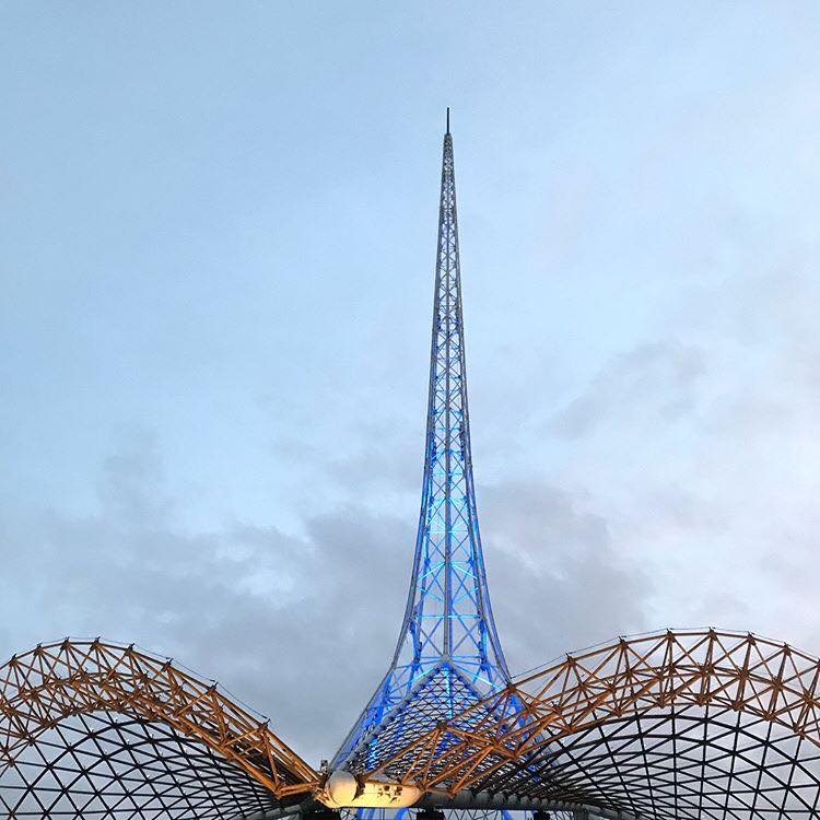
Old
Manchester Unity building is a grand old lady, I love the inside and outside of this iconic and grand representation of old Melbourne.
Beautiful
The Exhibition Building is so grand, steeped in Melbourne’s history and a pleasure to walk in and around each and every time.
Tired
The City of Melbourne Building on Elizabeth Street is looking very tired. Corner of Elizabeth & Little Collins. Hopefully someone will give it some love soon but keep it’s beautiful original charm (i.e. no skyscraper coming out of the middle of it!)
How has your relationship to Melbourne changed since you began on this project?
All
Discuss your thoughts of working on a long-term, team project
Melinda
Having lived through a few long term projects, I had an understanding this time of what it would take to produce the map. I love the interaction and collaboration with the team and I thrive on the challenges that the project brings. There are so many elements to bringing this map to life, so much more than anyone could realise.
The pressure of funding the project is not the fun part however pre-sales on our website and crowd funding has been a whole new experience for me and I love that we can share the progress of the artwork via social media.
With the first Melbourne map (started 30 years ago) we only really had a handful of people visit the garage throughout production and had to wait 4-5 years before knowing if it would be liked or not.
As we journey through each stage of the project we connect with the most amazing people, some who are familiar with the first map, others who have discovered the project for the first time. The encouragement and support has been so rewarding and I can’t wait to deliver the map to its new homes here and abroad... Melinda
Deborah
From my point of view, the Melbourne Map team is a wonderful balance of skills and professionalism. We all want to achieve the same end product, with the same standard and all realise what it takes for every element to come together. It’s rigorous and because we want the outcome we are careful to discuss any issues and resolve them. Previous experience has meant that we all know how it feels if you don’t recognise and make changes in-order to have it perfect for print. We are all on the same page.....no pun intended... Deborah
Lewis
It’s taken a lot longer than I expected that’s for sure. It was strange to get into the rhythm and understand the scale of the project. Especially early on, in the pencil stages. With never endeavouring on such a project it was really hard to predict any timeframe, not fully knowing or understanding the level of detail and attention required to research and create the large artwork.
The background knowledge and knowing the city and suburbs inside and out is a big job in itself, and coming from England, I’ve only had the pleasure of knowing Melbourne for the past four years. I’ve had to learn a lot quite quickly. I feel it’s a huge responsibility to all the people who live and work in the city, they all have their own areas and need representing. Knowing what buildings, streets and parks are significant is very helpful when people get in touch to let us know about certain community events or regular markets, these nuances can all go into the map and bring it to life. The more information we can have the better.
I spend most of my days drawing the map, and other days researching, its changed my view and appreciation of the city. I spend more time drawing the map and looking at images on the computer screen than I do in the real city. Which is quite weird. Sometimes when I go to the city, because I have this image (the map) burned into my mind, I get confused as to which is the real one.
When we see cranes or learn about building works happening in the city, that causes a bit of annoyance, knowing that somethings changed and needs altering in the map. There’s always something changing, and the longer the drawing takes, the more the city changes, so that’s another reason why I need to keep up a good pace.
It’s great to have each other, Mel and Deborah are brilliant encouragers and critiques, and we bounce ideas around and solve problems and issues together (what’s going where, in terms of characters and vehicles) collaborating like this is a really fun part.
But in the meantime, I must go back to the drawing board… Lewis
![]()
Contact details:
The Melbourne Map
Website and discounted pre-sales: www.themelbournemap.com.au
Email: melinda@themelbournemap.com.au
Melinda Clarke, Deborah Young, Lewis Brownlie, Melbourne, Australia
Interview by Deborah Blakeley, March 2018