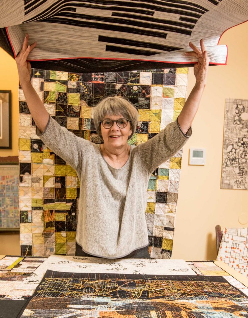
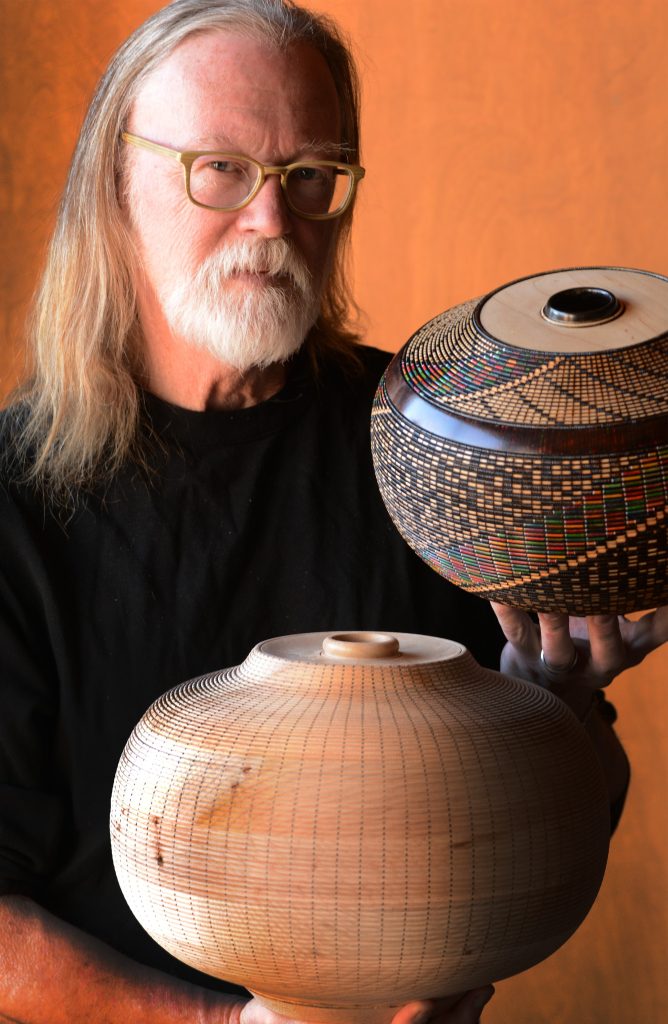
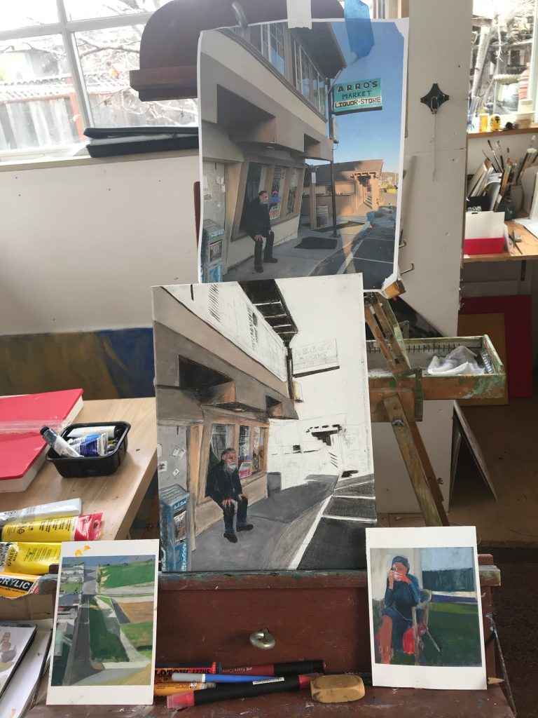
Paula Kovarik
Your most resent exhibition is titled, ‘Stitched Dissent'. Discuss the title and why you feel personally, the need to use art in relations to the current political position of your country?
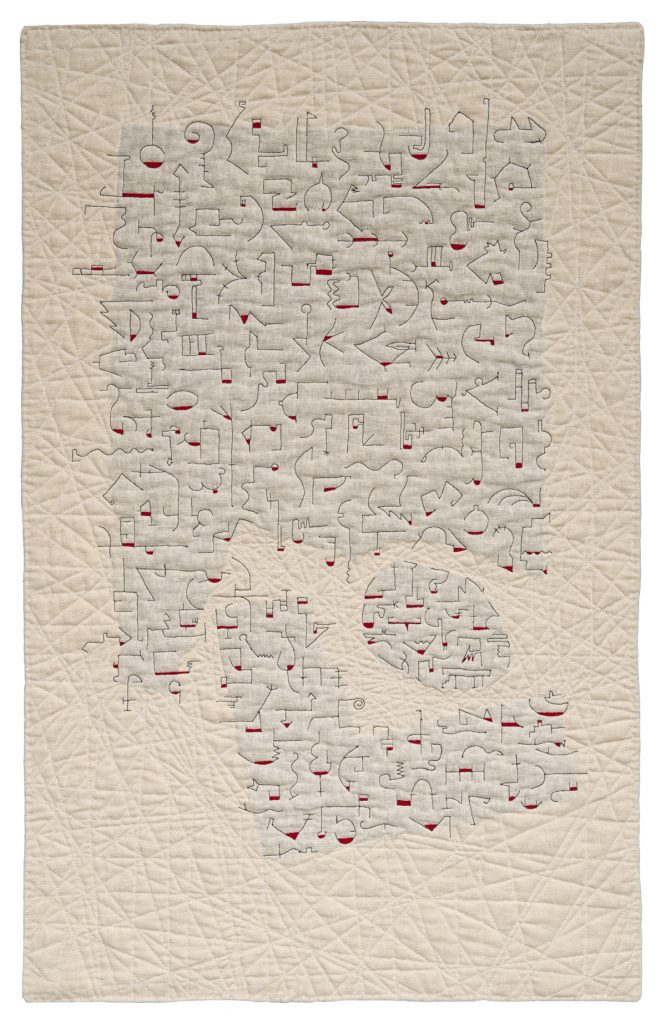
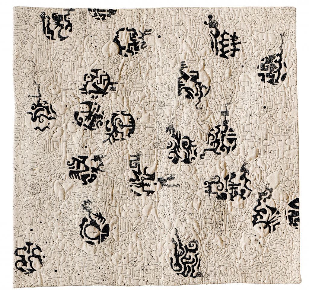
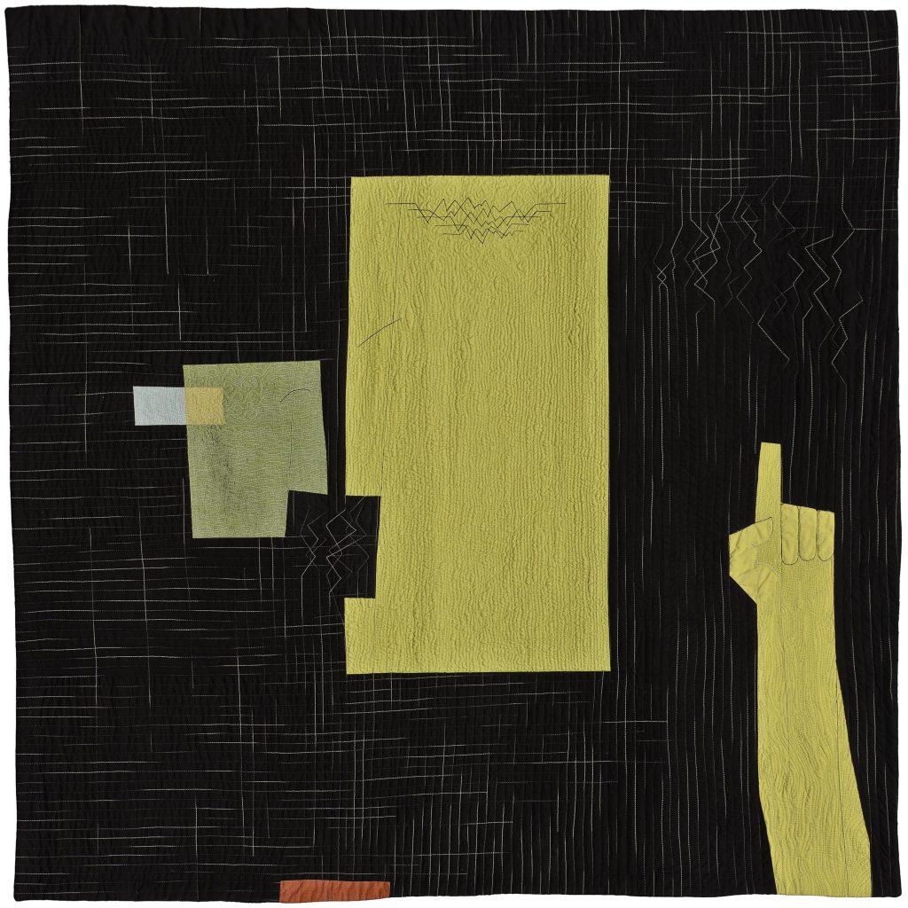
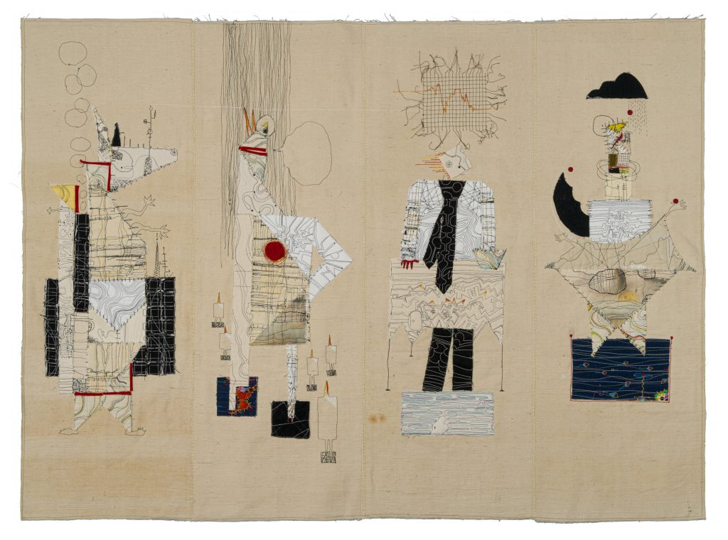
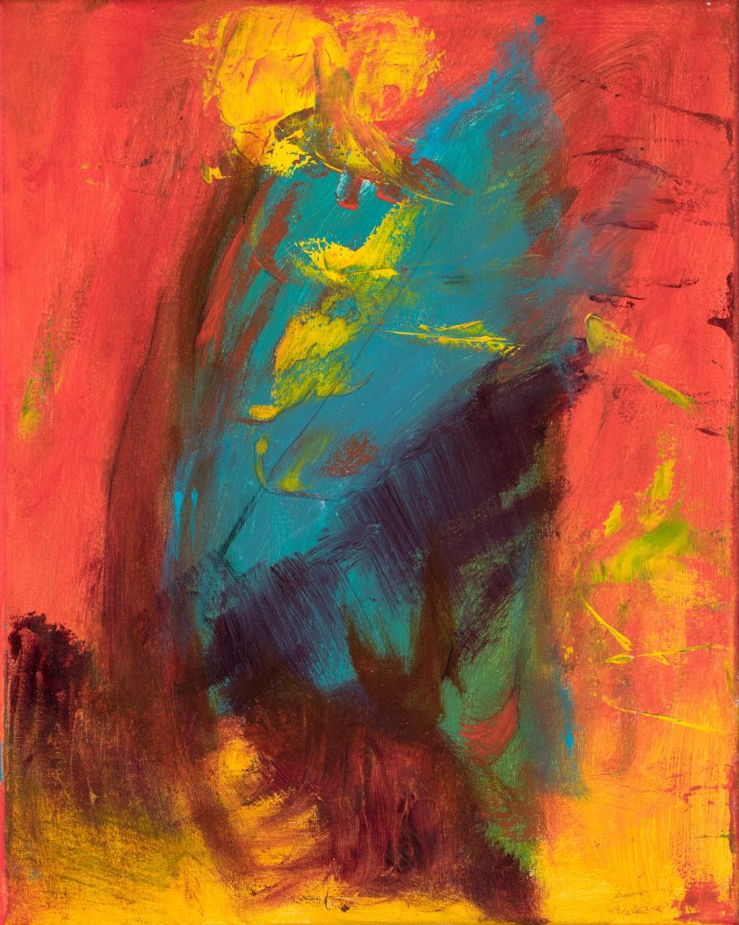
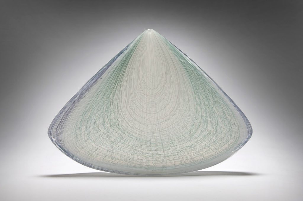
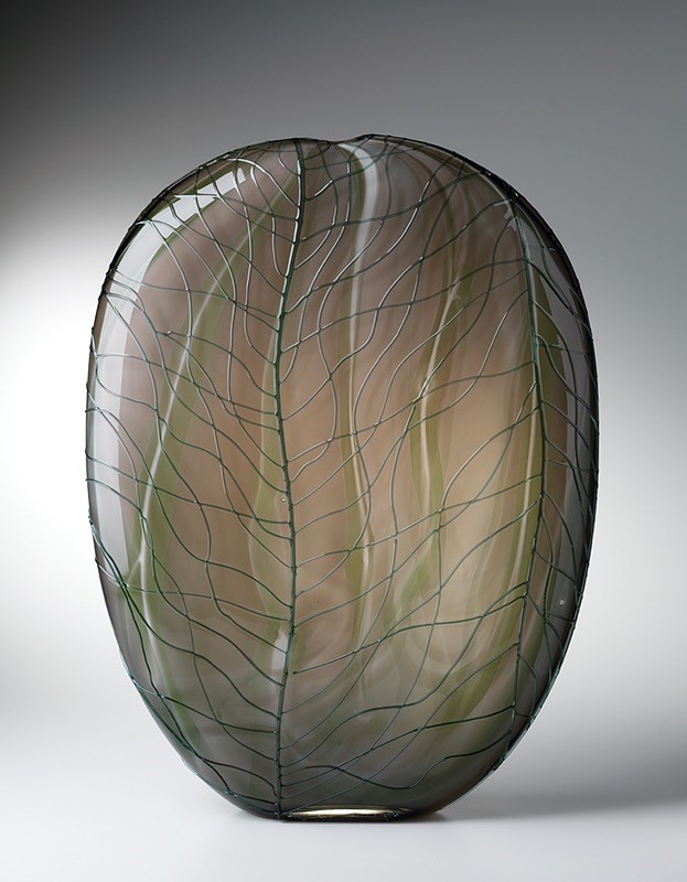
Better Not Said, 41” x 26”, 2019.
The background
Better not Said began with the idea of how we interpret language with ideograms and lettering.
The use of black, white and red.
I use black thread on neutral backgrounds in much of my work. I find that the high contrast of black against white enhances the mark and speaks loudly about the intent of the mark. After adding all the marks to the piece in black I went back into it to add the red thread.
Symbolism
The red thread that fills in spaces within the black marks represents what we hold back in our conversations. The things NOT SAID.
How has your quilting allowed you to travel the globe?
I teach workshops in many places. But more than that my work travels in shows. That is what is so special about this career. My quilts have been shown across the world.
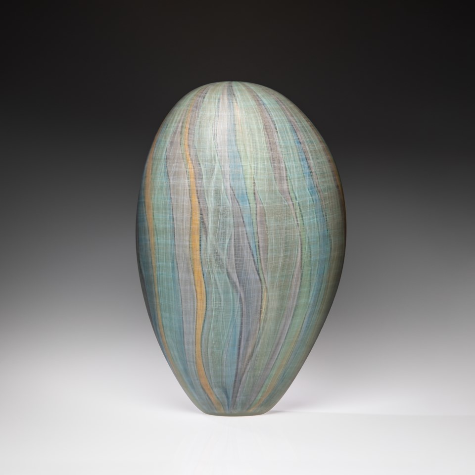
Discuss, line and how you use it in your work.
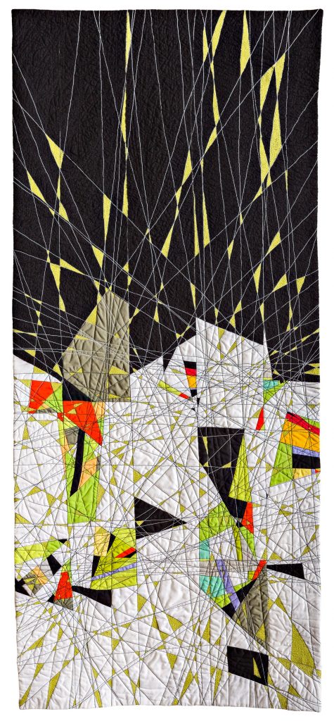
Sightlines, 48 x 19”
Though I do piece fabric and use colour and shape to create compositions my focus has always been on the line created by stitch. It is a language that not only adds texture but also meaning. It controls the density of texture, the direction the eye travels through the piece and the intent of my message.
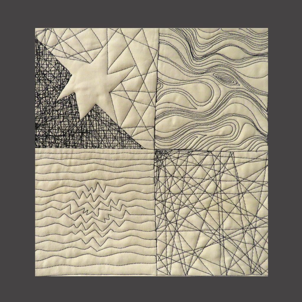 Line Matters, Sample
How do you want the viewers eye to travel around your quilts?
With wild abandon.
Pathways, 27.5 x 28.25”
Briefly take us through the quilting journey you have taken over your artistic career.
 Dissemination, a small piece about crowds and leaders. 12” x 14”, 2006
I started quilting after my mother introduced me to the craft about 15 years ago. Though I am not a traditional quilter I found that working with fabric and thread was a natural medium for me. I loved the textural quality of it. I am a graphic designer by trade and creating messages through composition and imagery comes naturally to me. I began to apply my design skills to this new medium in order to find my own unique approach to this art form.
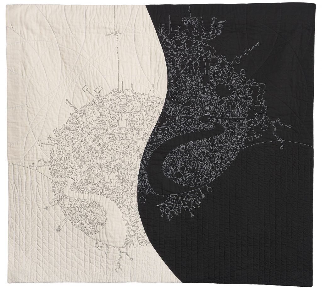
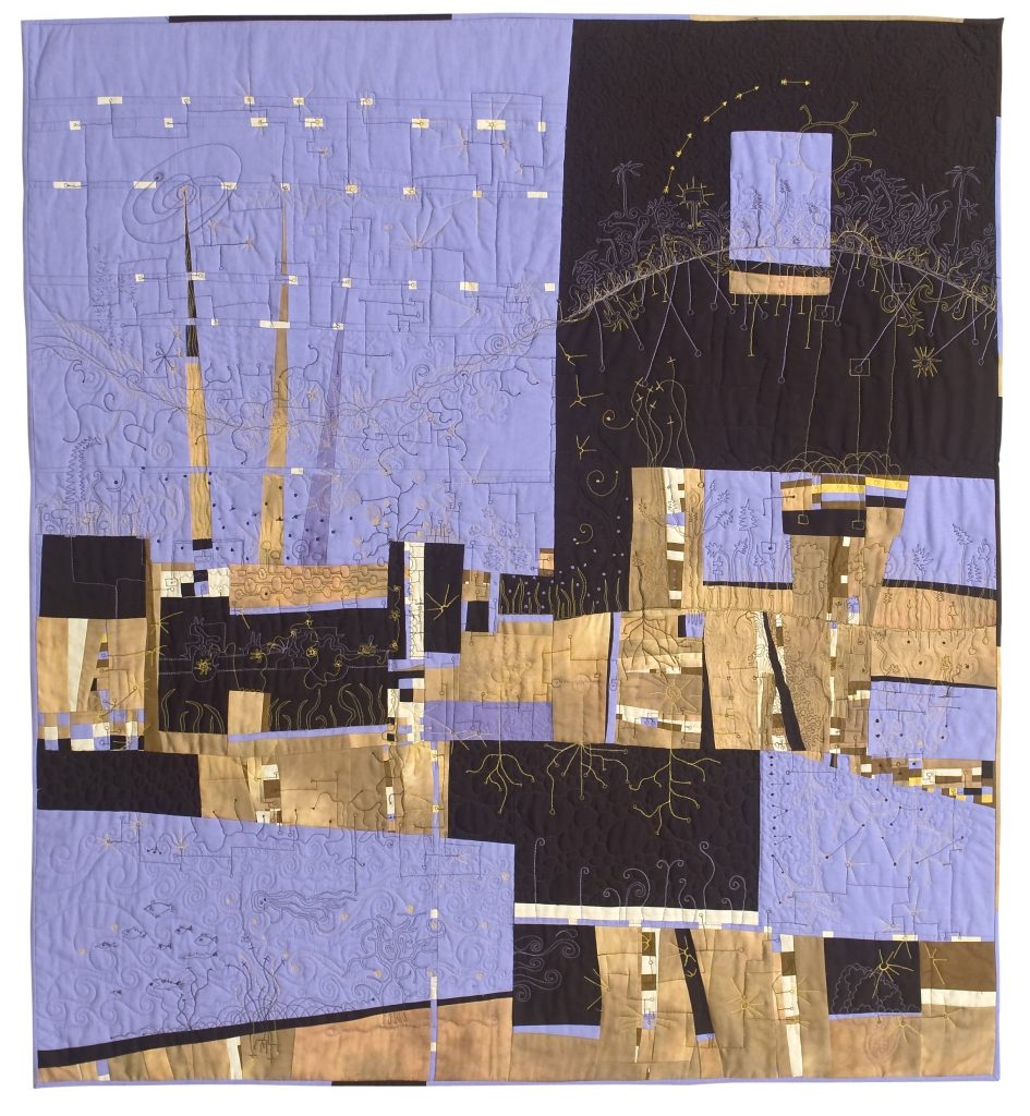 City, 41.5” x 38”. 2008.
City, one of the first pieces I made that was accepted into Quilt National.
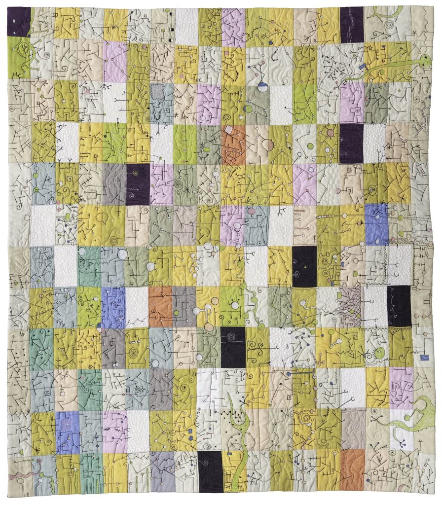
AHA! Moments, a piece that started with a doodle drawing that was enlarged and stitched over. It’s all about how our brain connects points of data.
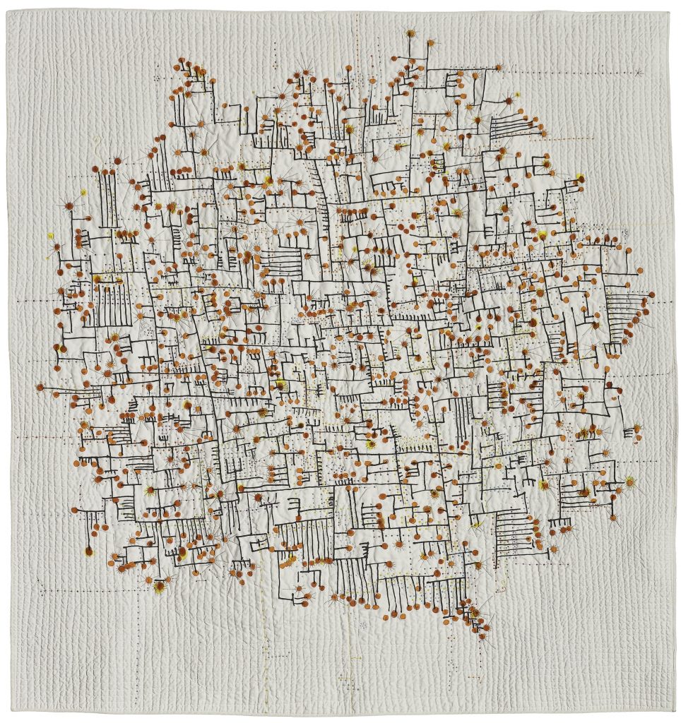 AHA! Moments, 57” x 54” 2010.
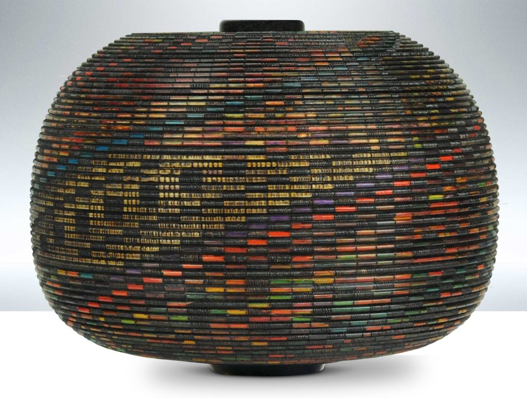
Round and Round It Goes, a piece that focuses on all the threats in the world from roaches to terrorists.
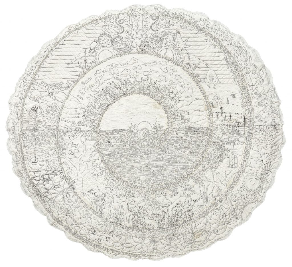 Round and Round It Goes, 54” diameter. 2013
Chaos Ensues, a collage piece that brings diverse pieces of fabric together to tell a story of chaos. 32” x 32”, 2017
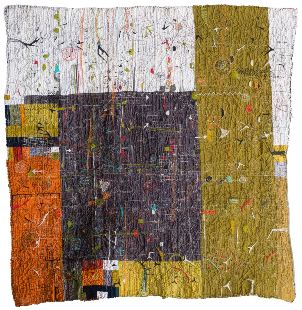 Chaos Ensues, 32” x 32”, 2017
My current work.
 Dark Heart, 46” x 55”. 2019.
Dark Heart, A piece that assembles pieces from other quilts to create a new being.
Comment on the way you use raw edges in your work.
I find that the more I work in this medium the messier I am getting. I love the raw quality of edges with threads hanging. Layered stitching adds depth and dimension. Piling on layers adds a textural element that is difficult to show in other 2D mediums.
Discuss the work ‘Insomnia'.
Insomnia was inspired by the world-wide economic collapse we all experienced in 2008. My business had suffered the loss of clients, I was worried about our savings and retirement and life was just a barrel of anxiety. All those thoughts went into these two pillow forms.
Size – How do you decide on the size of each quilt?
The quilts themselves determine their size. I build from bits and they grow to their mature size.
Backing – The backing of a quilt is an important part of each quilt. Comment on your thoughts on this aspect of quilting artistically.
I have many quilts that are two-sided because of the way the backing shows a different version of the stitching on the front. Since my stitching is so idiosyncratic, I often find new thoughts when I turn the quilt to the back.
Your mother passed on many craft skills to you. How do you see education filling these gaps currently.
I study art daily. I seek out artist talks, exhibits and critiques. But education also fills in another very important aspect of my practice. I read voraciously: science, politics, novels, poetry, botany, history, and commentary. These readings add bulk to my understanding of the world and find harbor in my work.
 Pundit, 41.5 x 41.5”
Take ‘Fallout’ and discuss the use of stains in this work.
Fallout is about nuclear testing. I wanted the work to look like an antique map. I used a vintage tablecloth as my substrate. I stitched the continents and oceans with blue and brown threads. Hand stitching added texture to the continents. Then I used tea to stain the piece to add depth. The dark brown spots made with dye represent areas on the earth where nuclear testing has been executed.
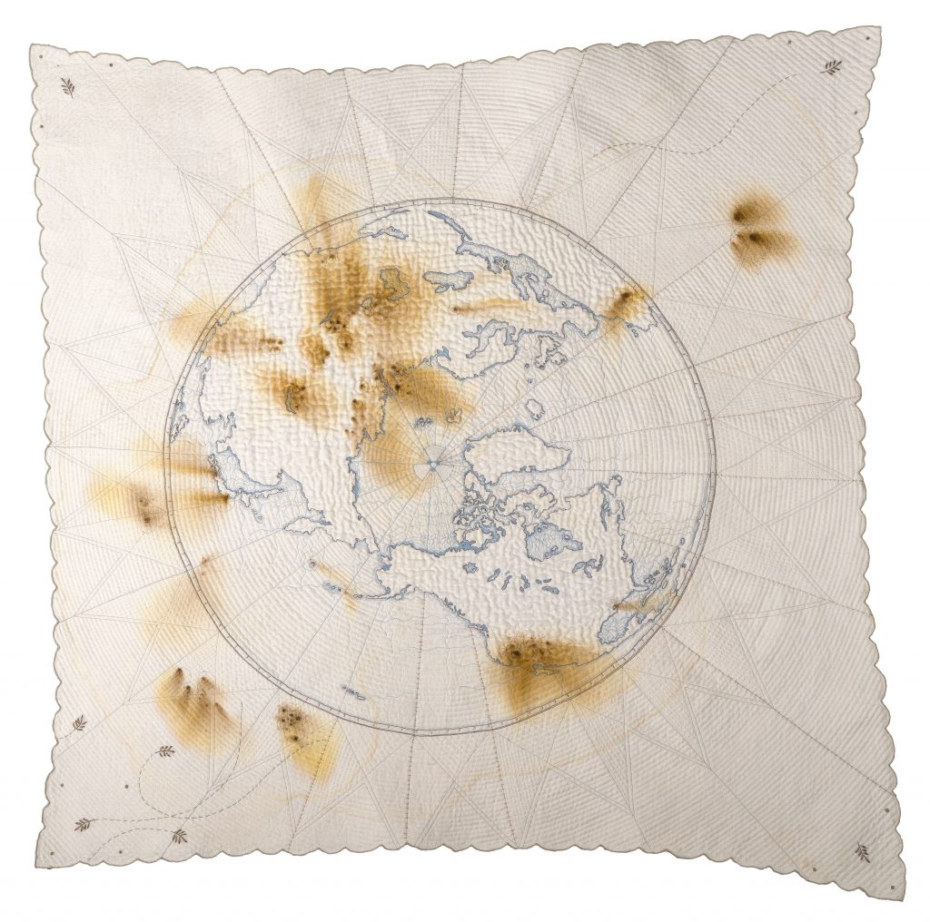
Fallout, 41.5” x 41.5” , 2017
Titles of works always have deep meanings can you take three quilts and discuss their title and why?
 Connecting Fantasy to Reality Proved Difficult 39” x 34”, 2010
This is an early piece that was traditionally pieced but then stitched in a fantastical way. The contrast is striking.
Same But Not: This piece shows the trajectory and journey of two threads, one black and one white. It is a dialog about race and separation. 39.5”x 42”, 2011
 Same But Not, 39.5”x 42”, 2011
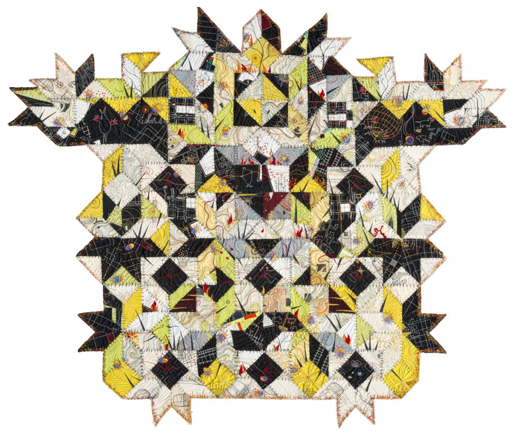
The Usual Suspects: Presto-Chango, Caught Red-Handed, Empty Rhetoric and Sideshow is about the clown show that happens in politics these days.
 The Usual Suspects, 40” x 54”, 2019.
Contact:
Paula Kovarik
paulakovarik.com
IG: @yellowbrickstudio
Deborah Blakeley, Melbourne, Australia
Interview by Deborah Blakeley, February 2020
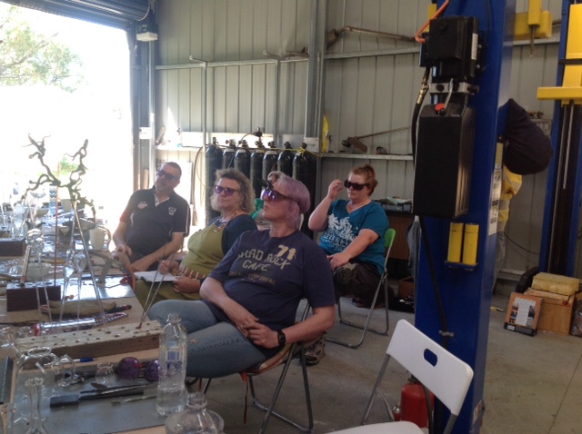
Peter Minson
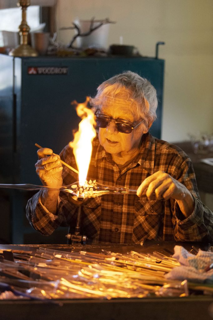
You are a third-generation glass blower. Did you ever consider another career away from glass?
As a 13-14 year old I would go to the factory in school holidays to earn pocket money and when I left school at 16 I started full time. At 19-20 years I was managing the production of medical and scientific glassware and 21-22 years, hire and fire as they say. Not something I liked doing, firing someone but required when needed. A fast learning curve at a young age of handling people and handling staff majority were women. Looking back, I was always going to be a glassblower and follow a family tradition.
As well as your artistic glass blowing you sell glass and glass equipment from Italy. Why Italian glass and equipment?
As well as your artistic glassblowing you sell glass and equipment from Italy. Why Italian glass and equipment?
In the early 90s I was being asked to teach glass beadmaking sometimes in the Glass Department in ANU Canberra. The best glass for this was made in Italy, Venice on the island of Murano. I had written to the owners asking to import direct to Australia but they advised me to buy from their USA distributors.
The best range of glassblowing torches, burners for Lampwork were made in USA. I was awarded a Winston Churchill Fellowship in 1995 so while away in USA I organized to bring burners, hand tools in from a supplier and while in Europe I made a point of going to Murano, organized a meeting with the owner and after a discussion they agreed to supply me direct into Australia.
Explain about your Aventurine Chips and how they are used in glass blowing?
Aventurine is a form of Saturated Copper Glass. It comes in chunks and it is broken down into different size chips and powder. It comes in 3 colours, sparkling gold-brown, blue and green. It is used to decorate glass beads mainly giving the beads a sparkly look in surface treatment or when encased.
When the glass is molten hot, roll the bead, object over the aventurine chips which stick to the glass, reheat in the flame and it combines with the glass. To give depth a form of surface treatment, encase the chips with a layer of clear glass and melt in.
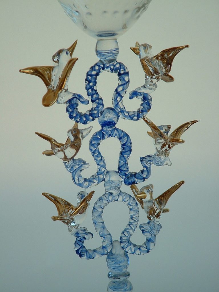
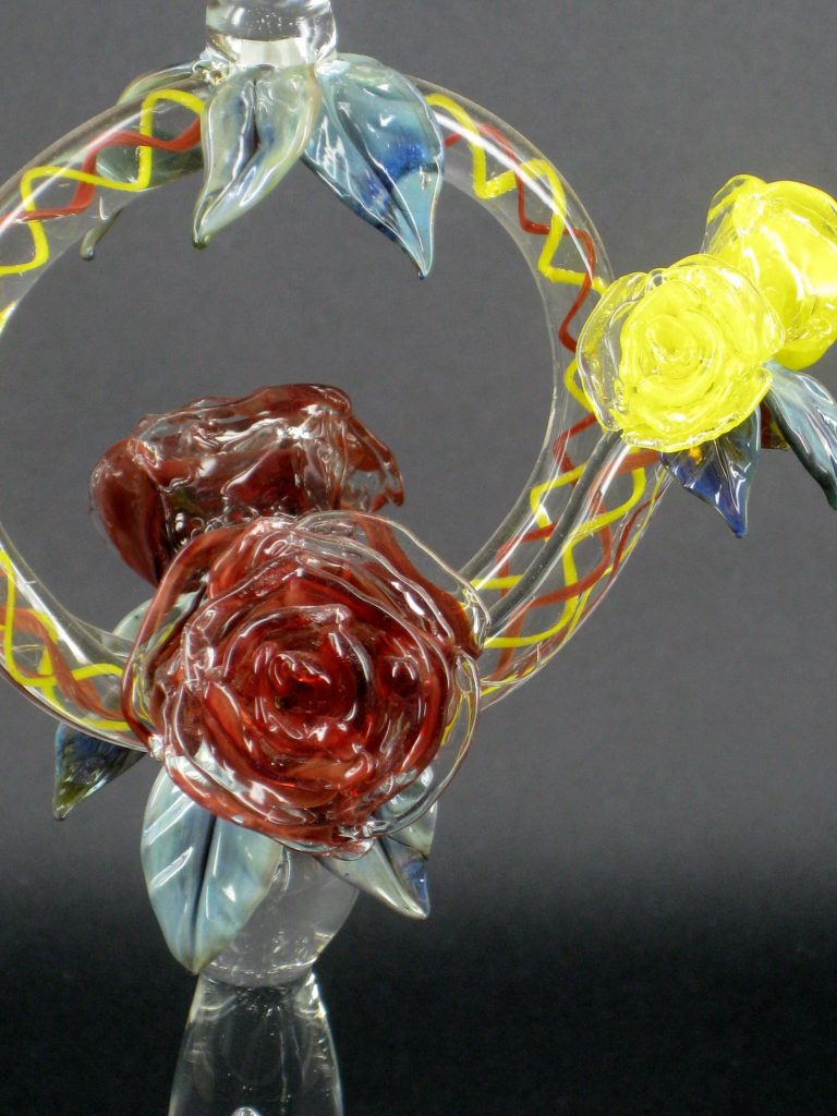
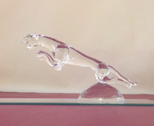
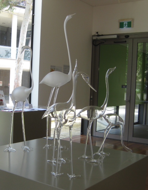
Explain about your work related to birds.
I have always like Birds mainly native birds, so colourful and interesting shapes and sizes. I decided to include them in glass items I made, on the stem of wine glasses, teapots, just free standing mostly trying to get their colouring correct especially showing the difference between male and female in the same breed such as Kingfishers. In 2002 I was approached by Niki Savvas an Australian Installation Artist working and exhibiting in England to make something in glass that would work with, complement her work in her next exhibition being held in London. It had to be something that had size and height and be simple. I came up with Birds, no specific breed just have good shape and height, long necks and legs, free standing in a number of positions. I made a sample, Niki liked it and commissioned me to make 12 and could I get them to England in 2 weeks time. They were successful and I was asked to make more for another exhibition and could they be the same with a bigger variety of stances and some taller. Most were around 500 mm tall and I managed to make some a metre tall.
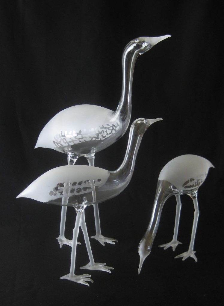
The birds are made free hand from Borosilicate tubing and rod. I work from drawings or photos of birds. I blow the body shape then heat a section to draw out blowing shaping the neck and head. I join onto the body the top section of both legs. Next I shape and seal the tail. Then I add the bottom section of the legs. I let cool then add the feet getting them in a position so the bird has a correct stance to balance.
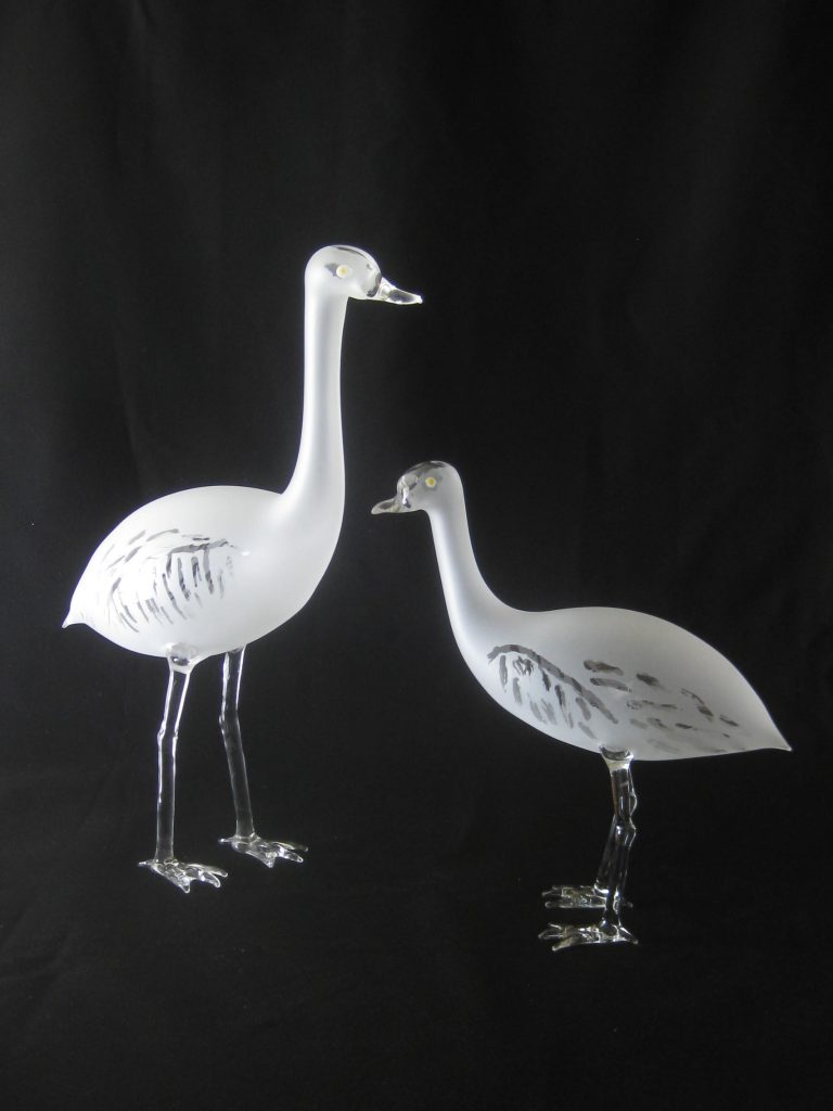
I live in Binalong country N.S.W. We are surrounded by birds, Magpies, lots of Parrots, Kookaburra, Sulphur Crested Cockatoo, Corellia, Wrens they are in our backyard in fact we are surrounded by them all the time.
Take two or three of your glass lamp pieces, discuss.
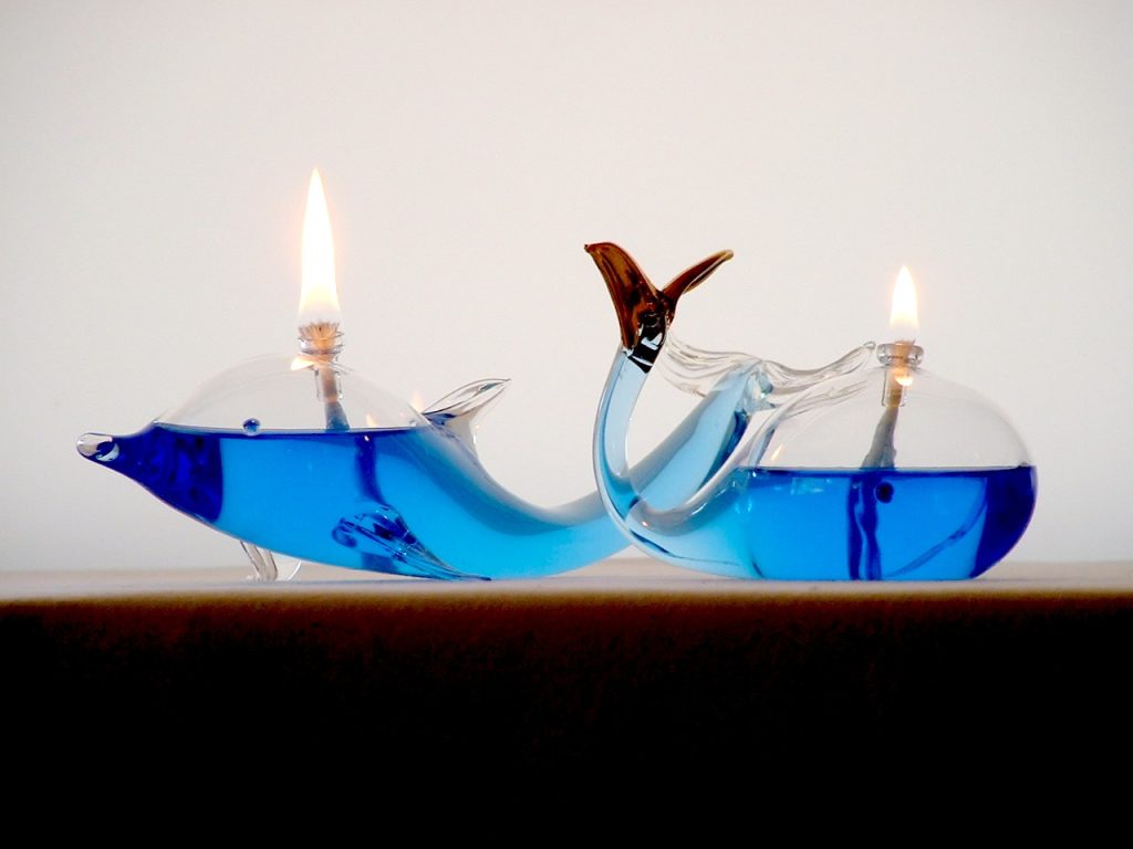
For many years I have made Oil Lamps as a variation on having wax candles on a table. It was a natural extension to make blown animals with a fibre glass wick filled with lamp oil could be used instead of candles. Dolphins and Whale shapes look good and appeal to people. They relate to them.
I found that adding a dye to colour the lamp oil added another dimension. Different colours appeal to different people so gives another selling point and attraction. They can see where it will fit into the decor in their house.
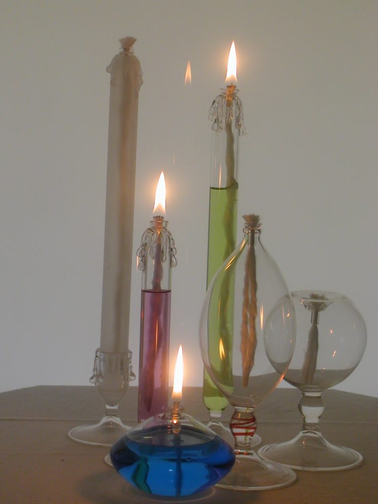
With particular animals such as Dolphins, Whales blue lamp oil attracts customers and complements the shapes. Our lamp oil is fragrance free, some people can’t handle fragrance and others like different ones. We suggest they can add a fragrance they like.
You have designed many teapots. Explain about this aspect of your work.
Over 30 years ago following on from a conversation with a few Potters about Teapots, the difficulty of making a good on that works well, I decided to see if I could make a Glass Teapot. Made from Borosilicate Glass ( Pyrex) which handles boiling water easily, doesn’t conduct heat very well should suit a teapot.
It took almost a year experimenting on shape and size. Making a spout that poured correct, doesn’t drip and then a lid that stayed on when pouring but was simple to make. Quickly I found out that size was important, the customer tells you this, how many cups of tea does it hold, does it pour well not drip, the lid fits and stays on. The handle stays cool so easy and comfortable to hold.
Over the years I have made variations on the shape but really the basic round slightly squat shape is most popular, customers relate to, and just a small line of a few colours, blue, red, green, black on the opening and lid satisfies most customer. We have a little Café here in the Gallery and use my Glass Teapots when serving a pot of tea. People love that we serve their pot of tea in a glass teapot I made and it works.
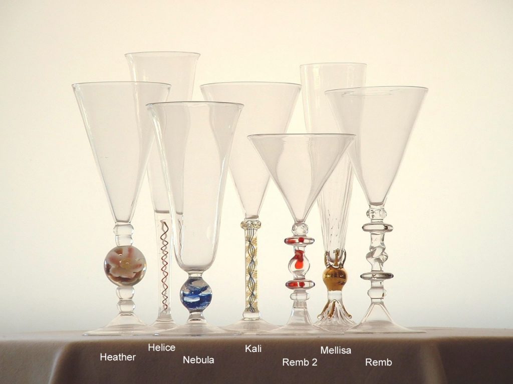
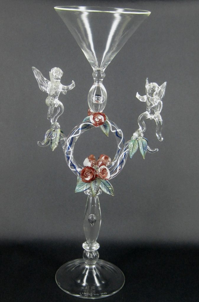
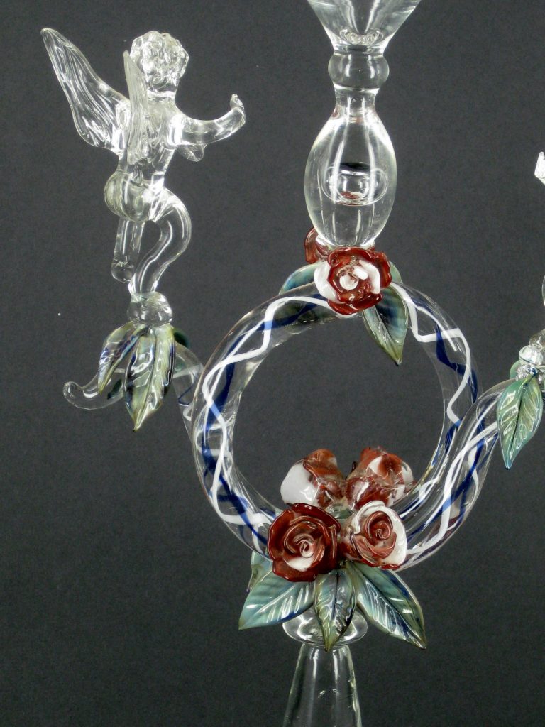
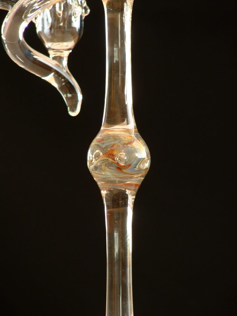
How have you worked on the beauty of stems in your glasses?
A wine glass is made up 3 parts, bowl, stem and foot. Each part must complement the other, balance to be good design. So in making a wine glass I think on what type, style of wine it will be used for. Reidel, an overseas glass company makes a different shape glass for every style of wine. So shape and size is important.
![]()
Adding a pattern to the bowl adds another dimension visually especially a pattern or colour. Serious wine drinkers like clear glass, no colour as it detracts from the colour of the wine however I have found if I use minimum colour, a simple line or fume the bowl with silver the reaction with the glass, light, sun shining on the bowl can react with the wine colour, bubbles and add to the enjoyment when using.
The stem allows me to experiment on shape and colour, still having to complement the bowl and foot. Looking at glass drinking vessels in books made over the centuries, can be very humbling and inspiring at the same time. Certain periods come to mind such as the English “Georgian Period”. Recently I did some work for the National Trust, they had a recent donation of a private collection of Georgian drinking vessels and I was asked to speak and explain at an exhibition they were showing. Very humbling to see the quality, styles and variations made so many years ago. In trying to equal those, challenges me, understanding type of stem, air twist etc and trying to replicate using a different type of glass working a different way and yet must look good and do the job. Getting the stem right is a big part of this.
Finally making a foot to balance, complement the bowl and stem can make or break the design and so attract or distract from the Glass. Getting this right is as important as the other parts.
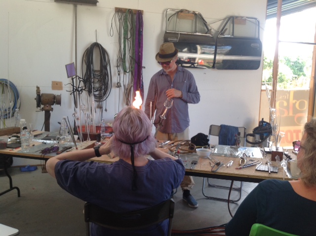
You still do classes. What have been a few highlights from your interaction with students?
I love teaching, especially Lampwork. I get great enjoyment in teaching people to work with glass as I do with a bench burner, glass tubing and rod in either low temperature, soft soda lime glass or high temperature hard Borosilicate glass. To take someone who has never worked with glass especially Lampwork, to see them gain hand skills, glass knowledge and confidence to make their ideas, be creative and get good results, nothing better for the student and teacher. To see them having as much fun and enjoyment as I do each day is very satisfying. I have been doing this for a long time, worked in all areas and forms of glass, Lampwork, fusing and slumping, casting, engraving and cutting, building furnaces, making the glass to work with and then using it to make functional or art glass, always glass the best material, most challenging of materials.
How as an artist do you relate to commissions?
A commission is always a challenge. If the client has a drawing or photo of what they want makes it easier, but not made in glass and they want it in glass. If they don’t have either I have to understand what they want and why.
What I try to find out is what they don’t like be it shape, size or colour. Then I try to make what I like based on what we have discussed trusting I have understood enough to create something they like also. Luckily I have managed to get this right over the years.
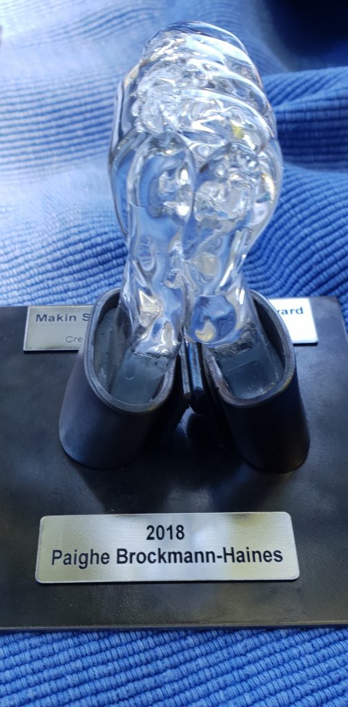
Take a recent commission and explain the involvement between you and the client.
There have been a number of Commissions over the years, “International Riesling Challenge” Award, I have made these for 20 years, also a trophy for a one of game between the Aussie “ Matildas” and the N.Z “Silver Ferns” celebrating 100 years of creating the ACT and Canberra. Luckily the Australian women won and is proudly displayed in a cabinet with all the other trophies they have won.
The most recent was a trophy for a “Signing” group, a perpetual Trophy where the winner get their name and year engraved on the base and a smaller version for the winner to take home.
“Signing” is where a person uses hands to talk through hand and finger shape and movement. Firstly I had to understand what “Signing” was and the importance of the “Clasped Hands” symbol. My friend who works in Metal collaborated. Looking at what I had made in glass, clasped hands with wrists, he made “Shirt Cuffs and a Button”, my wrists fitted perfectly into his sleeves cuffs with buttons complemented and completed the trophy.
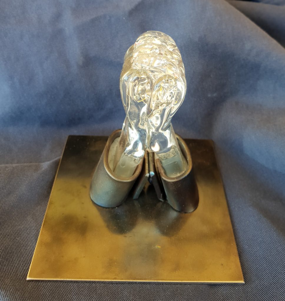
I was happy, he was happy and the Client very happy. Now each year hopefully we will get a repeat commission to make the smaller version for the winner to take home.
Recently you have had a retrospective at the Wagga Glass Gallery expand:
Your involvement with the Gallery
In 1981 Wagga Wagga Council advertised they would be holding an exhibition to showcase Australian Art Glass. They advertised nationwide and attracted entries from all over Australia. I received an entry form and sent some of my furnace work which I was making in ‘The Paris Creek Craft Workshops” S.A. My work sold to private collectors. In 1982 they ran another exhibition and this time my work was purchased to be included in the newly established National Art Glass Collection.
The value of glass to Wagga
In 2016 I was asked to open the exhibition celebrating 35 years of the National Collection”. I spoke to those attending how I saw the importance of establishing Collecting Art Glass in the early days for the Art Glass movement in Australia, and how over the years by adding to it had given it importance to desire to everyone working in glass to develop their work to international standard be equal to Art Glass made anywhere in the world and maybe become part of the Collection. This has happened and Australian Art Glass is equal to anything made overseas.
With my official duties done I spoke to the Mayor thanking the Council for supporting the Glass Gallery from inception. The Mayor assured me they would always support the Collection. Every year at budget time they have a meeting to decide where they will spend their funds initially looking at 5 core sections first and after that money goes to other areas as decided on need. In those 5 core sections each year the National Glass Collection Gallery is always 3 or 4 in importance to Wagga Wagga just in the number of tourists that come to see the collection from all over country and from overseas means they will always support the Gallery.
How did the Regional Gallery establish it connection with glass?
Back in 1978 a number of people started an organization called Ausglass to give a place for people working in glass a place to meet and talk about glass. In 1980 2 people who lived in Wagga Wagga had noticed the beginnings of this Art Glass movement, one John Elswood the other Judy Le Livre and decide to hold an exhibition to celebrate this. The first exhibition was in 1981 and work exhibited purchased by the Council and newly formed “Friends of the Gallery” and donated back to the Gallery were the beginnings of the Collection.
Contact:
Peter Minson
peter@minsonartglass.com.au
Deborah Blakeley, Melbourne, Australia
Interview by Deborah Blakeley, February 2020
Pamela Sunday
What, lead you to leap into ceramics full time?
I entered the world of ceramic serendipitously. A group of friends were searching for creative ways to socialize. It was the "Sex In The City" era, and we opted for creativity over cosmopolitans, I fell in love with the material of clay and the process of blending it to my will. It was challenging and scary to leave behind a successful life in fashion, but my passion for clay won out. I was fortunate to have design magazines to take notice of the work early on.
Now looking back on this move what have been two highlights?
One major highlight was a commission from Francois Catroux, the legendary Paris based designer. I was challenged to make a group of huge iterations of my Electrum Series. It was necessary to balance the new scale with the delicacy of the points. I spent many months experimenting and relearning the form, discovering how to make it work on a larger scale.
Another highlight was a feature in German Vogue. They ran a full-page portrait with my work and lovely interview, resulting in a whole new level of exposure to European collectors.
Many artists have been propelled by time at Anderson Ranch Arts Centre – how did your time there nourish you and your work?
I took a workshop at Anderson Ranch in the mid – 1990’s with the renowned Tony Hepburn. The experience of total immersion there, in a group of obsessed cohorts and teachers, was the impetus for setting up my first studio. The envoromnent gave me permission to consider myself an artist and make a full – on commitment to my future.
Discuss the importance of excellent photography of each piece.
Relate this back to your time as an Art Director and Artist.
I spent a decade working in the advertising department of Bergdorf Goodman. My aesthetic and work ethic developed there.
My husband, Paul Sunday, photographs most of my work. He is known for his beautiful lighting (and patience!). I was lucky to have publication – ready images from the beginning of my career.
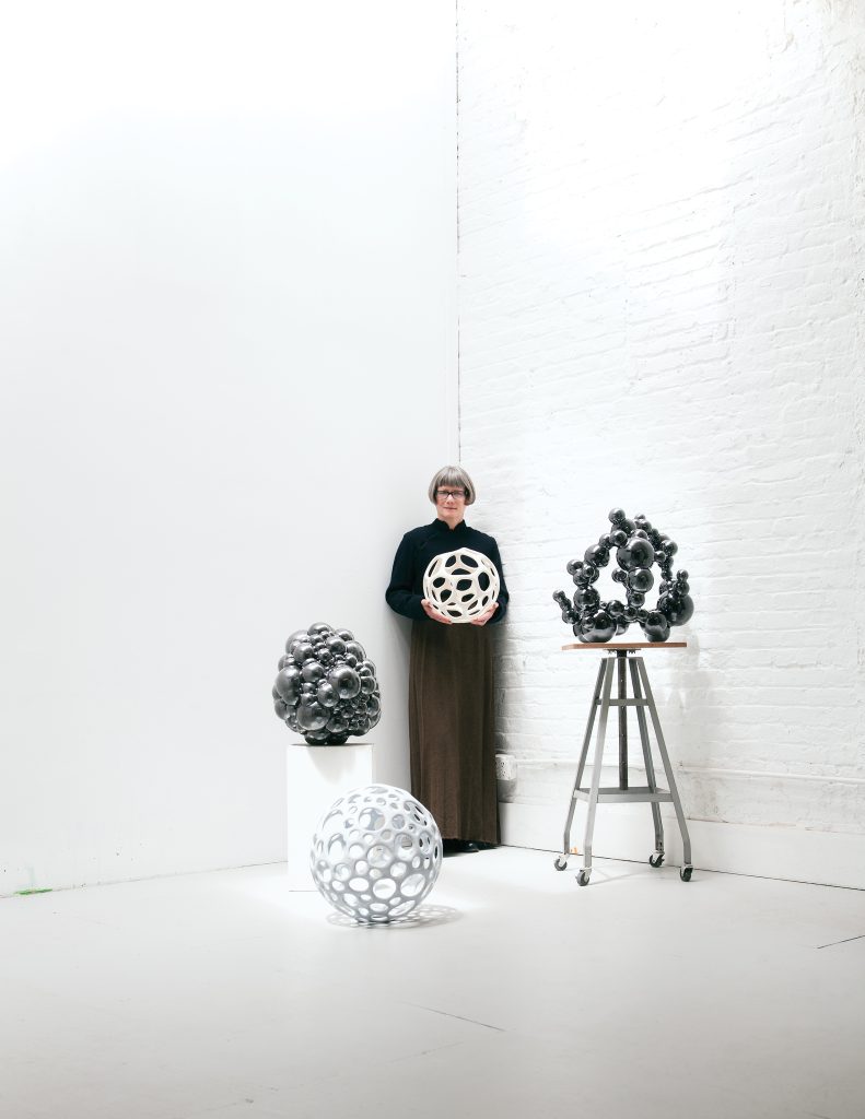
How is nature and science represented in your work?
I take inspiration from the images of microscopic life, scientific illustrations, historical references, and photography. The endless permutations and possibilities afforded by the recurrence of the orb in nature will no doubt continue to sustain my interest!
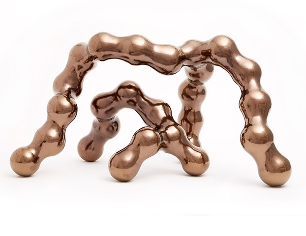
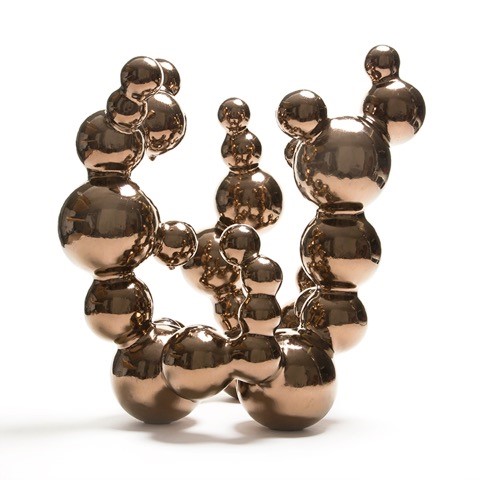 MOLECULAR: 19” high x 15” wide/deep: glazed stoneware
Please discuss the technique you use to make your work.
My sculptures are made by joining repetitive elements. Some components are formed on the wheel, and others are made using an assortment of hand-building techniques. I have a habit of pushing the tolerance of my materials to the edge. Each piece takes many weeks to complete. My process is an exercise in endurance and tenacity.
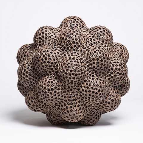
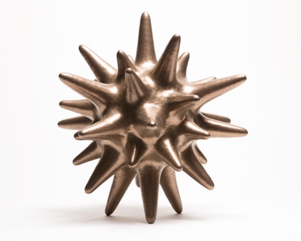
HIVE: 15”x 15”x 15”. Unglazed brown stoneware with lustre in indents
Discuss the importance of prominent pieces in an architectural setting.
When a sculpture can attain presence in an architecturally significant space, both are transformed into something more thrilling and memorable.
What size limits do you have?
There are no limits. Things keep getting bigger, it would be fun to see where I can go next.
Does all, of your work have a metallic lustre?
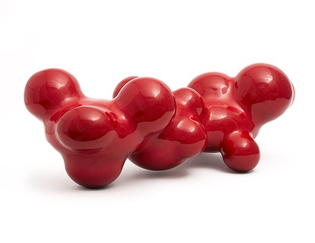
SAEPIO: 24” long x 19” wide x 12.5” high. Glazed stoneware
I love glaze chemistry; it’s a big part of the fun for me. I will always be developing new surfaces. While I have often gravitated toward metallic glazes, lately, I have been exploring rich glossy blacks and reds. My early work was often matte and textural. For me, it’s about pairing the form with the appropriate surface.

MOTUS: 19” long x 16” wide x 11.5” high. Glazed stoneware
Shape is a huge aspect of your work – take two or three pieces and expand on your use of sharp and soft shapes.
Stella:
Every aspect of this form is planned, the central sphere, three sizes of attachments, and the placement / balance of each component. I hope that it looks organized and organic at the same time.
STELLA: 14”X 14”x 14”, stoneware with satin metallic glaze
Rubrum:
This piece explores a new direction, exploiting a generative strategy, and asymmetry. It’s a different way of working but the orb is still the foundation.
RUBRUM: 24” long x 13” wide x 9.5” high. Glazed stoneware
Do you ever have work sold in series or collections?
Yes, on occasion, collectors have commissioned pairs or groups of works. The new generative experiments could lead to more of this way of thinking. The possibilities for groupings, series, and installations are endless.
Contact:
Pamela Sunday
Pamelasunday.com
Deborah Blakeley, Melbourne, Australia
Interview by Deborah Blakeley, February 2020
Keoni Carlson
Your work is an illusion. Discuss
Illusion work involves using one medium/material to look like another. In my case, I use wood to represent the “illusion” of fabric and/or beadwork.
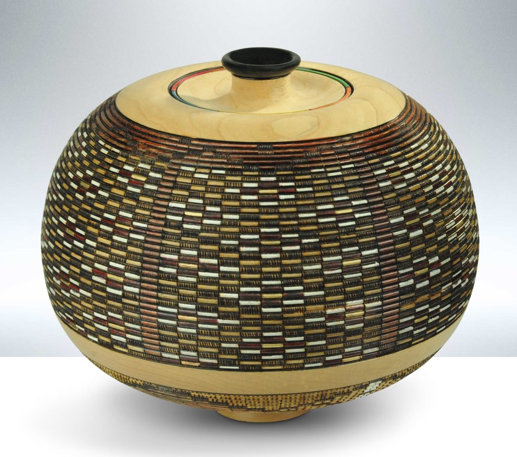
Copper Mountain, 8"h x 9"d vessel, Sugar Maple, woodburning, india inks, organic dyes and metallic inks
What have been some of the comments made by viewers when they realise it is wood?
There are very common reactions:
- . it’s really wood… didn’t believe it
- It must take an immense amount of time (yes, it does)
- I thought it was woven basketry
- Never saw the technique before
- How is it done?
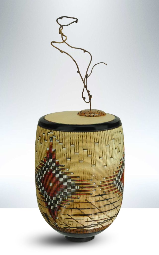 Sky Dreamer, 28"h x 9"d tabletop sculpture, Sugar maple, kiwi vine, red mallee burl, woodburning, india inks
You have only been working on this technique since 2017. Where did the inspiration come from?
The practice of illusion carving is quite old: think Europe and the great Cathedrals where wood was carved and gilded to suggest stone; and then in China and Japan even earlier where stone was carved to mimic wood. Artists of respective regions using available, local materials to create the illusion of more scarce sources.
I saw the techniques demonstrated in the early 1990s then revisited the style in 2003/2004, particularly influenced by the work of Lincoln Seitzman and Jim Adkins and then later by artist David Nitman. With my retirement in 2017, I was able to begin exploring the technique in ernest.
My love for the Lathe began as a young boy when introduced to the tool by my father; I was a hobby woodturner from that time forward. The journey to professional artist was accidental and organic, the evolution paced by unexpected opportunities and encouragements from family, colleagues and patrons.
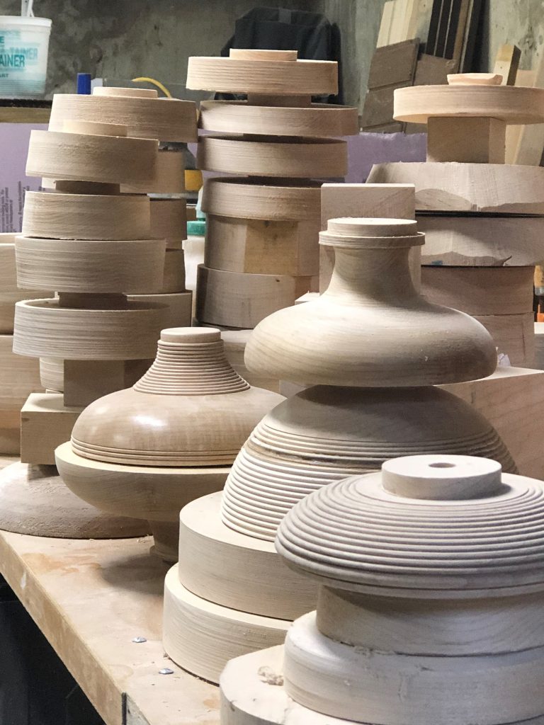 Preparing the canvases
You are a 3rd generation wood carver. What do you think your forebears would have to say of your art?
My hope is that they would be proud that the tradition of working with wood has continued. My family’s backgrounds were more as builders and carpenters… and the very practical world of the Mid-West and West, that I have found a niche as a wood artist would have both surprised and satisfied.
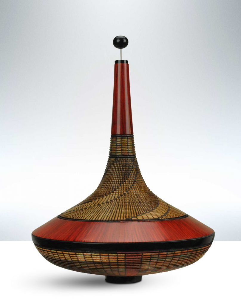
Contemporary wall sculpture, 22"d; "Eagles". porcupine quill center.
Can you tell us where some of the very best woven baskets can be seen and in which museums or galleries?
“Best” is so subjective. Examples of the technique can be found in collections at The Smithsonian Museum and western art collections of museums such as The CM Russell, the Briscoe and the Eitlejorge, all in the US. Collectors range the world stage as do galleries that showcase Southwest/Western fine craft/fine art.
I’m honored to have been selected as a 2020 Smithsonian artist and will join 120 others next April in an exhibition and public sales event in Washington DC.
Discuss the importance of keeping American Southwest tribal culture alive through your art.
Joseph's Coat: 8"h x 9"d vessel, Sugar maple, woodburning, india inks
My artwork is story-driven, an approach that I believe adds meaning and context beyond the wood art itself. I spend considerable time researching Native Cultures’ storytelling, legends and iconography. This provides a foundation for my eventual contemporary design interpretation.
Do you provide, an explanation of the story related to each piece?
Yes, of course… for any of the larger/major pieces. The story informs the piece and adds depth and meaning. I want to be sure my customers are able to tell their friends about the story of the artwork.
 Sol Via, 15"d x 2" wall sculpture, Sugar maple, woodburning, india inks
Comment on the marriage, of the two aspects of your work. Traditional wood carving and storytelling.
My work is story-driven… at least for the major and larger pieces. (small ones are just pretty (grin). I believe that the aspect of “story” adds much to the production of each illusion carving. “Story” is one of the things that sets my work apart. While patrons are drawn to the beauty and uniqueness, it is often the story of a piece that results in selection and purchase.
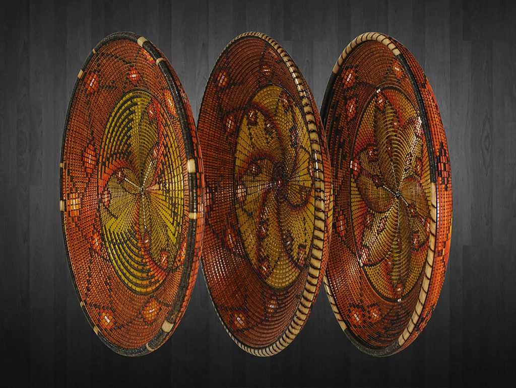
Sonoran Triplet: Dawn, Midday & Dusk, each platter is 10"d x 2"h, Sugar maple, woodburning, india inks
I do detailed research (thank you Internet) on tribal/Native Culture stories, legends, iconography and mythology. I have a degree in Library Science so am experienced in the process of detailed research; as well, my degree and earlier profession as a journalist also fostered my love of story… a grounding my entire life.
There’s an emotion to story that compliments the artwork
Once I’ve identified a story or aspect, then I interprete it into imagery that I can carve and color. All this is done freehand when sometimes a small bit of sketching. I don’t do detailed patterns or drawings prior to starting to carve. The spontaneous, organic nature of the interplay of carving and wood provide a one-of-a-kind direction.
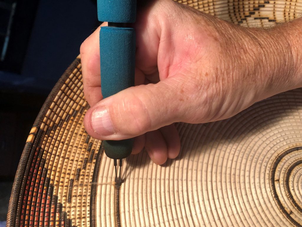
Detail shot: burning the design
What has led you to use sugar maple? Sugar maple is used for a very specific reason. Because I woodburn the designs at a very high temperature… the combination of heat + the sugar content of the wood itself produces a wonderful patina of soft browns and ivory as the cell structure actually carmelises.
You also use reclaimed or re-purposed maple. How difficult is it to source?
In the American late 1940s/1950s, furniture manufacturers used hardwoods such as Maple, Cherry and Oak to produce large volumes of functional furniture. Over the years, much of the work was handed down and eventually has found its way to flea markets, 2nd hand stores, etc. I look for these damaged, well-worn pieces and salvage wood. Another source is rail car flooring. Hardwood planks were inexpensive to use and the American rail industry expanded. Now many of the old freight boxcars are being scrapped and flooring recycled.
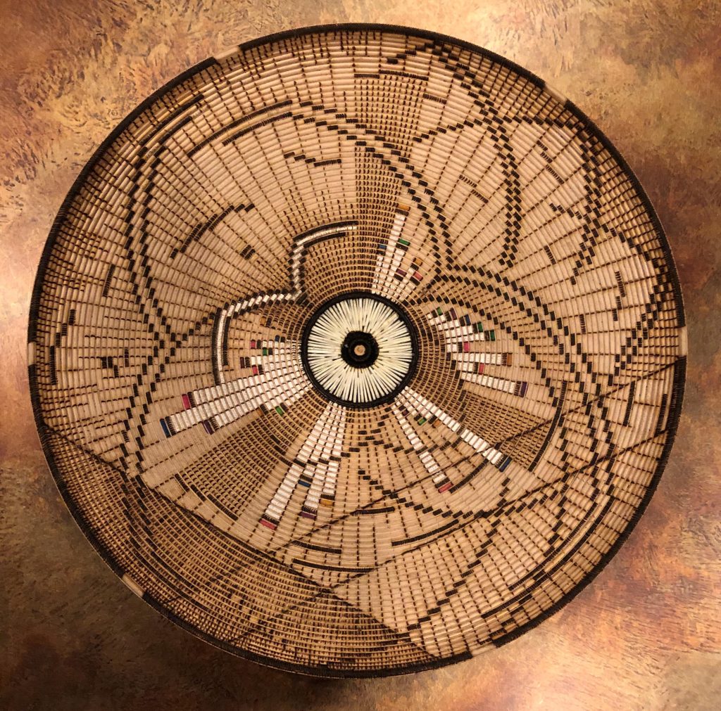
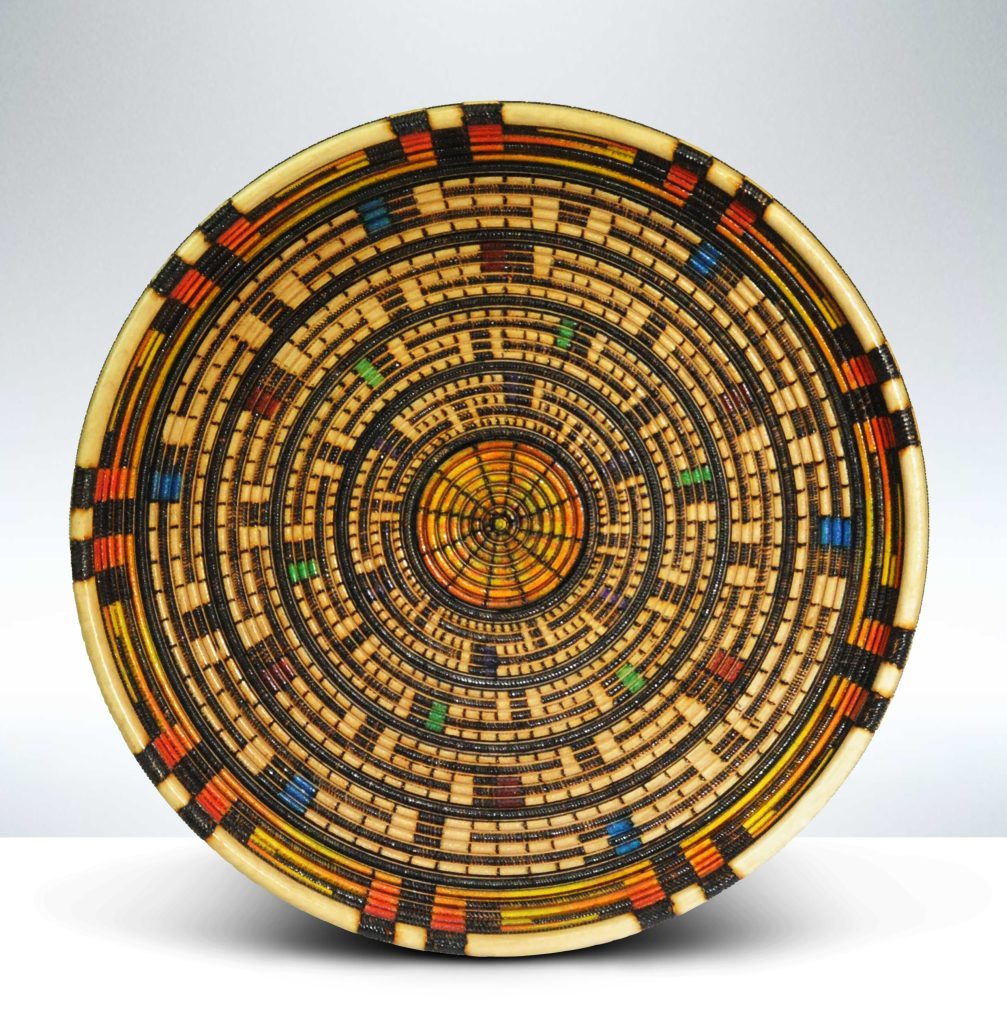
Patterns are represented using colour of the weave or beads that would have been woven into the baskets. Briefly can you explain how you do both techniques.
The woven technique involves woodburning a very high number of cuts in very fine-line detail. All the woodburning is done with a single tool… a 1/8” radius. By varying the pressure, the temperature and the density of strokes, I can create the illusion of weaving and fabric… even when looked at closely. From any distance, it’s difficult to believe “…it’s wood..”; For the woven designs that require color, semi-transparent India inks are applied. The transparency mimics the appearance of colored fabric. Inks are applied with brushes and solvent washes.
Ohana (family in Hawaiian) 14"H x 9"d vessel, Sugar Maple, woodburning, India inks
The beaded technique is again woodburned using the 1/8” tool. Actual beads are opaque in color. To achieve this, I use organic, solid dyes rather than the transparent inks. These dyes are actually applied twice. The first application of color soaks into the wood to produce a muted color effect. Can be nice but beadwork is opaque so a 2nd color coat needs applied. Each cell is colored discretely so that color does not bleed from cell to cell.
Can you expand on the inside of your baskets?
For some hollow-form executions, the vessel opening is large enough that the inside is visible. When this is the case, I woodburn and color the inside. This more than doubles the time required to finish the piece. As well, the entire inside must be finished first, then the outside of the piece is shaped to final form, carved and colored.
How do you sign your work?
I sign with my artist name: “Keoni”, the year a piece is produced, the name of the piece, and the studio location (either Colorado or California); On major pieces I also include a design reference number.
- I’ve became a professional artist (or at least started the journey in 2017 so have been at it for only three years at the professional level. Many fine this short time surprising.
- My success trajectory has been unexpected.
Year 1: Acceptance into a top tier art show; one gallery representation; several national awards.
Year 2: Full schedule of national, top tier art shows; nomination to the By Western Hands artisan guild; exhibition acceptance at The CM Russell Museum; multiple awards; additional gallery representation.
Year 3: Acceptance to the 2020 Smithsonian exhibition; SOFA-Chicago exhibition; refined, full schedule of top tier art shows; publicity coverage in several national publications ; refined gallery representation.
I believe my business background facilitated the fast start. Of course, the artwork had to be of commercial quality… but my understanding of the marketing, finance and business aspects was not a struggle… I’ve honed those skills with decades of a business career. I understood from the start, the need for branding… efficient material sourcing… differing customer sales channels… the value of publicity… tiered pricing… etc.
I often refer to myself as an “accidental artist…” as this current journey wasn’t at all planned. No art classes… no formal artist training…
I remain young and learning. Most every experience is a single data point, whether that be a gallery interaction… set-up and selling at a national show such as Philadelphia, Chicago or Smithsonian…
I am blessed many times over: my wife and life partner, Karen, is amazingly supportive; artist colleagues that freely share advice, experiences and hard-won knowledge… retail and gallery owners that, even in rejection, offer encouragement… and the many, many patrons that validate my work with each and every purchase.
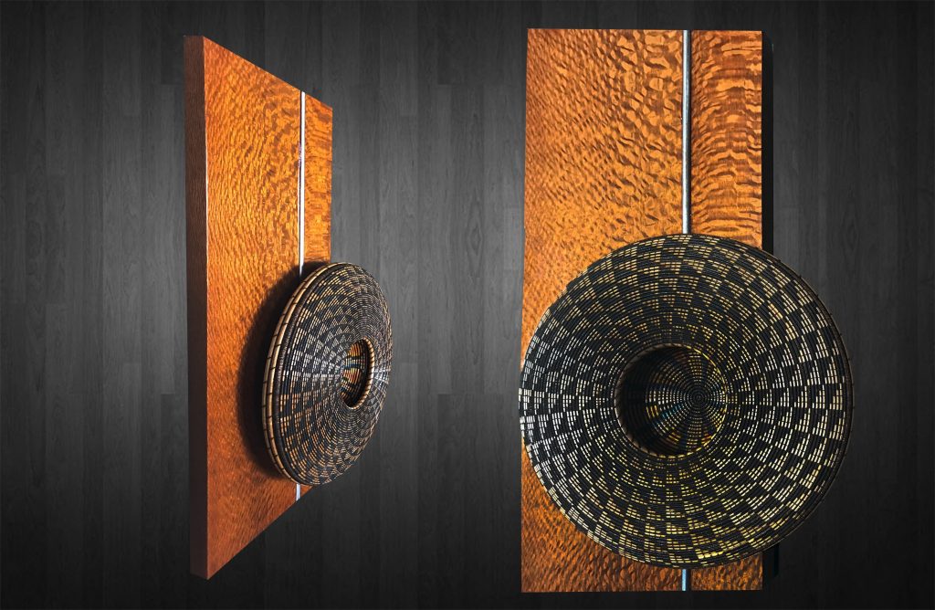
Journey, wall sculpture, Leopard wood/stainless steel accent back: 24"h x 18"w Medallion: 13"d x 3"h
Contact:
Keoni
KeoniWoodArt.com
KeoniWoodArt@gmail.com
Deborah Blakeley, Melbourne, Australia
Interview by Deborah Blakeley, February 2020
Susan Brown
You used to paint only in water colour, recently you have been working in acrylic too. How do you find the two mediums?
I had to reverse my brain when working in acrylic, as the technique is to go from dark to light (color), usually blocking out the dark areas in advance, whereas with watercolor, one must go from light to dark, usually leaving areas of white paper for the “whites.” It took me awhile to make the change when working in acrylics.
Another difference is the “happy accidents” one gets from watercolor—how colors blend “by themselves” (with a little help sometimes). However, watercolor is less forgiving than acrylic in that one can’t paint over what one has done—it was a revelation that I can make complete changes in acrylic just by painting over what I’ve done! Both watercolor and acrylic allow layers of color over another, though with slightly different techniques. Actually, I’m now able to switch easily between media, including oil as well.
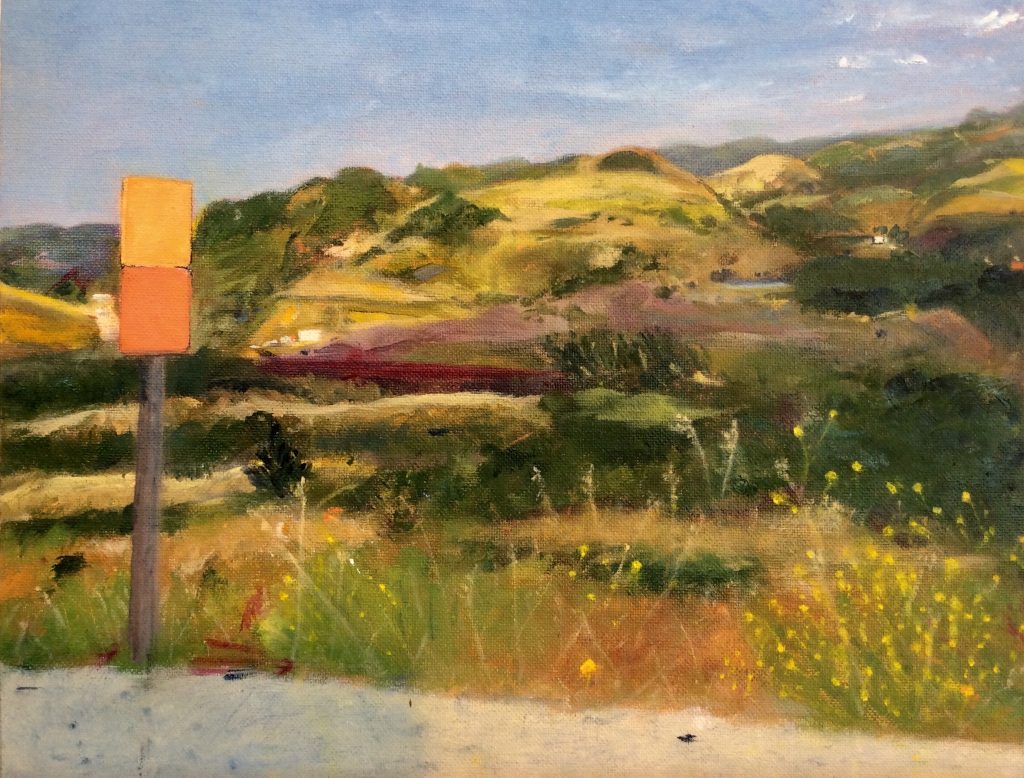
Hidden Valley Summer, oil,14”x 16”
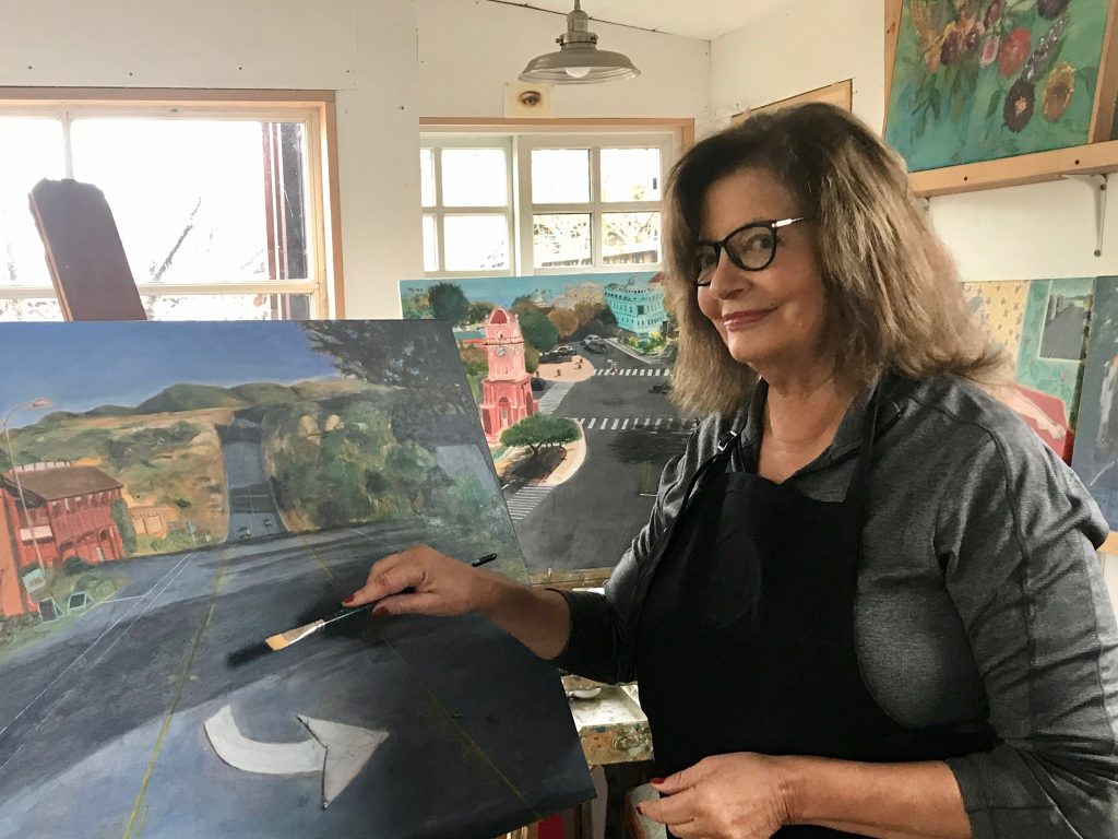
Comment on your series of Street scenes – Santa Cruz to San Francisco. Can you use 3 to 4 paintings and take us on the trip?
Discuss the content
Discuss differences in the environment you pass through
How you have used the physical road
Since living in the San Francisco Bay Area, and now Santa Cruz County, I have found in my street-scene/local landscape paintings a way to show my love of place and the deep emotional attachment I have for my CA home. This “location” series allows me to explore my fascination with the same location in various times of day and from different perspectives and vantage points. I enjoy the challenge of combining architectural details with city and rural landscapes and solving the geometry of space. My aim with these paintings is to share with the viewer this feeling of joy and warmth, and to evoke a deep feeling of place recognition, even if it’s somewhere you have never been.
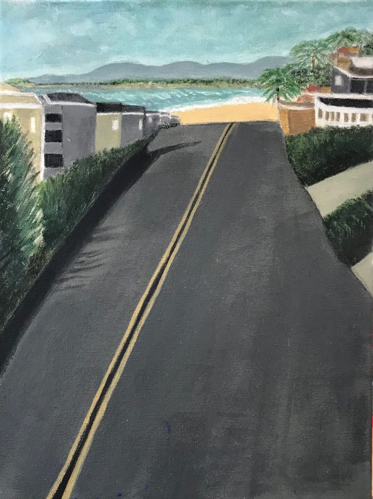
Rio Del Mar, acrylic, 12”x 14”
After completing a small painting of Rio Del Mar, My partner, Rick, suggested that I continue and paint a series of local areas that are important to me. I’d never done this level of architectural/landscape mix, but I was inspired by Richard Diebenkorn’s paintings that combine streets, buildings and landscape.
The first painting I did in this series is “Van Ness Ave” —which is the street where I live. I expanded the view to include several iconic town buildings, a hint of the Boardwalk and across the Bay to Moss Landing. It was a challenge! I had fun painting the cars, including the ice blue one parked on the street, which is my own car. It turned out well and has been exhibited in several venues, as well as prints in private collections.
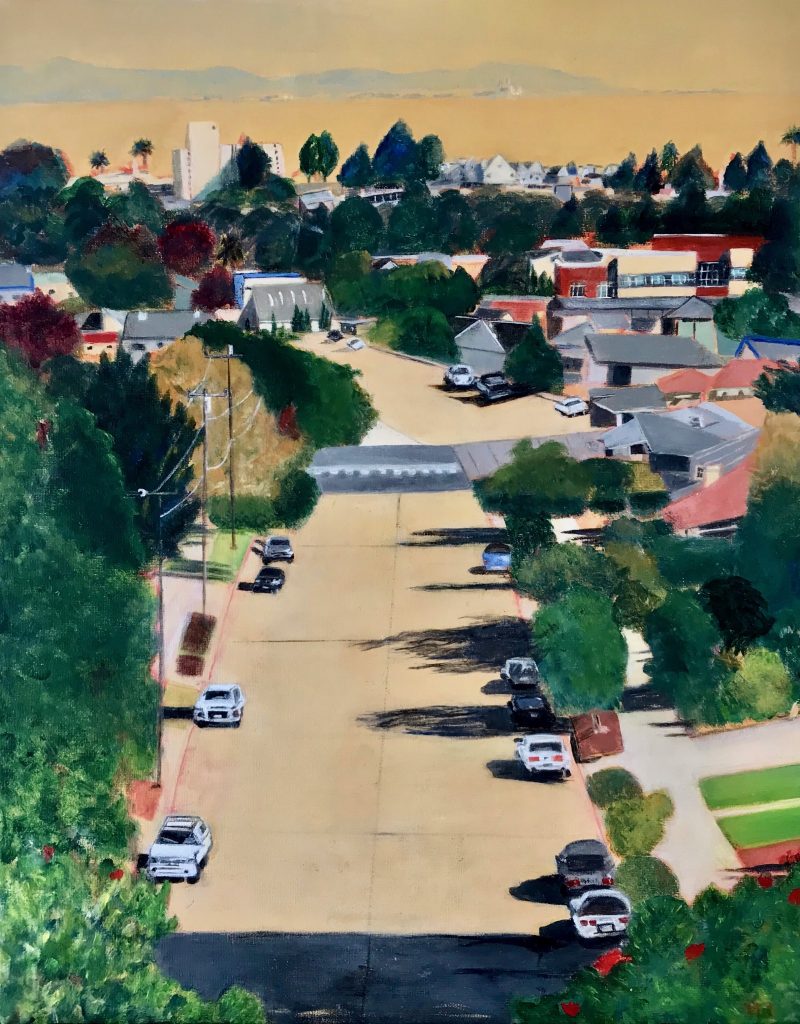
Santa Cruz Van Ness Ave, Acrylic, 18”x 24”
Next, I painted “Santa Cruz Downtown,” playing with the color of the representative buildings, including the town clock and the triangle building at the intersection of Pacific Ave. and Front St.; the main streets of the town. Another challenge, as this had lots of geometry such as the crosswalks and the angles of the street intersections.
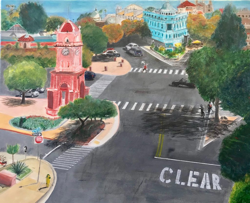
Santa Cruz Downtown, Acrylic, 18”x 24”
The next few paintings in the series are of various aspects of Davenport, CA—in different times of day and evening. Davenport is a small village with a few excellent restaurants, a country store and a famous glass blower. I’d been coming here for years to one of the restaurants, The Road House, and to Lundberg Glass before I moved to Santa Cruz, which is very close (10 miles) to Davenport. Now it’s a place I go to even more often, for brunch with friends, to walk on the bluffs, the beach and to explore the back roads.
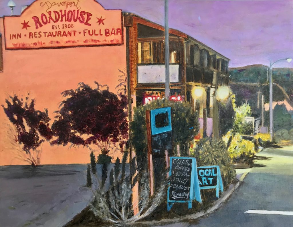
Davenport Evening, Acrylic, 16”x 20”
I’ll finish our “tour” with "San Francisco”—featuring one of the steep streets this great city is known for. I moved to the SF Bay Area in 1978, and never tire of going to the city. Again, I played with color (the street is not really purple) (<* , form and geometry.
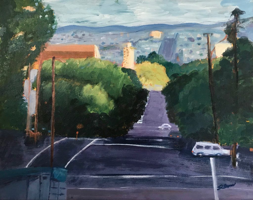
San Francisco 1, Acrylic, 16”x 20”
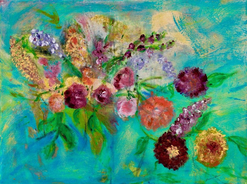
Discuss the use of colour in your flower paints also the use of cropping.
Color is the soul of all my paintings, especially the flowers, whether in watercolor or acrylics. When I was painting mainly in watercolor, I naturally gravitated to painting one or two “cropped” floral images as I was attracted to the form of each flower. I enjoyed painting watercolor flowers in large scope, including the peonies, which is the largest watercolor painting I’ve done; 36”X 24”.
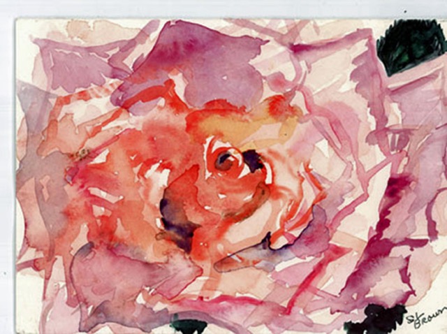
Beauty, Watercolor, 12”x 14”
The flowers seem to float off the page, which was the effect I was going for. I used watercolor glazing to show the depth of the flowers and express the delicacy and elegance of the forms, and goache to contrast the opaque dark background and leaves.
My magnolia watercolor paintings were inspired by Japanese floral paintings, including showing the petals as they are fallen off the plant. The symbolism is that the young and old are natural and inevitable parts of the same whole.
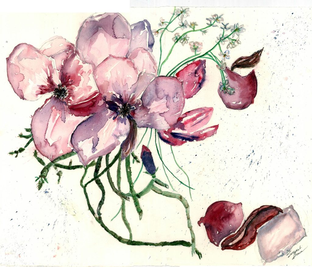
Magnolia 2, Watercolor, 16”x 20”
My acrylic flower paintings have more complexity and abstraction—using the elements of bold color and texture to which acrylic lends itself. It was fun to do them, as they are built on layers of background texture and color; the flowers themselves then added on top, even using my fingers to make effects.
Dream of Flowers, Acrylic, 18”x 24”
How important is colour in your abstraction work?
Color is my first instinct, then form and perspective. The abstracts are very fun and freeing for me, especially in contrast to the “Street Scene” series of paintings which are very “paintstaking,” full of geometry and detail.
Fire Dream, Acrylic, 16”x 20”
For most of my abstracts I start with lots of background color and texture on the canvas, let this dry, then add more color and shapes as I feel them. I sometimes use tools, such as squeegees in various sizes and large brushes to add texture.
A few of my abstracts, however, were done on the bare white canvas, one using streaks of red and yellow, in a color pattern that satisfies me.
Let’s Dance, Acrylic, 16”x 20”
That’s the fun to me of abstracts—I choose a color palette but am not quite sure where they will end up. (I confess that even after I’m done, I often add marks in pen or more paint to “finish” them.) I plan to do more abstracts, after I do a few more in my “Street Scene” series.
Blue Feather, Acrylic, 16”x 20”
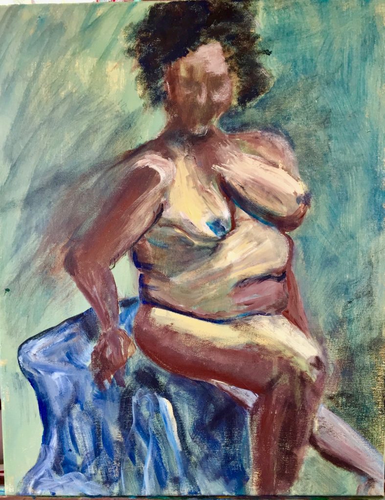
Do you go to life drawing classes regularly?
I’ve been going to life drawing classes and model drawing sessions for many years. In 2008 I was studying with Mike Kitchel, through the Pacific Art League in Palo Alto, CA. He taught a very geometric style of capturing form, which I think is a good basis for further study. Since moving to Santa Cruz in 2014, I joined the Santa Cruz Art League, and became even more dedicated to figure study with a marvelous teacher, Susie Wilson, an expert in form relationships, including explaining how to visualize an invisible grid on the body.
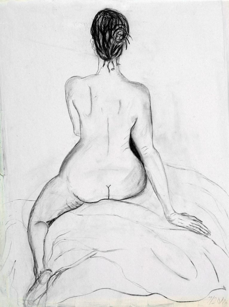
Marla 2, Vine Charcoal, 18”x 24”
She is extremely encouraging, and her concentration in how to really see the relationships and proportions of all the parts of a body, as well as how to capture movement and expression, was just what I needed to progress. I took her classes every week for about three years, and gradually became more confident in my abilities. I have entered and won several awards with my figure paintings which makes me happy that I’m on the right track!
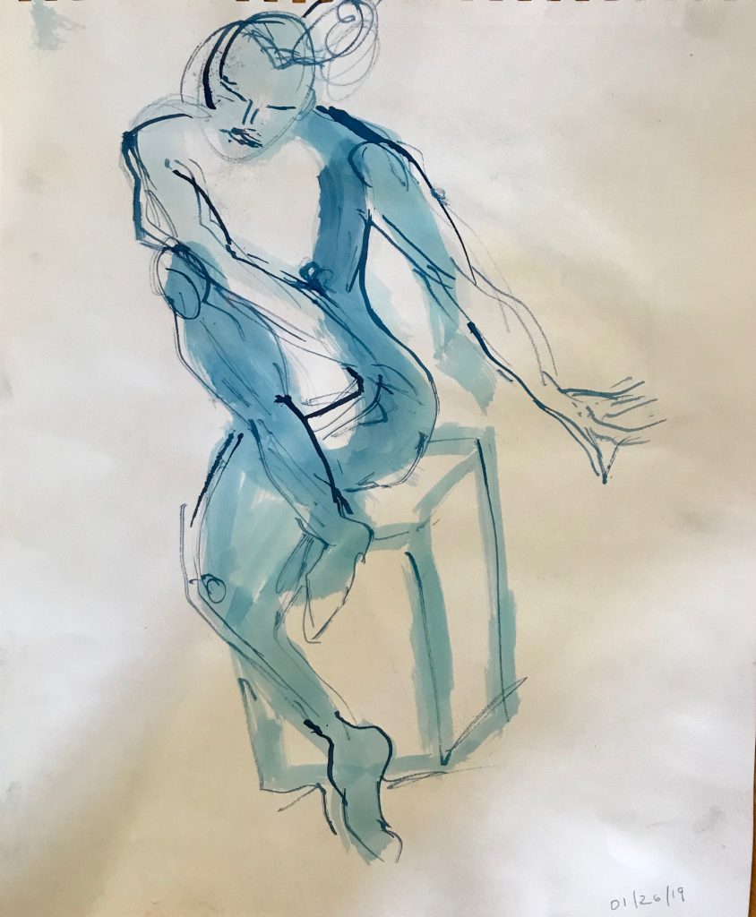
Blue Move, Ink and Bleach, 18”x 24”
Discuss the female form and its beauty and shape as inspiration to you in your work.
I love to draw and paint the female form, especially as I’ve been studying figure drawing for several years. The more, curvy the form the more fun I think it is, as in my “Muriel” paintings. Another thing is that I think that women are victimized so often due to bodies that don’t fit the unrealistic advertising and celebrity examples that I want to show through my painting the beauty of all types of bodies.
 Muriel 2, Acrylic, 16”x 20”
I also enjoy the challenge of drawing poses that are more difficult, such as foreshortened ones. There is something very satisfying about getting the proportion right as well as the likeness and expression on a face. Funny thing is that I’ve developed a drawing style without trying to—folks tell me that my drawings have a definite similarity to each other.
My figure paintings are definitely inspired by Matisse’s loose yet expressive style. I love his patterns and colors too and try to incorporate this into my work as well. I did a series of figure paintings based one of my drawings, using different colors to emphasize various aspects of the form and to depict various moods and themes, including the theme of a German legend, the Lorelei, a woman who threw herself into the Rhine River for love of a man who abandoned her. (She got her revenge in the legend as she became a rock in the river which caused shipwrecks!)
Unlike my figure drawings, actually my figure paintings are in a wide range of styles. I don’t plan it exactly but find out what happens as I put paint to the canvas. Some are more expressionistic, some more realistic and some more abstract.
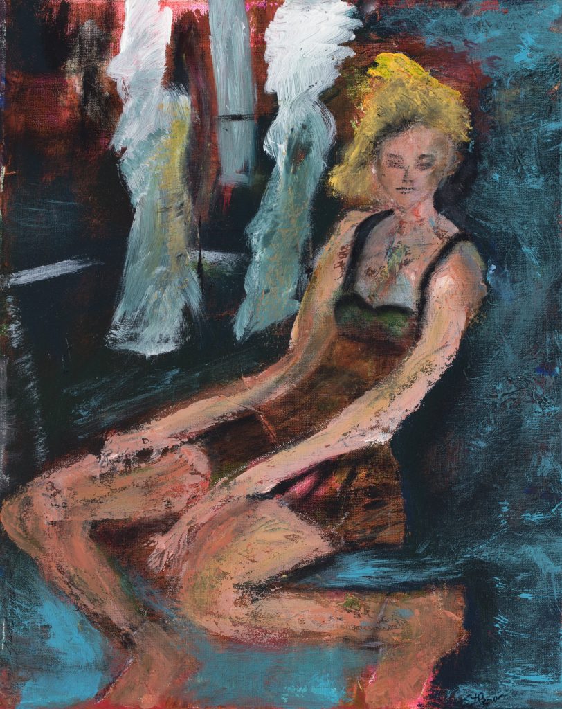
Waiting, Acrylic, 16”x 20”
You give week long classes comment briefly on the format they take.
The classes take place at Ghost Ranch, New Mexico, (www.ghostranch.org) a place where Georgia O’Keeffe lived and worked. It’s a gorgeous area of the USA, with many colorful, unusual rock formations, a beautiful river, (the Chama River), and mountains, including the Pedernal, which O’Keeffe named as her own.
Well, now it’s mine as well (<*
I’m honored to teach a class called “Inspiring Landscapes: Paint It Your Way” (as part of the Spring Festival of the Arts; from Sunday (evening), March 22–Friday (morning), March 27, 2020.
I’ll be teaching a variety of techniques, including travel sketching using pen and watercolor, color mixing technique, and acrylic and watercolor landscape painting. A good friend and excellent travel sketch artist, Julie Barreto, may be a guest teacher on one of the days when we do a field trip in the area. This workshop is available for all levels of painters and all media. The class format include demonstrations, daily studio time to work on each person’s own projects, at least one field trip and lots of individual attention to help each person progress. Besides the opportunity to stay at this beautiful property.
Using images of your work show how you have developed through your artistic career.
I started as a child in Ohio; don’t know if that counts as part of my artistic career! I went to art classes and won a few awards including one as best in show in my age group.
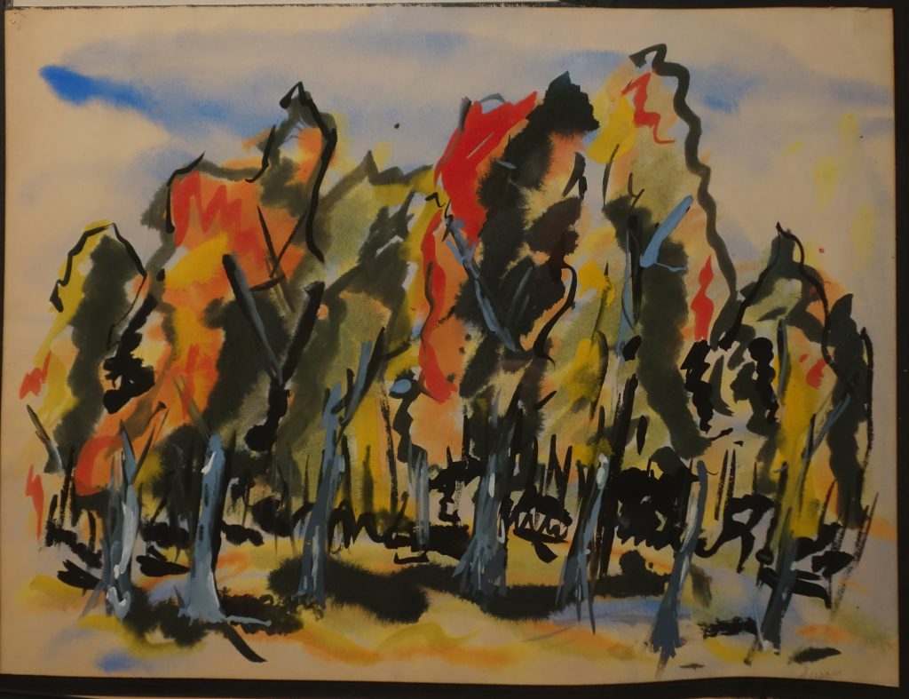 Ohio Fall Forest, Tempura, Ink, 18”x 24”
After moving to CA, I went back to my art again seriously in 1998, as I was going through a divorce. I first concentrated on my drawing skills as I was quite rusty. I took classes at the College of San Mateo, San Jose State, Pacific Art League in Palo Alto, CA and from excellent private instructors.
Watercolor took over my painting life, although I’d done oils as well. (At that time, I’d never worked in acrylics.) I painted mainly still lives and flowers, found joy in using exuberant color. I started exhibiting at galleries, restaurants and art shows and was even invited to represent the United States at the Florence (Italy) International Biennial Exhibition of Contemporary Art in 2011. I also taught watercolor for various city parks and recreation departments, and also for private classes.
Golden Blossom, Watercolor, 16”x 20”
Since moving to Santa Cruz, CA in 2014, I have tried various styles and media as explained previously, and am having the best time exploring and working in all media and many subjects, from figures, landscapes/urbanscapes to abstracts.
Orange Figures, Acrylic, 16”x 20”
Travel sketching is important, how do you approach is format?
(show examples of your sketch books)
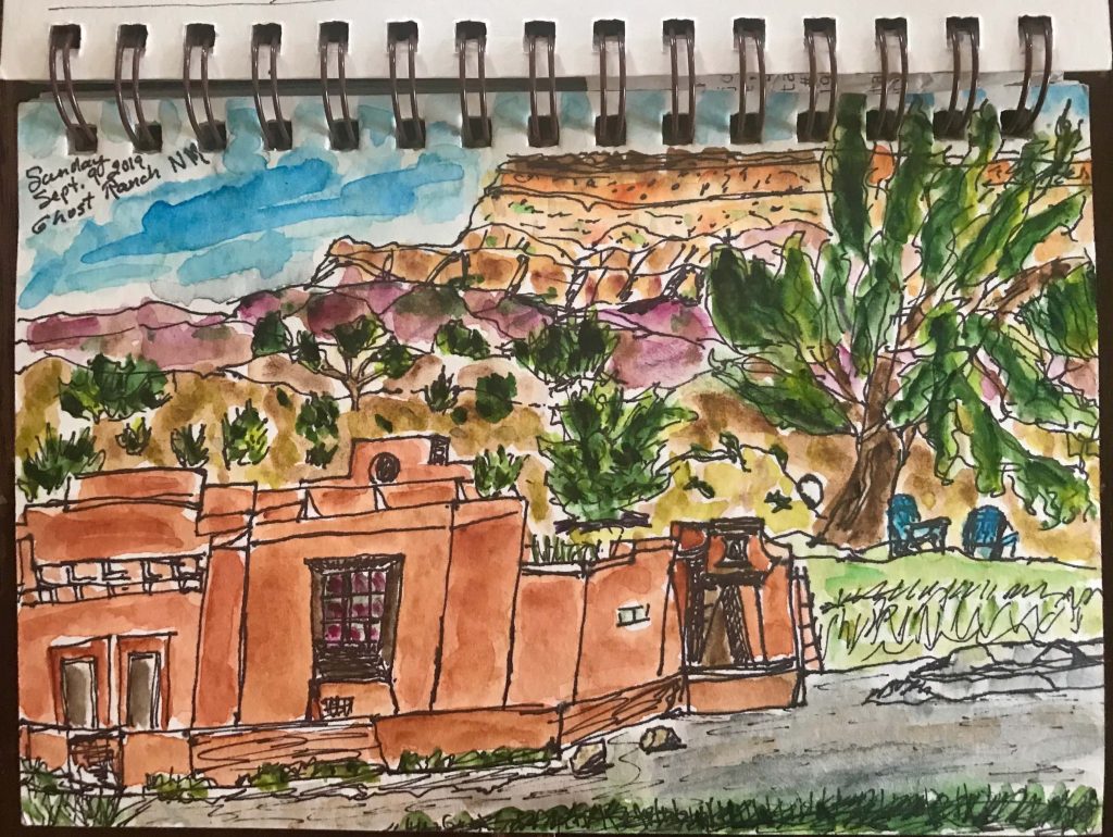
Ghost Ranch, Ink and Watercolor, 51/2”x 7” sketchbook
I have been doing travel sketching throughout my life but have been concentrating on it more in the past few years, especially as I’ve retired from a demanding career in technology marketing. Since then, I have had the opportunity to travel to many places, including Japan, Greece, Argentina, Chile, Italy and France, as well as New Mexico where I’m now teaching. I do plein air, on the spot sketching, depending on how much time I have to do it. Sometimes I’m lucky enough to get an hour or so, but mostly it’s grab a half an hour or even just a few minutes. I used to sketch mainly in pencil, but now I sketch in black ultra fine Sharpie or micro pens, as I like the effect. I’ve found that the more often I sketch the more satisfied I am with what I’ve done—probably an obvious observation (<*
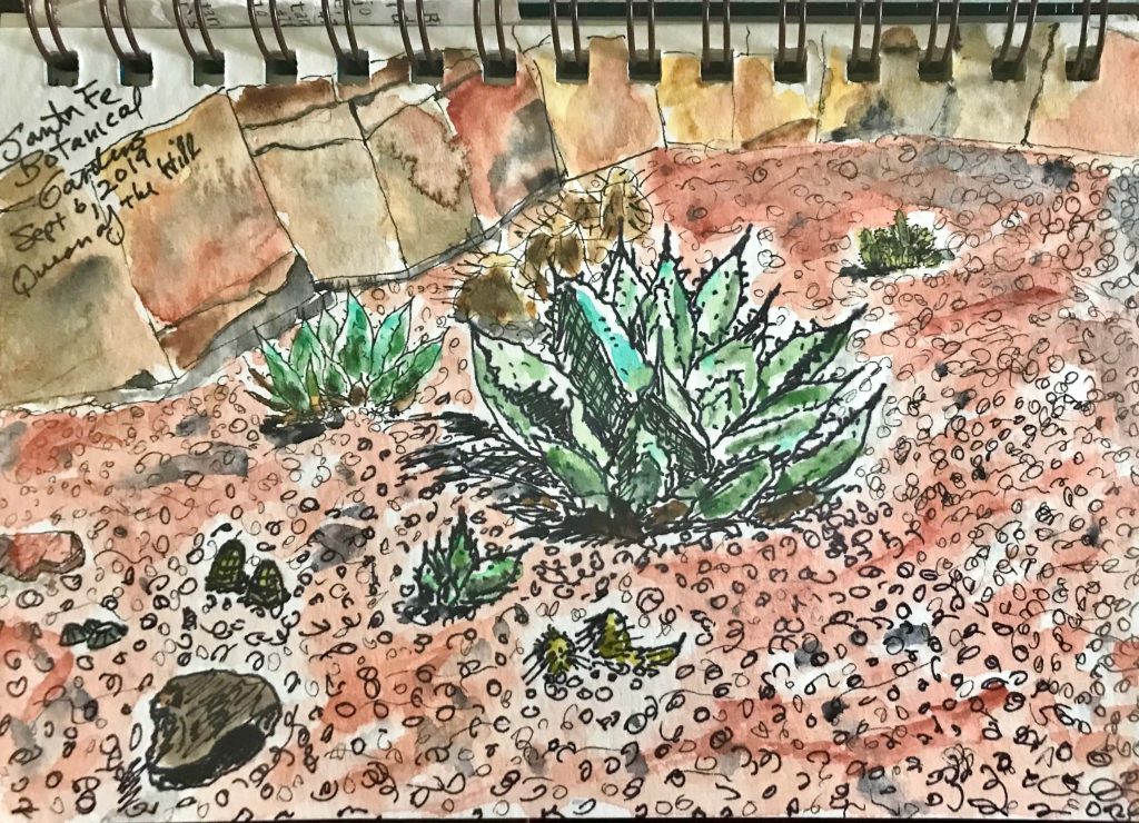
Queen of the Hill—Santa Fe Botanical Garden, Ink and Watercolor, 51/2”x 7” sketchbook
Do you use photography along with sketching when you travel. How do you combine the two?
I usually try to take a photograph of whatever I’ve sketched or started to sketch so I can fill in details later as needed. I take a small travel watercolor set with me so I can add color—sometimes as I’m sketching but often after I do the sketch and from the photo.
I find that I get great pleasure from looking back at my sketches, they bring back the experience of the place much more than a photograph alone!
(Note the Diebenkorn cards I use as inspiration)
I usually try to take a photograph of whatever I’ve sketched or started to sketch so I can fill in details later as needed. I take a small travel watercolor set with me so I can add color—sometimes as I’m sketching but often after I do the sketch and from the photo.
I find that I get great pleasure from looking back at my sketches, they bring back the experience of the place much more than a photograph alone!
Contact:
Susan Brown
email: susanbrownart@gmail.com
Deborah Blakeley, Melbourne, Australia
Interview by Deborah Blakeley, January 2020
Susan Howe
How did you first become involved with POSHU?
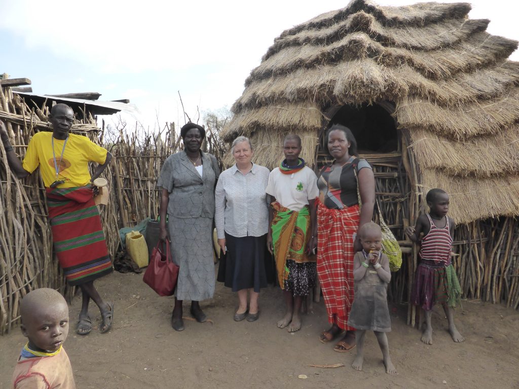
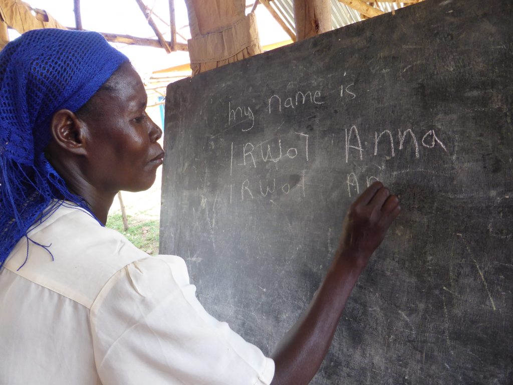
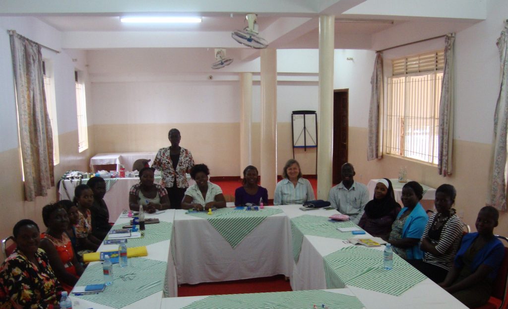
I first went to Africa in 2008 to live with my husband and children. Our neighbour was a doctor working in a village. He asked me to set up English class for older illiterate women who were caring for family members affected by AIDS. I found the women really appreciated the chance to learn. Then I was asked to set up these grassroots literacy classes in another 6 communities. That’s when I established POSHU. We employ local women to teach in their own language. We also distribute vegetable seed, encourage sports, and guide the women in setting up POSHU Savings Groups.
What does the word POSHU mean?
POSHU means Project of Self Help Uganda. POSHO is their staple food, like mashed potato is to us, so I wanted a simple name that reflects the grassroots nature of the project.
How many villages are now being helped?
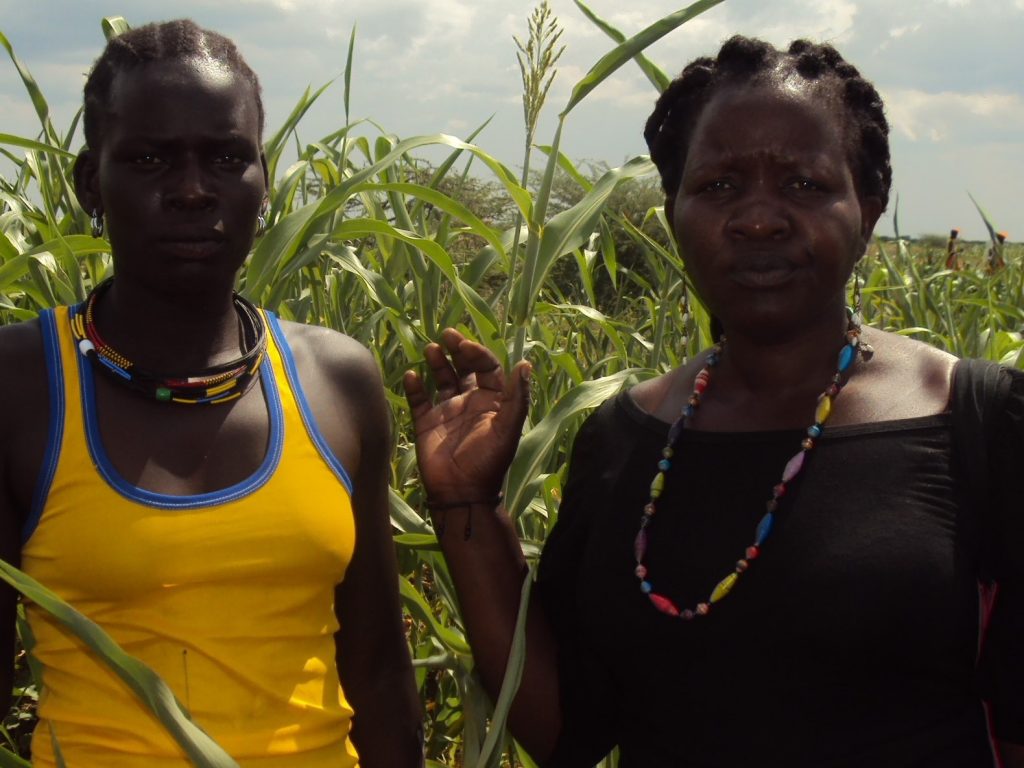
In 2019 we operate in 14 rural and remote villages in north and east Uganda. Mostly we stay for 5 years, then move on. By that time the women can manage by themselves. Since 2009 POSHU Classes have taught women in 28 villages, employing over 100 part-time teachers!
How can others help with this project?
You can purchase our POSHU paper bead necklaces from Mildura’s Art Vault. Or you can buy POSHU cloth bags from LiveFast Café at Halls Gap in The Grampians.
Become a Friend of POSHU and help with fund-raising, or decide if you’d like to make a regular monthly contribution. POSHU provides Tax Receipts for donations in Australia, and you can receive our POSHU Newsletter. We really appreciate our donors who make this project possible.
Our bank details are: POSHU Aust Inc
BSB 083-764
Account 20-141-2490
Who do you specialize in these three aspects?
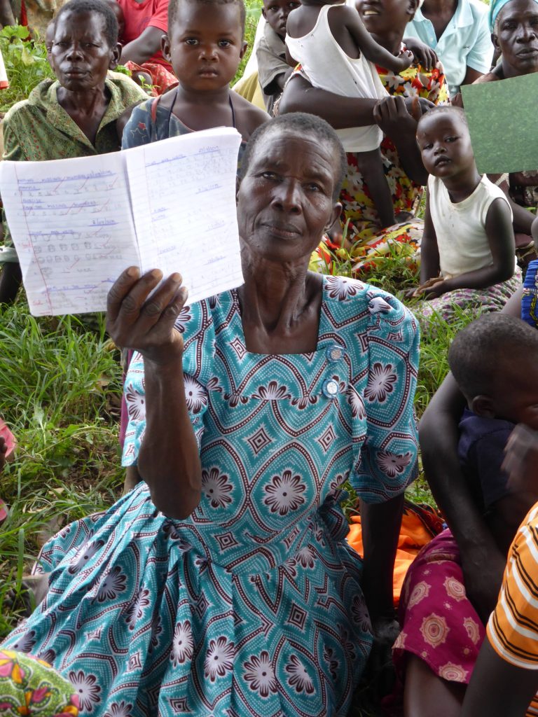
English
English is the national language of Uganda, yet few people in rural areas are able to speak English. If they know even basic English, it opens opportunities for them to gain employment or enrol in further study. Village leaders also attend our classes because they want to represent their people at District meetings, they tell me they need to understand documents concerning their land and water rights.
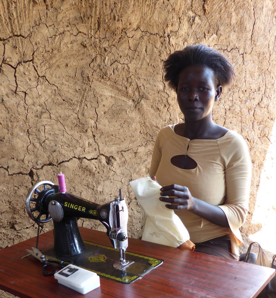
Sewing
Sewing is an income generating skill, but it’s also just a wonderful, creative activity for the hundreds of women and girls who attend our POSHU Sewing Classes. They love to meet together and work on their individual projects, whether it’s making clothes for their children, or a special dress for themselves. “We fill our space now when we walk, we hold our heads high! We know we look smart now,” they tell me. Quite something for women who have known only hardship and drudgery, who only had one dress till now. And they value the friendships they make through POSHU with women from surrounding villages.
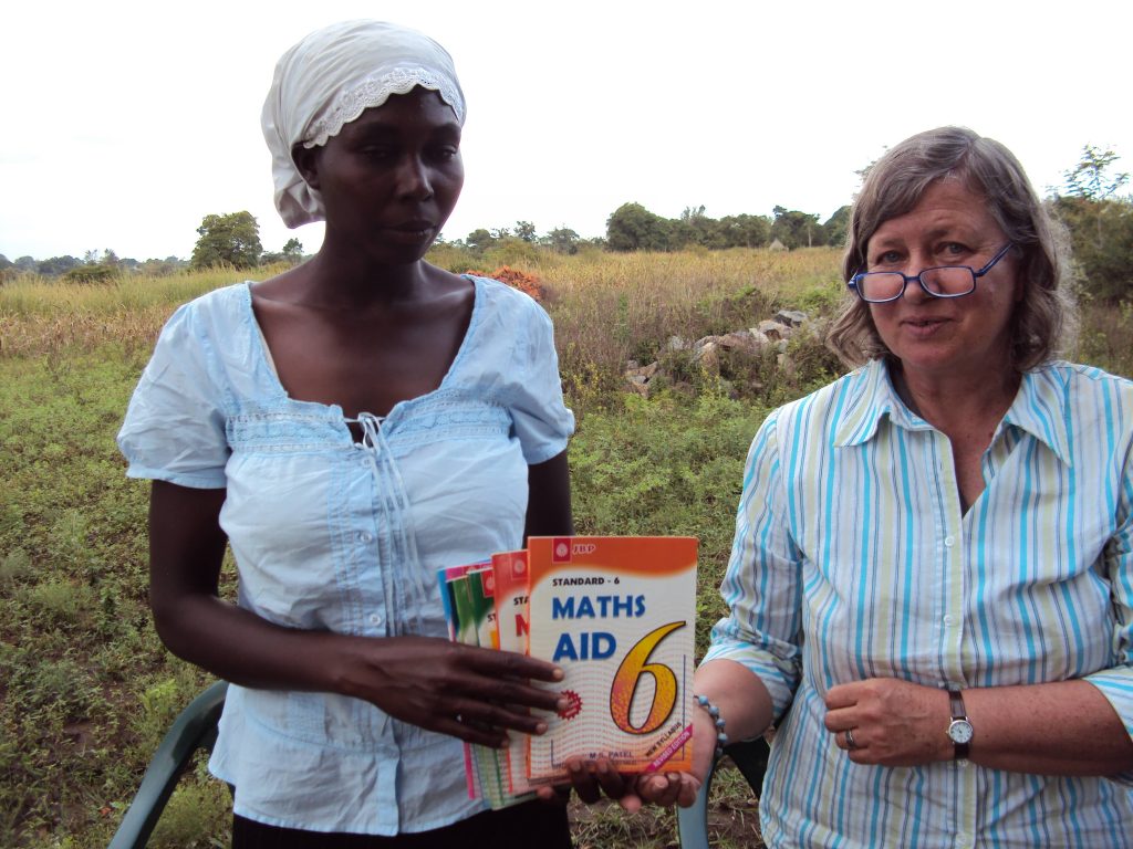
Maths
Maths is important for women subsistence farmers when they go to sell their surplus crops. If they don’t understand how the market works, if they don’t understand basic Math, then they just accept the small amount customers decide to pay them. POSHU teaches basic Math and financial literacy. The women tell me their income has improved because of this training. The next step is helping them to set up POSHU Savings Groups, enabling the women to set up small businesses. They also use their savings to pay school fees for their children, or to buy medicine.
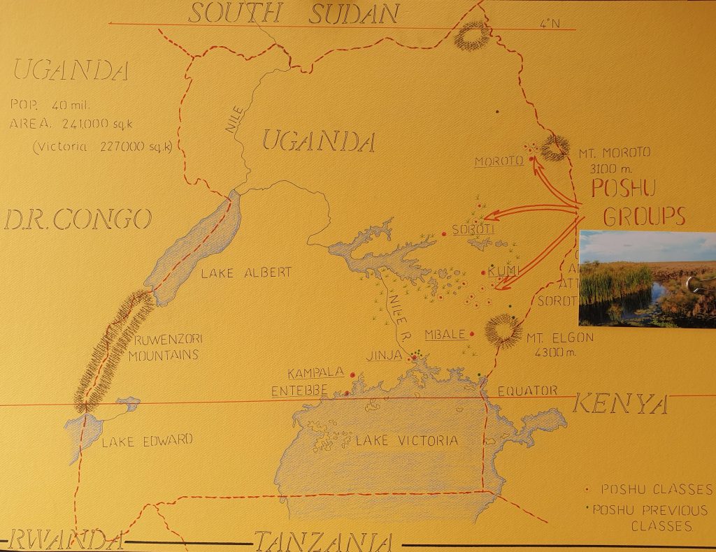
Can you help us put this area on a map?
Give us 3 stories that tell how important POSHU has been to these three women.
- Hellen has been our POSHU Sewing teacher in her village since 2010. She is highly respected for her commitment to her many students, and her attention to detail. Yet when we first met, she was almost destitute. The daily struggle against poverty proved too much for her husband, and he left to find work. Their three young children had only rags to wear, and there was no money for food, let alone school fees or medicine. Hellen laughed when we offered her a job as POSHU Sewing Teacher. It seemed so impossible. She had some training in tailoring, but no sewing machine. The other POSHU Teachers welcomed her, they became her friends. They saw in her what she couldn’t see in herself. Now they are a strong team. They’ve trained 200 teenage girls to sew! They also hold free classes twice a year for the women tailors who work at the Trading Centre, teaching them to sew the latest fashions and improving their skills. Hellen’s husband has returned and now they have two incomes to support their family.
- Jen has been our POSHU English teacher since she was 19 years old. She lived with her parents in their hut on the farm, so was able to save her POSHU earnings. After a year, she bought two goats which she raised up and sold. Then she bought two young bulls which she raised and sold at profit. Then she bought some land!! Every year she grows millet on her land and earns a good income! She has a plan for her future.
- Betty was almost destitute when we asked her to be a POSHU English Teacher in her village. She was overjoyed and cried. Life was difficult for her with a disability meaning she couldn’t dig in the fields. After 5 years of teaching with POSHU, she left last year to work in a shop in the town. Perfect for her!
- Our POSHU Teachers grow in confidence. Each year, some of them leave to attend full time Teacher’s College, with the support of their families and their community. Their goal is to become Primary School teachers!
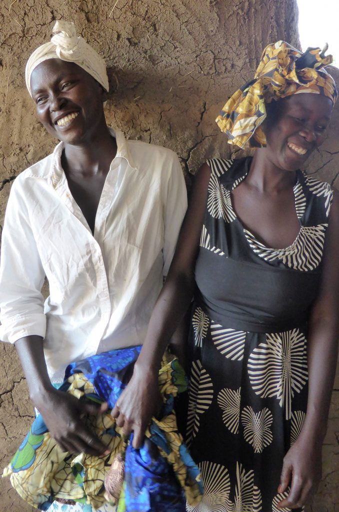
Happy Teachers
Discuss the importance of women helping women.
It’s so important for women to help other women. In the village context, there is already enough knowledge between them all to find their way out of poverty. They don’t need me, or anyone else telling them what to do. What they need is the opportunity to talk and to learn from each other. Almost every village now has at least one woman who is literate. POSHU provides a box of books, pens, chalk, black board. Many of our POSHU teachers are born leaders. We pay them to work in their own village, guiding 25 women and girls towards basic literacy. We try to say “Yes” to their ideas for developing further. Women are inspired by seeing what others are achieving for themselves, and importantly, they gain strength by working together and discussing everything as a group. Everyone has a role to play.
How are the women adding to POSHU themselves?
Each village is different, facing different challenges. And yet poverty has a familiarity to them all. Small changes can make a difference, everyone’s contribution counts. POSHU is valued by the women, and by their communities because we work lightly with them, we don’t tell them what to do. They have the freedom to develop their own ideas, to experiment with what works and what doesn’t. Every woman deserves this right.
What are the plans for POSHU in 2020?
POSHU works with the whole village, because women make sure everyone is included. In 2020 we plan to conduct training for young men in basic manufacturing skills. We have land in eastern Uganda where we’re building a shed that will be our POSHU Enterprise Centre. And we’re supporting a young woman to attend Basic Computer Training and Office Management. She will be an asset to our Enterprise Centre.
Contact:
Susan Howe
Email: susan.h.howe@hotmail.com
Our bank details are: POSHU Aust Inc
BSB 083-764
Account 20-141-2490
Deborah Blakeley, Melbourne, Australia
Interview by Deborah Blakeley, December 2019
Clare Belfrage
Can you discuss your use of line and its relationship with nature?
I have worked with the repetition of an element for many years now and most often using line to create pattern and rhythm. I think initially I used line to reference the grassy spines of the Yakka or Xanthorrea plant as well as using line to create glass drawings. I see the repetition of line in many parts of the natural world whether it is in the specific patterns of plants, rocks, shells, or as an expression of current or movement as experienced in water, sand and clouds. Working with line has been the way I’ve expressed something of the complexity of life that I have observed around me in the natural world. I am really interested in the detail in nature and ways of marking out the living of a life, the passing of time.
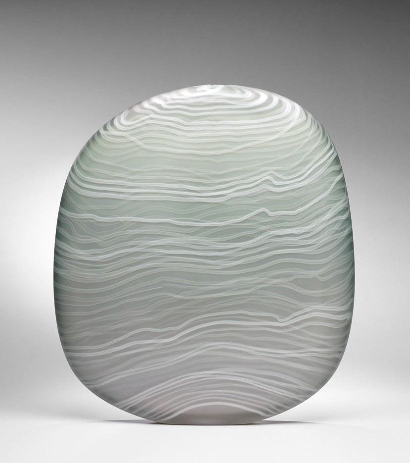
Awash in Grey, 2014, blown glass with cane drawing, sanded, 52 x 45 x 7cm, Photo by Grant Hancock
How are the threads of glass attached and can they be felt in the final work?
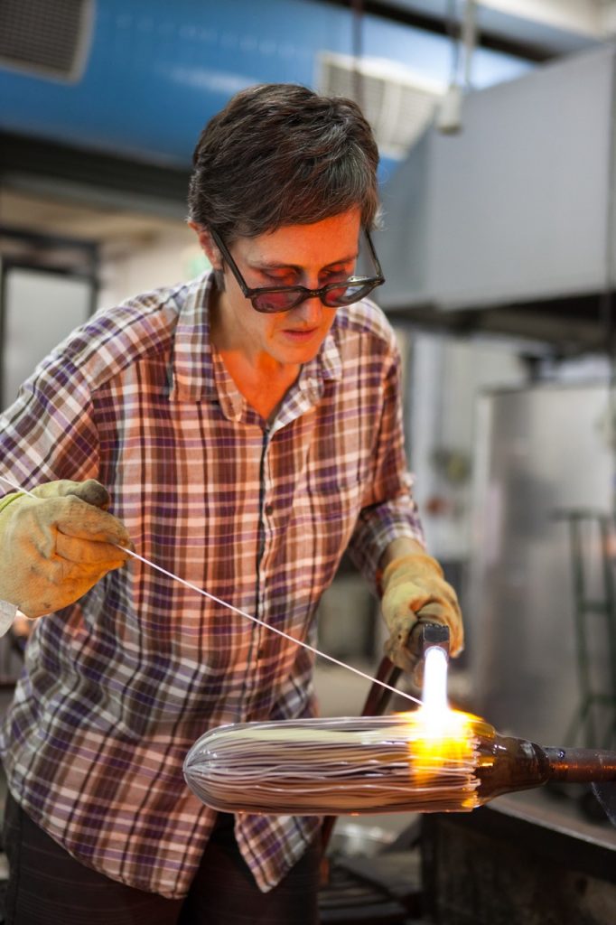
The threads of glass, often called stringers, are fused onto the surface of the glass during the hot process. I prepare the stringers by stretching out a gather of glass with a coloured core to a very fine diameter. Then I use a small torch to heat the stringer at the point of contact to my glass piece to attach it while manoeuvring it to create the pattern.
For different pieces I draw at varying stages of the process and this has an impact on the tactile quality of the line. When I draw early in the process and then gather more glass over the pattern work, the surface will be completely smooth. When I draw later in the process then the line work sits in relief and can be felt.
How have Canberra and Adelaide combined in your art life?
Being part of community has always been really important to me. In fact I’m sure its one of the aspects that really drew me to glass. From the time I finished my studies I felt I was able to jump into the current of Studio glass here in Australia and overseas, and there are many ways I have benefitted from this community. Adelaide and Canberra have been particularly important to me. There are many connections between these two cities and the incredibly vibrant glass communities they house.
I have worked in and around the JamFactory Glass studio in Adelaide since the early nineties and it is still where I do my glassblowing – and also participate in monthly clean-ups and studio meetings. In 1997 I was part of a group that started blue pony, also in Adelaide, a shared studio that ran for 15 years. This was a formative time for me as an artist and again a really important period of community support and growth.
I have also felt a strong connection to Canberra since the early nineties and have enjoyed great conferences, exhibitions and other events there. From 2009 – 2013 I had the privilege of being the Creative Director of Canberra Glassworks where I was able to engage with the Canberra based community and be creative at a whole other level to my artistic practice. I worked with a strong team and we were able to present great programs and events across all areas of glass making: workshops, exhibitions, residencies, collaborations, parties and festivals with the dual engagement of artists and the general public.
I am based again in Adelaide but enjoy all of the connections between the two cities and in fact my solo exhibition, A Measure of Time, a JamFactory touring exhibition is currently on show at the Canberra Glassworks gallery.
How important has the Tom Malone Glass Prize been to your career?
Winning the Tom Malone Prize in 2005 was an absolute thrill. It is an incredible validation of your work as an artist. The prize money is always very useful and being in the public collection of the Art Gallery of Western Australia is of course such an honour.
Tom Malone Prize Winner 2011, 2010, blown glass with cane drawing, 36 x 50 x 9cm, Photo by Rob Little
Winning the prize a second time in 2011 was probably even more of a surprise! The work was very different from the first piece which was great, and the judges, from their comments really acknowledged the development in my work which again was very affirming.
Take two pieces that have gone into overseas collections. (What and why these have been such highlights to you?)
Leaf Circuitry pair, (in the Corning Museum Collection USA) Tallest 42cm, Photo by Rob Little
The Corning Museum of Glass acquired two Leaf Circuitry pieces. These were some of the hardest pieces I have made in terms of the drawn pattern. The pattern comes from a type of eucalyptus leaf that I found particularly unusual. I was excited by it because of the way the rhythm was established and then interrupted by tangental lines. I was very glad that these pieces went to Corning.
With over 25 years, experience in glass art, what have been some of the major changes you have seen in the glass world?
I think the digital age has meant that there is so much more information that students can access. You can watch Youtube videos on almost anything! I think this has really increased the technical knowledge and skill levels in glass.
I feel like I have seen the popularity of glass rise and then fall again both for makers and in terms of the market. I think these things happen in cycles and that’s ok especially if you keep a long view.
What I really feel excited about is that artists are still being highly innovative with the material and that is ensuring a vitality within contemporary practice.
Collection of vessels at the David Roche Foundation Museum, Photo by Pippy Mount
Many of your works are all about form and shape. Discuss this aspect of your work.
A long time ago I moved away from the idea of ‘decorating a form’ and focused on the form and pattern being integral to each other. The form or shape always comes from the core idea but without heading down a path of being too literal. I like to think about what is the essence of an object or what are the core elements. This has resulted in many asymmetrical and flattened forms to carry the pattern work of my glass drawings.
Close Impression, teal and white, blown glass with cane drawing, sanded and pumice polished, 35 x 32 x 11cm, Photo by Pippy Mount.
Size, do you have a limit to the size of the work you do?
As my work is all made from the process of blowing glass there are definitely limits to the scale. In the last 12 months though, I have taken another step up in scale. I have a great team I can work with and we have been able to go pretty big for blown glass. This has enabled me to explore the feeling of a monolith and also the relationship between pattern and form on a larger scale. I guess the largest pieces are approximately 12 kilos and close to 70cm tall.
Untitled #6, Blown glass with cane drawing, 41 x 31 x 8cm, Photo by Grant Hancock
Pistachio and Blue collection is a group of pieces. Do you make many collects or mainly single pieces?
Over the last 20 years I have presented work most often as singles, but I have definitely made pairs and collections. Sometimes it is how the pieces speak to each other in a collection that becomes one of the most interesting aspects of the work. Most recently I have presented some collections made from pieces from different series. This has been particularly exciting for me.
Quiet Shifting, Purple and Gold Blown glass with cane drawing, sanded and pumice polished 64 x 40 x 20cm Photo: Pippy Mount
Comment on the title, SALA and your personal thoughts on this?
SALA – South Australian Living Artists Festival - is a brilliant, inclusive and huge visual arts festival held every August across South Australia. SALA invites all artists at all levels to participate. It is the biggest visual arts festival in Australia. In 2018 I was the ‘Feature Artist’ of the Festival. This meant that a monograph on my career and practice, titled, Rhythms of Necessity, written by Kay Lawrence and Sera Waters was published and launched. I also had a major solo exhibition, A Measure of Time, as JamFactory’s 2018 Icon, and national tour of the exhibition to eleven venues over three years. I gave a number of public presentations and demonstrations. This was an immense honour and a great opportunity to highlight glass making practice in South Australia and beyond.
How important is professional development to your current work?
I have always enjoyed being active in projects outside of my direct practice. I like the intellectual stimulation and contact with other interesting people. I’ve been involved in developing and hosting conferences and I always attend our Ausglass conferences. I am currently on the Board of Guildhouse, a not-for-profit organization that supports South Australian visual artists, craftspeople and designers to build and maintain sustainable careers. I’m not sure that these experiences directly influence my art work but they are nonetheless very important to me.
Take a resent piece and discuss…
A MEASURE OF TIME from Randy Larcombe on Vimeo.
This was made by Randy Larcombe. It is also called A Measure of Time.
How does your personal environment influence your work particularly colour?
I definitely look to the natural world for my colour sensibility. I mostly look at Australian plants but I am not a purist. I enjoy gardening and I have made a pretty nice front garden of native plants that has really focused on different textures. When I can I go bush walking and camping and I draw inspiration from these experiences.
Clare Belfrage
Adelaide, Australia
insta: clare_belfrage
Deborah Blakeley, Melbourne, Australia
Interview by Deborah Blakeley, December 2019
Emma Rodgers
Can you expand on the importance of people, places and experiences in your life as an artist?
 People who have influenced me
There have been so many people who have supported or had influence on my work an amazing tutor at school Stuart Dimalow , who encouraged me to go to art school and believed in me and encouraged me from such an early age. My Mother who took me to galleries and allowed me to constantly turn our kitchen table into a studio space. Sue Tucker who when at art school help me to develop my work through constantly show me so many aspects of these processes. David Jones at university who took me out of my comfort zone and made me engage with the public and apply for everything! My husband and family who has always supported my projects, no matter how bizarre they maybe. Henry Jabbour , we bonded over our love of art and have become great friends along the way.
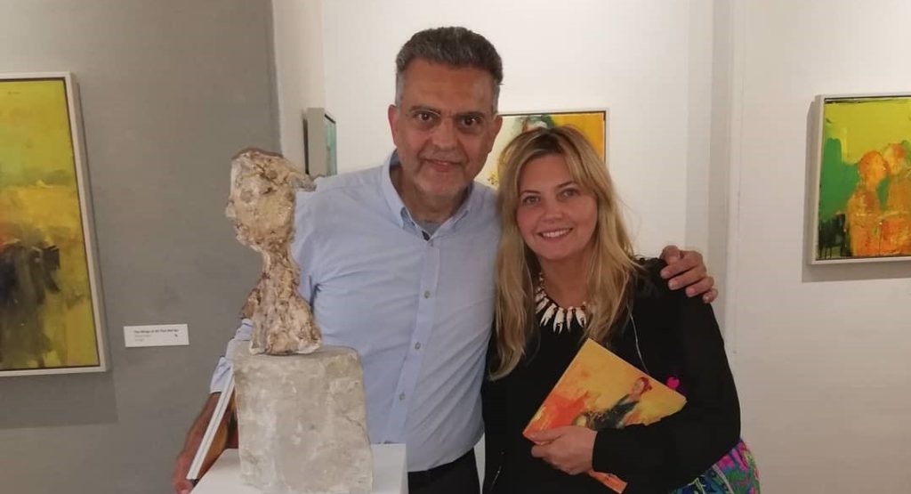
Henry Jabbour and Emma Rodgers
Castle Fine art foundry, my work would not have grown this way if I didn’t have the security of your technical skills. And so many others Thank you all , my path would not have been as rich and diverse without your influences.
Places and Experiences
I travel a lot and think it is my greatest luxury , to experience other countries, cultures, history and wild life has had a huge influence on my work.
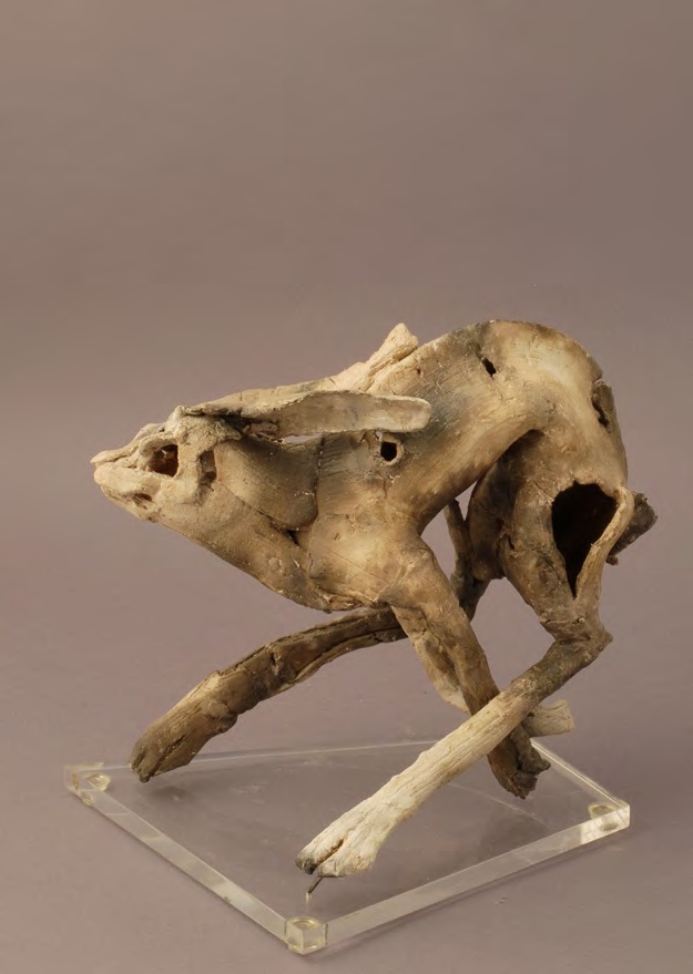
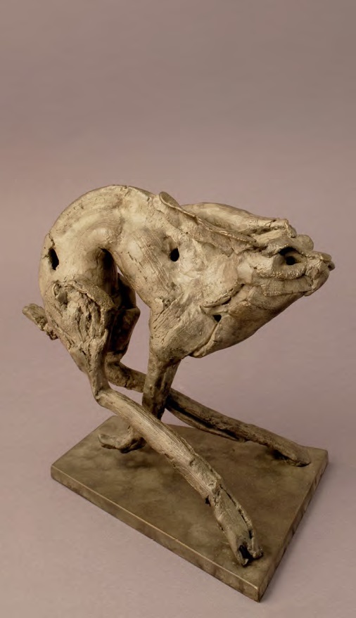
Museums. When visiting museums, I find the artifacts that are not fully restored the most interesting, allowing the viewer to fill in the gaps. Often the negative space is just as interesting as the form that remains. Some sections maybe well preserved while other extremely eroded and when they are reintroduced to sit next to each other after the passage of time, the contrasts are quite beautiful.
There is a piece in the British Museum of a horse and rider. All that remains is the horses head and torso with the rider’s hand tenderly placed on its neck, it shows such intimacy that for me, if it was ever fully restored it would destroy the piece. Nature is incredible in all its raw, yet intricate beauty. The more you peel away the more you find and Clay with its earthy characteristics is the perfect medium to translate natural form.
Museums and medical books are the perfect inspiration for working out how to display a piece. From the simplicity of the stands through to quite complexed forms when the artifact needs more support, some of these structures almost become part of the form, enhancing it, but without being too intrusive.
Reconstructed Figures
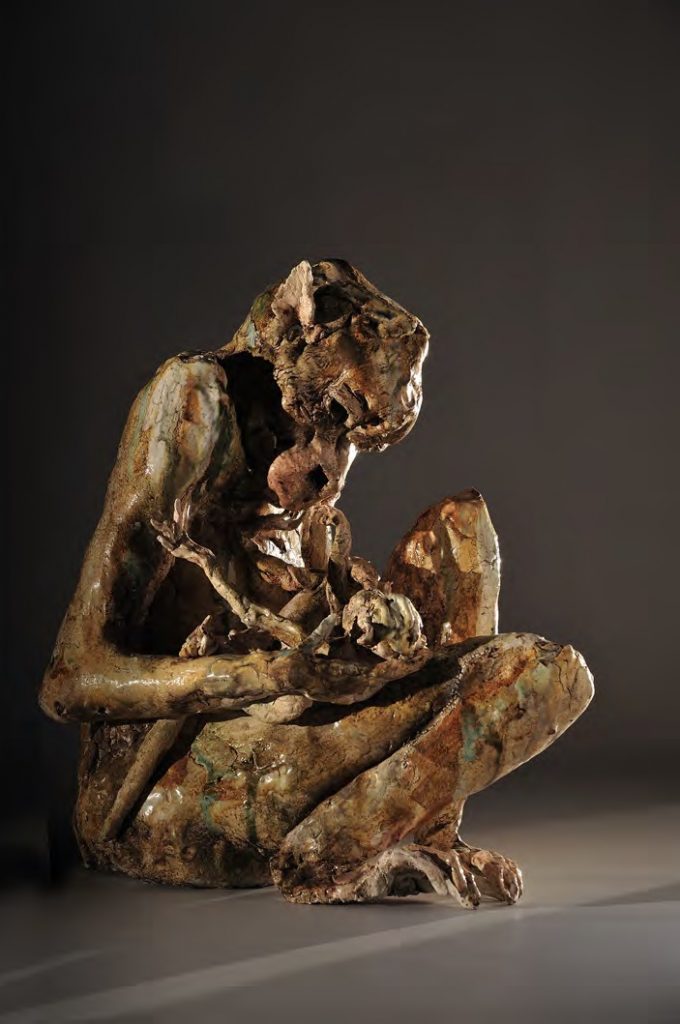
When considering displaying my work I look at what each piece needs. Some require the elevation of a stand to give them more presence and allow the viewer to see all angles. Whereas other for example the mother and child monkey, I want to appear to have climbed up into the show and are taking a rest. To achieve these holes are inserted at the correct angels and size in construction stage and stone is chosen by which best colour and surface finish suits the piece.
You mention two places Veterinary Theatres and Marvels space ships as important places in your career. Can you give a brief synopsis of each and their involvement in your art practice.
Through giving talks and demonstrations At Leahurst Veterinary school about how much nature inspires me. I was invited to view the facilities which were fascinating, as they are often striving to develop and improve methods within the practice with state of the art technology and a dedicated team. It is a privilege to have access to their daily life, from sketching in a field through to watching an autopsy and seeing how beautifully nature is constructed.
 Marvel
Marvel
I was approached by Marvel Films to create work for a Film called Guardians of the Galaxy. The pieces needed to feel other worldly as they were to be placed in the Collectors spaceship. This is a character that travel around the galaxy collecting artifacts. I loved working on this and seeing how the sets were made was amazing, such attention to detail. They even made space sweets!
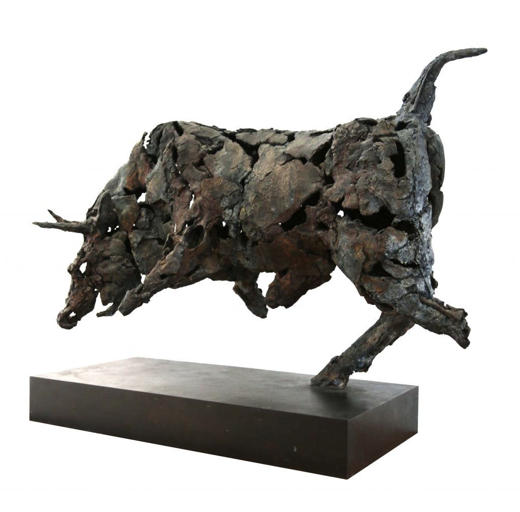
Bull
Marvel featured this sculpture in the Stark Towers penthouse of the character Iron Man, played by Robert Downey Jr, Avengers Age of Ultron.
I was then invited back to designing and producing sculptures with Marvel films for the sets of Avengers Age of Ultron. My children were invited on set and met Robbie Downey Jr and Chris Helmsworth whilst seeing a whole new perspective of what goes into a film. Wonderful memories for them.
Mother and Child
If you are willing to explore various routes of art, one of the huge perks of this job is being able to venture into other worlds.
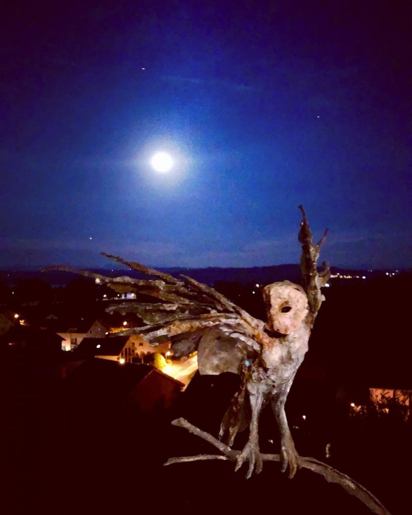
Owl
One of my friends has a pet owl, so I often visit to sketch, photograph generally observe. The sketches range from close fine detail to very loose often charcoal drawing whilst they are moving, jotting down just a few marks will give me the essence of what I am aiming to capture.
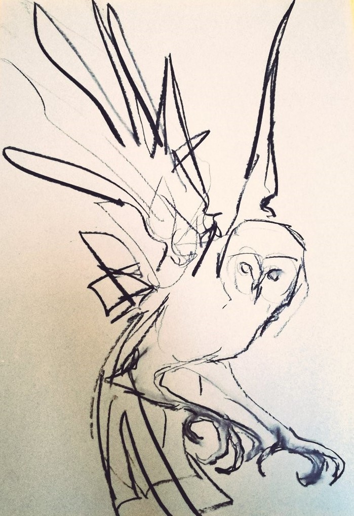
Being able to handle her and feel her joints really helps me to understand how she moves. When I feel I have enough to work from I will arrange everything around me in the studio and start to construct small quick studies in clay and wax, not really a maquette, more of a 3d sketch. I will then develop one of those poses either in wax or clay. With Luna, I wanted her wings to be made from her environment , but not necessarily include feathers as I felt that to obvious. I gathered bark, branches, moss and shard of slate and working from them developed her wings. Once I was happy with the form it was moulded, and a wax was made from this of which I hand cut and was then cast in bronze. I patinate all my own work, so the pallet was again inspired by the environment with very loose brush marks on the wings to emphases movement, and more refined marks to define the face and expression of the bird. The piece is then sealed and wax.
In this work you have a limited edition of 9. Can you say where they have all flown to?
Some have stayed in the UK, others have travelled to New York, Singapore and even Beirut.
Who is Lucy? Discuss this bronze.
Lucy was originally commissioned by a client in N.Y. She has a dachshund named Lucy which is very social and can often be found perched on her back legs to be fully involved with conversation. It pose is what inspired the composition of the piece. The clients has commissioned artists from all over the world to make Lucy in their own style and is planning an exhibition of these.
Way back in 1996 you were the winner of the prestigious Victorian and Albert Museum Prize.
How did this come to be?
I was a student at Wolverhampton University and the tutors would we were regularly encouraged to apply for various exhibition and projects, to help take the fear away from filling out form and encouraging us to start to plan and how we would develop out careers. Luckily one of those forms was the V& A ceramic contemporary. I was accepted and won two prizes, which astonished me.
Rabbit 1 Ceramic, Contemporary prize winner Victoria and Albert Museum, 1996
How did this propel you into the art world?
One of the prizes was an exhibition, and with the exposure the show gave me other galleries approached me to work with them. I realised that these opportunities don’t come along very often and acted on this. It was an incredible springboard for my career. Through the exhibitions I saved and had my first bronze cast. And was luck enough to be accepted at the R.A. Summer show. With the sale from this exhibition I was able to buy a kiln which gave me so much more freedom to work and develop.
Rabbit 1 Bronze Royal Academy of Arts
Another award more resent has been your nomination to Liverpool’s ‘Top 25 most influential Women in Liverpool’ discuss this honour.
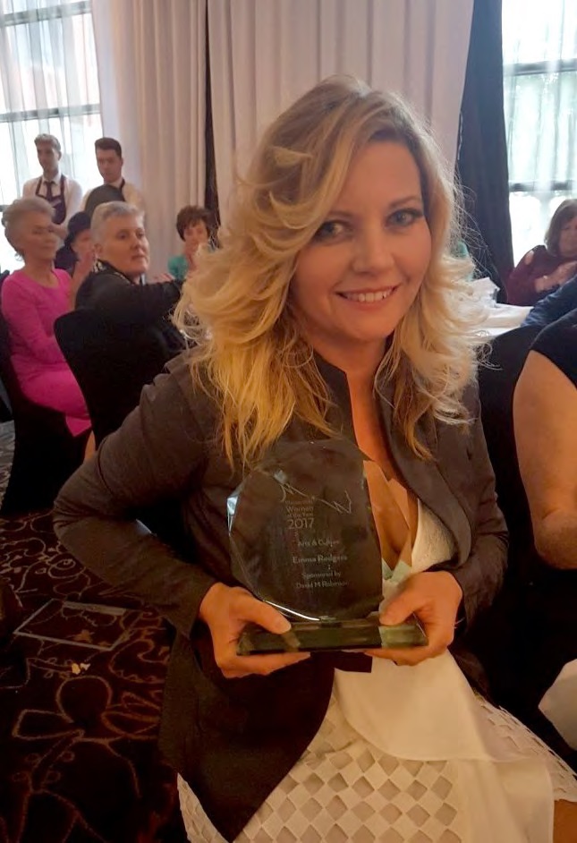
I was awarded Woman of The Year for Arts and Culture Liverpool and I think I was number seven in most influence women in Liverpool . I have also recently been awarded Gold and Platinum awards for arts and culture Wirral Life. These all feel slightly surreal, but were presented due to the attention from the public art I have produced and my work with charities using my art.
I am a patron of Clatterbridge Cancer Centre of which I works closely with in various areas. In the last year my work has raised £100,000 for The Michael Josephson Ball of which I have been involved with for a number of years. I also support a range of other charities in the North West including, St Johns Hospice, Claire House and Variety to name just a few.
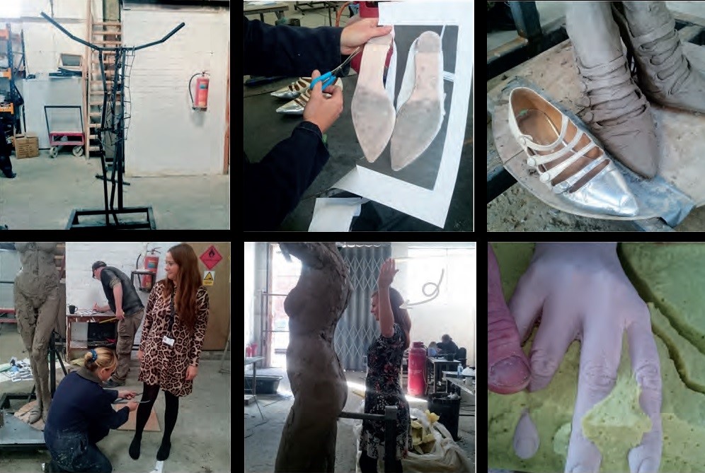
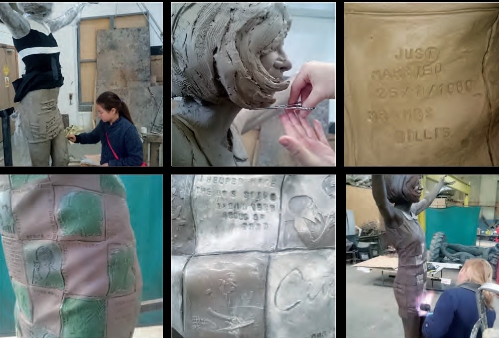
This leads us to two sculptures in Liverpool, Cilla Black and Liver Bird, discuss both.
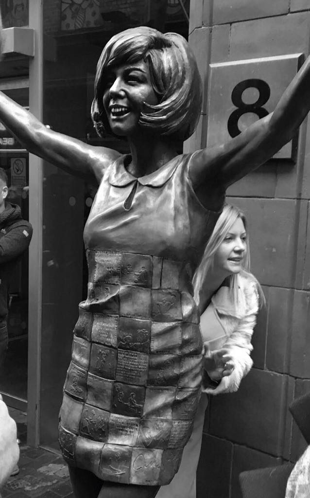
In 2017 I was commissioned by the family of Cilla Black to create a public art sculpture of "Cilla" which is now a permanent feature outside the famous Cavern Club, Liverpool.
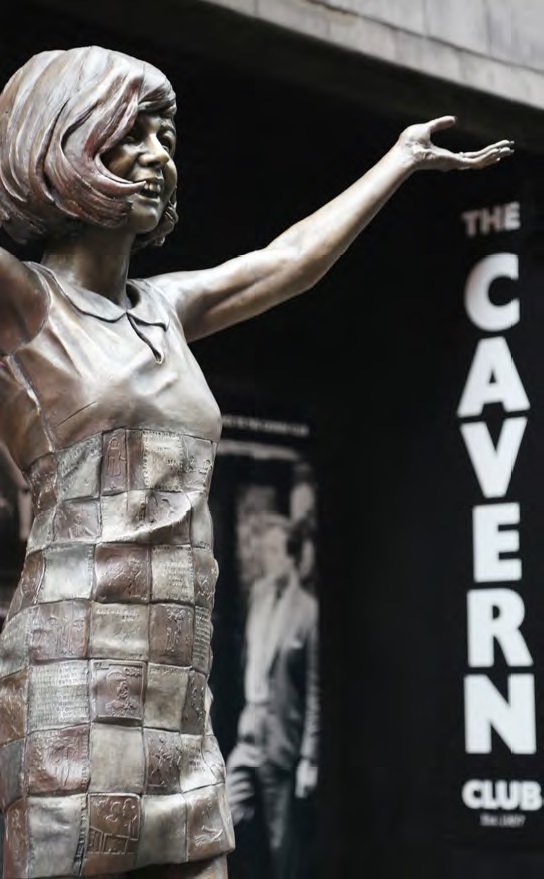
Cilla Black
In 2017 Rodgers was commissioned by the family of Cilla Black to created a public art sculpture of "Cilla" which is now a permanent feature outside the famous Cavern Club. Cilla had worked in the cavern at the beginning of her career, so we felt it was only fitting for her to return.
Cilla Black, detail
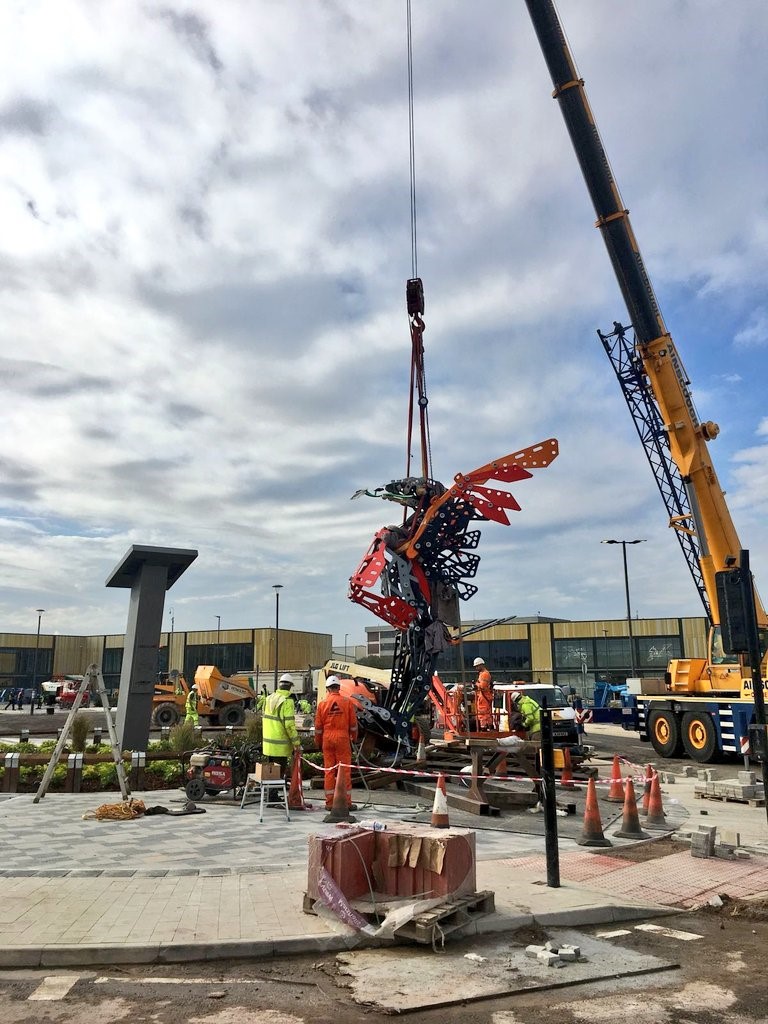
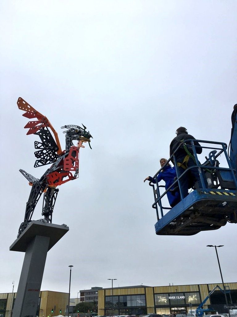
In the same year I also designed and created the world’s largest Liver bird, standing at 11 metres high.
Liver bird
Large sheet of steel is cut to appear to be constructed out of Meccano as this is the site of the original Meccano factory.
Liver bird
Liverpool in the same year she has also designed and created the worlds largest Live bird, standing at 11 metres high.
Discuss the pros and cons on working as a sculptor of contemporary celebrities who we all recognize instantly.
With Cilla Black, her family wanted 1960’s face with 1970’s nose. So that face had never existed at that time. This was created by layering images of both decades and working from them.

Cilla Black, detail
Friends of similar frames were approached and asked to pose in freezing studios whist we measured and sketched from them.
We also worked closely with the family , they would pop in throughout the process and offer advice or extra images. Robert her son provided us with a … of the first time Cilla had her hair cut by Vidal Sassoon. This was invaluable, as it showed the cut from all angels , but also how exited she was at it was around the time her career took off.
Discuss the pros and cons on working as a sculptor of contemporary celebrities who we all recognize instantly.
With Cilla Black, her family wanted 1960’s face with 1970’s nose. So that face had never existed at that time. This was created by layering images of both decades and working from them.
Cilla Black
Friends of similar frames were approached and asked to pose in freezing studios whist we measured and sketched from them.
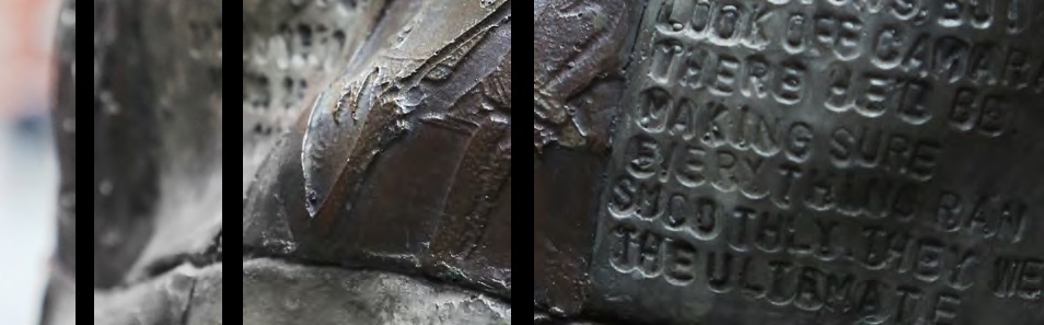
We also worked closely with the family , they would pop in throughout the process and offer advice or extra images. Robert her son provided us with a … of the first time Cilla had her hair cut by Vidal Sassoon. This was invaluable, as it showed the cut from all angels , but also how exited she was at it was around the time her career took off. I asked a hairdresser friend Alan if he would come to the studio with his scissor , and modelled clay as he explained how the hair would move and which angle to cut, to keep it looking as natural as possible. She had such a huge career that spanned decades I chose to hide details within the dress, but I didn’t think there would ever have been enough squares on her dress to tell the full story.
 Cilla Black, detail
Thankfully on the unveiling she was greeted well by the public, but my main thought when creating her was that I was making a sculpture for a family of their beloved mother and if they were happy , then we had done our job.
I asked a hairdresser friend, Alan if he would come to the studio with his scissors , and modelled clay as he explained how the hair would move and which angle to cut, to keep it looking as natural as possible.
 Cilla Black, detail
She had such a huge career that spanned decades I chose to hide details within the dress, but I dint think there would ever have been enough squares on her dress to tell the full story.
Discuss the pros and cons on working as a sculptor of contemporary celebrities who we all recognize instantly.
With Cilla Black, her family wanted 1960’s face with 1970’s nose. So that face had never existed at that time. This was created by layering images of
We also worked closely with the family , they would pop in throughout the process and offer advice or extra images. Robert her son provided us with a … of the first time Cilla had her hair cut by Vidal Sassoon. This was invaluable, as it showed the cut from all angels , but also how exited she was at it was around the time her career took off. I asked a hairdresser friend Alan if he would come to the studio with his scissors , and modelled clay as he explained how the hair would move and which angle to cut, to keep it looking as natural as possible. She had such a huge career that spanned decades I chose to hide details within the dress, but I dint think there would ever have been enough squares on her dress to tell the full story.
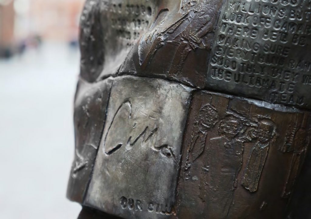 Cilla Black, detail
Thankfully on the unveiling she was greeted well by the public, but my main thought when creating her was that I was making a sculpture for a family of their beloved mother and if they were happy , then we had done our job.
Literature also inspires your work comment on one or two sculptures inspired by the Brothers Grimm.
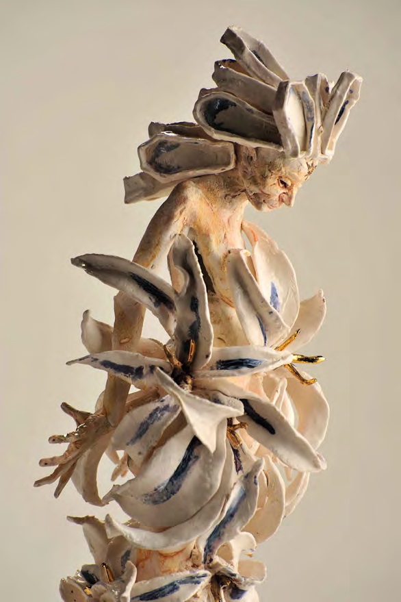
Twelve Brothers
I do enjoy interpreting folk tales. I have recently produced a body of work based on crane wife a love story featuring the transition of her from a crane to a woman and the effect she has on the people around her.
How and when do you add colour?
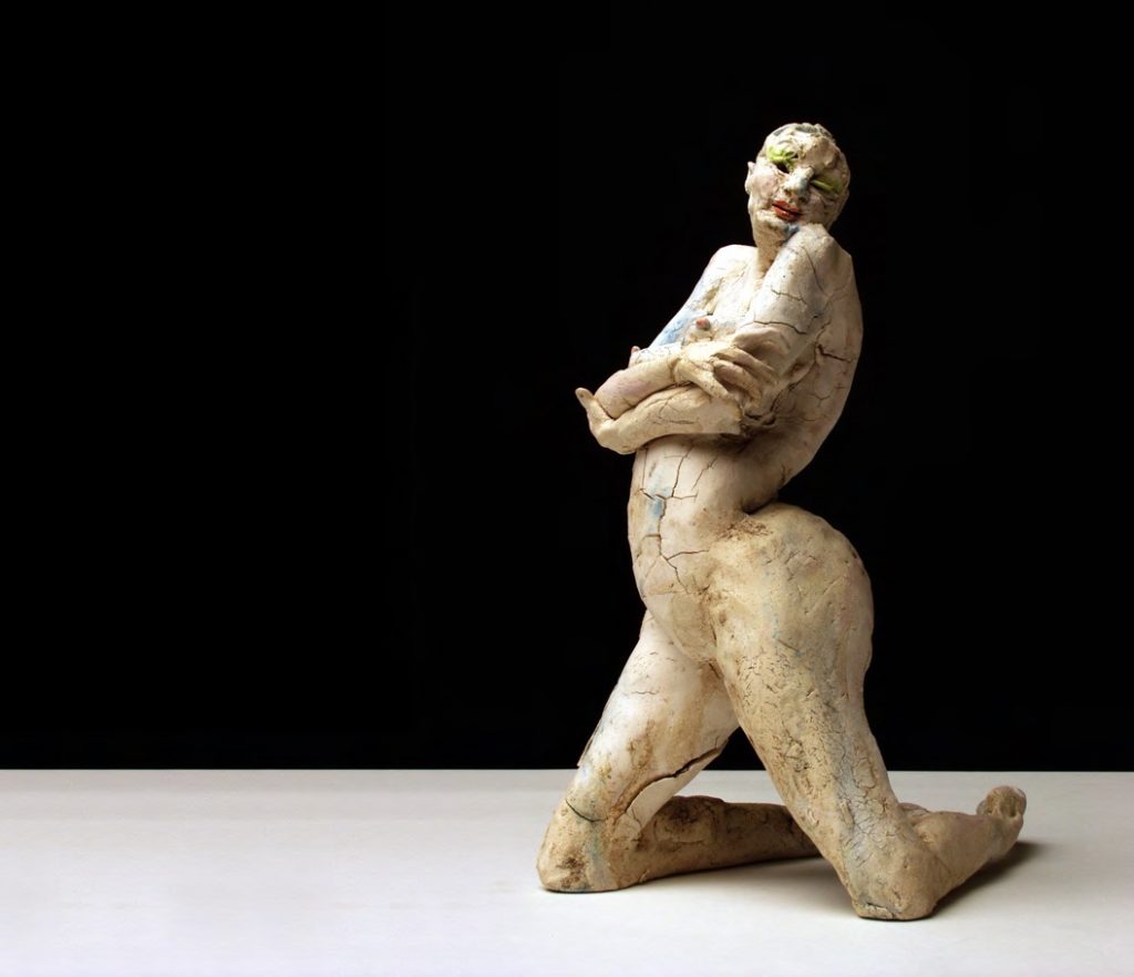
Show Girls
I always add oxides , slips and glazes after the first firing as it keeps the colours clean and enhances the surfaces rather than disguising them. The pieces can be fired several times adding to the pallet each time. Reds are usually the last firing and are fired lower to avoid burn out. I treat the sculpture as a 3d canvas using loose brush marks as if applying water colours, I start with darker tones were shadows would fall on your body and brighter colour were the sun would hit the body.
Where did the inspiration for ‘The Hunt’ come from – Chinese ceramics, Chinese painting or the Bayeux Tapestry?
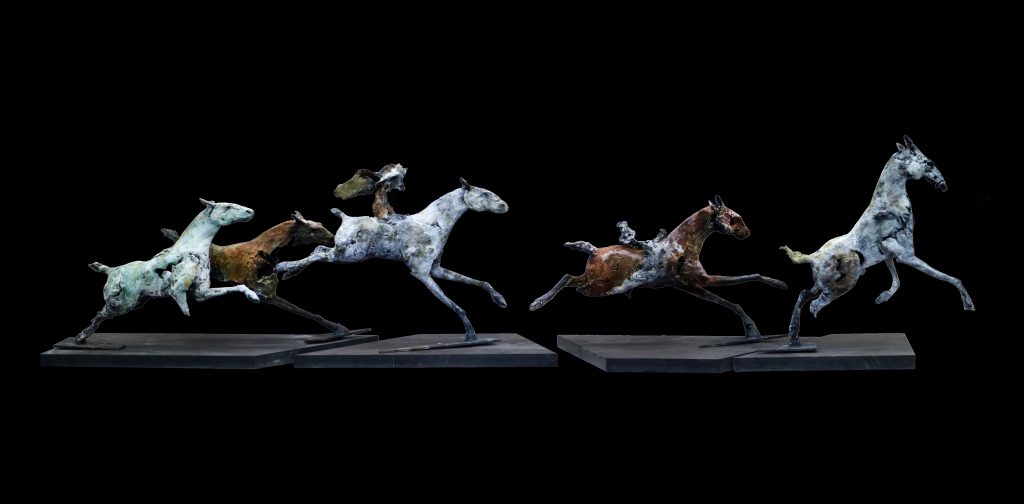
The Hunt
Hunt was inspired by water colours of Mongolian Hunting scenes,
As I make the brush marks translated such movement and strength. Then through research Ancient Nerge tribes I added further details to the piece. I also liver near Chester race course, so having access to viewing such highly tuned beasts in full charge was a great recourse.
Greek mythology is a recurring inspiration for artists, show one piece that fits these criteria and immediately comes to mind.
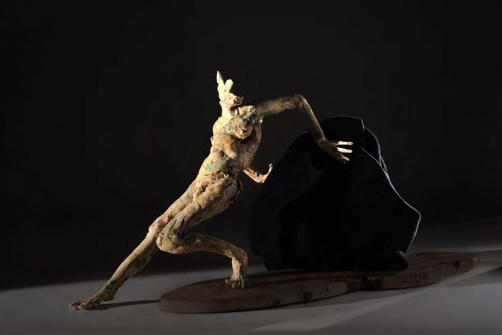
Story of Sisyphus
Most of my Exhibition for my solo show at Alice Mogabgab Gallery, Beirut was inspired by Greek Mythology starting of course with Beroe a nymph of Beirut, the daughter of Aphrodite and Adonis. Eros struck her twice with arrows of love and a confrontation took place for her love Eventually marrying Poseidon. Poseidon’s horses on brazen hooves, The Story of Philomela and the thankless task of Sisyphus were also interpreted in the exhibition.
You use Castle Find Art Foundry, expand on the importance of having these artisans to work with – the value of both their knowledge and artistic input.
I don’t think my career would have developed the way it has if it wasn’t for Castle Fine Arts Foundry. I have known Chris Butler and his team for almost twenty years, and I am lucky to call them my friends. Having access to such technical ability in so many areas gives me so much confidence in producing my work and approaching a new commission, as these can vary from a small complexe piece, through to twelve-foot copper beaten radiators. They allow me to work in the foundry which I feel is important in my style of work as it keeps the hand of the artist throughout the process.
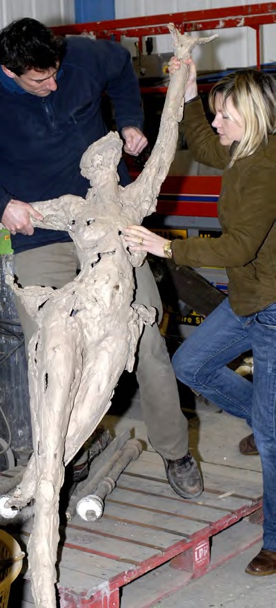
Lastly can you discuss your pieces ‘Finches’ inspired by Darwin and the connections that seen to keep connection us all. (Darwin, Wedgwood – Your incorporating porcelain into your sculptures.)
My Darwin inspired work.
![]()
These pieces were inspired by Darwin I have hidden many stories within these sculptures from Researching specimens and research from his trip to the Galapagos islands through to his drawings with hidden porcelain pieces broke to appear as wing to represent his marriage to Emma from the Wedgwood family. the branch they sit on is based on his sketch.

Contact:
Emma Rodgers
http://www.emmarodgers.co.uk/
info@emmarodgers.co.uk
Deborah Blakeley, Melbourne, Australia
Interview by Deborah Blakeley, December 2019
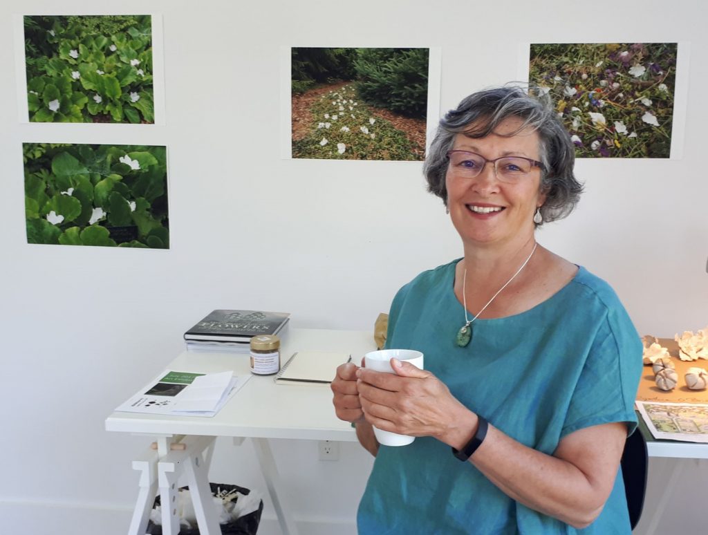
Barbara Brown
Can you expand on your Installation – Red Oak Labyrinth?
Many people in Ottawa have long desired to build a Botanical Garden. A plot of land was identified and a group of artists were invited to make temporary installations to animate the area and draw attention to the idea and the place.
With the curators, I toured the area in late November. They had asked that each of the six invited artists use live plants in their installations. As the area has yet to be developed it had no water supply and I couldn’t image being responsible to keep plants alive all summer in an open field without water. So, what to do?
Beginning of Red Oak Labyrinth, in early spring.
A large oak tree caught my attention while touring the field. Its form was clearly outlined as the leaves had fallen and the branches were bare. I’m not sure now what I was imagining but the curators said they thought I might make a labyrinth. For about seven years I had been building these ancient meandering walking paths and offering retreat workshops as a form of meditation or contemplation. The old Red Oak tree had several low branches which defined a welcoming space beneath it, and I could imagine being held by the tree in the circular pattern of the labyrinth. I made a plan to construct a 7-circuit Chartres style labyrinth with a circular bench around the trunk of the tree. We began the work in early May before the leaves had come out. With help from family, friends and volunteers we cleared the weeds and prepared a 70 foot circle beneath the tree.
Dan and his round bench for Red Oak Labyrinth.
My partner Dan built the bench and my son cut and split several cords of wood to define the paths of the labyrinth. A call was put out to the community and people came to help set out the cordwood in the circular pattern and then cedar mulch was added to the paths. The labyrinth was completed just in time for the Summer Solstice.
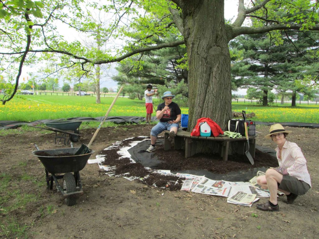
Building the Red Oak Labyrinth with volunteers.
A celebration was called for, even though the exhibition would not open for another week. I called upon my music therapy colleagues and asked if they could form a spontaneous choir of female voices to provide a setting to welcome the first visitors to walk the new labyrinth. On a warm and sunny evening, many friends came bearing flowers to bless the labyrinth and the singers arrived wearing white. The labyrinth was bedecked with white and yellow steamers. Many were enchanted by the experience that evening as they walked the ancient path of mystery and wonder.
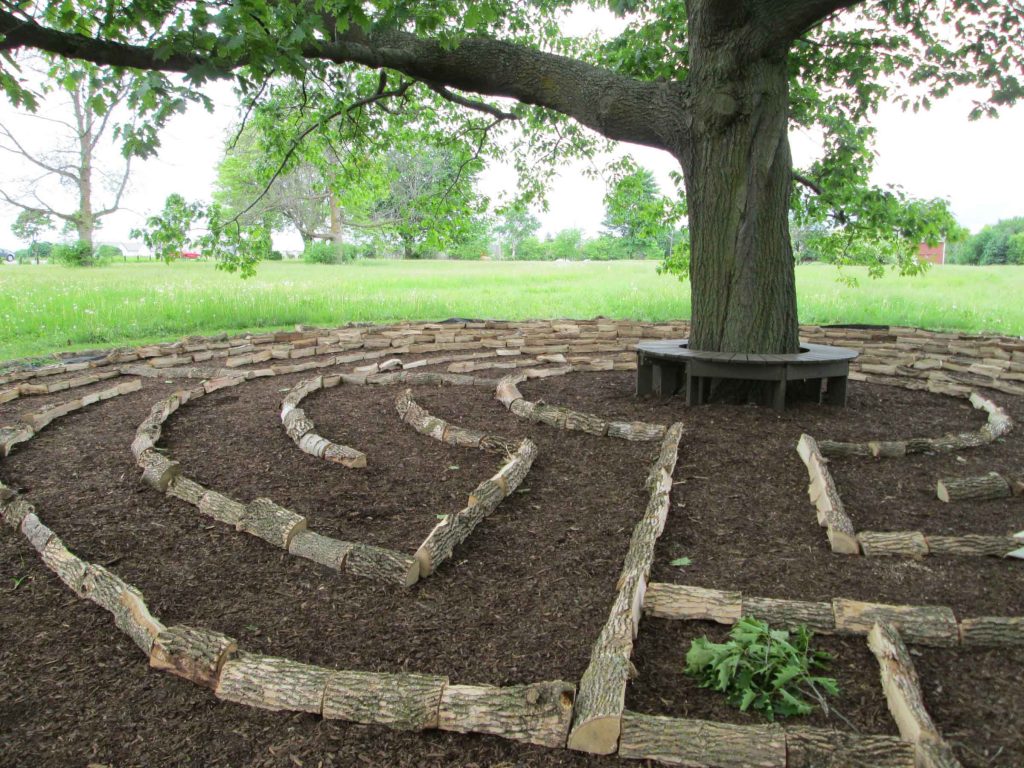 Red Oak Labyrinth, made with split Ash logs.
The Red Oak Labyrinth was opened to the public the following week and over the next 3 months many, many, people came and left surprisingly profound comments in the weather-proof notebooks tied to the bench in the centre of the labyrinth. I visited many days to tidy the place and to walk the labyrinth and write in my own journal. It became a popular place to visit that summer and helped to establish the place and the dream of a Botanical Garden in the centre of the city.
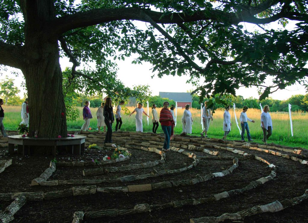 Red Oak Labyrinth, Celebrating Summer Solstice.
At the end of the September the exhibition closed and I had to do something to acknowledge all that had taken place in what had become a rather special place for many visitors. I put out the word that a Feast would take place before the dismantling of the labyrinth. About twenty people arrived bearing beautiful dishes of fine food. Words of blessing and thanksgiving were spilled and then collectively we picked up and stacked the cord wood that had been laid in the spring to form the labyrinth. As a gesture of thanks to those who had gathered to help me, I offered a fine oak aged port and spiced shortbread cookie in the shape of an acorn.
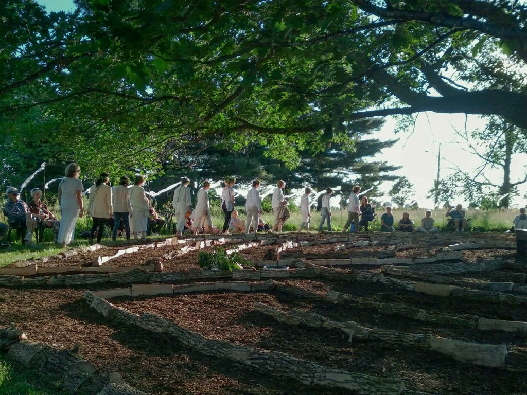
Red Oak Labyrinth, Celebrating Summer Solstice, with a female choir.
My gift at the end of three months was eight notebooks filled with words of praise and comments and stories left by people who had visited the labyrinth beneath the oak tree over the summer. I might one day put all the photo documentation and notebooks together into a book as a way of remembering what was more than I could ever have planned or imaged.
Red Oak Labyrinth, Celebrating Summer Solstice
How have you been able to combine your artistic work and interest in horticulture?
I was asked to start a new program for the Dementia Care Unit at the long-term care facility where I was working as an artist running creative arts programs for the frail elderly. My manager suggested I might try gardening as an activity. I was then thirty years old, living in a downtown apartment and knew nothing about gardening but I gave it try. I got the largest seeds I could find (green beans) and a big clay pot and some soil. To my surprise the men (it was a Veteran facility) loved working with the soil and the beans grew and I was hooked. It was a trial and error approach and I learned on the job. I soon signed up for classes in horticulture and became fascinated by the world or plants, flowers, trees and shrubs. My job afforded me the opportunity to follow my interests and to develop a program that became a comprehensive year around combination of gardening activities both indoors and outdoor, with art activities related to plants and gardens. Over several years, I became an avid gardener and built a sizeable garden at my home. With so much of my attention focused on the garden and plants it was a natural step that my artwork became focused on the garden.
Circular Time Series ‘Wheel of Cedar’
After many years of gardening, my art making became an extension of my garden making. It become a focus for my contemplations on the place of interaction between humans and nature and my understanding of a garden as a human construct.
Fast forward many years and now my home garden has become the source of most of the material I include in my photographic work. It feels like a full circle and leads back to the beginning.
Comment on your work in relation to the cycle of life?
Working with plants is a very relational way to observe the cycle of life. Some plants will complete their lifecycle in one season and they offer a speeded up version of what a human life cycle is. The same can be observed in the pronounced four seasons which we experience here in Canada. Winter is for real here and everything green dies except the evergreen trees and shrubs. In spring one can see the changes from day to day as plants sprout out of the moist earth and come into their full form in early summer. The blooms of summer soon set seeds and complete their growth by fall. As the temperature drops so do the leaves and a gloriously colourful ending happens just before winter sets in again. Where I live, we are fortunate to have four very distinct seasons to experience.
As I spent time with the elderly who were in the ending of their days it was psychically and spiritually relevant to emphasize the cycles of life and to acknowledge and celebrate all the seasons as a way of reinforcing the right and proper ending of all things. I have extended this contemplation into my own artwork and I have been surprised at the beauty that is to be found in the fading and dying of plants, and by extension, of people as well. It is one thing to know a beautiful fresh bloom in its full glory but also to see the exquisite contortions of the withered and wilted sculptural form of its ending.
Both my therapeutic work and my art work have allowed me to know and appreciate all points on the cycle of life and not to over focus on the beauty of youth as is the want of our current culture.
You have had several residencies, including one in India. Can you explain about this residency?
Why you applied to go to India for a residency?
My partner Dan and I were invited to join a group of international artists for a 10 day period in Jaipur, India to make art addressing issues of water scarcity in India.
Where in India did it take you?
The Kala Chaupal residency was hosted and organized by Leenika Beri, a communication specialist who is giving back to her country through organizing art-focused events . We were accommodated at the Diggi Palace Hotel in Jaipur, an old family compound now run as a hotel by the Diggi family. Most of the artists were assigned studio space at the Hotel in a large open building and some artists worked off-site at a paper making mill and a sculpture foundry. My practice is now photo based, so I set up an improvised studio in an open stairway area of the hotel’s courtyard.
Matka Water Pots, Jaipur Market
What work did it lead to?
Before going to India I did some research and knew generally what I wanted to say but I had no idea what that would look like. Having visited India previously I knew that the people of India have a very different and special relationship with water that we here in Canada do not. It seemed at some level rather perverse to be coming from Canada with our vast resources of water and traveling to India where water has become scarce and challenging to manage, not to mention highly political.
Matka Water Pots, Jaipur, India
Early on in our residency I went to the local market to purchase traditional earthenware water pots to see if they would inspire something. I had seen them employed in many places I had visited previously. It is such a contrast to my experience at home where water comes on demand from a faucet. I was showing the water pots to a fellow artist and explaining that the pots resembled a pregnant belly. Her eyes teared up as she understood the very visceral connection women have with water. Indigenous women in Canada understand themselves to be water carriers in a similar way that India women understand themselves. I also learned that it is women’s work to carry water in India and also in many other traditional cultures.
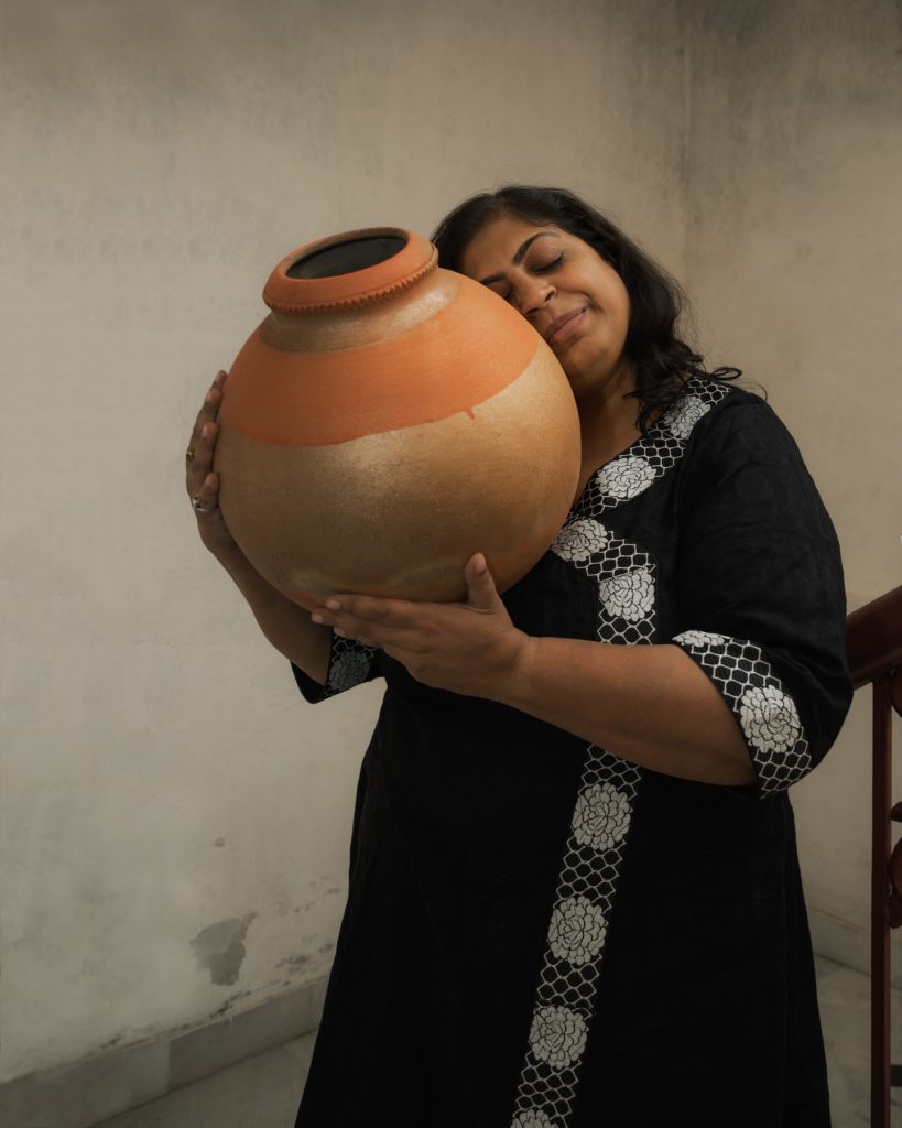
Matka Portait Series, Moutushi, India
From that encounter I got the idea of making portraits of women with earthenware water pots. Each session began with a conversation as I explained my observations regarding the connection between water pots and women’s bodies. We talked about our shared experiences with pregnancy and mothering. Interestingly, the India women were quick to strike a pose carrying the pots on their head as is common in India.
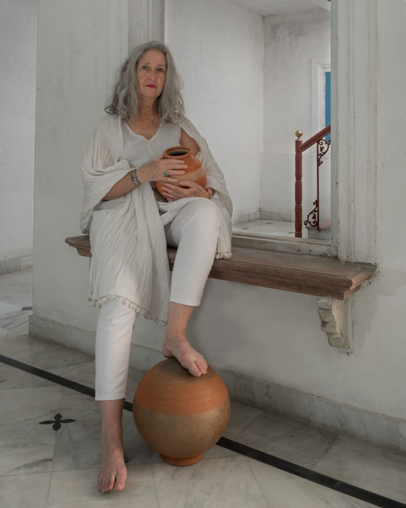
Matka Portait Series, Shanti, India
The North America women related to the pots as either their own womb or the children they had birthed. One of the young artists at the residency introduced herself and on her social media site stated that she was an artist and nudist. I couldn’t resist asking her if she would pose for a birthing scene, something that I knew was very risqué in Indian culture. She readily agreed and together with an older women posing as midwife we made a beautiful portrait. However, I was not surprised when both women declined to have their photographs shared over social media for the sake of their families.
How do you use photography to produce your Botanical images?
I love the feel of handling plant material and so I make arrangements of plants that are ephemeral, meaning they are very short lived. So, photography initially helped me to capture the compositions I made and allowed me to share them. I began this work outdoors, often in remote settings where I might be the only human eyes to see the compositions I made. Now I work indoors, in part not to have to deal with wind and changing lighting conditions.
Sometimes my images are made on a light box which gives a “backlight” quality to the images, reminiscent of those special moments in the garden when the sun is low and illuminates the plants as if from within.
Photography allows me to share my work but now it is the photograph that has become the driver of my work. Working as I do is very freeing. It allows me to create combinations of things that originate in nature, but are combined in a way that becomes a new view on the garden, one that can’t be found in that actual setting, one that has been created not found.
Compare, ‘Collected Garden - Fallen Peonies’ and ‘Etymology of a Flower - Peony’.
Early morning Kingsbrae Garden
At Kingsbrae International Residency for the Arts in New Brunswick Canada, I set myself a project of making photographic compositions that resonated with botanical herbarium sheets, the method used by plant sciences to preserve plant specimens for later study. Traditional herbarium sheets are mostly beige or brown leaves as the colour of plants fades as they dry. Using a photographic approach along with a scientific curiosity, I deconstructed flowers and laid them out in an arrangement that revealed the intricacy of their making.
 Collected Garden Series, White Peony
I had access to the Kingsbrae twenty five acre garden and after working for a week, I had a pile of wilted flowers by my studio door. Most mornings I would get up at dawn and walk in the garden taking photographs of whatever appealed in the moment and at the same time familiarizing myself with the place. One morning the perfect photograph require that I have one foot in a shallow pond. I got my shot and then looked down to check my footing and saw my iPhone in the pond! That just about ruined my day. By the time I got to the studio I was in a rather blue mood. I looked at the pile of dead and wilted flowers by my door and said today I’ll work with you. That accident resulted in a second body of work related to the Etymology Series which become the Collected Garden Series. As I had access to the bounty of a large garden, I was able to make several images that expressed various areas or plant collections in the garden.
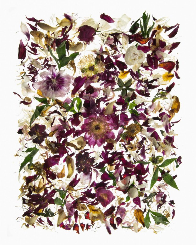
Collected Garden Series, Fallen Peony
I particularly enjoyed Kingsbrae’s White Garden, an homage to Vita Sackville-West’s White Garden for Sissinghurst Castle in England. My image is something not available in the garden as it is a focused and composed view.

Collected Garden Series, White Garden
Using four pieces from your collection that reflect the four seasons.
Where I live in Canada, we have four very distinct and pronounced seasons. While it is a bit of a cliché to make art based on the seasonal change, it is the reality of where we live.
Resisting Pink
My work as a Horticultural Therapist focused my attention on the cycle of life and the cycle of the seasons as I created programs based on growing things from seed, seeing them flower and fruit, harvesting and cooking the bounty of the garden. There is something very reassuring in the return of the light in the spring and the sprouting of the first shoots and the taste of the first greens from the garden.
Rochester Field Portrait, July
I worked with one of my colleagues from my time working in Long Term Care and we set ourselves a project to collaborate for a year and mount an exhibition of the work we made together. Cynthia O’Brien is a clay artist and our exhibition entitled LifeCycle Conversations gave us both an opportunity to reconcile the burden of grief we carry from the experience of working with so many elderly residents who died on our watch, not to mention the death of our own fathers.
Gathering #3, Desire for Arcadia Series
Most of our work focused on the last chapter of the life cycle but my personal work goes on to encompass all the seasons. It does bring a kind of rounded balance to my view of life. Yes, death is a reality but so is birth the new beginning of the spring, the fullness of summer and the ripening of all things in the fall.
I offer four images to illustrate the seasonal changes and the turning of the great wheel of life.
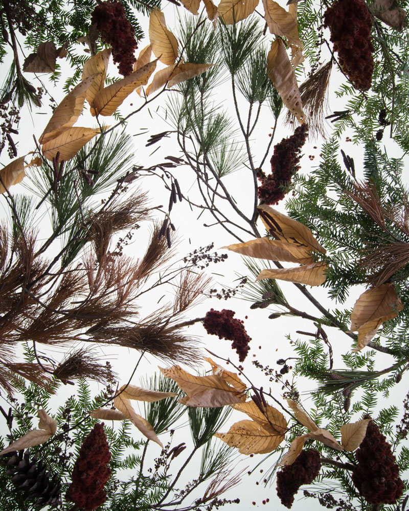
Winter Forrest, Desire for Arcadia Series
In your opinion discuss the importance of nature, health, and art.
Using my art practice, I work toward shifting my perspective from human as machine and human as having dominion over the world, to a more holistic understanding that sees humanity as a part of the continuum of the natural world. I trace the changing seasons and the cycles of life, death and rebirth as a place of observation which I am able to more fully inhabit through my practice as a visual artist. I find myself soothed as well as oriented by handling flowers and twigs, leaves and soil and contemplating the ending of all things.
As an urban dweller I seek to explore and experience the natural world away from the built-up city. Yet my primary access to nature is in my small urban garden at home. It’s not a large garden but it holds a diverse collection of plants that has amused and fascinated me for a couple of decades. As a Horticultural Therapist I learned how important and supportive contact with the natural world is, especially in a sterile health care setting. I do wonder what the next generations of children will be like as many are being raised in a regimented tidy, interior world with far less access to the natural world than what I grew up with.
Self Portrait, as Green Woman, Wise Woman
Contact:
Barbara Brown
website: barbarabrown.ca
Instagram: bbrownartist
Deborah Blakeley, Melbourne, Australia
Interview by Deborah Blakeley, November 2019
Eva Ennist
Can you explain about your residency at Tartu?
Your personal background with Estonia
Your mother’s working gloves
How these two aspects influenced your residency?
I was drawn to attending the Tartu Artist in Residency program in Estonia because my parents were Estonian, my life and work experiences deeply connected to this heritage. Both parents were incredibly hard working, creative and very frugal and my mother introduced me to making things from scratch, recycling and reusing. She had a DYI mentality long before the sustainability movement was a thing.
Mother’s working gloves prepped for collagraph print
My residency project was inspired by a collection of dozens of my mother’s old work gloves. Gloves that she had repaired and rebuilt many times, over many years from parts of other worn out gloves. Her commitment to getting every last bit of use out of any material or object was awe-inspiring. But in her final years, as dementia set in, it was also troubling to see this otherwise commendable frugality turn into an obsession with collecting and hoarding – a behaviour I suspect was rooted in her wartime experiences of making do with very little.
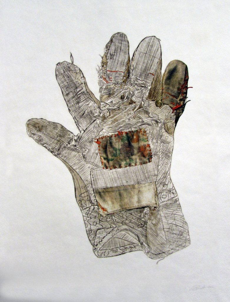
Resumed Repair #5, Drypoint print, digital print collage, 63.5 x 50.8cm
While in Tartu at the Estonian Print and Paper Museum, I worked with collagraph printed textile imagery, dry point etchings and the digitally printed enlargements of the actual gloves that I had brought from Canada. This exploration resulted in various collaged pieces that refer to my mother’s tireless work ethic and survival instincts – as well as to my own drive to sustain an art practice based on reusing and repurposing both materials and meaning.
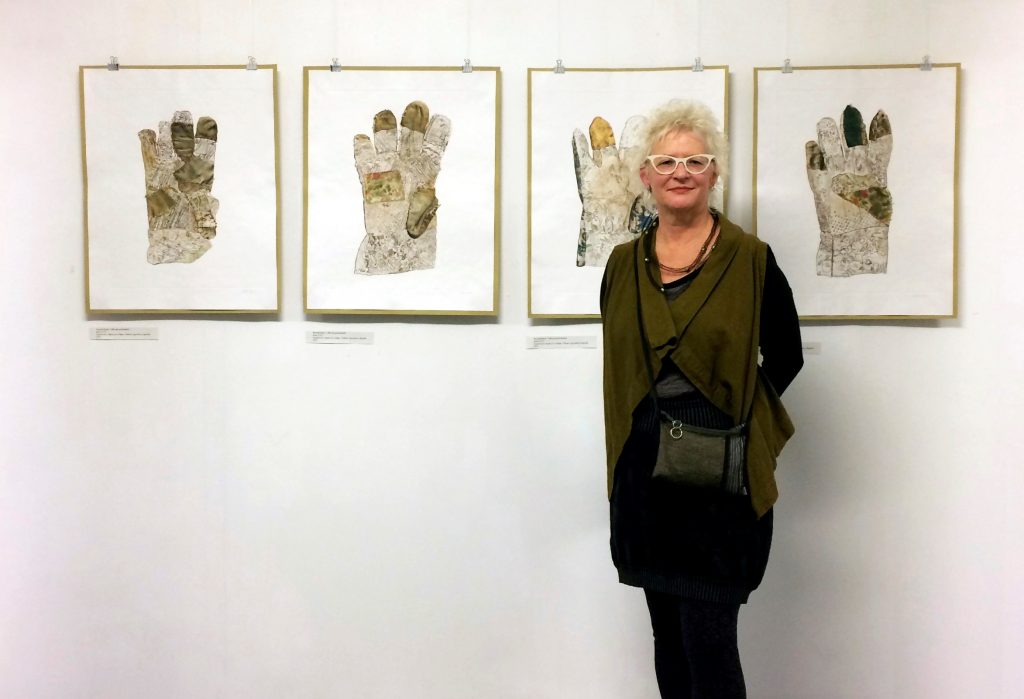
Tartuensis Gallery Opening
How important is travel and photography in your work?
I believe that travel to places near and far will only continue to amaze, bewilder, excite and inspire me and my art making practice.
At 20 years of age I took my very first trip abroad to Barcelona, Spain where I was able to climb up inside one of Antoni Gaudi’s incredible Sagrada Familia Basilica spires (they were permanantly closed to the public soon after). I found the experience breathtaking, both literally and artistically. Little did I know then that it would be an inspiration in my work to this day. Those shapes, as spires or temples, are one of many such architectural structures that reappear in my sculptures and encaustic /mixed media works.

Temple in India
Photography plays an integral part of expressing the experience of the places that I have travelled to. I document cultural sites, awe-inspiring landscapes as well as close-up details of design, art and craft found in unexpected locations and objects. I take countless images of man-made temple spires, baskets, traps and woven grids in landscapes. But often what I find more inspirational are various bird nests, spider webs and termite mounds - architecture created instinctively by animals.
Fishing baskets in Laos
These images may develop and materialize as sculptural objects made of wire, reed, bamboo, concrete and handmade paper.
Termite nests in Bhubaneswar, India
Photographs of the actual sculptures are often manipulated and find their way into the many layers of my encaustic paintings. The photo is transferred by fusing it to the wax medium creating a base image or recognizable texture.
Expand on your series, ‘Uncanny Resemblance’
Techniques you have used
The importance of found objects
the use of adding only single colour to specific works
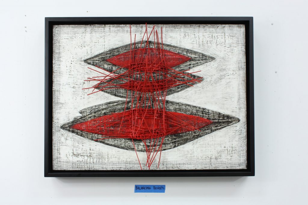
Balancing Baskets, Encaustic and mixed media, 46 x 61cm
For the exhibition, “Uncanny Resemblance”, all 50 wall pieces were encaustic paintings/mixed media works of various sizes. The mixed media elements include small, coiled, wire cones, flattened wire grids coated with paper pulp, scraps of window screening or woven reed structures imbedded into thick layers of encaustic medium (which is made of beeswax, damar resin and pigment). I also fused transfers of drawings and photographs from a preceeding series of sculptures.
This process of borrowing imagery and textures from older pieces allows new bodies of work to continue to relate to what came prior and to inform what may develop next.
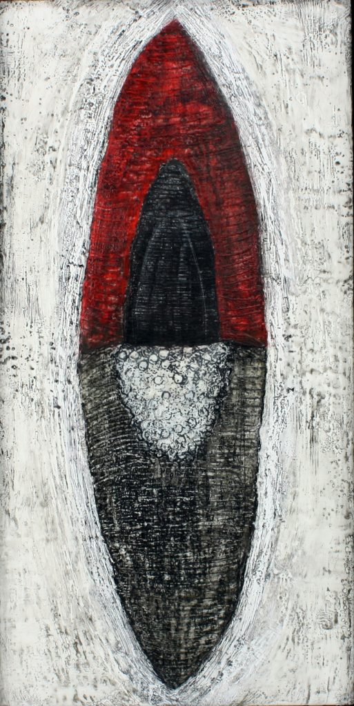
Black Lotus Budding, Encaustic and mixed media, 61 x 30.5cm
Discuss, size in your work using ‘Nesting’
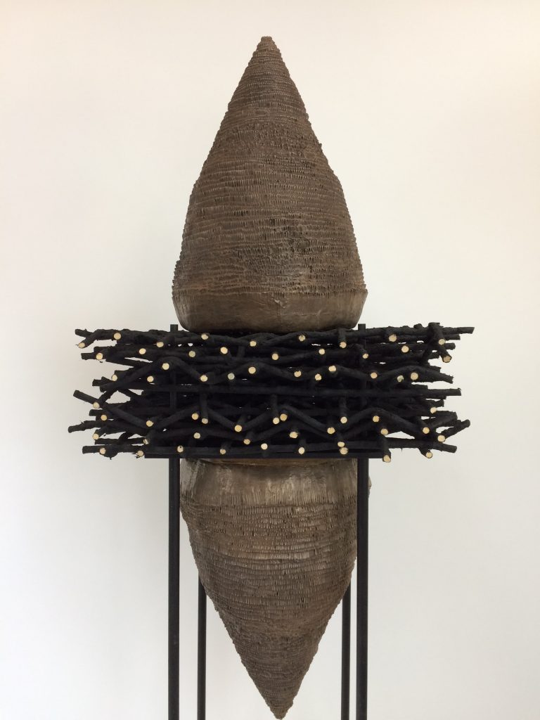
Nesting Hold, Reed, Wood, steel, abaca, cast resin, paint, 213 x 40.85 x 40.85cm
My sculptures range from small table pieces to fairly tall structures. Even though I refer to the five sculptures in the “Nesting” series as human scale, they are mounted on 33 cm high bases taking on an almost towering presence when up close.
The size of the larger sculptures I create is dictated by the size of the woven reed grids. These interlaced layers were once part of much bigger panels for previous sculpture installations. Once cut, these smaller grids can be manipulated in many different configurations.
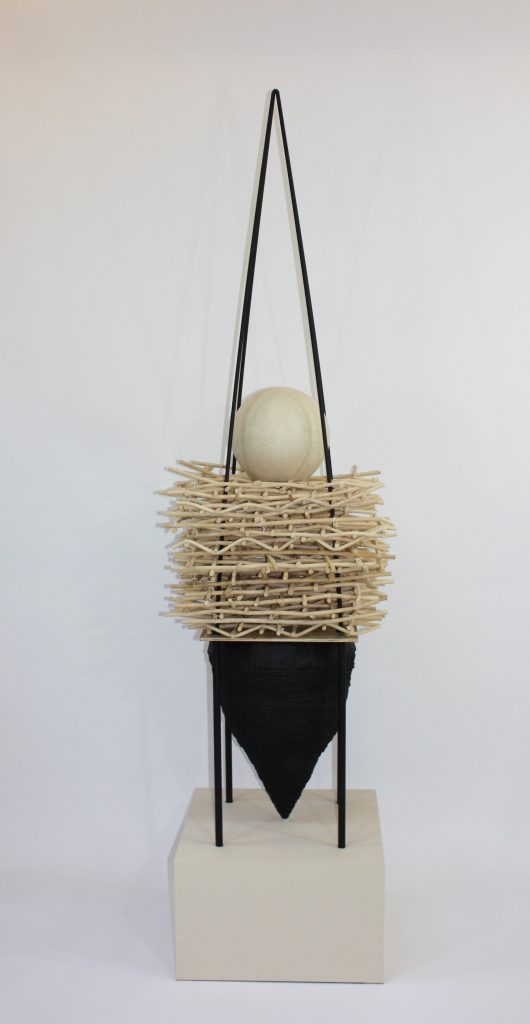
Nesting Tolerance, reed, cold cast bronze, wood, steel, paint, 195.5 x 54.25 x 54.25cm
Most elements of all, of my larger sculptures come apart so that I am able to get them out of my studio – a very real problem.
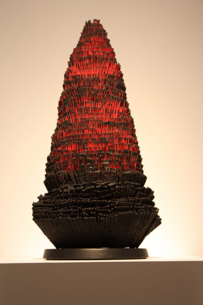
Nesting Lotus #6, Bamboo, handmade paper, concrete, 43.2 x 22.8cm
Take 1 or 2 specific materials that you have found and developed into your sculptures, discuss.
Many of my sculptures and encaustic mixed media works are made with natural reed, also known as the core of rattan. It is a pliable, dyeable vine when processed comes in diameters 2 mm to 30 mm. I have woven it into grid structures, sprayed it with paper pulp, embedded it into concrete forms, and into layers of encaustic wax medium. I have also created large installations, light sculptures and even a balcony railing with this textile-like material.
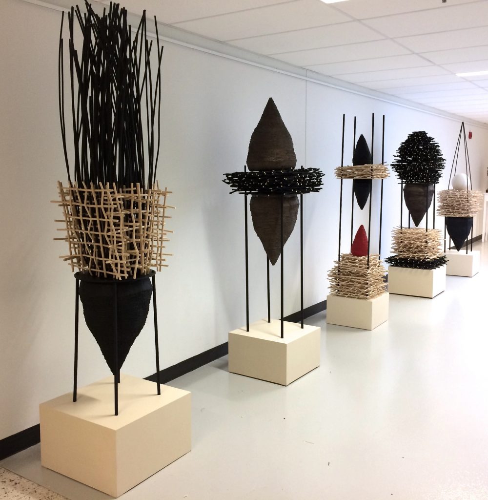
Nesting installation view at World of Threads Exhibition, 2018
Other frequently used but non-fibre materials that I work with are wire mesh and “hardware cloth”. Several years ago, I discovered 5 cm wide strips of this metal cloth that were being thrown out at a wire company here in Toronto. I salvaged several rolls and eventually began to coil the strips, forming them into very sturdy conical shapes. The grids overlapped allowing some very dense areas and other very open sections. I often created a “skin” by spraying hand made paper partially covering the cone. That was the foundation for many sculptures and two dimensional works over the last 22 years.
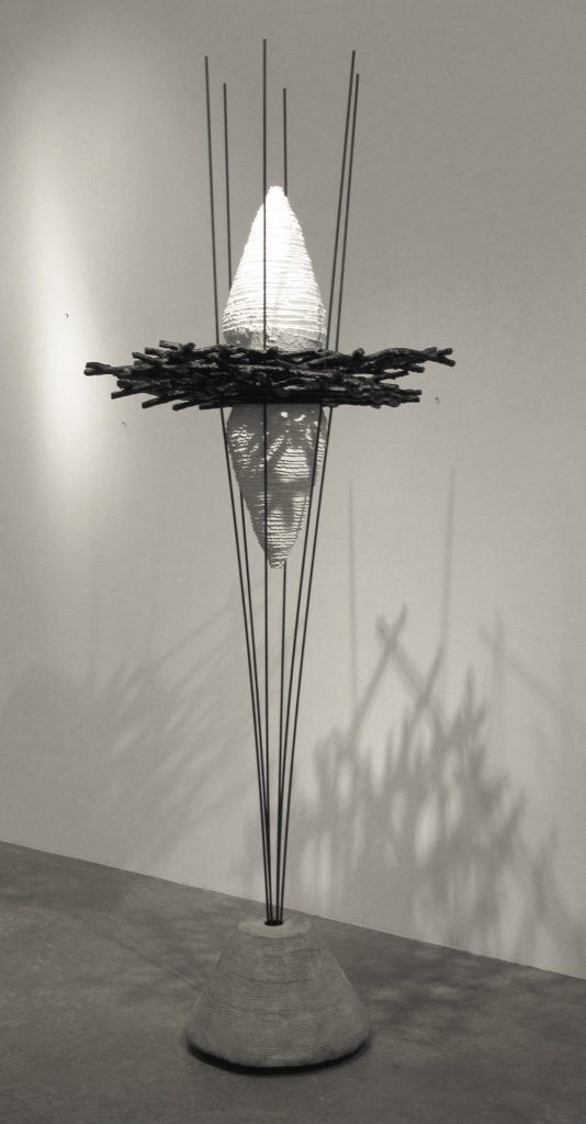
Potential, Concrete, steel, cast resin, reed, 183 x 35.5cm
How has sight and the actual eye charts become a part of your work?
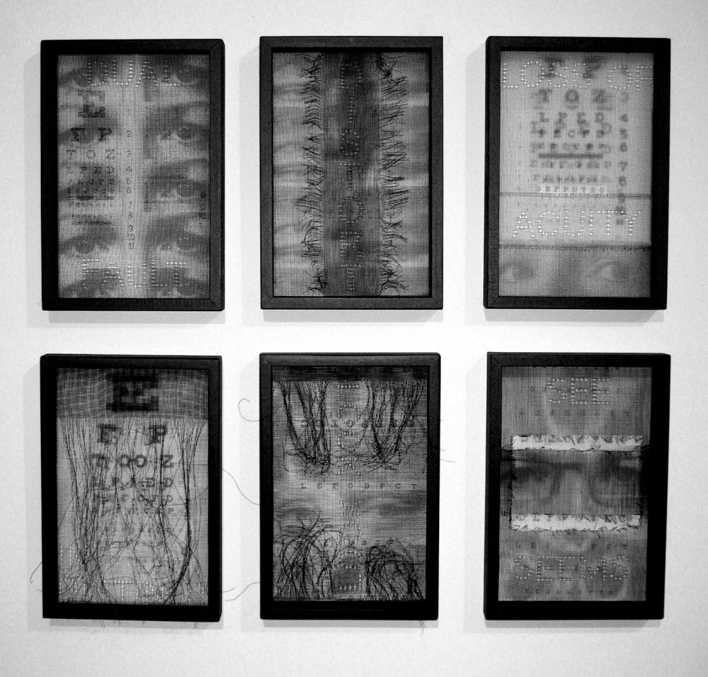
Eye chart series, wire mesh, digital photo, each 30 x 20cm
My family has had inherent eye problems for many years. Not only the run of the mill myopia and astigmatism but also glaucoma, retinal tears and detachment, cataracts and night blindness have been a on-going problem.
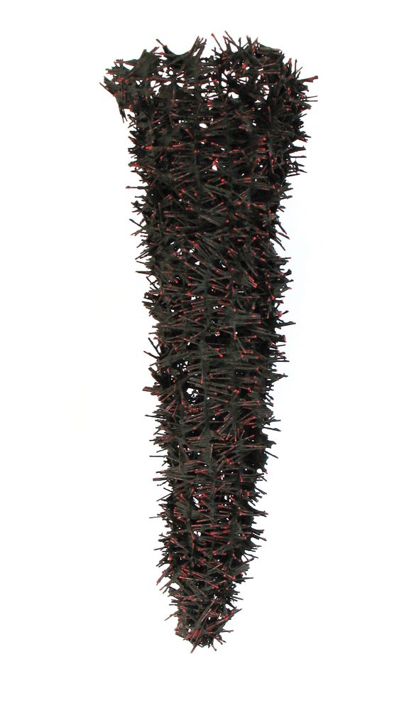
Blunted Sight #1, Bamboo, thread, wire, abaca paper pulp, 82 x 25cm
It seemed inevitable that I would delve into the capacity of sight and I have come across terms such as distortion, simultaneity, clarity that are fundamental in the language of vision as are anatomical references to cones and rods (the light sensitive cells in the retina of the eye). At the same time, these concepts could also be applied to human capabilities beyond the physiological such as concentration and focus.
I began to experiment with layering, assembling, sometimes ‘blurring’ images of the standard eye chart, my own eyes and related text. Textiles, hand made paper, wire mesh, digital embroidery and print were materials for both 2 and 3 dimensional compositions.
Mona – Give us your thoughts on using known art work as a basis of new art.
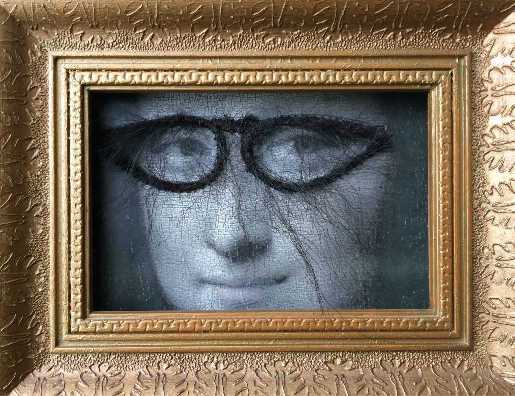
The Hairy Eye, photo transfer, fabric, artificial hair, thread, 22 x 17cm
If the artwork appropriated is designated “public domain” or an artist has considerably transformed the original artwork of another then I’m open to the work being used in essence as a “material”.
Using images of famous artworks like DaVinci’s Mona Lisa elicits an immediate recognition of the subject matter. This painting has been parodied by countless artists, designers and art directors for years for various effects - usually with comedic twist. This was one part of why I first started to “play” with Mona’s image. The other part was the fact that my favourite uncle/godfather had nicknamed me Mona Lisa (my full name is Eva-Lisa) when I was a small child. He travelled the world for his work and once brought back for me an incredible porcelain doll, which I named Mona Lisa. She was my favourite doll.
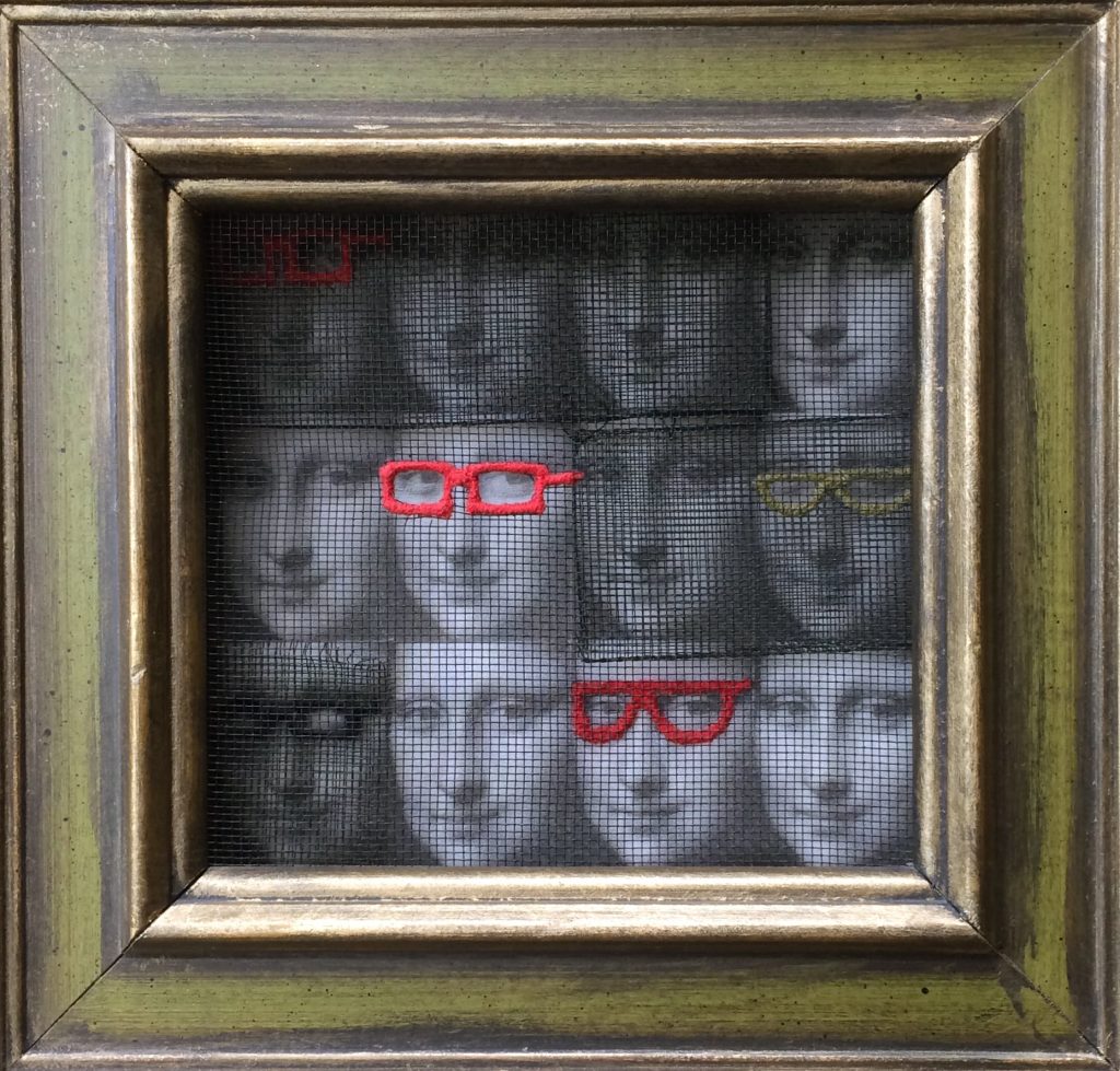
Emigmatic / Stigmatic 2, photo transfer, fabric, thread, wire mesh, 29 x 28cm
How have you manipulated Mona Lisa – use 2 or 3 works to explain this?
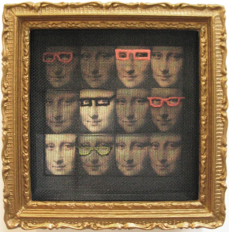
Myopic Mona, Photo transfer, fabric, thread, wire mesh, 20 x 20cm
While I was working with visual impairment as a serious concept for my work, I had also started creating collages where people or animals were wearing spectacles. I started cutting and pasting eyeglasses from magazines on all sorts of people and animals. This was initially for my own amusement – they were silly and I was able to do them while travelling. In the studio I took this a step further and started to applique fake hair onto singular images of Mona Lisa (The Hairy Eye #1) which had been photo transferred to fabric. This hair was sewn in the shape of eyeglasses. I decided to use multiple Mona Lisa images in one piece and machine embroidered eyeglasses with colourful thread onto a layer of window screening and mounted the piece in an ornate gold frame. This piece, titled Myopic Mona, sold for the highest bid at a fundraiser auction. It seemed I had hit a nerve. So I continued with this approach.
You have been practicing art for 40 years can you discuss your personal thoughts on how your art has changed and developed?
Actually, I have been making art professionally since graduating from art school over 43 years ago. I began to teach, travel and study abroad about 5 years into my practice.
For the first 10 years after school, the main focus of my work was textiles, specifically tapestry weaving for exhibition and corporate and residential commissions. Most of my designs came from looking at the natural world from very close up or from within. My sketchbooks were full of details of insects, diagrams of fossils and watercolours of plants growing out of rock crevices and geological cross sections. As tapestry weaving was very slow (especially pieces that were 9.3 sq metres in size) I felt the need to experiment with other, more immediate fibre techniques to express my ideas. I took a couple of courses in papermaking and never looked back. This new approach using hand made paper pulp and sheet form allowed me to embed and cast familiar woven elements such as mesh, gauze, and plaited reed to create wall pieces and sculptural forms.
Photo imagery seeped into the mix as well when the work took on a more sobering path after my father passed away late 1989. Personal mourning was expressed along side of loss and preservation practised by women of various cultures.
As time passed, the parallels of death and sleep became the theme of both 2 and 3 dimensional sculpture and installations. However, as the work progressed so did the emphasis of the eyes in a closed position gradually led to the investigation of the faculty of sight, with the eyes wide open. Perception, sight and insight are words that conjure up experiences and memories common to many - I was very interested in conveying this in mixed media (handmade paper, woven reed, photo imagery, wire mesh).
As this process was developing, in 1993 I was invited to join a team of architects and other craft based artists to create a large installation called Designed by Commission: Collaboration 1993 for IIDEX, Interior Design Show. My contribution was a two-layered canopy of thick woven reed and handmade paper pulp suspended over a ceramic, wood and glass platform installation. The creation of these 122 cm x 244 cm panels was the start of a series of large works using the same size and format for many exhibitions and installations.
But after a few years of storing these interesting and “still useful” materials, I decided to recycle the panels by cutting them into smaller sections for various other sculptures.
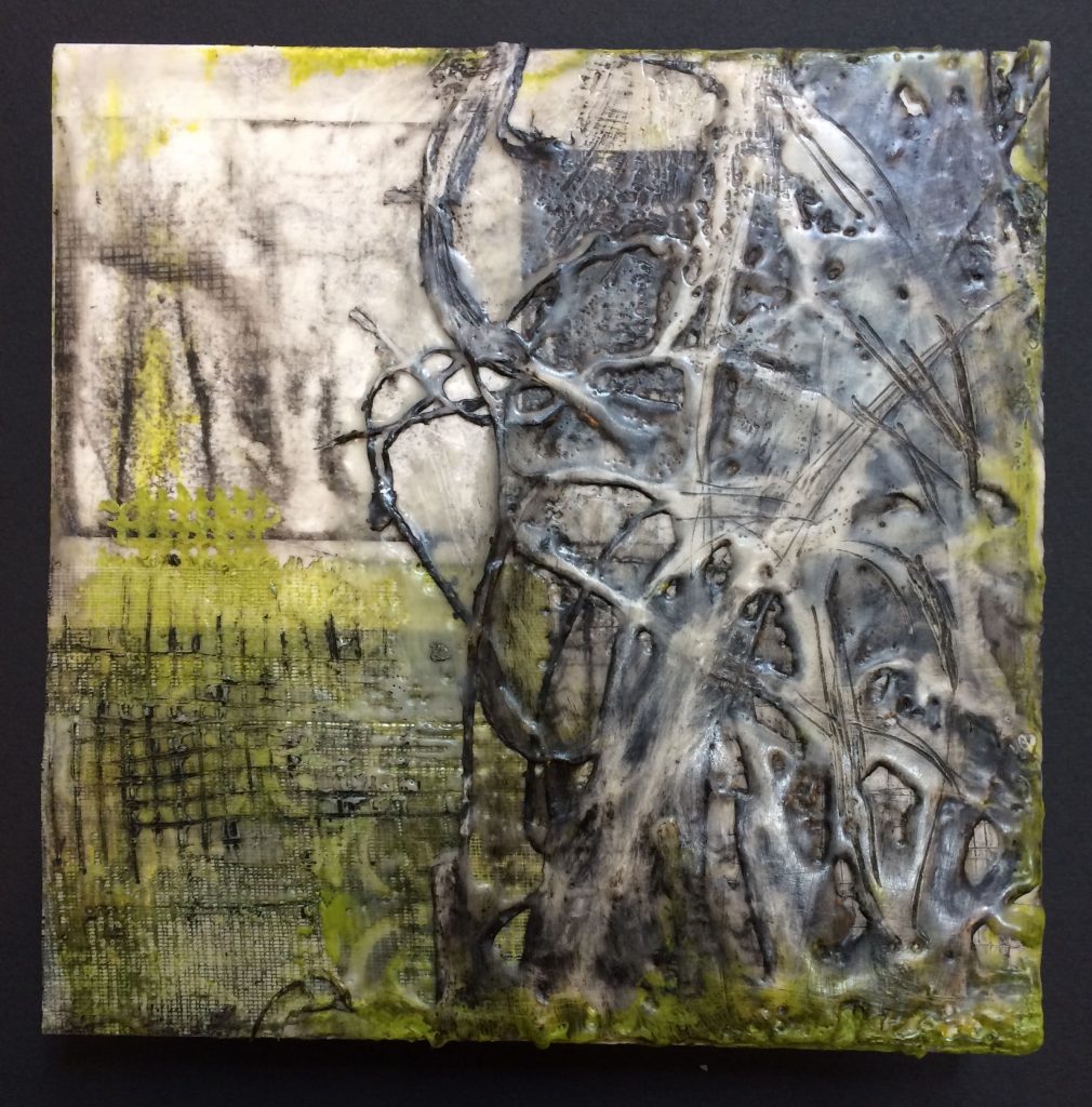
Untitled new work, encaustic and mixed media, 25.5 x 25.5cm
A few years ago, I was introduced to using textiles and mixed media in encaustic painting by a wonderful artist, Daniella Woolf. After taking a few courses and much experimentation, this approach has allowed me to develop many of my ideas in uncanny ways.
Your work is in many private and public collections, take one or two pieces that have given your great pride and why?
I have mixed feelings about this question. Through the years, many of the commissions, sales or exhibitions have been meaningful achievements in their time and place. But I can honestly say that none of them stands out beyond the others because each one is an affirmation of what I am doing as an artist. I think that just keeping at it, committing to taking risks, challenging myself with new techniques, materials and concepts in the studio and beyond is what I am most proud of. Plus knowing that for over 30 years I contributed to the art education of hundreds of students, which gives me great satisfaction.
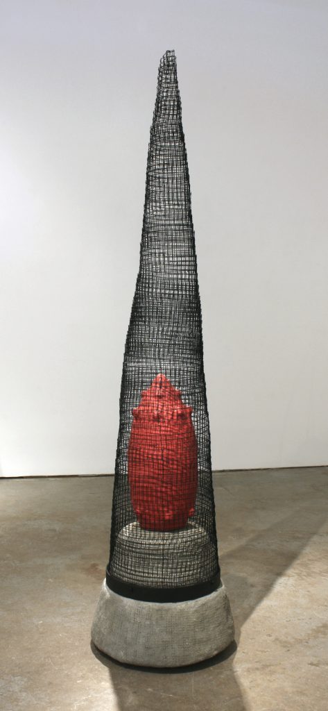
Safe, steel mesh, concrete, 155 x 35.5cm
Contact:
Eva Ennist
Email :
Deborah Blakeley, Melbourne, Australia
Interview by Deborah Blakeley, November 2019

Martin Gaudreault
Early in your career you were the official photographer for the Lac Saint-Jean bicycle crossing, discuss.
Crossing Lac Saint-Jean by bike is a unique event in North America. Imagine cyclists riding a Fat Bike that crosses a 32 km frozen water body in the middle of winter!
This unique event is for those who wish to cross it by bike by taming the Quebec winter on a 32-kilometre linear course made of snow and ice.
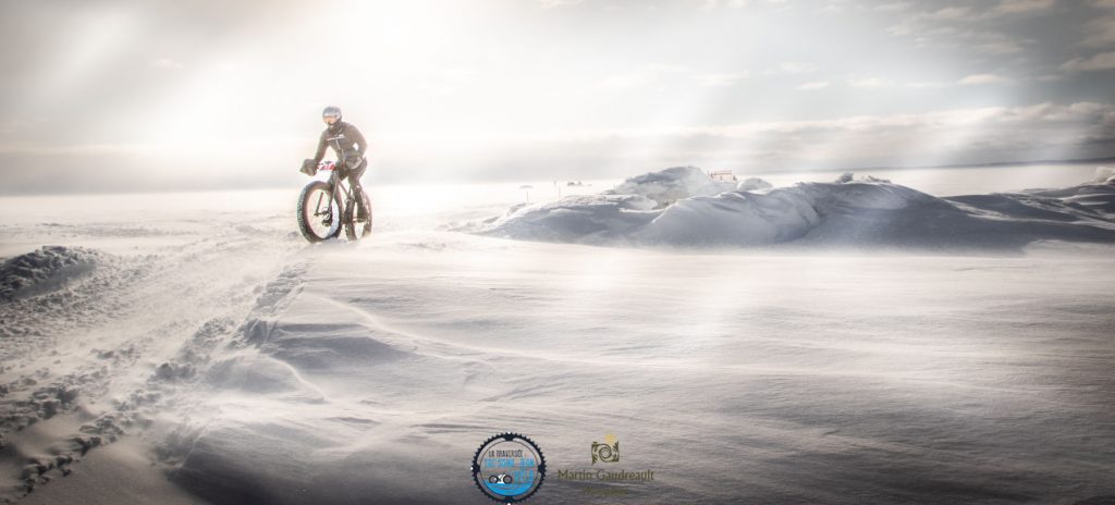
Cold Cyclist #1, Crossing Lac Saint-Jean by Bike, Digital photography, F10 1/500- 14 mm ISO 100
When I was offered to become the official photographer of this event, I decided to embark on this crazy adventure with a certain unawareness of the challenge it represented. My responsibility is to provide images of this event to the media in more than 60 countries. The special character of a 32 km long frozen crossing is unique in North America. It should be noted that Lac Saint-Jean is an inland sea and that in winter, in Quebec, and particularly in Saguenay Lac Saint-Jean, we have temperatures of -35 degrees Celsius.
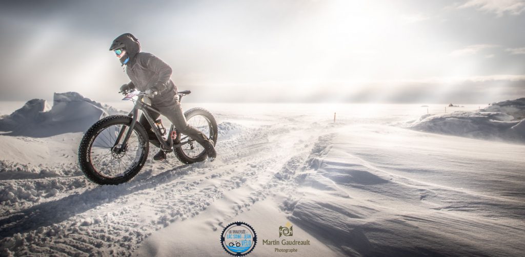
Frosted Adventure, Crossing Lac Saint-Jean by Bike, Digital photography, F5,6 1/500- 175 mm ISO 100
Taking pictures under these conditions becomes difficult for the equipment and for the photographer. When taking pictures, I try to capture the efforts of the participants and to reflect the climatic conditions encountered during the event. In this regard, over the past few years, I have experienced freezing rain, wind from 50 km/h to -30 Celsius, snowstorms and sunny days. Both the photographer and the equipment have succeeded year after year in making this event a unique moment!
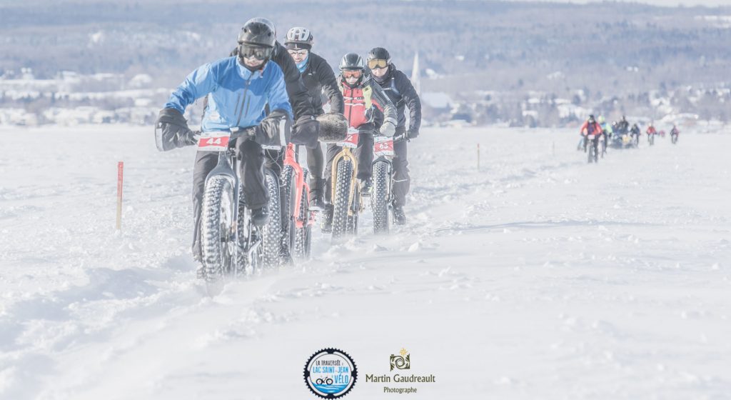
Cold Cyclist #2, Crossing Lac Saint-Jean by Bike, Digital photography, F9 1/500- 14 mm ISO 100
The main difficulty lies in knowing how to capture the movement at the right time and in the right place during such an event. Basic knowledge of photography is essential to achieve this. As I have to operate in a totally white environment, it is necessary to constantly validate the white balance in order to obtain a white snow and not...grey... As the bicycles used are oversized in terms of tires, their cruising speed is relatively low. It is therefore easy to fix the image in order to have an interesting rendering. The use of a slower speed allows to generate images with a certain movement in order to create a panning effect. As temperatures are low in winter, the equipment and especially the batteries must be charged and above all the photographer must have developed tips to keep it warm.

Les Chevaliers de I’Apocalypse, Crossing Lac Saint-Jean by Bike, Digital photography, F22 1/10 10 mm ISO 100,
Photograph exhibition at the Carrousel du Louvre in Paris
Use of the work for the lake crossing.
My images have been used in more than sixty countries; Canada, United States, Belgium, France, Brazil, are just a few examples of their dissemination. One was exhibited at the Carrousel du Louvre in Paris in December 2018 during the Salon National des Beaux-Arts. My photographs are used in specialized magazines (fat bike) or to promote our magnificent region as a first-rate winter destination.
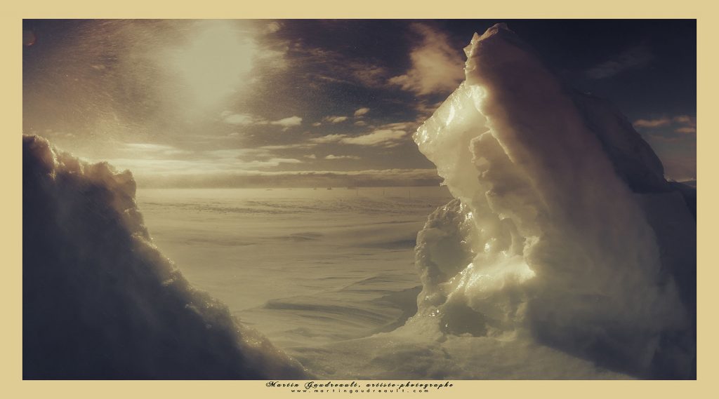
Contraction, Crossing Lac Saint-Jean by Bike, Digital photography, F11 1/500- 10 mm ISO 100
Photographing in black and white is a technique adapted to many scenes of nature. It is also particularly well suited to architectural photography. It draws the eye to geometric shapes, perspectives or contrasts of light. As a photographer, I can convey a message through black and white by getting to the point. Black and white is a very directive creative technique.
Les Angelots, Louvre Museum, Paris, Digital photography, F5 1/250- 50 mm ISO 100
The use of black and white is often synonymous with negative emotions when it is not. Rather, it demonstrates the aesthetics of a landscape, the purity of lines or the richness of textures. For my part, and in contrast to many photographers, I see black and white photography not as a symbol of nostalgia, but more as a particular vision of our universe.
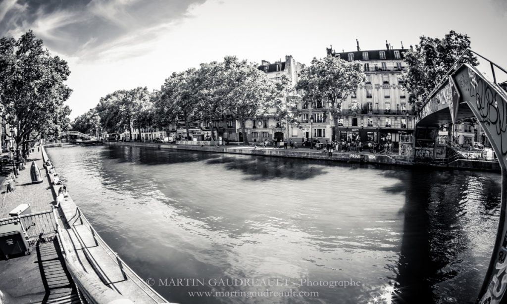
Romance in Paris, Canal Saint-Martin, Digital photography, F11 1/25- 10 mm ISO 100
Moreover, as human beings, we are surrounded by colours: colours of the seasons, clothes, animal colours, etc. With colour photography, we can very easily evaluate the time of its capture, while black and white is timeless. I could say that colour photography allows the photographer to use a more advanced language in terms of rendering, shapes, textures, etc. Black and white returns to the basis of the message by expressing the photographer's raw emotion through his digital eye.
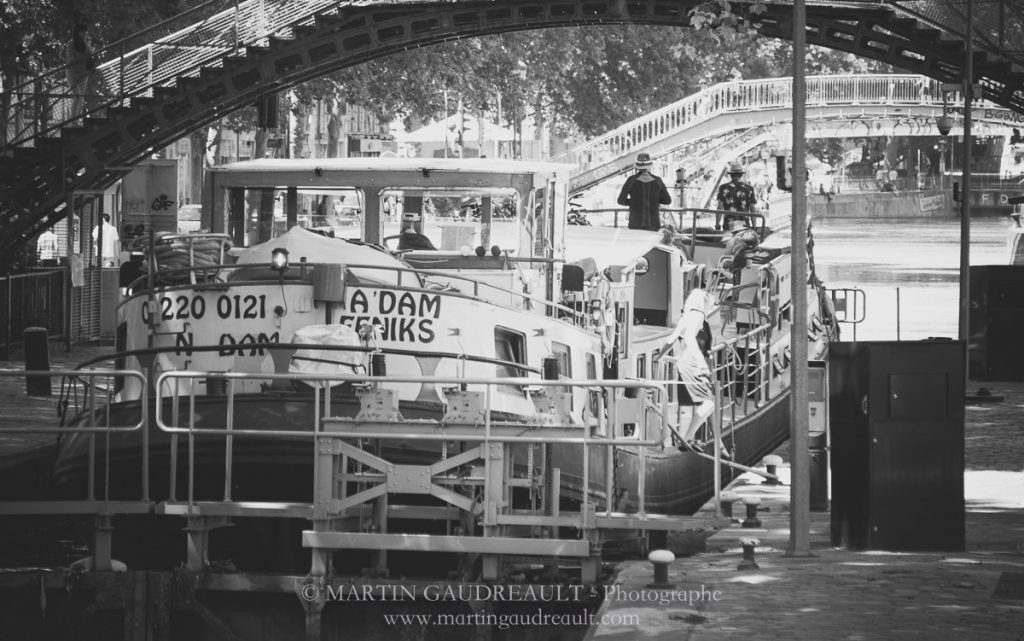
Romance in Paris #2, Canal Saint-Martin, Digital photography, F5,6 1/60 - 150 mm ISO 100
Nature has a wonderful way of combining colours; discussion on this use in your work.
It is mentioned that I am an image hunter and a film poet. I try to interpret the landscapes under the animated gaze of passion.
Zen, Digital photography, F13 1/80 - 175 mm ISO 100
The colours inspire me as much by their detailed palette as by the poetry they transmit to me. René Richard is one of the Canadian painters who has influenced me the most to date. He knew how to express the solitude of Canada's great outdoors through the colours of the different seasons.
Happy Springtime, Digital photography, F22 1/200 - 10 mm ISO 100
Silver medal, International Prize of Professionals in Art 2018 – Mondial Art Academia
I like to use black and white occasionally, because it allows me to express a less polished vision of the moment, while colour photography allows me to exploit the tonal changes that reflect the present moment. The use of colour allows me to highlight changes in light (hue), their intensity (saturation) or their luminance.
Minimalist Nature, Digital photography, F22 1/25 - 13 mm ISO 100, Post processing in Lightroom
Colour photographs have a distinctive personality according to the photographer's eye. For my part, I like the two opposite ones, namely warm and cold colours. For me, photography is never a random image, it is a research, then a narrative and an awareness of the natural and silent beauty that exists all around us. The calm, silence and feeling of serenity are an integral part of my work.
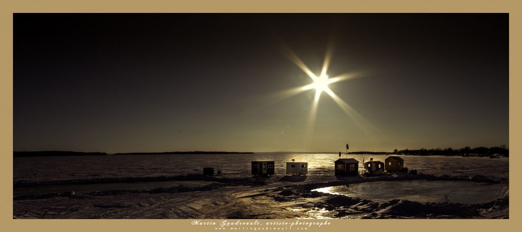
North Star, Digital photography, F22 1/100 - 17 mm ISO 100, Sepia processing in Lightroom.
I don't add anything during post-production. The effects are minimalist, thus respecting the original image, the authenticity of the moment captured, immortalized. I am a keen fan of the blue hour and the particularities of light at certain key times of the day.
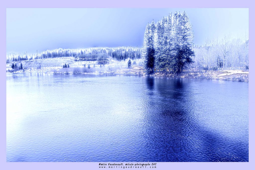
In the Early Morning, Digital photography, F11 1/160 - 22 mm ISO 100, Post processing in Lightroom
I always try to maintain the sensitive expression of the photographer, who feels emotions through his work tool, because a testimony is immortalized in a second from eternity. I thus express my very personal, often contemplative vision on diversity of Quebec landscapes and the elements that compose them, sometimes fragile and ephemeral.
Canal Saint-Martin,Digital photography, F3,5 1/1000 - 18 mm ISO 100
In all humility, I offer a deeply optimistic look to the public, in order to make them live an experience through the image as much by its colours as by the peace that emerges from it.
The Exhibition, Digital photography, F4,5 1/60 - 3 mm ISO 100
The sepia color allows me to give a "vintage" tone to my photos. I use it in certain contexts (such as architecture) to give a particular cachet to the photo especially since I am passionate about old buildings.
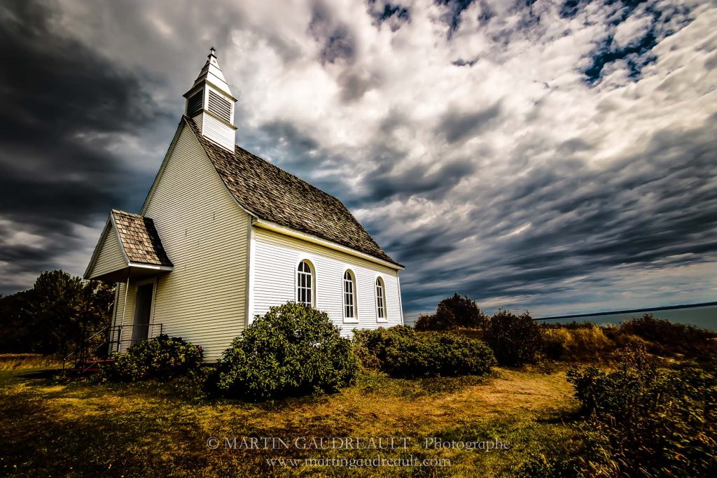 Goodness of Heaven, Digital photography, F4 1/2500 - 10 mm ISO 100 Post processing with lightroom
Scale is hard to show, discuss scale in your work.
I like to take pictures from below, because they will give the subject power.
Enchevêtrement, ESCHER, Digital photography, F3,5 1/200 - 10 mm ISO 100, Musée National des Beaux-Arts du Québec – Pavillon Lassonde
The viewer thus has a different perspective and allows the main subject to be magnified. This technique gives the vanishing lines of a building, for example, an amplitude and will make a different effect for the eye. In some cases, (with animals or trees), the low angle will give us improbable angles and very often with a particular luminosity especially in the forest.
Heaven, Digital photography, F11 1/10 - 10 mm ISO 100
You often use a very small coloured image as the addition of colour controlling the viewers eye. Discuss.
 Seul au Monde, Digital photography, F11 1/125 - 60 mm ISO 100
Preserving certain parts of the image that are occasionally coloured makes it possible to attract the eye to a particular element without taking anything away from the entire photographic composition. It is often a touch that will not take anything away from the message of the picture, will highlight the general subject.
What type/s of cameras do you use?
I use a Canon 7D MarkII camera with various lenses.
In your words discuss the importance of photography in recording history.
Let us refer to the invention of photography, no one suspected the importance of this discovery on the witnesses of the history of our humanity. As such, the Lumière brothers certainly had no idea that by filing more than 170 patents, mainly in the field of photography, they would pave the way for the explosion of photography as we know it today.
Adieu Johnny, Digital photography, F8 1/160 - 24 mm ISO 100
Photo, taken following the death of the French singer Johnny Hallyday,and his funeral procession in Paris
The photographic art was born and became a medium that was part of the visual arts family. Today, this medium occupies a prominent place in our society, rightly or wrongly, we are not here to debate it. You will not be surprised to learn that photography has been part of my life for several years and that this visual art allows me to immortalize the present moment. Photography is about looking beyond the image, feeling emotions, contemplating the scene, recognizing the right moment to trigger.
Grace filled moment, Digital photography, F2,8 1/5000 - 115 mm ISO 100
Behind each image there is a process, a reflection that is essential, a character to bring out. In all modesty, it is the artist's eye that expresses itself.
In addition to promoting all these elements, photography allows us to take a perpetual look at our society, both in its happy or sad evolution according to the circumstances, but also in the everyday life of people. We all have family clichés that mark our lives. Birth, Wedding, Family celebrations to name a few.
Whether it is Small or Great, history is lived by peoples, written and perpetuated by images. Many clichés remind us of turning points in the history of humanity, such as the end of the World Wars, the fall of the Berlin Wall or, more recently, the migrant crisis. I have in mind this quote from the philosopher Roland Barthes: "What photography reproduces infinitely only happens once". These few words summarize very well the importance of photography in recording history, because it is our history that we image!
Contact:
Martin Gaudreault
Email : martingaudreaultphotographie@hotmail.com
Website : www.martingaudreault.com
Deborah Blakeley, Melbourne, Australia
Interview by Deborah Blakeley, November 2019
Greg Winrow
Take two architectural works and expand on them and what initially drew the sites to you?
Fossgate Glory
With ‘Fossgate Glory’ I was drawn to the intricate stonework and of course the Majestic Eagle on top! What makes it more, surprising (or sad, in some ways I suppose) is this is higher in the building and rarely seen from the ground floor which now belongs to a pub chain.
‘Abstract Minster’ was again drawn by the fantastic Medieval Cathedral we have in York (more affectionatly, known as the Minster) It’s the biggest Cathedral in Europe and therefore it’s a difficult subject to avoid, Especially when it’s on your doorstep. I like the Winter effect of the tress within this image, the abstract feel of uncertainty, (if it’s there!) with the Minster in the background.
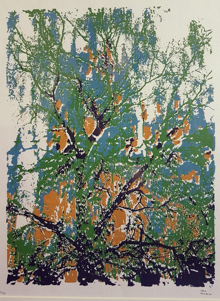
Abstract Minster
Discuss the importance of composition in your work?
This may sound a little pretentious, but I don't, consciously, think upfront about the visual elements or 'putting together' of the image. I just look for something that has an interesting angle perhaps and a pleasing feel to it.
Take Janes Shoes and discuss.
Jane’s Shoes was inspired by a friend of mine, Jane, not surprisingly! who sent me an image of her patent leather shoes which blew me away.
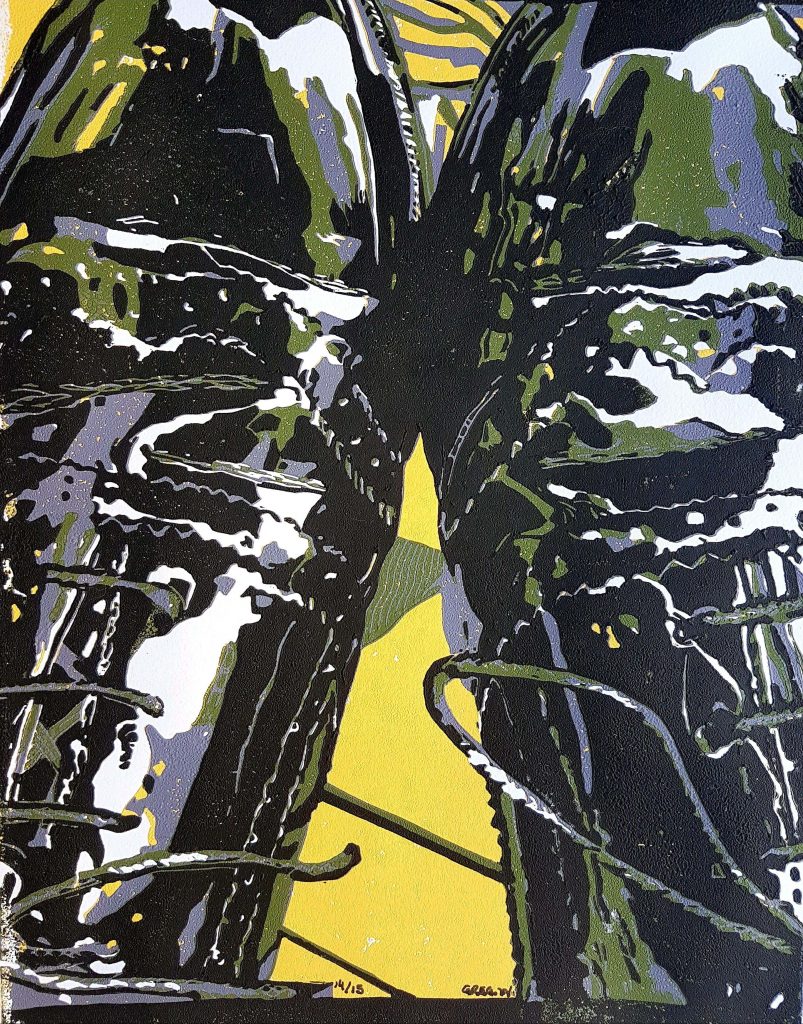
Janes Shoes
I loved the contrast between the lights and darks and thought it would be a great candidate for a lino.
Expand on the use of monochrome colour in ‘Shambles at Night’
The limited colour on 'Shambles at Night' was indeed a deliberate choice. I wanted the darks of the blue to emphasise the night and I suppose the chilling cold we get here in the winters. It was an experiment in the technique of reduction lino and the first one to use this process.
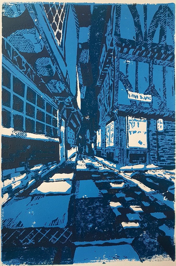
Shambles at Night
What is the limit number of your prints?
This can vary but usually between 10 and at the most around 40.
Do you sign all your limited prints?
Everyone!
You also work with silk screen print method discuss the differences of this technique to other methods you use.
Well, I only use Lino and Silk screen for the moment, but I am considering other processes. Lino can be an almost meditative process, I call it 'Western Meditation' sometimes! It’s a slow process but the interesting part, is deciding which elements of the Lino to remove. This is the fun part for me, then when the carving starts it can take hours, but it’s good to whittle away the time listening to some uplifting music in the background.
Silk screen on the other hand is a completely different affair! Once the image is prepared into stencils it can be a messy process, sort of old school photography I suppose and a bit nail biting in the worry that the image may over or under expose. If successful, the results can be more dramatic and instantaneous though.
When do you use Lino Printing?
I tend to split my time around 50/50 between both Lino and Silk Screen work, what motivates me between either isn't really known to me and I just tend to go with where the tide sends me! As mentioned, Lino work can be a somewhat meditative form and I may choose this as a more relaxing (if that’s the correct use of the word)
process. Most of my lino work now uses the reduction process whereby the same block is used multiple times and each ink is layered on every decreasing block finishing the last layer on very little lino from which I started. Once finished it can't be used again so the prints are unique. They can't be reproduced anymore, so this has a kind of charm I think.
You have done many commissions.
Take one and give us the background to the commission.
‘Dunton Springs’(with the barn house in the rear) was a commission I did for an old friend from way when. Emma and her husband sometimes visit this holiday destination in Colorado, and I did this commission as a gift from Emma to her husband on their wedding anniversary whilst they were there. It had a colour scheme that Emma wanted to follow but otherwise the draft was left up to me.
Dunton Springs
How has your location influenced your work both urban and rural York?
York Minster
Absolutely! York is a treasure trove of medieval streets and Roman influences, it’s also a small city so it’s easy to get around and one can’t help but feel influenced everywhere you turn.
Not travelling too far away you are suddenly out in the North Yorkshire countryside and this also is immensely picturesque. My work does tend to focus within the city however as I find the local architecture more enticing.
Saltburn Fisherman
How has your photography influenced your printmaking?
I studied Photography many years ago now, but I can't deny it must have an influence on how I see things, even if subliminally.
You are a member of the York Printmakers, what are two of the benefits of this membership?
Initially when I got back into the swing of things, I was a touch reluctant with the public aspect of my work. The Printmakers is a very good group that help and promotes effectively. It’s a great opportunity to meet with like-minded individuals who share the same or similar format, but I think if I'm brutally honest the uplifting feeling from a sense of community within the group is my main draw.
Can you share your studio with us?
Certainly, my studio and my living quarter tend to merge. This can have great advantages (in not having too far to travel) but on the down side I do have to be disciplined to avoid some fatal distractions. Tea and biscuits, etc.
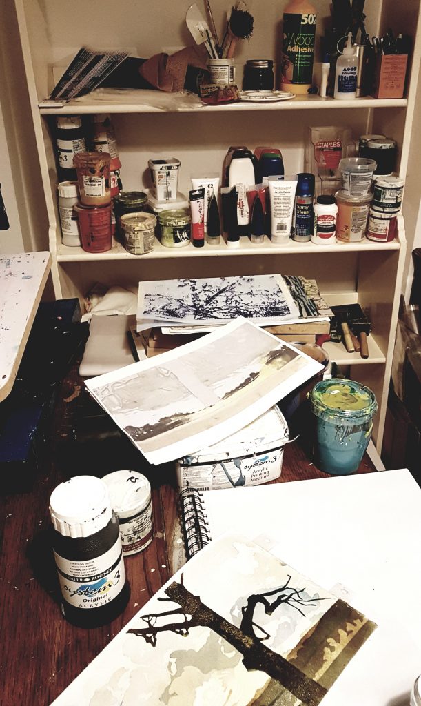
What is the main advantage of having your own press?
When I first started doing lino prints, I was using the back of a spoon which, crude as it was had some great results but a bit rustic in approach. Now that I have a press the results are a lot more refined and I love the process.
What is one of the disadvantages of this press ownership?
I opted for what’s called a 'portable press' It still weighs about 50kg and was difficult getting into the studio. Apart from this, there are none I can think of. Even my cat ‘Percy’ approves and often can be seen sitting on the press whilst I'm busy elsewhere.
Contact details:
Greg Winrow
gregwinrowprintart.com,
gwinrow@yahoo.com
Deborah Blakeley, Melbourne, Australia
Interview by Deborah Blakeley, November 2019
Gjertrud Hals
Explain about your recent work with copper wire.
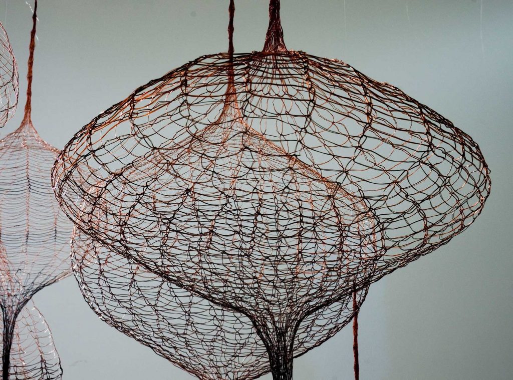
EIR series, Knitted copper wire, Photo by Sjur Fedje
For the last 2-3 years I have been working with copper wire, making 2D as well as 3D works. My father and grandfather were metalworkers, making and installing engines for the fishing boats. Our family was living close to the factory, and I found it thoroughly fascinating to see the different metal materials that they used.
For years I had been thinking about how to use metal in my artwork. Occasionally I had been using metal wire and various metal objects, but not as a central medium.
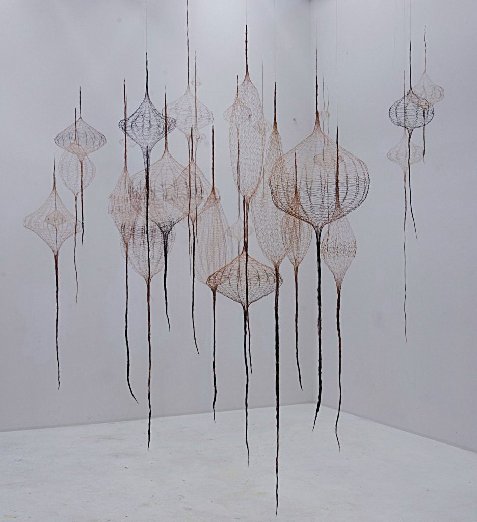
EIR series,Knitted copper wire, Photo by Sjur Fedje
After my parents died, in 2013 and 2017, I wanted to make a memorial piece. As knitting was my mother’s favorite hobby, REQUIEM was made of knitted copper wire from my father’s workshop, combined with small items from their estate and ring-pull tabs from beverage cans.
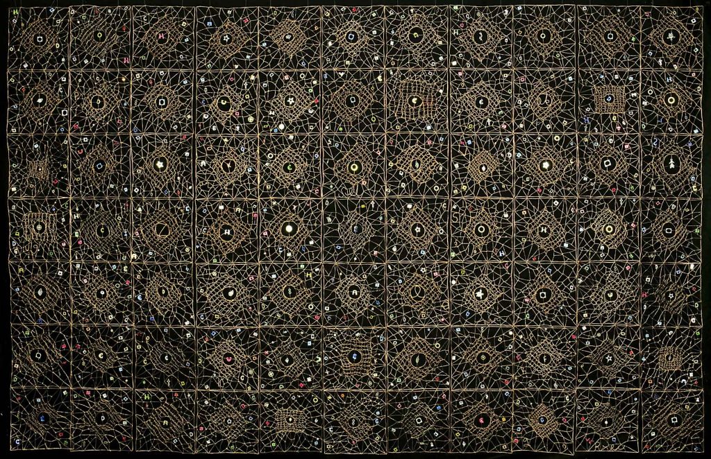
Requiem, Knitted copper wire, 2019,Photo by Sjur Fedje
Eventually I also wanted to make 3D artworks with metal wire, and I am now working on the EIR series, knit on big circle- shaped frames. Dark colored wire from dynamos and motors is used together with shiny, reddish wire from electric cables.
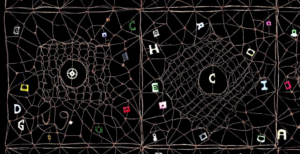
Requiem, detail, Knitted copper wire, 2019,Photo by Sjur Fedje
The title EIR, meaning corrugation, is pointing to one of the characteristics of copper, that I want to emphasize in this project.
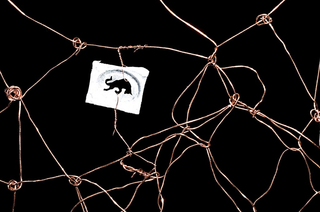
Requiem, detail, Knitted copper wire, 2019, Photo by Sjur Fedje
My next Solo Exhibition, in Galerie Maria Wettergren, Paris (February 8th - April 25th, 2020) will show the new metal pieces.
Comment on how your textile work can be related to your childhood and the local fishermen.
I was born on the Finnøy Island at the North Western Coast of Norway in 1948.
Finnøy Island, where Gjertude grew up
During my childhood there was an abundance of fishing of herring going on every winter. The herring were caught in large nets and hauled up in smaller ones. When the weather was bad, the harbor was packed with boats, and big bunches of fishnets were hanging out to be dried.
Every summer holiday I spent with my grandparents, living by themselves on the tiny Notholmen (not =net) island on Hustadvika. It is a famous and dangerous part of the Norwegian coastline; many ships have been wrecked along it.
Notholmen, where Gjertude stayed with her grandparents
In the evening, when the weather was good, I used to go with my grandfather putting out the fishing nets. The next morning, I would always wake up early, eager to see the nights catch. We used a rowing boat, and it was my job to maneuver the boat while my grandfather was hauling up the nets. Coming home, we worked on loosening the fish and crabs, rinse and hang up the nets to dry.
“The net” has thus been a central theme in my life and art from the very beginning. I am frequently using childhood memories, as in CORAL SEA from 2016: “When we were fishing with nets, sometimes big corals, we called them “sea trees”, would be attached to them.
Coral Sea, detail, 2016, Photo by Sjur Fedje
When they came up from the sea, they had bright yellow and red colors, that after a while would fade away. In my fantasy they were greetings from a mysterious world deep down there, colorful and fantastic, unlike the world we were living in.”
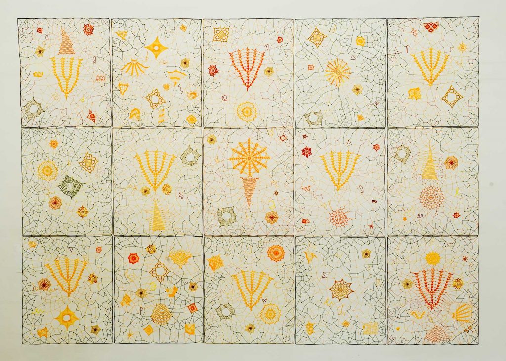
Coral Sea, 180 x 250 cm, Cotton and linen thread, glue, crochet knitting and various lace techniques, 2016, Photo by Sjur Fedje
Today scientists say that the coral reefs are highly endangered: huge coral areas have turned grey, also here at the Scandinavian coast.
What originally lead you from tapestry to Textile Art?
In the mid 70’s I had a desire to learn the craft of weaving, had two years of training in classic tapestry weaving and plant dying. However, I soon felt that for me it was too rigid, and I started experimenting with new ways to use the traditional craft. Gradually I also used other techniques and materials, amongst other I made a series of LETTER FROM THE ISLAND, embroidery made by hand and sewing machine.
Letter from the Island, 1983, Photo Nanna Wessel
Still not content, I began, in the early 80s, trying out paper cast, as I had a vision of making fiber sculptures. After having been working in a tiny bedroom for some years, I in 1985/86 got my own spacious studio, and about one year later the first LAVA vessel was a reality.
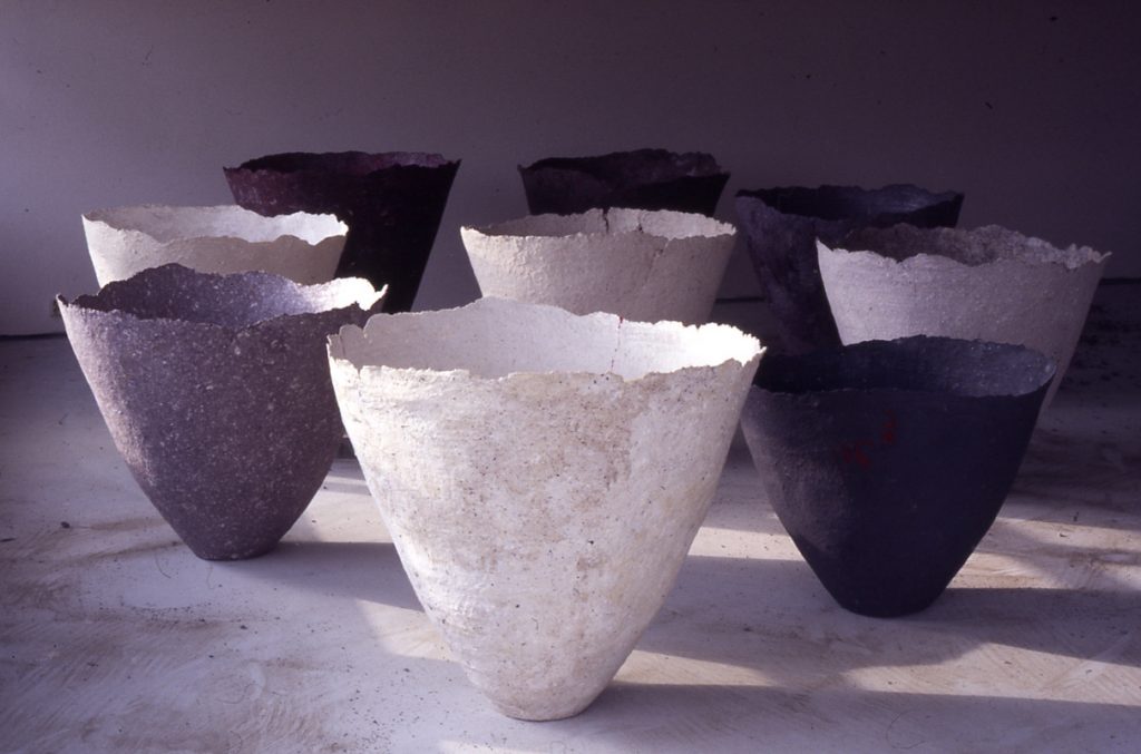
Lava (group) 1987, cotton, flax, and cellulose fibres, paper cast, each piece 90H x 80 cm
Discuss your Lava Series and how this came into being?
When I managed to make the first LAVA vessel, it was after years of testing and failing. I had a vision of what the shape was going to look like; a membrane, a shell, archaic and timeless, huge, vulnerable and strong at the same time.
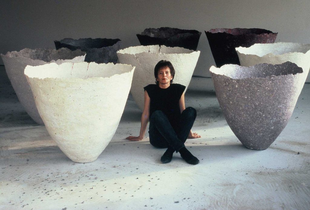
Gjertrude Hals, with Lava, 1987
I felt quite vulnerable myself at that time, having left my family for a period to study sculpture at the Trondheim Academy of Fine Art. Maybe the new surroundings helped to liberate the idea, because suddenly I succeeded! I knew immediately that I had found what I had been seeking, and after some months of building and testing different molds at the Academy, I went home to my new studio and started to produce the LAVA vessels.
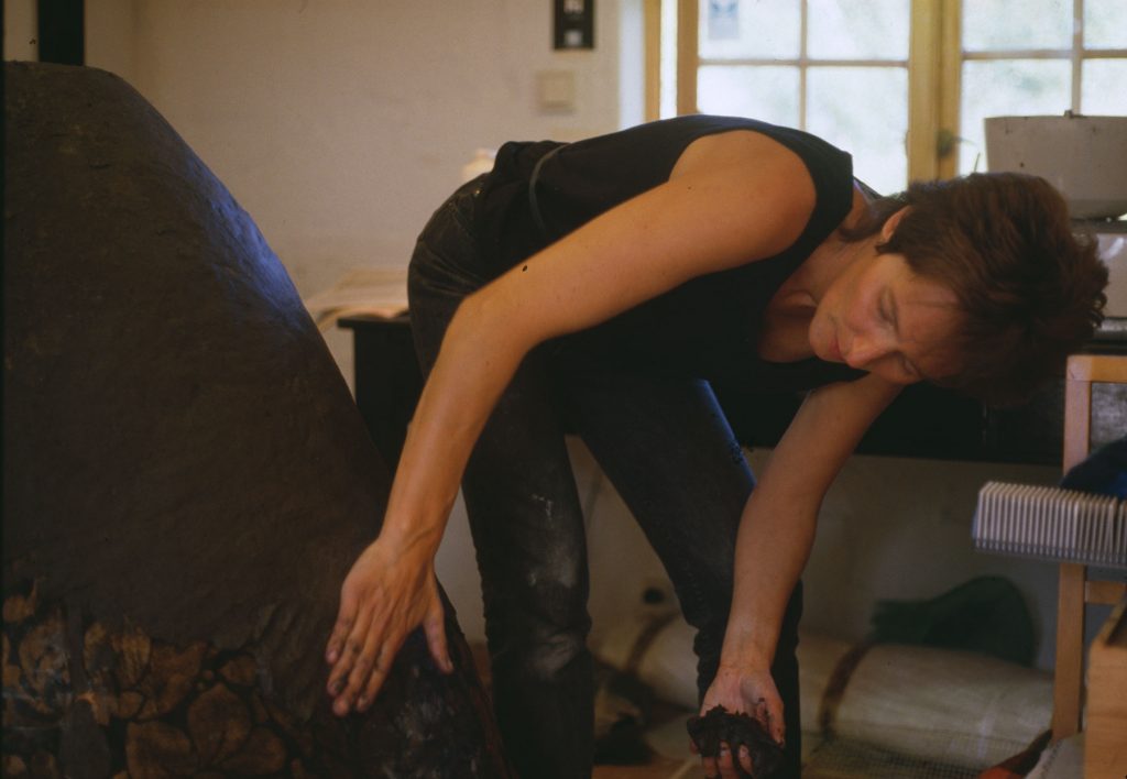
Two different molds were built out of cardboard and covered with thin plastic. To build the vessels themselves, I used paper-pulp with cellulose glue, cheese cloth and old fishnets as reinforcement.
It was physically hard work, especially to prepare the material. In the beginning I used pre-cut cotton, flax, linen and cellulose fibers, blending it in a kitchen machine. Eventually I was able to buy a Hollander Beater, where I could cut my own fibers, making it a lot easier and much more fun!
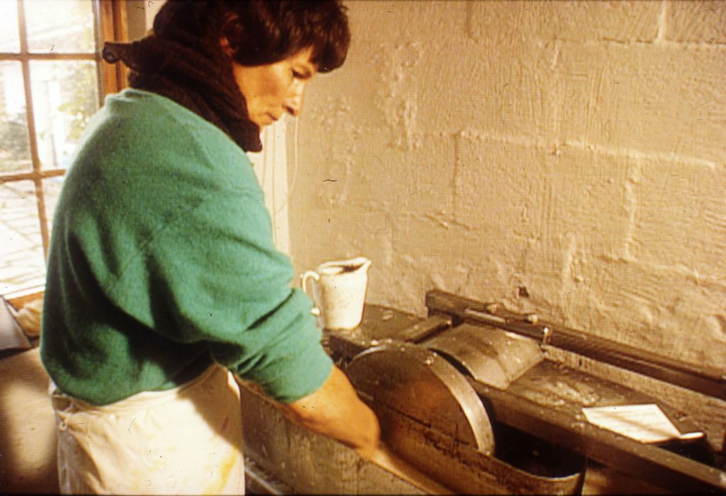
The LAVA project went on for a year and a half, with totally about forty vessels.
During that period, I was looking for a suitable location for taking photos. I tried different places, also outdoor, but it did not give the right feeling. One day I came upon a half-finished house construction, and it was perfect!
My husband took the photos, and I thought it was important that I was posing with my artwork in some of them, to visualize the size of the LAVA objects.
There were three Solo Exhibitions with the LAVA vessels:
Schæffergården, Copenhagen 1988
Molde International Jazz Festival 1988 (with a dance performance)
Gallery F15, Moss 1988 (also with a dance performance)
And many Group Exhibitions, selected:
Metro Art´s International Art Competition , New York 1987(I. Prize)
The National Annual Exhibition; Oslo 1987
The Tactile Vessel, Touring Exhibition in USA 1988
Neo Tradition , Museum of Decorative Art, Trondheim 1988
Perspective on Paper, Lillehammer 1989
ITF International Textile Competition `89, Kyoto 1989 (Grand Prix)
New Norwegian Textile Art, Museum Of Decorative Art, Trondheim 1989
Splendid Forms, Bellas Artes Gallery, New York and Santa Fee 1989
International Biennial of Paper Art, Düren 1990
Nordform, art, craft, design and architecture, Malmö 1990
Ode de la coupe, Museum of Decorative Art, Lausanne 1992
The Lava vessels are to be found in several collections:
Museum Bellerive, Zurich (3)
Museum of Decorative Art, Lausanne (3)
American Craft Museum, New York (1)
Erie Art Museum, Pennsylvania (I )
Leopold-Hoesch Museum, Düren (9)
The National Museum of Contemporary Art, Oslo(3)
The National Museum of Decorative Arts, Trondheim (1)
Arts Council Norway (1)
Bob Kelly Gallery, Gothenburg(1)
Daiichishiko Co. Ltd , Kyoto( 9)
Besides that, they are in a few private collections, I have also kept some for myself.
How and when did you know that you needed to move on from this vessel?
As one can see from my CV, the years from 1987-90 were very active. Besides sending the artworks, I also went to many of the places I exhibited, f.ex. in 1989 I was twice in Japan, in New York and other places in USA, as well as in Norway.
This was before we used internet, and the communication from my hometown to places like Kyoto and New York was challenging. I remember I bought myself a fax machine, but it did not help much on the situation:
With three children and a husband working full time, I realized that the LAVA success was about to ruin our family life. Because of all the administration and traveling, I had almost no time left to develop my artwork, and by the end of 1989 I was exhausted…
One day, while my son was using the water-hose, I told him he could flush the LAVA molds as well… He did so, and we dug down the remains in the garden.
This might sound like a drastic thing to do, but this act marked that “enough is enough” and gave me the timeout I needed. It prevented me from being tempted go on and on. I had no molds any longer!
Little by little I regained my health and could continue developing other projects.
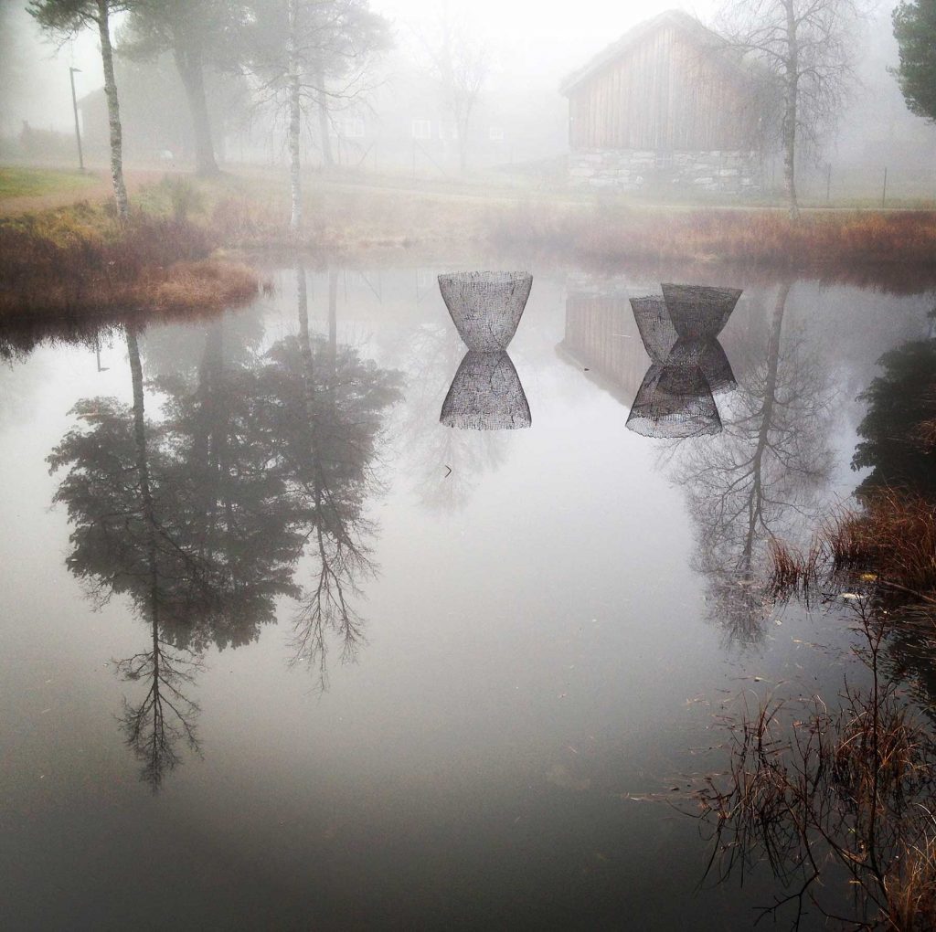
Ultima, in the water, photo Gjertrude Hals, 2018
Eventually, twenty-five years later, I made a similar mold for the ULTIMA vessels, that are made with cotton thread and resin.
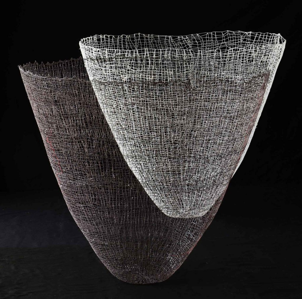
Ultima, 2018, 90 x 100, and 80 x 90, linen, cotton threads, knitted mesh, resin cast.
Discuss the importance of Magdalena Abakanowicz and how her work has influenced your work.
When training in drawing/ graphic art in 1971-72, I went to Poland on a study trip. I had heard about the “Polish wave” in textile, at the Art Academies in Krakow and Warsaw, I saw some examples. However, it was first in 1976, with a major exhibition of Magdalena Abakanowicz
art in Oslo, that I was hit by the wave: the “Abacans” hanging from the ceiling and the hollowed-out, headless human figures on the floor made a strong impression!
Like my heroine I wanted to express myself, but what was there for me to express? I was not, like Magdalena, living in a repressing regime, that I understood was much of a background for her art.
I realized that I had to find another way, being faithful to my own background and experience.
Although Magdalena Abakanowicz was my leading star in my early career, I think my art has always been quite different from hers. I could never think of doing something similar, that would be false.
Step by step; playing and working, failing and retrying, I was able to express myself and write my own visual poems. But the strong “wakening up experience” from 1976 will always be with me!
Why have 2D and 3D textiles, become so much a part of your presentation of textiles?
Interested in the empty spaces/ the negative spaces, I am working with the connection between form, light and shadow. For me lightness is an important quality, often combined with sizes and shapes that normally are thought of as massive and solid.
My artwork tends to blend into the environment, where the “spaces between” are playing an important role.
F.ex the 2D textiles should always have a distance to the wall, that will “waken them to life”, with changing light, movement and shadows.
The way the artwork is installed in the room is for me decisive, and I remember from my study days that I was intrigued by others that were not aware of, or did not mind, how their artworks were presented. As for the tapestries, I also disliked that there was a front and a back side. I soon started to make the weavings transparent, installing them in the room, to make both sides visible.
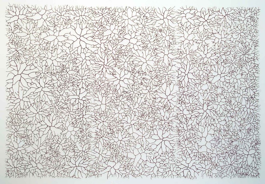
Insula, 200 x 300cm, Metal, wire and paper pulp
Comment on ‘Insula’
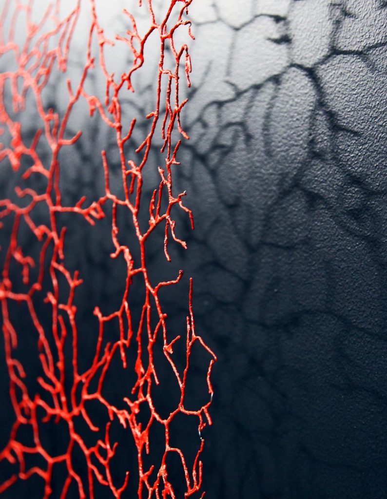
Insula, detail, 200 x 300cm, Photo Gjertude Hals
INSULA, that I look upon as one of my central artworks, was developed through a period of two years, 2006-8. In the beginning I called it FROM VESALIUS, referring to the 16th century Flemish anatomist Andreas Vesalius, well known for his anatomy drawings in “De humani corpus fabrica”. I was trying to make an arterial system, that I wanted to be an open structure. At the same time, it should allude an enclosed circuit; the circulation system.
My husband Odd is a psychologist, and since we met in 1970, he also, amongst other, has been my sparring partner. At this stage he was much into neuropsychology, and in this process, he came up with the term INSULA.
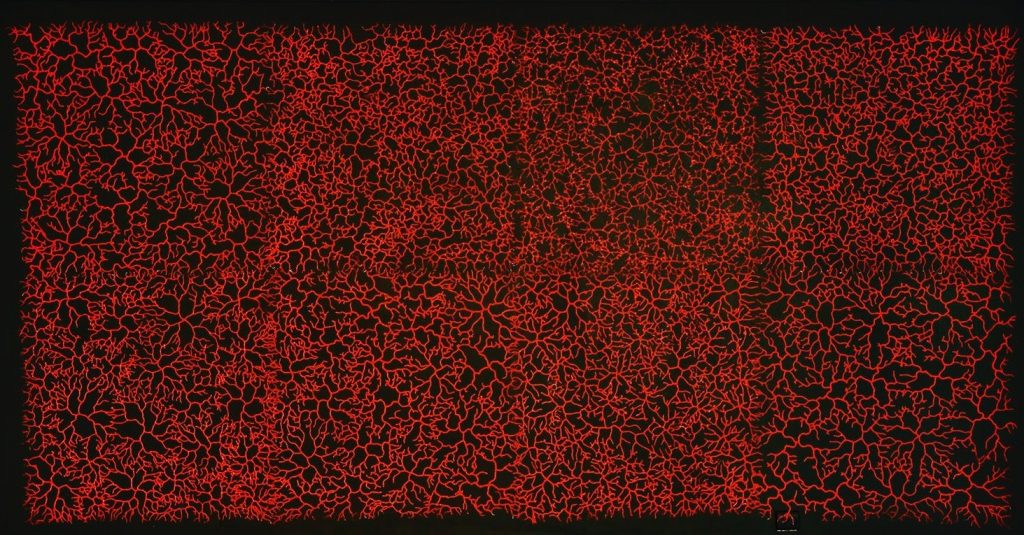
Insula, 200 x 300cm, Photo Gjertude Hals
I am always seeking symbols that encompass several meanings, so this was a deliberation: INSULA is the latin word for island, and it also may refer to Insular Cortex, a central structure deep inside the brain. It is believed to be involved with consciousness and plays a role in diverse functions, usually linked to emotions and perception of ourselves as isolated creatures, and to our consciousness of the “self”.
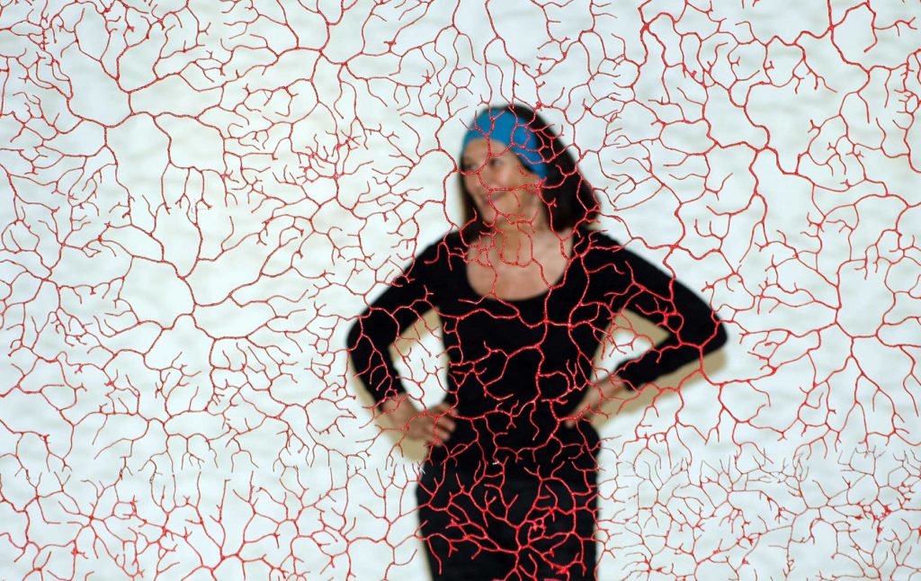
Insula, 200 x 300cm, with Gjertrude Hals, Photo Knut Fjeld 2008
At the same time INSULA has a reference to “the island” and a resemblance to coral reefs, another of my favorite themes. INSULA was made with metal wire into 100 x 100 cm squares, totally 9. The grid structures were sprayed with liquified, dyed paper pulp, about 50 layers. As one can see from the images, the artwork has been installed in different ways: with 8 squares, 9 squares, horizontal and vertical, and even once with a black background!
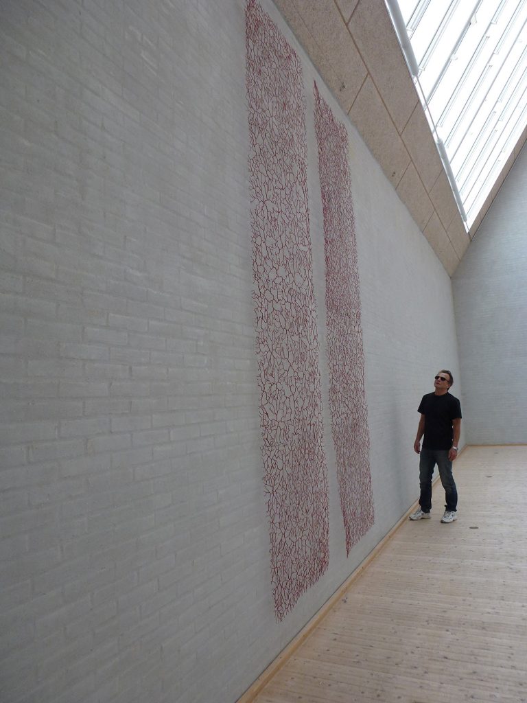
Insula, with Gjertude Hals, husband Odd, Photo Gjertude Hals
Discuss how you have moved from the world of tapestry and needlework to the world of textile art.
The tapestries I was making in the 70s and early 80s, for sure look very different from what I am doing today.
However, for me it feels like I never moved away from it, or any other artistic period of my life. It is all there! I go back to it in my mind, to «roundabouts» where I have been earlier.
Sorting through samples made f.ex. fifty years ago, might liberate a new idea! Every day I am using skills acquired through the years, using them in new combinations and sometimes, going in new directions.
How have you been able to use recycled materials in your work and the importance of recycling in contemporary art?
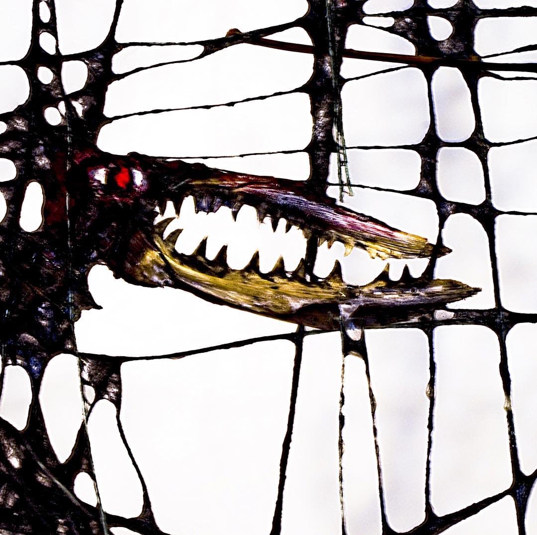
Fenris, detail, photo Sjur Fedje
Throughout my life I have collected items from the beaches and other places; shells and bones, bottle tops and textile fragments; materials that might otherwise be considered garbage.
As a teenager I made a series of what I called “material works” from objects found on the beach.
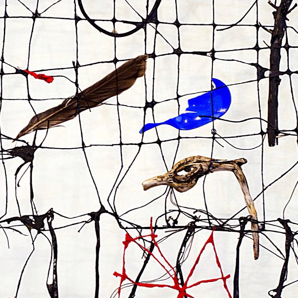
Fenris, detail, photo Sjur Fedje
About forty years later, the summer of 2004 I stayed for a month at Svalbard, the Norwegian archipelago in the Arctic Ocean. Wandering along the shores, I collected small items, everything from fish bones to man- made objects of metal and plastic.
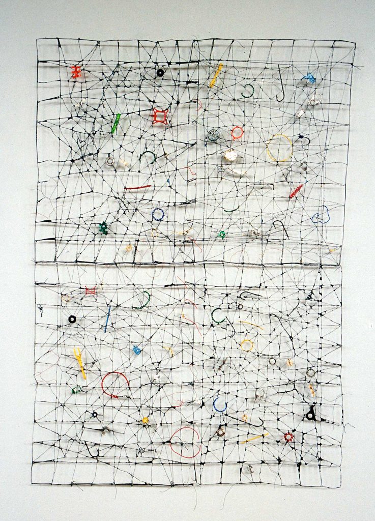
Kapp Mitra, 2005, 245 x 170cm, Threads, fibres, found objects,
Photo Nanna Wessel
They were integrated in my nets, as a new sort of “material works”, like KAPP MITRA, 2005 and FENRIS, 2004/06.
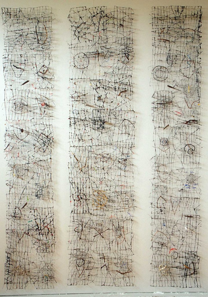
Fenris, 200 -06, , photo Sjur Fedje
Though environmentalism is an underlaying theme, I am not concerned with social morality when working with the trash materials, it has more with joy and creativity to do!
To use found objects, often used in a conceptual manner, has become quite common among artists today, I would say.
In this world of trash mountains and ocean gyres of plastic, many contemporary artists are in the front, battling what is happening to our planet. Some of my friends/colleagues have f.ex. formed the
“Guerrilla Plastic Movement”, where they are fighting for a plastic-free ocean by using visual, verbal and artistic means.
The importance of such activity should not be under evaluated. Artists have always been in the front row when big changes have taken place, as is necessary and inevitable in today’s situation!
Contact:
Gjertrud Hals
www.gjertrud-hals.com
Deborah Blakeley, Melbourne, Australia
Interview by Deborah Blakeley, October 2019
David Poxon RI
Why don’t you use white paint in any of your work?
Many years ago, I came back to watercolour as my primary medium of expression. I wanted to perfect as many techniques as I could without getting side tracked by the latest gimmicks and painting aids. I decided I would commit to paper, paint, and brushes only and find out how far I could go with this limited arsenal, without getting distracted. In my opinion it is not possible to get whiter than the white of the paper anyway, therefore my particular method of working requires that I preserve areas of white paper to represent any whites that may be in the subject choice.
Long Distance Love, Watercolour, 12 x 12 inches
I must confess that I did at one point acquire a tube of white gouache, and experimented with it, however I was disappointed with the results which looked artificial to me, and felt that I was using it out of misplaced laziness rather than for any worthwhile aesthetic reason. From then on I determined to develop my own way and methods of working, a purist approach for me simplifies my choices enabling me to concentrate totally on the modelling of my subjects.
What has led you to focus on reclaimed pieces as your subjects?
My childhood was spent in a heavily Industrial area in the middle of England. Derelict factories and buildings were my playground. My Father was a vegetable merchant who would frequently drive out of the city into the countryside to collect loads of potatoes and vegetables in his truck. Sometimes he took me with him, and the treat of the day was to get a ride on the Farmers Tractor.
Engine in an Autumn Field, Watercolour, 27 x 18 inches
Tractors, trucks, and factories were the first things I painted. Back home in our yard where he parked his truck there were a mountain of old vegetable crates and boxes, these were a readymade creative output for me as I built the Alamo, Roman Forts, Batmans cave, and anything else that had inspired me that day. I was also painting away on squares of old wall paper lining using my first tin of watercolours, a gift from my Grandmother at the age of five.
Later as a student I experimented with other mediums, styles, and subjects. When I decided to concentrate solely on pure watercolour I followed the time worn path of entering various contests and trying to get admitted to various art clubs. Years ago, entered a contest in Birmingham UK with a painting of an old Qualcast lawn mower.
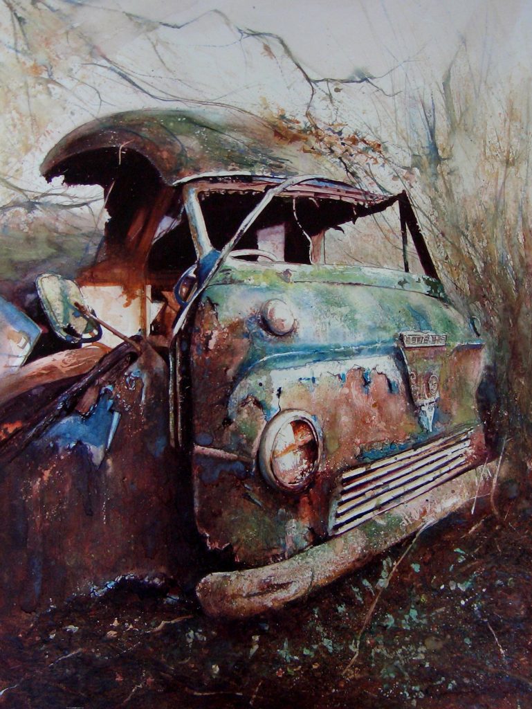
Van in a Wood, Watercolour, 18 x 26 inches
Peeling paintwork, rust, and fading memories of hissing summer lawns long since over grown. I had become disaffected with the usually landscape/townscape/sea subjects and had increasingly been drawn to subjects where nature was busy reclaiming what man had created or cast aside. Zooming in on surface textures, form and shapes, gave me more of a painterly workout. To my amazement I got first prize and also sold the work. This gave me the confidence to pursue the direction I was already on. The abandoned, the over looked, the discarded, all became objects and scenarios with distinct creative possibilities and I had an increasingly strong emotional connection with. I treat all my subjects as portraits in that they are living characters passing through this world just as we are. To me they are more beautiful in their regenerative state than when new, just as people become more interesting and soulful as they age. It is the search for the DNA of a subject that gets my total attention. Wrestling with the technical and emotional challenges of painting in pure watercolour, which requires some serious planning and is not the most forgiving medium, is what gives me the greatest pleasure. It can take many days or weeks to complete a painting, but if you enjoy the painting process like me why would you want to rush it ?
Take one painting and discuss where you found the subject.
What, drew you to it, colour or texture?
‘In a Farmyard’ pure watercolour.
This work is a typical subject for me. Objects seemingly randomly dumped by a farmer in his yard. Fortunately I now live in the wonderful Shropshire countryside, and am surrounded by Farming families, some of whom have taken a great interest in what I do. They have given me the run of their farm yards and buildings, and of course I have never lost my love for Tractors and agricultural machinery.
On a subject hunting trip to Grange Farm I came across this discarded treasure. I never move or rearrange objects as feel this gives the subjects an artificial feel. I prefer to rearrange my position and find the best angle to give me a ready made painting possibility.
The elements in this painting gave me all the forms and surface textures I look for. The smooth but dilapidated chicken feeder, the remnants, rust and paintwork , of an old engine, and other farmyard objects , all held together by an enveloping and powerful strong light and its resulting shadow force.
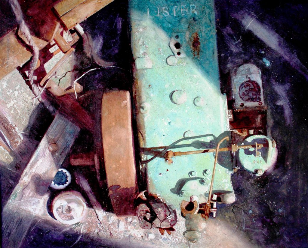
In a Farmyard, Watercolour, 18 x 26 inches
Discuss the logistics of sending your work overseas for exhibitions.
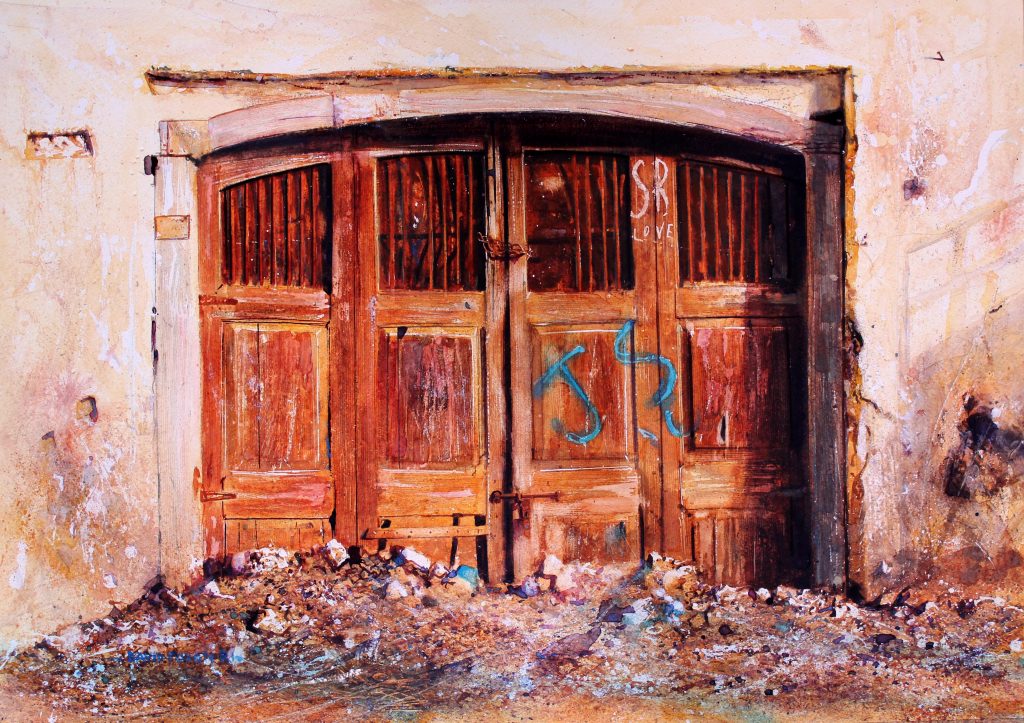
Careless Love, Watercolour, 27 x 17 inches
This depends on the ultimate destination, and different methods apply. Many overseas shows only require that you send your work unframed. In that case it goes rolled in a card tube, is easy to handle, the weight is low, and therefore the costs also.
The danger is that a fair degree of trust must be afforded the organiser in that the paintings need to be framed and presented for view in a professional manner. More typical Gallery situations will require that work is sent framed. In the UK all watercolours for exhibition must be behind glass. Overseas, particularly USA, they require plexi (plastic) glass. This means less weight, and is a safer option than sending glazed work in terms of sustaining damage in transit.. If I am shipping single items to a client, collector, or gallery, then I have specially sized robust cartons for sending single framed paintings. To ship 5+ to a gallery I have a selection of purpose made wooden crates lined with heavy foam inlays. This is a far more expensive shipping option due to the weight and size, and it is important to use a professional art courier who can handle collection and delivery plus the Customs paperwork efficiently.
What led you to writing two books on drawing and watercolour techniques?
I had, over the years, contributed many articles to the Art Press in the Uk and overseas. One of these Interviews had been spotted by the Editing Commissioner at Quarto Books in London. I was approached with the offer of writing and illustrating a drawing book Quarto had been commissioned to supply, ‘Different Strokes Drawing’. After an initial meeting I set to work providing content. Two weeks in they asked me to also work on a second book, the Still Life Drawing Bible. This was a very educational and enjoyable experience, Quarto are a top class outfit who provided excellent management of the project. The books were published world-wide in numerous different languages, did really well, and have been reprinted many times.
Later I was approached several times to author a ‘how to paint’ watercolour book, this is still a project that I will do at some point. However at that time I had ambition to produce a book which would be more biographical and less instructional, containing analysis of my own work rather than explaining basic techniques. I worked with a new Publisher who gave me the design and content freedom I needed. A few months ago Watercolour Heart & Soul was published.
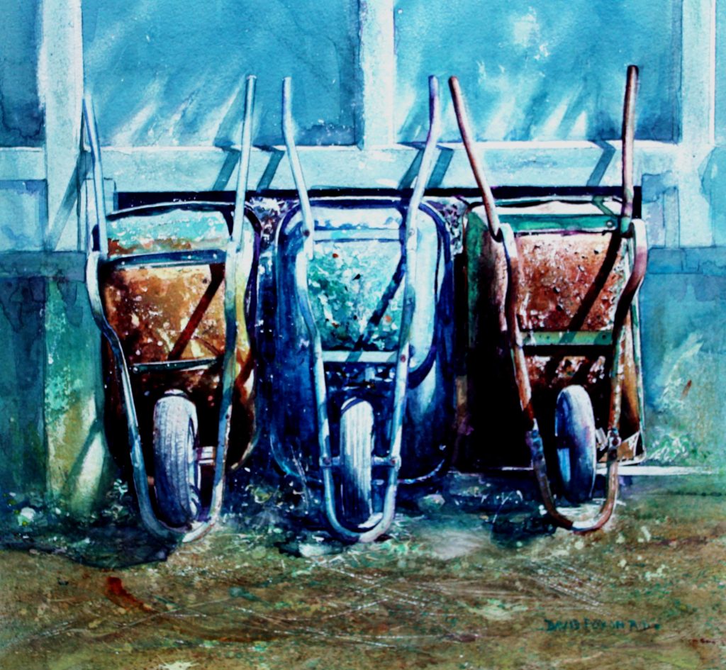
Let’s Go Out Tonight, Watercolour, 27 x 17 inches
Tell us about the International Watercolour Masters in 2020 and your involvement.
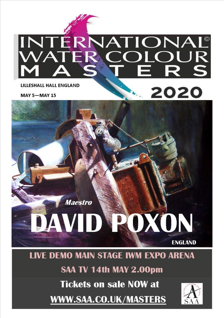
In 2017 I had a large solo show planned for the UK in a fabulous stately home venue. That year I was travelling a lot and on one expo outing in China in a late night discussion with Alvaro (Castagnet) and several other artists on the touring circuit I outlined my plan. Somewhere into the Shanghai night my solo show got set aside and I was persuaded to embark on a far more interesting project, a high profile International show featuring the world’s elite watercolourists. The International Watercolour Masters had been born. Fortunately there was a good selection of talent to draw on in terms of artist roster. In one of my previous working incarnations I had worked in the music Industry organising lots of world tours and logistics for high profile bands. That experience has transferred well to my art life, and particularly International shows. The ‘organiser’ in me does enjoy putting situations together and making them happen. IWM2020 is a much expanded show from iwm2018 which was one of the top selling UK art shows of that year with over 17000 visitors. 2020 will feature 39 elite Master painters, in a bigger venue, and with a far more ambitious programme.
IWM2020, as IWM2018, is presented in the heart of glorious Shropshire Countryside in an historic stately home, Lilleshall Hall. The Exhibition in 2020 will be a total event and day out with myself and team having complete control over all preparation and presentation. We will be present on every show day too. This is a new way of doing things. The days of the high street gallery expo where artists turn up, hang their paintings, then disappear till the end of the show, are numbered in my opinion.
In order for art shows to compete with everything else that tempts the visiting public they have to have a bigger and more attractive offer. The concept of IWM is more about elite festival, and all aspects of its presentation will be first class, to deliver an inspirational day out for visitors. Many of the 39 Master painters will be present throughout the show. Over 34 Live 50 minute TV Demonstrations are scheduled from the IWM Arena main stage. Most of the workshops, which will occur in adjacent seminar rooms, are sold out. Tickets for the show are selling well in UK and overseas, and the TV Advertising in UK will kick in soon, and of course the main draw is the incredible exhibition of paintings that will be on display.
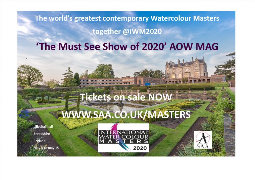
Why do you limit your work to watercolour?
How did this come about?
Well, I also like to draw in pencil, particularly portraits. However I guess I am a persistent sort of person who doesn’t give up easily. Watercolour does test all the nerve ends and asks all the questions, and it can shoot off out of control at any moment. However, trying to juggle all the elements is an endless quest, and I always have it in mind that my best painting will be my next ! It is the easiest medium to pick up, but the hardest to master. I love this medium, its radiance and transparent qualities, and feel like I am only at the beginning.
Expand on one of the amazing setting your work has been exhibited in.
In terms of exotic locations there are few to beat the huge productions which the Chinese have managed to stage. Although these have degenerated recently as economic reality sets in, the early shows, Shanghai Biennale, and Shenzhen Biennale, were incredible. Sponsored and paid for by the state ( $1million for each show) and with top class set up teams, these early exhibitions would be hard to beat or replicate in the future. They set a great benchmark for future organisers to emulate.
When you first began did you dream your art would take you around the world? Discuss this aspect of your art life.
It is very humbling to be in a position where I get invited to lots of exciting places around the world. However, I have always travelled in my working life, so guess this is just an extension of that. It’s great to meet old friends, and make new ones, and talk art all night long!
Tap Dancers, Watercolour, 15 x 12 inches
You are a member of the Royal Institute allowing you to use RI after your name. Discuss the process it takes to become a member.
The RI is one of the two oldest and prestigious Societies in the UK over 200 years old. Many Masters from the past, Turner, Girtin, Langley, to name but three, have been members. The current member numbers are approximately 60. Membership is by election, and is quite a convoluted process. Candidates must navigate a number of tests which can take up to 5 years. Consistency of work together with individuality and a mastery of the medium are all considerations, as is being selected to exhibit with the RI in it’s annual London show on at least two previous occasions. Applicants must first get the approval of the RI Council to pass to Candidate status. The final test is to win enough votes from the membership. Membership of the RI is the pinnacle of watercolour artist’s aspirations, so it is a tremendous honour. The Society aims to maintain its prestigious position as the leading UK watercolour organisation by adhering to it’s high standards and admitting only the best very candidates for membership status, it searches for quality not quantity.
Killing Time, Watercolour, 18 x 26 inches
Take two works where you have use old machinery. Discuss.
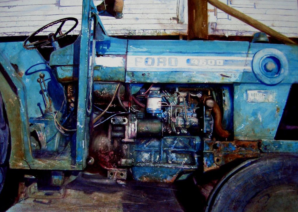
The Day is Done, Watercolour, 27 x 33 inches
This is a working Ford Tractor that often passes my studio. Tractors are regarded as living things by the farmers who drive them. They have to be reliant in all weathers as they plough their miles of furrows. Out of respect for those that work the land, and those that built the implements they work with, I try to be as accurate as I can in the initial drafting. The engines are complicated to draft out, but I spend a long time getting this right before I commit to the watercolour paper. I am not searching for photo realism, I am making a painting, however I have the intention of rebuilding the machine on the paper, and this is my approach when using my multi layering techniques to build form and body.
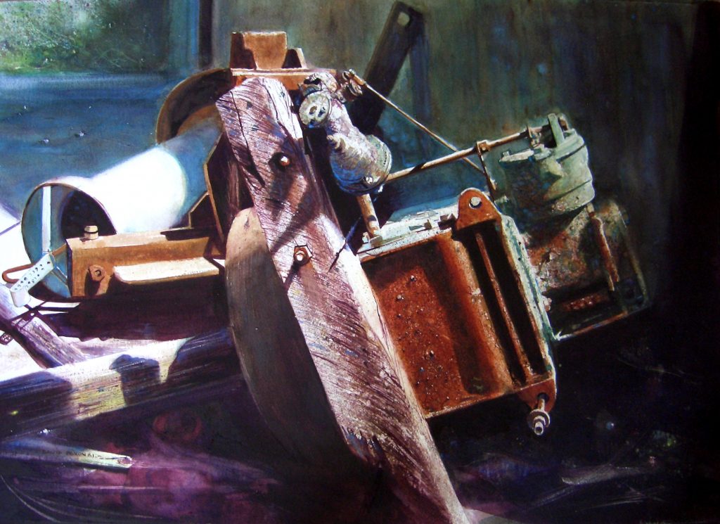
Machinery at a Farm, Watercolour, 17 x 26 inches
This is a painting of an old Lister machine that had been used in a milking parlour. Having come to the end of its working life I came across it basking in the midday sun, left in a heap by it’s owner, I knew immediately this was a subject for me. The beautiful blue green of it’s original paint work still resonated in places, but was now offset by those wonderful rust shades. I really enjoyed this subject. I feel I gave it renewed life and a fitting status, exhibiting it at the RI and winning the Winsor & Newton Award, I guess it’s legacy is confirmed.
You are currently working up to eight months ahead. Discuss the pros and cons of this timeline.
We are all products of our time, affected and shaped by lifes circumstances. Ultimately I don’t think there is any place to hide in painting, the truth will always out, and being truthful to your own abilities and aspirations is paramount. Copiers and imitators lack the personal and emotional connection with the originators concept, there is always something missing.
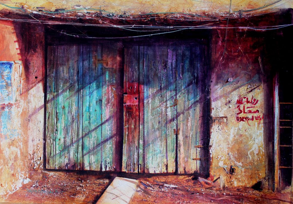
True Colours, Watercolour, 27 x 17 inches
If there is any historical context it is shaped by those circumstances. There are only two things within the control of the individual, their own thoughts, and actions. Everything else is beyond their control.
Watercolour painting is not a race through life, it is a search for yourself.
Contact:
David Poxon RI
davidpoxon.co.uk
david_poxon@yahoo.co.uk
Deborah Blakeley, Melbourne, Australia
Interview by Deborah Blakeley, October 2019
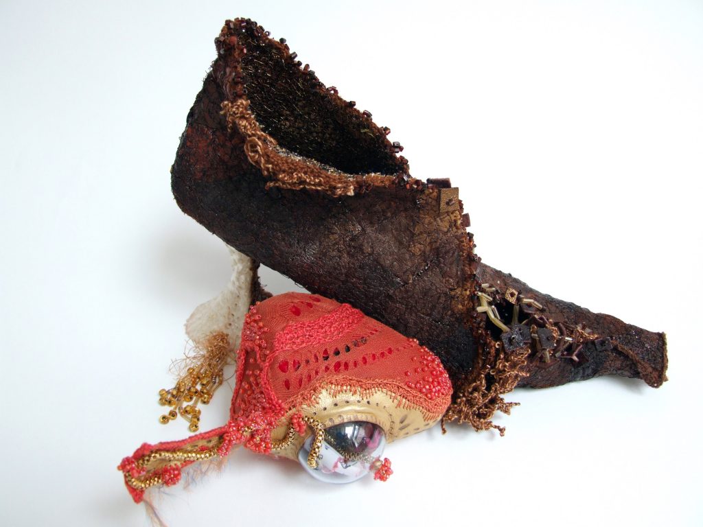
Helen McAllister
Explain about your training both PHD in Practice Design and MA in Embroidered Textiles.
The Embroidery interest emerged in my final years in school. A small school yet with a large and vibrant art department. This Embroidery trajectory continued through undergraduate, postgraduate and PhD. It was a medium that I felt had no limits, use and exploit and I could do it! I felt I was never a slave to the processes or techniques of embroidery but could make them work for me. After some years after undergraduate I undertook an MA in Embroidery where I wanted to rebrand and re imagine my practice. To that point the embroidery outcomes had been 2D image based work, yet I was questioning ‘Was this it?’ The MA saw moving from 2D to that 3D thinking. There was a perceived decorative ‘read’ of my work that now focused on Venetian history / cultural and materiality resulting in the Shoe form and narrative that captured the research and the rebranding of my practice. The practice based PhD focused on the need to make. The outcomes were not illustration to a written text but formed ‘chapters’ in themselves that questioned the materials and processes used and testing these outcomes with new discursive audiences.
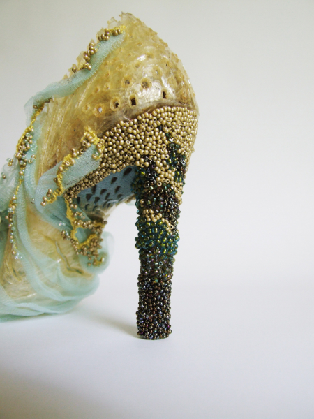
‘Walking on Water’- series, detail
Discuss how you work from one level to another. Reality, shoes to assembling shapes and colour in the abstract.
I trained through design practices and principles, therefore the starting point was about sampling, knowing the potential of a given material or process.
When in production of a series or multiplies, I often found it was easier to think in terms of assembly line, completing some aspects of a form but continually comparing it with the paired / partnered form, crossing over from one to another, as opposed to completing one form in isolation and moving on to the next form.
Why are you so drawn to shoes?
The shoe surfaced during my MA which coincided with a resurgent interest in new shoe designers, yet that was pure coincidence, it was the shoe form I found wonderful, with no two view points are the same with its inside and outside.
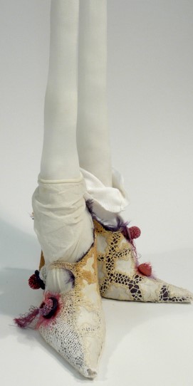
Tight Series
The scale was small, intimate, and hand-held. It was a revelation to me that I saw and thought 3 dimensionally which I continue to do so. The shoe object is such an iconic social signifier, codifier, narrator and protagonist. In Venetian historical fashion and cultural the 'Chopine' became a unique shoe form of ‘improbability’ that continues to fascinate me. This forged and completed the partnership of embroidery, Venice and the shoe. I cannot have one without the others.
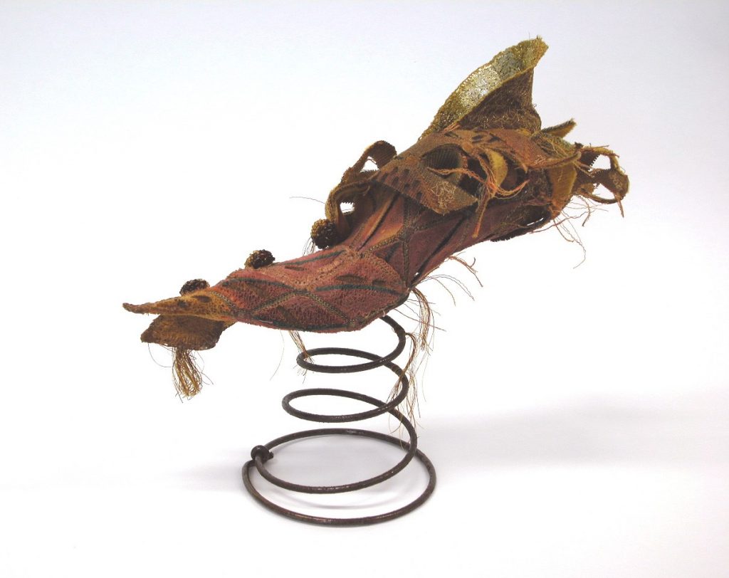
’Improbability’ Series – ‘A Spring in Her Step’
Comment on the connection of Venice and Belfast in your work and on the ‘Venetian Water Series’.
The shoe forms I created were protagonists and narrators. As part of the narration, I looked at self narration; the shoe was able to reflect the different periods of my life. At first, coming from Belfast and study in and of Venice seemed to have no connection, yet with time, I found they were complimentary. A piece of work that seems to some up all my influences and interests was called ‘Shattered Steps’. This piece at first glance is colourful, with rich surfaces, with its glass beading referenced Venice, (glass being sinominous with Venice). Yet the glass shards used had been collected in the 1980’s from a bombed church in Belfast. I had collected these shards which seemed like precious delicate mementos. I had not known what to do with them, as they sat in a box for many years. It was not until making ‘Shattered Steps that the shards made a perfect pairing of glass from wanton destruction of my Belfast roots now incorporated into this Venetian ostentatious impractical shoe form.
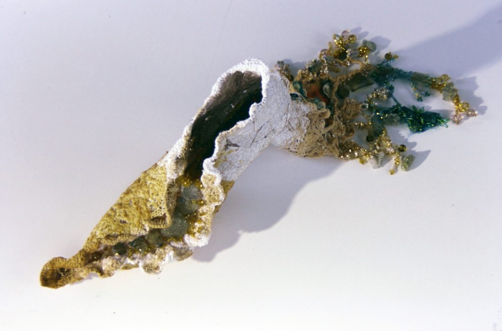
‘Shattered steps’ Series
The shoe from the ‘Venetian Water series’ came about from sitting at a canal’s edge where my eye level was with the waters.
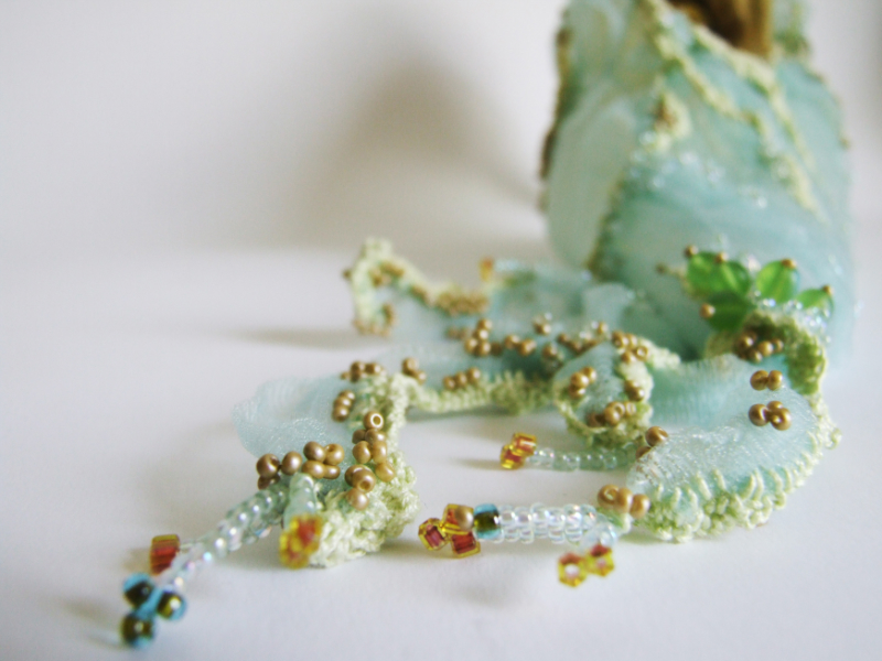
‘Walking on Water’- series, detail
The cityscape around seemed to float on the water at this eye level.
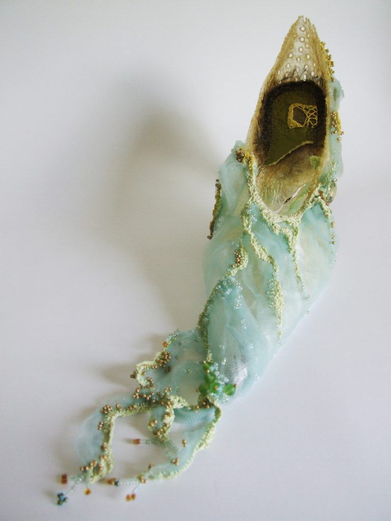
‘Walking on Water’- series
Discuss manipulation in one of your works.
Manipulation of a found material or object for me is part and parcel of contemporary embroidery practices. I like the transformation, giving a new interpretation, the subversive hand changing what already exists.
‘Cellotape’ Series
Often, I machine embroidered a new surface by the collage of chopped up laces / fabrics and (without giving all my secrets away) would ‘cook’ these. I like the happy accident and testing the unlimited possibilities of finding something new that can ‘say’ something that other materials or processes
cannot. I like finding the everyday, cast aside, cheap materials to work with. 'Cellotape' was a material that proved perfect for its colour / texture, and its transformed ‘read’.
‘Cellotape’ Series
Expand on “Shoe Making Kit’.
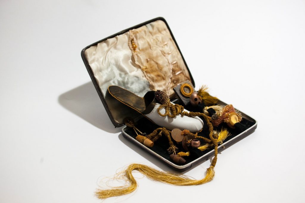
‘Shoe-Making Kit’ Series
I had come across a 18th Century shoe making box in the Applied Materials collection at Collins barrack in Dublin. The idea fascinated me, of these tool kits, often given as a leisure activity for middle class women; that then became an activity that women could make a living from. The production of flat pump / slippers; that were in vogue at the time, allowed women to have an independent income as well as women becoming consumers with discernment. The historical tools bear no resemblance to those used in the male cobbler shoes making craft.
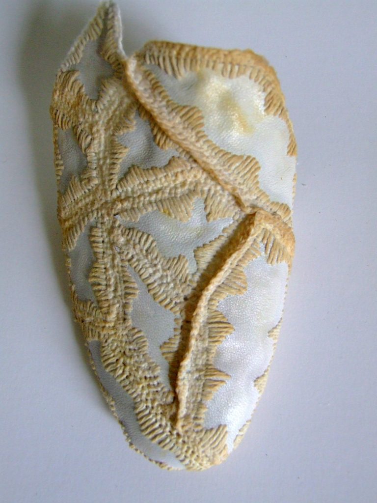
‘Vamp’, Sampling
While the shoe theme is still there in my work, I had moved from the single shoe artefact to that of
elements and details producing very different outcomes in the box presentations.
How do you find the themes for your work?
The shoe theme continues and develops through themes of narrative, gender and materiality.
Gone Fishing
What are you currently working on?
I am currently working on a body of new work that will coincide with a Symposium and Exhibition titled ‘(E) quality’.
Discuss your teaching and art practice and how you combine both?
This has developed over the years whereby I now locate my (published) writing with my practice in the Applied Materials domain. Having taught and practiced through design principles and practices, the Applied Materials ‘space’ links Design and Fine Art. Embroidery as an applied material is adaptable, with transferable knowledge and skills; adaptive to re imagine itself in new contexts.
‘Vamp’, Sampling
My roots has always been with embroidery, yet there is no ‘sector’ in Ireland, so embroidery as a medium always has to adapt, reflect and be relevant in contemporary contexts. I find that exciting, that no two students have the same outcome. There is no trend- led 'look' but, a breadth and dept of engagement that is continually being re-imagined.
Why do shoes give such pleasure?
There is much to say and write about shoes and our (uneasy) relationship with them. Shoes still seem to define gender, …and so does embroidery. The study of both has often pigeon holed the maker.
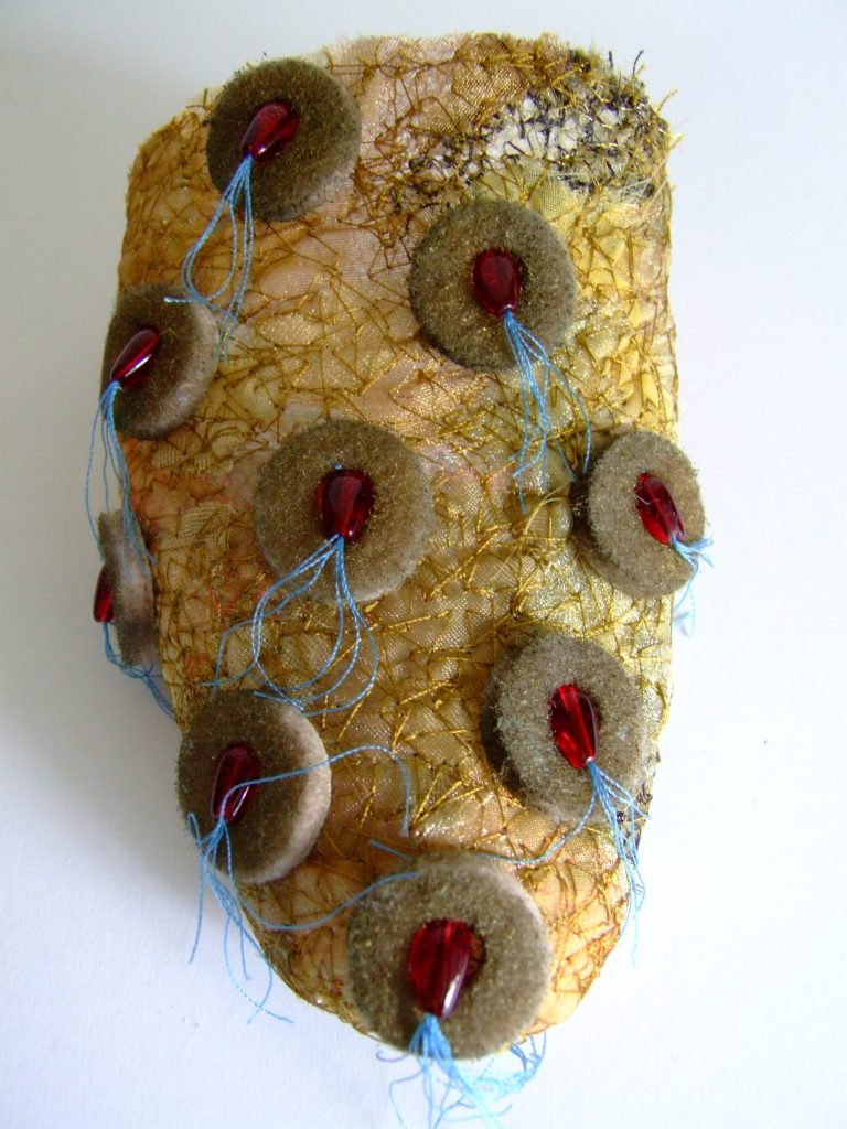
‘Vamp’, Sampling
Can you give your thoughts on the way textile art is perceived currently?
Textiles on the one hand has become so very popular, with the ever increase Guilds, groups and diverse platforms. Equilly, this popularity, especially if exhibited by women can be counter productive. Often still classed as a leisure pursuit, with a pervasive attitude that all and any can do. The practice and skill needed with soft materials is undervalued against the practice and skills needed with hard material processes.
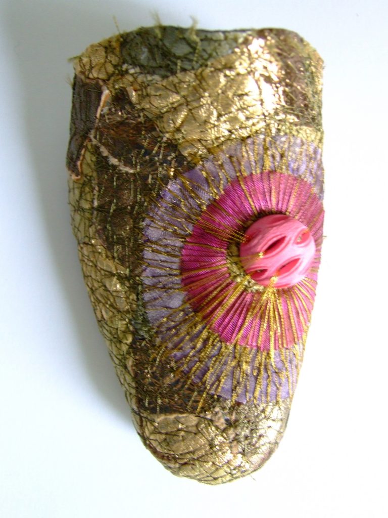
‘Vamp’, Sampling
Other countries seem to have a greater respect for the practitioner who works through soft materials but there still is a hierarchy in the arts. Applied Materials is often thought of as skill acquisition of a craft as opposed to the bed rock of design in the art and design institutes. It is not always understood as a very powerful medium that can communicate social, civic and political engagement.
Contact:
Helen McAllister
Helen McAllister <mcallisterh@staff.ncad.ie>
Deborah Blakeley, Melbourne, Australia
Interview by Deborah Blakeley, October 2019
Raudyn Alfarto
What made you leave the world of architecture for the art world?
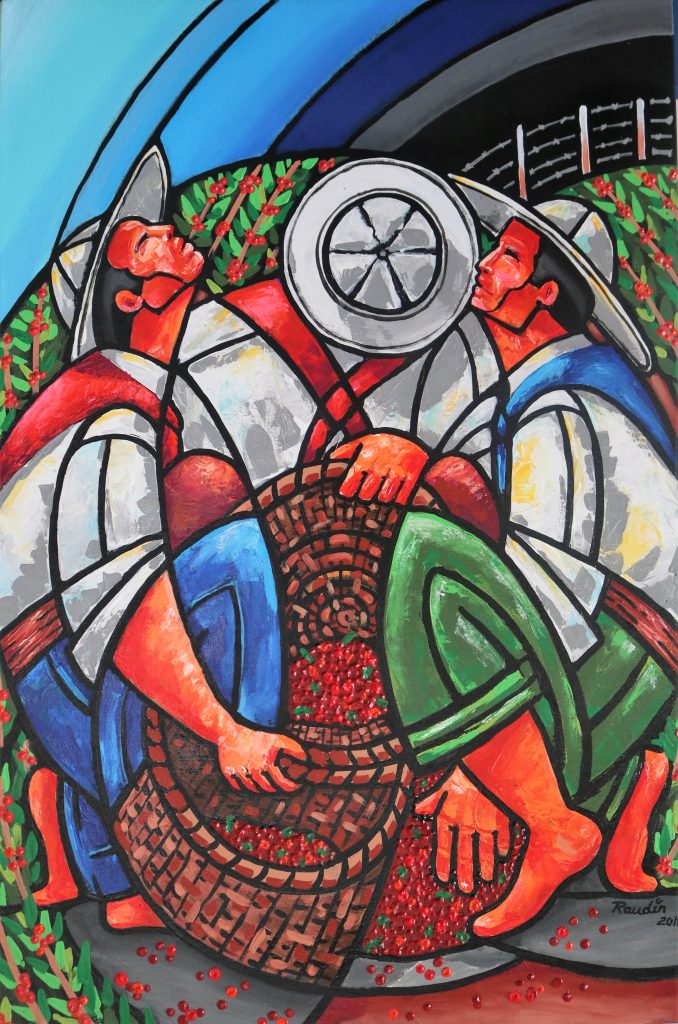
Let’s Gather 2018, 90 x 60cms, Acrylic on Canvas
As the Italian architect Renzo Piano once said, "If you have total freedom, you're in trouble. It's much better when you have some obligations, discipline, rules. When you don't have rules, you start building your own rules." Every specialty has its rules and regulations to establish in the end parameters of value, in architecture is no exception, creativity is limited in many occasions by the properties of the materials or by the budget of the client; it is also very important to determine your own style that characterizes you before others in this profession. In the art (painting) I have been able to develop my artistic style that within the architecture has limited me for the previous mentioned motives, the acquired architectural concepts and procedures facilitated me to explore and to determine this artistic style within the painting for its environment of neutrality.
Art gives me the freedom to develop compositions using geometric elements such as curves and circles which are difficult in architecture because of their construction in many cases; as an architect and lover of these elements I try to give balance, dynamism, character, foundation and above all intentionality to each work, it is there where the artist I feeds on this knowledge allowing me to develop this new style and at some point also develop it as an architectural style.
Comment on your association (from an early age) with coffee and your art?
El Callegon, 2017, 90 x 60 cms, Acrylic on canvas
In Costa Rica the time of harvesting the coffee fruit is between the months of December to February (3 months) which also corresponds to the period of school vacations, with it practically all the family was dedicated to this agricultural activity in order to have money for the purchase of gifts at Christmas and school supplies among others, my mother took us from small to the coffee plantations of my hometown Santa Barbara de Heredia where they also congregated multiple families to this activity; this "labor tradition" was becoming through the years in family coexistence within the coffee plantations, the joys, jokes, songs, meals and even the same sadness were shared among all who participated there, all that experience and accumulated memories served me to capture this vision through art firstly as a cultural legacy to my children and all the new generations of my country, because today it has been discontinued in many parts of Costa Rica due to its low profitability for its producers.
Raudyn Alfarto with the basket ready to collect coffee
The kindness, humility, joviality and responsibility among many other values I learned thanks to this agricultural activity. The history of Costa Ricans has revolved around coffee growing as an economic activity of great transcendence, developing its idiosyncrasy and life, and influencing the development of the model of economic, social and cultural development, basing a "culture with the aroma of the countryside and family pride in its sowing, production and harvest" as when I lived it in past decades in my village.
A family of coffee pickers in Costa Rica
Tell us about your exhibition at the Costa Rican Embassy in Guatemala?
Thanks to the "Declaratory of Cultural Interest" by the Government of Costa Rica and the Ministry of Culture to my art collection entitled "Coffee with a Costa Rican Flavour", the Embassy of Costa Rica in Guatemala extended to me the invitation to exhibit in that country before the diplomatic community and general public within a period of three months, which consisted of one month at the Embassy of Costa Rica and two months at the Royal Palace of the Captains in Antigua Guatemala.
Embassy of Costa Rica in Guatemala
It was my first international experience as a national artist before more than twenty ambassadors from different countries, consuls and heads of commerce; the pride of representing Costa Rica through my art was very high; I felt honored and privileged to receive so many samples of admiration and congratulations for it. They told me how they imaginatively transported them through my work to the time of this agricultural activity in my country, they showed that, through the proper use of geometric figures, the effect of bright colors as well as the hidden perspective achieved that effect.
Discuss who you show ‘hard work’ in your work and why it is so important.
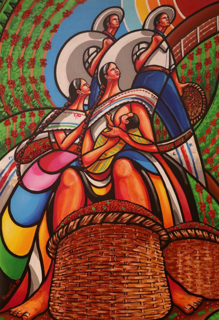
Hard Work, 2018, 110 x 65 cms, Acrylic on canvas
It is the representation of a fact that I observed in my stage of coffee collector, in her I saw a lady who was near me took off her basket to breastfeed her little son who was at her feet, after the baby satiated his hunger the lady returned again to her work as a collector, her husband was near her, but concentrated on the mission of being able to get as much coffee fruit as possible. The double work of this woman made me understand the enormous capacity and dedication in different situations, possibly not being able to count with the time or adequate person for the care of her baby would cause me to take him to his place of work generating this scene of great value; The very perspective of the work transforms it into a sculptural style, where the mother does not lose the other objective that is to return to work without first devoting time to their children, and in a second layer of the painting the representation of her husband and eldest son returning to their work as pickers once deposited the fruit in their respective sacks.
Show one of your paintings in black and white (showing movement and shape) Then show the same work with colour (how the colour transports us to place).
Grinding Coffee, 2018, 110 x 75 cms, Acrylic on canvas
“Color in certain places has the great value of making contours and structural planes seem more energetic”. Antoni Gaudí.
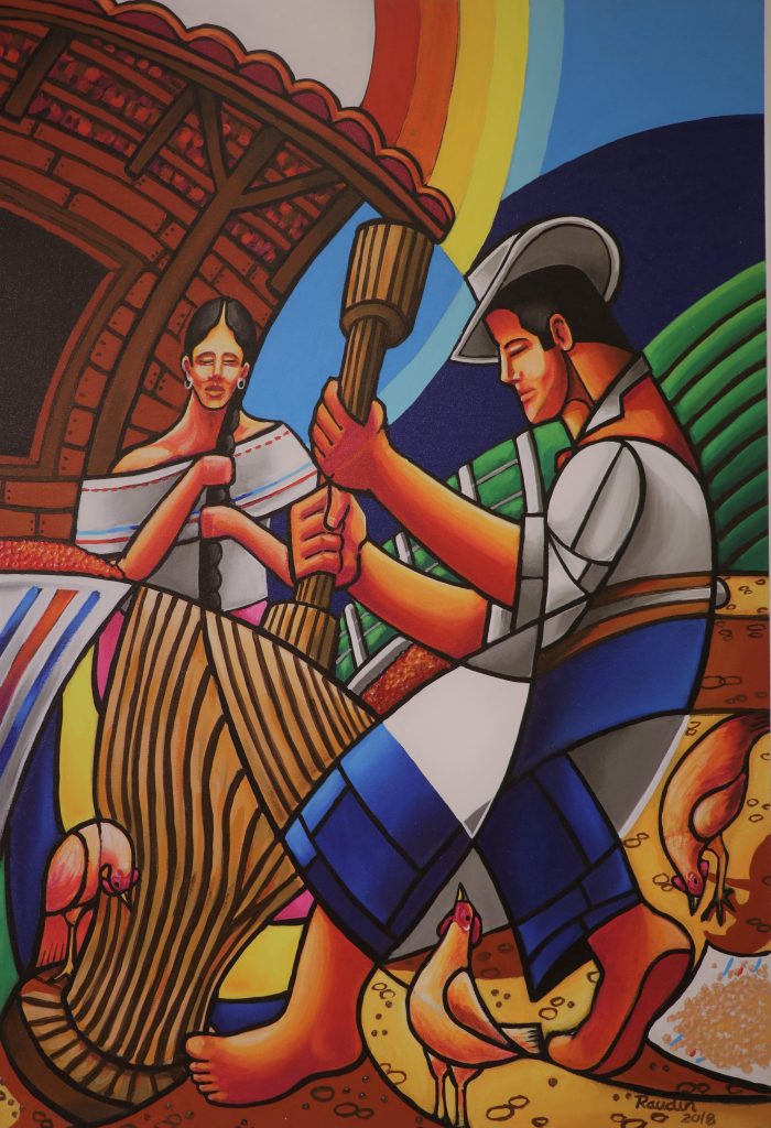
Grinding Coffee, 2018, 110 x 75 cms, Acrylic on canvas
Discuss the people in your work.
Woman:
She is the one who symbolizes in my works and in many occasions the natural beauty, the sublime of a figure, the surrender and determination of intentionality; she is also the one who best represents my country, thanks to her multicolored dresses in honor of our diverse and exuberant. The woman is a symbol of struggle with elegance, hidden tenderness and energy in her movements, it is a painted song that I hear her watching.
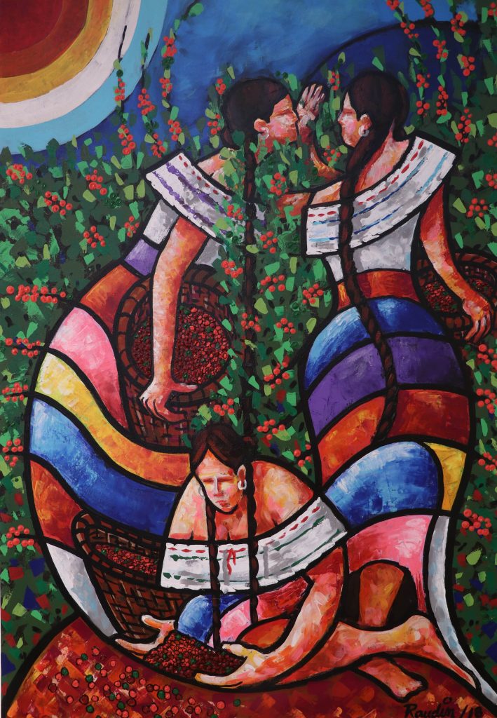
A Gossip in the Plantation, 2018 , 110 x 75 cms, Acrylic on canvas
Man: It is the one that represents the effort, the simple and humble of this population, it also symbolizes the human, that one can fail or stumble, but can also rise again; it is also the image of a rough and badly paid job (coffee picker) if losing in many cases its mischievousness of conqueror.
Loading the Cart, 2018, 90 x 60 cms, Acrylic on canvas
Both: They symbolize the union, the love, the commitment; I try not to put prejudices of one on the other, respecting their main human qualities to acquire a symbolic, attractive and intentional balance in my works.

At the Cart, 2018, , 90 x 60 cms, Acrylic on canvas
Can you use one or two of your paintings that show a political aspect? Expand on these works.
“God be with us" is the title of a sketch that I am about to paint; Costa Rica for being a mostly Catholic country since its colonial era, I try to represent the tradition or custom of an entire Costa Rican family in entrusting themselves to their god in an image before leaving home for work (collecting coffee), believing that they will have his protection and blessing for the rest of the day.
May God be with Us
“On the way home " is a work that represents the difficult transit of a cart pulled by oxen on the irregular topography of my country, at the sides of the road are observed wire fences limiting coffee plantations, this conformation was given thanks to a political decree of the Government of Costa Rica of the nineteenth century which established the royalty of land dedicated to coffee harvest for a period of five years, due to this new towns and regions were developed throughout the national territory.
Way Home, 2018 , 110 x 75 cms, Acrylic on canvas
Discuss the importance of costume in your work, and how you use it to introduce place.
Lunch at the Plantation, 2017 , 90 x 60 cms, Acrylic on canvas
Actually the dresses used for the harvest of the fruit of the coffee differ very much from those proposed in my works, because they are simpler and less colorful; I try to give it a more nationalistic and patriotic character with the use of our typical dresses; The man does not have so much change because his clothing is very similar to that used for agricultural work such as his wide hat, shirt and long pants and a colored scarf on his neck; in a certain way this would be our typical illustration for the world.
Why does costume need colour to show your country?
The Basket, 2017 , 90 x 60 cms, Acrylic on canvas
In my country, wherever you look, there is a rich and abundant palette of colors. In the morning until evening, different scenarios are presented before your eyes, all in the same place, passing from cold colors to warm ones and vice versa. From one moment to the next a rainbow appears before you as well as a macaw, a basket of variable fruits as well as a typical picturesque cart, that is to say in Costa Rica they stayed to live all the colors, I can't and won't be able to take these off my palette because they are part of our identity. The typical costumes is our letter of representation, as our flag (blue, white and red), blue as the sky that covers us, red for the blood and strength that gave our ancestors and white for peace in these 51,100 square kilometers.
Expand on dance in your work.
Cantanos Maria, 2018, 110 x 75 cms, Acrylic on canvas
Movement: The movement of the work is generated by curved lines in the lower part of the petticoat intersecting each other and separating the multiple colors; the other point that generates movement is the cyclic of circles that are in the upper part of the work reproducing the silhouettes of the participants, the main straight line is the one that crosses these circles like a radius, conforming the union of the arms in dance. The curve is the line of nature so our brain relates it as something familiar and beautiful, unlike the straight line that produces a state of stillness and solidity to the observer.
Waiting to Measure, 2018, 110 x 75 cms, Acrylic on canvas
Colors: Based on the theory of color, where harmonic colors are those that work well together, I try to sensitize the observer to perceive a balance in the work, thanks to the neutral color as black to easily separate and locate these colors within the work producing character and intentionality to each of the participating colors, the colors that are always present in my works is the orange that means enthusiasm and exaltation, producing feelings of strength, energy, ambition, determination, joy and triumph.
The Cajuela, 2018, 110 x 75 cms, Acrylic on canvas
Grace of the human body: I try to give personality to the human figure by means of the curved line to achieve a posture that reflects its attitude and temperament within the work, that curve must be very subtle sometimes, generating several planes of drawings at the same time, producing that the environment is camouflaged with the human figure and vice versa as mimetism does in architecture with its intonation. A theatrical scene, or like a painted song, is the main intention that I want to transmit to the observer, who shares his emotion just like when he was a coffee picker.
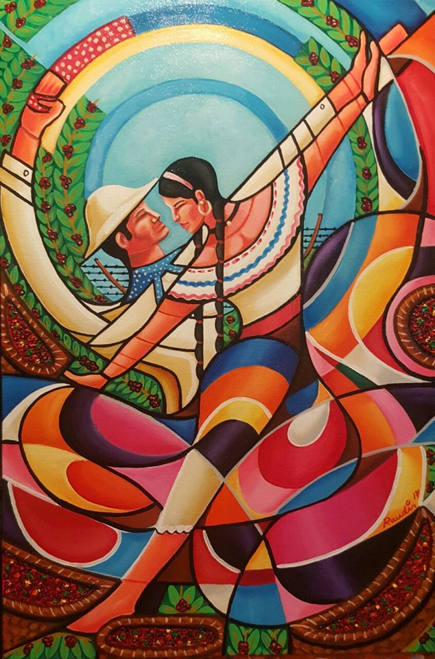
Dancing in the Cafetal, 2017, 90 x 60 cms, Acrylic on canvas
Tradition: In Costa Rica the dance expresses the traditions and customs of our culture, it is a corporal manifestation that in many occasions is to celebrate some festivity, in this occasion they dance inside the plantations of coffee like approval of a good received harvest. Our typical dance is based mainly on circular movements of the women's petticoats producing a wave of colors for the view, where the shouts of exaltation of both excite all the participants to the dance.
Waiting to Measure II, 2017, 90 x 60 cms, Acrylic on canvas
Intentionality: In my collection "Café con aroma a Costa Rica" it is to be able to relate the qualities of a good coffee like the characteristics that distinguish a Costa Rican; as it is known the coffee of Costa Rica is recognized by its high quality at world-wide level; but I can say the same of our identity; It is easy to recognize a good coffee first by its aroma, then by its body and flavor, so it is possible to distinguish a Costa Rican within a group of people as a coffee literally speaking, of course, because we are happy as the aroma, kind as his body and always leave a sweet taste of our humility, because to be a good Costa Rican has to leave a good taste in the mouth.
![]()
Contact:
Raudyn Alfarto
Raudin Antonio Alfarto Araya
arq.raudyn@gmail.com
www.facebook.com/raudyn.alfarto
Deborah Blakeley, Melbourne, Australia
Interview by Deborah Blakeley, October 2019
April Surgent
How did you first meet John Piatt?
I met John in the spring of 2018, after a mutual colleague that I met on a job in California suggested I contact him. I had been working from the Farallon Islands National Wildlife Refuge (30 miles offshore of San Francisco) on a northern elephant seal project that winter and said mutual colleague knew that we both lived in Port Townsend, WA. Also that John frequently needed volunteers to help with fieldwork.
John Piatt, Research Biologist, USGS- Alaska Science Centre, Anchorage, Alaska
What did you say or do to get John to ask you to join his research team, at Cook Inlet, Alaska?
I’m not sure what I said or did that got my foot in the door, other than sending John a blind e-mail introducing myself; I live in Port Townsend, I am an artist that has been working with different research teams in the field and if he ever needed any extra hands, perhaps I could help. We sent a few e-mails back and forth, met for coffee at his home office and a few months later I got an email asking if I would like to help out with some research in Cook Inlet, Alaska.
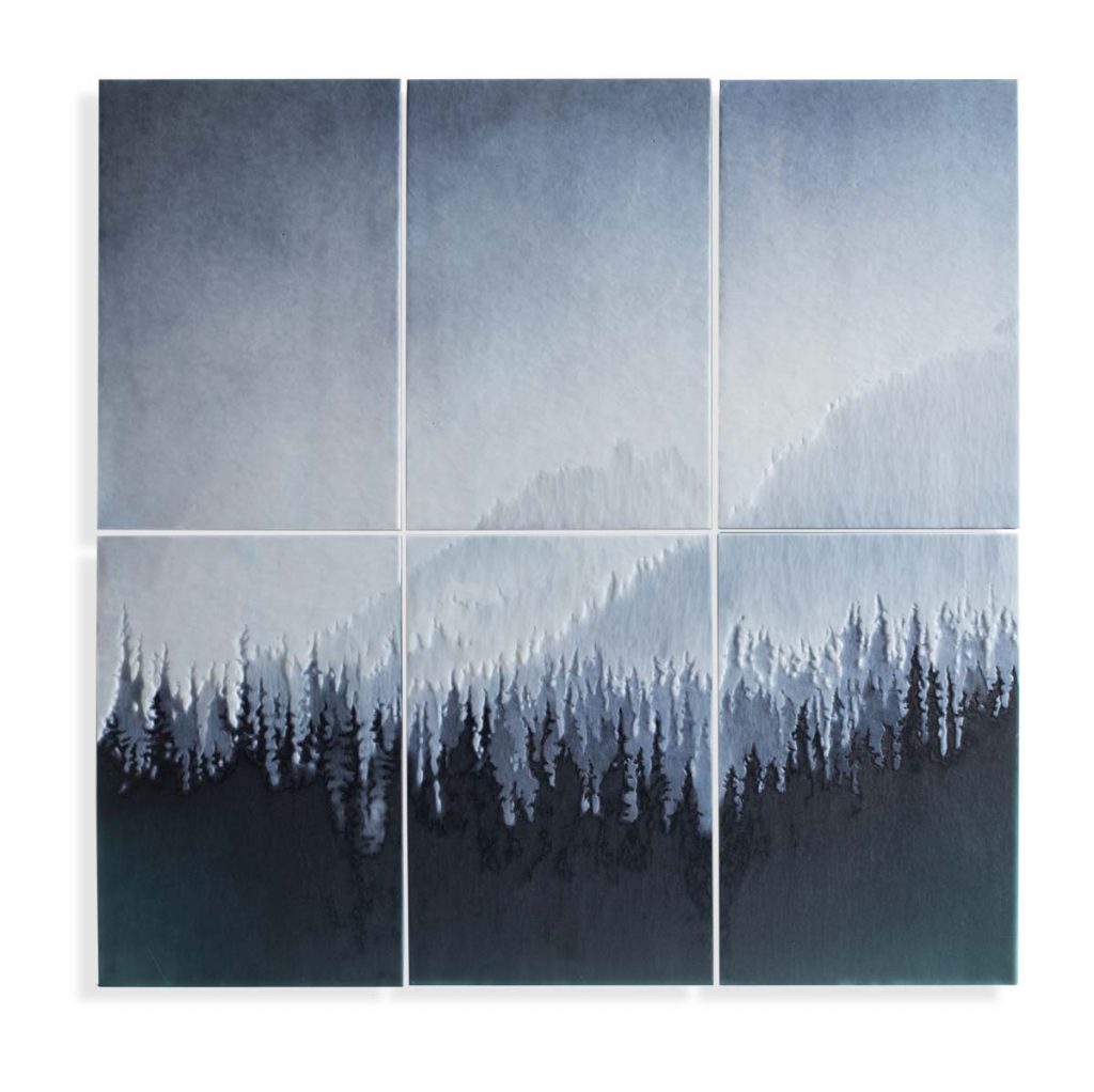
Suspended in the Atmosphere, 28.5 x 28.5 x .75” installed, Cameo engraved glass, 2019
It was an opportunity for him as well. Having an artist along is also a unique opportunity for a different type of outreach for his research. The first research cruise must have gone well enough as I was asked to come back on two more occasions this summer!
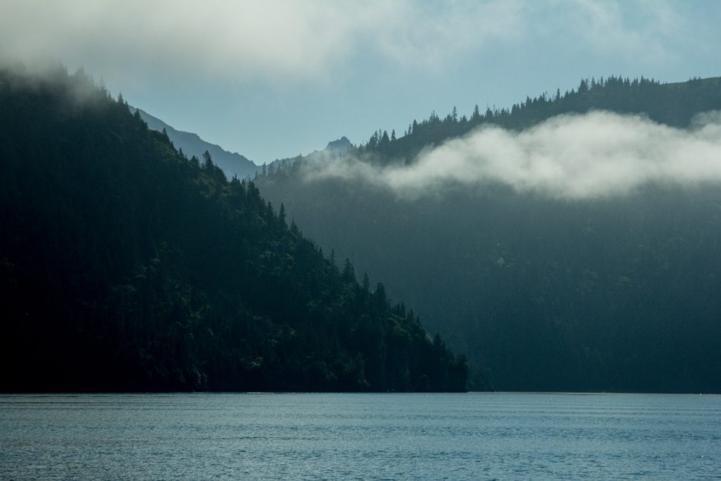
Kachemak Bay, Alaska
How has your interpretation influenced people to go beyond the research?
Hopefully my work has introduced people to places and ideas that they hadn’t either known of or considered before. The goal of collaborating with research and conservation scientists is to share some of what I learn and experience in the field through my work. I’ve had incredible opportunity to work from some of the most remote places in the world. The idea is to introduce these places to people and help lay the groundwork to understanding and why we should care about them, despite their inaccessibility.
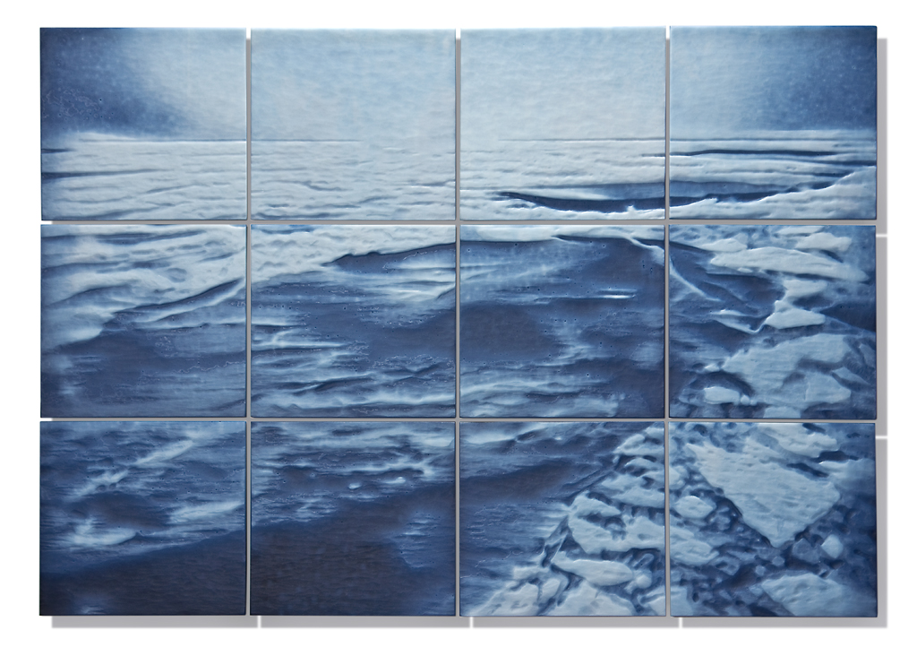 Much More Than a Picture of Ice, 25.75 x 36.5 x .75”, Cameo engraved glass, 2015
For the first time in human history, more people live in urban centres than rural environments and we are becoming increasingly disengaged to the natural world.
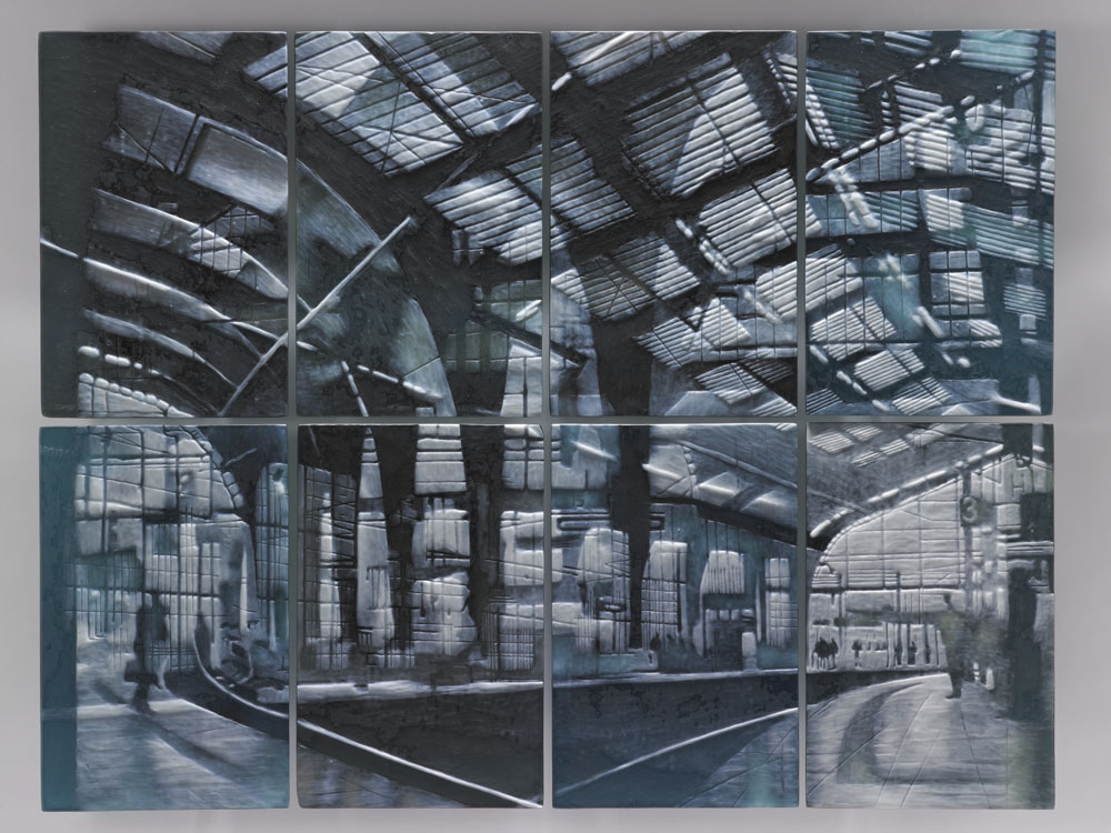
Berlin Interchange, 28.25 x 36.5 x 2”, Cameo engraved glass, 2011
This disengagement comes at a time when it is especially important that we understand the world’s ecosystems so that we can be better stewards of the environment.
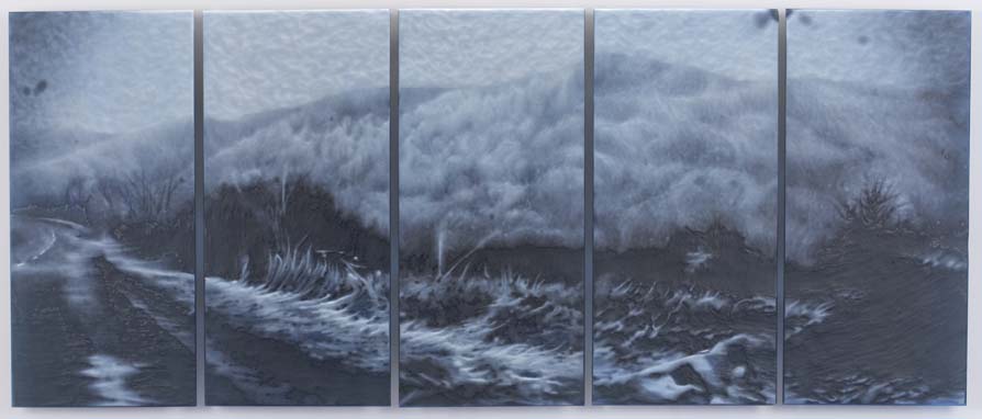
Into the Green Mountains, 17 x 41 x 2” installed, Cameo engraved glass, 2013
Hopefully my work helps build that connection to nature or at the very least is a reminder of the beauty that can be found in the natural world.
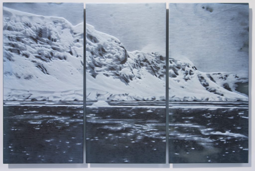
Decadal Time Scale, 19.875 x 30.25 x 2”, Cameo engraved glass, 2014
Discuss the importance of combining art and science.
Wildlife Biologist Ryan Berger on whale watch, the lighthouse on Southeast Farallon Island, Farallon Islands National Wildlife Refuge, California, 2017
This is a big question and one that I have spent years thinking about. I believe that combining the arts and sciences is important for so many reasons! When you break it down, artists and scientists from all mediums and fields are ultimately trying to accomplish the same thing only through different methods: At the end of the day we’re all observers of life trying to grasp a better understanding of our existence.
Walleye Pollock caught on a forage fish trawl for USGS study, Lower Cook Inlet, Alaska, 2018
My interest in fieldwork lies in the ideology that the dialogue between artists and scientists is imperative for a most informed and diversified understanding of life and that knowledge is the greatest agent for change. With science far too often inaccessible and unattainable, the goal of these collaborations is to bring awareness to the environmental crisis’ we’re facing in order to create a platform for understanding.

Hawaiian Monk Seal Research Program remote field camp at Pearl and Hermes atoll, Papahanaumokuakea Marine National Monument. Permit: PMNM- 2016-011
After all, it’s difficult to care or have compassion for things that are unfamiliar to us.
It has been my experience that cross-disciplinary exchanges are invaluable catalysts for facilitating complex ideas to the public at large and hold significant cultural value. With the consideration that many people only see and understand the world through pictures and or artist and writer interpretation, I see it as part of the artists’ role to illuminate thoughtful and knowledgeable observations on issues critically relevant to our times.
Your exhibition opening from this current research.
In The Space Separating opens at Traver Gallery in Seattle, WA on October 3rd and runs through November 9th, 2019.
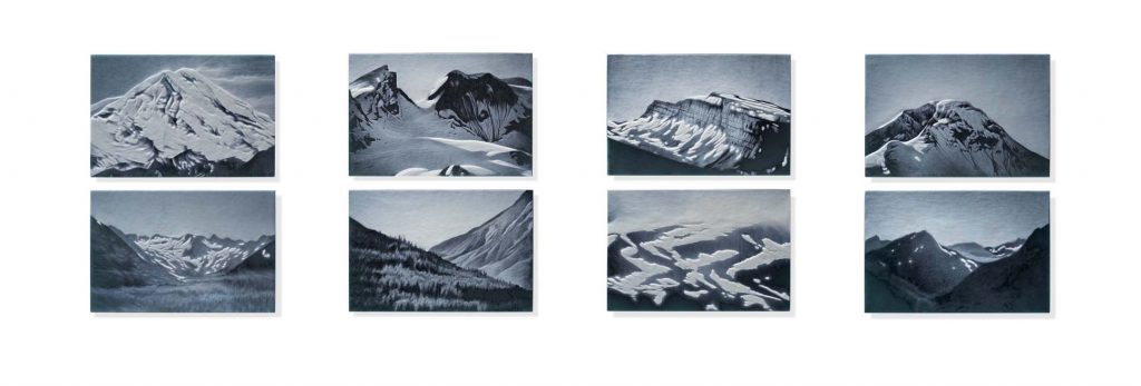
The Stark Beauty of a Planetary Landscape, 18 x 66”, Cameo engraved glass, 2019
The show will have eleven engravings inspired by my time spent working as a research assistant in Alaska and a large installation made from disposable lighters that were collected as marine debris from the shores of the North-Western Hawaiian Islands.
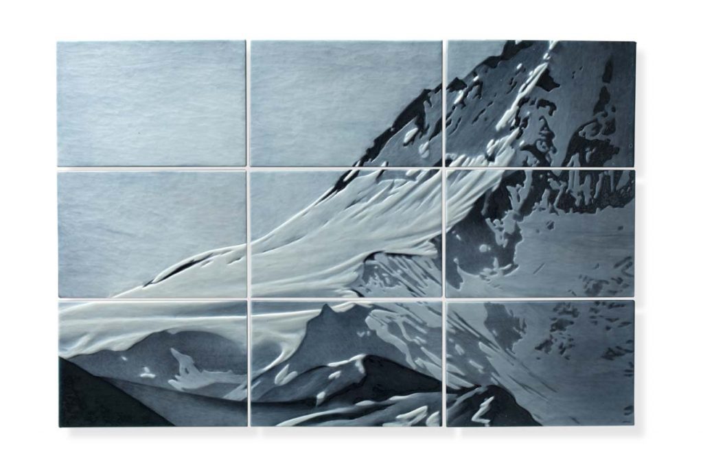
Ice Field; Anonymous, 17 x 25.5 x .75”, Cameo engraved glass, 2019
All the engravings for this show focus on light in land or sky scapes. Lower Cook Inlet is a remote and wild place with glacier topped mountains that surge from the ocean. The surrounding environment skews ones everyday perspective and gives you a palpable sense of being on a planet. Ice Field; Anonymous. is a nine-panel engraving that depicts an ice-capped mountain reflecting the light of high latitude, late afternoon sun. I had this piece hanging in my studio for a few months after I finished it and when I looked at it, it gave me a measurable sense of what it felt like to be at that place, at that time; for me that made it a successful piece.
Lighters….
Portrait of an Ocean, or, The Lighter Project as I have dubbed it, started when I was working for the Hawaiian Monk Seal Research Program from Pearl and Hermes atoll in the North-western Hawaiian Islands in 2016.
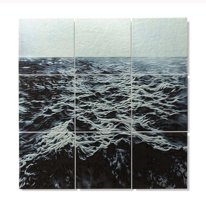
The Unnatural Movement of the Ocean with Plastic, 30 x 30 x .75, Cameo engraved glass, 2017
Although the North-western Hawaiian Islands are considered to be one of the most remote and wild places on earth traces of mankind can literally be found in every step. The tiny islands and islets are covered in marine debris from nations all around the Pacific.
Prolific amongst the debris were plastic disposable lighters.
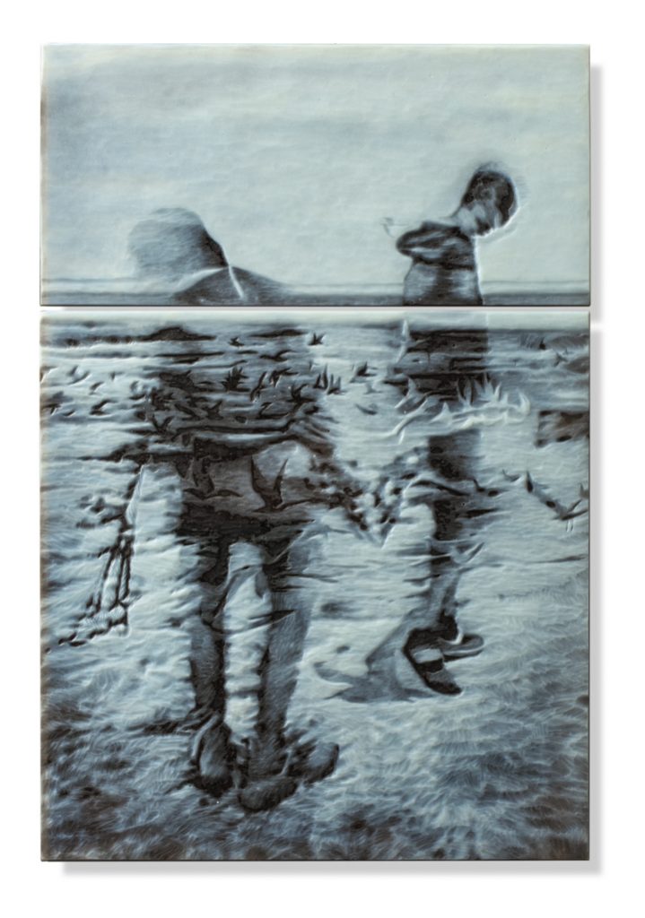
That Dream then, it was Here, 19.25 x 13 x .75”, Cameo engraved glass, 2017
Our team started to casually collect them, in part just to see how many we could collect and in part for something to do along the way while looking for Hawaiian Monk Seals. By the end of the season we had a five-gallon bucket full of them.
When I returned to my studio, I knew that I wanted to make a piece that spoke to the problem of marine debris and looked to the bucket of lighters as a symbol of that problem.
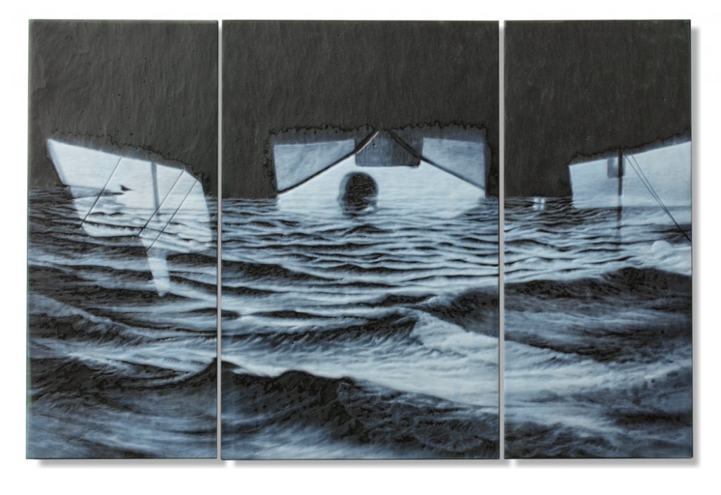
In the end it was the sea, 15 x 22.75 x .75”, Cameo engraved glass, 2017
I asked the Hawaiian Monk Seal Program if they would collect lighters for me in the 2017 field season to add to my collection. This time, they were collected from five different field camps by nearly 20 biologists from French Frigate Shoals to Kure Atoll and a total of 2,240 lighters were collected. With those lighters I made a 9 x 9 foot installation. I glued the lighters to 16 metal armatures and when it was completed the piece hung like a large monolith.
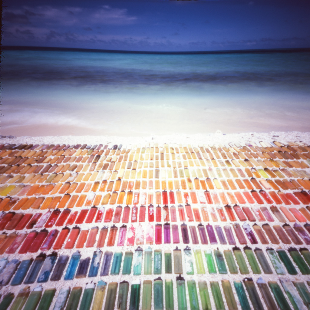
Pinhole Image of Disposable lighters arranged onsite, Pearl and Hermes Atoll, 2016, Papahanaumokuakea Marine National Monument. Permit: PMNM-2016-011
Biologists from the Hawaiian Monk Seal Research Program continued to collect lighters for this project in the 2018 filed season and I now have over 4,000 lighters. For my upcoming exhibition, In The Space Separating, I have used the additional lighters to double the size of the original installation; as marine debris accumulates on shores around the world, so too grows the installation. The composition of the second generation of the lighter installation is fashioned after a non-pyrotechnic distress flag.
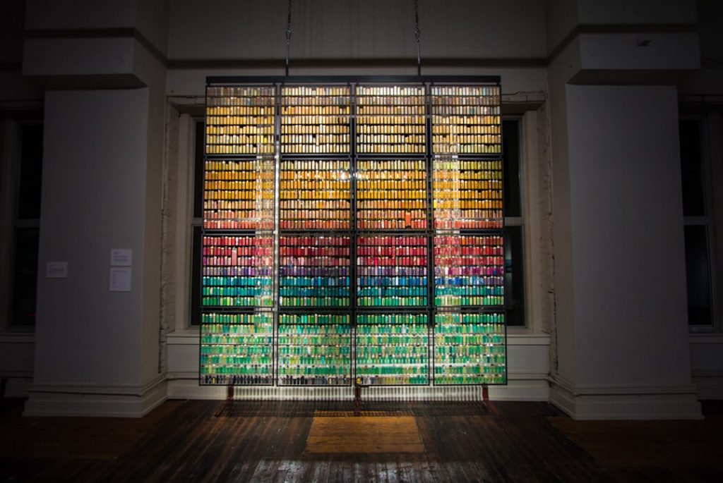
Portrait of an Ocean, 9 x 9 feet installed, Disposable lighter marine debris, metal, 2017
The lighters are all different shapes, sizes and colours. Many of them have writing on them, advertising businesses and brands. I have counted a handful of different languages from English to Japanese to Russian. The reaction to the installation is more often than not, of total disbelief.
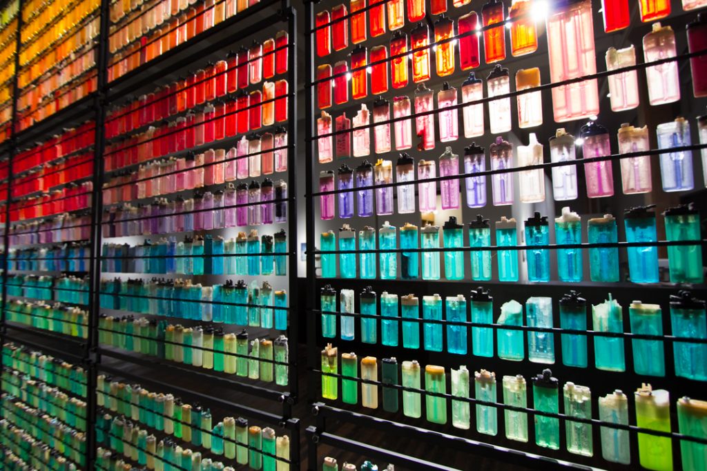
Detail: Portrait of an Ocean
When you first see the installation, it looks more like stained glass than marine debris. As you get closer to the piece and start to recognize that they are in fact thousands of disposable lighters it is a kind of shock.
Detail: Portrait of an Ocean
Many people ask how I have made them or aged them; assuming that I have bought them all. When they learn how they were collected the next reaction is to assume that perhaps a shipping container full of lighters spilled. It is a slow connection of the dots to realize that there is just that much debris in our oceans that you can pick out and have so many of just a single item.
What has led you to observe and allow us to be pulled up so sharply?
A deep love for the sea was instilled in me as a child who grew up on and around the great Salish Sea. A lifetime of observing the declining health of our oceans has turned me to science for answers, and over the last 6 years, I have collaborated with scientists from around the Pacific to learn about global warming and it’s impact on ocean ecology. Warming sea temperatures, ocean acidification, over-fishing and pollution are all taking their toll on one of the Earth’s most precious natural resources.
Drifting on a gentle wave, 15 x 24.5”, Cameo engraved glass, 2018
What led you to mural glass engraving?
Growing up in Seattle, an area known for it’s high concentration of glass artists thanks to Dale Chihuly, I was introduced to the medium of glass as a teenager. From the moment I saw people blowing glass in a hot-shop I knew that it was what I wanted to do. I ended up blowing glass throughout high school and then looked for university art programs that had glass departments. I spent one year at the College for Creative Studies in Detroit, MI and then transferred to the Australian National University’s School of Art renowned glass department. It was there that I was introduced to other approaches with the medium.
I started playing in the cold-shop (term used to describe the working area where one can cut, carve and polish glass) on the different equipment and was especially drawn to the engraving lathe. In 2003, my third year of studies in Canberra, Prof. Jiri Harcuba, a master engraver from the Czech Republic, was teaching an engraving course at Pilchuck Glass School. I had known several of his past students and was determined to take his class. It ended up being a life-changer, as from that class on I put down the blowpipes and really focused on engraving.
Harcuba ended up becoming my mentor and we worked and taught together for nearly a decade before his passing in 2013. He was an exceptional human being who inspired and encouraged me to experiment with engraving, not to be bound by the historical limitations of the craft. He also introduced me to the world of beautiful ideas and instilled in me the importance of being a lifetime student.
Discuss your 2019 work using panels to show the ‘Whole’ images.
Sky Trail, 16 x 20 x .75”installed, Cameo engraved glass, 2017
How do you decide on the number of panels and shapes in each piece?
My engravings are divided up into multiple panels to show a single image due to the process of wheel engraving. There are many ways that you can carve glass but my approach is on an engraving lathe; a machine that is much like a metal smith’s grinder. The shaft distance between the wheel and the machine more or less determines how large I can go per panel.
Sea and Sky, 30 x 30 x .75”, Installed, Cameo engraved glass, 2019
Another consideration is that I need to lift the panels to the grinding wheel; wheel engraving it is a lot like drawing but bringing the paper to pencil. This means that I am continuously moving the glass around. If the panel is very large it becomes very cumbersome not to mention heavy. Although the panels don’t weight much just to pick up, when you’re holding them all day long and pushing against a wheel they get heavy.
Larger works like, Sea & Sky need to be broken up for all of those reasons. Determining where and how I will break up an image into panels is always though and takes a lot of consideration.
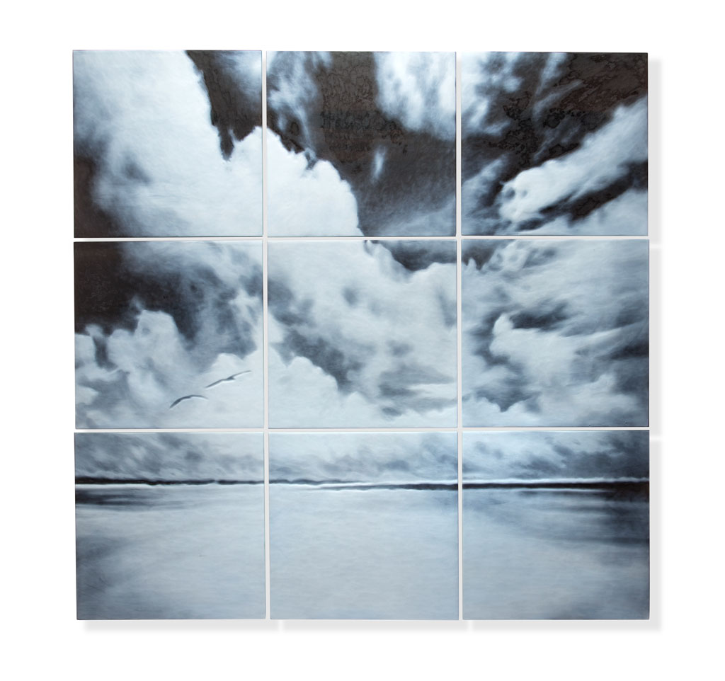
Sea and Sky, 30 x 30 x.75, Installed, Cameo engraved glass, 2019
Expand on ‘That Which is Beyond Imagination’.
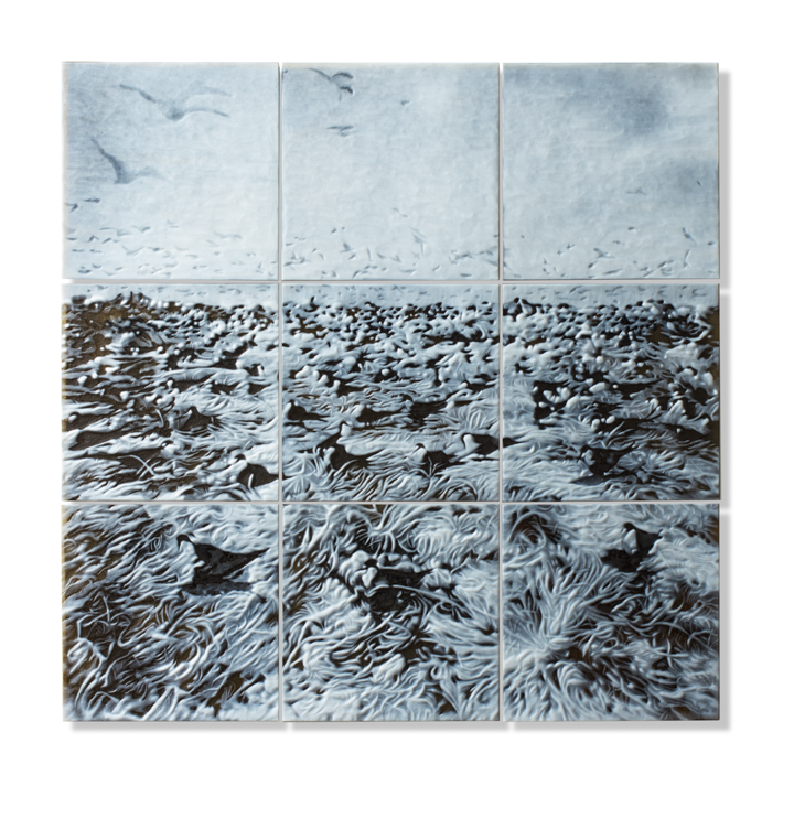
That which is beyond imagination, 25.25 x 25.25 x .75”, Cameo engraved glass, 2019
That Which is Beyond Imagination is a piece that I made in response to my work with the Hawaiian Monk Seal Research Program in the North-western Hawaiian Islands. It depicts the sooty tern colony on Tern Island in French Frigate Shoals. Although Tern Island is only a mere 34 acres it is home to over 300,000 seabirds and over 80% of them are sooty terns. Despite the chaos, deafening noise and overwhelming smell, being in the middle of a seabird colony of that size was one of the most extraordinary experiences of my life!
Like the vast majority of my work, each panel of this piece is comprised of three layers of Bullseye sheet glass that have been fused together. Each sheet is about 1.5 mm thick so the total panel thickness is just about 5-6mm. Each panel has a layer of white on one side and two darker layers under the white.
Using a photograph, drawing or combination of the two, I then roughly draw the composition onto the white layer with a wax pencil. Once the composition is complete, I take the glass to the engraving lathe and start cutting away. Because engraving is a reductive process, I usually end up marking the panels out several times.
Once the engraving part is complete, I wash the glass and put it back into the kiln to lightly fire polish to a matte finish. After the fire polish the panels are ready to have brackets glued to the back of them to be hung on a wall.
Look at four of your research destinations:
Antarctica – NSF
Palmer Station, Western Antarctic Peninsula, 2013
Farallon Island National Wildlife Refuge
Farallon Islands National Wildlife Refuge, 2017
Hawaiian Monk Seal Research Program – NOAA

North Island, Pearl and Hermes Atoll, 2016, Papahanaumokuakea Marine National Monument, Permit: PMNM-2016-011
Alaska – USGS
USGS RV, Alaska Gyre in Homer Marina. Homer, AK, 2018
Discuss one or two aspects that gave you artistic inspiration while there.
I’ve always been interested in the inherent connection between person and place. Whether in Antarctica, the middle of the Pacific Ocean, a city or in my own backyard I tend to draw inspiration from my surrounding environments no matter where I am. I like to observe how we interact with our surroundings and how our interactions with our surrounding influence the way that we navigate through life.
One huge difference in each location you had not expected.
One of the biggest pleasures that I enjoyed in Antarctica was on a solo glacier walk. On a clear afternoon I took a long walk up and over the glacier behind station to work on some drawings. I had come to a point on the glacier where there was a mind-blowing view of the Western Antarctic peninsula mountain range full of glaciers and especially crisp against the bright blue sky. The surrounding waters were a deep blue except for the areas full of bright white pack ice. The snow-covered landscape was all contours and almost appeared to be breathing; the planet itself was alive!
Although I have always felt a closeness to nature, I had never really felt the grandeur of a planetary landscape in that way. For the first time in my life I really felt like I was on a planet, spinning away in the universe. Actually feeling like I was on a planet like the ones I had seen in the night sky opened up a whole new perspective of life. Though the feeling does not come often, I have since had similar experiences both from the Farallon Islands National Wildlife Refuge and in remote Alaska.
If wilderness areas like Antarctica and Alaska represent our existence on a planet, then Pearl and Hermes Atoll represents the womb, or the life-source. Atop the very peak of an ancient volcano sunken into the sea over countless millennia, the world there seemed to vibrate with palpable energy, as if life itself were boiling up to the surface of the ocean.
Accessible only by boat and some 1,200 miles from Honolulu, Pearl and Hermes is a 450-square-mile atoll that is largely underwater. It has only six small islands and islets that have a combined landmass of about 80 acres. At first glance the watery landscape appears to be incredibly hostile and incapable of sustaining life. But on second glace, one realises that it is actually an oasis that can support untold numbers of marine and terrestrial species.
Great Frigate bird on marine debris, Pearl and Hermes Atoll. 2016, Papahanaumokuakea Marine National Monument. Permit: PMNM – 2016-011
Contact:
April Surgent
https://www.aprilsurgent.com
april@aprilsurgent.com
Deborah Blakeley, Melbourne, Australia
Interview by Deborah Blakeley, September 2019
Jo Davies
How does and English potter get a Solo exhibition in Shanghai?
Last year I spent a few weeks in China teaching at Jingdezhen Ceramics Institute and so, while I was there, I ended up meeting lots of new people who saw my work and liked what I was doing so the Mufei Gallery, which is part of a larger organisation called ‘The Pottery Workshop’, invited me to exhibit with them.
When did you first become involved artistically in China?
One of the professors at Jingdezhen Ceramics Institute asked me for some information and images about my work by email for a book she was writing on Western ceramics. I gladly gave her what she needed but then she asked if I would like to come to China to teach at JCI with all expenses paid. How could I say no?
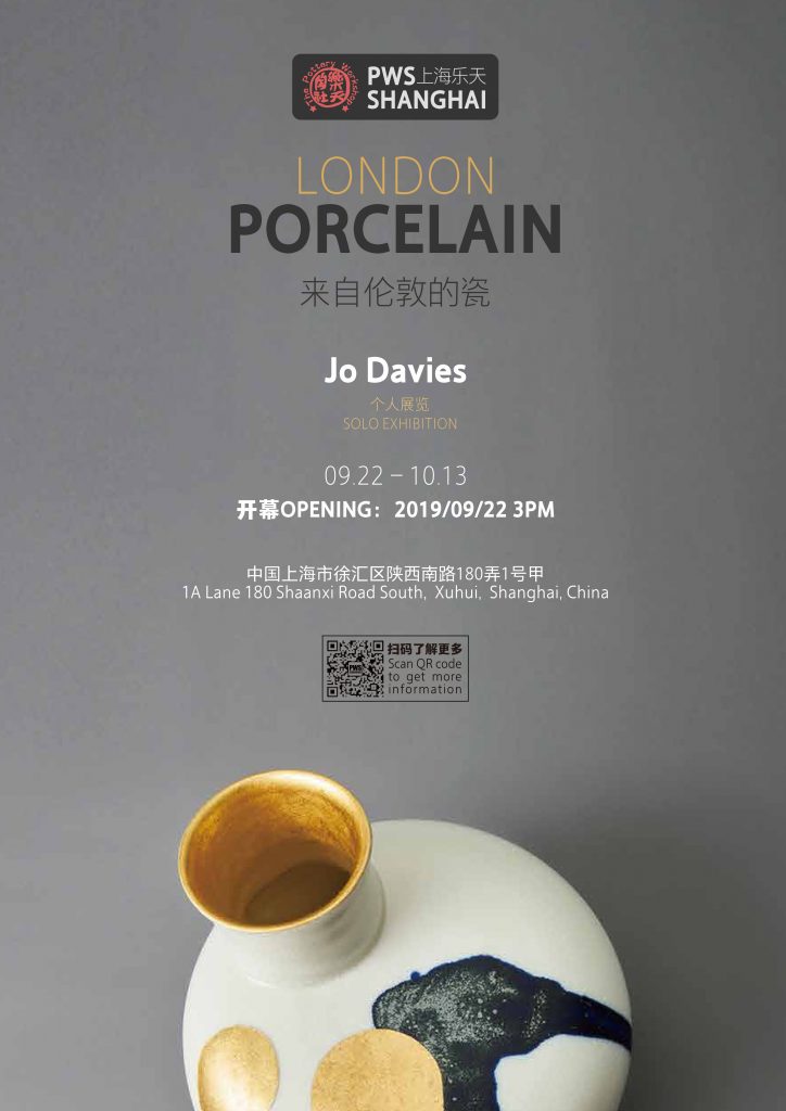
Tell us two special moments you have had (artistically) during your time as a visiting lecturer in China?
There were many inspirational moments - both large and small - but one of the main events for me was seeing the ghost market in Jingdezhen where many antique objects are being sold. However, many of the items are shards and kiln rejects that have only recently been dug from the ground after hundreds or even a thousand years of lying in an old kiln mound - discarded at the point of emptying the kiln because those pieces were below standard. They now make for fascinating testimonies to the long, arduous process that is involved in making ceramics and people are re-evaluating them as beautiful in themselves.
Expand on your work ‘Chinese Tea Set’
In Autumn last year I was asked to teach at the Jingdezhen Ceramics Institute and so I spent 5 weeks in this historically important part of China both teaching and researching. I explored the area, meeting new friends and building on my knowledge of porcelain in its birthplace. The research I undertook simply followed my natural curiosity for my own subject, shedding a light on cultural differences in attitude towards the material, its production methods and value within both Chinese and Western cultures. During the course of this research I took tea many times. Some tea sets were more formal, some were made by the artisans I was taking tea with and took on more artist aesthetics. I feel incredibly lucky that I was able to take tea both formally and informally, many people in the West have an idea of tea as being an entirely formal ritual without freedom for change but I saw that the objects encompassing a single set could be complementary rather than slavishly similar. I felt this was an important lesson that my experience in China taught me: the nature of a set of objects could cleverly hold the meaning of its function without having the same motif across every object. They can hold as much beauty and still be considered a set of objects without being the same colour even. This is very different to the way we are taught design in the UK - after Wedgwood and the Staffordshire tradition.
Chinese Tea Set, Photo by Matthew Booth
In seeing all these tea sets, from formal meetings to home studios, and observing the splashing, water-spilling nature of the ritual I gained a real insight into what was and what wasn’t important in tea-drinking in China. However, I have my own, British idea of this too and so the bringing together of my aesthetic with the Chinese Tea Set has been an enjoyable development and one that I hope will be accepted by a Chinese audience. My hope is to bring together these two worlds while making the set ostensibly a Chinese one designed for loose leaf tea that values small, exquisite sips of tea.
How has your Chinese Tea Set married East and West?
In China I noticed that tea was being served in a way that was both casual and formal. Beautiful tea sets were being used but water was being spilled liberally. As a British ceramicist the spilling of water from a spout, for instance, is considered a failure of design but in China this aspect was incorporated into the nature of the ceremony - a cloth is always present or there are perforations in the tabletop. This is why I created a tray with a pouring lip so that, much like the saucer of the English teacup, the water can be contained and poured away easily.
Discuss why the tray is so important in China.
The tray is not necessarily something that is used by the Chinese, it’s my addition to the tea set, a nod to Western preferences that include tea trays and saucers. Although there are often larger, more bowl-like containers and wooden slatted ‘table-trays’ included in Chinese Tea Sets, these are not quite like the tray I have introduced.
Comment on the lotus shape of the tray.
Chinese Tea Set, Photo by Matthew Booth
The tray doesn’t have an intentionally lotus shape, this is purely coincidental… a happy coincidence, given the lotus’ significance in Chinese culture !
Explain how you have reciprocated in the world of ceramics by being a visiting lecturer at the Ceramics Institute in Jingdezhen?
The teaching at the Ceramics Institute was a real leap of faith on my part. I knew very little about exactly what I would be doing with my students but, as it turned out, I was working with 4th year Design students and some Masters students. They were very unused to Western methods of teaching - where much emphasis is placed on individual creativity and investigation - and I was unfamiliar with their educational backgrounds, which were mostly based on learning by recreating the work of previous generations. Both systems have their benefits and disadvantages but it did mean we had some teething problems at the beginning. Many of the students slowly understood what I was looking for from them but there was definitely more than just the language barrier to cross! I learnt a lot from them too.
You trained at the Royal College of Art, London. At the time named ‘one to watch’. Do you think they anticipated a Solo exhibition in Shanghai the home of China?
I’m not sure anyone did…To be honest, I’m not sure what anyone anticipated, I certainly didn’t see this happening back in 2007 but I’m glad it is.
Discuss your Blue, White and Gold, Speak Vase Series.
Blue, White and Gold Speak Vase, Photo by Matthew Booth
While using cobalt to create blue is nothing new for a ceramicist, seeing its use in China revolutionised how I felt about the material. It was no longer the stayed hallmark of some Staffordshire ceramics but more of a living material that could be used freely. I gained a visceral sense of the material that displayed an individual craftspersons skill with beauty in every mark. I was drawn to the marks, particularly the Ming Dynasty shards which were ubiquitous in Jingdezhen, not just in museums but available to buy in their thousands at markets. Each shard was a detail of a larger image, an abstracted fragment that forces us to imagine their original state. In the new blue and white surface designs I wanted to capture some of that materiality of cobalt and create a surface that may or may not be a literal image.
Discuss the importance of Gold in modern China
I’m afraid this is something I’m not certain of, but my understanding is that gold has a history at least as old as porcelain in China, is often given as a gift as it is held to bring good fortune.
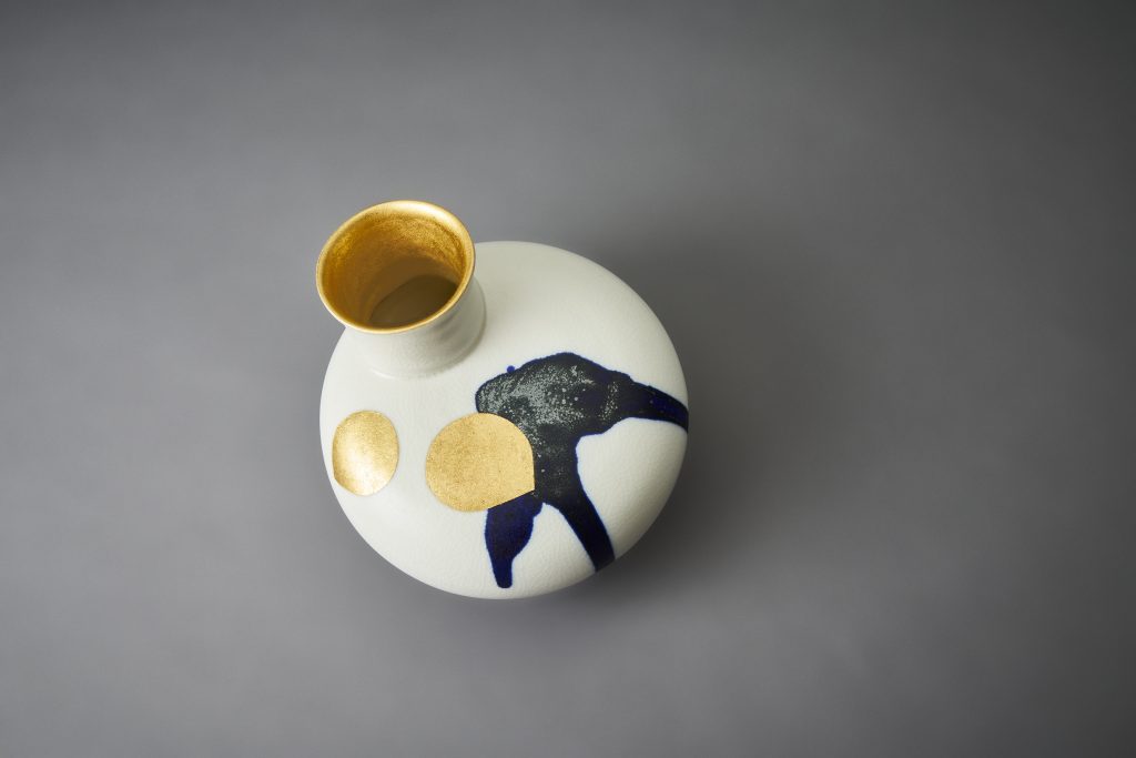
Blue, White and Gold Speak Vase, Photo by Matthew Booth
Currently showing at:
Next event:
Jo Davies: London Porcelain (solo exhibition) | 22 September - 12 October
The Mufei Gallery, Pottery Workshop, Shanghai
Contact:
Jo Davies
https://www.sammichellepaintings.com/
Deborah Blakeley, Melbourne, Australia
Interview by Deborah Blakeley, September 2019
CLICK HERE TO >>READ INTERVIEW OF JO DAVIES FROM NOVEMBER 2015
Raymond Quenneville
Since 1992, you have narrowed your work to landscape. Can you explain how this came to be?
I started painting landscape in oil long time ago when I was just fourteen. I have been doing it for many years until I completed my scholarship as a wildlife technician. Then I moved to wildlife painting and tried many mediums with a preference for watercolour. I have been painting birds with watercolour for about 10 years. After a while I decided to come back to my old passion; oil painting. Starting in 1992, I devoted myself entirely to painting landscapes in oil, through which I try to render a certain serenity and balance. To me, it is the best fit I could find to express my interior feelings. Over the years, I developed a distinguished style that is now recognised by art lovers and collectors.
You comment, ‘I try to highlight the fine consistency of the air, giving a sense of depth that the eye cannot dispute’, discuss using one of two paintings.
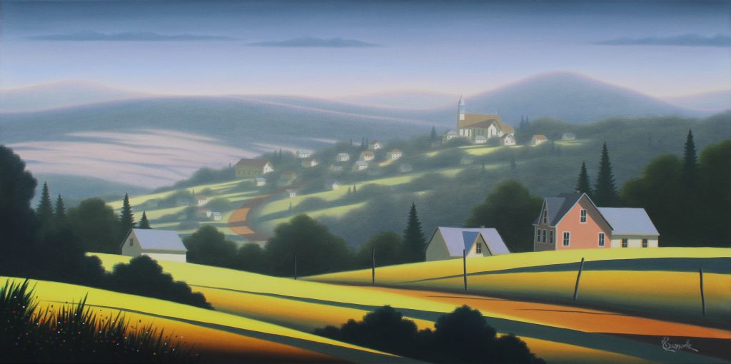
Retour à la maison 18 x 36 inches, Oil on Canvas
In each of my painting I try to maximize the impression of depth by creating a soft haze appearing as we move to the background. I use the value system to accentuate the aerial perspective. The strong contrasts of the foreground get diluted as we move toward the horizon. Similarly, most of the warm and brilliant colors and shapes of the foreground become cooler and vague along the way. This is how, in nature, our eye is decoding the presence of a haze. In French we would say that it is a “trompe l’oeil”.
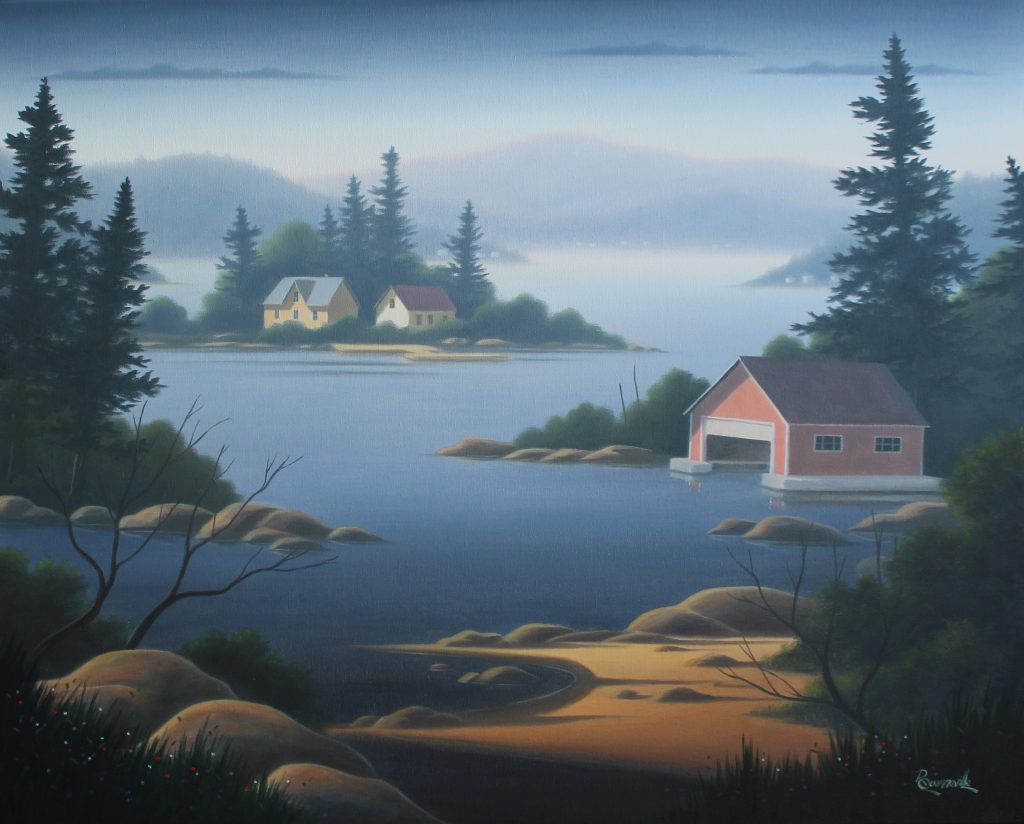
Entre les îles, 24 x 30 inches, Oil on Canvas
Discuss shapes in your paintings.
Through time, I removed unnecessary items from my composition. I kept essentially what is giving a direction to the eye and make the observer traveling into the landscape. Shapes of the trees, angles of the houses and churches, shadows, trail paths, all those elements are guiding the eye through the landscape with, at the end of the trip, essentially nothing, just a calm and hazy oasis of peace.
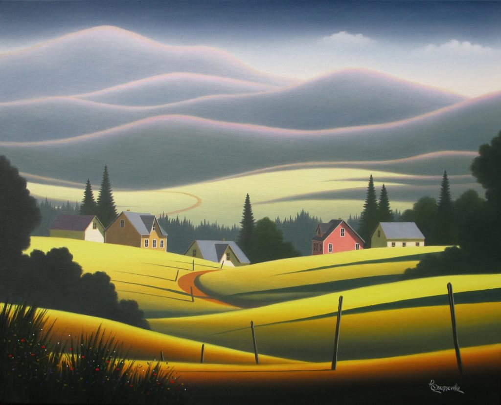
Tout ce temps, 24 x 30 inches, Oil on Canvas
While on shape you use many dimensions in our work. 6 x 36” 36 x 12” and 16 x 20” discuss the use of three different works represented in these three formats and why you have chosen these sizes.
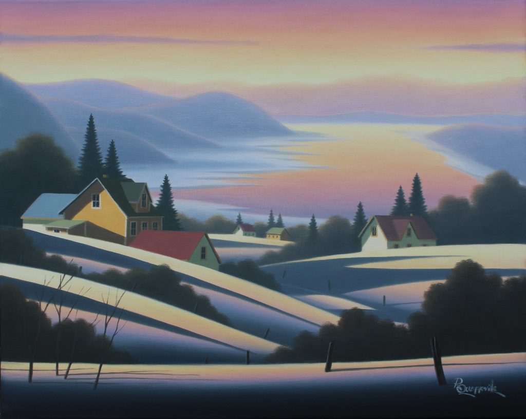
L’autre saison, 16 x 20 inches, Oil on Canvas
One of the challenges in painting landscape is to fit what is in front of us into a frame. To get it into a 16 x 20 inches box is not always easy. Some scenes required more air than other and deserve to be painted in the appropriate format. I used different canvas dimensions according to the subject I want to paint. Right from the sketch book, in the field, I decide which format will be the best for the situation. I will use a long 6 x 36 inches canvas for a farmland environment with many houses and barns.
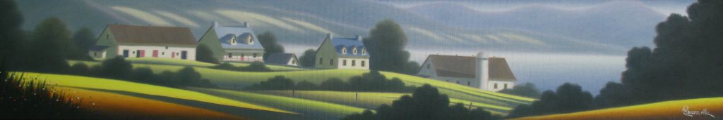
Choses tranquilles, 6 x 36 inches, Oil on Canvas
It provides me so much freedom when time comes to spread all the elements on the sheet. In other circumstances, I will use a 36 x 12 inches format to represent a scene where the bird’s eye view is the essential of what I want to express.
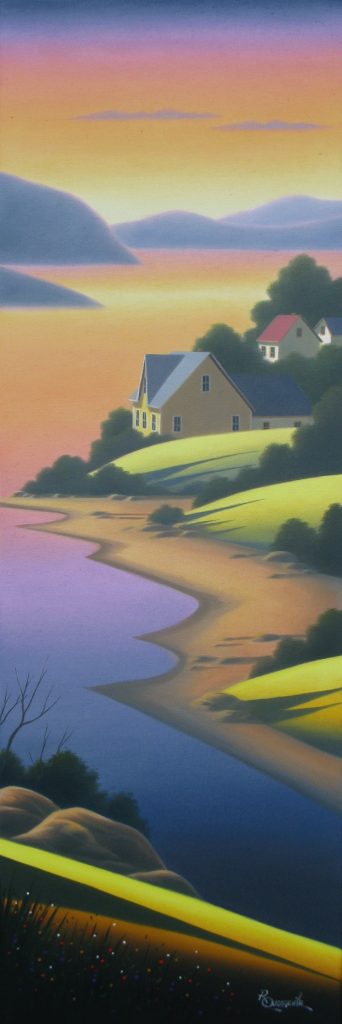
Rêver de partir, 36 x 12 inches, Oil on Canvas
For those particular formats, I intentionally cheat the perspective in order to make it easier for the observer to believe it. Nothing must interfere with his journey into the painting.
In your landscapes you add humanity by building – discuss.
Most of the time, there is buildings in my landscapes. They are there for many reasons. First they add colours and white patches into the mix and allow me to end up with an balanced chromatic complex. Second, buildings’ angles point into a direction that help guiding the eyes. They also bring some humanity to the landscape without being too distractive. I pay attention to details that will leave the observer alone in the painting… no animal, no car, nobody else than the one who gets into the landscape.
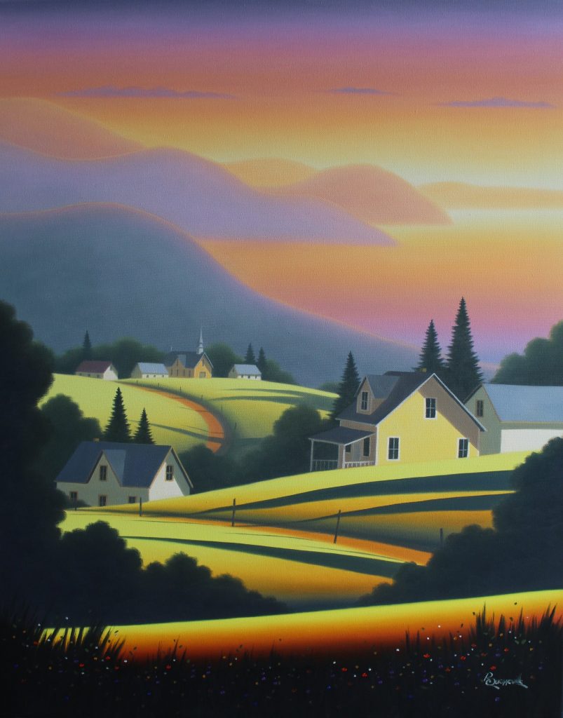
Dans le Soleil, 30 x 24 inches, Oil on Canvas
If you pay attention, you will see that there is no doors to most of the houses. No chance for the visitor to be disturbed by someone popping up. This notion of peacefulness in my artwork is important to me.
Are your landscapes local?
Most of my landscape are inspired by real location. My favourite areas are located on both side of the St-Lawrence River in Quebec (Canada), in Charlevoix, Côte-de-Beaupré, Bas-St-Laurent and Gaspésie regions. I also use sketches collected in other countries, from places I visited: Switzerland, Spain, France, USA, Portugal, Italy, etc. I keep from those places the very essential of the composition without paying attention to the architectural details. At the end, we don’t really know where we are. Houses are from Gaspé, red earth of the pathways is from Magdeleine Islands, mountains are from all over the world and skies are universal and free.
Can we see the seasons in your work?
There are different seasons in my artwork but they are not necessarily the one we are used to know.
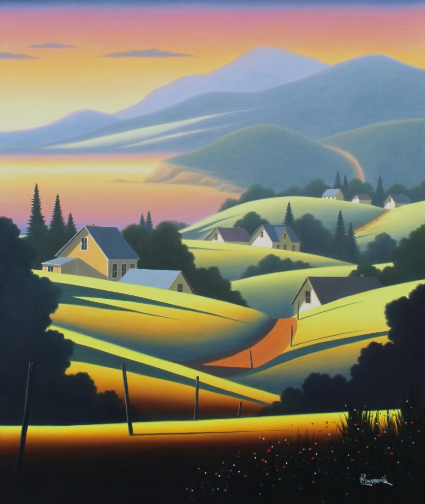
Plein d'espoir, 36 x 30 inches, Oil on Canvas
I would say that there is a warm season, where the predominant colours is a greenish yellow with some warm burned oranges, and a cold season where violet and beige are the main components.
Both are representing a moment of the day where the sun is low and the shadows are narrow and long. Up to you to decide if it is just after sunrise or just before sunset.
Expand on your involvement with Canada’s National Parks and how this collaboration has developed in your work.
I have been working with Parks Canada for many years while pursuing my artistic career. As a fire behaviour specialist I have been asked to participate in major firefighting operations all across Canada. I visited most of Canada’s national parks and had a chance to see incredible landscape both from the ground and from a helicopter point of view. Many of my painting are still inspired by the sky amber colour I have seen while working on the great fires.
Art with a difference – tell us about the Helmet of Dominique Maltais. How this commission came about?
It is a simple story. In 2011, I went to Petite-Rivière-St-François to paint the village and its environment. I posted the painting on my Website as I often do with my work. A few years later, Dominique Maltais who was attending the Winter Olympic Games in Sotchi was searching on the Web for an image of her village to put on her helmet. By typing Petite-Rivière St-François on the Web, she found the images of my painting and made it reproduced on her helmet. She finally won a silver medal and my painting was seen all over the world. Isn’t it funny!
Within your landscapes you also add maritime features discuss.
I like to paint quiet marine environment. Once in a while I add a ship or a row boat to the composition.
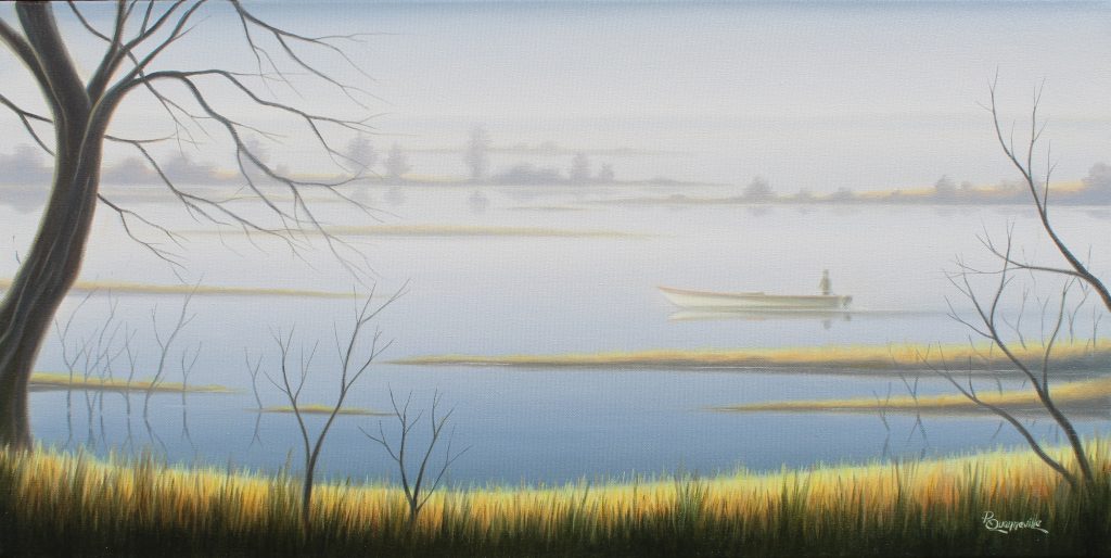
Moment Magique, 18 x 36 inches, Oil on Canvas
The intention being once again to get the attention to the focal point rather than adding a disturbing element to the scene. A few year ago, I moved to Champlain, a small municipality along the St-Lawrence River where I have now my studio. Huge commercial ships are navigating on the St-Lawrence and can be seen from the house. They are now part of my day to day environment and by the way have an influence on my artwork.
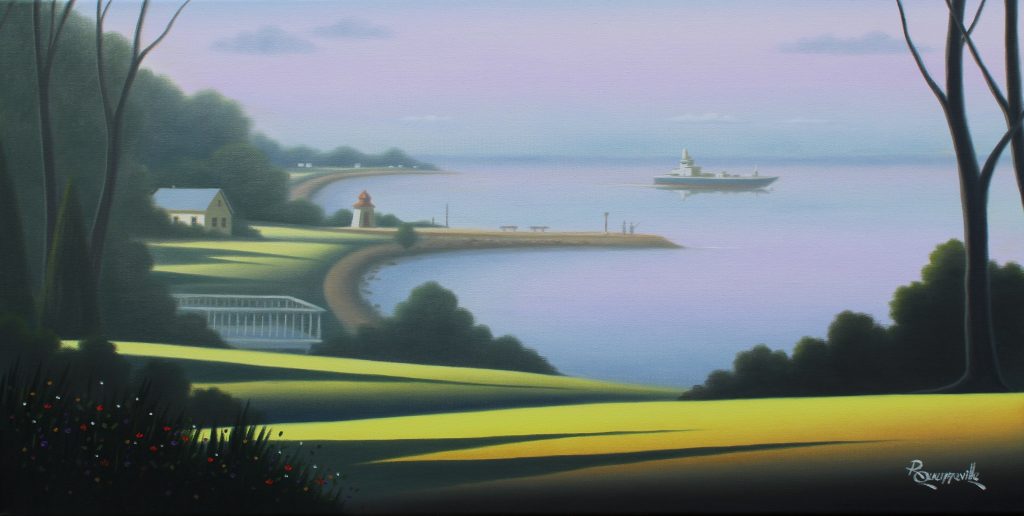
Pêche au bout du quai, 15 x 30 inches, Oil on Canvas
Can you discuss La Collection Hommage au Saint Laurent using both your photograph and painting?
Since 2016, I am working with four other Quebec artists (Yvon St-Aubin, Yvon Lemieux, Gérard Boulanger and Robert Roy) on a five-year project to paint the most picturesque regions of the St. Lawrence River (Canada). The group was established with a goal of creating 100 paintings, from the Thousand Islands to the Gulf of St. Lawrence. This is the first such venture in Quebec's art history. In October, 2017, the artists were introduced as guests of honour at the Quebec National Assembly. The collection “Hommage au Saint-Laurent” will be completed in 2020 and will be first shown at the general public starting in 2021 at the Pierre-Boucher Museum in Trois-Rivières, Québec.
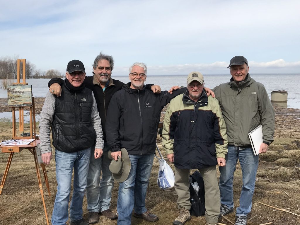
Lac St-Pierre, St-Lawrence River, Spring 2018
From left to right : Gérard Boulanger, Yvon St-Aubin, Robert Roy, Yvon Lemieux, Raymond Quenneville. Photo Éric Guénard,
Can you comment on the importance of meeting, sharing and discussing art with fellow artists?
Working along with other artists on a long period of time is to me the best way to progress, to refine your art and to reach higher levels. The project “Hommage au Saint-Laurent” has been quite stimulating up to now for the five of us. It forced us to put ourselves in “danger “, to go beyond our comfort zone. Other than that, each member of the group has between 30 to 50 years of experience as a professional artist. Easy to understand that sharing this experience is beneficial for everyone. I would say that these five years shared with my partners and friends have had a significant impact on my artistic approach and professional career.
Contact:
Raymond Quenneville
Deborah Blakeley, Melbourne, Australia
Interview by Deborah Blakeley, September 2019
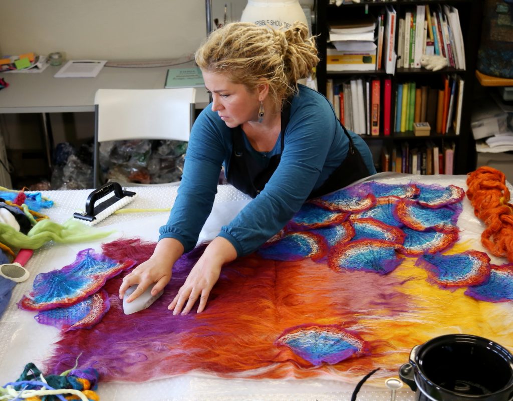
Yekaterina (Katia) Mokeyeva
Take one piece that you are proud of and explain why?
Innovation is what I am probably the proudest of. In sayings like "The new is the well-forgotten old", there is a sliver of truth. Revivals emerge constantly, in various areas of art. Aside from this, borrowing ideas from nature is natural to mankind, and similar "natural" ideas have occurred spontaneously in different places and time periods. A unique handling of such an idea is the technical interpretation and processing of it into something new, something that has never previously been applied in this craft. That would be innovation, and it enables development and progress of this craft as a whole.
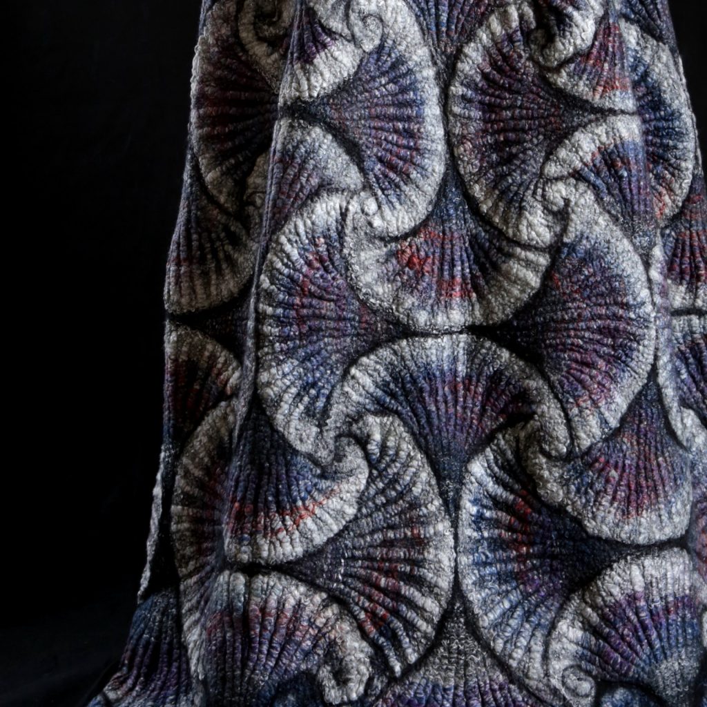
Mesmerizing Patterns, detail
My mosaic fiber structures, "Mesmerizing Patterns", constructed from small pre-felted elements with the necessary application of plant fibers, happen to be a form of innovation.
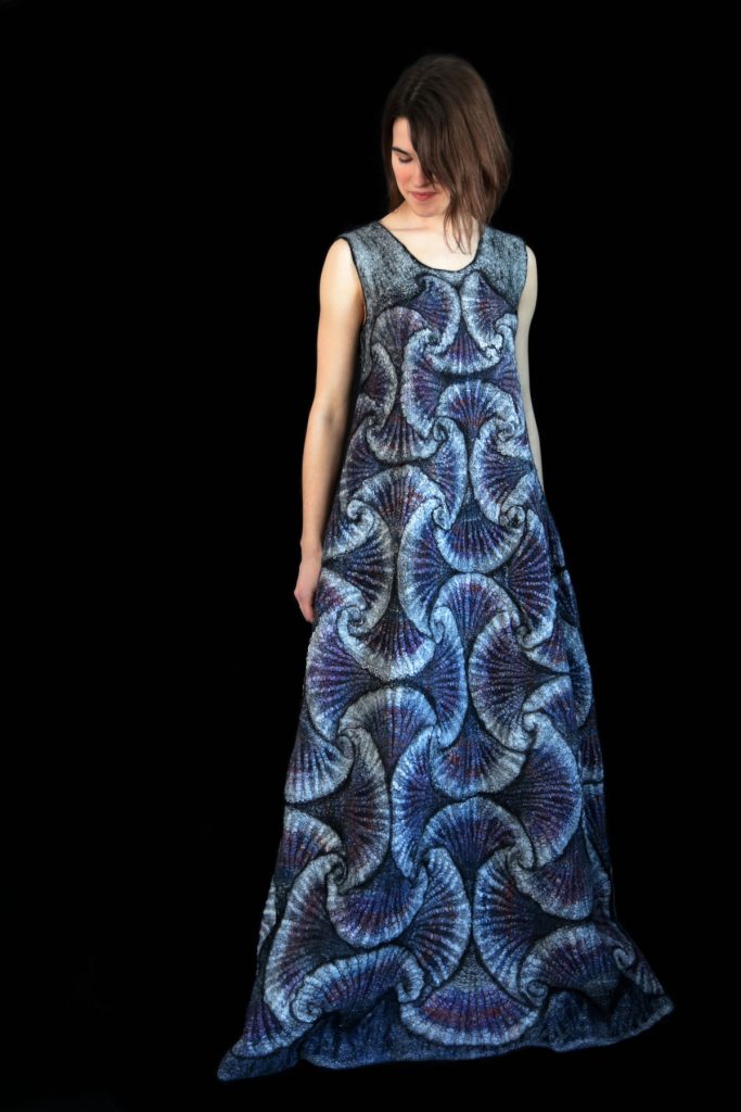
Mesmerizing Patterns
Take one of your full-length dresses and discuss...
Form
Wearable sculpture. Oblong, contour-flowing, repeating the curves of the human body, but not snug, somewhat free and swaying instead. It should be laconic and without excess, with clean and rounded edges, a form that does not detract content from perception, and is akin to an amphora.
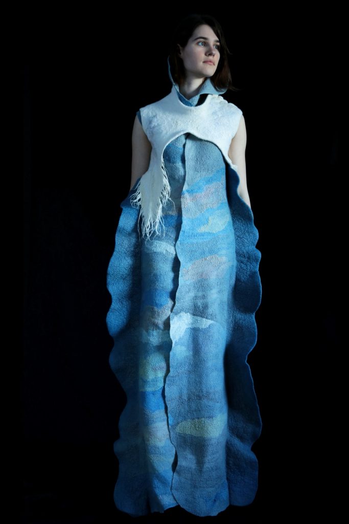 Conceptual
Technique
This is a 3-D hollow form that was practically sculpted and assembled from a multitude of hand-twisted felt ropes. There is no fabric involved, only wool and plant fiber comprising multiple small parts that are constructed together on a durable base layer, and a surface made of plant-derived fiber (Ramie roving).
Completed weight
Completed Weight. 990 grams (2 pounds 3 oz)This is a rather hefty piece. If it were an ordinary dress, that is. In this case, the weight is rather humble for a sculpture.
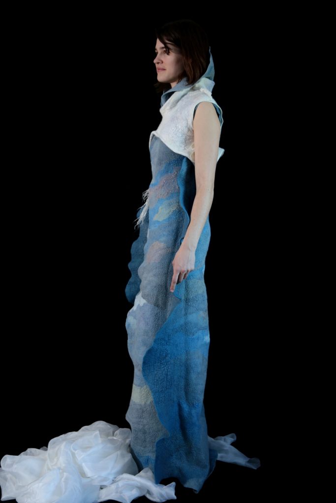
Conceptual
Colour and colour combinations
With the abundance of texture here, the variety of color had to remain minimal. Black was used to enhance contrast and depth, white for relief sculpting of voluminous textures, as well as creating light for prominent areas. Turquoise is often perceived as the color of water (if not the sky). It was my desire to use a bit of color to expand a theme - the theme of ocean elements.
Who the garment was made for or why it was made.
This exhibit piece is one of a group of wearable sculptures created for a project of a thematic duo-exhibition. I depicted the forms of an ocean in its various stormy conditions; some part of this depiction was metaphorical, and some of it bore a stylized resemblance to a lively, rampant sea.
Discuss the differences you noticed in your training between Moscow and San Francisco?
In Moscow, especially during the old times, art schools possessed an incredibly strong academic foundation. All art schools, regardless of the major, demanded a serious amount of classical training to be demonstrated at the exams. Many students, despite their display of outstanding skill and potential, had to apply several years in a row to even be considered, and were often rejected. A significant part of studying consisted of classical fundamentals, Drawing, painting, composition. In any of the majors, whether it was applied art, furniture design, fashion, textile, or architecture, these fundamentals were present. One thing that surprised me in San Francisco, was that many of the students were not very good at drawing, but more attention was given to the majors there. Everyone worked with great effort (likely due to the fact that studying there was incredibly expensive). The conditions and equipment were, of course, top-of-the-line. And during their studies at the college, students were able to participate in international and national competitions and contests or obtain an apprenticeship somewhere. The approach to education was also wiser, more grounded to real life. For example, textile artists and clothing designers would work on projects and collections that were tied to realistic product lines and industries. In short, this was the more practical and rational approach.
Take a scarf / collar and discuss the different techniques included within on piece.
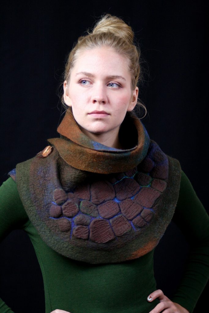
Turtle Shell
A statement piece that I created several years ago. it was already around then that I frequently used pre-felted elements, in this case, 3-dimensional segments of a "turtle shell". It was necessary to consider the direction of the fibers in the layout (a layout which must first be spread out on a plane and is comprised of multiple little pieces of wool roving). The correct arrangement of the fibers helped to create a structure that accordingly takes on the correct form upon shrinkage. Of course, the piece is "sculpted" by hand, but the form is planned during the layout. The surface was laminated with loose-weave cotton gauze.
I worked with color, cold and warm tones, to procure liveliness of depth and dimension. Thin, vivid lines were made to create an effect of glowing, and I achieved it with machine stitching.
Expand on the use of colour in your work.
To me, color is an instrument of great importance. At some point, I studied color theory, but have little memory of the class, mainly because I continue to work with color relying on intuition, as I had when I was a child; in other words, I perceive color based on how the eye sees it and the soul desires it. The creation of a rich palette, or on the contrary, limiting colors, aids me in delivering the concept.
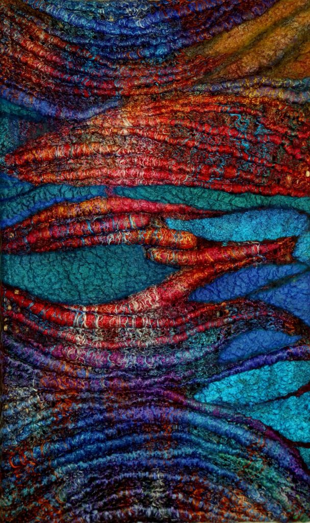
Colours 1
Wearable art as an art form
Sculptural, in this case fully "sculpted" from fibers, relative to the human body as another means of communicating a message but separate from mainstream fashion. With a mastery of craftsmanship and commitment to personal vision.

Sea
The reaction of the viewer and the reaction of the wearer.
The pieces that I create for exhibition projects are more likened to installations. The wearer puts them on for demonstration or photo session, but not as a regular garment. For a time, the wearer becomes a part of the project, a participant in a scene of an entire performance. The viewer, apart from being the recipient of the aesthetic, has an opportunity to make sense of the narrative, whether it is allegorical or metaphorical.
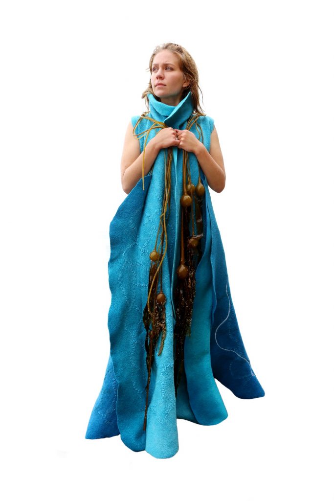
Wearable Art
How do you explain the importance of wearable art to the general public?
If someone asked me about the purpose of my pieces, I would reply with the simple answer that art comes in different forms. All art forms are equally important.

Sea of Nettles
How are you influenced by nature, to use natural fibres?
I direct my work down the stream that allows me to be closer to nature. Of course, attempts to return to the source and to be part of nature poses somewhat of a challenge for the modern human. But the ability to absorb inspiration from the natural surroundings rewards with a sense of euphoria. My last three years, I have spent living in the woods. Working with animal and plant fibers couldn't be any closer to my universe in this setting. Fiber is a soft and natural medium; its flexibility and texture feel very much alive.
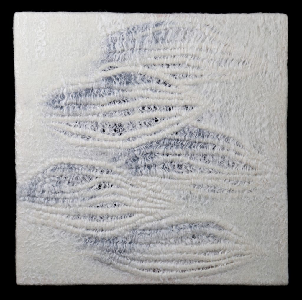
Color 21
How do you respond to natural fibres and how they combine to give the effect you are after?
Some of those fibers, unfortunately, are a result of processing that demands the utilization of various chemicals and dyes. While newer technologies have not yet replaced the ones currently in use, a compromise is made because the color and thinness of the fibers in some cases are essential. All of this is a similar process as in sculpture and painting. The key difference being that in place of using clay, or applying pigments, I apply and shape small pieces of animal and plant fiber. Fiber is quite responsive material. I create my surfaces using practically the tips of my fingers.
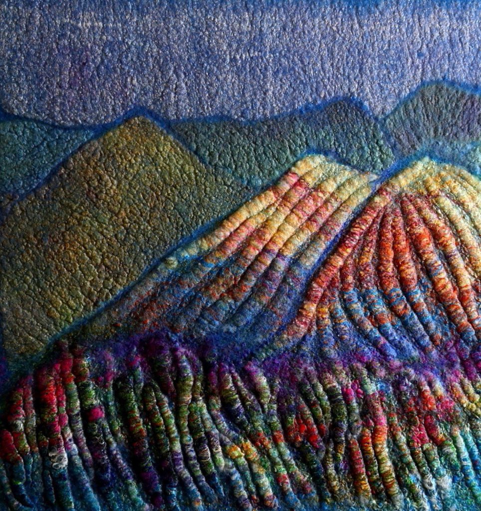
Color 3
How do you use your sketch book to develop a piece?
I doodle. Doodling has been a habit of mine for as long as I can remember. Because of this, I would sometimes get into trouble as a child. Of course, it isn't always possible to carry a sketchbook with you everywhere you go, and a calm moment is considered a luxury in our day and age. And yet, a few mindless doodles can procure the formation of bigger ideas.
- If making small sketches was already a natural habit, then I learned it in London when I took the summer study abroad program at Central St. Martins. Taking photographs of any interesting subject, whether it was nature, an object, or a color combination, or surface, then printing out those images on a simple color printer, was another way.
Then, to manipulate them, cut, take apart, put together, turn upside down, blow up or reduce in size, and so on.
- Short notes. They don't need to be full sentences, sometimes just unrelated words, or emotional states or impressions of something.
It isn't necessary to collect those impressions or words for one project only. Sometimes, the final image of whatever I intend to create hasn't fully developed itself in my mind (it happens). I could flip through my sketchbook, or even through one of my old sketchbooks; this awakes a process, thanks to which an abstract idea could become defined and concrete. There are also other techniques used in working with sketchbook materials, and they help to form outside-of-the-box-ideas. These methods I share with the participants of my art retreats.
Discuss retreats in relation to both the development for students and you as a teacher? The value of being in a special place.
Tenerife Retreat
Celebration, a special unforgettable time, an event for which a desirable place is chosen. How often do we celebrate our creative identity and our love for our craft? Of course, even working in solitude in your studio can bring great joy. But my retreats are a true manifestation of all that is most wonderful.
Tenerife Retreat
Breaking out of the daily routine, discovering beautiful surroundings, working with the best quality materials, is a great way to charge your inspiration for years to come. It is a nurturing event for my participants and myself as a teacher and organizer. Once upon a time, the vivid impression my time spent in studying abroad endowed my London sketchbook with magical powers.
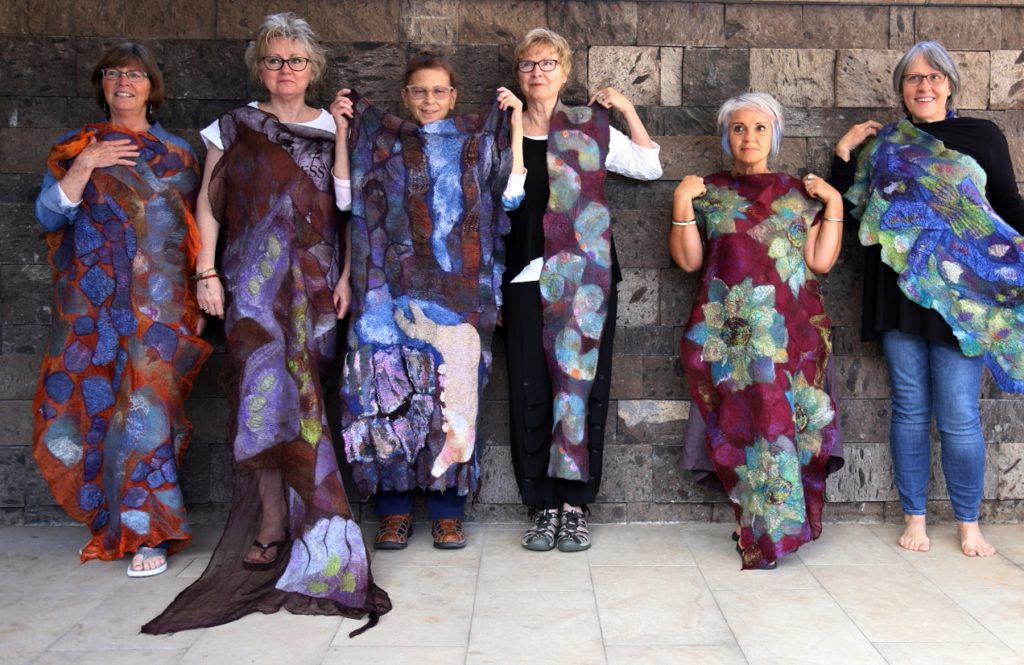
Tenerife Retreat
You teach on-line classes; can you share what is involved?
First and foremost, a great deal of patience is required. This is a challenge for my naturally restless character. Online classes demand a tremendous amount of computer work.
How do you set up a class?
Each lesson must first be drafted prior to being photographed and filmed, the videos processed and edited, and among all of that, detailed instruction must be given as everything is documented. Whenever I compose a course, it is as though I do a recount of all the years of my work, throughout which I developed and mastered the techniques that I share with my students. Such labor is both satisfying and bears great responsibility. It also forces you to be brave and open with the world. It is as though you invite people directly into your studio, most of them are strangers whose faces you've never seen. At the same time, some of them become friends. A soft and warm medium unites people and brings them joy!
What materials list do you suggest to students?
The materials we used were quite beautiful and attractive - premium quality wool roving, all sorts of plant fibers, luxurious silks, an abundance of colors.
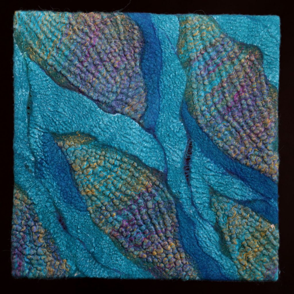
Color 11
How available are the materials (worldwide)?
I have accumulated a pretty extensive list of suppliers from different corners of the world. This includes tens of websites, each of them readily supplying ordered goods through the internet. I share this list with my class participants, and they add to it as well with their own sources.
How far and wide are the students who you teach?
If someone had told me, a person born in Ukraine and raised in Soviet Moscow some 25 years ago, that the extent of such communication is possible, I would never have believed it then. But it is a fact - my students live on every populated continent. I teach fellow Americans from every state, including Hawaii and Alaska, Canadians from far up North, people on all ends of Australia, South Africa, South America (Chile, Argentina, Mexico), practically all Western European countries, Scandinavia, Eastern Europe, the UK, Russia, Cyprus, China, as well as Japan (and the locations grow). Such are the incredible times we live in.
How do you incorporate this with your existing art practice?
All courses last between 4 and 9 weeks, with 1-2 lessons per week. The course materials are distributed on a specific platform and are made available to students at any time for them to access. Nonetheless, my participation is also necessary, as I give advice, explain to students the more complex nuances, and then review their results in a virtual classroom. This could take at least several hours, if not many more in the span of one day, and throughout the entire course. No other major projects or trips are possible during this time. Therefore, there are weeks dedicated to the classes, so that I may include some studio work, but nothing beyond that. Tutoring is a time-consuming process that requires dedication.
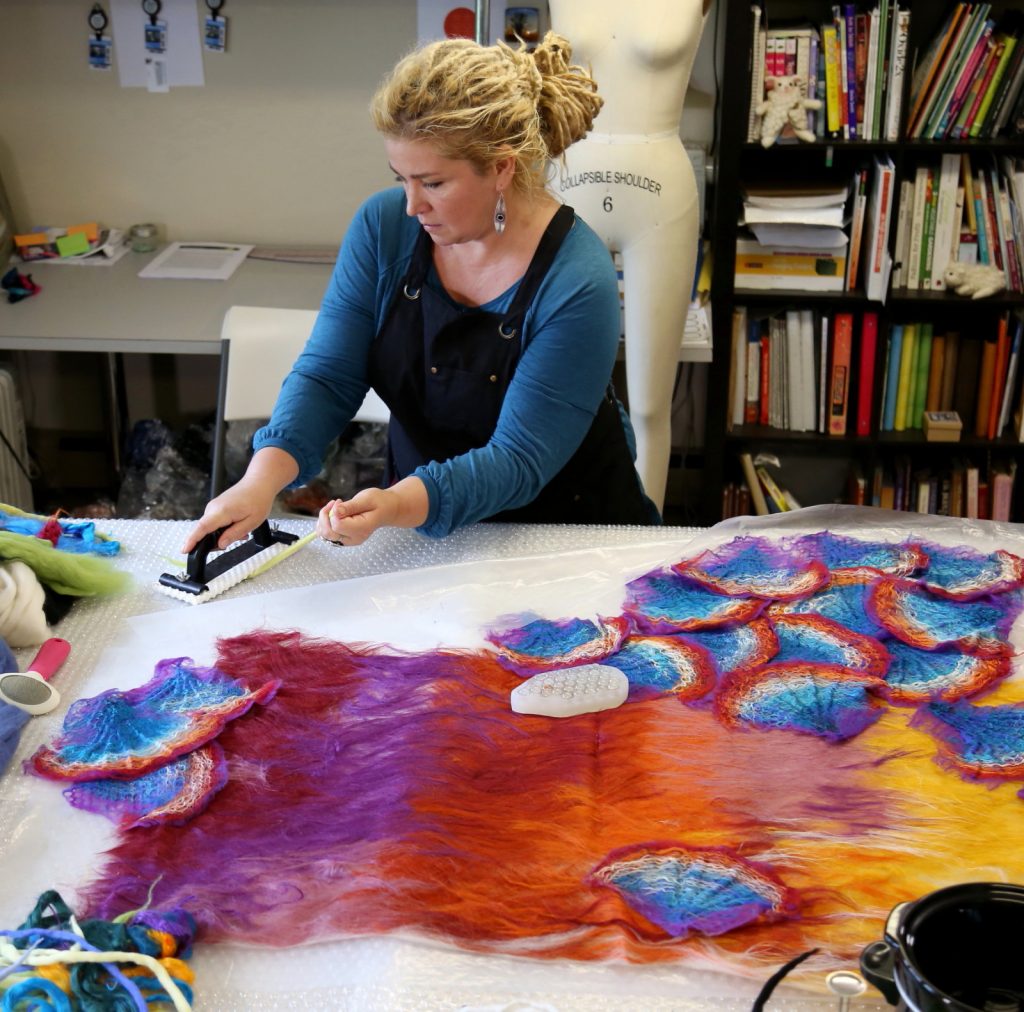
Studio shot
What have been three important lessons you have learnt and how do you now rely on them in your art?
Trust yourself. The truth, which did not reveal itself to me immediately, is that wherever there is a desire to please someone and meet their expectations, or to land into a fashionable trend, true art begins to hit a bit of a dead end and is instead replaced by conjuncture. Everything that is best is born from the depths of the heart and intuition.
An appetite emerges during a meal (as my grandma would say), and inspiration - during work. The endless wait for ever-elusive inspirational motivation is procrastination. As soon as you begin your work, your muse may arrive, sometimes with a completely unexpected idea.
Making a living being an artist quite a bit of anxiety. And anxiety is a creativity killer. I am learning to live here and now, in the present moment. It helps me to carry on, and it is not a finalized lesson.
Expand on your piece, “Darkness Is Your Candle”
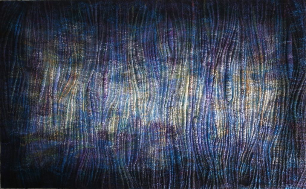
Darkness Is Your Candle, 142 cm X 89 cm, cellulose fiber wet felted on wool fiber base.
What lead you to move to do a large 2D piece?
The size was not very challenging or something new. Some of my 3-D wearable sculpture pieces have larger dimensions than this work.
The surface consists of well-defined pre-sculpted small 3-D elements. An intense use of tone, color and texture in one work was enough to deliver the idea. Therefore a choice was made to favor the 2-D format.
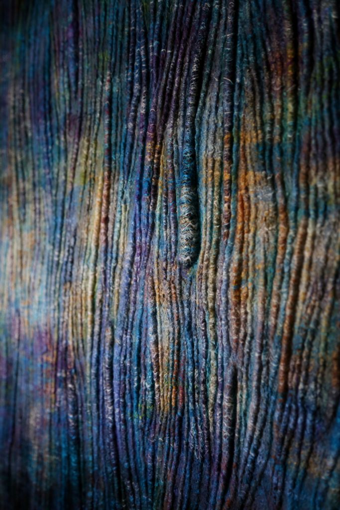
Darkness Is Your Candle, detail
Discuss the use of colour and lustre
A combination of warm and cool shades and a large tonal range, from almost black to "shining" light hues were the means by which I was able to achieve the effect of glowing. No lustrous or glittery fibers were used here, and no special lighting is required. The "glow" was merely painted using cellulose fibers of various colors.
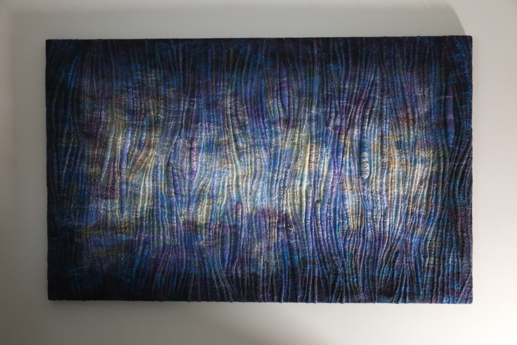
Darkness Is Your Candle
Where did the inspiration come from?
Since the beginning of my relationship with this medium, I tried applying the techniques that I used in my old paint and pastel works. The ways of depicting light, or an even more interesting idea of creating a ‘glow from the inside’, was something that always fascinated me. Several years ago I made a series of conceptual garment pieces called "Bioluminescence."
"Darkness is your candle," this is the line from "Wetness and Water" by Rumi, the 13th century Persian poet. The emotional state, as well as memories of life experiences encompassed in a whole, resonated with the meaning of those words, and have become a foundation of this piece.
“No matter how fast you run,
your shadow more than keeps up.
Sometimes it's in front.
Only full, overhead sun
diminishes your shadow.
But that shadow has been serving you.
What hurts you blesses you.
Darkness is your candle.
Your boundaries are your quest.” ― Rumi, The Big Red Book
Contact:
Yekaterina (Katia) Mokeyeva
https://www.feuer-und-wasser.com
https://www.facebook.com/FeuerUndWasser
Deborah Blakeley, Melbourne, Australia
Interview by Deborah Blakeley, September 2019
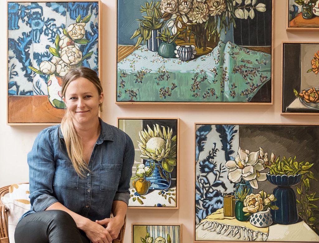
Sam Michelle
Do you think having come from a creative family influenced your choice to be an artist?
I think having encouraging creative grandparents along with a particular aunty gave me confidence in trying new creative projects while I was young. I think I have taken this passion through to adulthood and it has helped influence my choice to be an artist.
Discuss how you combine floral, textiles and objects in your still life paintings.
Lately I have been playing around with levels and heights in my still-life. I have been designing my own objects within my current collection, for example I have been using hills and trees from my recent NZ painting trip to design objects within my still life paintings.
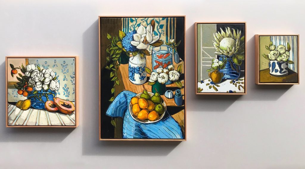
Have you been highly influenced by Margaret Preston’s work?
Being a Kiwi I have a lot of Australian art history to catch up on. I recently purchased a book on Margaret Preston to learn more about her and her work. I tend to be more influenced by todays painters and ceramicists.
Where do you source your flowers?
My favourite florist is Azalea Florist in the South Melbourne market, but as that is an hour away from me, I like to visit the Tooradin fruit and flower shop who are super lovely and will order in particular flowers for me.
Can we add your video Sam Michelle – Paintings, here?
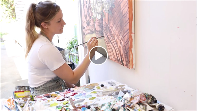
Sam Michelle is an award-winning oil painter who works from her … Watch this short video for Sam’s …
How does your art, work in with your current lifestyle?
I paint everyday and I would paint all night if I could. I have a great detached home studio which makes balancing home and work very easy. I can shut off work and focus on my home life after a day of painting. I am always focused on making sure I am balancing the need to paint with catching up with friends, exercising and family life.
You came to Australia from New Zealand do you use both Australian and New Zealand flora in your work?
I am currently working on a NZ inspired collection from my recent trip to NZ. This will be the first time I have used native NZ flora in my work, however NZ and Australia tend to share the love of some of my favorites, hydrangeas, proteas, dahlias & peonies.
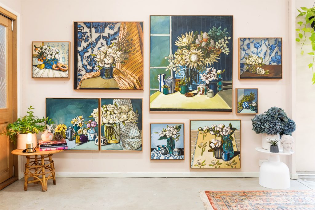
How important is a good and supportive gallery in the promotion of your work?
I am blessed with a supportive Gallery but I also like to promote my work as I think it is a team effort. However, that’s not to say if you don’t have a gallery that you need one. Some of my favourite and very successful artists are self represented and doing very well.
Colour is ever present in your paintings, discuss.
I love to play around with colour however I rarely use the primary shades. I like to interpret my subjects in my own way and don’t always feel like I need to paint things in the exact colour they are.
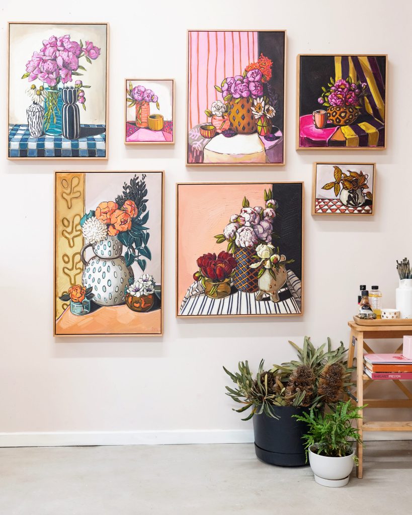
What are your current goals for your art?
I have been working on my landscape language for a while now and would like to continue this work. I love the idea of travelling and creating a collection from the trip. I think your eyes are fully open when you are visiting somewhere new and I would love to be able to tell that story within still life and landscape works.
Discuss ‘Arranged Nature and Strips’.
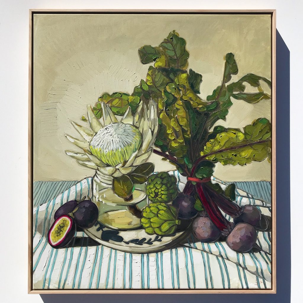
Arranged Nature Strips, 77 x 67 cm, Oil on Canvas
This work was created after my trip to the US. I was particularly taken with my trip to the Getty and created a body of work based around my experience there. On the way home from the airport I was so inspired, we stopped off at the South Melbourne market and I purchased lots of produce and flora. This painting was based on the many still life works I saw at the Getty and the beautiful palette and architecture.
Take several paintings and expand on them and what makes each one sing.
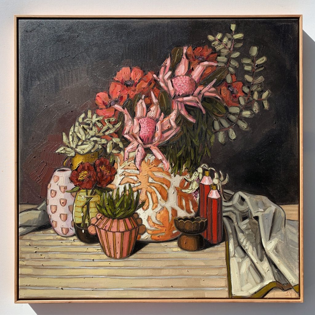
Peonies, Waratah & Giant Poppies, 86 x 86, Oil on Canvas
Red Charm & Daffodils, Diptych. I think what makes this painting sing for me is that I always try and give my flowers little personalities and these flowers all seem to be turning to the warm light as if there is something to see.
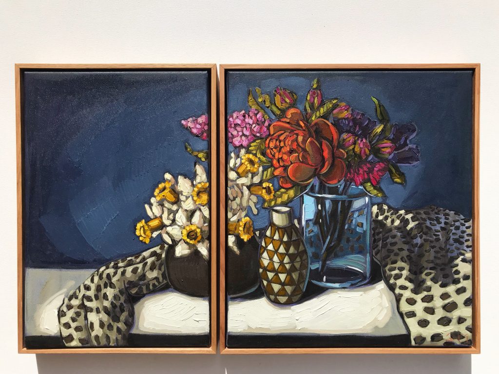
Red Charm & Daffodils, 48 x 33, 48 x 33 cm, Oil on Canvas
Peony Buds and King Protea. As above, my goal with my flowers is to give them personality, this one sings for me as it is like a parent looking over her three young children.
Comment on ‘The City Flower’
The first time I used a diptych set up was with an underwater painting of two figures. I had the women on one side and the male on the other side (canvas) and they were holding hands in the middle. I wanted to experiment with this in still-life and have enjoyed playing around with the composition, how to make each section equal in its own right and also work well together.
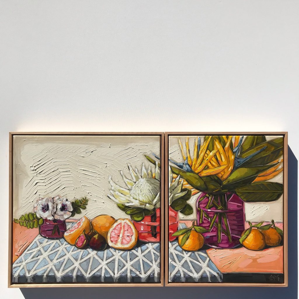
City Flower, Dyptich, 47 x 47, 47 x 43 cm, Oil on Canvas
The thought process in the sizing of each image and composition of both. It really is me setting out a personal challenge for myself, I will keep working on the sketch and composition until I am happy with it.
Do you find our work coming out of your studio, is very seasonal?
Last year I did seasonal releases and challenged myself to investigating and painting what flower was in season when. This year I my aim and goal is to tell more of a story with a collection and not to have so many rules 🙂
Contact:
Sam Michelle
https://www.sammichellepaintings.com/
Deborah Blakeley, Melbourne, Australia
Interview by Deborah Blakeley, September 2019
Angus McEwan
Can you expand on how you paint textures and surfaces?
I work with watercolour to create my textures, exploring surfaces and details that convey each objects identity. I will combine techniques and other types of media with watercolour, including collage and I will employ methods from one media and transfer that to watercolour to create paintings that are non-traditional.
I use collage occasionally to change the surface of the painting. This act alone can enhance the textural element within the image. Collage as a technique is ubiquitous within Scottish, but it tends to be married with oil or acrylic. I wanted to try it with watercolour to see whether it would be successful or not.
I did a series of paintings a number of years back using Cuba as an inspiration and created many of the paintings with a collaged substrate.
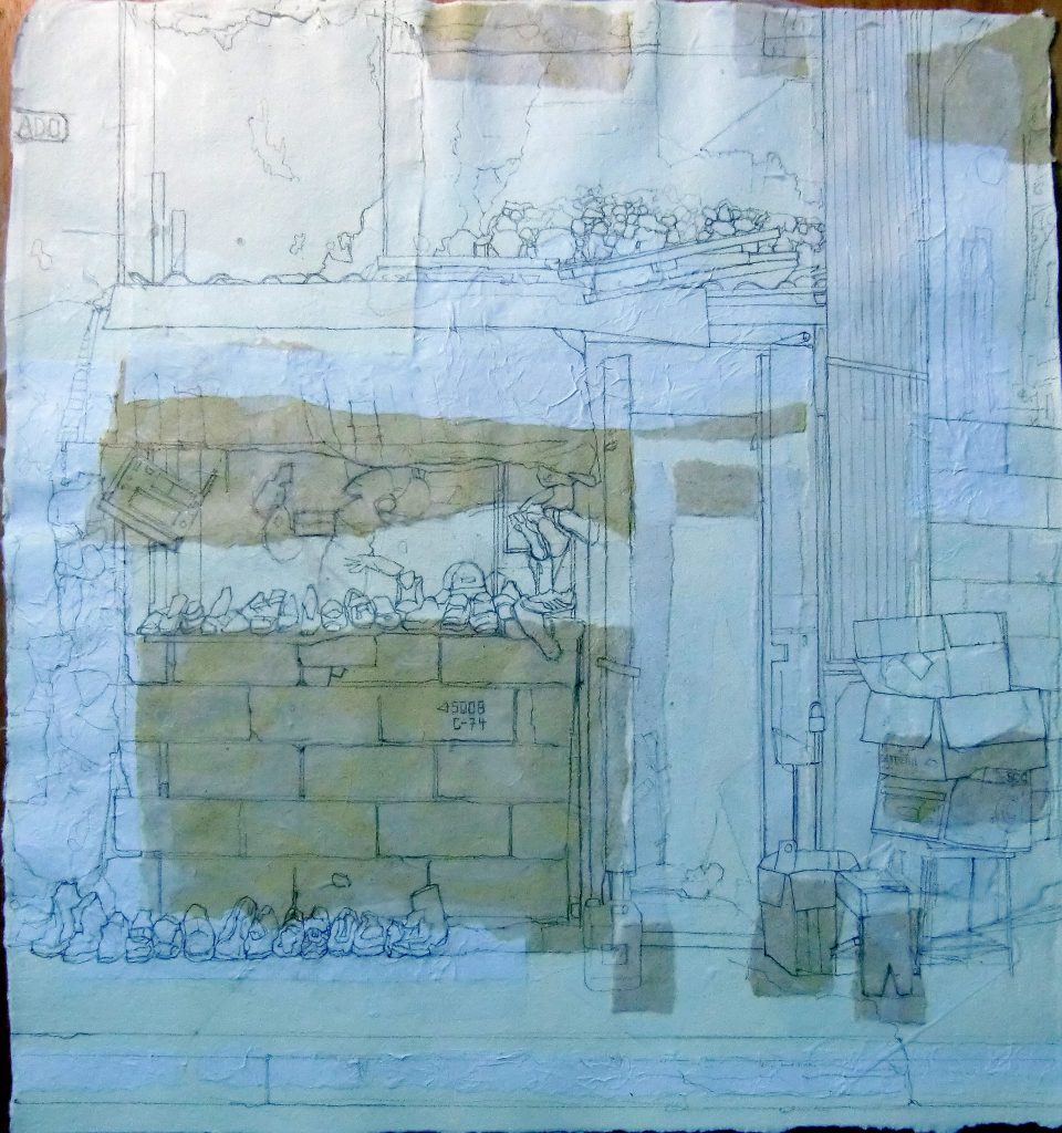
Make do and Mend, 56 x 60 cm, Watercolour on Collage
“Make do and mend”- this painting, as you can see, started off with simplified shapes ripped and placed roughly where I anticipated they would be needed. I then drew carefully the basic outline of the main objects. At this point it is important to ignore the shapes as you draw, it is very easy to be distracted by the collaged pieces as you map out your composition. Once this is worked out, I paint as I normally would as if the collage wasn’t there. The result should be that you aren’t initially aware of the collage but as you look carefully at the painting you will begin to see a textural surface that will enhance the image.
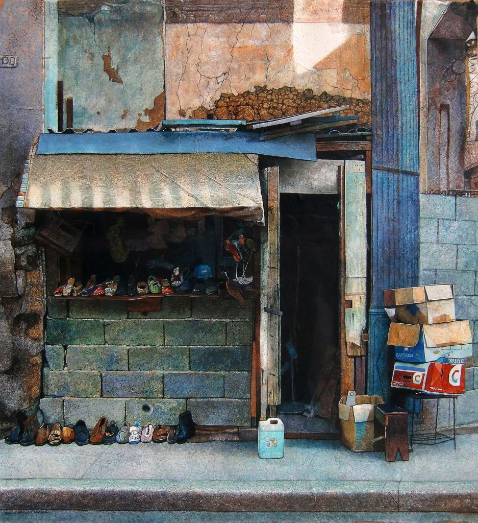
Make do and Mend, 56 x 60 cm, Watercolour on Collage
Another technique that I use in just about every painting is splattering, this also helps me describe surface texture and I use it in multiple ways, wet on wet, wet on dry, masking, no masking, light masking. I usually put down quite a few washes before I start the process of splattering.
 Poster Girl, in progress
The image above is a detail of “Poster girl”, watercolour on handmade Fabriano. I wet the surface with a water spray then splattered with a synthetic square headed one stroke brush. This creates arbitrary marks on the surface which can describe texture, tone or colour.
You can see the final painting below and how the area in the bottom right was developed further as I worked with the splattered marks. I also added stamps and stencils to add lettering to the image.
Poster Girl, 41 x 55 cm, Watercolour on Collage
Ageing or falling apart is often the focus of your work – Discuss.
There is nothing like aged material to remind us of our mortality. Even the things we make eventually return to dust. I attempt to record some of the objects I come across as a way of preserving the moment. The objects will either disintegrate, be repaired, replaced, or removed but they will not remain static. The inevitable decline of the objects that attest to our presence on this rock would eventually be wiped away through time. It is my sincerest hope to show the unique qualities in those things that I paint, however decrepit. They are most often unnoticed, ignored or neglected but they all display a degree of inherent beauty that would not be considered traditional. Their decaying surface fascinates me, and I must try to capture this in my work.
When and why did you decide to work in watercolours?
In 1996 I won the Alastair Salvesen Travel scholarship which allowed me to travel to China for 10 weeks. Part of the prize was to have a large one person show in Edinburgh in the Academy buildings, a large space that would need a lot of work. I knew that I would be travelling quite a bit and that I would need to create while on the road. I took a few acrylics and drawing materials with me and decided that watercolour would probably be the most sensible medium to take with me. I worked with the paint a few months before hand to get a feel for it and found the whole process a struggle. It took a few moments of desperation to figure out how to work with the medium. Even now working Plein air gives me a few headaches as its too quick for my normal process of slow methodical washes built up over time.
Due to working in watercolour, does this restrict you to size?
In a word, yes! I work on paper and therefore constrained by the size of the paper. Although you can get rolls of paper, I tend not to go crazy with the size as it just takes me years (literally) to finish the work. I also work on handmade paper and the full sheets are 56 x 76cm and are normally the largest I will work to but occasionally I have a brainstorm and do something larger than that.
Discuss the types of brushes you use?
I use specifically brushes that contain either synthetic hair or synthetic and sable/natural hair mix. I really can’t control pure sable brushes as they never return to the centre when I’m working with them. I hate chasing the point when I’m working. I want to know where the point is everytime, not some of the time.
As far as makers go, I will use very reputable brush manufacturers like Escoda & Da Vinci but I also purchase inexpensive brushes. As long as they do the job. I also like Prolene synthetic brushes and have used them for over 38 years, the brush hairs are amazingly soft and springy.
Take one specific brush that you love using and why?
I use the ½ inch, square headed, one stroke brush by Prolene. When new they provide beautiful consistent small straight washes. When they are old, they are amazing. They will split apart and become an excellent splatter brush, superb stipple brush and provide amazing marks when dragged. They are also good for dry brushing.
How many exhibitions would you work on in a year?
One solo show of around 25/30 pieces or two two-person shows with around 15 pieces. I also try to take part in group shows around the world, as
This can take me all year because I paint slowly (methodically with many washes), and I teach in College part of my week so everything takes longer than it should due to the stop start nature of my time.
You also exhibit outside the UK discuss how different an overseas exhibition is?
The logistics are completely different. Normally overseas institutions need the work well in advance (sometimes 2/3 months) so they have time to frame the paintings. As such the work will be sent unframed, compared to organising the framing myself in a UK based show. A lot of the time you haven’t seen the venue overseas so trust in the people organising the show is a big thing. I usually do due diligence by speaking to others who have worked with or shown with a prospective organiser. In the UK I would normally go and vet the space and meet the people who are working with me. Transport is really a big issue and I have over the years developed a system of packing work that can be used at least twice (there and back). Recently an organiser said to me that my packaged artwork was the best they had ever seen - I do take a good bit of time to put it together.
Discuss the Plein Air Salon Competition.
Every two months the magazine Plein air Salon have an online competition where they select the top 3 painting overall and winners from each section from the work submitted. The work, despite the name doesn’t have to be completed in plein air. At the end of the year they select finalists from the section winners (from the year) to have the opportunity to win the grand prize of $15,000 (USD). The final prize-winning selections however reflected the Plein air title, so it does seem to be important.
Why you entered?
This is an online competition which appealed to me due to the fact I don’t have to send my paintings overseas.
The work you entered
I have entered a number of work; “Beating heart of China” won best Vehicle April/May; Tea Break was selected as Annual finalist for the 8th PleinAir salon: “Shroud of Qingdao” was also selected as Annual finalist for the 8th PleinAir salon; Tea Break” won best watercolour in August/September 2018; “Contemplation” won 1st place overall: $1000; Shroud of Qingdao” won best watercolour June/July 2018.
Technically, discuss the work.
Not sure what you are looking for here? Each of the paintings were very different some took 6 months others were a lot quicker. All were watercolour.
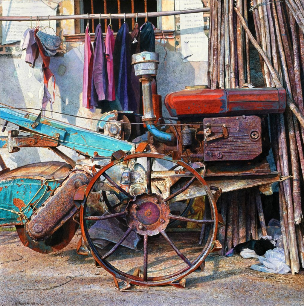
Beating heart of China, 57 x 56 cm, Watercolour
“Beating heart of China”-took many months and was quite challenging as there were so many different aspects to the painting. I really wanted this to wow! I therefore spent along time making sure each area made sense. There weren’t many opportunities to be careless with the paint and I do like some parts of the painting to have an element of serendipity or chance involved in it at some point.
“Tea Break” had to be planned and drawn carefully as I wanted it to be an accurate representation of the moment. I also used the paper for my white areas, so this had to be painted around in a methodical way as I don’t use masking fluid. Watercolour on handmade Fabriano. “Tea break”, is a moment in time preserved for eternity, the point when someone puts their cup and newspaper down on the desk and walks out the door never to return. Why have they not returned? Why did they not come back for their coat or clean the mug or put the paper in the bin?
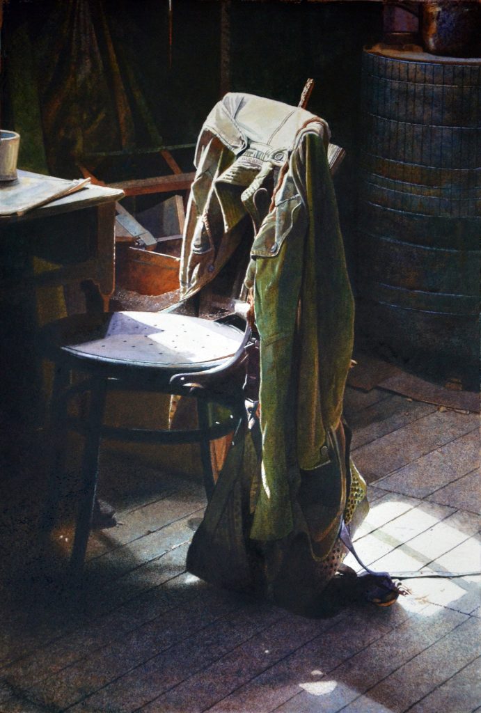
Tea Break, 56 x 38 cm, Watercolour
“Shroud of Qingdao” I came across this boat on a beach one late November day while on a visit to Qingdao to attend the opening of an exhibition. I was immediately taken with the boat which had obviously been half buried on purpose and covered with a rough, thick blue cloth to protect it from the elements. Having very little time I drew a few of the boats which took my eye, but I knew this one was going to be particularly interesting to paint. I spent 6months painting every single stone with a 2/0 paintbrush.
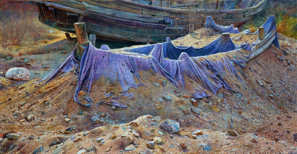
Shroud of Qingdao, 55 x 103 cm, Watercolour
“Contemplation”, this was a very interesting painting to do as it has the bulk of the subject matter at the top end of the painting. There are very few colours involved and I wet and rewet the floor surface to produce the polished floor. I found the “magic” sponge to be a huge help when creating the light part of the floor.
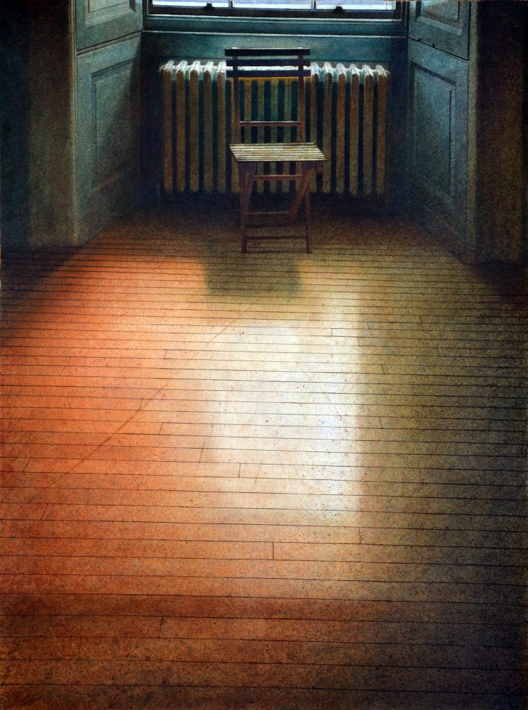
Contemplation, 76.5 x 57.5 cm, Watercolour
What is the importance of international awards?
Personally, it’s a vindication that the work I’m creating is comparable to other artists, not just in the UK, but worldwide. It’s a huge compliment and I find that my place in the art world is not just focussed on Scotland or the UK anymore but globally.
I am much more aware of what is going on in other countries than used to be and as a result I think it helps motivate me to be a more accomplished painter.
In your words discuss watercolour and how they are perceived or miss perceived by the general public and even galleries.
Watercolours, especially in the UK, get a bad rap. Often seen as being the domain of Sunday painters or amateurs. Truth be told it is a most difficult medium to master and much trickier to work with compared to Oils or Acrylics. I teach all of them at College and watercolour is the one medium that can make an accomplished artist look less than capable. For that reason alone, it should get more respect from the public, Galleries, Museums and even some artists. The other reason it doesn’t seem to get a lot of respect is that it was used historically as a medium to work out compositions or to paint Plein air. It was used by many painters in 18th Century to help with their studio oil paintings. I also believe that the fugitive nature of early watercolour paints meant it was not something you would want to use for serious work.
Now however, the quality and consistency of professional paints are very stable and barring leaving your work in a greenhouse it will certainly be around a lot longer than it used to. Just consider Albrecht Durer’s work “Young hare” from 1502, its amazingly fresh and it’s a watercolour on paper.
Watercolour is certainly worth investing in as an artist and a buyer. I have found that it is incredibly popular around the world, especially in China and the US
Discuss ‘Out of Sync’
Where did you find this image?
This was a door in Fabriano, Italy and one that I have looked at many times over the past 6 years.
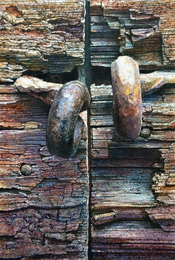
Out of Sync, 22 x 21 cm, Watercolour
Composition
I wanted to focus down closely so that the image almost became a landscape. It’s something I’ve wanted to do for a while. It really becomes quite abstract if there isn’t a hook that can take you into the image. I divided the painting into two halves although it isn’t exactly in the centre, this compositionally, is a no, no! I do it all the time, so long as there is something that can take your eye across the chasm it will work. One of the metal hoops breaks the line and therefore disrupts the division.
Colour
I work with my colours as pure (from the tube) washes. What I mean by that is that I don’t mix my paint very often. Its all done by layering on the surface. I advance the colours by alternating warm & cool washes. The overall image is warmer and more towards burnt orange tones and the bottom is darker and heads towards a bluer/violet red. The darker wash at the bottom provides stability to the image
Texture
Wood & metal. I love texture but I especially enjoy painting the texture of wood and metal. It has to be said that in this instance the colours are quite muted for my work however it was the strong tones that appealed to me. I had to make sure the basic tonal structure was accurate everything else I can create from my imagination.
Comment on your interest in locks, using three images to show your fascination.
Busted-Cuba, 21 x 15 cm, Watercolour on collaged surface.
I love doors and locks are part of that fascination. They tend to offset the vertical aspect of a door and woodgrain with a horizontal metallic bar or clasp. An opportunity to have a foil in the composition. In the instance of “Busted the metal clasp is twisted into interesting diagonals which I echoed in the scratch in the door.
 Brown Out, 38 x 55 cm, Watercolour on handmade Fabriano.
This is a relatively new painting and is currently on show in Bulgaria. The main thing for me was to emphasise the bleached-out colour of the door with the beautiful blue wire mesh in the dark of the window panels. It was tricky resisting the urge to balance out the warm colours with washes of blue. I had to stop myself many times.
 Coming Apart at the Seams, watercolour on handmade Fabriano.
This is a slightly older painting although it is one, I returned to recently to try out another method of working. The original door was green, and I’m not very found of green to work with and prefer a Manganese Blue colour (although it is more complicated than that).
This painting has turned out to be one of my more popular image as I have come across a few imitations on the web over the years.
Take one painting that has propelled your career and why has it?
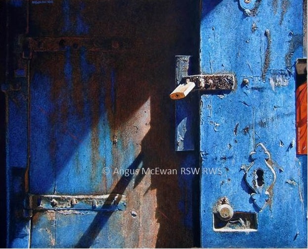
Slipping into the shadows, 52 x 65cm, watercolour on Fabriano Artistico.
This was the first International watercolour competition outside of the UK that I entered, and I won the Bronze award. The exhibition was one of the largest watercolour exhibitions in the world at the time-Shenzhen Watercolour Biennial China 2013-2014.
I decided to travel to China for a few days to pick up the award and through this I met many people who have been very influential in many aspects of my career ever since. This painting has probably created the road I am now travelling on. So many opportunities and friendships have been developed from this exhibition and it has opened many doors ever since. I am very grateful to have had this opportunity.
Contact details:
Angus McEwan AWI RSW RGI RWS
Deborah Blakeley, Melbourne, Australia
Interview by Deborah Blakeley, August 2019
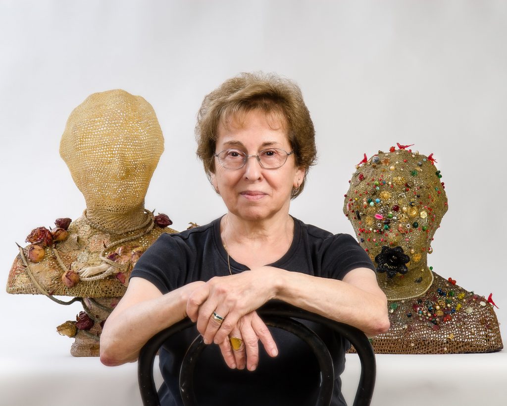
Norma Minkowitz
So many found objects and textiles, how did this combination come about?
Early on in the 1970's my work was both knitted and crocheted in opaque solid sculptural forms. When the work became transparent in the 1980's, I found the addition of found objects to be both provocative and an insight into my imagination, daydreams, thoughts and fears. "Child of The Night" 2008 is such a piece.
 Child of The Night, 2008, 12 x 32 x 22 inches
It is a dark piece and has a psychological reference to childhood demons. It is about universal themes and in this case suggests (as we have perhaps experienced) a child waking up in the middle of the night and familiar daytime toys become objects of darkness, feeling threatening as the light is no longer visible.
When did your work take on both crochet and found objects?
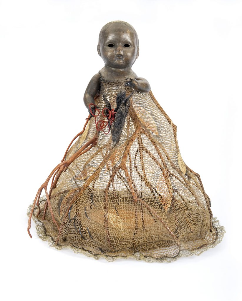 The Present, 2011, 26 x 28 x 27 inches
In the 1980's I started experimenting with found objects, many from nature (That were once alive) such as twigs, branches, flowers and leaves. I also used small hardware from metal that was prominent in such sculptures as Excavation.
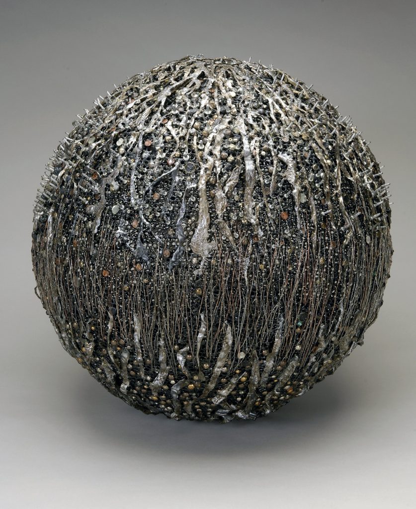
Excavation
From the start of my sculptural work, I always included different textures by stitching, crocheting and knitting. The found objects added another dimension to my work. The base and structural part of my sculptures were always crocheted and stiffened. I also at times used paint directly on the fiber.
How has crochet developed in your work? Take two early pieces to show the early stages of your work.
" Around and A Round" 1974 is an example of mixing crochet with knitting which was a frequent combination of techniques and created varied textures and patterns in my very early works.
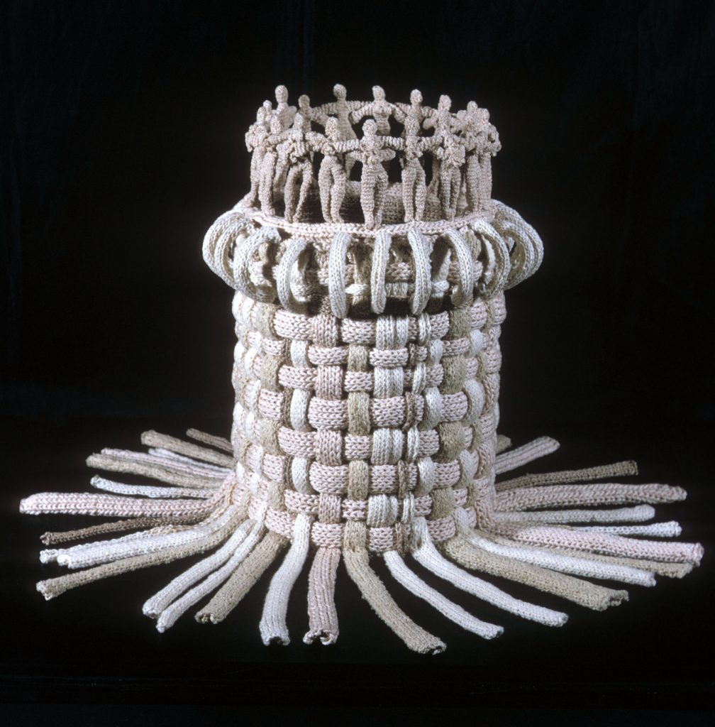
Around and a Round collection of Sandy and Lou Grotta
This experimental solid work was a precursor to my transparent vessel forms as it was both a sculpture also alluded to containment.
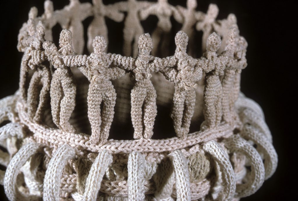
Around and A Round, Around and A Round, 1984, Fibre, detail
This was made before I started stiffening my work, so it needed a structure inside (in this case a coffee can) to keep it upright. The second early piece which is in the Collection of the Denver Art Museum is called “Ghost Rings" 1981.
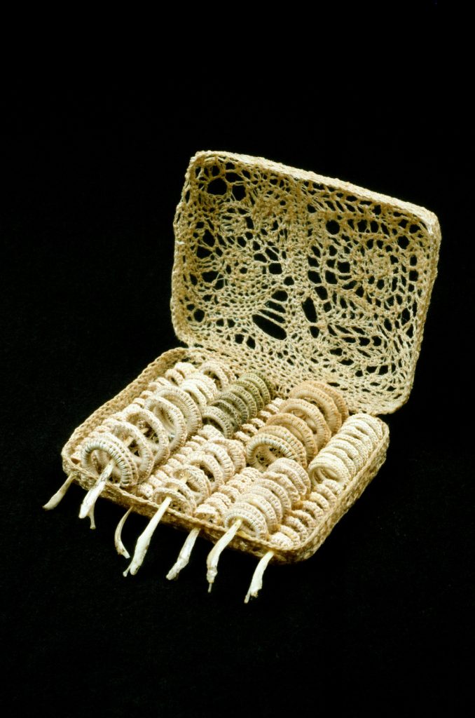
Ghost Rings, 4 x 4 x 3 inches
This was a very small piece, about 4"x 4"x 3". It was one of the first times I actually crocheted around an object in an open lacey technique, removed the object and had a fragile transparent patterned sculpture. This was a move forward to the vessel forms that followed.
Discuss the importance of transparency in your work.
My work with outer netting creates mystery by obscuring the shape within creating a sense of ambiguity in the shadows of the work. My transparent work conveys a sense of inside and outside, because the transparent mesh walls allow visual access to the interior. Despite the repeated use of the same basic stitch, which to me has a spiritual quality, no two stitches are exactly alike. This conveys the intimacy and imperfection of the human hand and makes the work more powerful.
![]()
Cyclone Coming, 2019, Stitched and crocheted drawing
I feel the open mesh gives a feeling of ethereal lightness but also implies the concept of containment and psychological complexity. I feel the direction of transparency also related to my interest in developing a personal language as well as connecting to my passion for the drawn line.
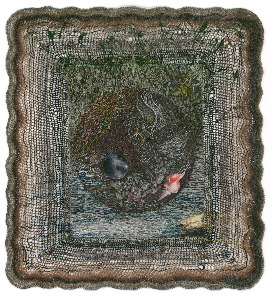
Down the River, 2018, 22 x 21 inches
Take two pieces from your Vessel Forms and briefly explain the techniques you have used and the variations.
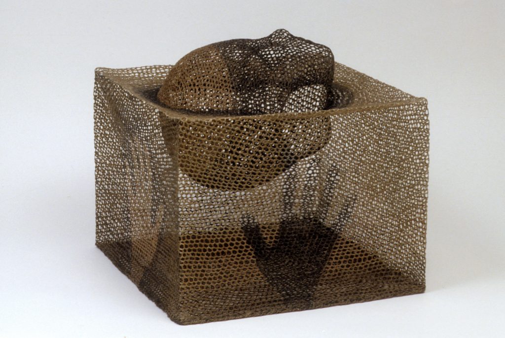
I Can't Touch You, 1988, Collection of Barry Fisher
" I Can't Touch You" was created by first making a crocheted head from a casting for the top of the sculpture and as a focal point. When I crochet, I only use one basic stitch as my work is not about different stitches, but the creation of a strong textured surface that is both transparent ,fragile and mysterious. The head I crocheted was supposed to symbolize my mother who had recently passed away. The outside was crocheted over a square form to be the base of the sculpture or perhaps to suggest a coffin also to cradle the head. Each part was stiffened and assembled so that the bottom of the head was visible from both the outside of the box while showing a vision of a submerged head inside of the box. I also painted hands on the outside of the box elucidating the title.
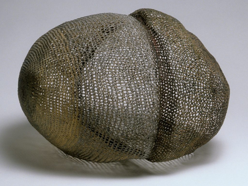
Nucleus, 1990, 12 x 17 x 16 inches
"Nucleus" was a minimal irregular sculpture showing simplicity and variety of textures that showed the interior spaces and the exterior spaces in a overlapping texture that made the piece very interesting and somewhat like my drawings. It was crocheted over rags and fillers, shellacked and then the rags were removed to form the piece.
You comment, “I was drawn to containment, simultaneously, revealing and concealing” discuss.
The notion of containment has been a continuous investigation for me. The concept
of containment motivates personal feelings that I often express in universal themes of earth, life and death. They could suggest the safety of a shelter or a cage from which there is no escape. We see the outside, but also see what is contained within.
The fineness and visual lightness of my linear constructions makes them seem ephemeral; these qualities also relate to my love for pen and ink drawings. These sculptures reveal and conceal at the same time, and the interior often becomes blurred suggesting different stories to the viewer. I encourage the viewer to interpret their own narrative when viewing my work.
What was your first piece to join the collection of a museum?
How did this acquisition propel your career?
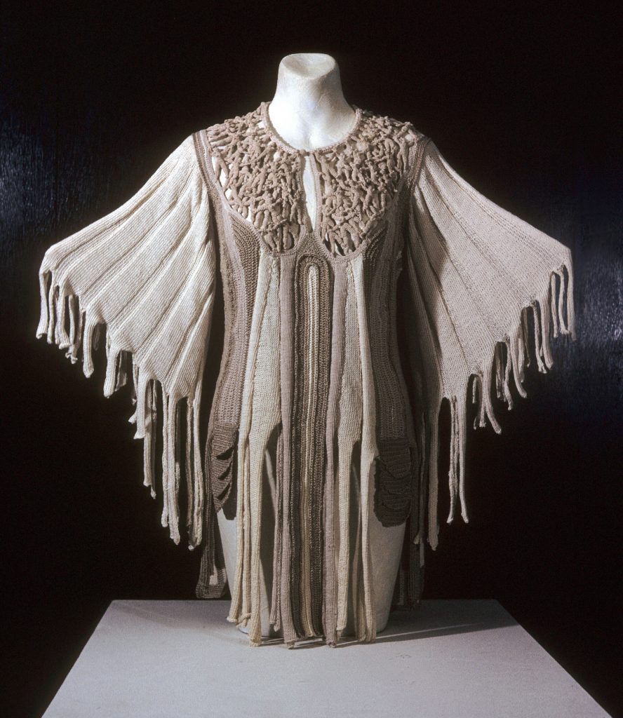
Cloak 1979 collection Metropolitan Museum of Art.
I don't know exactly which the first piece was as I have 54 artworks in 32 museum collections. One of my first artworks to go to a major Museum was a wearable art piece called "Come Fly with Me".
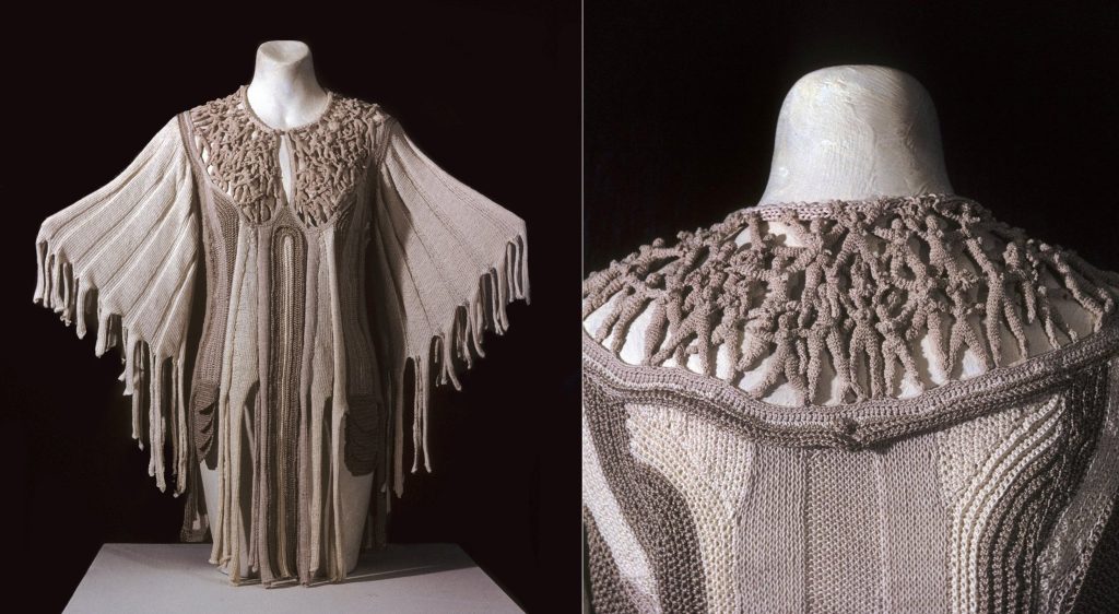
Cloak 1975 Also know as Come Fly with Me, 30" x 29"- Collection Metropolitan Museum of Art
It went to the Metropolitan Museum of Art in NYC and that was a very important acquisition. I will, however, pick one that was more sculptural and is more indicative of my current work. It was a wall hanging that has made an impact on my career. "Journey's End", Is a crocheted and stitched wall drawing with found objects measuring 5' x 5'x 2" which was purchased last year by The Minneapolis Institute of Art.
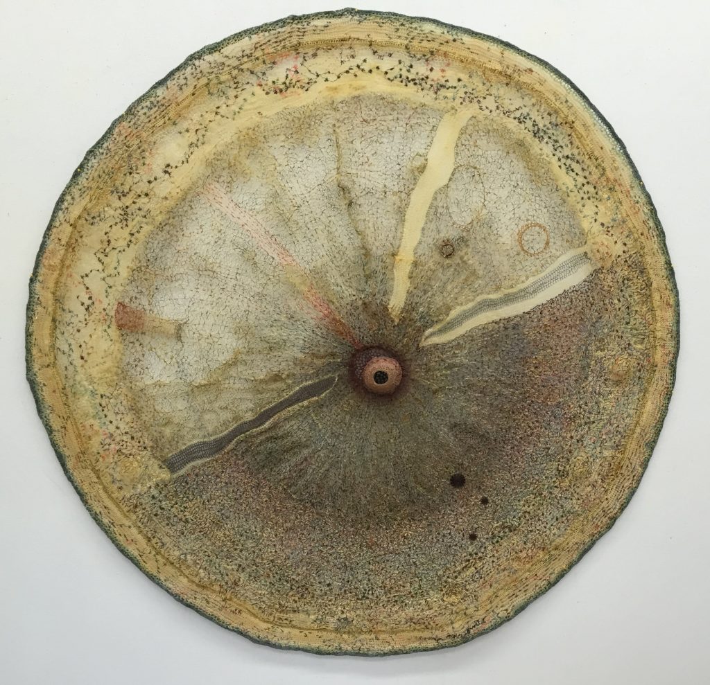
Journey's End, 20 inches Dia
This was an important purchase for me. They also purchased another smaller stitched drawing called " Lunar Landing" which at that time was a fairly new direction for me as it combined paper, crochet, collage and stitching.
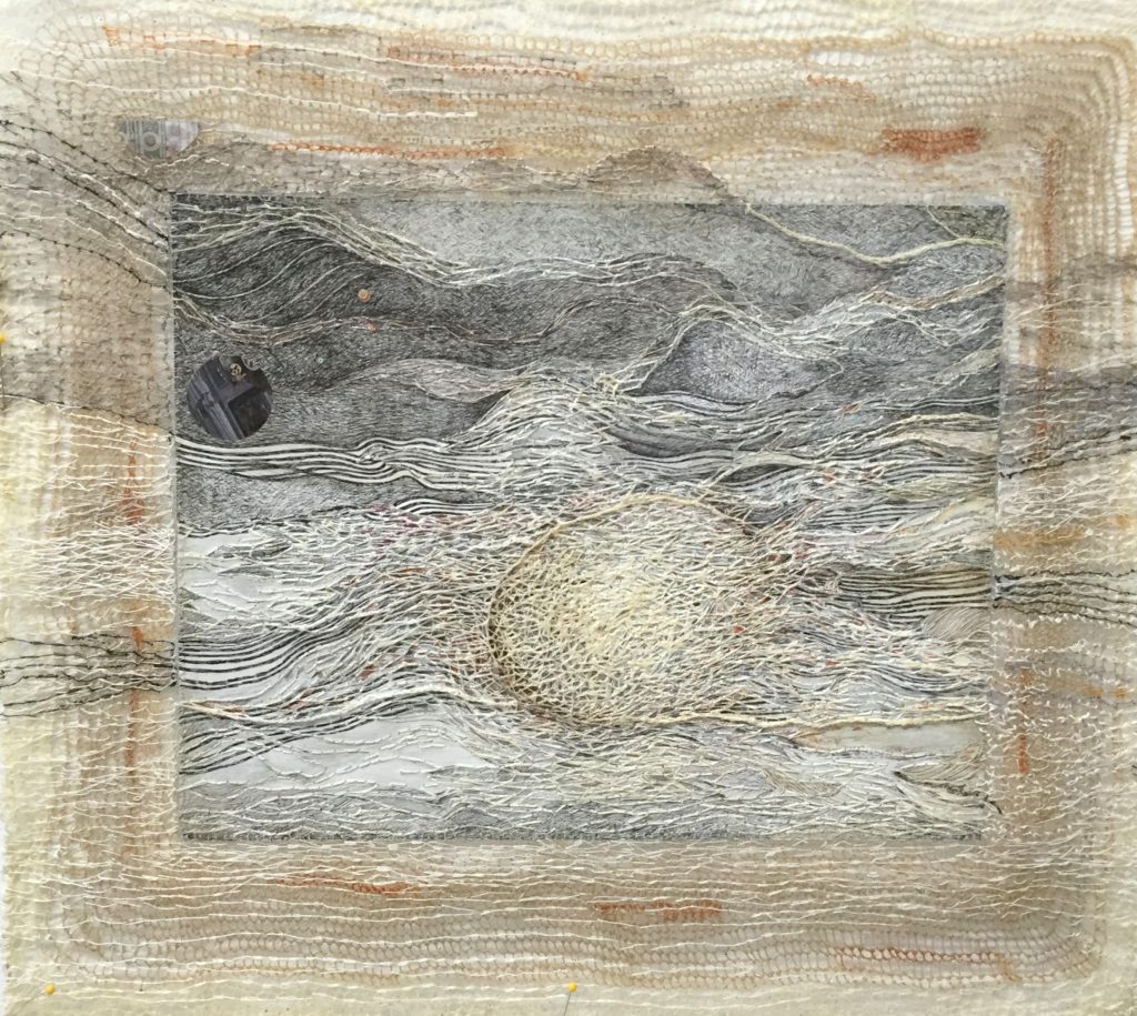
Lunar Landing, 2017, pen and ink, college and stitching
Even though I have had many museum purchases at much earlier dates that were exhibited in Museum shows, this was important as it was well publicized and has led to a public presentation at the Museum in late October 2019. It will be a discussion with a scholar regarding one of my other sculptures in their collection.
Expand on how you are drawn to the human form?
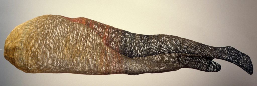
I am the Land, Denver Art Museum
As I exhausted the possibilities of the many enclosed vessel forms, I had created, I turned to my interest in the human form. My earliest drawings in pen and ink were always about the human form as well as the human condition. I now returned to the idea of using the figure in my sculptures which was a difficult transition as to being able to create them while making them transparent and at the same time structured. These where at once much larger and more complicated than the vessel forms. These veiled figurative sculptures were mostly created in the 1990's to the mid 2000's. I have also created multi -figure sculptures that illustrate the passage of time and other kinds of transitions, I call these installations sequential as I often use several juxtaposed and related figures together.
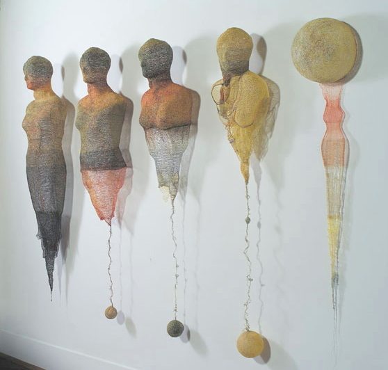
Body and Soul, Angle view
They are nearly identical figures that subtly change as does time and circumstance. "Goodbye Goddess" is such a sequential piece.
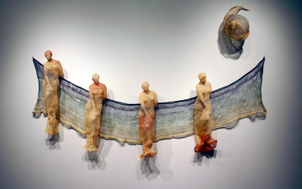
Goodbye Goddess
I still exhibit my figural sculptures and make new ones, but my work continues to change. In 2007, I started using modeling paste which has a plaster- like consistency to fill in the spaces of the fiber's netting. This process creates a surface that focuses on and highlights the lines rather than the open spaces. I drew with the stitches, introducing a bas relief surface of concept, energy and movement. I often highlighted the lines with colors of paint, the concept of the figure was now bolder and darker in concept. My work continues to change and often reverts to previous methods and expressions.
Discuss ‘Goodbye Goddess’ the background to this exhibition as well as how it extended your work.
This is a well written accurate description of my sculpture by Kathleen Whitney a contributor to Sculpture Magazine, in a feature article of my work in Sculpture Magazine 2007.
Goodbye Goddess by Kathleen Whitney 2007
"Goodbye Goddess" is a series of four nearly identical smaller than life-size" Classical statuettes in a line that leads to a fifth circular shape hanging above them. Their contours are blurred, their features indistinct. Each is dressed in a Roman Style, draped in a toga-like outfit that falls well over the feet. These multiple figures slowly change in detail to become symbols of passage. In the fifth and final form, the same face that is on the figures in now distant and sky-bound, like a soul departing the body. To Minkowitz it is a piece that symbolizes the process of mortality or perhaps immortality through a series of subtle visual alterations in each figure."
"Goodbye Goddess" is in the collection of the Wadsworth Athenaeum in Hartford CT and was recently exhibited in an impressive show called She: Images of Female Power from the Permanent Collection 2017. Being in this show with other major artists was certainly a plus for my career.
Discuss the relationship of your fine thread work with drawing.
Drawing continues to be important to me and I find the threads and wires I use mimic the patterns and movement, as well as the irregularities of my pen and ink drawings. My sculpture evolves into three dimensional drawings. The fibers placement creates a surface that focuses on and highlights the lines I draw with my stitches. These stitches introduce the concept of energy, message and movement. I often highlight these drawn lines with colors of paint. There is a crossover between the stitched line and the drawn line that contribute to my work that weaves the personal and universal together. I use fiber as if I were drawing and often the drawn line as if I were stitching. I find them to be interchangeable.
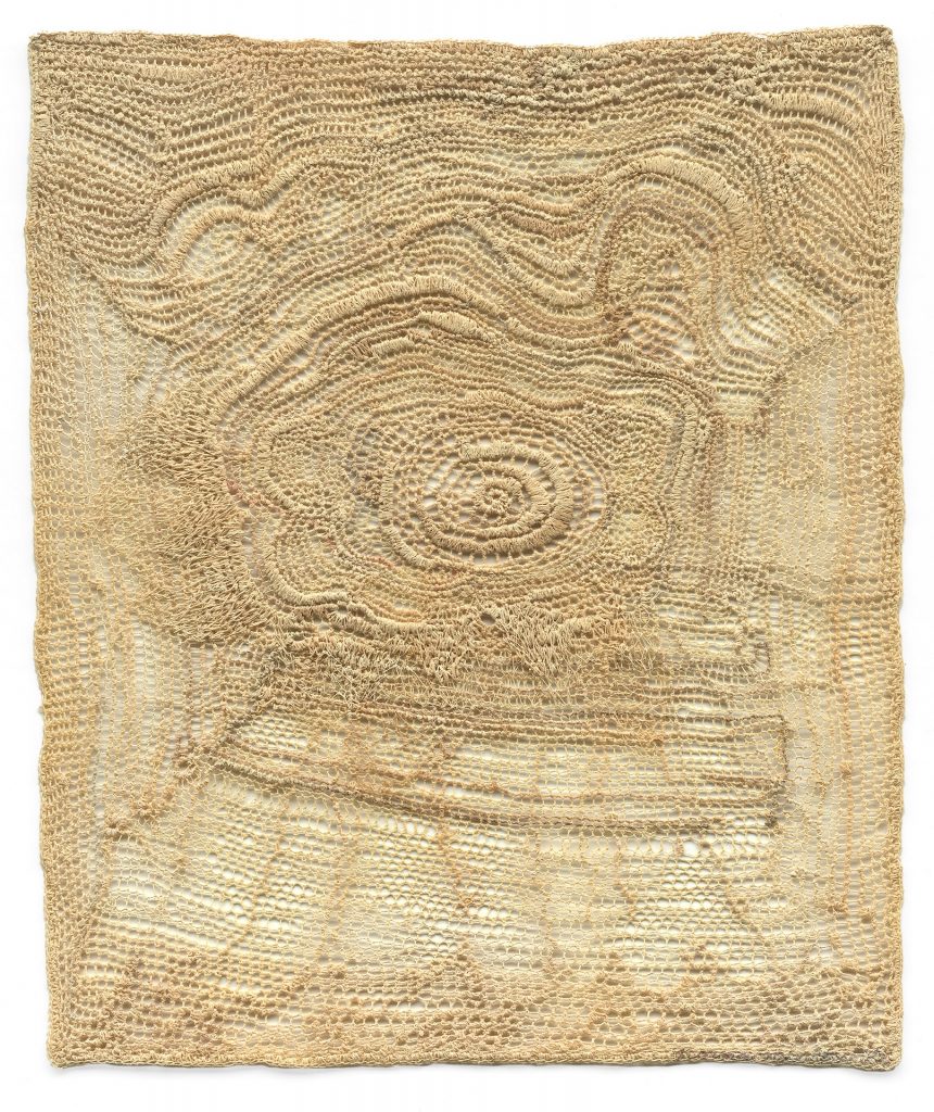
Detour, 2019, crochet and stitch drawing
You comment, “Fibre becomes art, when it is about why it is made rather than how it is made” expand on this comment in relations to textile craft.
A fiber work in my current opinion is craft when the reason for its making , although skilled and not without merit is when it is only about technical skill, emphasis on the use of many stitches and patterns without a clear message. It is a work of art when there is a powerful concept, fresh ideas, experimentation of materials to initiate reflection. I believe in risk taking and art that is unique to the artist. Art should push boundaries. At the same time there is really no simple definition as the art world and concepts of what art is keep changing.
Explain about your fibre drawings using Goodbye My Friend.
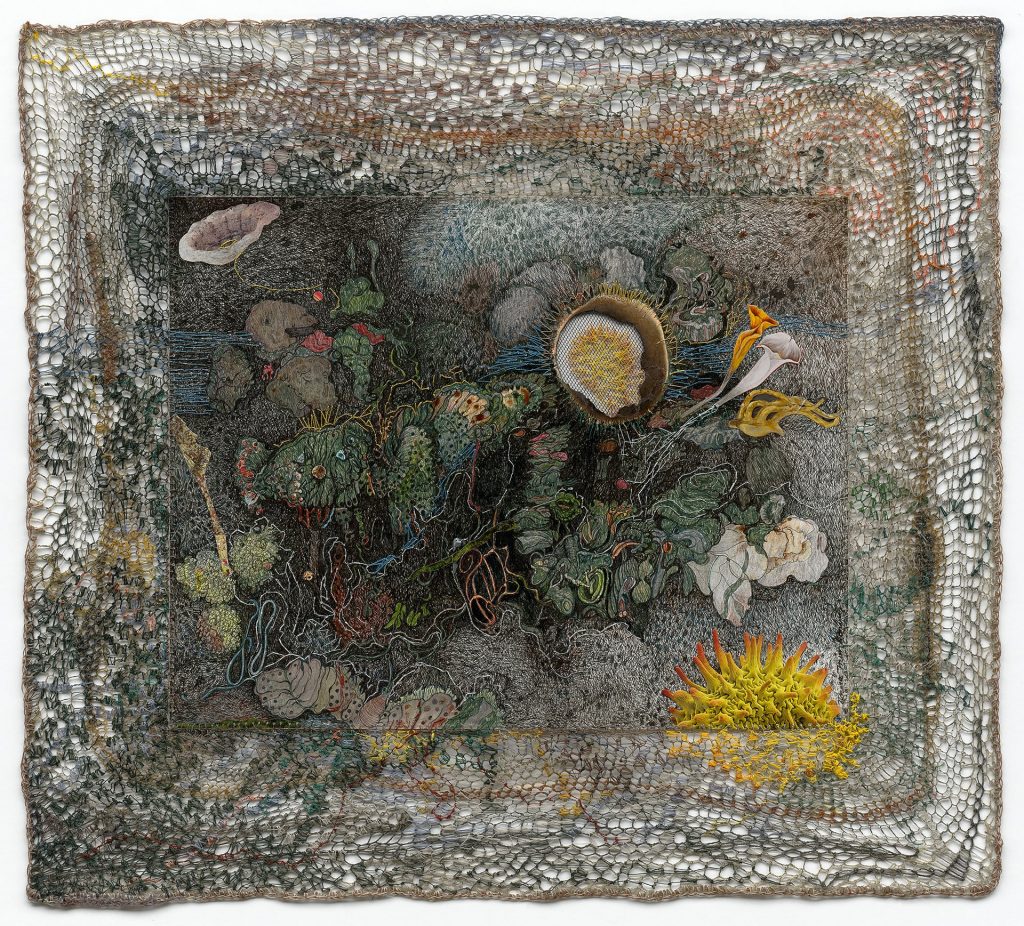
Goodbye My Friend, 2017, 13 x 20 inches, Fibre, paper, and ink, with college
Drawing continues to be important to me and I have recently embarked on a path to combine my drawings on paper with stitching, collage and crochet. " Goodbye My Friend” was a very personal stitched drawing. It was originally drawn on paper and then combined with a border of crochet, collage and stitched fiber to create this magical image suggesting another place with a female profile in the middle searching or lost in reverie. At that time, I didn’t know what the title would be, but knew it had a sense of mystery and darkness. Shortly after its completion, not yet titled a close young friend took her own life. This hit me very hard and the drawing suggested my feelings of loss and regret. I titled the drawing "Goodbye My Friend”.
Take one piece and explain how it has influenced your current work?
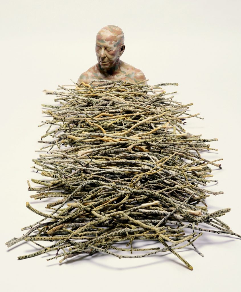
The Path, 2014
"The Path" 2014. I often dwell on the mysterious cycles of death and regeneration while focusing on the passage of time, containment and sequence. "The Path" is a self-portrait cast from my own head and painted in a camouflage pattern suggesting the act of hiding to avoid the inevitable path. The dead twigs which were once alive are symbols for bones. These bones are crocheted around to protect, caress, contain or perhaps entrap for eternity. I think rather than saying this piece influenced my work since it is current, I think it would be more appropriate to say my prior work influenced this latest major installation.
Contact:
Norma Minkowitz
norminky@optonline.net
Deborah Blakeley, Melbourne, Australia
Interview by Deborah Blakeley, August 2019
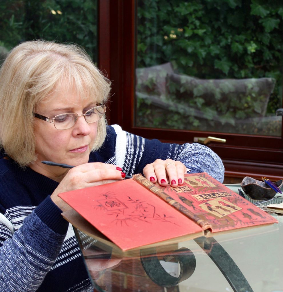
Kerry Miller
Can you expand on several of your floral works?
One of the first flower book sculptures I made was called “Plant Life of the Black Forest” where I made the illustrations into a circular bouquet or large posy. I framed it then placed it above the fireplace at home and was quite surprised by people's reactions. “Oh, look you've used real flowers. No, hang on, they can't possibly be real. Can they?”
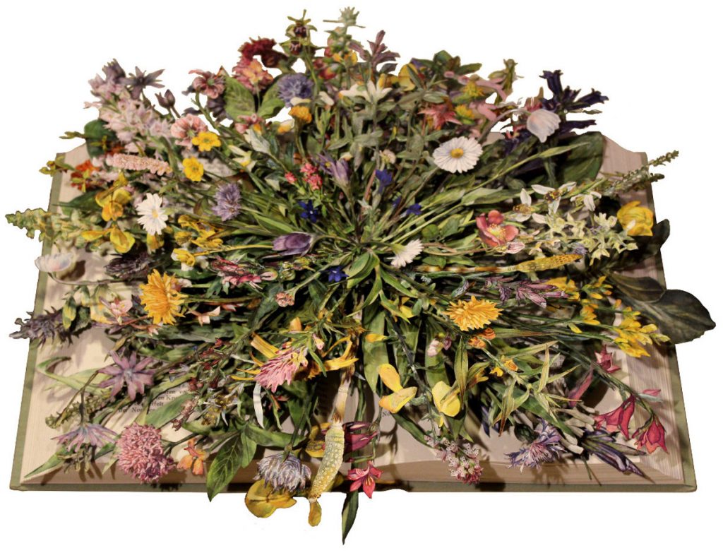
Plant Life of the Black Forest, 415 x 444 x 110 mm, Mixed Medium
This spurred me on to try using flowers in different ways and forms.
With “English Botany, vol 2” there was an added challenge in making the sculpture. As a botany book, the flowers were represented with roughly half of each plant being coloured and the other half being left as a black and white line drawing. My challenge was to colour the black and white part of each illustration using watercolour, to seamlessly match the coloured part. It was a time consuming labour of love.
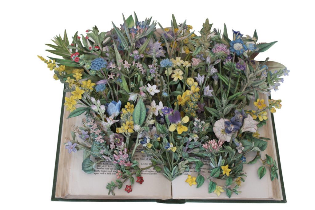
English Botany, vol 2, 150 x 232 x 36mm, Mixed Medium
“Flowering Plants of Great Britain, vols 1 and 2” also had additional challenges. The sculptures were commissioned for a cruise ship, so they needed to be able to withstand a salt atmosphere and vibrations from the ship. I enjoyed finding ways of achieving this, without affecting the character of the work.
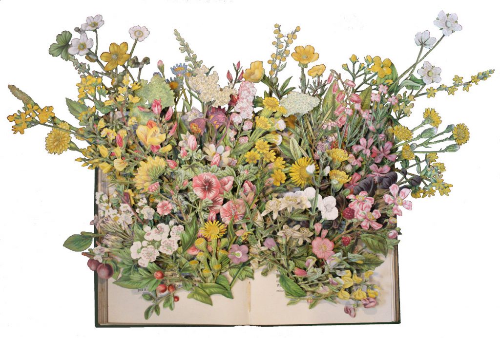
Flowering Plants of Great Britain, vols 1 and 2,approx, 330 x 520 x 90mm Mixed Medium
A few years ago I found a lovely book of butterflies and moths, which I was keen to use. The problem was that they did not have a habitat, that is there were no plants for them to rest upon. I overcame this by adding plants from two volumes of flower books. Thus “Butterflies & Moths Of The Countryside/Wild Flowers Vols 1 & 2” was born. At the time I wrote this description:
“A large butterfly book lies open on the table, two little wild flower books strewn casually across the top. As if by magic, a profusion of wild flowers springs from their pages, carpeting them in layer upon layer of green fronds and an intricate kaleidoscope of floral colour. Butterflies and moths escaping the confines of their book, now fluttering gently in amongst the flowers, alighting on their fresh and delicate petals - completing the scene of a glorious, peaceful English spring”.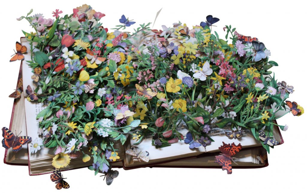
Butterflies & Moths Of The Countryside/Wild Flowers Vols 1 & 2, 305 x 470 x 120mm, Mixed Medium
Where do you source your books from?
Finding a suitable book for my work is never an easy task, but it is very much an enjoyable and rewarding part of the process. I spend hours rooting around in jumble sales, charity shops, dusty old bookshops, giveaways – anywhere that has old discarded books with illustrations.
Do the books have to be full of illustrations?
Unless a book is quite heavily illustrated, I wouldn't even consider using it. It also has to capture my imagination. The finished sculpture needs to be both richly populated with illustrations and contain a large amount of detail.
Detail makes me happy!
Are the illustrations coloured or do you colour some of them?
With one or two exceptions, all my book sculptures have had colour added by myself, even where the illustrations were coloured already. I use variously acrylics, watercolours and inks to achieve the seamless and harmonious look I want.
In the case of black and white illustrations, I find that colour adds a sense of realism and brings the characters to life.
Do you ever have critics say that you should not deface books?
People seem to realise that what I am actually trying to achieve is the re-purposing of books, giving them new life and opening them up to a wider audience.
I am quite proud of the fact that I can make use of books that others might consider to be in an unusable condition.
As friends and neighbours have become aware of my work, I have found bags of books left on my doorstep or handed to me at social events, in the hope that I can use them. Many of these books would otherwise have ended up simply being recycled.
How did you come to this art form?
I have been working in collage for more years than I care to remember.
My book sculptures were a natural progression and the result of lengthy experimentation, using books as a means of producing work in 3D. As I perfected my techniques and developed processes using this extra dimension, I was able to produce far more complex and therefore – as far as I'm concerned - more satisfying work.
“Book Sculptures”
Sketches by Boz - Kerry Miller's sculptures from Emanuele Marani on Vimeo.
Do you use only old books?
So far, I have chosen to use only old books or those published more recently, but which contain old illustrations. I find that these lend themselves to my work in a way that perhaps modern books would not. I believe that the books I use have been lost in time and that this gives me the opportunity to reveal them to the world once more, but in a very different form.
Have any current artists commissioned you to use their book or books?
Not so far, though I am quite intrigued by the idea.
How do you decide on using the front cover or the book open?
In many ways, the book itself will dictate whether I make it as an “open” or “closed” sculpture, though the final decision is often made at a relatively late stage in the process.
The type, character and number of the illustrations can often help me to decide. Working with them, as I cut them out and take them through a series of processes, enables me to lose myself in their miniature world and, from this, my vision for the finished work gradually forms.
Discuss your use of volumes of magazines
In Victorian times, weekly or monthly magazines were periodically bound into a volume. The fun of working with such books lies in the wide variety of subjects illustrated within.
Do you see your work as that of a ‘social historian’?
No, I would not make such a grand claim. Though I create my book sculptures in the hope that the story they tell, albeit within a new narrative, will survive into the next century.
Comment on your personal thoughts on the replacement of print by digital?
I appreciate that so much information these days is only available digitally. However, I have a very real passion for books – something that was instilled in me by both parents from an early age. They both loved book hunting and I would spend many happy hours with them, rooting out interesting volumes to take home and read quietly. For me, the school holidays were about either hunting for butterflies and grasshoppers or curling up with one of the books I had unearthed.
So, while I use the internet as much as anyone, for me, nothing could ever replace the printed word. The very smell of books has a calming effect on my soul. I've heard it described as “grass and vanilla” but whatever it is, it's like breathing in history and you can't replace that with a digital equivalent.
Show us two works where the images have escaped out and beyond the book. Why did they need to escape?
“Peter Pan in Kensington Gardens” is a good example of this. In the novel, Peter Pan is just a baby who flies from his nursery window and ends up in the famous Kensington Gardens in the heart of London, enjoying a series of adventures with the birds and the fairies. With this sculpture, I wanted to bring out the whimsical nature of the book and to draw out the ethereal qualities of many of the characters. For example, the fairy who sews skeleton leaves to make summer curtains, the trees that go for a walk round the park each evening and the Lord Chamberlain, who always carries a dandelion clock in case the Queen of the Gardens wishes to know the time.
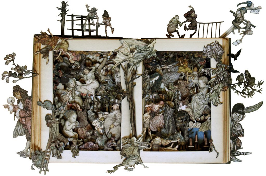
Peter Pan in Kensington Gardens,483 x 640 x 100mm, Mixed Medium
To do justice to the book, I believe that it was important to draw out the playfulness of Barrie's story and to reflect both the captivating charm of Peter's new friends and his sense of wonderment, as he attempts to unravel the mysteries of both his immediate surroundings and of the world itself. In order to achieve this, I felt that it was paramount for some of the characters to escape the confines of the book to reveal the exuberance of their personalities.
“The Boy's Own Annual 1886” contained so much action that I wanted to draw the characters out of their environment and give them space to abandon themselves to their various activities. The fireman, diligent in his duty of extinguishing a fire; the boy fishing in a pond off the side of the book; a young man holding his friend back from falling over the side.
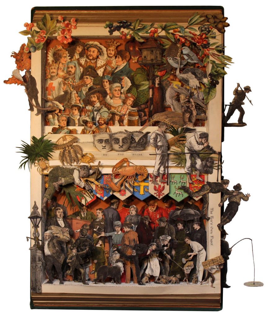
The Boy's Own Annual, 1886, 465 x 395 x 38mm, Mixed Medium
Your work is just as delightful when the original cover is very worn – discuss (Mrs Beeton's Book of Household Management)
I discovered this very old copy of “Mrs Beeton's Book of Household Management” in a junk shop. Although complete, it was little more than a pile of loose pages, held together with an elastic band. Inside, however, the lovely illustrations were revealed to be in perfect condition. By restoring the book as far as possible, I was able to preserve its rugged and gnarled appearance, which I think greatly enhances the character of the sculpture. I make no apology for the missing spine and back cover.
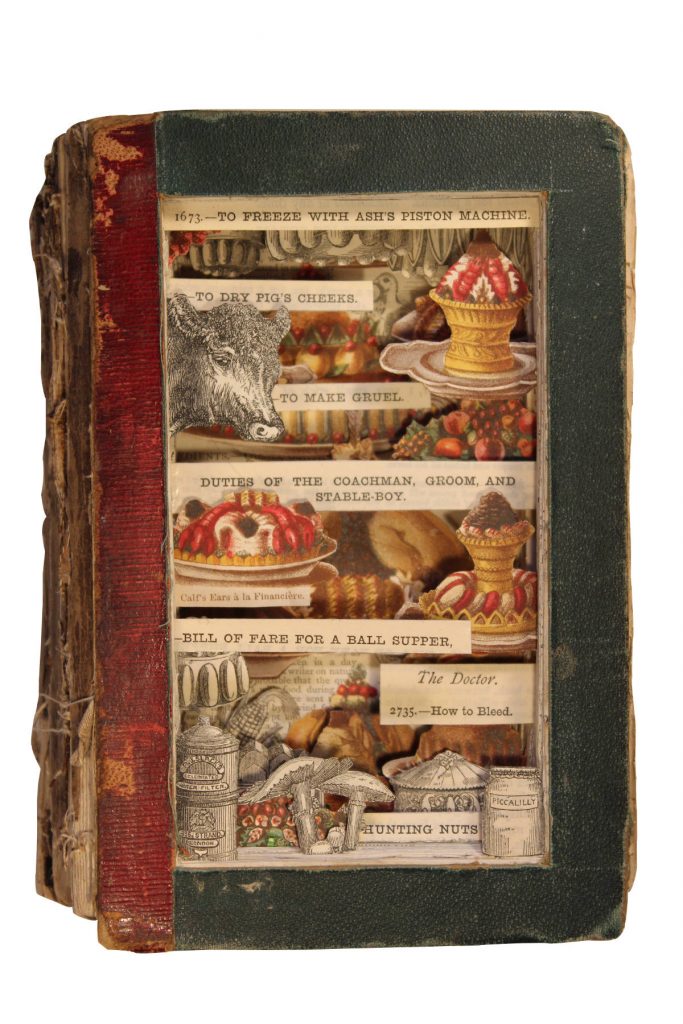
Mrs Beeton's Book of Household Management, 180 x 115 x 73mm, Mixed Medium
When is a book too rare for you to work with? How do you know?
I am keen to avoid using rare books in my work, but the price will usually reflect its rarity and I use this as a guide.
Comment on using catalogues.
I have only used one catalogue in my work so far. It was an 1890s catalogue of saddlery which relates to a London company that is still in existence.
In retrospect, my feeling is that catalogues lack sufficient character and interest.
Show us one or two books that have been very special to you and why.
It's so hard to select just one or two books when they have all been special to me in different ways. I suppose I would single out the ones I particularly enjoyed creating.
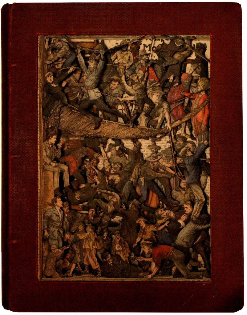
Chums, 308 x 240 x 62mm, Front, Mixed Medium
“Chums”, an annual from 1908/9 stands out in this respect, because of all the action that was portrayed, so much in fact that I made it into a double-sided piece.
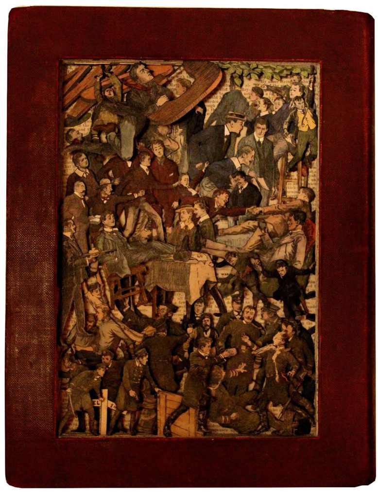
Chums, 308 x 240 x 62mm, Front, Mixed Medium
Another one that springs to mind is “George Cruikshank's Table Book”. This was tremendous fun to make because of the delightfully funny characters it contained - it made me smile just to work with them.
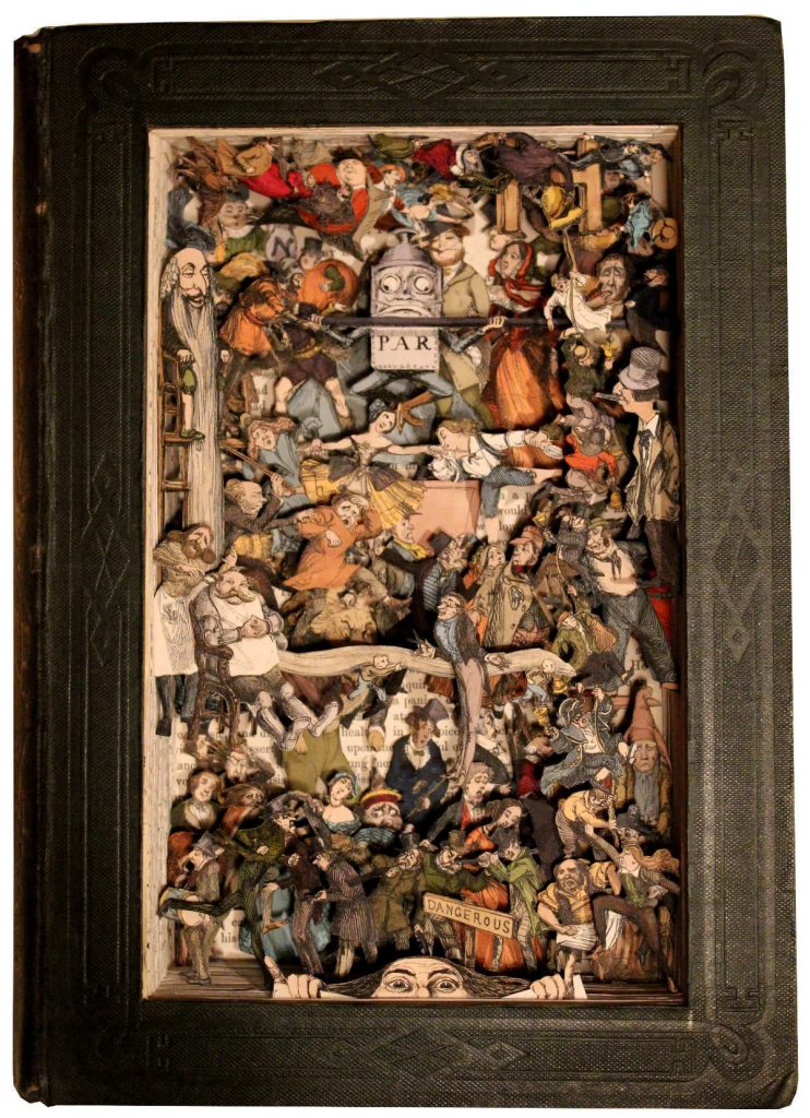
George Cruikshank's Table Book, 250 x 82 x 30mm, Mixed Medium
Very briefly, explain how you cut and the tools you use.
Various different forms of cutting are required to make my book sculptures and to this end a number of different methods need to be employed. Apart from the more obvious scissors and scalpels with a large variety of different blades, my husband has put his engineering skills to good use and made me a set of tools which he has designed specifically for my work.
You exhibit around the world, how many exhibitions do you prepare for each year?
Each book sculpture takes a long time to make, so I am only able to produce a small number each year. For that reason, I have to keep the number of exhibitions to a manageable level.
Why do you think your work is so popular in America?
When I first started making my book sculptures, I was approached by a gallery in Los Angeles, who subsequently represented me for a number of years. When the principal of the gallery retired, I had the opportunity of being represented by the fabulous Heller Gallery in New York City, so now all the pieces I make are normally shipped directly to them.
But beyond that, I do think that Americans appear to be particularly drawn to the Englishness and also to the unique aspects of my work.
Deborah Blakeley, Melbourne, Australia
Interview by Deborah Blakeley, August, 2019
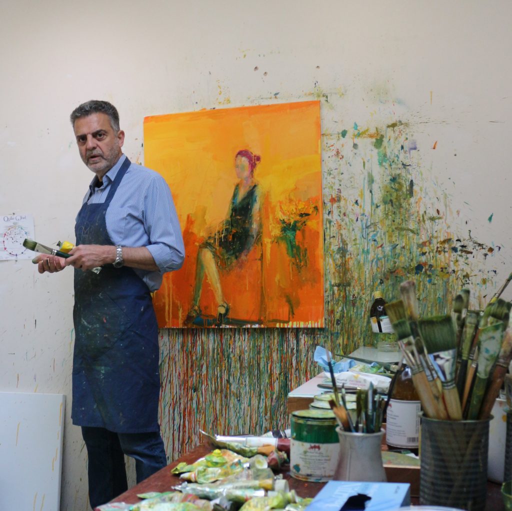
Henry Jabbour
You use colour and very heavy brush strokes; how do you still capture such serenity?
That is such an interesting question. I definitely don’t feel serene when I am painting. I am in constant struggle with paint, colour, form, my feelings and the feelings I get from what is on the canvas. Each painting is an emotional journey unique to itself. It is difficult for me to pinpoint how I achieve what I am after, but it does not happen on the spot. I have to live with the work and not look at it for some time so that when I come back to the canvas and work on it again, I am in a different emotional space. When I do that several times, then the angst initially felt and projected onto the canvas is diminished. I am glad you feel serenity in the work - I am always amazed and delighted by the diversity of emotions that my work evokes in the viewers.
![]()
Lap of Roses, Oil on linen, 50 x 45 cms
Recently you have introduced the diptych format to your portfolio. How did this come about? Please give two images to explain this?
This happened organically - I don’t remember thinking “I want to do diptychs”. I was in my studio working on multiple canvases for my solo show ‘A Life More Human’ at The Union Gallery. The first diptych that emerged for this exhibition was ‘Your Heart to Mine - Eve and Adam’. I was painting the two canvases at the time but as two separate paintings, and at some stage they were placed next to each other against the wall. I felt there was a connection between the two figures - that they somehow were communicating and looking for each other. So I decided to unite them and started to paint them together. Every time I was painting on one, the other half was hanging next to it. So in this instance it was the work itself that demanded to be in diptych format, it somehow emanated that feeling of togetherness and belonging.
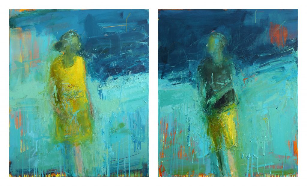
Your Heart to mine – Eve and Adam, Oil on Linen, 80 x 130 (80 x 65 cms)
What makes you stop at two?
The diptych in a way resembles duality for me. Many things are described in context of duality - light/dark, life/death etc… As I was exploring the diptych format in my work I was conscious of the passage “On Joy and Sorrow” by the Lebanese writer Gibran Khalil Gibran - He says: “When you are joyous, look deep into your heart and you shall find it is only that which has given you sorrow that is giving you joy”. Put simply - there is no joy without the experience of sorrow.
There is no reason to stop at two but in the context of this exhibition, the duality seemed important for me. ‘A Life More Human’ is about exploring the idea of being human and trying to portray that in a visual form. It is about being in the present moment independent of its duality with the past or the future. I remember years ago reading the philosopher Krishnamurti’s thoughts about fear - he says “Fear is never an actuality; it is either before or after the active present.” This resonated with me.
If I am ever to expand beyond the format of the diptych I feel there has to be an inherent reason for it - somehow it has to make sense within the work.
Do you feel that you need to keep these to a certain size and are they always sold together?
The size of the diptych again is dictated by the subject matter and the feeling that I am trying to bring to the viewer about the work. It is what feels intuitively right. The two canvases of the diptych do belong together. They are one work really, and I would not want them to ever be separated.
Can you discuss the connection between the elements of the diptych ‘My Heart Broke Loose’ III? And how does this relate to other paintings in the series titled ‘My Heart Broke Loose’?
The ‘My Heart Broke Loose’ series is about the symbolism we associate with flowers and our relationship with them. Flowers are inherently beautiful yet their beauty is transient, which is itself symbolic of the human condition, youth, ageing and death.
‘My Heart Broke Loose’ III is a dark painting compared to others in the series. The flowers are completely separated from the figure by the gap between the two canvases. I don’t want to place a particular interpretation on it, but it could be a momento mori or a depiction of grief.
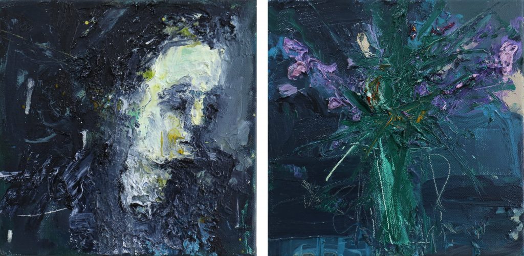
My Heart Broke Loose III, Oil on Linen, 30 x 30 (30 x 60 cms)
The earlier paintings in the series do not have the same sense of separation between the figure and the flowers. In the first such painting, ‘My Heart Broke Loose’ for example, the flowers spill across both canvases so that the figure is immersed and surrounded by them. This painting is lighter and more joyful, a feeling I have tried to express through composition and colour.
Flowers are an integral part of your work — discuss.
My studio in Cambridge is at the bottom end of my garden which was designed with the idea of having blooms for a considerable part of the year and with a variety of colours. So as I walked to my studio every morning I would see these blooms and colours and eventually they somehow worked their way into my canvases. Again, the flowers have a particular significance in the work for me. Our relationship with flowers is really intriguing and complex – we marvel at their beauty and they delight us. We offer them to others at times of great joy and at times of great sorrow. Their beauty is very transient – and somehow they remind us of the cycle of life and death, vigour and disintegration, youth and old age. Observing and appreciating the beauty and life cycle of flowers is about being human and being in the moment.
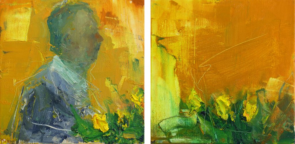
My Heart Broke Loose, Oil on Linen, 30 x 30 (30 x 60 cms)
Flowers aren’t always associated with women in your work; discuss using ‘Man Amongst His Roses’.
Absolutely - for some reason, society’s relationship or perception of flowers is often associated with the feminine. It is not a masculine thing to say, I love flowers. Traditionally, you would not give a male friend or partner a bouquet of flowers (although thankfully these stereotypes are fading). I wanted to challenge this in my work. I wanted the love of flowers in my work to be gender neutral.
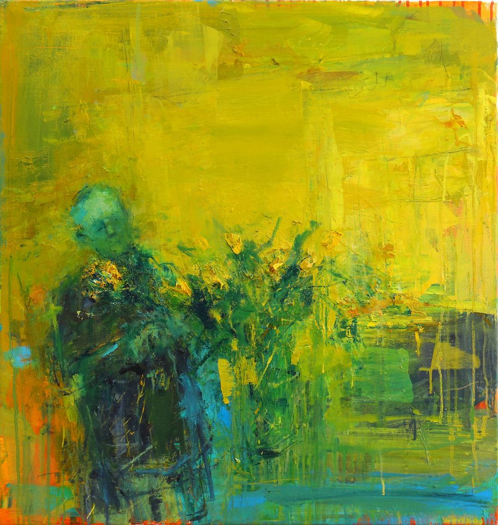
Man Amongst the Roses, Oil on Linen, 81 x 75 cms
How has your training as an artist affected your work? And how has this developed over time?
I have had a traditional training – I learnt to draw and paint using traditional methods of observation. That was important to me – I sought that knowledge. However, over time my work has really diverged from it. Although I still draw from observation, when I paint I rely mostly on memory and imagination. My colours are mostly imagined or remembered from past experiences. However, I think I would not have been able to explore this way of working if I did not have a good understanding of the anatomy of the human body, the fall of light on an object, and traditional theories of colour. All these were provided by my years of formal training in art.
How do you manage combining painting, printmaking, and sculpture into your time frame?
Bringing my ideas to life using different media is very exciting for me. They somehow connect on many levels - intellectually, emotionally and technically. I do not see them as separate bodies of work. The way I paint sometimes changes after I come back from a week of printmaking. I have been painting and printmaking for some time now, but sculpture is a new venture. I remember being in Galerie Alice Mogabgab in Beirut which represents my work and seeing the sculptures of Emma Rodgers (a renowned British sculptor). I immediately fell in love with her work. I contacted her when I was back in the UK and she invited me to visit her studio. Emma’s work had a profound impact on me. We are exploring similar ideas in our art. Emma thought that my work could be translated into sculpture so she invited me to come and work with her in her studio to explore the possibility. That was very exciting for me. I did that over a period of two and half years and created some of the sculptures that are in this exhibition.
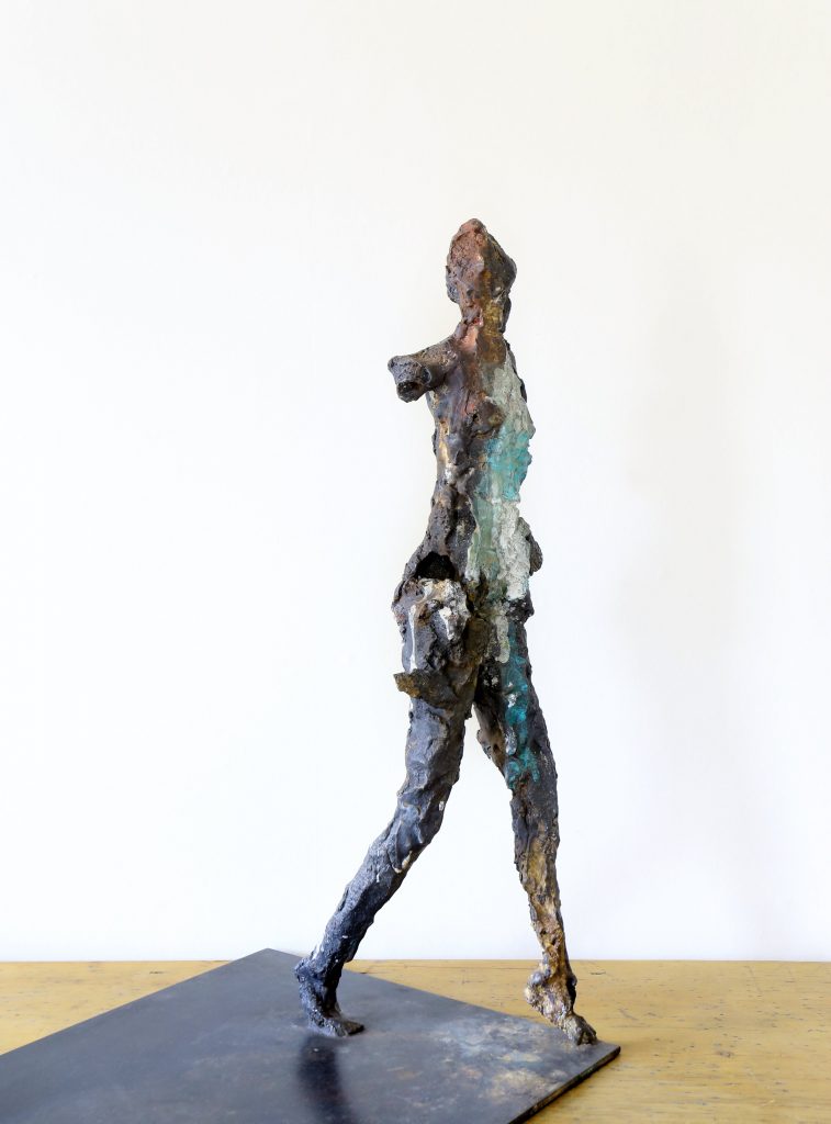
Stepping Out, Unique Bronze, L68 x W36 x H63 cms
In your current exhibition you have ‘When The Light Returns’, why was this the painting chosen for the impressive exhibition book?
The choice about which painting to use for the cover was made by Alison Auldjo (the director of The Union Gallery who is hosting my second solo show in Edinburgh). I wanted to leave it to her to make that choice. I think she chose that because it was the last painting I made for this exhibition. The more I think about it the more I feel it was such a good and inspired choice. ‘When The Light Returns’ is a very optimistic painting and a very optimistic title – ‘A Life More Human’ ought to be about optimism and joy as well as darker feelings too.
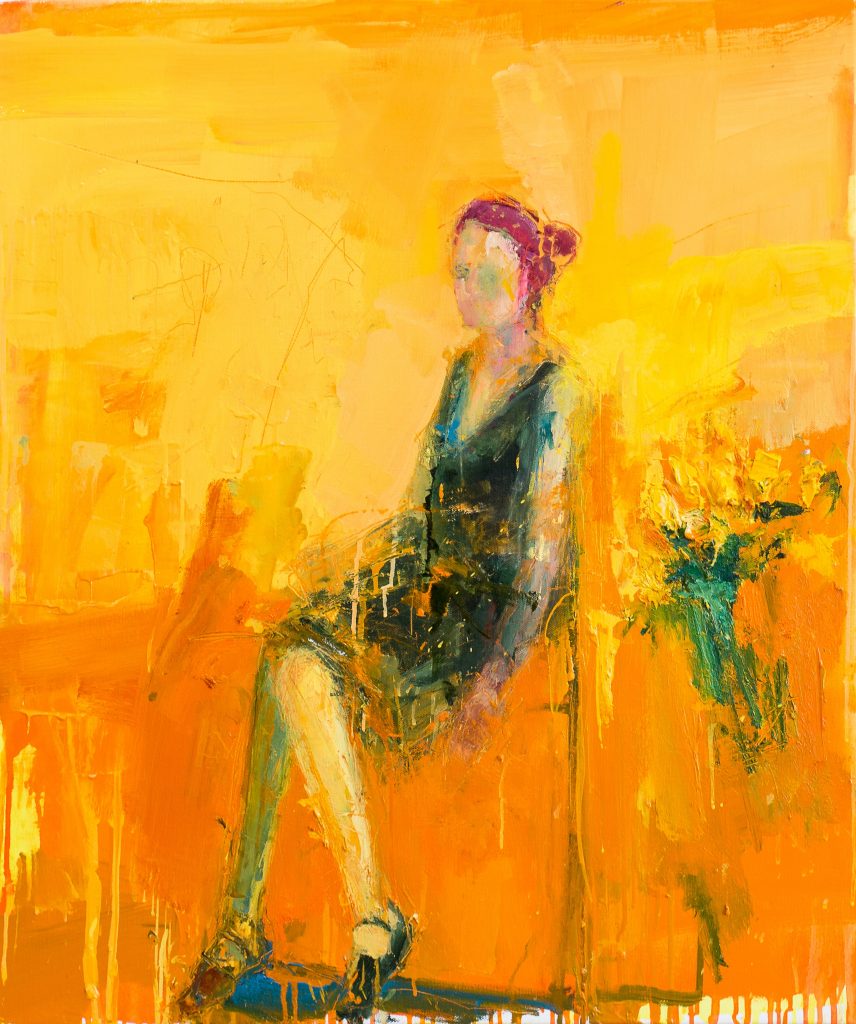
When the Light Returns, Oil on Linen, 96 x 81 cms
When I was working on this painting I wanted to explore the joy I get from light. Being bathed in sun, feeling its warmth on the skin and the tranquility that one can get from it. The woman is just sitting there -- feeling the moment. That is what I wanted for that painting and that is the first impression that I want the viewer to get from that work. After that, I want the viewer to further their experience of the work by exploring all the other components in it and for them to build their own story with it.
With the painting ‘Morning Ritual’…Discuss beyond the obvious tea ritual to the deeper ritual of craft. (You may like to add ‘Threading’ to this answer.)
The paintings ‘Morning Ritual IV’ and ‘Threading’ are really inspired by ‘Intimism” – an art movement of the late 19th and early 20th century that depicts the human figure in domestic scenes. Artists that championed ‘Intimism’ include Pierre Bonnard, Edgar Degas and Edouard Vuillard, and more recently Richard Diebenkorn. These are all artists whose work I really love and admire.
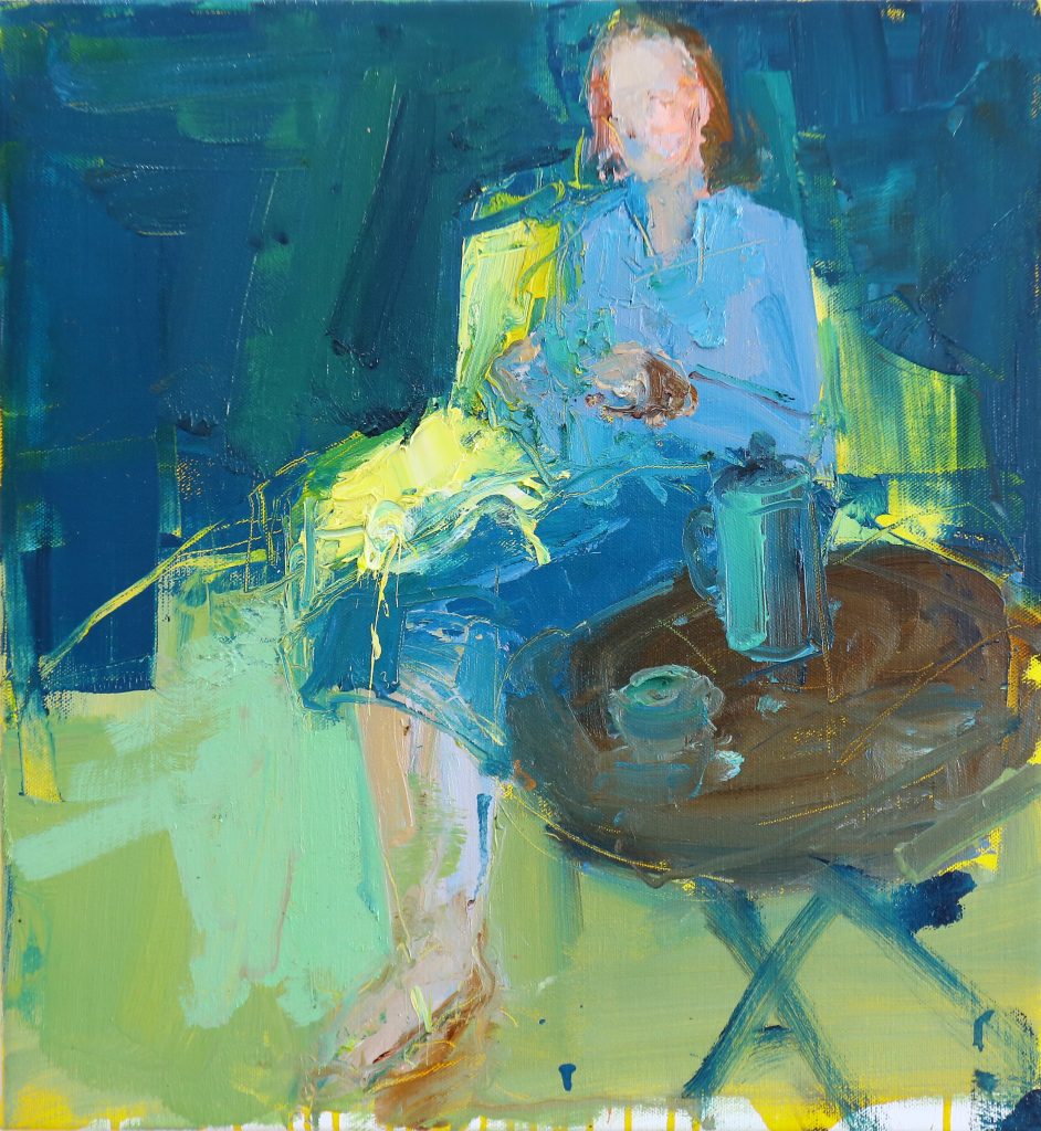
Morning Ritual, Oil on Linen, 60 x 65 cms
The two works you mention are a personal take on this idea. They are also about the human spirit being engaged with the moment and appreciating it. Morning Ritual is about the early morning rise with a cup of coffee, being at one with one’s thoughts and the world. Threading depicts the moment of concentration of threading a needle – such a simple task, but one which requires our whole attention.
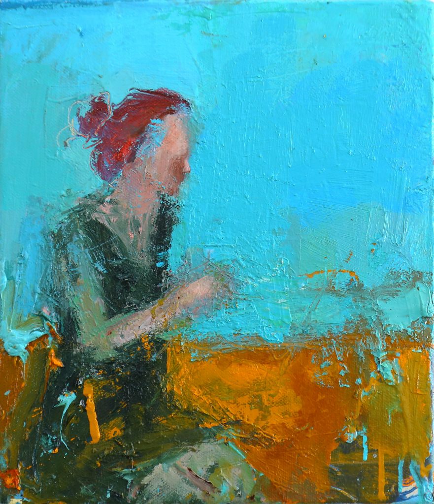
Threading, Oil on Linen, 35 x 30 cms
‘Seated Woman’ is seen as timeless elegance – discuss.
The figure in the painting is caught in a moment of reflection or relaxation. She is at ease with herself, and carries her body with ease, unlike some people who are elegant only when others are watching. The painting is about feeling at home in your own skin, being reflective, and not trying to be something you are not.
There is no pretension about her, she just is.
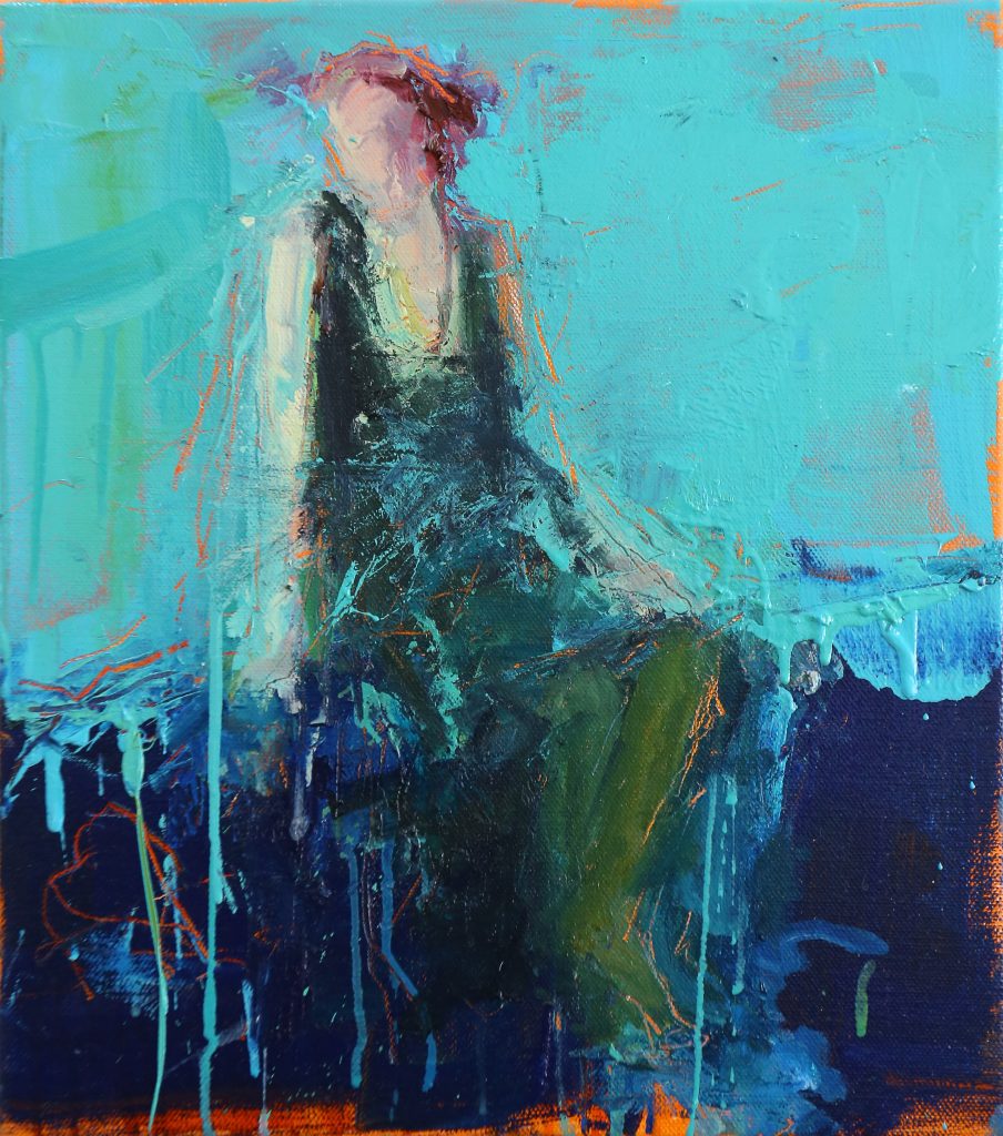
Seated Woman, Oil on Linen, 45 x 40 cms
‘Beauty Within’ discuss.
‘Beauty Within’ is a ceramic sculpture of a standing male figure. The figure hangs simply on the wall. He looks weathered and scarred but stands tall and proud.
This sculpture is about the experience of being human but he resists being labelled or being defined by his experiences or his scars. Despite the nail driven through his hips and the cracks in his body and limbs the Beauty of ‘Him’ shines through from within.
Beauty Within, Unique Ceramic Sculpture
He is the embodiment of the quote by the Spanish Writer José Saramago “Inside us there is something that has no name; that something is what we are”.
Expand on your method of two plate etching, use ‘Dancer III.
Etching is an exciting print process where an image is created on a plate (traditionally copper plate) by using strong acid. The process of etching dates back to the 15th century and there are many renowned artists who have created wonderful works using this technique, most notably Rembrandt, Dürer and William Blake. Over time, etching has been adapted and developed so that images can be produced more creatively. For me, etching is important in my practice because of its sense of history. I feel like I am connecting with past artists that I admire and that I am continuing in a rich tradition. I have created images using single and double plate etching techniques.
Two plate etching is when I am creating an image using more than one plate – so the final print is created by pressing the paper through the press sequentially against two individual copper plates loaded with different colour inks. This method allows me to add more than one colour to an image. For example, in ‘Dancer III’, the majority of the image in this etching was created on one plate - that being the dancer. In the second plate, I added the green turquoise colour in the foot and in the background. Adding a second colour to the image was important for me and it somehow helped my print work to have a dialogue with my paintings and sculpture.
Dancer 111, Lift Ground Etching and aquatint from copper plates
Lastly expand on how you show emotion in your art.
This question is really hard to answer – it’s like having to explain where does emotion come from. I think I show emotion in my work because I feel emotion when I am working. All my work comes from an inner emotional place or reservoir that I don’t try to control or even understand. But when I am painting, I am always trying to connect or relate to something. Without that, the work really feels vacant and then I have to abandon it. I think, for me, emotion also comes from colour – I do have an emotional relationship with colour, because I always associate colours with memories and the emotions that connect with these memories.
I do want my work to be about emotion – I strive for it to be the narrative in my work, and the fact that you have asked me that question, Deborah, tells me that you have somehow connected with my work at an emotional level and not only at a visual or intellectual level. That gives me comfort and joy - that I am reaching the viewer’s emotional space and providing nourishment for what goes on there.
Contact:
Henry Jabbour
Deborah Blakeley, Melbourne, Australia
Interview by Deborah Blakeley, August 2019
CLICK HERE TO >> READ INTERVIEW OF HENRY JABBOUR FROM MARCH 2017
Susan Cutts
Are all, of your sculptures constructed in paper?
Yes, I work solely in paper although having said that I have used tulle dipped in pulp for the skirt in Cherish.
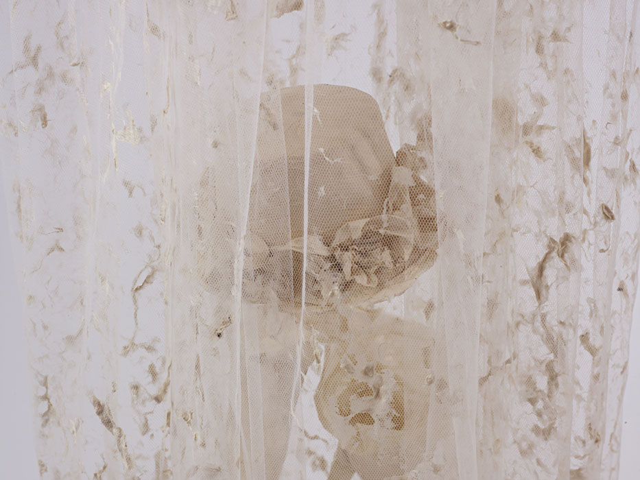
Cherish, detail
You make your own paper from raw materials. Briefly discuss this process.
When I first started using my own handmade paper (in about 1990) I went the usual route of cotton linters chopped up in a liquidiser. I found obtaining the linters in the Uk, at that time, quite difficult as was information on papermaking. Eventually, I discovered Carriage House in the US and started using an assortment of linters, In about 1998 I bought a Hollander beater from Peter Gennatar (great papermaker living in Holland). It changed my papermaking I was able to work from the raw fibres, which produced a pulp from which I made the sort of paper I had dreamt of making. From then on I was hooked on working with natural fibres. I enjoy the whole process of soaking, cooking etc. I'm not a person 'in a hurry' so papermaking suits me. Of course, working with oriental fibres has enabled me to push my technique (I think) and achieve the finish I envisage.
Fairytale
Currently you are in a temporary studio. How are you able to cope under these very basic conditions?
I moved out of my purpose built studio to make way for an indoor swimming pool. Crime – yes – but I can basically work anywhere so long as I have water and electricity, My current space has neither so I am working with the Hollander in our garage, the actual sheet forming and sculpting taking place in the temporary studio. The temporary place is a weird place to work, its formed of two Victorian railway carriages with a room joining them together. Originally they were seaside holiday homes (we live by the sea) and were sold with a piece of land, a well and a railway carriage after the First World War (19140=-1918)Foxes live underneath and can be a bit smelly but thankfully were there are foxes there aren't mice!
I'm going to continue with the Hollander in my garage and am moving to an adjoining property, which was also once a holiday chalet but without the history of the railway carriages, on the plus side it has water and electricity, and a sea view.
You are a member of the Royal society of Sculptors. How does this fit with paper?
Are you the only MRSS working in paper?
I've been a member since about 1999, I submitted to join as I see my work as sculpture and don't want it defined by the medium. I think there are other members working with paper but very differently and not solely.
Button Up
How do you activate colour in your work?
During the processing of the paper.
After the paper is made.
If the piece I am working on demands colour I tend nowadays to use pigment specific to handmade paper, and this is added during the pulp making process. I have used fibre reactive dyes in the past, mainly because I was familiar with how to use them and how they worked and they were readily available in the UK.
Red Shoes
In your past you had training in Theatre Corsetry, expand on how this background has developed your work.
I love the image of the corset, I love working with the image. Being me I wanted to learn how to construct the corset in fabric, basically, I felt the understanding of the construction helped me in the construction when working with paper.
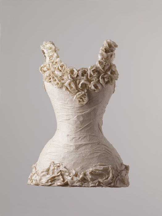
De Colletage, front
You comment, ‘I choose through my work to explore the relevance of dress to identify and the integration between wearer and observer’ Discuss.
I CHOOSE through my work to explore the relevance of dress to identity and the integration between wearer and observer. Basically, I use dress as a metaphor – I want the viewer to relate to the work, to identify with the work, I want to explore with the work the relevance of what we wear and how we wear and how we perceive what is worn. I like using contemporary dress with an historically inspired piece and vice versa.
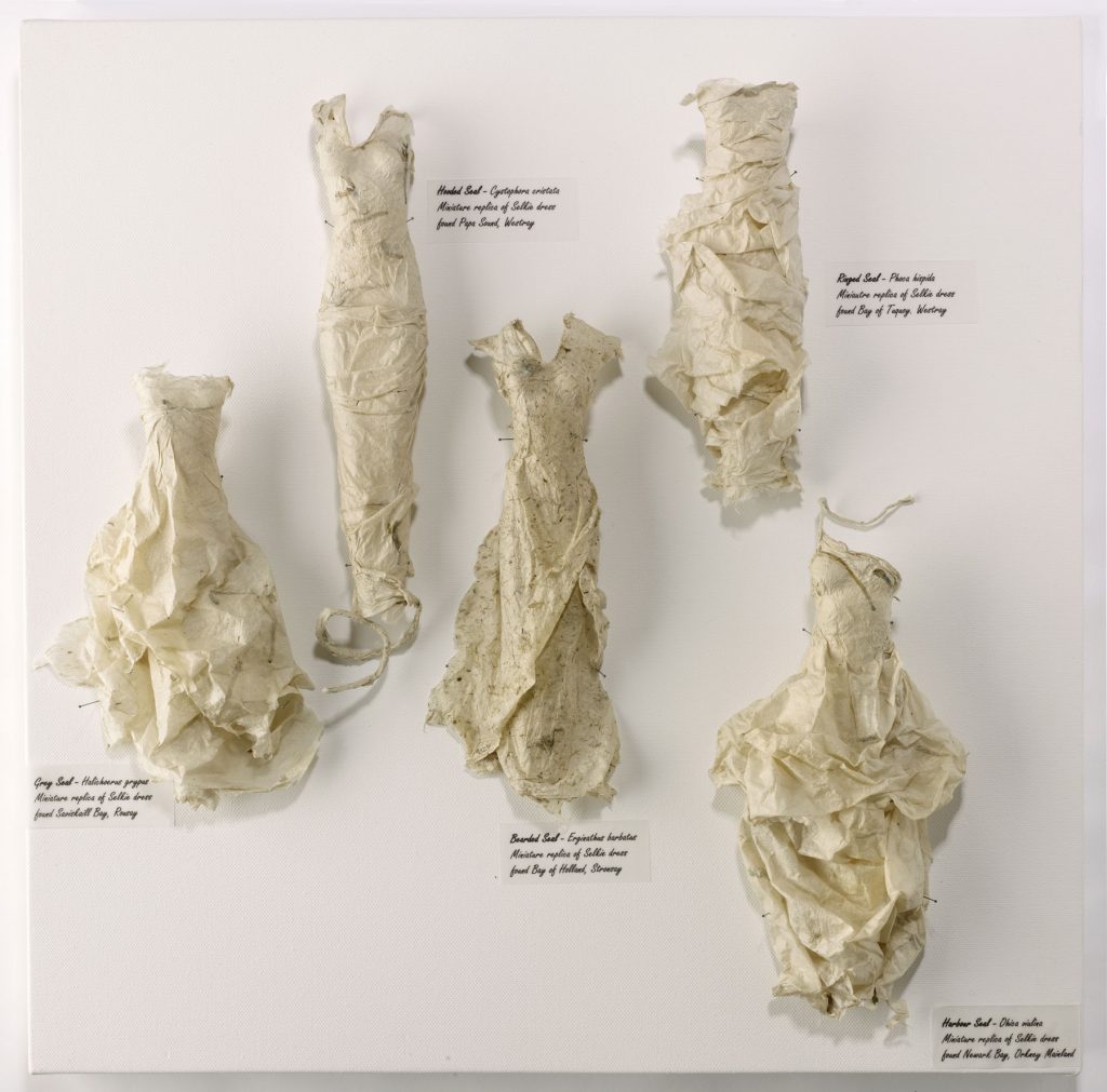
Selkie
On a larger scale you work on installations. Discus one or two of your installations.
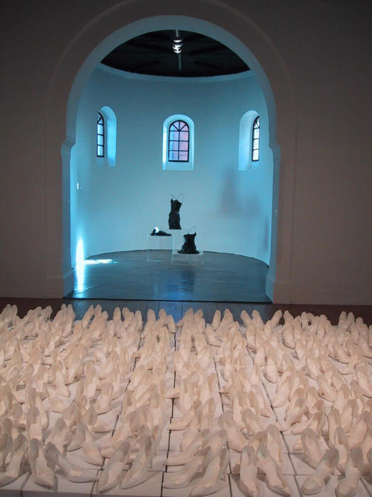
Stiletto
My first major large scale piece was Stiletto. I am often inspired to start a piece with maybe one or two pieces in mind but as I work I find more and more reasons for making the piece and the work gets bigger and bigger. I like working in multiples for this reason – I often see the piece as needing to made up of many parts, its hard sometimes to know when to stop.
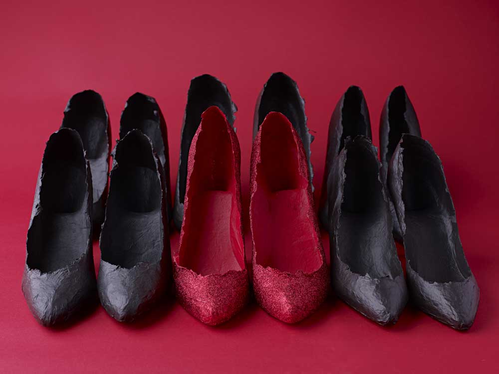
Red Shoes
Explain about your shoes / stilettos and how you have used them in various ways.
I love the shape of shoes, I love how an old shoe, a loved shoe portrays and betrays the wearer. To me the image of a shoe is very evocative, to make them in paper means they are never worn, they are fragile. I am currently thinking about a piece using the ballet shoe. I love the image of the ballet shoe and want to make a large piece – its all about finding the right reason for making the work. I have had this idea for sometime and only recently thought that the ballet shoe would be the ideal 'messenger' for the piece.
‘Who Knows Where the Time Goes’- Discuss.
The importance of the hanging of this work.
How it felt to see your work in the Museum space.
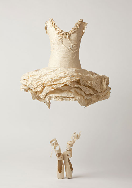
Who Knows Where the Time Goes
You ask about the importance of the hanging of this work. To be quite honest I try and make my work as easy to install as possible. I am often not at the hanging so rely on the technician to 'do his job' which, invariably they 'do' very well. This piece was easy to install just a matter of hanging the dress over the shoes at an appropriate height. The ballet shoes sit below the dress and are balanced.
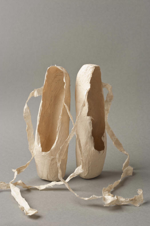
Surlopointe
It is always good to see your own work in an exhibition although I always think when I see the work, I could have done some things better or differently.
What are you currently working on?
I am about to start work on the ballet shoe piece. I am currently preparing the fibre – gampi – then I'll make the pulp and then the hundreds (hopefully not thousands) of sheets of paper for the work. These I will freeze until I need them as I work with the paper whilst wet which enables me to work as I do.
Discuss the visual impact of the human body has on your work even in its absence.
I like the idea of the body/person being the ghost in my work. Heads, hands and feet do not feature in my work. I am basically only interested in how the garment drapes over the body, is moved by the body. For me the impact of the work is the creasing, drape etc I'm not particularly aware of the body shape I have chosen. More recently I have been working with, I think, fairly androginuous forms but that may not occur to the viewer.
Little Black Dress
Compare two pieces to show how paper can be manipulated to form different textures.
Different textures. I can't really think of how to answer this question. I make and work with the paper, the paper has a tremendous input in the work. Depending on the fibre, how I have beaten it, made the paper, applied the paper all dictate the final texture – basically- the texture doesn't have an awful lot to do with the maker. I can create creasing, drape etc but how it dries is up to the paper itself. A high shrinkage will give a different effect from paper that hasn't shrunk so much – the texture, I think, is out of my hands its the papers contribution to my work. To have complete control of the process, to have a very set idea of how the work should look is not something I would want or could achieve!
You have exhibited around the world what was on exhibition that challenged you but also allowed you to develop.
'Cherish' detail
I know most artists would say that every exhibition is a challenge and you learn something every time your work goes on public view. Mostly I have learnt from exhibiting is the basic nitty gritty of sending the work and making it easy to install. I think I learnt something from Cherish which could push my work into using fabric.
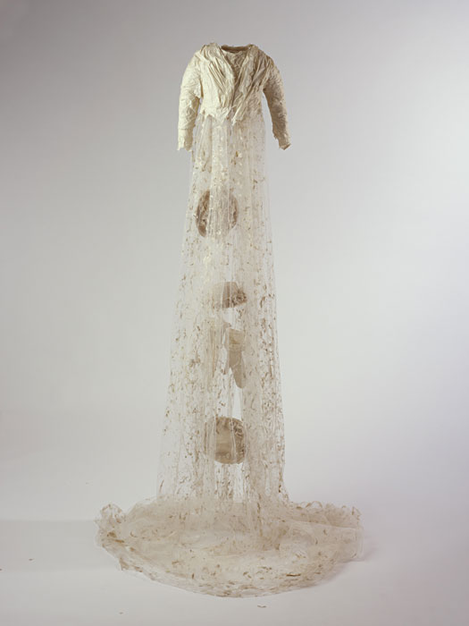
'Cherish'
I dipped netting into pulp, I love the effect and might use it again but basically I love technique and try with each new piece to push the technique to achieve the image I want. I am a slow worker, I think about the next piece of work for AGES taking into account, once the inspiration is settled in my mind, how the work will be formed, which fibre to use.
Contact:
Susan Cutts
susan@susancutts.com
www.susancutts.com
Deborah Blakeley, Melbourne, Australia
Interview by Deborah Blakeley, July 2019
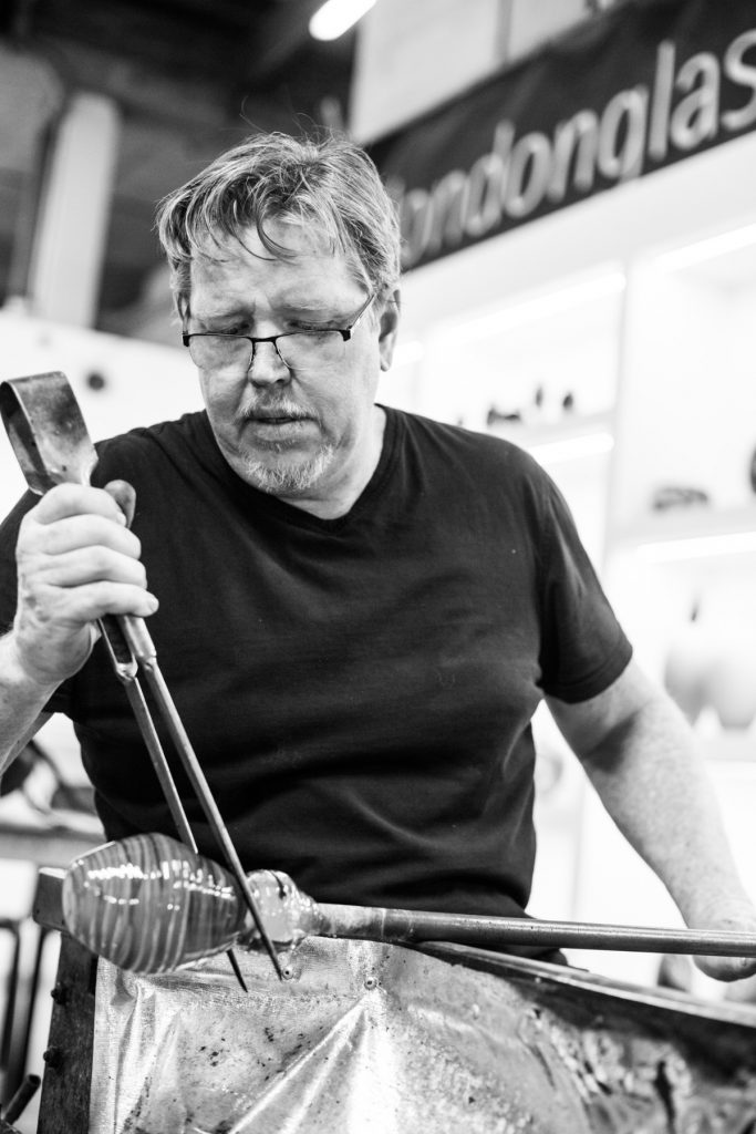
Bruce Marks
Your Bird Series is about form, can you discuss the importance of human recognition of form and your bird series?
I think that certain forms can enter your subconscious directly and make something tingle deep down there. I strive to achieve this in my work and feel that I have had the most success at this with my bird series.
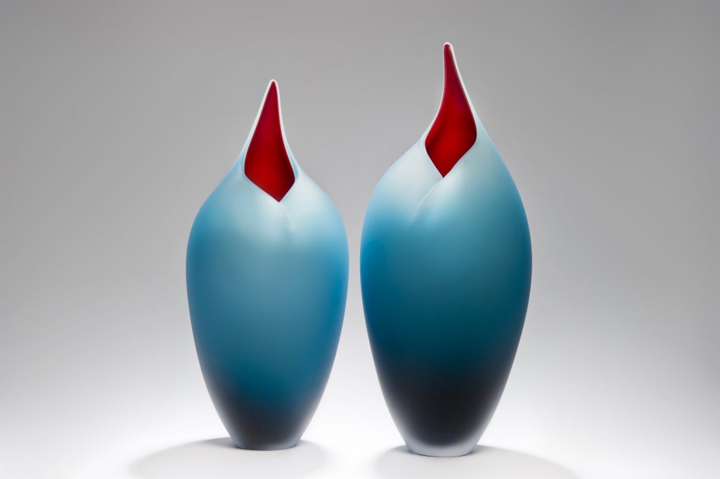
The birds have evolved over the past 9 years that I have been making them and I feel that they are in their final stage of evolution, they are as close to perfect as I can get them. I think form is to your eye what music is to your ear.

Explain how you have had to adapt your glass practice to allow you to work on your own and why is it important to you?
I now have a very good assistant, Lyndsay who has changed the way I work for the better. I originally worked on my own whilst waiting for the perfect assistant.
Discuss how you combine form and colour in your work.
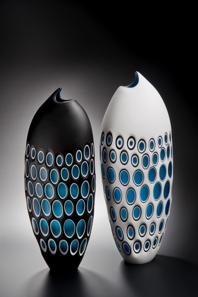
With glass it is possible to use colour to the extreme, but I have always preferred to use the colour to accentuate the form rather than dominate it. I normally use a single interior colour and a graduated exterior Colour with white between the two to act as a canvas.
Discuss the relationship of colour in your fish series. How colour is used both internally and externally?
The fish series was an exercise in colour arrangement on a relatively simple form. I wanted to experiment with bringing the internal colour to the outside and allowing light to pass through.
You also tutor at UCA Farnham, discuss.
I am a visiting tutor at UCA Farnham, the University where I completed my MA in glass. I find this to be a not only enjoyable but beneficial to my own practice. By helping the students to understand what is required and important in a professional practice I am constantly reflecting on my own work. I also feel really energized to see the incredible work that they are creating
What are the advantages of your memberships to various Glass Artist Societies?
It is important to be involved in the community of your chosen field and by being a member of these societies it opens all sorts of opportunities for me to meet and be part of the glass community.
Tell us about the Hotshop that you work in and why it continues to give you inspiration.
I work at London glassblowing which is owned and run by Peter Layton. We recently celebrated our 43rd anniversary as a studio which is a testament to the incredible energy and creativity of Peter and his team. As a member of the team you bring your skill and knowledge to the co-operative, but you also have the time and space to create your own unique work.
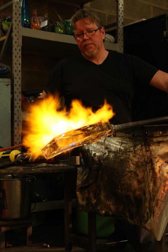
Why it is important to have a viewing area?
I think it a good idea to be able to show the public what is involved in the making of our work. It creates appreciation for the work and open a dialog between customer and artist.
When can the public see you working?
We are open everyday between 10am and 6pm except Sundays
How important is the Hotshop in the education of the public to contemporary glass?
It is very important, one of the most common things said to us in the hot shop is “I didn’t realise what is involved in (and how much effort goes into) making a piece of glass.”
Do you work to commission?
I do take commissions for both my existing work and for work designed by other artists and customers. I feel that the commission process can be rewarding to both client and artist if it is approached in the correct way. It often pushes the boundaries of your skill and creativity.
You are constantly introducing time in your work, Boats and again in Time Stood Still, discuss.
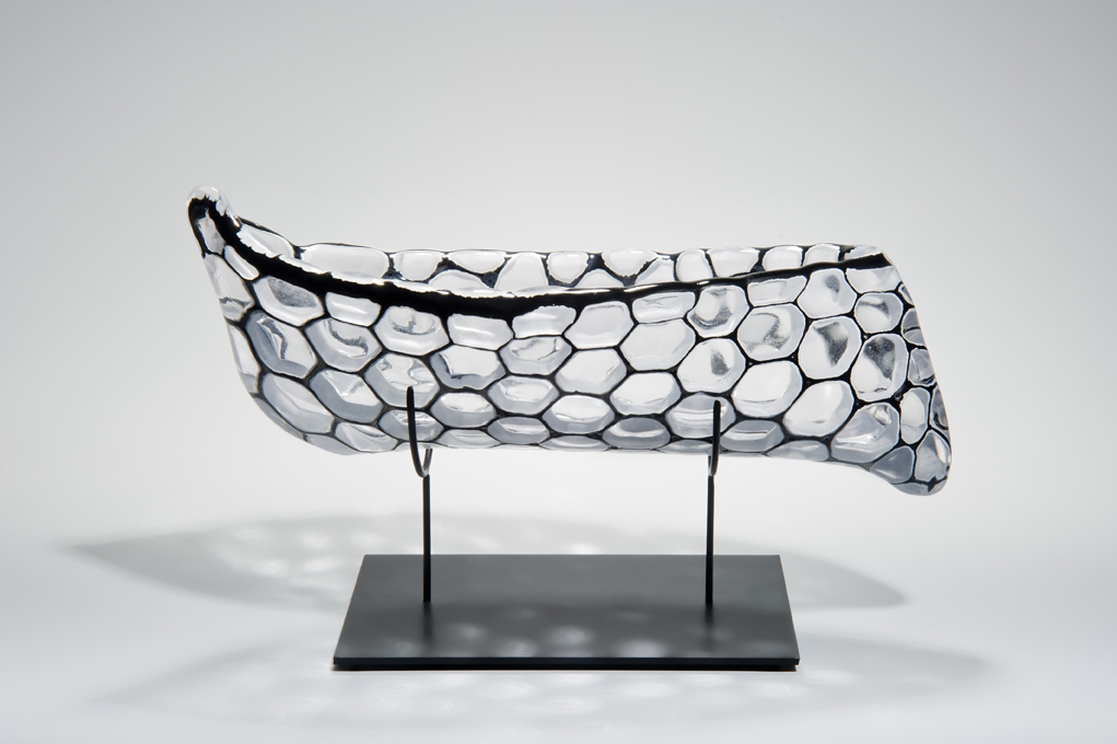
I think time is a fascinating thing. As you get older your perspective of time changes, you realise that your perception of time is not reliable, you feel like something that may have happened ten years ago feels like it happened last week, and time seems to be speeding up.
Take one piece that you found hard to sell (let go of) and why?
I recently sold a piece that was part of my Fragile identity series called “Somewhere over the rainbow” I found it quite emotional as the piece had come about in response to my mother’s (and Grandmothers) fight against depression. Fortunately, the lady who purchased it was really taken with the emotional side of it and understood the narrative immediately, I know it’s gone to a good home.
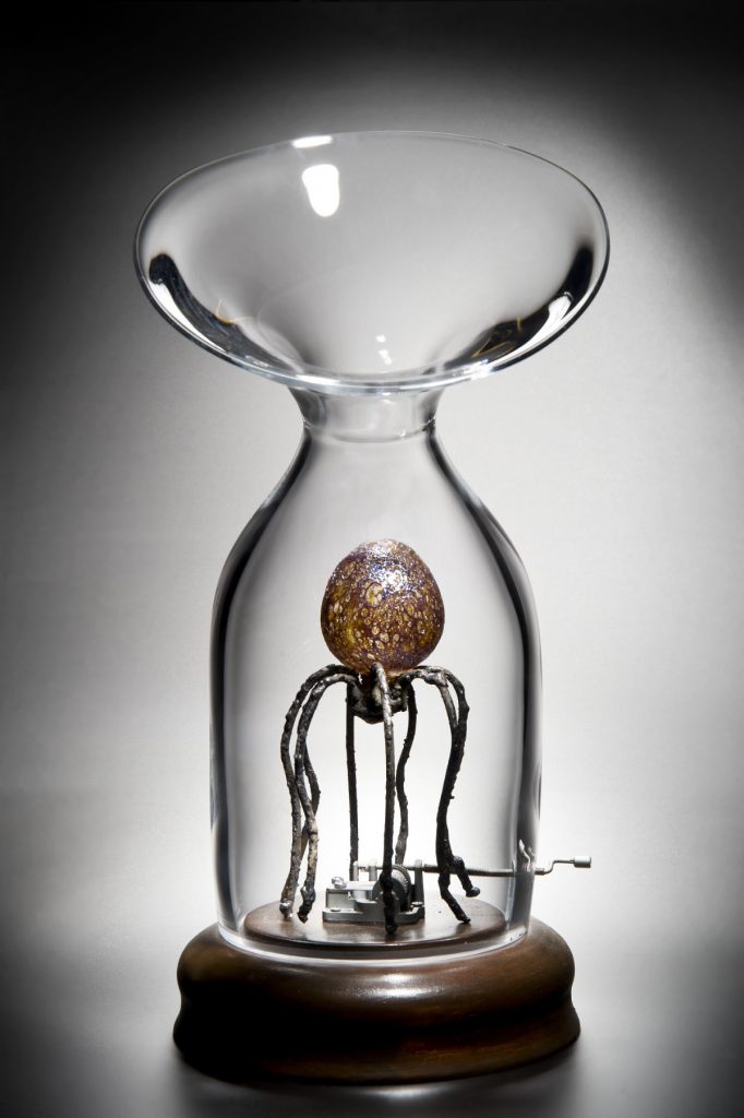
Explain an exhibition or series of work that has been very influential in the growth of your career?
I think that being involved with London Glassblowing from the beginning has had the most influence on my career. My Glass career began there and continues to this day, it is a fun collaborative and creative environment headed up and owned by Peter Layton.
Completing an MA at Farnham also plays a big factor in the way I work and think about my work.
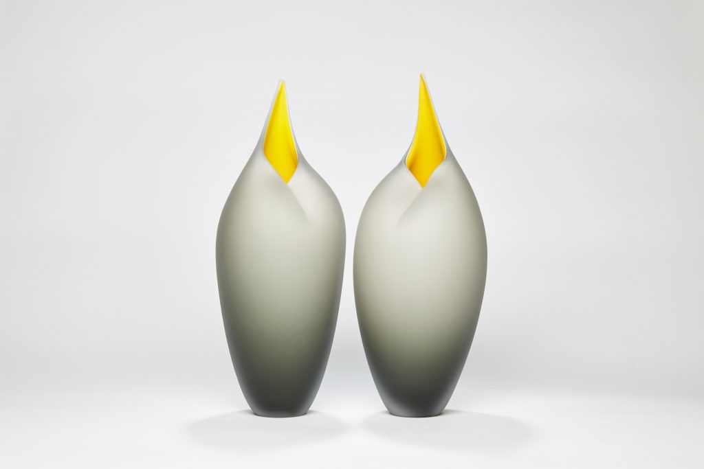
Contact:
Bruce Marks
Studio Manager
London glassblowing
Instagram Brucemarksglass
Deborah Blakeley, Melbourne, Australia
Interview by Deborah Blakeley, July 2019
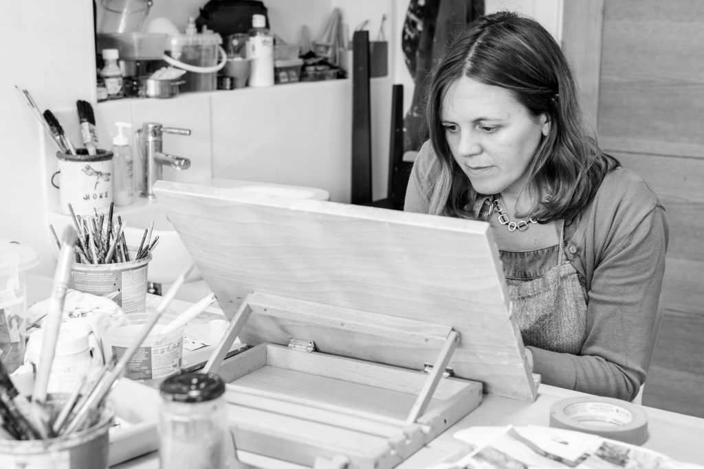
Jayne Stokes
How important is photography to your work?
Photography plays an important role in the development of my work. The starting point for 90% of my pieces is a personal photograph or a found image. I base my paintings and 3 dimensional pieces on the journeys that I make and the landscape I experience. On each journey I carry a camera and the first step is to take a photograph of those scenes that capture my imagination. The photograph then informs the painting.
What is the value of being a member of the Society of Scottish Artists?
I became a professional elected member of the SSA 3 years ago. This was a great honour for me at the age of 43, as it gave me a sense of recognition for those 23 years spent making art. The SSA is a great organisation to be part of and it has provided me with many opportunities to further my career as an artist.
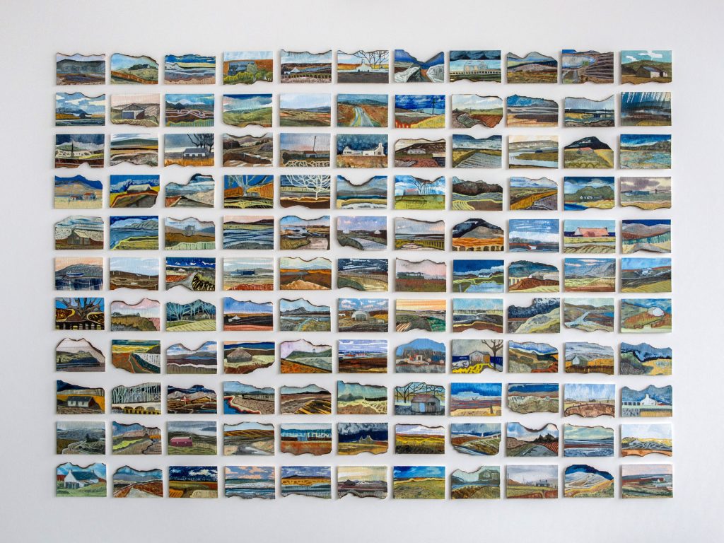
Outer Hebrides, Watercolour and college
You don’t work on conventional 2D surfaces – How did this approach develop?
Take us through a quick historical synopsis of the development.
I have been fascinated with collecting found objects from the age of 10. I can remember summer holidays as a child looking for objects on the beach to use to make things. When I graduated from Edinburgh College of Art in 1996 my degree show was a combination of painting and installation. I used found objects collected on Portobello beach in Edinburgh and these informed the paintings and drawings I made. At art school I was shown by my then lecturer Glen Onwin, artists like Robert Smithson who explored the concept of creating artworks in the land, not been bound by rigidly sticking to the use of a 2-dimensional surface. This is an idea that has remained with me throughout my career.
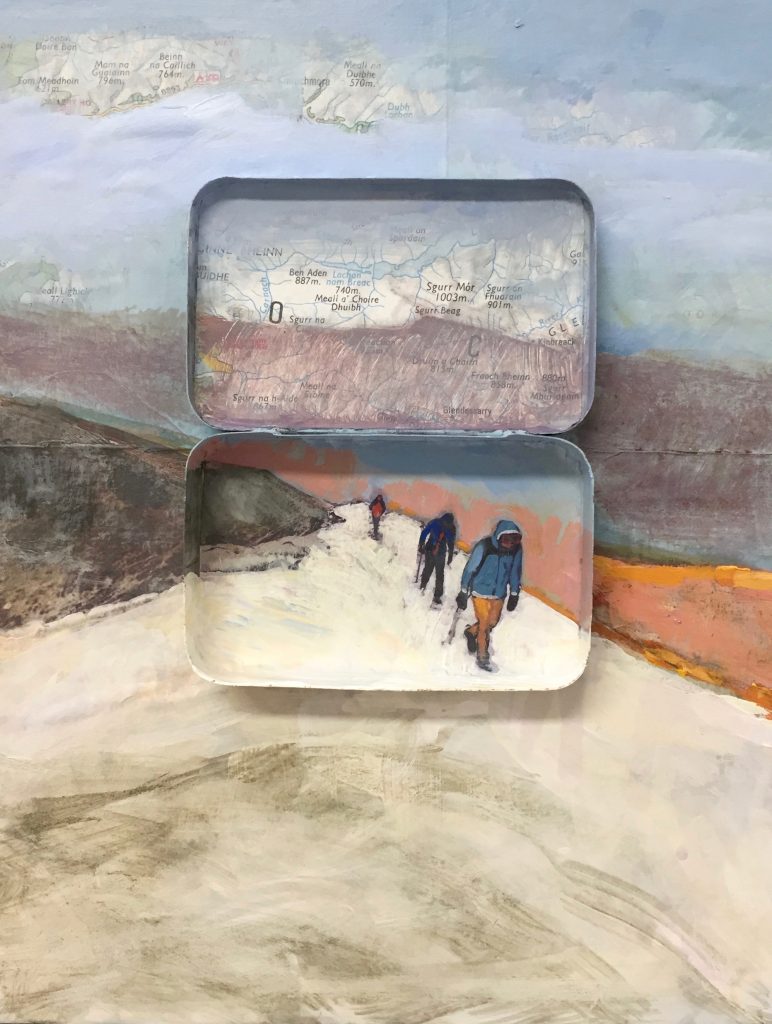
Glencoe, Acrylic, college and found objects
The objects I incorporate in my pieces have aryl history; they have been passed on from somebody or discovered in the landscape when I am on a journey. We discard so much today and I like the idea that I can use an everyday object and transform it into something magical.
Where is your studio?
At home in North Berwick, Scotland.
What are two things that make your studio so special to you?
This is the first time that I have been lucky enough it have a purpose-built studio at home. My husband Ben designed it and I like the fact that I can work all hours as I am a bit of a night owl. The light is also perfect with my intricate work.
Discuss both urban and rural Scotland in your work.
Colour and texture are probably the most important elements in my work. The landscapes that I photograph are those which have a drama about them, quirky or unusual and which tell a story. My preferred subjects are Scottish landscapes. I have lived in Scotland for over 15 years and I never get tired of exploring places. I love the remoteness of the Hebrides, the wildness of the Highlands and the contrast with the city and the urban decay which is depicted in my shopfront pieces.
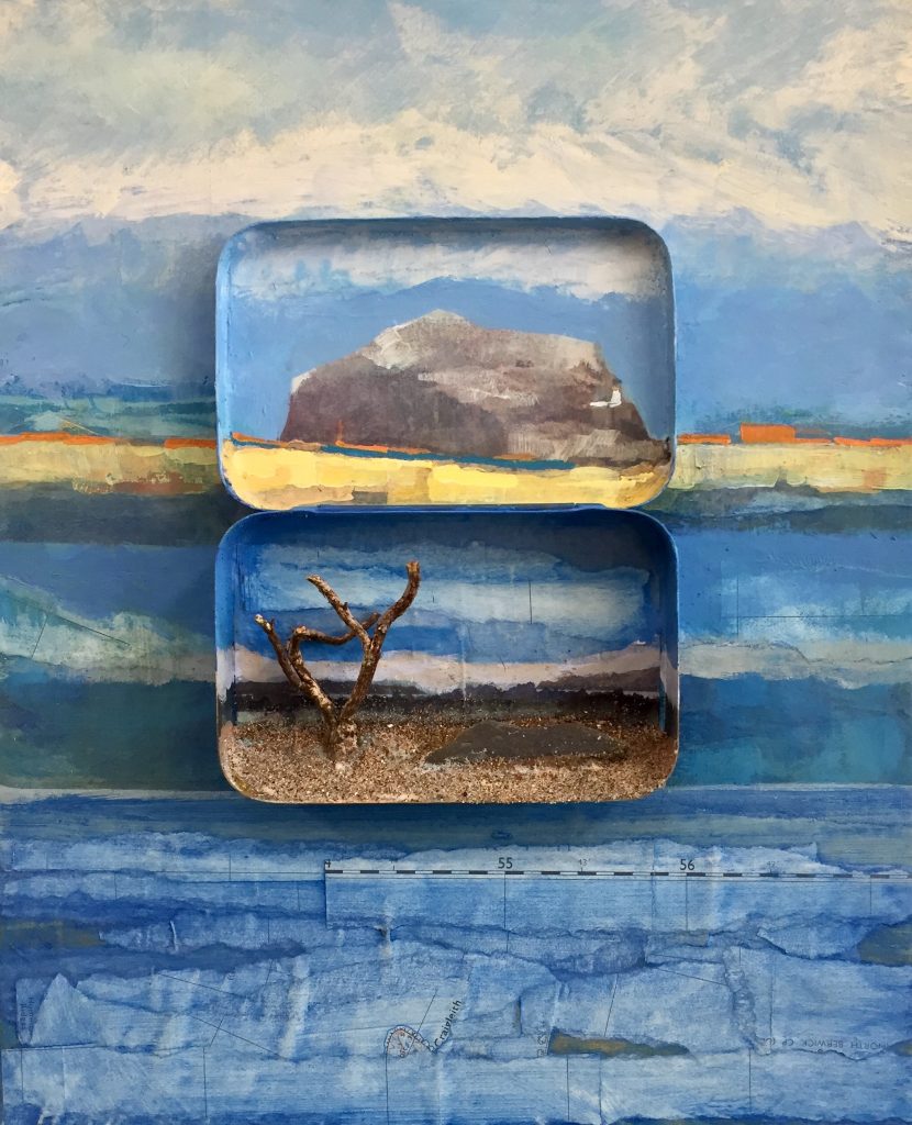
Tin of Bass, Acrylic, college and found objects
Where do you source the found objects in your work?
I collect objects directly from the land and my matchboxes and tins are found in junk shops and on eBay.
Discuss how you use small images combined, to make a large image.
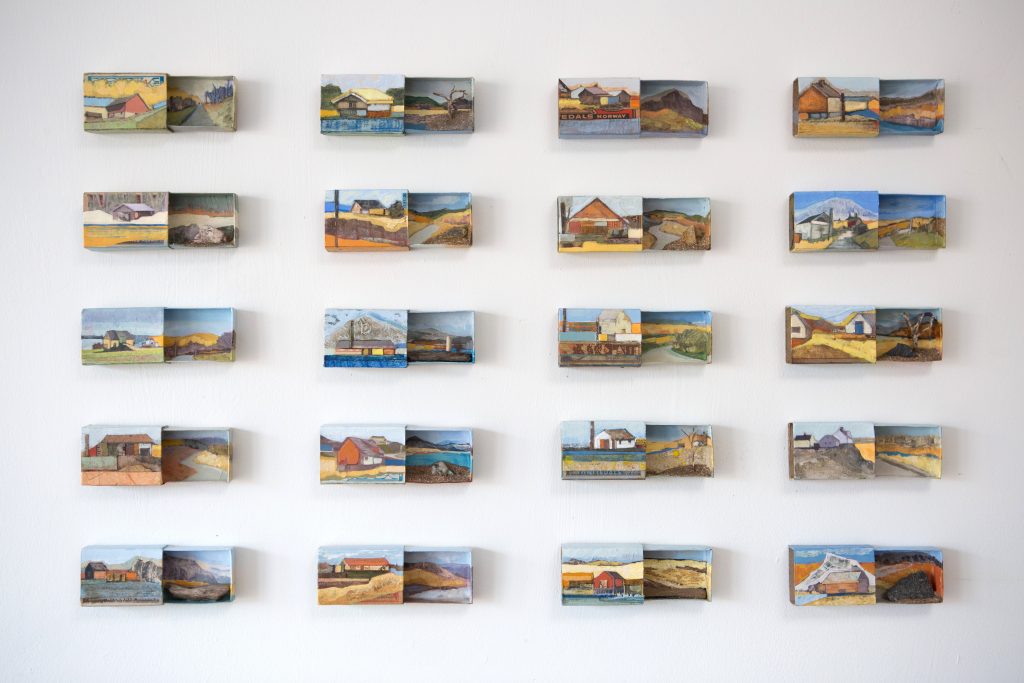
Almost Utopia, Acrylic, college and found objects, matchboxes
I am fascinated by our relationship with images, the value we attach to them and their ability to evoke emotion. This relationship has changed with the ubiquity of digital technology. I recall the enjoyment of looking at family photo albums as a child and reflecting on the places I had visited. Now we are more likely to store away endless files electronically after a brief glance. This process is mirrored by us increasingly transient relationship with places, as our lives become busier and less appreciative of our surroundings. The aim of my work is to make us stop and think carefully about the environment around us. Working on a miniature scale forces the viewer to look closely at the painting and having several small images in one large piece takes the viewer on a journey.
Expand on ‘Cairngorm Climbers’.
Your involvement with them.
Your use of mixed medium in this painting.

Cairngorm Climbers, Acrylic, college and found objects
I discovered an old ordinance survey map of the Cairngorms in my local antique shop ‘The Penny Farthing’. I subsequently found an archive photograph of some climbers in the Cairngorms and I was struck by how the landscape dwarfed the figures. This combination of materials and the gift of an old Altoid tin gave rise to the production on this piece. Tins like this are often pieced together from fragments, random images, found objects and old maps that were collected and accumulated in my studio during the year. The old tins I integrate into each painting are used to select the figures and buildings, to set them apart from their surroundings or provide a different perspective – often functioning like a magnifying glass’.
You have won many prizes – discuss one that helped your artistic career and why?
In 2017 I was awarded the Open Eye Gallery Prize at the Royal Scottish Academy in Edinburgh. This was probably one of the best prizes I have won as it gave me my very first solo exhibition in a prestigious gallery in Edinburgh. Working for a show like this pushed my work further, focused my mind, gave me valuable exposure and increased opportunities elsewhere.
Expand on the use of circles in your work. Using ‘North Berwick Vignettes’ and ‘Digging Deep’’.
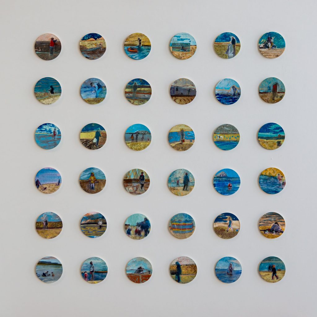
North Berwick Vignettes, watercolour, college on paper
I am lucky enough to live by the sea and this has provided inspiration for my work including the circular pieces. In the summer North Berwick is filled with tourists and people looking through binoculars and telescopes at the famous Bass Rock. The circle idea came about because I was thinking about the use of these objects to see and how it makes scenes circular. There is also a long history of artists and photographers especially in Victorian times. A vignette is often added to an image to draw interest to the centre and to frame the central portion of the photo.
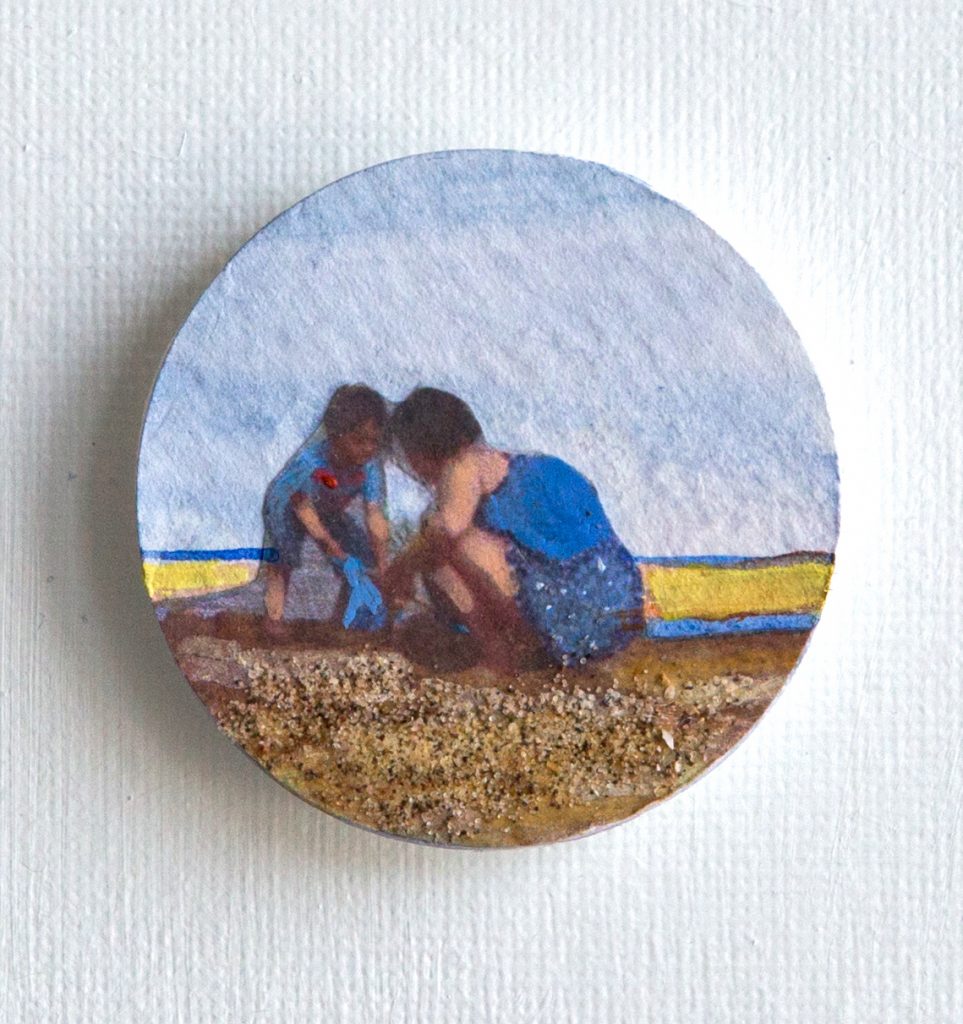
Digging Deep, watercolour, college and sand on paper
What are you currently working on?
I am currently working on a new series of matchbox pieces which will be heading to shows in September this year. I will need to make some new journeys to inspire the work and I am thinking about scheduling a trip to Shetland or Orkney.
How important is landscape to the sale of your work?
I like people to relate to the places I paint so the location of the landscape is of fundamental importance to sales of my work. Generally, I only paint Scottish landscapes if I am exhibiting in Scotland, although I do occasionally make exceptions to the rule.
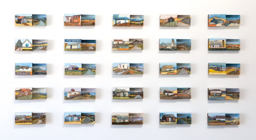
Archipelago, Acrylic, college in matchboxes
Why is painting landscapes now so much a part of your DNA?
I think an important part of being an artist is to reflect the world around you. We are in an age where the landscape and nature are in serious jeopardy. I have children and I want them to appreciate our landscape and if we don’t heighten awareness of these issues then the landscapes, I document will be a thing of the past, simply relics and memories.
Jayne Stokes:
www.jaynestokes.com
Deborah Blakeley, Melbourne, Australia
Interview by Deborah Blakeley, July 2019
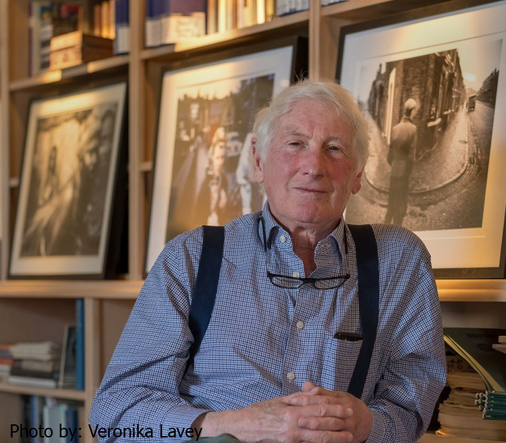
John Bulmer
PHOTOGRAPHS BY JOHN BULMER, POPPERFOTO - COPYRIGHT - MAY NOT BE REPRODUCED WITHOUT PERMISSION.
From your years, of photography in the professional world, discuss the introduction of both colour and digital photography.
France, Photograph by John Bulmer
I was trained as an engineer and have always believed in using the latest and best technology.
Colour is an interesting subject. We see the world in colour, so the introduction of black and white photography in the 19th Century was quite an odd event.
Black Country, Photograph by John Bulmer
It had its advantages. The process of photography is a form of abstraction. The world is a complicated place, and what we are doing in a photograph is trying to simplify and arrange the items within an emotional impact. Adding the element of colour complicates this process.
Black Country, Photograph by John Bulmer
Digital cameras are simply a better tool to achieve the image we strive for. At first, they had problems with quality etc. But to me, there is absolutely on point in struggling with an old fashioned tool when there is a much better one at hand.
The North Series, Photograph by John Bulmer
Can you discuss one or two images where you have used colour and it has led to highlighting the drab or bleakness of place?
In 1965, I was asked to do a whole issue of Sunday Times colour magazine on “The North”.
Woman hanging out washing, Halifax. Photograph by John Bulmer
This was the cover Picture for the Sunday Times Magazine.
This was a magazine primarily in colour, and clearly it would have been a cop-put to take only pictures in black and white, yet I struggled to see how I could get across the right emotional image of the changing industrial north by taking pictures of cobbled streets on a sunny day. I therefore decided to work in winter, and use fog and rain as much as I could to simplify the distracting backgrounds of the industrial landscapes and terraced houses.
Miner and his pit Pony, Durham, 1965, Photograph by John Bulmer
This was hard as colour film was so slow and had poor latitude.
Tell us about one of your early photographs that led to your work becoming part of the publishing world.
I think the picture that changed my life was this one of a student climbing the window of Kings College Chapel, Cambridge, where I was studying Engineering.
We sold it to life magazine, and it also ran on the font page of the Sunday times. I was expelled from Cambridge but landed a job on the Daily Express in London as a news photographer. This was a great compat experience and gave me a good start to my career.
Discuss the importance of composition in photography.
The North Series, Photograph by John Bulmer
Discuss the importance of working in a series as an artist.
Although an individual great picture is a wonderful thing to me the satisfaction of working on a picture story and building up a set of images around an issue gibe the most satisfaction. The same thing drove me to film making, where you have a beginning, middle and end. Where the whole process moves forward, so is less repetitive.
The most important things in a photograph are:
That the subject is interesting.
That the viewers eye knows where to go and is not take out of the photograph.
This combination need to give a strong emotional impact.
It’s hard to make rules about how to do this, and that is one of the things that give photographs their magic
Your comment, “The switch to colour was, therefore quite sudden and few photographers were prepared for it.” Discuss.
When I started as a professional in the early sixties the climate for photography in Britain was not great. The magazine “Picture Post” has closed and apart from the newspapers there were few outlets for photography. Life Magazine in the USA ran some great picture stories, but they, where all in B&W. Colour was used only for the advertising, fashion and a few travel stories.
The Sunday Times Colour Magazine, as it was called, was the first magazine in the world to use colour as the standard for photojournalism. The photographers who had worked for the picture post were not used to working in colour, and to my mind many went out and shot black and white picture with colour film in their cameras. The pictures were not simple enough – colour was an extra distraction.
It seems odd now, when we are so used to colour, but from the start photographers had got in the habit of thinking in black and white and need to change that thought process.
Manchester Series, Photograph by John Bulmer
You have traveled extensively, how is the represented in you work?
What matters in photography is not where it is taken, but whether the subject is interesting.
When I first went to the industrial north in 1960 I remember thinking that it was a exotic as darkest Africa. The 1960’s were a time when Britain was outward looking. The colonial era was ending and it had become easy to travel to the far corners of the earth. The Sunday Times had the money to do it and the world was full of interesting stories.
Show us two or three of your photographs that tell a whole story.
New Guinea Courting, Photograph by John Bulmer
The same human emotions apply in every society.
A woman in Cyprus grieving her husband and son, Photograph by John Bulmer
North Miner, Photograph by John Bulmer
Discuss how you have been able to photograph ‘people’ – venture into their private lives.
Cane Cutters, Photograph by John Bulmer
As a teenager, I fell in love with the “Decisive Moment” picture of Cartier Bresson. I have always aimed a being a “fly on the wall” photographer rather than someone who directs or intimidates their subjects. I am not suggesting one is better than the other, it’s a case of what works for you. When I did have an assignment to make a portrait of someone, I tried to put them at their ease rather than formally posing them, and where possible catch them off their guard. Sometimes I would say I had finished and shoot just as they relaxed.
How has new editorial staff shaped or changed your photography?
The people who have shaped my career have been, Tim Wolsey (Designer) and David Hughes (Editor) at the Town Magazine, the Michael Rand (Art director) and Godfrey Smith (Editor and others at the Sunday Times Magazine. They gave me freedom and encouragement (and of course assignments) and I will always be grateful.
What have been your favourite cameras over the years and why have you updated them?
I have never been a fan of square pictures, I find the 2 x 3 shape of the 35mm camera much better for composition. I started with a Canon then Leicas with wide-angled lenses and a Nikon F for longer lenses. At that time, they were the best available. Leicas were no good for long lenses and the SLR did not have good fast wide-angle lenses, they were also difficult to focus quickly. This meant carrying a lot of cameras in the days when you needed different bodies for Colour / B&W or fast/ slow film. Later I changed to the Olympus OM1 System. The lenses were very good and being smaller and lighter they were a great relief to my back. In the nineties, when I was mostly making films, I changed to the Canon EOS system, as I needed the autofocus for my imperfect eyes.
When Digital came of age; I moved on to the Canon Digital bodies, which over time graduated to a good resolution and speed. In time, I found the weight and size of the Canon system a bit of a distraction and looked for a half frame mirrorless camera.
I started with a Panasonic but found the delay in the viewfinder an unsurmountable problem. The first system to overcome this was the Fiji X series and I now have a Fuji XT-2 and and XT-3. These give results almost indistinguishable from the full frame cameras and are much smaller, lighter and more discreet.
Discuss photographs where you have used the written word to great effect within the image.
Photograph by John Bulmer
I have always felt that a photograph needs to speak for itself, and the modern desire for so much explanation dilutes the power of the image. Word within the image are a different issue, and I certainly like to do that when the opportunity arises. As with all pictures my preference is for the “decisive moment” of life as opposed the staged image, but there are no rules, and both can be powerful.
Photograph by John Bulmer
Tell about some ‘famous faces’ you have photographed and why they have become so memorable?
Two Mill Girls, Photograph by John Bulmer
These two girls, I photographed in 1965. The picture was used in the Sunday Times Magazine and on the cover of my book. “The North” I met one of them thirty yearls later in a BBC TV Studio. The have become the face of the north for me.
Chang Kai Shek, Photograph by John Bulmer
Chang Kai Shek, at one time the leader of the largest country in the world. This was one of my hardest assignment, there was such security around him that it was hard to get near, and I had my cameras and body searched, I was aware that he had the power to kill or torture anyone that displeased him. That was obviously unsettling.
Another was the Queen, I have photographed her on many occasions, but my favourite is this one with Haile Sellaisse in his carriage. The airport when she arrived in Addis was so chaotic that I could not get near, and only after running for nearly a mile at high altitude did I get this shot.
‘Thelonius Monk’ 1960 – discuss.
I believe you have to make the image and framing in the camera, and that’s one reason I don’t like square format cameras. The chance of finding a good composition in the darkroom are minimal.
Thelonius Monk, Photograph by John Bulmer
This picture of Thelonius Monk, I was backstage at the theatre, and found a small tear in the curtain at the back of the stage. I enlarged it just enough to get my lens through the hole.
Expand on your photograph North Korea, 1973, Sunday Times.
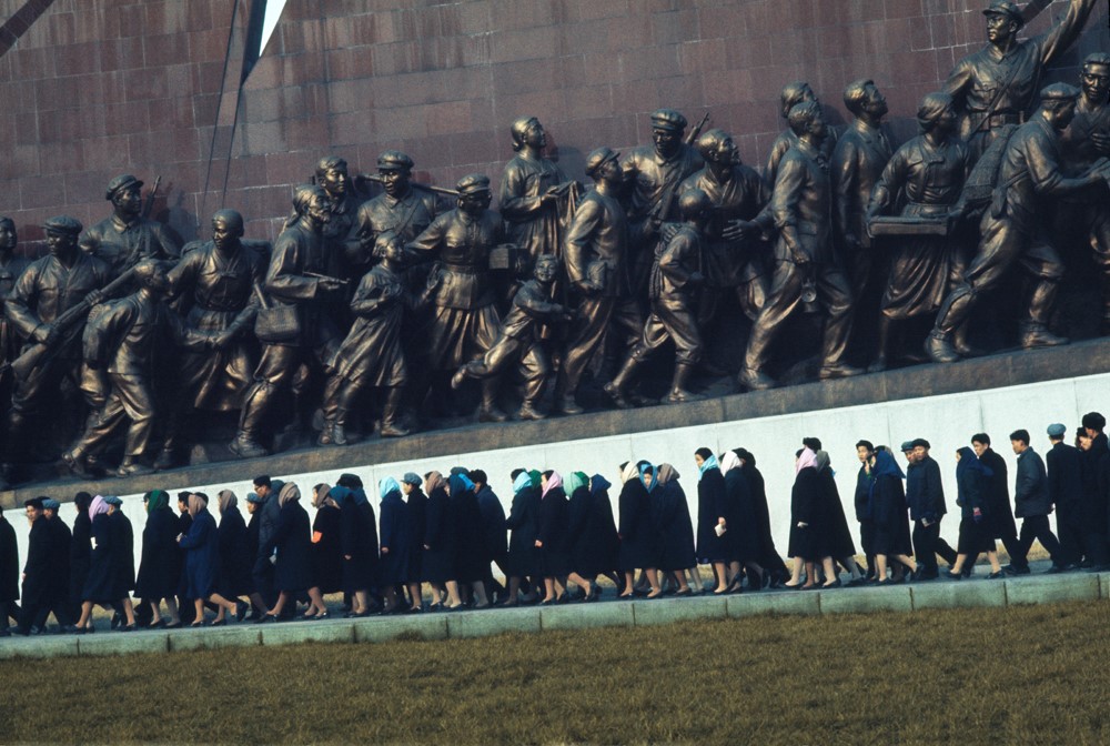
North Korea, Photograph by John Bulmer
North Korea was the hardest place I have ever worked. We were under constant survalence, and were not allowed to photograph anything they did no approve. I resorted to photographing out of a lavatory window to show how ordinary people lived
Expand on your sideways move into film photography.
By the early 1970’s The Sunday Times ran into a problem. The advertisers complained that the editorial shown alongside their adverts – Biafta, Vietnam and social realism, were not compatible with the comfortable lifestyle they were trying to promote.
The Sunday Times Magazine had a new editor, who called me into his office and said, “We are looking for stories on crime, middle class living and fashion.” I knew it was time to move on.
I had also found that travelling the world was a lonely business, and I was going out day after day and making the same compositions of people without really getting deep into their culture.
How did this happen?
I was offered the first visa to Burma that any photographer had been given since the war. The Sunday Times were not interested, so I went to the BBC and said, “I’ve never made a film in my life, but I’ve been given this Visa. Will you give me the Money” They said, “Yes” and we made a 50 minute film for “The World About Us.”
What did you have to learn to make the changes needed?
What can you say in hindsight?
It was a big change, fortunately I was technical enough to be able to use a professional 16mm film camera. Other photographers I knew made films using another cameraman, this often led to frustration. At first, I tried to make every shot composed like a still photo. This led to rather static camera work, so I learned to accept that the camera needed to flow more, even at the expense of composition. Film making is team work, and this was hard having been a loner.
Decisions at the BBC and all TV were made by words people, unlike the Sunday Times, and I think to this day that problem persists. I think now some cameramen have been to art school, and the visual quality of TV has improved a lot.
I retired from film making a little over ten years ago, as humping a heavy camera around very wild places is a young man’s sport. The commissioning editors at the BBC / Discovery Channel etc. were changing and wanted young presenters to guide the viewer. I preferred films where the locals spoke for themselves and felt it was time to move on.
I returned home to archive my still pictures and have published two books, ‘The North” which is eight assignment from the sixties and early seventies on the changes in the industrial north of Britain. “Wind of Change” which is about the end of the colonial era all over the world.
In hindsight, I have no regrets. Many of my colleges moved into advertising and commercial work in the seventies, when the editorial market changed. I found that sort of work depressing, and instead had an extraordinary life travelling to and spending a significant amount of time in the most exotic and amazing locations.
I have now transferred my archive to Popperfoto who I know will take care of it, and market the pictures through Getty images. I have seen a number of photographers leave their archive with academic institutions where the pictures will sit in a vault and never be seen again. This way I think I will have the best chance of the images being looked after and seen by as many people as possible in the future.
John Bulmer
john@johnbulmer.co.uk
http://www.johnbulmer.co.uk/
Deborah Blakeley, Melbourne, Australia
Interview by Deborah Blakeley, July 2019
David Oliveira
Your sculpture is just like a drawing. How did you come to this technique?
I consider my sculptures drawings, or if you prefer 3D drawings. I was searching for a way to draw in the air. Wire offers the resistance and aesthetics I was searching for. I started using wire as the main technique for my work. The wire is a line with different diameters, materials and colours. I use it accordingly in what I want to represent.
You exhibit around the world, take one country that gave your artistic career a huge boost and why?
 I can´t. I am not even sure if that has existed in, my career. My career has been, step by step. Each work connects with the next one. It was in Portugal that I was given the biggest challenges.
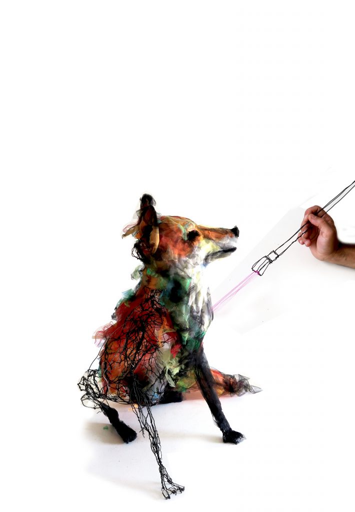
Take ‘Arabian Women’ and discuss.
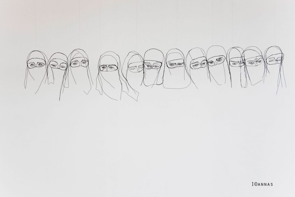
The Burkas piece appeared after my visit to Turkey. Before that visit, I didn´t have much contact with the reality of this life. An Arab woman told me she felt safer behind the fabric. I wanted to represent the shield carried as a second skin. The fabric is embedded in their DNA. This work is hung by being suspended to the wall.
What gauge wire do you use?
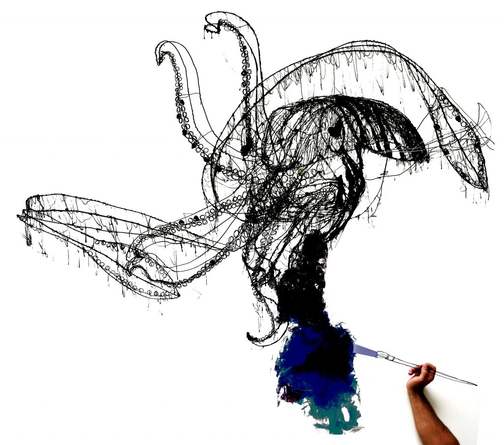
I use several kinds of lines. From galvanized wire to silver, to iron. The gauge is used according to the density of the line I want to represent. Or, according to with its function. Besides being sculptures they are also structures.
Sometimes you incorporate coloured wire. Is this plastic coated?
Why and when do you add colour?
I use several techniques applied in the wire. One of them is a coated velvet applied not just for the colour, mainly because of the feeling (It is warm, cosy, nice to the touch).
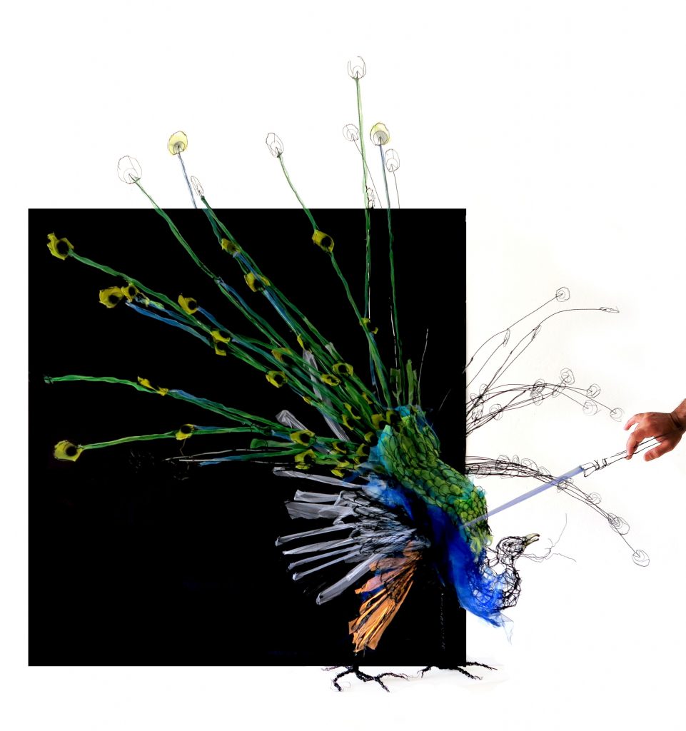 Discuss your technique from inspiration to completion (briefly)
Starts with an idea, an image in my head.
I study the shape I intend to represent, mainly seeing images and movies online.
Then I start directly bending wire until I reach what I want.
After I paint it, black most of the times ( also to protect from corrosion)
The work is then labelled it and is technically filed ( measures, photos, name, year). Then I try to sell it
Can you expand on your portrait and how you have taken it into 3D?
A portrait is made by knowing how a human skull is, understanding and knowing the main facial muscles. I then add elements that will identify it. Mainly the shape and distance of the eyes, shape of the nose, size of the mouth, hairlines, and ears. When you are doing your own, you use photos or a mirror.
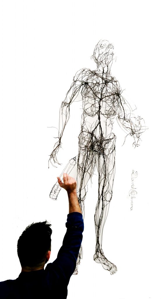
Please take us briefly from 2009 till 2019. Discuss both the works and your own artistic journey.
I graduated from university 2008 in ceramics- sculpture. My interest in drawing with wire started with me trying to represent the visible (skin). In 2010 I returned to the university for a postgraduate in drawing and compared anatomy (animals) that I did only the classes, not the tests (incomplete).
In my work, I realise there was a lot of empty space underneath the visible (skin), so I started representing the bones. In 2014 wanted to explore what I could find inside the bones (the energy, the intention, the movement). In 2015 I did a big exhibition called – Total Movement - about how we relate to everything, with all living creatures on the planet. I became a vegetarian also. In 2018 I did this huge exhibition in Lisbon a reservoir of water, with the water museum called – Life by a Thread. This year, in 2019 with End Youth Homeless. I also did a campaign that is travelling around the UK called- Now You See Me. Designed, trying to raise awareness about the young homeless in the UK. I´m back to Lisbon, preparing an exhibition in Casa Dell 'art Alfama’ to open in mid-July.
Construction image
Take ‘Bougainvilla’ discuss the construction of this work?
In this one, I used pieces of coloured tulle (mesh, net) to give colour to the flowers.
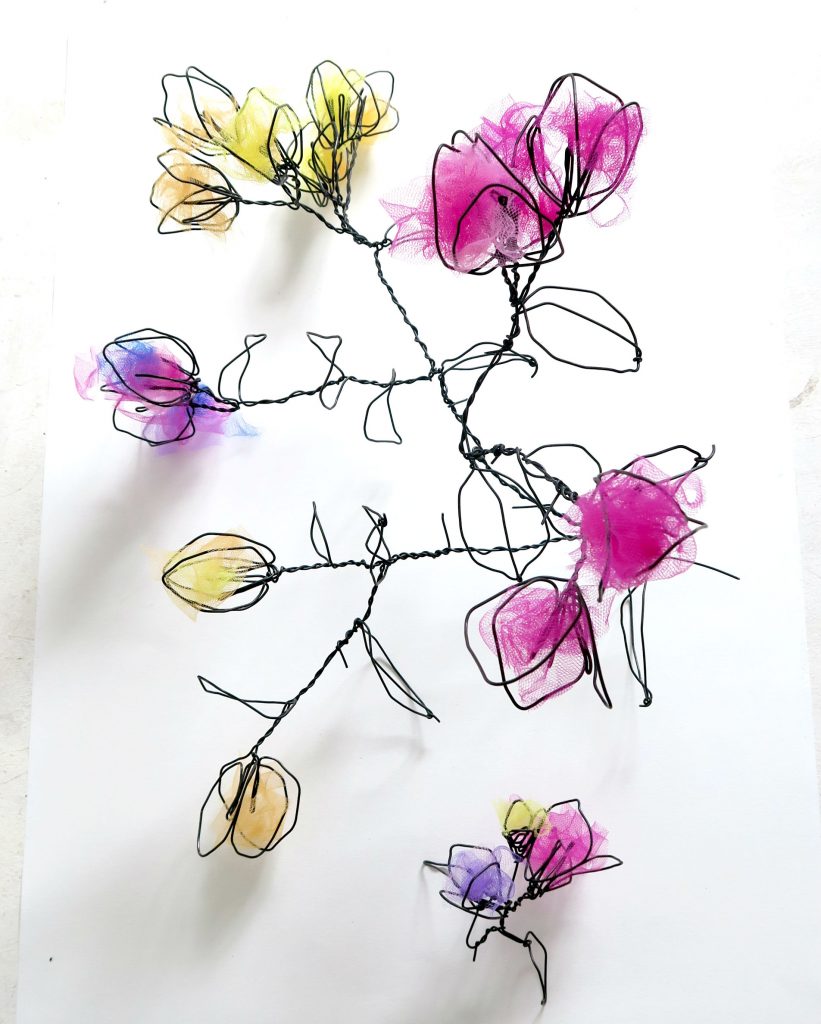
Tell us about the background story of ‘Tortured Man’.
My grandmother was Catholic, so I did a Jesus’ head, she has it above her bed. A client saw the picture and asked me if I could do one for him. I did the one I called tortured man.
Discuss one installation that has given you great joy, both in the production and the final presentation.
In 2012, The TVI, a free Portuguese channel was celebrating 20 years. They invited me to create a work around the theme – time capsule. I created a huge brain that was on stage, behind the presenters, being transmitted on National tv, during the ceremony.
Another was in 2016 I was invited to present my work in Gaeta, Italy. For that, I went there, with my friend a, photographer and first assistant- Sofia Trindade. That was a great production moment... In 2018 for the exhibition at the Reservoir (mother of water das Amoreiras) the place was so high (7m) I had to call my friends to go up the ladder because suddenly I was terrified.

David Oliveira
instagram: davidoliveiraescultura
Deborah Blakeley, Melbourne, Australia
Interview by Deborah Blakeley, July 2019
Norm Sartorius
You comment, “It’s (a spoon) an instrument, a tool of nurturing that is universal, or very close to universal, in the human experience.” Discuss.
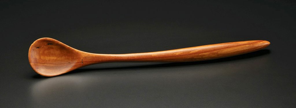
Functional Apple wood spoon, mid 1970’s
The core reason humans have a connection with spoons is that we are born with one on the end of each arm. Cup your fingers and you have a spoon. No one knows when early humans first made a separate utensil from wood, leaves, shells, coconut shell, or some other natural spoon form but it may have followed the advent of cooking. Not wanting to burn themselves they needed something to transfer hot food to the mouth. Nurturing others and ourselves is the mission of spoons.
Expand on the fact that each spoon you make is individual.
I did not want to manufacture a line of spoons. I wanted each spoon to be a response to the creative offering of the wood put together with my state of mind at that moment, that day.
Algerota Burl Scoop
Starting point:
In my shop I am surrounded by many small pieces of rare and interesting woods. They may be special for their colour, grain, and figure or it may come from the history of the wood. Where did the tree grow? What culture usually used the wood?
Wood often comes with a story and sharing that story is part of my goal.
Use:
I made functional spoons from the mid 1970s until the late 1980s. My customers would sometimes say my work was too nice to use which presented a dreadful problem. Should I make more typical, familiar spoons out of plain woods so that people would not be afraid to put it in their spaghetti sauce or should I make what most excited me even if that disregarded function? I chose the latter and have never regretted it.
Woods you use:
I have over 100 different woods in my shop. New woods often bring new ideas. For years I was a member of the International Wood Collectors Society. After appearing at retails shows for over 40 years other makers have learned my interest and some bring wood gifts to shows or ship some of their choice waste when they get home. After storms people call asking if I want the limb that fell from Uncle Henry’s cherry tree. I’ve foraged in the dumpster at Martin Guitar. I often work from other maker’s scrap and, of course, I purchase some wood when I can’t resist the beauty and character that I see online from trusted suppliers.
Apart from spoons, you have made a commemorative piece, ‘Ditch Digger’. Tell us about this piece.
Ditch Digger
“Ditch Digger” was carved from the stump wood of my grandfather’s black walnut tree and it’s my response to advice my father gave when I was a boy. He said what I did in life didn’t matter to him as much as how I did it, adding that even if I became a ditchdigger, if I was a very good ditchdigger, I would have a fine life. My father was a country doctor and he was very sceptical when I started my career in woodcarving. He passed away in 1983 well before I had any success. The sculpture shows a human figure holding a spoon larger than a shovel. This is my tribute to my dad and my thanks for his wise guidance.
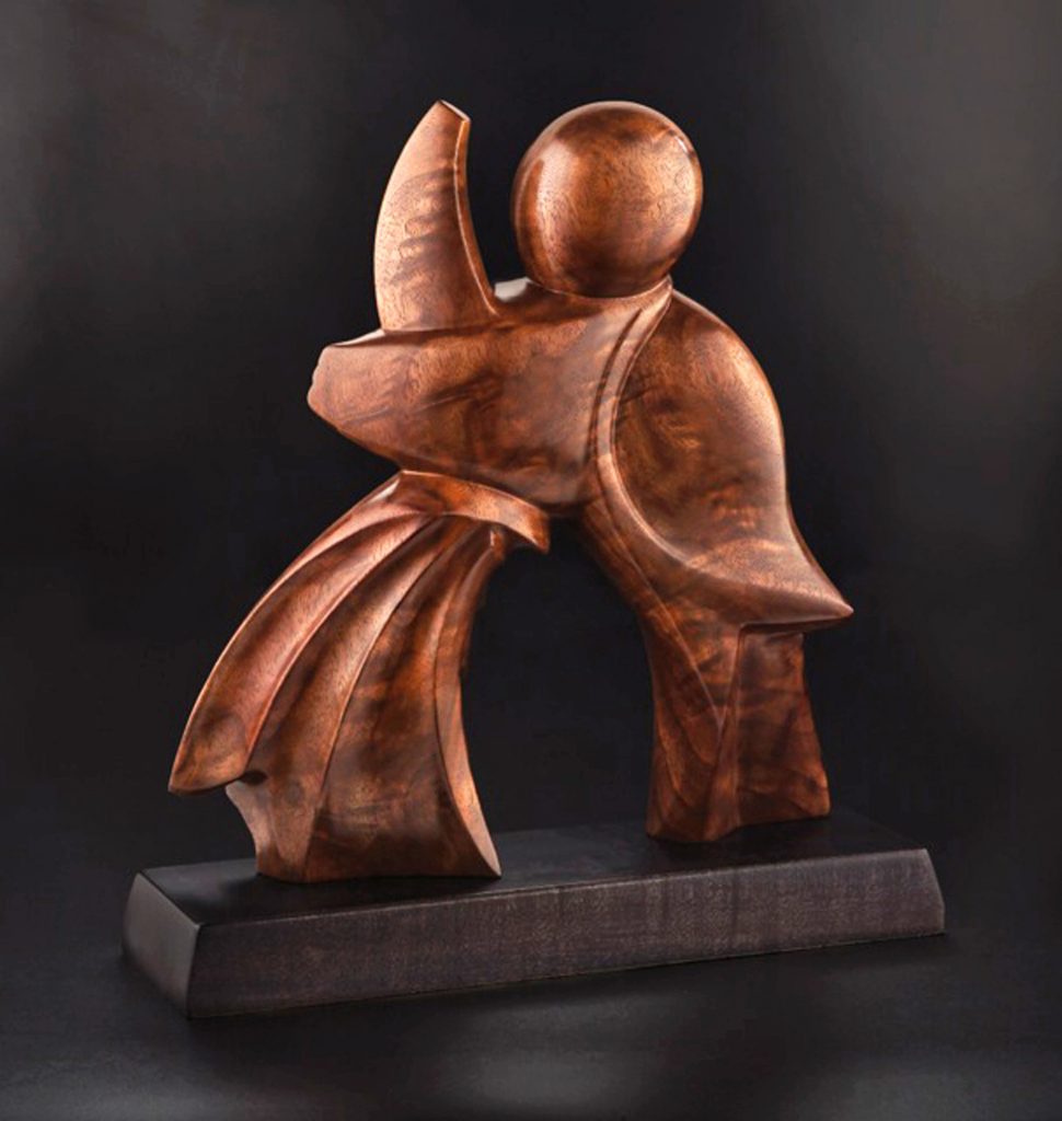
Ditch Digger, rear view
Comment on the fact that you have spoons in so many museums.
Discuss the importance of craft being in these collections.
In the early 1990s, I began to exhibit at the leading craft exhibitions in the US. Museum curators would attend these events to keep abreast of new work in decorative art. When I met curators I would always ask, “Do you have any wooden spoons in your collection”? I learned what had already been collected and how new selections were typically made. At the 1995 Smithsonian Craft Show I asked Michael Monroe, then Curator in Charge of the Renwick Gallery of the Smithsonian’s American Art Museum, that question and he said there were no wooden spoons in the Renwick’s collection. Much to my surprise he then said if I could find someone who would purchase and donate a specific spoon that he liked he would accept it into the museum’s permanent collection.
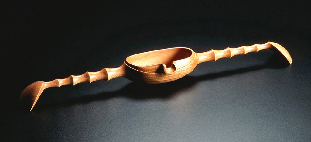
Spoon From a Forgotten Ceremony in the Renwick Gallery
Collectors Robyn and John Horn already had several of my spoons and agreed to placement of Spoon From a Forgotten Ceremony in the Renwick. I learned two things with this transaction. First, that one cannot donate one’s own work to a museum and second, that part of the reason is that the artist must be paid for their work.
I now have work in 20 museum collections. In some, cases I played no role beyond making the work and in other circumstances the museum bought directly from me. Without the support and cooperation of collectors it would be much more difficult for museums to add to their collections.
Another lesson was that the curator makes the choice not the artist or the collector. The work must answer a need in the museum’s collection from the curator’s point of view. Museums commit to caring for objects for many generations. They are the cultural memories of our world. Art historians evaluate museum collections and their accumulated documentation and place that work in the perspective of time, trends, and movements. I have greatly enjoyed working with several museums and have appreciation and respect for their mission as guardians of culture in our society.
Art and Craft are often passed down one generation within families but seldom two. The contact with the artist and the reason for the purchase is forgotten. Museums bridge time and provide a window into past cultures for hundreds of years.
Are any of your spoons in Galleries outside the USA?
Not that I’m aware of.
Your studio is a part of you, discuss.
My shop is cozy. It’s more than a studio; it’s a refuge where I’m protected from the rest of the world.
There are windows that look out to my yard and garden. Large oak trees and flowers bracket a brick sidewalk. Inside, wood and tools, and usually my favourite music surround me. It’s a bit messy and cluttered with wood, wood, wood! In the centre of my studio is a simple wood stove. Every winter, feeding the fire is as routine as my interaction with wood, tools, and ideas.
You work alone – discuss your comment “Blank time is significant to my creativity.”
I have a recliner in my shop. I consider it a tool. I’m old enough now that people will sympathize with the notion of napping but I’ve done it my entire career. Taking a break is like clicking the refresh symbol on my computer. I return to work with a clear mind and focus is easier. A short walk, visiting the garden to pull a few weeds, getting a phone call from our son, even doing dishes or cooking serves the same purpose.
If I’m at a critical stage carving a spoon and am having trouble making a decision some blank time often reveals the best path.
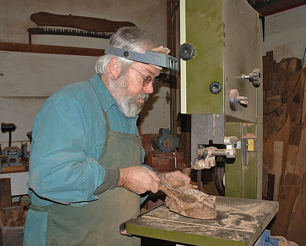
What is one of your favourite woods to use and why?
A long time favourite is Algerita and Algerita burl. This is a common bush in the Sonoran Desert of the American Southwest. When these bushes grow close to a water source they become a small tree. The wood is yellow/green with beautiful grain. Where the trunk meets the dirt there often are small burls. This tree grows in hot and dry environments with rocks and sand. Few pieces are perfect and all but a few are very small. It is not harvested for commercial use. At shows I met a woodworker who lived where this tree is common. He was able to send me what he had salvaged from construction sites. It is a good example of a wood that can be used for small work but is unavailable to the normal timber market.
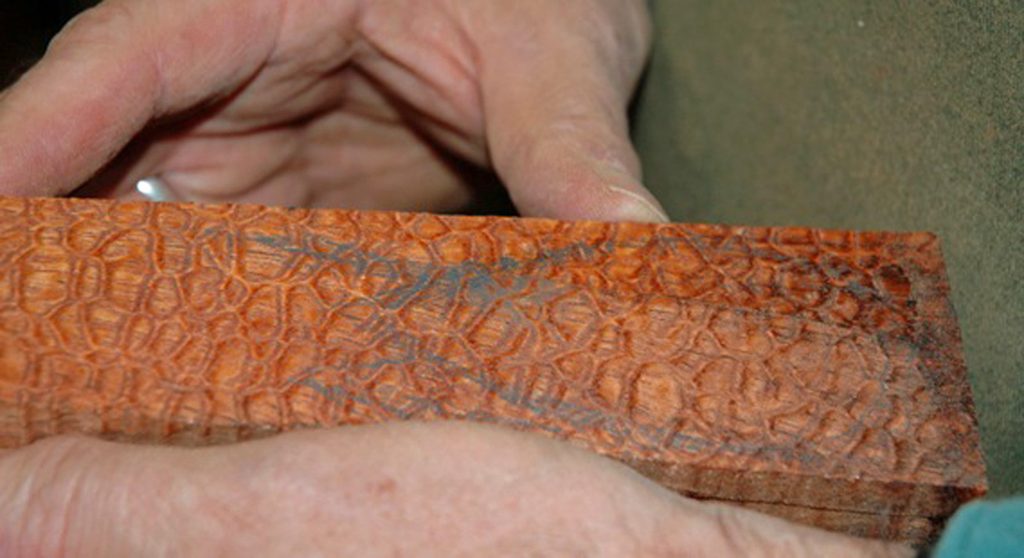
I also enjoy expanding the exposure to wood for my customers and the public at shows. It’s wonderful to have wood in my display they have never seen. In the Eastern US everyone is familiar with Dogwood, a small decorative tree found in the landscaping of many homes but few have seen the wood. Dogwood is another beautiful wood large enough for my work but too small for any commercial timber use.
Please discuss two spoons that show a fun or cheeky aspect of your work.
Spoon with Three Piercings – Pear Wood – 9.5 x 3.5 x 2 – 2004 - Years ago there was a large pear tree overhanging my backyard but rooted in a neighbour’s yard. When my neighbour removed the tree after some storm damage I asked for some of the wood. Included was a section where the yearly movement of sap had carried iron stain above and below three nails buried in the tree. I had seen this before in wood but had never tried to retain the nails in my work. In 2004 tattoos and piercings were becoming increasingly popular so I wanted to reflect that in the title.
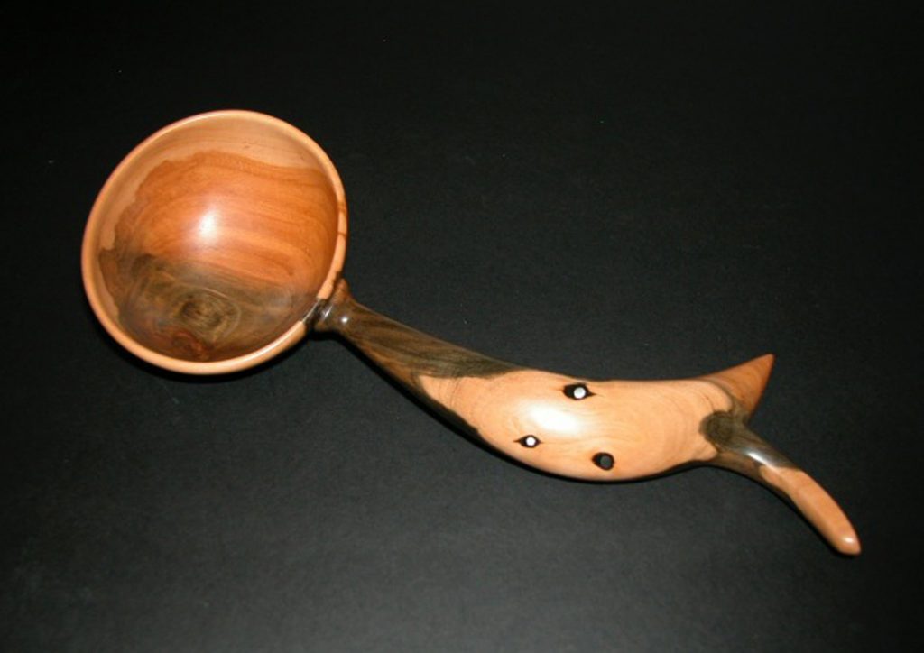
Three Piercings – Pear Wood
Airhead - Australian Snakewood – 6 x 3 x 1.5 - 2012 - I had a momentary lapse of attention when I was almost finished hollowing the bowl of this spoon. In that moment I punctured the bottom. For an hour I was annoyed with myself and thought the piece was ruined but gradually a different idea emerged. This figural spoon seems to be taking a walk with blond hair flowing. Only skeleton evidence of the bowl form remains suggesting the absence of mind. It could be taken as good or bad. A Zen state or a vacuous one, which is it? I thought Airhead was the name I deserved for going through the bottom but it was also the best name for resulting rescued spoon.
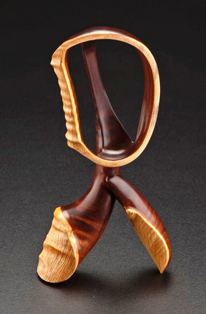
Airhead - Australian Snakewood
Comment on one tool that you love to use and why?
Once I’m finished roughing out a piece on the bandsaw I move to my pneumatic sanding drum. It’s a 3 inch diameter x 6 inch wide inflatable drum mounted directly on a 1 HP 3450 rpm motor. I start with a 24 grit belt. This is my primary sculpting tool for roughing out and refining all but concave forms. It is very aggressive even with the most gnarly burl or super dense wood. I am not sanding so much as shaping. I work on the quarter of the spinning belt that is immediately in front of me. From 3 o’clock to 6 o’clock if the circumference were divided like a clock. I rarely work on top of the belt because my hands and the work itself obscure what is happening. I use a very bright overhead light. Carving with abrasives allows use of any wood regardless how dense or wildly figured it is. I love the huge variety of woods in the world and want to try any wood that appeals to me. A 24 grit belt doesn’t care that the wood dulls edge tools or that it has rowed grain. The use of an abrasive wheel in shaping small wooden art objects was highly developed by mid-century American carver Emil Milan (1922 – 1985). My first teacher, Phil Jurus, was a student of Milan’s. My first pneumatic drum had been one of Milan’s drums. While I never met him, his approach to woodworking greatly influenced mine. I worked as part of a four man team to research Milan’s life. Our book, Emil Milan: Midcentury Master, published by the Center for Art in Wood in May 2018 and was the result of this extensive research.
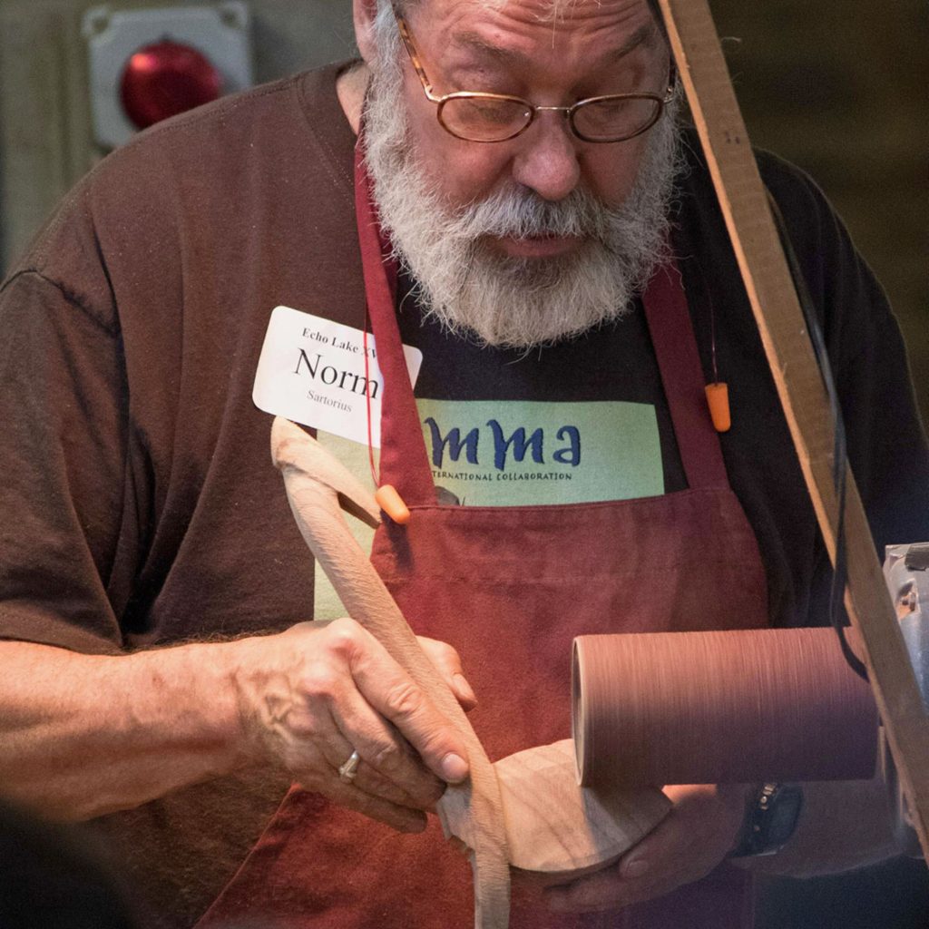
Do you record the wood used on each spoon?
Since 1997 I have kept records for each year’s spoons. Information recorded includes title, wood used, dimensions, price, customer, and where it was sold. There’s space as well for a comment or few word story, if I want to remember a specific detail. This documentation has been very useful when asked to provide images for publication, museum records, and collector appraisals.
Have you found that certain woods are becoming rare or no longer available?
Most woods are still available for the small work that I do. While there’s never been more pressure than there is now on the rare and beautiful woods of the world, these same woods have been sold for centuries and pieces of these woods are in the shops of old makers and dealers all over the world. If you need 100 board feet of perfect Brazilian Rosewood you will have trouble finding it but if you can use an irregular shaped scrap that is in the short rack of an old guitar business you may be able to get just what you need. My wood collection has taken 40 years to accumulate; a chunk, a small piece or two at a time. There are thousands of types of wood I have never seen. A few of them are surely fantastic.
You also make other wooden objects – letter openers, bracelets and sculptures.
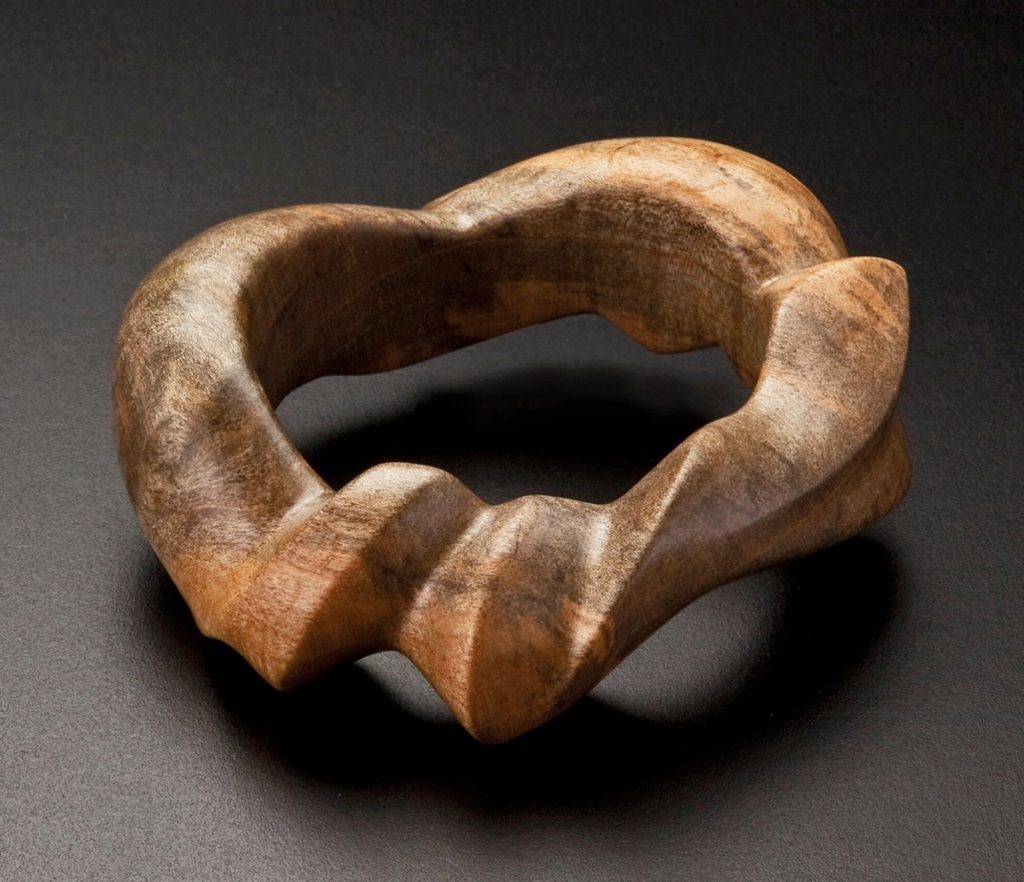
Bracelet, Monticello Poplar
I have made sculptural bracelets and letter openers throughout my career. I always have a few at each show. My spoons are expensive so when someone new visits my booth the more modestly priced bracelets and letter openers give them an entry to my work. I have customers who collect letter openers with one long time customer having over 70. A few letter openers are in museum collections. The same attention to rare and beautiful woods and unique forms that I insist on with my spoons is also shown in these items.
The sculptures are another matter entirely. They are more ambitious than most spoons and much larger in scale. Most have referenced spoons but in a more abstract way. The “Spoon Dreams” series explores creativity as it relates to wooden spoons suggesting a dream where all bowls, all handles, all woods, all shapes, all connections are available. I make sculptures at the rate of a couple a year as opposed to spoons where I aimed for at least 50 per year most of my career.
Discuss ‘Monticello’
“Monticello” - Monticello Letter Opener - Tulip Poplar - 10.5 x 1.75 x .75 inches. Thomas Jefferson, the author of the Declaration of Independence and the third President of the United State may well have planted the tree from which I carved this letter opener. In his Weather Memorandum Book on April 16, 1807, Jefferson noted planting very close to his home, Monticello: "1. Laurodendron in margin of SW [shrub circle] from the nursery." This tree grew to be enormous and unfortunately hollow. 84” in diameter at it’s base this was described as one of ‘Mr. Jefferson’s pet trees”. It was designated both one of Virginia’s Remarkable Trees and a Millennium Landmark Tree”. Eventually this magnificent tree was removed for safety concerns and I was offered some of the wood for carving.
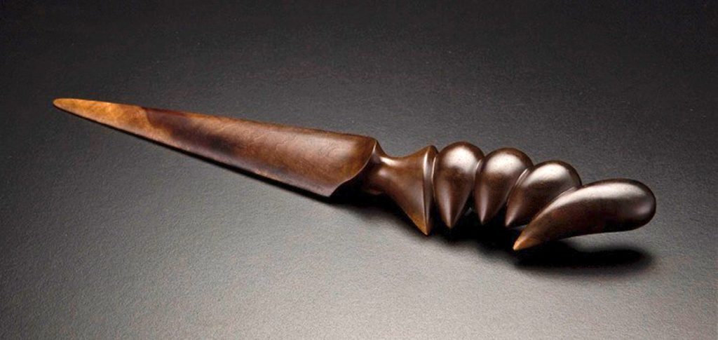
“Monticello” - Monticello Letter Opener - Tulip Poplar - 10.5 x 1.75 x .75 inches.
The huge hollow tree held water and over the years this water stained the wood very dark nearest the soaked interior surface. It was from this unusually dark wood that I carved this letter opener. Letters were the internet of the day for our founding fathers and crafting letters was an art form. This contemporary letter opener honours those bygone days and pays respect to Thomas Jefferson, who loved science, nature, letters, and trees.
In July 2019 you have three spoons spanning 12 years in the exhibition curated by Helen Harrison why these 3 spoons?
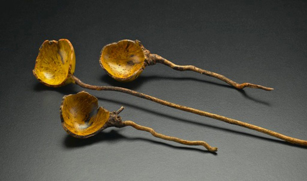
Sperm Spoons, Algerita Burl
Helen chose these spoons from the ‘Avaliable Work’ section of my website. I could have declined but agreed she had made good choices; an excellent recent major piece, a modest spoon a few years old, and the oldest work available at the site.
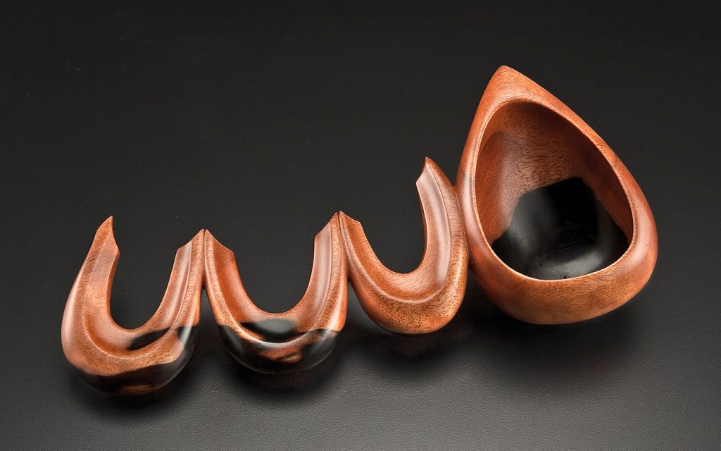
Arches, Macassar Ebony
She covered a broad price range and style of spoon in her selections. These spoons were part of a recent show in Key West, FL called With the Grain: Contemporary Approaches to Wood Art.
Discuss, “Traces” – African Blackwood Burl Spoon.
Tell us about POP, Professional Outreach Program and your involvement.
The American Association of Woodturners (AAW) fosters and promotes high standards of professionalism in the field of woodturning through a range of initiatives.
At every year’s AAW Symposium there is a POP themed exhibition and auction to raise money for the organization’s projects. This year a few non-turners were invited to contribute, I was fortunate to be included.
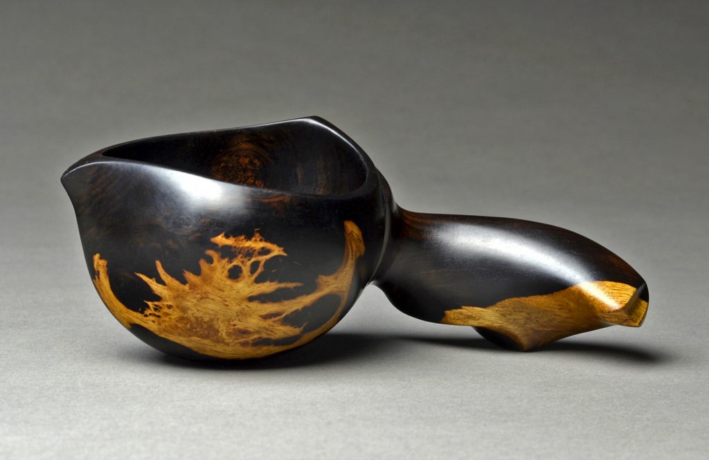
Better than None – African Blackwood Burl Spoon - 6” x 2.5 x 2
This is the second completely new spoon I’ve made since health issues sidetracked me in the summer of 2017, so this represents a trace of my previous career. I also greatly enjoy the traces of sapwood visible on the outside of the spoon bowl. Patterns of this sort only occur when the miniature mountain ranges of eye burls interface between heart and sapwood. These traces are worth seeking and worth revealing as, I hope, was the personal reveal that I can still make a spoon after a significant layover.
How has your work developed from 2004 till 2019?
Since 2004 the changes have reflected aging and my desire to use the very best materials in my wood collection. If the piece fails to excite me, I may let it go. As technology has largely replaced letters with emails the use of letter openers has dropped so I make fewer each year. As time passes, I find I am free to be experimental and to step even farther from the functional reference of the spoon form.
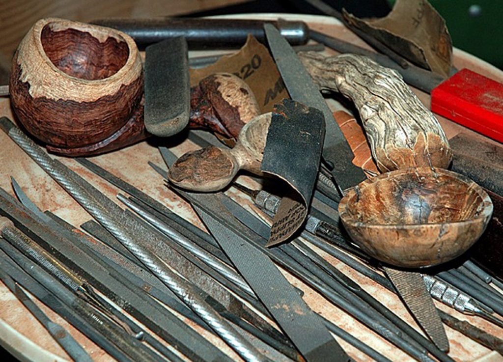
What are one or two important things you have learned?
I believe that the artist/collector relationship is even more critical in the future than it’s been all along. Most of us need to sell our work in order to continue making. I’m especially grateful to collectors not only for supporting me but also for their advocacy for the field. Organizations like the Collectors of Wood Art, The American Association of Woodturners, the Center for Art in Wood and the leading craft schools such as Arrowmont, Penland, Haystack, Anderson Ranch, etc all count on the sustained support of collectors The documentation of our field in craft publications and periodicals is also critical and funding organizations such as the Center for Craft, Creativity, and Design help document our field.
I’ve also learned that people appreciate a story that helps make a connection between them, the artist, and the object. Part of why they visit my booth is to see the work but often they want to talk about their lives, their families, their experiences. They want to share what’s on their mind with a friendly person. Sometimes we connect over a related interest such as a book or museum show we’ve each seen. Many retired people who have woodworking as a hobby want to ask questions about woods, tools, finishes. In most cases I see this as fostering the good will that exists among woodworkers. You never know where it will lead and sales are certainly not the only reward of this work.
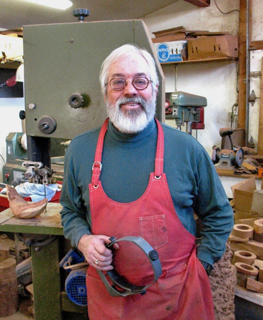
Contact details:
Norm Sartorius
www.normsartorius.com
Deborah Blakeley, Melbourne, Australia
Interview by Deborah Blakeley, June 2019
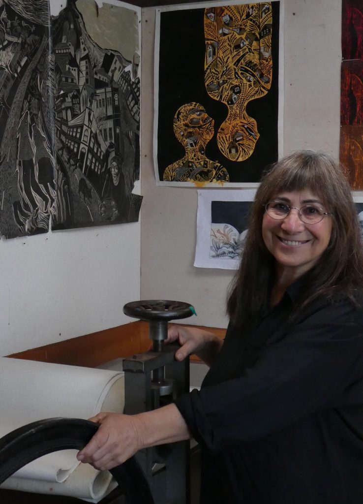
Kati Thamo
You have been fortunate to win a Go Anywhere Grant discuss.
Yes, I was very fortunate to gain a Go Anywhere grant in 2010. It was a privately funded grant sponsored by Artsource in Perth to allow Western Australian artists to have the opportunity of travel to further their art practice. It enabled artists to undertake journeys to explore places that had particular relevance to their art making. For me it was an obvious choice of where to go - back to the family homelands in Hungary and Transylvania. Ever since I was child growing up in suburban Perth, I heard stories of the family’s remote Transylvanian homelands, a distant world so different from the hot, flat, coastal plain of Perth.

This was an exotic and mysterious world I’d only heard of from family stories or in fairy tales - of forested mountains, weeping deer, bears and wolves, village lives….… I had been a practicing artist for many years before getting this grant, and people were always commenting on how my work carried an Eastern European aesthetic, even when I depicted the Australian bush! And with the wonderful opportunity this grant offered I devised a journey from Istanbul through Eastern Europe and up to Berlin, spending time in particular in Transylvania, Romania and Hungary. It allowed me to visit the various places I had heard so many stories about. And in a broader sense, I was able to gain a sense of an aesthetics of place by visiting ethnographic museums, art galleries, cemeteries and churches alongside travelling through forests and villages throughout the region.
It was an enormously enriching experience for me to go back to the family village in Romania which even after decades still resembled the old black and white family photos I had leafed through as a child; there were still horses and carts loaded with hay, folk wood engravings on gates and fences and family homes filled with colourful embroideries.
Older people we met still had tales they remembered - of bears that hibernated in our family crypt in the hillside cemetery, of tulips in their gardens that came from my grandmother’s yard, of furniture taken from the home abandoned once my grandfather died. It was a journey dense with experience for me, to actually see the places I had only heard of in stories; an opportunity to place those many tales I’d been told in real settings; to go from the imaginary to the tangible.
Ingrained, Flying at Dusk
Since that fortuitous opportunity, I have produced several bodies of work inspired by my experiences. In the linocuts ‘Ingrained’, a series I am continuing to develop, I have created images based on the wood carved fences and arches common in Transylvanian villages. I’ve tried to re-create the patina of old engraved wood, and integrate my own imagery into the designs. Another ongoing sequence is a series of etchings, again based on my aunts vivid storytelling, which are more surreal and darkly fanciful, like my aunt’s stories were. In images such as ’The Land of Longing’ I’m not trying to depict an actual place, but to evoke the kind the shadow world she created for me, a world that has existed in a kind of parallel reality and which has it’s own bizarre logic.
Land of Longing
Although my art practice ranges across many themes, I think I’ll always somehow return to the strange and compelling world that was created for me at a distance when I was a child. Something about those family tales captures my imagination in a way that goes beyond the personal and particular to a more mysterious and mythic evocation of being in the world.
Explain how you are influenced by Folk art in your printmaking.
I grew up in Perth in Western Australia, the city to which my Hungarian parents emigrated in the years following the second world war. As with many other emigres my parents filled our house with decor that reflected their Hungarian/Transylvanian heritage. My old Transylvanian aunt also lived with us and sewed continually, cross-stitching blackly on red cloth as she embroidered tablecloths, cushions and napkins, and so our home was filled with the intense colours of Hungarian embroidery. And while my friend’s suburban houses had lino floors and paintings of the outback on their walls, our house had Persian carpets and oil paintings of Transylvanian village scenes. I grew up surrounded by folk designs, and folk art - there were decorative ceramic platters, jugs and bowls on display, and every Easter we would paint our blown eggs with decorative Hungarian patterns. Of course that folk aesthetic seeped inevitably into my own art making.
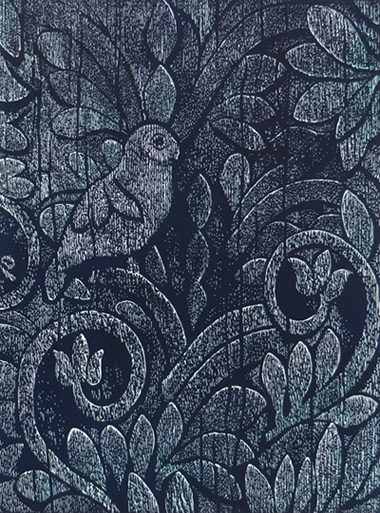
Ingrained
You comment, “My art is a form of storytelling with a strong narrative intent evident in my work.” Use 2 or 3 pieces to ratify this comment.
As I mentioned earlier, my old aunt was a great storyteller - hers were often dark tales of betrayal, loss and paranoia, and often strange and funny. It was the quirkiness that hooked me in and so perhaps she is the reason behind the storytelling impulse in my own art making. Though, rather than just illustrating these old stories, I’ve reconfigured aspects of them into visual metaphors, making a kind of fable or improbable account. And the same approach holds true when I create images from stories that are drawn from my own life or from dreams or myths. An incident in my daily life may make its way into my art making, to emerge with a twist, and holding several meanings that are more or less ambiguous.
In ‘Turn Around’, a triptych of solar plate etchings, I’ve tried to create a sequence of dream images based around a girl on a journey riding a bird towards a kind of lit stage. Were she to turn around she would see she was being followed by a hound, perhaps a wolf, but her attention is drawn ahead to where some folk are dancing, enthralled, to an accordionist’s tune.
Turn Around
The ‘Deer That Wept’, another solar plate etching, is an image drawn directly from one of my aunt’s tales. She described once being in the forest behind her village and an injured deer came down to the nearby creek, and was crying. In my image, the deer that sheds tears into the water is not only that injured animal, but also stands for aspects of my aunt’s sad and thwarted life.
Deer That Wept
Another large collagraph print, ‘Unravelling Eden’ describes a period of our lives when we lived in the bush with our young children.
Unravelling Eden
I’ve referenced tapestries, or embroidered rugs, in this work, as while we lived there the forest did form the tapestried backdrop to our lives. The interlocking details within the image of people and animals refer to many of the incidents and stories connected to our experiences there. This is not a linear tale, but evokes a kind of song cycle, with a river flowing through.
Take ‘Another Song’ and discuss the technique, particularly the use of water colour?
In my etching Another Song I’ve used two plates to create a layered effect. The indigo plate shows the butcher bird which serenaded us on a high hill one day last year, singing to the banded rail that nests in our garden. The under layer of orange/sienna is another plate also etched with birds and flower details. I’ve included various native orchids in this image to reflect the delicacy of the rail, with it shy, graceful demeanour and intricate patterning. In this print, as with many others, I’ve used touches of watercolour to highlight a couple of areas.

Another Song
You often place your work within another context discuss.
Within a book
On a jar
In the last few years I’ve made a couple of large series of etchings. In one, ‘The Book of Nature’ there’s a series of linked images showing the pages of open books. In using books as the underlying image structure, I wanted to draw on a range of associations from encyclopaedia and scientific documentation through to illuminated manuscripts and sacred texts.
![]()
In Clear Air
This ‘book’ has no text but instead has intricate images of nature inscribed on the pages. The images are drawn from natural environments, are detailed and intimate expressions of place describing profusion, complexity and entanglement. And although each page has details of small plantscapes, there’s also a sense of a larger landscape of hills and valleys suggested by the book profiles, as one image flows into another.
Another series has been a sequence of images of glass biomes - etchings of small delicate environments which hold various plants, animals, birds and insects.

Wildlife Preserve
I started making images of birds and animals in bottles a couple of years ago, and the sequence has been growing. Where we live in Albany is only a small town block, and yet our yard harbours a range of wildlife. We have a bevy of bandicoots, along with frogs, ringtail possums, king skink lizards and a various birds - including the very delicate banded rail, which raises it’s brood under our mandarin tree every year. In making these works, I was thinking of our yard being a kind of biome, a small refuge where animals could shelter. On a larger scale the greater southern coastal region of Western Australia has established refuges on offshore islands along with fenced enclosures in national parks to hold and monitor various endangered species. Some of these animals, such as the Noisy Scrub Bird and the rare Western Ground parrot, have also ended up being depicted in my etched biomes. I quite like the ambiguity of these small scenarios - are the animals and birds trapped in there or are they being sheltered and protected? Of course there’s an association with specimen jars in museums, but my animals are depicted as alive and looking out at us, perhaps asking something. I wanted to capture a sense of fragility and also poignance in these images.
When I print these biomes, I cut stencils to mask out the backgrounds which makes the jars and bottles appear to float in space, creating a further sense of vulnerability - they could even be metaphors for our planet… floating in space and carrying this precious profusion of life.
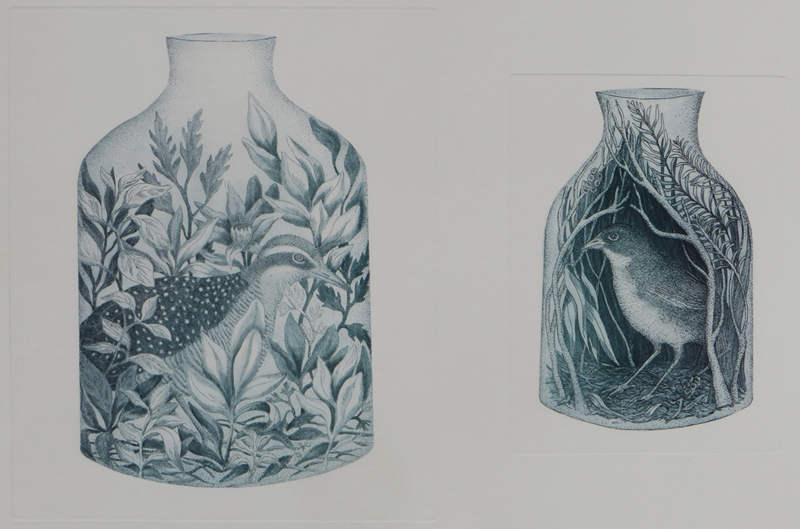
Wildlife Preserve, Birds
So, yes, with these two series of works there is a very evident theme of containment. Whether in glass containers or in the pages of books, I intended these small ecologies to suggest the vulnerability, complexity and current fragility of various ecosystems.
You also print and paint on found pages, expand on this aspect of your work.
More recently I created a small sequence of watercolour and gouache paintings on the pages of old encyclopaedias, a place where information is collected, documented, collated and often ultimately outdated. On each of these pages I’ve painted a realistic depiction of a plant or animal. As I painted them I thought these specimens could act as a kind of foil to the information below them - offering something replete with it’s own ‘beingness’ and not necessarily fully explicable to us.
A large number of your works are based on Australian flora and fauna, comment on the deeper meaning beyond the initial observation.
I grew up in the suburbs of Perth, but moved to the country as a young adult, and have largely lived on the south coast of Western Australia ever since. For many years when my children were young we lived on a wilderness property, surrounded by forest and a proliferation of native vegetation along with native animals. The delicate tracings of foliage and branches thread through my memories of our years there. And even when we moved to the larger town where we still live, we are surrounded by national parks known for their plant diversity and profusion. So I have spent decades either living, camping or walking through the wilderness. That experience of being immersed in the bush, means the plants forms that i’m so familiar with become part of the patterning of my world. And the birds and animals I depict are often a record of encounters, like the butcher bird in ‘Another Song’ that serenaded us so effortlessly on a bush walk a while ago. In many of these works I’m attempting to express something of the exquisiteness of the natural world; to suggest something of the interlocking complexity and delicate balance in the natural ecosystems.
I’m interested in our relationship with the ‘wild’ - how we often romanticise it and yet inevitably damage it. Nature is no longer ‘unbounded’ - even the wildest, most remote places are becoming compromised by the damaging effects of humans. Closely attending to the natural world around us may help bring a shift of emphasis from a human centred view to consider other ways of relating to the world around us - to foreground wilderness as something worth attending to.
Using ‘Stitch Lives Together’ discuss…
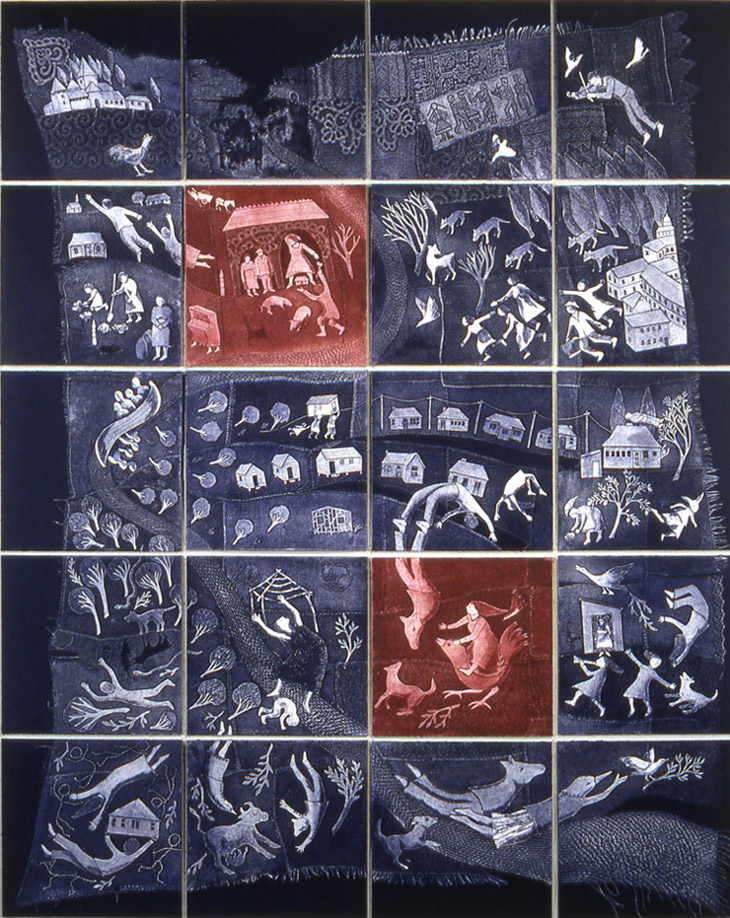
Stitching Lives Together
I created the large multi panel print piece, Stitching lives Together as part of my honours thesis when I studying at the University of Tasmania in 2001. It’s an autobiographical work exploring the interconnected stories of three generations of women in our family - my mother, my elderly aunt and myself. It takes the form of a large ‘quilt’ composed of twenty blocks, where a profusion of characters is overlaid on a patched background, tracing a visual lineage that stretches from Eastern Europe through to the Australian bush. I hoped to create a form of family ‘tapestry’, combining stories from my aunt and my mother and interweaving them with my own. it tells a story of dispossession and migration, and the adaptation of subsequent generations to a new land. There is a stitched ’river’ running through the piece, intimating how lives run into other lives, one generation flows into another, creating a continuum.
The collagraph blocks I used to create this work are made with stitched fabric and paper cutouts, with painted elements creating highlights and shadows. I often use multiplate printing as part of my process where plates inked in different colours are printed one over the other to give a richer depth and colour range to the images. Sometimes with prints I’ll create two series of the same image using different colours - with one edition in a pared back colour palette, and then playing around with a range of colours in a second edition to create a richer and varied tonal range. In this way the same image is imbued with different resonances.
You have many works bought into public collections. Discuss one of these.
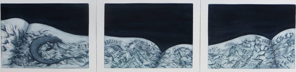
Book of Nature
Last year (2018) I had an exhibition with Turner galleries in Perth called ‘Bird in a Bell Jar’ where I displayed the suite of etchings, ‘The Book of Nature’. I was very pleased when the Perth Children’s Hospital purchased the full set of 16 prints for their intensive care waiting room. I can only imagine how stressful it must be waiting whilst you child is in treatment, and I’m glad to be able to contribute some visual relief in that clinical environment. In the imagery for this compendium I’ve drawn plants and animals on open book pages, creating a sense of an unfolding story as you move from one image to the next. In many ways the Book of Nature works are a meditation on nature, and I hope the work will provide a kind of solace, or at least some calming distraction for those who wait.
Contact Details:
Kati Thamo
kati@katithamo.com.au
kthamo@internode.on.net
Deborah Blakeley, Melbourne, Australia
Interview by Deborah Blakeley, June 2019
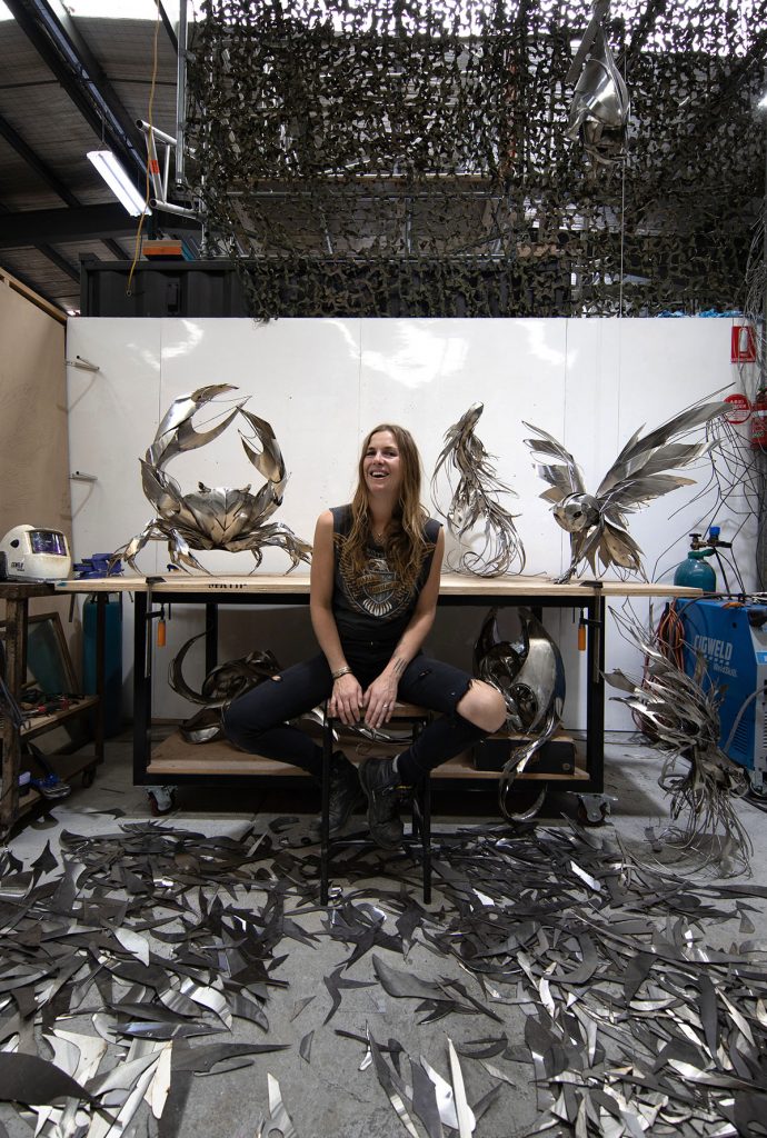
Georgie Seccull
How did you become involved in the Art of Dining exhibition at the NGV (National Gallery of Victoria)?
Briefly discuss how the ‘whole’ table setting was done.
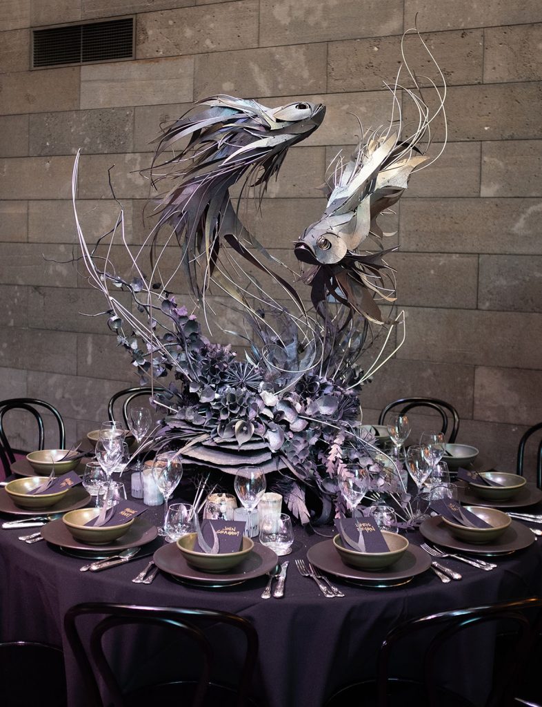
Dancing in the Dark
I was invited to be involved by Adelaide Bragg for the 2016 exhibition and ended up taking on 2 tables that first year, my own as well as a collaboration with Minimax. Both tables featured exotic otherworldly birds. This year the brief was lavish excess, with the encouragement to be as wild as we liked, so I created a scene where Siamese fighting fish swam up out of the table and danced above you as you ate.
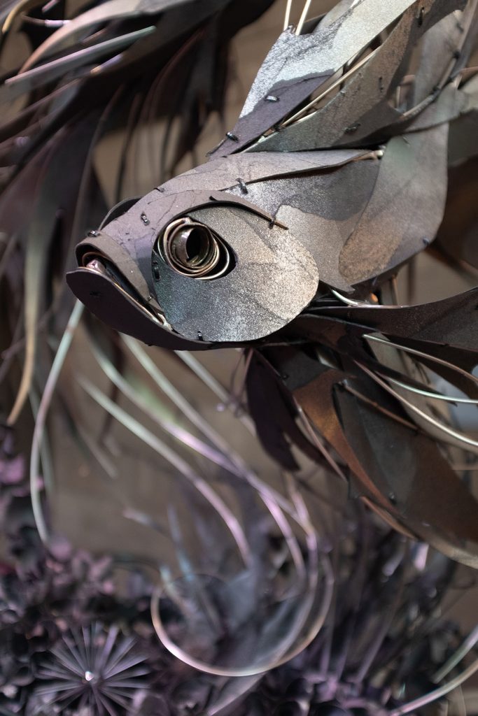
Dancing in the Dark, detail
The fish were made out of steel and paper, which then all the paper scraps and off cuts left over from the fish were used to create a dark and dreamy coral reef below. As for the table settings, all credit goes to my mum for putting all that together, she styled the entire thing.
Dancing in the Dark, detail
Explain about your studio.
Well right now my partner and I are actually in the process of moving both home and studio from inner city Melbourne to St Andrews, a small town out in the bush about 45 mins from the city. There is a beautiful shed here that was built from all kinds of incredible salvaged materials; frames from old Melbourne piers, church windows, dairy doors. It’s a work of art in itself and so we are very excited that it will be home to all our future creations.
Please take us through the process of one piece, from the inspiration to the completion.
![]()
It usually begins with an expression or movement I have in my head. I'll draw up a little sketch and then find references that allow me to understand how that movement would work – for example if it's an animal I'm making I'll look at how their muscular structure moves and I'll try and work out how it would move to get in the position I have in my mind.
![]() Transcendence
Transcendence
Then I'll begin to create the internal frame. For me, this is the most important part – it dictates to movement and flow of the overall piece. Once that is done it becomes very organic from there, picking up pieces one at a time and letting each one come together to dictate the outcome.
Discuss ‘Geisha Garden’ both the large suspended truss and closer center pieces.
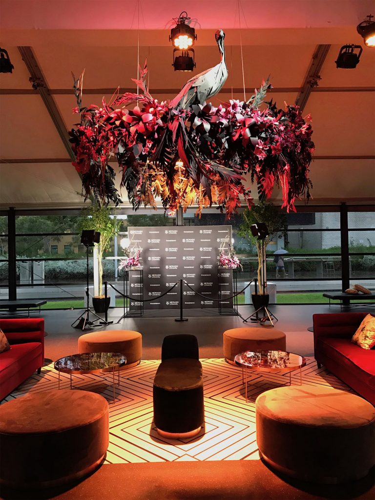 Geisha Garden
Geisha Garden was created for Monash University graduations marquee. I wanted to create a garden within the marquee that felt like it was alive, with lustrous petals blooming from the tails of exotic birds and strange unusual flowers growing from geometric metal structures.
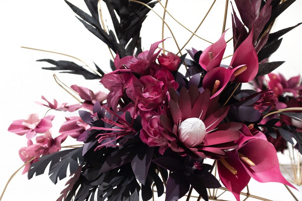
Geisha Garden, detail
It was a very tight timeframe with only 3 weeks to get it done. I had a team of girlfriends in the studio most days, cutting and pinching and curling each individual petal and leaf, which I would then glue together one by one to create each flower.
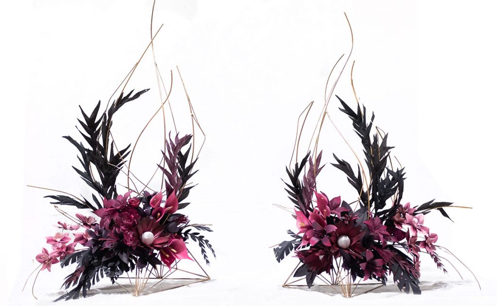
Geisha Garden, detail
Expand on ‘Symbiosis’ at the Mistere Spa Forest Retreat in NSW.
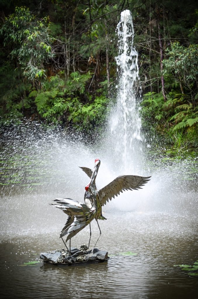
Symbiosis
Symbiosis was quite an unusual piece, in the sense that it was specifically made to be installed on a tree stump, in a pond, in the middle of the rainforest. The piece is 2 brolgas performing their ritualistic dance that bonds them for life. Seemingly a choreographed performance, their graceful strutting and bowing is an instinctive art form, with the rainforest and the water fountain in the background, I thought it was the perfect stage for them to perform on.
Show us your work with bees, discuss.
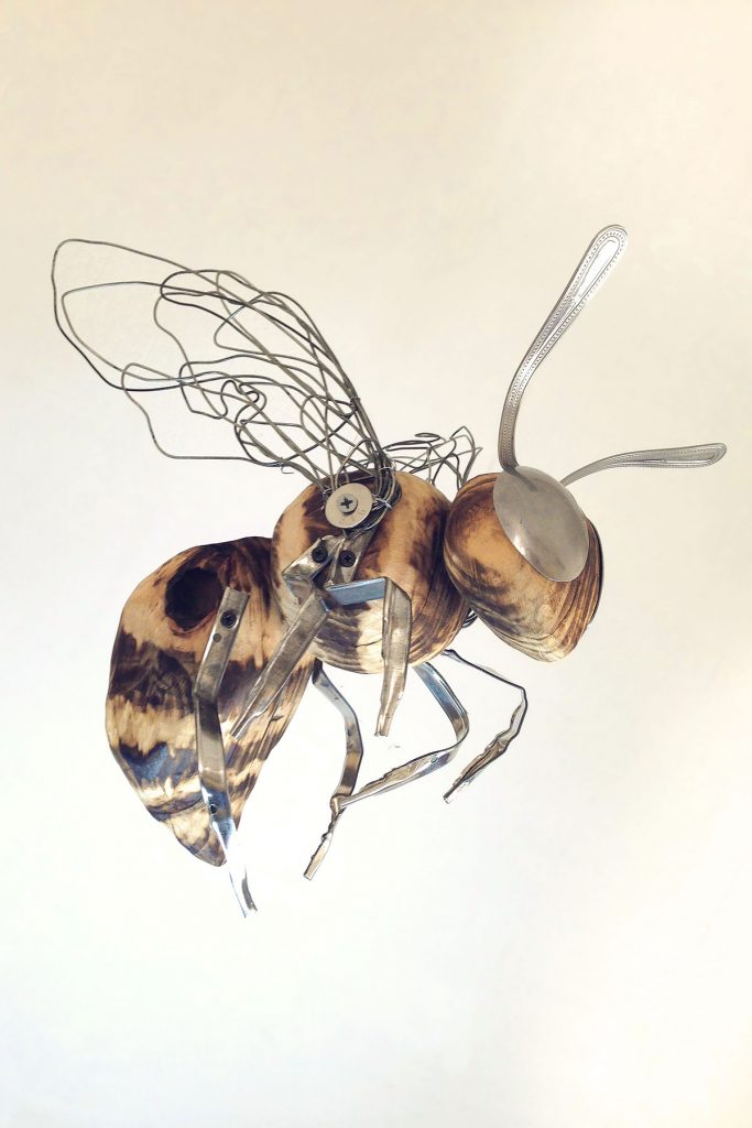
The bees were made for the International Garden and Flower Show. They’re made entirely from salvaged materials. The bodies are made from wooden shelves found in hard rubbish that I carved into shapes and then burned with a blowtorch to give them their stripes. Their little legs are made out of the metal binders of filing cabinet folders, their eyes are made from teaspoons I found in the op shop and their wings are shaped from wire.
Comment on recycled materials that you have used in a piece.
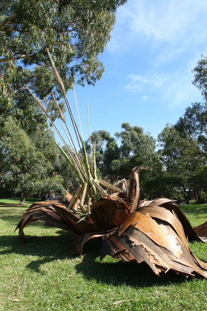
Another Earth
‘Another Earth’ is a piece made entirely from salvaged and natural materials. It was created for an organic land art exhibition ‘From Nature’ where the brief was ‘What would nature look like if it could transform and evolve itself into self-expression?’ I had found some old aged plywood on the side of the road that had developed wonderful brown tones throughout it. Using a paint scraper I was able to scrape back its layers into thinner sheets that I could then weave together to create the petals. For the inside of the flower I used wooden bits and pieces I’d found in a recycle place and then detailed them with leaves, gumnuts, acorns.
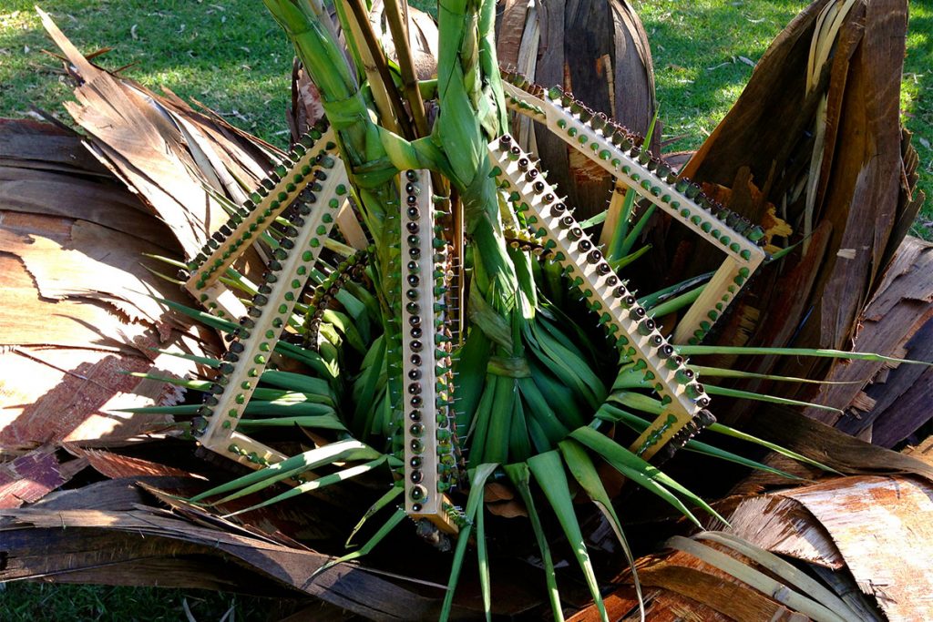
Another Earth, detail
Discuss ‘BIG’ use ‘Crystal Palace’ to explain how you work big.
Crystal Palace
For large scale projects, there always needs to be an internal structure that is the main frame and then everything can be suspended from that. For Crystal Palace, my job was made easier as there was already an existing truss in the pavilion. For large projects, I always begin by making a mini model first and then use that as a reference to work from. In the case of Crystal Palace that was the first major project I ever took on and at the time I was working out of my mum's house. I had worked out the circumference of the truss was 26 metres. My mum’s side fence was 16 metres and I remember draping material down the fence, cutting it into shape and hoping it would all come together when it came to install. Nowadays with a much bigger studio, I am able to build the framework and work onto it, creating the artwork in sections so that it can be easily transported and installed.
Further afield you have done an installation in Ireland explain how this came about and how it was done.
The chapel installation in Ireland was for our friend’s wedding.
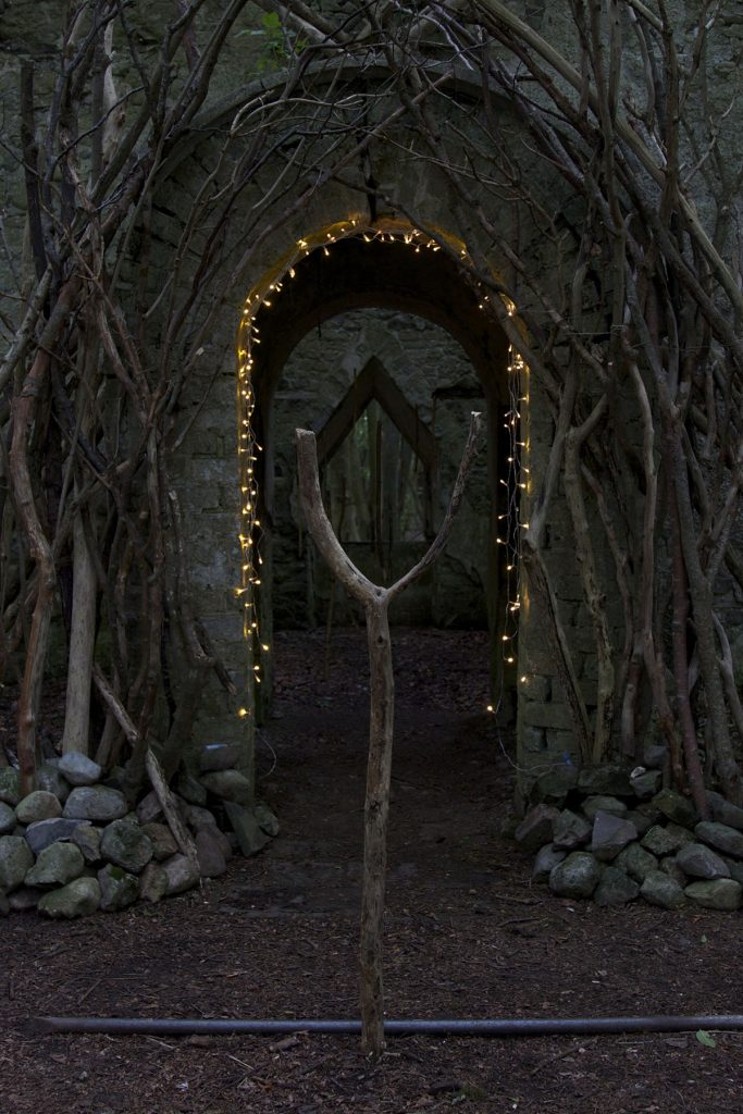
When we arrived they asked my partner and I if we could bring to life this old abandoned cottage that was on the property of this beautiful Irish manor.
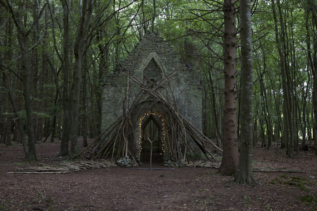
That project was a lot of fun, probably because it was for our friends but also because it was so spontaneous - we only had 1 day to run around sourcing whatever we could find laying about in the woods and create something magical to for them to get married under.
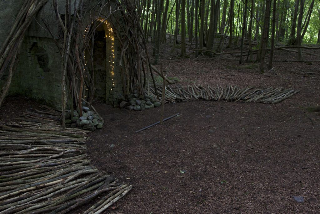
Often your work is around events and event planning. Discuss this aspect of your work as an artist.
How did you move from advertising to artist?
After I left advertising I began by making things for shop windows and exhibitions. Being a self-taught artist, each new opportunity allowed me to play with different materials and learn new techniques. After about a year or two of building up a folio, an old friend who was now the stylist for a big Melbourne event company got in touch and asked me to create a large piece for a wedding - which ended up being Crystal Palace. After that, most of the work I did was primarily for events – allowing me fabulous opportunities to create all kinds of wonderful things and work with new mediums, always teaching myself along the way and learning as I went.
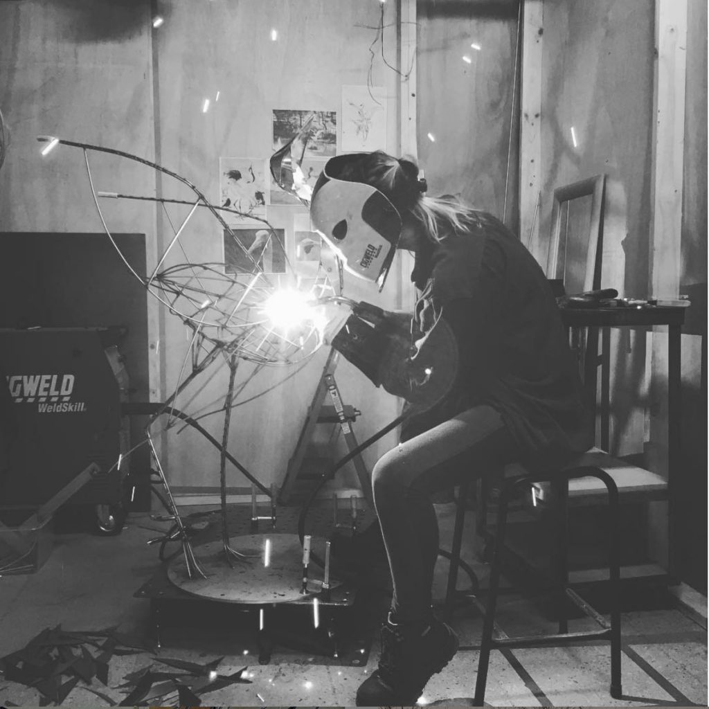
How do you combine salvaged and new materials together to make a piece?
Most of the time it’s as simple as using the offcuts from previous projects to create new things. For example, with the recent NGV project where I used the paper off cuts from the fish sculptures to make the coral. With all my metal sculptures I am always using all the scraps to create the animal features. I find the shapes of the offcuts are always so much more interesting than what you would cut yourself.
Many of your pieces are temporary. How do you decide when to discard or reuse?
After a job many of my temporary pieces end up suspended from the roof of our warehouse, creating a wonderful surreal scenery above our heads. However, for the ones that aren’t durable enough I will break them down into pieces I can reuse in future projects.
Contact:
Georgie Seccull
georgieseccull.com
Deborah Blakeley, Melbourne, Australia
Interview by Deborah Blakeley, June 2019
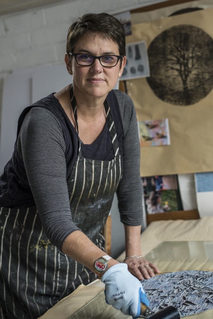
Kate Gorringe-Smith
Migration is a huge backdrop to all your printmaking,
Comment on your background as a child of immigrants to Australia and how this has influenced your career and art.
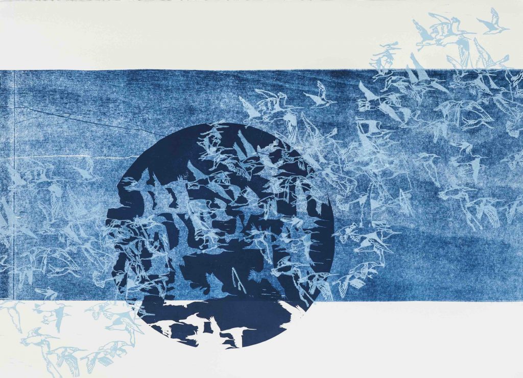
The Fossil Memory of the Sky (iii) 2012, Linocut and woodblock print, 56 x 67cm.
In 2009 my family and I returned home to Melbourne after three years in London. Our return was spurred by my father’s death; my mother needed me at home. We all had trouble reconnecting with our old lives. My parents, ten pound poms, migrated to Australia in 1966, the year I was born. Without Dad, it was suddenly clear that it was not so much Australia that was Mum’s home, as my father himself. Without him to anchor her, her heartland reverted to England.
I began to use migratory shorebirds in my work for my first solo show in 2010, in particular the Bar-tailed Godwit. These birds travel annually from Australia, where they avoid the harsh northern winter, to Siberia, where they breed. Ever restless, they never settle. One can interpret neither destination as their true home, or both. Our brief period overseas, coupled with my bereaved mother’s stories, gave me an insight into the tragic and hopeful world of migration and resettlement. The birds provided the perfect metaphor.
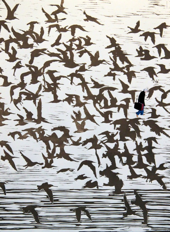
Red Suitcase, 2011, Linocut and collage 76 x 56cm.
As well as embodying this deep sadness, shorebirds also carry the hope of overcoming amazing odds as they travel annually across the globe, traversing seas and continents. These tiny birds can fly for nine days straight without stopping to rest or eat; they can navigate an entire ocean without any landmarks; they can fly in their lifetime further than from the earth to the moon, and they link 23 countries with their journeys.
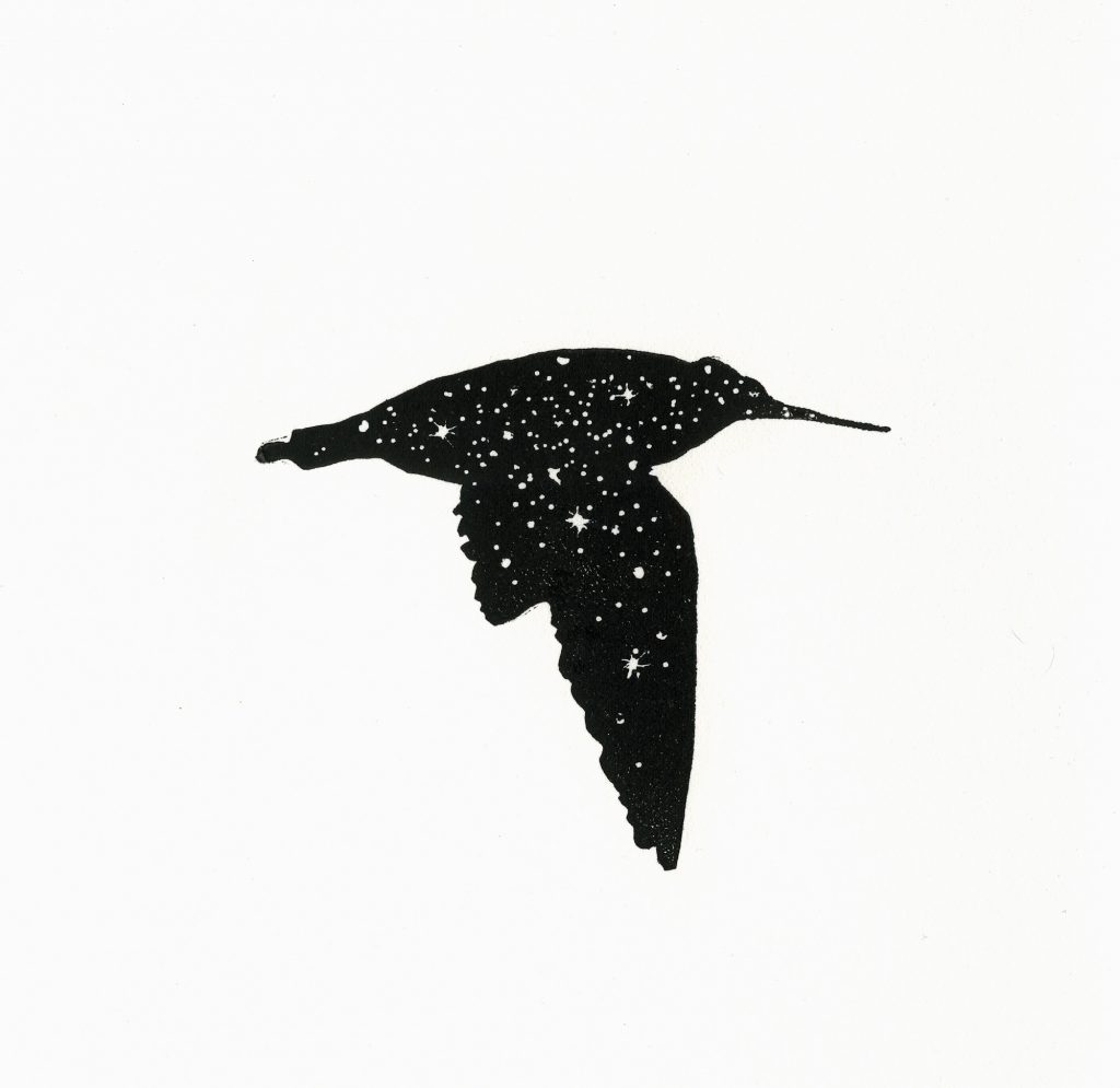
Fly by Night, 2012, Linocut, 32 x 27.5cm.
Since this first exhibition in 2010 I have continued to use migratory shorebirds in my work both as metaphor and as themselves. I have since discovered that they are our most endangered group of birds but sadly, in general, are very poorly known by the wider population despite ours being a beach culture. It has become a bit of a mission to try and bring these amazing birds and their plight to light.
Discuss how you have been influenced by your time with Birdlife Australia.
I had a great six years in the 1990s working for Birdlife Australia, or the Royal Australasain Ornithologists Union as it was back then, as a scientific editor. My first position was as Assistant Editor working of the mighty seven-volume tome, the Handbook of New Zealand, and Australasain Birds (or HANZAB for short). I later worked as editor of the RAOU’s membership magazine, ‘Wingspan’. I also did some illustration work for them on the side, and while working for the RAOU I did my degree at RMIT in printmaking.
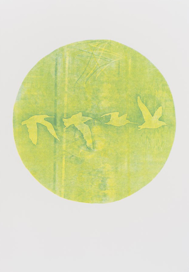
An Instinct for Mapping, Stenciled woodblock monoprint, 76 x 100cm.
Working for the RAOU was a huge influence on my life – not only from the point of view of learning so much about birds, but also working for an NGO full of passionate and knowledgeable people who had great integrity to the organization and the environment.
These days I am so thankful to have worked there as it provides me with a great resource to support the work I am trying to do with communities and artists. I am on my third and biggest group art project based around migratory shorebirds, and my contacts through Birdlife are so generous with their knowledge and time – they are a great support to my work. Also, The Flyway Print Exchange and my current project, the Overwintering Project, both have a fundraising aspect built into them and having worked for Birdlife I am happy to be able to send the funds raised to their shorebird conservation projects knowing the money will be well spent. I admire their employees and volunteers so much. It is a connection I treasure.
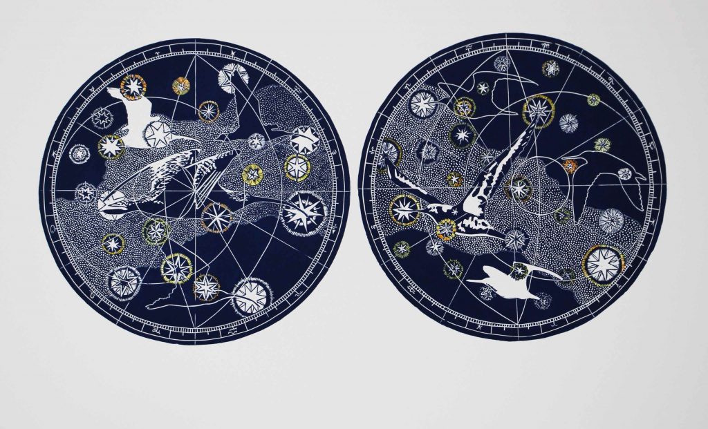
New Constellations, 2015, Hand coloured linocut, 56 x 76cm.
This print was accepted into the 2015 Silk Cut Linocut awards
Take, ‘Notations of Home : Westernport White Mangrove’ discuss.
‘Notions of Home: Westernport White Mangrove’ is part of a series of works based on species found in the Western Port Ramsar site, my chosen research site for the Overwintering Project (The Ramsar Convention is an international convention created in the 1970s to protect internationally significant wetlands www.ramsar.org). It is a linocut.
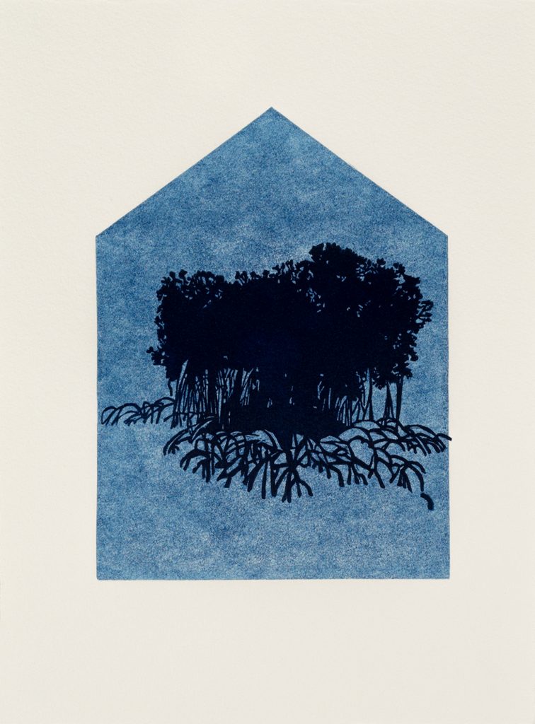
Notions of Home: Western Port White Mangrove, 2018 Linocut, 17 x 13cm.
The house shape is a ghosted linocut (so it is the second print without re-inking the linocut – hence it is a softer shade of Prussian Blue), and the mangrove silhouette is also a linocut printed over the ‘ghost’ house. The print is quite small, only 17 cm high x 13 cm wide. Blue is my favourite colour – I find it hard to abandon. But it is also the colour of the water, the sky – life. The idea behind the print (and also The Overwintering Project – more on that later!) is that if we extend our idea of home to include our environment we have to accept responsibility for it. A couple of years ago I came across the following quotation by Wanta Jampijinpa, a Warlpiri Elder: ‘Knowing your animals and plants, your environment, is knowing your home and yourself.’ This statement articulates my intentions beautifully. The Western Port White Mangrove is, I believe, the most southerly occurring mangrove and of course mangroves are nurseries and shelters for many animal species.
Your art cannot be discussed without talking about your involvement with shorebirds – explain.
In answer to your first question I wrote how I first came to use migratory shorebirds in my work, as a metaphor for the longing a migrant feels for home. Since then I have researched and thought about these birds a lot, and they have come to mean a great deal to me.
Migratory shorebirds connect the world. Every year they migrate from the shores of Australia and New Zealand to their breeding grounds above the Arctic Circle in Siberia and Alaska. The remarkable annual circuit that they fly is called the East Asian-Australasian Flyway and it passes through 23 countries. The pathways of their migrations bind skies, land and sea into a meaningful whole. Their journeys connect us through time and space, as they have been flying between the poles for more years than humans have walked the earth.
I have come to believe that migratory shorebirds and the Flyways are important ideas for our time. They challenge our notions of what is precious – they are small, their plumage is modest, they do not sing and their habitat is often unremarkable. But they fly unimaginable distances, their biology is so finely tuned that they can fly eight days and nights without stopping to eat or drink, they can navigate featureless oceans to find the same tiny stretch of beach, and return to it, year after year after year. And, in an age where human migration is often viewed as a threat to borders and resources, these tiny birds also remind us that we are globally interdependent in a multitude of complex, subtle and ancient ways. But they are also our most endangered, and possibly least known, group of birds.
Birds are bio-indicators. This is a bloodless term meaning that the presence of birds indicates a healthy environment. If shorebirds continue to decline at their current rate, and some species have declined by 80% over the last 30 years, it also means that the global environment of the Flyway is being seriously degraded. This of course also affects our health, wellbeing and ultimate survival. Looking after migratory shorebirds and the Flyway is another way of looking after ourselves. It is urgent and it is vital. I would like to think we are doing it for them and all the other living things that depend on the global ecology, not only to save ourselves.
Briefly explain
What are shorebirds?
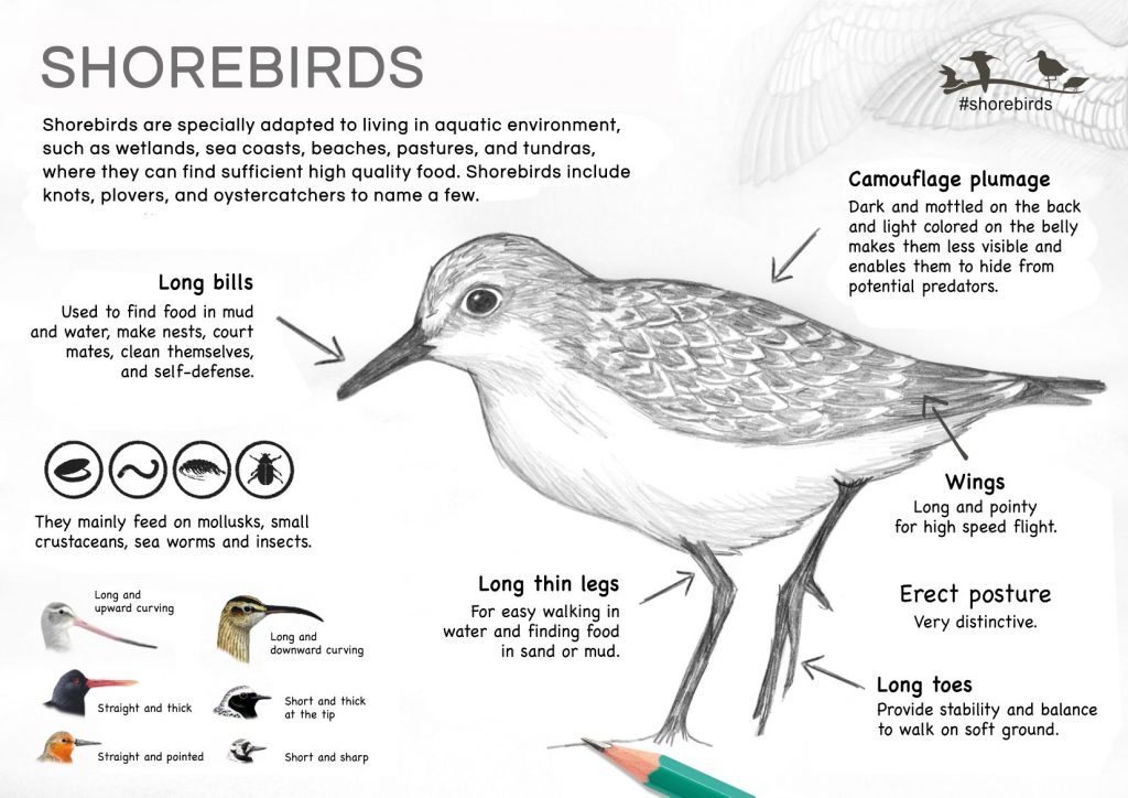
Shorebird, ID
Godwits, sandpipers, stints, plovers, whimbrels, curlews, snipe…we have thirty-six species of migratory shorebird that spend October to May on the coast of Australia and New Zealand. Come autumn, they head north. Their destination is their breeding grounds in northern China, Mongolia, Siberia and Alaska. Once they have bred they will head back south, completing an annual circuit of roughly 25,000 km. Over their lifetimes many of these birds, having completed this journey every year of their adult lives, will have flown more miles than from the earth to the moon.
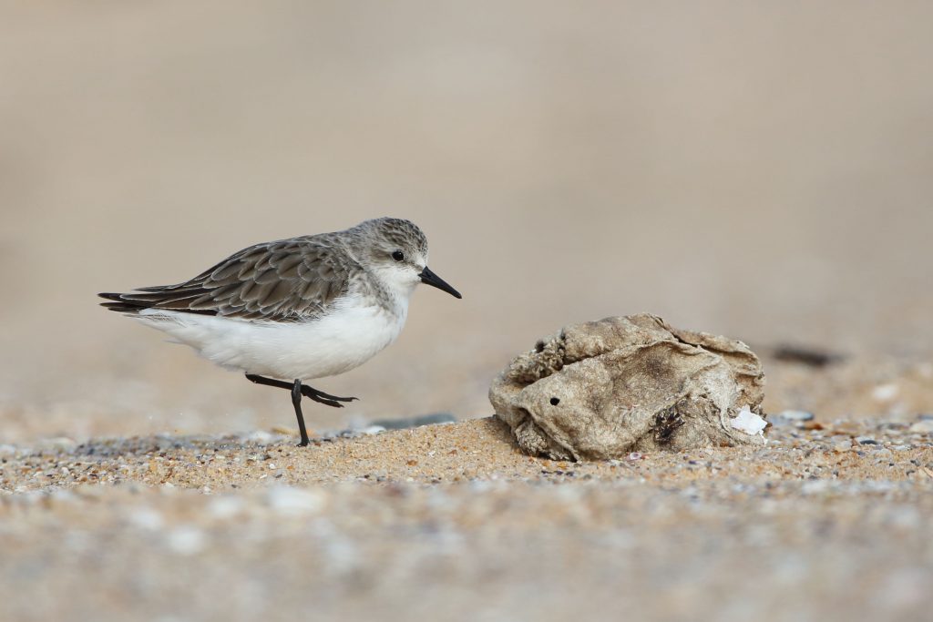
Red-Necked Stint Photo by Dan Weller
‘Shorebirds’ is the US term for these birds. In the UK they are called waders, and here in Australia we use both terms. They generally live on the shore, hence the name, and are small to medium sized with longish bills and legs. The shape and size of their bill denotes the prey they eat. They forage on the mudflats, following the tide out daily to get their required food to build up for the next migration. As the tide comes in they come in to shore to roost. They are incredibly well camouflaged. They don’t have webbed feet.
They really do have both a literal and metaphorical visibility problem. Friends of mine who have literally spent their entire childhoods on the beach have never noticed them. They are incredibly well camouflaged, but also when the tide is out they go out with it – maximizing their foraging time to fuel their unbelievable migrations. Next time you are on a beach with mudflats, looks for tiny brown birds, often in a flock, that make the regular silver gulls look huge. They will often lift as a flock when spooked by a dog, flying as one, glittering in the sunshine.
The journeys they take.
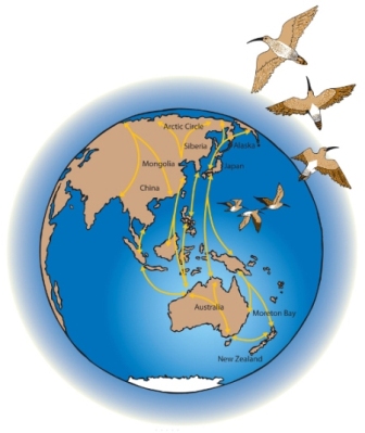
Map of East Asian- Australasian Flyway
No-one really knows why shorebirds make the migrations that they do, except that the arctic has an incredible amount of available food in its short summer, and similarly our southern beaches provide a warm and food-rich haven whole the arctic is engulfed in ice and snow. But why these journeys began is a mystery. An amazing mystery! The circuit of the Flyway is 25,000 km long and over its lifetime of migrations one of these shorebirds, which are quite long-lived, will travel a distance further than from the earth to the moon and back!
Navigation is another mystery, but scientists have evidence that shorebirds can detect the earth’s magnetic field, which would help with orientation. It is also thought that they may us the stars to navigate.
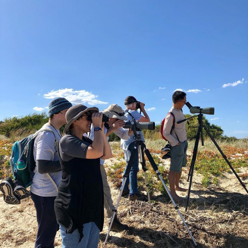
Bird watching at Stockyard Point, on the Mornington Peninsula, Victorian Wader Studies Group
From tagging birds we also know that many species are incredibly site faithful, which means that they will return to the same stretch of beach every summer. We don’t yet know whether the young of a bird will return to the same stretch of beach as its parent, but I believe research is being done with bird DNA to see if this is the case.
What is the East Asian – Australasian Flyway?
The East Asian-Australasian Flyway describes the route these birds fly annually from Australia and New Zealand to arctic Siberia and Alaska. It is one of eight Flyways that encircles the globe, and links 23 countries, each of which plays a part in providing habitat for these birds to overwinter, stopover or breed. The countries are: USA (Alaska); Russia (Siberia); Mongolia; China; North Korea; South Korea; Japan; the Philippines; Vietnam; Laos; Thailand; Cambodia; Myanmar; Bangladesh; India; Malaysia; Singapore; Brunei; Indonesia; Timor; Papua New Guinea; Australia and New Zealand. We are all links in the chain that protects the survival of these birds. There is an organisation, the East Asian-Australasian Flyway Partnership which works across borders for the conservation of our migratory birds.
The threat you are trying to highlight through exhibitions.
Of the eight global Flyways, ours is the most highly populated (by two thirds of the world’s population), and includes countries with many of the world’s fastest growing economies. These factors, coupled with the fact that wetlands are disappearing at a rate three times faster than forests (Ramsar Convention Secretariat, 27 Sept. 2018), put considerable pressure on migratory shorebird habitat. Migratory shorebirds depend on mudflats and intertidal zones, much of which has been reclaimed along the Flyway for industrial, recreational or residential purposes. Over the last 30 years these pressures, particularly in the region of the Yellow Sea – a critically important site for shorebirds to rest and refuel during their migrations – have seen some species decline by 80%. They are also at risk from climate change which has already been detected to be ‘shifting; the arctic seasons so the birds are not getting as much feeding time during their arctic breeding period.
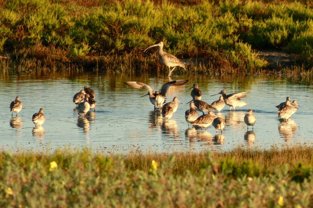
Shorebirds at Stockton Sandspit, Newcastle, NSW, Australia, photo Juliana Ford
The best thing for us to do to help our migratory shorebirds is to join an organisation like BirdLife and put money toward shorebird conservation, and keep our dogs tethered on the beach so they don’t disturb feeding shorebirds. Disturbance by dogs may seem momentary, but remember these birds’ biology has become so finely tuned over thousands of years of evolution and if they are disturbed by humans or dogs they may not get enough food to fuel their migrations. When you are talking about 28 gram birds to miss out on these few extra grams of fat is highly dangerous.
I discovered so much by reading ‘The Eastern Curlew’ by Harry Saddler, can you give a short review of the book and your personal relationship?
‘More than any other group of animal, birds carry the weight of our metaphors. They fly heavy with meaning.’ (p. 76)
Harry Saddler has written a very special book in The Eastern Curlew, a wonderful heartfelt blend of scientific fact, Flyway travelogue and personal insight. It is an incredibly thoughtful and well-researched book that paints a vivid picture of the most endangered of our migratory shorebirds. I learned a lot from the book, but the one thing that was really impressed upon me was how much of a little machine this bird is and how every minute of its life feeds into maintaining these epic migrations. There is no room for chance – they eat, they rest, they watch the weather to choose their moment and they fly, breed, then fly again.
I met Harry when he was researching his book – he had been asked to review my first major migratory shorebird project, ‘The Flyway Print Exchange’ which was on exhibition at Melbourne’s Immigration Museum (http://rightnow.org.au/review-3/why-shorebirds-in-the-immigration-museum/) and so contacted me to chat about shorebirds when he was researching his book.. We are still friends, and he took me and my son to French Island in search of Eastern Curlews last summer. Sadly we only spotted them in flight so didn’t get a good look, but it was a lovely trip.
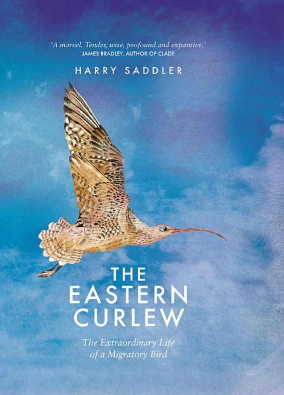
The Flyway Print Exchange
Travellers
How did Flyway Print Exchange exhibitions come about?
The Flyway Print Exchange was the first major group art project I ever undertook. The idea of trying to involve artists from all along the Flyway in a print exchange, and then actually sending the prints along the Flyway and back – to follow the birds’ route of migration – just came to me and then seemed too good an idea not to pursue! I ran the idea by Dr Golo Maurer, who at that stage was the head of Shorebirds 2020, BirdLife Australia’s main shorebird conservation program. He encouraged me and somehow that was enough to make me just jump in!
Starmap, 2014, Etching and linocut, 26 x 26cm
My hope for the project was to make people really understand the reality of these birds’ migrations – the distances they travel and the perils they face. It is one thing to know a fact in a cerebral way, it is another thing to believe something viscerally and in your heart. I think that art can move a person from knowing to believing, and this is what I hoped to achieve, at least for some, with the Flyway Print Exchange.
To finance the project I was lucky to receive funding from the Adelaide and Mount Lofty Ranges Natural Resources Management Board in SA, and a grant for Melbourne Water. The NRMA funding helped me stage the first FPE exhibition as part of the 2014 Adelaide OzAsia festival which celebrates the links between Australia and Asia, and the Melbourne Water grant supported the first Melbourne exhibition at No Vacancy, a small gallery in Melbourne’s Federation Square in October 2014.
How many artists were involved and how did they come on board?
My plan was to find 20 artists from as many Flyway countries as possible to participate in a print exchange inspired by the East Asian-Australasian Flyway. I put out calls through both printmaking and shorebird networks – and was astonished by the response I received. It was fabulous! And so exciting to hear from artists all over the world!
I started by emailing as many print facilities and workshops in Flyway countries as I could find. Some responded; some didn’t. There were interesting hurdles to overcome! For example, to contact printmakers in China, I emailed Red Gate Gallery in Beijing, a gallery founded by Australians, to ask for advice. They suggested I have the project description translated into Chinese, which I did, and subsequently had many expressions of interest! I had the email address of a Siberian ornithologist who I hoped might help me find local printmakers, but unfortunately she was in the field when I needed to find my artists so I had no luck there.
In the end I had twenty artists involved, from nine Flyway countries: New Zealand, Australia, Indonesia, Singapore, India, Japan, South Korea, China and the USA (Alaska). They are Amanda O’Sullivan, Helen Kocis-Edwards, Vida Pearson, Alexis Beckett, Violet Hammer, Sharon Keighran, Gret Mingundoo Allwood, Syarhizal Pahlevi, Feng Jianming, Ni Jianming, Hyun Tae Lee, Kyoko Imazu, Garry Kaulitz, Edwin Mighell, Cia Xiao Hua, Celia Walker, Tham Pui San, Radhika Gupta and Kavita Shah.
I’ll always be grateful to these artists for their trust and generosity. Each artist made a new print for the project and editioned it 30 times – and most of the artists did this without even knowing who I was. Thanks to funding I was able to provide paper for the editioning, although Ni Jianming in China used his own paper as the heavy Hahnmuhle I provided did not suit his print medium. Each artist also received a full set of the prints.
The result of the exchange is manifold. It is a literal exchange – with the prints changing hands and being shared – but it is also an exchange of ideas and inspiration. Our disparate group of artists - varying in age and experience, not to mention culture and background - which may never gather together in person, is now bound by this exchange of work. A small community has been created around the works and around the Flyway itself.
How many places did the exhibition go to?
To date there have been over 20 Flyway Print Exchange exhibitions in every state and territory of Australia except Tasmania and Canberra, as well as in New Zealand, Indonesia, Singapore and Hong Kong.
How far were some of the exhibitions?
Hong Kong is the farthest destination to which the exhibition has travelled.
Explain the story behind the sending of the second print by mail and how did they fair in comparison to the flight path of the birds.
Xixe Xi City, 2014 (Habitat capital) Woodcut, water, printing, 26 x26 cm. (paper size) by Ni Jianming
Flyway Print Exchange exhibitions consist of two sets of prints – one set is pristine, while the other set have been posted along the Flyway and back, from Melbourne to New Zealand, to Singapore, to Alaska and then back to Melbourne. The prints returned home weathered and crumpled, marked by addresses, postmarks and stamps. In the gallery space they stand in for the birds themselves, bearing witness to the physical journey that the Flyway defines.
The Overwinter Project
Give brief history of these exhibitions.
The Overwintering Project is my current project. It is designed to connect artists around Australia and New Zealand with their local migratory shorebird habitat. Conservation campaigns are still usually run with a ‘heroic’ species as the target for conservation. This is probably because it is easier to make people relate to a cute animal, but it doesn’t always help in getting the message across that to save species we need to save habitat, and also that habitat incorporates entire complex systems that include plants, animals, and inanimate elements such as hydrology and geology. So in the Overwintering project I am inviting artists to go out into their local shorebird habitat, preferably with a shorebird or local expert, to see the birds and then to make a work in response to any aspect of that habitat that inspires them. In this way I hope the project will also promote a recognition of the value of biodiversity and of course, because the birds migrate, how this local habitat links us directly into a global ecology.
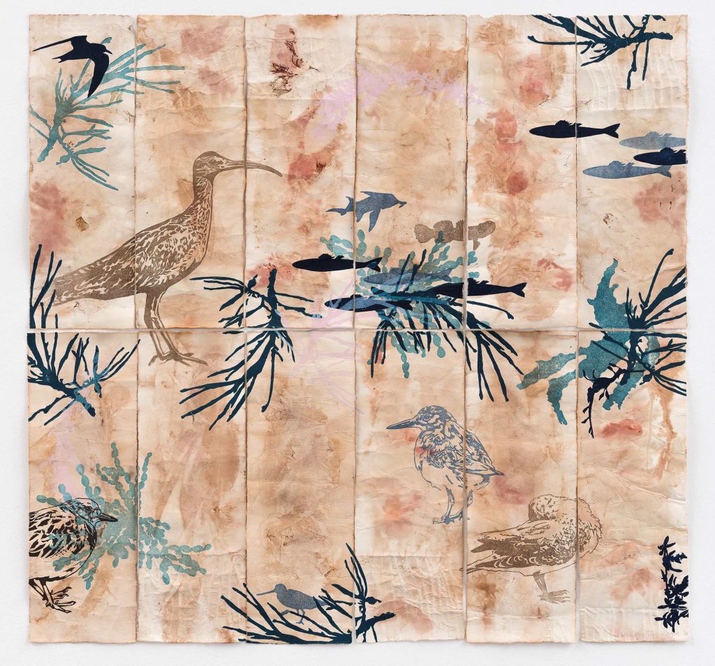
Tidal Fugue, 2018, Linocut on eco-printed paper, unique state, 60 x 90cm.
I launched the project in June 2017 and so far there have been 15 exhibitions in NSW, Victoria, Tasmania, Queensland and South Australia. Another 13 or so are already planned reaching into 2021, including major exhibitions which will include the Overwintering Project Print Portfolio (this consists of prints donated by artists in response to open calls) at Charles Darwin Uni in the NT, Mandurah PAC in WA, Coffs Harbour Regional Art Gallery in NSW, the Mornington Peninsula Regional Gallery in Victoria and the Burnie Regional Art gallery in Tasmania. Over 150 artists have joined the project, both by contributing works to the Print Portfolio or by holding their own local exhibitions. We have so far raised $10,000 for BirdLlife Australia’s migratory shorebird research programs from the sale of prints!
How can others become involved in this project?
Artists who work in print media can send me prints to join the project’s core (the bit I am in change of: two of the same print, 28 x 28 cm, one to exhibit and one to sell – but please email me first for details) – the Overwintering Project Print Portfolio, but anyone anywhere working in any medium can hold their own Overwintering Project exhibition independently as long as the project’s aims and parameters are adhered to. Just email me and we can go from there! I can help you find your local migratory shorebird habitat and local shorebird experts, and will help publicise your event or exhibition through the project website, newsletter and social media. There are also ways for schools and community groups to get involved.
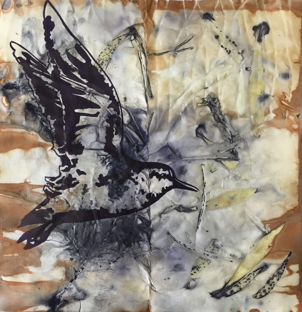
Altona Stint, 2019, Linocut on eco-printed paper, unique state, 28 x 28cm.
Comment on the quote, ‘ Knowledge bestows ownership: uniqueness bestows value.’
A few years ago I was invited to be in a print exchange about Portland, a small historic town on Victoria’s western coast. I’d spent a bit of time there for various reasons – travelling between there and Mount Gambier, which lies of the other side of the SA border. My research into both areas, and the Victorian Great Basalt Plain that stretches from the SA border to inner city Melbourne, made me realise that every place is environmentally unique. Not just remote, pristine places, but local urban areas have unique geologies and ecologies and associations of species. So when I was writing the Project Description for the Overwintering Project, which is designed to try and generate a genuine connection between artists and their local migratory shorebird habitat, I was thinking about what it is that makes us value a place. So I wrote this phrase to try and encapsulate what it is that makes us value and feel ownership (and therefore responsibility) for a place.
‘ Knowledge bestows ownership: uniqueness bestows value.’
Contact details:
Kte Gorringe-Smith
Deborah Blakeley, Melbourne, Australia
Interview by Deborah Blakeley, June 2019

Charlene Foster
How influential was the Avon Place Glass in Cambridge, USA have on your early career?
Avon Place Glass was the first hot shop I stepped foot into, over 20 years ago. I took a beginner’s glassblowing class there. I remember seeing a plate being spun and thinking ‘that’s pretty rad!’. After that, I would continuously dream of melting glass colors, and I knew this is what I wanted to do in some shape or form. So, in that sense, I would say it was pretty influential.
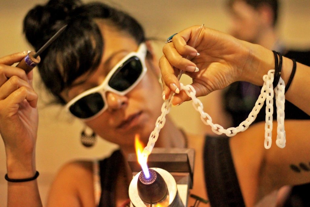
Corning With White gun mount chain, Photo Pyroscopic
Tell us about your time at Corning Museum of Glass?
In early 2002, I was back in Alaska working for the only glassblower in Anchorage and I really wanted to get out of there. I applied to Pilchuck, Penland and Corning for their summer intensive glass programs hoping to get into one and ended up getting accepted to all three. I left home with a backpack and a little money left on my credit card. Until I arrived at Corning for the last session of the summer, I was under the impression that the glass life was nothing but a party. But, CMOG is no joke! We couldn’t even listen to music in the studios. At first I was kind of upset, but honestly it forced me to take my work more seriously.
Why does having Corning Museum of Glass add so much to a glass artists CV?
Corning is historic and anyone who’s taken intensive classes there is probably pretty serious about their work.
Where did CHA CHA come from?
When I left Corning Museum of Glass, I took a bus to New York City and stayed with a friend I knew from high school who had a studio apartment in SOHO. I was lucky enough to get a job right away working for Michael Davis Glass in Long Island City, but even a full time job with him wasn’t enough to survive in Manhattan. So, I got a second full time job at a Brazilian restaurant on Avenue C called Esperanto. The majority, of people I worked with were foreign and everyone pronounced my name differently or called me anything but Charlene. Cha Cha came along when the guys in the kitchen would call me “Cha Cha Loca”... It just stuck.
What lead you to working on solo glass chains?

Glass Chain, photo Jeff Di Marco
My first glass chains were part of a Glass Bondage Series that symbolized the psychology of relationships. It was based off the meaning behind the Devil and the Lovers Tarot card and the fragility of the ties that we have to one another. It was a metaphor to show that our relationship can last if we take care of them, but if you abuse them and throw them around, they will shatter. The work received a lot of attention, but not always the kind I was hoping for. I decided to move away from those large scale sculptures. I took my work down to a smaller scale and started making jewelry. Glass chain making takes a lot of patience, repetition and stillness. I started doing it as a meditation and as a challenge to see if I could actually complete something so time consuming.
Take several Solo glass chains and discuss…
When you add other materials to the links
My glass chains are flameworked together. This is a glass chain which is made completely out of Corning white gun mounts. This one was made during the Michigan Glass Project and was a collaboration with glass artist Salt.
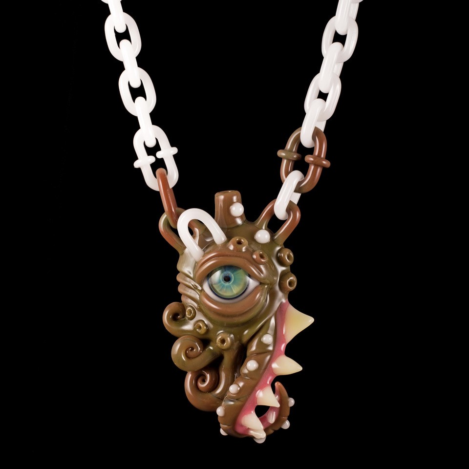
Salt make with Corning Gun Mounts, Photo Pyroscopic
The use of colour
I tend to be very particular about the glass I use for chains, the cleaner the colour the better. I prefer glass that doesn’t bubble up or have too many flaws to begin with. In order to be strong and durable, wearable glass should have the least amount of stress within it. Bubbles are ok at times, but I try to make sure the bubbles within my work are round which makes them less likely to crack. The quality is very important.
UV Reactive Custom Chain, for B-Real of Cypress Hill, Photo Pyroscopic
This UV reactive chain was a custom commission for the musician B-Real of Cypress Hill.
Under natural light this chain looks completely clear.
The number of links
The number of links per chain all depends on the length and the millimeter of the rods I use to start with. It also matters whether or not I use metal to complete it. I often get custom orders for chains that are 30 inches long, that’s usually about 50 to 60 links.
When you add other materials to the links
Photo Axel Dupeux
Here is a variety of glass colours I used for series of necklaces in that mixed sterling silver with glass. The circular coin is my logo. These chains were shorter choker style necklaces averaged 16-20’’
Discuss shape in relation to your series, ‘Jewelry Collabs’
My recent jewelry collabs are different from my chain work. I wanted to try something different and incorporate beads and stones with glass. I blend styles with the artist I’m collaborating with, by making or using beads to mix with their pieces. Here are some examples of jewelry collabs I enjoyed working on:
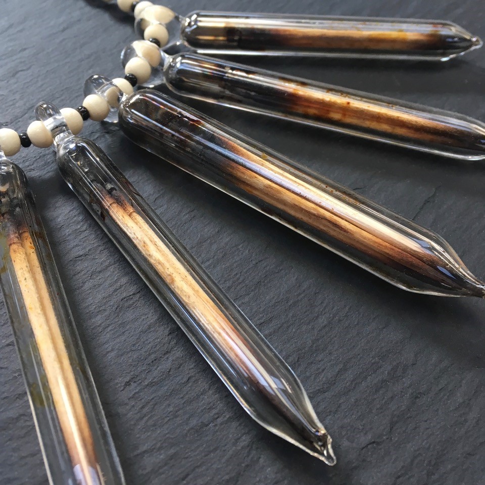
Collaboration with Sibelley. Made with Glass, Bone, Sterling Silver and Burnt Toothpicks. Detail
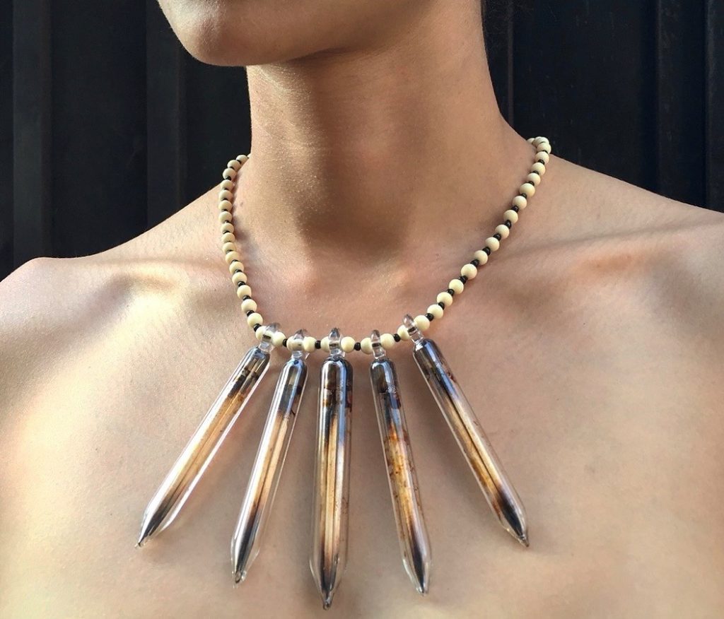
Made with Glass, Bone, Sterling Silver and Burnt Toothpicks.
Take us through the way you combine coloured glass with clear glass in your Warrior Series.
My Warrior Series was designed to incorporate glass with different color stones and crystals. Similar to my Jewlery Collabs, they are both shaped like Cleopatra style necklaces, but with my Warrior Series I use clear glass spikes. I started this work to make it easy for clients to order these pieces and request their favourite kinds of stones. I also accept beads from clients for these projects. I love that I can reuse vintage beads of theirs that create a whole new necklace for them.
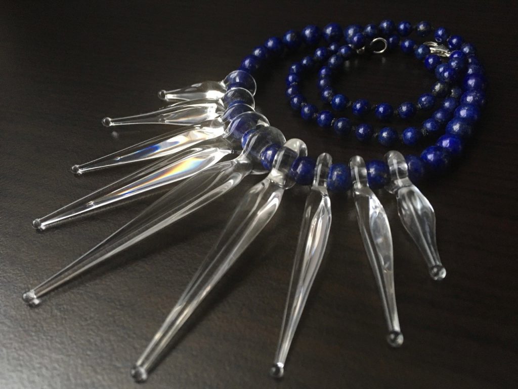
Clear Glass & Lapis Lazuli. Warrior Series
Explain your involvement in the Michigan Project.
The Michigan Glass Project is very near and dear to my heart and something I look forward to being involved in every year. I love how all, of these amazing artists get together, not to compete but to donate their time and art for a greater cause. We put in crazy long hours and push ourselves to the limit to create something truly unique. Some of the most incredible
collaborations have been made there, start to finish in just 3 days. At the end everything is
auctioned off and all the proceeds go to funding the arts in Detroit public schools, through the charity Art Road Detroit. It’s definitely one, of my favourite glass events and I can’t wait to go back this year.
Detail of The Michigan Glass Project.
You also collaborate with other glass artists, discuss one collaborations that have influenced your own work.
Spectral Crystal Devi 2017, Photo Alex Reyna
This massive collaboration was between 10 artists during the Michigan Glass Project 2017-
Banjo, Phil Siegel, Salt, Original Gongster, Big Z, Brandon Martin, Northern Waters (2 artists), Frompy and myself. This piece was auctioned on Instagram for $75,000.00. Aside from being super inspired to be involved in the creation of such a powerful piece of art, it also influenced me to incorporate more crystals and spirituality into my own glass work.
Discuss the complimentary use of jewellery and glass in your practice.
Humans have been making jewelry from glass for thousands of years, but people are still surprised when I tell them I make glass jewelry. Personally, I love the way that light reacts with the transparency of glass, especially sun light. It makes for a different experience every time you look at it.
Trip A Collaboration
Contact details:
Charlene Foster
Philadelphia, PA, USA
Deborah Blakeley, Melbourne, Australia
Interview by Deborah Blakeley, May 2019
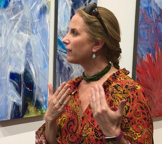
Katherine Downey Miller
How important is your environment to your past and current work?
Growing up in New England, the weather and change of seasons became very important to my past and present work. I grew up with a sky light above my bed, enabling me to see the seasons change, see what it was like during a thunderstorm or what happens when rain pelts down. It’s very important to me to be near the ocean. I don’t have to be around it all the time, but just to know it is there and I can access it. It gives me a sense of openness of mind. My painting studio is located in SOWA, the Arts district in Boston in the South End. I’m surrounded by galleries and activity and yet can shut my door and focus on my work. I have great light in my studio which is very important. I can hear seagulls near my studio. I like to go outside and sketch and paint. I bring all my information into the studio and work from there.
Collossal, Acrylic and Mixed media on watercolor paper, 50”x 50“
How do you deconstruct your work to abstract landscapes?
Salmon, Oil on canvas, 36" x 36"
I deconstruct my work by starting with some kind of reference to the land or natural elements. It could be literal or emotional. As I build the painting through composition and gestural movement, I turn my painting around, and paint from all sides until the painting works each way, in terms of the visual language. Each time I turn the painting, the language changes and becomes fresh.
In your opinion discuss the importance of art to record time and place.
I think art is important in recording time and place because it is visual. Art can be a visual representation of place, of an important place to the artist. Art can also be place coming from emotion. Time is more difficult but can be shown through many ways. Representationally, it can be shown by how many different ways light hits a tree, or by showing a whole apple, then different bites taken out of the apple. In a way a visual story with no words. Abstractly, time and place can be shown through mood or color.
How did you see your movement from representational to abstract.
My undergraduate degree is in painting from Skidmore College and my MFA from the School of Visual Arts in NYC. I think as a young artist I was drawn to a kind of representation. I was always a loose painter. My power has always been shown through my brushstrokes. My MFA is in Illustration, so I am drawn to the tangible, but I am also drawn to atmosphere and the intangible.
Santa Fe, oil on canvas, 24" x 24"
I think it’s a natural progression and evolution to go from representational to abstract. The easiest way for me to access this is landscape to abstraction. I think nature is the best teacher. It’s all me, my brushstrokes and imagery are just looser, yet based in natural, organic structure.
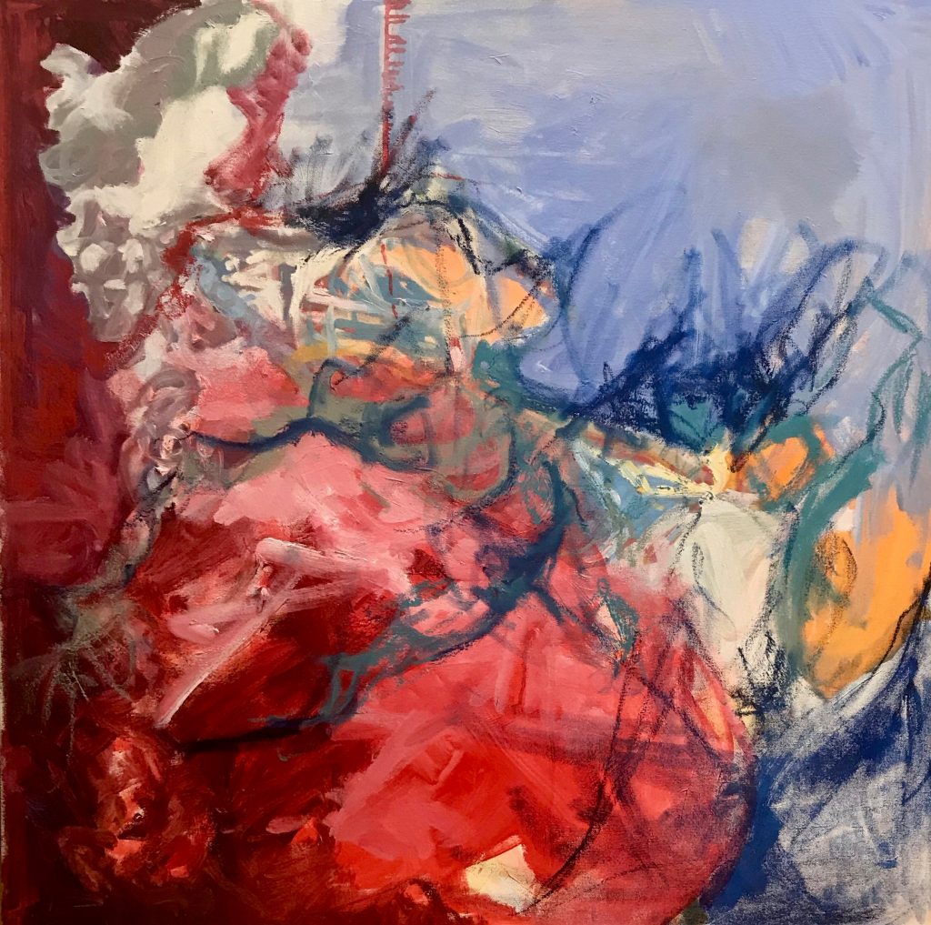
Into the Deep, oil on canvas, 36” x 36”
You show your work installed. Can you explain the value of this presentation method?
The value of showing my work installed is that it gives me a deadline and makes me work towards it. I find I work better under deadline, whereas, if I don’t have a deadline, things are a bit wishy washy. Presentation is very important because it makes one get organized with the artist statement and other documents. It’s important for me to get my work seen because I do want to sell it. It does little good sitting in my studio. Installing my work allows me to finish a chapter as well and enables me to work on new bodies of work and new ideas.
You use both water colour and oil in your work when do you use one rather than and other.
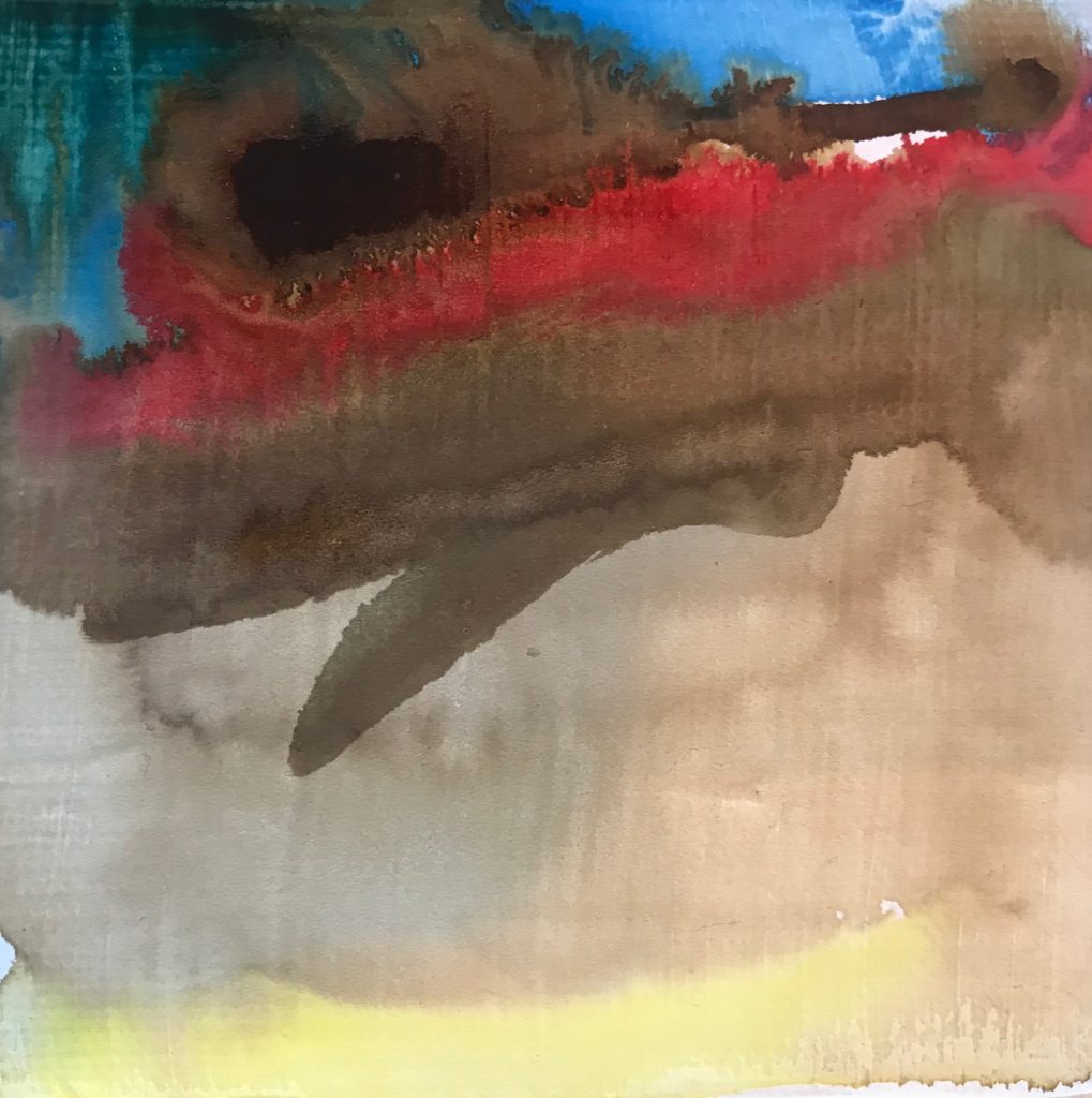
Flow 1, Acrylic on canvas, 20” x 20”
I teach watercolor, but don’t necessarily use it. I use Golden High Flow Acrylic paint on prepared surface, that enables the paint to react like watercolor. As a watercolorist, I love watercolor blooms, but the colour isn’t vivid enough for me, so I figured out this other way to have my acrylics look like watercolor. I love the lightness of feeling of water media paints, but I love the richness of oils. They are like butter. So, it depends on what I am painting and what mood I’m in, which media I choose to work in at that moment.
Red Rocks, oil on canvas, 36“ x 36“
Your Dog Portraits:
How patient are dogs and yourself to paint?
Rustler, oil on canvas, 11“ x 14”
When dogs are sleeping, they are patient! I work from photographs and enlarge them.
What techniques do you use?
I use brushwork as description of form in oil, watercolor and acrylics. I don’t know what technique I would call it except shaping with my brushes.
How do you manage to capture each dog’s personality?
I manage to capture each dog’s personality because I do a photoshoot with the owner and their dog in a place that is special to them. Meeting the dog makes it not such a disconnect for me when I paint. I can sense the personality of the dog through the meeting. I create a series of sketches which are then reviewed by the client.
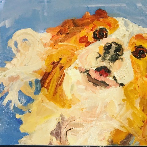
Lolita, oil on canvas, 11” X 14”
Take a commission and explain why it has been so special?
My dog commissions have been so successful because of the time I take to paint them and the individual attention I give to my clients. I share my working sketches with them so they can be part of creative process and decision making. When I start on the painting, I have the composition down in the sketches, so I am prepared to start painting. I usually work from multiple photographs as well as meet the dog, so I really feel I get a feeling for their personality.
For example, in this portrait of Jesse, painted in oil, size 12”x 12”, I feel that I captured her loving gaze. She was quite elderly at the time and I think the work expresses the wisdom she gained in her years.
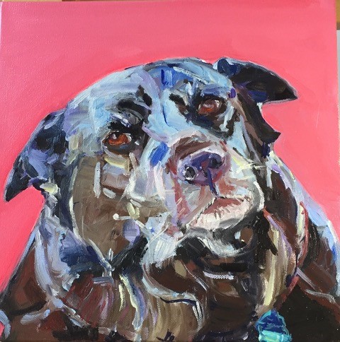
Jesse, oil on canvas, 12” x 12”
Discuss background in the dog images.
Sometimes, I just do a plain background in a punchy color that complements the color of the dog and highlights their aura. Other times, I include some landscape or a place that is important to the dog and the owner. I always try to meet the client’s wishes but sometimes need to temper them with what I know will work.
Discuss the philanthropic aspect of this aspect of your work.
I donate a lot of work to school auctions, medical groups and the MSPCA / Angell Memorial. Who wouldn’t want to buy or win a dog portrait that goes towards a good cause? I believe in the causes I support and it doesn’t hurt to also get my name out.
Can you explain the relationships between your visits to the New England Aquarium, your lifetime bound with the sea and your latest body of work?
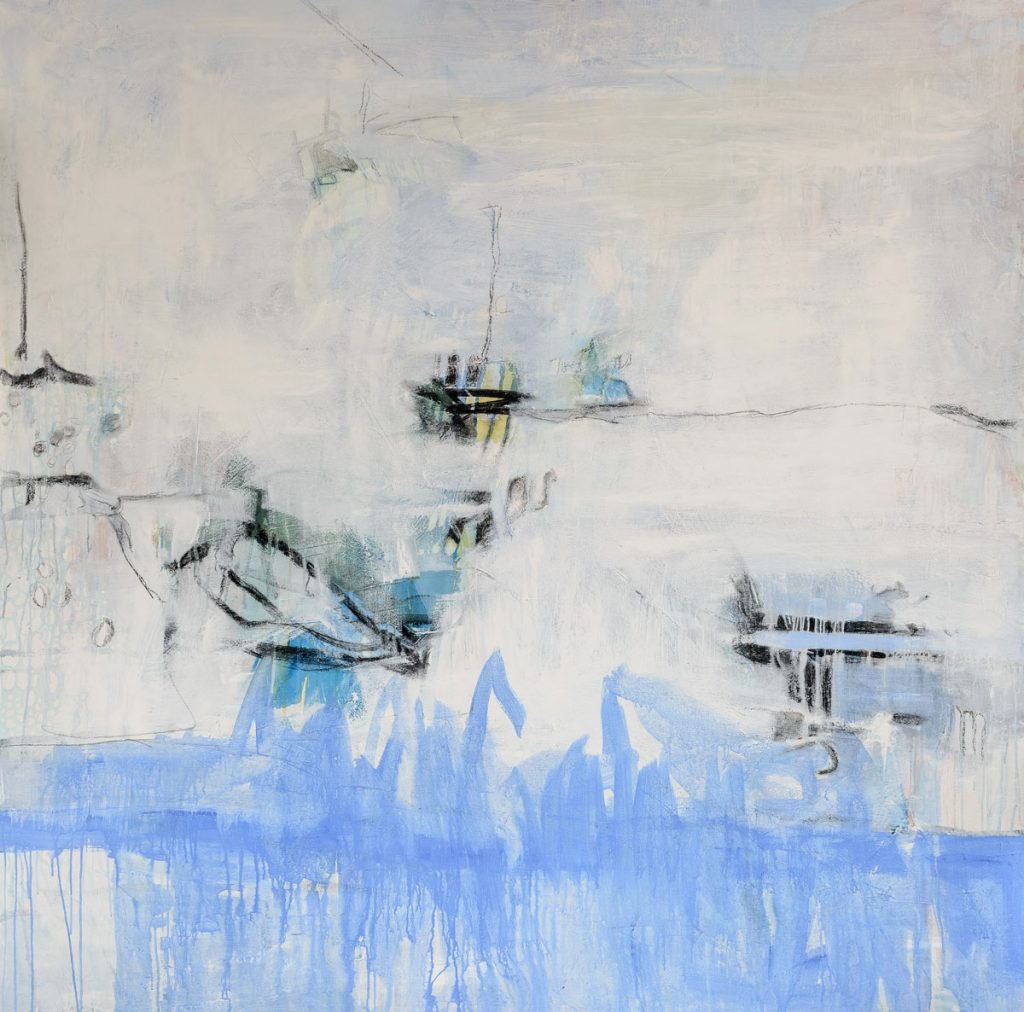
Lake, Acrylic and mixed media on canvas, 6’ x 6’
I originally went to the New England Aquarium to look for glow in the dark fish and fish with bio luminosity, which I am fascinated with because it is a natural occurrence in nature. When I got there, I was intrigued by the color blue. It was dirty aquarium water, but in the pictures, it looked like gorgeous azure blue, all different tones. This current body of work was sparked by the concept of bio luminosity and remembrances of growing up, visiting the ocean, swimming, fireflies and phosphorescence - like stars falling to the ground. When I went to the aquarium, I thought what I would be looking for was bio luminosity. What I came away with were ideas about water, undersea life, the many different colors, etc. So, this current body of work became even more about the ocean and water. I’ve always thought of the ocean as the great vast unknown, a source of life, never-ending. And we don’t treat it well, so I wanted to call attention to its beauty and energy. As a painter, I’ve always been intrigued by light. Imagine looking up through the water and seeing a shaft of light shining through. Just beautiful. So, there is a direct connection between my childhood remembrances and my current feelings and emotions towards the ocean and the color blue.
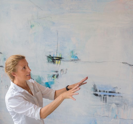
Contact details:
Katherine Downey Miller
kdowneymiller@gmail.com
Deborah Blakeley, Melbourne, Australia
Interview by Deborah Blakeley, May 2019
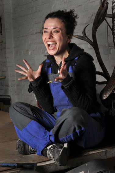
Yasemen Hussein
What made you move from glass to metal?
I actually started off my imagined career as a dancer, god did I want to be a dancer, but my parents were strict Turkish Cypriot immigrants in Birmingham and it was too much of a leap of faith for them to let me follow this.
Then I discovered I could draw, then came clay, then came glass.
When I won an assistantship to do my Masters degree in the USA it was genuinely a complete shock.
I had only applied as incentive to get my work finished quicker, get them photographed and keep the Turkish community off my back, as long as I stayed in education I could avoid an arranged marriage.
Now that was powerful incentive!
Going to Illinois State University blew my brain, physically, culturally, and definitely in my work.
The MFA was heavily dominated by male glass blowers, my background was lost wax casting, I was young and easily intimated, but it actually worked in my favour.
There was such freedom within discipline’s and processes that when I was challenged to try something more thought driven than technically driven, Pandora’s box flew open, that’s when I turned to mythology and metal to interpret my new challenge.
I would never have made the work I made if I had stayed in the UK, but I also couldn’t have afforded to do a Masters degree in the UK.
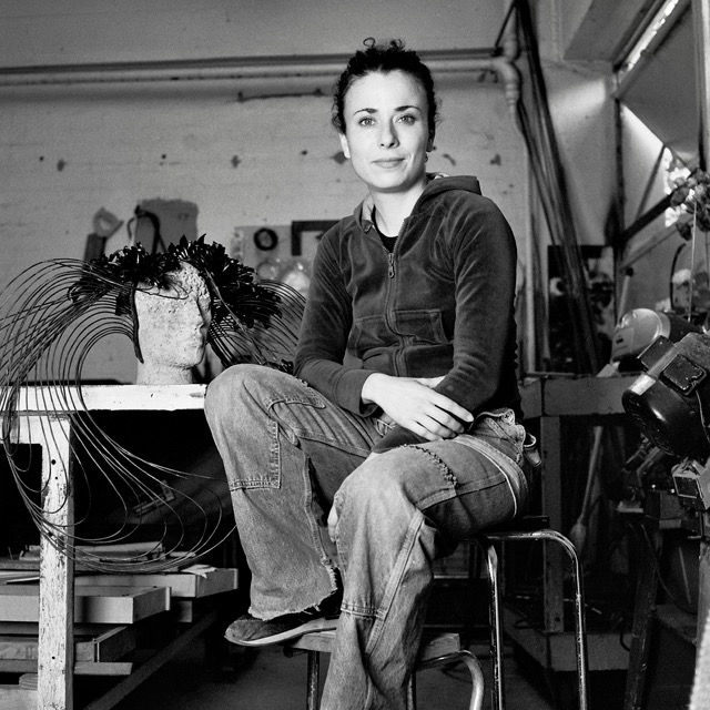
Photo by Logan Riehl
What was it about electrical cables that go you so excited?
I had never been to a scrap yard in my entire life, and this was the 90’s in North Carolina, while I was taking a blacksmithing course at Penland School of Arts and Crafts, before health and safety had gone nuclear.
We got to climb around in all this scrap, I LOVED it! I’ve always had a thing for the industrial, for metal, for rust.
At this scrap yard there was a building just for copper, when I walked in and there was a mahusive pile, up the ceiling (or that’s how I’ve memorised it!) of bright bright electrical copper wire, it looked like a giant’s hair, all elegant curls and chaos!
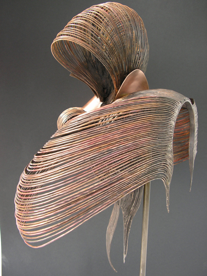
Geisha
How did you and your metal wigs become involved with the V&A?
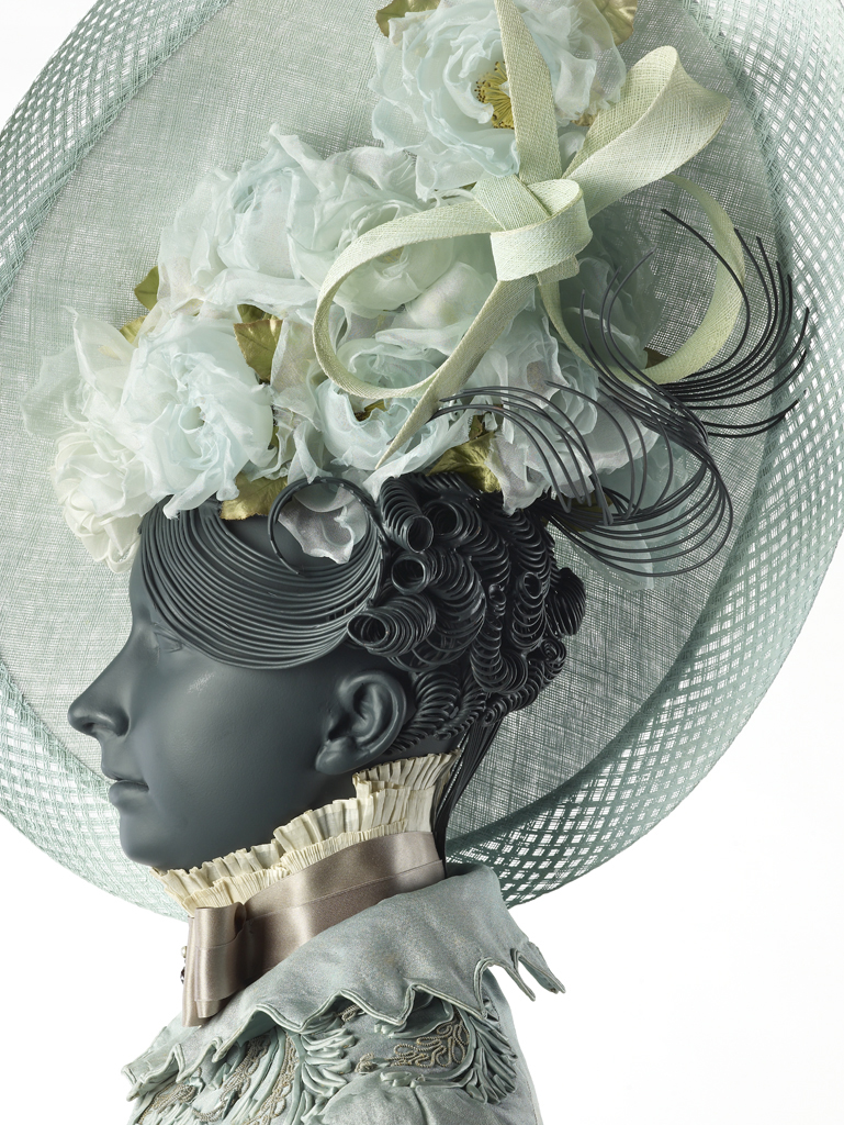
Museum of London
Years ago, I was randomly introduced to Philip Treacy, he was in the middle of a commission with the Museum of London to make hats for an exhibition called The Vauxhall Pleasure Gardens. He asked me to make the wigs for the mannequin’s, I made over 20, some interacted with his hats, some alone.
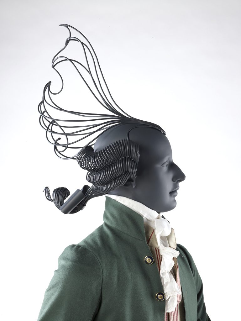
Museum of London
Someone at the V&A years later had seen these wigs and that’s how I got contacted to make some wigs for their exhibition Passion Power and Politics in 2018.
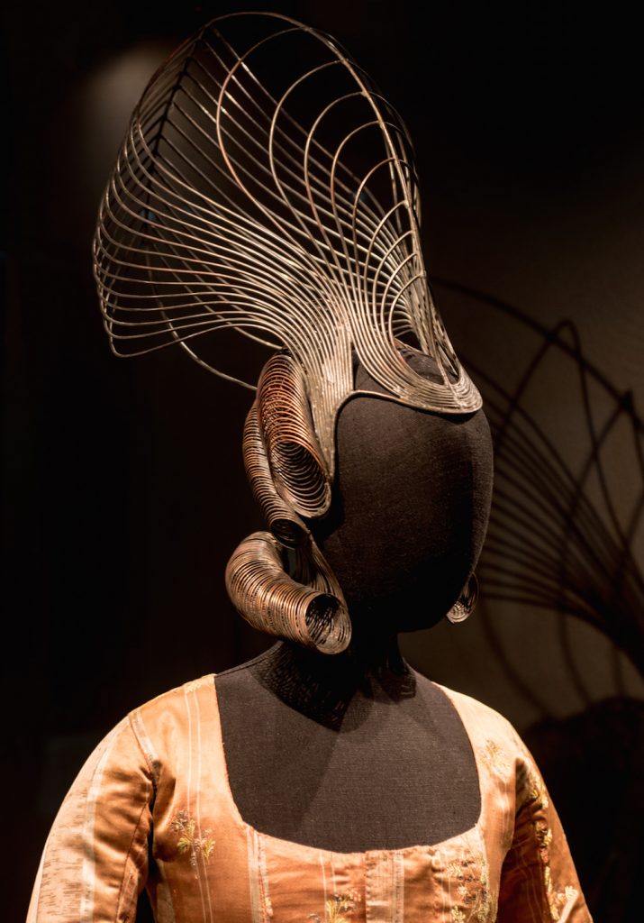
Victoria and Albert Museum
I have to say it has always been a dream of mine to get work into the V&A and when I dropped off the work; I did cry with sheer joy….not the most professional moment of my life but a real dream come true!
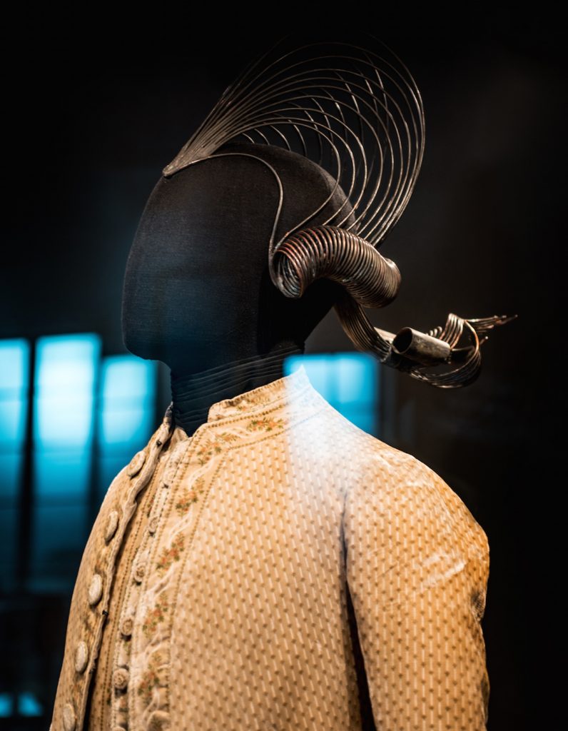
Victoria and Albert Museum
Discuss the actual history of hair and wigs that is so intertwined in your work?
In honesty I started to make the wigs in North Carolina because the copper was literally begging me to do it! I had to because I could see just how perfectly it would work.
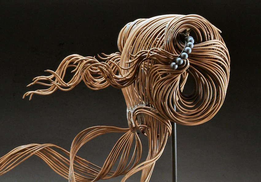
Elizabethan
As soon as I made one, I was hooked. I have always been a gatherer of images, in the age-old world of libraries and photocopiers, before Google. I realised I had many many images of beautiful women with hair I could never have, as I have a Turkish curly afro. The first 4 hair pieces I made were from a pictures of a young Marilyn Monroe,
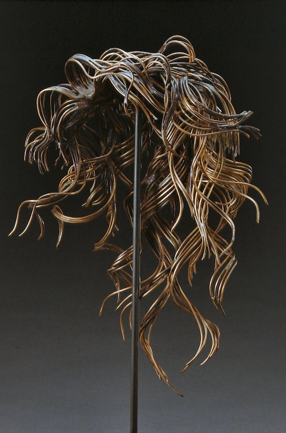
A young Marilyn Monroe
an Elizabethan queen, a Spanish girl and a Geisha.
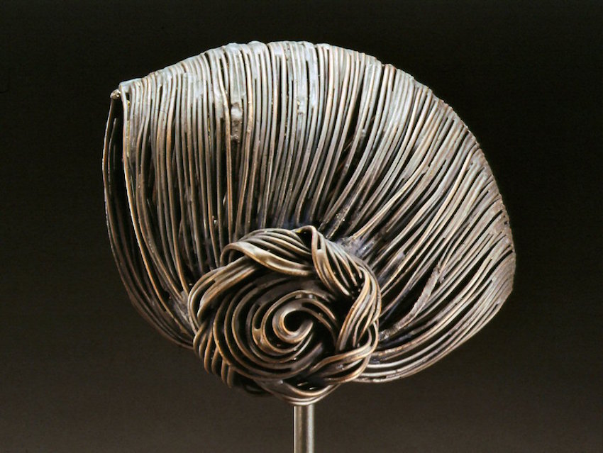
A Spanish girl
Wonderfully random and gave me so much to work with stylistically.
Explain another wig aspect of your work ‘Geisha’.
The Geisha hairstyle triggers off my imagination endlessly, I could keep making them and never get bored, the beautiful lines I see in them is exactly how I used to draw.
They have everything in them that makes me happy about a sinuous line, there is nothing more satisfying than bending soft copper wire into a perfect glorious bend!
To be honest with the Geisha I am driven by the aesthetic, not the culture or history of them.
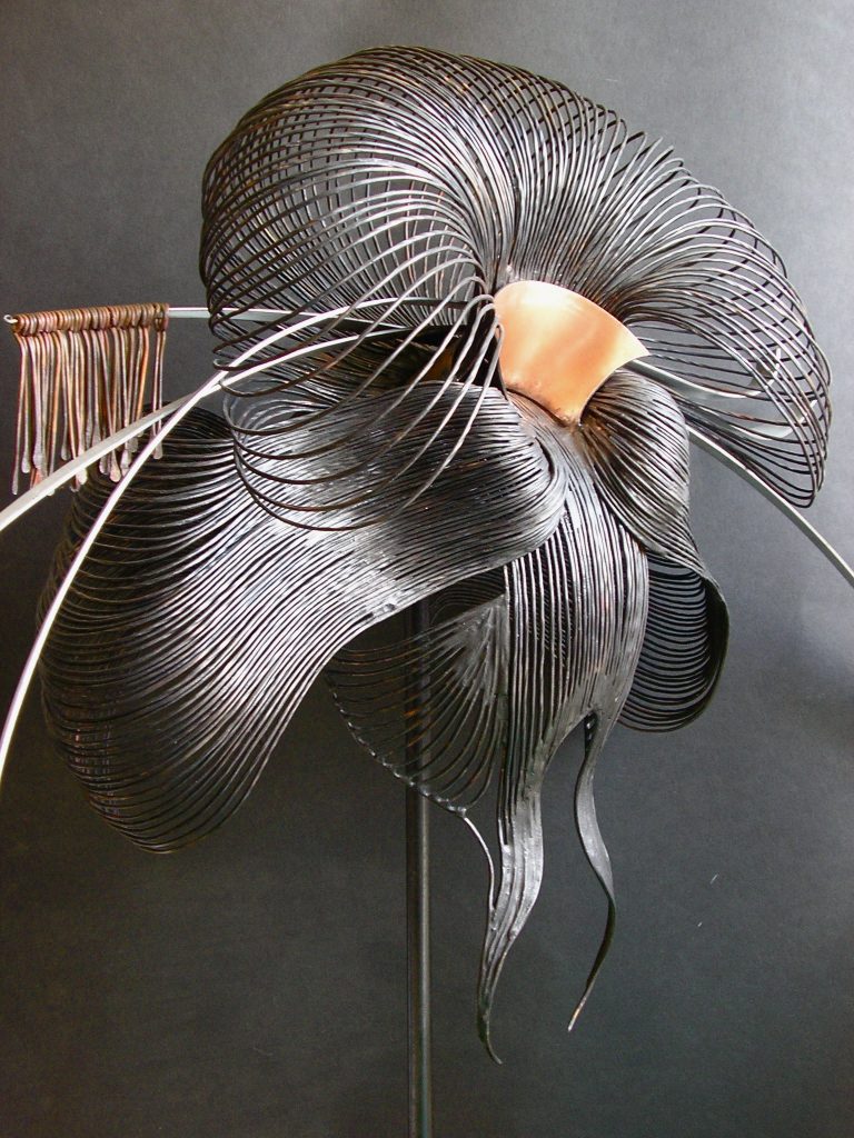
Geisha
How has your work been used within retails settings?
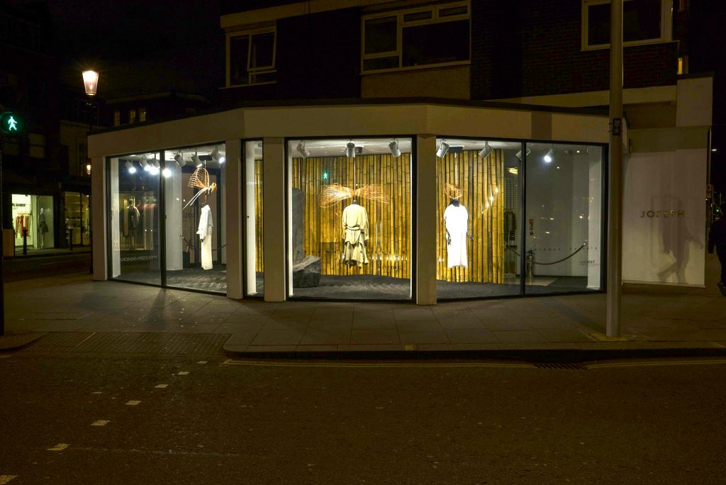
Joseph in Mayfair, London
I have only had one commission specifically for retail, I was approached by the clothing company Joseph in Mayfair, London, to make a Geisha inspired window display, which was music to my ears!
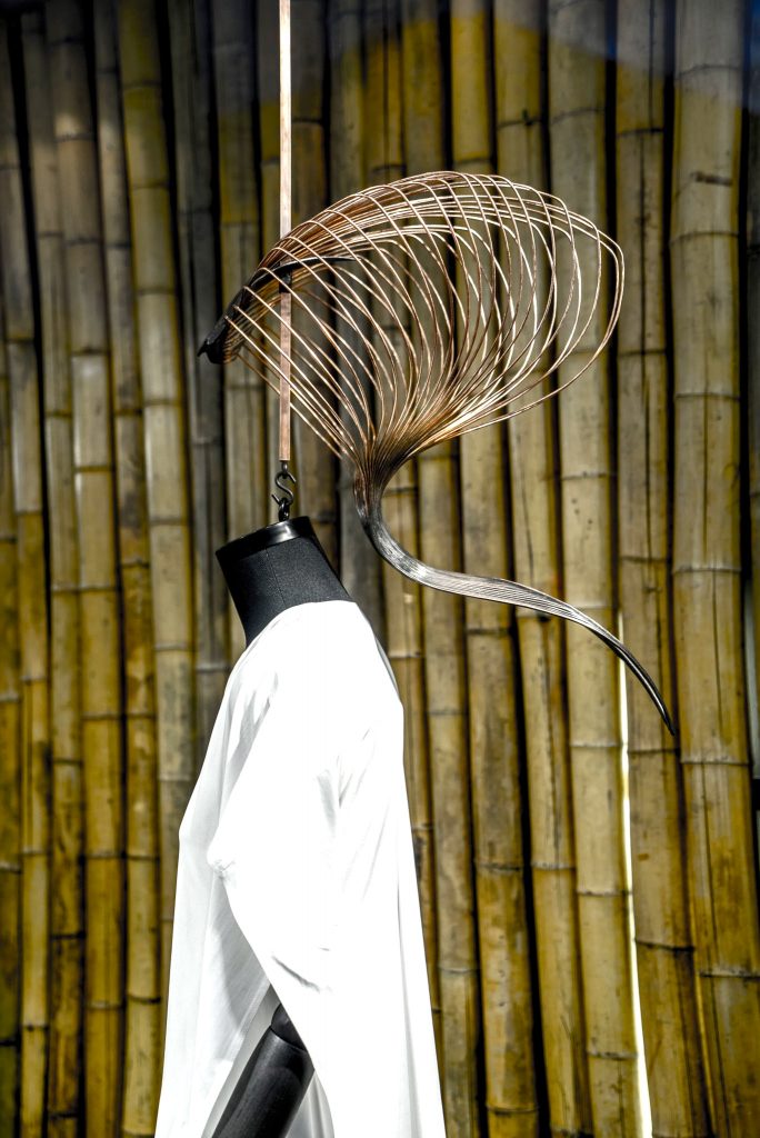
Joseph in Mayfair, London
I loved making this work as I was allowed to push the imagery, all three pieces were a joy to make and I was really pleased with the outcome, and so were they.
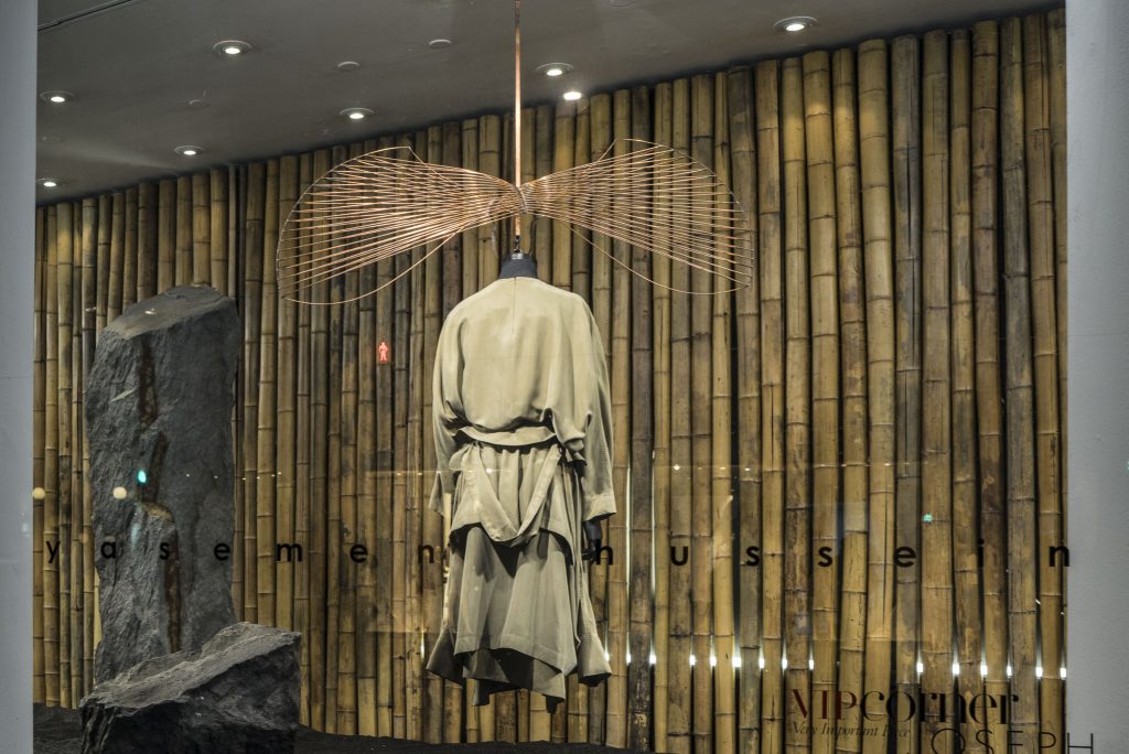
Joseph in Mayfair, London
Expand on your feathers, within the Four Seasons in Tokyo?
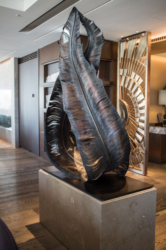
Feathers, Four Seasons in Tokyo
This was an incredible commission for me, a big learning curve, not only in scale but also technically, I’d never made anything so big, anything to be so public, so it was a mine field of negotiations.
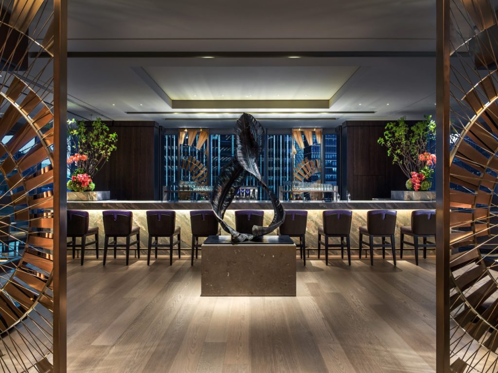
Feathers, Four Seasons in Tokyo
Once the design was accepted, I was lucky enough to find a company to help me with the technical aspects of making the piece earthquake proof.
Also, it was a challenge to find an electroplater that could bronze a piece of that scale.
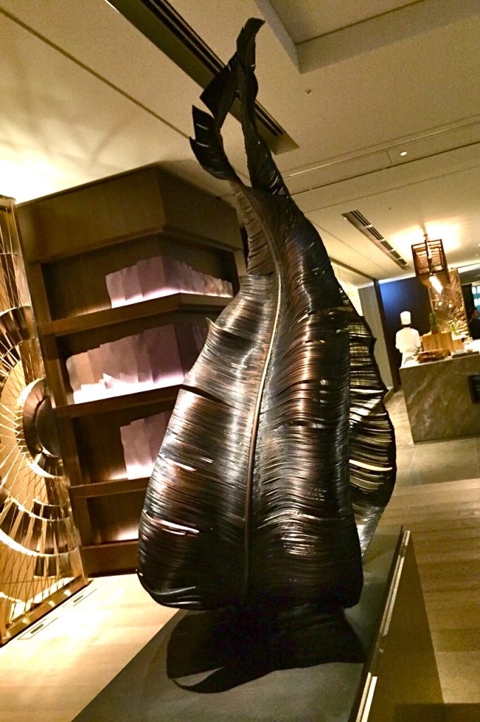
Feathers, Four Seasons in Tokyo
All of which I conquered, but it wasn’t the easiest of lessons to learn.
I think the act of delegation for a control freak is an important lesson!
Take one of the commissions you have worked on and discuss how this has extended and developed your art practice.
This is a tough ask as my working life has had no linear common thread, it’s been a roller coaster of random connections as I have not been represented by an agent or gallery.
Every job is a new set of rules.
Victoria Secret model, Catwalk Show, Photo by Alessandra Ambrosio
From making work to bend around Victoria Secret models to feathers on ceilings, to a cardboard replica of a Faberge egg!
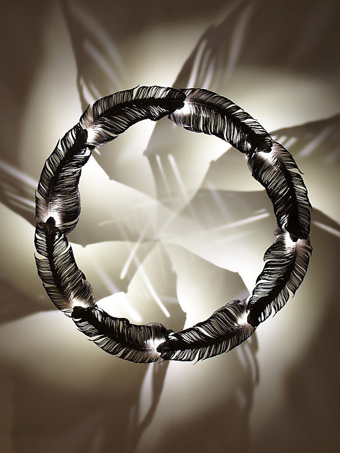
Feather Chandelier, Candy and Candy
Every job I get I have to circle it like a wolf and figure out how I approach it, there has never been a set approach I can use for each job.
Pan Maquette, clay and steel
What are you currently working on?
You can’t publish this till after May 24th or I will be in a LOT of trouble! I will be able to send you pictures AFTER May 24th, this is the date the tour starts and I can’t publish anything till then.
I hope this is ok??
 has made arrangements with Yasemen Hussein and we will give you all a newsflash as soon as we have images that can be shared. This is such exciting news and we are so grateful to Yaseman, that she is allowing us to share this amazing commission with images and a short introduction to her latest commission with really BIG names…. Can’t wait!
Contact details:
Yasemen Hussein
Deborah Blakeley, Melbourne, Australia
Interview by Deborah Blakeley, May 2019
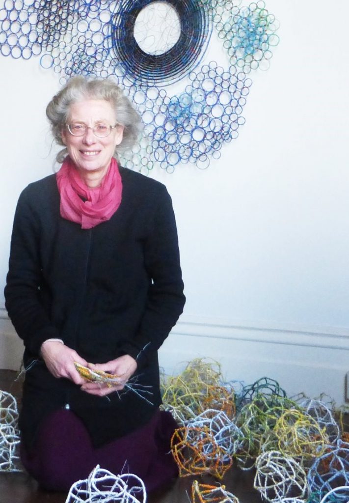
Deborah Duffin MRSS
The natural world has had a huge influence on your work. How can this be seen in two current works and one from the past.
I began to look at the natural world in the early 1980’s. I primarily see myself as an abstract artist, but I wanted to move away from the architectural forms of earlier work. In 1988 I was invited to create an installation at Unit 7 Gallery, London ‘Wire to Line’,
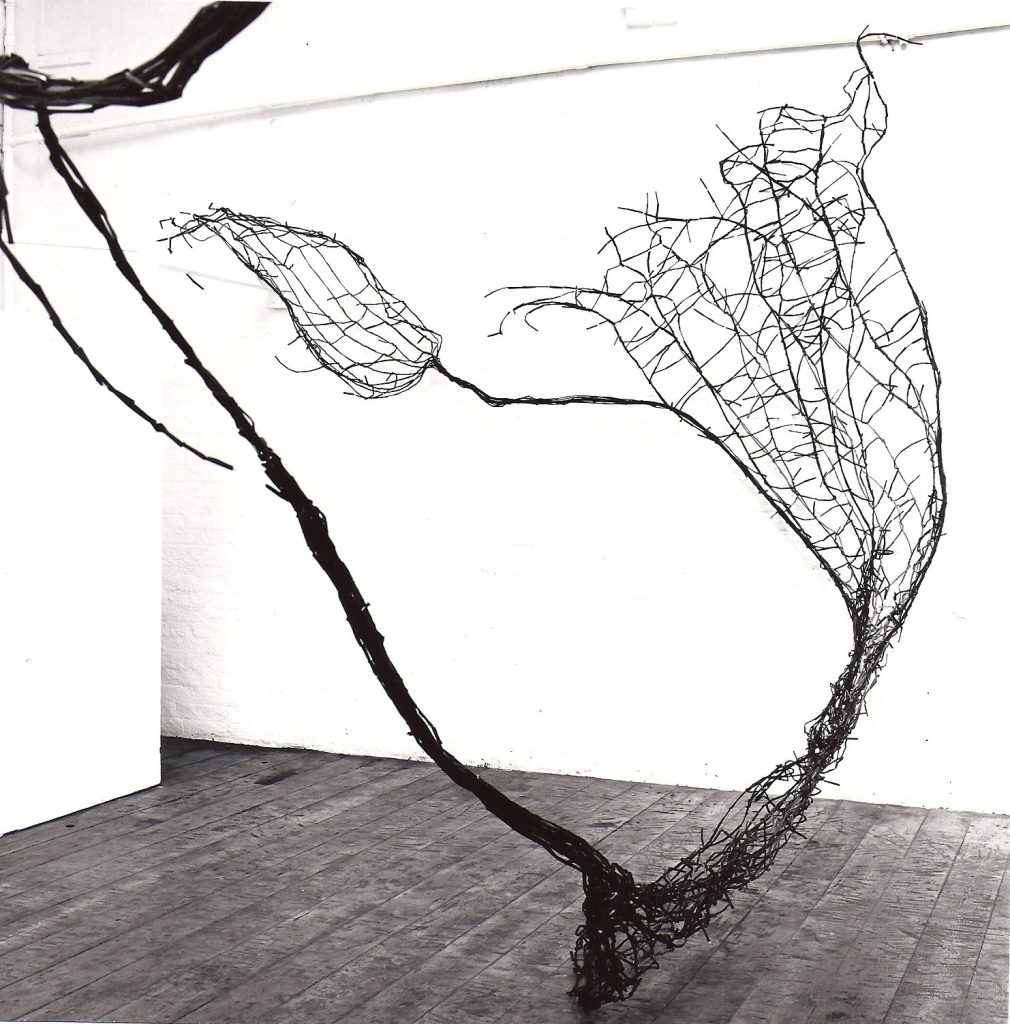
‘Wire to Line’, installation, wire, paper, sellotape.
I had been using fan shapes after making observational drawing of ducks’ antics at dusk on a pond in the park – they created fan shaped water trails as they played. The gallery, situated on an upper floor of an industrial block, was surrounded by winter trees – this also provided inspiration. I wanted to create a three-dimensional drawing that could be walked through. I kept in mind the kind of shapes and forms I wanted, while making several large pieces. These swept through the space and wound round its features – beams, columns and exposed pipes - describing the space and creating a new energy within it.
The rich and fertile subject matter – patterns, rhythms, and energy of the natural world, still inform my practise.
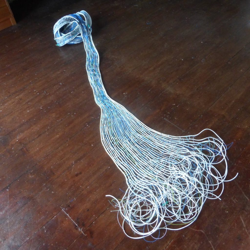
‘Freedom’, wire & cable, 220x90x20cm
One recent piece ‘Freedom’,completed in 2018, aims to emulate tracks, trails and tangles observed in the movements of flying insects, swarms of ants and the slime trails of slugs. It also encapsulates with idea of change and transformation - the way one thing merges into another: an ant’s nest breaks up as they go in search of food, or water changes form as it gets channelled through a rock formation.
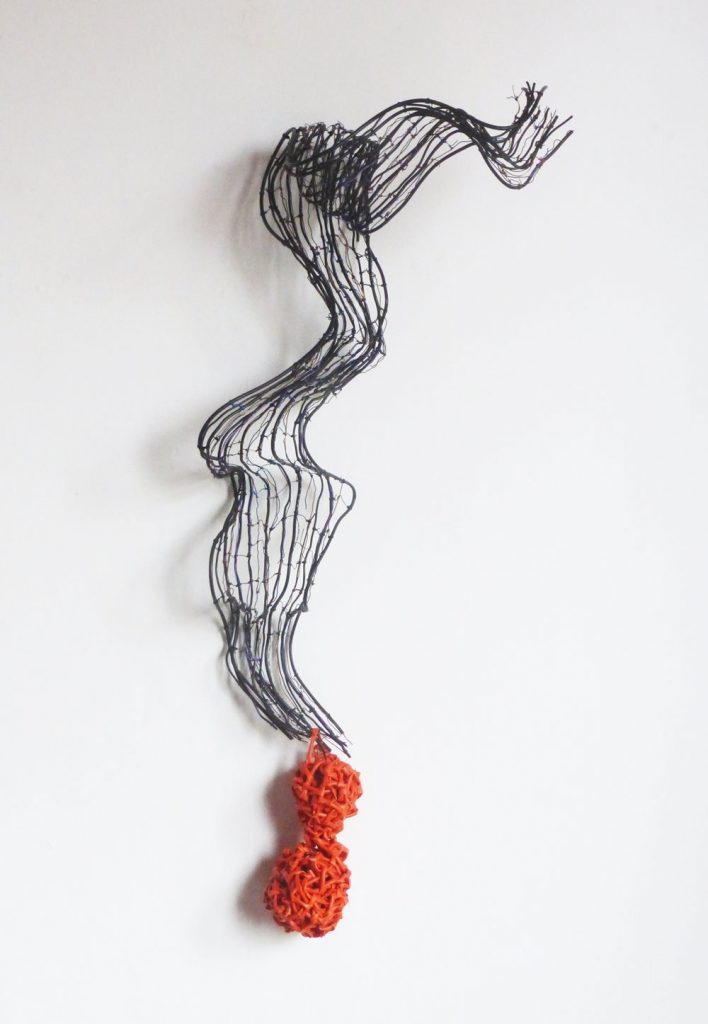
‘Wave and Object’, wire, cable, electrical sleeving, 105x45x32cm
The third piece ‘Wave and Object’, aims to capture the undulating, flowing energy of a wave and its relationship with objects encountered on its way. I hold my observations and experience lightly, and this piece went through many transformations. In the end, the way it worked visually, as a piece, dictated the final result.
You enjoy doing commission work, take one commission and expand on the recent commission…
Who was the commission from?
Liberty Global.
Why it initially excited you.
The company wanted someone who could work with their provided materials – coax cable, fibre cable and electrical wire. I love the malleability of these types of materials and I was excited by the challenge of marrying their desire to highlight the company aims with my wish to be experimental. This was a challenge. I did some research and came up with shapes I felt reflected their ideas and kept these in mind in a fairly loose way. I had a feeling this combination might lead me into new territory, which is exciting.
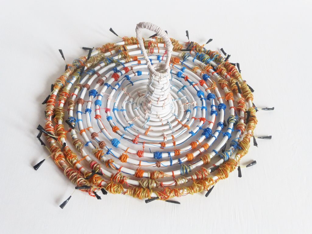
‘In the Loop’, coax cable, fibre, electrical wire, tape, 37x40x18cm
Were there any restrictions?
The only restrictions were that I use their materials and that I encapsulate the aims of their company. They wanted five pieces of varying shape. Apart from that, they were happy for me to decide on the forms the pieces took.
What followed the initial talks and what ideas did you put forward?
I supplied images of previous work I felt related to the kind of forms I had in mind for the commissioned pieces, and I described my understanding of their aims, which they were happy with.
Were the clients involved in the production process?
Only in the sense that they supplied the materials and one of their technicians advised me about safety issues for using the fibre, which I hadn’t used before. Fibre’s internal core is fine glass, which breaks easily and can puncture the skin, so I had to modify the way I worked and how I worked with the material in a visual sense.
‘Hotline’, coax cable, electrical wire, 52x15x13cm
How was the finished work received?
They were very pleased with the results. My Liberty Global contact said: ‘We absolutely love them! The way you have managed to depict such things in the sculptures is truly amazing.
How did the work fit within the location?
I haven’t seen them in situ. They are in the corporate library at Liberty Global headquarters in London. It is not open to the public, but I am pleased their employees will be able to enjoy the work. I hope it prompts some interesting questions – since the way I use materials would probably be a surprise. I had stripped down the cables and manipulated them in ways that often obscured their origins; most people would struggle to identify the materials used.
Expand on how your work can often be used both inside and outside.
The materials I use are mostly waterproof, often plastic, PVC and wire. So in theory they could all be sited outside (with the exception of a series made with black annealed wire). In practise, there are some I would not site outdoors for various reasons. When I began siting pieces outdoors, there were a few unforeseen consequences: one piece came back infested with tiny insects, which had burrowed up the gaps between wire and electrical sleeving. This meant I had to keep it outside and could not show it indoors in future. Now I take that kind of thing into account in how I make the work and which pieces I think suitable for outdoors. I also think of the colour - pale colours – white, yellow, orange, show up better in a delicate work against foliage etc. For indoor wall pieces, darker colours work better - but I am flexible, and some work in either context.
You often work with architects, comment on some of the highs and lows that come with this work.
I mainly worked with one London architect over many years. He began by buying pieces for his collection; he loved my work and was very supportive. He paid a regular sum each month, so when he had finished paying for one piece, he would choose another and the payments carried on. This was very good for an artist, since income is irregular. He was adventurous and commissioned me to make a piece in the stairwell of his home. I had complete freedom to play with the space, which was exciting. He also exhibited my work, first in the practise he worked for and later in a gallery he created in a practise he jointly set up. I also worked as a consultant to him – introducing him to other artists and helping to set up his gallery – I trained his administrator to run the gallery since I had organised exhibitions and written my book: ‘Organise Your Own Exhibition – A Guide For Artists’. We worked together on selecting artists, offering me an opportunity to look at a wider range of artists and play with how the work might complement each other. I can’t think of any lows to the arrangement – he was good to work for and with.
England is renowned for its gardens and parks how has this included your sculptures?
Many stately homes open their gardens in the summer, and there is a passion for outdoor sculpture parks up and down the country. Some have themed shows and sometimes I enter if my work seems relevant. More often, I am invited on recommendation or the organiser has seen my work elsewhere. My work lends itself to this type of outdoor event since my work appears fragile and delicate, and so a temporary siting seems more possible. In fact, my work is remarkably resilient and has been permanently sited outdoors, for example, at the University of Exeter sculpture trail
‘White Entwined’, wire, cable, 152x85x22cm
Some of my works are malleable - I may twist them around a tree or reform them to suit a particular place – this is part of the making process - I never consider a piece truly finished unless it is bought or commissioned and has a new owner. The pieces I retain may be changed, and become new pieces time and again.
Some of my works are suspended and turn in the wind, creating an on-going, changing series of relationships. One example was ‘Zephyr II’.
‘Zephyr II’, installation, wire, electrical sleeving
Heathercombe Edge Sculpture trail. Two pieces were suspended within a tree and revolved at different speeds, so that every moment was a new experience. This represents human existence – we appear to take the same routes, make similar decisions and choices –yet every time there are variations to our resulting experiences. The joy of life is in these unexpected occurrences, which if we take notice can affect our future choices and directions.
Take ‘Red Semi Circle with Knots’ and explain two points related to this work.
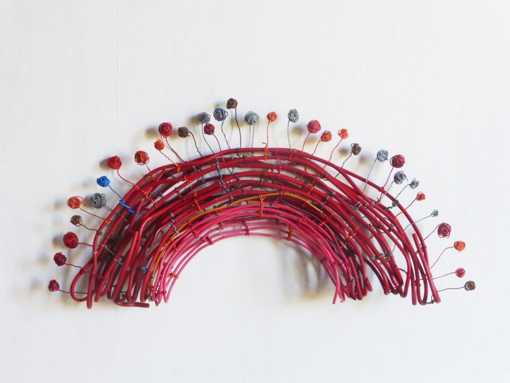
‘Red Semi Circle with knots’, wire, cable, 38x18x5cm
The technique and materials used.
The materials are collected wire and cable tied together with electrical wire. I initially made this piece as a circle using the electrical wire to tie the larger cable together. As I work, I leave long ends to the electrical wire, so I can use them in ways which the work later dictates (this could be practical – ie to tie something together, or a visual decision, often both). I decided to fold the piece in half and then felt it needed some interesting points. I had used knots in earlier work and thought they would be an interesting contrast to the main body of the piece. It also related to observed wild flowers poking up on a bank or cliff edge – I often get down on my knees to observe or take photographs from unusual angles.
The importance of smaller works.
Smaller works play an important part in the development of ideas. I work regularly - like a pianist practising – and this allows me to try out techniques, textures and shapes in a relatively short time, which I can use at a later date. Some of my large pieces take months or years to make, and I like to have smaller pieces on the go at the same time – I enjoy completing something in a shorter timescale. These pieces are the ones I most often sell – they are more affordable and can be housed on a mantelpiece, shelf or wall in someone’s home.
Why do you think as humans we are so drawn to circles.
Use two pieces to explain this?
I think our attraction to circles is partly because it is such a complete form – simple yet unmistakable. At the same time, it is curvaceous rather than angular. It is a form often seen in nature, and suggests motion and fluidity. It is often replicated in man-made objects as well – bottles, cups, plates – what other shape would be as serviceable? I also often use spheres and spirals, which have a similar feeling. My piece entitled ‘Growth’ has a circle at is centre (although it is actually made as a spiral).
‘Growth’ wire, packaging, 111x88x25cm
It was a starting point in a structural sense – the rest of the form came out of that circle, so it has a practical application. Visually, it provides an anchor, which allows me to be really wild in what comes next – it holds the piece together. I often use this device for this purpose. The circular form draws our attention to the structure of what we are observing in the natural world too, for example, a knot in wood, or water dragged down a hole.
Some of my pieces are made of many overlapping circles, for example ‘Bubble Up II’
‘Bubble Up II’ plastic circles, electrical wire, variable, this formation 65x57x28.
The idea for stringing the circles together came out of observing turbulent water – from afar it looks wild and irregular, but close up it contains numerous tiny perfect circles of varying sizes (bubbles), which overlap and create layers through which other circles can be partially observed. Many objects, both natural and man-made, are made of multiple circles; this repetition attracts our attention, draws us in and mesmerises our gaze. I collected the circles used in this piece, for years (from drinks bottles) just because I liked them, long before I came up with an idea for using them. They had a useful function in their former life – allowing a bottle to be sealed, then when removed they just become a shape useful for something else.
Your photography work ‘Dandelions at Dusk’ explain the technique you have used for this work.
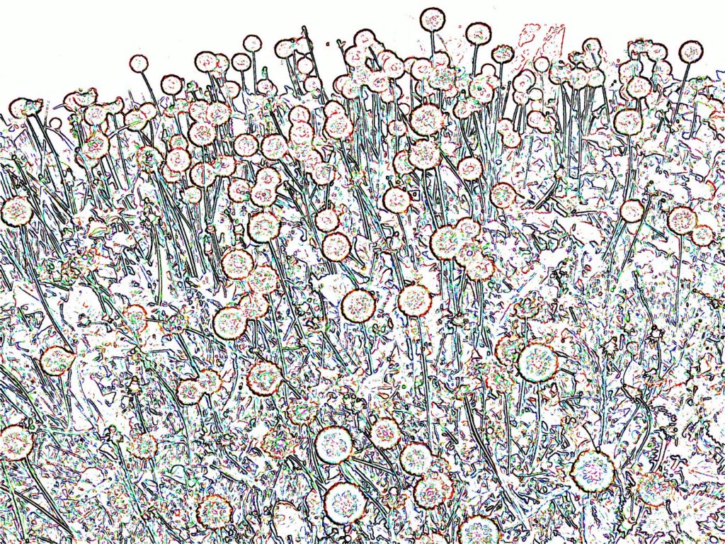
‘Dandelions at Dusk’
This piece was one of a large series of works, which came out of a photograph of a huge bank of dandelion clocks happened upon on an evening walk. I used photo manipulation software to play with the image. I was particularly interested in working with its linear aspects, and creating drawings that exaggerated, elongated and/or distorted the circles of the dandelion clocks. In some pieces, I combined other imagery from different photographs to create interesting contrasts and play with the idea of movement and flux. This particular piece was an early one of the series; I used several features in the software, combined in the one image. The title was just a working title to enable me to keep track of the imagery I was producing, and I probably should have changed it, since I had moved away from the original source -the process had taken me into new territory.
Discuss colour and light in your photography?
‘Stepping out’
‘Stepping out’ (size variable, as printed) was one image from a series, taken on the same night. The light and colour come from a local funfair. Walking around the fair and experiencing the excitement that grows through the evening had seemed to me to be full of heat and electrifying energy – the colours in this piece represent this experience. In this sub-series, I aimed to encapsulate the jerky movement of walking and create a drawing that expressed my feelings as I moved. I set my camera to take several shots automatically and walked along holding the camera in the direction of the fair. I had no idea what I would capture!
I am attracted by light as a medium, because of its luminescence and intensity. This intensity enables me to portray the heightened feelings that occur when we focus on the energy within us. Drawing with light through the camera and combining this with actual movement and gesture is a way to make physical something we can only feel. The visual result is the physical manifestation of this energy in the same way as the rising wave or the strata of towering cliffs, visually communicate natures activity. The physicality of movement is important in my life – dancing, walking, running. Playing with energy is integral to my work as well as being an important part of the person I am and the way I live.
You have made work for an optician’s window. What did you come up with?
They wanted something eye catching for two windows facing onto the high street in Beverley, East Yorkshire. They were open-minded about the final form, and unconcerned whether the pieces represented their business. They wanted something elegant and stylish. They gave me an advertising brochure, full of futuristic spectacles, which inspired ideas and I came up with one striking abstract form for each window - woven, fan shaped forms made with electrical wire left over from a previous commission. I used pale colours so they would show up in contrast to the interior, which from outside looked dark and shadowy.
You use weaving techniques in your work. When did you introduce this process?
This began with the pieces I made for the opticians in Beverley, East Yorkshire, in the late 90’s (described above). I needed to come up with something that would be resilient, rigid and create the type of fan shapes I wanted. Weaving with lots of short pieces of wire also allowed me to involve my young son. I gave him the task of finding the right pieces from my collection. In that way we worked together for hours – he was fascinated to see the pieces evolve and it taught him about colour and measuring as well as co-operative working. It forced me to be creative and flexible in how I approached working. I was, therefore, able to undertake commissions throughout the years when he was young.
Taking on three very different mediums Sculpture, drawing and photography how have you been able to combine and also separate the work?
Untitled drawing I, pencil, 2.25 x 1.5 metres
Drawing underpins all my work and is the core of what I do. My definition of drawing is broad: it is not just about using a pencil and drawing lines – although that is part of it. It is also about an attitude – an open-ended, experimental and playful approach. I take this same attitude in all my work. Drawing with traditional drawing materials may include direct observations from life, but also involves experimenting with the action of drawing. Rather than illustrate or record, I aim to get to the essence of what I observe and to encapsulate the feelings I experience while watching, for example, a flock of birds or the rolling sea.
Untitled II, coloured pencil, 50x50cm
As I watch these phenomena, enthralled, I am overwhelmed with the feeling of belonging to their world and yet at the same time I know I am merely an observer.
As I work with any medium, I begin with an open mind, I set up a process and I watch to see what occurs as I am working, I go with this and develop the piece as I go along. It is about developing a relationship with the medium. The outcome of an individual piece is always a surprise to me and I see the way I work as a metaphor for life - each piece a new form of life arising through the combination of the medium, my actions and the experience of observation over many years.
I take the same approach when working with a camera – this is made more possible with the advent of digital cameras and I work with the camera’s features (for example zoom and focus), my own physical gesture and natural phenomena like rain on a windowpane or a firework show. Again, I aim to get right into the essence of subject and medium.
The sculptural work I see as three-dimensional drawings, which enable me to extend into another dimension while retaining elements of the 2D drawings. For some installations, I have combined two or more media in the same piece. At Camerawork, London in 1986, as part of an event:
‘Illuminations’ installation, wire, Perspex, light projections
I suspended wire works and found Perspex shapes from the ceiling and projected images onto them as they turned.
I have also combined drawing directly on walls with wire pieces and used light to create shadows and atmosphere.
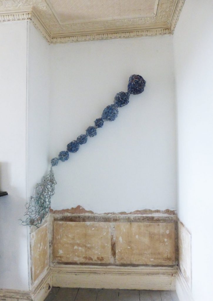
‘Cornered’ (installation, wire, packaging)
The surroundings and features become part of the work and often dictate a new set of decisions as I install a piece or an installation. Cornered’ was one recent example, shown in a mixed exhibition: ‘Presenting Mostly Yourselves’, part of Plymouth Art Weekender in 2018. The curator had selected a couple of pieces. I took them to the site without knowing where they would be placed. A half renovated alcove revealing its history, attracted me. I placed the piece in such a way as to invite the audience to move into the space and share it – only at this point, could the whole piece be seen and its presence experienced close up. The physicality of my work can then be fully lived – the viewer becoming part of the work and feeling a relationship with the building and the work as one.
You use unusual materials in your 3d work – how did this begin?
I am self-taught as a sculptor (I trained as a painter) so I was looking for materials I could use without equipment, experience or knowledge, and that I could manipulate in order to draw in 3 dimensions. I had curated a series of shows at ‘J’ Warehouse, London in 1984, and one of the artists involved, Deb Thomas, was using wire in her work; she kindly showed me some techniques. Another artist I had shown in that event, Lucia Nogueira, became a good friend - we were both looking to move into 3d. We scoured the streets of London together, after businesses had closed for the day and put out their rubbish. This waste supplemented what I bought, and her wonderfully eccentric approach opened my eyes to yet more possibilities.
In 1995 I was approached by British Telecommunications to make a piece from their old telephone wire, to celebrate their change from analogue to digital (I have no images of the piece, since I went into premature labour before it was installed). However, I had also been asked by the Barbican Art Centre to make another version of the BT piece for a solo show in 1996, resulting in ‘Two Fans’ made especially for the space. This experience opened up an awareness of how much we discard and I began to focus more on recycled and found materials.
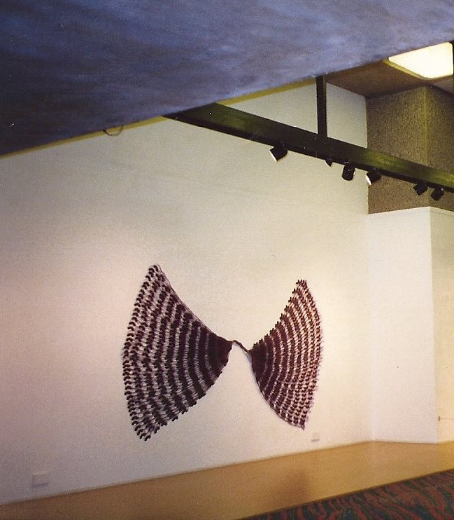
‘Two Fans’ installation, telephone wire, approx. 3x2metres
This chimed with my passion for collecting and with environmental concerns, which had been with me from childhood. I cannot bear to throw something away that might come in handy! I think this comes from seeing my dad keep screws and washers; my mum recycling her own clothes to make things for us children; my aunt squirrelling away string, rubber bands etc. Many things get reused over and over again in my work and my life. The excitement of finding new materials and ways to use them is an integral part of the adventure of making.
Contact details:
Deborah Duffin MRSS
Deborah Duffin MRSS, South West England, UK
Interview by Deborah Blakeley, May 2019
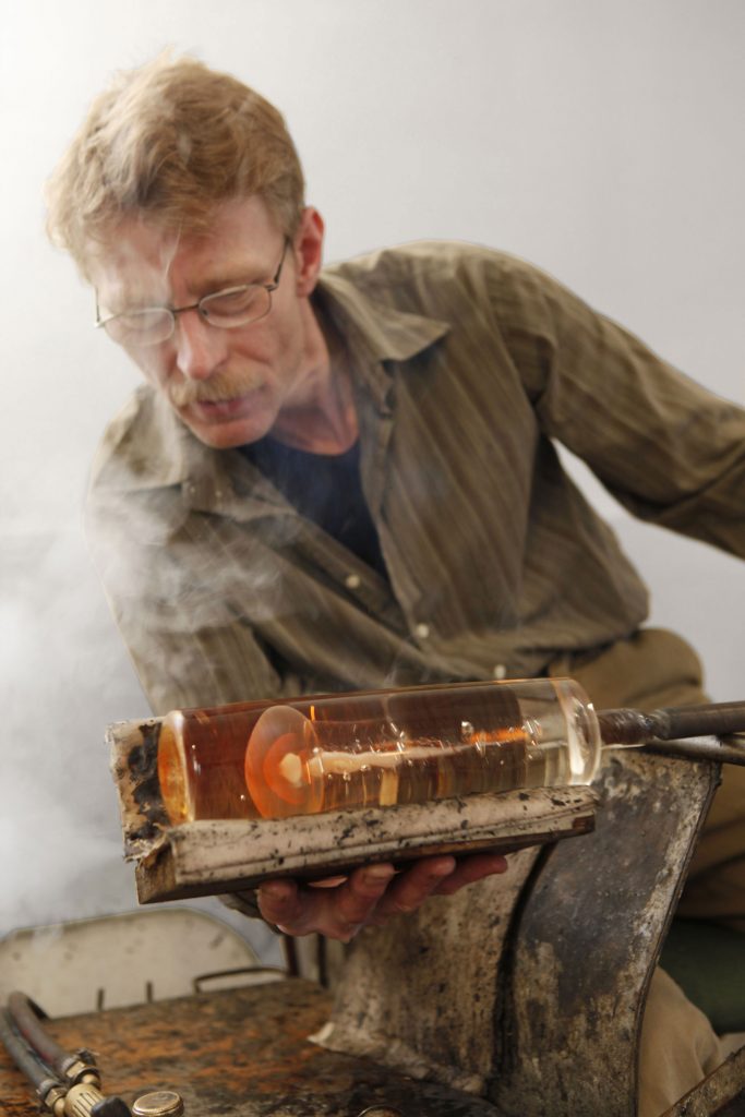
Steffen Dam
What drew you to the natural world as a source of inspiration?
My grandfather’s books have been an important inspiration for me. He was a dedicated reader of natural history. He also had a library filled with illustrated books on the sciences also natural flora and fauna.
Your interest in nature is still very alive today and, in your glass, discuss.
Yes, I have a large vegetable garden and I work in both my garden and studio.
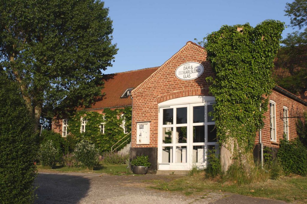
Studio
Art was not your original starting paint – discuss.
No, I was trained as a tool maker. Combining this with my knowledge of the natural world. I built my first ceramic studio in 1985 The ceramic studio soon turned into a glass studio. Leading to me leaving my job and working as a glass artist full time.
Expand on you Rawkow Commission from the Corning Museum, USA.
Describe the work you did for this commission.
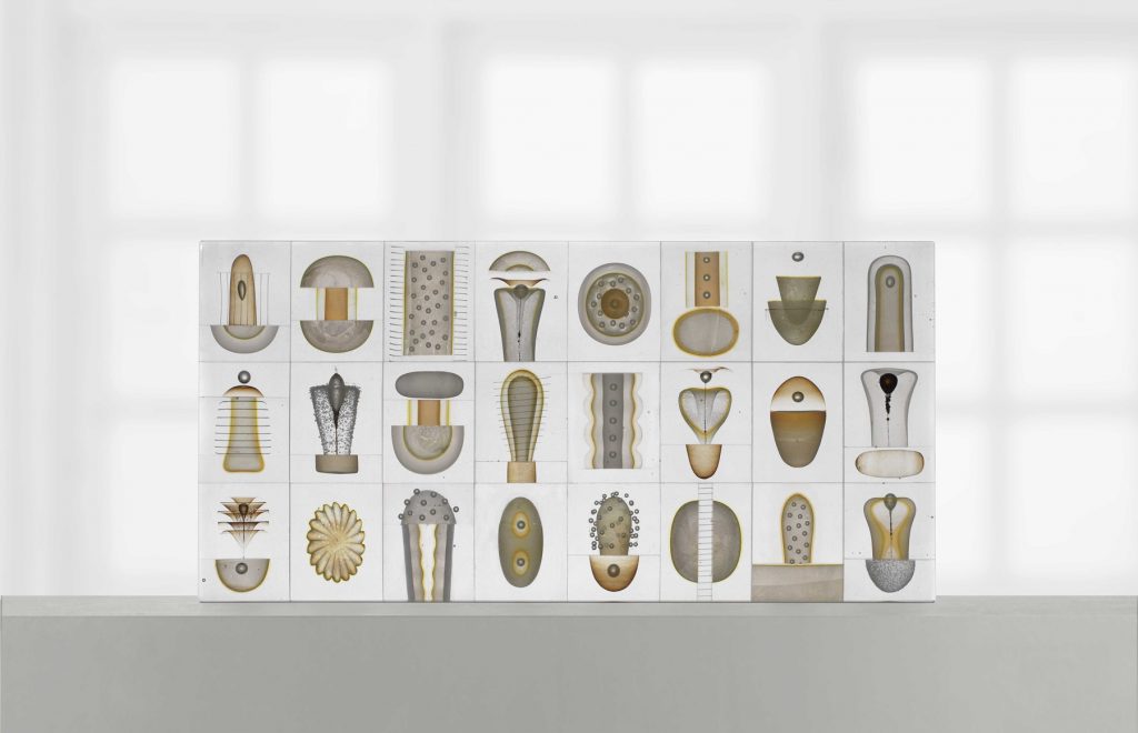
This work is a glass botanical panel. Made up of 24 blocks each block contains my interpretation of part of a flower.
It appears as 24 blocks of glass. It is basically made up by the blocks being sliced and rejoined in all directions many times. There would probably be over 100 pieces of glass if you counted them all.
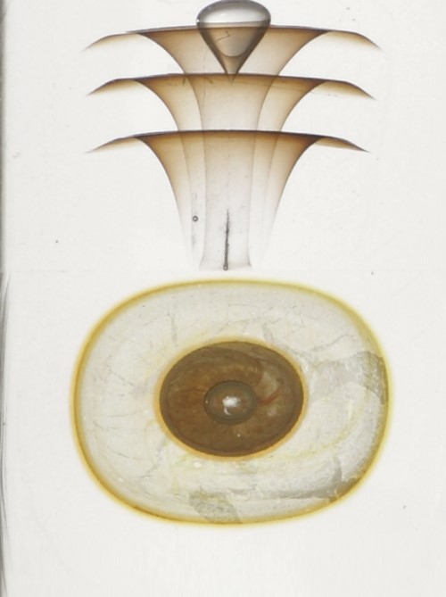
What make this piece so special?
This is a very relevant question and i think you should ask it of any artist you meet.
It is called a Flower Block and I believe that is a plausible title. The title of course is a metaphor – a verbal flower. It depicts botanical details and yet I have very little exact knowledge of botany. In other words we are between fiction and reality here.
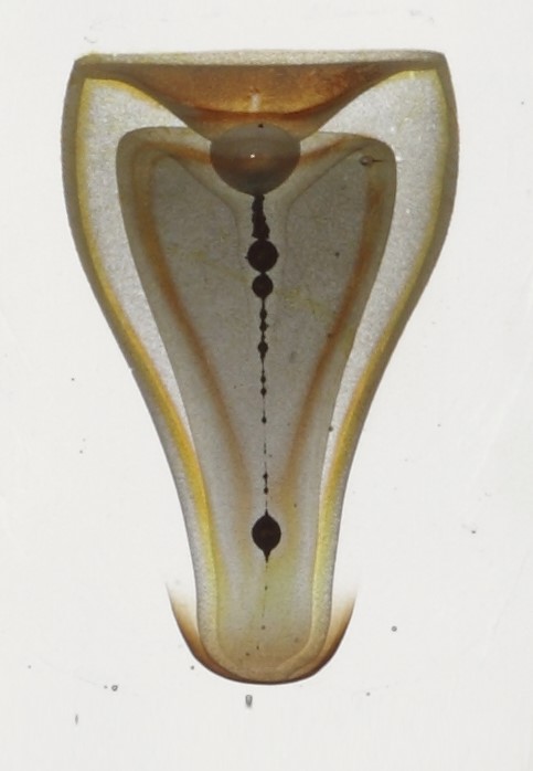
In spite that it’s very exact, precise and square, it’s equally uncertain what we’ve have in front of us – it’s not science and it’s not Hans Christian Andersen. We’re in the land of the idea – the land of abstraction – a place where things can go in several directions. The purpose of this piece of glass, or of any metaphor is to use one subject to gain insight in another and thus prove to the viewer that abstract thinking is possible.
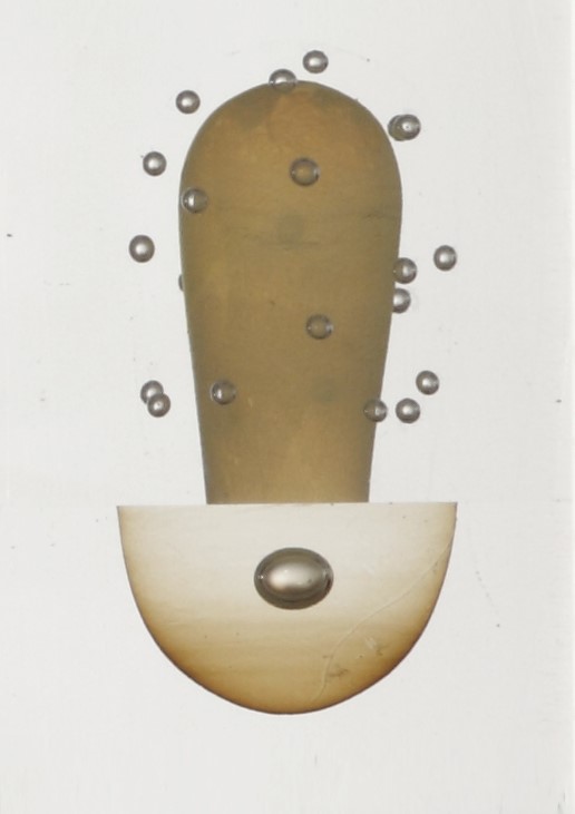
Each block contains my image of a botanical detail. Even though I have very little exact botanical knowledge about botany. The aim is to get a balance between reality and fantasy.
How did you position the individual pieces blocks?
I make many more detail than I need . They lay on my table for weeks, while I select and change the positions . This is a tricky part of it.
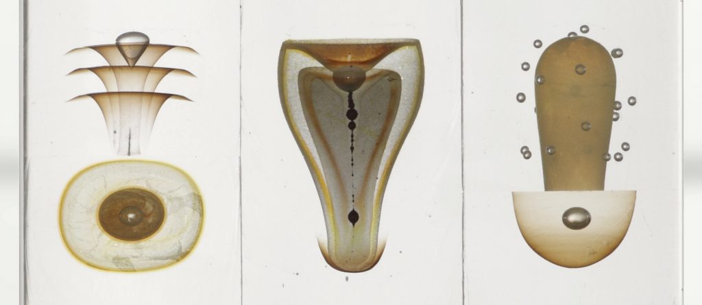
How are the colours made?
All the colours are made using silver foil or carbon from a welding torch. They are not manufactured colours. The welding torch and silver give a palette of its own. From opaque white to dense yellow. I am constantly striving to be in charge of the colours.
Can you explain about the creation of accidents in your glass – Happy accidents.
Can you show us a current piece that you have been working on and why it has excited you due to a new technique?
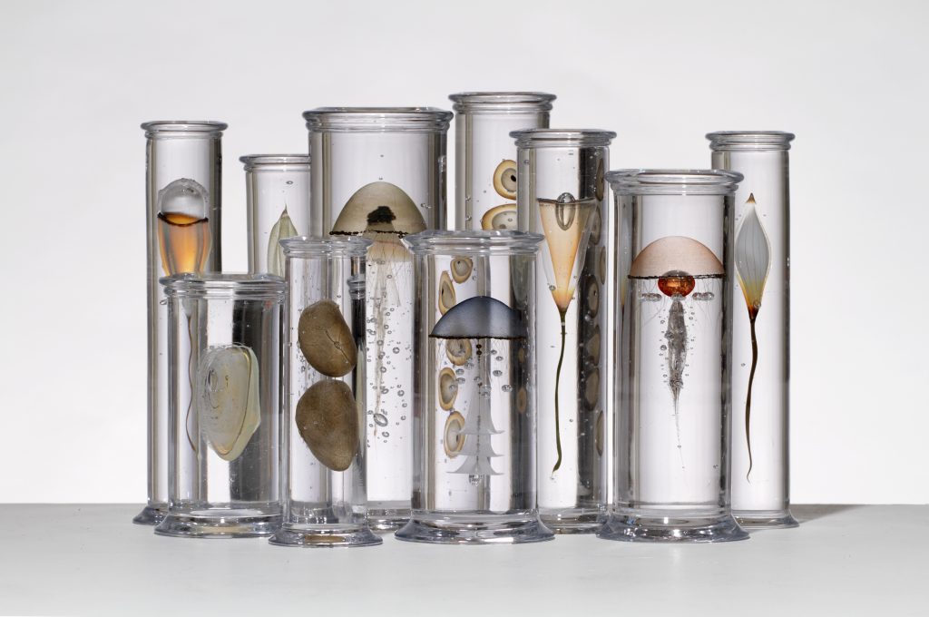
I have recently made a large group of specimen jars called Pangaean zoology. The group is 2 m long and consists of 20 different solid glass cylinders containing fictive biological specimens. I have been solving technical and artistic problems on this kind of work for years and I'm very satisfied that i can still invent new specimens and improve the plausibility of existing types.
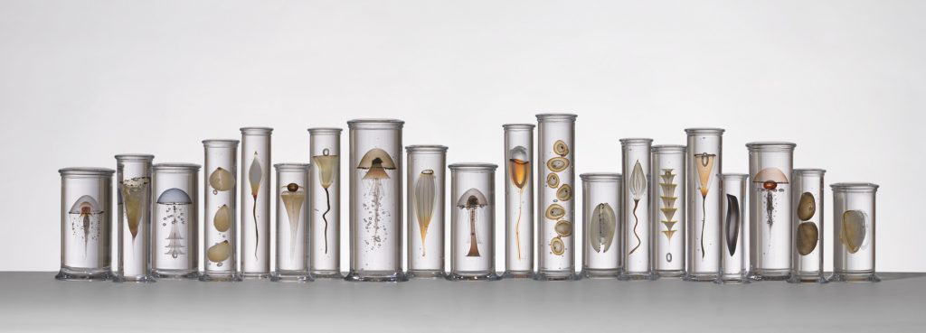
Contact details:
Steffen Dam
Ebeltoft,, Denmark
Interview by Deborah Blakeley, April 2019
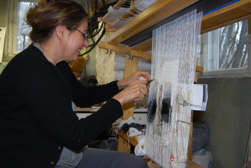
Aino Kajaniemi
How do you portray ‘moments and atmospheres in a persons life’ onto fabric?
I see my art as symbols. In my tapestries I combine human beings and symbols together. The symbols can be animals, plants or an object such as clothing. They are personal, intimate objects which portray our similar common memory. My symbolist picture language is like international communication without words.
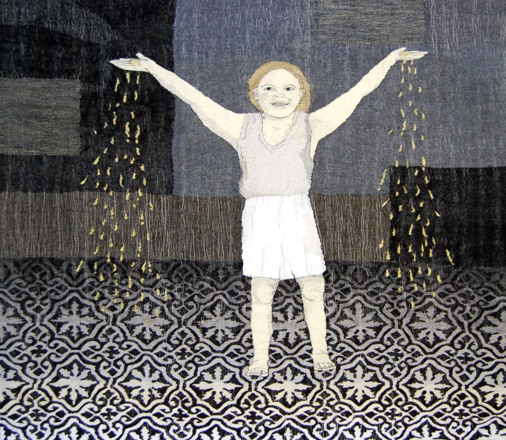
Golden Rain
There is something about the posture or facial expression of a human in relation to his or her environment that can create a memory or an association in my mind to something I have experienced; lives concrete feelings, moments and atmospheres.
Using, ‘Poppies’ and ‘Flora’, explain the differences but also the connections between these pieces.
Poppies series is a colour study. I have used colours from the warm pallet but added their contrast colours as lines and shadows in the flower. I tried to create an impression of joy and energy.
Poppies
In the Flora series the black background is very important. The plants have the main role: form, fragility, character and tones
Flora
You use tone and a limited palette in your works ‘Beauty’ and ‘Innocent’. Discuss this whole series and how it came about and the need for such a subtle palette.
Beauty
When I was young I had lot of feelings that I held inside me. I spent all my energy to work out my emotional life so I didn’t want to have more feelings to handle through colors. The black and white world seemed simpler. I want to use shades more than colours. I feel that colours need a bigger space because they are full of energy. When I use strong colours I don’t want to tell a story in the work. Colour in itself includes messages.
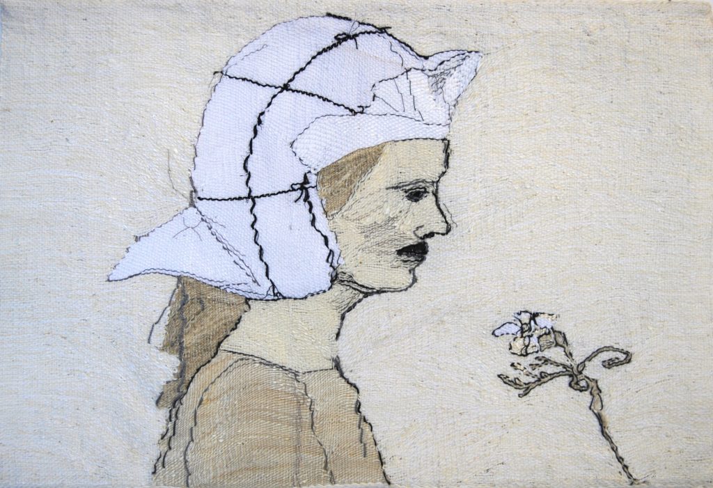
Innocent
Comment on the techniques you in different hair and floral aspects in your work.
My tapestries are very graphic. Drawing with a pencil I have an idea of a certain kind of a line. As a contrast of the fine line I like to add rough materials like real human hair. I like rough and smooth materials, the disagreement and discussion between them.
Various plants can be symbols of life´s complexity and alternatives, discussing with their surroundings and the environment.
You have had several Church commissions. Take one that has given you a great deal of artistic scope.
The last Church textile commission I have done is Muurame Church. It was designed by the most famous Finnish architecture Alvar Aalto in the year 1929.
Alta Textile, Muurame Church
What was the initial brief.
The primary role of Liturgical textiles is to be a part of divine worship with metaphors communicating the Church's message. On the other hand they also have a clear function as the priest dress and Communion textiles. At the same time textiles "decorate", they are a part of the architecture of the church. In other words, church textiles are at the same time informational, utility articles and interior decorations. In addition to all this, they should also be independent works of art.
In Evangelic Lutheran church we use 5 or 6 colors in church textiles: White, red, green, violet, black and sometimes blue. I have done liturgical textiles for 7 churches. The colour of the textiles tells the time of the religious church year.
What is the meaning or symbolism within the piece.
The main symbol in Muurame Church´s textiles is a rose. Different colours of the flower has a different meaning: love, purity, death, virginity, perfection.
A root, leaf and stem have many liturgical meanings. A fish is the symbol of the Christ.
The relationship between the tapestry and the space it is in.
Muurame Church was renovated to its original design in the year 2018. I tried to make modern, interesting and surprising but peaceful textiles which are in a balance with the architecture of Alvar Aalto and the strong colours of the interior.
What are your personal thoughts on the importance of contemporary textiles within churches?
I like the richness of religious symbols and try to use them as much as possible. In the church they handle the most important issues: birth, life, death, faith, truth, grace, holiness and love. If the artist succeeds to get this spirit into the textiles, it is art.
Pulput Textile
Your exhibition at the Helsinki Gallery Katariina, was big but solo. How did you manage this exhibition?
Scale, 60 square meters
Number of pieces needed, 21 pieces
The curation of the exhibition.
The gallery chooses from the applicants those who will have the gallery to exhibit their work.
I have had two big exhibitions with my daughter in the years 2017 and 2019 in big museums, Kemi and Kouvola. This has been both a challenge and a possibility. These museums are 800 and more than 1000 square meters big. My daughter, Aura Kajaniemi
makes spatial and two dimensional art works with bead embroidery.
You also portray animals in some of your work. Discuss one or two of the animals you have used and why?
In year 2012 I stayed in Paris for 2 months. My idea was to get to know the world´s maybe most famous tapestry series, The Lady and the Unicorn and start to design my own large tapestry series influenced by the series. I combined the story with human beings in large tapestries. I made 10 big sketches. At first there was a unicorn, then the horn dropped off portraying a horse and finally no animal at all. Afterwards I have analyzed these tapestries and have found commonly handled questions: how a human being can find her/his place in the world, the reverses, fears, needing support and dreams.
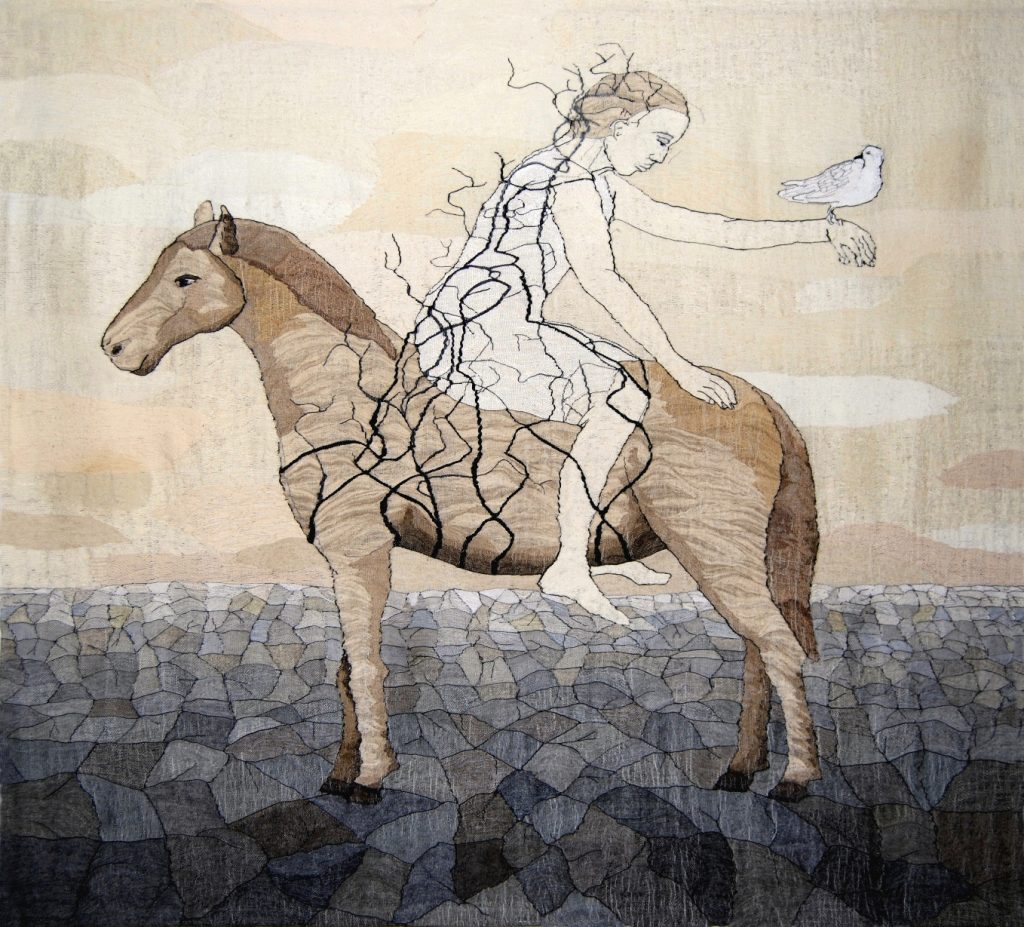
Sounder
Take us briefly through the technical process from the first drawings to the final finished piece.
My work begins with drawing by a usual pencil on a paper. All my tapestries have a same-size sketch. I set it to the back of the warp and follow the pencil lines by weaving.
My weaving is not traditional tapestry weaving. I think that it can be expressed as impressionism in tapestry. I don’t know or care about rules but want to weave freely and quickly. I use vertical loom and fasten the weft with a common fork. I don’t want to hide the warp, like in a traditional tapestry because in my way of weaving the surface becomes livelier and you can see the structure of the fabric.
Weaving is about making decisions; how thick or thin threads to use, do I combine threads to form different tones or use original colors, do I want the surface to be shiny or rough, do I create structure and effects using thicker materials? Do I want the tissue to be so dense that it cloaks the warp threads or so that the texture of the tapestry stands out and the fabric becomes almost transparent?
Nowadays I get all of my weft threads from flea markets. That way surprising tones and materials appear in my color pallet. Weaving is also finding; even though I have practiced this technique almost 40 for years, I´m not in complete control of the threads. Chance has its role, for example when I weave a face, the threads may position themselves so that a smile turns into sorrow or anger becomes joy.
I like variable surfaces and use them as a part of the story of a work.
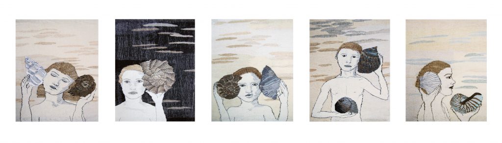
From Close to Far
The materials I have used are: linen, cotton, hemp, jute, sisal, nettle, viscose, acrylic, silk, wool, bamboo, bass, paper yarn and paper strip, horse hair and human hair, feathers, fishing line, metal wire, plastic strip and yarn, twig from a tree, birch park, lurex, gold thread and triacetate strip.
Flax is my favorite material; heckled flax in many thicknesses, tow flax, hand spun flax and even not at all worked flax fiber. In flax I can find all atmospheres from fineness to heavy burden.
Silk represents for me something luxurious and exotic, wool something homey.
Because I use an upright loom and not a frame, I use pedals so that I don´t have to pick up the leases. In my opinion this frees me to concentrate on what matters: being expressive and the choices it requires. I attach the weft to the texture with an ordinary fork.
Sometimes I feel like being a solid part of my handloom. The connection occurs in many ways; my feet pedal, eyes watch, head decides and hands interknit.
Where did you learn to become a weaver?
I studied first in a weaving school for two years and it was a good basis for my career. It is said that when you know the technique, you can forget it.
What lead you to tapestry as your art medium?
After weaving school I studied in the University of Art and Design in Helsinki and graduated as a textile artist in the year 1983. When I was making my final examination I showed my sketches to my teacher and she said: The only way to weave these is tapestry weaving. I had to create the weaving technique by myself; nobody really taught me how to weave a tapestry.
Discuss where your studio is.
I started to work as a free artist in 1990. The same year I moved to my childhood home to take care of my parents. My parents died and my second child was born at that same year. My family stayed in the house after my parents death. I still live and work there, in Central Finland, Jyväskylä. My weaving studio is in a base floor, drawing, sewing and office rooms at the second and the third floors.
What restrictions does your studio have or not have?
My house is designed for family life. The studio is planned for hobby and spare time working. It should be bigger and higher and there should be more storage places.
Do you think that living in Finland has influenced your need to have some artistic pursuit over the long winter days and nights?
There are many people who are very sensitive of the darkness. That isn`t my problem. I work regularly and with same daily routines all year long.
Contact details:
Aino Kajaniemi
www.elisanet.fi/aino.kajaniemi
Aino Kajaniemi, Jyväskylä, Finland
Interview by Deborah Blakeley, April 2019
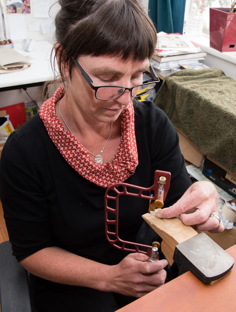
Olivia Hickey
You are preparing for your upcoming Wilderness residency in 2019.
Can you explain?
I have been awarded a residency by Arts Tasmania for a 6-week residency based at Lake St Clair. This will be undertaken in two three week blocks to allow for a flow between the landscape and my studio. Its focus is to develop and refine techniques and materials to enable me to work in remote and wild landscapes. In 2016 I had a similar residency at Cradle Mountain that lead into my first exhibition that was focused on the land there and this residency is the next step in my explorations.
The residency is part of a larger project that will take me a year and a half to complete in which I plan to walk much of the land that you can see from the Overland Track than runs through Cradle Mountain- Lake St Clair National Park. It will involve a number of solo bushwalks from 3-10 days duration into some wild and inaccessible areas.
Being in place is essential in developing both my way of working and my art. The freedom to travel allows me to locate and record organic and geological source material without removal from place. This is incredibly important to me as I deeply believe that land should be left unchanged by my passing.
Recently you have had the horror of Australian bushfires, literally at your doorstep. What preparation did you have in place?
I live on an off grid property surrounded by bush and I had to evacuate for most of two weeks due to bushfires. I travelled around with much of my workshop in my car and returned to my studio in the safer moments to work on some wedding rings that had been commissioned.
Celery Top Pine, Topophillia
The hardest thing during this time period, was not only the threat of losing my house but watching the fires threatened and engulf the irreplaceable wild landscapes of this island. I found myself pondering the question that if somehow, I could have made a deal to lose my home in order to save the wild places, I know that I would have.
How have the past fires influenced your work?
The first body of work that I created was site specific to the Tarkine, the Central Highlands and in the South West. In the Summer of 2016, just as I was installing it in an exhibition as fires were burning and threatening all of the places that I had responded to with my art. This was a deeply powerful personal journey as it made me question what, in fact, my work was about.
The landscapes that I focus on are all vulnerable places, human land use and more importantly climate change. My work is focused on plants from the time of the Gondwana supercontinent I focus on rainforest and alpine areas and these plants have little or no ability to regenerate after the hot fires that we now experience. These plants were once spread out over large tracts of land but as a result of continents moving as well as the climate warming and drying what we have now in Tasmania is the last refuges of these particular plants. This pattern is repeating through all southern continents
When I did my Cradle Mountain residency I went and visited the February Plains and saw first-hand the impact of the fires on this landscape. My resulting tried to encapsulate the loss that occurred. I exhibited photographs of burnt Pencil Pine Trees and the remains of the last hide hut combined with a collection of jewellery that was made from cast Pencil Pine needles.
The deep understanding of the preciousness of these places is what deeply underpins my work. I aim to be able to immortalise, through metal, photographs and prints to create a tangible record of these places for maybe even in my lifetime they may no longer be there.
My work is about the love of and joy in these wild places and I create tangible talismans of these places that others can connect with.
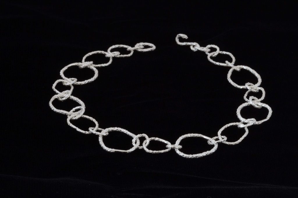
Pencil Pine necklace.
What lead you to becoming a jeweller?
I was travelling in Africa many years ago and chanced upon a south American man who was making and selling jewellery. I was immediately entranced by the ability to make metal flow, bend and move. I apprenticed myself to him for a couple of weeks and learnt some basic skills and when we parted he gave me a couple of sets of pliers, a bag of stones and a roll of silver wire. I then travelled for another couple of months and supported myself by what I made. Life took me in different directions at this time as I focused on outdoor adventures including a 110 day solo walk traversing the South Island of New Zealand.
I’ve worked in the outdoors for most of my life in roles of guide, instructor and teacher and have been involved with this in order to help people connect to natural places in order to care about it.
I suffered a major injury which left me unable to carry a pack, I was living in the Blue Mountains in NSW at the time and was searching for a way to be immersed deeply in land without an ability to travel large distances. I did a couple of short courses in Jewellery making and was absolutely captivated. One of my teachers was Marisa Molin and her work linked natural places and jewellery and I suddenly saw my path. I moved to Tasmania in 2013 to follow it.
How is your environment captured in your work?
My work is created through direct impressions of landscape. Moulding for jewellery is done In Situ and then the mould brought back into my studio for development. I use Photography to capture the wider landscape as well as to create lines that are used in etching and a number of organic printing techniques are used in place to create direct impressions.
I like working with the detail and scale of the natural forms as creating them into different mediums gives a wearer or a viewer a different perception of place. It creates of point of connection for the wearer, a talisman of place. It is my hope that it can transport people to the places that they are connected to.
I am a multimedia artist and my exhibition work is a contract of 3 dimensional jewellery works capturing the textures and scale of land and I contrast these with 2 Dimensional work of photographs or prints to talk of the wider landscape
You comment, “I am enthralled by the hidden details within the land and find myself captivated by the complexity and the beauty in the small.” Comment.
There is an activity that I have done numerous times in my life when I have worked with people in the outdoors. I get them to study a small piece of land and just observe, the colours, textures, diversity and coming and goings of ants. When this process starts. I have noticed that people get immersed in their small piece of land. At the end of this I get them to lift their eyes and try and get them to imagine how many times that size plays out in the view that they see and the diversity within the land that they can see.
My way of seeing land is like this. I am familiar with the ‘big picture’ of land and easy to see it just as a forest or a mountain but once one slows down and starts to look it becomes incredibly diverse. My work aims to capture that, this fern, this leaf, these patterns on bark. I’m utterly fascinated. My moulding for jewellery is an extension of this.
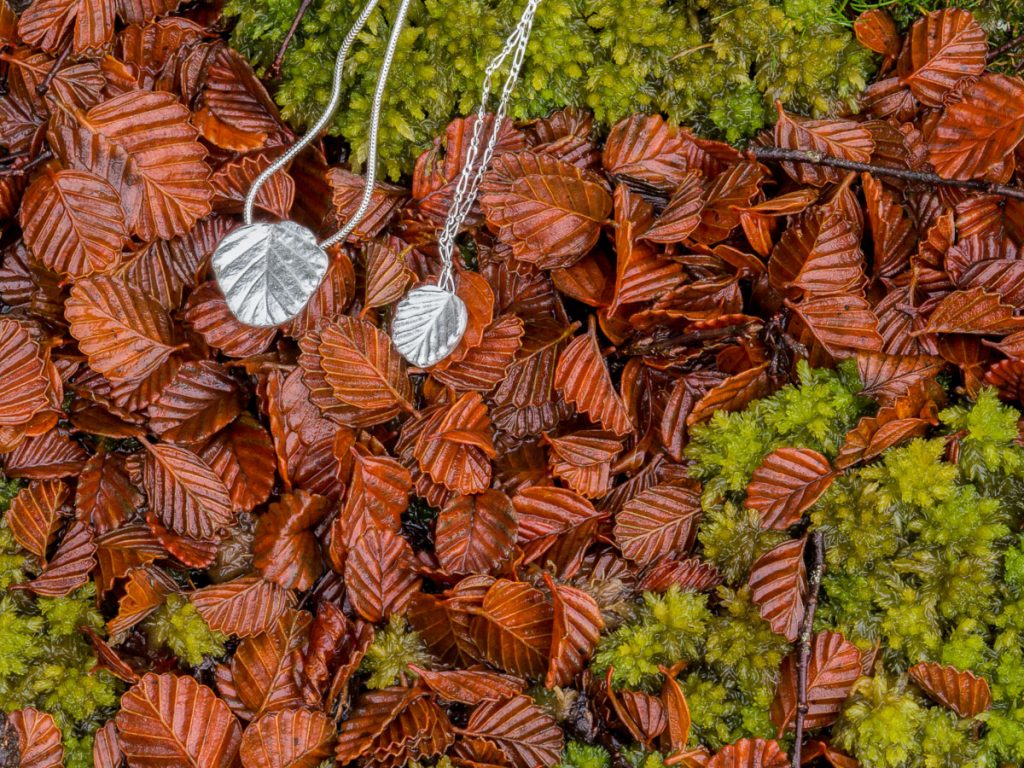
Fugus pendants
Take one of your photographs that has helped to lead you a series of jewellery. Discuss.
I have been focused on the process of casting organic objects into metal. I observed that these cast forms were in many ways the opposite of the places that I was seeking to represent; permanent versus impermanent, ephemeral versus solid and fragile versus robust. This created a tension and became the focus of my investigation of how to accurately encode and communicate the landscape that they are a part of. I returned the cast pieces to Land and observed that although they were a different material they still belonged in Place. I photographed my work in place and discovered that only the action of placing it on the landscape of the body turned it into jewellery.
This discovery lead to a body of work ‘Topophilia’ that explored this theme. The cast pieces were turned into jewellery and exhibited within and removable from the photograph. The concepts behind this discovery remains the underlying concept of my work.
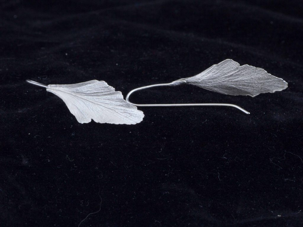
Celery Top earrings
Take your piece Lichen and explain briefly the techniques your use this this work.
I use the lost wax casting method to create much of my work. It gives me the ability to transmute organic objects directly into metal which then allows me to create wearable objects. I fill a flask with plaster encasing the organic object and place it in a kiln which burns out the organic matter. The cavity that is left is then filled with molten metal.
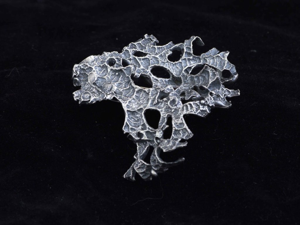
Lichen
Can you expand on your Tarkine fern rings?
I was involved in a conservation art project called Tarkine in Motion and I based myself in the rainforest in areas that were due to be logged. My eyes were drawn to the diversity of ferns in this landscape. I was experimenting with techniques to mould the forms in order to be able to take away impressions of these plants. I returned to my studio with the moulds.
These developed into a series of stackable rings and has expanded to a number of different plant imprints. When I created my first gold ring I realised that I found the medium to accurately encode the preciousness of place when I discover them in the bush.
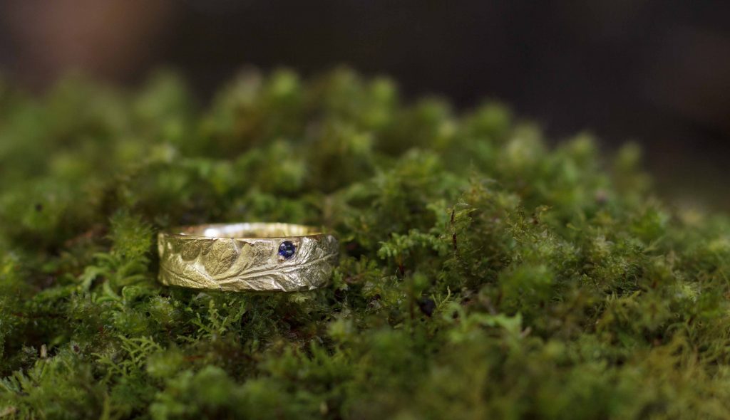
Gold Tarkine ring – Batswing Fern
Discuss the seasons of Tasmania and their connection to your work.
As I am a land artist and do much of my work in place the seasons directly influence my work. The warmer months combined with the longer days lend themselves to pack carrying journeys where moulding, photography and impressions of rocks can be taken. Winter is more of a time to go inwards and develop my ways of working as moulds cannot cure in time over winter and the weather is harsher. However, winter walks are a passion of mine and its where photography comes into play as it captures the essence of this land being a glacial landscape.
Passing Snow Flurries
Contact details:
Olivia Hickey
Olivia Hickey, Tasmania, Australia
Interview by Deborah Blakeley, April 2019
Deborah Blakeley
How did Zoneone Arts come about?
It was a slow process, beginning with TA@G, Textile Art @ the Guild. This was the Embroiderers’ Guild of Victoria, where I helped to organize a monthly textile speaker.
This went along for a long time but found its end.
It allowed me to know that there was an interest in artists and their art practice. My husband asked why not do a similar thing on the internet? He even suggested that I could take the idea further and go beyond Melbourne, even beyond textiles.
With much planning I prepared the site and Zoneone Arts was born.
I asked Lauren, a textile artist from the USA, if she would answer an online interview or conversation.
 Lauren Camp interviewed, June 2012
https://zoneonearts.com.au/category/textile/
Very promptly she said yes, she would do an interview, but could not have it done for a fortnight. Wow! I was so excited.
I was on my way. Perhaps it was also the words of wisdom that Lauren gave me, “get out of your zone.” I am indebted to her for that gentle push, or was it a great shove? But it worked.
What keeps Zoneone Arts going?
It is the fun of the chase. Where is the next interview? So many artists and so many different mediums. The list of mediums has grown along with the number of artists interviewed, coming from many countries worldwide.
Where do you find the artists?
Over the years I have been fortunate to have travelled extensively and I am always on the look out for interesting artists. For instance, while travelling in Iceland I saw this work by Valdis Harrysdotter, using handmade vegetable paper formed into bowls.
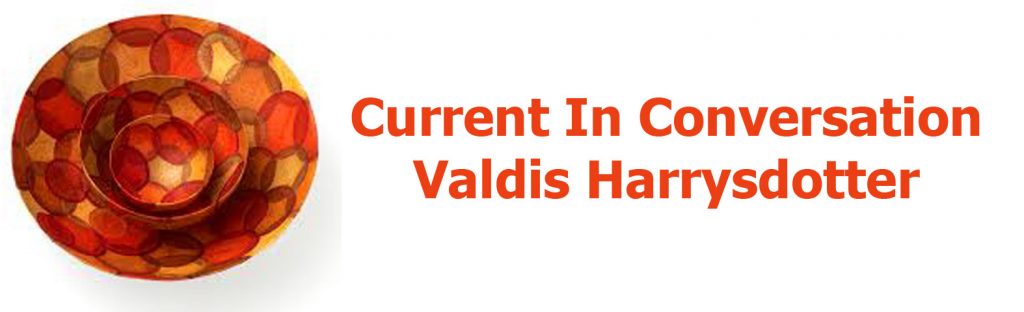
Valdis Harrysdotter, Interviewed September 2015
https://zoneonearts.com.au/category/paper/
There were three further artists I interviewed following my trip to Iceland, two painters and a photographer.
I am sent many invitations to exhibitions. With one gallery, Union Gallery in Edinburgh, and the gallery director, Alison Auldoj, I have built a close relationship. Alison Auldoj drew my attention in the very early days to the artist Barbara Franc with an interview in March 2013.
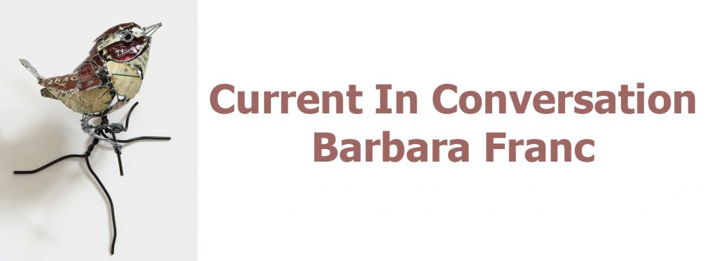
Barbara Franc, Interviewed March 2013
https://zoneonearts.com.au/category/sculpture/
Later Henry Jabbour, in 2017.
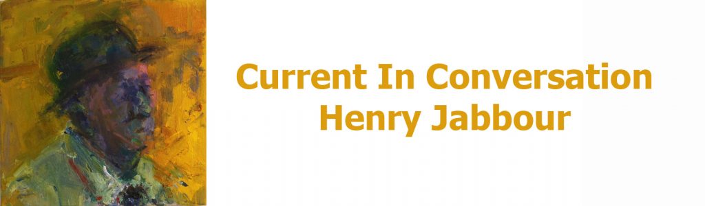
Henry Jabbour, Interviewed 2017
https://zoneonearts.com.au/category/painter/
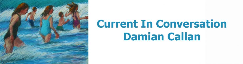
Damian Callan, Interviewed, 2019
https://zoneonearts.com.au/category/painter/
Most recently Damian Callan in 2019. It has been these links and the building of friendships, often via emails, that has led to the introduction of such an array of wonderful and different artists. I cannot begin to express my debt to people such as Alison Auldoj.
Often it is an artist who shares another artist with me. They may be a friend or they may share a studio or have been to art school together.
Two places that have introduced great networking onto my radar have come from both ends of the world, London and Canberra. In London I have interviewed many artists who have had, or still have, a studio at Cockpit Arts, an amazing incubator for artists. They support each other, learn from each other and develop their art within the one space. Each artist is so different but I will name two. First Katharine Morling working in ceramics interviewed in July 2013. Katharine still works out of Cockpit Arts.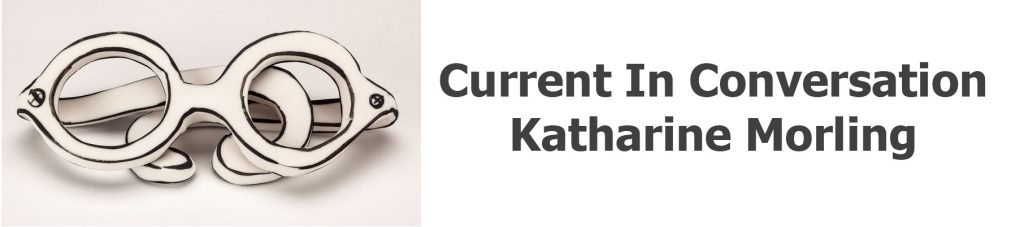
Katharine Morling, ‘Glasses,’’ July 2013,
https://zoneonearts.com.au/category/ceramic/
Secondly Eleanor Lakelin, working in wood, who shared her story with Zoneone Arts. in June 2018.
Eleanor Lakelin, Photo by, Interviewed, June 2018,
https://zoneonearts.com.au/category/wood/
Closer to home Canberra, Australia, and the wonderful Canberra Glass Workshop which allows the general public to visit and watch the glass artists at work. They also have a great residency program, that brings together both local and international artists sharing, learning and supporting each other.
Lisa Cahill was given a wonderful commission to celebrate the end of WWI for both Australia and France at the opening of the new Australian Memorial in Villiers-Bretonneux, north of Paris, and produced this glass ‘Rising Sun’.

Lisa Cahill interviewed May 2018.
https://zoneonearts.com.au/category/glass/
I am always going to galleries, as do many of my readers, visiting both local and international galleries. These can be exhibitions in private galleries or exhibitions held in large public galleries. I visited the Immigration Museum in Melbourne, my home city. I discovered the work of David Monahan. There were a large collection of photographs (36) by Monahan depicting Dubliners who were preparing to migrate, some to Australia. Hence the reason for the exhibition at the Immigration Museum. Each of the photographs were taken with the same old suitcase, but the Dubliner was set in a favourite or personal space that needed to be remembered before leaving Dublin.

David Monahan, Interviewed April 2013
https://zoneonearts.com.au/category/photography/
Explain some of the surprises that have come out of interviews.
This is easy, one of my best faux pas, was what I thought to be a simple question, that I posed to Peter Randall-Page.
Here is the question:
Your work is in many Public Collections, can you take one that you remember as giving you a huge boost to your career?
Here is Peter Randall-Page’s very honest answer. Also, he has been so forgiving to me in tactfully mentioning the many places where his work is in a public collection.
Honestly, I am still delighted every time a work of mine enters a public collection but without question, the biggest boost was when the Tate bought Where the Bee Sucks.
What a gentleman, thank you Peter.
Peter Randall-Page interviewed January 2015
https://zoneonearts.com.au/category/sculpture/
What have you learnt in the growth of Zoneone Arts?
That art is always on the move, with different artists, different medium, different techniques within a discipline.
Technology has changed so much since the first artist, Lauren Camp, to the last, Robyn Stacey. Images are still so important but the images that artists now send to me are huge and the reproduction of them is beautifully clear.
Hopefully, I have learnt to ask deeper questions. This has been summed up so well by Vicky Forrester and I am wowed by the generosity of her comments.
Founder Deborah Blakeley is on a mission to expose the pulse of contemporary arts and crafts practice.
Through her in-depth dialogues with makers across the globe, from all disciplines, Deborah artfully brings to light the common threads that drive the creative spirit.
Deborah diligently researches the featured artists in order to elicit from each their deeper motivation. Often questions juxtapose elements of their working practice that, in answering, bring to light new connections for the artist-maker and audience alike.
The ever-expanding collection of interviews present a comprehensive view of the creative arts today, making for a fascinating and informative read for both appreciators and makers.
I am honoured and delighted to be a featured maker. Vicky Forester.

Vicky Forrester, interviewed April 2015
https://zoneonearts.com.au/category/jewellery/
I truly believe what Vicky has written so well; it is exactly what I have always endeavoured to achieve and will continue to do so in the future.
Are there any questions artists don’t answer?
Very rarely. Every artist is so generous. Sometimes they will combine questions, others they will have answered within another question. No! they just keep on giving.
Do you find language a barrier?
I am very fortunate that most speak and write English. An interview coming up in the next few weeks is with Steffen Dam from Denmark. Steffen was concerned that he doesn’t write or type easily. So together we were able to put together a wonderful interview. He happily added to my research. Steffen filled in the gaps.
Steffen Dan, Interview interview, coming in 2019
https://zoneonearts.com.au/category/painter/page/1/
Talk about a few answers that have brought laughter with the responses?
I still smile when I think about a comment made by John Short.
I know it will make you smile and perhaps laugh too.
This shows just how confident the artists are and how they are so happy to share small stories with Zoneone Arts.
John said, “Some time ago I ditched the ubiquitous bouncy castle at one of our son’s birthday parties in favour of having the kids all sit individually for small watercolour portraits, which they all got to take home with them in their goody bags. It really was great fun, it’s a bit of a real party trick actually and at one point as I was painting one of my sitters, I was conscious of a boy watching over my shoulder and nearing completion he called the others through to look and said ‘Wow! It starts off crap and then it’s cool’
Actually, sounds like a metaphor for my career.”
John Short, interviewed January 2013
https://zoneonearts.com.au/category/painter/page/2/
Discuss the people who have helped with Zoneone Arts?
Keith Marais from Comma5 who is always there for me, just an email away for any technical support. He has become not just my IT man but a valued friend.
Anna Harley for her proofreading for this interview Her continuing encouragement of Zoneone Arts.
My readers who often comment and many who will be unaware that their kind words of encouragement have kept me going.
All the 300 artists, without whom there would be no Zoneone Arts. Thank you from us all but especially myself.
Katharine Coleman MBE, interviewed January 2018.
https://zoneonearts.com.au/category/glass/
My family who have always supported me throughout the life of Zoneone Arts, several times gently suggesting that I go back to the computer and find another interesting artist. Don’t give up.
Euan, my son, who every week patiently produces my In-Conversation signature that closes each week’s email. Thank you for always doing these with a smile and often a valued comment on the art.
My husband, John Blakeley, thank you for being my numero uno fan.
Deborah Blakeley from Zoneone Arts, "Take a seat and join me each week to meet a new exciting artist." https://zoneonearts.com.au/
Contact details:
Deborah Blakeley
Deborah Blakeley, Melbourne, Australia
Interview by Deborah Blakeley, April 2019
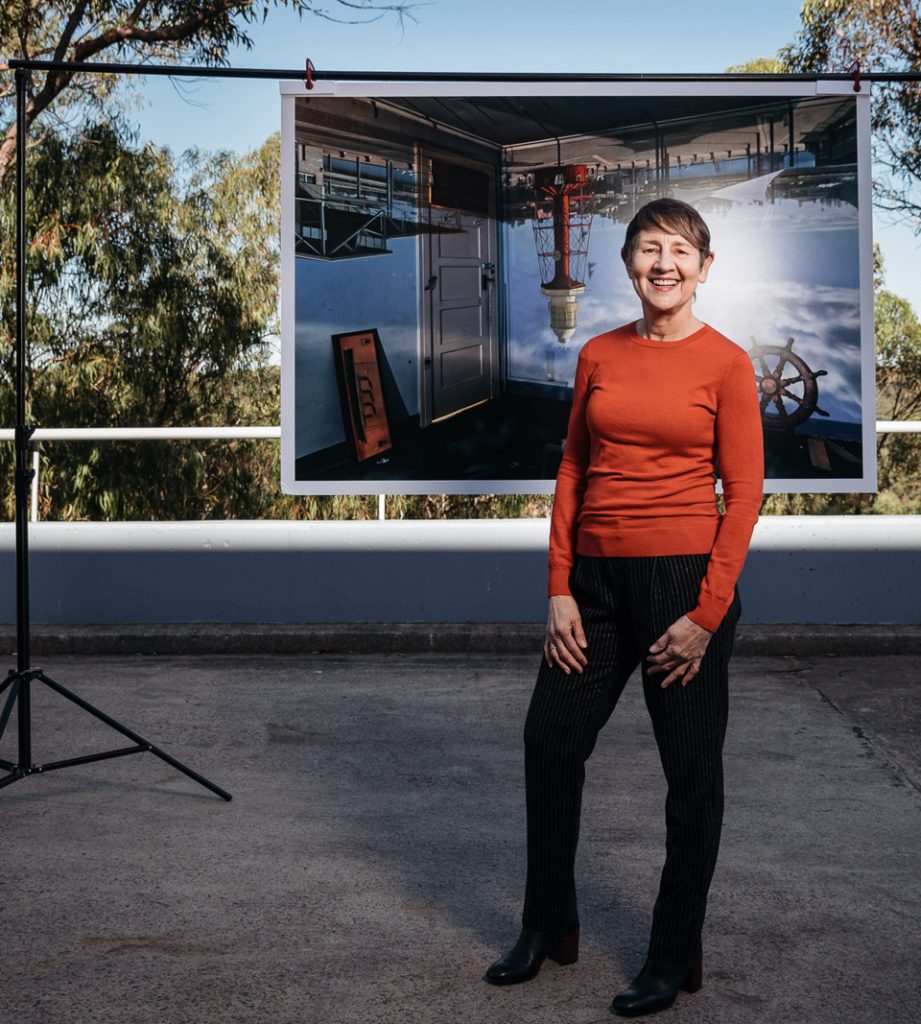
Robyn Stacey
What lead you to still life photography?
When I started working with historic collections the still-life tradition provided a working methodology to tackle their huge size and diversity. The four collections I worked had holdings of over a million artefacts consisting of specimens, objects, ephemera, and even properties, some collections named and categorised in Latin exclusively, so I needed a plan.
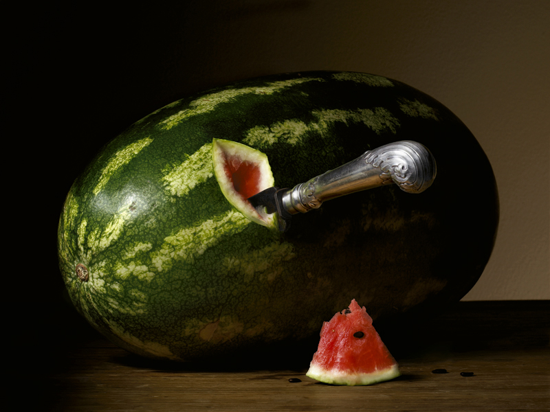
The First Cut
How has historical - still life painting influenced your work?
If you want to understand composition, still life is a great teacher. The compositions and the lighting in the best still life are a tour de force. The still-life qualities of rendering detail lovingly and creating a powerful mise- en-scene through lighting lend themselves brilliantly to photographic interpretation. The sharpness of the lens, and the control over lighting allows the photographer to reveal detail and invest both simple and intricate compositions with a heightened reality.
You state, “Still life is meant to be read” use this statement along with a photograph to explain the full meaning behind the work?
This quote offers a good insight into that statement “…Still life images captivate us with their close-up views of objects no longer living but far from lifeless. Yet, the sophistication of this genre hardly exhausts itself in the breathtakingly realistic reproduction of widely differing surfaces. On the contrary, every pictorial element can also convey some religious or moral content or serve as a reminder of time’s irreversible trickling...”
Miss Eliza Wentworth’s Glassware
The symbolic codes of the still life genre pose the recurring philosophical questions about beauty, truth, and wisdom, Miss Eliza Wentworth’s Glassware as well as being a particular set of glassware also references the fragility and precariousness of life. In the still-life tradition glass, particularly shattered or broken glass, refers to the frailty of life, but the still-life composition also served to demonstrate that by preserving the real object via an image permanence can be lent to the most fragile.
Expand on your approach and work processes when dealing with historical and scientific collections.
I began working with historic collections in 2001 with no particular aim except to produce a single exhibition. Both the exhibitions and books that have flowed from the initial research have naturally segue-wayed into each other covering the period from first white contact to the end of the nineteenth century. Each collection had its own challenges but with each of them I tried to minimize the handling and transportation of the objects to the studio. Sometimes the material couldn’t be moved and I had to photograph in situ, setting up a mini studio in the space. For example all of the Beau Monde images were shot in the Macleay Museum because nothing could leave the building.
I initially researched each collection, the history behind it, what’s significant about it, and tried to view as much of the collection material as possible with a curator or collection manager. At this stage making only lo-res digital files of everything in situ so that objects or specimens don’t have to be moved. This process enabled an overview of all the material in the collection to be developed, and an archive created that could be used to cross reference different parts of the collection and as a store of useful references to be used as the project developed. Research is undertaken into the historical imagery, style of compositions in vogue at particular periods etc., which could be relevant to constructing the final images.
I then decided where I wanted to start with the collection and what the first few images could be. I usually started with the more elaborate set-ups.
You have used your work and books to expand the availability of early Australian collections to the general public. Discuss.
The collections referenced in the exhibitions and books are historically, culturally and scientifically significant but little known outside a specialist world. The aim of the books was to raise awareness in the broader community about the significance and value of these collections. Given their scientific and historical significance and their physical fragility, only a small amount of the collection material at the Herbarium, the Macleay museum and Living Museums are accessible to the public and these collections never travel.
Herbarium the first book is based on the scientific collection at the Royal Botanic Gardens Sydney and was the first book with the author Ashley Hay. Starting with Banks and Solander arriving at Botany Bay on the Endeavour with Cook in 1770, Herbarium documents the plants that botanists, teachers, clergy, and hobbyists collected when they first arrived in Australia. Everyone in the colony collected and Saturday was known as Collection Day. In the Northern Hemisphere people believed a second act of creation had taken place in Australia so strange was the flora and fauna here. Specimens and plants were collected to be sent overseas which signifies the importance of the indigenous flora and fauna to the rest of the world.
Museum is based on the Macleay Museum and Macleay collections held at Sydney University. The earliest component of the Macleay Collection is its’ spectacular natural history collection housing a fantastic repository of Australian specimens. The Macleay collection is one of the few collections in the world that span all continents and most countries, the earliest specimen dating from 1756. It has a repository of more than 5,000 type specimens (the specimen from which all others are named) and more than 600,000 specimens in the insect collection alone making it internationally significant.
Rouse and the Cumberland Plain
House was based on a number of Living Museum properties and collections which focus on various domestic environments, from a farm at Rouse Hill to a Harbourside Palladian villa. Reflecting the habits, thoughts and aspirations of society in the nineteenth century colony the Living Museum’s collection bears witness to changes and trends in the community and tell us who we are and where we have come from.
Take a particular photograph, and briefly explain the meaning of the groupings of the items and the importance of them to the collection.
Garniture, Cape Bulbs
A garniture is a number or collection of any matching, but usually not identical, decorative objects intended to be displayed together. Complete sets of garnitures are exceptionally rare. A status symbol between the 17th and 19th centuries, garnitures later fell out of fashion. Sets were damaged or broken up and individual pieces sold off; few complete sets now exist, and even fewer survive in their original settings. In 1769 Wedgwood described the public’s insatiable appetite for vases as a ‘violent Vase Madness’ and by 1775 he made over 500 shapes available. They were never made in sets of twos, fours, or sixes, they were always made in odd numbers, of three, five, or seven. Recently there has been a revival of interest in Garnitures as demonstrated by the exhibition Garnitures vase sets from National Trust Houses held at the Victoria & Albert Museum in London (October 11, 2016 – April 30, 2017).
The floral arrangement of South African exotics, including arum lilies, clivia and watsonia flowers, and melianthus, are typical of those seen in early colonial views. The vignettes painted on the vases similarly depict blooms of contrasting forms and colours. Highlighting botanical diversity was fundamental to the Gardenesque style of planting popular at the time. All the flowers used in the composition are nineteenth century varieties, not contemporary hybrids.
Tell us the story behind ‘Leidenmaster 1’ and the specific collection this comes from and your involvement.
When I was undertaking a residency at the Herbarium of the Netherlands, at the University of Leiden I discovered that the book still life genre originated in Leiden and was at its height around 1620-1640; given Leiden’s significance as “the home of the book still life” it made sense to draw upon this genre during my time photographing the collection.
Leidenmaster 1 depicts some of the oldest books extant today. Many of these books also happen to be herbaria, containing plants pressed between their pages. Because books were portable it made them perfect for horseback travel and enabled people to collect as they journeyed – most early collectors were from the military, clergy, and doctors, because they were educated and they often travelled.
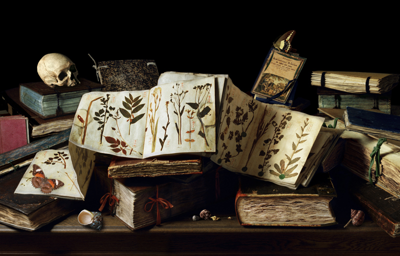
Leidenmaster 1
To understand the significance of the collection I have described some of the books in the image.
The book with the orange spine centre foreground is the Rauwolf herbaria, the finest among the very rare, still preserved sixteenth century herbaria. There are spoils of war from the King of Sweden, a Japanese scroll from 1860s, and some of the earliest plants collected from the middle east. The book with the pink ties may be the oldest Herbarium extant in the world. The Herbarium bears the title En Tibi Perpetuis Ridentum Floribus Hortum, which freely translated means as look here a garden in which the flowers smile upon you forever. The book was made in Ferrara (Italy) around 1542-1544. It is generally assumed that the idea to conserve plants by drying them under pressure for the use of scientific study originates with Luca Ghini around 1540.
Explain the ‘Beau Mondes’, and the convex image?
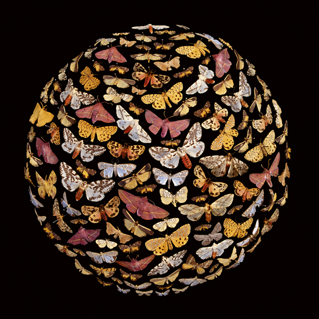
Pink
The three Beau Mondes are a response to the globally significant Entomology collection housed in the Macleay collection. Some of these specimens date from the original collection that Alexander Macleay brought with him when he arrived as Colonial Secretary to NSW in 1826.
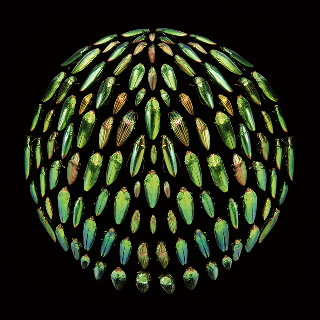
Green
During the nineteenth century Entomology was concerned with taxonomy, identification and classification, looking for similarities and difference between species. Specimens were arrayed on graph paper in perfect squares, displayed row after row, in endless columns. I wanted to emphasise the display and pinning of nineteenth century Entomology as well as reference the Victorian gothic hence the black velvet ball that the specimens are pinned on.
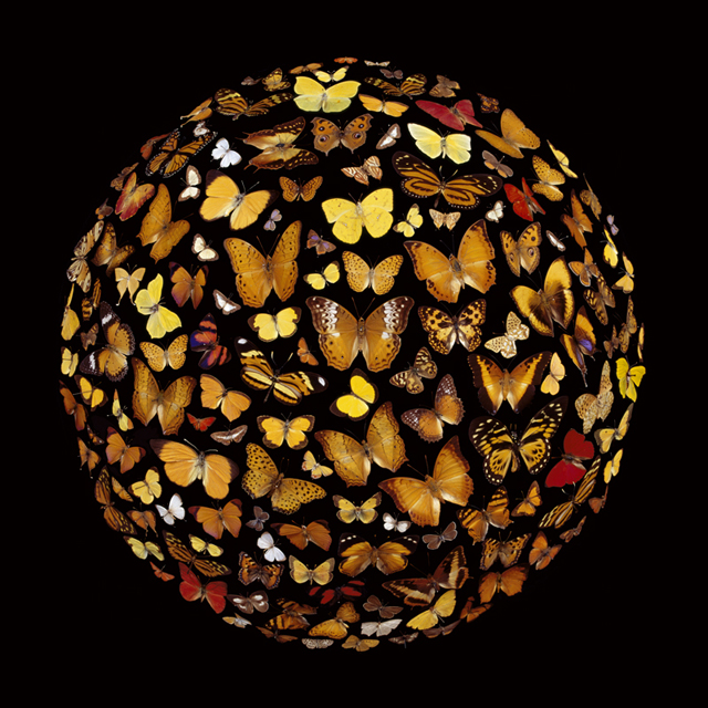
Yellow
Can you briefly explain the historical importance of Australia to collectors in the 19th century both in Australia and abroad?
In the late eighteenth century there was an explosion of interest in Europe in the newly discovered plants and animals from the strange and 'topsy-turvy' land full of 'antipodean oddities' known then as New Holland, Nouvelle Hollande, New South Wales, or just Botany Bay. These plants and animals were so rare and difficult to procure that they were looked upon much as visitors from the moon would have been.
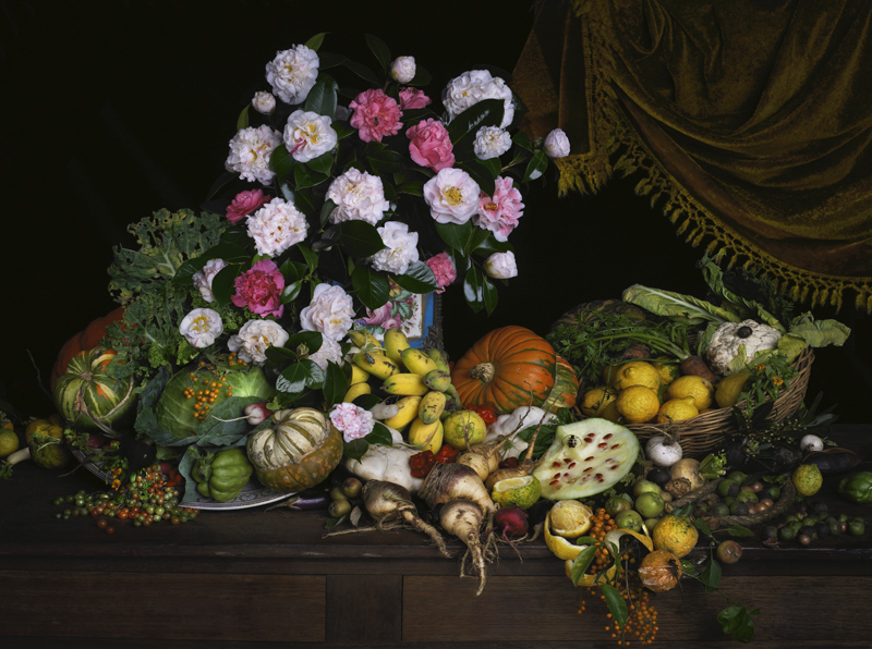
Fontaine de Vaucluse
In the eighteenth and nineteenth centuries anyone who was anyone had to have a garden and /or a collection that included Australian plants and animals. From the King of Bavaria to Josephine and Napoleon, the flora and fauna of Australia created a popular and scientific upheaval in Europe. And anyone who had the time and money travelled here, making the early settlement in Botany Bay more sophisticated and cosmopolitan than might be expected, Palladian villas and Neo-Gothic estates doted the harbour while princes from Sri Lanka and European adventurers and noblemen came to trade and explore the country.
Using ‘Walnuts’ and Gorilla Skull discuss the difference in the two approaches to composition in the photographs.
Gorilla Skull
The Dutch Still life tradition solved the problem of how you situate the giant purple jewel, the Gorilla Skull and the necklace made from human teeth next to each other in one composition. Gorilla Skull references the exotic specimens held in the Macleay collection and the three generations of Macleays who collected exotics from dealers and Emporiums, employed their own private collectors, and organised their own expeditions. The aim was to build a collection that reflected taste, accomplishment and curiosity.
Walnuts
While the Dutch Still life tradition is the exemplar when it comes to dealing with excess in a composition, Walnuts demonstrates something completely different. Based on the Spanish Still life tradition that was more interested in elevating the overlooked, taking what could be considered mundane or commonplace and making it the focus of the composition with very little embellishment. The Walnut in still life also references the body of Christ, and the Trinity so can appear in the very complex still life compositions as well.
Contact details:
Robyn Stacey
Robyn Stacey, Sydney, Australia
Interview by Deborah Blakeley, April 2019

Preston Singletary
Can you expand how important, your glass art has been to your own Tlingit cultural heritage.
I cannot claim that my work is any more important than any historical objects from my Tlingit culture. I do feel that my art and perspective bring a new dimension to Indigenous art. I feel that it breaks out of the cultural corral that anthropologists would like to place our cultural art in. The materials that we use are becoming increasingly hard to acquire, for example - the large logs for totem poles and dugout canoes. I think you’ll see new materials being used for cultural art, and I just happen to be doing it in this new way. There were people who were before me, and there will be people after me. As the Maori say, “My work is not my own but those of many”, meaning that the ancestors who pioneered our cultural styles gave us a vocabulary to represent our history. Like the Aboriginal people have their “pattern laws”, it identifies them.
Spirit Box, Collection of Detroit Institute of the Arts, Cast and sand carved glass, 23 x 28 x 18"
As the formed lines and designs are cultural, how do you keep a balance between them and your own contemporary art?
I have studied hard and sought out mentors who have helped me with developing my work. I contend that since the European immigration to North America our art and culture has suffered in many ways. Our people were not allowed to engage in our culture that had governed us for thousands of years. The monetary system was effectively dismantled. There was a lot of knowledge that was lost during this time change and we are working to reconstruct it so that it will live on for generations to come. In the past it was the clan leaders who commissioned all the material objects to be made, such as totems, canoes, boxes, bowls, and spoons. Today the clan leaders are not financially empowered to commission art work as in the old days. It occasionally happens, but not as much. If there were no practicing/working artists there would be no good art. For this reason we are forced to go to the commercial market. I do feel that I am prepared to make strong work for my community when it’s asked of me.
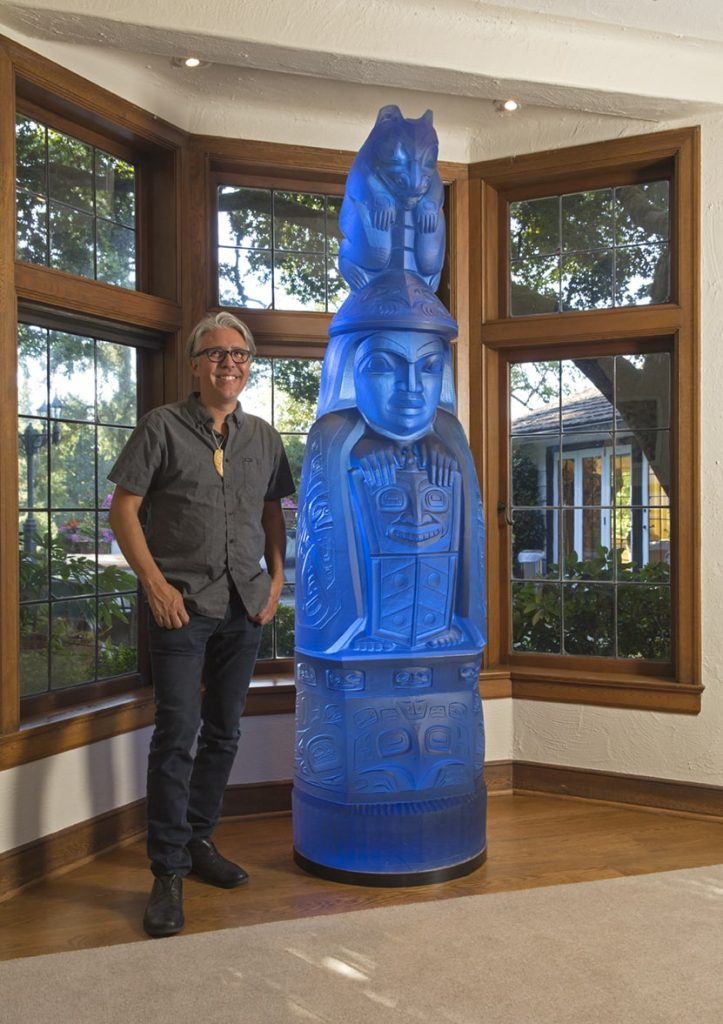
Family Story Totem, Kilm-cast lead crystal, 84 x 24 24" Photo James Prinz
Glass art would not have been traditional, how do your elders see and relate to your representation of your shared culture?
The first couple of pieces I made were the upside down Tlingit hat forms with a wolf design carved on them. I sent them up to Alaska for a group exhibition and one was displayed at the Museum of History and Art in Anchorage, it’s still on display there. Years later when I brought my work back to Alaska for a cultural art and culture gathering I think my work came way out of left field, but was received enthusiastically. Eventually I was asked to make a significant triptych for Sealaska Heritage, a cultural arts center in Juneau. This signified to me that my cultural peers were embracing and supporting my work. They told me as much, that they wanted our art to expand and grow. This was a very important right of passage for me and the work that I do.
Can you discuss how you have been able to inspire other indigenous artists to develop along similar lines especially glass?
I try to work with established Indigenous artists in a collaborative way, where they become the designers and I execute their designs by how they see it using the techniques that I employ for my own work. By doing this, I hope to expand the vocabulary of Indigenous art. To date I’ve worked with many Native American artists from around the country, as well as Maori of New Zealand, Hawaiian and Australian Aboriginal artists.
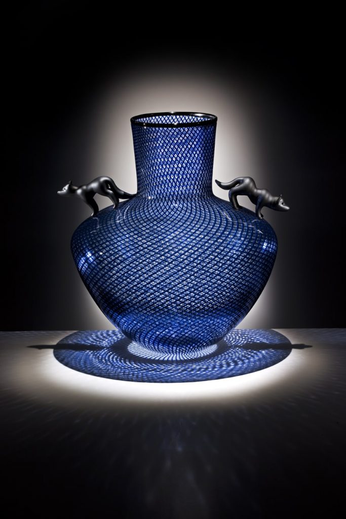
Spirit vase
There are plans to build a glass studio at the Evergreen State College where they have a strong Native Arts program and want to develop a Masters program in the arts for Indigenous people. This program would have a glass studio that would be part of that masters program. This to me would be an amazing opportunity to provide a place where Indigenous people could learn to work with glass.
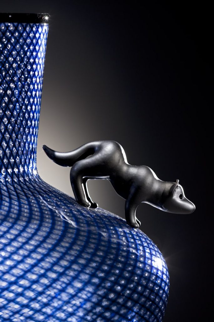
Detail of Spirit Vase
Explain the process of your drawings and artwork that is required before you begin work on the glass.
My pieces are inspired by traditional carved objects, 2-D design work and how it integrates on the 3-D piece. In the beginning I was mainly inspired by historical objects, but of course my glass pieces would not be regarded in the same way, so I realized that I had an opportunity to interpret them in different ways. Sometimes it’s an exaggerated scale of an object, and sometimes it’s inspired by the Modernist art of the turn of the century, Primitivism, Surrealism and even abstract art. Some of the ideas are generated on paper and some are conceived through the glass blowing process. In some cases I’ve had objects sitting around on shelves for years, and then one day I can see something in it and I’ll finish the form.
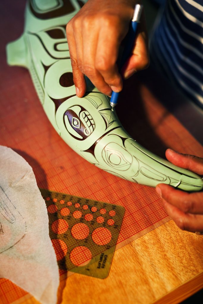
How did you first come to work on ‘Totem’ commissions?
I was first driven to make a glass House Post, which I made first. These are the door like shapes that people think of, but they are actually tunic designs and if you look at the scoop out of the top center you can imagine that. In any case, these were the first forays into making larger monumental work. I became driven to make a totem pole made of glass, and so I worked collaboratively with a good friend, carver and mentor David Svenson to make the first “Family Story Totem”. It’s a story that relates to my Great Grandmother Susie Johnson Bartlett Gubatayo. At the turn of the century she had a pet grizzly bear as a child and the bear developed a taste for taffy that was made by a Russian woman living in Sitka where Susie came from. She went to the forest to pick berries to sell to get Russian money so she could buy taffy for her beloved pet.
I was able to find clients and supporters to commission additional versions of this piece in different colors, three in total. Now I’m making a new “Killer Whale Totem” which is my clan symbol and will be even larger than the “Family Story Totem”, standing at over eight feet tall.
Family Story Totem, Kilm-cast lead crystal, 84 x 24 24" Photo James Prinz
Discuss your work ‘Family Story Totem’ and how this work took a further link and was cast in the Czech Republic.
Due to the massive nature of these pieces weighing 2000 lbs. I was having difficulty finding a studio to help me execute these pieces. I had another old friend, Charlie Parriott who had been helping people execute pieces in the Czech Republic. They have a lot of experience working in larger scales, they have access to lead crystal and they have a lot of skill with the cold working which is pretty extensive on these pieces. Also very exacting in the way that they are ground to stack up precisely.
What was their response to the story the Totem told?
The Czech’s were very intrigued with the idea of helping out with these pieces. I feel, in general, people were intrigued with the notion of Native art and culture. We have developed a very close working relationship today.
Comment on Tlingit Dancing Staff.
"This work explores the dynamic relationship between the wolf and the raven."
Tingit Dancing Staff, Preston Singletary and David Franklin, commissioned by Regional Arts and Cultural Council
This piece represents the Tingit Dancing Staff, which were used by the singers or dancers and were thumped on the floor to keep time or wavered in sync with the music.
Tingit Dancing Staff
Public commissions are now a huge part of your work, can you expand on 'Transformations', commissioned by the Seattle University.
Transformations, commissioned by Seattle University, Admissions and Alumni Building
Aluminum and fussed glass, 7.5' x 5.5 x 1"
Size: 7.5 feet x 5.5 feet
Technique: Aluminium and fused glass inserts
This was one of the first public art pieces I did. They came to me directly and asked
me to make something for their campus. This was the first exploration with metal and
glass, and also abstraction on a larger scale. In the end it opened up some new
perspectives to approach and scale.
On a much smaller scale ‘Shelves & Baskets tell us about them?
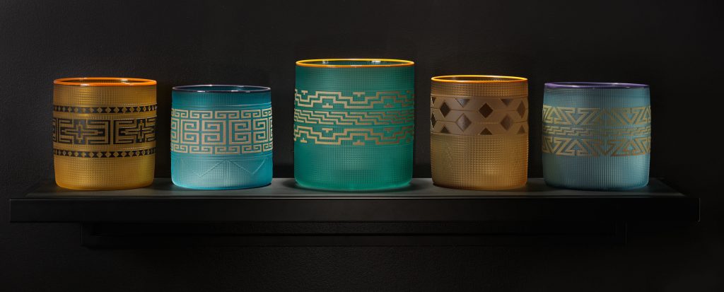
Indian Curio Shelves, Blown and sand carved glass baskets, 9" 10" (individual baskets) Photo Russell Johnson
These pieces came about as an exploration of the basket form in general. At first I made them in earth tone colors to mimic the traditional pieces. Later on I decided not to limit myself to just the muted tones and started exploring different color combinations. They range from 4 x 5 inches, to 8 x 9 inches, and I have done very large ones too, as big as I could utilizing a big team. The designs are all traditional or at least historical. There was a time when baskets were made for the tourist trade and I’ve studied a lot of the designs through historical photos from Indian Curio Shops.
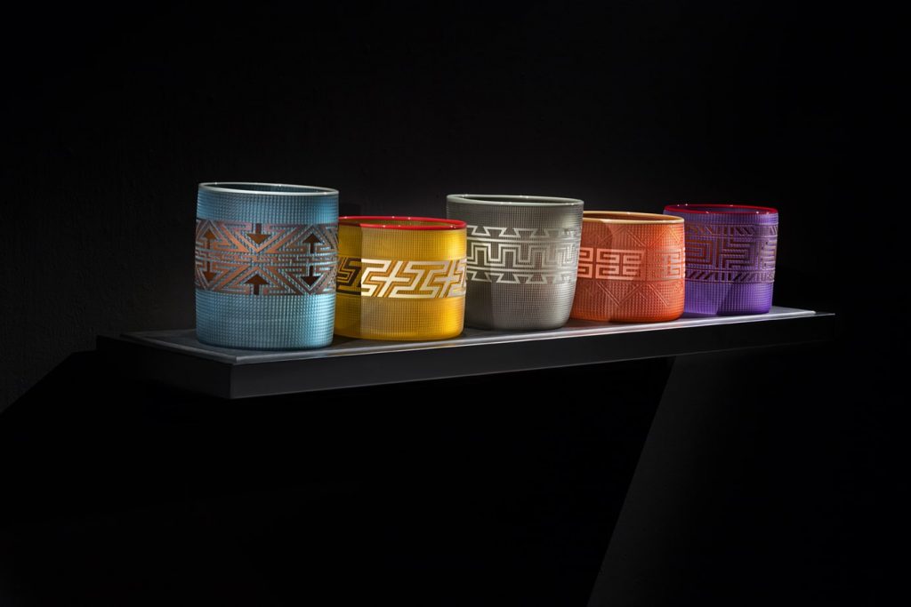
Indian Curio Shelves, Blown and sand carved glass baskets, 9" 10" (individual baskets) Photo Russell Johnson
In regards to lighting of the glass, of course lighting enhances the effect of the piece, but I feel too that glass is one of the only mediums that people make excuses for in terms of lighting. I feel that the glass has different effects in different light, but you
just need to play with it in different parts of the space it’s being viewed in. In the case of my hat forms, I do believe that the glass has a “spirit” in it, which is revealed when the lighting is right. Kind of like when people explored caves and found themselves standing somewhere with a ray of light coming down through a crack highlighting a petroglyph!
Can you expand on the history behind the traditional weaving and was it done by men or women? How has this history effected your work.
Traditionally weaving was done by women. It was gathered from cedar trees, the skin just under the ruddy bark. It was split, softened and then woven. Spruce root was also used by the Tlingit, Haida and Tsimshian. In my way, these glass baskets are an homage to traditional basketry.
Briefly give us the inside story of ‘Martin Guitar’.
The Martin Guitar company had contacted Sealaska corporation, my tribal affiliate. They were brokering a deal to procure spruce wood from land that was controlled by Sealaska. Martin had expressed interest in producing an affordable/production guitar with an Alaskan Native design. Sealaska put me in touch with them. Melissa Post, a Curator from the Museum of Glass, contacted Martin to see if they could get a prototype to tour with an exhibition I had in 2009, and so they sent me a spruce guitar to paint a design on. The project was never executed, but I did get to keep the painted prototype.
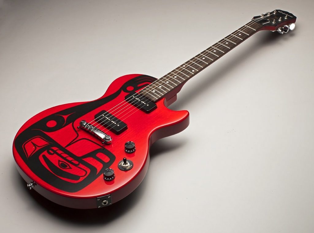
Spirit Wolves. Fender Stratcater Bass, for the experience Music Project I, Science Fiction Hall of Fame, Photo Russell Johnson
Explain how your journey has been influential both personally and the importance of bringing your cultural heritage to the eyes and sensors of the general public in an artistic way.
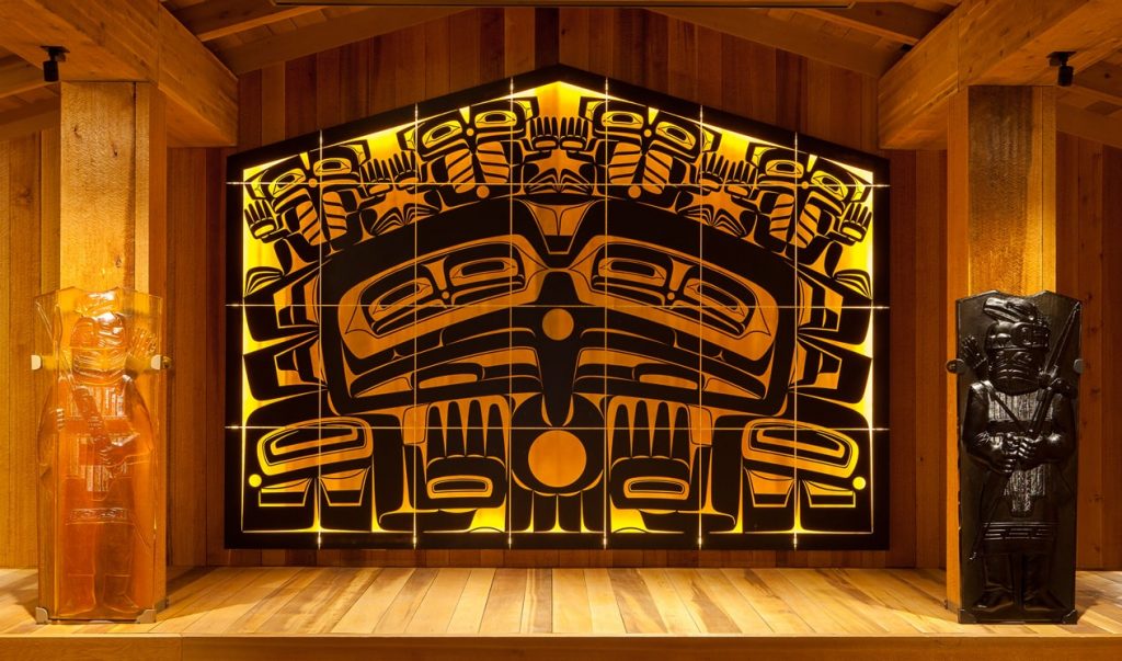
Glass House Screen, Sealaske Heritage Institute, Alaska, 28 Kiln fired panels, 11 x 16' x 5" Posted 6' Tall
When I first got out to high school, I fell directly into glass blowing as a job. I thought it was a great day job, but music was my first passion. Later I went to the Pilchuck Glass School and realized how artists work with glass in many different ways. In an effort to find my own personal style, I turned to my culture. I never realized how fulfilling it would be. It brought me back full circle to my family, my people, my history and culture. The more I learn the more intriguing it becomes. There is really so much to learn. I have been adopted by important mentors and given additional names, which validated me within the Native community. I was given an honorary Doctor of Arts degree by The University of Puget Sound, and I felt that this validated me in the Western perspective. I also explore my culture through music, and I work with Native and non-Native musicians with my band Khu.éex’. We use Native singing, storytelling, performance art and spoken word using Jazz, Rock and Funk styles. In the old days of Tlingit culture, the stories, songs, dances and art were all one thing. So it is a very full life that I live and I’ll keep doing it as long as I can!
Contact details: Preston Singletary
studio@prestonsingletary.com www.prestonsingletary.com
Preston Singletary, Seattle, USA
Interview by Deborah Blakeley, March 2019
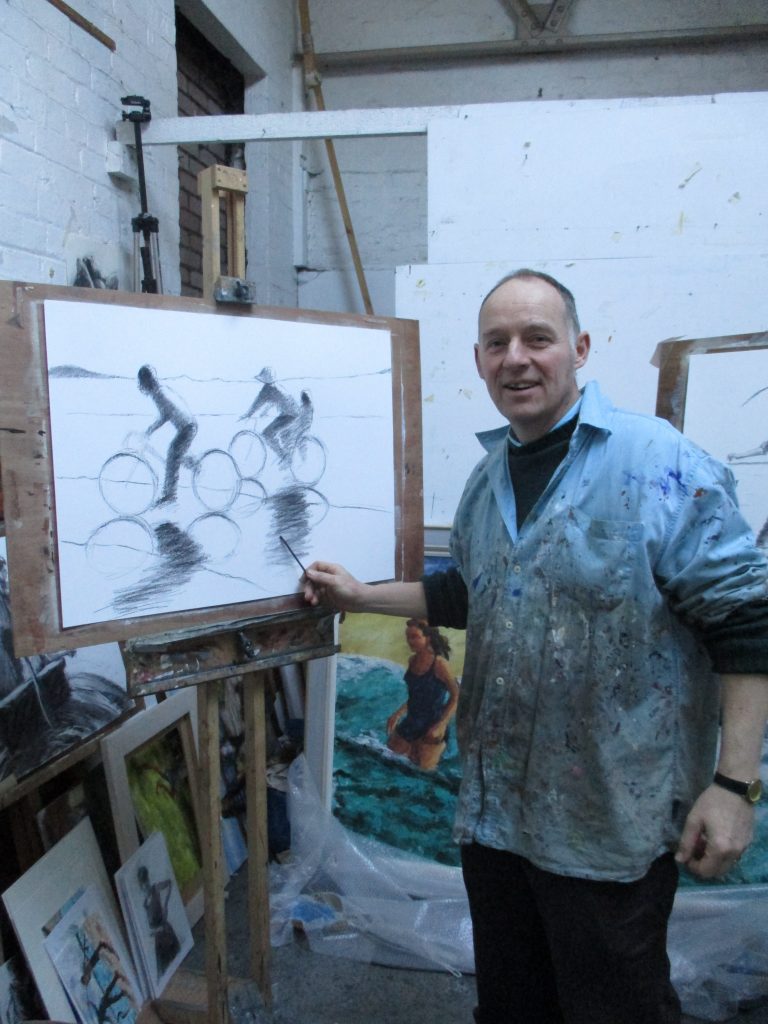
Damian Callan
You title your art as figurative art, discuss this using image to explain the terminology.
Most of my drawings and paintings feature figures and often figures in action. I tend to lose interest in images that are figure-free. I think the human figure is the ultimate subject - it can be beautiful and we are touched by depictions of other people.
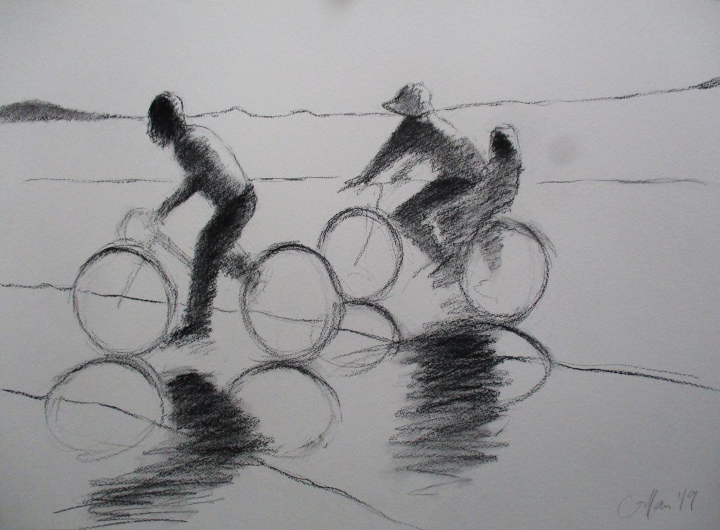
Bicycles Shadows, charcoal 55 x 77 cm
What made you leave science for art?
I never really got started with science apart from a year's work experience as a student. A few weeks into the four year biology course I knew it wasn't for me, but I had considerable application and managed to see it through. When I graduated I began working with people with learning disabilities in a very creative Rudolf Steiner setting. That led me to eventually take a second degree in Drawing and Painting at Edinburgh College of Art.
You have had an unusual residency in a hospital. Can you expand on what this time involved?
I spent time in the Liberton Hospital just outside Edinburgh and homed in on the occupational therapists and physiotherapists who were teaching stroke victims to walk and regain other basic motor skills all over again. It was miraculous work and very moving to witness. I produced a series of paintings of a man taking his first steps with the help of a therapist. These were done on seven small panels and decorated with an imitation gold leaf. I was aiming at an almost religious quality to the images.
Teaching is a part of your week – discuss this aspect of your painting week.
I teach 2 -2.5 days a week, mainly in my studio and also at The National Gallery. Students come to me to learn to paint the figure in oils. At the gallery I run a drop in event that encourages people to 'have a go' at drawing in public - something that seems to work through a kind of spontaneous magic and many have a revelation and experience a real breakthrough and say they want to take up drawing more seriously as a result. I enjoy teaching and learn a terrific amount in the process. I often find that I'm urging students to try a particular approach and then realise it would actually suit me very well to do the same...
![]() Best Dress III, III charcoal 35 x 25cm
Best Dress III, III charcoal 35 x 25cm
Location is a major part in your art teaching – Explain how you move from location to location to expand the joy of plein air painting.
One of the courses I run alternates between a day drawing at a particular Edinburgh location ifor example the swimming pool, the canalside, a hotel lobby, an auction house showroom and a then day in the studio with a portrait model where the students put together a composition based on the model's pose and their location drawings as a background for the figure. Its great fun going behind the scenes to these different places and there is always so much material for paintings. In the summer I take groups out in to the landscape and to the coast to produce plein air oil paintings. There is a wonderful compliment between the changing Scottish weather and working alla prima with oil paint. It is possible to change or modify your painting in response to the drama of the light and changing scene.
Catch, oil on canvas 61 x 91cm
When you paint with oil you work on board not canvas, why?
I work on a mixture of canvas, board and prepared paper. The weave of the canvas is great for allowing you to build up layers, but the hardness of board is helpful when applying paint with a roller (which I often do).
Movement is in your work, very often showing the pure joy that children show through movement, discuss this aspect of your work.
The one thing that I really learnt at Edinburgh College of Art was drawing the figure. We had regular life drawing classes and were taught anatomy by the great George Donald. This inspired me to work with the figure. But it wasn't until I started painting moving figures (based on bathers in a local pool that had a wave machine) that my work really took off. I think there is something in the elusiveness of a moving figure that helps me work in a more spontaneous and lively way. I continued painting swimmers and athletes for a few years until our children were born and then it just seemed perfect to start depicting them and their activity.
The children you paint are often your own children. How do they feel about your sharing them in this way?
I quote my daughter; she says she feels, 'Honoured and respected...' I suppose they've never really known anything else. When they were younger people would ask 'Don't you mind selling the paintings, wouldn't you rather keep them?', but I didn't mind because we still had the children. Now that they're growing up and leaving home, there are a few paintings I wish I'd kept.
 Leaving the Boat, oil on canvas 50 x 60 cm
Discuss the obvious comparison of your works Blue Dress I with the work of Degas.
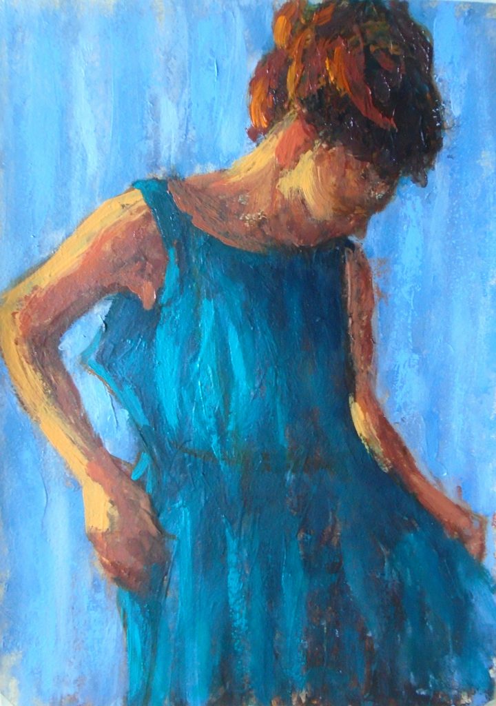
Blue Dress I, oil on paper 35 x 25 cms
I love Degas' work and was very lucky to be asked to produce a book describing and emulating his technique. I learnt an enormous amount by examining and exploring his different approaches in order to explain them to others. He described his technique as 'a series of operations' and was quite scientific in the way he experimented. I have tried to emulate this aspect and in paintings like Blue Dress I and II I have built up layers in stages often changing from loose colour to drawing lines in order to add definition.
Can you expand on your technique of drawing without lifting the charcoal from the page?
I encourage my students to begin their drawings with a single continuous line formed by not lifting the charcoal off the page. It is one of those right brain approaches; a more intuitive or instinctive way of working that not only creates livelier drawings, but often produces more accurate observation. I use this technique myself and try hard not to miss the beauty of the first unselfconcious marks that are generated. The challenge is to develop the drawing to make it more substantial without losing that initial delicacy.
Take ‘Harbour Wall’ and discuss your use of charcoal.
Like many families, one of our summer holiday challenges is to throw ourselves off the high harbour wall into the cold sea water, this often seems to happen just before tea time. The children were lined up waiting for everyone to have the courage to jump together and I was struck by how heroic they looked - like Olympians about to do something very brave. I sketched out the scene with the help of some photographs and using the continuous line start. Then gradually built up areas of tone and shade to solidify the figures. I wanted to show their tentativeness and anticipation through a lightness of touch and charcoal can be perfect for this sort of sensitivity.
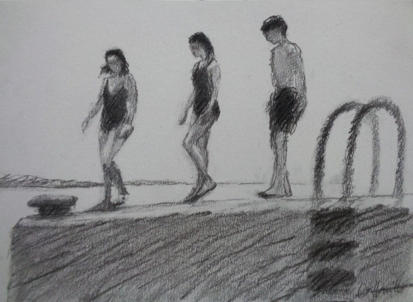
Harbour Wall, charcoal 25 x 35 cm
You are currently having a solo exhibition at Union Gallery in Edinburgh…
How was the exhibition given its title ‘Moving Images’?
I wanted to be ambiguous about the movement in my subjects and the way they move me personally.
What lead you to fill the exhibition with so much sunshine and not a spot of rain?
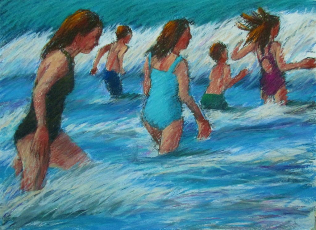
Swimming after the Storm, pastel 55 x 77 cm
Ah yes, 'Into each life a little rain must fall...' (especially in Scotland). I love the drama of sunlight and many of the scenes in these paintings are from the Hebrides where the weather changes so rapidly that sunshine can be short-lived and a reason to celebrate when it does burst through. When the sun comes out on the West Coast of Scotland there is no place on earth more beautiful - who wouldn't want to paint that?
Contact details:
Damian Callan
damian.callan@gmail.com
Damian Callan, EDINBURGH, Scotland
Interview by Deborah Blakeley, March 2019
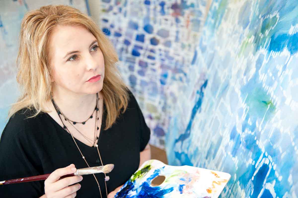
Belinda Wilson
Can you expand on your master’s Research, and relate the importance of art on current day issues – Climate change?
The Master of Fine Art by research (MFA) degree was undertaken through RMIT University in Melbourne. The degree took 4 years to complete (part time) as I was employed as the Deputy Head of School, (Vocational Education) in the School of Art, RMIT University. I have been working at RMIT since 2010 when I relocated from regional Victoria to take up this position. My current position at RMIT is a Senior Advisor, Learning and Teaching, Vocational Education.
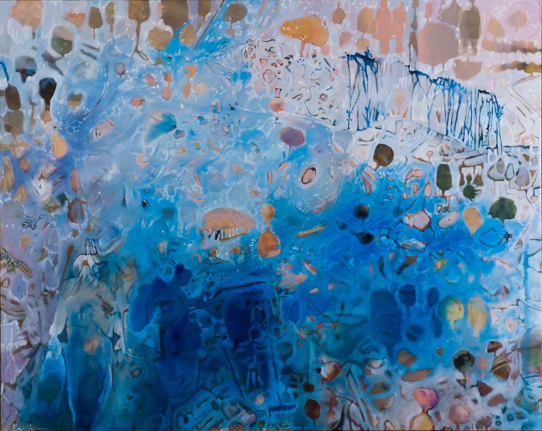 Searching for Ghost Gums, Oil on linen, 125 x 155cm
The practice led research undertaken through the MFA, emerged from a studio-based approach to landscape painting and drawing. I combined my own memories with selected personal experiences and historical accounts of others, to create a body of artwork that investigated extreme weather conditions. Primarily, I concentrated on the locations of Longwood, Wangaratta and Milawa in North East Victoria, Australia to narrate experiences of living through drought, flood and bushfire and how this affected inhabitant’s emotional wellbeing.
In recent times, the issues surrounding extreme weather conditions in Australia has come into stronger focus, as many regional communities are being devastated by the impacts of challenging weather conditions. How the extreme weather affected inhabitants in regards to their lifestyle and emotional wellbeing has been a critical aspect of my research project. The direct relationship between personal wellbeing and extreme weather are important factors when making the body of work for the MFA, as it is now evidenced that extreme weather does impact and influence how we feel. There can be obvious physical impacts on one’s environment such as losing a house in a bushfire or livestock destroyed as a result of drought. Ultimately the weather negatively affects and impacts on our wellbeing which was evidenced in my research.
Art has the potential to bring attention to many current issues that can sometimes be overlooked or misunderstood. For communities in regional or remote areas, art plays an important role in recognising these challenges and understanding what is happening in these communities.
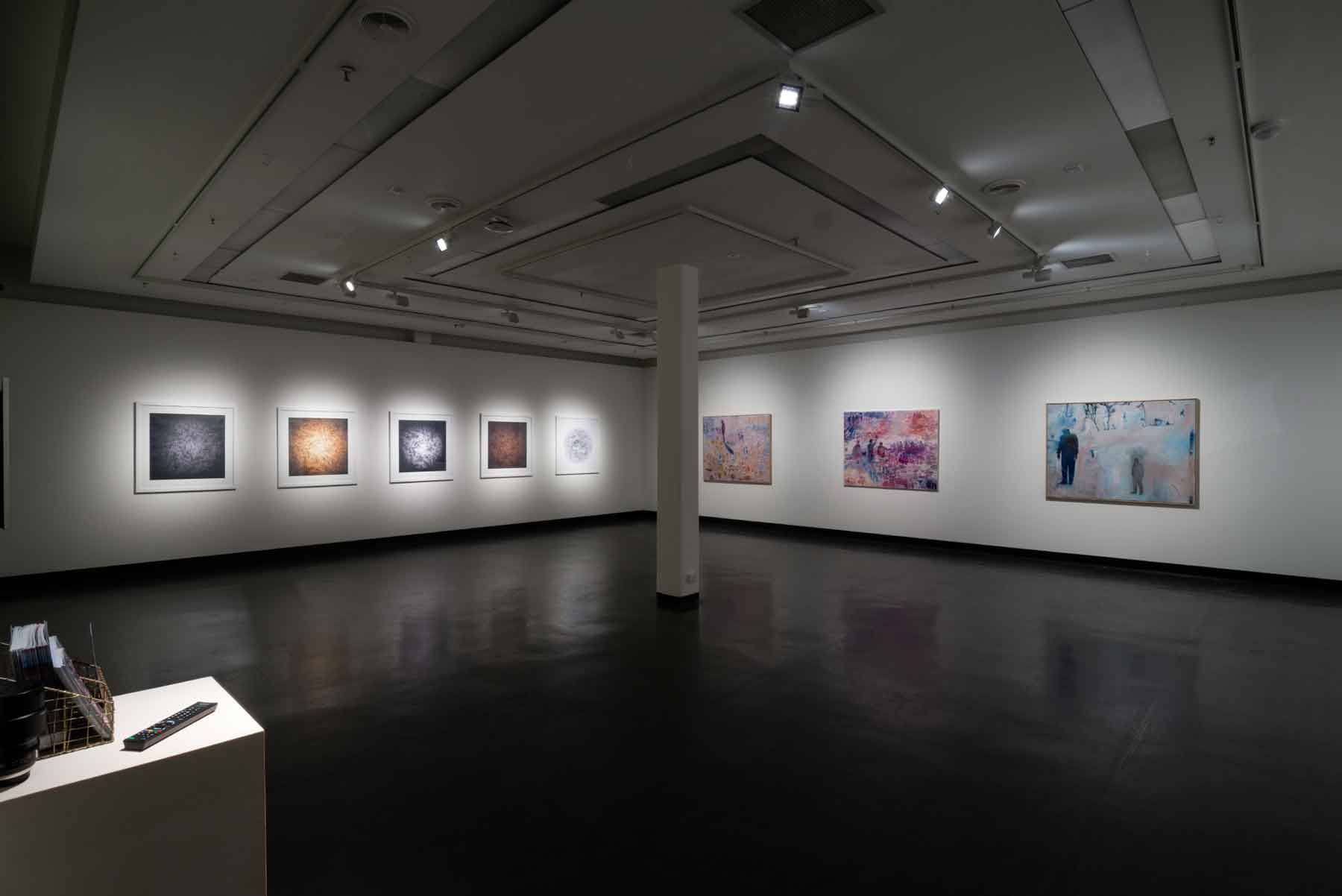
MFA Exhibition, July 2018
Highlight three devastating conditions that continue to face Australians and your art. Comment on these 3 aspects as an Australian Artist.
Drought
Flood
Fire
Like many teenagers growing up in a regional town, the desire to leave is compelling and I left when I was 18 years old and moved to Melbourne to study fine art at University. I returned to Wangaratta in my thirties for family reasons and encountered a nine-year drought (2000 -2009) This was known as the Big Dry or Millennium Drought that was followed by extreme bushfires that created chaos and loss. The worst of these fires became known as The Black Saturday bushfires in February 2009. The Black Saturday bushfires caused 180 fatalities and burnt across Victoria throughout the month of February. These events made a significant impact on me personally, which influenced my art practice. In my landscape paintings, the environment was portrayed to not only have a sense of place but a reaction to the extreme weather conditions that surrounded me.
Your work has been in one Australian Embassy, South Korea, Costa Rica and New York City. Can you explain how each came about and briefly discuss a painting that went to each embassy and why?
I lived and worked in South Korea for 2 years (1996-1998) as both an artist and educator. It was an amazing time living abroad and discovering a new and exciting country that was rich in history and culture. Living overseas as a young woman in her 20’s was exciting but sometimes overwhelming and daunting. I knew no one when I arrived but the hospitality and friendliness of the Korean people and expatriates that I encountered was amazing. I lived in the city of Bucheon, a satellite city of Seoul, about 25 kilometres away.
During my time in South Korea, I was involved in an artist group called A-link (Artists living in Korea) which was founded by Mary E Roettger and Andrew Owen. “A-Link’s mission was to generate a new visual resource and exchange between Korean art students and Foreign/Overseas Korean artists” (Mary E Roettger 2000). One of the highlights from A-Link was an exhibition in 2000 at The Ilmin Museum of Art. The exhibition was organised by A-Link coordinator Raymond Hahn and curated by Mr Chang Dong-Kwang. The exhibition featured 17 Korean and international artists which showcased an exploration of artistic mediums from each artist whilst they lived in Korea.
Many of the expatriates in South Korea would meet at the Australian Embassy for Friday night drinks. I met the Manager of the Australia Centre; Clinton Jackal and we discussed an art exhibition to be the official opening of the Centre. The exhibition titled Quasi ideals: Images of Satiric Symbolism was opened in July 1998 by the Australian Ambassador Tony Hely. The artworks that were exhibited were created in gouache on water coloured paper and featured images that responded to my environment in Korea, the people I encountered as well as the culture and customs that I experienced.
After I left South Korea, I travelled to Europe and Central America where I lived in Costa Rica for a period of 6 months. I continued with my practice in landscape paintings which was exhibited in Costa Rica.
Several years later I would exhibit at the Sofitel hotel in Melbourne in 2003 with a solo exhibition that showcased the painted landscape from North East Victoria where I was living at the time. The exhibition also partnered with wine and food producers of the North East region and the local produce was featured at the Sofitel restaurant for the month the exhibition was on.
You work in many sizes how and why do you decide on the original canvas size?
There is a lot of planning when creating a body of work to exhibit. Many considerations come into play. The theme of the work, the style I want to relay, the exhibition space, art mediums and who the audience will be.
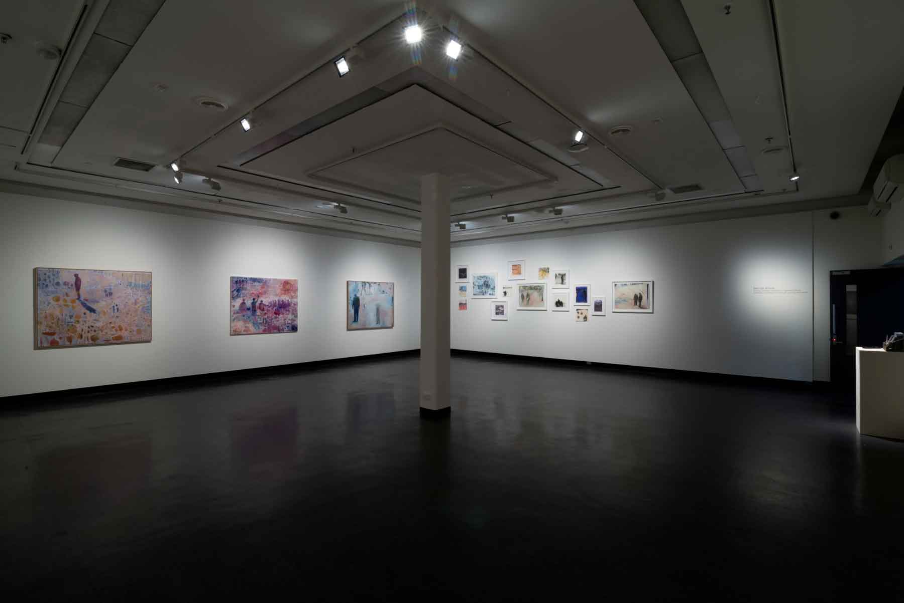
MFA Exhibition, July 2018
Currently, my preferred canvas size is 125 x 155cm. The larger canvas provides a freedom to explore. I don’t have to squeeze images and figures into a small area. The larger canvas allows for expressive brush work, detail and space surrounding the figures. The space between each figure on the canvas reminds me of distance when living in a regional community.
How do you decide on the amount of time you will spend on Exhibition/s work each year?
I am constantly creating new works, many are to be exhibited and some will never be seen outside my studio. These works are about exploration, idea building and seeing how they will ultimately develop. I work on multiple pieces at once, due to my time constraints with working at a University and having a family. Some artworks take many months to complete.
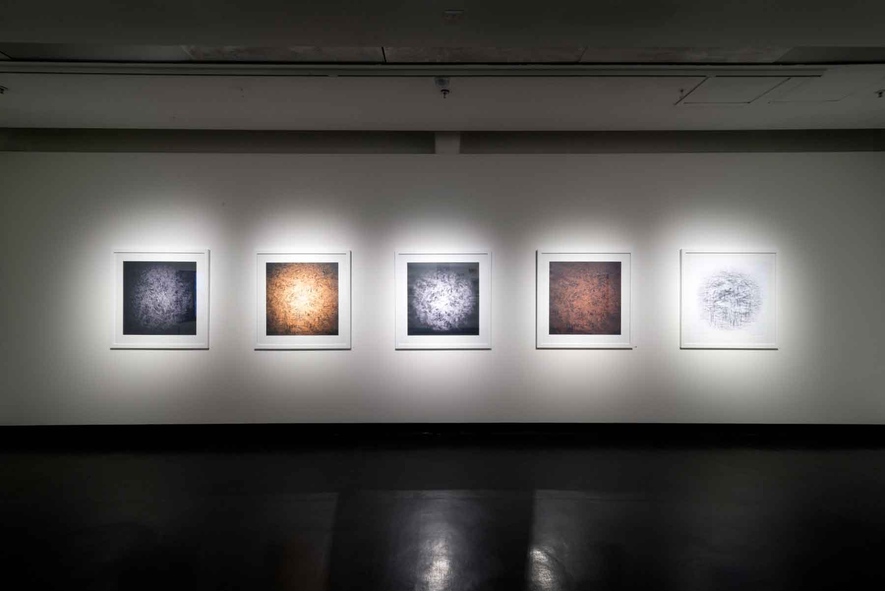
MFA Exhibition, July 2018
When exhibiting, I like to have a number of artworks to select from. Currently, I am showing with Brenda Colahan Fine Art in Sydney. This gallery representation commenced last year after I exhibited at The Other Art Fair, Sydney. This year I will again be exhibiting at The Other Art Fair in Sydney from March 14-17. Being exhibited in an art fair for the first time not only was an amazing experience but also reflected the years I have been a practicing artist. The atmosphere from the exhibiting artists, the audience and new clients that I met all provided a very successful experience.
As well as holding solo and group exhibitions you have University lecturing position, how do you fit it all in?
I have been working in the education field and on my art practice for many years. I enjoy working in the University sector, in particular the RMIT Art School as I was able to combine my love of art with education. Working with art students and other artists provides an environment for feedback, dialogue and reflection. I enjoy the company and rigorous conversations that is had at the University especially in regard to creating artworks.
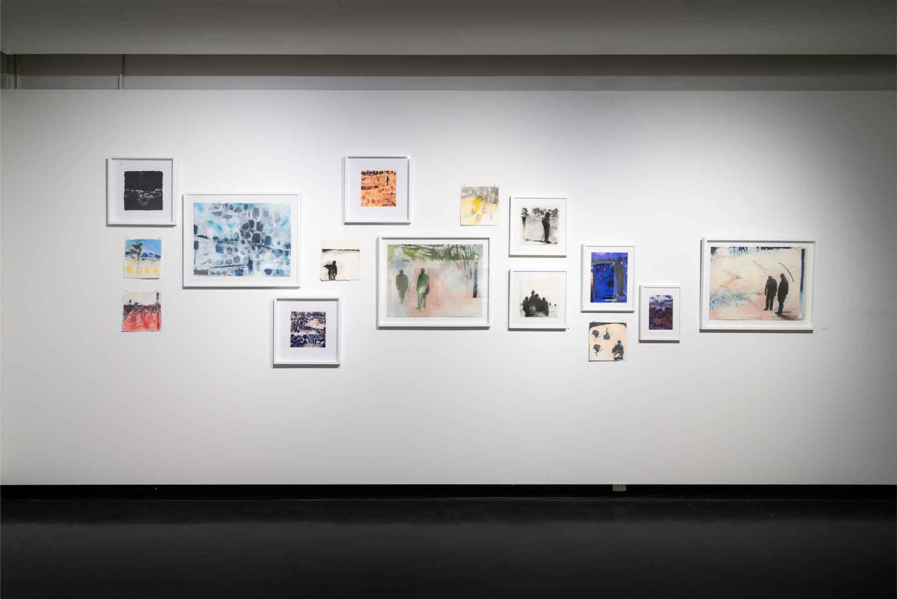
MFA Exhibition, July 2018
I have always been hard working and I manage to juggle full time employment with an art career by having a supportive partner, family and well organised schedule. When it comes to time management, I am quite pragmatic. What is most urgent and what can wait. I work most days on my practice, sometimes in the evenings or when I have an exhibition coming up in the early hours of the morning before work. It is a labour of love and I am fortunate to have had the opportunities that have allowed me this. These opportunities have been created not through luck but tenacity and hard work.
Who is Mr Wilson?
Mr Wilson is based on my father as well as the many men and women who live and work in regional and remote communities. Mr Wilson is a silent, hard-working, stoic hero who is committed to family and the community. My father Michael Wilson has lived in regional Victoria all his life. His knowledge of the community and country living provided the impetus for many of the artworks that I have created.
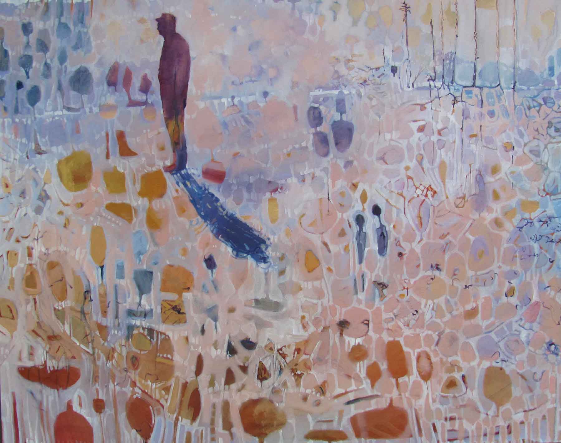
Mr Wilson, Oil on linen, 125 x 155cm
When did you first introduce Mr Wilson into your work?
My Wilson emerged in my work in 2014. My father and mother have always been very supportive of my art practice. My father Michael agreed to be a model for a series of photographs that documented changing weather and temperature over a period of several hours. The photoshoot was taken at the foot of the Warby Ranges in South Wangaratta. I documented a change in climatic conditions over a period of six hours. This photoshoot was undertaken in January 2014 on an intensively hot summer’s day and established a creative vision for the MFA and many of the artworks created. These photos inspired a series of paintings and drawings and the development of digital artwork and animated drawings with sound.
Take ‘Relocation’ and discuss the deep layering of the work.
Many of my oil paintings such as ‘Relocation’ use a method of thin washes of oil paint to build up surfaces. I use a lot of thinning medium to dilute the oil paint. These layers provide a surface that can then be blocked out so images and shapes can emerge through the paint. The oil painting medium can be deceiving as it could be interpreted as water colour or inks. However, oil paint has the capacity to be more supportive for multiple layers of paint.
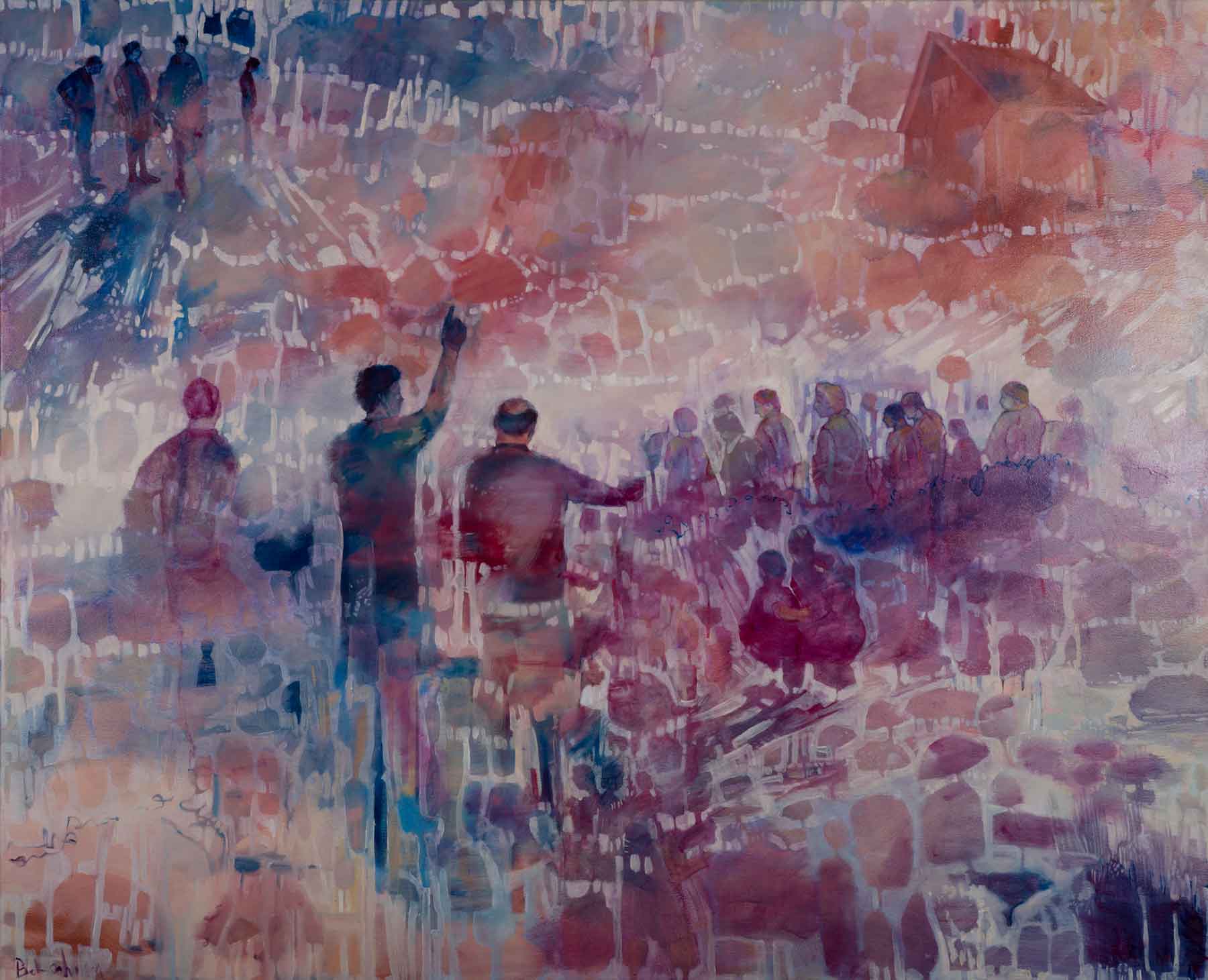
Relocation, Oil on Canvas, 125 x 155cm
Oil painting for me is a lot hardier and forgiving than watercolour. For many paintings, the images are worked out on the canvas, the layering method allows for this to happen. I may have sketches and photos that I base the work on, but it is how the paint moves and flows on the canvas that allows for the imagery to emerge and be finalised.
You use several mediums, expand on your many choices and why each has a place in your portfolio?
I am torn between painting and drawing. I enjoy using both mediums to create artworks. Drawing is actually, an easier medium to use for me, but I like the challenges that painting provides. I never really know how a painting will turn out, whereas in drawing my mark making is very definitely and I have a lot more control over drawing mediums. Recently, I introduced digital drawing into my portfolio. The beauty of digital drawings allows me to reproduce and manipulate images. I can scale them to be quite large but also very small. I usually produce limited editions of no more than 50 prints.
You were included in 20 Australian Women Artists over 20 Years Exhibition at the Brenda Colahan Fine Arts Gallery. Discuss.
Your feelings on being included along with 19 others.
I was thrilled to be included in this exhibition called 20 Australian Women Artists. The calibre of artists who I admired greatly, was one of my career highlights. For many years, I would view these artist’s artworks in many exhibitions. They are artists who have created a unique voice and identity in contemporary Australian art. Each artist provides a significant contribution to the art scene in Australia. They are recognised on both a national and international scale.
Which, of the other artists did you feel most formidable to be amongst?
I would say all of them. To be included in this exhibition with these amazing artists who have such a strong name in the Australian art scene was incredible.
To have my work alongside Tracey Moffat, Judy Cassab, Melinda Harper, Emily Kame Kngwarreye just to name a few of the exhibiting artists provided a remarkable experience for me as an artist. It was overwhelming to be exhibited along side these brillant artists.
Your personal feelings on exhibitions that are gender based.
This is a difficult question, as I don’t feel my art practice is based on my gender. I tend to make art as a commentary on issues both personal and environmental. Though I am a female artist, I don’t think this defines my work. To be included in a gender-based exhibition celebrates the contribution that each artist has made to the industry and showcases the diversity and range of work that is being produced by contemporary artists.
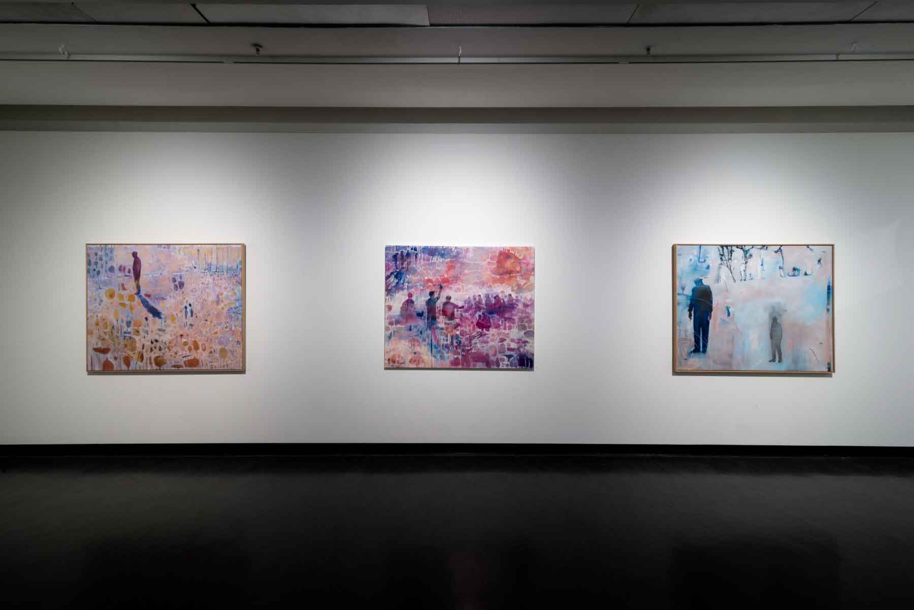
MFA Exhibition, July 2018
Have you ever exhibited with Aboriginal arts before.?
What did you learn from them?
How many pieces did you have to submit?
Expand on the diversity of this exhibition for you personally.
My work was included in the 20 Australian Women Artists over 20 Years Exhibition at the Brenda Colahan Fine Arts Gallery. This exhibition included Indigenous artist and non- Indigenous artists. The exhibition and artworks were selected and curated by Brenda. This was the first time my work had been included with Indigenous artists and I feel immensely proud to be included amongst the calibre of these great artists.
Can you give your own thoughts on the importance of having practicing artists work with students at a University level?
I think it is incredibly important to have industry professionals work in the education sector as this provides students with current practices, trends and understanding of what the industry requires. When I was Deputy Head in the School of Art, all my teaching staff were practicing artists that would exhibit throughout Australia. This taught the students not only the methodology about making art but also the business about being an artist. Each artist would provide their understanding of the art industry, the expectation of exhibiting, the ability to network and run a studio. I think this provides an art student with a better understanding of how to become a working artist. The educators at RMIT are very generous with their time, knowledge and experience with the students.
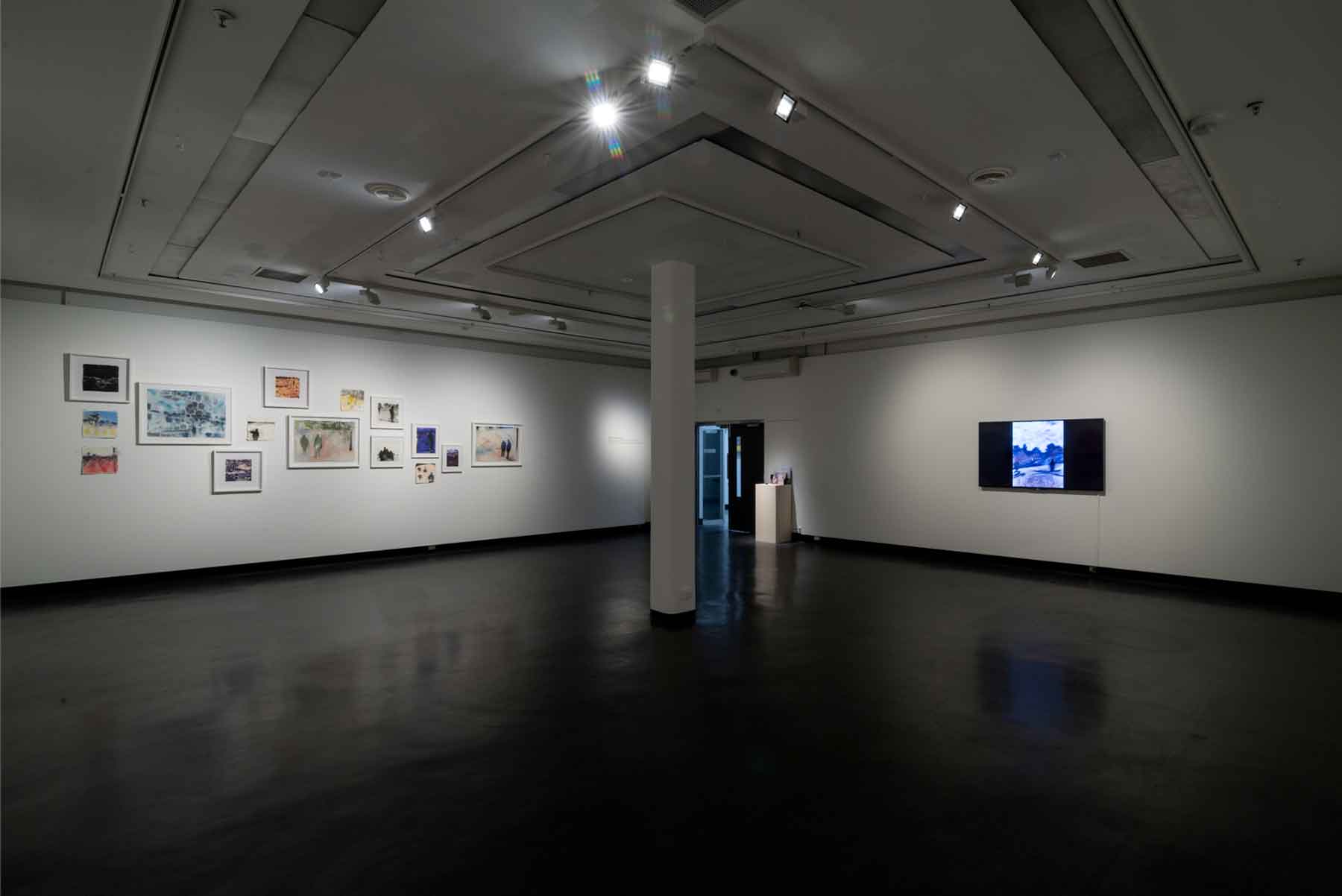 MFA Exhibition, July 2018
What do the students give you?
As an educator with many years of experience, I was constantly inspired by my art students. They provided a refreshing and energetic view of art making. They also knew about trends and ideas that were coming from the grass roots of the art scene. I think it is important to support visual arts education as in some instances funding can waiver in support for the arts. Visual arts education provides a voice and visual identity for our society. It is always exciting, changing and challenging.
What can the students gain from your art practice?
I think my 30 years-experience in the art sector can provide a wealth of knowledge and practice for students. I feel many educators including myself provide a very honest approach to be an artist, what some of the pitfalls are, what to watch out for, how to stay true to yourself as an artist, and working and exhibiting in a professional manner.
Contact details:
Belinda Wilson
https://www.instagram.com/belinda_wilson_studio/
https://www.brendacolahanfineart.com/contact/
Belinda Wilson, Melbourne, Australia
Interview by Deborah Blakeley, March 2019
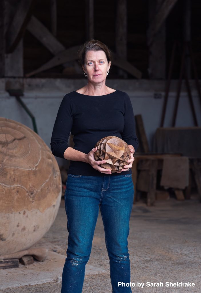
Alison Crowther
Can you explain how you came to be working with wood, especially at such a large scale?
I started working with wood whilst doing my first degree in Three-Dimensional Design. I did some research in to the ancient timber-framed houses in West Wycombe, Buckinghamshire and fell in love with oak. The scale has grown with experience and opportunity to use whole trees.
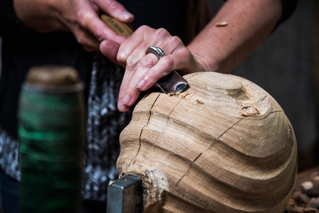
Carving with a small maquette, Photo by Matt Wreford
Why do you specifically use English oak?
It is native, readily available, lasts outside and is loaded with historical relevance - the druids worshipped at alters made of oak, Henry VIII’s tall ships that sailed the globe were built from oak sourced from the same woodlands I select timber from in West Sussex.
You use unseasoned oak; can you explain this for the lay person?
‘Unseasoned’ means fresh or ‘green’ timber, not dried or ‘seasoned’ by air or a kiln.
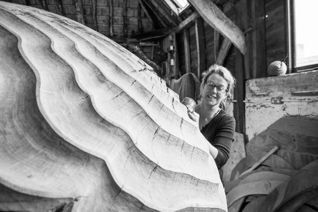
Working in the studio, Photo by Matt Wreford
Your thoughts, on the importance of the correct sourcing of wood and the associated ecological issues?
It is always important to me that the wood I use is sourced sustainably from well-managed woodlands as locally to the studio as possible. We have very high standards of forestry stewardship in the UK which ensures that the timber and woodlands are well cared for.
How does the natural character of the wood influence your work?
I am in conversation with the timber at every stage - from the tree’s habit that can influence the overall shape of a sculpture at the timber selection stage in the woodland, right down to the intricate carving of the finished surface in the studio which may warrant a particular focus around a knot or change in carving direction to accentuate compression ripples under a heavy bough.
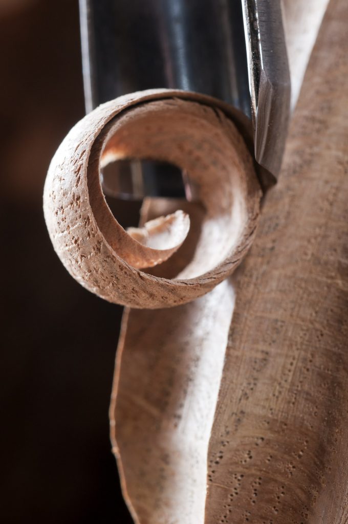
Close up of carving process, Photo by Jacqui Hurst
Take ‘Torpedo’
How you came to have this huge oak to work on and give a new life too?
The tree was offered to me as it had had to be taken down locally because of dropping one of its limbs. It was right on the side of a busy road, the old road to London from Petworth.
How many pieces did it end up being?
The log was 6 metres long and made three sculptures, the ‘Torpedo’ being the largest at 3m long, and two smaller pieces at 1.5m long each - one of which was shipped to a new hotel lobby in Heifei City, China.
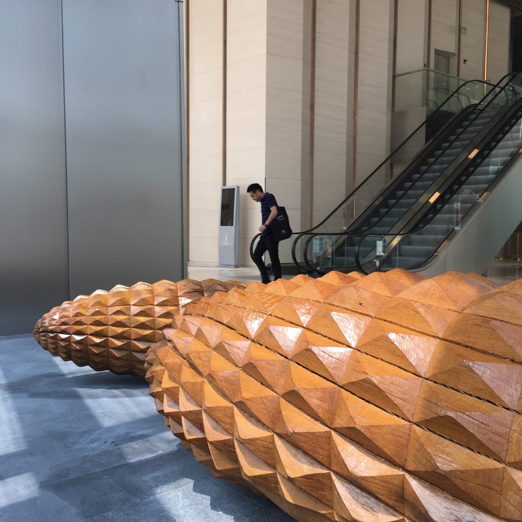 Scale Tree II and III
It isn’t essential to know the history, but it gives a rich narrative to support the aesthetic appeal. Sometimes clients are particularly interested to know the origins of the tree.
Expand on one of your large installations and why it stands out.
A recent tripartite commission, The Scale Trees, for the main lobby space, Tower 7, One Shenzhen Bay, China, was a joy to produce from the initial concept sketches and research, to the installation in partnership with transport company Mtec and art installers UAP.
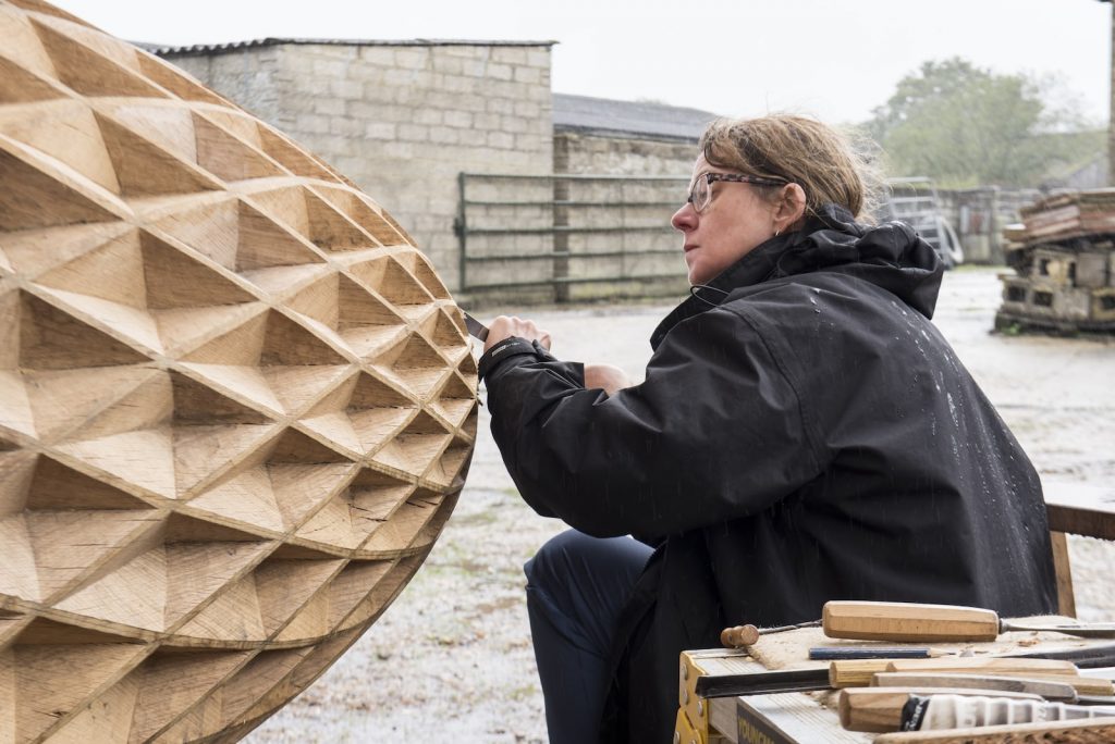
Carving, Scale Tree I
The surface textures of the sculptures were particularly satisfying to carve, they were a new design and involved working with several skilled carpenters here in the UK. Scale Tree I is also the tallest sculpture I have ever made at 5m high.
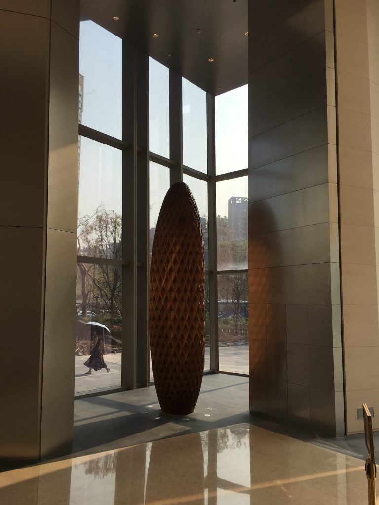 Scale Tree I, Shenzhen Bay, China
Scale Tree I, detail.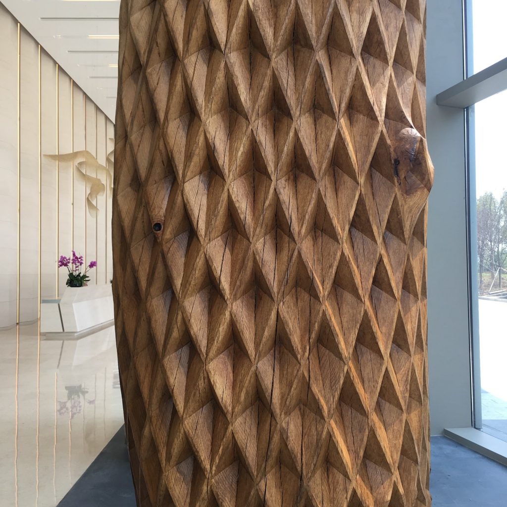 Scale Tree I, detail.
How do you balance exhibition work and commissions?
Good question! I try to factor into the year of commissioned work a couple of ‘gaps’ or opportunities to produce new work that could be exhibited in the future. It’s important to keep developing your work and trying new ideas.
Exhibitions are however a risk financially, I have to be careful that the studio can afford those risks and the commission work takes priority because we have to operate as a viable business.
Can you take us through the process of the “Kissing Bench’
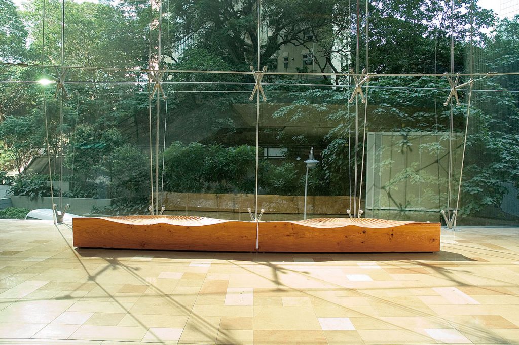
Kissing Bench 11
The original commission:
I was approached in 2006 by an art consultant based in Hong Kong to produce ideas for commissions for a new Swire Properties building, 3 Pacific Place.
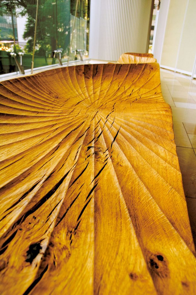
Kissing Bench 11, detail
Design:
The Kissing Bench design evolved from the traditional ‘kissing seats’ where a couple sit together facing in opposite directions enabling them to embrace or ‘kiss’.
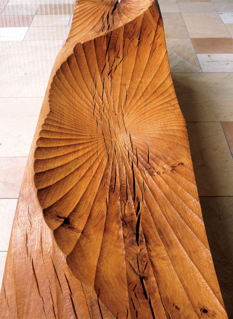 Kissing Bench 11, detail.
The process of getting it to Hong Kong:
I organised the shipping myself from the UK to Hong Kong. The art consultant dealt with a local art handler from Hong Kong docks to site.
The sculptures were carefully crated at my studio into wooden crates that were then loaded into a shipping container. The container, after being fumigated, went from Southampton docks to Hong Kong.
Discuss the wear factor of this type of work:
3 Pacific Place is a busy public area with people passing through this space from offices or the shopping malls to the parks, restaurants and cafes, so the benches are in constant use. The seat surfaces have built up a wonderful polished patina from the human interaction, the rubbing of clothing and contact with hands.
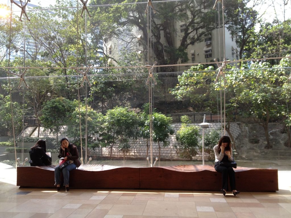
Kissing Bench, Hong Kong
After this a smaller but interesting commission Font 11.
Font II was commissioned for a small boutique hotel in Exeter. The architects were refreshing, keen to have a sculptural ‘reception desk’ to meet and greet rather than acres of polished desk top surface. The flat top needed to be the right height for clients to paperless ‘check-in’ on a tablet. A padded leather circle protects the top and provides a practical surface for signing any papers required.
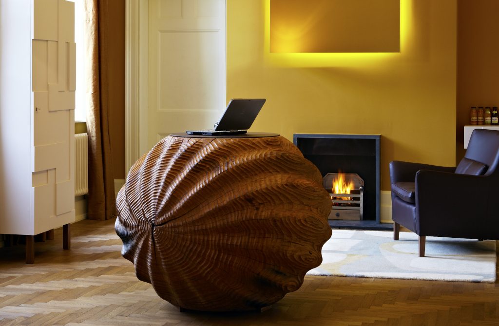
Font II, Magdalen Chapter Hotel, Exeter, UK
Can you take a recent pieces of work that shows your smaller work?
The ‘Walnuts’ are a series of small pieces that I carved last year from English walnut wood that was salvaged from a woodland clearance.
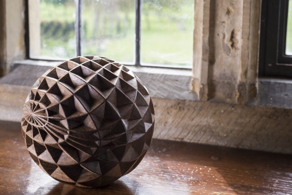
Incised Walnut I, Photo by Jacqui Hurst
The incised texture is intricate and required very sharp gouges to give a precise edge to the geometric patterns.
The lines around the small sphere, although based on a grid, follow the natural annual growth rings one way, almost like latitude on a globe, and the lines going from centre to centre, or pole to pole with longitude, follow the medullary rays, the cellular transport systems that run from top to bottom of a tree.
I’d like to experiment much more with these smaller works.
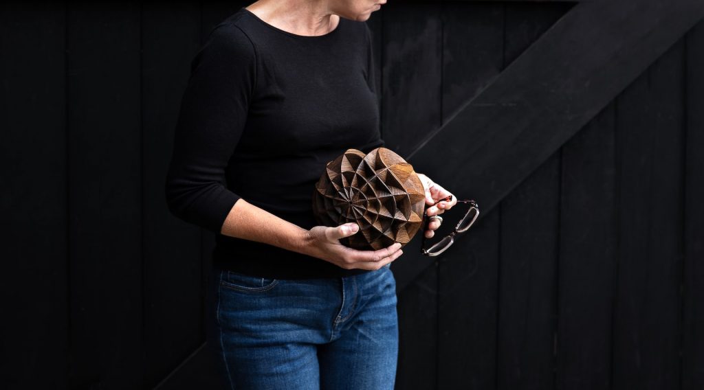 Incised Walnut 11, Photo by Sarah Sheldrake
Show and discuss one tool that you love using and explain the pleasure it gives you.
Oh! that has, to be my lignum vitae mallet. It’s just so reliable and never needs sharpening!
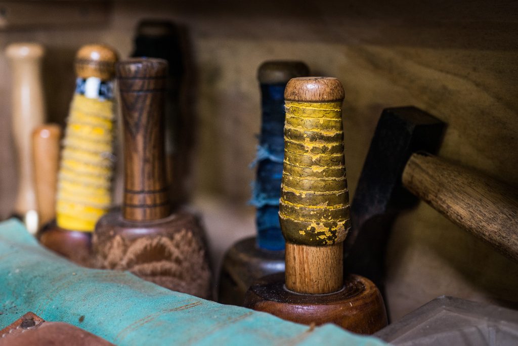
Mallets, Photo by Matt Wreford
You studied at the Royal College of Art, when during this time did you start to work with wood.
That was in my second year at the RCA when the projects became self-initiated. There had been a great storm in the south of the UK and there were hundreds of oak trees that had blown, down so I had access to free materials.
I’m not sure exactly what inspired me to start carving. Perhaps it was a reaction against the high-tech design led environment. Carving is so immediate.
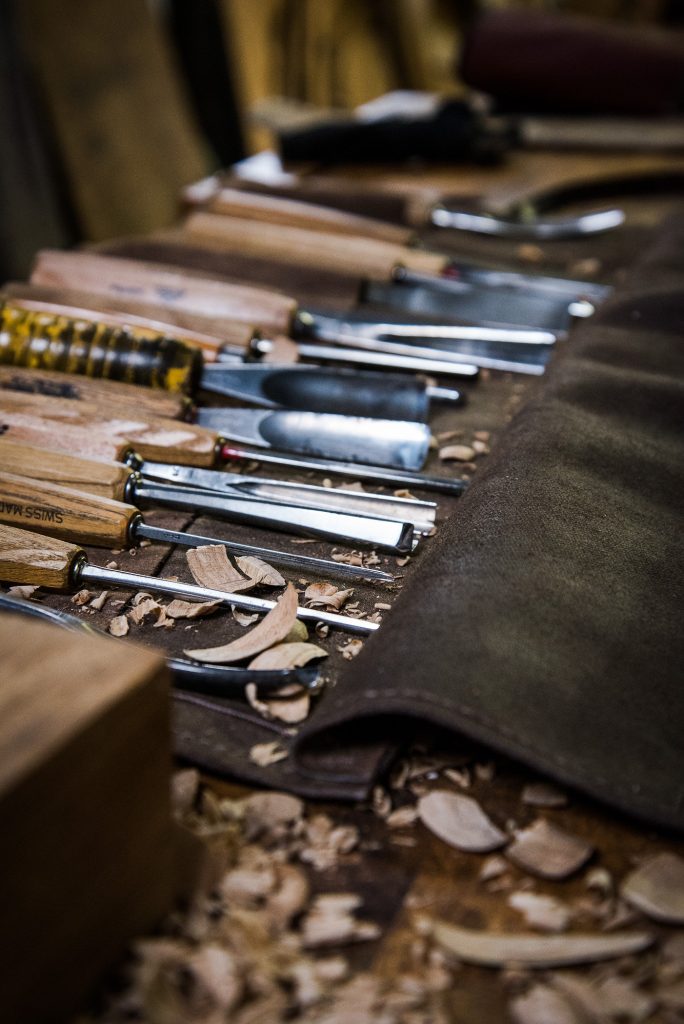 Carving Gourges, Photo by Matt Wreford
You are a member of the Royal Society of Sculptors are their many others who work solely in wood?
No I don’t think so. Wood isn’t a very fashionable material for sculpture in the 21st century and direct carving is probably more associated with the 20th century, but I think I bring a fresh way of approaching the material and the processes.
Can we take a peek into your studio and please explain why it is important to you.
I have worked from my current studio, a rented timber-framed barn, on a working farm at the foot of the South Downs for the last fifteen years.
It is about 150m x 2 in size and we use about the same area outside in the yard for storing large sections of timber and doing the roughing-out of new projects.
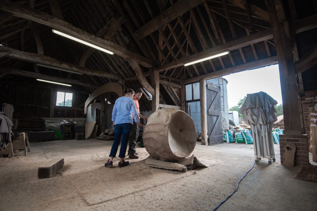
Alison Crowther Studio, Photo by Sarah Sheldrake
The building is timber-framed which dates, back to the 17th century at one end. It is imbued with a sense of history and of being built and crafted, by hand so it feels like an appropriate space to be creating my sculptures in.
Contact details:
Alison Crowther
www.alisoncrowther.com
Alison Crowther, West Sussex, UK
Interview by Deborah Blakeley, March, 2019
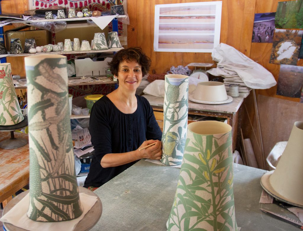
Cathy Franzi
Can you discuss how the Nelson Nichols Scholarship has affected your art practice?
I received this award in my first year of a Master of Visual Arts (Ceramics) at the Australian National University School of Art & Design. The scholarship was a generous donation from Gail Nichols and David Nelson supporting early career ceramic students. The scholarship gave me confidence in the direction my work was taking at the end of my first year at Art School, having already worked in the ceramics field for 15 years.
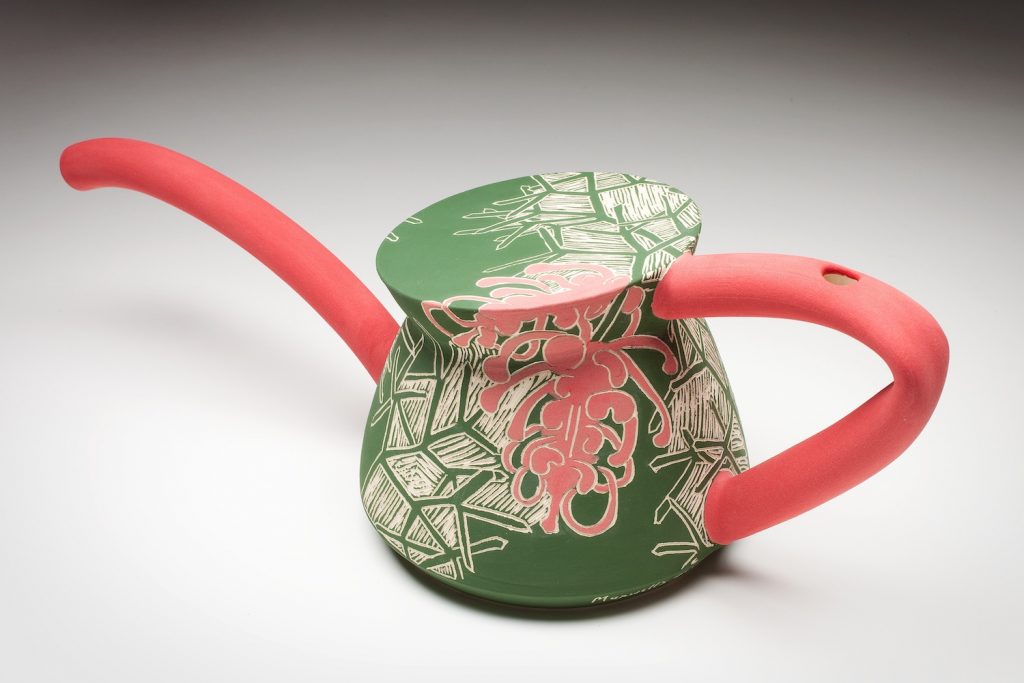
Maxwells Grevillea, From Endangered Series, 2010. Mid-Fired Clay,
wheel-thrown and altered, sgraffito, 16h x 32w cm. Photo by Stuart Hay
Where did the botanical interests come from?
I have always been fascinated in plants and was fortunate to have a childhood filled with camping holidays and bushwalks. My immersion in the Australian bush and my subsequent love of nature motivates my deep botanical and environmental interest. I followed this path through my first degree in science before I began a career in ceramic visual art.
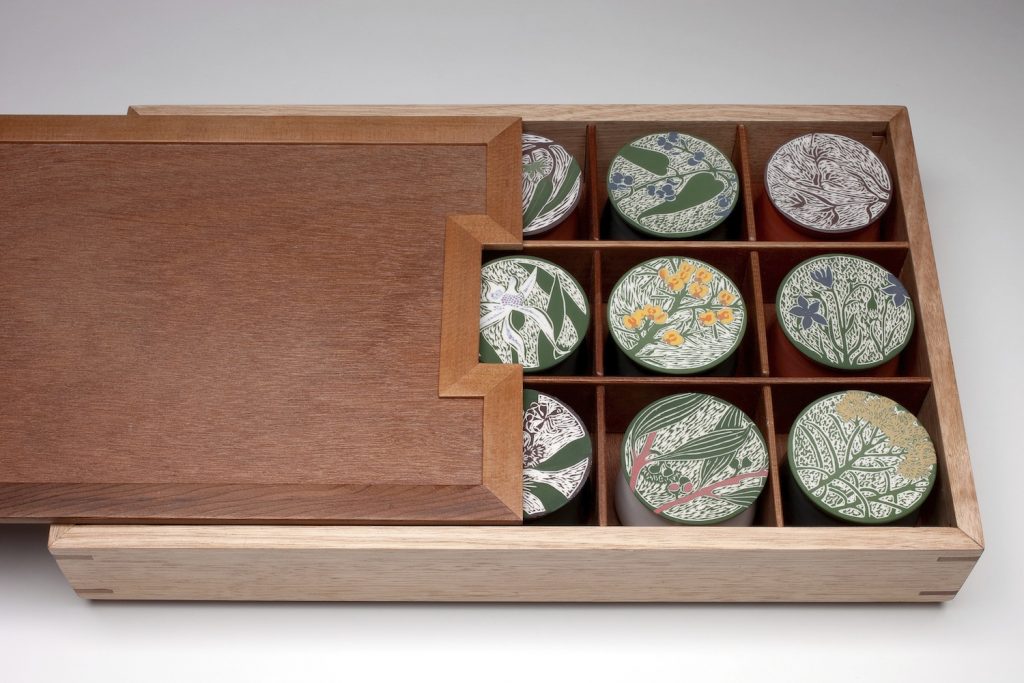
Mt Majura Seed Box, 2010, Porcelain, wheel-thrown, sgraffito,
recycled timber, 6h x 40w x 15d cm, Photo by Stuart Hay
How has your work given a new voice to Australian flora?
Currently there is a renewed interest in Australian flora in art and design, in part because of the extraordinary shapes and textures to be found, and perhaps because of increased awareness of our poor environmental health and lack of action. This is certainly from where my voice and activism lie.
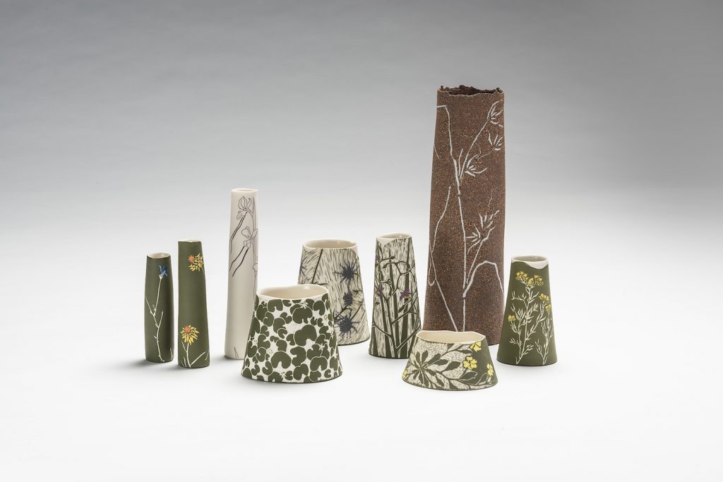
Natural Temperate Grasslands, 2015, Porcelain, stoneware wheel-thrown, sgraffito, and inlay, 37h x 40w x 16d cm, Photo by Rob Little, Digital image
How have your travels working in ceramics in Ireland, UK and NZ influenced your need to develop your own Australian style?
My experience working overseas and immersion in the history of ceramics through visiting the great museums and galleries of the world has deepened my appreciation of the way ceramics captures the materials, technology and culture of a place, time and people. This is what I aim to do in my own work.
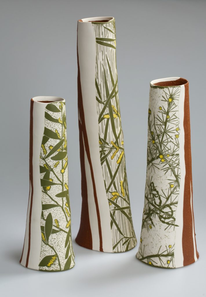
Arid-zone Acacias, 2016, Porcelain, 55.5h x 15.2w x13.3d cm,
Photo by Andrew Sikorski-Art Atelier
You have work in the Centenary Capsule in Canberra. Discuss
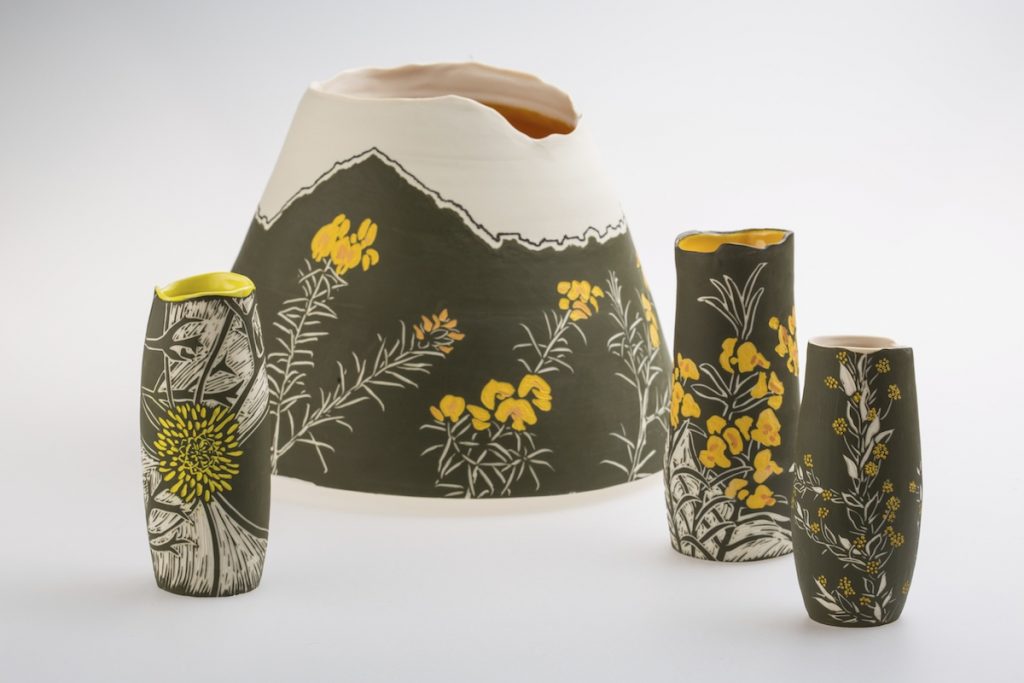
Golden Hill, Detail, 2013, Porcelain, wheel-thrown, 20h x 20w cm,
Photo by David Paterson
Canberra’s centenary in 2013 was acknowledged through a wide range of exhibitions and cultural events reflecting on its design history, architecture and landscape. During this year I created a solo exhibition based on Walter Burley Griffin and Marion Mahony Griffin’s plan to revegetate the hills of Canberra in single colour plantings of predominately flowering Australian flora. My research led me to Mahony Griffin’s colour-coded botanical notebooks held in the National Library of Australia. I followed this with research in the field to examine the species growing on each of the five sites. The exhibition ‘Painting the Hills of Canberra’ was shown at CraftACT: Craft and Design Centre and it was from this body of work, inspired by Canberra, that a small vessel decorated with a local plant was chosen to be included in the Time Capsule.
One hundred objects are in the time capsule providing a snapshot of life in Canberra in 2013 and includes all sorts of things such as artworks and photographs, letters, restaurant menus, and even a parking fine. Descriptions of the significance of each object is also sealed in the time capsule to be opened in 2113. I think it is a fascinating project and provokes our imagination to the future.
You have been awarded the Biennial North Queensland Ceramic Awards along with many others. Discuss this one in particular.
The actual award-winning piece.
The design
The actual botanical information
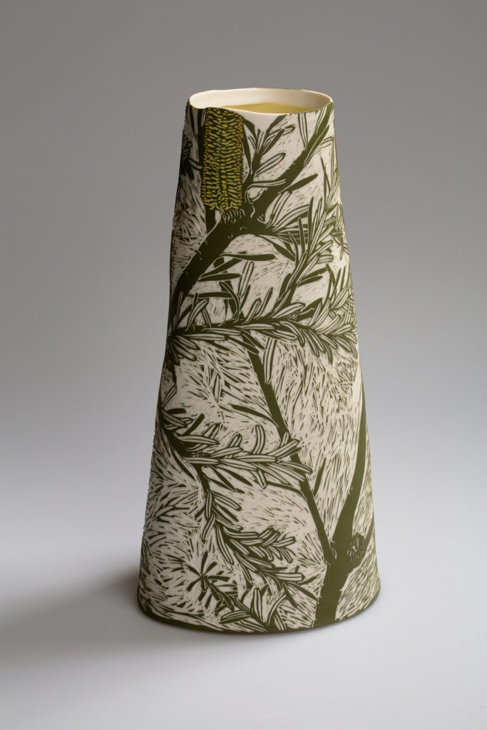
Silver Banksia, 2016, Porcelain, wheel-thrown, and altered,
38.4h x 19.5w x 11d cm,
Photo by Andrew Sikorski-Art Atelier
We are fortunate to have many competitions and awards specifically for ceramics. The Biennial North Queensland Ceramic Award has long aimed to increase public exposure to a high standard of ceramic visual art and displays the diversity of work currently being produced in Australia. I received the Scott Brickworks Acquisitive Award for the work ‘Silver Banksia’ based on the species Banksia marginata.
How do you research the plants on your vessels?
I am committed to understanding the plants I represent on my artwork. Where they grow, the ecology and environment in which they belong and the threats they face. To gain this knowledge I have developed a long-term engagement with botanical science.
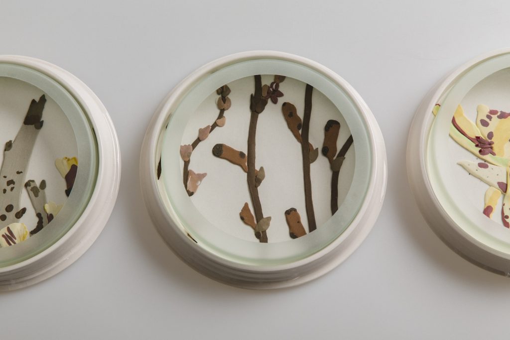
Herbarium Dishes, 7 Endangered (detail), 2015, Porcelain, etched glass,
6h x 1600w x 22d cm,
Photo by Andrew Sikorski-Art Atelier
I spend time in the field researching plants and seek opportunities to work with scientists. For example, I am a volunteer with the National Seed Bank on their seed collecting expeditions. I research plants in the Australian National Herbarium, through databases and in Living Plant collections. Many of my exhibitions are based on specific plants in specific locations where I have had an involvement with botanists.
Are there any endangered plants on any of your vessels?
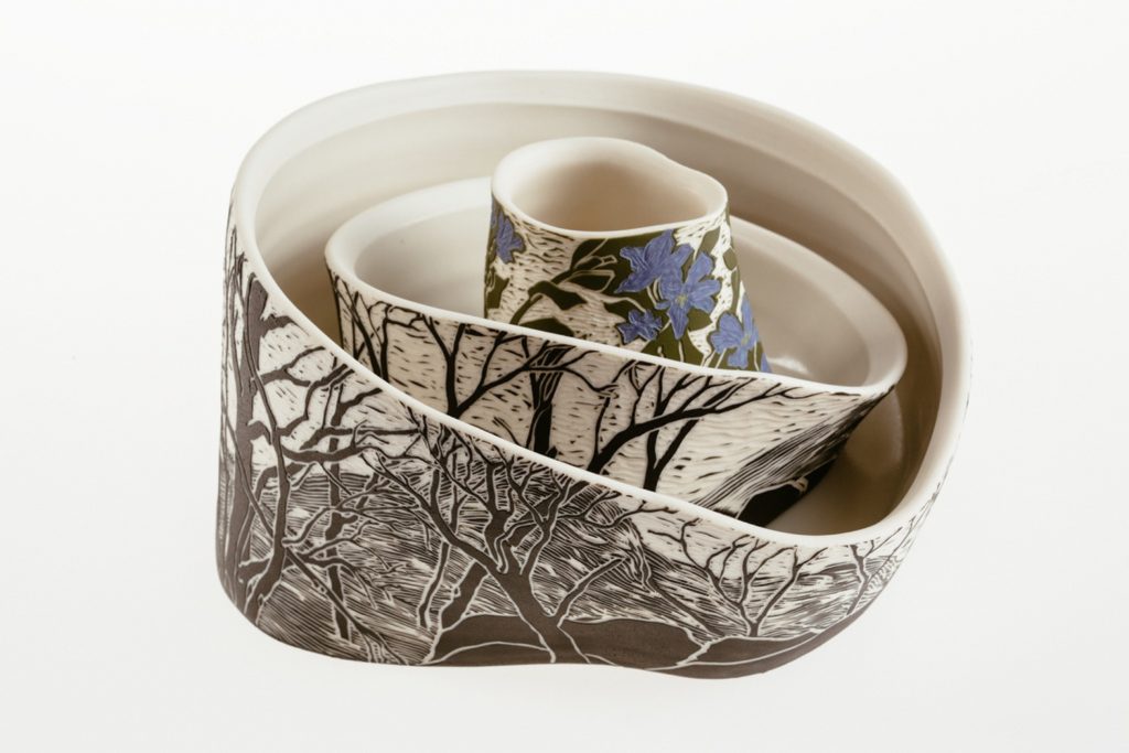
The Ephemeral Dampiera fusca: Tinderry Range, 2014, Porcelain,
16h x 28w x 14d cm,
Photo by Andrew Sikorski-Art Atelier
Unfortunately, many plants in Australia are endangered and in any ecosystem there will be plants under threat, if not the whole ecosystem. Therefore, I represent endangered plants on my work often. I am currently part of the project ‘Art of Threatened Species’ through the NSW Office of Environment & Heritage and Orana Arts. So far, I have been out in the field with Threatened Species Officers to study three endangered orchids, The Crimson Spider Orchid, The Sandhill Spider Orchid and Oaklands Diuris. My subsequent artwork will be part of a touring exhibition later in the year.
Are all the plants named on the vessel or just your mark?
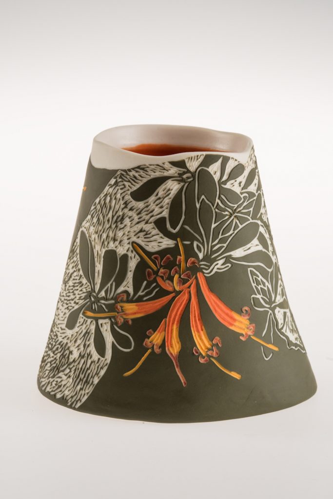
Lambertia inermis, 2017, Porcelain, wheel-thrown and altered, sgraffito, 10h x 12.5w x 10.1d cm, Photo by Andrew Sikorski-Art Atelier
I sign all my work with the name of the plant.
Do you find the buyers gravitate to specific plants or is it a design response?
I think it can be both. My aim is to find a way to capture the character of the plant in design, colour, technique and ceramic materials.
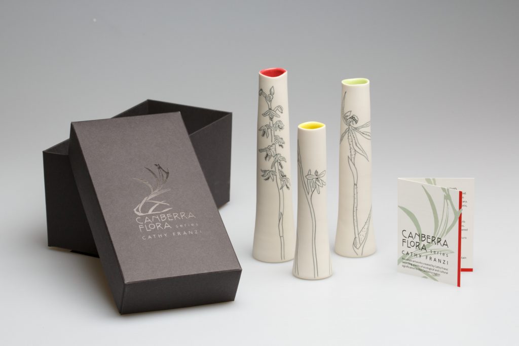
Orchid Set, Set of 3 Orchids from The Canberra Flora Series, 2017, Porcelain, wheel-thrown , ink inlay, 17h x 9w x 4d cm,
Photo by Andrew Sikorski-Art Atelier
Colour of Australian native plants are very distinctive. Discuss this using 1 or 2 pieces.
The colours of plants in Australia vary widely from olive green to the silver blue of some Eucalypts. I am constantly testing my materials to find colours that capture this. Ceramic materials only show their true colour after the final firing, which makes it very tricky!
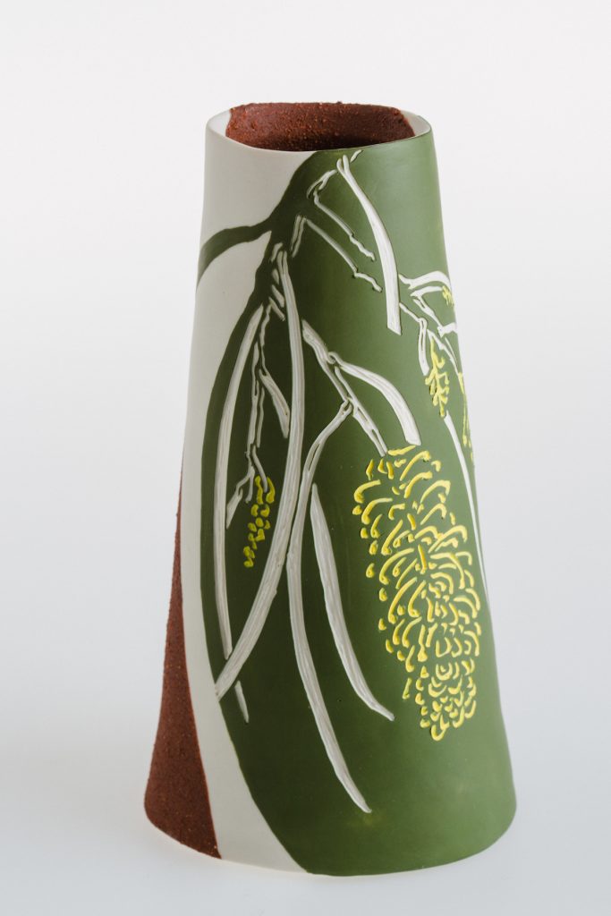 Hakea lorea, 2015, Porcelain, mid-fire slip wheel-thrown, sgraffito,
14h x 8w x 10.6d cm, Photo by Andrew Sikorski-Art Atelier
Size, what are the restriction on the size of your work?
At the moment I am restricted by the size of my largest kiln, which is 900 mm height by 600 mm width.
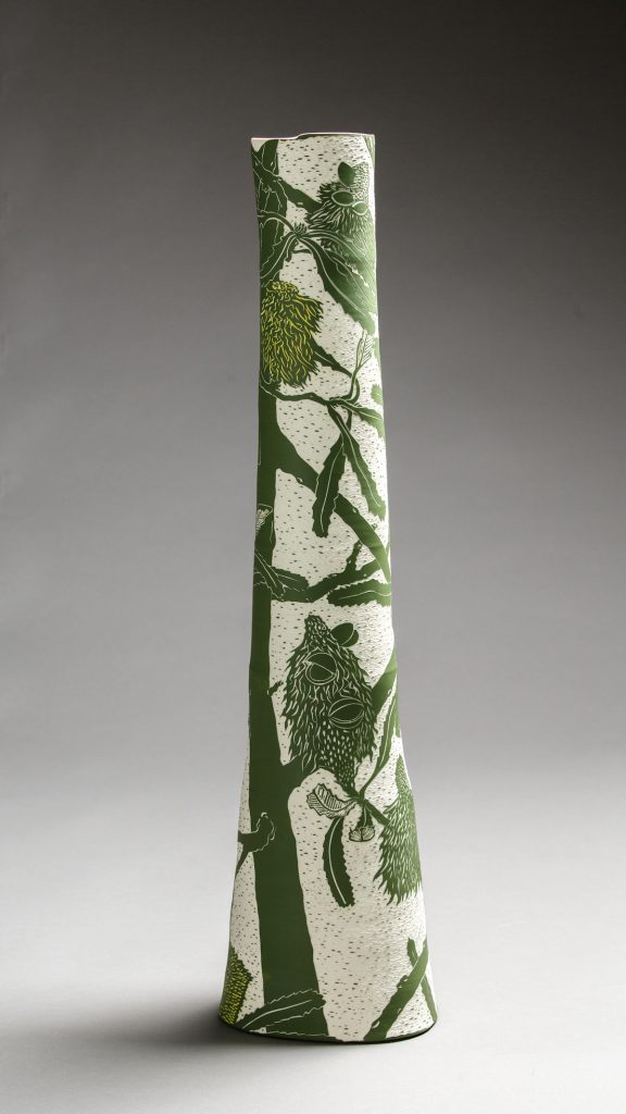
Saw Banksia, 2018, Porcelain, wheel-thrown and altered, sgraffito,
75.8h x 18.9w x 18.4d cm, Photo by Andrew Sikorski-Art Atelier
Take 1 or 2 pieces that you have made recently and discuss.
Design both shape and artwork
Technique (briefly)
What was it the excited you about the finished piece/s and why?
My last solo exhibition was at Sabbia Gallery in Paddington Sydney and was based on a residency I had at Fremantle Arts Centre earlier in the year. During my residency I went on a field trip with staff from the Threatened Species Seed Centre into the Stirling Range National Park in Western Australia’s biodiversity hotspot. We collected seed from the highly threatened Banksia anatona and it was this plant and 11 other extraordinary Banksias that I chose to work with for my exhibition.
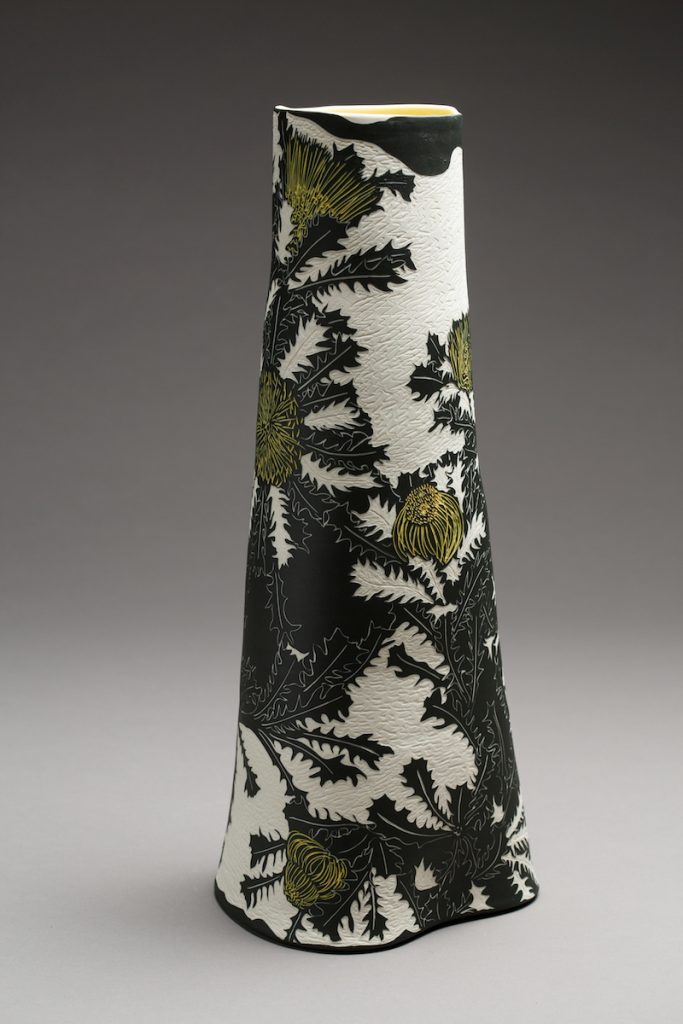
Banksia anatona, 2018, Porcelain, wheel-thrown and altered, sgraffito,
53.2h x 22w x 20.5d cm,Photo by Andrew Sikorski-Art Atelier
My vessel forms are thrown and altered on the potters’ wheel in porcelain. The technique I use is sgraffito where I carve the surface material away to ‘draw’ my design on the ceramic surface.
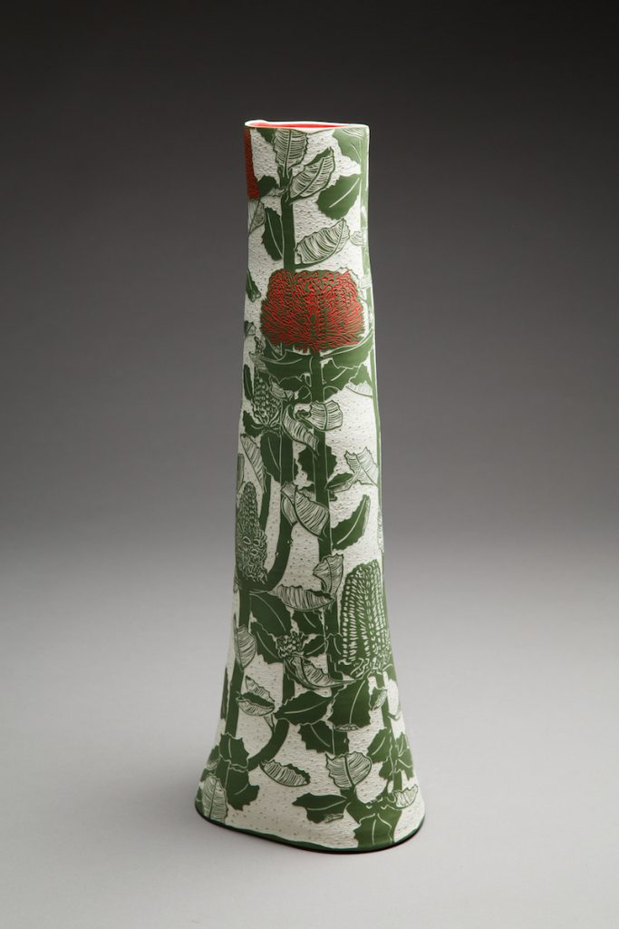
Banksia coccinea, 2018, Porcelain, wheel-thrown and altered, sgraffito,
66.4h x 23.5w x 20.5d cm,Photo by Andrew Sikorski-Art Atelier
Your work is in many collections, can you take one that has given your career a challenge?
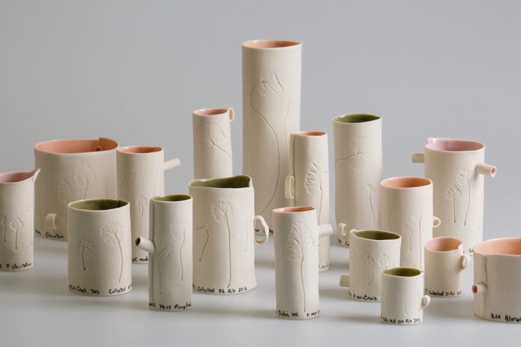
Patterns of Distribution, (In leaf shape of Australian Pelargonium species (detail) 2016, Porcelain, 16h x 108w x 36d cm,
Photo by Andrew Sikorski-Art Atelier
In 2016 I had a residency in the Australian National University Research School of Biology with Professor Adrienne Nicotra. I was awarded the residency through the prestigious Vice-Chancellor’s College Artist Fellows Scheme, as an opportunity for post-doctoral interdisciplinary research. In the Nicotra lab I engaged with their research on leaf form and function of two Australian plant species, Alpine Buttercups and Pelargoniums. My usual way of representing plants did not seem appropriate and so I experimented with new ways to be able to capture leaf shape and form with accuracy. The resulting artwork is now in the collection of the Research School of Biology.
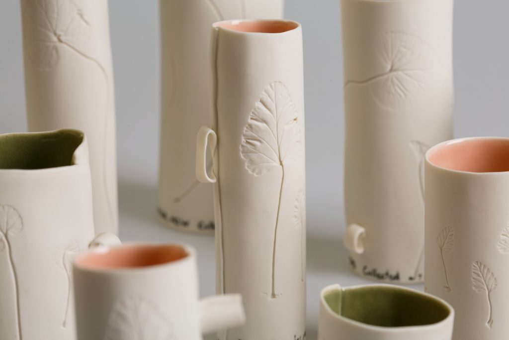 Patterns of Distribution (detail) (In leaf shape of Australian Pelargonium species (detail) 2016, Porcelain, 16h x 108w x 36d cm, Photo by Andrew Sikorski-Art Atelier
Comment on your thoughts on being an Australian artist working with such an Australian theme.
I see my practice as one that engages with contemporary issues, and my interest and concern is for our long-term biodiversity. I hope that my work is not capturing the last we might see of some magnificent and unusual flora.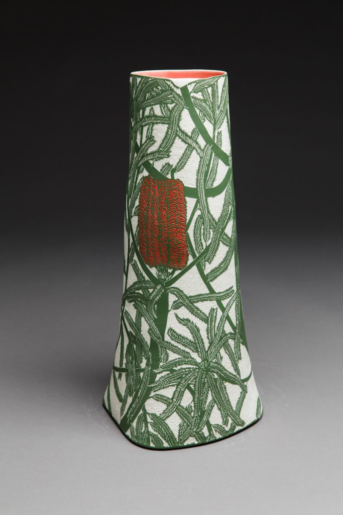
Banksia brownie, 2018, Porcelain, wheel-thrown and altered, sgraffito,
48.3h x 23.6w x 21.1d cm,
Photo by Andrew Sikorski-Art Atelier
Contact details:
Cathy Franzi
Website: www.cathyfranzi.com
‘Drawings’ Sabbia Gallery, 1 – 23 March 2019. https://sabbiagallery.com/exhibition/ceramic-masters-2019/
‘Coastal : Botanical’ Narek Galleries, 9 March – 27 April 2019. http://www.narekgalleries.com/future-exhibitions.html
Cathy Franzi, Canberra, Australia
Interview by Deborah Blakeley, February 2019
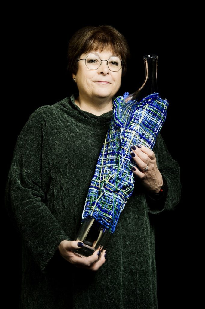
Cathryn Shilling
How did your move from the UK to the USA in 2001 lead you to your career in glass?
In 2001 my family moved to a small town on the east coast of the US, Darien Connecticut, chosen for its, close proximity to Manhattan. Until this move, I had a successful career as a freelance graphic designer. I was keen to find a creative outlet. I had always loved stained glass and owned a catalogue of contemporary pieces that was very well thumbed. So, when a studio nearby advertised their evening classes I signed up and began to study the art and craft of stained glass.
My years in graphic design allowed me to develop skills in a wide range of creative processes and products and the move to glass seemed natural and spontaneous. During this time, I began to develop my deep love of glass as a material, spending hours in the warehouse studying the exquisite sheets of hand blown glass. I found glass a fascinating and seductive material and in my practice I love to explore the fluidity of glass as a liquid, its sculptural quality as a solid as well as its transparency.
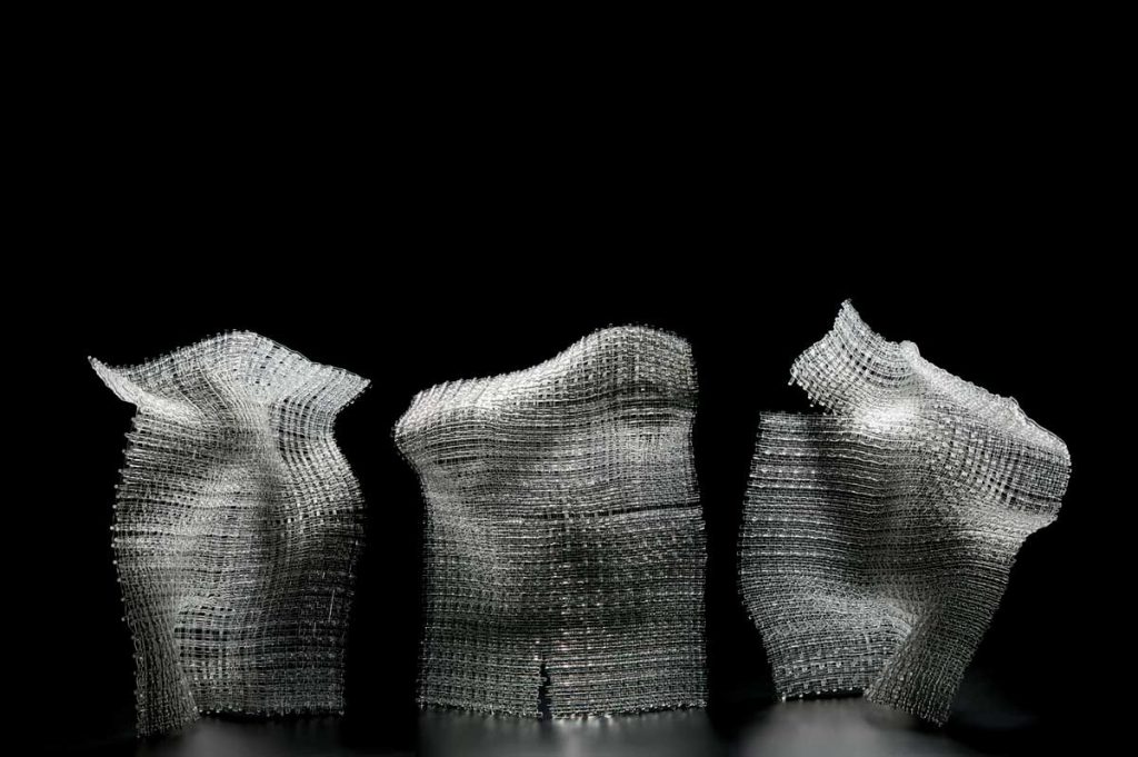 Dissonance, Photo; Ester Segarra
On my return to the UK I signed up for classes at Kensington & Chelsea Adult Education College, fully meaning to develop my stained glass practice. But I soon realised that I didn't want to continue to design what other people wanted me to.
Instead I wanted to make my own ideas and I quickly realised that fused glass offered me that possibility. My research into contemporary art glass then lead me to glassblowing and I began to take classes in order to expand my knowledge of glass making techniques.
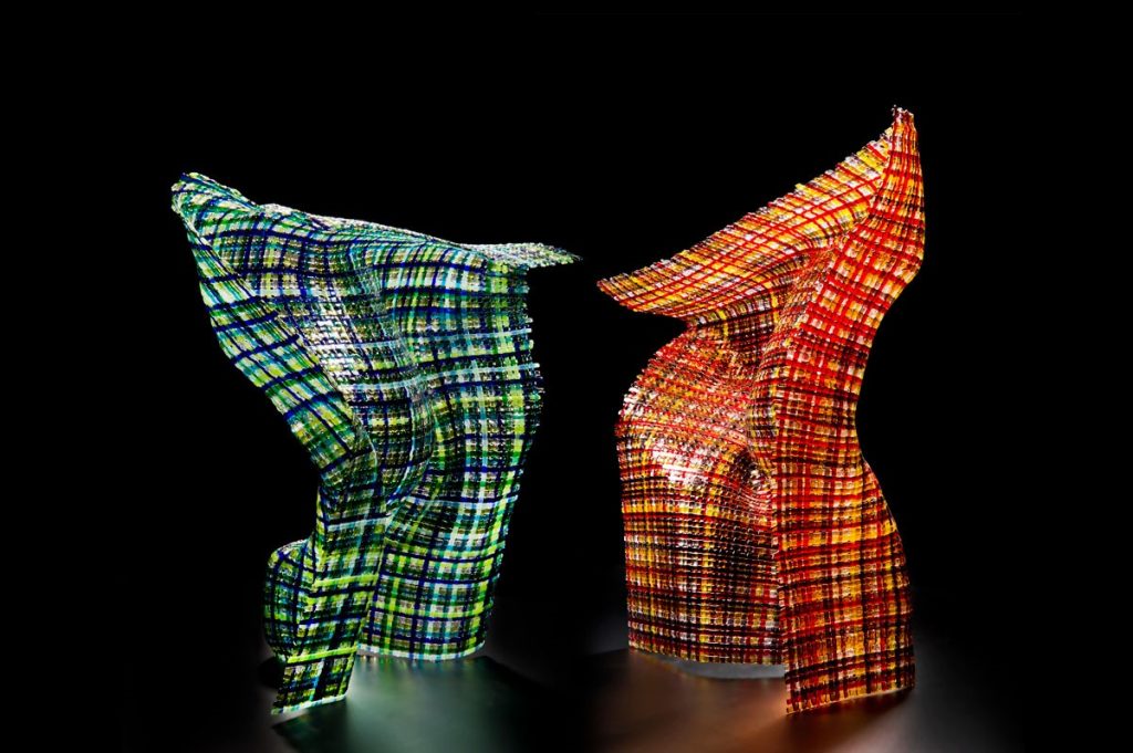 Standing Proud, Photo; Ester Segarra
Kiln formed glass is the perfect medium for my work. It gives me the creative and technical freedom to produce tactile, tangible and enduring pieces that explore the sculptural quality of glass. Hot Glass however allows me to investigate and work in a more immediate and direct way with my chosen material, drawing inspiration from its molten state in order to produce unique and tactile vessels.
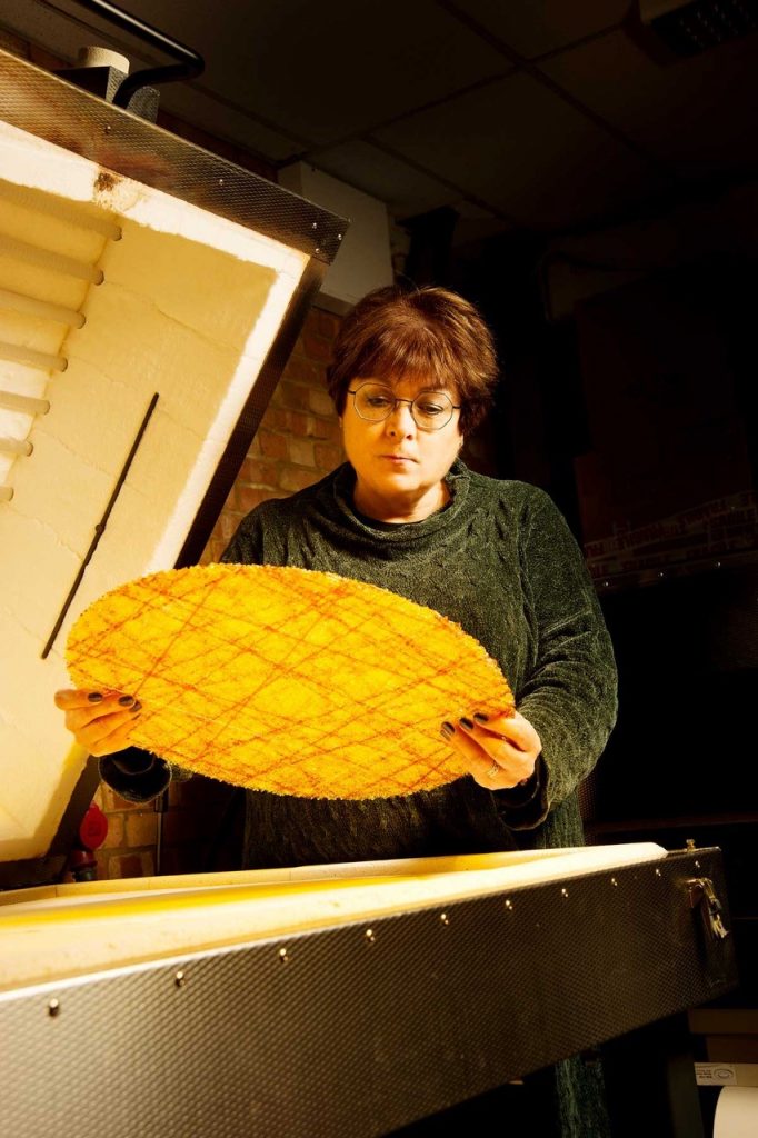 Cathryn Shilling, in her studio, Photo; Ester Segarra
You have worked in two countries and several Glass Studios can you expand on both the differences and similarities?
My experience of a stained glass studio in Connecticut was really only as a student. I soon realised though that there were quite a few differences between the way things are done in the US and the UK where the tradition of stained glass goes back centuries. I don’t think that this is the same for glassblowing, as the tools seem to be the same wherever you are, except that each studio is set up to suit the master glassblower. Artists working in London are faced with some of the highest rents anywhere in the world so our studios tend to be small and often shared. Through Instagram I have glimpsed studios of artists all over the world and am often envious of the space available to them.
Tell us about the 30 Most Amazing Glass Artists of which you are one?
The first I knew of this list was when a colleague sent me the link. I have no idea how I was included in such esteemed company but it was a lovely surprise. The work highlighted was my woven glass pieces, Synergy Series I. I remember a bit of chatter about the artists not included in the list on social media but that’s about it. However, I think it brought my work to the attention of artists and collectors internationally.
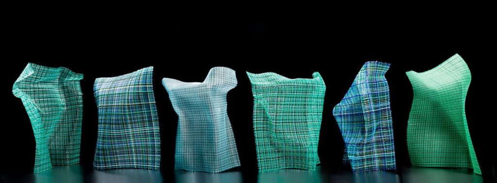
Synergy Series I, Photo; Ester Segarra
With all artists, the photographing of their work is imperative, but particularly with glass – discuss.
The captivating optical qualities of glass is what makes it notoriously difficult to photograph. When you submit work for exhibitions and competitions you are being judged on a photograph. I was lucky to have been introduced to Ester Segarra quite early on in my career, she is a very talented photographer and I feel that I owe her lot as she takes beautiful images of my work. These images have given me the confidence to enter all sorts of exhibitions and competitions.
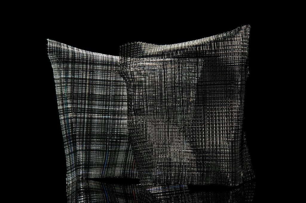 Synergy Series I, Photo; Ester Segarra
Glass is an undervalued medium but the rise of social media – Pinterest, Face Book and Instagram in particular means that it is now reaching a far larger and often very appreciative audience. One South American collector told me that he found my work by ‘driving through the internet.
How long have you been working with woven glass canes?
Early woven glass
While studying at Kensington & Chelsea College we went on a class trip to the Victoria & Albert Museum in London. This was in 2005 and I saw work by the then Artist in Residence, textile artist Sue Lawty and this completely changed the way I approached glass. Firstly, there was little of what I thought of, as textiles on display. She didn’t allow the title of ‘textile artist’ to limit her exploration of ideas, for example there were large wall pieces made from hundreds of pebbles that Sue had collected from different beaches. And some of the few weaving she had done were made of lead. They were in a showcase with other small woven test pieces. Seeing these little experiments that she had made from all different materials set me on a path that I am still exploring today. I went away and began making my first experiments fusing glass cane into sheets of woven glass.
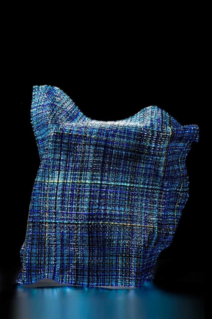
Hidden Gestures II, Photo; Ester Segarra
Using images can you take us history and process of your woven body of your work.
Back in the glass studio I started to make tests using any glass stringers and noodles that I could get my hands on - so please don't judge me for the colour selection! I was supposed to be making a light of some description that term so I justified these tests by sewing the squares together with wire and making it into a hanging piece. The idea being that it played with light when the sun shone on it.
 Glasswork Quilt Light, Photo; Ester Segarra
I called it Glasswork Quilt and I entered it into the V&A Inspired By competition that year. Peter Layton was the judge for the glass section and he gave it a Highly Commended, commenting that it required more thought! And I can’t really argue with that. In 2011 I was given the opportunity to return to this work and reimagine it as a large lighting installation, working with Angel Monzen of Vessel Gallery. It was great to have the opportunity of working with a product designer and take a previously unresolved idea through to fruition as a collaborative project. I learnt so much from this process.
I then began making my first experiments fusing glass cane into sheets of woven glass using Bullseye glass stringers. While at art school I had toyed with the possibility of studying sculpture but it was a very sexist age and I was told that ‘sculpture was for men, not for girls’! But fused glass rekindled my interest in three dimensional objects. Rather than slumping the woven glass sheets into a bowl or platter, I started to tentatively explore them in a different way and make them more sculptural. As I began experimenting with them, my aim became to create the effect of loose fabric gently blowing against a human form. I played with putting them in groups and called them Synergy Series as together I felt they evoked a stylised sense of human movement, like a sort of dance.
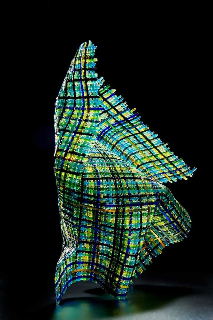 Blown, Photo; Ester Segarra
Mixing form and fragility, I make kiln formed works that imitate fluid fabric in glass. Sometimes incorporated with organic blown forms, I make pieces that emulate the body and its coverings. My Cloaked Collection are large, figurative pieces that are the culmination of the development of ideas and processes made over a long period of time.
 Clocked – Odysseus & Calypso, Photo; Ester Segarra
The process of slow, considered exploration of the material cold and rigid in the studio. The technical exploration of hot glass processes requiring quick judgements in order to create a form, drawn from observation. And the process of resolution, so by bringing these elements together, produces something that is greater than the sum of the parts.
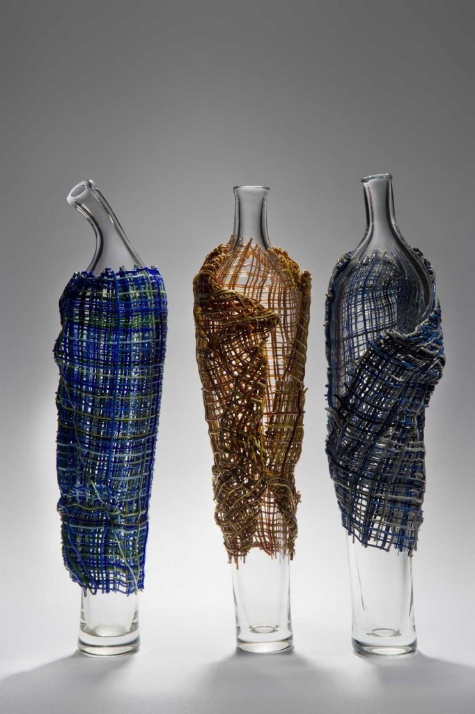 Clocked – Collection, Photo; Ester Segarra
The pieces stand tall like characters in a play, conveying the essence of inevitable tragedy to be found in life, love, war and death.
Cloaked - A film about the work of Cathryn Shilling
After your back operation many glass artists would have give up. How has your injury and operation given you glass art momentum?
Even before my operation in 2011 I had found that working with glass helped me through some very difficult times. My studio was a place of sanctuary. I wasn’t sure how able I would be after the operation, so I prepared my entries for the 2012 Bullseye Emerge competition and the British Glass Biennale and made the applications whilst still in hospital. Looking back I can’t really remember the early days, weeks or months after the surgery. I had to start by learning to walk again and it was jolly hard work. But it is probably being a glass artist and the desire and drive to continue to make my work that helped me in my rehabilitation.
Working as curator at London Glassblowing was also important to me in my recovery. It is a great feeling when all the preparatory work comes together to make a beautiful show.
How essential an element is, having a talented team to work with?
Since my operation I have had to change certain things about my practice, there is much I can still do but I have had to realistic about what I can no longer do. In a way this has been quite liberating because I no longer am restrained by my own quite poor skills in the hot shop. I have been associated with London Glassblowing since I was a glass student and I have always enjoyed the interplay between warm and hot glass techniques. Working with a very talented team, be it at London Glassblowing or at Devereux & Huskie has become essential for my blown work.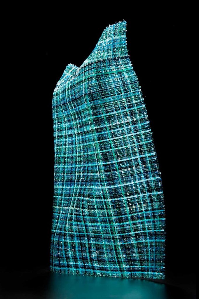
Hidden Gestures VI, Photo; Ester Segarra
My kiln glass is a different matter as I mainly work in a scale that I can manage for myself, although sometimes I need to use an assistant for logistical reasons. I find the most difficult and tiring part of my practice is packing work safely for shipping so I often need help with this.
Can you explain your collaboration with Bruce Marks using Tidal I and Tidal II and the whole series development together.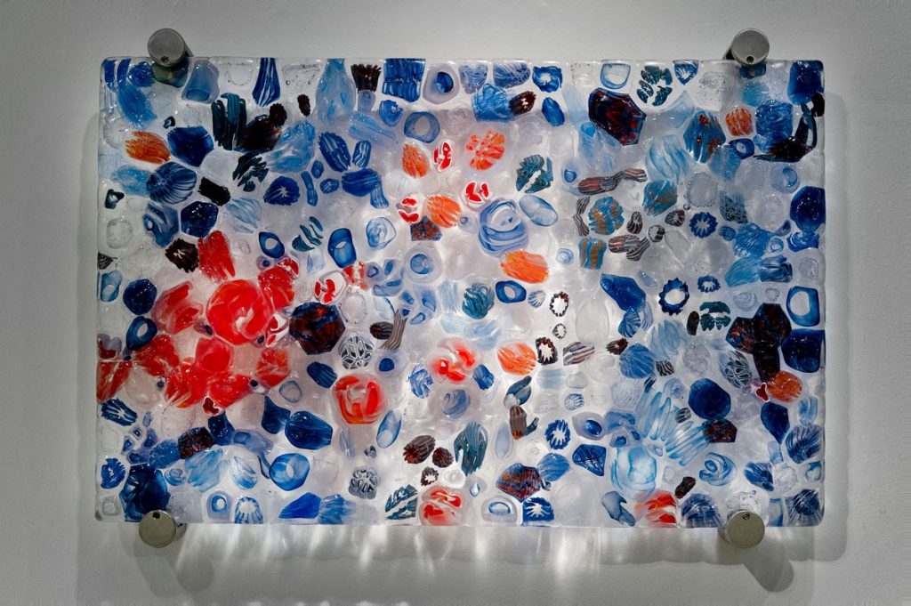
Cathryn Shilling & Bruce Marks, Tidal I, Photo; Ester Segarra
In 2017 London Glassblowing held an exhibition called Synergy that was all about collaborations. Bruce Marks is a glass blower and the Studio Manager and he asked if I would like to collaborate with him and make a piece for this show. The starting point for the work was a conversation reminiscing the joy of discovering the myriad of ocean creatures and plants in and around rock pools during childhood seaside holiday trips. Despite the fact that my holidays were in the UK and Bruce’s were in South Africa.
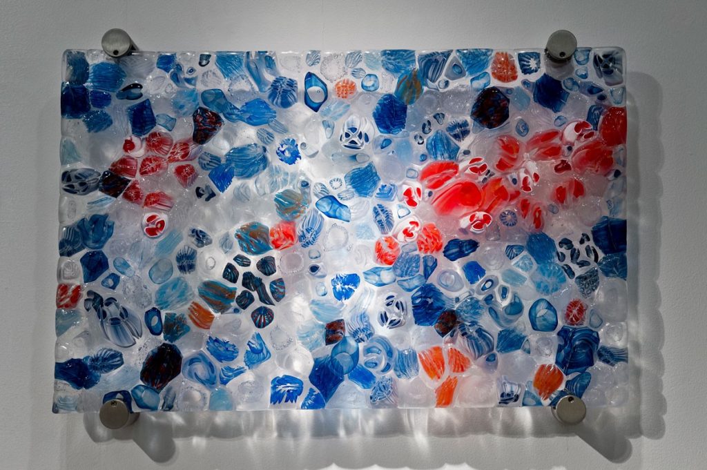
Cathryn Shilling & Bruce Marks, Tidal II, Photo; Ester Segarra
Rock pools are found in the intertidal zones around the world and are filled with seawater at high tide but become separate pools at low tide, revealing a whole new world, teeming with life. The flora and fauna that live in them need to be hardy enough to withstand the constant changes in their environment and are uniquely adapted to their conditions. These include sea anemones, crabs, sea stars, sponges, whelks, sea urchins , abalone and shrimps as well as seaweed and sea grass.
Tidal I and II are made up of many different complex canes, fused together, so that they give the sense of miniature marine eco systems. It is intended that through these pieces, the viewer is drawn into the detail and perhaps discovers an element that rekindles childhood memories and emotions from a past now dormant in the mind.
Discuss the Series ‘Hidden Gestures’
Hidden Gestures II, Photo; Ester Segarra
Kinesics is the study of Body Language by which humans subconsciously give and receive non-verbal communications. These physical expressions may reveal our true feelings by signalling the difference between what we say and what we mean. Body posture, and the position of a body in relation to others is an important indicator of feelings, attitudes and moods.
Through Hidden Gestures I strive to capture the quality of a particular human movement or behaviour through glass. This body of work is produced by fusing and slumping but it is not quite what it seems at first glance. By using texture, light and colour in an unexpected way my intention is to evoke a stylised sense of human movement, without literally recreating the form of a human within fabric.
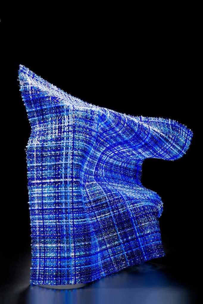 Hidden Gestures IV, Photo; Ester Segarra
The meaning stems from a dialogue the pieces share. The forms although separate, are interconnected through a continuous flow of movement from one to the other. This is underpinned by the use of the colour turquoise that is included in all of the pieces. Although these are individual pieces, my aim is to create a collaboration between a group free-standing entity, evoking a symphony of movement greater than that of the individual components.
Recently you had a residency at Northern Lands Creative, Scotland. Where has this residency taken you work?
The residency at North Lands Creative was an amazing opportunity and gave me time and space to concentrate entirely on my own work. At the beginning of the residency I was offered an exhibition in the North Lands Gallery. It is quite a large space but I was determined to give them a good show.
I followed three different threads of work during the residency, one of which involved using thicker clear glass cane than I’ve worked with before to make exhibition pieces on a bigger scale, experimenting with pushing the material beyond its usual technical parameters. I will be showing some of these pieces in a solo show at Vessel Gallery in London in June this year. Secondly, I was able to finally pursue an idea that had been in my thoughts for a long time, based on photographic imagery from the local area that I printed on silk as well as glass. The third thread was not planned for and evolved during the residency. My observations of the natural environment during my time at North Lands Creative has led to a completely new direction in my work. Through this work my aim is to capture, in a compelling and evocative way, the ‘Genius loci - spirit of place’, particularly where sky, land and sea collide. I am excited by the possibilities.
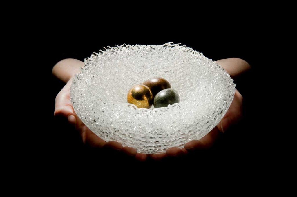 Nestled, Photo; Ester Segarra
How has your involvement with Peter Layton influenced your glass and your career?
I first went to London Glassblowing in 2004 as a student of blown glass. In 2009 when the studio found a new home in the then up and coming Bermondsey Street, I began working in the new gallery space to help out. Then in 2010 Peter Layton asked me to curate an edit of the British Glass Biennale. I think my background in design has helped me immensely in my role as Curator, a position I am very proud to hold.
Although I still continue making fused glass in my own studio, the creative atmosphere at London Glassbowing has had an enormous influence on my work. The gallery has a rich exhibition programme each year that showcases Peter Layton and his team of artists as well as the very best contemporary glass artists currently working in the UK and beyond. Over the past ten years I can really see how much my work has developed with each exhibition opportunity that being part of London Glassblowing brings. More than once an exhibition theme has set me on a fresh and exiting path, especially when that involves collaborating with another artist in the team. I have learnt so much from my colleagues and watching both the glassblowers and the cold workers has broadened my creative horizons. Being amongst such talented people really keeps me on my toes.
Explain about The Gallery of London Glassblowing, where you are the Curator. Why should a visit to this gallery be a London must do?
Established in 1976, London Glassblowing is one of the longest running hot glass studios in Europe. It is unique in that visitors to the gallery are welcome to come and watch some of the finest makers in the world at work. To find such a hub of creativity and craft in the middle of London is so unexpected and exciting but it also helps people to understand the value of the work on display in the gallery. The gallery itself has a dynamic exhibition programme, featuring the finest contemporary glass artists from the UK and across the world, as well as work by Peter Layton and the team of resident artists. Consequently we attract visitors from all over the world.
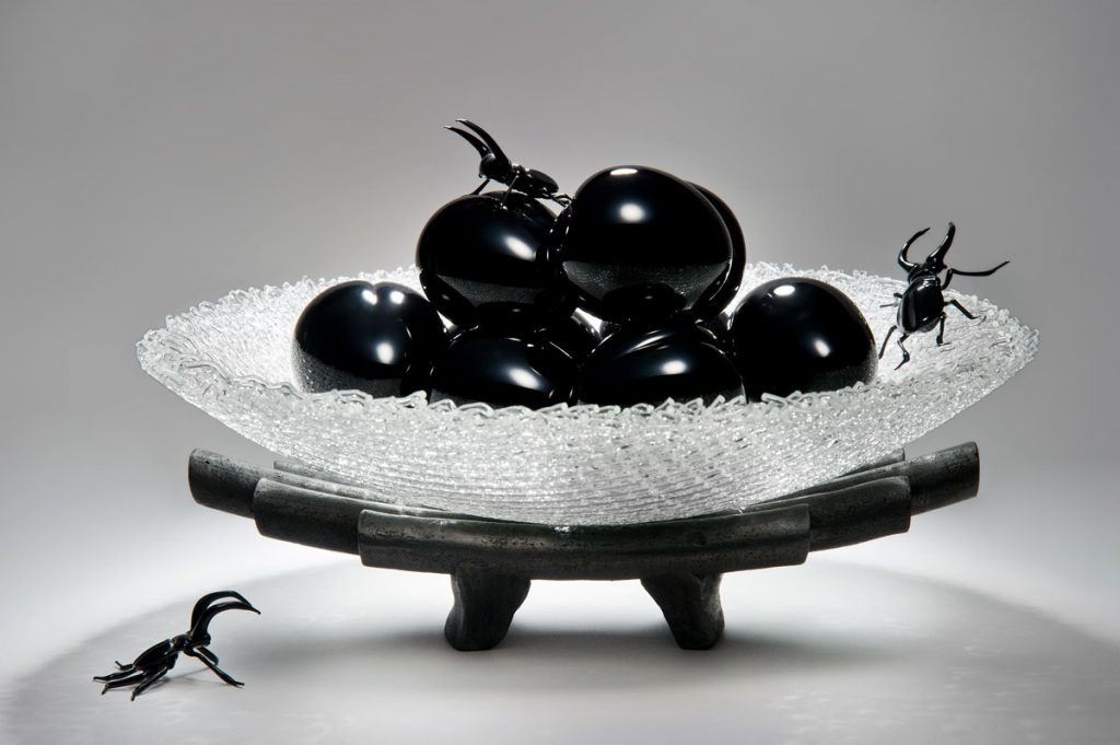
Cathryn Shilling & Anthony Scala, The Fleeting Nature, Photo; Ester Segarra
Contact details:
Cathryn Shilling
www.cathrynshilling.co.uk[/vc_column_text][/vc_column][/vc_row]
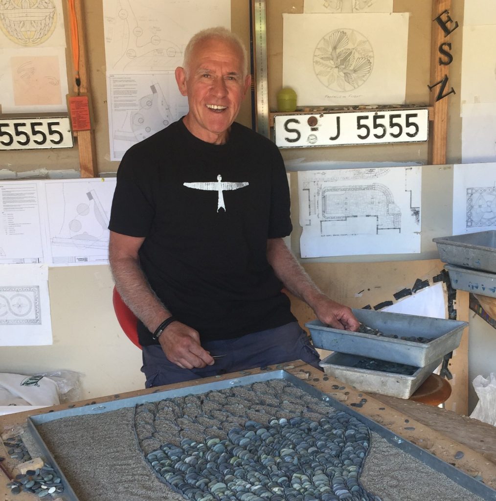
John Botica
Firstly, why pebbles?
My interaction and encounter with pebbles was purely coincidental. My first cousins here in NZ are very successful and established stonemasons and back in 2004 they had two clients who wanted to commission an artist for a pebble mosaic. At that time, I dabbled in conventional mosaics and these events led me to believe this was an exceptional opportunity to establish myself as a pebble mosaic artist. After 3 months of experimenting in this medium of expression I embarked on my first commission, a mosaic 3mts in diameter which was a huge success.
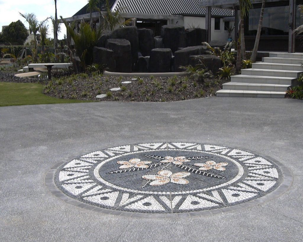
When you are commissioned to do a piece do you use local pebbles?
New Zealand has got the best selection of pebbles in the world and this is purely due to its geological attributes. Destruction of rocks takes place at such rapid pace creating multitude of pebbles excessively. There is a beautiful explanation of this activity on my website. I take a special pride in using explicitly local/NZ pebbles throughout my projects allowing me to become entirely independent on foreign stones if I choose to do so.
Discuss the size of your pebbles.
For majority of projects it is of utmost importance to have a considerable variety in size of pebbles especially when creating a background of a pebble mosaic. Gaps should be avoided at all costs and this is only possible if small enough pebbles are used to fill in the gaps. If you pay special attention to my technique you will have noticed that I create outlines of objects using the thinnest pebbles in existence enabling me to create the most intricate mosaics.
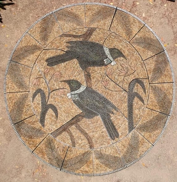
How does size and shape, needs to be taken into the narrative of your work?
Upon embarking on this most exhilarating journey of my life I had a clear vision what I wanted to achieve and how to establish this so called “point of difference”. I place tremendous importance on achieving precision and to be able to do this I use rather small and very thin pebble placing them on edge. In doing so a beautiful movement/rows of pebbles(and a mento) are formed so appealing to the eye. I am a staunch opponent of using flat stones since they rob a pebble mosaic of its “flow”.
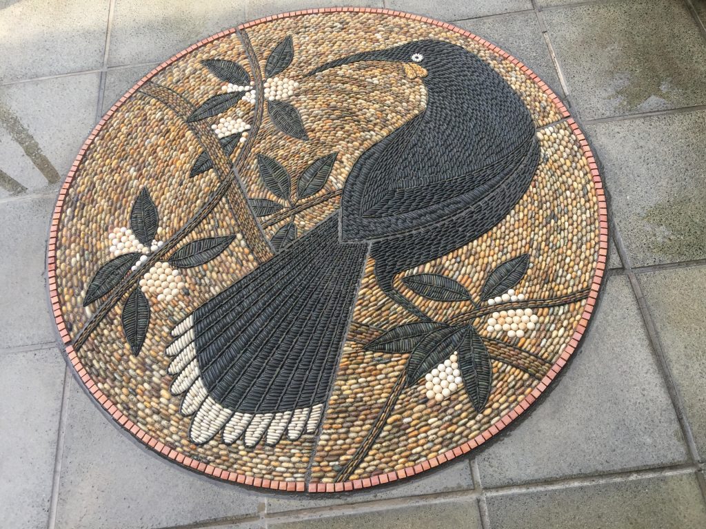
Do your pebbles need to be prepared?
As I have suggested previously, I am exposed to a great variety of pebbles which minimizes need for tumbling. I have considered this as a possibility especially with some rare stones like jasper for example which is red and very irregular in shape.
These questions of course lead to storage.
Where and how do you store them?
There is no need for me to store a great amount of pebbles since I sort and collect them specifically for each project. I do have some special stones put aside but this does not require a great amount of space.
Where do you collect special or specific pebbles from?
There is one incredible stone/pebble I am so fond of and it is a very dark/black stone originating from the most common rock formation on the North Island of NZ called argillite. Black pebble is almost impossible to find in mother nature’s pebble I collect from a beach located 40 min of drive from my home. In this regard I consider myself very fortunate.
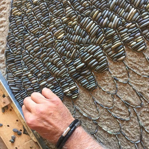
Take a very early Greek pebble mosaic that has either directly influenced your work or has led you to a style.
I have always wanted to develop my own style, but I have to mention The Lion Hunt pebble mosaic from Pella dating to around 320BC. This particular mosaic is so intricate and has been created with astonishingly small stones and it must have taken a long time to complete. This mosaic has convinced me of my ensuing mission which entails to strive for impeccable precision and putting preference on usage of smaller pebbles. The time required to complete a mosaic is not a factor. To adopt perfection and precision should be paramount.
You are self-taught, but now teach and lecture internationally. Discuss your feelings and need to share your passion and joy with others.
A very important aspect of teaching the art of pebble mosaics is not to seek for financial benefits. Originally, I started teaching just to get out of my studio and create more diversion in my life by communicating with people. Creativity calls for a great degree of solitude. By teaching I have experienced a lot of joy and found myself to become increasingly passionate about it. Teaching is an act of conveying and perpetuating one’s knowledge not merely to enable others of achieving competence but to keep this art alive.
Take one big and one small piece and compare and contrast the differences that size has had on both pieces.
When you see a large mosaic anywhere in the world in Spain for example, they are very impressive due to their size predominantly. But if you look at them closely imperfection is apparent. I have created a lot of large mosaics appealing in size as well as small ones appealing in precision. To bring as much intricacy into a large mosaic as possible is something that I am striving for.
Give your thoughts on the need for public art
If you visit any impressive city in the world there is an interplay of beautiful architecture and exciting public art that enhances their image. We need public art to awaken beauty in our hearts to make our domicile more enjoyable. Life without art is not a meaningful one. What is actually art? Does it not entail that everything we do and see should be fulfilled with beauty and love ? Sometimes I observe people paying no attention to art in public spaces. This is worrisome. To be oblivious of beauty of art is disappointing.
How important have commissions been for the growth of your career?
Very strong presence of commissions directly relates to your success as an artist. I have experienced a considerable growth in commissions lately. I have become more confident more secure and very powerful. I have become even more humble We are referring here to personal growth which is paramount for success in art. Your own satisfaction and results that you are producing make you feel more at ease. And when you are relaxed your ability to improve as an artist is greatly enhanced.
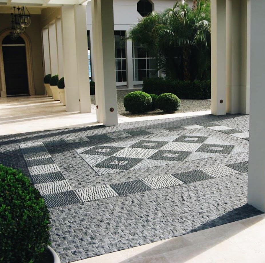
Expand on the patina on your work?
The term patina has been used indiscriminately to signify surface changes that supervene to artefacts either by human or natural contribution and in most cases resulting in increase of their value. However, with stone and pebbles patina addition by natural contribution is to be avoided in order to preserve their original appearance. In the casa of pebble mosaics avoiding damp and shady areas and installing them in areas with more exposure to the sun would greatly minimize patina addition.
Is there a difference to patina and wear in the Northern and Southern Hemisphere?
Obviously, addition of patina to stone surface by natural contribution is far greater in the Northern Hemisphere through colder and more damp weather conditions which I have discussed in the previous question. Also, there is an additional problem with water freezing and its expansion that result in stone/pebble destruction. Special sealers can be used to circumvent this issue and I use such a sealer on all if my mosaics to create this “wet’ look and to offset dirt and patina addition.
New Zealand is your “New Home”, how have you learnt about Mauri patterns, how have you bridged these cultural differences?
Yes, New Zealand is my adopted country and it has awakened a giant within me. New Zealand has enabled me to discover my own significance. By exploring the beauty of Maori and Polynesian motifs I was able to establish a new direction in pebble mosaic art. Maori culture and art are so prevalent in New Zealand and it is almost impossible not to be connected to it. I admire how New Zealand has embraced its indigenous people. My biggest dream and vision was to be able to collaborate with a Maori artist on a project. This dream was realised in 2016 by creating five mosaics at Bastion Point in Auckland arguably one of the most significant sites in New Zealand history.
Tell us how pebbles have taken you to a place that was completely unexpected?
To this very day I cannot comprehend this miracle of my becoming a pebble mosaic artist. It is inconceivable that this has taken place in a country of no apparent pebble mosaic tradition. The unexpected realm is the enrichment of my own soul and excitement of being able to touch human hearts with my art. I have experienced unforeseen transformation in my own character rewarding me with such personal satisfaction which I have never envisaged occurring. And to actually reach that stage in your life where your existence has got significance is a very powerful incentive to create better art. Like Stephen Covey said once:” To live, to love, to learn and to leave a legacy” us something that each one of us would be happy to witness.
Contact details:
John Botica
john@powerofpebbles.com
www.powerofpebbles.com