
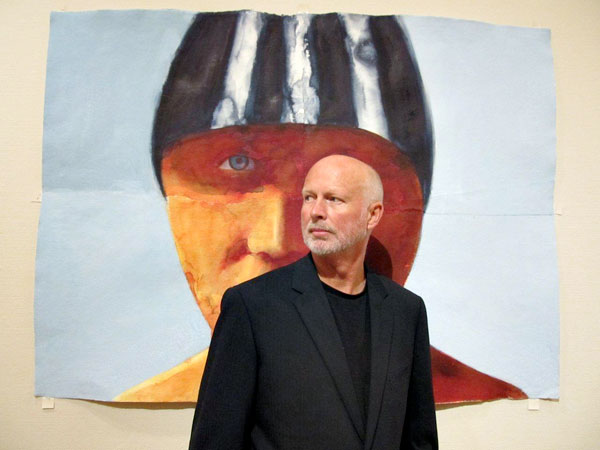
Graham Dean
Where did the initial idea for this exhibition come from?
Jon Bennington contacted me to see if I was interested in putting on a solo show around an Olympian theme. That was two and a half years ago – Waterhouse and Dodd came on board a bit later. I was due another solo show with them so it seemed a good idea to combine the two and have it around the time of the Olympics. A summer show is a strange one for me, it’s usually the ‘downtime’ but I guess this year is different.
Can you explain about the exact wording for the title for this exhibition; ‘Fitter, Quicker, & Longer’?
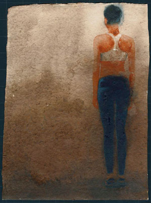
High Jumper
Hum...... the titIe was a bone of contention. I had the original title in my head as soon as I started the works and that was ‘Faster, Higher, Stronger’ – the Olympic motto. It was only a few months ago that we found out that LOCOG, the official Olympic body, had secured rights to a long list of Olympian words –‘gold, silver, bronze, the games, Olympic etc etc. This included the motto. They were quite assertive in threatening anyone who used these words and I really couldn’t risk a libel action against the gallery or the Museum .So I invented a phrase like it –‘Fitter, Quicker, Longer’, it has a slight tongue in cheek quality to it and some people have said it sounds like a condom advert. This is very ironic if you knew the stories behind condom use at Olympic Games. In Beijing, 400,000 were given out to athletes in the village and each one has ‘Faster, Higher, Stronger’ printed on them!
How do you feel about preparing for and exhibition that needs to work in two sites?
Working for two different exhibitions for two different sites was quite a daunting task and it was also two and a half years on the same topic. A feat of endurance you might say. I think there is somewhere in the range of 90 paintings to choose from for these two shows. Not too sure if I would do it again but it has been enjoyable and the exhibition in Bath allows me to play around with groupings of paintings – more like an installation – as it’s such a big space.
Two and half years is a huge commitment, tell us about some of the highlights?
I really didn’t know how to get into this exhibition. I discussed many ideas with Jon ranging from flags, to a show dedicated only to Jessica Ennis. This all seems odd looking back, as I don’t as a rule do portraits and I wasn’t interested in a celebrity type show but I was having trouble. I was unsure that I made the right decision in taking up the invitation. Then one day when I was researching and looking around for ideas, I read about an American art critic who wrote to say that ‘he had never seen a good painting on the theme of sport hanging in a museum ‘. If I need a spur then that was it.
You have been to so many trials and meets how did you record this?
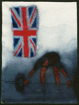
Weight Lifter
I travelled to many places over the two and a half years – Weight lifting in a sparse hall in South Croydon with a Union Jack pinned up (looked like a film set). I came in the wrong door and found myself ‘backstage’ in their warming up area. That was interesting in itself. Other venues were weightlifting along the South coast, athletics in Birmingham, sea swimmers in Brighton and Paralympians in London.
I also went to the Oxford/Cambridge boat race; this was the first time of being put into the photographer’s pit which was a bit of a scrum. I started looking one way, taking photos making notes, doing drawings and the bank of photographers all with mega lenses were pointing the other way. This was to be the pattern for the next couple of years. In the end I stopped liking this and decided to attend smaller events – with the same athletes - where I could get very close to them and I was left alone to do what I wanted. This is the only way I can work really. There is a strong streak of the maverick in me that has been there all my life.
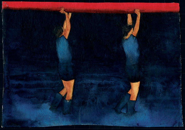
Rowers
How many sketch books and albums did you make up for this exhibition?
I work in a variety of ways but always from life. That is important to me; I like to hear my model breathing. I then draw, make notes and take photos. All these elements are important and people may be surprised by the amount of words that use – possible titles or springing off points for ideas. These exhibitions are a slight diversion for me and I have adopted a more ‘recordist’ approach then I normally do. In fact I don’t tend to record at all, most of my paintings end up being invented, they just take many paths and diversions on route. I still ask myself every time I paint if the painting has a ‘feel’ to it. A simple phrase but I know of no other way to describe such an abstract concept. I should say that my working method is; I’m told quite unique. I overlap several sheets of handmade paper when drawing up the image. I then paint each sheet separately so the studio looks like an odd collection of hands, arms, legs, torsos, heads etc. Then I ‘jig-saw’ the work together overlapping the sheets and ripping and tearing the composition into place This gives me the opportunity to stretch or contract the final image until it looks right.
How many works are at the exhibition?
There are about 90 works in total which we choose from. The two shows comprise of about 75-80 paintings. I can’t say as yet as we haven’t hung London.
Can you discuss the size of the works and how you made the decision on the sizes you would exhibit? How involved have the curators been?
I always start small though I don’t call them studies - they are small finished works in their own right, in fact sometimes if I feel that I have said everything that needs to be said in the small work then I won’t do the big one. The large works are all between 6 and 8 feet in height. For watercolours they are monsters, and people often don’t believe me when I tell them the medium. I did set out 20 odd years ago to ‘re-invent’ watercolour on a large scale and remove it from the world of the leisure painter and flowers and landscapes. What I’m doing is far more contemporary and has a relationship more towards artists like Peter Doig , Marlene Dumas , Tony Bevan , Hughie O’donaghue etc etc. The curators have played only a small part in the selection of things – after 38 years I have a good understanding of which works fit together for a show and I like a certain degree of control!
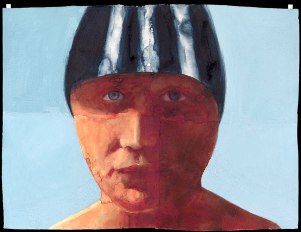
Swimmer
Colour must be a vital part of this work. I know that here in Australia our eye is honed to spot the green and gold. Are all your athletes British?
Colour is vital but I feel your question might be too literal. I could write a whole chapter on how colour has influenced my work but for these shows I visited the huge sorts of emporiums that are now in the malls of the world. Many years ago sports clothing came in white. It’s now a multi-colour selection of day glow colours and I set out to use some of these colours in the work. The paintings have been described as colourful which slightly surprises me as people should really visit an athletics meeting and see the bright array of colours from sports kits to sponsors signs. It’s a corporative world and I wanted to use some of that. I think the athletes came from all over the world; I didn’t make a note of who they were or where they were from. This was irrelevant to me as I didn’t want a personality themed show.
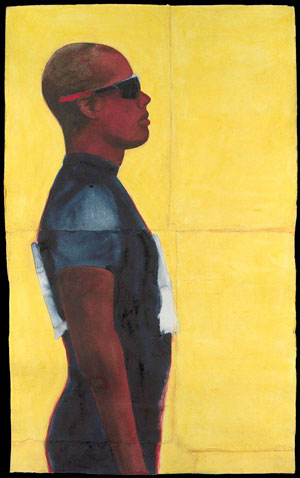
Runner
As an artist to be so involved in sport, especially at Olympic standard, can you explain how you approached the physical form?
The athletes themselves were a source of physical fascination. Firstly, the skin was amazing on many of the women. Jessica Ennis for example looks like bronze – most had incredible glowing healthy skin, the best I had ever seen. Then I came across short, compact, stout, taut weightlifters and wrestlers. Large backed swimmers and flat chested female runners. In fact I was surprised how lean and small in stature that the athletes especially runners were. The television paints a different picture as it often does with peoples bodies. It seems to like smaller people of finer features as does photography.
“I said..I was in the the last lap of making these works or I can see the finish line” Graham Dean. How do you now feel at the end of all this work?
There was an audible sense of relief at finishing this series. I can’t wait to get back to my other work and try out some new ideas with a model and see what come out of it. But first I’m spending a while at my other house in Italy with friends to energize myself again.
On a more personal note, are you going to any events at the London Olympic games?
You will find my answer to your last question amusing – I’m actually booked on a plane out of London on the day the Games start. I may watch some of it on my i pad but I’ve worked with these people for a long time and now I want a break! I’m keen though to see the opening ceremony and to see what Danny Boyle has done with it. He has accepted such a difficult job and hats off to him if he pulls it off.
Graham Dean, Brighton, UK
Interview by Deborah Blakeley, July 2012

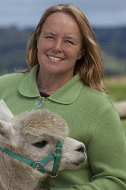
Angela Betheras
What made you decide to place alpacas on your farm?
I grew up in Labertouche, my parents had beef cattle, I couldn’t handle them on my own nor could I afford the acreage. Since I was interested in textiles I wanted a fleece animal. Sheep are not that enjoyable and have too many jobs to be done. Met an alpaca, met the alpaca industry, fell in love with both and purchased my first alpacas in 2004
Can you explain some of the ‘special’ charm of your girls? – they are all girls?
No not all girls, sometimes you get boys! I could go on all day about the special charm of the animals. Their charm is intelligence, personalities, their love of being part of all that is happening on the farm, and their calming influence.
What can you tell us about the fleece and it extra qualities of alpaca for both weaving and felting?
Alpaca fleece is softer, warmer, and lighter than sheep wool and it doesn’t prickle. Weaving creates a very soft weave as it does with the felt. The felting can be a little hairy and many will want to mix wool with the felt and so with all the textile work it can be combined with other fibres such as silk and cotton.
My signature Zoneone Arts question – what are the most important design elements?
Being a photographer by profession, I would say that the negative space is the most important design element in the composition.
Tell us about your design work in alpaca?
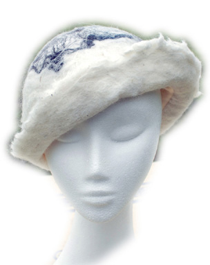 I felt, knit and crochet for my shop therefore it has to be a bit more conservative in order for it to sell. I must pay the mortgage. I do mainly accessories such as scarves, bags, wraps (large and small),
I studied millinery for 12 months at the Melbourne School of fashion so I can get carried away with my hats. I am just starting to work on coats both long and short
Can you expand on the winning of the Victorian Rural Woman of the Year and your current involvement with alpacas and China?
2011 was a wonderful year. RIRDC Victorian Rural Woman of the Year, must winners tend to come with an agricultural background.
It is an award given for a future project to enhance your industry rather than being based solely on what you have done in the past.
My project is investigating the possibility of taking my textile art and art done by other female alpaca breeders to China to sell in their boutiques. The year also involved over 30 speaking engagements so it didn’t leave me much time to plan my trip to China. Those engagements don’t seem to be stopping but I hope to get to China before Christmas 2012.
Tell us about a place you have visited because of your award in 2011?
As a Black Saturday survivor I hosted a morning tea/afternoon tea at my business donating all the food and coffees and a percentage of my sales for the day to raise funds for the women who were flooded in Charleton in 2010. I won the award and soon after that, the Charlton community invited me to visit their region and to speak at a Ladies Day. It was a great couple of days.
Tell us about your green packaging?
I am part of the “Leaf Program” in Baw Baw Shire. This means my business has been assessed to be environmentally sustainable business, not just about the green packaging. Nickelby at Darnum and four other businesses who are Creative Yarragon, don’t use plastic bags or paper bags (none made in Australia). I use acid free tissue paper and since my customers just have their cars in my car park I often don’t wrap items such as creams, cards and sometimes the smaller garments, I encourage them to wear those home.
You have become one of the West Gippsland representatives please tell us about your area.
West Gippsland in my opinion is one of the most beautiful areas in Victoria. We are known for our rolling hills and green. 1 hour from Melbourne, 1 hour from the beach, 1 hour from the snow. It is a small country community so it means you can be in Collins Street at 9am for a business meeting and back home on the farm by 2pm.
Once you leave Melbourne and get on the freeway you can make it to West Gippsland without having come across any traffic lights. We have wonderful schools, the largest regional arts centre with the largest stage outside of Melbourne. We have a huge artist community and when we hold our arts month in May it is larger than anything else in Victoria.
We have wonderful wineries and fabulous restaurants and beautiful 4star and above B&B’s to welcome you and of course we have Nickelby At Darnum!

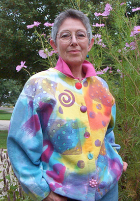
Jennifer Gould
Tell us how your time in Japan studying weaving in a kimono factory influenced your artwork?
It was a goal of mine to go there as a student, which I did in (1971-1972). I came away from that year with an appreciation of pattern-on-pattern design, especially in combining fabric. This is evident in kimono and obi wearing: both pieces are usually patterned and the combination of colours and woven or painted images can be extremely graphic or highly subtle. I was fascinated! I studied kasuri (ikat) weaving at the Yuukistumugi kimono weaving factory This factory is extremely famous for their unique and complex warp and weft patterns, indigo dye vats, I knew how to weave, but this was a world of centuries old techniques that were completely new to me. It opened up a world possibilities from which I am still exploring and benefiting every day.
What made you move from hand spinning and weaving to making dolls?
I realized that hand spinning as a career was not right for me. I visited my hand spinning teacher who ran a shop selling Shaker reproduction furniture as well as Shaker inspired doll clothing that fits a Barbie doll. I took some cat dolls that I'd made, seeing those dolls, she asked me to design an all-fabric doll; so began my career in designing dolls!
Can you explain how you get such charming faces on all your dolls?
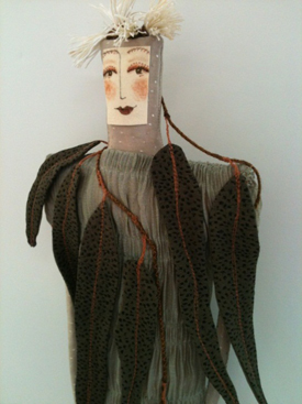 I've worked really hard at achieving a face that I find lovely and serene while contemplative or even dreamy. I have a hard time getting away from that pretty face. I developed a flat needle-sculpted face on which, I think; those are more expressive and quirky. Like anything, practice is what makes it happen.
You are a member of many organizations in the textile world. Can you explain the value this has had on your work?
I really value the textile organizations I belong to, most especially my local fibre arts guild and the Michigan League of Handweavers. My local fibre arts guild, especially, gifts me with so many close friends who I can do “textiles and fibre talk”. The Surface Design Association (state, national and international), FAN (Fibre Arts Network of Michigan), and the Handweavers Guild of America have also been very important in my textile journey.
Do you have a doll that you simply cannot sell? If so, why?
No, I really make all of my dolls to sell.
You have been written up in “500 Handmade Dolls.” Can you tell about this experience?
A photographer friend mentioned that Lark Books was looking for entries. I sent images of my favourites, that I thought were the most inventive and inspiration. They were a triptych entitled, “Self-Portraits: 7 th , 8 th , 9 th Grades.” If you keep producing and creating, your best work will happen---and then it will be ready at the right time to be published. (My art faculty advisor once said, “From quantity comes quality.” He was so right!)
You have sent your work to Australia twice. Explain how this has helped you?
I am assured that having a website for exposure is absolutely important since that's how you found me! For my 2012 exhibit, Deborah Blakeley suggested using gum tree leaves in some of the dolls and that brought a whole new dimension of plant life (Eucalypts) to me.
You do classes. Why?
I love teaching; I've had students who arrived at a class swearing that they were scared and just didn't think they could do “it,” they came out with THE most wonderful work! Encouraging students to experiment, play, and create is so gratifying, also passing on what I've learned about working with fabric. The money, of course, is nice, too.
Where do you get your inspiration?
My eyes are immediately drawn to the world of nature, texture of pattern that inspires me. I also love three-dimensional work and actually have a hard time keeping things flat.
My signature Zoneone Arts question: What are the most important design elements to you?
The initial elements are shape and size. The outline of the shape, for me, needs to be simple so that the patterning can be highly complex. I have developed a number of doll shapes that I consider my personal canvas and those shapes I repeat often. Early in my doll making career I made life size figures, I soon found them uncomfortable for me to work with. The size I use may seem small I have found it to be both intimate as well as a comfortable size for my hands. I'm a touchy feely person, so holding the piece while I'm working is very much a part of the final product. Within the shape and size, all the other design elements come into play: color, value, visual movement and texture, line and ultimately composition.
Website: www.jennifergoulddesigns.com
Jennifer Gould USA,
Interview by Deborah Blakeley, June 2012
Lauren Camp
When you first wrote your poetry it was to accompany your art work. Can you explain how this worked?
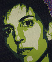
Early on, exhibitors of my artwork asked for 50-word “blurbs” to accompany the works. I had been a magazine editor and knew how to write clearly about my processes, but the effort and end result felt dull. Gradually, the blurbs became more poetic, and these writings became important to each project. No piece was complete until I had written the poem.
Now, I separate the two – writing poems for certain subjects and creating artwork for others.
You now work with jazz and experimental musicians, can you tell us about that?
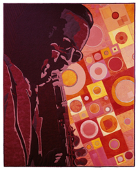
‘Just Swing’ ©2001, threadwork on dyed and layered silk, cotton, lame and ultrasuede, 50” x 41”
I have had a number of chances to read with musicians in front of an audience. With the combination of their sounds, it becomes thrilling to hear my poems become something fuller, something that moves.
Jazz has long been an inspiration for me. I was first introduced to jazz as an adult, and began to want to shape it, creatively. This was how my fiber art series, “The Fabric of Jazz,” came to be. I began with a desire to visualize the vivid sounds of seminal jazz trumpeter and singer Louis Armstrong in fabric and thread. For 12 years, I continued creating portraits of musicians and their instruments.
Each piece required great research into the musician’s life, but also into his or her music. It was a chance to self-study, to listen, to travel back in history — quite an education for me. After I had made two portraits, I knew I wanted to do a whole series and that I wanted them to travel. In 2000, “The Fabric of Jazz” began a four-year tour of the United States. It was on exhibit in 10 museums and art centres. Thousands and thousands of people experienced these portraits, and saw the colours and shapes of each sound the way I see hear them.
When the series began travelling, I pulled back from creating any more jazz works, but I missed that extensive study of the music. The logical next step for me was to interact more with the music itself. I got involved in my local public radio station as a disc jockey, and began broadcasting jazz each week, mixing different eras and melodies together. Ten years later, I still air jazz with poetry and world music on a show entitled “Audio Saucepan.” The show energizes me, and keeps me very much attached to music.
I also write poems about jazz musicians. Here’s the beginning of a poem called “Satchmo’s Mouth”:
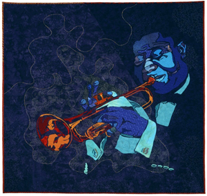
‘So Black and Blue” ©1997, threadwork on layered cotton, 50” x 48”
In the collection of Mack Avenue Records, Detroit. MI
Satchmo I said can I crawl inside your mouth the temple, the tempo of grunting sunlight dry gravel self against self the gritty timbre of time
Several of my jazz portraits have gone into intriguing collections. Mack Avenue Records, a Detroit-based jazz label, owns two of the works. Art in Embassies, a program through the U.S. Department of State, has twice requested works from the series. My portrait of Benny Goodman is in the U.S. Embassy in Kiev, Ukraine right now, and four prints are permanently housed in the embassy in Bamako, Mali.
Can you share with us some of your art processes?
My art processes vary widely. Every choice I make is based on the end result I see in my mind. Recipes elude and frustrate me, so when I dye fabric, I do it without exact need, and am delighted by what results — shoving it neatly on my shelves until the right occasion to use it comes along. My current work often immerses me in detail and repetition, and usually some mathematical patterning or determination of spatial considerations. Any process is reasonable to me – though crazy to others – because I am moving toward a specific vision.
Even though I haven’t been creating jazz works lately, I think all my work has movement and rhythm. That’s the goal, and I move exhaustively toward it again and again.
My signature Zoneone Arts question – what are the most important design elements?
Space, depth and patience.
Books by Lauren Camp
This Business of Wisdom
Published by West End Press in 2010
Website: www.laurencamp.com
Lauren Camp USA,
Interview by Deborah Blakeley, June 2012
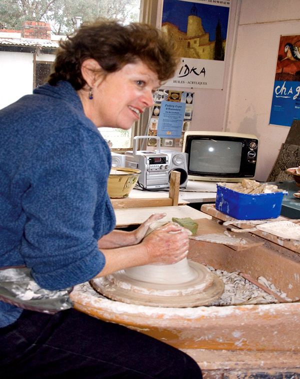
Jane Annois
How would you describe your own pottery style?
I work in two styles: in raku, originally a Japanese firing technique but adapted to modern equipment and desired results. These pieces are more sculptural or decorative where I explore surface textures, contrast of colour and play with form.
The second style is “terre vernissee”, French tableware using traditional honey, green and blue glazes. These pieces are intended for everyday use and reflect the colours and style of the south of France.
What art qualifications do you have? How did you decide to become a potter?
The qualifications came after the decision to become a potter. I was always interested in pottery, making things with my hands, the practical and creative nature of pottery, and subsequently the history, cultural differences and the science behind pottery. I was already working as a potter when I decided that if I wanted to pursue it further professionally, and learn more about the processes, I needed a qualification.
I studied for a Graduate Diploma in Ceramic Design at Monash University in 1988/89. With ceramics I never stop learning. I attend workshops by my favourite artists, attend conferences and have learnt a lot from my involvement and work with the French ceramic artists.
Explain about your time in France where you learnt you craft?
I went to France in 1997 to work in a pottery studio and visit other ceramic artists. I was a French teacher in secondary schools in Melbourne, then taught English as a Second Language part time and worked as a potter part time. I went to France to use and improve my French and discover the French ceramics scene.
I spent a month working in a studio with artist Sylvie Deverchere in Bourgogne, throwing, decorating and learning how it works in France. I was able to meet many ceramic artists not only in Bourgogne, but also at La Borne, a ceramics centre in the middle of France, in Provence and the Rhone Alpes. I assisted at several ‘marches de potiers’ where I was inspired to begin a similar event in Melbourne. Since forming these friendships I have returned annually to France, to visit the potters, participate in the marche de potiers and eventually exhibit in galleries in France.
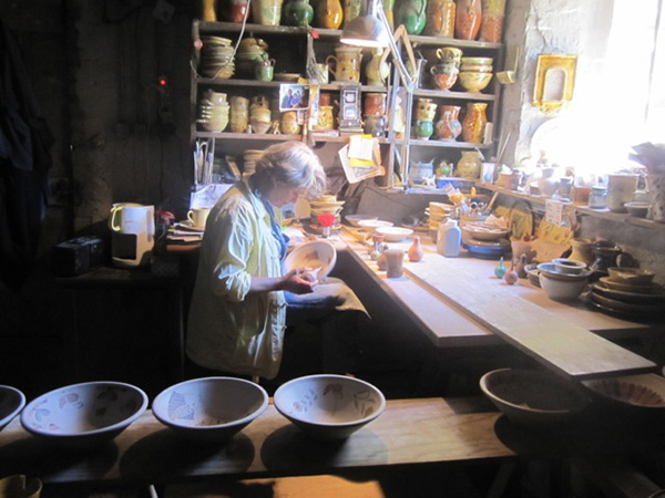
Pottery workshop at Cliousclat, Isabelle decorating.
Is there an artist who has influenced you?
There are several artists who have influenced me. In the raku technique and style it would be South Australian artist Jeff Mincham who pushed the boundaries with raku, creating large forms with intriguing textures. The other raku artist is Frank Boyden from USA, who introduced me to the technique of terra sigillata in raku, which instantly struck a chord and I have been pursuing it ever since. Jeff Mincham also said to me once, that ceramics enabled him to travel the world, sharing his knowledge, meeting some wonderful people and sharing his common interest. This has also inspired me and I have been fortunate to have had similar experiences.
With terre vernissee, my French friends Yves Gaget and Jean Jacques Dubernard from the Rhone Alpes ,have influenced and taught me a lot about the techniques. Jean Nicolas Gerard has inspired me in his freedom and strength of his work.

Participating in raku workshop at La Grange Dimiere with Fran Brunet
Explain how your knowledge of French culture, and the people has developed into tours of France where you network with French artists? Tell of several special moments that you have had during one of your tours?
I have always been a Francophile, majoring in French at University, spending a year in France before beginning a career as a French teacher.
I began taking Australian ceramic artists to France to visit ceramics studios, potters markets, and rural areas. This has taken off as the beginnings of a cultural exchange, which continues strongly today.
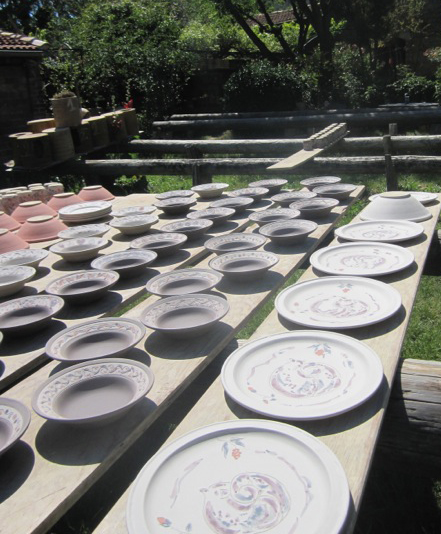
Pots drying in the sun at Cliousclat
Having participated in many French potters markets in the years leading up to the tours, I had met potters from all over France, and visited some of the most spectacular parts of France. During these markets, I stayed at the local potters homes, shared meals and enjoyed their company. The tours allow me revisit and maintain the contacts with all these people, introduce them to the Australians and vice versa.
The tours are quite personal where we are welcomed into artists’ homes.
Visiting the pottery studio and showroom of Jean and Catherine Mercion
Each time I go to France, I take time to visit new areas, take part in new events, and explore further options.
Many who have come with me, wished to return again but visit different regions of France
![Where we stay on the lavender farm in the Drome [June 2012]](https://zoneonearts.com.au/wp-content/uploads/2015/03/jane-annois-lavender-farm-drome.jpg) | 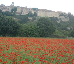 |
Where we stay on the lavender farm | Poppies at Sault, Provence |
I have diversified to run tours with a music focus, going to the wonderful summer music festivals in France, particularly Jazz at Vienne; wine- visiting the Beaujolais, Bourgogne and Alsace regions; art- taking a professional artist as tutor, a mix of exploring the background of various French artists/museums/galleries and hands on painting and drawing, in Provence, the Dordogne, the Loire Valley and in Brittany [4 tours]; a gourmet tour with a French chef, gardens etc. However all the tours enjoy local cuisine and wines, artists, rural villages. I now have some people returning for their fourth tour.
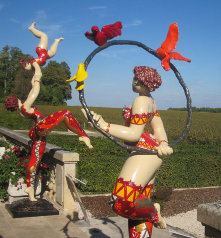
Chateau Pommard
The tours go to the Rhone Alpes, Drome, Provence, Camargue, Dordogne, Loire Valley, Borgogne, Alsace, Languedoc, Cote d’Azur, Brittany and more.
As the tours are small, [max 8 people] we are able to be spontaneous, and take advantage of local events and surprises.
During the recent fete de la musique, the evening of the summer solstice where there are free music performances in the streets all over France, Jacques Long, husband of ceramic sculptor Brigitte Long, played guitar and sang the blues with fellow singer Elisa and band. I then asked Jacques and Elisa if they would perform for our Australian group. The special moment was our wonderful evening at Brigitte and Jacques’ house, a private performance, we all brought food and wine, just loved the music, all joining in at the end.

Music tour: Jazz at The Facteur Cheval: Robyn McKelle [June 2012]
Another special moment happened when we visited Montelimar, initially for its nougat, but then discovered the museum of contemporary art. One of our group was admiring a painting when the artist passed and struck up a conversation. He invited us to his solo exhibition in the countryside. After a few twists and turns, we came upon a Roman aqueduct carrying water to what was once a silk factory, of which there were many in the area during the 17th and 18th centuries. This ancient building, remarkable for its architecture, housed his exhibition and that of another sculptor. Again a privileged experience, in an extraordinary environment.
Explain some of the similarities and differences between pottery in France and Australia.
We are all individual artists, each working in our own studio. The French say that we are free from the history and tradition, which can underpin and influence their work, that we are not restricted in any way. However the French artists may be informed by their history in their initial studies, but generally use the medium of ceramics to express themselves freely. As Australians we still look towards Europe and Asia for inspiration from ceramic history, and often follow similar trends and styles. Many regions of France do have distinctive styles derived from local clay deposits, traditions in kiln firing etc, but contemporary ceramic artists both French and Australian have moved beyond regional specifics to reflect concepts rather than location.
The main difference between the two countries is that the French are professional potters. They do not have a second job. Their sole income is from ceramics. Most have a “salle d’expo” or gallery showroom attached to their studio. Their sales come from the potters markets, galleries and their home gallery. In Australia there are very few who can make a living from ceramics alone. Most have a second job – often teaching.
Having said that the French are finding it much harder since the economic crisis, and may be forced into restructuring their work life.
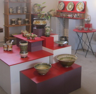
Pottery studio of Isabelle Gatineau at Pelussin
Explain about the pottery expo, how it came about and how we can become involved?
The French could not believe that we did not have a potters market in Australia. It is an essential part of being a potter in France. It is a showcase for not only the public but for galleries and commissions. It is an opportunity for networking and socializing for a solitary occupation.
It provides a major percentage of a potter’s income. Work is selected and must be of the highest standard. Therefore it raises the quality each time, as it is difficult to be accepted. It is like the Olympics of the pottery world.

Jane at the Pottery Expo at Federation Square, Melbourne Australia, December 2011.
Yves Gaget and Jean Marc Plantier came to Australia in 2001 to help me get the first Pottery Expo off the ground. While in France I learnt the do’s and don’ts of the market. First it must be a Pottery Only event. High quality, exhibition standard. Beautiful natural setting where the public will come, free entry. Educational component. Clay hands on activities. Food. And so on …….
Also your favourite galleries in Melbourne and a gallery/ies in France that you recommend?
In Melbourne, I explore Fitzroy and Collingwood galleries. Potier in South Melbourne, Lighfactory in Eltham.
In Paris Galerie Helene Poree near Odeon and La Celestine in rue St Paul, le Marais, Nadia B in Dieulefit in the Drome.
What does success mean to you?
Being able to live my desired lifestyle; to be able to share the best of France with others, and introduce new experiences; To make a difference. It is a thrill when people say that the trips have changed their lives.
I feel successful if I can spend summer in France doing all the things that I love and then summer in Australia. In between trips I can work in my ceramic studio and prepare the Pottery Expos.
My signature Zoneone Arts, question – what are the most important design elements? Please answer this question.
Harmony of surface and form. The contrast of texture and smoothness. Tactility. In a functional piece, it would be functionality and form. Simplicity, harmony of decoration/glaze with form. Balance.
How do you see your art evolving?
I am currently working collaboratively with two artists, I see my work as becoming more sculptural, preparing the surface for line drawings, developing textural surfaces.
The other style “Terre Vernissee” I would like to develop more in France, working alongside some of the French ceramic artists in this field. Ideally I would like to immerse myself for a few months and allow myself to experiment with techniques I have learnt. Who knows?
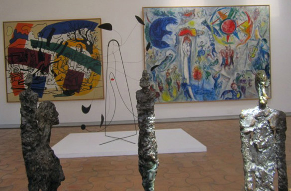
Inside Fondation Maeght, Vence
www.potteryexpo.com
www.zestefrenchtours.com
Jane Annois, Victoria, Australia,
Interview by Deborah Blakeley, August, 2012

Corrie Allegro
My signature Zoneone Arts question – what are the most important design elements?
A combination of design elements come together in this genre of books to create a visual and tactile experience for the reader. The play of interaction with 2 dimensional elements into 3 dimensions by turning a page, pulling a tab, even moving into time and sound becomes magical for old and young.
Here design is using words, graphic illustrations, different printing techniques and assorted paper stocks to create in mass publications or in very small limited editions beautiful books. And, which at the final stage are put together by hand through folding and glueing little bits of paper into books that can and have lasted hundreds of years.
In our growing digital age the illustrated 'book keeps reinventing itself.
What started you on the collecting of Movable & Pop-Up books?
My wife Nancy and I were taking an extended world trip in the late '70s and as a book enthusiast as reader and a graphic designer for profession I'm always looking for inspiration and ideas.
In London I came across a cheap pop-up book on dinosaurs and thought this is different and can I use it for work. It has opened a whole new field of study and 34 years later a consuming hobby has evolved into a history of 'movable' books dating from 1797 to the present.
Do you still have your very first pop-up book?
Yes. But there are many, many others!
Where do you keep your books?
They are in a room on bookshelves to the ceiling on three sides with some shelves behind glass.
How do you protect your collection? eg archival paper
The antiquarian books and a few one-offs are housed in mylar acid free sleeves.
I keep sunlight and heat at bay! But hey, I'm not paranoid...
What book is still elusive?
The hunt and gathering can and does take patience and money.
There are always books from the past and current artists to chase.
Tell us about a place you have visited because of your collection?
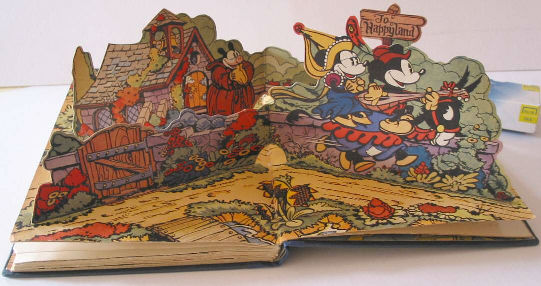
Over the years I have been lucky to meet artists and paper engineers around the world working and creating books of beauty.
In 2010 I gave a talk in Portland, Oregon at the Movable Book Society, (3 day conference held every two years). And yes, I thought I was different but there quite a lot of unusual book people.
Tell us about your current favourite paper engineer and why?
In a small field of only a couple of dozen professional paper engineers in the world there are many favourites. There's Kees Moerbeek in Holland, Robert Sabuda, Matthew Reinhart, David Carter, Andy Barron and Bruce Foster in the US.
David Pelham, Ron van der Meer, Corina Fletcher and others in Europe...and I have to aknowledge the creators from the past. These and may more give their own magic and unlimited imagination to create a printed book that at the end is hand made.
Website: www.allegrobookcollection.typepad.com
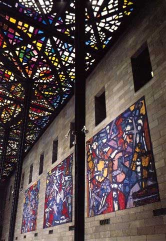
Helen Smith
My signature Zoneone Arts question – what are the most important design elements?
A number of design elements come together to make a real work of art. To name just some which are important to me - colour, harmony and balance.
Can you tell us about the value you have had from being a volunteer guide at both the NGV and ATW?
When I began as a Voluntary Guide at the N.G.V. in 1969 the Director, Eric Westbrook, told us he saw the Guides as a link between the collection and the public. With this in mind it has been a great pleasure to welcome people to the Gallery and show them some of the treasures in the wonderful collection in the N.G.V. This is equally true in guiding at the Australian Tapestry Workshop, that is, introducing visitors to the art of tapestry, especially the contemporary Australian tapestries woven here in Melbourne.
Tell us what we as the audience should do to help a guide make a tour extra special?
The audience can help to make a good tour by showing real interest and enthusiasm. This may be by asking questions and/or sharing views and ideas about works seen on the tour.
Can you explain the process that the ATW goes through to make a tapestry?
Making a tapestry:
This begins with receiving a commission and having a detailed discussion between client, artist and weavers. A firm quotation giving cost and completion date is supplied, and once the quotation is accepted, the weaving begins.
For further insight, one can access greater detail re the process of making a tapestry by going to the A.T.W. website and following the links. Or go straight to www.austapestry.com.au/faqs/the-process
What does success mean to you?
Success to me is when people say "I must come to the Gallery more often" (the N.G.V.), or at the A.T.W. "I'll never look at a tapestry the same way again."
What is your favourite tapestry and why?
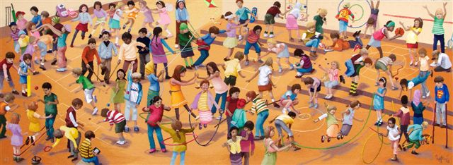 Robert Ingpen AO, ‘Games Children Play', Royal Childrens Hospital, 2009
It is hard to pick one favourite tapestry, as the A.T.W. has created so many wonderful ones (over 400) in collaboration with so many marvellous artists. However, I can say a particular favourite is 'The games children play' designed by Robert Ingpen AO, and made to hang in the new Royal Children's Hospital, Melbourne. It is such a cheerful, lively picture, full of colour, movement and energy.
Can you recommend books that you have helped you understand Australian Art so well?
There are a great many good books on Australian art and artists. To name just four, they are 'Australian Painting' by Bernard Smith, and 'Dreamings, the Art of Aboriginal Australia' edited by Peter Sutton, 'Artist's Tapestries' by Sue Walker, and 'Contemporary Australian Tapestries', a publication of the Australian Tapestry Workshop, are last two are invaluable in learning about the work of the A.T.W.
Website: www.austapestry.com.au
Cresside Collette
My signature Zoneone Arts question – what are the most important design elements?
I trained originally as a Graphic Designer but from an early age I drew and painted. It just seemed to be a natural part of my life. When I was a teenager I started making large wall hangings - embroidering and appliquéing fabrics onto hessian backings. It seemed an inevitable step to want to create the whole fabric and learning to weave tapestry gave me those skills.
The most important design elements to me are colour, line, tone and shape. Tapestry gives you the added bonus of texture and complete colour saturation as the weave absorbs rather than reflects light.
I feel fortunate to have had a long career as a tapestry artist- exhibiting my own work, studying, and teaching the technique to others. I can't imagine my life without it.
Can you tell us about the importance of the time you spent in Edinburgh doing post Graduate studies?
I was awarded an Overseas Study Grant by the Crafts Board of the Australia Council in 1979 to study at Edinburgh College of Art in the only tapestry department within an art school at that time. I had spent four years as a production weaver at the Victorian Tapestry Workshop (now ATW) honing my weaving skills and conforming to the strict regime of excellence that being a workshop weaver demands.
My teachers in Edinburgh, Maureen Hodge and Fiona Mathison, opened my eyes to the expressive qualities of the medium and to conceiving work as an artist who was willing to take visual and technical risks to produce interesting tapestry.
Explain about your time at Bundanon in NSW?
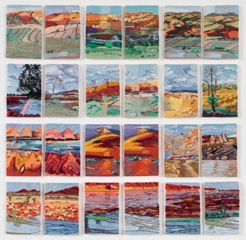 In 1990, whilst a weaver at the Victorian Tapestry Workshop, I wove a tapestry based on one of Arthur Boyd’s Shoalhaven landscape paintings, gaining a strangely intimate knowledge of its features.
Consequently, being resident at Bundanon became, for me, a very special experience, seeing first hand the places that had inspired his art. However, I had to make these landscapes my own and to imprint my personal stamp of observation on them.
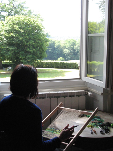
Responding to the openness, vividness of colour and sheer beauty of the surrounding bush I started to work “en plein air” with a small frame propped on my knees, weaving the scene before me directly onto the warp without any preparatory sketches. This is a very immediate way of working in tapestry — normally a very painstaking process — with aesthetic decisions being made constantly with the changing patterns of sunlight and passing clouds. The endless choices gave an exciting fluidity to the exercise, giving the pieces a fresh vitality in their reflection of light, colour and atmosphere. As far as I know this technique had not been adopted by other weavers.
My experience at Bundanon has led to working "en plein air" in many interesting locations including Sri Lanka and France.
What does success mean to you?
Doing something I love on a daily basis.
What is your favourite tapestry and why?
The Lady and the Unicorn Suite at the Musee du Moyen Age in Paris because it constitutes the creative and technical peak of Mediaeval tapestry. Woven in Brussels in the 15th C. it is exquisite in its fineness of weave and intricate detail depicting courtly costumes and flora and fauna in six charming tableaux. Five of the tapestries allude to the five senses and the sixth to the rejection of material possessions in favour of true love.
You show at exhibitions – why do you see exhibiting as important to your career?
As a visual artist exhibiting your work is the only way it can be seen, appreciated or purchased.
Website: www.cressidecollette.com
David Leaser
Tell us about your visit to the Huntington Library, Art Collection and Botanical Gardens in California and how it lead you to travel to South America?
After completing the photographic essay, Tropical Gardens of Hawaii, I spent a day at the Huntington Library, Art Collections, and Botanical Gardens in California. The Huntington was featuring an exhibit of paintings from Frederic Church, one of my favourite 19th century artists. When I left the exhibit, I went into the affinity bookstore they had set up and I saw my book, “Palm Trees: A Story in Photographs.” It made me think, “why not go to South America and see if I can retrace Frederic Church’s footsteps and photograph the sites he had painted.” So, I hopped on a plane and went to Ecuador, where I spent about two weeks in the Amazon and then in the Andes.
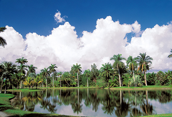
Fairchild Tropical Botanic Garden outside Miami, Florida.
You said that you were “struck by the tiniest flowers on the rainforest floor”. Can you expand on this statement?
You know, most people were taken by the raucous parrots, giant tree sloths and the like, but I started to turn my attention to the overlooked parts of the rainforest. I was first fascinated with the leafcutter ants, but then I started looking at these tiny flowers that we had been stepping upon. At such a small scale, they seemed insignificant, but each small flower contained its own ecosystem for the small insects and reptiles.

Senecio - this is the size of a thumb nail.
I had an epiphany: Why not show viewers the most intricate, intimate workings of the tiniest of flowers and elevate their status. When I returned to Los Angeles, I set up a studio to photograph flowers – some of them smaller than your fingernail – and then enlarge them enormously to show them to people in a way they have never seen them before.
I struggled for a long time to master the technique, but through much trial and error, I figured it out. In fact, my technique was just featured by Nikon in their quarterly magazine. The issue is Fall 2012 Edition of Nikon World.
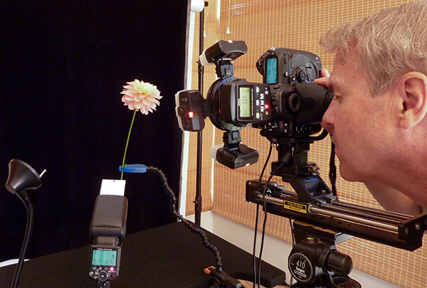
David Leaser , with Nikon macro setup.
When we look at images like “Rococo” it is not only the flower but the black background that transports us back to the Flemish School and 1500’s is this your intention?
You picked up on that! Yes, I have always appreciated the works of botanical artists like Ambrosius Bosschaert and Rachel Ruysch and the way they isolated their botanical subjects against a black background. I’ve taken in a step further and decontextualized them even more so you are really drawn into the complexity of the flower with no distraction. I’ve been told by art critics the work is very modern because of the black backgrounds, but actually it is a return to style of the Flemish school. I think the work is equally at home in a modern setting as it is in a traditional one.
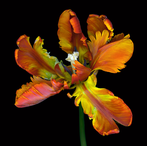
Rococo.
Do you always use either black or white backgrounds. How do you decide?
I belabor every aspect of these works, including the backgrounds, and it really depends on the flower.
I am trying to give these flowers a “Hollywood portrait” treatment, so I test the flowers against multiple colors. Some look amazing against white, and others against black. Each flower really makes the call.
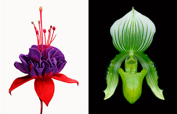
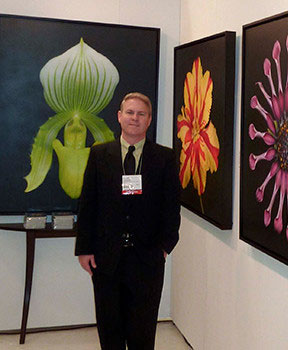
Fuchsia The Queen Paphiopedium Orchid
Most of your floral photographs are done in your studio. Can you explain (very simply) your technique?
I developed a process that combines macro photography with some revolutionary equipment and software, some of which was used by NASA on Mars. Most of my images are actually composites of multiple photographs of the same flower, each with a different focal point. I then sandwich the images together to create a highly detailed image. I can then selectively de-focus certain areas to direct your eye where I think it should go, typically to the most interesting part of the flower. My studio looks like a mini studio you would find for glamour photography, with light boxes, high powered strobes and seamless backgrounds.
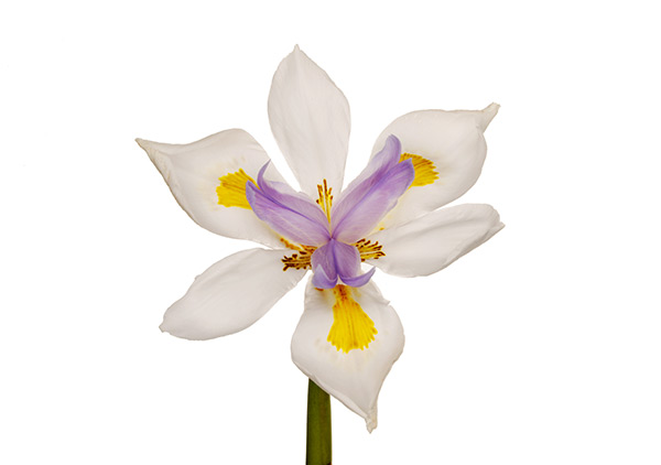
Fortnight Lily.
Where do you get your flowers from, especially the exotic ones?
I am fortunate to live in Southern California, where we can grow most anything. And we have the Los Angeles Flower Mart, which houses more than a city block’s worth of flower vendors. I make regular trecks to the flower mart and spend hours looking for the perfect flowers. But that only goes so far. We also have a greenhouse in our back yard to grow exotics. My wife and I pour through mail-order catalogs and plant hundreds of rare flowers each year. You’d be surprised to know that often the ones that seem like winners do not photograph well, and others we thought were too plain show up beautifully in photographs. They’re a lot like people, I guess.
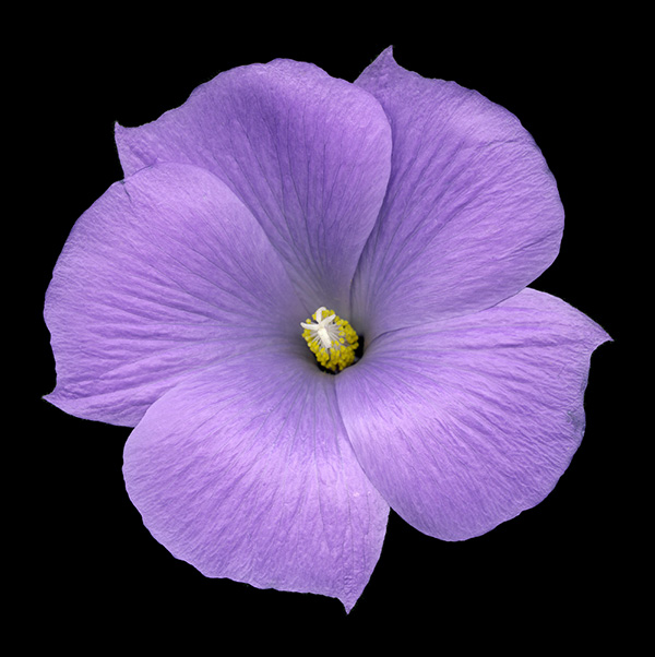
Masquerade.
What type of camera do you use?
I use digital Nikon cameras, lenses and flash units exclusively. I find Nikon equipment to be rugged and easy to use, and their lenses are unmatched for sharpness. I am presently using a Nikon D3X body with Nikon macro lenses. I also use Nikon’s Close up Lighting System and Elinchrom strobe lights. To capture these images, you need to introduce an enormous amount of light, which can sometimes cause the flowers to wilt!
Many of the prints go beyond floral, to pattern. Do you manipulate the plant to gain this?
No. Although I am not striving for photo journalism, I’ve found I really need to do very little with the actual flowers to create a great image, aside from laboring over how to position them in front of the camera. I intentionally pick flowers which do have a unique structure, and then photograph from many angles. My image, Tiger’s Eye, is a perfect example. I had photographed it multiple times in a standard pose and it looked very average. Then I decided to look right into the flower the way a hummingbird or bee would. The result is a flower image that staircases you to the center because of its unusual patterns.
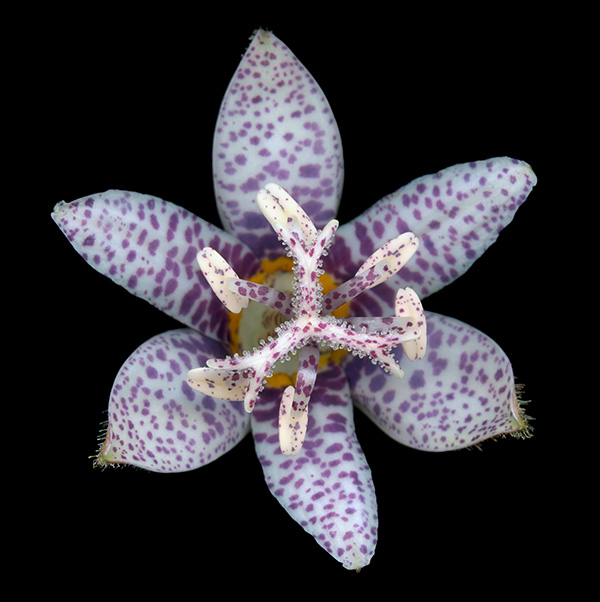
Miyazaki – Toad Lily.
The printing of your photographs come in different formats, Collector’s edition prints and smaller Silver Editions, can you explain about these?
Every aspect of my work is archival and museum quality, down to the media and framing materials I use. The Collector’s and Silver Editions are printed on archival canvas with archival inks by, what I believe to be, the best art canvas printing house in the United States. By printing on canvas, the viewer can see the image without the interference of a pane of glass. I also offer these images on archival paper and also in a unique format using specially treated aluminum, where the image is actually infused right into the metal. It’s a modern take on the Daguerreotype. My work is only available in limited editions to help protect their value for collectors.
In simple terms can you explain what dettagli process is?
An art critic in New York called my work dettagli because it captures detail like you’ve never seen before. You can literally see grains of pollen on the stamens of a hibiscus and the hairs on the stems of an orchid. The process really starts with my initial photography, which is extremely sharp. Then, by stacking together multiple images that are sharp in different areas, I can achieve an image with complete sharpness from corner to corner. But the reproduction must be flawless. My canvasses are the highest quality, and they are coated with gesso to make them smooth and luminous. The pigment is applied and the image is them coated with a UV coating to add a bit of depth. Finally, I intentionally frame images with black backgrounds with black frames to draw your eye to the centre of the canvas, creating a stronger sense of depth.
Exhibition details
My work has been exhibited in museums and galleries around the world.
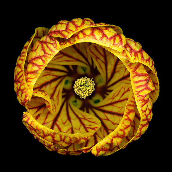
Tigers Eye
Tiger’s Eye was selected to appear at the London Art Biennale at the Chelsea Old Town Hall in January 2013. Eleven images are in the permanent collection of The Huntington Library, Art Collections, and Botanical Gardens in California. The Nightflowers collection was awarded a silver medal at the International Photography Awards. More than 8,000 submissions from 90 countries competed in the Awards, the largest to date. The work was juried to be featured in Architectural Digest’s exclusive home design show.
Gallery details
The work can be viewed in my online gallery at http://davidleaser.com/ where a list of art galleries featuring the work is also posted.
Contact details
DAVID LEASER FINE ART
12021 Wilshire Boulevard,
Los Angeles, California 90025 USA
Email: david@davidleaser.com
Publication details
My work has been featured in major publications, including the Los Angeles Times, Nikon World and Architectural Digest. I have also authored four books featuring my photography, including two photographic essays, “Palm Trees: A Story in Photographs,” and “Tropical Gardens of Hawaii.”
“I recommend Huntington Library, Art Collection and Botanical Gardens in California, to anyone going to LA.
This is a must visit.” Deborah Blakeley
Website: http://www.huntington.org
David Leaser, Los Angeles, USA
Interview by Deborah Blakeley, December, 2012