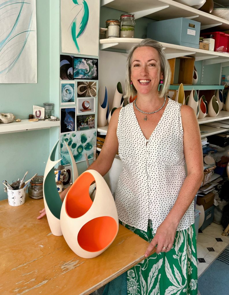
Sarah Hillman
What keeps you looking for new ways to explore space.
I always feel immersed in my surroundings, mesmerised by crashing waves on the shore or by the undulations of a sandy beach or swirling rock pools. I particularly love how sunlight impacts the natural environment, how a cloud casts a shadow across a field or highlights the contours of rolling hills. I find engaging with the natural world a constantly shifting, transient experience. A sunset is never static; I love looking up and seeing how the clouds change colours, how the light changes and shadows cast shift and evolve. I feel constantly inspired by this beautiful world we live in, an ever-changing visual landscape. It’s this shifting sensory experience that I try to capture within my work.
About four years ago we moved to Sussex, and I am very lucky to be on the edge of the beautiful South Downs and not too far from the sea. I love this stunning landscape, and how nature can sculpt and adapt the forms around it. Tactile pebbles on the beach or smooth driftwood which have been carved by the sea. The colour in my work is also inspired by the natural world; the stunning shades of the sea, a vibrant sunset or bright plants and flowers. Nature is a constant rich source of inspiration.
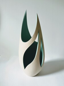
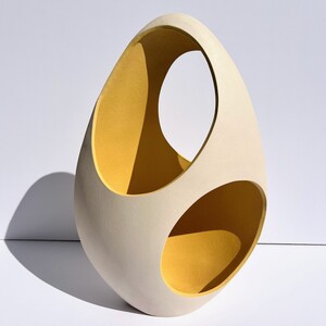
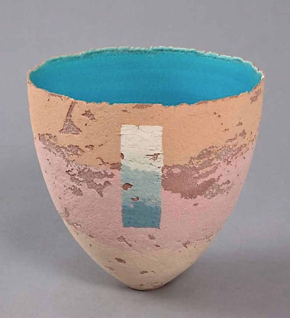
Waterfall Form
Are you restricted to the size of your work and why?
When I took up Ceramics at Farnham College in 1996, I instantly fell in love. I began pushing the clay to its limits by making large hand-built forms, then after my Masters in Cardiff I began to translate the sculptural elements of my work to smaller forms. I tend to work on a few pieces at any one time, usually of various sizes. I find the visual language between a collection of work naturally lends itself to a range of sizes. But ultimately, I like to make pieces that are accessible and can become part of someone’s home.
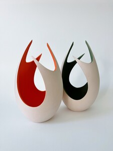
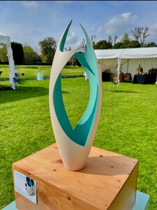
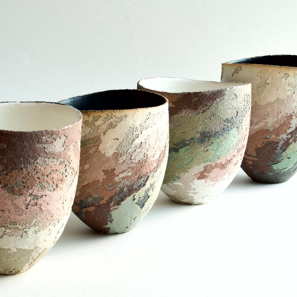
Splash Forms
Can you briefly explain the stages you take in producing a design piece?
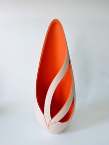
I have a series of press moulds I use for my work, which I made many years ago. I have always slab built as I find it the most effective way to make the initial form to then adapt. I make an enclosed form from the mould and I then hand cut each piece individually. I can often visualise the form before I start to cut, mapping lines with a wet brush before starting to remove sections and manipulate the piece. I’m often sketching ideas of how the lines will intersect, but ultimately my work comes to life in the cutting process.
Why do many of your works have the term pod in the title?
In naming my work, I often nod towards the natural world from where I draw influence. Tactile pebbles, seed pods and flower buds. The organic shape of the initial press moulded form is very much “pod” shaped, so the titles come from that.
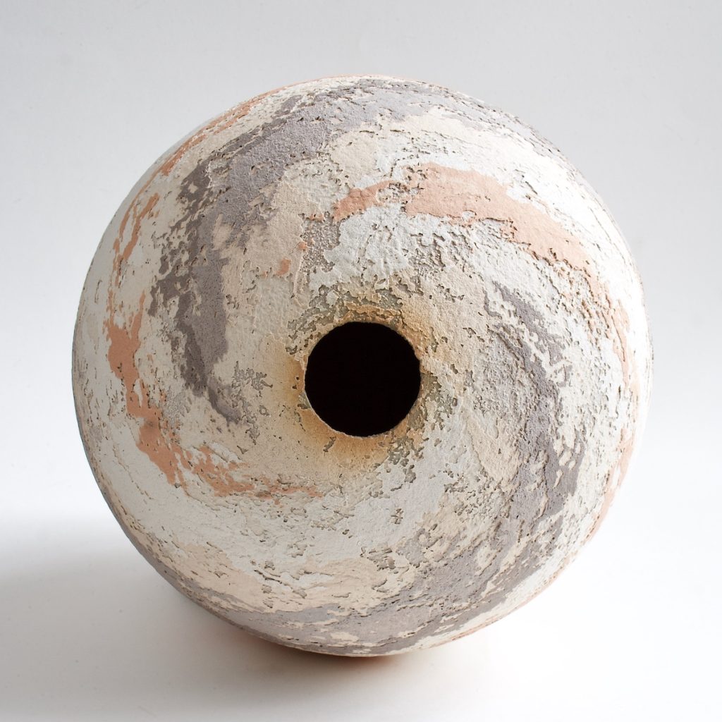
Flower Pod
What led you to place the colour on the inside rather than the outside?
In my first London studio (at Kate Malone’s Balls Pond Studios) I was still experimenting with large scale sculptural shape and form. I wanted to further explore the interior space of the forms I was making, once I began putting the colour solely on the interior it brought a new dimension to the work. Anish Kapoor is an influence on my work, I love the way he creates perspective disorientation in his work using block colour.
Discuss the importance of the missing, in your work.
Exploring the negative space within the form began to become extremely important in my work. Leaving the external surface as the natural white clay body draws the viewer into the space within. Once the light and shadows interact, the whole visual experience becomes interactive. So, the negative space begins to hold as much significance as the physical form itself. The shifting perception of form becomes an interactive engagement from the viewer’s perspective; how the experience changes depending on the angle of view or the direction of light. While I was studying for my Masters, I stopped using glaze on my work and started exploring flat colour. The interior colours used on my work aim to absorb light to enhance the shadows and depth within the piece.
Flower Pod
Do you ever open your studio for Open Studio Days?
I was a resident at Cockpit Arts in Holborn for several years, during this time I took part in regular Open Studios, and large shows such as Origin at Somerset House. The Cockpit Arts community was a hugely important part of that time, and the open studios held twice a year were busy collaborate events.
After I moved out of Cockpit and began working alone from my home studio, I didn’t hold many Open Studios. However now based so close to the creative city of Brighton, I am hoping to start collaborating with Artists Open Houses events. I feel that exhibiting with a large group of makers for such events leads to their success.
Potfest
Can you expand the importance of Potfest
Last year I took part in Potfest Glynde Place which was a fantastic experience. Potfest host many ceramic shows across the UK, and It was the first show I’d applied to in quite a few years. The shows have a selection process, and it leads to a high standard of work. I really enjoy exhibiting at shows as it’s a great opportunity to chat with other makers but more importantly to speak to people directly about my work. However, the shows require a lot of planning and preparation, which with three children can be a lot to juggle. There are many wonderful shows around the country which I hope to take part in once my children are a little older.
 Discuss the importance of simplicity in your work?
The simplicity of my work has evolved over time - sometimes less really is more! Particularly when a sweeping line creates a strong contrast between the interior and exterior form, then the shadows cast become so significant. The consideration of how the interior lines intersect becomes the most important language. I am a huge fan of modernist abstract sculptors such as Barbara Hepworth and Henry Moore, both have such minimalist yet elegant sculptural work.
Comment on how your study at The Centre of Ceramic Study influenced your work.
It’s sometimes hard to believe I have been working with clay for 30 years. As mentioned, I began at Farnham College where I had a fantastic tutor, Andrew Rowley, who was hugely influential in my drive to pursue a career in Ceramics. I remember him saying to me that if I worked hard, I could make a name for myself, and giving me that encouragement and belief really stayed with me.
I went on to Nottingham Trent to do a BA in applied arts and from there on to The Centre for Ceramics Studies in Cardiff to take my Masters. It was during this time I studied alongside fellow makers such as Sara Moorehouse and Paul Wearing. It was an intense yet fascinating year really exploring the medium of clay with such an amazing group. I continued to work in a sculptural nature exploring movement and perception, and space and form.
After I’d completed my MA, I moved to London and joined Balls Pond Studios, then moved on to London Cockpit Arts. It was my 5-year residency at Cockpit that really helped me find my voice as a maker. Cockpit houses a vast number of mixed disciplines, while offering business support and mentoring. I was able to make contacts through the well attended Open Studios, which led to my work being selected for a television set loan for ITV while also working with the Royal Academy of Arts.
I am now settled in Sussex and work happily from my lovely home studio. I’m always looking for new ways to manipulate the clay and thirty years on, I never tire of seeing how far I can take such a versatile yet natural material.
Sarah Hillman
Contact:
Website: www.sarahhillmanceramics.com
Email: Sarah_hillman@hotmail.com
Deborah Blakeley, Melbourne, Australia
Interview by Deborah Blakeley, July 2026
Images on these pages are all rights reserved by Sarah Hillman

Steven Hagan
Do you like to be known as a glass foodie?
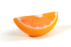
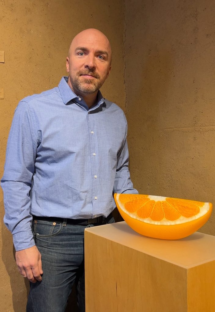
Orange Wedge, 12.5x6.5x5 inches
I can appreciate the label of a glass foodie. I was raised in a food driven family. Shared meals and time together were pretty important and I was always excited to help in the kitchen from a very young age. I think I realized that being in the kitchen meant I got to be involved in the process and get little treats or samples and that was always amazing.
Can you discuss how and where your glass studio is?
My studio is located in Tucson Arizona. I moved here in 2021 and started my studio with Mark Leputa. I came from Oregon and Mark came from Alabama and it was our hope to pair our studio practices into the same studio space. We have all of the kilns, torches, and cold working equipment we use to create our works. Then we use the Sonoran Glass School as our hot shop access, which is a public access glass space here in Tucson.
How many of you, work together to achieve your pieces and why?
Generally a citrus sculpture has three people working to complete the project. Some of the steps are just me and one other person. Like the cane pulling and murrini bundling portion of the process. It isn’t until the final assembly that the third set of hands is really needed. And that is just helpful with working the doors while there is a lot of hot torch work being done to complete the citrus rind texture.
Discuss the layers of colours you need in your glass to create an orange.
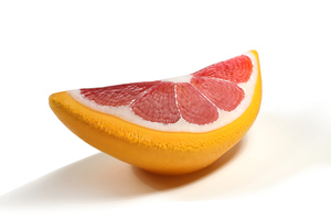 Pink Grapefruit, 13.5x6x5 inches
I would say that there’s really just two layers of color to complete an orange sculpture. I believe the murrini pattern is the most vital to my work. Pulling and bundling the canes to make my representation of the citrus fruit is vital to the designs. The second and more backdrop to the murrini pattern would be the rind surface. I get color close to the surface to give the illusion of the bubble volume looking primarily that solid orange. I use different color combos to create variety and sometimes the rind colors are actually two different colors layered together.
Blood Orange, 9x11x10 inches
Discuss the difference in technique to make a half and a quarter orange.
A fair share of the process is the same. The cane pulling and murrini bundles are created and at any time in the process the patterns could become a wedge or a half. The final decisions are made either based on the size of the patterns. A large one I will use for a half shape versus a slightly smaller pattern can get stretched into the wedge shape a little easier. Also sculpting the wedge shape takes quite a bit more refining to get the profile the way I like. I use cork block paddles and spend a bit of time getting the long angled profile just right.
Half Lime, 10x11x10 inches
How large can some of your glass be?
Some of the largest sculptures are between 12-14 inches in one direction. So the finished objects are certainly larger than life in comparison to a standard sized piece of fruit. I’ve also started making some watermelons, while they are still often larger than the original the leap in size isn’t nearly as drastic.
Is it very heavy?
In the process of production, the glass always feels heavier or larger until the piece comes out of the kiln. I actually love the scale where the work is currently at. The heaviest of works are generally less than 12-15 pounds but feel so substantial still. The finished sculptures are completed as a bubble form, which reduces a fair share of the overall weight in comparison to if the sculptures were a solid volume of glass. Then they would weight 40-50 pounds and be far more taxing on our bodies during the process.
What other fruit do you make?
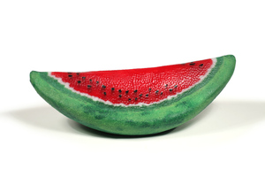
Watermelon Segment, 14x7x5 inches
I have also made both kiwis and watermelons as sculptures and smaller consumables like earrings and marbles. When I started making the murrini patterns into citrus I recognized the ability to expand my representations. It just took a little time to get to the different fruits.
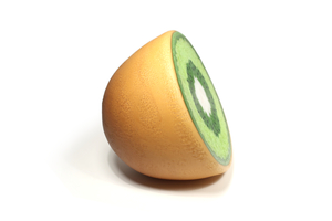
Kiwi
Discuss why you have spent so much time academically, from first graduating in 2002 to 2011?
I believe with any art media life experience is as vital to our journey and education as being in a classroom or academia. So my gap of time between finishing my undergrad degree and starting a three year grad program allowed me to gain knowledge about glass but more importantly the time to explore some of my own ideas of concept or process. I felt maybe a little older starting grad school to some of peers in the program but it actually was very helpful to know myself a little more. I don’t think I would’ve been ready had I jumped right from undergrad into a grad program.
What is one of the aspects of teaching that make you especially happy?
It is absolutely the human connection. I love glass and the choreography that occurs during the production process. Sharing that love of the material brings me so much joy and feeding off the energy people give off while learning or experiencing the glass making process is so wonderful. I’ve taught class with children so young that a parent is holding them in their arms and as old as 96 years. It’s a huge age gap but really cool to see how excited people can get about glass even as first timers.
Comment on your love of food and fruit?
![]()
Blood Orange, 9x11x10 inches
As I mentioned, I grew up in a food driven family. Pairing my love of food and my love of glass took some time. Obviously, when I first started with glass I made a lot of functional objects. Cups, bowls, plates, vases…. A lot of the standard vessel format objects. I feel incredibly lucky to have a studio practice with some of my best friends and the opportunity to mix my glass and food loves. It wasn’t until my thesis show for grad school that the fruits and sculpted objects began to pair my two loves. Glass and food. I feel incredibly lucky to have a studio practice with some of my best friends and the opportunity to mix my glass and food loves.
Expand on your small pieces of fruit – earrings.
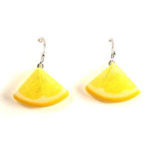
Lemon Earrings
Before the sculptures there were the earrings and marbles, what I call the consumables that I make out of the murrini patterns. I had one murrini pattern in my MFA thesis show and I knew leaving grad school that was the coolest thing I had ever created out of glass. So over the course of the next few years I really dug in and learned more of how to reproduce that citrus pattern.
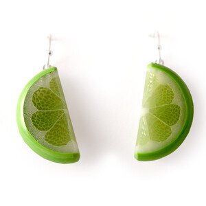
Lime Earrings
I saw the value in the color and vibrant patterns and wanted to share those with the world. It was some years later that the larger sculptures became a thing and took a fair share of my focus
Steven Hagan
Contact:
Website: https://stevehagandesigns.com
Email: stevehagandesigns@gmail.com
Deborah Blakeley, Melbourne, Australia
Interview by Deborah Blakeley, June 2026
Images on these pages are all rights reserved by Steven Hagan
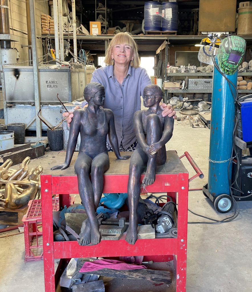
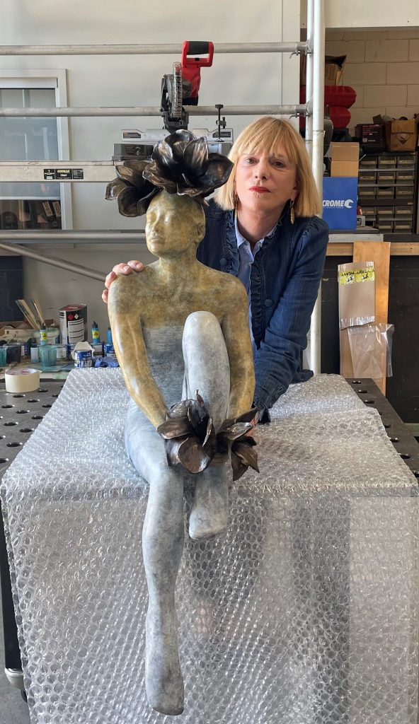
Margot Stephens
Can you expand on how you have been working in clay since a young age?
It was an enthusiastic art teacher in Year 9 High School that decided to teach the art class how to throw pots on a wheel using the local clay that began my career.
 Louisa
How influential was your father in your career choice?
By 16 I had a modest income through my clay work & my father offered to help to buy a kiln of my own, if I could raise half the money. By year 12 Dad had built a studio. I applied to go to art school in Sydney.
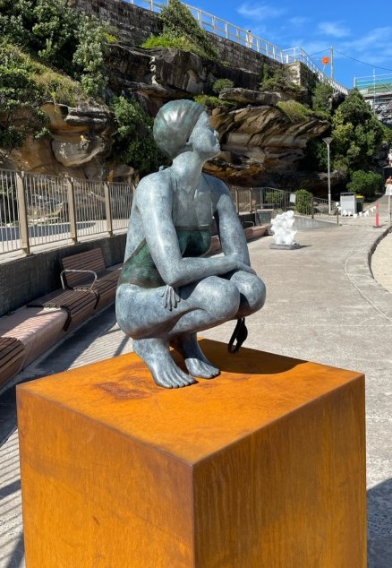
What led you to specialize in figurative sculpture?
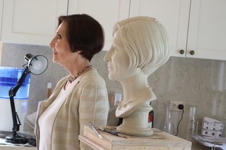
I spent three years majoring in life drawing & anatomical studies at City Art Institute. During time In the first year the at University of Sydney offered a 6 week study tour of Italy, studying early renaissance art. The professor conducting the tour kindly pointed out where I could find sculptures by Michelangelo, Bernini & others visited as extra-curricular study. It wasn’t until later I found out dad had extended the mortgage on the farm so I could attend. The experience of studying in Italy was life changing. Returning to Italy at the completion of the BA I settled in In Deruta, Italy. I was offered the opportunity to study Maiolica painting & sculpture in the studio of Carla Corna. Concurrently I was invited to be an artist in residence at the ceramics department at the University of Perugia. I returned On return to Australia I was ambitious to set up a studio & began to use life models for sculpting figures from this point onward.
Your first Public Commission.
The first Public Art commission came in 2014, friends of my parents recommended me to their Centenary Celebration Committee in Ariah Park.
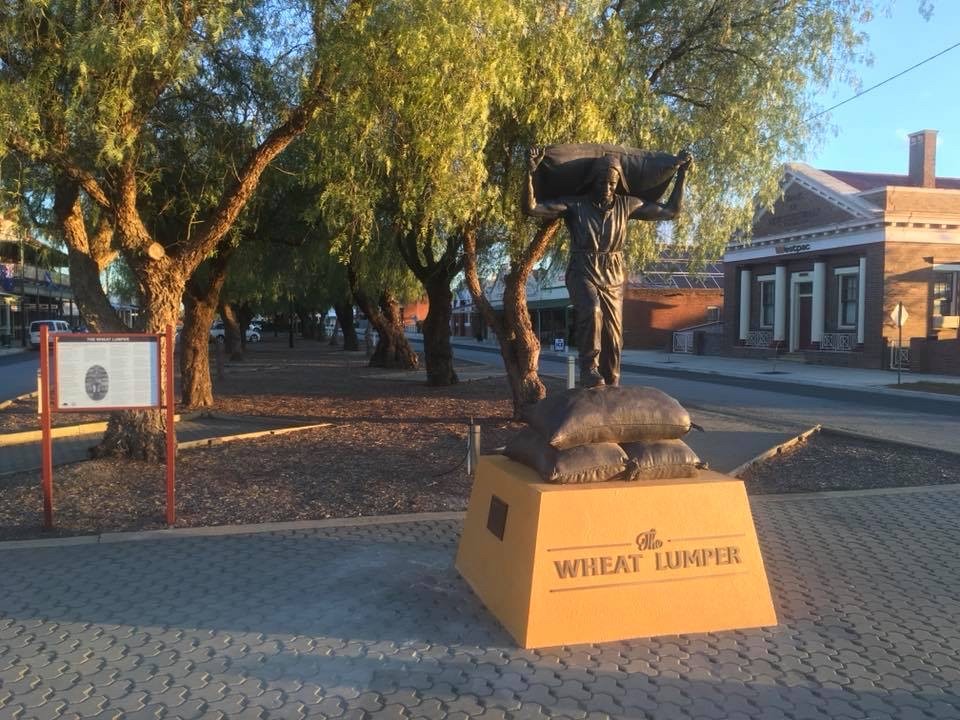 The committee was looking to place a wheat lumper in the main street & when I first received the call, I had to ask what a wheat lumper was? This was my first foray into learning about a part of Australian History. I found it exhilarating & fully immersed myself into learning.
 The figurative specifications Wheat lumpers were; the men working on the wheat farms were returned servicemen from WW1 and farmers, they were very lean, muscular & fit. The biggest stroke of luck was finding a model that fit the required figurative specifications and was also knowledgeable about wheat lumping as he had met some of the old lumpers in his youth whilst working in the region.
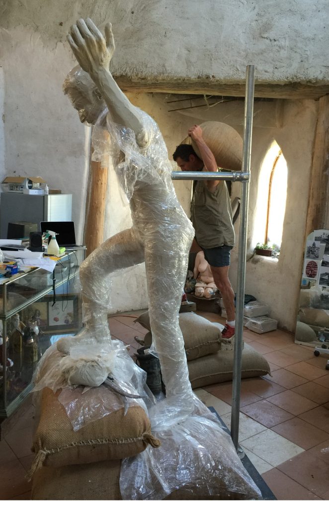
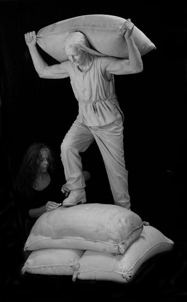 The Wheat Lumper, Clay
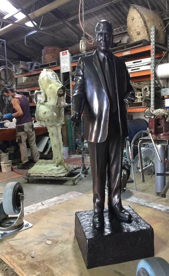
Can you expand on the Waterhouse commission?
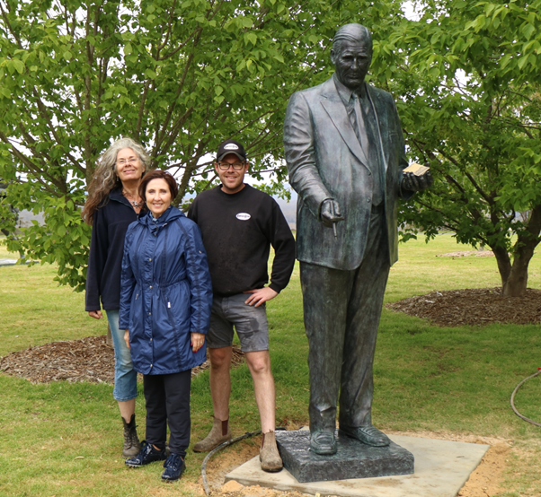
It was during the bronze casting of The Wheat Lumper that Rob Waterhouse was visiting the foundry & saw my work. Rob was looking for a sculptor to make a 125% scale portrait of his father, the famous Bookie, Bill Waterhouse.
 Maquette of Bill Waterhouse, bronze, edition of four
Bill was already 6’4” (193cm) tall, so with shoes and a base the resulting bronze sculpt was just over 250cm. When I went to meet Bill to take measurements, he asked Rob what I wanted them for? Rob told him I was the undertaker!
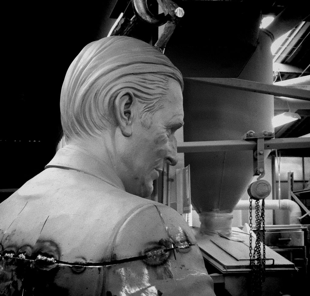
Bill Waterhouse in the foundry
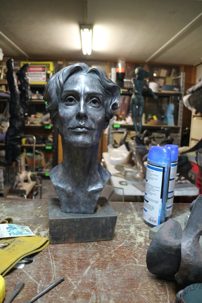
At the unveiling event of Bill’s bronze, I met the painter, Tim Storrier, who introduced me to his wife, whom he felt had a likeness to the portrait of Nefertiti. I was invited to make a portrait bust of Janet Storrier.
 Janet Storrier
It was a wonderful experience as the stand for the clay bust, I was working on was in a gallery surrounded by Tim’s extraordinary atmospheric landscapes & sky-scape paintings. Immersed in this beauty I sculpted the delicate vulnerability of Janet.
Janet Storrier bronze at foundry
Later I was commissioned to sculpt the portraits of the Waterhouse women.
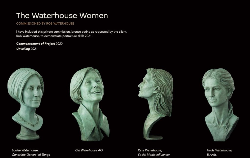
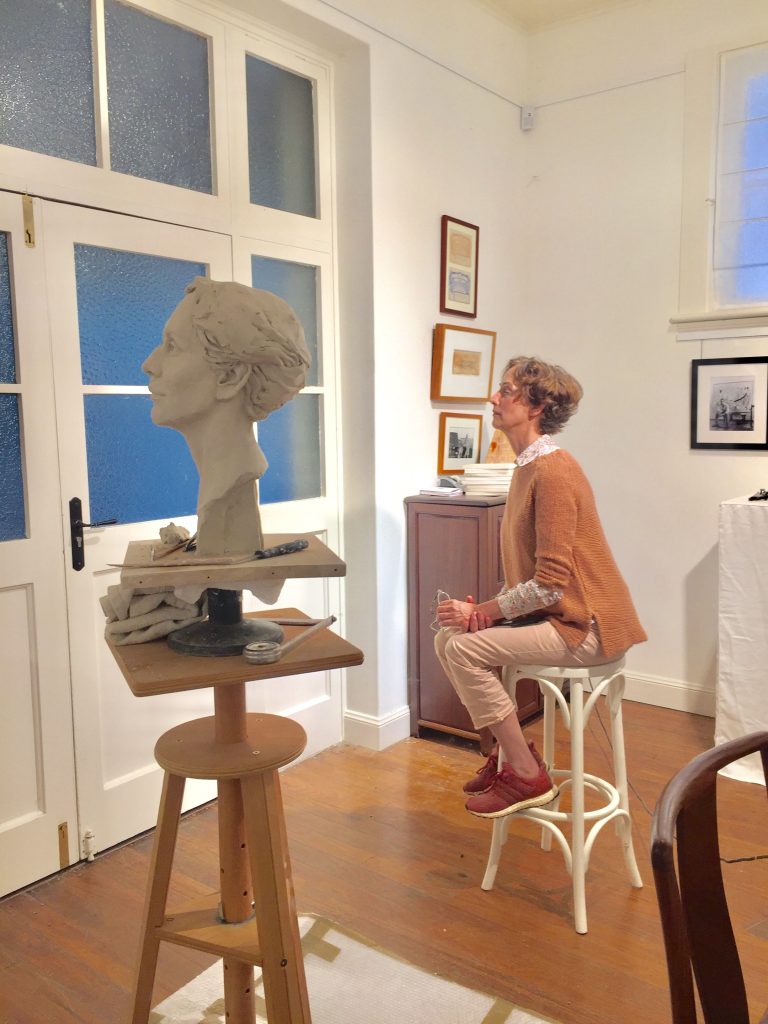
The sittings were conducted on their farm near Bowral, so travelling the clay portraits between my studio at Eurunderee & the farm limited their size to ; they’re life scale head & partial shoulders.
 Louise Waterhouse
I like to spend the first sitting taking measurements & chatting with the sitter trying to get to know them a little. I take videos of them moving as well. On return for the second sitting, I have an armature with clay to approximately the scale of the sitter, I may have some drawings to demonstrate what I’m planning. It is at this point the model can tell me what they think, and I alter the portrait accordingly. I have the model sit for an hour each session whilst I rough in as much information as I can & take photos.
The likenesses and differences in the women.
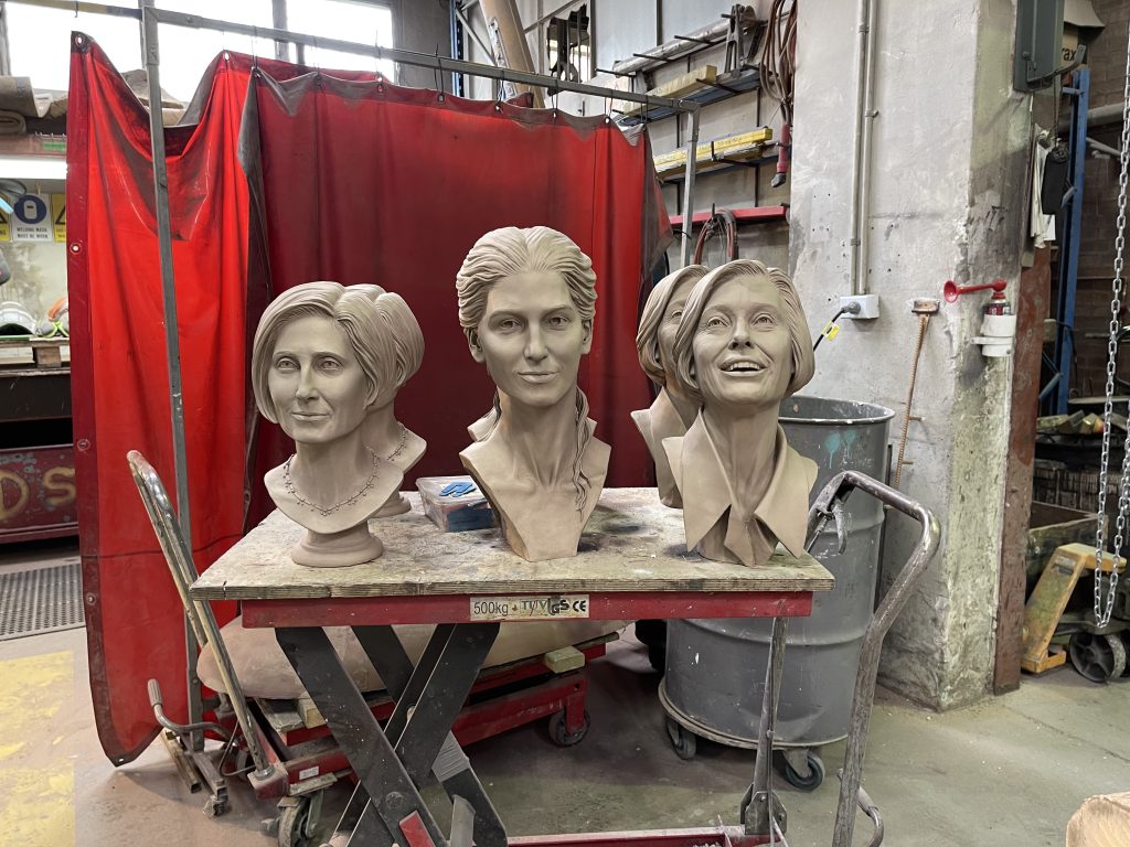 I spent many happy days sculpting each of the Waterhouse women over a few months working on their portraits, fitting sittings in with their busy schedules. The four women are very different in personality as you would expect. I most enjoyed working with Gai, with a background in acting (she was one of the early “Dr Who” girls), she could hold her pose effortlessly and had little input into my vision, I was free to see. Gai Waterhouse is the first Australian woman to train a Melbourne Cup Winner in 2013. The portraits are cast in bronze, there are two of each so Rob could have a complete set & each sitter had a bust of her own.
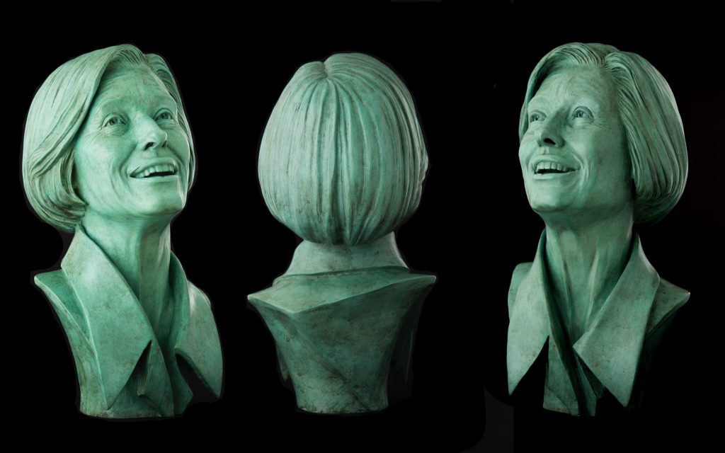 Gai Waterhouse AO
At the unveiling event of Bill’s bronze I met the painter, Tim Storrier, who introduced me to his wife, whom he felt had a likeness to the portrait of Nefertiti. I was invited to make a portrait bust of Janet Storrier.
Discuss another more current woman.
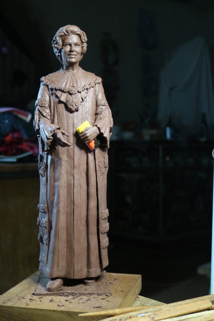 Maquette & clay Joy Cummings AM
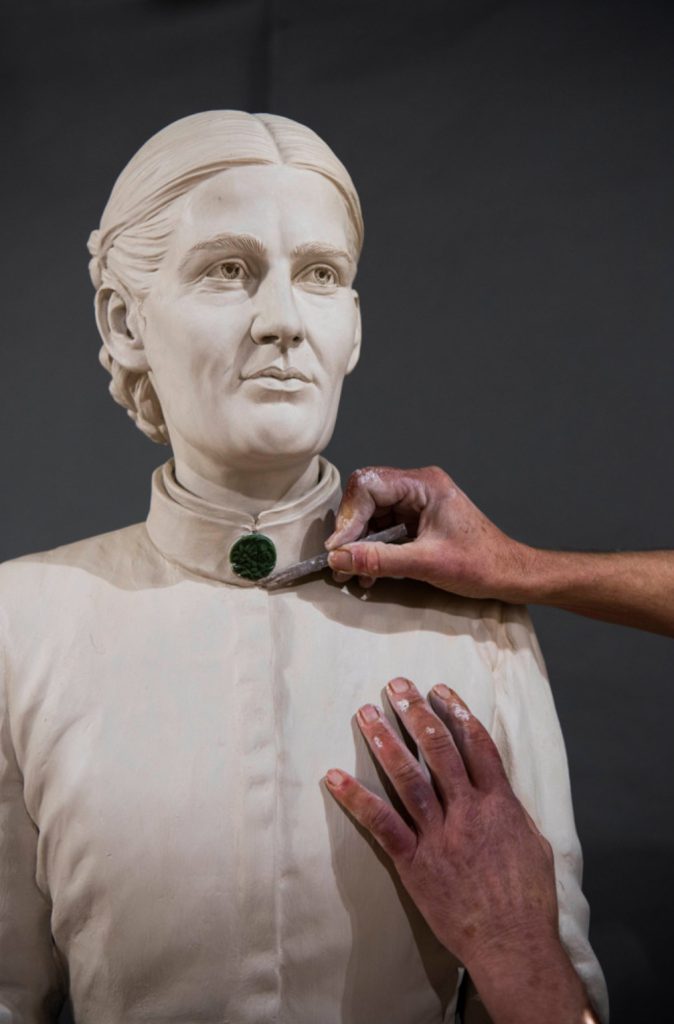
Joy Cummings AM. The same year I was invited to submit a maquette, with five other sculptors, for commission. This was so exciting; I had researched Joy and her career for the maquette & felt so honoured to be awarded the work for the bronze life scale figure. Australia’s first female Lord Mayor, City of Newcastle NSW, Joy took the regalia of the office seriously, which meant a lot of detailing went into the gown & mayoral chain. I contacted the makers of Mayoral gowns; they supplied me with samples of the fabrics & details on the embellishments. I found just carving the embroidery around the edge of the gown took a day to carve 50cm and I had over 5 meters!
 Joy Cummings AM at foundry
Can you discuss your work ‘Louisa Lawson’.

How did you come by the commission?
The sculpture of Louisa Lawson came about as a result of an article written by Lesley Hughes in The Monthly magazine in August 2020. Hughes article was about how NSW’s first public feminist, whom had been acknowledged as the Mother of Suffrage in NSW parliament in 1902, went uncelebrated at the centenary of her death. Hughes went on to point out that ‘-there were more monuments of animals in Australia than of non-fictional women’. The Rotary Club of Mudgee picked up the challenge as Louisa had grown up in the region.
What was the research process you needed to do for it?
Reading extracts from The Dawn, a publication that Louisa bought out monthly from her printery in Sydney from 1888 -1905, one of the longest running journals published, edited by Louisa, printed & distributed by women. By cross referencing everything, I felt I had a feeling of the woman behind her words.
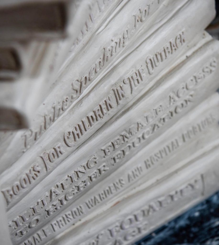
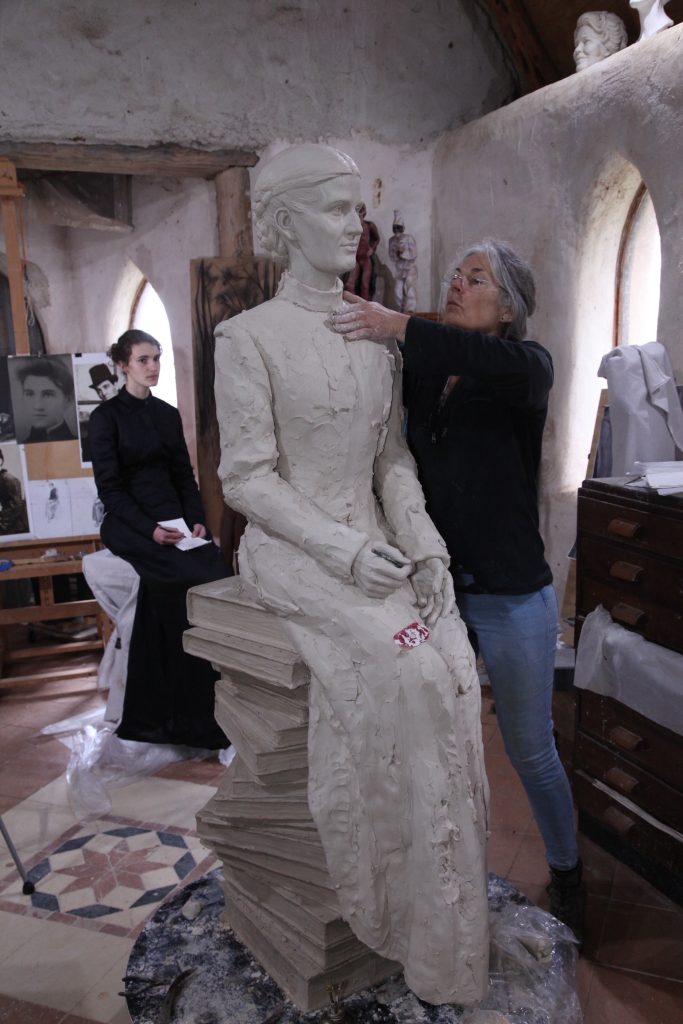
As a girl Louisa had a secret spot in the bush where she had built a pile of rocks upon which she sat to read & write poetry. I replaced the rocks with books. The book spines afforded the opportunity to highlight some of Louisa’s many campaigns she championed throughout her lifetime. The book stack is a haphazard spiral, encouraging the viewer to move around the sculpture.
 I worked with other creatives to bring the sculpture together to be historically accurate; pattern maker Kayt Dickson made the costume based on Louisa’s own hand made clothes that we could see in photographs from the Holtermann photographic collection.
 Where is it now standing?
We bought together the list of campaigns, (which had been assessed and approved by Prof Clair Wright), a poem Louisa had written not far from where the sculpture is now sited & Louisa’s slight smile. The location of the sculpture is just outside the Town Hall building on Market Street, Mudgee, a building where, as a woman, she was unable to enter to present a petition for a school to be built at Eurunderee, serving a community of 80 farming families at that time.
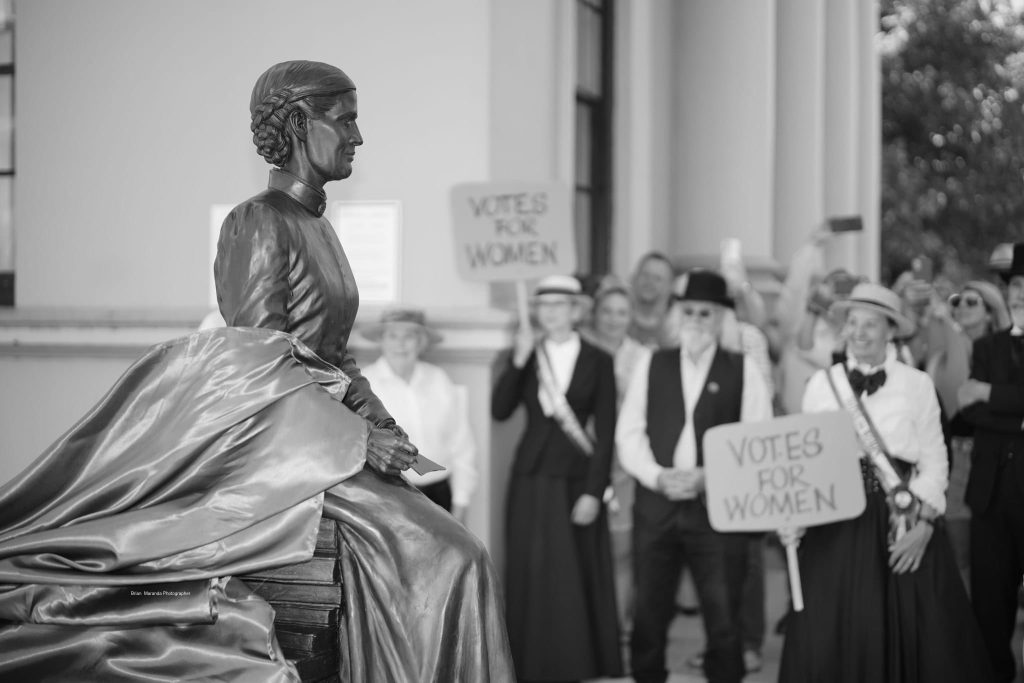 Unveiling of Louisa Lawson photograph credit Brian Maranda
The article written by Leslie Hughes was the inspiration & Leslie unveiled the sculpture on International Women’s Day in 2023.
Is there anyone you would like to sculpt?
I would love to have the honour of sculpting Julia Gillard, I admire the steely resolve that encases a compassionate centre, her political prowess & the significance of her achieving the highest office in our country. Perhaps the woman whom we most respect, whatever your politics. I look forward to meeting and learning about many interesting people in the future.
Explain the importance of Life size sculptures.
The question regarding ‘Life size’ refers to scale, & scale is particular to location and the intent of the sculptures, relationship to the viewer. Usually when I’m commissioned to make a life scale sculpture it is to personalise the figure to the viewer; so, the subject is relatable. When a figure is scaled up, as in the case of the Bill Waterhouse sculpture, it is to be placed in the landscape & have a monumental presence. This was as much about Bill’s persona as his physicality, being a very tall man and was described by his peers as being a ‘larger than life’. Scale affords additional significance to a sculpture.
 Bill Waterhouse in the garden with Louise, Matt & myself
You have made plaques. Discuss.
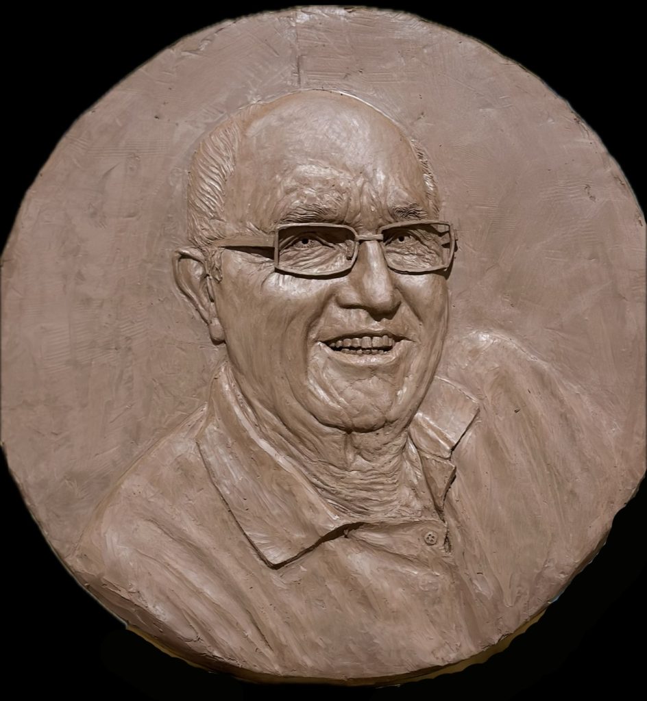 Paul Stwart, clay
The bas relief plaques were commissioned by the Birdon Group, Port Macquarie shipyard, an Australian company that began with a family & a few mates in the 1970’s & grew into the global shipping construction company it is today.
I was commissioned to make portraits of the original team for their ‘Make It Happen’ Project, honouring the founding members. It was a challenging project as I worked directly from old photographic materials & they were scaled to 110% life scale, the bronze plaques to be mounted on recycled steel beams, at height. The original vision for the project was not shared with me; I was employed specifically to carve bas relief portraits.
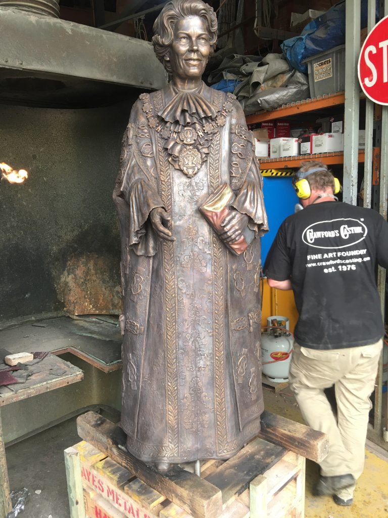
Chasing metal, at Crawford's Casting, Sydney
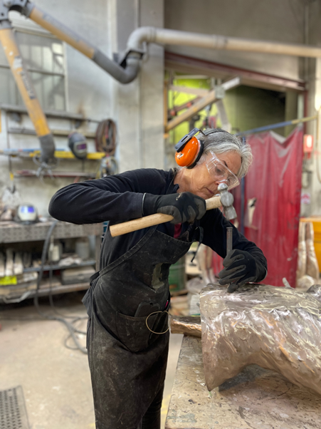
The process of making a commissioned sculpture is endlessly fascinating, I meet interesting people who are passionate about their ideas, I enjoy the research, getting to know the subject; realising the figure in clay in the studio is my happy place, from the welding of the armature, balancing abstracted shapes to refining shapes, clothe, limb and skin, it’s really exciting. Once the client approves of the work, the foundry team move into the studio to take a mould of the clay & leave up to 10 days later with a negative, my clay destroyed. I next meet the figure in wax at the foundry at Strathfield, where I clean & repair it ready for ceramic shelling & bronze pouring. After the bronze is poured & the foundry men have reassembled the parts, I tidy up with metal chasing.
Tell us about your foundry
My favourite & constant creative collaborator is Matthew Crawford from Crawford Casting. Matthew works right across the spectrum of sculpture and has an enormous knowledge he quietly draws upon when working with sculptors attending the foundry. It is always a privilege to have your work cast in bronze and any advice proffered by Matthew in its creation is of value. I have learnt so much over the past decade of having my sculptures cast at Crawfords and have formed a huge respect for the skills of the foundry team. When I first met Matthew in 2015, I explained I had little experience of bronze, I had mainly worked in ceramics; he said “Its time Margot, you moved into The Bronze Age”.
Where is your studio today?
My studio is purpose built straw bale construction, designed to provide a cool environment for working in clay; it is built in the style of a country church as I have always loved seeing them dispersed around the landscape, I had imagined buying one & turning it into a studio, when that wasn’t to be, I built my own. Shortly before my father died, we travelled around together looking at country churches, whilst I made sketches. They are a very simple design with a high- pitched roof & simple rectangular shape. I can build sculpture up to 6 meters in height within. I’ve only gone as high as 3 meters so far, but there is still time!
Enchanted Earth Studio - Saddleback Trail - Eurunderee 2850 - NSW
Tell us about Face 2026 in the UK.
Tell us about Face 2026 in the UK The FACE is an International portrait exhibition held by the The Society of Portrait Sculptors biannually in the UK. Every now & again I make a submission, its similar with painters and the Archibald here. To be selected into FACE UK would be the best excuse to go & see some of the best portrait sculptors working Internationally today. We have some outstanding portrait sculptors in Australia; we should do something similar here!
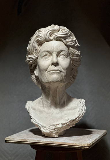 Kay Norton-Knight, Plaster, life scale
Your close observation goes beyond people to birds discuss.
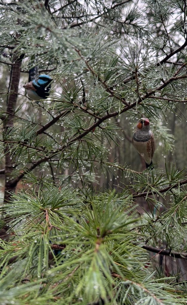 Your close observation goes beyond people to birds, discuss
At the end of each year commissions are usually completed and there are a few months over Christmas period of quiet. My husband grows Bonsai, a type of sculpture we enjoy living with, we have one child & used to decorate one of the trees each year. It occurred to me in our forest environment, that the most beautiful things in the trees are the small birds, so I sculpted the local birds in clay, moulded, slip cast, glazed & decorated our Christmas tree with them. We aren’t religious people but I like the idea of family & friends coming together to exchange gifts & enjoy our Australian summer food. The birds became gifts from me, then others purchased them to gift to others, especially to send overseas.
Contact:
Margot Stephens
Website: www.margotstephens.com/
Email: margot.lee.stephens@gmail.com
Deborah Blakeley, Melbourne, Australia
Interview by Deborah Blakeley, May 2026
Images on these pages are all rights reserved by Margot Stephens
Fátima Zagonel
Do you feel your work as a graphic artist was a good base to continue to onto Botanical Art?
In some ways, yes. I think that my compositions are always created with the intended use of the illustration in mind. This helps make the image more suitable for its purpose, especially when I need to portray different aspects of a plant within the same plate.
Can you expand on the importance of being collected by the Shirley Sherwood Collection?
Being part of the Shirley Sherwood Collection means having doors open to exhibitions and remarkable publications. It is like having a distinguished mark of quality. I met her at my graduation exhibition from the Margaret Mee Scholarship at the Royal Botanic Gardens, Kew (London Herbarium).
 1999 - Kew Gardens - Margaret Mee Fellowship Exhibition
At the time, I had no idea who she was or what she represented. She graciously approached me and said she was interested in two of my paintings. Someone else was also interested in one of them, so I shyly asked her later: “Have you decided which one you are taking?” She smiled and said, “I will take both, dear.”
2008 - The opening of The S. Sherwood Art Gallery at Kew
I didn’t realize at the time that it was my lucky day. I met her again in Rio, in New York and at Kew when she opened her gallery. She is always so attentive and makes you feel important — she is truly a lady.
 2016 - Exhibition ASBA and HSNY
Where can people see this the Shirley Sherwood Botanical Collection?
At her gallery at the Royal Botanic Gardens, Kew in London. She frequently promotes exhibitions from her collection. Usually, a theme is chosen, and if your work fits that profile, you may be included.
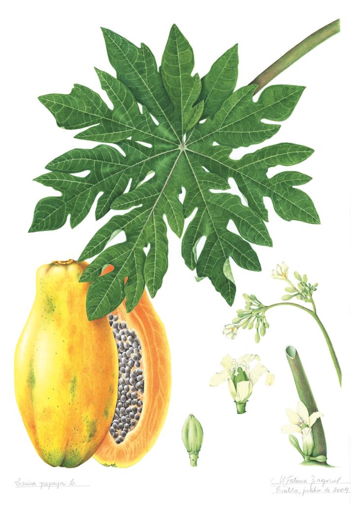 Carica papaya
Does living in Brazil have you focusing on Brazilian native plants?
Yes, absolutely. I mainly portray native plants. Of course, sometimes I accept commissions or work on subjects with special meaning, such as a plant with my son’s name: Laelia Cattleya nobile bruno-bruno, which I illustrated with great pleasure.
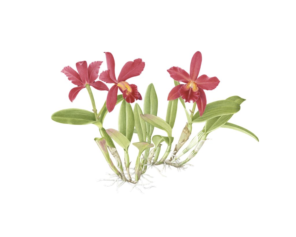 Laelia Cattleya nobile bruno-bruno
Can you discuss the positioning of the leaves in Caladium Bicolour?
When I first saw this plant, I was amazed. There were so many different patterns that I couldn’t choose which one was the most beautiful — I wanted to portray them all.
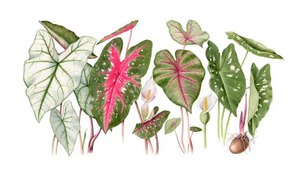 Caladium Bicolor
So, I selected my favorites and decided to create a panel. I challenged myself to do something different from traditional botanical composition. It gave me great satisfaction and made me feel that I should take creative risks more often!
Why do you let some of the plants flow over the frame?
(Campanula Mollis) was illustrated during the Margaret Mee Scholarship at RBG Kew under the guidance of Christabel King. I believe that painting a plant without showing the underground part reveals its full growth habit more clearly, which is also a traditional approach. Even so, it may appear as though the plant is flowing.
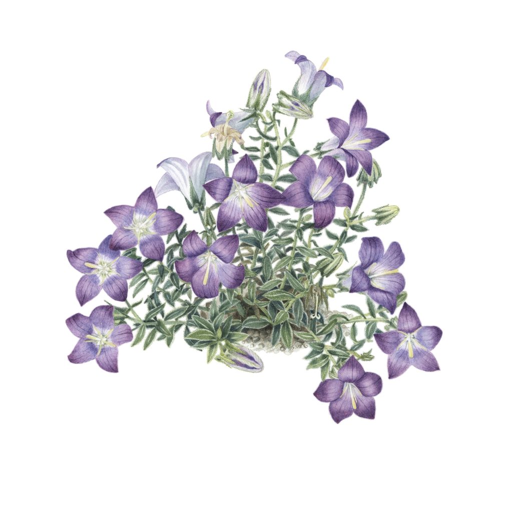 Campanula mollis
You paint beyond plants – fruit and nuts. Can you comment on some of these works.
Sometimes fruits are more representative than flowers, as in the papaya tree. In this case, I chose to highlight the fruit. Other times, I depict both flower and fruit with equal emphasis, even if the flower is not the most important part — it can be so beautiful that it is impossible to ignore, as in my Passiflora edulis illustration. To achieve this, I sometimes have to wait for different seasons in order to portray both stages.
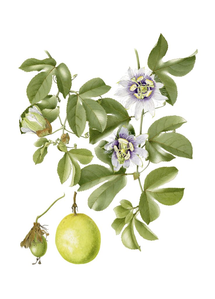 Passiflora edulis
Have you painted plants that are on the endangered list, or have become extinct since?
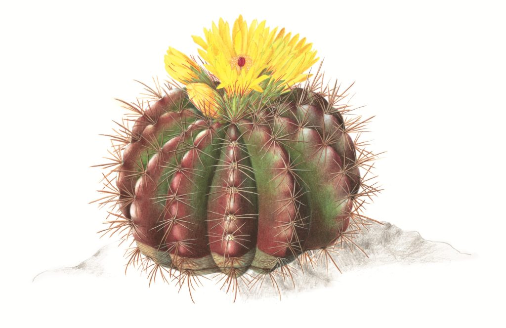 Parodia ottonis
Yes. I was fortunate to visit a protected area outside my hometown where I saw some endangered plants on a private property. One is a small cactus, Parodia ottonis, and another is Hippeastru psittacinum.
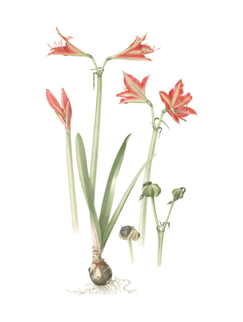 Hippeastrum psittacinum
I also included Araucaria angustifolia in a composition about macrofungi from Brazil’s pine forests.
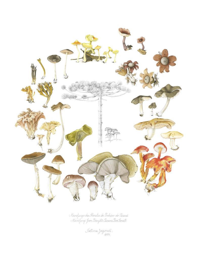 Macrofungi of Paraná Pine Forests
This tree is the symbol of Paraná State, where I live. Its seeds have been appreciated since ancestral times. I also illustrated the pine and its seed. When I moved into my house 40 years ago, the first tree planted in my backyard was this pine — it is majestic. It is very similar to the Australian Araucaria bidwillii.
Discuss your entomological illustrations.
Some subjects are chosen for their importance or beauty, while others come unexpectedly — as in this case. My group was presenting an exhibition at the entrance of the Federal University of Paraná (Biology Department). My artwork depicted Senna bicapsularis, a species full of stamens that resemble small antennas.
 Senna bicapsularis
An entomologist approached me and asked if I would be interested in drawing bees. I said I had never illustrated any kind of insect. He replied, “After seeing all the stamens you included in your illustration, I’m sure you will enjoy it!” The result was two years of drawing bees for the manual Brazilian Bees, followed by another book, Insects of Brazil, and more work thereafter.
Contact:
Fátima Zagonel
Website: www.fatimazagonel.com.br
Email: fatima@zagonel.net
Instagram@fatimazagonel
Deborah Blakeley, Melbourne, Australia
Interview by Deborah Blakeley, May 2026
Images on these pages are all rights reserved by Fátima Zagonel
John Kiley
Can you explain why you refer to your glass as ‘geometric architectural forms’?
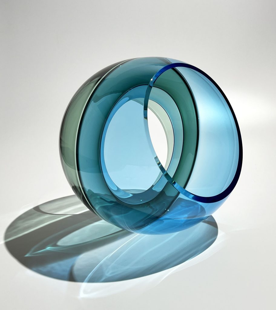
Most of my glass work uses primary geometric forms, such as spheres and rectangles. I also construct sculptures using multiple parts, and these pieces reference architecture, albeit abstractly.
Aquamarine Tower, 2023 80 x 20.5 x 13 in (203.2 x 52.07 x 33.02 cm)
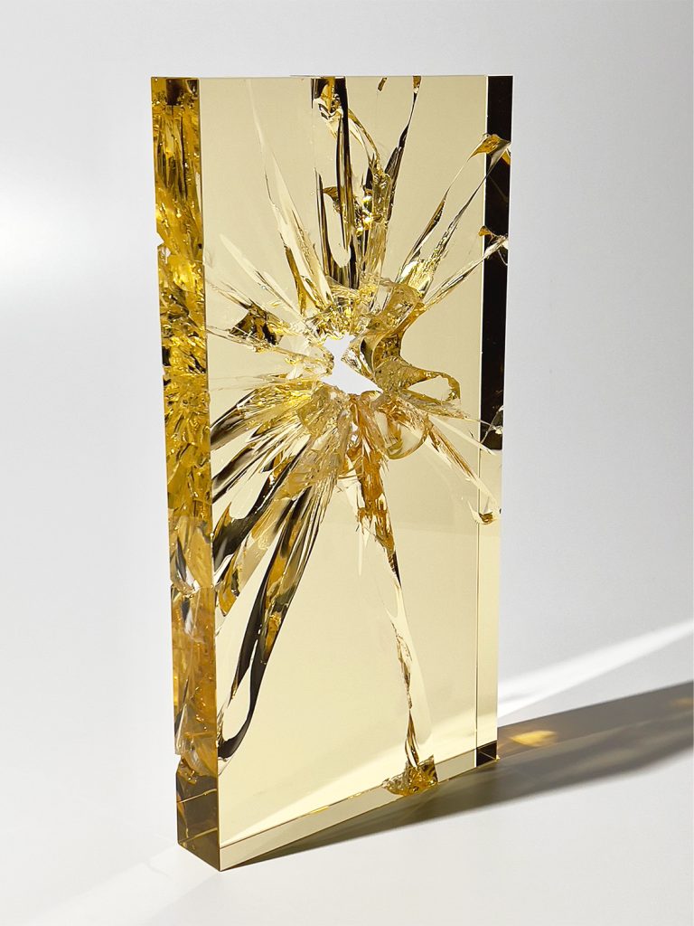
Discuss how you use impact and thermal shock in your work?
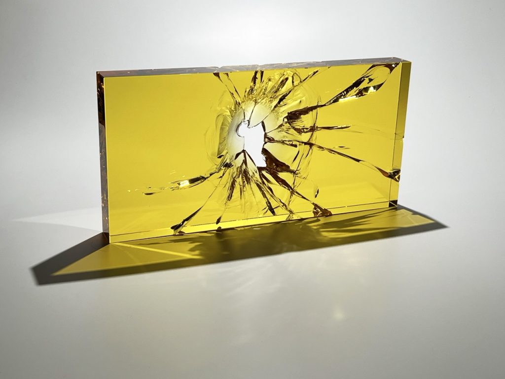
This relates to the “Fractographs”. I employ various methods to break polished optic glass blocks, creating a three-dimensional record of time, energy and place. Impact Fractographs are made using a sledge hammer. I also use thermal shock to break the glass, either by pouring molten glass onto a room temperature glass block, or focusing a propane torch on a specific point on the glass, and then using a few drops of water to initiate a break. After the piece is broken, I reconstruct it, using optic epoxy.
Indianola Fractograph #1, c. 2026, 24 x 12 x 2.25 in (60.96 x 30.48 x 5.72 cm)
Comment on how your glass art has taken you to over ten counties and in what capacities.
I’ve been fortunate to travel extensively because of glass, for exhibitions, teaching, and working with other artists. Recently I worked in Italy with Lino Tagliapietra and Dante Marioni making the torch for the Olympic closing ceremonies. Another favorite trip was for an exhibition at Waterford City Hall in Ireland, that showed contemporary glass sculpture (including my work) alongside masterpieces from Waterford Crystal.
I’ve also been to Bulgaria to source supplies, and to China.
What led you to want to become a glass artist?
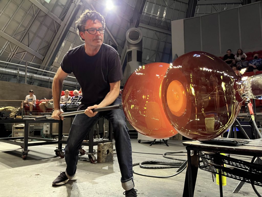
I didn’t set out to be a “glass artist” but I wanted to be a sculptor from the time I was quite young. After I graduated from high school, I set up a small sculpture studio in a tool shed behind my fathers business in Seattle. My little studio was next door to the Glass Eye Studio, a famous little factory that produces glass giftware. I’d visit once or twice per week and eventually convinced the production manager to hire me. After about a year or so working there, I was hired to work on Dale Chihuly’s team, and shortly after met Lino Tagliapietra. Working with them and learned about the sculptural potential of glass which is very different than how it’s used to make functional objects.
Twilight Tower, 2024, Bonded Optic Glass & Steel 80.5 x 32.5 x 13 in (204.47 x 82.55 x 33.02 cm)
You have been trained at three glass school, Stanwood, Penland and Seattle. What took you from one to the next?
Pilchuck is located not too far from where I grew up in Seattle, and it’s the most famous glass school in the world. I took my first course there when I was eighteen years old. Pratt Fine Arts Center in Seattle provided a good introduction in fundamental glassblowing skills, which were built alongside assisting other artist and working in production studios.
I also went to Penland Mountain School of Craft in the mountains of North Carolina for a two-month intensive glassblowing course. This was a great place to learn new skills and lay the groundwork for developing a body of work.
Briefly discuss how working with Dale Chihuly and Lino Tagliapietra has influenced you.
In the 1990’s I worked with Dale Chihuly for four years and travelled with the team during the Chihuly Over Venice project. Dale has in innate understanding of the material that transcends technique. His ability to capture the inherent beauty of glass and draw the viewer in remains unmatched.
Working with Lino Tagliapietra for sixteen years was incredible. Aside from his renowned artwork, he’s also widely considered to be the best glassblower in the world. He was very adamant that one should find their own voice and look outside of technique and material for inspiration. It was a gift to be able to work so closely with him.

Midnight Sentinel, c. 2025, 31 x 17 x 15.5 in (78.74 x 43.18 x 39.37 cm)
How do you document all your art?
All of my work is photographed and catalogued in a database. I also make a video of each Fractographs breaking in slow motion. For solo exhibitions galleries will often make a printed catalogue of the show as well, and occasionally a poster. The image of a works are typically seen by more people than will ever see the piece in person.
Crystal Color Horizon, c. 2026, 13.25"h x 20" x 18" as arranged. Individual elements are 3"d
Can you take one piece that has been added to a specific Collection and how it came to be in the collection?
Elton John collected a number of pieces over the years, and would visit Traver Gallery in Seattle, where I show my work. He was in town for a concert during one of my exhibitions and gave me tickets to the show. That was pretty cool…
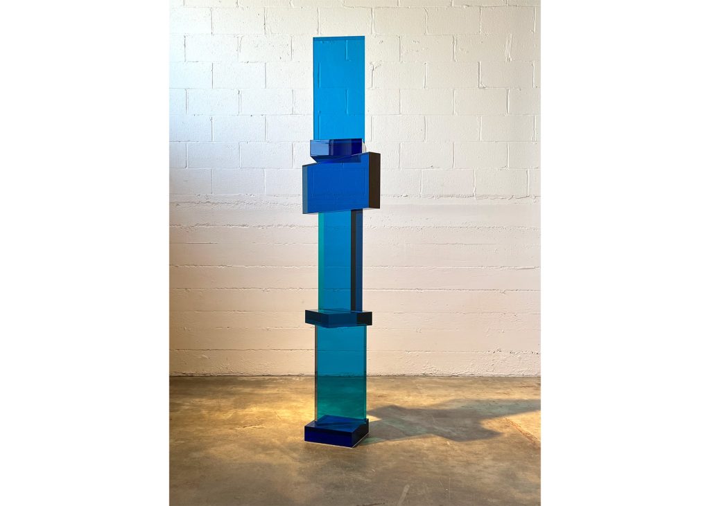
Discuss your ‘Towers’
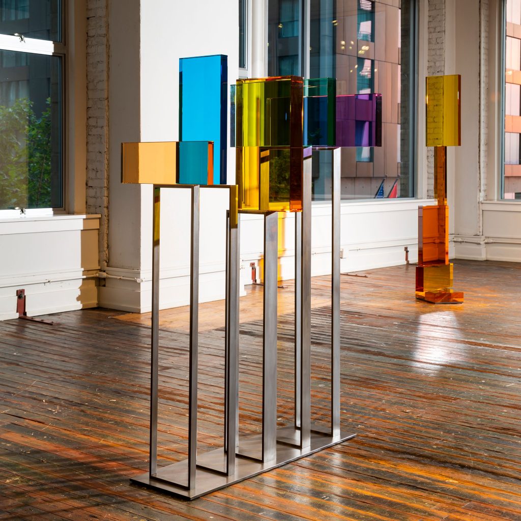
Chromatic Tower, 2020, 61 x 24 x 40 in (154.94 x 60.96 x 101.6 cm)
The towers are the most monumental pieces that I’ve created. They’re up to two meters tall, and can weigh 200 kilos. Part of this work to me is about physically balancing heavy, perfectly polished, optic glass blocks, then repositioning the elements until I decide it looks right. The sections are then chemically bonded together, which is a very involved process. The finished sculptures remind me of buildings, or architectural elements. They change as the viewer moves around them.
Sometimes the finished sculptures are monochromatic, but occasionally I’ll use different colors in an overlapping pattern to create more visual interest. Optic glass is the purest form of the material, and reflects, transmits, and refracts light in an incredible way. Considering how each element and the finished sculpture interacts with light is critical.
Sunset Shadowmaker, c. 2025, Blown, Cut & Polished Glass, 36" x 23" x 9" As installed
Explain what the word ‘Fractograph’ is and in relationship to your work.
Fractography is the science of the breaking of brittle materials. The term fractograph in a scientific context is usually a magnified photograph of the surface of a broken material. I use the term to describe broken and reconstructed glass blocks. Fractures caused by impact or thermal shock propagate through brittle materials at the speed that sound travels through that material. In the case of optic glass, that’s as much at 11,0000 MPH. Breaks in glass cannot be exactly replicated, so each pieces is irreproducible.
Indianola Fractograph #1, c. 2026, 24 x 12 x 2.25 in (60.96 x 30.48 x 5.72 cm)
How do you cope with the size and weight of each piece?
You have to stay in shape, and with glassblowing work with a good team. Glassblowing is very difficult to do alone, particularly for larger pieces.
John Kiley Working Shot
How large is the team in your glass works?
The glassblowing team is typically seven people including myself. I also have assistants who work in the cold shop grinding and polishing.
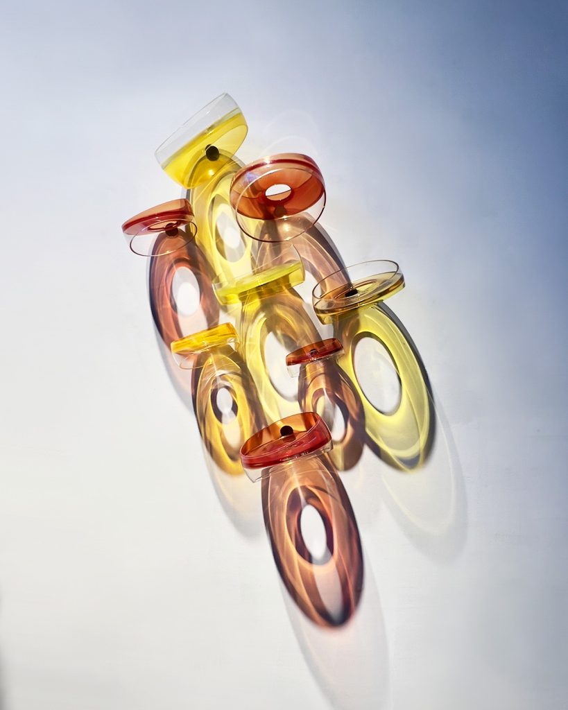
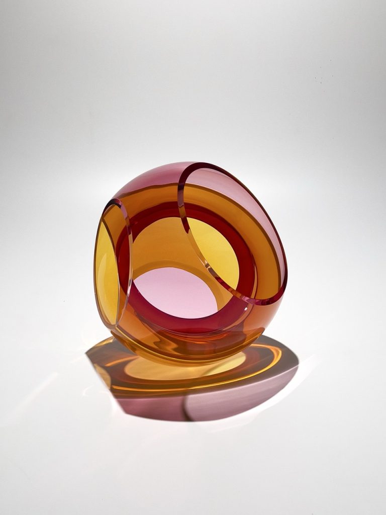
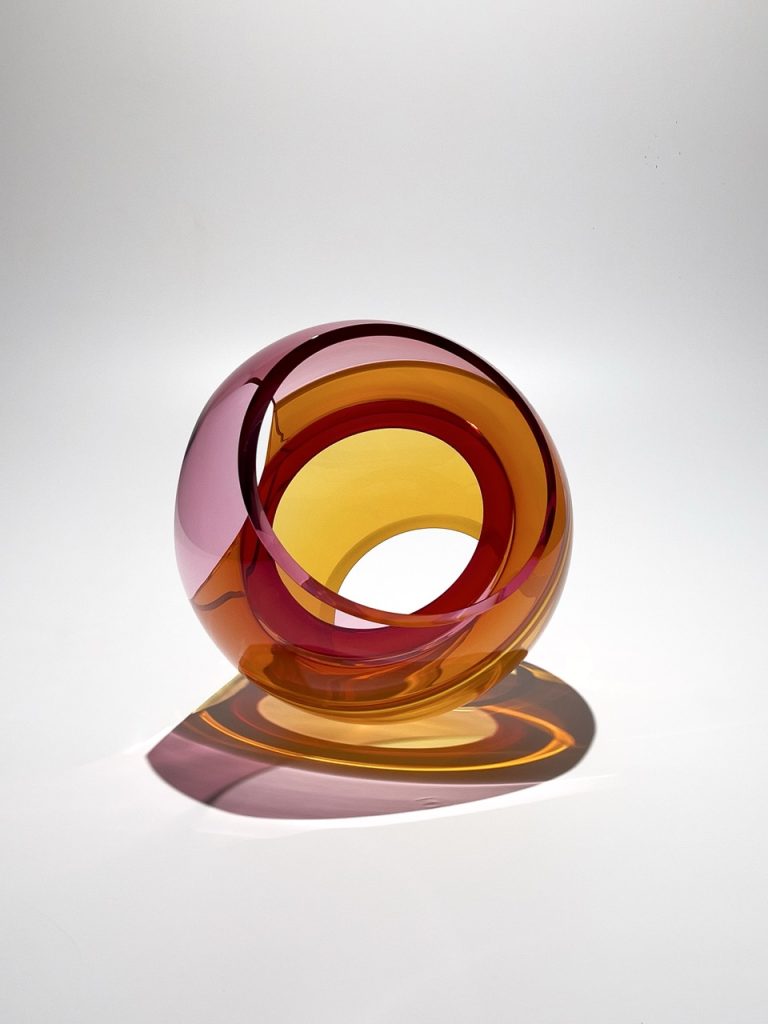
Explain how the viewer needs to become involved in your spherical forms, (peering through).
Concave Crosscut, c. 2026, 16 x 14 x 14.5 in (40.64 x 35.56 x 36.83 cm)
True sculpture should have no front. The interior sections of my speerical forms either have a solid membrane dividing the interior or overlapping colors with on opening. The inside is just as important as the outside.
Concave Crosscut, c. 2026, 16 x 14 x 14.5 in (40.64 x 35.56 x 36.83 cm)
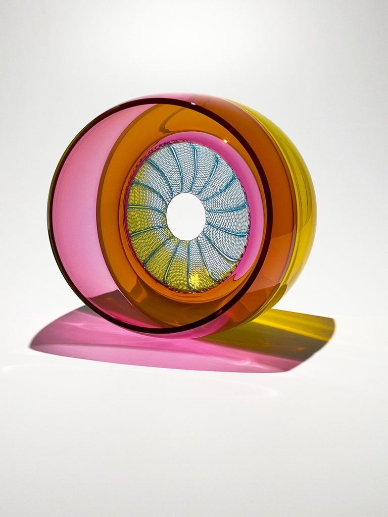
What led to your collaboration with Dante Marioni?
Zanfirico Halo - With Dante Marioni, c. 2026, 15 x 14 x 10.5 in (38.1 x 35.56 x 26.67 cm)
I met Dante Marioni when I was 17 years old, before I ever touched glass. We’ve been good friends for many years, and using the patterns that he makes positioned inside of the spherical forms made sense to both of us. It’s really fun working together.
Zanfirico Halo - With Dante Marioni, c. 2026, 15 x 14 x 10.5 in (38.1 x 35.56 x 26.67 cm)
How do you combine glassblowing and fabrication in your work?
To make larger sculptures using blown glass elements, the pieces need to be chemically bonded. This process involves griding, polishing, and the fabrication of armatures to secure the sections until the adhesive sures.
Sailish Sea Overlap c. 2024 49.53 x 49.53 x 49.53 cm 0
What method are you currently working on?
I’m constantly experimenting and lately have been utilizing a 5 axis waterjet machine to help create the rough shape for new forms, based on my Fractographs. It’s a new way of working and thinking for me.
This video shows us how innovative John Kiley is. How he is able to see far beyond the obvious. A true independent artist and thinker. Take yourself to the next level of understanding of why some of us are watchers while others are inspired by what is in clear sight, Waiting to be unlocked.
John Kiley
Contact:
Website: https://www.johnkiley.com/
Email: john@johnkiley.com
Deborah Blakeley, Melbourne, Australia
Interview by Deborah Blakeley, May 2026
Images on these pages are all rights reserved by John Kiley
[/vc_column_text][/vc_column][/vc_row]
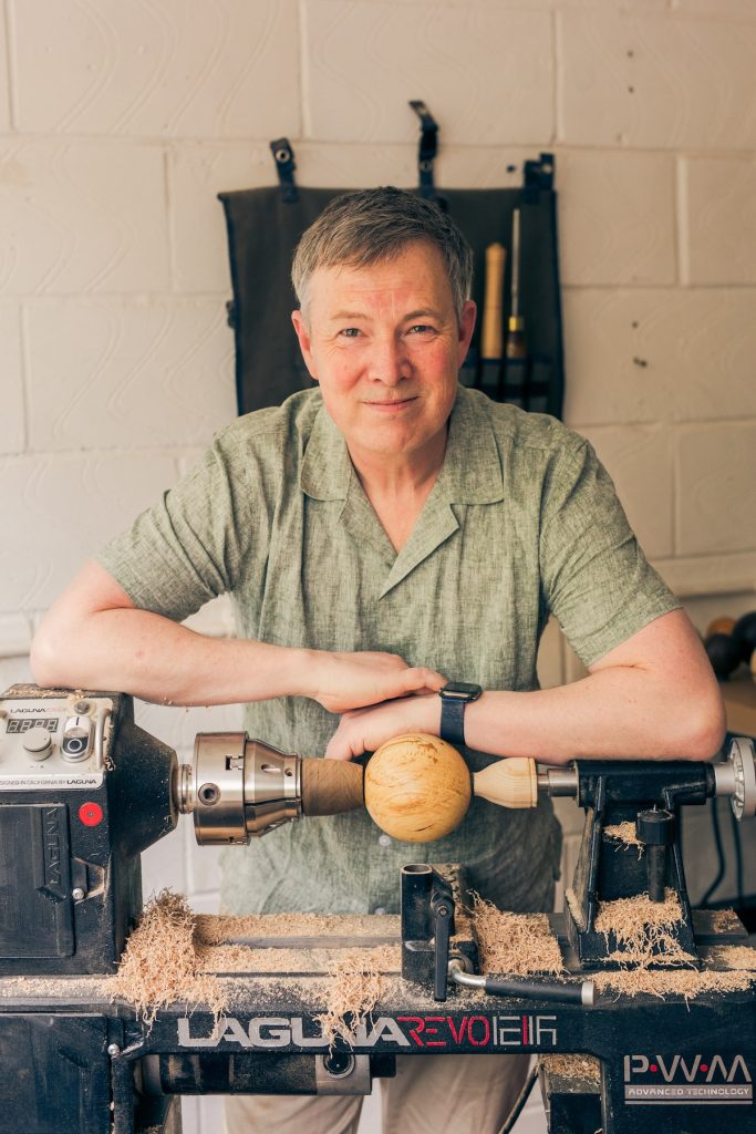
Randon Burns
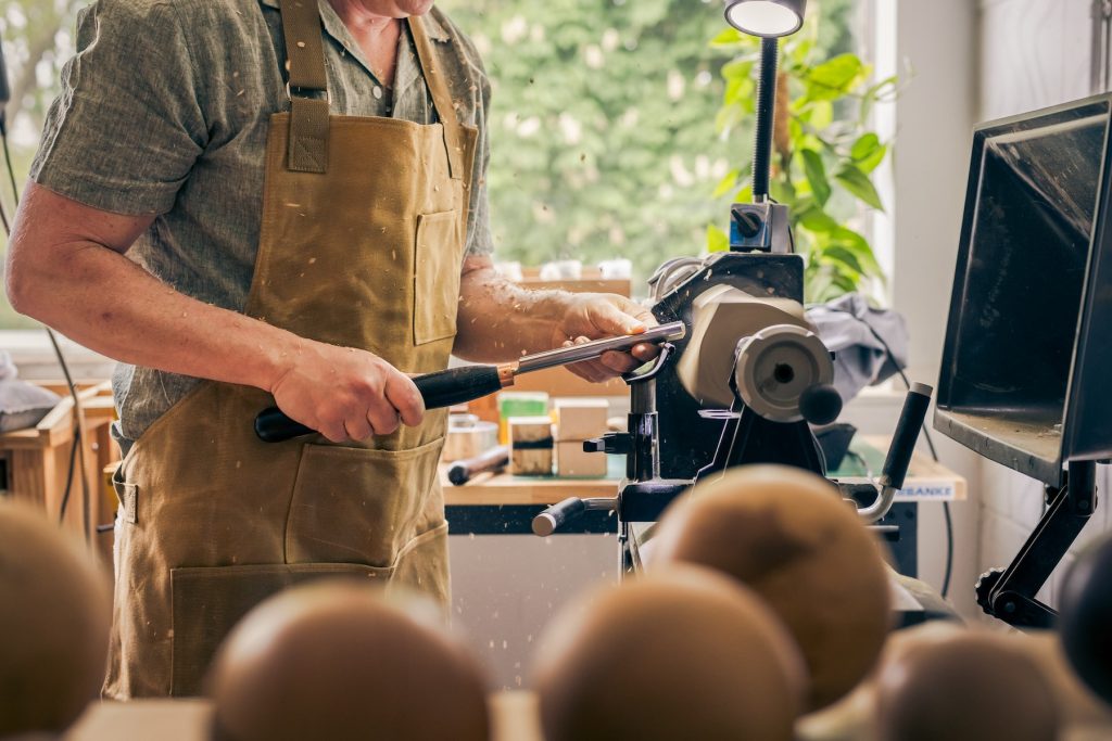
When did you first become involved with wood, as an art form?
I came to craft, and to wood, relatively late after a career as a project manager in the translation industry. When that industry was significantly impacted by advances in AI, I went looking for a more creative path. London is fortunate to have many institutions offering adult education in craft and the arts, so I began exploring.
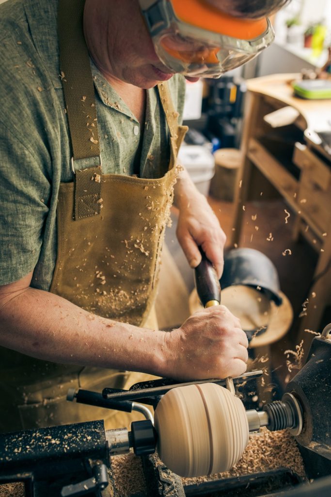
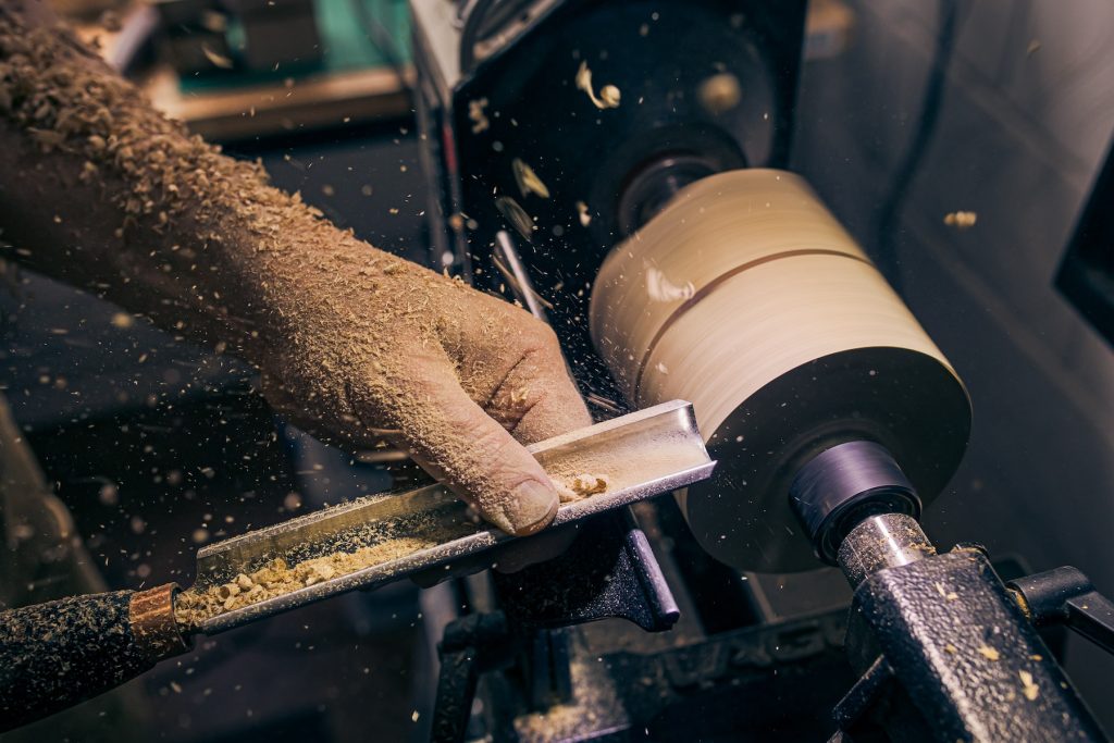
Work in progress by Paul Read Photography
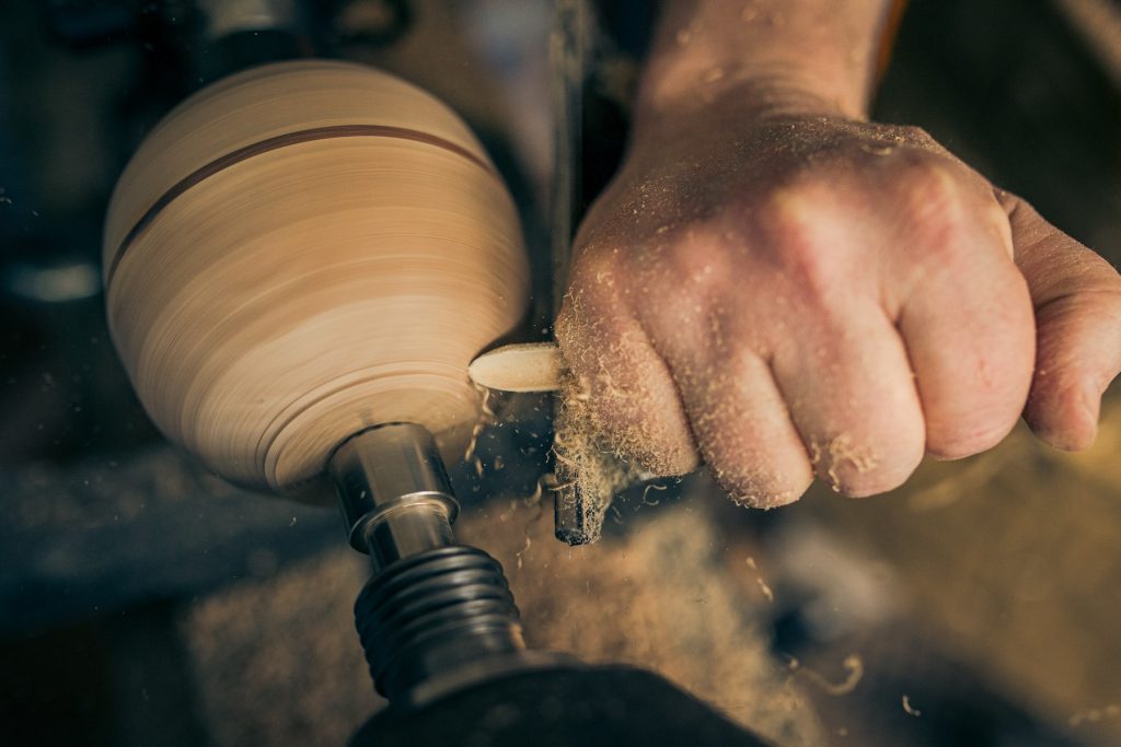
I started with wood carving in 2023, initially inspired by Japanese netsuke, and then moved on to silversmithing, coppersmithing, stone carving, and various aspects of jewellery making. I discovered woodturning at Blackhorse Workshop at the start of 2024. Blackhorse is a wonderful community-based wood and metal workshop, and that’s where things really clicked.
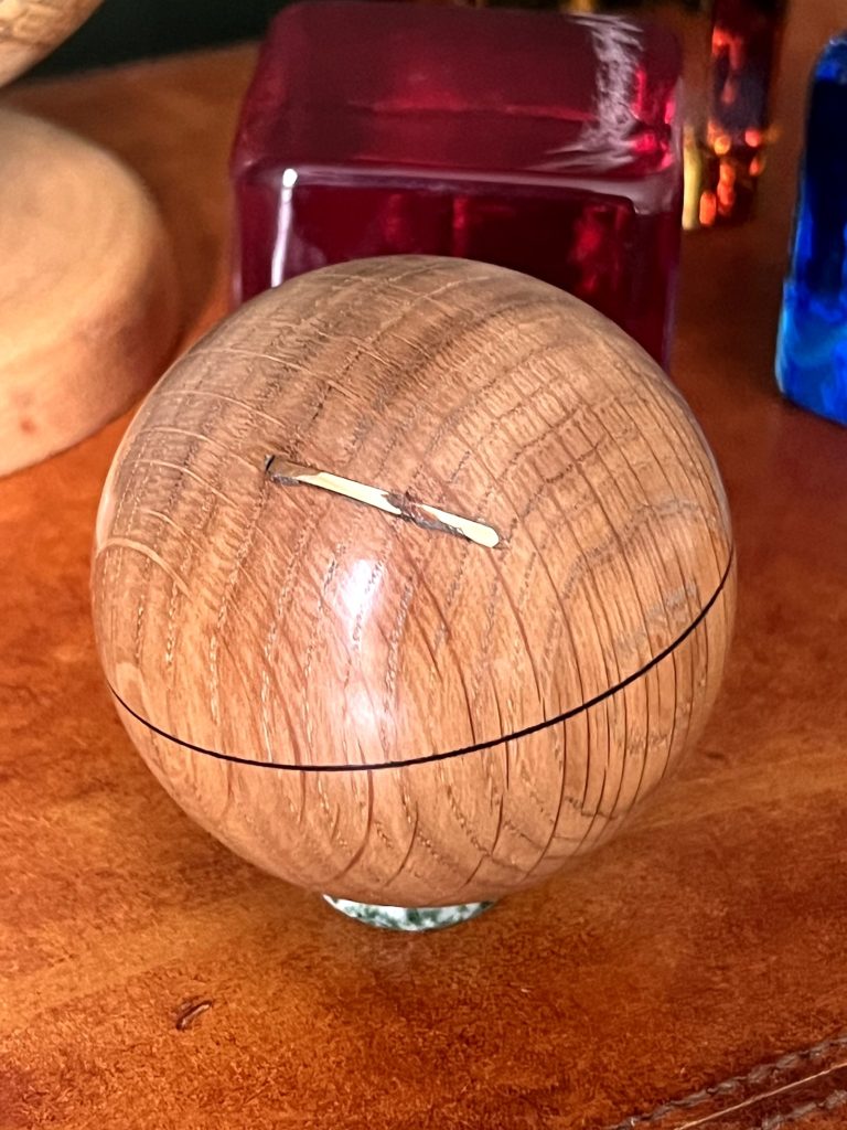
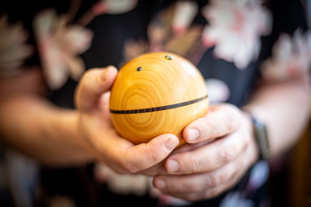
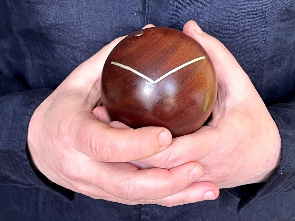
What is unique about the globes you make and what is it about the shape of a globe that excites you?
My globes are minimalist representations of personal geography. They are turned wooden spheres, each marked with either the Equator or the North Pole to establish a geographical point of reference. Specific locations or connections between places, flight paths for instance, are then inlaid with metal or set with gemstones.
 London to Tel Aviv in oak and gold edited
Nothing else is marked, so each piece is reduced to its most basic elements, a curve, a line, a dot, yet each piece still holds history and tells a story.
There is something inherently compelling about a pure form like a sphere. I’ve always had an interest in geography, cartography, history, and travel, so it comes naturally to me to look at a sphere and see a globe.
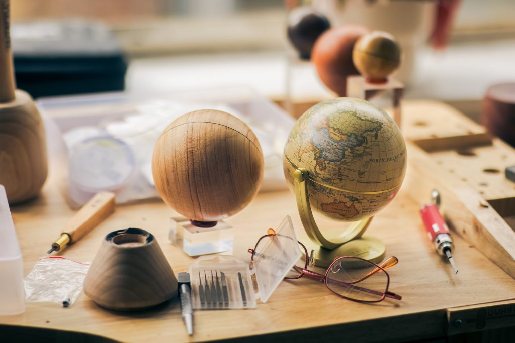
What type of wood do you mainly work with and why?
I’ve been experimenting with a range of woods. Open-grained species like oak and black walnut, with their visible pore structure, work particularly well, but there are many others I’d like to explore.
When working on commissions, I keep a selection of blank spheres available so clients can choose the wood themselves. It’s interesting to see what people respond to, and that has influenced the direction of my work.
![]() Assorted globe blanks - photo by Paul Read
Assorted globe blanks - photo by Paul Read
Discuss the importance of combing wood with silver, gold, and gems.
Precious metal inlay is a centuries-old technique, but it’s most often seen on flat surfaces such as boxes or cabinets. Adapting it to a curved surface like a sphere has been a learning process.
I use silver, gold and gemstones partly because I trained with them through jewellery courses, but also because they carry an inherent sense of value. They allow me to mark certain places or routes as significant in a direct and readable way.
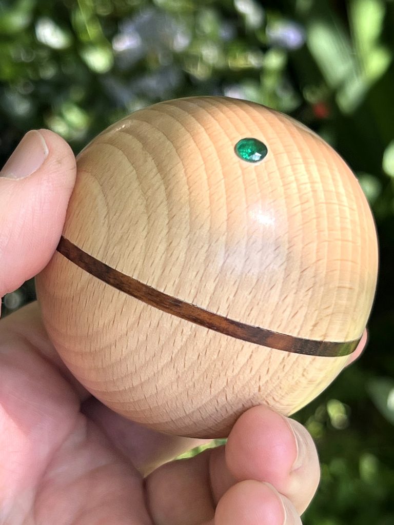 Ireland in oak and emerald edited
Explain a little about the importance of being a member of the Worshipful Company of Woodturners?
The Worshipful Company of Turners received its Royal Charter in 1604, although its origins in London date back to the 12th century, making it one of the oldest livery companies still in existence.
I became a Yeoman of the Company in 2025 during my bursary year at Cockpit, through active involvement and support of its work. The Company plays an important role in supporting the craft today through education, funding, and community, and it has been a valuable part of my development.
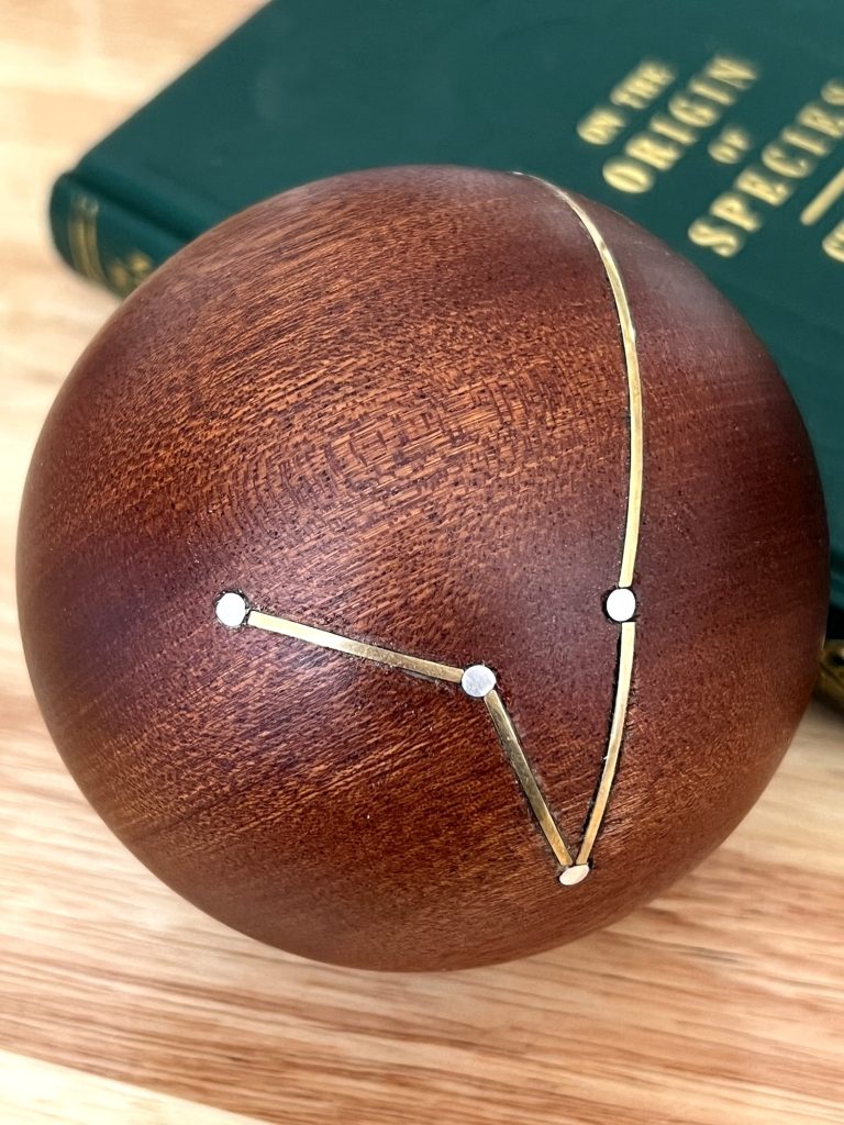 Darwin’s Voyage, edited
You take commissions, discuss that process and give an example.
I work mainly to commission. Once people understand the idea of a globe marked with their own places and journeys, they quickly begin thinking about the places and connections that matter to them and their loved ones. They come to me with their stories, and we work together to decide how best to represent those connections, including the choice of wood and materials.
I enjoy hearing the stories behind each piece, and that aspect of the work gives me a strong sense of purpose while I’m making it.
For example, my first commission was for someone based in London who works frequently in New York. It was commissioned as a gift by a colleague who understood the importance of those two locations to that person and their work. I’m originally American and moved from New York to London myself 20 years ago, so the piece felt personal to me as well. The resulting globe, in black walnut and inlaid with gold, charts the flight path between those two cities.
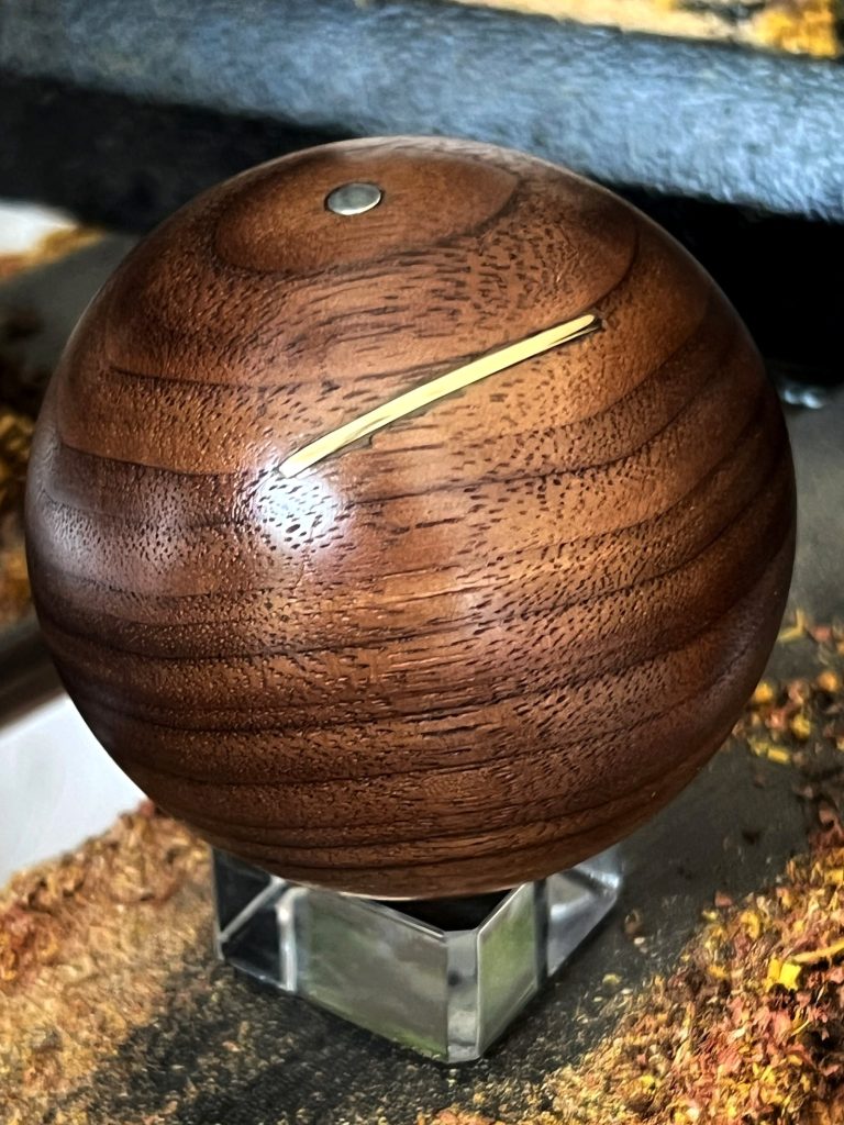 LHR-JFK in gold and walnut edited
As my skills catch up with my ambitions, the work has become more complex. I recently completed a globe charting Darwin’s voyage from the UK to the Galápagos via South America. That piece was speculative, but it quickly found a home. I haven’t yet done London to Melbourne, but perhaps that’s next.
Comment on the importance of sharing you skills through workshops with others.
I was fortunate to learn in a shared workshop environment with an enthusiastic teacher, and I think it’s important to pass that on. There’s a strong appetite for woodturning in London, but relatively few opportunities for people to try it.
 Globe with equator
Teaching is ultimately about connection: connecting people to the material, to each other, and to the wider woodturning community. That same idea of connection runs through my own work, so it feels like a natural extension of what I do.
Expand on the importance of Cockpit in London and your art practice.
Cockpit is a remarkable organisation, currently celebrating its 40th anniversary. It is one of the leading craft incubators in London and is supported by many of the livery companies, the historic city guilds.
 Globe in progress photo by Paul Read
For me, it has provided not just studio space, but structure, community, and opportunity. Their open studios, held twice a year, create an important bridge between makers and the public, allowing people to see both the work and the process behind it.
Recently you have started a three-month residency at Makerversity. It sounds wonderful can you explain how you got the residency and what and where it is?
Makerversity is a shared workspace in the basement of Somerset House in London. Somerset House was once the home of the Navy Board and now houses the Courtauld, among other institutions.
 Makerversity provides workspace and equipment to a wide range of makers, innovators and designers. It offers shared access to advanced tools such as state-of-the-art 3D printers and laser cutters, alongside more traditional woodworking equipment. Many of the residents are developing prototypes or startup ideas, which creates a very different atmosphere to Cockpit.
That difference is exactly what drew me to it. It has given me the opportunity to explore how more advanced manufacturing techniques might be incorporated into my work or design process, without having to invest in equipment that may not ultimately be relevant. As with Cockpit, the community aspect has also been invaluable.
What are you currently working on?
I was recently shortlisted for the Royal Academy Summer Exhibition with a piece titled Nurse’s Journey: MNL – LHR (via DXB). It traces the route many Filipino nurses take when coming to work in the NHS, often travelling via Dubai as there are no direct flights from Manila.
 Nurses Journey MNL- LHR via DXB
The piece works on a literal level as a flight path, but also more broadly as a reflection on movement, labour, and connection between cultures.
I’m now preparing for the possibility of exhibiting it this summer. The final selection isn’t announced until the end of May, so I don’t yet know if it will be included, but it’s an encouraging step.
 Randon Burns
Contact:
Website: www.randon.co.uk
Instagram: @randon.co.uk
Email: studio@randon.co.uk
Deborah Blakeley, Melbourne, Australia
Interview by Deborah Blakeley, April 2026
Images on these pages are all rights reserved by Randon Burns
Mela Cooke
Was your original occupation as a physiotherapist and the understanding of the human body a big influence on your sculpture?
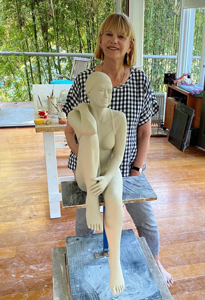
My original occupation as a physiotherapist has had a profound influence on my sculpture. Years of working with the human body gave me an intimate understanding of anatomy, balance and movement. I have always had a natural inclination to portray the human form in three dimensions and interestingly I never draw. Sculpture has always felt like my most natural language.
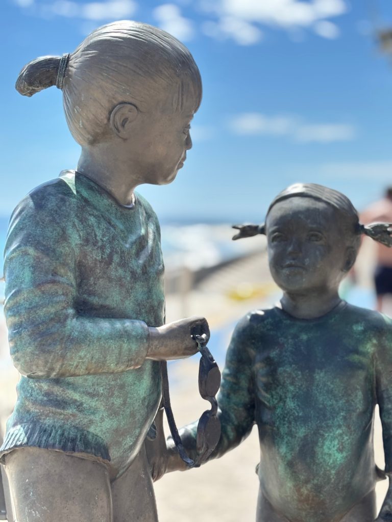
'My Little Sister' at Cottesloe Beach WA photo by Deborah Blakeley
Can you please explain why and when you decided to work only in bronze?
I began working in clay, making moulds and casting in cement fondu. Once I had sculpted several pieces and was pleased with the results, I decided to have a work cast in bronze. From that moment I was completely hooked. Bronze allows a permanence and richness that elevates the work.
Bronze and clay allow you the joy of both mediums expand on both.
Kindred Spirits at the Foundry before patination
For many years bronze casting was financially demanding, so I continued running my physiotherapy practice while sculpting part time. During this period I also studied marble carving. Marble is a reductive process, removing material to reveal the form within. While I loved the discipline of marble, I ultimately preferred the serenity of modelling in clay. Clay is responsive and immediate. Bronze then transforms that tactile, intimate modelling process into something enduring. The joy lies in both stages. Clay is fluid and forgiving. Bronze is permanent and powerful.
Over time, as gallery representation increased and sales became consistent, I sold my physiotherapy practice and committed fully to sculpture.
Comment on your models and where you find them?
My models are often very close to home. My two athletic daughters and my granddaughters feature frequently, and when they are unavailable I work with friends, children and sometimes grandchildren of friends. Familiarity allows me to capture authenticity rather than simply likeness.
How big and small are your sculptures?
My sculptures range from small works such as Have I Told You Lately, which is 25 cm high, to life sized figures. I often work at two thirds life size, as this scale retains presence and impact while remaining accessible to collectors.
The Conversation H38 W60 D40
Take on of each, big and small and discuss the specific sculptures and why they are these sizes?
As an example, a smaller work like Have I Told You Lately is intentionally intimate. Its scale invites close viewing and suits interior placement on a table or sideboard. In contrast, larger works which can be placed indoors or outdoors, such as All Dressed Up With Nowhere To Go, and Just Paused demand greater scale to convey strength, movement and narrative. The size supports the emotional weight of the subject.
All Dressed Up With Nowhere to Go in clay in the studio
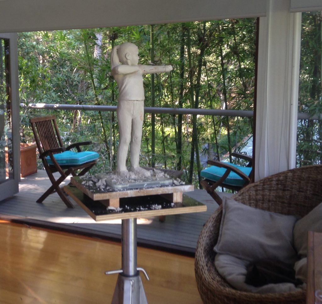
Tell us about your studio…
My studio is located in a purpose built building in our back garden. It is a 40 sq metre space with timber floors, large windows and beautiful natural light. It includes a small kitchen with my beloved Italian coffee machine, a bathroom and a deck overlooking trees on one side and our tennis court on the other. Music is essential. I have a good sound system and rarely sculpt in silence. Light and music are two things I must have. They shape the mood of the space.
Discuss the importance of the foundry you use.
I work with three foundries, two in Brisbane and one in New South Wales. I originally discovered them through other sculptors and through research when I began casting more regularly. Accessibility matters. Being able to visit the foundry, check waxes and patinas, and discuss finishes face to face is invaluable. The relationships are deeply important to me. All three owners are sculptors themselves, so they understand the precision and finish I require. There is trust built over many years, and that trust allows consistency in output and quality.
Take one Public Work that has influenced you sculpting?
One public work that influenced me greatly was the installation of my sculptures in Maryborough, where twenty four works are permanently installed throughout the CBD. Seeing my figures interact with everyday public life reinforced my belief that sculpture should create connection and joy in shared spaces.
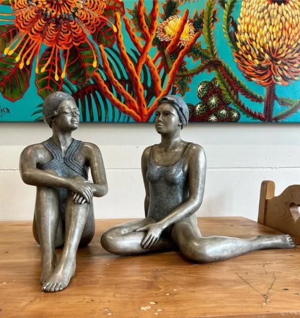
Look at your series ‘Swimmers’
Halcyon Days 70H 38W 40D
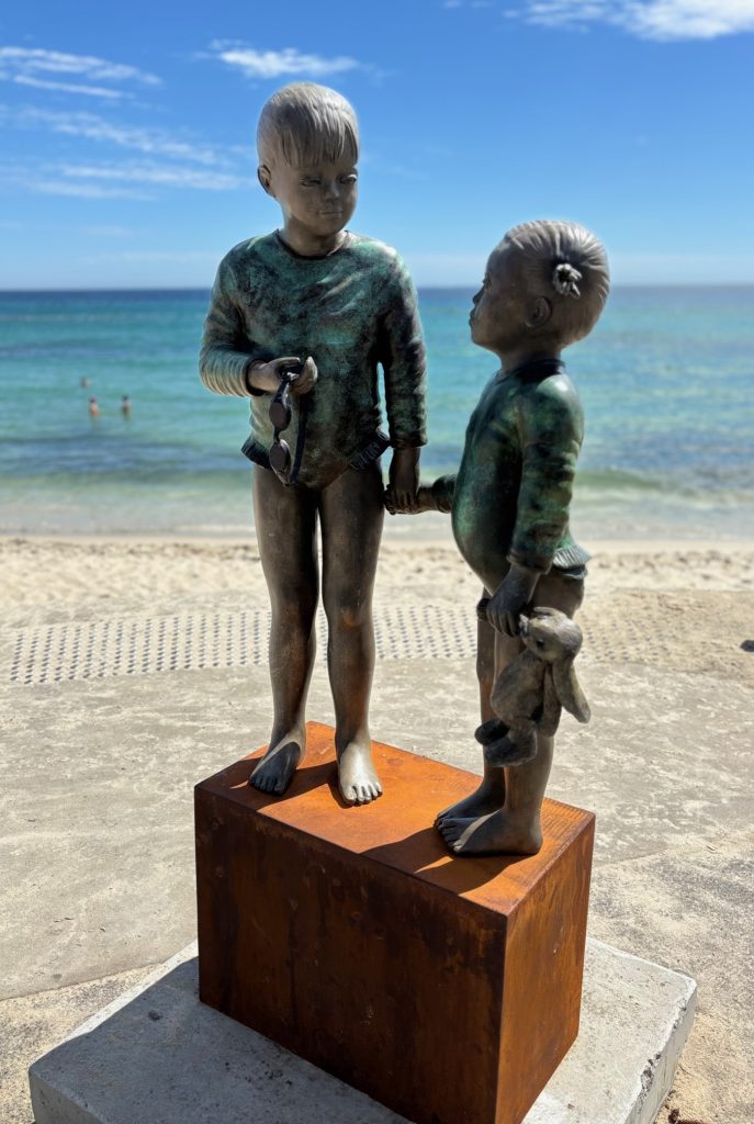
The Swimmers series evolved from a request by close friends in Sydney who asked me to sculpt a swimmer for their poolside. Like most Australians, I have swum all my life. Beaches and pools are deeply embedded in our culture. I initially sculpted a broader series of sportswomen including a volleyballer, netballer, golfer and others, but the swimmers resonated most strongly. Almost every Australian has a memory connected to water, so the emotional link is immediate.
Has living in Queensland and Australia influenced the series?
Living in Queensland has certainly influenced this series. The climate encourages outdoor living and an intimacy with water. That relaxed, sun filled environment shapes the posture and mood of the figures.
Take one sculpture you have be especially delighted with where it now lives and why?
'My Little Sister' at Cottesloe Beach WA photo by Deborah Blakeley
One swimmer I am especially delighted with is My Little Sister. The first edition now lives in my daughter’s home at the end of a corridor overlooking the pool. The placement is perfect. The sculpture becomes part of daily family life, reflecting movement, childhood and connection.
Reflect on ‘Lifesaver’
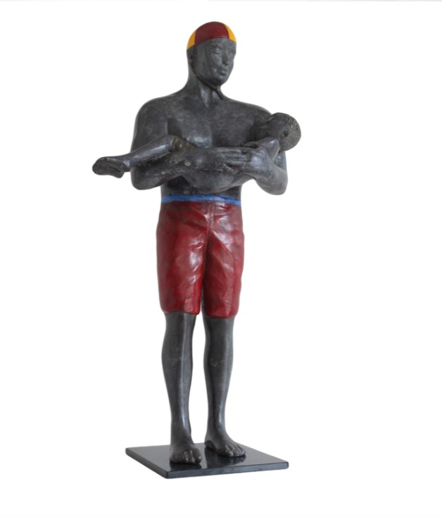
The Lifesaver 48H 10W 7D
Lifesaver emerged after I saw a photograph of a lifesaver carrying a small boy to safety. The image stayed with me. I recreated it first as a smaller work and later as a larger commissioned version. The scale enhances the protective strength of the figure.
Give us some additional background to’ Polka dot Diva.’
Polka Dot Diva represents the quintessential Australian summer moment. The polka dots, the relaxed pose and the sunglasses evoke warmth and confidence. The sunglasses in particular are symbolic. They speak of beach culture, bright light and a certain Australian ease. They also create a subtle barrier between the viewer and the subject, adding intrigue and personality.
Working on a small sculpture in the studio
Mela Cooke
Contact:
www.melacooke.com
www.instagram.com/melacooke.sculpture/
Deborah Blakeley, Melbourne, Australia
Interview by Deborah Blakeley, April 2026
Images on these pages are all rights reserved by Mela Cooke

Clare Conrad
Is all your work’s wheel thrown?
Yes. Since I first touched clay, at the age of 16 (on an art foundation course at college), I have been captivated by the magic of throwing - gaining such control over a lump of stuff from the ground, to create a fine, thin, perfect form. Nothing else quite measures up!
How important is place to your work?
I have always felt that my clay work is my autobiography. It has been my response to my surroundings since the first year of my degree course in 1985, when the college trip to Venice affected me deeply, resulting in the decoration technique I developed, and continue to use. I realised that every aspect of my pots reflects something that moves me. My earliest memory was picking up a “conker” (horse chestnut) in reception class in the primary school playground, fascinated by its contrasting qualities of textures and colours.


Large Round Bowl, 26cm
Over the years we have lived in many different environments, and they have each fed into my work - coastal areas (particularly the Dover cliffs on the south coast), city centres, and now, beautiful, hilly, rugged, sparsely populated countryside. I delight in using my technique and making colours to match and evoke my surroundings.
Colour
Colour has been central to my work since the Venice trip in 1985. Before that I was mainly fascinated by contrast and texture. Hans Coper was my driving force since age 16 in 1964 - still is, but now colour is an essential part of it.
I delighted in mixing all my own colours (from the three primaries with white), while studying painting on the early foundation course. It was natural that this would be the way to approach vitreous slips for my pots. I buy three primary colour glaze stains from a supplier, and achieve a vast array of shades, which I keep track of by making tiny (1”) squares - each with a code on the back (a number or short recipe). I mix everything from raw materials - the basic colour stain powder with glaze ingredients and powdered clay, which, when water is added, is divided up in varying amounts (spoonfuls) to create the myriad shades. (I have always loved paint companies’ shade cards!)
 Wave Scooped Rim
Clay
I have always used T material - recommended to me by a tutor at Bristol University, it is horribly expensive (more than porcelain), but has incredible wet strength, so it doesn’t collapse during fine throwing, or crack during the decoration stage. It is strong and warp-resistant at all stages, but too coarse for me to throw neat, so I mix it with a top quality smooth white stoneware. I have tried many alternatives, but nothing is as trouble-free as this combination.
 Autumn Colours
You have work in both private and public collections. Take one piece and explain why this purchase was so important your art work?
Every purchase is a huge boost, but a special one was in 1994, when Bristol Museum and Art Gallery bought a vessel, It is a design based on shutters against faded ochre peeling walls in the south of France. It was special to have something bought for their permanent collection, especially as I had been a very frequent visitor for the years while studying for the ceramics degree there, and had gained much inspiration - initially for the college projects, and later for my own work.
9” ht. no. Na1913 Photo Bristol Museum and Art Gallery
An occasion that stands out is when an interior design company asked me if I could match fabric and wallpaper colours for a client’s room.
This was quite a challenge, but the result was very successful, very satisfying, and gave me a new palette of undiscovered colours that I have continued to use. I made several small vessels, and the client chose the finished design, which I then made a version 24 cm.ht (9½”) 2023.

Colour matching testing
When you do a joint exhibition for example ‘Showcase 1’ with Joanne Last. How did you collaborate with the other artist?
I have shown with many other artists, but I have never had a part in the decision. It has always been the gallerist’s choice. They are usually chosen for the colour match, style, or subject inspiration. I remember being thrilled, when, in 1989, I was given a solo show to accompany Carol Farrow’s paperworks. I’d loved her work for years. It was a superb match of style, inspiration and colour. Later, an exhibition to accompany Janette Kerr’s expressive, atmospheric sea paintings. Coming right up to date - my pots were chosen to be with an artist in Flock Gallery here in the Welsh Marches border, Daniel Crawford’s superb pared-back, minimal colour paintings accentuating the stark, rugged, atmospheric landscape of the area. My next solo exhibition is of my ceramics to be shown with Newlyn Group of paintings inspired by the chalk landscape in White Chalk Gallery (named because of its position) in Wiltshire, UK.
How ceramics are displayed in Art Galleries; is very important, discuss.
I love it when my pots are chosen specially to go with a particular painting style, or colour scheme. I think it is of benefit to the potter, the painter, and the viewer. Pots and paintings complement each other - colours, or shapes in one leading the eye to the other, the placing of them is hugely important to make a satisfying composition. The display itself, when done well, is an important artwork, which can enhance peoples’ experience.
Gallery display, generally, is very important. It is noticeable when thought, and artistic skill have gone into the curation and placing, rather than just finding a space to put an object.
 Large Round Bowl, 26cm top view
Take one of each of the three shapes you mainly work with and expanding on the techniques and the importance of the visual effect.
Since 1973, when I saw eggshells burning on a fire, my favourite shape has been the deep eggshell, - the inside membrane had turned black, leaving the outer brown shell untouched, reminiscent of Hans Coper’s pots. When, (in Venice 1985) I became obsessed with colour and texture, this form was ideal to be a canvas for my designs. I’ve almost always found it necessary to combine my colour designs on a three dimensional form, rather than on a flat canvas.
 Vessel and Jagged Bowl
An important aspect of all my forms is the rim. I intentionally make them subtly jagged. I find that it adds drama to the piece, and is a focal point, when the exterior texture is seen against the contrasting interior smoothness. This is done with ribs in the final stage of throwing.
After the base has been turned, it is decorated when nearly dry. The thickness and dryness of the slip must be just right in relation to the dryness of the pot - either too much, or too little dampness affects the amount of slip that adheres. It requires great concentration to be sure that it works when both pot and slip are constantly drying. The intensity of the final colour isn’t visible until it is fired, so I write my code in food dye on each layer, so that I can see what I’m doing. Each layer must wait for the underneath to dry slightly. I call the whole enterprise ‘controlled randomness’. I have a certain amount of control in the placing of the colours, but inevitably there is a difference in the amount of slip that adheres, and the amount that comes off with the application cloth.
Another form that I have loved to make for 40 years is the ‘jagged bowl’ semi-sphere. This springs from my love of conkers! It works best, when I throw a perfect semi-sphere, turn the base to a perfect round, cut it in half vertically, and rejoin it ‘skew-whiff’. It is high risk endeavour, cracking and warping the two main problems, and it is very time-consuming.
 Wheel thrown and altered
It is hard to specify three shapes that I make most frequently, I often experiment with form as well as colour. This image of blue sea-inspired pots shows the variety. When a form is more complex, it changes the nature of the design that can go onto it.
How large can you produce pieces?
The largest that I’ve made so far, is 36 cm.ht. (c 14”). I’ve thrown them in three sections, and refine them, when leather hard, to ensure a smooth perfect form. The difficulties encountered are considerable, I need to decorate most of my forms upside down, and the fine, jagged edge makes it impossible to turn, or decorate it by resting it on the rim, so it always rests on a support inside. Manipulating a large thinly-thrown pot, when it is half dry is nerve-wracking!
 36 cm.ht. (c 14”)
Kiln
I now have two kilns, both electric, the largest is 4 cu ft. Electric kilns are completely inactive atmospherically, and I delight in the fact that every mark on my surfaces is by my hand (though I do love the effects created by flame by other potters).
Discuss the limitations of your work?
Weight
My pots are quite lightweight - people are often surprised that they are not heavier. I like to throw quite thinly. They are not as fragile as they appear, and I emery them under running water during the final stage.
 Tiny round bowls
Your studio
My current studio is perfect. It is right next to the house. We converted it from a tumbledown, oil-covered Victorian brick lean-to. It’s quite small - 200 sq.ft plus an attached small room ideal for the kilns. My major requirement is daylight (and warmth!), and, with the addition of a roof window we put in, this is great. In the past, I have been in garden sheds, and a cellar, which would have been disastrous without daylight bulbs. I need daylight in order to see my colours properly.

Are all your pieces watertight?
Do you make pieces for domestic use e.g., bowls.
The pots are all watertight. They are fired to stoneware temperature, with vitreous slips, which are glaze/clay mix (sometimes glaze inside). Most of them are sculptural, rather than utilitarian, but some are used as vases.

Ripple Vessels, wheel thrown.
Do you like to think your ceramics are immediately recognisable as yours and why?
Yes, I know that they are, and this thrills me!
 Cylinder vase 20cms tall
For many years I have met strangers who tell me that they have been somewhere (like mediterranean countries) where there are peeling walls in faded colours - and that they have immediately thought of my pots. No-one has seen anything similar before, so I feel that my years of perseverance has been worthwhile in creating something unique.
 Pocket Pots, Wheel thrown and altered. 12cms
It does feel quite strange that there are hundreds of my pots out in the world, and mostly, I have no idea where they are, or who has bought them, as most of them have been bought from galleries.
 Landscape, Scooped rim, 23cm
Contact:
Clare Conrad
Contact: clareconrad@hotmail.com
https;//www.clareconradceramics.co.uk
Deborah Blakeley, Melbourne, Australia
Interview by Deborah Blakeley, March 2026
Images on these pages are all rights reserved by Clare Conrad

Heidi Woodhead
Comment on the importance of tranquillity in your art?
Tranquillity is important in my art practice. The reason I began painting was as a counterpoint to the death and destruction I encountered daily in my work as a forensic crime scene examiner. I use my art practice to create a sense of tranquillity in my life and to create something beautiful amidst the chaos. I also use my painting to seek a moment of calm, a stopping place, time to reflect and pause and appreciate just being in the moment. I try to translate a feeling of calm in the paintings themselves, too, by using soft lighting, slightly blurring the lines, and choosing calming colours.
 2023, All That I Am, 92cm x 122cm, oil on canvas
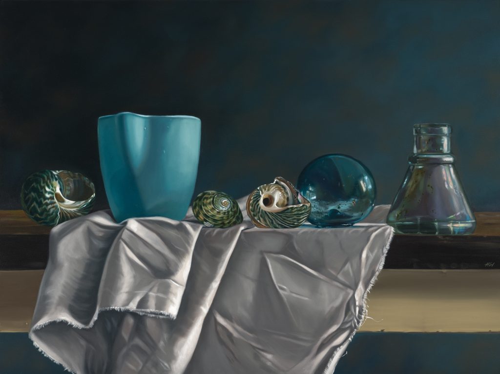
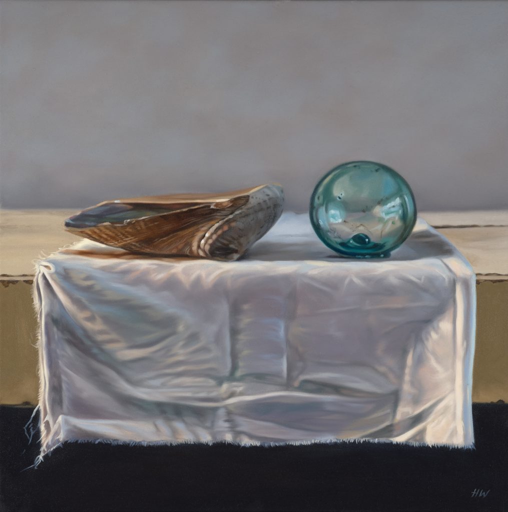
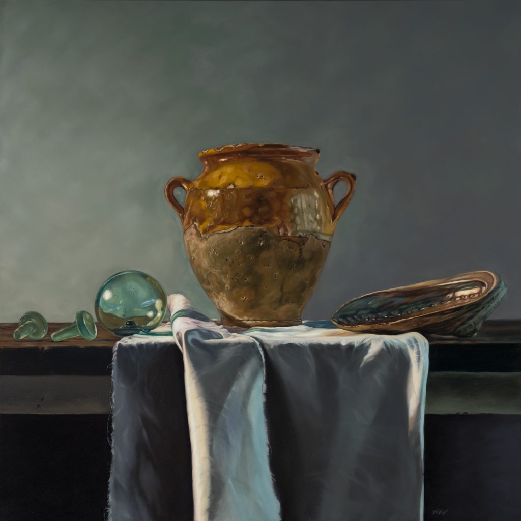
You do Still Life paintings, can you explain the importance of the frayed white cloth in many of your still life paintings?
In my most recent exhibition, Oceanic, I included a frayed white cloth in many of the paintings. This white cloth was representative of the ocean, in its form and undulating folds. Arranging the fabric in a certain way in my still life compositions suggested the movement of water, or the foamy turbulence of the ocean.
 Ebb and Flow, 2025, oil on canvas,122cm x 92cm
Where do you get the pieces for your still life art?
I am a collector at heart and love fossicking through antique shops, garage sales and markets. I am always on the lookout for interesting bowls or ceramics, vases and plates. I also love collecting really time worn objects with patina and texture that speak to me of their history. When I am considering a piece to put in a painting, I usually pick something for the texture of the piece and how it might work in juxtaposition with the fruits or flowers I am putting next to it. Sometimes that is a piece of glassware that will bend the light in an interesting way, and sometimes it is a chipped old piece of crockery with a lovely, coloured glaze.
Your latest works, After the Rain, how do you include the silver leaf?
In of my latest works, After the Rain, I have included a background of silver leaf. This painting was inspired by the magnolia flowers that were coming out on the street where I live last Springtime. But Spring in Tasmania is notorious for showers and wind amongst the sunlight. I was trying to evoke the shivery, silvery bright sunlight that was being reflected on the recent raindrops of each petal. I developed the idea of the silvery light and applied a background of silver leaf around the magnolia image that I had painted.
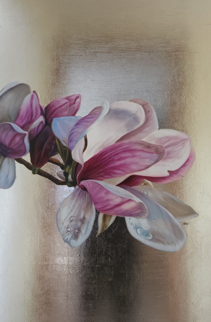 2025, After the Rain, 2025, oil and silver leaf on board
Does living close to the ocean influence the collection of shells in your work?
Living close to the ocean means that it is a constant inspiration. I swim in the sea regularly and find walking along the beach very meditative. Any time I visit a coastline I find myself collecting shells or bits or seaweed or feathers. I can’t seem to help myself. I find such immense beauty in the natural world, that I must pick up bits and pieces to take home and sketch later.
 First Light, 2025, oil on canvas, 60cm x 60cm
Do you find your environment in Tasmania small or overflowing with inspiration?
I love Tasmania and I find it a very inspiring place to live. I like that it has a smaller community feel and I like living in a place of such enduring natural beauty.
Why do you choose to paint or draw various subjects?
The subjects I choose to paint, and draw come from a deep creative drive. I like to paint around a theme for each of my exhibitions and I arrive at a theme depending on what I feel inexplicably drawn to. For example, my last exhibition, Oceanic, was my response to an obsession with the ocean and wanting to communicate a sense of history with time-weary, ancient objects. I chose to paint shells, fragments of sea-pottery, ceramics and glass that symbolise the natural and man-made world and time passing.
 Stillness and Reflection, 2025, oil on canvas, 122cm x 122cm
By painting those objects, I was referencing our place in history and questioning its relevance in our contemporary world. My exhibition of 2023, Tulip Fever, was centred around the Dutch obsession with tulips in the 1630s. With that collection of paintings, I was tapping into that burning desire for beauty, of exploding colour and light with just a hint of the underlying darkness, a peripheral vulnerability not entirely apparent, giving a haunting quality to the work.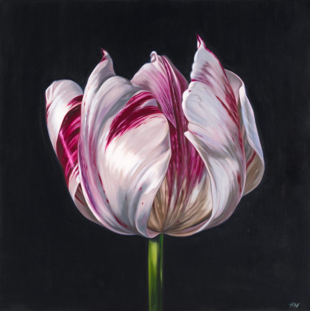 2023, Sempre Augustus, 122cm x 122cm, oil on canvas
Is your botanical art influenced by old Dutch masters.
My botanical art is very influenced by the Dutch Masters. I strive for a classical element to my paintings, and I look to the old masters of still life for inspiration, be it in their use of light and dark or their subject matter. I especially admire female artists of that time such as Rachel Ruysch and Anne Vallayer-Coster.
Discuss your painting ‘Oyster Catchers, Nelson Bay’.
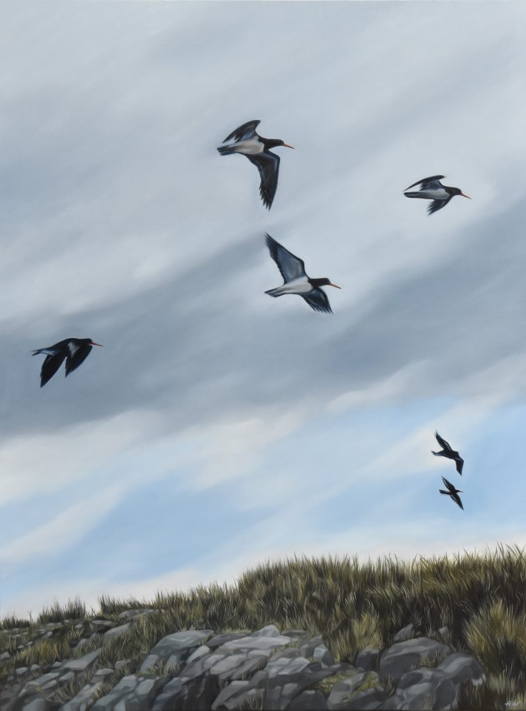 2024, Oyster Catchers, Nelson Bay, oil on canvas, 122cm x 92cm
Oyster Catchers, Nelson Bay is a painting I made after visiting the West Coast of Tasmania. I rarely paint landscapes, but I felt compelled to capture the wildness of that windswept coast. The location of the painting is Nelson Bay in North-Western Tasmania, just below Marrawah. I enjoyed the abundance of sea birds amongst the rocks and grasses and felt really exhilarated by the atmosphere.
What are you planning on painting in the future?
My next exhibition will be September 2027 at Handmark Gallery in Hobart. I am planning a series of still life paintings focusing on fruits and vegetables in more of a kitchen setting. I feel drawn to creating a beautiful simplicity, an organic aesthetic of speckled eggs, home grown apples, crumbling crockery, and blue and white china.
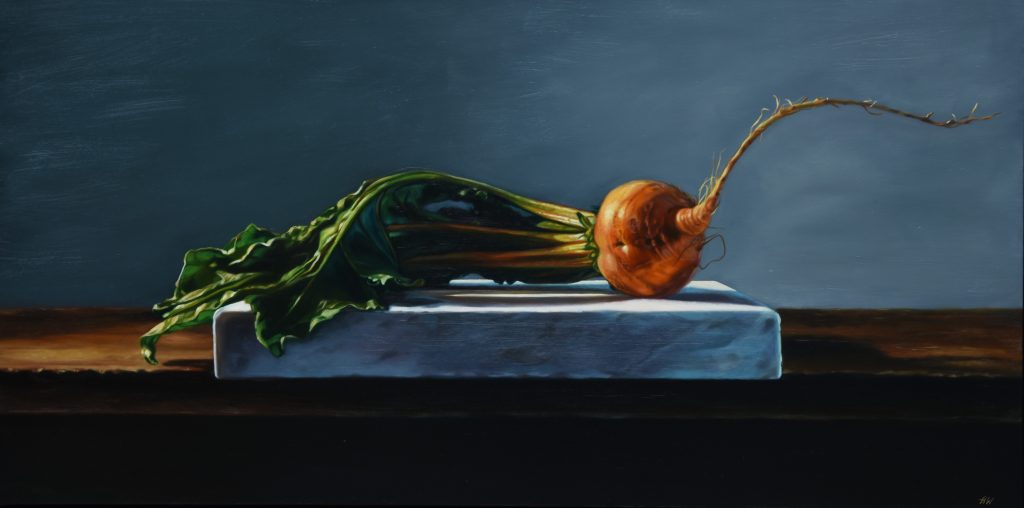 2025, Golden Beetroot, oil on board, 120 x 60
Explain the sizes of your works and why?
The size of the works I create is usually informed by the subject matter and how it speaks to me. I usually include a range of sizes but never very small or extremely big. I would say my sizes are more mid-range, which is what I feel more comfortable working with. It is also a matter of practicality in that my studio is in the attic of my old stone cottage, circa 1840-50, accessed by a very narrow staircase.
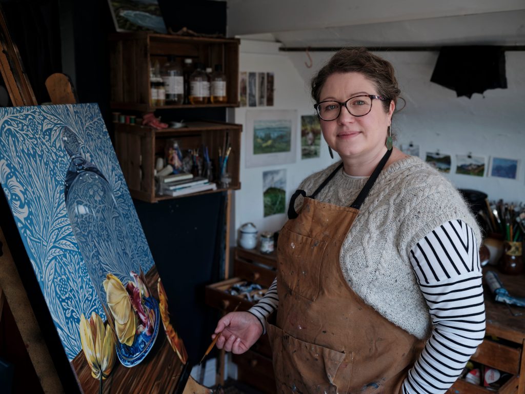
Where did you learn to paint and draw?
I don’t remember learning to paint and draw; it is simply something I have always done. I remember sitting at the table as a very small child painting with my mum and my sister. Over the years I have done various workshops, and I do a lot of self-directed learning if I am interested in a particular area (such as how to apply gold leaf). Painting and drawing is my way of making sense of my surroundings. I find it a balm and a challenge and each time I sit down to make art I learn something about myself and about the process itself.
Tell us what has regenerated your art recently.
I have recently become very inspired by the garden and interested in a more classical approach to still life composition. I find myself wanting to notice and capture more detail and look closely at my subject. I find it a challenge to capture different textures and surfaces too. I have a love of painting glass; I like the way it refracts light and bends shapes into something almost abstract. I have also been experimenting with glazed ceramics and different surfaces such as cloth and wood.
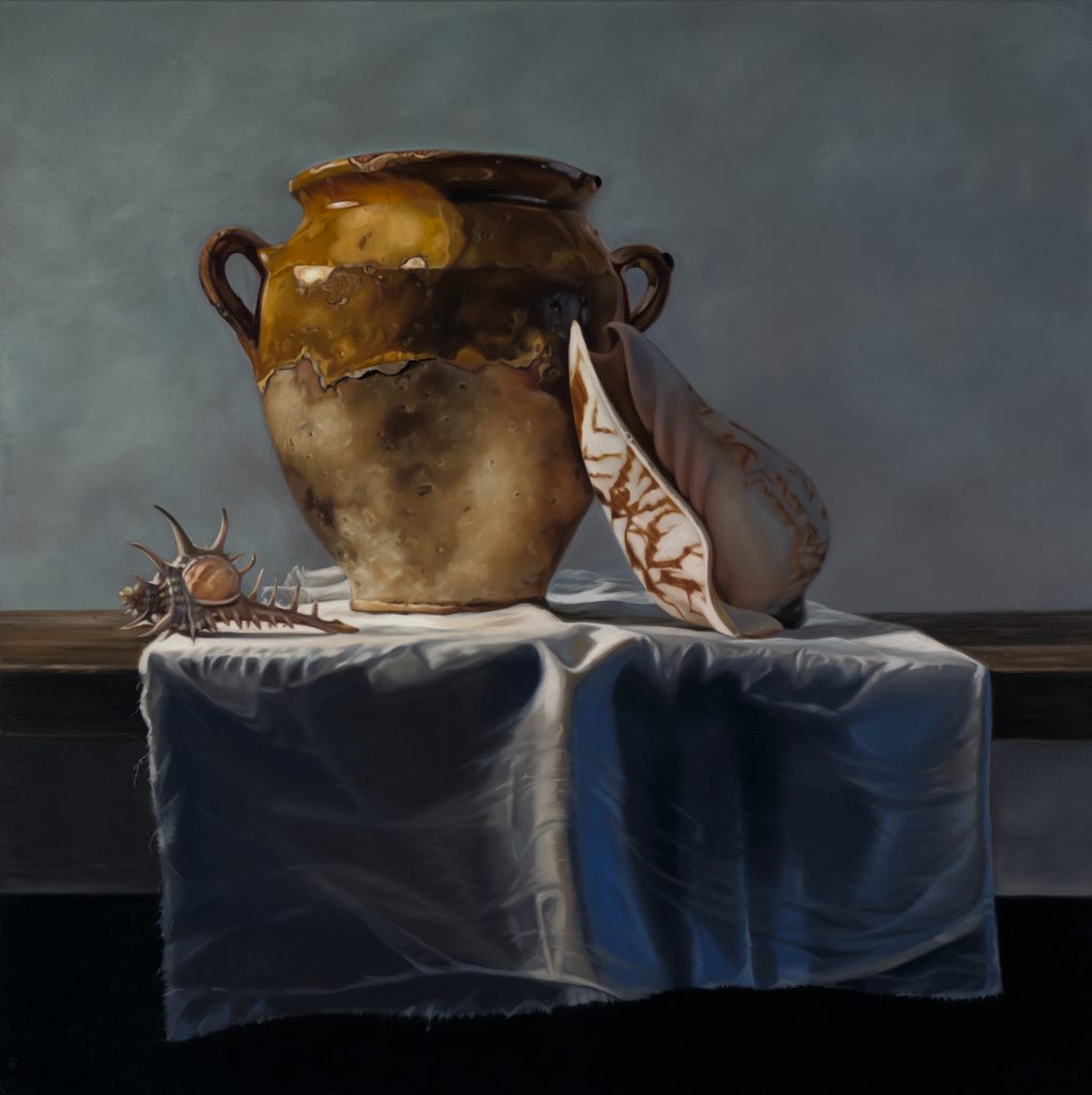 Tempests Rise, 2025, oil on canvas, 122cm x 122cm
Contact:
Heidi Woodhead
heidiwoodheadartist.com.au
heidiwoodheadart@gmail.com
Deborah Blakeley, Melbourne, Australia
Interview by Deborah Blakeley, February 2026
Images on these pages are all rights reserved by Heidi Woodhead

Paul Cleden
Discuss how figurative movement is so important to your work?
 Figurative movement has always been at the centre of my work, I have, from my earliest memories, been drawn to people and movement, the dynamic shapes and energy is mesmerising.
 The cutting process gives scope for long sweeping shapes, while the overlap of the multi block method increases this even more. As time has progressed, I’ve pushed things on, not wanting to get pigeonholed or to static with one “subject’ as its far too easy to do.
How does lino cutting give such natural flow lines in your work?

The images in circles, and in this case ‘Bike’, came from a specific need to create a series of circular prints for hanging decorations. It is always a delicious challenge to fit a square picture into a round shape. The removal of the square shape gave a freedom to experiment with slight distortion and composition. As ever I love a challenge.
![]()
Crowds can be both inside and outside compare two prints.
Crowds can be both inside and out. yet I feel a crowd is for the most gathered for something and in a space. For example, ‘Platform Talk’ has everyone restricted to the line on an underground platform, while ‘Theatreland’ has them arriving at the doors to a nights entertainment, but still restricted as they reach the entrance.
Everyone is restricted to the line on an underground platform, while ‘Theatreland’ has them arriving at the doors to a nights entertainment, but still restricted as they reach the entrance.
 Can you expand on your silk squares and how they can be used?
I was approached to use some of my designs on silk square, scarves and cushions, a few years ago now, which I’m always interested to do. I love to see my work translated onto other things, probably the illustrator in me. As to their success, that’s hard to judge, as I don’t sell them, they’ve ended up in some firstrate places such as Liberties in London, but my work on greetings cards has probably been the biggest success, I suspect the price point helps that.
 Your comment, “I have no problem with people buying this work as perhaps it is the only way to afford a specific image” Elaborate.
I love people to buy my original work as its the ideal way to enjoy it. Original prints are very affordable, but for some people the first step into owning original art is to buy something else. I have sold a great number of prints to people who initially buy cards, they get to live with an image without the initial cost, for many one of my prints is the first time they buy an original piece of artwork.

The only exception in my opinion, is a giclee, this does open Pandoras box, to spend good money on a posh photocopy when for a little bit more they can get the original seems a shame.
Discuss the ‘swing’ seen in Beat the Bat and Straight Down the Middle.
 ‘Beat the Bat’ & ‘Straight Down the Middle’ both part of a commission, each had a swing from the earliest drawings of cricketers, the motion that the figures created is clear when you see the game, which can be sedate for long parts, until the bowler takes aim, and the batsman responds.
 For that short time the frantic motion creates a fantastic swing. It arrived in the print from the very first drawings.
Take one city that you have illustrated and discuss the print.
I generally don’t do pictures of cities, as its the people I am drawn to, but in a recent commission for ’80 the Strand’ in London, the clients wanted three cities represented is a series of prints, London, New York and Manchester.

This gave me the opportunity to explore buildings. It is good to challenge oneself as an artist, in this case to find a language that sat with my work to show decidedly static buildings. In ‘Wet London’ I included rain and people rushing around to add movement with the backdrop of the London skyline, my hometown until I was 25.
 Tell us about your work from Purple Raincoat.
The images from the ‘Purple Raincoat’ is a very interesting one, as this is an as yet unpublished work, also written by yours truly. I have a considerable body of writing waiting like a fallow field to one day be harvested. I find that my illustration work is an ideal contrast to the prints I tend to focus on. Even here the backgrounds are prints, a freer mono print technique that allows for far more spontaneity and expression.

Perhaps one day ‘The Peculiar Purple Raincoat’ may be in a book form for everyone to enjoy. (any publishers do say hello!)
The process you take before the work goes to press.
The vast majority of my work uses four blocks of lino, so a base level of four colours, with the white of the paper as another factor.
 With each colour overlapping you can create another colour, so there is a potential of multiple variations, but then add in inking half a block with different colours and things gets interesting.
 Tell us about your studio.
My current studio is only a year old, as we recently moved house and I had the garage converted last year. It’s a square white room full of light. The double aspect windows looking down the garden and off into the fields beyond. I do work alone here, which is definitely the hardest part of my job.
 I’m currently collaborating with the Leach pottery in Somerset on a set of work which celebrates their practice, ready for a show in July. This means I get to spend some time drawing in their pottery, with the company of the artists there. I use a wonderful 140-year-old nipping press, with a huge 60cm x 45cm bed, big enough for all of my work. To change anything about my studio? More storage, I suspect that most artists would feel the same as this. I do have a super garden room that I’m going to set up a screen-printing space in. On my ‘to do’ list for this year.

Contact:
Paul Cleden, Somerset, UK
www.paulcleden.com.uk
Mail@paulcleden
Deborah Blakeley, Melbourne, Australia
Interview by Deborah Blakeley, February 2026
Images on these pages are all rights reserved by Paul Cleden
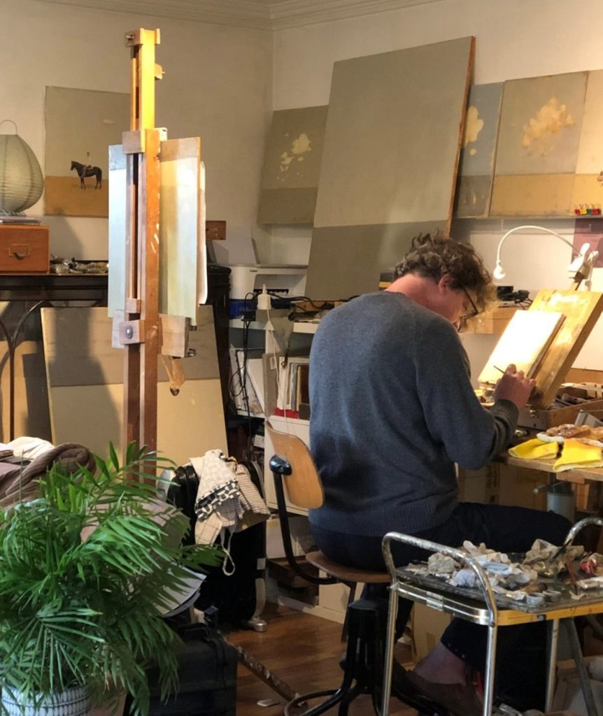
Diarmuid Breen
What led you to mainly doing figurative work?
I was painting landscapes back in 2012, motorways, Airports –nonplaces. I injured my wrist at this time and had an operation where I had three months recuperating, unable to paint. It was this three month break from painting which led to the figurative work. When and if my hand got better I wanted to paint something that really meant something to me.
The Present, A future. Oil on Canvas, 25 x 30cms
Where is your current studio?
My wife and I have moved recently ( 2 years ago ) from Cork city in the South of Ireland to Kildare which is nearer to Dublin, and I paint in our living room. My wife’s an artist also so our home is more like an old school salon than a modern home.
How has your art training effected your work?
I went to art college when I was thirty six, graduating at forty. Doing that was a pivotal moment in my life. It gave me the confidence to pursue a career in art.
The Wall, Oil on canvas, 30 x 44cms
Family is very important to you, comment on how you combine them within your art.
Well, to be honest I don’t spend as much time with family as I would like. To be an artist one has to be selfish with ones’ time.
Can you expand on your work ‘For God’s Sake’?

For God's Sake, 160 x 120cms
Yes, “For God’s Sake” is a large painting I completed in 2024. 120 x 160 cm. It consist of a group of men, carrying a huge cross in a coordinated effort to go nowhere. It’s a statement about work really. The men are so focused on the task, and the different characters are working at different levels of industry, some are getting their shoulders in under the cross while some are holding back hardly touching the cross. Also the title is ambigous depending on the emphasis of tone the viewer brings. The subject matter came to me after I came across some photographs of a religious ceremony carried out in Belgium in the forties. The reference image was not complete so I had to extend the cross and put in the figures on the left hand side carrying the foot of the cross.
It is almost as if you are taking us back in time. Discuss
Yes I like to paint figures from the 1940s and 50s.
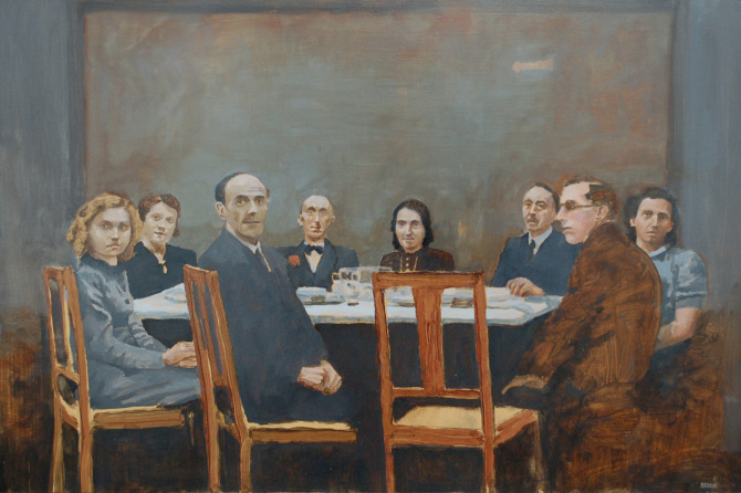
A Place for You, Oil on canvas, 50x 40cms
The clothes and hairstyles I feel are better for painting. Its easier to convey a mood, if there’s an element of nostalgia in the work, I find.
What is your main medium?
I generally use oil on canvas.
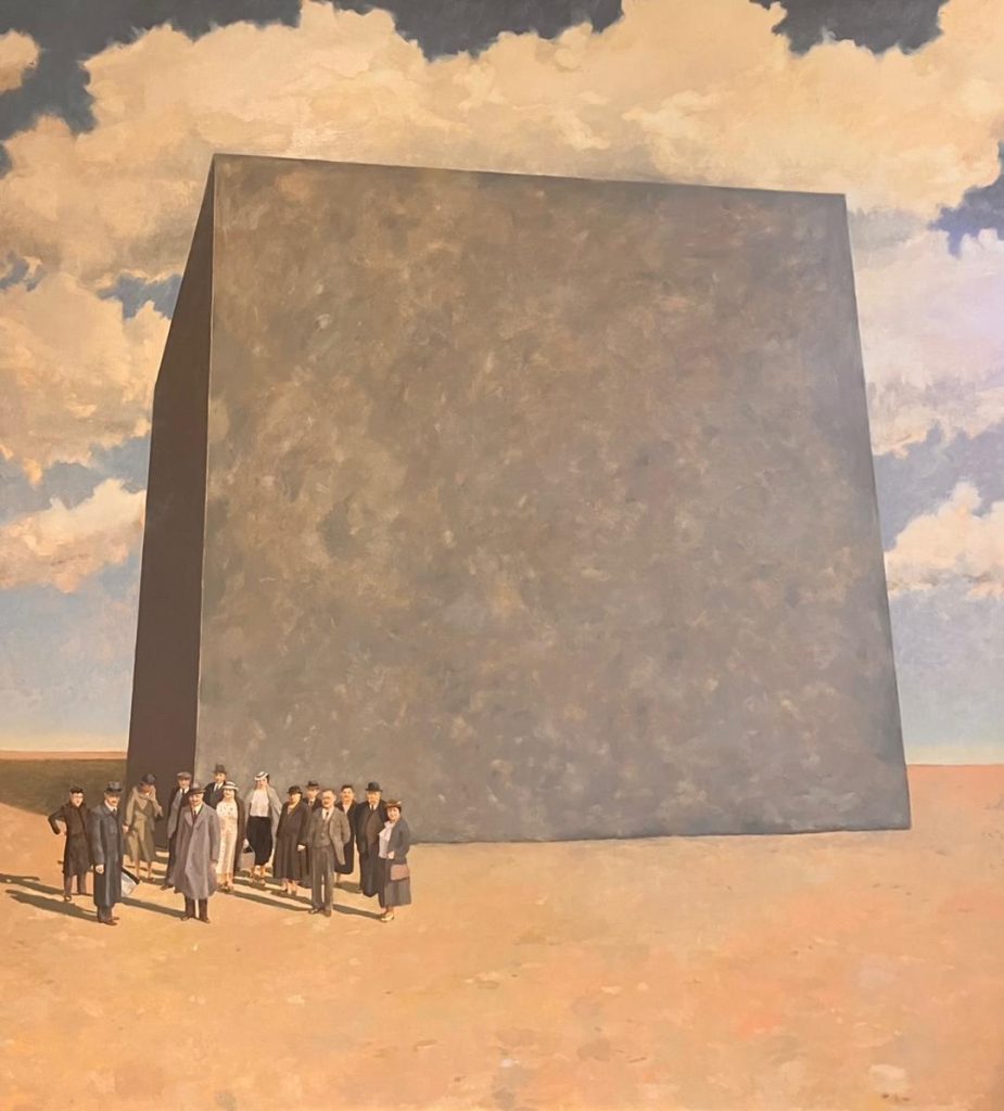
Bedrock, Oil on canvas, 120 x 135cms
What are you currently working on?
Well I’m in Copenhagen in Denmark at the moment, which I’m loving and I’m working on a body of work for a solo exhibition in October 2026 in Cork, Ireland. And whilst I’m here I am going to try and get some of my works into a gallery in Copenhagen.
Recently you have been in Turkey, has this influenced you?
No not really. Coming to Denmark has influenced me a lot more. I was here for a few months last year and lived at first out in the countryside. The flatness of the landscape, and the open skies and yellow wheat fields as well as the beaches had a very strong impact on me and gave me a whole new painting energy and a new route to follow and explore.
Discuss work you have done, within the home setting and work at the beach.
For the past ten years I’ve been working on a series of paintings with a working title of “Existing Realities”, a commentary, or my reflections on the relationship we have with work. When I arrived in Denmark in 2024 I had just completed a body of work for an exhibition in Waterford Ireland entitled “Give me my Meaning” Some of these paintings were based on interiors and were quite somber in mood and tone.
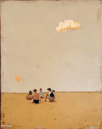
Last Summer Days, Oil on canvas, 50 x 40cms
Having arrived in Denmark I was influenced by the flat landscapes and the open skies. I then moved to a town by the sea in northern Zealand and could not stop painting the landscapes there. It was a holiday from the work of painting about work. If that makes sense.
What are your thoughts on art and philanthropy working together.
Obviously philanthropy is important if not vital for the arts. If there was no financial support from philanthropists then the cultural centres would not survive. Also for us artists, financial support is vital to continue making the work, so every purchase could be seen as a philanthropic act.
Contact
Diarmuid Breen
Instagram: diarmuidbreenart
Deborah Blakeley, Melbourne, Australia
Interview by Deborah Blakeley, January 2026
Images on these pages are all rights reserved by Diarmuid Breen
Liam Lynch
Firstly, what led you to photography and film making?
I grew up in the country (Central Victoria) surrounded by nature. As a child, I spent hours alone in the bush or lying on my back watching birds of prey — particularly brown hawks and wedge-tailed eagles — circling in flight in search of a meal. That fascination has never left me and has undoubtedly formed the foundation of my wildlife photography and passion for conservation over the years,
Explain how you see photography as an art form in 2025?
I think it’s a very challenging time to sell photography as an art form. It always has always been, but nowadays “everyone with a phone is a photographer.” The perception that an image is not considered art because it can be reproduced in its exact form multiple times is seen as a disadvantage for photographers striving to be recognised as artists in fine art and gallery spaces.
I’ve spoken about this with a couple of gallery owners this year, and both confirmed the difficulty they have promoting and selling photographic prints both online and directly from their gallery walls. Personally, I sell more prints when people see them first hand on clients. walls or in public spaces than I do through my website.
Nature is a very wide format discuss.
Take a small area, Elephants…

Elephant Snorkel, 2025
In 2008, I was invited, to work with the Conservation Response Unit (CRU), part of the Sumatran Elephant Conservation Programme located in Tangkahan, North Sumatra (Indonesia). Established in 2002, the CRU uses trained captive elephants, their mahouts, park rangers and local community representatives for direct, field-based conservation interventions. These units support the conservation of wild elephants and their habitat while creating opportunities for local communities, achieving positive outcomes for both elephants and people.
 Elephantus Oculus
At the time of my visit, all of the elephants at the centre had been relocated from Aceh following the 2004 tsunami. With the assistance of the mahouts and rangers, I was able to work directly with the elephants up close and even in the water with them while they bathed and played. Although these were captive, trained elephants, they were not kept in enclosures and still maintained many of the traits and behaviours of the wild elephants in the region.
Underwater…
 Gliding Turtle 2025
What different types of cameras do you use?
I use a Sony mirrorless system inside an Aquatica housing, which has had some custom modifications to allow me to adjust specific camera and lens operations while underwater.
How good a swimmer are you and do you have to be?
 Tonga 2018
You do not need to be a great swimmer, but you do need to be confident in the water, aware of how quickly ocean conditions can change, able to adapt to those changes, and prepared for them.
What sort of assistance do you need for this area of photography?
When I’m not in familiar locations, I rely heavily on local knowledge — whether that’s from dive operators or a network of fellow divers and underwater photographers.
 Heading South 2025
Can you expand on several rare encounters you have been able to photograph?
That question puts a smile on my face. I have had many, but here are two: On one of my many trips to Tonga to photograph the humpback whale migration, I was“head-butted” by a very friendly juvenile. He then proceeded to lift me (very gently) out of the water with his pectoral fin and appeared to grin at me afterwards.
 Headbutt, 2025 ‘Headbutt’ ~ Curiosity Meets Contact
Another memorable moment took place in a remote Sumatran rainforest. After weeks trekking through extremely challenging jungle terrain, we finally found a mother and baby Tapanuli orangutan and followed them for several kilometres through the dense canopy. While the mother stayed high and remained quite shy, her baby was far more inquisitive — coming down lower and, at one point, urinating directly above me, much to the delight of the research team.
 Orangutan, Beti 2014 title: ‘Beti’
Explain about the Tapanuli Orangutans and this project?
In 2014, I was invited to join a group of researchers in a remote pocket of rainforest on the island of Sumatra — the unexplored Batang Toru ecosystem, approximately 142,000 hectares. This rainforest is home to hundreds of unique species including criticallyendangered Sumatran tigers, hornbills and the world’s most trafficked animal, the pangolin. The researchers were particularly focused on the orangutans inhabiting the region. At the time, these were considered part of the Sumatran orangutan species, but in 2017 they were officially declared a third, separate species: the Tapanuli orangutan. They instantly became the rarest great ape on Earth, with fewer than eight hundred individuals remaining.
To put this into perspective: there are an estimated 12,000 Sumatran orangutans in the wild, and they are already considered critically endangered. So where does that leave the Tapanulat fewer than eight hundred?
 ‘Tapanuli Orangutan’
Resently, I read a report that another group of Tapanuli orangutans has been discovered outside the Batang Toru forest in an area of peat swamp forest — the first confirmed record of the species outside Batang Toru. Unfortunately, the area is particularly vulnerable to land use change due to its non-protected zoning, placing this newly confirmed habitat at considerable risk.
The discovery has sparked both optimism and concern: it offers an opportunity to expand understanding of the species’ range, but it also brings new conservation challenges. Since 2014, I’ve returned to Sumatra several times to work with various organisations, including school-based tree-planting groups in the Batang Toru area that I have helped raise funds for. My images from my time in the forest and from subsequent trips have been. used in publications and conservation awareness campaigns.
Discuss this profound comment by Baba Dioum, ‘In the end, we will conserve, only what we love, we will love what we understand, and we will understand only what we are taught.’
I first heard this phrase spoken by Farwiza Farhan at a conservation festival in Sumatra I had travelled there to work with another conservation group that year and was fortunate enough to interview and film her. The quote resonated deeply with me, especially as I was collaborating with a school-based group at the time. To me, it underscores that education and understanding are the keys to conservation — and that begins with children.
Farwiza is the leader of Forest, Nature & Environment Aceh (HAkA), a homegrown Acehnese
NGO dedicated to protecting the Leuser Ecosystem in Sumatra. By empowering communities,
taking legal action, and mobilising local, national and global campaigns, Farwiza and her
team are paving the way for truly sustainable development. Her impact on community-driven
conservation was recognised with the 2016 Whitley Award.
When do you use black & white and when is colour more appropriate?
 Leafy Palladium 2025 (monotone/palladium) Leafy Sea Dragon
With my palladium printing, black and white (monochrome) is the only option, but in general I decide whether to present the final image in colour, monochrome, tri-tone, greyscale or a combination while editing. Modern software and printing processes have significantly expanded the creative possibilities over the years.
 ‘Prom Queen’
How did the Ned Kelly Series come about?
The body armour depicted is based on reproductions by Anna Borghazi, an Australian Film Industry Award–winning costume designer. I photographed them during the production of the film Ned Kelly starring Heath Ledger back in 2002.
 Burnt Moon 2025
Ned is one of Australia’s most mythologised figures. My images have evolved over time, with a new series currently in production. Like many Australians, I’ve long been captivated by the stories surrounding our most famous outlaw (or bushranger, as we call him). In each series, I aim to resurrect the iconic armour worn by Ned Kelly and his gang.
One series features the surface inscribed with excerpts from Kelly’s Jerilderie Letter, an 8,000-word manifesto transcribed by gang member Joe Byrne, including the powerful statement:
“I am a widow’s son, outlawed, and my orders must be obeyed.”
— Edward ‘Ned’ Kelly, The Jerilderie Letter (1879) The latest series depicts Ned and the gang emerging from the charred landscape after the devastating “Black Saturday” bushfires in 2009.
 Kelly Gang 2025 Bushfire. Aftermath
These images are being adapted into wall coverings, including experimental transparent film printed and adhered to waterproofing membrane inside a shower.
 Kelly Gang on Balk
What are you currently working on?
Recently my focus has shifted toward transforming my images — and potentially other images, archives and collaborative works — into large-scale wall coverings and murals.
 Jelly Wallpaper Interior Bathroom 2025
My goal is to have them displayed across multiple surfaces and textures, both internally and externally. It’s an exciting and highly creative time for me, full of research, development and exploration of new possibilities — and of course, it’s challenging, which is exactly how I like it.
 Leafy industrial hanging brass wall panels
These images are concepts that have been mocked on existing wall surfaces and contain AI elements.
Contact
Liam Lynch
Liam Lynch
Liam Lynch Photography
0419118607
liam@liamlynchphotography.com.au
Deborah Blakeley, Melbourne, Australia
Interview by Deborah Blakeley, January 2026
Images on these pages are all rights reserved by Liam Lynch
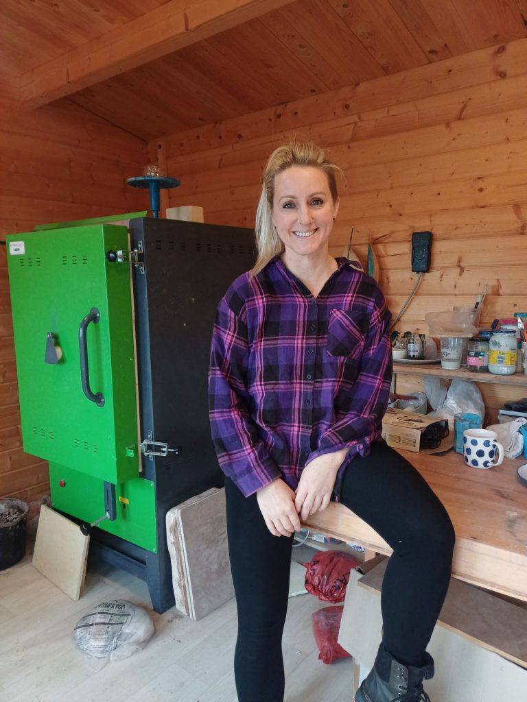
Lucy Morris
Can you Please expand on your comment, ‘My work is influenced by my role as a talk therapist?
Working with clients as a therapist has given me a strong awareness of how emotions and psychological states shape human experience, and I translate those insights into material form. Clay becomes a medium through which ideas such as vulnerability, resilience, and repair can be explored in a tangible way.

Becoming from within.
What has been your art training?
I started using clay in an evening class when I was fourteen and I fell in love with the material. This led me to using clay in my GCSE’s, A levels, and then starting to specialise in my foundation year at Hereford Art College. From here I completed a Bachelor of Arts degree in Ceramics at Cardiff university, which I completed in 2004.
What has been you talk therapy training?
I started using clay in an evening class when I was fourteen and I fell in love with the material. This led me to using clay in my GCSE’s, A levels, and then starting to specialise in my foundation year at Hereford Art College. From here I completed a Bachelor of Arts degree in Ceramics at Cardiff university, which I completed in 2004.
Discuss the importance of the large ears of a hare?
The extended ears in my work speak to the quiet power of listening, a central element in my therapeutic practice. In the therapy room, I often witness how rarely people feel truly heard. This absence isn’t always loud; it can show up in the subtle, repeated missing of someone’s emotional needs. Many grow up in environments where they feel unseen and unheard, and this emotional invisibility can deeply impact wellbeing. The ears in my sculptures aim to hold that story. They carry feeling, elegance, and the ache of wanting to be noticed, not just visually, but emotionally.
 Enough
Why have you introduced small touches of colour to your hares?
I have always loved colour and I enjoy the placement of this on the work to draw attention to specific areas. Colour can hold a lot of emotion and I have always found myself drawn to blues. My aim in future work is to explore the use of colour and surface further.
Comment briefly on the process of hand building your ceramic art?
Each piece is initially made from solid clay shapes that I roll and shape. Once I am satisfied with the direction of the piece and the proportions work, I start to sculpt the more detailed parts which are the face and paws.
I spend quite a lot of time ensuring the face expression matches important. The piece is then dismembered, and the shapes are hollowed out before I reassemble to piece.
The hollowing process is carefully considered as with many pieces I need more weight to hold the sculpture in its sitting position safely, yet the feet and legs need to be less heavy. Decisions are made as I move through the process.
What I am aiming for. and that the paws are the right size for what I have imagined.
Where is your studio?
I work from a summer house which is in my garden. It gets very cold In the winter months, so sometimes the work moves into the house temporarily.
Are you completely self-sufficient?
Yes, I work independently.
How do you personally look after your own mental health?
I enjoy exercising and spend much of my spare time downhill mountain biking. The combination of being in beautiful forests or mountains and trails feels very cathartic and mindful. It is almost impossible to think about anything other than what I am doing right there in that moment. I also enjoy trail running, weightlifting and I ride a motorbike. These activities offer a counterbalance to the stillness of therapeutic work and the gentle physicality of sculpting.
How do you manage to get such human expressions on your hares faces and body language?
I think this aspect of my work has grown from hours spent observing clients in therapy, attuning to the body’s unspoken language. As a therapist, we are trained to listen beyond words and that the body holds a narrative, often revealing what cannot yet be voiced. This embodied awareness informs both my clinical and sculptural practice.
Do you often see the likeness of hares to young children?
For me, my work is rooted in the adult experience, reflecting the relational dynamics I encounter in therapy and throughout life. While that’s my starting point, I think the beauty of art is that people make links and connections that feel personal to their own experience, so I always enjoy hearing the perspective of others.
You do two sizes of hares, why?
My work has a range of sizes from miniature pieces you can hold in your hand, to much larger sculptures.
There is something that can feel very intimate about holding the smaller objects and I notice they often create a real depth of emotion. Its not uncommon for people to cry or have strong reactions when they are held.
The mid and larger pieces hold more of a physical presence. I enjoy the physical process of making larger pieces and have always been drawn to the idea of making larger sculptures. If I had a bigger kiln I’m sure the size would keep expanding.
How many real hares are within your environment?
I find this question interesting because for me my fascination with hares began whilst I was teaching ceramics in a prison environment rather than because I grew up seeing many, which often surprises people.
In the prison we started an animal project which focussed on Hares as they represent both hypervigilance and vulnerability; something which we explored as this mirrors parts of the prison experience. In my work the use of the hare is more symbolic to this, rather than because I have grown up sighting them.
 Honour your experience
Living in South Wales I have unfortunately not been lucky enough to see a hare near to my home, however, with summer trips to mid and north Wales I have been spolit with some sightings.
Comment on how are your hares designed to sit on plinths or shelves?
The weight of the body and limbs support the expression of emotion that I want to capture.

Hanging on to the edge of life
One of the first pieces I made in this style was inspired by observing people sat outside one of the homeless shelters I regularly visited for a previous job. I would notice the weight of people’s bodies fallen against walls. There was a sense of heaviness, not only of the physical body but also the emotions and trauma these people were holding.
I wanted to find different ways to place my pieces in expressive postures. I found always working to a flat base was limiting. For example, a recent piece called ‘Hanging on the edge of life’ was inspired by clients descriptions of anxiety, where there is a sense of falling and slipping off. At times I like to use gentle humour to express challenging emotions.
I often imagine the hares sitting, reaching for connection, slumping, or falling. The long shelves and plinths have enabled me to create work that can be viewed from the perspective that I imagine it.
Take two hares with different attitudes and discuss.

She let go and her breath came back
At its foundation, this piece is about hope and survival. It is about moving forward.
I wanted to express something about how we hold trauma physically. The heavy weight of the limbs and body giving a sense of what has come before. The legs and thighs are exaggerated and powerful, suggesting that there is strength within and there is an innate ability to move forward and survive.

This Too Shall Pass
This piece carries a thoughtful tension which is captured by the gaze of the eye and body positioning. Inspired from my client work in the therapy room, there is a sense that something quite serious is being considered or is in the process of being worked through.
Discuss, ‘Fall Seven Times and Stand Up Eight’ and the titles of each piece.

Fall seven times and stand up eight
This piece was made for competition where they asked people to make a piece inspired by a famous quote or saying. I chose this saying because for me it represents something about survival and moving forwards despite the adversity that we may experience in life.
The titles of the sculptures have developed to be a powerful part of the work.
When creating a new piece, I start with the emotion or the feeling that I want to express. This is often inspired by an encounter in a therapy session or a thought or feeling I have about my own life experiences. I spend time considering how I can best portray what I am considering. Once created the naming process is there to support what came before.
Do you take commissions?
I have made some commissions. However, I notice that sometimes this process can deviate slightly from the creative aspect as there are by nature more rules about what the outcome will look like.
Do you find yourself falling in love with each hare as your hands bring them to life?
Yes, absolutely. I particularly enjoy creating new larger pieces or when I am in the process of sculpting the posture and expression for the work. It often becomes an intense hyper focus, and I am lost in my studio for many hours at a time.
How many exhibitions can you manage in a year?
I am just nearing the end of my second year of exhibiting, I think I am still finding my feet with balancing my therapy business and art work. Last year I exhibited in four shows and this year I have exhibited in six. This felt like quite a lot as I have also set up my private therapy practice this year.
What are your plans for 2026?
Now I am having a little creative breathing space after a very busy year. I am in the middle of the ‘thinking stage’ where I consciously daydream and piece ideas together in my mind. I cannot say exactly where next year will take me, but I do know I am excited to progress my work. I have started the application process to some of the shows so I am hopeful that I will be successful
Contact
Lucy Morris
lucymorrisceramicart@gmail.com
Deborah Blakeley, Melbourne, Australia
Interview by Deborah Blakeley, December 2025
Images on these pages are all rights reserved by Lucy Morris

Abdelaziz Lourhraz
Does your home, Morocco and the environment effect your colour choices?
Absolutely, the environment plays a crucial role in my creativity, behaviour, and reflection. My Moroccan culture has had a profound influence on me, particularly through its richness and diversity. I am inspired, by warm colours, light, and the cultural heritage that forms an invaluable local resource.
 Untitled, mixed technique on canvas ,size 30cm on 30 cm, 2018
Do you always use acrylic paint in your work?
I prefer to mix different mediums, seeking interaction and fusion between colours and the materials. I experiment with watercolour combined with oil paint, marble powders, coloured papers, inks, natural dyes, and acrylics. This constant exploration allows me to expand the expressive possibilities of my work.
 Untitled, mixed technique on canvas, size 97cm on 97 cm, 2024
How have you finally settled on painting as your main medium?
My engagement with painting began in my childhood, nurtured by an artistic family whose influence was invaluable. I am constantly drawn to the enigmatic possibilities of painting, exploring techniques, textures, and the interplay between them. Today, my practice into contemporary paradigms, experimenting with other disciplines such as installation, minimal art, video, and photography, seeking new ways to enrich and challenge my visual language.
Painting constitutes to be the principal medium of my practice, I seek to experiment and explore ever new modes of expression.
How small and how large are your paintings?
 Untitled, mixed technique on canvas, size 25cm x35 cm x 3, 2018
The dimensions of my canvases vary according to the theme, technique, and composition of each work. In my view, the choice of scale is intrinsically tied to the artistic process itself. I find that working on a small format often proves more demanding than on a large one, as the reduced space limits the freedom of expression. For this reason, I am naturally drawn to large canvases, which offer me a greater sense of creative openness and allow my ideas to unfold more fully.
 Untitled, mixed technique on canvas, size 100cm x100 cm, 2024
How do you manage your canvas when you want to ‘dribble’ applied the paint?
This is indeed a very interesting question, as it touches on the role of spontaneity in the expressive process. In my view, painting is a multifaceted and creative discipline through which the artist conveys both vision and emotion. My pictorial approach often lies between abstraction and semi-figuration, requiring me to construct layered compositions of color, transparency, and texture. At times, I allow chance to intervene, bringing greater fluidity, fusion of materials, and harmony among transparent hues.
This process often leads me to work on several canvases at once, since focusing on a single work feels restrictive. By laying my canvases flat on the ground, I can observe, experiment, and contemplate their evolving states. The drips in my paintings remain deliberately uncontrolled, imparting movement and vitality to the surface.
In most of your work you have a very distinct horizontal or vertical line discuss.
The line is one of the most essential elements in my work, as it profoundly contributes to structuring the composition of my paintings. It grants them both aesthetic clarity and a visual balance between reflection and spontaneity. For me, lines embody movement and imbue the work with pictorial strength. Horizontal lines symbolize stability, while vertical lines evoke transcendence and spirituality. They form a plastic language that conveys the freedom of gesture, uniting the instinctive with the reflective.
 Untitled, mixed technique on canvas, size 100cm x 100 cm, 2024
How often do you work with an assistant?
I have long worked alone, managing every aspect of my practice independently. This solitude affords me both freedom and calm within the studio, allowing me to be immersed in my creative process. It is in this quiet space that I turn inward, drawing from the depths of my soul to externalize positive emotions—whether through color, form, or the materials and textures chosen for each canvas to generate visual harmony. Solitude offers me comfort, tranquillity, and the silence needed for deep reflection. To be and to work alone strengthens both my concentration and my sense of well-being.
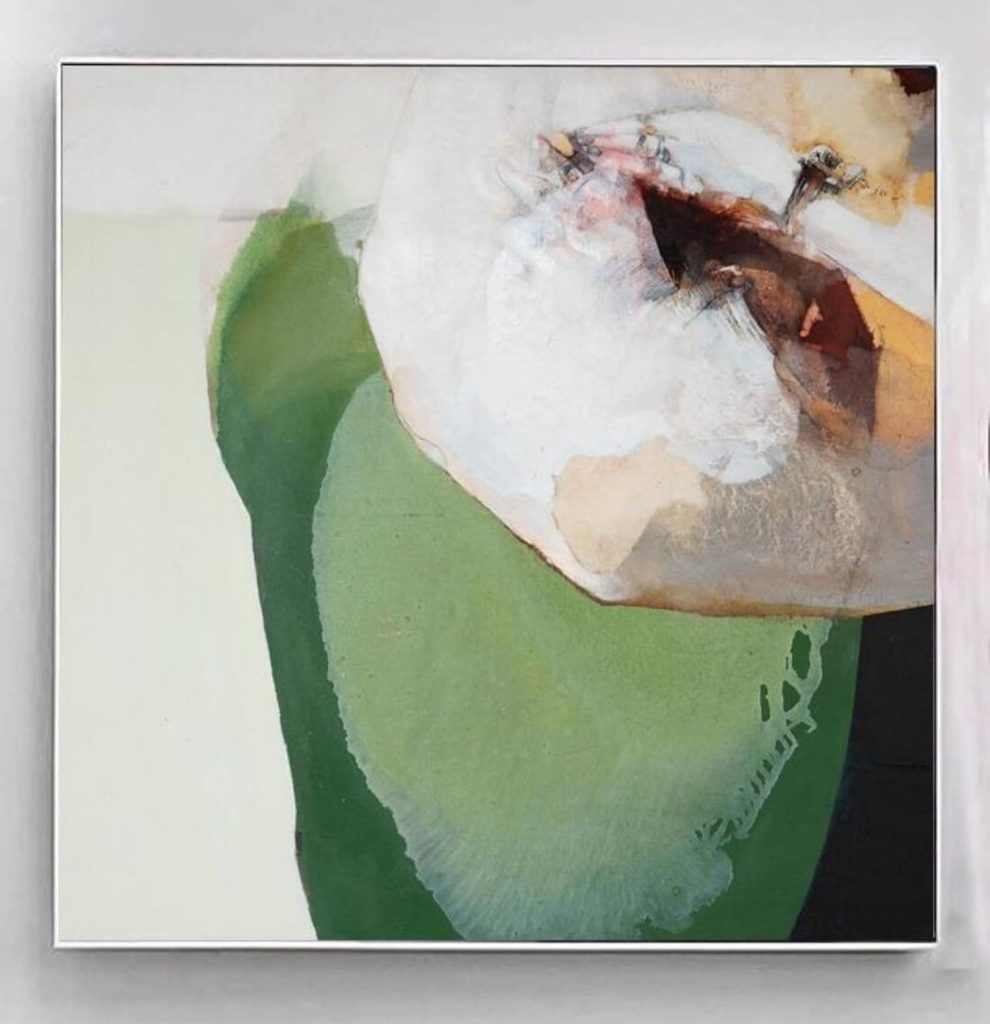
Untitled, mixed technique on canvas, size 90cm x 90 cm, 2024
Discuss three paintings and how each has a definite prominent colour?
Within my pictorial practice, chromatic transparencies prevail, establishing color as the very foundation upon which the visual structure of the work rests. I regard myself as a colourist, deeply fascinated by the infinite subtleties of the chromatic spectrum. My palette is deliberately abundant, for I seek richness, intensity, and resonance in color. In response to your question, I will reflect upon three hues that imbue my canvases with a defining presence.
Blue, to me, embodies serenity of the soul. It conveys tenderness, gentleness, and calm, while at the same time revealing the psychological depth of my inner being.
 Untitled, mixed technique on canvas, size 30cm x30cm, 2018
Orange carries warmth, elegance, and profound symbolism. It anchors me to the terrestrial and recalls the Moroccan villages whose landscapes are bathed in radiant, sun-drenched tones.
 Untitled, mixed technique on canvas, size 61cm x 70 cm, 2024
Violet is, in my eyes, a color of enchantment—imbued with a unique, authentic sensibility. It signifies a fusion between floral delicacy and the vastness of nature, between coolness and an ultimate state of tranquillity. I often employ it within abstract landscapes to evoke that delicate balance.
 Untitled, mixed technique on canvas, size 120cm x 130 cm, 2016
How has Jackson Pollock influenced you?
Jackson Pollock is a major figure who developed an abstract and gestural pictorial style that profoundly shaped the history of modern art, paving the way for the emergence of contemporary art based on concept and ideation.
 Untitled, mixed technique on canvas, size 70cm x 70 cm, 2024
It is true that I have been influenced, by various artistic paradigms both modern and contemporary but at a certain point I chose to focus on my own accumulated experience and reflective awareness. This led me to a personal quest for identity, drawing from my ancestral culture while connecting this approach to a broader, universal artistic vision.
 Untitled, mixed technique on canvas size 31cm x 35 cm, 2024
Contact:
Abdelaziz Lourhraz
Tel: +212 661 374 305
Facebook: www.facebook.com/lourhraz
Deborah Blakeley, Melbourne, Australia
Interview by Deborah Blakeley, December 2025
Images on these pages are all rights reserved by Abdelaziz Lourhraz
[/vc_column_text][/vc_column][/vc_row]
Heather Blanton
What drew you to painting the human form?
I am more about human energy and the will to excel in human spirit rather than human form.
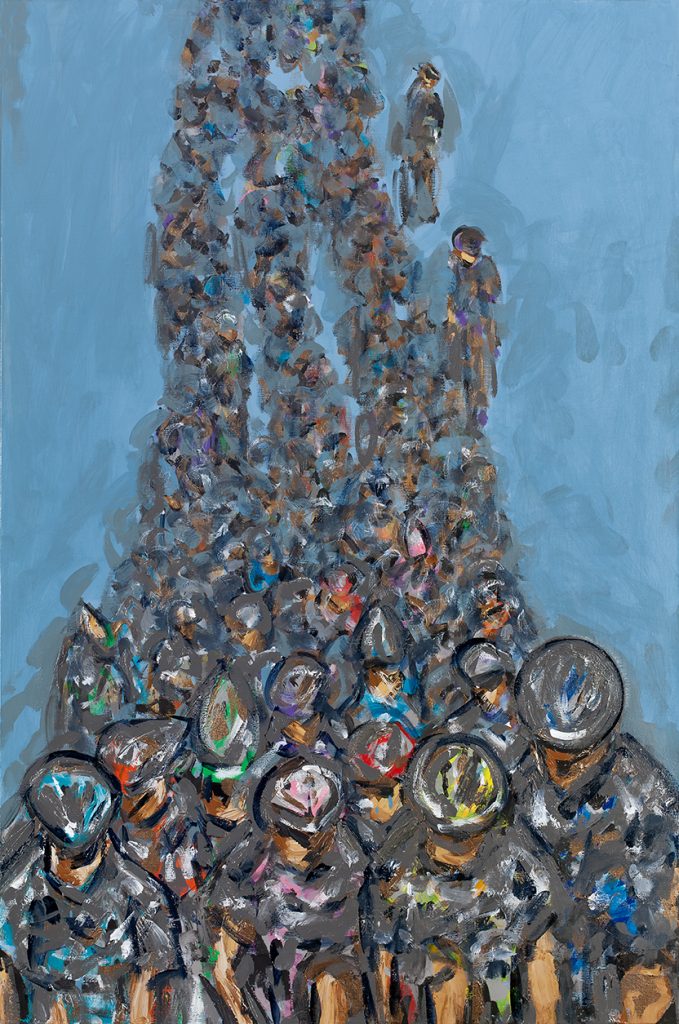
What then led you to painting athletes?
A commission from a cyclist in 2013 whet my desire to convey the feeling of the peloton and then other sports from there.
Have you only several sports or are you continually adding more sports?
I am constantly adding new sports genres.
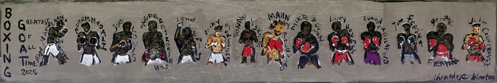 G.O.A.T Boxers 2025, Oil on Canvas
How much time do you need to take in watch each sport and the best technique of an athlete?
It depends on my knowledge of the sport. when a Boston bruins wife asked me to do a hockey piece I spent days researching.
Do you use a sketch book or photographs to get familiar with sports?
YouTube videos mostly
Discuss the difference in painting individual sports athletes to ones playing in teams.
My eye is always on the individual’s energy rather than a team dynamic.
 Golfer Grid 36x36x1.5 inches. Acrylic on Canvas
What medium do you use?
Acrylics for health and drying times.
What sport do you play?
Currently none, but I played tennis and softball growing up.
Have you been commissioned to do a specific sport?
All the time. My latest commissions are F1 and a skier piece.
 How do you get the feeling of movement – especially in mass groupings?
I don’t pre-plan the work I let it organically flow so it’s always a mystery revealing itself to me in the studio.

Skiers on Plexiglass 24x23.5x25 Inches
You comment, “… that you like to create the push and pull between abstraction and realism” discuss.
Correct proportions and photographic realism are not in my mind at all. I want the viewer to see it is a sport however I am inviting them to see it in a new energetically focused way.
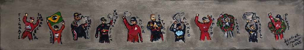 Discuss the use of shadows in particular your skiers.
The shadows to me are part of my favourite things about the work. Although I don’t always include them, they are about the bright sun experienced out on the white powder. Distinct shadows mean a tremendous amount of blue skies and light!
 How do you approach combining of sports, e.g., triathlons?
Triathlons I keep three canvases separately typically and do each sport individually. I am always trying to push myself to do intense sports like triathlons, hoping to convey the iron men and women’s shear power in human spirit.
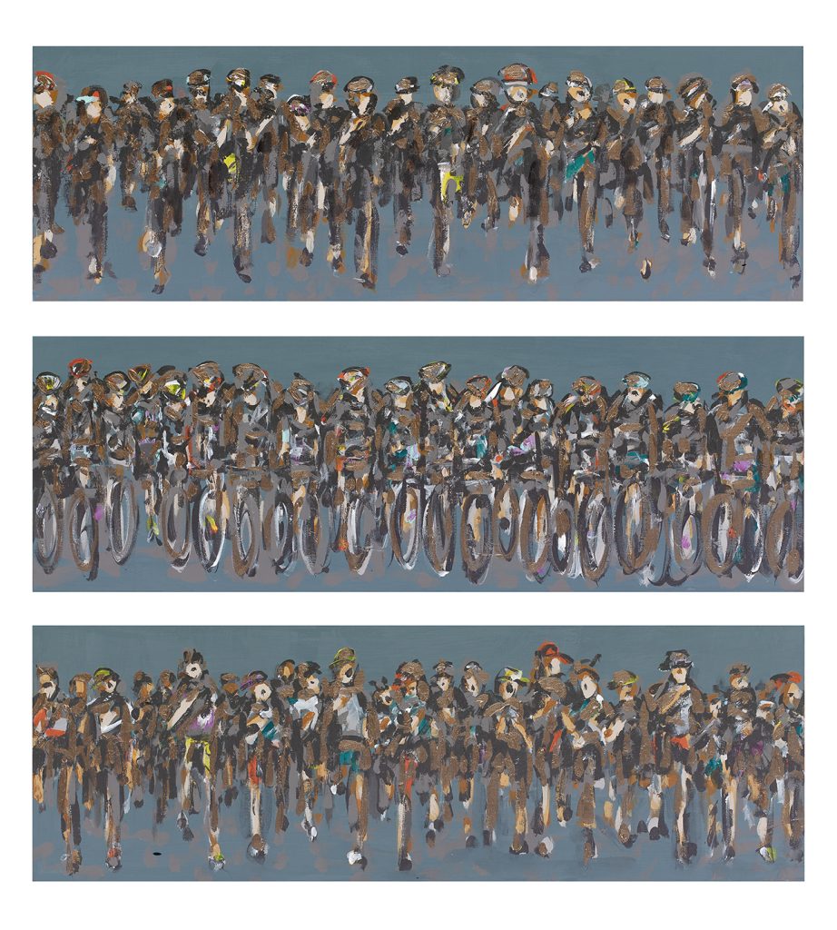 Contact:
Heather Blanton
Deborah Blakeley, Melbourne, Australia
Interview by Deborah Blakeley, November 2025
Images on these pages are all rights reserved by Heather Blanton
[/vc_column_text]
What drew you to painting the human form?
I am more about human energy and the will to excel in human spirit rather than human form.
What then led you to painting athletes?
A commission from a cyclist in 2013 whet my desire to convey the feeling of the peloton and then other sports from there.
Have you only several sports or are you continually adding more sports?
I am constantly adding new sports genres.
G.O.A.T Boxers 2025, Oil on Canvas
How much time do you need to take in watch each sport and the best technique of an athlete?
It depends on my knowledge of the sport. when a Boston bruins wife asked me to do a hockey piece I spent days researching.
Do you use a sketch book or photographs to get familiar with sports?
YouTube videos mostly
Discuss the difference in painting individual sports athletes to ones playing in teams.
My eye is always on the individual’s energy rather than a team dynamic.
Golfer Grid 36x36x1.5 inches. Acrylic on Canvas
What medium do you use?
Acrylics for health and drying times.
What sport do you play?
Currently none, but I played tennis and softball growing up.
Have you been commissioned to do a specific sport?
All the time. My latest commissions are F1 and a skier piece.
How do you get the feeling of movement – especially in mass groupings?
I don’t pre-plan the work I let it organically flow so it’s always a mystery revealing itself to me in the studio.
Skiers on Plexiglass 24×23.5×25 Inches
You comment, “… that you like to create the push and pull between abstraction and realism” discuss.
Correct proportions and photographic realism are not in my mind at all. I want the viewer to see it is a sport however I am inviting them to see it in a new energetically focused way.
Discuss the use of shadows in particular your skiers.
The shadows to me are part of my favourite things about the work. Although I don’t always include them, they are about the bright sun experienced out on the white powder. Distinct shadows mean a tremendous amount of blue skies and light!
How do you approach combining of sports, e.g., triathlons?
Triathlons I keep three canvases separately typically and do each sport individually. I am always trying to push myself to do intense sports like triathlons, hoping to convey the iron men and women’s shear power in human spirit.
Contact:
Heather Blanton
Deborah Blakeley, Melbourne, Australia
Interview by Deborah Blakeley, November 2025
Images on these pages are all rights reserved by Heather Blanton

Kate Blacklock
You use many mediums in your artwork. Can we begin with your photography?
Certainly.
How do you achieve your photography using computer and flatbed scanning?
All the photographic works that I do start with scanning actual objects. I use a large format flatbed scanner and lay plant material directly on the scanner and scan, sometimes moving the flowers or leaves while they are being scanned. When I started this process of “SCANOGRAMS”, more than 15 years ago I just scanned individual flowers and that was the image. Then I started arranging groups of flowers to make a single composition and this led to adding other objects in the arrangements to create still lives- a series that was very much influenced by Dutch paintings. I am continually pushing the process and found that moving the materials while they were scanning created movement and abstractions that enhanced the image. Each of the current pieces that I am making now is made up of layers of scans that are arranged in Photoshop. One image might be a composite of 30 different layers.

Pink Rock 2
How does 'Whirl Bloom' derive so much colour and movement?
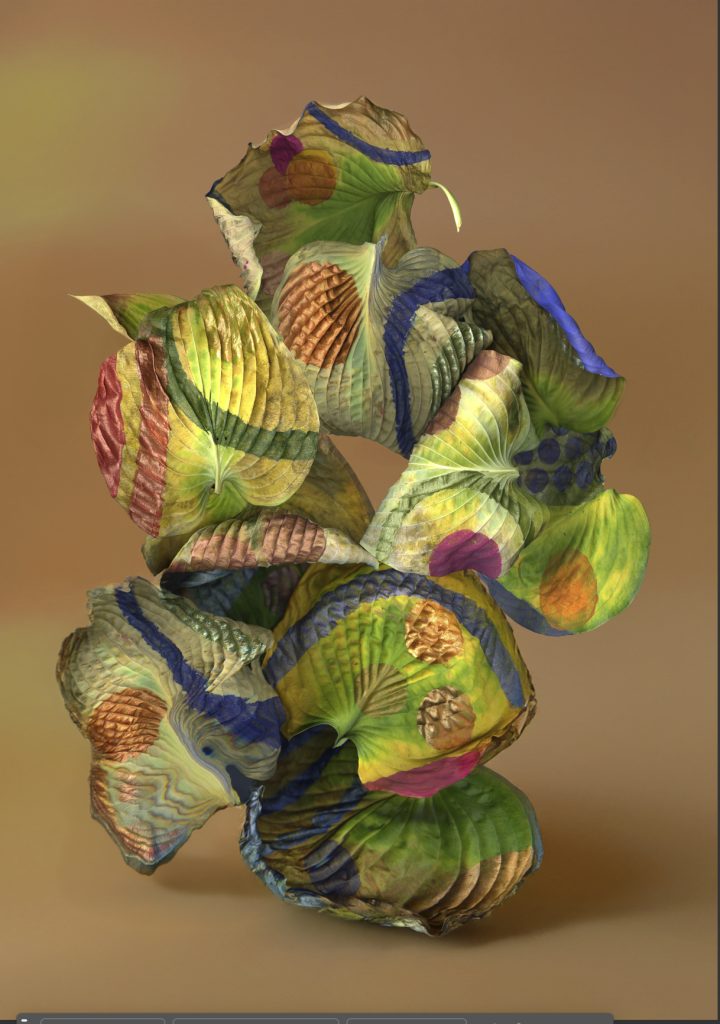
Whirl Bloom
Whirl Bloom is one in a series of compositions loosely influenced by the shapes of Chinese Scholars Rocks. I started by painting patterns and shapes on Hosta leaves from my garden. Over time and as the leaves started to dry and change shape and colour, I scan them- sometimes moving them in the process. Then I manipulate the scans in layers to create the form and finally I digitally create the space behind and around the composition of leaves. The colour is pretty accurate to the painted leaves.
‘Coleus Form’ has more of a still life format, discuss.
My early Scanograms had black backgrounds. This was a direct result of the process of scanning with the cover of the scanner removed. You can see this in ‘Hydrangea Vase’ which is multiple scans digitally stitched together into the shape of a classical vase.
Hydrangea Vase
Over time I began experimenting with other light sources to create more depth and atmosphere and a sense of place.
Coleus Form
With Coleus Form and the newer pieces in the Scholars Rock Series, as well as the Vessel Series, I have pushed the forms to appear more object-like by generating a space with lighting and depth and with color that enhances the forms. You can see this in both Coleus Form and Athena’s Vase which are recent pieces.

Athena’s Vase
Comment on the Chinese Rock formation of ‘Flower Rock’
Flower Rock and all the images in the Scholar’s Rock Series came from looking at GONSHI or Chinese Viewing Stones.
 Scholar’s Rock
These are natural rock formations that are coveted for their beauty and form miniature landscapes to be studied and appreciated.
How have you taken and used a natural source while using a manmade source of infused and dyed aluminium?
The dye sublimation surface creates a beautiful almost 3-dimensional effect and changes from different angles depending on how the light bounces off it. It adds another level of illusion.
After looking at your photography, we can see the link to your ceramic works, discuss the Vessel series.
Did this work lead you into painting?
For many, years I made ceramic sculpture and my introduction to the material was through making pottery starting when I was 12. My early vessel sculptures used the form to express ideas about objectification and the male gaze.
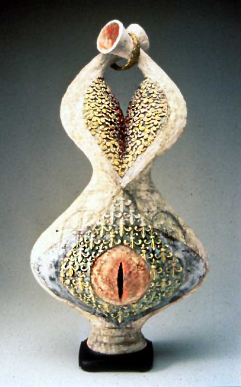
Cross Your Heart
I was drawing from the classical forms of the porcelains of the 18th and 19th centuries. I returned to that form in the scanograms in the Vessel series- but the influence here was also from petal arrangements I have seen in my travels that create elaborate images such as once spotted on the floor of a church in Italy. So no, the painting evolved more from my sculpture on which I had been painting with more elaborate imagery on the surface of the figurative.
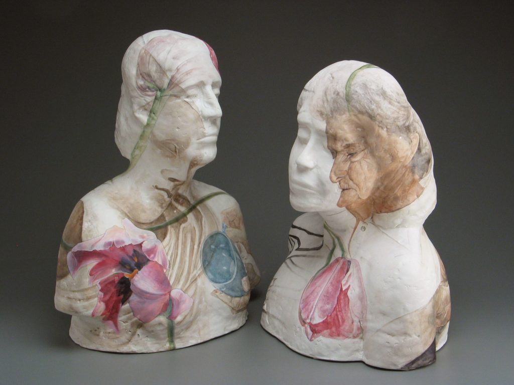
Duet
How was the pandemic an influencer to your painting?
My current series of paintings started during the isolation period of the pandemic. While the external world diminished in scope, my focus shifted inward, both literally and figuratively. My home served as a backdrop for creating tableaus that explored themes of motherhood, aging and identity.
 Inside Out
More recently I have integrated the suburban landscape around me, an element that has always appeared mysterious and somewhat off kilter, as a character within the narrative. The pandemic and its aftermath resulted shifts and distortions in the perception of time. Memories overlapped with present realities and future uncertainties. The figures and animals depicted in the paintings embody this phenomenon through their juxtaposition. They do not necessarily inhabit the same space or even the same temporal plane.

Does having your studio by your home have pros and cons?
I have had my studio at my house for over 30 years. There are only pros to this for me. I am very fortunate. I can work whenever I want and whenever I have time. It is right there. There is no separation for me between my living and my art making. I raised a son by myself and having a space that was right there made it possible for me to continue making. My narrative paintings are set in my neighbourhood or in my home and my scanagrams are made from things I grow in my garden. With these, I can simply go outside and find what I might need to add to the composition I am working on. This also has meant that I go back and forth between the two bodies of work somewhat dependent on the light in my studio (painting) and what is happening in my garden (scanograms). I also don’t need to work with others around- in fact I can’t. So, the solitude suits me. I teach 4 months of the year, so I feel I have the perfect balance
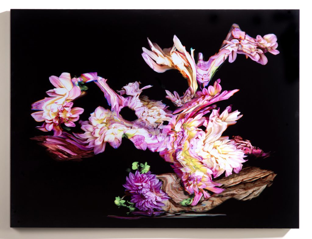
Flower Rock#2
Tell us about one work that has been a huge influence on your current art?
Because I move back and forth between media, I can’t think of one piece that has propelled me in any particular direction. I am motivated by challenges and never wanting to feel that I am just cranking things out. I am currently working on the digital photographs, after a very focused period of painting. What has been interesting is that I have found that I am thinking in a more “painterly” way, particularly in relationship to light and form with the newest scanograms.
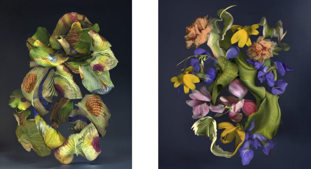
New Work
Contact:
Kate Blacklock
Website: kateblacklock.com
Email: kate@kateblacklock.com
Instagram: Kate.Blacklock
Deborah Blakeley, Melbourne, Australia
Interview by Deborah Blakeley, October 2025
Images on these pages have all rights reserved by Kate Blacklock
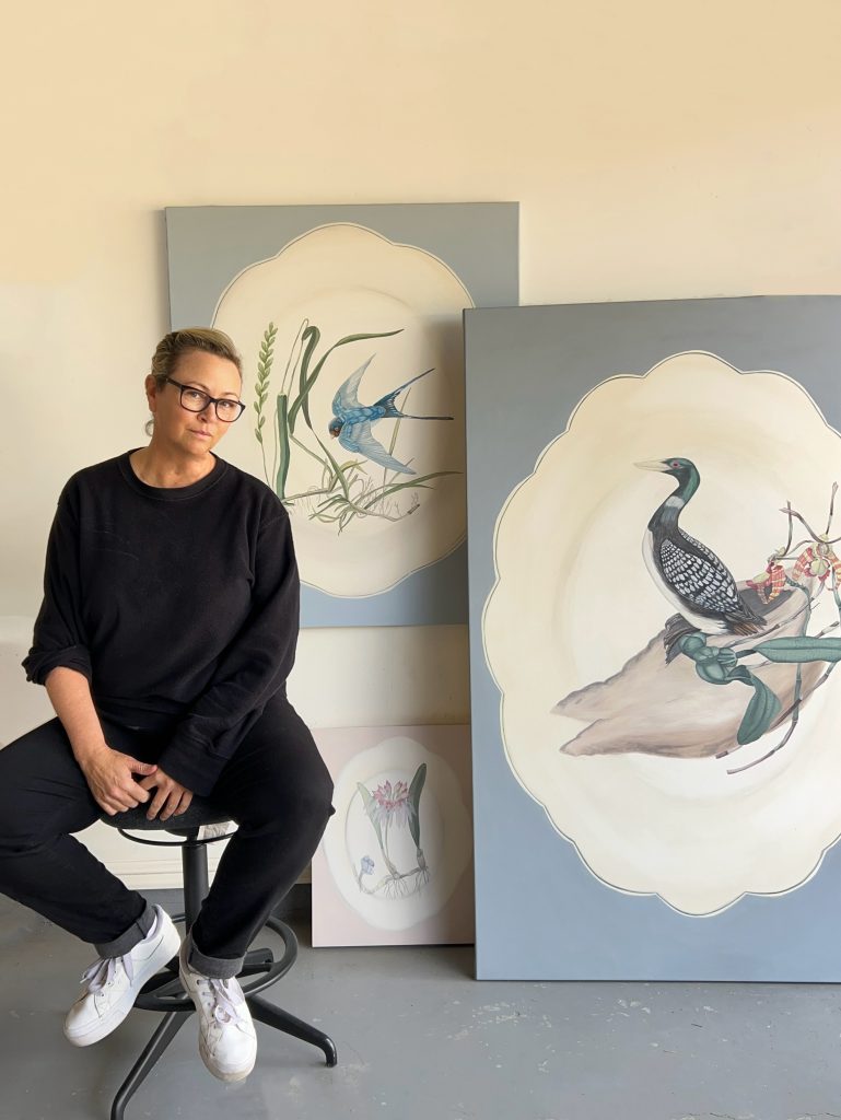
Tania Mason
What led you to your new work using antique plates as the background?
I have been thinking about using antiques and I was fascinated with the flora and decorative aspects of ceramics, and it pretty much just came together as a thought, and I started with exploring the concepts, and they fit like a glove!
How do you choose the type of plate shape and pattern?
I am obsessed with the oval shape and some decorative bubble shapes on the edges of the plate. Mostly, vintage plates, not the plates we generally dine with.
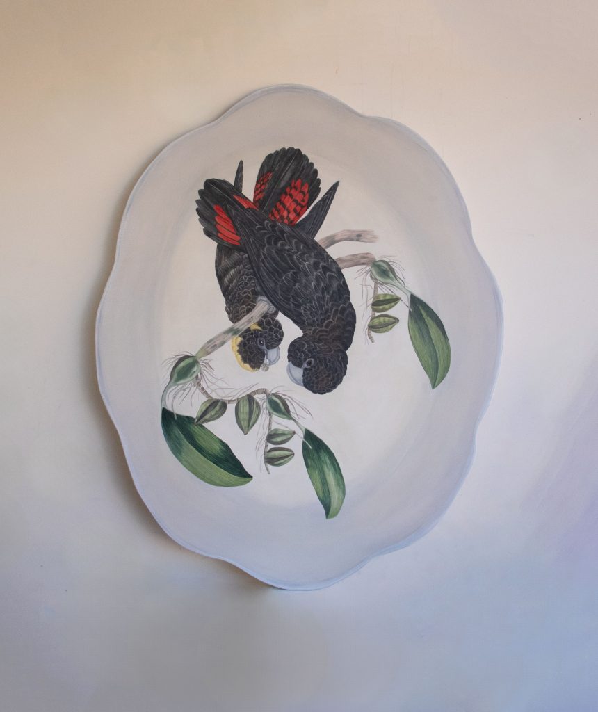
What are the sizes of this series?
We have a range of small medium and large. H40x 50 cm . H103cm x L 85cm to 153cm x 103cm
How are you using old concepts of fine china to promote a current issue, the environment?
The flora and the birds are archival images located from libraries from all over the world. Some are 700 years old, and I arrange them in a composition that sits well with each other and then play with the formation on the plate to get them right. I then draw and paint them.
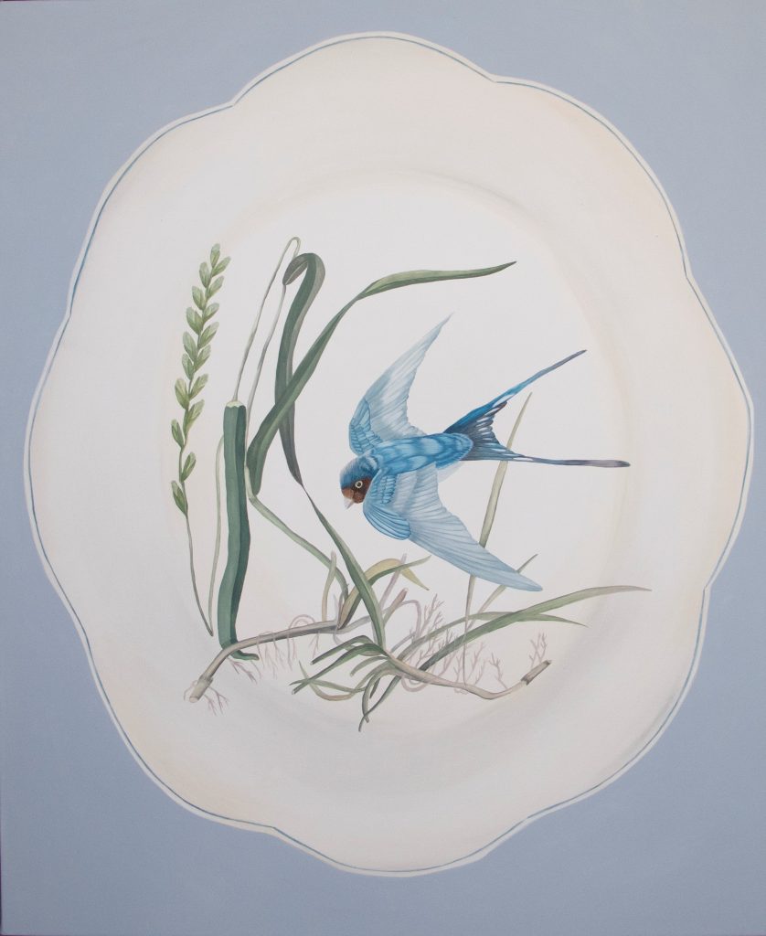
Using the botanicals as a subject and the fact that we are obsessed with flora on our plates, that hang on walls, cabinets and shelves, is something I want people to be reminded off that we are obsessed with these as a subject and love collecting them but we do not really look after our environment. Soon, these objects might be the only recall of the flora and bird life we have lost due to climate change.
How did you come up with the super title, ‘Surrounded by Time’ come up?
It is time we have and time we do not! We are surrounded by time moving forward and these objects and subjects are of the past yet hold our very future!
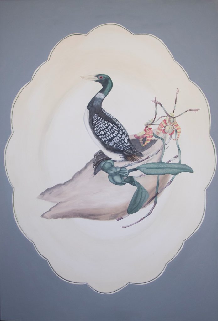
Previously you painted birds on plinths – discuss.
Also, here birds on plinths are a metaphor for the bird life we are losing and when we place it on a plinth, it becomes memorabilia, something we remember to cherish.
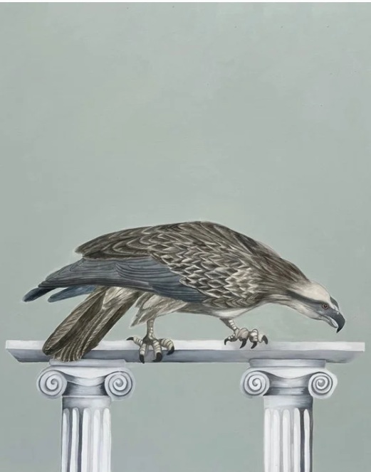
How have you been able to exhibit your work around Australia and beyond to the world?
It is with a lot of planning, contacting galleries, and galleries and curators contacting me.

Tell us about your commission to the Art Centre of Victoria and the Australian Ballet?
I was commissioned by the Victoria Art Centre and The Australian Ballet to respond to the triple bill ballet called The Ballet Ruses. It was wonderful to be so intimate with the dancers and see the costumes come together.
With a Fin Arts Degree in sculpture. Discuss your Installation in particular – paper.
Sculpture is interesting but I find installation a better fit! I love concepts of immersing the audience in the artworks.
How has your work progressed from on series to another?
It is mostly ideas, concepts and exploring these. How they connect and influence each other.
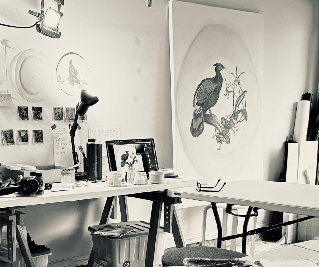
Comment on the importance of entering major art prizes?
It is really nice being a finalist. And create to be a part of a group exhibition. Winning is even better!
Contact:
Tania Mason
Deborah Blakeley, Melbourne, Australia
Interview by Deborah Blakeley, October 2025
Images on these pages have all rights reserved by Tania Mason
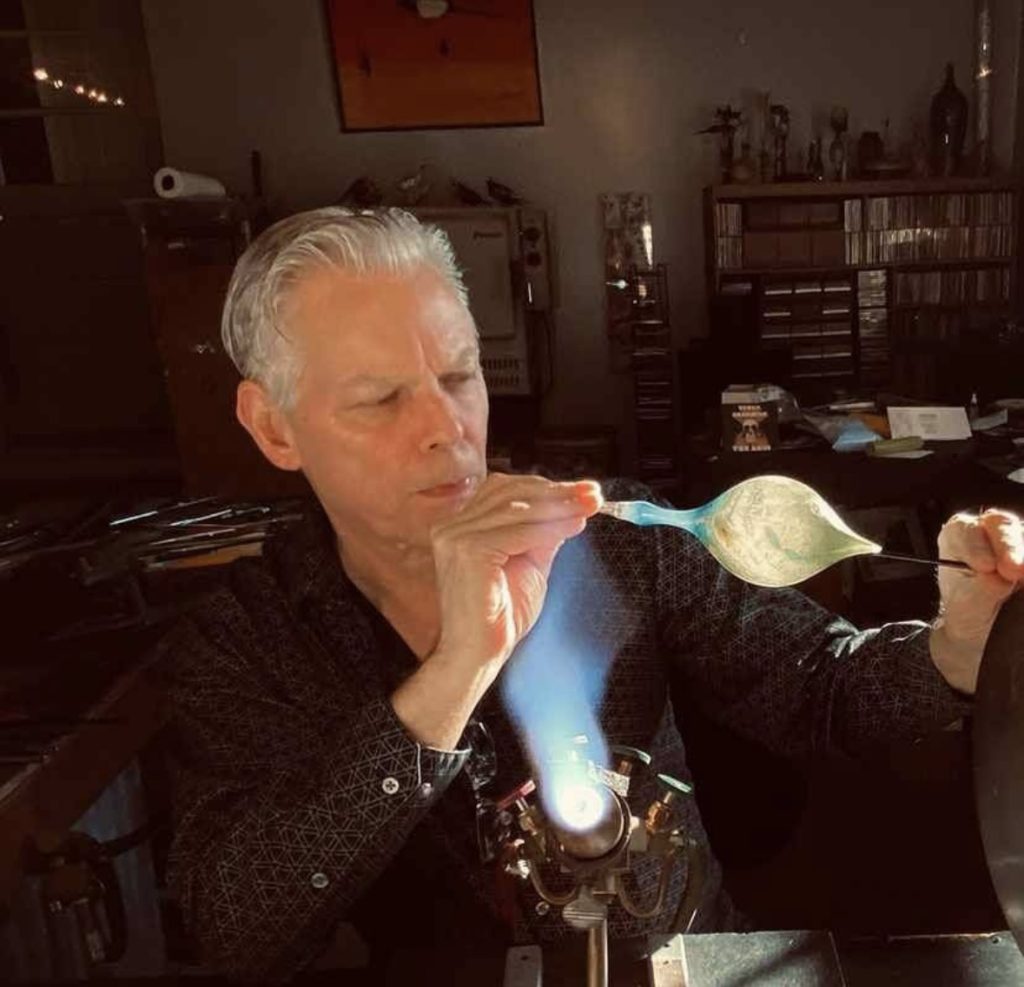
Shane Fero
What led you to specialize in Flamework?
My family moved from Chicago to Winter Haven, FL when I was almost 14. We lived very close to a lake, and I would ride my bike around the area. There was a little area of shops called Pismo Beach on Lake Ned, which had a shop called the Howell Family Glassblowers. I would go watch Bob demonstrate and I was fascinated. About a year later in 1969, Bob and Marie retired and sold out to a younger couple of glassblowers, Jerry and Lee Coker. I would still visit and then they offered me a job doing odd jobs for them, and within two months they asked if I wanted to apprentice under them. This became a journey for me learning under them, although I was in high school. Later, one of their students, Roger Smith, bought them out as they wanted to move on. I continued under Roger becoming a demonstrator at Cypress Gardens and going to college as well. I continued this until I was 21 years old when I moved to the Adirondacks Mountains to demonstrate at two tourist attractions near the Canadian border to work under the Coker’s again. I was a philosophy major at Plattsburgh State University while making glass. In 1977, I opened my own gallery, Classical Glass in Plattsburgh with a colleague.
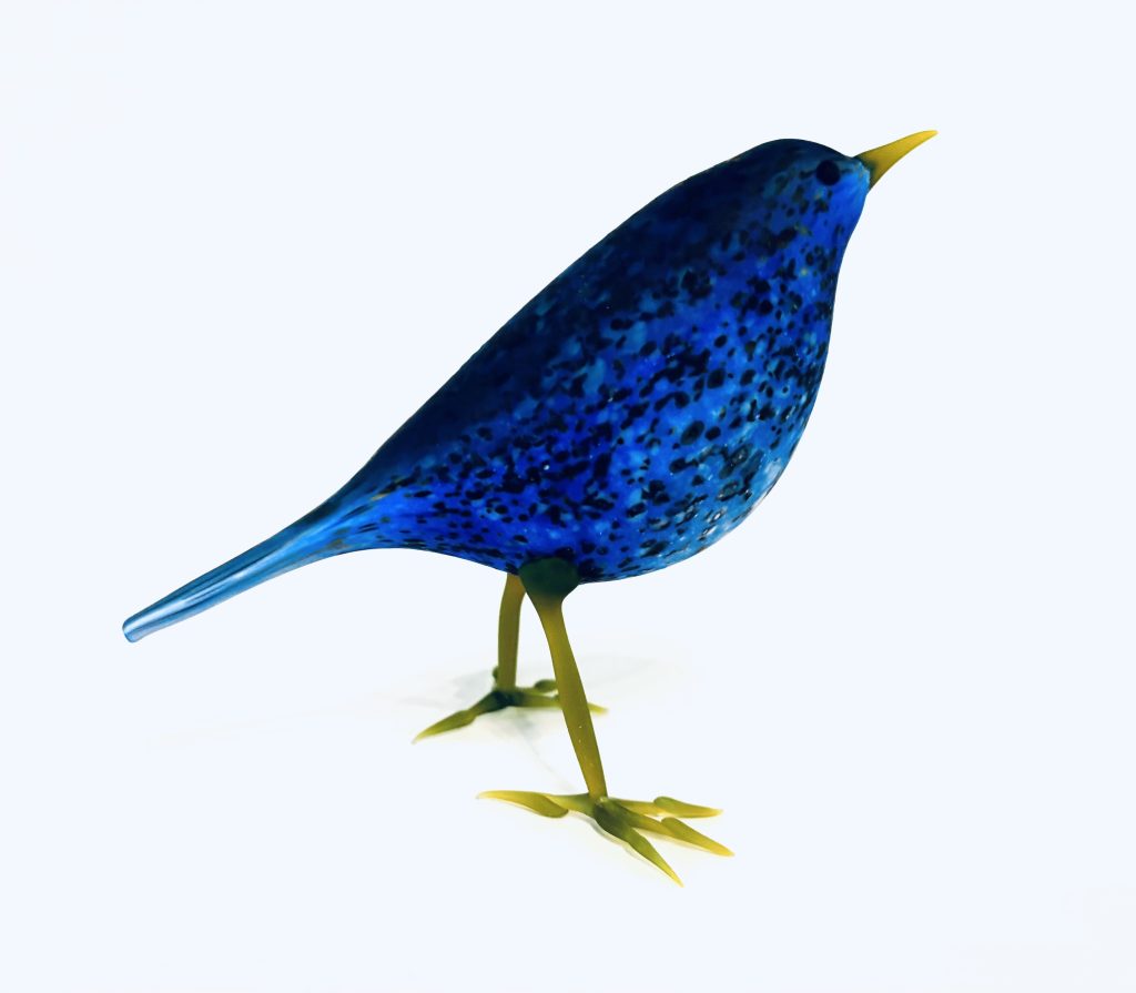 Dark Blue Bird
You have taught glasswork at all levels and in many countries. What three important things do you always want to pass on to your students?
Well, I have been teaching since 1977, and obviously teaching the fundamental techniques of flameworking is essential, but the use of colour and form is also very important. Above that, I try to impart the importance of a personal narrative and expression in their work over simple imitation.
When did you first create you glass birds?
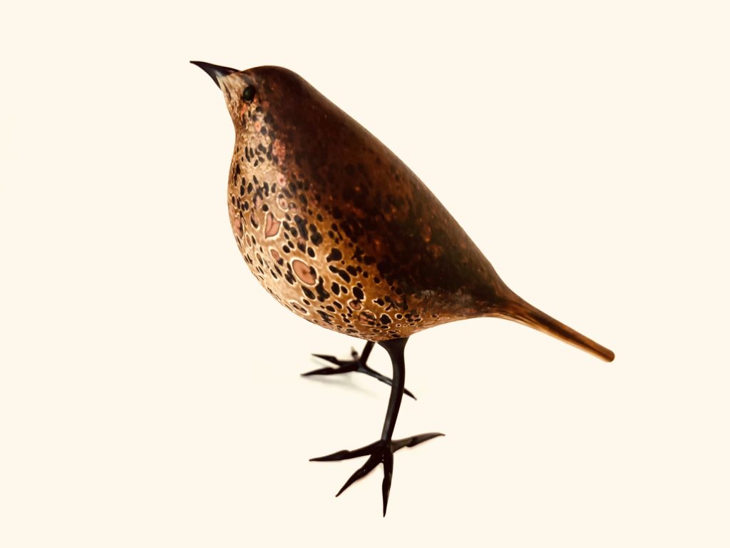
Boxwood Sparrow, 2025
One of the first things you learn after the basics in flameworking is how to make a simple solid bird. I also learned to make blown birds, but I would probably say that way back when, they were kind of kitschy. As to the modern blown birds, I started creating them in 2002 after 9/11. I was invited by my gallery, in Asheville, NC, Blue Spiral 1 to exhibit in a muti-media show on birds. I made a couple of shadow boxes with birds, some bird drawings, and some free-standing birds, which were a big success and continue to do so after all these years.
Blue Tit
How accurate are they to the actual birds?
Although, I do make actual species of birds, my focus is to make birds out of my imagination, although referencing colours, gesture and the spiritual aspect of birds. Basically, much of my work is painterly using forms to paint and draw with powder and rods of glass to achieve the quality I want. Then they are acid-etched to achieve the matt surface, mostly done by my wife, Sallie.
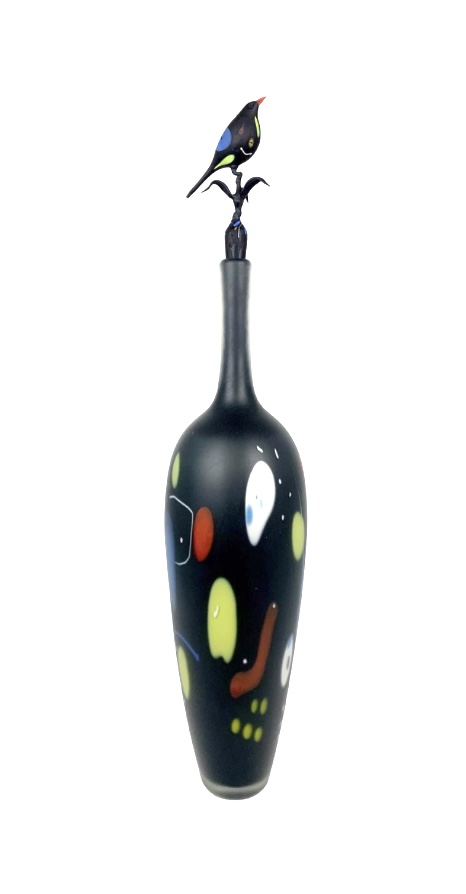
Birds have always played a connection to art through out history, discuss.
Yes, birds have always held a fascination with all cultures and this is depicted in art and even in literature. Birds with colours, the idea of flight, and even as pets is as old as civilization. I have been known to combine human and bird forms in my sculptures, based on my interest in mythology, archaeology, and in the history of art.
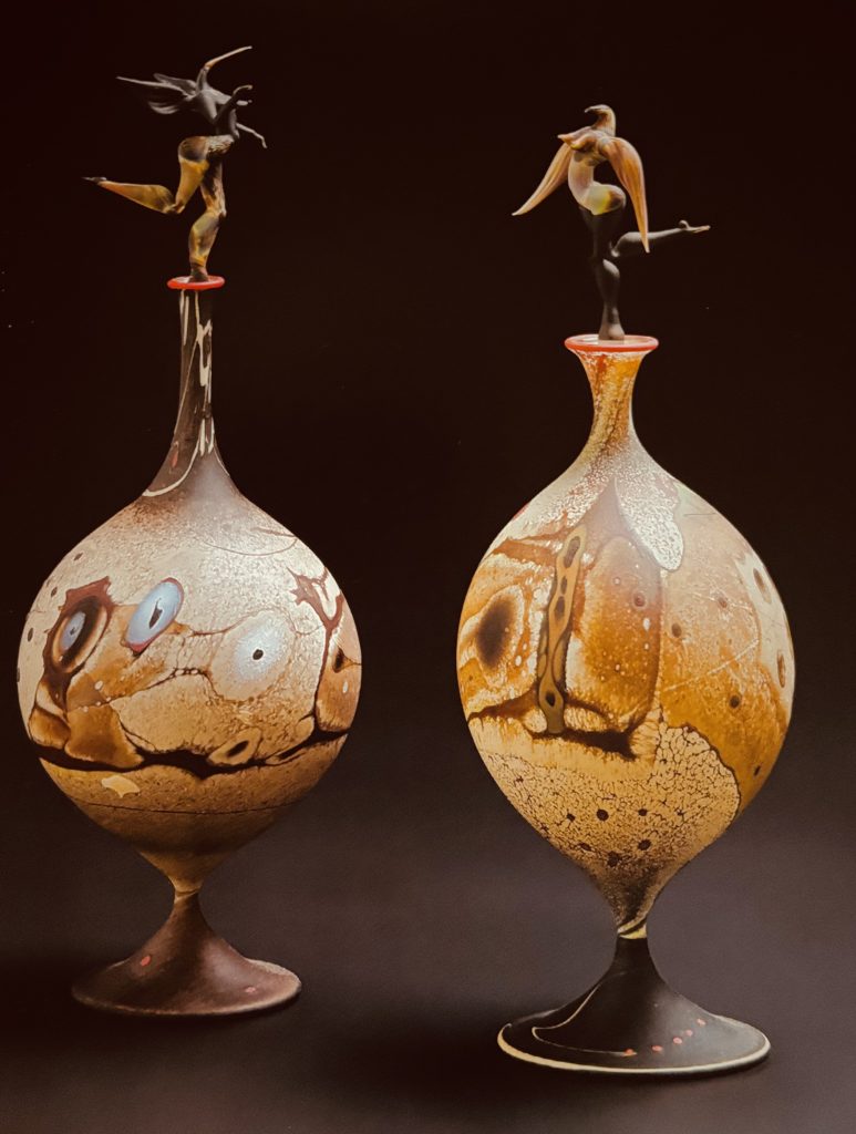
Two Bird Spirit Bottles
Comment on your involvement with Corning Museum of Glass in New York?
I first visited The Corning Museum of Glass when I was 19, right after the Great Flood that damaged the museum. After I moved to NY, I would visit the museum and also buy my glass tubing that I used from Corning Glassworks. Also, I had a gallery in Corning that would buy my work starting in 1978. I saw the first New Glass Review there in 1980. I was asked to do a lecture in 1980 at Plattsburgh State University on the modern Studio Glass Movement and although I didn’t have a lot of money, I bought the entire slide show for use in my presentation at Plattsburgh State. It was an important influence on me to focus on individual expression that I saw there. I was featured in the New Glass Review, but only once and lately in the acquisitions section.
In the early 2000s, Fred Birkhill (now deceased) and I co-taught for many, many years at The Studio of Corning Glass and then later, I taught there by myself. Back around 2016, the Museum acquired one my larger bird bottles (hot and flameworked glass) which is still on display. I was the President of the Glass Art Society from 2006-2010, in which I was a participant in planning the GAS conference there in 2009.
You have taken part in over 400 group and 33 solo shows. What are some of the stipulations you now have on your agreeing to show?
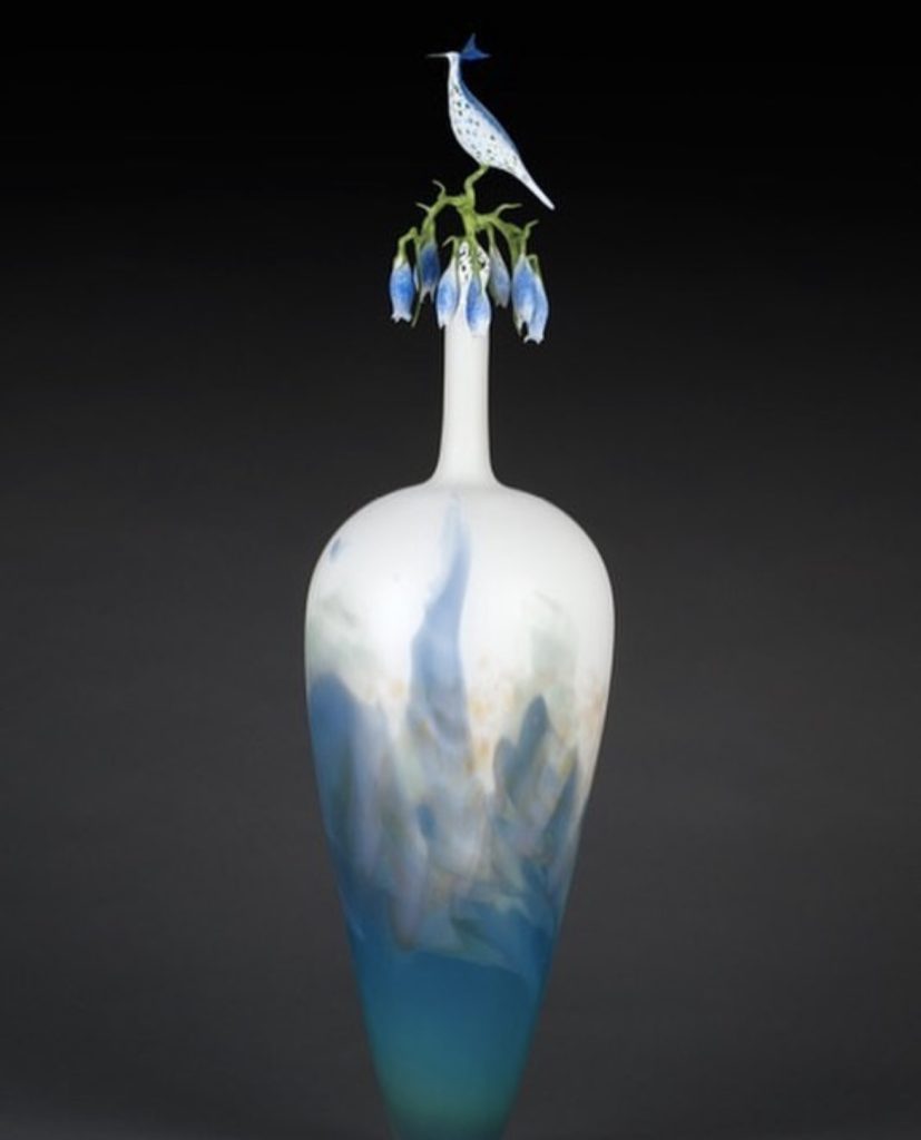
Mountain Landscape Vessell
Well, that number has increased! I don’t really have any stipulations in that
I agree to do exhibitions or not.
How do you package your birds to fly from your studio?
My birds are either nested in poly-fil or nested in carved-out soft foam and poly-fil for shipment.
You have other work that goes beyond birds.
Yes, even though I am known for my birds now, I also make solid surreal sculptures, shadow boxes, all kind of small vessels, animals of every kind, the large vessels, bottles and teapots (hot glass & flameworked), and I paint in watercolours and acrylics. Many of these can be viewed on my website.
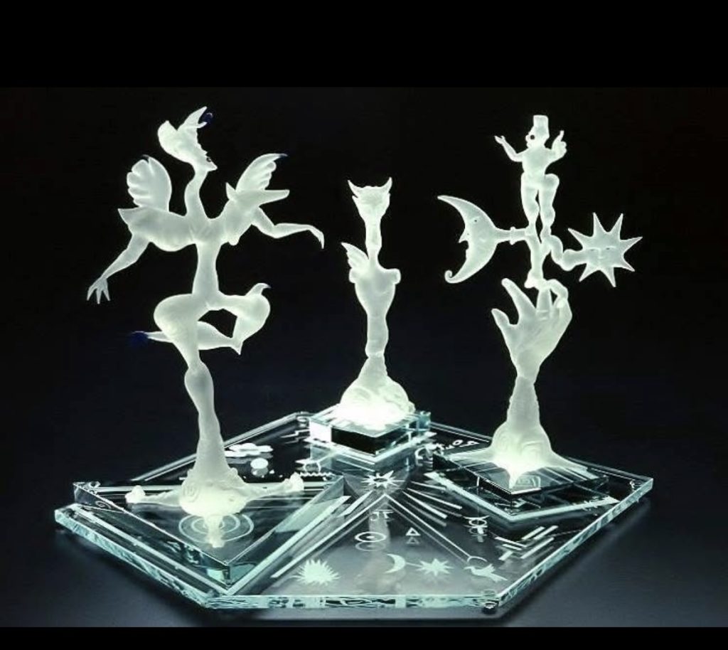
Spectrum
Do you see a difference between American glass and your knowledge of German glassblowing?
In the 19th and 20th Centuries, American flameworking was influenced by German Flameworking, especially from Lauscha. I have been there many times.
American flameworking diverged from the traditional flameworking, especially from the 1980s. It was more personal expression and narrative focused.
Although, Italian flameworking also has had a big influence as well.
How has the equipment you now use to what you learnt on 5 decades ago.
Yes, the equipment has changed considerably since I began in 1969. When flameworking really took off, it developed sub-genres like the bead movement and the functional pipe movement, more coloured glass in borosilicate, more tools, and torches evolved. The proliferation of glass and tools was significant. I still use crossfires that I was taught on with the addition of modern torches, though.
How large and small are your pieces?
My birds are around the size of small songbirds, around 4”h x 6-7”w x 3”d. but may vary. The big bottles or teapots are generally around 24”h x 7”w x 7”d., but have been up to around 30” in height. Some of the solid sculptures were up to 20”h. small vessels are around 12”h, and the shadow boxes 17” x 17”, but up to 40”l x 14”h
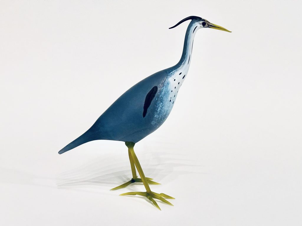
Great Blue Herron
Where has you glass art taken you?
My glass has taken me to four continents, including Australia twice, teaching, exhibiting, lecturing, and my work is collected by personal collectors and around 35 museums worldwide.
Expand on how different the colours have been to achieve?
Birds are made with a clear tube, covered with powders and rods that I draw with in the flame, and maybe glass shards or frits to achieve the desired results. They are then fused together, blown out and shaped. There is no difference in the process, except in the way I decorate them in layers of colour.
Contact
Shane Faro:
https://www.shanefero.com/https://jodygraham.art/
Deborah Blakeley, Melbourne, Australia
Interview by Deborah Blakeley, October 2025
Images on these pages have all rights reserved by Shane Faro

Jody Graham
How has your background influenced your art?
Everything about my life influences my art. I believe the marks that come out of me are a direct response to all I have lived, and they evolve as I do.
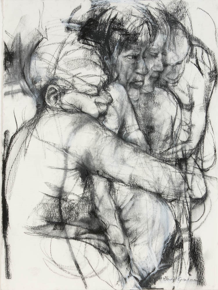 ‘Polarized’ 2008 charcoal on paper 76cm x 56cm
If I were to answer this question through a few key memories that I believe shaped my development, these come to mind:
When I was young, before starting school or around that time, I used to help my dad colour in his drafts plans for machines he was designing. I remember how excited I was to be on the floor, colouring in the parts I was allowed to. Looking back now, I found more joy in that than in many other childhood games. I was a daddy’s girl, and it felt meaningful to be allowed to help with his work.
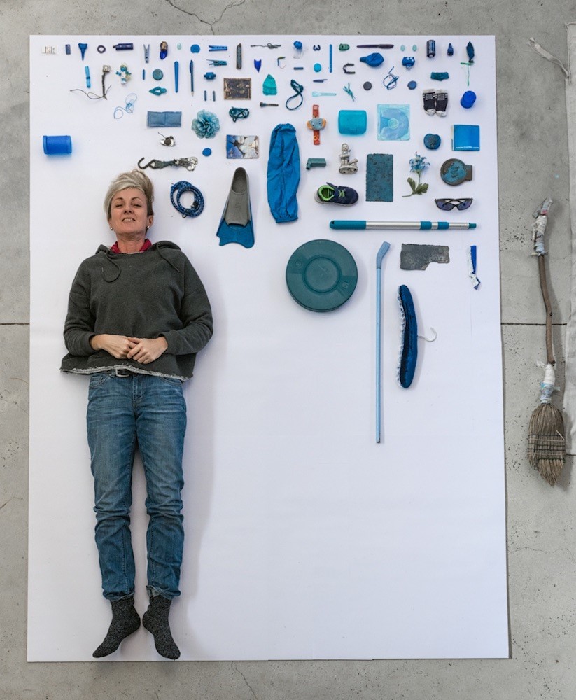 Bowerbird collecting and organising my stash Photo credit James Blackwell
My dad was always drawing, not to create pictures, but to work through ideas for the machines he was building. My mum, too, had an interest in art. At an early age, I found her old school books with ink and pencil drawings in them. I loved looking at those drawings.
Another strong memory from my childhood is the Picasso print that hung in my bedroom. (Picasso ‘A Mother and Child and Four Studies of Her Right Hand’ 1904). I looked at it constantly as a child. I still have that print now, and I often wonder how much its imagery has shaped me. I have drawn since I was a child. Everything I encounter influences my drawing, especially my emotional states. Whether I am happy, sad, angry, or quiet, I draw in all these moods. Over time, I have come to understand just how valuable difficult feelings can be when making art. I draw my feelings out rather than bottling them up.
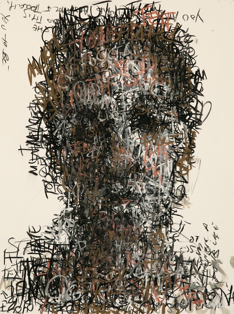 Borderline’ 2015 charcoal and pastel on paper 76cm x 56cm
Birds
Expand on …
Their eyes
Movement
Addition of the use of one colour
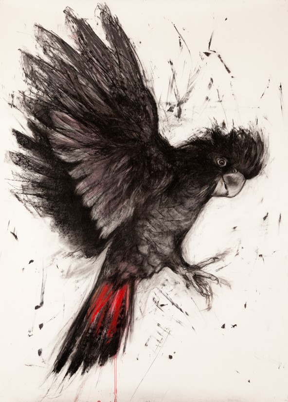
‘Freedom’ 2023, 140cm x 114cm , charcoal from Black Summer bushfires, ink, pastel on paper
I do not just look, I really look. I absorb the world around me like a visual detective!
I have read that they, That is why, when I catch a bird watching me, I stop. I let them look. I give them the chance to decide what kind of person I am. That moment of eye contact becomes our unspoken greeting, a visual handshake, if you like.
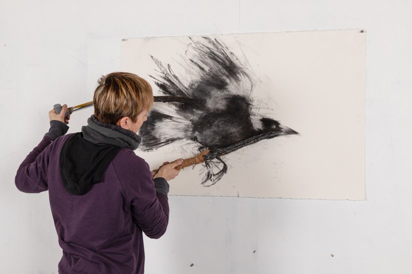 Jody Graham drawing a magpie in flight with charcoal sticks from Black Summer Bushfires.
I take the time to engage; and I am often rewarded. Birds come close. I get to see the shimmer in their feathers, the glint in their eyes. These fleeting, intimate moments stay with me, and they inevitably find their way into my artwork. Eye contact has become a recurring theme, not just for what it says about the birds, but for what it reveals about us.
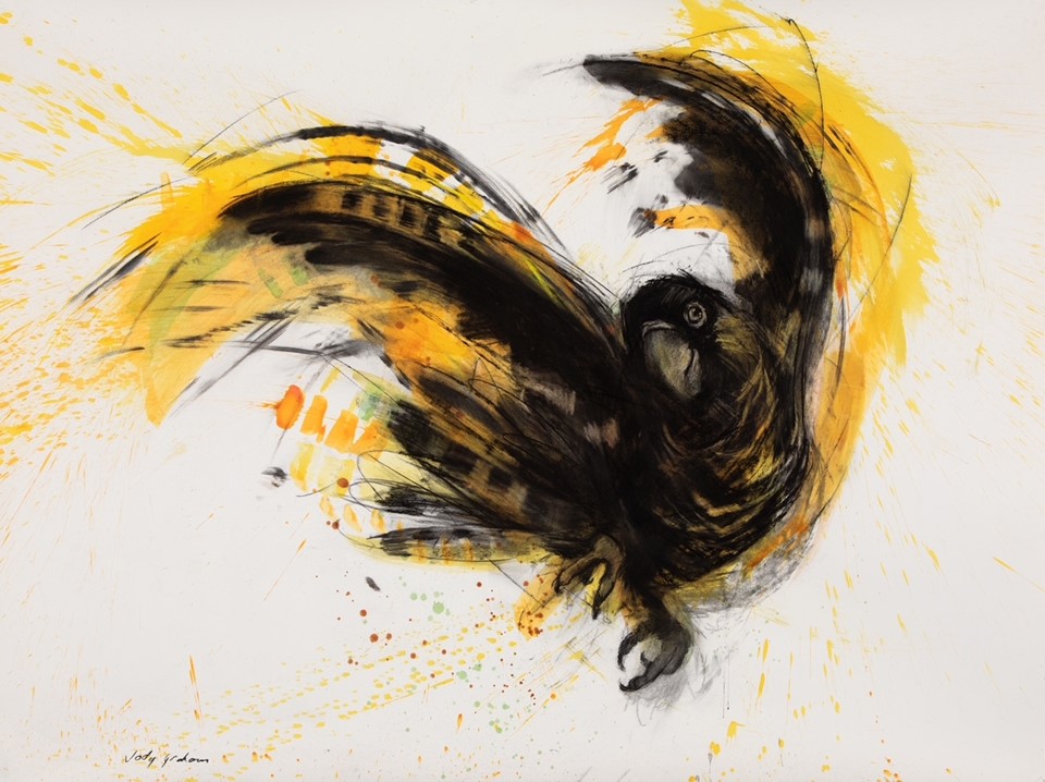 ‘Yellow-tail Dance’ 2025, 98cm x 150cm , charcoal, ink, acrylic, pastel on paper, Image Jody Graham
Movement is just as vital to my process. I do not sit still when I draw. I move with the energy of the bird, especially when they are in flight. The gestures, their shifts in direction and balance, guide my hand and arm as I draw. Gestures, their shifts in direction and balance, guide my hand and arm as I draw.
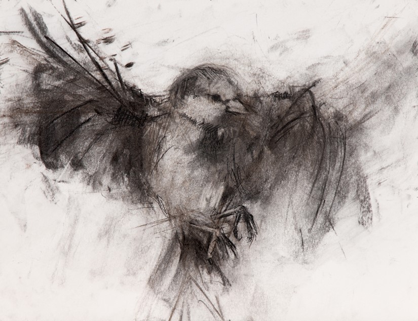
'Somewhere to Land' 2020, 29cm x 42cm, charcoal from Black Summer Bushfires.
I choose to work with a reduced palette, intentionally. I do not want to draw or paint with lots of colour. I prefer exploring all the marks I can achieve through charcoal drawing. Occasionally, I add just one or two colours, like the flash of red or yellow on a black cockatoo. I do this to mimic that burst of brightness you catch when you see a bird in the wild.
The sight of a bird, their sound, their inquisitiveness, and their freedom, inspires me!
Tell us how you have expanded beyond known art materials to,
Burnt sticks.
Your invention of gloves
I think the urge to make my own materials has always been with me, even before I understood what it was. As a kid, my family travelled constantly for my dad’s car racing. We were in and out of motels across the country, living out of bags, always moving. Somewhere along the way, I started collecting things, tiny motel soaps, sugar packets, sauces, salt and pepper sachets, jams. I kept them tucked away in a private stash.
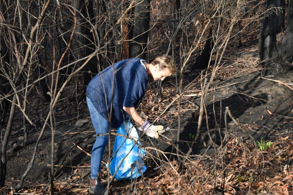 Collecting after the Black Summer Bushfires
At the time, I did not really question it. But looking back, I can see it was about comfort. In a world that shifted constantly, those small, ordinary objects gave me a strange sense of control. I told myself, if we did not make it home, I would still be okay, I had my soaps and jams. That survivalist mindset has stayed with me, and it runs underneath much of what I do today. My practice has always involved collecting, salvaging, and transforming what others throw away.
Discarded things, what some might call junk, have always caught my attention. Junk feels alive with potential to me. I sometimes say I am a thwarted sculptor, because even though I mostly work two-dimensionally, deep down I wonder if sculpture was my true calling. Making my own tools from discarded things I find, satisfies a certain sculptural itch. I like hanging my handmade implements from hooks in my studio, having them surround me and reaching for them while I draw and paint.
This instinct becomes even more important during residencies, when I do not have access to my full studio. I become highly resourceful, using whatever I can find. It forces me to invent and adapt.
One of the most profound examples of this happened in the aftermath of the Black Summer bushfires. I was working on an artist residency at BigCi – Bilpin, NSW that is in an area where charred trees and branches were everywhere, haunting reminders of what had been lost.
I began using these burned fragments to draw with, knowing that many of them had once provided shelter and perches for native wildlife. To use a branch that may have once held a Yellow-tailed Black Cockatoo felt deeply symbolic. It was a way of drawing not just with the landscape, but with its memory, calling attention to the fragility of these ecosystems and the urgent need to protect them.
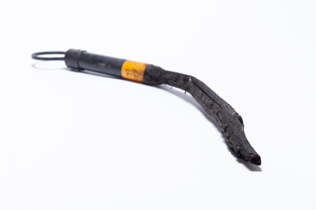 Charcoal drawing stick made from discarded material from Black Summer Bushfires
The tools I make are unpredictable, and that is what I love most about them. They leave marks I could never plan, spasmodic, awkward, often beautiful. And in using them, I consume less, recycle more, and do my bit to clean up discarded rubbish.
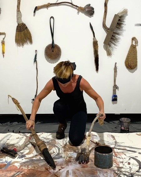 Jody Graham - Using later version of gloves - painting gloves, photo credit Richard Nolan-Neylan
One of my favourite examples of this process is how I started making my drawing gloves. This also began at BigCi in Bilpin. Each day I walked long distances, often up and down the Bells Line of Road - looking for coffee but really scavenging for materials. As much as I appreciate nature, it is the discarded, human-made stuff that grabs my attention. I am fascinated by the ghost of an object’s past life, who used it, how it ended up abandoned.
One day, I found an old workman’s glove by the roadside. It was worn, dirty, and completely beautiful to me. Back in the studio, I stuffed it with rags, mounted it on a stick, and started using it like a brush. It was strange and wonderful. But since I was mostly drawing at the time, I needed a version that could work with charcoal instead of paint. It took months of tinkering, but eventually I figured out how to attach charcoal to each finger and thumb.
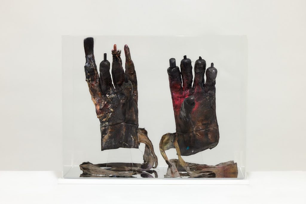 First set of Drawing Gloves photo credit Richard Nolan-Neylan
I will never forget the day I got both gloves on and started using them for the first time. I was grinning, completely thrilled with myself, when a friend suddenly walked into the studio. He froze, took in the scene, and burst out laughing. We both did. It was one of those perfectly absurd, joyful moments in the studio—when creation feels so strange it becomes magic. I will never forget the look on his face.
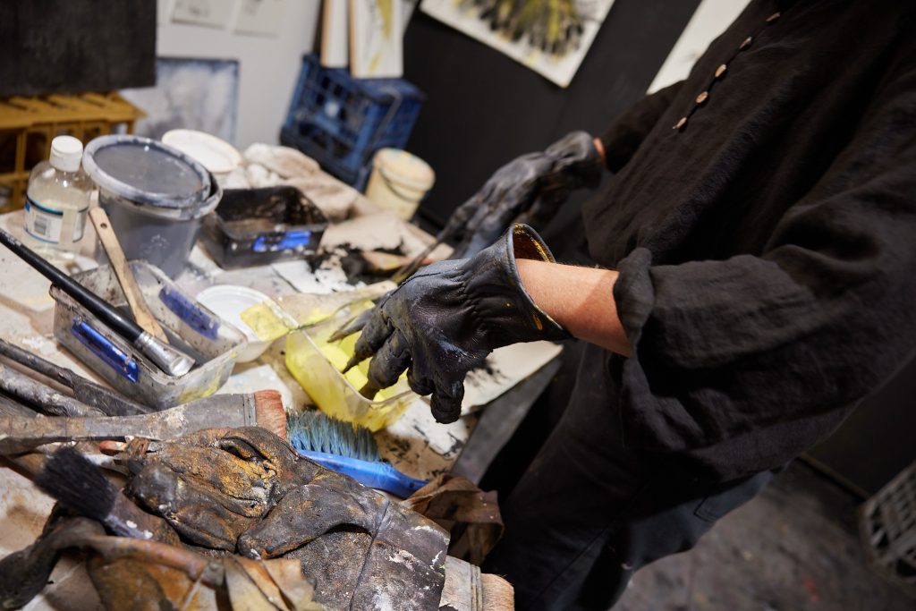 Jody Graham - Using later version of gloves - painting gloves, photo credit Richard Nolan-Neylan
You are so open and frank, discuss.
‘I like leaving evidence of mistakes in my drawings because I think there is integrity in the struggle to get it right.’
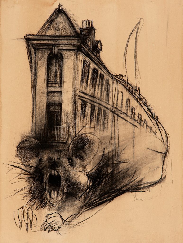
‘Rat-house’ 2022 charcoal and coffee on paper 76cm x 56cm
Can you expand on this through one piece.
I like to leave evidence of mistakes in my drawings because they reflect who I am. I am human, flawed, evolving and I want my work to carry that same honesty. A smudge or a misplaced line is not a failure; it is part of the process; a visible trace of the effort it takes to get things right.
I draw by eye, levelling and measuring by sight, no projectors, no shortcuts, because I value the challenge. The back-and-forth of adjusting and reworking: that is where the real satisfaction lies. It is a human process, full of imperfections, and that is exactly what I want to preserve in the final piece.
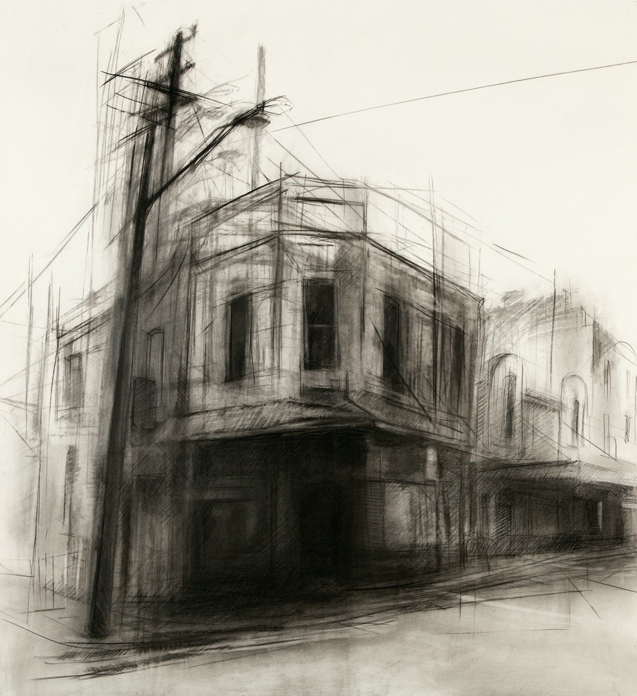 ‘Little Queen’ 2016 charcoal on paper 120cm x 114cm , Image Jody Graham
You can see this in Little Queen, a drawing of a corner building I pass often in Newtown, where I live. I am drawn to older architecture, especially corner buildings that quietly watch over the streets. Capturing the old telegraph pole was important too; they are disappearing, and I want to hold onto these details before they vanish.
In Little Queen you will notice faint construction lines and an earlier position for the pole and streetlights. I left them there intentionally. They are not mistakes anymore; they are evidence of thought, revision, and the human touch that defines my work.
Contact:
Jody Graham
Deborah Blakeley, Melbourne, Australia
Interview by Deborah Blakeley, September 2025
Images on these pages have all rights reserved by Jody Graham

Pete Monaghan
You use the term ‘Vernacular’ Architecture, - Constructed of local materials, traditional techniques and reflecting cultural practices. Discuss this in reference to your paintings.
Buildings that appear to have ‘grown’ out of the landscape, constructed of natural boulders that have been rolled into place or stratified, slate-type rocks placed upon each other, colours particular to their region, local materials, and along with the ubiquitous ‘crinkly tin’ all form unique buildings that are in sympathy with their location. It’s easy to overlook these humble structures and we lose them in the name of progress.
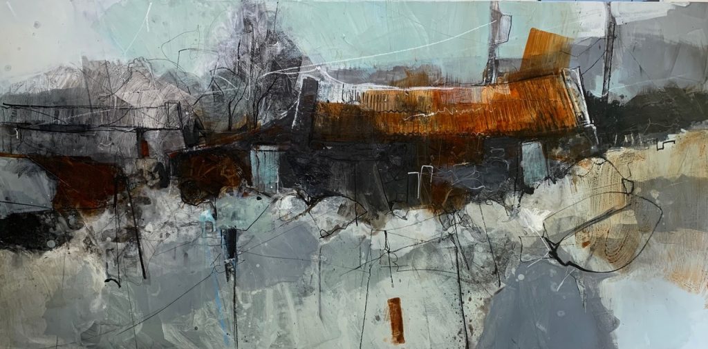
Do you sell your original work beyond Wales?
Yes, my work sells throughout the UK and Ireland and some works have gone further afield; USA, Germany, Australia, Russia. I only deal with galleries in Wales at present, some of the UK and Irish galleries have found the art marketplace challenging the last few years and having reduced I now find it may be a good time to broaden my scope again.
Discuss the use of a singular primary colour in, ‘Siopa Castell.’
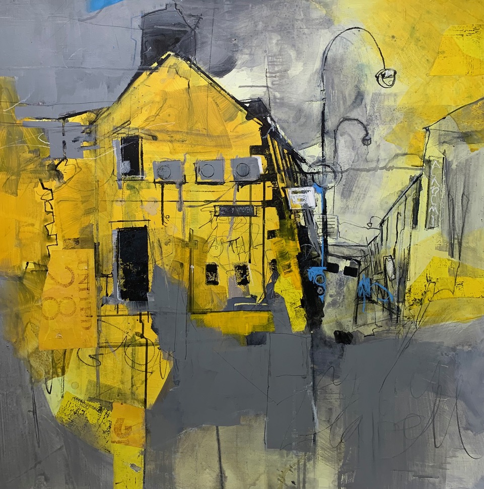
The use of a single primary colour in this painting is very simply to challenge myself. I don’t generally use many primaries, certainly not yellow and yet this building, in a local town centre caught my eye. It’s bright yellow stained walls and plethora of signage and exterior air-conditioning units and drainpipes gave it an industrial, urban and shabby feel that I particularly enjoy. I wanted to use yellow to sing out almost like a Basquiat painting.
Materials
Acrylic and collage with water-soluble crayons on wood panel.
Size
1 metre square.
Location
Location Currently held by Oriel Ffin-y-Parc Gallery in north Wales… https://welshart.net/artists/59-pete-monaghan/works/20487-pete-monaghan-siopa-castell- 2024/
Colour
Yellow! Neutral grey to calm areas that were becoming too busy. A flash of blue to give interest or excitement. Black lines in water-soluble crayons or acrylic ink, used for outlining/ emphasising and scribbling
Tell us about your “hidden” Studio space.
I was fortunate enough to have a studio in the ‘Old College’ in Aberystwyth, west Wales. It was the original home of Aberystwyth University, the first Uni in Wales. When the time came to renovate the very prominent seafront property, we, the artists, were re-housed to a temporary University building out of town which is wonderfully secluded in woodland, next to a small river. The University has been great in supporting us in this way and the building houses the Aberystwyth printmakers too. We will return to the old college when its renovated.
How important is it to you to be able to share your studio space and be able to relate to other artists?
I have a very small studio space (9 square metres) but I can shut the door to be alone if needed. Other artists and printmakers are often around and the impromptu meetings in the kitchen over a cup of coffee are mostly profound and stimulating. As mentioned I’m not sure there is a classic but certainly there are elements that I love and re-use time and again. Such as corrugated cardboard and old maps for collage. A welsh barn would be typical subject matter, I love the way they snuggle into the landscape and show evidence of hard graft over generations. I want to capture that in the work. There are also colours that could be regarded as favourites; ultramarine blue and burnt Sienna, van gogh brown, green-gold, transparent raw Sienna, transparent red iron-oxide, all from Golden or Liquitex.
Comment on the size of your work and how you have the majority at a standard size. My standard size would be 40 x 50cm. That seems to fit well with the work that I do. But it’s good to challenge that convention by working on extreme landscape format or square, or tiny or massive! If my studio was bigger I would probably favour a size more like 75 x 100cm. Using standard sizes is an economical decision, I can re-frame pieces if necessary and I like to keep things simple.
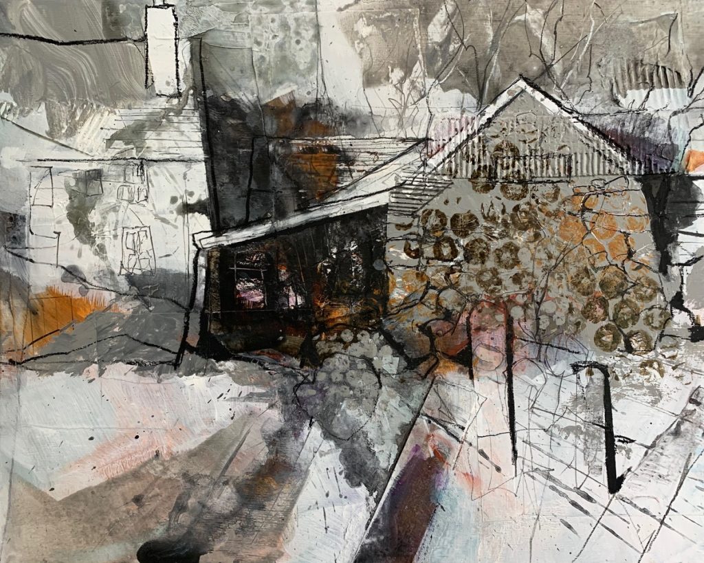
Explain about one of your wild card works.
Every work is definitely different and challenging in some way, there is not really any sort of standard work. I suppose that a ‘wild card’ piece would have to be off the scale different so… I recently tutored a workshop at a lovely venue in Yorkshire, England. They have developed a barn as a new working space and I ran a course working at large-scale. It was fascinating, not just what the students produced but my own work became more exciting and visceral for being able to throw paint around and retreat ten metres from the piece that I was working on.
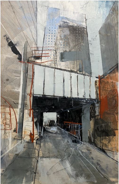
Discuss with us a classic Pete Monaghan.
As mentioned I’m not sure there is a classic but certainly there are elements that I love and re-use time and again. Such as corrugated cardboard and old maps for collage. A welsh barn would be typical subject matter, I love the way they snuggle into the landscape and show evidence of hard graft over generations. I want to capture that in the work. There are also colours that could be regarded as favourites; ultramarine blue and burnt Sienna, van gogh brown, green-gold, transparent raw Sienna, transparent red iron-oxide, all from Golden or Liquitex.
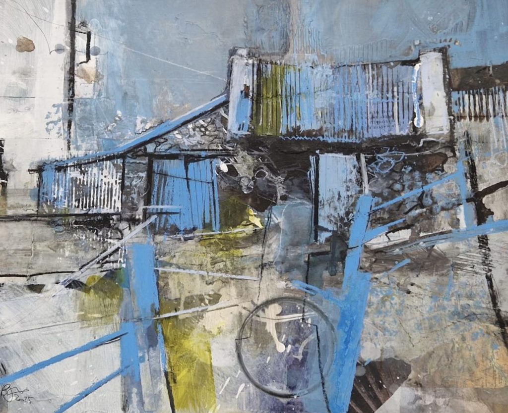
Comment on the size of your work and how you have the majority at a standard size.
My standard size would be 40 x 50cm. That seems to fit well with the work that I do. But it’s good to challenge that convention by working on extreme landscape format or square, or tiny or massive! If my studio was bigger I would probably favour a size more like 75 x 100cm. Using standard sizes is an economical decision, I can re-frame pieces if necessary and I like to keep things simple.
Comment on how you over paint on canvases but how you have this documented for the buyer and future buyers?
I paint on plywood panels. These are ‘blocked’ or ‘cradled’ at larger sizes. I often layer over work as part of the painting process and if a work is returned from a gallery then I’ll cast a very critical eye over it and maybe re-work the painting if it can be improved. I wouldn’t necessarily be documenting this process or informing the purchasers of it.
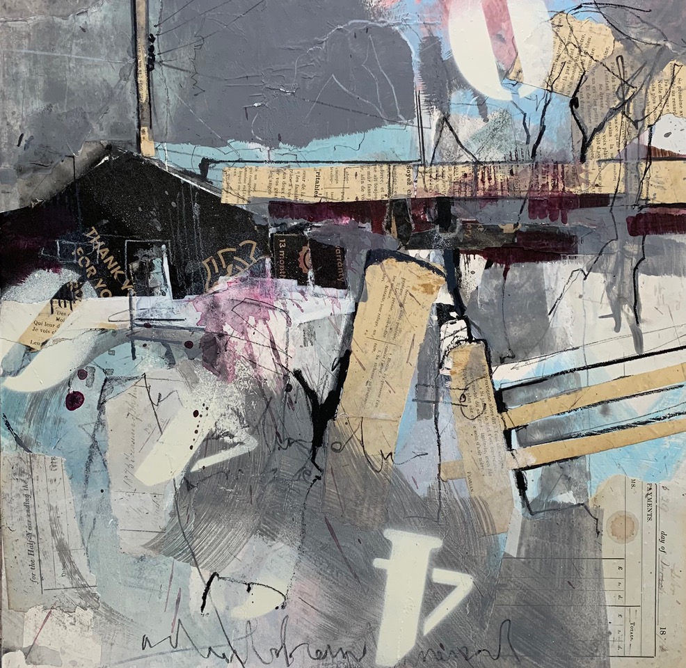
“Simplicity is Genius” is written over the door of your studio. Why do you have it up and expand on the meaning of it through one of your paintings?
Most of my work is held together by line, line is the essence of what I do. My work has been described as ‘organised chaos’ and there’s definitely some truth there. I see it as an asset to be able to allow the work to go through a stage of chaos before sorting it out by calming areas and simplifying. I use white to radically edit works. If they reach the stage of being ‘nice’ then they’re in for radical editing too
Contact:
Pete Monaghan
Aberystwyth, Wales, UK
hello@petemonaghan.com
Deborah Blakeley, Melbourne, Australia
Interview by Deborah Blakeley, August 2025
Images on these pages are all rights reserved by Pete Monaghan
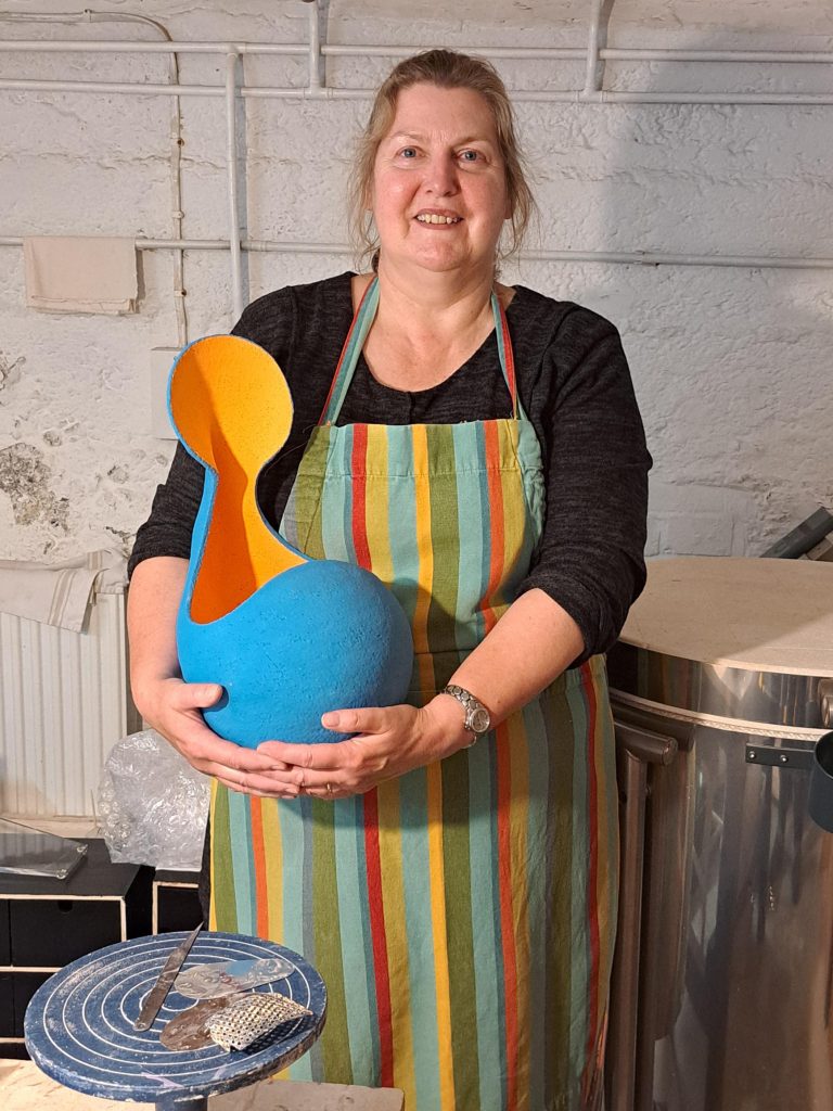
Anna Phillips
Colour is so important and bright in your work – When did this happen?
Colour burst onto my scene after working with black clay for an extended period, this is probably about 8 / 9 years ago. The introduction of such vibrancy was a 180o switch from the muted blackness and patinated gold and silver leaf tones I had been working with.
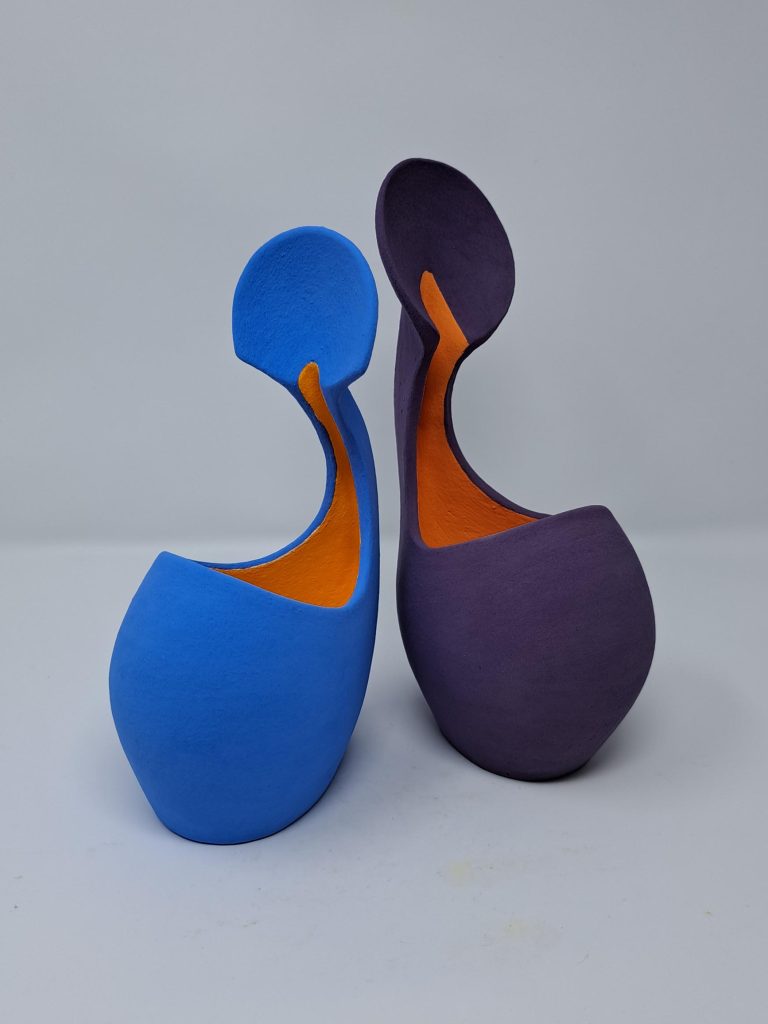
I have asked about your colour but your shapes also dominate your work, discuss.
My shapes have evolved over the years – the current forms I am using reflect back as an evolution of shapes I was making approximately 35 years ago – the shapes have developed but it is still work from the same genus of form.
How is your work related to the human form?
I have completed wall pieces in the past however I always revert to making vessels; pots hold the imprint of the maker in the same way a human form blends the genes of the parents, both contain parts of beauty and imperfection and, as a pot is a vessel to contain liquid, dust or air, so the human form is a holder of the individuals spirit and essence of being. I also enjoy life drawing people – my work reflects an abstraction of aspects of these forms.
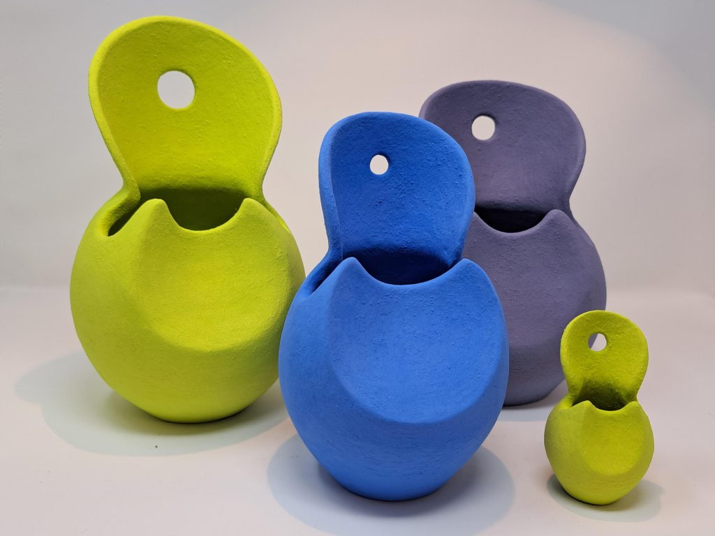
How do you find having your studio at your home?
Having a home studio is both an asset and a downfall. It is good to be able to access the studio 24/7, to check on a piece’s drying progress and work when the mood takes you even if that is at 3am when the rest of the household sleeps. On the other side there are always distractions of the phone, doorbell and household chores that require attention. I must be disciplined in setting myself set studio times and fitting in domestic demands around this.
How do you achieve two colours separating e.g. yellow inside and orange outside? All my colour is applied by brush by hand, there are no aids to control the lines – this is achieved by time, patience, a steady hand and remembering to breathe!
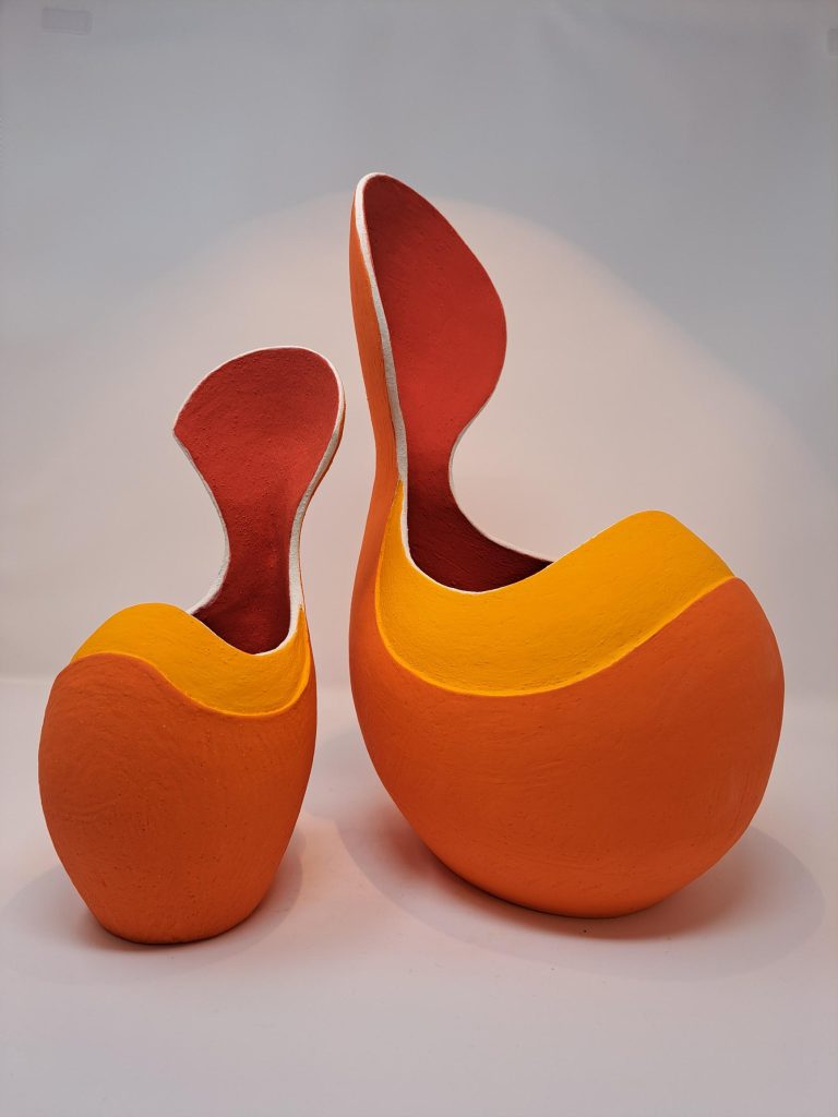
What are your colour combinations?
Colour combinations ebb and flow. My mood decides them, however the most popular with the public appear to be an orange interior with mid-blue exterior. I look to nature for inspiration; it is not constrained by colour charts and can produce some quite outrageous combinations.
Where do you get your inspiration?
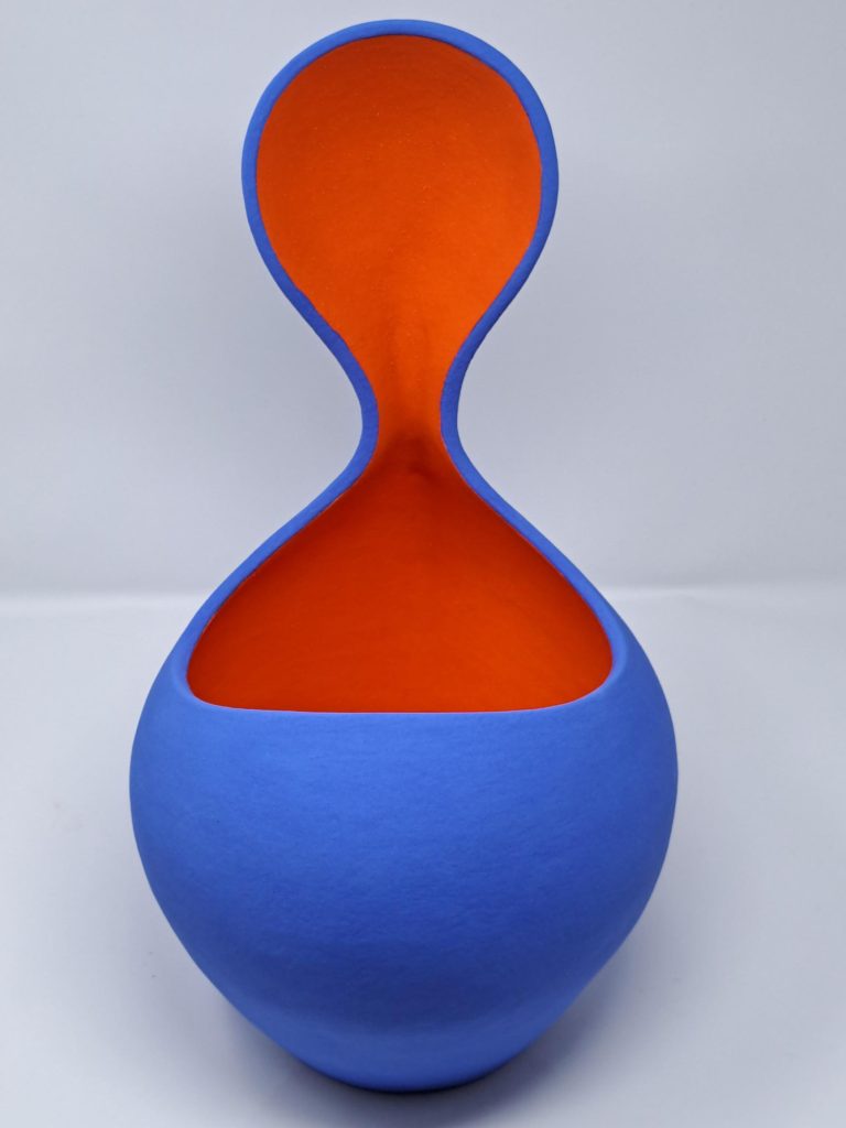
Inspiration comes from many sources; - medieval armour, insects, modern dance, flowers and people. My vessels have bellys, necks and loose references to a head, and influence from the human form, armoury and insects can be found running through it all.
Comment on your other work using black with patterns in patina silver / gold leaf.
This work developed when I first encountered black clay. I enjoyed creating carved patterns in the surface which, when fired, I would colour in blocks of gold and silver leaf that I then patinated to create an age look to the surface. I stopped making this work as the decorative process of working with the leaf caused me eye pain – I felt this was my body telling me it was time for a change, that’s when the colour work exploded from within, like a kickback from working with darkness.
Where do you source your clay?
Clay is sourced from commercial suppliers and at the local materials store. I am currently working with the Earthstone Ashraf Hanna clay body as it has a very white firing clay body which contains a large proportion of molochite which enables me to create the forms I make and for them to withstand the heat of the kiln with minimal distortion.
How large can you make your ceramics and why?
I am restricted by kiln size, currently the largest dimensions I am able to make are 60cm high by 50cm wide by 60cm deep.
Some of your ceramics become outdoor sculptures – does discuss.
My pieces are all fired to vitrification and I have made pieces specifically for outdoor display – the difference with these being ensuring that they can drain effectively and allow surface water run-off rather than pooling, and be weatherproof – well frost hardy – I still wouldn’t recommend leaving any ceramic out in the snow and ice.
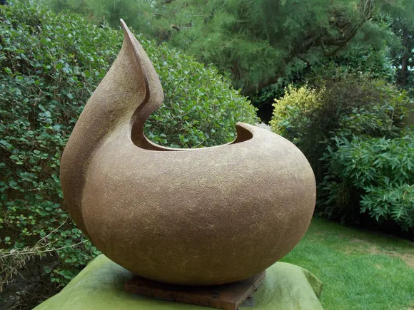
Do you take commissions?
I have completed commissions; however, I have to be really engaged with work to feel relaxed in making it. Regularly commissions come through as requests for a specific size or colour way rather than for installation pieces. I enjoy making the pieces I wish to make and feel that this is communicated within the product. Clay is unforgiving and if you find yourself trapped making a piece you do not enjoy and feel fully comfortable with, I believe that this shows through in the finished article. I want the plastic earth that I sculpt with to show only positivity from its maker, not a struggle or any negativity.
How involved does the purchaser become?
Purchasers tend not to be involved, my work has been described as “marmite”, people either enjoy and get the work, or the colours and forms turn people off totally!
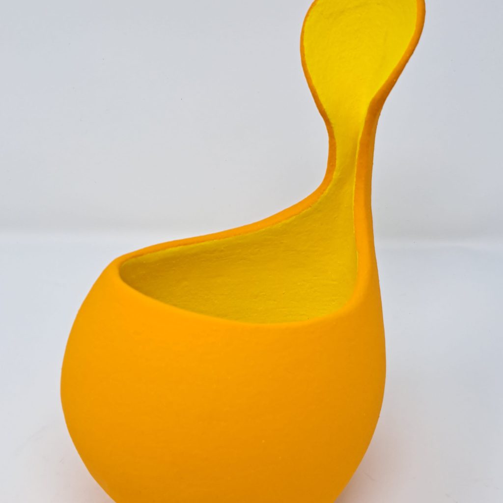
What is one piece that has been hard to let go and why?
A piece I created back in the studio of my first ceramic tutor. Having completed college we spent a few weeks working together. It was a pot that she had admired greatly as I was creating it and the piece was raku fired, it was highly successful and I knew that I would never be able to recreate the fire effects, I handed it over, still warm, as a thank you for her friendship, support, tuition and belief in my capabilities.
Do you keep a section of your work for prosperity?
Yes, I do have a selection of pieces I have kept, these are few but serve as a reminder of different stages in my life and development as a maker.
Contact:
Anna Phillips
www.annaphillipsceramics.co.uk
Instagram – annaphillipsceramics
apceramics@hotmail.co.uk
Deborah Blakeley, Melbourne, Australia
Interview by Deborah Blakeley, August 2025
Images on these pages are all rights reserved by Anna Phillips

Nicole Farhi
Do you feel that having formally being involved in fashion has made you very aware of body shape in your sculpture?
My years in fashion trained my eyes to read form, movement instinctive precision. That sensitivity to physicality carried over into sculpture. There is also a share discipline and emotional impact through shape. Both fashion and sculpture are for me acts of interpreting the body.
What are your thoughts on extending a hobby into a career?
Sculpting was more than a hobby for me. I always knew deep down that one day I will be sculpting full time. It took longer than I thought, because it is not easy to turn your back when you have built a successful company, and you are going to leave behind the people you have worked with and love, your team.
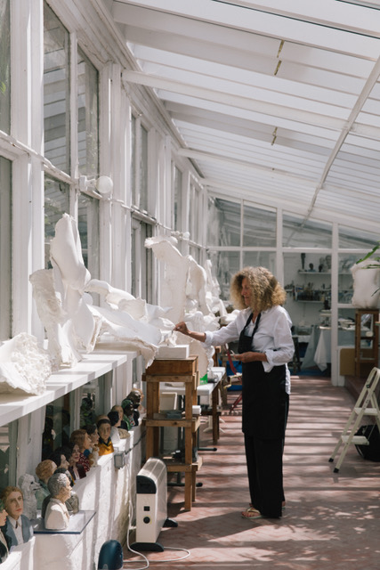
Nicole Farhi, Image by Iona Wolff
Why was your involvement with Eduardo Paolozzi so pivotal in your sculpture?
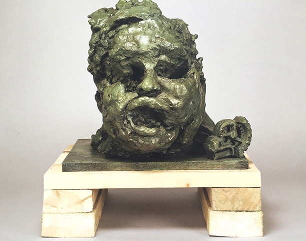 Homage to Eduardo Paolozzi #3
I met Eduardo Paolozzi in the late 80s at the Royal College of Art’s Foundry. I was casting my first bronze. Eduardo was taking some students around the foundry, he came and looked at what I was doing, was interested and invited me to his studio. He was extremely generous with his time and was always ready to look at the work of a young sculptor, he was ready to consider the work of any student and mine by extension as unique and therefore of value and interest. He would take me to his foundries, to museums, we will drive around London or would walk in the streets, and he would open my eyes to the world around us.
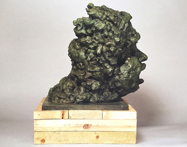 Homage to Eduardo Paolozzi #2
We became not only friends, but he became my mentor, he taught me to work in different mediums, plaster, wax. He gave me this invaluable gift, confidence in what I was doing.
Tell us about your exhibition J’Accuse….! and what you are focusing on.
J’Accuse… is a series of sculpted portraits of people who were wrongly accused and condemned for crimes they didn’t commit. Each face is a quiet remembrance of those who were silent, and it is about bringing them back into the present, not just as names in a file but as human beings with presence, dignity and story. In showing them, I hope to make space for reflection, it is our responsibility to remember. This exhibition at Pitzhanger Manor and Gallery has just finished but it will be shown again in Edinburgh during the French /Scottish Conference about Miscarriages of Justice this September at The Fine Arts Society Gallery 6 Dundas Street Edinburgh.
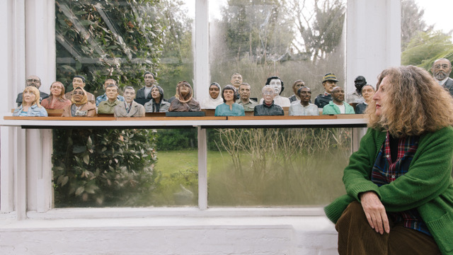
J’Accuse… image by Iona Wolff
Your sculptures range in sizes, take two on small and one large and discuss your choice of size and why?
The size of my work follows the emotional and conceptual focus.
When I sculpt a series of very small heads, it's often about the many — a collective voice [Couples], a shared experience] Writers], or a common injustice [J’Accuse]. Each head is part of a chorus, and their smallness invites closeness and contemplation, almost like holding memory in your hand.
But when I sculpt a large bust of a single person [Paolozzi, Bacon, Giacometti…], the focus narrows to one human being. The scale grows because I want the viewer to feel the weight of that one life — its dignity, its suffering, its presence. It becomes monumental not just in size, but in emotional intensity.
How was your artistic career affected by Covid?
Apart from that fact I didn’t show my work for two years, and didn’t have any models coming to my studio. The two years of lockdown left me free to concentrate on my work. I enjoyed this forced solitude and worked well.
Discuss ‘Entrelace’ and why you use only some parts of the body.
In Entrelacé, part of the Womankind series, the decision to show only fragments of 2 female bodies—hands, legs, and feet entwined—speaks to a deeper intention beyond anatomical completeness. By omitting faces and torsos, I shift the viewer's focus from identity and recognition to gesture, texture, and emotion. This fragment invites intimacy without intrusion. The entanglement of limbs suggests vulnerability, contemplation, and embrace.
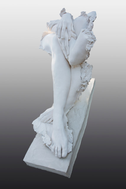
Entrelace
‘Couples’ comment on how you have added color to this collection.
I paint each series of little busts not only “Couples”. Perhaps because intimacy lives on the small scale. I am very fond of these little bust, they are like secret jewels made visible, their smallness invites closeness, I like finding details, in the case of “Couples” the shape of their dress, the color of their lipsticks, the color of their eyes, hair.; I enjoy spending that extra time with them.
Do you feel that being a woman, you are able more comfortable with work like ‘Cybele’?
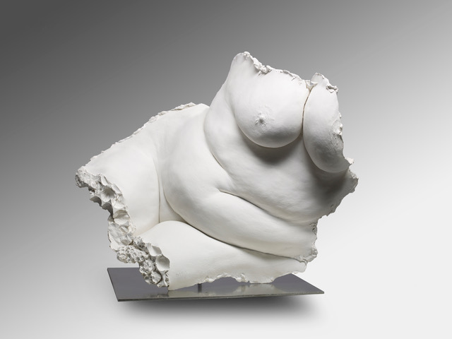
Cybele
As a woman, I carry an intimate, lived knowledge of how the body is looked at, judged, celebrated, or hidden. That embodied experience may give me a kind of truth-telling authority here — not just technical, but emotional. There’s a quiet defiance in Cybele, and maybe that comes from someone who knows what it means to inhabit flesh that is so often spoken for by others.
Whether I am more at ease because of my gender is not a question I asked myself; what matters is that I have chosen to speak from the inside out, and it resonates.
Would you say Cybele is a goddess of defiance as well as fertility
Yes definitely, Cybele refuses to shrink, to apologize. The folds of her flesh are not just maternal but sensual. She is full of energy; she offers life as power.
Comment on your ‘Jesomite’ Collection.
Do you mean Jesmonite. it is a water based acrylic composite material much lighter than traditional casting materials, it is easy to work with and reproduce fine details very well. I have been working with this medium which resembles plaster for a long time. Unlike cold, rigid materials like bronze or marble, Jesmonite has a natural soft matte finish and can feel almost skin-like. This tactile quality is perfect for sculpting moments when a woman is completely at home in her body. My new series” Intimacy” is a perfect example of what jesmonite can bring to my work.
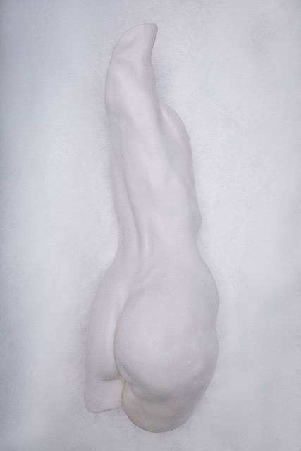
Intimacy
Expand on the importance of being able to add MRSS after you name.
I am not sure it has ever helped me so far. But I like to be part of the community of sculptors in the UK.
Expand on the technique of your sculpture. (briefly).
Two techniques.
1] I love modelling in clay and depending on the size of the work, I make a mold and cast the work in plaster or in cement in my studio.
2] Life casting. I make a mold directly on the parts of the model’s body I want to show. It is an intricate process; you have to work fast and very often it requires the help of an assistant.
Tactile and sensual are words that mark your sculpture, discuss.
My work is sensual and tactile because it is rooted in the body — both mine, as the maker, and the bodies I represent. I sculpt by touch, by feel, by presence. The act of shaping material is intimate: it requires closeness, attention, and care. I'm drawn to the textures of skin, the weight of flesh, the gravity of stillness after movement.
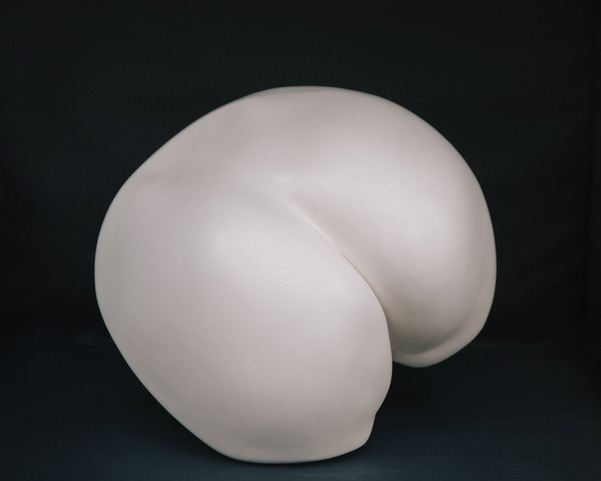 These are not abstract ideas for me — they are physical realities. I want viewers to feel something with their eyes, to sense the warmth, softness, or tension of the forms, even without touching them. Sensuality, for me, is not about seduction — it's about truth. It’s about the honesty of a body at rest, unguarded, unposed, deeply itself.
What keeps you working?
I’m going to be 79 and I love working. I will never stop — because it’s who I am. Creating is not something I chose to do once — it is the way I live. It keeps me alive, present, and connected to the world. With every piece, I discover something new. As long as I breathe, I’ll keep making — because this work is not about age. It’s about life.
Each sculpture begins in silence and becomes a conversation between my hands, the material, and the body I am trying to understand. My work is sensual and tactile because that is how I know the world: through touch, through presence, through the physical truth of form.
I sculpt not to idealize the body, but to be honest about it — its weight, its softness, its stillness, its freedom. I am drawn to the moments just after movement, when the body is fully itself, unguarded. There is something deeply human in that quiet. Tactility is the language I use to express that intimacy.
Where do you get your models?
Asking friends, friends of friends, meeting by chance a lovely woman who accepts to sit for me.

Paolo Sitting, 2018, Plaster cast
Discuss the importance of your relationship with the foundry you use.
I work with two foundries: one for smaller pieces, one for larger works. The scale may change, but the care and precision remain constant. These relationships are as important to me as the clay itself. A foundry is not just a service — it is a partner in translation. They help carry the touch of my hands into bronze or other mediums without losing what matters: the softness of a curve, the tension of a line, the presence of breath in form.
Over the years, we have developed a shared language. They understand that my work is about feeling, not just finish. Their skill allows the sensuality and immediacy of the sculpture to survive the alchemy of casting. Without that trust — without that mutual respect — the work would not be what it is.
Where is your studio?
In my garden.
Take three sculptures that are historically important and why you wanted to sculpt them?
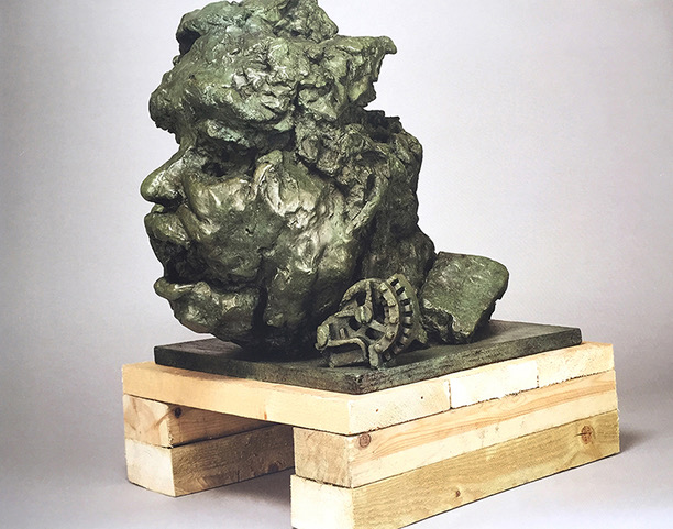
Homage to Eduardo Paolozzi . 1994/95 Bronze
I made his bust when Eduardo was alive. It’s raw, visceral, almost as if the form is resisting smoothness. His face here seems half-formed, or perhaps half-dissolved into the materials of his own imagination — Eduardo gave me his little mechanical form to play with, I added it at the base. The man and the machine in dialogue. it’s a sculptural memory of his volcanic mind. The exaggeration of flesh, the cavernous mouth, the suggestion of being overwhelmed — is this how I saw him in moments? Brilliant, prolific, but burdened?
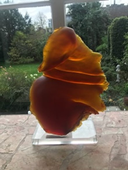
OPIS in Glass
The importance of trying new medium. Every medium gives you a different understanding of what you want to say/
— Glass carries an organic fluidity, almost like a wind-sculpted shell or a living flame paused in motion. The warm amber and red tones evoke both vitality and tenderness, with the translucency of the medium allowing light to animate it from within. Perfect medium to offer a dialogue between solidity and ephemerality.
REVERSO
Jesmonite, An important piece because a new departure in abstraction.

Reverso marks a turning point—a sculptural movement away from the literal body and into its memory, its echo. What once might have been the back of a seated figure becomes, in this abstraction, a site of pure intimacy: closed, enfolded, inward-looking.
The form suggests flesh yet refuses direct figuration. It is smooth, tender, almost shell-like—inviting the viewer not to look at it, but to feel with it. One side is convex, pressing outward like a breath held in tension; the other, concave, suggests retreat, protection, the inner curve of silence.
By withholding identity, Reverso becomes universal. It could be the back of a woman asleep, a seed, a gesture frozen in time. Its ambiguity is its strength. It speaks of bodies without showing them, of desire without performance, of rest without display.
Contact:
Nicole Farhi
Web – nicolefarhisculpture.com
Email – nicolefarhi1@gmail.com
Deborah Blakeley, Melbourne, August Australia
Interview by Deborah Blakeley, 2025
Images on these pages are all rights reserved by Nicole Farhi

Tania Pepper trading as Tania Clarke Hall
What first led you to work with leather?
For me leather occupies a wonderfully creative space balanced between textiles and metals. Leather has many of the great qualities of fabric such as flexibility and tactility, but it does not fray. Leather can be formed and moulded like a metal, but the process is much more immediate than with gold or silver. The lightness of the leather also allows me to work on a larger scale knowing that the finished piece will be comfortable to wear.

Freehand - lines
Do you colour your leather yourself?
I usually work with leather that is already dyed and then colour the edges myself. This is a core element of my practice, and I work continuously on developing new colours and brighter finishes. There are, however, some pieces where I dye the leather myself.
Is there a certain type of leather you prefer to use and why?
I use vegetable tanned leather as it has a richness, robustness, stiffness and importantly the ability to mould into twists and other forms. I also love the fact that vegetable tanning is the oldest form of tanning and uses plant tannins to build flexibility and durability into the leather.
 Multicoloured Triangulation
Expand about how, ‘Making the Cut’ influenced your work?
‘Making the Cut’ represents a pivotal change in how I develop new work. I am now committed to only using offcuts, which usually end up in land fill, to create new pieces. This shift offers not only a greener approach to making but also new challenges in my design process and construction techniques as I shift from using strips of leather as my starting point, to other shapes and sizes.

Making the Cut Brooch 2
Tell us about how you have been able to get your jewellery into leading Art Gallery stores in London and New York?
I was very fortunate to do a fair called ‘Treasure’ in central London a year after I graduated and it was there that I met the buyers from the Victoria & Albert Museum, and Tate Britain and Tate Modern. My jewellery being at these two prestigious museums gave me the confidence to do a trade fair in New York and brought my work to the attention of the wonderful Bryna Pomp who invited me to participate in the MAD About Jewellery show in New York a few years later.
Expand on the importance of Cockpit for you and your art.

Stacking-Neckpiece Black-Gold
Cockpit Studios is an incredible social enterprise that houses over 175 makers in two locations in London. Being part of a community of diverse and talented craftspeople from milliners and weavers to glass engravers and silversmiths (and more) gives me access to an enormous range of expertise, support and inspiration. I share my studio with 4 other jewellers who are my creative ‘family’. Cockpit also provides excellent business development support which has made a real difference to my practice. More recently, the fact that there are several leatherworkers at Cockpit who can provide me with high quality leather offcuts, has really become really valuable!
What special tools do you need for your art practice?
My tools span those used for leatherworking such as a strapcutter (my favourite tool, so simple but so effective) to those used for metal working or jewellery making such as files and riveting hammers.
How have commissions helped develop your jewellery?
Working with clients to create a piece is extremely rewarding. One client encouraged me to redesign the invisible clasp for the ‘Stacking Necklace’ and the solution I developed for her is now used in other pieces too. I am forever grateful to her for this commission.
 Stacking Neckpiece - Black & Gold
Take, ‘Twist and Shout’ and explain some of the special work you have had to develop for this piece?
A few years ago, I made a version of my ‘Twist and Shout’ edged with gold leaf. I was able to do this thanks to Aline Cathy David, a professional gilder who conveniently has a studio opposite me at Cockpit. Together we experimented to find the best way to prepare and polish the cut edge of the leather for gilding. There was a lot of work in involved to prepare the four long bendy edges which made up the piece and I had to make special stand so the leather stood rigid when polishing it.

Twist and Shout - Gilded Twist
How is gold added in ‘Freehand Lines Necklace’ ?
Unlike the ‘Twist and Shout’ above, gold is added to the surface of the leather for the ‘Freehand Lines Necklace’, rather than the edge. I learnt how tool gold leaf onto leather using the traditional method used by bookbinders and then adapted it to my practice.
Your brooches are large, but light discuss the importance of weight and size with jewellery.
Working with leather enables me to make brooches as large as I like, as the weight of the leather element is minimal. I love to make brooches that make a bold and colourful statement; I like to think of them as wearable mini sculptures. I take into careful consideration the type of metal fixing I make to ensure that the brooch sits well on the garment and remains lightweight.
How is ‘Freeform Squares’ worn? What stops it from falling?
 Freeform Squares Necklace - modelled
‘Freeform Squares’ is one of those pieces where there is no right way to wear it! It can be wrapped around the neck once or even twice, or the smaller end can simply be pulled through the larger squares at the other end to make a loop. The stiffness of the leather stops the squares from falling out of shape. In fact, I carefully select the part of the skin where the fibres are most tightly packed to ensure this.
Comment on why you combine pearls with leather in your jewellery.
 Rhapsody in Pearl - modelled 2 – square
I love to combine pearls with my jewellery as the lustre of the pearl complements the fine surface texture of leather. With black leather I love the near monochrome palette that this combination brings. Pearls are very lightweight so I am able to use pearls freely and often in large quantities to add a playful element.
Contact:
Tania Pepper
Email: tania@taniaclarkehall.com
Web Page:www.taniaclarkehall.com
Deborah Blakeley, Melbourne, Australia
Interview by Deborah Blakeley, July 2025
Images on these pages are all rights reserved by Tania Clarke Hall

Barbara Gittings
How has your past as a designer and cutter in fashion influenced your current ceramic work?
My years as a pattern cutter have certainly informed my ceramics, I see things in 3D, which makes it easier to achieve unusual shapes. I make paper patterns for my bottles, instinctively knowing which angle will give the correct amount of lean. The exposure to all the fabric patterns has definitely crept into my subconscious and informs the patterns that I create.
 Leaning Bottle 2022
On average how many cuts would you make to achieve a final piece?
My patterns through the clay are sometimes very complex, often made up of left over bits of pattern from previous pieces, which already consist of innumerable cuts, so it is difficult to give a precise answer. I have just made a couple of “loaves” of pattern, using the cut offs from two previous pieces, incorporating them with white clay. This will make one medium sized piece, it has taken me two days to make the patterned loaves. These will rest for a few days, I will then take slices from the loaves and patch them together into a press mould. I would guess that there have been hundreds, maybe thousands of cuts made to achieve these smallish loaves.
 Sculptural Bowl, 2022
“My ceramics explore the multi layered effects nature creates via the laying down of strata, weathering and erosion” discuss.
I’m fascinated by the geometry in nature, especially as growth and random chaotic forces skew and distort the initial perfect symmetry. I’m constantly exploring these balances between symmetry and asymmetry, perfection and imperfection in my work.
 Oval Coracle 2025
Where do you get your clay?
I get my clay from various suppliers in the UK
How do you colour the clay?
Up until quite recently, I used mainly oxides to colour my clay, as I prefer the slightly softer, earthier colours that oxides give. In the last few years I have started to use stains as well, in fact I have a box of different coloured stains which have sat on my shelf for a year, and which I’m looking forward to experimenting with, but somehow I never seem to find the time.
By now, do you have set formulars for each colour?
I’m not very scientific in my approach to colouring. I don’t make test tiles and as I don’t use a wide variety of colours, the outcomes are fairly predictable. Occasionally there are serendipitous surprises which can’t be replicated, as well as not such happy outcomes, but these are not common. This approach guarantees that no two pieces are ever the same.
 Floating Bowl 2022
Can you expand on how you smoke-fire your work and the restrictions?
I fast smoke-fire with crumpled up newspaper in a metal dustbin with holes punched in the sides around the bottom of the bin. I used to do a slower process in a brick structure with sawdust, but the thermal shock was greater and I would lose pieces through cracking and often the effects of the smoke would be too dark and mask the Nerikomi pattern. I have learnt over the years how to prevent too much smoke from affecting the work, but one never knows what the end result will be. If a piece comes out too dark, I pyrolize it in my self-cleaning oven which goes up to 600C and will usually be left with “ghost” marks from the smoke.
 Small Head Bowl 2022
What is the meaning of Nerikouri?
Nerikomi is a Japanese word which I understand to mean the layering, cutting and merging of different coloured clays and generally refers to hand built as opposed to wheel thrown work.
 Oval Form 2025
Why is repetition such a large part of your work?
I’m drawn to primitive mark making, which often consists of repetitive patterns. Repetition occurs throughout the natural world as well, in sea shells, tree bark, flora and fauna, the list is endless. My emphasis is on irregular repetition, my work embraces abstraction and asymmetry while still referencing the geometric.
 Sculptural Bowl 2023
How do you manage to achieve, in your work the effect of stitches holding the strips together?
This was a happy accident. Usually one would score a join running with the join, or in cross-hatching, but on one occasion I scored across the join. The score marks became visible once the pattern was scraped back. When I started out, I was always trying to mask the joins, now I celebrate the joins, emphasising them with deeper score marks.
 Tilted Bowl 2024
Can we fully understand your technique by watching your video ‘Nerikoni Porcelain Bottles’
Discuss the shapes you make your bowls in.
I have made several moulds inspired by milliner’s hat blocks in various sizes, one a head shape, the other a beret. I also am drawn to semi spherical shapes which I sometimes alter and distort. Another favourite is a tilted bowl shape which was inspired by a wooden bowl made by an African artist.
 Head Bowl 2024
Are all your ceramics fully water tight?
None of them are water tight, they are purely decorative. For the smoke-firing to have an effect, some porosity is necessary, so although they are porcelain, they are only fired to 1060C
Are your works made in singles and placed together or are some sold in groups?
They are made in singles, although a pattern might be a theme through several pieces, having been made from a large loaf of patterned clay.
 Large Oval Form 2022/2023
Take two of your sculptural pieces and discuss both works?

Asymmetric Form 2022/2023
This piece resulted from two failed attempts to make a large wall piece. After the first attempt cracked, I reclaimed the pattern and tried again. When this also failed I decided to give up on the wall piece and as it was now a large loaf of reclaimed pattern I embraced the challenge to make a large sculptural piece. This stands 22.5cm tall, by 28x34.5cm and is one of my larger pieces. The base started in a slump mould and the sides were slab built onto the base using slices from the loaf. I started without a clear idea, allowing the slices of pattern to dictate to a certain degree the final outcome. I like to explore the line between order and chaos and the juxtaposition between control and spontaneity in my sculptural pieces.
 Rhomboid Sculptural Form 2024
This piece was also the result of a piece going wrong and the pattern being reclaimed and was built in the same way as the previous piece. It is smaller and its dimensions are H.14 x W.28 x D.26cm
Do you take commissions?
I have taken on some commissions, but I prefer to work on things I want to make.
Take on piece that has given you delight and why?
This piece illustrates my unscientific approach to colours. I had made a large loaf of pattern from reclaimed bits and pieces of left over pattern and marbled together scrapings from previous work (each piece generates a take-out food container’s worth of scrapings) The loaf before firing looked as if the end results would be a mixture of greys and browns as you can see below I was delighted when I opened the kiln to see all the subtle and glorious blues.

I was further delighted when the gallery passed on to me a letter the customer in China had sent them on receiving the bowl. They said they had cried on opening the package, because it was so much more beautiful than they had expected it to be.
 Contact:
Barbara Gittings
Website: https://www.barbaragittingsceramics.com
Email: barbaragittingsceramics@gmail.com
Deborah Blakeley, Melbourne, Australia
Interview by Deborah Blakeley, June 2025
Images on these pages are all rights reserved by Barbara Gittings
Paul Bennett
What led you to work on your art full time and beyond Graphic Design?
My degree was in Fine Art (Painting) and after graduating I panicked as I had no idea how to make a career in the arts. I shared a house at university with a couple of graphic designers, and it always interested me and somehow, I found myself working in the industry after graduating. I enjoyed it for a while, but it just became being creative by committee. People changing your work just to feel like they were contributing and doing their jobs. I decided to hire a painting studio and worked away evenings and weekends. After I started making a few sales and getting some recognition I decided to ditch the graphic design and go full time painting and never looked back.

Evening Shores, 120cm x 100cm, Oil on Canvas
Discuss the importance of your local landscape of North West of England and Scotland in the development of your art?
It’s very important and I never take it for granted. My in-laws lived near the West Coast of Scotland, and it was a great source of inspiration, when I first started focusing on landscape / seascape painting. I try to get back there as much as possible. The Southwest Coast is also very important to me and my work.
Tell us about the five reasons for people to commission works by you?
Art is always in the eye of the beholder, but a commission takes this to the next level– requests can range from a customer having missed out on an original and asking for something similar, to a photo from a landscape of somewhere they have been that has meant a lot to them, a honeymoon, a holiday, a place of special meaning to them, to deliver this to them in Oils is fabulous.
I’ve been doing this for nearly twenty years and can easily get a good idea of what the customer wants.
I know what questions to ask to really understand the impact they are looking for
I am honest and feel comfortable letting a customer know if something they have requested will not work. Even if it means not going forward with the commission. People appreciate that.
I have a professional approach and deliver, I have so many emails from happy customers letting me know what the commission means to them, it’s very rewarding - I enjoy it and I believe that shows in the finished painting.

Setting Sun 2, 50cm x 50cm, Oil on Canvas
How have commissions influenced your art work?
They can sometimes send you in different directions that you might not have thought of and push you out of your comfort zone. They can also give me a good indication of what paintings are connecting better with people.
How does light influence your work?
Morning

Morning Tides, 100cm x 100cm, Oil on Canvas
Full sun

Beyond the Sun, 50cm x 50cm, Oil on Canvas
Rain

Evening Squall, 100cm x 100cm, Oil on Canvas
It could be said that light is my main motif and how it changes at different times of day. Weather is also important and we get a lot of it up here in the Lake District.
Why are clouds so important to you?
Clouds can create drama. They shield and reveal the light.

Tomorrows Sun,, 120cm x 100cm, Oil on Canvas
Comment on the horizon in your work?
Its all about layers and atmosphere, moody weather about to break or clear up.

The Falling Light, 100cm x 100cm, Oil on Canvas
What leads you to making images into prints?
I just wanted to make my work more accessible. I’m also with a few publishing companies and it helps putting my work onto walls where people can’t go for a large original.
What is your edition run?
25
The term ‘Expressionism’ how do you relate it to your work?
It’s not something that I consciously think about. I try not to directly reference real places in my work. Just the idea of a place that has been inspired by a place I’ve visited and experienced. To communicate the emotional essence of a place. That is what I try to deliver for people with commissions too, it means so much to people.

A Prelude to Dusk, 100cm x 100cm, Oil on Canvas
You are represented globally. Tell us about two works that have travelled and where.
I had an amazing residency in Kyoto, Japan. I was lucky enough to create a series of works there. I would love to go back.
The world seems a lot smaller, from the U.K.. Brexit was always going to be and is a disaster. Paintings going to the EU, declined almost overnight. Now there’s uncertainty with the tariffs from the USA. I believe original artworks are exempt, but I’m not sure many people are aware of that. I sell regularly to Australia and that has been consistent from the beginning which is amazing.

Solitude, 100cm x 100cm, Oil on Canvas
You now only do a few portraits a year why and who?
I’ve painted one portrait in the past five years. The portraits take up a different part of my head and was a great contrast to the landscapes. A few years ago I started exploring electronic music and this is now a really important creative and technical outlet for me that sits nicely with my visual work. I think it has replaced the portrait painting.
Comment on your studio and one thing that it continues to being you joy daily.
I had a great studio, in the centre of town, but unfortunately the landlord wanted to increase my rent by 300%, so I moved out. I now have a smaller studio in the little Lake District village of Staveley. It has great views of the local fells, which I feel blessed to have. It’s difficult to find good studios here. There are not many suitable buildings as it’s a national park and property is at a premium and scarce. I’m currently looking for a bit of land and so I can have a studio built.
How do you involve your young children in your studio?
My daughter is busy being a teenager and my son is crazy about football. What daddy does is not that high up on their radar, which I’m totally happy with. Also there is a lot of wet paint, which is not the best combination with busy kids! But they have both enjoyed being at the studio with me and creating their own paintings which is great.

After the Rain, 800cm x 120cm, Oil on Canvas
Contact:
Paul Bennett
Email: paul@paul-bennett.co.uk
Deborah Blakeley, Melbourne, Australia
Interview by Deborah Blakeley, June 2025
Images on these pages are all rights reserved by Paul Bennett

Ben Schwab
Has moving to upstate New York influenced your work?
Yes, it’s been a pivotal shift—not just in my environment, but in my entire approach to painting. I previously worked representationally, and directly from life. I’d typically paint from observation, responding to the immediacy of the urban landscape around me.

Passages, Oil on canvas, 60 x 60 inches, 2024
But after moving to upstate New York, that immediacy changed. I was no longer immersed in the city. As a result, my process evolved. I started to work more from memory, digital photographs, and layered reference images. The cityscapes I paint now are less about direct observation and more about reinterpretation, drawing from multiple sources and letting the image unravel and re-form through the act of painting.

Echoes, Oil on canvas, 72 x 72 inches, 2025
This distance—both physical and emotional—has allowed me to abstract my work more freely. The structures are still there, but they have become more fragmented and layered. I’m not trying to replicate a specific street or skyline anymore; I’m exploring the memory of place, the sensation of movement through space, and the emotional residue that certain environments leave behind. Living in upstate New York has given me the mental and visual distance to see cities differently—to deconstruct them, rebuild them, and let them exist somewhere between memory and imagination.

Topography, Oil on canvas, 48 x 36 inches, 2023
Have you always lived in a city?
Not always. I have lived in both rural and urban settings at different times in my life, and each has shaped how I see and make art. Cities certainly left a strong imprint on me—the visual density, the constant movement, the layering of architecture and history. But I also carry with me a deep appreciation for quieter, more spacious environments. Living in a city sharpened my interest in complexity and impermanence, while more rural places have helped me slow down and notice the subtle shifts—the light, the texture of surfaces, the silence between things. Both experiences feed my work in different ways.

Expanding Space, Oil on canvas, 48 x 72 inches, 2024
How do you find the locations to paint? Are they actual locations?
I find locations from both digital source images and from real locations—a street I have walked, a building I have seen, or a city I have experienced firsthand. But the final painting is not about replicating that place. I use the original setting more like a point of departure. Over time, it gets filtered through memory, emotion, and intuition. Often, several different places will merge in a single painting, or a real location will become abstracted to the point where only the feeling remains. I’m less interested in documenting a site than in evoking its essence—how the city feels, and what it reveals about change, time, or resilience.

Excerpt, Oil on canvas, 48 x 48 inches, 2023
Comment on the importance of painting, “now” as a record for history.
I think painting now—being present with the current moment—is a form of witness. Cities change rapidly. Landscapes shift. Even places we think of as permanent are constantly evolving.

Reflections, Oil on canvas, 44 x 60 inches, 2022
Through painting, I’m trying to hold onto fragments of that movement. It's not just about recording buildings or streetscapes, but about capturing the atmosphere, the emotional texture of a moment in time. In a way, every painting becomes a kind of artifact—one that says, "this is how it felt to be here, now." Long after a building is torn down or a neighborhood transforms, that feeling can still live on in paint. That’s what excites me: the idea that painting can serve both as a personal record and a broader historical echo.
Are your cityscapes always in daylight?
Not necessarily, but the paintings may seem that way. While some pieces lean toward daylight, I’m often drawn to transitional lights such as dusk, or early morning. Those are the times when a place can feel most alive or mysterious. There’s something about the in-between light that magnifies the color and invites a deeper emotional reading of a scene. Shadows stretch, colors deepen, and forms begin to change—that ambiguity really interests me. It opens space for interpretation, which aligns with the abstract nature of my work. The changing light adds emotional weight and mystery to a piece. However, often because of the deconstruction process I tend to use, even if images are at night, it registers as daylight in the painting.

Indeterminacy, Oil on canvas, 76 x 108 inches, 2021
How small and how large are your paintings and why?
My paintings vary widely in scale. On the smaller end, I create works on paper around 24 x 22 inches—those are often more intimate, almost like visual notes or meditations. On the larger end, I’ve worked as large as 108 x 204 inches, and everything in between. The larger formats allow me to physically immerse myself in the work—to use my whole body in the painting process—and to layer more extensively.

They give the viewer space to step into the piece. I tend to choose the size based on the energy of the idea. Some concepts need room to breathe and expand, while others are quieter and more suited to a smaller, more concentrated format.

Ascension II, Oil on canvas, 84 x 156 inches, 2019
Do you paint places for commissions?
Yes, I do. I really enjoy commissions when there’s a meaningful connection between the client and the place they’re asking me to paint. I still bring my style and abstraction to it, but it becomes a collaborative process capturing, not just a location but the feeling or memory tied to it. When someone comes to me with a place that holds meaning for them, it becomes a kind of dialogue—we talk about what the place represents, the memories tied to it, the atmosphere they want to preserve. I don’t approach commissions as literal recreations. Instead, I try to capture the essence or emotional truth of the location, interpreted through my style. It’s always a balancing act—honoring someone else’s vision while staying true to my own visual language—but when it clicks, it becomes a powerful collaboration.

Shifting Planes, Oil on canvas, 48 x 36 inches, 2023
Contact:
Ben Schwab
Web www.benschwab.com | Instagram: @ben__schwab
Email: studio@benschwab.com
Deborah Blakeley, Melbourne, Australia
Interview by Deborah Blakeley, May 2025
Images on these pages are all rights reserved by Ben Schwab

Mary Pal
Why do you find natural textiles so rewarding?
Unlike paper, which is generally flat and unmalleable, textiles are delightfully textured and capable of movement, which provides endless opportunities for artists. The tactile nature of natural fibres allows for a deeper connection with the material. Each thread can be manipulated to create intricate patterns, adding layers and depth to artwork.

A World of Difference - Detail
Are all natural fibers able to take dye?
To my knowledge, yes.
Do you dye your fabrics?
Sometimes. Primarily I dye my cheesecloth with Procion MX dyes and use paint on my textile backgrounds.
Can you expand on the fact that the fabric can fulfill the needs of a weathered face?
Today, everywhere we look, we are bombarded by images featuring the flawless complexions of youth, but I see far greater beauty in the lines and creases that develop in our faces over time. So, while rough and textural materials might seem unlikely media for work in portraiture, they are perfect for the faces that I find so appealing. The innate qualities of cheesecloth allow me to capture the essence of age, portraying the wisdom and experiences etched into every wrinkle and fold. This approach celebrates the uniqueness of each individual, turning the perceived imperfections into remarkable attributes that tell a story.
 Half Time, 12 x 12 inches
How do you see fibre art being included with ‘mainstream art’?
I find it difficult to understand why it hasn’t been all along. There is a bias, I think, that textiles, items we wear and use every day, have less inherent value than hard canvases and paints available only in specialty shops. Items made with cloth are deemed “craft” rather than “art,” perhaps because of their association with domesticity and functionality. However, fibre art demands just as much creativity, skill, and vision. Fibre artists strive to challenge these perceptions and elevate textiles to their rightful place in the art world.
Fibre art can evoke powerful emotions and convey profound messages, just as any other medium can. The versatility and tactile nature of textiles allow for a unique form of expression that resonates deeply with viewers. As more people recognize the artistic potential of natural fibres, I believe that fibre art will continue to gain acceptance and appreciation in mainstream art circles.
 The Other 1% - 60 x 36 inches
How have you seen the collectability grow in fibre art since you began?
To be honest, it’s been minimal. Without the support of fibre-specific organizations that provide exhibition opportunities, my work would seldom be displayed to the public. These organizations play a crucial role in advocating fibre art and helping textile artists gain visibility and recognition.
 Equus 24 x 18 in
What led you to working with cheesecloth?
It was a bit of a fluke. A piece of dyed cheesecloth I had stitched to two abstract pieces, along with a variety of other textiles, had in one, the appearance of a human figure, and then puzzling out how to achieve that effect intentionally led to experimentation that resulted in the figurative work I do today. This accidental discovery opened up a realm of possibilities, allowing me to explore the interplay between texture, color, and form in creating representations of the human experience.
How did your children help you develop your cheesecloth art in the early days?
After completing the abstract piece I just mentioned, Composure, it was actually my teenage son who jokingly pointed out the “man” he saw in the cheesecloth.

Composure II, 16 x 16-min
This playful comment sparked my curiosity and led me down a path of intentional experimentation with the material.

Composure I, 16 x 16-min
How long have you been working with cheesecloth and extending the boundaries?
I began my cheesecloth work in 2008. Over the years, my techniques and artistic vision have evolved significantly. Of course, other fibre artists have attempted to replicate my work, but they have taken the shortcut of fusing the cheesecloth to a background fabric. To me, this completely negates the fluid qualities cheesecloth is capable of providing, and results in portraits that are stiff and flat-looking.
Take one portrait that initially helped you develop your art.
 Portrait, 12 x 12 inches
My first experiment was a seated figure, Waiting, based on a copyright-free online photo, Elderly Woman, by Chalmers Butterfield. Just at that time, there was a call for donations of textile work 12 inches square and, realizing the full figure didn’t scale easily to that size, I decided to do just her face. It garnered a lot of attention at the auction.

Waiting, 28 x 22 inches
Expand how Nysha helped with a commission and continuing with friendship.
That first publicly exhibited auction piece definitely changed my life. The successful bidder was someone named Nysha Nelson, a name I didn’t recognize. The next year, he discovered that I had finally launched a website and contacted me to purchase one of the pieces posted there. After exchanging emails, we discovered we both belonged to Studio Art Quilt Associates (SAQA) and agreed to meet in person at the next conference. A talented artist in his own right, Nysha became both a dear friend and a treasured sounding board, and when I showed him a piece I was making for a Taiwan exhibition, Nereids, he was captivated.
 Nereids - 25 x 52 inches
Knowing I was frustrated with the space constraints of my domestic sewing machine, he offered a trade: his Handi-Quilter in exchange for the work when it returned from the exhibition. What a boon. Finally, I was able to make much bigger pieces and began regularly producing portraits that were 1.5 metres and larger.
In 2020, when I was invited by Timeless Textiles to participate in the Australian exhibition “This Ain’t the Archies,” celebrating a textile artist who had inspired me, I knew immediately who my subject would be. Nysha graciously consented and sent me some photos to work from.

Nysha - 48x35 inches
Nysha's support and friendship have been invaluable in all my endeavors. His insights often help me in choosing how to approach a new theme or composition.
How have you used words and poetry in your work?
Perhaps because of my love of poetry, when I create portraits of singers like Leonard Cohen and Willie Nelson, it makes sense to me to connect snippets of their artistry with their image.

Willie - 45x34 inches
Or when I sculpted a face that had the look of an old sailor in Lighthouse Keeper, I incorporated the first few lines of the poem, “Sea Fever.” In those instances, the text became an integral part of the story I was telling about them. Integrating literary elements into visual art enriches the narrative, giving viewers multiple layers to explore and connect with.

Lighthouse Keeper - 36 x 46 inches
Take three images that look quite different because of the sitter.
Youth Peggy, a portrait of novelist Margaret Atwood
 Peggy - 20 x 40 inches
Middle Aged The Drifter, a portrait of a street musician

The Drifter - 41 x 30 inches
Old A World of Difference, a portrait of environmentalist David Attenborough

A World of Difference - (Attenborough) 48 x 35 inches
Do you enter exhibitions to expand your work?
Definitely. When I see an exhibition call with a specific theme, I enjoy the challenge of selecting a portrait that will best convey my response to that prompt.
Apart from people, discuss your animals and nature work.
I am always pushing the boundaries of my medium. It began with my first cheesecloth class, where I wanted to teach students how to manipulate the cheesecloth without the pressure of trying to capture a human face, which can be daunting. I designed a very simple pine (Windswept Pine) along the lines of paintings by Canada’s Group of Seven artists, which everyone loves. I use it in classes to this day because it is such a gentle introduction to using cheesecloth to convey figurative imagery. But I have also had fun using it for horses’ manes, ocean waves, and an assortment of furry and feathery critters.
 Windswept Pine, 16 x 16 inches
Each piece I create is a testament to the versatility of cheesecloth and the endless possibilities it presents.
How large and small are your works and why the sizes?

Bella - 60 x 36 inches
When it comes to the size of my work, I carefully consider the emotional impact I want to create. Larger pieces allow for grand, immersive experiences, inviting viewers to explore every detail up close and then to stand back to take in the effect of the entire artwork. Conversely, smaller works can evoke intimacy and personal reflection, drawing the observer into a more contemplative engagement with the subject.

Jumbo Grizzly - 37 x 24 inches
You make the comment that older faces have, “a life that has lived” - discuss.
Older faces, in particular, fascinate me because they tell stories of lives fully lived. The lines and wrinkles, the expressions shaped by years of experience, carry a depth that younger faces have yet to acquire. Each portrait becomes a tribute to resilience and wisdom accumulated over time.
Why do you teach and share your technique?
Teaching and sharing my technique are integral to my practice. I have been a teacher all my life, so even now, it gives me immense satisfaction to mentor budding artists and help them discover their unique voices. Seeing their progress and the innovative ways they interpret techniques is incredibly rewarding. Every time I say I am retiring from teaching; some exciting opportunity comes my way, and I can’t resist the adventure.
Comment on how you have combined your art and literature in ‘Peggy’.
In Peggy, my portrait of Margaret Atwood, I blended my art with colours from her Handmaid’s Tale novels. I was influenced by the exhibition I created her for: “Colour With a U” for my Canadian SAQA pod.
Peggy, 24 x 40 inches
Do you take commissions?
I have done several commissions, some of people, some of pets.
What are you currently working on?
I am working on a portrait of Canadian painter Emily Carr, who lived not a block away from my new home in Victoria, British Columbia, and whose works celebrate the beauty in my new surroundings.
Contact:
Mary Pal
Web – www.marypaldesigns.com www.marypalteaches.com
Email – marybpal@gmail.com
Deborah Blakeley, Melbourne, Austral
Interview by Deborah Blakeley, April 2025
Images on these pages are all rights reserved by Mary Pal

Joanne Clark
How has your degree in Environmental Design and Architecture influenced your artwork?
Studying environmental design and architecture has had a significant influence on my work and the way I think. Architectural theory has provided me with a structured approach to creation, focusing on precision and functionality. Unlike traditional art, which can be more artist-centric, design and architecture are inherently people- and audience-centric. This perspective has shaped my approach to art, encouraging me to consider how my work interacts with space and the people experiencing it.
How have exchanges to Italy and Canada altered your art?
My experiences in Italy and Canada have profoundly shaped my artistic perspective. Italy reinforced my appreciation for the value of art and design in everyday life, something that is not always emphasized in Perth. I resonated with the deep cultural respect for craftsmanship and creativity. In Canada, I was exposed to a more academic and theoretical approach to design, which broadened my understanding of its intellectual foundations. I also appreciated the positive and non-cynical attitude of designers there—people took pride in their work and saw it as their life’s calling, which was incredibly inspiring.
Tell us about working in Hong Kong?
While in Hong Kong, I worked with a local public artist, which was an invaluable experience. I was introduced to integrating technology into art, including CNC machines, resin, and wood.

Our designs won the Good Design Award in Japan. Beyond technical skills, I gained insight into work ethic, business practices, and a new philosophy where art and design serve a fundamental purpose beyond commercial success. It reinforced my belief that as artists, we are called to create.

How has art changed by embracing glass, light, sound, and technology?
My work has always been rooted in allegory, using symbolism and metaphor to explore deeper meanings. The integration of new materials and technologies expands the possibilities for expressing these ideas, allowing for more immersive and thought-provoking experiences.

How have your combinations of graphite and oil worked to present abstraction?
While working in Shanghai as both an architect and artist, I drew inspiration from my surroundings. The grey tones of China—the chalky bricks, the dust, and the atmosphere—fascinated me. Graphite became a natural medium to capture this aesthetic, often contrasted with pops of red, a significant color in Chinese culture.
What led to Abstraction being at Bund 22 in Shanghai?
Exhibiting at Bund 22 was an extraordinary opportunity. As a recent graduate, I was fortunate to have an art manager and be part of a collective that helped secure the exhibition. It was a prestigious space, and I worked harder than ever before—seven days a week, networking and creating. The experience was surreal, with performances by a circus troupe and diplomats attending the exhibition. It was truly a once-in-a-lifetime experience.
Comment on the one red or yellow crane.
These artworks explored how the built environment in China shapes collective identities. The cranes symbolized the rapid urbanization and the impact of architectural development on individuals and society.

Are the buildings real or representations of cities?
The buildings were real but arranged in a collage to form a larger metaphysical city, blending reality with conceptual representation.

How did you come to combine concrete and resin?
During a home renovation, we broke a concrete slab, and I found the moment deeply symbolic. As a new mother, my beliefs and perceptions were being dismantled, much like the broken foundation of our home. The act of pouring resin over the fractured concrete became a metaphor for healing and renewal, reflecting Christian mythology where brokenness is restored through faith.

How large are these pieces?
This particular piece measured approximately 50x50x25 cm.
Does one idea lead to the next, or are they formed through residencies or commissions?
I am constantly generating ideas—my mind is an endless machine of creativity. While some ideas evolve naturally from previous works, others are shaped by residencies or commissions.

In your furniture, you use a combination of modern and old—CNC technology and recycled wood. Discuss.
My furniture merges traditional materials with modern technology. Using recycled wood honors history and sustainability, while CNC technology introduces precision and contemporary innovation. This fusion reflects the broader human experience—where the past and present coexist and inform one another.

What made you combine art and manufacturing techniques?
I am driven by curiosity and experimentation. I find routine uninspiring, so I explore new techniques and disciplines. People often expect artists to have one signature style, but creativity should be fluid and multidisciplinary.

What has been one public art piece that excited you while moving your career forward?
A recent mural for a child health center was particularly meaningful. I had been working on high-end projects, often for clients who already had access to great design. When I saw how poorly designed the child health center was, it felt unjust—young mothers and children deserved a nurturing environment. I secured funding and transformed the space, ensuring that design served those who needed it most. This project reinforced my belief in the power of art to impact communities positively.
How has learning classical drawing techniques been valuable in your art?

Classical training provided me with a strong foundation, allowing me to be more intuitive and confident in my work. Painting is fundamentally different from design—it requires a balance of technical skill and instinct. Just as a great structure relies on solid foundations, great artwork is built on knowledge and discipline.
You comment, ‘Oil is slow to dry … it encourages me to think and react in a deliberate and thoughtful manner.’

Oil painting teaches patience and intentionality. Each step is deliberate, informed by principles and experience. This philosophy extends beyond art—living consciously and thoughtfully leads to more meaningful and beautiful outcomes.
Contact:
Joanne Ruth Clark
www.joanneruthclark.com
Deborah Blakeley, Melbourne, Australia
Interview by Deborah Blakeley, April 2025
Images on these pages are all rights reserved by Joanne Ruth Clark

Lisa House
Expand on how the hue in your work and colour gives such a sense of place.
Leading on from this, colour is part of your work and depicts season. Comment on this (with four paintings) for each season.
I imagine the desired appearance of the painting, and colour plays a crucial role in this creative process. I explore both subdued palettes and intensely vibrant colour combinations to capture the essence of a particular location or season.
Winter Moon – I have used deep blues, greys and white to suggest winter stillness. Plus, warmer brown tones which just adds a touch of coziness to the foreground.
The atmospheric moon stands in stark contrast to the night sky, softly illuminating the cottages and trees beneath it.

Winter Moon 80 x 80 cm
Days of Spring – To create this piece I kept the palette light and airy, using a soft duck egg blue in the foreground, complimented by a creamy peach sky. I wanted to create an uplifting and gentle painting to evoke feelings of fresh new beginnings.

Days of Spring 60 x 80
I used patterned fabrics to infuse a sense of joy to this painting.
Beach huts evoke a touch of childhood nostalgia for me, and those magical days spent at the seaside.
My intention was to create a piece that captures an atmospheric essence, filled with soft pastel candyfloss hues reminiscent of a carefree moment in time.

Magical Summer 40 x 40 cm
Pink Moon – Autumn’s Harvest Moon inspired this piece. Following the heat of the late summer and entering the autumnal colour palette. I wanted to create a very earthy and vibrant piece to represent the beauty of this ‘decaying season and appreciate autumn in all its glory.
I aimed to reflect the earthy tones that characterize autumn, as the foliage shifts in colour to stunning reds, rich browns and burnt oranges.

Pink Moon 60 x 80 cm
How do you choose a particular landscape?
The Yorkshire Landscape is a primary source of inspiration for me, characterised by its rural charm. Enriched with captivating focal points of quaint cottages, farm buildings, and animals. As it evolves through the changing seasons, it provides me with a stream of fresh ideas.
How do textiles influence your work (e.g. You Colour My World)?
How do you gather suitable material for your still life work?
I find fabric very seductive and an indulgence to collect. The more decorative, the better!

Burano Carnival 45 x 50 cm
I collect from second-hand shops and the search for it is such an exciting stage of the creative journey. Most fabrics are from old clothing which I use every part of including the buttons. I love the journey of somebody’s old discarded striped shirt beginning its new life in one of my paintings. Travelling to a different town and sometimes a different country.

Burano, Venice
Objects for my still-life paintings are sourced this way too and it's an absolute pleasure shopping for old teapots, teacups, jugs etc to surround myself with in the studio.
A trip into Burano, Venice in 2024 profoundly inspired ‘You Colour My World’.
Surrounded by the colourful decorative architecture of the island accelerated my use of pattern and colour in my paintings. It was such a magical place to be and the feeling I had being there is unforgettable!! I felt so inspired, and upon my return, I created a new collection of richly decorative paintings with vibrant fabrics, stencilling techniques, and colourful stitching.

Pink House in Burano 30 x 32 cm
I then applied this to a painting I was currently working on, based on a famous Yorkshire landmark known as ‘The White Horse of Kilburn’ A huge white chalk horse on the Yorkshire hillside and a popular visitor attraction. painting became - ‘You Colour My World’.

Then the painting became - ‘You Colour My World’.

Burano Carnival 45 x 50 cm
The decorative work continued towards the end of 2024 and can be seen in a ‘Book Bench’ I was commissioned to paint by Cockerton business group and Darlington Borough Council.

Book Bench
The ideas were generated by local school children which I amalgamated into one design to create the finished piece. The design depicts features from Cockerton Green, famous literacy quotes, a huge rainbow and birds, creating a lively and inspiring seating area for the children’s library. It is set to be placed on the village green in springtime.

Book Bench
Is it your aim to make us, the viewer feel that we are trespasser, or there with your permission in your landscapes?
Not at all.
I aim to create a captivating environment for the viewer, encouraging an emotional response, and inviting the viewer to escape in an alternate realm.

Book Bench
Your still life is of large, vases and then with smaller vases you add fruit, plus the odd cup of coffee. Do you mean to give the feeling that you have just left the room?
This is not the intension.
I paint the scene from an observational perspective incorporating objects with personal significance to me. One artwork where I’m very much in the scene, titled ‘Lady in Black’ serves as a self-portrait surrounded by birds. My love for Victorian Gothic style interiors greatly influenced this piece and I plan to develop this collection in the future.

Lady in Black 50 x 50 cm
Comment on the combination in ‘Wild Romance’ of flowers, pottery, seagull, textiles.
This painting was inspired by a wonderful trip to Cornwall on the South Coast UK. Watching the seagulls flooding the sands and feasting on scraps of discarded food gave me lots of photography opportunities.
A lovely interaction between two gulls gave me the idea for ‘Wild Romance’
I painted one gull as if they were patiently waiting for the other with a single flower in a charming white jug, perched on a pretty ornate table. For me the blue and white colour scheme with a touch of yellow evokes ‘seaside’.
What leads you to add animals and birds to your still life?
I feel good around animals, and I spend hours bird watching from my garden. I prepare unique food attracting the same birds back each day. Studying their mannerisms is a true joy and seeing them hopping around the garden onto different pots and tables has inspired their inclusion in my still life pieces.
The influence of meditation and sound bath experiences have influenced my 'Spirit animal' paintings.
Among the creatures that have emerged during my recent meditative practices are stags, hares, foxes, eagles and bears, each contributing to the development of my most recent works
Recently you have been working on birds, comment.
Birds offer endless inspiration for me. Their behaviours, and habitats provide a rich source of visual and creative interest which is freely available all year round.
Can you share some of your recent birds, and discuss the works?
Discuss ‘Percy’ and how you have captured the exact movement that is so well know of a pigeon.
Percy
A symbol of peace and resilience!
Pigeons are beautiful to paint with their unusual colourful feathers. They create great shapes, especially when they crowd onto one small feeding perch.
While I primarily rely on my own photography to capture bird poses, I also draw inspiration from professional photographers online. The ‘strut’ of Percy was inspired by one such image. I used an olive-green background palette to create a collection that contrasts with my previous work, characterized by vibrant colours.

Percy
The Kiss
The affectionate behaviour between a pair of pigeons inspired this painting. This charming display of kissing and locking necks, inspired me to create my interpretation of one of my favourite paintings, Gustav Klimt’s - The Kiss.
I chose fresh colours to harmonize the gentle hues of the pigeons. I aimed to capture the endearing connection between these two lovebirds.

The Kiss
Taming A Jackdaw
A pair of Jackdaws began visiting the garden each day. I gradually gained their trust, and they came a little closer over time. They are quite large birds, so I was surprised at how timid they were compared to other garden birds. I found their behaviour intriguing which inspired this piece. I tried to capture its hesitant stance as it peered at the food. I chose to use a delicate pink patterned background to add elegance to the birds robust profile.

Taming A Jackdaw
How important is the background related to where the bird was? (The little hints, owls and night light, seagull, and water)
Every part of the painting is important. Adding subtle details in the background makes the painting more immersive for the viewer and creates an engaging narrative.
What are you plans for the future?
I am in the process of preparing for my upcoming exhibition. May 23 to June 4, 2025, at The Station in Richmond, North Yorkshire.During this event, I will be engaging in live painting on several days which is a lovely opportunity to meet visitors to the gallery.
Additionally, I have more travel painting excursions planned, with my next destination being Barcelona. I am also interested in pursuing further opportunities for mural projects and creating 'book bench' installations.
 Contact:
Lisa House
https://www.lisahouseartist.co.uk/
Deborah Blakeley, Melbourne, Australia
Interview by Deborah Blakeley, March 2025
Images on these pages are all rights reserved by Lisa House

Peter Kuttner
How do you feel your work heading the graphic arts department at National Museum of American Illustration has affected your art?
A few months before starting at the National Museum of American Illustration, I had just graduated from Ringling College with a fine art degree in illustration. Having studied many of the works in depth as a student, suddenly being surrounded by the originals in a museum setting was surreal, to say the least. It gave me an even greater appreciation for the craftsmanship and storytelling of the illustrators who came before me.
At the time I joined, the museum was brand new to the public, and I wore many hats while working there. Beyond my role in the graphic arts department, I was involved in everything from exhibit tours to marketing, which gave me firsthand experience in how artwork is presented and received. That experience sharpened my eye for composition, color, and narrative, elements that continue to shape my artistic approach today.

Harbor of Solitude II 28”x24”
Minimalism, it is clear in your art discuss this using two works.
Minimalism plays a significant role in my work, particularly in my Cut-Out Series,
where simplicity and negative space become just as important as the painted elements. One example is Garden Serenade, where the carefully shaped cut-outs create an interplay between light, shadow, and color. They create an interplay between light, shadow, and color.
The floral elements are suggested rather than fully defined, allowing the viewer’s imagination to complete the composition. By reducing detail and focusing on form, the piece maintains a sense of openness and movement.

Garden Serenade 48”x64”
Another example is Silent Drift II, a sailboat piece set along the coastline, a piece where the balance between cut-out and textured background surfaces enhances the feeling of weightlessness and motion. The negative space acts as both sky and sea, emphasizing the quiet stillness of the sailboats while letting the composition breathe. This minimalist approach not only defines the aesthetic of the series but also reinforces the themes of airiness and fluidity that run through much of my work.

Silent Drift II: 36” x 24”
You want to bring happiness into your art. Discuss.
Art has the power to shift a person’s emotional state, and I see my work as an invitation to a moment of joy. I gravitate toward subjects, like sailboats, flowers, and hot air balloons with vast horizons, that evoke a sense of adventure, tranquility, and wonder. The colors I choose are often soothing and uplifting, reinforcing that sense of optimism.

Canyon Bend 64”x50”
There’s also a playfulness in my process. I enjoy creating compositions that feel open and welcoming, where the viewer can step in and experience a scene with their sense of imagination. Whether it’s the carefree drift of a sailboat or the quiet energy of a blooming flower, my goal is to create work that gives people a sense of lightness, something that resonates beyond the canvas.
Can you explain the importance of the horizon in your work?
The horizon is more than just a dividing line in my work, it’s a point of contemplation, a place where movement and stillness meet. I often use it as an anchor, whether subtly implied or distinctly marked, to create a sense of depth and space.
In my Quiet Landscapes series, for example, the horizon becomes the focal point, inviting the viewer into a vast, open expanse. The simplicity of layered tones suggests distance and serenity, allowing the mind to wander. In my sailboat pieces, the horizon plays a different role - it provides a sense of stability and direction, reinforcing the journey within the composition.

Quiet Landscape: 8” x 8”
For me, the horizon represents possibility. It reminds us that there’s always something beyond what we see, whether it’s a distant shore or an unexplored idea.
How important is color in your work?
Color is everything. It dictates mood, energy, and movement within my compositions. I often use color in a way that balances vibrancy with restraint, letting it guide the emotion of the piece without overwhelming it.

Taking the Long Way 28” x 58”
In Taking the Long Way, for instance, the hues of the sky against the cool blues of the balloon create a sense of uplifting adventure. The contrast is intentional, it draws the eye and evokes a sense of nostalgia.
Similarly, in my floral pieces like Openness II, I use color to create layers of texture and depth. The vibrant florals against neutral backgrounds allow the subject to emerge with quiet intensity, keeping the composition both grounded and alive.

Openness II 30" x 54”
Ultimately, color is my way of communicating beyond words. It’s the first thing that speaks to the viewer, setting the tone before any shape or form registers.
What do you mean when you say you are a process artist?
For me, being a process artist means that the act of making is just as important as the final outcome. My work evolves through layering, cutting, refining, and reworking, each step informing the next. I embrace the unpredictability of materials and techniques, allowing intuition and experimentation to shape the final composition. The process itself becomes a dialogue between control and spontaneity, which often leads to unexpected discoveries.
 Dual Harmony 40"x34”
When did you first come to your ‘cut out ‘art?
My journey into cut-out art began in 2006 when I would scrape dried paint off my glass palette. I discovered that beautiful, organic forms emerged from the layers of paint, and I became fascinated by the complex textures created on the glass side of the scrapings. Over time, I learned to create these paint scrapings with greater control, which I now refer to as "skins" once they are peeled off the glass.
The process starts with loose painting on a mirror using acrylic paint. Once it dries, I cover the entire painting with gesso and allow it to dry completely. At that point, I peel the whole painting off the mirror’s glass surface. After peeling, I can cut or tear these skins into their final shapes. This technique allows the pigments from the paint to settle on the glass, preserving them and resulting in a more colorful and vibrant experience in the final artwork. It’s a method that blends necessity with discovery, leading me to the unique cut-out style I explore today.

Pale Green Dreams 28”x28”
How large can each cut out be? Does this affect the finished work?
The largest cut-out I’m able to create can be up to 35 x 28 inches (89 x 71 centimeters). This size does impact the finished work, as larger cut-outs allow for more intricate designs and a greater presence in a space. Additionally, working at this scale challenges me to think more broadly about composition.

Sailing the Sky 40”x70”
What is the average size of your work and why?
Most of my piece’s range between 24x24 inches and 48x48 inches, though I also create smaller and larger works depending on the project. This size range allows for a strong visual impact while maintaining an intimate, approachable quality. Larger pieces can carry a greater sense of presence, filling a space with energy, while smaller work invites more personal engagement. The scale I choose often depends on the subject matter and how I want the viewer to experience the work.
Do you use your ‘cut outs’ on in sails, balloons, and flowers?
Yes, the cut-outs are a central element in my artwork, including subjects like sailboats, flowers, and balloons. I’m also excited to share that I will soon be creating trees with colorful canopies, expanding the range of my cut-out designs. Each piece allows me to explore different forms and textures, bringing a sense of vibrancy and life to my compositions.

Elevated Horizon 48”x48”
Does your environment influence your work?
Absolutely. My surroundings shape not only the subjects I choose but also the mood and atmosphere of my work. Coastal settings, vast horizons, and open skies have a direct impact on my color choices and compositions. Even in urban environments, I find inspiration in the rhythm of architecture and the way light interacts with surfaces. Whether it’s the serenity of nature or the structure of a cityscape, my environment continuously informs my visual language.

Whispering Grove II 16”x16”
You have sold your work to the public, museums, galleries, and Royal collections – please take one and explain why it was so important to you personally and your art career?
My first painting sale remains my most memorable. In 1998, at the Best of Ringling Art Show, Louise Briggs Appleton purchased an 8x5-inch oil painting of mine. It was the first time I had ever sold a painting, and I was completely shocked that it sold for $500. That moment was pivotal, it was the first real validation that my work had value in the art world.
When I arranged to deliver the painting, I casually mentioned to Ms. Appleton that I had three other pieces painted on the same day and in a similar style. She immediately told me to bring them along, and to my surprise, she purchased the entire group. That experience taught me two important lessons: first, that my work could truly resonate with collectors, and second, that confidence in my art could lead to opportunities I never expected. That sale set the foundation for my career and gave me the motivation to continue pursuing my artistic path.
Once you have used the ‘cut out’ process does your work then become college?
There’s definitely, a overlap, but my work doesn’t fit neatly into traditional collage. While I layer elements and use shapes that get collaged, my approach is more about the utility of design. The cut-out process allows me to refine the composition in a way that feels more deliberate and structured. I love that I can get a strong sense of how a painting will look before I ever adhere material to the canvas, making the process feel more like constructing a design rather than assembling a collage in the traditional sense.
You have your art in many, Art Galleries. How do you keep up with the demand?
It’s a balance of preparation, workflow efficiency, and creative momentum. I maintain an ongoing studio practice, ensuring that I always have several works in progress while also setting aside time for experimentation. I also collaborate closely with galleries, planning for exhibitions and maintaining a steady inventory. At the same time, I’m mindful of pacing myself, quality and artistic integrity always come first. If demand exceeds what I can produce, I focus on maintaining consistency rather than rushing to fill gaps.

Winds of Reflection 48”x34”
Contact:
Peter Kuttner
Details:
Web - www.PeterKuttnerFineArt.com
Email - pkuttner@gmail.com
Deborah Blakeley, Melbourne, Australia
Interview by Deborah Blakeley, March 2025
Images on these pages are all rights reserved by Peter Kuttner.

Pat Burns-Wendland
How important was it to win the Reed T Cooper Bursary, to your career?
The Reed T Cooper Bursary is awarded to a mid-career artist. I was fortunate enough to be selected for this award. It provided me with the opportunity to experiment with a technique that I had learned several years prior when I took a course with Claire Benn and Leslie Morgan at the Crowe Barn in the United States. Part of this course was on “paper lamination” and this provided me with all kinds of possibilities.
 Seasons Memorabilia paper lamination
How did the Ontario Arts Council assist in the ‘Seasons of Life’?
The Ontario Arts Council awards grants to artists who are putting on art shows and this all tied in with the opening of my show “Seasons of a Life” produced from the experimental work from the Cooper Bursary. They provided funds to help hang and advertise this show.
Discuss the meaning of the ‘Seasons of Life.’
Cooper Bursary. They provided funds to help hang and advertise this show.
“Seasons of a Life” was work produced over one year and culminated with my show celebrating not only the work but my 70th birthday. I took pictures and memorabilia from my 70 years on this earth to produce work that corresponded with the four seasons.
 Seasons Silk Stencil dyed
I had decided to use the memorabilia as my paper lamination stencil to produce four similar works but each showing the different seasons that we experience in Canada. I wanted to work with silk organza because I thought once I had the four- season pieces done that I would dye the stencil and have yet another piece of work. Unfortunately, the silk organza was not the best choice for the stencil as it broke down after four pulls, but I was still left with a piece that was accepted into several shows.
Comment on your thoughts, on how art can highlight environmental issues.
I live in one of the most beautiful areas of Ontario protected by the Niagara Escarpment as well, we are a World Biosphere area. I believe nature plays an important role in art especially the colours that nature provides, I work in natural fibres only and the dyes and chemicals that I use are environmentally acceptable.
Expand on this project) expanding on the four seasons of your life
and work.
I work primarily in silk for these art pieces. While some of them are wearable the majority are just for show.
My very first large piece was made out of Tencel but I just find I love the feel and stability of the silk yarn as it is very strong and allows me to add multiple layers of colour and paint without compromising the cloth.
 Spring Kimono Front
My very first large piece was made out of Tencel but I just find I love the feel and stability of the silk yarn as it is very strong and allows me to add multiple layers of colour and paint without compromising the cloth.

Spring Kimono Back

Summer Kimono Front

Summer Kimono back

Autumn Kimono Front
 Autumn Kimono Back
 Winter Kimono Front

Winter Kimono Back
How do you decide on the fiber you will use to weave a piece?
All of my cloth is handwoven and I use 2/20 silk sett at 30 threads to the inch. The dyeing process is either done on the warp before the weaving starts or painted with dye after the weaving process. This method allows me to blend the colours depending on the final effect that I want to achieve.
Discuss the size of your loom/ looms?
At the present time I have two looms, a Leclerc 36” counterbalance loom and a Schacht Baby Wolf. I was using a Leclerc Weavebird computerized loom but during Covid I decided to pass this loom along to someone who wanted to do more complicated weaving patterns. I love to weave but my area of interest over the past twenty years has been to see what I can do with different techniques applied to the surface of my handwoven cloth therefore, the need for patterning comes from the surface design and not the weaving pattern.
Studio Image
What led you to weaving?
I am a Master Spinner and received my designation from the Ontario Handweavers and Spinners in 1983. Weaving was a natural progression from spinning because what do you do with all the yarn that you spin. I used to use my handspun yarn but for me it was not cost effective.
Why has the kimono been such an influential shape for you?
The kimono shape is perfect for the work I do. It has clean lines, simple shape, and the possibilities are endless with how you can treat the surface of the cloth. To be clear, these are in no way a copy of the Japanese kimonos. I had the privilege of studying an original kimono and to see the work of Itchiku Kubota a true master of the kimono.
Discuss color in your work.
I love colour. I have taken numerous colour courses from instructors such as Jane Dunnewold of Texas, Claire Benn from the UK. Lyric Kinard from the US. and many others. To me it does not matter whether the colours are subtle or bright. That is the joy of doing my own dyeing process, I can mix and match as much as I want to. Being Canadian, especially in winter, we are surrounded by white, different shades of grey and the odd time, a few red berries or gold leaves will supplement the subtle shades. This was particularly important in the piece “Ghosts of Winter”. This piece was based on the grey skies and the dark grey almost black of the branches of the trees but then you see the beech leaves that are still on the trees and they are almost transparent, and some are a subtle shade of gold.
Comment on the importance of being able to do your own dying.
I always dye and print both the front and back as well as the lining. I was in a juried show of wearable arts when I first started weaving clothing and one of the jurors said that the inside should be as beautiful as the outside of the garment. That stuck with me all these years.
In the past, I wove clothing, but the market was not there for me. I live in a rural area of Ontario, and you just do not find a market for expensive clothing, and it was just getting too hard to travel the distance to Toronto or Ottawa for a weekend sale. That is when I decided to turn my attention to art pieces. While some of my kimonos can be worn, the later pieces because of the faces can’t be washed so therefore not recommended as clothing.
Take on piece and describe the impact of both the front and the back.

Detail
My latest work has faces appearing on the back of the garment.

Ghosts back
Comment on the faces that subtly appear out of the kimonos.
These faces are first drawn on a piece of plastic then cheesecloth and white glue are used to form the face. Once the face has dried, it is then sewn on the garment using invisible thread. This technique was developed by Mary Pal an amazing textile artist who now resides in British Columbia. I took a course from Mary and asked her if I could use this technique in my work and she gave me permission to do so.

Ghosts Front
How has your time at Seneca College influenced your work?
I took the Dressmaking Certificate Program at Seneca College because I felt that I did not know enough about sewing and tailoring to be able to sell my work. It was a wonderful experience, in fact, I took several of the courses a couple of times because I enjoyed them so much.
Discuss how you embellish your work. (with close-up photos)
YOUR HATS….

Fur Hats being modelled
Why do you combine fiber in the weaving of your hats?
My hats started out as a way of using up my leftover handwoven materials.
Comment on the trims you use.
I was fortunate to work with a Toronto Furrier who spent time showing me how to work with fur and I was able to purchase trims from him. I was also fortunate to have an indigenous trapper who provided me with pelts that I took to the furrier. The fur I used was raccoon or fox as they have the longer staple. I never had restrictions put on my work because I used fur, I had comments about cruelty to animals mentioned to me, but these people do not understand the balance of nature. I have several friends who are trappers, and they are the kindest people to animals as well as humans that you would ever want to meet.

Fur Hat & Scarf
In Canada do you have restrictions on the use of animal fur.
A lot of fur is now farmed. Manufactured “fake” fur was not an option because it basically does not stand up to the wear and tear. The oils on our skin make this type of fur clump together and it is hard to clean.
How has your environment influenced your hats?
I still have some fur and make hats if required but to be honest, our winters have not been cold enough for this type of hat.
BANNERS….

Legacy installed
Discuss your banners and how long, some are and why?
The banners for the Legacy project were the idea of my neighbour who was making a full -sized killer whale skeleton from reclaimed cedar decking and siding. He asked me to produce three banners that would hang above the whale to represent the diminishing salmon population because of logging in northern British Columbia. Salmon are the mainstay of the killer whale. I was intrigued by the possibilities of this project.

Legacy discharge layer
Each of the three banners is thirty-three feet long by thirty-eight inches wide and are made from very fine commercial silk. I dyed the silk then made silk screens of the fish and discharged some of the fish then added blood spots on the background.

Legacy dyed and first layer of printing
Where were they used?
This was a six-month project and when finished, the Legacy project travelled around the province of Ontario and was last shown at the Ontario Science Centre in Toronto.

Legacy banners being installed
How did you progress from spinning to spinning and weaving?
Do you find weaving therapeutic?
Weaving, especially the setting up of the loom is very therapeutic for me. I know other weavers who find the weaving itself to be therapeutic. I don’t spin anymore, and I feel sad about that, but you can’t fit everything into your life, and I still have so much to learn. At this moment I have woven several lengths of cloth to be used in botanical printing. This is a technique that I just started to learn last year, and I don’t know where it will take me, but it is fascinating to learn new techniques.
How influenced are you from learning and viewing traditional weaving techniques, especially of indigenous weaving?
When it comes to indigenous weaving techniques, I am in awe of what is created using simple tools. I guess any weaver is influenced by ancient techniques and they just interpret them in their own way using the tools we have available today.
Tell the readers about your involvement in the World of Threads Festival.
I have had the good fortune to have my work juried into the World of Threads Festival since 2009. Dawne Rudman and Gareth Bate have produced the most incredible fibre festival. This show has shown work from all over the world, and I have met some of these incredible artists at the opening of this show. World of Threads is a biennial show, and any textile/fibre artist can submit their work for jurying. The show is held at the Queen Elizabeth Community and Cultural Centre in Oakville Ontario, and you can find out all the information on their website. Worldofthreadsfestival.com
The importance of the word, World? With today’s technology we can communicate with people all over the world and take online or in person courses from some of the most amazing instructors. In this time of worldwide upheaval, we need to create art just to feel some sense of normalcy and connection
Contact:
Pat Burns - Wendland
Details:
Web . patburnswendland.com
Email - pat.burnswendland@gmail.com
Deborah Blakeley, Melbourne, Australia
Interview by Deborah Blakeley, February 2025
Images on these pages are all rights reserved by Pat Burns-Wendland

Susan Wright
Explain where your photography has taken you?
Wow, when I reflect on this, it truly amazes me! Photography has been an incredible gift, granting me the privilege to travel to some of the most fascinating and beautiful places in the world and the joy of connecting with extraordinary people along the way

Within Italy, I’ve explored every region, capturing the essence of its people and places. My work has introduced me to individuals from all walks of life—Prime Ministers, winemakers, chefs, artisans, musicians, designers, market vendors and so many more—all of whom have enriched my understanding of culture, humanity, and the beauty of diverse lifestyles.
 The Times, Matteo Renzi, Italian PM
Beyond Italy, I’ve ventured extensively through the Mediterranean, the Adriatic, and Eastern Europe, immersing myself in their unique histories and traditions. Earlier in my career, I also traveled across North America, experiences that further shaped my perspective and deepened my love for storytelling through the lens.

Transumanza or cattle drive through the regions of Puglia and Molise in Italy - on the third day of the cattle drive, leaving the town of Santa Croce di Magliano to arrive at 'Femmina Morta' along the roads and tratturo in the Campobasso region of Molise.
You comment, “Learning my craft in the days of film, hand-held, light meters and dark rooms, provided a valuable foundation.” Discuss this further.
In the age of analog and film photography, creating images required a completely different approach. With medium format film costing roughly $1.00 per frame, every shot demanded precision and intention. Composing an image and determining the correct exposure often relied on a handheld light meter, leaving little room for error and requiring a deep understanding of both artistic and technical elements.

Chapel of the Madonna di Vitaleta near Siena in Tuscany, Italy. Taken with film.
Today, with the advent of digital photography, the process has become more accessible, and the disposable nature of pixels means many people take photographs without much thought for composition or technique. However, the foundation I gained from working with film—understanding how the camera perceives a scene differently from the human eye—has been invaluable. This knowledge allows me to interpret and craft images more intentionally, shaping the story I want to tell through the lens.

Ravello, panorama, Italy. Taken with film.
Without the discipline and foundation of analog photography, I wouldn’t have the same depth of understanding or appreciation for the art of creating meaningful images.
What were your briefs in Australia working for the State and Federal Government?
My travel assignments were primarily for the state and federal tourist boards, so I was shooting anything from a Jillaroo mustering cattle in outback Queensland to a surf carnival at an iconic Sydney beach.
 Hinchinbrook Island Aerial, Queensland Australia. Taken with film.
I was shooting most of this work on medium format transparency film, so the look and feel was completely different to work that you would see today.
I mostly shot all images in colour due to the fact that the content was for promotional material in brochures and magazines. Most of the work I shot in monochrome was for personal pleasure. There is something so evocative about a portrait shot on analog b&w medium format film. A look and feel that digital can not replicate.
How did everything change when you went to Italy?
Yes, everything changed dramatically when I made the move to Italy—Il Bel Paese!

This transition coincided with the revolutionary shift to digital photography, a time of significant transformation both personally and professionally. The most profound change for me was experiencing Italy’s deep-rooted appreciation and support for the arts, which stands in stark contrast to the culture in Australia.

This nurturing environment allowed me to grow immensely in my artistic expression and develop greater confidence as both a woman and an artist. Italy embraced me with open arms, and I truly flourished—both personally and in my career, which thrived in ways I hadn’t imagined.
Why did you go to Italy?
I first went to Italy for a photographic conference in Orvieto, Umbria, and from that moment, doors began to open for me. I felt an overwhelming surge of artistic creativity while I was there, and I knew it was a sign to pursue my photographic career in this beautiful country. It’s no wonder that Italy has drawn countless artists, poets, musicians, and writers over the centuries, it’s a place brimming with creative energy.

Deep down, I knew this was an opportunity I couldn’t pass up, and my intuition proved right. The past 20 years have been incredibly rich with creative and personal experiences that have enriched my life in ways I could never have imagined. While the journey hasn’t always been easy—navigating cultural differences and the infamous Italian bureaucracy—it’s been deeply rewarding. I’m profoundly grateful for how this adventure has shaped me, both as an artist and as a person.

You work for some very big names in the travel industry. Can you tell us about this type of work? Has it changed with the development of the internet?
Working for clients like The New York Times, National Geographic, and Lonely Planet has been an incredible experience. What makes this work so rewarding is the depth and detail their writers bring to researching each location and story. As a result, the photo assignments go beyond the usual travel trends, exploring narratives that are far more original, compelling, and thought-provoking.

The industry has changed dramatically with the rise of the internet and social media, bringing both positive and negative shifts.
 Gourmet Traveller, Venetian Lagoon
On the downside, social media has lowered the overall perception of quality in photography. The popularity of iPhone photography—essentially app-generated images—has contributed to a loss of image quality. Additionally, the rise of trends and imitation has diluted originality, with many copying the unique styles of innovative photographers rather than exploring their own artistic vision. Photography has often become less about creative expression and more about gaining followers, likes, and financial rewards. This obsession has even led to alarming behaviors—I've witnessed people take frightening risks just to capture a photo or selfie.
On the positive side, the transition to digital and social media significantly expanded my global reach. Early on, I leveraged my strong online presence to showcase my work to a broader audience, which undoubtedly boosted my career. Being based in Rome, speaking fluent Italian, and working with international clients as a local expert gave me a unique edge that proved invaluable.
 Delicious Magazine, Rome
Comment on how you capture food in your photography.

When shooting food for a travel piece, the approach is vastly different from a controlled studio environment. My work often takes place on location during assignments, where I adapt to the setting and equipment constraints.
In Italy, working with chefs and restaurant staff is always a joy due to their passion for food, but shooting in restaurants comes with challenges. Lighting is often the biggest hurdle, as well as working discreetly during service hours, typically around lunch or just before dinner. Time is limited, so I make the most of the available backdrops and lighting—even if it means photographing food away from the restaurant table.

The presentation plays a crucial role, and while Michelin-starred restaurants often provide exceptional visuals, the rustic charm of a trattoria—with simple dishes set against timber and cotton—can be equally captivating.
For equipment, I rely on my 105mm f/1.2 lens for stunning food shots, and an 85mm or 50mm for overhead compositions. Wide-angle lenses distort too much, so I opt for longer focal lengths with as much height as possible. On assignment, I pack light: a reflector to bounce light and a portable LED light with a diffuser when needed, though natural ambient light is usually my preferred choice for capturing food’s true allure.
 Chef Portrait
Are there any special events/ traditions that you would suggest and can tempt us with images?
There are soooo many, but I will suggest three that left a lasting impression on me…

Galicnik Wedding Festival in Macedonia - This two-day celebration, steeped in centuries-old traditions, draws visitors from across the globe to witness and take part in this vibrant cultural event, highlighted with elaborate costumes, folk dancing and sinking and traditional ceremonies. An experience I’ll never forget.

Molise Transumanza - a 4 day cattle drive from the region of Puglia to neighbouring Molise, moving livestock from winter to summer pastures. An ancient tradition that lives on in many regions of Italy today, known as the ‘Transumanza’.

Pentecost Sunday, Pantheon, Rome, Italy - The Pantheon is transformed into a vision of ethereal beauty during he Pentecost Sunday rose ceremony where millions of crimson rose petals cascade down from the 9 metre oculus above.

t is an experience so surreal and sublime. The ceremony which represents the descending holy spirit, leaves spectators speechless and in awe! Truly magical!

Take us to four very different places that have delighted you and why?
In my opinion travelling is the best education you can have. You may read many things about a place but it is only when you truly experience it and see things with your own eyes that you really know the truth of a place, the people and their culture.

This is possibly the greatest gift I have received through my work as a travel photographer and how this depth of experience has helped me to understand and appreciate different cultures.
Mostar, Bosnia and Herzegovina, is a picturesque gem nestled along the banks of the River Neretva. This charming town is incredibly photogenic, with its enchanting streets and captivating history. The iconic Stari Most Bridge, which was tragically destroyed during the war, has been meticulously rebuilt to its original design—a feat that feels almost magical, like something out of a fairytale.

Unlike many popular destinations, Mostar retains a relaxed and authentic vibe, making it easy to explore without feeling overwhelmed by crowds. Bosnia and Herzegovina as a whole is a fascinating country, offering breathtaking landscapes and a rich cultural tapestry that beckons travelers to discover its hidden treasures.
Kotor Bay, Montenegro - has truly breathtaking scenery! The area was once part of the Venetian Republic so this is evident in the exquisite architecture of the charming villages nestled on the picturesque bay. Dramatic mountain ranges and tranquil secluded waters make for a striking backdrop to these charming villages rich in history and culinary heritage.

South Tyrol, The Dolomites, Italy – This breathtaking region has long been one of my favourite destinations in Italy. Nestled along the Austrian border, it offers a stunning contrast of ancient, jagged granite peaks towering over lush green valleys, dense forests, historic villages, and serene alpine lakes. It's a truly dreamy and captivating landscape.

The region's food and wine are equally as inviting, and I've had some of my most unforgettable dining experiences here.

The Dolomites are spectacular year round throughout the seasons.
Torino or Turin, Italy - this is one of my favourite cities in Italy. It is often called the Paris of Italy due to the strong French influence in the architecture and cuisine. Located just on the border of France, Turin was home to the Italian Royal family, the Savoy Dynasty and this has left a rich legacy of exquisite architecture in both the city of Turin and surrounds.

Turin was where the Italian tradition of the aperitivo was born. There is nothing quite like the experience of sitting in the magnificent Piazza San Carlo sipping a bitter Vermouth or Campari, admiring the beautiful Baroque architecture and watching the elegantly dressed Torinese pass by.

Turin is also the gateway to the beautiful Le Langhe wine region.

Discuss the importance of how the photograph is taken either horizontally or vertically.
In my line of work, which is predominantly editorial photography, framing an image in either vertical or horizontal (or landscape and portrait) is crucial. When composing and framing an image there is always the page layout in mind. Editors in general like a wide variety of choice when creating a visual layout so having content shot in both formats is a must. Sometimes this would not be possible, but there are always ways to work around composition when framing your image and telling the story within the frame.

I tend to naturally shoot a scene in portrait mode with adequate negative space as I’m often thinking about a masthead on a front cover or text filling in the negative space.
How do you approach portrait and the sitter?

This depends on the client really. If I’m given a photo brief by the client I will be guided by the preferences of the photo editor or art director. If I have more creative input I would generally meet with the portrait subject to get a good feel for what I’d like to portray with the subject, the mood of the portrait and of course the setting and over story telling of the image.
I do prefer natural, ambient light although that is not always possible, so I’d use a diffused lighting situation with a soft box, either flash or LED lighting. I also prefer a very unobtrusive background that tends to disappear in the image to allow the subject’s true expression to engage the viewer.
How do you approach unknown people to photograph?
This is possibly one of the most rewarding components of my job as an editorial / travel photographer. You meet some fascinating people that make for compelling portraits!

On my travels in Italy I have seen so many fascinating characters that have perhaps lived extraordinary lives and it shows in their faces. If I have the chance I will approach these people firstly by starting up a conversation in Italian and see what happens from there. If the person is quite open I will ask if I can take a portrait. Although in Italian they say ‘make a photograph’ which is fare una foto.

Most times strangers that you meet are happy and quite flattered to be asked, but for sure this is something very spontaneous and fast. But often this is the best way to take portraits as the subject doesn’t have time to think about it too much and become self conscious. The authenticity shines through with this spontaneous approach to portraiture.

Florence Street Portrait
Tell us about the work you have done with different craftsmen. Eg. Weavers.

During the pandemic I had the time to work on some photo essays as I was not able to travel for work. I was living in Florence at the time and I had always wanted to photograph the ancient silk mill or the Antico Setificio Fiorentino.

One of the most rewarding subjects for me to photograph are the talented artisans in Italy. I am intrigued by their incredible talent, expertise and the centuries old traditions which they are keeping alive. I spent a few days at the Antico Setificio Fiorentino taking photographs and interviewing the talented weavers and their exquisite materials. It was absolutely fascinating and I was so grateful for the time I was allowed to create the photos and transcribe the interviews that were all done in Italian.

The photo essay and written essay was chosen for the ‘World Through a Lens’ series in the New York Times. This was one of the most rewarding photo shoots I’ve done, because I was able to really spend the time to research the history, take the photos and speak with the artisans.

It’s not always possible to have that gift of time to devote to one photo assignment. So I was extremely grateful and so thrilled to see the essay published.

Contact:
Susan Wright
Details:
Web - www.susanwrightphoto.com
Email - susan@susanwrightphoto.com
All images copyright Susan Wright - Please contact the copyright owner if you wish to share or publish any images.
Visit the online archive to license stock images: https://www.susanwrightphoto.com/archive
Deborah Blakeley, Melbourne, Australia
Interview by Deborah Blakeley, January 2025
Images on these pages are all rights reserved by Susan Wright

Corrina Sephora
Tell us about your studies in metal and sculpture in Boston.
I studied Sculpture at MassArt, and I was fortunate to attend during an exciting time. I had the opportunity to double major in Sculpture and Metalsmithing, which allowed me to explore a wide range of techniques and develop ideas both large and small. My interest in sculpture started in high school through jewellery making, during this time my curiosity deepened, as I had started welding with my dad at a young age—about five years old. I always knew that this was something I wanted to pursue

Nirvana
MassArt was the perfect place to nurture that passion. The facilities were top-notch, and the faculty were incredibly talented and supportive. The community there was also a huge part of the experience—I’m still in touch with many of the people I studied Sculpture with. It was a challenging environment, but in a way that pushed me to grow. I remember on the first day of school, one of the professors told us, " One percent of all art school students will go on to practice what you study, and make a living doing that, once you graduate from school " That really stuck with me and shaped my approach to both my work and my career.
 AVIRONS, Collection III Photo credit Terrell Clark
Information that has put you in good stead for your current work.
An lot of what I learned when I was in college about using blacksmithing in Sculpture and learning traditional techniques and incorporating it into sculpture, combining the sculpture with ideas and concepts that were important to me and using metal sculpture as the vehicle or the space to have the language exist to have the stories be told.

In the studio, Dwelling in a sea of time and space – before it left for Italy. Photo credit David Clifton Strawn
How far have you deviated since then?
When I went back to graduate school, I began working with new materials and expanding my practice. I revisited printmaking and started incorporating cast iron into my work. I also ventured into collaborative projects, which was a new experience for me, and I took video classes. I really enjoyed the contrast between contemporary imagery and technology, like video, alongside the ancient techniques of sculpture and metalworking.

From the mountains to the ocean,Je+t'aime, Photo credit Jill Buckner
My graduate studies at Georgia State University provided the perfect space to explore these ideas further. It allowed me to experiment with materials and concepts while continuing to develop my technical skills in metalworking. It was a time of creative freedom, where I could push the boundaries of my practice and truly explore the intersection of old and new technologies.
What are you currently working on?
Currently, I’m working on an exhibition called Beyond the Cosmos, which I just installed. We are getting ready for an Artist talk moderated by the curator that all three of us artists in this show worked with to exhibit in Venice, Italy last year.

Ethereal Walking Boat (Sculpture), Welcome to the Universe (Painting) AVIRON Eclipse (Wall sculpture) Photo by the Artist
This new body of work represents a slight departure from my previous exhibition in Venice, Italy, titled Dwelling in a Sea of Time and Space.

Beyond the Cosmos
In that show, I explored the journey of life, using video projections on the floor of water with 118 boats, seven planets, and an Oar—elements I refer to as 'Aviron,' which is French for 'oar.' The work focused on the beginning of time and was inspired by a story I read in a book on alchemy and mysticism.
In contrast, Beyond the Cosmos moves more toward the physical object. The exhibition includes a large copper wave, a 8 foot by 16-foot painting of the universe, an ethereal walking boat, one of my Aviron oars, and planetary pieces that incorporate lights and crystals. There’s a playfulness in the way the work explores the voyage of life, blending mysticism and spirituality with metalworking techniques.
This new work allows space for the viewer to reflect on their own journey, while for me, as the artist, it serves as a way to chart experiences of life, death and the after world and allows the viewer to explore where they've been, where they are going and the imagined and real moments along the way.

You have done many residences take one that has been of great interest and why?
I've done several artist residencies, and I’m a big believer in stepping outside my regular workspace to find new inspiration in different environments. I’m especially excited to have recently been awarded a year-long artist residency at Atlanta Contemporary in Georgia, which will allow me to create new work in my own city.
Among the residencies I’ve participated in, the Vermont Studio Center stands out as one of the most profound. I spent a month there, and the experience was deeply impactful. The center is located right on a river, and the community was made up of about 75 artists from all over the world. We shared three meals a day, and I had a job on the grounds working in the gardens for a couple of hours each week. That simple, hands-on work was a meaningful part of my creative process.
The Vermont Studio Center also had a meditation dome, which gave me a quiet space to reflect. I keep in touch with some of the artists I met there in 2006. During my month there, I set a daily practice of creating one drawing and one small sculpture each day. This routine helped me develop a sense of flow and experimentation, which is important in sculpture, where there’s often a lot of technical planning involved. By making a piece a day, I was able to tap into intuition and let the work emerge more freely.
While I was there, I made 14 small boat sculptures, and the other artists started calling me 'The Boat Lady.' After two weeks of creating these smaller pieces, I had the idea to combine a series of boats into one large installation. This was a pivotal moment in my practice, as it led me to explore wall installations and more immersive sculptural work. When I returned to my studio, I created one of my favorite sculptures, Where Have I Come From and What Will I Leave Behind?, which was recently acquired by the Museum of Contemporary Art of Georgia.

Where Have I Come From and What Will I Leave Behind?
You do commissions both private and public, explain about one from each group.
Public:
I create commissions for both private and public environments. One public commission that I’m particularly proud of was awarded through a national call for sculptors. They started with about 50 applicants and narrowed it down to five. I was fortunate to be selected, and they flew me to Freeport, Illinois, just outside of Chicago, to present my proposal to the mayor and the Arts Council. They covered all my travel expenses, including accommodations and a rental car, which made the entire experience incredibly exciting.
The project was for the Freeport Art Museum, and I was tasked with creating a sculpture that reflected the town’s history and environment. Freeport is located on a river, so I did a lot of research into the area’s history, including the indigenous people who lived there, as well as the town's growth over time. I also explored the elements that brought the community together and incorporated those symbols into the sculpture.

Bridge Beyond.
The final work consisted of three tall sculptures titled Bridge Beyond.
It was an honor to be selected for such a meaningful project, and I truly enjoyed the process. This commission was a turning point in my career, as it pushed me to think more deeply about how public art can connect with both history and community.
Private:
For private commissions, one of the most memorable opportunities early in my career was working with a private client who commissioned me to do all of the metalwork for their residence. This included highly sculptural architectural metalwork. Over the course of about three years, I created sculptural railings, sconces, and several fireplace screens, among other pieces, for a multi-million private residence. It was an incredible project, and I had the opportunity to design every piece from the ground up.
When the project was completed, I asked the client if I could host a celebration to showcase the work. I also brought in additional sculptures and placed them throughout the front and back gardens. One piece in particular, my Walking Boat sculpture, caught their attention, and they decided to purchase it to keep at their private residence.

Walking Boat Sculpture, forged, fabricated, and patinated copper, 64"x 30"x 48
That experience was a lot of fun, and I’m still in touch with that collector. They’ve since built a lake house, and we’re currently in conversation about potential new projects.
You gave an address in Chicago at the National Women’s Caucus for Art. Expand on your thoughts on women and art in the 2020’s.
While I was in Chicago for the National Women's Caucus for the Arts, I had the honor, of being one of the speakers. It was truly wonderful to address such a diverse and talented audience, and to be in the company of incredible women artists from all over the world. During my talk, I gave an overview of my work as part of a conversation I titled Forging Forward. The theme was about overcoming obstacles and not being stopped by the word 'no.' I reflected on moments in my career where I could have given up, or where I stepped outside the traditional boundaries of what women were 'supposed' to do—either in the world or as artists.
The conversation seemed to resonate with many of the women in the audience, and I had the chance to bond with several of them. Some of these connections have led to lasting friendships. I also found that many of the women’s works touched on similar themes to mine. For example, my mother passed away from bone marrow cancer, and I began exploring the imagery of cancer cells in my work. One of the women I met, an art curator, was working on a body of work with similar conceptual ideas, even though her visual language was quite different. She invited me to be part of a major exhibition in Chicago, which was an exciting opportunity.
Another artist I connected with was Marguerite, a sculptor from the West Coast. She later referred me to an exhibition in New York City, Behind the Mask, which showcased 30 women metal sculptors and welders. That exhibition was an amazing experience.
Giving the lecture created a space of vulnerability, empowerment, and connection. It was truly fulfilling to share my journey with others, and I’m grateful to still have professional relationships and close friendships that grew out of that conversation.

Guns; as a starting point. Explain about your work, ‘Blood of the Earth’.
Remington Rifle Bouquet 1
Where did the concept come from?
Blood of the Earth is a concept that draws from a couple of different sources. The first comes from a book I read about the ancient blacksmithing process. The term 'blood of the Earth' was used to describe iron ore being mined from the Earth. The ore, which often appeared red like blood, was considered the 'blood of the Earth' and, in ancient times, iron was seen as a symbol of power and strength. In alchemical traditions, it was almost a magical material to discover and work with. There were even ceremonies involved in the process of transforming iron ore into a 'bloom'—a mass of purified metal. In some cultures, this transformation was seen as a sacred act, with the blacksmiths playing a central role in turning raw material into something powerful and usable.

Blood of the Earth
The second inspiration comes from an experience I had when I was about 19 years old, at Haystack Mountain School of Crafts in Maine. I met Doug Wilson, one of the first blacksmiths I encountered. Outside his studio, he had feathers hanging, and I was curious about them. I asked him what they meant, and he told me, 'I had to set the metal free.' I was fascinated by what he meant, so I asked him to explain further. Doug told me that the people in the town had given him old, recycled metal from a building that had been torn down—turns out, it was the town jail, and the metal came from jail cell bars. Doug had transformed those bars into feathers, symbolizing freedom. He said he had 'set the metal free.'
This encounter stayed with me. Later, when people began giving me metal pieces to transform, I remembered Doug's story. One day, I was asked to transform guns into something new. This was around the early 90s, and I recalled Doug turning jail bars into feathers, so I wondered, 'What if I could turn these guns into something beautiful?' Around the same time, my irises started blooming flowers my mother had given me from bulbs she had passed down. I thought, 'I could make flowers out of these guns.'
 Blood of the Earth - detail
A notable moment came when an Iraq War veteran brought me an AR-15 and asked me to transform it. I was being filmed by a reporter from the Atlanta Journal-Constitution, and they wrote an article and made a video about it. I decided to turn the barrel of the rifle into flowers, and that was the beginning of my ongoing exploration of transforming weapons into art.
Years later, a filmmaker reached out to feature me in a documentary, alongside another artist who was also working with guns in the aftermath of a school tragedy. We were both inspired by the concept of transforming violence into something beautiful. After the film was completed, the other artist, Joseph, shared it with a friend of his. His friend watched it and said, 'Joseph, I love what you’re doing with your work, but who is that woman in the film? Does she have more of those sculptures?' That friend turned out to be Elton John. And that’s how I ended up being part of Sir Elton John’s collection.
Rifle Bouquet
Where did the guns come from?
The first guns I worked with came from a church, as part of the concept of 'swords into ploughshares.' I was invited to bring my forge to a church just outside the city, where I transformed guns into garden tools. This concept wasn't entirely original to me—I did some research on the idea of repurposing weapons into peaceful tools. I chose to create an adze, an ancient hand hoe that was like tools used by the Egyptians and other cultures throughout history. Once the guns were transformed into these tools, they were visually striking and conceptually powerful. I loved the idea, and the images of these transformed pieces were shared on social media.
Later, I was introduced to an Iraq War veteran who, following the Parkland shooting, wanted to have his AR-15 destroyed. This was part of a larger movement of veterans who, after experiencing the trauma of war, were making a public statement about the dangers of civilians possessing semi-automatic or automatic rifles. Many veterans, including this one, chose to destroy their guns and publicly share the process on social media. This was my second transformation project.
Afterward, I was connected with a group doing a project in collaboration with the Martin Luther King Jr. Historic Site and Bernice King. The project focused on mothers who had lost their children to gun violence. I was invited to participate in a weekend-long event, which involved a variety of activities. One part of the project included a gentleman from the Midwest who brought a furnace to melt down guns. We melted the guns and transformed them into shovels. The ceremony was poignant, as mothers, including Bernice King, brought the guns to the furnace, where they were melted down to make shovel handles.

Afterward, we worked with Trees Atlanta to plant trees using the shovels on the grounds of the Martin Luther King Jr. Center, as well as at various other sites to honor victims of gun violence, especially youth and those who had lost their lives due to police violence.
Comment on ‘Native Lands 11’ as part of this work.
When I worked with the group at the Martin Luther King Jr. Historic Site, we received guns that had been collected through a gun buyback program in California. These guns were cut into pieces, almost like smithereens, and my job was to sort through the box and, like a kind of puzzle, reassemble the parts just enough so that we could melt them down. The pieces came from various types of guns, and as part of the process, I was gifted a number of these parts to use in future sculptures. One of the pieces I created from these gun parts was used in an altar for the project.
 Reliquary 1 & 2
After that, I was connected to another organization based outside of Colorado. Unfortunately, I can't recall their name right now, but they focus on turning guns into garden tools. I became the point person for the Southeast region, working with individuals who wanted their guns destroyed or transformed into something positive, like garden tools.
One project that stood out involved two guns that were given to me by a woman whose father was a police officer. These were personal firearms—a Beretta and another gun—which appeared to be almost brand new, still in the box, and hardly touched. The woman felt uncomfortable having them in her home and asked me to destroy them. I decided to make her a feather sculpture, drawing inspiration from Doug Wilson, whose work I admired.
As I worked on these pieces, I reflected on the history of the American West, where settlers claimed the land, and how indigenous peoples were pushed further and further away.

Native Lands, 11 I wanted to create a piece that honored the spirit of the Native American peoples who originally inhabited this land. These sculptures are meant to honor their memory and their struggles, and they were eventually exhibited in Colorado, where the organization that connected us is based.
One of your larger sculptures, ‘Uprooted Voyageurs’ is full of meaning, please expand on this.
The sculpture Uprooted Voyagers was part of a body of work I created that focused on the refugee experience. For about a year, I made a series of sculptures inspired by the idea behind the saying 'We’re all in the same boat.' These pieces explored the interconnectedness of humanity, the idea that we’re all on a shared journey through life. One day, while browsing the internet, I came across an image of a refugee journey. It showed a boat that had nearly disintegrated, with people struggling in the waters. The more I looked at it, the more it resonated with the work I had been creating about shared journeys. I realized that the image captured a powerful reality—that sometimes we are all in the same boat, but at other times, that boat disintegrates, leaving people to navigate the unknown.
 Uprooted Voyageurs
This moment led me to dive deeper into the stories of refugees. I began reading articles and learning about the experiences of those who are forced to leave everything behind and start over in unfamiliar lands. From this research, Uprooted Voyagers was born. The piece is about the experience of being uprooted—of having to leave everything you know and embark on a journey that takes you through multiple countries, often facing immense hardship along the way.
This theme is still relevant today, as refugees continue to flee from conflict and persecution in many parts of the world. In Georgia, there’s a town called Clarkston, which is known for being one of the most diverse areas in the world per square mile. The town's mayor has made it a point to welcome refugees, and there are even community programs like a place called Refugee Coffee, which supports refugees and helps them integrate into the community. It’s an example of how a town can create space for people who have been uprooted, showing that the journey of refugees is not just something happening overseas but something that is also happening in our own backyard.
This piece was recently acquired by the City of Atlanta, as a part of recognition for work that I am creating nationally and internationally.
This is also related to your etching, ‘Uprooted Boat’ comment on the way you use several mediums in one project.
 Uprooted Boat II
When I’m creating sculptures, I often start by working in a sketchbook, doing preliminary drawings to explore ideas.

In addition to sculpture, I sometimes collaborate with a printmaking studio to create etchings, monoprints, lithographs, or mixed-media prints that are connected to the sculptures I’m working on. These prints often serve to expand on the ideas and themes in my sculptures, and that’s how these etchings came about.
In your ‘Lunar, Studies in Time’ you use several mediums in work, discuss.
Lunar Studies in Time was a series of drawings I created shortly after my mother passed away. The inspiration for this body of work came from something my mother said to me before she passed: "I’m sending this prayer to you from the moon." I found that phrase deeply moving and thought-provoking, and it became the catalyst for the series. The drawings explore the connection between her words, the moon, and the sense of time and memory I was processing during that period. It was a way for me to honor her and the sentiment she left behind.
 Lunar Studies in Time IV
What was it like to be in Venice as a modern-day artist?
Exhibiting in Venice in the context of the Venice Biennale was one of the most extraordinary experiences of my life. One of the aspects that made it so special was the opportunity to see an incredible diversity of artwork from around the world, representing a global spectrum of artistic voices. The selection of artists and their work was truly inspiring, and being part of that environment was a privilege.
What made the experience even more meaningful was exhibiting my own work in Venice. There was something incredibly special about being immersed in such a prestigious, global exhibition space, surrounded by the rich history of the city and its artistic legacy. It felt like a rare moment of connection within the international art conversation.
Being part of this global dialogue allowed me to grow as an artist, as I was stepping into uncharted territory. It also gave me a fresh perspective on the long-standing tradition of artists participating in the Venice Biennale, especially during its 60th edition. One particularly moving aspect of the Biennale for me was the representation of Indigenous artists. For the first time, the United States' representative at the Biennale was an Indigenous artist, Jeffrey Gibson, who is Choctaw and Creek. I’ve been following his work for years, and I admire how he blends ancient traditions with contemporary art, honoring the voices of Indigenous peoples today.

Dwelling in a Sea of Time and Space
On opening day, I had the privilege of witnessing an unforgettable performance by Indigenous dancers from various Native nations across the U.S. Their costumes—beautiful handmade jingle bell dresses—along with their shawl dances, brought to life ancient cultural traditions in the heart of Venice. It was a powerful reminder of the vitality and resilience of Indigenous cultures.
As for my own installation, Dwelling in a Sea of Time and Space, it was well received during the opening night. The room-sized installation honored water and the journey of life, featuring 118 small boat forms and seven planets, each representing one of the original celestial bodies. There was also an avon—a French term for a magical staff used to connect the spirit world with earthly realms. This installation was inspired by ancient alchemy and mysticism, as well as blacksmithing traditions, where the blacksmith is not only a toolmaker but also a diviner, healer, and sometimes even a sorcerer.
The boat forms in my installation were deeply personal. They are inspired by my grandfather, a retired fisherman, and by the Viking tradition of sending their dead across the water to the next world. The boat, for me, symbolizes the journey from one phase of life to another, a passage between realms. My installation aimed to evoke a sense of timelessness, connecting the viewer to both earthly and spiritual journeys.
My work was one of three featured in the exhibition with the European Cultural Centre, and we worked closely with curator Shannon Morris, who organized our show. As part of a group of three artists from Atlanta, I wanted to bring our experience in Venice back to our home city, so we curated a follow-up exhibition in Atlanta. This show gives us the opportunity to continue the conversation about the work we presented in Italy. It’s a way for us to stay connected to the international art community while maintaining our local presence. There was also a fourth artist, who was part of our group in Venice but not included in the Atlanta exhibition, hailing from Alabama.
Overall, participating in the Venice Biennale was not just about showcasing my work, but about engaging with a global network of artists, sharing stories, and celebrating the power of art to transcend borders and connect people across cultures.
How did Creating financial support and Funding exhibiting and transporting your work in Italy happen? Any suggestions for other artists?
When it came to funding the project in Italy, most of the support I received came from individual clients and collectors who believed in the project and were willing to support my vision of taking the work overseas. It was truly a leap of faith—stepping into uncharted waters—and I’m deeply grateful for the trust they placed in me. To help raise awareness and funding, I organized a series of events in my collectors’ homes as well as at the gallery I work with, Spalding Nix Fine Art. These gatherings were a way to share my plans and the process of preparing for the exhibition, and I was pleasantly surprised by the outpouring of support from my collectors, peers, and curators.
In addition to private donations, I received some funding from the Office of Cultural Affairs to support my international exhibition, which was incredibly helpful. The events I held—both in private homes and at the gallery—were key to connecting with people and letting them know about the project. There was also some crowdfunding involved, but we kept things relatively low-profile until we were ready to make an official announcement.
If I were to undertake a similar international project again, I would seek corporate sponsorship. This was one of the biggest lessons I learned through this experience. I would also take more time to carefully plan the costs, particularly related to shipping. I initially underestimated the complexity and expense of transporting the artwork internationally, and I would advise anyone in a similar position to build a much larger budget for shipping and logistics than you might think. I’ve also considered the idea of creating works that are easier to transport, perhaps by designing them to be broken down into smaller pieces, which would eliminate the need for art handlers and make the process more manageable. I met several artists who successfully transported their work in this way, and it’s something I would explore for future projects.
Overall, while I’m extremely grateful for the support I received from my collectors and the city, corporate sponsorship could significantly alleviate some of the financial pressures, especially when it comes to the more logistical aspects like shipping.
Welding, takes us from a trade to Contemporary art, discuss.
There’s a rich history of metal sculpture that bridges both ancient blacksmithing and contemporary art, blending functional craftsmanship with conceptual and sculptural practices. While techniques like welding, blacksmithing, metal casting, and metalsmithing have traditionally been associated with trade and craft, they have evolved into powerful mediums for contemporary artists. Although these methods were once primarily used by tradespeople, today they are central to the work of many contemporary sculptors.
One of the most well-known figures in this realm is Richard Serra, whose monumental steel sculptures have redefined the use of metal in art. Other influential artists, like Louise Bourgeois, have also explored metal as a medium in their work, creating sculptures that are deeply conceptual and emotionally resonant.
For me, a significant source of inspiration comes from the ancient spiritual practices intertwined with blacksmithing. In these traditions, the craft of forging metal was not just about creating tools or functional objects, but also about ceremony and transformation. This blend of art and ritual deeply informs my own work.
Last year, I had the honor of being part of an exhibition in New York City called Behind the Mask, which featured 30 women metal sculptors. The exhibition became a traveling show, and I was thrilled to represent women in the field of metal sculpture on both a national and international stage. This experience highlighted the growing visibility and significance of women in the field, and it was a moment of pride for me to contribute to this broader conversation about the role of metal in contemporary art.
‘On the Surface of the Water’ explain about this work and how you anticipate the swarms to be mounted.
“On the Surface of the Water” is an installation that features multiple boat sculptures, each a small, individual piece contributing to a larger composition. The idea for this work first emerged during an artist residency at the Vermont Studio Center, where I set myself a challenge to create one piece of art every day—one drawing and one small sculpture. I did this for 14 days, and after reflecting on the work I had created, I envisioned building a large installation composed of smaller components.
My background in metalworking plays a significant role in how I approach this work. I use a particular metal-forming technique called spiculum, where a piece of sheet metal is shaped by cutting and forming it over a wooden stump, creating a boat-like shape. I began by making a series of small boats, initially placing them on the wall in a way that resembled a flock of birds in flight. I used foreshortening to create the illusion of the pieces getting smaller and fading off into the distance. This concept of movement—boats on the surface of the water—evolved into the first iteration of the installation.
The installation was accompanied by a series of stop-motion drawings and a video in which I appear in a canoe, which I had repaired, drifting out into the morning mist at sunrise. The video captured the serene beauty of the moment, which is also reflected in the installation itself. Since that first version, I have created several installations of this kind, often for private collectors, and the work has continued to evolve in scale and composition. Some of these installations feature up to 70 small boat sculptures. I used a similar approach in my installation, Dwelling in a sea of Time and Space, and the installtion Celebration Cinquante.

Dwelling in the Sea of Time and Space V1
In terms of how the work is mounted, I typically create a wall map, labelling each individual component of the installation, which is laid out on the floor before being attached to the wall. The layout process is an integral part of the work, as I carefully arrange the boats into a composition that feels dynamic and fluid—like boats moving across water, or birds flying in formation.
I enjoy the challenge of creating an installation that appears to float on the wall, composed of multiple small metal objects. The resulting composition evokes the sense of lightness and movement, which I find complements contemporary architecture well. For me, the process of assembling these pieces and watching the installation take shape is both meditative and joyful. The result is an installation that not only feels alive, but also has a strong visual presence, whether it’s mounted in a private collection or a public space.
 Contact:
Corrina Sephora
Details
CorrinaSephora.com
Deborah Blakeley, Melbourne, Australia
Interview by Deborah Blakeley, January 2025
Images on these pages are all rights reserved by Corrina Sephora

Overview of 2024
Overview of 2024 on Zoneone Arts
Zoneone Arts has showcased 20 artists from around the world in many mediums during 2024.
Every artist has given so much of themselves and their art practice. I wish to thank them and help you the reader to revisit or see artists you may have missed, Click over the image and you can read the full interview.
Anne Petters, is a wonderful glass artist and I ask specifically about her commission for Coventry Cathedral.

“Working with the team of Coventry Cathedral from Dean John Witcombe and curator Mike Tooby to all the committed staff has been a heart warming and inspiring experience. The openness, deep conversations and support I received helped me immensely to develop the installation without restrictions or problems.” Anne Petters, England https://zoneonearts.com.au/anne-petters/
Coco Elder, brings art that is Australian landscapes and close botanical art.

"The two practices provide different challenges and a different sense of accomplishment. With painting, I grapple with transcribing the essence of place via shape and space. Nature motivates my colour palette, but it doesn’t restrict how I play with colour." Coco Elder, Australia https://zoneonearts.com.au/coco-elder/
Claire McCall, certainly helps all of us in Australia welcome in the summer holidays.
 “Apart from the fact that I feel at home by the ocean, and I spend my vacation time in this environment, I think the beach landscape suits my style of painting with its texture and movement. Colourful umbrellas and people in a relaxed state are also an endless source of inspiration for multiple painting compositions.” Claire McCall, Australia https://zoneonearts.com.au/claire-mccall/
Jacob Barfield, made me feel young again, as he explained some of the learning curves he has had to master in becoming a glass artist.“ I felt when starting to try to make a career as an artist. It’s confusing like a puzzle, but if you stick with it and don’t give up eventually, you’ll be able to piece it together.” Jacob Barfield. USA

“I felt when starting to try to make a career as an artist. It’s confusing like a puzzle, but if you stick with it and don’t give up eventually, you’ll be able to piece it together.” Jacob Barfield. USA https://zoneonearts.com.au/jacob-barfield/
Jayine Gillman Crimmins, it was wonderful to have another paper artists. I am always in awe how artists can recycle paper their art and Jayine adds extra meaning.
 “In 2009, when the US was experiencing a recession, I was reading many op ed columns by [former NY Times columnist] Bob Herbert. He wrote movingly about the terrible circumstances, [including losing employment, underwater mortgages, etc.] many people were experiencing at that time. While I was personally fortunate enough not to be adversely affected, the economic decline of average Americans was deeply troubling. I began to shred my financial statements including bank statements, bills, and other financial documents.” Jayine Gillman Crimmins, USA https://zoneonearts.com.au/jaynie-crimmins/
Jerusha McDowell, uses her photographic lens to allow us to see deep into country Australia.
 “Photography and horses have been such an important anchor for me since leaving my national security career. The discipline and solitude of it has given me the space I needed to recalibrate.” Jerusha McDowell, Australia https://zoneonearts.com.au/jerusha-mcdowell/
Julie Easton, work is hard to believe that it is was originally, waste. Look hard at the image below and can you guess what it is made from?
 ….. Irrigation hose.
“Living in one of the largest urban centres, Los Angeles, with tons of waste all around provides me with endless materials to ponder and experiment with. Walking down a city street with eyes wide open, it is easy to find objects that provides artistic food for thought!” Julie Easton. USA https://zoneonearts.com.au/julie-easton/
Julie Payne, leaves, me with such a smile, not only are her drawings very detailed but she adds humor. As well as drawing Julie works her art in garden art commissions.
 “Started as an exercise in using luscious, coloured pencils. It soon developed into a story of eating your greens and different families of vegetables. I saw the ‘Culinary Greens’ as the apex family that everyone aspires to.” Julie Payne, Australia https://zoneonearts.com.au/julie-payne/
Katarina Wells, ceramics as so large and presents the environment.
 “A renewed interest and appreciation for all things handmade, slow, made. In this world where time seems to go faster and faster and most of us seem to have less of it, we do recognise the value of objects that exude the opposite.” Katarina Wells. Australia https://zoneonearts.com.au/katarina-wells/
Lauren Betty, her work is big, bold and modern while she added such a softness to the finished work.

“My emotional connection has fallen into the love of the process. The meditative actions taken in dying of the fabric, hanging the fabric, pooling water onto paper, and composing compositions. This is what I hold dearly.” Lauren Betty. USA https://zoneonearts.com.au/lauren-betty/
Linda Coomber, is relatively new to her craft of basket making. She uses local grasses, nuts and barks, allowing the Australian country to become a decorative art.

“My area is made up of beaches, headlands, rivers, estuaries, creeks, mountains, and flood plains. It is a diverse and beautiful landscape. Both native and introduced plants grow vigorously in our temperate, humid climate – rich pickings for a scavenger like me!” Linda Coomba, Australia https://zoneonearts.com.au/linda-coomber/
Linda Mitchell, uses a multitude of materials, leaving the viewer to try to look very deeply into her work.

“While earning my masters in painting degree, I ended up in an elective collage course, because my first choice, ceramics, was always full. As the only grad student in class, my professor encouraged me to work independently and choose a variety of materials to push the boundaries of collage.” Linda Mitchell, USA https://zoneonearts.com.au/linda-mitchell/
Loren Eiferman, work is addressing the environment, a big task.

“I think of my sculpture as drawing, but in wood. This is a very time-consuming process, and each sculpture takes me a minimum of a month to construct.” Loren Eiferman https://zoneonearts.com.au/loren-eiferman/
Michele D’Avenia, paints with complete precision. Every detail is given his full attention.

“In the composition of my paintings, nothing is given to chance, each object is placed in the right place, in a so-called “invisible scaffolding” to create an elegant and harmonious compositional balance. Subsequently, to bring out the composition as much as possible and have an immediate reading of the painting.” Michele D’Avenia, Sicily https://zoneonearts.com.au/michele-davenia/
Sherry Czekus, paints people in the most common places but there is movement and attitudes throughout each painting. We don’t need to see the faces to recognize the person.

“The city crowd, in its simultaneous specificity and anonymity, became the subject matter of a kind of figurative painting that did not focus on individual identity. The crowd itself has become the single entity.” Sherry Czekus https://zoneonearts.com.au/sherry-czekus/
Stephanie Galloway-Brown, Is, well known and awarded for her portraits.

“The Archibald is Australia’s most prestigious portrait painting prize. It gets a lot of media attention and thousands of eyes will gaze across the finalists’ portraits. It’s extremely hard to get in to and for me it has been one of my high-ranking achievement goals, so I was very excited when I found out I’d been selected as a finalist for 2024.” Stephanie Galloway-Brown, Australia https://zoneonearts.com.au/stephanie-galloway-brown/
Vitor Moreira Da Costa, is a cityscape painter, who works on fabric, and local cork as well as paper.

“As a Portuguese born in Brazil, my art is strongly influenced by Portugal, more specifically by Porto.” Vitor Moreira Da Costa, Portugal https://zoneonearts.com.au/vitor-moreira-da-costa/
I wish to thank both the artists and you the reader for keep Zoneone Arts so vibrant, thank you. I look forward to introducing you to many new artists in 2025
Deborah Blakeley
Deborah Blakeley, Melbourne, Australia
Interview by Deborah Blakeley, December 2024
Katarina Wells
You have been working in ceramic for over twenty years. What has been one or two large changes you have seen?
The biggest change since I started making and selling my ceramics has been the opportunity that platforms like Instagram bring.
It enables artists and makers to present their work to a wider audience and therefore opens up opportunities which just weren’t accessible 20/ 25 years ago.
Another change is that there is a renewed interest and appreciation for all things handmade, slow made. In this world where time seems to go faster and faster and most of us seem to have less of it, we do recognise the value of objects that exude the opposite.
 Credits, Photography by Susan Wright
How does having your own studio effect your style?
Working from my own studio/home enables me to weave work and everyday life together. I might open the bungs of my kiln to let it cool down and uncover pieces I’m working on to let them harden a bit more, have breakfast, spend a few more hours in the studio, go for a swim or walk, add a few more coils…It allows me to work slowly on often quite large pieces that need time to rest in between each coil to not collapse.

Credits, Photography by Susan Wright
How does the environment influence your current work?
I live close to the ocean and a National Park and love collecting little treasures I find on my walks along the shore or the bush.
I’ve been especially attracted to weathered and eroded surfaces lately. Rocks, shells, driftwood …

Credits, Photography by Susan Wright
You comment, ‘…pieces ‘grow’ slowly over a period of up to one week.’ Discuss.?
Since my pieces are made from coils rather than on the wheel, they start with a base and are built up coil by coil. I often think of that rhythm as being similar to growth rings of a tree or the layers of sediment in a rock. Also, I try to let my pots develop a life of their own and to not force a shape but see what happens rather than work too much towards a preconceived idea.
 Credits, Photography by Susan Wright
Can you discuss, balance in some of your work?
Balance is an important element in my work. I am drawn to small bases which brings me back to the idea of something big ‘growing’ from a small beginning. So there needs to be physical balance for stableness and visual balance as well.
Credits, Photography by Susan Wright
Take one of your largest ceramics and discuss its development in comparison to a smaller piece.
I am limited by my kiln to 60x60x60cm, so that’s how big my largest pieces can be, which is just as well as they get pretty heavy to lift around while I’m working on them.

Credits, Photography by Susan Wright
It is quite a slow process and I usually only add one large coil a day which I pinch out as thinly as possible, which means that the walls of my pots are relatively thin and need to harded before the next coil can be added next coil can be added.

Credits, Photography by Susan Wright
Where I don’t leave the pinch marks as visual effect I often work with a wooden paddle to thin and shape the pot.
In comparison smaller pieces I often work on in groups- still, I rarely finish a piece in one sitting.

Credits, Photography by Susan Wright
Comment on your pieces you build together, and how they become sculptural pieces?
My abstract sculpture pairs and totems are inspired by patterns in the sand - marks left by the retreating tide and other transient forms like foam floating on water.

Comment on colour in your work and how it is achieved?
I use oxides like iron, manganese and copper, sometimes mixed with slip ( runny clay), sometimes on their own. I also make terra sigillata, which is made from the finest clay particles and was used extensively in ancient and primitive ceramics. I also use some bought glazes, but sparingly.

Credits, Photography by Susan Wright
Most of the clays I use are quite heavily ‘grogged’, which means they have aggregate added to them which results in a more textured look.
I like a ‘raw’, unglazed looking finish but ensure that pieces are still watertight where it's practical.
Take ‘Keiko’and discuss this piece.
I am very drawn to the Japanese concept of Wabi Sabi - 'an awareness of the transient nature of earthly things and a corresponding pleasure in the things that bear the mark of this impermanence’ - sometimes also referred to as ‘Perfect Imperfection’.

Credits, Photography by Susan Wright
Keiko is a nod towards this concept and Japanese ceramics
Vases are also in your work, share how you use the combination of vase and plants.

Credits, Photography by Susan Wright
I am a keen gardener and love flowers. My house is filled with pots ( the ones that end up with cracks usually) and plants.

Credits, Photography by Susan Wright
How is your work marked
I use a stamp with my initials
Do you take commissions?
Yes, commissions are quite a big part of my work life. Sometimes they lead to interesting projects that spark off new ideas and at other times they can be tedious, but in the end I’m grateful to be given the opportunity to support myself with what I love doing.

Credits, Photography by Susan Wright
What has been a valuable lesson ceramics has given you beyond art?
Patience and acceptance!

Credits, Photography by Susan Wright
Katarina Wells
https://katarinawellsceramics.com/
Photography: susan@susanwrightphoto.com
Deborah Blakeley, Melbourne, Australia
Interview by Deborah Blakeley, November 2024
Images on these pages are all rights reserved by Katarina Wells

Stephanie Galloway-Brown
Can you explain the journey you have taken to become a portrait artist?
I came to painting later in life. I had always loved portraiture and a humanist story, but it wasn’t until I worked for an international award winning portrait photographer that I really took it more seriously and pushed that further into my own painting. I went to see The Archibald for the first time after moving to Sydney and was so in awe I thought wow could I actually do this? So I started painting portraits starting with a large oil painting of my daughter and it was selected for the Shirley Hannan Portrait prize.

Good Morning Tiger, Oil on canvas, 122 x 92 cm. Finalist Shirley Hannan Portrait Prize
I left that job and started painting portrait commissions and studying at Julian Asheton's art school which I loved. That was 20 years ago now and many paintings and rejections later have led me to being be hung in that Archibald.
You began portrait painting your daughter. Since then, have you found it easier or harder to paint someone you know well?
I think there’s pros and cons to both but ultimately painting someone I know well does come easier as there is freedom to portray them in a way you feel comfortable and know their quirky little traits well. Most often I’m a bit of a people pleaser so trying my best not to offend anyone. I am trying to get past this though as find sometimes a comment or suggestion from someone can completely derail your initial ideas or concept and the painting can end up being more of a collaboration than interpretation of your true vision.
How do you decide on the background for each portrait?
Backgrounds cause me as much angst as the portrait. It's an opportunity for me to be more expressive or abstract and then the trick is trying to balance it with the portrait without it becoming disjointed. If I’m trying to tell more of a subjects personal story, then there will be elements that document their lives or tell their story in some way.

John Ogden, 120 x 92 cms, Encaustic and oil on board
You comment, …’my art seeks to create moments of peace’ expand.

Mignon Parker, 92 x 102 cms. Finalist and winner peoples choice award Mudgee Arts Precinct Portrait Prize.
In our busy lives and a world that’s filled with noise and chaos and angst I want my work to be quiet and reflective or offering a moment to be still and just enjoyed. Offering that fleeting moment of fond nostalgia. Whether its looking into a pair of soulful eyes and just connecting or gazing into a landscape that’s just stopped in time, quiet observation and peaceful.

King Parrot in Coastal Banksia, Oil and wax, on canvas, 76 x 110 cms
What led you to your project, Face of Extraordinary Volunteers?
I was doing a portrait of some firefighters in Victoria for an unsung hero exhibition at Parliament House Canberra and at the same time the disastrous Black Saturday fires happened in Victoria so I got to see what they endured up close and personal.

The Black Saturday Firefighters, Oil on canvas, 140 x 100 cms
I was so inspired by their courage and what they put themselves through as volunteers I came back to Sydney and decided to discover and paint the portraits of other volunteers dedicated to their different causes in my own area. I met the most extraordinary people and their stories and lives were so fascinating I decided to make a book to go with them. It ended up being a very challenging and overwhelming project which took quite a long time, interviewing, writing and painting the portraits. I had to try raising the funds to put towards the costs of producing the book, so it was also a huge learning curve. Having a background in graphic design I was able to produce the book myself and then outsource the printing.
How did you choose the twenty-two extraordinary volunteers?

Face of Extraordinary Volunteers, Oil on canvas, 30 x 30 cms. (individual portraits)
I did a lot of research for local organisations and volunteering groups and I got help from my local council and word of mouth and set about sourcing diverse individuals and organisations. From the head of a big charitable organisation to someone doing something as small as clean up Australia Day. It’s about the little things that matter to make a difference.
Did your project help to celebrate these organizations?
I would like to think it did in some small way by helping to bring attention and awareness to their causes and what a huge difference a small thing can make to our communities by these special humans.

Face of Extraordinary Volunteers book cover by Stephanie Galloway-Brown
Was getting each person to agree easy?
It is very hard to make that initial approach to paint someone and this never gets any easier even approaching Archibald subjects. Mostly it was easy as many volunteers will think primarily of their cause or organisation and put that first even if they are not comfortable with the idea of personally being portrayed. There were a few that did not want to be part of it and a few I felt weren’t the right fit or their objectives weren’t quite a right.
Where are all the portraits now?
Most of the portraits ended up with the subjects and some got painted over or discarded.
You also paint your environment. From street scenes to comfy indoor places. Discuss.

The Chill Out Zone, oil on canvas, 91 x 122 cms
This is the direction I am moving more towards now and this is the theme of a new body of works. I have always been drawn to painting more of my environment and the nostalgic scenes I love and enjoy. From dreamy getaways to homely garden scenes and interior/exterior and coastal scenes. I’m currently trying to move away from so many commissions and portraits to focus on these scenes. It’s where I’m being pulled towards and want to explore more.

Palm Beach Ferry Myra, Oil on canvas, 78 x 78 cms
Tell us about entering the Archibald Prize?
The Archibald is Australia’s most prestigious portrait painting prize. It gets a lot of media attention and thousands of eyes will gaze across the finalists portraits. It’s extremely hard to get in to and for me it has been one of my high ranking achievement goals so I was very excited when I found out I’d been selected as a finalist for 2024. The exhibition also travels for the next year around various galleries, so it receives a very large audience. I had tried entering 3 times, before I had was selected for the Salon des Refuge which is also a very good achievement.

Kathrin Longhurst, 121.5 x 91.5 cms, Finalist Archibald prize 2024
How and why did you choose Kathrin Longhurst, and a little about her?

It was a last minute decision to enter the Archibald as I was bogged down with commissions. I’ve known Kathrin for a long time and had been wanting to paint her for a while so had a good visual idea of how I wanted to approach the portrait. It also just seemed like good timing with where she was, in her career and so I rang and asked if anyone else was painting her that year and as luck would have it she was free and agreed. I was also in admiration not only of her art but of her project on the refugee portrait series. Also Kathrin’s own story of her life growing up behind the Berlin Wall reflected on my time I had spent in Berlin standing in the other side of that wall. So that is how the painting evolved.
To be short listed is so exciting explain the importance.
I have also just found out I’ve been selected for the Portia Geach memorial award 2024 which I’m also immensely proud of with a portrait of artist Sally Robinson.

Sally Robinson, Oil and wax on canvas, x 101 cms Finalist Portia Geach 2024
To work hard at what you do and be able give your art an audience is like the final piece of the puzzle. This helps you sell more work or find gallery exposure you may want. All enabling you to make more work and explore the work you want to make. And to be recognised as a serious artist. It is not the be all and end all but it helps. I just happen to love painting portraits so it is the perfect chance of exposure for my work.
Contact:
Stephanie Galloway-Brown
https://www.gallowaybrown.com.au/
e: stephanie@gallowaybrown.com.au
Instagram: https://www.instagram.com/stephaniegallowaybrown
Deborah Blakeley, Melbourne, Australia
Interview by Deborah Blakeley, October 2024
Images on these pages are all rights reserved by Stephanie Galloway-Brown

Coco Elder
You specialize in both painting and ceramics. Discuss the combination of the two and how it works for you?
The two practices provide different challenges and a different sense of accomplishment. With painting, I grapple with transcribing the essence of place via shape and space. Nature motivates my colour palette, but it doesn’t restrict how I play with colour.

Off the Basin Track, Spring
My paintings inspire my ceramics the design and decorative qualities are straight forward and are often a simplification from a completed painting. Yet timing is paramount with construction and joining the hand rolled slabs.
Getting my hands into clay is more tactile and certainly messier, requiring a lot more preparation prior to making, especially if I’m reconstituting clay and making my own paper clay.

Salvation Creek. Boat. Front
The sgraffito process with ceramics is much like the carving process I use when I engrave into the oil paint on board. With the latter I’m removing the paint to either reveal the white of the primed surface or the actual timber of the board. Whereas with the former, I’m scratching into the underglaze paint to reveal the white of the clay beneath. Both processes accentuate the process of drawing which I love.

Sunlight Dancing, Front
How has your study of landscape architecture influenced your art?
The field trips to various national parks around Sydney opened my eyes to the fragility and interconnection of all associated with the land, from the geology, aspect, topography flora and fauna. It sensitised me as to why plants grow where they do, or why they don’t.

Bursting Banksia
Studying botany and horticulture helped me to not only see the bigger picture but the intricacies of patterns and textures. Landscape Architecture really helped me fall in love with native plants.

In the Garden of the Promised Land
How have you adapted a way of carving into your paint, to gain your personal effect?
The carving process is quite spontaneous. I don’t plan it like I do the painting process, nor the construction of a ceramic vase. However, I generally look to where I want to create more light in the picture. Sometimes I refer to the botanical construction of the plant, and at other times my hand guides the process creating patterns of various surface textures that just come to me intuitively.

Golden Light at the Swim hole the Never Never
When did Cezanne’s art become such an influence and why?
Cezanne was probably the greatest precursor to abstraction. It wasn’t until I visited his incredible studio in 2001, still set-up as he left it today, and Mont Saint Victoire in the Provence where he travelled by foot to paint, that I could see what he was talking about in seeing geometry in nature.

Winter Woodland
“Everything in nature is similar to sphere, cone, or cylinder”. When you spend enough time just looking at the formation of the land, plants, the water even the sky, interlocking patterns reveal that everything is connected.
Why is the Australian native environment always seen in your art?
I have always loved visiting National Parks and seeing how nature perfectly landscapes its own garden. Although, possibly my initial studies in horticulture made me fall in love with native plants as they are so symbiotic. A weed was seen almost as an enemy. Yet really a weed is just a plant that grows out of place and out of control. Like various cultures, we have a lot of introduced species and as I’m growing older, I have grown to appreciate all plants in different contexts, particularly now living on the mid-north coast where sub-tropical plants thrive alongside cool temperate rainforests.

North West Vista from the Waratah Track
Discuss the irregularity in the shape of your pots?
I’m usually inspired by the organic shape of rocks or the lie of the land that I have painted when I make a pot. At other times it’s an expression of a shape that just comes to me subconsciously. I draw it first on a piece of newspaper and this becomes the pattern to make the slab vase.
Why do you use monochrome in most of your pots but occasionally pastels?

King's Canyon, Front
I used to love making lino prints when I was younger. I like the contrast & simplicity of black and white, positive, and negative space. It allows some areas to be intricately carved and other spaces to breath. When I have used coloured underglazes, I have just felt like a change, although it can make the subject more complex. The latter possibly appear more pastel-like as I don’t glaze the exterior wanting a mat finish. If glazed, it would be more vibrant and glossier detracting from the earthiness.
Refection is widely used in your art. Comment on this.

Immersion the Never, Never
Reflections fascinate me. Not only are they mirrors but they are windows into another world, another landscape, one that is perhaps on the surface, more abstract, but also freer. I have fun with reflections.
What are some of the marked differences between Ku-Rug-Gai Chase National Park and Bellingen Shire?
It’s a completely different colour palette due to aspect and geology. Ku-ring-gai is coastal and the plants have adapted to the salt breezes of Pittwater and the warmth of the Sydney sandstone. There is a lot more heath, woodland, and escarpment.

Spring in the garden of Ku-Ring-Gai
The Bellingen Shire extends from Dorrigo Mountain on the Great Dividing Range, (rich in volcanic soil, with towering ancient trees like the Antarctica Beach) with great waterfalls and a river system that spill out to the sea at Urunga and Mylestom.

Bellingen Shire, Big Sundown- the Never, Never
The colour in your art is ‘Australian’ can you explain the colours that need to be included and why?
From my perspective, the eucalypt greens and vibrant blue of our sky are distinctly Australian. I use 3 different types of yellow (warm & cool - Indian, Golden & Lemon) and two types of blue (ultra-marine & phthalo) to mix my greens. Our sky is never a straight blue from a tube and needs mixing. Yet we also have a lot of earthy colours reflective of our various soils and rocks. Burnt sienna is a must for this and helps to create the green of the eucalypt.
Flora is often zoomed in on. Your give us a bee’s eye view, discuss.
I love to play with the macro and micro. When you investigate a flower, there is a whole landscape within. The inside of flowers reveals amazing patterns and geometry. This fascinates me as something so tiny can lead the eye on a journey.

Shadow Play of Banksia Serrata & Kangaroo Paw
Discuss the use of shapes in your work.
Composition is the most important component to a painting, which comprises the placement of shapes. I often use a camera as a view finder to assist in finding interesting shapes. Trunks and branches of trees help to define shapes. Shapes are built up as blocks of colour. I look for the largest shapes first and then break these areas down into smaller shapes.
How often do you revisit a particular place for inspiration?
It depends how much a place inspires me. I return frequently to the Never Never as I have found so much subject matter in this landscape. Yet I’m always keeping my eyes open for new inspiration.

Crystal Waters- the Never Never
When do you work on still life work?
I return to still life when I discover something blooming that I want to take home with me, and I just have to paint it.
Colour is important in your work. Discuss the use of natural colours and manufactured colour.

Shadow Play of Telopea
Difficult question. I see purple and lilac in shadows and there are so many variations of grey from yellow-grey, blue-grey, and on and on. Tertiary colours are more complex and yet more natural. The primary and secondary colours are basic, pure, more manufactured yet you need both to make a tertiary. Colour helps to express a feeling which need not be true to what one observes. It also helps to elicit atmosphere whether real or surreal.
How important is the use of the ‘right’ frame to finalize your work, to you?

The right frame is critical as it can make or break the artwork. It’s important that it works harmoniously and therefore needs to pick up on the tones within the work.
What would an average work day be for you?
I’m fortunate that there is no average day. Though generally it starts with feeding & tending to our animals. We have four cats, four goats and 5 chickens. Then coffee, followed by yoga or a walk if I don’t get too distracted from clearing emails. Then it’s straight into the studio. I usually have a couple of paintings on the go. One needing completion and one ready to be carved. I try to put Wednesdays aside for ceramics and work with other artists in a shared studio, but I don’t always make it if I have deadlines for exhibitions.

Refuge Bay
Contact:
Coco Elder
https://www.instagram.com/coco_elder/
https://www.facebook.com/coco.elder.3/
Deborah Blakeley, Melbourne, Australia
Interview by Deborah Blakeley, October 2024
Images on these pages are all rights reserved by Coco Elder

Linda Mitchell
Explain about your involvement in the Art in Embassies?
The American Arts in Embassies program provides a database which allows US diplomats to select art for loan while the diplomat is residence.. My work was selected by Robert Godec, the U.S. Ambassador to Bangkok, and is now on display in his diplomatic residence. The work will remain on display until his tenure is up at which time it will be shipped back to me.
 ‘Quartet Elephant’ on display in American Embassy in Bangkok, Thailand
When did you first use mixed medium in your art?
While earning my masters in painting degree, I ended up in an elective collage course, because my first choice, ceramics, was always full. As the only grad student in class, my professor encouraged me to work independently and choose a variety of materials to push the boundaries of collage. I used all sorts of materials such as wood and metal scraps, glass, paper, fabric, string and found objects. After that class, merely painting was not always satisfying. The joy of delving into materials and the third dimension eventually led me to my second graduate degree in sculpture.

"Beastly Floral: Wildcat" Acrylic, beads, charms, yarn, grommets on canvas 80”x120"
Why do you find it such a gratifying medium?
Using a multitude of materials creates complex visuals and allows the viewer to engage in a sort of game play of discerning exactly what the eye is seeing. Mixed media also incorporates the history of objects and materials such as furniture, fabrics, mementos and jewelry from my own life and that of others. I feel the past lives of these elements and the memories they contain. There are all the traditional associations and uses of the objects that add another layer and for me, the beauty of mixed media is that the palettes are endless!
 Sacred Spiral, Mixed media on canvas, 50 x71"
Where do you collect your added medium such as textiles and beads from?
I am always collecting materials to reuse in my work, such as friends’ used pajamas and bedsheets for my “Closet Monster” installation. I imagined the dreams and nightmares contained within them as I sewed the creature in his lair. I love reusing my broken crockery, furniture, jewelry, and objects to give them another life. Friends give me many items to repurpose and I am the lucky recipient of beautiful bits of beads, metal and stones from a couple of generous jeweler friends.
 Sacred Ground, Repurposed furniture, beads, acrylic on canvas
Discuss, “Trion, Trees and Lion” where do you go to study lions? By adding mixed medium explain how it enhances the lion, make him less formidable – is this your intention?
“Trion” is part of my Flauna series, which combines the beauty and complexity of flora and fauna in novel ways. The lion face is painted over the intricate meanderings of tree images, alluding to the richness and unexpected labyrinth of inner life. I want to encourage humans to identify with our fellow sentient beings, perhaps see parts of themselves in them. The layered imagery makes the lion more relatable and perhaps more thoughtful and vulnerable.

"Trion" trees + lion, Mixed media on wood panel 14 x11"
These days I study lions, and all other creatures on the internet. In early days before computers, I would make scrapbooks of collected photos and images of creatures that I was drawn to. Sometimes I want a realistic image, but I often set aside reality and create my creatures from my imagination.
Why do animals play such a large part in your work?
I have always been attracted to and enchanted by animals. The original ones were the Cocker Spaniel puppies my mother bred in our family home. I adored the imaginary ones, such as Dumbo, who was my favorite character as a child. I even believed the animal cookies I ate lived on in my stomach! I remember seeing elephants for the first time in the zoo and falling in love with their immense size and mesmerizing swinging trunks. I am always drawn to animals in my daily life, whether its the dog at the party, road tripping to check out a zebra-donkey hybrid with friends, or just the native wildlife around me in my world. I relate on an emotional level to animals and employ them to portray my world of thoughts and feelings.

Lost, 2023 18x24" Acrylic and graphite on gray paper.
What has led you to working with large installations?
I craved a larger experience for my pieces and wanted to envelope the viewer in my world. In my installation, “Serio in Verse,” I began to incorporate soft sculpture along with paintings, creating a conversation between 2d and 3d elements. Eventually these led to the addition of even more diverse materials on the wall including a life size figure, painted elements, found objects and string in “The Butterfly Effect.” This last one was inspired by the structure of a crime board, with lengths of string making connections and cross referencing between the elements. With my installations, I want to create experiences that you feel like you are stepping into rather than looking just looking at on the wall.

The Butterfly Effect, Soft sculpture, found objects, yarn and mixed media installation. 96x140x12"
Can you take us through the thought process of “Where will you go, what will you do, who will you be?

"Where will you go, what will you do, who will you be?" Mixed media installation. 44x88"
Each of the nearly identical painted dog figures incorporates a unique element: a feather, spikes or even a tree growing out of it’s head. These details symbolize the choices we make in this life. I was inspired to create this as I observed my son and his friends maturing into young adults and making decisions that would direct their lives. The string shows how these possibilities can intersect, reconnect, or veer into a completely different direction. Small found objects where the strings meet suggest memories, experiences, and milestones.
While discussing this work can you also explain the size, and where was it made for?
This wall sized piece was originally exhibited in my solo exhibit at The Everhart Museum in Scranton, PA. The challenge of an installation is to make a large visual experience that attracts the viewer but requires a closer look to experience the intimate pieces that comprise the work. One must come up closely to see the personal detail and particularities of each figure after seeing the larger geometry of the full installation.
How do you combine textiles and paint?
Which came first?
By adding acrylic paint does it also add movement?

The Bad Thing, 48x60 Acrylic and mixed media on quilted fabrics
I originally worked only with paint. As I began to try collage with 2d elements, I also began to add fabric in my mixed media pieces. Some of the pieces begin with a very messy layer of acrylic paint as a base which suggests forms to me. I then layering with fabric and collage. I usually bring paint back on top of the fabrics. In my quilt tapestry works, I combine scraps of fabric, then sew them together and stretch them on a frame and paint over the quilted fabrics to define the imagery. I find that adding paint over the fabrics’ diverse colors and patterns creates movement and layers of interest.
What are you currently working on?
I’m currently working on a series that revisits the concept of repurposing furniture as integral elements of paintings. About 20 years ago, I was gifted bits of beautiful antique furniture and was inspired to use them in my work. A recently broken chair with dark patina wood and beautiful swirls demanded that I create a new series of these. The beauty of life contained within a piece of wood speaks to me and is a reference to my love of nature, an underlying theme in my work. Lately, these pieces involve hours of tiny beadwork that satisfy my obsessive mind and bring a sense of magic and sparkle to the works.
 Welcome to Heaven, Repurposed furniture, acrylic, canvas, yarn, beads
Did Covid alter your art practice?
Covid and the quarantine did change things for me. In the beginning, I stayed home and began a quarantine journal using scraps of fabric heat-pressed to paper. I would then draw images with ink and journal my thoughts for the day. Later, when I felt comfortable enough to go to my studio, I began painting my white-out series. I felt as if life was being whited-out in quarantine and isolation, so the works reflected that absence of color. I explored many common themes such as fear, loneliness and separation and how time became ambiguous and strange.

Time was Something, from Whiteout series. Graphite and acrylic on fabric
Discuss, the joy of breaking the rules.
As an artist with three fine art degrees, I have learned a lot of rules. Fortunately, most of them recede as I stick to my own path. One in particular has always annoyed me. I learned that paintings with a lot of emotional content were often labeled sentimental or nostalgic. After decades of creating, I no longer listen to that critical voice; I just tell the imaginary censor to get lost because I have something to say.

Comment on how important it is to continually extend yourself and your art. How do you manage not to let yourself repeat, but rather extend you art?
I feel the need to constantly evolve, or I tend to get a little bored. I will switch sizes, structures, materials and mediums to get myself back into a flow. My husband gave me alcohol inks for Christmas last year, a new medium I had never heard of. It has been a challenge! They bleed and run and have no interest in what I’m trying to do, which has made for some crazy exploration. But in the end, I’ve found the unpredictability quite enjoyable and have created my own way of using them, adding acrylic paints, text and even collaging. I think it helps to “stir the soup,” keeps things fresh. I’m not afraid to try something new, and I’m not afraid to fail. It may take quite a few failures, but eventually I will get to something that satisfies me.
What has been an exhibition that has made you look closely at the message you are wanting the viewer to see?
My exhibit, “Secrets,” from this past January was the culmination of a very personal journey. For the year previous, I worked in a quiet, contemplative, private, studio practice. I was attempting to tune out the public, the social media, the likes and comments, all the things that artificially affect my work.

“Secrets” graphite, acrylic, collage on paper
I didn’t post these pieces and as a result, this process generated work that was honest and unafraid. This was not an easy year, with personal difficulties that needed to be fully experienced and expressed cathartically. I took this time and tried a new approach of colored graphite, with acrylic on paper using a limited subdued color palette. I took the leap of adding poetic text to these pieces and sharing my inner thoughts. After the year was over, I exhibited many of the pieces and created a companion book of the show. Keeping my work to myself for the year allowed me to create something authentic that I later felt comfortable sharing.
Contact:
Linda Mitchell
Website:www.lindamitchellartist.com
Email: Lindamitchellart@comast.net
Deborah Blakeley, Melbourne, Australia
Interview by Deborah Blakeley, September 2024
Images on these pages are all rights reserved by Linda Mitchell

Vitor Moreira Da Costa
How have your roots to both Porto, Portugal and Porto Alegre, Brazil, influenced your art?
As a Portuguese born in Brazil, my art is strongly influenced by Portugal, more specifically by Porto.
Brazil enters this scenario due to the various comings and goings, I felt obliged to see Portugal in a different way than the one I have always known.
This restlessness has never left me and this different look, as if it were the first time, moves me to explore new paths.
Is it the architecture or the cityscapes that draw you?
That's a good question, as I'm an architect the answer should be immediate, but I feel obliged to say cityscapes, the city is made up of scenery for the theatre of life and it's this scenery that create a greater affinity with the people who see in my drawings the moments they spent in Porto.
You comment, ...”capturing the soul of cities on paper.” Can you discuss this quote?
As an observer who lives in cities, when I stop and see beyond what the eyes see, it is in that moment that I register the soul of the city and that is what touches us most deeply. the soul creates memories.
What led you to transferring your art from paper to textiles and cork?
I think it was a natural transition when building a business within an artistic environment.
We have always been open to new products as, long as they fit within our artistic philosophy and sustainability principles that govern our activity.
 3 Way, Big cork bag
One point that I cannot give up when creating a product is that it must be unique and different from everything else on the market. We like to be unique and with 100% Portuguese partners.
Can you take one of your bags and discuss why you have created this extension of your work?
Portugal has a strong cork industry and the technology to produce the most varied types of products.
After research conducted by Architect Elsa Duarte, my partner in this and other projects found a company in the Alentejo region (Portugal) that contained all the characteristics we were looking for to create a quality, unique, artisanal product with sustainable practices.
This symbiosis gave rise to a partnership lasting almost 3 years in which we created models with twelve units of each piece.
The importance of cork to Portugal.
Cork is the second Portuguese export product after wine and is increasingly pioneering in the solutions it presents with the implementation of modern technology.
The durability of the product.
Like any bag, durability is linked to use and how it is cared for.

Fifty shades of blue cork bag
Regarding the execution of our bags, production is completely manual, with natural cork and natural leather, the printing is UV and with water-repellent treatment.
The importance of clever design.
This is the key to success, when we create something unique, well executed, artistic and with quality materials the probability of success is much greater.
How have you found the right crafts people?
As I mentioned before, I am totally in favor of partnerships and when we are governed by the same principles there is no way to go wrong, this is exactly what happens to us in this case and in all others in which we are involved.
How closely is sustainability to your products?
This is a crucial point in our philosophy, all our products are produced in Portugal and with companies with sustainable policies from raw materials to the final product.
Discuss how the Porto cityscape blends old and new so compassionately.
I think this point defines a lot of Porto's auras.
A moderately modern city with a heavy medieval heritage full of nooks and crannies that often make us get lost finding sites and views we would otherwise never see.
This combined with the friendliness of the people of Porto make this city a destination not to be missed.
 Discuss your work, “World” inspirationally and architecturally.
This piece was in the drawer of my mind for two years, it finally came out when I inherited a frame from my grandmother Virginia that had been on the wall of her living room for over 30 years.
I decided to create a design for this frame, I went through the list of countries in the world, I chose buildings, bridges, towers, monuments from all the countries in the world and I started in Portugal with the Clérigos Tower and from there I added an element from each country.
During the execution of this piece, it became very clear to me that there are more similarities between us (humanity) than differences. It is amazing how cultures that are sometimes so different have similar forms of architectural expression and social visions.
This for me has always been the most interesting issue in architecture, this power to express the societies that built it and that live it daily.
How many Editions do you stop at in your limited editions.
Our limited editions are always 1 edition, and the number of copies can vary between 150 and 250 copies.
How do you to decide which works become limited?
In my opinion, for a piece of art to have the characteristics of a limited edition, it needs to represent a pivotal or representative moment in the artistic journey.
In my case, the piece we currently have as a limited edition represents an important moment because it is the first work in which I apply color beyond the black of the drawing and the gold leaf. The blue of Porto’s tiles.

4-Pontes-.-4-bridges
When did you decide to blend your art with tourism?
I can't give you an exact moment, in this project everything happened naturally, one day I came to Porto to draw for myself and moments later tourists passing by asked if what I was drawing was for sale.
After that day I started my journey selling my drawings on Rua das Flores, for six years, it was my life. This symbiosis with tourism comes from the identification of tourists with the city and with the representation I make of the memories they experience.
Having said that, I can say that I didn't decide to combine my work with tourism, it happened.

Bairro Alto
How do you decide on a ‘new’ suitable cityscape to work on?
Porto is a city with countless design opportunities, full of nooks and crannies, surprising views, full of textures, colours and different materials where the medieval contrasts with the new.
At an initial stage it was quite easy to find perspectives to draw, as I approached the hundreds illustrations, I felt the need to challenge myself by changing the way I draw but maintaining the same passion for the process and for this city that I love.
The criterion that has always governed my choices is the existence of different textures and being a drawing that I have never done before as I hate doing the same drawing twice.
Do you use a sketch book or photographs?

Belem Tower
All my drawings are made in pen on paper.
In terms of the process for executing them, I have worked in various ways, drawings made on site, drawings in which I traced the general perspective on site and finalized the details in the studio, some made using images on my cell phone as reference.
When did you first add gold leaf to your work?
Gold leaf came into this project at the beginning, when my wife and I discussed how we could add something from Portuguese culture to my drawings, she immediately remembered the gold carving. (a centuries-old Portuguese technique in which furniture, altars and sacred art were covered with gold leaf).

This idea immediately triggered a search and learning how to combine these two arts.
The result is what we see, our work brings together the traditional and meets the new like Porto.
How do you decide where to place it and how much to add?
In all my work I always look for balance and especially when working with gold leaf it is important to be especially careful with the relationship between full and empty as it is a medium in which the line between elegance and exaggeration is very thin.
Take two works that go beyond Porto to other areas of Portugal. E.g. Lisbon.
Portugal is a country full of places that deserve to be portrayed and which I did not focus on properly.
The drawings we have today of other Portuguese cities arose from challenges given to me by residents of those places.
Now, take us further afield, and comment on work from other European cities and beyond.

Japao-Quioto-Japan-Kyoto
The drawings you refer to are part of an unfinished collection in which I set out to make a drawing of every country in the world.
In this collection, the concept is to choose places that are not so touristy and well-known but that represent the local architectural culture.
This collection will give way to a book in which the complete collection will be represented.

Your scarves….
 Discuss the colour palette that you use in your scarves.
All our scarves are designed by Arqtª Elsa. based on my abstract acrylic paintings with the superimposition of my black line drawings. The color palette I like to use in my paintings is mostly between blues and greens.

The positioning of the art, in relationship to the wearer.
The option that governs us when it comes to positioning has to do with how to best show the design regardless of how it is used.
 Tell us about your logo VIMOC with each letter rolling into the next.
The logo is our design and was created from scratch, since the beginning of this project the intention was to create a strong and unique brand identity.
![]()
VIMOC.
I mentioned throughout our conversation, to be unique I needed a unique letter.
What led you to want promote Porto with your art?
My passion for this city that was not where I was born but in which I feel at home.
A city that deserves to be represented and promoted to the world and these records remain as memories of the city that never stops evolving and changing, creating memories for everyone who visits us and leaves a little piece of themselves, taking a little piece of us with them.
Why did you decide to make piece at such varied pricing, and be part of tourism rather than following the usual Gallery Avenue?
I think that art is not for the fortunate few, art should be available to everyone, as I mentioned I have been creating memories.
Sometimes these memories of mine connect with those of other people. That's the beauty of art and it doesn't matter if it's a 5 euro print or a 5000-euro acrylic painting.
The most important thing is the effect that this memory has on the buyer and not its price.
 Contact:
Vitor Costa
https://www.vimoc.pt/projetovimocdeco@gmail.com
Deborah Blakeley, Melbourne, Australia
Interview by Deborah Blakeley, August 2024
Images on these pages are all rights reserved by Vitor Costa

Julie Easton
What led you to work with recycled materials?
My mother grew up as a Mennonite on a rented farm in Oklahoma, USA during The Great Depression of the 1920’s. Although she ended up moving to Los Angeles, California during the Second World War and eventually carving out a prosperous life for herself, she never forgot her roots. Reusing and saving were a part of her daily life even during more prosperous decades in California. Perhaps by osmosis, I learned that ‘reusing’ was the sensible way to live in the world.
I don’t remember the notion of conservation or ‘repurposing’ being popular when I was growing up in the 60’s. It was something, however, that I learned by watching mom. Her ‘normal’ was to wash out plastic bags and reuse them. We would only buy what we could afford, enjoying the simplicity of ‘less is more’. I was content and appreciated what we had and didn’t see acquiring material goods as leading to more happiness.
 Frequencies 02, Dry cleaning laundry identification tags, encaustic wax, pigment. 40” x 40” x 1.5”
A few decades later, it became popular in the art world to repurpose everyday materials into works of art. Given my mom’s influence, it seemed natural for me to follow this direction. Some of my artistic inspirations in this vein include the beautiful and creative works of El Anatsui and Tara Donovan among others.
 Shaved Bronze Encaustic wax with mica pigment, 14” x 12” x 1.5”
How do you go about collecting and storing your materials?
It is usually easy for me to collect materials for a new series of work. I begin by looking around my urban environment (Los Angeles) to see what is littering our streets or filling our trash bins.
I also work with traditional art materials including encaustic wax and liquid porcelain. I try to marry the unconventional with the traditional. After many successful and unsuccessful experiments over the years, I have begun to get a sense of which materials complement one another.
For the Urban Tapestry series, cigarette butts are collected from receptacles in the smoking section at the college up the street from my studio. I also have generous friends who smoke and save the butts for me. The process is straight forward. They are washed, sprayed with a watered-down bleach solution and put in the sun on screens to dry. The process is repeated over several weeks until the odour has dissipated.
Next, they are individually dipped in street paint then stored in clear bins until they are ready to be sewn onto large heavy canvas hanging from the studio rafters.
 Puff, Cigarette butts dipped in liquid porcelain, fired 2200 degrees Fahrenheit. Shell of cigarette butt left
Are the original materials obvious to the viewer after the work is complete?
I would probably say the original materials are not obvious. At least, this is what I hear from viewers who say they are surprised by the underlying materials used. Cigarette butts (disinfected), cash register receipts,

White Waves + (detail) Cash register receipts, encaustic, Titanium white encaustic, custom frame 60” x 60” x 2”
bicycle inner tubes and most recently, garden irrigation hoses are some of the materials I repurpose. People are initially drawn to the textures, colors or the way light might play on the surfaces. Then they might ask what the piece is made from.
Comment on how you integrate your art and ESL teaching, in your words, ‘mini–United Nations.’
I have chosen a dual career path. I am both an artist and a teacher of English to adults who come from all parts of the world. Both careers are equally creative. One has typically been a solo pursuit and the other reciprocal.
I would like to share with you the current highlight of my life. It is the integration of both careers and how it happened quite organically.
My studio work necessitates a lot of sorting, cutting, dipping and other monotonous tasks before a work can be put together into something beautiful. These tasks are meditative, so listening to podcasts, music, or other auditory relief can help move the process along in a pleasant way.
Simultaneously, I was teaching ESL at the community college up the street. I saw a need for students to use language in meaningful ways outside of the traditional classroom environment. In the classroom, small groups helped facilitate natural language and cultural exchange among students from different cultures. In a classroom of over 50 international students, to be most effective I would have needed a native speaker in each group who could offer language correction and explanation. But this wasn’t feasible.
 Orange Coral Starburst, Toothpicks, encaustic, custom walnut frame 13.25 x 10.25
The idea occurred to offer an invitation to students who might want to volunteer in my studio. In exchange for helping me with mundane tasks of cutting, dipping, etc, I offered correction, and new vocabulary while we practice English in a natural setting. We explore whatever topic naturally arises and have a lot of fun at the same time. The result is a win-win opportunity for all of us.
An unexpected outcome is that we have become an international family, a living community connected by our shared stories, joys, challenges and obstacles overcome. We also talk about mundane topics such as movies, food, places we’ve visited locally and abroad and so much more. We have become friends over our months together and when one volunteer leaves to go back to her country, or moves on in her career, newcomers feel the love and are instantly welcomed.
Although we keep our hands moving during those 3-hour time blocks and accomplish a lot, it is the conversation, comradery and connection that makes it all worthwhile. Maybe this is what my grandmother on the farm in Oklahoma felt generations ago when she and her friends would work together in quilting circles helping one another prepare for the cold winters ahead.
How do you cope with the need to acquire ‘many’ for example bicycle inner tubes? Finding one inner tube, but multiples!
Finding hundreds, or in some cases, thousands of a particular cast-off man-made object is part of the challenge and appeal that keeps me moving forward.
 Tropical Blue Bicycle 02 Bicycle inner tubes, encaustic wax, pigment, 13.25” x 10.25” x 1.5”
Bicycle inner tubes were relatively easy to find. My neighbor used to work on Venice Beach in Southern California. He repaired bikes and replaced popped inner tubes for the thousands of weekly bicyclists riding along the 9 miles of our bike path fronting the coast.
When I explained the project to him, he gladly saved the damaged tubes. I would come home to piles of them on my front porch several time a week and it always felt like Christmas. Now that he has changed jobs, local bike repair shops are my next target.
Colour is very important in your work, discuss?
In the beginning, I was interested in making textural work that did not involve color. Maybe because my first love was black and white photography in which the absence of color directed one’s attention to the play of light and shadow and the presence of form.
 Pool Party, Bicycle inner tubes, encaustic wax, pigment, custom ash frame.14”x12x1.5”
Making work with a concentration on texture and form through repetition without color, continued for over a decade. After a while, I longed for color and realized it was also fear and lack of knowing how to work with it that held me back.
Now, I am embracing the joy of incorporating color and see how it adds a whole different dimension. I am excited as I play with this endless new source of inspiration!
What are you currently collecting? Are you very specific?
Currently, I am working on developing two different series. One made entirely of toothpicks, and another made from irrigation tubing.
 Green Tubular Coral, Irrigation hose, encaustic, custom polished aluminum frame 13.25 x 10.25
I admit that both projects involve ‘buying’ the materials instead of finding ones that are used or thrown away. Primarily, because it would be nearly impossible to find hundreds of thousands of used toothpicks, and then there would be the daunting task of sanitizing them.
Irrigation tubing poses a different challenge. People tend to use it for a very long time and locating used tubing in large quantities has proven futile. Initially, I tried contacting the manufacturer for defective tubing that may be thrown away. The U.S. distributor said it is made from recycled tires in China, and he was not able to provide the source.
Do you think your own environment has a large impact on your art in the pursuit of containing man-made base material?
Absolutely. Living in one of the largest urban centers, Los Angeles, with tons of waste all around provides me with endless materials to ponder and experiment with. Walking down a city street with eyes wide open, it is easy to find objects that provides artistic food for thought!
Some years ago, I would walk along the coast with my dog at a time when smoking was allowed on the beach. As a non-smoker, I was surprised by how many cigarette butts littered the shore. Looking closely, I noticed how each had a unique shape, depending how the smoker would push and twist when extinguishing it. In essence, they were little sculptures if seen with the right frame of mind.
 Double Urban Tapestry Cigarette butts disinfected, dipped in street striping paint, canvas. Wall mount custom maple cleat 130” x 60
I’ve often been drawn to the durable, viscous paint used to stripe the white line down the middle of city streets. The thought occurred, “What would happen if I dipped objects in this paint?” So began the hunt for a distributor of the paint. After a lot of experimentation, the Urban Tapestry Project with hundreds of thousands of cigarette butts dipped in street stripping paint was eventually developed.
Discuss, the sizes of your art.
Sometimes a specific material and how it is used in repetition calls out to be made a particular size. It usually does not have the same voice or presence presented in a different dimension. That is to say, the material and ultimate dimension of the finished art work in tandem.
Does the finished weight have to be considered, when sizing your work?
Initially, I reflected on the size a piece needs to be in order to be successful. I tend not to give much consideration to the weight of a finished piece before jumping in. I generally have a sense of what size a work needs to be for the materials to do their magic. Some materials beg to be seen in a large format. Such was the case with Urban Tapestry (cigarette butt piece).

Double Urban Tapestry Cigarette butts disinfected, dipped in street striping paint, canvas. Wall mount custom maple cleat 130” x 60”
I did not consider the weight when starting that project. However, as it was hanging from my rafters in the studio during the making, I realized it was becoming quite heavy, so I consulted with an architect/engineer to make sure the rafters could support the weight. In moving the finished piece to the art gallery, and eventually to the collector’s home, several people were needed to transport it and a special cleating system was rigged in the art handler’s van.
In the end, size and weight are questions which I consider, but try not to be constricted by. Do sculptors who work in bronze or marble limit themselves due to weight?
Your piece, ‘Coffee Break’
Is this in two pieces comment on why you felt the need to show it in multiples?
Discuss both light and shadow in this piece and others.
 Coffee Break, Patterned after McDonalds coffee cup protectors turned inside out. Laser cut aluminum powder coated white, custom frame 26” x 26” x 5” each.
I initially made Coffee Break as a single piece, and it was good. However, as a diptych it was even better. The light and shadows play off the forms and onto the wall as the sun moves through the room at different times of the day. The diptych, with a simple break between the two pieces, has more surface to play off. It seems to act as a sundial without the ability to tell time.
What obstacles do you have to get past when explaining that your work is using recycled materials to produce art?
To live in Los Angeles is to live in an urban experiment, culturally, politically, gastronomically, and in most every way. Everything is possible here, and many people choose Los Angeles for the opportunity to ‘be’ whoever they want to be and to ‘discover’ something out of the ordinary.
Given the culture that surrounds me, I see my use of recycled materials to produce art as an asset, rather than something I must get past when explaining the work. It often adds to a person’s fascination with a body of work knowing it is made from something familiar.
Comment on your work where you have used bullet casings
We were on a bike ride in the hills and stopped on a higher knoll where my partner could get reception on his cellular. I sat on the dirt and starting fishing around at something brass-like that was poking out of the ground. It was a spent bullet casing. I had never seen a bullet before and was drawn to its color and form.
Digging further, I found a few more and pocketed them.
They stayed in my studio for quite some time until an idea gelled. I wanted hundreds of them and found a recycling company that had huge dumpsters full of spent bullets. With their permission, I climbed into these bins and picked out the casings that fit a specified diameter.

Braille Bullets SOS /WAR (detail) Bullet Casings Dimensions 12” x 12” x 2.5”
Empty holes spell out in (reverse) braille SOS/WAR/SOS
They needed to fit into a metal panel with holes. As you see, some of the holes were intentionally left empty, as they spell out (in reverse braille) SOS WAR SOS.
Contact:
Julie Easton
Deborah Blakeley, Melbourne, Australia
Interview by Deborah Blakeley, July 2024
Images on these pages are all rights reserved by Julie Easton

Michele D'Avenia
What was the point in time when you knew that you wanted to be an artist?
Ever since I was a child, I have always been attracted to drawing. I continuously drew and coloured, trying to reproduce everything I saw, especially the images and covers of the "Micky Mouse" magazines that I grew up reading. Although I had this confirmation as a teenager, it seems incredible but one day after leaving school while I was returning home, feeling stressed thinking about my uncertain future, I heard a voice in my head repeating to me "you are an artist, you are an artist, you are an artist.”
 As the Sun Fades 50 x 70 cms , Oil on canvas
Who are two people who have helped you to achieve this goal?
My father., Painter, decorator and art enthusiast, he introduced me to the wonderful world of colour and drawing since I was a child, giving me the first lessons on drawing and colour techniques. But all this didn't help me achieve a goal, it was just a way to do what I felt and be myself.
Subsequently, in the path of my life, I have always been very lucky to surround myself with people who have always seen and believed in my talent, stimulating and making me notice that what was normal for me was actually special.
Take ‘Abundance’ and discuss the importance of light and colour in this work.

Abundance, 40 x 50 cms, Oil on canvas
"Abundance" is a medium sized oil on canvas still life painting. It is a painting of great emotional impact which manages to attract the attention of the observer. All this is not occasional, but strongly desired. The painting, with a pyramidal composition, was executed on a canvas prepared with a dark background primer (ivory black). This made it easier for me to carry out a highly contrasted work, creating a wonderful contrast between light and shadow which gives the work a great perspective. The colour, applied in glazes until saturation, enhances the objects represented at maximum chromatic power. They are rich in delicate nuances and at the same time with a three-dimensional plasticity that makes the composition emerge from the darkness, giving great atmosphere and depth to the painting.
Tell us a bit about your restoration work?
It all started when I was in the academy of fine arts. I had a great desire to learn but the academy I attended didn't give me what I was looking for. I wanted to know more, I wanted to understand and learn ancient painting techniques. One day I had a great intuition: "I would like to see how ancient paintings are made and structured" In a city not far from Messina I found a restorer who gave me the opportunity to attend his laboratory for the restoration of ancient paintings and sculptures. Shortly thereafter he took me in to work in his shop. This was a great training experience for me, acquiring all those workshop techniques and secrets, which are still part of my professional background today. Oil painting as it was done in ancient times, preparing the supports with the right plaster and painting with glazes until the desired effect is achieved. Since that moment I have never abandoned the wonderful world of restoration which continues to keep me linked between the past and present. Ancient technique representation of today - contemporary.
Comment on the way your still life work is often avoided of anything but the single object.
In the composition of my paintings, nothing is given to chance, each object is placed in the right place, in a so-called "invisible scaffolding" to create an elegant and harmonious compositional balance. Subsequently, to bring out the composition as much as possible and have an immediate reading of the painting, I concentrate as much as possible on the objects in the foreground, synthesizing the background a lot. In this way the background creates the wonderful atmosphere that envelops the entire painting. The synthesis of the background is so exaggerated that it makes the work atemporal.

In Full Bloom, 100 x 90cm, Oil on canvas
Compared to this, you also do still life paintings with many objects discuss.
The objects that I include in the compositions are always well studied, both for the shapes and for the chromatic aspect they must have. Furthermore, they have a very specific task, they are there, not to demonstrate their beauty but to symbolize or renew the plot of a story. Like in a still image from a film, where there is a before and an after.
 Primi Luci 40 x 60 cms, Oil on canvas
What historical artists do you hold in high esteem and why?
As I have already mentioned, I have always been fascinated and in love with all the art of the sixteenth and seventeenth centuries with all its immense artists who contributed to making the history of art. Although among all these artists there is one in particular who has been a constant point of reference for me and that is Michelangelo Merisi known as Caravaggio. He is an artist with a powerful and direct language. With his strongly marked ‘chiaroscuro’ he manages to give importance to subjects and human figures, making them three-dimensional, creating a completely new spatiality. But what is even more fascinating is that the technique of this sixteenth-century master is modern and contemporary even today.
 On the Edge 100 cms. Oil on canvas
‘Zucchini Flowers’ you are using your humor and stretching the viewer as to is it not usually cut as a flower for a vase.
Yes, it's true, in "Zucchini Flowers" there is a bit of irony that distances you from the usual conventional representations.

Fiori di Zucca, 50 x 40 cms, Oil on canvas
But there is also a great point of truth... my own perspective. I’m driven by the constant and exasperated search for beauty and aware that beauty is everywhere. As in this case, where a simple and poor object still has great objective beauty, it's all about knowing how to grasp it.
Discuss the positioning of your model in ‘Summer Bliss’
"Summer bliss" has a rigorously balanced composition, where the female figure, with a soft and seductive chromatism, is immersed in a sparkling setting of clear and transparent water, aiming to evoke a moment of pure relaxation.
 Summer Bliss, 100 x 100 cms, Oil on canvas
The nice thing is that in a discreet and non-intrusive way, I am present in the scene. At the bottom right you can see my shadow immortalizing the scene.
Tell us why ‘Art of the Goat’ was painted and given this title?
“The Art of the G.O.A.T” was a commission.
 Art of the G.O.A.T 100 x 300 cms, Oil on Canvas
The client asked me to create a large painting depicting our nations favourite sport, football. As a non-fan and non-enthusiast, I really didn't know where to start. Through the many researches I did I was struck by the action of this footballer, Cristiano Ronaldo known as "The Greatest of all time" I decided that I wanted to create a painting that immortalized him with a new Caravaggesque painting depicting the image of him emerging from the darkness while performing the spectacular bicycle kick. By painting him with a strong plasticity I wanted to highlight the athlete's fantastic performance.
You give, a lot of thought, to all your titles, discuss.
I believe that the title of a painting has great importance, because it helps the viewer to understand better or faster what you want to tell them. Usually the title comes first, when I have the inspiration of what I want to create. A few, rare times when the work is finished. In that case it is the painting itself that suggests the title to me.
If this is not enough, you also sculpt. Discuss the techniques used in ‘The Ballet Shoes’ in the casting process.
Yes, sculptures have always fascinated me and are truly fantastic. It is a different language that is closer to real than paintings, because while a painting is a deception of the eye because it creates three-dimensionality on a superfine flat two-dimensional.
 L’altra Faccia del Peccato, Bronze
The sculpture is real, wonderfully three-dimensional, you can see and touch it from every side. Furthermore, it is exciting to give the sensation of softness to a hard material, such as marble, stone, bronze.
“The Ballet Shoes” is a sculpture that had a fairly long process.

Le Scarpette, Bronze
The initial plan was to make it in Carrara marble, but during the final phase a blow from the chisel was fatal, bang! and the marble broke. In order not to lose the work, I glued the sculpture and made a silicone mould to reproduce it in plaster and be able to continue the work. When the model was finished, I produced the bronze casting with the subsequent patina (the thin film on the bronze of the sculpture).
What are you currently working on?
I am currently working on some painting commissions that depict still life works with dark backgrounds with objects emerging from the darkness, placed in precarious situations with a strong emotional impact. When I have completed these works, my commitment is to dedicate myself to new production for the American market which has ‘water’ as its main theme.
Does your environment give you inspiration and do you want to transport the viewer?
Yes, I am lucky enough to live in a wonderful place full of stimulation and inspiration for my work.

The Fruit of Life, 100 x 150 cms, Oil on canvas
Although I believe the important thing is not the place you are in but on the contrary, the more you travel, the more you know and experience new places and things and the more you are stimulated because your predisposition to inspiration is within you. But the ability to see beauty is fundamental and is the exciting part of things. I am like a sponge, I absorb everything around me. I assimilate every emotion, I hold it and I try to pour it into my works both paintings and sculptures.
Discuss light and shadows in both your paintings and sculpture.
As you now know, since I was a child I have been fascinated by Caravaggio's revolutionary way of painting. I immediately understood the great importance of light in both painting and sculpture, so that it became the essential characteristic in my art. As in sculpture it enhances the all-round plasticity, also in paint things and people emerge from the darkness, thanks to a revealing light that falls only on the parts I prefer, enhancing their beauty and plasticity. The shadows are shrouded in darkness, taking away from the viewer everything that I don't think is appropriate.

Waiting for Freedom, 129 x 94.5 cms, Oil on canvas
It is a strong and delicate balancing act at the same time.
All this gives the work I create a fascinating perspective and the possibility of leading the viewer to the emotions I wish to communicate.
Moments, 90 x 50 cms, Oil on canvas
Contact:
Michele D’Avenia
Michele D’Avenia Art Gallery
Email: micheledavenia@hotmail.com
Deborah Blakeley, Melbourne, Australia
Interview by Deborah Blakeley, July 2024
Images on these pages are all rights reserved by Michele D'Avenia

Lauren Betty
Can you expand on your comment, “…there is a rhythm that exists on the farm” how does this rhythm influence your art?
When my husband and I came across this land, there was an unfinished barn with a slight structure on top of it, a long gravel drive up to a clearing , and views of the sunrise over acres and acres of pasture. The trees were swaying and “talking”, rubbing up against one another. Immediately we knew had found our homestead and named it “Talking Tree Farm”.
 Frida and Diego the goats
The rhythm exists in the sound of the trees, the winds, and the seasons. I am on mother earths time, the sunrise, the sunset, and the weather dictates everything. The animals go out at sunrise and away at sunset, the rhythm is the movement of the farm and all its beings.
The influence rhythm has on my art is that is all interconnected. I moved to the farm in 2020 from the city, and my art was transformed.

Originally, my studio did not have running water and I was using a rain barrel to wash my brushes. Seeing the pigment wash into the ground was frustrating . I was watching the pigment poison the ground. I began using fabric to absorb the pigment in my dirty paint buckets and suddenly realized I had found my next chapter in creating art. This is what i call I my “aha moment”.
I found old metal objects that had been stirred up from the earth and began using these to create rust on paper and fabric.

The peaceful and quiet rhythm of isolation on the farm combined with the need to be environmentally conscious and sustainable created the “Fabric of Being “ collection!
Discuss how you use college and fabric in your work.
I use collage and fabric to create compositions that evoke an experience. The majority of my work is on a large scale, to have the viewer stand within the paintings. The process is my passion. I have dyed fabric hanging from clotheslines and rolls of paper strewn across the floor covered in watered down paint. Once dry, the dyed fabric and paper is torn into monochromatic compositions. My paintings are a form of propagation.

Taking a piece of a whole, planting, nurturing, and duplicating my surroundings. The weave of the fabric is represents my integration with nature and the symbolism of being interconnected with our environment.

How strongly has your art been influenced, by your formal art training?
The art I create today could have been accomplished with or without formal training, but I believe that when we learn how to use multiple “tools”, it allows us to find ourselves in our art. Life drawing, realism, sculpture, basic disciplines allowed me to free up space for the creative process to flow. As a multidisciplinary artist, I am able to create with fluidity of thought without guessing the process. Knowledge is freedom to tell your own story.

What method of recording do you do when you travel?
I love to collect organic forms from the area that I’m traveling. Branches, rocks, shells, feathers, bones, sand, anything tangible as diaries of the adventure. I also have been known to send myself postcards! One of my favorites is a postcard i sent to myself from Abiquiu, New Mexico, USA with a photo of Georgia O’Keeffe riding passenger on a motorcycle in 1944. I write simple notes to myself . These tangible diaries create the shrines throughout my studio.
Discuss the femininity of your work?
Women and nature have an undeniable bond. My art is representational of nature. That is why my art has femininity.
 ‘Of Light and Water’ I, 48"x 48" Mixed Media on Canvas
You have work in both private and public collections. Please take one that you were sorry to see go but also delighted to where it went and why?
In the beginning of my art career, I held fast to the emotions surrounding individual paintings. Now, many years have passed, and my emotional investment in the individual painting is severed when it leaves my studio, giving space for my mind to breathe into the next piece of art. My emotional connection has fallen into the love of the process. The meditative actions taken in dying of the fabric, hanging the fabric, pooling water onto paper, and composing compositions. This is what I hold dearly.

‘Of Light and Water’ II, 48"x 48" Mixed Media on Canvas
Discuss how multi layering brings out unexpected results in you art.
I believe the canvas already has a plan, and I am its tool. The delicate surprises of color change when the underlayer of paper is combined with the sheer top layer of a dyed fabric, is comparable to mixing color on layers of transparent film. Repeated to achieve deep organic hues. Combined with the different size of weave in the fabrics , the folds become deep crevasses exposing small peeks of rust. A focal point of warmth trickling through a monochromatic sequence of layered color. The multilayering is unpredictable, and the outcome is unpredictable as well. I simply allow the painting to transform and trust the process.

'Willow' 1 70"x 60" Mixed Media on Canvas
Comment on your current colour palette.
I lean towards a monochromatic color pallet. The color inspiration is influenced by my surroundings, also inspired by travel. I will bring the ocean or the desert home to the mountains and recreate the colors on the canvas. It’s a visual diary for me. I travelled to Joshua Tree National Park and the surrounding area of California several times this past year. In my current exhibition in North Carolina, USA , the colors depict warm tones, deep grays, and whites. I brought the high desert to North Carolina! Carolina! grays, and whites I brought the high desert to North Carolina! 
'Wind Moon Howling' I 48"x 48" Mixed Media on Canvas
How do you compose landscapes to give such a calming embodiment?
I am fortunate to have found my place of serenity in the foothills of the Appalachian Mountains. I watch the ever-changing landscape of the weather, mist, fog, clouds, sun, moon, and seasons from the farm. I try and capture the movement of the elements in the form of collage. By using the thin delicate weave of fabric, and haphazard placement, i attempt to mimic the serene. This ethereal display of nature is the inspiration of my landscape paintings.

'Wind Moon Howling' II, 48"x 48" Mixed Media on Canvas
Discuss your amazing studio….
The studio was the first structure able to be used when we began the work on our homestead. It was a shell of a structure, so getting it up and running was a huge undertaking and it’s still very rough around the edges. The studio sits above the barn . The sounds of the goats, chickens and ducks echo over my music, and at night the frogs sing around the pond in chorus! in chorus!

It is my sanctuary, oasis, and a space where my mind can open. I have 1200 square feet of raw work space with multiple windows and glass doors to allow for the natural light. Through the glass I can see the pastures, the pond and all the trees surrounding the studio. An extra large, table is in the centre of the space, and is used as my main flat surface for the focus painting.

There is an area that I have dedicated to a lounge/sleep space, decorated with found objects of wood, bones, feathers, rocks, and shells. These objects are my “collections” from my travels and from around the farm, and they are displayed in shrines to nature over a drawing table. It’s a very thought provoking, space and is rough enough to feel free to explore my art in all mediums!
In 2023 you had five exhibitions – how do you keep up the pace.
It all circles back to the rhythm of the farm, and the isolation that allows me to focus on my art. I’ve been an independent artist for years, and self-discipline is a necessity to achieve the goals I set for myself.

I found that integrating my life on the farm and my art, and seeing them, allows space for freedom of thought and creativity. When the opportunity presents itself to exhibit my work, I jump at the chance to have a vision come to life.
Contact:
Lauren Betty Art
Deborah Blakeley, Melbourne, Australia
Interview by Deborah Blakeley, June 2024
Images on these pages are all rights reserved by Lauren Betty

Claire McCall
Why do you find, using palette knives so satisfying in your work? How many sizes do you use?
I love the buttery texture of oil paint and find the use of palette knives very satisfying as you can create thick impasto passages and then move the paint around as you wish to blend edges or create movement in the paint with directional strokes. I generally stick with 2 sizes unless I am working on a very large canvas. I use a medium size knife with rounded edges for background work and a small knife with a more pointed tip to work with fine detail on figures.

How did ‘place’ become such an important part of your art?
I like to think that the viewer can translate my paintings to their own place in terms of space and in terms of their own world. With figures generally turned away from the viewer, one can easily put themselves or family members in the painting.

Another Day Done
How large and small are your paintings?
My paintings vary from 30cm x 30cm to 120cm x 120cm with various dimensions in between.
Comment on your statement, …”the drama of abstraction vs realism’ in relationship to your work.
When I start painting a work, I will first complete the background. My backgrounds are quite abstract with free palette knife movement and mark-making with the tip of the knife. The figures or a focal point will then be carefully constructed with a solid foundation amongst the thick impasto abstraction.

A Picnic Lunch
This is the more detailed realism for the eye to focus on initially before being swept around the painting.
Why are there so many of your paintings done at the beach?
 Sandcastles
Apart from the fact that I feel at home by the ocean, and I spend my vacation time in this environment, I think the beach landscape suits my style of painting with its texture and movement. Colourful umbrellas and people in a relaxed state are also an endless source of inspiration for multiple painting compositions.
Take your painting, “Beach Cricket” and discuss.
The Beach Cricketer is a figurative work that conveys a classic pose of a child playing one of the all-time favourite activities of a beach holiday, beach cricket. It is a memory that many people can relate to and can include lots of motions that help to convey movement in my painting. The figure wears a cap hiding the details of his hair and face. This gives the viewer a chance to put themselves in the picture.

Beach Cricket
Is it your aim to record the feelings of Australia and our times at the beach?
I do love the old impressionist works of figures at the beach by artists such as Edward Henry Potthast who convey a different era of beach costume and would love my paintings to be a record of this point in Australian history.
 Beach Ball
Comment on your thoughts about entering art shows.
Art shows are a perfect place for an emerging artist to begin showcasing their work to a broader audience. It is not so much for the prizes as judging is a subjective process, but to regularly exhibit at art shows is to become known by regular art show enthusiasts and I have often been approached for commission work when my works have been seen by collectors at art shows on a consistent basis.
Where has this led you and your art practice?
I did enter the Camberwell Art Show with my very first painting back in 2003/4 in complete ignorance to the high standard of work that would be on display. Of course, it did not get hung, however I did use this show to measure my progress. In the next year, I did get hung, and sold a couple of pieces the year after. Three years after my first attempt at this show, I won ‘Best Representational Work In Show’.

Ice-Cream
My art practice has been driven by my unwillingness to give up even in the face of rejection.
“Painting is easy when you don’t know how, but very difficult when you do” Discuss this quote in relationship to your own art.
The more you learn of course in art, the more you find out how much there is to learn. When you don’t know how, I guess it’s easier to simplify the process. I have developed my method over a number of years and all of the elements that go towards composing and completing my paintings become second nature, but it is a complex process which can only come together with many failures and successes behind you as experience to draw on.

Beach Umbrellas
Are the children in your art your own?
My earlier works featured my own children and often a friend’s children.

Age of Innocence
Take, “The Lifeguard” and add the other elements of beach life you paint and why?
The Lifeguard features a lone figure however adding a seagull flying past or the lifesaving flag in the distance can add context for the viewer and provide more atmosphere and elements for the eye to focus on.

Lifeguard
What or who inspired your art and what and who encourages you now?
I have been inspired by many local artists in Melbourne. I am a big fan of the Melbourne Twenty Painters Society. Many members are impressionist painters and I enjoy their annual exhibitions. I am inspired however by many genres of art and I look forward to studying the works of the masters in galleries around the world as I find myself with more time on my hands now that my children are older.
Discuss painting light and particularly, bright light.
Light very much dictates my attraction to a scene that I might paint. I particularly like late afternoon light as it turns golden. I pay close attention to the direction of light and the colour of the shadows to give the painting an overall warmth. Bright lights can be added at the very end to really turn up the highlights.

At the Beach
When the weather turns, what do you paint?
I would normally gravitate towards sunny days to paint outdoors otherwise I can work from source photos.
Discuss your studio and one or two objects that your love having in it?
I love the very tall windows of my studio that give beautiful light to work in.

How do you capture the magic moments, in a sketch book or photos?
I very much prefer photos over sketches as I am concerned with light and colour in my compositions.
Contact:
Claire McCall
clairemccallart@gmail.com
Victoria, Australia
Deborah Blakeley, Melbourne, Australia
Interview by Deborah Blakeley, May 2024
Images on this page are all rights reserved by Claire McCall
Linda Coomber
Explain what led you to basket weaving?
My interest in basketry and fibre art is a mid-life phenomenon that grew out of a need and into a passion. Having recently moved to the Mid North Coast of NSW, Australia, I acquired some beautiful old wooden chairs with caned seats. The caning was damaged and broken. I searched around for someone to fix them, and a friend introduced me to Helen Beale, one of Australia’s most talented caners and weavers.
Helen declined to fix my chairs but offered to teach me how to do it myself. Out of those caning lessons came basketry, weaving and fibre art.

Black
Why do you source your materials locally rather than using traditional flax?
Every area, indeed, every country, has its traditional weaving materials. In the UK and Europe, it is mostly willow. In native American weaving, sweet grass, pine needles, wicker, spruce root and cedar bark are all used. Anything pliable can be used in basket weaving as long as it is bendable and can form a shape.
I’m still learning and experimenting, and try many different leaves, vines and grasses that grow in my local area, as well as more traditional materials from my area, like Pandanus and Lomandra.

Dracena
Describe the landscape around your studio?
I live on Gumbaynggirr Country on the Coffs Coast of NSW. My area is made up of beaches, headlands, rivers, estuaries, creeks, mountains, and flood plains. It is a diverse and beautiful landscape. Both native and introduced plants grow vigorously in our temperate, humid climate – rich pickings for a scavenger like me!
Collecting seed pods and similar materials is the make of your work. Discuss how they are added to your work.

Clay Base
My weaving is a mix of traditional basket weaving techniques like twining and plaiting, but I also use coiling, where I sew together coils of natural materials using a strong waxed thread. This allows me to add embellishments like stones, shells, and seed pods, which are sewn directly into the work.
Being a scavenger is fine, but where do you store it all?
Yes, storage is a problem. Luckily, I have an airy, dry area under my house, and a very understanding husband!
Mould is my enemy, so once my materials have dried out, I hang them from racks suspended from the ceiling in our garage. That way they stay clean and dry until I need them. Larger pieces are stored in cardboard boxes and paper bags. Air flow is important, so no bags or boxes are ever sealed.
Is this a seasonal activity?
Certainly, in many parts of the world, collecting weaving materials would depend on the season, but in my area, where temperatures are mild all year, I am able to collect all year round.

Driftwood Rush
Expand on the process you take in using local plants to produce a suitable material to weave with.
I’ll use two examples. Lomandra, also known as mat rush, is a perennial clumping plant with long, strappy leaves. They are native to Australia and grow abundantly in my area. I cut handfuls of the leaves close to the base of the plant. Once I’ve harvested the leaves, I think I’ll need, I’ll take them home and spread them out in the direct sun. Within three days, the leaves will curl and dry to around one third of their original width, but they will still retain their green colour. At this stage, I use a sharp needle to split each leaf into thin strips. These strips are quite pliable, and ready for weaving.
The Radiata Pine tree is also very common in my area. It has long needles that when dry, are a lovely red brown colour. The tree sheds its old needles all year round, so you can collect them straight from the ground. After I’ve rinsed and dried them in the sun, I store these in a cardboard box, ready for use.

Serenity Stones
What is the drying time needed?
This varies greatly. Some, like the pine needles, are already dry when I collect them, but most strappy leaves will take a few weeks to dry out completely.
Do you add colour, either natural or manufactured dyes?
I don’t use dyes. I prefer the lovely, earthy colours that that are inherent to each variety of leaf or plant that I use. If I feel the need to add colour, I’ll do it by using coloured waxed thread, particularly in my coiled pieces.

Palm Sheath
A special twist in your work is the use of introduced deer antlers, discuss.
 Antler 1
Deer were introduced into Australia from Europe in the 19th century as game animals. Today, they are feral animals in many areas throughout Australia and cause a variety of environmental problems, unfortunately. Fallow deer are particularly abundant in some areas of NSW. Many people don’t know that deer shed their antlers naturally every year, and then grow a new set. They will often rub up against a tree until the old antlers fall off, so it’s not uncommon to find a set together beside a tree where deer are common.

Antler 2
These naturally shed antlers are beautiful, tactile things. Anywhere in length from 40cm to close to a metre, I have found they make wonderful, dramatic handles to my woven baskets. Their colours are beautiful too. They can range from dark brown to almost white.
Are there any local restrictions on the collecting of plant material?
Aside from it being terribly rude to raid a neighbour’s garden without permission, no, there are no restrictions in my area! I make sure I selectively harvest – I never take a whole plant, just a handful of leaves; after all, I’ll probably want more sometime in the future.
How do you define your work, artwork, or useful artistic objects.
I consider myself a weaver. Weaving is almost as old as human history. Traces of baskets have been found in the Egyptian pyramids, and woven basket liners have left their impressions inside the fragments of ancient pottery.
Baskets and woven materials were needed as containers, clothing, floor coverings, storage and for transport. Almost all cultures used and experimented with the natural materials around them to create woven objects.

In our modern lives, we no longer need to weave our own clothing and floor coverings, but I like the notion of bringing the natural world into our interiors. By beautifying and texturizing our living and working spaces, a statement can be made about valuing artisanal objects, whether considering them as artworks worthy of putting on our walls or as useful objects to be used daily.
Your background in psychology, has it helped with your artistic practice?
If it has, I’m not aware of it!
Take ‘Jacaranda Vase’ and discuss.

Jacaranda trees are very common in my area. Most people will know them for their gorgeous violet coloured flowers, but they also have the most beautiful woody seed pods. I use these seed pods to decorate some of my vessels, and they are particularly lovely around the top of vases. To make the vases suitable to hold fresh flowers, I’ll often build the vessel around a glass insert. That way the vase is a usable and useful piece of art.
The sizes of the vases can vary from 20cm or so to very large pieces that are half a metre in height.
Using locally foraged plants means that I never run out of materials for my pieces.
Comment on the importance of the local artistic community in giving you the opportunity to define your own art.
For the last five years, I have been the gallery manager of our local community art gallery. The Art Space Urunga is entirely staffed and managed by volunteers and supports local established and emerging artists in all mediums. One of the benefits for me has been that through meeting many other artists, I have been able to collaborate with several to combine their skills with mine. For example, I have worked with several potters to design bases for my weaving. A glass artist has made gorgeous luminous glass bowls for me to weave around. Currently, I am working with a local woodworker who is making handles for my pieces from beautiful local timbers. These creative collaborations have brought complementary skillsets that have enhanced my projects.

Vase
You take local workshops, how does your teaching qualifications assist you within the classes?
I have learned through classroom teaching that, no matter what the subject is, it is important to try many different approaches when teaching a skill. Some people respond to what you say, whereas others may learn best by watching and doing. Teaching has also taught me that follow up is vital. Whether I’m teaching someone how to make their own twine or how to make a ribbed basket, I always have notes with detailed instructions and photos for people to take home. You can’t remember everything you’ve learned in a workshop, so handouts can remind you of processes and techniques you may have forgotten.

Palm Platter
How do you extend your students to go beyond the expectations of a basket?
I am constantly surprised by people’s innate creativity. Once the basic methods have been mastered, the resulting baskets from workshop participants are rarely the same. Each individual’s choices of specific materials and how to put them together leads to very different results.
Do you take commissions?
Yes, gladly.
Contact:
Linda Coomber
Details
Linda Coomber
New South Wales, Australia
Deborah Blakeley, Melbourne, Australia
Interview by Deborah Blakeley, May 2024
Images on this page are all rights reserved by Linda Coomber
Loren Eiferman
How overwhelmed do you feel about the environment we are passing onto the next generation?
As with most of my circle, I feel very stressed about climate change. It is here and happening before our eyes. Lilacs now blooming twice a year: once in spring, and again strangely in the fall. Insects and diseases that were often relegated to the Southern Hemisphere are now prevalent where I live -- in the northern hemisphere. Spring peepers (frogs) are chirping away the first week in March instead of in April, and of course much worse outcomes including bleaching of coral reefs and many species are on the brink of extinction. This is not normal. These are indeed strange and changing times that we are all living in. But I remain hopeful that human ingenuity and knowledge will get the upper hand and be able to reign in and realign this runaway train. Both of my daughters are working on addressing climate change and are seeking fundamental new pathways to alleviate this global problem. I am proud that they and many in their generation have chosen this path, and for this reason, I remain hopeful.
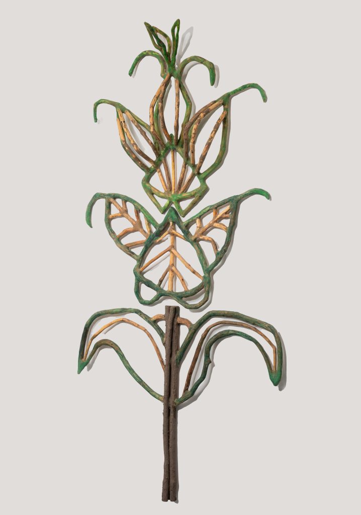
Prunella Gradiflora Self Heal, 2022, 150 pieces of wood, pastel, linseed oil, 62 x 31 x 5
Do you work one series at a time, exclusively?
I used to work exclusively on one series at a time. Often working within a certain framework of what captivated my imagination for several months to years at a time. Now, it seems that I frequently hopscotch between series, and I am not rigorous about sticking within the confines and parameters of a particular series anymore. I find myself experimenting and playing more these days in my studio.
Where does your current inspiration come from?
My current body of work is inspired from different sources. One source is the mysterious illustrations found in the late 15th century Voynich Manuscript. This manuscript was written in an unknown language, by an unknown author and filled with botanical illustrations of plants that don’t exist in nature, past or present. For the past eight years I have been translating the botanical section of the manuscript into three-dimensional wood sculptures.
Another source of inspiration is the black and white photographs from the early 20th century German photographer, Karl Blossfeldt. He photographed nature in extreme close-up and the photographs from his seminal book, “Urformen der Kunst” (“Original Forms of Art”) are extraordinary. The way a plant curls or the shape and color of a tight bud always inspires me. It is ultimately the nature that surrounds me, in all her myriad forms and wisdom that I draw daily inspiration from.
You collect most of your material locally. What is the process from then?
I start out every day with a walk and collect tree limbs and branches that have fallen to the ground. I never chop down a living tree. I carry those sticks back up into my studio. I then let the wood sit for many months in what I call my “sea of sticks” to make sure the wood is dry and won’t check or crack. I usually do a drawing first and that drawing acts as a road map of where I want the sculpture to go. From there, I start looking for shapes found within each stick to correspond to the lines found in my drawing. I then cut small naturally formed shapes, joining these small pieces of wood together using dowels and wood glue. Next, I make a putty to fill in all the open joints. I then wait for the putty to dry and sand the putty until it’s smooth. The goal is to make the line of the wood seem continuous and all the joints appear seamless. I usually reapply the putty, wait for it to dry, and sand it at least three times. I want the work to look as if it grew in nature, when in reality, each sculpture is built from hundreds of small pieces of wood that have been meticulously crafted together.
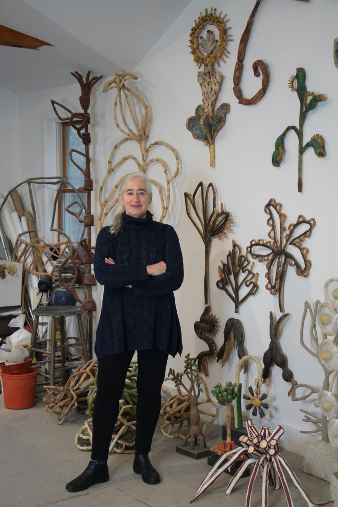
I think of my sculpture as drawing, but in wood. This is a very time-consuming process, and each sculpture takes me a minimum of a month to construct. I frequently work on two sculptures at a time since there is so much down time waiting for the putty to dry.
When and why did you decide to work with wood?
It’s been a long circuitous route to get to where I am now. I used to be a painter. I was working in my tiny apartment in Manhattan’s Little Italy, making large oil paintings on paper. I had three studio walls that were filled with nearly completed paintings. On one particularly hot and humid August day, the paint wouldn’t dry, and I had no more wall space. I was stuck with three very wet paintings that couldn’t be moved. I am wired to always be making and creating art. Since I couldn’t paint, I instinctively picked up a piece of balsa wood that I had been using for a framing material and a straight edged razor blade and inexplicably proceeded to whittle away. Literally time stopped. After eight hours of being in an almost trance like state of crafting this piece of balsa wood, I realized that I derived more creative fulfillment as a sculptor than as a painter! From that point, I evolved from whittling balsa wood with a razor blade to getting a proper whittling set.
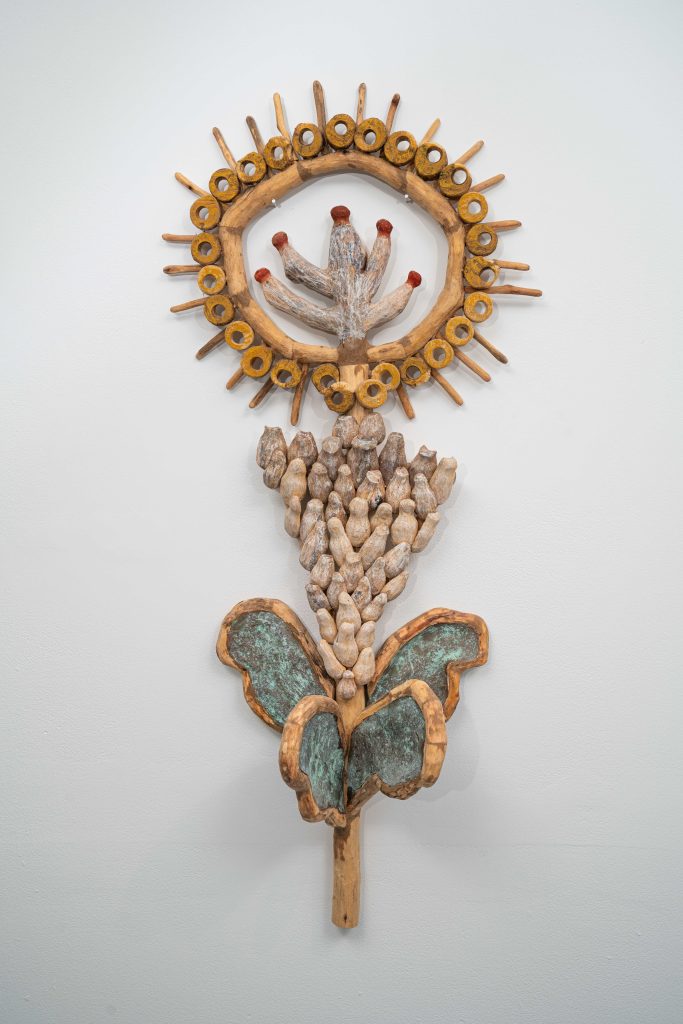
New Growth, 2021, 142 pieces of wood paper clay, linseed oil, pastel, copper metal coating with green patina, 38 x 16 x 8
Eventually, I realized that balsa wood is a terrible sculpting material and I started gathering sticks in Central Park and hauling them via the subway back to my studio.
I also started using better tools, including a small electric Dremel and now a Foredom flexible shaft tool.
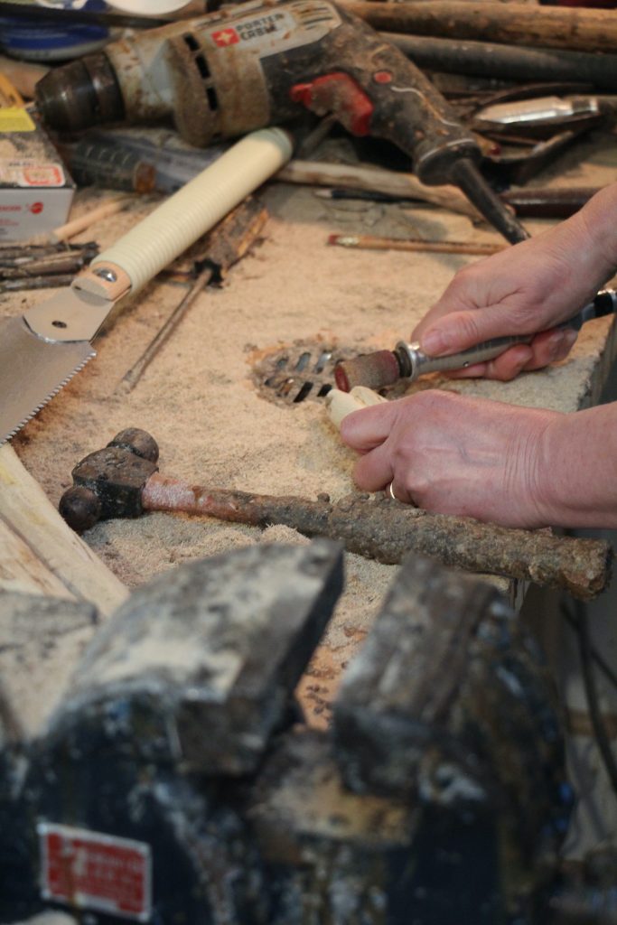
I’ve been working with sticks now as my main material for decades. While my work has evolved from totemic style carvings of my earlier period into a more nature-inspired and botanical direction, my material, and my decades-long love of working with wood has remained.
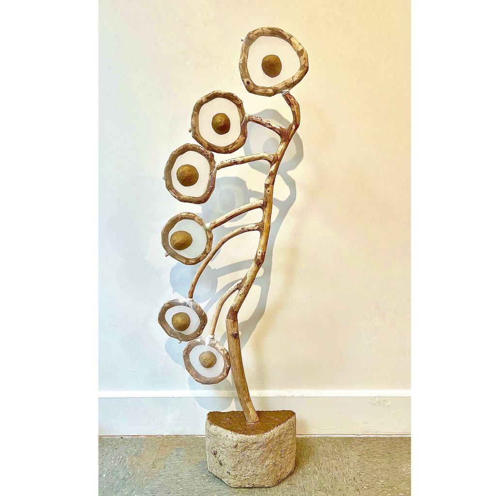
Lunaria 2024 78 pieces of wood, pantyhose, 50 x 157
Tell us about your commission with the MTA Metropolitan Transportation Authority.
How did the commission come about?
I received a call from the director of the MTA/ Arts and Design saying I was one of five artists chosen for a commission at the Metro North Station in Pelham, NY. I didn’t know how that happened since I never even applied to the open call. I later found out that one of the curator judges on the panel put my name forward. So, I went about visiting the train station, learning about the history of Pelham and synthesizing many ideas to come up with a way of working in metal. I created a vision board with my proposed ideas for the project and happily I received the commission.
What were the perimeters?
The project was open, to all ideas, and we could design anything we wanted. We were given a budget, and I originally had another whole design that was to run the length of the station’s platform that would’ve been attached to the overhang--but that ended up becoming too costly. So, I scaled it back to have the eight black steel panels built into the stations existing railings, which is the project that was ultimately commissioned.
What was the inspiration?
I researched the origins of the Town of Pelham. I discovered that the Town of Pelham was incorporated in the late 1880’s. During that time, William Morris, the Roycrofters and other popular designers from the Arts and Crafts movement were active. I wanted to emulate the carpets and wallpaper designs that were commonly found inside the homes in Pelham Heights at the time of its founding. So, I came up with the concept for “Home: Inside/Outside” where I designed eight tri-layered panels made from textured black painted steel that emulated the patterns of these carpet and wallpaper designs. There were three separate iterations that were installed throughout the station’s hand-railings. The shadows created by these panels were integral to the design, such that standard MTA railings now can be read as vertical planks of wood flooring across the platform and the panels that were built read as interspersed carpets within that flooring. I wanted these carpets to be visually contemplative, indicative of a modern-day mandala but in metal. These carpet-like screens hopefully engage the viewer into seeing new forms in the negative and positive spaces and in that moment of engagement the viewer goes back “home”, is connected to the outside from the inside, is entertained, is engaged in a new way, allowing them to meditate on the value of “home”. I wanted to convey the idea that “home” can be anywhere and everywhere one might travel, even if it’s just a week-day commute into Grand Central Station.
Butterfly cropped
Discuss the material you used and why?
I decided that my wood work would be best translated using black metal textured rods. Metal rods and wooden sticks have a similar cylindrical form, and I could texture the metal to resemble wood. The material needed to be totally weatherproof and stand up to the strict standards and guidelines of New York’s Metropolitan Transportation Authority. I wanted the metal to appear like my wood sticks. Together with the fabricators help, we came up with a unique way of working with the metal. Like my singular process of working with wood, the metal needed to be cut into small pieces and then welded and formed into the shapes and forms I had designed. This way of working was new to both of us, and it was a very exciting process to be part of.
Lollipop cropped
Take one or two pieces of that have needed much taming.
Before I start a new sculpture, I usually do a pencil drawing first in my sketchbook. This drawing frequently is about the final form and what I want the shape of the completed work to look like. I don’t always take into consideration how I’m going to get from Point A (the drawing) to Point B (the finished work). That’s where the difficult part comes in. I am giving myself a challenging task and it’s almost like, why did I just give myself this impossibility?!! So, for instance, when I went about building “Albutilon”, I knew that I wanted all the petal like forms to touch, but I had no idea how to make that happen spatially.
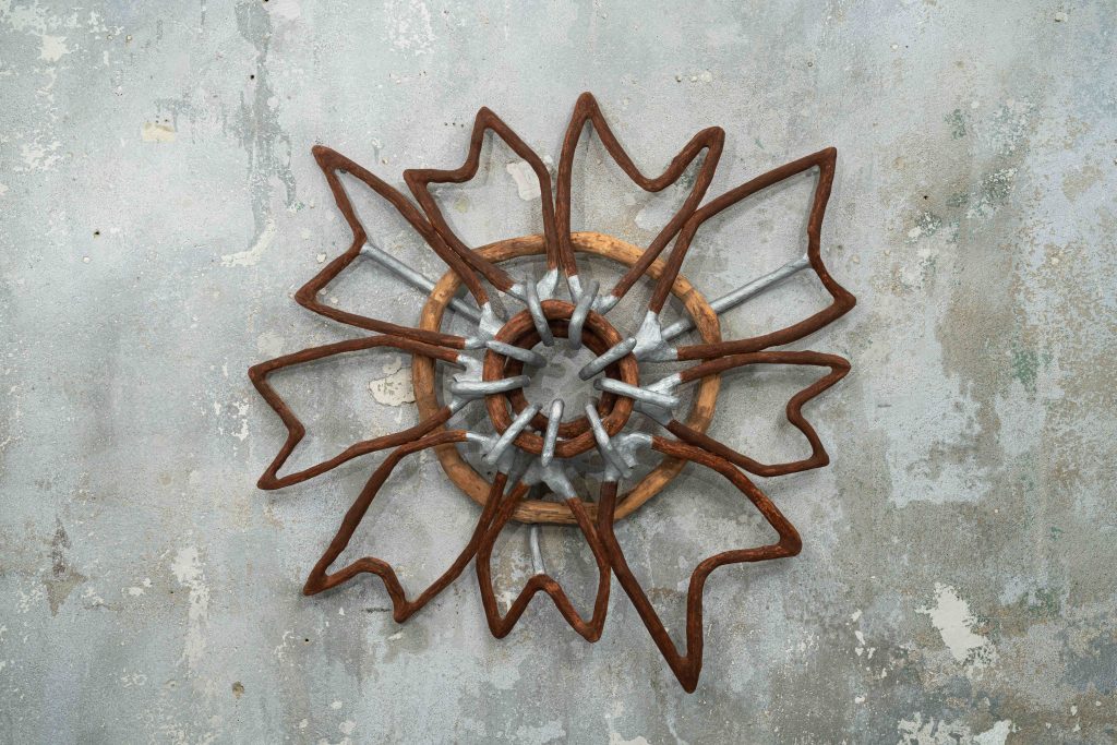
Albutilon, 2022, 118 pieces of wood, pastel, linseed oil, silver metal coating, 33 x 32 x 17
So, for this work, I drew a preliminary drawing in my sketchbook, and then had to draw a larger full-scale drawing. That larger drawing became almost a dress-makers pattern that I could follow to help guide me.
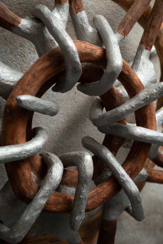
Albutilon (center side super close up), 2022, 188 pieces of wood, with pastel, linseed oil and silver metal coating, 33 x 32 x 7
I laid the small pieces of wood right on top of this full-scale drawing. I had never done that before with a sculpture, but this work demanded a new way of working. This work was very complicated to build, and it took 118 small pieces of wood that were seamlessly jointed together to make it come to life.
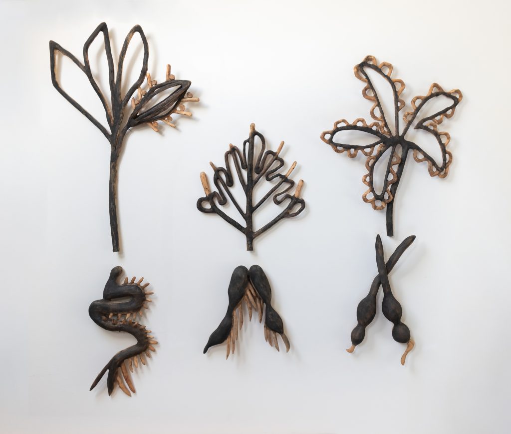
Specimens (full view), 2018,287 pieces of wood with graphite, 46x56x5
Another work, “Specimens” had so many twists, turns and angles in it that it took me months to build. This six-part wall work was made from 287 small sometimes tiny, sometime carved, pieces of wood that were jointed together and then covered with powdered graphite.
Comment on your older work in clay.
‘Take the Money and Run’.
Take the Money and Run
My clay work came about during a very difficult period for me. I didn’t have the energy or time to focus on creating my wood sculpture. Each wood sculpture needs hundreds of hours to create and build. For a year I didn’t have that calm focused energy or strength for this type of creative outlet. I needed to work with something that gave me more immediate results. I started making clay portraits that could be finished in a couple of days to a week instead of taking months to build. I started working with self-hardening clay and sculpted portraits of people that were profiled in the pages of the New York Times. This was 2010-2011, the time of the financial crash and the subsequent bank bailout, the Arab Spring, and the Fukushima disaster. These were the stories at that time that were captivating me both emotionally and politically.
The political background?
“Take the Money and Run” shows four CEOs from four separate financial institutions and how much money each made because of their golden parachute. These CEOs became extraordinarily wealthy while the Main Street investors were completely wiped out. These clay portraits were the CEOs from four financial institutions: Merrill Lynch and his $161 million dollar payday, Countrywide Financial and his $121 million dollar bonus, the CEO from Washington Mutual who made off with $18 million dollars and the head CEO from Lehman Brothers that made $22 million dollars. These four CEOs are nestled in a suitcase filled with hundred thousand dollar bills and the exterior of the case is covered in pennies. The vintage travel suitcase has an interior mirror so that the heads with an engraved brass plaques that states their financial payday are now reflected in the mirror and I put heavy duty casters on the bottom. So, “Take the Money and Run” seemed like a perfect title. This work now lives on my studio floor.
Take one clay work and discuss it in detail. Also, why you have chosen this one?
The final work from this period was a work called “Dreams of Our Ancestors”.
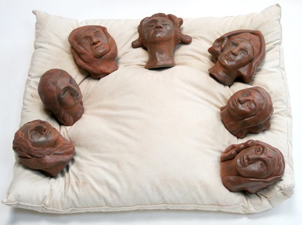
Dreams of our Ancestors
This work portrays seven extraordinary women, each of whom had a profound impact on a world religion. Women such as Sun Bu’er, the first Taoist; St. Kateri Tekakwitha, the first Native American ever canonized by the Catholic Church; Margaret Fell Fox, who was known as the mother of the Quakers and the founder of the Religious Society of Friends, Mirabai, a 16th century poet, mystic and Hindu saint who was devoted to Krishna and Hildegard de Bingnen who was a saint, visionary theologian, musician, polymath, artist, scientist and Benedictine abbess from the Middle Ages. These seven women are all together, resting and dreaming together on a pillow. As strange as it sounds, it was the strength and energy from these dynamic women that helped to heal my distress.
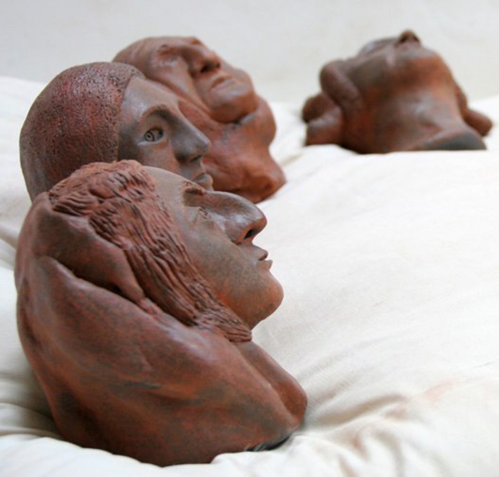
Dreams of our Ancestors detail
I realized that my source in creating art does not come from a place of anger or politics but rather from a more connected interior space. Completing this clay series allowed me to finally return to my wood work with renewed vitality and inspiration.
You are very diligent and do a drawing every morning, discuss.
Each sculpture that I build takes me a minimum of a month to construct. As previously mentioned, I used to be a painter, and I was really missing working with colour. I also missed the immediacy of creating work and seeing results quicker. I needed those “art” endorphins coursing through my mind and body. I also needed to be making work that takes up less physical space, something that is always a sculptor’s dilemma. I came up with what I call my “morning drawings”.
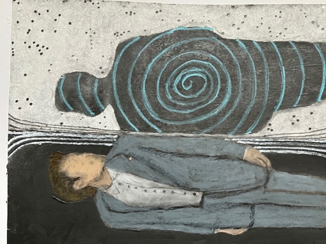
Parallel Lives
I usually read The New York Times daily and tear out images that strike me. From there I go about working on my drawing in an 11 x 14” sketchbook. Each drawing is usually based on an image found in the paper. I frequently work on the drawing when I first get into my studio in the morning, and I might continue to work on it for several mornings till it’s completed. It’s a way that I trained myself to focus and not get so distracted and be productive at the same time. I use many different materials in working on these drawings such as: crayons, chalk, powdered graphite, earth, matte medium, pen, watercolours. I had a college art professor from when I spent a year in France who taught us that if you put your body in the position of work, then the work will flow from there. This was one of the most useful words of wisdom that I learned throughout all my art classes. I repeat it frequently and it has become my daily mantra. I find beginning-starting a workday is frequently the most challenging for me. My morning drawings are a simple way to sit at my drafting table and begin to focus and start my workday.
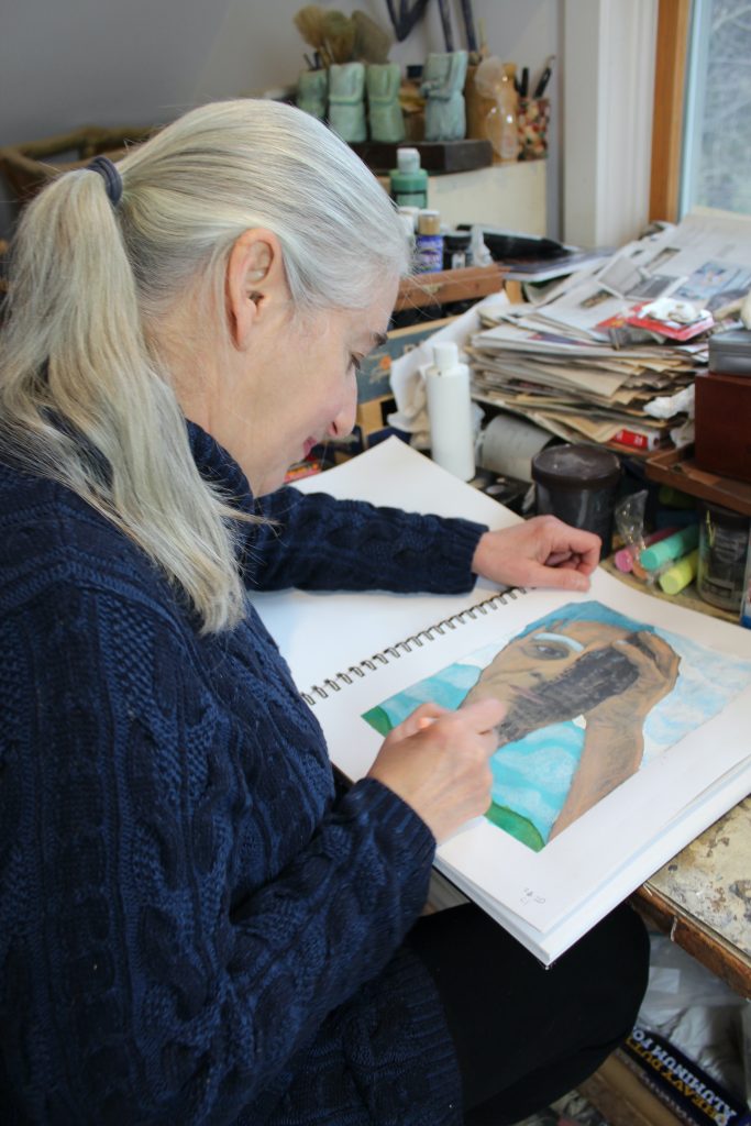 Contact:
Loren Eiferman
Loren Eiferman@gmail.com
Instagram: @loreneiferman
Deborah Blakeley, Melbourne, Australia
Interview by Deborah Blakeley, April 2024
Images on this page are all rights reserved by Loren Eiferman
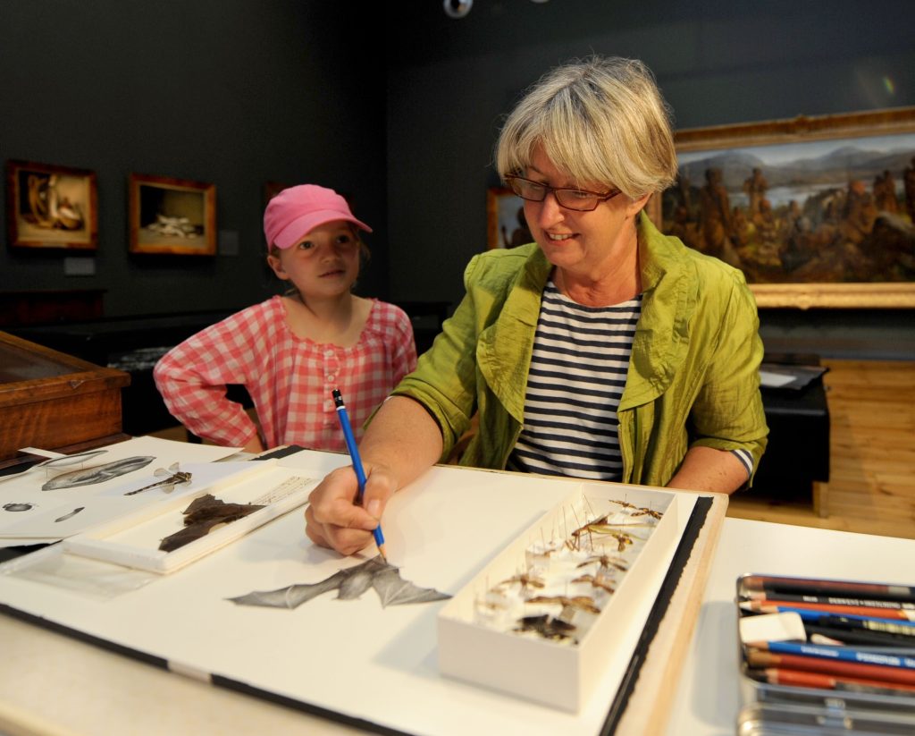
Julie Payne
You have been short listed for the Glover Prize on several occasions. Can you explain your work, and a little about the Glover Prize?
The Glover Prize is a prestigious landscape prize celebrating the Tasmanian landscape. I love being part of this exhibition as it always pushes the question of what constitutes “landscape”. My submissions are always specifically made for the “Glover” and often will examine emotive aspects of experienced memory and place. I grew up in the semi -remote north east of Tasmania and always look back at this time for visual stories to tell.
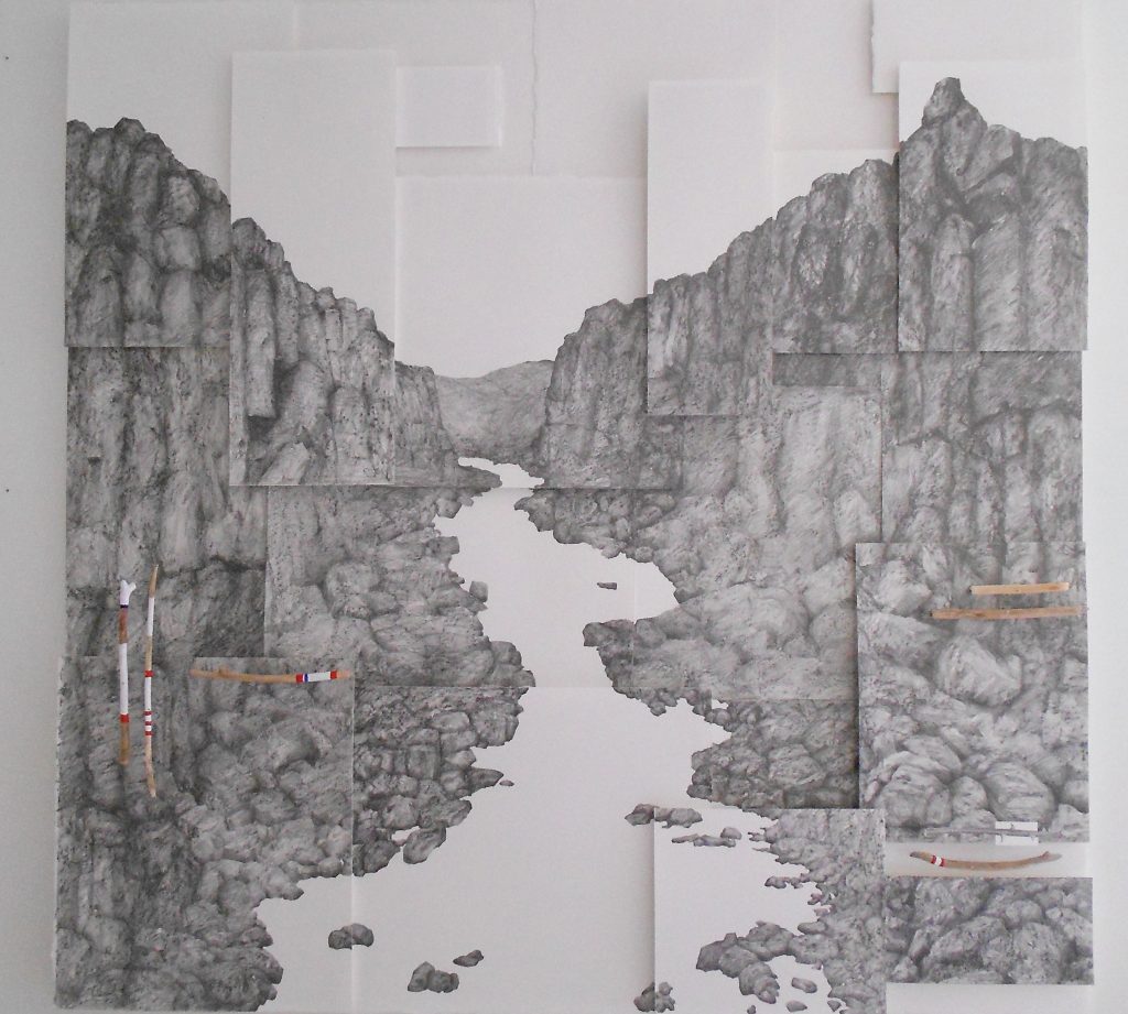 Glover Prize Finalist Drawing “The Gorge in a Hundred Parts
Take ‘Spring Carnival’ and discuss the work and how you combined watercolour and pencil.
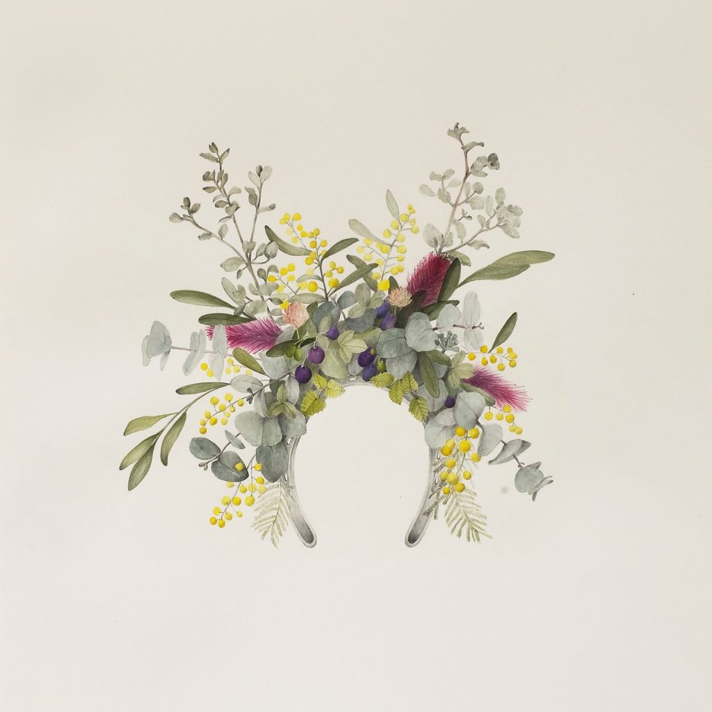 “Spring Carnival” Pencil + Watercolour wash
I have always been interested in the play of known objects and combining additional elements to form another object. In this case it was the “fascinators” worn at spring carnival horse races and connecting the horseshoe as the basis of the headpiece and then attaching abundant native flora to form the fascinator.
Prior to this work I had been producing work only using graphite pencil but wanted to experiment with colour. With great tenacity I started to see how well watercolour and graphite can be combined. This then led to much greater confidence with colour in later work.
The importance of symbolism in this work.
I tend to use symbolism a lot in my work to initially capture the viewers gaze and once I have their attention, I want them to bring them on a journey of storytelling.
In Spring Carnival, the clue was the horseshoe and then it’s not such a leap to start thinking about horse racing, costume and place.
In the “Text Gardens” ie “The Garden of the Lost and Forgotten” superfine grass seed is used to establish the link with colonisation of the Australian landscape.
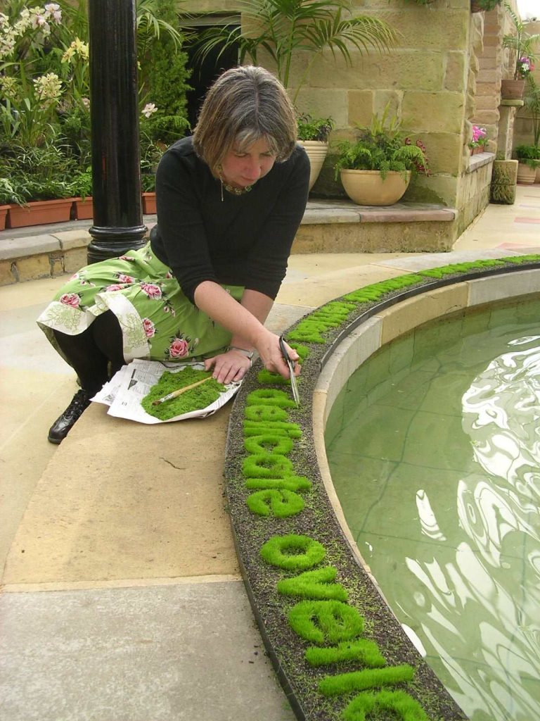 “The Garden of Human Happiness” grown grass text -detail of cutting. Tasmanian Royal Botanic Gardens.
Comment on the importance of nature in your work.
During Art School I studied as a sculptor and loved the work of site-specific artists such as Richard Long, Rosalie Gascoigne, Andy Goldsworthy, Ken Unsworth, Anthony Prior, among many. All, at that period, were looking at a new approach to what sculpture could be and seemed to enjoy the direct response to a specific landscape.
Coming from a Sculpture department filled with noisy heavy machinery and time-consuming processes, the alure to making ephemeral art installations in the natural landscape was very attractive.
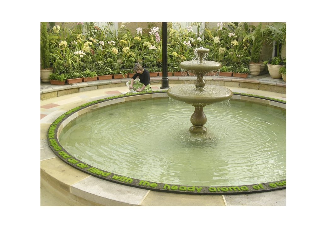 “The Garden of Human Happiness” grown grass text - Tasmanian Royal Botanic Gardens.
How have you extended Botanical art to one with your own twist?
I started looking at botanical art as a return to drawing after studying and practicing architecture. Architecture requires exceptional care in details and botanical drawings worked on a similar level. However, I was not interested in the scientific principles of botanical work and instead used plants as symbols for storytelling. For instance, “Journey through the Contents of a Fridge” was a fun reminder of all the forgotten plants that congregate and form their own colony in unseen human made spots.
How does living in Tasmania influence your art?
After working in Brisbane, Melbourne and Darwin I realised the uniqueness of having a strong family connection to the north-eastern region of lutruwitta/Tasmania.
It was a raw and unprivileged childhood background that allowed immense scope for working out the way of the world on my own terms. It’s also incredibly beautiful place along with being a microcosm of political dissent, tragic colonial history and populated by extraordinary people that seemed to be sifted down to the bottom of Australia. There is plenty to be inspired by in the State.
 “Lemon Spritz” Watercolour + Pencil
How does the art society in Tasmania nurture you and your art?
I don’t really have a connection to the Art Society apart from a few workshops to teach form techniques in drawing + colour washes.
Tell us about your studio?
I feel so incredibly lucky to have a studio at the Salamanca Arts Centre on the waterfront of Hobart.
Making art can be a very lonely occupation at times so greeting my studio buddies is a very positive way to start the day.
There are eight individual studios in our section of SAC, each occupied with dedicated professional artists. Although we mostly simply get on with our work after an initial greeting, we do have occasional celebratory gatherings to mark individual achievements. It’s a very positive working environment.
Of course, I could mention that the studio is spacious, light and located in fabulous Salamanca Place but it’s the heartfelt sharing that is number one.
Comment on your series, Flood Sticks, and your environmental presence in Tasmania.
Flood Sticks is a story based in memory and fragility while also showcasing the beauty of the Cataract Gorge in Launceston.
The “Flood Sticks” series focuses on the wildness of the Gorges that geographically divides the city. It is known for their spectacular and dangerous flooding events as well as its calm summer beauty. The sticks have been collected, stripped bare by the raging floods, and juxtaposed with the fragile boat vessels.
 “Flood Sticks” Scratchboard + collected flood sticks from Cataract Gorge.
You use many, different background papers in your work. Comment on this, particularly in relations to ‘IXL Still Life’.
 “IXL Still Life” Watercolour and Pencil over salvaged timesheets in concertina format.
Experimenting with different papers is similar to a painter experimenting with different “grounds” on a canvas. Each produces a different effect and takes the initial preciousness away from starting a drawing.
In the IXL Still Life series, old timesheets from the Henry Jones IXL Jam Factory were collected, after the site was abandoned, and reused them in a linear format to imbue them with the fruit that was processed on site while also paying homage to the workers.
You have also extended this by putting your work in a book format, comment.
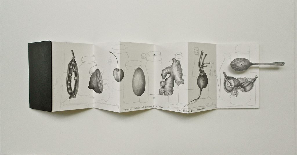 “Journey through the Contents of a Fridge” pencil on paper.
The concertina book format was chosen to suggest a processing line and telling longer individual stories.
Discuss the use of humour in your work.
Along with tackling many political and emotive themes, I do enjoy a laugh as well.
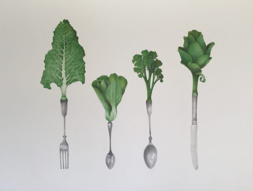 “The Culinary Greens” Graphite and coloured pencils.
“The Culinary Greens” started as an exercise in using luscious, coloured pencils. It soon developed into a story of eating your greens and different families of vegetables. I saw the Culinary Greens as the apex family that everyone aspires to.
Beyond your studio, into gardens. How did this become such a large part of your art practice?
In 2001 I was commissioned to produce artwork to celebrate the opening of the Queen Victoria Museum, Inveresk site in Launceston. It was a disused railway yard employing hundreds of workers during its days. The Museum restoration had sanitised the huge site, eliminating the personal histories of tendered gardens and social gatherings that occurred. I liked to think that no matter how much new landscaping had been done, the tender history of site would always seep through and start telling stories. This is where the idea of growing text that suggested past activities originated. It was called “The Garden of the Lost and Forgotten” and I loved that you could not supress history so easily. It was also delightful tending this garden. It’s certainly high maintenance.
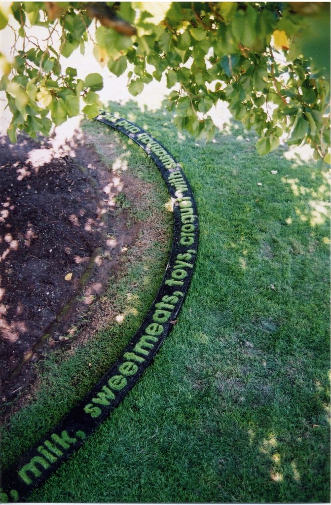 Garden of Loss and Desire” grown grass text - detail. Woolmers Estate
However, the process, the stories that could be told, and the clean visual impact was very satisfying and I went on to grow another four text gardens commissioned for various festivals.
Explain your commission within the Conservatory at the Royal Tasmanian Botanical Gardens?
“The Garden of Human Happiness” was grown specifically to tell a wandering story around the fountain within the Conservatory of the Royal Botanic Gardens.
“The Garden of Human Happiness” grown grass text - Tasmanian Royal Botanic Gardens.
What other installations have you done?
Other site specific Installations have been created for Woolmers Estate, Festivale in Launceston, and Kelly’s Garden in Salamanca Place, Hobart.
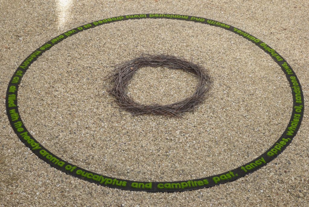 “Mr Peacocks Garden” grown grass text. Salamanca Arts Centre Hobart, Tasmania.
Ephemeral works locations have been located at the Cataract Gorge, Launceston; Fortescue Bay, Tasman Peninsula; Port Arthur Historic Site and Holly Bank Reserve.
How important is the weather for your installations?
A good downpour of rain is always welcome, although this often means a brisk growing session and lots of hand trimming with scissors. Gardens are always germinated in controlled greenhouse conditions until the words are stable enough for an outdoor location.
Does this art need both ‘Green Thumbs’ and tender loving care?
The art of Sculpture requires an artist to be a master of many crafts. One simply has to learn the craft and limitations of the material for each idea. Growing grass in the form of Helvetica Bold is no different.
"Topiary Ted" sewn fake grass topiary
How did ‘Topiary Ted’ come to life?
“Topiary Ted” was a response to a group exhibition at the Royal Botanic Gardens in Tasmania. I thought it would be fun to upset the formalised gardens layout with some more unusual topiary. Obviously, I didn’t have the time to grow real topiary, so recycled tennis court Astro turf was sewn together to bring Ted into being.
Ted was greatly loved, and I certainly learned the residual power of the childhood teddy bear on visitors.
Astro turf, fishing line and recycled plastic bags never seems to die, so three Teds now sit watchfully in my own garden.
Discuss Tasmanian history and your art?
There is plenty of Tasmanian history to examine and make comment on.
Tasmania has a history that is both culturally rich and, at times, devastatingly cruel and unequal.
Issues ranging from the in just treatment of the Palawa people and convict servitude to the privileged dominated the colonial times.
Relatively recent issues of deforestation, invasive species, environmental and social issues, and loss and memory have all been foundation ideas for various artworks.
Explain your involvement lecturing at the University of Tasmania.
Teaching at the University of Tasmania was a delight. After graduating in Architecture, I was asked to lecture three days a week in Foundation Studies with first year students.
In the second year of teaching at the School of Architecture, the School of Art invited me to teach Sculpture for the remaining two days available.
Although it was a bit crazy sometimes figuring out which school a student was in if I saw them out of context, I thoroughly enjoyed each and every student, yep, even the ratbag ones.
Teaching Sculpture at the School of Art taught me to quickly identify where a student was trying to head with an idea and hopefully assist with being able to distil the concepts’ essential qualities.
Teaching in the School of Architecture was a revision of the complex interplay of ideas, research, practicalities and building skills to think and draw three dimensionally.
You are busy doing residencies, take one that has led you to relook at your work.
I have been fortunate to be granted three studio residencies in France and Ireland. Each have had a positive impact in disrupting patterns of working but it was at Draw International in Caylus, France that was the most enjoyable. The quality of the participants is high, I thoroughly enjoyed discussing ideas, trying new less precious techniques and living in a small French community.
 Studio at Draw International - Caylus, France
Contact:
Julie Payne
Details
Julie Payne
Tasmania, Australia
Deborah Blakeley, Melbourne, Australia
Interview by Deborah Blakeley, April 2024
Images on this page are all rights reserved by Julie Payne
Jerusha McDowell
What led you to open a Gallery and go beyond being a freelance photographer?
I studied photography and filmmaking at university and returned to photography following a very different career. I made the decision about two years ago to resign from my career in the Defence and Intelligence community to focus on photography as a full time career.
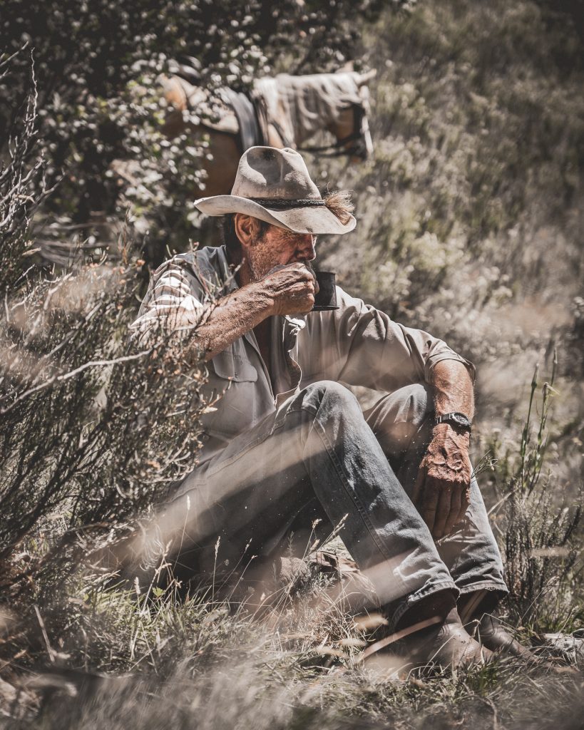
I opened the gallery exactly one year later, and it has been open now for a year. When I first returned to photography I began working as a freelance photographer doing equestrian events, and client work but I was always very focussed on developing my core landscape and documentary work and opening the gallery seemed the logical next step. There is something special about exhibiting your work the way it is meant to be experienced. The digital world is so vast these days it is easy for photographers to get their work seen without the need to print and frame and present the work. But to me a photograph isn’t really a photograph until it is printed. A photograph has such a journey from the decisions you make taking it, through the editing process, to the printing, framing, and exhibiting. The gallery is very important to me because it allows my work to reach that destination.
Added to this you are also a film maker. Tell us about this part of your professional life.
I studied both photography and film making at university, and I have always loved video and film making. I am getting the chance to do more film and video lately and I’m really enjoying it again. There will be a film component to the project I am working on in the Mountains. Right now, we’re just working through some of the logistics issues of carrying video equipment on horses.
Take us to ‘Your Australia’ through e crossing.
The Crossing is the first collection from a documentary project I am working on titled ‘Where the Snowy Mountain Stockmen Used To Ride’, photographing riding expeditions in the Australian Snowy Mountains. This is an ongoing documentary project with my friend, guide, and subject Mark Swan. It began simply, as an excuse to ride horses and shoot remote and beautiful landscapes.
It quickly became something much more. ‘The Crossing’ collection shows a plateau crossing in bad weather near Tabletop Creek in the Snowy Mountains, and simple fireside rituals as we stop to rest and let the weather clear. Photography is about more than pictures. it’s about revealing things unseen. It’s about showing people something through your eyes. As a photographer your connection to a subject is the defining characteristic of storytelling.
The weather up here changes so quickly, changing the entire landscape around you. The fog had closed in, blanketing the landscape, and making navigation uncertain. The wind and rain were driving in hard making lighting a fire seemingly impossible, and yet, with a little patience the quart pots were soon filled with hot tea. This project continues to be an amazing journey. Getting to capture the amazing people and places out here is one of the great privileges of my life.
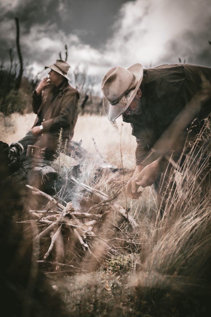
I have been overwhelmed with how this project has been received so far, it has been published in RM Williams Outback Magazine and has received a number of awards including a Top 5 in the International Photography Awards. Shooting in the mountains is never easy. The weather changes so quickly around you. The riding is hard, the environment harsh and unforgiving especially on sensitive camera equipment. But as an artist these are the projects you dream about.
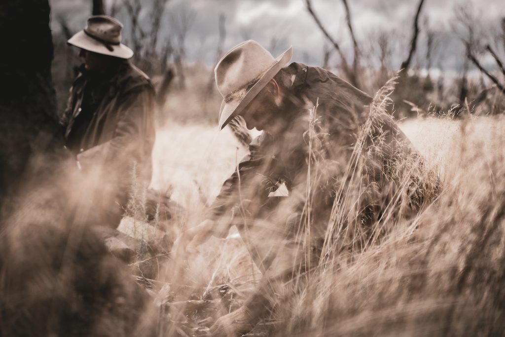
Discuss the pleasure of cropping and highlighting images? E.g. ‘Buckled’
The editing process is interesting, I never really sit down with an image and know exactly where I’m going. I feel like every image has its own journey that it takes me on, not the other way around. The decisions you make when editing in photography are usually about what to leave out rather than what if anything you add. Cropping can change the whole story quickly by removing the clutter and distraction around an element you are focussed on. Buckled is a really good example of this. Where focussing on a much smaller part of the scene tells a more potent story.
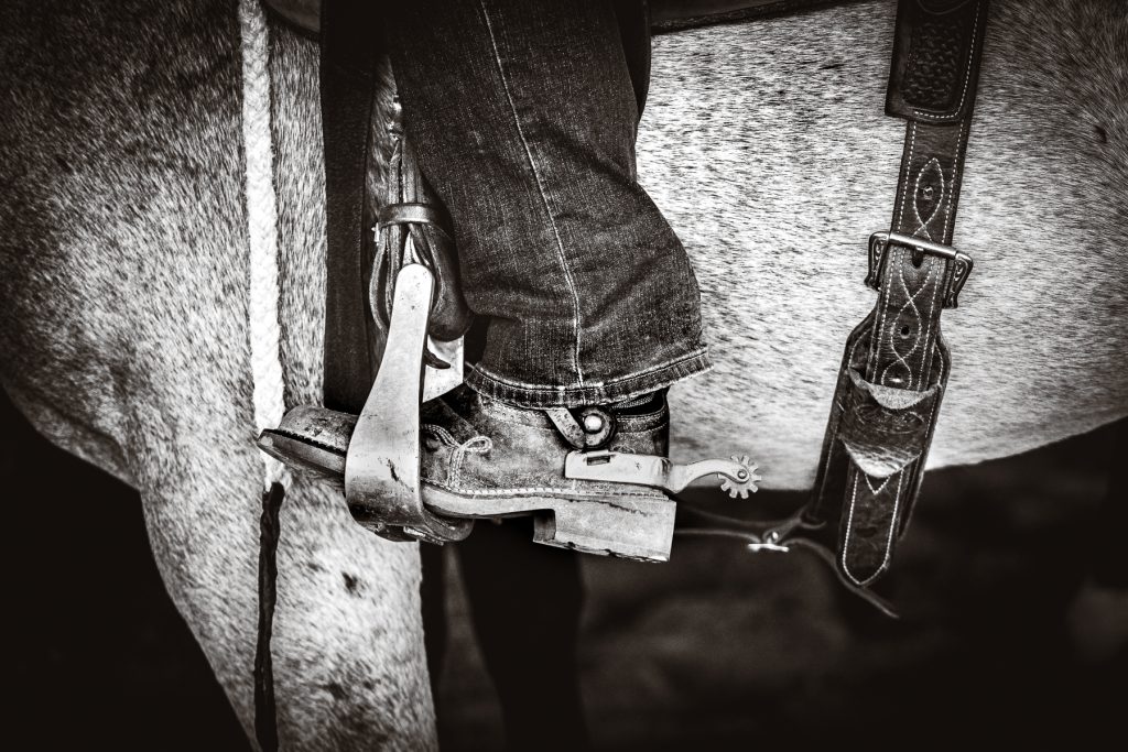
Comment about the importance of limited editions of your photographs?
Doing limited editions is something that was a natural progression after I opened the gallery. It reinforces that the photographs are a finite physical thing. This is really important in the modern/digital world I think.
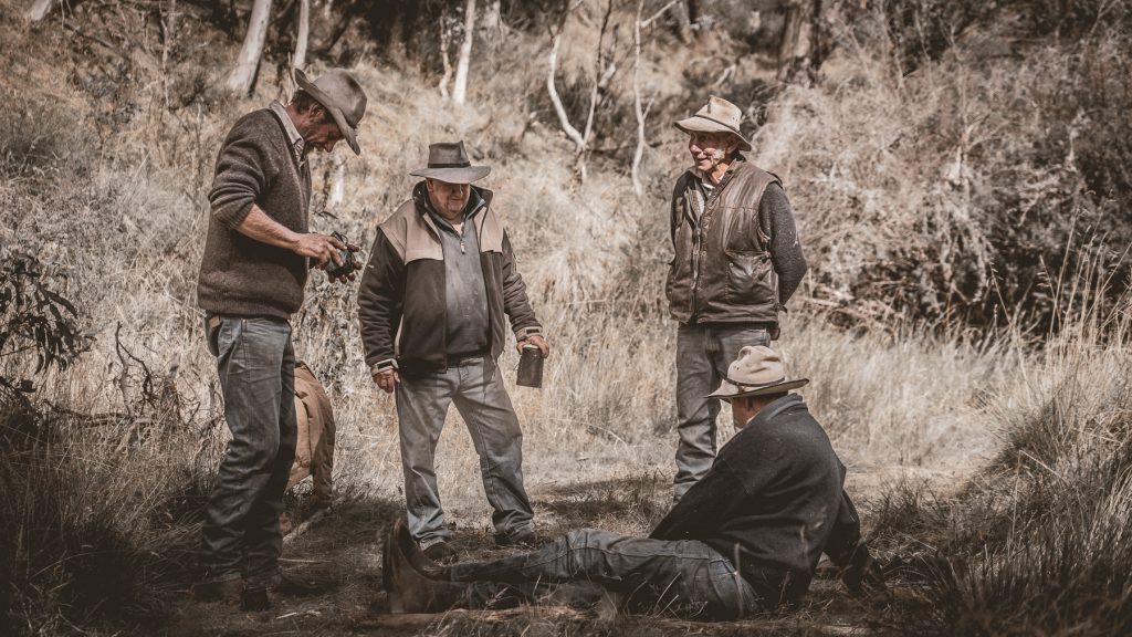
Also, smaller purchases, cards, and the sold-out calendar for 2024.
The gallery offers selection of fine art landscape documentary works as well as a range of cards and giftware.
HORSES…
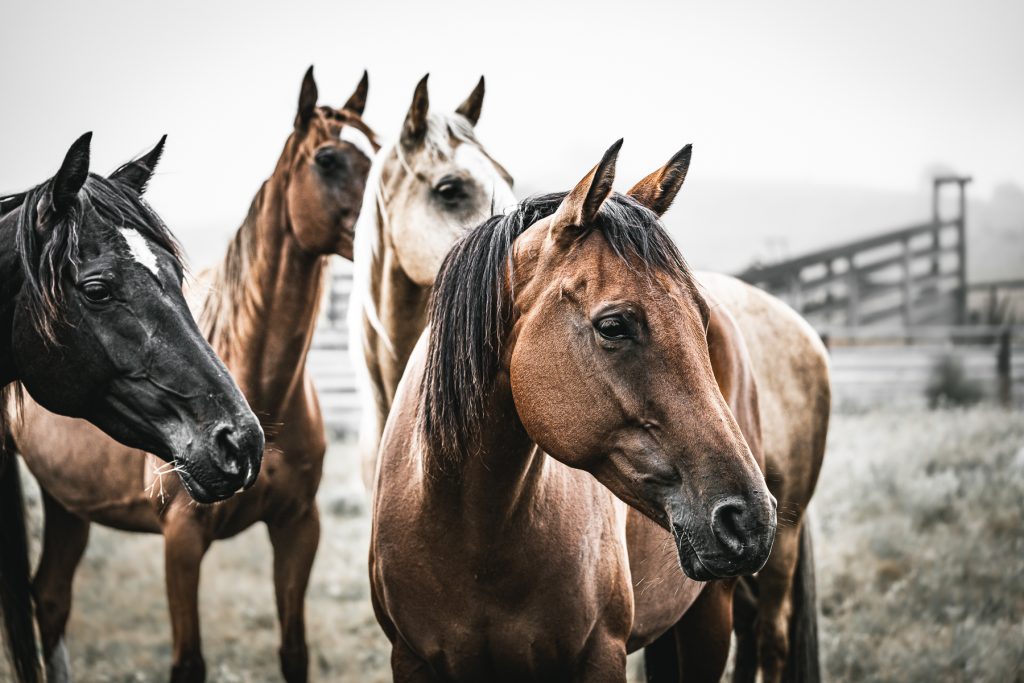
Tell us about your love of horses, which is so obvious in your work.
Horses are definitely a lifelong love affair, and one I am now lucky enough to share with my daughters. Horses force you to be honest, not just with them and with yourself. Otherwise, they see right through you. I am incredibly lucky now to be able to combine my love of horses, the bush, photography and storytelling in the one creative pursuit, and it feels like coming home. Photography teaches you many things, patience, the art of observation and above all perspective. You understand the power of perspective and your ability to change it. Photography and horses have been such an important anchor for me since leaving my national security career. The discipline and solitude of it has given me the space I needed to recalibrate.
Take one or two equine images and give us a short inside story that goes with the photograph.
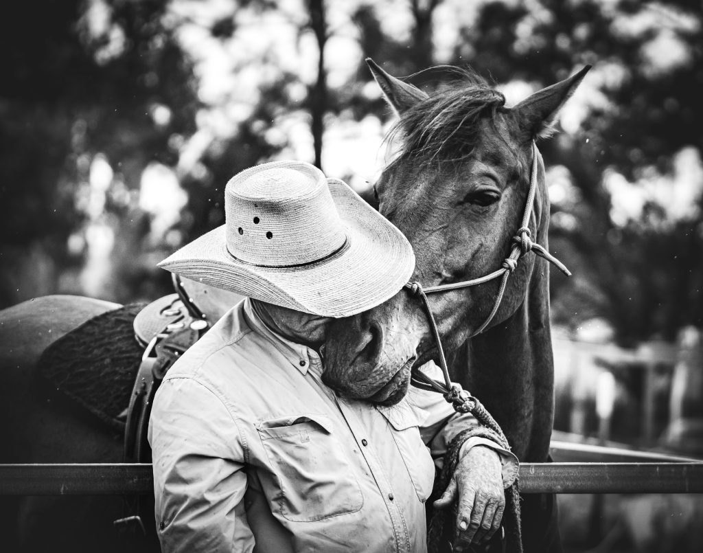
This shot is special and is probably a good example of how I moved from shooting events to shooting in a more documentary style. I now think of almost all my work as documentary photography. It is documenting people, horses, landscapes in a way that shares the world around me with the rest of the world. This image was taken at local horse event, but I was more interested in what was happening out of the arena. This was an incredibly tender moment as the rain began to fall Phil responded to his horse’s gesture, walking over and allowing a moment of connection which I was lucky enough to capture. I remember his response to the image was quite emotional.
LANDSCAPES…
To me landscape photography isn’t about a perfect image. To me photography is all about storytelling, if there isn’t a story, it doesn’t matter how perfect the shot is, it isn’t going to resonate with people. I am attracted to telling stories that help me tell mine, that reflect my search for identity and place. I like creating images that have a certain amount of ambiguity to them. That are more a question than an answer. I began life on a very remote property in the bush, in the high country of the New England Tablelands. We had no electricity, no plumbing, and for me life unfolded beyond the reach of the modern world. My earliest memories are of the rhythms of the bush, storms rising, up through the gorges, the smell of horses, eucalyptus, kerosine and woodsmoke in the rain. It was a magic place that had a deep and lasting effect on me. A tension between the desire to live outside the safety, comfort and complexity of the modern world and the deep yearning to belong somewhere has always pulled at me, is a recurring theme in my work.
Comment on the almost sepia colour of your part of Australia in photography.
I guess That’s a question of style and I guess I definitely have a style or a signature, especially in the tones and colour I use. I used to work overseas a lot and coming home after being away a while was always emotional. I’d flick through inflight magazines featuring the familiar Australian landscapes, grateful to be home, grateful to be whole, and returning to our beautiful land. Yet I always found myself searching in vein for my landscapes. The glossy spreads would feature the red dirt of the interior or the sapphire blues of the coastline but not the beautiful soft tones of the middle; the tablelands and high country. This is my country. The colours and contours of these landscapes have a unique beauty. Harsh and yet soft and subtle. The light, the sky the air. Over the range but not out back. These are the landscapes I love. I think if I have a signature or style it is because these are the colours and textures I love, that comfort me, that call me home. I was asked recently how long it took to develop my style… I hope, is a lifelong journey. It takes a while for you to start trusting your own instincts and stop looking to emulate others but once you do it’s a never ending process of discovery and expression and evolution. So many things influence and change you and you always keep learning and growing. Creativity is a strange unaccountable thing.
The physical vastness and what you are wanting to capture and why? I approach landscape photography from a feeling or emotion. Its about using elements in the landscape to tell a story or express something. It’s usually more about what a place feels like to me rather than what it looks like. It’s funny, I still don’t really think of myself as a real landscape photographer even though I take a lot of pictures of landscapes! My most recent landscape collection ‘Fields Of Gold’ is a series celebrating the vast beauty of the snowy mountain high plains and the brumbies that call them home. Influenced by the early Australian impressionist paintings that always captured my imagination, these works to me are about capturing the freedom and promise of these these plains.
Can you expand on the importance of your skill within your rural community?
I am a part of an beautiful rural community here in Bungendore on the NSW Southern Tablelands. One that has given me friendships and creative partnerships with incredible people who inspire me endlessly.
My gallery is part of The Malbon, an incredible local business collective which includes local businesses and artisans its been such a huge opportunity for me to grow by business and expand my reach as an artist, and I have also been able to use my skills to support growth and evolution of the Malbon its a great partnership I am lucky to be part of an amazing and supportive rural community here in Bungendore.
I love this landscape here. Not the white-sand beaches of the coast not the red dust of the outback. I love the crisp air and muted colours up here, it’s harsh but it’s subtle and beautiful too.
Contact:
Jerusha McDowell
Details
Jerusha McDowell
Rushe Photography Gallery open 7 days, Bungendore, NSW
Deborah Blakeley, Melbourne, Australia
Interview by Deborah Blakeley, March 2024
Images on this page are all rights reserved by Jerusha McDowell
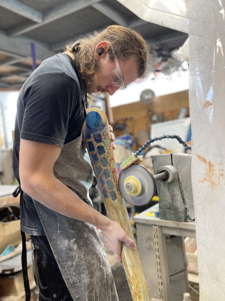
Jacob Barfield
Comment on your statement, ‘Piecing the puzzle of life together through art and creativity.’
This statement is something I created to describe the feeling I felt when starting to try to make a career as an artist. It’s confusing like a puzzle, but if you stick with it and don’t give up eventually you’ll be able to piece it together.
How do you develop both Glass and custom-made metal stands. Combining two very different skills?
Learning how to work with metal was a skill I learned out of necessity to take my art to the next level. A lot of glass art needs to be displayed in certain ways in order to get the best effect. Metal stands are not only strong but when done properly complement the artwork. Most of the time I develop the artwork first and then design the stand around the piece.
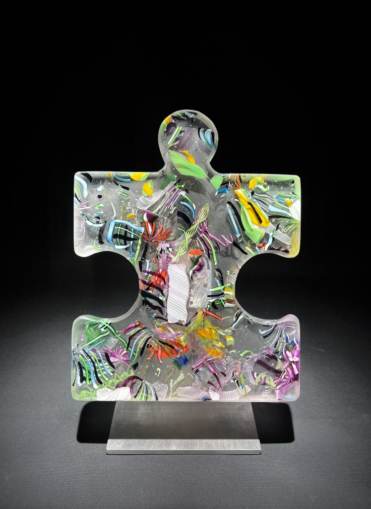
Discuss how important it was for you to shown technical skills as a young boy.
Learning how to work with my hands were very important skills to develop. Almost every job and hobby I had required some sort of hands-on skills that took time and practice to develop. A lot of those technical skills required good hand-eye co-ordination, I was able to translate that developed coordination into the work I currently produce.
Comment on how you see art as a continuum to your art skills.
I’ve always enjoyed learning new things and one of the qualities of glass that I enjoy is how many tools and skills are required when producing the art. Because of this I had to learn a large variety of new techniques in order to produce the work I wanted to make.
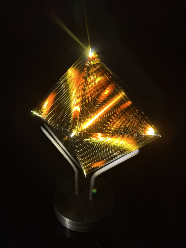
Puzzle Pieces.
Where did the idea come from?
I’ve always liked puzzles and I even made a puzzle piece table in woodshop class in high-school.
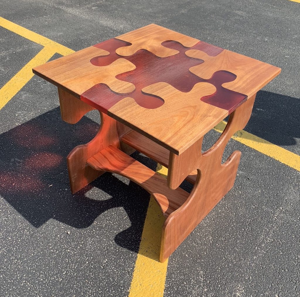
So I guess the idea of puzzle pieces as artworks was always in the back of my mind. But when I started to pursue glass, I wanted to produce something that had a lot of versatility. After dwelling on the idea of versatility for a while I eventually thought back to that project in high-school and decided to try making puzzle pieces out of glass.
Can you briefly explain the production of this series?
The pieces are made by taking chunks of glass and melting them into a puzzle piece shaped Mold. Once cooled down I then coldwork the edges so there aren't any sharp edges. Then I polish the glass and attach custom made mounts.
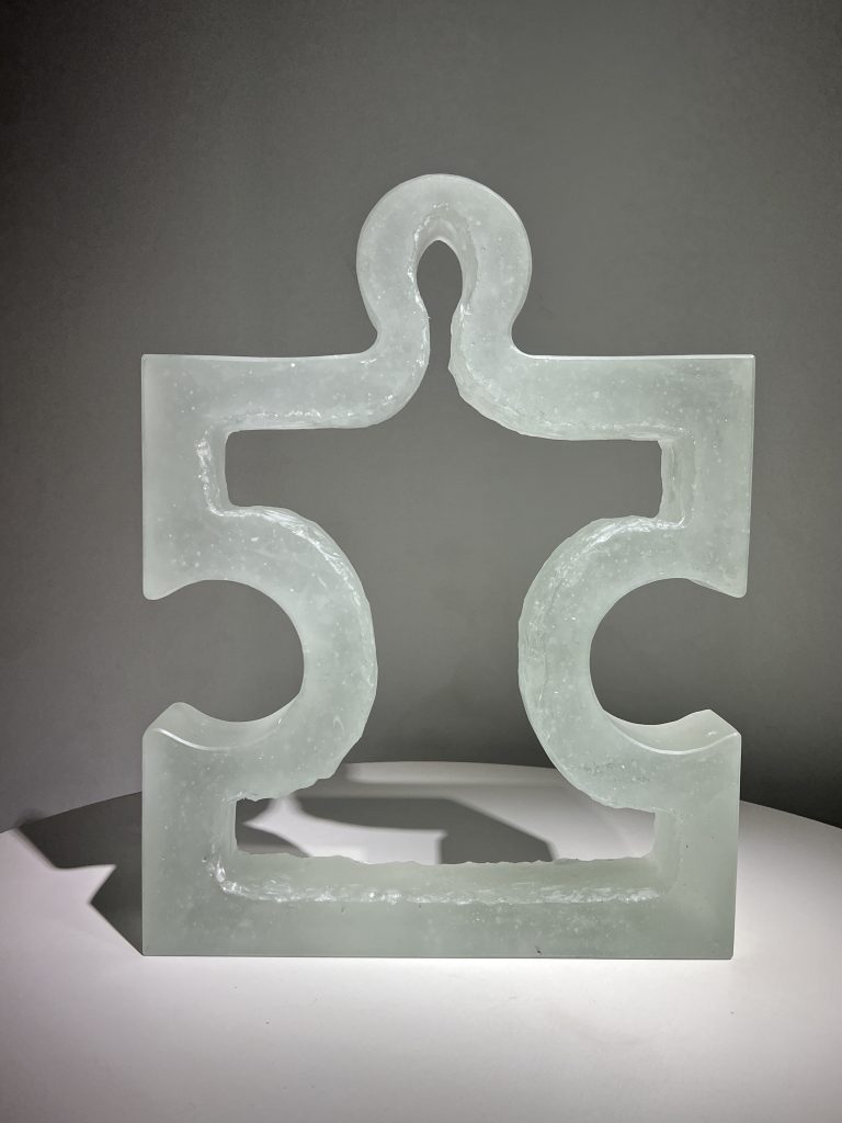
How large are the pieces?
The smallest is 8 ½” the largest is 13”
How are they sold? (the number of interlocking pieces)
They can be sold individually or in complete sets.
Comment on diverse ways the pieces can be displayed.
All the pieces are designed to connect with one another. You can assemble a collection in any way you want. These pieces can be mounted on the wall or attached to a stand and displayed on a table.
What and why are there restrictions on the size?
No restrictions on size, but the size I produce is small enough to display on a table but big enough to look good on a wall.
Trees of Life.
Comment on the size of these works.
The trees are 2 feet wide and 3 feet tall
How are the best ways of illuminating the pieces?
An overhead spotlight works well since it illuminates the leaves and creates a nice sparkle.
Comment on your pieces, ‘Nautilus’?
These are sculptures that are made in a glass blowing studio. I heat the glass until it is molten and then stretch and shape the glass into the Nautilus form. They’re called Nautili because they share a similar swirl to a nautilus’s shell.
What are you currently working on?
Recently, I have been working on a series I call infinity. This series uses layers of glass that have been cut and cold worked in different ways in order to create infinite patterns of light and color within the piece.
Where is your studio and do you share it with others?
The studio is located in San Diego and I share it with my step-dad and mom.
Contact:
Jacob Barfield
www.jacobbarfield.com
Deborah Blakeley, Melbourne, Australia
Interview by Deborah Blakeley March 2024
Images on this page are all rights reserved by Jacob Barfield
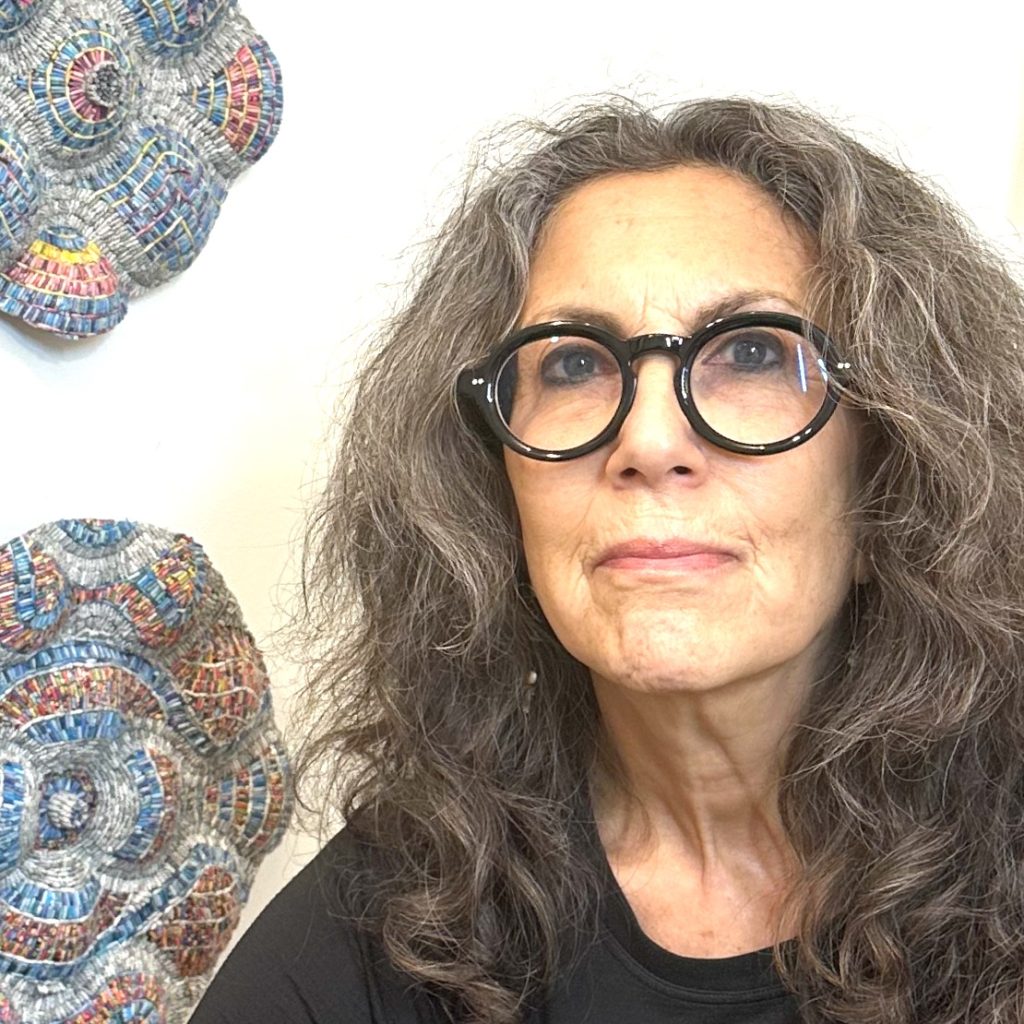
Jaynie Crimmins
Can you firstly, discuss the importance of the original text in all your pieces?
My source materials are integral to the conceptualization of a project/series. A project called Building a Blue Wall illustrates this very clearly. The Building a Blue Wall project began after the 2016 election in the US. The work is created from shredded non-profit and political solicitations, health care statements as well as magazine articles highlighting issues to protect our freedoms - this work was in support of social justice, women's health, civil rights for all, science, advocacy, and arts organizations.
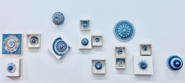
Building a Blue Wall 2016-2018
Are they always from the same source or are there pieces with a combination of sources?
My work is very personal to me, and I have been working on projects/series to express my ideas. Because each project is an expression of a specific narrative, if I am using multiple mailings and sources - they get mixed up and end up in the same work. A Field Guide to Getting Lost used one type of catalog [RH catalogs] and In Search of Beauty [pre-pandemic] used individual catalogs for each work. Currently I am using only New Yorker magazines - but not one issue per work.
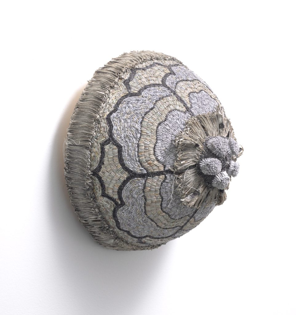
A field Guild to Getting Lost, 12” x 12” x 8” D, shredded RH catalogs, security envelopes, thread, over armature, mounted on wood, side view.
Take us back to your grandparents and how they have influenced your need to collect.
Examining my propensity for collecting leads me directly to my maternal grandparents, particularly my grandmother - the original recycler. Her reasons were not necessarily environmental. The need to save, collect and repurpose things was born from poverty. And that need immigrated to the US from parts of Eastern Europe.
My desire to collect and up-cycle materials originated with my observations of discarded clothing becoming crocheted rugs, old curtains becoming aprons and leftovers becoming the ingredients for new meals.
Nothing was wasted, everything possible was reused. Castoff items became novel and compelling in their potential for metamorphosis. Combining this sensibility with the shredding of junk mail illuminates the physical acts of deconstructing and repurposing.
Can you take us through the process you take from shredding to transformations?
Using a diamond-cut shredder, I shred catalogs, magazines, and security envelopes. Currently I am working with New Yorker Magazines and security envelopes. I manipulate the shreds in various ways - rolling, folding, and sewing. Rolling [which is the only technique I am using now] is done with my non-dominant [right] hand and then individual rolls are placed on a support one-by-one with a tweezer using my left hand, applying an archival adhesive called Lineco. It is a painstaking and meditative process. Steps to roll a shred
How do you decide on the balance and symmetry of each piece?
My work looks like it is following a sketch or plan, yet it grows organically. In my mind, I am planting a seed when I start my work in the center. From this "seed", the entire work takes form. I am interested in symmetry but do not really measure or layout the work prior to beginning - therefore I identify my work as applying approximate symmetry. While I am working, I sometimes sketch on the armature, and then I generally ignore what was drawn!
How important is the colour of the original printing in your work?
My palette is derived from the printed colors of the materials I am using. Prior to shredding the magazines or catalogs, I create separate piles of colors, much the same way painters organize their paint palette. I shred the colors individually, storing colors that are not part of the selected palette for that work. The various patterns, from the inside of security envelopes, are shredded as well.
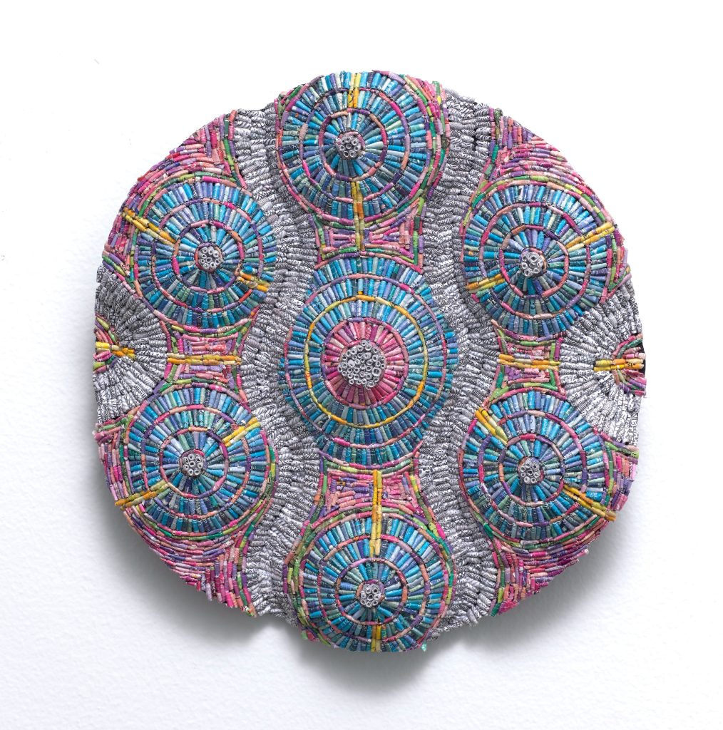 Equanimity #14 shredded New Yorker magazines and security envelopes over post consumer armature, 8 x 8 x 2.5D
Discuss the way you use different dimensions in your work?
The surfaces of my work are textural, and the work is generally installed as wall reliefs. Until someone called me a sculptor, I never thought of myself in that way. There has always been an element of projection in my works whether created by the materials themselves or the armatures used. For my current series, Equanimity, the armatures used are from fruit packing purple cardboard inserts. These surfaces have undulating convex/concave surfaces that represent the waves of my breath during mediation.
Comment on how single and multiple pieces as hung for sale.
I am very particular about the installation of my work in certain instances. I like to group them in various configurations, mixing large and small work, framed and unframed. I have also been very lucky to have worked with and continue to work with incredible, intelligent, and talented dealers and curators. In those instances, I am not involved at all in how the work is installed, leaving it to their discretion.
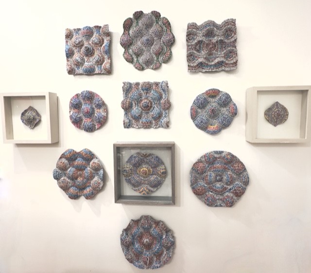
Equanimity, installed at The Clemente, NYC
When and how did you first produce this idea?
In 2009, when the US was experiencing a recession, I was reading many op ed columns by [former NY Times columnist] Bob Herbert. He wrote movingly about the terrible circumstances, [including losing employment, underwater mortgages, etc.] many people were experiencing at that time. While I was personally fortunate enough not to be adversely affected, the economic decline of average Americans was deeply troubling.
I began to shred my financial statements including bank statements, bills, and other financial documents. I used beeswax as a coating to entrap this deconstructed information as if in amber - to preserve for perpetuity. The projects were called: Home Economics and Borrowing from the Future. From these initial series, I began adding more source materials to express personal ideas and replace their messages with my own narratives. I also freed the shreds from the wax, allowing the newly introduced materials, with color, to be exposed.
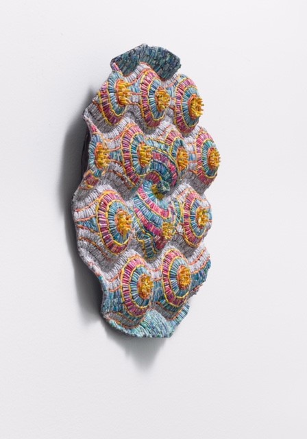
Equanimity #10 shredded New Yorker magazines and security envelopes over post consumer armature, 12 x12 x 1.5D
Comment on how your understanding, of paper art, has changed since you began. – (Seen as art not a craft.)
As the definition of fine art has shifted and morphed, paper arts have been re-categorized and celebrated as fine art. This evolution is inspired by the increased recognition of the technical skill, artistic vision, and conceptual depth inherent in paper arts. Paper artists have expanded the possibilities of the medium using found, manufactured and handmade paper - all in the service of creating meaningful and elevated art objects.
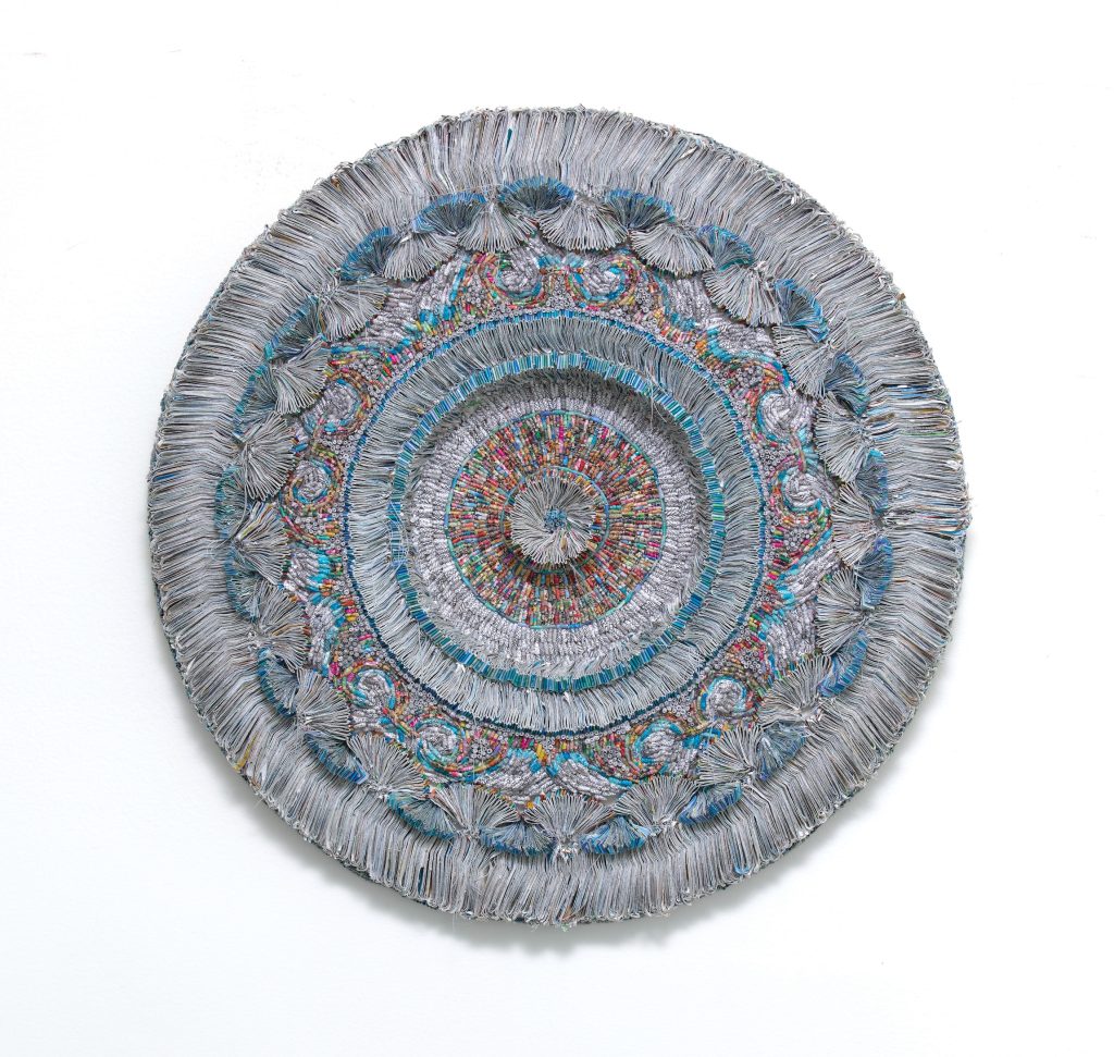 In Search of Beauty #11
Tell us about your up coming exhibition, ‘With Every Fibre.’
I am excited to participate in the group show With Ever Fiber at Greenwich Academy's Luchsinger Gallery in Greenwich, CT. It is the first time I am exhibiting at a private day school and am looking forward to having my work introduced to a new audience and interacting with the students. The work included in this show is from my In Search of Beauty series which incorporates sewing.
The curator Kristen Erikson states: "The works in this exhibition largely transcend artistic categories, instead fusing elements of weaving, sewing, painting, sculpting, and mathematics into three-dimensional sculptural forms. Found materials mingle with natural and synthetic. dyes and fibers. Patterns are developed, repeated, and distorted, sometimes evoking recognizable forms like fossils, archeological fragments, maps, or constellations."
Are you ever given commissions along with boxes of related papers?
I am working on a commission now and have had prior commissions but only one in which I was given specific shredded documents to work with. It was a birthday gift for a collector's sister. The shreds were financial papers from their [deceased] mother, that, to the client, represented their single mother's strength and independence.
How did Covid effect your art practice?
Covid had a huge effect on my art practice. For one thing, I started a meditation practice which influenced my work [and will be discussed later on]. One of the reasons for beginning to meditate was that I live around the corner from Lenox Hill Hospital in Manhattan. During the pandemic, there were refrigerator trucks parked around the corner from my apartment to house the overflow of Covid victims' bodies. It was extremely upsetting, I would say traumatic, especially since there was a segment of the US population that was denying the pandemic was real. I needed to calm down.
Also, my pre-pandemic studios, were in a neighborhood accessible to me by train in Brooklyn, NY called Bushwick. It is a thriving artist community, and I met many friends there. When it was clear we were going into lockdown, I brought enough supplies home with me for about a week or two. I do not own a car, and at the time, public transportation was being used mostly by essential workers. After several months, the realization that the pandemic was extremely serious and dangerous, I decided to move my studio into Manhattan to a neighborhood that I could walk to from my apartment - East Harlem. At first, I felt displaced, but eventually I began to build a new community of artists scattered around that part of the city.
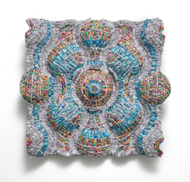
Equanimity #3 10” x 12” x 1”D, shredded New Yorker magazines and security envelopes over post consumer armature.
You have also exhibited beyond the US – comment on one experience.
A friend had recommended my work for the Sharjah Biennial Arts Festival in the United Arab Emirates. I submitted images and a statement based on their theme and the work was accepted into the exhibition! It was an incredible experience. I met artists from all over the world and was so honored to be shown with creatives of that high caliber. The Biennial staff was amazing - organizing trips, meals, everything. Each artist was given a space in which to install their work at several venues - indoors and outdoors. The experience was truly transformative.
Comment on how you combine meditation and creativity, in your art.
I began to practice meditation during the pandemic - focusing on the breath and specific phrases. Meditating during uncertain times helped me to remain present and try to find some balance in my life. The definition of equanimity is: mental calmness, composure, and evenness of temper, especially in a difficult situation.
In addition to meditation, creating can also be a meditative process. Working with my materials enables me to connect with the present moment and immerse myself in the creative process.
Equanimity, as a body of work, embraces the notion that the waves in each piece embody my breath and state of mind, while the use of New Yorker magazines aims to capture both the struggles and joys that challenge me to keep a calm state of mind.
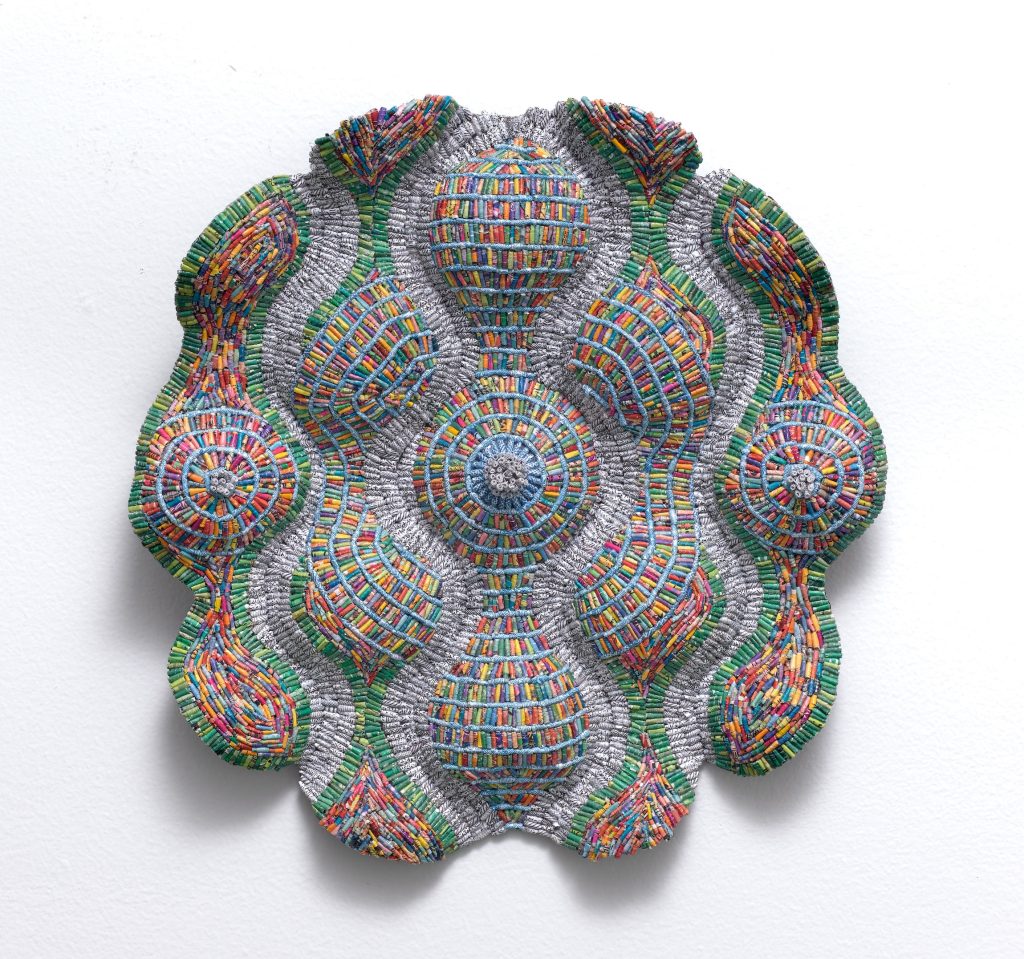 Equanimity #5, 2021, shredded New Yorker magazine images, security envelopes over up-cycled armature, 12 x12 x1.5 D.
Contacts:
Jaynie Crimmins
Interview by Deborah Blakeley, February, 2024
Images on this page are all rights reserved by Jaynie Crimmins
Sherry Czekus
What led you to paint everyday life?
Photographing the liveliness of city life and crowds of people is what led to my interest in painting everyday life. Figurative painting has always been a draw for me but not in a portraiture sense. The city crowd, in its simultaneous specificity and anonymity, became the subject matter of a kind of figurative painting that did not focus on individual identity. The crowd itself has become the single entity. Observational paintings of the everyday have generated fresh perspectives as I record the crowd and its progressive changes over time, particularly in fashion and electronic technology.
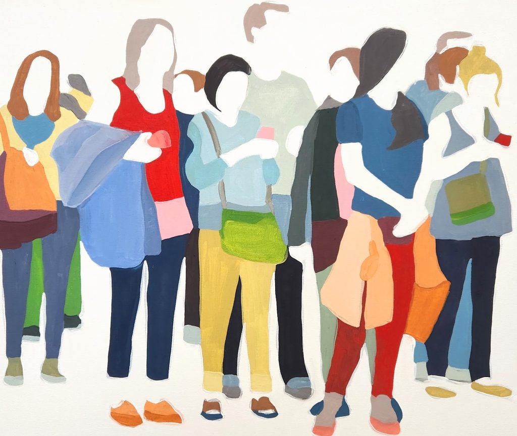 ‘A Peculiar Thing Happened’ 20 x 24cm
Comment on physical crowds and how they been affected by Covid?
The most startling effect of Covid-19 was in the early days of the pandemic as safety measures were put in place globally, the urban crowd disappeared from the public domain. My paintings are depictions of people walking along the sidewalks and public walkways in the city and people were ordered to stay indoors except in necessary situations. As an artist, I was not one of the mandated types of workers who could work in this manner and even if I was, there was no one to photograph in my surroundings. Since the mandates have been dropped, my most recent excursions to capture the crowd have yielded very different results than the pre-pandemic urban scene. The crowds are fewer, less dense than before Covid-19.
Discuss one painting and how you have read the body language involved?
The body language in ‘On The Platform’ indicates the relationship between those in close proximity to each other while some are disconnected from the crowd engaged with their cellphone activity or simply watching for the next train.
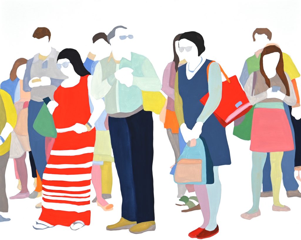 ‘On The Platform’ 60 x 48cm
I find the consistency in the distance each person stands apart from one another of interest. If people took the opportunity to acknowledge one another or start a conversation, they would be close enough to do so. And yet there is no obligation to do so. There seems to be a kind of order in establishing an area of personal space and social norms that’s unspoken yet understood as a public crowd participant.
Why are there no actual faces in your work?
The paintings aim to reveal the identity of the crowd as a whole rather than expose the identity of the individual. The lack of faces in the figures is a move to place the emphasis on the gesture of the bodies and how they interact together in social spaces and situations. I photograph the people in the crowds and its my way of protecting their privacy as the project intends to illustrate a social portrait of urban society. The gestures emerging in the group reveal something about all of us and the community develops an evolution of social behaviours by seeing each other and being seen publicly.
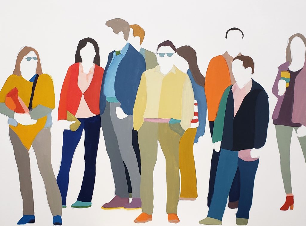 ‘Church and Wellington’ 36 x 48
Including faces in the paintings I fear would shift the focus to personal identity of the crowd members and would make the paintings less about gesture and the crowd as a whole.
Movement is shown in ‘City Life Study’, discuss.
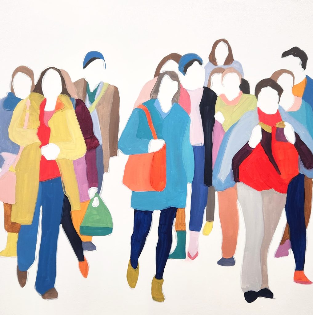
‘City Life Study’ #3, 24 x 24cm
The movement in ‘City Life Study’ is an illustration of the urban environmental structure and flow or rhythm of movement that the crowd walks within while walking on the sidewalks or crossing the street. The everyday experience of walking from one place to another is a public social happening in the downtown area of any large city. It could be running an errand on a lunch break or walking from public transit to a work space. To be swept up in the movement is energizing. The gesture and position of the feet of the figures in the paintings carries the feeling of the motion though the baseline of the canvas. The viewer is invited to experience the sense of being part of the crowd as it moves towards them or following the figures in front of them.
Comment on colour and your paintings.
Once I have chosen the composition to paint from the photographs I have recorded, the colours in the painting are determined as the painting develops. I choose a few colours to begin with and create a puzzle to be worked out compositionally through form and colour. The colour balance is intended to guide the viewer through the painting. The colour pathways are developed throughout the painting, placing lights and darks and specific shades strategically that make up the forms of the figures. You may notice chartreuse green appears in a linear pattern through the centre of the painting. It may be half of a shirt, a belt, one side of a bag, a bracelet and a jacket folded over an arm. Its meant to guide the viewer through the painting, to bring attention to the details of the figures. Red may be a tall boot, the top of a cell phone, one side of a collar or a scarf. Red can be lightened to pink with an added tinge of orange and placed beside the red to create a sense of volume in a bag, for example. The colour forms are flat and painted in a hardedge format in order to create a shallow space for the crowd to exist.
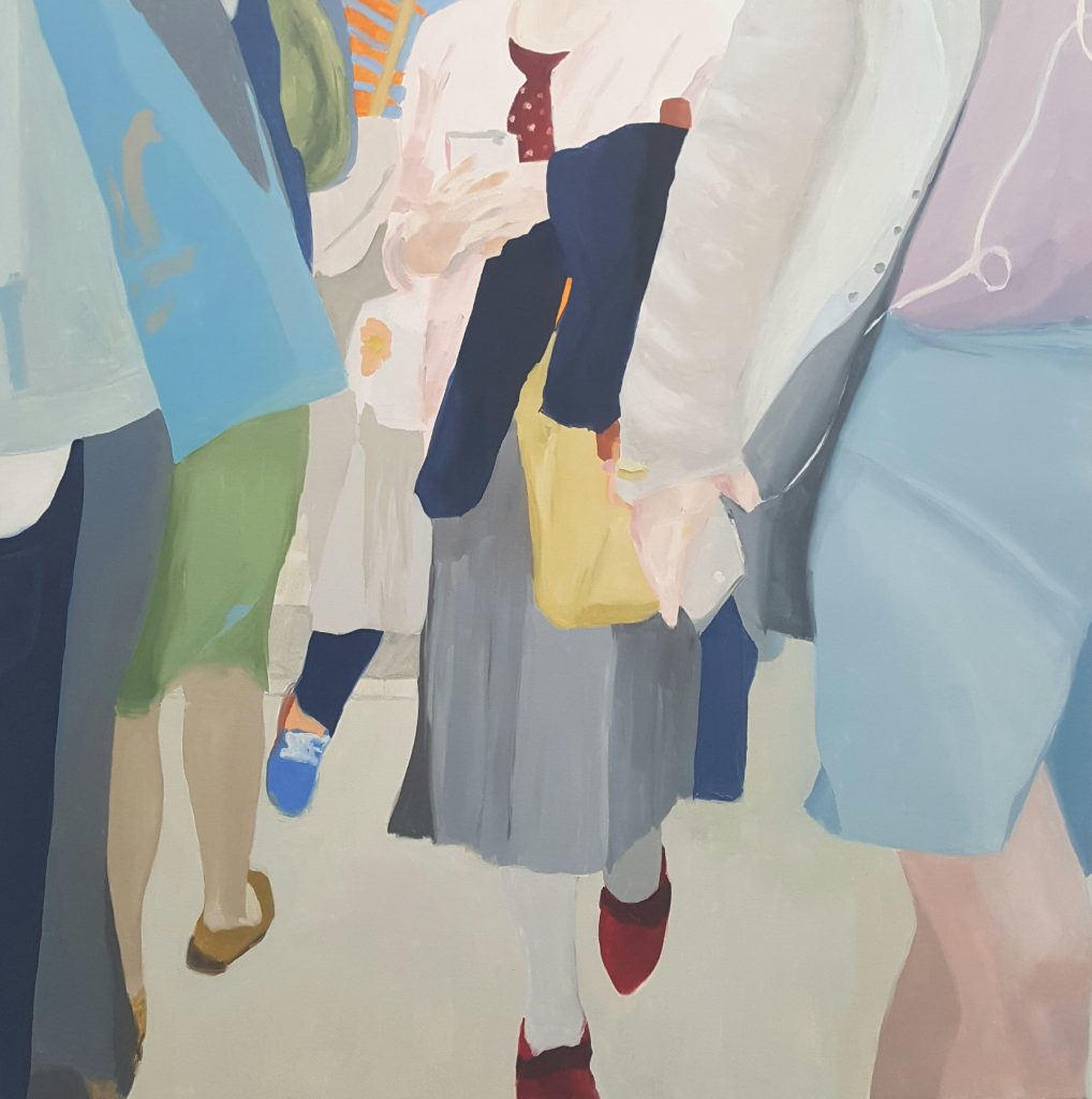
‘Crossing With The Light’ 48 x 48cm
Colour and colour theory are aspects of the paintings that I hope helps the viewer engage with the paintings as a way to look at ourselves and how we all are part of public engagement.
How is clothing so revealing in so many ways?
Clothing hints at various aspects in the urban crowd. The details of fashion can indicate the timeframe of the image when particular fashions in clothing and accessories have its moment and carry through to pair with new fashions. Short jackets with large lapels and tall boots with high heels or low heels paired with leggings or wide leg pants have all made an appearance recently. I’m not a fashionista but I do record these aspects. The public social sphere is an environment that influences fashion trends as people are present to see one another and to be seen, like the flaneur and flaneuse. Clothing can reveal cultural influences in terms of fashion trends and colours. The way one dresses can indicate a person’s type of employment or leisure activity. Wearing clothing publicly is a form of expression and communication that reveals visual clues about us individually and collectively as a community.
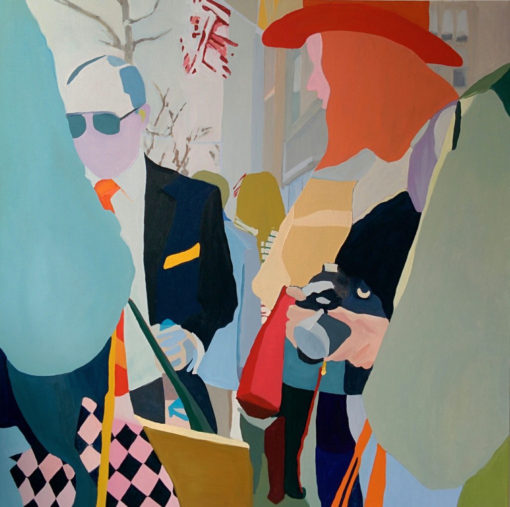 ‘Lexington Ave’ 60 x 60cm
In ‘Acquaintances’ the title makes us look more closely.
I titled the painting ‘Acquaintances’ as its difficult to determine the exact nature of the relationship of the figures in the painting.
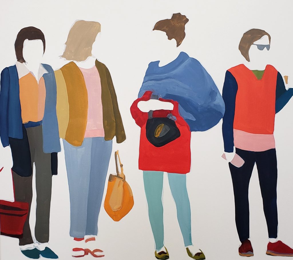 ‘Aquaintances’ 36 x 40cm
Painting, as an act, is a pathway to knowledge and understanding about the subject and environment I am painting. It’s a slow and cumbersome process to paint something. The brush as a tool is not precise and the viscosity of the paint on the brush requires some negotiation between how long can you paint without reloading the brush and how accurately can you put down the mark you intend with the paint you have loaded on the brush. Mixing the paint colours falls in line here too. These are painters’ problems to work out. But the process of painting is a learning process. Every aspect of the image painted has been deliberately done so by the painter and so every aspect of the image is considered. I had a long time to study the figures in the image, thinking about their relationship to one another and this is what drew me to choosing the image for the painting. I could study the engagement between these people. I believe the painting poses more questions than provides answers. The engagement is friendly, but are the two central figures acting cordial to one another having never met? Is someone asking for directions? Or are they friends taking advantage of a stop light to have a deeper conversation? Do the others listen in on the conversation, particularly the female on the right? I’m not sure. The moment seems synchronous and fleeting and regardless of their relationship to each other, the connection of the moment was what drew me to paint it.
In your ‘Canadian Series’ you zoom in on the subjects. How do you make the discussion?
 ‘Canadians’ #3 24 x 24cm
The ‘Canadians Series’ is a series of abstract paintings that zoom in on the figures in the scene. The emphasis is not on the figure and relationships but instead a more formal approach to developing a series of paintings. Forms, patterns and colour tend to dominate the canvases in these paintings. The compositions are square, neither portrait or landscape and look at areas of clothing with intriguing patterns, bags with shiny accessories and the less obvious intersections of the figures in the crowd.
 ‘Canadians’ #2, 24 x 24cm
Compositionally, I’m searching for balance in form and colour and problem solving that directly on the canvas. There is space to explore volume in the forms in these paintings with very thin paint brushed over the flat colour blocked forms. The images are from photographs taken in Canada and titling the series ‘Canadians’ allowed a clue that these abstract works are figurative.
‘In Line’ comment on how your images are like looking at a cross section rather than the whole?
The cross-section view in ‘In Line’ is a cropped digital photographic image of a line of pedestrians gathering at a red light and waiting for the signal to cross the street.

‘In Line’ digital image
The image crops the middle section of all the figures in a horizontal line. The centre of the action seems to be happening at this point. Bodies are turned, some are front facing, holding bags and purses, arms crossed and dangling. The gesture of the body is evident in the positioning of the legs. The viewer can get a sense of who these people are collectively without revealing the upper and lower portion of the body and I found this to be a compelling discovery. The forms that make up the colour of the clothing and accessories provide the flow and rhythm though the image. We can focus our attention the mass movement resembling a line dance rather than the identities of all of those who make up the scene. I think we can try to imagine ourselves as part of the crowd.
Contacts:
Sherry Czekus
sherryczekus.com
Sherry Czekus, Waterloo,ON, Canada
Interview by Deborah Blakeley, February, 2024
Images on this page are all rights reserved by Sherry Czekus