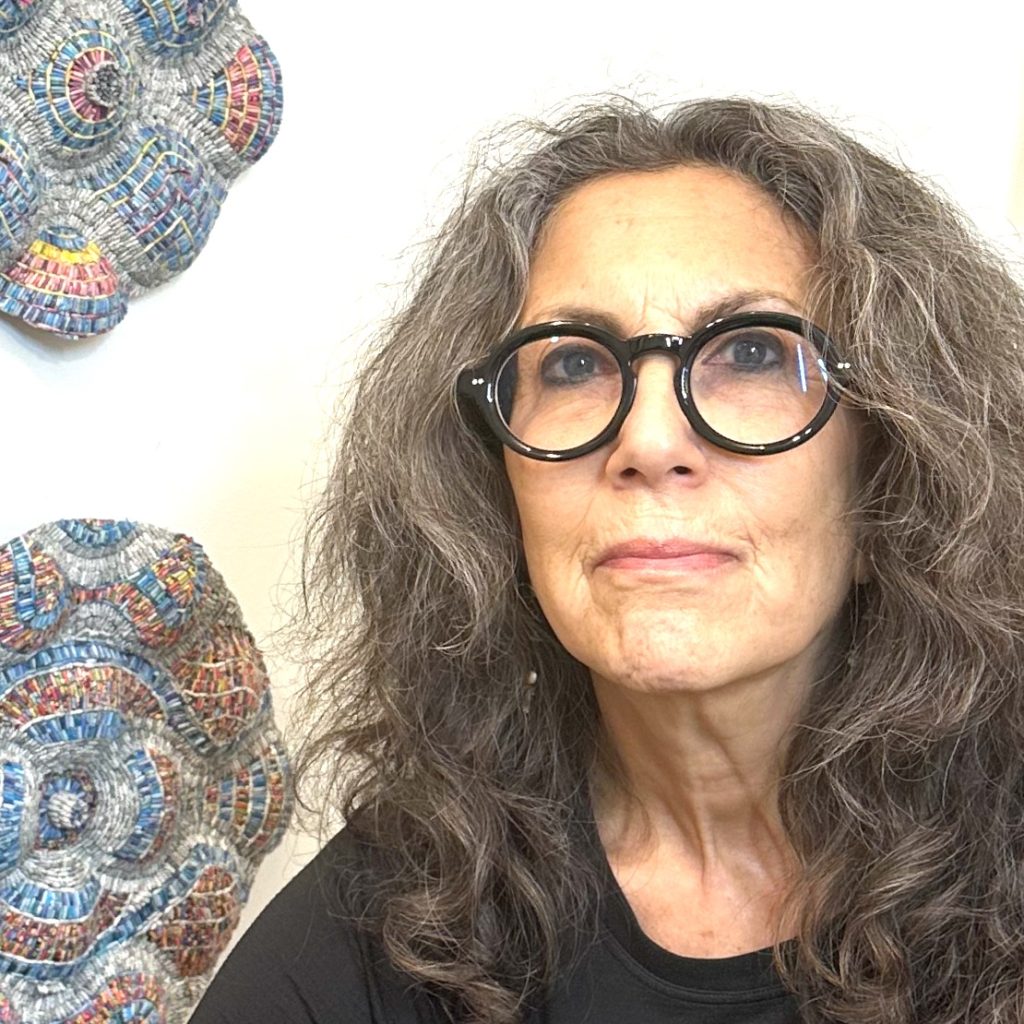
Amy Genser Paper Artist - Connecticut, USA.
‘The sources of my work are textures, patterns, and grids.’ discuss your statement in relationship to your work.
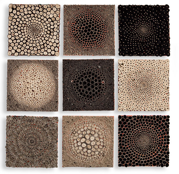
I love order and some form of hierarchy in artwork. Perhaps it from my work as a Graphic Designer. There has to be some underlying uniformity for a piece to work. In the case of my work, it is usually the material of the paper, and shape of the circles.
You look deeply into nature for your inspiration, beehives, barnacles, views from above and below. Discuss.
It is perfectly imperfect. I love all kinds of organic processes. They are visually intriguing and engaging. We spend a lot of our summers on the beach in Rhode Island. I love watching the water, the rocks, and the light. Our beach has rocks with these really neat barnacles and seaweed. Their colours are always changing. Sometimes there’s a lot of it, and sometimes just a little. It’s neat to watch the progression. One day when the seaweed was purple, brown, yellow and green, my husband made the awesome observation that nature never clashes. I love that.
Briefly explain the technique of your paper construction.
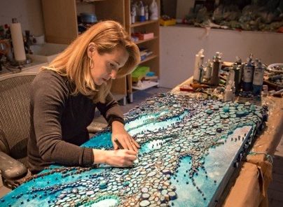
Pieces are cut or torn into about 12-inch strips of varying widths and then stacked with other colours from my stash of multi-coloured papers. I then roll them in a long tube to provide contrast and visual interest within each roll. I combine colours, treating the paper as pigment. The rolls are then sealed and cut into varying sizes for placement.
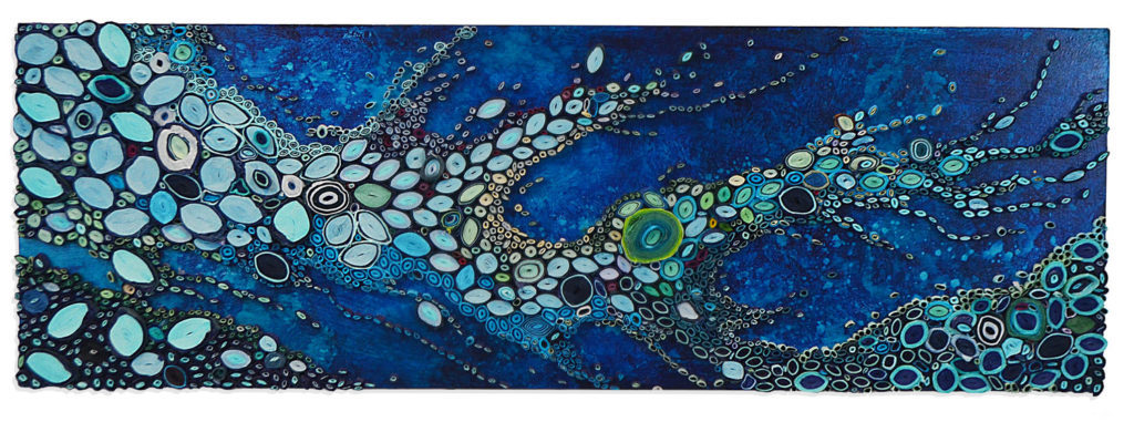
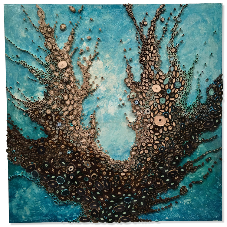 Big Celadon Roots, 30″x 30″x 1.5″
How did you become involved with paper?
I found my way to my medium while studying for my MFA at RISD. My plan was to become a graphic design professor, but I took a detour after taking a paper-making class. After graduation, I kept playing around with paper and making all kinds of sculptural forms. I wasn’t able to make my own paper anymore, but found lots of options available from all over the world. When I discovered the layered, circular form, I loved how I could use this one simple module to create worlds of compositions.
Where did you do your training and how well did it prepare you?
I trained as a graphic designer at the Rhode Island School of Design. It helped me to have a critical eye, how to talk about my work, and how to push myself beyond my comfort level. I was taught to take risks with my work.
Are you able to work on very large pieces or does your studio restrict you to size or are there other restrictions?
The largest piece I am able to construct in my studio is about 5′ x 6′. Other than that, I either work in my living room, or rent studio space. When I was working on a 15’h x 10’h commission for the Nemours DuPont Hospital for Children in Wilmington, DE, I built the piece in a rented studio for 6 months. Even with that piece, it had to be constructed in panels. It was essentially a giant jigsaw puzzle that came together on my studio floor in Connecticut, then adhered to the wall in Delaware.
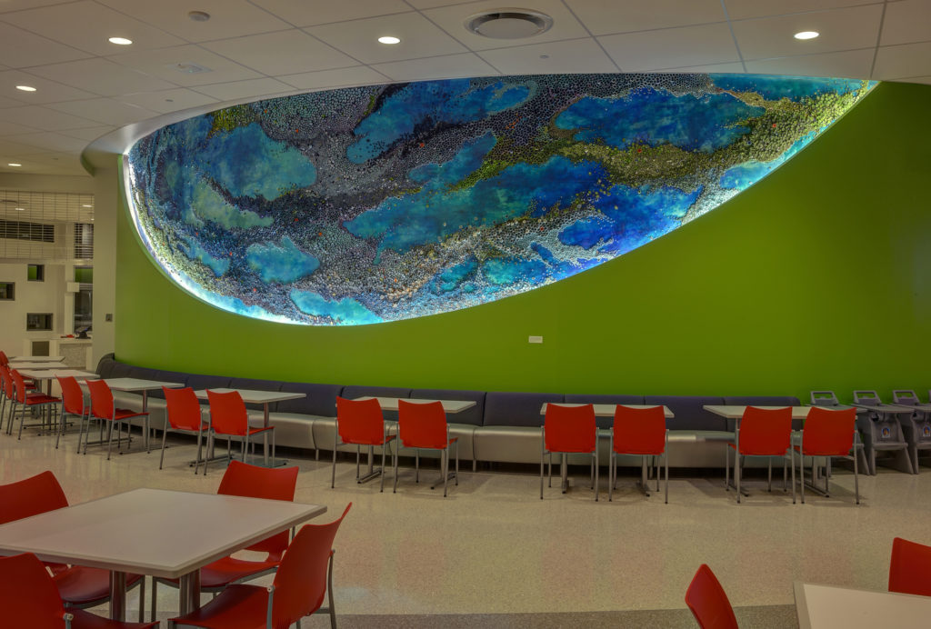 Flow, Nemours Du Pont Children’s Hopital, 45′ x 10′
How high can you build up the layers in your work?
I can build them up to about 12′. However, I am interested in doing more sculptural work that transcends the limitations of a flat substrate.
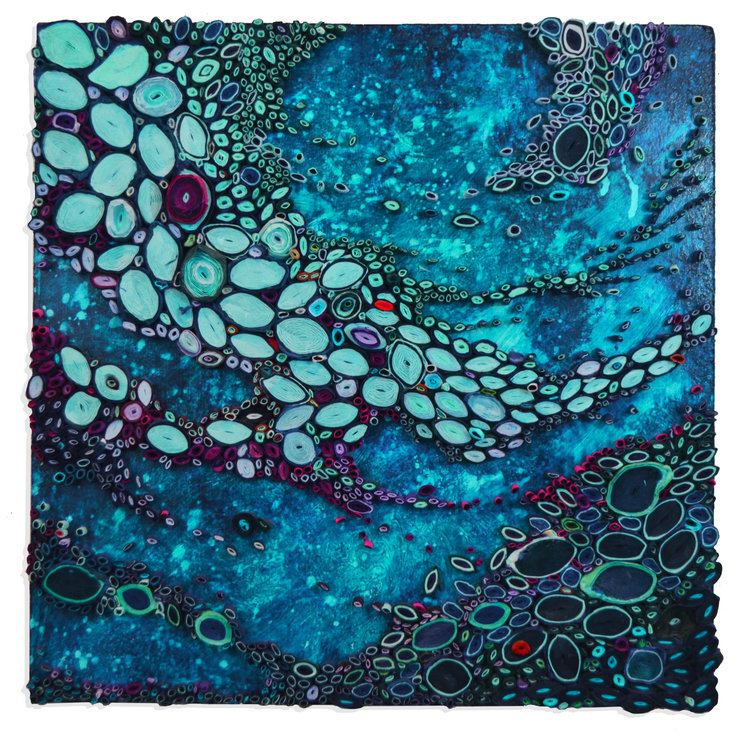
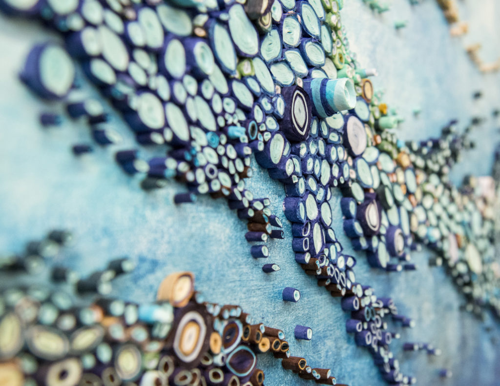 Blue – Detail
Do you have recommendations for the preservation of your very fragile work?
The work is not as fragile as one might think. I layer the paper with several layers of varnish. This protects the paper from fading. It also hardens the paper into a solid. It is then easy to clean. The pieces are very strongly attached to their surface. Some of the pieces (usually the ones built on Masonite board) are framed. I use conservation glass on the frames to provide further protection.
 Lochness Landslide, 12″ x 36″x 2″, Paper and Acrylic on Masonite Board
Colour is very important in our work how do you achieve the colour?
Colour is definitely a main character in my work. It can illicit so many emotions. It can be vibrant or quiet. I will never get bored of playing with colour. Endless possibilities.
Can you expand on the tiniest additions of colour that you use to complete a piece? (a tiny bit of orange)
I always like there to be some kind of surprise in my work. This pop of unexpected colour usually does the trick. I want a viewer to keep searching the paper for many different colours stuck in the piece.
 Tanzanite Ruby, 18″ x 18″x 2″, Paper and Acrylic on Masonite Board
What type of paper / papers do you use?
I primarily use dyed Mulberry paper. I also use a lot of Japanese rice papers. I have papers from all over the world.
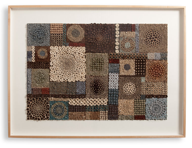
Titles are very personal but also very provoking. Which comes first the title or the work?
The work comes first. The final piece inspires the title. Sometimes my family helps me name my work.
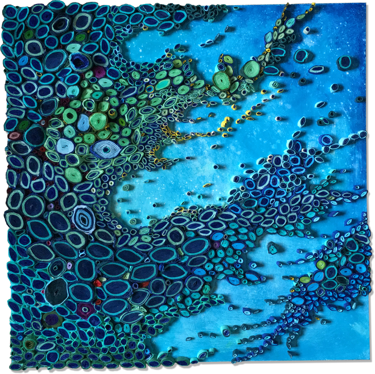
Aqua Moon Series, 20″x 20″x 3″
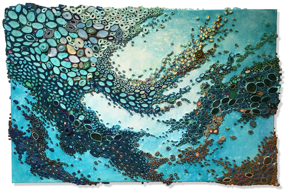
Many of your most recent works are aquatic – discuss?
My favourite place in the world is next to the ocean. It is where I am at ease. I think the different colours of water are spectacular. I love the palette of the beach. It just feels good.
You are currently exhibition at Bergdorf Goodman. Expand in the importance of being within this prestigious space.
It was exciting to show at Bergdorf Goodman. They have an international clientele. Some of the work ended up travelling to other countries to their new homes. As one of the salespeople said to me, “shoppers always come to Bergdorf Goodman either first or last on their trips. They always come. We have the best stuff”.
 South Beach Sweep, 18″ x 18″x 2″, Paper and Acrylic on Masonite Board
Can you take us through a quick progression of your work since before 2009 to 2016 using 5 of your favourite or works that have propelled your career?
The work is constantly evolving. I started out doing neutral, graphic work, such as “Black and White Squares” 2009.
Black and White Squares, 18″x 18″x 1″
I was able to work with contrast and shape with these pieces. “Waterfall” 2009 was the first piece that set me off in my continuing aquatic themed work. Looking back, I can see that there are lots of spaces between the circles (I like them nice and condensed now). It also doesn’t have the same level of size contrast of the papers. Also, it’s more uniform colour-wise. Not as much variation with lights and darks. “I Pledge My Allegiance to the Circle” 2011 was an interesting piece for me.
‘I Pledge My Allegiance to the Circle’ 2011
I was work became much more organic. I was also working with a lot of intense, vibrant colour. In 2012, “Float” was received with a lot of praise. It was this piece that really set off my aquatic work. It’s my favourite colours. I always default to the aquatic turquoise colours. The most difficult challenge I’ve had work-wise was the installation “Flow”, 2014 at the Nemours DuPont Children’s Hospital. It was much larger than anything I’d ever created. I had to figure out how to fabricate the work structurally, and how to make my teeny tiny paper pieces make a statement over that large space. It was pretty amazing to see it installed.
How do you feel paper art has developed within the art world over these years?
Paper art has definitely gained popularity as an art form. There have been paper shows all over the world. There are also several new publications featuring paper arts. However, I have not seen any work that is similar to mine. I am greatly inspired by the work of contemporary paper artists.
 Pause, 24″x 36″x 3″, Paper and acrylic on canvas
Contact details
Amy Genser
www.amygenser.com
amy@amygenser.com
Amy Genser, Connecticut, USA
Interview by Deborah Blakeley, December, 2016
Think a colleague or friend could benefit from this interview?
Knowledge is one of the biggest assets in any business. So why not forward this on to your friends and colleagues so they too can start taking advantage of the insightful information the artist has given?
Other artists you may be interested in: