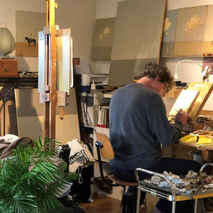
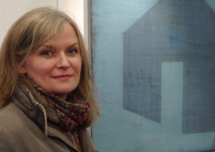
Susan Laughton Painter - Cheshire, UK
Line is an important part of your work discuss?
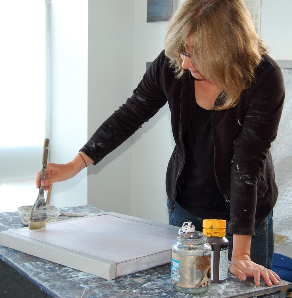
Drawing has always been an important form of expression to me, whether artistically, technically or practically. It helps me to think and organise my thoughts in the form of conscious decision making or more subconscious sketching. Line in particular is important because it can be used in so many ways, such as to define spaces, edges, divisions and movement. Lines in my sketchbook are made with fine propelling pencils because I like the sense of precision and delicacy. In my paintings they are made with a sharp etching point which cuts into the plaster giving a fine and precise line. In contrast to this controlled approach I also use sand paper on the surface of the plaster to create more random marks and lines.
Can you compare two works rural / urban?
Technique:
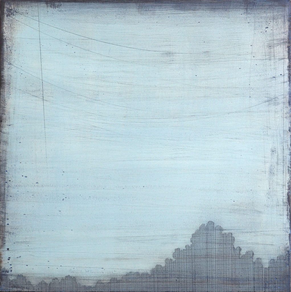
Urban: Late Evening
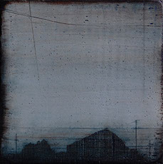
Late Evening, 20 x 20 cm, Acrylic & Plaster on Board
I apply a very thin layer of white plaster onto board (or sometimes onto canvas stretched over board) and, when dry, sand it. This smooths the surface but also adds marks and lines from the sandpaper. Next I apply a fairly thick layer of acrylic – this forms the base colour of the painting. I then etch in the drawn, linear aspects of the painting before sanding it again. Many layers/washes of thin acrylic are applied which adhere differently to the first layer of acrylic or any exposed plaster, which is much more absorbent. I may then respond to the effects of this with more drawn lines or sanding.
Rural:
Stillness III
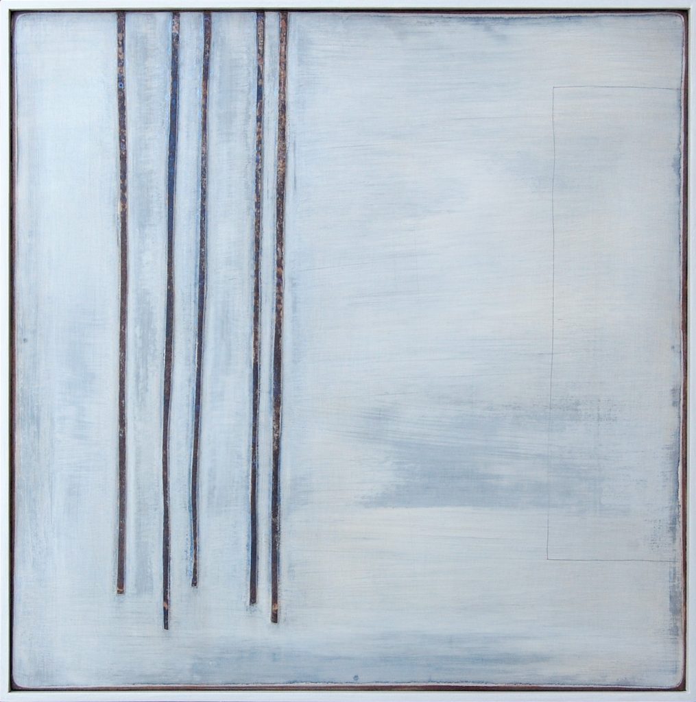
Stillness III, 41 x41 cm
For this series of paintings I took a different approach. Rather than etching lines into plaster, the lines of trees are created using strips of card. The lines stand proud of the surface, rather than being cut into it. The surface is white gesso (again sanded!) and washes of acrylic.
Colour:
Urban: The sky here has a certain ‘smogginess’ about it. There is the turquoise of dusk, behind a dirtier grey blue but also streaks of orange/brown that are more gritty than a picturesque sunset.
Rural: The influence of a cloudy white Northern sky is never far away in my paintings. The white gesso is washed with subtle layers of blues and greys and the card stained the deep rust browns of tree bark.
Composition:
Urban: I find the outlines of rooftops and the inevitable wires and telegraph poles of an urban/suburban skyline particularly captivating at dusk. The dark forms highlighted against an almost dark sky have a poetic sense of unseen activity. The forms are simplified, and more often than not imagined, compilations of many different observations.
Rural: Although the nearby woodland that inspired this painting is densely packed with slender trees I wanted to represent just a few and to accentuate there slenderness against the sky behind. Composition is about balance and sense of what feels ‘right’ to me. There is a fine pencil line on the right of the painting which I think was a purely abstract, subconscious addition to contrast the heavier weight of the trees on the left.
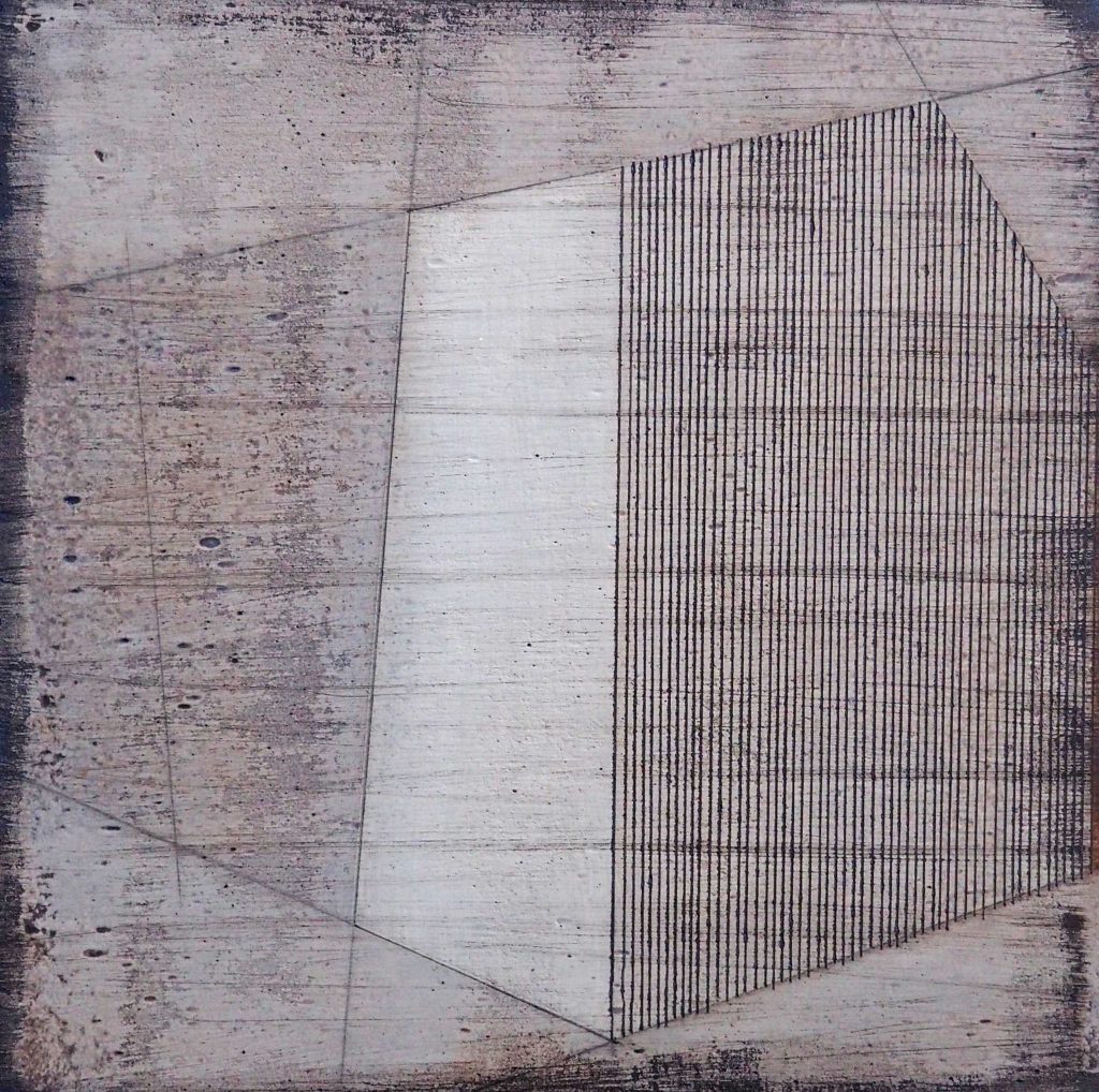
Expand on the importance of manmade architectural objects in your work?
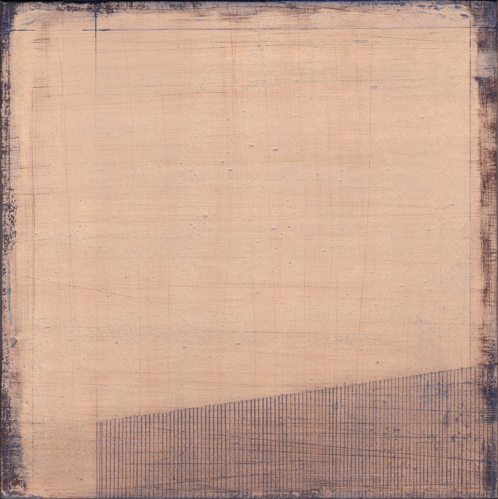
Man made constructions impose their presence on the natural landscape, particularly the sky: telegraph poles, isolated buildings, roof tops, fences and power lines all attract my attention. These structures create tension within space and mark the passage of time and distance when travelling. These linear, graphic elements can be used in an abstract way to ‘construct’ a painting.
Celadon Sky II, 30 x30cm, Acrylic & Plaster on board
You formally worked in architecture discuss how this has influenced your fine art career?
I was an Architectural Technician for twelve years, producing technical drawings and specifications for many types of buildings. It required attention to detail and an ability to organise lots of complex information into logical and accurate drawn instructions. I think this need to simplify and remove the superfluous has influenced my reductive approach to painting and drawing. There is also often a repetitive aspect to a lot of buildings, years of drawing repeated parallel lines has definitely influenced my work!
Lament, 20 x 20cm, Acrylic on Plaster Board
Discuss your work in relationship to your exhibition – Travelling Light
Title :Travelling Light – The landscape is my starting point, not a vision of landscape as a scenic or static view, but as a space travelled through and experienced. I think things I see whilst on the move are still my main inspiration, quite often when on the motorway, so not usually picturesque or romantic to most people, but I love the constantly changing conjunction of urban, industrial, rural and suburban you get from this travelling viewpoint. I particularly like evening light when there can be a stillness as well, a sense of thoughtfulness, even when on the move, so I wanted a title that conveyed that, hopefully in a poetic way.
Gallery: Quercus Gallery is based in an old Georgian building in the centre of historic Bath. The ground floor of the gallery has lots of natural light and a lovely contemporary but homely feel. The lower ground floor is a small intimate space.
Duration – the exhibition ran for a month.
Colour: most of the paintings have a subtle colour palette of whites, blues, browns and greys with a few having stronger turquoise hues, one painting ‘Elevated’ is metallic gold – a colour which is I hope to work with more in the future.
Size: the work ranges in size from 20x20cm up to 80x80cm
Presentation: the curation and hanging of the show was done entirely by the gallery Director Evie Williams and I was delighted by the way the paintings had been hung in relation to the space and to each other.
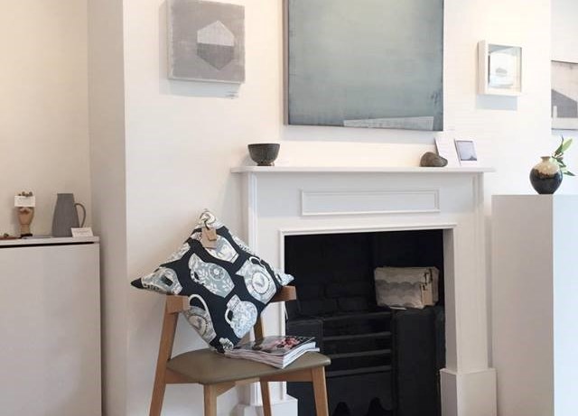
Image by, Director Evie Williams
Expand on the importance of manmade architectural objects in your work?
Although I take photographs I use them in quite a loose and interchangeable way, often combining several references in one painting. This painting ‘Sea Wall’ was influenced by several photographs, one of the huge granite walls on the harbour wall and others of Staithes village itself.
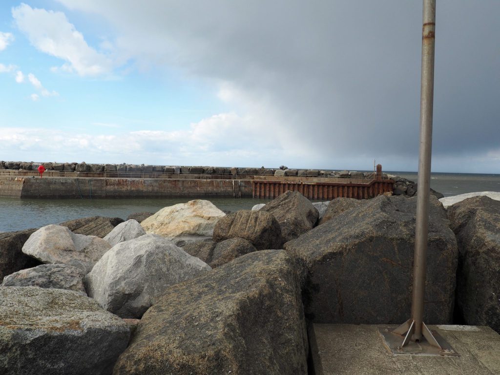
I made a quick sketch of the boulder shapes but also wanted to include the white washed gable walls of the houses that also protect the inhabitants from the sea. The process is part analytical, part spontaneous.
Sea Wall
Discuss your drawings ‘Winter Journey I – IV
A set of drawings I made a few years ago from dried leaves and seedbeds collected on a winter walk. I wanted to get back to observational, representational drawing and capture the details of the plant forms.
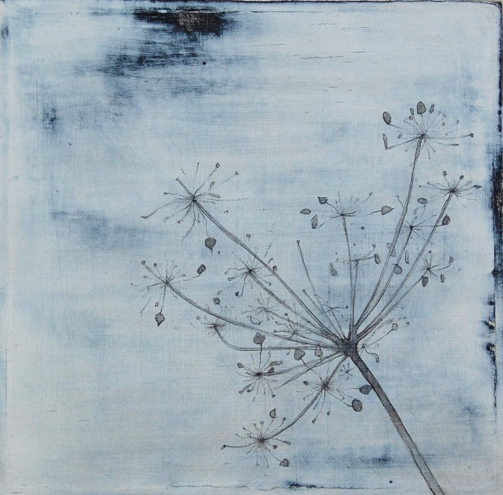
Winter Journey I, 20 x20 cm, Pencil, Acrylic & Gesso, on Board
I was also interested in the abstract placing of the shapes within the square format. I think my intention was for them to be quite stark and minimal, but I seem to have some strong need to always sand the work to introduce a feeling of wear and tear, which connects all my work at the moment.
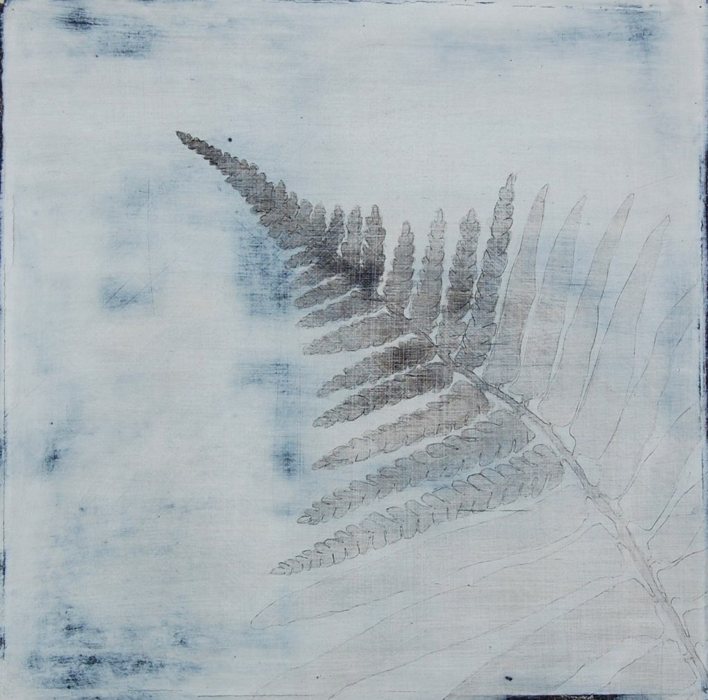
Winter Journey IV, 20 x20 cm, Pencil, Acrylic & Gesso, on Board
‘Storm Warning’ discuss the use of colour in this painting.
This painting is uncharacteristic of most of my work in the use of strong burnt orange, in contrast with heavy metallic grey. For me it is a way of representing the more intense colours of the sky without them becoming too romantic or ‘pretty’, to capture a sense of foreboding that an approaching storm can bring.
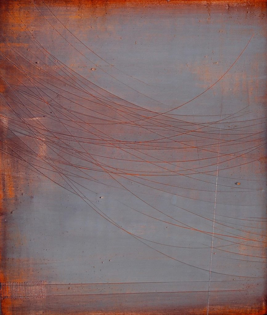
Storm Warning
Comment on the importance of having a working relationship and exhibiting in the Royal West of England Academy to a private gallery.
I was delighted to have my work ‘Setting out’ accepted for the Drawn exhibition at the RWA. The setting is grand and traditional and much bigger than a private gallery. As an old established institution it has a history and prestige that a small, private gallery may not be perceived as having. The work is selected and curated by a group of elected Academicians, mostly established artists, whereas a private gallery may well be curated by one person – the gallery owner. Both are important ways of showing work for an artist. At the RWA work was selected to meet the exhibitions criteria: “It aims to raise the profile of drawing, exploring it as both an autonomous discipline and an interdisciplinary tool. The exhibition pushes the parameters of drawing by exploring the parallel language of multiple disciplines.”
Contact details:
www.susanlaughton.com
Susan Laughton, Cheshire, UK
Interview by Deborah Blakeley, January, 2016
Think a colleague or friend could benefit from this interview?
Knowledge is one of the biggest assets in any business. So why not forward this on to your friends and colleagues so they too can start taking advantage of the insightful information the artist has given?
Other artists you may be interested in: