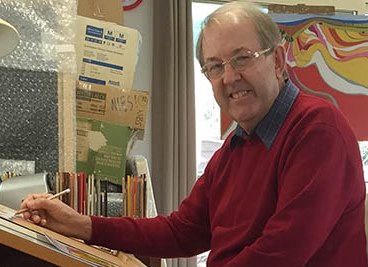
Richard Klekociuk Drawing - Tasmania, Australia
You make the comment that your work is all about “trying to say a lot with very little” Can you expand on this?
I have been involved in producing art for over 45 years and during this time my ‘ways of seeing’ have undergone a series of changes due to a number of factors, the most important being the years of experience I have ‘chalked up’. I have always been keen to experiment, change and adapt to a variety of situations and this has resulted in an expansive portfolio, mainly drawings, but also painting and digital art.
My first serious attempts at art during my time at art school were all about semi-abstraction. As I grew older I became more interested in realism, especially fine detail. About 10 years ago I began to simplify my work. Was it the fact that I was getting older? Was I bored with continual realism? Was I starting to see things differently? It probably is a combination of all three, plus a growing interest in a more refined way of seeing. In other words, I’m trying to give my audience less to look at and more to imagine, but in a way that doesn’t result in my subject losing its integrity. I want my work to be clever enough not to need too much information. This way of working is a lot more difficult than realism. It’s about what one leaves out of a composition, more than what one adds.
I’m enjoying this phase of my art and oddly enough, it is bringing me closer to my training days at art school.
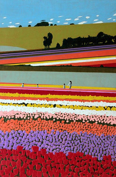
Tip Toe through the Tulips, Coloured Pencil
You use coloured pencils can you explain how this choice of material came about?
I have always been interested in pencils, biros and felt pens since I was a child, but it was until the mid 1980s that I gravitated to coloured pencils. I like them because they are ‘dry’, ‘portable’ and ‘immediate’. You can take them anywhere and work with them on a wide variety of supports from paper, clay board, to timber. The pencils I work with are of archival quality and most can be worked together if required, on the same drawing. I have so many colours to choose from, that I rarely need to ‘mix’ them to obtain a particular shade.

Conara Dreaming, Coloured Pencil
You work with Prismacolor, Polychromos, Luminance, Lyra, Coloursoft and Pablo pencils, just a few of the twenty four different pencil brands in your pencil. Can you discuss a few of the differences between then and why you have them all available for you to use.
One can never have enough coloured pencils! I must have well over 3,000 in my collection, but most brands are different, and offer varying qualities of finish and appearance. Each brand works best on a certain support (paper). The more archival brands I collect, the more choices I have regarding colours.
My top brand is Luminance, a chalk-like pencil that responds beautifully to the Canson pastel board that I use for 95% of my drawings. Why use pastel board and not paper? After many years of trialling different supports I found that the Canson pastel board suited my style. It’s the best and most consistent support I have ever worked on, so why change? The pastel board is as thick as conventional mountboard, has a gentle ‘tooth’ and readily accepts most (not all) brands of pencils that I have. To be honest, it’s a joy to work on, I love it!
Prismacolors perform beautifully on pastel board, their buttery, oily colours are wonderful. The only downside has been the inconsistent quality of this brand. Being a soft core pencil, they can break easily and the cores can shatter. I use a Ledah 333 electric sharpener and sometimes, 10 seconds in a microwave will repair a shattered core.
Polychromos are a very popular pencil and it’s easy to see why. They have a waxy appearance on pastel board and (like Luminance) are tough enough to be sharpened to a point if required.
Pablo and Lyra pencils are my major choices for working on illustrations and are my recommended pencils for my first publication, NOT YOUR AVERAGE ADULT COLOURING BOOK, due for release in my home town on November 21st. (please visit my facebook page: you add colour). These pencils are ideal for colouring smaller areas, especially adult colouring books!
Do you think the current interest in adult colouring books with lead to more adults returning to drawing?
The colouring fad that is sweeping the world is a most interesting and surprising phenomenon. When will it end? Will it ever end? It certainly has ‘drawn’ a lot of people to art. It’s not about learning how to draw, but how to relax. I see great potential in using such books for a broad range of people, from the very young to the very old. Each ‘target age group’ though, needs a particular type of colouring book. I have taken it upon myself to produce a book that contains examples of how I ‘think’ with my drawings. I have chosen a very mundane and boring range of subjects so that people can colour them in such a way that results in something quite personal, and not something that has already been dictated as the ‘final product, just add colour’.
Colouring books, as therapy are great, but we need to expand that and encourage imagination and personal input.
How do the public respond to your use of colour pencils?
I am fortunate here in Tasmania, that my work is generally well received. There will always be the traditionalists who think that 2D art is all about oil, acrylic, watercolours and pastel painting.
Art should be firstly about the idea/concept and the medium second. I have been fortunate to win a number of awards in ‘open company’ and this has given me a lot of satisfaction and the incentive to keep exploring the possibilities of coloured pencils.
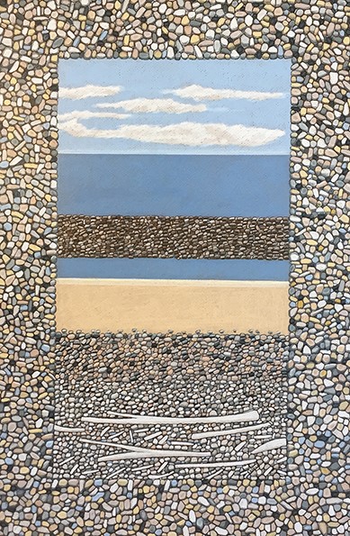
Still Life Lillico Beach, Coloured Pencil
2005-6 were two years that brought about great change in your career, discuss..
Retirement from one’s full-time career is not any easy thing to plan and execute, but at the end of 2005, I said good bye to 37 years of art teaching both high school and college students, and on January 2nd at 8 am, I embarked on a new career as a full-time artist. I have no regrets, except that it would have liked to start this adventure a few years earlier!
The first year (2006) was a hectic time. So much freedom! Fortunately, the self-discipline and planning that was essential to teaching came in handy and saw me through the year and I still work in a ‘teacher-like’ way, and I appreciate the training I went through at the Tasmanian School of Art so many years ago.
Can you compare Summer Still life –Sisters Beach with Rock Allsorts?
Both drawings are on Canson pastel board with Prismacolor pencils and are the same size (60 x 40cms unframed).
“Summer Still Life” is a collection from of objects on Sisters Beach, one of my favourite holiday locations in North West Tasmania.
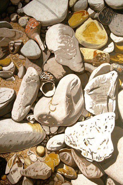
Sisters Beach, 60 x 40 cms, Coloured Pencil
The composition can be viewed from bottom to top. The shell in the centre leads one’s eye to the main, pale orange shell towards the top left. The textured stones have a ‘cascading look’ about them. I often ‘arrange’ my still life objects, but in this case the composition was ‘in situ’.I used a lot of French greys and ochre shades, with mineral orange for the largest shell (for focus).
“Rock Allsorts” was a contrived composition, featuring a broad range of rocks from my collection. Again, this is read from the bottom, with the eye resting on the small rock with its accompanying shadow. We are blessed with some beautiful rocks and I chose a wide variety of patterns for contrast. The emphasis in this composition was the use of Cool Greys to give a blue tinge to the over all look of the drawing.
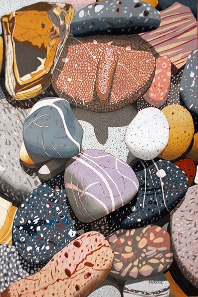
Rock Allsorts, 60 x 40 cms, Coloured Pencil
Can you discuss the use of colour and symmetry in your paddocks work?
Because my work has become very simplified of late, I have had make definite decisions about the appropriate (limited) colours that I should choose. All of my landscape are ‘cleansed’ of objects that I think aren’t necessary, such as fences, power poles, buildings etc. I simply want the landscape to be the feature, uncluttered and as ‘clean’ as possible. I like the ‘mathematics’ of farming, the way the land is divided for crops. Mark making both natural and man-made are important in such work. The colours are a ‘summary’ of the subject, the symmetry is influenced by mark making.

NW Pastoral, Coloured Pencil
Can you explain your digital drawing using Lavender View?
I live just a 40 minute drive away from the magnificent Bridestowe Lavender Estate, where currently visitors from around the world are being treated to a stunning display of row after row of intense lavender. My digital work is highly simplified and in this particular artwork I have included an iconic tree from the estate that’s gives the artwork a focal point and a contrast with the rows of lavender.
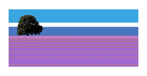
Lavender View, Digital
How long have you been working with digital drawing?
I first began digital drawing in 1999, and I find that this compliments my coloured pencil work. It has allowed me to refine my subjects even further than has been the case with my recent coloured pencil work, plus I produced larger works (on acrylic sheets) that really suit a more simplified artwork.
Discuss your thoughts on the developments of new digital technology in art?
The past 10 years has seen enormous changes in art practice and art thinking. Some may see this as the beginning of the end for traditional art mediums, but I don’t. This is an opportunity too good to ignore. We must embrace change and think ‘outside the square’. Artists will never lose their identity by trying something new and different. The only thing that is stopping is our imagination. Be brave!
 Colour Shock, Table Cape, Tasmania, Digial
Expand on your work “Landscape in Clay”
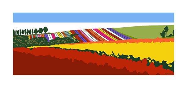
There are several themes in my work, among them being rocks, bread, tulips, mark making and ‘bricks’. About 5 years ago, I saw a ‘landscape’ in the pattern of a clay brick that reminded me of a ‘landscape’. It was about this time that I become very interested in the work of the late Australian artist, Fred Williams. His simplified paintings of the Australian landscape are inspirational. The more I looked, the more I saw traces of his work in some of the bricks.
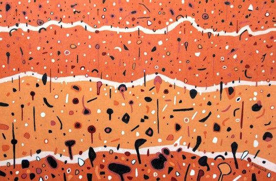
Landscape in Clay, Coloured Pencil
I visited a local brick company and was astounded to see the ‘landscapes’ in some of their products. This has resulted in a series of drawings of landscapes inspired by brick patterns, one of which won a major art award. I believe that these bricks contain the ‘landscape DNA’ from where the clay was sourced.
“Landscape in Clay” features not only some of the shapes and colours in a fired clay brick, but landscape contours and flora.
Contact details.
Richard Klekociuk
artkleko@gmail.com
http://www.facebook.com/youaddcolour
Richard Klekociuk, Tasmania, Australia
Interview by Deborah Blakeley, December, 2015
Think a colleague or friend could benefit from this interview?
Knowledge is one of the biggest assets in any business. So why not forward this on to your friends and colleagues so they too can start taking advantage of the insightful information the artist has given?
Other artists you may be interested in: