Ray Hassard Painter - Ohio, USA
When we use the words “Plein Air” in art, we immediately think Impressionist. What they were painting was the scenes they were witnessing. Can you discuss this in relation to your own plein air art?
The Impressionists are largely thought of in terms of landscape painting, but they also did scenes of people at work, at train stations, relaxing in public places—the activities of their time. One of the great things they taught us is that art supersedes subject—that is, anything is worthy of being painted, not just religious or historical themes. But “common” subjects must be painted in a way that makes them reveal themselves as meaningful, worth contemplating, even beautiful. My painting heroes, Sargent, Sorolla, and Degas, used all the resources they had–values, colour, bravura brushwork, etc.—to bring out the transcendence they found in the commonplace.
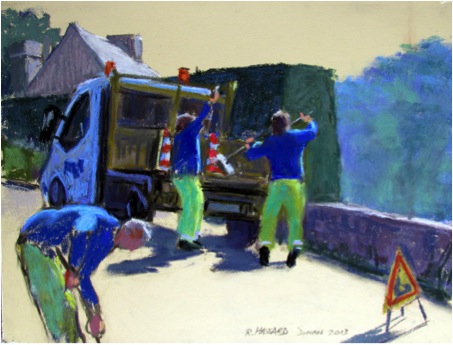
‘Road Menders’
How do you choose your subject?
In plein air painting, it is mostly the light and the arrangement of big shapes I see while squinting that attracts my attention. And those are important elements at the start of any painting, plein air or studio. Beyond that, though, there has to be an idea, or concept, no matter how simple. When I know why I’m painting a subject, I should be able to know how to paint it.
One of my main motifs is people doing things–working or playing—and I get excited by areas full of busy activity. The architectural setting is important too, whether it be a shopping mall, the tents at an outdoor market, or a huge construction site.
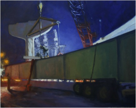
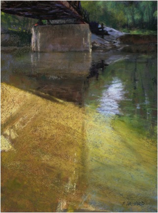
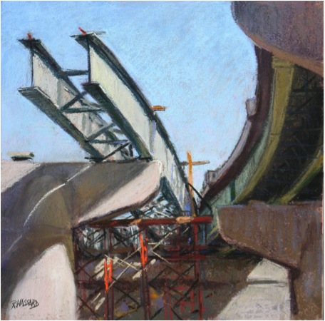
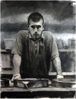
‘Centering the Beam’
Can you compare 3 images that show the diversity of you plein air work and discuss?
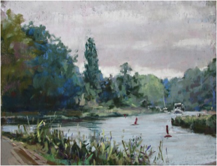
Lengthening Shadows:
Primarily a landscape painting with lots of water, which I love to paint, this piece was done with a group here in Cincinnati that meets weekly to paint en plein air. A fellow artist obligingly sat on the bench long enough for me to get a figure in it. This was a relaxed, contemplative, kind of painting, and is more “finished” than a lot of my plein air pieces.
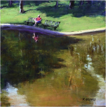
‘Lengthening Shadows’
Balloonhead:
This was done during a “Quick Draw” event in Richmond, Virginia. Painters had a very limited amount of time to complete (and frame) a painting and subjects were to be chosen from within an area of only a few city blocks. I picked the farmers’ market for the colours of the tents, and the young man making another balloon hat looked like he wouldn’t leave too soon. It was a rushed, almost frantic, painting, involving a great deal of sketchiness and simplification of a very complex situation.
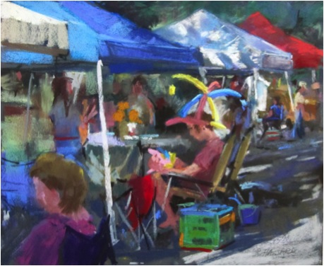
‘Balloonhead’
Allahpattah #6:
Every winter I spend some time in Florida to get away from the cold and a favourite painting place is Allahpattah Wildlife Management Area. Like much of Florida, it was originally swampy, then drained and cleared for raising cattle. Now it is being returned to its original state, but still has the character of a savannah, with wide open areas of grass and palm trees in the distance. I usually go there very early in the day and it is often very foggy. This painting was done on a very clear morning and the sun, barely above the horizon, was illuminating the seed heads on the weeds. I knew it was very fleeting and that I would be looking right into the light and hesitated a bit, but I couldn’t resist the challenge. With the help of a large umbrella pulled down in front of me that I could peek out from, and working very quickly, I captured the scene as best I could.
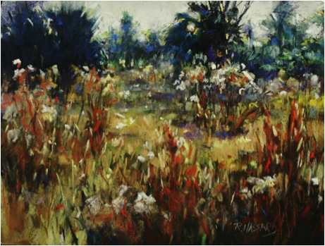
‘Allahpattah #6’
As a pastellist, can you share some technical tips that you have found particularly useful?
I have found that different painting surfaces make a huge difference, and after working with different grounds for years, I have settled on some favourites, some workhorses, and a few more exotic grounds for special occasions.
When I travel overseas, my workhorse is Colourfix by Art Spectrum, which comes in many colours. I bring a couple of 9” x 12” “Rainbow” packs containing all the colours they make. Nearer to home, I like to travel with Ampersand Pastelbords: a rigid board coated with an unaggressive sanded surface. It is a favourite for working in the studio too.
PastelMat, a relatively new product with a very different, almost slick, surface produces a different look. Despite the surface feel, it holds layers of pastels beautifully and firmly. (La Maltesse, 9” x 12”)
‘La Maltesse’
La Carte is one of my more exotic surfaces with a very different, nubby sort of texture—it reminds me a bit of the feel of rough commercial carpet! I like to use it for figure studies, leaving the beautifully rich textured surface showing as much as possible. (Portrait Study 12-29-11, 10” x 12”)
‘Portrait Study’
Recently a friend has been making me some super rough panels. They are an all-over even roughness, but can eat up sticks of pastel in no time. For some subjects, they are ideal, but they work best with few changes and reworkings. (Flood of Light, 16” x 12”)
Can you discuss the pastels you use and how and why you make specific choices?
I use just about all the brands of professional quality pastels available, from the very hard NuPastels and Cretacolours, to the ultrasoft Great American brand. In fact, that is one of my favorites, and since it is made here in Cincinnati, it is easy for me to replenish my stocks. I generally start by blocking in my darks with a NuPastel blue-violet and my lights with a NuPastel light tan. From there I start to block the local colours in loosely with hard pastels and then slowly move over to the softer ones as I develop the painting. I do not use fixative as I work or when I finish, since a good textured surface can hold the pastels quite well.
I make my choices based on local colour and value first. Then I consider how soft it must be to get the effect I want. A hard pastel is more transparent because the binder holds pigment more firmly. So I can get a “wash” of colour if I use the right pressure over an existing colour with a hard pastel on a sanded or textured surface. Softer ones are great for spontaneous marks and strong, pure, accents.
Recently you have been on a residency in France. Can you expand on this and the work you did during this time?
I was Artist in Residence in Dinan, a wonderful medieval city in Brittany, for the month of June. The artist Yvonne Jean-Haffen (1895-1993) bought a large house, La Grande Vigne, high on a hill overlooking the river Rance in the mid-1930s. She lived and worked there until her death. La Grande Vigne is now a museum and the residency program Mme. Jean-Haffen established is administered by a group called Les Amis de la Grande Vigne. I was given the use of a small house at the bottom of the hill next to the main gate, which was probably a gatehouse or caretaker’s house once. At the end of my stay one piece was selected for their permanent collection.
Living in one place for a good amount of time was a different travel experience for me, and one I loved. I came to know people in the area a bit, got good advice from people about subjects and places to paint, and had the luxury of revisiting locations at all times of day and in different weather conditions. I found the banks of the Rance an endless source of inspiration and went up and down the river on foot and by car. Also, to my delight, there were often people working on the road, just outside the house! (Road Menders, 9” x 12”) By the end of my stay I had 36 pieces in various stages, in both watercolour and pastel, for the committee to choose from.
The weather was mostly grey and overcast, often rainy, while I was there. The muted greens, greys, and blues were a far cry from the vibrant colours of India and the colourful landscapes of the US Southwest. Coming to grips with the values and searching for the small colour notes within the overall scheme became my biggest challenge there.
You do an amazing amount of travel – can you discuss several works from different Continents, discuss colour and light and how it varies in different places?
I love to travel, have loved it since I was a small child when my grandparents would take me on road trips. Painting in a new place can recharge artistic batteries, restore flagging spirits, and revive interest in all manner of things, as well as offering an experience beyond that of just being a tourist.
Halfway up a mountainside in Bhutan is this stunning view of a monastery where two rivers meet. High mountain light with low humidity gave clear distances and good strong colours.
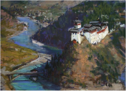
‘Wang Dzong’
Rance—reflections 12” x 9”
By the time I finished this painting, it was starting to rain. High humidity, soft edges and colours and overcast skies were often the case in Brittany. I probably overstated the value contrasts here—I’m still coming to grips with grey days!
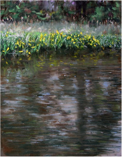
‘Rance—reflections’
High humidity again across the river from Niagara Falls, but this time on a clear crisp day. The water colour is completely different from the Rance, not brown and cloudy, but clear, as it flies over the lip of the falls, with a fabulous blue-green colour I have only seen at Niagara.
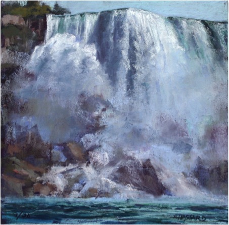
‘Thunder’
Can we discuss ‘The Project’ and the masculinity of these works?
I’m interested that you call these “masculine”. I never thought about it in those terms, though I can understand how it would come to mind with road construction. Certainly, there are a lot of women working there, including the fore(wo)man who is my liaison in many ways. To me, it is just a fascinating area of massive, interesting shapes, bright colours, and constant activity and flux. It brings to mind thoughts about the past being replaced by the present, the meaning and idea of “progress”, and the continuum of history through public projects, past, present, and future.
I haven’t shown the paintings much in public yet, but some of the most positive comments have been from women. Most are surprised at the subject; most are delighted to look at something they have not paid much attention to before.
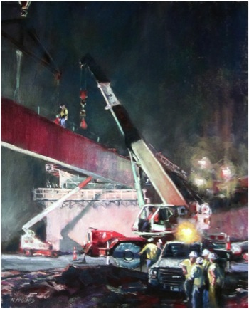
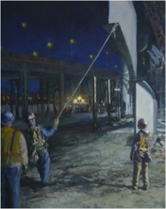
About 5 miles down the road I live on, an automobile viaduct from the 1930s needed to be torn down and rebuilt. The area is one on the edge of the city that once been middle class, but had declined greatly. The old structure and the buildings it rose above interested me from the time I moved to Cincinnati in 1985. When workers began clearing the area in 2011 I found the huge equipment and changing landscape fascinating. I decided I had to start painting this, almost as a documentary. Once they started working at night, the drama, scale, and visual excitement were over the top for me. It wasn’t really possible to set up and paint in the midst of it all, but the workers have been very good about letting me run around and take photos.
I have done some pastels at the site “Curves”,
Mostly they are studio pieces. Besides the pastels like “Flying the Beam”
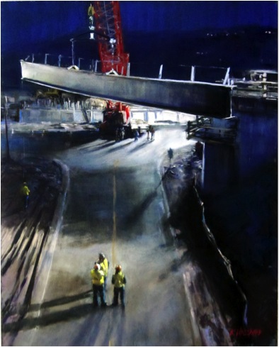
“Convergence” (both 20” x 16”), I have done a number of larger oils. The scale of the project calls for larger sizes than I am like doing in pastels. So, “Pull”, “Centering the Beam” and several other oils are 30” x 40”. “Shadows” is 24” x 36”. The scale of this project is huge and has more than a year still to go, so my work is cut out for me!
A number of the pieces have won major awards in different competitions and shows. Recently many of them were on view in Cincinnati and one critic wrote “Ray is one of those rare painters who can see the poetry in almost anything. Look for his poetic paintings of bulldozers, mud, steel and concrete scattered throughout the show”.
The three galleries that represent me, on the other hand, were not as enthusiastic. One suggested that if I put the construction company’s name on the machinery they might be able to sell some of the pieces to the company. Maybe, but that is not the reason I am doing this and I didn’t make that change. Nothing else I paint has the sheer excitement and abstract dynamics that these construction scenes abound in, so I’m painting these for myself. A few years ago, I did a series of 6 or so paintings of people riding bumper cars at amusement parks and fairs. Everyone loved them–no one bought them, my galleries couldn’t sell them. It may prove to be the same with this construction series. I am looking to have at least 100 viable pieces by the time this project comes to an end, in various mediums and sizes, and to show them together. I am hoping this show will travel a bit, but nothing is firm yet on that score.
Painting on ordinary streets in India, I was often told by people that “there is nothing of interest here to paint”. I got a similar response from the workers and management when I started, followed by excitement and even joy of seeing their daily work as art. Now I am known by a lot of them and they always ask how the project is coming along.
Some of your figurative work you do in Charcoal. Comment on how the absence of colour affects this work?
I think that black and white often carries an emotional load that colour sometimes softens. I believe strongly in the value of life drawing as an exercise and skill developing discipline, and I do love working in black and white. The absence of colour really makes me pay close attention to subtle value changes, and in realistic painting or drawing, values are usually the most important thing. Learning to see and understand them better is a lifetime’s work in itself.
“Chili Parlor Man” is a pastel, but using only black, white, and greys.
Ray Hassard, Ohio, USA,
Interview by Deborah Blakeley, July 2013
Think a colleague or friend could benefit from this interview?
Knowledge is one of the biggest assets in any business. So why not forward this on to your friends and colleagues so they too can start taking advantage of the insightful information the artist has given?
Other artists you may be interested in: