Flo Snook Textile Artist - Brighton, UK
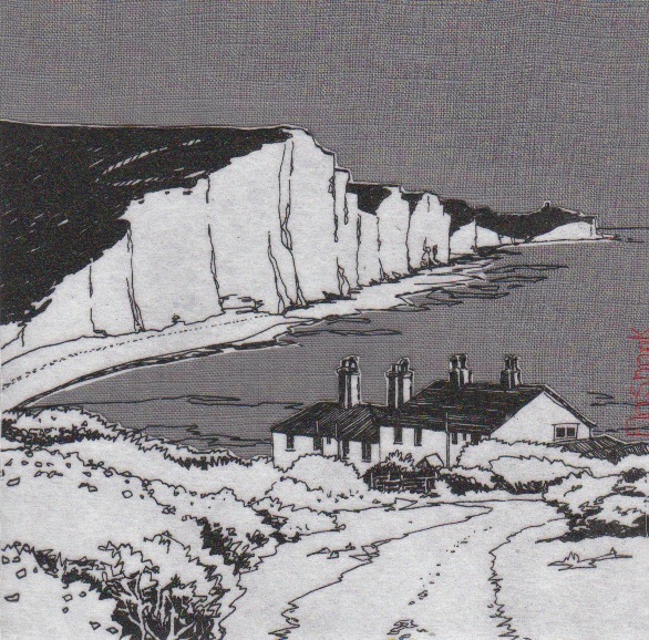
It is not just the sea but the influences made by man to the coastline e.g. piers, fishing cottages that are represented in you work, discuss.
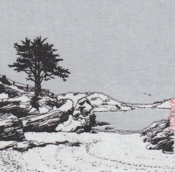
I am fascinated by people’s relationship to the sea. I love to observe how we live and work with it, how we try to impose our will on such a powerful force of nature, with the building of piers and sea defences, harbours and fishing ports, but ultimately it is Nature who will outlast us all. I often stay in a cottage by the sea in South Devon which is perched on the headland above the crashing waves, which I can hear as I fall asleep. This gives me a strong sense of the relentless power of water and weather acting on the rocks and headlands around me, and how temporal we are in the face of it.
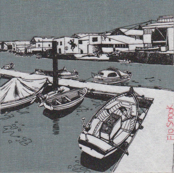
Can you expand on the ‘textile canvases’ and the technique you have developed?
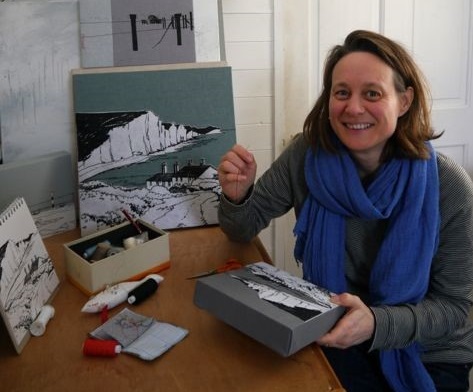
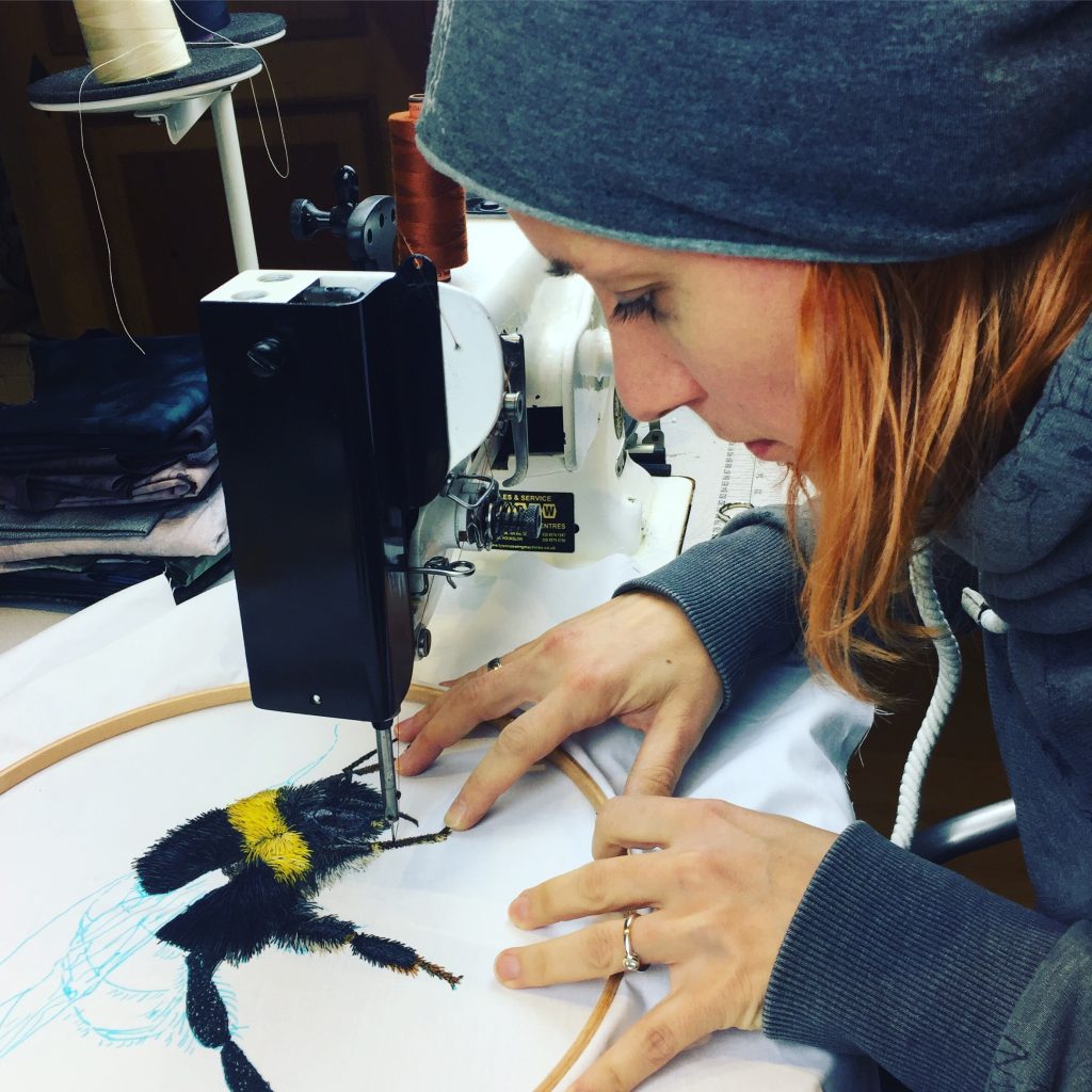
It was while I was completing my Textile Degree in 1994 that I created my first textile canvas. I was also creating vibrant landscape paintings at the time, and I wanted to create a canvas with hand dyed fabrics that would stand up in it’s own right as a piece of art, and not be dismissed as a ‘wall panel’ with little of the same value as a painted canvas. This piece was exhibited alongside my paintings in my degree show in the Mall Gallery in London. 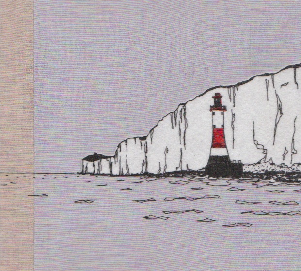 As my career progressed, I refined my style to a more restricted colour palette, using natural linens to express the colours I observed in the coastal landscapes. My starting point for each canvas is my sketchbook, where I create pencil sketches using the ‘partial peek’ method; I love the way it gives the drawings a fluidity of line as my eye travels around the landscape. I also take photos, and from these together with the sketches I create pen drawings to work from. At first I hand stitched and appliquéd all my images from these drawings, but this was far too labour intensive and I developed joint pain. So I began transferring the drawings onto silk screen so that the image can be printed onto white vilene, which I then appliqué onto the background fabrics, adding hand stitched details. This makes each canvas unique despite the printing process. More recently I’ve been framing my canvases in tray frames. This had added another layer of value to them and I’ve found that this has meant that they have fully broken into the fine art market. I am now selling in a London gallery on the Kings Road, Kensington.
Explain your embroidered signature, both style and colour?
I’ve always been inspired by Japanese prints, with their simplicity of line and muted colours, but always with bright accents of colour here and there. They often sign their prints with a red stamp, positioned on the side of the image. It’s for this reason that I always hand stitch my signature in red thread on the side of my canvas. Flo Snook is my maiden name which I decided to keep for my artwork, particularly because it is such a feature of my work, and it has to be said that Flo Scott just doesn’t have the same ring to it and isn’t so memorable! 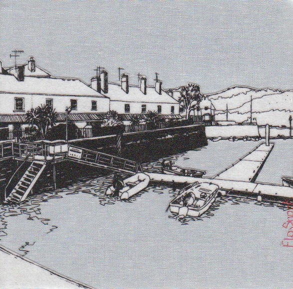
Is all your embroidery done by hand?
Yes. I embroider and hand-stitch once the canvas has been stretched on the frame. I’ve never liked machine embroidery – for me it takes all of the joy out of stitching.
Many of your textile pieces have two or more coloured backgrounds, explain why you use combinations and how you deal with the seam?
When you look out to sea, the colours are always changing. As clouds cross the sky, their shadows create varying shades and tones which I like to capture in my work, by sewing together strips of background fabrics.The more strips of colour I use, the more challenging it is to machine sew them together perfectly parallel and then stretch them on the wooden frame so that they remain parallel. I like this challenge. As I stretch the fabric, I make sure the seams are open and pressed flat against the frame.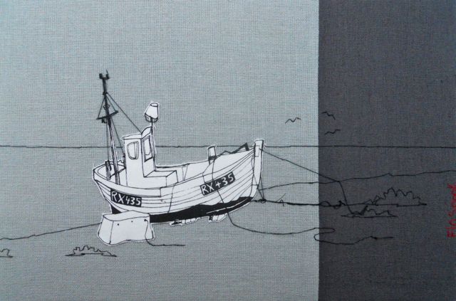
Your textile work, how is it mounted?
My canvases are stretched over a wooden frame (44mm deep) and then framed within a deep tray frame, giving each one depth and weight. I also create smaller textiles fixed to board, which are window-mounted and framed behind glass.
‘RNLI Salcombe’ discuss the use of red and gold in this piece?
I often like to pick out colours in the piece I’m working on to either draw the eye to the focal point or to let the eye travel around the composition. The RNLI piece was commissioned by the RNLI and I wanted to pick out some of the colours of the boat to draw the eye there, and make it come alive.
Your work is ‘less is more’– discuss
I’ve realised that I am a very sensitive person and I find loud colours, busy places and clutter overwhelming. I often retreat to my studio when I find the world stressful and overpowering, in order to escape into the landscapes I create. I find it soothing to re-interpret the world I see into it’s calm basic components. Perhaps I’m trying to re-educate the world into seeing the way I do? Perhaps I’m attempting to scrape away the layer of bling and overstimulation to reveal a way of honest simplicity underneath? I find our current capitalist society to be a delusional lie we tell ourselves; the belief that economic growth can continue at the expense of the environment indefinitely, is absurd. Nature will always win, and ultimately we’ll need to curb our unrealistic consumer lifestyles and learn to live more simply. So I like to tell the story that ‘less can be more’.
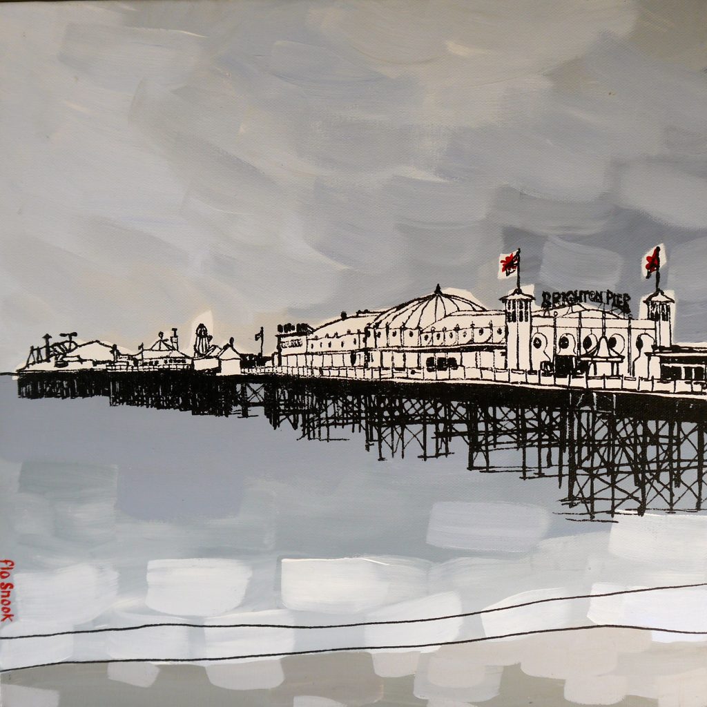
Your combination of printing and acrylic paint in ‘Brighton Pier’ discuss this aspect of your work and other pieces?
This was an exciting development of my work: I realised that I could paint with acrylic onto canvas to create a background on which I could silk screen my drawings. Although I’ve only created a small collection of these paintings so far, featuring Brighton and Dungeness coastal views, it’s something which I’d like to expand on in future with my Devon and Cornwall work.
When and how did you introduce your accessary range?
It was through creating cushion covers initially that I found my style, so in a sense it was the accessories that came first. Over time however, I found it was important to me to be recognised as an artist, with the focus on my canvases. But occasionally I enjoy creating a useful ‘product’ that is more affordable than a canvas and makes a good gift for weddings and other events.
Tell us about your coastline linen cushions?
I created a range of cushions which depict the coastline (literally) of the UK in 2012, the year of the Queen’s diamond Jubilee. I wanted to express something very British in this cushion design, so each one has a panel of patchwork with suggestions of the red white and blue flag. The coastline itself is silk screen and I hand embroider my name on the side of each one. These cushions have been popular with expats and look at their best with a feather filler.
On your mugs, again you have used your signature to bring a smile, expand on this, especially the placement?
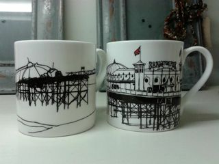
The mugs were a collaboration with interior designer Terri Prior who owns the shop ‘One In The House’ in Brighton. She wanted to create a couple of mug designs that would be popular with tourists and with people with a strong connection to Brighton. In Brighton we have two piers; Brighton Pier (formerly called ‘Palace Pier’) and the West Pier, now sadly collapsed and burned down, a mere skeleton of it’s former self, but which is still a very strong local landmark. So I created a pair of mug designs from drawings of both piers, with red accents on the flags. Terri decided to put my red stitched name motif on the inside of the mug to add character to the drawings and to catch your eye as you drink your tea!
Sketch books play a huge part in your art practice discuss….
The size of the sketch books you use?
I use a range of sizes. For carrying around with me when I’m out sketching, I have a small hardback book. For a majority of my pen drawings I have a 20x20cm sketchbook that I keep safe in my studio, these can be scaled up for canvases up to 40x40cm. For commissions I often use an A4 sized book or A3 depending on how big the drawings need to be. When I created a textile canvas of the West Pier for Zoe Ball and Norman Cook (aka Fat Boy Slim) I used a large sketchbook for a large more detailed drawing. 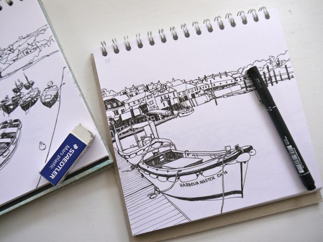
Do you take a new sketch book for each location?
That’s probably a good idea! No I usually carry on with the same book.
What materials do you draw with in them?
I’m not fancy. All I need for sketching is a good 2B pencil, a rubber and scalpel for sharpening my pencil. For my pen drawings I have a range of 1-8mm pen nibs.
On the top left hand side you have a numbering system, can you explain this?
Ha ha! You noticed my code system for referring to the photos I took of the same view which I refer to when drawing in pen.
Discuss the importance of the environment in both your work and the materials you use?
I am a big campaigner for protection of the environment and for raising awareness of better ways of stewarding the land and sea. I am also a Permaculture Designer (see my other website www.permaculturedesigner.co.uk) and I like to apply permaculture to all areas of my life. It is a design system that attempts to mimic nature so that we can live in harmony with our biosphere. For this reason I prefer to choose natural fabrics that have less damage to the environment in their production as compared to some cottons and artificial fabrics, and where possible I use up-cycled fabrics too. For a time I found an organic white cotton with a very close weave that I could use as my appliqué fabric, but unfortunately they stopped producing it, so I’m back to using Vilene for the time being. Felt would have been a good replacement with less of a ‘footprint’ but I found that it didn’t give me the crispness of line that I wanted. I use FSC rated wood for my frames and have used water based inks for my prints. In my work the environment is everything. By continually drawing the land and sea, I am falling into a deeper and deeper relationship with my beloved island, and I hope that I can draw the viewer into a deeper relationship with it too. The more we develop a connection to the land and coastal areas, the more we care for them and protect them.
You are very generous with your art work to charities can you expand on one of these?
I am currently holding a silent auction to raise money for Parkinson’s UK with three of my paintings. I’m conducting the auction by email and through Twitter and Facebook. Sadly my father passed away last year after 8 years of living with the disease and Parkinson’s UK were such a supportive charity to us during that time that I wanted to say thank you and give something back.
Can you explain the importance and recognition of textiles in today’s art market?
I feel it’s really important for textile artists to be accepted as artists in their own right and not pigeonholed into the crafts market. It has taken me years to build up recognition as an artist just because textiles has been my main choice of medium. Last year I applied for the Brighton Art Fair, and I was accepted (as an artist) and I exhibited in September. I had applied for this art fair in the past, only to be told to re-apply for the craft fair, much to my dismay! I noticed that there were many other textile artists now exhibiting at the art fair also, so I am hoping that this is part of a trend of welcoming textile artists into the art market. This is great because textiles has so often been undervalued in the past, but now it is holding it’s own.
Contact details.
www.flosnook.co.uk
studio@flosnook.co.uk
Flo Snook, Brighton, UK
Interview by Deborah Blakeley, April, 2015
Think a colleague or friend could benefit from this interview?
Knowledge is one of the biggest assets in any business. So why not forward this on to your friends and colleagues so they too can start taking advantage of the insightful information the artist has given?
Other artists you may be interested in:

