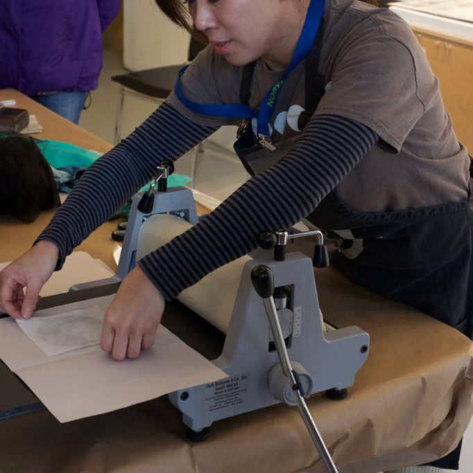
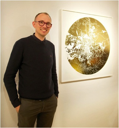
Ewan David Eason PrintMaker - London, UK
Your early work was involved in the exploration of colour, and more concisely the colour concepts that were introduced by Paul Cezanne. Can you expand on this?
In the summer ’96 (when I was 16) I went on holiday to France with a copy of Robert Hughes’ book The Shock of the New, using it as a guide to paint. Every day I would go into the countryside with a canvas, foldable easel, oil paints and brushes and paint the scene I was in using a different ‘ism’ to the previous day working my way through Impressionism, Fauvism, Modernism and so on right through to when the book was published in 1981. I kept returning to Cezanne’s use of colour in his painting of Mont Saint-Victoire from 1887.
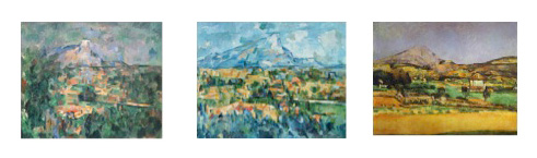
He in fact painted this Mountain about 87 times over his career. His palette mainly consisted of white, red, blue, yellow, purple, orange and green. Over the next 2 years I explored how these colours could work together or oppose one another either mixed or as solid forms. At around the same time I visited Charles Saatchi’s Sensations Exhibition at the Royal Academy. As a result of seeing Gary Hume’s hospital door paintings and Hirst’s ‘dot’ paintings as well as studying more established artists like Patrick Caulfield, Patrick Heron, Bridget Riley and Michael Craig-Martin I concentrated more on the opposition of unmixed primary and secondary colours. Not only was I interested in colours opposing I also became interested in opposing forms, structures, concepts and how these opposing forces could highlight or subdue the other.
This theme of opposites continued throughout University. I became more aware and interested in current artists and like what University does, I discovered more of who I was as a person and the more of my personality I put into I my artwork the more passionate I became about creating the work.
I started looking into artists who dealt with appropriation. Artists like Richard Prince, Cindy Sherman and Sherrie Levine. One series by Sherrie Levine from 1981 called After Walker Evans is a reproduction of a selection of Walker Evans photographs taken in 1936, whereby she rephotographed and re-exhibited a portrait from one of Walker Evans exhibition catalogues; appropriating it as a partial reclamation of Art History for women. Like Prince and Sherman, Levine was re-authoring the image.
From a very simple level I saw it as a sort of ping pong game between opposites, male and female. The ball was now coming my way. So I rephotographed her image and exhibited it as one of my own, calling it After Walker Evans, After Sherrie Levine by Ewan David Eason. It wasn’t that I wanted to reclaim the male status back, it was more about the cheekiness of me doing it. Silly as it was though, it did start my interest to create opposite appropriations. Like Sherman I wanted to include myself in the work and like Levine I sourced the works from artists. I created pastiches of artists work through various mediums such like video, painting, photography and other forms of print making.
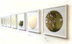
‘Mappa Mundi’
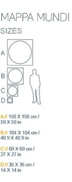
Your ‘Mappa Mundi’ prints come in four sizes.
How did you decide on the sizes?
When did you decide to compare the print size with the logo of a man?
It started with the 36 x 36 cm size, any smaller than this the detail of the artwork deteriorated.
I knew I could print up to 150 x 150 cm but didn’t want to limit myself to just 2 sizes.
The sizes in between; 69 x 69 cm and 104 x 104 cm were incremental size progressions.
Do you have a Limit to your print run?
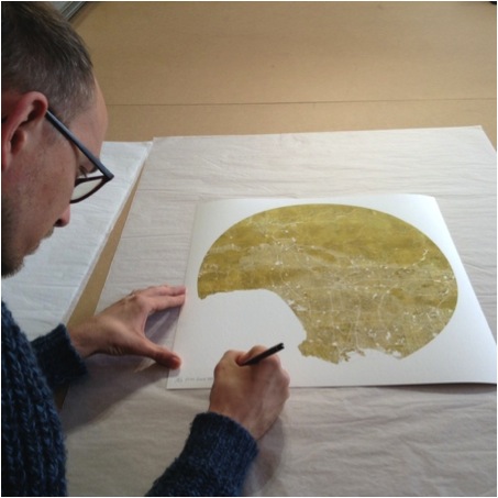
Yes, definitely. I don’t want to create a commodity with an unlimited edition. By limiting the amount I make, the artworks become more and more rare.
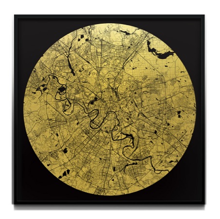
Mappa Mundi Moscow
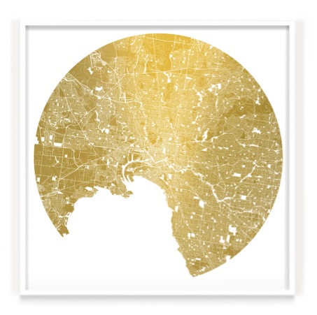
Is the gold actually gold leaf?
I use 4 types of gold; 24 carat gold leaf, imitation gold leaf, brushed imitation gold dibond and gold thermal ribbon.
How did the opposite theme translate into your current Mappa Mundi series?
In 2011 I was invited by the artist Tom Helyar-Cardwell to exhibit in an exhibition called Celestial Architecture. At the same time I had looking at the work of Bernard Cohen and his use of loose and rigid styles. I started cutting out straight lines in my sketchbook which I could then lay on top of other patterns. Unlike what I was expecting, the stencil itself inspired me rather than the new images it created with the drawings beneath. It reminded me of interlocking roads on a city map. Rather than creating new road maps in my sketchbook I began to cut up an A-Z London map. I also began to look at older maps suchlike the circular Mappa Mundi’s; medieval maps of the world commissioned by landed gentry of the time. It hadn’t been established that the world was circular at the time however the artists drew reference to a verse in the Bible, Isaiah 40: 22 which talks about He (the Lord) sit(ting) enthroned above the circle of the earth. The most famous of these maps and the largest still in existence is the Hereford Cathedral’s Mappa Mundi which reflects the medieval church with Jerusalem at the centre of the world.
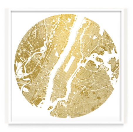
Mappa Mundi Manhattan
Continuing to look at maps I came across Charles Booth’s Descriptive Map of London Poverty from 1889 or more commonly known as his ‘Poverty maps’. Booth set out to define levels of poverty or wealth in London, street by street using a colour coded system. Examples of these colours included Black; defining Lowest class; Vicious, semi-criminal. Middle class would be defined with Red and Upper class as Yellow. I found the colours, rather than street names or area titles, became an abstract image in itself. In the same way that I created my original pastiches of other artists work I started considered how I could pastiche these maps.
Rather than defining people into different groups with multiple colours, I decided that I would oppose this by selecting one colour, a sacred colour that drew on the egalitarian nature of people rather than defining us as poor, middle class or rich. I chose Gold for it sacred and precious quality.
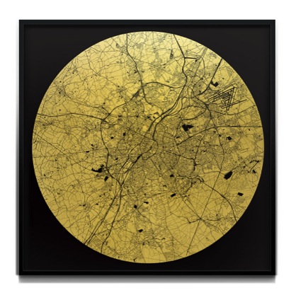
Mappa Mundi Brussels
What is the exact distance (land to sky) your maps show?
It really depends on the city that I am creating. Essentially I want the final image to look like a well-balanced abstract intricate pattern. Some of the maps cover many miles, however others may cover just one.
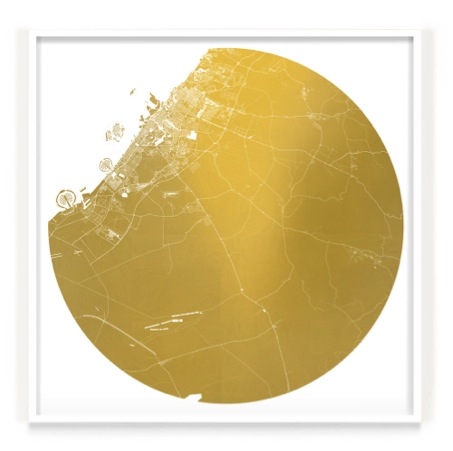
Mappa Mundi Dubai
Are these images easier for us to perceive because of our knowledge of space maps and now google maps? Discuss.
Yes I think so. Most people have access to any city at a click of button. I have however found it fascinating when I remove all the names how difficult it can become to distinguish the area or city due to people becoming so familiar that waterways are blue, roads are multi-coloured (depending on their size) and land mass is a light yellow ochre (on google maps). When all the colours are removed and made the same it becomes anonymous patterns of interlocking shapes.
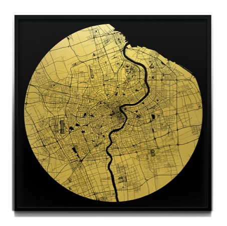
Mappa Mundi Shanghai
Removal is an important part of this series. You remove all the colour and street names, why do you do this?
Rather than defining people or areas by names or colour I wanted to emphasise that we are all the same; sacred.
Maps have developed since medieval times to today’s electronic maps. Your maps are still representations of places that have meaning for you. Can you expand on this?
When I first started making the London map I decided that I didn’t want to just create a gold map of London, I wanted to make the map more personal. Like the original Hereford Mappa Mundi being centred on Jerusalem I decided to centre my map on a significant place to me; where I proposed to my now wife. All the maps I have completed since have either been centred on a significant place to me or the person commissioning the artwork.
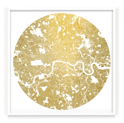
Mappa Mundi London
Can you discuss why you choose Venice as there is so much blank? Is this map more graphic when compared to a map of London?
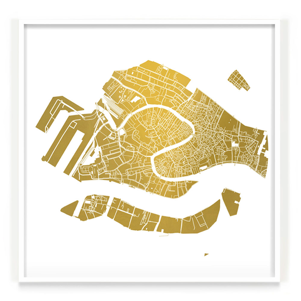
Mappa Mundi Venice
To learn to paint like Cezanne I started painting Venetian scenes from photographs that my father had given to me in 1996. Looking through the photographs and intensely studying them in order to capture re-portray the essence of the scene I became obsessed with the beauty of the city. On the occasions I have visited I am always left wanting more, which I why I chose to include it in my selection.
Compared to most of the other cities I have created it certainly has the most amount of water represented and becomes more graphically abstract however I felt it was important to keep it in due to the nature of city. I’m also very interested in exploring the idea that familiar places become abstract images once distinct colours or names are removed. On most occasions I find that it isn’t what area is covered that defines the image, it is what I think looks well balanced.
Discuss some of the wonderful locations your ‘Mappa Mundi’ has been exhibited in? How did these exhibits come about?
As a result of entering one of my pieces to the gallerist Cynthia Corbett’s Young Master Art Prize in 2012 she exhibited my artwork in some very well established art fairs around the world as well as BFAMI’s charity auction exhibited at Christies and Camden’s Round House.
I also have some really great Galleries and Art Consultants who present my work on my behalf, most notably A Space For Art, Fawn Art Consultancy, Annabel Cary, Peter Benjamin, Art Unified (in LA) and Store Street Gallery in London. They have helped get my work seen in The Barbican (London), Christies, private members clubs, various public locations in LA, and many other established venues around the world.
It has also been such an honour to be selected to exhibit in the Royal Academy in 2012 as well as in 2013.
You have been selected twice by the Royal Academy. Can you explain both the process and the importance of the selection to your career?
Like most selecting processes, the process of applying for the RA Summer Exhibition requires a lot of patience and suspense. You apply in the January, then told a week before it opens to the public in June that you have been chosen to exhibit. Being selected is an honour and has been incredibly helpful for me in getting my work exposed to a larger audience
How much time does it take and where do you go to research old maps?
I go to a lot of museums and libraries. Living in London I am spoilt having the National Archive as well as the the British Library, both of which have given me access to very rare maps.
Mappa Mundi Melbourne
Another aspect of your work is your current series, ‘Fractal Reactor 1′. Can you discuss this series?
Still using the opposites as my starting point; rather than looking down onto the earth I am now experimenting with images looking up into the sky. Rather than roads I am looking at fractal organic shapes and the patterns they create. I have also been studying Japanese art particularly the traditional paintings where the sun is always represented as red. Rather than a red foreground sun I chose to make the background red and the sun gold. Unlike the Mappa Mundi patterns being contained in the circle, I chose to bleed the fractal pattern outside. Like what the maps do, I am also experimenting with the theme of nostalgia so I chose to feature a tree outside my parent’s house that I used to climb as a child.
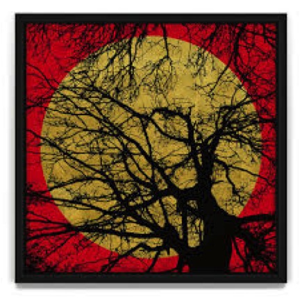
Fractal Reactor 1
Let’s talk about your video:
Here’s a little explanation of why I created it:
Opposites is a structure that I return to create my work. With the chaos of life or maybe my dyslexia I like to create structures to work upon. Just like I had formed the structure of Opposites I began to think about structures that helped me or a viewer to in engage with art and what was a journey I could take to create it. I compiled this 11 point guide.
Nostalgia: The work evokes a memory of the past, maybe good, maybe not.
Movement: As I walk past a piece or maybe I press a button it creates a different shape, a different sense, a different sound.
Humour: The piece makes you laugh. Punchline, or maybe the narrative is random.
Technical ability: The piece is technically impressive. How has this person done this?
Relationship with artist: You know them by reputation or you know them because they are a friend.
Pity: You feel sorry for the artist or you feel sorry for the cause of the art.
Journey: It takes you somewhere you’ve never been before. It takes you on an adventure.
Colour: It is your favourite, maybe least favourite colour. Maybe the colour goes with your furnishings.
Status Symbol: The piece is famous. Maybe the piece has been made by somebody famous, maybe you’ve seen it somewhere famous.
The Unknown: It is strangely alluring. You look at it and you go somewhere else with your thoughts.
Familiarity: You are familiar with the line of work and you want to invest into it.
Essentially, it is a reflection of my/your personality, your interests.
Contact details
info@ewandavideason.com
www.ewandavideason.com
Ewan David Eason, London, UK
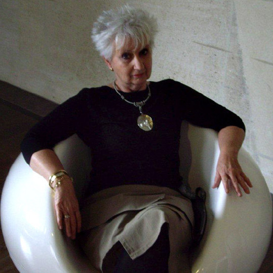
Interview by Deborah Blakeley, July, 2014
Think a colleague or friend could benefit from this interview?
Knowledge is one of the biggest assets in any business. So why not forward this on to your friends and colleagues so they too can start taking advantage of the insightful information the artist has given?
Other artists you may be interested in: