
Anton Thomas Artist / Cartographer - Victoria, Australia.
Can you discuss how important research and preparation is to your work?
I estimate that some 35-40% of my overall labour time is research and prep, the rest being time spent drawing. This may seem a high amount for a completely hand-drawn artist, but my goal is to make maps that are as informative as they are artistic, so I spend a great deal of time with real-world data. I’m drawing real places, that real people live in, so it’s critical that I research properly to ensure I capture something of the feel of a place.
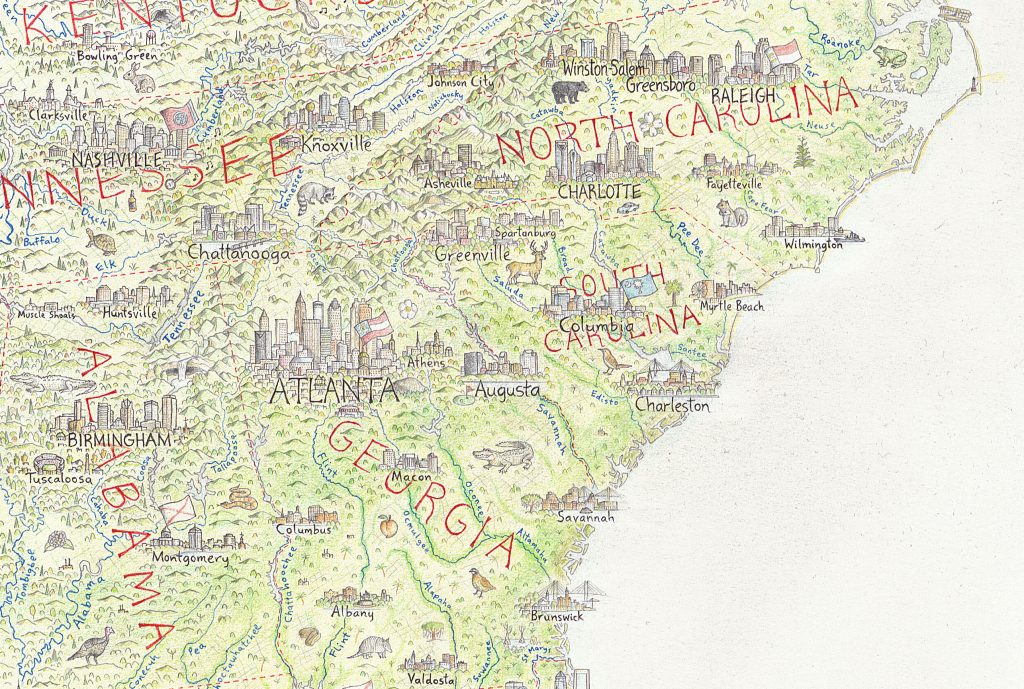
Southeast, USA
To make sure content is accurately geolocated within a region, I have to spend a lot of time prepping the area. This involves plotting out where everything must go, creating a pencil blueprint that I can then fill in.
You make the comment, ’By vividly illustrating geographic data, I hope to bring attention to dynamism and mystique of our world.’ Discuss.
Maps have always been a critical lens by which we view the world, and it never fails to amaze me how quickly anyone gets immersed in a map of an area they know well. Show someone a map of their country and they’ll quickly start telling stories about their lives and travels while tracing their finger along highways and coastlines.
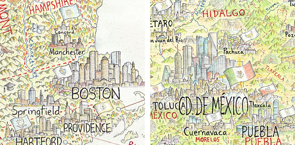
Capital Cities
There is a big demand for good maps, but in the age of the smartphone there is less and less practical need to peruse a map – we can just be navigated around with ease. I’m by no means a luddite about this, I’m a big fan of these tools. Nonetheless, this is causing a decline in societies (already shaky) geographic literacy, and I feel the space has been blown wide open for compelling traditional cartography to reconnect us with geography. Our Earth is more magical, awe-inspiring, treacherous and mysterious than any world conjured up by the great fantasy authors. I feel that by illustrating a map with true data, drawn in an elegant and fantastical way, it can capture anyone’s attention while educating them about geography.
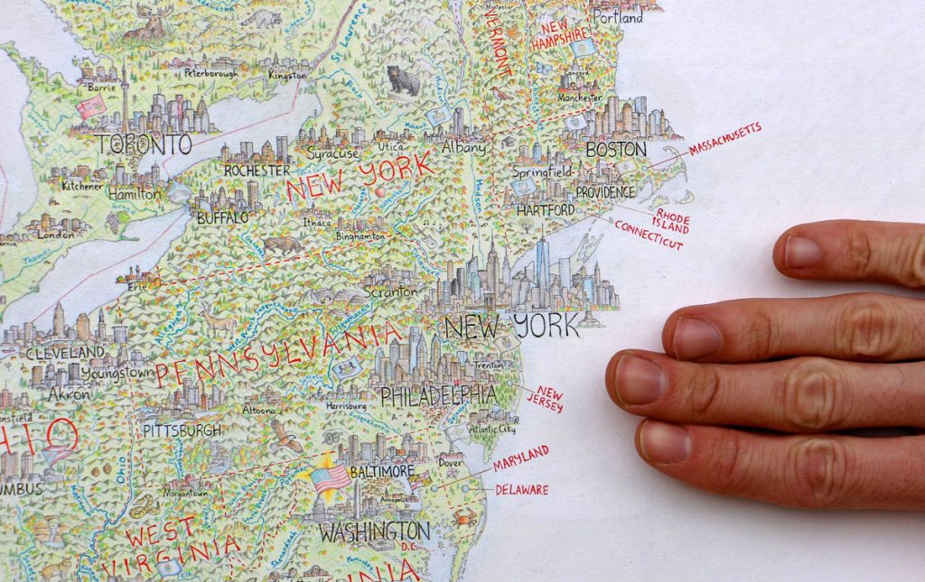
Hand scale, East Coast, USA
You are currently working on a huge map of The North American Continent, can you take two cities from your over 600 cities and towns, discuss their complexities as an illustrator?
San Francisco. One of the most famous cities in the world, with dozens of iconic features to choose from, SF is a good example of how complex things can get.
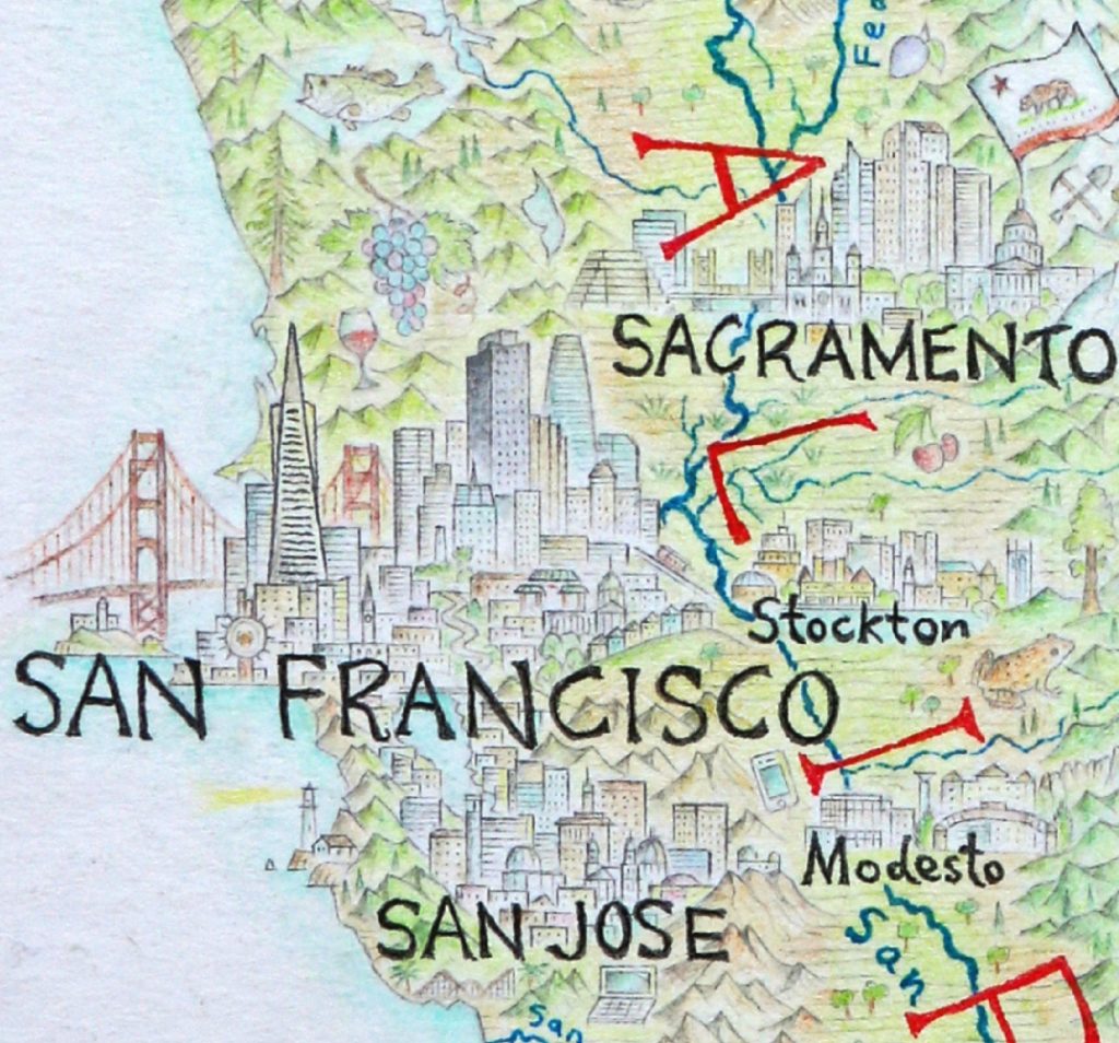
The approach I take with most cities is to build them somewhat like the cross-section of a forest. I have the tallest buildings of the skyline – the canopy – towering in the background and creating the shape. Meanwhile the foreground is where I build an understory of content, and have a chance to include the smaller, more finessed landmarks of a city. In the case of SF, I managed to fit Fisherman’s Wharf, the Ferry Building, Nob Hill, winding Lombard Street, Chinatown gate, City Hall, a tram, and a row of painted lady houses. The background has the tallest most distinctive buildings creating the skyline, along with the Golden Gate Bridge and Alcatraz. This one city alone took many hours of research, prep, and drawing.
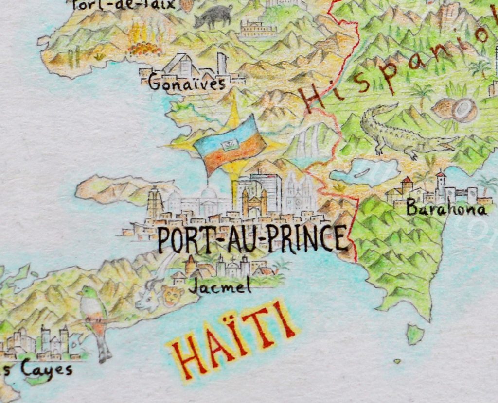
Port-au-Prince, Haiti. Some cities have such unique specifications that I have to really think outside the square. Port-au-Prince was devastated by the Haiti earthquake in 2010, which destroyed many buildings, including most of its iconic civic landmarks.
Port-au-Prince, Haiti
So, the kind of features I normally look for are simply not there anymore. This includes the National Palace, which as the seat of government is the building I usually draw a nations flag upon. After a lot of research to determine what iconic buildings still remain and what was lost, I was unsure the best way to handle a portrait of the city with the finesse and care required to do it justice. Finally, I chose to draw two of the iconic buildings that were destroyed – the National Palace and the Cathedral – in a light, ghostly style to create a contrast with the other buildings that still stand. I wanted to reference the earthquake, which left an undeniable mark on Haiti’s contemporary geography, while also showing that the spirit of the city lives on.
When and how do you decide to add a town to your map?
When do you decide not to include a town or city?
This has proven to be one of the most controversial elements of my map, and there’s no easy way around it. It’s controversial because if someone’s beloved home city is missing, it may well frustrate and annoy that person… which is understandable. I have a population criteria to determine city inclusion, which goes something like this. If a city has more than 100,000 people in its metropolitan area, it gets included. At the large scale of my North America map, I usually choose the hub city of a metropolitan region rather than try to include everything – I simply don’t have the space. For example, Seattle is just Seattle, I did not attempt to squeeze in Tacoma, which is its own city but is still considered part of the larger Seattle metropolitan area.
In the northern 90% of Canada, as well as Alaska and Greenland, I dropped the city inclusion right down to 1,000 people to correct for a much lower population. Otherwise, there’d be no towns to draw up there at all.
Finally, all capital cities are included, with the flag of their entity flying above the legislature buildings. This goes for both international capitals, and state/provincial capitals of the US, Canada and Mexico.
What have been some obvious landmarks that people will be looking for?
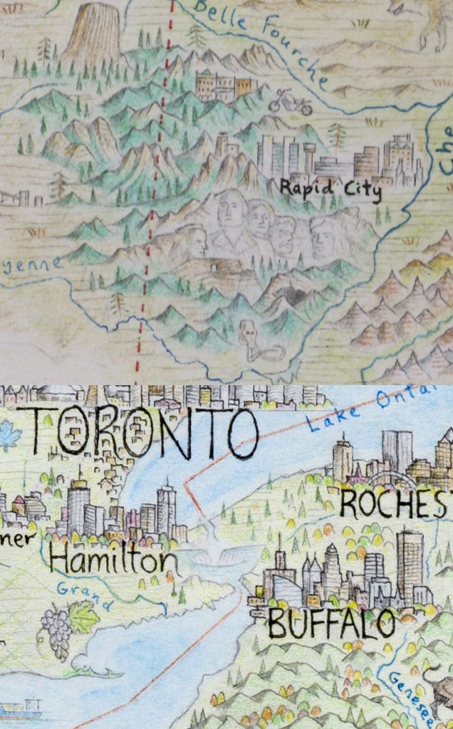
For anyone who is from North America, they’ll naturally go straight for their home city or region, and it’s always fascinating to get feedback from a local. I’ve had people tell me that I drew the building they work in, or the church they were married in, and that’s always so exciting. Overall however, the most commonly searched-for features would include the cities of New York, LA, San Francisco and Chicago, along with Niagara Falls, Mt Rushmore, the Grand Canyon, Yosemite, and more recently, Trump’s wall along the Mexican border… which no, I will not be drawing.
Rushmore, Niagara
When you add animals how do you decide when and where to place them?
Every animal is a little different. The vast majority are wildlife, rather than livestock, so I take great care to ensure that I’m putting animals within their actual range. If I want to draw a tarantula somewhere in Arizona to give it more of that desert southwest feel, then I’ll look at the different species of tarantula found in the area and make sure I get the right one in the right place.
Some animals are chosen based on their symbolic significance, as animals often have important roles in regional iconography. I especially love anything that has multiple layers of meaning behind its inclusion. For example, the Californian red-legged frog in northern Cali is 1) the official state amphibian of California, 2) endemic to that region, 3) drawn in Calaveras County, which is most famous for Mark Twain’s book The Celebrated Jumping Frog of Calaveras County, which 4) lead the county seat of Angel’s Camp to being nicknamed “Frogtown”. So right there are four reasons why this frog made it onto the map.
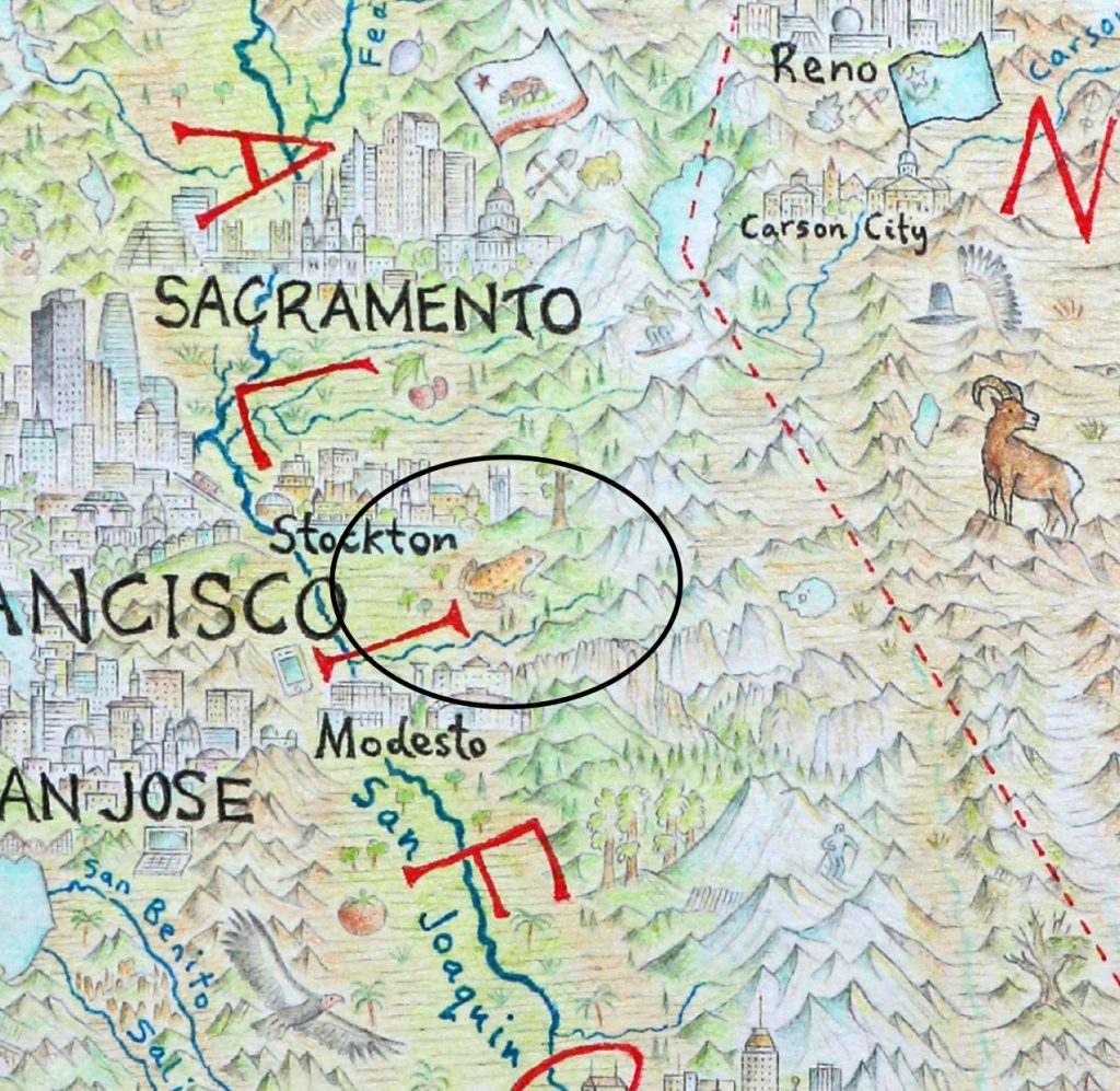
Californian red-legged frog
Why did you decide to add Cuba, Jamaica, and The Bahamas?
The map is called The North American Continent, so it’s all about the entire region. North America as a geographic region includes Central America all the way to the Panama/Colombia border, it includes Greenland, and it includes the Caribbean – hence the focus on Cuba, Jamaica and The Bahamas. Also as the bulk of my print sales will be in the US and Canada – certainly the lions share of the continent – I want Americans and Canadians to learn about and consider their wider neighbourhood.
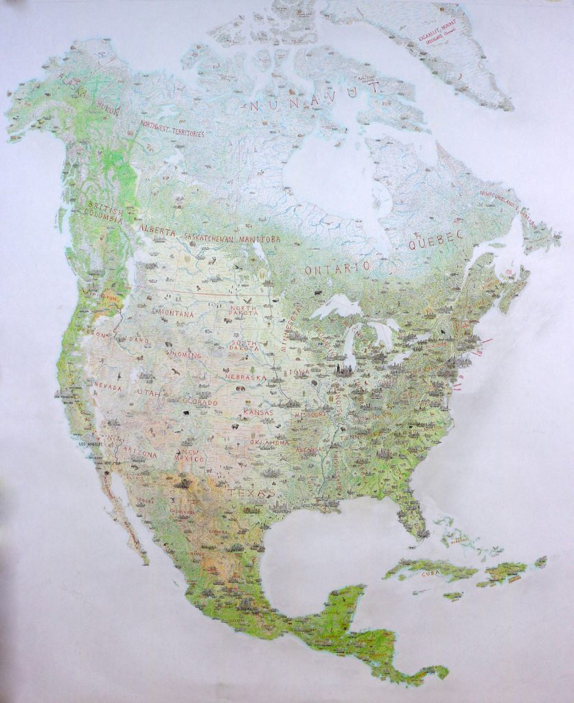 North American Continent
Discuss the differences involve in depicting Arctic landscapes onto you map?
The Arctic has been a fascinating region to focus on, and required a different approach to the rest of the map. For one thing, being a frozen tundra landscape, the base colour is the paper: white. I had to be very creative with my colour pencils, using a lot of blues and purples for shadows, and yellow or ochre for highlights. It was a region I could move comparatively quickly through, because of the lack of cities, which was nice after punishing slogs through Central Mexico or the American Northeast. There were big challenges though. Simply finding content at all was not always easy, and I had to learn to let the map breathe.
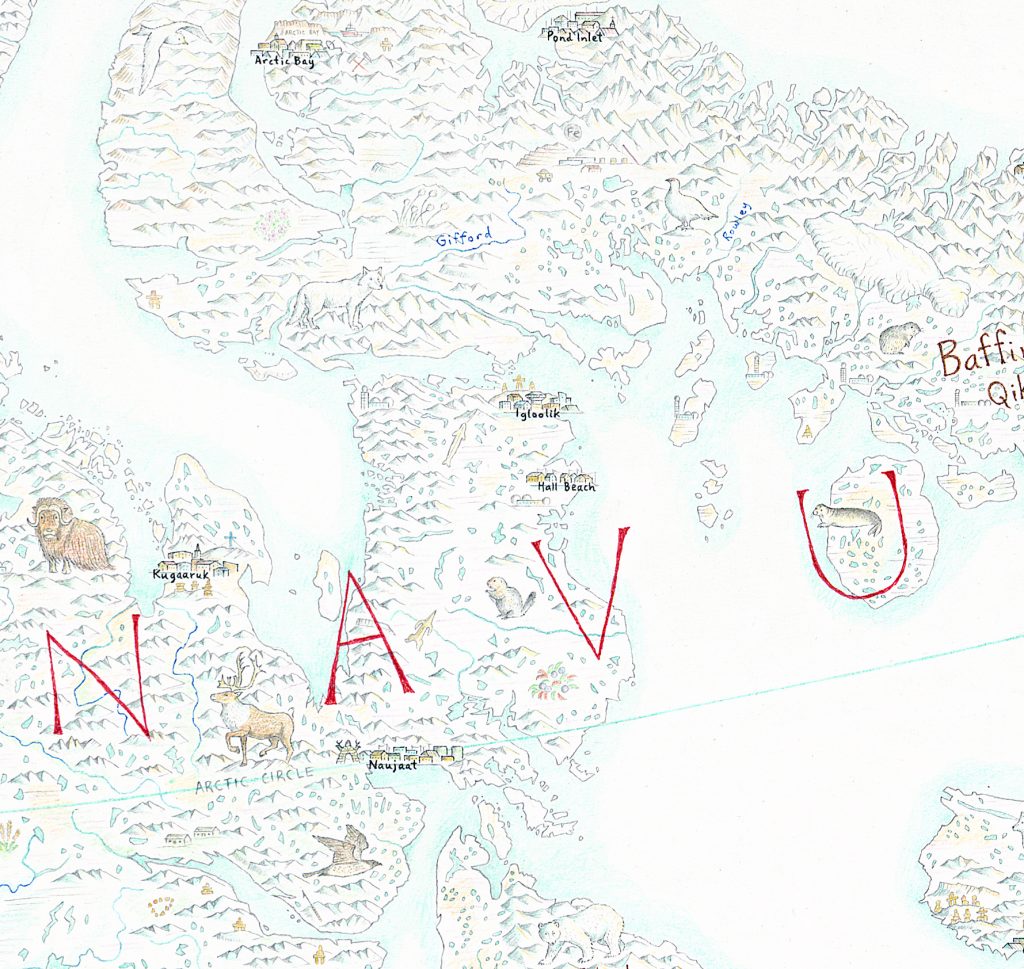
Arctic
To be okay with wide open spaces that had infrequent features. And while the Arctic has many wonderful animals, I did cycle through the basics quite quickly (polar bears, arctic hares, seals, walrus, artic wolf, arctic fox, lemmings, muskox, caribou etc). Also challenging were the coastlines of the Canadian Arctic and Greenland, which are some of the most complex in the world. Trying to get the fjords of Greenland and Labrador accurate felt like I was playing 3D underwater chess.
I loved learning about the Arctic at the level I did, where I was reading all about these Inuit hamlets that few people have ever heard of, learning about the culture and lifestyle of peoples of the far North. Pangnirtung, Kugluktuk, Grise Fiord, places that boggle the mind to think about. Places that have days or nights that can last months, places that you’ll kayak on one day, and weeks later could be dogsledding the exact same spot. Places that seemed like another planet to the world I know, yet others call home.
Expand on the importance or use of red on your maps?
I use red fine-liner pen for any political divisions on the map. I label entities with it, and draw all my borders. International borders use an unbroken red line, while subnational borders (US and Mexican states, Canadian provinces) are delineated with a dashed red line.
Discuss Cruz de la Parra and why you have chosen to add this historical cross?
The Cruz de la Parra is located in southeast Cuba, and is a cross that was apparently erected by Christopher Columbus himself.

Cruz de la Parra,
This is an extraordinarily rare and historically significant relic. While the arrival of Columbus spelled doom for so many millions of indigenous inhabitants of the Americas, there’s no question that it was one of the most significant moments in world history, and the legacy of his landing is felt in every corner of the continent I’m drawing. I also featured his ship – the Santa María – landing at the Bahamas. I was surprised to come across a relic that was so directly tied to Columbus, and it’s a major tourist attraction in this region of Cuba.
When did you first become fascinated in cartography?
I can’t pinpoint the exact moment, but somewhere around age 6 or 7 I suddenly found myself obsessed with maps. I would stay up late and draw the coastlines of New Zealand (my home country), the world, and my own fantasy lands. I believe it was something to do with the remarkable geography of NZ, and some of the beautiful flights I took between Nelson and Wellington. Also I’d been drawing animals and landscapes even younger than that, but they didn’t really merge into pictorial maps until many years later.
What lead you to have a career in cartography?
You live in Australia but are working on a North American map. How did this come about?
At age 21 I moved from NZ to the USA with a one-way ticket, and ended up spending almost 2 years moving around North America, taking all kinds of jobs – from cooking to laying grass sod, as well as playing a lot of live music. It was the first place I ever went overseas, and I was blown away by the geography of the continent. I could not believe the variety and sheer scale of it, and it reignited my deep passion for cartography. Toward the end of my travels there, late 2012, I was living in Montreal and my housemate asked me to draw him something as a keepsake before I left. He’d noticed I was half-decent at drawing, and encouraged me to do so… on his refrigerator. We had this crappy old fridge that had rust stains on it, and after he painted it over with white house paint he suggested that that could be my canvas. So, I proceeded to draw a map of North America freehand on the fridge with pen, in which I drew little skylines for each of the major cities. I absolutely loved the process, finding it to be creative, stimulating, and fun. Meanwhile, everybody who saw the fridge loved it too, so I thought hey – I ought to follow this up.
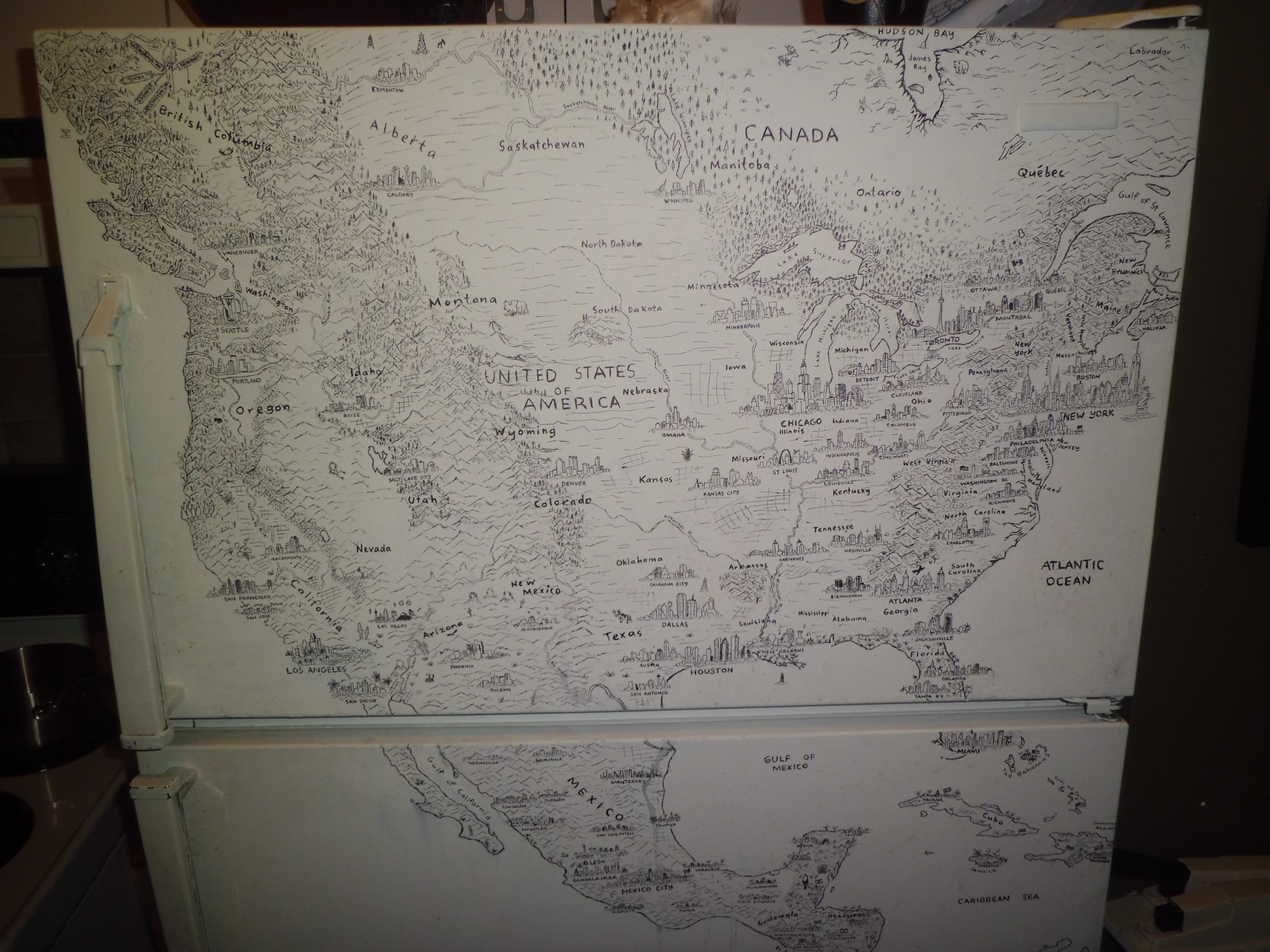
Montreal Fridge
Six months later I’d moved to Perth and I got to work drawing a map of South Asia and Australasia (on paper this time), teaching myself to use colour pencils.
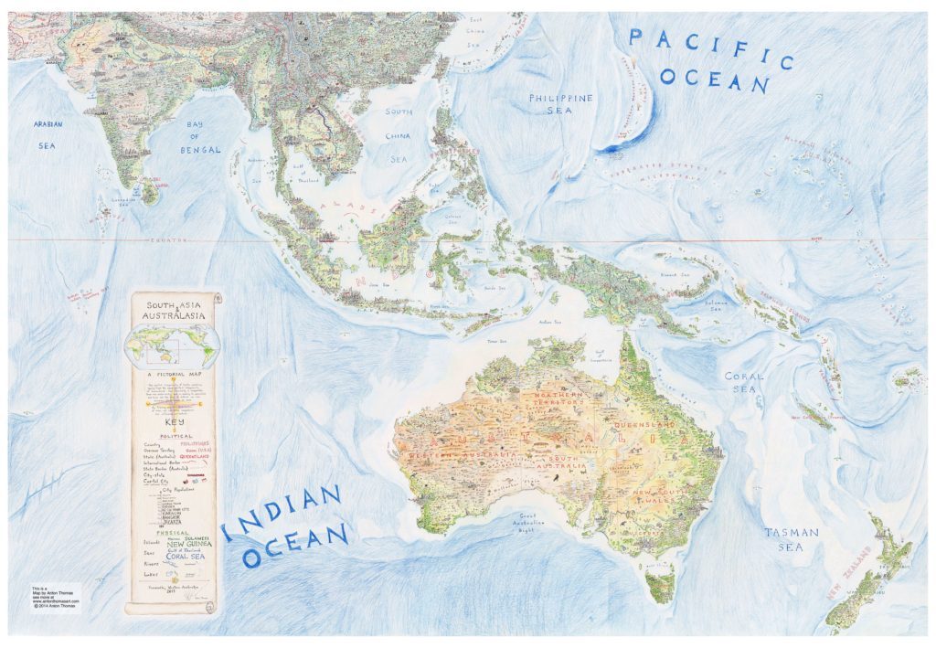
South Asia and Australasia
This gave me the skills and confidence I needed to draw North America properly, which I commenced upon moving to Melbourne in early 2014. It has been almost four years since I began The North American Continent, it is my love letter to a remarkable part of the world… a place that taught me to think bigger, and to try something different. In 2016 I got a huge amount of exposure from a feature on National Geographic’s Best Maps of 2016, which expanded my reach and showed me that there was a big market for what I’m doing. I spent much of last year developing upon this, while trying to finish the map, and embarked on a lecture tour throughout the US and Canada. Here is one of my talks from a cartography conference in Montreal. Moving into 2018, I’ve quit my dayjob and am now mapping fulltime. I expect to finish The North American Continent in a few months, and hope to have the first round of prints to market before Christmas.
Contact details:
Anton Thomas
Anton Thomas, Victoria, Australia
Interview by Deborah Blakeley, May 2018
Think a colleague or friend could benefit from this interview?
Knowledge is one of the biggest assets in any business. So why not forward this on to your friends and colleagues so they too can start taking advantage of the insightful information the artist has given?
Other artists you may be interested in: